
Wood brings warmth, texture, and natural character to almost any interior, but the surrounding colors determine whether it feels airy, dramatic, rustic, or refined. These 20 wood colour palette ideas pair popular finishes such as white oak, walnut, cherry, maple, teak, and espresso with paint, upholstery, stone, metal, and textiles. The key is to identify the wood’s undertone first. Warm woods usually coordinate with cream, olive, terracotta, and muted blue, while cooler finishes sit comfortably beside gray, white, charcoal, and dusty pastels. You can also mix light and dark woods when one finish remains dominant and repeated accents create balance. Whether you are decorating one room or planning a connected home, the following complete looks make it easier to use these 20 wood colour palette ideas.

1. White Oak And Warm White Wood Color Palette
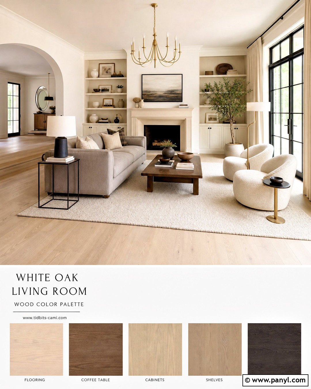
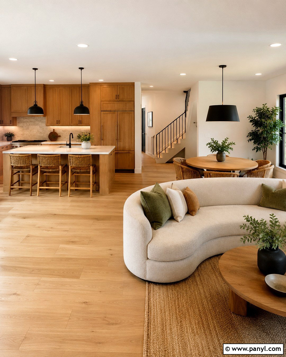
Sunlit white oak creates an easy foundation for a bright living room, bedroom, or open kitchen. Use the wood across the flooring and one large furniture piece, then surround it with creamy white walls rather than stark blue-white paint. Add a soft greige sofa, oatmeal curtains, and an ivory wool rug to keep the palette calm. Small charcoal accents, such as window frames, lamps, or cabinet pulls, provide definition without making the room feel cold. Bring in brushed brass sparingly through lighting or hardware for a subtle glow. Bouclé, linen, pale stone, and handmade ceramic decor strengthen the soft natural look. Keep the wood finish matte or low-sheen so its quiet grain remains the most inviting part of the design.
2. Walnut And Cream Wood Color Palette
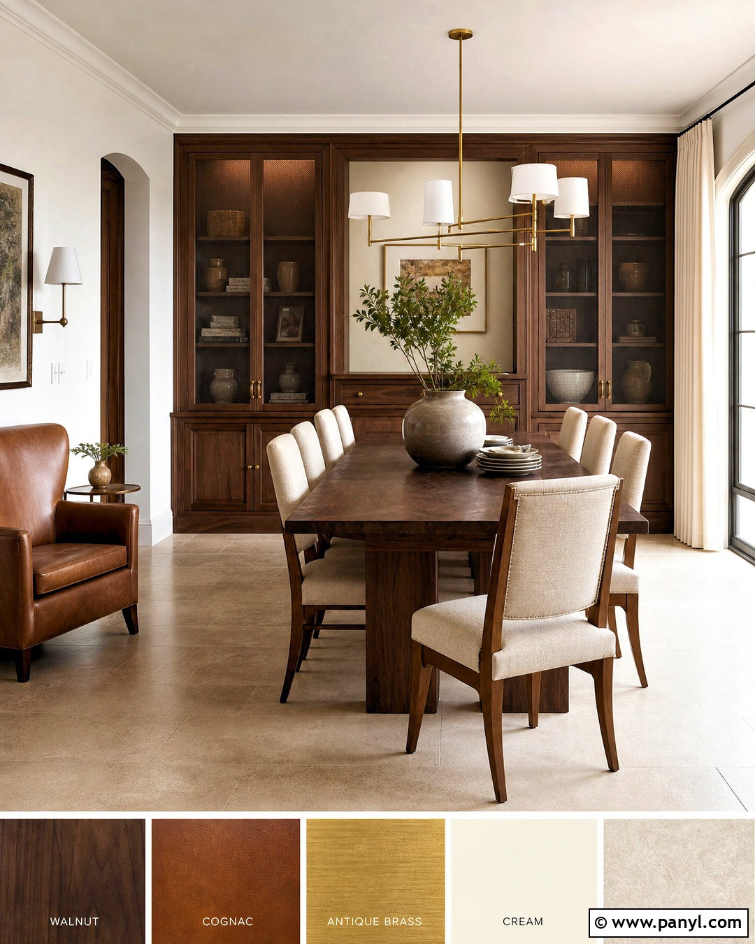
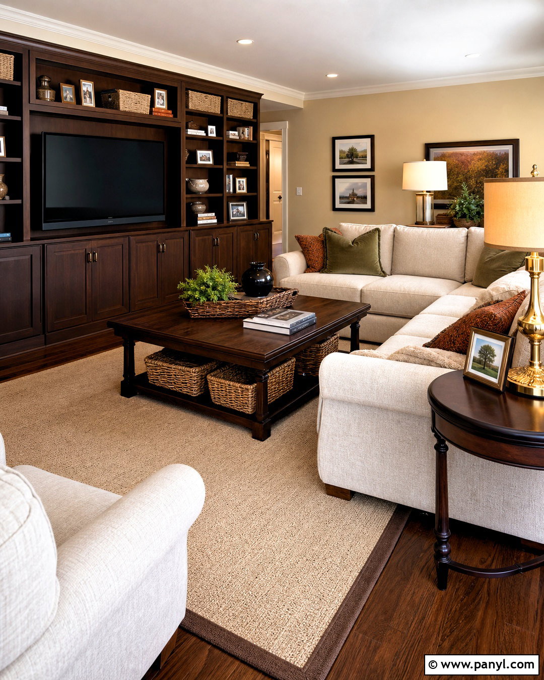
Rich walnut looks polished and welcoming when it is balanced with light, creamy colors. Make walnut the dominant finish through built-in cabinets, a dining table, or a substantial bed frame. Choose soft cream walls and warm beige upholstery to lift the deeper brown grain. A light limestone fireplace, ivory rug, or pale quartz countertop prevents the room from becoming visually heavy. Introduce cognac leather through one chair or a pair of stools, then add antique brass lighting for controlled warmth. Black can appear in thin frames and hardware, but avoid large solid areas that compete with the wood. Complete the room with flax linen, ribbed glass, and restrained greenery. This palette works especially well in transitional, midcentury, and contemporary interiors.
3. Natural Oak And Sage Green Wood Color Palette
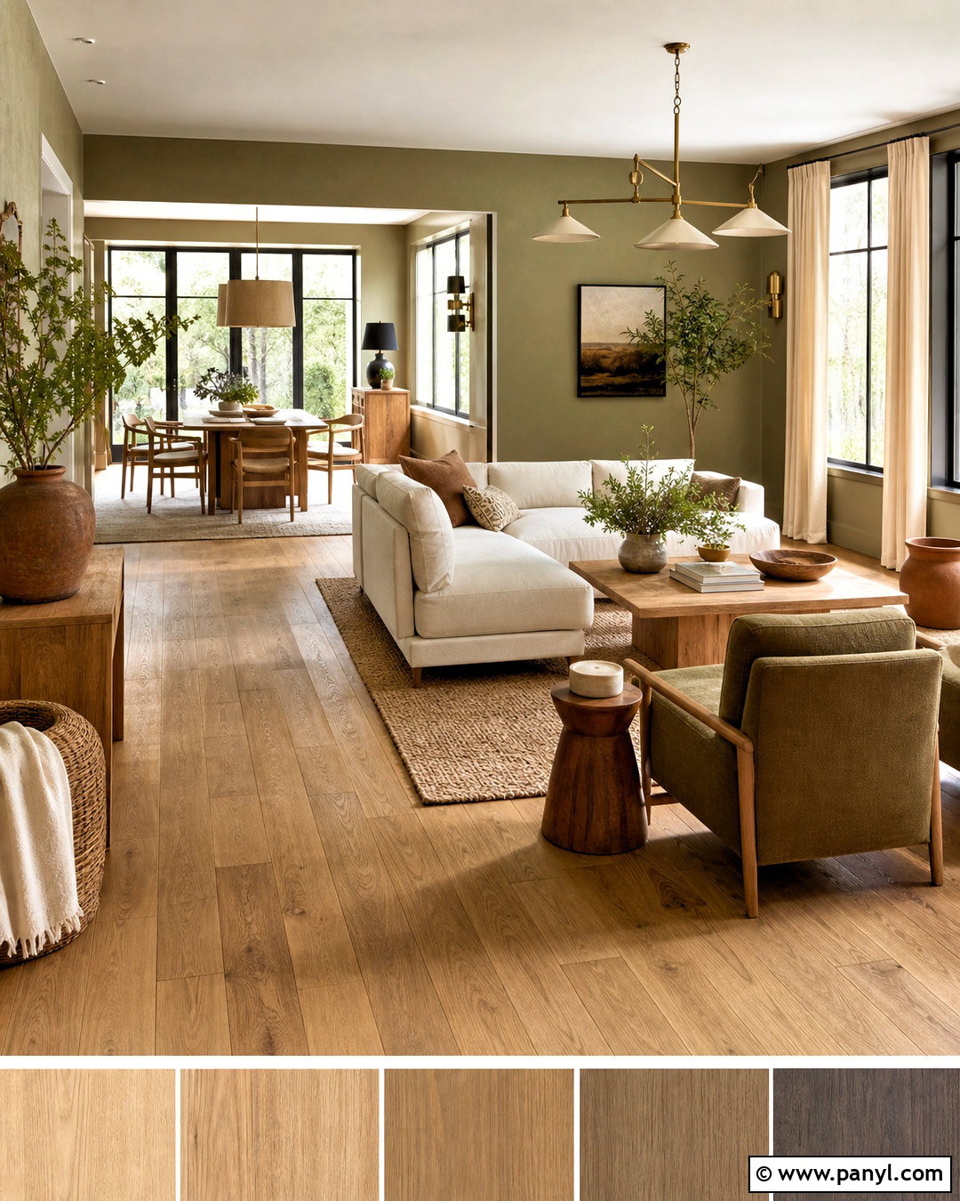
Natural oak and sage green create a relaxed palette inspired by gardens and wooded landscapes. Use oak flooring, cabinetry, or a dining table as the warm base. Paint the walls a muted sage with gray undertones so the green feels peaceful rather than overly bright. Layer in warm white upholstery, woven jute, and beige linen curtains to soften the room. A darker olive accent can appear on an armchair, kitchen island, or patterned rug. Choose aged brass hardware and off-white ceramic lighting instead of shiny finishes. Plants can enhance the nature-based scheme, but vary leaf shapes and keep containers simple. Terracotta pottery adds one earthy contrast. The complete look feels grounded and fresh without relying on excessive rustic decorations or matching wood furniture.
4. Dark Walnut And Navy Blue Wood Color Palette
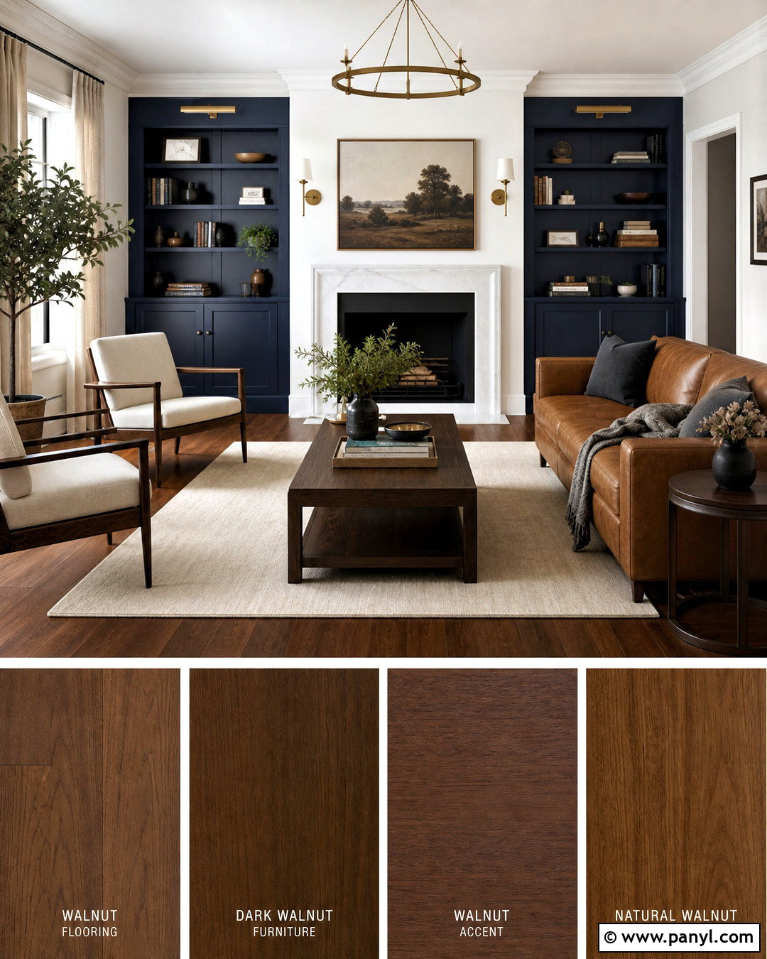
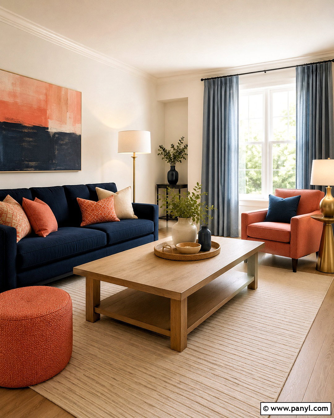
Deep navy gives dark walnut a tailored, high-contrast setting that feels confident rather than gloomy. Use walnut on the floor, media unit, desk, or dining furniture, then apply navy to one major surface such as built-in cabinetry or a feature wall. Keep the remaining walls soft white or pale stone to preserve brightness. A camel leather sofa, cream rug, and natural linen curtains bridge the dark blue and brown finishes. Add brushed brass sconces or cabinet pulls for a warm highlight. White marble or lightly veined quartz can introduce a crisp reflective surface. Repeat navy in a few textiles, but avoid covering every upholstered piece with it. This complete palette suits a study, dining room, living room, or sophisticated open-plan apartment.
5. Honey Oak And Soft Blue Wood Color Palette
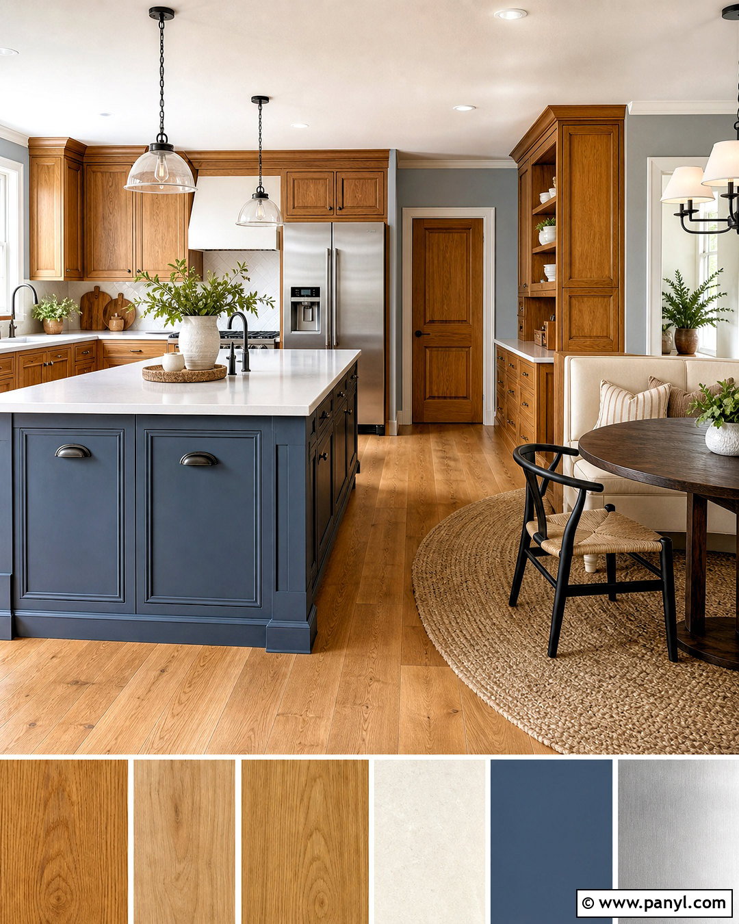
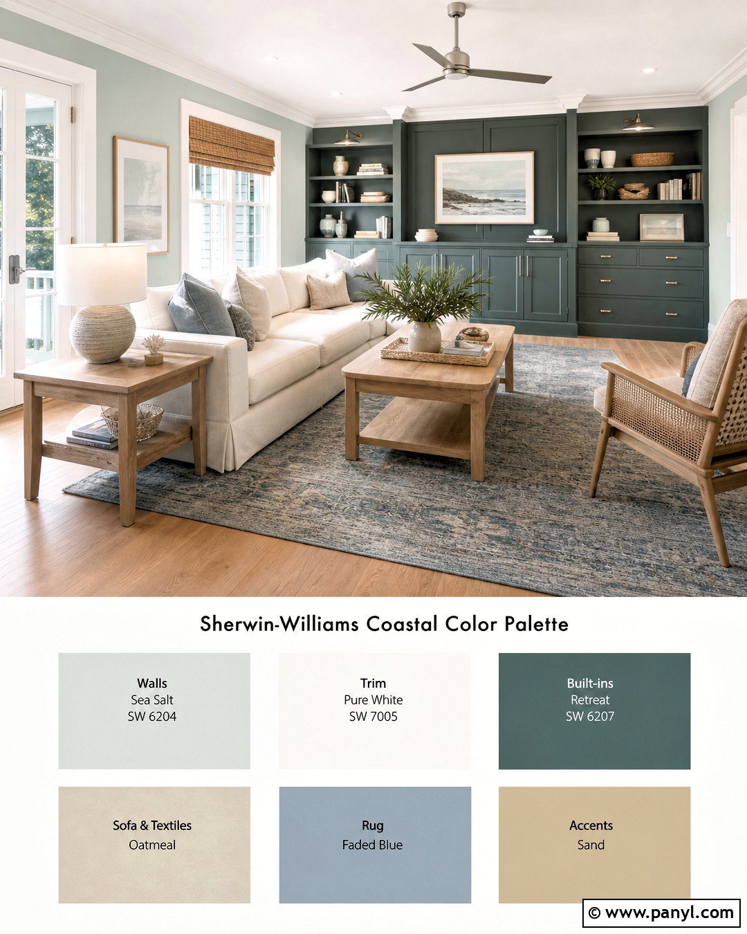
What can make golden honey oak feel lighter and more current? Pair its warm yellow undertone with soft, slightly muted blue. Keep the oak visible on floors, cabinetry, or vintage furniture, then use powder blue or pale blue-gray across the walls. Choose an ivory sofa or cream bedding to create breathing room between the two colors. A woven tan rug, whitewashed ceramics, and natural cotton textiles maintain the relaxed mood. Deeper slate blue can define a kitchen island, reading chair, or window treatment. Use satin nickel or aged pewter hardware for a cooler counterpoint to the golden wood. The final space should feel collected and comfortable, with simple furniture shapes that allow the oak grain and gentle blue background to work together naturally.
6. Maple And Charcoal Gray Wood Color Palette
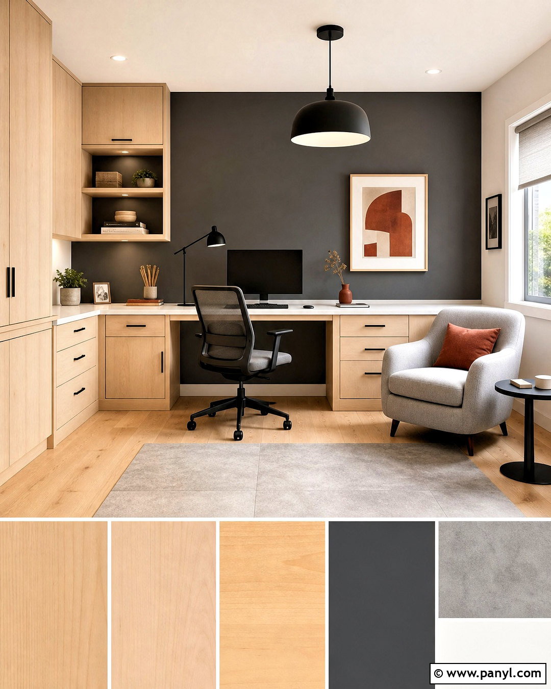
Pale maple gains definition when paired with charcoal gray and clean architectural lines. Use maple cabinetry, flooring, or storage walls as the dominant material, allowing its subtle grain to brighten the space. Paint one wall charcoal or introduce the dark shade through a sofa, kitchen island, or upholstered headboard. Keep other surfaces warm white to prevent the contrast from feeling severe. Light gray textiles, white quartz, and concrete-style porcelain tile support the modern direction. Matte black lighting can be included, although it should remain lighter in scale than the charcoal feature. Add a few muted ochre or rust accessories for warmth. This palette produces a practical contemporary room that feels crisp and structured while preserving the approachable softness of natural maple.
7. Cherry Wood And Dusty Green Wood Color Palette
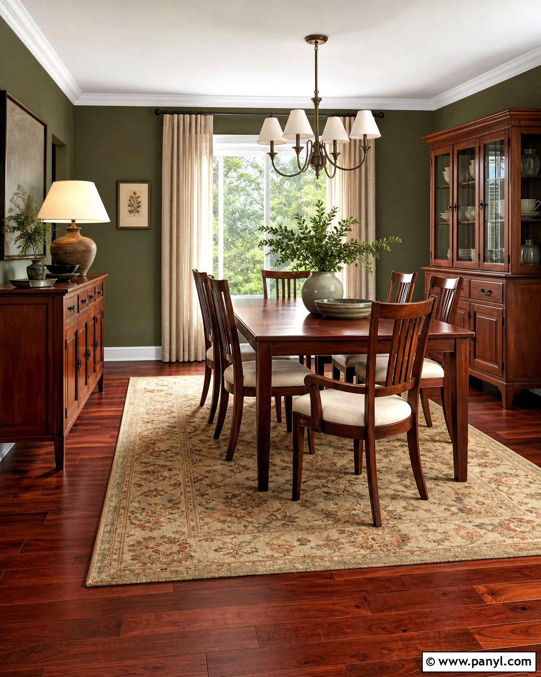
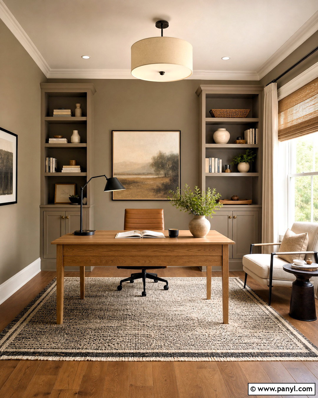
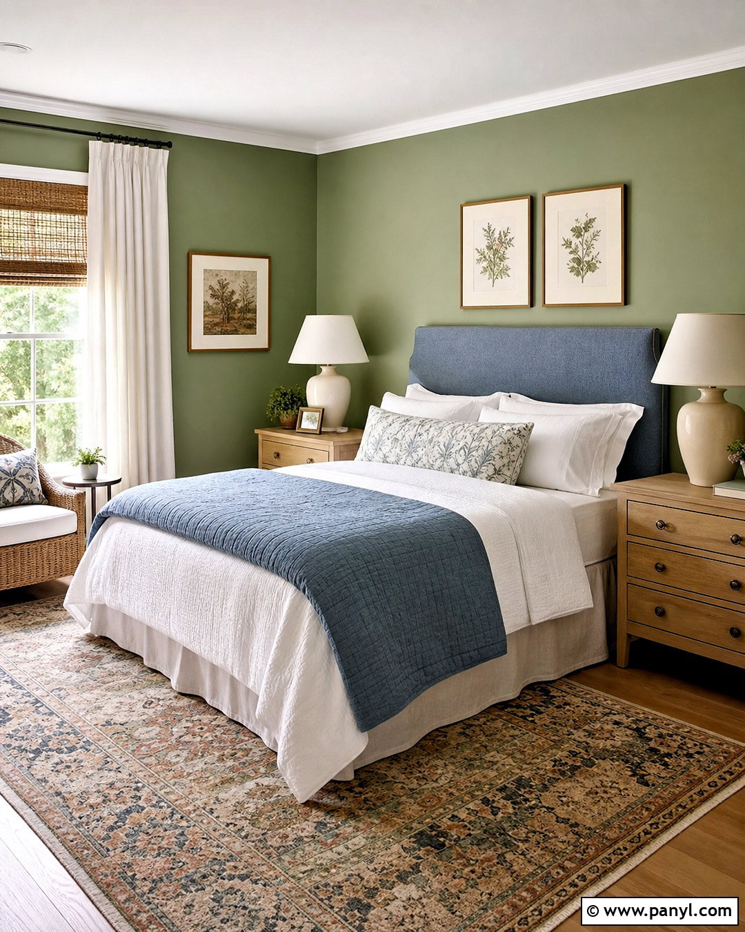
Cherry wood has a recognizable red undertone that becomes especially elegant beside dusty green. Let a cherry dining set, dresser, built-in library, or traditional floor establish the room’s character. Choose a desaturated green with gray or olive notes for the walls, avoiding highly saturated emerald that may exaggerate the red grain. Upholster larger furniture in cream, mushroom, or soft taupe. A faded botanical rug can quietly connect the wood and wall colors without making the room feel themed. Use aged bronze hardware, warm white lampshades, and natural linen at the windows. Darker green accents can appear in pillows or ceramics. The finished look respects the richness of cherry while making it feel calmer, fresher, and easier to incorporate into an updated traditional home.
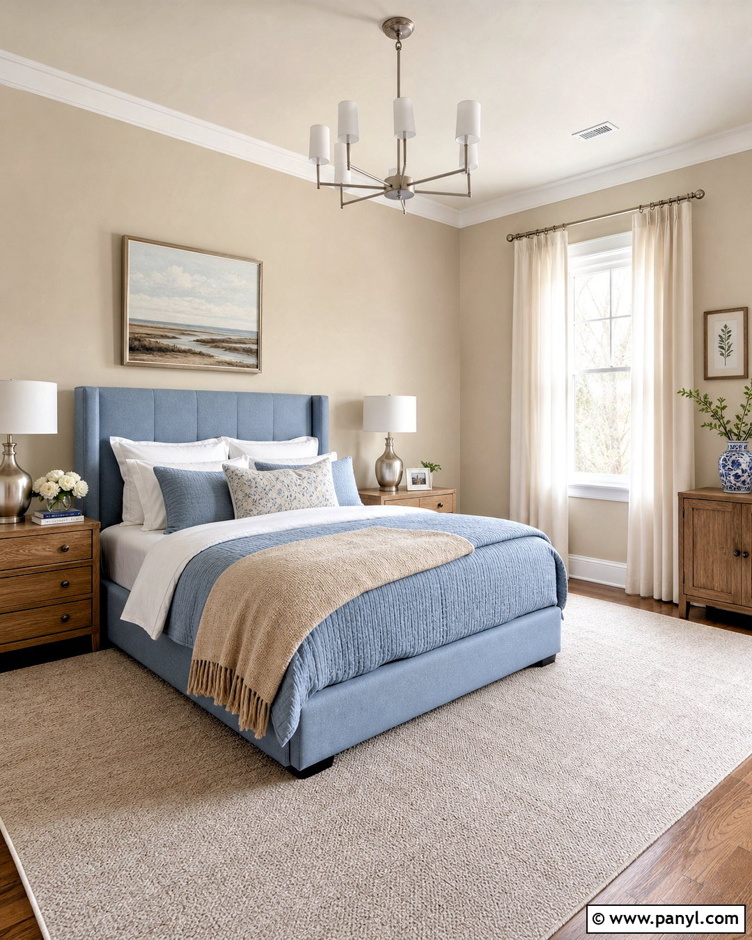
8. Teak And Terracotta Wood Color Palette
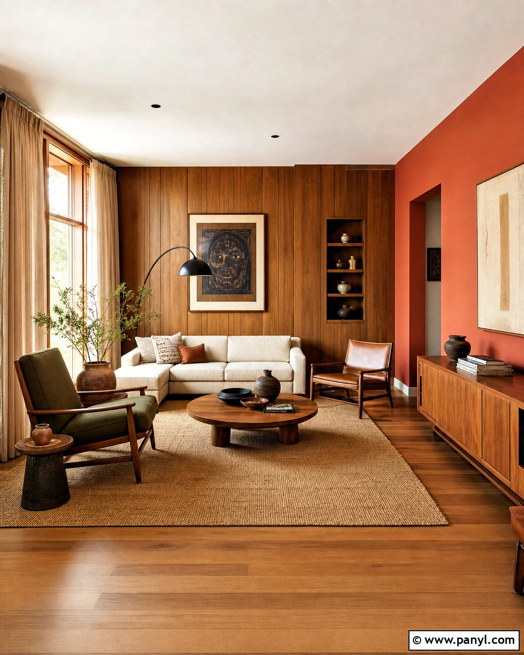
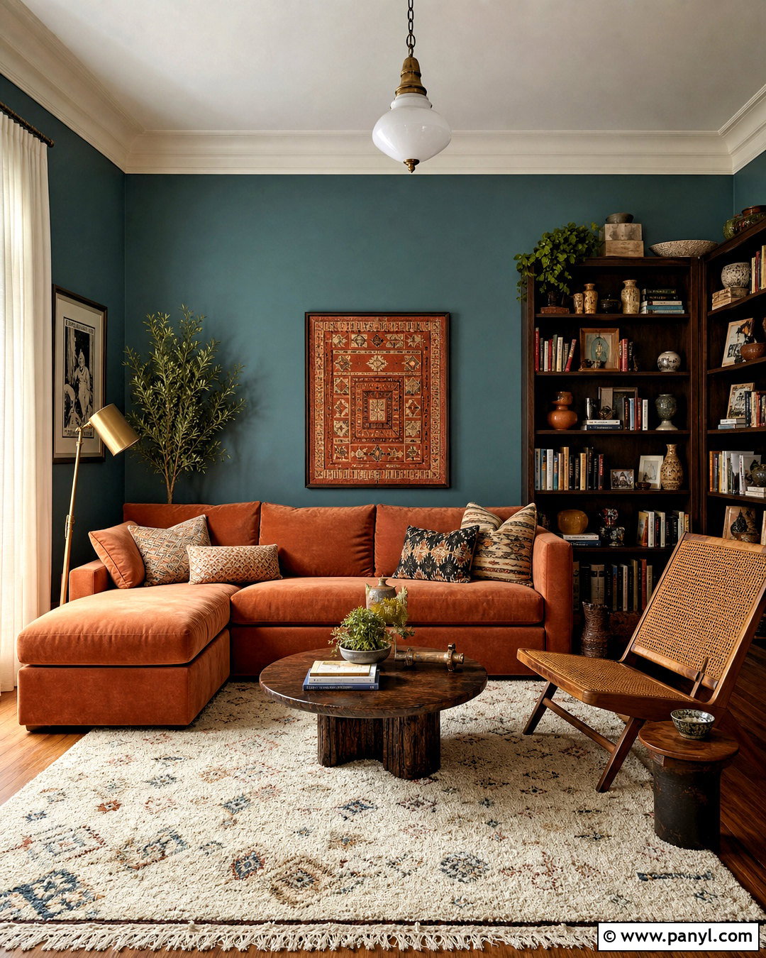
Warm teak and terracotta form a sunbaked palette filled with earthy depth. Feature teak through streamlined furniture, wall panels, or kitchen cabinetry, then use clay-toned paint on one wall or in large upholstered pieces. Balance those warm colors with sand, warm white, and pale beige across the remaining surfaces. A cream sofa, woven rug, and linen curtains will stop the room from becoming too orange. Add dark olive through cushions, artwork, or a single lounge chair for natural contrast. Blackened bronze lighting and handmade pottery reinforce the organic character. Choose simple midcentury or contemporary silhouettes instead of ornate furniture. When the materials remain tactile and the brighter terracotta is limited, the complete room feels vibrant, relaxed, and visually cohesive rather than overly rustic.
9. Ash Wood And Cool Gray Wood Color Palette
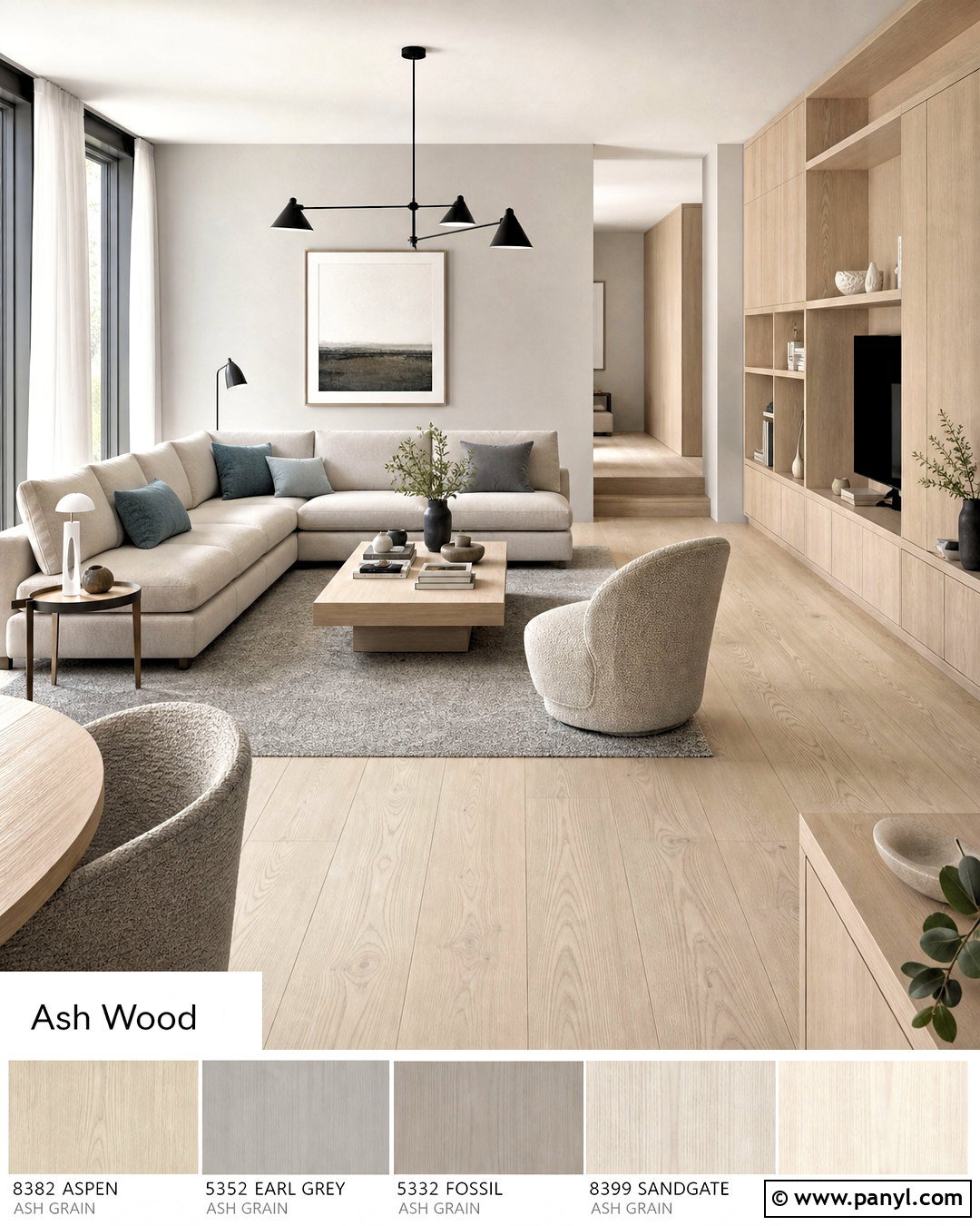
Pale ash has a quiet, cool-neutral appearance that works beautifully in streamlined Scandinavian interiors. Use it for wide-plank flooring, flat-panel cabinets, or minimal furniture. Surround the wood with soft gray walls that have balanced undertones rather than obvious blue or purple notes. Choose an off-white sectional, silver-gray rug, and sheer white curtains to maintain an open atmosphere. Matte black accents can outline light fixtures, window frames, or chair legs. Add one restrained color, such as dusty blue, through cushions or a textured throw. Brushed nickel and frosted glass fit the cooler direction better than yellow metals. Introduce wool, boucle, and pale ceramics so the room does not feel sterile. The completed palette appears clean and restful while retaining plenty of natural texture.
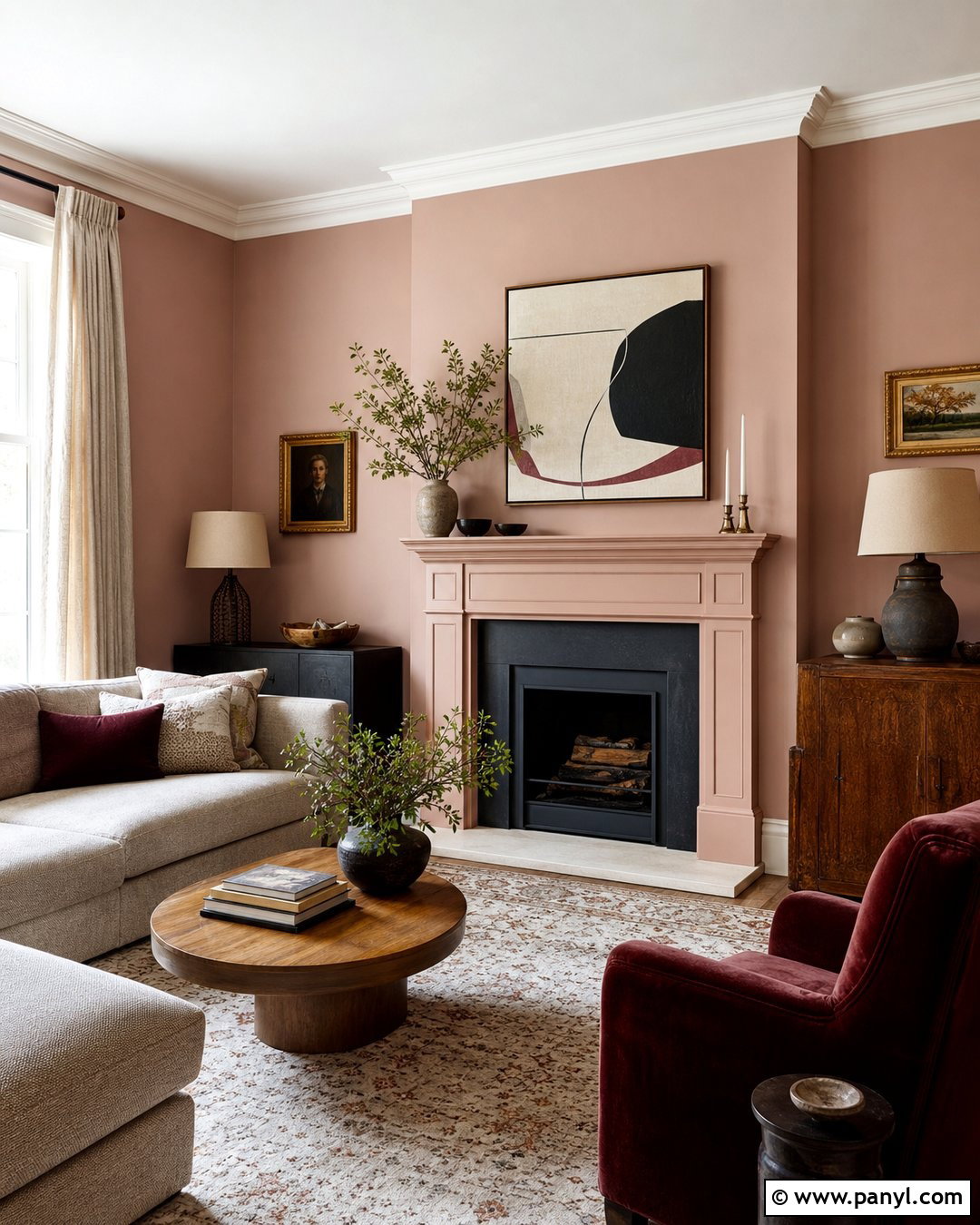
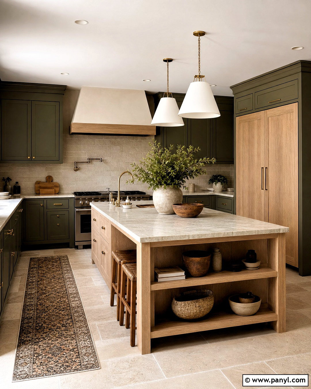
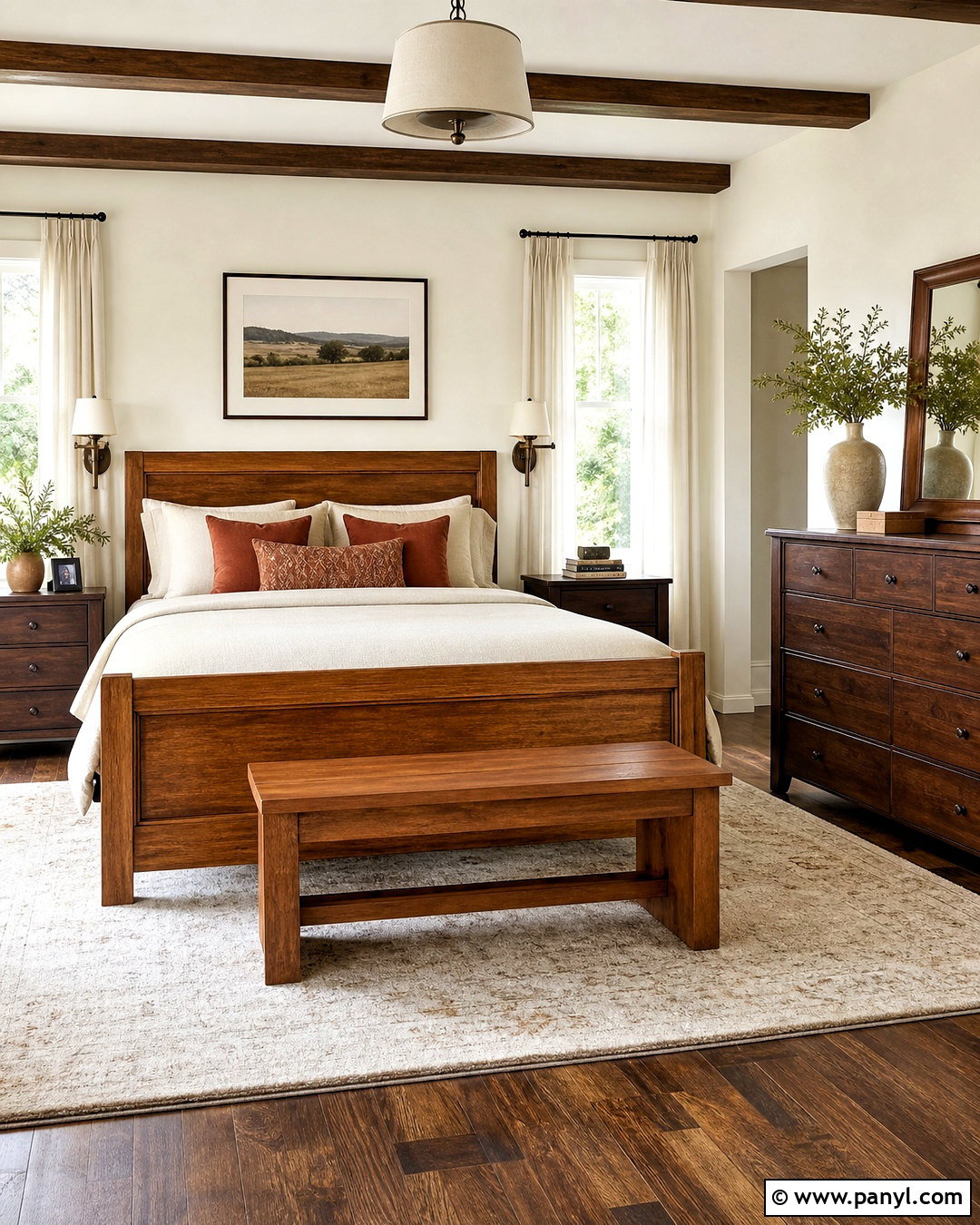
10. Espresso Wood And Ivory Wood Color Palette
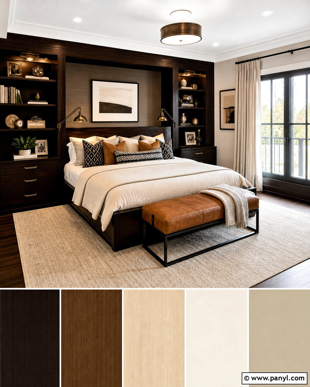
Espresso wood creates striking contrast in a room built around ivory and light neutral colors. Use the nearly black-brown finish for a bed, dining table, vanity, or built-in shelving rather than every wooden surface. Paint the walls soft ivory, then select cream upholstery and a pale beige rug to reflect light around the darker furniture. Add medium brown leather, woven baskets, or walnut accessories to create a gradual transition between the extremes. Warm metallic finishes, including aged brass or bronze, complement the espresso undertone. Keep window treatments light and full-length to soften the room’s sharp visual lines. A restrained pattern in black, tan, and cream can unite the palette. This balanced design feels dramatic and comfortable without making an average-size space appear smaller.
11. Whitewashed Wood And Coastal Blue Wood Color Palette
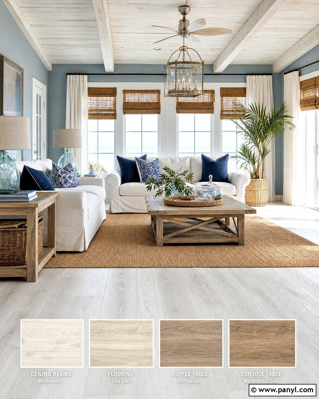
Whitewashed wood and coastal blue can feel fresh without relying on obvious nautical decorations. Start with pale whitewashed flooring, a washed-oak table, or lightly finished cabinetry that still reveals the natural grain. Use misty blue on the walls, then bring in crisp white slipcovered seating or bedding. Sandy beige should appear in a jute rug, woven shades, and linen accents, creating a connection to the wood’s underlying warmth. Add a deeper ocean blue through one chair, a patterned rug, or a few pillows. Choose weathered nickel, clear glass, and matte ceramic lighting. Avoid anchors, ropes, and heavily distressed accessories. The full room should look bright, casual, and modern, with layered natural textures creating more interest than decorative themes or excessive blue accents.
12. Reclaimed Wood And Warm Beige Wood Color Palette
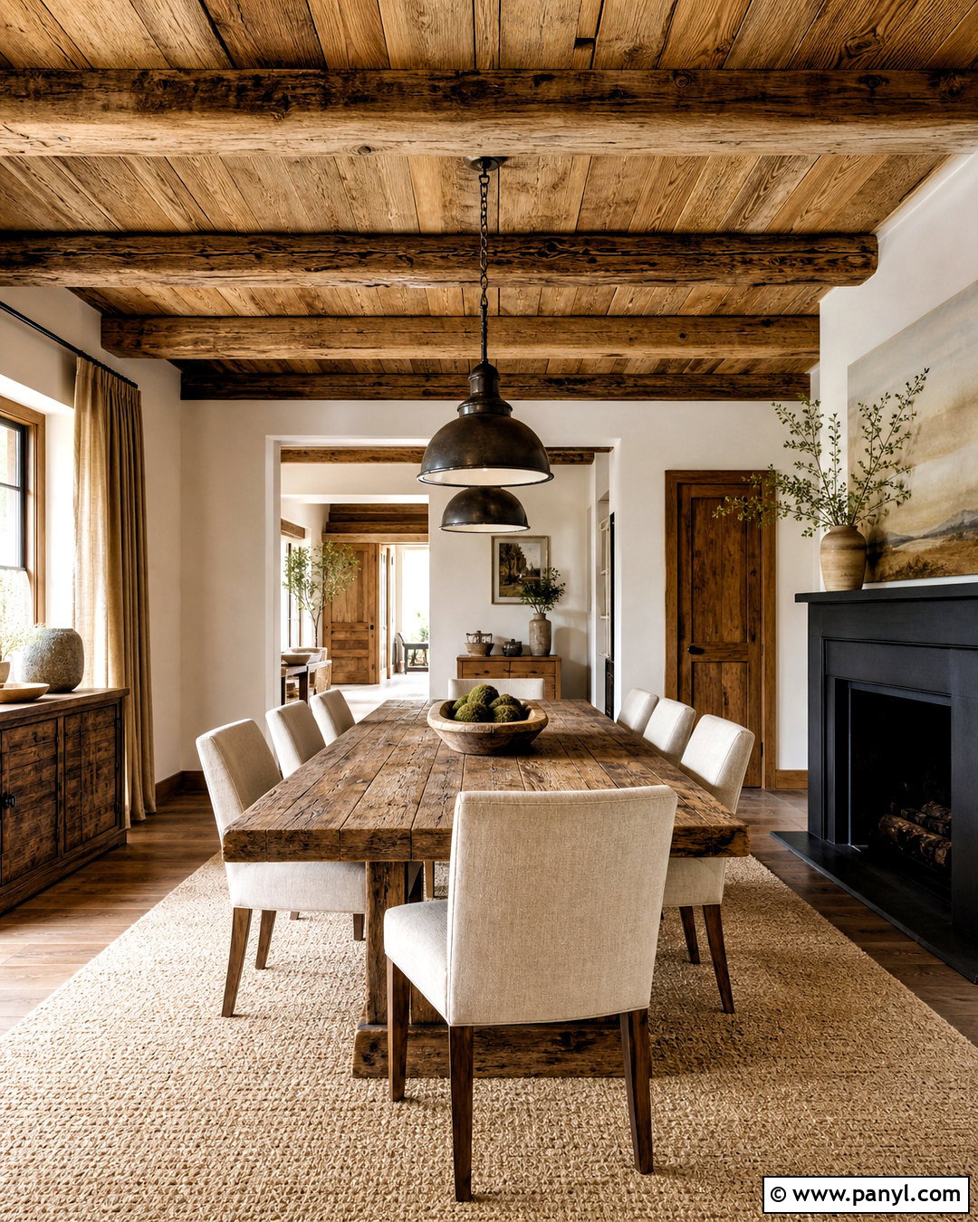
The irregular tones of reclaimed wood need a quiet background that allows their character to stand out. Use salvaged boards for a dining table, ceiling beams, shelving, or one carefully finished feature wall. Choose warm beige paint that connects with the wood’s tan and brown variations. Upholstery in oatmeal, camel, and soft cream creates a smooth transition around the rougher material. Add charcoal through a fireplace surround, pendant lights, or steel furniture frames to provide modern structure. A natural wool rug and simple linen curtains soften the hard surfaces. Limit other distressed finishes so the space does not become visually busy. With clean furniture shapes and uncluttered styling, reclaimed wood can anchor a complete modern rustic room that feels authentic, comfortable, and thoughtfully balanced.
13. Mahogany And Pale Blue Wood Color Palette
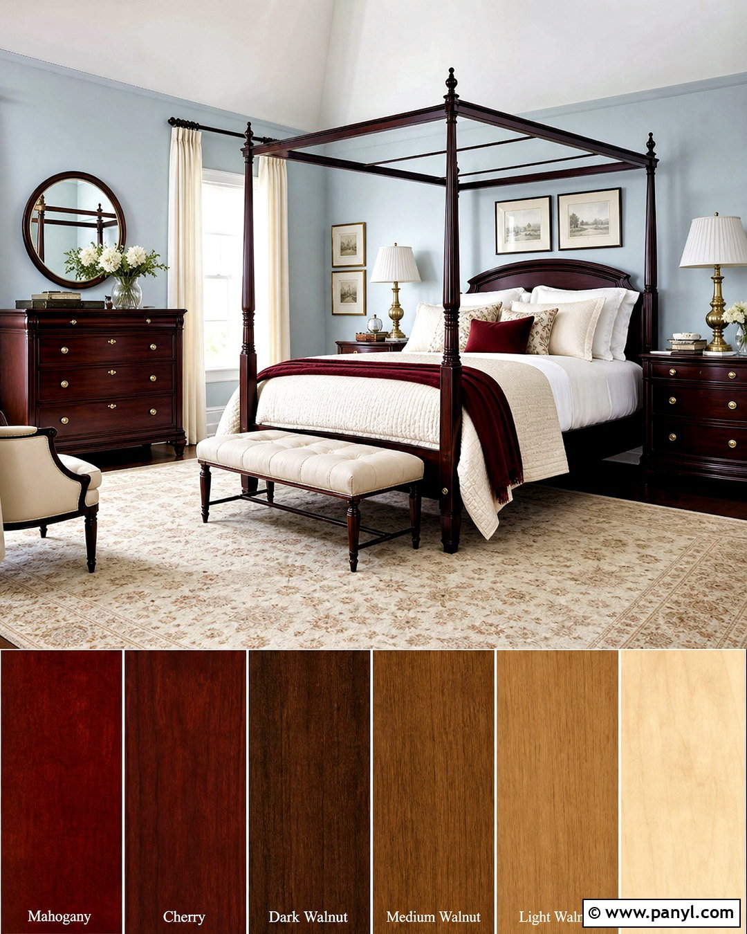
Mahogany’s deep red-brown color becomes graceful when contrasted with pale, chalky blue. Feature the wood through a traditional dining table, four-poster bed, sideboard, or paneled study. Paint surrounding walls a subdued blue with enough gray to keep the result sophisticated. Use ivory upholstery, off-white curtains, and a faded cream rug to lighten the heavier furniture. Small accents of burgundy can repeat the wood’s red undertone, while muted brass lighting adds warmth. Incorporate white marble, alabaster, or light ceramic pieces for another bright layer. Avoid placing multiple dark wooden objects closely together; distribute them around the room for balance. The finished palette offers classic character with a refreshed atmosphere, making inherited mahogany furniture feel deliberate rather than dated or overly formal.
14. Red Oak And Olive Green Wood Color Palette
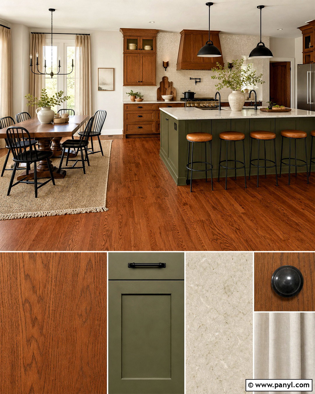
Red oak can look warm and grounded when paired with olive green, tan, and soft cream. Allow the oak to lead through flooring, kitchen cabinets, or a substantial dining set. Apply muted olive to lower cabinetry, a built-in bookcase, or one wall rather than covering every surface. Cream walls and light stone countertops help control the combined richness of the wood and green. Use tan leather seating, flax curtains, and an oatmeal rug to create a natural middle layer. Dark bronze hardware complements the warm grain without adding excessive shine. Black may appear in slender lighting details, while ivory ceramics keep shelves bright. This complete palette works particularly well in craftsman, farmhouse, and transitional homes where sturdy materials and practical comfort are central to the design.
15. Birch And Blush Pink Wood Color Palette
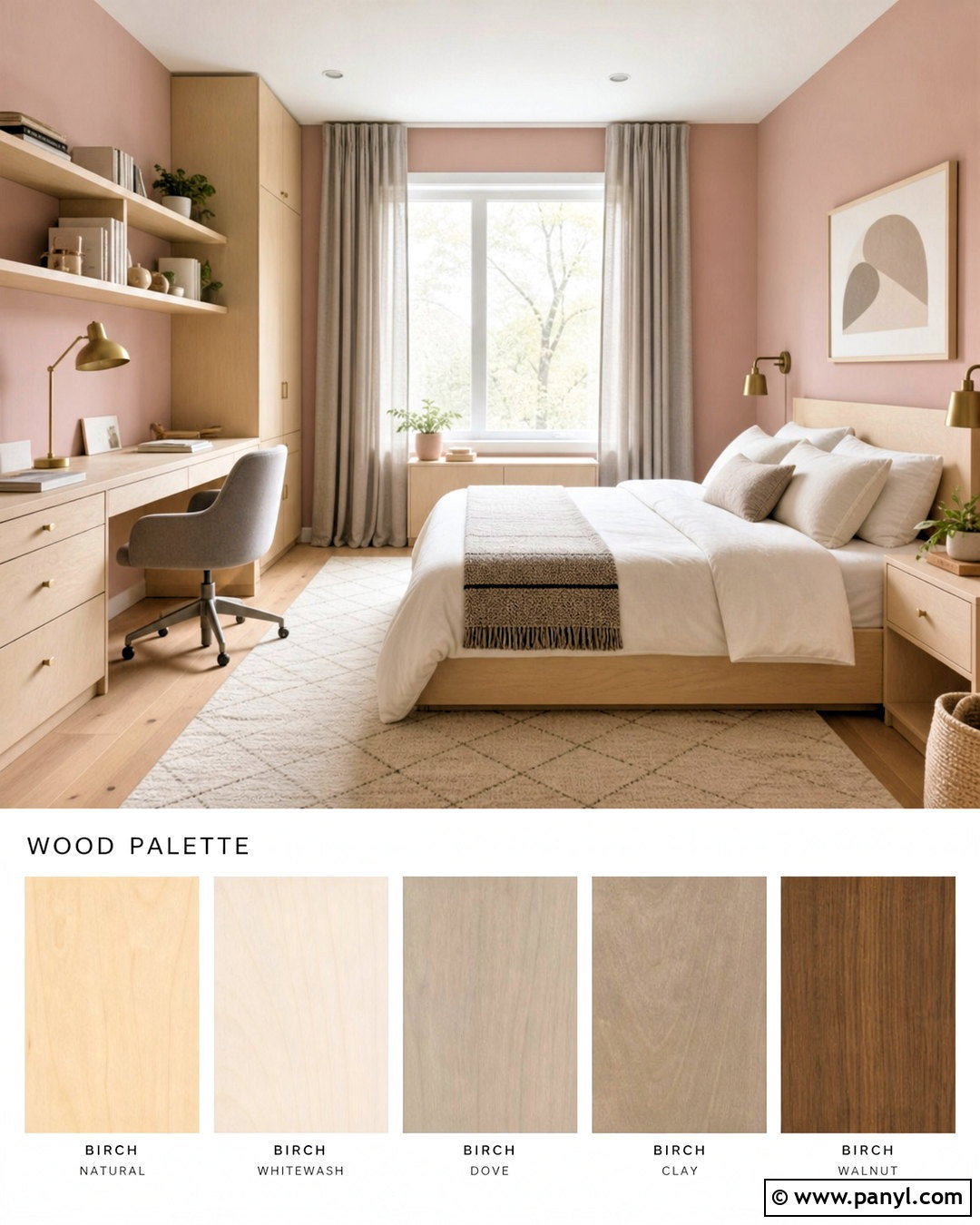
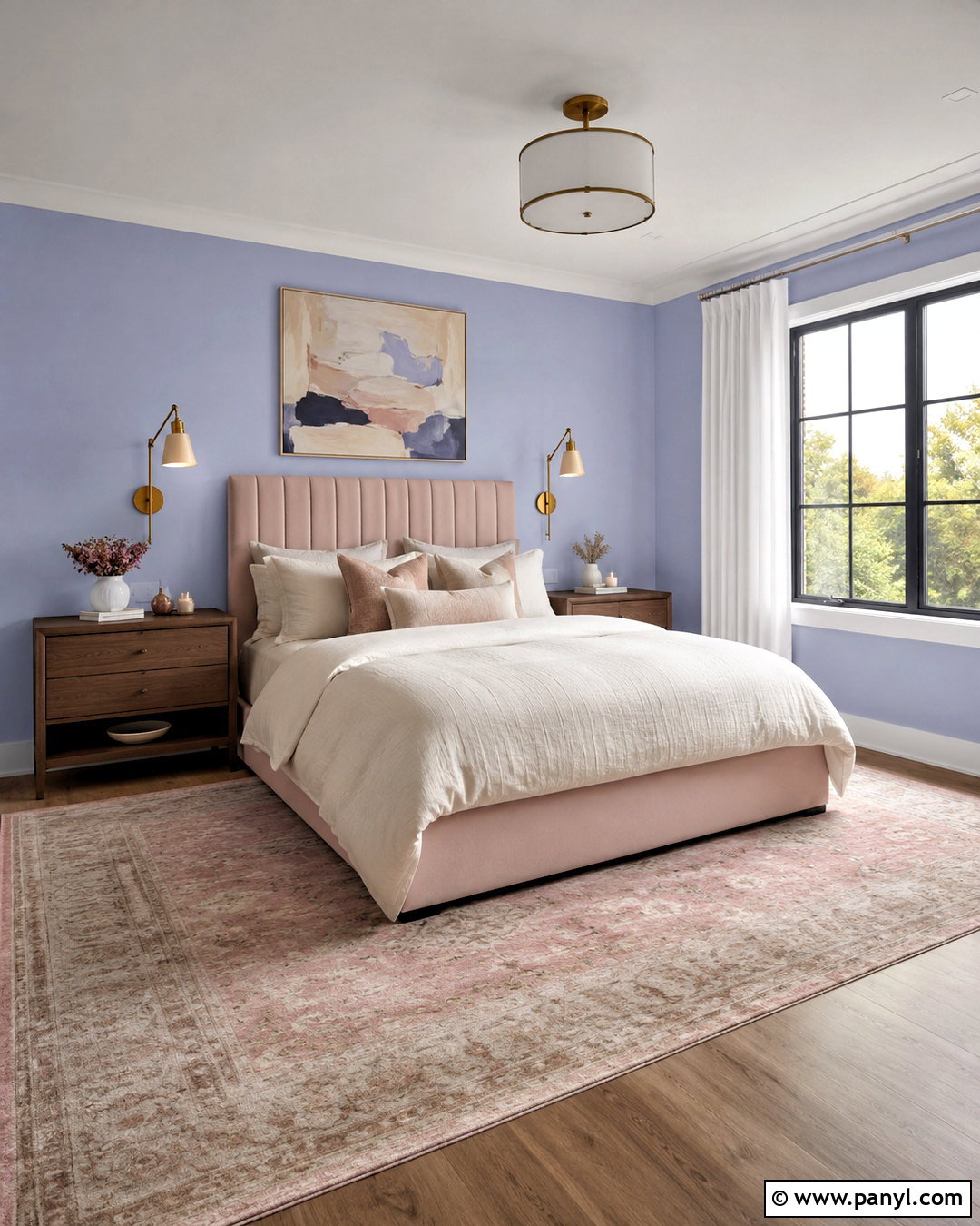
Soft blush gives light birch a warm, welcoming personality while preserving its airy appearance. Use birch for a platform bed, compact desk, open shelving, or simple Scandinavian-style furniture. Paint the walls a pale mineral pink with beige or gray undertones, avoiding sugary or highly saturated shades. Ground the scheme with warm white bedding, an ivory sofa, or a cream rug. Mushroom gray can appear in curtains or an upholstered chair, creating a mature neutral contrast. Add brushed brass through one pendant or a few small handles, then introduce handmade white ceramics and natural linen. Keep patterns subtle and geometric. The complete room feels gentle and modern, making this palette especially effective for bedrooms, nurseries, home offices, or small living spaces needing additional warmth.
16. Cedar And Forest Green Wood Color Palette
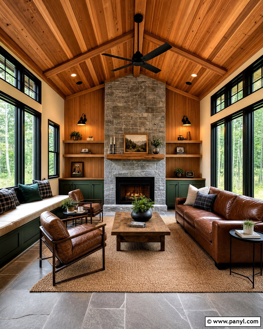
The aroma and orange-brown coloring of cedar suggest a cozy retreat surrounded by nature. Use cedar on a ceiling, paneled wall, built-in bench, or outdoor-facing sunroom feature. Pair it with deep forest green cabinetry or upholstery, then add warm cream walls to prevent the wood and green from overwhelming the space. Brown leather seating and a woven tan rug reinforce the natural palette. Choose black metal around windows, lighting, or fireplace doors for crisp definition. Stone in soft gray or taupe can form a hearth, floor, or tabletop that cools the cedar’s stronger orange notes. Keep accessories simple and functional. With generous daylight and balanced neutral surfaces, the room will feel warm and enveloping without resembling a dark, overly themed cabin.
17. Smoked Oak And Greige Wood Color Palette
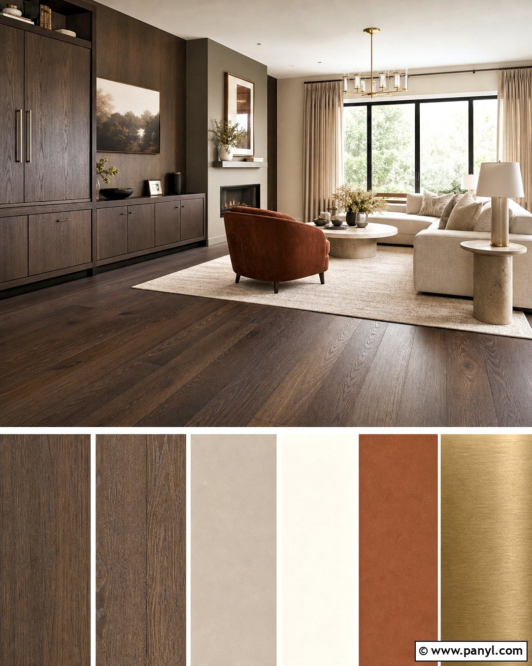
Smoked oak offers rich depth without the reddish cast found in many dark woods. Make it the anchor through flooring, kitchen cabinets, a media wall, or a large dining table. Warm greige walls will connect with its brown-gray undertone and create a seamless architectural background. Use an ivory sofa, pale stone countertops, and oatmeal textiles to lift the darker finish. Matte black hardware adds structure, while brushed brass lighting introduces a small note of warmth. A muted rust chair or cushion can provide color without disrupting the neutral scheme. Mix smooth stone, soft wool, and ribbed glass to prevent the palette from appearing flat. The finished room feels modern and refined, yet the visible oak grain keeps the look natural enough for everyday living.
18. Ebony Wood And Jewel Tone Wood Color Palette
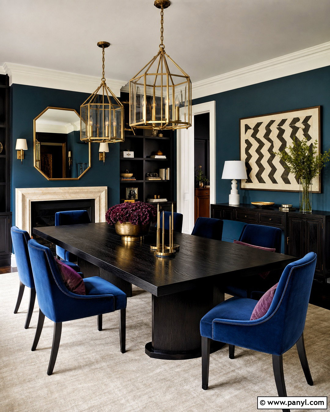
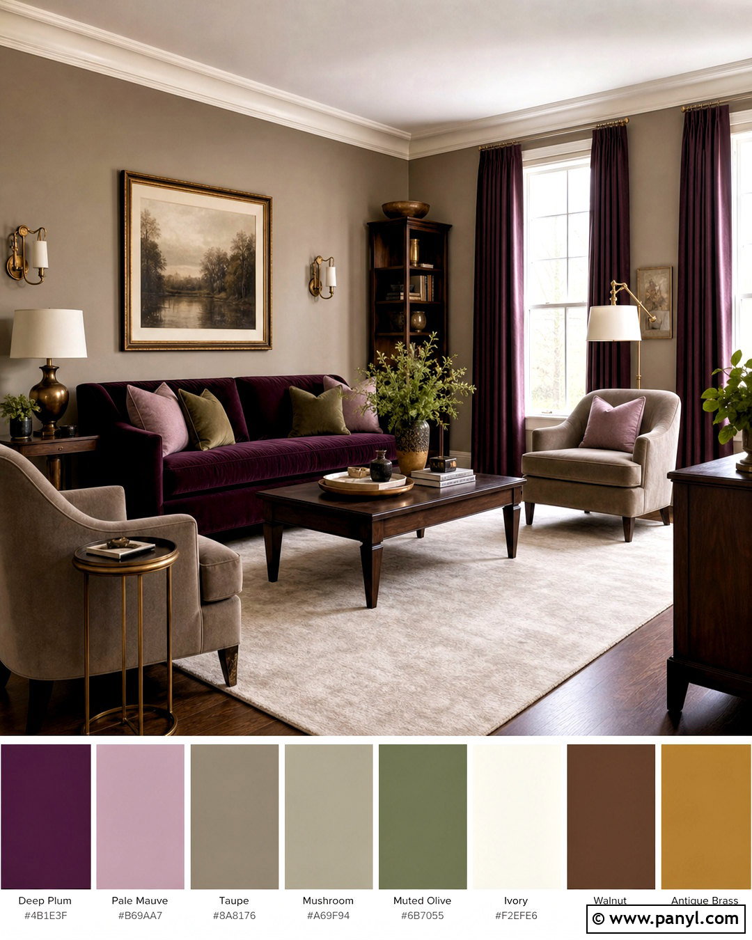
Ebony-stained wood provides a dramatic framework for saturated jewel colors. Use the dark finish selectively on a dining table, bookcase, vanity, or kitchen island. Choose one dominant accent, such as deep teal, and apply it to walls or a velvet sofa. Add smaller touches of sapphire blue or muted plum through textiles, while keeping the ceiling and trim warm white. A cream rug and pale stone surfaces will separate the dark elements and preserve brightness. Polished brass can appear in lighting and hardware for an elegant highlight. Limit patterns to one rug or a pair of cushions so the colors retain clarity. The completed design feels bold and sophisticated, with enough neutral space to suit a normal home rather than an elaborate luxury setting.
19. Mixed Oak And Walnut Wood Color Palette
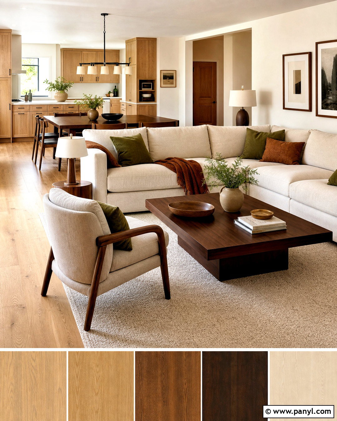
Combining oak and walnut works best when each finish has a clear role. Let light oak dominate through flooring or cabinetry, then introduce walnut on a dining table, coffee table, or pair of accent chairs. Warm white walls provide a neutral bridge between the two woods. Choose beige upholstery and an ivory rug to keep the contrast relaxed. Repeat walnut in two or three smaller details, such as picture frames or lamp bases, so the darker finish does not appear accidental. Black hardware adds definition, while olive or rust textiles bring in an earthy accent color. Avoid adding several similar medium-brown woods. The complete room will feel layered and collected because the light and dark finishes are visibly different but connected by warm undertones and repeated materials.
20. Natural Wood And Black Wood Color Palette
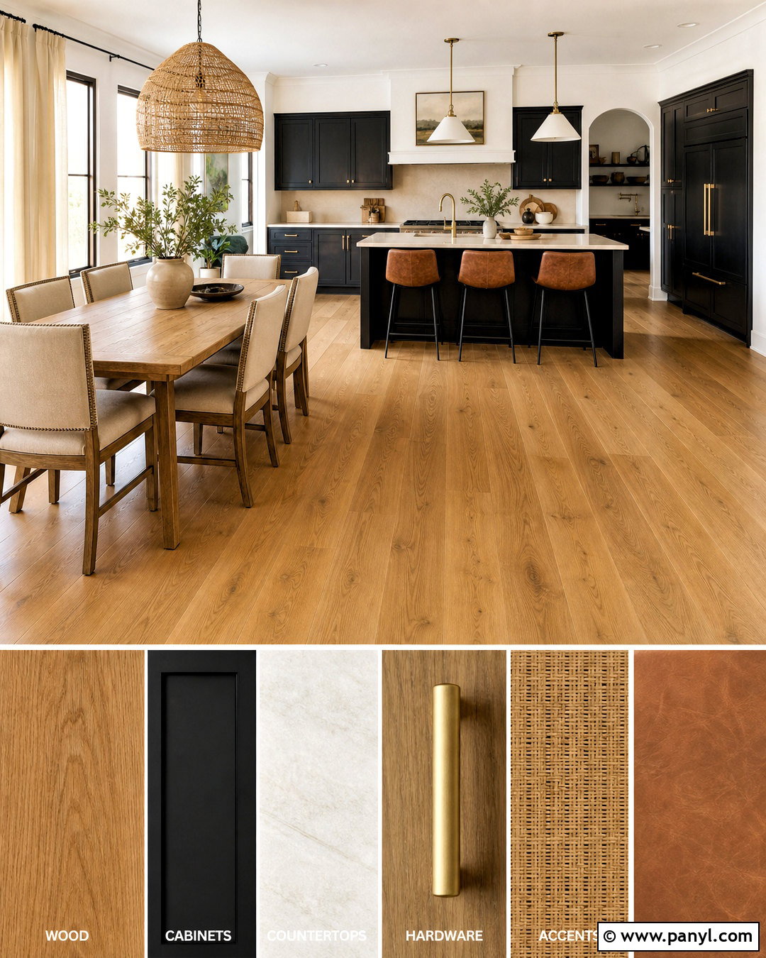
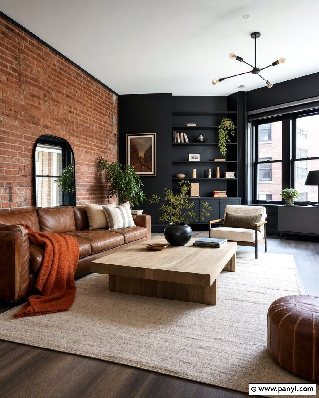
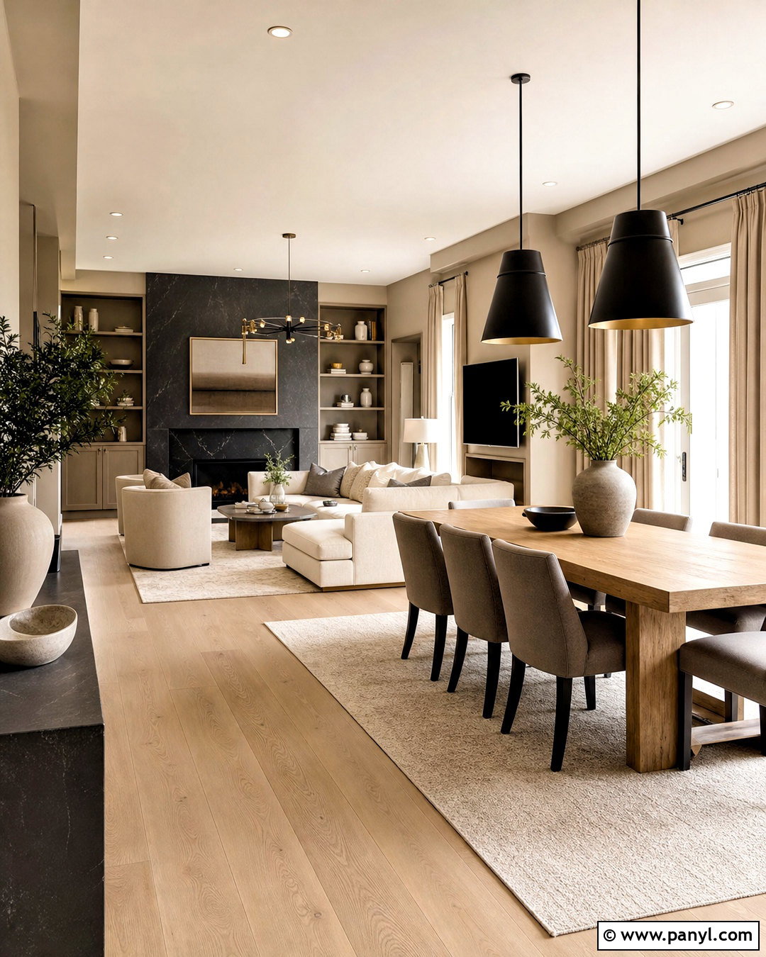
Natural wood and black create a clean, graphic palette that suits modern kitchens, dining rooms, and living spaces. Start with medium-toned oak or teak flooring and repeat that finish on one major furniture piece. Use black for cabinetry, a fireplace, window frames, or a single wall, keeping the finish matte to reduce glare. Warm white walls and light beige upholstery prevent the contrast from feeling harsh. Add cream stone, woven cane, and natural linen for softness. A small amount of cognac leather can strengthen the connection between black and brown. Choose simple fixtures in black or aged brass, but avoid excessive metal. The complete design feels crisp and contemporary while the visible grain, tactile fabrics, and warm neutral layers keep it inviting.
Conclusion:
A successful wood palette begins with the finish already covering the largest area, whether that is flooring, cabinetry, paneling, or furniture. Identify its warm, cool, red, yellow, or neutral undertone before adding paint and textiles. Then select one dominant wood, one supporting finish, and a small group of repeatable colors. Light stone, rugs, upholstery, and curtains can bridge contrasting materials, while black or metal accents add definition. Always compare samples inside the actual room because daylight and artificial lighting can noticeably change wood and paint. From airy white oak to dramatic ebony, these 20 wood colour palette ideas provide practical starting points for creating rooms that feel layered, coordinated, and naturally comfortable.

Related Ideas and Inspiration:
Leave a Reply