
Green can make a home feel calm, grounded, fresh, or unexpectedly dramatic, depending on the shades surrounding it. These 20 green color palette ideas explore combinations for living rooms, bedrooms, kitchens, bathrooms, dining spaces, home offices, and even house exteriors. Soft sage remains a flexible decorating choice, while warmer olive tones are gaining attention for their depth and timeless character. () You will also find rich emerald, earthy moss, pale mint, blue-green, and forest shades paired with practical neutrals and colorful accents. Each look includes coordinated walls, furniture, finishes, textiles, and decor rather than one isolated color. Use these complete schemes to confidently choose paint and furnishings from the following 20 green color palette ideas.
1. Sage Green And Warm White
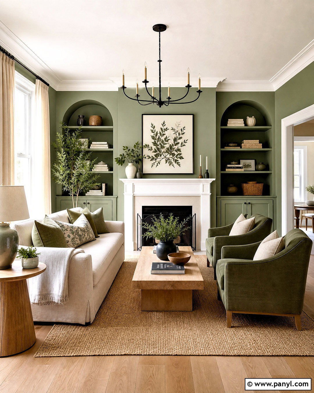
Sage green and warm white create a living room that feels fresh without looking cold. Paint the walls a muted sage, then use creamy white on the ceiling, trim, and fireplace surround. An oatmeal-colored sofa provides a soft neutral foundation, while pale oak tables keep the arrangement light and natural. Add ivory curtains, a woven beige rug, and cushions in sage, cream, and subtle tan stripes. Small touches of matte black can sharpen the scheme through curtain rods and picture frames. Finish with ceramic lamps, simple botanical artwork, and a few leafy plants. This balanced palette works especially well in rooms with moderate natural light because the warm undertones prevent the green from appearing overly gray.
2. Olive Green And Terracotta
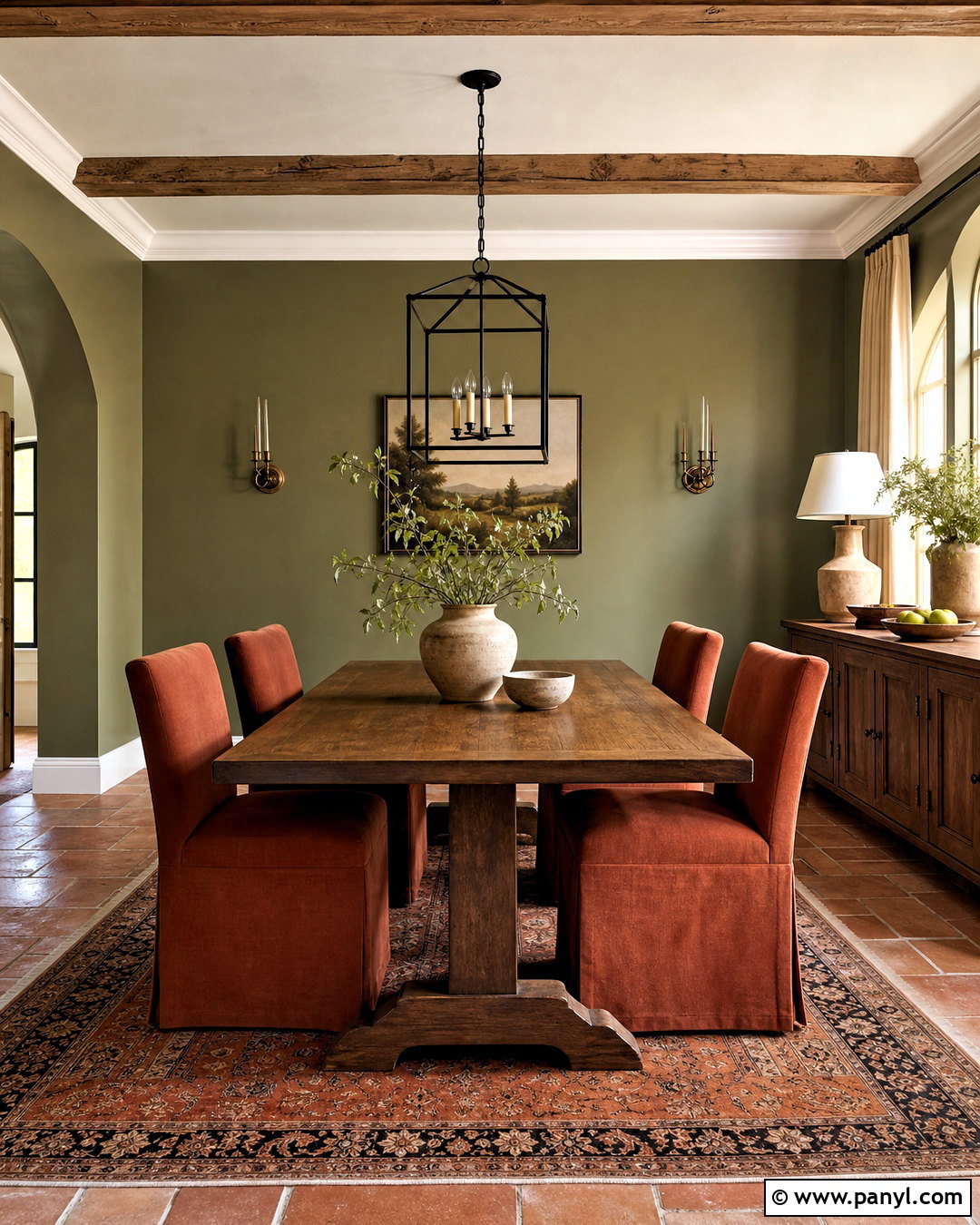
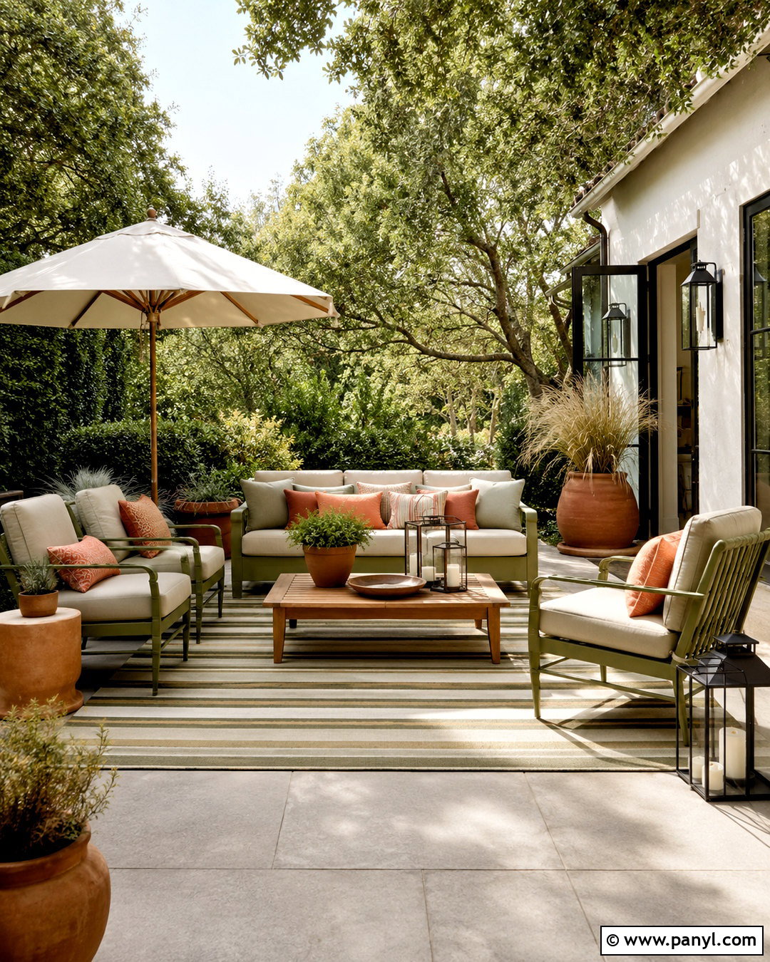
Imagine an inviting dining room where earthy color surrounds a sturdy wooden table. Olive green walls provide a grounded background, while terracotta appears on upholstered dining chairs, patterned curtains, or a large area rug. Choose a walnut or medium-oak table to connect the two natural tones. Warm white on the ceiling and trim keeps the room from feeling heavy. Black metal lighting adds clean definition, and aged brass candlesticks introduce a softer gleam. Decorate with cream pottery, rust-colored linens, and framed landscape prints. This palette suits farmhouse, Mediterranean, and collected interiors. Balance is important, so let olive cover the largest surface while terracotta appears in smaller, repeated accents around the complete dining space.
3. Forest Green And Cream
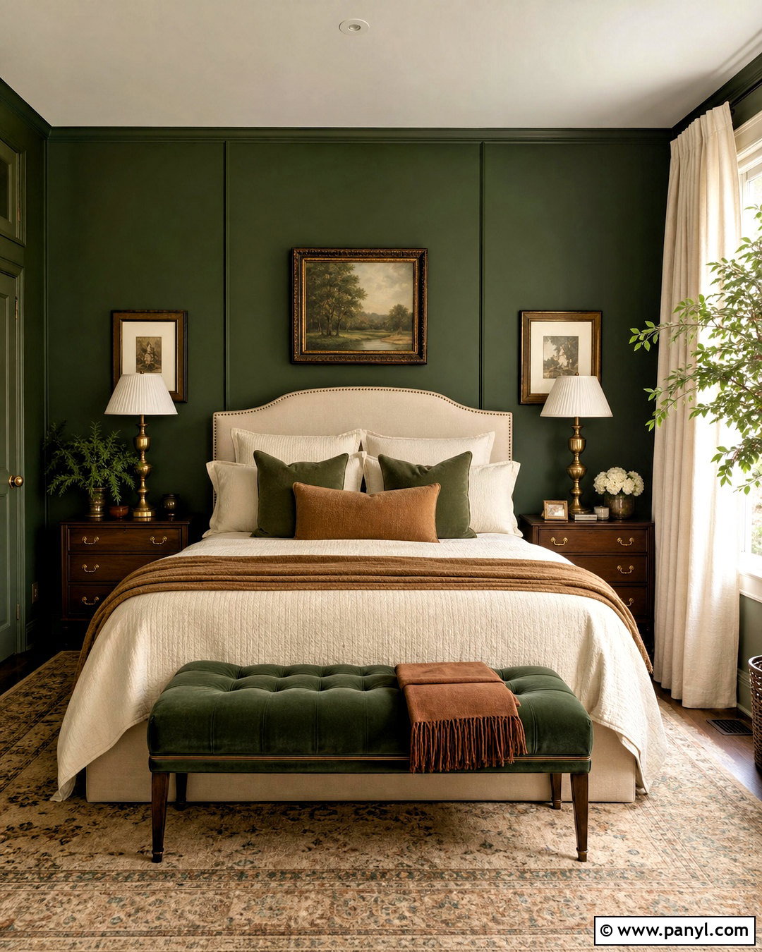
Forest green can feel wonderfully cozy when it is balanced with generous areas of cream. Use the deep green on bedroom walls or across the wall behind the bed. Choose an upholstered cream headboard, ivory bedding, and natural linen curtains to brighten the darker background. Walnut nightstands add warmth, while antique brass lamps complement the richness of the green. A vintage-inspired rug containing forest, beige, and faded brown helps connect every element. Keep the ceiling and baseboards soft white rather than bright white. Complete the room with dark wood frames, textured pillows, and one caramel-colored bench. The result is restful and sophisticated, with enough contrast to make the furniture and architectural details stand out clearly.
4. Emerald Green And Brass
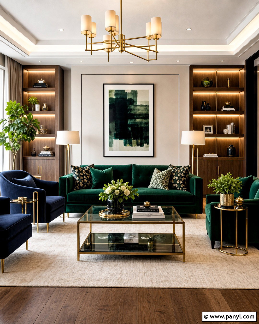
For a polished living room, combine emerald green with brass, ivory, and deep navy. An emerald velvet sofa can become the focal point against warm ivory walls. Add two navy accent chairs to give the layout depth without competing with the sofa. A cream rug softens the darker furniture, while a glass coffee table with a brushed brass frame brings in reflective warmth. Repeat the metal through floor lamps, cabinet hardware, and small decorative objects. Walnut shelving prevents the room from feeling too formal. Use cushions that mix emerald, navy, and ivory in simple patterns. This jewel-toned palette feels luxurious, but the neutral background and clean furniture arrangement keep the finished room comfortable, functional, and approachable.
5. Moss Green And Natural Wood
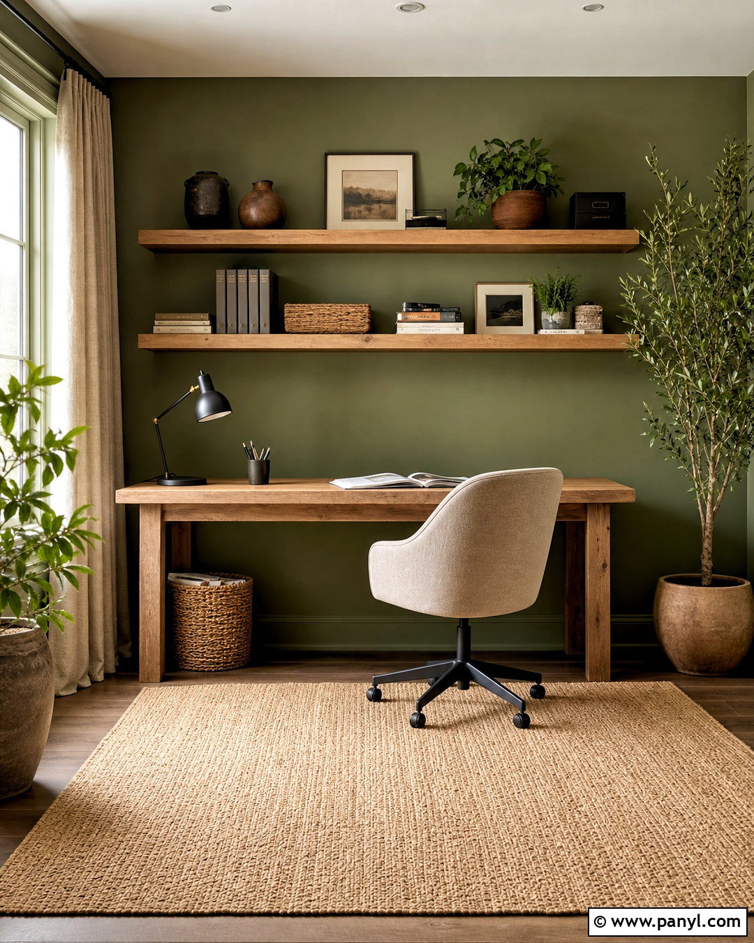
Moss green and natural wood bring a relaxed woodland character to a home office. Paint the walls a soft, earthy moss rather than a highly saturated green. Place a simple oak desk near the window and add matching floating shelves for books, storage boxes, and pottery. A warm beige desk chair and woven jute rug keep the work area comfortable and visually quiet. Use charcoal on a task lamp, cabinet pulls, and narrow picture frames for contrast. Linen curtains in an unbleached oatmeal shade soften incoming light. A few plants can reinforce the palette, but avoid filling every surface. With organized storage and restrained decor, this complete workspace feels connected to nature while remaining practical for everyday concentration and productivity.
6. Mint Green And Soft Gray
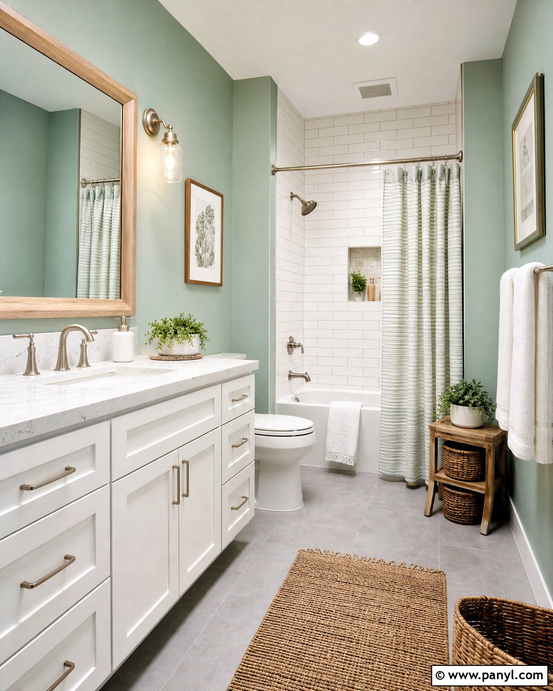
Could a small bathroom feel brighter without relying entirely on white? Pale mint green walls create an airy base, especially when paired with soft gray floor tile and a white vanity. Choose marble-look quartz for the countertop and a simple white subway tile around the shower. Brushed nickel fixtures complement the cooler undertones without adding harsh contrast. Introduce light oak through a mirror frame, small stool, or floating shelf. Towels in white, mint, and pale gray make the palette feel intentional. A woven basket and subtle striped shower curtain add texture. Keep accessories limited and use clear glass around the shower when possible. The finished bathroom feels clean and refreshing, yet warmer and more distinctive than a plain neutral scheme.
7. Dark Green And Blush Pink
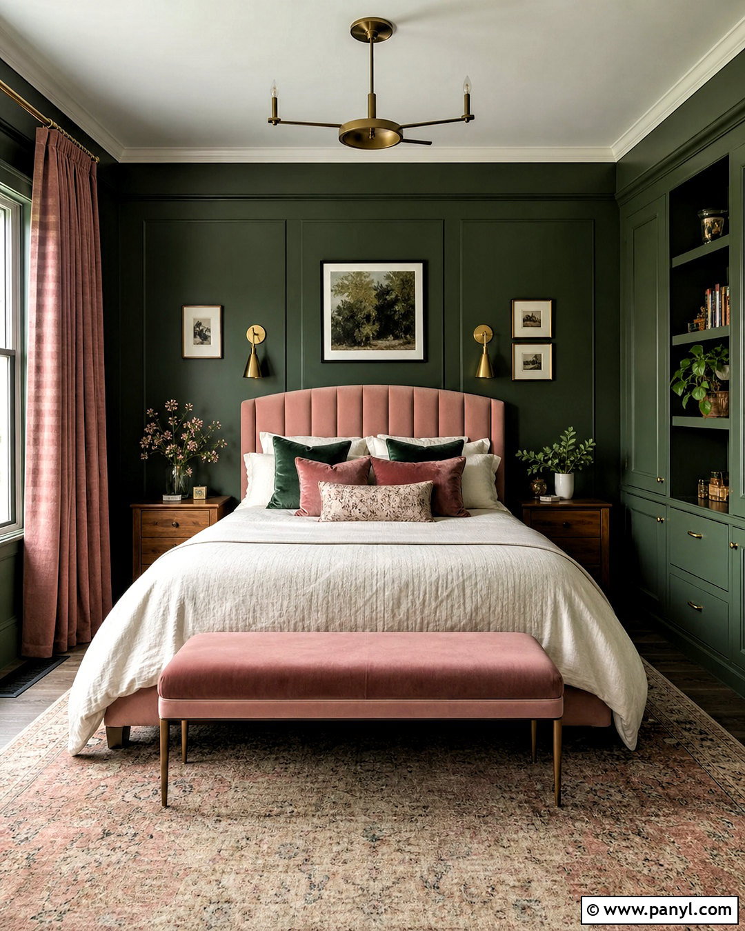
Dark green and blush pink create a bedroom that feels dramatic, soft, and carefully balanced. Color-drench the walls and built-in storage in a deep green with warm undertones. Place a blush upholstered bed against the main wall and layer it with ivory sheets, a cream quilt, and green velvet pillows. Medium-toned wood nightstands help bridge the strong colors. Use aged brass sconces for warm contrast and hang dusty rose curtains to repeat the bed color without becoming overly sweet. A neutral rug with faded green and pink details grounds the arrangement. Keep artwork simple and use black sparingly through narrow frames. The overall palette combines a cocooning background with light, comfortable furnishings that prevent the room from feeling enclosed.
8. Pistachio Green And Butter Yellow
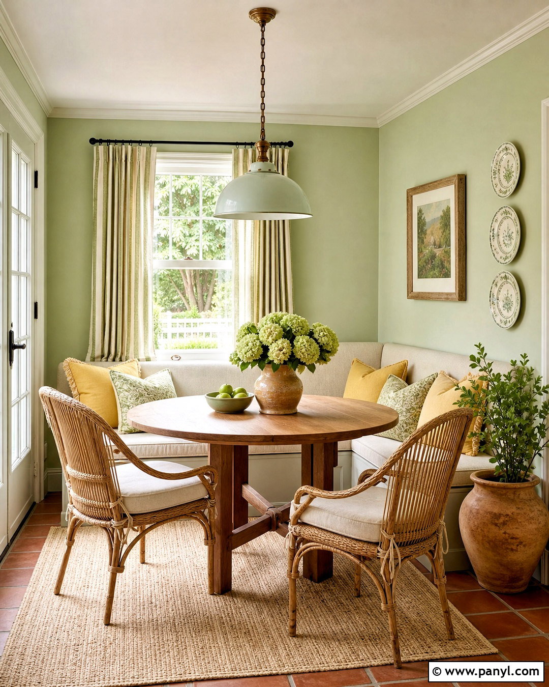
A sunny breakfast nook comes alive with pistachio green, butter yellow, and warm white. Paint the walls a light pistachio shade, then place a small round oak table in the center. A built-in banquette with creamy upholstery saves space and creates a casual gathering area. Introduce butter yellow through seat cushions, striped curtains, or a pendant light with a painted finish. White trim and a pale woven rug maintain brightness. Add small accents of terracotta through pottery and planters to keep the pastel colors grounded. Natural rattan chairs bring useful texture without introducing another strong hue. This cheerful palette suits compact kitchens and breakfast rooms because it reflects light while still providing enough color to feel welcoming and memorable.
9. Blue Green And Sandy Beige
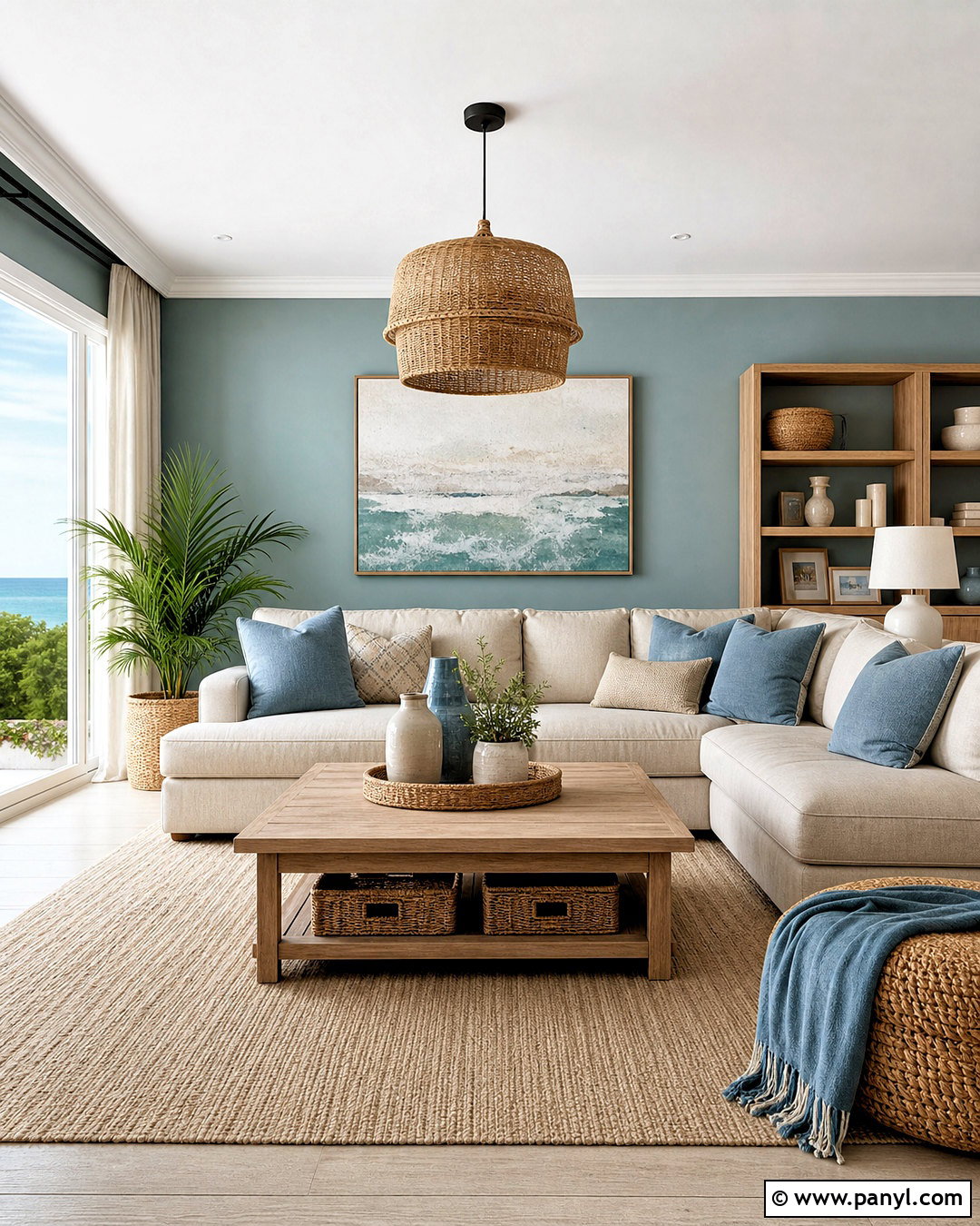
Blue-green walls can give a living room the refreshing character of a coastal landscape without relying on themed decorations. Choose a muted teal or sea-glass green for the walls, then furnish the room with a sandy beige sectional and pale oak tables. Off-white curtains and a cream rug keep the larger surfaces light. Add cushions in blue-green, faded denim, and warm tan for gentle variation. Woven baskets and natural fiber lampshades contribute texture, while brushed nickel or matte black fixtures provide clean definition. Avoid anchors, shells, and obvious coastal accessories. Instead, use abstract artwork, ceramic vessels, and relaxed linen fabrics. The finished palette feels breezy and modern, with a comfortable arrangement suited to daily family living.
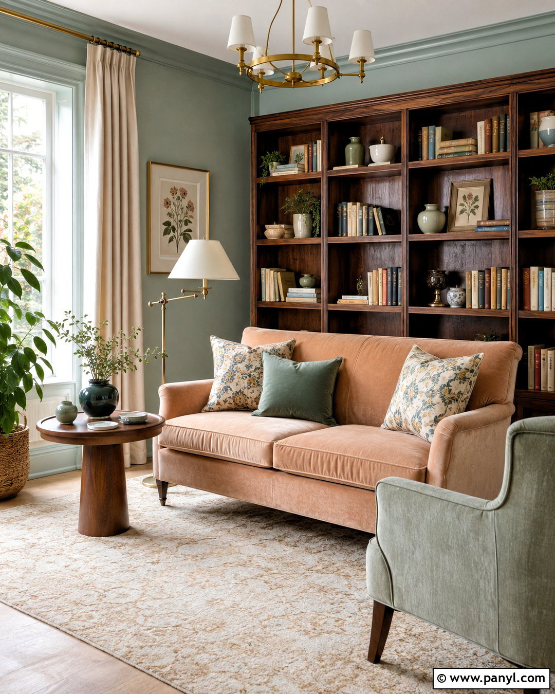
10. Avocado Green And Burnt Orange
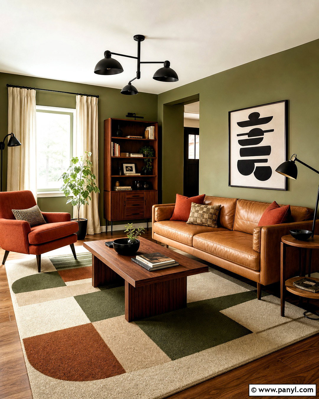
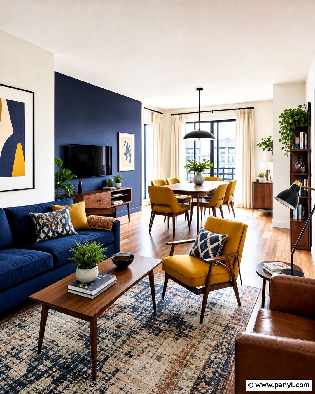
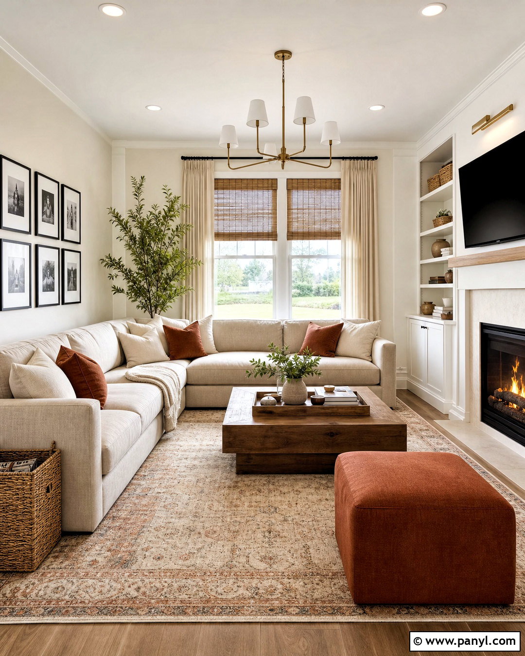
Avocado green and burnt orange deliver a warm retro-inspired family room that can still look current. Cover the walls in a muted avocado shade and choose a low-profile camel leather sofa as the main seating piece. Introduce burnt orange on an accent chair, textured pillows, and a patterned area rug. Walnut furniture fits naturally into the scheme, especially when used for a long media console and rounded coffee table. Cream curtains and an off-white ceiling balance the richer colors. Use matte black lighting to add a modern edge. Graphic artwork containing green, rust, tan, and brown ties the palette together. Keep furniture lines simple so the room references vintage interiors without feeling like a themed recreation of another decade.
11. Eucalyptus Green And Greige
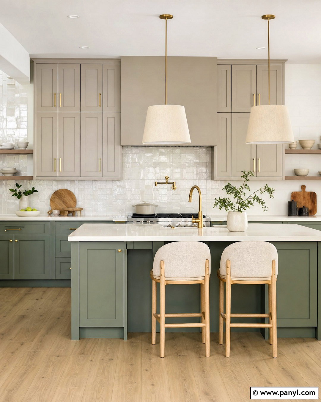
Eucalyptus green pairs beautifully with greige in an open kitchen that needs color but must remain easy to coordinate. Paint the lower cabinets a dusty eucalyptus shade and use warm greige on the upper cabinets or surrounding walls. Select creamy quartz counters and a handmade white tile backsplash to reflect light. Pale oak flooring adds natural warmth, while brushed brass hardware keeps the muted palette from falling flat. Upholster counter stools in oatmeal fabric and choose simple linen pendants above the island. A few charcoal details, such as window frames or small appliances, create needed definition. This combination feels calm and modern because every color has a softened undertone. It also connects naturally with adjoining neutral living and dining areas.
12. Hunter Green And Camel Brown
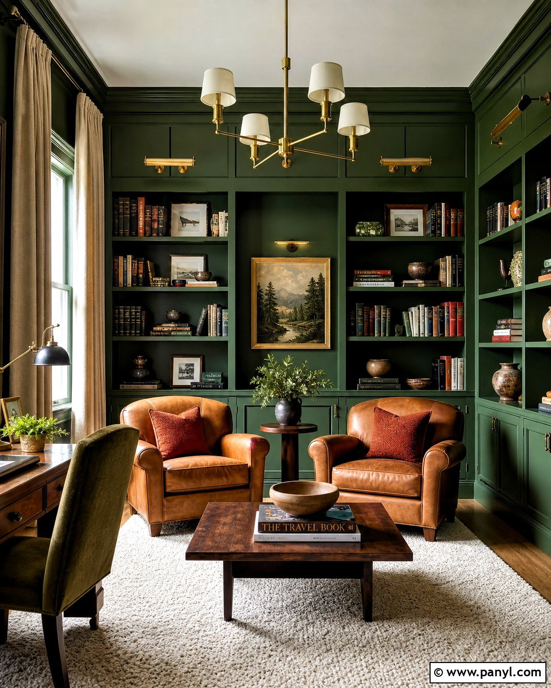
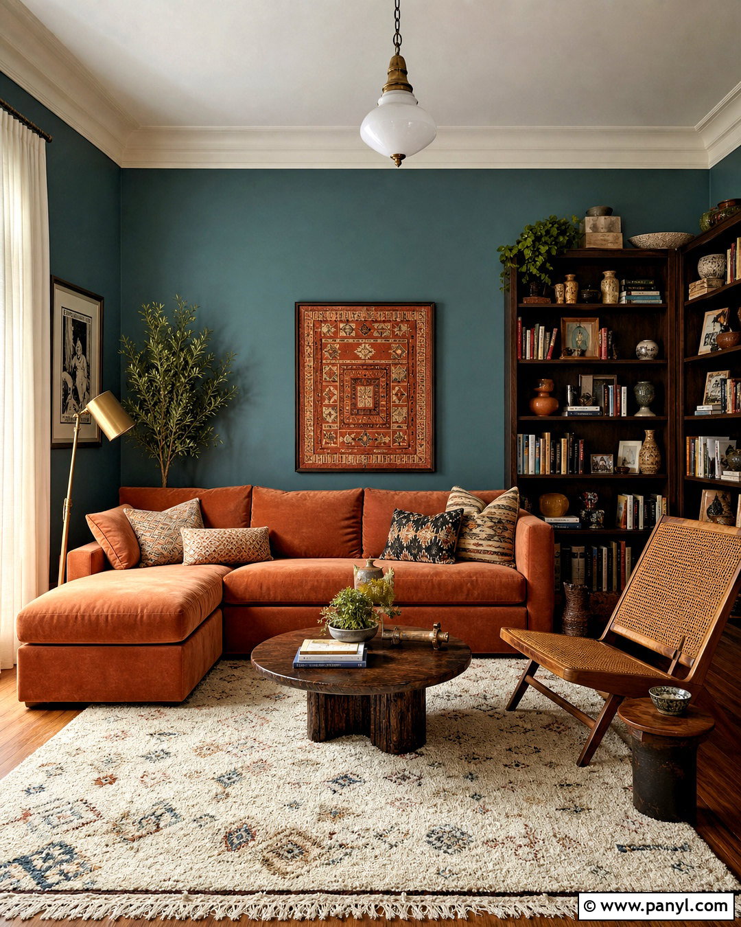
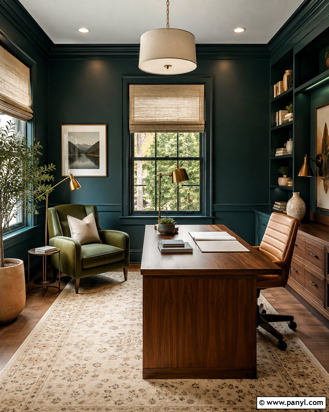
A library or reading room becomes instantly inviting with hunter green, camel brown, and warm ivory. Paint the walls, shelving, and trim the same deep green to create a cohesive envelope. Place a camel leather sofa or two leather club chairs near the bookcases, then add an ivory wool rug beneath the seating arrangement. Walnut side tables reinforce the richness of the leather. Use antique brass picture lights and a traditional floor lamp for layered illumination. Curtains in oatmeal linen soften the dark walls without weakening their impact. Add rust and cream pillows for subtle color movement. Organized books, framed art, and a few ceramic objects complete the shelves. This palette produces a comfortable retreat that feels established rather than excessively formal.
13. Lime Green And Cobalt Blue
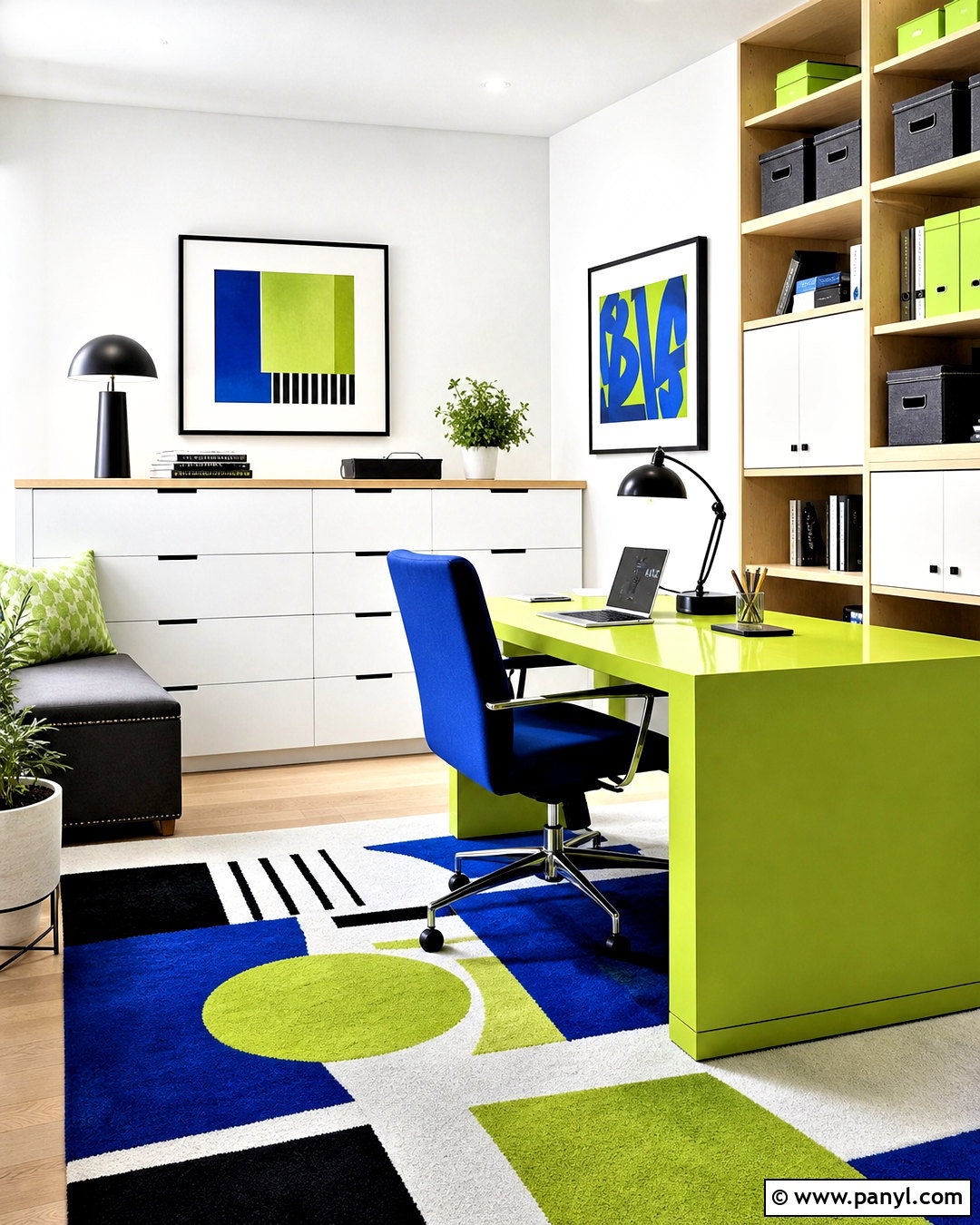
Lime green and cobalt blue can energize a creative home office when both colors are used with restraint. Start with crisp white walls and introduce lime through a painted desk, storage cabinet, or one well-defined wall section. Use cobalt blue on the desk chair, window shade, and a graphic rug. Pale birch shelving keeps the room light, while black task lighting gives the colorful scheme a clear structure. Add storage boxes in white and natural canvas to prevent visual clutter. Artwork can include both main colors plus small touches of orange. The final workspace feels playful but organized because neutral surfaces surround the brighter features. This approach is ideal when you want an expressive room without committing every wall to a bold color.
14. Fern Green And Dusty Blue
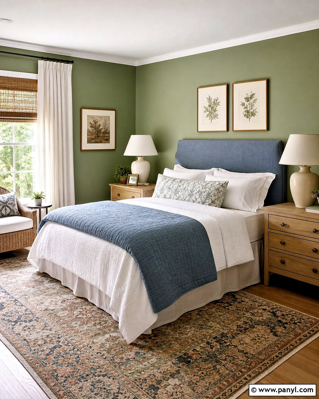
Fern green and dusty blue make a guest bedroom feel peaceful, layered, and connected to nature. Use fern green on the walls and choose a dusty blue upholstered headboard as the room’s main contrast. Dress the bed in white linen, a soft gray-blue quilt, and patterned pillows that repeat both colors. Light oak nightstands maintain an airy look, while ceramic lamps with cream shades add gentle texture. Select a faded area rug containing green, blue, beige, and small touches of brown. Natural woven blinds can sit beneath simple white curtains for flexible light control. Botanical prints are appropriate, but keep them understated. The complete room offers guests calming color, practical bedside storage, and a comfortable arrangement that does not feel overly decorated.
15. Celadon Green And Warm Taupe
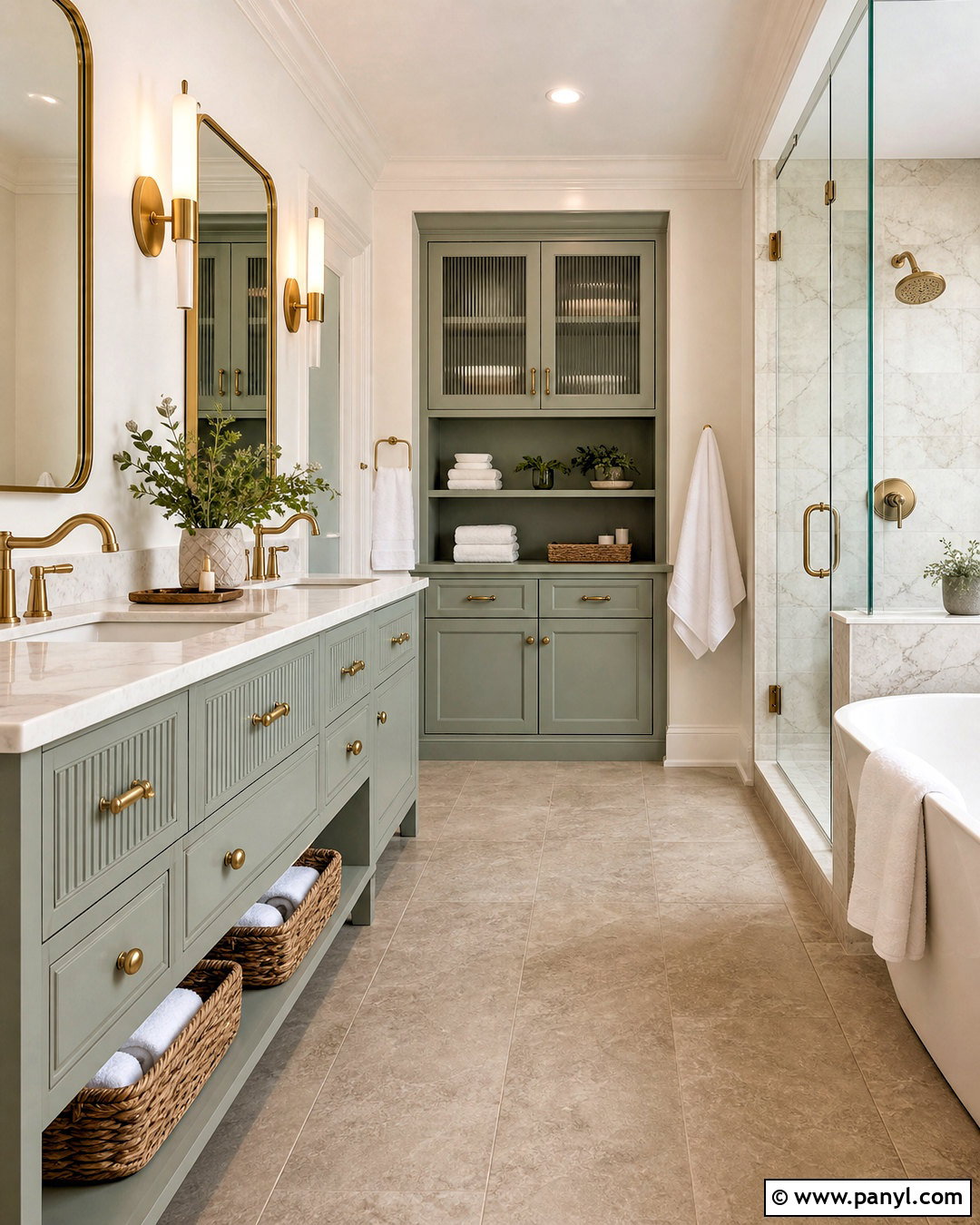
Celadon green creates a refined bathroom when paired with warm taupe, white marble, and brushed brass. Cover the vanity in the pale gray-green shade and use large taupe porcelain tiles across the floor. A white marble countertop and matching shower surround brighten the space while adding subtle pattern. Choose brushed brass faucets, mirror frames, and sconces for a warm metallic accent. Walls can remain creamy white so the celadon cabinetry stays noticeable. Add white towels, a taupe bath mat, and light wood storage baskets to complete the palette. Ribbed glass cabinet fronts or a fluted vanity detail can introduce texture without clutter. The finished bathroom feels serene and polished, with soft colors that work well in both compact and spacious layouts.
16. Pine Green And Charcoal

Pine green and charcoal form a strong modern kitchen palette with plenty of warmth. Use pine green on flat-panel cabinets and charcoal gray on the island base or tall pantry units. White quartz counters give the darker colors breathing room, while a backsplash of warm white rectangular tile keeps the design approachable. Choose medium-oak flooring to prevent the room from feeling industrial. Matte black hardware blends neatly with the charcoal surfaces, and oversized white pendant lights brighten the island. Add counter stools with tan leather seats for another warm layer. Keep dishes and appliances mostly concealed behind organized cabinetry. This complete kitchen works because the bold green remains dominant, while charcoal creates depth and wood balances the cooler architectural finishes.
17. Jade Green And Coral
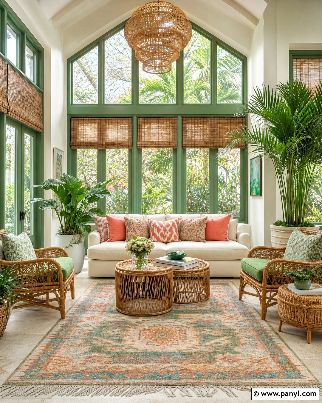
Jade green and coral can make a sunroom feel lively without overwhelming its naturally bright setting. Paint the window frames or one central wall jade green while leaving the remaining walls warm white. Arrange a cream sofa with coral cushions, then add two woven chairs with jade seat pads. A patterned rug containing green, coral, pale blue, and beige unites the seating group. Rattan tables and bamboo shades support the warm, casual mood. Use white ceramic planters and a few healthy indoor plants around the room’s edges. Limit coral to textiles and small accessories so it remains a cheerful accent. The completed space feels colorful, fresh, and comfortable, with enough neutral material to keep the stronger shades visually balanced.
18. Grass Green And Crisp White
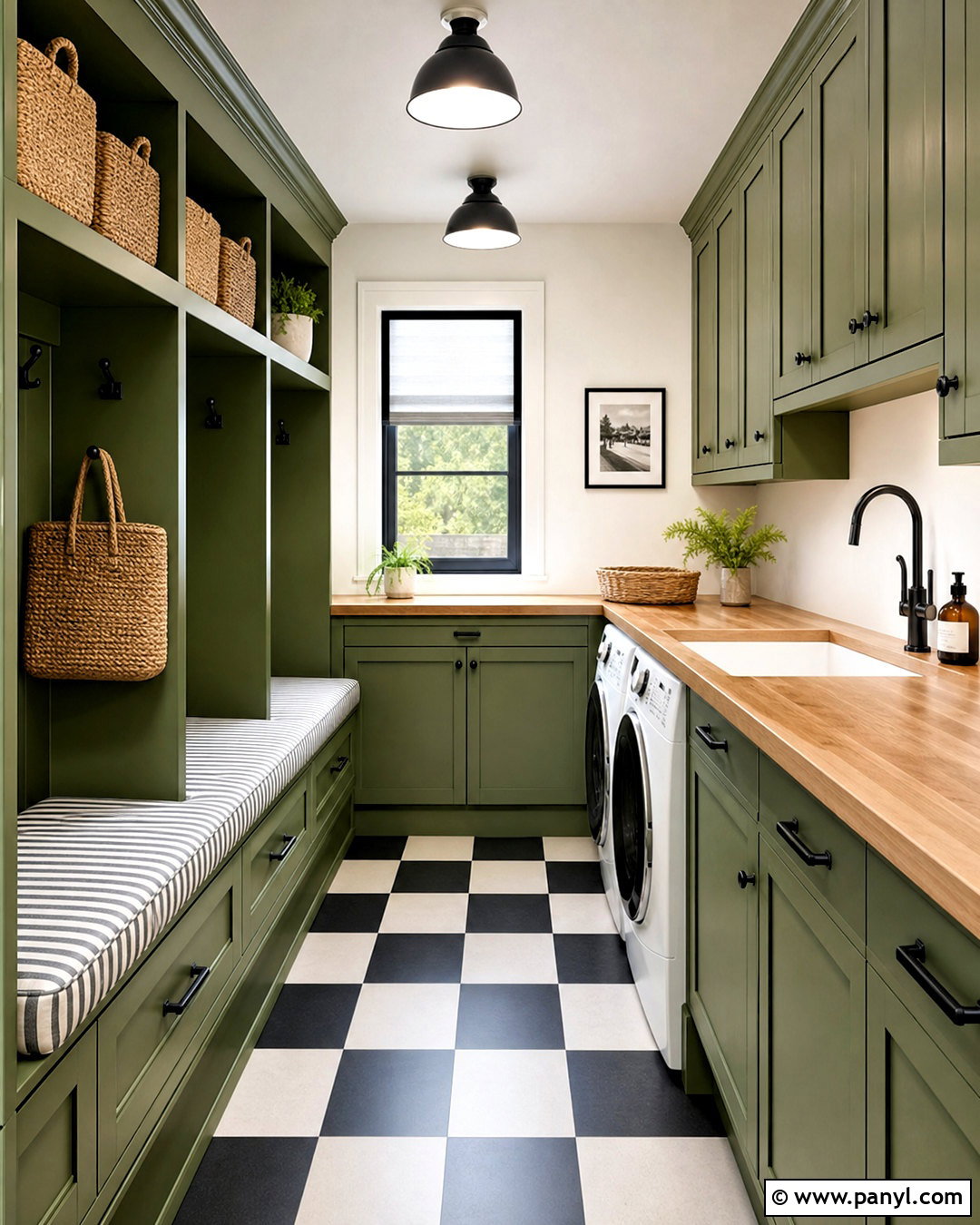
Grass green and crisp white bring clean energy to a mudroom or laundry room. Paint the lower cabinets and tall storage lockers a clear grass green, then use bright white on the walls, ceiling, and upper cabinetry. A durable black-and-white checkerboard floor introduces graphic contrast and hides everyday wear better than a plain pale surface. Choose butcher-block counters to warm the room and add black hooks, pulls, and utility lighting. Woven baskets provide practical storage for shoes, cleaning supplies, or folded linens. A striped bench cushion can repeat green, white, and black. Keep frequently used items inside labeled-looking but text-free containers or closed cabinets. This functional palette makes a hardworking transitional space feel cheerful, orderly, and intentionally connected to the home.
19. Deep Olive And Pale Sky Blue
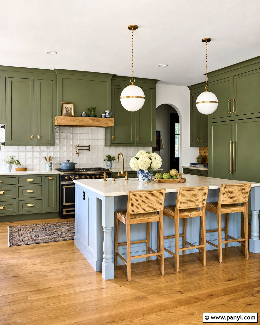
Deep olive and pale sky blue offer a fresh alternative to an all-neutral kitchen. Use olive green across the main cabinetry, allowing the color to establish a warm and grounded base. Paint the island pale blue for a light contrast that feels unexpected but gentle. Cream quartz counters and handmade ivory backsplash tile connect both cabinet colors. Add aged brass hardware, white globe pendants, and medium-oak flooring for warmth. Counter stools in natural woven cane keep the island casual. A few blue-and-white ceramics can repeat the accent color without making the space look overly coordinated. Because the blue is light and the olive is earthy, the complete scheme feels balanced, distinctive, and suitable for traditional, transitional, or updated cottage kitchens.
20. Green Monochromatic Palette
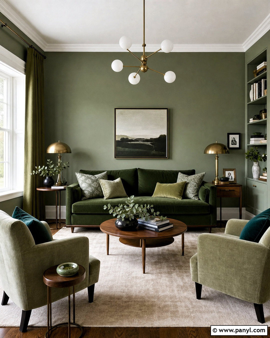
A monochromatic green living room gains depth by combining several clearly different shades. Start with medium sage walls, then add a forest green sofa and two pale moss chairs. Use olive curtains to frame the windows and place a soft cream rug beneath the complete seating group. Cushions can mix eucalyptus, fern, and emerald tones through solids and restrained patterns. Walnut tables and antique brass lighting bring warmth between the layered greens. Keep the ceiling and trim an off-white shade so the color variation remains easy to see. One or two black accents provide definition. The result feels cohesive rather than repetitive because light, medium, and dark greens are distributed across walls, furniture, textiles, plants, and decorative details.
Conclusion:
The most successful 20 green color palette ideas balance green’s natural character with colors, materials, and finishes that support the intended mood. Sage, mint, and celadon can brighten quiet rooms, while forest, hunter, emerald, and olive create greater depth. Warm wood, cream, greige, brass, and natural fibers make green feel welcoming. Terracotta, blush, sky blue, coral, or cobalt can add personality when carefully repeated. Before committing, test paint samples beside flooring, furniture, and fabrics throughout the day. Pay attention to whether the green leans warm, cool, gray, blue, or yellow. A coordinated palette should connect every surface and furnishing while still allowing the room to feel comfortable, useful, and personal.

Related Ideas and Inspiration:
Leave a Reply