
Choosing paint becomes easier when every shade has a clear role. These **20 Sherwin Williams color palette ideas** combine wall colors, trim, cabinetry, accents, flooring, and furnishings into complete looks you can recreate. The collection moves from warm neutrals and earthy greens to coastal blues, terracotta, charcoal, and expressive color. It also includes Universal Khaki SW 6150, Sherwin-Williams’ 2026 Color of the Year, alongside familiar favorites such as Alabaster, Accessible Beige, Evergreen Fog, and Naval. () Before committing, sample each color on several walls and check it throughout the day, since exposure and surrounding finishes can change its appearance. Use the following rooms and exterior schemes as practical inspiration for **20 Sherwin Williams color palette ideas**.

1. Sherwin Williams Universal Khaki Palette
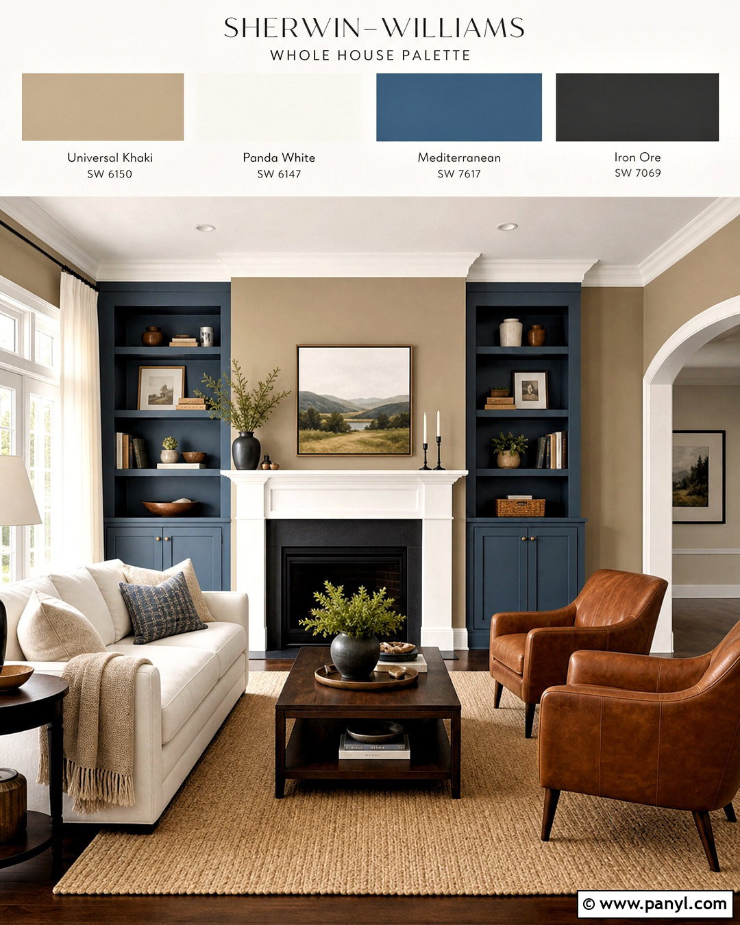
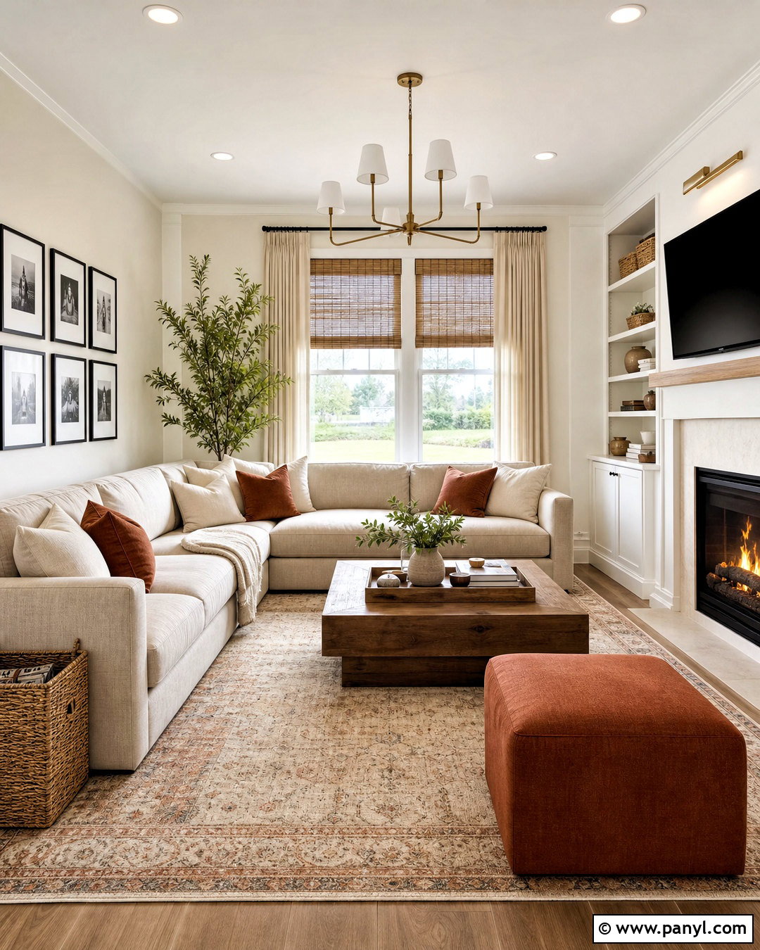
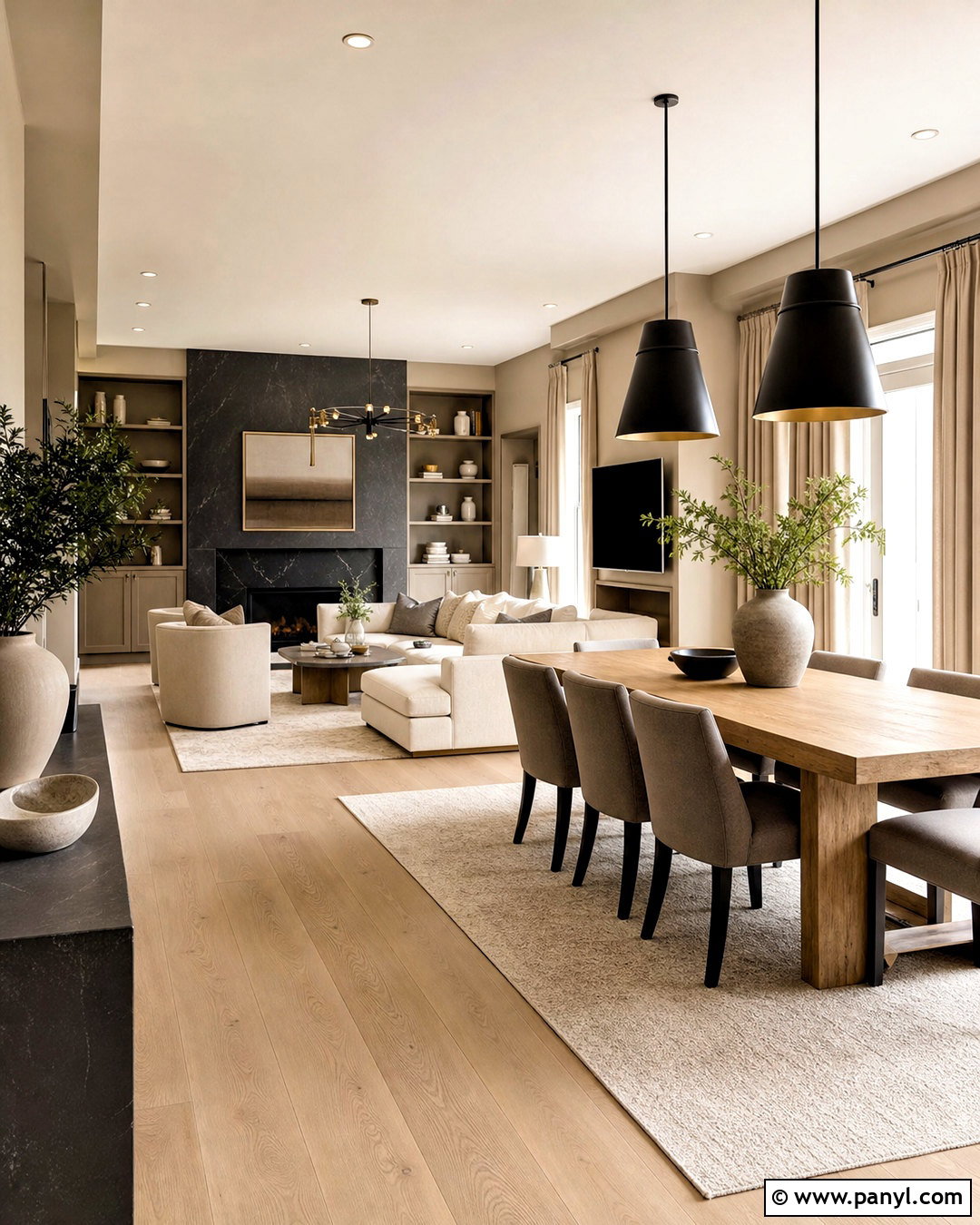
Universal Khaki SW 6150 creates a grounded living room that feels warm without becoming overly beige. Use it across the walls, then paint the ceiling, fireplace, and trim Panda White SW 6147 for gentle contrast. Mediterranean SW 7617 can bring depth to built-in shelving or a media cabinet, while Iron Ore SW 7069 works on metal lighting and smaller accents. Complete the room with a cream sofa, cognac leather chairs, medium walnut tables, and a woven tan rug. Rust-colored pillows introduce an earthy note without overwhelming the neutral foundation. This balanced palette works especially well in open-plan homes because each color can repeat naturally through connected spaces. Universal Khaki is a mid-tone tan that coordinates especially well with white and saturated colors. ()
2. Sherwin Williams Alabaster And Accessible Beige Palette
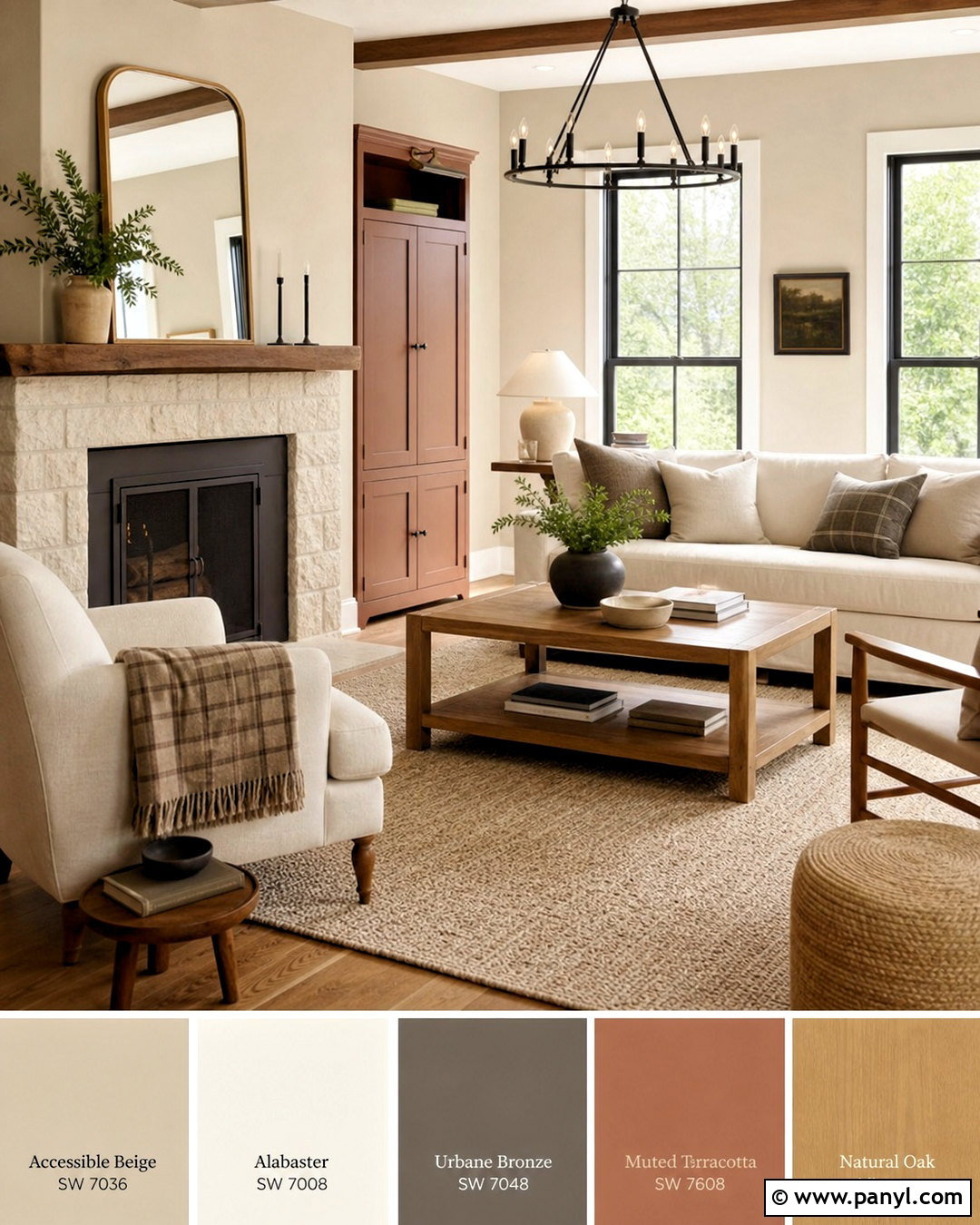
Soft daylight gives this timeless palette a comfortable, welcoming quality. Paint the main walls Accessible Beige SW 7036 and use Alabaster SW 7008 on trim, doors, and the ceiling. Urbane Bronze SW 7048 makes a handsome finish for a fireplace, bookcase, or kitchen island visible from the room. Add restrained warmth through Rookwood Terra Cotta SW 2803 on a small cabinet or selected accessories. Natural oak furniture, linen upholstery, black iron lighting, and a textured wool rug reinforce the relaxed look. This combination is useful for traditional, transitional, and modern farmhouse interiors because it mixes creamy light tones with controlled contrast. Keep permanent surfaces simple with warm white quartz, honed limestone, or pale oak so the palette remains adaptable over time.
3. Sherwin Williams Sea Salt Coastal Palette
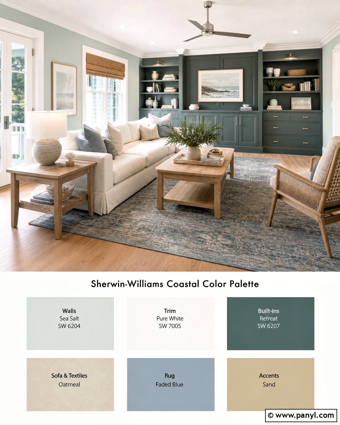
Want a coastal room that does not rely on obvious nautical decor? Cover the walls in Sea Salt SW 6204, a softened green-blue that pairs naturally with organic textures. Pure White SW 7005 keeps the ceiling, trim, and window frames crisp, while Retreat SW 6207 adds weight to a built-in cabinet or reading nook. Use Natural Tan SW 7567 for an adjoining hallway or subtle color-blocked feature. Choose a slipcovered oatmeal sofa, white oak tables, woven shades, and a faded blue rug. Brushed nickel lighting and pale stone accessories provide a clean finish. The complete palette feels airy yet substantial because deeper green prevents the lighter colors from appearing washed out. Avoid bright turquoise accents; muted blue, sand, and driftwood tones maintain a more sophisticated coastal atmosphere.
4. Sherwin Williams Naval Living Room Palette
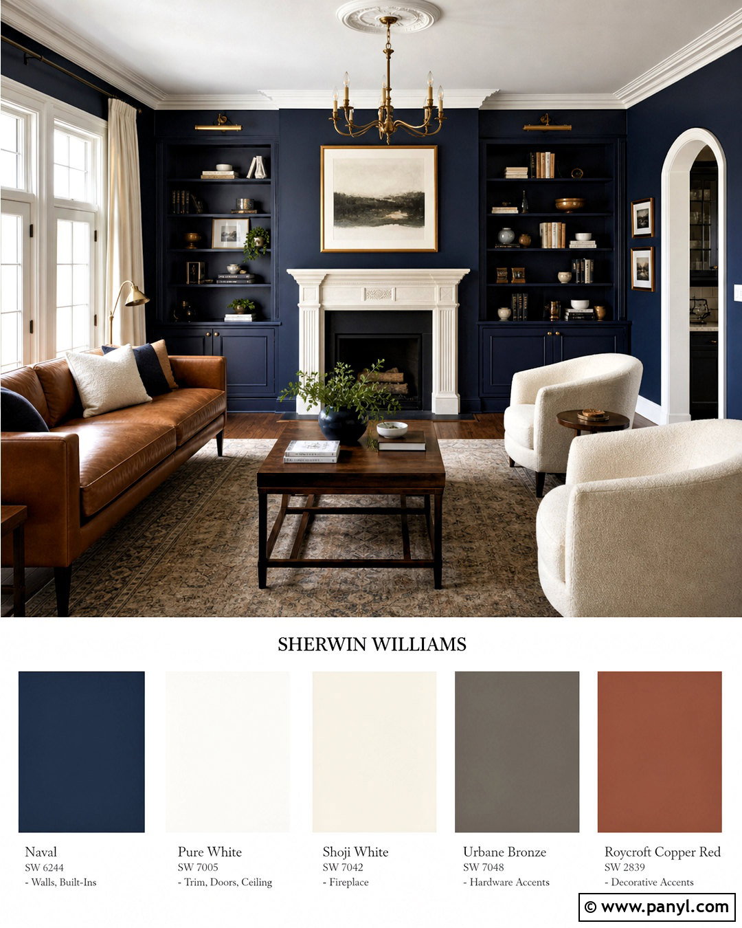
Naval SW 6244 can transform an ordinary living room into a polished space when balanced with enough light. Apply Naval to the walls and built-ins, then use Pure White SW 7005 on the ceiling, windows, and substantial crown molding. Leather Bound SW 6118 introduces warm brown on an interior door or compact accent cabinet. Add Natural Linen SW 9109 through upholstery, drapery, or an adjoining entry. A camel leather sofa, cream boucle chairs, walnut coffee table, and vintage-inspired rug keep the dark blue from feeling cold. Brushed brass sconces and picture lights offer a warm reflective finish. This palette performs best in rooms with generous windows or layered lighting. Repeat white, tan, and brass around the room so every dark surface has a lighter visual counterpoint.
5. Sherwin Williams Evergreen Fog Kitchen Palette
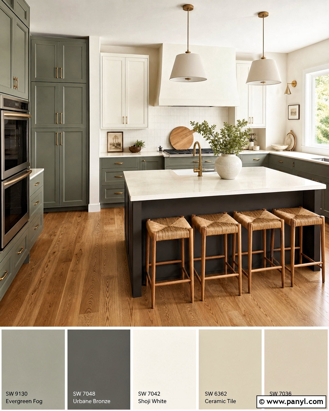
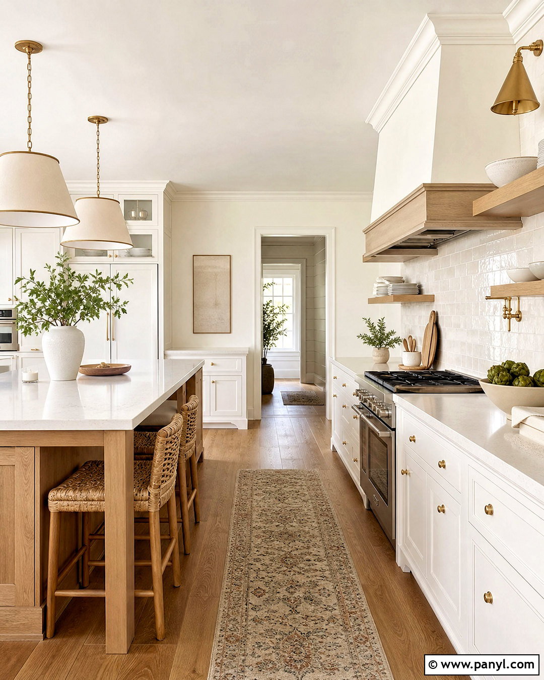
Evergreen Fog SW 9130 gives kitchen cabinets a calm, nature-inspired presence. Pair the green-gray cabinetry with Shoji White SW 7042 walls and a matching warm white ceiling. Use Urbane Bronze SW 7048 on the island base or pantry door to create a grounded focal point. Accessible Beige SW 7036 can connect the kitchen to a neighboring breakfast area. Complete the look with creamy quartz counters, a handmade off-white tile backsplash, medium oak floors, and aged brass hardware. Woven counter stools and simple ceramic pendants add texture without creating clutter. The combination feels current but remains practical because none of the colors are aggressively bright. For a smaller kitchen, keep upper cabinets Shoji White and reserve Evergreen Fog for lower cabinets, allowing the room to retain an open appearance.
6. Sherwin Williams Agreeable Gray Palette
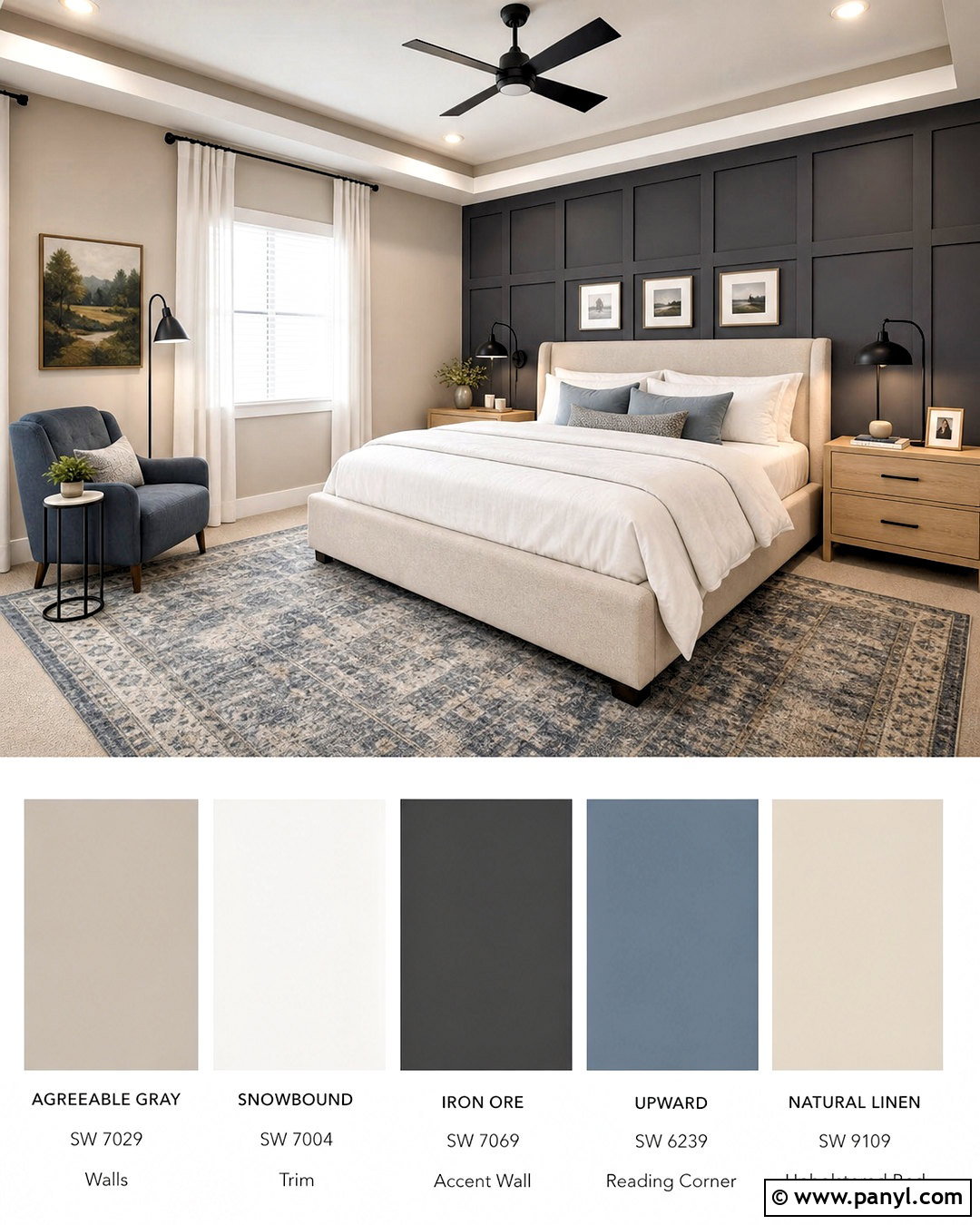
A quiet gray palette can still feel layered and inviting. Use Agreeable Gray SW 7029 on bedroom walls, Snowbound SW 7004 on the ceiling and trim, and Iron Ore SW 7069 on a paneled headboard wall or painted dresser. Upward SW 6239 adds a restrained blue accent through a reading corner, bathroom vanity, or selected textiles. Furnish the space with an oatmeal upholstered bed, pale oak nightstands, white bedding, and a blue-gray wool rug. Matte black lamps repeat the Iron Ore contrast without dominating the room. Because Agreeable Gray sits comfortably beside warm and cool finishes, this scheme can bridge existing beige carpet, gray tile, and natural wood. Test the wall color beside permanent materials before painting, especially in rooms with limited natural light or strongly colored flooring.
7. Sherwin Williams Clary Sage Bedroom Palette
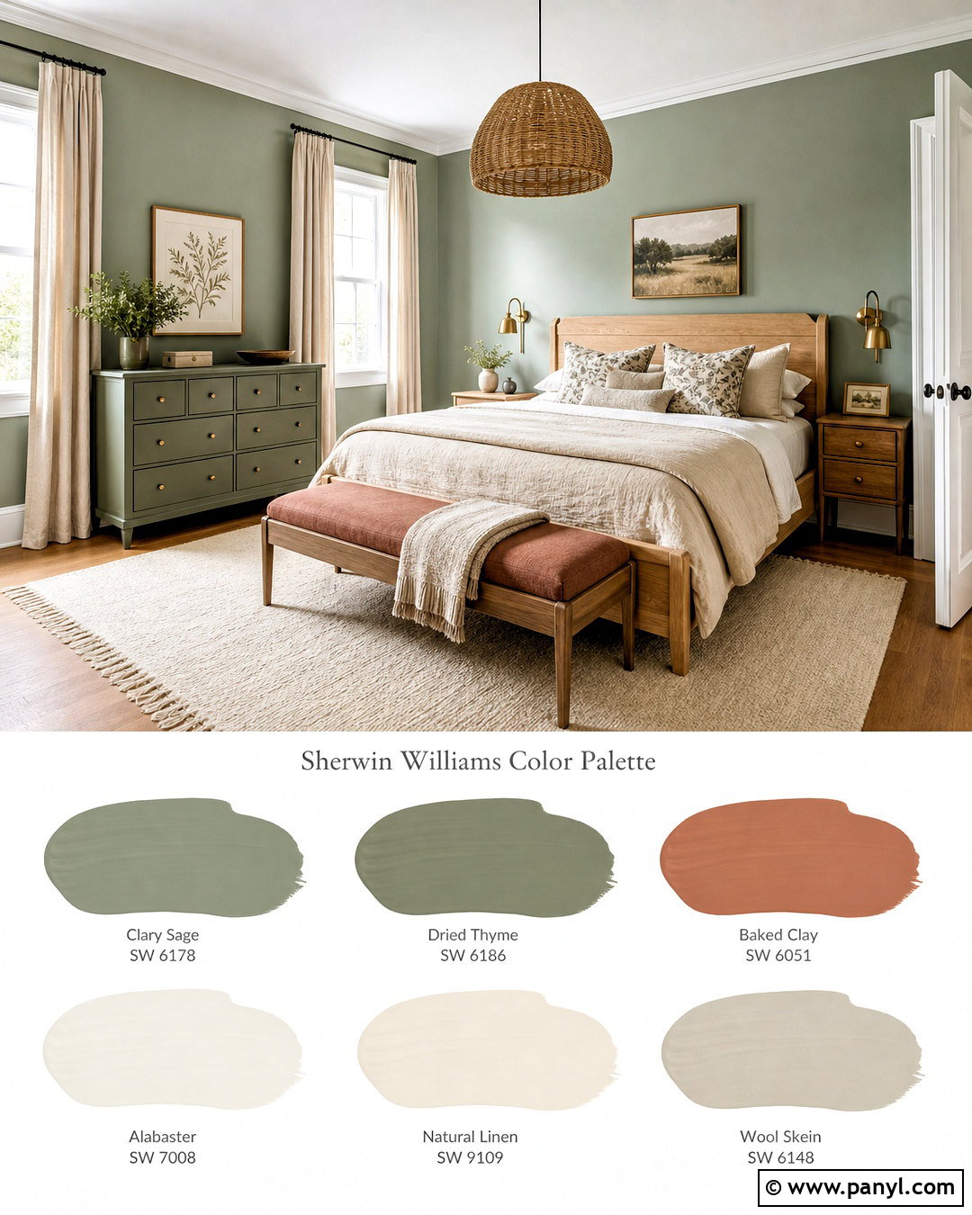
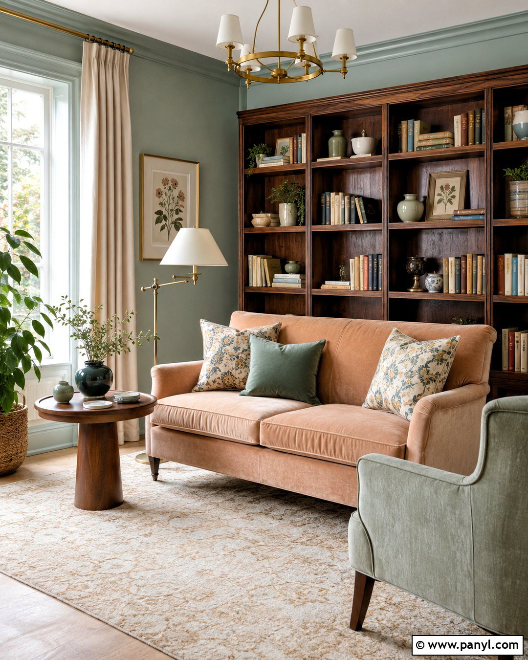
Imagine waking up in a room surrounded by soft garden color and warm natural materials. Clary Sage SW 6178 works beautifully across the walls, while Creamy SW 7012 brightens the ceiling, trim, and closet doors. Paint a dresser or window seat Dried Thyme SW 6186 to add tonal depth. Baked Clay SW 6340 brings a muted terracotta accent to a small bench, framed artwork, or decorative objects. Choose a light oak bed, flax linen bedding, woven pendant, and cream wool rug to keep the room restful. Small touches of aged brass provide warmth without appearing ornate. This full palette suits cottage, farmhouse, and relaxed transitional bedrooms. Keep patterns modest, using botanical prints or narrow stripes that repeat sage, cream, and clay in controlled amounts.
8. Sherwin Williams Upward Blue Palette

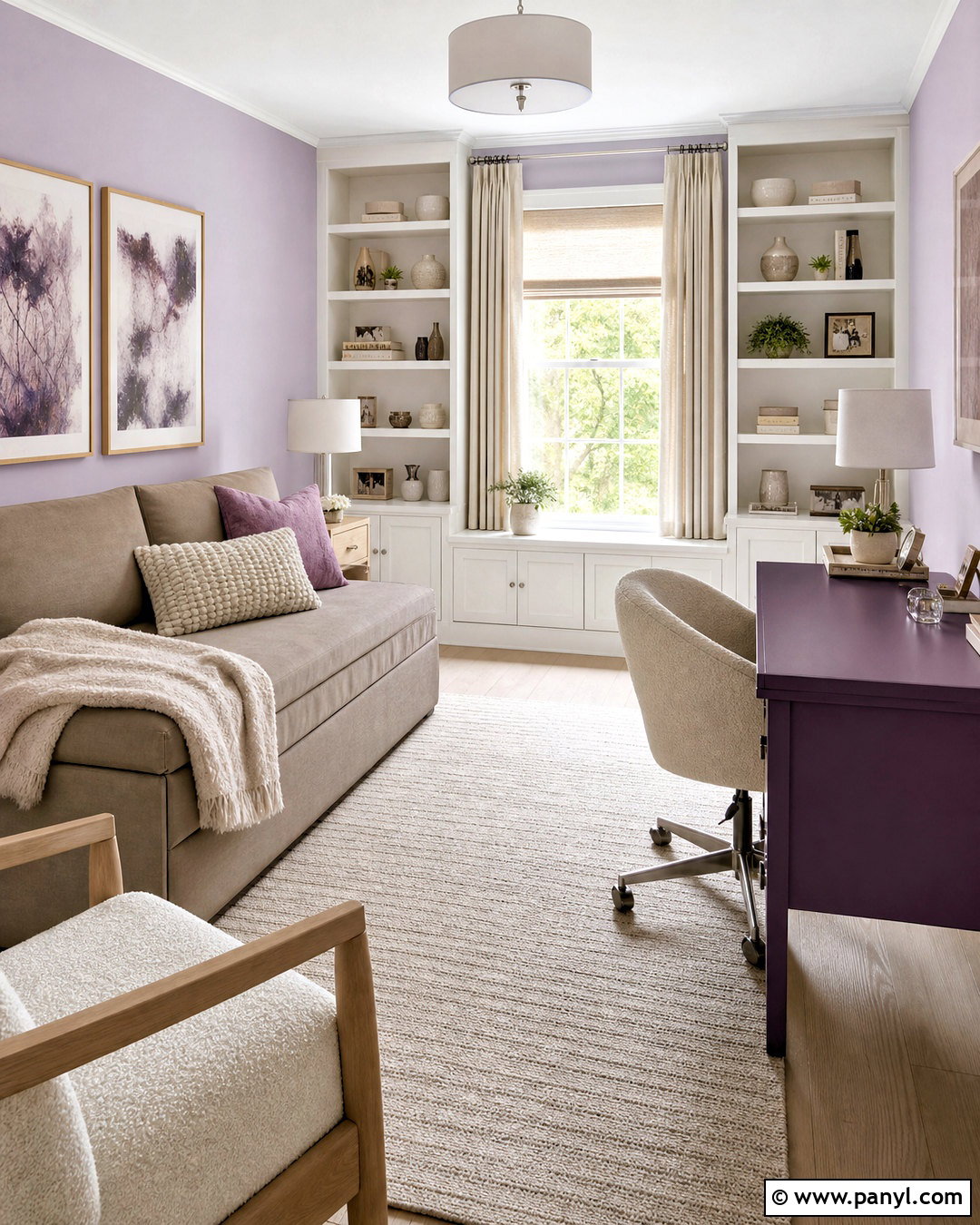
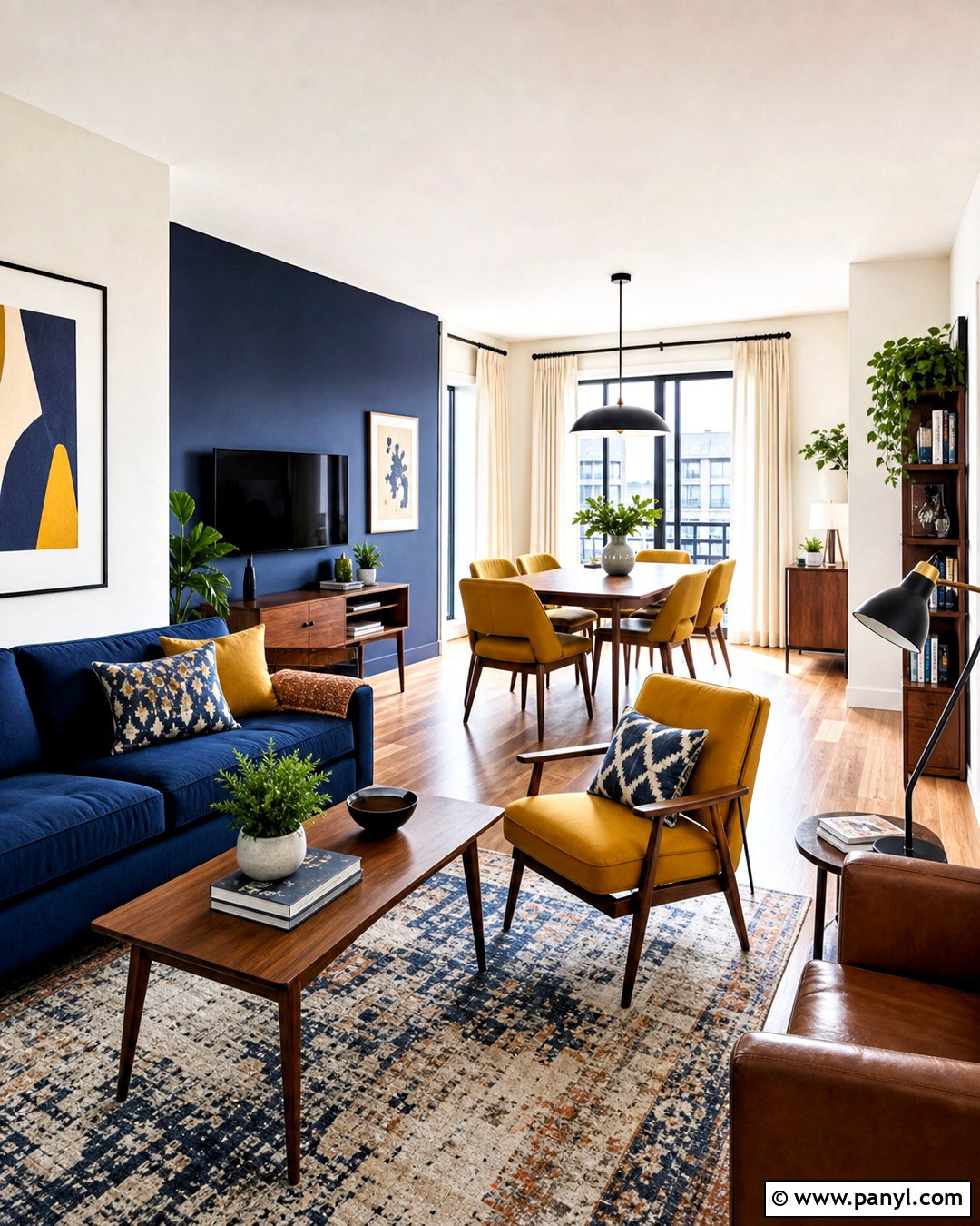
Upward SW 6239 establishes a breezy home office that feels fresh rather than childish. Paint all four walls in the soft blue, then frame the room with Snowbound SW 7004 trim and ceiling paint. Waterloo SW 9141 gives a bookcase, desk, or interior door a deeper blue finish. Bring in Natural Linen SW 9109 through an adjacent hallway or upholstered chair to warm the cool colors. A white oak desk, cane-front storage, cream curtains, and a natural fiber rug create a practical foundation. Add matte black task lighting for definition and a few rust-colored accessories for gentle contrast. Keeping most surfaces light allows the darker blue furniture to become an organized focal point. This palette also translates easily to bathrooms, bedrooms, and compact laundry rooms.
9. Sherwin Williams Redend Point Palette
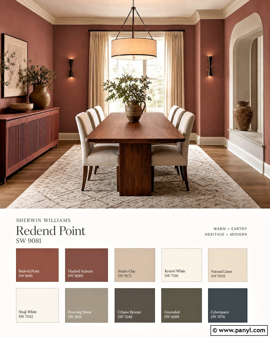
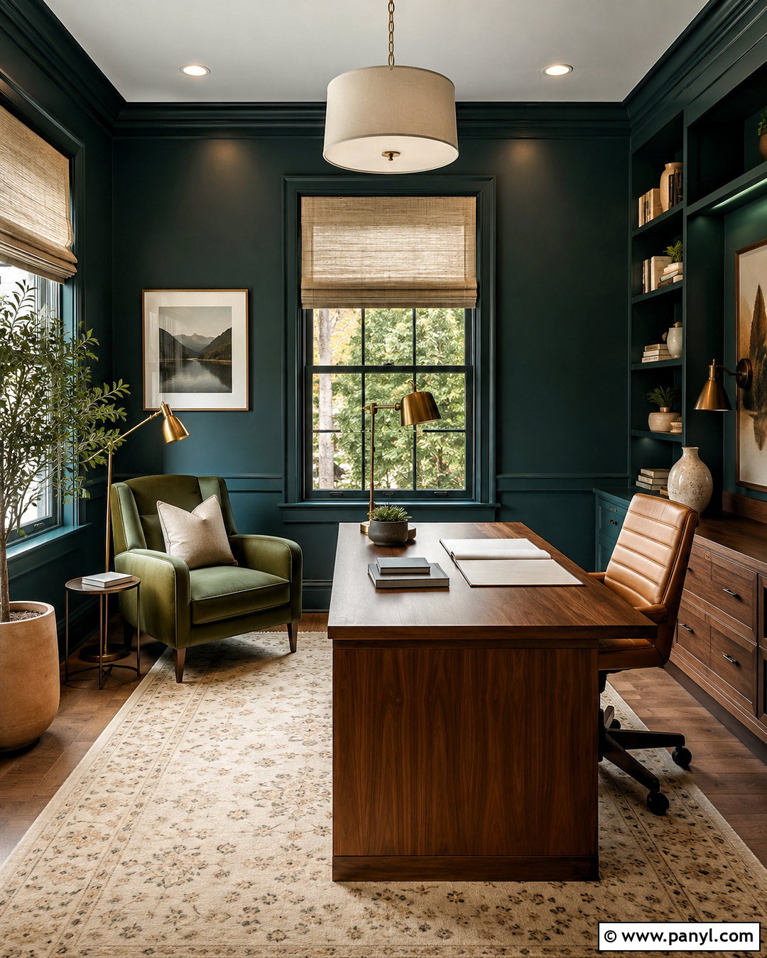
Redend Point SW 9081 makes a dining room feel intimate, earthy, and collected. Use it on the walls, then select Kestrel White SW 7516 for trim and the ceiling to soften the contrast. Hushed Auburn SW 9080 gives a buffet or paneled niche additional depth, while Studio Clay SW 9172 works on an adjoining hallway or architectural feature. Anchor the room with a medium walnut table, oatmeal chairs, an ivory patterned rug, and a large linen pendant. Dark bronze hardware and candle-style sconces complement the rosy brown undertones. Keep decorative accents limited to pottery, framed landscapes, and muted greenery. The finished space should mix tonal reds with plenty of cream and wood, creating warmth without turning the entire dining room pink or overly rustic.
10. Sherwin Williams Cavern Clay Palette
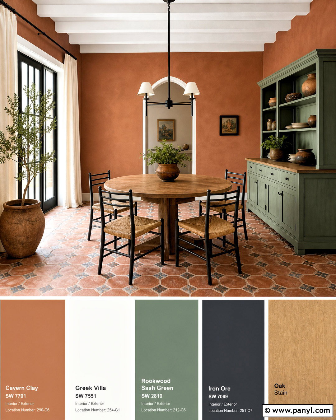
Sun-baked color brings immediate personality to a breakfast room or casual dining area. Paint the walls Cavern Clay SW 7701 and use Greek Villa SW 7551 for trim, window frames, and the ceiling. Rookwood Sash Green SW 2810 provides an earthy green counterpoint on a hutch or lower cabinetry. Add Iron Ore SW 7069 through a metal pendant, chair frames, or a slim interior door. A round oak table, woven-seat chairs, cream curtains, and patterned clay-colored tile complete the warm Southwestern influence. Keep the arrangement simple and modern rather than filling it with themed accessories. Terracotta pottery and one large botanical branch are enough. This palette is particularly effective in sunlit rooms, where natural light reveals the orange, brown, and muted red complexity of the wall color.
11. Sherwin Williams Black And White Palette
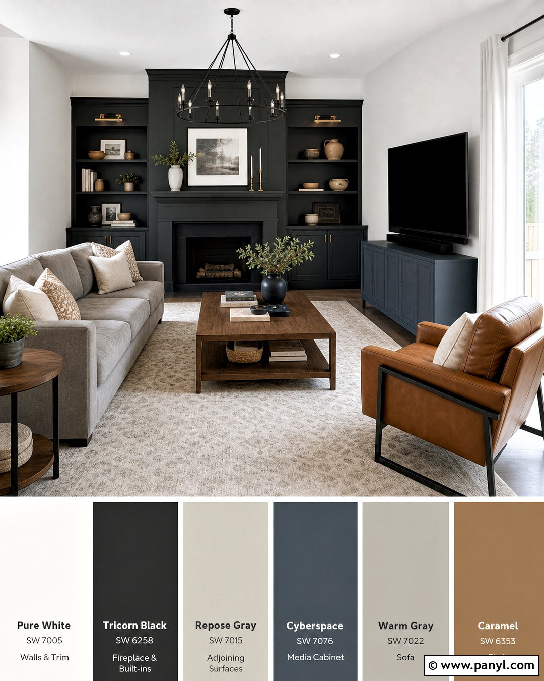
High contrast feels comfortable when soft textures and warm wood interrupt the black-and-white division. Use Pure White SW 7005 on the living room walls and ceiling, then paint a fireplace, built-in cabinet, or window wall Tricorn Black SW 6258. Repose Gray SW 7015 creates a gentle transition in the adjoining hall. Cyberspace SW 7076 can appear on a media console or interior door as a slightly softer alternative to solid black. Select a warm gray sofa, caramel leather chair, walnut tables, and an ivory rug with a fine charcoal pattern. White curtains keep the windows bright, while black metal lighting repeats the darker features. Limit small black accessories so the contrast remains architectural. This palette works particularly well when the room includes visible wood grain and layered neutral fabrics.
12. Sherwin Williams Rainwashed Bathroom Palette
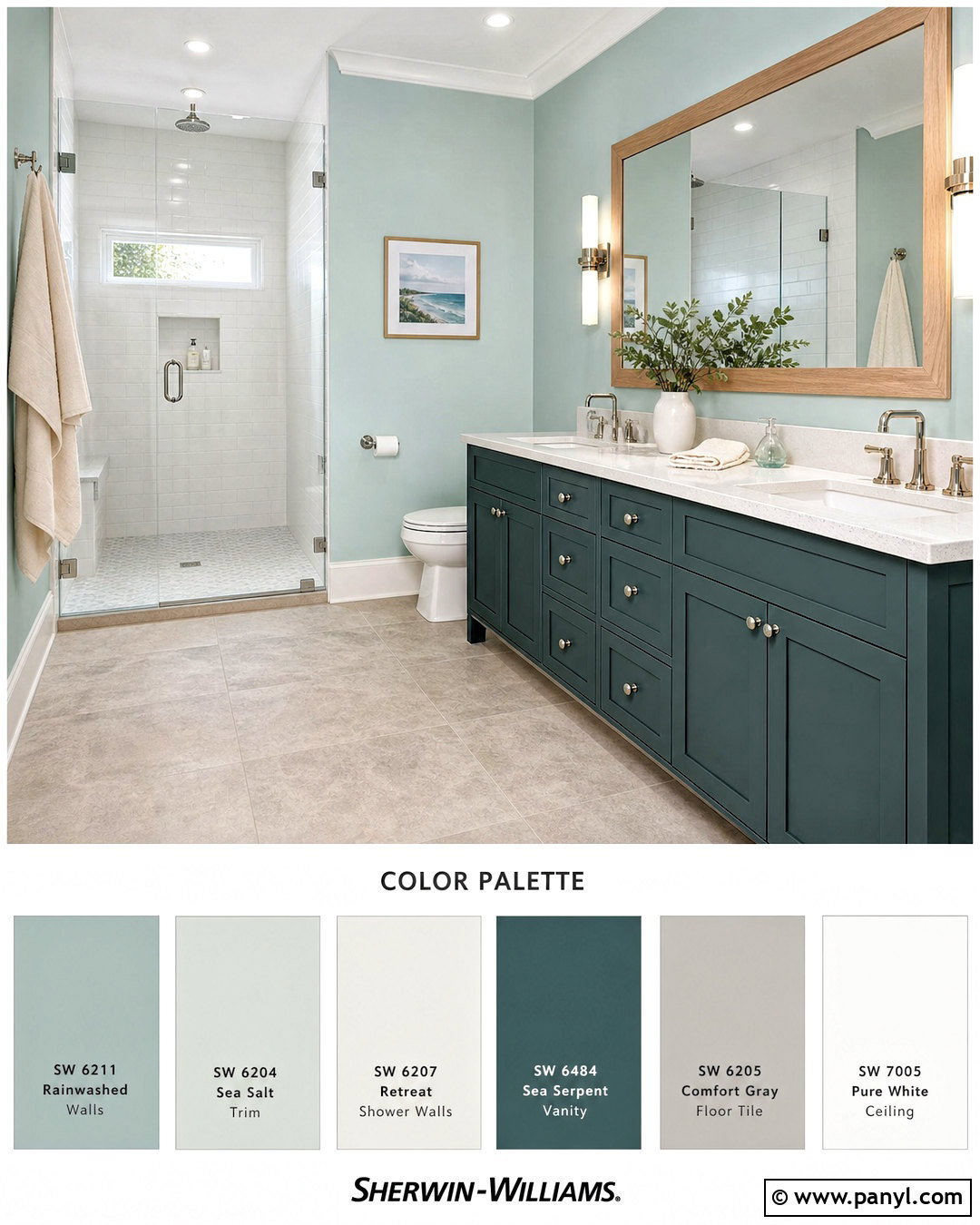
Rainwashed SW 6211 creates a clean bathroom that still feels warm and residential. Apply it above white wall tile or across the full walls, depending on the room’s size. Greek Villa SW 7551 works on the ceiling, trim, and door, while Sea Serpent SW 7615 gives the vanity a strong blue-green anchor. Natural Tan SW 7567 can appear in an adjoining dressing area or linen cabinet. Choose a pale quartz counter, brushed nickel fixtures, white oak mirror frame, and warm gray floor tile. Cotton towels in cream and muted blue reinforce the palette without unnecessary decoration. A clear glass shower enclosure keeps every color visible. Balance is important here: the deep vanity should occupy less space than the lighter walls, tile, and trim, especially in a bathroom with one small window.
13. Sherwin Williams Accessible Beige Whole Home Palette
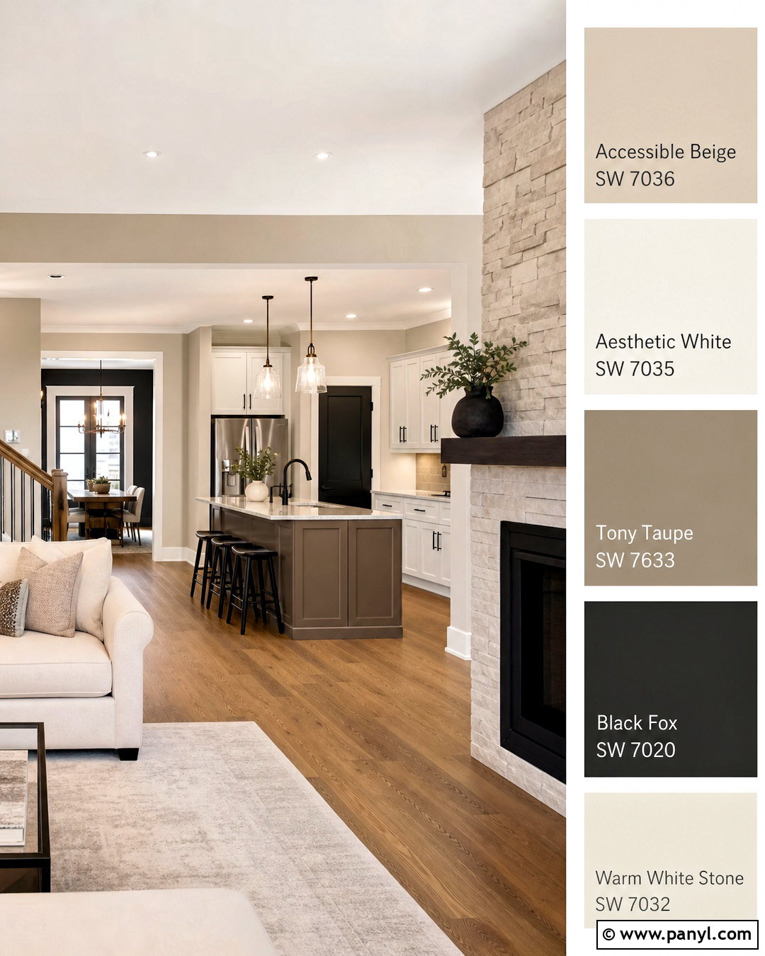
Accessible Beige SW 7036 can unify an entire home without making every room look identical. Use it in main living areas, hallways, and the stairwell, then apply Aesthetic White SW 7035 to ceilings, trim, and quieter bedrooms. Tony Taupe SW 7038 brings medium-depth contrast to an office, dining room, or kitchen island. Reserve Black Fox SW 7020 for interior doors, a powder room vanity, or a fireplace surround. Repeat medium oak flooring, warm white stone, linen upholstery, and dark bronze hardware throughout the connected spaces. Individual rooms can introduce muted blue, olive, or rust through textiles while the paint colors remain consistent. This approach creates a clear visual path through the home and reduces abrupt color changes, making it especially practical for open layouts and homes with limited square footage.
14. Sherwin Williams Pewter Green Exterior Palette
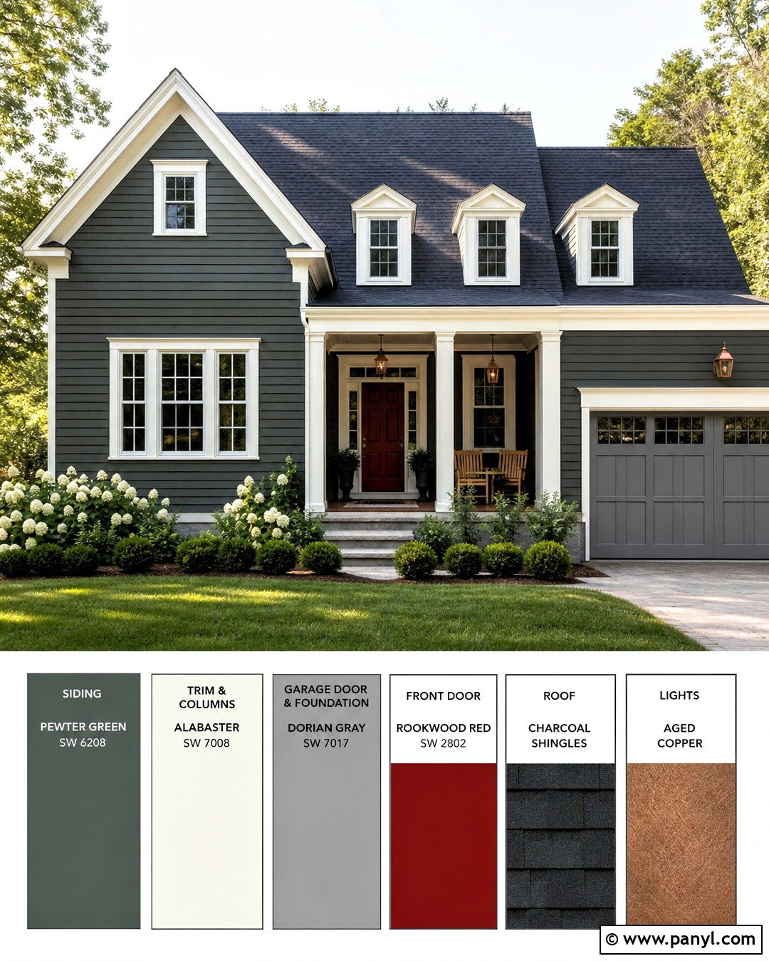
Pewter Green SW 6208 gives a traditional exterior a deeper, more established appearance. Use it for lap siding, then select Alabaster SW 7008 for fascia, window trim, porch columns, and the garage surround. Dorian Gray SW 7017 works on a stone foundation, secondary siding, or garage door. Paint the front door Rookwood Red SW 2802 for a rich historical accent that stands out without looking overly bright. A charcoal architectural-shingle roof, aged copper lighting, and natural wood porch furniture support the classic scheme. Keep landscaping structured with boxwood, ornamental grasses, white hydrangeas, and a simple stone walkway. Before committing, compare large exterior samples in sun and shade. Outdoor light can make paint appear brighter and cooler than the same color viewed indoors.
15. Sherwin Williams Stardew Bedroom Palette
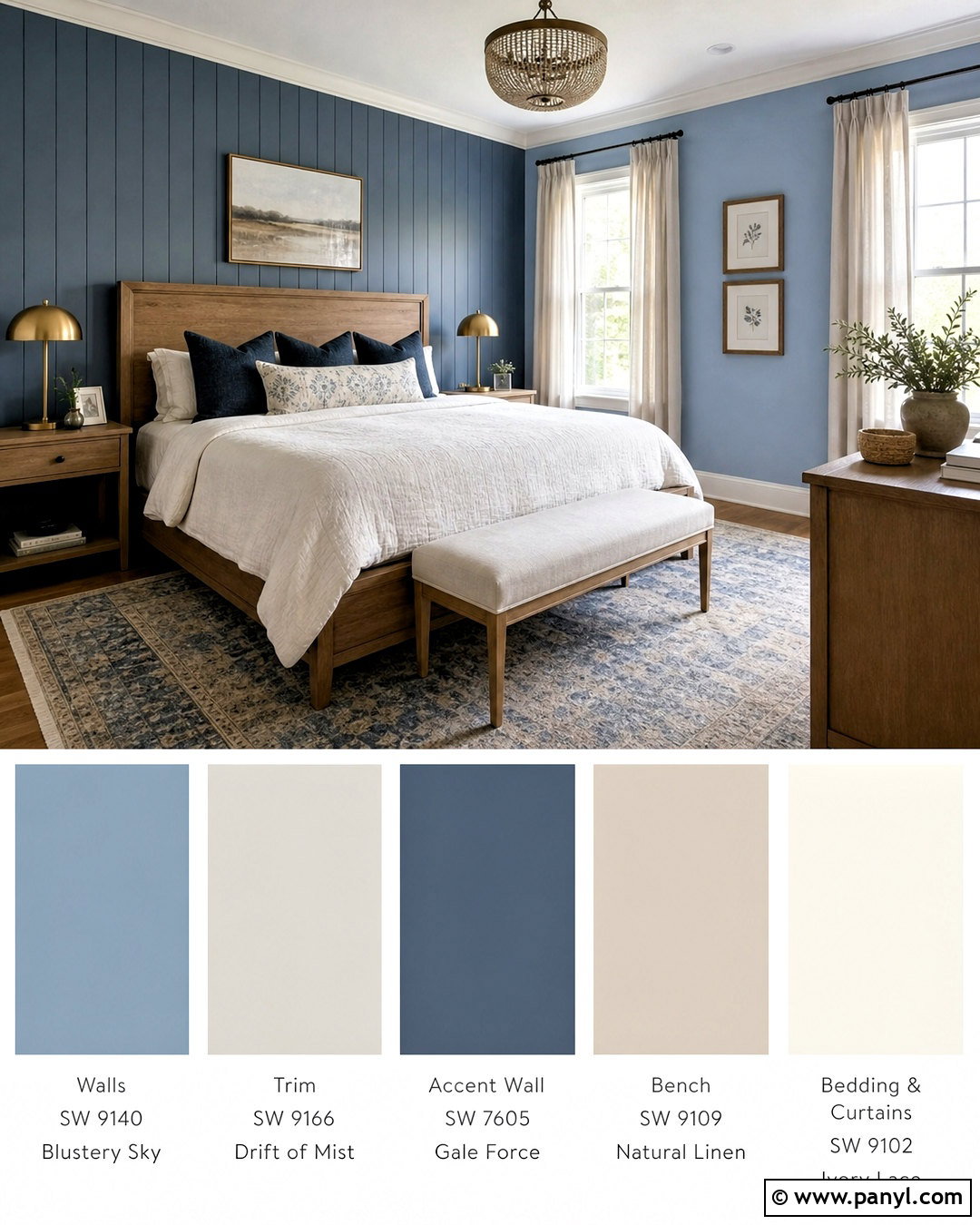
Stardew SW 9138 offers enough color to make a bedroom memorable while remaining easy to live with. Use it on the walls and choose Drift of Mist SW 9166 for the ceiling, trim, and closet doors. Gale Force SW 7605 creates a dramatic finish on a tall headboard wall, dresser, or reading nook. Natural Linen SW 9109 warms the scheme through an adjacent bathroom or painted bench. Dress the room with an oak bed, ivory quilt, flax curtains, and a vintage-style rug containing faded blue and beige. Brass lamps add subtle warmth, while dark blue pillows connect the deeper accent color. Keep the bedding mostly light so the layered blues remain distinct. This complete look suits coastal, transitional, and updated cottage homes without requiring themed artwork or decorative accessories.
16. Sherwin Williams Coral Island Palette
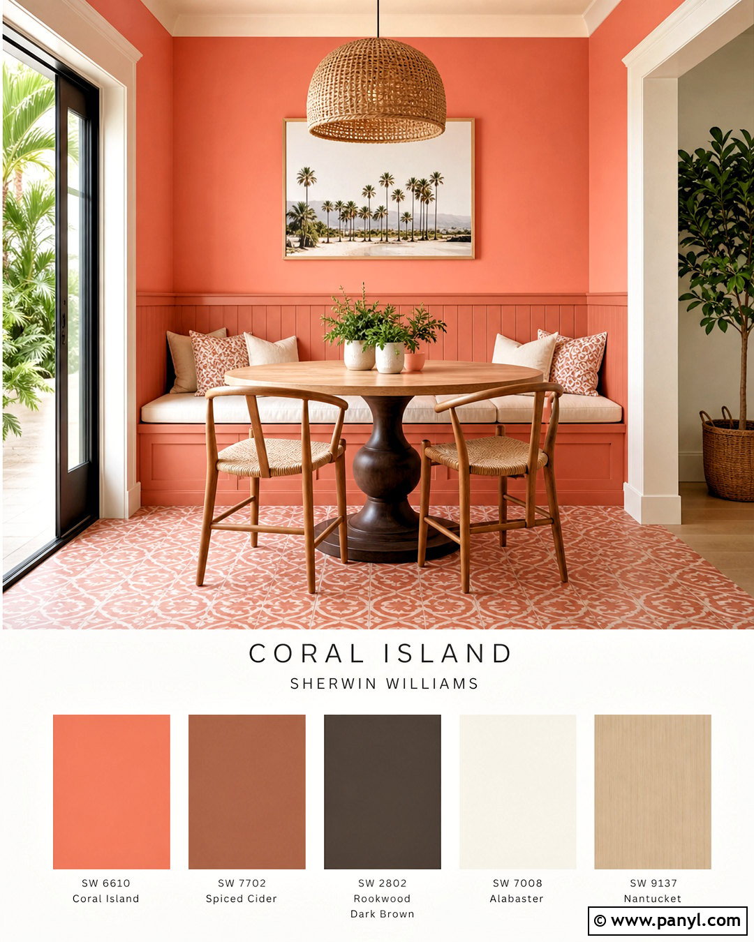
Coral Island SW 6332 turns a breakfast nook into a cheerful focal point. Apply it to the walls or a paneled banquette area, then use Creamy SW 7012 on the ceiling, trim, and remaining cabinetry. Spiced Cider SW 7702 adds a deeper orange-brown note to chair frames or a freestanding hutch. Rookwood Dark Brown SW 2808 grounds the room through the table base, interior door, or metalwork. Choose a pale oak table, woven chairs, off-white seat cushions, and patterned tile with restrained coral details. Green plants provide a natural complementary color without requiring another painted surface. Keep windows lightly dressed to maximize daylight. Since coral can reflect onto nearby materials, test it beside counters and flooring to ensure those fixed finishes maintain their intended color.
17. Sherwin Williams Radiant Lilac Palette
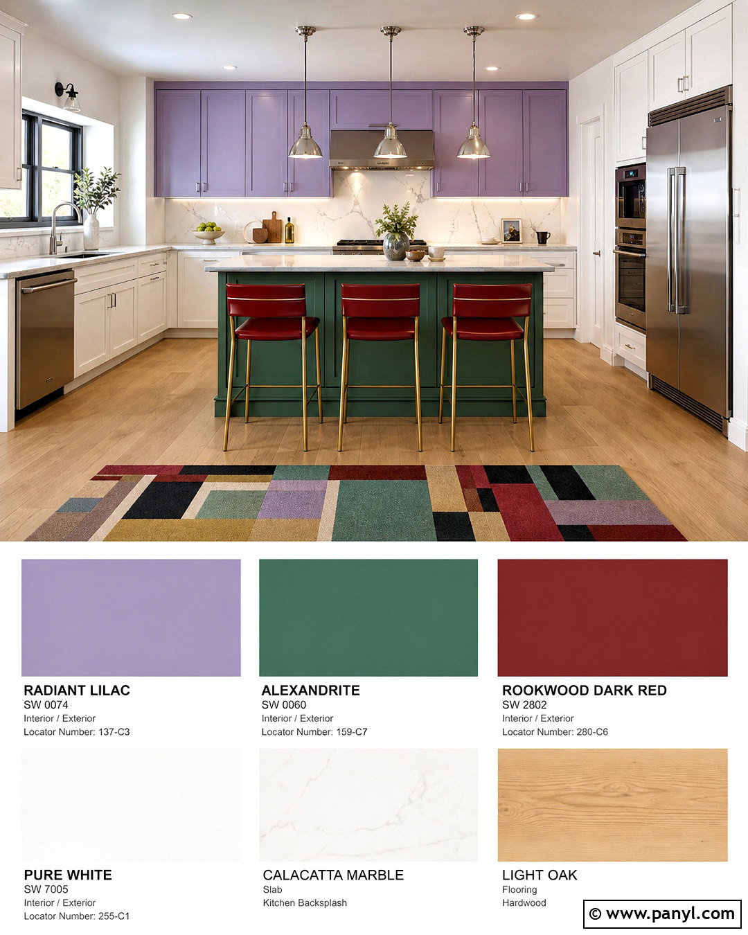
For a playful kitchen with a designer feel, use Radiant Lilac SW 0074 on upper cabinets or a freestanding pantry. Pure White SW 7005 keeps lower cabinetry, walls, and the ceiling bright. Alexandrite SW 0060 can appear on a compact island or breakfast bench, creating bold green contrast. Introduce Rookwood Dark Red SW 2801 through dining chairs, a painted door, or limited accessories. Finish the room with white quartz counters, softly veined marble tile, light oak flooring, and polished chrome hardware. A simple round table and graphic rug can connect the purple, green, and red in smaller amounts. The key is controlling placement: give white the largest share, lilac the second-largest, and treat the darker colors as focused accents rather than equal competitors. ()
18. Sherwin Williams Offbeat Green Palette
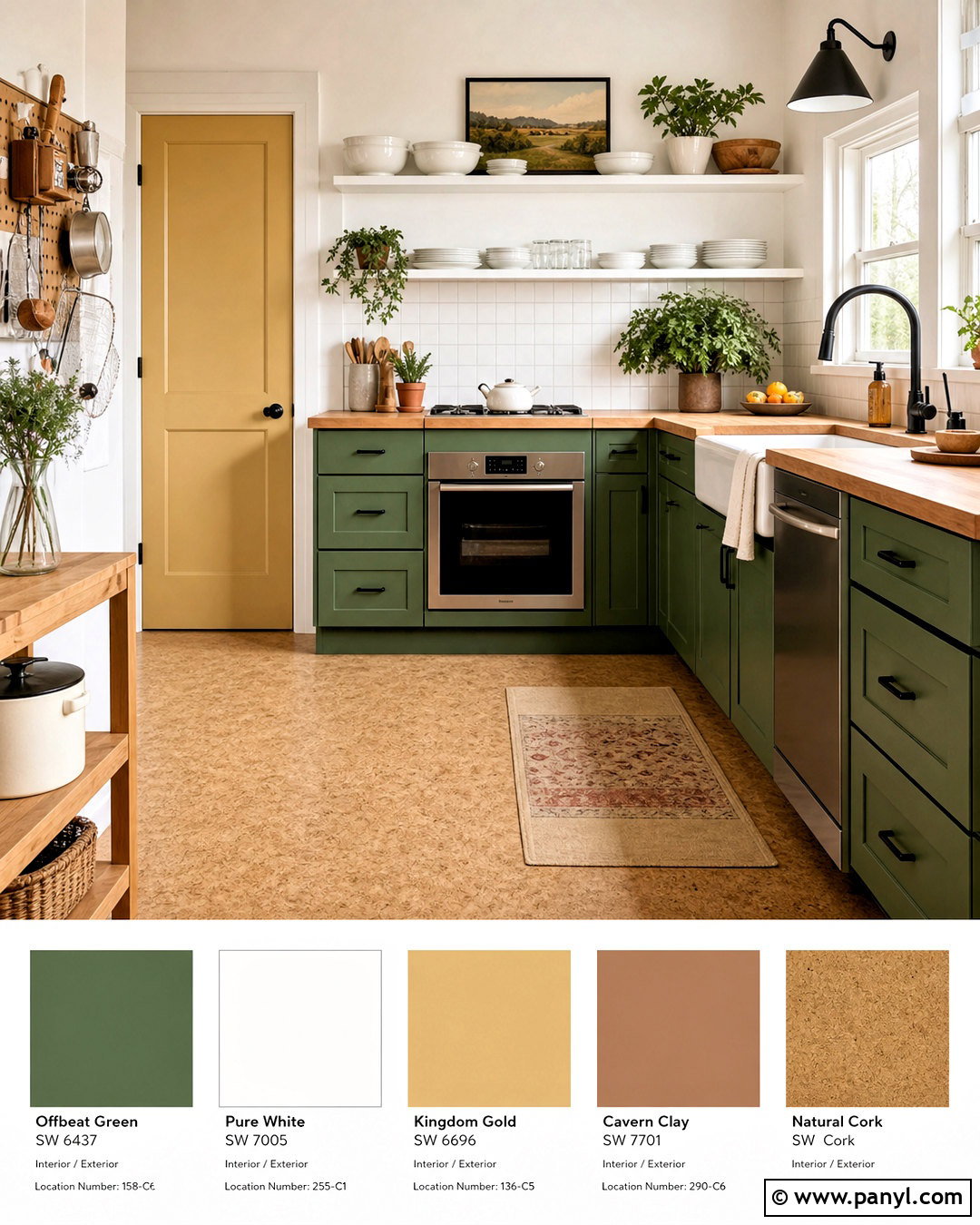
Offbeat Green SW 6706 brings energetic color to a compact kitchen or creative utility room. Paint the lower cabinets green while keeping walls, upper storage, trim, and the ceiling Pure White SW 7005. Kingdom Gold SW 6698 adds a sunny note to a pantry door, stool, or narrow shelving unit. Cavern Clay SW 7701 supplies earthy balance through tile, a painted bench, or small furnishings. Choose butcher-block counters, white square backsplash tile, natural cork flooring, and matte black hardware to make the bright hues feel practical. Open shelving should display mostly white dishes and wood accessories, preventing the palette from becoming visually busy. This look works best with clean cabinet fronts and uncomplicated lines, allowing the distinctive colors to provide personality instead of relying on excessive decorative details. ()
19. Sherwin Williams Warm Winter Neutral Palette
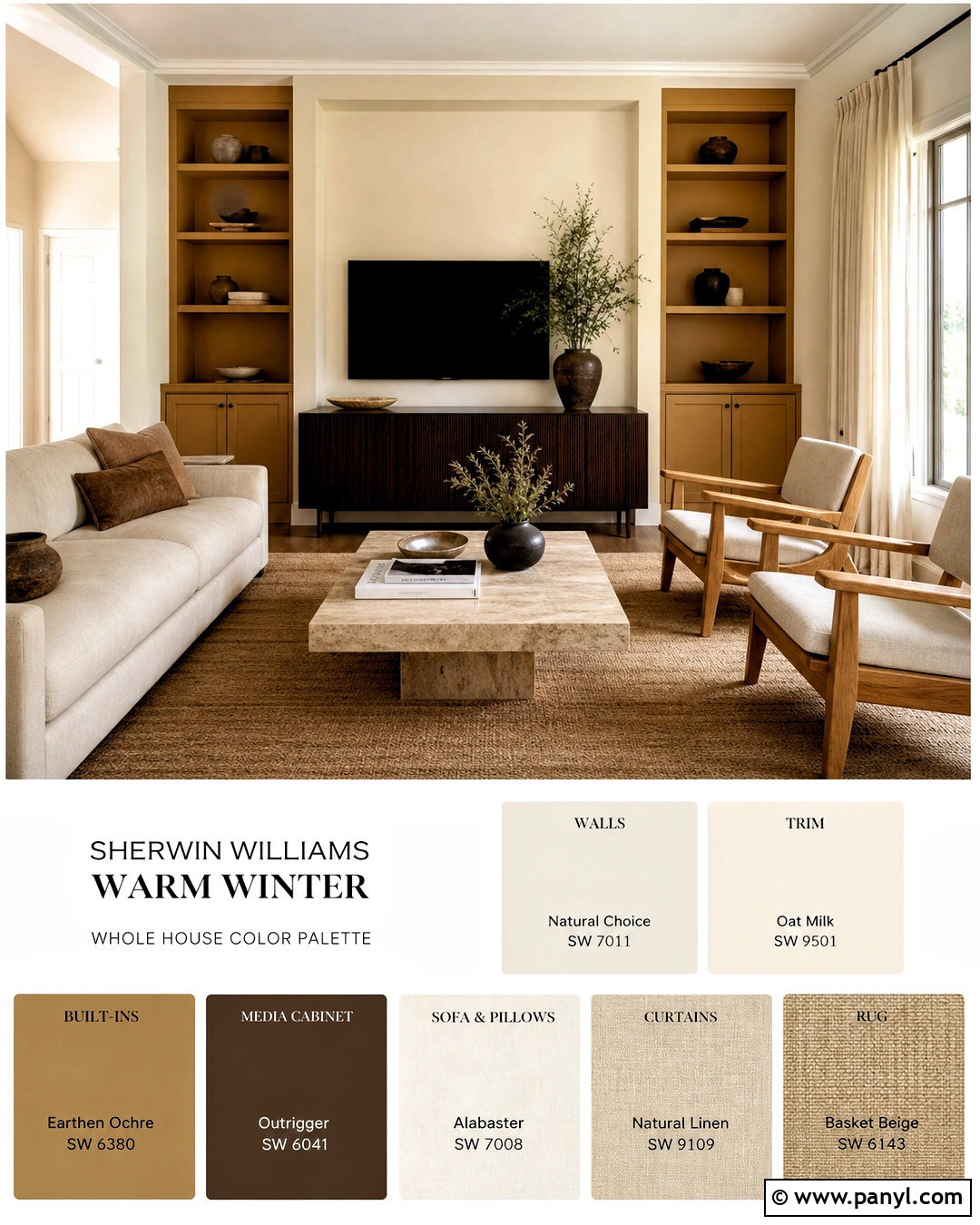
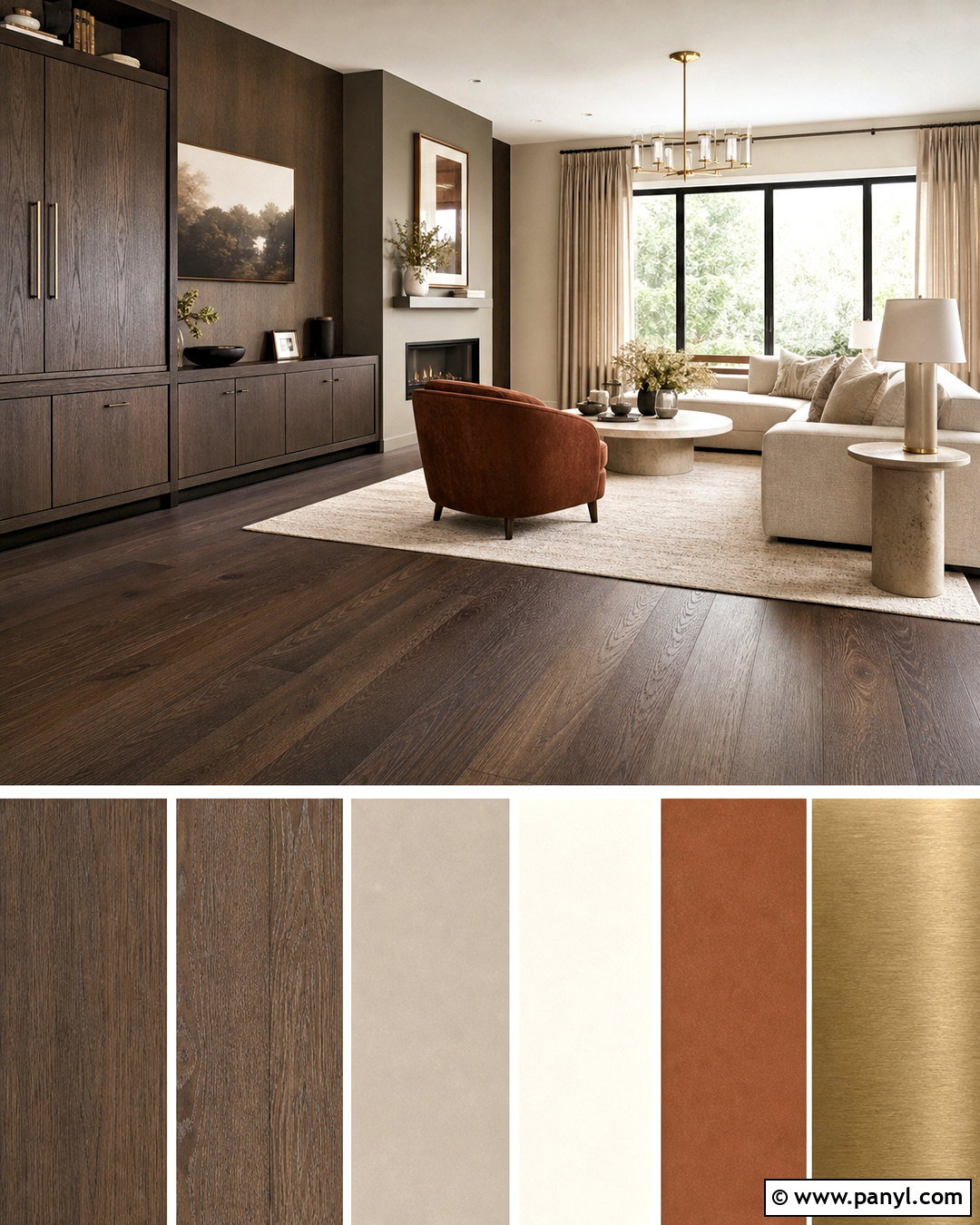
Warm Winter SW 9506 makes a refined foundation for a modern organic living room. Use it across the walls, with Oat Milk SW 9501 on the ceiling and trim for a soft tonal transition. Earthy Ochre SW 9532 can highlight built-in cabinetry, a window seat, or an architectural niche. Outrigger SW 9517 provides a deeper brown accent for an interior door or media cabinet. Furnish the room with a low cream sofa, sculptural oak chairs, a travertine coffee table, and a handwoven wool rug. Linen curtains and matte ceramic vessels support the natural palette without making the room appear rustic. Rounded furniture shapes soften the earthy colors. These hues belong to Sherwin-Williams’ Form + Function Designer Color Collection, which focuses on organic neutrals inspired by nature. ()
20. Sherwin Williams Sanctuary Neutral Palette
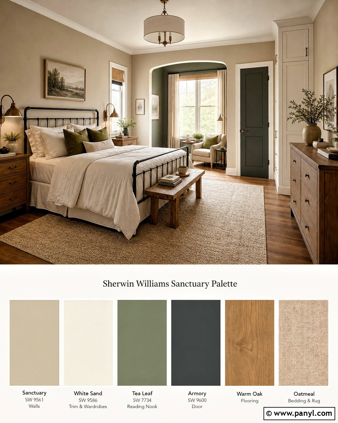
Sanctuary SW 9583 establishes a quiet, cocooning bedroom with more dimension than a basic beige scheme. Paint the walls Sanctuary and use White Sand SW 9582 on the ceiling, trim, and built-in wardrobes. Tea Leaf SW 9604 gives a reading nook, dresser, or upholstered headboard area a muted green accent. Armory SW 9600 provides dark contrast on an interior door, small cabinet, or metal bed frame. Complete the room with warm oak flooring, oatmeal bedding, olive pillows, linen curtains, and a softly textured cream rug. Add brushed bronze lamps and minimal botanical artwork for a collected finish. The colors come from the Warm + Welcoming Designer Color Collection, a group of layered warm neutrals designed to create comfortable, coordinated interiors. ()
Conclusion:
The best palette does more than place attractive colors beside each other. It connects paint with flooring, furniture, lighting, textiles, and permanent architectural finishes. These **20 Sherwin Williams color palette ideas** offer options for neutral whole-home schemes, colorful kitchens, calming bedrooms, sophisticated living rooms, practical bathrooms, and character-rich exteriors. Start by identifying the surfaces you cannot easily change, such as stone, tile, countertops, and flooring. Then sample the suggested wall, trim, and accent colors beside those materials. View every sample during morning, afternoon, and evening light before making a final choice. By giving each shade a specific purpose and repeating key tones thoughtfully, you can create a home that feels coordinated, comfortable, and personal.

Related Ideas and Inspiration:
Leave a Reply