
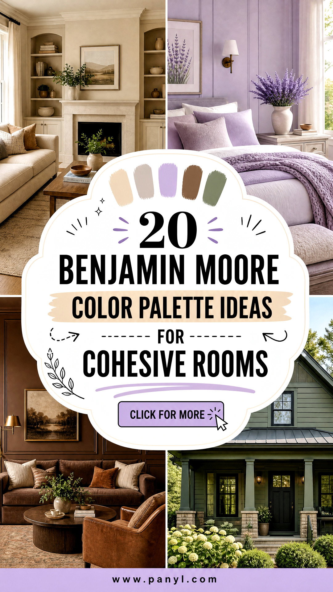
Choosing paint becomes much easier when every shade has a clear purpose. These **20 Benjamin Moore color palette ideas** combine coordinated wall colors, trim shades, accents, furnishings, and finishes to create complete looks rather than disconnected swatches. A successful palette usually begins with one dominant color, then adds secondary hues, a versatile trim color, and a contrasting accent. This approach helps rooms connect while still giving each space its own personality. Benjamin Moore also recommends testing samples in the actual room because natural light, artificial lighting, and surrounding materials can change how a color appears. () From warm neutrals and restful blues to rich browns and earthy greens, the following designs offer practical inspiration for using **20 Benjamin Moore color palette ideas**.
1. Benjamin Moore Silhouette Color Palette
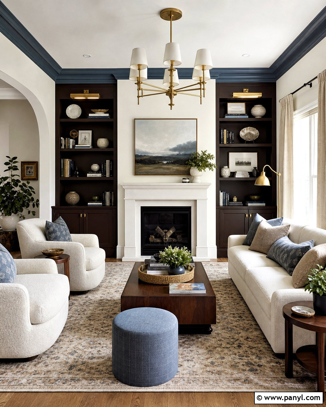
Create a tailored living room around Silhouette AF-655, a deep espresso brown softened by charcoal undertones and Benjamin Moore’s official 2026 Color of the Year. () Paint built-in shelves or the fireplace wall in Silhouette, then use Swiss Coffee OC-45 across the remaining walls for warm contrast. Raindance 1572 works beautifully on an adjoining hallway or ceiling detail, while First Crush CSP-310 introduces a gentle pink-beige accent through upholstery. Add walnut furniture, oatmeal linen curtains, aged brass lighting, and a softly patterned rug. Cream boucle seating prevents the darker paint from overwhelming the room. This palette feels refined without becoming formal, especially when the brown is repeated through wood, leather, and smaller decorative pieces.
2. Benjamin Moore Warm Neutral Color Palette
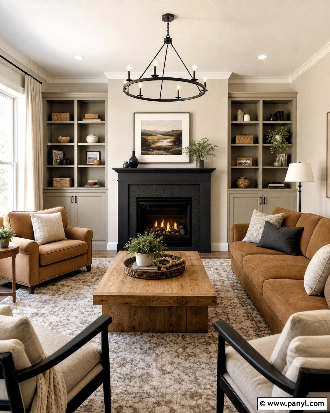
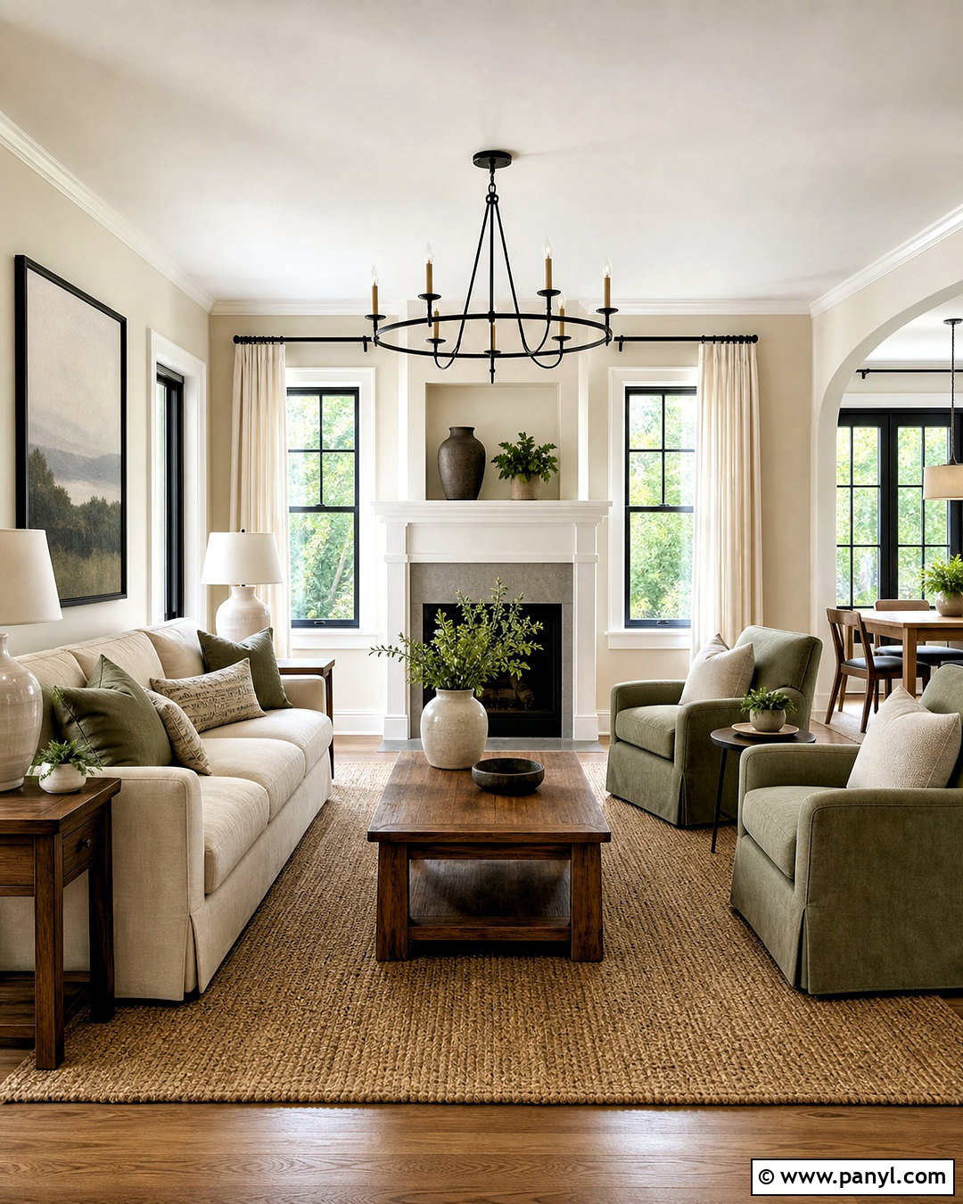
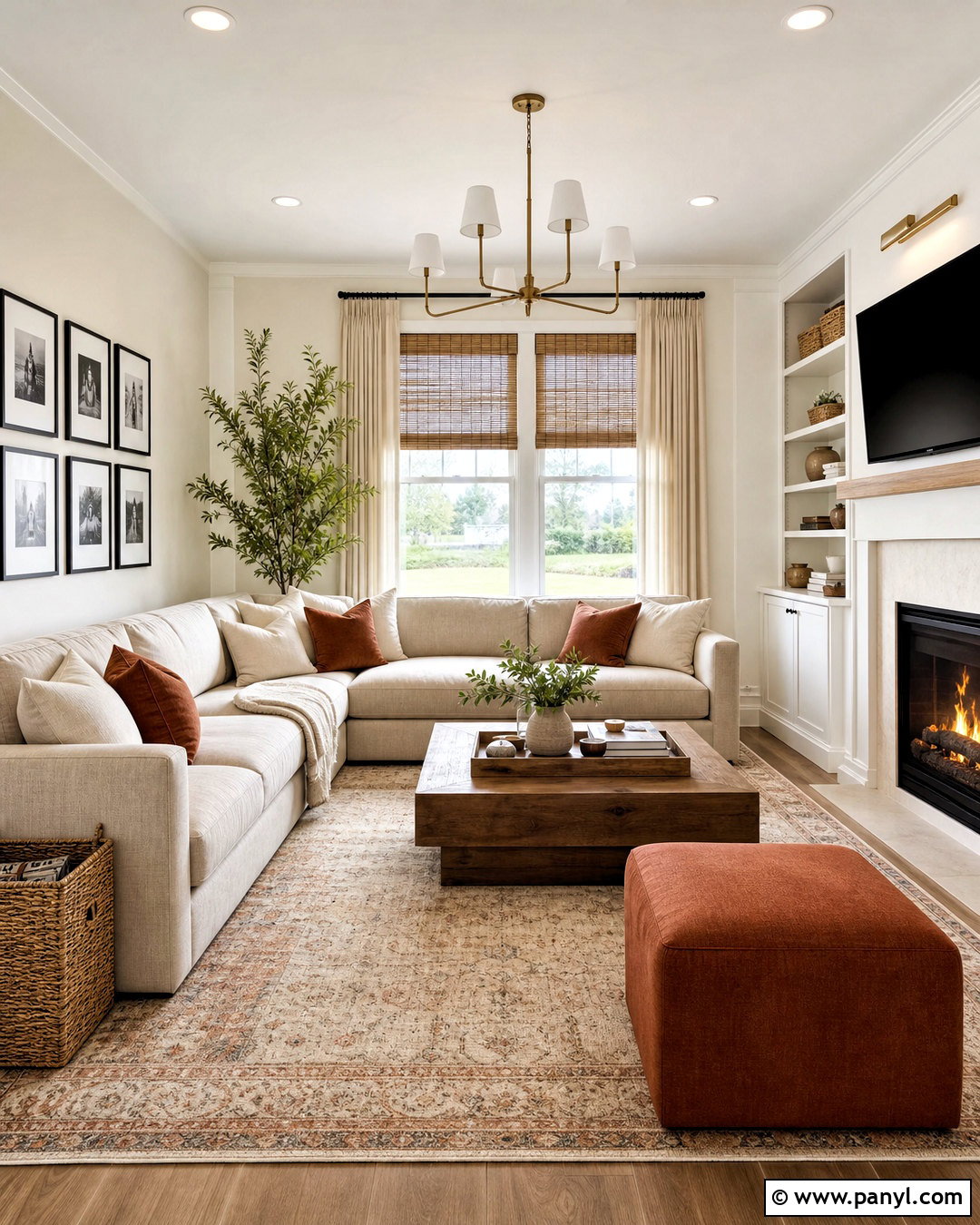
Imagine a bright family room that feels comfortable in every season. Use Edgecomb Gray HC-173 as the main wall color, White Dove OC-17 on the ceiling and trim, and Revere Pewter HC-172 on built-ins or an adjoining dining area. Kendall Charcoal HC-166 adds definition to a fireplace surround, interior door, or media cabinet. Complete the room with a camel-colored sofa, natural oak tables, cream curtains, and woven storage baskets. Black metal lighting gives the soft palette a sharper edge without disrupting its warmth. Because the shades share subtle neutral undertones, the transitions feel smooth and intentional. This combination works especially well in open layouts where living, dining, and kitchen spaces need to look connected.
3. Benjamin Moore Sage Green Color Palette
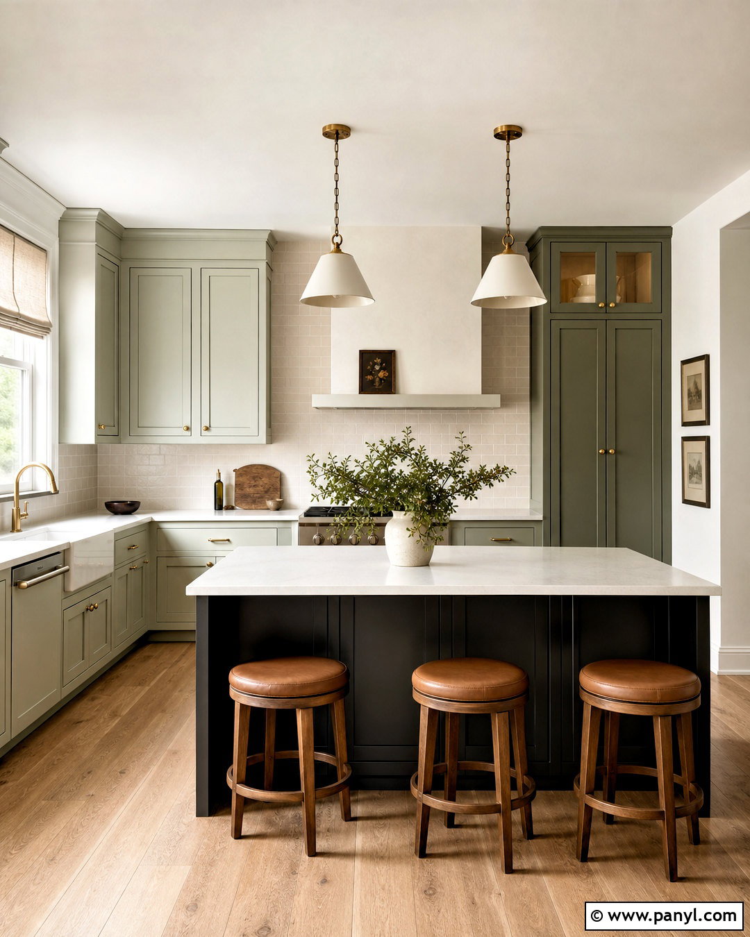
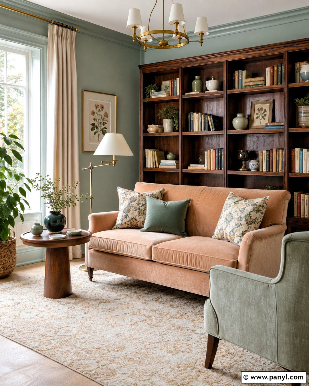
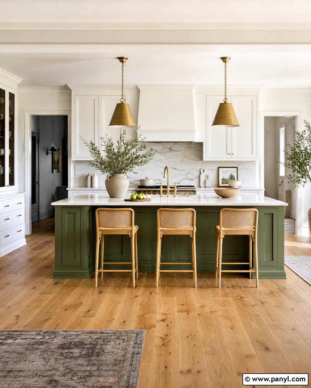
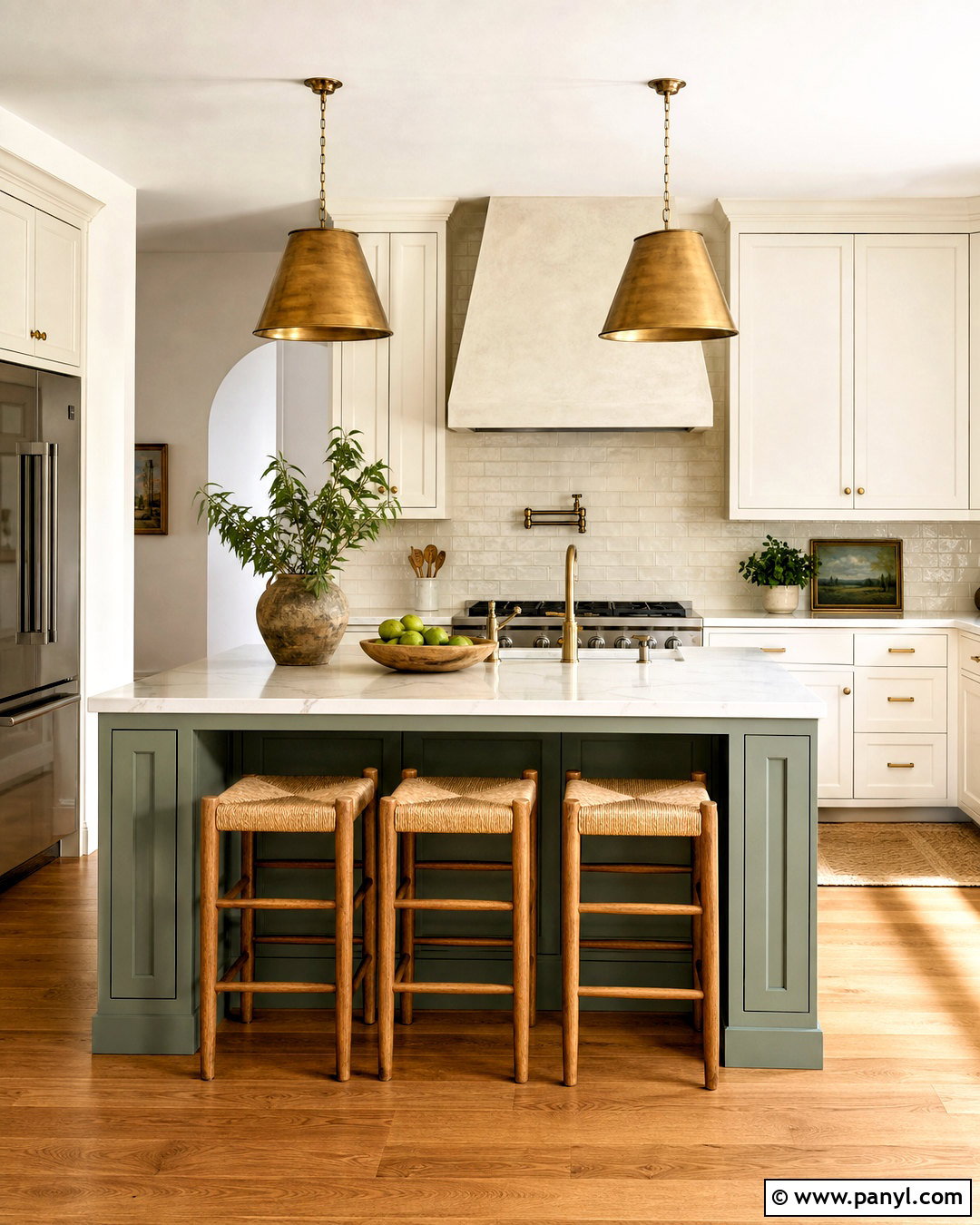
Soft greens can make a kitchen feel fresh while remaining easy to decorate. Paint the cabinetry in October Mist 1495 and use Swiss Coffee OC-45 on the walls, ceiling, and trim. Introduce Saybrook Sage HC-114 on a pantry door or freestanding hutch for gentle depth. Wrought Iron 2124-10 grounds the scheme through an island base, hardware, or metal-framed windows. Choose pale quartz countertops, a handmade cream tile backsplash, white oak flooring, and aged brass fixtures. Linen Roman shades and simple ceramic accessories reinforce the organic character. The finished kitchen feels calm and layered rather than overly themed. It also creates a flexible background for herbs, wood cutting boards, and everyday cookware displayed on open shelves.
4. Benjamin Moore Coastal Blue Color Palette
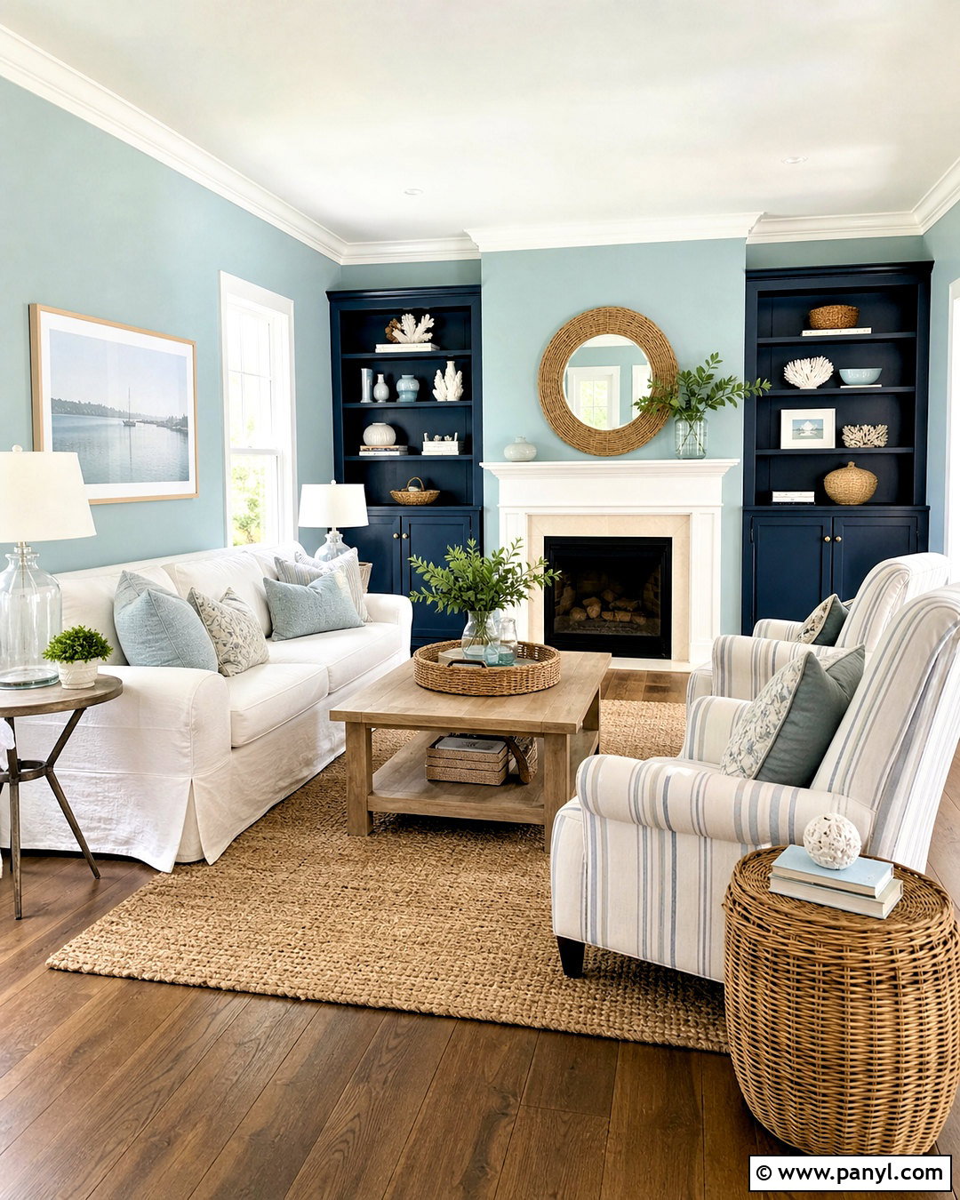
For a coastal living room without obvious nautical decorations, begin with Palladian Blue HC-144 on the walls. Its light blue-green character pairs naturally with White Dove OC-17 trim and Hale Navy HC-154 built-ins. Use Natural Wicker OC-1 on an adjoining entry or painted console to introduce a sandy neutral. A relaxed slipcovered sofa, pale oak coffee table, striped linen chairs, and woven jute rug complete the room. Add navy pillows in moderation, along with clear glass lamps and brushed nickel details. Keep window coverings lightweight so the palette receives plenty of natural light. The result feels breezy and polished, with enough contrast to remain interesting throughout the year rather than looking like seasonal beach decor.
5. Benjamin Moore Modern Farmhouse Color Palette
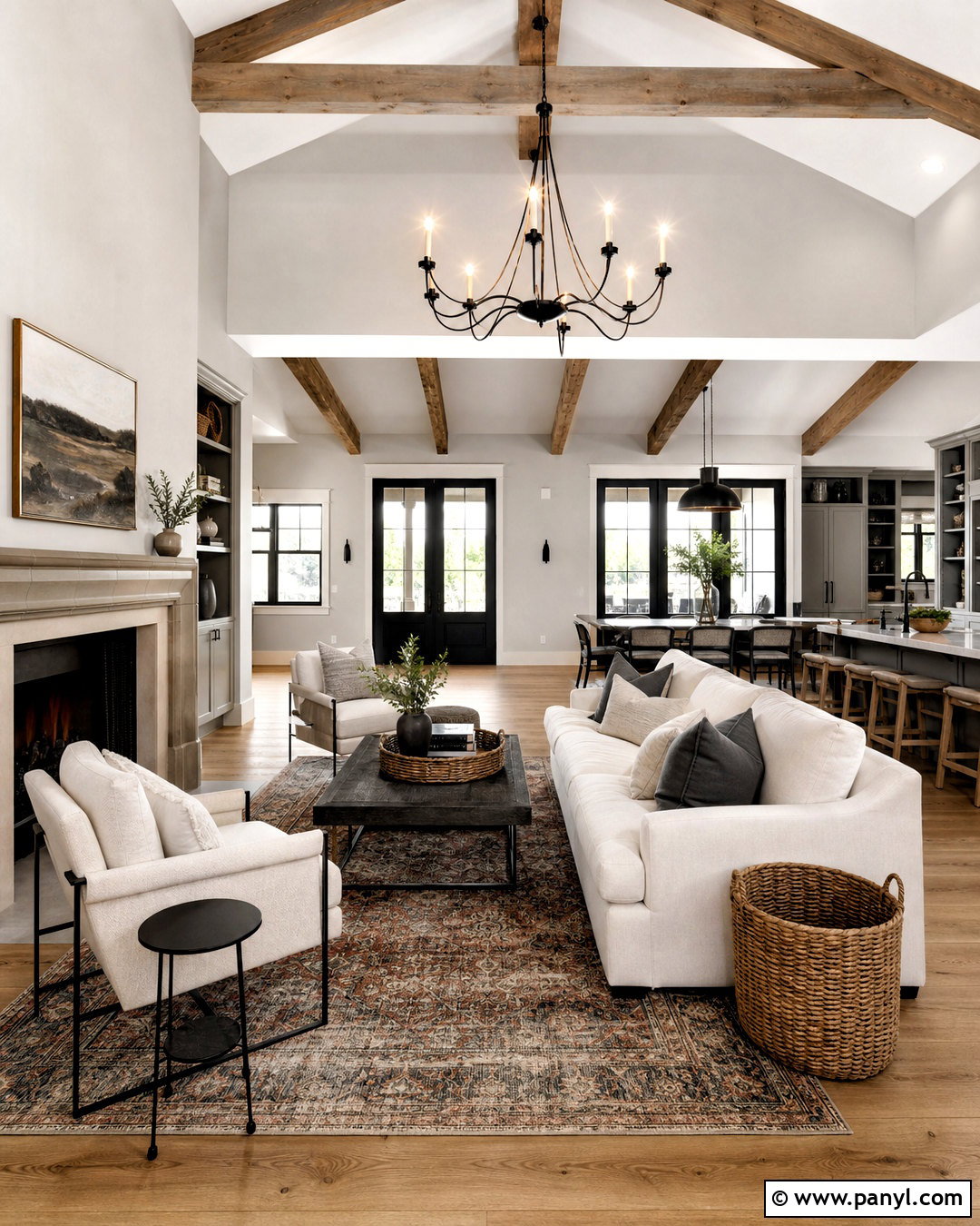
A modern farmhouse palette works best when clean whites are balanced by muted color and strong contrast. Cover the main walls in Classic Gray OC-23 and use Simply White OC-117 for ceilings, trim, and paneled details. Paint lower kitchen cabinets or a fireplace surround in Knoxville Gray HC-160, a deep blue-green gray that complements natural wood. Black Beauty 2128-10 is ideal for window frames, interior doors, and small metal accents. Bring in wide-plank oak flooring, a warm white sofa, linen upholstery, and a vintage-style patterned rug. Avoid filling the room with decorative signs or distressed finishes. Simple pottery, black lighting, woven baskets, and a few antique wood pieces create a more authentic, updated farmhouse appearance.
6. Benjamin Moore Dark Green Color Palette
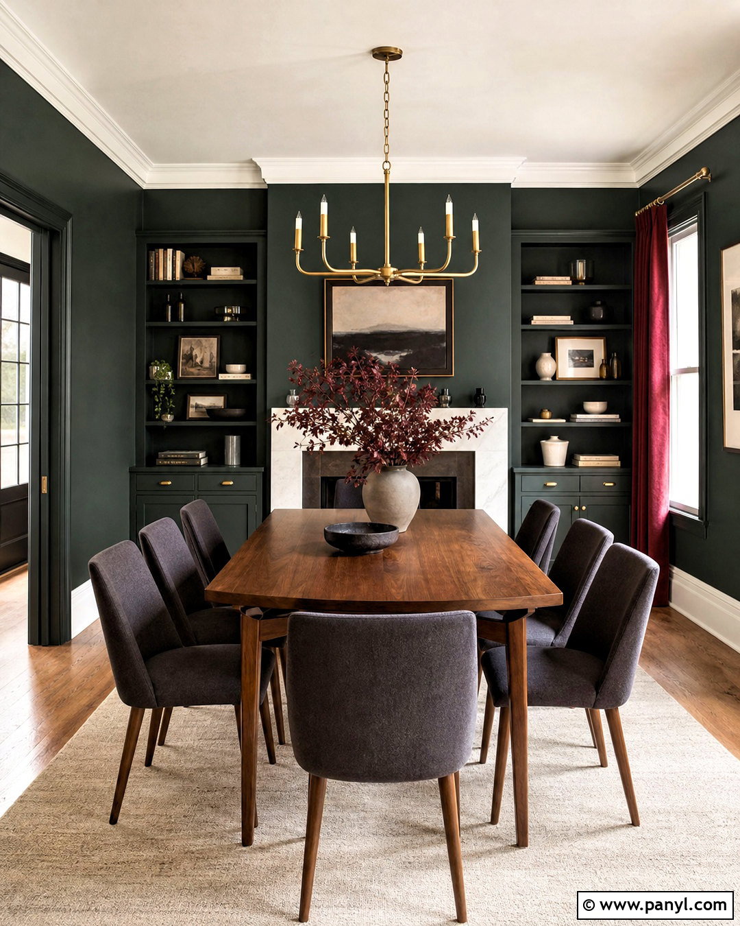
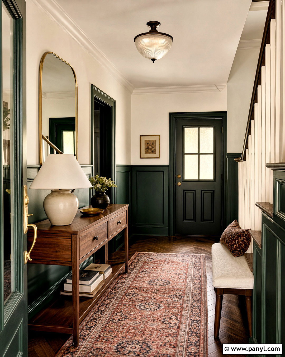
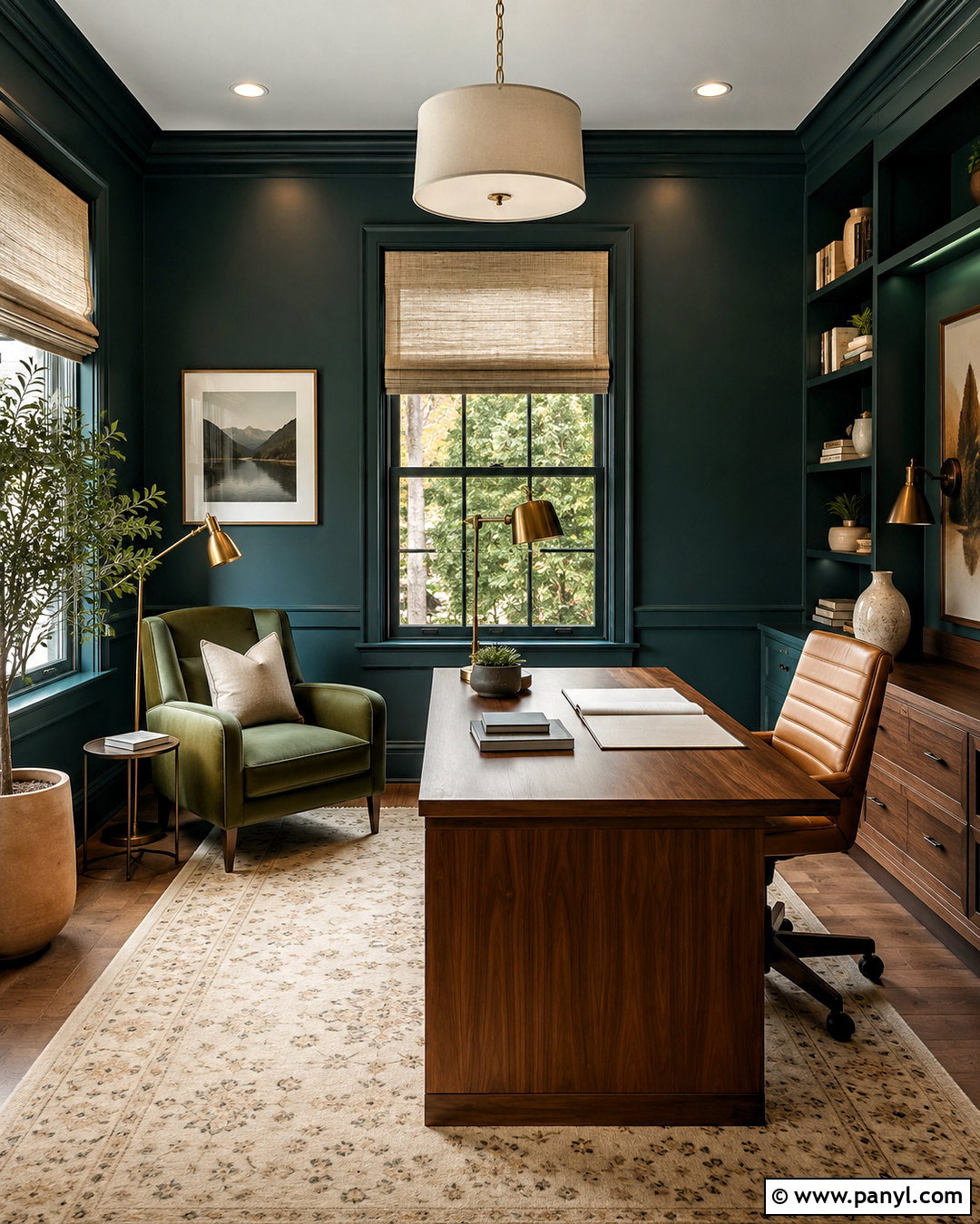
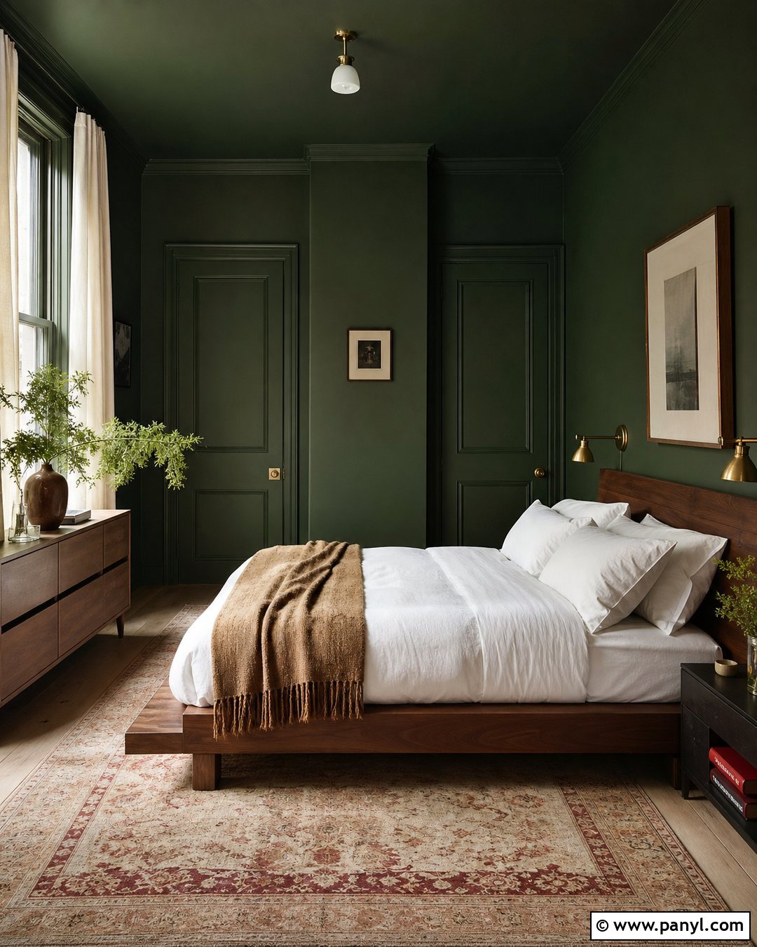
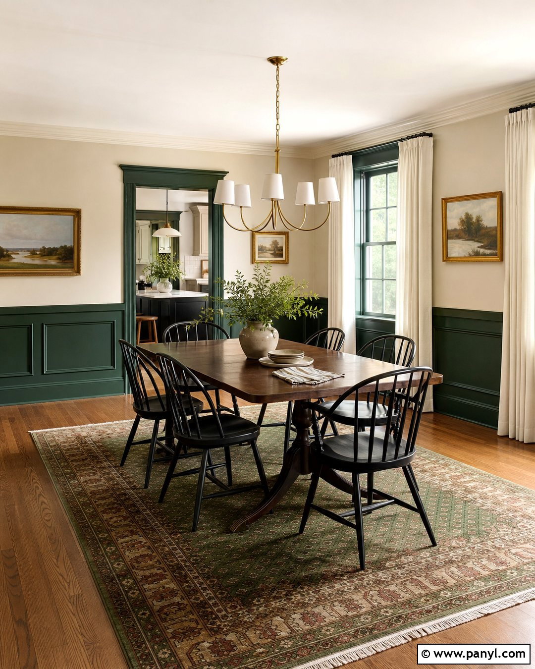
Turn a dining room into an intimate gathering space with Salamander 2050-10 covering the walls and built-in cabinetry. This nearly black green looks especially rich beside Chantilly Lace OC-65 on the ceiling, crown molding, and window trim. Introduce Kendall Charcoal HC-166 through upholstered chairs or a painted sideboard, then add a restrained touch of New London Burgundy HC-61 in artwork or patterned textiles. A medium-toned walnut table, warm brass chandelier, and cream wool rug keep the room welcoming. Use eggshell paint on the walls and a higher sheen on cabinetry so the green develops subtle dimension. The complete look is dramatic but balanced, making everyday meals feel special without relying on overly formal furniture.
7. Benjamin Moore Quiet Blue Color Palette
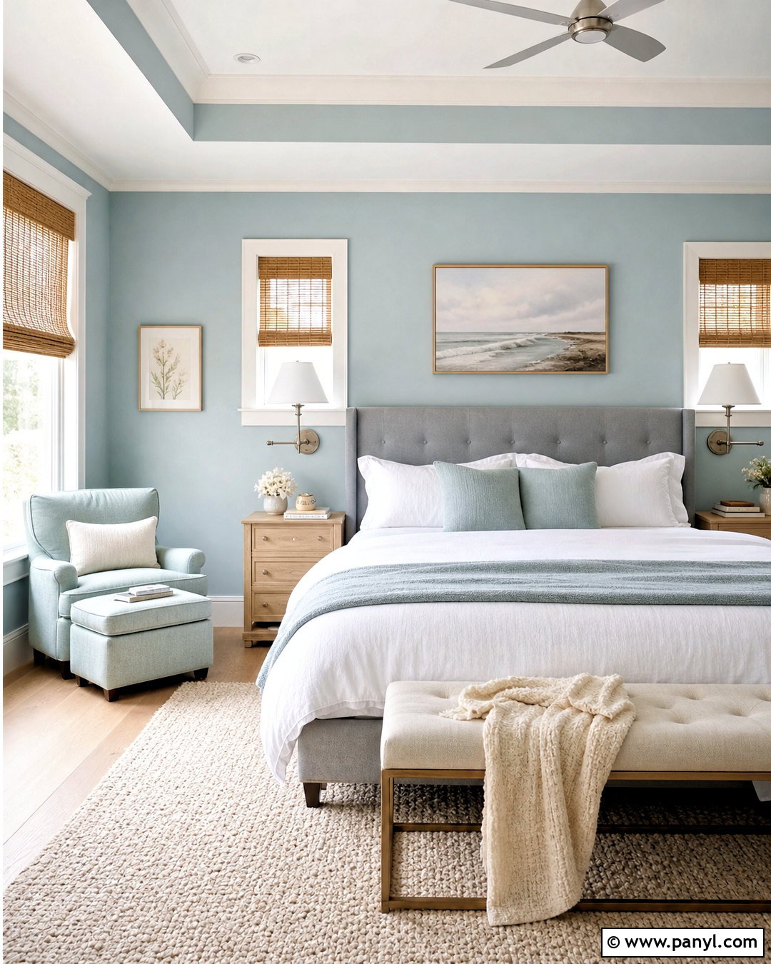
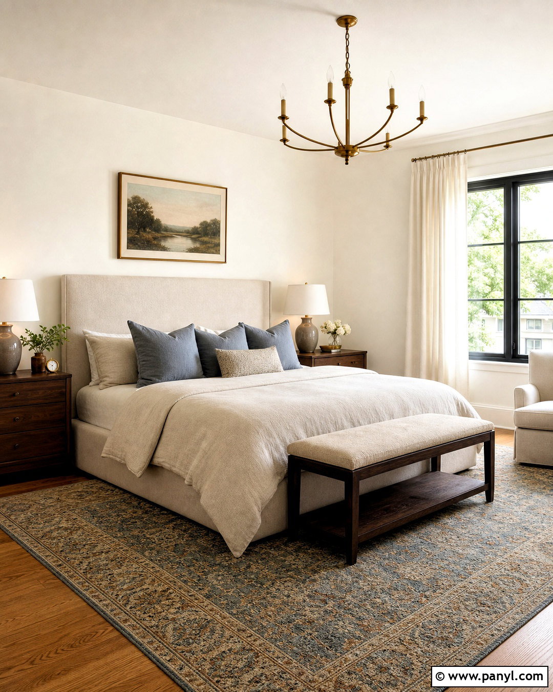
A restful bedroom begins with Quiet Moments 1563, a gentle blue-green-gray that creates a soft background for sleep. Use Healing Aloe 1562 on a reading nook or adjoining bathroom to continue the tranquil effect. Cloud White OC-130 keeps the trim warm and prevents the cooler colors from feeling icy. Add Boothbay Gray HC-165 through a painted dresser, bench, or upholstered headboard. Layer the bed with white cotton sheets, pale gray-blue linen, and a textured cream throw. Light oak nightstands and woven shades bring natural warmth, while brushed nickel sconces maintain the airy mood. Keep patterns subtle and repeat the palette in small amounts throughout the room for a cohesive, uncluttered retreat.
8. Benjamin Moore Terracotta Color Palette
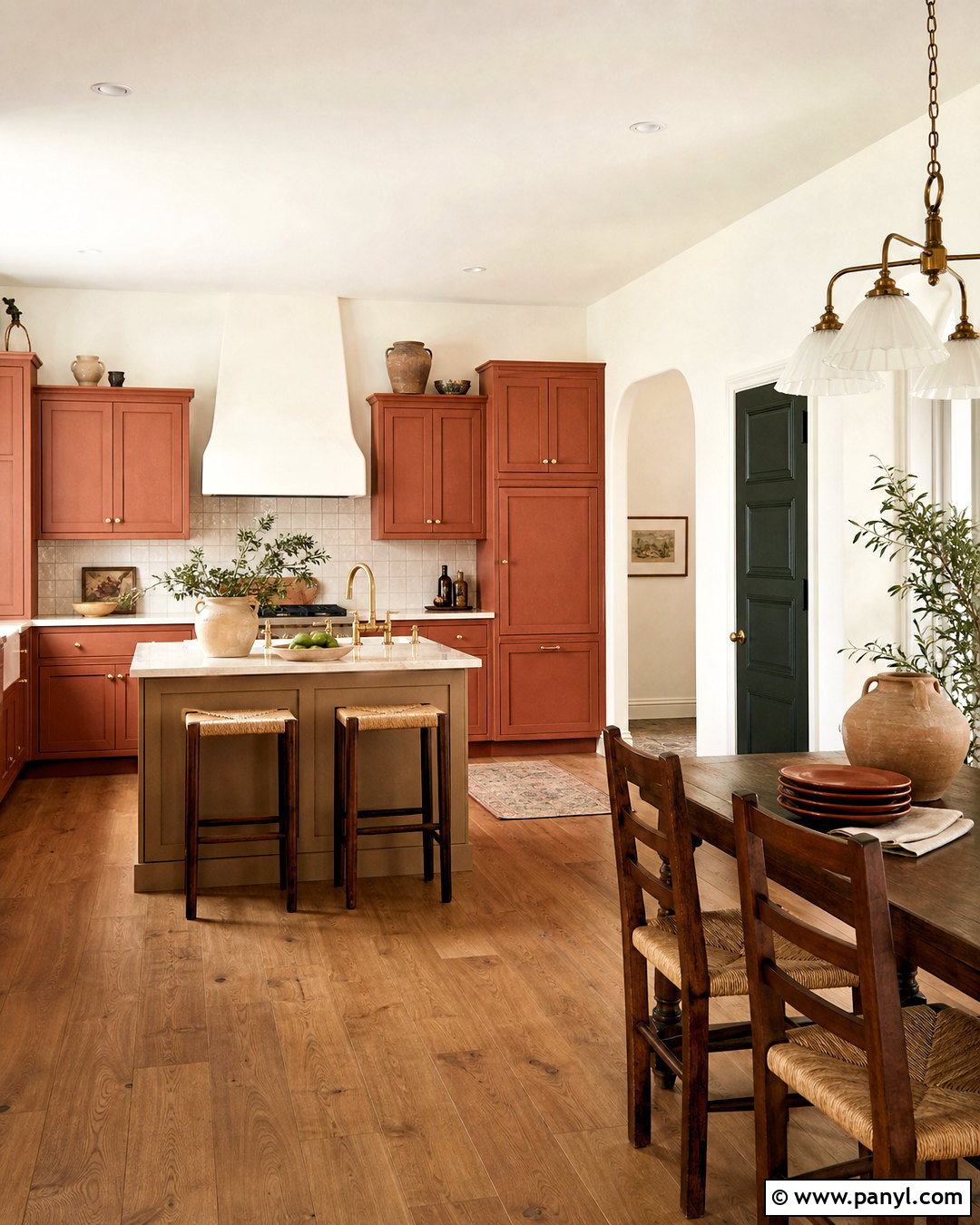
Warm terracotta can give a kitchen or breakfast room an inviting, sunbaked character. Use Southwest Pottery 048 on a plaster-style accent wall or lower cabinetry, then balance it with Swiss Coffee OC-45 on the remaining walls and ceiling. Sherwood Tan 1054 provides a grounded neutral for an island or adjoining mudroom. Add Black Forest Green HC-187 to a pantry door or breakfast nook bench for an earthy contrast. Cream stone counters, medium oak cabinets, handmade tile, and unlacquered brass hardware support the color story. Complete the space with rush-seat chairs, linen curtains, and simple pottery. The palette feels warm and expressive, yet the generous use of creamy white keeps it light enough for daily living.
9. Benjamin Moore Blush Pink Color Palette
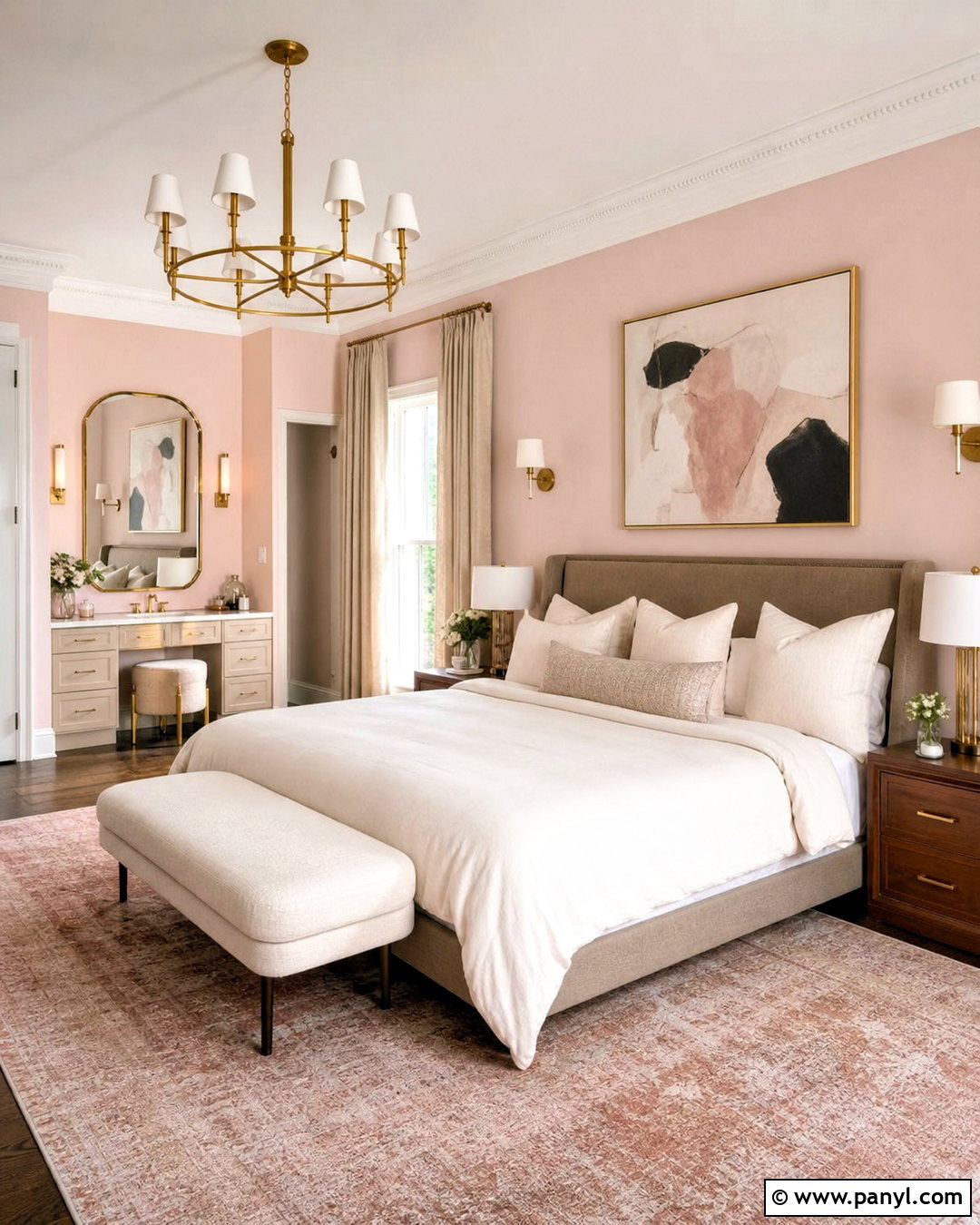
Blush paint can look sophisticated when it is combined with warm white and deep brown. Cover bedroom walls in Proposal AF-260, then use White Opulence OC-69 on the ceiling, doors, and trim. Paint a vanity, bookcase, or small dressing area in First Light 2102-70 for a slightly rosier variation. Mink 2112-10 anchors the palette through a bed frame, nightstands, or an accent door. Choose ivory bedding, walnut furniture, natural linen curtains, and antique brass lighting. A patterned rug containing faded pink, taupe, and cream will connect every shade. Avoid overly sweet accessories. Sculptural lamps, abstract artwork, and clean-lined furniture give this Benjamin Moore palette a mature, comfortable look suitable for primary bedrooms or guest rooms.
10. Benjamin Moore Navy Blue Color Palette
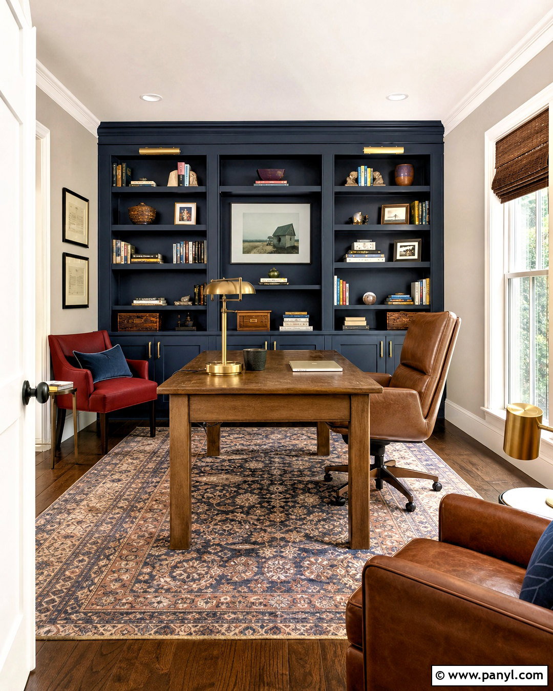
Hale Navy HC-154 creates a strong foundation for a classic home office or library. Use it on built-in shelving and the wall behind the desk, while keeping surrounding walls and trim crisp with Chantilly Lace OC-65. Gray Owl OC-52 softens the transition in an adjacent hallway or sitting area. Introduce Caliente AF-290 as a small red accent through a painted chair, artwork, or patterned rug. A substantial oak desk, cognac leather seating, and polished brass lighting add warmth to the blue-and-white scheme. Arrange books, storage boxes, and decorative objects in balanced groups so the shelving remains functional. The finished office feels focused and established, with enough bright white to keep Hale Navy from making the room feel enclosed.
11. Benjamin Moore Greige Color Palette
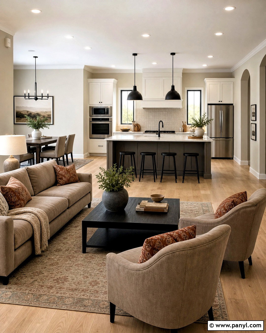
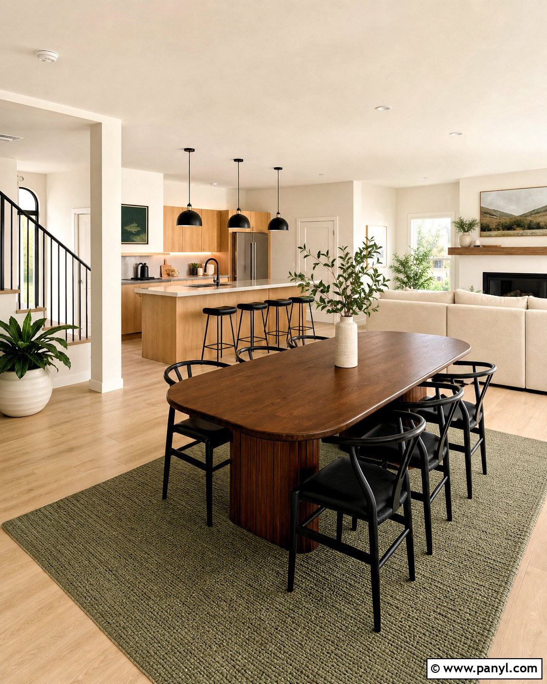
For an open-plan home that needs effortless flow, use Pale Oak OC-20 as the dominant wall color. Apply White Dove OC-17 to ceilings, trim, doors, and kitchen cabinetry for a soft, clean framework. Balboa Mist OC-27 can distinguish the dining space without creating an abrupt color change. Bring in Chelsea Gray HC-168 on the kitchen island, fireplace surround, or built-in storage for stronger definition. Choose light oak floors, mushroom-colored upholstery, cream curtains, and matte black lighting. A few rust or olive textiles will add warmth without altering the neutral foundation. This layered greige palette suits changing furniture and seasonal decor, making it a practical option for homeowners who want flexibility along with a polished, coordinated interior.
12. Benjamin Moore Midcentury Color Palette
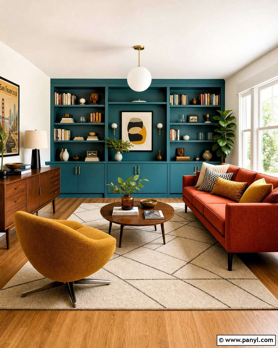
Bring midcentury character into a living room with Aegean Teal 2136-40 on a feature wall or low built-in cabinet. Use Swiss Coffee OC-45 across the remaining walls to create a warm, gallery-like background. Golden Retriever 2165-30 introduces mustard depth through a painted reading nook, while Rust 2175-30 adds a controlled reddish-orange accent. Furnish the room with a streamlined walnut credenza, tapered-leg sofa, rounded lounge chair, and low-profile coffee table. A geometric rug can combine teal, cream, gold, and rust without overpowering the architecture. Finish with globe lighting, linen curtains, and simple ceramic pieces. The colors reference classic midcentury interiors, but the uncluttered arrangement keeps the finished space current and comfortable.
13. Benjamin Moore Black Exterior Color Palette
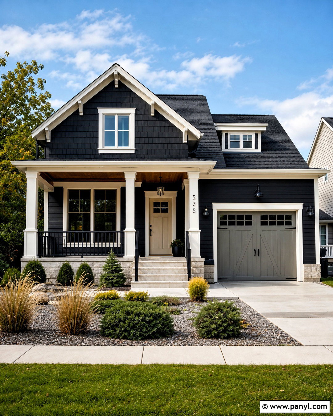
A dark exterior can feel welcoming when black paint is balanced with warm neutrals and natural materials. Use Black Beauty 2128-10 on the main siding, White Dove OC-17 on window trim and porch columns, and Muslin OC-12 on the front door. Copley Gray HC-104 works well for the garage door or secondary siding. Add a medium-brown wood porch ceiling, black metal lighting, and simple house numbers. A charcoal roof visually connects with the dark body color, while pale stone steps keep the entrance from looking heavy. Finish the curb appeal with layered evergreen shrubs, ornamental grasses, and light gravel beds. This palette gives an average craftsman, ranch, or modern farmhouse exterior a strong identity without requiring elaborate architectural changes.
14. Benjamin Moore Cottage Color Palette

A cheerful cottage kitchen can combine Woodlawn Blue HC-147 cabinetry with White Dove OC-17 walls and trim. Use Hawthorne Yellow HC-4 inside glass-front cabinets, on a small pantry door, or around a breakfast alcove. Georgian Green HC-115 adds a natural accent through dining chairs or a freestanding cupboard. Pair the colors with butcher-block counters, warm white tile, aged brass hardware, and honey-toned wood flooring. Café curtains, a small round table, and open shelves filled with everyday ceramics complete the relaxed arrangement. Keep the yellow and green limited so the blue remains the dominant feature. This balanced palette delivers cottage charm through color, practical furniture, and traditional materials rather than excessive decorative accessories or artificial distressing.
15. Benjamin Moore Lavender Color Palette
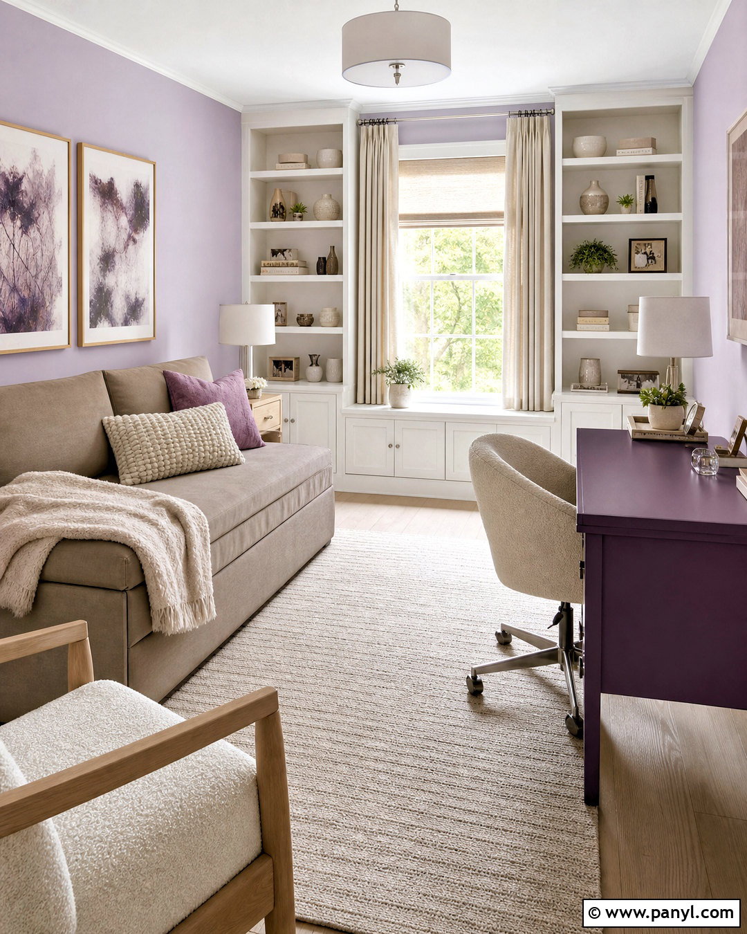
Lavender Mist 2070-60 gives a home office or guest bedroom a quiet touch of color without feeling overly purple. Pair it with Paper White OC-55 on the ceiling, trim, and shelving for a cool, clean outline. Use Smoky Taupe 983 on a sofa bed, storage cabinet, or adjoining hallway to add warmth. Shadow 2117-30 creates a deep plum focal point on a desk, interior door, or compact bookcase. Furnish the room with pale oak, cream boucle, brushed nickel, and softly textured linen. Abstract artwork can repeat plum and gray in small amounts. This palette is especially useful for a multipurpose space because it feels soothing enough for guests while remaining polished and focused during working hours.
16. Benjamin Moore Desert Color Palette
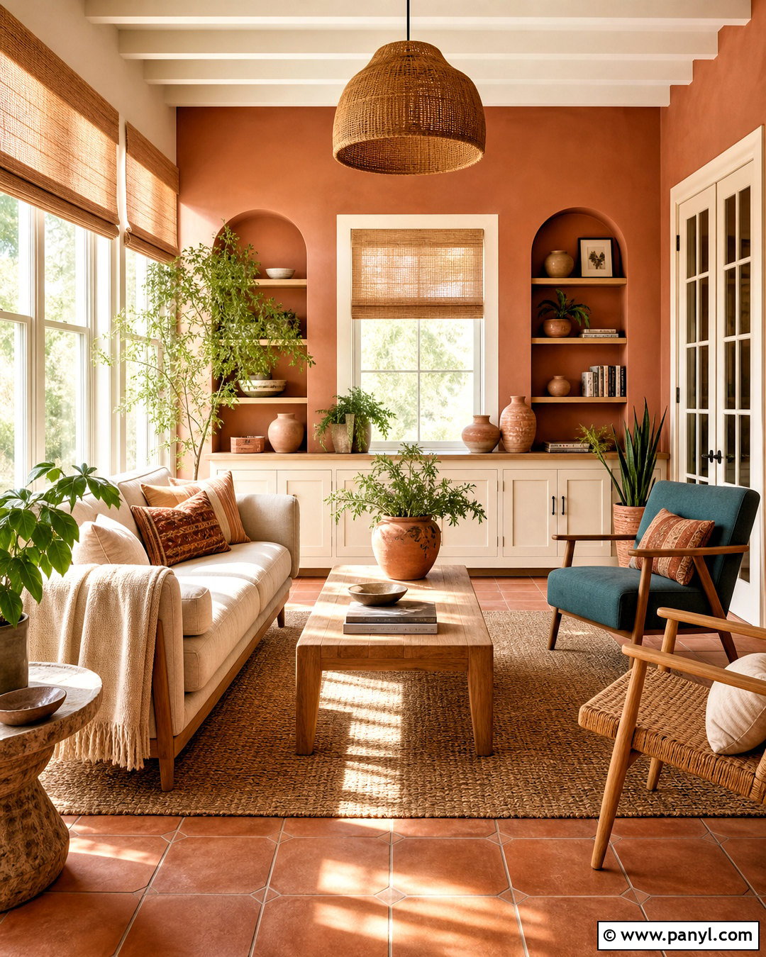
Canyon Dusk 079 sets a warm, earthy mood in a sunroom or casual living area. Use it on the main walls, then add Pale Moon OC-108 to the ceiling and trim for a creamy yellow-white contrast. Muslin OC-12 can soften an adjacent hallway or built-in unit, while Aegean Teal 2136-40 introduces a cool counterpoint on a cabinet or upholstered chair. Terracotta floor tile, light oak furniture, woven shades, and natural linen make the colors feel connected to the landscape. Add clay pottery and leafy plants, but leave enough open space for the painted surfaces to remain visible. The completed palette feels relaxed and sun-warmed, combining desert-inspired color with practical materials suited to an everyday home.
17. Benjamin Moore Scandinavian Color Palette
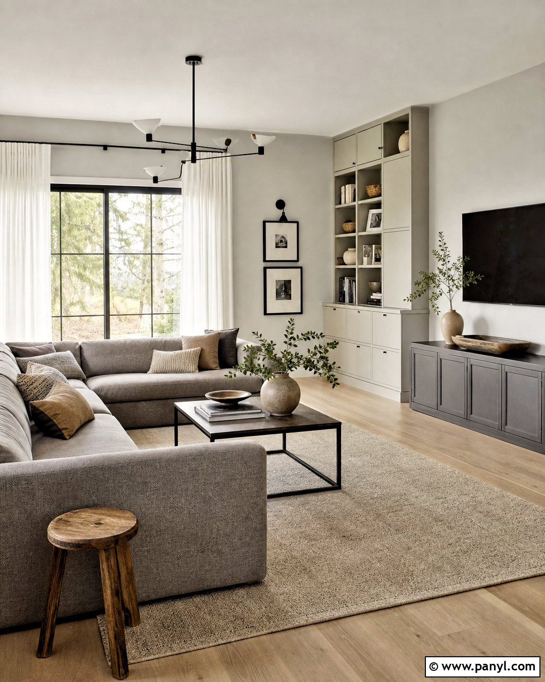
A Scandinavian-inspired family room relies on light colors, useful furniture, and carefully controlled contrast. Paint the walls in Steam AF-15 and use Silver Satin OC-26 on built-in storage or an adjoining dining area. Knoxville Gray HC-160 provides muted blue-green depth on a media cabinet, while Wrought Iron 2124-10 sharpens the scheme through lighting, window frames, and small furniture details. Choose pale oak floors, a warm gray sectional, white linen curtains, and a simple wool rug. Closed storage keeps toys and electronics out of sight, allowing the restrained palette to feel calm. Add a few handmade ceramics, black-framed artwork, and textured cushions. The result is bright and functional without appearing empty, cold, or overly minimal.
18. Benjamin Moore Brown Color Palette
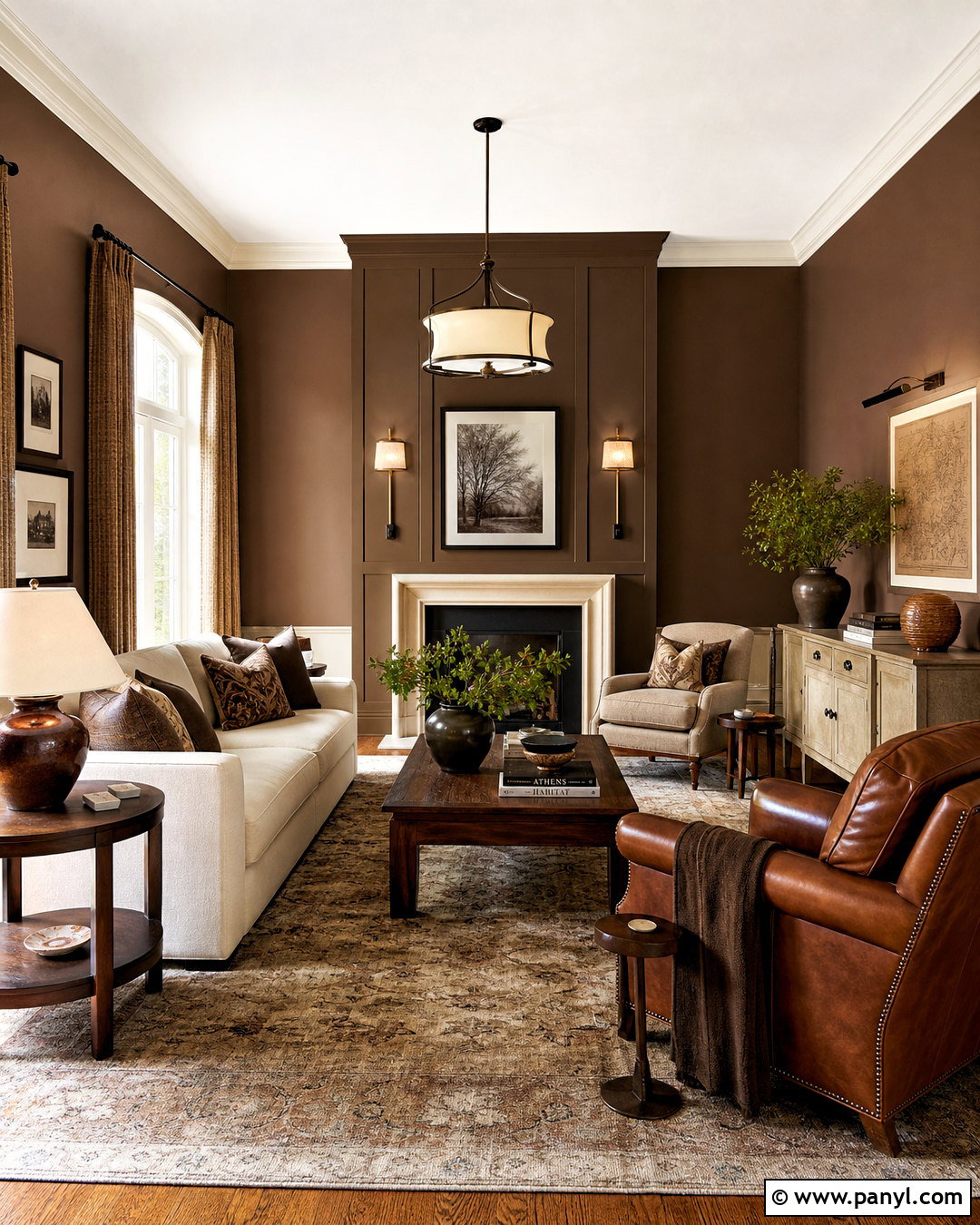
Rich brown can make a living room feel luxurious while still relaxed. Apply Silhouette AF-655 to paneled walls or built-ins, and use Batik AF-610 on the remaining walls for a softer brown transition. Swiss Coffee OC-45 brightens the ceiling and trim, while Sherwood Tan 1054 introduces a golden neutral through an adjoining entry or painted console. Furnish the room with cream upholstery, walnut tables, tobacco-colored leather, and a patterned wool rug. Bronze lighting and woven curtains reinforce the warmth without creating an overly dark interior. Place lighter furniture against the deepest walls to improve contrast. This tonal brown palette works particularly well in rooms with large windows, substantial woodwork, or a fireplace that can serve as the central focal point.
19. Benjamin Moore Kids Room Color Palette
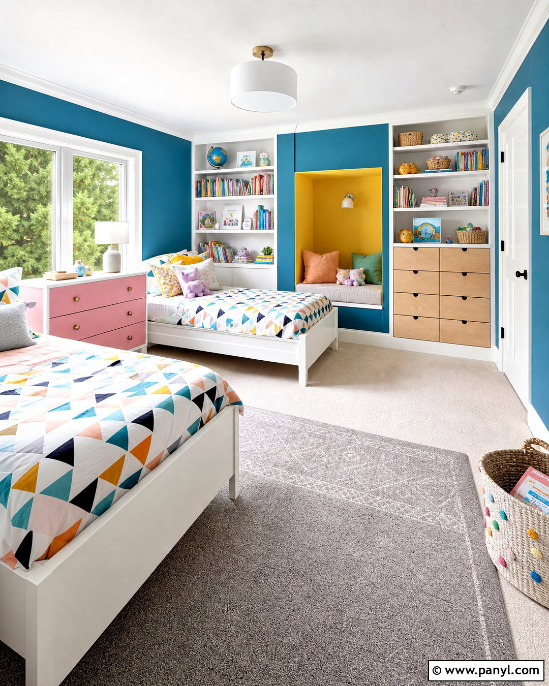
A colorful kids’ room can feel playful without becoming visually chaotic. Use Teardrop Blue 2053-60 on the main walls and Chantilly Lace OC-65 on the ceiling, trim, shelving, and closet doors. Paint a reading nook in Hawthorne Yellow HC-4 and introduce First Light 2102-70 on drawer fronts or the back of a bookcase. Keep the furniture simple with white beds, natural birch storage, and a soft gray rug. Bedding can repeat the blue, yellow, and pink through small geometric patterns. Use labeled baskets outside the photographed scene or color-coded bins to support easy organization. The finished room remains bright, practical, and adaptable, allowing artwork, books, and toys to add personality without competing with an uncontrolled rainbow of colors.
20. Benjamin Moore Green Exterior Color Palette
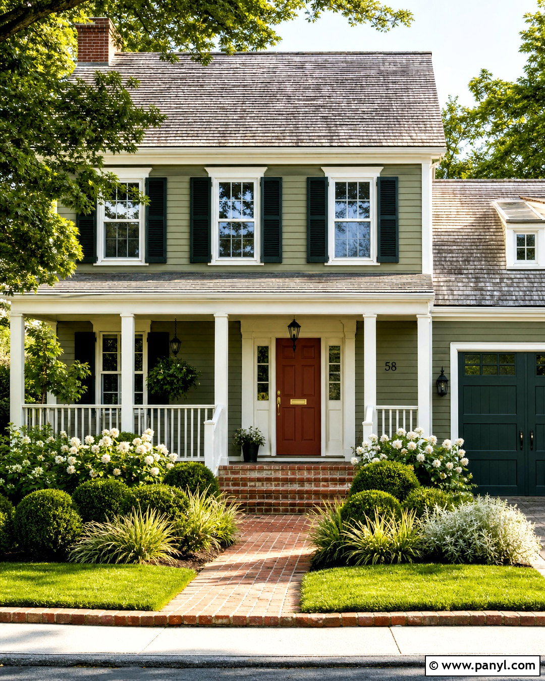
Narragansett Green HC-157 gives a traditional exterior deep blue-green character that changes subtly with daylight. Use it on the siding, then apply Swiss Coffee OC-45 to trim, porch railings, and window frames. Essex Green HC-188 adds darker definition to shutters or the garage door. Paint the front door in Southwest Pottery 048 for a warm terracotta accent that stands out without looking overly bright. A weathered gray roof, red brick walkway, brass door hardware, and black lanterns complete the structure. Surround the house with clipped boxwoods, white flowering shrubs, and loose ornamental grasses. This complete exterior scheme suits colonial, craftsman, and cottage homes, offering classic curb appeal with a distinctive front entrance and balanced architectural contrast.
Conclusion:
The best **20 Benjamin Moore color palette ideas** combine beautiful paint colors with the materials, lighting, furnishings, and architectural features already present in a home. Start with the shade that will cover the largest area, then build around it with a dependable trim color, one or two supporting tones, and a stronger accent. Repeat colors through textiles, wood finishes, cabinetry, or decor to connect the complete space. Before committing, paint large sample boards and view them at different times of day. Pay close attention to undertones beside flooring and countertops. Whether you prefer quiet neutrals, earthy greens, classic blues, or expressive dark colors, a coordinated palette makes the final design feel considered and complete.

Related Ideas and Inspiration:
Leave a Reply