
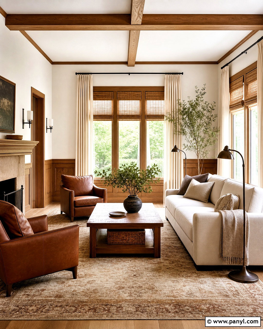
Benjamin Moore Swiss Coffee OC-45 is a warm, creamy off-white that makes an inviting foundation for many whole-home palettes. Its soft beige warmth and high light reflectance help rooms feel bright without the sharpness of a pure white. () The key is choosing companion shades that respect those warm undertones. Earthy greens, gentle blues, layered neutrals, terracotta tones, deep charcoals, and sophisticated reds can all work beautifully. Because lighting, flooring, cabinetry, and nearby finishes affect how paint appears, sample every combination in the actual room before committing. This guide uses Benjamin Moore Swiss Coffee OC-45, since paints with the same name from other brands can look different. Explore these 45 Swiss Coffee coordinating colors for complete, practical palettes you can recreate.

1. White Drifts With Swiss Coffee
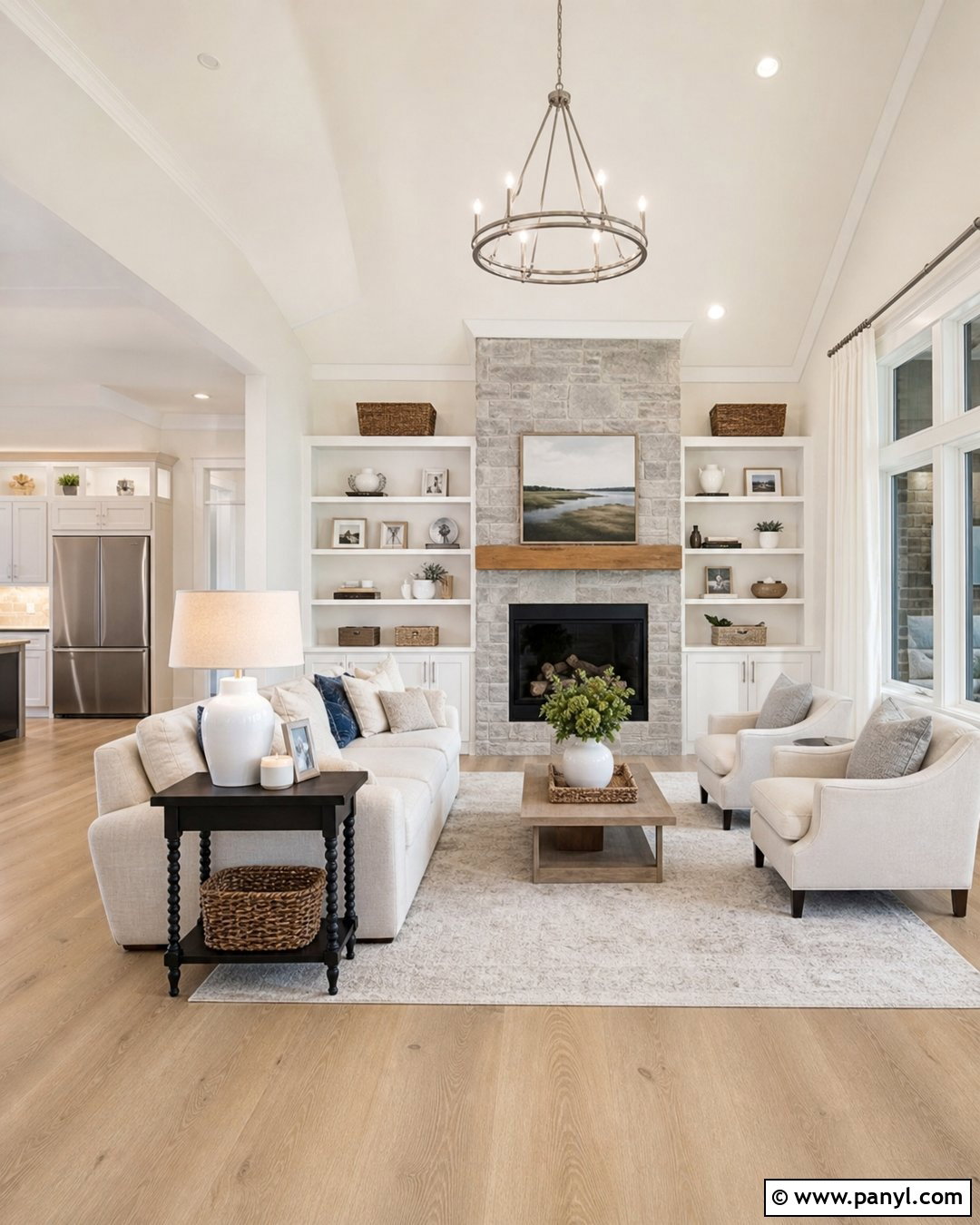
White Drifts creates a soft tonal scheme that feels cleaner and slightly cooler than using Swiss Coffee alone. Benjamin Moore officially presents these two off-whites together, making the pairing especially useful when you want gentle definition without obvious contrast. () Paint the main walls Swiss Coffee and use White Drifts on trim, interior doors, ceilings, and built-in shelving. Add pale oak floors, oatmeal upholstery, ivory curtains, and small accents of brushed nickel or aged brass. Natural linen and light gray stone keep the room from looking overly yellow. This combination works particularly well in open living areas where strong color changes could interrupt the flow. Use matte walls and satin trim so the subtle color difference remains visible.
2. Lush With Swiss Coffee
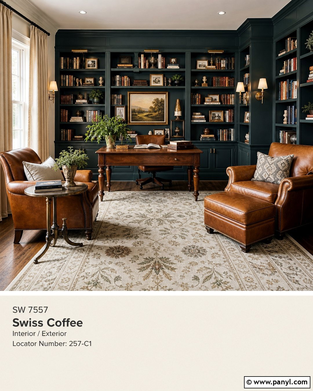
Deep green Lush gives Swiss Coffee a rich, nature-inspired contrast while preserving its comfortable warmth. It is one of Benjamin Moore’s listed coordinating colors for Swiss Coffee, so the pairing offers a dependable starting point for an earthy room. () Use Swiss Coffee across the main walls, ceiling, and trim, then apply Lush to a fireplace wall, built-in bookcases, or lower cabinets. Walnut furniture, cognac leather, woven shades, and antique brass lighting strengthen the organic character. Introduce cream upholstery and a muted botanical rug to connect the light and dark areas. This palette suits traditional living rooms, libraries, and home offices. Keep large windows uncovered or lightly dressed so the saturated green remains lively instead of heavy.
3. Newburg Green With Swiss Coffee
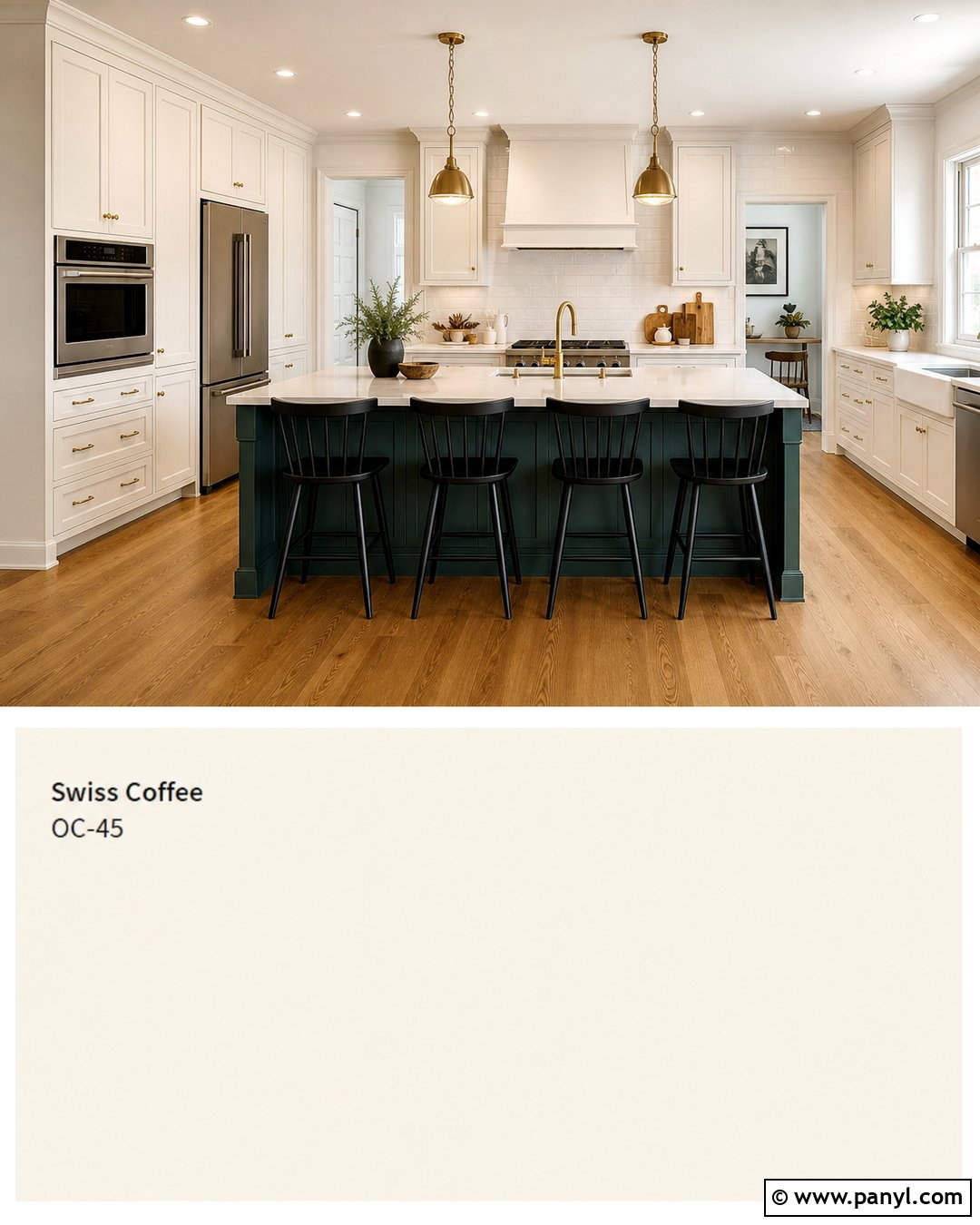
Newburg Green brings blue-green depth to Swiss Coffee and creates a polished palette that can feel traditional or contemporary. Benjamin Moore includes both shades in an expert-selected color combination, along with a supporting neutral. () For a kitchen, use Swiss Coffee on perimeter cabinets and walls, then introduce Newburg Green on the island or tall pantry units. Choose medium oak flooring, creamy quartz counters, and a backsplash with soft beige movement. Brushed brass hardware adds warmth, while black stools provide a sharper outline. In a bedroom, Newburg Green can cover the wall behind the bed with Swiss Coffee elsewhere. Layer ivory bedding, rust-colored pillows, and warm wood nightstands to prevent the blue-green from feeling too cool.
4. White Dove With Swiss Coffee
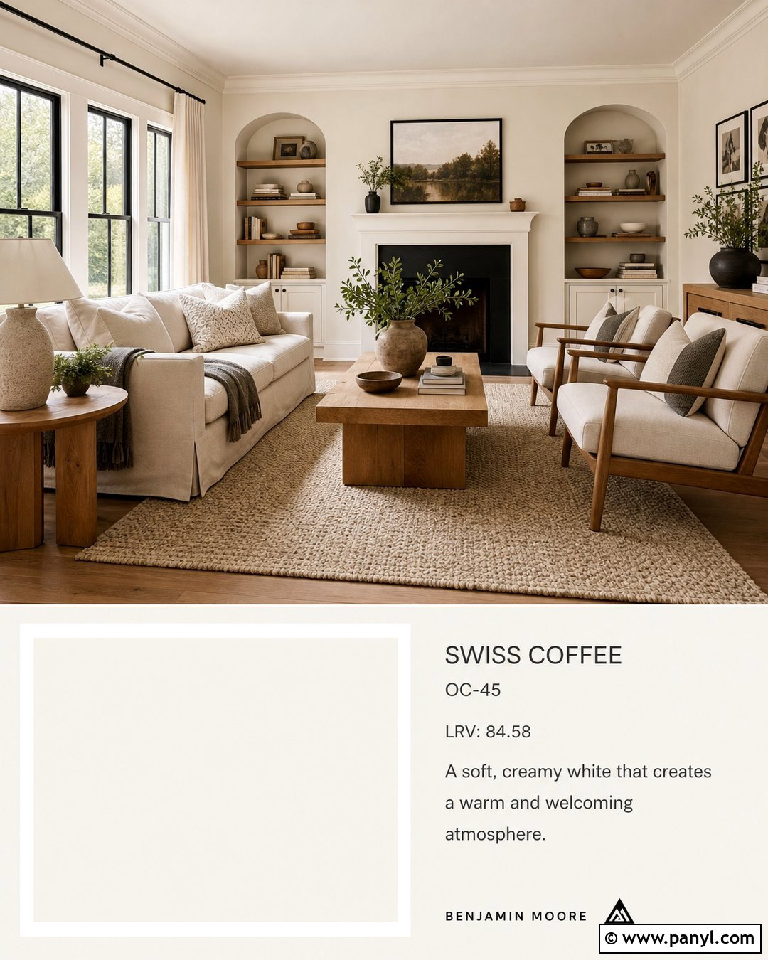
White Dove is a useful partner when Swiss Coffee walls need trim that looks fresh but not dramatically bright. Cover the walls in Swiss Coffee and use White Dove on baseboards, crown molding, doors, and the ceiling. The gentle contrast creates a layered white room rather than a stark two-tone effect. Complete the space with natural oak furniture, warm beige upholstery, and off-white linen curtains. A textured wool rug and matte black picture frames add enough definition to keep the palette interesting. This combination works best when adjoining rooms also use warm whites or soft neutrals. Before painting, compare large samples because artificial lighting can make two similar whites appear more different. Repeat both shades throughout the room for a deliberate, balanced finish.
5. Chantilly Lace With Swiss Coffee
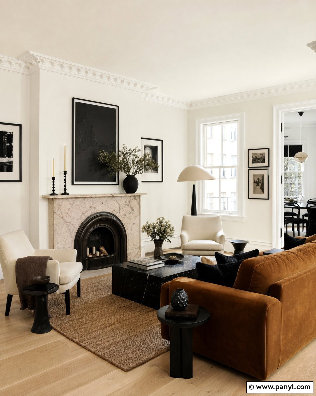
For noticeably crisp contrast, pair Swiss Coffee walls with Chantilly Lace trim and ceilings. Chantilly Lace has a cleaner appearance that outlines architectural details and keeps the warmer wall color from blending into every surface. This combination is effective in rooms with substantial millwork, tall windows, paneled doors, or traditional crown molding. Add white oak flooring, a camel sofa, cream chairs, and simple black accents. In a kitchen, use Swiss Coffee on cabinets and Chantilly Lace on the ceiling, with pale marble-look quartz and polished nickel hardware. Avoid adding too many unrelated whites through upholstery and tile. Instead, repeat the two main tones intentionally. Test the trim beside existing countertops, since very bright white can emphasize cream or yellow notes in surrounding finishes.
6. Simply White With Swiss Coffee
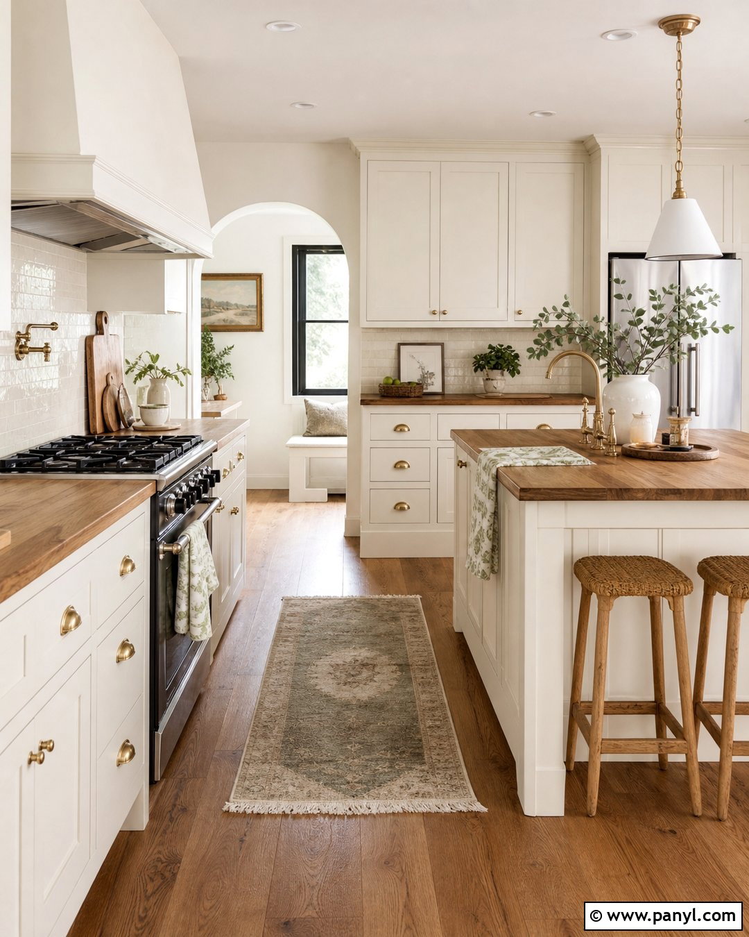
Simply White adds a bright yet gently warm edge around Swiss Coffee, making the pairing comfortable in sunlit family rooms and kitchens. Paint the walls Swiss Coffee, then place Simply White on the ceiling, trim, doors, and window casings. Build the rest of the room with honey oak, woven rattan, ivory cotton, and warm gray stone. Soft blue or sage accessories can provide understated color without disturbing the light atmosphere. This combination also suits a farmhouse kitchen with Swiss Coffee cabinets, Simply White walls, butcher-block accents, and handmade cream tile. Keep the metal finishes warm, such as brushed brass or aged bronze. Since both paints respond strongly to surrounding light, inspect samples during morning, afternoon, and evening before choosing which one should cover the larger surfaces.
7. Pale Oak With Swiss Coffee
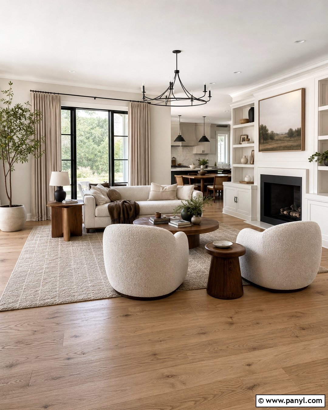
Pale Oak gives Swiss Coffee a soft greige companion that makes open rooms feel warmer and more grounded. Use Pale Oak on the main walls and Swiss Coffee on trim, doors, ceilings, and built-ins. The subtle separation works well with light oak flooring, creamy boucle seating, warm gray rugs, and natural linen drapery. Add walnut side tables for depth and black metal lighting for a clean outline. In an open-plan home, Pale Oak can define the living and dining areas while Swiss Coffee continues through hallways and connecting spaces. This palette is particularly helpful when pure gray feels cold but beige looks too heavy. Limit strong yellow woods and orange accessories. Dusty blue, muted olive, charcoal, and faded terracotta accents will create a more balanced and sophisticated finished room.
8. Edgecomb Gray With Swiss Coffee
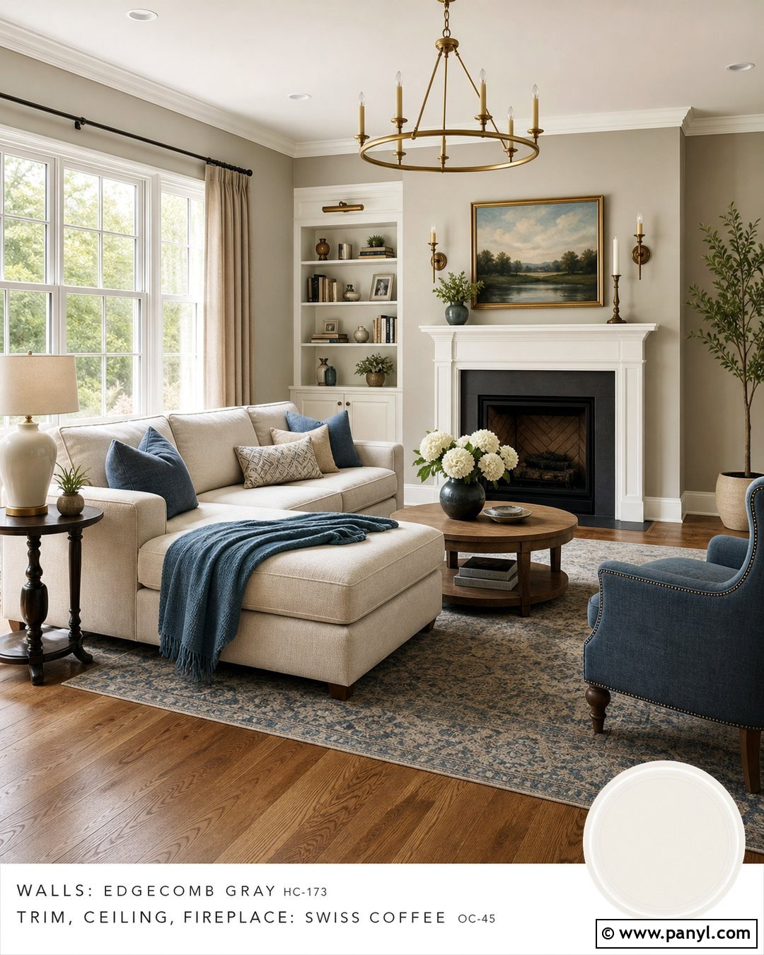
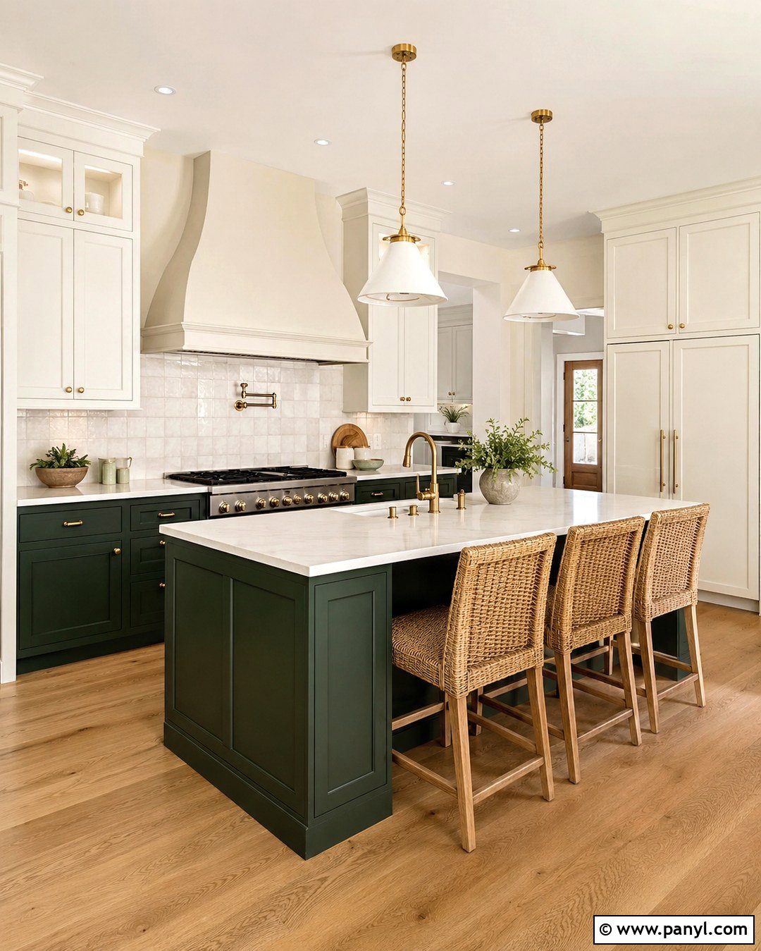
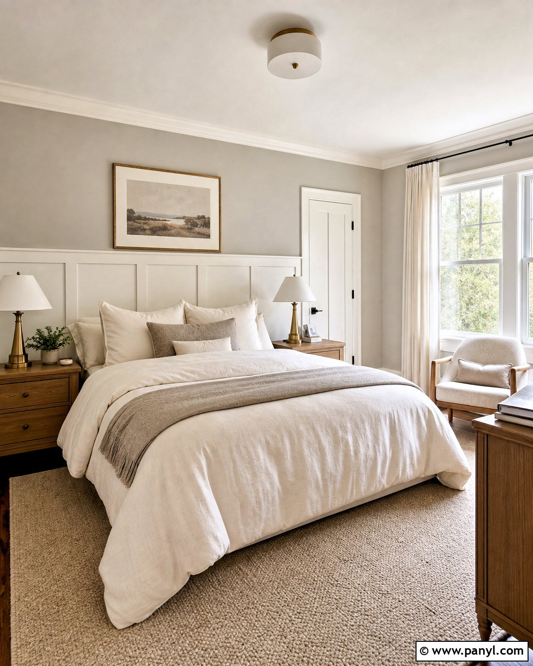
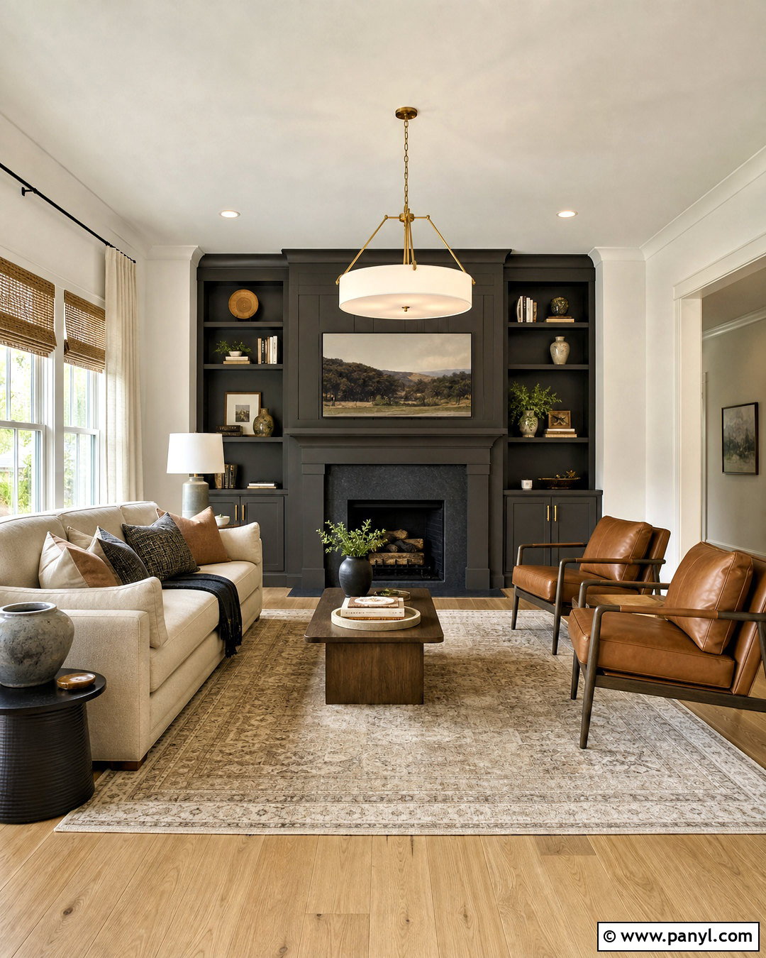
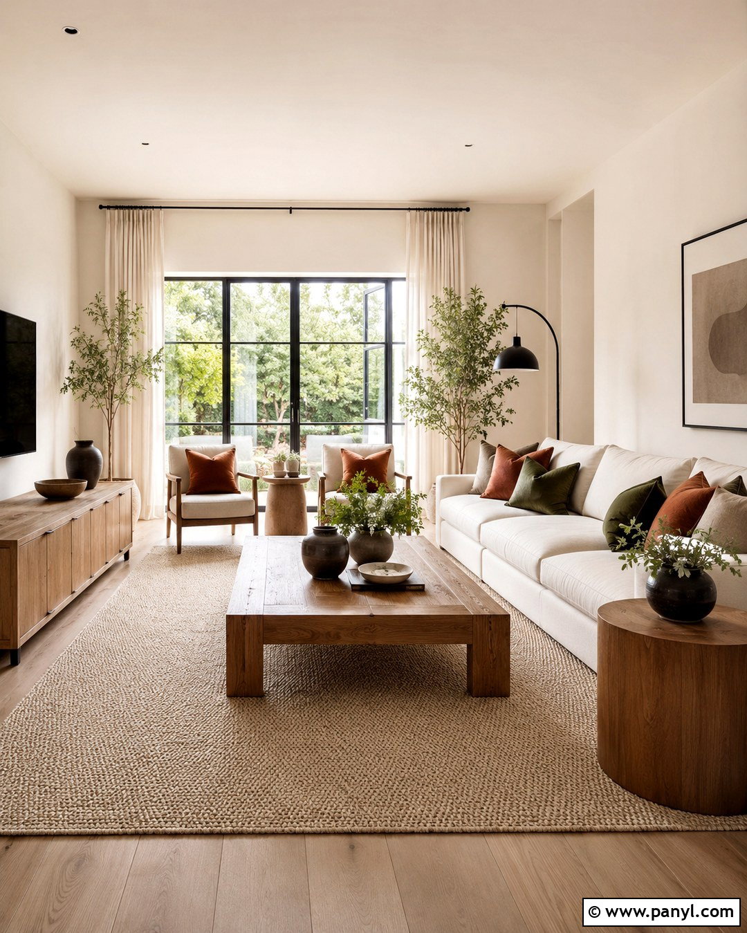
Edgecomb Gray and Swiss Coffee create an approachable neutral palette with enough contrast to show off doors, molding, and cabinetry. Paint the walls Edgecomb Gray and reserve Swiss Coffee for trim, the ceiling, and a fireplace surround. Add medium-toned oak floors, an oatmeal sectional, taupe curtains, and textured cream pillows. Black-framed artwork and an antique brass floor lamp provide definition without making the room feel formal. In a kitchen, Edgecomb Gray can cover lower cabinets while Swiss Coffee brightens the uppers and walls. Choose creamy quartz rather than icy white counters so every finish relates to the warmth of the paint. This combination suits transitional homes because it bridges classic architecture and streamlined furniture. Sample it near stone, tile, and wood before finalizing the palette.
9. Revere Pewter With Swiss Coffee
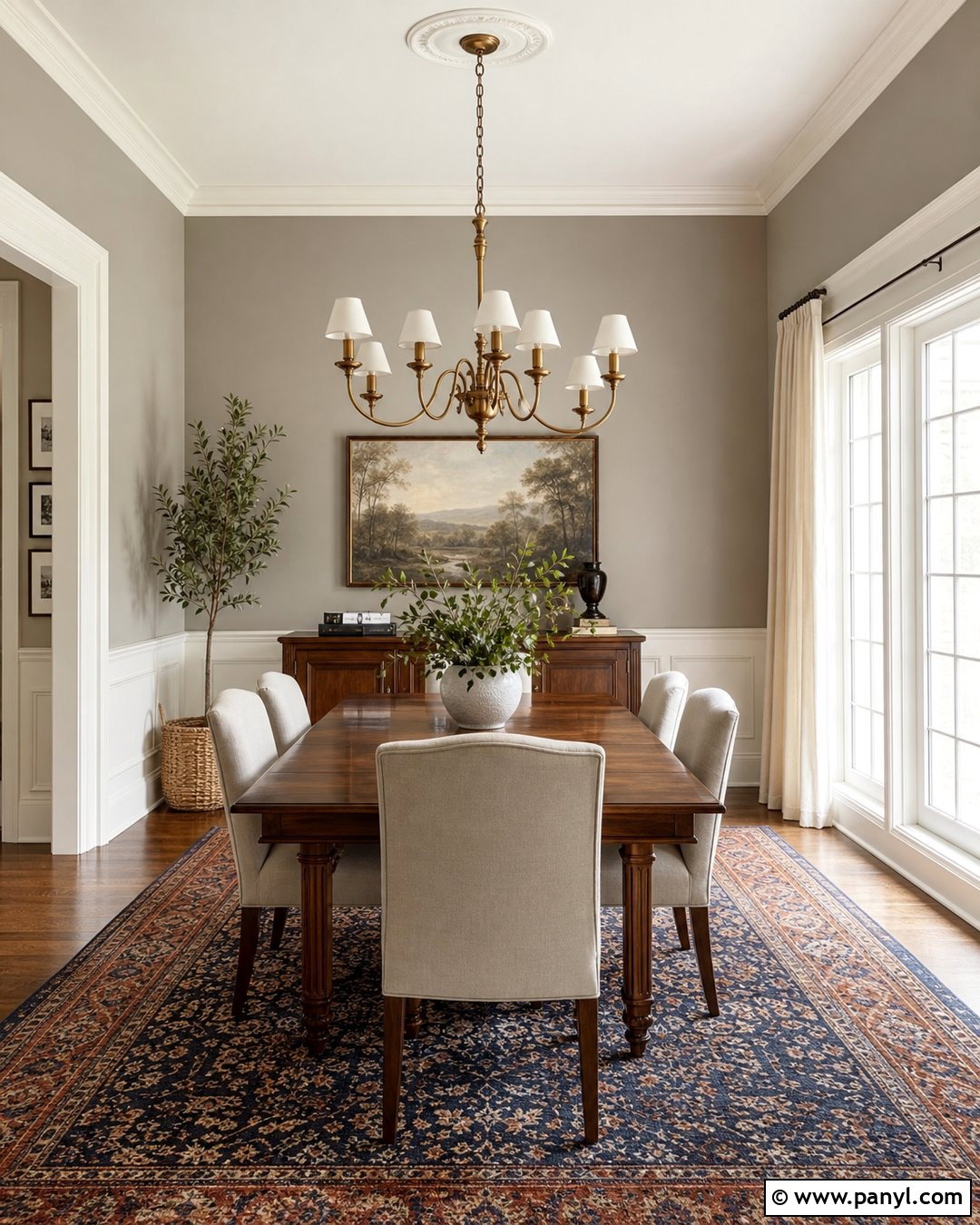
Revere Pewter adds medium greige depth beside Swiss Coffee and works especially well in rooms with traditional details. Use Revere Pewter on dining room walls, Swiss Coffee on wainscoting and trim, and a softer version of Swiss Coffee on the ceiling. Complete the look with a walnut table, flax-colored chairs, a vintage-style rug, and an aged brass chandelier. Forest green or muted navy accents can make the neutral scheme feel more dimensional. In darker rooms, keep Revere Pewter limited to the upper walls so the creamy lower paneling reflects more light. The color may shift warmer or grayer depending on exposure, so evaluate it beside the flooring. Repeating Swiss Coffee in an adjacent hallway will make the transition feel cohesive rather than abrupt.
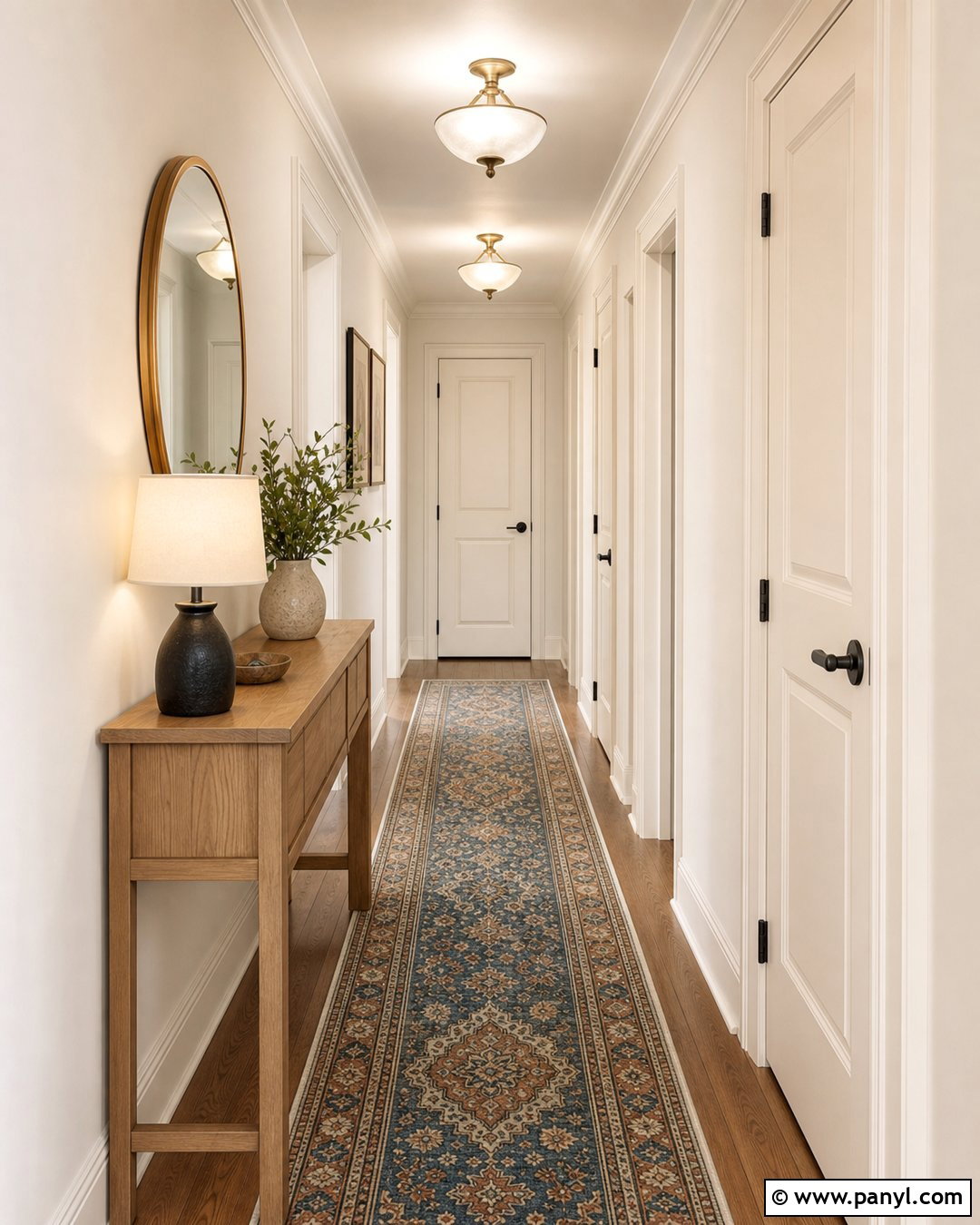
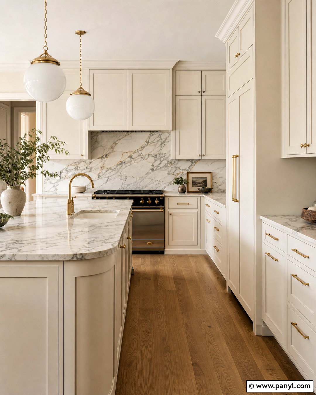

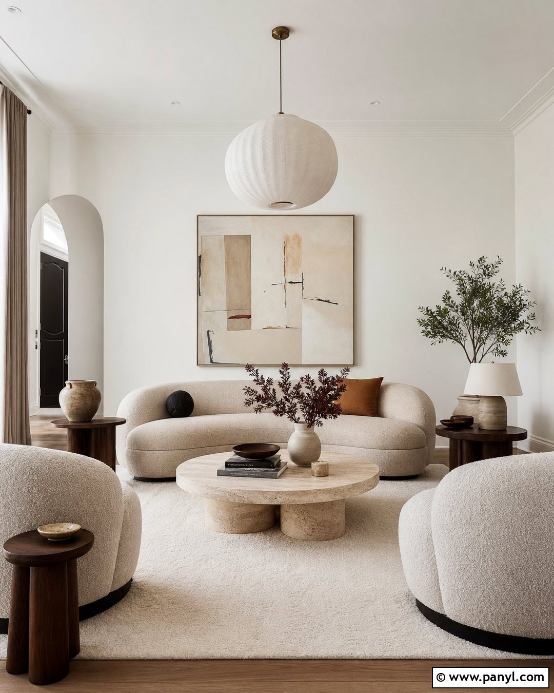
10. Balboa Mist With Swiss Coffee
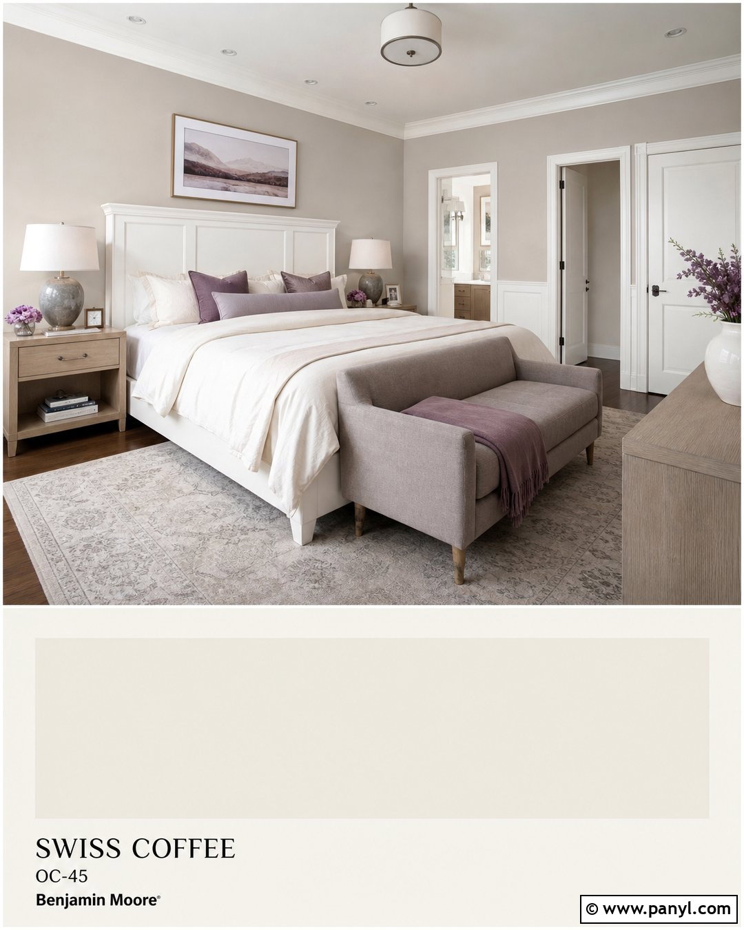
Balboa Mist offers a gentle gray-beige contrast that can calm the creaminess of Swiss Coffee without turning the room cool. Paint bedroom walls Balboa Mist and use Swiss Coffee on the trim, ceiling, paneled headboard wall, and closet doors. Layer the room with ivory bedding, mushroom-colored upholstery, pale oak nightstands, and brushed nickel lamps. Dusty lavender or muted blue textiles add quiet color while staying compatible with the restrained palette. This combination is also attractive in a bathroom with Swiss Coffee cabinetry, Balboa Mist walls, warm white tile, and veined quartz. Avoid stark blue-white fixtures where possible because they can make the paints look more yellow. Soft white lighting, natural textiles, and understated metal finishes will produce a peaceful, complete design.
11. Classic Gray With Swiss Coffee
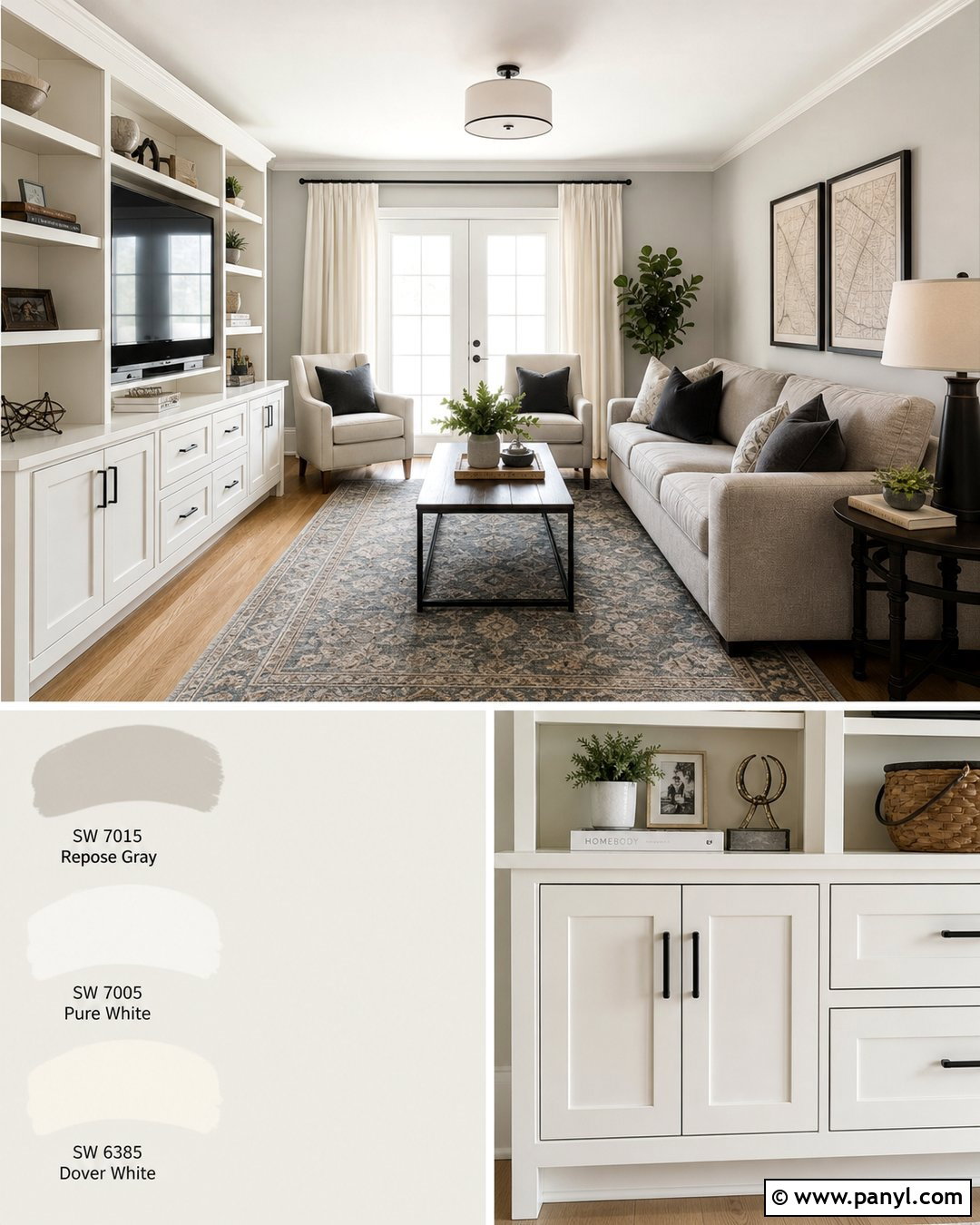
Classic Gray keeps a room light while giving Swiss Coffee trim a soft, visible border. Use Classic Gray on the walls of a small living room or hallway, then paint baseboards, doors, ceiling, and built-in storage Swiss Coffee. Bring in white oak flooring, a light taupe sofa, cream curtains, and a faded rug combining beige and blue-gray. Warm brass hardware helps connect the two paints, while charcoal accents prevent the scheme from disappearing into one pale surface. This palette is useful for homes where natural light changes significantly throughout the day. Classic Gray may appear nearly white in strong sun and more shadowed in the evening. Repeat deeper accents at least three times through lamps, frames, and textiles to give the finished room rhythm and definition.
12. Natural Cream With Swiss Coffee
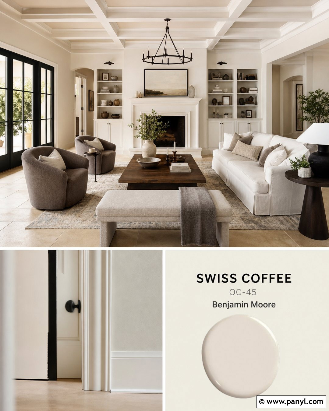
Natural Cream develops the beige side of Swiss Coffee and produces a welcoming, layered neutral interior. Apply Natural Cream to the walls and Swiss Coffee to trim, ceilings, built-in cabinets, and a simple fireplace mantel. Use medium oak or limestone flooring, a cream sofa, mushroom-colored chairs, and woven wool textiles. Dark bronze lighting and walnut tables add depth without breaking the warm flow. In a bedroom, Natural Cream can create a cocooning background for Swiss Coffee millwork and soft ivory bedding. Add muted olive cushions or faded blue artwork for controlled contrast. Because both colors are warm, include materials with different textures to avoid a flat result. Linen, boucle, wood grain, stone, and handmade ceramics make the closely related shades look purposeful.
13. Muslin With Swiss Coffee
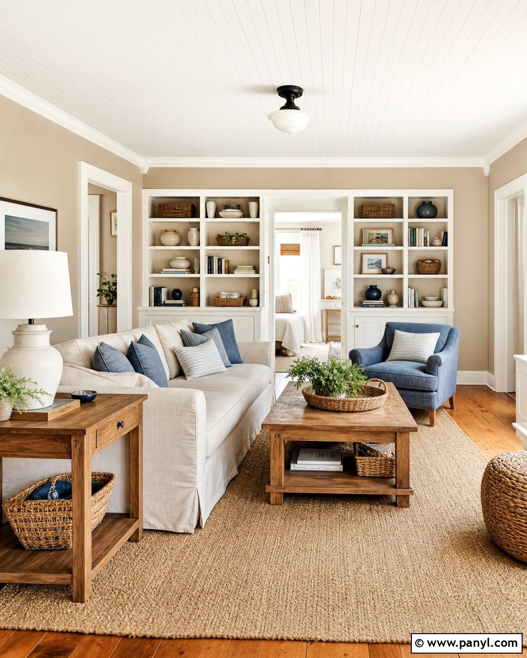
Muslin introduces relaxed tan warmth that makes Swiss Coffee feel brighter and cleaner by comparison. This combination suits a casual living room, welcoming entryway, or comfortable guest bedroom. Paint the walls Muslin and use Swiss Coffee on trim, doors, ceilings, and built-in bookcases. Add a slipcovered cream sofa, warm oak tables, woven baskets, and a natural fiber rug. Muted denim blue, olive green, and rust-colored accents provide a casual country influence without becoming overly themed. For a more contemporary result, include matte black lighting and simple abstract artwork. Muslin can deepen in low light, so balance it with pale window treatments and reflective surfaces. Keep the largest furniture pieces light to ensure the completed room remains airy rather than uniformly brown.
14. Manchester Tan With Swiss Coffee
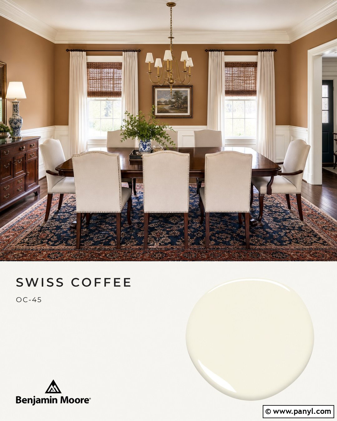
Manchester Tan adds classic warmth to Swiss Coffee and works beautifully in traditional rooms with wood furniture. Cover the walls in Manchester Tan, then use Swiss Coffee on substantial trim, wainscoting, doors, and the ceiling. A mahogany dining table, cream upholstered chairs, and a patterned rug with muted navy and rust will give the room depth. Choose aged brass lighting and natural woven shades to complement the warm undertones. If the space is small, keep Manchester Tan above chair-rail height and let Swiss Coffee occupy the lower half. This makes the room feel lighter while preserving the richer color. Carry Swiss Coffee into the adjoining hallway for continuity. Blue-and-white ceramics or restrained botanical artwork can freshen the finished scheme and prevent it from appearing overly beige.
15. Shaker Beige With Swiss Coffee
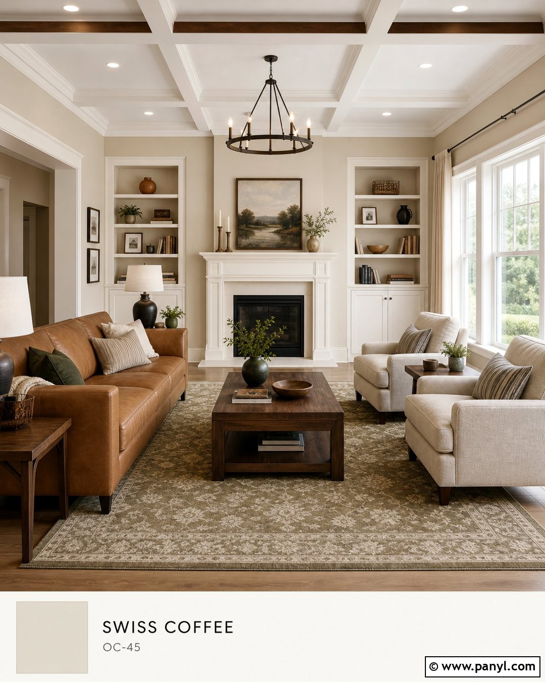
Shaker Beige creates a comfortable midtone backdrop for Swiss Coffee architectural details. Use it in a family room with Swiss Coffee trim, ceiling beams, built-in cabinets, and a painted fireplace. Introduce a camel leather sofa, oatmeal armchairs, walnut tables, and a large rug combining cream, muted red, and olive. The furniture should include both lighter and darker values so the beige walls do not dominate. Woven shades and bronze lighting reinforce the warmth, while charcoal picture frames add a clean boundary. This pairing also works in connected spaces where Swiss Coffee serves as the whole-house trim color. Keep the ceiling light to balance Shaker Beige’s visual weight. Samples are essential near orange-toned floors, which may intensify the warmth more than expected.
16. Grant Beige With Swiss Coffee
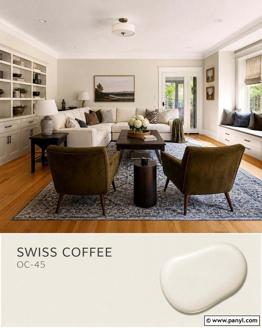
Grant Beige offers an earthy neutral bridge between Swiss Coffee and green, gray, or brown furnishings. Paint the walls Grant Beige and use Swiss Coffee on trim, interior doors, the ceiling, and window seats. Complete the room with medium oak flooring, a cream sectional, olive velvet chairs, and dark wood end tables. A patterned rug containing tan, ivory, and smoky blue will tie the entire palette together. In an entryway, Grant Beige walls can frame Swiss Coffee paneling and a black console for a tailored look. Use natural materials such as linen, jute, leather, and stone to strengthen the grounded character. Avoid pairing the scheme with icy gray flooring. Warm wood or beige stone will help both paint colors appear intentional, harmonious, and inviting.
17. Pashmina With Swiss Coffee
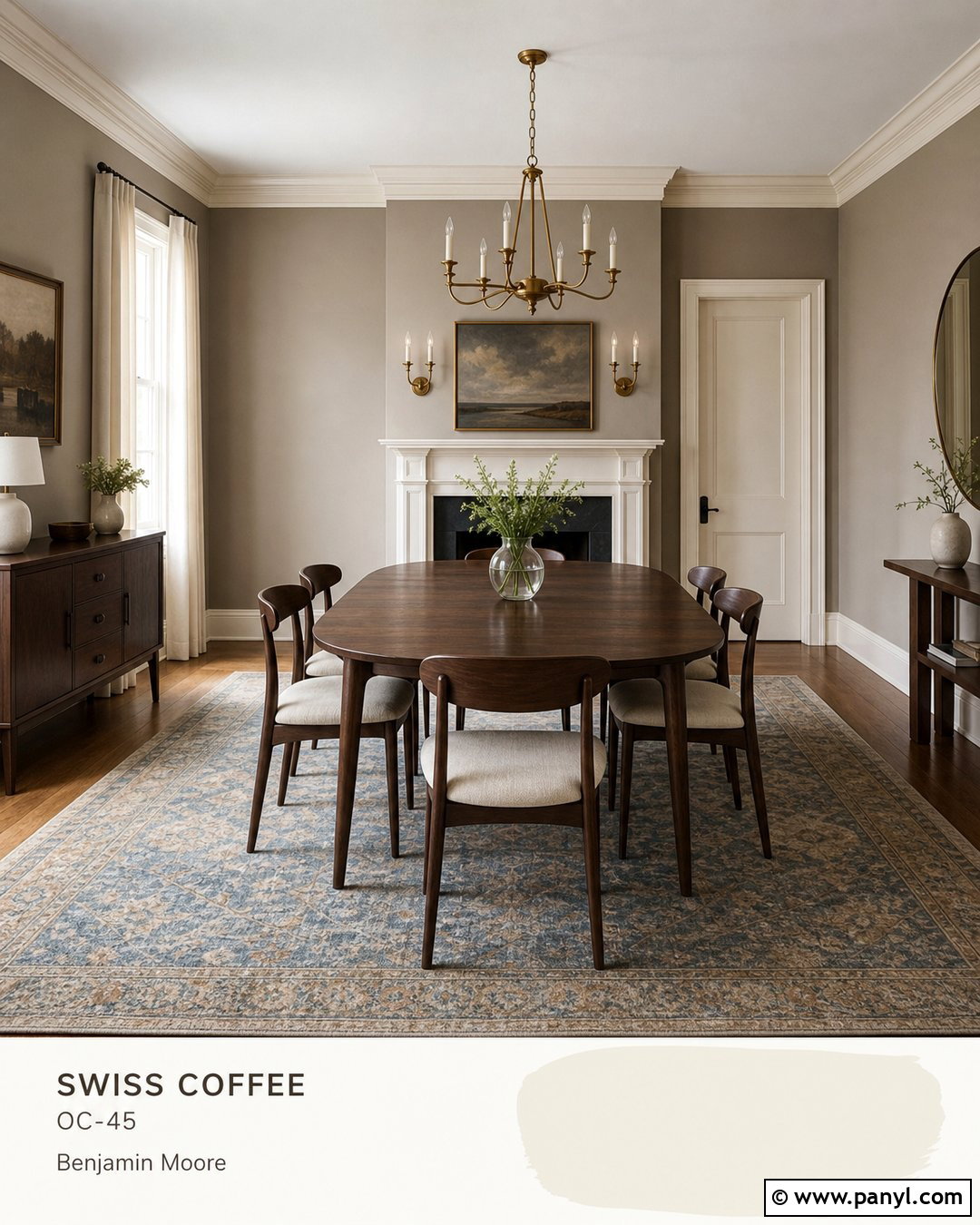
Pashmina gives Swiss Coffee a darker, moodier neutral partner without sacrificing warmth. Use Pashmina on the walls of a den, dining room, or primary bedroom, then paint the ceiling, trim, fireplace, and interior doors Swiss Coffee. Choose walnut furniture, cream upholstery, antique brass lighting, and a rug that combines taupe with muted blue. The lighter paint should appear on several substantial surfaces so Pashmina does not overwhelm the room. In a kitchen, consider Pashmina for the island and Swiss Coffee for perimeter cabinetry, paired with creamy quartz and oak floors. Black accents can sharpen the palette, but use them sparingly. Plenty of layered lighting is important because Pashmina develops greater depth in shadows, especially in rooms with limited natural exposure.
18. Kendall Charcoal With Swiss Coffee

Kendall Charcoal creates strong but softened contrast against Swiss Coffee. Paint a fireplace wall, built-in cabinetry, or lower kitchen cabinets in Kendall Charcoal while keeping the surrounding walls and upper surfaces Swiss Coffee. Use warm oak flooring, cognac leather, cream textiles, and brushed brass hardware to connect the light and dark colors. A living room could feature a Kendall Charcoal media wall, Swiss Coffee walls, an ivory sectional, and a patterned rug with charcoal, beige, and muted rust. For an exterior, Swiss Coffee siding with Kendall Charcoal shutters and garage doors creates a grounded scheme. Avoid cool, blue-gray accessories that may fight the warmth. Repeating charcoal in lighting, frames, or hardware will make the contrast feel balanced rather than limited to one isolated feature.
19. Chelsea Gray With Swiss Coffee
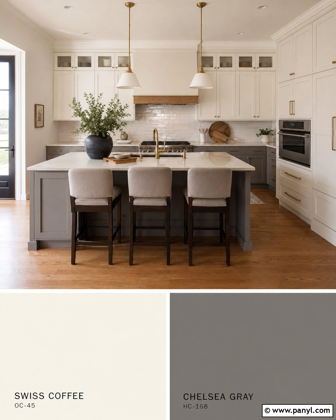
Chelsea Gray brings tailored medium-gray contrast to Swiss Coffee and is especially effective on cabinetry. Use Swiss Coffee on kitchen walls and upper cabinets, then apply Chelsea Gray to the island and lower cabinets. Add creamy quartz counters, a handmade warm white backsplash, aged brass pulls, and medium oak flooring. The result feels substantial without becoming as dramatic as a black-and-white kitchen. In a living room, Chelsea Gray can define built-ins or interior doors while Swiss Coffee remains the dominant wall color. Add camel leather, cream linen, and muted green textiles to warm the gray further. Keep ceiling paint connected to Swiss Coffee rather than introducing a bright blue-white. This simple decision will help every painted surface relate naturally under both daylight and artificial lighting.
20. Wrought Iron With Swiss Coffee
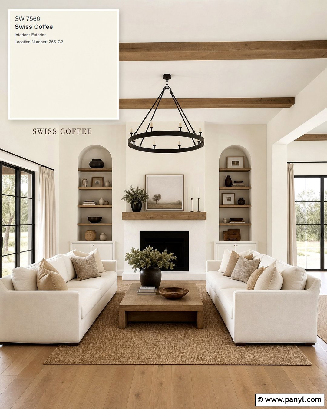
Wrought Iron provides near-black contrast with a softer character than a completely pure black. Pair Swiss Coffee walls and trim with Wrought Iron interior doors, built-in shelves, window frames, or a kitchen island. Add white oak floors, cream upholstery, blackened metal lighting, and natural linen curtains. Warm brass details can keep the dark color from feeling industrial. For a modern farmhouse exterior, use Swiss Coffee siding, Wrought Iron shutters and garage doors, a stained wood entry door, and warm gray stone. The dark paint should highlight a few meaningful architectural features rather than cover every accent. Repeat it through planters, railings, or light fixtures for cohesion. This palette works best when wood and woven textures soften the bold contrast between the two painted colors.
21. Black Beauty With Swiss Coffee
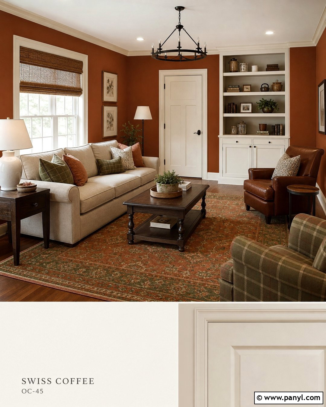
Black Beauty creates a bold, elegant framework around Swiss Coffee. Use Swiss Coffee across the walls and ceiling, then paint built-in cabinets, a fireplace surround, or a bank of interior doors in Black Beauty. Furnish the room with a cream sofa, sculptural oak tables, caramel leather, and a graphic rug that combines black with warm ivory. Add brushed brass lighting to introduce a reflective finish and prevent the dark paint from appearing flat. In a kitchen, Black Beauty lower cabinets can anchor Swiss Coffee upper cabinetry and warm marble-look counters. Keep decorative objects edited and repeat black through small elements such as frames and curtain rods. Generous daylight and layered lamps will preserve the dramatic contrast while maintaining a comfortable, livable atmosphere.
22. Hale Navy With Swiss Coffee
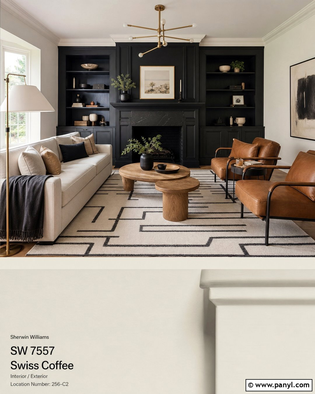
Hale Navy gives Swiss Coffee a classic blue contrast that feels polished rather than overly nautical. Use Swiss Coffee on living room walls and trim, then feature Hale Navy on built-ins, a media cabinet, or the wall behind a fireplace. Complete the room with a camel sofa, cream chairs, warm oak flooring, and a vintage rug containing navy, rust, and beige. Aged brass lighting and woven shades reinforce the warmth. In a kitchen, Hale Navy works on the island beneath creamy quartz, while Swiss Coffee covers the perimeter cabinets and walls. Avoid filling the room with bright red or stark white accessories. Muted terracotta, cognac leather, and natural greenery will create a more sophisticated palette that balances the navy’s depth with Swiss Coffee’s softness.
23. Newburyport Blue With Swiss Coffee
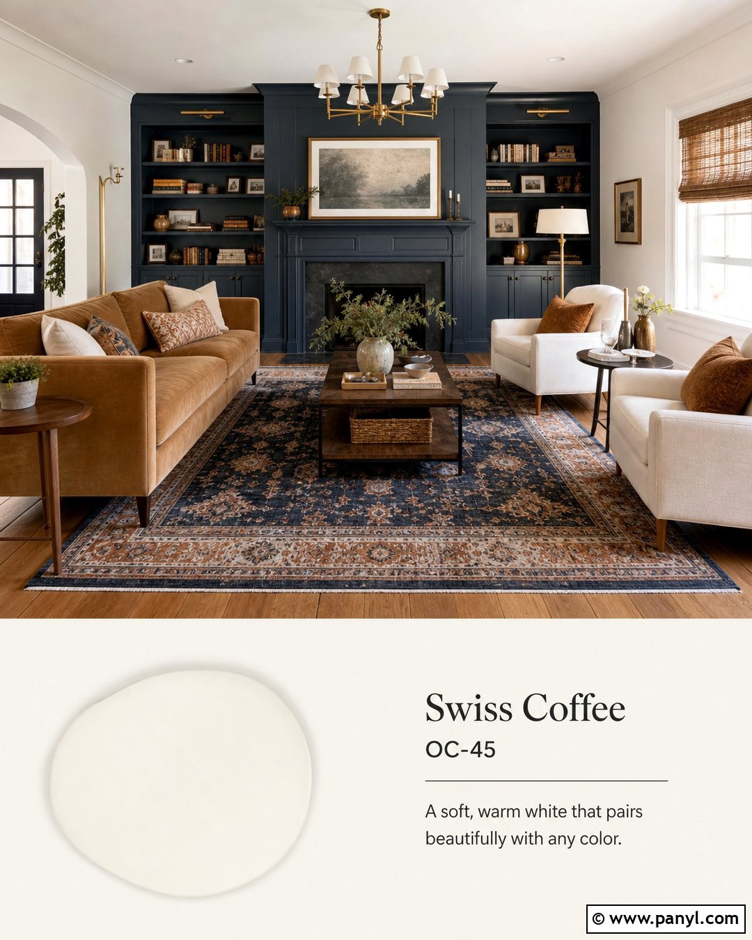
Newburyport Blue creates a slightly brighter traditional blue scheme with Swiss Coffee. Paint a dining room’s upper walls in Newburyport Blue and use Swiss Coffee on lower paneling, trim, built-ins, and the ceiling. Add a warm wood table, natural linen chairs, an antique-style brass chandelier, and a patterned rug with cream, faded blue, and cinnamon accents. For a bedroom, place Newburyport Blue behind the bed while surrounding walls remain Swiss Coffee. Layer ivory bedding, striped blue pillows, and medium oak furniture for a relaxed finish. This color combination can suit coastal, colonial, or transitional homes depending on the materials. Use woven textures for casual character or polished metals and tailored upholstery for a more formal result. Keep the lighting warm-neutral rather than strongly yellow.
24. Boothbay Gray With Swiss Coffee
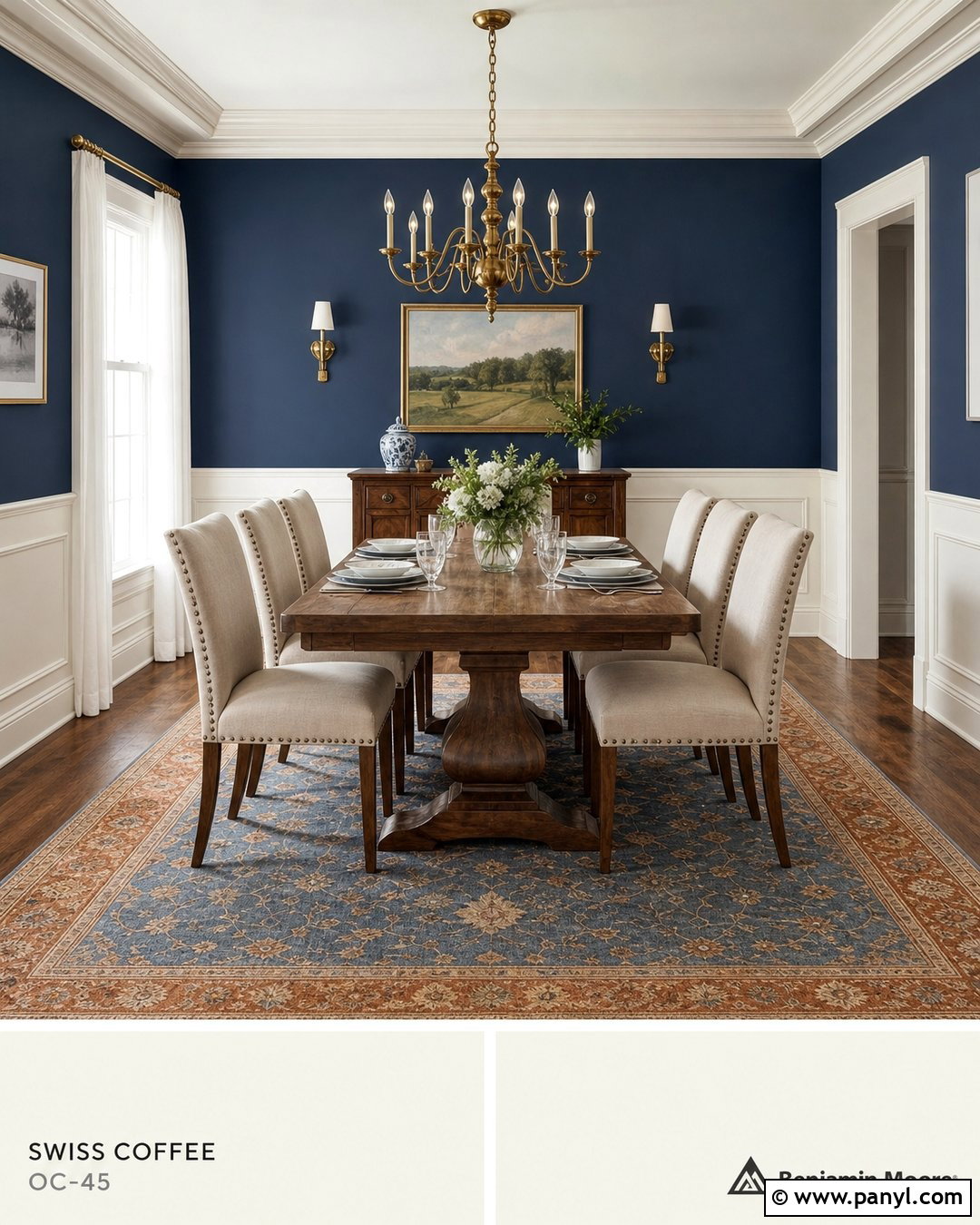
Boothbay Gray adds a muted blue-gray note that makes Swiss Coffee feel warm and welcoming. Use Boothbay Gray on bathroom vanities, kitchen islands, or a bedroom accent wall. Keep the surrounding walls, trim, and ceiling Swiss Coffee to provide a bright envelope. Pair the colors with pale oak, creamy quartz, warm white tile, and brushed nickel or aged brass hardware. In a living room, add an ivory sofa, blue-gray chairs, and a rug that mixes beige with faded blue. Natural wood is important because it bridges the cool and warm sides of the palette. Avoid brilliant white fabrics that could make Swiss Coffee appear overly creamy. Instead, select ivory, flax, oatmeal, and light taupe textiles for a softer and more integrated finished space.
25. Smoke With Swiss Coffee
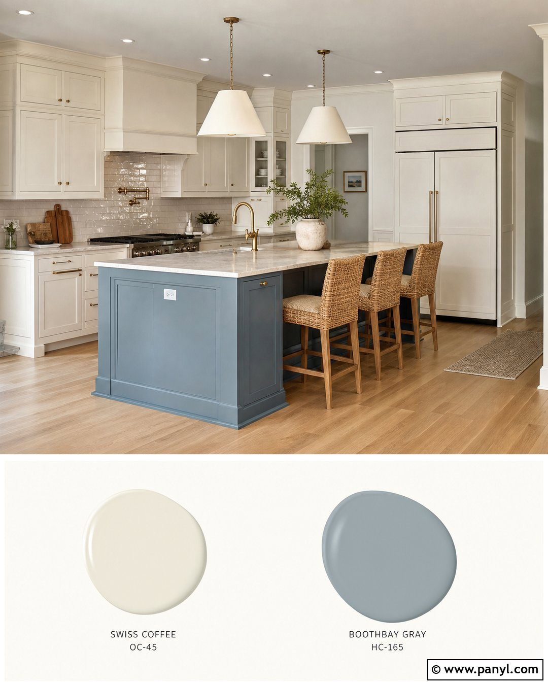
Smoke creates a restful blue-gray palette that works beautifully with Swiss Coffee in bedrooms and bathrooms. Paint the bedroom walls Smoke, then use Swiss Coffee on the ceiling, trim, doors, and a paneled headboard. Add warm white bedding, taupe upholstery, bleached oak furniture, and a wool rug with subtle blue and beige patterning. Brushed nickel lighting feels clean, while aged brass adds a warmer traditional note. In a bathroom, combine a Smoke vanity with Swiss Coffee walls, creamy stone-look tile, and lightly veined quartz. Keep window coverings natural and understated so the blue-gray remains the main secondary color. If the room receives cool northern light, add more wood, woven texture, and cream fabric to maintain a comfortable balance throughout the day.
26. Quiet Moments With Swiss Coffee
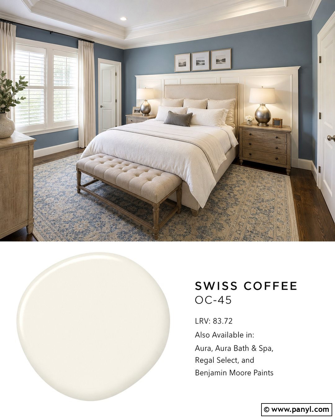
Quiet Moments introduces a pale blue-green layer that gives Swiss Coffee a calm, airy quality. Use Quiet Moments on bedroom or bathroom walls and reserve Swiss Coffee for trim, ceilings, cabinets, and doors. Complete the room with light oak, warm white linen, woven baskets, and a rug containing muted aqua and sand. Polished nickel can produce a fresh finish, while brushed brass creates a warmer look. In a living room, Swiss Coffee walls can surround Quiet Moments built-ins or a painted window seat. Add cream seating and natural wood tables to keep the palette from becoming too cool. This combination benefits from simple styling and plenty of texture. Avoid highly saturated turquoise accessories, which can overpower the subtle relationship between the two soft paint colors.
27. Palladian Blue With Swiss Coffee
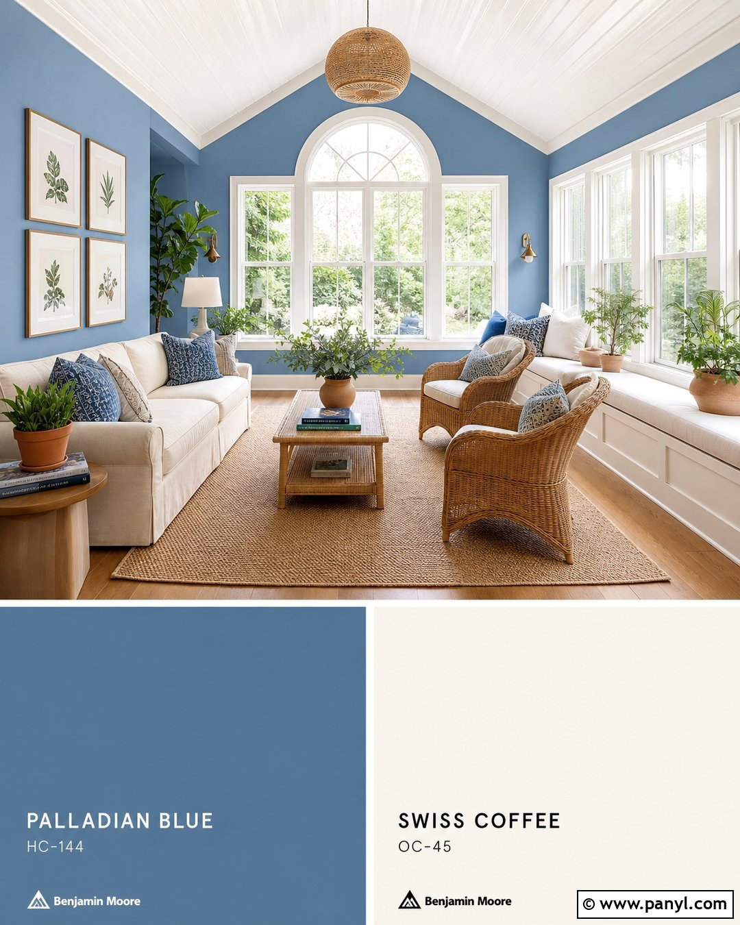
Palladian Blue brings an easy blue-green freshness to Swiss Coffee and suits kitchens, sunrooms, and relaxed bedrooms. Paint the walls Palladian Blue and use Swiss Coffee on cabinetry, trim, the ceiling, and interior doors. Add honey-toned oak, natural rattan, cream upholstery, and linen curtains to reinforce the breezy warmth. A sunroom could include woven chairs, an ivory sofa, botanical prints, and terracotta planters. In a kitchen, use Palladian Blue on the island beneath warm white quartz, with Swiss Coffee perimeter cabinets and a creamy backsplash. Keep decorative blue accents muted rather than vivid. Small touches of aged brass or bronze will connect the cool wall color to the warmer off-white. The finished room should feel light, natural, and comfortably layered rather than themed.
28. Woodlawn Blue With Swiss Coffee
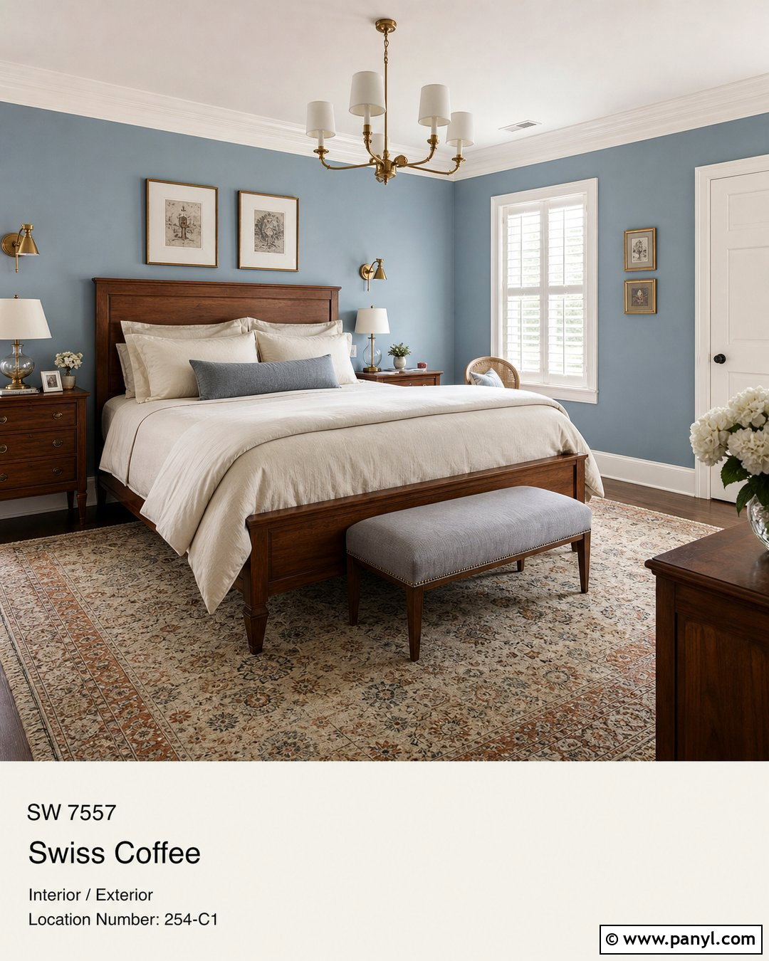
Woodlawn Blue creates a soft historical palette when paired with Swiss Coffee. Use Woodlawn Blue on dining room or bedroom walls and highlight trim, crown molding, shutters, and doors in Swiss Coffee. Bring in a medium wood table or bed, cream linen, warm gray upholstery, and an antique-inspired rug. Brass lighting and simple framed landscapes complement the traditional character without making the room feel dated. For a more contemporary interpretation, select streamlined furniture, pale oak, and minimal black accents. The blue should cover enough surface area to establish the room’s identity, while Swiss Coffee maintains brightness around architectural edges. Repeat warm ivory in curtains and upholstery so the trim does not look isolated. This measured balance keeps the entire space cohesive and inviting.
29. Aegean Teal With Swiss Coffee
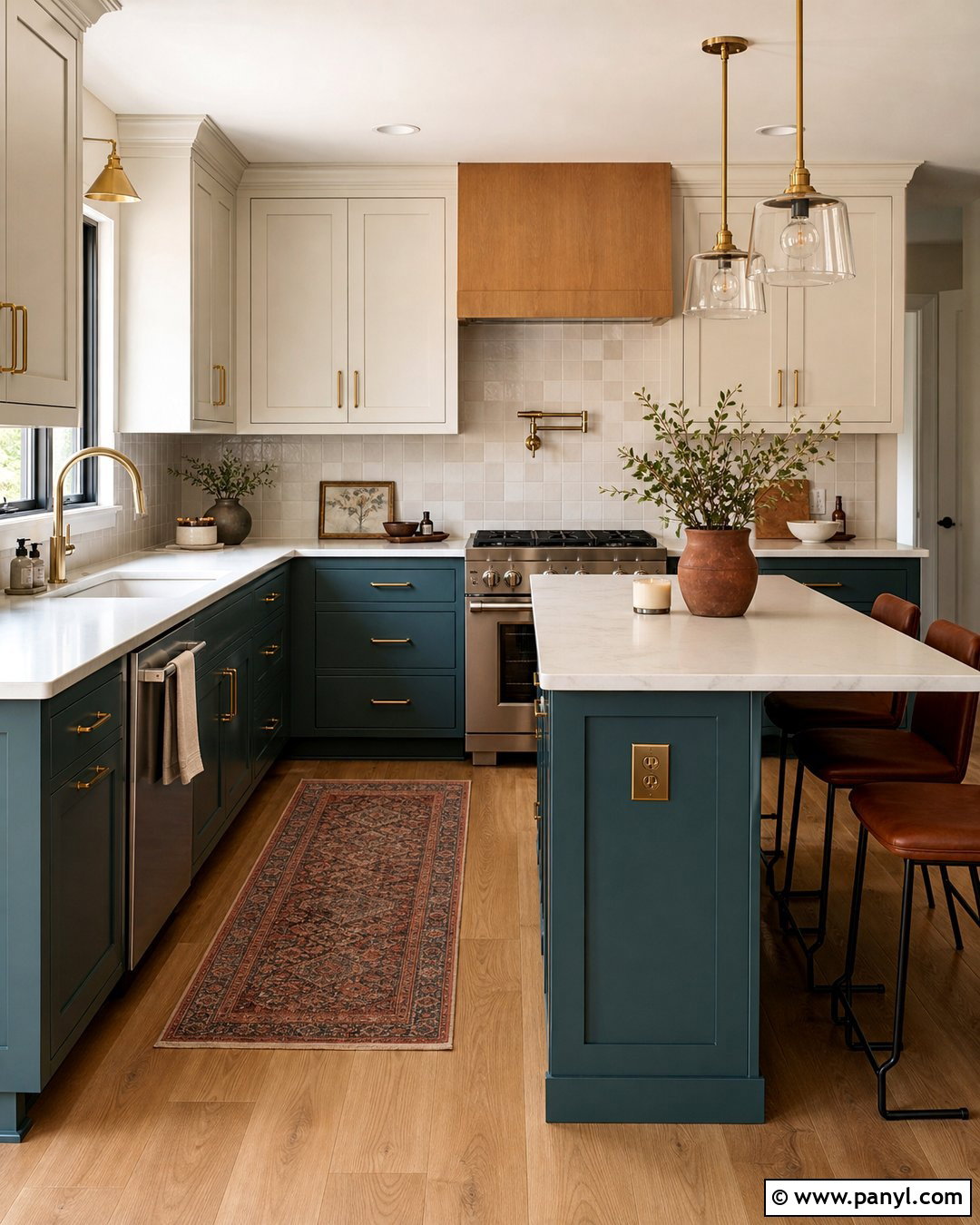
Aegean Teal gives Swiss Coffee a sophisticated blue-green partner with moderate depth. Paint lower kitchen cabinets or a substantial island in Aegean Teal, then use Swiss Coffee on upper cabinets, walls, trim, and the ceiling. Choose creamy quartz, warm white handmade tile, medium oak flooring, and brushed brass hardware. In a living room, an Aegean Teal fireplace wall can anchor Swiss Coffee walls, ivory seating, and walnut furniture. Add muted rust or dusty rose pillows for a small amount of complementary warmth. Avoid cool gray floors, which may separate the two paints visually. Natural stone, wood grain, woven textiles, and aged metals help create a complete palette that feels colorful but still grounded enough for long-term use.
30. October Mist With Swiss Coffee
October Mist adds a gentle sage green layer that fits naturally with Swiss Coffee’s creamy warmth. Use October Mist on bedroom walls, kitchen cabinets, or dining room paneling while applying Swiss Coffee to ceilings, trim, and connecting spaces. Pair the colors with pale oak floors, linen upholstery, woven shades, and warm white stone. Matte black accents create structure, while aged brass adds a softer traditional finish. A bedroom could feature October Mist walls, Swiss Coffee doors, an oatmeal upholstered bed, and muted clay-colored pillows. In a kitchen, reverse the balance with Swiss Coffee walls and October Mist cabinetry. Include plants carefully so the room does not become uniformly green. Terracotta, tan leather, and creamy ceramics will provide attractive visual relief.
31. Saybrook Sage With Swiss Coffee
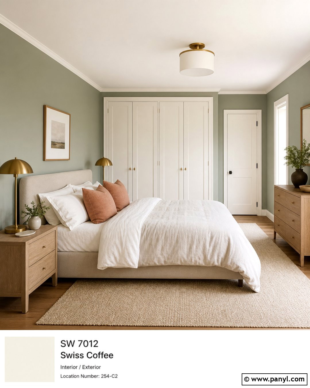
Saybrook Sage creates a classic, muted green scheme that feels more grounded than a pale pastel. Paint the walls Saybrook Sage and use Swiss Coffee on trim, ceilings, built-ins, and paneled doors. Add walnut or medium oak furniture, a cream sofa, and a patterned rug combining olive, beige, and faded blue. Aged brass sconces and woven shades reinforce the warm, established character. In a mudroom, Saybrook Sage cabinetry can sit against Swiss Coffee walls with brick or limestone flooring and bronze hooks. Keep the surrounding fabrics and hard finishes warm rather than icy. Small amounts of black can sharpen the scheme, but brown and bronze accents will feel more natural. This palette suits cottage, traditional, farmhouse, and relaxed transitional interiors equally well.
32. Carolina Gull With Swiss Coffee
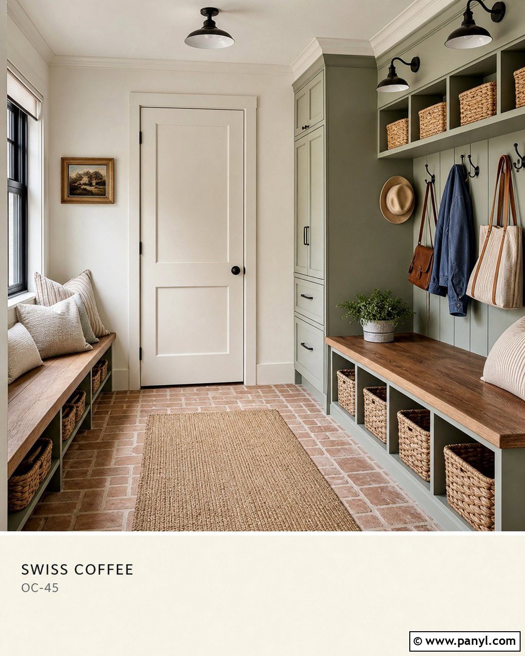
Carolina Gull offers a deeper gray-green contrast that makes Swiss Coffee appear bright and refined. Use Carolina Gull on a kitchen island, library built-ins, bathroom vanity, or paneled dining room walls. Keep Swiss Coffee on the remaining walls, ceiling, trim, and interior doors. Add white oak or walnut, creamy stone, aged brass, and natural linen to bridge the two colors. A living room could include Carolina Gull cabinetry, a Swiss Coffee fireplace, camel leather chairs, and an ivory sofa. Repeat the green through a muted patterned rug rather than matching every accessory exactly. Because Carolina Gull carries noticeable visual weight, balance it with generous pale surfaces and good lighting. The finished palette should feel earthy, substantial, and connected to natural materials.
33. Caldwell Green With Swiss Coffee
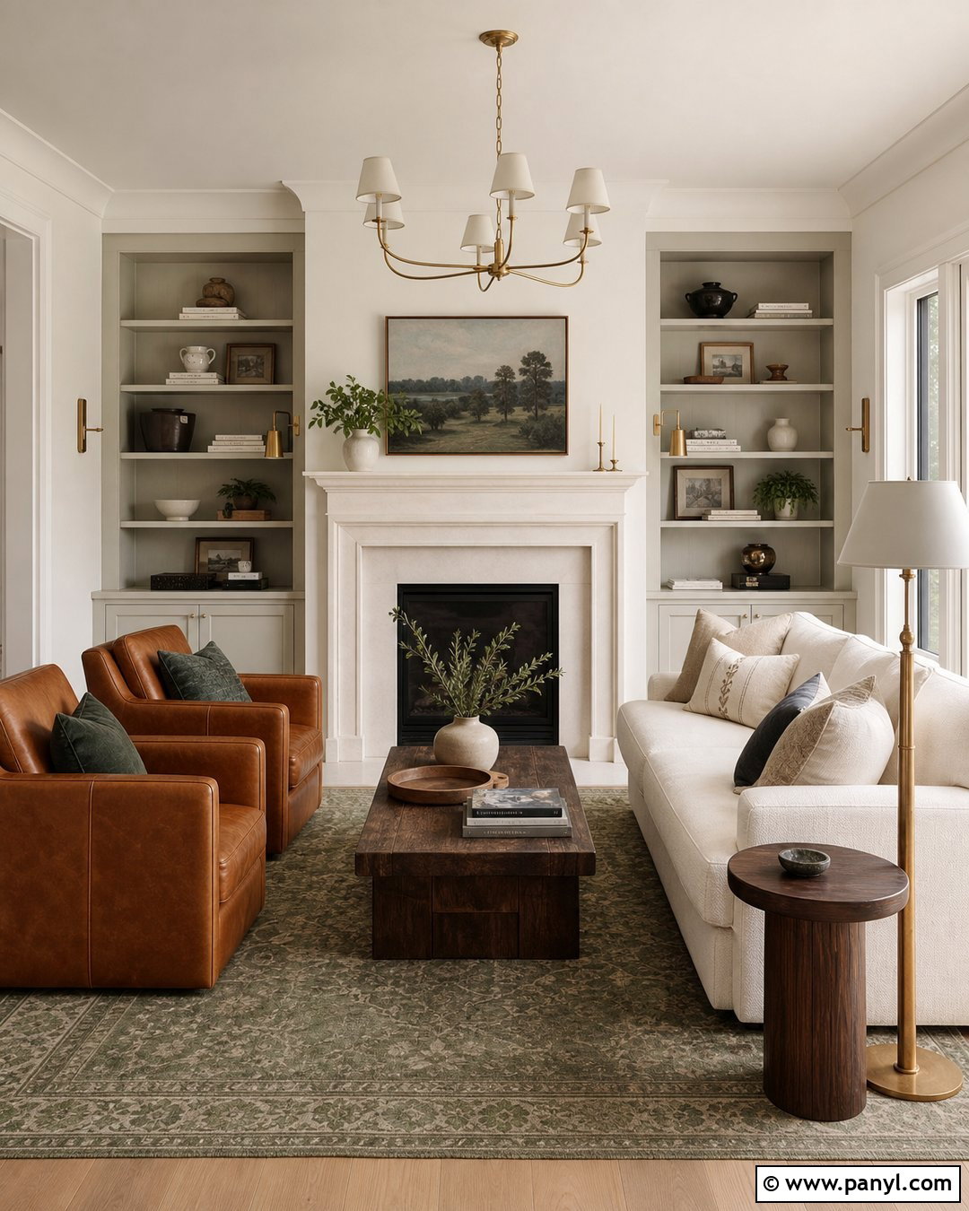
Caldwell Green adds traditional depth while maintaining a softer appearance than very dark forest green. Use it on dining room walls or built-in cabinetry, with Swiss Coffee covering the ceiling, trim, doors, and fireplace. Furnish the room with warm mahogany or walnut, cream upholstery, a faded patterned rug, and aged brass lighting. Rust, camel, and muted blue accessories can broaden the palette without competing with the green. In a kitchen, Caldwell Green lower cabinets pair well with Swiss Coffee uppers, warm marble-look counters, and medium oak flooring. Avoid stark white backsplash tile because it may disconnect from the creamy paint. A warm white handmade tile or softly veined stone will create a smoother transition and a more thoughtfully finished design.
34. Essex Green With Swiss Coffee
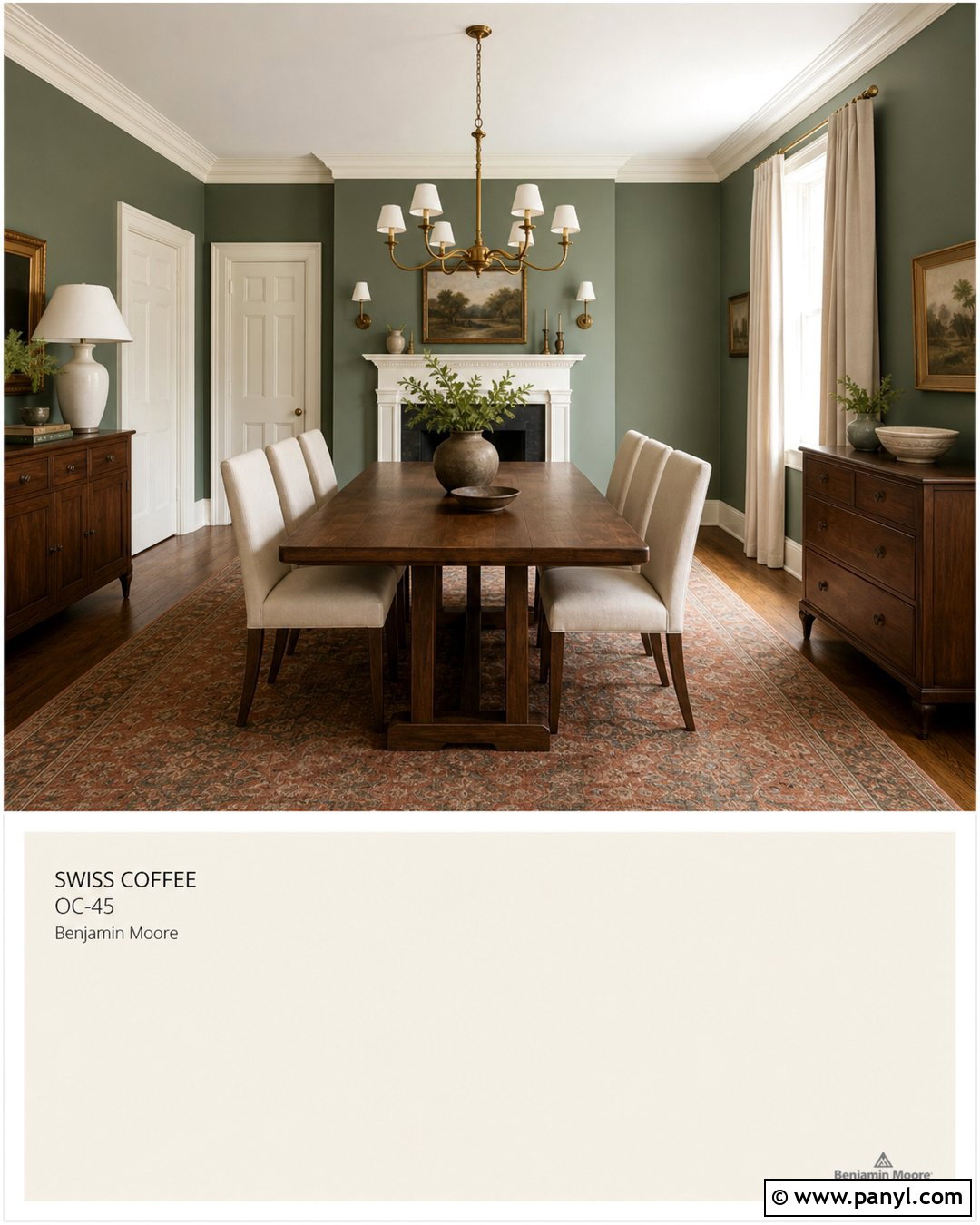
Essex Green creates a dramatic, almost black-green contrast against Swiss Coffee. Use it on a library’s built-in bookcases, a kitchen island, exterior shutters, or a single paneled wall. Keep Swiss Coffee on the larger surrounding surfaces so the room remains bright and approachable. Pair the scheme with walnut, cognac leather, cream linen, antique brass, and warm-veined stone. In a home office, Essex Green cabinetry can frame a wooden desk while Swiss Coffee walls and ceiling reflect daylight. Add a traditional rug with muted burgundy, tan, and green to connect the elements. For a cleaner modern look, select white oak furniture and simple black lighting. Limit additional saturated colors so the deep green remains the clear focal point of the completed space.
35. Backwoods With Swiss Coffee
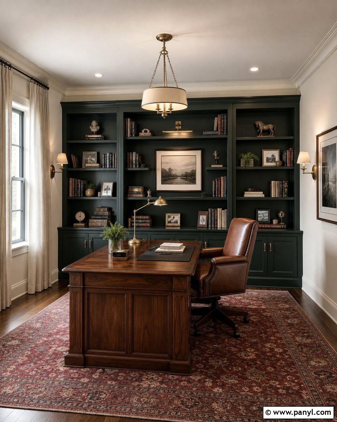
Backwoods brings dense, earthy green to Swiss Coffee and works well in rooms designed around natural materials. Paint kitchen cabinetry, a mudroom storage wall, or bedroom paneling in Backwoods. Use Swiss Coffee on the upper walls, ceiling, trim, and nearby hallways to relieve the depth. Add soapstone or creamy quartz, medium oak, unlacquered brass, and handmade warm white tile. A bedroom could combine a Backwoods paneled headboard wall with Swiss Coffee surroundings, flax bedding, and walnut nightstands. Use terracotta and muted tan accents to emphasize the organic warmth. The green should appear in one substantial feature and a few smaller repeats, such as fabric or artwork. This approach creates a cohesive room without allowing the darker shade to overpower the architecture.
36. Cromwell Gray With Swiss Coffee
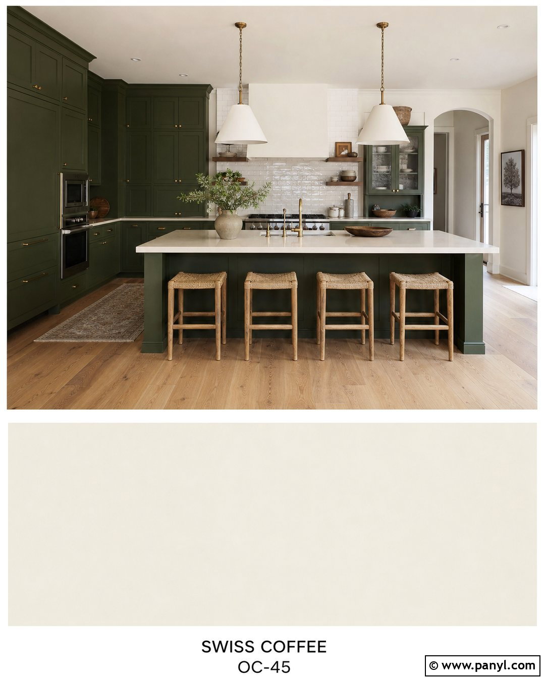
Cromwell Gray is an earthy olive-gray that creates an understated connection between Swiss Coffee and natural wood. Use Cromwell Gray on walls or cabinetry and Swiss Coffee on trim, ceilings, doors, and built-in details. In a dining room, combine the palette with a walnut table, cream upholstered chairs, a woven rug, and aged bronze lighting. In an entry, Cromwell Gray walls can frame Swiss Coffee paneling and a dark wood console. Add muted rust, tan, and soft black through artwork and accessories. Because this color can change from greenish to neutral depending on the light, test it near existing floors and stone. Warm oak and beige limestone will emphasize its earthiness, creating a calm and established room with subtle contrast.
37. Southwest Pottery With Swiss Coffee
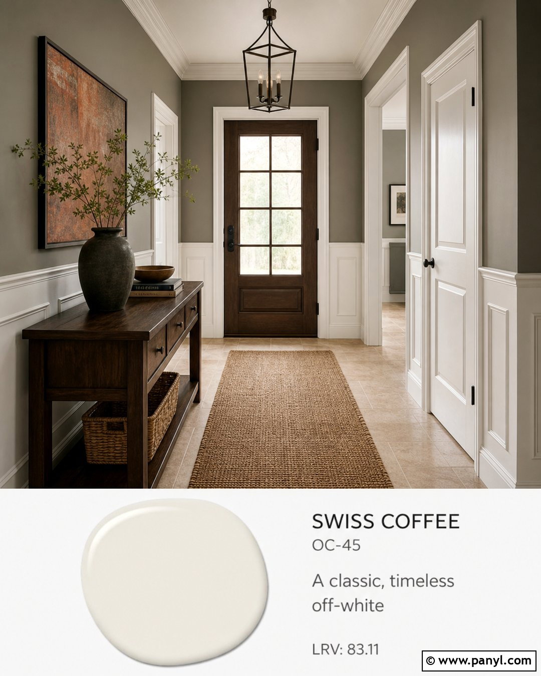
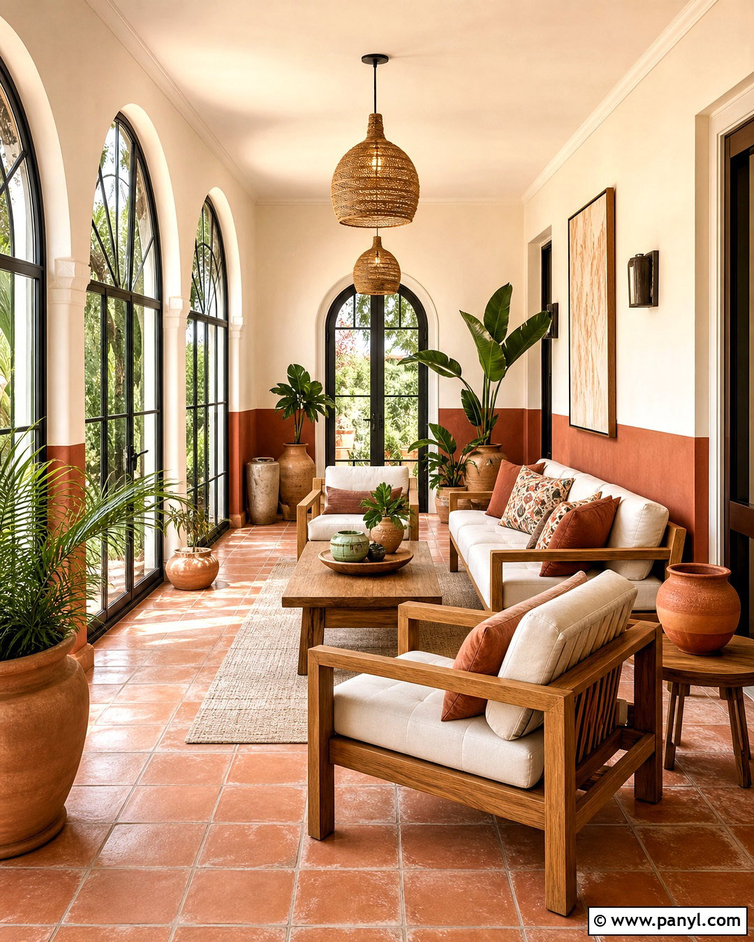
Southwest Pottery introduces muted clay warmth that gives Swiss Coffee an earthy, current character. Use the terracotta-toned color on dining room walls, kitchen base cabinets, or a bedroom headboard wall. Keep Swiss Coffee on ceilings, trim, upper cabinetry, and surrounding rooms. Add white oak, cream upholstery, woven pendants, and warm limestone or handmade tile. In a living room, include an ivory sofa, cognac chairs, and a rug combining clay, tan, and faded blue. Limit orange-toned accessories because the wall color already carries substantial warmth. Charcoal or deep olive accents will provide balance. This palette works best with natural textures and simple forms, producing a complete space that feels sun-washed, welcoming, and connected to the landscape.
38. Terra Cotta Tile With Swiss Coffee
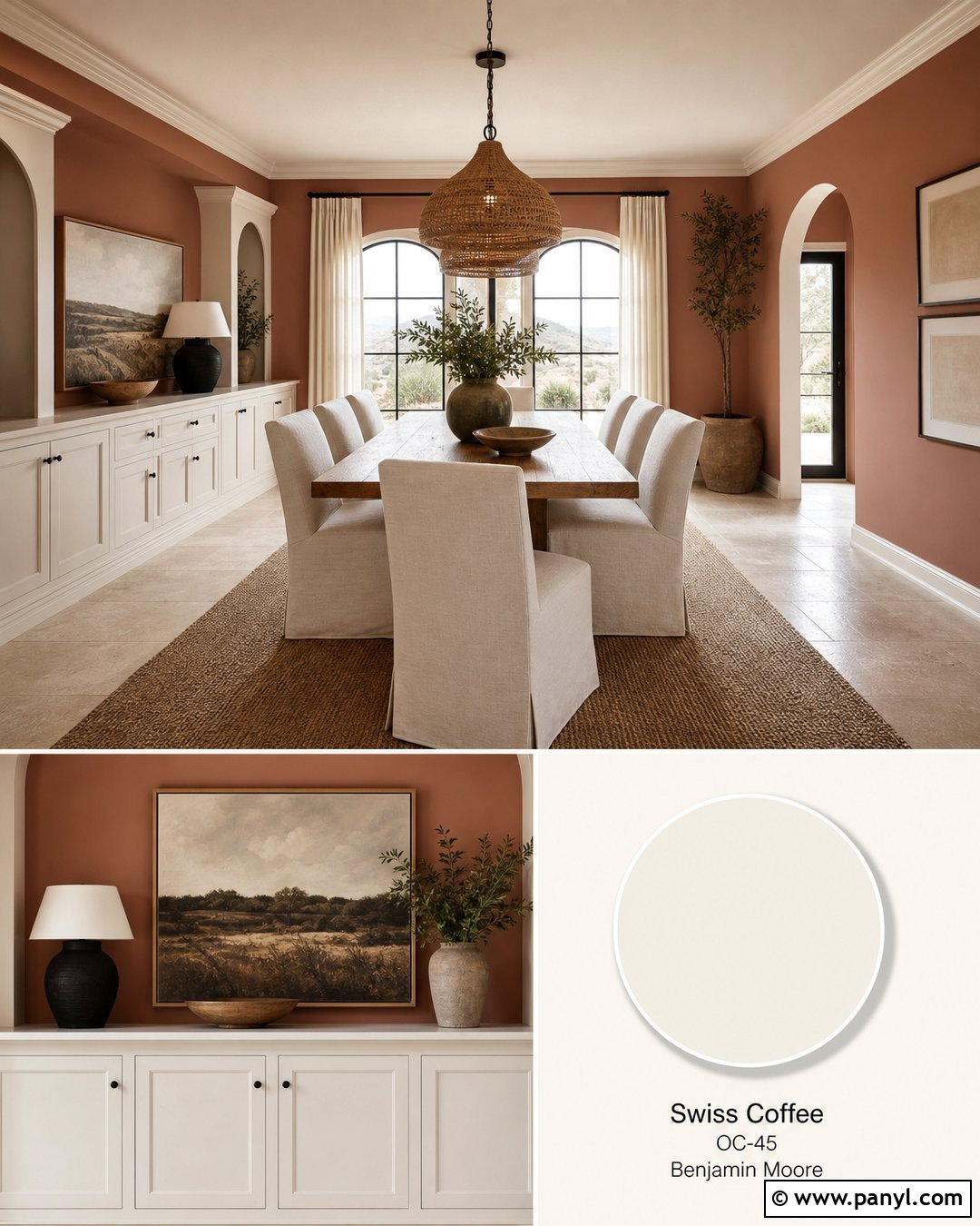
Terra Cotta Tile creates a richer, more saturated clay contrast with Swiss Coffee. Apply it to a fireplace wall, dining room, powder room, or kitchen island rather than every surface in a large open plan. Use Swiss Coffee on the ceiling, trim, doors, and adjacent walls to surround the warm color with breathing room. Complete the look with creamy upholstery, walnut furniture, jute or wool rugs, and aged brass lighting. Deep green accents provide attractive contrast, while dusty pink or orange accessories may make the palette feel too uniform. In a kitchen, pair Terra Cotta Tile cabinetry with Swiss Coffee walls, creamy quartz, and handmade ivory backsplash tile. The result should feel earthy and collected, with balanced amounts of light and dark material.
39. Potter’s Clay With Swiss Coffee
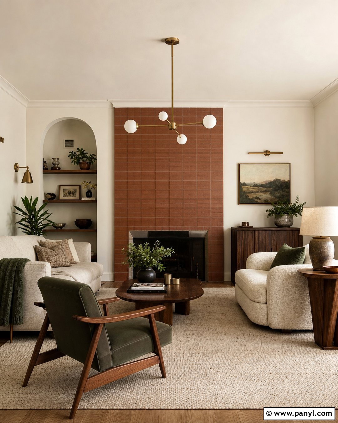
Potter’s Clay gives Swiss Coffee a softened brown-orange companion that feels comfortable in casual, nature-focused interiors. Paint the walls of a den or dining room Potter’s Clay and use Swiss Coffee across trim, paneling, ceilings, and built-in cabinets. Add an oatmeal sofa, dark wood furniture, woven shades, and a patterned rug containing cream, rust, and olive. Black metal lighting provides needed definition, while ceramic lamps and natural baskets reinforce the handmade quality. In a bedroom, limit the clay color to the wall behind the bed and repeat it through one or two textiles. Keep the remaining fabrics light and textural. This combination is especially successful with wood floors and warm stone, which support the earthy palette without introducing unrelated undertones.
40. First Light With Swiss Coffee
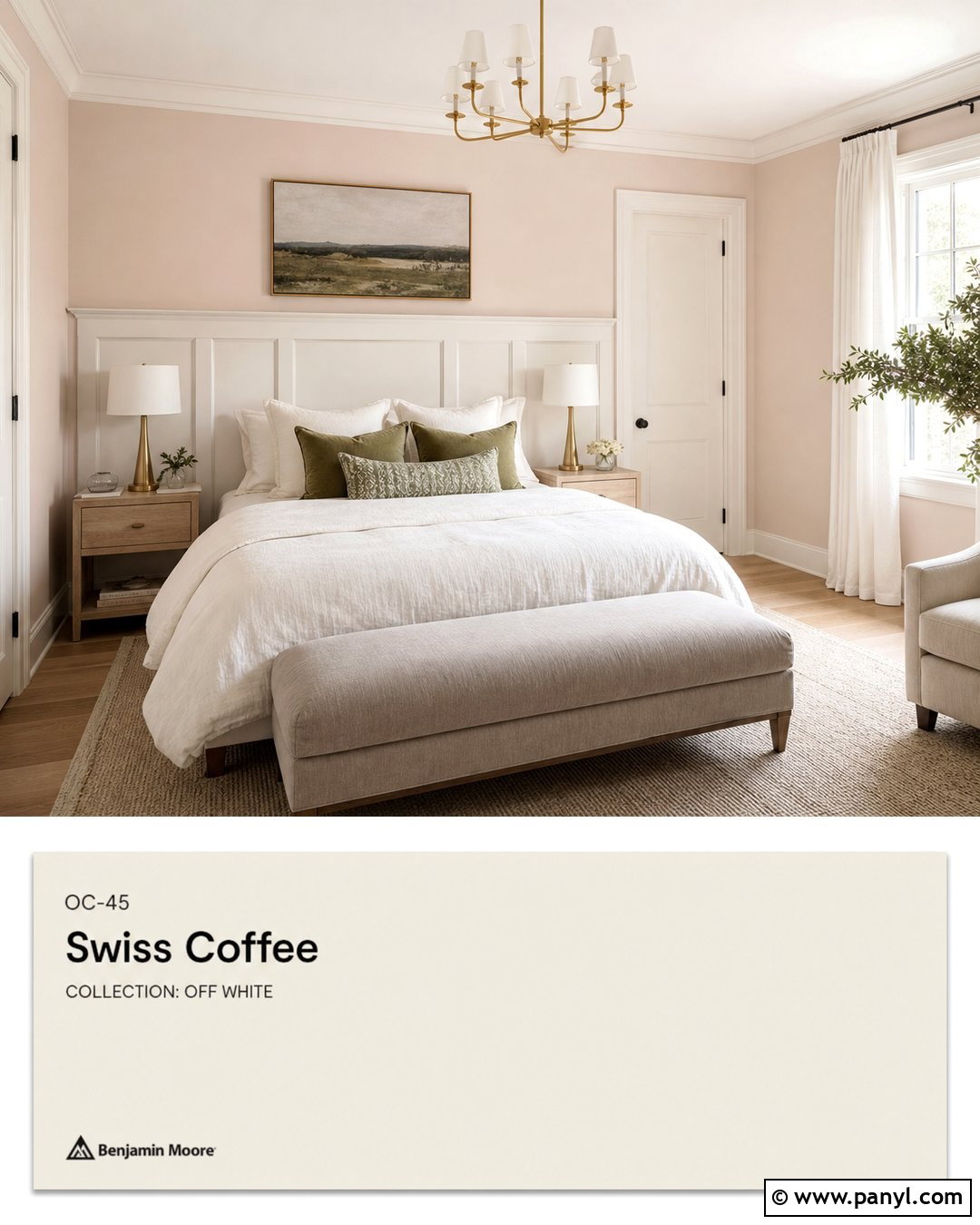
First Light adds a delicate blush tint that softens Swiss Coffee without creating a sugary pink room. Use First Light on bedroom walls or bathroom cabinetry and keep Swiss Coffee on trim, ceilings, doors, and built-ins. Layer the room with ivory linen, pale oak, warm gray upholstery, and brushed brass or polished nickel lighting. Add dusty blue or muted olive accents to balance the blush. In a bedroom, a Swiss Coffee paneled headboard and First Light walls can be paired with oatmeal bedding and a subtle vintage rug. Avoid excessive rose-colored accessories. The paint should provide the main pink note while the furniture remains neutral. This restrained approach creates a light, grown-up palette suitable for bedrooms, nurseries, dressing areas, and quiet sitting rooms.
41. Proposal With Swiss Coffee
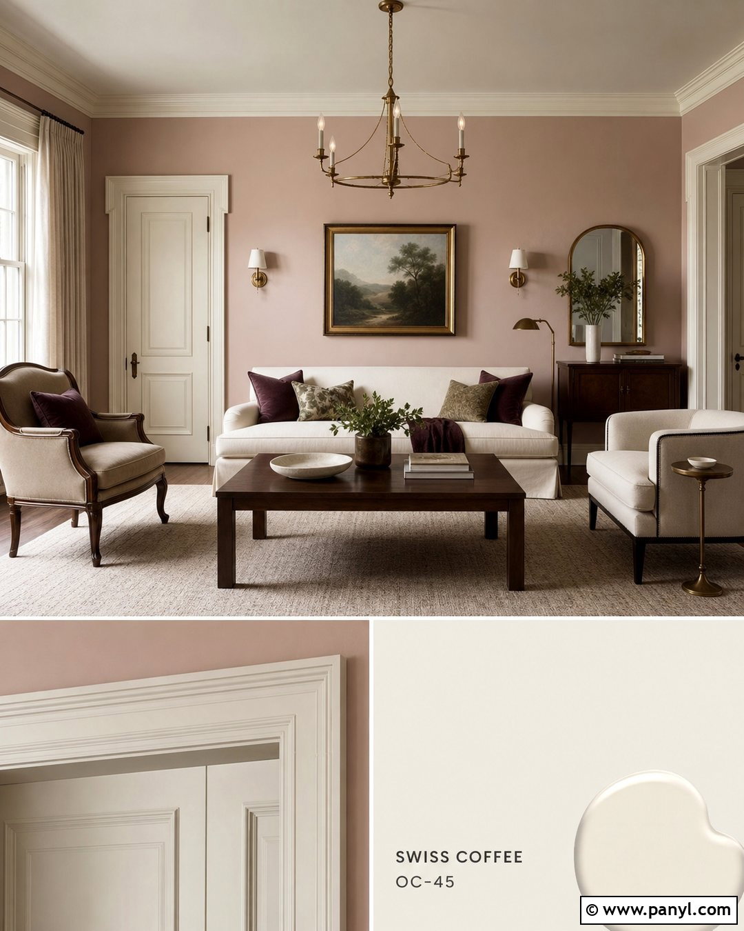
Proposal creates a muted rosy-beige scheme that complements the creamy character of Swiss Coffee. Paint a bedroom, sitting room, or powder room in Proposal, then use Swiss Coffee on trim, ceilings, doors, and decorative molding. Add warm white upholstery, walnut furniture, a beige wool rug, and antique brass lighting. Deep plum, olive, or charcoal accents will prevent the palette from becoming overly pale. For a bedroom, layer ivory bedding with mushroom and dusty rose pillows, keeping patterns subtle. In a powder room, Proposal walls can surround a dark wood vanity and Swiss Coffee millwork. Use warm marble or creamy quartz rather than brilliant white stone. The completed room should feel softly colorful, tailored, and balanced by several natural textures and deeper grounding details.
42. Chippendale Rosetone With Swiss Coffee
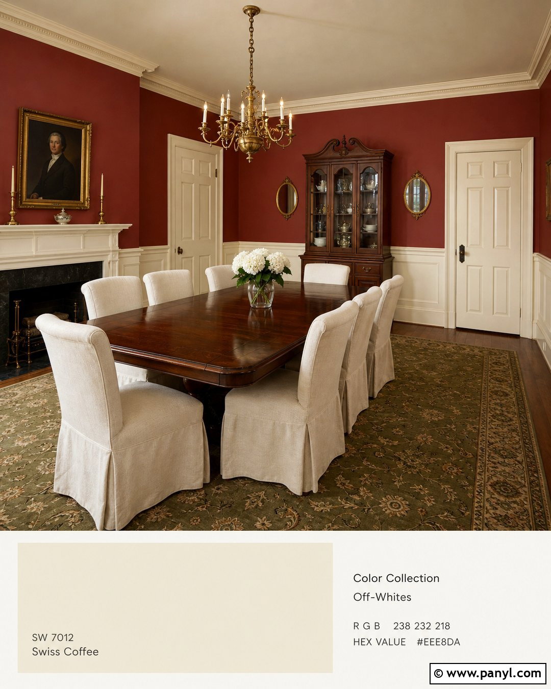
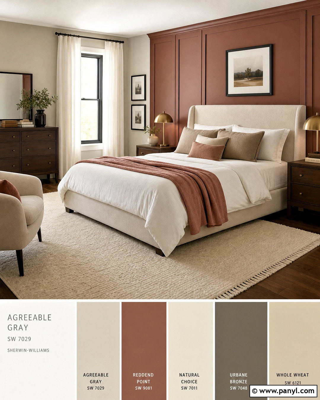
Chippendale Rosetone supplies historic red-brown warmth that makes Swiss Coffee look especially rich. Use it in a dining room, study, or paneled entry where a deeper color can create definition. Paint the walls Chippendale Rosetone and apply Swiss Coffee to the ceiling, trim, wainscoting, and doors. Add dark walnut furniture, cream linen, an antique-style rug, and aged brass lighting. Muted olive or smoky blue accessories can provide balanced contrast. If the room is small, use the red-brown shade above tall paneling so Swiss Coffee still occupies much of the visual field. Avoid adding bright red décor. Let the paint provide the primary color, supported by warm wood, understated patterns, and soft neutral upholstery for a cohesive traditional design.
43. Cinnamon Slate With Swiss Coffee
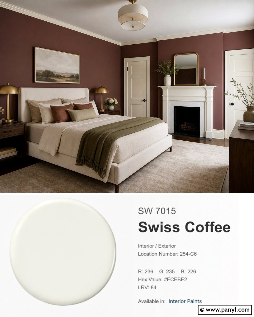
Cinnamon Slate introduces a complex plum-brown contrast that gives Swiss Coffee a sophisticated, contemporary mood. Use it on bedroom walls, kitchen cabinetry, or a dining room’s built-in storage. Keep Swiss Coffee on trim, ceilings, adjoining walls, and other substantial surfaces. Add walnut wood, oatmeal upholstery, warm white stone, and brushed brass fixtures. In a bedroom, combine Cinnamon Slate walls with a Swiss Coffee ceiling, an ivory upholstered bed, clay-colored pillows, and a muted olive throw. In a kitchen, the deeper color works well on lower cabinets beneath creamy quartz. Avoid bright purple accessories, which can exaggerate its plum quality. Choose subdued green, tan, charcoal, and rust details instead. The finished palette will feel layered, warm, and distinctive without becoming overly dramatic.
44. Vintage Wine With Swiss Coffee
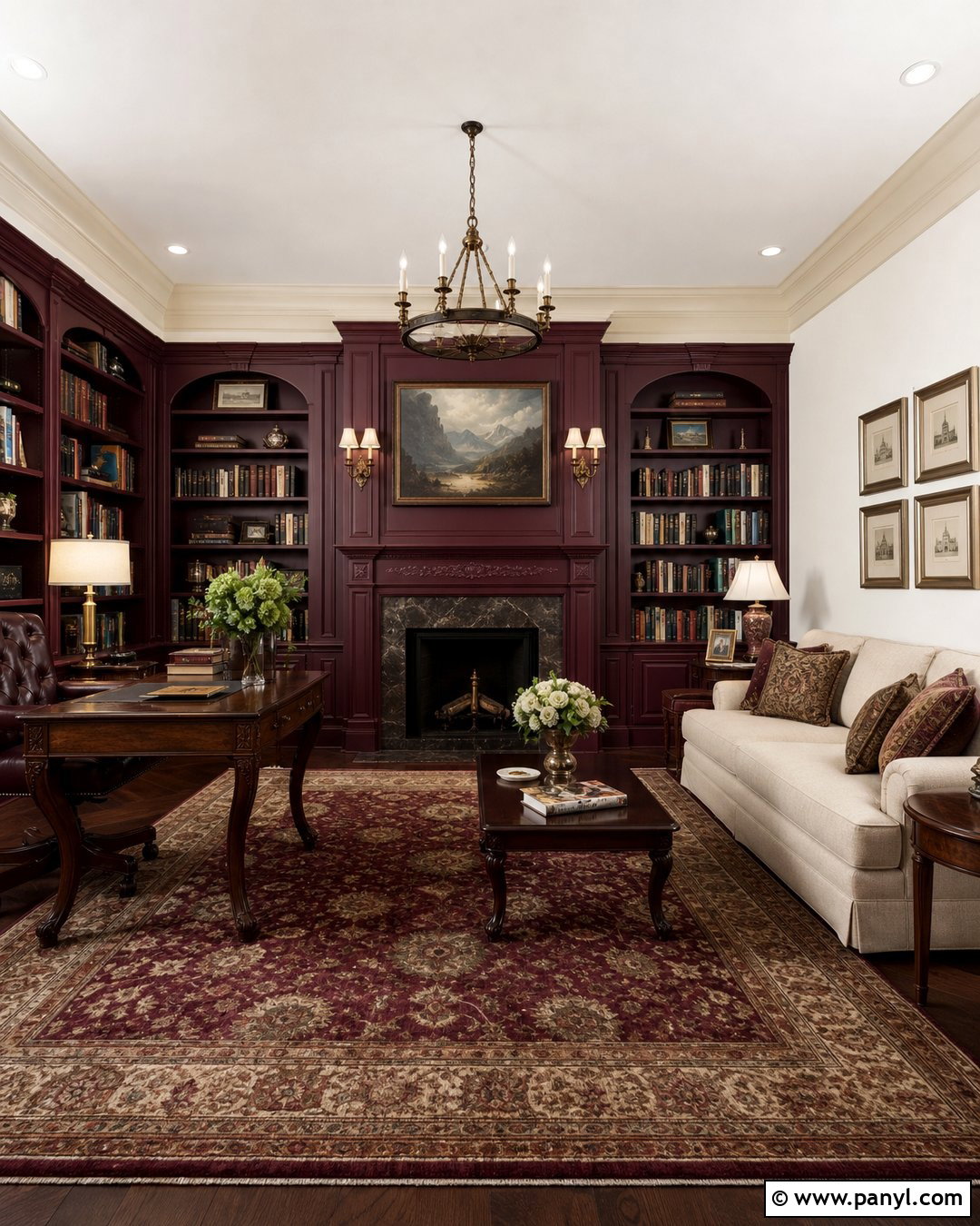
Vintage Wine creates a deep burgundy-plum accent that adds richness to Swiss Coffee. Use it on a dining room, library cabinetry, a painted fireplace, or an interior door collection. Keep the larger walls and ceiling Swiss Coffee to maintain brightness. Complete the room with dark wood furniture, cream upholstery, aged brass lighting, and a traditional rug containing muted burgundy, olive, and beige. In a bedroom, Vintage Wine can define the headboard wall while Swiss Coffee surrounds it. Add flax bedding and walnut nightstands rather than more red furnishings. This shade is visually strong, so repeat it only through small patterned details. Balanced lighting and pale textiles will help the completed room feel luxurious and comfortable instead of dark or overly formal.
45. Blue Nova With Swiss Coffee
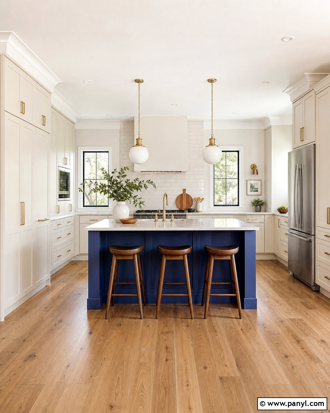
Blue Nova gives Swiss Coffee a confident blue-violet contrast suited to cabinetry, accent walls, and architectural features. Use Blue Nova on a kitchen island or living room built-ins while Swiss Coffee covers the surrounding walls, trim, ceiling, and upper cabinetry. Add medium oak flooring, creamy quartz, brushed brass hardware, and warm white textiles. In a bedroom, Blue Nova can anchor the wall behind an ivory upholstered bed, supported by walnut nightstands and a rug combining blue, beige, and muted rust. Warm materials are important because they connect the saturated blue to the creamy off-white. Avoid combining the palette with icy gray flooring or brilliant white fabric. Repeating Blue Nova in artwork and one textile will create a deliberate, balanced finished space.
Conclusion:
The best Swiss Coffee coordinating colors either support its warm creaminess or create controlled contrast around it. Soft greiges, tans, and warm whites produce peaceful transitions, while sage, blue-green, navy, charcoal, clay, and burgundy add stronger definition. Build each palette as a complete room by considering walls, trim, ceilings, cabinetry, flooring, furniture, textiles, and metal finishes together. Always confirm that you are sampling Benjamin Moore Swiss Coffee OC-45, since similarly named colors from other manufacturers are not identical. View large painted samples beside permanent surfaces throughout the day and under your actual lamps. With careful testing, these 45 Swiss Coffee coordinating colors can support interiors and exteriors that feel cohesive, comfortable, and thoughtfully finished.

Related Ideas and Inspiration:

Leave a Reply