
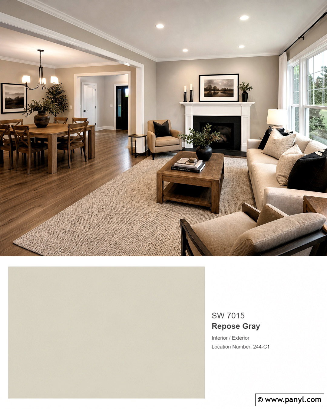
Choosing colors to pair with Sherwin-Williams Repose Gray can transform this flexible neutral from simple to memorable. This guide to **20 repose grey coordinating colors** covers complete room palettes rather than isolated paint swatches. Repose Gray SW 7015 balances gentle warmth with subtle cooler notes, so it can support crisp whites, layered grays, earthy browns, muted greens, rich blues, and clay-inspired accents. Sherwin-Williams specifically lists Eider White, Pavestone, and Coral Clay as coordinating colors, while the additional combinations below expand the palette for different rooms and design moods. Always test large samples beside fixed finishes because daylight, flooring, countertops, and artificial lighting can shift the result. Use these complete looks to find the best **20 repose grey coordinating colors** for your home. ()

1. Repose Gray And Eider White Living Room
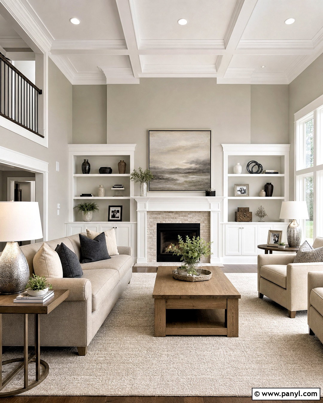
Eider White creates a soft, low-contrast transition beside Repose Gray. Paint the living room walls Repose Gray, then use Eider White across the ceiling, trim, fireplace surround, and built-in shelves. This combination feels warmer and more relaxed than pairing gray with a brilliant white. Choose a light oatmeal sofa, natural oak coffee table, and ivory textured rug to continue the gentle neutral palette. Add muted charcoal pillows and brushed nickel lighting for definition without making the room harsh. Pale linen curtains keep the windows bright and airy. A few matte ceramic vessels and simple botanical artwork complete this comfortable transitional room, which works especially well in an open floor plan with warm wood flooring.
2. Repose Gray And Pure White Kitchen
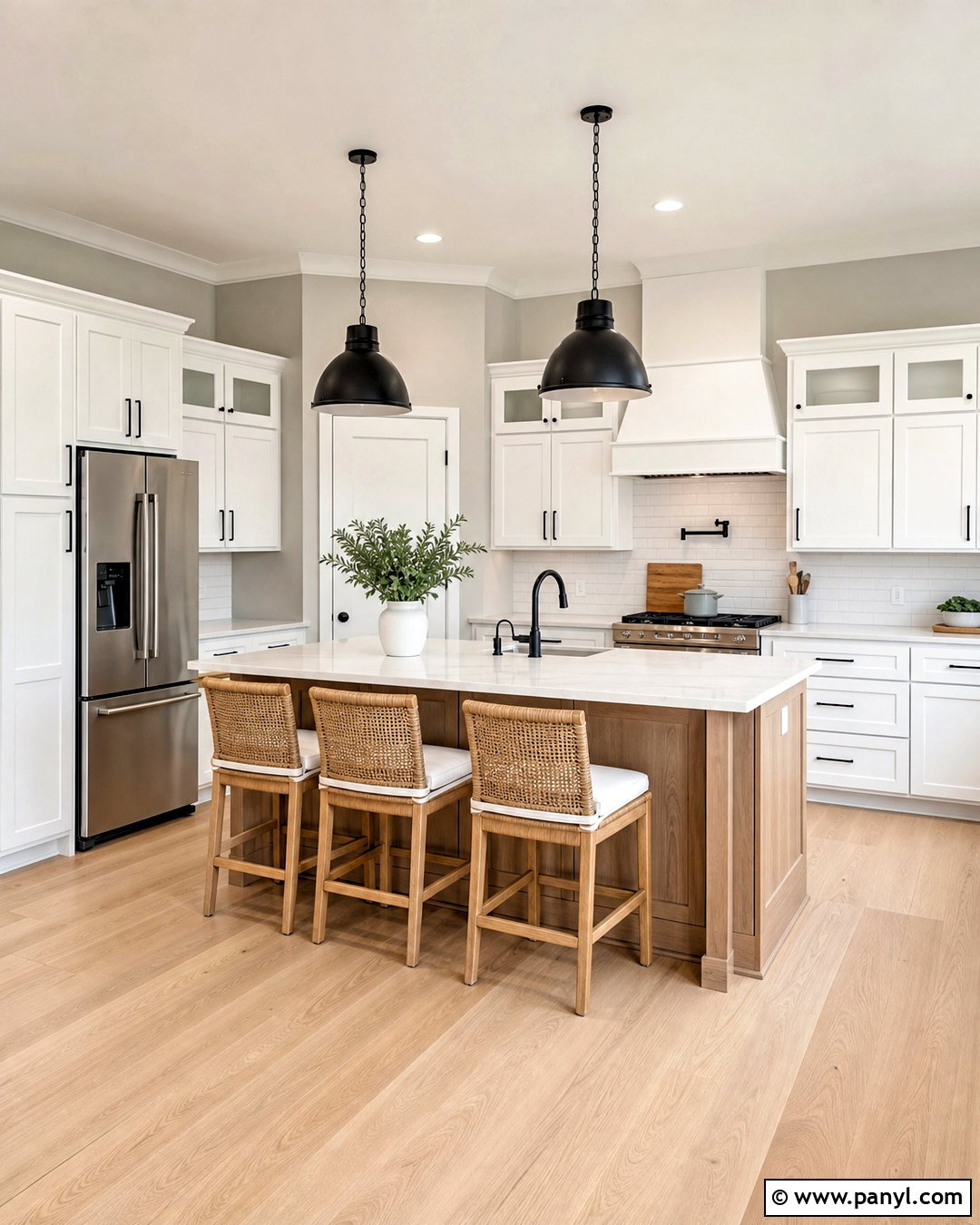
For a clean kitchen with noticeable contrast, place Repose Gray walls around Pure White cabinets and trim. The white cabinetry lifts the gray and prevents the overall space from looking heavy. Add lightly veined white quartz countertops, a glossy white subway tile backsplash, and pale oak flooring to create a bright foundation. Matte black cabinet pulls and simple black pendants give the room a modern outline. A medium oak island introduces warmth and keeps the black accents from becoming too dominant. Finish the space with woven counter stools, clear glass accessories, and restrained greenery. This complete palette suits transitional, farmhouse, and contemporary kitchens while allowing appliances and permanent finishes to remain visually balanced.
3. Repose Gray And Alabaster Bedroom
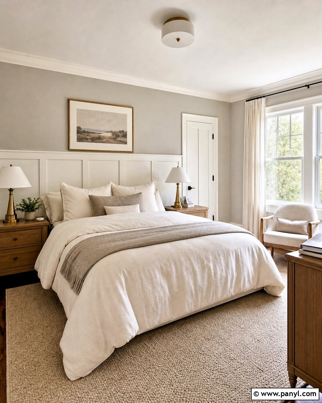
A bedroom layered in Repose Gray and Alabaster feels warm, quiet, and inviting. Use Repose Gray on the walls, then bring Alabaster onto the ceiling, trim, doors, and a painted wood headboard wall. The creamy white softens the gray while maintaining enough separation to highlight architectural details. Dress the bed in ivory linen, warm taupe blankets, and muted gray pillows. Medium-tone oak nightstands and aged brass lamps add natural warmth without turning the palette yellow. A beige wool rug grounds the arrangement, while light-filtering off-white curtains keep the room comfortable during the day. Complete the look with understated landscape prints and one dark bronze bench for a small amount of contrast.
4. Repose Gray And Pavestone Dining Room
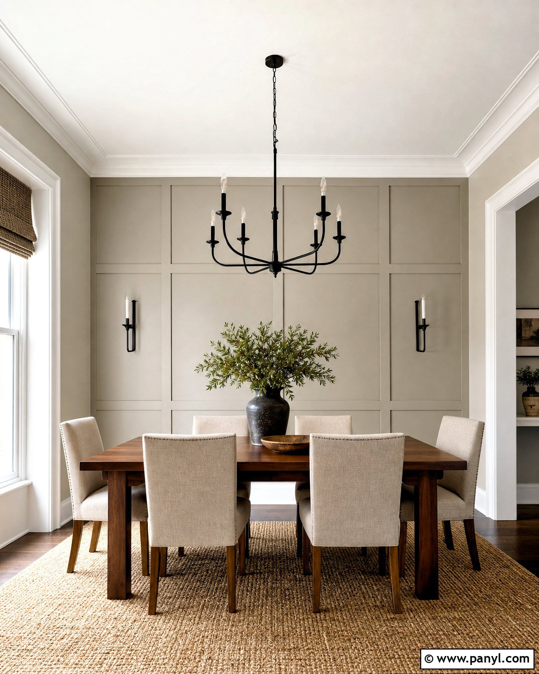
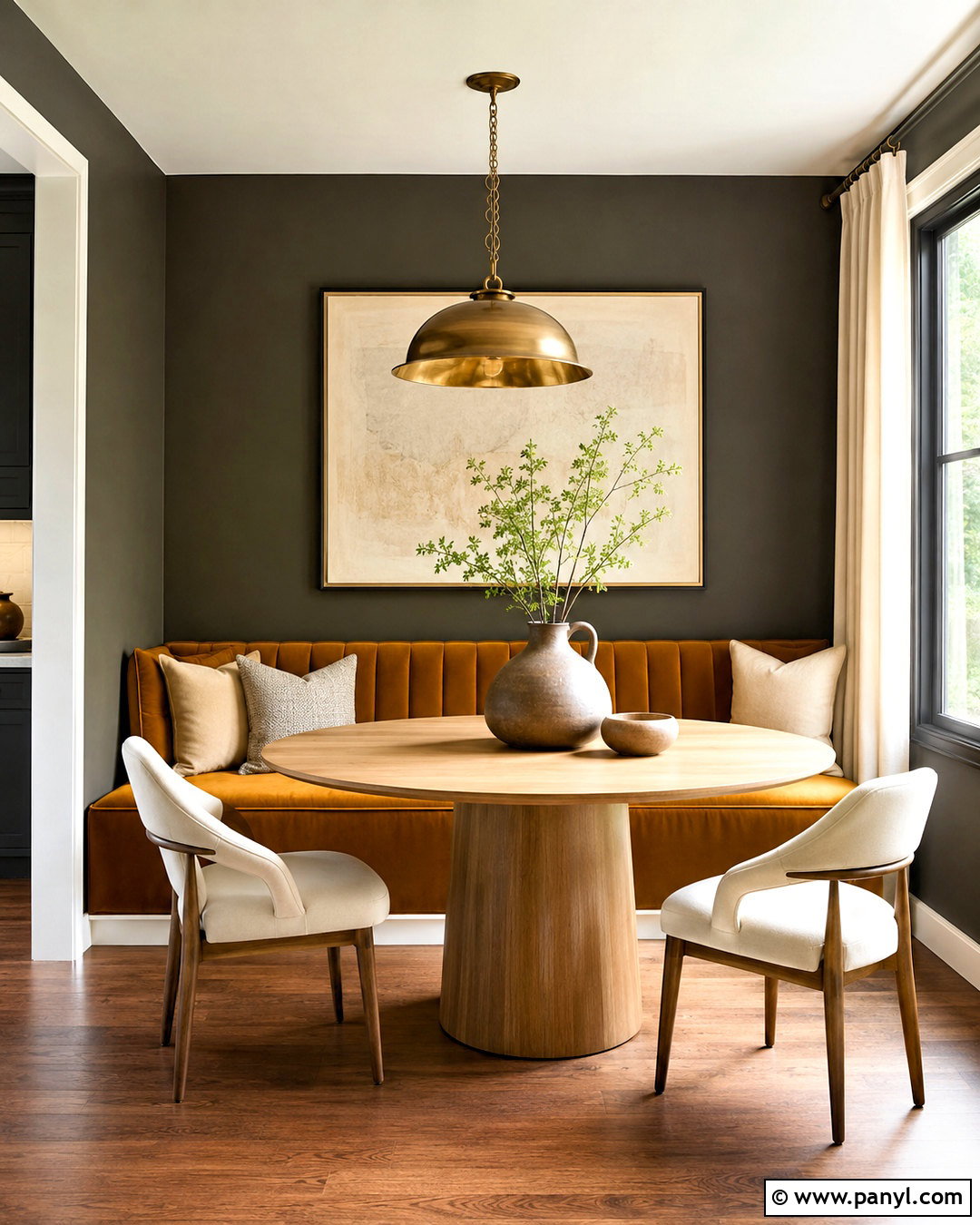
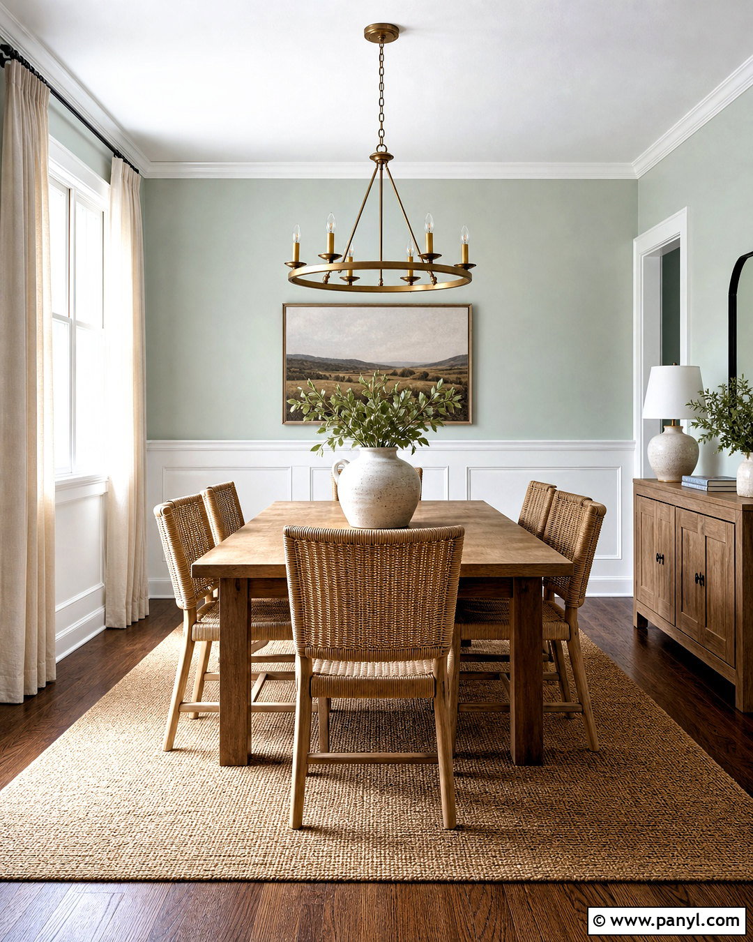
Pavestone gives Repose Gray a deeper, earthier partner that feels sophisticated without creating dramatic contrast. Cover the main dining room walls in Repose Gray and use Pavestone on a paneled feature wall, lower wainscoting, or built-in storage. A walnut dining table and upholstered oatmeal chairs connect the two neutrals through their warm undertones. Keep the ceiling and crown molding soft white to prevent the layered gray scheme from feeling enclosed. Add a substantial black iron chandelier, woven window shades, and a natural jute-blend rug. Cream ceramic dishes and muted green branches provide subtle freshness. This finished dining room looks grounded, comfortable, and polished enough for both everyday meals and special gatherings.
5. Repose Gray And Mindful Gray Home Office
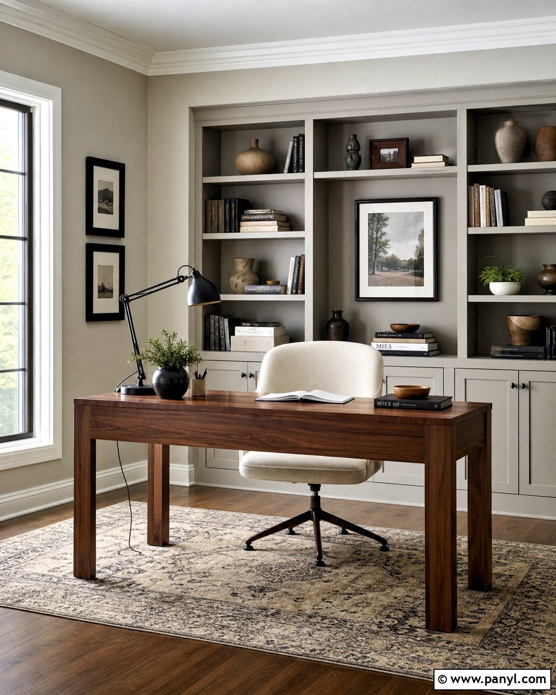
When you want a focused workspace without using a bold accent color, combine Repose Gray with Mindful Gray. Paint three walls Repose Gray and apply the deeper gray to built-in bookcases, cabinet doors, or the wall behind the desk. Choose a streamlined walnut desk to introduce warmth and an upholstered cream office chair for comfort. Black picture frames, hardware, and a slim task lamp sharpen the neutral palette. A faded beige and charcoal rug adds pattern while remaining professional. Keep window treatments light and simple so natural light can move across both paint colors. Carefully arranged books, pottery, and storage boxes complete a calm home office that feels organized rather than overly formal.
6. Repose Gray And Dovetail Family Room
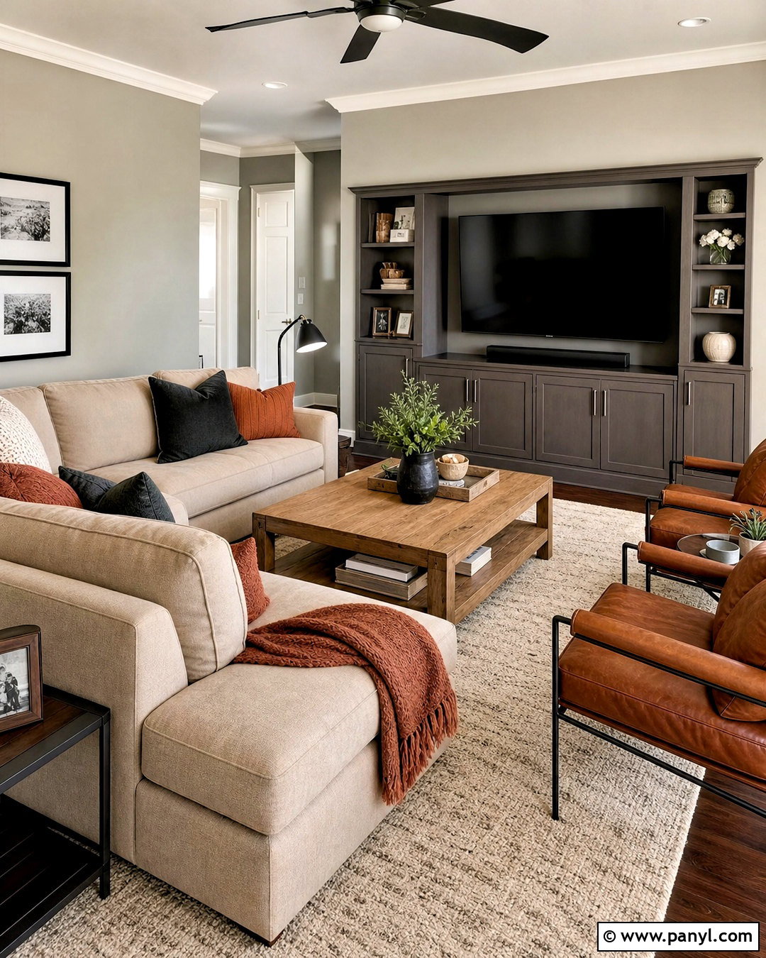
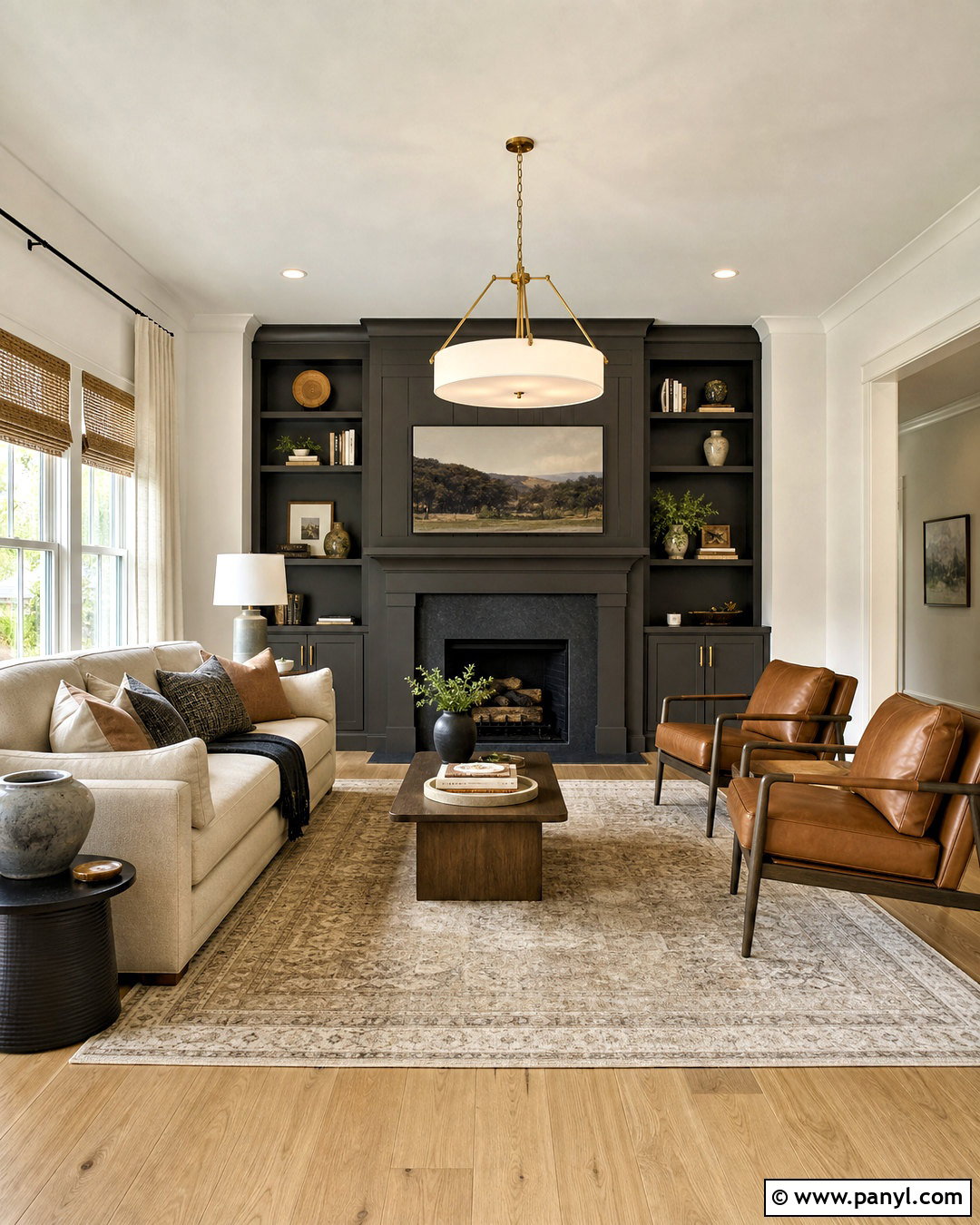
Dovetail brings rich charcoal-gray depth to a family room centered around Repose Gray. Keep Repose Gray on the surrounding walls and paint the television wall, media cabinetry, or fireplace built-ins in Dovetail. This darker surface helps visually organize electronics and creates a strong focal point. Select a large warm beige sectional, a medium oak coffee table, and a textured cream area rug to soften the contrast. Leather accent chairs add warmth and durability, while black metal lamps connect with the deeper cabinetry. Introduce rust, taupe, and charcoal through washable pillows and throws. The completed room feels cozy and practical, with enough contrast to create character but not so much that it loses its relaxed atmosphere.
7. Repose Gray And Gauntlet Gray Entryway
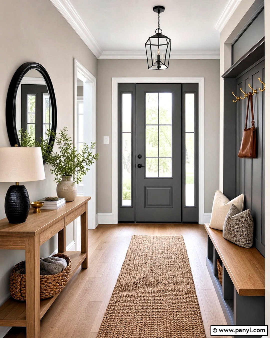
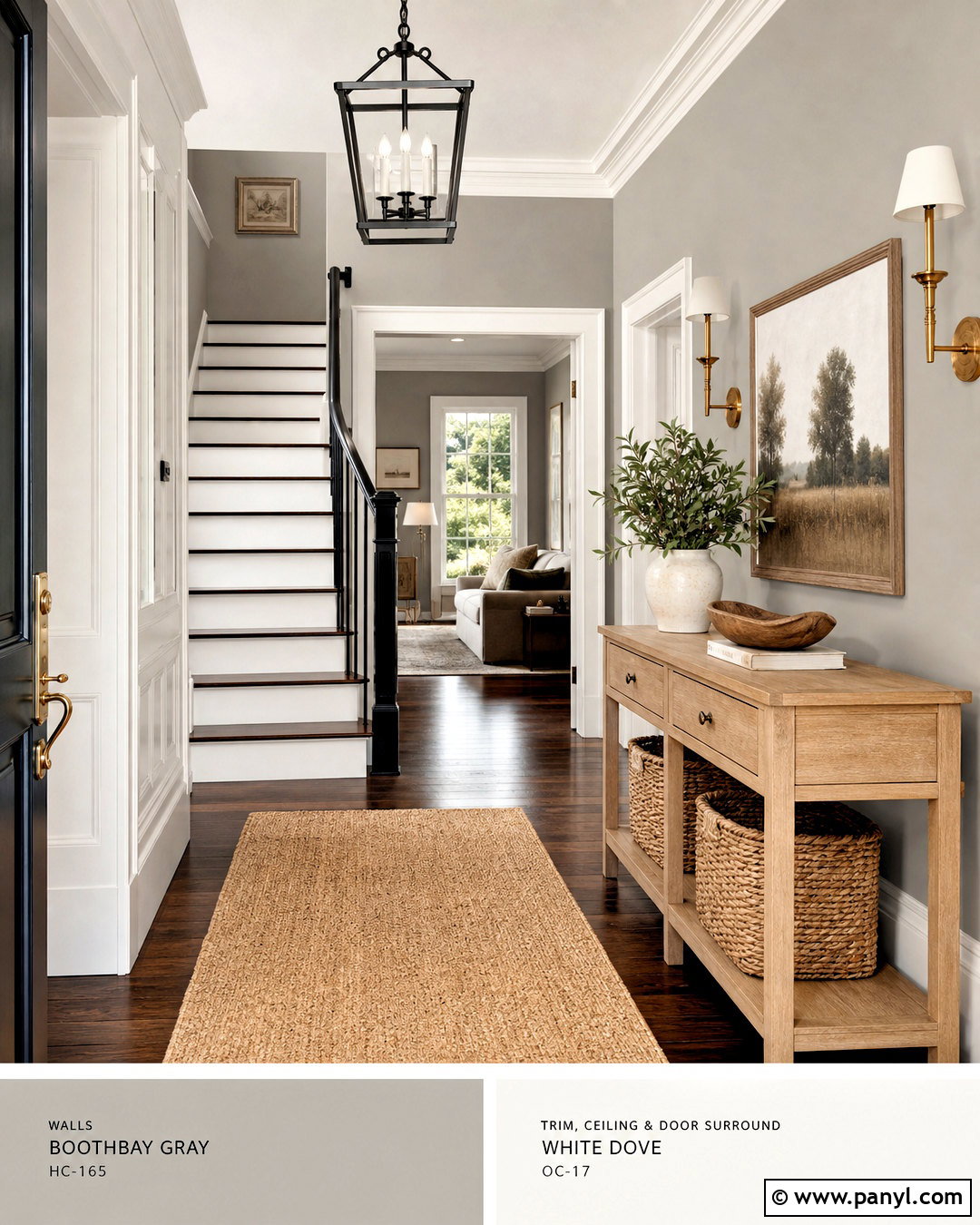
An entryway gains definition when Repose Gray walls are grounded by Gauntlet Gray doors and millwork. Apply Repose Gray throughout the main wall area, then use Gauntlet Gray on the interior front door, staircase railing, or a built-in bench with storage drawers. Warm white trim maintains a crisp boundary between the two grays. Furnish the space with a narrow natural oak console, a round black-framed mirror, and a woven runner in beige and charcoal. Add simple brass hooks and an ivory bench cushion to brighten the darker elements. A ceramic table lamp and a leafy plant soften the practical surfaces. This coordinated entry feels orderly, welcoming, and connected to adjacent neutral rooms.
8. Repose Gray And Urbane Bronze Living Room
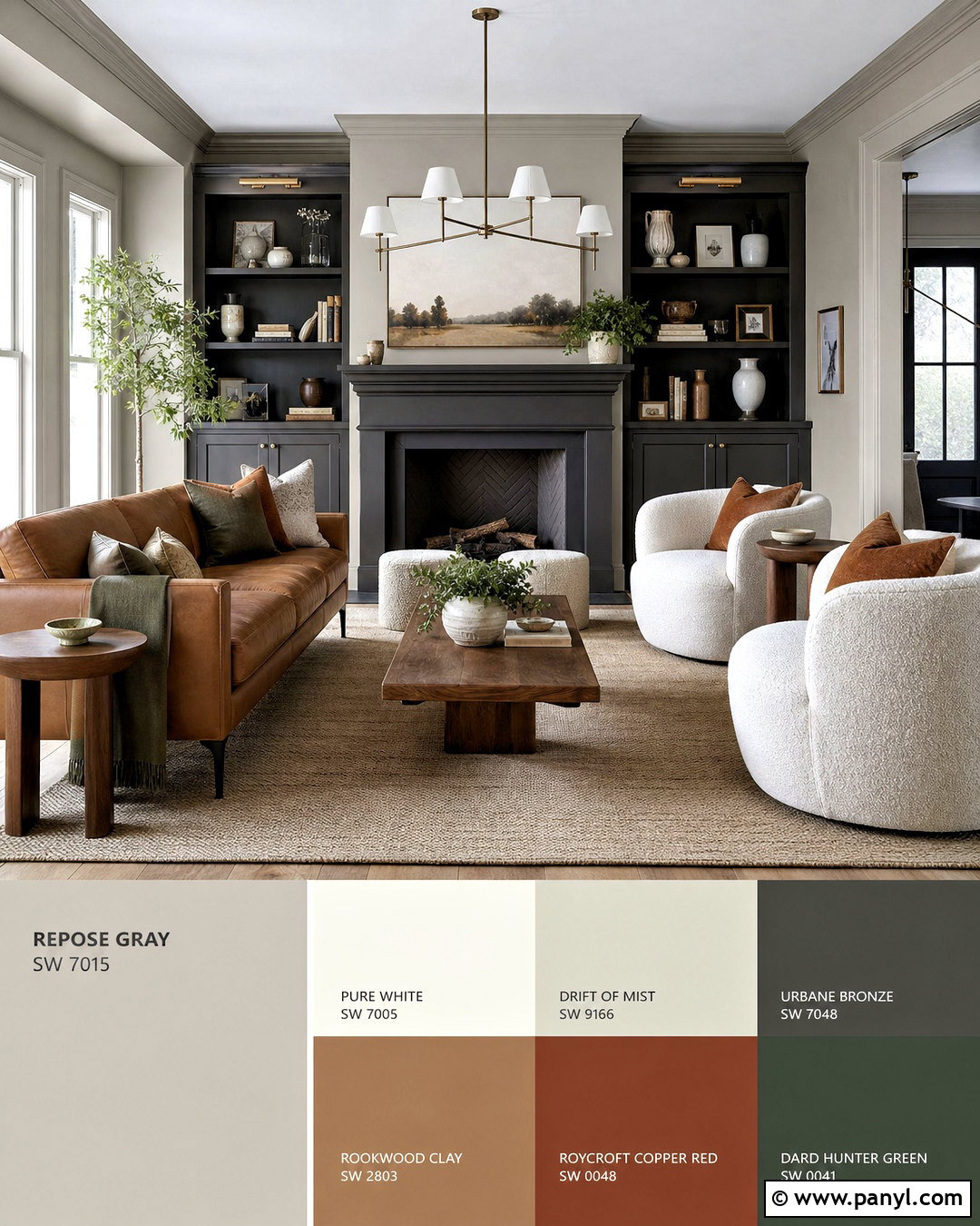
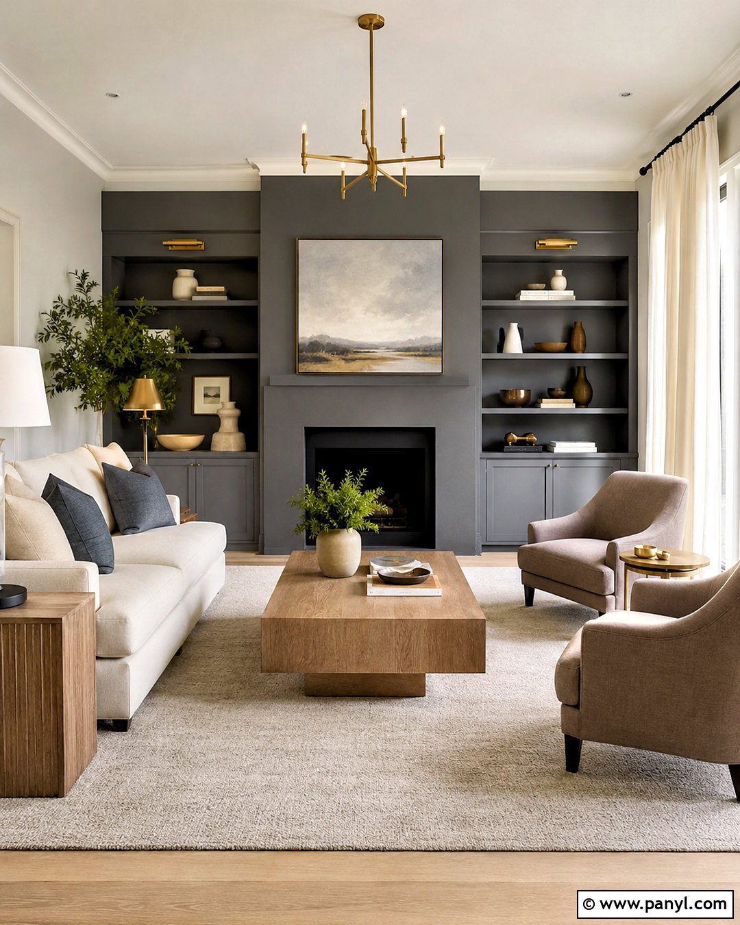
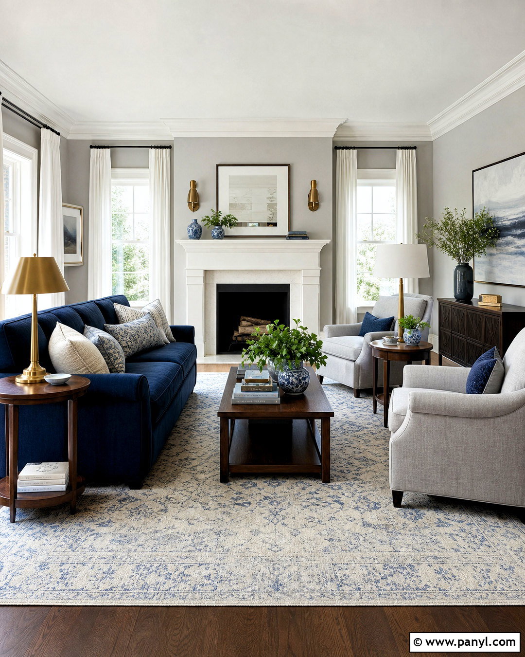
Urbane Bronze turns Repose Gray into a richer, nature-inspired living room palette. Use Repose Gray as the broad wall color and apply Urbane Bronze to the fireplace, built-in shelves, or a single architectural wall. The deep brown-gray accent feels softer than black while still providing substantial contrast. Add a camel leather sofa, cream boucle chairs, and a large vintage-style rug containing taupe, olive, and faded rust. Walnut furniture and aged brass lighting emphasize the scheme’s warm direction. Keep curtains light and loosely woven so the darker focal point does not dominate the space. Natural pottery, dark wood frames, and several green plants complete this grounded room with a comfortable, modern-organic character.
9. Repose Gray And Black Fox Kitchen
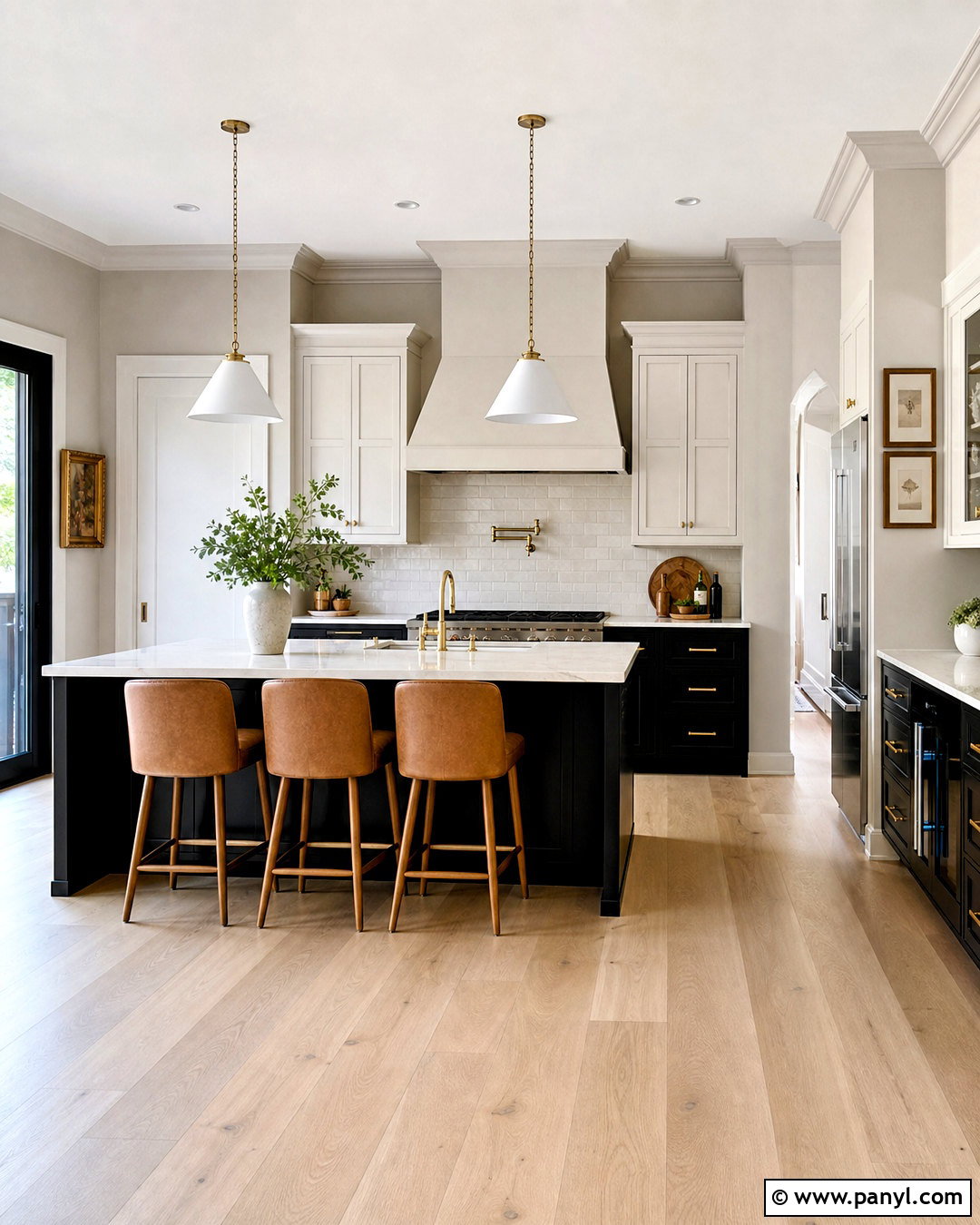
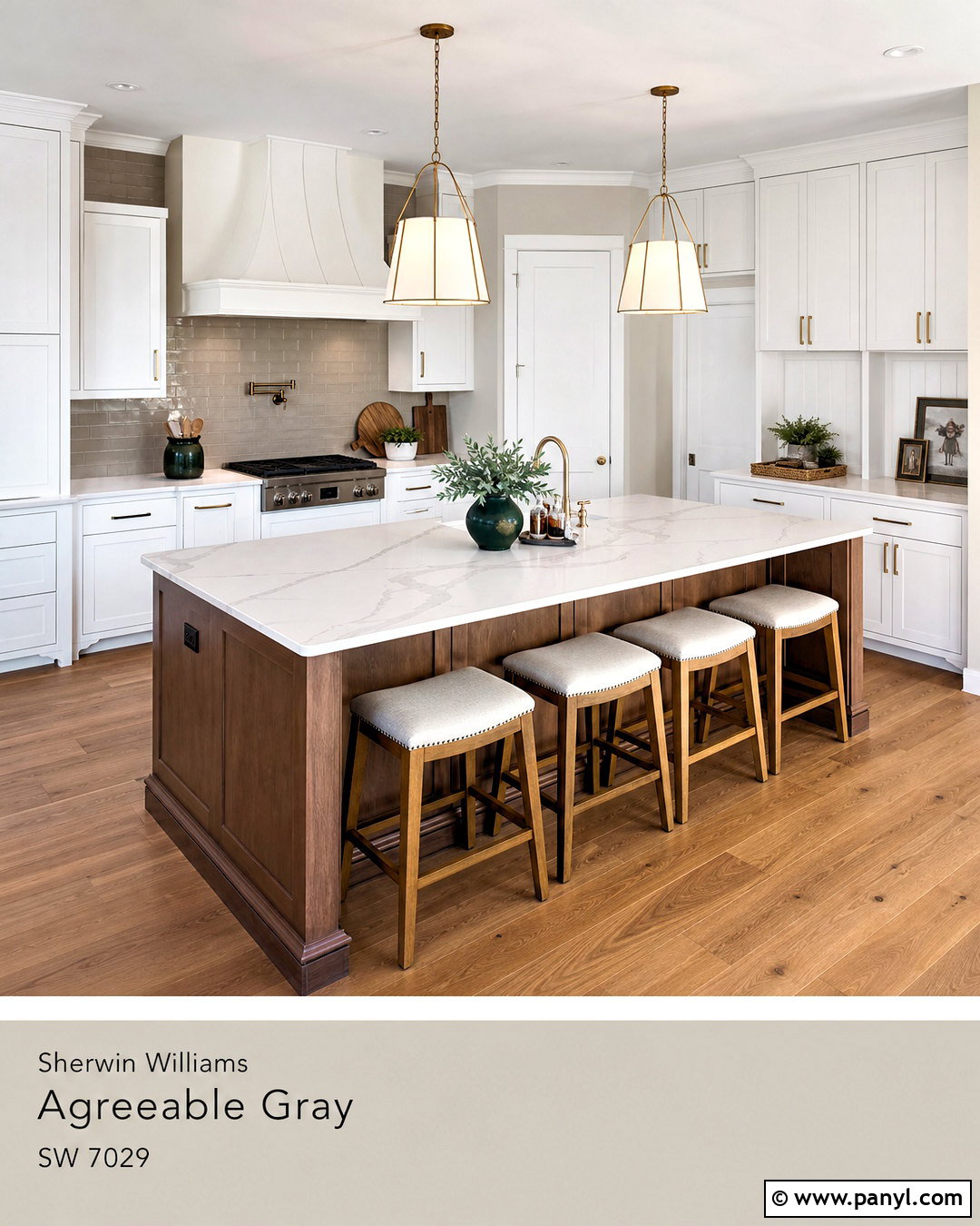
Black Fox provides a deep brown-black accent that works beautifully with the restrained character of Repose Gray. Paint the kitchen walls Repose Gray and use Black Fox on the island, lower cabinets, or a full pantry wall. Balance the dark cabinetry with warm white upper cabinets and creamy quartz countertops. A handmade backsplash in soft ivory introduces texture, while medium-tone white oak flooring warms both paint colors. Choose aged brass hardware and cone-shaped pendants to bring a gentle glow to the strong island color. Upholstered counter stools in tan performance fabric make the space more approachable. The finished kitchen feels upscale and layered, yet the neutral materials keep it suitable for a practical, everyday home.
10. Repose Gray And Iron Ore Bathroom
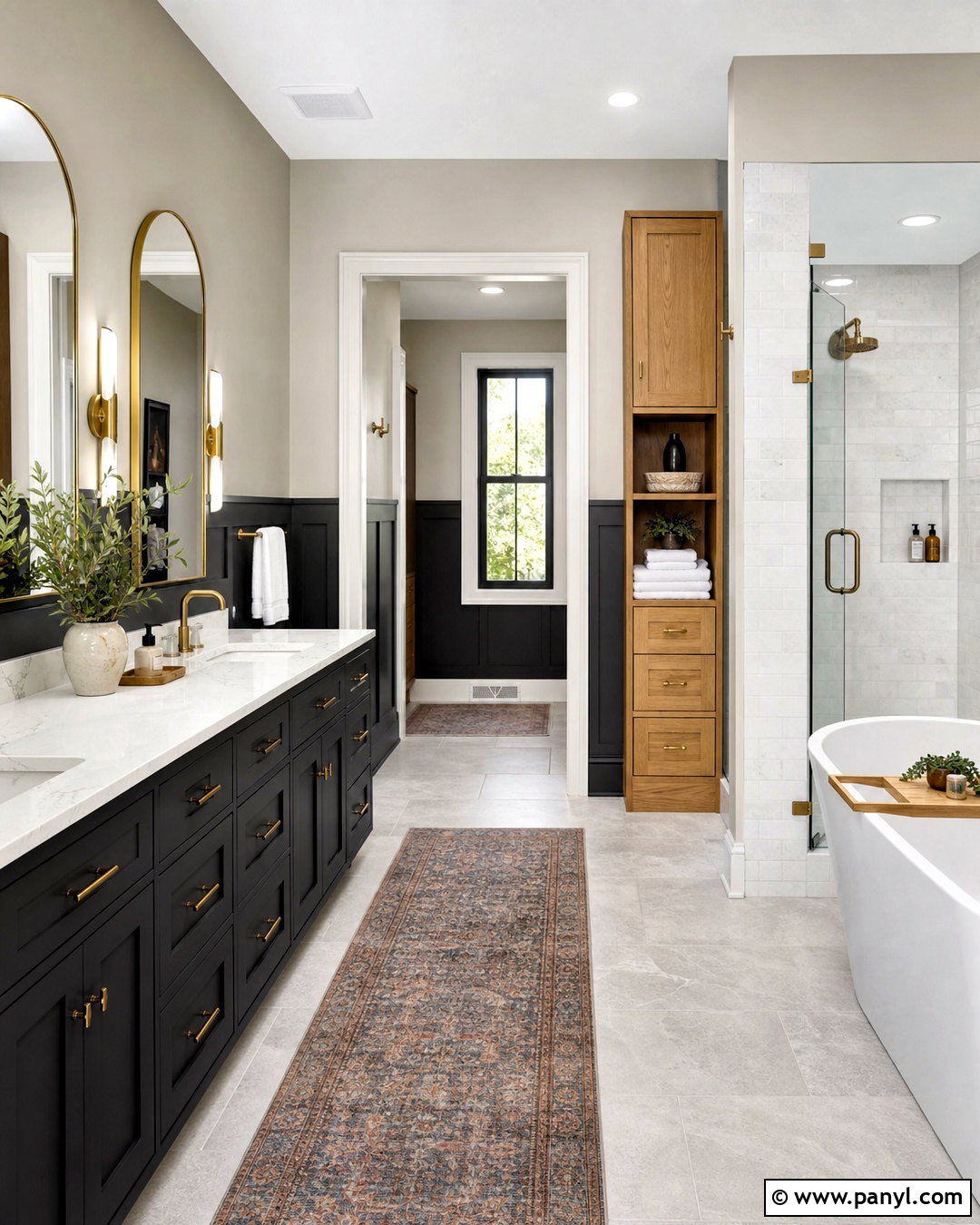
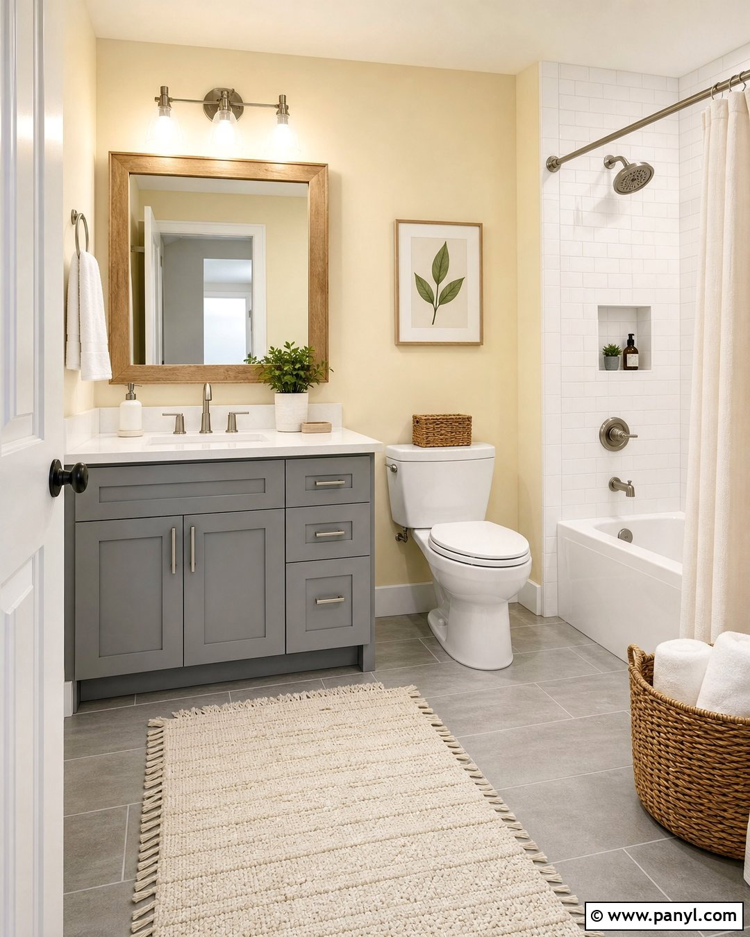
Iron Ore creates a bold bathroom contrast without looking as sharp as a pure black. Use Repose Gray on the upper walls and paint the vanity, door, or paneled lower wall in Iron Ore. White marble-look quartz, a pale stone tile floor, and warm white trim keep the compact space open. Select brushed brass faucets and rounded mirrors to warm the gray combination. An oak-framed linen cabinet introduces another natural material and prevents the room from feeling overly monochromatic. Finish the design with white towels, a muted vintage runner, and a small ceramic planter. This complete bathroom palette feels modern and substantial, with the dark paint concentrating visual weight around useful features rather than covering every surface.
11. Repose Gray And Tricorn Black Mudroom
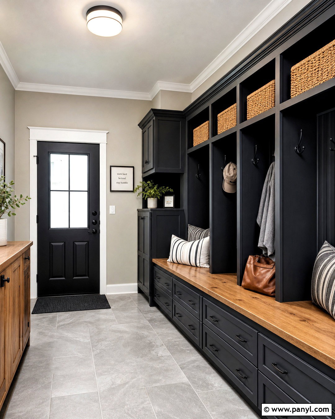
A hardworking mudroom benefits from the crisp structure of Repose Gray and Tricorn Black. Paint the walls Repose Gray, then use Tricorn Black on tall lockers, lower storage cabinets, and the utility door. Keep the ceiling and baseboards clean white to separate the dark cabinetry from the gray background. Install a warm butcher-block bench seat and tan woven baskets to introduce practical storage and natural contrast. Durable light-gray floor tile hides everyday dirt while supporting the wall color. Add matte black hooks, a simple flush-mount light, and washable striped cushions. The finished mudroom appears organized and intentional, proving that functional areas can handle strong contrast when lighter surfaces and warm textures are evenly distributed.
12. Repose Gray And Naval Bedroom
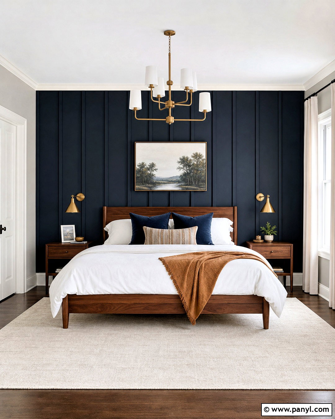
Naval gives a Repose Gray bedroom a deep, classic focal point. Paint most walls Repose Gray and reserve Naval for the wall behind the bed or for custom wardrobes. A natural oak or warm walnut bed creates a bridge between the cool blue and balanced gray. Layer crisp white bedding with navy pillows, a soft camel throw, and subtle striped sheets. Use warm brass sconces to frame the headboard and repeat the finish on small drawer pulls. An ivory rug and off-white curtains preserve brightness around the darker wall. Finish with coastal landscape artwork rather than obvious themed decor. The result is restful and refined, with enough color to feel distinctive while remaining easy to update.
13. Repose Gray And Indigo Batik Exterior
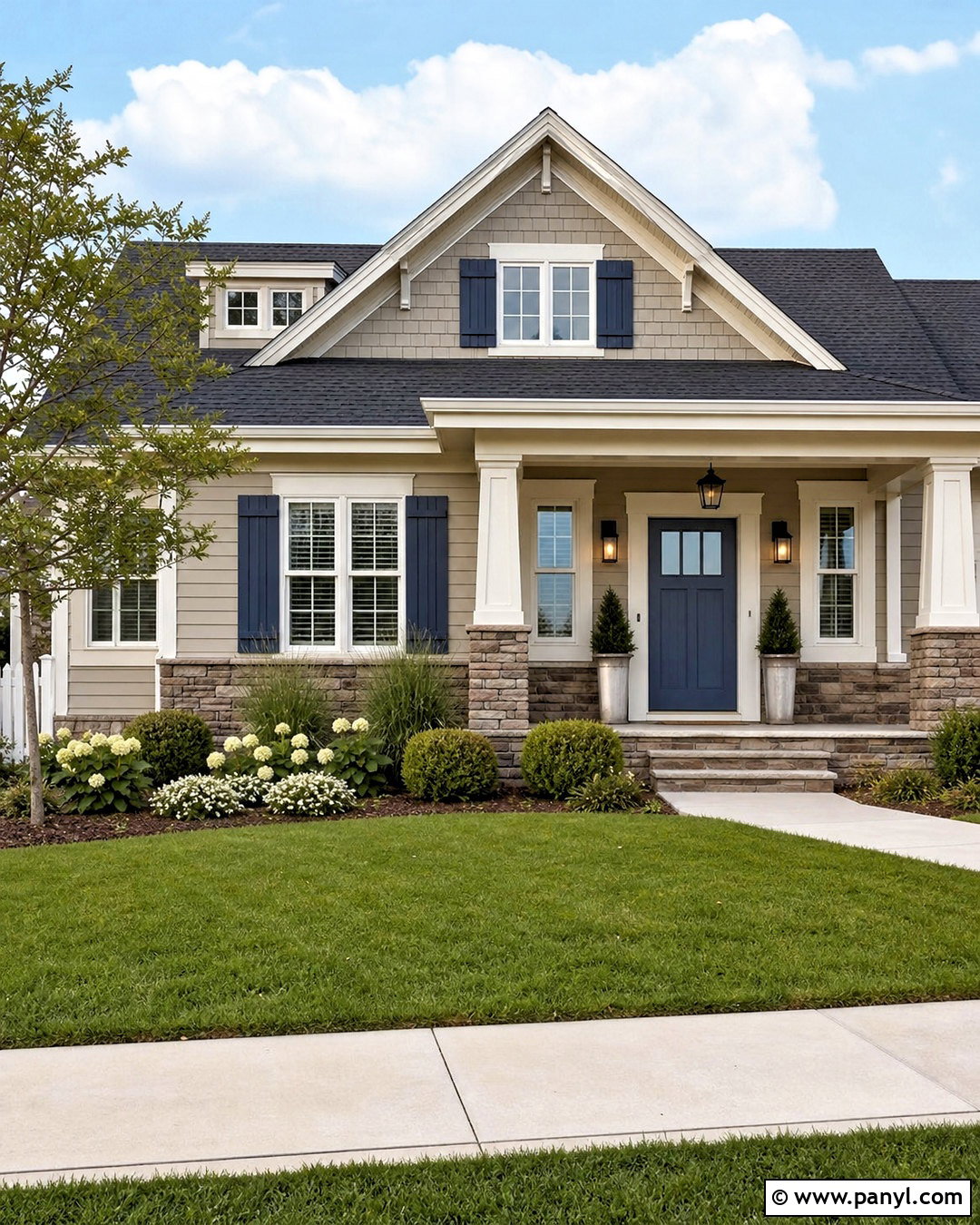
Indigo Batik gives a Repose Gray exterior a confident accent without overwhelming a typical residential facade. Use Repose Gray on the main siding, a clean warm white on trim and porch columns, and Indigo Batik on the front door and shutters. A charcoal architectural-shingle roof supports the blue-gray palette, while medium-tone stone around the foundation adds natural variation. Choose matte black porch lights, dark house numbers, and simple metal planters for a consistent finish. Fresh landscaping with boxwood, ornamental grasses, and white flowering shrubs softens the painted surfaces. This complete exterior scheme works especially well on Craftsman, ranch, and traditional homes because every color has a clear architectural role.
14. Repose Gray And Rainwashed Bathroom
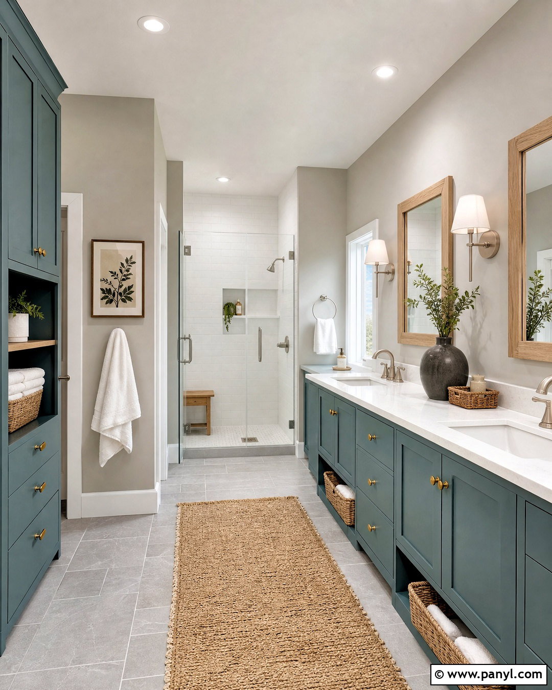
Rainwashed introduces a gentle blue-green note that makes Repose Gray feel fresh and relaxed. Cover the main bathroom walls in Repose Gray and use Rainwashed on the vanity, linen cabinet, or a paneled tub surround. Select white quartz countertops, pale gray floor tile, and glossy white shower tile to maintain a clean background. Brushed nickel fixtures support the cool side of the palette, while a light oak mirror and woven baskets add needed warmth. Use white towels with small blue-green details and a washable ivory runner underfoot. A simple glass shower enclosure keeps the colors visible across the room. This balanced bathroom feels soothing and airy without relying on a completely white interior.
15. Repose Gray And Sea Salt Laundry Room
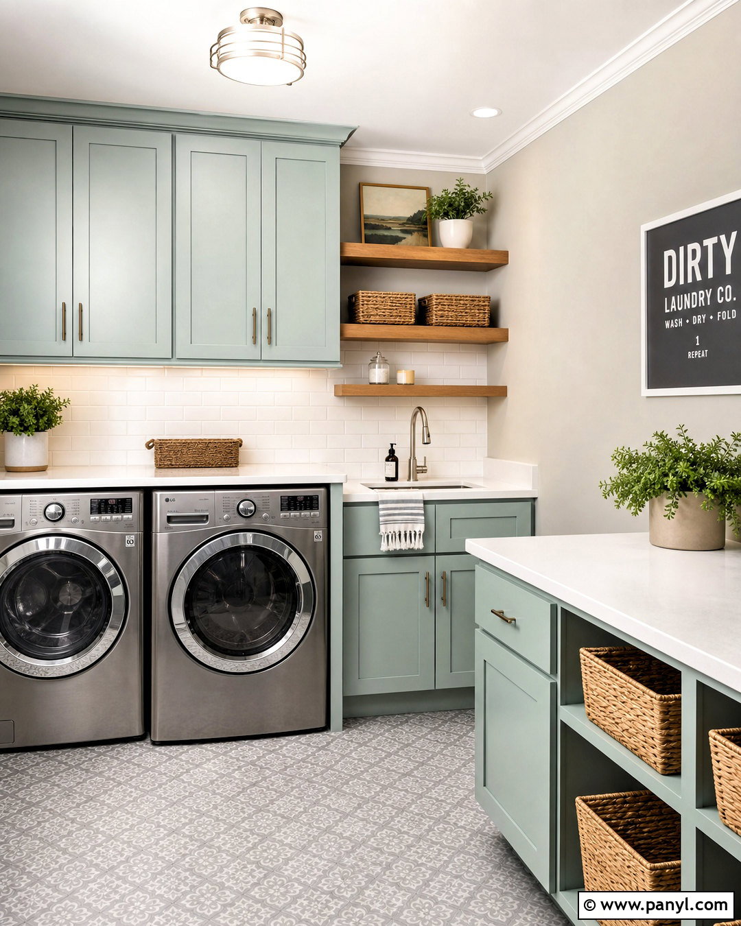
A laundry room painted in Repose Gray and Sea Salt feels brighter and more enjoyable without sacrificing practicality. Use Repose Gray on the walls and Sea Salt on the cabinetry or utility closet doors. White quartz counters and a white tile backsplash reflect light around the work surfaces. Install warm oak floating shelves above the machines and organize supplies in matching woven baskets and clear containers. Brushed nickel hardware keeps the look light, while a patterned gray and blue-green floor adds personality and helps disguise minor marks. Include an undermount utility sink and a simple hanging rail for function. The finished room appears clean, coordinated, and calm, with every storage feature incorporated into the overall palette.
16. Repose Gray And Evergreen Fog Kitchen
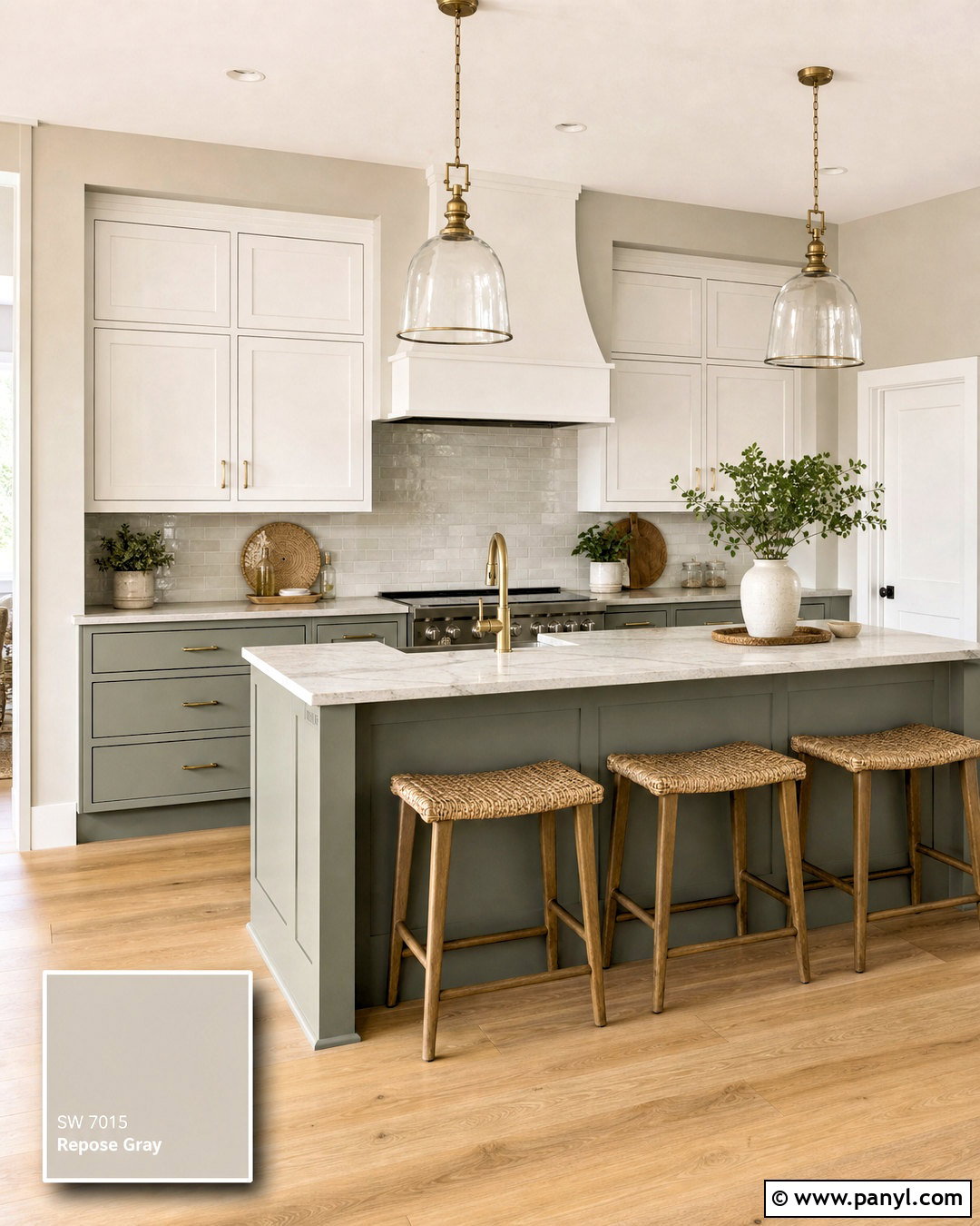
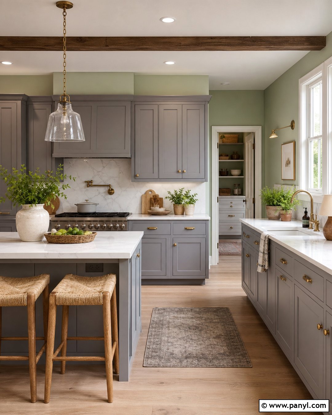
Evergreen Fog offers an earthy green contrast that gives Repose Gray a more organic character. Paint the kitchen walls Repose Gray and use Evergreen Fog across the island or lower cabinets. Keep upper cabinets warm white to maintain openness, then add lightly veined quartz countertops and a soft white zellige-style backsplash. Natural white oak flooring and woven stools connect the green-gray cabinetry to warmer materials. Choose aged brass hardware and clear glass pendants for a soft, polished finish. A few stoneware bowls, wood cutting boards, and potted herbs provide practical decor. This complete kitchen palette feels current yet restrained because both paint colors are muted, allowing the wood, metal, and textured tile to contribute equal visual interest.
17. Repose Gray And Retreat Sunroom
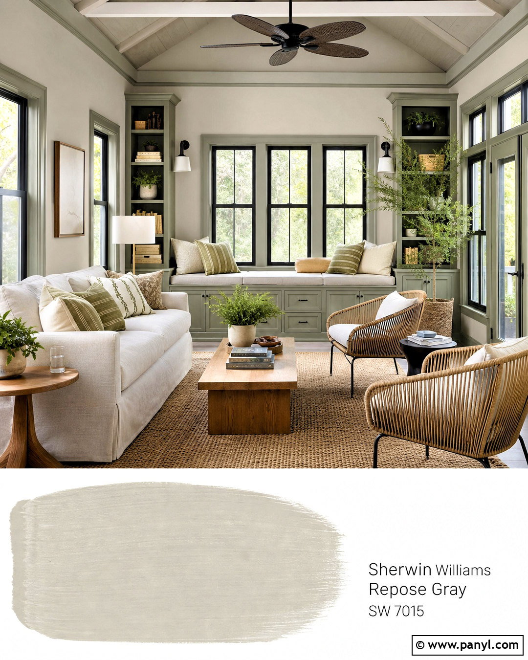
Retreat creates a comfortable botanical palette when paired with Repose Gray in a bright sunroom. Apply Repose Gray to most walls and use Retreat on a built-in window seat, storage cabinets, or the wall facing the garden. Furnish the room with a light neutral sofa, two woven lounge chairs, and an oak coffee table. Add cream cushions, olive-striped pillows, and a textured indoor-outdoor rug to connect the paint colors. Soft white curtains can filter intense sunlight without hiding the windows. Black metal plant stands and a simple ceiling fan give the room a clean framework. Complete the space with leafy plants in terracotta and stone pots for a relaxed indoor-outdoor look that remains cohesive year-round.
18. Repose Gray And Accessible Beige Open Floor Plan
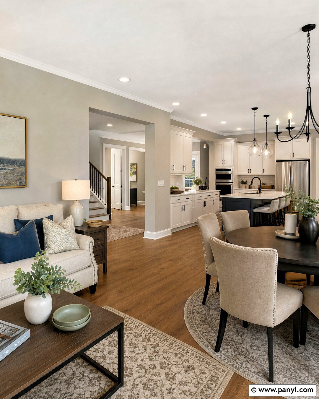
Accessible Beige adds warmth to an open floor plan while allowing Repose Gray to remain the leading neutral. Use Repose Gray in the living and dining areas, then introduce Accessible Beige in the adjoining kitchen, hallway, or breakfast space. Connect the rooms with consistent warm white trim, medium oak flooring, and repeated black or aged brass hardware. A cream sofa, beige dining chairs, and taupe rugs prevent abrupt changes between wall colors. Add muted blue, olive, and clay accents in small amounts throughout the shared space. Maintaining similar fabric textures and wood tones is more important than matching every accessory. The completed interior feels gently layered, with clear zones that still belong to one coordinated home.
19. Repose Gray And Coral Clay Dining Room
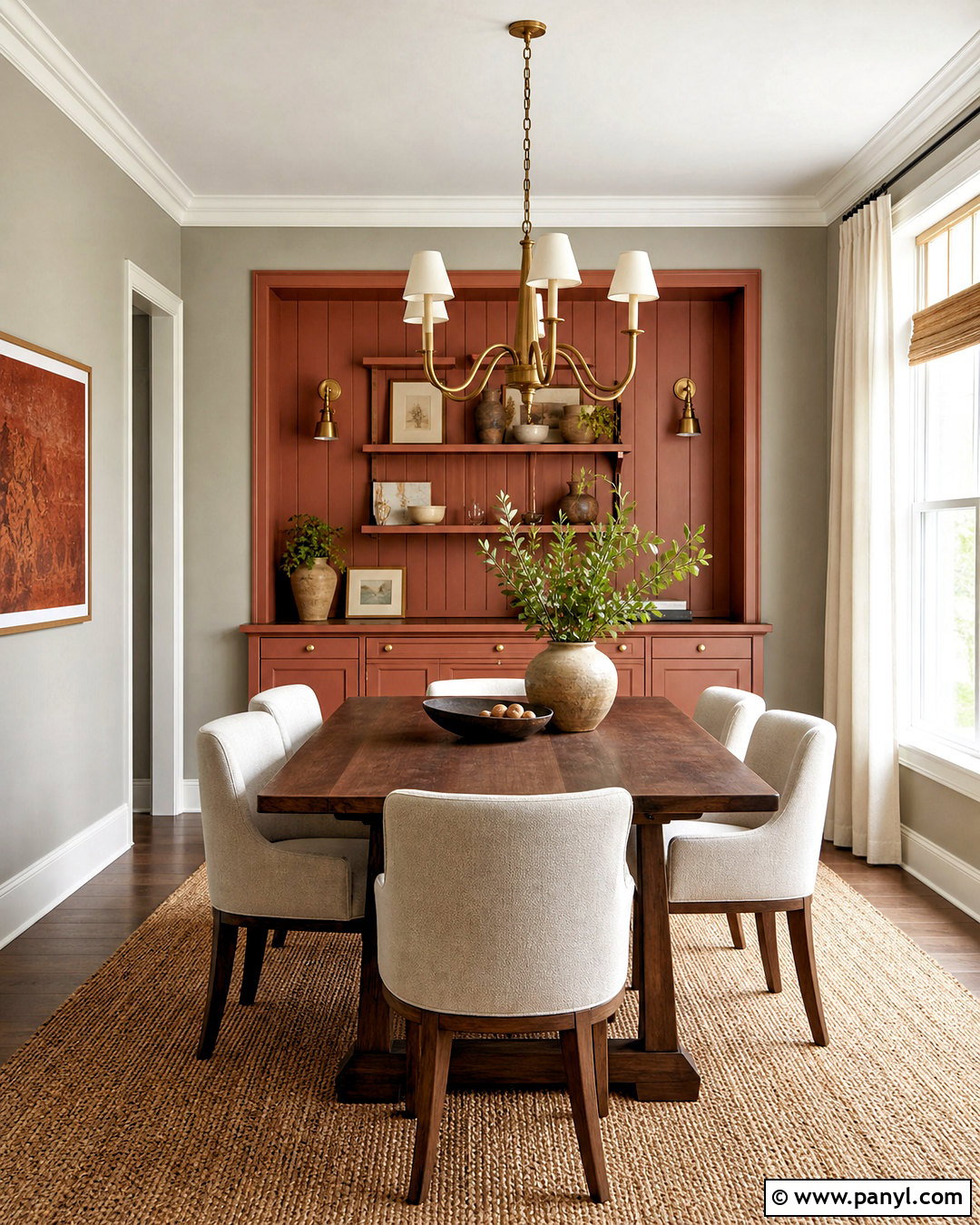
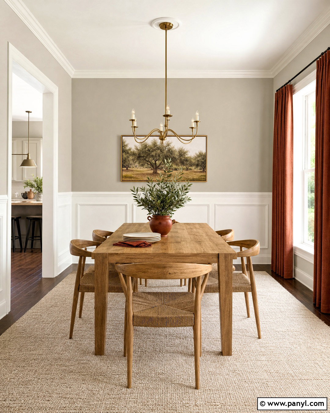
Coral Clay brings warmth and personality to Repose Gray without demanding a brightly colored room. Paint the dining room walls Repose Gray and use Coral Clay on a built-in buffet, paneled alcove, or the wall behind a sideboard. Choose a medium walnut dining table, cream upholstered chairs, and a natural woven rug to support the earthy accent. Warm white trim helps the coral tone look clear rather than muddy. Add an aged brass chandelier and simple ivory curtains for softness. Artwork containing muted terracotta, charcoal, and beige can connect the full palette. The finished room feels welcoming and distinctive, with the clay color concentrated on one meaningful architectural feature instead of scattered through unrelated accessories.
20. Repose Gray And Cavern Clay Living Room
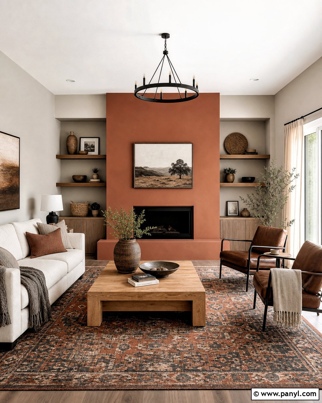
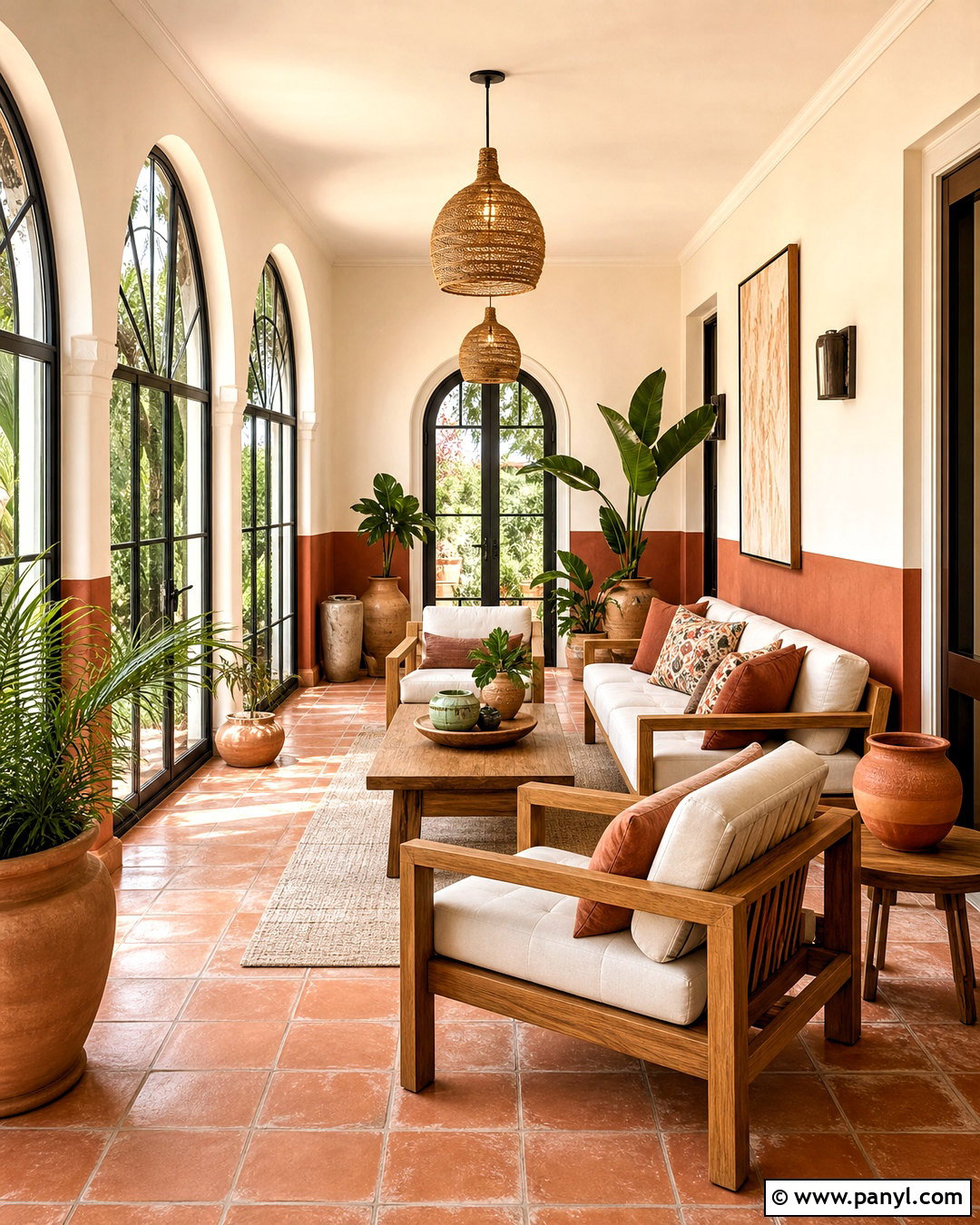
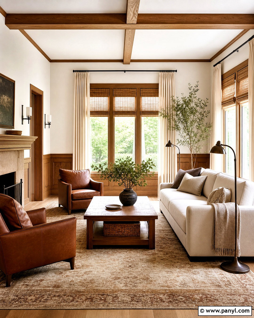
Cavern Clay creates a rich desert-inspired scheme around Repose Gray. Keep Repose Gray on the main walls and place Cavern Clay on the fireplace surround, built-in shelving, or a broad feature wall. Furnish the living room with a cream sofa, saddle-brown leather chairs, and a substantial oak coffee table. A patterned rug combining rust, beige, charcoal, and faded blue ties the warm clay color to the cooler gray. Use matte black lighting and curtain rods for structure, then soften the room with linen drapes and textured pillows. Handmade pottery, woven baskets, and restrained greenery add natural character. This complete look feels warm and collected while preserving the calm versatility that makes Repose Gray so useful.
Conclusion:
The best **20 repose grey coordinating colors** show how easily this neutral can move from crisp and modern to warm and earthy. Whites such as Eider White, Pure White, and Alabaster brighten trim and cabinetry. Deeper shades like Dovetail, Iron Ore, and Naval create clear focal points. Muted greens and blue-greens add freshness, while Coral Clay and Cavern Clay introduce warmth. For a successful result, assign each color a specific role across walls, trim, cabinets, furnishings, and accents. Repeat key materials to connect the palette throughout the room. Most importantly, test every paint color in the actual space during morning, afternoon, and evening light before making your final decision.

Related Ideas and Inspiration:
Leave a Reply