
Sherwin-Williams Agreeable Gray SW 7029 is a warm greige with a beige undertone and an LRV of about 60, making it light enough for many rooms without appearing stark. () The best 20 agreeable gray complimentary colors range from soft whites and layered neutrals to muted greens, rich blues, earthy pinks, and dramatic charcoal tones. The right pairing depends on natural light, flooring, fixed finishes, and how much contrast you want. Always sample both colors together because Agreeable Gray can look warmer, grayer, or slightly taupe as lighting changes. The complete palettes below combine wall color, furniture, finishes, textiles, and accents, giving you practical ways to decorate with 20 agreeable gray complimentary colors.

1. Agreeable Gray And Extra White
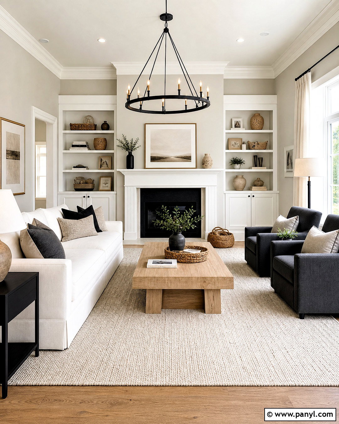
Extra White SW 7006 creates a fresh, clean contrast that keeps Agreeable Gray from feeling too beige. Sherwin-Williams lists Extra White as an official coordinating color for Agreeable Gray. () Use Agreeable Gray across the walls, then apply Extra White to ceilings, baseboards, crown molding, doors, and built-in shelving. In a living room, add a soft white sofa, pale oak coffee table, and textured ivory rug. Matte black lighting and small charcoal accents provide definition without making the room harsh. This pairing works especially well in open layouts because the crisp trim gives each architectural feature a clear outline. Repeat warm wood and woven materials throughout the space so the cooler white remains connected to Agreeable Gray’s underlying warmth.
2. Agreeable Gray And Incredible White
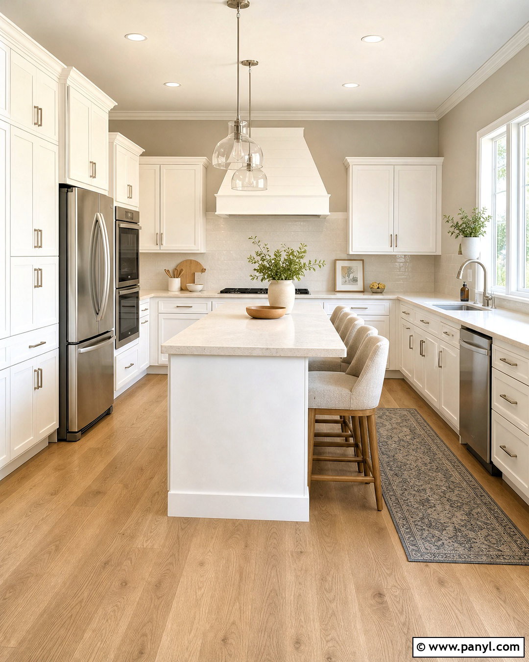
Incredible White SW 7028 creates a soft, low-contrast palette with Agreeable Gray. It is another coordinating color featured by Sherwin-Williams for SW 7029. () Paint the main walls Agreeable Gray and use Incredible White on kitchen cabinets, interior doors, and trim. This gentler white looks comfortable beside cream quartz counters, brushed nickel hardware, and natural white oak flooring. Add counter stools covered in oatmeal fabric and simple ceramic accessories in warm white. A muted blue-gray runner can introduce subtle color without interrupting the quiet scheme. This combination is useful in homes where a bright, crisp white feels disconnected from existing beige tile or warm countertops. The finished room appears airy, coordinated, and inviting rather than sharply divided.
3. Agreeable Gray And Pure White
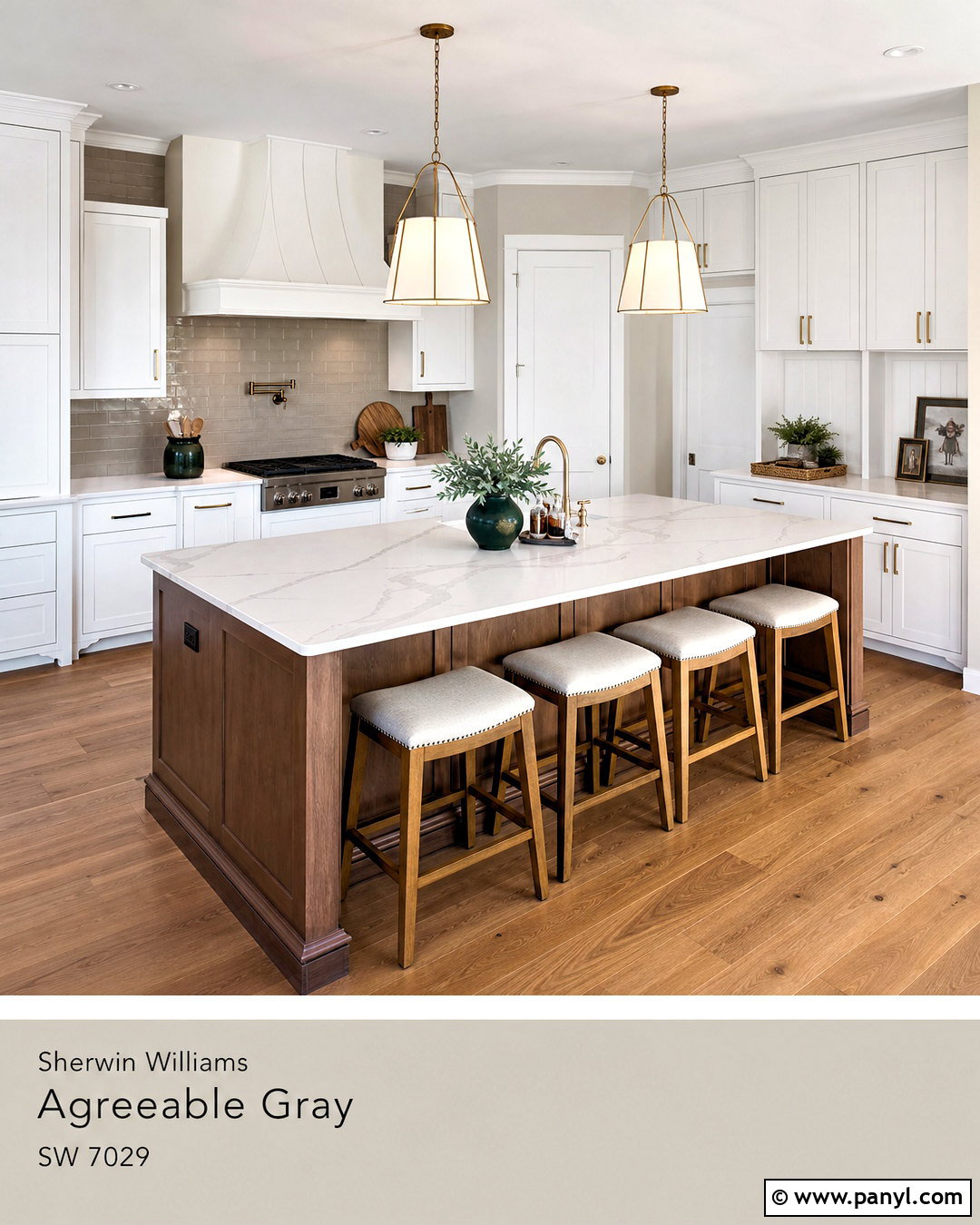
Do you want a balanced white that feels clean without looking icy? Pure White SW 7005 offers enough softness to sit comfortably beside Agreeable Gray while still creating visible contrast. Try Agreeable Gray walls with Pure White kitchen cabinets, ceiling paint, window trim, and a painted range hood. White quartz countertops with restrained gray veining keep the surfaces bright, while medium-tone oak flooring adds warmth below. Complete the room with brushed brass hardware, linen pendant shades, and a taupe backsplash. A few deep green accessories bring natural color into the neutral setting. This whole-room palette feels polished but not overly formal. It is especially effective in kitchens that connect to Agreeable Gray hallways or living areas because the transition looks clean and continuous.
4. Agreeable Gray And Alabaster
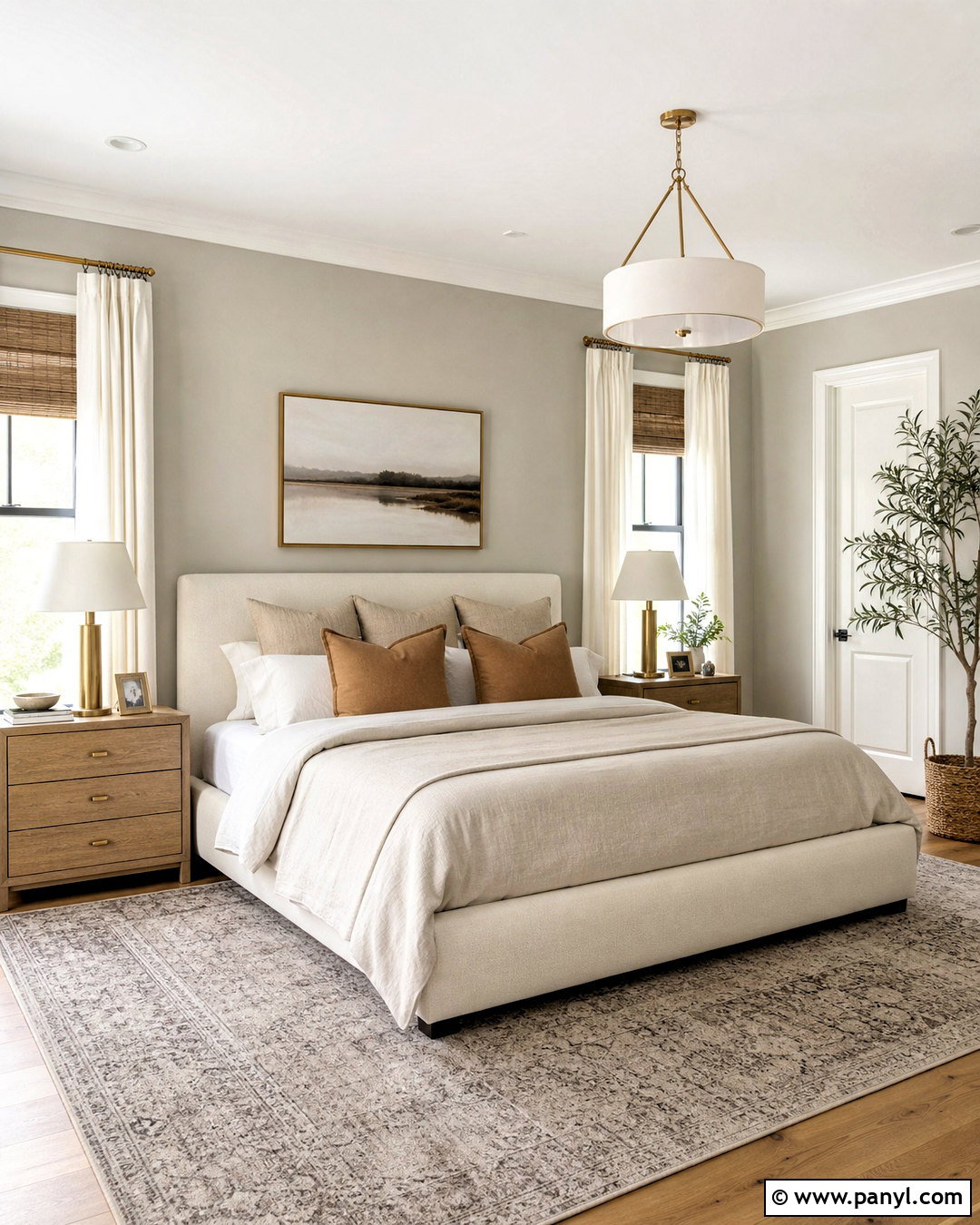
Alabaster SW 7008 brings creamy warmth to Agreeable Gray, creating a relaxed palette for a bedroom or family room. Cover the walls in Agreeable Gray and use Alabaster on the ceiling, trim, fireplace surround, and nearby built-ins. Choose an upholstered bed or sofa in warm ivory rather than bright white. Layer oatmeal linen, camel-colored pillows, and a softly patterned greige rug for depth. Medium oak nightstands or side tables strengthen the warm undertones shared by both paints. Brushed brass lamps add a gentle glow, while small charcoal details prevent the scheme from becoming washed out. This complete look suits rooms with warm daylight, tan carpet, or beige stone because Alabaster connects those finishes to the cooler gray notes in the walls.
5. Agreeable Gray And Snowbound
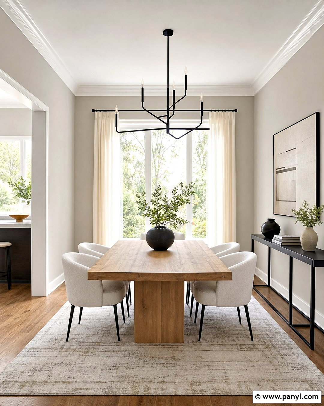
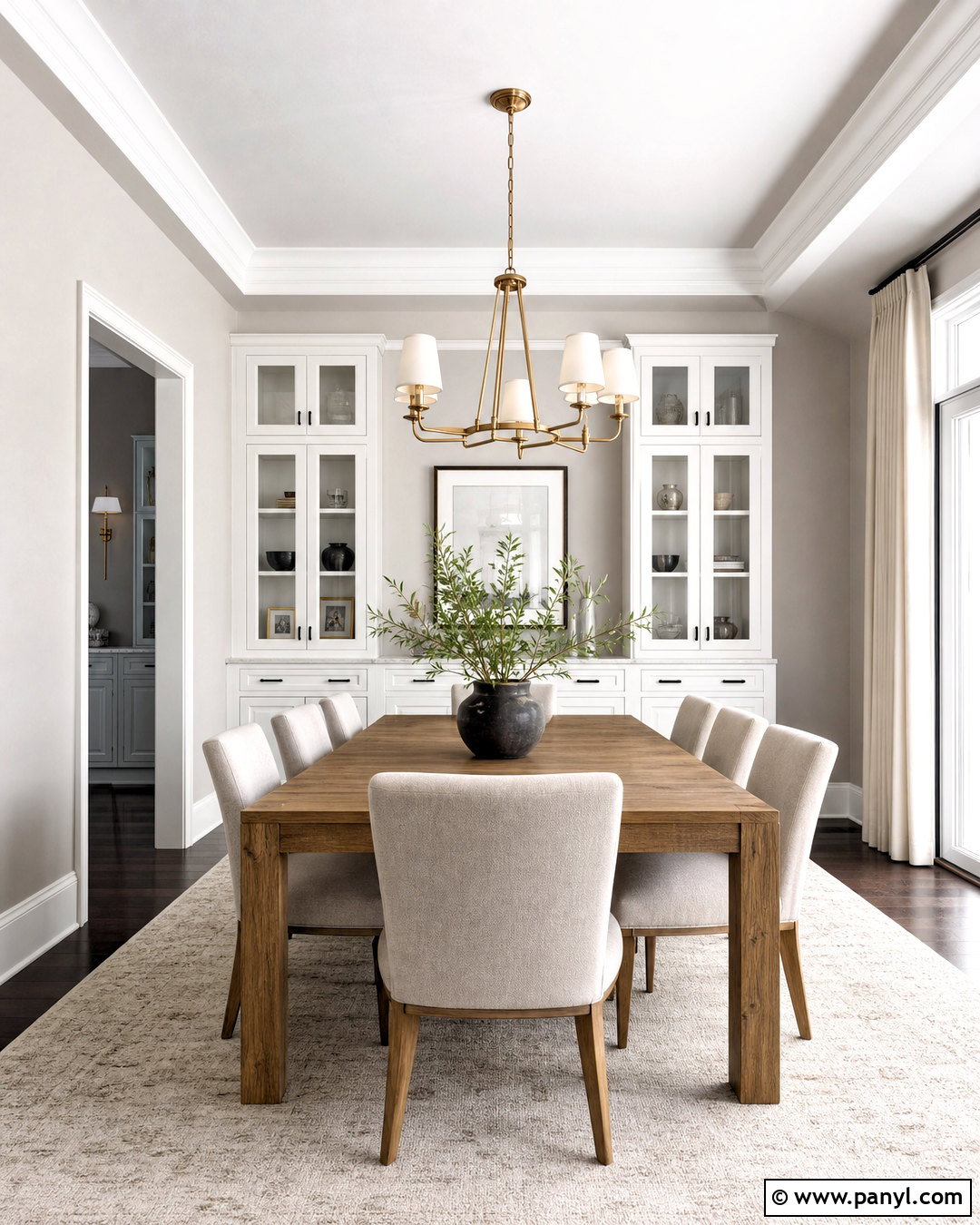
Snowbound SW 7004 gives Agreeable Gray a slightly more modern and tailored appearance. Use Agreeable Gray on the primary walls, then paint trim, paneled doors, and built-in storage in Snowbound. In a dining room, introduce a light oak table, curved off-white chairs, and a sculptural black chandelier. A cream-and-gray rug can bridge the two paint colors while adding understated pattern. Keep window treatments warm white and hang them close to the ceiling to emphasize height. Black frames, dark ceramic pieces, and a slim console create crisp visual anchors. Since Snowbound can shift with surrounding finishes, test it beside counters, tile, and flooring. When the undertones work together, the room feels bright, current, and comfortably layered.
6. Agreeable Gray And Coral Rose
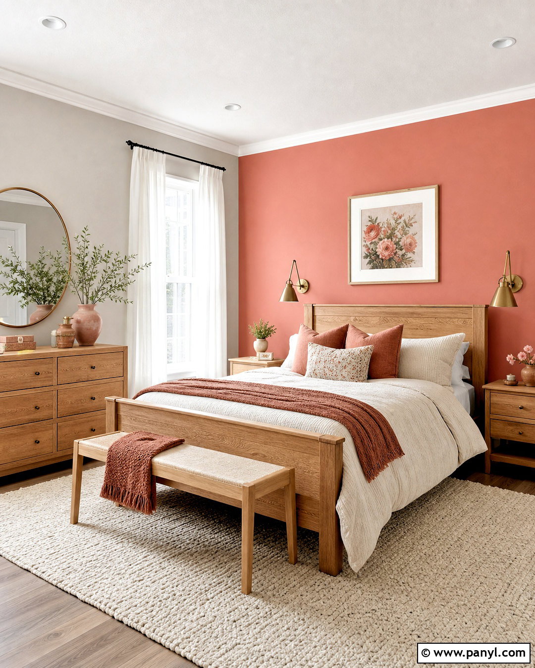
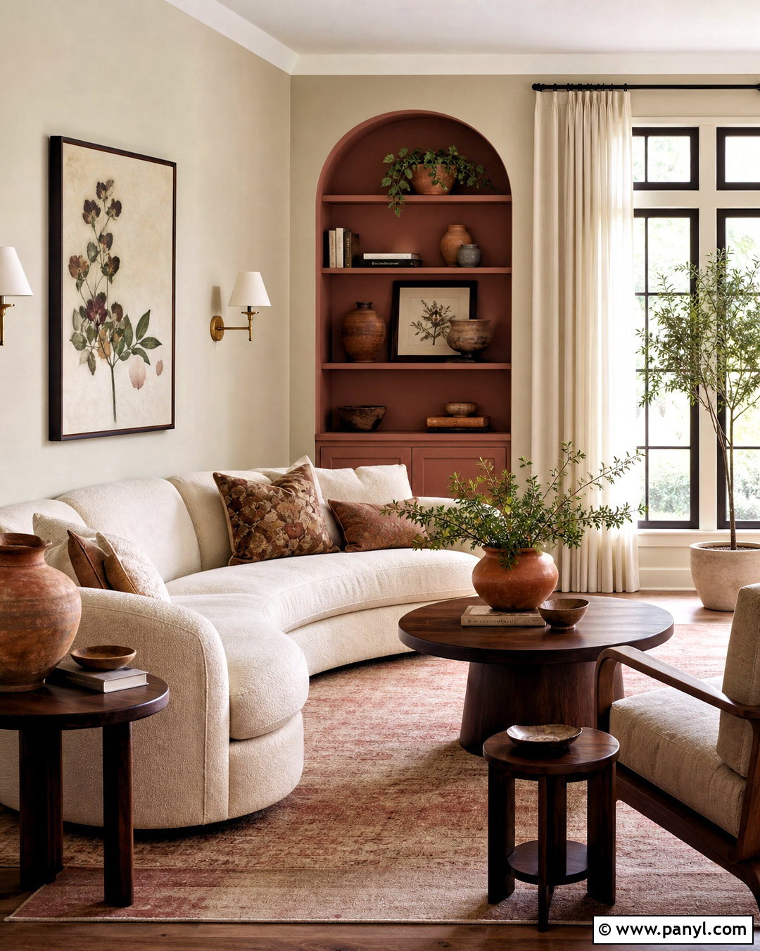
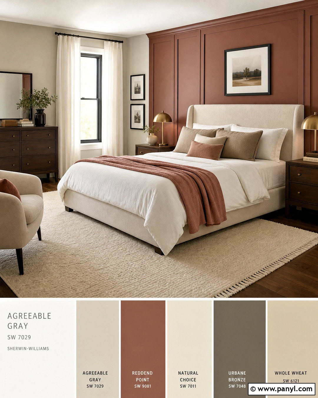
Coral Rose SW 9004 adds warmth and personality without overpowering Agreeable Gray. Sherwin-Williams identifies it as a coordinating color for SW 7029, making it a useful choice when a neutral room needs an earthy accent. () In a bedroom, keep three walls Agreeable Gray and use Coral Rose behind the bed. Add a natural oak bed frame, ivory bedding, muted clay pillows, and a woven cream rug. Brass sconces and warm white curtains maintain a soft, cohesive feeling. Repeat the rose shade in one patterned throw or ceramic lamp rather than covering every surface. The finished design feels grounded and welcoming because the dusty pink-red tone draws out Agreeable Gray’s beige side while the gray prevents the palette from becoming overly sweet.
7. Agreeable Gray And Naval
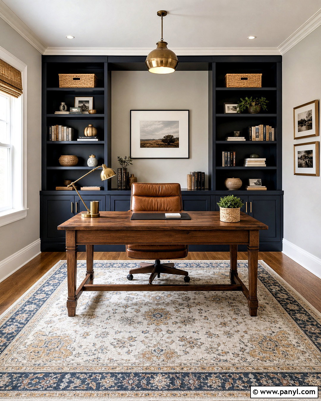
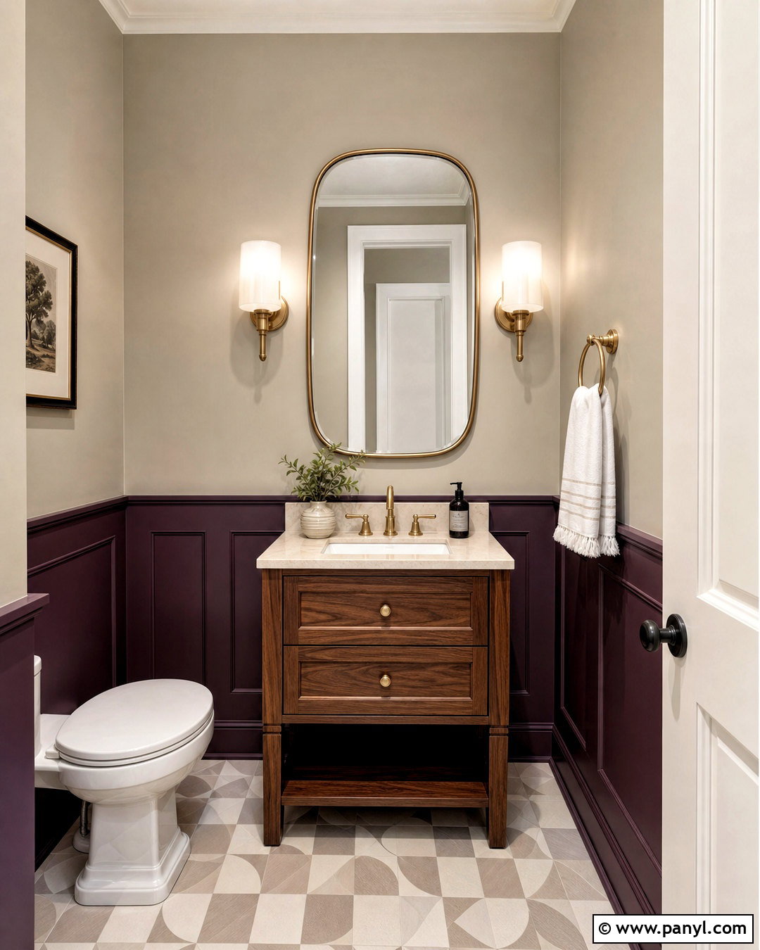
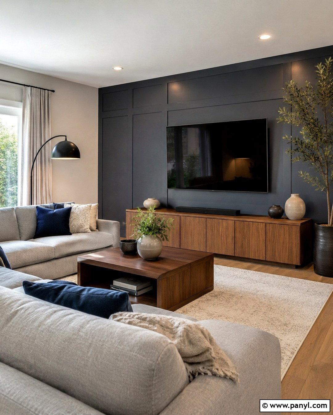
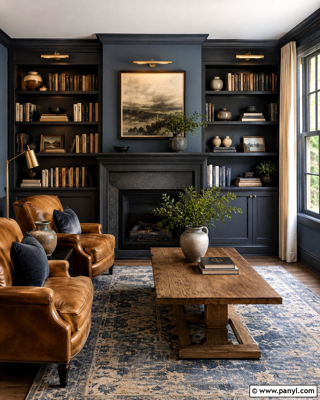
Naval SW 6244 provides bold, classic contrast against Agreeable Gray. Use Agreeable Gray on the walls of a home office and Naval on built-in bookcases, lower cabinetry, or a wide focal wall. A walnut desk introduces rich warmth between the light greige and deep navy. Add a cognac leather chair, an ivory-and-blue rug, and aged brass lighting for a complete, collected workspace. Keep the ceiling and window trim soft white so the room remains open. Small black accessories can blend with the darkest blue areas, while natural baskets soften the built-ins. This pairing feels substantial without becoming heavy when Naval covers a limited architectural feature. It also works well in rooms with strong daylight, which reveals the depth of the blue.
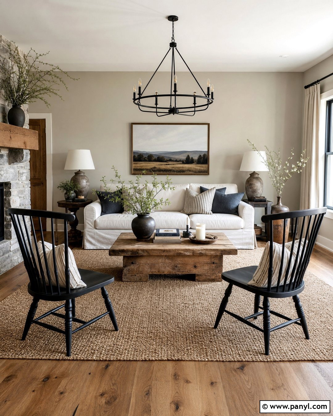
8. Agreeable Gray And Moody Blue
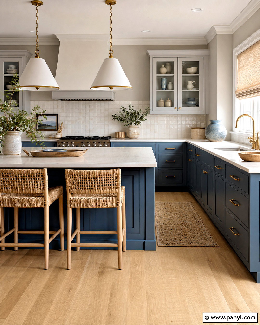
A muted blue can make Agreeable Gray feel calmer and slightly cooler. Moody Blue SW 6221 works beautifully on a kitchen island, bathroom vanity, or lower cabinets while Agreeable Gray covers the surrounding walls. Combine the colors with creamy quartz counters, white oak flooring, and a backsplash of warm white handmade tile. Brushed nickel or antique brass hardware can work, but use one metal finish consistently for a more polished result. Add natural linen shades and simple pottery in cream and blue-gray. The blue should remain the visual anchor, while Agreeable Gray provides a quiet backdrop. This completed scheme offers enough color for personality without sacrificing versatility, making it suitable for connected kitchens and living spaces.
9. Agreeable Gray And Sea Salt
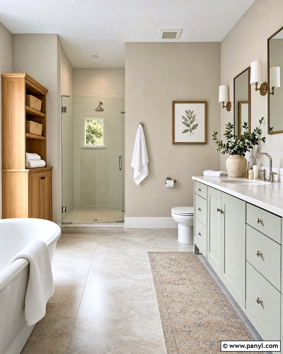
Sea Salt SW 6204 creates a light, restorative palette when paired with Agreeable Gray. In a bathroom, paint the upper walls Agreeable Gray and use Sea Salt on a vanity, paneled accent wall, or adjoining water closet. Choose warm white shower tile, pale quartz, and natural oak cabinetry to connect the two soft colors. Polished nickel fixtures add gentle brightness without the strong contrast of matte black. Finish the space with white towels, woven storage baskets, and a restrained botanical print. Sea Salt may appear green, blue, or gray depending on the light, so test it near the intended surfaces. Together, the colors create an airy bathroom that feels fresh and soothing while remaining warmer than a conventional blue-and-cool-gray combination.
10. Agreeable Gray And Evergreen Fog
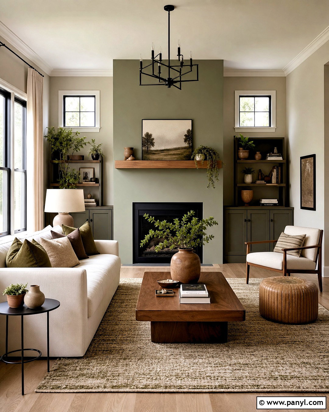
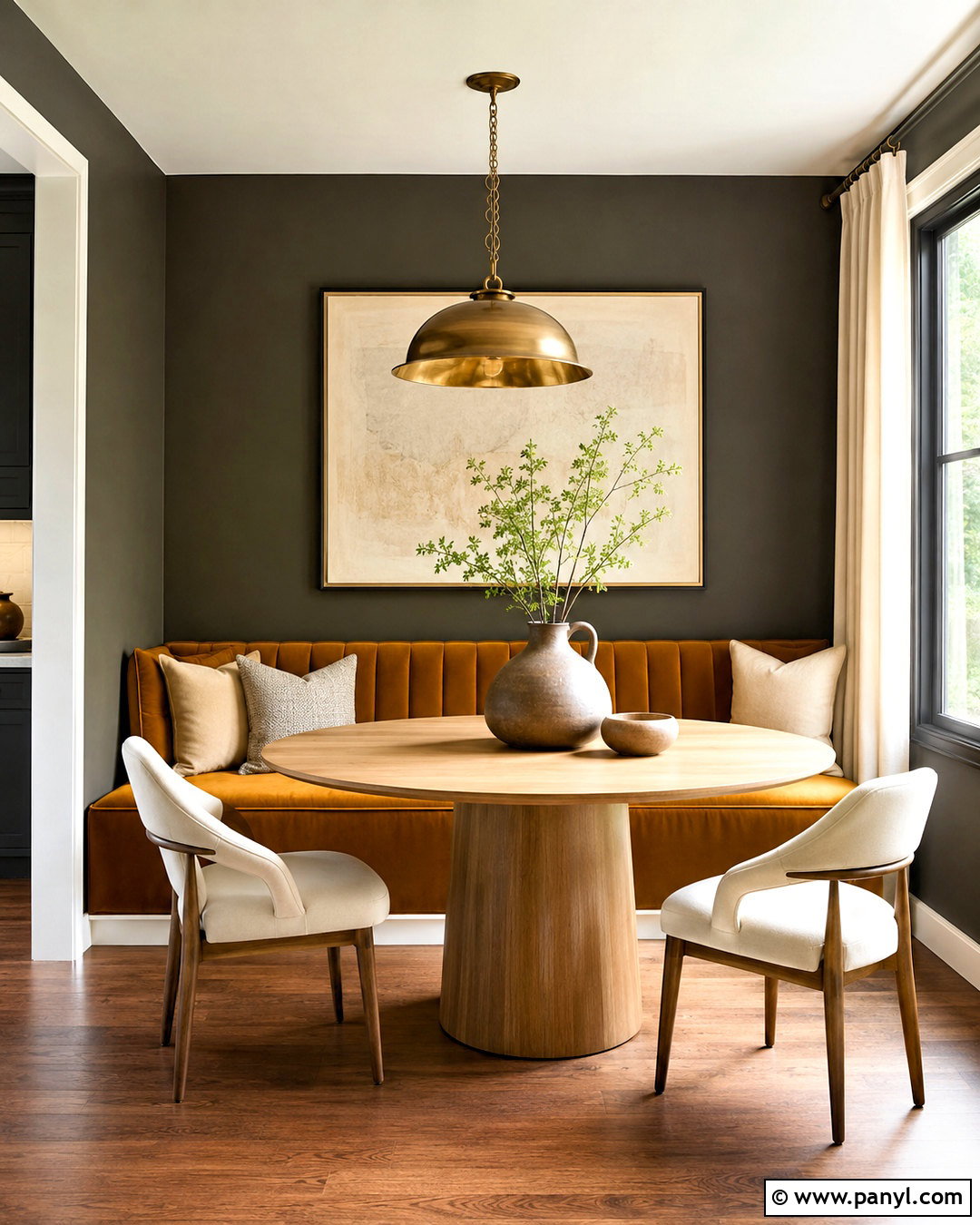
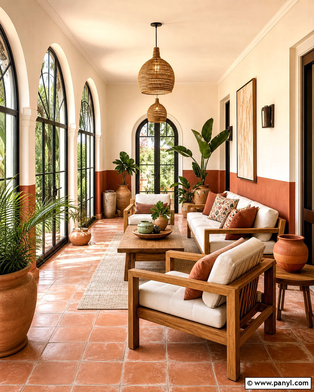
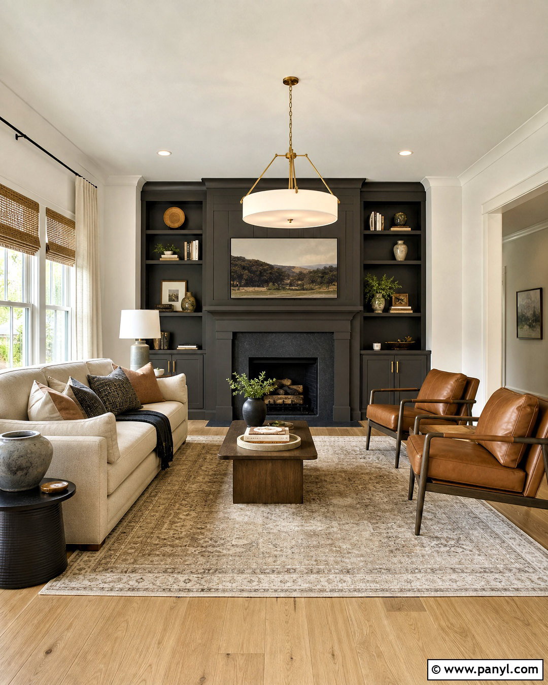
Evergreen Fog SW 9130 adds an earthy green layer to the warm neutrality of Agreeable Gray. Create a complete living room by using Agreeable Gray on the main walls and Evergreen Fog on built-in cabinets or the fireplace wall. Bring in a cream sofa, walnut coffee table, and a textured rug that combines beige, olive, and soft gray. Black iron lighting creates structure, while linen curtains preserve the relaxed mood. Add a few terracotta accessories and leafy plants to reinforce the nature-inspired palette. Avoid using too many competing greens; repeat Evergreen Fog through only two or three smaller details. This scheme suits modern organic, transitional, and updated farmhouse homes because it mixes familiar neutrals with muted color and natural materials.
11. Agreeable Gray And Urbane Bronze
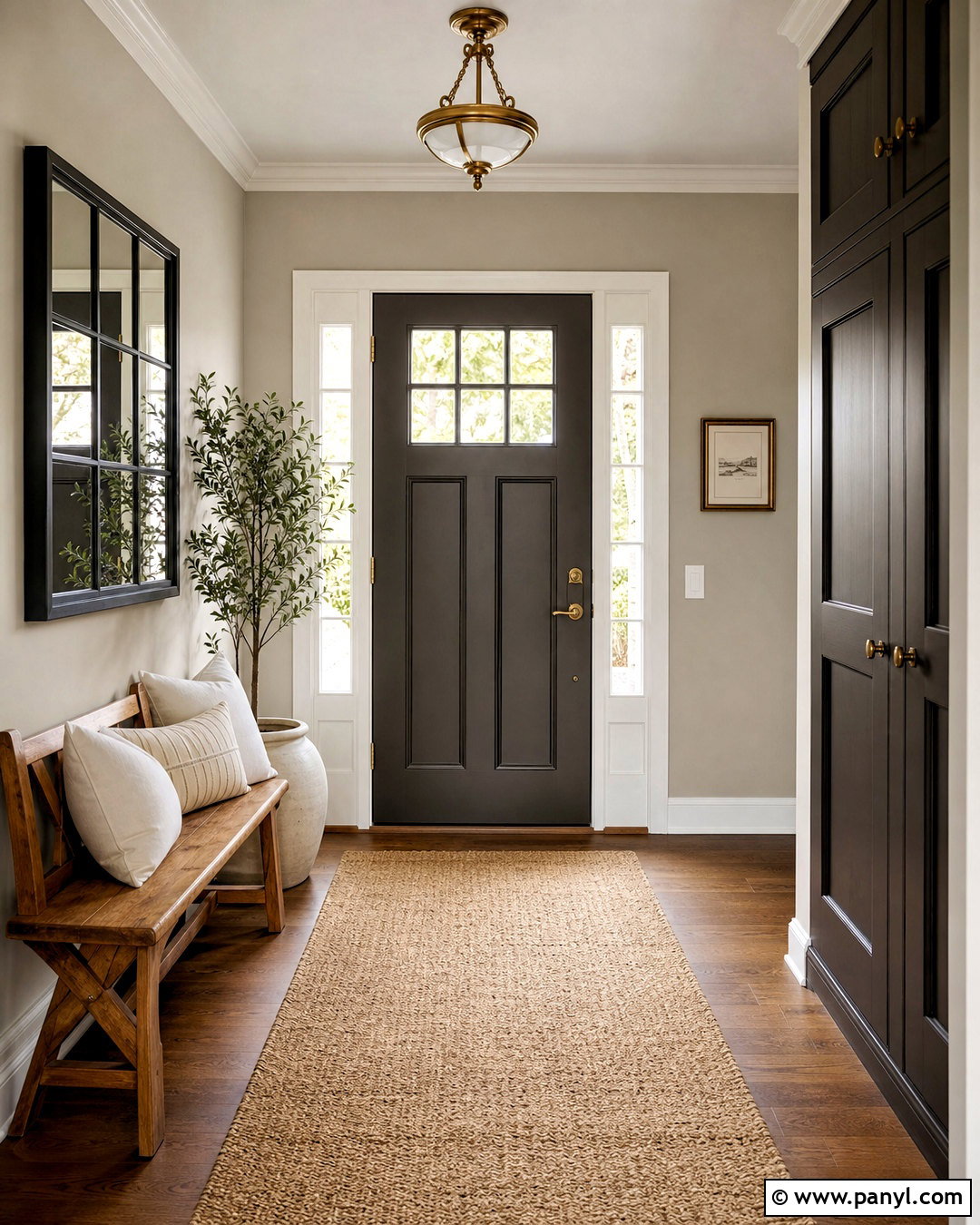
Urbane Bronze SW 7048 gives Agreeable Gray a darker, warmer counterpart with an earthy brown-charcoal character. In an entryway, cover the walls in Agreeable Gray and paint the interior side of the front door, a console, or paneled storage in Urbane Bronze. Add a medium oak bench, woven runner, and aged brass ceiling light. Cream upholstery and off-white pottery keep the darker surfaces from dominating the narrow space. A large black-framed mirror can reflect light and connect with the deep accent color. This complete palette feels grounded and sophisticated without relying on pure black. It is particularly effective around natural stone, wood flooring, and bronze hardware because every element shares a warm, organic quality.
12. Agreeable Gray And Iron Ore
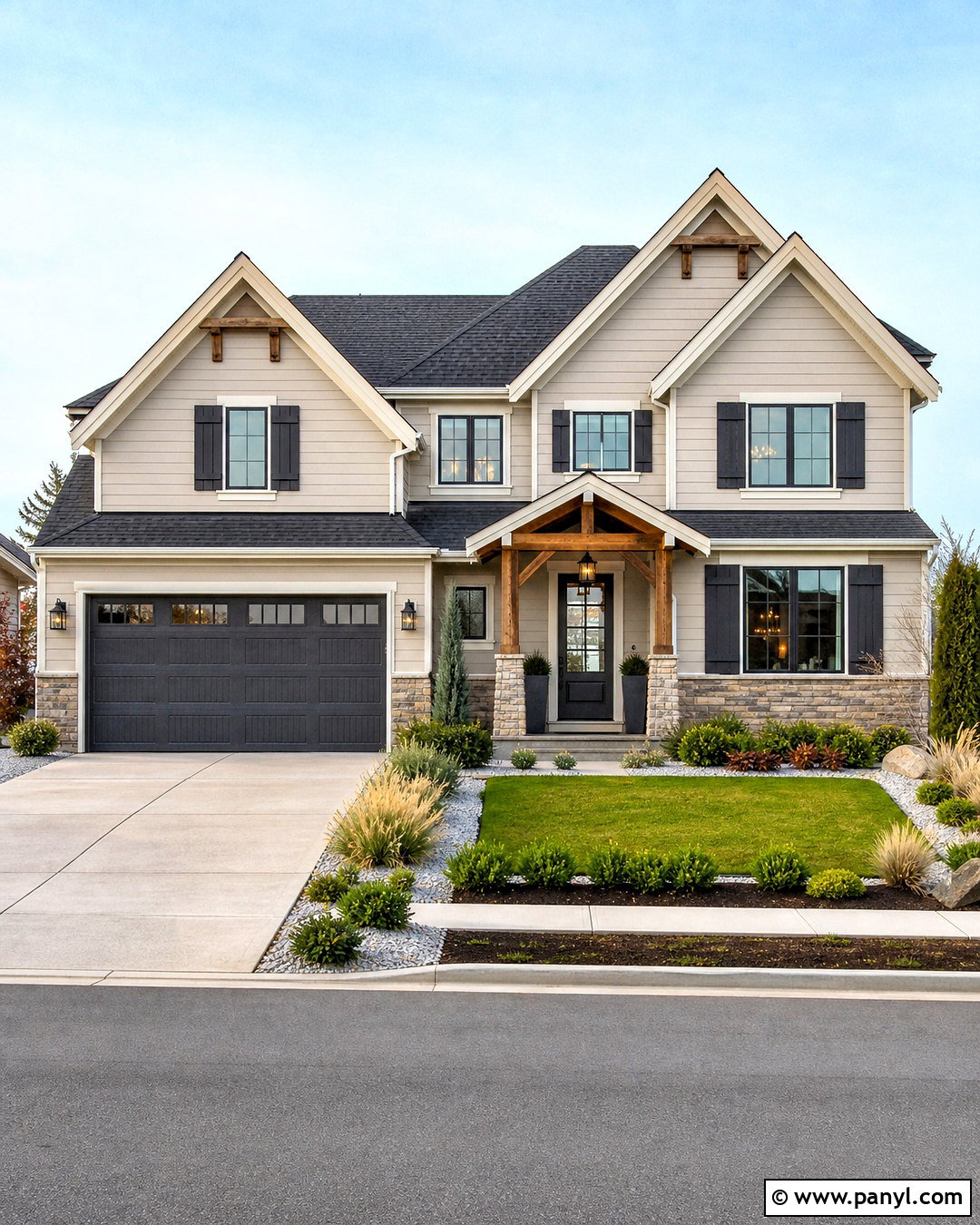
For strong definition, pair Agreeable Gray with Iron Ore SW 7069. Agreeable Gray can cover the siding of a home exterior, while Iron Ore defines shutters, garage doors, porch columns, or the front door. Add warm white trim to separate the two colors and prevent the facade from appearing flat. A charcoal roof, natural stone foundation, and stained cedar accents complete the material palette. Keep landscaping simple with layered evergreen shrubs, ornamental grasses, and pale gravel borders. Black lanterns and house numbers should match the depth of Iron Ore rather than introducing another dark tone. This scheme gives an average home a crisp, updated presence while preserving warmth through wood, stone, and Agreeable Gray’s beige undertone.
13. Agreeable Gray And Tricorn Black
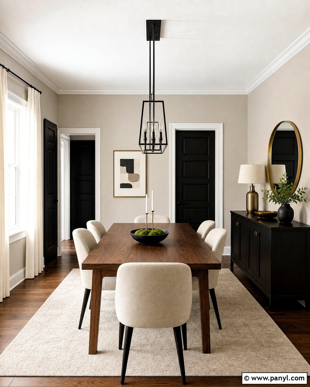
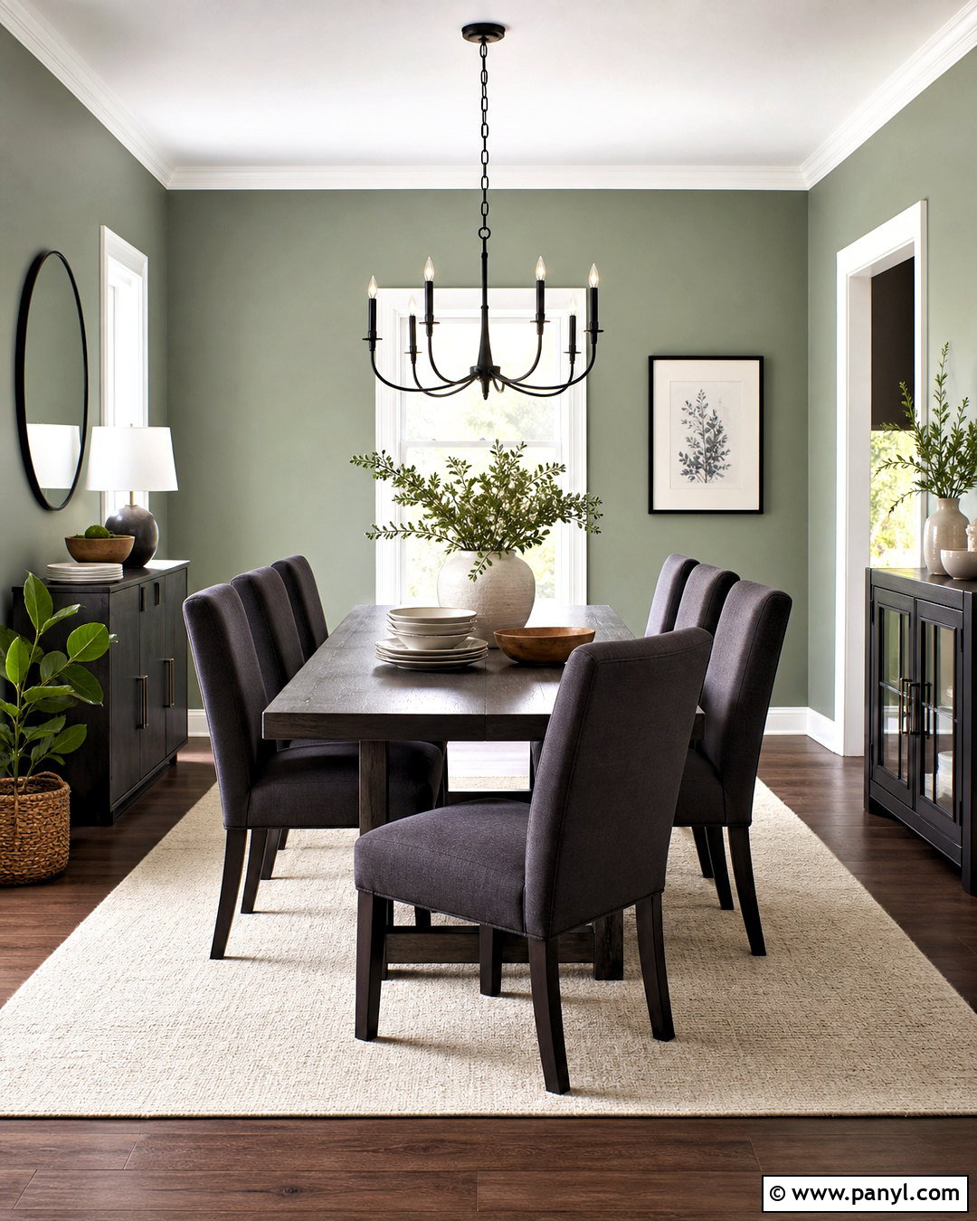
Tricorn Black SW 6258 brings graphic contrast to an Agreeable Gray palette. Use Agreeable Gray on the walls of a modern dining room, then introduce Tricorn Black through a painted buffet, interior doors, window frames, or slim wall molding. A warm walnut dining table keeps the contrast from feeling cold. Pair it with oatmeal upholstered chairs, a cream rug, and a linear black chandelier. White curtains soften the windows, while brass candlesticks or hardware add warmth in controlled amounts. Avoid filling the room with black furniture because one or two bold elements will make a stronger statement. The completed space feels sharp and intentional, with Agreeable Gray acting as the comfortable bridge between clean black accents and natural brown wood.
14. Agreeable Gray And Dovetail
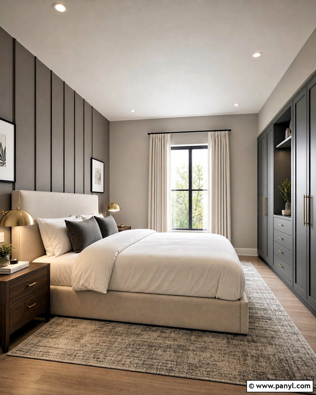
Dovetail SW 7018 creates a tonal look that adds depth without introducing a completely different color family. Paint the main bedroom walls Agreeable Gray and use Dovetail on the wall behind the bed, built-in wardrobes, or a reading nook. Choose a light upholstered bed, warm white bedding, and walnut nightstands to balance the deeper gray. A rug mixing greige, charcoal, and cream can blend both wall colors across the floor. Add brushed brass lamps and simple black frames for subtle contrast. Because Dovetail is much darker than Agreeable Gray, it gives the room a clear focal point while maintaining a coordinated undertone. This combination works well for anyone who wants a layered neutral bedroom rather than a colorful accent wall.
15. Agreeable Gray And Gauntlet Gray
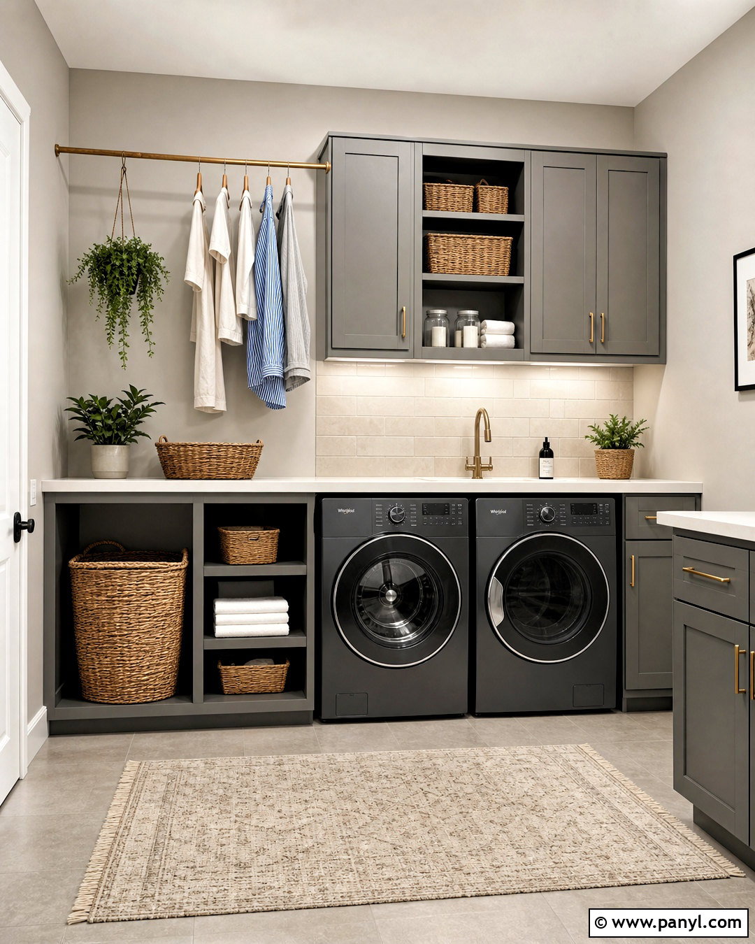
A laundry room can feel practical and polished with Agreeable Gray and Gauntlet Gray SW 7019. Use Agreeable Gray on the walls and Gauntlet Gray on shaker cabinets, a utility door, or the base of a built-in folding counter. Install warm white quartz, a light taupe tile floor, and a simple cream backsplash. Brushed brass cabinet pulls bring warmth, while matte black appliance details add definition. Include natural baskets, labeled storage containers without visible decorative clutter, and one wooden hanging rail. Under-cabinet lighting keeps the darker cabinetry functional. The two grays create clear contrast but still look related, making the small room feel thoughtfully planned. Warm materials stop the tonal gray palette from appearing industrial or overly cool.
16. Agreeable Gray And Mega Greige
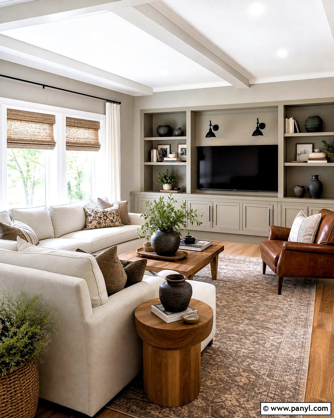
Mega Greige SW 7031 deepens Agreeable Gray’s warm neutral qualities and creates a comfortable, cocooning palette. In a family room, use Agreeable Gray on most walls and Mega Greige on built-in media cabinets or a wide fireplace surround. Select a cream sectional, medium-brown leather chair, and a large rug with taupe and faded black patterning. Warm oak tables and woven shades add natural texture, while black sconces frame the focal wall. Keep decorative objects simple and repeat the darker greige through pillows or pottery. This layered combination is ideal when blue or green accents feel too colorful. It creates visual depth through changes in value, allowing furniture, wood, textiles, and architectural details to form one cohesive, inviting room.
17. Agreeable Gray And Anew Gray
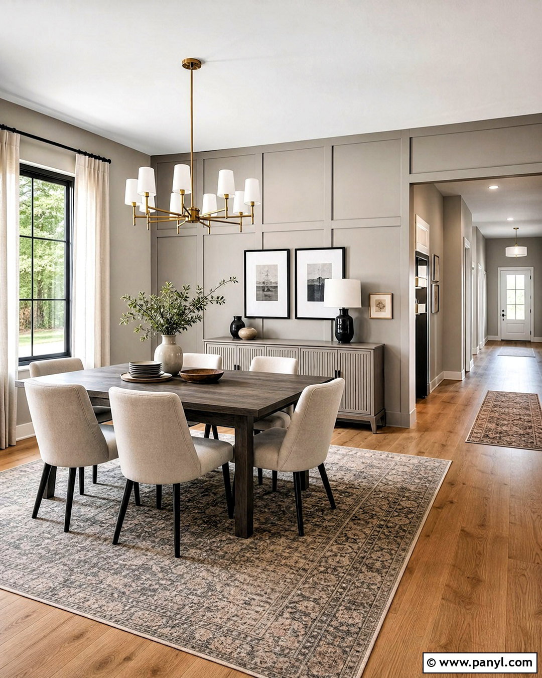
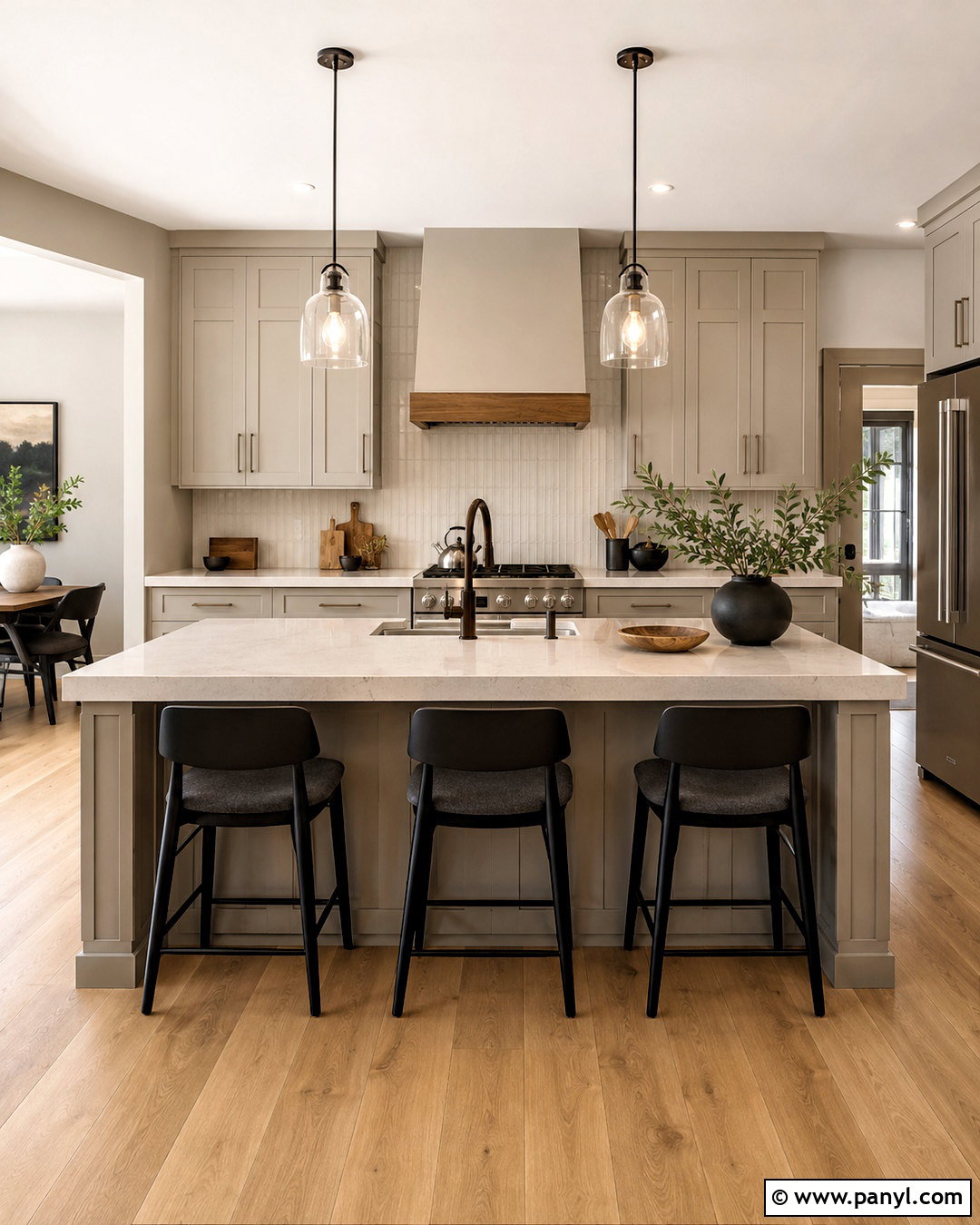
Anew Gray SW 7030 is a natural partner for Agreeable Gray because it creates subtle separation while remaining in a similar warm greige family. Use Agreeable Gray on hallway and open-plan walls, then apply Anew Gray to a dining room, kitchen island, or lower half of a paneled wall. Furnish the space with warm oak, cream upholstery, and soft black accents. A patterned rug containing beige, tan, and gray will make the color transition feel intentional. Add aged brass lighting to lift the neutral scheme and linen curtains for softness. Since these colors are close, vary texture and finish to keep the design interesting. The result is a flowing whole-home palette that defines connected spaces without abrupt or distracting color changes.
18. Agreeable Gray And Accessible Beige
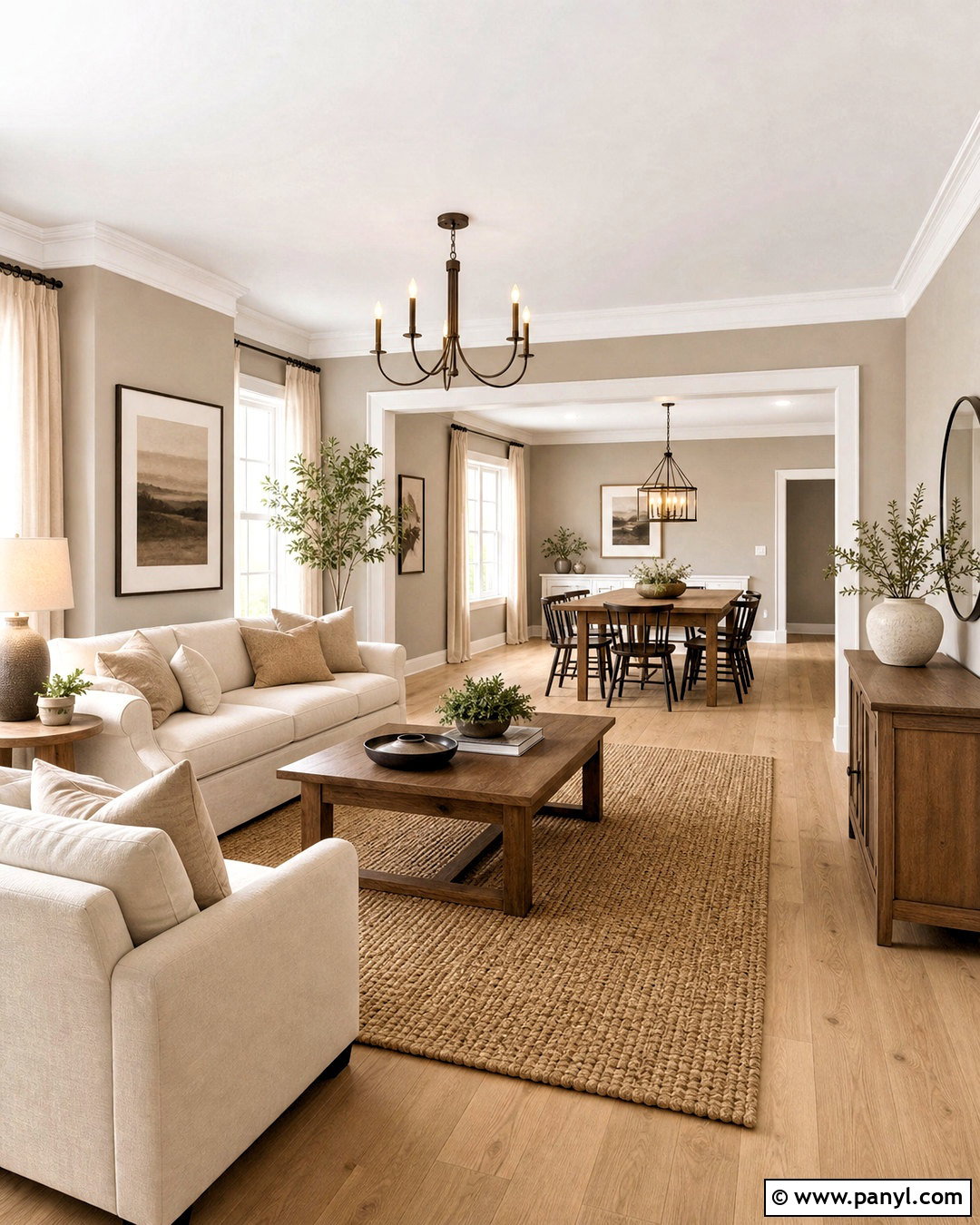
Accessible Beige SW 7036 shifts an Agreeable Gray palette in a warmer, more relaxed direction. Use Agreeable Gray in the main living area and Accessible Beige in an adjoining dining room or sunroom. Connect both spaces with continuous white oak flooring, warm white trim, and natural linen curtains. In the warmer room, add a cream sofa or dining chairs, a jute-blend rug, and medium brown wood furniture. Black or bronze lighting provides just enough definition. Repeat small amounts of each wall color through textiles to smooth the transition. This combination works best when the home contains tan stone, beige tile, or honey-toned wood. Both neutrals support those finishes, but their subtle difference keeps the overall scheme from looking flat or overly matched.
19. Agreeable Gray And Balanced Beige
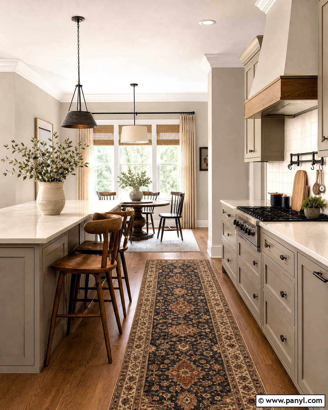
Balanced Beige SW 7037 creates a richer neutral contrast with Agreeable Gray. Consider Agreeable Gray walls in an open kitchen and Balanced Beige on a pantry door, breakfast nook, or connected mudroom cabinetry. Complete the scheme with cream quartz, handmade off-white tile, walnut seating, and aged bronze hardware. A washable runner featuring muted beige, charcoal, and rust can bring the colors together. Keep ceilings and trim warm white so each neutral remains distinct. Balanced Beige is noticeably deeper and earthier, so it works best as the supporting color rather than covering every surface in a dim room. The finished palette feels warm and established, especially in homes with traditional millwork, natural stone, wood beams, or transitional furnishings.
20. Agreeable Gray And Daydream
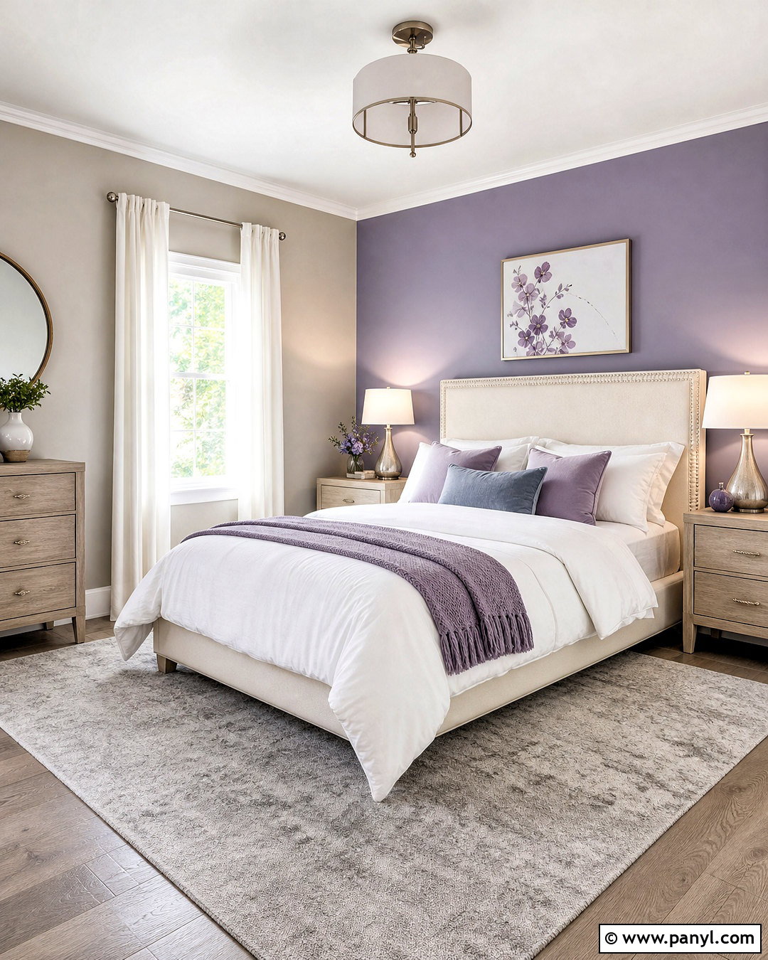
Daydream SW 6541 introduces a pale blue-violet note that gives Agreeable Gray a softer, more expressive character. Use Agreeable Gray throughout a guest bedroom and apply Daydream to the ceiling, a built-in desk, or the wall behind the bed. Pair the colors with an ivory upholstered headboard, pale oak furniture, and white bedding layered with dusty blue and muted lavender accents. A silver-gray rug and brushed nickel lighting maintain a light appearance. Add only a few violet details so the room remains restful rather than themed. Warm white curtains help balance the cooler accent color. This completed palette is especially attractive in spaces with gentle natural light, where Daydream can provide color without competing with Agreeable Gray’s quiet warmth.
Conclusion:
Choosing among these 20 agreeable gray complimentary colors becomes easier when you consider the entire room instead of comparing isolated paint chips. Soft whites create clean trim and cabinetry, while deeper greiges build a layered neutral palette. Muted green, blue, and rose accents add personality, and charcoal or black brings stronger architectural definition. Connect each color combination with flooring, furniture, metals, textiles, and natural materials that share similar undertones. Most importantly, place large paint samples beside permanent surfaces and observe them from morning through evening. Agreeable Gray changes noticeably with light and nearby colors. Careful testing will help you create a balanced, comfortable home that feels coordinated from one space to the next.

Related Ideas and Inspiration:
Leave a Reply