
Accessible Beige is a flexible warm greige that can shift from softly beige to subtly gray as daylight changes. The right companion color helps control that shift while giving each room a clear mood. Warm whites create an airy, seamless look. Muted greens and blues emphasize its natural side, while charcoal, brown, and navy introduce stronger contrast. Before committing, sample every pairing beside flooring, cabinetry, countertops, and upholstery. Check the colors in morning light, afternoon light, and under your usual lamps. Also repeat the companion shade at least twice through paint, textiles, furniture, or decor so the palette feels intentional. The complete room schemes below explore 20 accessible beige complimentary colors for welcoming, balanced spaces.

1. Accessible Beige And Alabaster Living Room
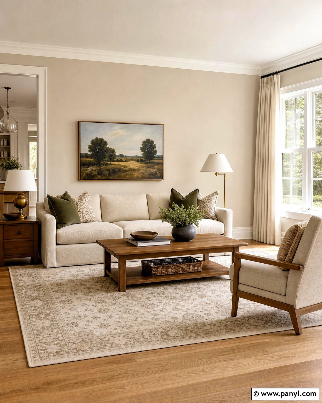
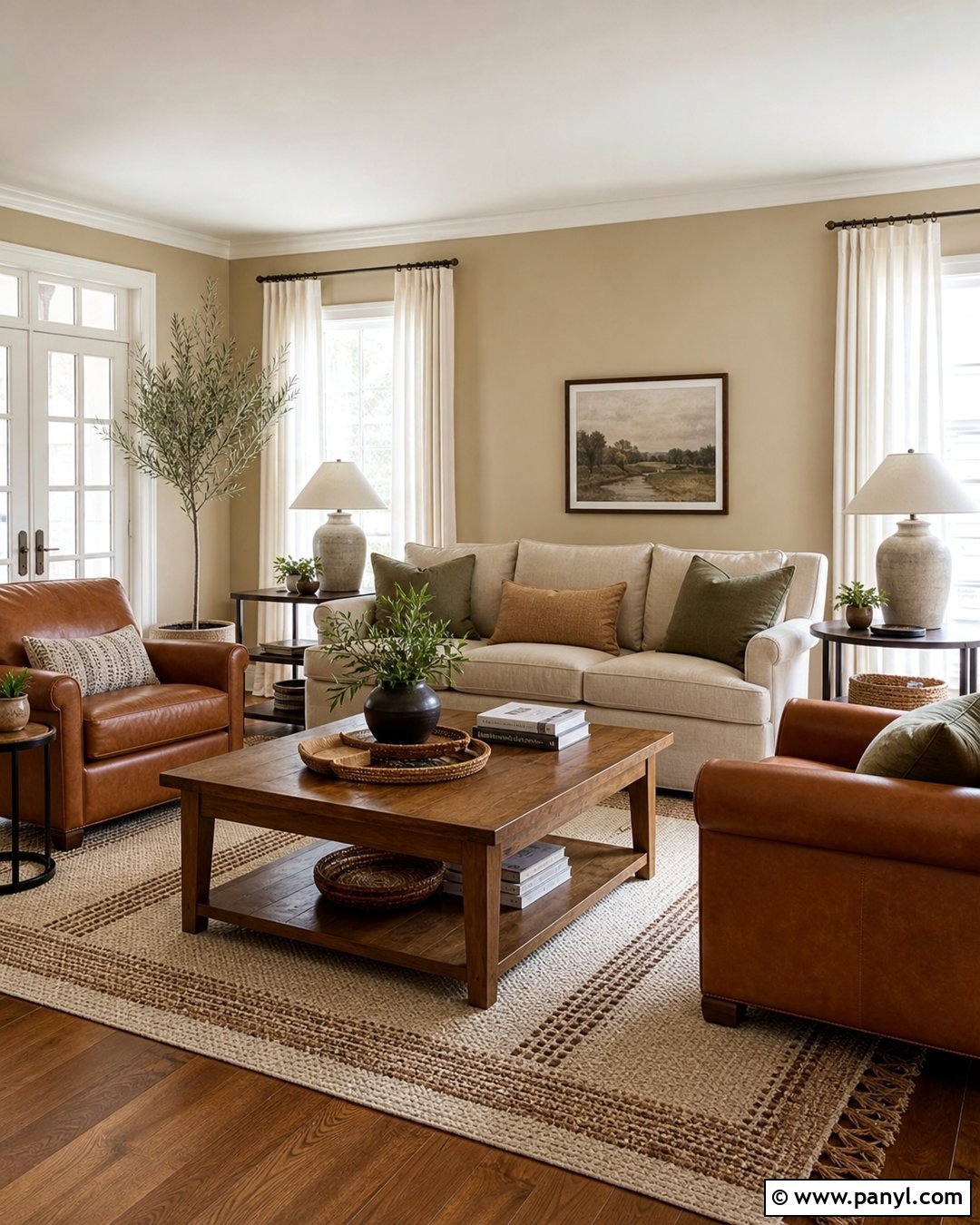
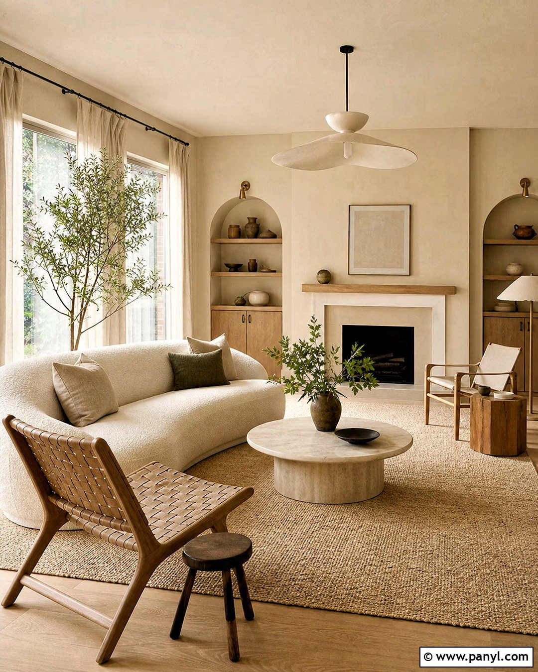
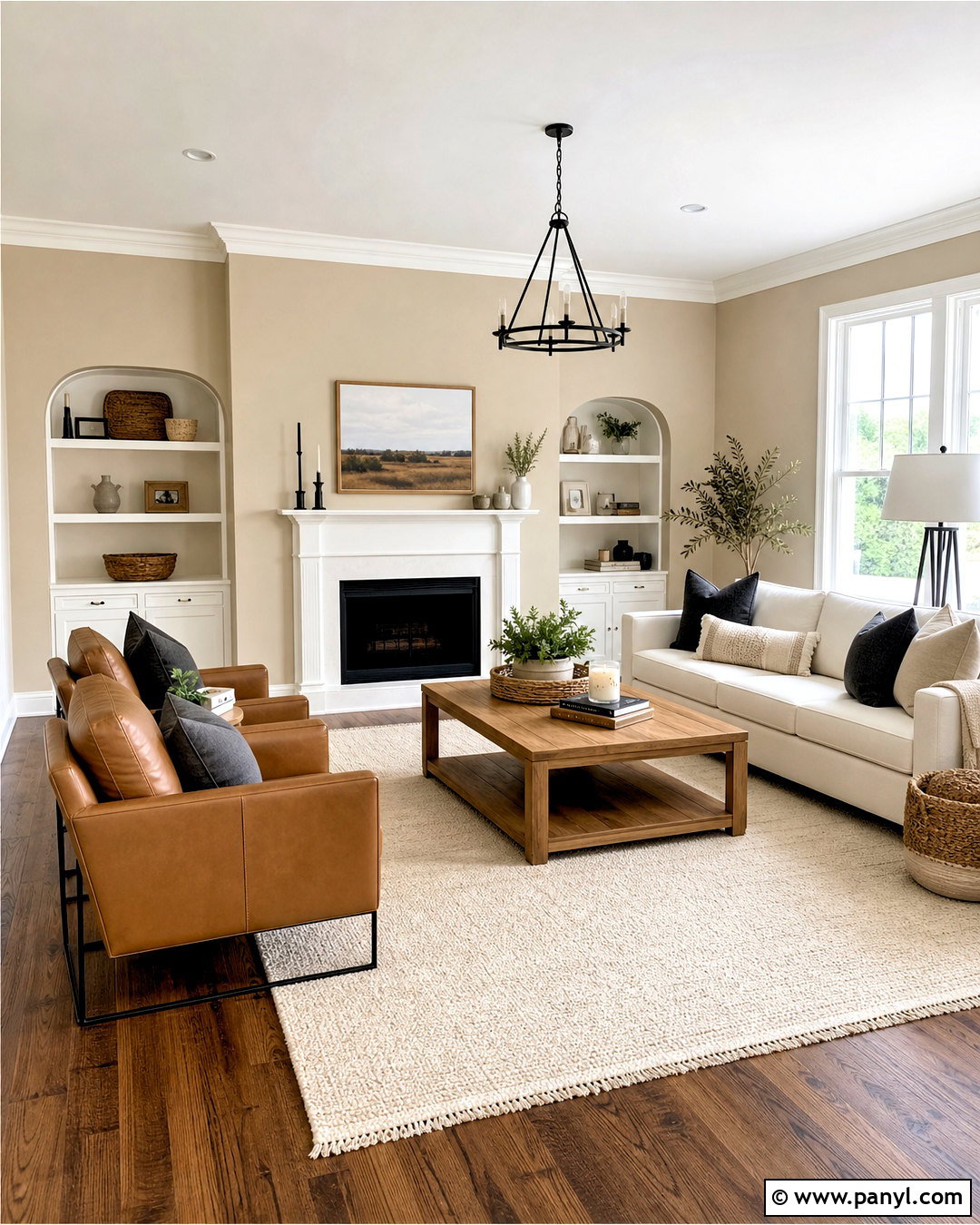
Alabaster brings gentle brightness to an Accessible Beige living room without producing the sharp contrast of a cool white. Use Accessible Beige across the main walls, then apply Alabaster to the ceiling, trim, fireplace surround, and built-in shelves. A light oatmeal sofa keeps the room calm, while medium oak tables prevent the neutral palette from looking washed out. Add an ivory rug with a subtle taupe pattern, warm linen curtains, and a few olive green pillows for natural depth. Brushed brass lamps provide a soft metallic highlight. Finish with matte ceramic vessels, leafy branches, and framed landscape art. This combination suits traditional, transitional, and modern organic rooms where comfort matters more than dramatic color.
2. Accessible Beige And Pure White Kitchen
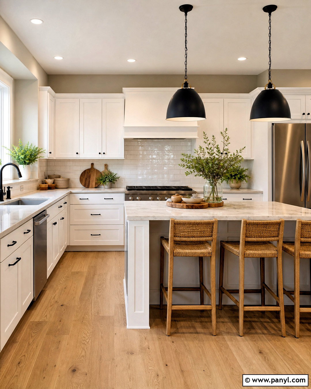
Could a beige kitchen still feel clean and modern? Pair Accessible Beige walls with Pure White cabinets for crisp definition that remains comfortable rather than clinical. Choose simple Shaker doors, polished nickel hardware, and pale quartz counters with quiet taupe veining. A glossy off-white subway tile backsplash reflects light and connects the two paint colors. Ground the kitchen with medium-tone white oak flooring and woven counter stools. Matte black pendants can add a controlled graphic accent without overwhelming the palette. Repeat Accessible Beige on a breakfast nook wall or pantry door for continuity. Clear counters, warm wood cutting boards, and a small arrangement of green herbs complete this bright, practical kitchen scheme.
3. Accessible Beige And Aesthetic White Bedroom
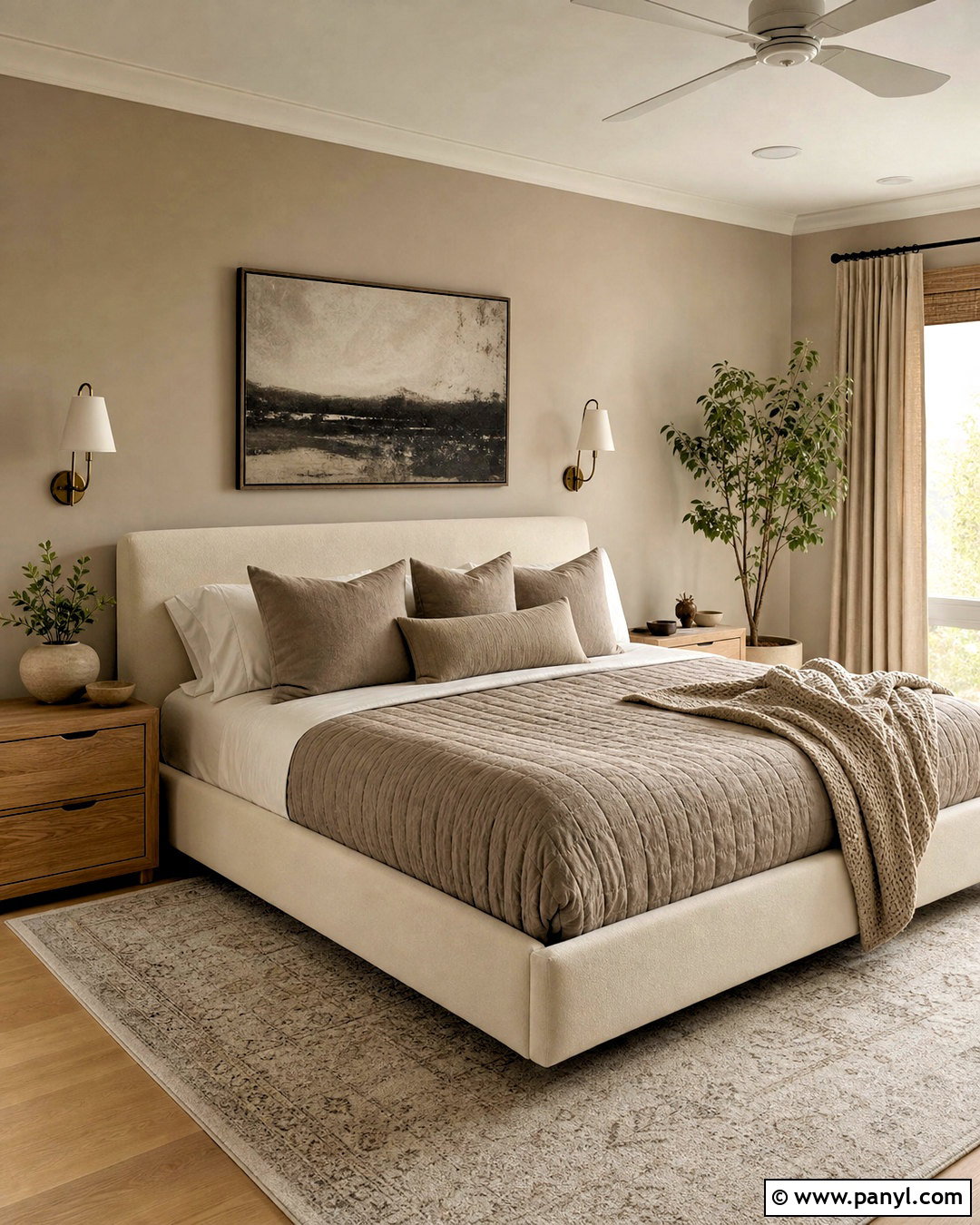
For a restful bedroom with gentle tonal contrast, place Accessible Beige on the walls and Aesthetic White across the ceiling, trim, and upholstered bed. Because both colors feel softened, the room flows smoothly without looking flat. Layer the bed with ivory cotton sheets, a mushroom-colored quilt, and textured taupe pillows. Light oak nightstands keep the palette warm, while aged brass sconces add understated character. Use full-length oatmeal curtains mounted near the ceiling to make the room appear taller. A cream and gray woven rug can define the sleeping area over hardwood flooring. Finish the look with charcoal line art and one muted green plant, keeping small decor simple so the soothing color relationship remains noticeable.
4. Accessible Beige And Sanderling Dining Room
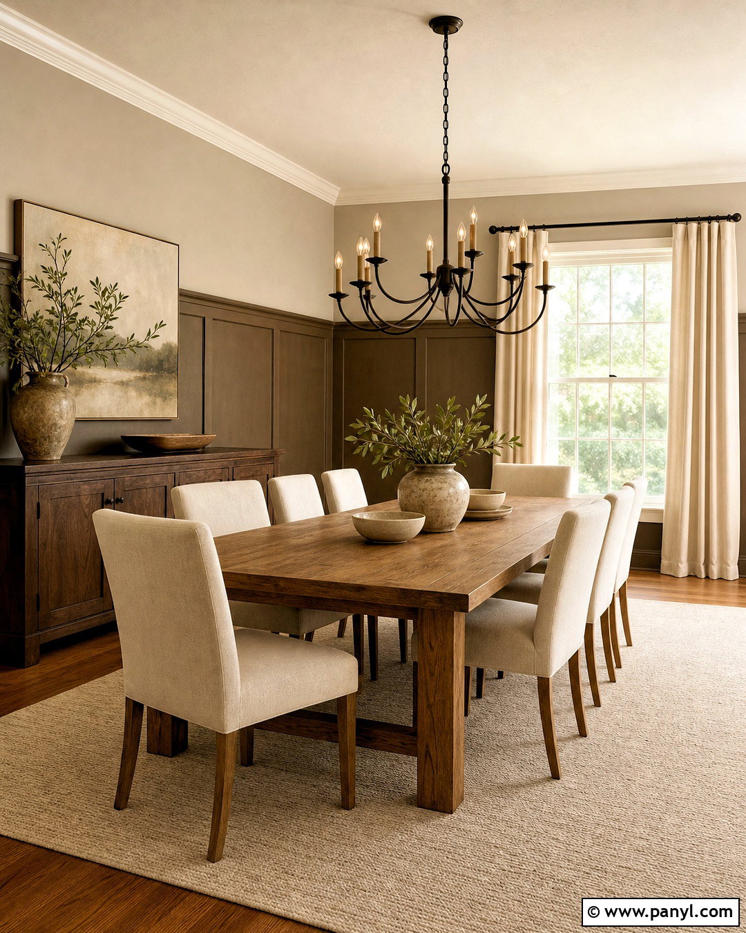
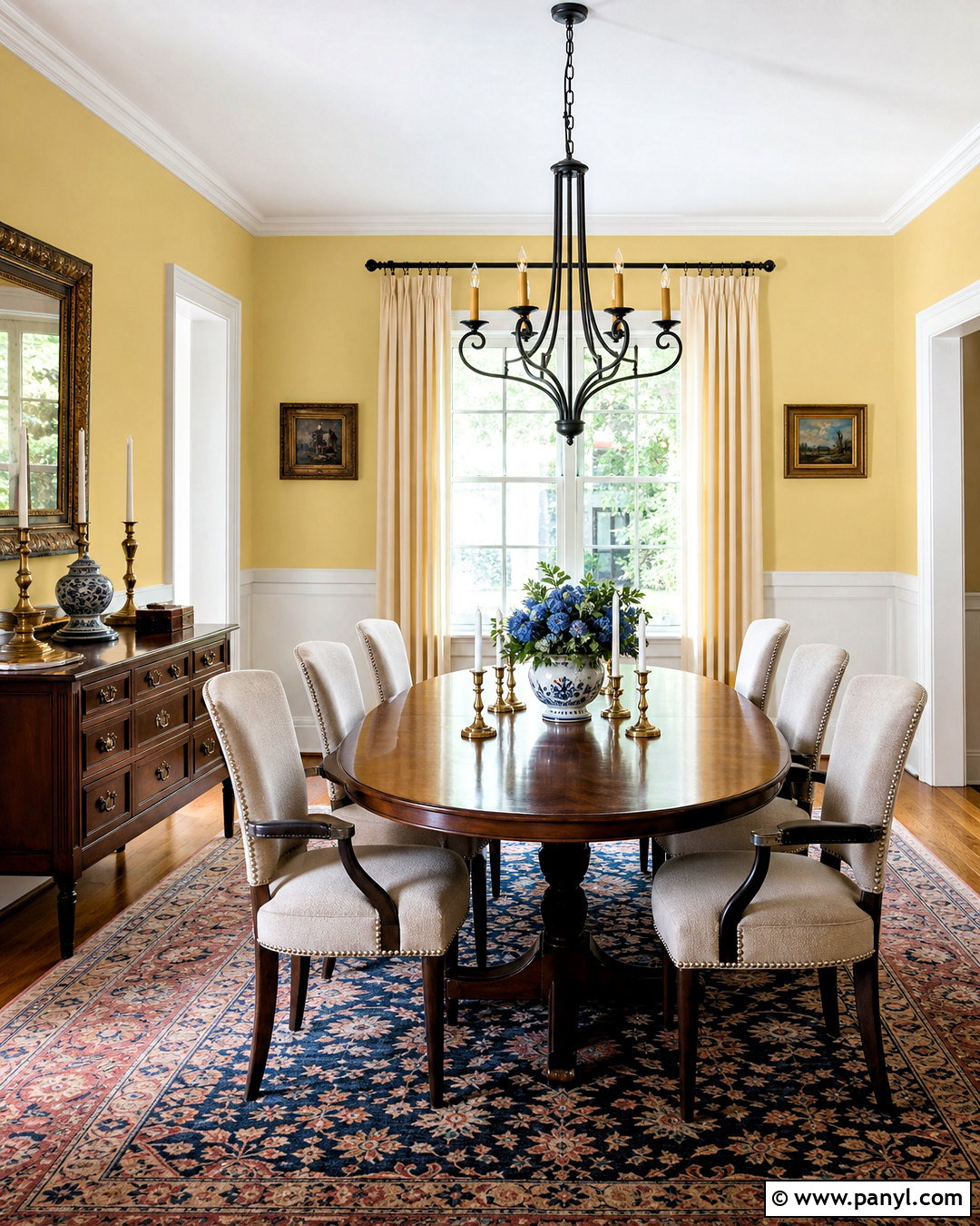
Sanderling gives Accessible Beige an earthy brown companion that works beautifully in a grounded dining room. Cover the upper walls in Accessible Beige and use Sanderling on lower paneling, a buffet cabinet, or both. A solid oak dining table reinforces the natural palette, while cream upholstered chairs keep the setting from becoming too dark. Choose an ivory flatweave rug with a restrained geometric border and hang a bronze linear chandelier above the table. Stoneware dishes, linen napkins, and amber-free clear glass accessories add useful texture. Soft white trim provides a clean outer edge. For balance, introduce muted black through picture frames and curtain rods, then finish with olive branches in a substantial ceramic vase.
5. Accessible Beige And Cadet Home Office
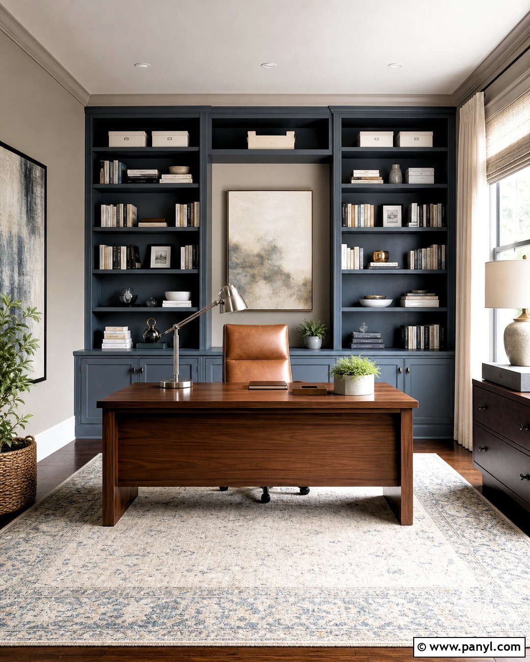
Cadet adds cool blue-gray structure to the warmth of Accessible Beige, making it a practical choice for a focused home office. Paint the main walls Accessible Beige, then use Cadet on built-in bookcases and a compact desk wall. The cooler cabinetry becomes a clear focal point while the beige background keeps the space approachable. Add a walnut desk, a camel leather chair, and a low-pile cream rug with blue-gray detailing. Brushed nickel task lighting connects naturally with Cadet’s cool character. Keep window treatments light with off-white woven shades or simple linen panels. Organized books, white storage boxes, and a few dark ceramic accessories complete a professional room that feels polished without becoming cold or overly formal.
6. Accessible Beige And Sea Salt Bathroom
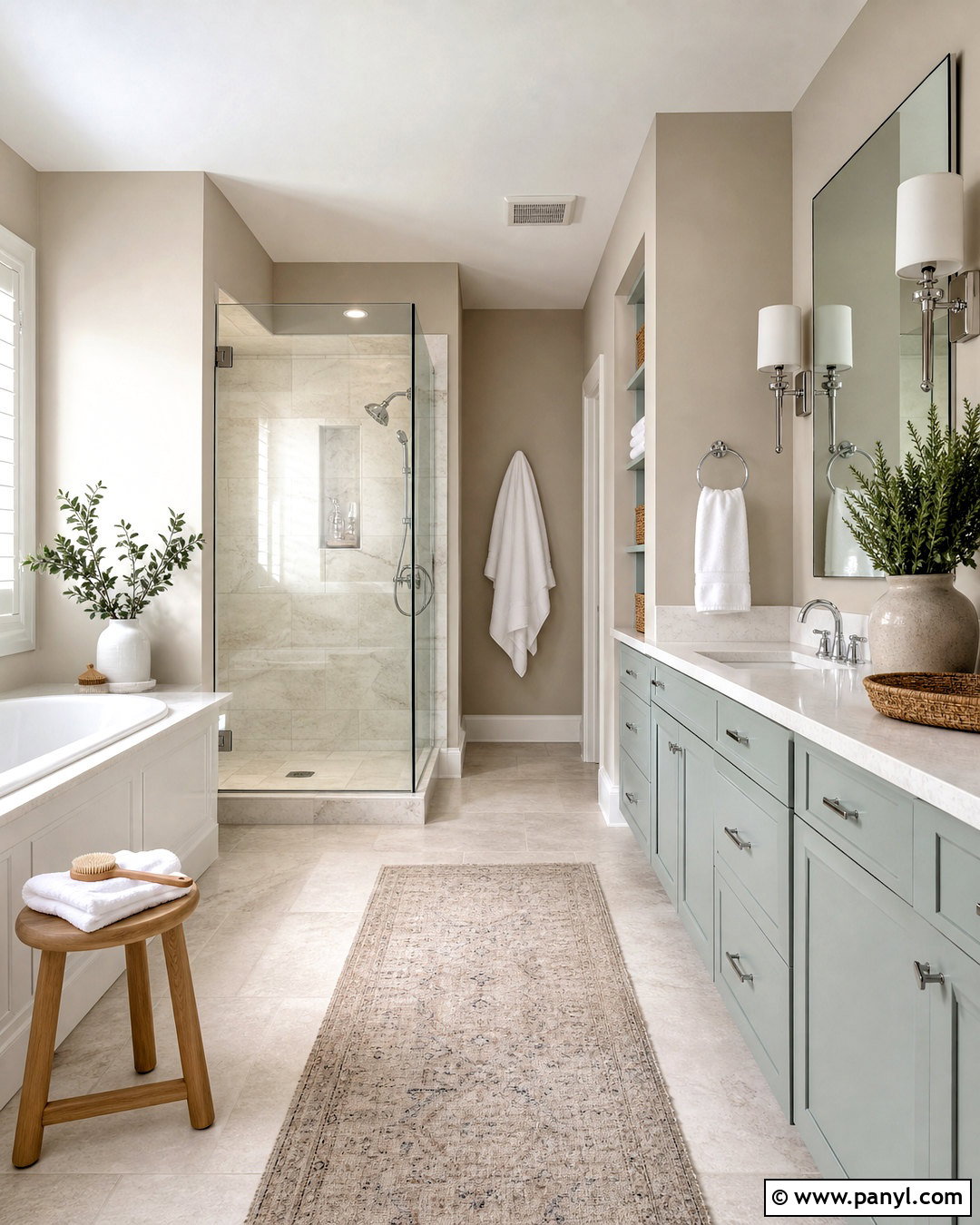
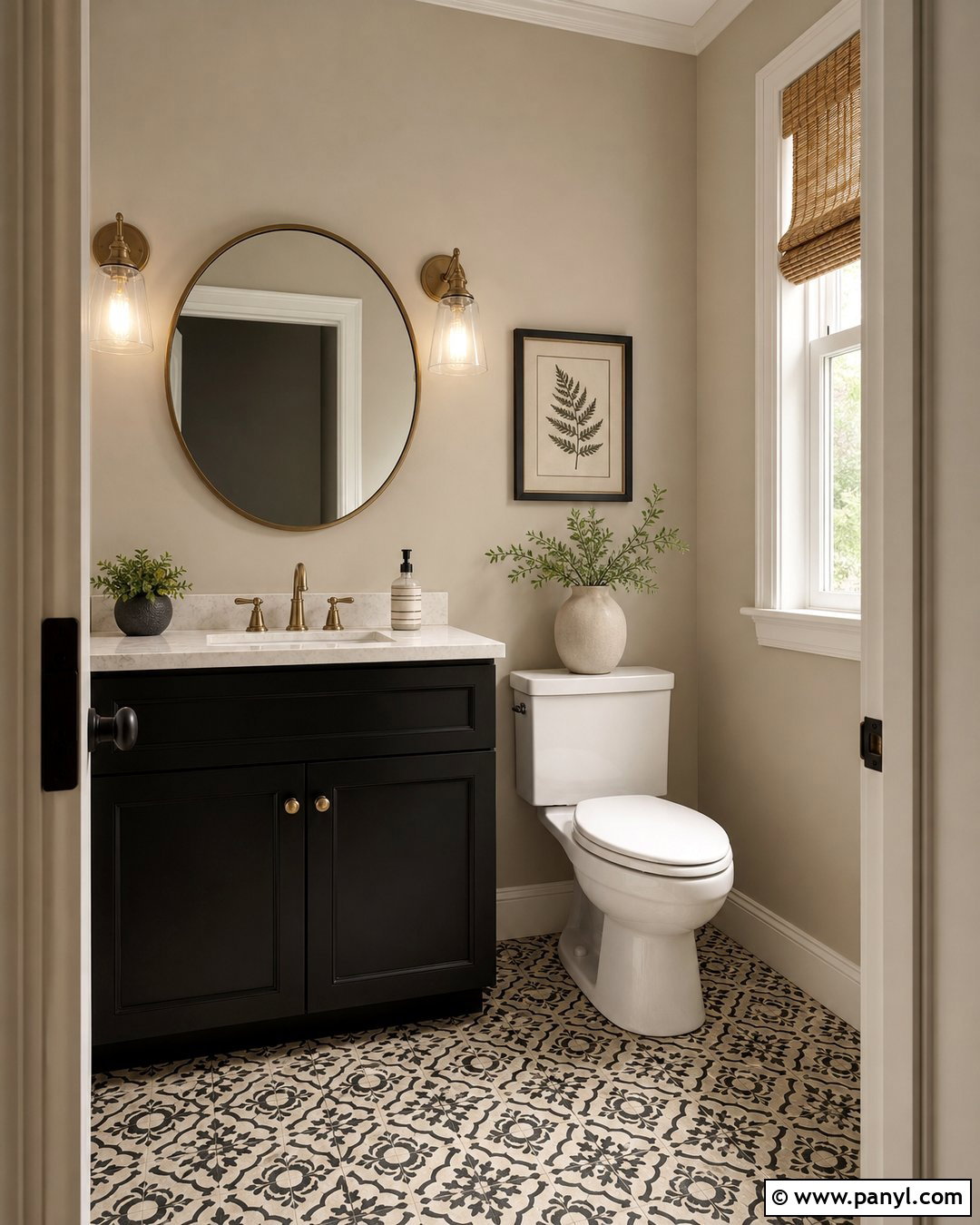
A quiet blend of beige, green, and blue can make an ordinary bathroom feel fresh and restorative. Use Accessible Beige on the upper walls and Sea Salt on the vanity for soft color that still reads as neutral. White quartz counters, polished chrome fixtures, and a clean white tub create brightness around both shades. Select pale limestone-look floor tile to echo the warmth of the walls. A frameless mirror and clear glass shower enclosure maintain an open appearance. Bring in texture through natural cotton towels, a light wood bath stool, and woven baskets. Small touches of eucalyptus green can strengthen the palette. Keep the trim warm white so the finished bathroom looks connected, calm, and easy to maintain.
7. Accessible Beige And Clary Sage Kitchen
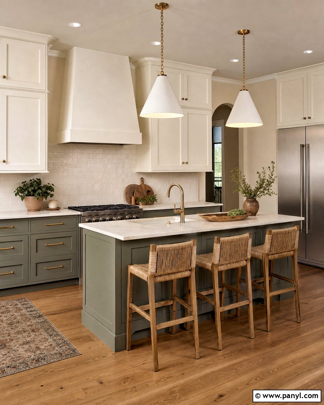
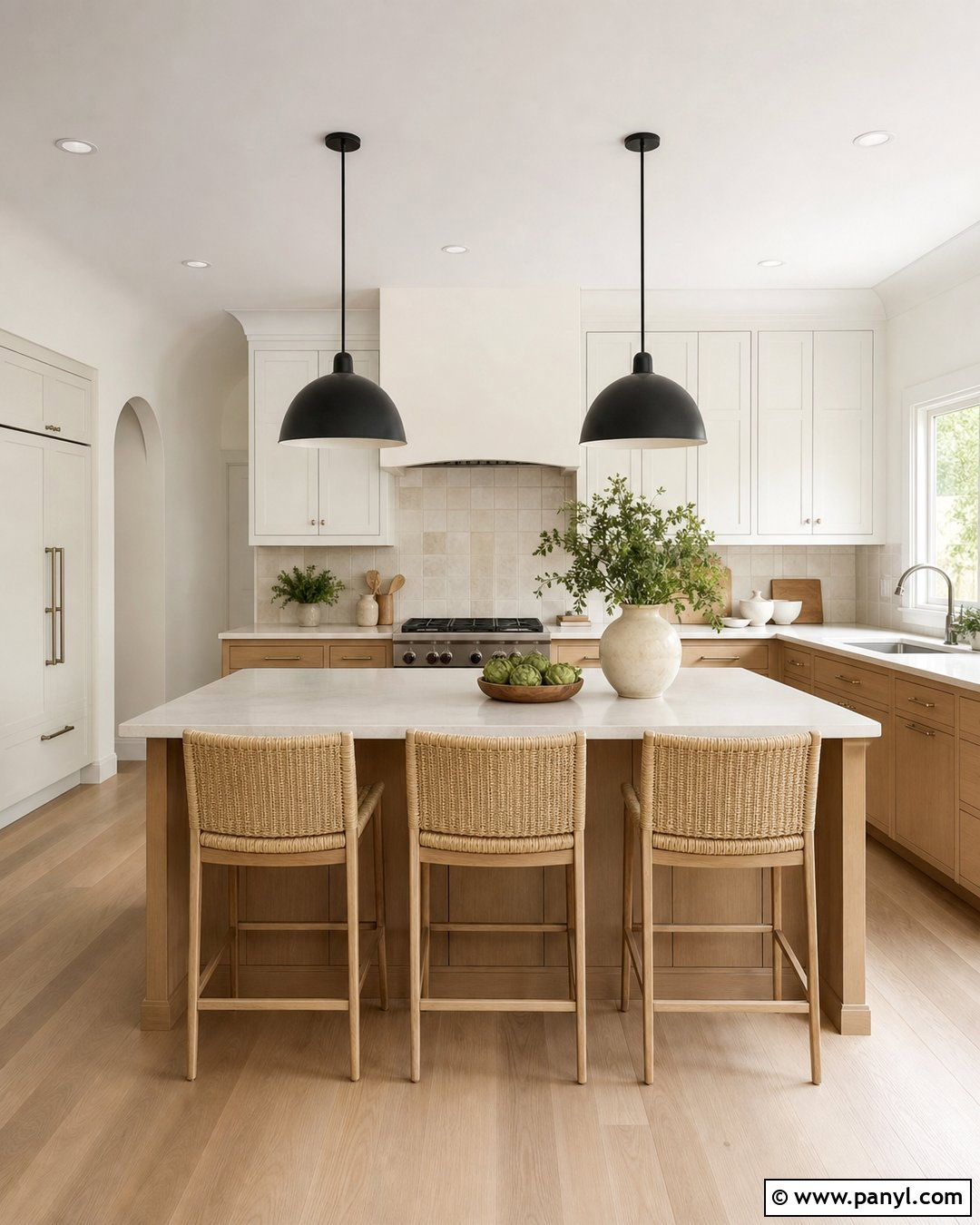
Clary Sage brings more depth than a pale green while preserving the earthy personality of Accessible Beige. Use Accessible Beige on the kitchen walls and Clary Sage on lower cabinets or a generous island. Warm white upper cabinets help the room stay bright and prevent the green from feeling heavy. Choose creamy quartz countertops, handmade ivory backsplash tile, and antique brass cabinet pulls. Natural oak flooring and woven counter stools reinforce the organic color story. A plaster-look range hood in Accessible Beige can connect the cabinetry to the surrounding walls. Finish with simple pendant lights, white stoneware, and fresh herbs in terracotta pots. The completed kitchen feels colorful and warm, yet restrained enough for everyday living.
8. Accessible Beige And Evergreen Fog Entryway
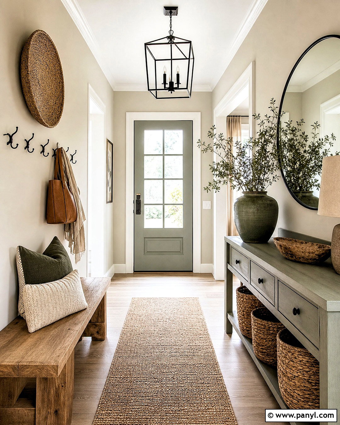
The first view into a home should feel welcoming, organized, and connected to nearby rooms. Paint entryway walls Accessible Beige, then coat the front door and a slim console cabinet in Evergreen Fog. This muted green-gray creates a confident focal point without fighting the warm neutral background. Add a natural jute runner, a medium oak bench, and black iron hooks for useful contrast. An oversized round mirror can reflect daylight and visually widen a narrow hall. Store shoes in woven baskets beneath the bench to reduce clutter. Repeat Evergreen Fog through a patterned pillow or ceramic planter. Warm white trim and a simple brass ceiling fixture finish an earthy entry that transitions easily into beige living areas.
9. Accessible Beige And Naval Bedroom
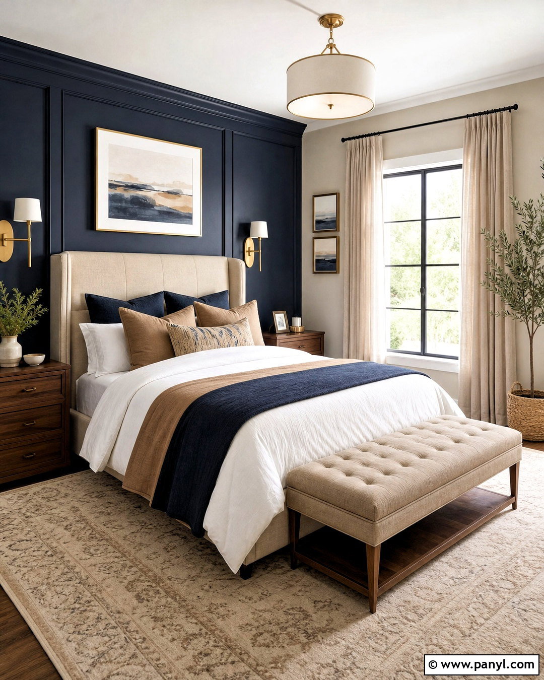
Naval gives Accessible Beige a dramatic partner that works especially well in a bedroom with plenty of natural light. Keep three walls Accessible Beige and use Naval behind the bed to create a strong, calming anchor. Choose an oatmeal upholstered headboard so it remains visible against the deep blue. Layer white bedding with camel, beige, and navy textiles, then ground everything with a cream rug featuring a small blue pattern. Medium walnut nightstands add warmth, while aged brass sconces introduce a refined highlight. Use full-length natural linen curtains rather than dark drapes. A few framed prints with blue, tan, and ivory details will unify the complete palette without making the room feel themed or overly coordinated.
10. Accessible Beige And Upward Guest Room
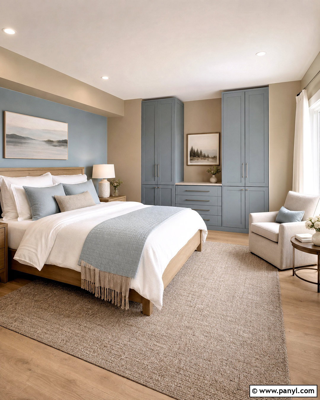
Upward offers a soft, slightly smoky blue that gives Accessible Beige a gentle cool contrast. Paint most walls Accessible Beige and apply Upward to the wall behind the guest bed or to a pair of built-in wardrobes. Select a white oak bed with clean lines, then layer it with white sheets, a pale blue quilt, and a textured sand-colored throw. A light taupe rug keeps the floor quiet, while brushed nickel lamps echo the cooler blue notes. Add airy off-white curtains and simple coastal landscape prints without using obvious themed accessories. A small beige reading chair and oak side table complete the layout. The result feels fresh, restful, and welcoming throughout changing daylight.
11. Accessible Beige And Rainwashed Laundry Room
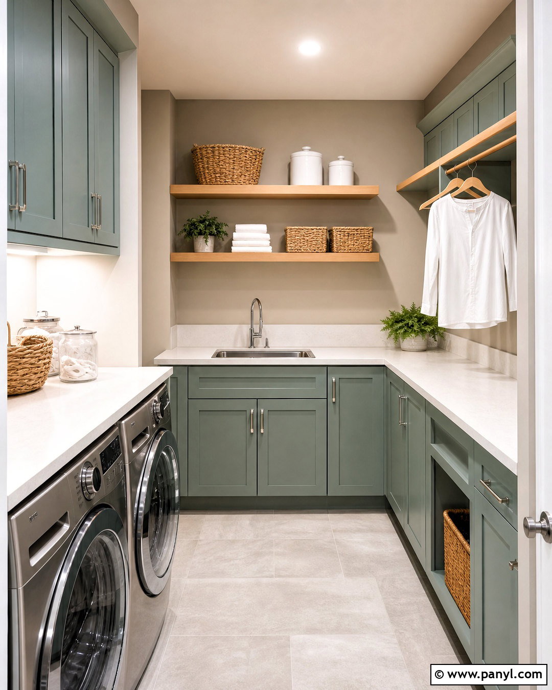
Laundry rooms benefit from color that feels cheerful but not distracting. Pair Accessible Beige walls with Rainwashed cabinets for a breezy green-blue scheme that brightens routine tasks. Use warm white quartz counters above the machines and carry the same material across a practical folding surface. Pale gray floor tile adds durability while keeping the compact room visually open. Woven baskets, clear storage containers, and labeled-free ceramic canisters maintain an orderly appearance. Add a natural wood hanging rail and a small stainless steel sink with polished chrome hardware. If space allows, install open oak shelves against the beige wall. Soft white trim and bright ceiling lighting complete a functional laundry room that feels calm, coordinated, and intentionally designed.
12. Accessible Beige And Repose Gray Open Plan
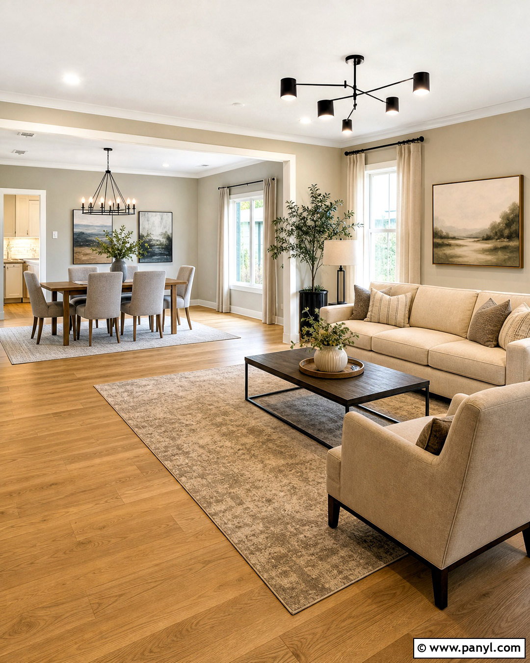
When connected rooms need distinction without an abrupt color break, Repose Gray can create a quiet transition from Accessible Beige. Use Accessible Beige in the living area and Repose Gray in the adjoining dining space or kitchen. Keep ceilings and trim one consistent warm white to unite the entire floor. Repeat both wall colors through a beige sofa, soft gray dining chairs, and a rug containing taupe, ivory, and gray. Natural oak flooring should continue uninterrupted between zones. Black lighting and window frames can provide a common accent, while linen curtains soften the architecture. Before painting, sample the colors where the rooms meet because nearby windows can change their undertones. The finished plan should look layered, not divided.
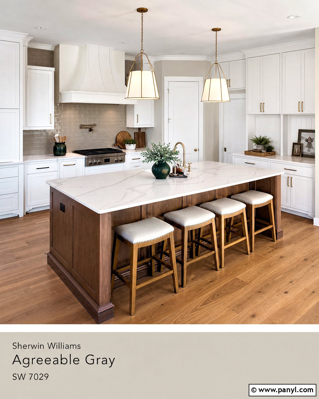
13. Accessible Beige And Agreeable Gray Family Room
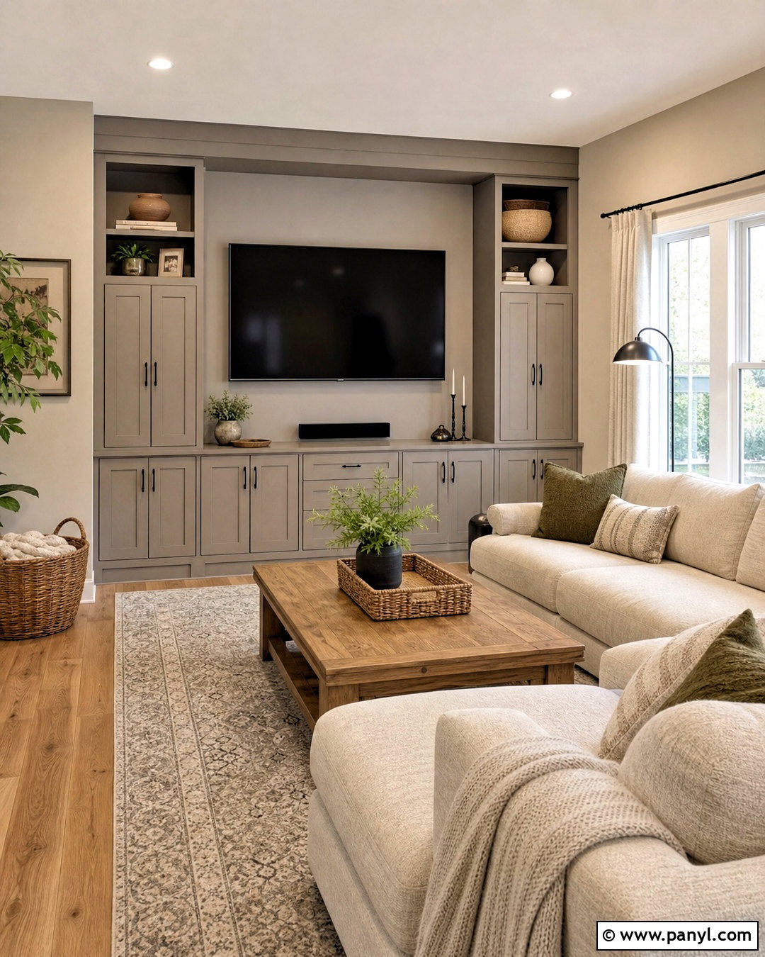
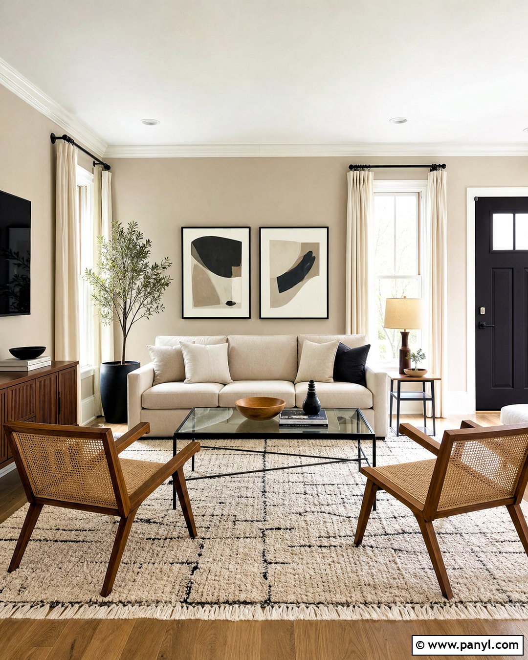
Agreeable Gray and Accessible Beige form a warm neutral palette with enough variation to define furniture and architectural details. Cover the family room walls in Accessible Beige, then use Agreeable Gray on built-in media cabinets or an adjoining reading nook. Choose a large oatmeal sectional, medium oak coffee table, and durable ivory-and-gray patterned rug. Soft olive pillows can introduce natural color, while black metal lamps add definition. Hide electronics inside closed cabinetry so the subtle paint pairing stays visible. Off-white linen curtains maintain brightness around windows, and woven baskets provide practical toy or blanket storage. This complete scheme works particularly well for busy spaces because its layered neutrals accommodate changing accessories, seasonal textiles, and everyday household activity.
14. Accessible Beige And Urbane Bronze Exterior
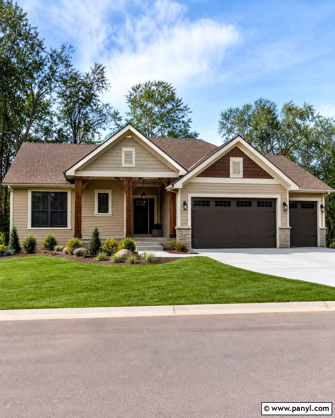
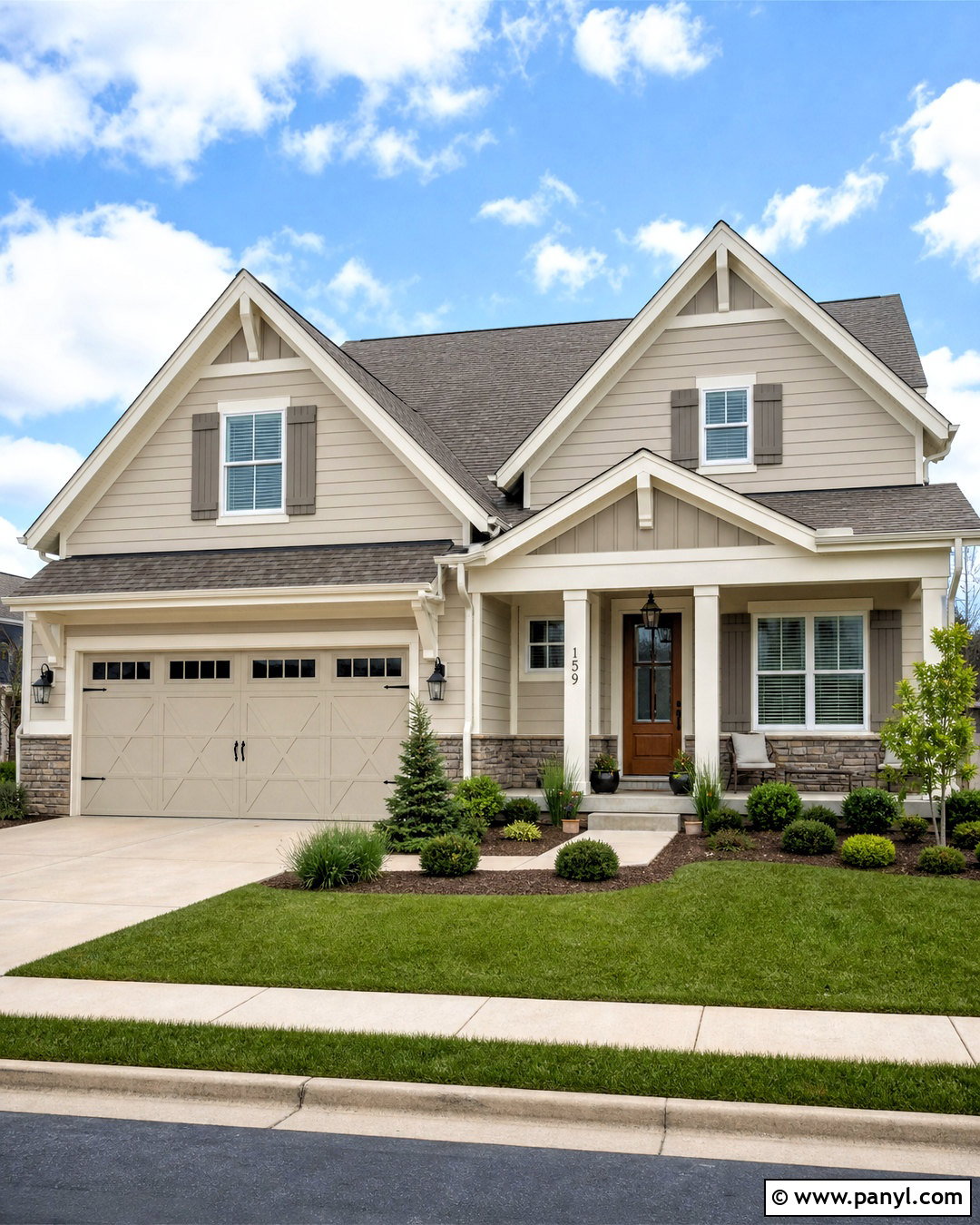
Urbane Bronze creates a substantial exterior accent against an Accessible Beige house body. Use Accessible Beige on lap siding or stucco, then apply Urbane Bronze to the front door, garage door, shutters, and selected trim details. Choose a warm off-white for fascia and window trim so the exterior does not become too dark. A medium brown architectural-shingle roof will connect naturally with both paint colors. Add black lanterns, stained wood porch posts, and simple house numbers for clear definition. Landscaping should include layered evergreen shrubs, ornamental grasses, and pale stone edging. A clean concrete walkway and two large planters frame the entrance. This balanced exterior scheme suits ranch, Craftsman, and straightforward suburban homes.
15. Accessible Beige And Iron Ore Fireplace
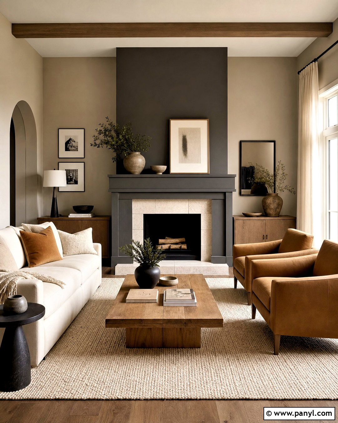
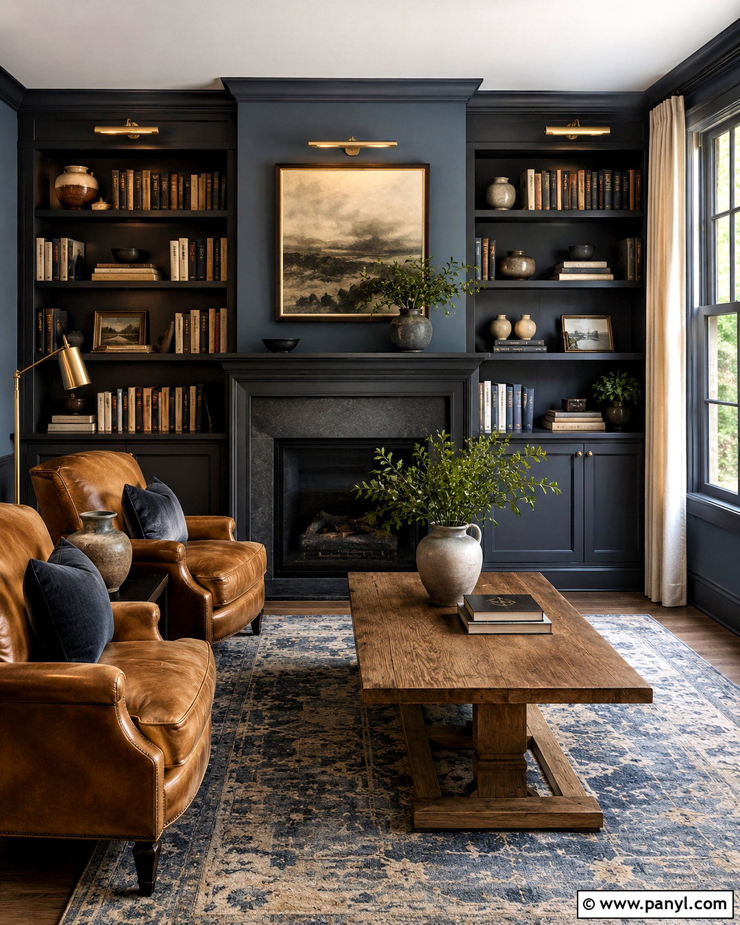
Iron Ore turns a basic fireplace into a strong focal point while Accessible Beige keeps the surrounding room warm. Paint the walls Accessible Beige and coat the fireplace surround, mantel, or vertical chimney breast in Iron Ore. Use pale natural stone at the hearth to soften the dark charcoal and connect it to the beige walls. Arrange a cream sofa and two camel chairs around a medium oak coffee table, leaving clear paths through the room. An ivory textured rug keeps the seating group light. Repeat Iron Ore through slim window frames, a floor lamp, or small picture frames. Add linen curtains and minimal ceramic decor so the fireplace remains dominant without making the complete living room feel severe.
16. Accessible Beige And Retreat Mudroom
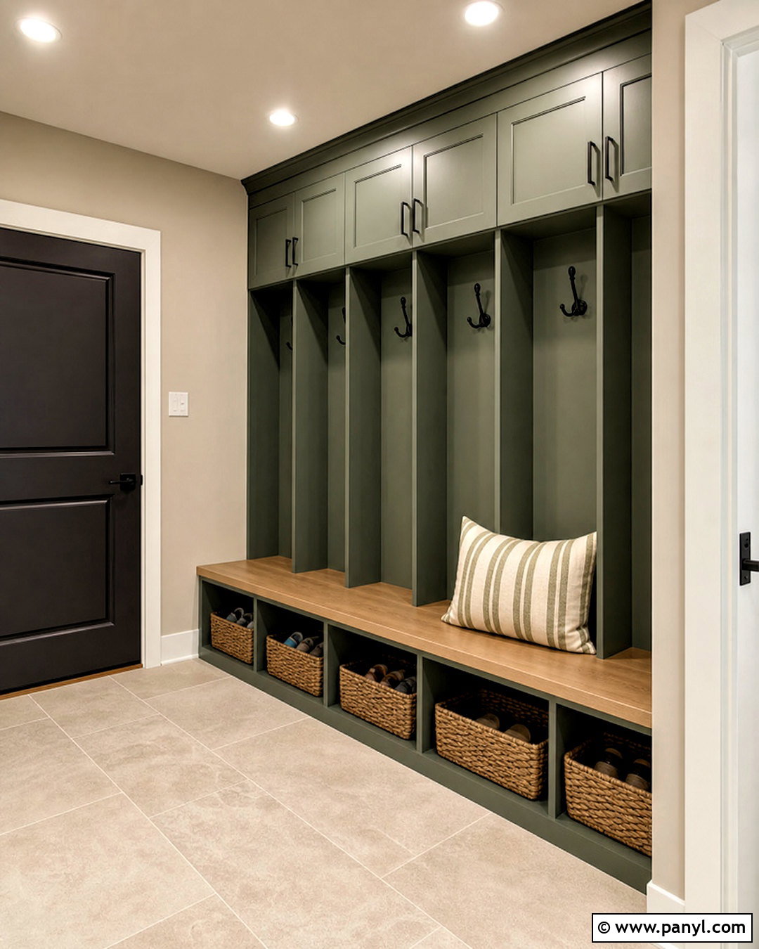
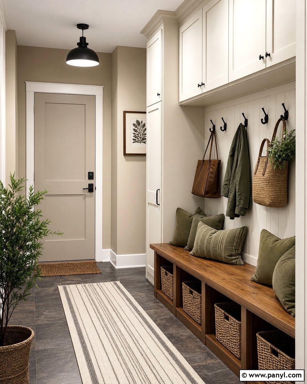
Retreat introduces a deep, muted green that feels practical and grounded in a hardworking mudroom. Use Accessible Beige above the storage units, then paint floor-to-ceiling lockers, cubbies, and a built-in bench in Retreat. Add a natural oak bench seat to warm the green cabinetry and withstand daily use. Large beige porcelain floor tiles hide minor dirt while connecting to the walls. Matte black hooks, cabinet pulls, and a simple ceiling fixture create durable contrast. Organize shoes in woven baskets and reserve upper cabinets for less frequently used items. A striped cushion containing cream, olive, and taupe can soften the bench. Warm white trim and strong overhead lighting keep this complete storage space welcoming rather than dark.
17. Accessible Beige And Redend Point Sitting Room
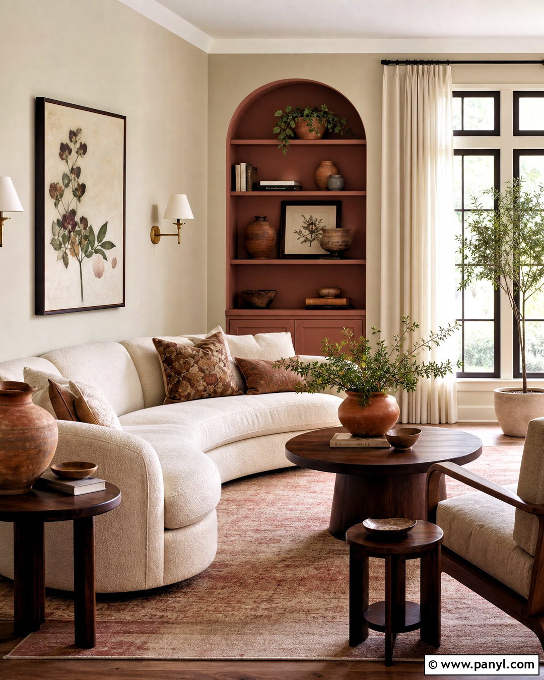
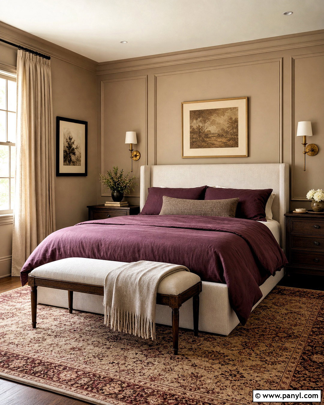
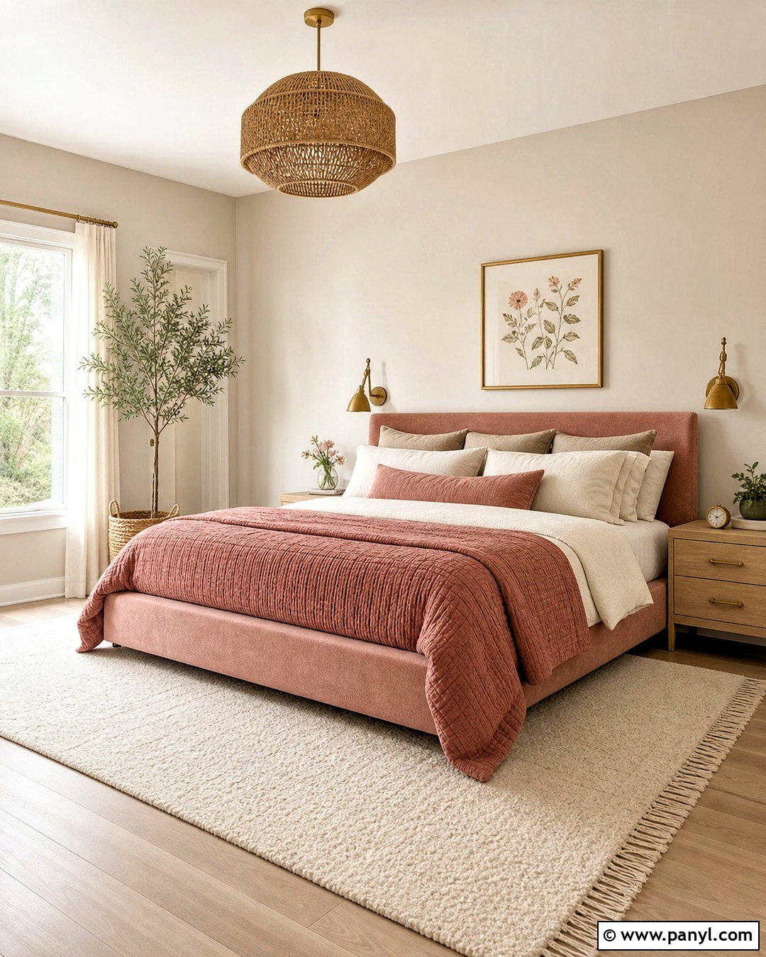
Redend Point adds dusty rose warmth to Accessible Beige without turning the room overly sweet. Keep the main walls Accessible Beige and use Redend Point on a shallow alcove, built-in cabinets, or the wall behind a curved sofa. Choose cream upholstery and warm walnut furniture to support the earthy undertones of both colors. A vintage-inspired rug containing faded clay, beige, and muted blue adds depth underfoot. Hang aged brass sconces and use off-white linen curtains for a soft finish. Dark brown picture frames can provide definition without the sharpness of black. Complete the sitting area with textured cushions, terracotta pottery, and restrained botanical artwork. The palette feels collected, comfortable, and suitable for relaxed conversation or reading.
18. Accessible Beige And Cavern Clay Sunroom
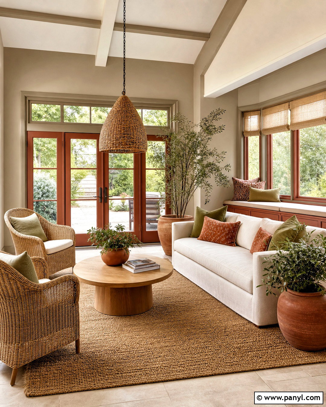
Sunlight brings out the warm side of Accessible Beige, making Cavern Clay a natural accent for an energetic sunroom. Paint the walls Accessible Beige and use Cavern Clay on French doors, a window seat base, or one solid end wall. Furnish the room with light rattan chairs, an ivory sofa, and a round oak table. Add cushions in cream, rust, and muted olive, then place a flatwoven jute rug beneath the seating group. White or natural linen shades control glare without hiding the windows. Terracotta planters filled with leafy green plants reinforce the sunbaked palette. Keep the ceiling warm white and use black metal sparingly through slim lighting or plant stands to define this inviting, indoor-outdoor space.
19. Accessible Beige And Mauve Finery Dressing Room
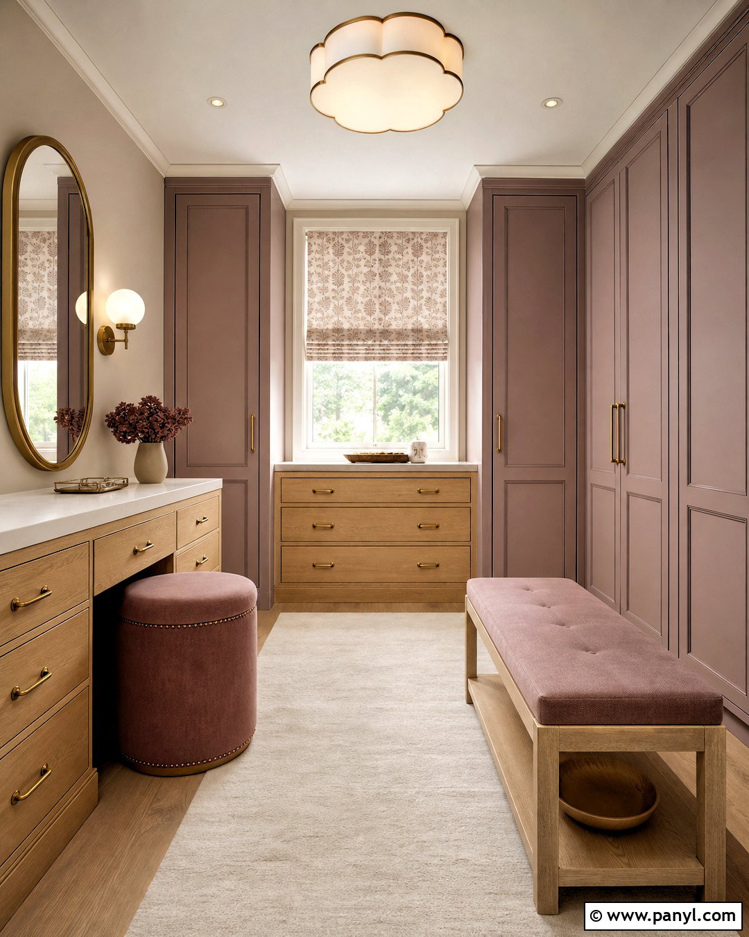
Mauve Finery gives Accessible Beige a soft, sophisticated accent with more character than another neutral. Paint the dressing room walls Accessible Beige and use muted mauve on wardrobe doors, a compact vanity, or an upholstered bench. Warm white trim will keep the two colors distinct and brighten the room. Choose light oak cabinetry interiors, brushed brass hardware, and a cream wool rug for a polished finish. A rounded mirror and two milk-glass sconces create a practical grooming station. Repeat mauve in a small cushion or patterned window shade rather than across every accessory. Closed storage, matching hangers, and clear walking space are essential. The completed room should feel organized, comfortable, and quietly colorful instead of overly decorative.
20. Accessible Beige And Creamy Nursery
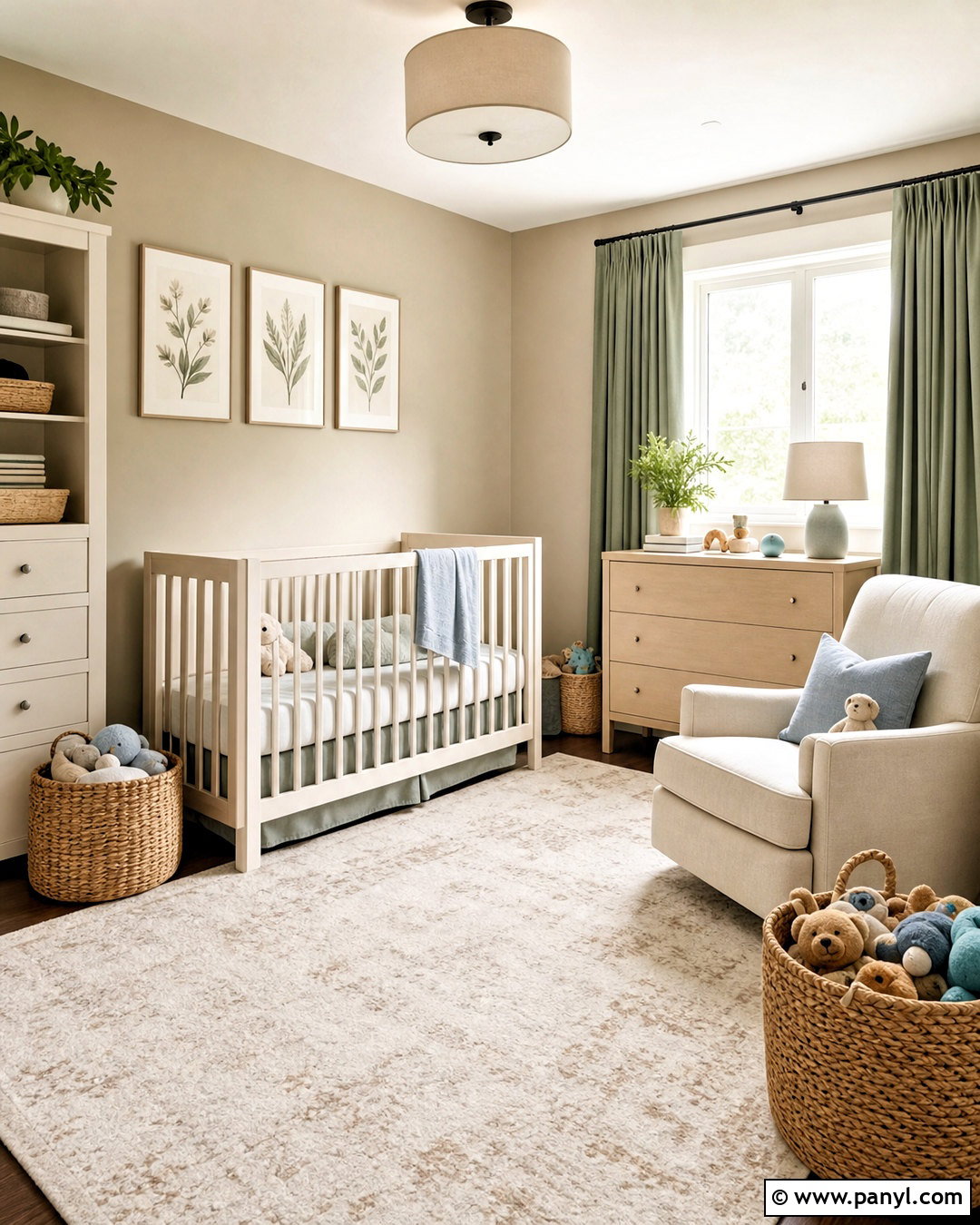
Creamy creates a tender, warm backdrop around Accessible Beige without relying on bright white. Paint the nursery walls Accessible Beige, then use Creamy on the ceiling, trim, crib, and low storage cabinets. Add a natural maple dresser, a washable ivory rug, and a comfortable oatmeal glider to build a soft tonal foundation. Muted sage curtains and small touches of dusty blue introduce calm color without disrupting the neutral scheme. Choose woven baskets for toys and books, keeping storage low and accessible. A simple ceiling light provides clear illumination, while a shaded floor lamp supports quieter evening routines. Finish with nature-inspired artwork and cotton bedding in cream and taupe for a cohesive nursery that can adapt as the child grows.
Conclusion:
The most successful Accessible Beige palette considers the whole room rather than matching two paint chips in isolation. Flooring, fixed finishes, daylight, lamps, furniture, and nearby rooms all influence how the combination appears. Begin with large movable samples and observe them for several days before buying paint. Warm whites create subtle contrast, greens and blues add natural balance, and deep shades such as Naval or Iron Ore establish stronger focal points. Earthy rose, clay, and brown tones bring additional warmth. Whichever pairing you prefer, repeat it thoughtfully and leave enough neutral space for the room to breathe. These 20 accessible beige complimentary colors offer flexible starting points for creating a connected, comfortable home.

Related Ideas and Inspiration:
Leave a Reply