
Choosing among **20 light neutral paint colors** is easier when you picture each shade as part of a finished room instead of viewing it alone. Undertones, flooring, sunlight, trim, furniture, and textiles can make the same neutral feel warm, cool, crisp, or cozy. The looks below cover versatile whites, beiges, greiges, grays, taupes, and softly tinted neutrals. Each color is paired with materials and decor that help its undertone read clearly. Before committing, brush large samples onto several walls and observe them throughout the day. Compare the samples beside permanent finishes, including countertops, tile, cabinets, and flooring. Use these complete room schemes to find your favorite among these **20 light neutral paint colors**.

1. Warm White Paint Color
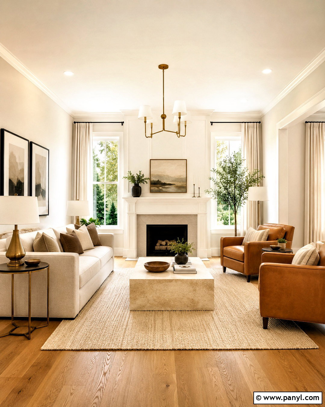
A warm white paint color gives a living room a clean appearance without making it feel cold or unfinished. Choose a white with a gentle cream undertone, then pair it with natural oak flooring and soft white trim. A relaxed oatmeal sofa, two camel leather chairs, and a woven wool rug create subtle contrast. Add a travertine coffee table and brushed brass lighting for warmth. Black picture frames provide small, crisp accents without overpowering the pale palette. Use linen curtains that closely match the walls so the windows feel taller and wider. This complete look works especially well in rooms with limited daylight because the warm materials keep the color from appearing flat or overly gray.
2. Creamy White Paint Color
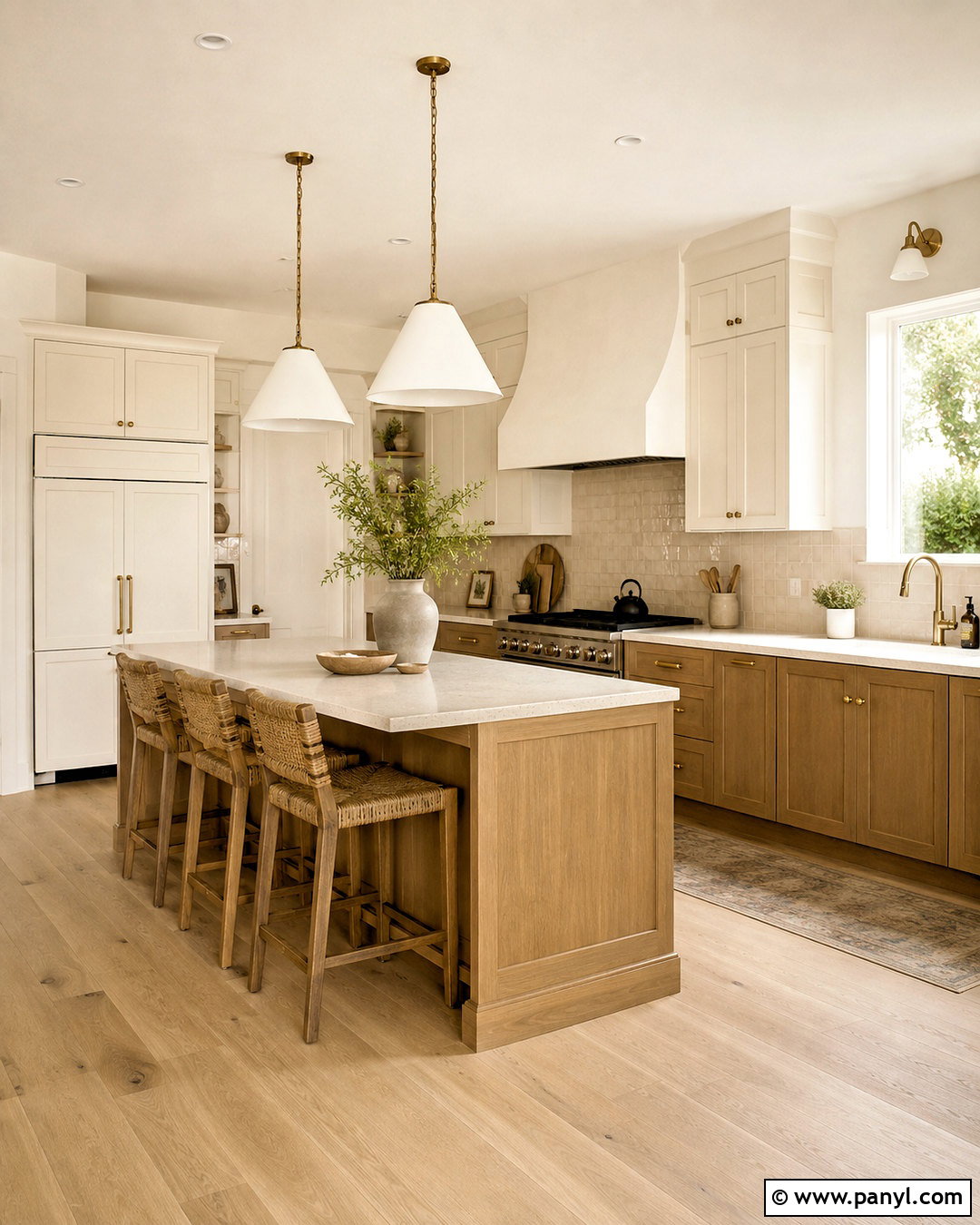
Can a kitchen feel bright and welcoming without using stark white? A creamy white paint color creates that balance beautifully. Use it across the walls and upper cabinets, with slightly brighter white on the ceiling and trim. Ground the palette with medium oak lower cabinets, warm white quartz countertops, and handmade beige backsplash tile. A softly veined stone island adds movement while aged brass hardware brings a gentle glow. Choose natural woven counter stools and pale oak flooring to continue the warmth. Small accents in muted sage green prevent the cream from looking too yellow. This coordinated kitchen feels light, practical, and comfortable while still offering enough tonal variation to define every surface clearly.
3. Soft Ivory Paint Color
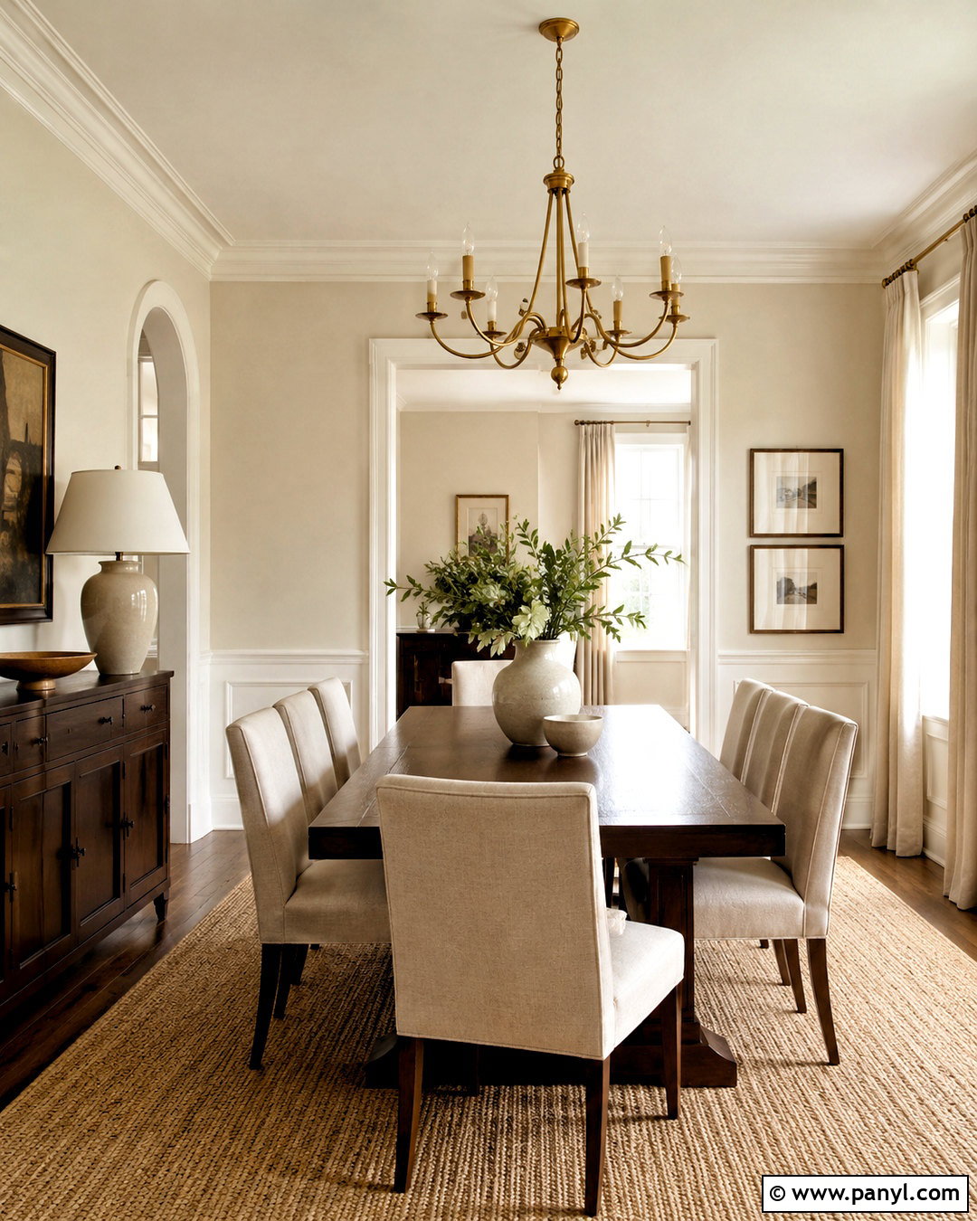
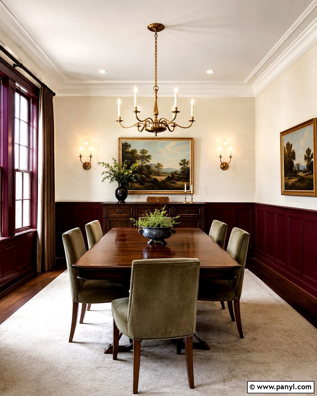
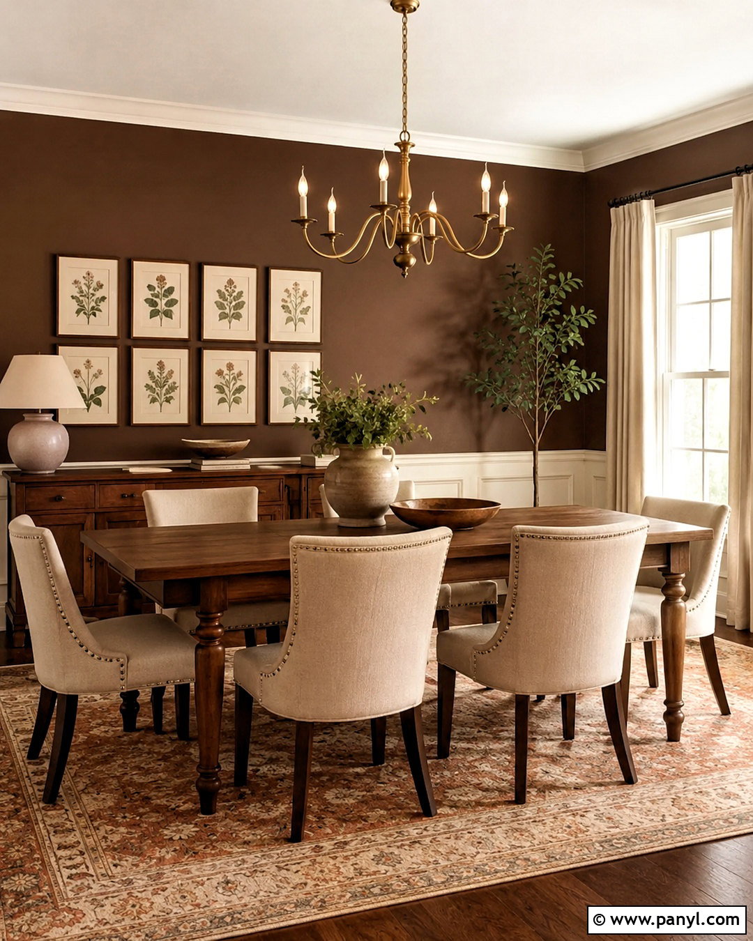
Soft ivory creates a polished dining room that feels warmer and gentler than pure white. Paint the walls in a pale ivory with restrained yellow undertones, then use crisp warm white for the crown molding and baseboards. Center the room around a walnut dining table with upholstered flax-colored chairs. A large natural fiber rug softens the wood floor and establishes a calm foundation. Hang a simple antique brass chandelier rather than an ornate fixture. Linen curtains, cream ceramic lamps, and one large landscape print complete the layered palette. For balance, introduce dark bronze through the curtain rod and picture frame. The finished room feels traditional yet fresh, with enough contrast to keep every ivory surface from blending together.
4. Pale Linen Paint Color
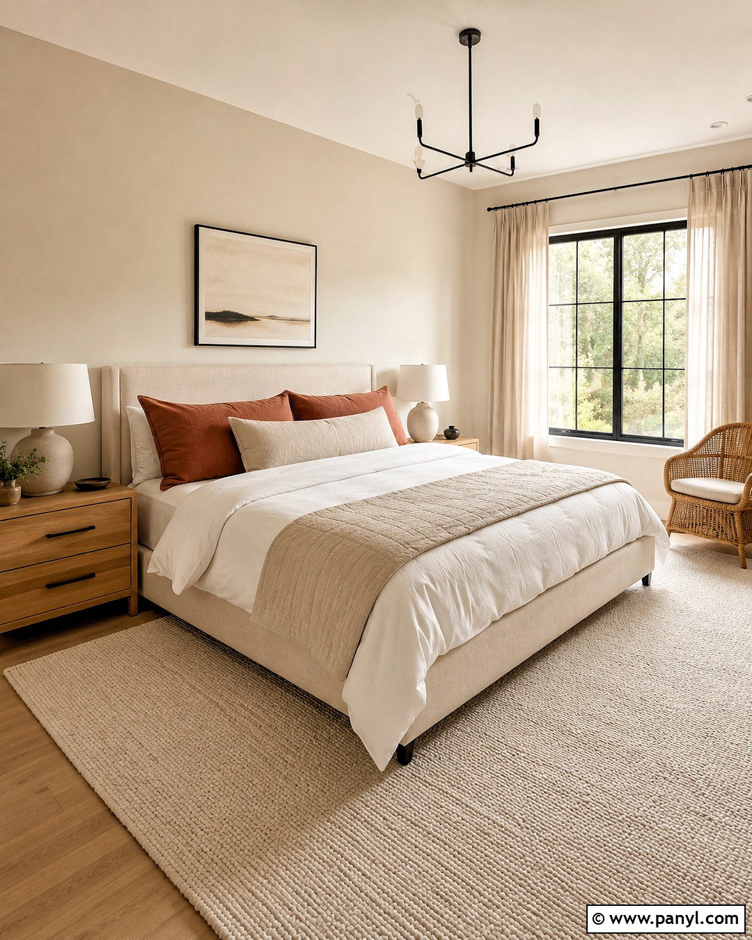
Pale linen paint brings quiet warmth to a bedroom without creating a noticeably beige backdrop. It has a soft woven-fabric quality that works naturally with relaxed, organic materials. Cover the walls in pale linen and keep the ceiling a cleaner warm white. Place an upholstered oatmeal bed against the main wall, layered with white bedding, a beige quilt, and muted clay pillows. Light oak nightstands and plaster table lamps maintain the airy feeling. Add full-length flax curtains and a low-pile wool rug under the bed. A black bench or slim black curtain rod gives the scheme a necessary outline. The final bedroom feels restful, uncluttered, and thoughtfully coordinated rather than plain or colorless.
5. Light Beige Paint Color
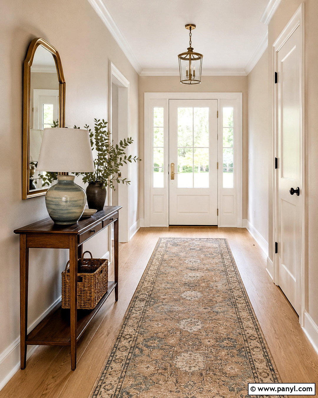
Light beige can make an entryway feel established, comfortable, and connected to the rest of the home. Select a balanced beige that is neither strongly yellow nor pink. Pair it with warm white doors, substantial baseboards, and medium-tone white oak flooring. A slim walnut console creates contrast while leaving the walkway open. Above it, display a rounded mirror with an aged brass frame. A washable patterned runner containing tan, cream, and muted blue adds practical color. Finish the space with a ceramic lamp, a woven basket, and one leafy plant. This complete entrance works well for traditional, transitional, and contemporary homes because the neutral wall color bridges warm wood, pale trim, and darker decorative accents.
6. Soft Sand Paint Color
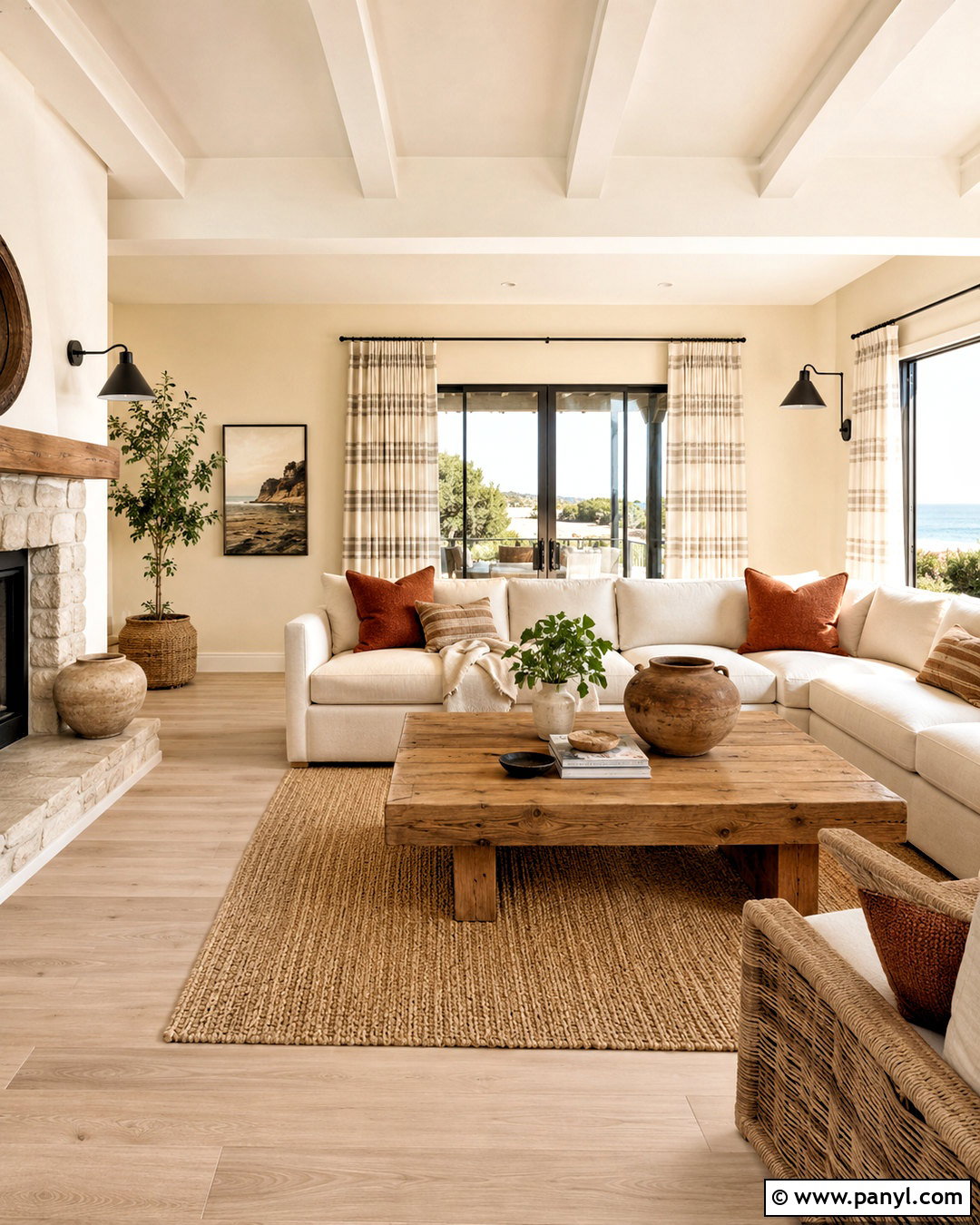
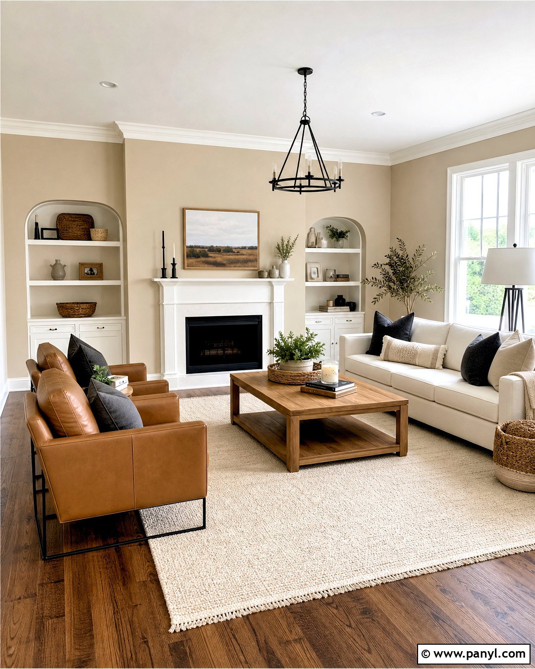
Imagine a sunlit family room with walls that echo the soft color of dry beach sand. This neutral has a subtle golden base, making it a natural partner for warm woods and casual fabrics. Use soft sand paint on every wall, paired with creamy white trim and a pale wood floor. Arrange a deep ivory sectional around a chunky oak coffee table. Bring in striped beige curtains, rust-colored pillows, and a textured jute rug for relaxed warmth. Matte black sconces and a black metal side table add definition. Keep decorative objects simple, using stoneware, woven baskets, and light wood frames. The complete room feels casual and bright without depending on pure white surfaces.
7. Warm Greige Paint Color
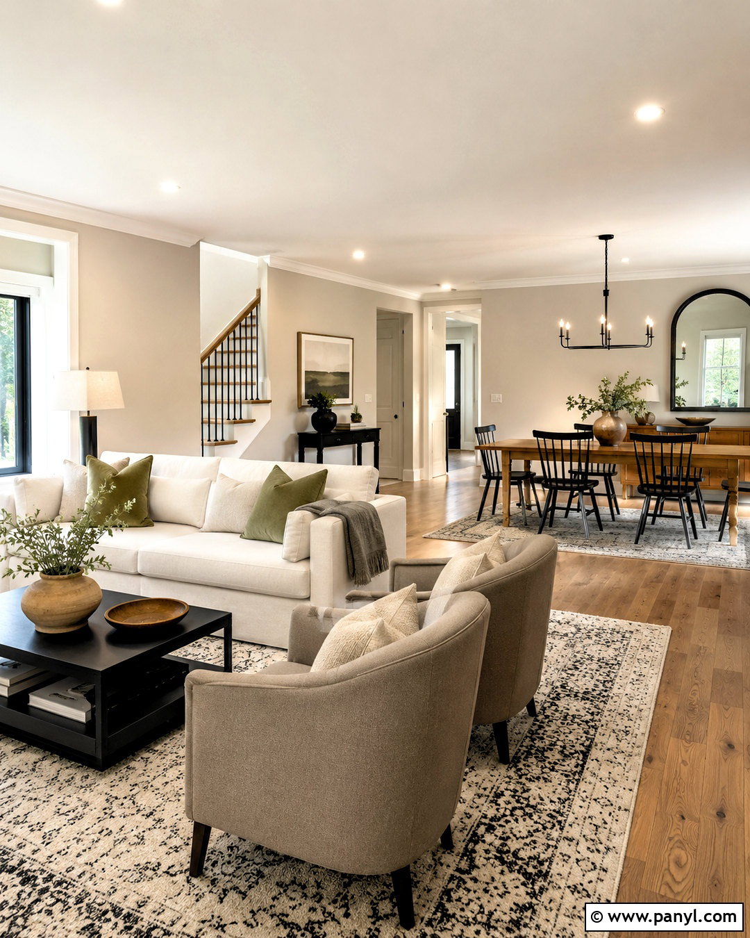
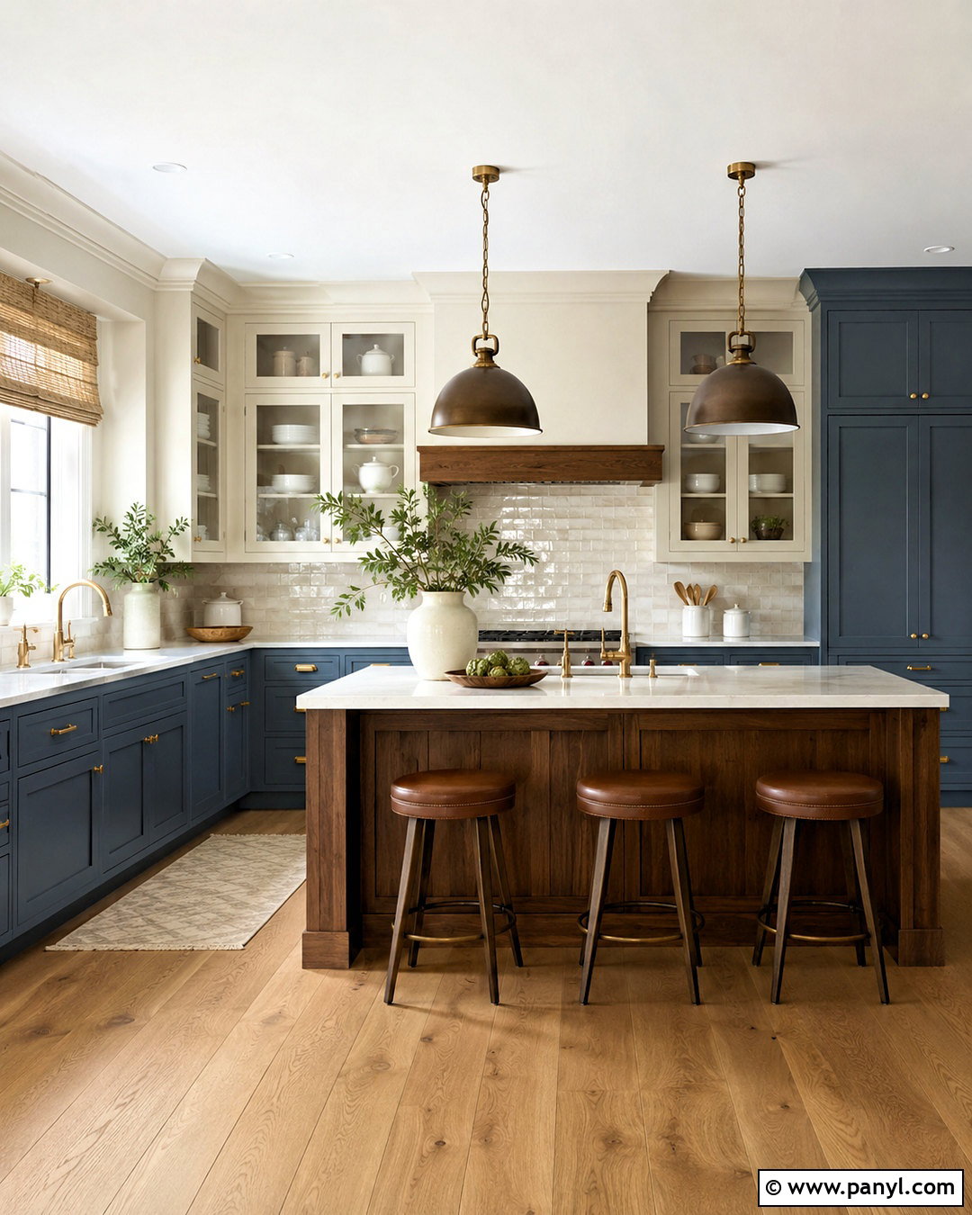
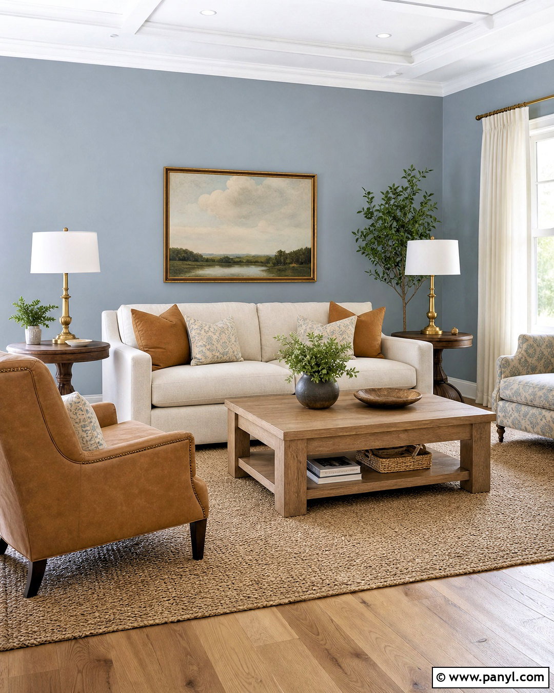
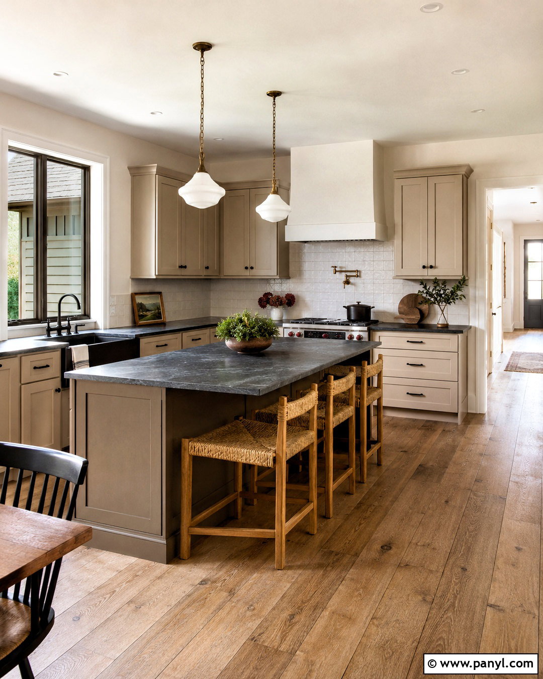
Warm greige blends the softness of beige with the tailored appearance of gray, making it especially useful in an open living and dining area. Paint the connected walls one consistent light greige to create visual flow. Use warm white on the ceiling, trim, and interior doors. Choose a cream sofa, taupe accent chairs, and a medium oak dining table so the furniture repeats both sides of the greige undertone. A large ivory rug with a fine charcoal pattern connects the seating area. Add black metal lighting, muted olive cushions, and handmade clay pottery for contrast. This balanced scheme feels modern but not cold, and it coordinates easily with wood, stone, black accents, and soft natural textiles.
8. Cool Greige Paint Color
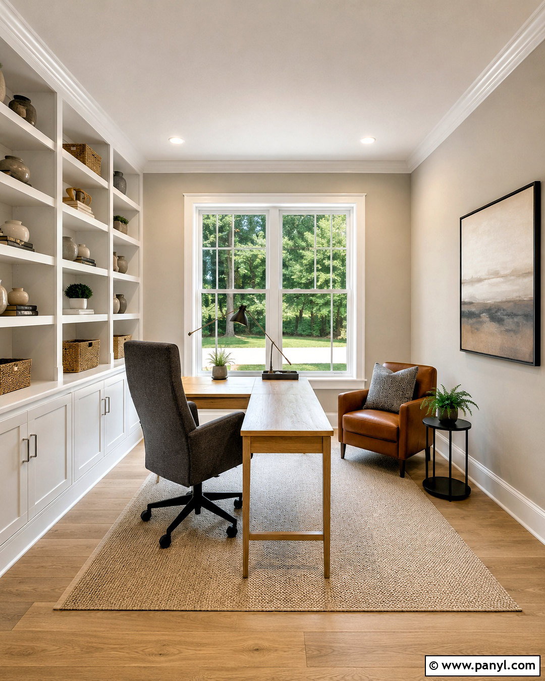
For a bright home office, cool greige offers more softness than plain gray while maintaining a clean, focused atmosphere. Choose a pale greige with a restrained violet or blue undertone. Pair it with clean white trim, a white ceiling, and light natural oak flooring. Position a streamlined oak desk near the window and add a charcoal upholstered chair for contrast. White built-in shelves keep the perimeter light, while brushed nickel hardware supports the cooler wall color. Introduce warmth through a beige wool rug, woven storage boxes, and one cognac leather side chair. Pale blue artwork and a simple glass lamp complete the look. The room feels organized, airy, and professional without becoming sterile.
9. Pale Taupe Paint Color
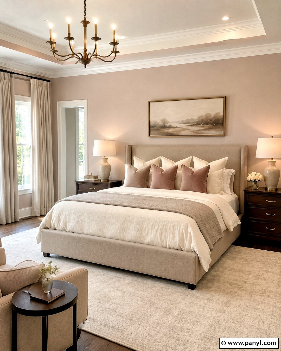
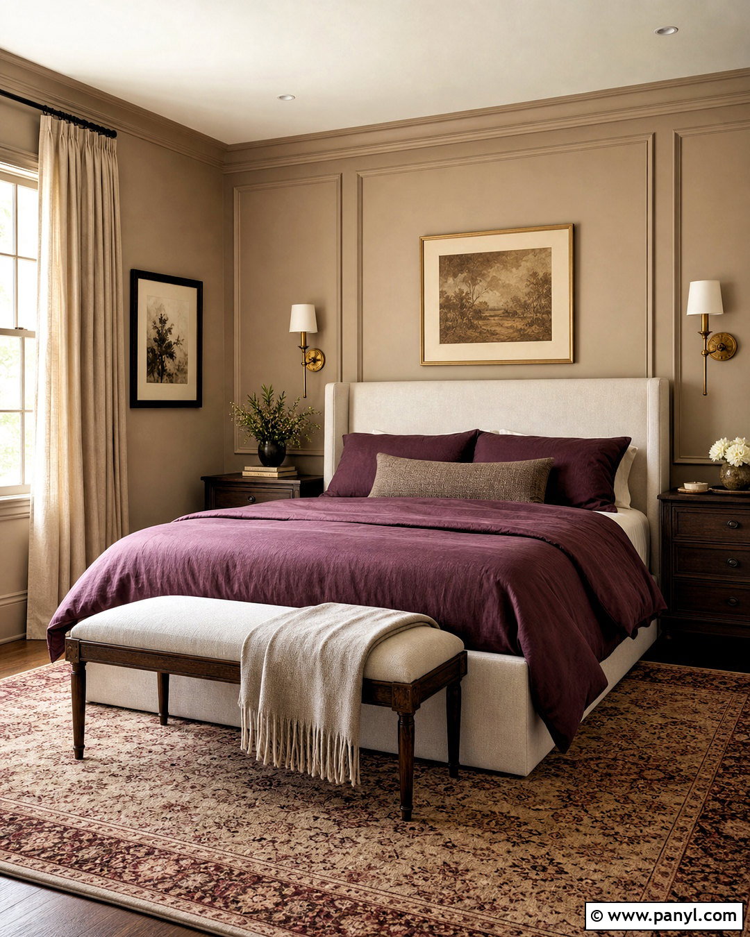
Pale taupe creates a sophisticated primary bedroom by combining gray, brown, and a faint rosy warmth. Use the color on all four walls for an enveloping but still light effect. Add warm white trim and a softly contrasting ceiling rather than using a brilliant, blue-based white. Select a tall upholstered bed in mushroom-colored linen, then layer it with ivory sheets, a taupe coverlet, and dusty rose accents. Dark walnut nightstands anchor the light palette. A creamy wool rug, ceramic lamps, and bronze hardware add depth without clutter. Hang oatmeal curtains from ceiling height to soften the windows. This coordinated bedroom feels elegant and restful, with warm and cool notes kept in comfortable balance.
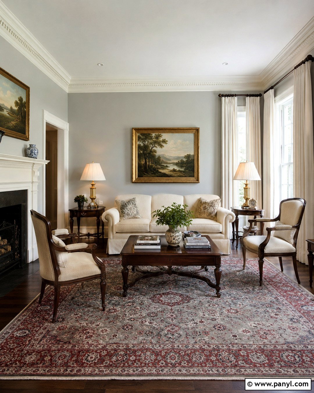
10. Mushroom Beige Paint Color
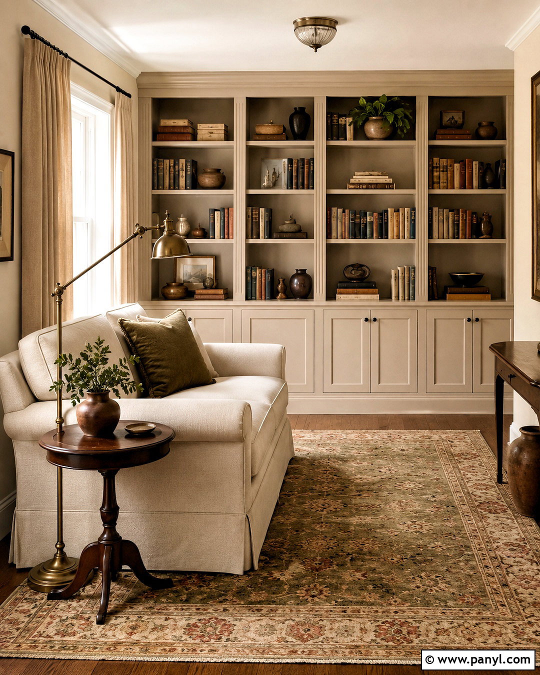
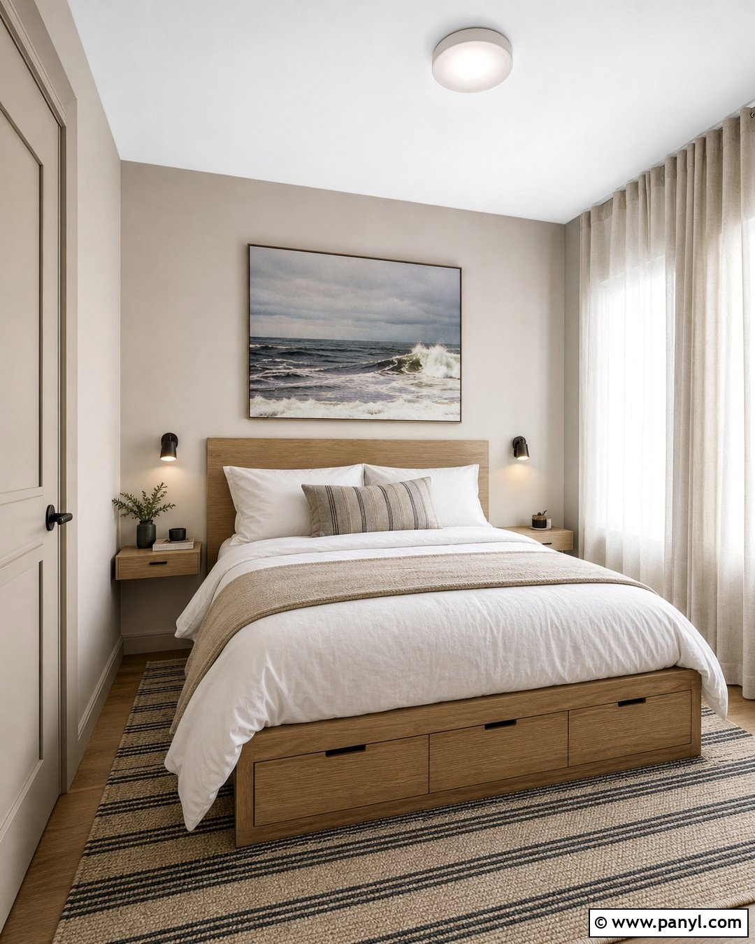
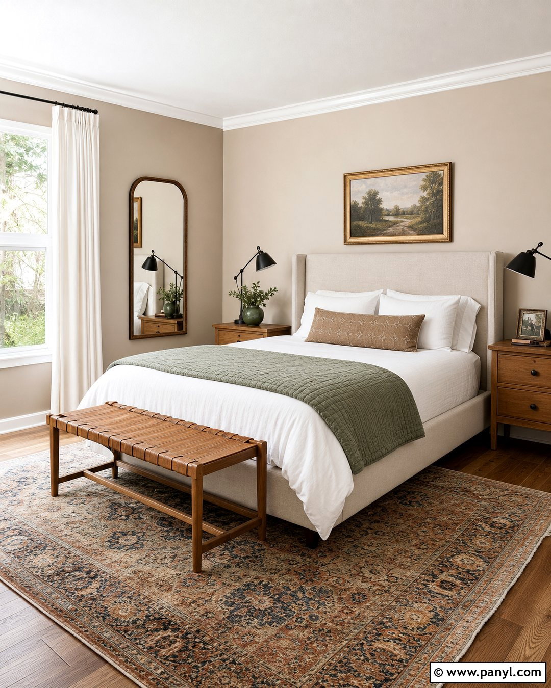
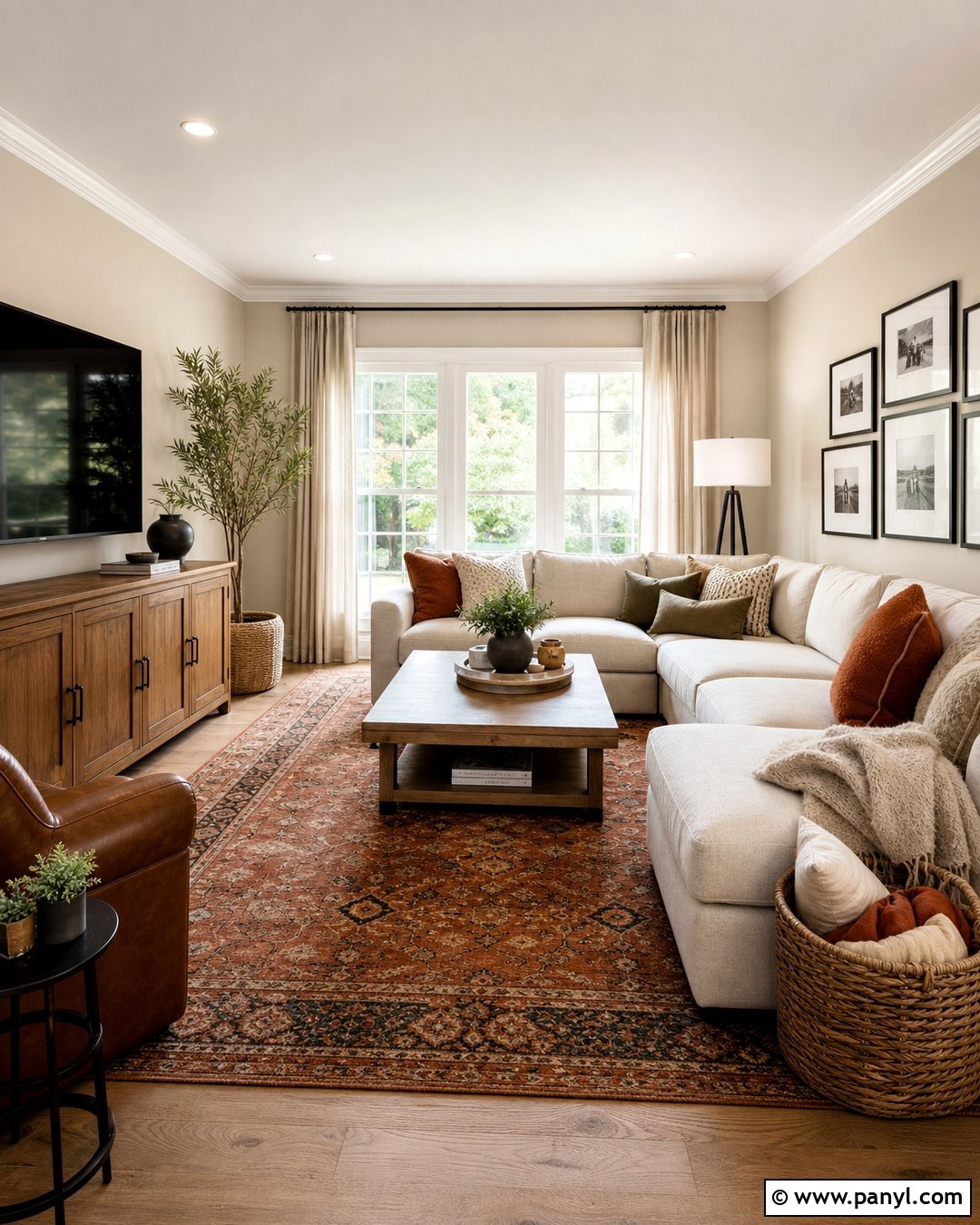
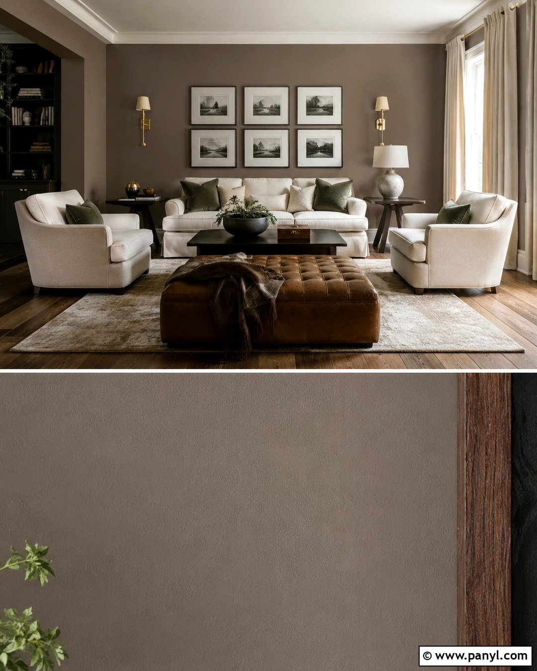
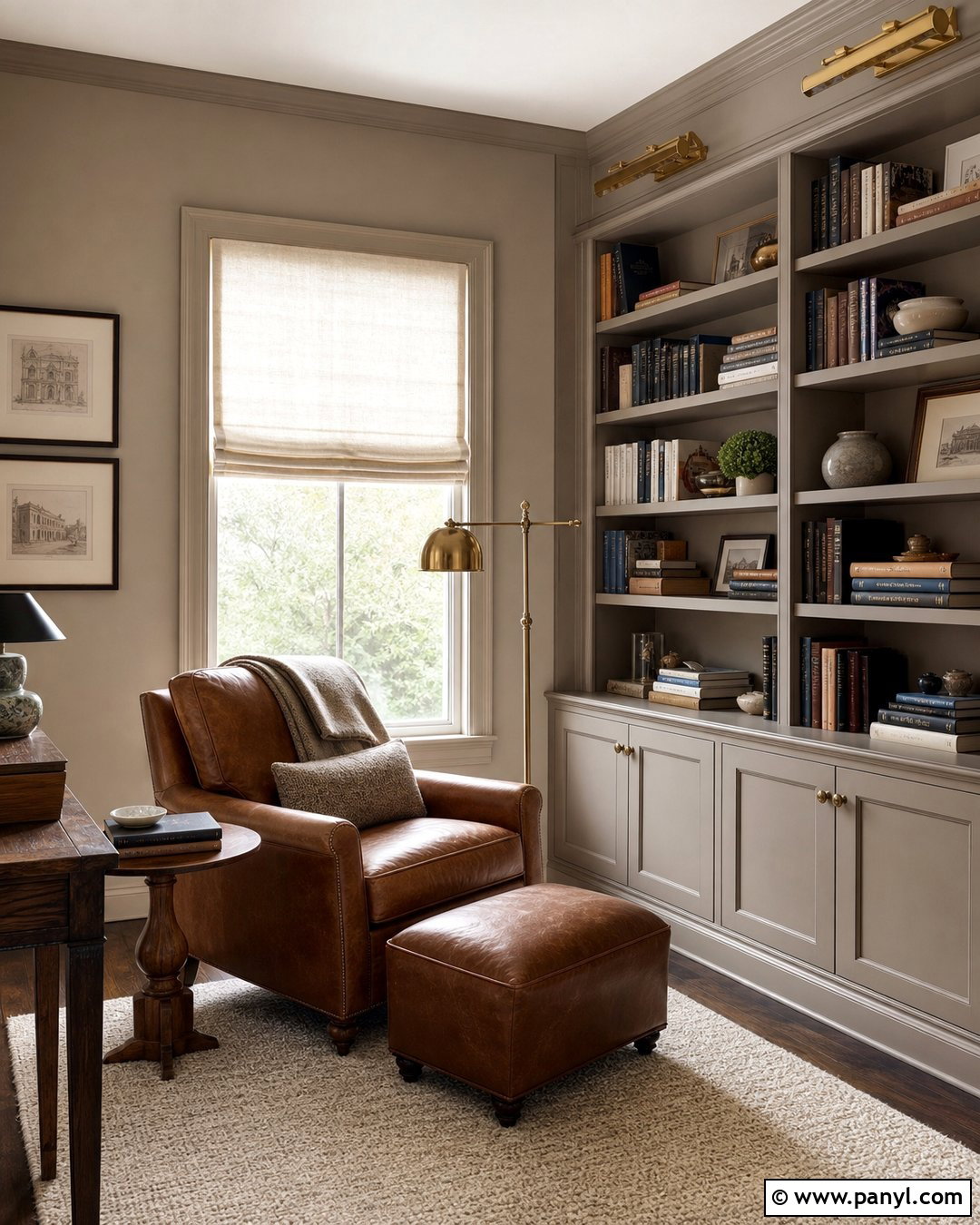
Mushroom beige is an earthy neutral that gives a reading room or small den a cozy, grounded character. Its brown-gray undertone looks especially attractive beside aged wood and creamy upholstery. Paint the walls and built-in bookcases in the same light mushroom shade, using different finishes to create subtle dimension. Add a compact ivory loveseat, a walnut side table, and a vintage-inspired floor lamp in antique brass. A muted Persian-style rug can introduce faded olive, rust, and taupe without disrupting the neutral setting. Finish with flax linen curtains and dark bronze hardware. The resulting room feels layered and inviting, proving that a light paint color can still create a rich, intimate atmosphere.
11. Light Gray Paint Color
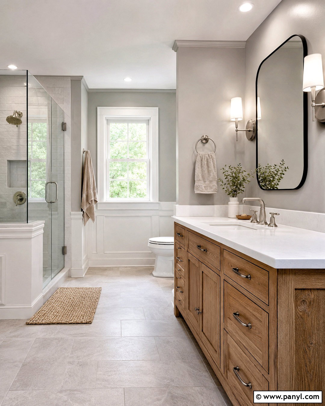
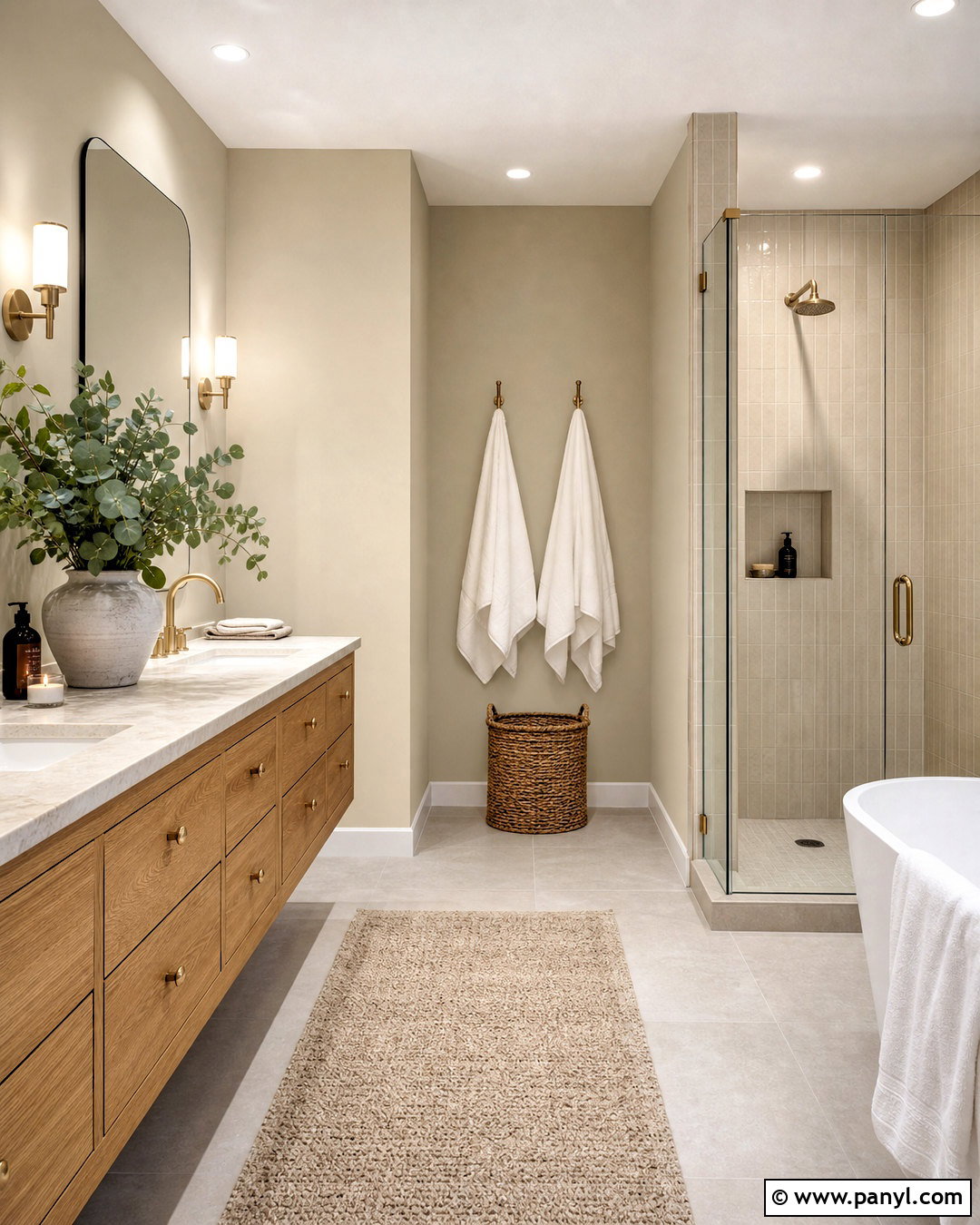
Light gray can look fresh and timeless in a bathroom when it is supported by warm materials. Choose a gentle gray that does not lean strongly blue. Use it above white wall paneling or simple ceramic tile, then repeat clean white on the ceiling and trim. A natural oak vanity immediately warms the palette, while a white quartz countertop keeps the room bright. Add brushed nickel faucets, clear glass shower panels, and pale gray floor tile for continuity. A woven bath mat and oatmeal towels bring in softness. Complete the design with a rounded mirror, simple sconces, and one small wooden stool. This balanced bathroom feels clean and calm rather than cold or overly industrial.
12. Pearl Gray Paint Color
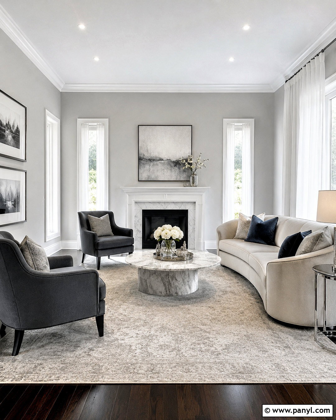
Pearl gray has a luminous quality that works beautifully in an elegant living room with refined but comfortable furniture. Paint the walls in a very light gray containing a subtle warm or silvery undertone. Use crisp white trim to sharpen the architecture. Arrange a curved cream sofa with two pale blue-gray chairs around a white marble coffee table. A large rug blending ivory, silver, and soft taupe keeps the palette cohesive. Add polished nickel lamps and small touches of dark charcoal through frames and side tables. Sheer white curtains allow daylight to spread across the pale walls. The complete scheme feels airy and graceful, while layered textures prevent the light gray backdrop from appearing empty or unfinished.
13. Blue Gray Paint Color
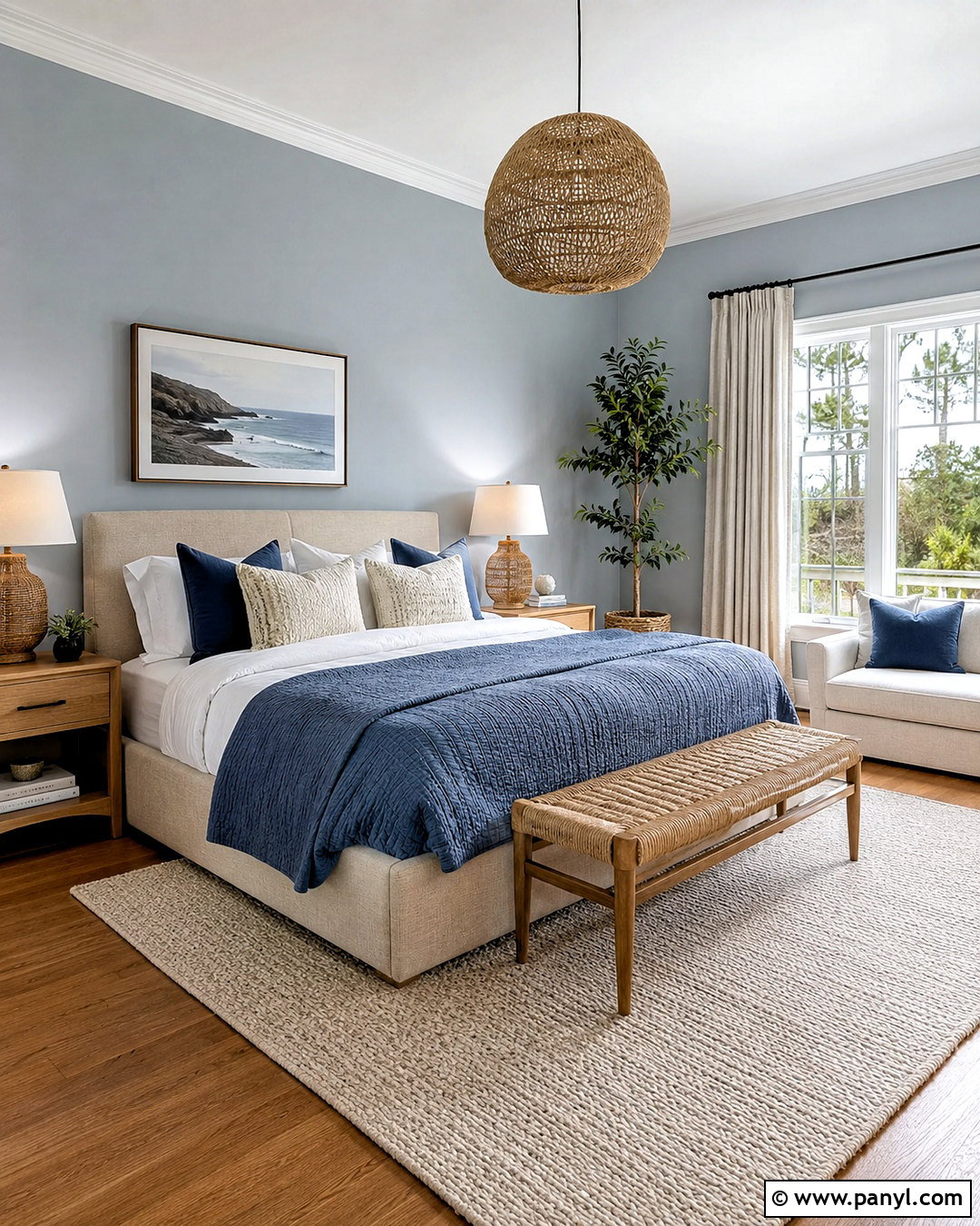
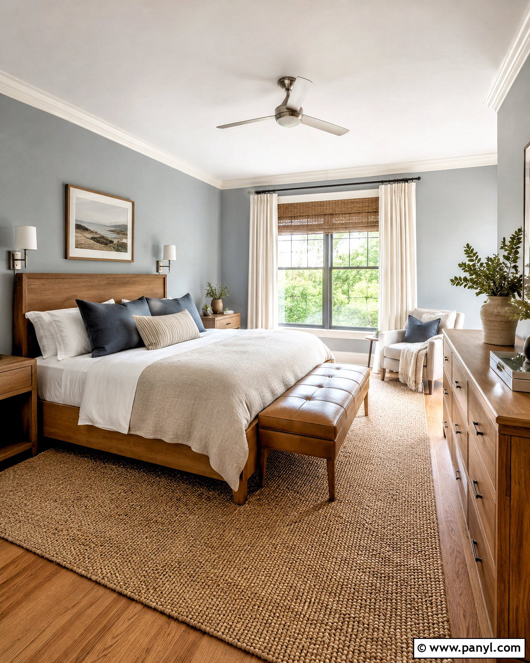
A pale blue-gray wall color can turn a bedroom into a peaceful retreat while remaining neutral enough for changing decor. Select a misty shade with more gray than blue, then pair it with clean white trim and warm oak flooring. Use a natural linen bed, white bedding, and a quilt in soft denim blue. Light wood nightstands and woven lamps introduce warmth that balances the cooler walls. Add a cream rug with a subtle blue border and long oatmeal curtains. A few navy accents provide depth, but keep them small and repeated. This complete palette feels fresh, restful, and easy to live with, especially when natural fibers keep the blue-gray walls from becoming too formal.
14. Green Gray Paint Color
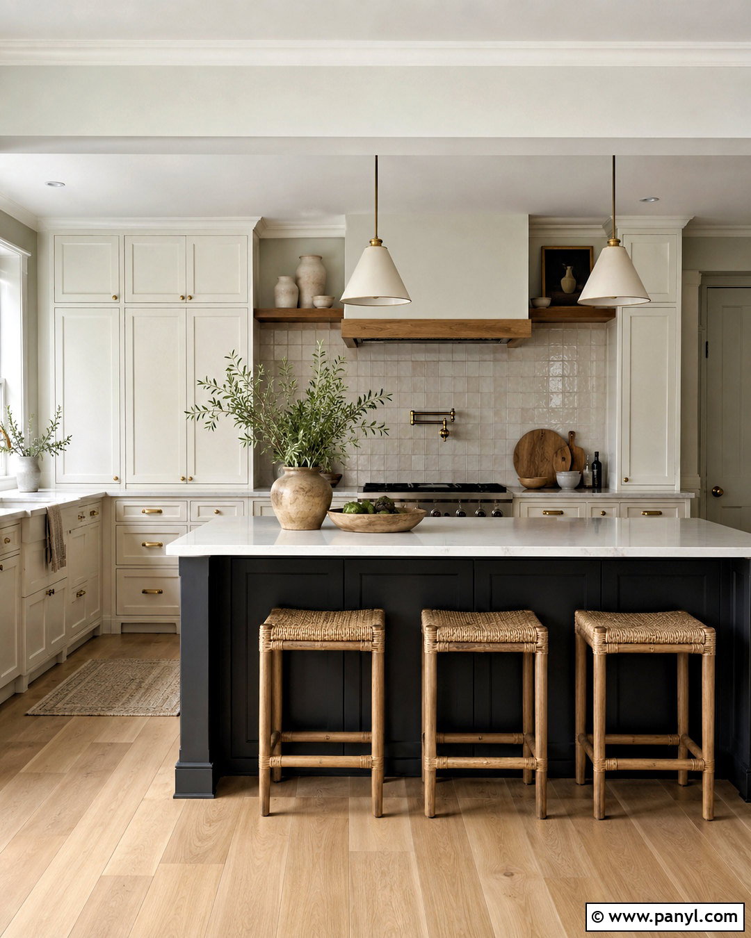
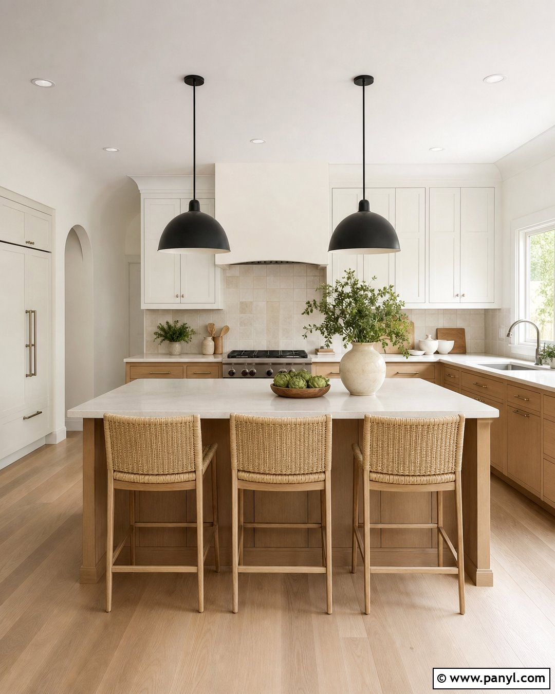
Green-gray paint creates a calm kitchen that feels connected to natural materials without looking overtly colorful. Choose a very light, muted shade with balanced green and gray undertones. Apply it to the walls, then use creamy white cabinets and pale quartz countertops. A backsplash of warm white zellige-style tile adds soft variation. Bring in white oak flooring, woven counter stools, and aged brass hardware to emphasize warmth. A muted charcoal island can provide a grounding focal point in a larger room. Display a few cream ceramics and wooden cutting boards instead of bright accessories. The finished kitchen feels fresh and organic, with the pale green-gray walls acting as a versatile neutral backdrop.
15. Pale Sage Neutral Paint Color
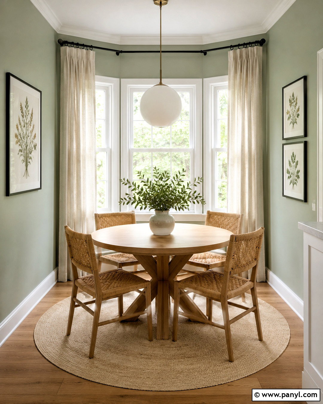
Pale sage offers a gentle alternative to beige in a breakfast nook or casual dining space. Select a desaturated sage with plenty of gray so the result remains soft and adaptable. Paint the walls pale sage and use warm white on the trim, ceiling, and window frames. A round light oak table keeps the layout open, while woven chairs add texture. Hang a simple white globe pendant above the table. Flax curtains, a cream washable rug, and muted botanical artwork support the natural palette. Add small black accents through the curtain rod and picture frames. This complete design feels cheerful in morning light yet calm throughout the day, with enough warmth to avoid a chilly green cast.
16. Soft Stone Paint Color
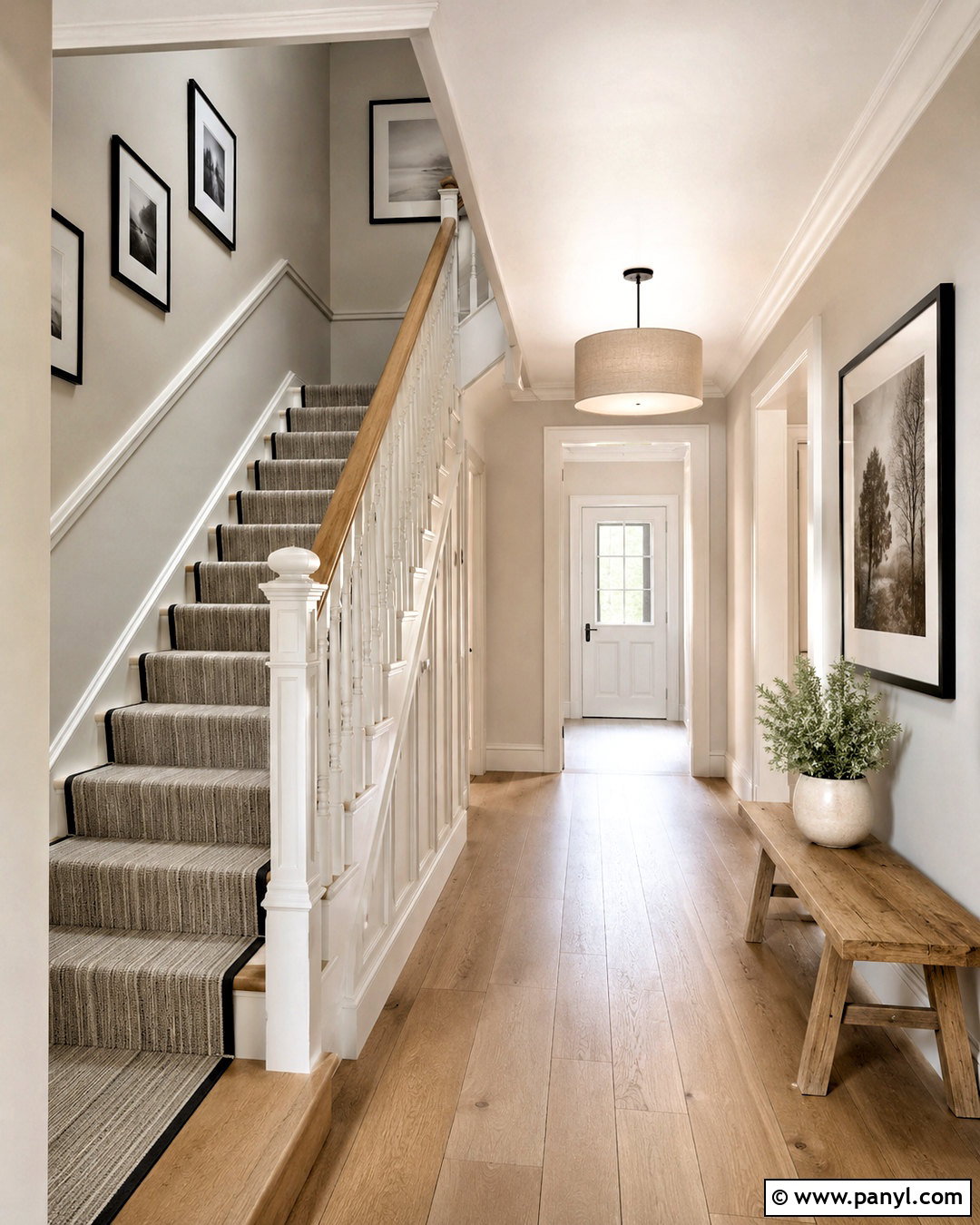
Soft stone paint gives a hallway and staircase a subtle architectural presence. This light neutral usually combines beige, gray, and a faint mineral undertone, allowing it to coordinate with several adjoining rooms. Use it across the walls while keeping the stair risers, spindles, doors, and trim warm white. A natural oak handrail and matching floor bring warmth to the scheme. Lay down a durable runner with thin charcoal and oatmeal stripes. Add simple black-framed artwork in an evenly spaced arrangement, plus a small wooden bench where room allows. A linen-shaded ceiling light finishes the look. The cohesive palette makes a pass-through space feel intentionally designed without introducing a demanding or highly noticeable wall color.
17. Putty Beige Paint Color
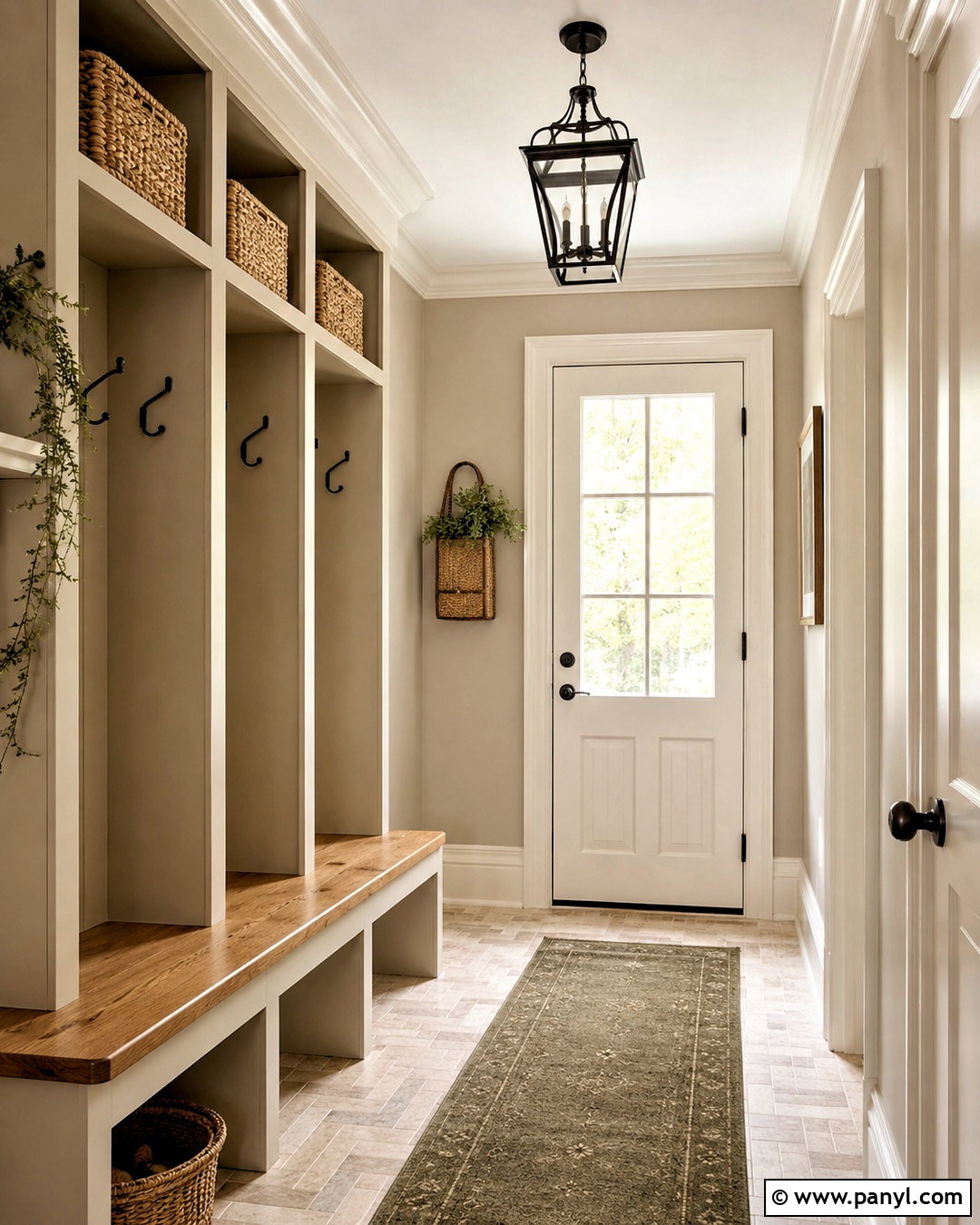
Putty beige creates a practical and inviting mudroom because its earthy undertone works well with hardworking materials. Paint the walls a light putty shade and use slightly deeper putty on built-in lockers or storage cabinets. Warm white trim keeps the space bright. Install a natural wood bench, matte black hooks, and woven baskets for daily organization. Beige-and-cream patterned floor tile can disguise light dirt while supporting the wall color. Add an indoor-outdoor runner in muted olive and tan for softness. A simple black lantern-style ceiling fixture provides definition. The completed mudroom feels coordinated, durable, and welcoming, with enough tonal variation to make the storage features look custom rather than heavy.
18. Blush Beige Paint Color
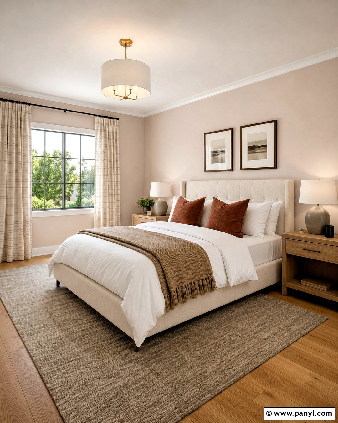
A barely-there blush beige can make a guest bedroom feel warm, flattering, and quietly distinctive. Choose a pale neutral with a restrained pink or peach undertone rather than an obvious pastel appearance. Pair the walls with creamy white trim and a natural oak floor. Use an ivory upholstered bed with white linens, a camel throw, and muted terracotta pillows. Light wood nightstands and off-white ceramic lamps keep the room relaxed. Add an oatmeal rug and softly striped beige curtains to balance the rosy undertone. A small amount of deep brown through frames or hardware provides contrast. This complete room feels welcoming and polished while remaining neutral enough to suit different guests and seasonal bedding.
19. Oatmeal Paint Color
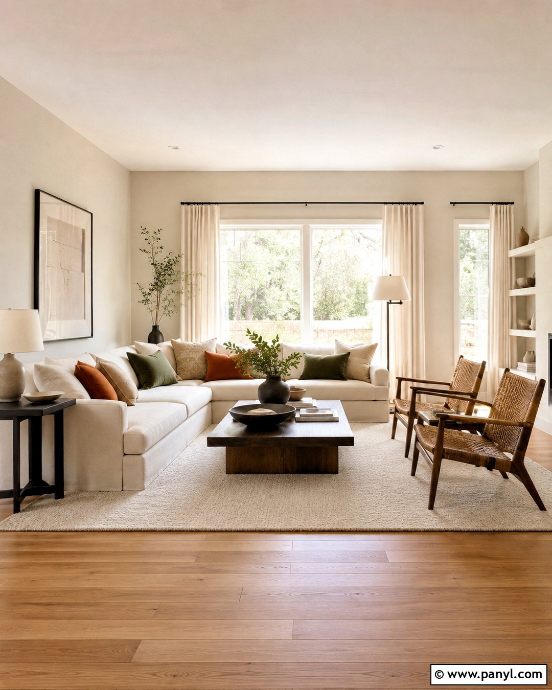
Oatmeal paint delivers a relaxed, natural backdrop for a cozy family living room. It sits between cream and beige, with a soft warmth that complements textured upholstery and medium-tone wood. Cover the walls in light oatmeal and use warm white for the ceiling and trim. Choose a spacious cream sectional, a walnut coffee table, and two woven accent chairs. Layer an ivory wool rug over oak flooring, then add camel, olive, and muted rust pillows. Linen curtains and ceramic table lamps reinforce the comfortable palette. Black metal accents should appear sparingly in lighting and frames. The overall room feels layered and family-friendly, with practical warmth that is more forgiving than a bright white interior.
20. Chalk White Paint Color
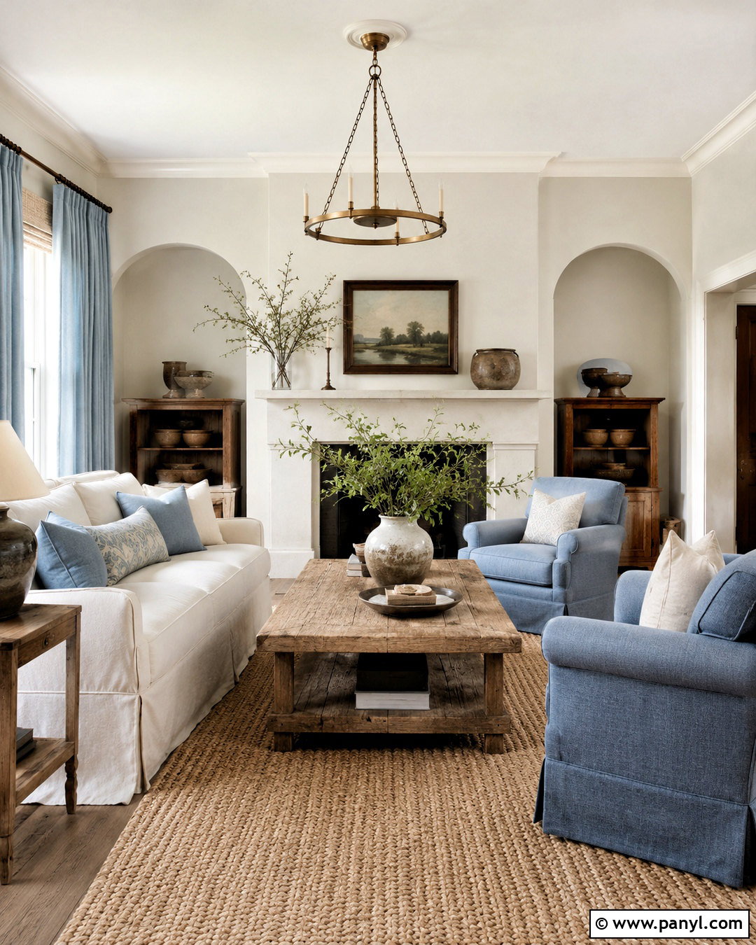
Chalk white creates a softly aged look that suits a bright cottage kitchen, relaxed bedroom, or traditional sitting room. Unlike a sharp gallery white, it carries a muted gray-beige undertone. Use chalk white on the walls and a cleaner warm white on architectural trim for gentle contrast. In a sitting room, combine a slipcovered cream sofa with weathered oak tables and faded blue linen chairs. Add a braided wool rug, simple pottery, and antique brass lighting. Pale blue curtains can provide quiet color without changing the neutral character. Finish with dark wood frames and a few botanical branches. The complete look feels collected and comfortable, balancing freshness with the character of natural, timeworn materials.
Conclusion:
The best light neutral is not simply the palest color on a paint card. It should connect your room’s flooring, fixed finishes, furniture, lighting, and overall mood. Warm whites, linen tones, beiges, and oatmeal shades create comfortable softness. Greiges, taupes, and stone colors provide balanced depth. Light grays and gently tinted neutrals can make a room feel fresh and distinctive. Test large painted samples beside the materials that will remain in the space, and view them during morning, afternoon, and evening light. Once you understand the undertones, these **20 light neutral paint colors** can help you create rooms that feel bright, coordinated, welcoming, and easy to personalize.

Related Ideas and Inspiration:
Leave a Reply