
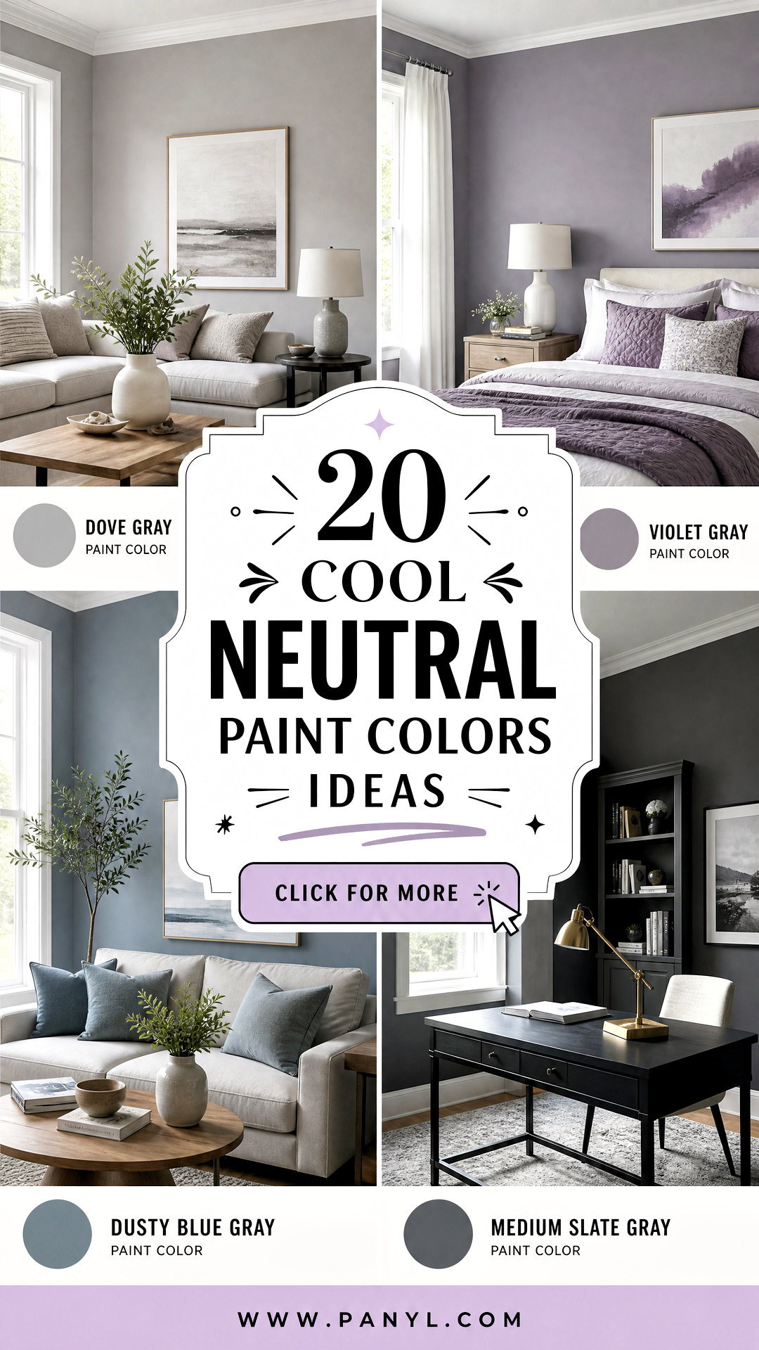
Cool neutral paint colors create rooms that feel fresh, calm, and polished without looking cold or flat. These flexible shades include crisp whites, silvery grays, muted blue-grays, green-grays, cool greiges, and deep charcoal tones. Their subtle blue, green, or violet undertones can make interiors feel open and restful while providing a versatile background for furniture and decor. () Pair lighter shades with white oak, linen, and brushed metal for softness. Use deeper neutrals with pale upholstery and warm wood to maintain balance. Always test paint on several walls because daylight, artificial lighting, flooring, and nearby finishes can change its appearance. The complete room schemes below will help you confidently decorate with **20 cool neutral paint colors**.
1. Crisp Cool White Paint Color
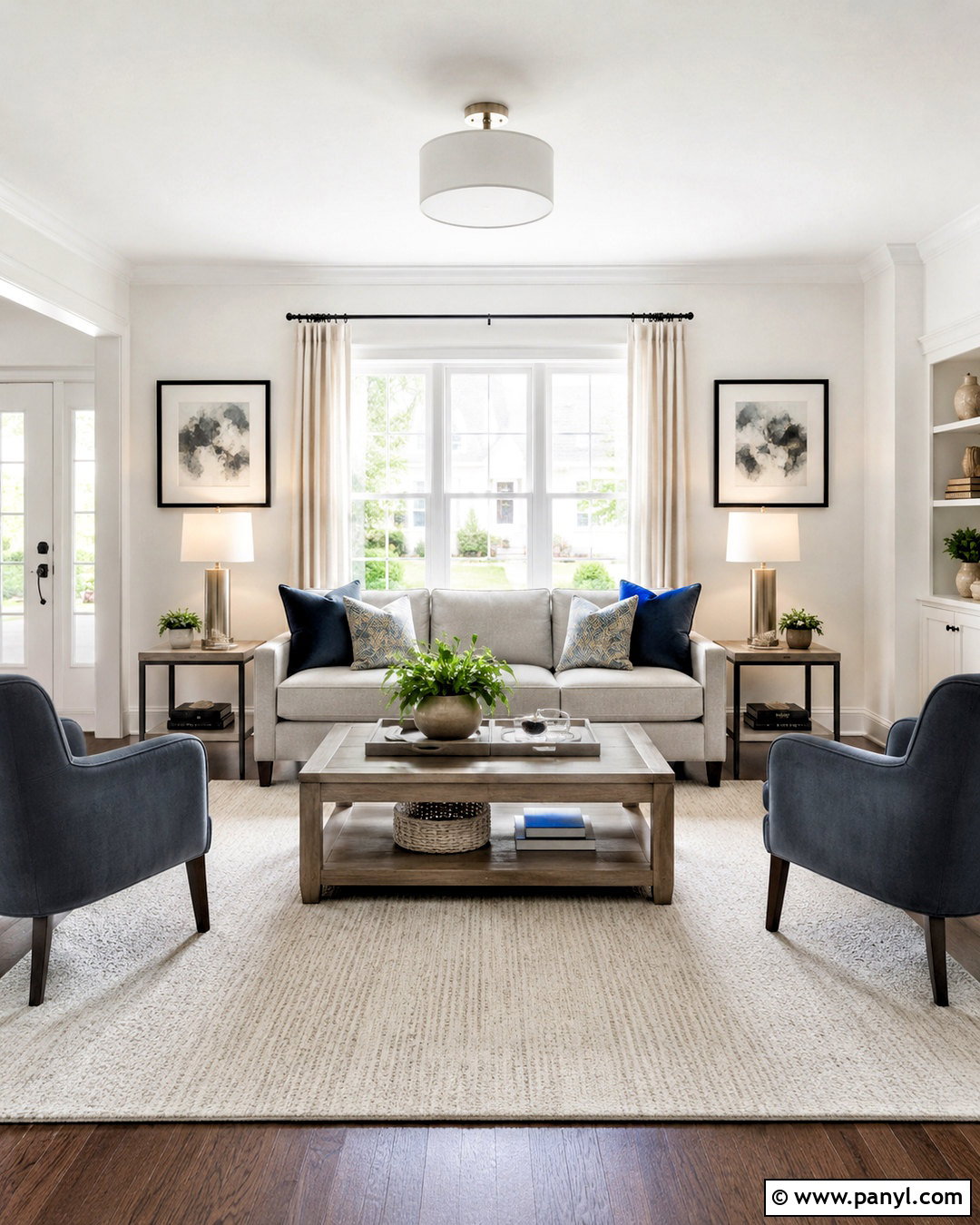
A crisp cool white gives a living room an airy foundation without introducing creamy or yellow undertones. Use it across the walls and ceiling to visually connect the entire space, then add slightly brighter white trim for quiet definition. A streamlined light gray sofa, pale oak coffee table, and textured ivory rug keep the room comfortable rather than clinical. Bring in smoky blue pillows, brushed nickel lamps, and charcoal-framed artwork to reinforce the cool palette. Natural linen curtains soften large windows while allowing maximum daylight into the room. If the space faces north, include medium-toned wood and woven accessories so the cool white does not appear overly blue. This scheme works especially well in smaller rooms and open layouts.
2. Blue White Paint Color
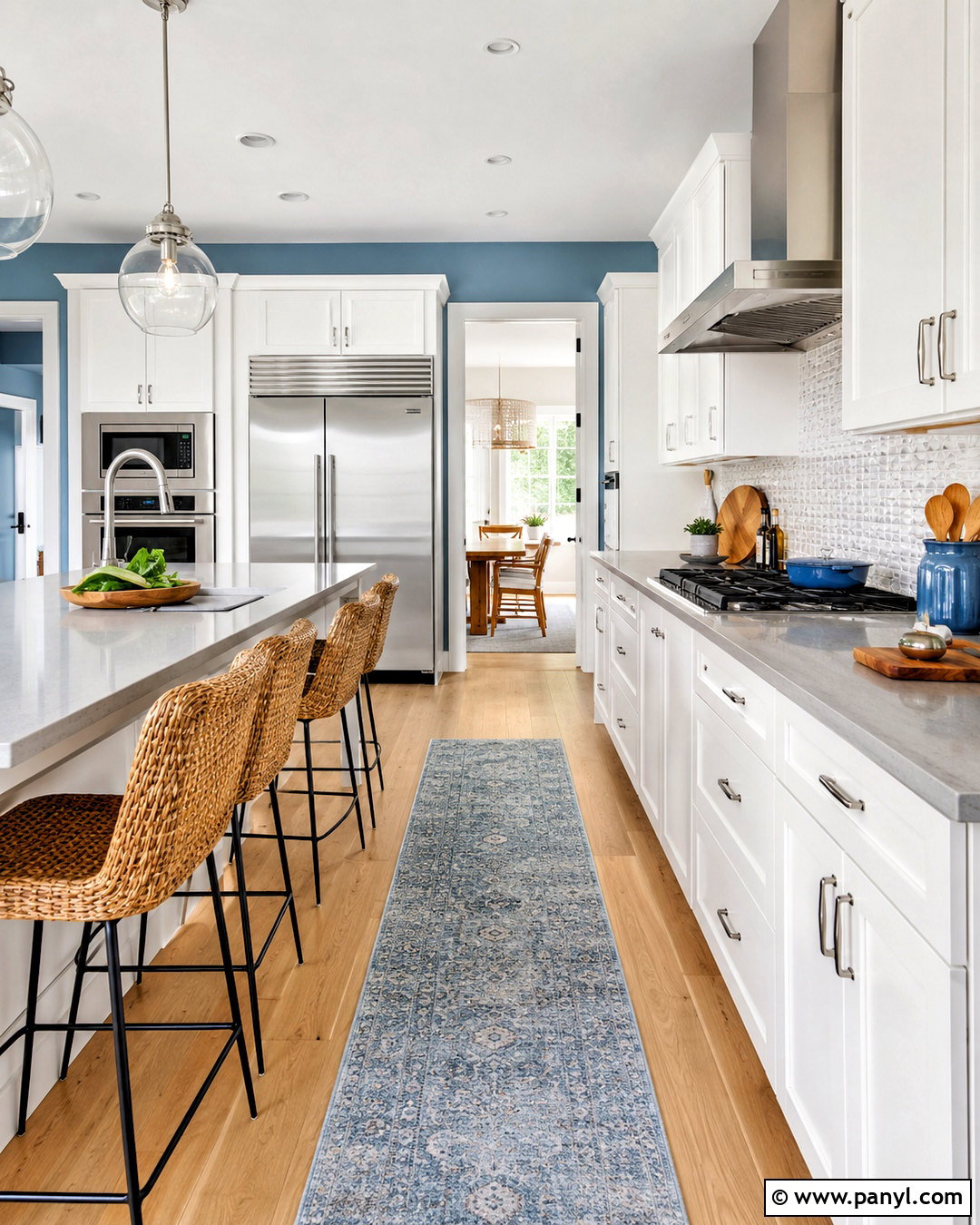
Barely visible blue undertones can transform ordinary white walls into a refreshing backdrop for a bright kitchen. Pair blue-white paint with clean white cabinets, pale gray quartz counters, and a backsplash made from softly reflective pearl tiles. Light maple flooring keeps the room balanced and prevents the cool finishes from feeling stark. Brushed stainless steel hardware and simple glass pendants reinforce the clean color direction. Add woven counter stools, a muted blue runner, and a few natural wood cutting boards for gentle warmth. Use satin paint on the walls for easy cleaning and semigloss on trim and doors. This complete palette feels especially attractive in kitchens receiving warm afternoon sunlight, which naturally softens the blue undertone.
3. Pale Silver Gray Paint Color
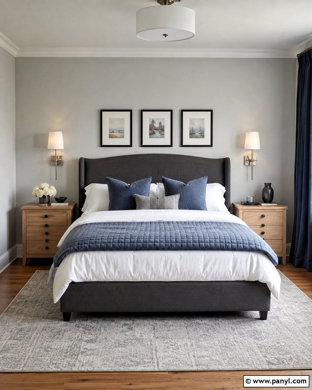
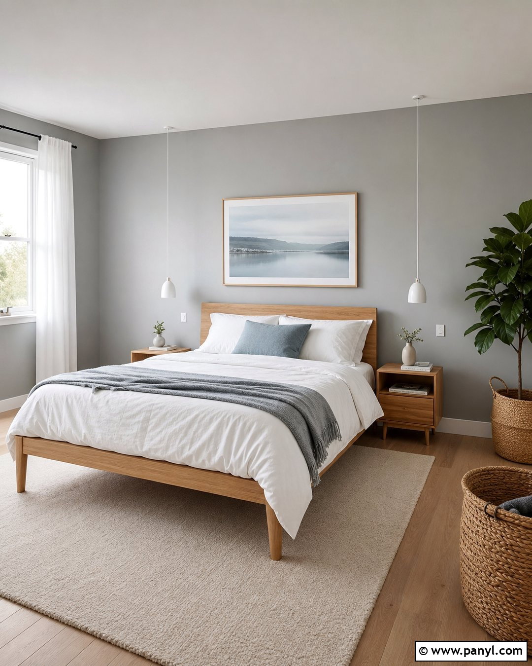
Pale silver gray creates a polished bedroom that feels peaceful, light, and easy to personalize. Cover the walls in this soft neutral, leaving the ceiling and trim a clean cool white. Choose an upholstered bed in medium charcoal, white cotton bedding, and a quilt with subtle gray-blue stitching. Pale oak nightstands prevent the room from becoming too monochromatic, while brushed nickel sconces add a quiet reflective finish. Ground the layout with a large ivory and gray rug extending beyond the bed. For depth, include slate blue pillows and simple black picture frames. Silver gray can shift noticeably in changing light, so sample it beside the headboard, flooring, and window before committing to the entire room.
4. Soft Blue Gray Paint Color
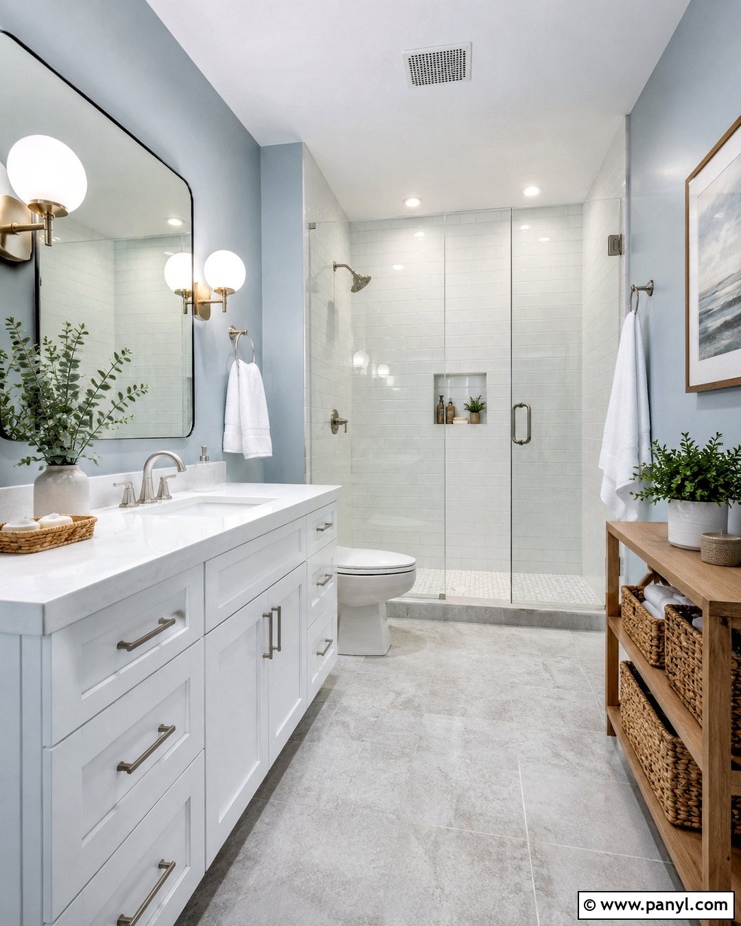
What if a bathroom could feel colorful and neutral at the same time? Soft blue-gray walls provide that balance, especially when paired with a white oak vanity, white quartz counter, and brushed nickel fixtures. Use large pale gray floor tiles and glossy white shower tile to create a clean, continuous backdrop. A frameless mirror and simple globe sconces keep the design modern without making it impersonal. Add white towels, a small woven basket, and restrained eucalyptus greenery for natural texture. Choose a blue-gray that remains noticeably muted rather than pastel. In a windowless bathroom, select brighter white bulbs with good color rendering so the walls do not turn dull or overly gray under artificial lighting.
5. Misty Gray Paint Color
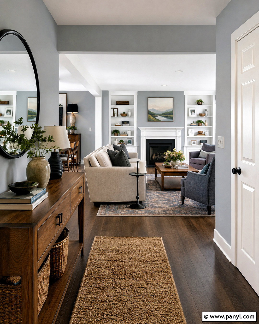
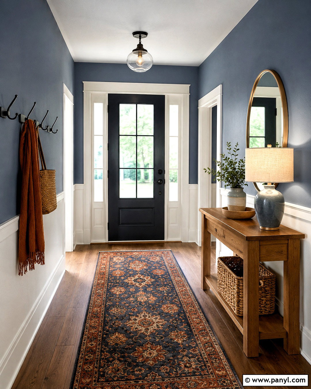
Misty gray is a useful whole-home paint color because it provides gentle contrast while allowing rooms to flow naturally together. Apply it throughout an entry, hallway, and adjoining open living space, using the same crisp white on baseboards, doors, and ceilings. In the entry, combine a narrow walnut console with a round black-framed mirror and a light woven runner. Continue the walnut finish through the living room with small side tables and shelving. A soft oatmeal sofa, blue-gray armchairs, and charcoal accents complete the coordinated palette. Keep decorative pieces simple and repeat materials between areas. The resulting scheme feels connected and intentional, yet the walls still offer more dimension than standard builder white.
6. Dove Gray Paint Color
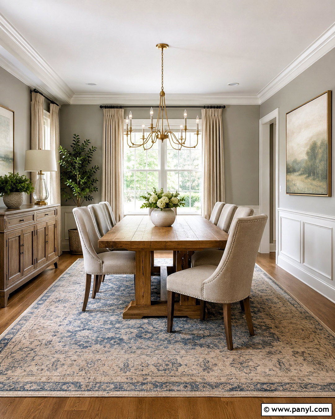
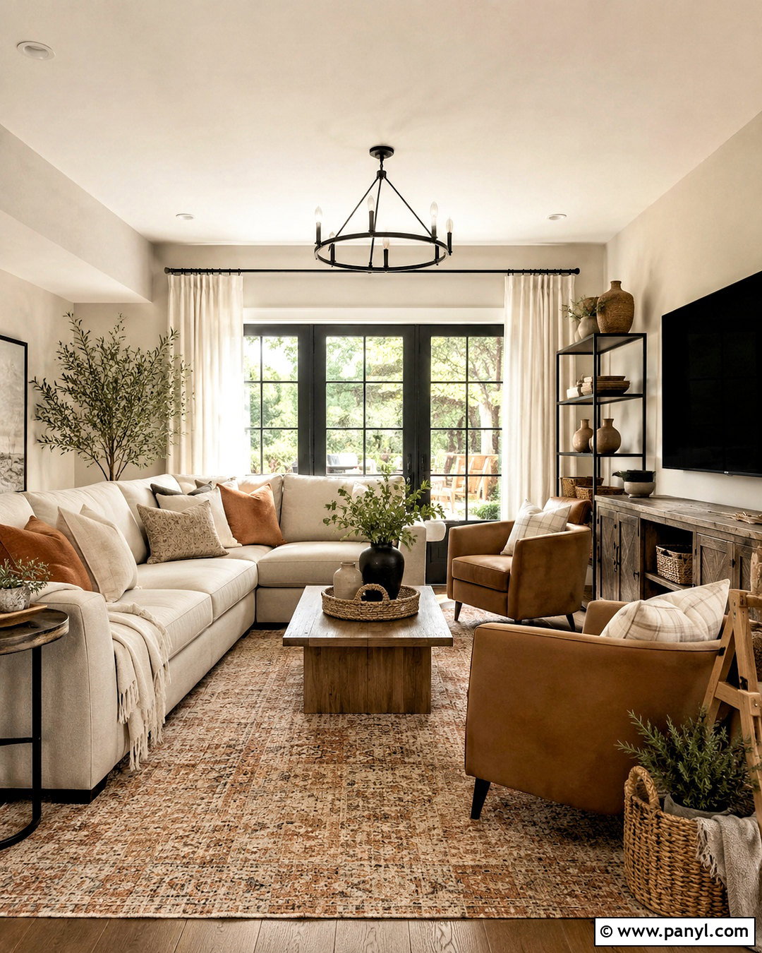
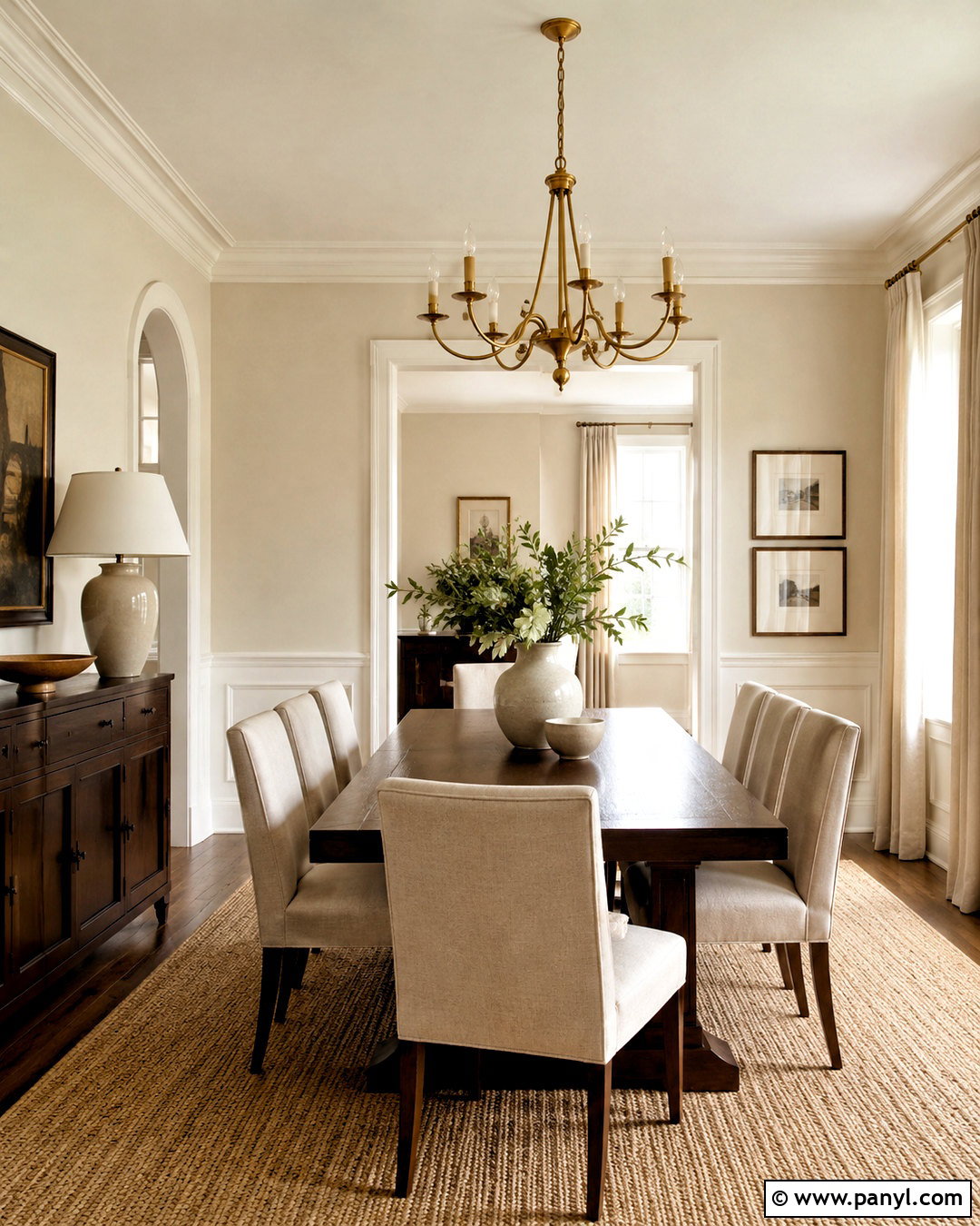
Dove gray brings soft sophistication to a dining room without competing with artwork, lighting, or furniture. Paint the walls in a delicate gray with restrained blue undertones, then frame them with crisp white crown molding and baseboards. A medium-toned oak table introduces warmth, while upholstered dining chairs in cool beige create a comfortable transition between gray and wood. Hang a sculptural brushed brass chandelier for contrast, but keep other metals matte black or nickel. A large patterned rug combining ivory, gray, and faded blue anchors the full arrangement. Finish the room with linen curtains and one oversized landscape print. The mix of warm natural materials and cool painted walls makes the dining area inviting throughout the day.
7. Green Gray Paint Color
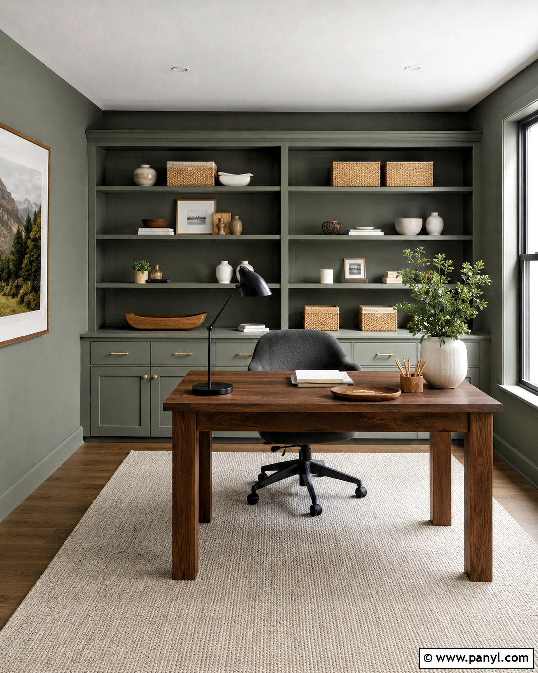
A muted green-gray can make a home office feel focused and restful while still functioning as a practical neutral. Paint all four walls in the same shade and use clean white on the ceiling to preserve brightness. Position a walnut desk near the window, then add built-in storage painted a slightly deeper green-gray for subtle layering. A charcoal task chair, black metal lamp, and cream wool rug give the workspace structure. Style the shelves with white ceramics, closed woven boxes, and a limited collection of books to control visual clutter. Natural wood and warm leather accessories help prevent the walls from looking too cool. This balanced office design supports concentration while appearing polished enough for video calls and client meetings.
8. Cool Greige Paint Color
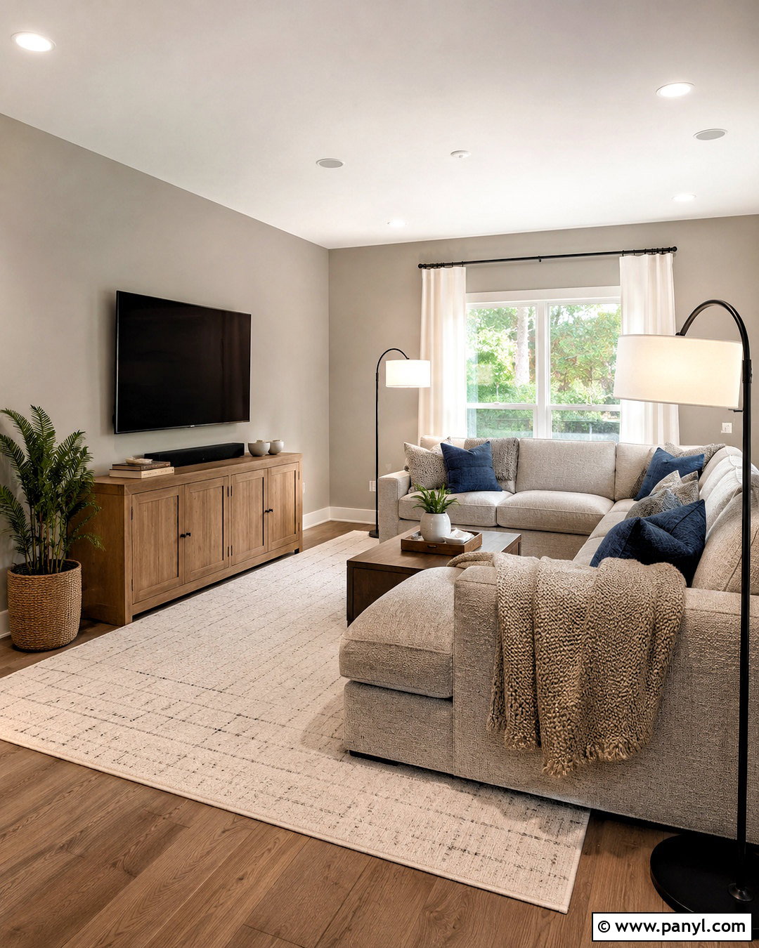
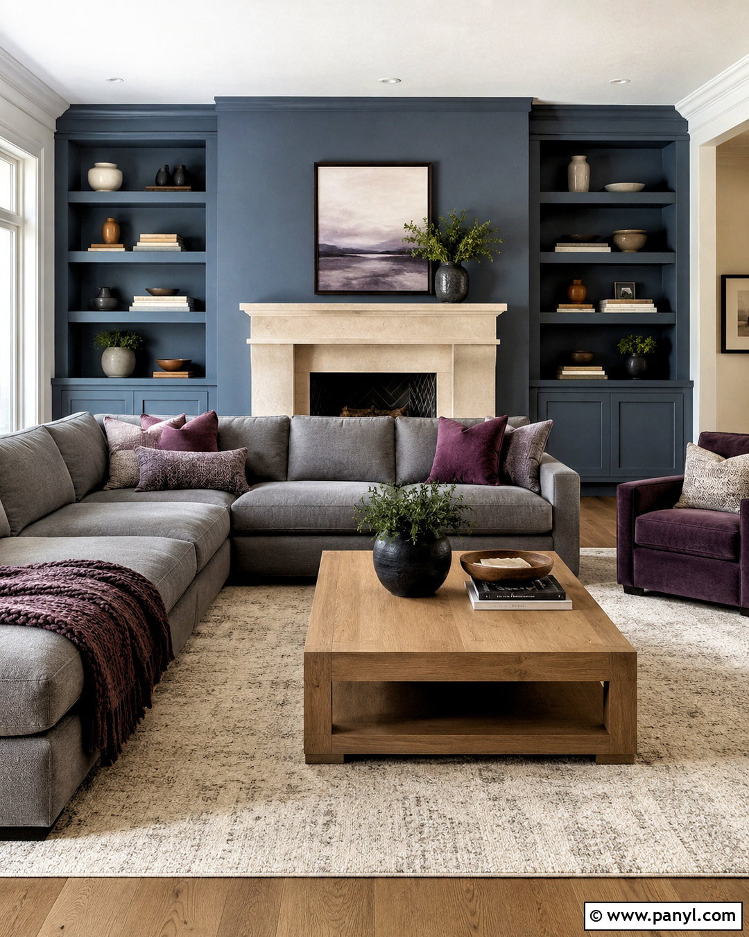
Cool greige bridges gray and beige, making it particularly useful in family rooms containing both cool upholstery and warm wood. Cover the walls in a gray-dominant greige with only a slight beige influence. Add a deep sectional in textured light gray, a medium oak media console, and a large ivory rug with a subtle linear pattern. Muted navy pillows and soft taupe throws connect the palette without introducing strong color. Choose black metal floor lamps and simple white shades for clean contrast. Instead of matching every finish, repeat each main color at least twice across the space. This creates a collected room that feels cohesive. Cool greige is also forgiving when flooring contains mixed gray, beige, and brown tones.
9. Cool Taupe Paint Color
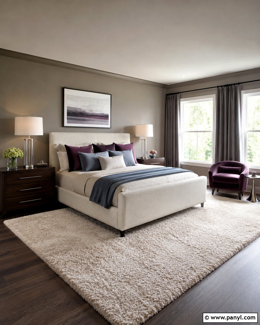
Cool taupe provides more warmth than standard gray while maintaining the refined violet or gray undertones associated with cooler neutrals. It works beautifully in a primary bedroom with upholstered furniture and layered natural fabrics. Paint the walls taupe, then use a lighter version of the color on the ceiling for a gentle wrapped effect. Select an ivory linen bed, dark walnut nightstands, and smoky plum or blue-gray accent pillows. A large wool rug in cream and muted taupe grounds the arrangement. Add brushed nickel lamps and charcoal curtain rods for definition. Avoid strongly yellow woods and orange fabrics, which may clash with the undertone. Balanced with soft whites and dark wood, cool taupe feels restful, substantial, and timeless.
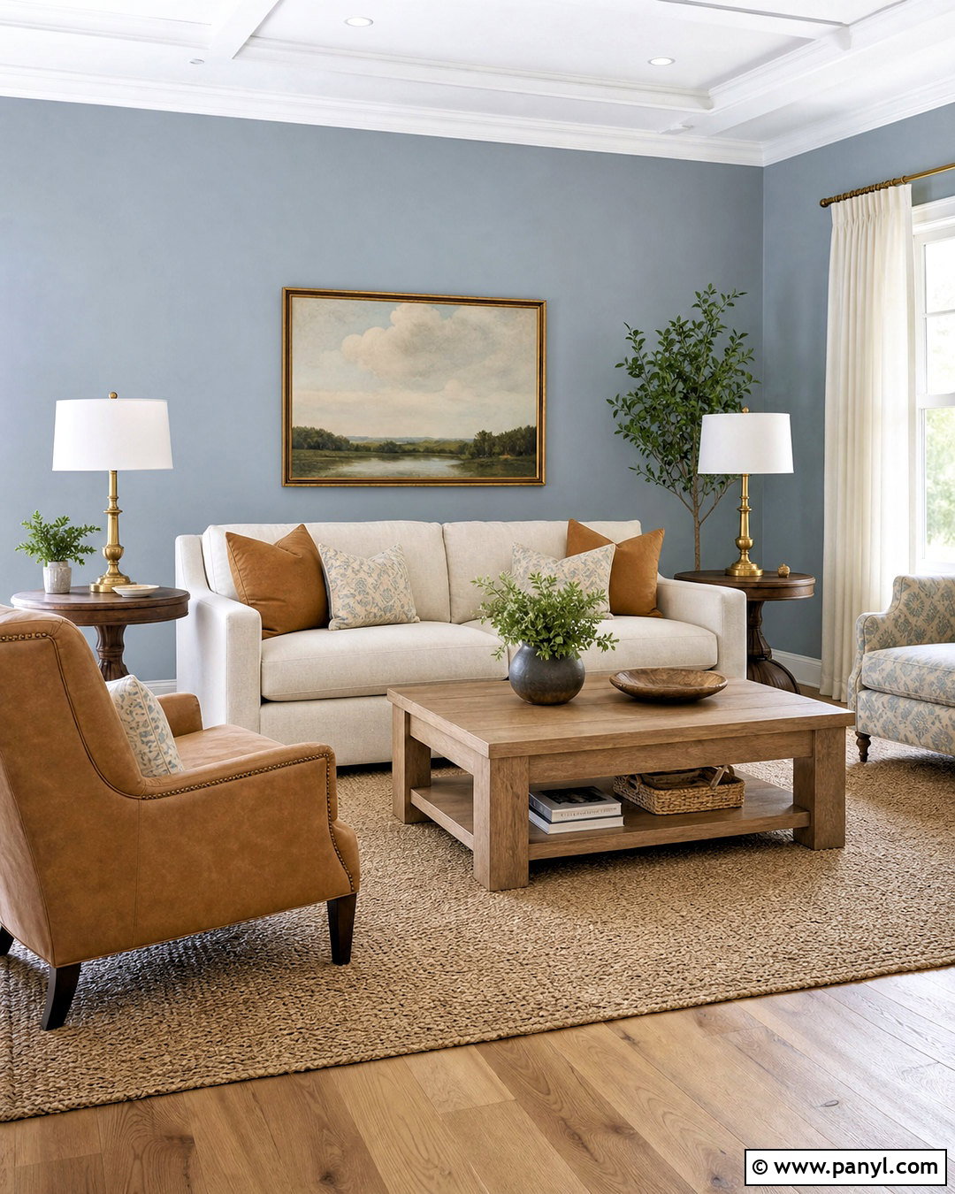
10. Violet Gray Paint Color
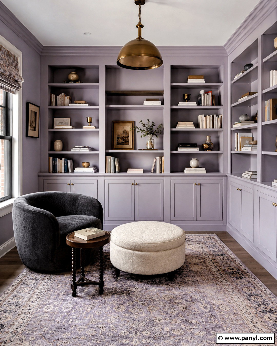
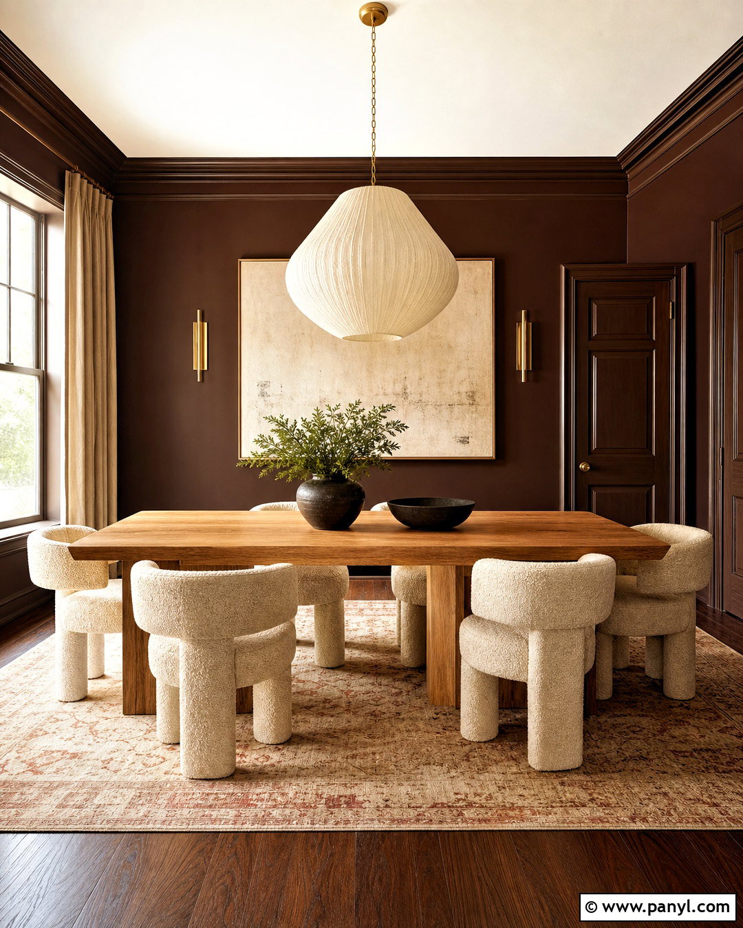
Violet-gray creates a subtle, sophisticated reading room that changes beautifully as daylight moves across the walls. Choose a pale shade that looks primarily gray, with the violet undertone becoming visible only in shadows. Pair it with built-in bookshelves painted the same color in a satin finish for a unified appearance. Add a curved charcoal chair, ivory ottoman, and small dark wood table near the window. A faded rug containing lavender, slate, and cream quietly echoes the wall color. Use aged brass lighting to introduce controlled warmth without overpowering the palette. Because violet undertones can intensify beside yellow flooring, test the shade directly next to existing wood. The finished room should feel layered and neutral rather than noticeably purple.
11. Pale Stone Gray Paint Color
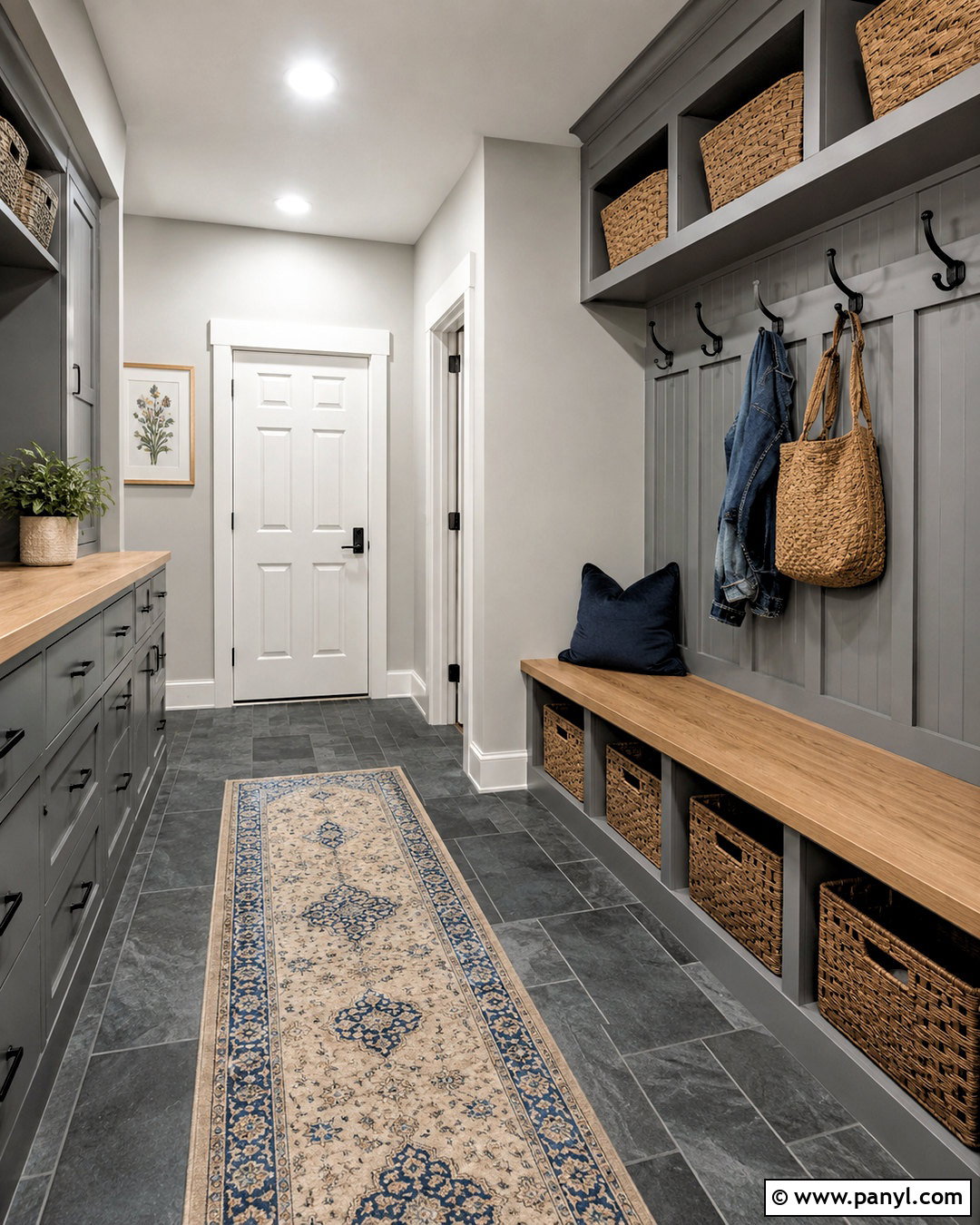
Pale stone gray gives a mudroom a practical yet attractive background for everyday storage. Paint the upper walls in a light mineral gray and install built-in cabinets in a deeper version of the same color. White oak bench seating, matte black hooks, and charcoal slate-look flooring create a durable mix of finishes. Add woven baskets above the cabinets and labeled storage inside closed drawers to minimize clutter. A washable runner combining cream and muted blue softens the hard surfaces. Keep the ceiling and interior doors cool white to maintain brightness in this frequently narrow space. The completed design feels organized because its colors and materials repeat consistently, while the layered gray palette hides minor marks better than bright white walls.
12. Fog Blue Paint Color
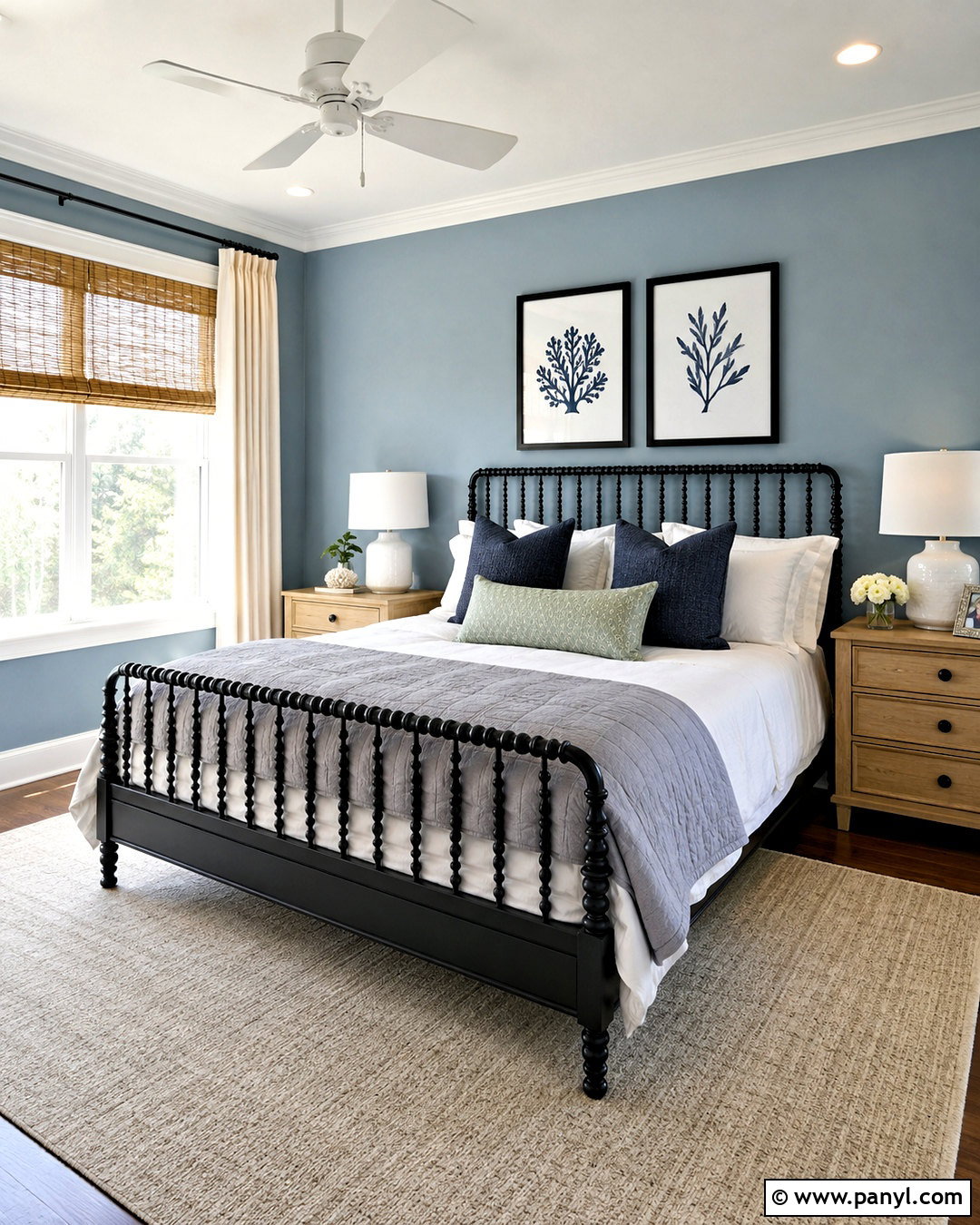
Fog blue is muted enough to function as a neutral but colorful enough to make a guest bedroom memorable. Paint the walls this hazy blue-gray, then use fresh white on the trim, ceiling, and interior door. A simple black spindle bed creates definition against the light walls. Dress it with white bedding, a quilted gray coverlet, and patterned pillows in navy and soft green. Light oak nightstands and woven window shades warm the overall scheme. Place an ivory rug beneath the bed and add one black-framed botanical print above the headboard. Keep the accessories restrained so the wall color remains the room’s quiet focus. The complete look feels welcoming, calm, and suitable for guests with different decorating preferences.
13. Dusty Blue Gray Paint Color
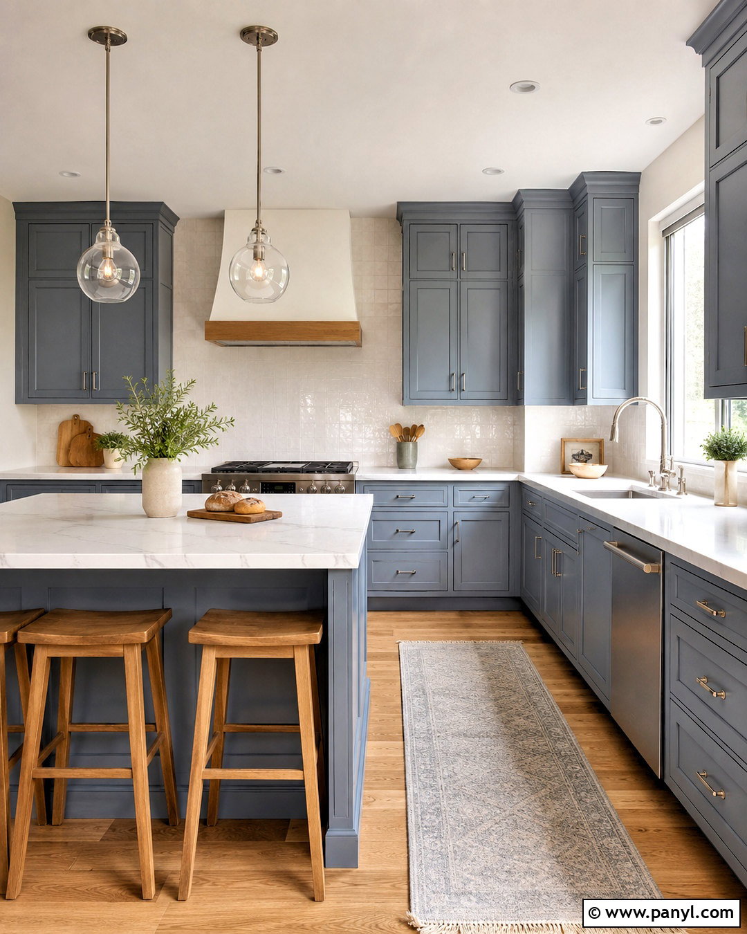
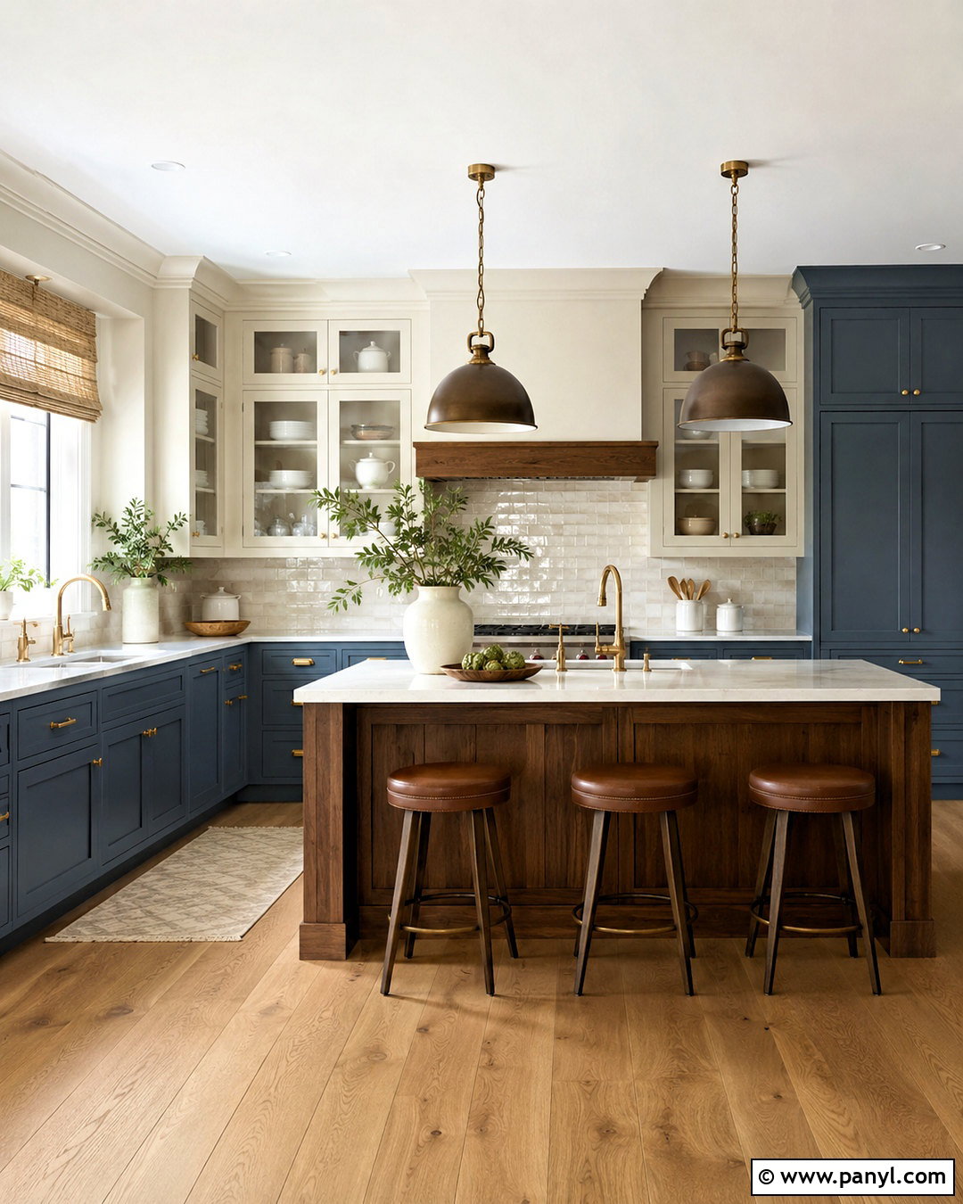
Dusty blue-gray can make kitchen cabinetry feel distinctive without turning the room into a strongly colorful space. Use the shade on both lower and upper cabinets, selecting a durable satin or semigloss finish. Balance the cool cabinetry with white marble-look quartz counters, creamy white walls, and a handmade white tile backsplash. Wide-plank natural oak flooring introduces warmth from below. Choose brushed nickel hardware for a seamless effect or aged brass for gentle contrast. Clear glass pendants keep sightlines open over the island. Finish the space with light wood stools and a washable gray runner. Repeating the cabinet color on a nearby door or pantry creates continuity, making the kitchen feel carefully designed rather than dependent on one isolated color feature.
14. Eucalyptus Gray Paint Color
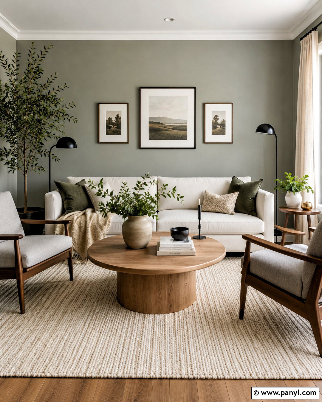
Eucalyptus gray combines muted green with a cool gray base, creating a grounded neutral for a relaxed living room. Apply it to the walls, then use soft white trim and ceiling paint to keep the room open. Arrange a cream sofa opposite two walnut-framed chairs upholstered in pale gray fabric. A textured wool rug, rounded oak coffee table, and linen curtains add softness without overwhelming the green-gray background. Introduce deeper forest green sparingly through pillows or ceramic accessories. Matte black lighting and picture frames provide necessary contrast. Include several real or realistic leafy plants, but vary their shapes so the room does not feel themed. The full palette has a natural quality while remaining cleaner and cooler than traditional sage interiors.
15. Light Pewter Paint Color
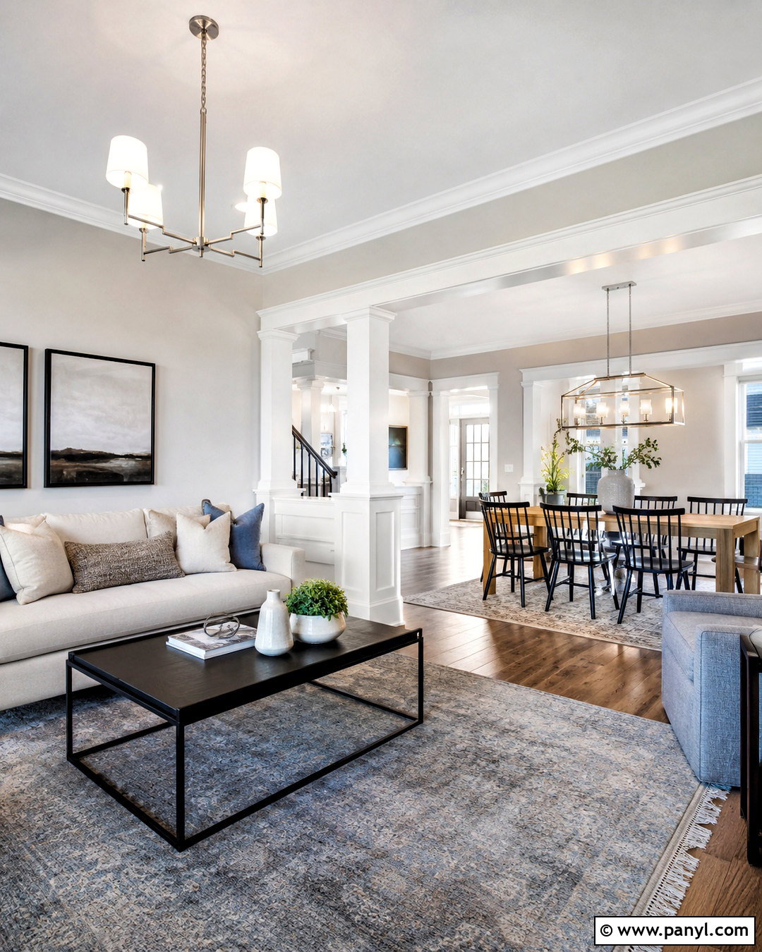
Light pewter adds enough depth to highlight architectural details while remaining suitable for a bright, open living and dining area. Use the paint continuously across both spaces to create a clear visual connection. Apply crisp white to columns, window trim, and baseboards so the structure stands out against the medium-light gray walls. Furnish the living area with an ivory sofa, black metal coffee table, and blue-gray rug. In the dining area, repeat black through chair frames and use a natural oak table for warmth. Brushed nickel lighting works smoothly with the pewter undertone. Limit the palette to a few repeated finishes. This keeps the open floor plan organized and prevents each functional zone from looking like a separate decorating project.
16. Medium Slate Gray Paint Color
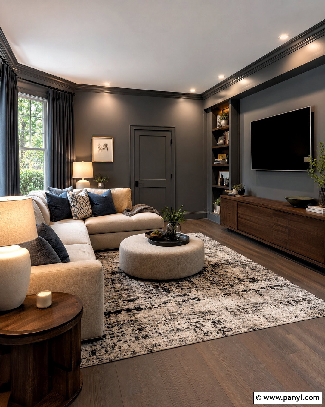
A medium slate gray can turn a television room into a cozy retreat without relying on very dark walls. Paint the room in a gray with a restrained blue undertone, including the doors and trim for a seamless color-drenched effect. Choose a pale oatmeal sectional to create strong but comfortable contrast. Add a low walnut media cabinet, an ivory and charcoal rug, and blackout curtains matching the walls. Soft blue pillows connect the upholstery to the paint color. Use multiple lamps with clean white bulbs instead of one harsh ceiling fixture. Built-in shelves should remain sparsely styled with books, ceramic objects, and closed boxes. The resulting room feels intimate for viewing while remaining fresh and readable during daytime.
17. Charcoal Blue Paint Color
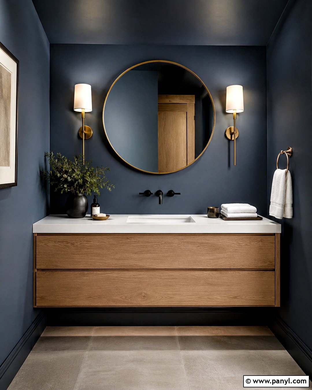
Charcoal blue makes a striking yet practical backdrop for a compact powder room. Paint every wall in the deep blue-gray shade and continue it across the ceiling for an enveloping look. Install a floating white oak vanity with a white stone counter to break up the darker surfaces. A round brass-framed mirror and two simple brass sconces introduce warmth, while a matte black faucet adds crisp definition. Use pale gray porcelain flooring and bright white towels to keep the room balanced. One small framed print is enough decoration in the limited space. The complete scheme feels dramatic without becoming busy. Test the paint under the actual sconces because deep blue-gray colors may appear much bluer beneath cool artificial light.
18. Deep Green Gray Paint Color
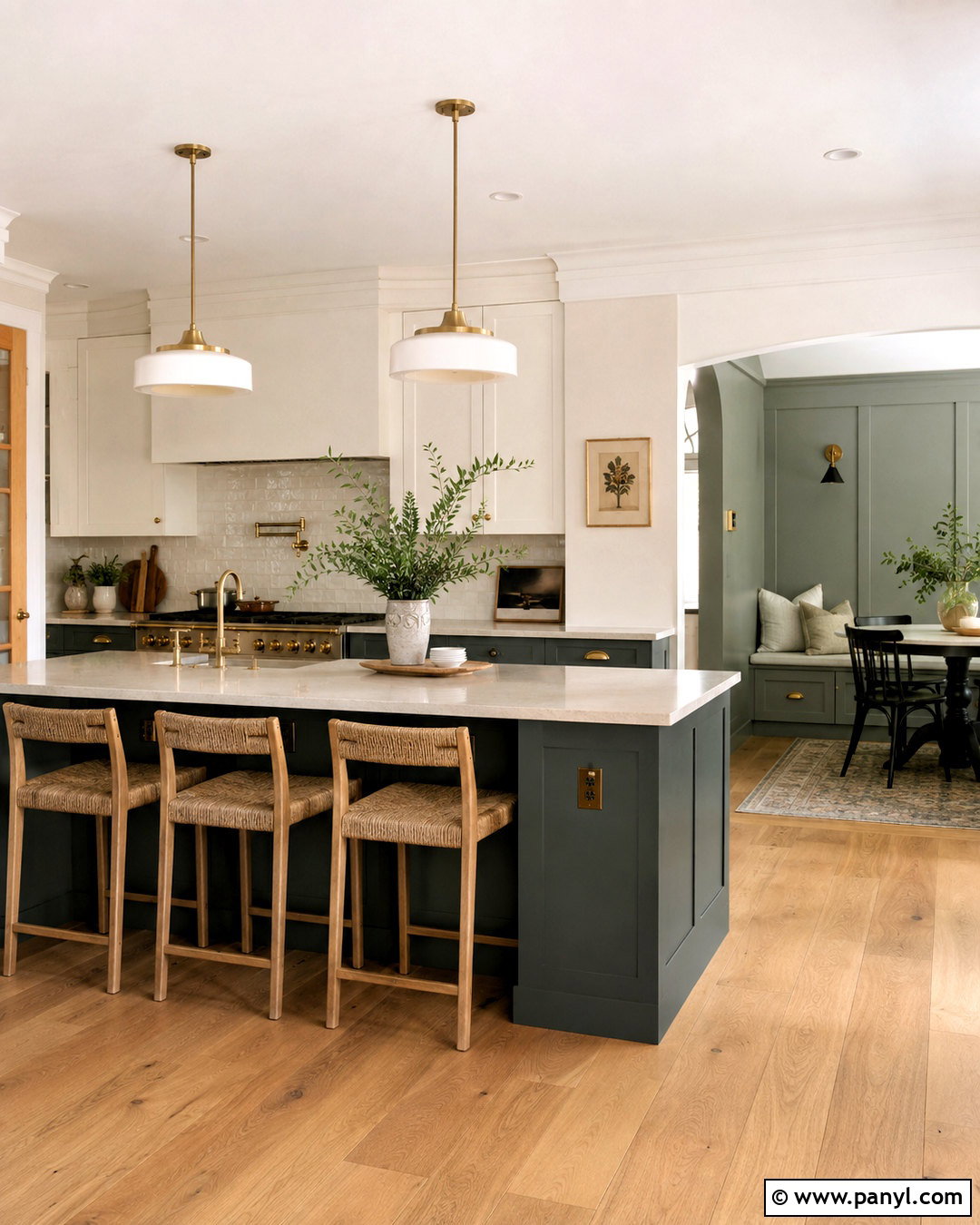
Deep green-gray brings depth to kitchen islands, cabinetry, and adjoining walls while still coordinating with neutral finishes. Create a balanced two-tone kitchen by painting the island and lower cabinets green-gray, leaving upper cabinets a clean soft white. Continue a lighter related green-gray across the breakfast nook walls. White quartz counters and a pale stone backsplash brighten the darker cabinetry. Add natural oak flooring, aged brass pulls, and woven counter stools to warm the cool undertone. A simple wood dining table ties the nook to the kitchen. Keep countertop accessories minimal so the cabinetry remains the defining feature. This full scheme provides richer color than pale sage while remaining subdued enough for a long-lasting kitchen design.
19. Graphite Gray Paint Color
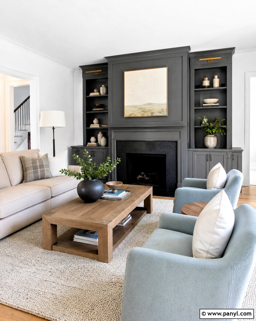
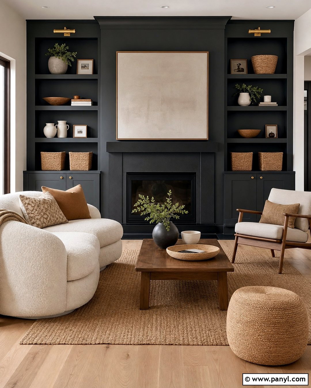
Graphite gray creates an elegant fireplace wall that can anchor an otherwise light neutral living room. Paint the fireplace surround, built-in cabinetry, and connecting wall in one deep graphite shade. Keep the remaining walls cool white to balance the visual weight. Place a light beige sofa facing the fireplace, with two pale blue-gray chairs arranged perpendicular to it. A warm oak coffee table and cream textured rug soften the contrast between dark paint and light upholstery. Use black cabinet hardware for a quiet finish, then add brushed brass sconces above the built-ins. Restrained artwork and ceramics prevent the focal wall from becoming cluttered. This coordinated arrangement makes graphite feel intentional rather than like a random dark accent.
20. Soft Blue Black Paint Color
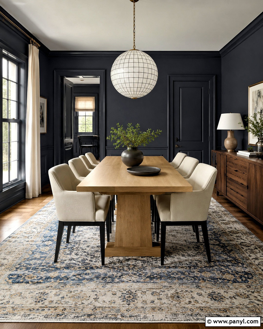
Soft blue-black creates a dramatic dining room that still feels softer than a true black interior. Apply the color to the walls, trim, and doors, but keep the ceiling a clean pale gray to provide lift. Center a natural oak dining table beneath a large white globe chandelier. Upholstered chairs in light gray or ivory create contrast and remain easy to coordinate with seasonal table settings. Add a large muted rug containing faded blue, cream, and charcoal. A warm walnut sideboard gives the dark walls more dimension, while silver-framed artwork reinforces the cool undertone. During the day, light linen curtains preserve natural brightness. At night, evenly spaced sconces help the room feel intimate rather than shadowy or enclosed.
Conclusion:
The best cool neutral paint colors provide a flexible background while giving every room its own clear atmosphere. Crisp whites and pale silver tones make smaller spaces feel refreshed, while fog blue, green-gray, and cool greige introduce restrained color. Pewter, graphite, and blue-black can add depth when balanced with light upholstery, natural wood, and bright trim. Pay close attention to flooring, fabrics, fixed finishes, and window direction before choosing a final shade. Paint large sample areas and observe them at different times because neutral undertones can shift as the light changes. () With thoughtful testing and coordinated materials, these **20 cool neutral paint colors** can support comfortable, polished, and cohesive interiors.

Related Ideas and Inspiration:
Leave a Reply