
Neutral background wallpapers create a calm, polished screen without making app icons, widgets, or desktop folders difficult to see. The best designs combine restrained colors with enough texture, shape, or natural detail to feel inviting rather than empty. Warm beige, soft greige, ivory, taupe, stone gray, and muted earth tones all work beautifully, whether you prefer minimalist graphics or realistic photography. Consider how the main elements sit around your icons and leave open space where clocks or folders appear. Subtle contrast also helps the wallpaper remain clear across different screen sizes. From linen textures and organic arches to quiet landscapes and botanical shadows, the following collection offers 20 distinct ways to use neutral background wallpapers.
1. Beige Linen Background Wallpaper
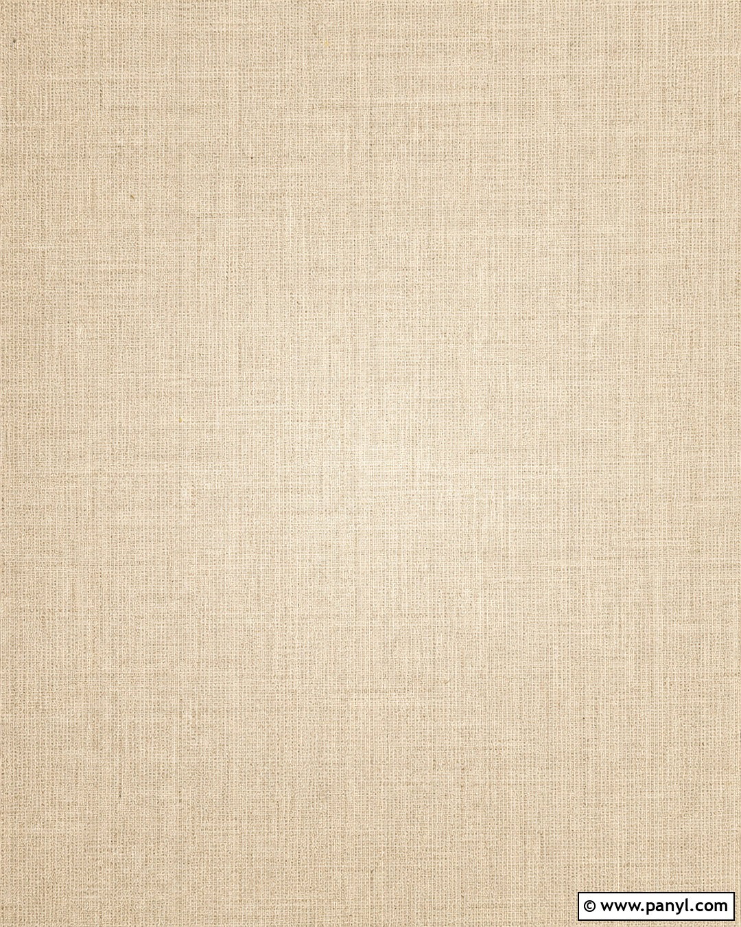
A beige linen design brings soft texture to a screen while maintaining a clean, uncomplicated appearance. Choose warm oatmeal as the main color, then introduce fine cream and light taupe threads for realistic woven depth. The texture should remain subtle, with no harsh seams or oversized fibers competing with icons. A faint light gradient near the center can create dimension and keep the background from looking completely flat. For a desktop, position the clearest area where folders are usually arranged. On a phone, use an even weave with slightly darker edges to frame the lock-screen clock. This complete neutral wallpaper feels warm, tactile, and versatile without relying on decorative objects or busy patterns.
2. Cream Paper Background Wallpaper
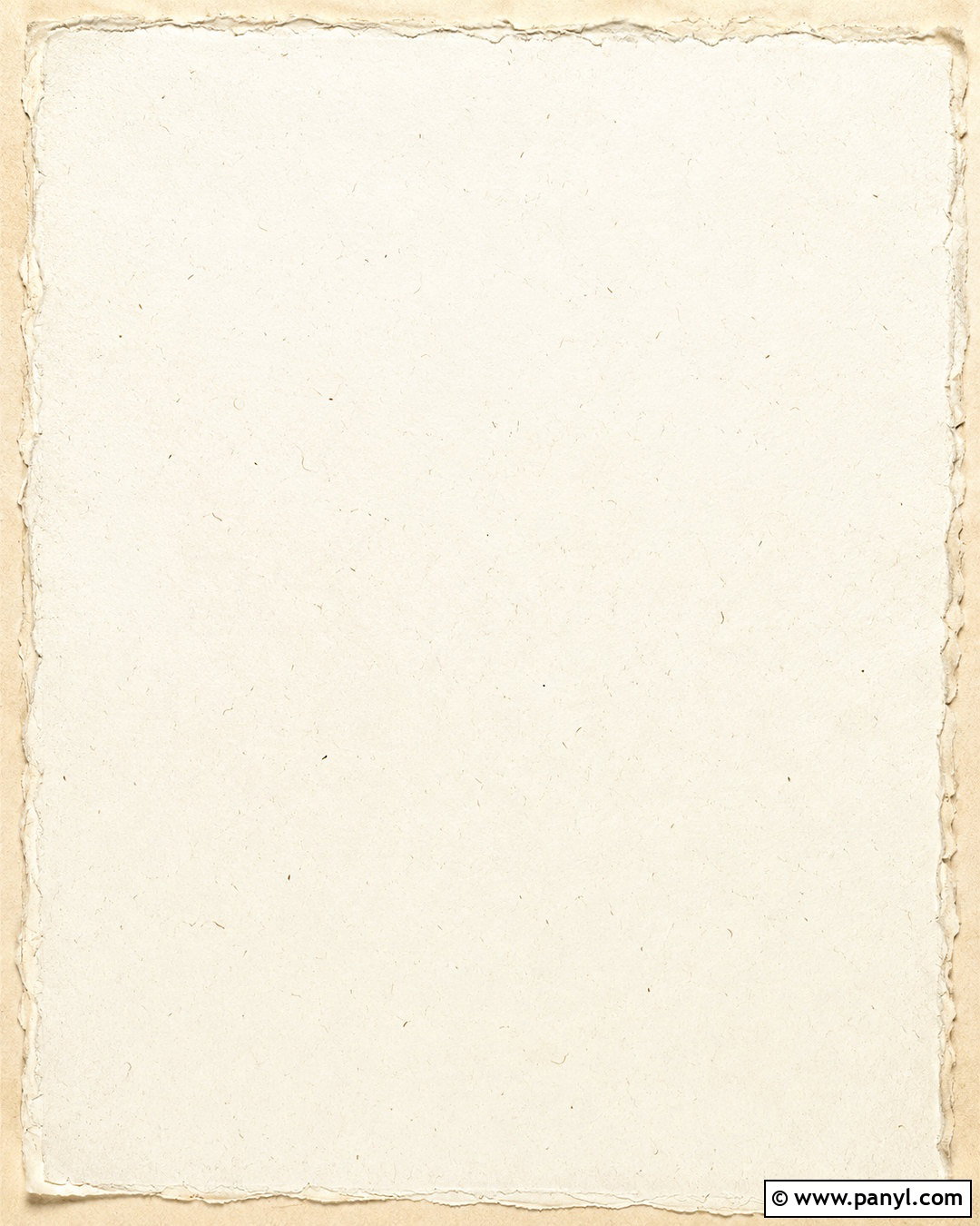
Soft handmade paper provides a natural background that feels refined but never formal. Build the design around creamy off-white paper with faint fibers, delicate speckles, and barely visible deckled variations. Keep the center mostly open so app icons, calendars, or desktop shortcuts remain readable. A gentle shadow along one edge can suggest layered stationery without turning the wallpaper into a crowded flat lay. Pale flax and warm gray details add depth while preserving the neutral palette. This look works especially well for minimalist devices, creative workspaces, and screens with coordinated beige icons. The finished wallpaper should appear softly illuminated and tactile, combining the freshness of white with the comforting warmth of natural paper.
3. Greige Plaster Background Wallpaper
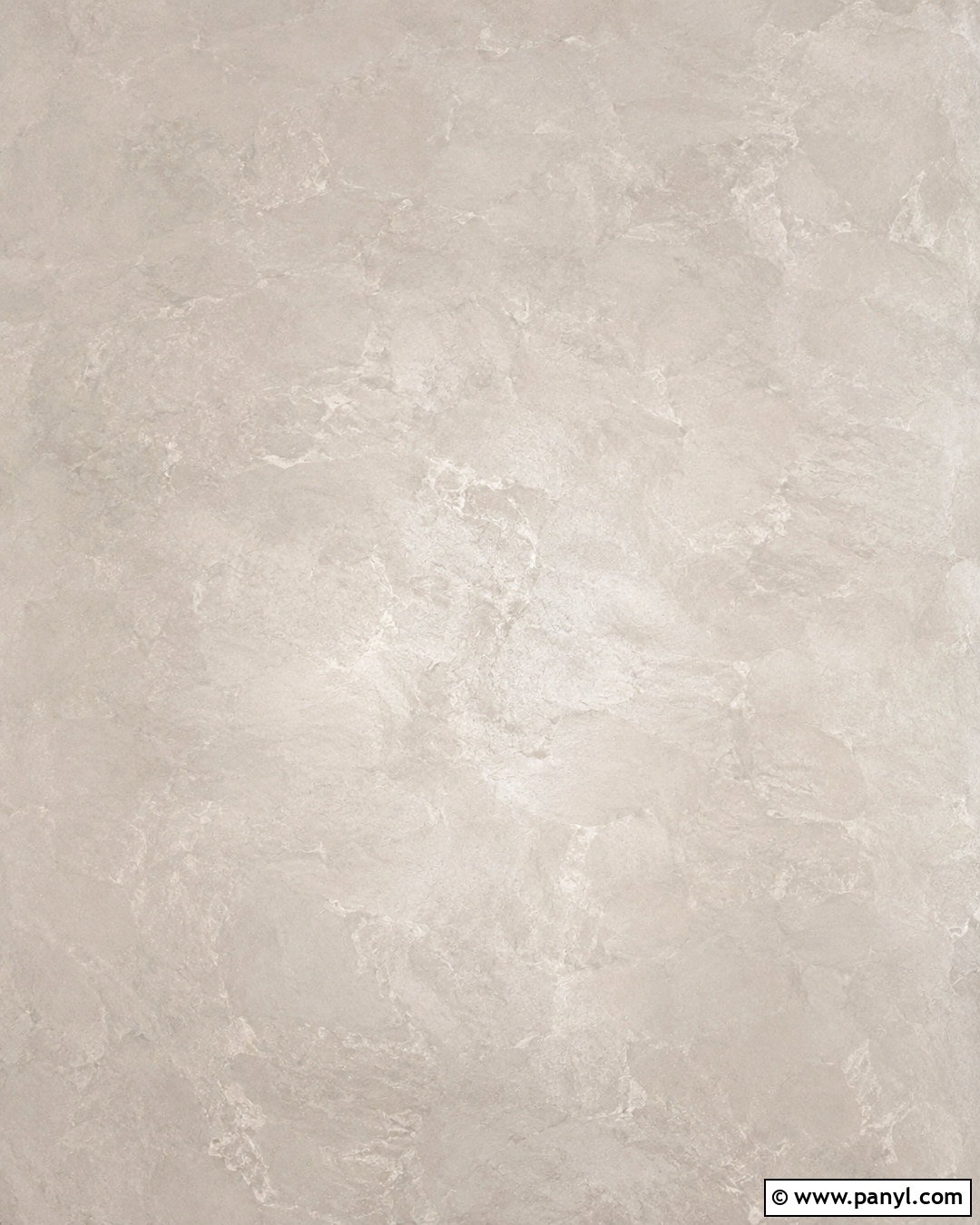
Can a plain wall texture still feel interesting? A greige plaster wallpaper proves that quiet imperfections can create plenty of character. Begin with a balanced blend of warm gray and beige, then add subtle trowel marks, clouded tonal changes, and a matte mineral finish. Avoid deep cracks or dramatic stains, which can distract from screen content. Instead, use gentle horizontal movement and a softly brightened central area. The result should resemble a carefully finished limewash or Venetian plaster wall photographed in even daylight. Dark charcoal icons will look crisp against the pale surface, while cream widgets blend naturally. This understated background suits contemporary, organic modern, Scandinavian, and minimalist digital themes without appearing cold or unfinished.
4. Taupe Abstract Background Wallpaper
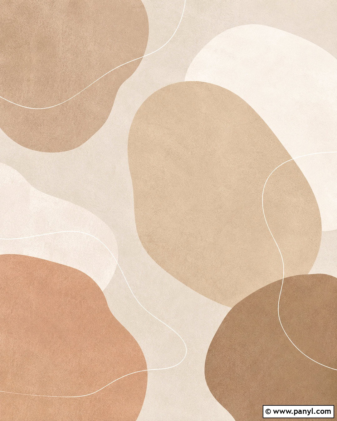
Flowing organic shapes can make taupe feel modern and expressive without creating visual clutter. Use a pale mushroom base with overlapping forms in warm taupe, sand, ivory, and muted clay. Keep the curves large and simple rather than filling the screen with many small elements. Thin off-white lines can follow one or two shapes to provide gentle movement. Place the strongest forms near the corners or lower third, leaving practical open space for icons and widgets. A very light paper grain will soften the digital edges and unify the palette. This complete abstract composition feels artistic yet controlled, making it suitable for phone lock screens, tablet displays, and desktops that need a polished neutral focal point.
5. Sand Dune Background Wallpaper

Imagine opening your screen to smooth dunes shaped by a quiet breeze. A neutral desert wallpaper can feature pale sand in the foreground, soft beige ridges in the distance, and a hazy ivory sky. Keep the horizon low or place it near the lower third so the upper area remains open for a clock and status icons. Gentle shadows should define the dunes without becoming dark or dramatic. Avoid footprints, buildings, or strong sunlight that would interrupt the peaceful simplicity. A restrained palette of cream, camel, and light taupe creates natural warmth. The full landscape provides recognizable depth while remaining minimal enough for everyday use across phones, laptops, and large desktop monitors.
6. Neutral Botanical Background Wallpaper
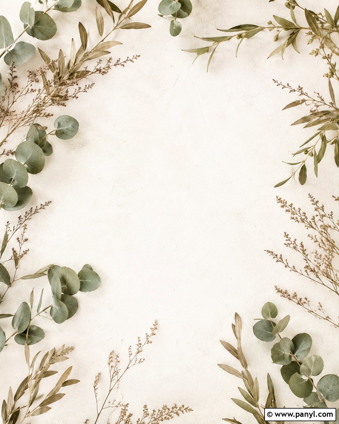
Delicate leaves introduce nature without overpowering a calm neutral screen. Start with a warm ivory background and arrange muted beige, dusty sage, and soft taupe branches around the outer edges. The foliage can resemble eucalyptus, olive leaves, or airy dried stems, but it should remain sparse and balanced. Leave the center clear for app icons or a lock-screen clock. Use soft shadows beneath a few leaves to add realistic depth, while keeping the overall finish light and uncluttered. The muted sage acts like a natural neutral and prevents the composition from feeling overly beige. This botanical wallpaper creates a fresh, restful look that pairs beautifully with cream widgets, brown icons, and simple device themes.
7. Ivory Arch Background Wallpaper
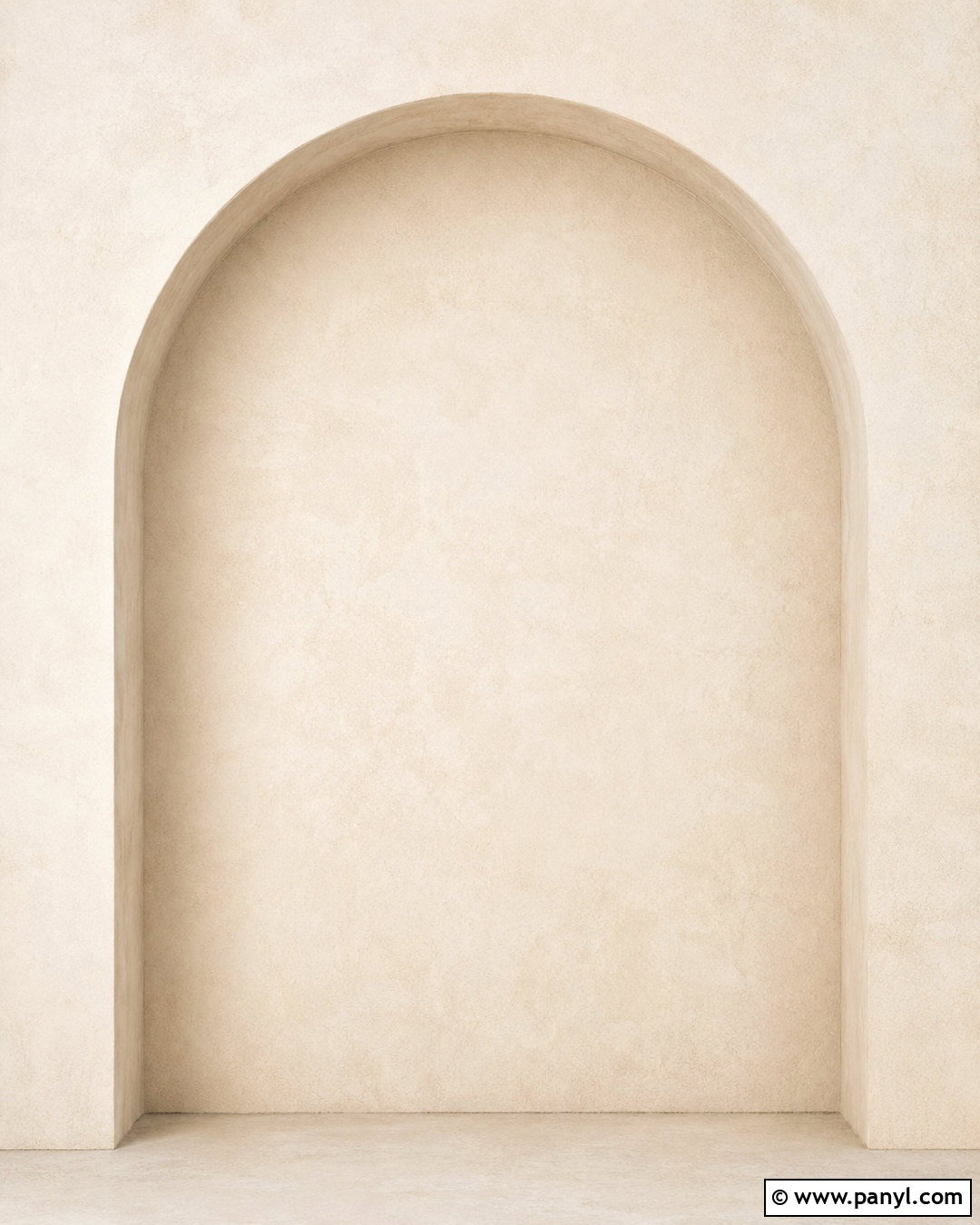
A large architectural arch gives an ivory wallpaper structure while preserving its minimalist character. Use a soft cream base with one oversized arch in slightly darker beige or light greige. Position the curved form toward one side so the screen has a clear area for folders or widgets. Add a restrained plaster texture to both colors, helping the graphic appear warm and dimensional instead of sharply digital. A narrow taupe shadow along the arch can suggest depth, but it should remain subtle. The palette works best when every shade has a warm undertone. This finished design references modern Mediterranean interiors and simple architectural forms, producing an organized neutral background with a strong yet quiet visual identity.
8. Beige Marble Background Wallpaper
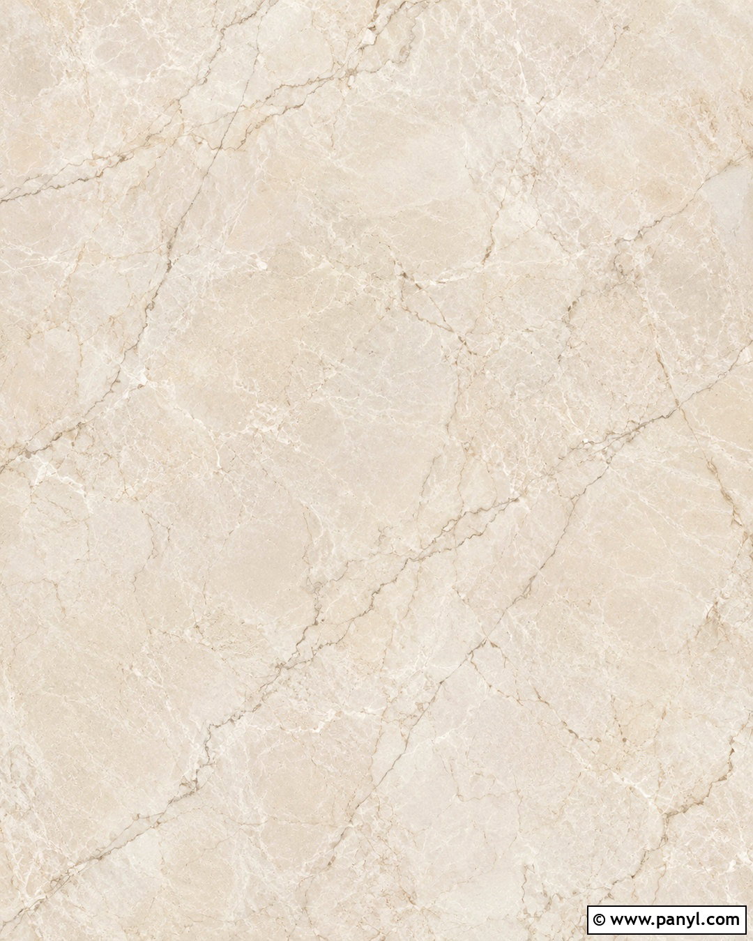
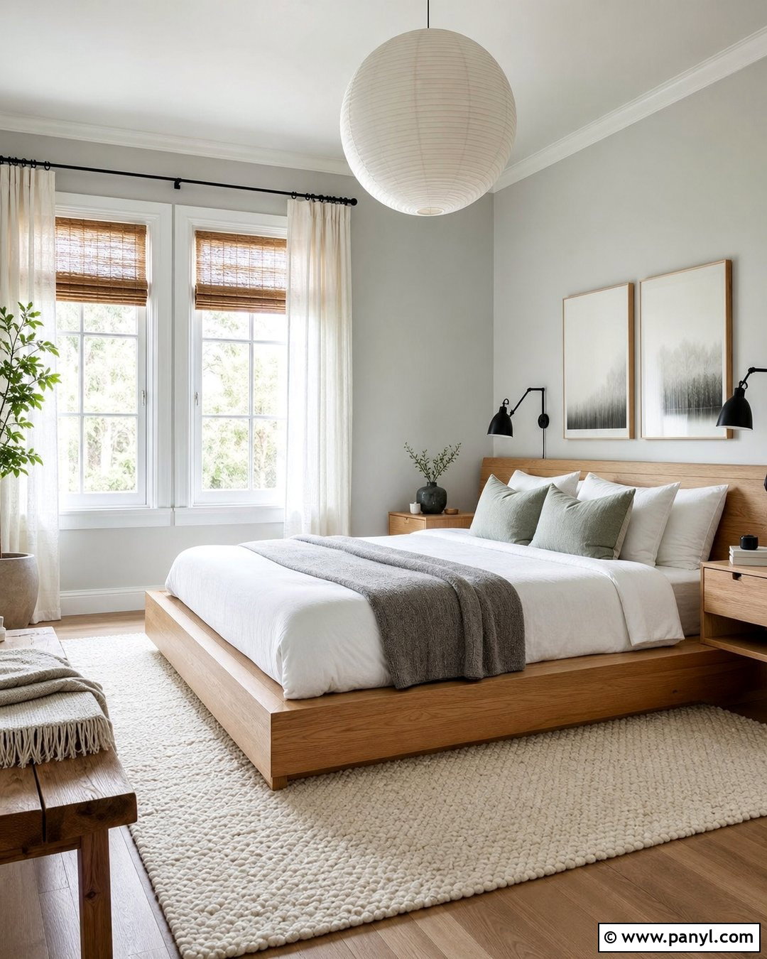
For a polished neutral look, select light beige marble with soft, widely spaced veining. The base can blend ivory, almond, and warm cream, while thin veins in greige and pale taupe move gently across the image. Avoid high-contrast black lines or crowded patterns that make icons difficult to identify. A honed finish is preferable to a glossy surface because it reduces harsh highlights and creates a softer appearance. Arrange the main veins near the edges, leaving a quieter section through the center or upper third. The complete wallpaper should resemble a realistic stone slab photographed straight on. It offers subtle luxury while remaining practical for desktops, tablets, and phone home screens.
9. Neutral Coastal Background Wallpaper

A quiet shoreline can become a soothing background when its colors stay pale and understated. Compose the wallpaper with warm beige sand, translucent gray-blue water, and a soft ivory sky. Use a high viewpoint or gentle horizontal framing to simplify the landscape and avoid a crowded horizon. Small, foamy waves can form graceful white lines across the lower portion of the screen. Keep rocks, people, buildings, and boats out of the scene so the neutral color story remains uninterrupted. The muted blue-gray water adds freshness while still reading as neutral. This complete coastal view feels airy and spacious, making it especially effective for busy desktops that benefit from a calm, open background.
10. Warm Gray Concrete Background Wallpaper
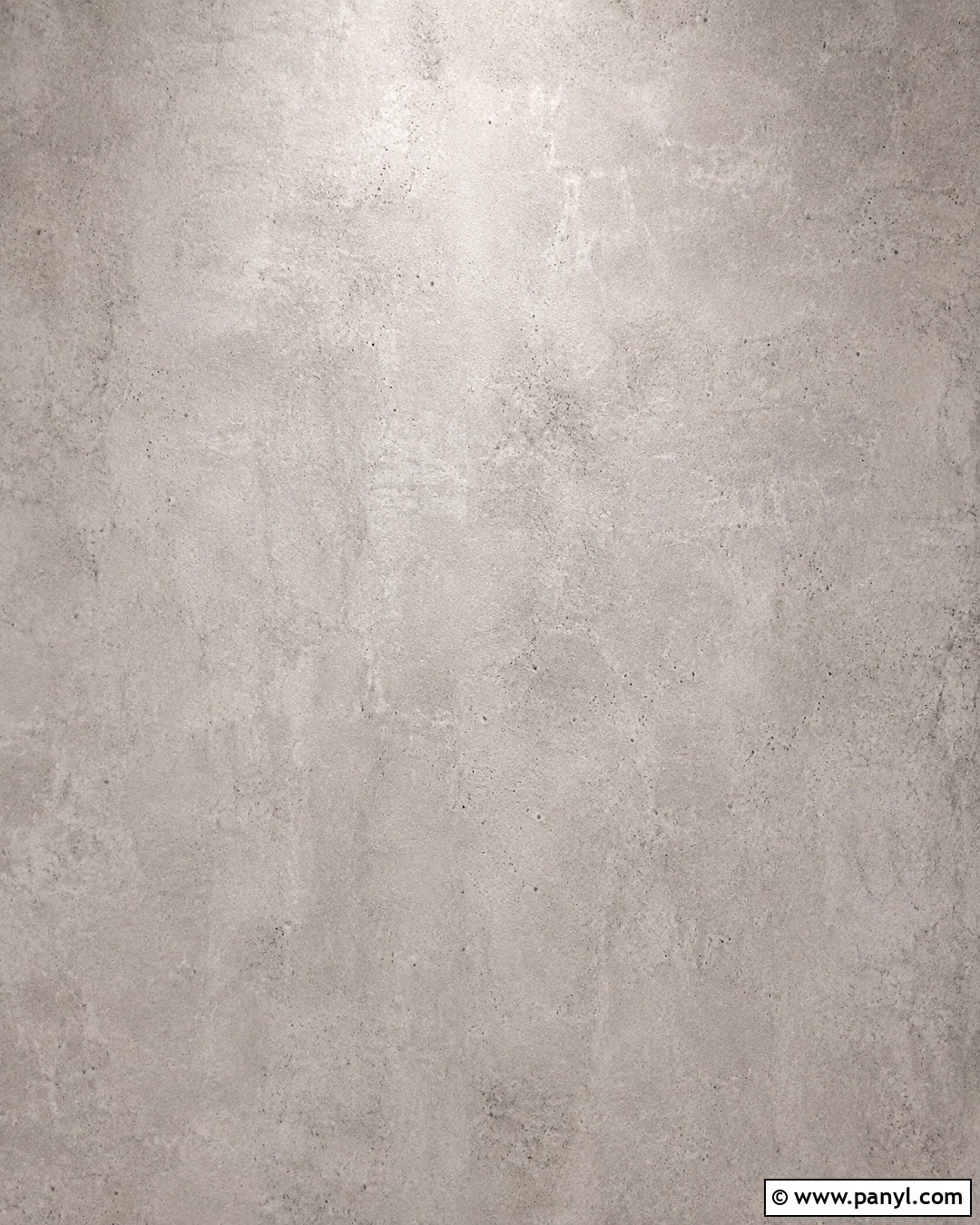
Warm gray concrete offers an urban alternative to beige without making the screen feel dark. Choose a pale cement color with subtle patches of greige, faint pores, and softly blended finishing marks. The texture should appear smooth and refined rather than cracked, stained, or industrially rough. Distribute the tonal variation evenly so icons remain readable in every area. A slight lightening toward the upper center can help darker widgets stand out. Pairing warm undertones with a matte finish prevents the gray from looking blue or sterile. This background works well with black, white, tan, or muted green icons. The overall effect is modern, practical, and quietly architectural across both large and small screens.
11. Neutral Wavy Line Background Wallpaper
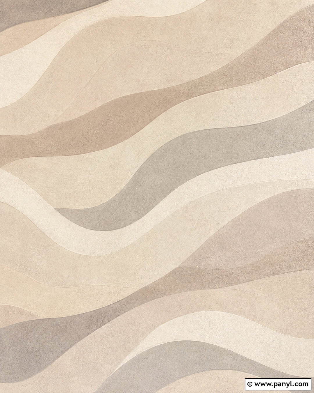
Gentle wavy lines add rhythm to a neutral wallpaper while keeping the layout simple. Begin with a light biscuit or cream background and layer broad flowing bands in beige, taupe, and soft greige. Let the lines travel vertically or diagonally so they guide the eye without creating a rigid pattern. Keep their edges slightly softened and introduce a fine paper texture for a more organic finish. The waves should be spaced far enough apart to provide open zones for icons. Place darker taupe bands near the outer edges and lighter colors through the middle. This balanced composition feels current and playful, yet it remains calm enough for work devices, home screens, and minimalist digital planners.
12. Dried Grass Background Wallpaper
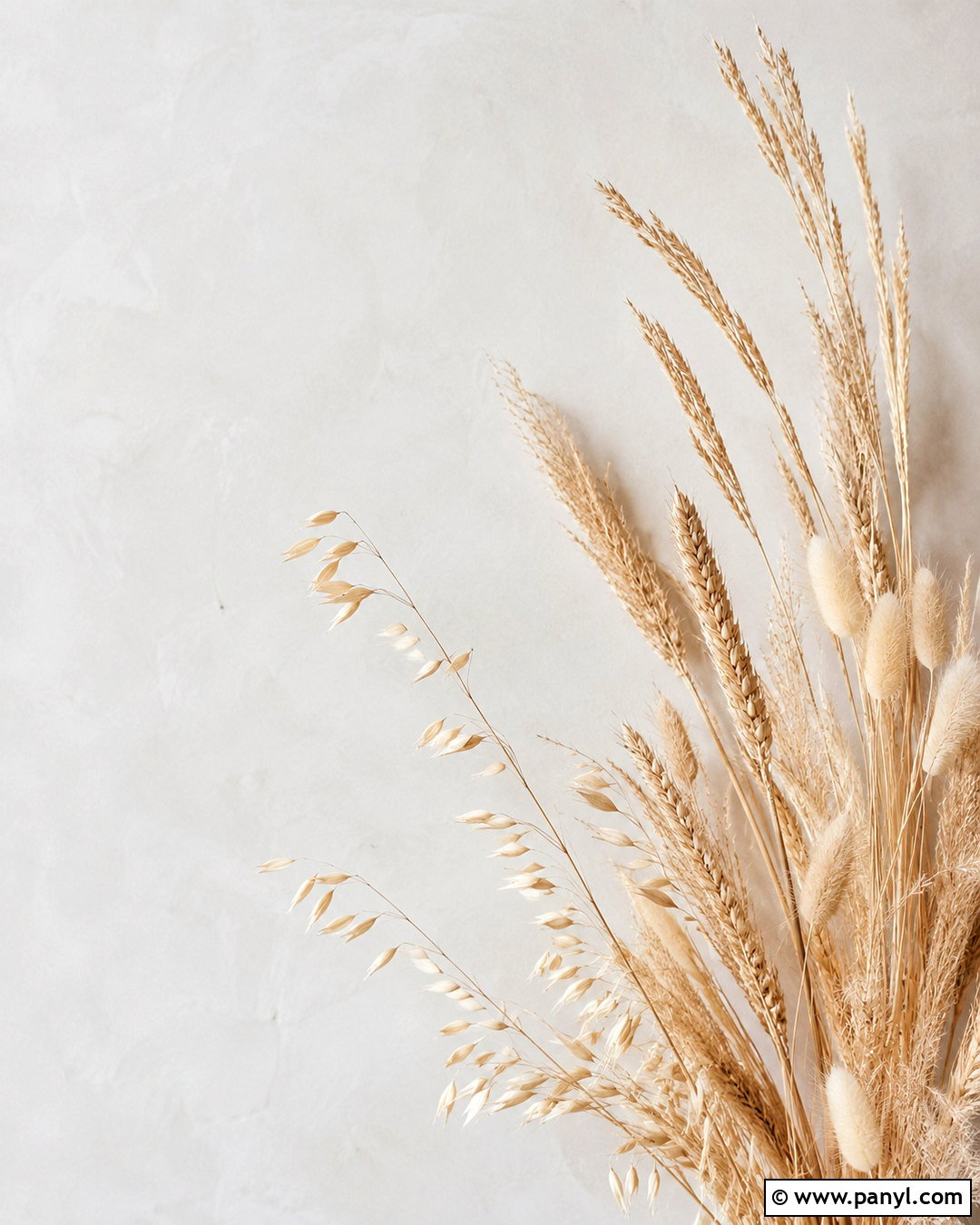
Sunlit dried grass creates a warm photographic wallpaper with natural movement and delicate texture. Use slender stems in wheat, oat, and pale camel tones against a softly blurred cream background. Position the grasses along one side or across the lower third, allowing generous negative space around the clock and app icons. A shallow depth of field keeps distant stems soft while one small cluster remains clear. The lighting should feel bright and diffused rather than golden or heavily shadowed. Avoid dense bouquets, containers, or decorative text. This complete nature composition delivers the comfort of an earthy landscape in a simplified format, pairing easily with brown, white, beige, or sage device accessories and digital themes.
13. Neutral Mountain Background Wallpaper

Layered mountains can feel wonderfully peaceful when their shapes and colors are simplified. Create a distant landscape with overlapping ridges in misty greige, stone, light taupe, and warm gray. An ivory sky should occupy much of the upper half, offering a clean location for the time, date, or desktop folders. Keep the mountain edges soft and slightly hazy to create depth without strong contrast. A pale foreground ridge can anchor the composition, while darker peaks remain limited to the bottom third. Skip trees, buildings, and dramatic clouds to protect the minimalist look. This complete neutral mountain wallpaper combines recognizable scenery with a restrained palette, making it calming, practical, and easy to coordinate.
14. Beige Checkerboard Background Wallpaper
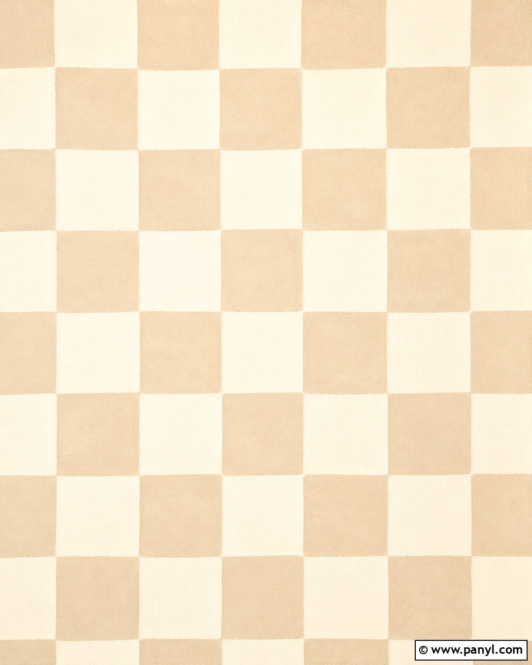
A tonal checkerboard introduces playful geometry without abandoning a neutral aesthetic. Use large alternating squares in pale beige and creamy ivory, then soften the contrast so the pattern does not compete with icons. A fine woven or paper grain can keep the blocks from looking overly flat. Consider slightly irregular edges for a hand-painted effect, or choose crisp lines for a cleaner modern finish. Scale is important: fewer, larger squares usually create a calmer screen than a tiny repeating grid. Keep widgets simple and position them within the lightest sections when possible. The finished wallpaper has enough personality for a stylish phone or tablet, while the narrow color range keeps the entire digital layout cohesive and easy to view.
15. Neutral Window Shadow Background Wallpaper
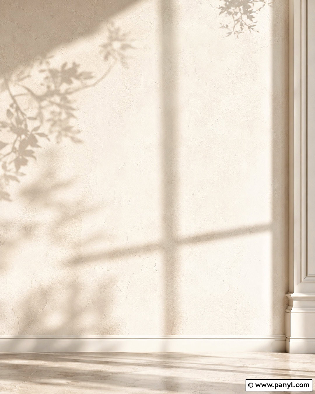
Soft window shadows can transform a plain cream surface into a serene, light-filled background. Photograph an ivory plaster wall with diffused rectangular shadows from a nearby window, then add one or two delicate leaf silhouettes for natural movement. Keep the shadow color pale greige rather than dark charcoal. The center should remain relatively clear, with the architectural lines falling toward a side or corner. Bright, even exposure will preserve the neutral palette and prevent icons from disappearing in darker areas. This wallpaper feels like a quiet room on a clear morning, yet it includes no furniture or distracting objects. The full composition is simple, realistic, and well suited to minimalist home-screen arrangements.
16. Stone Pebble Background Wallpaper
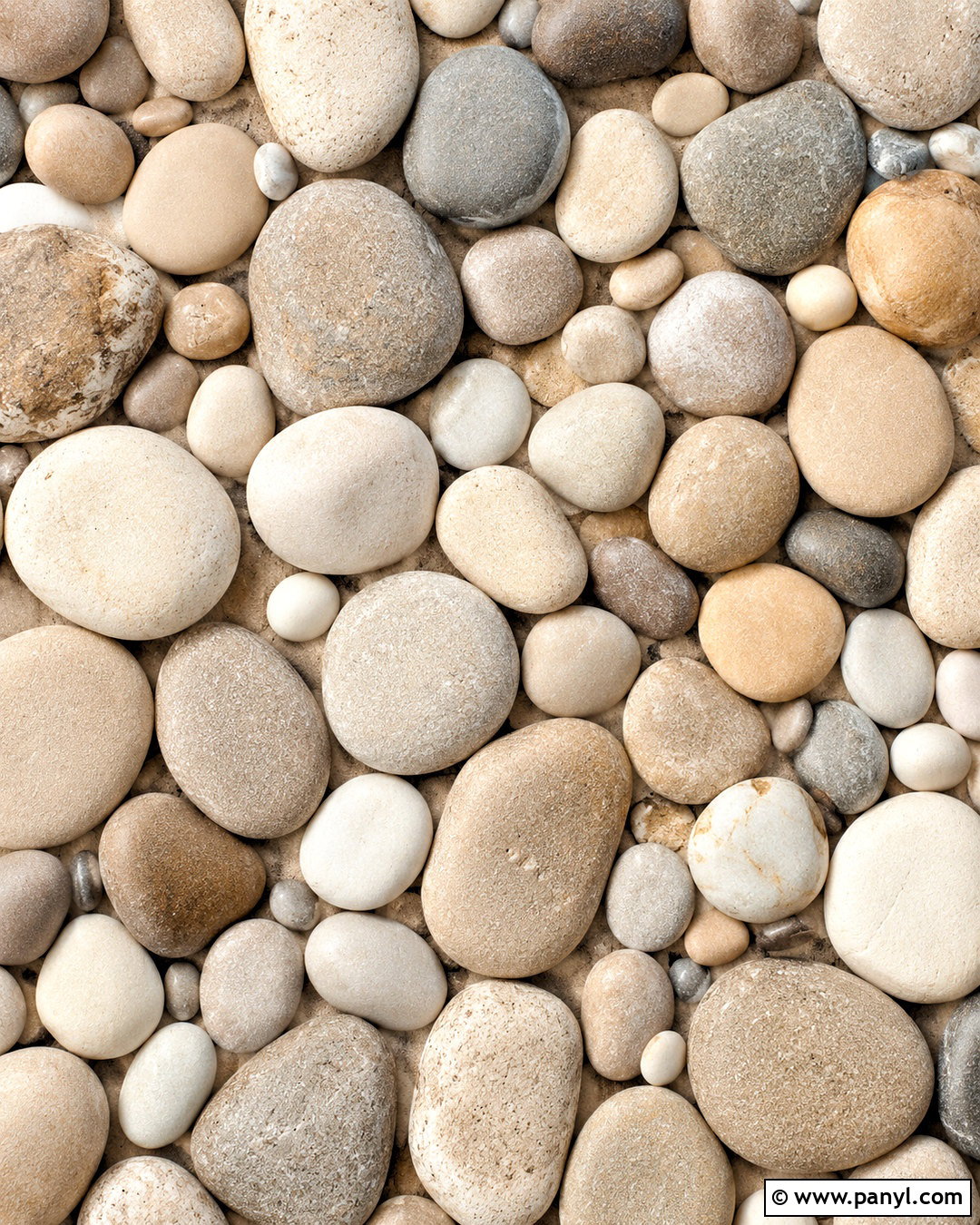
Smooth pebbles offer a tactile neutral background when arranged with restraint. Choose rounded stones in ivory, sand, mushroom, warm gray, and pale taupe, then photograph them from directly above. Use larger pebbles rather than many tiny pieces, which can make the screen appear busy. A small area of fine beige sand between the stones will create breathing room and soften the composition. Keep the surface matte and the shadows light, showing shape without producing strong contrast. The most uniform section should sit behind the main icon area. This natural arrangement brings gentle variation to the screen while maintaining a cohesive color palette inspired by quiet beaches, spa interiors, and organic modern materials.
17. Cream Boucle Background Wallpaper
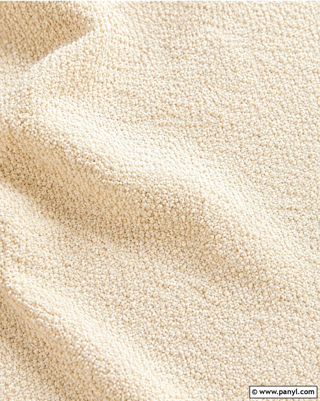
Cream boucle creates a cozy, dimensional wallpaper that still looks clean from a distance. Fill the background with soft looped fabric in warm ivory, then introduce gentle folds or a curved seam to provide structure. The fibers should be visible but not enlarged so dramatically that they become distracting. Use diffused light to reveal the nubby surface, with pale beige shadows defining the fabric’s movement. Avoid decorative objects, patterns, or contrasting colors. A relatively smooth center can support icons, while a subtle fold near one corner adds depth. This finished textile background feels comfortable and modern, matching neutral phone cases, home office setups, and desktop themes influenced by soft upholstered furniture.
18. Neutral Terrazzo Background Wallpaper
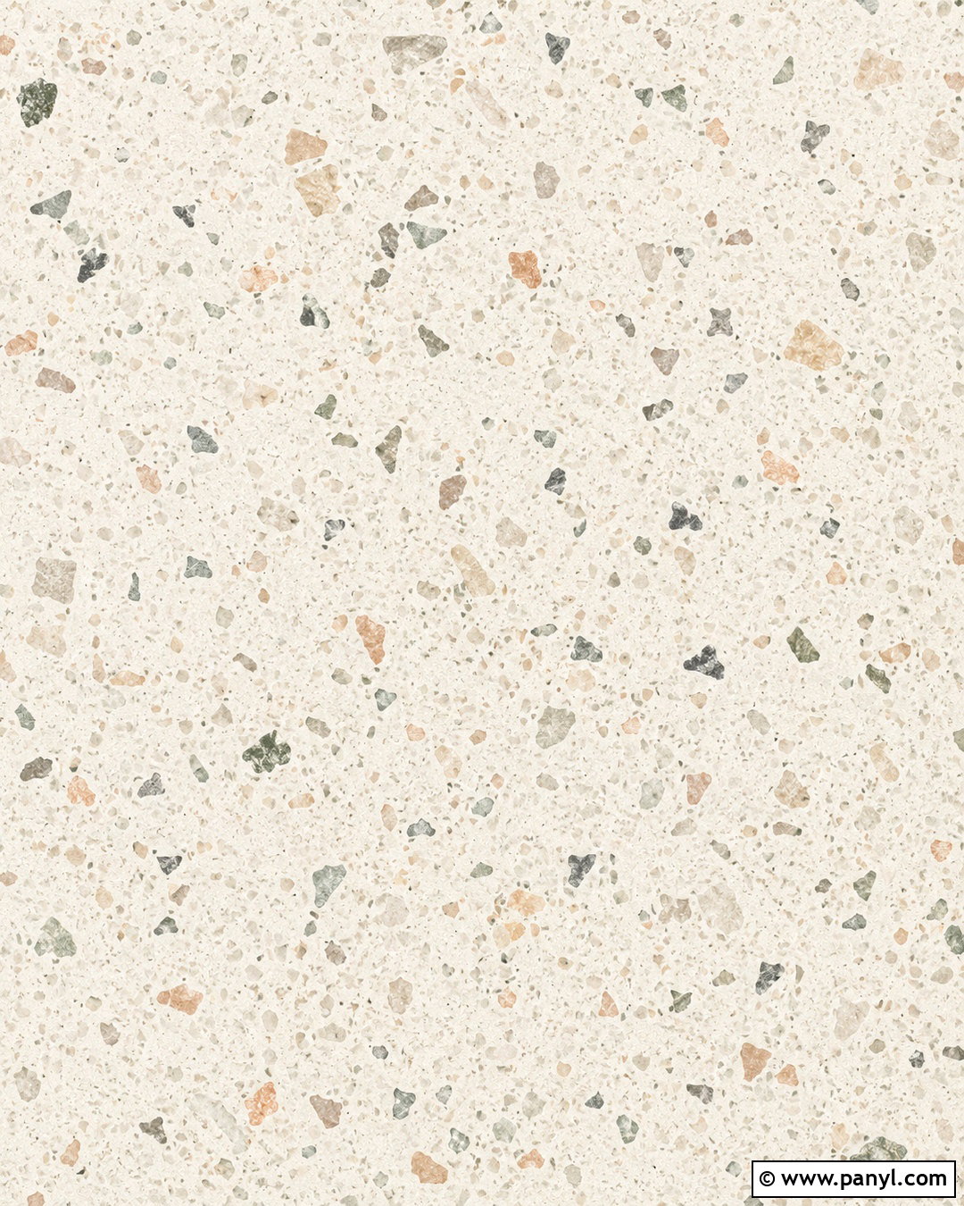
Terrazzo can remain quiet and sophisticated when its chips are widely spaced and softly colored. Start with a warm cream base and scatter medium-size fragments in beige, light taupe, clay, muted sage, and warm gray. Keep the shapes irregular but balanced, avoiding tiny confetti-like pieces that would interfere with app labels. Concentrate a few fragments near the edges and preserve calmer zones through the middle. A matte surface and soft lighting will make the design feel like real stone rather than a flat digital pattern. This complete neutral wallpaper introduces color in a controlled way. It works especially well for modern devices that use simple white, brown, or monochrome icons and rounded widgets.
19. Beige Minimalist Still Life Background Wallpaper
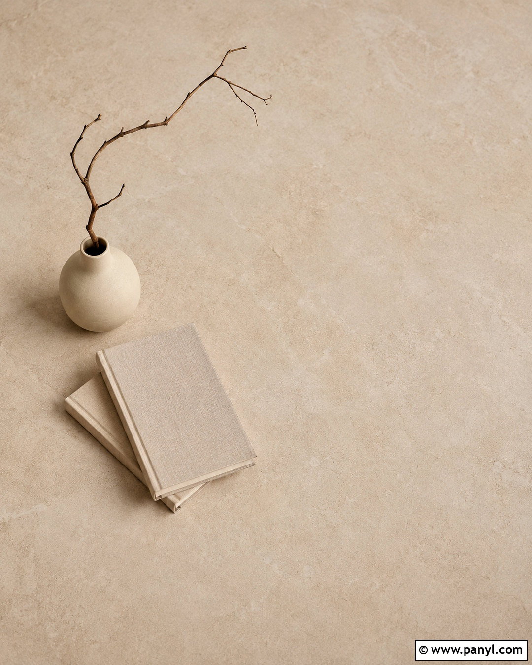
A carefully arranged still life can add warmth without sacrificing useful screen space. Place a matte cream ceramic vase, one curved dried branch, and two stacked neutral books on a pale beige surface. Position the arrangement in the lower corner, leaving most of the background open and softly textured. Choose book covers without visible words, and keep the vase simple rather than highly decorative. Gentle shadows should ground the objects while preserving a bright overall appearance. Colors can include ivory, oatmeal, camel, and a touch of muted brown. This complete photographic composition brings a home-inspired feeling to a phone or desktop while keeping clocks, folders, and widgets clear and visually organized.
20. Neutral Layered Paper Background Wallpaper
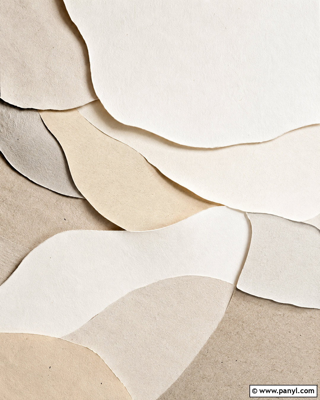
Layered paper shapes provide depth, softness, and a handcrafted finish. Build the design with overlapping curves cut from ivory, warm white, beige, greige, and pale taupe paper. Arrange the layers along the bottom and one side, creating an open central area for screen content. Soft shadows between each piece will make the composition dimensional, but the contrast should remain gentle. Use smooth matte paper for a clean look or introduce faint fibers for natural texture. Avoid very small cutouts, sharp patterns, and too many layers. The finished background resembles minimalist paper sculpture photographed from above, delivering an artistic neutral design that stays practical on phones, tablets, laptops, and desktop monitors.
Conclusion:
The most effective neutral background wallpapers balance simplicity with enough visual detail to make a screen feel personal. Textures such as linen, plaster, paper, boucle, and stone add depth without demanding attention. Natural subjects, including dunes, mountains, grass, and coastal water, create a peaceful atmosphere, while arches, waves, and layered shapes offer a more graphic finish. When choosing a design, look for open space behind important icons and moderate contrast around labels. Warm undertones usually create a softer appearance, while gray and greige produce a cleaner modern effect. With these 20 neutral background wallpapers, you can create a coordinated digital display that feels calm, stylish, and easy to use.

Related Ideas and Inspiration:

Leave a Reply