
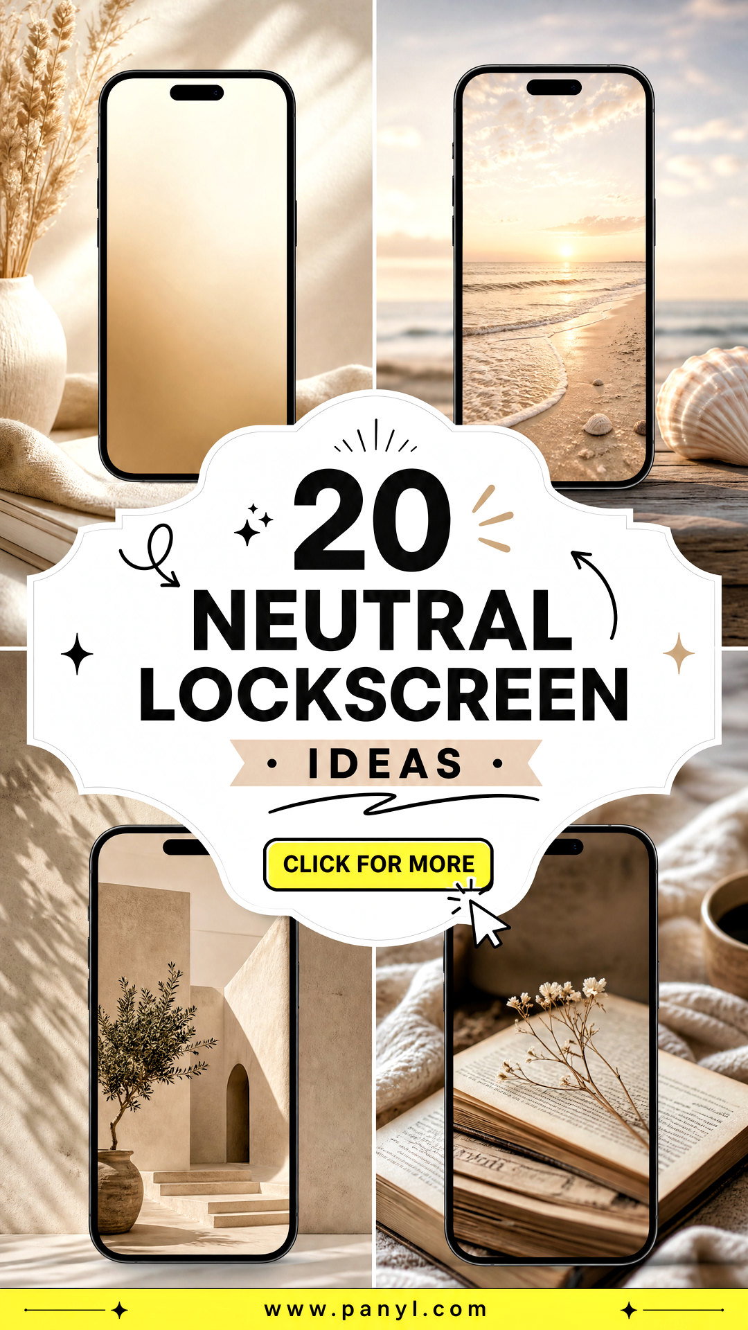
Neutral lockscreen ideas can make your phone feel calmer, cleaner, and more polished every time you pick it up. Instead of bright graphics competing with the clock and notifications, neutral backgrounds use soft colors, natural textures, and simple compositions. Beige, cream, taupe, warm gray, muted brown, and off-white all work beautifully, but the best design also considers contrast and screen layout. Leave open space around the clock, keep important details away from widgets, and choose an image that remains attractive after cropping. From subtle linen textures to quiet landscapes and modern patterns, these looks suit minimalist, cozy, organic, and classic aesthetics. Explore the complete designs below to find neutral lockscreen ideas that match your phone and personal taste.
1. Beige Linen Lockscreen
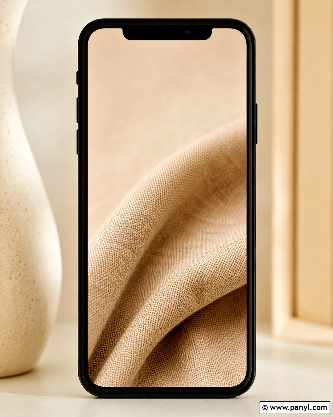
A beige linen background creates a warm, simple lockscreen that feels polished without looking empty. Choose a close-up fabric texture in light oatmeal or creamy beige, with the weave visible but not overly sharp. A subtle fold near one lower corner can add dimension while leaving the upper third open for the clock. Use dark brown or charcoal clock lettering for clear contrast. Keep widgets minimal, preferably in transparent or softly tinted beige boxes. This lockscreen works especially well with tan, cream, brown, or gold phone cases. For a coordinated screen setup, carry the linen color onto the home screen but use an even plainer version so app icons remain easy to recognize.
2. Neutral Travertine Lockscreen
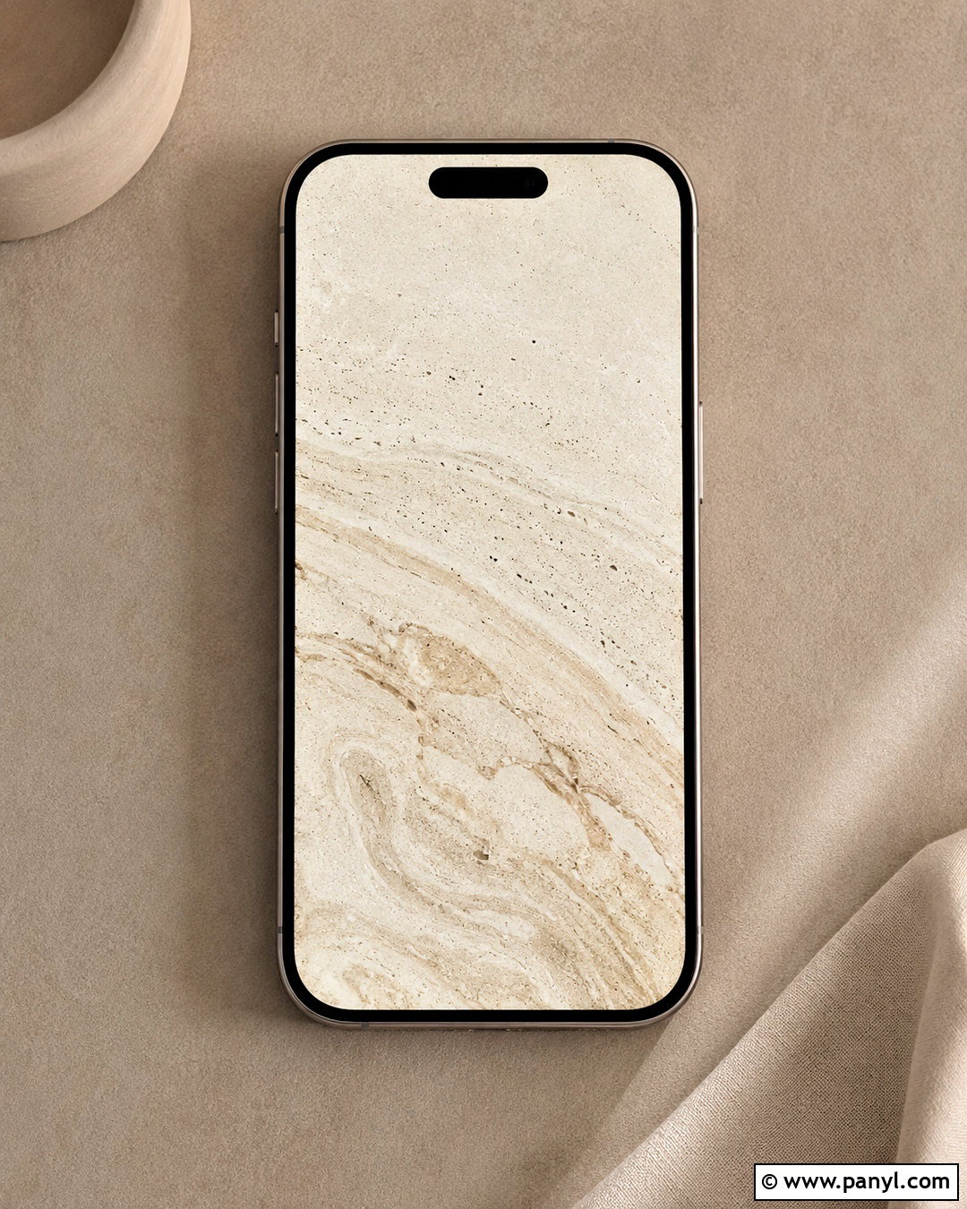
Soft travertine gives a neutral lockscreen natural movement and a refined stone finish. Look for warm ivory stone with pale beige veins, tiny pores, and gentle tonal variation. The pattern should run vertically or diagonally so it follows the shape of the phone instead of appearing abruptly cropped. Position the quietest area behind the clock, then allow the stronger veining to appear toward the bottom. Black, espresso brown, or muted bronze clock details will stay readable against the stone. This design pairs beautifully with clear, cream, or taupe phone cases. Keep extra widgets to a minimum because the texture already adds interest. The finished result feels organic, modern, and quietly luxurious without relying on bold color.
3. Cream Gradient Lockscreen
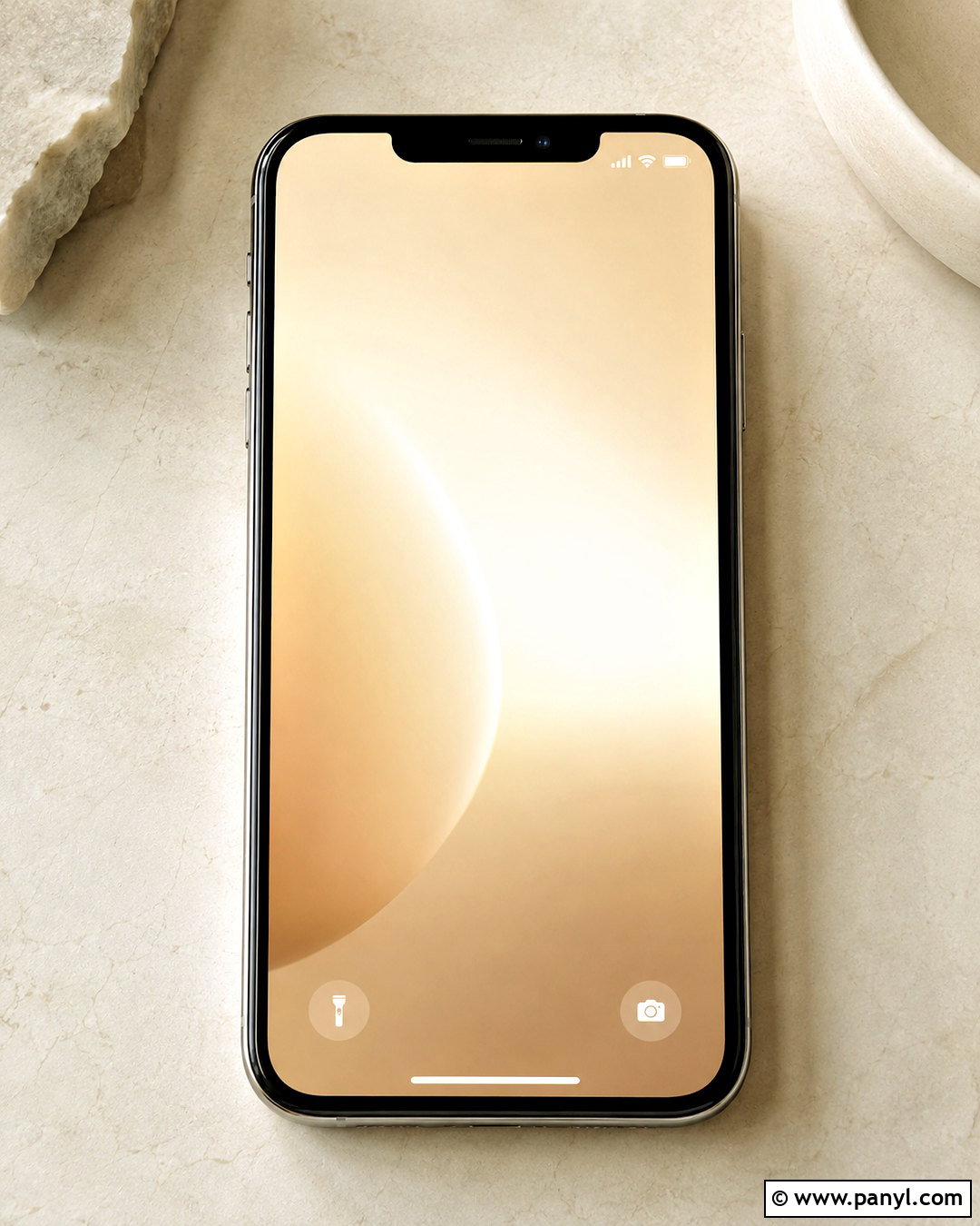
For an especially clean look, create a cream gradient that shifts gently from warm ivory at the top to soft beige at the bottom. The smooth transition gives the screen depth while preserving plenty of visual space for the time, date, and notifications. Add a faint glow in the center rather than a harsh highlight, and avoid obvious bands between colors. A dark taupe clock provides definition without the severity of pure black. If your phone allows tinted widgets, match them to the deeper beige at the bottom. This complete lockscreen suits minimalist home screens, monochrome icons, and warm neutral cases. It also adapts well to different crops because there is no central object that can be accidentally cut off.
4. Plaster Arch Lockscreen
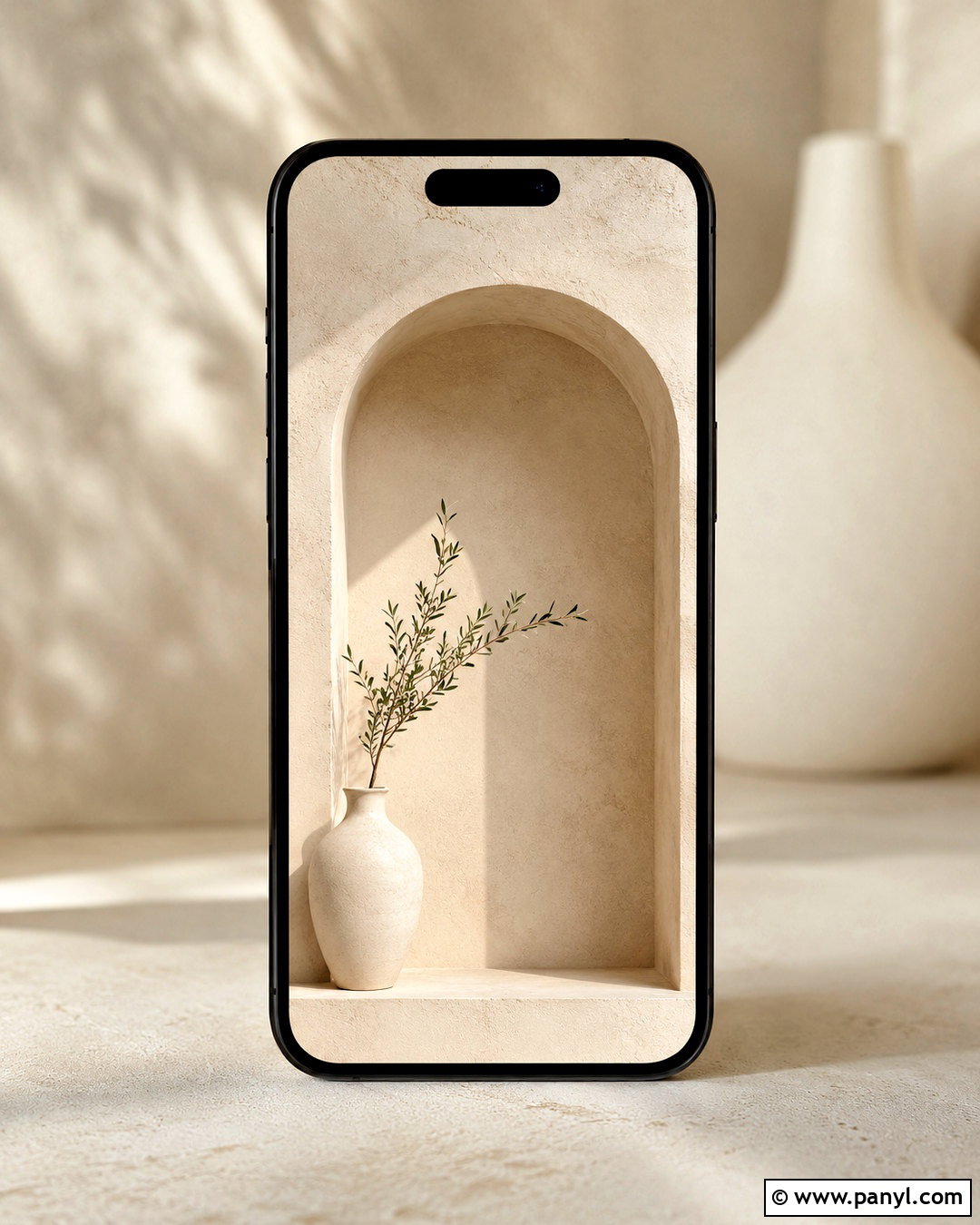
A warm plaster arch introduces an architectural focal point while keeping the lockscreen calm. Use a softly curved doorway or recessed niche in ivory plaster, surrounded by muted beige walls. Place the arch slightly below center so the clock has an uncluttered background above it. Gentle shadows along the curved edge will create depth without making the image feel dark. Inside the niche, include one understated object, such as a pale ceramic vase or a small branch. Choose a dark brown clock and simple widgets that match the wall tones. This design has an organic Mediterranean influence, yet its restrained palette works with modern interiors and minimalist phone themes. Avoid adding multiple arches or accessories, which can make the narrow screen feel crowded.
5. Dried Botanical Lockscreen
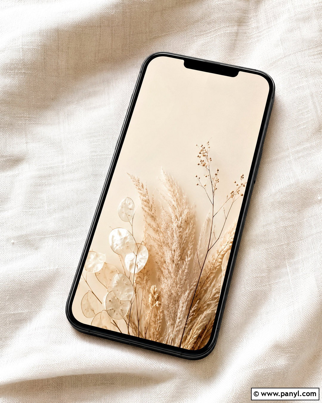
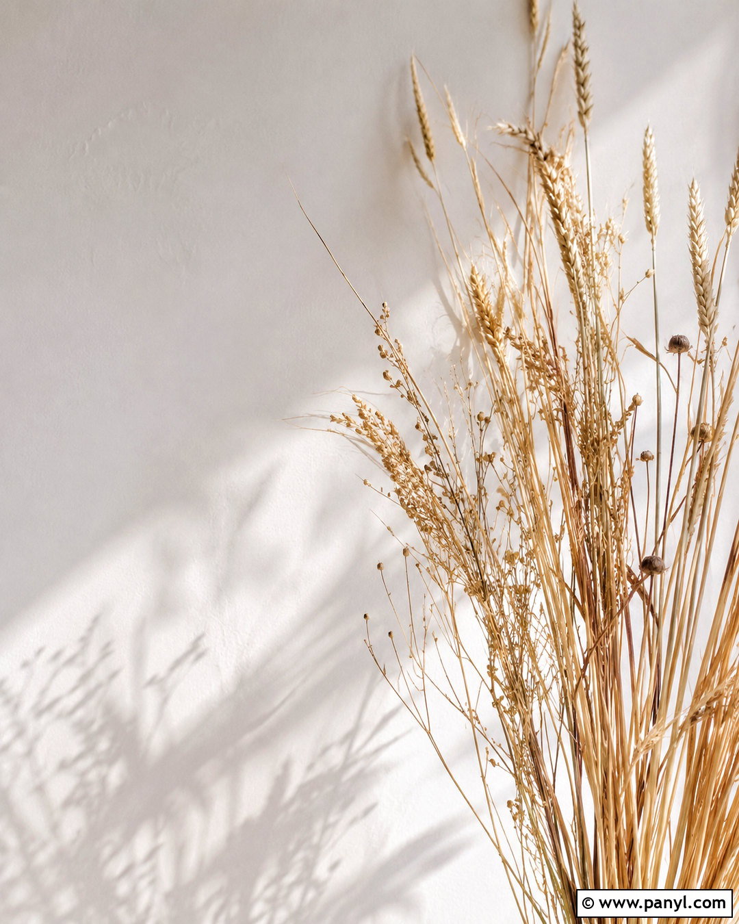
Delicate dried botanicals can soften a neutral screen without overwhelming it. Begin with a warm cream background and arrange two or three slender stems along one lower side. Pampas grass, dried honesty pods, or fine beige leaves provide recognizable shapes while staying within the neutral palette. Keep the stems below the main clock area and allow one airy branch to extend slightly upward for movement. A warm gray or deep taupe clock will remain easy to read. Choose transparent widgets or limit the screen to the date and time. The design looks especially cohesive with a matte beige phone case and botanical home-screen icons. For the cleanest finish, use natural shadows and avoid dense bouquets, saturated greenery, or overly detailed floral arrangements.
6. Minimal Line Art Lockscreen
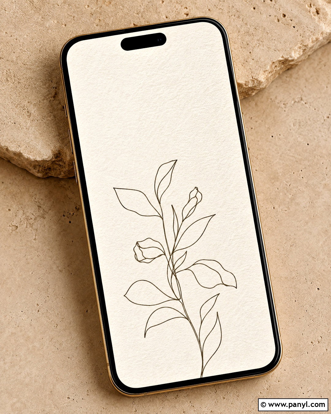
Minimal line art brings personality to a neutral lockscreen while maintaining a simple, organized appearance. Select one continuous illustration, such as a face, hand, leaf, or abstract figure, drawn in dark taupe on a creamy off-white background. Center the artwork in the lower half so it does not interfere with the clock. A faint paper grain can prevent the background from looking flat, but it should remain subtle enough to preserve readability. Match the clock to the line color for a coordinated composition. If widgets are necessary, place only one beneath the date and use a soft cream treatment. This lockscreen works with black, beige, clear, and brown cases, making it an easy choice for a modern everyday phone setup.
7. Neutral Checkerboard Lockscreen
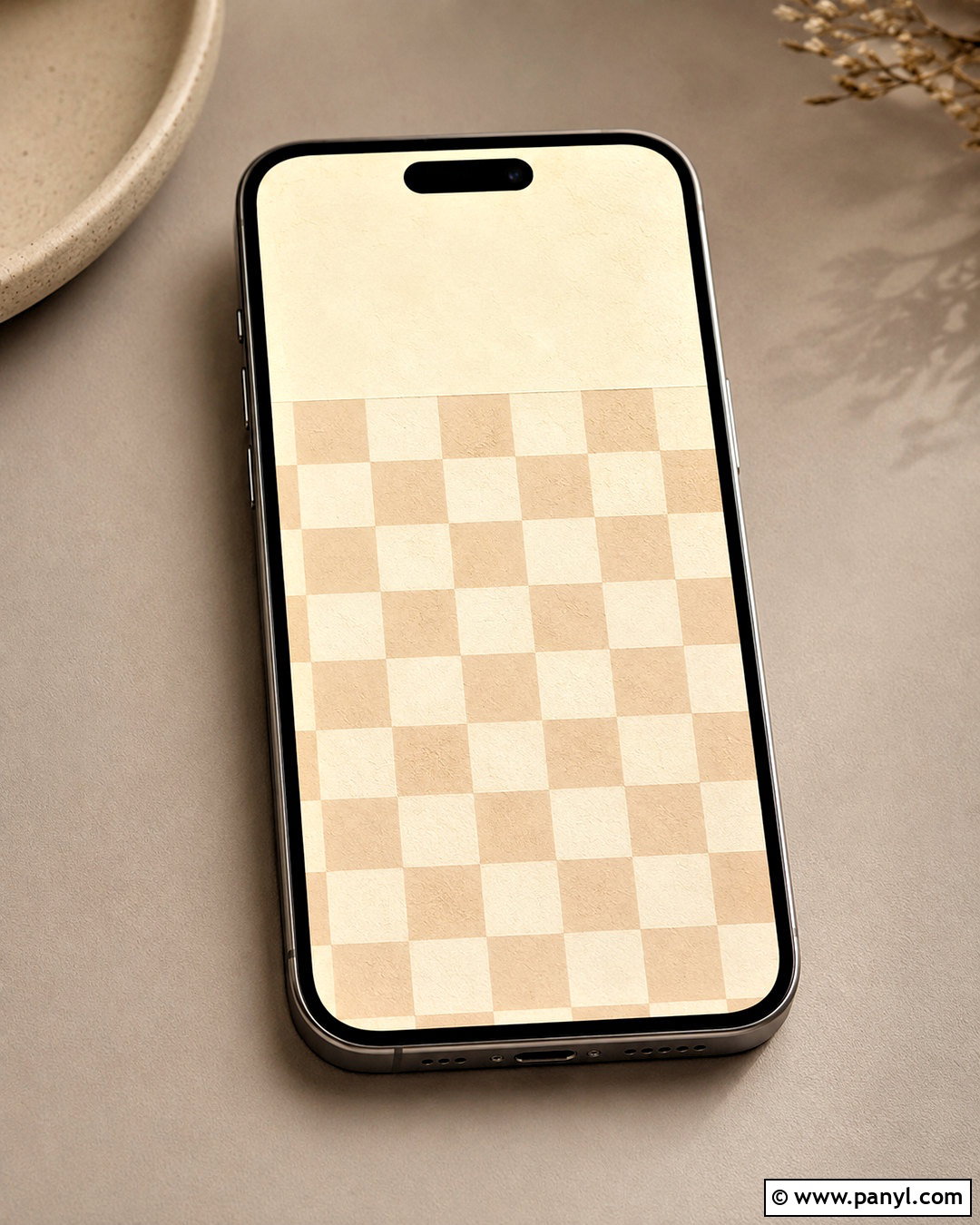
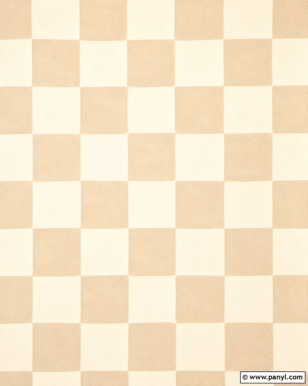
A neutral checkerboard pattern adds structure and playfulness without introducing strong color. Use medium-size squares in cream and warm beige rather than tiny checks that may create visual noise. Slightly soften the edges or add a paper-like texture so the design feels relaxed instead of overly digital. Leave a solid cream panel across the upper portion for the clock, or fade the checks gradually as they approach the top. Dark brown clock lettering will connect naturally with the warm palette. Keep widgets simple and evenly aligned to reinforce the geometric layout. This complete design works well with minimalist icons and tan accessories. For a more understated result, choose colors that differ by only a few shades rather than creating sharp black-and-white contrast.
8. Neutral Paper Collage Lockscreen
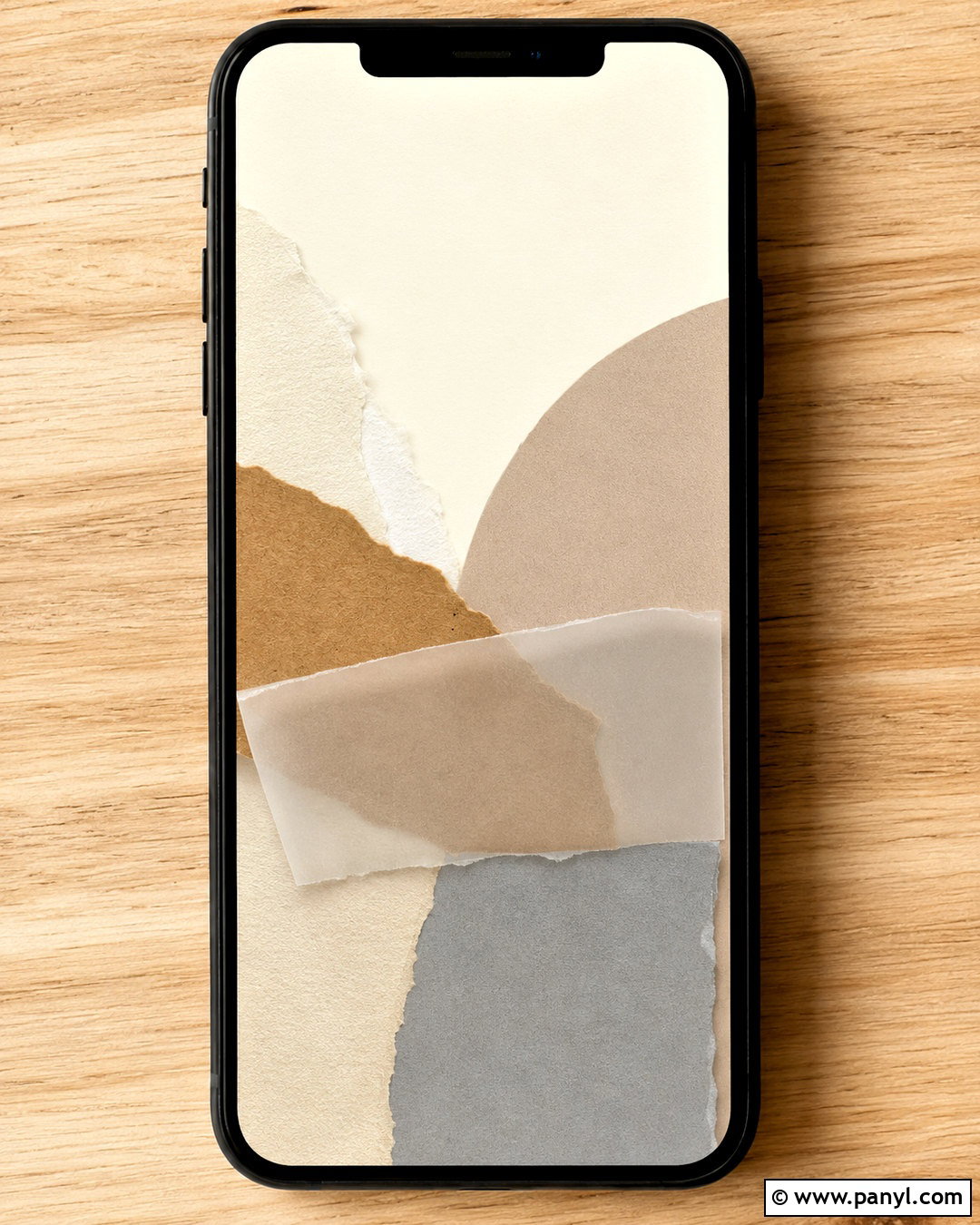
Layered paper shapes can give a neutral lockscreen a handmade, editorial quality. Combine torn pieces in ivory, kraft brown, pale taupe, and soft gray, arranging them mainly across the lower two-thirds of the screen. Include one curved piece, one straight-edged block, and a small strip of translucent paper to create variety. Realistic shadows between the layers will provide depth while keeping the palette restrained. Leave the top section mostly plain for the clock and date. Use charcoal text for contrast, then select a single neutral widget if needed. This layout pairs nicely with brown leather or clear phone cases. Avoid printed words, logos, or excessive scraps so the finished lockscreen remains clean, balanced, and suitable for everyday use.
9. Sandy Beach Lockscreen
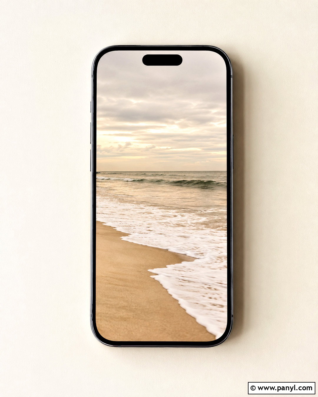
A quiet beach scene offers a natural neutral palette and a calming sense of space. Choose a vertical composition with pale sand in the foreground, creamy foam near the center, and a softly overcast beige-gray sky above. Keep the horizon low enough that the clock appears against open sky rather than detailed waves. Muted taupe clock lettering can complement the landscape, although charcoal may provide better contrast on lighter screens. Use no more than one small weather widget to preserve the peaceful view. This lockscreen feels coastal without relying on bright blue water or tropical color. A soft grain or slightly diffused finish can make the photograph feel cohesive. Pair it with a cream, stone, or translucent phone case for a complete understated look.
10. Beige Desert Dunes Lockscreen
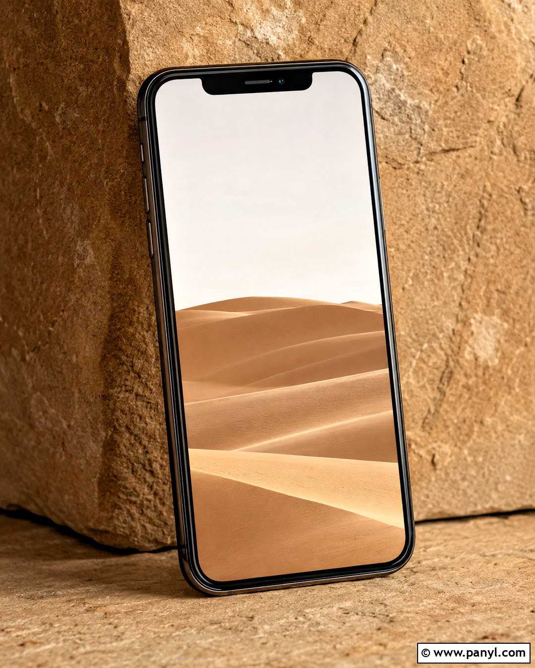
Rolling desert dunes create an elegant neutral lockscreen with simple curves and natural shadows. Select a photograph featuring warm beige sand, pale camel tones, and a bright, nearly white sky. The strongest dune line should sweep across the lower half of the screen, leaving open sky around the time and date. Soft shadows can define the landscape, but avoid deep black areas that disrupt the gentle palette. Use dark brown clock lettering and minimal widgets. The flowing shape complements the vertical format and remains visually interesting even when notifications appear. This look coordinates especially well with tan, brown, or muted gold accessories. Choose an uncrowded scene without people, buildings, or tracks to maintain the clean and peaceful composition.
11. Cloudy Neutral Sky Lockscreen
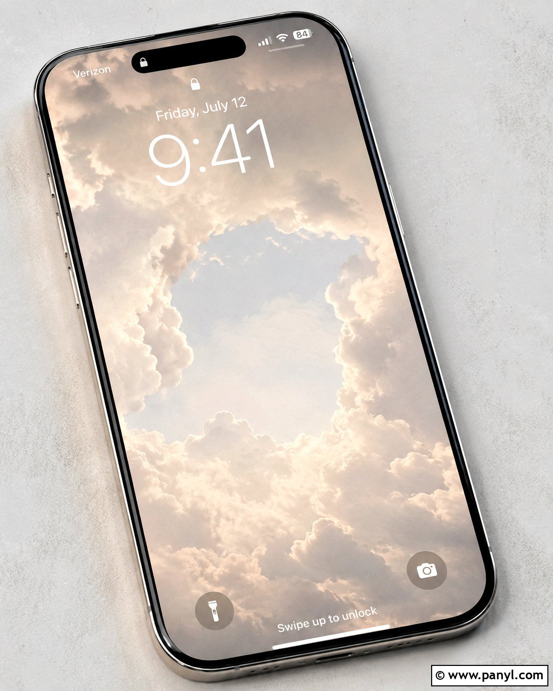
A pale cloudy sky can turn the entire lockscreen into a soft, spacious background. Use layered clouds in warm white, light gray, and faint beige rather than dramatic storm colors. Keep the center relatively clear so the clock remains visible, with fuller cloud shapes gathered near the top and bottom edges. Charcoal lettering offers dependable contrast, while a muted gray date keeps the interface cohesive. This design is ideal if notifications frequently cover the lower screen because there is no important focal point to hide. A very subtle film texture can add warmth and prevent the photograph from feeling sterile. Pair the finished lockscreen with grayscale icons, a clear case, or a cool taupe case for a light, minimalist setup that still has dimension.
12. Smooth Pebble Lockscreen
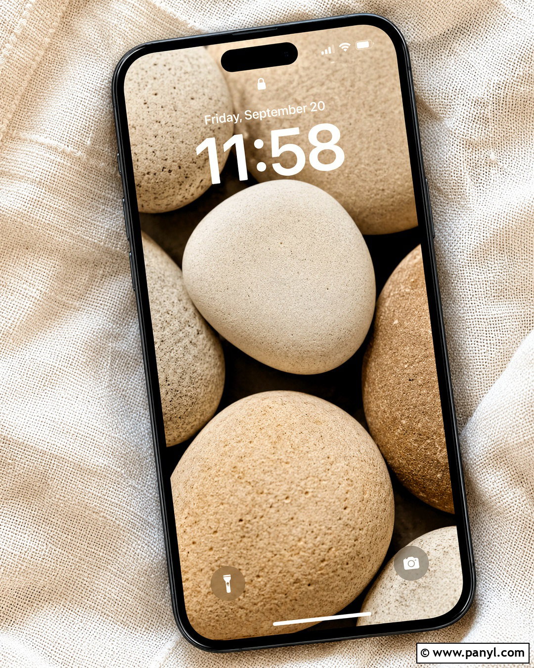
A collection of smooth pebbles creates a tactile neutral background inspired by natural materials. Arrange rounded stones in cream, greige, sand, and pale brown, using larger shapes rather than a busy field of tiny rocks. Position the simplest light-colored pebble behind the clock so the numbers remain clear. Dark charcoal text will usually offer the best visibility. Gentle shadows between the stones should show their form without creating harsh contrast. Keep widgets limited because the repeated shapes already provide visual interest. This design feels balanced and grounded, making it a strong choice for wellness-focused or nature-inspired phone themes. Match it with warm gray icons and a stone-colored case, or use a clear case to let the understated screen remain the primary feature.
13. Light Oak Lockscreen
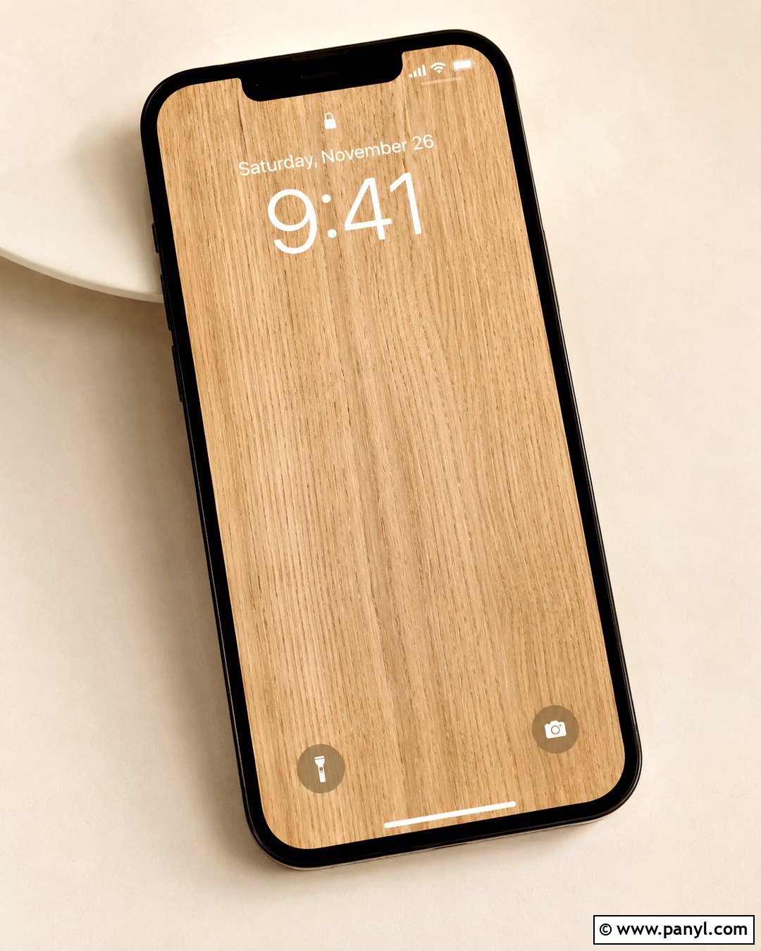
Light oak brings warmth to a lockscreen while remaining clean enough for daily use. Choose vertical wood grain in pale honey beige, natural tan, and creamy brown. The grain should be fine and consistent, without large knots positioned behind the clock. A slightly matte finish will look more modern than glossy wood. Use deep espresso lettering for the time, then select transparent or lightly tinted widgets that allow the texture to remain visible. This lockscreen coordinates naturally with beige, brown, green, and black phone cases. It also works well with minimalist home-screen icons in cream or charcoal. To keep the image from resembling a flat sample, include gentle lighting across the grain and a realistic variation in tone from one side to the other.
14. Ivory Marble Lockscreen
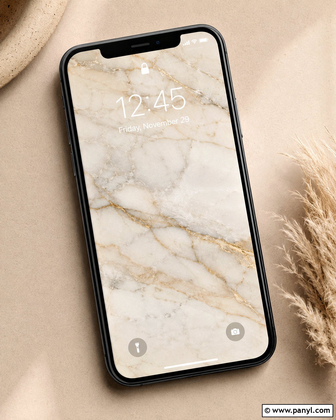
Ivory marble offers a classic neutral background with enough movement to feel distinctive. Select a warm white slab featuring thin taupe and light gray veins rather than bold, high-contrast markings. Place the most open section behind the clock and let one graceful vein travel diagonally across the lower portion. Dark gray or espresso lettering will provide clear visibility. Keep the date small and avoid stacking several widgets over the stone pattern. A narrow metallic accent in muted gold can appear within the veining, but it should remain subtle. This lockscreen pairs well with clear, cream, black, or gold-toned cases. The overall look feels polished and timeless, especially when the matching home screen uses plain ivory with coordinated neutral app icons.
15. Neutral Coffee Table Lockscreen
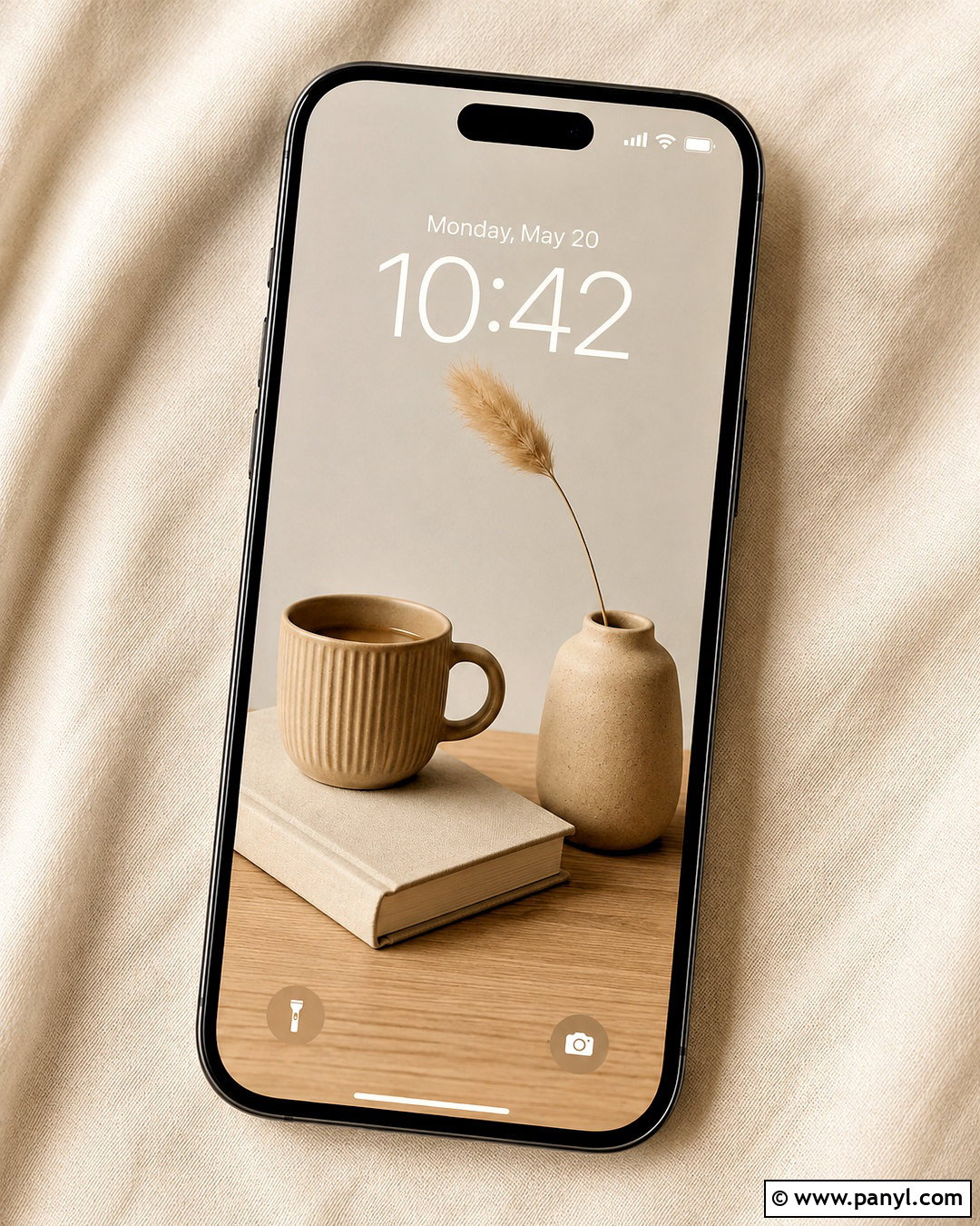
A carefully styled coffee table scene can create a cozy neutral lockscreen with realistic depth. Use a pale oak table holding a closed cream book, a ribbed ceramic mug, and a small beige vase with one dried stem. Arrange the objects in the lower half and photograph them from above, leaving an uncluttered linen surface near the top for the clock. Warm brown text will coordinate with the wood and ceramics. The objects should overlap slightly to form one connected composition rather than appearing scattered. Keep colors within cream, oatmeal, tan, and soft gray. This design suits cozy minimalist themes and pairs beautifully with leather or taupe cases. Avoid visible writing on the book so the screen remains visually quiet and easy to personalize.
16. Neutral Architecture Lockscreen
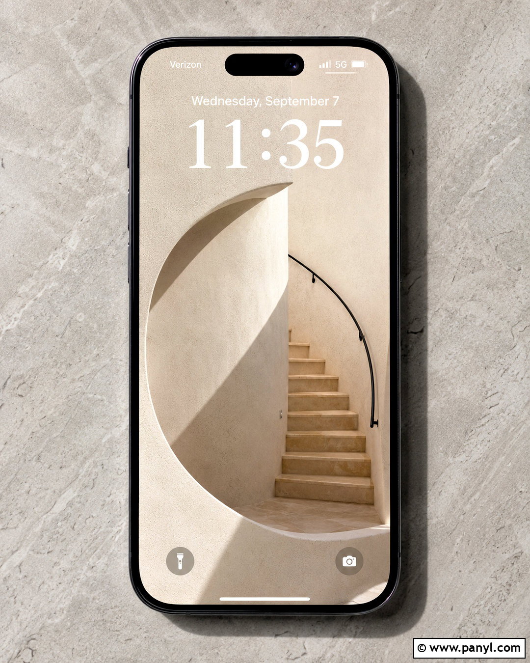
Simple architecture can give a neutral lockscreen a crisp, modern character. Choose a vertical photograph of an off-white stucco wall with one curved opening, a narrow staircase, and soft geometric shadows. Keep the upper wall mostly empty so the clock has a clean backdrop. Pale beige, warm white, and light greige should dominate, with a small matte black railing adding controlled contrast. Match the clock to the railing for a unified result. A single calendar widget can fit beneath the date without obscuring the architectural lines. This lockscreen works particularly well with modern icon sets and black, clear, or stone-colored phone cases. Straighten the perspective carefully so vertical lines align with the screen and the composition does not feel tilted or visually unbalanced.
17. Abstract Neutral Shapes Lockscreen
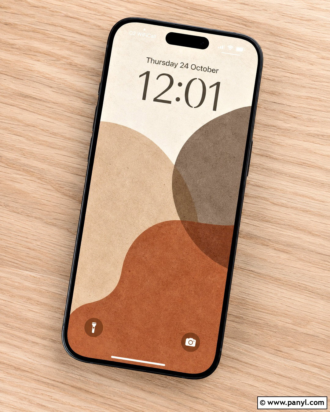
Overlapping organic shapes make a versatile neutral lockscreen that feels modern but approachable. Build the composition with large rounded forms in cream, warm beige, muted taupe, clay brown, and soft charcoal. Keep the lightest shape in the upper center to create a clear area for the clock. Add a fine grain or painted paper texture so the forms do not look overly flat. Clock lettering can be charcoal or dark brown, depending on the background behind it. Limit widgets to one small row and use matching neutral tints. This design is easy to coordinate with almost any case because it includes several related shades. Avoid tiny decorative marks and sharp color changes, which can distract from notifications and make the screen appear busier than necessary.
18. Beige Gingham Lockscreen
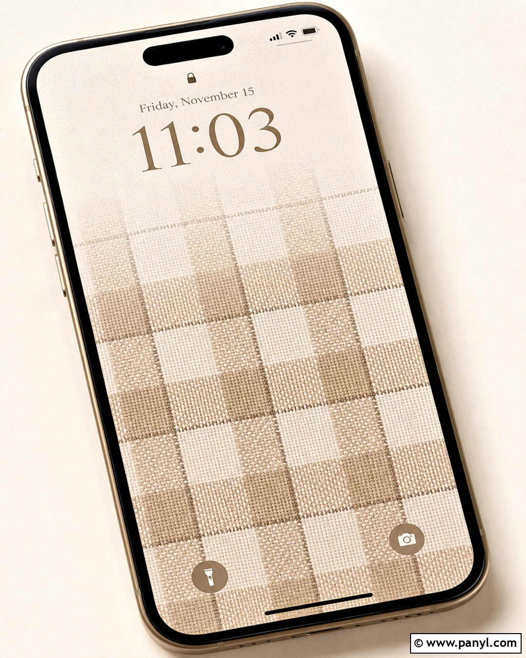
Beige gingham gives a neutral lockscreen a soft, familiar pattern that can feel cozy or lightly vintage. Choose broad checks in ivory and sandy beige, with thin taupe lines for definition. A fabric texture or slight irregularity will keep the pattern from looking like a rigid digital grid. Fade the checks near the upper center, creating a quieter section for the clock and date. Espresso brown lettering adds enough contrast while staying warmer than black. Keep widgets in simple cream boxes with rounded corners, or remove them entirely for a cleaner result. This design pairs well with cream, brown, dusty pink, or sage accessories. Use a medium-scale pattern so the checks remain visible after cropping without becoming distracting on a smaller phone screen.
19. Vintage Book Lockscreen
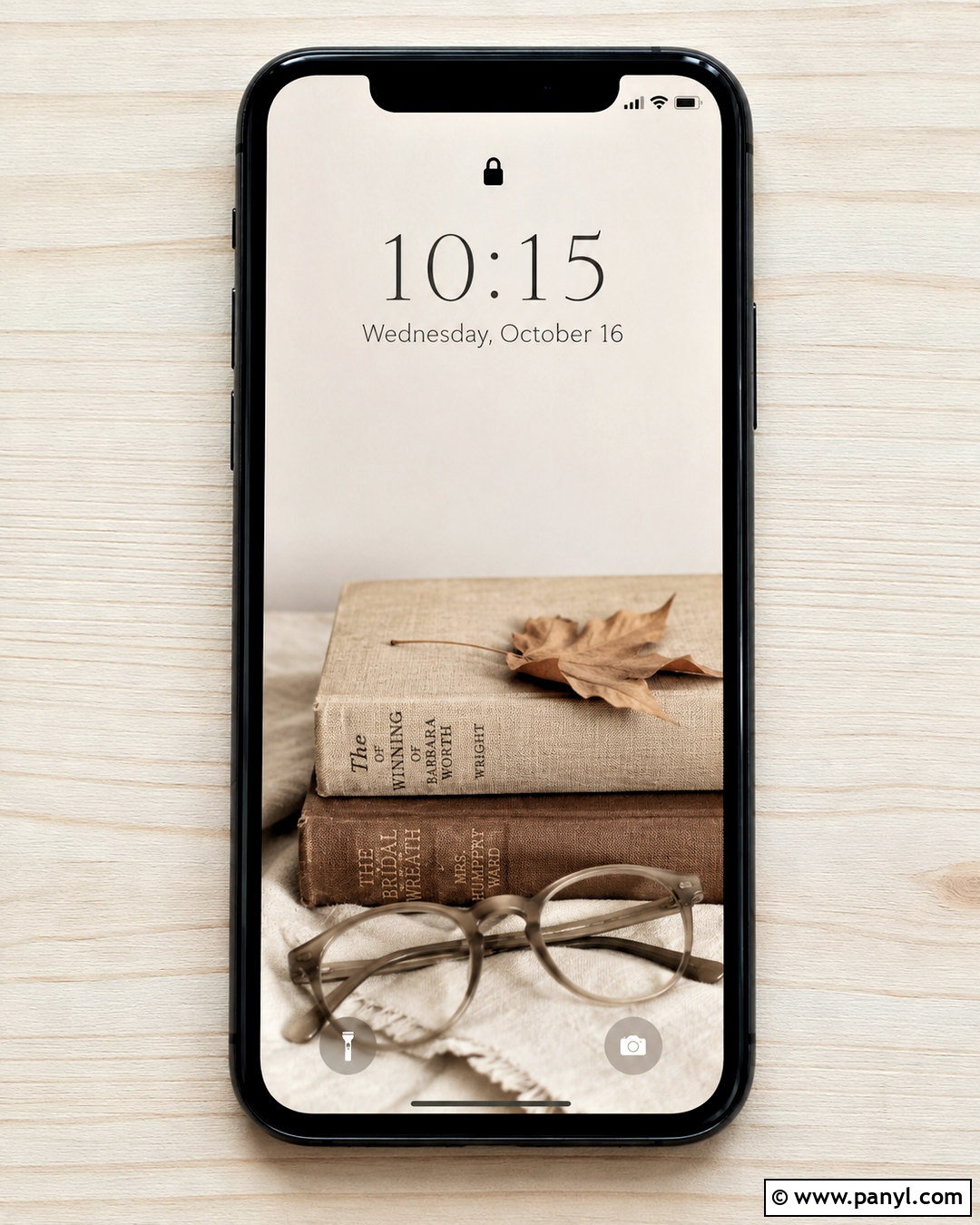
A vintage book arrangement creates a warm neutral screen with a thoughtful, collected mood. Stack two clothbound books in faded beige and mushroom brown on a light linen surface. Add a pair of neutral reading glasses and one pressed leaf near the lower edge. Photograph the arrangement from above, keeping the upper half spacious and free from printed titles. Use a dark taupe clock to match the book covers, and avoid extra widgets that might compete with the still life. Soft directional shadows will add realism while maintaining the light palette. This design looks especially cohesive with brown leather, tortoiseshell, or cream phone cases. Select restrained props and plain covers so the final lockscreen feels personal and classic rather than cluttered or heavily themed.
20. Cream Floral Lockscreen
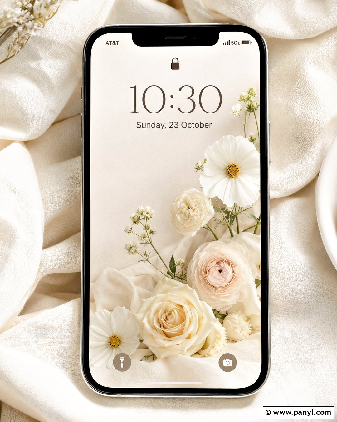
Soft cream flowers provide a romantic neutral lockscreen without introducing bright color. Use a loose arrangement of ivory roses, white cosmos, or pale beige ranunculus along the bottom and one side of the frame. Place the flowers against warm off-white linen or lightly textured plaster. Keep the upper center open for the clock, allowing only a few delicate stems to reach into that space. Dark taupe text will remain readable and connect with the flower centers and shadows. Choose transparent widgets or omit them to preserve the airy composition. This design works with cream, blush-beige, clear, or gold-accented cases. Avoid dense bouquets and pure white backgrounds, as gentle tonal differences help the petals remain visible while keeping the overall look calm and neutral.
Conclusion:
The best neutral lockscreen ideas combine a calming palette with a practical layout that keeps the time, widgets, and notifications easy to read. Warm linen, travertine, paper, wood, and stone offer subtle texture, while arches, florals, landscapes, and abstract shapes provide a stronger focal point. Whichever design you choose, reserve open space around the clock and check how the image looks after your phone crops it. Coordinate the background with your case, icons, and widget colors for a more intentional result. You can also use a detailed lockscreen with a simpler matching home screen. This creates a cohesive phone theme that feels stylish, balanced, and comfortable to use throughout the day.

Related Ideas and Inspiration:
Leave a Reply