
Neutral walls can make a home feel brighter, calmer, and easier to decorate, but the right shade does much more than simply fade into the background. The best neutral wall color ideas use thoughtful undertones to connect flooring, furniture, textiles, and architectural details. Warm whites bring softness, greige balances modern and traditional rooms, while taupe, mushroom, stone, and muted earth tones add depth without overwhelming a space. Lighting matters too. A color may appear creamy in sunlight but cooler under artificial light, so always test large samples before committing. The complete room combinations below cover airy, cozy, modern, rustic, and elegant looks, helping you find practical inspiration among these 45 Neutral Wall Color Ideas.

1. Warm White Neutral Wall Color
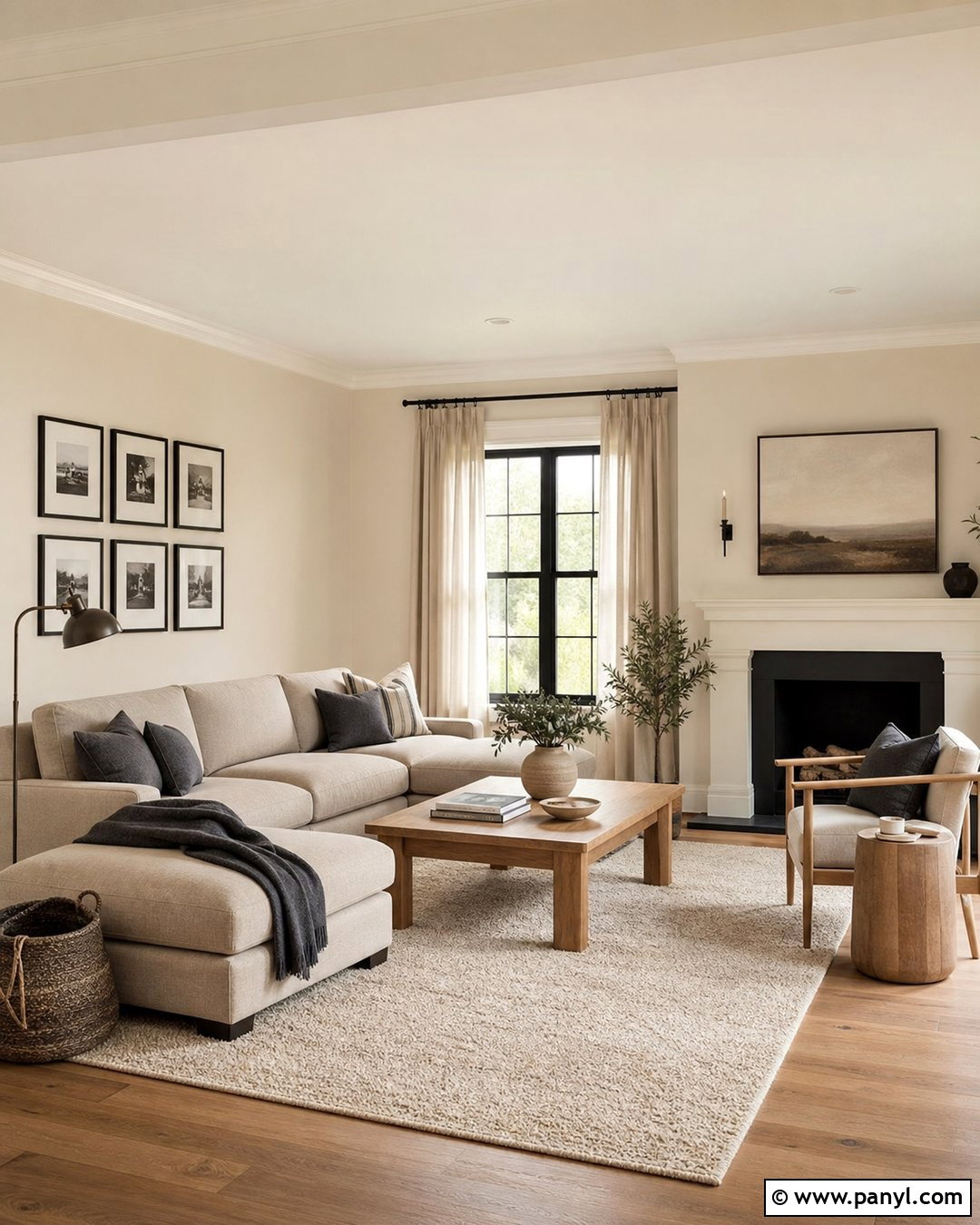
Warm white walls create an inviting living room without looking yellow or overly creamy. Pair them with a light oatmeal sofa, natural oak coffee table, and woven wool rug to reinforce the gentle warmth. Soft beige curtains can frame the windows while allowing plenty of daylight to enter. Add contrast through matte black picture frames, a bronze floor lamp, and a few charcoal-striped pillows. Medium-toned wood flooring prevents the room from feeling washed out. For a polished finish, use slightly brighter white on the trim and ceiling. This complete palette works especially well in rooms with northern exposure because its subtle cream undertone balances cooler natural light while keeping the overall space open, relaxed, and easy to update.
2. Soft Ivory Neutral Wall Color
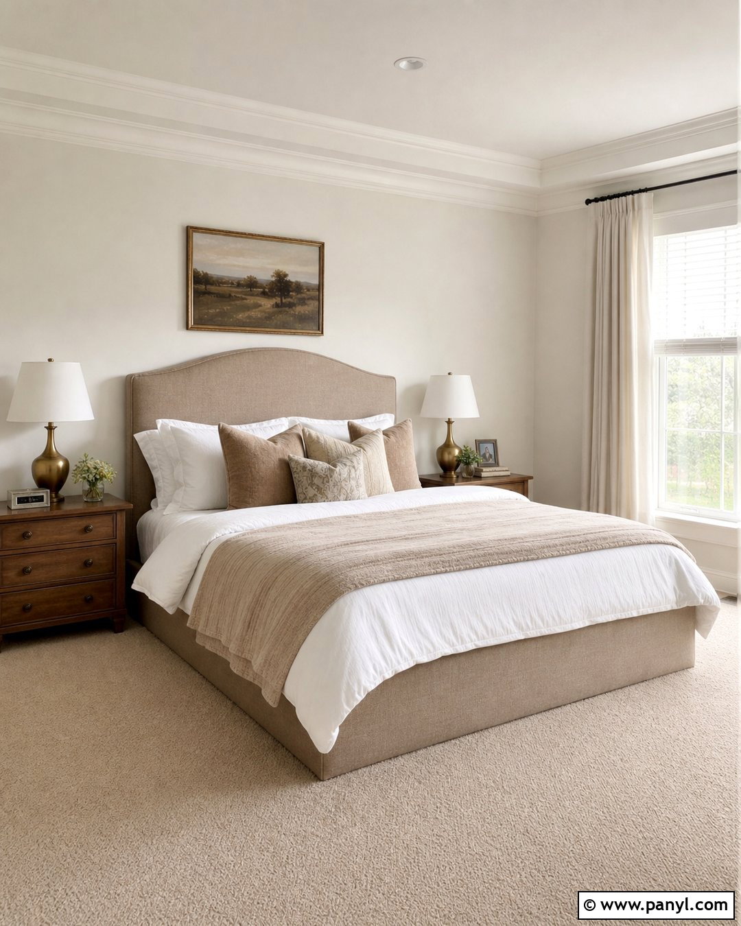
Soft ivory walls give a bedroom more warmth than crisp white while preserving a clean, restful appearance. Build the room around a padded linen headboard in pale tan, layered white and camel bedding, and medium oak nightstands. Antique brass lamps add a quiet glow and introduce a refined finish without making the design formal. Choose light beige carpeting or a large textured rug to soften the floor. Muted landscape artwork and clay-colored pillows can provide restrained color. Keep the ceiling and trim a gentle warm white so the transitions remain smooth. This neutral wall color is particularly useful in bedrooms with limited sunlight, where pure white can seem cold and gray but ivory creates a softer, more comfortable atmosphere.
3. Cream Neutral Wall Color
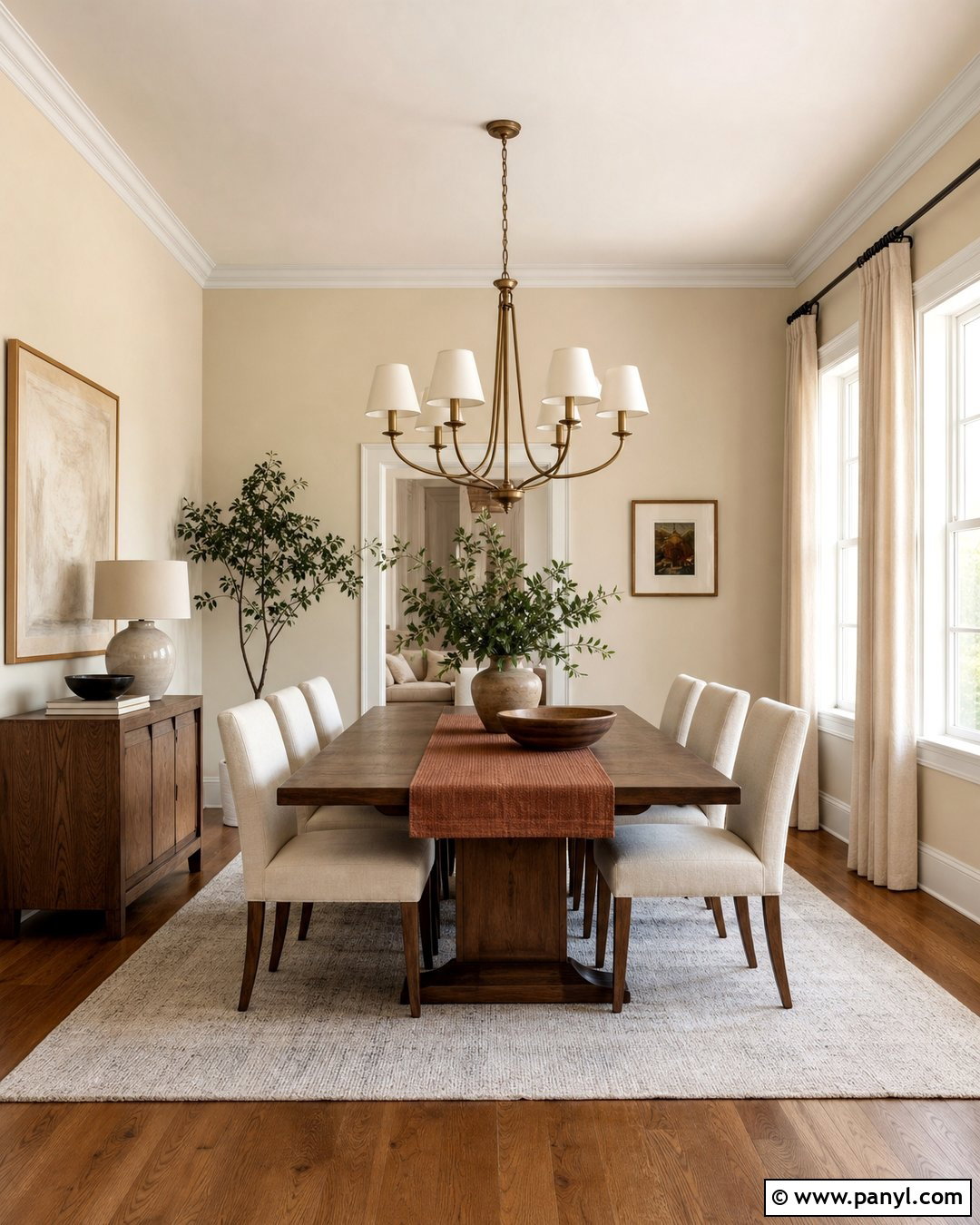
A creamy wall color can turn an everyday dining room into a warm, welcoming gathering space. Use a medium walnut dining table as the visual anchor, then surround it with woven rush chairs or upholstered seats in flax-colored fabric. An aged brass chandelier brings warmth overhead, while off-white linen curtains keep the windows soft and simple. Introduce earthy accents through ceramic bowls, framed botanical prints, and a muted rust runner. Cream walls look especially balanced beside natural woods because their yellow undertone echoes the material’s warmth. Avoid filling the room with too many matching beige pieces. Instead, layer cream, tan, brown, and black details so the finished design has clear definition, contrast, and a comfortable collected quality.
4. Off White Neutral Wall Color
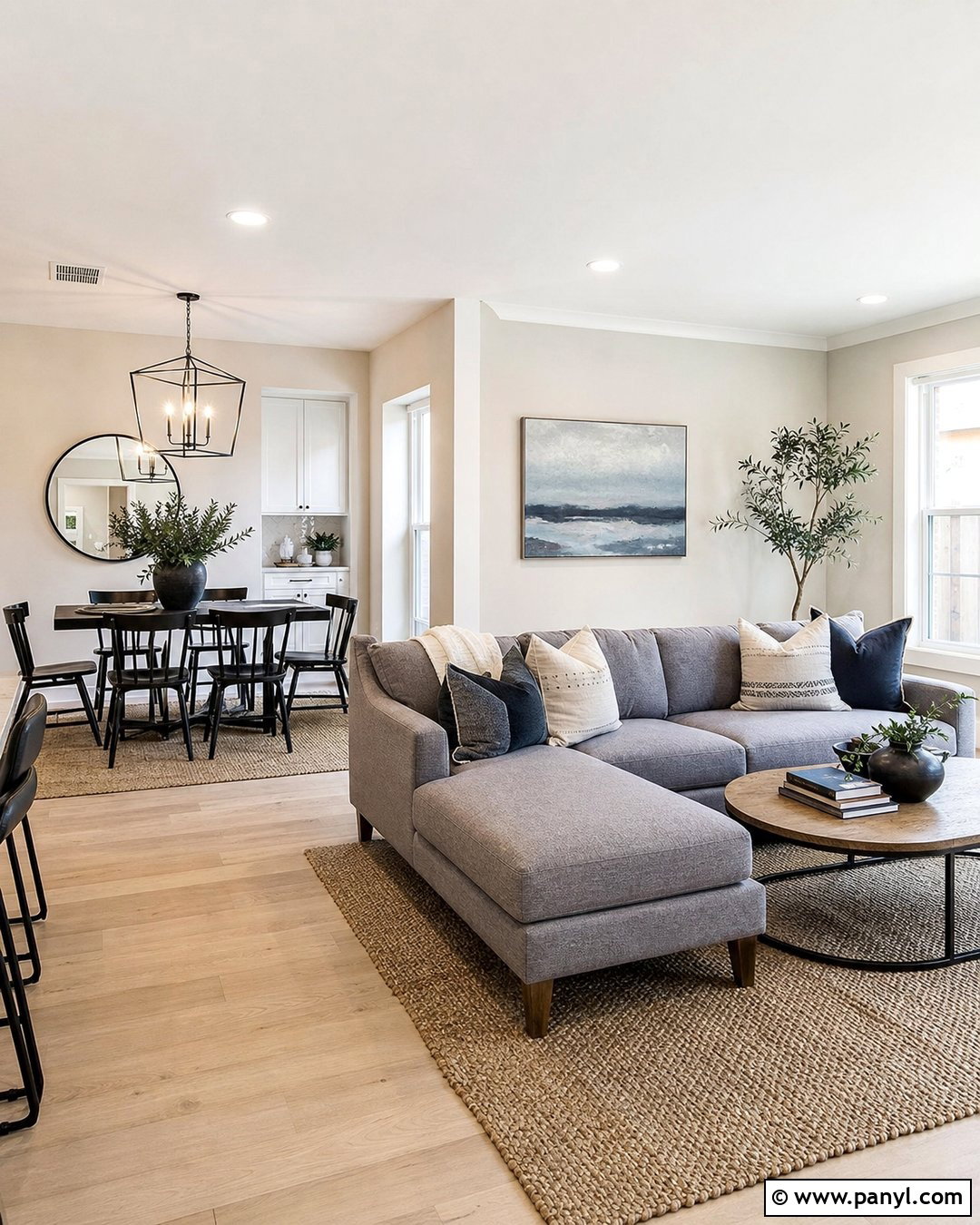
Off-white walls are an adaptable choice for an open-plan living and dining space where several finishes need to connect. Combine them with pale oak flooring, a warm gray sectional, and a slim black dining table to create a balanced transition between zones. Use a natural fiber rug beneath the seating area and a low pendant above the dining table to define each function. Soft green plants and muted blue-gray artwork can supply gentle color without interrupting the neutral scheme. Choose satin off-white for trim and a flat finish for ceilings. The slight variation in sheen creates dimension even when the colors are similar. This approach feels lighter than beige but less severe than gallery white, making it practical for busy family interiors.
5. Alabaster Neutral Wall Color
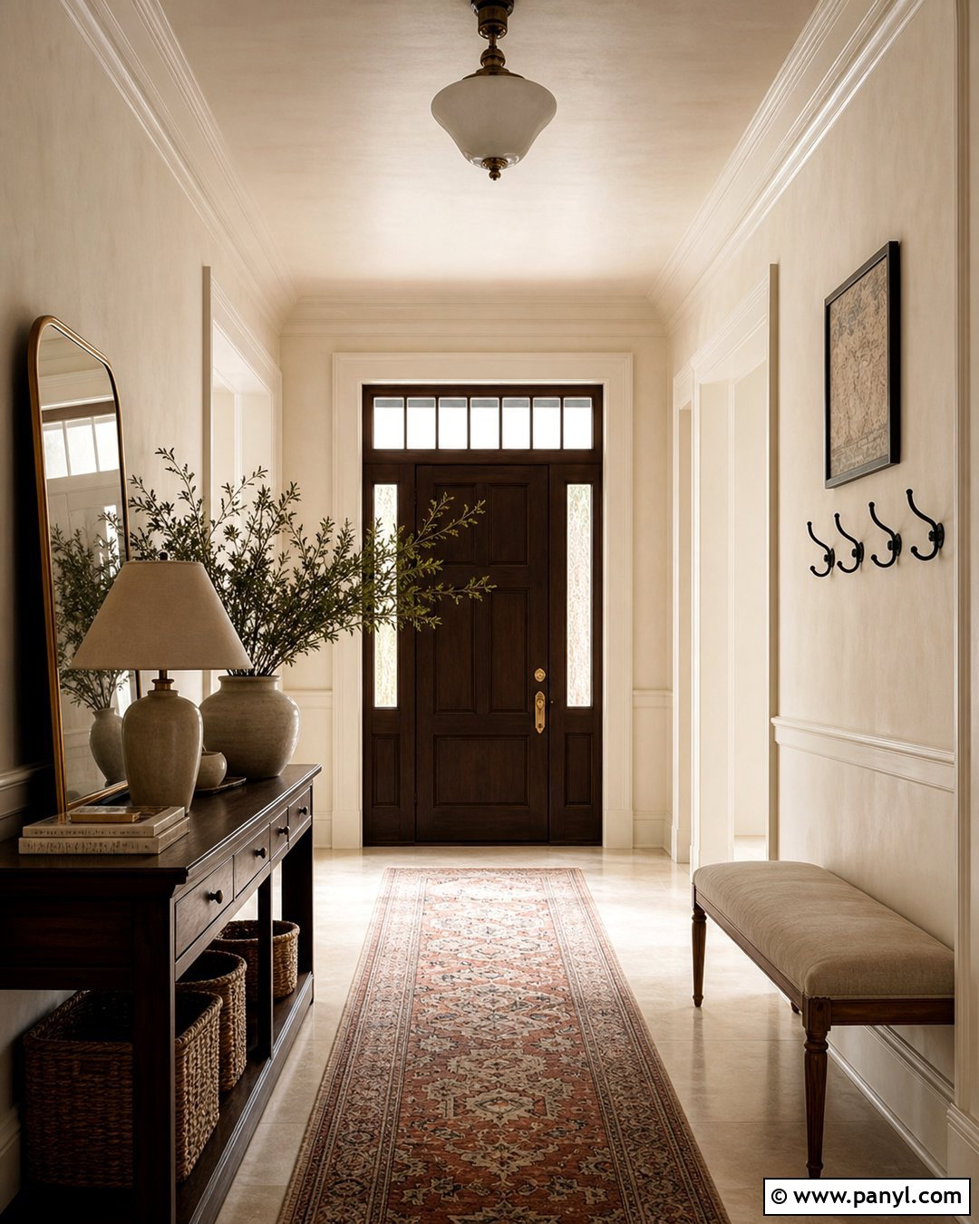
Alabaster-colored walls bring understated softness to a traditional entryway. Pair the pale, creamy surface with a dark walnut console, curved brass mirror, and a small upholstered bench in natural linen. A vintage-style runner containing beige, muted green, and faded terracotta can hide everyday wear while connecting the palette. Use black iron hooks or a dark lantern pendant to give the light walls stronger definition. If the entry includes paneling or molding, paint those details the same alabaster shade in a satin finish. The subtle sheen will highlight the architecture without introducing another color. Complete the space with a ceramic lamp and leafy branches. The result feels bright and gracious while remaining practical enough for a normal, frequently used entrance.
6. Chalk White Neutral Wall Color
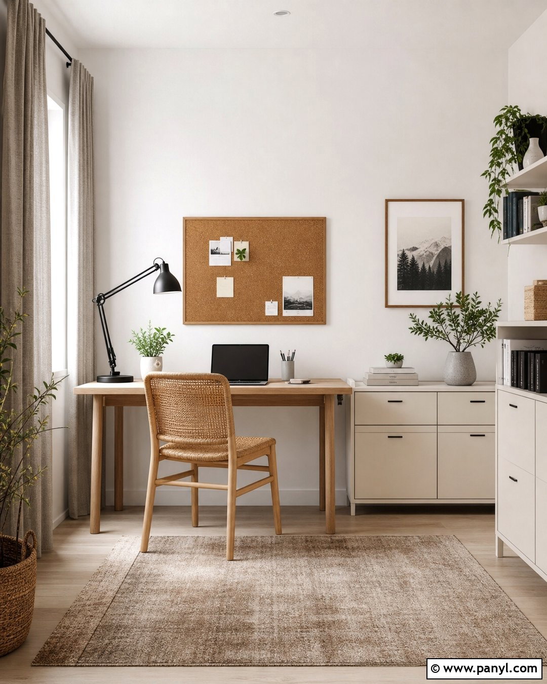
Chalk white has a muted, powdery character that works beautifully in a relaxed home office. Rather than using stark white furniture, introduce a light oak desk, woven desk chair, and low cream storage cabinets. Warm gray curtains reduce glare, while a soft taupe rug grounds the work area. Add a sculptural black lamp, cork pinboard, and simple wood frames for useful contrast. The walls should appear softly white rather than glossy or blue, creating an easy background for video calls and focused work. Keep clutter contained in matching baskets and closed drawers. A few green plants will make the room feel fresher. This complete look balances productivity with comfort and suits modern, Scandinavian, or casual transitional homes.
7. Pale Beige Neutral Wall Color
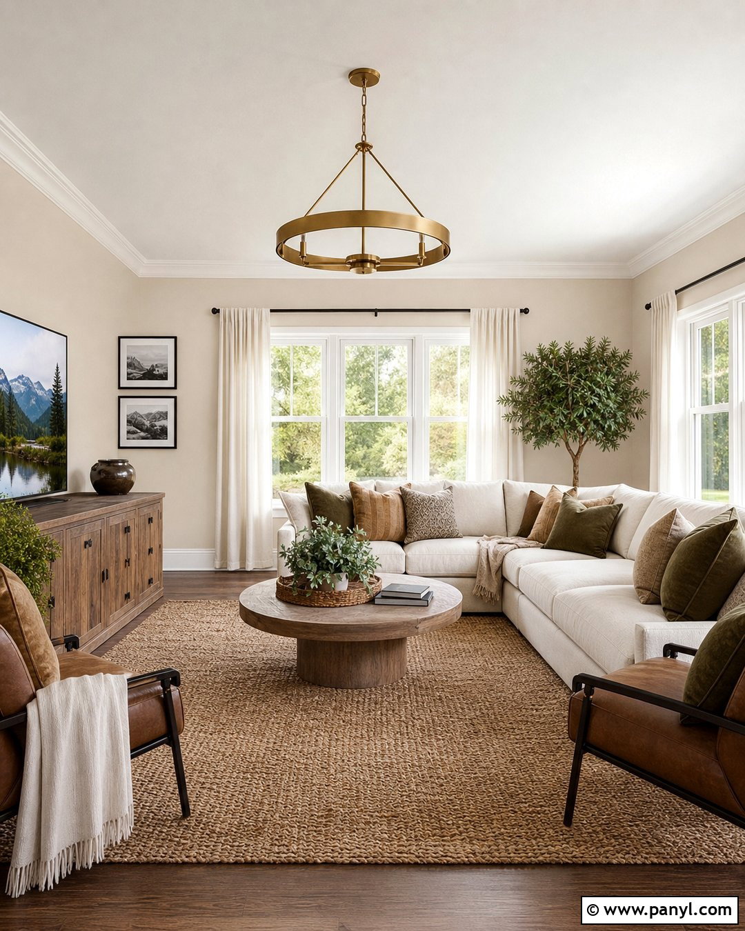
Pale beige walls create a gentle family room that feels warm without becoming visually heavy. Choose a deep cream sectional, medium oak media console, and textured jute-blend rug. Layer the seating with olive, camel, and off-white pillows to add depth while maintaining a natural palette. Simple ivory curtains can extend from ceiling to floor, making the windows appear taller. Use aged brass lighting and black-framed artwork for definition. Because pale beige may look flat beside similarly colored furniture, include several textures such as boucle, linen, woven grass, and ribbed ceramics. The finished room should feel coordinated rather than matched. This wall color is a practical bridge between warm wood flooring, white trim, and everyday furniture in mixed neutral shades.
8. Sandy Beige Neutral Wall Color
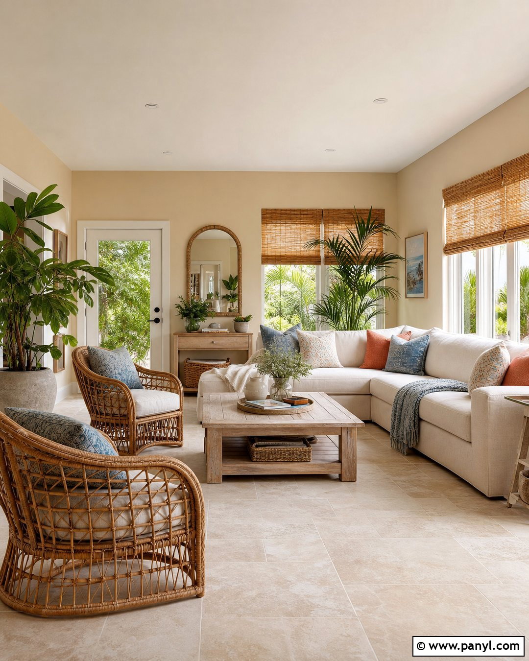
Sandy beige walls can give a sunroom an easy, nature-inspired character. Combine them with honey-toned rattan chairs, a washable cream sofa, and a bleached wood coffee table. Add cushions in faded blue, warm terracotta, and oatmeal to reference coastal colors without creating a themed room. Woven bamboo shades provide privacy and repeat the golden warmth of the walls. Stone planters and abundant green foliage complete the connection to the outdoors. Keep the ceiling bright warm white so the room still feels airy. Underfoot, select pale limestone-look tile or a durable natural fiber rug. This full palette works best when each material has visible texture, allowing the simple neutral wall color to feel layered, sunny, and comfortably lived in.
9. Oatmeal Neutral Wall Color
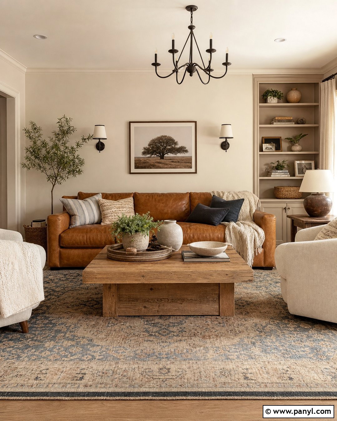
Oatmeal walls offer a cozy foundation for a casual living room filled with substantial, comfortable pieces. Start with a caramel leather sofa and two cream upholstered chairs arranged around a chunky oak coffee table. A faded patterned rug in tan, brown, and dusty blue can introduce movement beneath the furniture. Choose linen curtains close to the wall color so the windows blend into the room. Dark bronze sconces, walnut frames, and a black fireplace screen add needed contrast. Incorporate knitted throws, boucle pillows, and handmade pottery to vary the textures. This medium-light neutral is warmer than greige and quieter than golden beige. It creates a grounded room that feels welcoming through every season without depending on temporary decorative trends.
10. Linen Neutral Wall Color
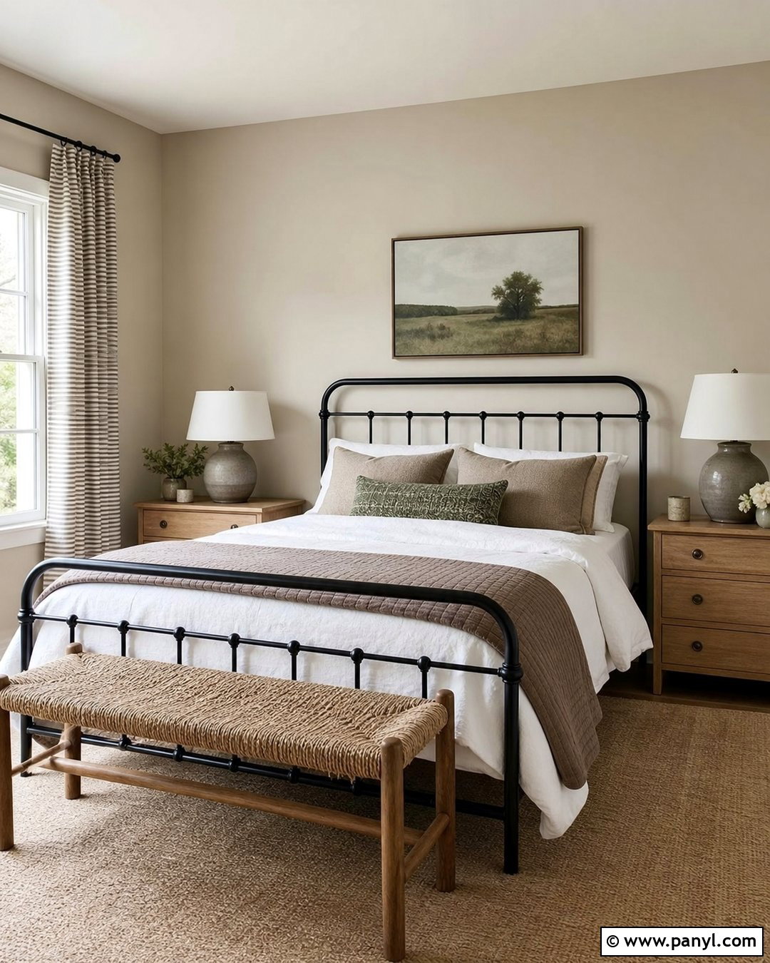
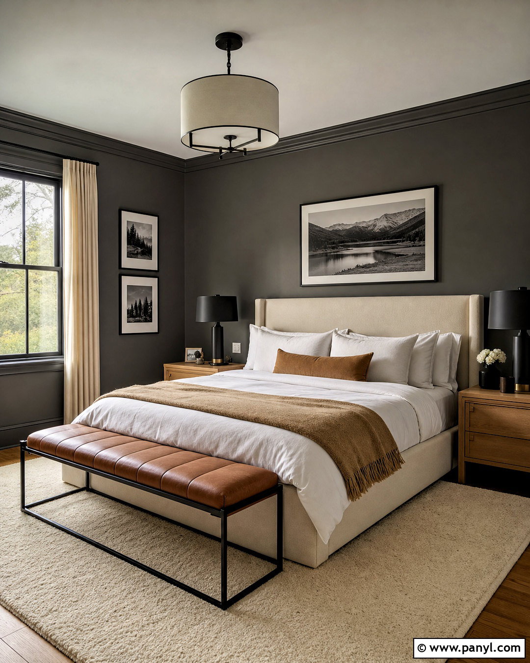
Linen-colored walls suit a calm guest bedroom where comfort and simplicity matter most. Pair them with a black metal bed, crisp white sheets, and a lightweight quilt in warm taupe. Place small oak nightstands on both sides, topped with ceramic lamps in a soft cream finish. A woven bench at the foot of the bed offers practical storage and reinforces the natural materials. Use subtle striped curtains and a low-pile beige rug for another layer of pattern. The black bed frame keeps the pale palette from becoming vague, while muted green artwork adds a restrained organic note. Linen walls have enough warmth to make white bedding appear fresh, yet they remain neutral enough to coordinate with changing blankets and seasonal accessories.
11. Natural Tan Neutral Wall Color
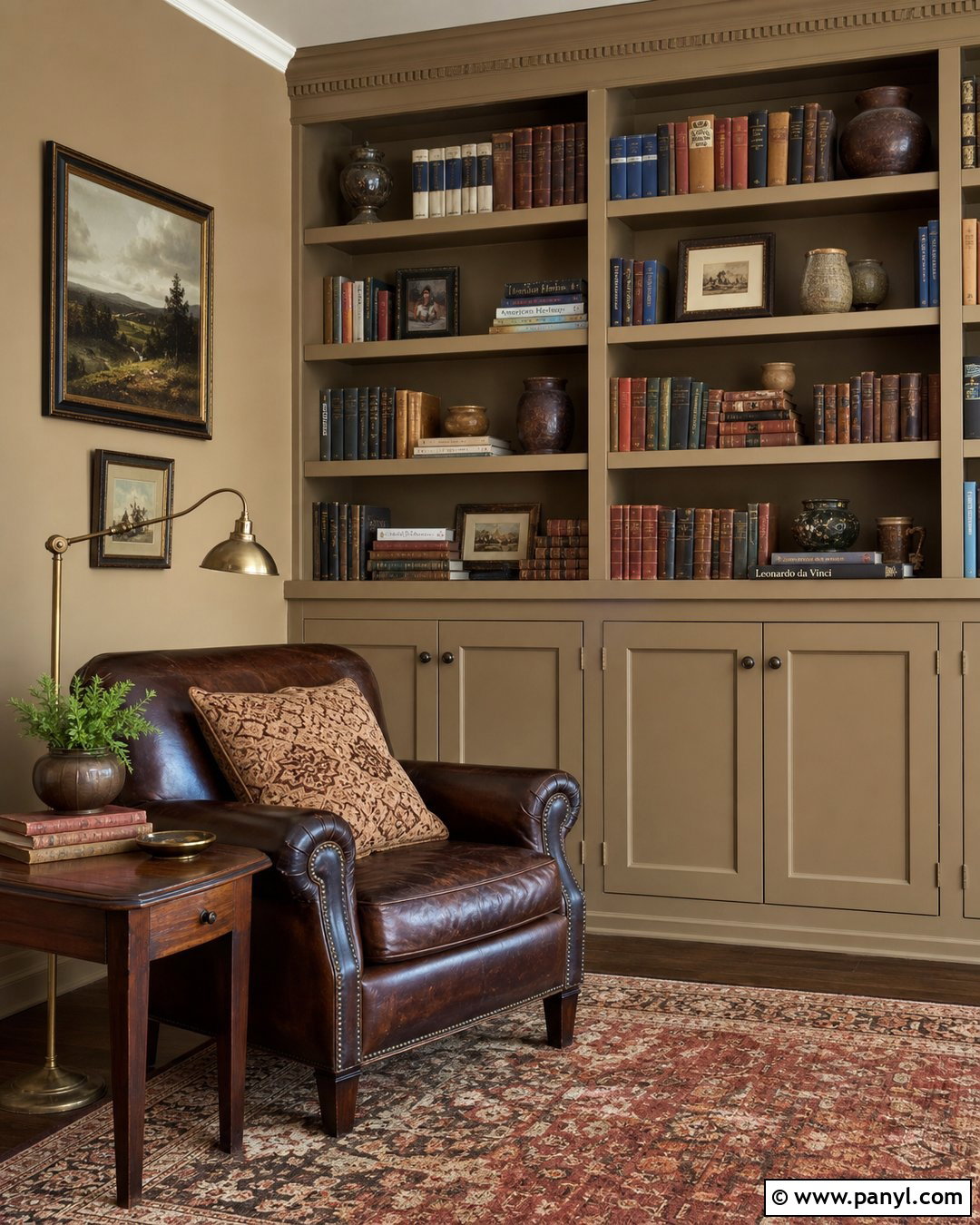
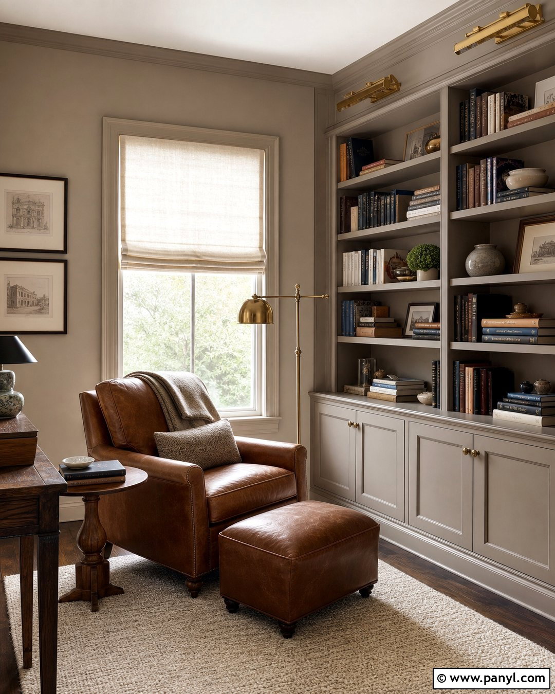
Natural tan walls can bring warmth and structure to a home library or reading room. Use built-in bookcases painted the same color for an enveloping effect, then add a chocolate brown leather chair, brass reading lamp, and small walnut side table. A patterned wool rug in rust, cream, and deep brown will create a comfortable foundation. Keep the ceiling a lighter warm white to prevent the medium-toned walls from closing in the room. Books, pottery, and framed artwork provide varied colors that look especially rich against tan. If space allows, place a low upholstered ottoman near the chair. This complete design feels established and cozy, showing how a deeper neutral can create atmosphere without relying on bold or highly saturated wall color.
12. Biscuit Neutral Wall Color
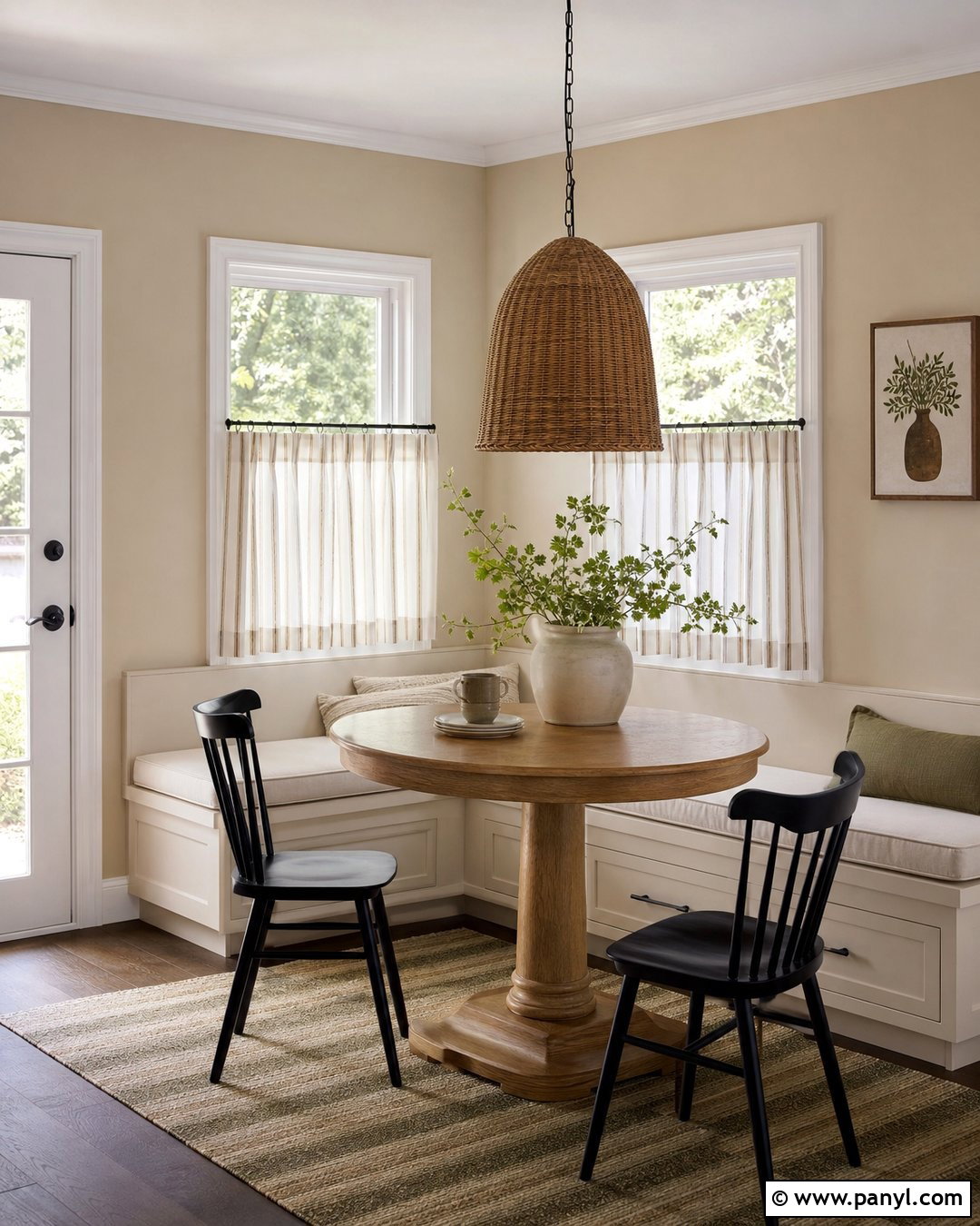
Biscuit-colored walls make a breakfast nook feel sunny and relaxed, even when the space is small. Build the seating around a compact oak pedestal table and a fitted bench covered in washable cream fabric. Add café curtains in a subtle beige stripe and a woven pendant with a simple rounded shape. Black dining chairs can introduce crisp contrast and keep the palette from feeling too sweet. Style the table with a stoneware vase and leafy stems rather than numerous small accessories. A washable patterned rug in tan and faded olive will define the nook. Biscuit sits between cream and light beige, so it coordinates naturally with white cabinetry, warm wood, and brushed brass finishes while maintaining an informal, family-friendly mood.
13. Camel Neutral Wall Color
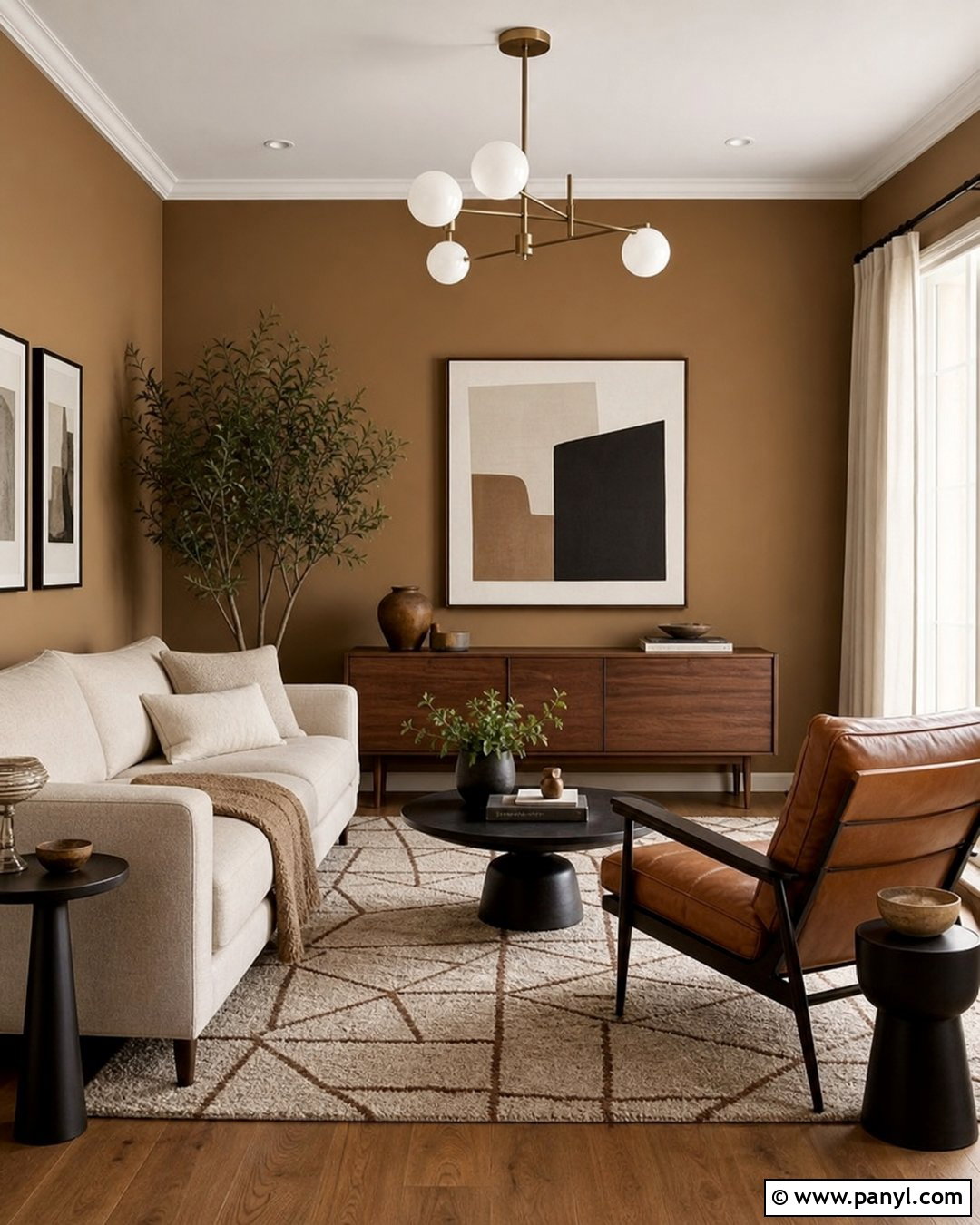
Camel walls create a confident neutral backdrop for a midcentury-inspired living room. Pair the warm color with a low walnut media cabinet, cream sofa, and cognac leather lounge chair. A geometric rug in ivory, brown, and muted orange can strengthen the period influence without making the room feel dated. Use globe lighting in opal glass and brass, then add black accents through frames and side tables. Cream curtains provide visual relief around the windows and help balance the deeper wall color. Keep decorative objects limited but sculptural, including a tall ceramic vase and one large abstract artwork. This full scheme demonstrates how a richer neutral can feel both sophisticated and comfortable when balanced with pale upholstery, clean furniture lines, and natural wood.
14. Light Khaki Neutral Wall Color
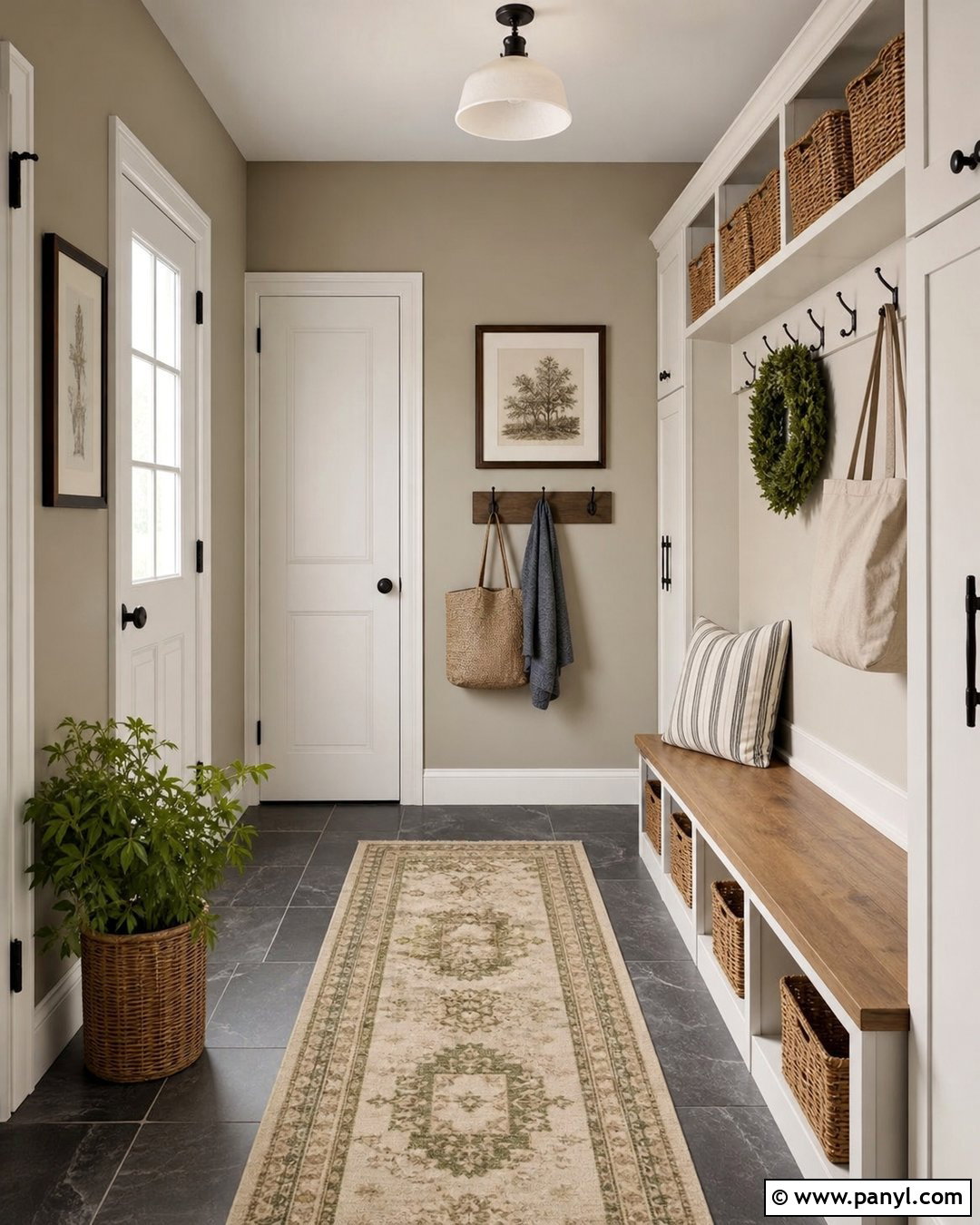
Light khaki walls provide subtle earthy color in a hardworking mudroom. Combine them with warm white cabinets, a natural oak bench, and matte black hooks. Durable slate-look flooring gives the room a darker base and hides dirt better than pale tile. Add woven baskets above the cubbies, striped seat cushions, and a washable runner in beige and olive. Khaki’s restrained green-brown undertone connects easily with outdoor gear, wood, and black metal finishes. Paint the trim a soft cream rather than sharp white to keep the contrast comfortable. Good overhead lighting is important because khaki can deepen in shadow. The completed room feels organized and grounded while offering more personality than a standard white or cool gray utility space.
15. Wheat Neutral Wall Color
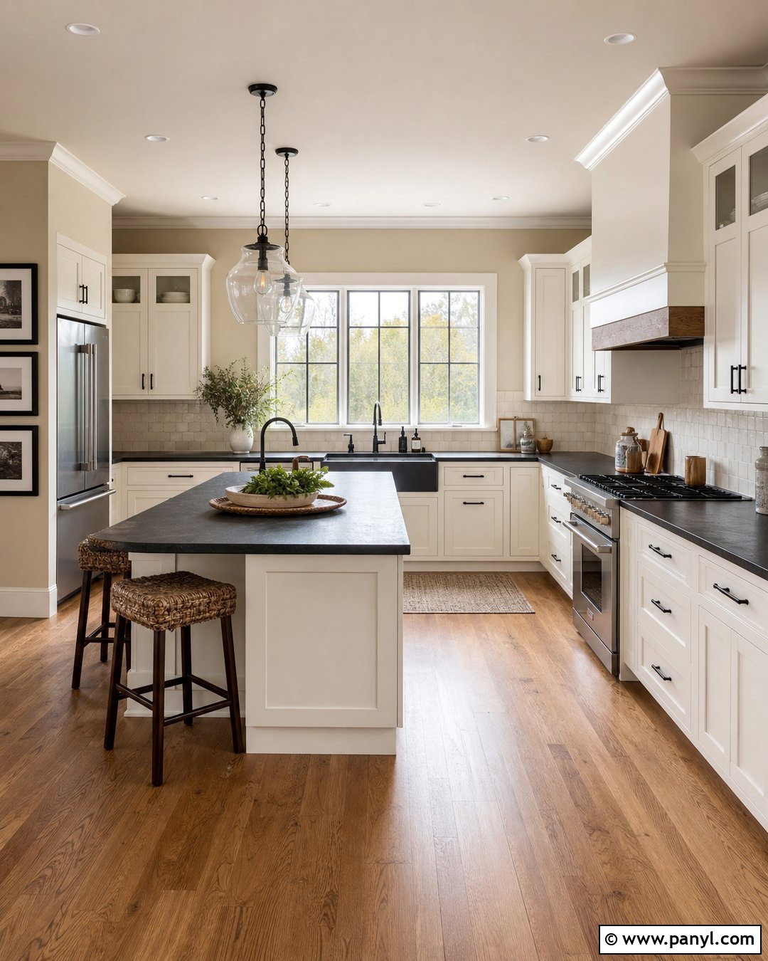
Wheat-colored walls can make a farmhouse kitchen feel warm without turning overly yellow. Use creamy white Shaker cabinets, butcher-block accents, and honed soapstone-look countertops for a balanced mix of light and dark materials. Medium oak flooring reinforces the natural palette, while black hardware adds a clean outline to the cabinetry. Hang simple glass pendants above the island and introduce woven stools with curved wooden frames. A faded runner containing tan, sage, and muted rust provides softness underfoot. Keep the backsplash quiet with handmade off-white tile and warm grout. Wheat walls tie these different finishes together and create a sunlit impression, making the kitchen feel welcoming, practical, and collected rather than overly polished or strictly themed.
16. Warm Greige Neutral Wall Color
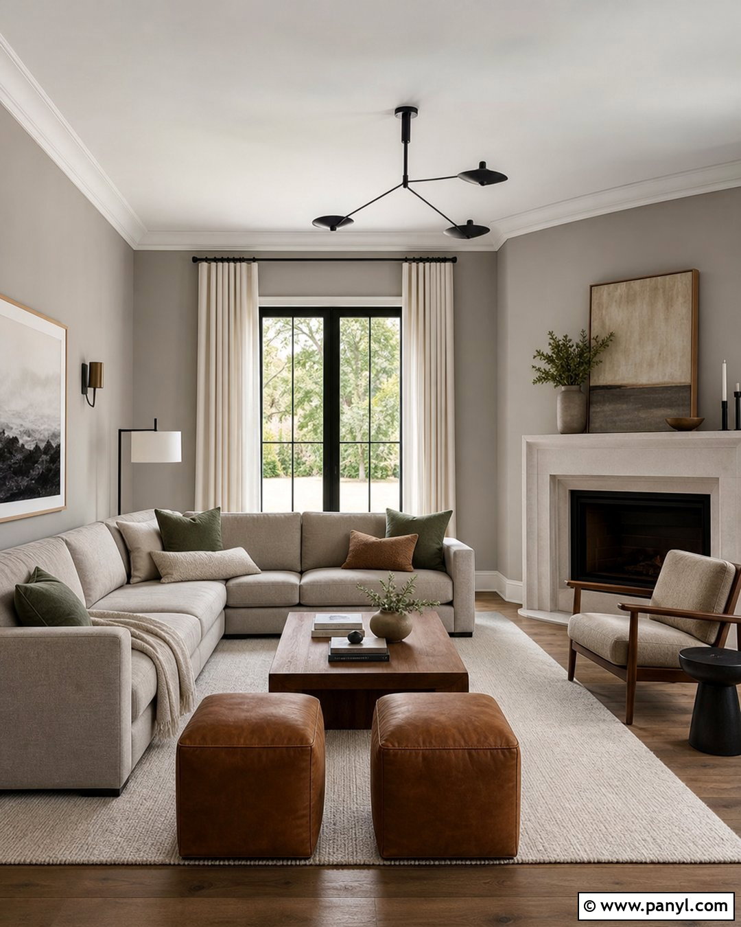
Warm greige walls are ideal for an open living room that combines gray upholstery with brown wood furniture. Choose a soft gray-beige sectional, medium walnut coffee table, and ivory wool rug. Add camel leather stools and cushions in cream, charcoal, and muted olive to strengthen the warm undertones. Long off-white curtains will keep the room bright, while black curtain rods and lighting provide definition. If there is a fireplace, use pale limestone or warm white plaster instead of cool blue-gray tile. The completed palette should shift gently between beige and gray as the daylight changes. This versatility makes warm greige useful when existing finishes do not belong entirely to either a cool or warm color family.
17. Pale Greige Neutral Wall Color
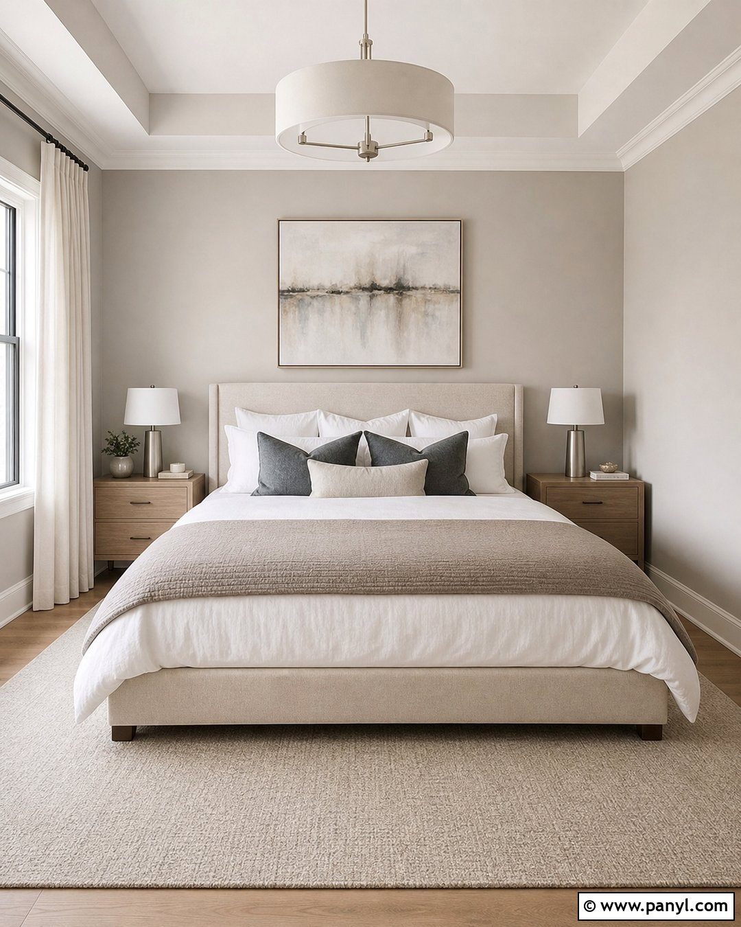
Pale greige walls create an airy primary bedroom with more depth than plain white. Pair them with an upholstered bed in oatmeal linen, white bedding, and a taupe coverlet folded across the foot. Light oak nightstands and brushed nickel lamps keep the look clean, while darker charcoal pillows establish a focal point. Select pale beige carpet or a softly patterned gray-and-cream rug. Full-length ivory drapes will warm the windows without creating strong contrast. Limit artwork to one large abstract piece containing soft brown, gray, and cream. The slight gray undertone keeps the room composed, while the beige base prevents it from feeling cold. This restful combination works well with transitional, modern, and understated luxury interiors.
18. Putty Neutral Wall Color
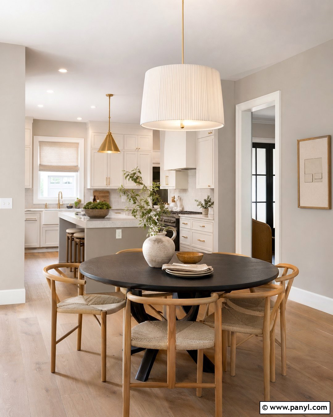
Putty walls give a kitchen dining area a grounded, architectural quality. Combine the muted gray-beige color with warm white cabinets, unlacquered brass hardware, and medium oak flooring. A round black dining table with curved wood chairs creates a strong silhouette against the understated walls. Use a simple linen pendant and cream Roman shade to keep the details soft. Display a few handmade ceramic pieces in brown, ivory, and muted green rather than colorful collections. Putty is particularly effective when the room includes stone countertops or tile with both warm and cool veining. It visually connects those mixed undertones. The finished space feels substantial and calm, offering more character than off-white while remaining flexible enough for everyday decorating changes.
19. Mushroom Neutral Wall Color
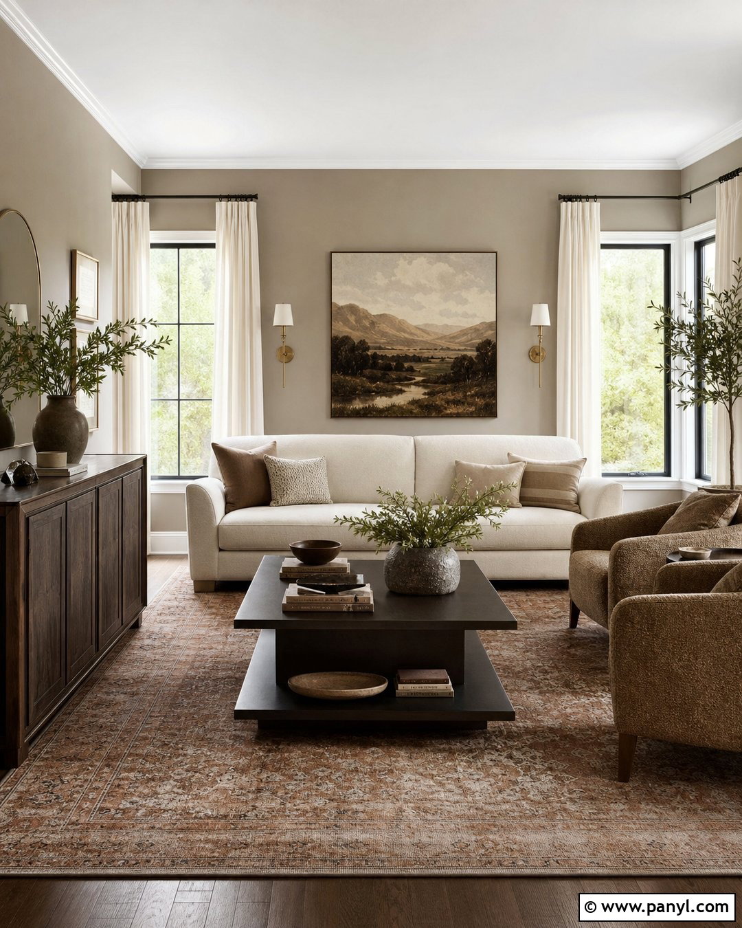
Mushroom walls make a living room feel cozy, tailored, and quietly dramatic. Choose a cream sofa, dark walnut console, and two armchairs covered in textured tan fabric. A vintage-style rug with faded brown, rust, and gray details can unite the furniture while adding history. Install antique brass sconces and use dark bronze curtain rods for polished contrast. Curtains in warm ivory will brighten the room and keep the medium wall tone from becoming heavy. Add one oversized landscape painting and a few stoneware accessories rather than many small decorations. Mushroom contains gray, brown, and sometimes a slight mauve undertone, so testing is essential. When coordinated carefully, it produces a rich neutral room that changes beautifully with daylight.
20. Taupe Neutral Wall Color
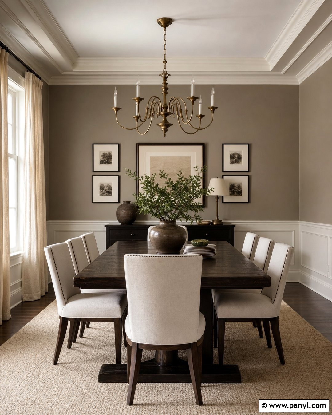
Classic taupe walls can transform a formal dining room into a warm and elegant setting. Pair the color with a long dark oak table, upholstered linen chairs, and a large cream rug. A sculptural chandelier in aged brass adds a refined focal point without competing with the walls. Use full-length ivory curtains and paint the trim a softer cream to create gentle contrast. Black-framed artwork, brown ceramic vessels, and a muted green centerpiece can deepen the palette. Taupe works best when its brown undertone is repeated in wood, leather, or woven materials. Avoid pairing it only with cold silver and blue-gray pieces. A complete warm scheme allows this sophisticated neutral to feel intentional, comfortable, and suitable for both everyday meals and gatherings.
21. Rosy Taupe Neutral Wall Color
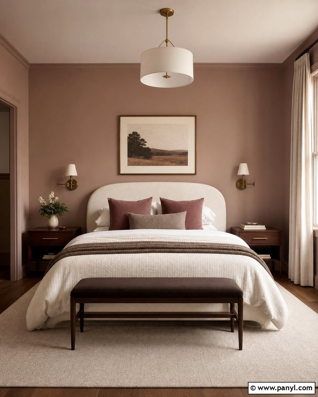
Rosy taupe walls offer gentle warmth for a bedroom without looking noticeably pink. Build the room around a curved cream headboard, walnut nightstands, and layered bedding in ivory, cocoa, and dusty mauve. Use antique brass sconces and a pale wool rug to reinforce the soft, polished character. Curtains in natural linen should be slightly lighter than the walls, creating subtle separation around the windows. Add artwork with muted terracotta, brown, and charcoal details. The room needs a few dark elements, such as black frames or a deep brown bench, to prevent the palette from appearing overly delicate. This nuanced neutral works especially well with warm woods and soft textiles, producing a restful bedroom that feels distinctive but still easy to live with.
22. Gray Taupe Neutral Wall Color
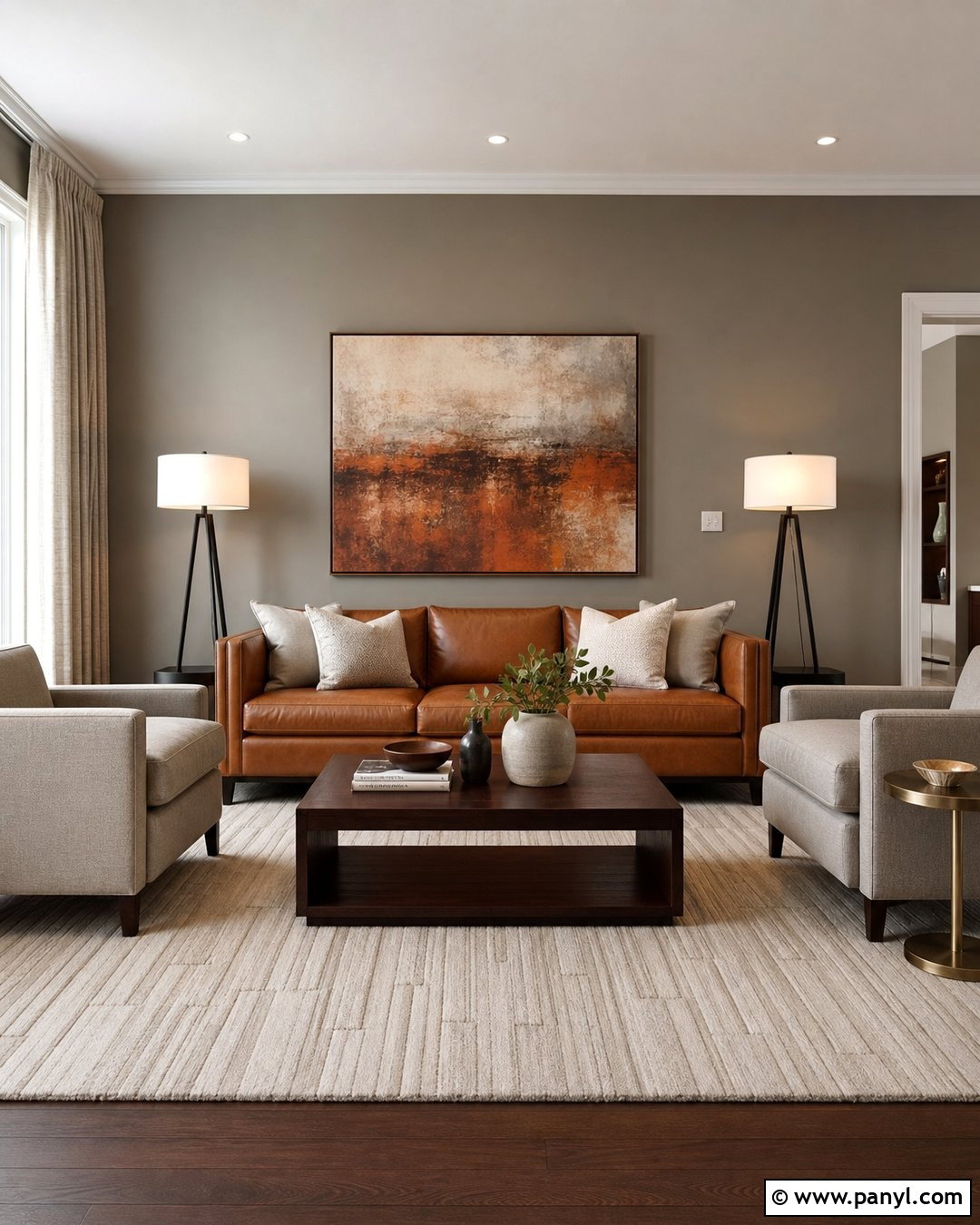
Gray taupe walls provide a sophisticated bridge between cool flooring and warm furniture. In a contemporary living room, pair them with a camel leather sofa, pale gray lounge chairs, and a dark oak coffee table. Use a cream rug with a subtle linear pattern to brighten the center of the room. Matte black floor lamps and window hardware add clean contrast, while brushed brass accessories prevent the scheme from becoming cold. Choose curtains in soft stone rather than stark white. A large abstract artwork containing charcoal, beige, and rust can connect every major color. This balanced approach lets gray taupe shift with the light while maintaining enough warmth to complement wood, leather, wool, and mixed metallic finishes.
23. Mocha Neutral Wall Color
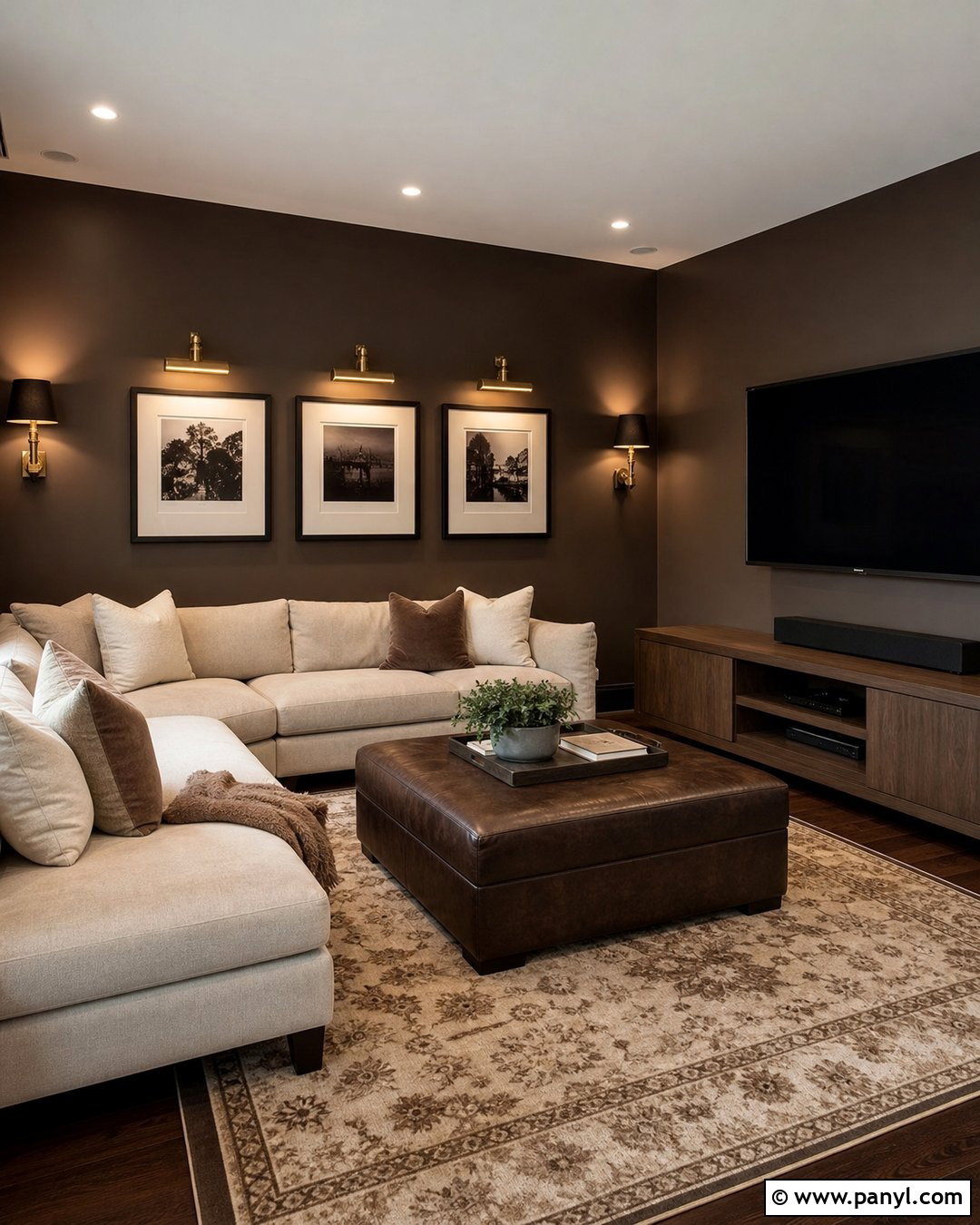
Mocha walls create a deep, comfortable background for a media room or den. Use a generous oatmeal sectional, dark brown leather ottoman, and low walnut media cabinet. Add a thick patterned rug in cream, cocoa, and charcoal to brighten the floor and absorb sound. Wall-mounted brass picture lights can illuminate framed artwork, while black sconces provide focused reading light. Keep window treatments close to the wall color for a seamless, cocooning effect. Cream pillows and a soft ivory throw will prevent the seating area from disappearing into the darker palette. Mocha is a strong neutral, so balanced lighting and pale upholstery are essential. The finished room feels intimate and polished without requiring bright accent colors or elaborate decoration.
24. Cocoa Neutral Wall Color
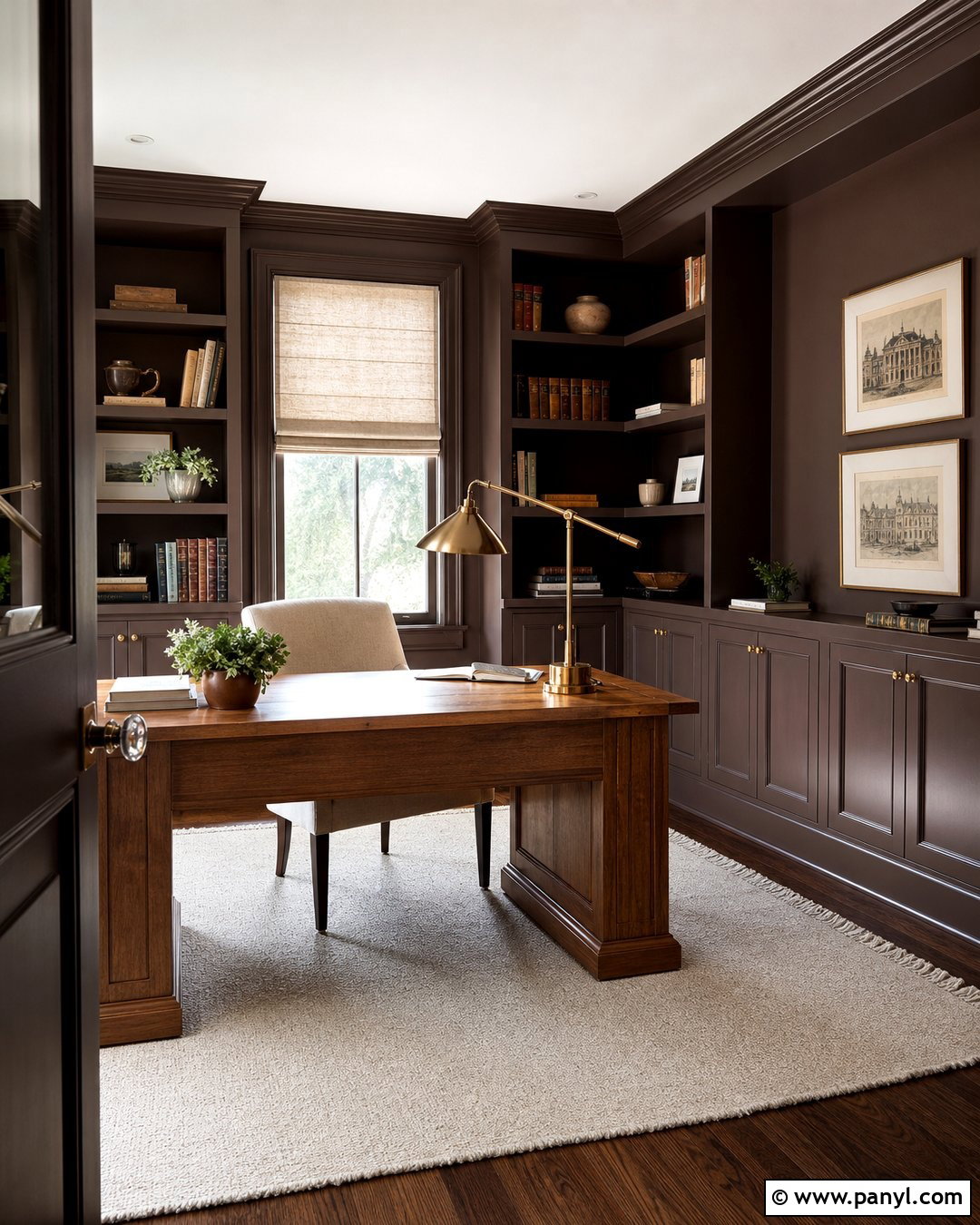
Cocoa-colored walls can give a home office a focused, library-like atmosphere. Pair them with a substantial oak desk, cream upholstered chair, and built-in shelving painted in the same brown neutral. Use an ivory flat-weave rug to brighten the floor and linen Roman shades to soften the windows. A brass desk lamp and small framed prints add character while maintaining an orderly look. Incorporate closed cabinetry along the lower shelves so supplies remain hidden. A pale ceiling creates needed lift above the darker walls, especially in a compact room. Cocoa works well with natural leather, warm metals, and visible wood grain. Together, these materials create a productive workspace that feels composed, comfortable, and more personal than a conventional white office.
25. Stone Neutral Wall Color
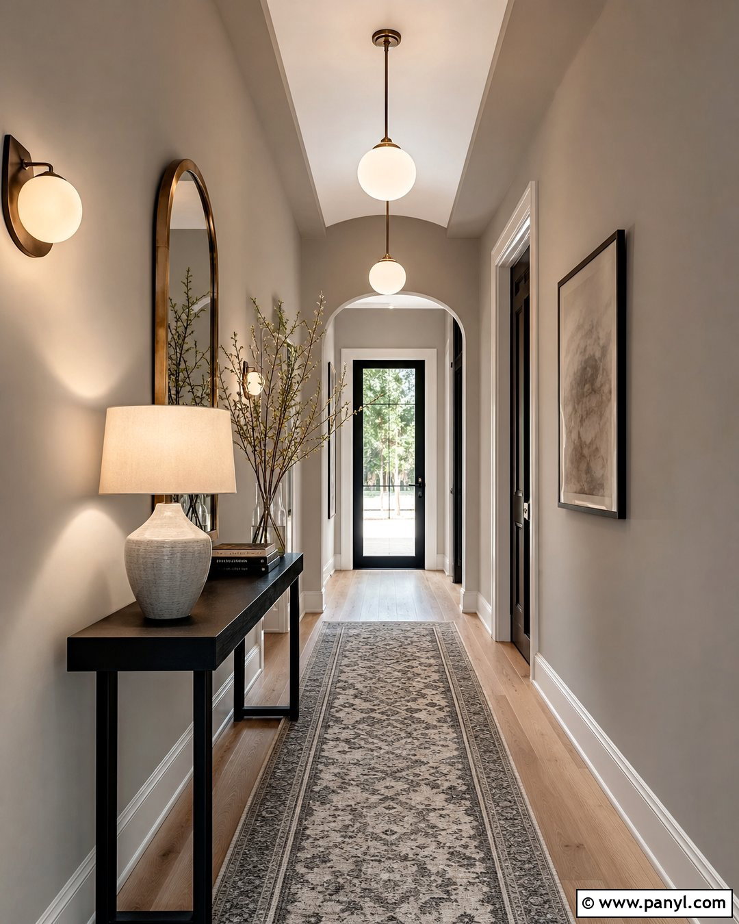
Stone-colored walls bring quiet texture to a modern entryway or hallway. Combine them with pale oak flooring, a slim black console, and an oversized round mirror with a bronze frame. A narrow runner in beige, charcoal, and muted blue can add pattern without crowding the passage. Use simple globe sconces and one ceramic table lamp for layered lighting. If the hallway includes doors, paint them warm white so they remain clearly defined against the walls. Stone neutrals often contain both gray and beige, making them useful for connecting mixed flooring, metal, and furniture finishes. Keep decorative pieces large and limited. A bowl, stacked books, and a tall branch arrangement are enough to make the completed space feel welcoming rather than cluttered.
26. Limestone Neutral Wall Color
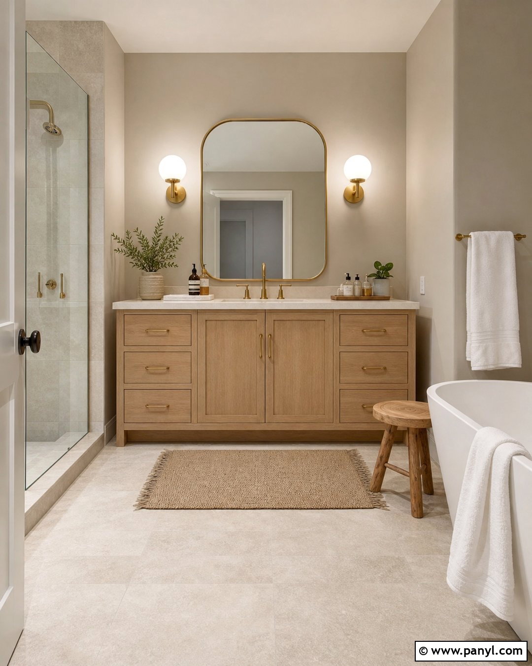
Limestone walls can make a bathroom feel calm, bright, and connected to natural materials. Pair the soft beige-gray paint with a white oak vanity, creamy quartz countertop, and brushed brass fixtures. Use large-format porcelain tile in a pale stone finish on the floor and inside the shower. A rounded mirror and simple globe sconces will soften the clean lines. Add white towels, a woven bath mat, and one small wooden stool for warmth. The wall color should complement the tile without matching it exactly, creating subtle layers rather than a flat beige box. With practical storage and minimal accessories, this complete bathroom feels fresh and spa-like while remaining realistic for an average home and easy to maintain.
27. Clay Beige Neutral Wall Color
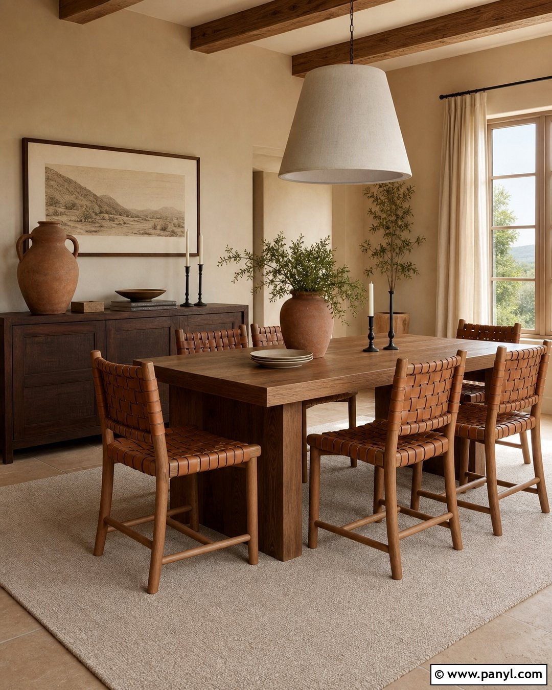
Clay beige walls introduce an earthy warmth that suits a relaxed dining room. Use a solid oak table, woven leather chairs, and a low sideboard in dark brown wood. A large linen pendant provides soft texture overhead, while an ivory rug lightens the floor. Add muted terracotta pottery, black candlesticks, and simple botanical branches as restrained accents. Natural linen curtains can be selected one shade lighter than the walls. Clay beige has a subtle red or orange base, so it pairs naturally with cognac leather, rust textiles, and warm woods. Keep the trim creamy rather than brilliant white. This complete palette feels grounded and sun-warmed, but its muted colors ensure the dining space remains neutral, versatile, and comfortable throughout the year.
28. Plaster Neutral Wall Color
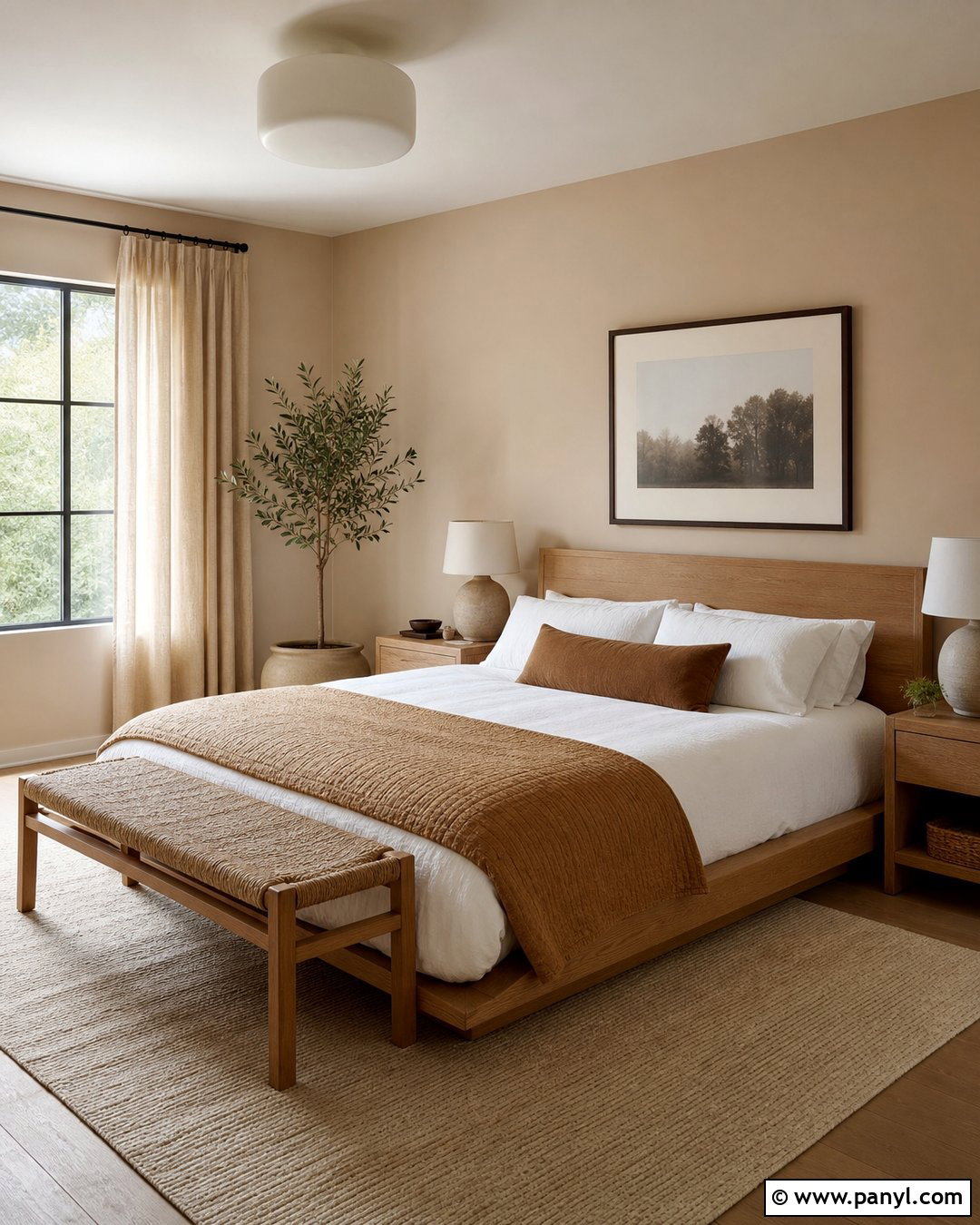
Plaster-colored walls give a bedroom a soft, handmade appearance, even when standard smooth drywall is used. Choose a shade that falls between warm beige and dusty blush, then pair it with an oak platform bed and relaxed white linen bedding. Add a camel quilt, woven bench, and small ceramic lamps with matte finishes. Natural fiber curtains and a pale textured rug will reinforce the organic character. Keep furniture shapes simple and avoid shiny chrome or high-gloss surfaces. A few dark brown accents, such as picture frames and a wood stool, provide structure. The resulting bedroom feels warm and tactile, with the muted wall color acting as part of the complete material palette rather than a separate decorative statement.
29. Pale Terracotta Neutral Wall Color
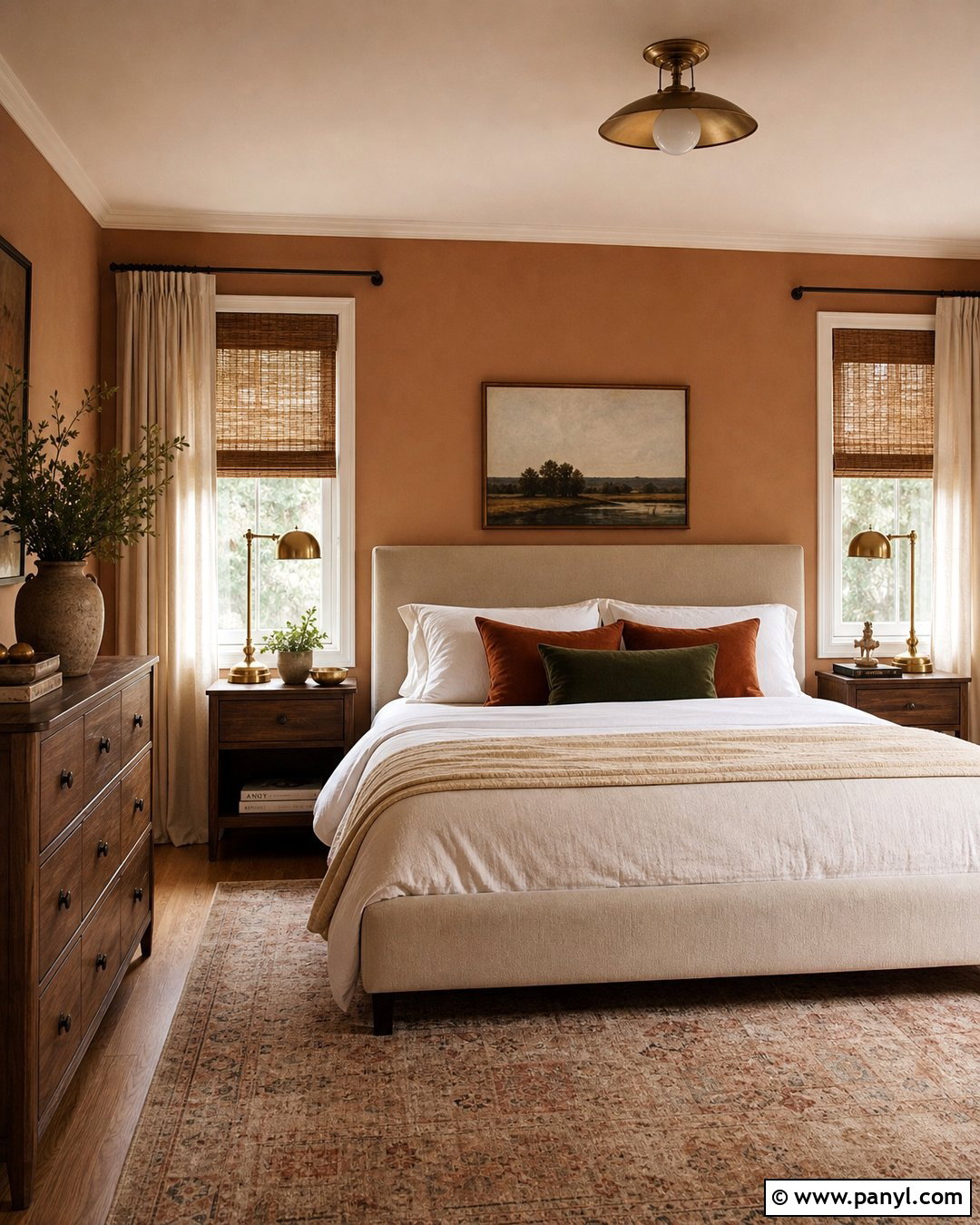
Pale terracotta can function as a neutral when its orange and pink tones are softened with beige. Use it in a cozy guest room with a cream upholstered bed, medium walnut nightstands, and white cotton bedding. Layer the bed with a sand-colored coverlet and pillows in muted rust, olive, and oatmeal. Woven shades and ivory curtains will keep the windows light while repeating natural textures. Add antique brass lamps and a faded patterned rug for a collected look. The ceiling and trim should remain warm white to balance the earthy walls. This complete scheme offers more personality than beige but stays calm because every color is muted. It works especially well with handmade pottery, natural wood, and simple botanical artwork.
30. Dusty Blush Neutral Wall Color
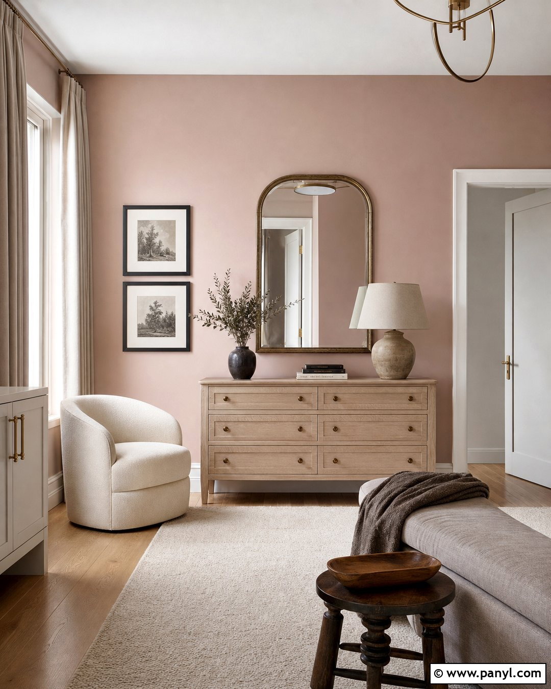
Dusty blush walls create a subtle neutral backdrop for a sophisticated dressing room or bedroom. Pair them with a cream boucle chair, light oak dresser, and an arched mirror in aged brass. Use an ivory rug and oatmeal curtains to keep the room grounded in warm neutrals. Introduce deeper contrast through chocolate brown frames, a walnut stool, or black lamp bases. Bedding or upholstery should combine cream, taupe, and muted rose without becoming overly coordinated. The key is choosing a blush with plenty of beige or gray, allowing it to read as atmospheric rather than sugary. The finished room feels soft and flattering while still mature, practical, and compatible with traditional, modern, or transitional furniture.
31. Soft Peach Neutral Wall Color
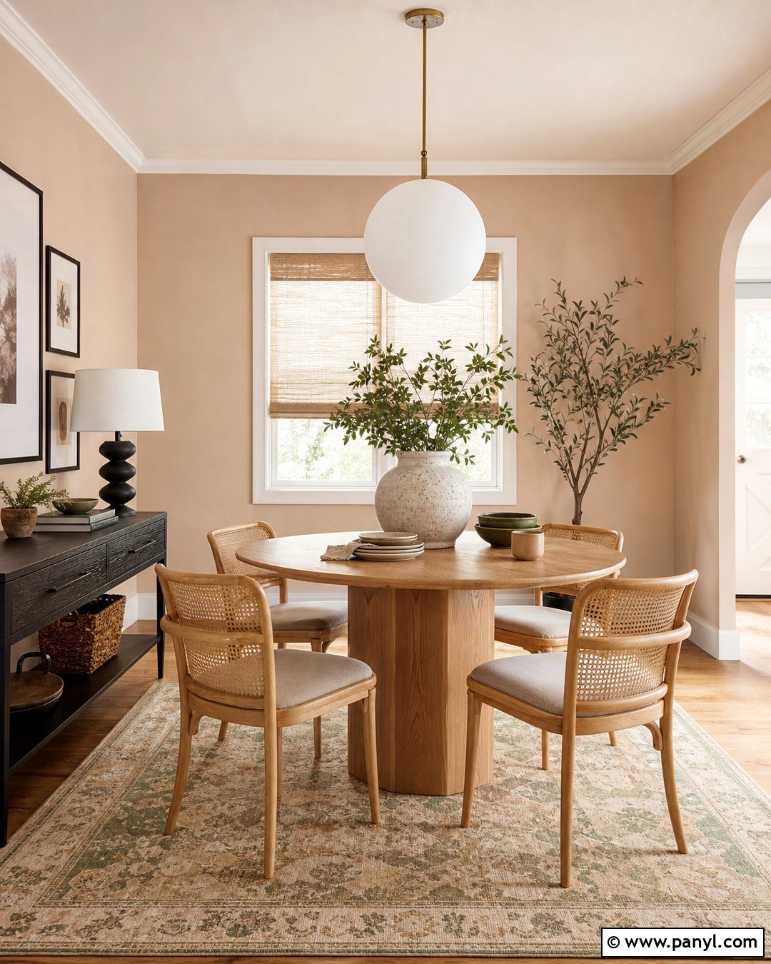
Soft peach walls can brighten a small breakfast room while maintaining a restrained, neutral character. Choose a pale shade with beige undertones, then add a round oak table and four cream or natural cane chairs. A white globe pendant keeps the overhead view simple and modern. Use woven shades, warm white trim, and a washable rug containing sand, rust, and faded green. Black picture frames and a slim dark console create enough contrast to sharpen the palette. Complete the room with stoneware dishes and leafy branches. Peach reflects warm light beautifully, but it should be tested beside flooring and cabinetry to avoid becoming too orange. In this balanced design, it feels sunny, welcoming, and surprisingly versatile.
32. Pale Olive Neutral Wall Color
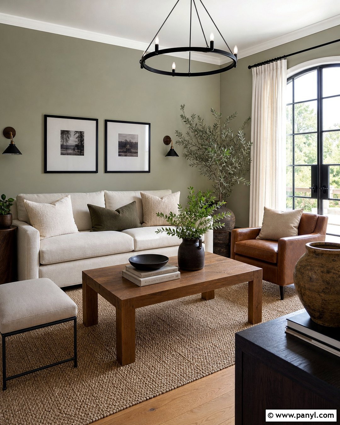
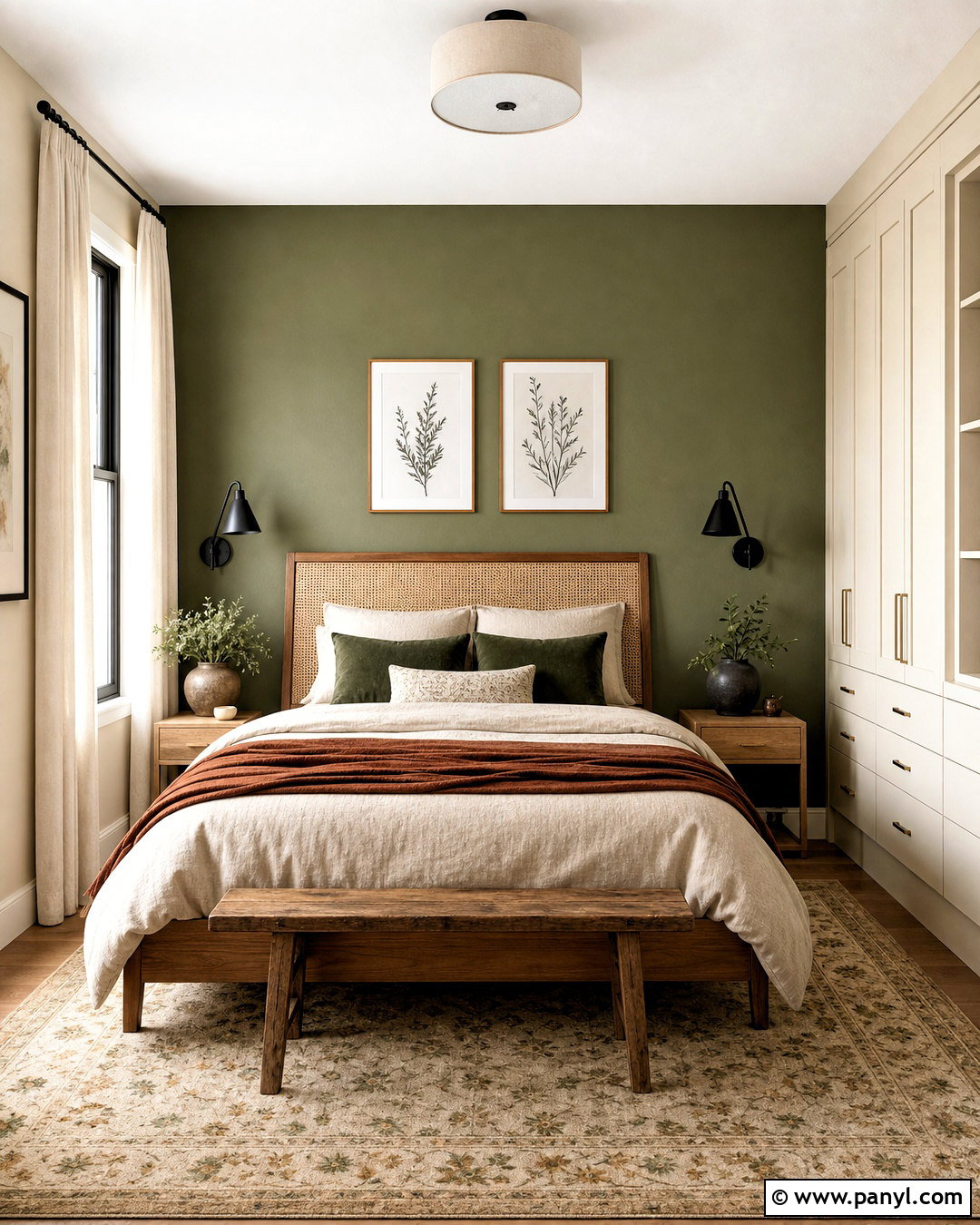
Pale olive walls bring subtle natural color to a living room while remaining quiet enough for everyday use. Pair them with a cream sofa, cognac leather chair, and medium oak coffee table. A textured beige rug establishes a soft foundation, while dark bronze lighting and black frames provide contrast. Use linen curtains in warm white to keep the windows bright. Pillows in oatmeal, muted brown, and deeper olive can build a layered palette without introducing unrelated colors. Add a few plants, but vary their shapes so the room does not feel themed around greenery. This complete look works because the gray-brown undertone of pale olive connects comfortably with wood, stone, leather, and woven fibers, creating a grounded but airy interior.
33. Sage Gray Neutral Wall Color
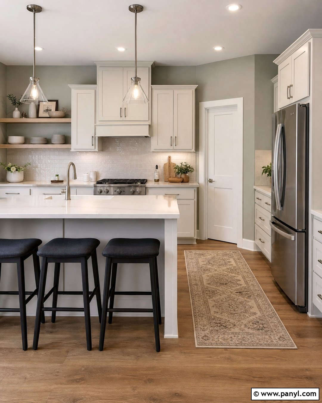
Sage gray walls are a smart choice for a calm kitchen with mixed natural finishes. Combine them with warm white cabinets, pale oak shelving, brushed nickel hardware, and creamy quartz countertops. A handmade off-white backsplash keeps the room light, while charcoal stools add a sharper modern edge. Use medium oak flooring and a washable runner with beige, gray-green, and muted rust details. The wall color should appear subdued rather than minty, allowing it to coordinate like a neutral. Add wood cutting boards, ceramic containers, and one small plant for practical styling. This complete palette feels fresh without relying on a strong green statement, and it connects cool metal fixtures with warmer cabinetry, flooring, and woven accessories.
34. Muted Eucalyptus Neutral Wall Color
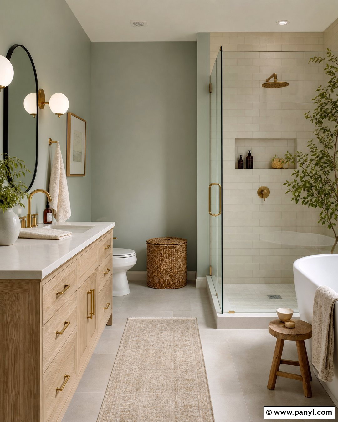
Muted eucalyptus walls can make a bathroom feel refreshing without using a predictable blue or bright green. Pair the soft gray-green shade with a white oak vanity, warm white countertop, and brushed brass hardware. Use cream subway tile in the shower and pale limestone-look flooring throughout the room. A rounded black-framed mirror introduces a clean focal point, while globe sconces provide balanced lighting. Add white towels, a woven basket, and a natural wood bath stool. Keep accessories simple so the wall color remains visible and calm. The brown-gray undertone helps eucalyptus coordinate with natural surfaces, resulting in a complete bathroom that feels organic, bright, and more distinctive than a standard white or cool gray scheme.
35. Olive Beige Neutral Wall Color
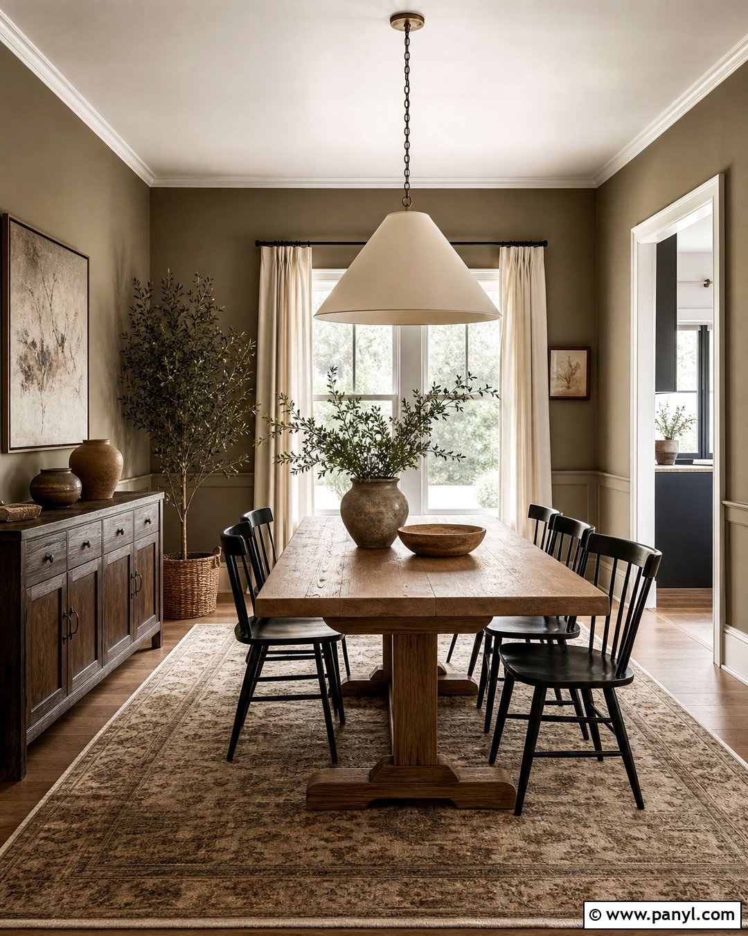
Olive beige walls create a grounded backdrop for a rustic-modern dining room. Choose a solid wood trestle table, black spindle chairs, and a large cream pendant with a simple shape. A vintage-inspired rug in tan, faded olive, and charcoal will define the dining zone and add softness. Use off-white linen curtains and warm white trim to brighten the medium wall tone. Display earthy pottery on a dark wood sideboard, but leave enough open surface to keep the room uncluttered. Olive beige works well beside wood because its green-brown undertone reflects colors already found in nature. The completed room feels warm and substantial, with enough contrast to look intentional and enough restraint to remain flexible for changing table linens and artwork.
36. Blue Gray Neutral Wall Color
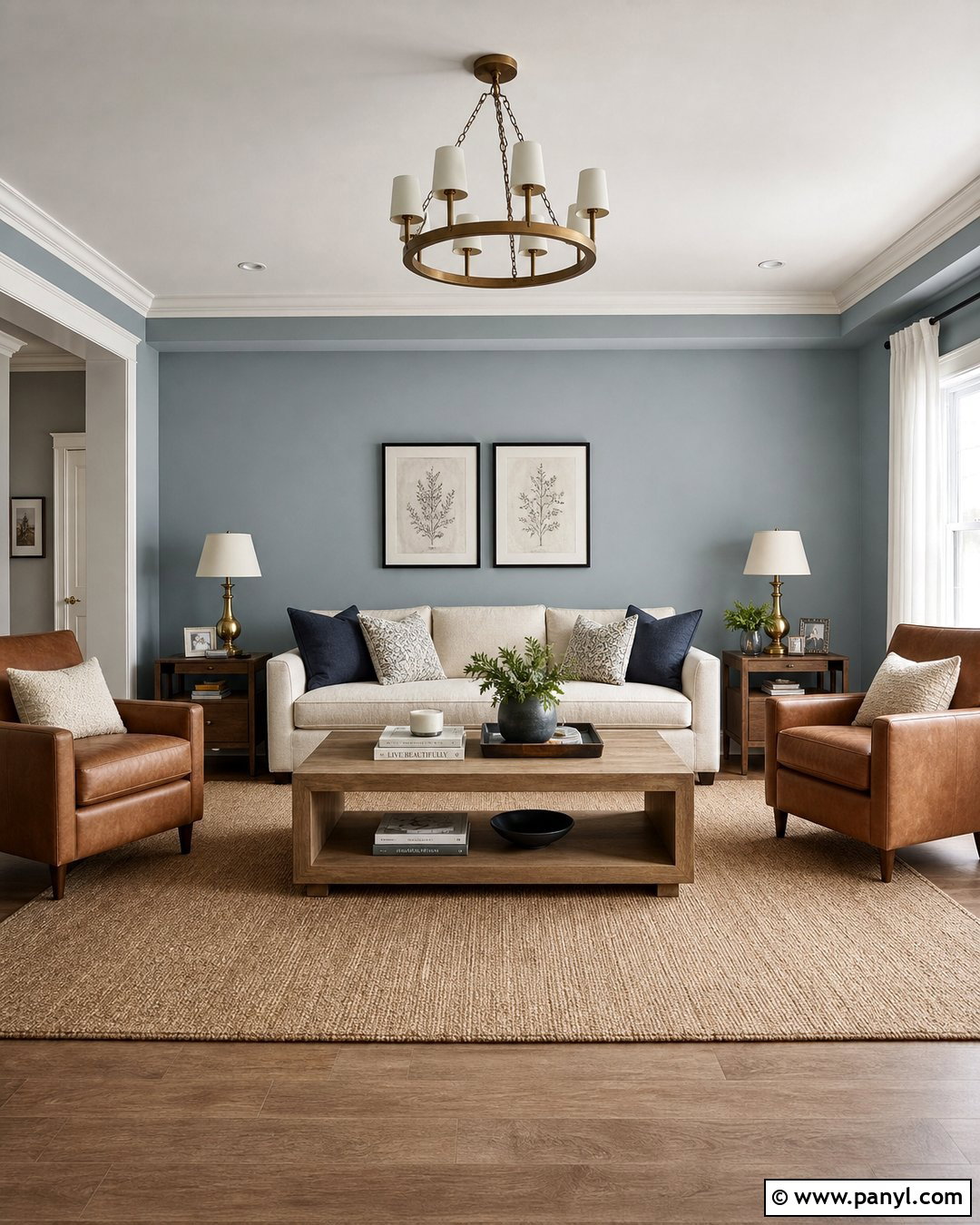
A muted blue-gray wall color can behave like a cool neutral in a bright living room. Pair it with an ivory sofa, natural oak coffee table, and warm beige rug to prevent the space from feeling chilly. Add camel leather chairs and cushions in cream, navy, and soft brown. Full-length white curtains will reflect daylight, while aged brass lighting introduces warmth. Use black frames sparingly for definition. The blue should remain dusty and restrained rather than vivid, allowing it to recede behind furniture and artwork. This complete palette works particularly well in sunny rooms, where strong warm light can balance the cool undertone. The finished result feels clear, composed, and gently colorful without sacrificing the versatility expected from neutral walls.
37. Dove Gray Neutral Wall Color
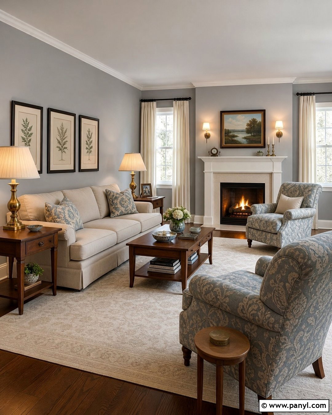
Dove gray walls create a refined background for a traditional living room when they are balanced with warm materials. Use a flax-colored sofa, walnut side tables, and a cream wool rug. Add patterned armchairs combining gray, beige, and muted blue to connect the walls with the furnishings. Antique brass lamps and medium brown wood keep the room from becoming too cool. Choose ivory curtains instead of bright white, then include a few charcoal accents through frames and fireplace tools. Dove gray works best in rooms with generous natural light or warm artificial lighting. This finished design preserves gray’s quiet elegance while avoiding the flat, icy appearance that can occur when it is surrounded only by white, silver, and cool-toned furniture.
38. Pearl Gray Neutral Wall Color
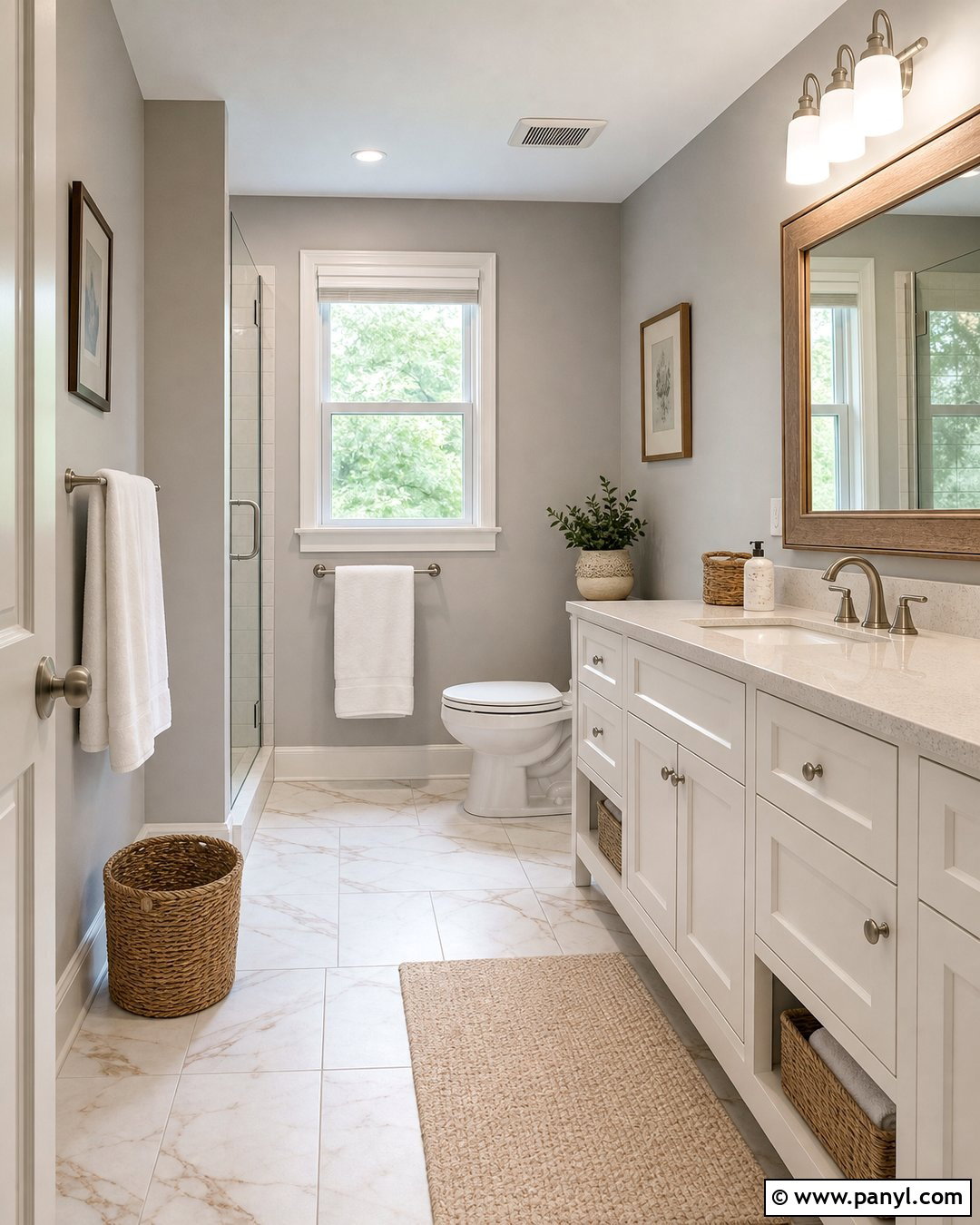
Pearl gray walls can give a small bathroom a light, polished look without the severity of pure white. Pair them with a warm white vanity, pale quartz top, and brushed nickel fixtures. Use marble-look porcelain tile with subtle beige and gray veining to connect the surfaces. A light oak mirror frame and woven storage baskets introduce needed warmth. Keep towels white and add a soft beige bath mat underfoot. Clear glass around the shower will maintain an open view across the room. Pearl gray should appear silvery and gentle rather than blue. When supported by warm wood and soft textiles, it creates a balanced bathroom that feels clean, spacious, and comfortable instead of cold or overly clinical.
39. Charcoal Neutral Wall Color
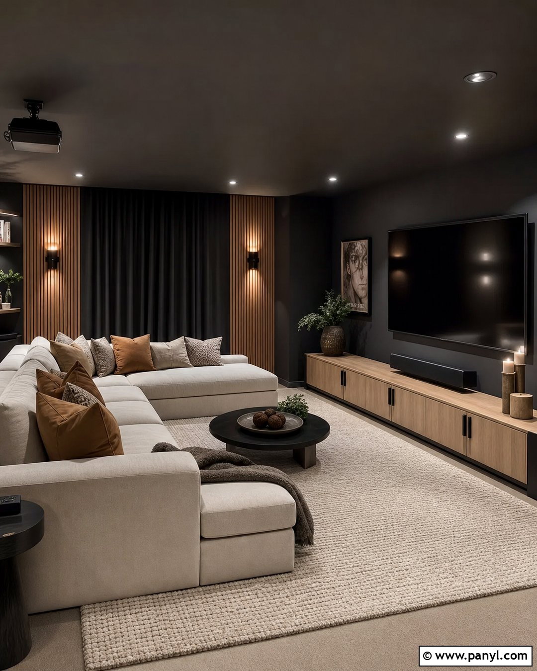
Charcoal walls make a dramatic yet neutral foundation for a media room. Balance them with a large cream sectional, pale oak media cabinet, and a substantial ivory rug. Use warm wood acoustic panels or shelving on one wall to introduce texture and prevent the dark color from appearing flat. Brass sconces and dimmable ceiling lights can provide practical layers of illumination, while caramel and taupe cushions soften the seating. Keep window treatments close to the charcoal wall color for a seamless effect. A few large framed prints are more effective than many small pieces. This complete scheme feels immersive and comfortable, proving that neutral walls do not have to be pale when lighter furnishings and reflective finishes are used thoughtfully.
40. Soft Black Neutral Wall Color
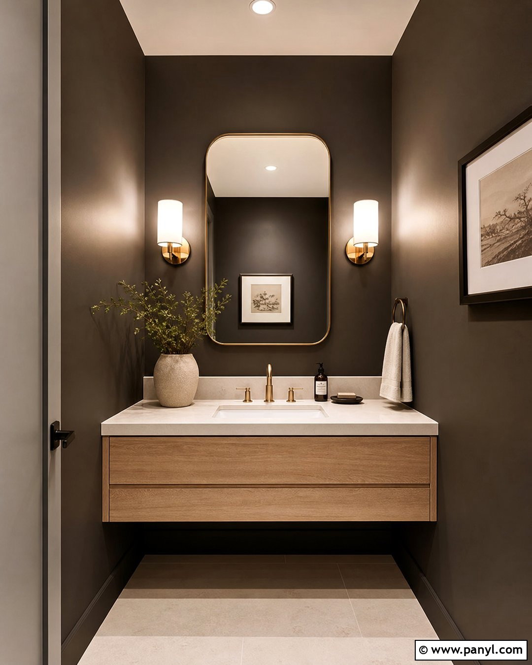
Soft black walls can create a sophisticated powder room without making the compact space feel unfinished. Pair the walls with a floating white oak vanity, creamy stone countertop, and aged brass faucet. Use a large rounded mirror to reflect light and visually expand the room. A warm white ceiling, pale floor tile, and bright sconces will keep the dark walls balanced. Add one framed artwork and a simple ceramic vase rather than crowding the space with accessories. Choose a softened black with brown or charcoal undertones instead of a harsh blue-black. This full design turns an ordinary powder room into a distinctive interior while keeping every finish practical, coordinated, and suitable for a relatable home rather than an oversized luxury setting.
41. Warm White Color Drenched Room
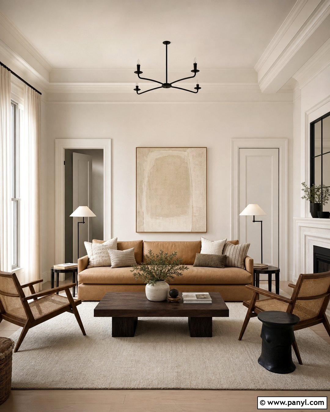
Painting the walls, trim, doors, and ceiling in one warm white creates a seamless room with subtle architectural depth. Use different finishes to maintain definition: matte on the ceiling, eggshell on the walls, and satin on trim and doors. Furnish the living room with a camel sofa, dark walnut coffee table, and ivory textured rug. Add woven chairs, black metal lighting, and large neutral artwork to prevent the monochromatic envelope from feeling empty. Floor-length linen curtains in a slightly deeper cream can softly frame the windows. Because the paint treatment is continuous, furniture shapes and materials become more noticeable. This complete color-drenched look is calm and modern, yet the warm undertone keeps it comfortable rather than stark or gallery-like.
42. Taupe Color Drenched Bedroom
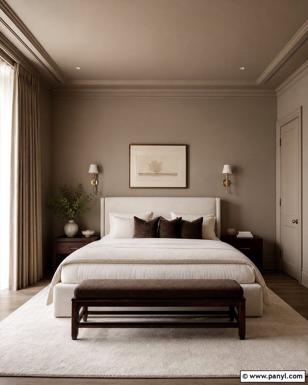
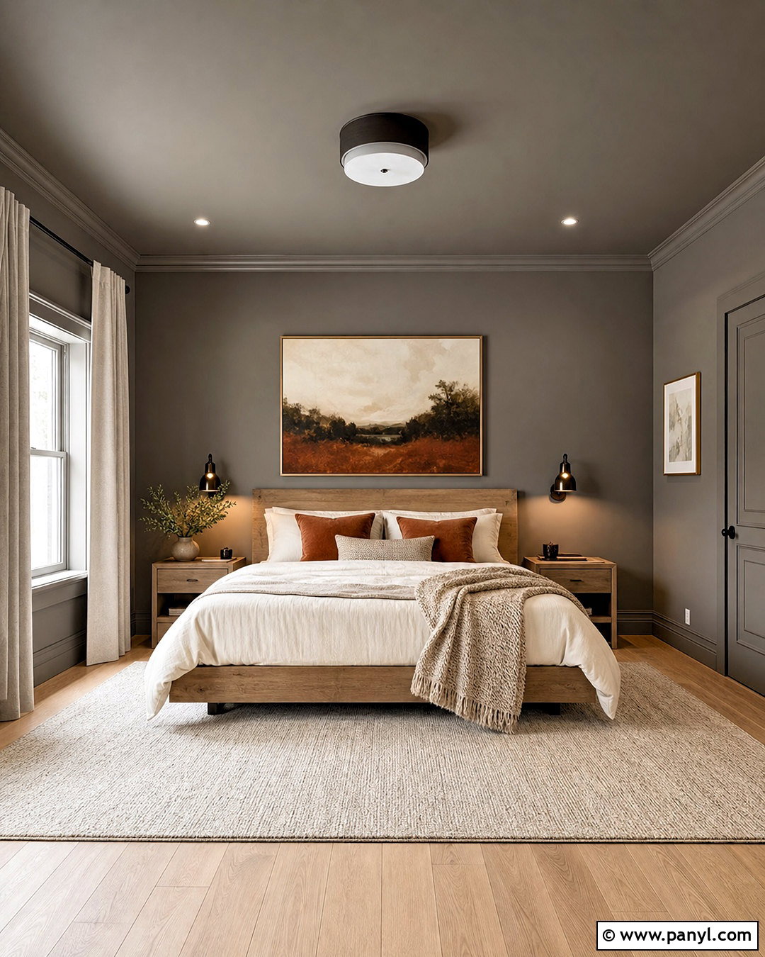
A taupe color-drenched bedroom feels enveloping when the walls, trim, doors, and ceiling share the same muted brown-gray shade. Choose an upholstered bed in warm ivory, crisp cream bedding, and a walnut bench to stand out against the continuous color. Antique brass sconces and a pale wool rug add brightness without interrupting the restful palette. Keep curtains close to the wall shade so they blend quietly into the background. Layer pillows in cocoa, oatmeal, and dusty rose for controlled variation. The all-over treatment works especially well in a room with molding because changes in sheen highlight the details. The completed bedroom feels cozy and intentionally designed, with enough pale fabric and reflective metal to prevent the medium taupe from becoming oppressive.
43. Two Tone Neutral Wall Color
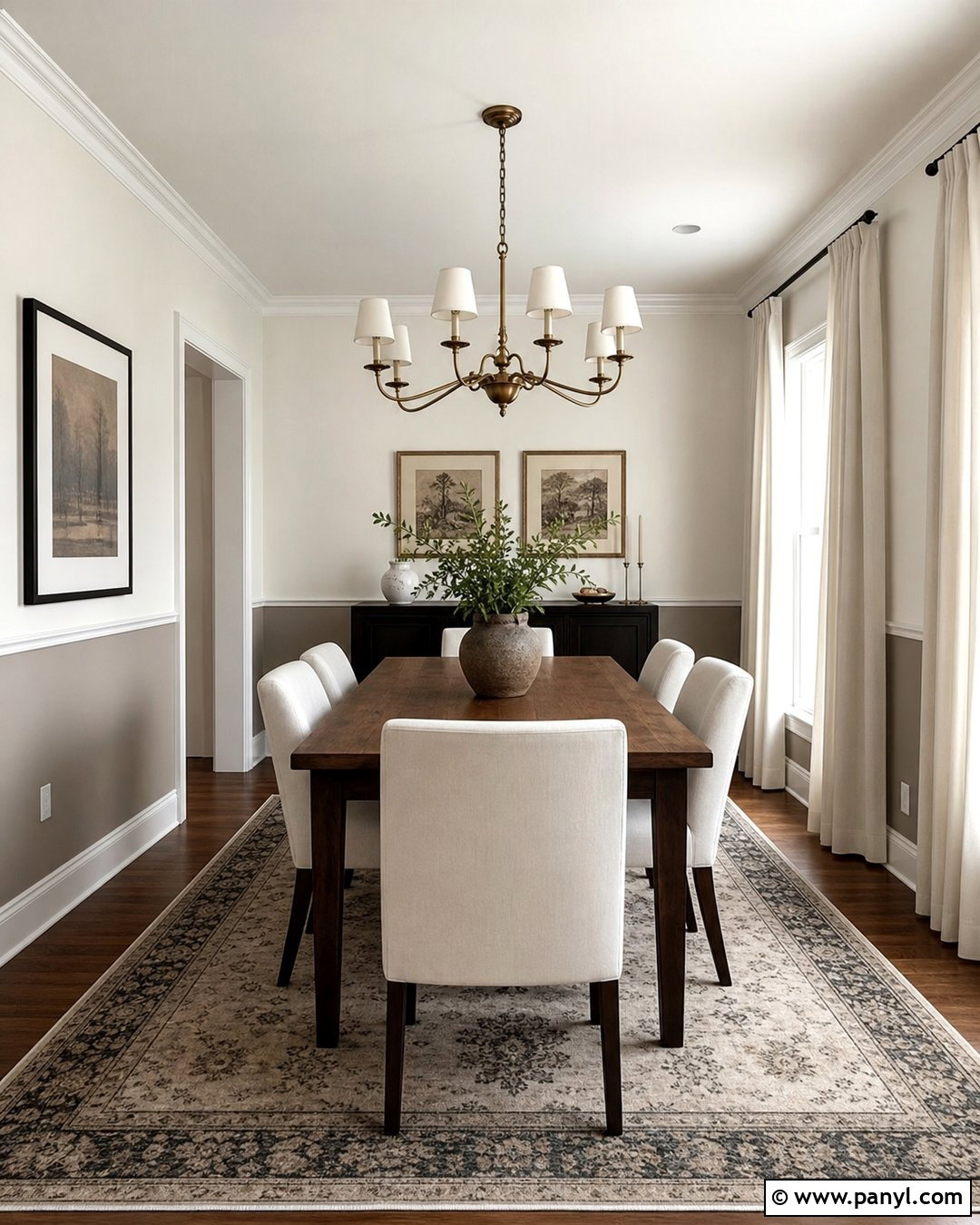
Two-tone neutral walls can add structure to a dining room without introducing bold color. Paint the lower third in medium mushroom and the upper walls in warm off-white, separating them with a simple chair rail. Pair this treatment with a walnut dining table, cream upholstered chairs, and a patterned rug containing brown, beige, and charcoal. Use an aged brass chandelier and ivory curtains to keep the room bright. The darker lower section visually grounds the furniture and hides everyday scuffs more effectively than a pale wall. Repeat mushroom through pottery or picture frames so the color feels connected. This complete scheme provides architectural interest in a plain room while preserving the adaptable, calm quality of a neutral interior.
44. Neutral Wall Color With White Trim
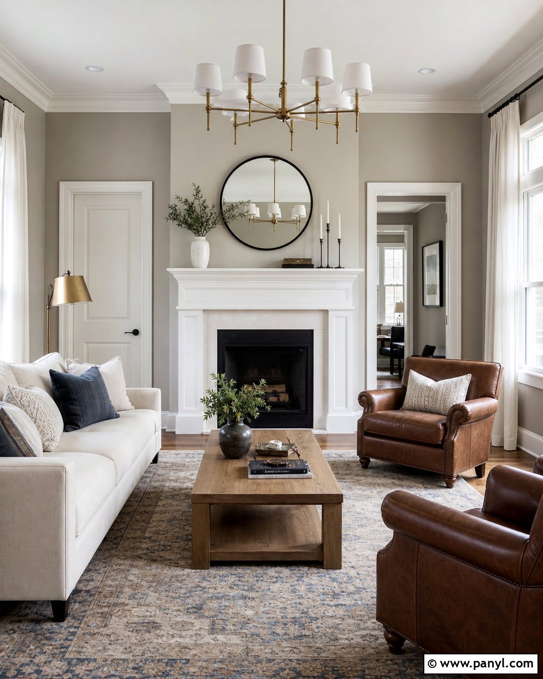
A medium greige wall paired with clean warm white trim creates definition in a transitional living room. Use the white on baseboards, window casings, doors, crown molding, and the fireplace surround. Furnish the room with a cream sofa, brown leather chairs, and a medium oak coffee table. A faded rug in ivory, taupe, and muted blue will connect the warm and cool details. Add black curtain rods, aged brass lamps, and simple linen drapes for a balanced mix of finishes. The contrast should be noticeable but not severe, so avoid a blue-white trim beside warm greige. This complete palette highlights architectural details while giving the main walls enough depth to make pale furnishings, artwork, and wood pieces stand out.
45. Whole House Neutral Wall Color
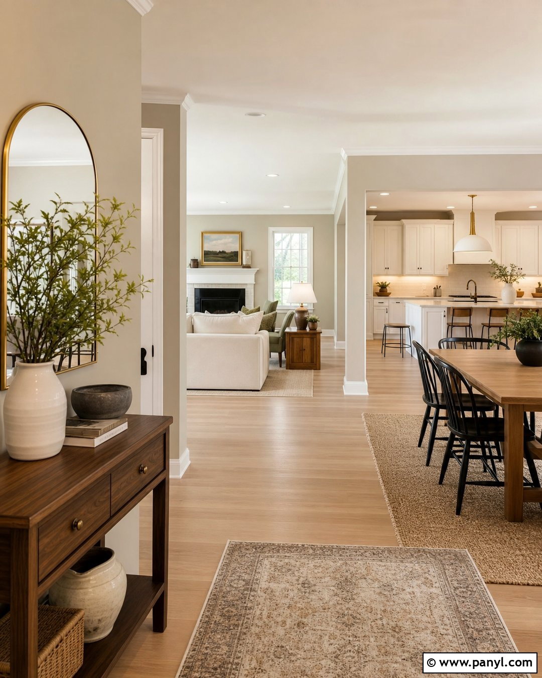
A consistent warm greige can connect an entry, hallway, living room, and open kitchen without making every space look identical. Use one main wall color, then vary the supporting materials by room. The entry might feature a walnut console and patterned runner, while the living room uses cream upholstery and oak furniture. In the kitchen, pair the walls with warm white cabinets, beige stone counters, and black hardware. Keep trim and ceilings consistent in a soft warm white throughout the home. Repeating finishes such as oak, brass, black metal, and natural linen creates another visual link. Before painting, test the color in sunny and shaded rooms. A successful whole-house neutral should remain balanced as the light changes from area to area.
Conclusion:
These 45 Neutral Wall Color Ideas show how whites, beiges, greiges, taupes, earth tones, and deeper shades can support complete, comfortable rooms. The most successful choice is not simply the most popular paint color. It is the shade that works with your light, flooring, furniture, trim, and fixed finishes. Compare undertones carefully, and test large painted samples on more than one wall. Observe them in morning light, afternoon sun, and artificial lighting before deciding. Once you select a color, repeat its warmth or coolness through textiles, woods, metals, and decor. Thoughtful layering will make neutral walls feel dimensional, welcoming, and personal rather than plain, cold, or unfinished.

Related Ideas and Inspiration:
Leave a Reply