
The **20 Best Neutral Wall Colors 2027** reflect a warmer, more natural approach to decorating. Cold gray and sharp white are giving way to creamy whites, sand, mushroom, taupe, clay, and softly tinted earth tones. These colors still feel versatile, but they bring more depth and personality to a room. Current forecasts point toward nuanced neutrals that change gently with the light and pair naturally with wood, stone, linen, and aged metals. () The right choice depends on your flooring, natural light, furniture, and fixed finishes. Always test a large painted sample before committing. The complete room schemes below show practical ways to decorate with the **20 Best Neutral Wall Colors 2027**.

1. Warm White Wall Color
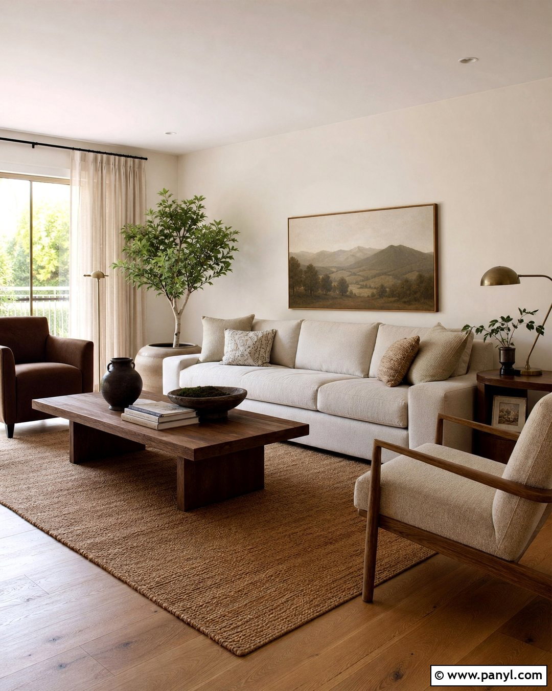
Warm white creates a bright interior without the clinical feeling of pure white. Choose a shade with a subtle cream or beige undertone, then repeat it across the walls and ceiling for a seamless look. In a living room, combine this color with medium oak flooring, an oatmeal sofa, and ivory curtains. A soft brown rug and walnut coffee table provide enough contrast to define the seating area. Add aged brass lighting, handmade pottery, and muted landscape art for warmth. Keep the trim only slightly lighter than the walls rather than using a sharp white. This complete palette works especially well in north-facing rooms because the creamy undertone helps balance cool daylight while maintaining an open, airy appearance.
2. Creamy Ivory Wall Color
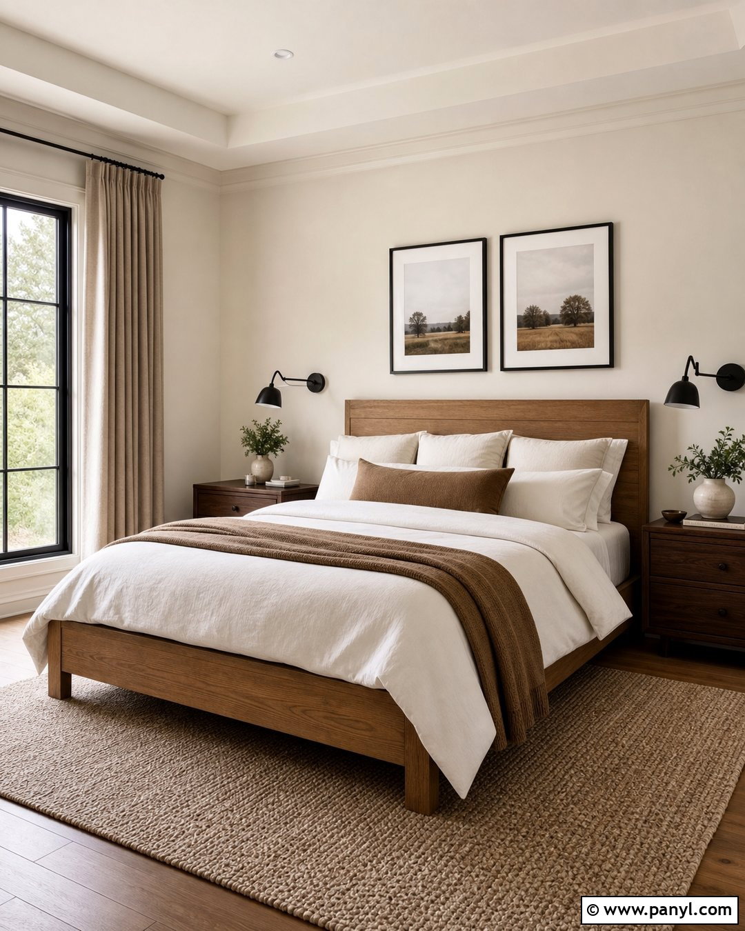
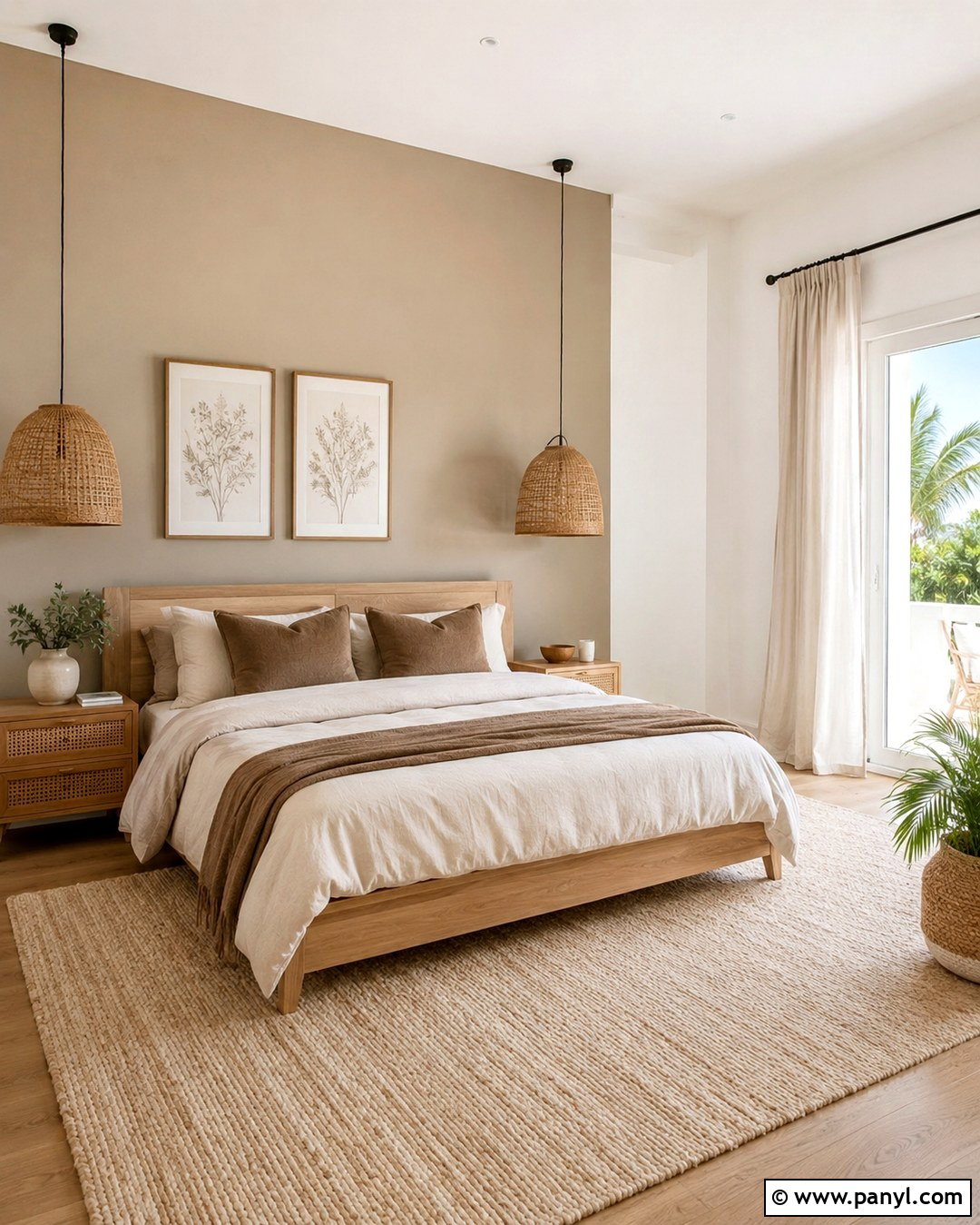
Creamy ivory gives a bedroom a gentle, comfortable glow while remaining light enough for smaller spaces. Paint the walls ivory and use the same shade in a flatter finish on the ceiling to soften visual boundaries. Pair it with a natural oak bed, warm white bedding, and a textured camel-colored blanket. Light tan curtains and a woven wool rug continue the quiet palette. For contrast, add dark bronze sconces, walnut nightstands, and simple black-framed artwork. Ivory can develop an unwanted yellow cast when surrounded by bright gold or orange finishes, so balance it with mushroom, brown, and faded blue accents. The finished room should feel layered and restful rather than pale, empty, or overly traditional.
3. Soft Linen Wall Color
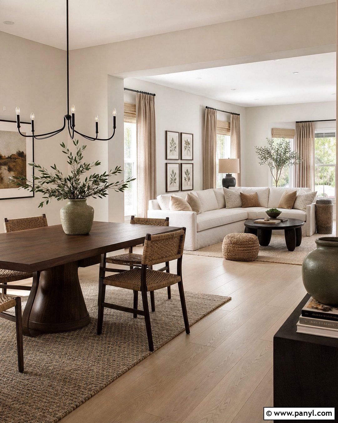
Soft linen sits between warm white and pale beige, making it an adaptable choice for an open-concept home. Use it throughout the living room, dining area, and connecting hallway to create visual continuity. Light oak floors, a cream sectional, and flax-colored curtains reinforce its natural character. Introduce definition through a chocolate brown dining table, woven dining chairs, and matte black lighting. Sage green pottery and softly patterned pillows can add restrained color without disrupting the neutral foundation. Linen-colored walls are especially attractive beside stone fireplaces and natural wood cabinetry. Instead of relying on several unrelated beige tones, repeat the wall color in upholstery, window treatments, and ceramics. This creates a coordinated interior that remains relaxed, functional, and easy to update.
4. Oatmeal Beige Wall Color
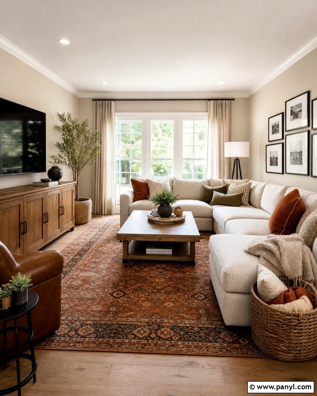
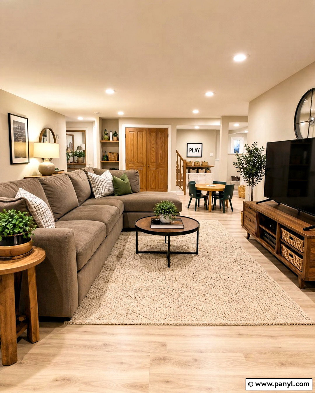
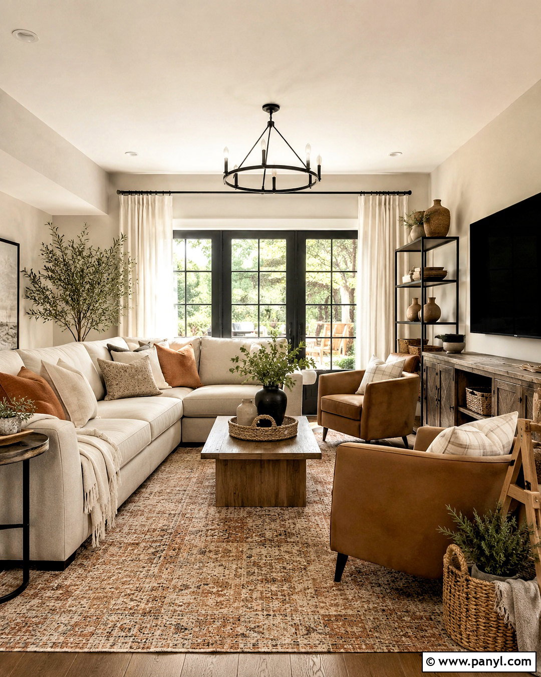
Oatmeal beige is a comfortable mid-light neutral with enough depth to make white furniture stand out. It suits a family room where durability and everyday comfort matter more than formal decoration. Pair the walls with a deep cream sectional, caramel leather chair, and warm oak media cabinet. A patterned rug containing beige, rust, brown, and muted olive connects the entire scheme. Use off-white trim to keep the contrast soft, and introduce black only in small amounts through lamp bases or picture frames. Linen curtains, baskets, and nubby upholstery prevent the room from looking flat. Oatmeal beige works best when its warm undertone relates to the flooring, so compare samples beside wood, tile, and carpet before selecting the final shade.
5. Sand Beige Wall Color
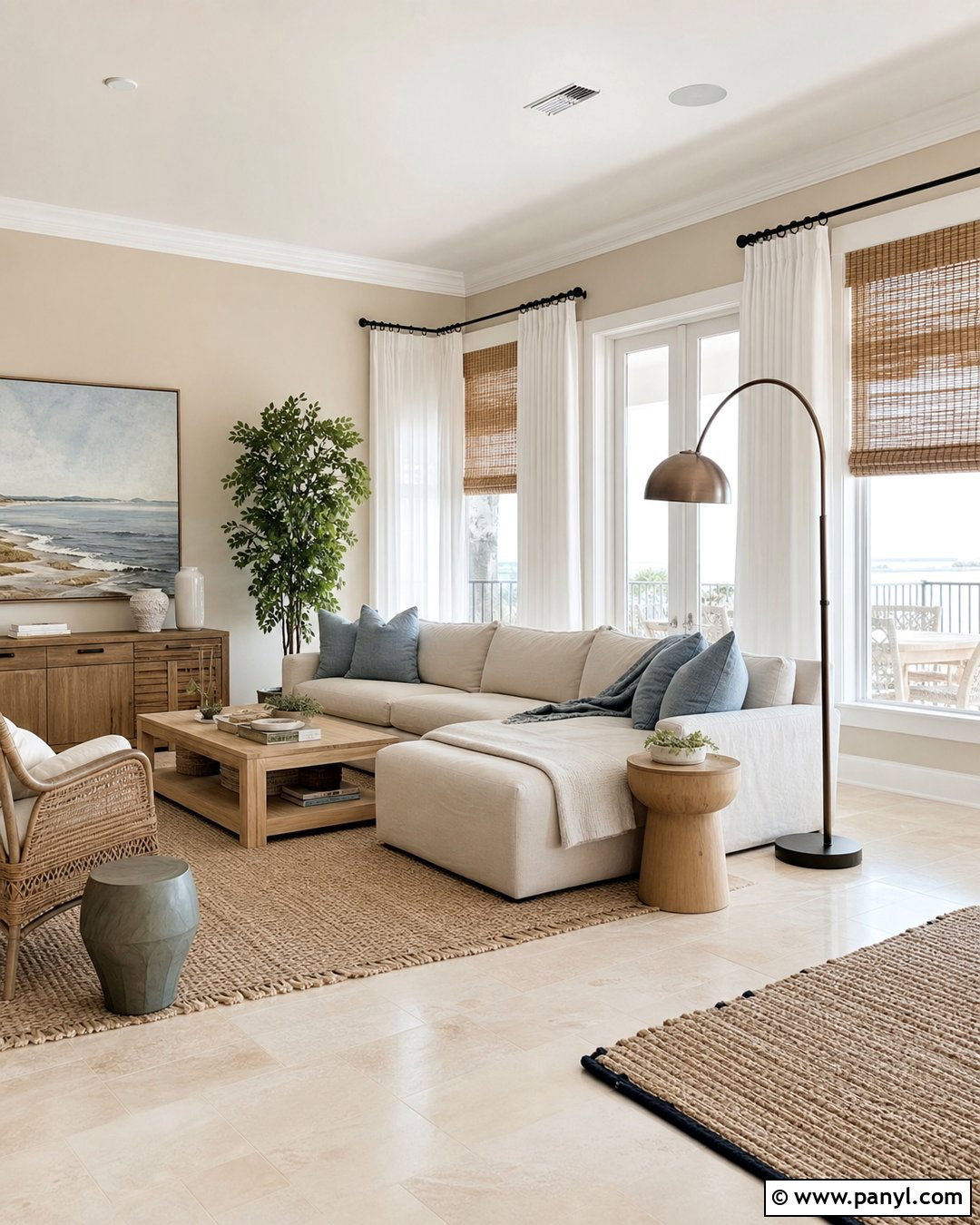
Sand beige brings the quiet warmth of natural landscapes into a bright living room. Choose a balanced shade that feels earthy without becoming strongly yellow. Combine it with pale limestone flooring, a low-profile cream sofa, and light oak tables. Soft blue-gray pillows and faded coastal artwork provide cool contrast while keeping the space calm. Use woven shades beneath white linen curtains to control glare and introduce texture. Brushed nickel or muted brass fixtures both work, depending on the undertones already present in the room. A few darker elements, such as a walnut console and bronze floor lamp, keep the palette grounded. This complete design feels fresh and modern because the sandy walls are balanced by clean furniture lines and restrained natural accessories.
6. Warm Greige Wall Color
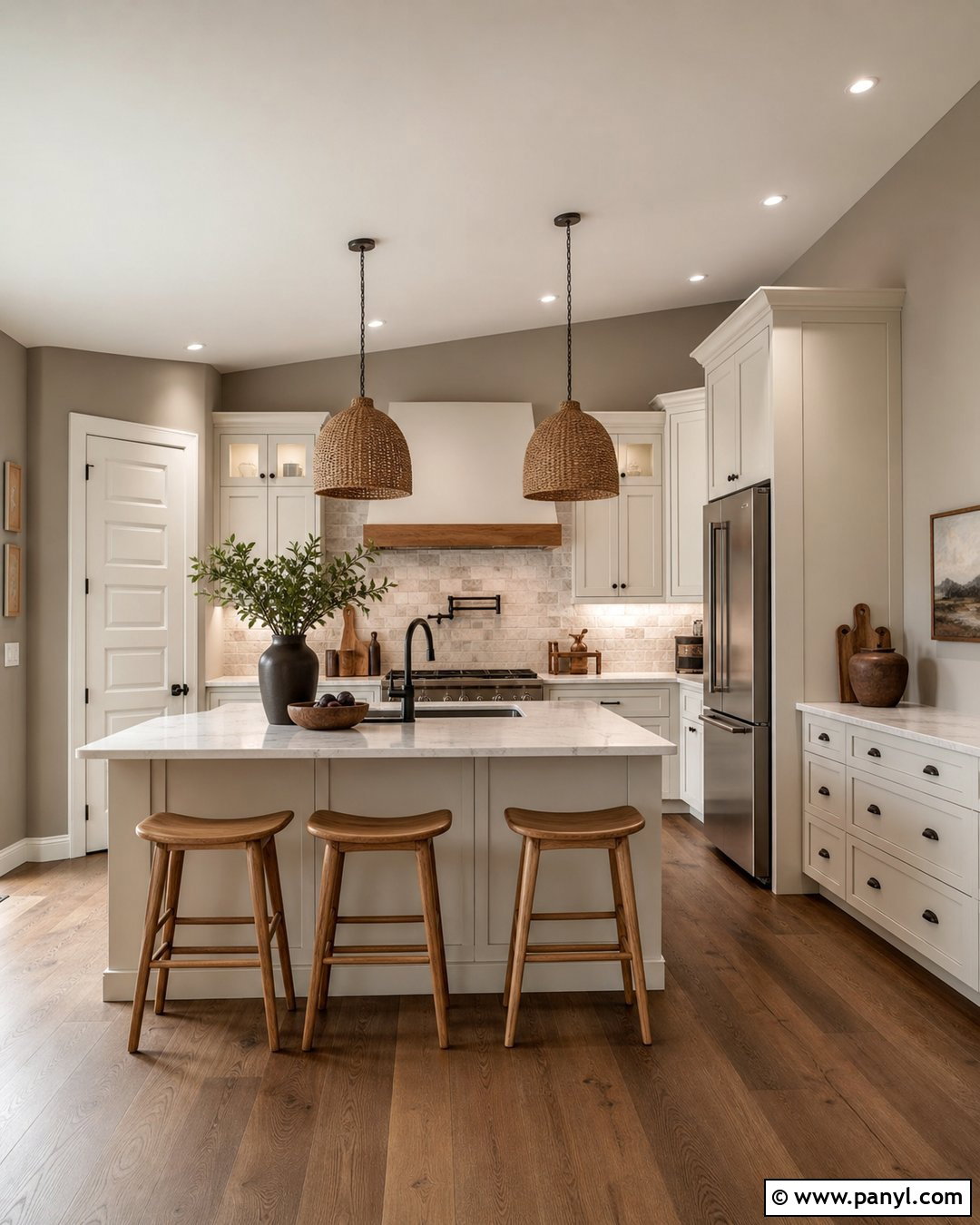
Warm greige remains useful because it connects beige furnishings with cooler stone, metal, or tile finishes. For a kitchen, select a greige that reads more beige than blue-gray. Use it on the walls beside warm white cabinets, veined quartz counters, and a soft gray stone backsplash. Natural oak stools and woven pendant lights prevent the kitchen from feeling overly polished. Add muted bronze hardware and a few dark brown accessories for structure. Greige can change significantly throughout the day, so evaluate samples in morning light, afternoon light, and under the kitchen’s permanent bulbs. The finished scheme should bridge warm and cool surfaces rather than emphasize one temperature. It is particularly practical when existing finishes cannot all be replaced during a renovation.
7. Mushroom Taupe Wall Color
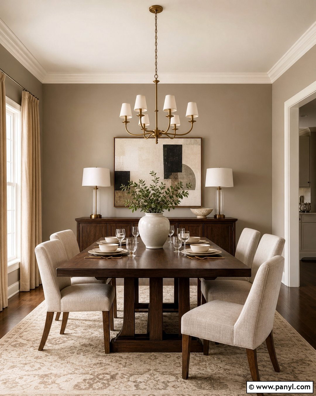
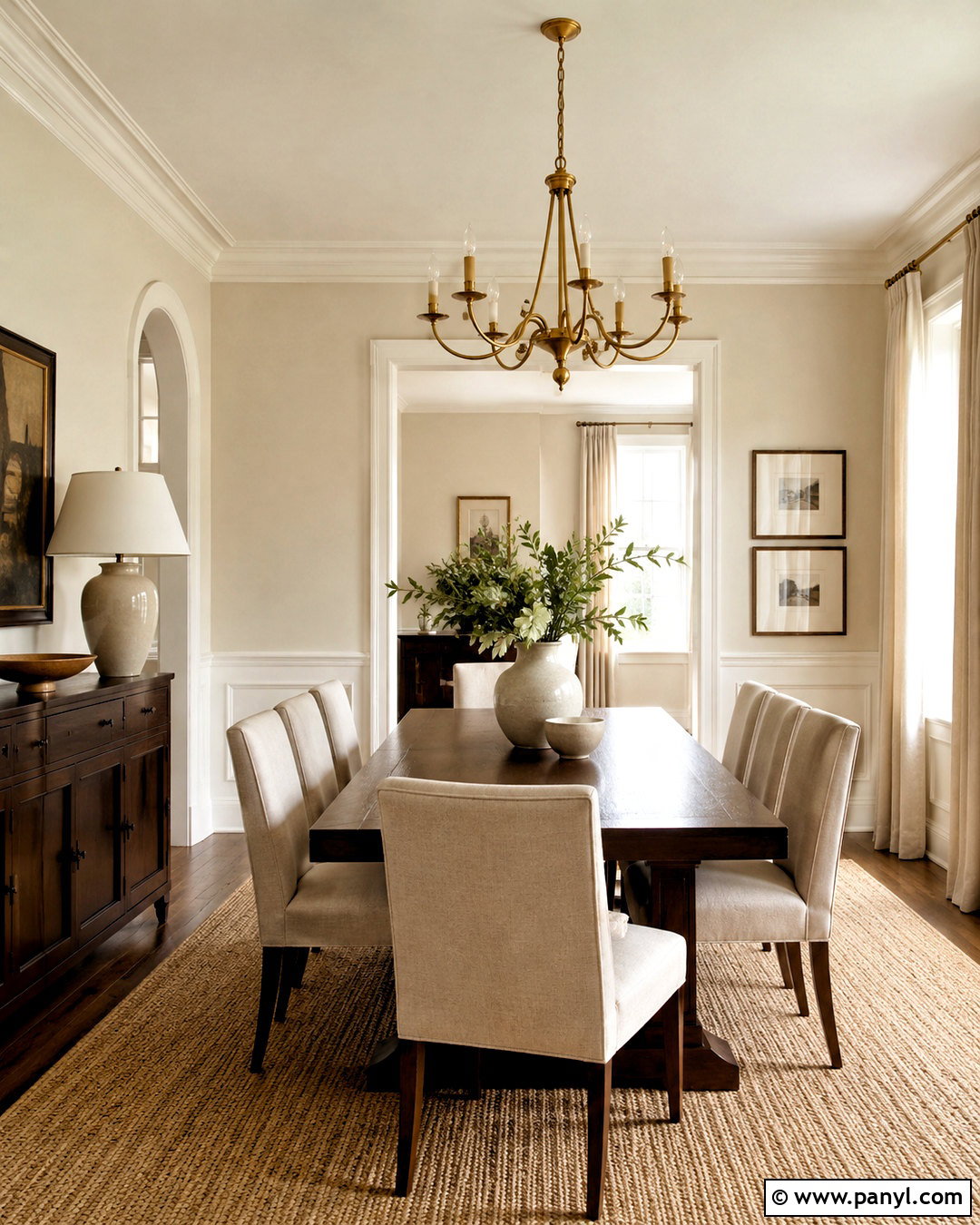
Mushroom taupe offers more dimension than standard beige and can appear greige, brown, or softly mauve as the light changes. Use it in a sophisticated dining room with warm white trim and a slightly lighter ceiling. A dark walnut table, upholstered oatmeal chairs, and an antique brass chandelier create an inviting focal point. Add a low sideboard, oversized abstract artwork, and full-length flax curtains to balance the darker walls. Cream tableware and pale stone accessories provide freshness. Because mushroom colors often contain subtle pink or violet undertones, test the paint beside flooring and wood finishes to avoid unexpected clashes. When the undertones are coordinated, the complete room feels intimate, modern, and rich without depending on a bold statement color.
8. Putty Neutral Wall Color
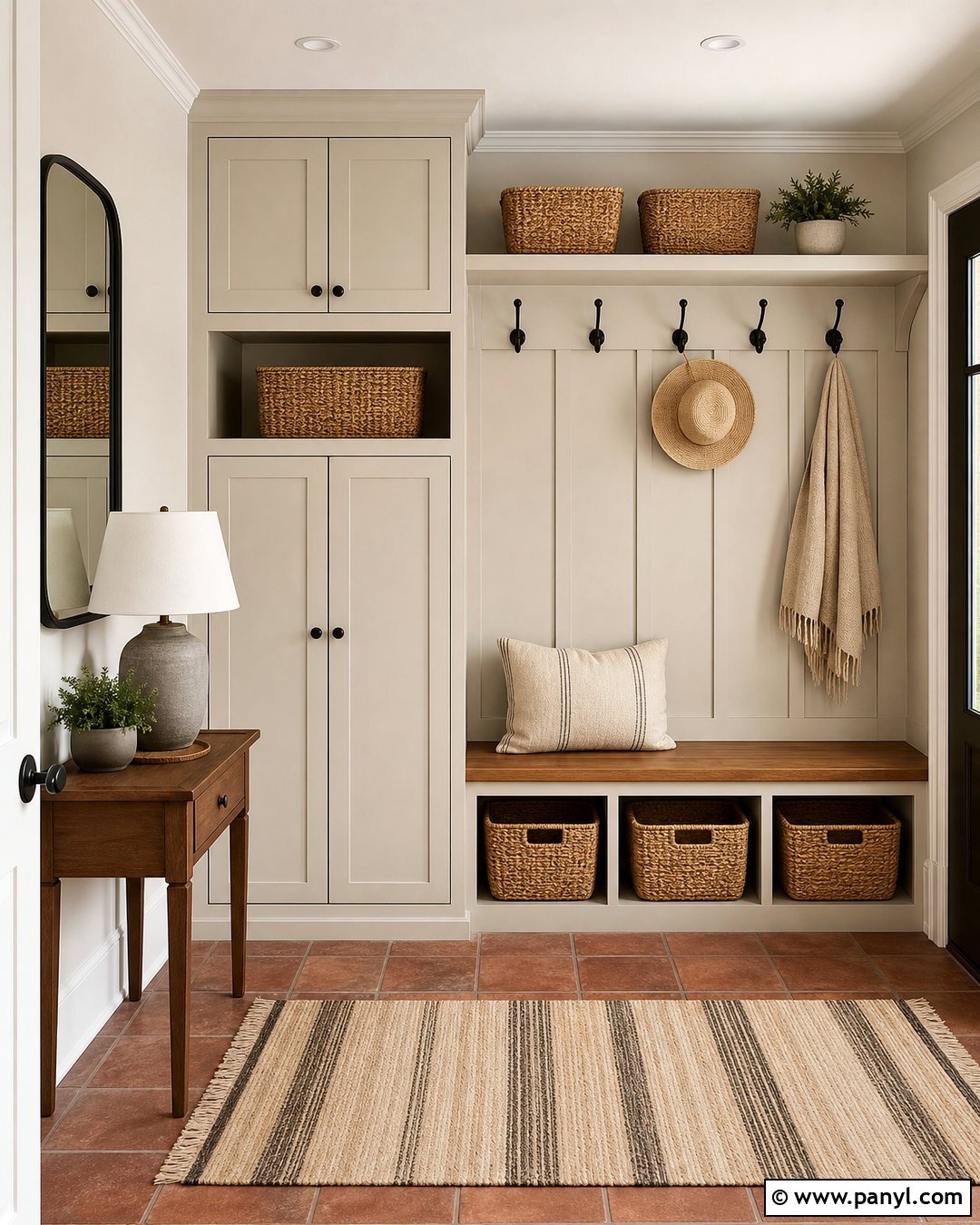
Putty is an understated beige-gray that works beautifully in practical spaces such as entryways and mudrooms. Paint the walls and built-in storage in closely related putty tones, using an eggshell or satin finish on cabinetry for easier cleaning. Pair the color with terracotta tile flooring, an oak bench, and woven storage baskets. A black-framed mirror and dark bronze hooks add crisp definition. Include a striped beige runner and a simple ceramic lamp if space allows. Putty provides enough warmth to complement natural materials, but it does not show everyday marks as quickly as bright white. The finished entry feels organized and welcoming because the paint, storage, seating, and flooring share one grounded palette rather than competing for attention.
9. Limestone White Wall Color
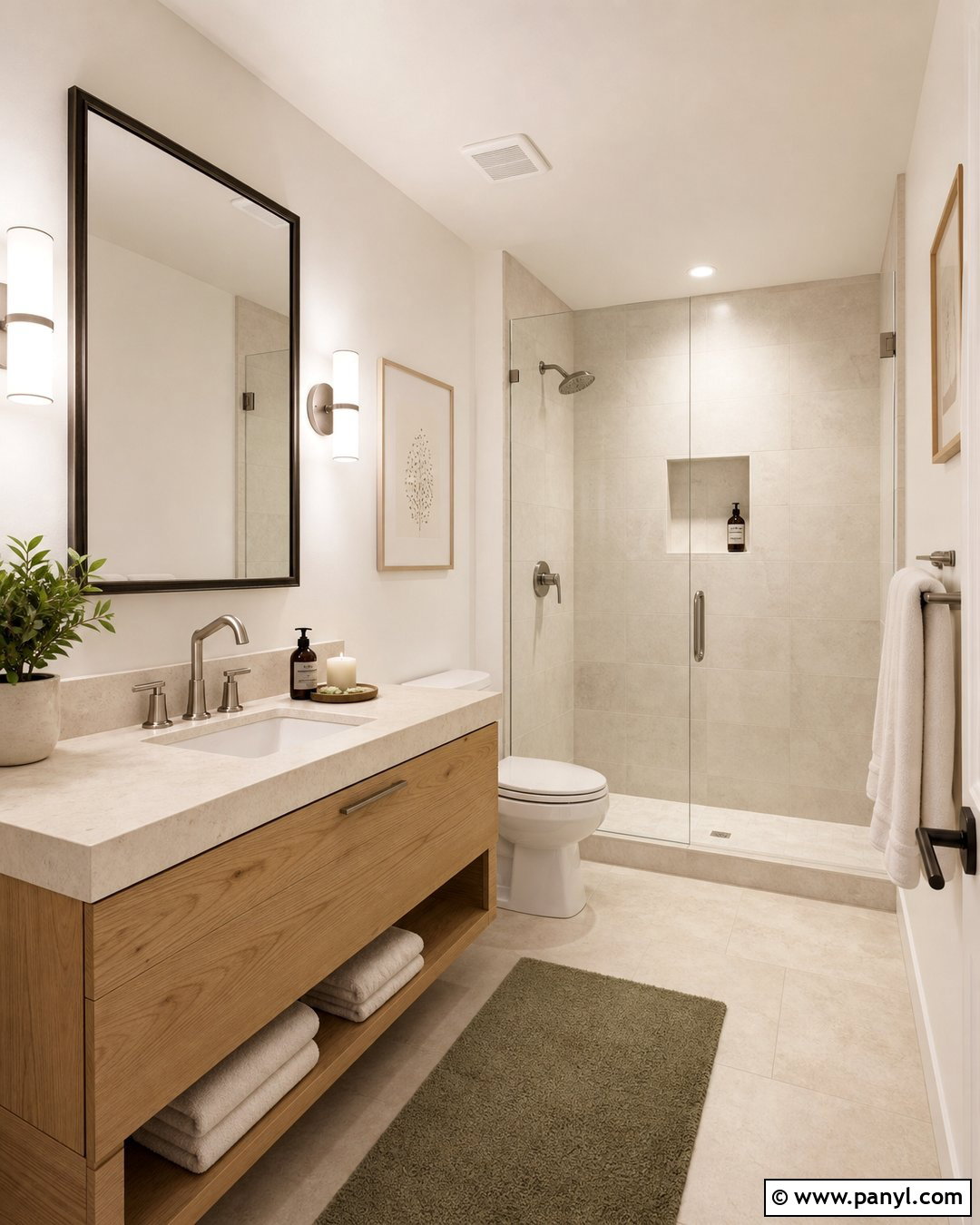
Limestone white has a chalky beige or gray undertone that feels softer and more architectural than standard white. It is ideal for a bathroom with natural stone finishes. Use the color on the walls and ceiling, then add a floating light oak vanity, creamy limestone floor tile, and an off-white quartz counter. Brushed nickel fixtures maintain a quiet appearance, while a thin dark bronze mirror frame creates definition. Choose warm white towels, a textured shower curtain, and one muted olive bath mat. The limited palette allows the subtle variations in the stone and wood to become decorative features. Limestone white also handles bright daylight well because it reduces glare while keeping the bathroom clean, spacious, and visually connected.
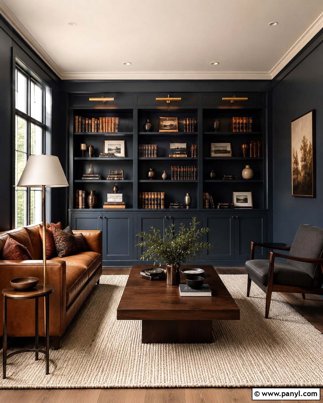
10. Clay Beige Wall Color
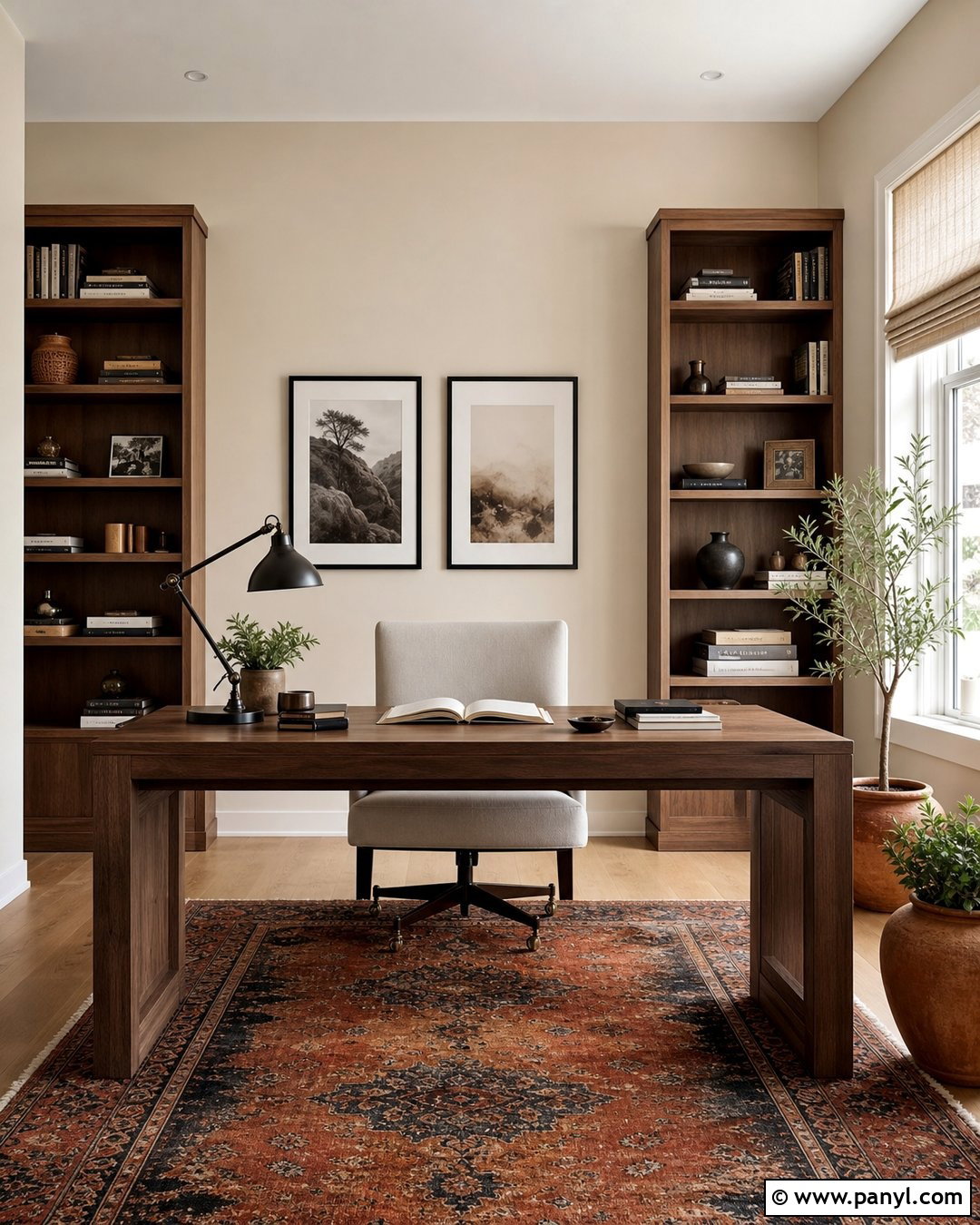
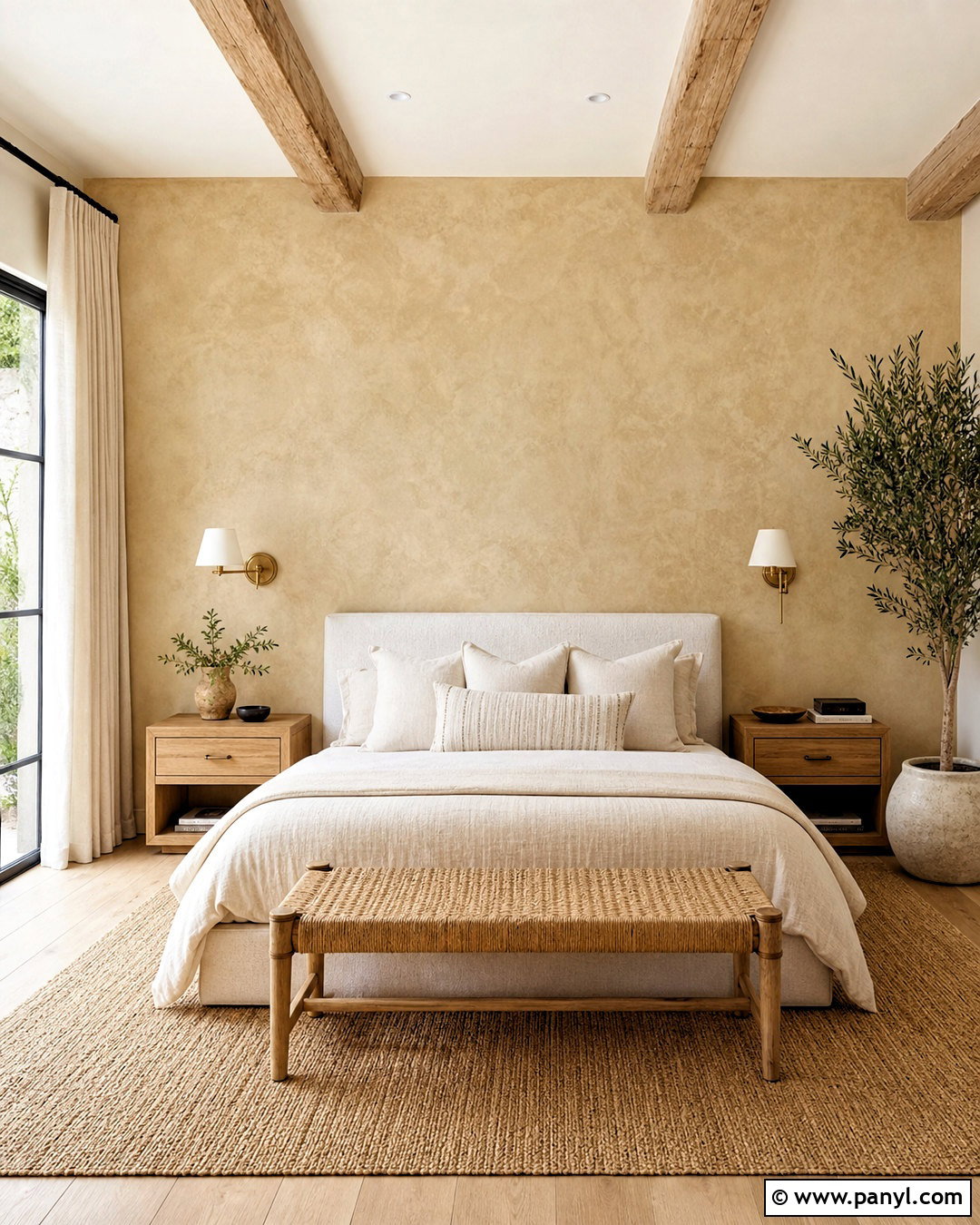
Clay beige introduces an earthy red or peach undertone without reading as a strong color. It works well in a home office where plain white can feel uninspiring. Pair clay-beige walls with a walnut desk, cream upholstered chair, and tall oak bookcases. Use a flat-woven rug containing faded rust, tan, and charcoal to connect the furniture with the walls. A dark bronze task lamp and black-framed prints add necessary contrast. Keep window treatments light and simple so daylight reveals the color’s subtle warmth. Plants in aged terracotta containers reinforce the natural palette. The complete office feels focused yet welcoming, with enough color to create character while remaining neutral enough for video calls, changing artwork, and different working arrangements.
11. Pale Khaki Wall Color
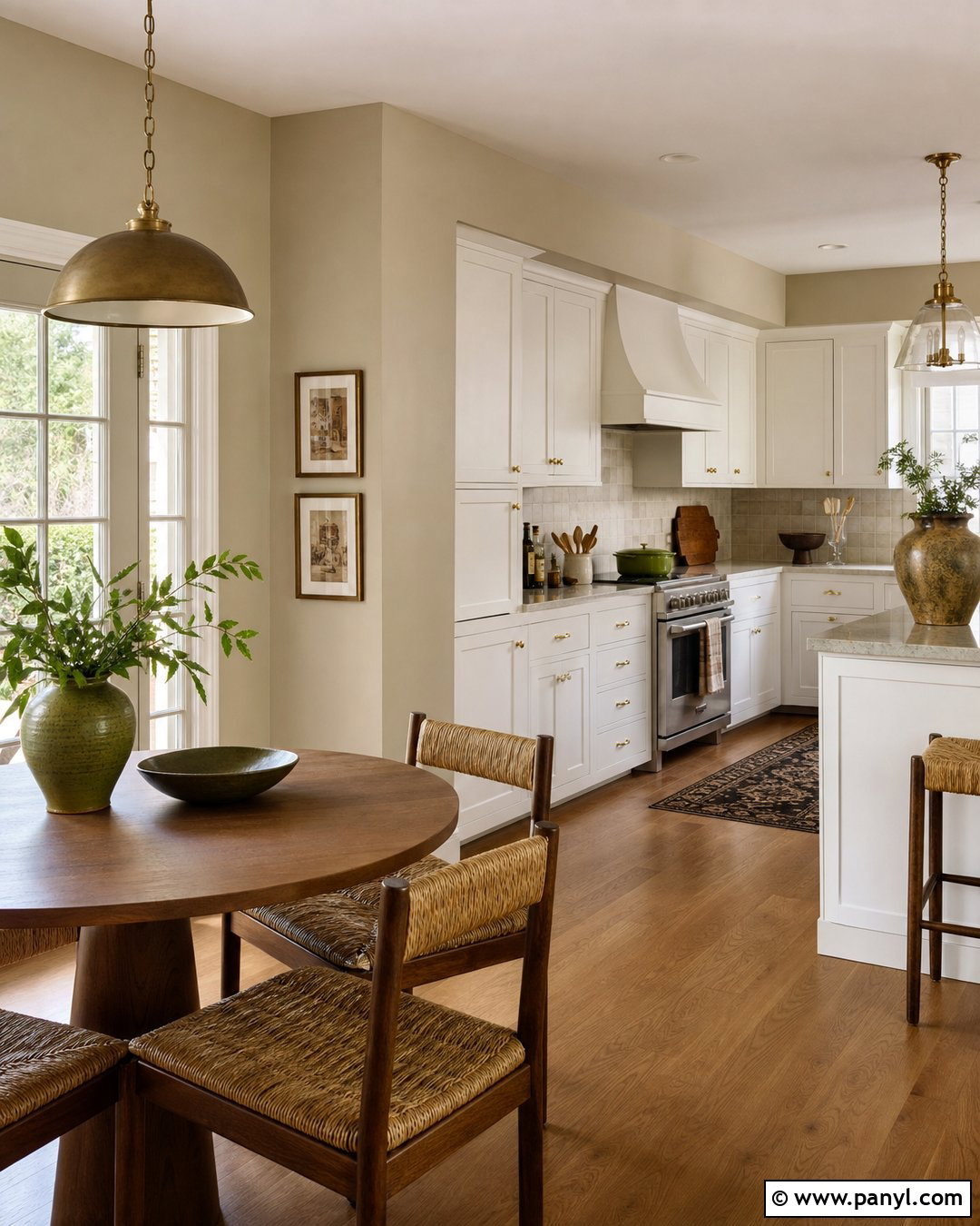
Pale khaki combines tan, beige, and a restrained green undertone. It creates a grounded kitchen or breakfast room that feels warmer than gray but less expected than cream. Use the color on the walls with warm white cabinets, honed stone counters, and medium oak flooring. Add a round walnut table surrounded by woven rush chairs. A softly aged brass pendant, cream Roman shade, and olive ceramic bowls complete the earthy scheme. Keep the backsplash simple with handmade off-white tile so it does not compete with the wall color. Khaki responds strongly to surrounding finishes, appearing greener beside red-toned wood and more beige beside cool stone. Large samples will reveal whether the undertone complements the room throughout the day.
12. Soft Sage Neutral Wall Color
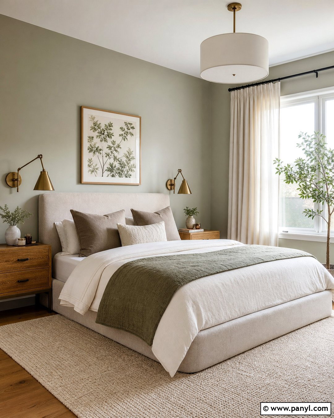
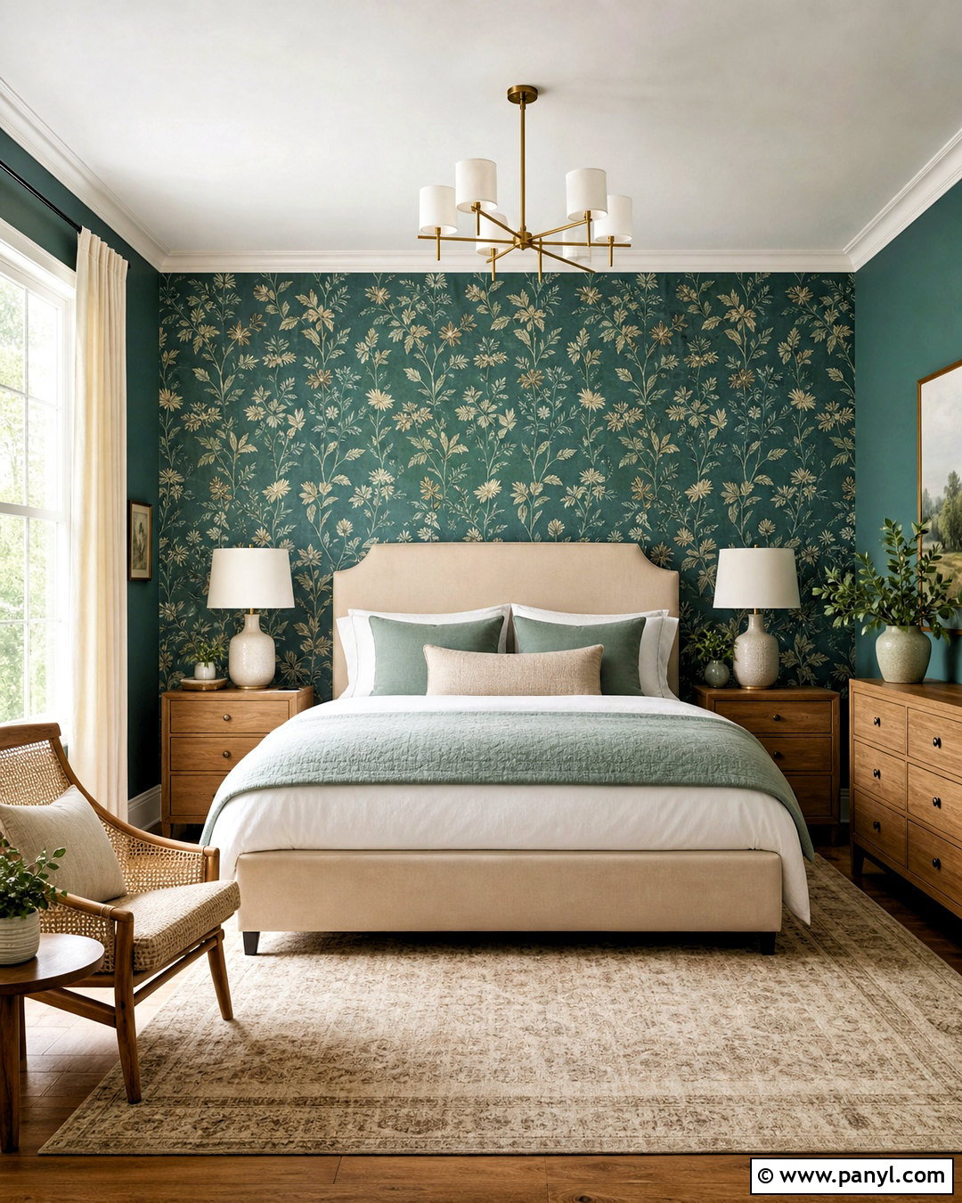
Soft sage can function as a neutral when it contains plenty of gray, beige, or brown. Use it in a calming bedroom with an upholstered oatmeal bed and warm oak nightstands. Layer ivory bedding with taupe pillows and a muted green quilt to create a connected palette. Natural linen curtains soften the windows, while aged brass sconces add gentle warmth. A cream wool rug prevents the green from becoming too dominant. Keep artwork minimal, using botanical sketches or abstract forms in tan, charcoal, and faded olive. This finished design feels restful because every color appears slightly muted. Soft sage is particularly effective in rooms overlooking trees or gardens, where the walls create a natural visual transition between the interior and outdoor view.
13. Dusty Olive Wall Color
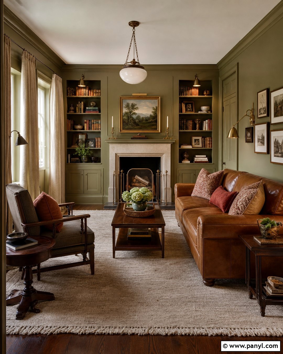
Dusty olive is a deeper neutral for homeowners who want warmth and character without using a vivid green. It suits a library, den, or compact sitting room. Wrap the walls, trim, shelving, and ceiling in closely matched olive tones for a cohesive effect. Furnish the space with a caramel leather sofa, walnut side tables, and an oatmeal wool rug. Cream curtains and a pale stone fireplace keep the darker palette from feeling heavy. Add antique brass lighting, rust-colored pillows, and framed artwork with generous cream matting. Good artificial lighting is important, especially in a north-facing room. The completed space should feel enveloping but still clear, with light upholstery and reflective metal finishes balancing the earthy depth of the walls.
14. Pale Blush Neutral Wall Color
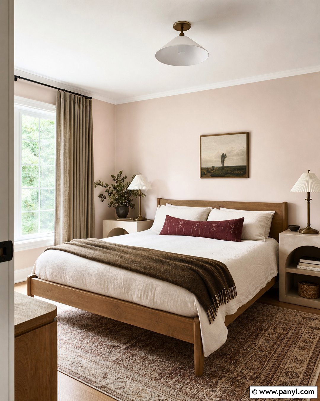
Pale blush becomes a sophisticated neutral when its pink undertone is softened with beige, taupe, or gray. In a guest bedroom, pair blush walls with a light oak bed, ivory bedding, and mushroom-colored curtains. A faded burgundy lumbar pillow and brown wool blanket add depth without making the scheme overly sweet. Use aged brass lamps and simple plaster-finish nightstands for a balanced mix of warmth and texture. Avoid combining blush with strong pink accessories. Instead, introduce grounded colors such as olive, camel, cream, and walnut. Paint the trim a soft warm white to create a clean but gentle boundary. The complete room will feel welcoming and distinctive while remaining versatile enough for different bedding, art, and seasonal textiles.
15. Muted Terracotta Wall Color
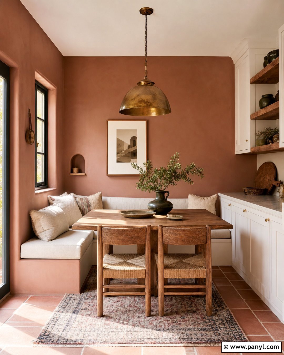
Muted terracotta can act as an earthy neutral when the color is softened with brown, beige, and clay undertones. Use it in a dining nook or breakfast area where warm color encourages a comfortable atmosphere. Pair the walls with a built-in cream bench, natural oak table, and woven chairs. Add oatmeal seat cushions, a faded geometric rug, and a simple aged brass pendant. Dark green pottery or a single leafy plant provides complementary contrast. Keep nearby cabinetry warm white rather than stark white, which could make terracotta appear too orange. With bright daylight and plenty of pale textiles, the finished room feels sun-washed and natural. It offers more personality than beige while remaining easy to coordinate with wood and stone.
16. Cocoa Taupe Wall Color
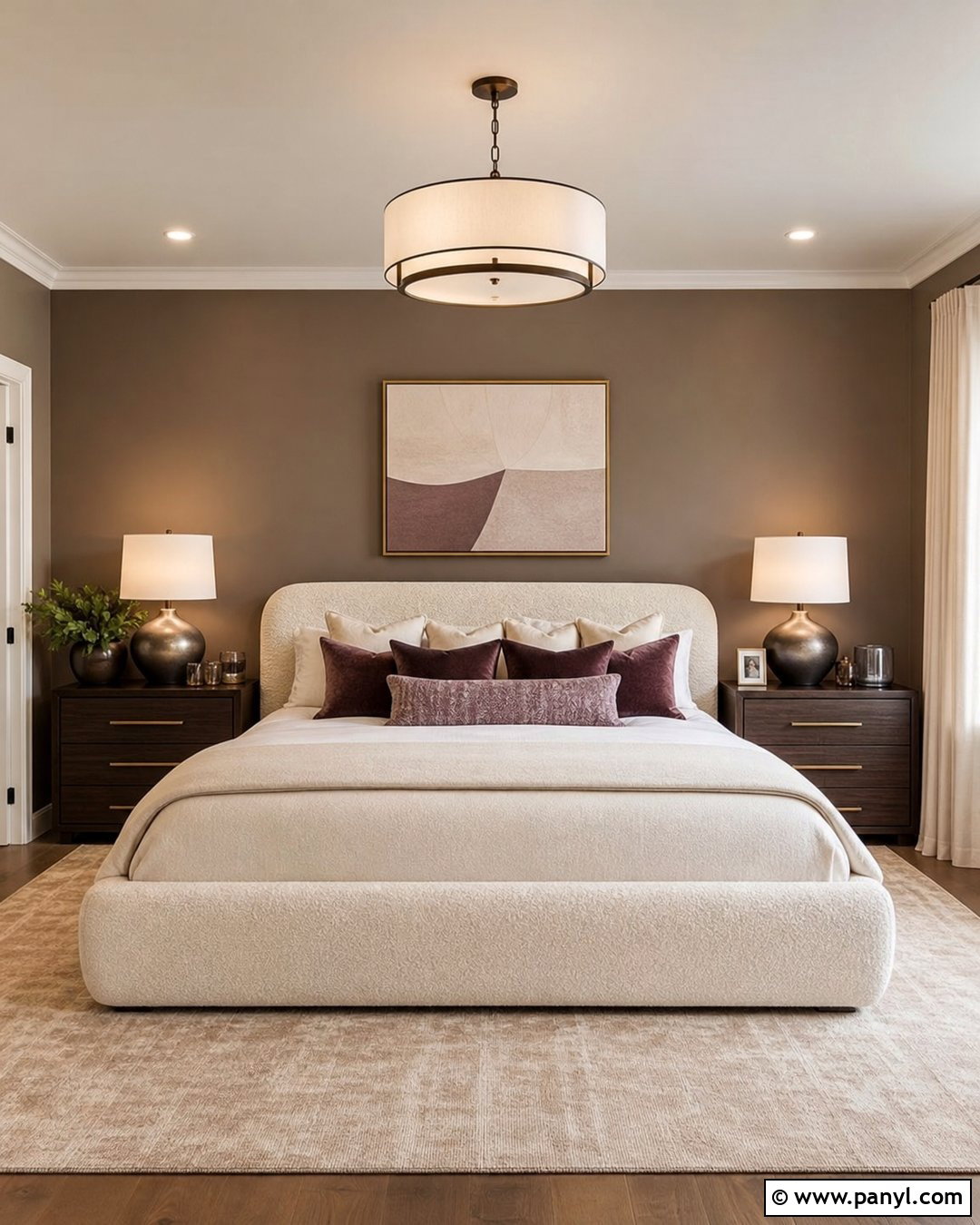
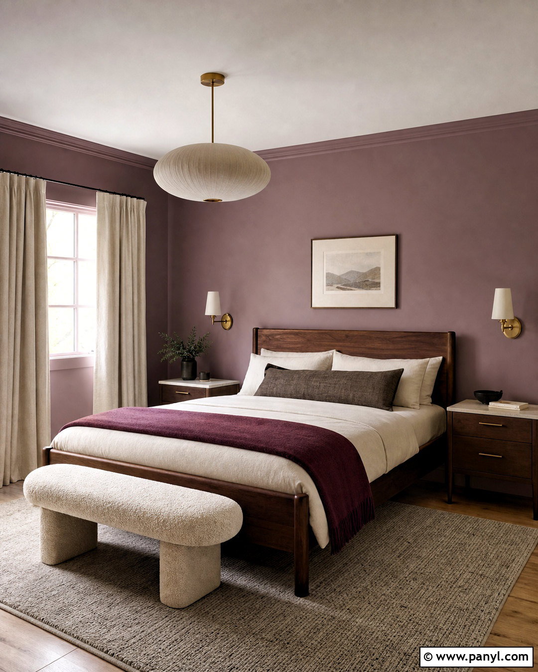
Cocoa taupe creates a cozy, polished background for a primary bedroom or formal sitting room. Choose a medium shade with balanced brown and gray undertones, then use warm white on the ceiling and trim. Pair the walls with a cream boucle bed or sofa, dark walnut furniture, and layered ivory textiles. A pale taupe rug lightens the floor, while bronze lamps and smoked glass accessories deepen the scheme. Include one restrained accent, such as muted plum or dusty blue, to reveal the complexity of the wall color. Cocoa taupe works best in a room with generous natural or artificial light. The finished design feels substantial and luxurious, yet its simple materials and familiar furniture shapes keep it comfortable and approachable.
17. Stone Gray Wall Color
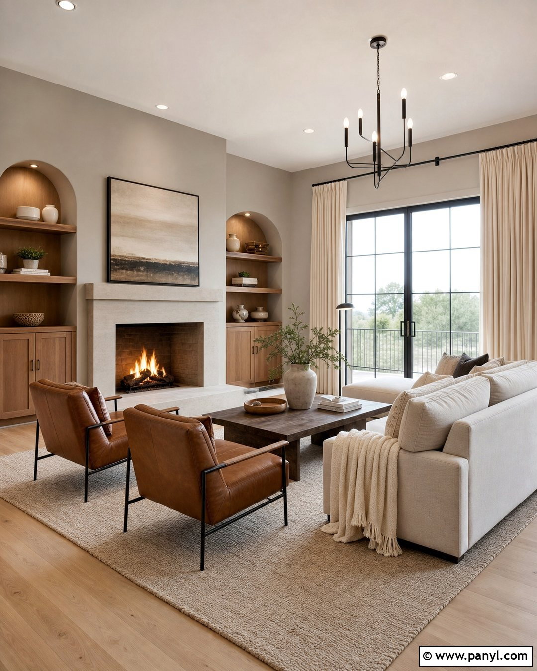
Stone gray offers a cooler neutral option without returning to the flat blue-gray palettes of previous years. Look for a mineral shade with beige, green, or brown undertones. In a contemporary living room, combine it with white oak flooring, a warm ivory sofa, and a light gray limestone fireplace. Camel leather chairs and a dark wood coffee table add warmth. Use full-length cream curtains to soften the walls and improve the room’s acoustic comfort. Black accents should be limited to slender frames or lighting details. A textured rug mixing ivory, taupe, and gray ties the palette together. The finished space feels clean and modern because the gray is balanced with organic materials rather than sharp white furniture and high-contrast accessories.
18. Parchment Beige Wall Color
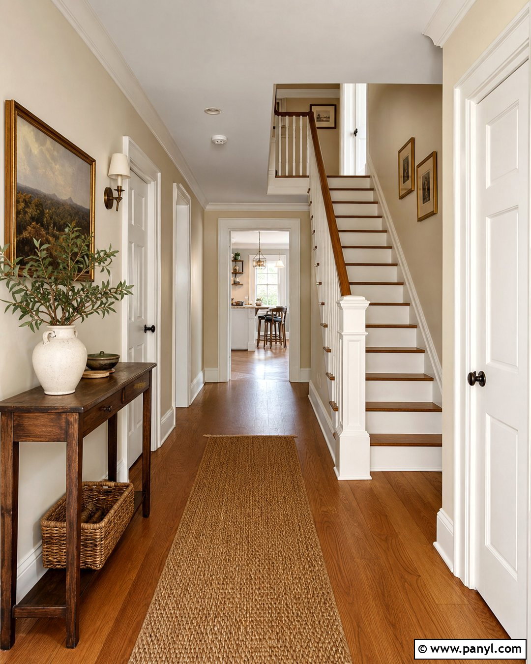
Parchment beige is a pale, papery neutral with soft yellow and gray undertones. It brings warmth to hallways, staircases, and other connecting spaces where natural light may be limited. Use it continuously across the walls and choose creamy white for the trim, doors, and stair risers. A natural oak handrail and medium-toned wood flooring add structure. Decorate with a narrow walnut console, woven runner, and framed prints in aged brass or dark brown frames. If the hallway opens into several rooms, repeat the parchment tone through fabrics or accessories to improve visual flow. This coordinated design makes a transitional area feel intentional. The color stays light and practical while avoiding the cold, unfinished appearance sometimes created by basic white paint.
19. Café Au Lait Wall Color
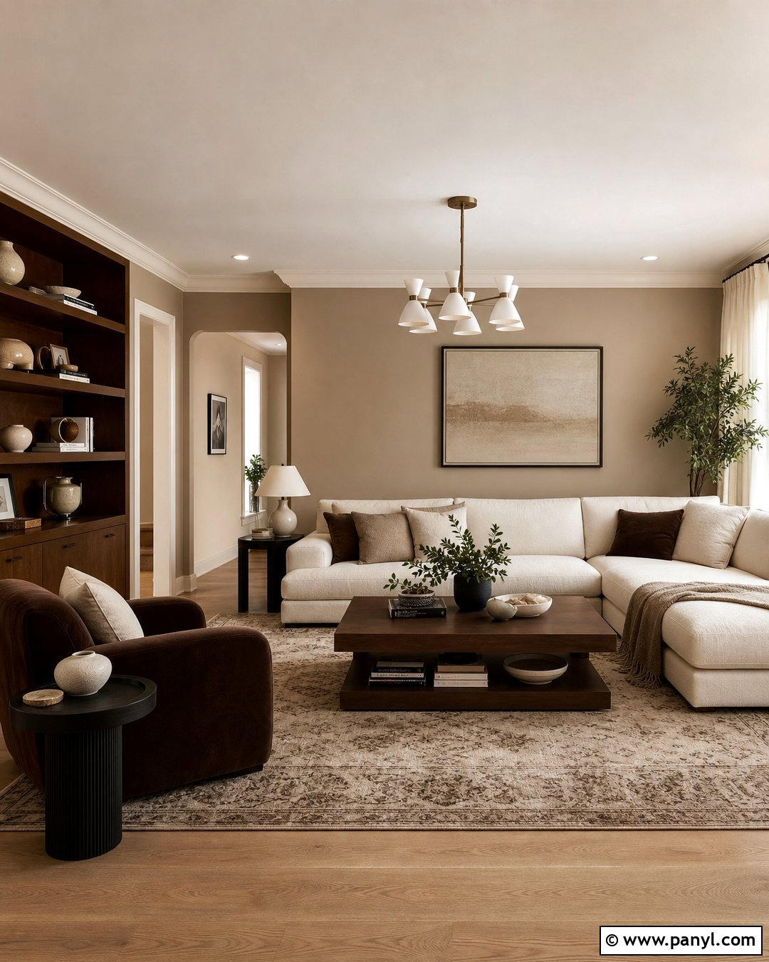
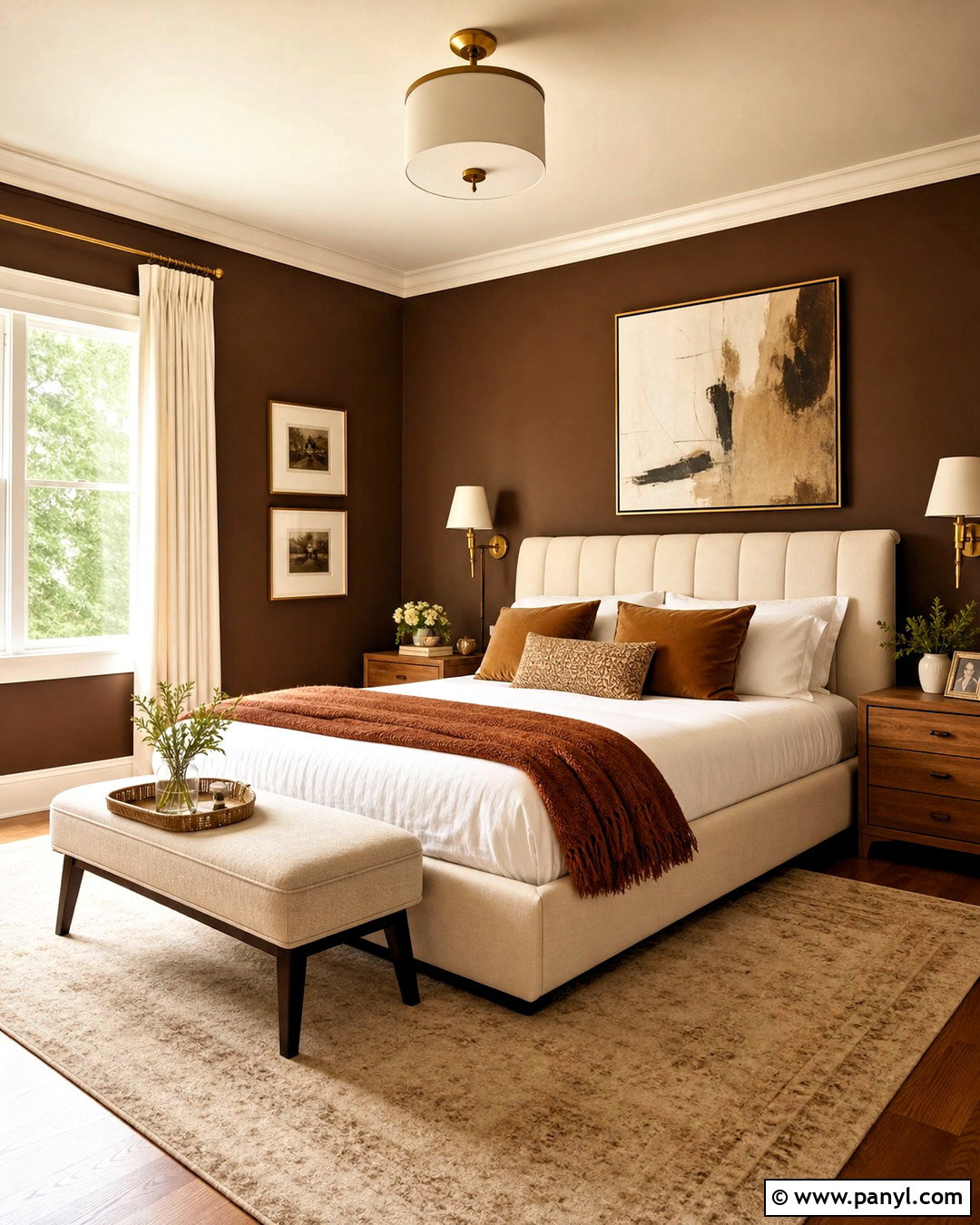
Café au lait is a milk-softened brown that creates a comfortable and grounded living space. Use this medium neutral in a room with strong natural light or generous windows. Pair it with a cream sectional, pale oak flooring, and a large ivory-and-brown patterned rug. Walnut shelving and a chocolate velvet chair strengthen the tonal design. Bring in contrast through off-white curtains, plaster lamps, and a few matte black frames. Instead of adding bright accent colors, vary the textures with boucle, linen, wool, leather, and smooth ceramic pieces. Paint the ceiling warm white to preserve height. The completed room feels layered and inviting because the brown walls are surrounded by lighter neutral surfaces that prevent the palette from becoming visually heavy.
20. Soft Charcoal Wall Color
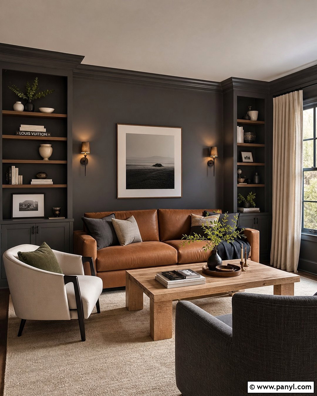
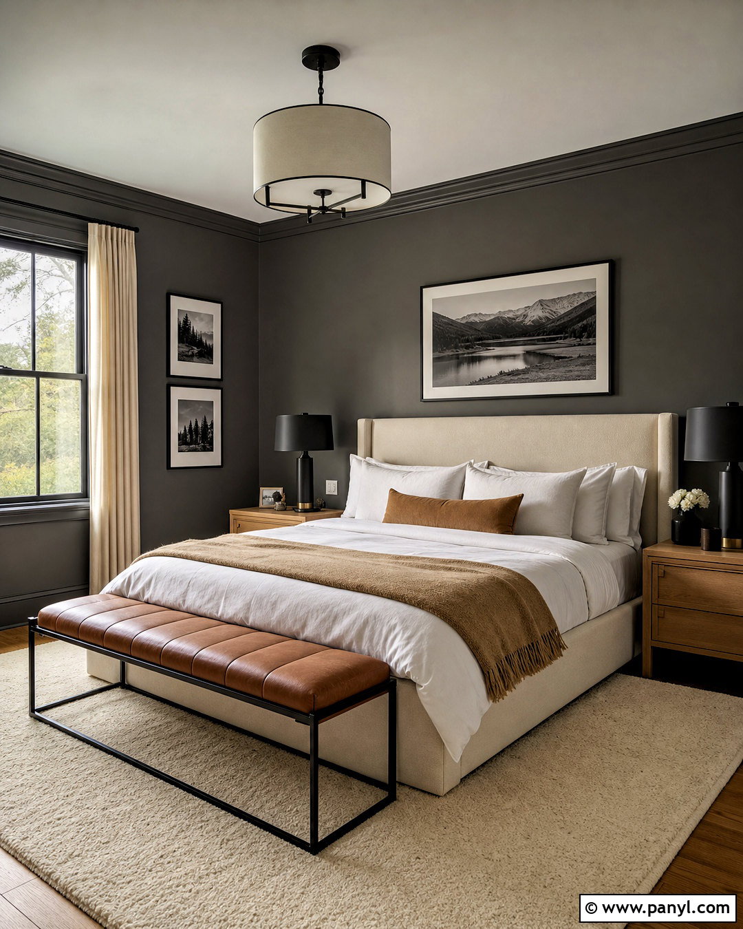
Soft charcoal provides a dramatic neutral alternative for a media room, office, or intimate lounge. Choose a softened charcoal with brown or green undertones rather than a cold blue-black. Apply it to the walls, built-ins, and trim for a continuous backdrop. Balance the depth with a camel sofa, cream rug, and light oak coffee table. Linen curtains in warm ivory help frame the windows and reflect daylight. Add bronze sconces, walnut shelving, and artwork with broad white mats. Keep the ceiling a lighter mushroom or warm white if the room is small. This complete scheme feels cozy and refined rather than dark because pale upholstery, natural wood, layered lighting, and clear walkways provide contrast throughout the space.
Conclusion:
The **20 Best Neutral Wall Colors 2027** move beyond cold gray and plain white, offering warmer and more expressive choices for every room. Cream, linen, sand, greige, mushroom, khaki, clay, and softened earth tones create flexible backgrounds while giving interiors greater depth. The best wall color should connect naturally with the room’s flooring, furniture, lighting, and permanent finishes. Test large samples on multiple walls and observe them from morning through evening before making a final decision. Once the undertone is correct, build a complete palette with natural wood, stone, woven textiles, and controlled contrast. This thoughtful process will help your neutral interior remain comfortable, cohesive, and visually appealing well beyond 2027.

Related Ideas and Inspiration:
Leave a Reply