
Gingham feels instantly cheerful, nostalgic, and easy to personalize. The best **gingham background aesthetic ideas** go beyond a basic checked pattern by combining color, texture, scale, and small decorative details into one polished composition. Soft pink checks can feel romantic, while brown, navy, or black gingham creates a more grounded look. Florals, fruit motifs, ribbons, lace, and paper textures can also shape the mood without making the design feel crowded. Whether you need inspiration for a phone wallpaper, desktop screen, social media graphic, invitation, or printable paper, consistent spacing and a controlled color palette make a noticeable difference. The complete looks below explore 20 creative and practical **gingham background aesthetic ideas** for different moods and uses.

1. Pink Gingham Background
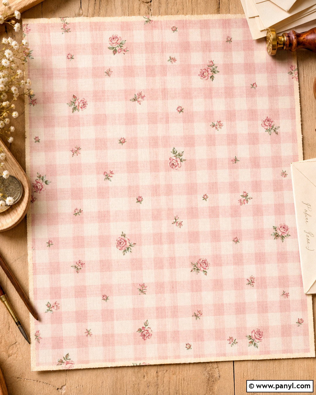
A soft pink gingham background creates a sweet, relaxed look that works especially well for phone wallpapers, digital planners, and feminine social graphics. Start with pale blush and warm white checks in a medium scale, keeping the contrast gentle enough for icons or text to remain visible. Add a slightly faded fabric texture so the pattern feels tactile rather than digitally flat. A thin cream border, tiny rosebuds in the corners, and a centered blank area can complete the composition without overwhelming it. For a cleaner result, repeat just one floral accent instead of scattering several decorative elements. Warm pink, ivory, and muted green should form the complete palette, creating a cohesive background with soft cottage-inspired character.
2. Blue Gingham Background
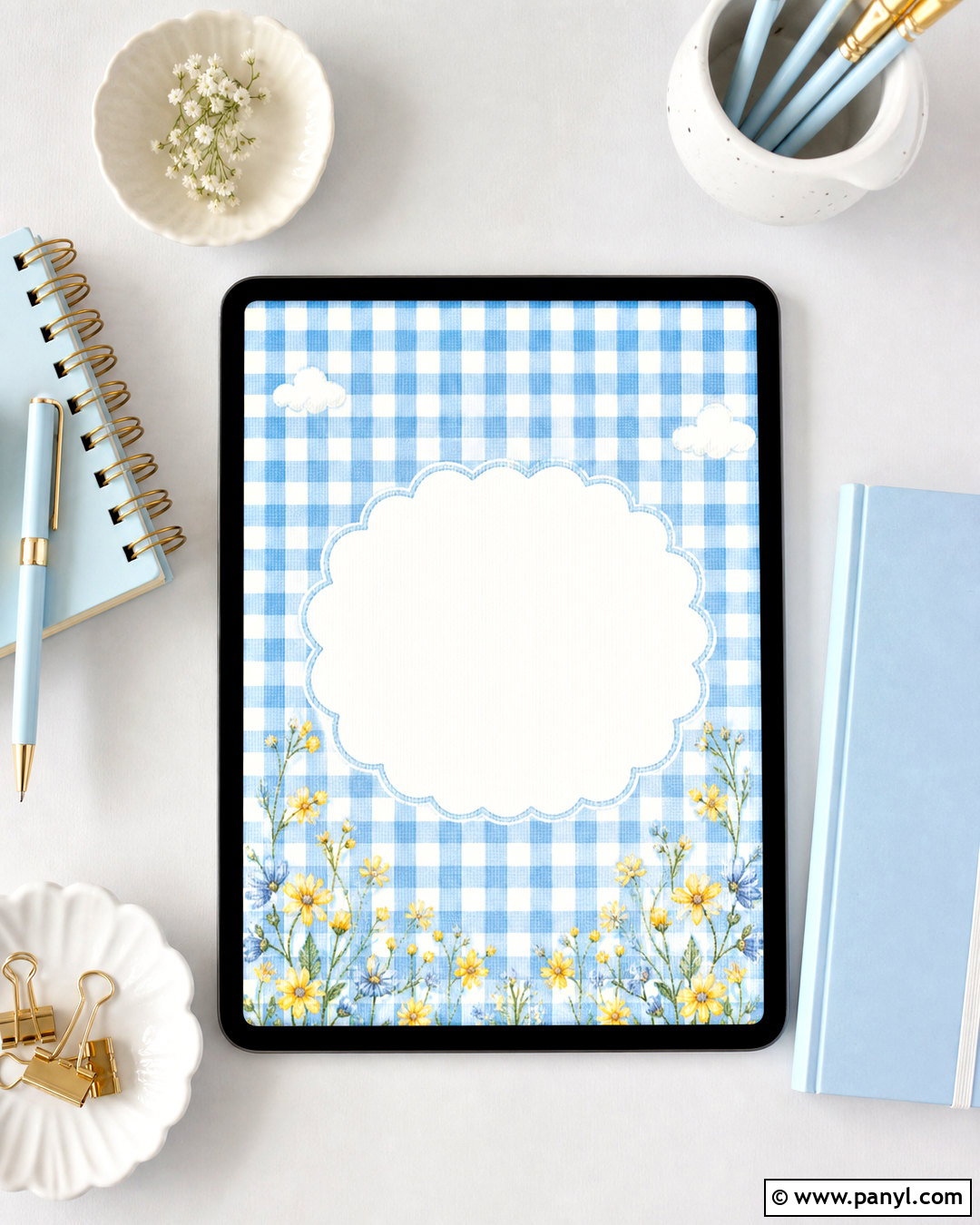
Fresh blue and white checks bring an airy, calming quality to a gingham background. Choose powder blue for a gentle aesthetic or cornflower blue for stronger definition. The entire design can include medium checks, a white scalloped frame, and a few delicate cloud or wildflower illustrations around the outer edges. Keep the center relatively open if the background will hold text, calendar widgets, or app icons. A subtle woven-cotton texture adds depth while preserving a bright appearance. Pair the blue with crisp white, pale gray, and tiny touches of butter yellow. This complete palette feels clean and playful without looking childish, making it suitable for tablet screens, stationery, summer announcements, and peaceful desktop wallpaper.
3. Sage Green Gingham Background
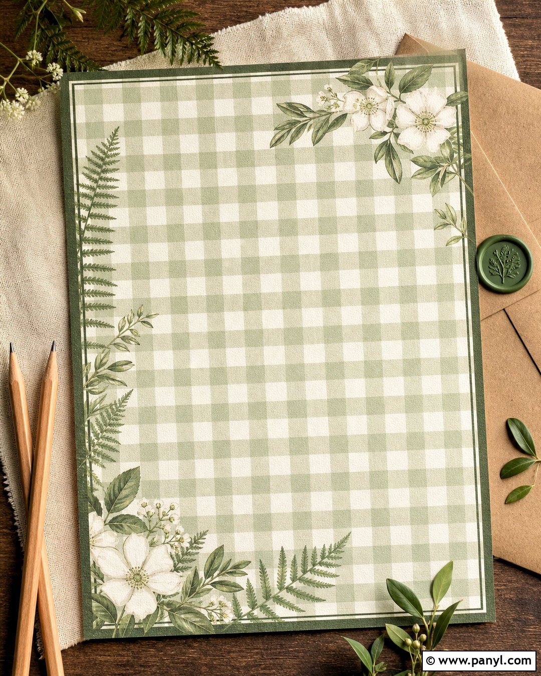
Sage green checks offer a grounded alternative to brighter pastel gingham. Build the background with muted green and creamy white squares, then introduce botanical accents such as small fern sprigs, olive leaves, or delicate white blossoms. A fine dark green outline around the border can give the composition structure. For a natural finish, layer in a faint linen texture and slightly irregular check edges that resemble hand-printed fabric. Leave breathing room between the decorative plants so the pattern remains easy to see. This complete look works beautifully with warm beige, off-white, and light oak tones. It is especially effective for cottagecore graphics, digital journals, recipe cards, garden-themed invitations, and calm phone backgrounds.
4. Lavender Gingham Background
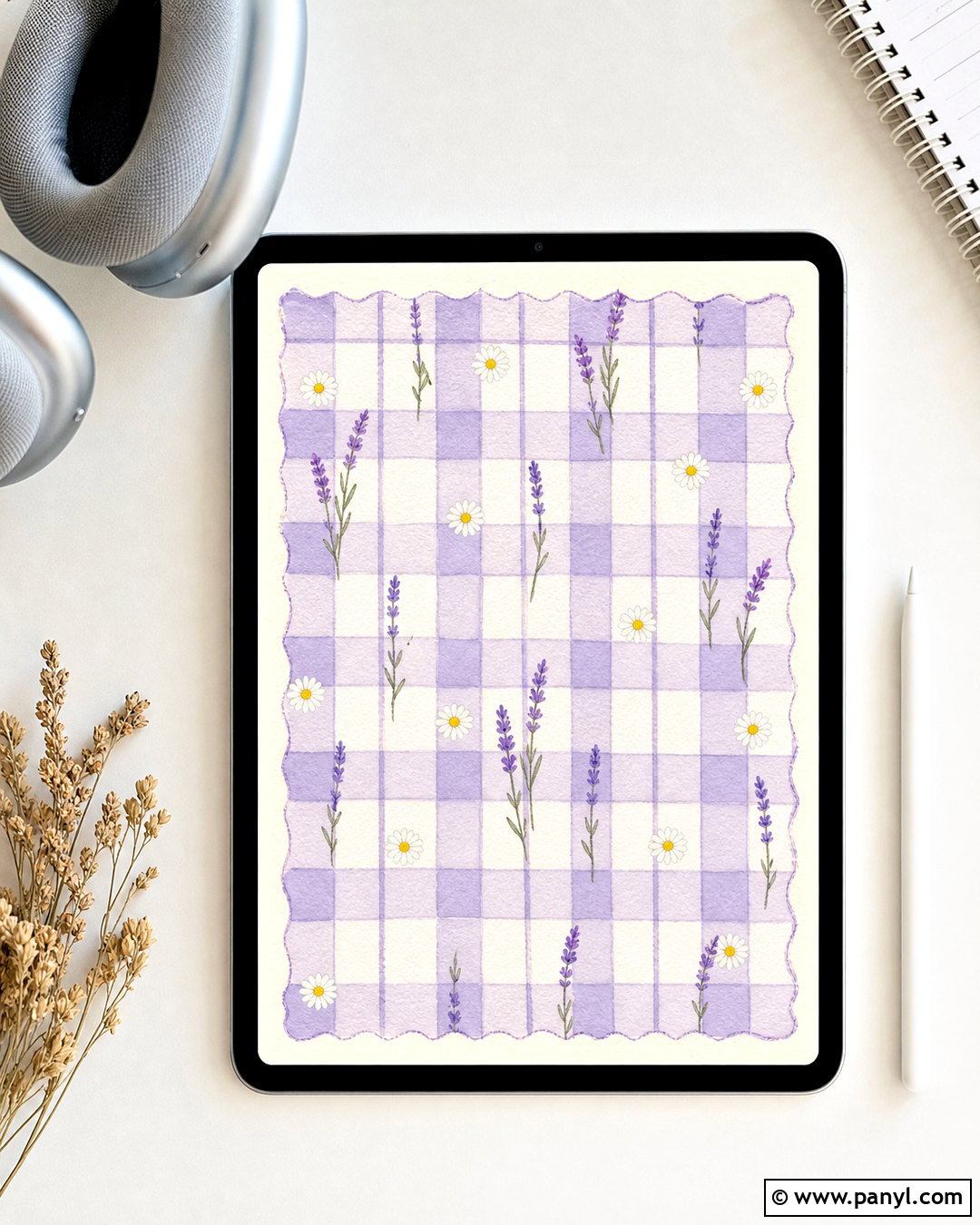
Imagine soft lavender checks paired with tiny white flowers and a graceful cream border. This gingham background should feel light, dreamy, and polished rather than overly sugary. Use pale purple and white for the main check pattern, then add deeper violet sparingly through narrow outlines or small botanical details. A watercolor finish can soften the grid and make the squares look hand-painted. Place miniature daisies or lavender stems near opposite corners to balance the composition while keeping the middle uncluttered. For additional depth, include a faint paper grain beneath the checks. The completed background pairs beautifully with white icons, charcoal lettering, or silver-gray details, making it useful for spring stationery, tablet wallpaper, and gentle bedroom-inspired digital designs.
5. Yellow Gingham Background
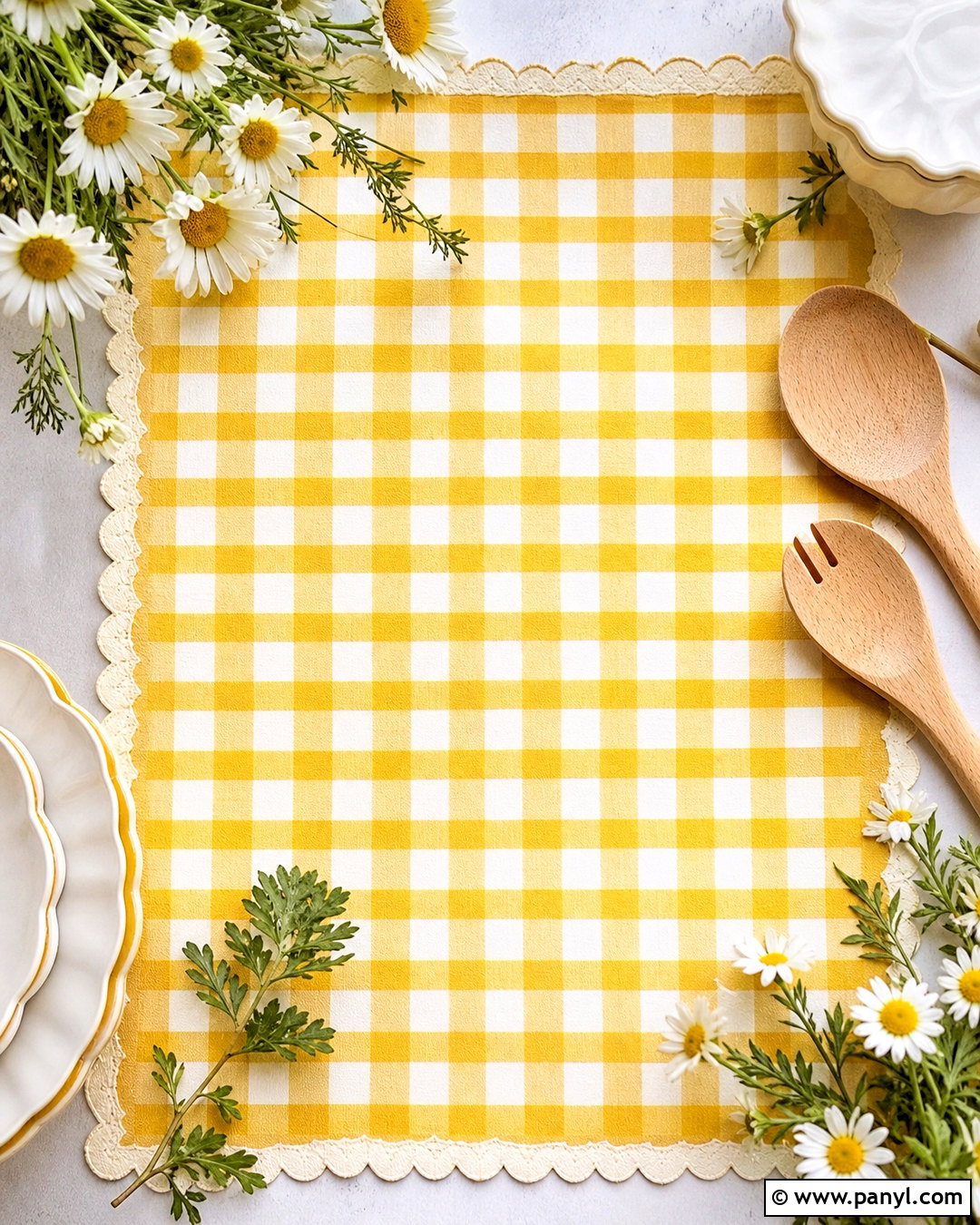
A yellow gingham background can capture the bright feeling of a sunny kitchen or spring picnic. Use butter yellow rather than neon tones, combining it with warm white checks for a pleasant, readable pattern. Complete the design with a narrow scalloped edge, tiny chamomile flowers, and restrained touches of leafy green. The checks can be slightly uneven to suggest printed cotton fabric instead of a rigid computer-generated grid. If the background is intended for a screen, keep the center simple and position flowers around the perimeter. Soft cream, golden yellow, white, and fresh green produce a balanced palette. This cheerful composition suits recipe pages, brunch invitations, seasonal wallpapers, packaging, and optimistic social media graphics.
6. Red Gingham Background
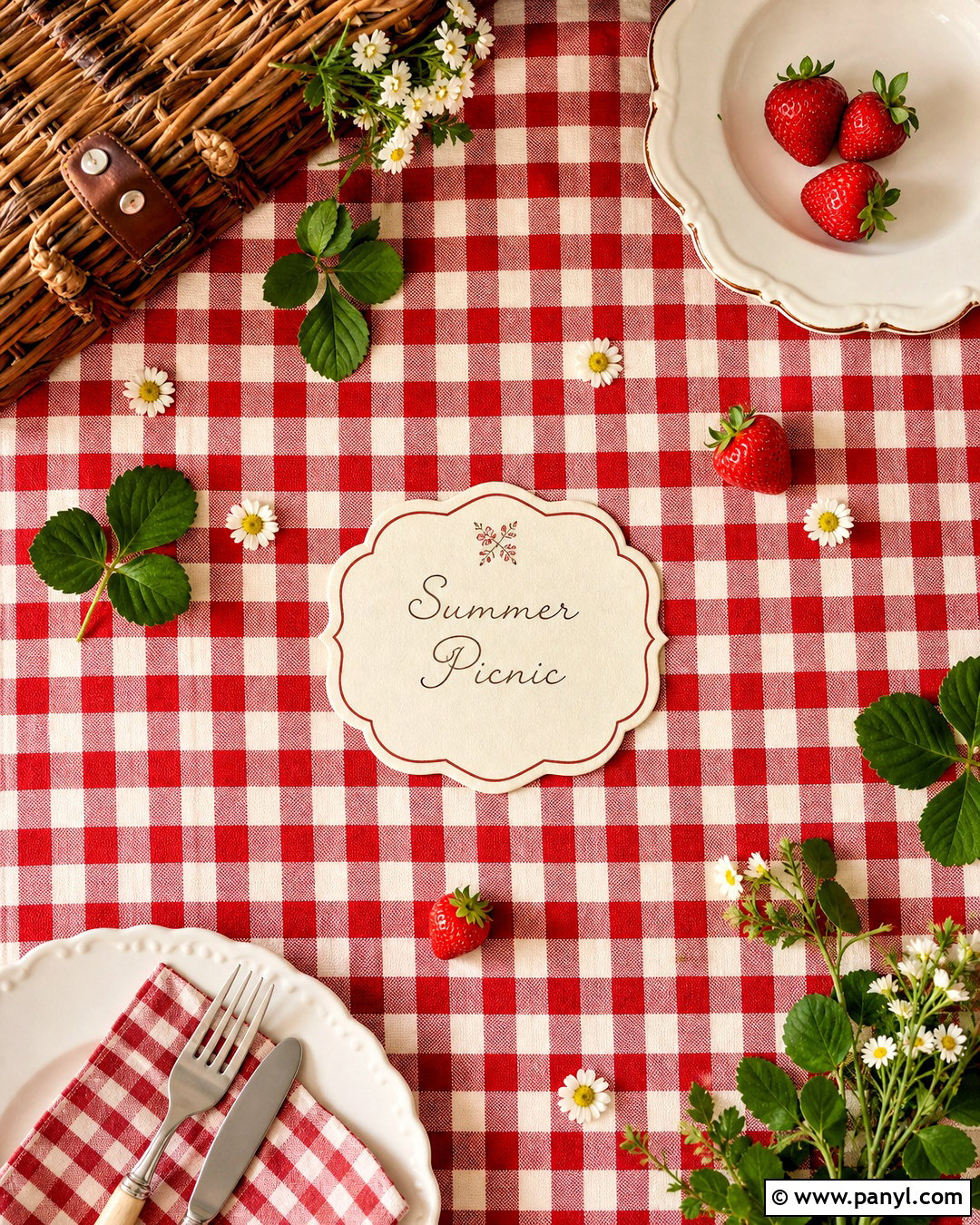
Classic red gingham has a bold, nostalgic personality that instantly recalls outdoor picnics and welcoming country kitchens. Build the composition with cherry red, soft white, and slightly faded overlapping checks. Instead of covering everything with extra motifs, add a cream label shape in the center and small strawberry or daisy details near the corners. A woven fabric texture will make the pattern feel familiar and realistic. Keep the red warm rather than overly dark, and use green accents only in limited amounts. This complete gingham background works well for food-themed graphics, recipe covers, summer party invitations, and cheerful desktop screens. The clear palette provides plenty of personality while maintaining a simple, recognizable structure.
7. Brown Gingham Background
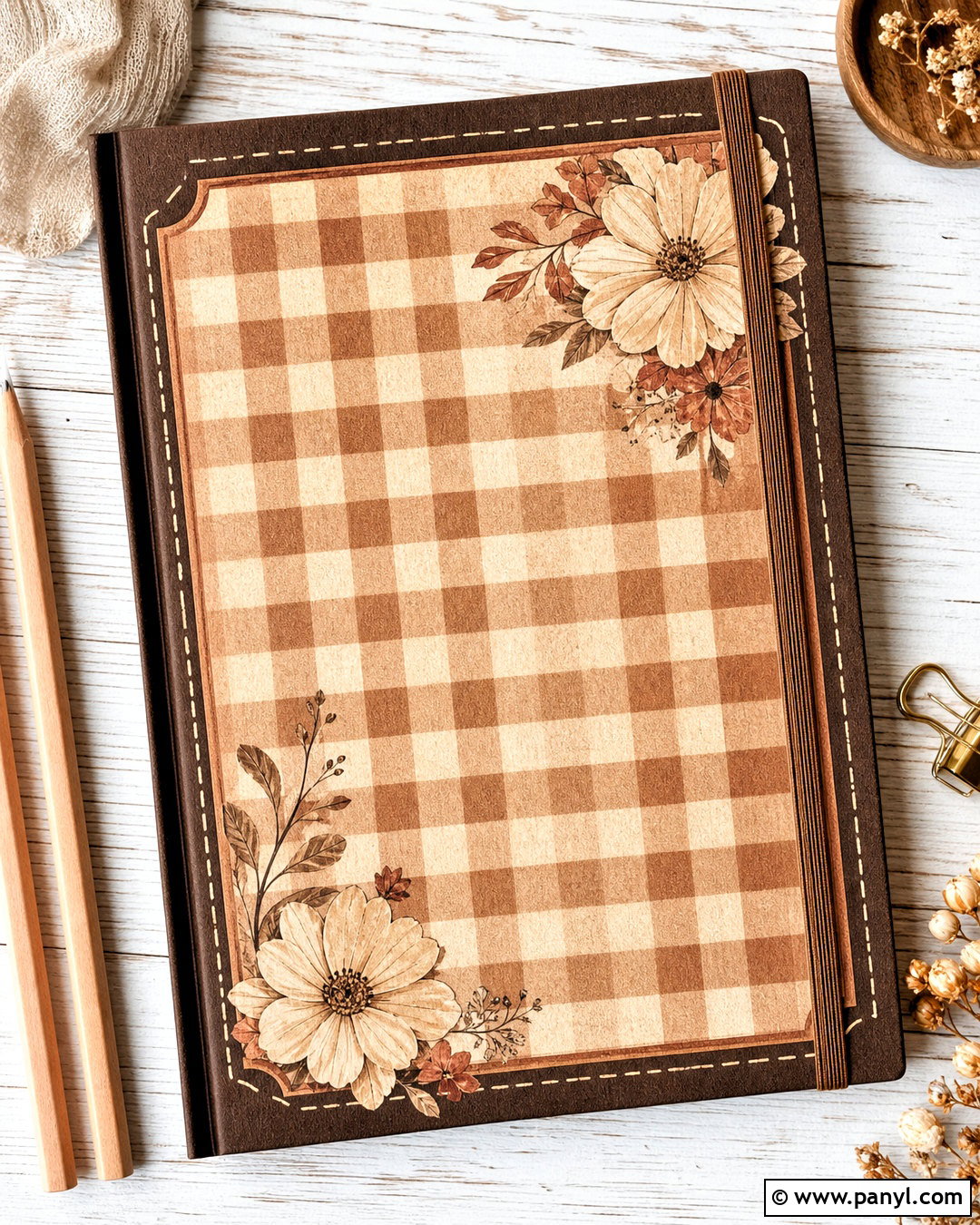
Warm brown gingham creates a cozy, understated background with vintage appeal. Choose caramel and cream checks in a medium or small scale, then layer in a subtle recycled-paper texture. A dark espresso border can frame the design, while tiny beige flowers, leaves, or simple stitched lines add detail without disrupting the neutral palette. To keep the composition from feeling heavy, use cream generously and reserve the darkest brown for outlines. A softly faded finish makes the complete background suitable for autumn graphics, café branding, journal pages, and neutral desktop wallpaper. Pair it with ivory lettering, muted terracotta accents, or warm gray icons. The finished look should feel comfortable, handmade, and gently nostalgic rather than rustic or distressed.
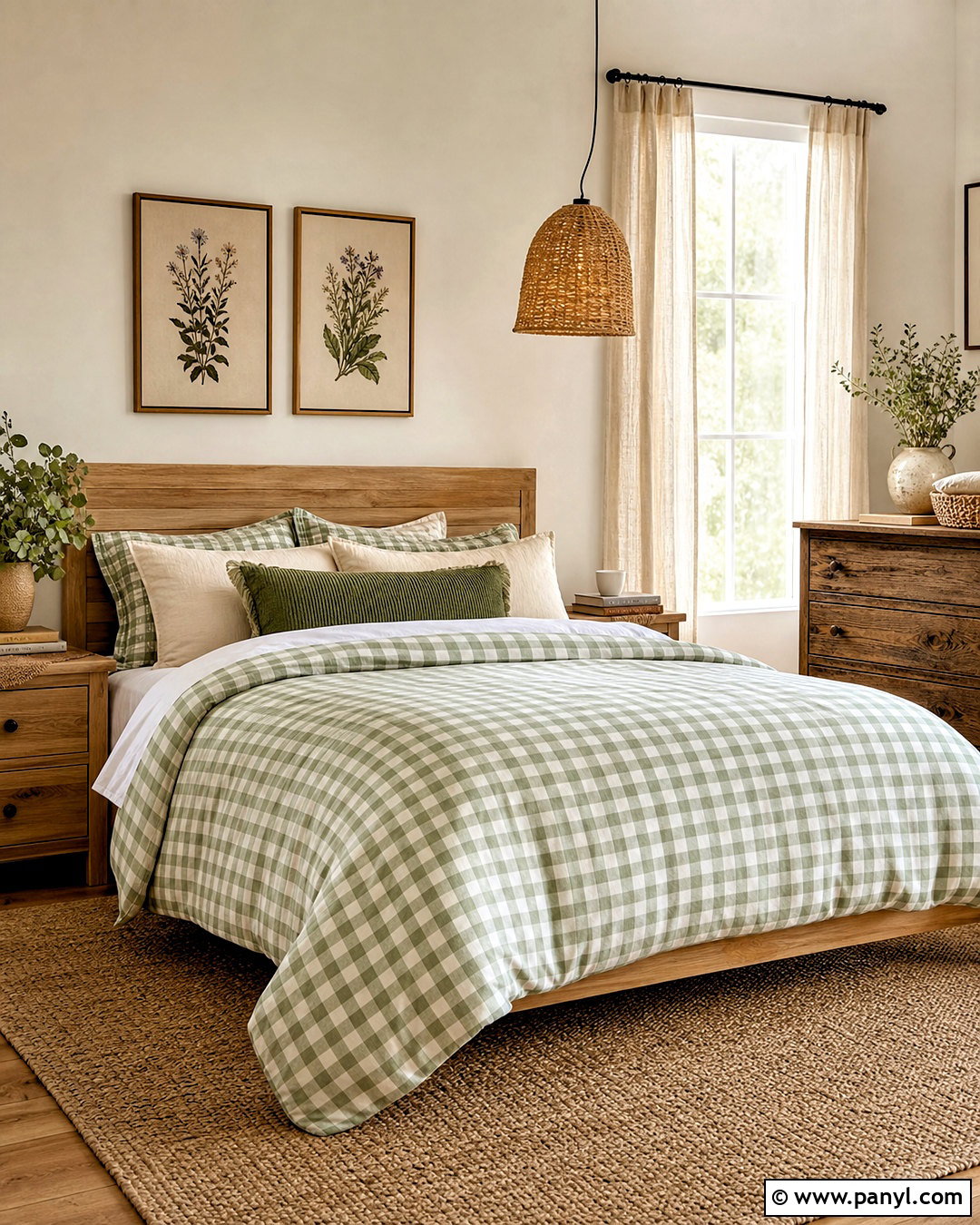
8. Black And White Gingham Background
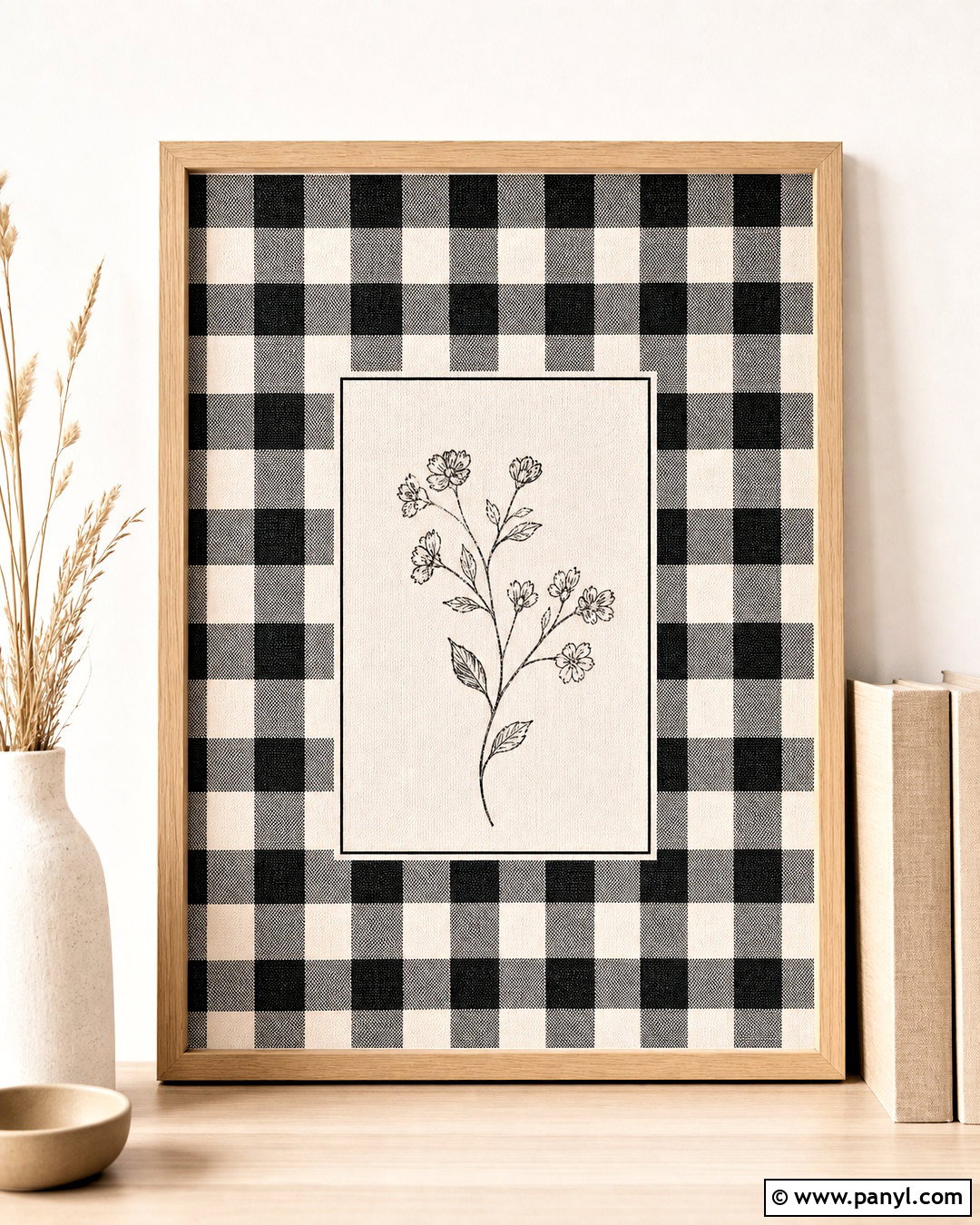
For a crisp and versatile design, use black and white gingham with a simple, modern composition. Medium-scale checks provide visual movement, while an off-white center panel gives text, photographs, or icons a quiet place to sit. Introduce a thin black frame and perhaps one understated botanical line drawing in a corner. Avoid adding too many motifs because the high-contrast checks already make a strong statement. A very subtle canvas texture can soften the sharp geometry without making the pattern look aged. This complete background works for monochrome social graphics, printable labels, desktop organization, and minimalist stationery. Small beige or muted green accents can warm the design while preserving its clean, graphic character.
9. Peach Gingham Background
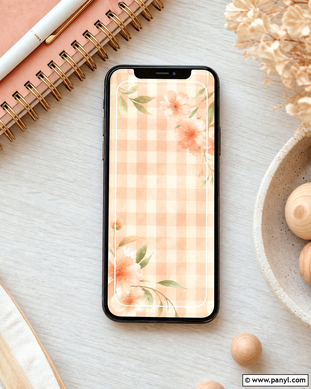
Peach gingham feels warm, friendly, and softer than bright orange. Create the main pattern with pale peach, creamy white, and a slightly deeper coral shade where the checks overlap. A rounded white frame in the center can hold a quote, calendar, or photograph. Complete the edges with tiny peach blossoms, delicate leaves, or simple curved lines in muted green. A lightly brushed watercolor texture keeps the grid from appearing too formal. Use decorative details in only two corners to maintain balance and open space. This gingham background is well suited to summer phone wallpaper, baby shower stationery, digital scrapbooks, and welcoming social posts. The finished composition should feel sunny, gentle, and cohesive.

10. Mint Gingham Background
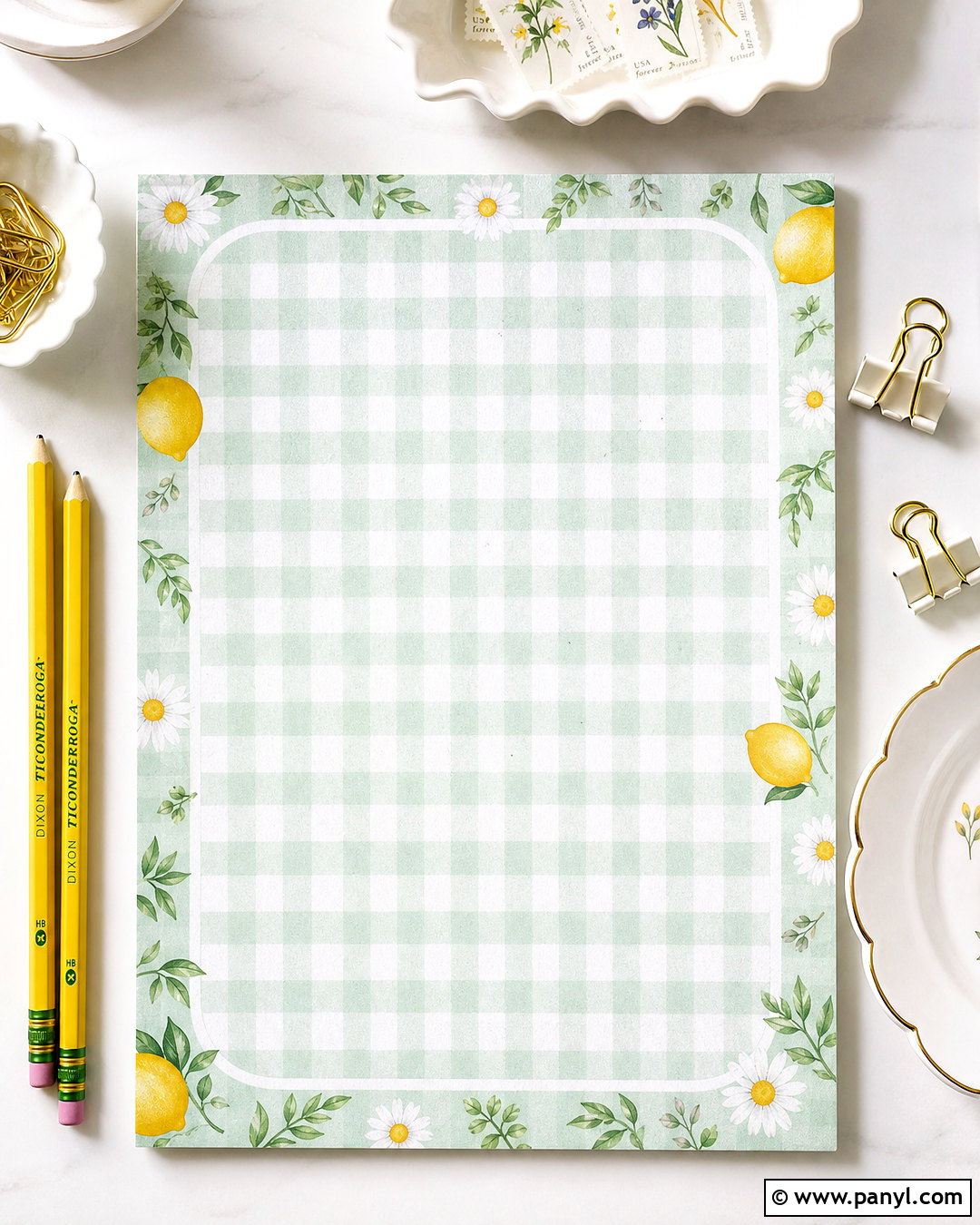
Cool mint checks can make a gingham background look refreshing and uncluttered. Use pale mint green against clean white, choosing small or medium checks depending on how much text will appear over the pattern. Add a slim white border with rounded corners and a few tiny lemon, leaf, or daisy illustrations near the edges. Soft yellow provides contrast, while deeper green outlines keep the decorative details clear. For texture, include faint paper fibers or a smooth watercolor wash rather than heavy distressing. The full design works especially well for spring graphics, recipe templates, tablet wallpaper, and neat digital planners. Maintain generous open areas so the background remains useful, not merely decorative, across different screen sizes.
11. Pastel Rainbow Gingham Background
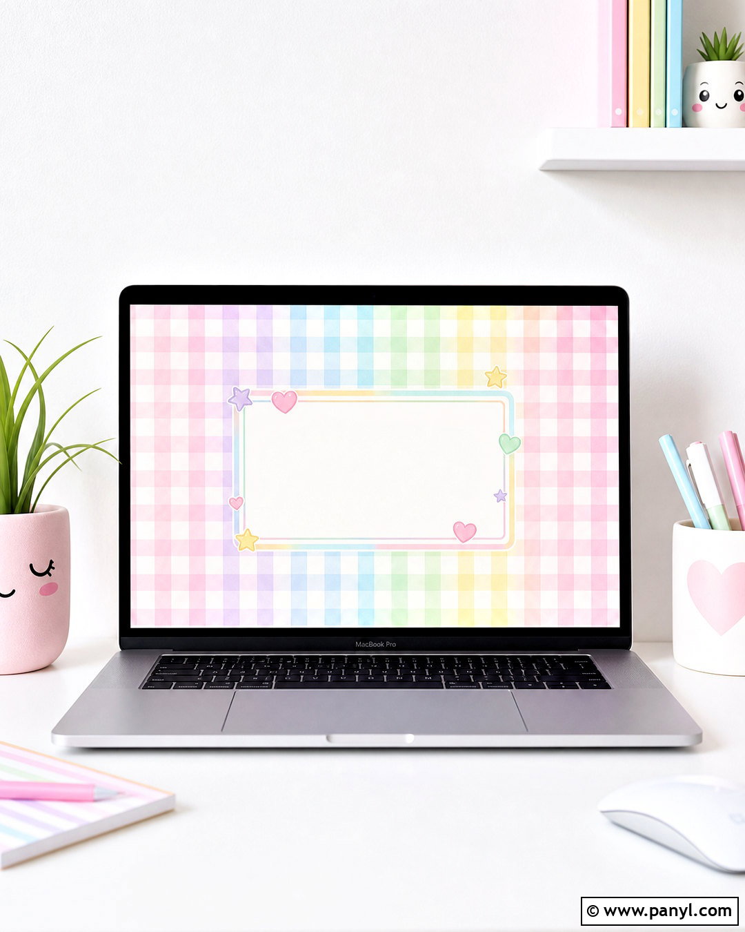
A pastel rainbow gingham background offers more color while remaining soft and organized. Alternate pale pink, lavender, sky blue, mint, and butter yellow across an evenly spaced grid. Use white intersections to prevent the composition from becoming too busy. A simple white center panel or lightly blurred middle area can improve readability for icons and lettering. Finish the design with a thin multicolor border and a few tiny stars or hearts placed symmetrically around the outside. The checks should share the same low saturation level so no single hue dominates. This complete background brings playful energy to children’s printables, creative desktop wallpaper, party graphics, and cheerful social posts while maintaining a coordinated, polished appearance.
12. Strawberry Gingham Background
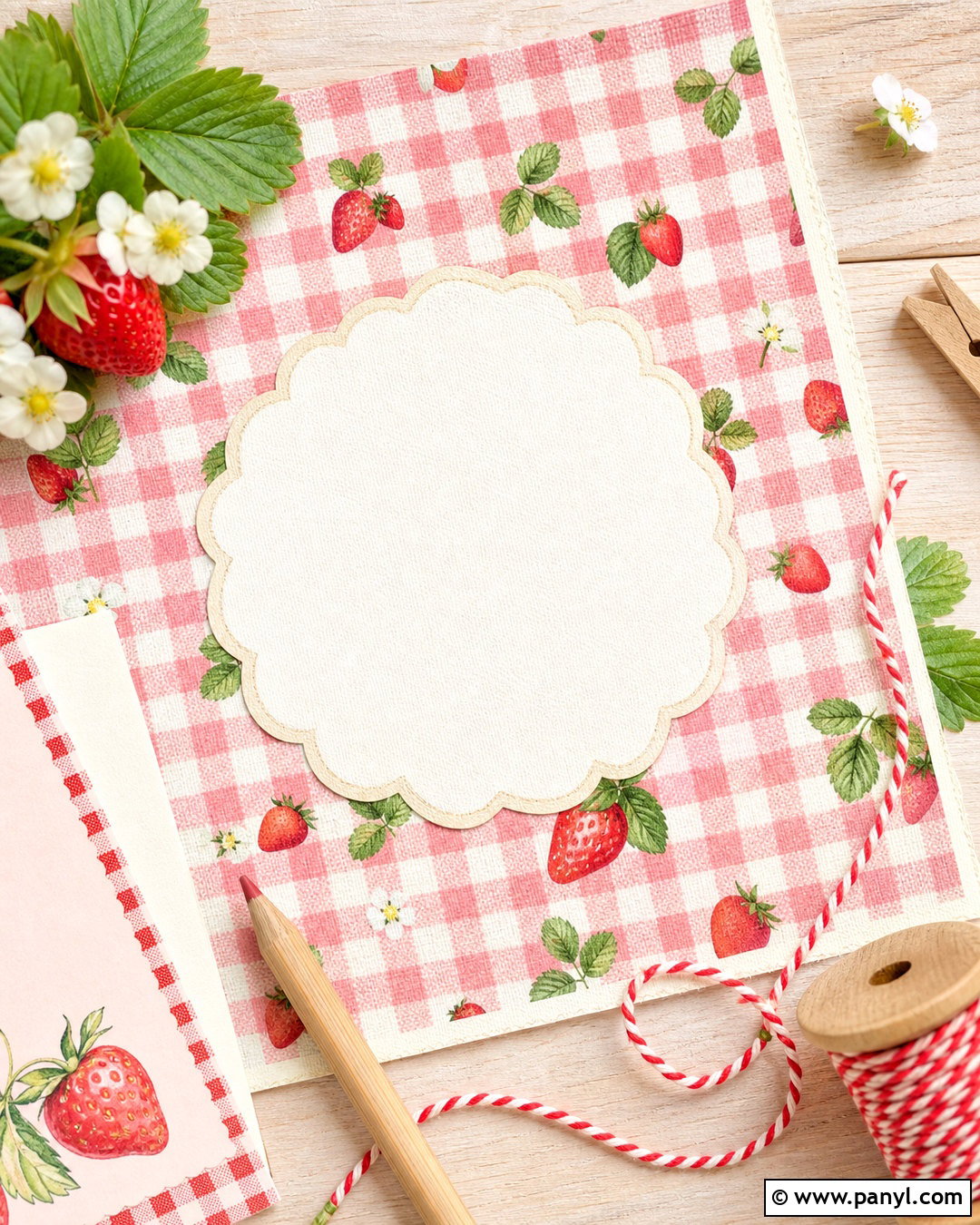
Tiny strawberries can transform red or pink gingham into a complete summer-inspired composition. Begin with blush pink and white checks, then scatter miniature red strawberries at controlled intervals instead of placing them inside every square. Add fresh green leaves and a few small white blossoms to connect the fruit motif with the background. A cream scalloped frame can surround the design, while an open center keeps it suitable for phone icons or invitation wording. Select a small check scale so the strawberries remain easy to identify. Slightly faded colors and a cotton texture will reinforce the handmade cottage feeling. The finished background works for recipe cards, picnic graphics, digital paper, and charming seasonal wallpaper.
13. Daisy Gingham Background
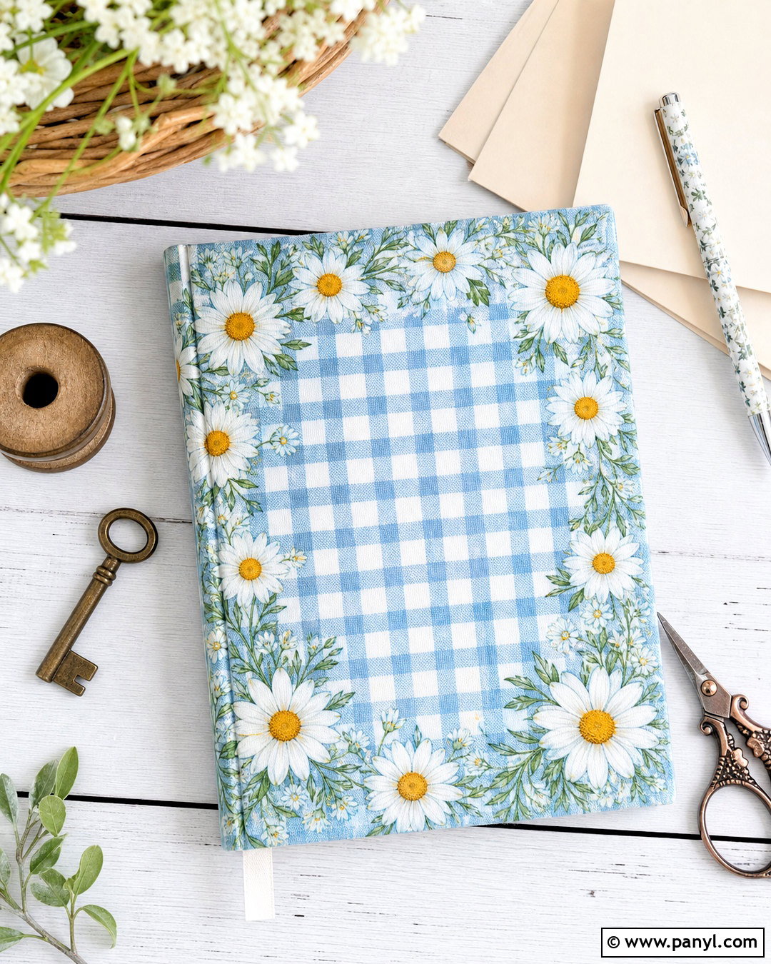
White daisies bring a fresh garden detail to colorful gingham without making the design complicated. Choose sky blue, soft yellow, or sage green checks for the base, then add evenly spaced daisies with golden centers. Let several flowers overlap the border so the composition feels layered, but preserve a clean central area for practical use. A hand-painted finish works particularly well because slightly imperfect petals complement the familiar check pattern. Keep stems and leaves minimal, using muted green to avoid competing with the base color. This complete gingham background feels appropriate for spring announcements, journal covers, laptop wallpaper, and garden-themed stationery. The final arrangement should look bright and natural, with balanced spacing between every decorative feature.
14. Cherry Gingham Background
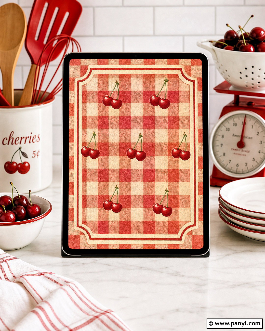
A cherry gingham background combines retro charm with a bold, recognizable color palette. Use cream and pale red checks as the foundation, adding pairs of glossy red cherries with slim green stems around the edges. A rounded cream frame can sit in the center, outlined in muted burgundy for stronger definition. Keep the fruit illustrations small and consistently spaced so they enhance rather than hide the gingham. Slight paper grain and faded corners can give the finished design a vintage print quality. Red, cream, burgundy, and leaf green create a cohesive composition for kitchen printables, summer invitations, phone wallpaper, and playful branding. The overall background should feel cheerful and nostalgic, not overly saturated or visually crowded.
15. Bow Gingham Background
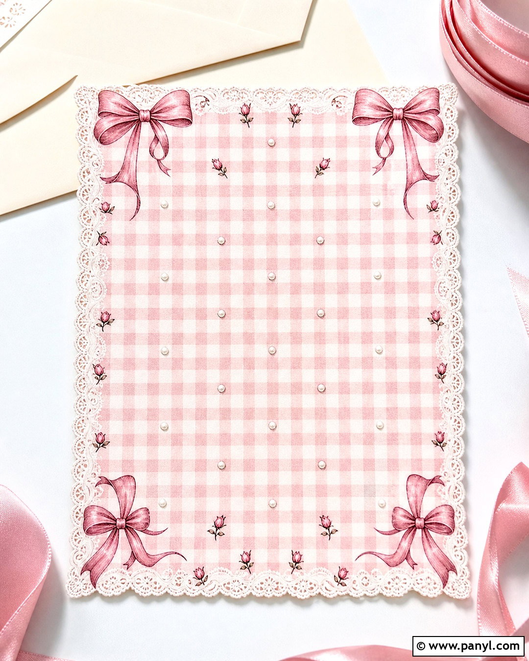
Delicate bows can give pink gingham a romantic coquette-inspired appearance. Begin with small blush and white checks, then arrange cream or dusty rose ribbon bows in a loose, repeating pattern. Use fine outlines and soft shading so each bow remains clear at phone-screen size. A lace-like border can frame the composition, but the middle should stay relatively open if widgets or lettering will be added. Pearly white accents and tiny rosebuds provide extra detail without introducing unrelated colors. The full gingham background works beautifully for digital invitations, tablet wallpaper, printable stationery, and feminine social media templates. Consistent bow sizes, generous spacing, and a restrained pink palette keep the design polished rather than excessively decorated.
16. Lace Gingham Background
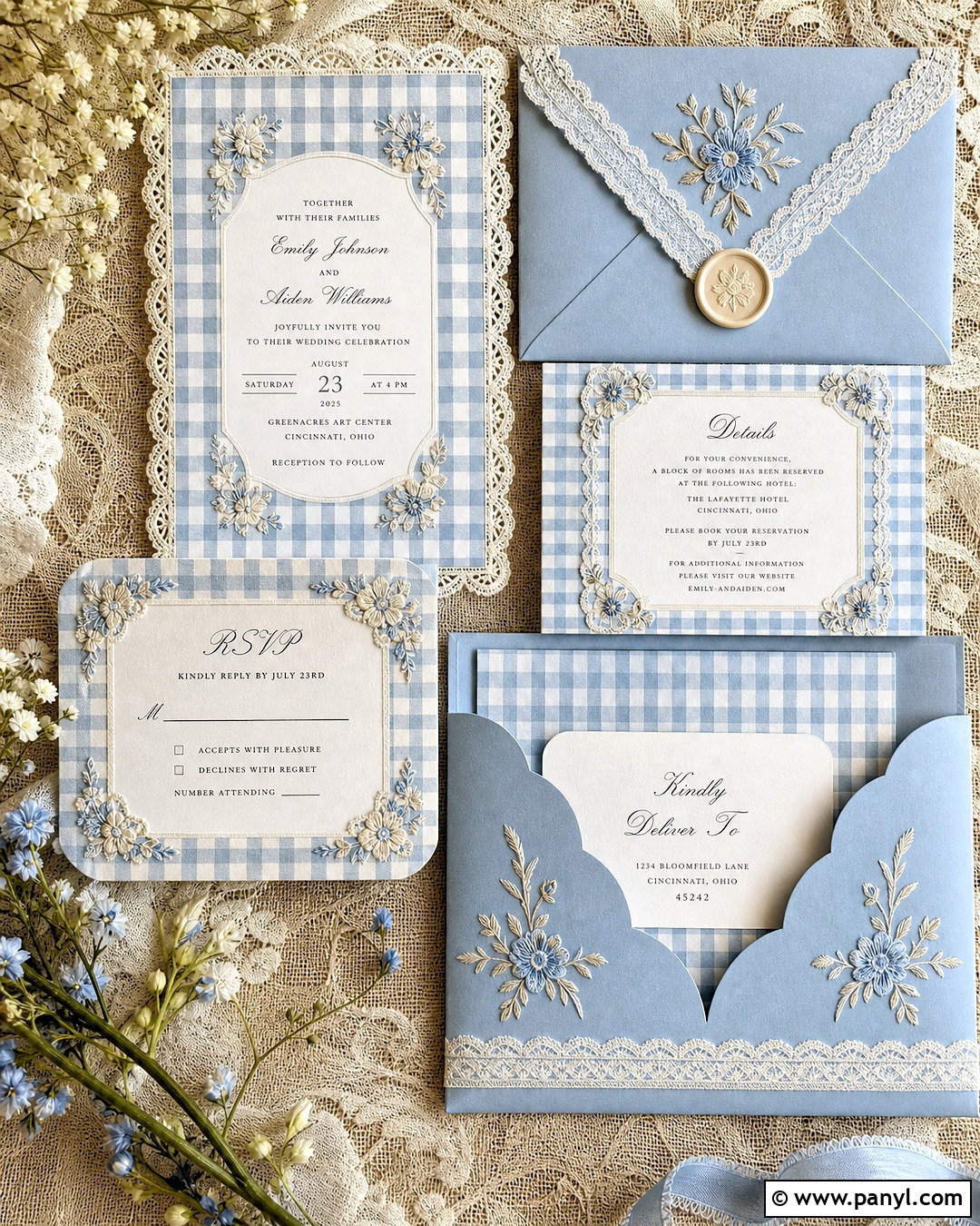
Lace and gingham create a layered cottage-inspired background with plenty of softness. Start with powder blue, blush pink, or pale sage checks, then place narrow white lace borders along two opposite edges. Add a small embroidered floral motif near each corner to connect the decorative frame with the checked base. The lace should remain crisp and delicate, while the gingham can have a faint fabric weave for contrast. Avoid covering the entire design with lace because the checked pattern still needs to remain the main feature. This complete background works for wedding stationery, digital journals, phone wallpaper, and vintage-inspired packaging. Cream, white, and one pastel hue will keep the composition cohesive, readable, and pleasantly detailed.
17. Scrapbook Gingham Background
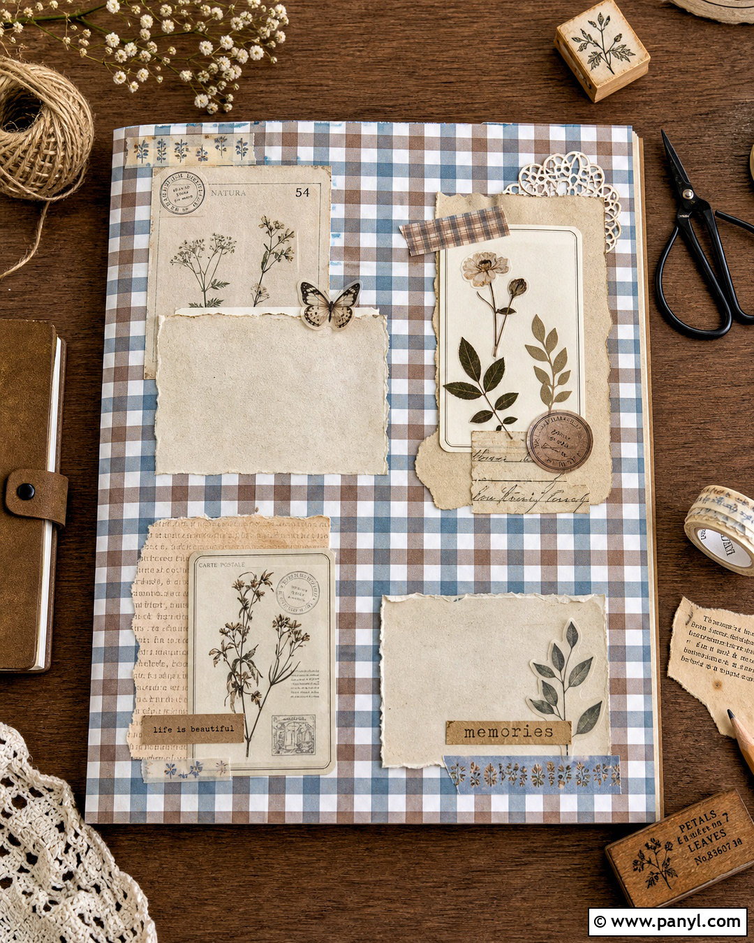
A scrapbook gingham background can feel collected and creative while still following an organized layout. Use muted blue or brown checks as the base, then layer torn cream paper, small floral tape strips, postage-inspired shapes, and pressed botanical illustrations around the edges. Leave one large paper area open in the center for a photograph, title, or calendar. Shadows should be soft and realistic, giving the layers dimension without making the design look messy. Repeat only two or three accent colors throughout the arrangement. This complete composition works for memory pages, desktop organizers, digital journals, and social media collages. Balanced margins and restrained layering will preserve the recognizable gingham pattern beneath the decorative scrapbook elements.
18. Watercolor Gingham Background
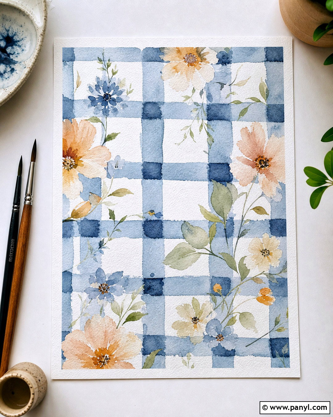
Watercolor gives traditional gingham a softer and more artistic finish. Paint the checks with uneven edges and gentle variations in opacity, using dusty blue, lavender, peach, or sage against a warm white paper base. Slight overlaps should create naturally darker intersections. Complete the background with a loose floral border or several translucent leaves positioned around the corners. A visible cold-pressed paper texture reinforces the handcrafted effect. Keep the center light so the composition can accommodate a quote, invitation details, or screen icons. This adaptable gingham background suits wedding stationery, art prints, tablets, and digital notebooks. Limiting the palette to one main color, white, and two botanical accents will produce the most harmonious result.
19. Desktop Organizer Gingham Background
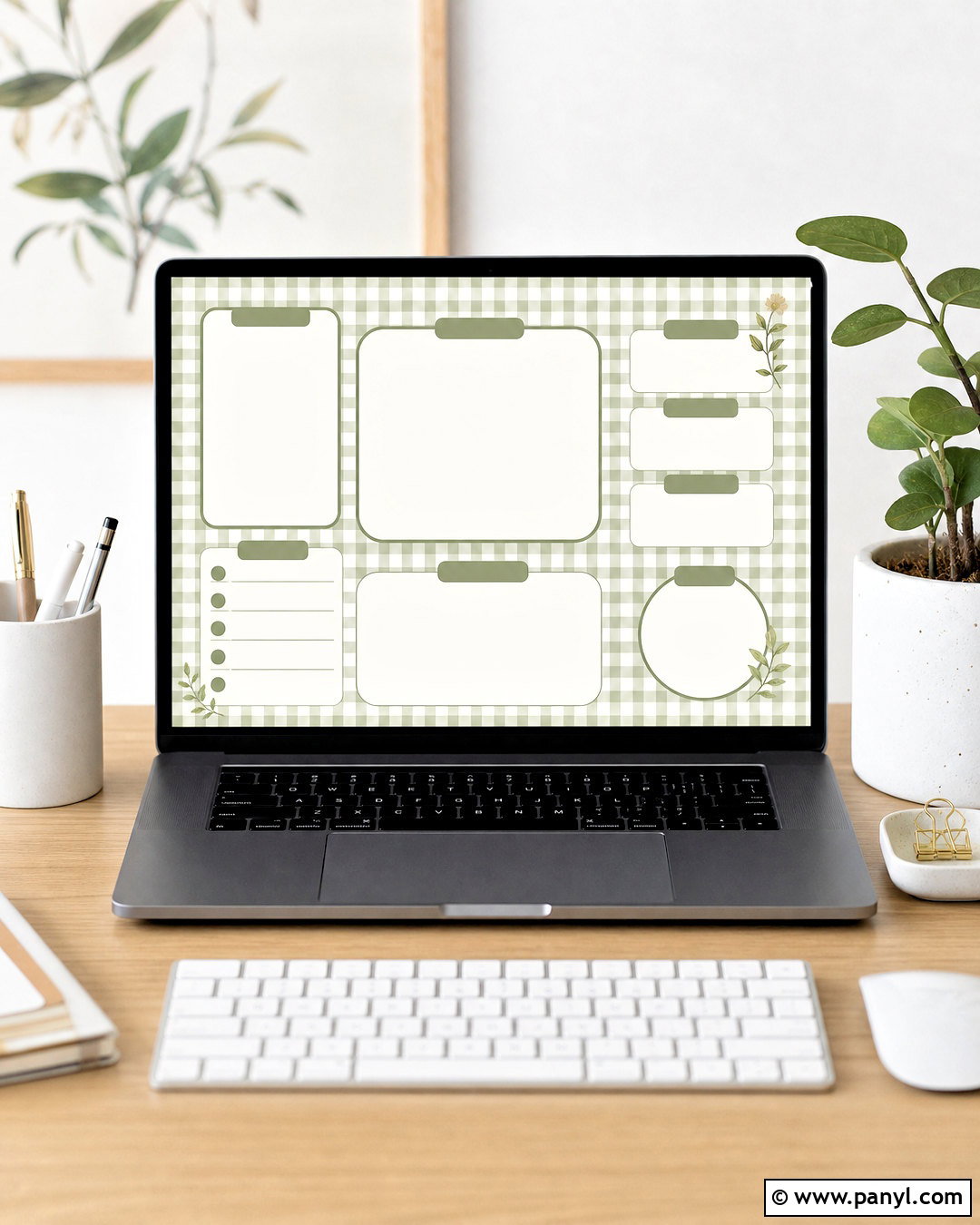
A desktop organizer combines gingham decoration with useful visual structure. Choose a calming sage, blue, or neutral brown check pattern, then add several large cream panels for files, current projects, notes, and weekly priorities. Use rounded corners and simple colored outlines that coordinate with the gingham. Small botanical illustrations can decorate unused corners, but they should never interfere with folder placement or desktop icons. Keep the check scale small and the contrast moderate to reduce visual distraction. The complete layout should include ample negative space and clearly separated functional zones. This gingham background is ideal for anyone who wants a coordinated computer screen that feels decorative, organized, and easy to navigate during everyday work or study sessions.
20. Phone Lock Screen Gingham Background
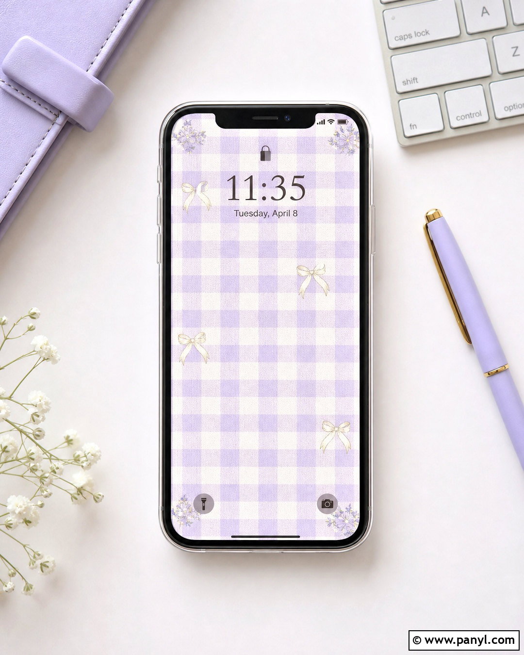
A phone lock screen needs a gingham composition designed around the clock, notifications, and screen controls. Select soft pink, lavender, mint, or blue checks with low contrast, then create a lighter open area across the upper center for readable time and date information. Place tiny florals, bows, cherries, or strawberries near the lower corners rather than behind important interface elements. A subtle fabric or paper texture adds character without reducing clarity. Keep the border narrow so the design adapts to different phone dimensions and cropping. The complete gingham background should look attractive even when partially covered by notifications. Simple spacing, controlled color, and a recognizable central pattern create a lock screen that remains practical and polished.
Conclusion:
These **gingham background aesthetic ideas** show how one familiar check pattern can support many different moods, from soft cottagecore and romantic coquette to cheerful retro and clean minimalism. Begin with a controlled palette, choose a check size that suits the final format, and leave enough open space for text, icons, or photographs. Decorative details should reinforce the central theme rather than hide the gingham beneath them. Florals, fruit, lace, bows, paper layers, and watercolor textures all work when used consistently. Whether you are creating a phone wallpaper, desktop organizer, invitation, or printable page, thoughtful spacing will make the finished background feel attractive, balanced, and genuinely useful.

Related Ideas and Inspiration:



Leave a Reply