
A warm blend of soft orange and blush pink makes peach feel cheerful, calming, and easy to personalize. These peach background aesthetic ideas work beautifully for phone wallpapers, desktop screens, social posts, invitations, presentation covers, and creative branding. The key is building a complete visual composition rather than relying on one flat color. Texture, spacing, accent shades, and carefully selected objects can transform a basic peach palette into something minimal, vintage, floral, playful, or polished. You can also adjust the intensity, moving from pale peach cream to rich coral peach. Whether you prefer clean graphics or detailed photography, the following looks offer practical inspiration for creating memorable 20 peach background aesthetic ideas.

1. Minimal Peach Background

A minimal peach background feels warm without looking busy. Begin with a smooth pale peach base that leans slightly pink rather than bright orange. Place one simple off-white arch or thin cream circle near the lower corner to create balance. A tiny terracotta dot or delicate line drawing can add another focal point without disturbing the open space. Keep most of the center clear if the background will hold app icons, a quote, or presentation text. A subtle paper grain prevents the solid color from appearing flat or unfinished. This design works especially well for phone screens, website headers, and digital planners. Pair it with white, warm beige, or muted brown typography for a soft, polished result.
2. Peach Watercolor Background

Soft edges and blended pigments give a peach watercolor background an artistic, handmade appearance. Combine washes of pale peach, blush pink, and warm apricot across a lightly textured cream surface. Leave a few translucent areas where the paper shows through, creating natural movement and depth. Small white speckles can resemble scattered paint droplets, while one deeper coral wash provides gentle contrast. Avoid filling every corner with equal color because uneven saturation makes the design feel more authentic. Keep the center slightly lighter when using the background for invitations, digital notes, or social media graphics. Cream lettering, dark brown script, or muted sage details pair beautifully with this complete watercolor composition without competing with its flowing texture.
3. Peach Floral Background
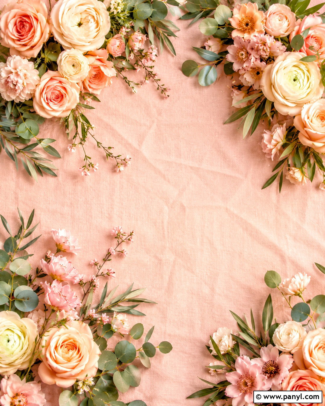
Imagine delicate flowers arranged around the edges of a softly colored canvas. Start with a light peach background, then build a loose border using blush roses, cream ranunculus, peach-colored blossoms, and small green leaves. Keep the floral clusters fuller in two opposite corners and lighter along the remaining edges. This creates a natural frame while preserving useful space in the middle. A faint linen or handmade-paper texture adds softness behind the flowers. For an elegant appearance, use dusty sage and olive foliage rather than bright green. This peach floral background can complement wedding stationery, phone wallpapers, feminine branding, or spring graphics. Complete the palette with ivory, muted coral, and restrained touches of warm gold.
4. Peach Fruit Pattern Background
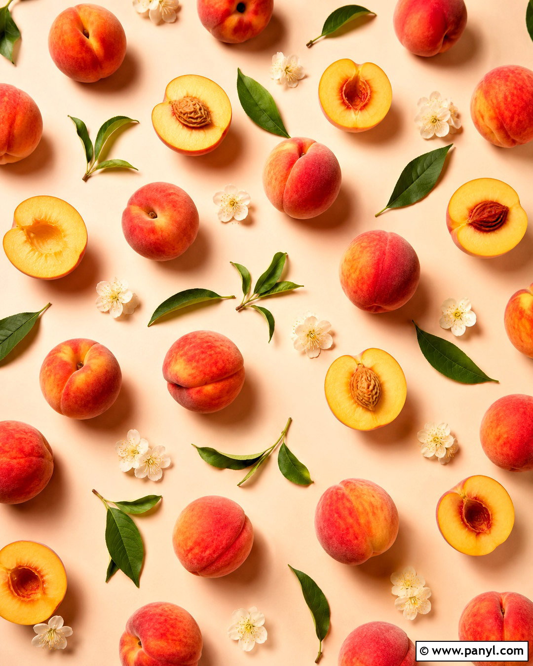
A repeating fruit pattern brings playful energy to a peach background without making it feel childish. Use small illustrated peaches in several positions, including whole fruit, halves, and leafy stems. Arrange them across a pale cream-peach base with generous spacing between each shape. Soft coral fruit, warm yellow highlights, and muted green leaves create enough variation to keep the pattern interesting. Add tiny white flowers or understated dots between larger elements to fill awkward gaps. Maintain a consistent illustration style so the finished background feels coordinated. This design suits kitchen printables, recipe covers, summer party graphics, and cheerful phone wallpapers. A slightly irregular arrangement will appear more relaxed and handcrafted than perfectly aligned rows.
5. Peach Gradient Background

A smooth peach gradient creates depth while remaining clean enough for everyday digital use. Blend pale cream at the top into blush peach through the center, finishing with a richer coral tone near the bottom. The transitions should look soft and seamless, with no harsh color bands. A barely visible glow behind the center can help icons or simple lettering stand out. For additional dimension, include translucent curved shapes in neighboring peach tones along one edge. Keep these layers subtle so the color transition remains the main feature. This peach background works well for smartphones, laptop screens, presentation slides, and social media stories. White, chocolate brown, or deep burgundy accents provide readable contrast without cooling the warm palette.
6. Peach Cloud Background

Dreamy clouds can turn a simple peach background into a gentle sky scene. Use a blush-peach sky that fades into pale apricot near the horizon. Add soft white clouds with rounded forms and faint pink shadows, spacing them unevenly so the composition feels natural. A small group of wispy clouds near the top can balance one fuller cloud formation below. Include a subtle glow behind the clouds instead of a sharply defined sun. Tiny stars may be scattered across the upper section for a whimsical touch, even within the bright daytime palette. The finished peach cloud background is ideal for calming phone wallpapers, journals, or inspirational graphics. Keep the center uncluttered if you plan to add readable text.
7. Peach Sunset Background

Warm peach color appears naturally at sunset, making this background rich and atmospheric. Build the scene with a pale golden horizon, a saturated peach sky, and soft coral-pink clouds overhead. A simple mountain ridge or distant ocean line can anchor the bottom without distracting from the sky. Use muted lavender in the shadows to balance the warmth and create greater visual depth. The sun should appear as a small creamy circle rather than an overpowering bright spot. Gentle grain can give the finished image a nostalgic film quality. This peach sunset background fits travel mood boards, phone wallpapers, social graphics, and reflective quote posts. Keep silhouettes understated so the layered sky remains the strongest part of the composition.

8. Peach Checkerboard Background
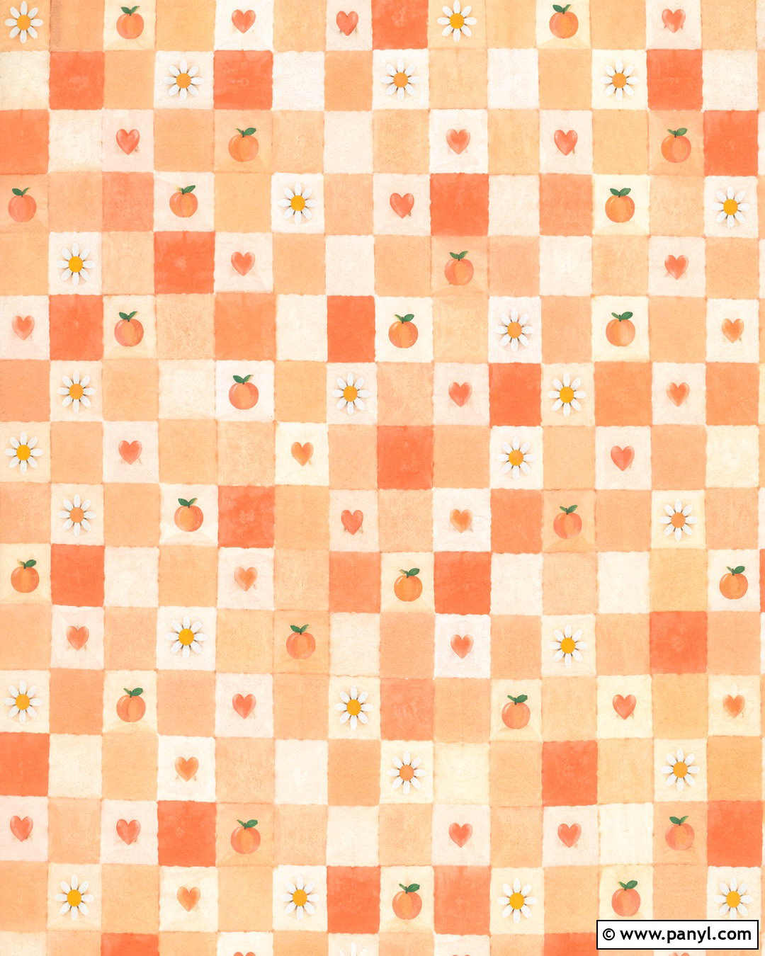
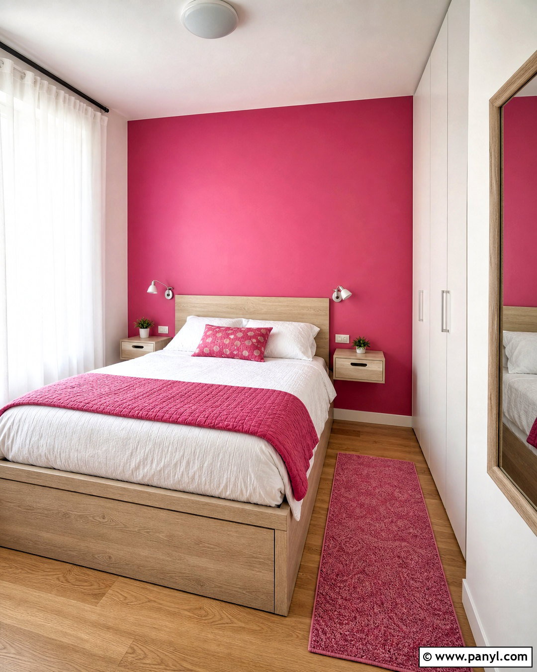
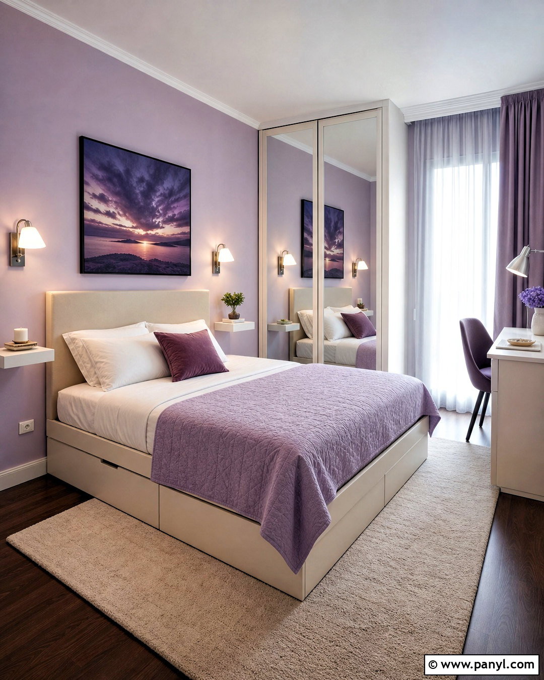
A peach checkerboard background combines retro personality with a clean geometric layout. Alternate pale peach and creamy white squares across the entire design, using slightly rounded or softly imperfect edges for a relaxed look. Introduce a few darker coral squares in selected areas rather than following a strict two-color pattern. Small daisies, hearts, or simple fruit illustrations can sit inside several squares while the rest remain plain. This prevents the composition from looking overly repetitive. A light printed-paper texture adds warmth and removes the harshness often associated with digital grids. The completed pattern works nicely for tablet screens, notebooks, packaging concepts, and social media templates. Pair it with dark brown accents for clear, friendly contrast.
9. Peach Gingham Background
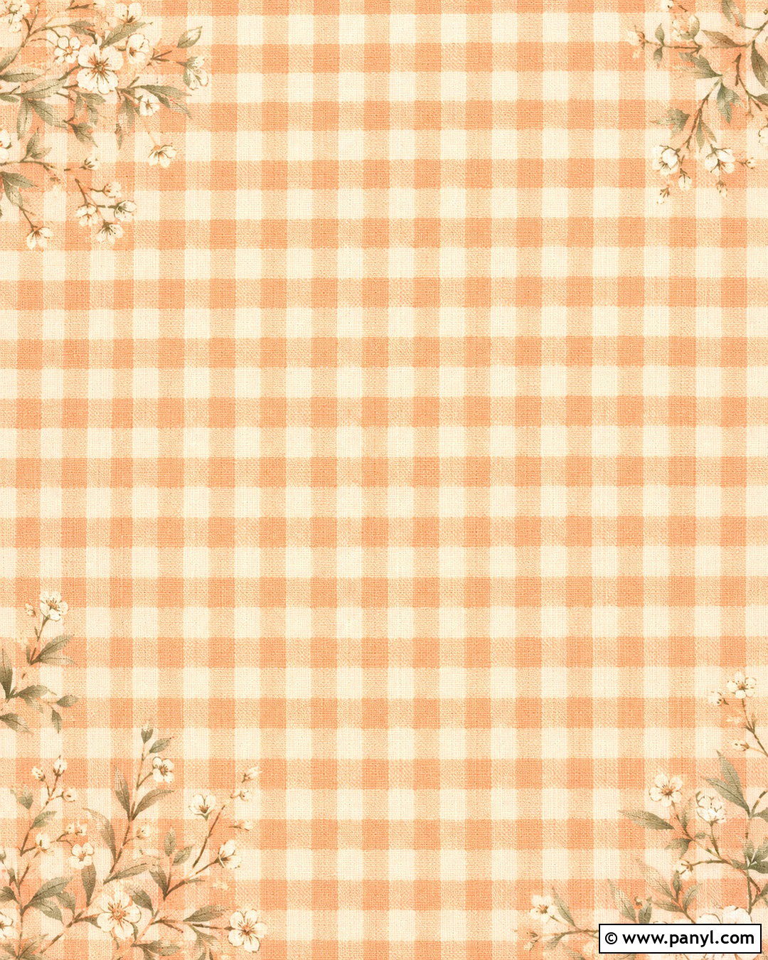
Soft gingham offers a cozy alternative to a bold checkerboard design. Create the pattern with thin cream and muted coral stripes crossing over a light peach base. Where the lines overlap, use a slightly deeper apricot shade to imitate woven fabric. Keep the scale medium so the background looks decorative but does not overwhelm icons or text. A subtle linen texture strengthens the fabric-inspired effect. For a cottage-style finish, add tiny white flowers or simple green leaves around the corners while preserving an open central area. This peach gingham background works especially well for recipe cards, spring invitations, digital planners, and cheerful device wallpapers. Warm ivory and dusty sage accessories complete its gentle, coordinated color scheme.
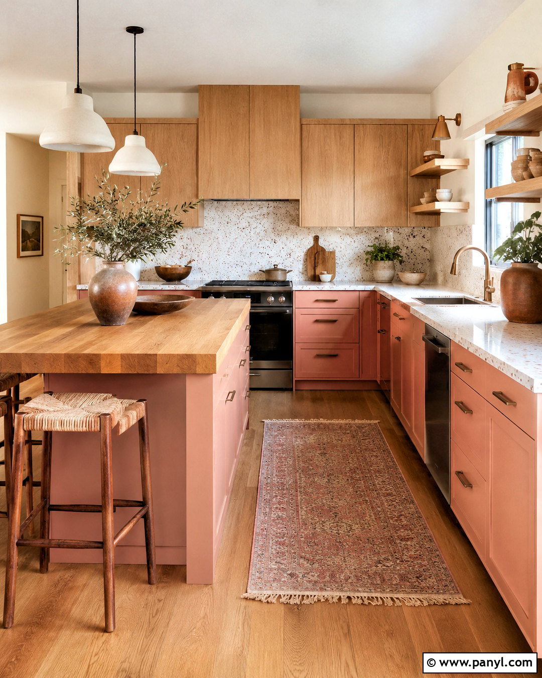
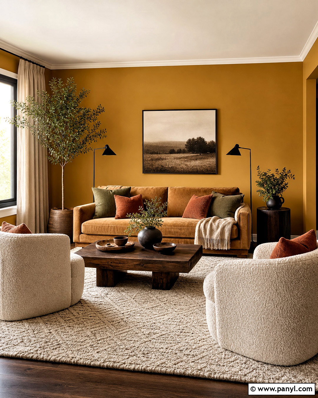
10. Peach Marble Background
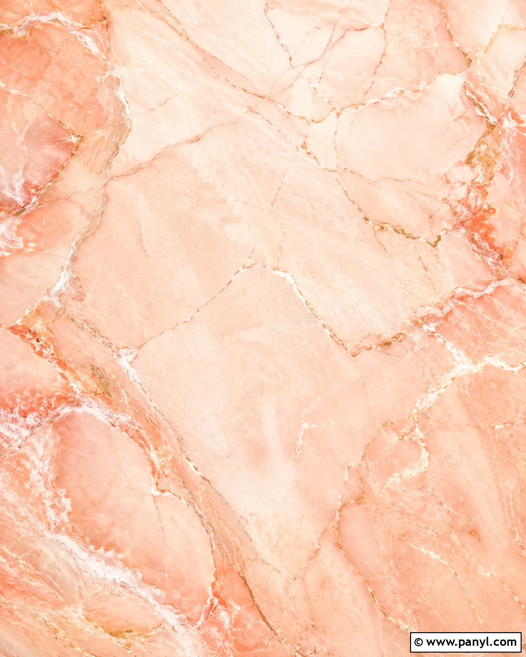
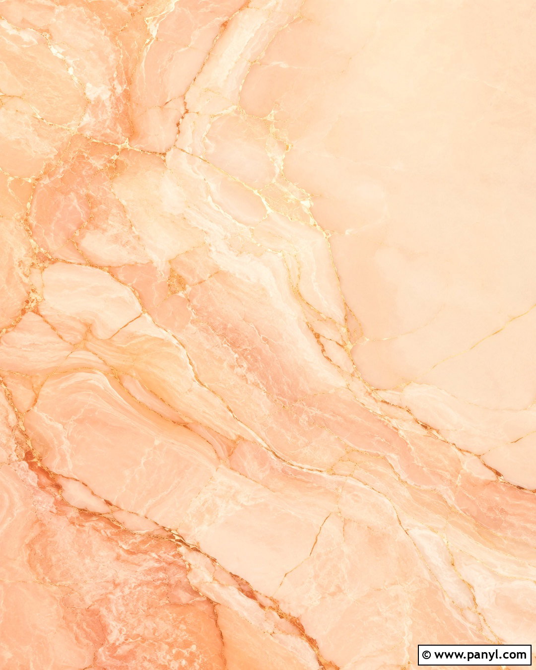
Flowing marble patterns give peach color a polished and luxurious appearance. Begin with a creamy peach base, then weave soft white, blush pink, and pale coral veins through the composition. Add very thin warm-gold lines in selected areas, but keep them restrained to avoid an overly decorative finish. The veins should move in different widths and directions, resembling natural stone rather than evenly spaced waves. Place the strongest movement around the edges and leave the center calmer for app icons or lettering. This peach marble background can enhance tablet screens, brand graphics, presentation covers, or elegant event stationery. Pair the design with ivory, brushed gold, and dark espresso details to create a complete and sophisticated visual palette.
11. Peach Terrazzo Background
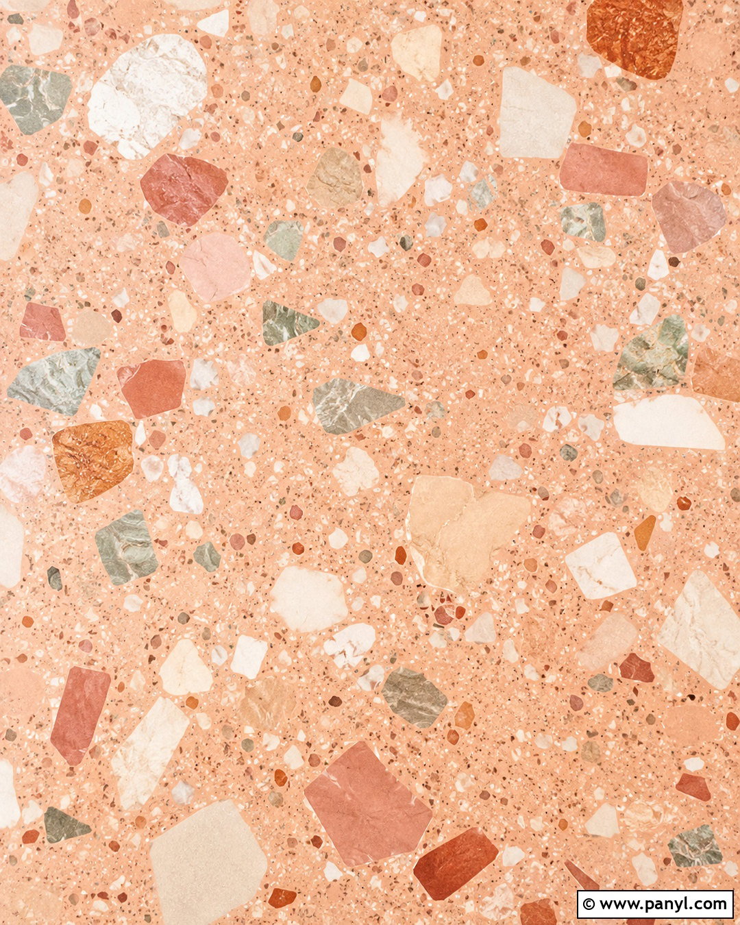
Terrazzo introduces texture and color through scattered fragments rather than a repeating pattern. Use a warm peach foundation dotted with irregular chips in cream, terracotta, dusty rose, muted sage, and pale beige. Vary the size and direction of the pieces, leaving enough peach visible between them so the design can breathe. Concentrate slightly larger fragments along the outer edges while using smaller shapes through the middle. This provides visual interest without making the background difficult to use. A matte stone texture will make the composition feel more realistic and less like simple confetti. This peach terrazzo background suits desktop wallpapers, presentation templates, creative packaging, and modern social posts. Deep brown typography creates an attractive, readable contrast.
12. Peach Abstract Shape Background

Layered organic forms create a modern peach background with plenty of movement. Start with a pale peach base and overlap large curved shapes in coral, cream, blush pink, and warm terracotta. Add one muted sage shape to break up the warm palette and create a balanced focal point. Thin dark brown lines or small dotted details can connect the larger areas. Keep every shape soft and rounded rather than sharp or angular. Leave one broad area relatively clear if the design will support text, icons, or a product image. This peach abstract background looks polished on website banners, social templates, digital planners, and laptop screens. A faint grain finish unifies the colors and gives the composition tactile depth.
13. Peach Vintage Collage Background

A vintage collage brings storytelling and personality to the peach palette. Layer faded photographs, torn cream paper, peach-colored flowers, old postcards, botanical sketches, and small pieces of gingham fabric across a muted blush base. Use overlapping corners and pieces of beige paper tape to make the arrangement feel assembled by hand. Warm sepia tones should connect the different images, while coral details keep the composition lively. Avoid covering the entire surface; a few open peach areas will make the collage easier to view. This peach background is ideal for mood boards, journal covers, laptop wallpapers, and creative social posts. Add subtle film grain and worn paper edges to strengthen its nostalgic, collected appearance.
14. Peach Boho Background
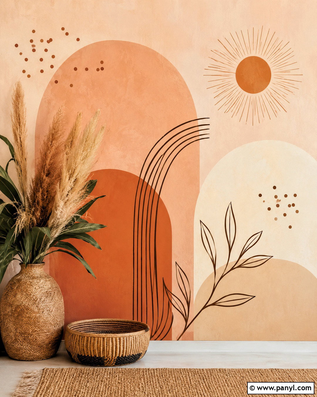
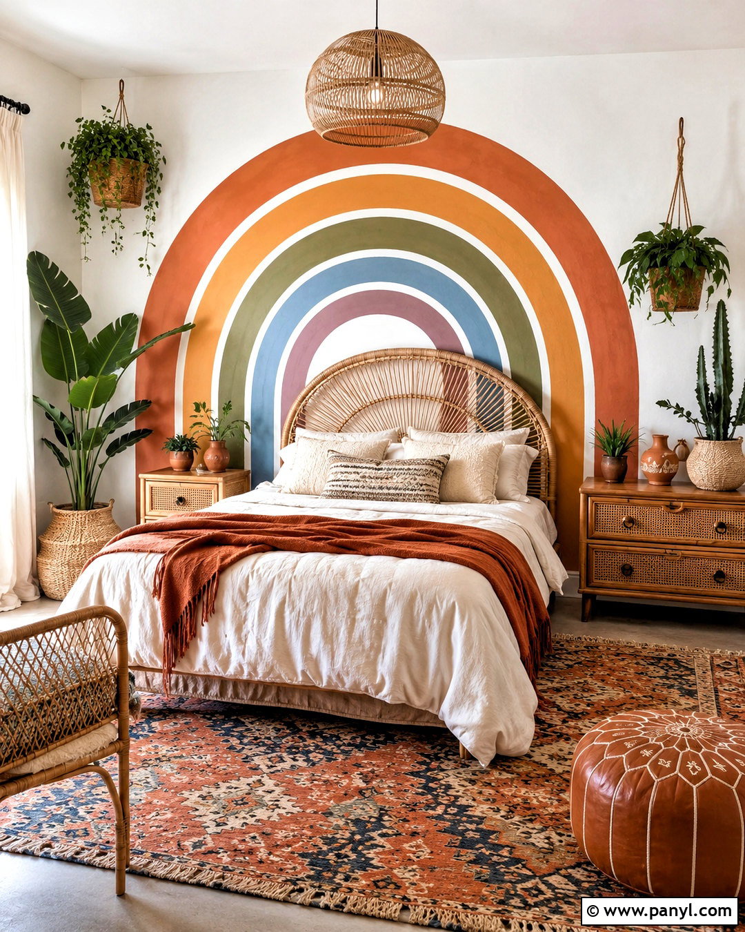
Earthy colors and handmade details give a peach boho background a relaxed, natural character. Place overlapping arches in pale peach, clay terracotta, warm beige, and muted cream against a lightly textured backdrop. Add a small line-drawn sun, delicate leafy stems, and a few scattered dots to complete the composition. One dark brown curved line can bring definition without making the look feel heavy. Arrange the elements asymmetrically, leaving clear space around the center or upper portion. The final design should feel warm and grounded rather than overly bright. This peach background suits phone wallpapers, printable wall art, small-business branding, and digital journals. Pair it with natural woven textures and restrained sage-green details for additional balance.
15. Peach Botanical Background
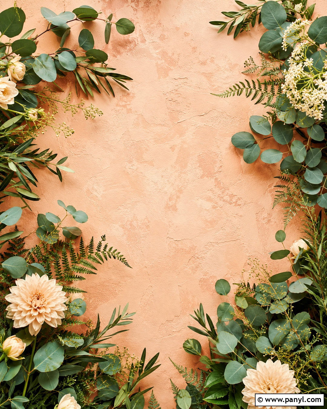
Fresh greenery creates an appealing contrast against a warm peach background. Begin with a dusty peach base, then frame the composition using eucalyptus stems, olive branches, fern leaves, and small cream flowers. Position fuller botanical clusters near the lower corners and let a few slender stems extend along the sides. Use sage, olive, and soft forest green instead of vivid emerald shades. Fine shadows beneath the leaves can create realistic depth while keeping the center open and functional. A subtle plaster texture gives the background a natural, contemporary finish. This peach botanical background can complement wellness branding, invitations, desktop wallpapers, and presentation covers. Warm white lettering and small terracotta accents will tie the whole arrangement together.
16. Peach Daisy Background

Cheerful daisies can brighten a peach background while maintaining a simple, coordinated appearance. Scatter small white flowers with golden centers across a soft coral-peach base, varying their size and angle to avoid obvious repetition. Add several partially cropped daisies around the edges so the pattern appears to continue beyond the frame. A few tiny cream dots can fill empty spaces without creating clutter. Keep the flower centers muted mustard rather than bright yellow for a softer palette. A light paper grain gives the design a friendly illustrated quality. This peach daisy background works for phone wallpapers, notebook covers, spring party graphics, and playful social content. Leave enough space between the flowers for icons to remain clearly visible.
17. Peach Celestial Background

Stars and moons give peach color an unexpected celestial twist. Use a watercolor peach base that fades from light blush to warm coral, then add small cream stars, delicate constellations, and slender crescent moons. Place the celestial details more densely near the corners while keeping the center relatively open. Thin warm-gold outlines can add refinement, but they should remain subtle and consistent. Soft white clouds or faded circular glows may be included to create dimension. Avoid dark navy so the design retains its light peach identity. This celestial peach background makes a calming phone wallpaper, journal cover, meditation graphic, or astrology-inspired social template. Pale lavender accents can provide gentle contrast without disrupting the harmonious warm palette.
18. Peach Coastal Background

A coastal composition makes peach feel fresh, sunny, and relaxed. Blend a pale peach sky with a creamy sand-colored lower section, then add a slim strip of muted turquoise water between them. Include understated elements such as a striped beach umbrella, small shells, soft waves, and a woven sun hat near the edges. Keep the center free of large objects so the background remains suitable for text or icons. White highlights and light aqua details will cool the palette without overpowering it. A slight photographic grain creates a casual vacation feel. This peach coastal background is well suited to summer phone wallpapers, travel graphics, invitations, and mood boards. Natural beige and coral accents complete the sun-washed arrangement.
19. Peach Desk Flat Lay Background

A styled desk scene can function as both a useful background and a complete visual story. Set a cream notebook, peach pen, small white keyboard, ceramic cup, and dried flowers on a matte peach desktop. Arrange the objects around the outer edges while leaving a clean central area for text, branding, or digital notes. Add a folded beige fabric and one muted sage accessory for texture and color balance. Soft, realistic shadows should define each item without making the layout feel dark. This peach flat lay background works for productivity posts, website graphics, desktop wallpapers, and small-business content. Consistent warm finishes and uncluttered spacing will make the final scene look polished, practical, and approachable.
20. Peach Bedroom Background
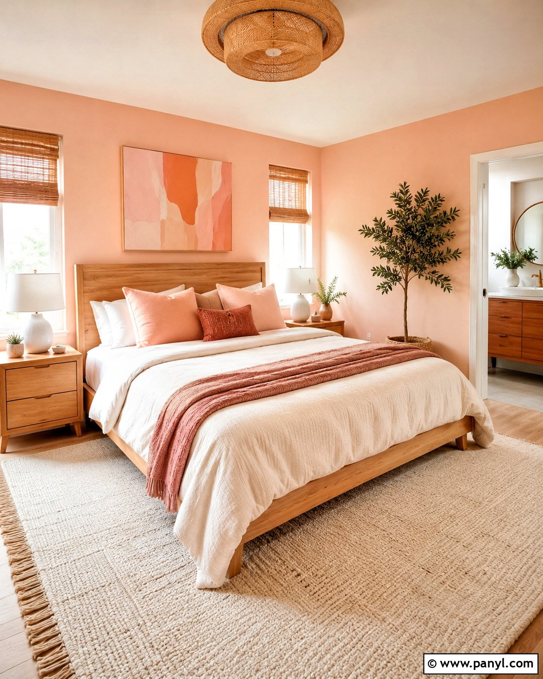
A complete peach bedroom scene creates a cozy background with realistic depth and visual warmth. Use pale peach walls, creamy bedding, a light oak bed frame, and layered blush and terracotta pillows. Position a small nightstand beside the bed with a white lamp, simple books, and a ceramic vase of delicate greenery. Natural woven shades and an ivory rug can soften the room, while one abstract artwork repeats the peach palette above the headboard. Keep surfaces neat so the image remains suitable for a video-call or desktop background. The overall design should feel bright, relatable, and comfortable rather than staged. This peach background combines home inspiration with a calm aesthetic that works throughout the year.
Conclusion:
The best peach background aesthetic ideas combine a warm color palette with thoughtful texture, balanced spacing, and a clear visual theme. Minimal gradients create practical everyday wallpapers, while floral, botanical, coastal, and celestial compositions offer more personality. Patterns such as gingham, terrazzo, and checkerboard can feel playful without becoming overwhelming when their colors remain coordinated. For additional depth, try watercolor washes, paper grain, fabric texture, or realistic shadows. Always consider where icons, text, or other content will sit before filling the design. Whether you want something modern, nostalgic, cheerful, or calming, these 20 peach background aesthetic ideas provide adaptable looks for digital and creative projects.

Related Ideas and Inspiration:




Leave a Reply