
Pink stripes can feel soft and romantic, bold and playful, or clean and modern depending on the colors, scale, and direction of the pattern. The best pink stripes background ideas combine a clear stripe layout with complementary tones, subtle texture, and enough visual balance for text, photos, or decorative graphics. Narrow lines create a refined effect, while wide bands make a stronger statement. Vertical stripes appear neat and structured, horizontal bands feel calm, and diagonal or wavy patterns add movement. Details such as watercolor edges, linen texture, metallic accents, and faded gradients can make even a simple pattern look distinctive. Whether you need a backdrop for social media, stationery, wallpaper, or creative branding, these complete designs offer practical inspiration for 20 pink stripes background ideas.

1. Pastel Pink And White Vertical Stripes Background
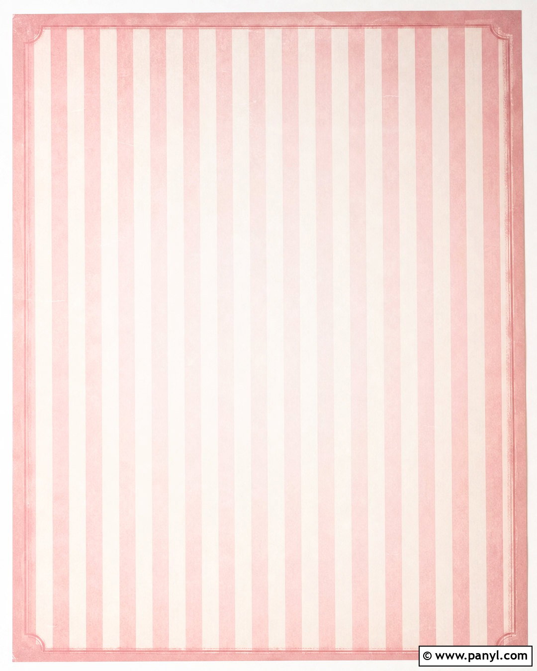
A pastel pink and white vertical pattern creates a light, polished background that works without looking overly busy. Use equal-width stripes in soft blush pink and warm white for a balanced layout. A faint paper texture can prevent the design from feeling flat while preserving its clean appearance. Keep the pink slightly muted rather than sugary bright, especially if you plan to layer text or photographs over it. A thin dusty rose border adds definition without competing with the stripes. For a softer finish, lightly fade the pattern near the center to create a natural area for a logo, title, or invitation message. This complete background feels fresh, gentle, and versatile for digital stationery, mobile wallpapers, product graphics, and feminine branding.
2. Hot Pink Diagonal Stripes Background

Bold diagonal stripes bring instant energy to a hot pink background. Alternate vivid fuchsia bands with crisp white stripes at a consistent 45-degree angle. Make the pink bands slightly wider so the design has a strong color presence without becoming visually chaotic. A subtle glossy finish can give the surface a contemporary, polished look. Add a narrow pale pink line beside each white stripe to create depth and make the pattern feel more customized. Leave a clean rectangular area in the center when the background will support text or promotional graphics. This vibrant layout is especially effective for social media covers, party graphics, packaging concepts, and playful digital wallpapers. The strong diagonal direction makes the entire design feel upbeat, youthful, and full of movement.
3. Blush Pink Pinstripe Background
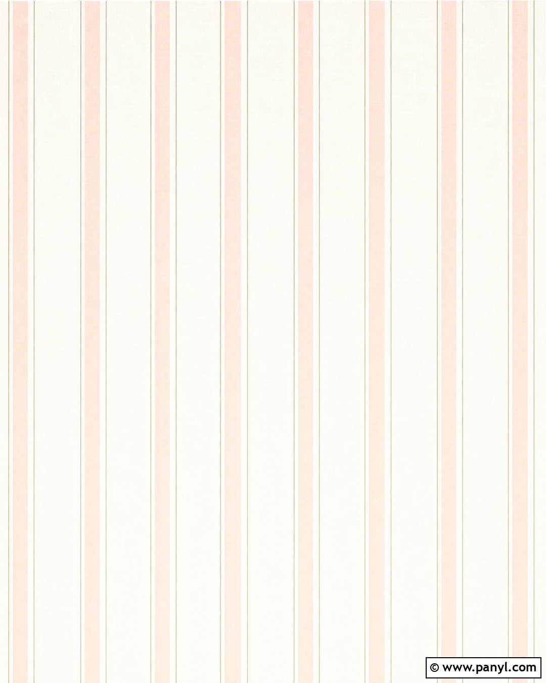
Thin blush pinstripes offer a quieter alternative to wide, graphic bands. Begin with a warm ivory base and add evenly spaced lines in muted blush pink. Pair every third pink line with an extremely fine taupe accent to create subtle rhythm and sophistication. The stripes should remain delicate enough to function almost like texture when viewed from a distance. A soft linen grain gives the background warmth and makes it suitable for more refined applications. Keep the corners clear and avoid extra motifs so the precision of the pinstripes remains the main feature. This understated design works beautifully for wedding stationery, elegant website sections, desktop wallpapers, and minimal brand graphics. It feels organized and graceful while still bringing a noticeable touch of pink to the finished background.
4. Dusty Rose Horizontal Stripes Background

Horizontal dusty rose stripes create a calm, grounded composition with a slightly vintage character. Combine wide bands of dusty rose, faded blush, and creamy beige rather than using only two colors. Vary the widths in a repeating sequence so the design has visual interest while remaining orderly. A light plaster or handmade-paper texture can soften the edges and give the surface a gently aged appearance. Place the darkest rose bands near the top and bottom, leaving lighter tones through the middle for text or artwork. The finished background feels warm without becoming overly sweet. It can complement digital journals, quote graphics, scrapbook pages, and boutique packaging. Muted colors and wide horizontal lines make this option particularly comfortable to view on larger screens.
5. Pink Gingham Stripes Background
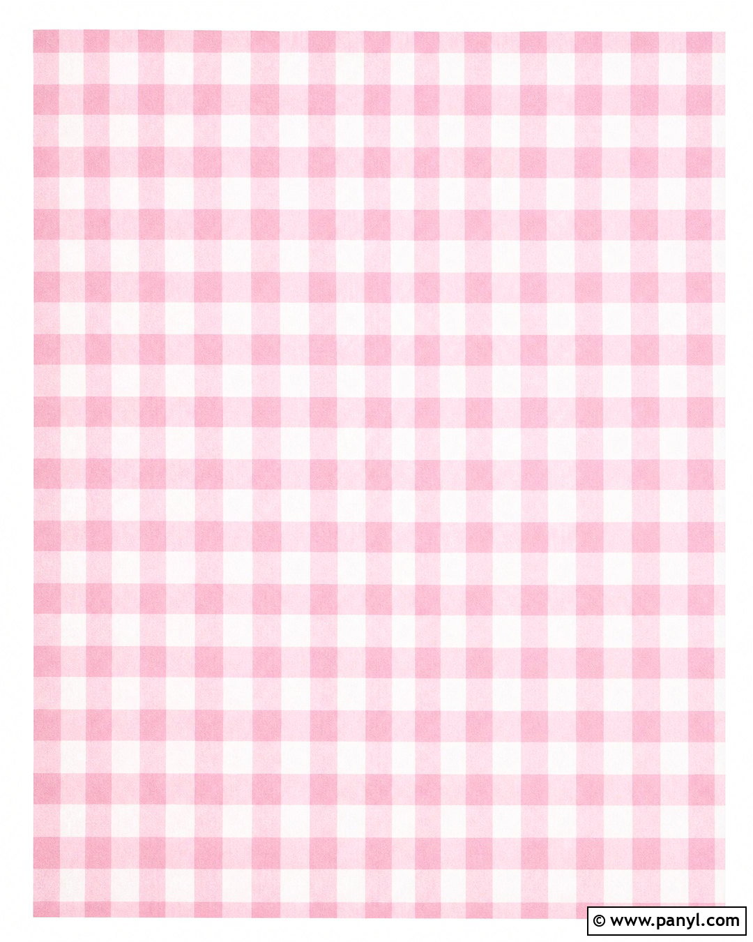
A pink gingham background combines horizontal and vertical stripes into a cheerful woven-looking pattern. Start with a white base, then layer translucent pastel pink bands in both directions. Where the stripes overlap, the color should deepen into a medium rose square. Use medium-width bands to keep the checks visible without making the pattern feel crowded. A soft cotton texture helps the design resemble real gingham fabric and adds a cozy, familiar quality. Include a narrow white margin around the outside when using the background for cards or printable labels. The complete look pairs naturally with simple typography, small floral graphics, or clean product photography. This pattern is ideal for spring-themed graphics, kitchen printables, baby shower stationery, and charming social media templates.
6. Pink Ombre Stripes Background
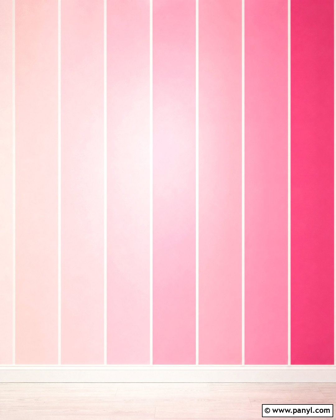
An ombre stripe design blends several pink tones into one smooth, coordinated background. Arrange wide vertical bands that progress from pale ballet pink on one side to raspberry pink on the other. Soften the transitions slightly while keeping each stripe distinct enough to preserve the pattern. Introduce narrow white lines between selected bands to prevent the gradient from appearing like a single block of color. A gentle center glow can create a practical focal area for titles, icons, or photographs. Keep the surface smooth and modern with no heavy grain or decorative motifs. The resulting background feels colorful and dimensional while staying organized. It is a strong choice for phone wallpapers, beauty branding, presentation covers, online banners, and celebratory graphics that need a polished pink color story.
7. Pink Candy Stripes Background
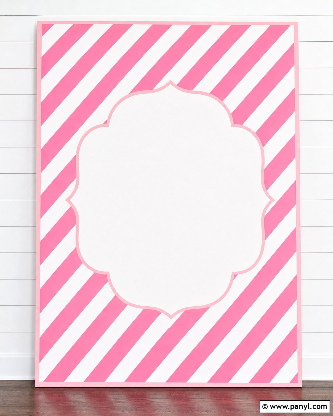
Classic candy stripes deliver a sweet, playful look through wide pink and white diagonal bands. Choose a clear bubblegum pink rather than a muted shade, and keep each stripe the same width for a crisp finish. Add a very light shadow along one edge of every pink band to suggest folded paper or dimensional ribbon. A pale pink outer border can frame the pattern and help it look finished on invitations or digital posts. If text will be included, place a white oval or rounded rectangle in the center with a thin pink outline. The complete design should remain bright and uncluttered, with the striped pattern providing most of the personality. It works well for birthday graphics, bakery packaging, children’s printables, and cheerful desktop backgrounds.


8. Pink And Gold Stripes Background
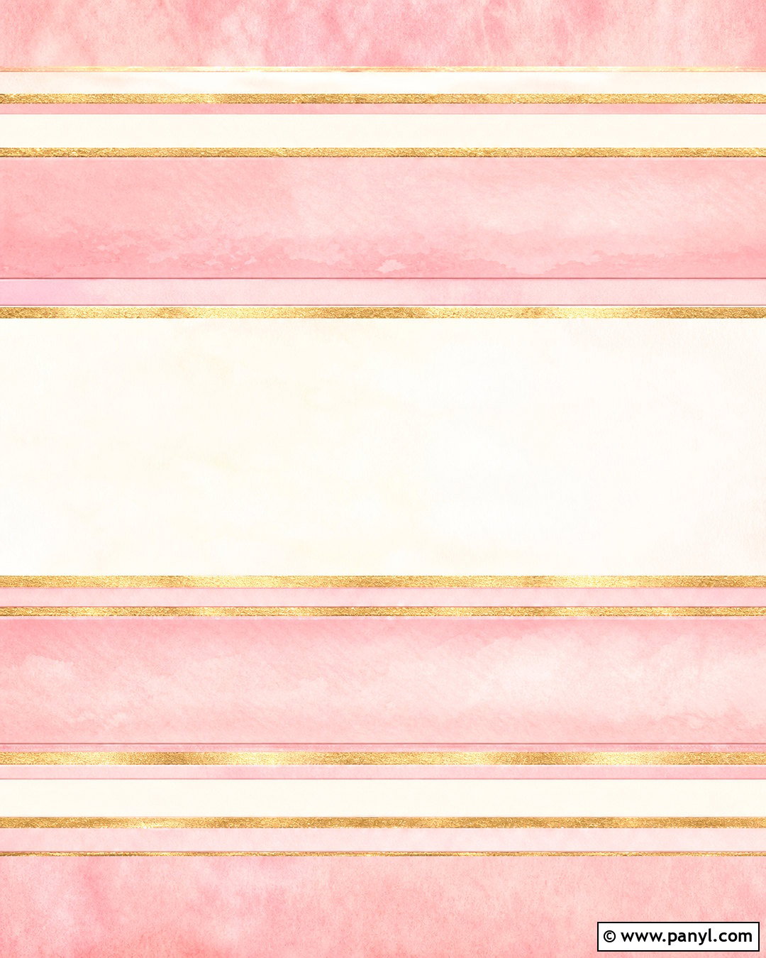
Pink and gold stripes create an elegant backdrop when the metallic details are used with restraint. Alternate broad dusty pink bands with narrower champagne-gold stripes on a soft cream base. Give the gold lines a brushed metallic texture rather than a mirror-like shine, which helps the pattern feel refined and realistic. Thin white spaces between the colors provide clarity and stop the palette from becoming heavy. A faint watercolor wash behind the stripes can soften the overall composition. Reserve a pale central area for typography if the background will appear on invitations, announcements, or brand materials. This coordinated design balances warmth, luxury, and readability. It is suitable for sophisticated social graphics, event stationery, cosmetic packaging concepts, and decorative prints without relying on excessive sparkle.
9. Pink And Red Stripes Background

Pink and red can create a bold striped background when their intensity is carefully balanced. Use alternating bands of coral pink, cherry red, pale blush, and warm white. Vary the stripe widths to give the layout a lively editorial quality rather than a rigid uniform appearance. Vertical placement keeps the energetic palette looking structured. Add a subtle matte paper texture so the saturated colors remain approachable and do not resemble glossy plastic. A thin burgundy outline around the outer edge can ground the brighter tones. Keep decorative additions minimal because the color contrast already provides plenty of interest. This striking background suits fashion graphics, modern stationery, energetic phone wallpapers, and colorful promotional designs. It feels confident, upbeat, and contemporary while maintaining a clear repeating pattern.
10. Pink And Green Stripes Background
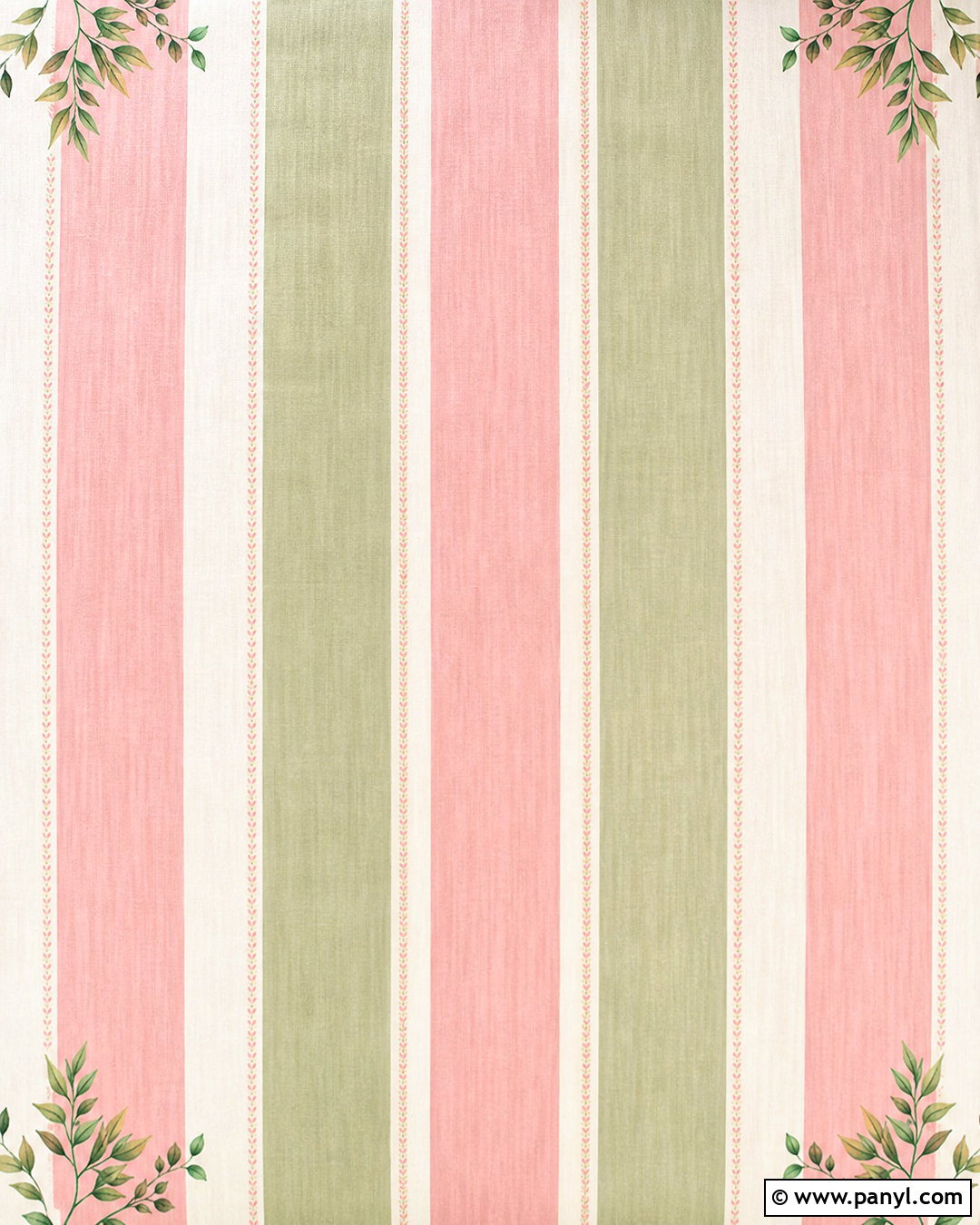
A pink and green striped palette feels fresh when both colors have warm, softened undertones. Pair blush pink with muted sage green and separate the colors using narrow ivory lines. Wide vertical stripes create a clean foundation, while an occasional thin rose accent adds variety to the repeat. Apply a gentle linen texture to bring a natural quality to the digital surface. Small leafy details may appear sparingly near the corners, but the center should remain open and easy to use. Avoid highly saturated green, which can overpower the softer pink. The complete background is well suited to garden-themed stationery, spring graphics, boutique branding, and botanical social media posts. Its balanced mix of rosy warmth and earthy green creates a cheerful design that still feels relaxed.
11. Pink And Navy Stripes Background
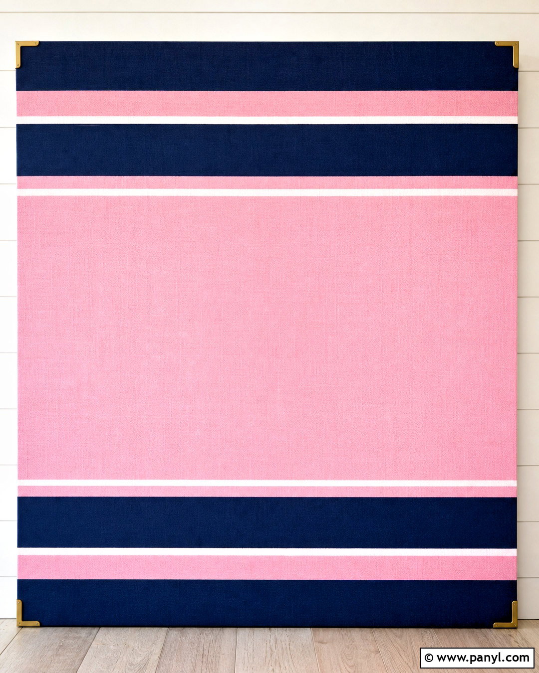
Navy gives pink stripes a crisp, tailored appearance that feels more structured than a pastel-only palette. Use wide navy vertical bands, medium blush stripes, and narrow white separators. Keep the navy slightly softened rather than pure black-blue so it blends comfortably with the warm pink. A fine woven texture can make the pattern resemble quality fabric without reducing clarity. Place a broad blush panel through the center if the background needs to hold text or a logo. Small brass-colored corner details can add warmth, but they should remain understated. This complete striped design works for polished stationery, preppy digital wallpapers, presentation covers, and modern brand materials. The combination is bold enough to attract attention while remaining orderly, balanced, and easy to coordinate with white typography.
12. Pink Rainbow Stripes Background

A pink-centered rainbow background can include multiple colors while maintaining a cohesive rosy theme. Arrange curved or vertical stripes in blush, peach, coral, mauve, lavender, and soft raspberry. Place the pink shades across most of the design, using peach and lavender as supporting accents. Narrow cream lines between the colors help each band remain clear. Slightly soften the edges to create a friendly illustrated finish rather than a harsh geometric look. A pale pink base keeps any small gaps consistent with the main palette. Leave one lighter stripe wider than the others to provide space for a title or graphic. This colorful background is ideal for creative printables, children’s decor graphics, tablet wallpapers, and positive social posts that need an upbeat but coordinated appearance.
13. Pink Wavy Stripes Background

Wavy pink stripes introduce gentle movement without the sharp energy of diagonal lines. Draw flowing horizontal bands in blush, rose pink, cream, and pale peach, allowing each stripe to curve in a smooth repeating rhythm. Keep the waves broad and gradual so the background does not become dizzying. A subtle grain adds softness and gives the pattern a screen-printed quality. Use lighter colors around the center and deepen the rose tones near the outer edges. This arrangement creates natural visual framing for text or photography. The finished background feels playful, modern, and relaxed at the same time. It can support creative website graphics, mobile wallpapers, packaging mockups, and cheerful stationery. Rounded movement also makes the pattern feel more organic than perfectly straight stripes.
14. Pink Watercolor Stripes Background
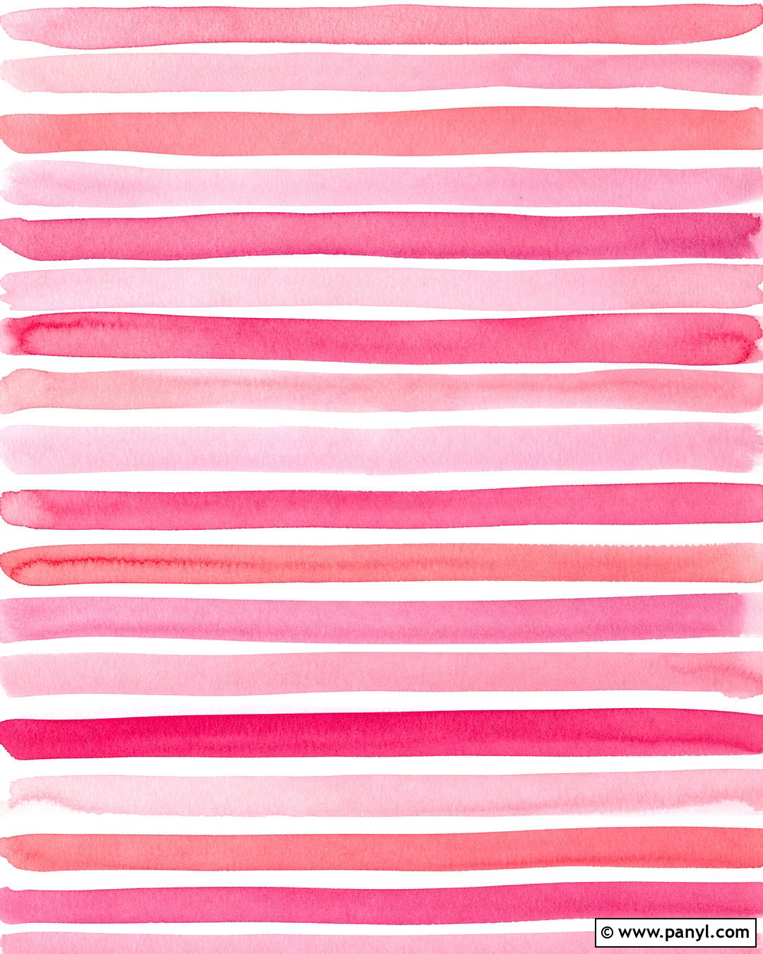
Watercolor stripes make a pink background feel handmade and expressive. Paint uneven horizontal bands in pale blush, dusty rose, raspberry, and diluted coral on a warm white paper surface. Allow the brush edges to remain softly irregular, with occasional transparent areas where the paper shows through. Leave slim white gaps between the stripes so the colors do not blend into a solid wash. Small variations in saturation will add character, but avoid heavy splatters that could distract from text. Create a lighter section near the center for practical layering. This complete background is well suited to artistic stationery, journal covers, quote graphics, and creative brand materials. Its imperfect painted finish offers warmth and personality while the repeating bands maintain a clear, organized structure.
15. Pink Retro Stripes Background
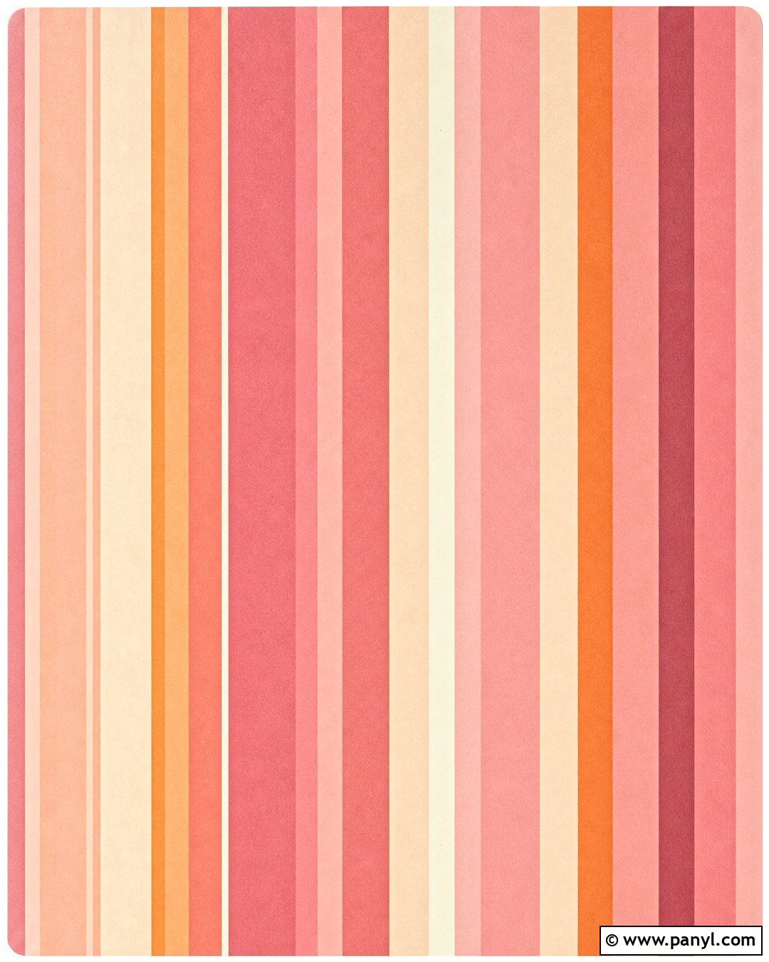
A retro pink stripe pattern works best with warm, slightly faded colors and varied band widths. Combine salmon pink, dusty rose, cream, muted orange, and soft burgundy in a repeating vertical layout. Include one very wide pink stripe followed by several narrow accent bands to capture a vintage graphic feel. Add a fine paper grain and slightly softened color edges rather than artificial distress marks. Rounded corners can make the full background resemble an old poster or album cover. Keep the central composition bold and uninterrupted unless a title area is required. This coordinated pattern suits retro-inspired phone wallpapers, poster graphics, notebook covers, and playful branding. The deeper accents give the pink palette definition, while the cream spaces prevent the finished design from feeling too dark.
16. Pink Scalloped Stripes Background
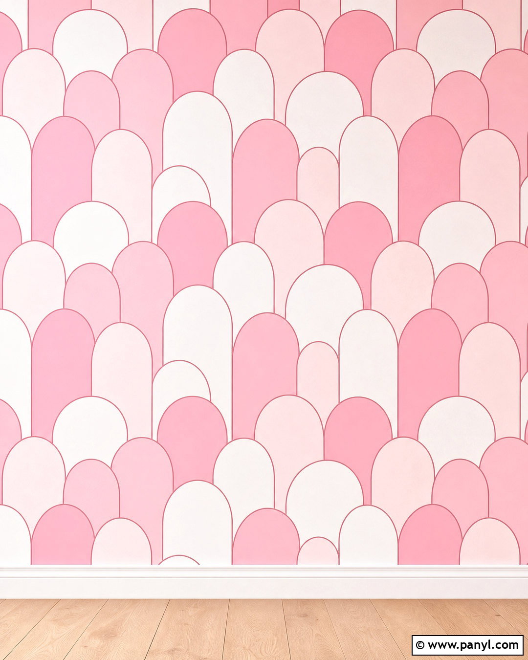
Scalloped stripes offer a decorative twist on a standard horizontal pattern. Build each band with repeating rounded arches in pale pink, medium rose, and warm white. Stagger the rows so the curves nest together neatly, creating a soft wave effect across the entire background. Thin raspberry outlines can define selected scallops and give the design more dimension. Keep the scale medium so the repeated shapes remain visible on both print and digital formats. A smooth matte finish supports the clean geometry. Leave the center free of extra icons or illustrations, allowing the layered stripe pattern to carry the design. This charming background works for nursery printables, craft graphics, invitations, and playful packaging. It feels decorative and distinctive while remaining orderly and easy to coordinate.
17. Pink Floral Stripes Background
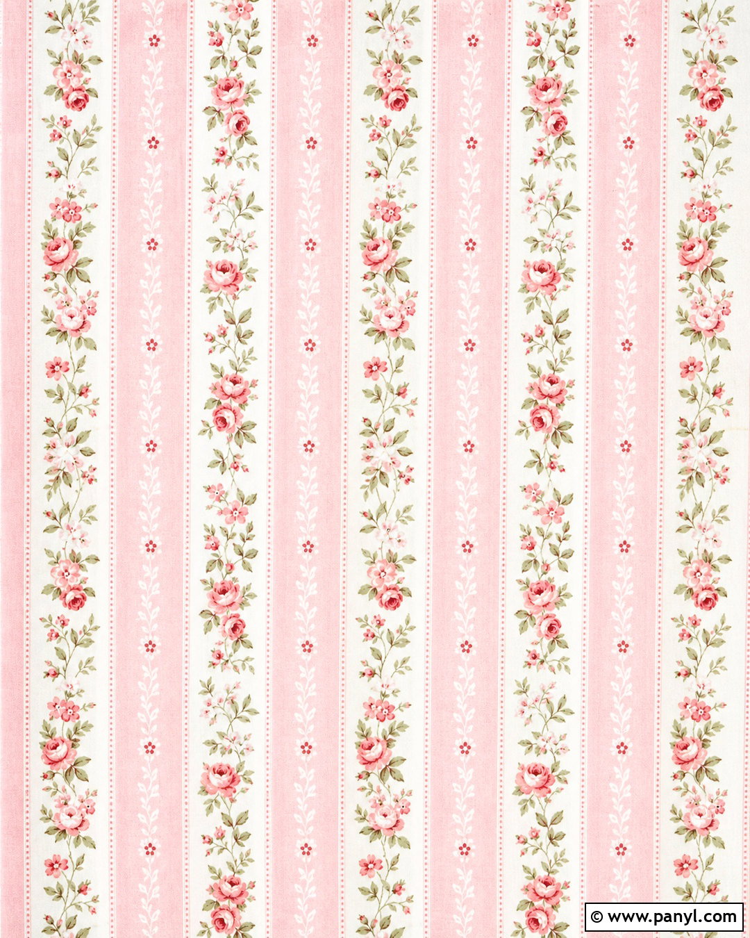
Floral details can enhance a striped background without hiding its structure. Start with alternating vertical bands of blush pink and creamy white, then place small rose, daisy, and leaf motifs inside every other pink stripe. Keep the flowers in deeper pink, soft coral, and muted sage green. The white bands should remain plain to provide breathing room and preserve the striped effect. Use a lightly printed fabric texture for a cozy, handcrafted finish. Make the floral repeat small and evenly spaced rather than scattering oversized blooms across the design. This complete pattern is suitable for decorative stationery, bedroom-inspired wallpapers, digital scrapbooking, and spring packaging. The stripes bring organization, while the restrained flowers add warmth, detail, and a gentle garden character.
18. Pink Polka Dot Stripes Background
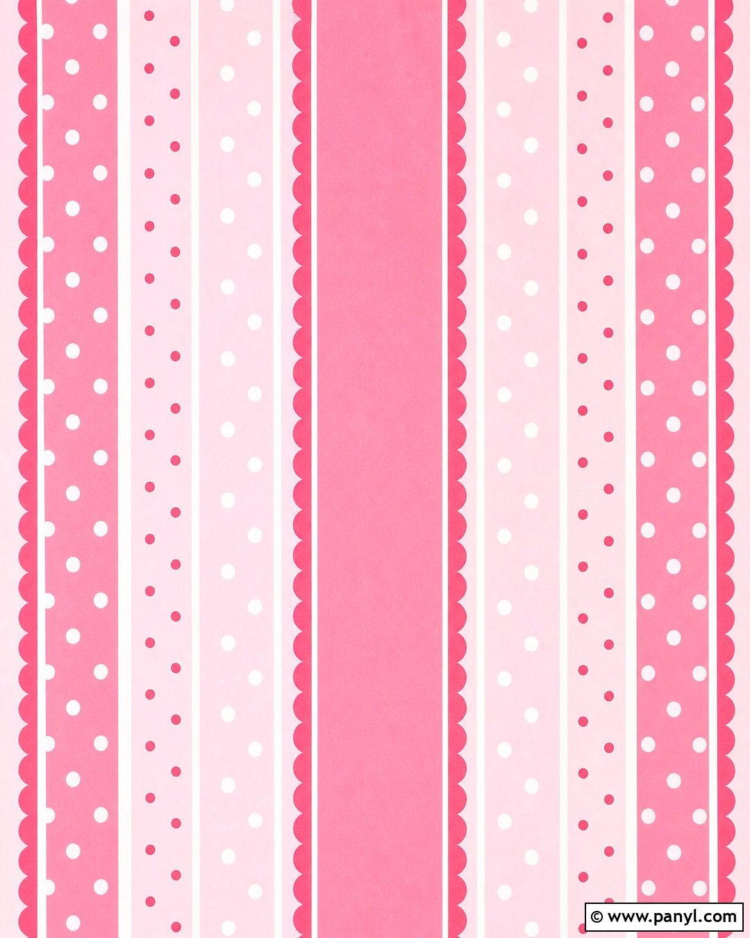
Mixing dots with stripes produces a playful pattern that still feels controlled. Alternate wide bubblegum pink and pale blush vertical bands with narrow white separators. Add small white polka dots inside the darker stripes and tiny raspberry dots inside the lighter ones. Keep all dots evenly spaced and consistent in size so they support rather than compete with the striped layout. A thin scalloped border in soft pink can frame the finished background. Leave one white stripe slightly wider near the center to accommodate short text or a simple icon. This cheerful combination works for party printables, children’s graphics, digital planners, and fun product labels. Clear repetition and a limited color palette help the two patterns look coordinated instead of overly crowded.
19. Pink Linen Stripes Background
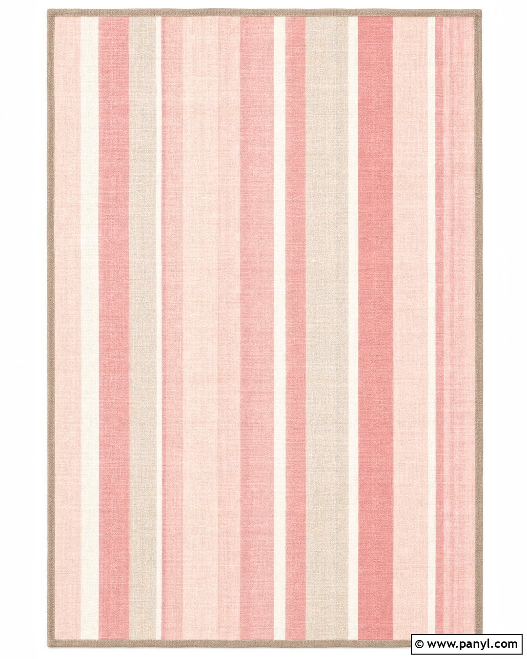
A linen-inspired pink stripe background offers subtle texture and a relaxed, natural finish. Choose muted blush, warm white, pale taupe, and dusty rose for the vertical bands. Use slightly irregular widths to suggest woven fabric while keeping the overall repeat balanced. Fine horizontal fibers should cross the stripes softly, creating realistic textile detail without reducing readability. Avoid strong contrast and glossy effects. A narrow taupe border can ground the pale palette and make the background suitable for printed cards or digital templates. The finished look feels calm, comfortable, and quietly polished. It complements minimalist stationery, lifestyle branding, journal pages, and desktop wallpapers. Natural texture gives the simple stripes depth, making this background more inviting than a perfectly flat geometric pattern.
20. Pink Neon Stripes Background

Neon pink stripes can look bright and modern without requiring a dark background. Begin with a clean white base and add electric pink, vivid magenta, and bright coral diagonal bands. Separate the strongest colors with slim pale pink lines to maintain definition. Give selected stripes a soft luminous edge, but keep the glow controlled and crisp rather than hazy. A smooth acrylic-like finish reinforces the contemporary graphic effect. Leave a broad white area slightly off-center for black or deep magenta typography. The completed background is ideal for energetic social posts, modern event graphics, phone wallpapers, and eye-catching presentation covers. Its bright palette creates strong impact, while the white foundation preserves clarity and keeps the overall composition fresh and usable.
Conclusion:
The most effective pink stripes background ideas use more than a simple two-color repeat. Direction, width, texture, spacing, and accent colors all help create a complete design with a clear personality. Soft blush pinstripes can feel refined, while hot pink diagonals, neon bands, and candy stripes create stronger energy. Watercolor, linen, metallic, floral, and retro finishes add depth without losing the recognizable striped structure. Before choosing a layout, consider where text, photographs, or logos will appear and reserve enough visual space for them. Whether your goal is elegant, playful, vintage, or modern, these 20 pink stripes background ideas offer adaptable combinations for digital graphics, print projects, wallpapers, stationery, and creative branding.

Related Ideas and Inspiration:



Leave a Reply