
Choosing gray can feel surprisingly complicated because every shade changes with daylight, flooring, and nearby finishes. These 20 neutral gray paint colors offer a practical mix of warm greiges, balanced midtones, and soft cool grays for real homes. Each selection is paired with a complete room design, including trim, furniture, materials, lighting, and accent colors. You will find airy options for small rooms, welcoming shades for open floor plans, and deeper neutrals for spaces that need definition. Always test a large sample on several walls and check it during morning, afternoon, and evening light. Use the following complete looks to compare undertones and confidently narrow down the best of these 20 neutral gray paint colors.

1. Sherwin-Williams Agreeable Gray SW 7029
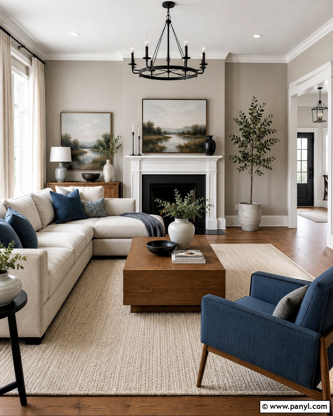
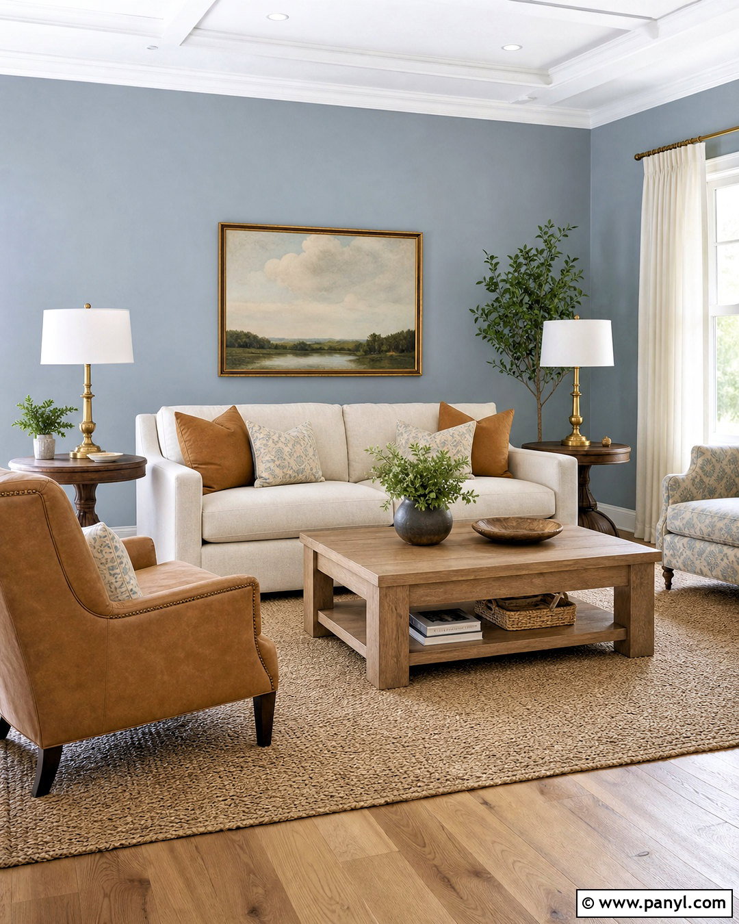
Agreeable Gray creates a welcoming living room that feels warm without looking noticeably beige. Sherwin-Williams describes it as a gray with a beige undertone, making it especially adaptable around common residential finishes. () Paint the walls Agreeable Gray and use clean white on the ceiling, baseboards, and window trim. Add a oatmeal-colored sectional, medium oak coffee table, and textured cream rug to reinforce its comfortable character. Matte black curtain rods and a black metal floor lamp provide crisp definition. Complete the room with muted blue pillows, stoneware pottery, and simple landscape artwork. This whole-room palette works particularly well with medium or dark wood floors because the warmer surfaces help keep the gray from appearing flat.
2. Sherwin-Williams Repose Gray SW 7015
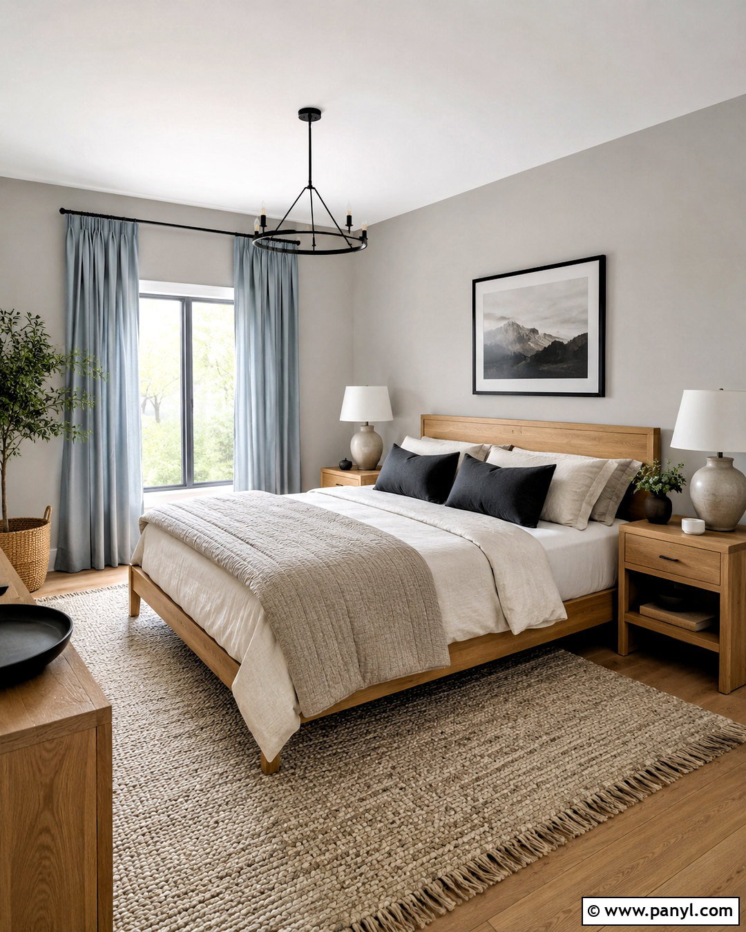
Soft daylight gives Repose Gray a clean, relaxed appearance that fits a modern bedroom beautifully. It is a light neutral gray that can shift slightly warmer or cooler depending on the windows and surrounding finishes. () Pair the walls with warm white trim and a natural oak bed to prevent the room from feeling cold. Layer the bed with ivory linen, a light taupe quilt, and muted charcoal pillows. Use matching oak nightstands and simple ceramic lamps with off-white shades. A woven wool rug adds softness beneath the furniture, while pale blue-gray curtains create gentle contrast. Keep accessories restrained with black frames, a leafy plant, and one upholstered bench. The finished bedroom feels calm, balanced, and easy to update seasonally.
3. Sherwin-Williams Mindful Gray SW 7016
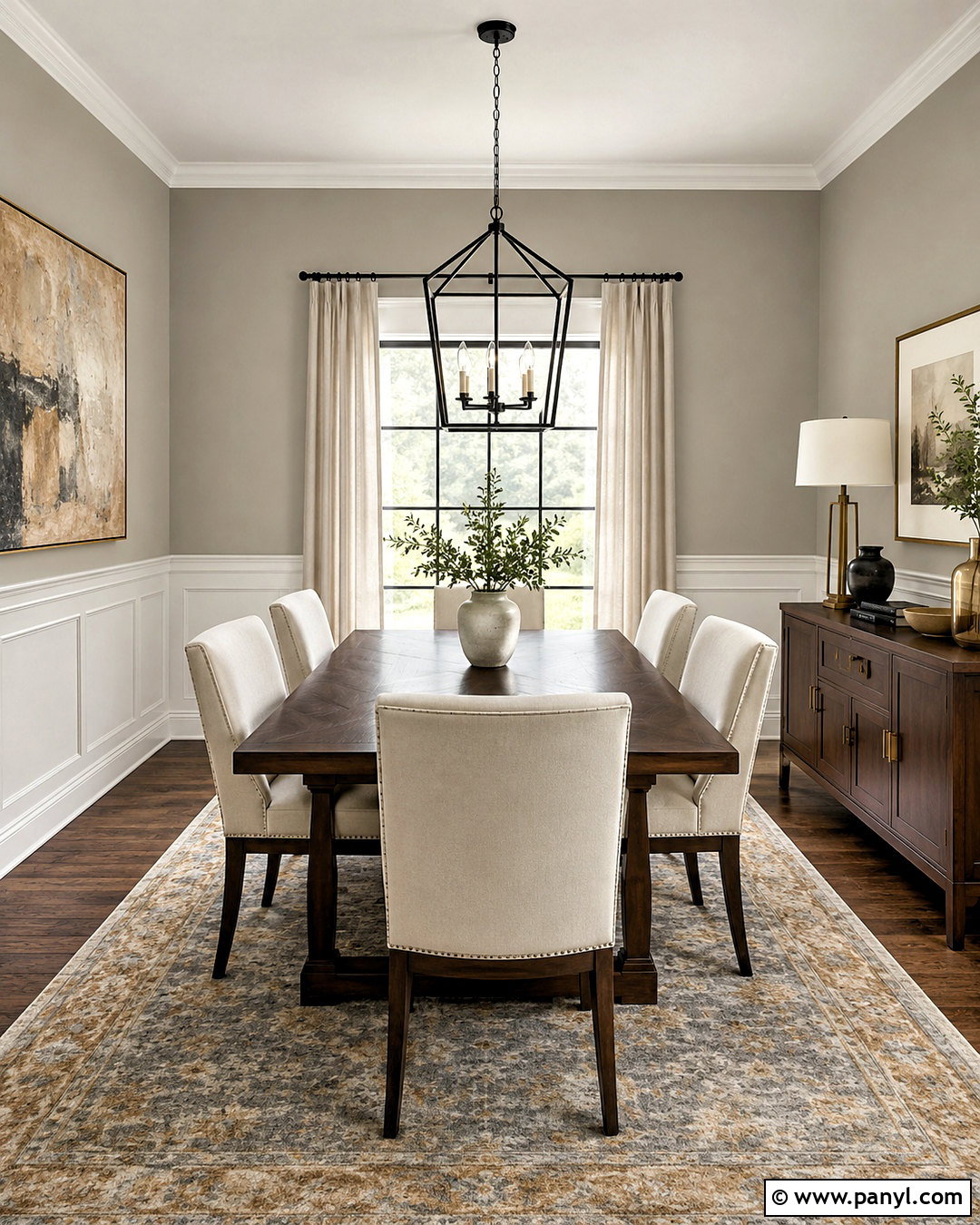
Want a gray that gives a dining room more definition without making it feel dark? Mindful Gray is a warmer light gray that Sherwin-Williams recommends pairing with a cooler white for contrast. () Use it across the walls above simple white wainscoting for a tailored but approachable foundation. Center a rectangular walnut dining table beneath a large black lantern pendant, then surround it with upholstered cream chairs. A faded gray and tan rug connects the wall color to the furniture. Add linen curtains, a black-framed mirror, and a narrow walnut sideboard styled with ceramic vessels. Brushed brass candlesticks introduce a subtle warm finish. The complete look feels polished enough for formal meals while remaining comfortable for everyday family use.
4. Sherwin-Williams Worldly Gray SW 7043
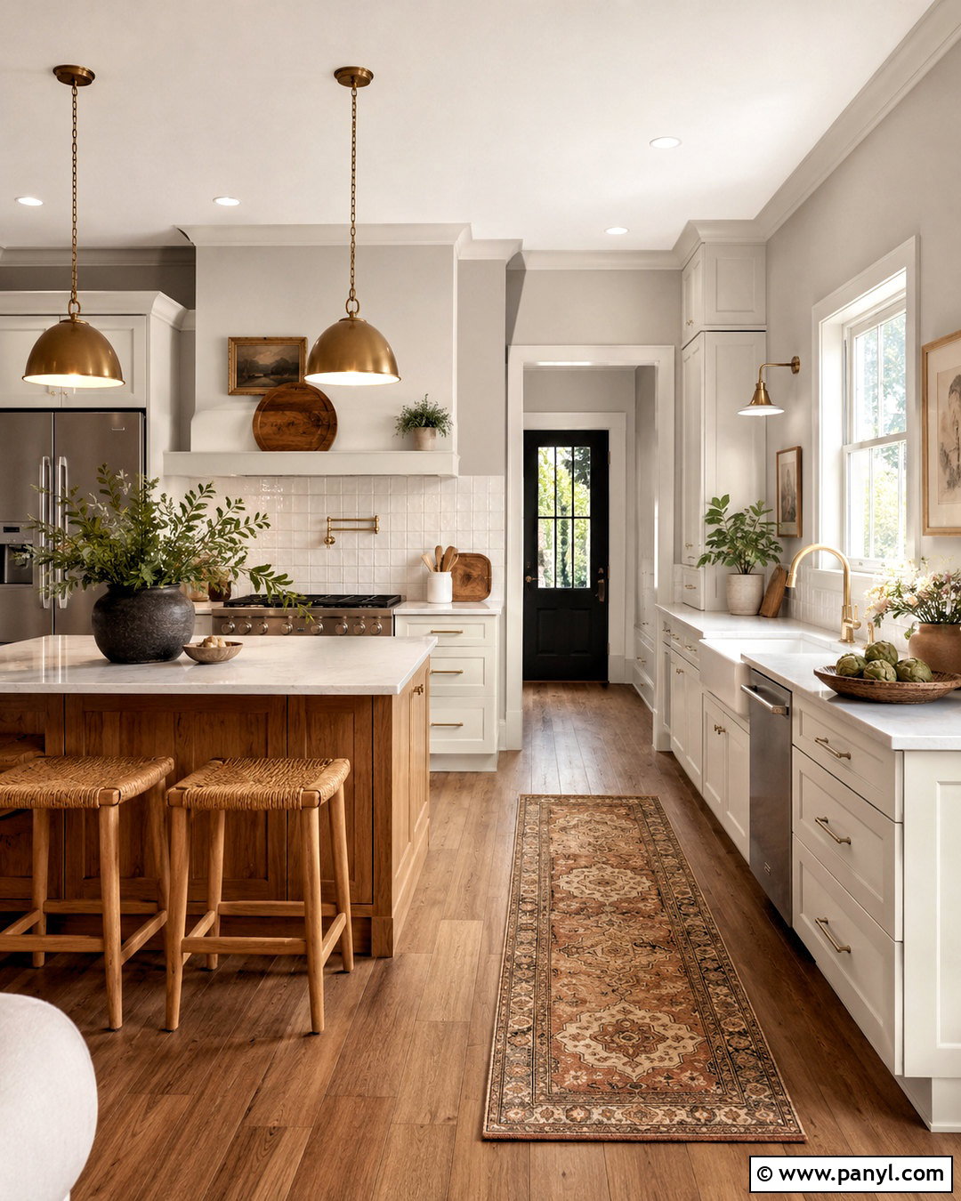
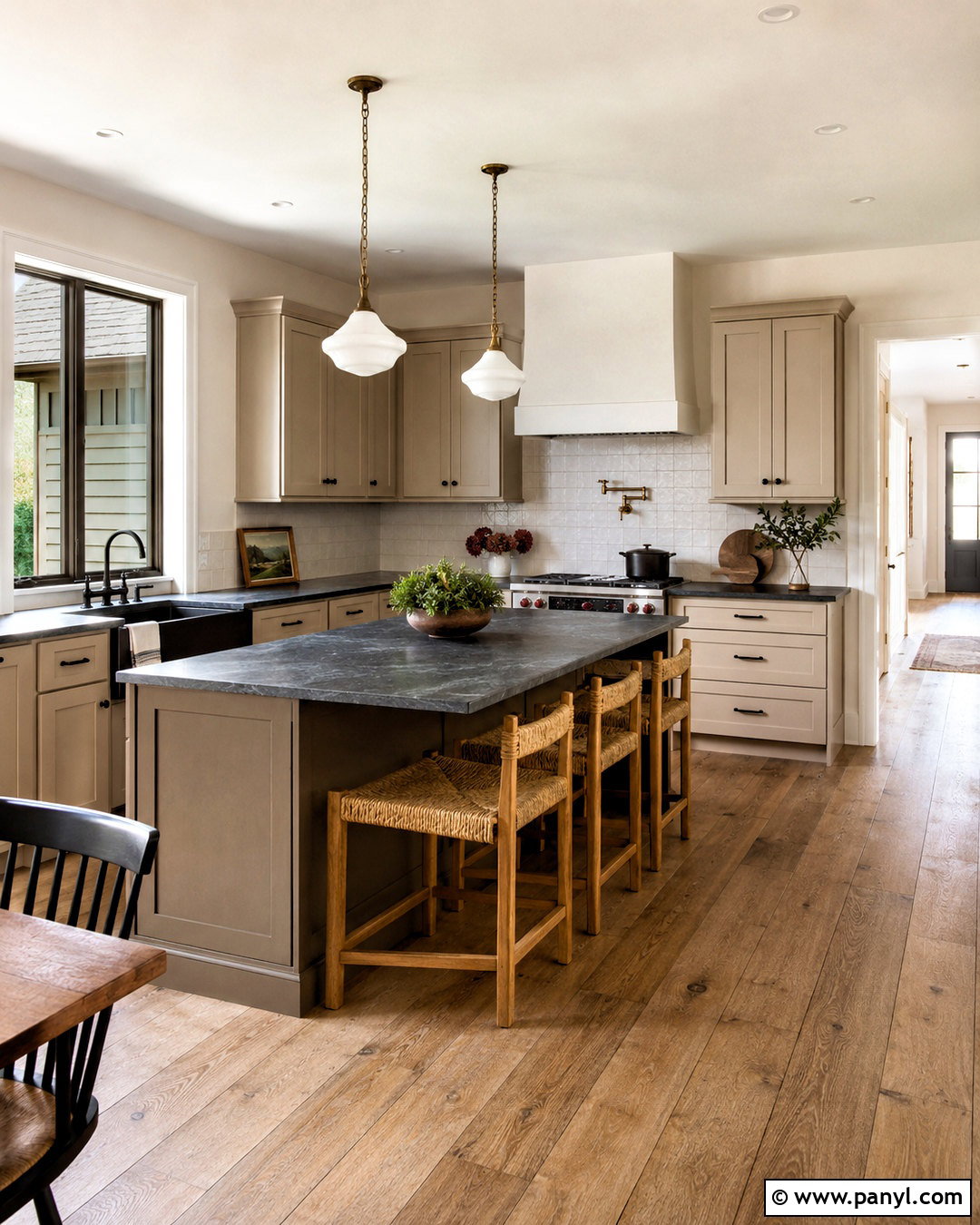
Worldly Gray works naturally in an open kitchen where warm woods and pale stone need a quiet connecting color. This popular Sherwin-Williams neutral belongs to the brand’s widely used collection of versatile interior shades. () Paint the walls Worldly Gray, keep the ceiling and trim soft white, and use creamy white cabinets rather than bright blue-white cabinetry. Choose a lightly veined quartz countertop, warm oak island, and handmade off-white backsplash tile. Aged brass pendants and cabinet hardware enhance the comfortable undertones. Finish the kitchen with woven counter stools, medium brown flooring, and a small vintage-style runner containing gray, rust, and beige. The result is a cohesive kitchen that feels current but not trend-dependent, with enough contrast to highlight every material.
5. Sherwin-Williams Light French Gray SW 0055
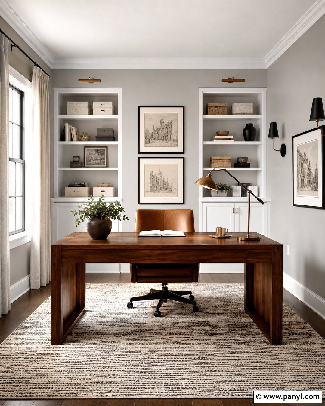
Light French Gray brings a cleaner, more tailored character to a home office. Sherwin-Williams includes this historic shade among its popular interior colors, making it a useful choice for homeowners seeking a recognizable neutral gray. () Cover the walls in the gray and use crisp white for the ceiling, trim, and built-in shelving. Position a medium walnut desk in front of the brightest window and add a camel-colored leather chair for warmth. A flat-weave cream and charcoal rug grounds the workspace, while black metal sconces create symmetry above the shelves. Style the room with white storage boxes, restrained greenery, and framed architectural prints. Pale linen curtains soften the windows without changing the paint’s appearance. This balanced design feels focused, organized, and professional without becoming stark.
6. Sherwin-Williams On The Rocks SW 7671
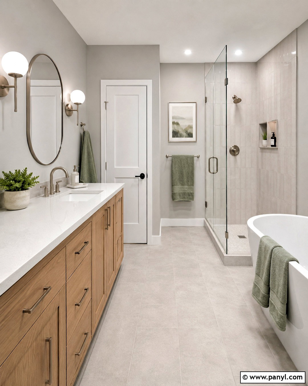
In a bright bathroom, On The Rocks provides a pale gray backdrop that feels fresh without relying on plain white walls. Sherwin-Williams lists this versatile shade among its expert-picked and popular interior colors. () Pair it with a white oak vanity, polished white quartz countertop, and vertical off-white shower tile. Use brushed nickel plumbing fixtures to maintain a clean transition between the cooler wall color and the white surfaces. A frameless glass shower keeps the compact layout visually open. Add a rounded mirror, white globe sconces, and pale gray floor tile with subtle variation. Soft sage towels and a small wooden stool introduce gentle color and natural warmth. The complete bathroom feels bright, uncluttered, and contemporary while still being comfortable enough for everyday use.
7. Sherwin-Williams Passive SW 7064
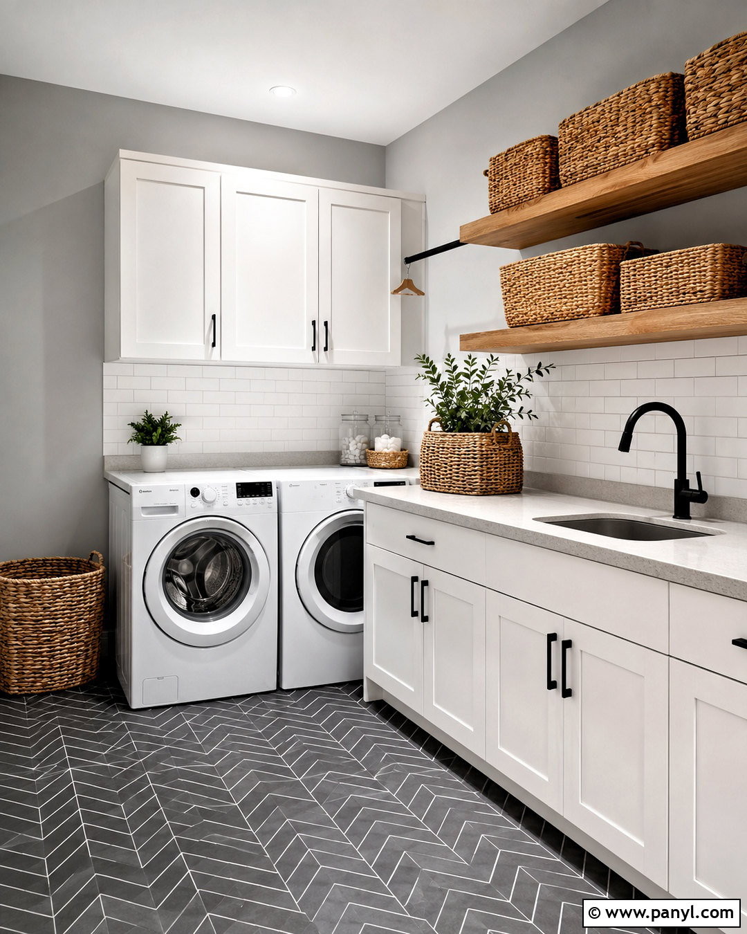
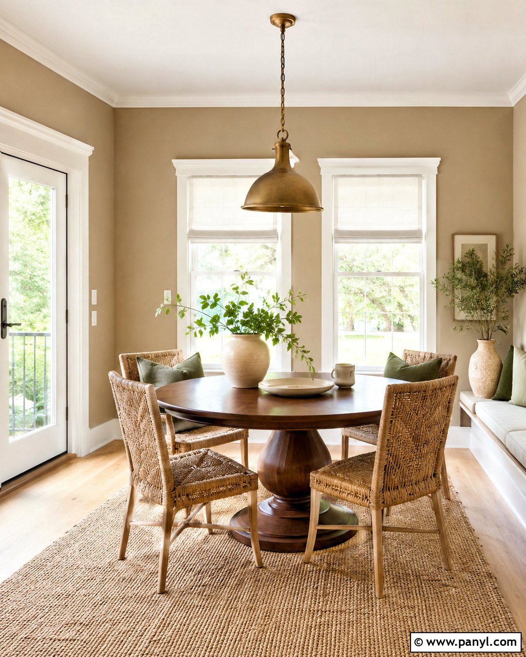
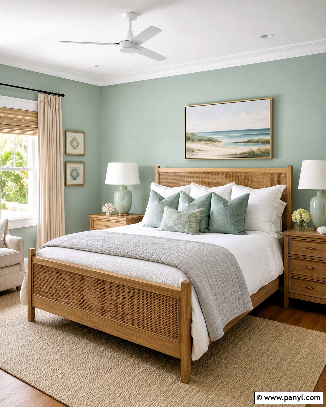
Passive can give a laundry room a crisp, organized look, especially when paired with uncomplicated whites and natural textures. The shade appears in Sherwin-Williams’ collection of top interior colors and reads as a relatively cool, clean gray in many spaces. () Paint the walls Passive and install white Shaker cabinets above a white front-loading washer and dryer. Add a pale gray quartz folding counter and a simple white subway tile backsplash. Light oak floating shelves bring warmth to the cooler palette, while matte black hooks, cabinet pulls, and a utility faucet sharpen the design. Use charcoal and ivory patterned floor tile to hide daily wear. Finish with labeled woven baskets, a striped cotton runner, and one small plant for a functional room that still feels intentionally designed.
8. Sherwin-Williams Crushed Ice SW 7647
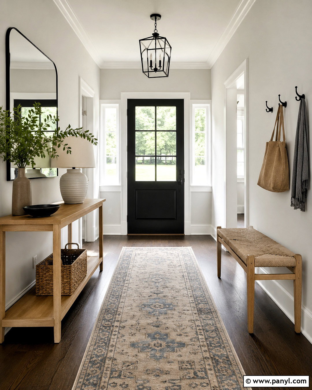
Crushed Ice makes an entryway feel light and adaptable, even when the space connects several differently decorated rooms. Sherwin-Williams includes it among the brand’s popular interior neutral selections. () Use the color on every wall and continue soft white across the trim, ceiling, and interior doors. Place a slim white oak console beneath a large black-framed mirror to create a functional focal point. A washable runner with gray, beige, and faded blue connects the color scheme while disguising tracked-in dirt. Add a woven bench, black hooks, and a shaded table lamp for practical storage and lighting. One oversized ceramic vase with leafy branches adds height without clutter. The completed entry feels brighter, wider, and connected to both warm and cool finishes elsewhere in the home.
9. Sherwin-Williams Gossamer Veil SW 9165
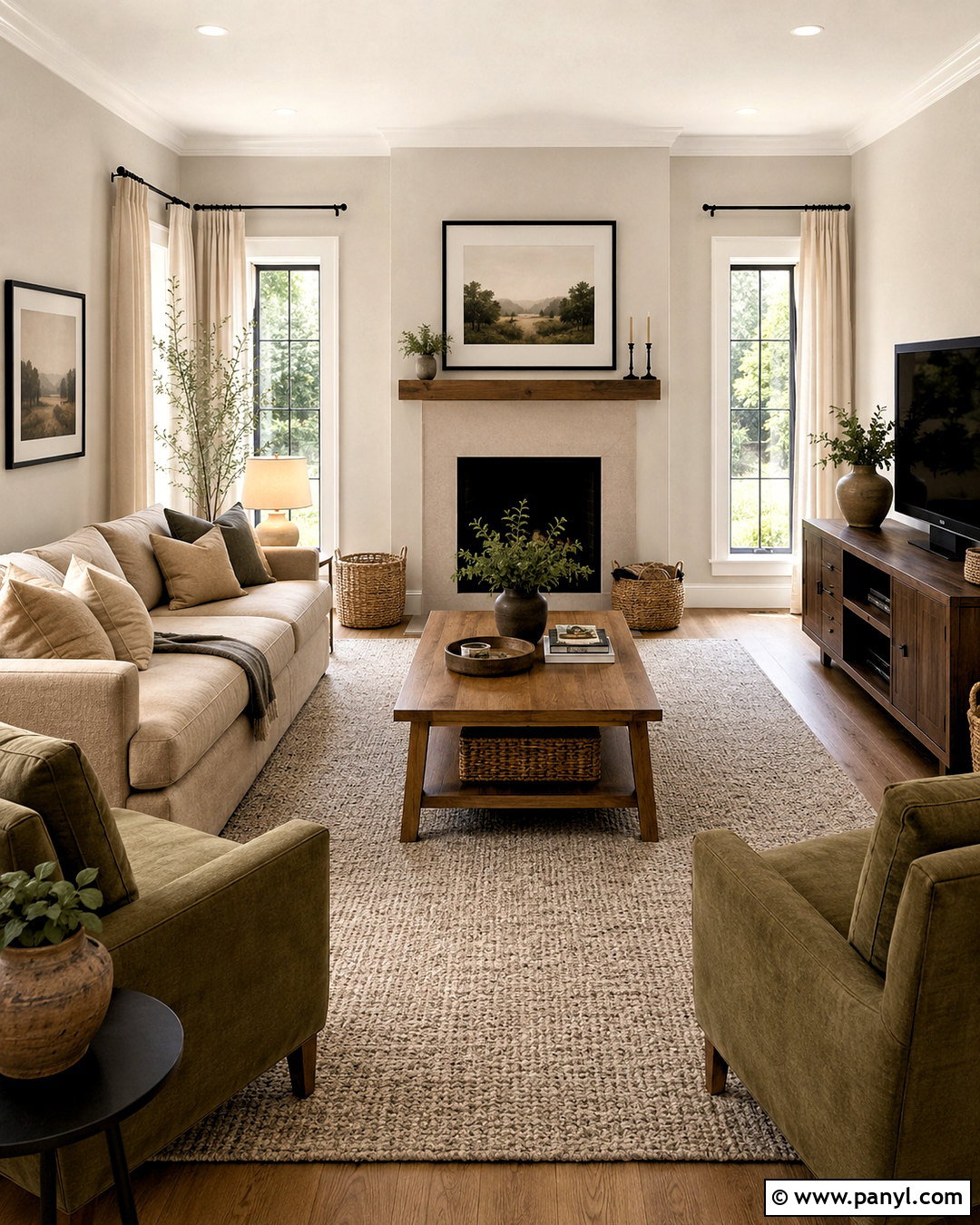
Gossamer Veil creates a soft foundation for a family room filled with warm, durable materials. This Sherwin-Williams expert pick is part of the company’s popular interior color collection. () Paint the walls in this light neutral and use warm white trim to maintain gentle contrast. Arrange a deep beige sofa and two olive green armchairs around a medium oak coffee table. Ground the seating area with a textured ivory and gray rug that can handle regular family use. Add linen curtains, woven baskets, and a low walnut media cabinet for practical storage. Black picture frames and a dark bronze floor lamp prevent the palette from becoming washed out. The complete room feels comfortable and calm, with enough layered texture to make the subtle wall color look purposeful.
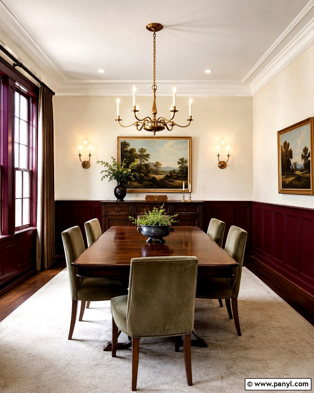
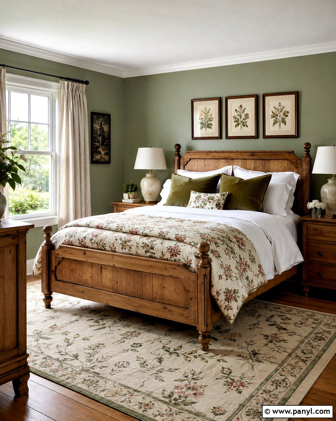
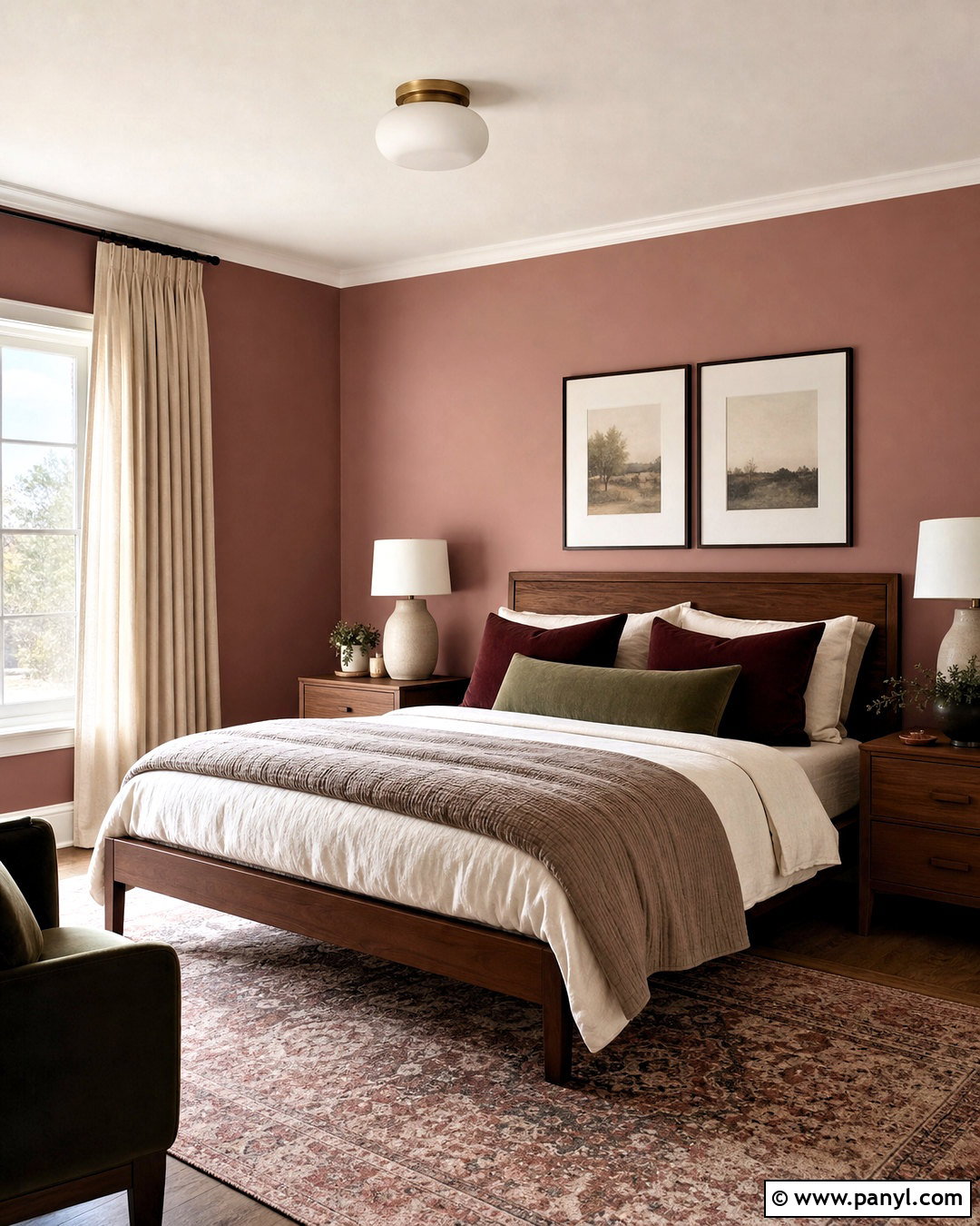
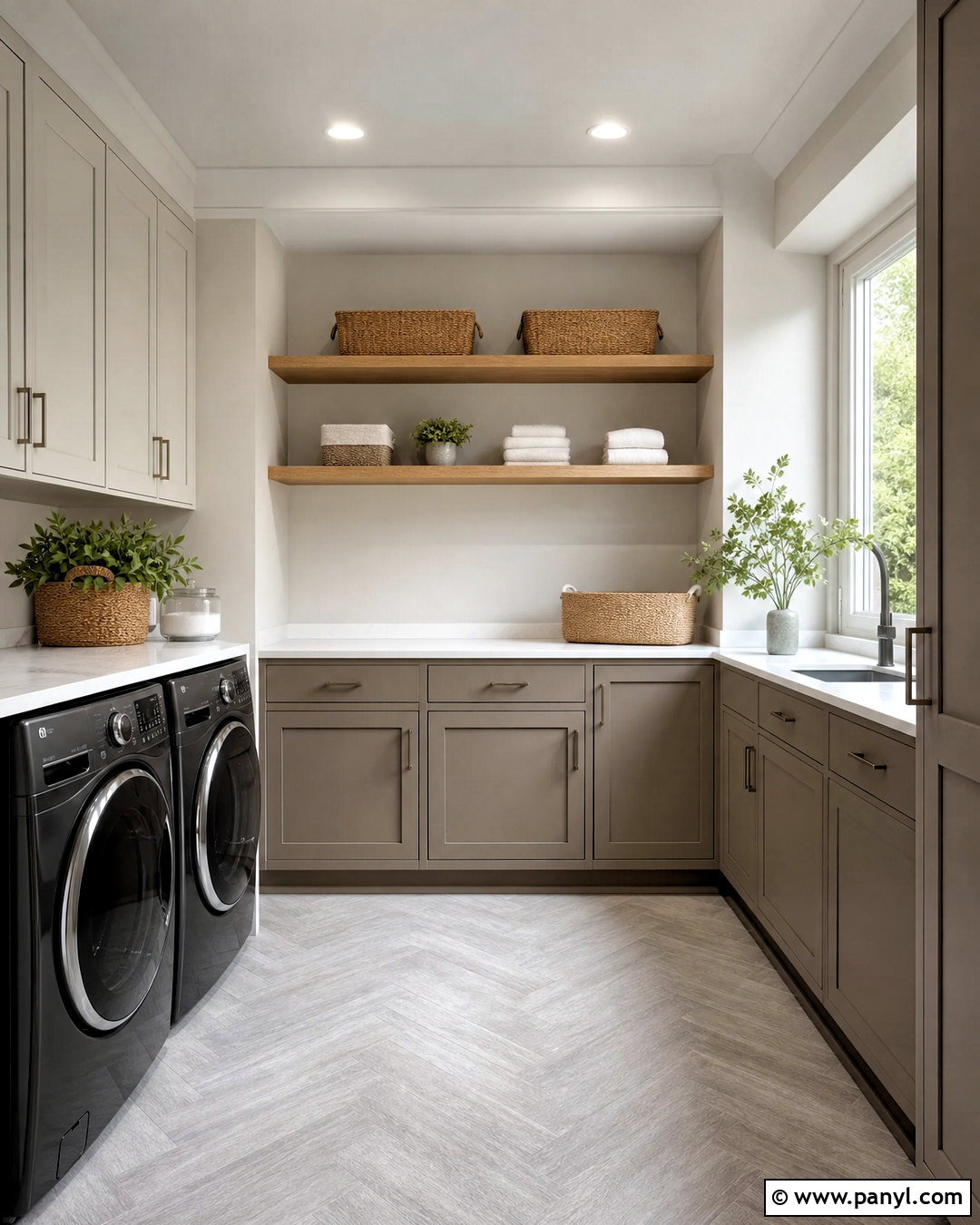
10. Sherwin-Williams Drift Of Mist SW 9166
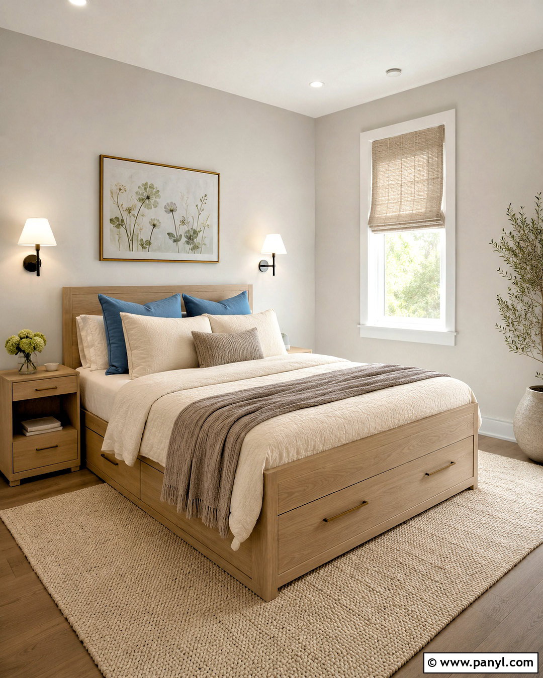
A small guest room can feel more spacious when Drift Of Mist is paired with streamlined furniture and limited contrast. Sherwin-Williams features this light neutral among its most popular interior colors. () Apply it to the walls, then paint the ceiling and narrow trim a gentle warm white. Choose a simple white oak bed with built-in drawers to reduce the need for extra storage furniture. Dress it with cream bedding, a mushroom-colored throw, and dusty blue accent pillows. Compact wall-mounted sconces free the nightstands for guests’ belongings. Add a pale woven rug, natural linen shades, and one botanical print above the bed. This complete design keeps the floor visible and the colors quiet, helping a modest room feel airy, comfortable, and thoughtfully arranged.
11. Benjamin Moore Edgecomb Gray HC-173
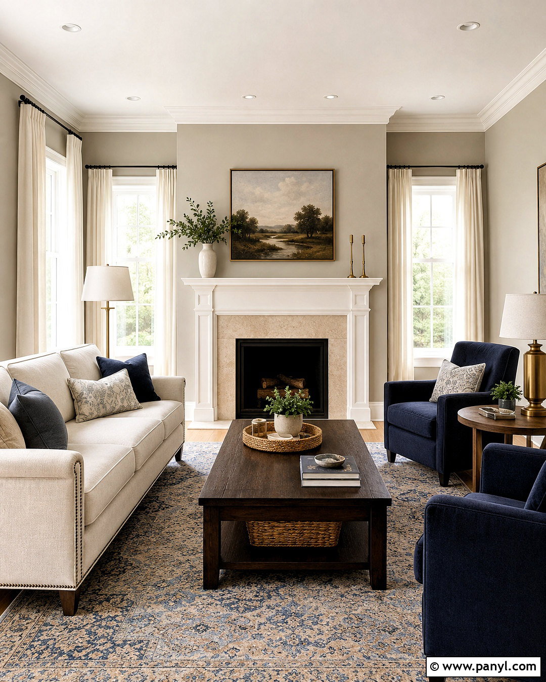
Edgecomb Gray brings soft warmth to a transitional living room without overwhelming architectural details. Benjamin Moore describes it as a welcoming go-to neutral, and its lighter value allows it to reflect a useful amount of light. () Paint the walls Edgecomb Gray and highlight the fireplace mantel, crown molding, and window trim in creamy white. Arrange a warm ivory sofa with two muted navy chairs around a dark oak coffee table. A beige and blue patterned rug bridges the warm walls and cooler upholstery. Add antique brass lamps, linen curtains, and a few dark wood accents to create depth. Keep the fireplace surround simple with pale limestone or subtly veined quartz. The completed room feels timeless and collected rather than overly coordinated.
12. Benjamin Moore Classic Gray OC-23
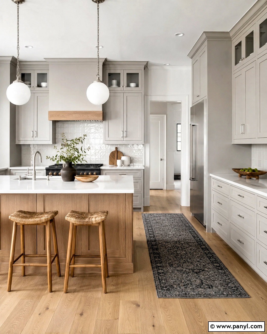
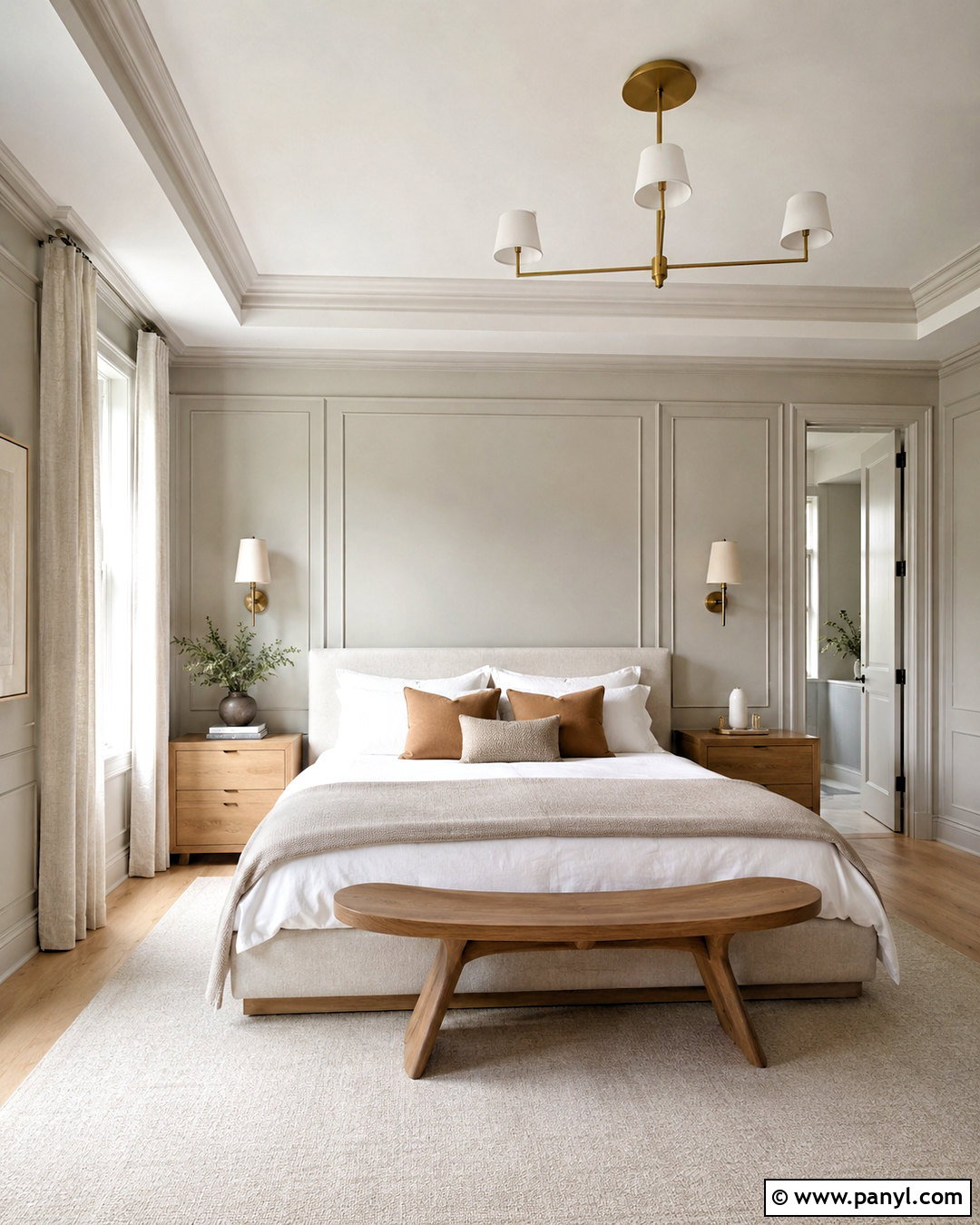
Classic Gray is an excellent starting point for a serene primary bedroom with light, layered neutrals. Benjamin Moore includes it among its most popular gray interior colors and recommends it for subtle greige combinations. () Paint the walls and simple wall paneling in Classic Gray, then use a slightly brighter white on the ceiling and trim. Select an upholstered oatmeal bed, white oak nightstands, and a soft ivory rug. Layer crisp white bedding with a taupe coverlet and muted clay-colored pillows for understated warmth. Hang full-length linen curtains near the ceiling to make the room appear taller. Brushed brass sconces, black-framed art, and a curved wooden bench finish the arrangement. The overall space looks airy and refined without feeling colorless or impersonal.
13. Benjamin Moore Gray Owl OC-52
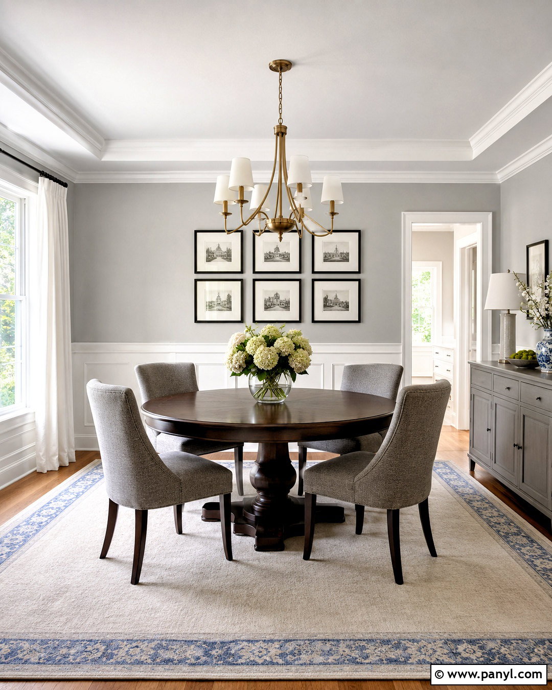
Morning light can make Gray Owl feel particularly fresh in a kitchen with simple modern finishes. Benjamin Moore lists it among the company’s most popular gray interior colors. () Use Gray Owl on the perimeter cabinetry and keep the walls soft white to create gentle separation. Add a white quartz countertop, pale oak island, and glossy off-white backsplash tile that reflects light across the room. Brushed nickel hardware supports the cooler side of the palette, while oak flooring and woven stools keep it welcoming. Finish the island with oversized white globe pendants and a bowl of green foliage. A charcoal runner and a few black accessories add definition. This complete kitchen feels light and clean, but the natural wood prevents it from resembling a cold showroom.
14. Benjamin Moore Stonington Gray HC-170
Stonington Gray gives a sunny dining room an elegant, balanced background for darker furniture and clean white millwork. Benjamin Moore identifies it as one of its most popular gray interior colors and also features it for exterior use. () Apply it above white board-and-batten paneling to break up the wall area. Choose a round espresso-stained dining table with warm gray upholstered chairs, then center a brushed brass chandelier overhead. A cream rug with a subtle blue-gray border softens the dark table. Hang white linen curtains and simple black-framed prints to reinforce the tailored palette. A narrow painted sideboard provides storage without competing with the table. The finished design has traditional structure, contemporary simplicity, and enough warm accents to balance the cooler gray.
15. Benjamin Moore Balboa Mist OC-27
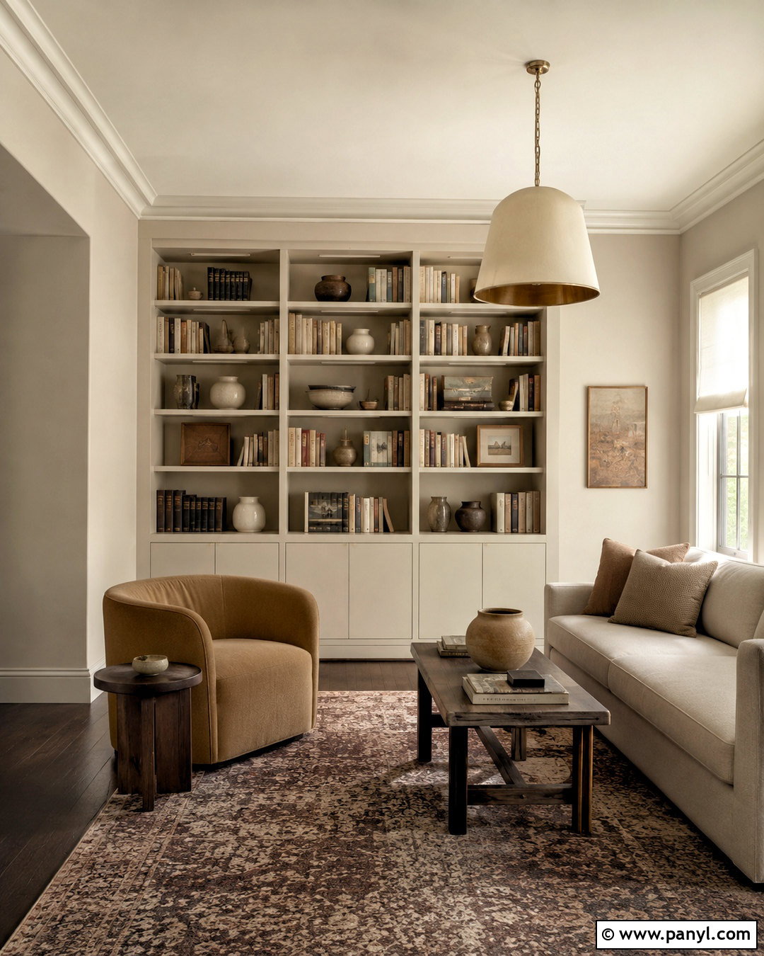
Balboa Mist creates a gentle greige envelope that suits a quiet reading room or compact den. Benjamin Moore notes that the color combines gray with a warmer red-violet influence, which helps explain its softly complex appearance. () Cover the walls in Balboa Mist and use ivory on the ceiling, trim, and built-in bookcases. Place a curved camel-colored chair beside an antique brass floor lamp and a small walnut table. Add a low cream sofa if space allows, then ground the furniture with a faded plum, taupe, and gray rug. Linen shades filter strong sunlight and keep the walls from washing out. Finish with books, framed sketches, and ceramic pieces in off-white and brown. This layered design makes the subtle paint color feel rich rather than plain.
16. Benjamin Moore Collingwood OC-28
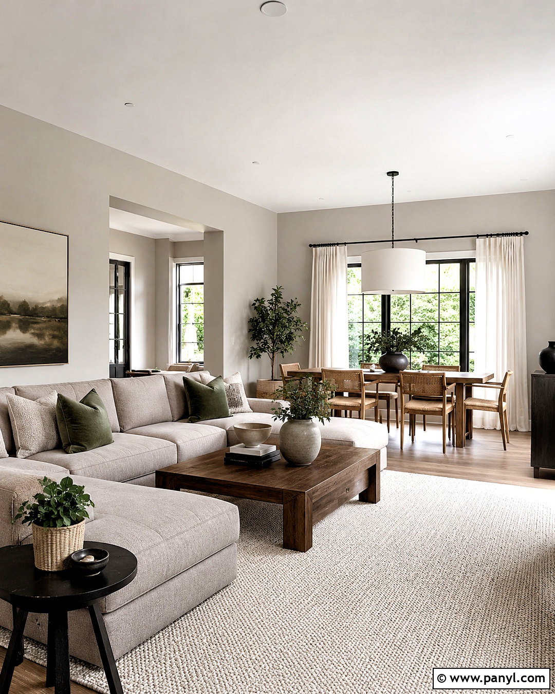
Collingwood supports a comfortable open-plan living and dining space where the paint must connect several materials. Benjamin Moore includes it in its broad gray interior collection alongside other soft, versatile neutrals. () Continue the shade across both zones and use creamy white for all trim and ceilings. In the living area, combine a flax-colored sectional with walnut tables and muted green pillows. In the dining area, use a medium oak table, woven chairs, and a linen drum pendant. Repeat black metal accents in both spaces to create continuity. A large ivory rug defines the seating zone, while a smaller patterned runner adds interest near the dining table. The finished layout feels connected and restful, yet each functional area remains visually distinct.
17. Benjamin Moore Revere Pewter HC-172
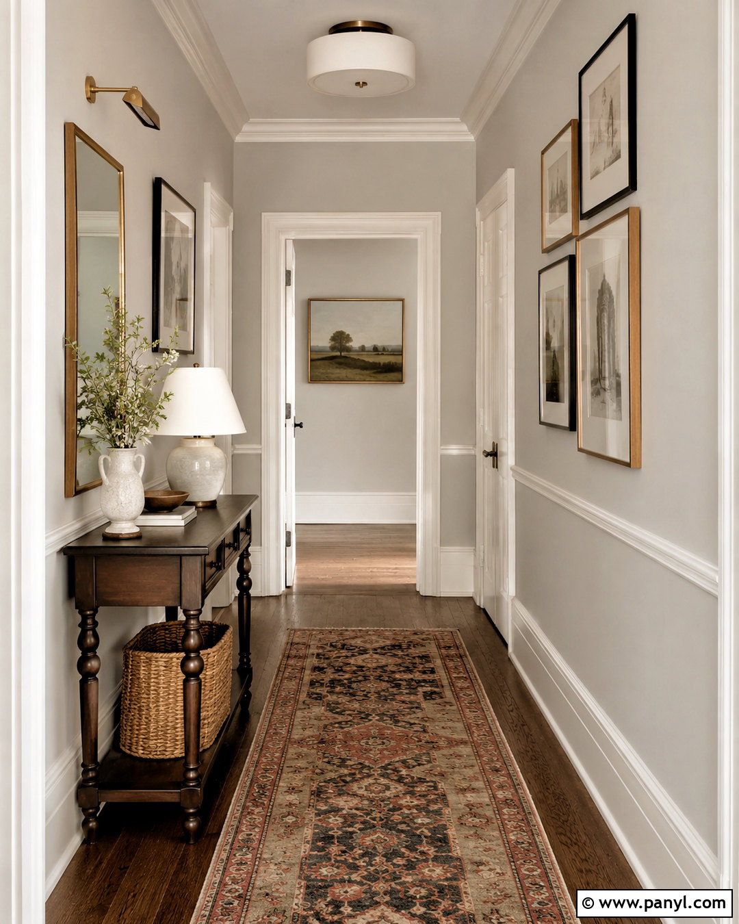
Revere Pewter delivers enough warmth and depth to make a large hallway feel intentional rather than forgotten. Benjamin Moore identifies it as an iconic and popular neutral that works across many spaces. () Paint the upper walls Revere Pewter and add warm white picture-frame molding below for architectural interest. Use the same white on doors, casings, and baseboards. Lay a long vintage-style runner containing olive, beige, charcoal, and faded rust, then repeat those colors in a restrained gallery wall. A dark wood console and antique brass picture light create a strong focal point at the hallway’s end. Add a round mirror, woven storage basket, and one ceramic lamp. This complete scheme turns a pass-through area into a polished transition between surrounding rooms.
18. Benjamin Moore Thunder AF-685
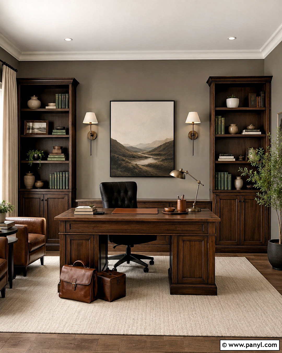
Thunder offers a grounded greige backdrop for a home office that needs warmth, focus, and visual depth. Benjamin Moore features it among its popular gray interior colors and greige selections. () Paint the walls Thunder and use soft white on the ceiling and window trim. Install walnut bookshelves along one wall, leaving enough painted surface visible to frame the wood. Pair a substantial walnut desk with a black upholstered chair and an ivory wool rug. Bronze sconces, linen curtains, and cognac leather accessories reinforce the room’s warmer direction. Add closed storage along the bottom of the shelving to keep paperwork hidden. A few cream ceramics and muted green books brighten the composition. The finished office looks established and professional while remaining inviting for long work sessions.
19. Benjamin Moore Pale Oak OC-20
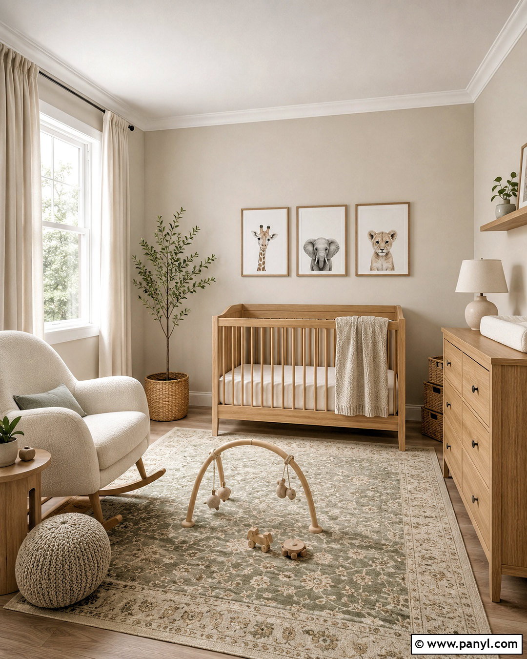
Pale Oak helps a nursery feel peaceful and flexible enough to grow with the child. Benjamin Moore places this light shade within its gray interior collection, where it sits comfortably among warm, understated neutrals. () Paint the walls Pale Oak and keep the ceiling, doors, and trim a soft creamy white. Choose a natural oak crib, matching dresser, and comfortable boucle rocking chair in warm ivory. A washable rug with muted sage, beige, and gray details adds pattern without dominating the room. Install blackout linen curtains, a simple white ceiling light, and one shaded floor lamp for layered illumination. Use woven baskets, wooden toys, and framed animal prints as restrained decoration. The completed nursery feels calm, practical, and easy to refresh later with different textiles or artwork.
20. Benjamin Moore Silver Satin OC-26
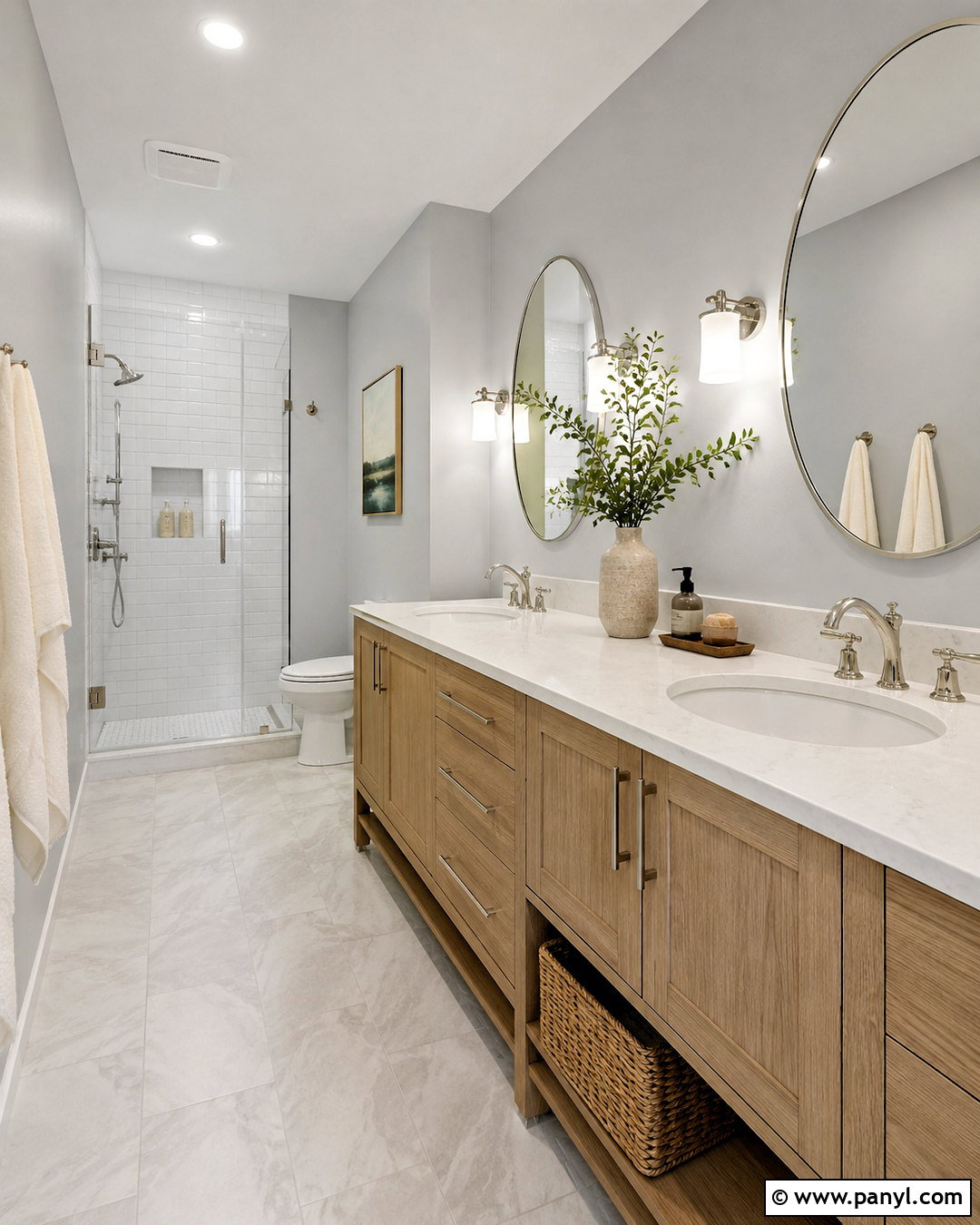
Silver Satin creates a polished bathroom that feels bright, clean, and softer than an all-white scheme. Benjamin Moore includes this pale shade in its established collection of gray interior colors. () Use it on the walls around a white oak double vanity with a lightly veined white quartz countertop. Continue glossy white tile through the shower and use pale gray porcelain tile across the floor. Polished nickel faucets, oval mirrors, and white glass sconces add shine without harsh contrast. Warm the space with cream towels, a light wood stool, and a woven laundry basket. A frameless shower enclosure preserves open sightlines. The complete bathroom feels airy and quietly luxurious while using durable, practical materials suited to a frequently used space.
Conclusion:
The best neutral gray is not simply the most popular shade. It is the color that supports your flooring, fixed finishes, daylight, and preferred furnishings. Warm greiges such as Agreeable Gray and Edgecomb Gray complement wood and cream, while cleaner grays such as Passive and Stonington Gray work beautifully with white, blue, and polished metal. Lighter shades can open compact rooms, while midtone options add welcome definition to larger spaces. Before committing, paint large sample boards and move them around the room for several days. Viewing these 20 neutral gray paint colors beside your actual furniture and finishes will reveal which undertones create the most balanced, comfortable, and cohesive home.

Related Ideas and Inspiration:
Leave a Reply