
Choosing among Sherwin Williams off white paint colors is easier when you look beyond the small color chip. Every off-white has subtle undertones that react to daylight, artificial lighting, flooring, cabinetry, and nearby finishes. Warm shades can soften cool rooms, while gray, violet, or green-influenced whites create a cleaner and more contemporary effect. The right choice should support the entire room, including the furniture, textiles, trim, and accent colors. Always test a large sample on several walls and observe it throughout the day before purchasing paint. The complete looks below explore warm, cool, creamy, and greige-leaning options, helping you compare 20 Sherwin Williams off white paint colors in realistic home settings. ()

1. Alabaster SW 7008
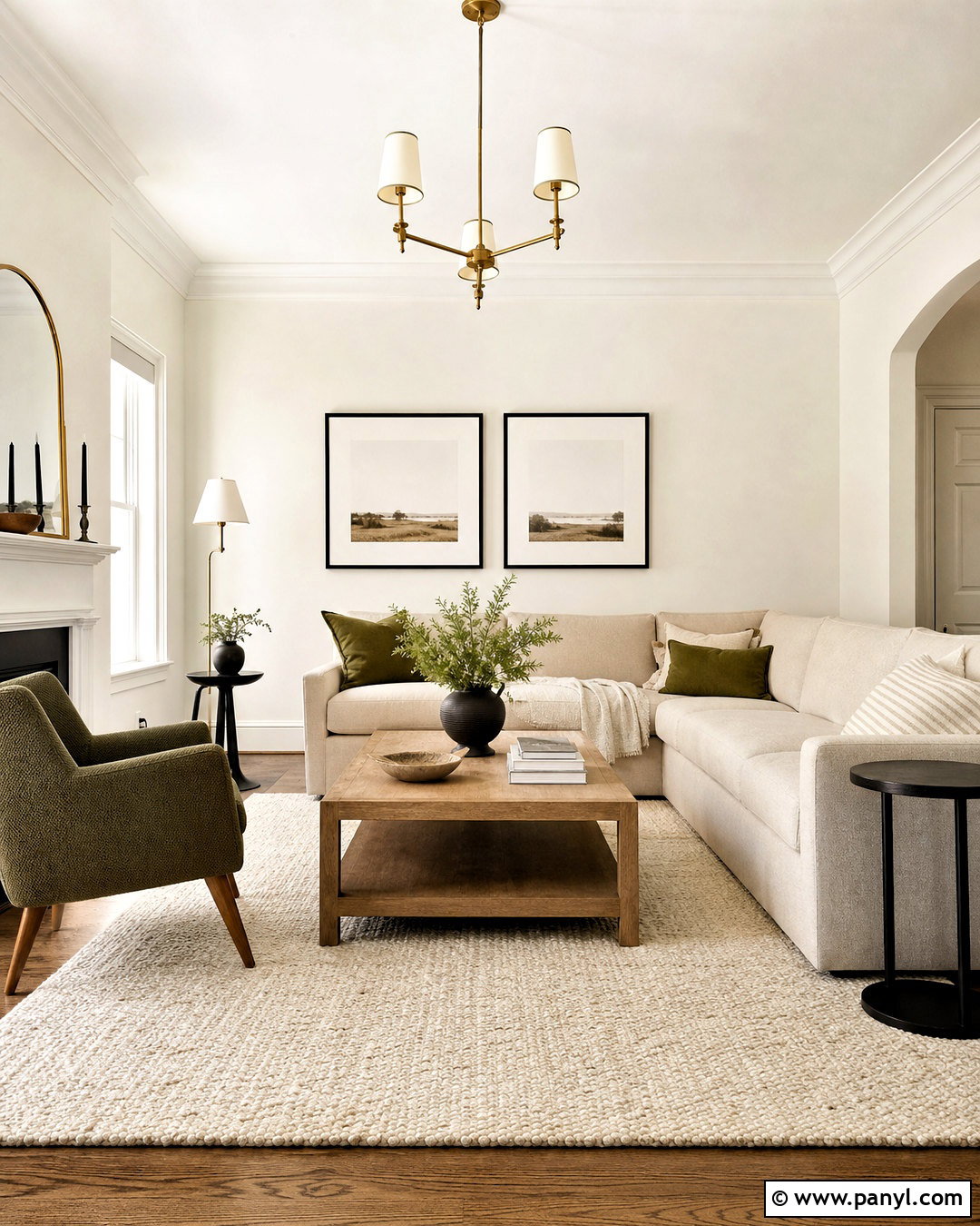
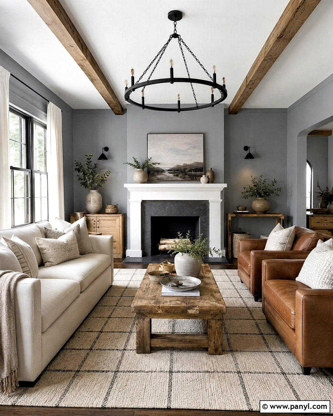
Alabaster SW 7008 creates a softly welcoming living room without looking heavily yellow or overly creamy. Paint the walls and fireplace surround in Alabaster, then use Pure White on the ceiling and detailed trim for gentle definition. A light oatmeal sofa, warm oak coffee table, and woven natural-fiber rug continue the relaxed palette. Add muted olive pillows, black-framed artwork, and antique brass lighting to keep the room grounded. This combination suits transitional, organic modern, and updated farmhouse interiors. It is especially effective in a living room with balanced natural light and warm wood flooring. Because Alabaster has subtle beige influence, compare it directly with countertops, tile, and upholstery before using it throughout an open floor plan. ()
2. Pure White SW 7005
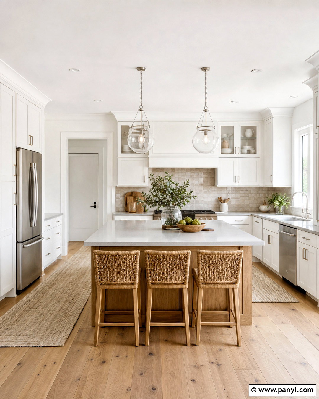
Pure White SW 7005 works beautifully in a clean, modern kitchen where a softer white is preferred over a stark commercial finish. Use it across Shaker cabinets, walls, and trim, changing the paint sheen to create subtle separation. Pair the cabinetry with pale gray quartz counters, a handmade light taupe backsplash, and brushed nickel hardware. Natural white oak flooring and woven counter stools add warmth without making the kitchen feel rustic. Finish the room with simple glass pendants and a few deep green accents. Pure White contains a slight softness that makes surrounding materials feel clear and balanced. It is a versatile choice when the kitchen includes both cool stone surfaces and warmer wood details. ()
3. Creamy SW 7012
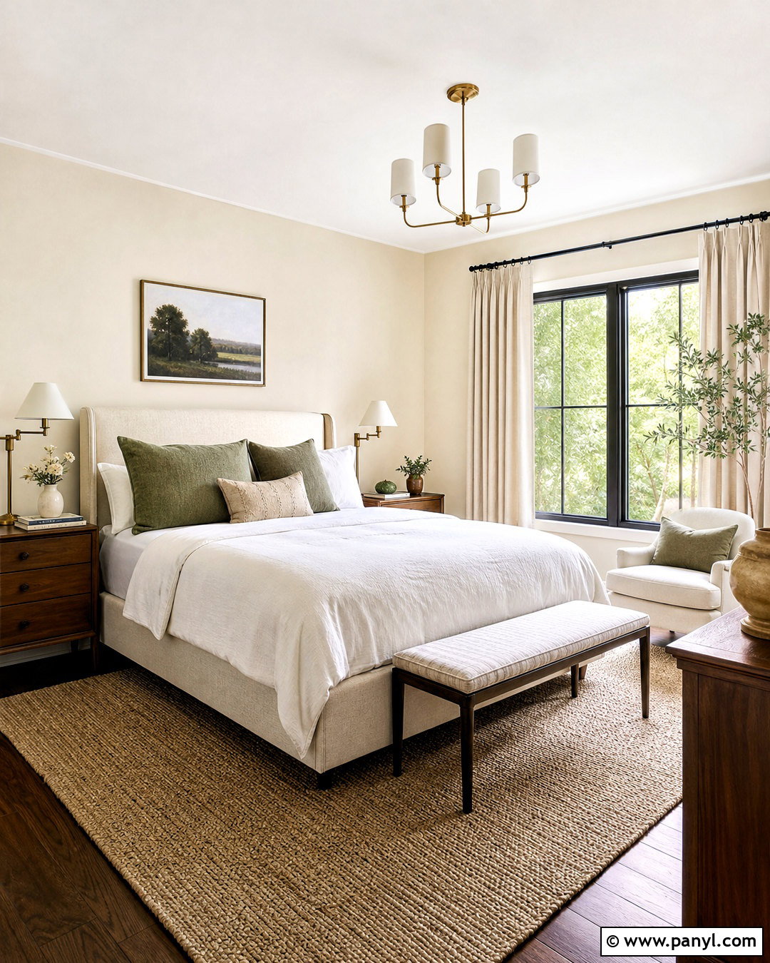
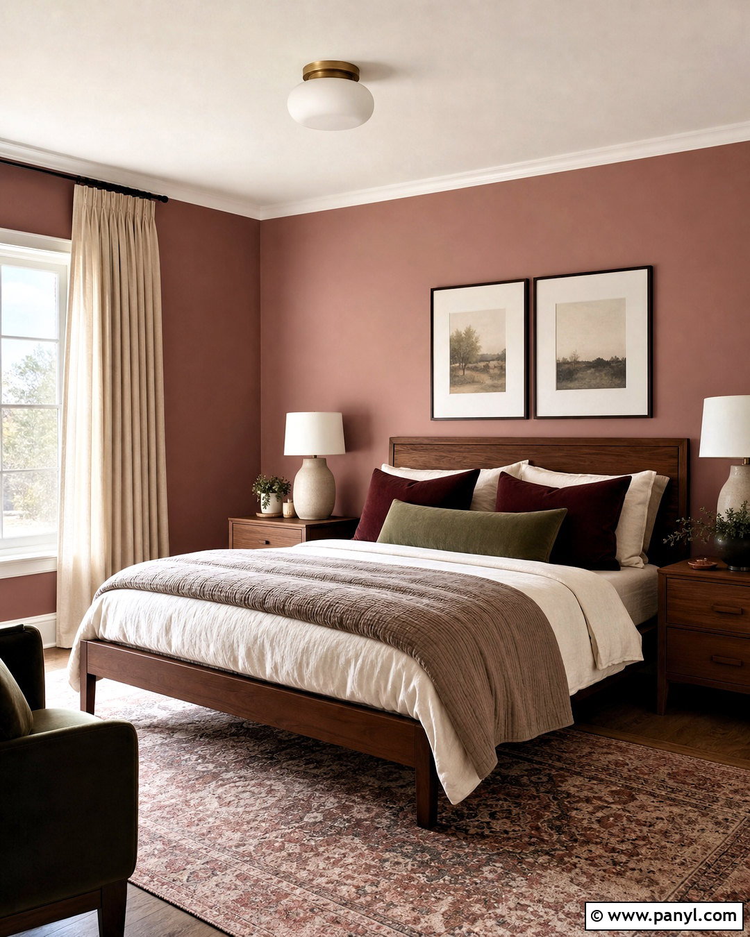
Creamy SW 7012 can turn a plain bedroom into a warm, restful retreat. Cover the walls in this inviting off-white, then select slightly brighter white for the ceiling and trim so the room maintains definition. An upholstered oatmeal bed, medium walnut nightstands, and ivory linen bedding reinforce its comfortable warmth. Add soft sage green pillows, an understated botanical print, and a textured wool rug for natural contrast. Creamy works especially well in north-facing bedrooms because its warmth can counter cooler daylight. Avoid combining it with icy white furniture, which may make the walls appear more yellow. Instead, repeat warm finishes through wood, aged brass lamps, woven shades, and flax-colored curtains for a complete and cohesive bedroom palette. ()
4. Dover White SW 6385
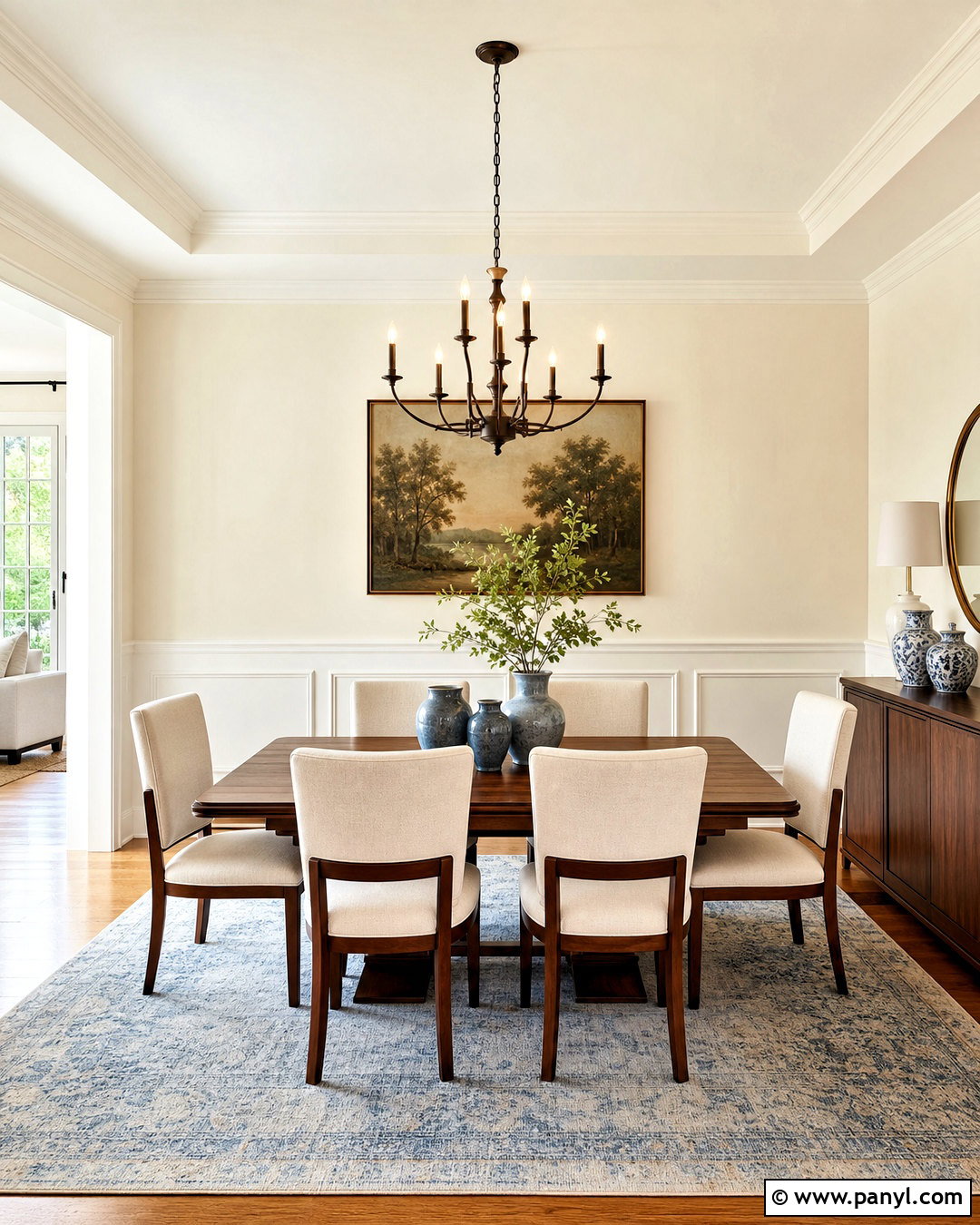
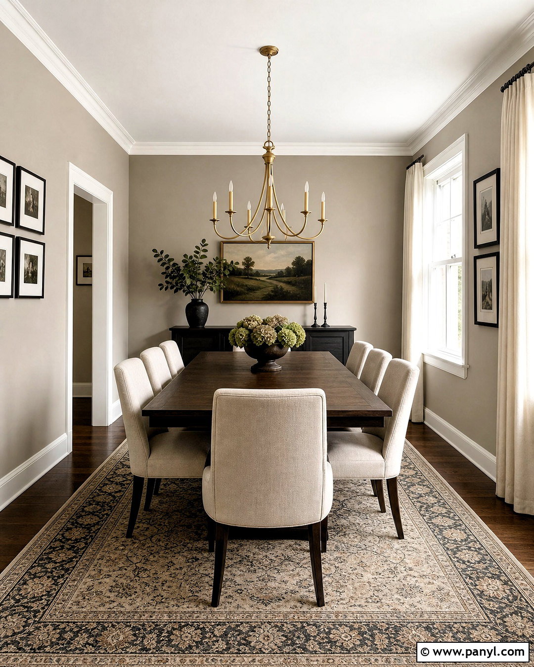
Imagine a dining room that feels sunny even before the table is set. Dover White SW 6385 provides noticeable warmth, making it a strong choice for traditional rooms with cherry, walnut, or medium oak furniture. Use it on the walls with warm white millwork, then center the space around a substantial wood dining table and cream upholstered chairs. A faded blue patterned rug, bronze chandelier, and simple ceramic vases keep the scheme classic but fresh. Since Dover White has a yellow tint, it performs best beside finishes that share its warm direction. Cool gray flooring and blue-white trim can exaggerate the creaminess. Test it near existing woodwork and use layered neutral fabrics to create a polished, comfortable dining room. ()
5. Shoji White SW 7042
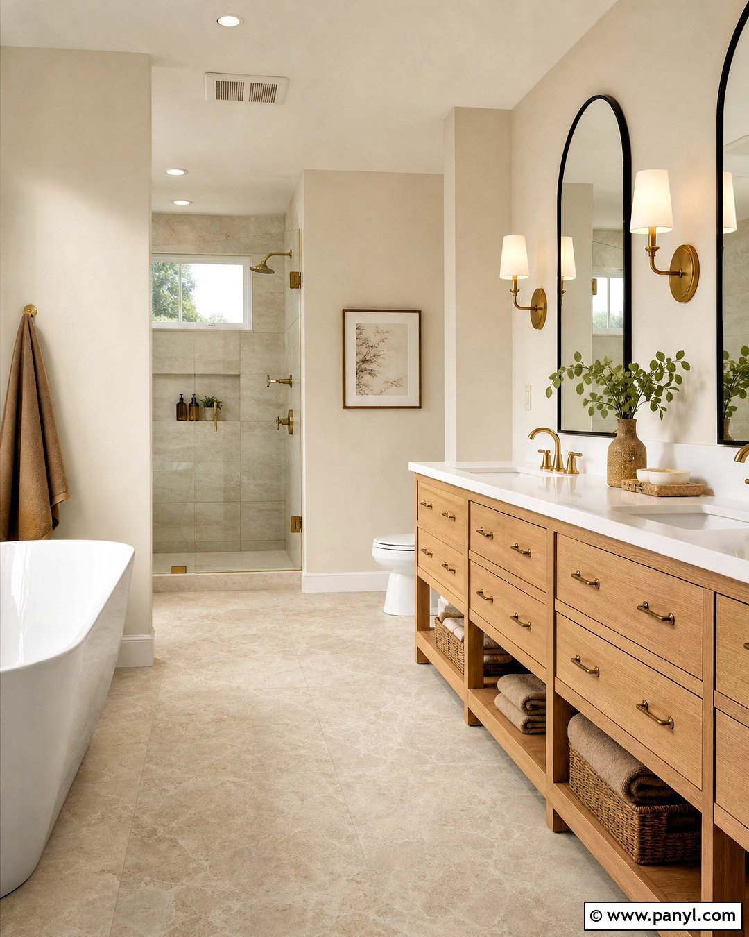
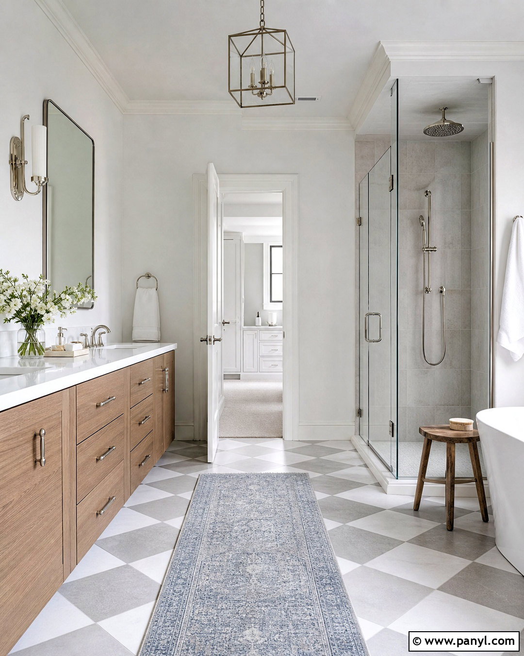
Shoji White SW 7042 delivers a sophisticated bathroom that feels warm, quiet, and slightly earthy. Paint the walls in this creamy, greige-bordering off-white and use Pure White on the ceiling, doors, and window trim. A white oak vanity, pale limestone floor, and warm white quartz counter complement its muted character. Add an arched black mirror, brushed brass fixtures, and sand-colored towels for balanced contrast. Shoji White is deeper than a crisp white, so it can help a bright bathroom feel less exposed and more relaxing. It also works well beside natural stone containing beige, taupe, or warm gray veining. Keep decorative accents simple so the wall color, wood grain, and stone texture form one calm, cohesive design. ()
6. White Duck SW 7010

White Duck SW 7010 is an appealing exterior color for homeowners who want a soft neutral facade rather than brilliant white siding. Use it on horizontal lap siding, then introduce brighter white trim around windows, eaves, and porch columns. A charcoal architectural-shingle roof and matte black front door provide crisp contrast. Complete the curb appeal with warm stone at the foundation, natural cedar porch furniture, and layered green landscaping. White Duck has enough visual body to remain noticeable in strong outdoor light, where lighter whites can appear washed out. Its warm, muted appearance also helps connect modern exterior details with traditional architecture. Before painting, test it beside the roof, masonry, and driveway because these permanent materials strongly affect how an exterior off-white is perceived. ()
7. Greek Villa SW 7551
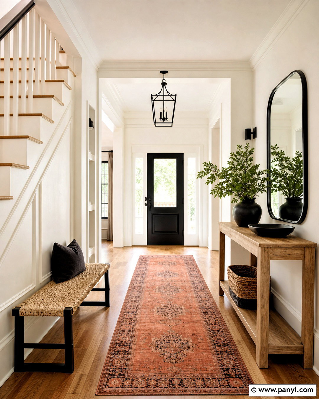
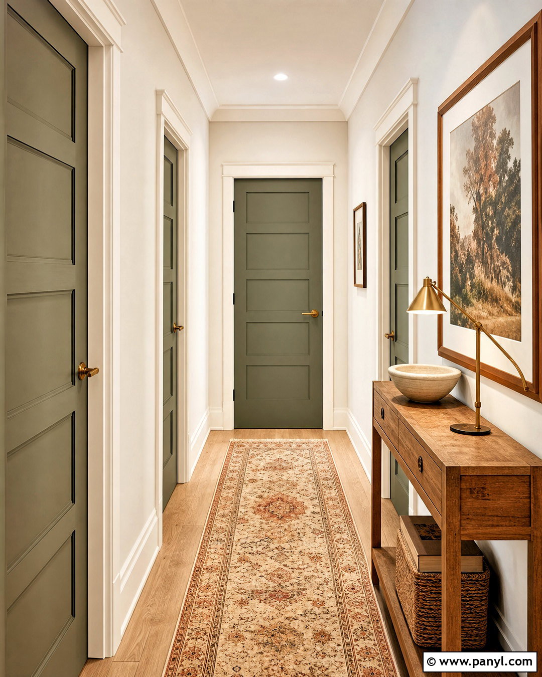
Greek Villa SW 7551 brings a bright, sunny quality to an entryway while remaining softer than a sharp white. Paint the walls, paneled staircase, and interior doors in the same color, but use eggshell on walls and satin on woodwork. This subtle sheen change creates depth without introducing another white. Add a slim natural oak console, a rounded black mirror, and a woven bench beneath wall hooks. A faded terracotta runner and leafy green plant give the space warmth and character. Greek Villa comes alive in natural light, so it is especially useful near glass doors or a generous front window. Dark accents keep the pale palette defined, while wood and woven materials support its approachable warmth. ()
8. Snowbound SW 7004

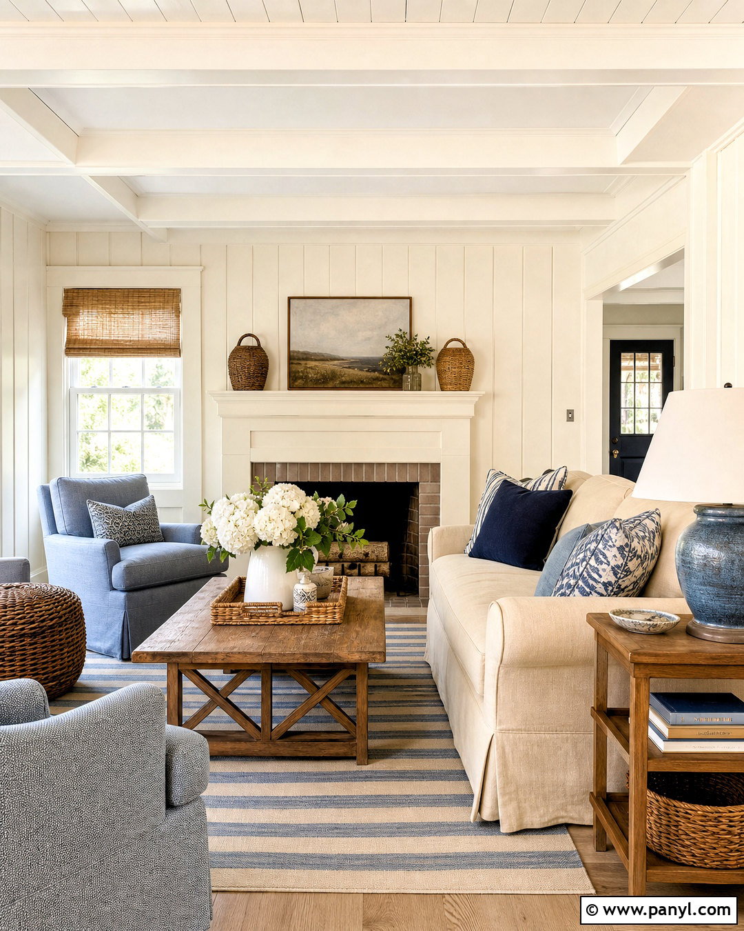
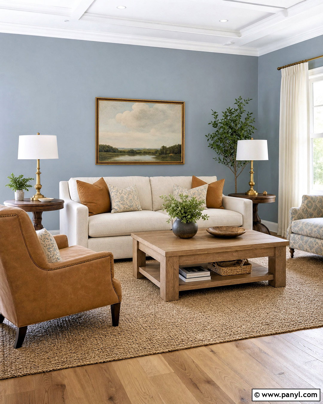
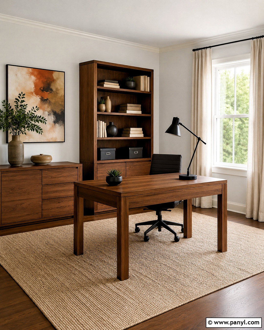
For a streamlined home office, Snowbound SW 7004 provides a cool off-white backdrop with a slight gray undertone. Paint the walls and built-in shelving in Snowbound for a seamless effect, then use a cleaner white on the ceiling if additional contrast is needed. Furnish the room with a pale oak desk, charcoal upholstered chair, and matte black task lamp. A low-pile gray rug and muted blue storage boxes reinforce the cool palette. Bring in one warm element, such as a cognac leather guest chair, to prevent the room from feeling sterile. Snowbound coordinates naturally with gray-influenced finishes, making it useful in workspaces containing concrete-look flooring, silver metals, black windows, or contemporary cabinetry. ()
9. Eider White SW 7014
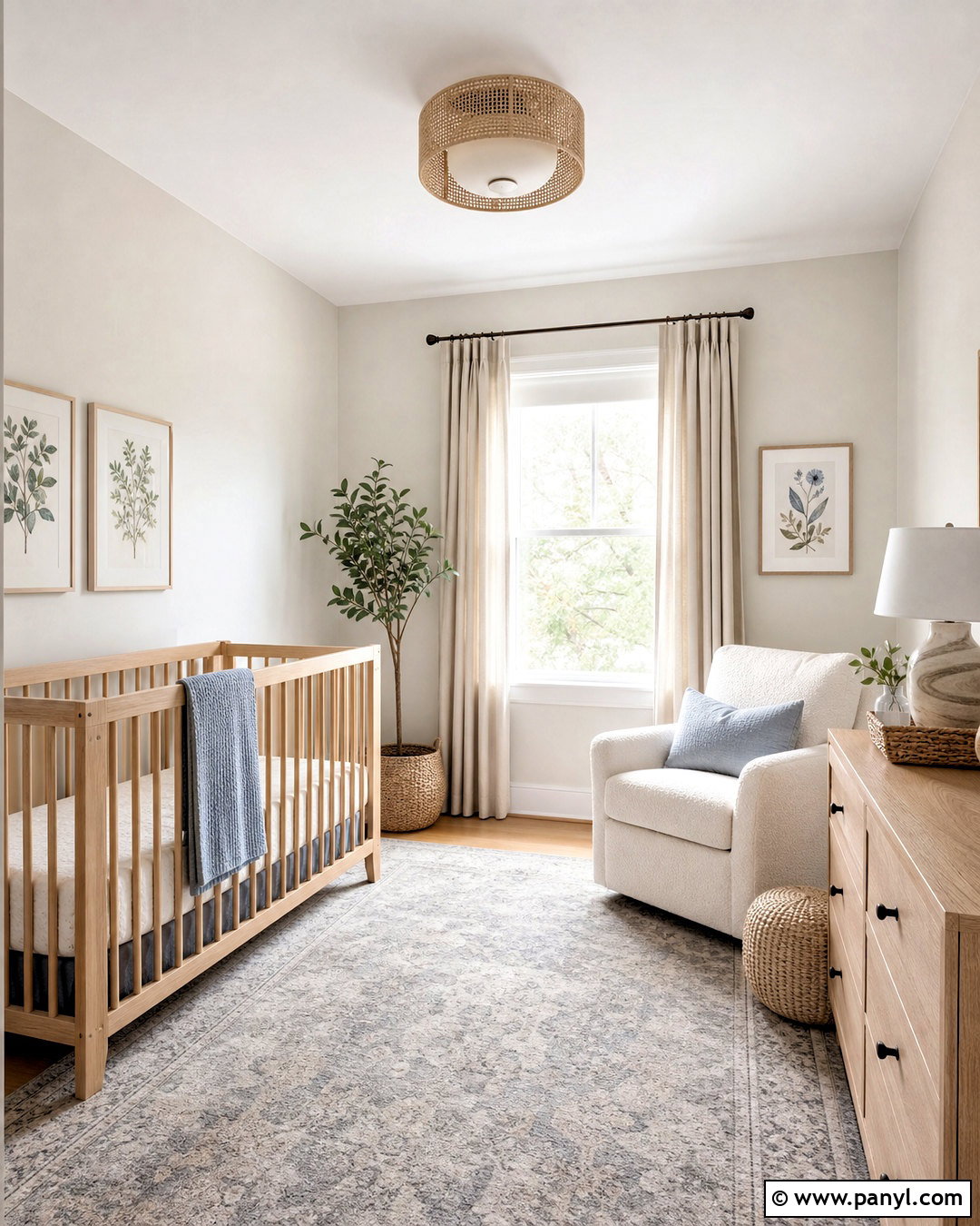
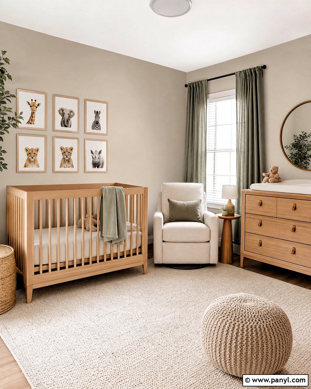
Eider White SW 7014 creates a refined nursery with more depth than a standard bright white. Its gray influence supports a calm palette of dusty blue, pale lavender, mushroom, and natural wood. Paint the walls in Eider White and use Extra White on the crown molding, baseboards, and paneled closet doors. Choose a light oak crib, a cream boucle chair, and a washable gray-beige rug. Soft linen curtains and small botanical prints add texture without making the room busy. In some lighting, Eider White may reveal a cooler or slightly violet cast, so sampling is important. It works best when the room’s fabrics and furnishings intentionally repeat its quiet gray undertones rather than competing with strong yellow or orange finishes. ()
10. Oyster White SW 7637
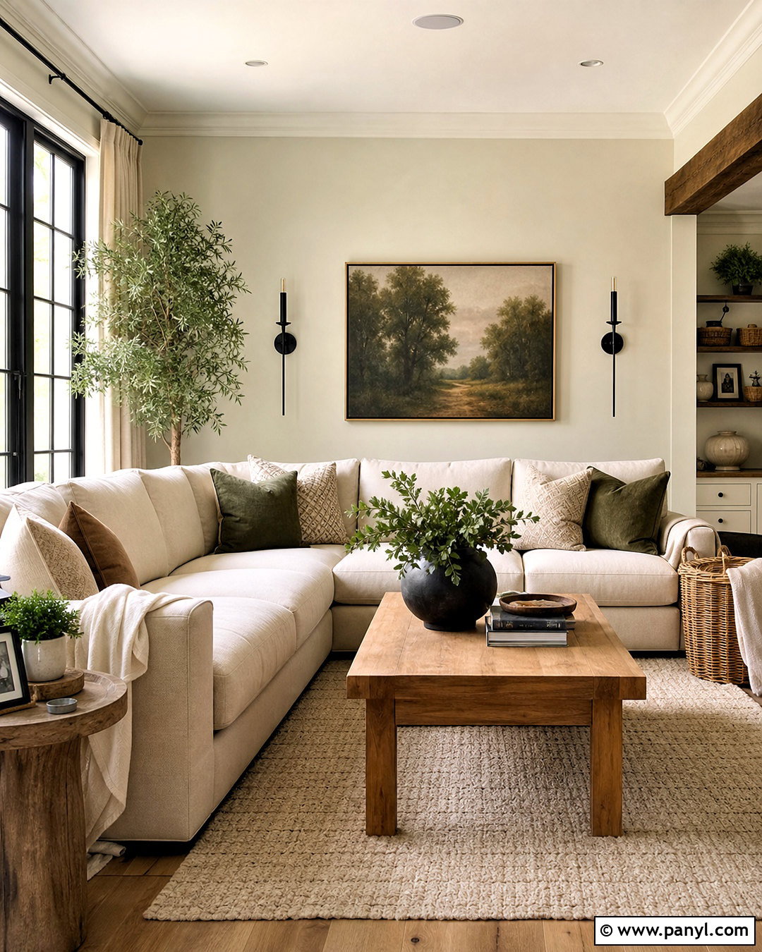
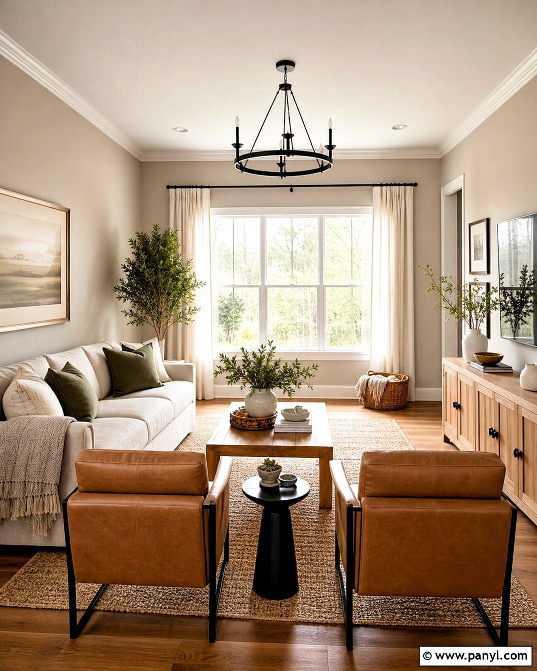
Oyster White SW 7637 is a calming choice for a comfortable family room filled with organic materials. Its creamy green-beige undertone pairs naturally with olive upholstery, weathered wood, woven baskets, and warm stone. Cover the walls in Oyster White, then use a lighter warm white on trim to sharpen the architecture. Arrange a large beige sectional around a simple oak coffee table and textured ivory rug. Add muted green pillows, black iron sconces, and landscape artwork for understated color. This off-white is particularly helpful when a room contains both beige and green finishes because it can visually connect them. Avoid extremely cool blue-gray accents unless you want the warmer undertone of the walls to become more noticeable. ()
11. Aesthetic White SW 7035
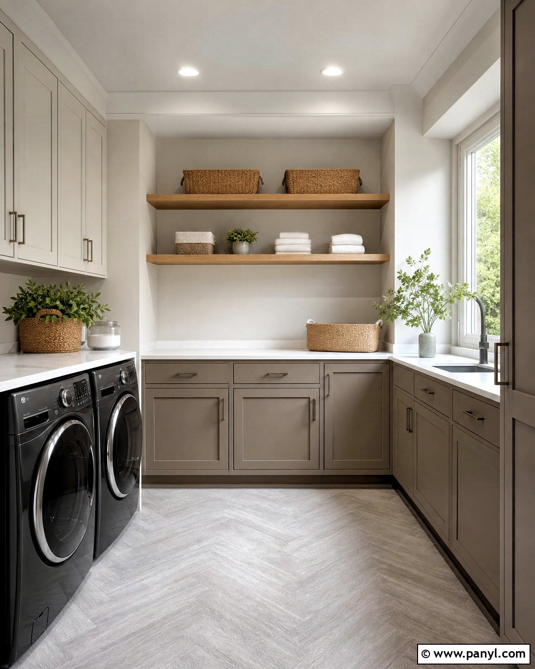
Aesthetic White SW 7035 gives a laundry room a polished neutral foundation without relying on predictable bright white walls. Use it on the walls and upper cabinetry, then introduce Pure White trim and a deeper mushroom color on the lower cabinets. White quartz counters, a light gray herringbone floor, and brushed nickel hardware keep the room crisp. Open oak shelves add warmth and provide attractive storage for glass containers, woven baskets, and folded linens. Aesthetic White carries a subtle violet undertone and can read like a pale greige in certain light. That makes it useful beside cooler gray appliances and stone surfaces. Check a sample near beige flooring, however, because strongly golden materials may emphasize its cooler side. ()
12. Origami White SW 7636
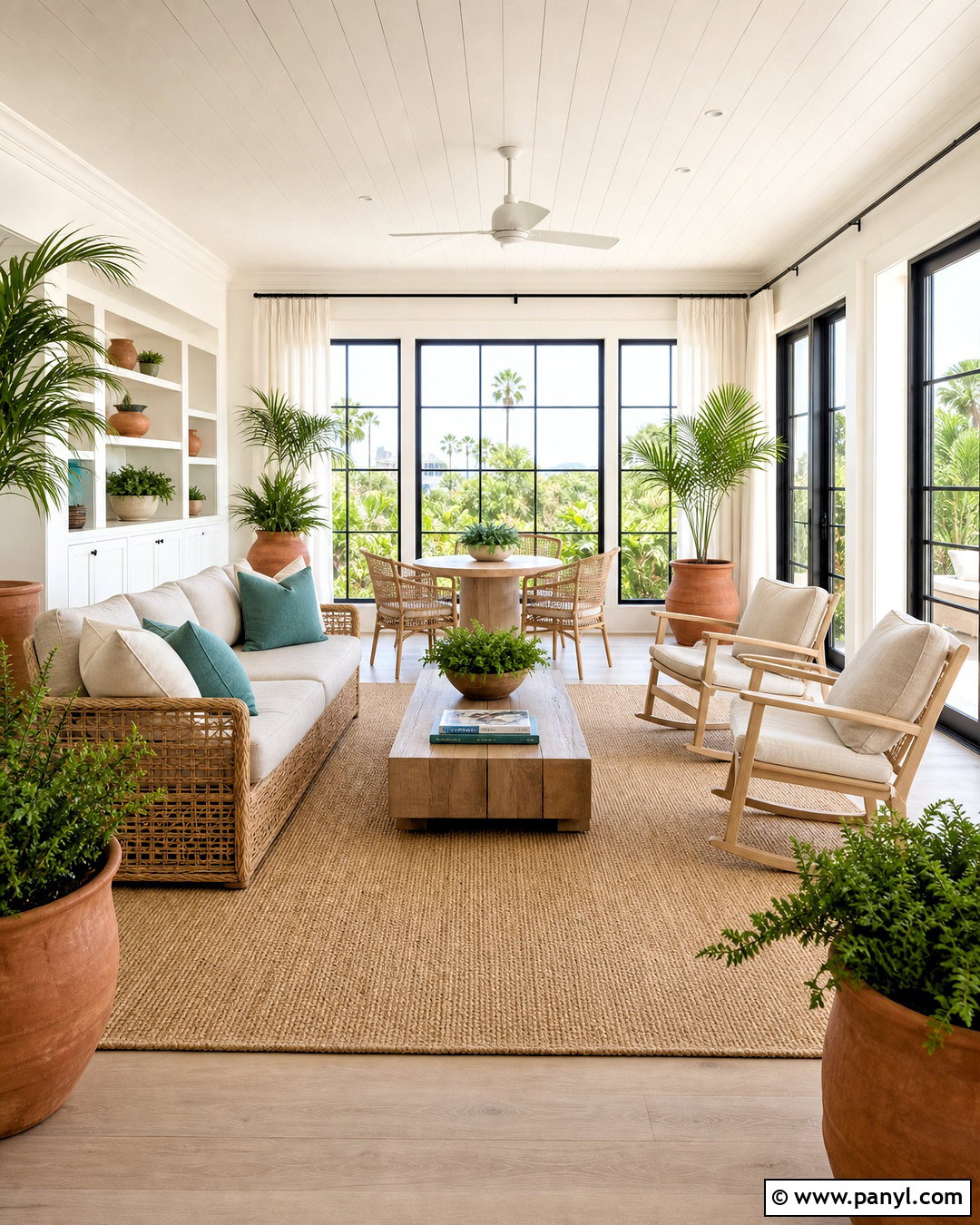
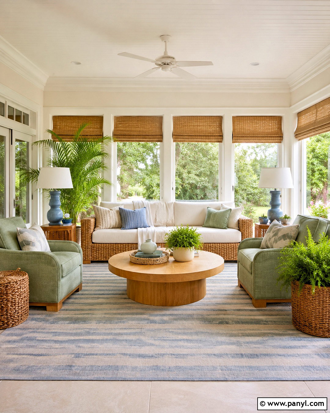
Origami White SW 7636 supports a bright sunroom that feels crisp, natural, and comfortably warm. Paint all four walls in this versatile off-white, then repeat the color on simple built-ins for an uninterrupted backdrop. Choose a light rattan sofa with flax cushions, two pale oak chairs, and a woven jute rug. Soft blue-green pillows, large terracotta planters, and relaxed white curtains complete the airy design. Matte black window frames or curtain rods add enough contrast to define the pale surfaces. Origami White can work across multiple rooms and design directions because it sits between clean white and warmer neutral territory. In a sun-filled room, its softness prevents glare while still helping plants, natural fibers, and outdoor views feel fresh and vivid. ()
13. Natural Choice SW 7011
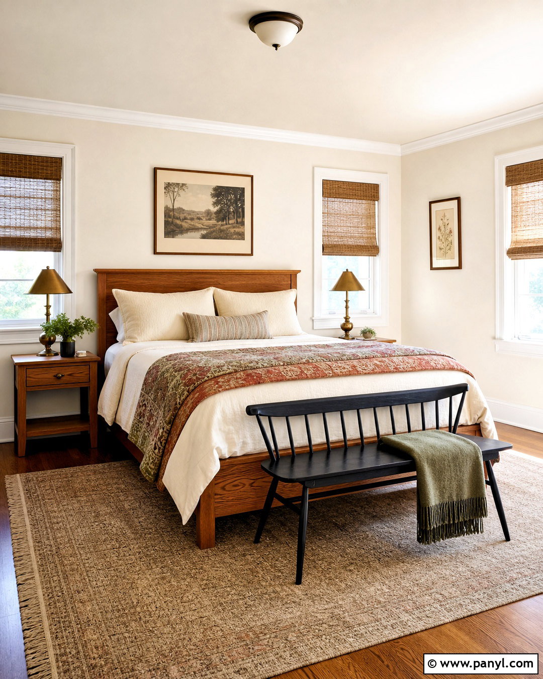
Natural Choice SW 7011 makes a welcoming guest bedroom feel finished without demanding bold color. Apply it to the walls and pair it with warm white trim, a medium oak bed, and layered ivory bedding. Add a quilt in muted rust, sage, and tan to bring gentle contrast into the room. Woven shades, aged brass lamps, and a soft beige rug continue the natural direction. This off-white feels particularly appropriate in homes with traditional wood flooring or warm-toned furniture. Rather than adding cool gray nightstands, choose wood, mushroom, or soft brown finishes that relate to the room’s warmth. A small black bench or dark picture frames can provide definition, ensuring the neutral palette feels deliberate rather than faded or unfinished. ()
14. Incredible White SW 7028
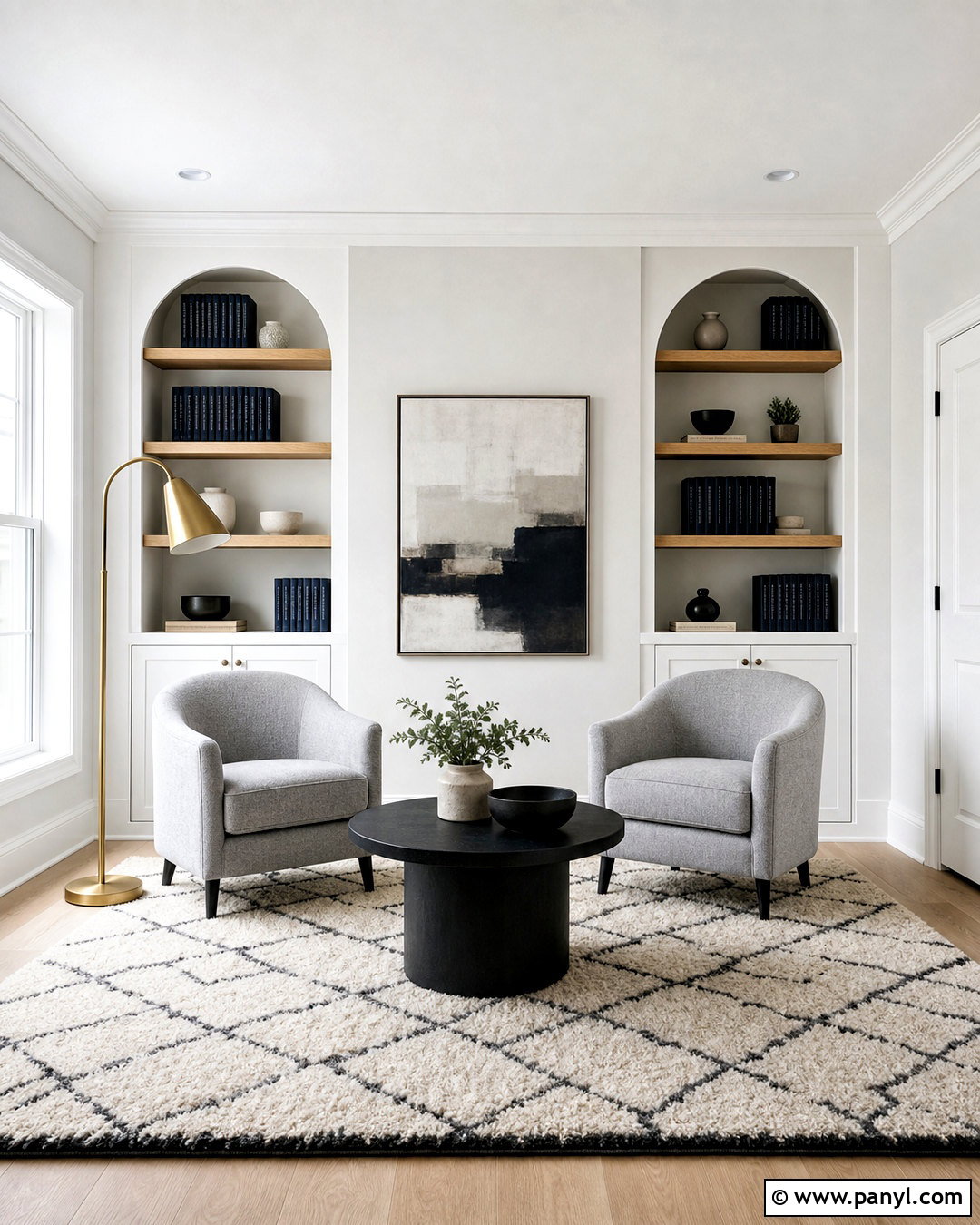
Incredible White SW 7028 offers a reassuring, cool backdrop for a contemporary reading room. Paint the walls in this gray-influenced white, then highlight the trim and built-in bookcases with Snowbound for subtle tonal contrast. Place two soft gray lounge chairs beside a round black table and anchor them with a cream-and-charcoal geometric rug. Pale oak shelving, navy book spines, and a sculptural floor lamp add interest while maintaining the quiet palette. The color works especially well when you want white cabinetry or architectural details to remain visible against the walls. Since natural light can strengthen cool undertones, introduce warm wood, ivory textiles, or brushed brass to keep the finished room balanced and inviting throughout the day. ()
15. Egret White SW 7570
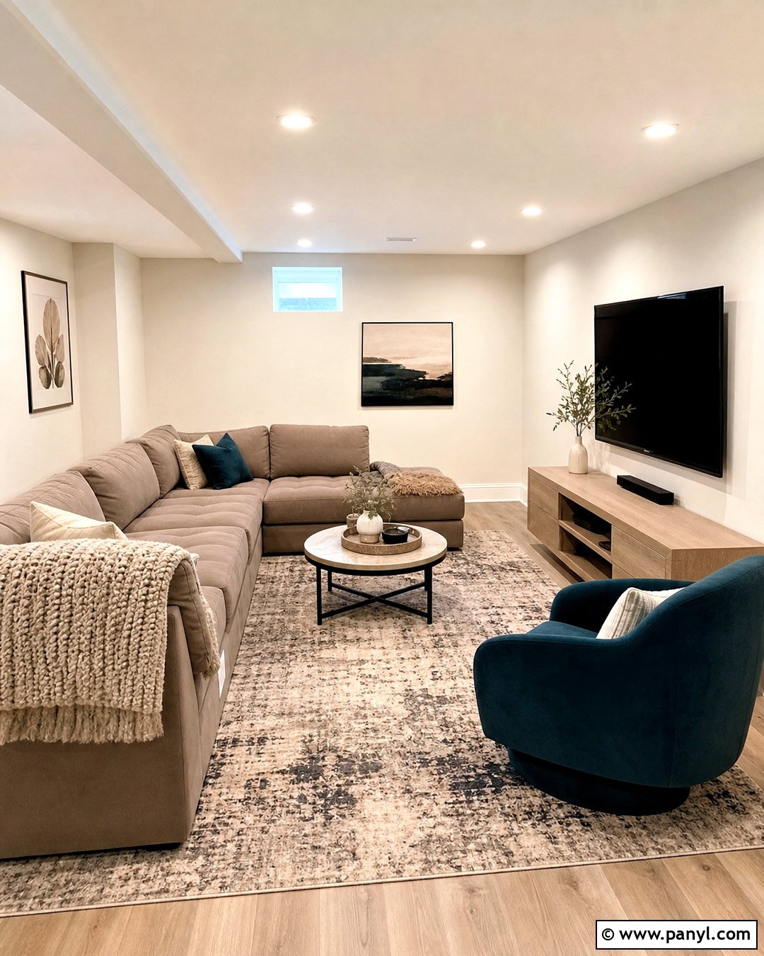
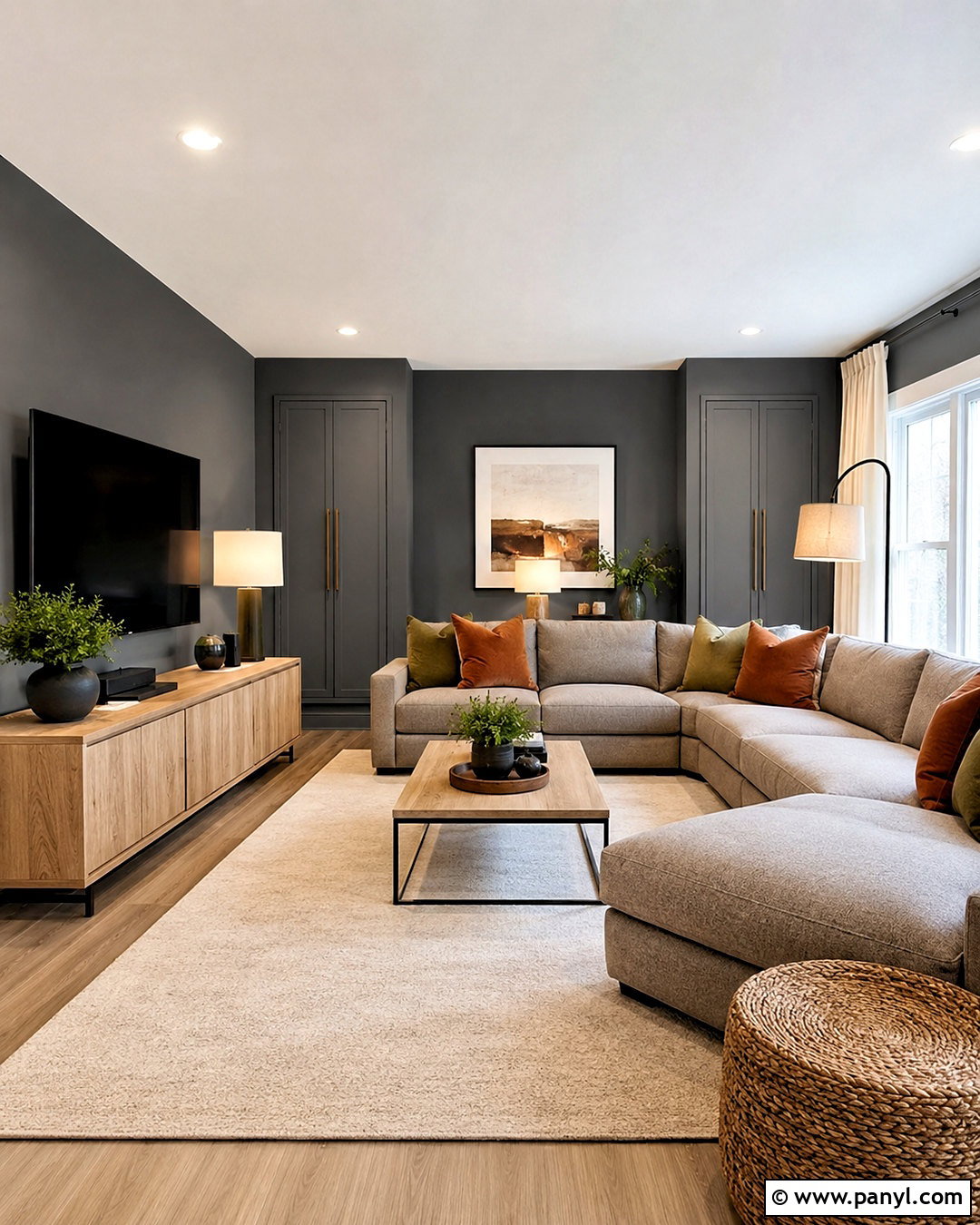
Egret White SW 7570 can soften a finished basement that receives limited natural light. Its stone-like undertones give the walls enough presence to avoid looking flat beneath recessed lighting. Use Egret White throughout the main seating area, with Snowbound on the ceiling and trim. Select a mushroom sectional, a pale oak media console, and a low-pile rug combining cream, taupe, and charcoal. Add a deep teal chair or accent cabinet for controlled color. Warm LED bulbs can help the room feel inviting, but test the paint beneath the exact bulbs you plan to use. Repeating stone, wood, and softly textured fabrics creates a coordinated basement where the off-white reads as intentional, comfortable, and more dimensional than builder-grade white. ()
16. Heron Plume SW 6070
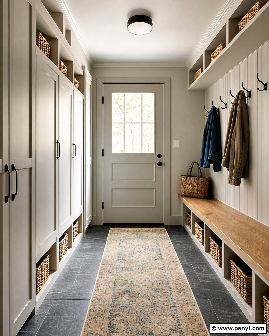
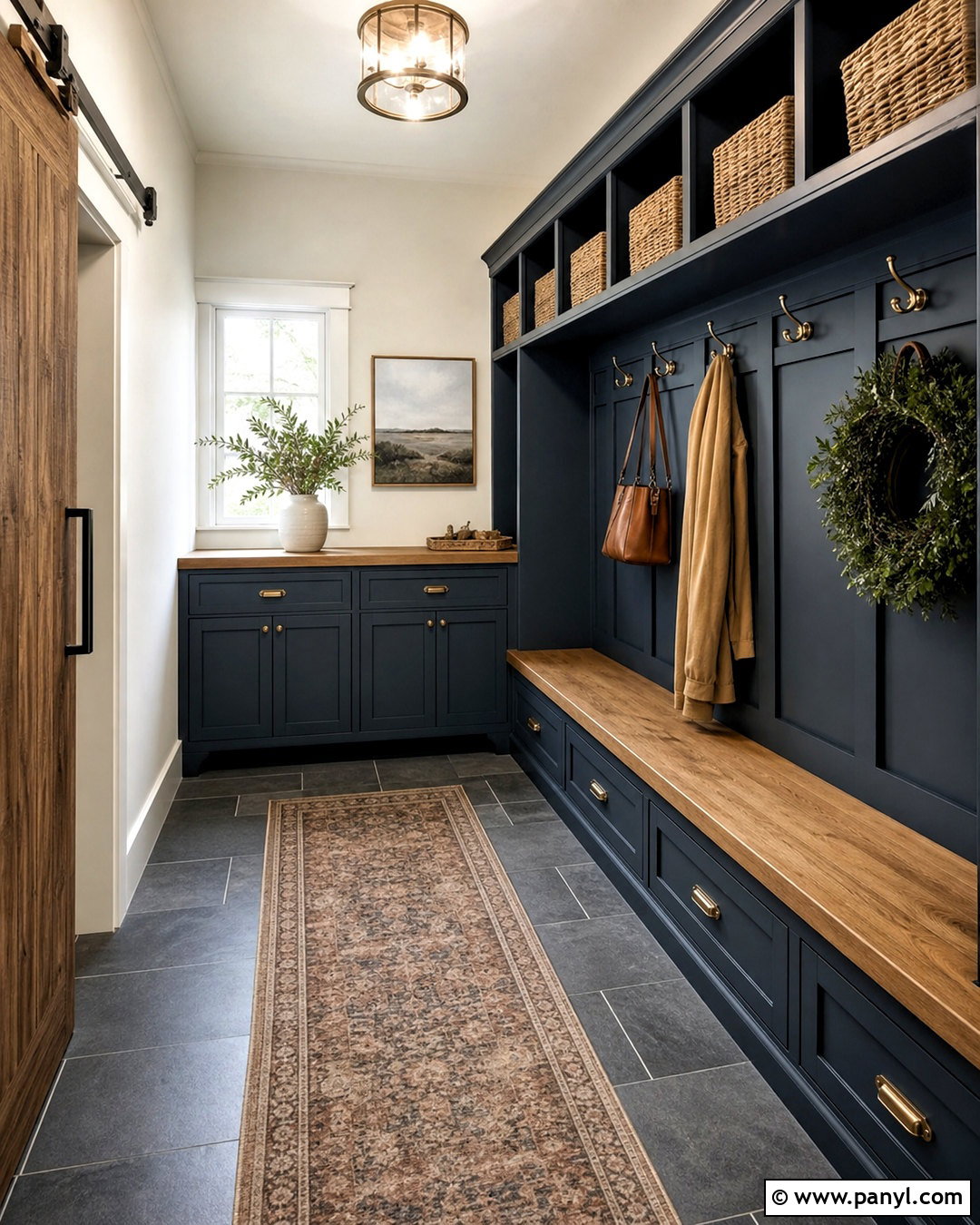
Does your mudroom need a neutral that hides daily wear better than brilliant white? Heron Plume SW 6070 creates a soft, practical backdrop with a lightly grayed appearance. Paint the walls and tall storage lockers in the same color, using a durable satin finish on cabinetry. Pair it with a charcoal slate-look floor, warm oak bench, black hooks, and woven storage baskets. A runner in faded beige and blue adds pattern while disguising tracked-in dirt. Brighter white trim around doors creates a clean boundary without making the room feel cold. Heron Plume fits especially well in transitional homes where warm and cool finishes meet. Keep the palette restrained so the storage layout, natural textures, and subtle wall color work together as one organized design. ()
17. Neutral Ground SW 7568

Neutral Ground SW 7568 gives a cottage exterior a warm, established look that connects naturally with landscaping. Use it on board-and-batten siding, paired with creamy white window trim and muted sage shutters. A medium brown roof, weathered brick walkway, and stained wood front door complete the traditional palette. Surround the facade with hydrangeas, boxwood, ornamental grasses, and lavender for layered curb appeal. This off-white is useful when a home needs more warmth than a crisp white can provide but should still appear light from the street. Because exterior sunlight can reduce visible color depth, apply large samples on different sides of the house. Check them beside the roof and masonry before finalizing the trim and accent colors. ()
18. Panda White SW 6147
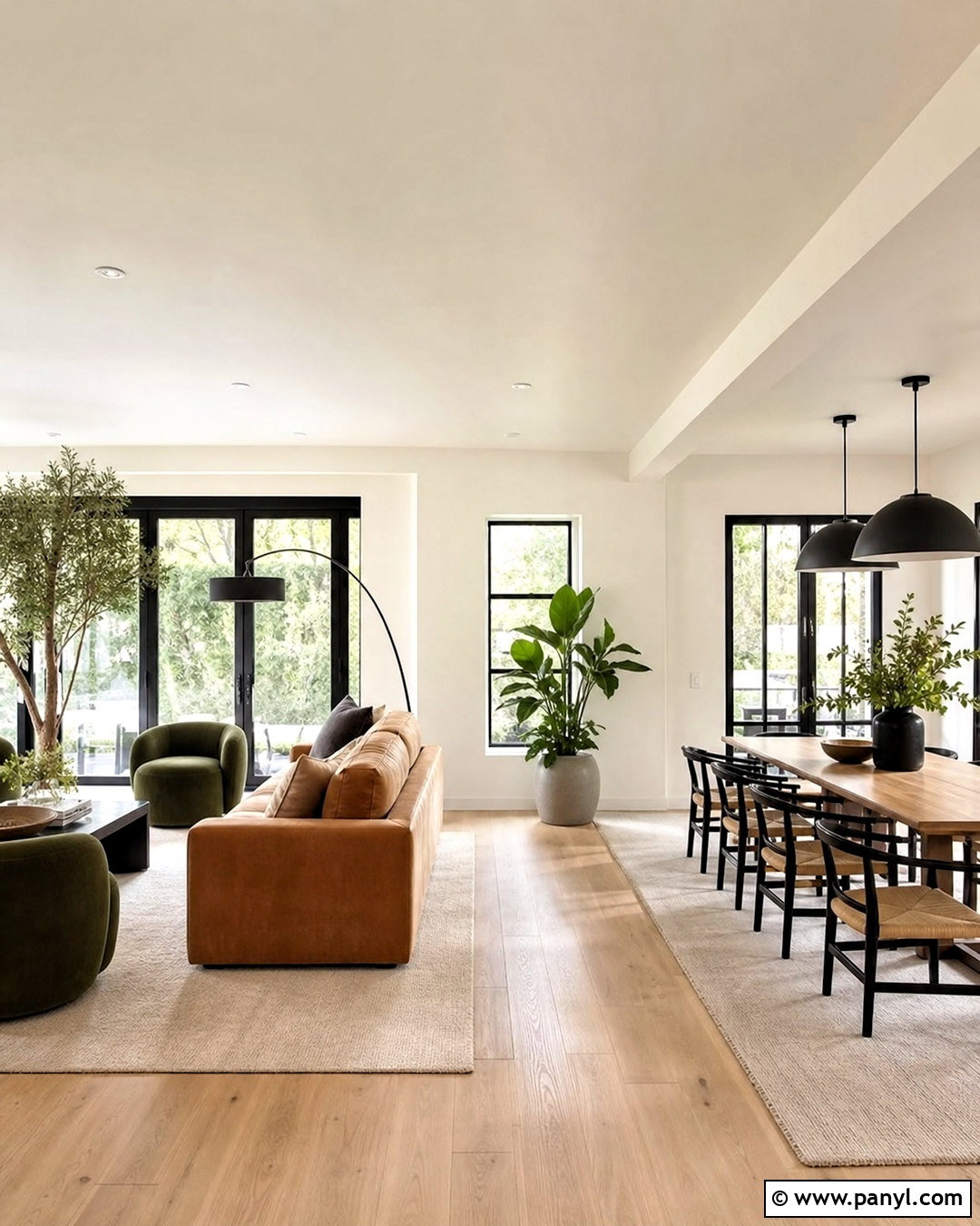
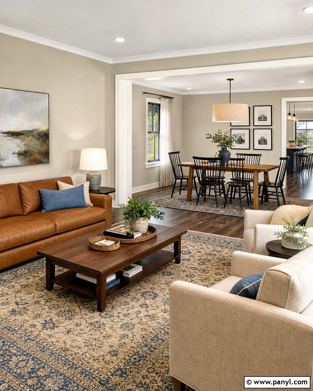
Panda White SW 6147 works well in an open-plan living and dining area that needs continuity without looking overly bright. Paint the connected walls in this warm, balanced off-white, then use a cleaner white on the ceiling and trim. Define the living zone with a camel-colored sofa, olive chairs, and an ivory wool rug. In the dining area, repeat the warm woods through an oak table and woven-seat chairs. Black metal lighting and dark picture frames provide a consistent accent across both zones. Panda White also complements nature-inspired exterior palettes, but indoors it feels especially comfortable beside wood, linen, leather, and greenery. Keep large furnishings warm or neutral so the wall color remains calm instead of appearing unexpectedly beige. ()
19. Divine White SW 6105
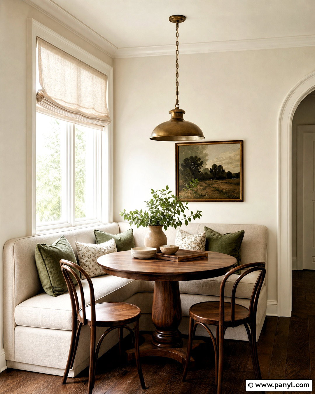
Divine White SW 6105 creates a cozy breakfast nook with a richer off-white character. Cover the walls in this shade and add a built-in banquette upholstered in oatmeal performance fabric. A round walnut pedestal table, curved wood chairs, and a small antique brass pendant reinforce the welcoming palette. Use warm white trim rather than a blue-white option to avoid a noticeable undertone clash. Complete the nook with relaxed linen shades, earthy green cushions, and simple ceramic tableware. Divine White is well suited to spaces where comfort matters more than crisp contrast. It also helps traditional cabinetry, warm stone tile, and medium wood floors feel connected. In a small room, keep the remaining colors restrained so the walls look softly layered rather than dark or overly creamy. ()
20. Westhighland White SW 7566
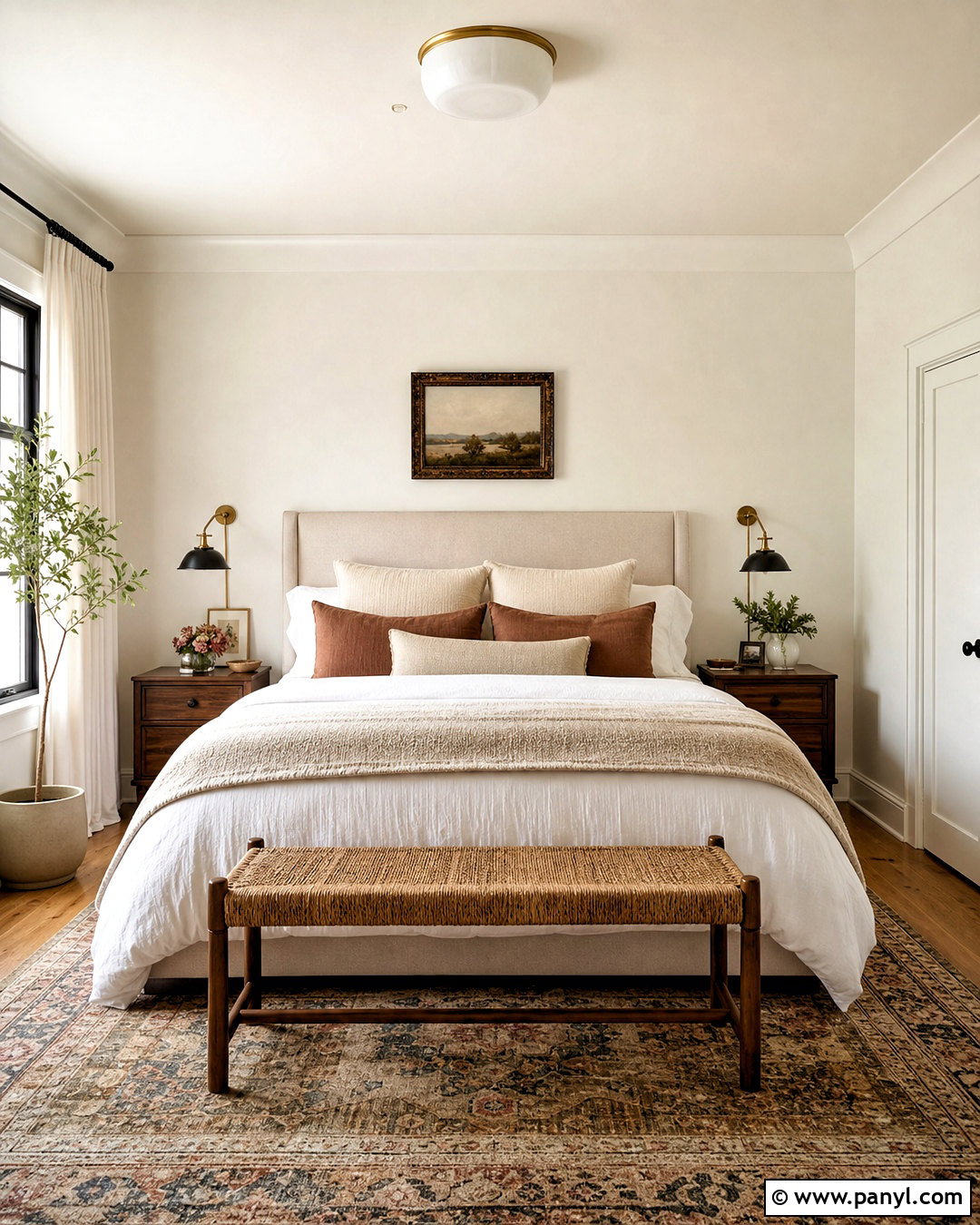
Westhighland White SW 7566 completes a warm primary bedroom with a light, classic envelope. Paint the walls and ceiling in the same color, using flat paint overhead and eggshell on vertical surfaces. This color-drenching approach reduces harsh boundaries and makes the room feel calm. Add a linen-upholstered bed, warm walnut nightstands, and layered bedding in ivory, flax, and muted clay. A vintage-inspired rug, woven bench, and bronze reading lights provide depth. Westhighland White pairs comfortably with warmer materials, making it useful when flooring or furniture has honey, red, or golden notes. For contrast, use soft black curtain rods and frames rather than introducing a cold white. The final result feels bright, collected, and gently traditional without becoming overly formal. ()
Conclusion:
The best off-white should connect the permanent finishes, furnishings, and lighting already present in your home. Alabaster and Pure White offer versatile foundations, while Creamy, Dover White, and Divine White bring noticeable warmth. Shoji White, White Duck, and Oyster White provide earthy depth, while Snowbound, Eider White, and Incredible White suit cooler schemes. Once you have narrowed the options, paint large movable sample boards and view them beside flooring, counters, trim, and fabrics during morning, afternoon, and evening light. This simple step can reveal undertones that small chips cannot show. With thoughtful testing, these Sherwin Williams off white paint colors can create rooms and exteriors that feel coordinated, comfortable, and enduring.

Related Ideas and Inspiration:

Leave a Reply