
Searching for **20 greige paint colors Sherwin Williams ideas** is a smart starting point when you want a neutral that feels warmer than gray but more balanced than traditional beige. Greige can connect wood floors, stone countertops, white trim, and upholstered furniture without making a room feel flat. The key is choosing a shade that works with your natural light and existing finishes. Some greiges lean creamy, while others reveal taupe, violet, green, or cooler gray undertones. Always test large samples on several walls and view them from morning through evening, since exposure can noticeably change a neutral. Sherwin-Williams also recommends considering light reflectance and room orientation when selecting neutrals. () Here are **20 greige paint colors sherwin williams ideas**.

1. Agreeable Gray Sherwin Williams
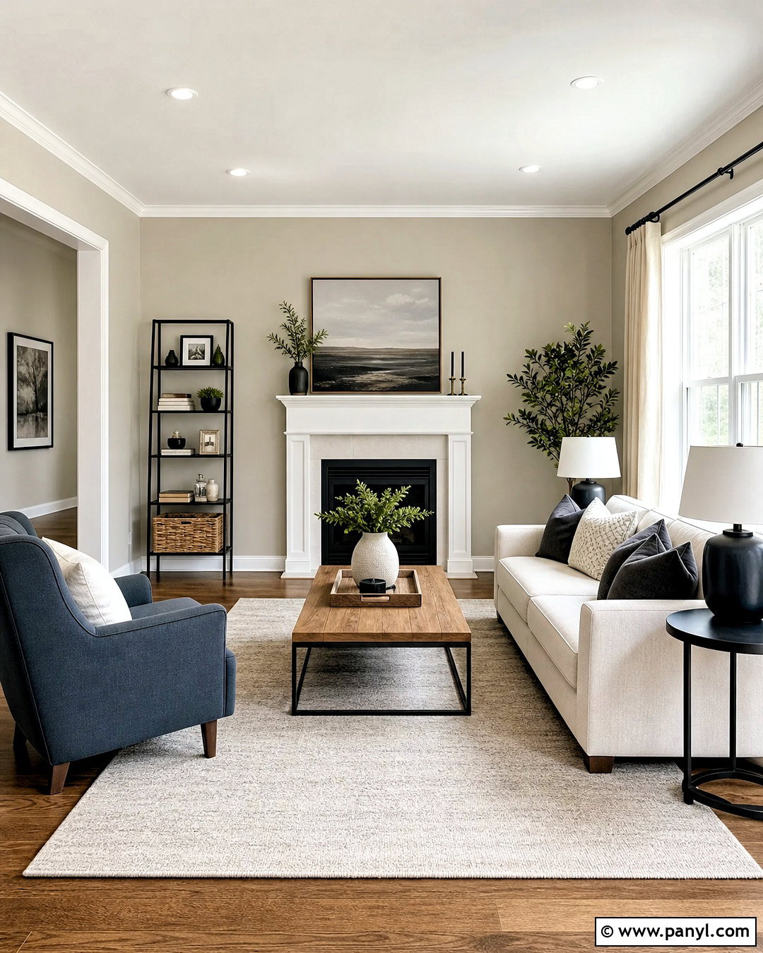
Agreeable Gray SW 7029 creates a balanced backdrop for a comfortable living room with warm and cool finishes. Paint the walls this soft greige, then add Pure White trim for gentle definition. A cream sofa, medium oak coffee table, and oatmeal rug reinforce its warmth without making everything look beige. Introduce contrast through matte black lamps, charcoal pillows, and a muted blue chair. Linen curtains keep the windows light and relaxed. This combination works especially well in open spaces where the wall color needs to coordinate with white cabinetry, wood flooring, and stone surfaces. Because Agreeable Gray may shift with exposure, sample it beside flooring and countertops before committing to the complete room. ()
2. Accessible Beige Sherwin Williams
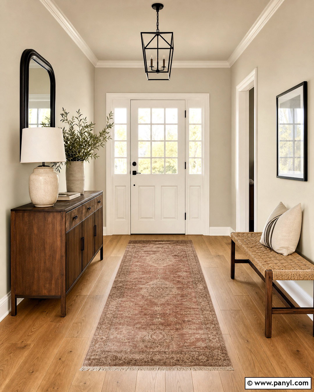
Accessible Beige SW 7036 brings an earthy greige character to an entryway or connected main floor. Use it on the walls with warm white trim, natural oak flooring, and a simple walnut console. A woven bench, black framed mirror, and ceramic table lamp create a practical but polished entrance. Add olive green branches and a faded rust runner to highlight the color’s warm side. Unlike a strong golden beige, this shade maintains enough gray influence to feel current beside black metal and clean-lined furniture. It is also a useful bridge between creamy tile and brown woodwork. Test the color near fixed finishes because it can appear warmer in late-afternoon sunlight and more subdued under indirect light. ()
3. Repose Gray Sherwin Williams
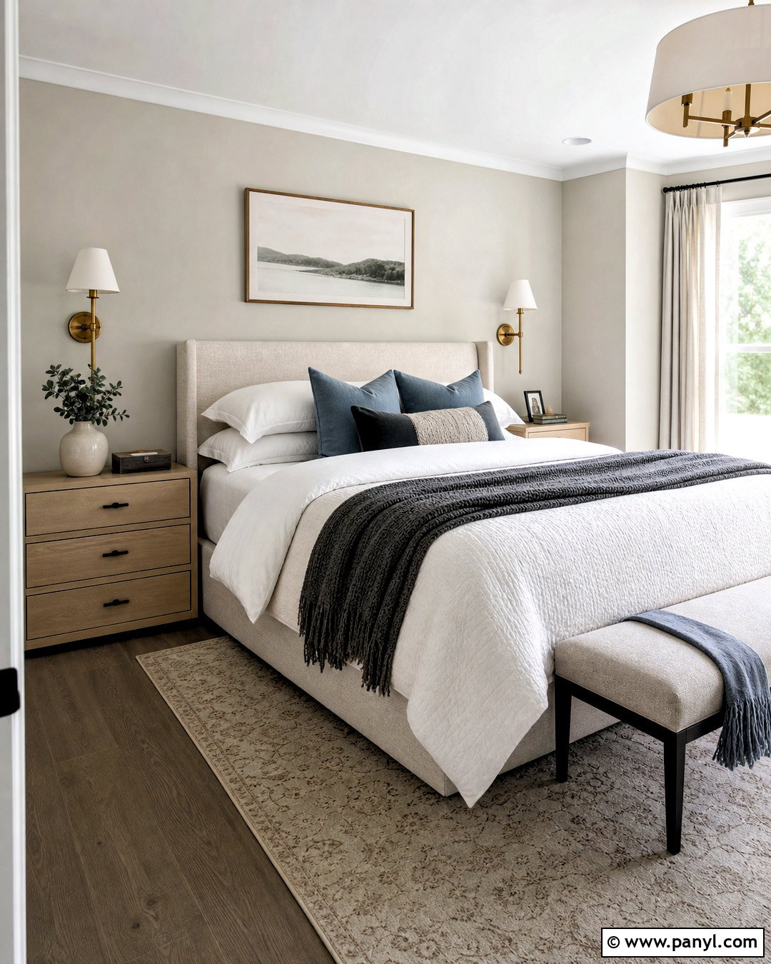
Repose Gray SW 7015 suits a calm bedroom where the design mixes crisp details with natural warmth. Cover the walls in this light gray-based greige and pair them with bright white trim and a soft white ceiling. Choose an upholstered oatmeal bed, pale oak nightstands, and warm brass sconces to prevent the room from feeling cold. Layer white bedding with taupe, dusty blue, and charcoal accents for subtle dimension. A textured wool rug and full-length linen curtains soften the clean palette. In cooler or north-facing light, the gray side may become more noticeable, so balance it with warm woods and creamy textiles. Sampling is particularly important if the room contains cool flooring or blue-gray stone. ()
4. Worldly Gray Sherwin Williams
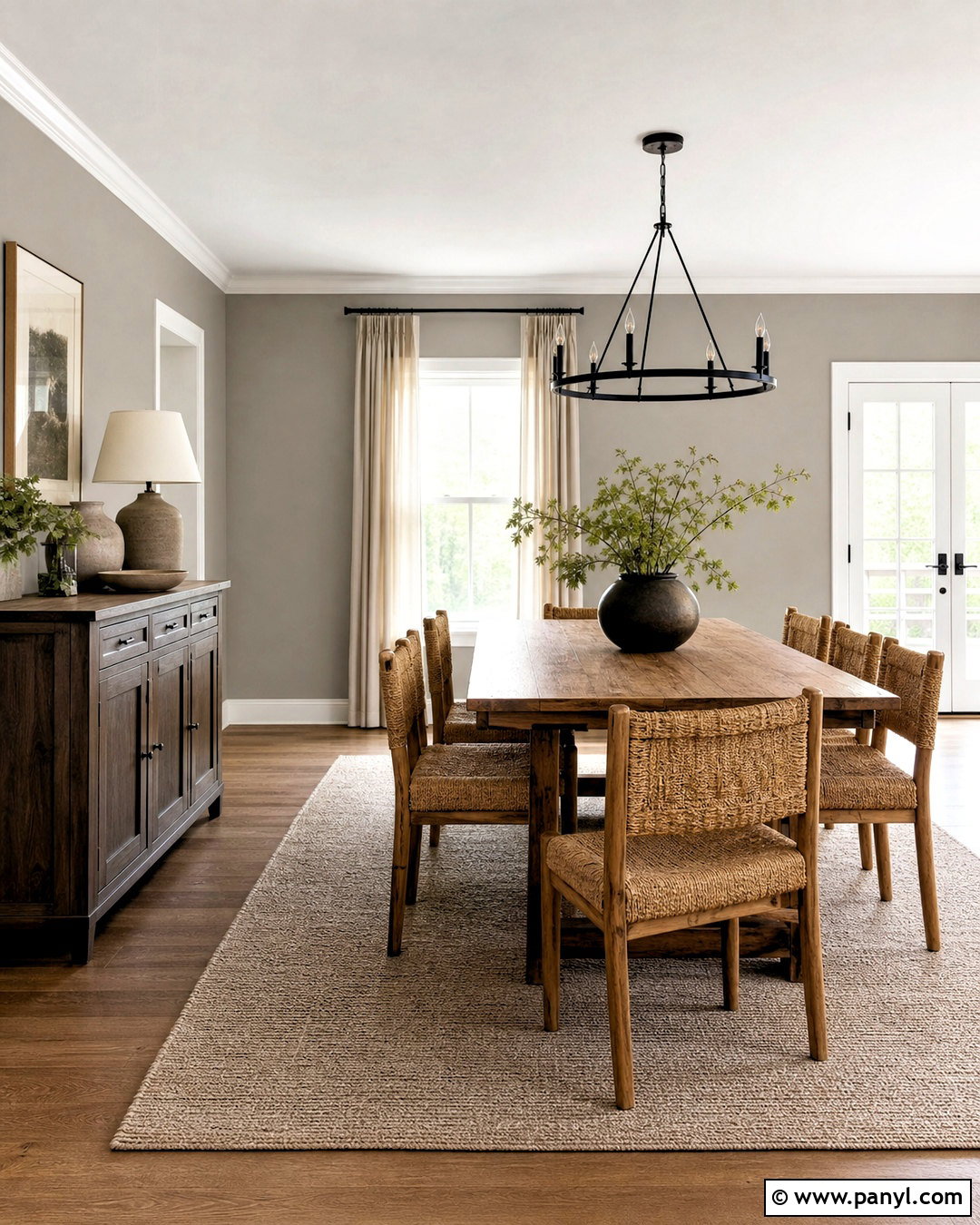
Worldly Gray SW 7043 provides a grounded, welcoming foundation for a dining room filled with natural materials. Paint the walls this mid-light greige and use warm white on the ceiling, trim, and window casings. Center the space with a substantial oak dining table, woven rush chairs, and a simple black chandelier. Cream drapery, handmade pottery, and an understated taupe rug complete the room without competing with the wall color. Add a dark wood sideboard for contrast and display a few muted green accessories. Sherwin-Williams includes Worldly Gray among neutral shades that can create a clean, inviting atmosphere. Still, evaluate it in your own light because nearby wood tones can emphasize its beige or gray qualities. ()
5. Perfect Greige Sherwin Williams
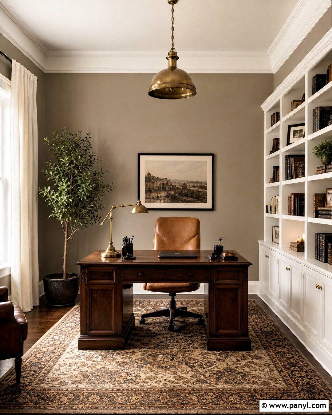
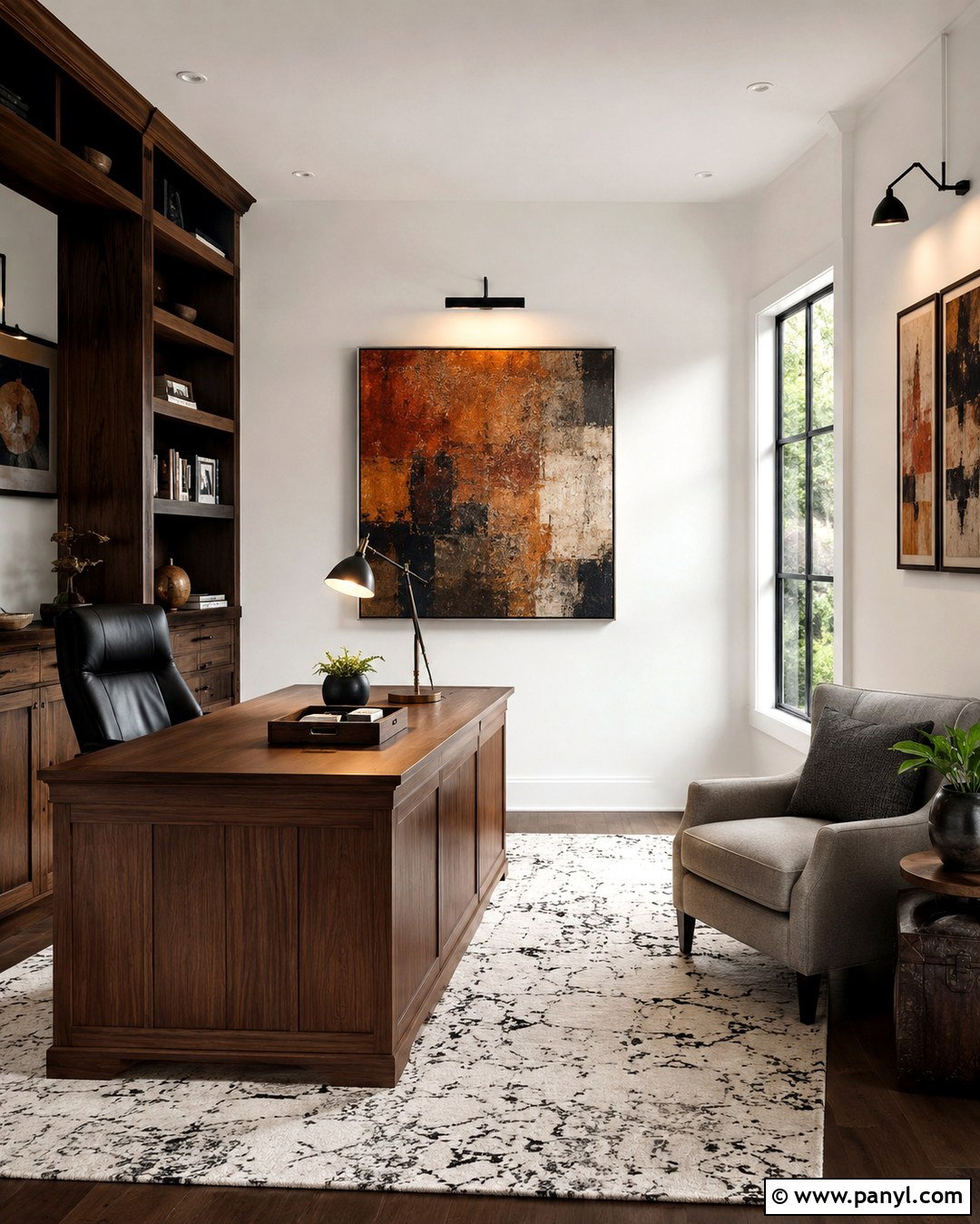
Perfect Greige SW 6073 delivers more depth than many pale greiges, making it useful for a cozy home office or library. Apply it to all four walls, then add creamy white trim and medium walnut furniture. A camel leather desk chair, substantial bookcase, and vintage-inspired rug build a warm, professional look. Use aged brass lighting and black accessories to introduce definition. Soft ivory curtains and a light ceiling prevent the deeper walls from making the room feel enclosed. Perfect Greige has a richer taupe character, so it looks especially coordinated beside warm wood, bronze hardware, and beige stone. Test it carefully around pink or red-toned flooring, which may make its warmer undertones more apparent. ()
6. Anew Gray Sherwin Williams
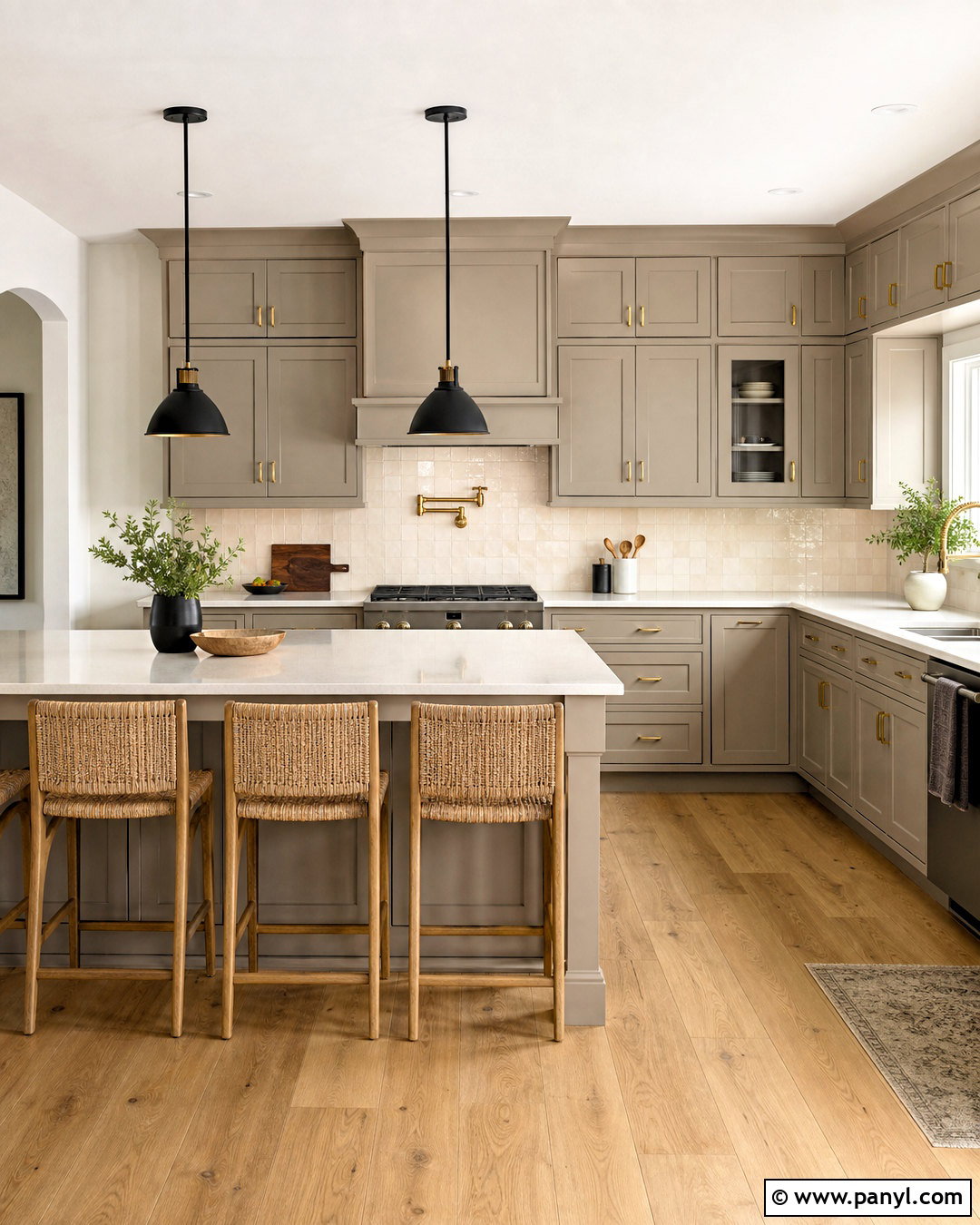
Anew Gray SW 7030 can give kitchen cabinetry a warm, tailored appearance without the weight of dark brown. Use it on shaker cabinets with creamy quartz countertops, an off-white handmade tile backsplash, and medium oak flooring. Brushed brass pulls bring out its warmth, while matte black pendants keep the scheme from becoming overly soft. Paint the surrounding walls a gentle warm white to let the cabinetry remain the focal point. Add counter stools with woven seats and a few natural wood accessories for texture. Anew Gray is deeper than Agreeable Gray, which helps it hold its own against stone and metal finishes. Sample it vertically on cabinet doors because sheen and shadows can significantly affect the finished color. ()
7. Mindful Gray Sherwin Williams
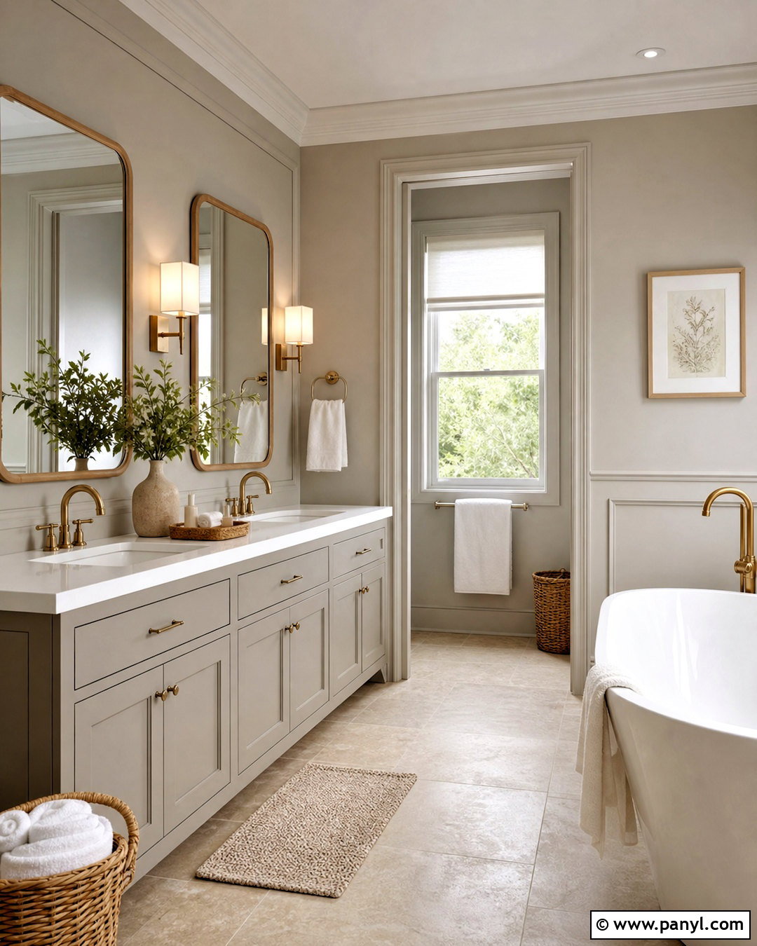
Mindful Gray SW 7016 creates a composed bathroom palette when paired with warm white tile and natural wood. Use the greige on a double vanity and repeat it on an accent wall above simple painted paneling. Choose a white quartz countertop, rectangular undermount sinks, and brushed nickel or muted brass faucets. A pale oak mirror frame, woven baskets, and cream towels add warmth around the stronger gray notes. Keep the floor quiet with limestone-look porcelain tile in a beige-gray blend. This complete scheme feels clean but not stark, and the vanity color provides enough contrast to anchor the room. Always test the selected cabinet paint in its intended sheen because satin finishes can appear lighter than flat wall samples. ()
8. Alpaca Sherwin Williams
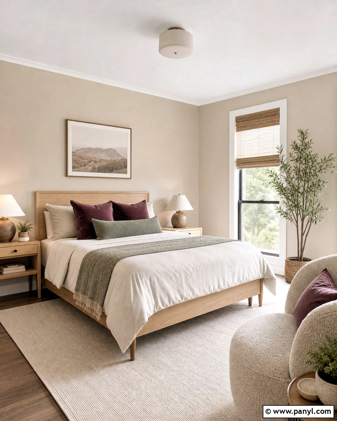
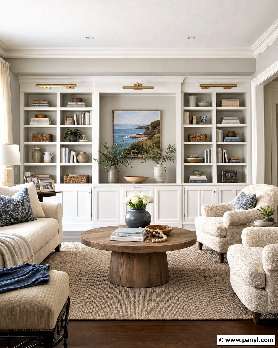
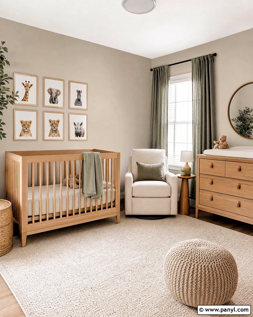
Alpaca SW 7022 offers a softer greige backdrop for a nursery, guest room, or quiet reading space. Paint the walls this muted neutral and combine it with creamy white trim, pale maple furniture, and an ivory boucle chair. Dusty rose, muted plum, or lavender-gray textiles can complement its subtle warmth, while sage green accents provide an earthier alternative. Use a simple cream rug and woven window shade to keep the palette natural. Alpaca works best in a layered room rather than a stark black-and-white scheme. Sherwin-Williams describes it as a flexible greige that can support both light and dark accents. Large samples will reveal whether its undertones coordinate with your flooring and fabrics. ()
9. Requisite Gray Sherwin Williams
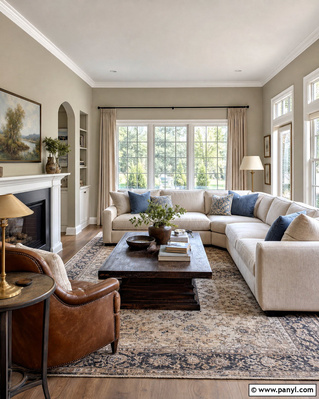
Requisite Gray SW 7023 brings noticeable depth to a family room while remaining versatile enough for everyday living. Cover the walls with this medium greige and brighten the architecture using soft white trim. Build the seating arrangement around a cream sectional, cognac leather chair, and dark wood coffee table. A large patterned rug combining beige, charcoal, and faded blue connects the entire palette. Add black curtain rods, aged brass lamps, and natural linen panels for balanced contrast. Requisite Gray can look sophisticated beside warm flooring, but it may reveal cooler or slightly violet notes in certain exposures. Compare samples on multiple walls rather than judging it from one small chip. Warm lamps and textured fabrics will help maintain a comfortable atmosphere after sunset. ()
10. Mega Greige Sherwin Williams
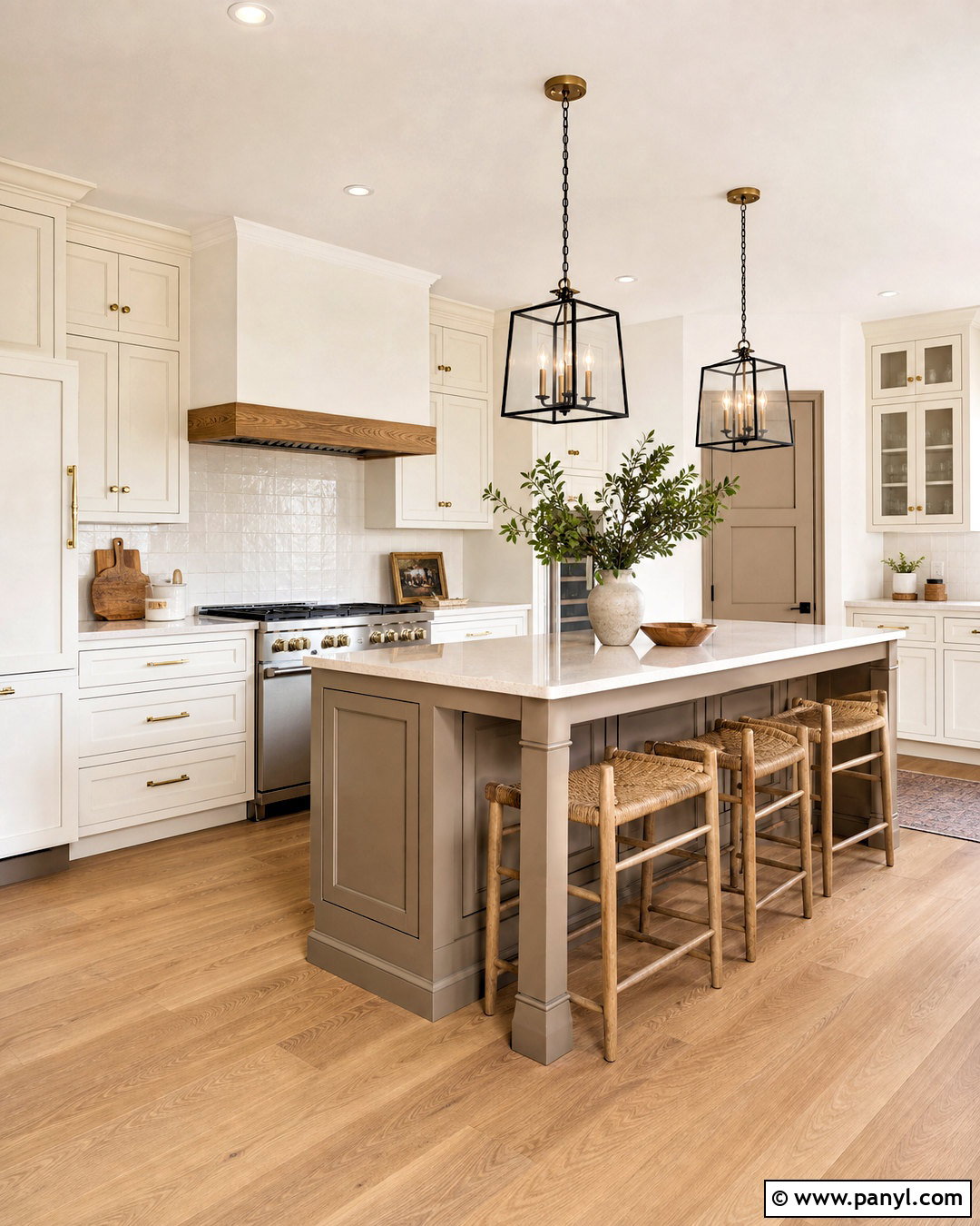
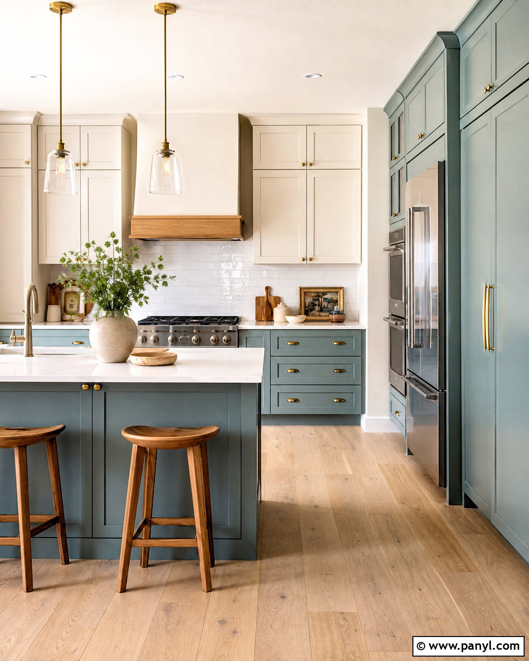
Mega Greige SW 7031 is a strong option for lower kitchen cabinets, an island, or built-in storage that needs visual weight. Paint the island this deep taupe-greige and surround it with warm white perimeter cabinets. Use creamy quartz countertops, light oak flooring, and a backsplash of handmade ivory tile. Aged brass hardware emphasizes the brown warmth, while black-framed pendants add a modern edge. Carry the color onto a nearby pantry door or coffee station for a connected design. Because Mega Greige is darker than many whole-room neutrals, it works especially well as a controlled focal color. View a painted sample beside the countertop and flooring under daytime and evening lighting before finalizing the cabinetry. ()
11. Colonnade Gray Sherwin Williams
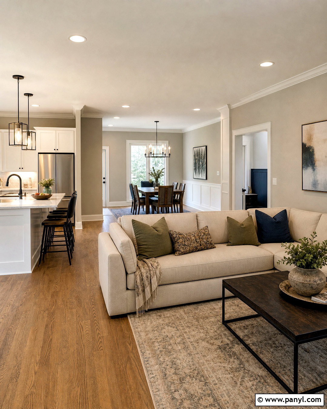
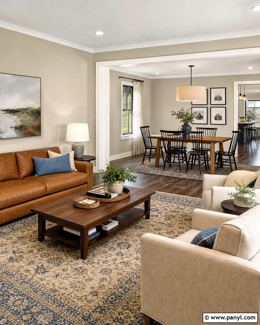
Colonnade Gray SW 7641 creates a relaxed whole-house palette for open living, dining, and kitchen areas. Use it consistently on the main walls, then define doors, ceilings, and trim with a clean warm white. Medium oak flooring and off-white upholstery keep the design welcoming. Repeat black metal in lighting, picture frames, and cabinet hardware to establish rhythm throughout the connected spaces. Muted green, soft navy, and clay-colored accents can be added in small amounts without disrupting the neutral flow. Colonnade Gray sits comfortably between beige and gray, making it useful where several finishes must work together. Since open rooms receive light from different directions, place samples in each zone and check how the color changes across the day. ()
12. Amazing Gray Sherwin Williams
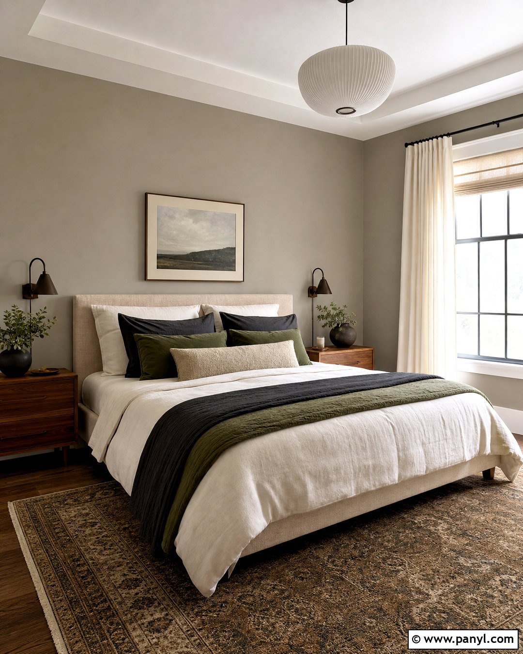
Amazing Gray SW 7044 can turn a primary bedroom into a warm, restful retreat with slightly deeper walls. Pair the greige with soft white ceilings and substantial white baseboards for a finished look. Choose a natural linen bed, walnut nightstands, and bronze reading lights. Layer the bedding with ivory, mushroom, olive, and charcoal textiles rather than introducing many bright colors. A vintage-patterned rug adds character while repeating the warm gray and brown tones. Finish the windows with creamy linen curtains mounted high to make the room feel taller. Amazing Gray has enough presence to define large rooms, yet it remains quiet beside wood furniture. Test it around existing carpet, since beige carpeting can make the wall color appear cooler by comparison. ()
13. Popular Gray Sherwin Williams
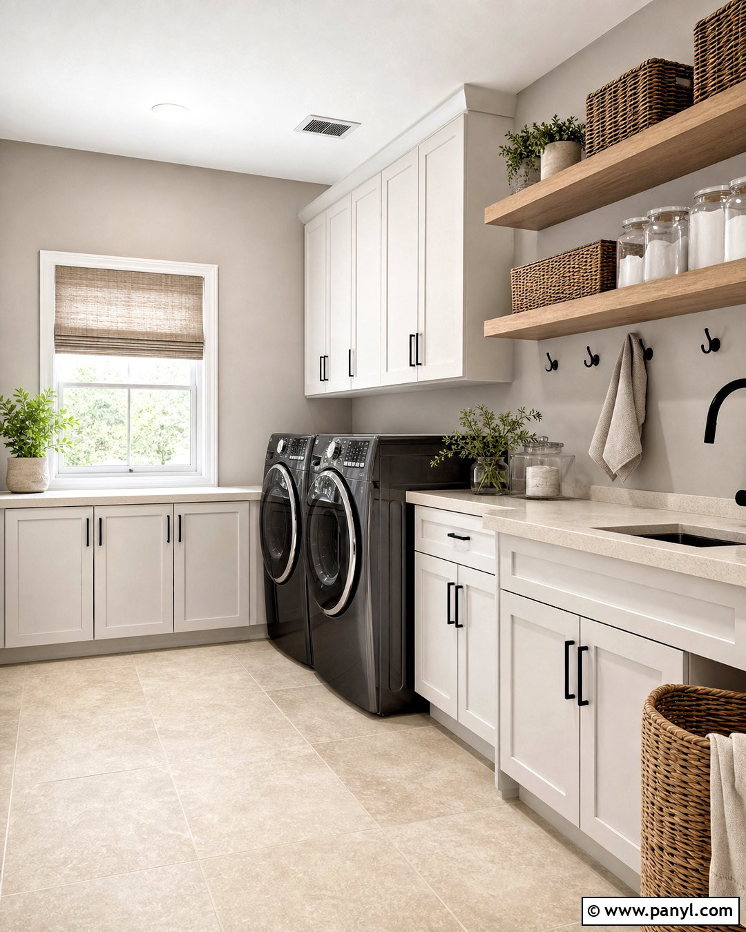
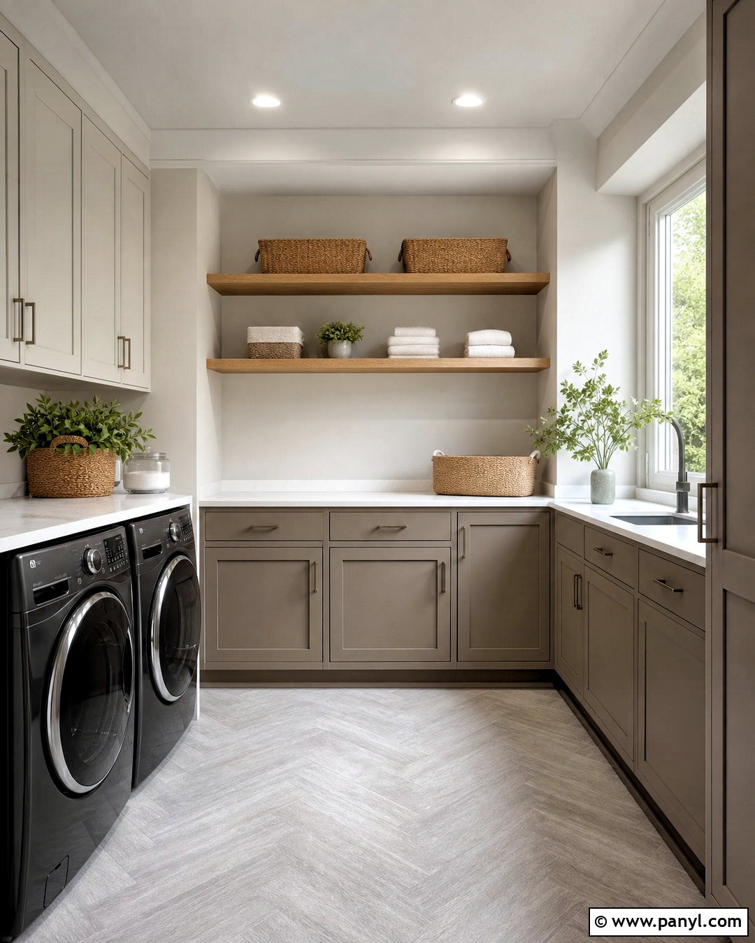
Popular Gray SW 6071 is a light, warm greige that fits a bright laundry room or small utility space. Paint the walls this gentle neutral and pair them with white shaker cabinets, pale quartz counters, and light oak open shelving. Use beige limestone-look flooring rather than cool blue-gray tile to maintain a cohesive undertone. Woven baskets, clear storage jars, and matte black hooks make the room attractive and functional. A simple Roman shade in cream and taupe adds pattern without overwhelming the compact space. Popular Gray can provide more warmth than a standard pale gray, particularly in rooms with limited decorative elements. Compare a sample against appliances, cabinetry, and flooring so the finished laundry room looks intentional rather than mismatched. ()
14. Versatile Gray Sherwin Williams
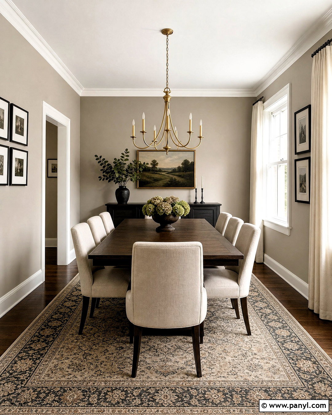
Versatile Gray SW 6072 brings a warm taupe-greige foundation to a formal dining room or traditional sitting area. Cover the walls in this medium neutral, then use creamy white trim and ceiling paint to frame the space. A dark walnut dining table, upholstered oatmeal chairs, and a muted Persian-style rug create a layered look. Install an aged brass chandelier and add linen curtains in a soft ivory tone. Black accents can appear in narrow frames or candleholders, but brown woods should remain dominant. The resulting room feels classic without relying on yellow beige. Versatile Gray may show subtle mauve warmth beside certain finishes, so test it near red oak, pink granite, and burgundy fabrics before selecting the final palette. ()
15. Useful Gray Sherwin Williams
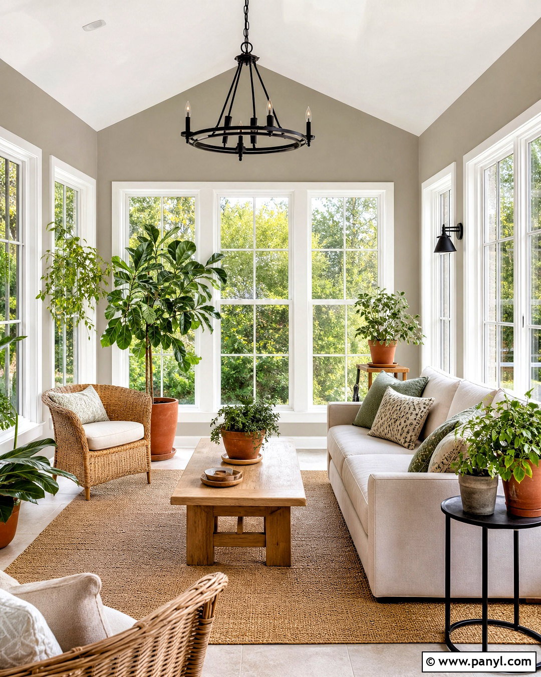
Useful Gray SW 7050 works beautifully in a sunroom where the palette connects indoor comfort with outdoor greenery. Apply it to the walls with creamy white trim and wide windows left visually open. Furnish the room with a light oak table, woven chairs, an ivory sofa, and a natural fiber rug. Add sage cushions, terracotta planters, and matte black lighting for an organic but structured look. The subdued greige walls allow leaves, wood grain, and textured fabrics to stand out. In some settings, this color may reveal a gentle green-gray quality, making it particularly compatible with gardens and landscape views. Test samples beside both the windows and interior doorway because strong reflected greenery can influence how the finished walls appear. ()
16. Analytical Gray Sherwin Williams
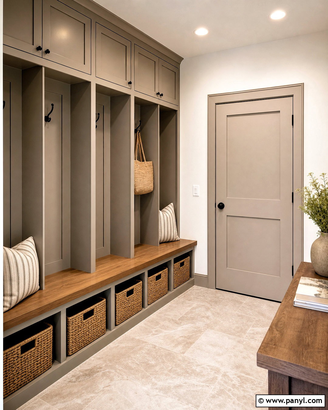
Analytical Gray SW 7051 offers an earthy, substantial greige for mudroom cabinetry and built-in storage. Paint floor-to-ceiling lockers in this shade and combine them with warm white walls, medium oak benches, and durable beige stone flooring. Use matte black hooks and cabinet pulls to sharpen the practical design. Woven baskets, striped neutral cushions, and closed upper cabinets keep daily clutter controlled. Repeat the cabinetry color on an interior door to make the narrow space feel cohesive. Analytical Gray’s grounded character suits rooms that collect dirt and receive frequent use because it provides more depth than a pale neutral. Sample it beside the flooring and nearby kitchen finishes to create a smooth transition between connected rooms. ()
17. Pavestone Sherwin Williams
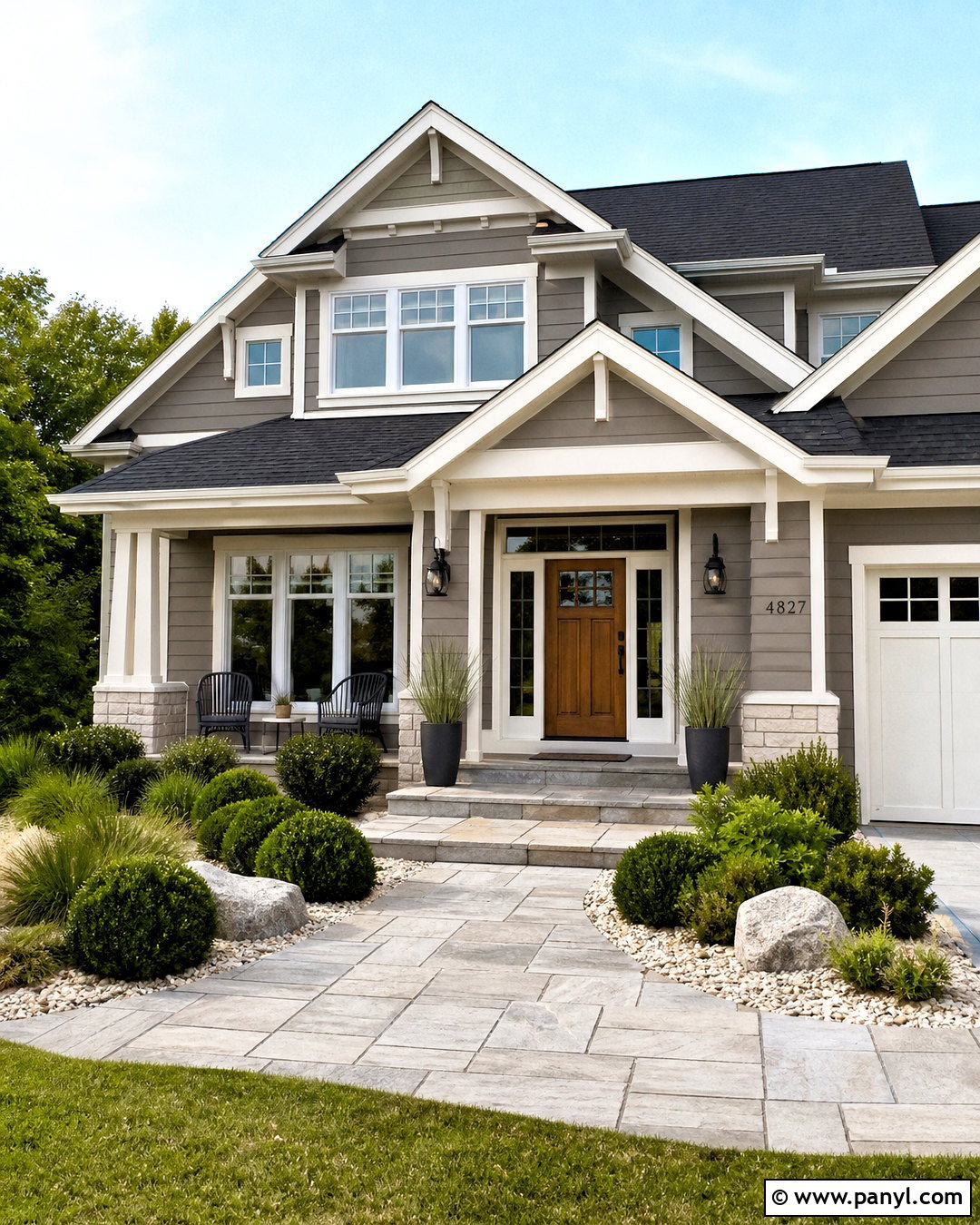
Pavestone SW 7642 creates a sophisticated exterior scheme for a craftsman, ranch, or updated traditional home. Use it on the main siding, then add warm white trim around windows, fascia, and porch columns. A stained cedar front door introduces natural warmth, while charcoal roof shingles and matte black lights provide contrast. Complete the curb view with a stone walkway, clipped evergreen shrubs, ornamental grasses, and light gravel beds. This deeper greige works well as a body color because strong outdoor light typically makes painted surfaces appear brighter. However, roof color, masonry, and neighboring materials can change how neutral siding reads. Paint a large exterior sample on more than one side of the house before making the final decision. ()
18. Drift Of Mist Sherwin Williams
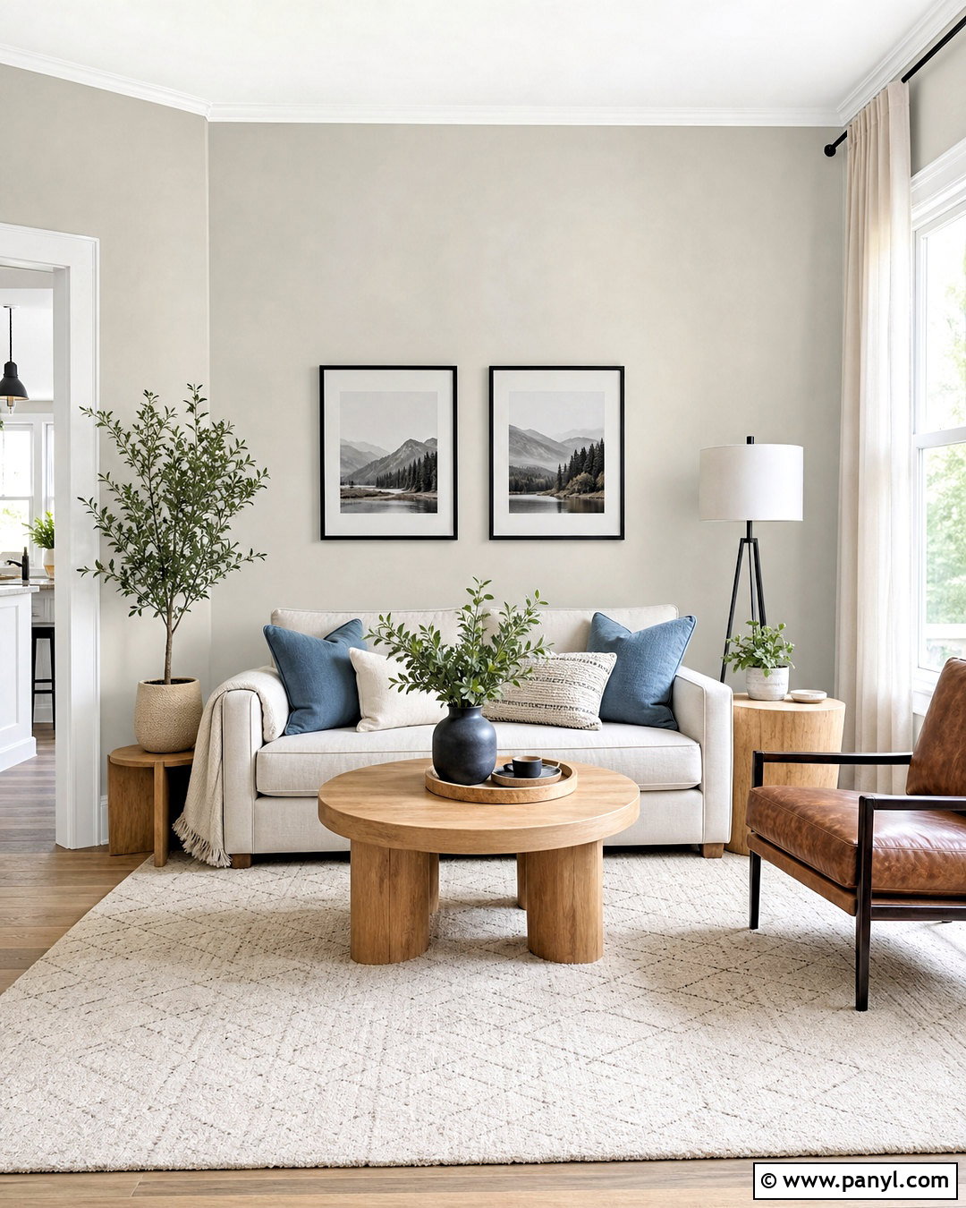
Drift of Mist SW 9166 gives a small living room an airy greige envelope without the sharpness of pure white. Paint the walls in this pale neutral and use a slightly cleaner white on the trim for subtle separation. Choose a light beige sofa, blond oak tables, and a softly patterned cream rug. Add depth through charcoal picture frames, muted blue pillows, and one cognac leather accent chair. Sheer linen panels let natural light move through the room while preserving softness. Sherwin-Williams recommends light-reflective warm neutrals such as Drift of Mist for north-facing spaces that receive limited sunlight. Even so, sample the shade beside your upholstery because it can appear almost off-white in bright exposure. ()
19. Shoji White Sherwin Williams
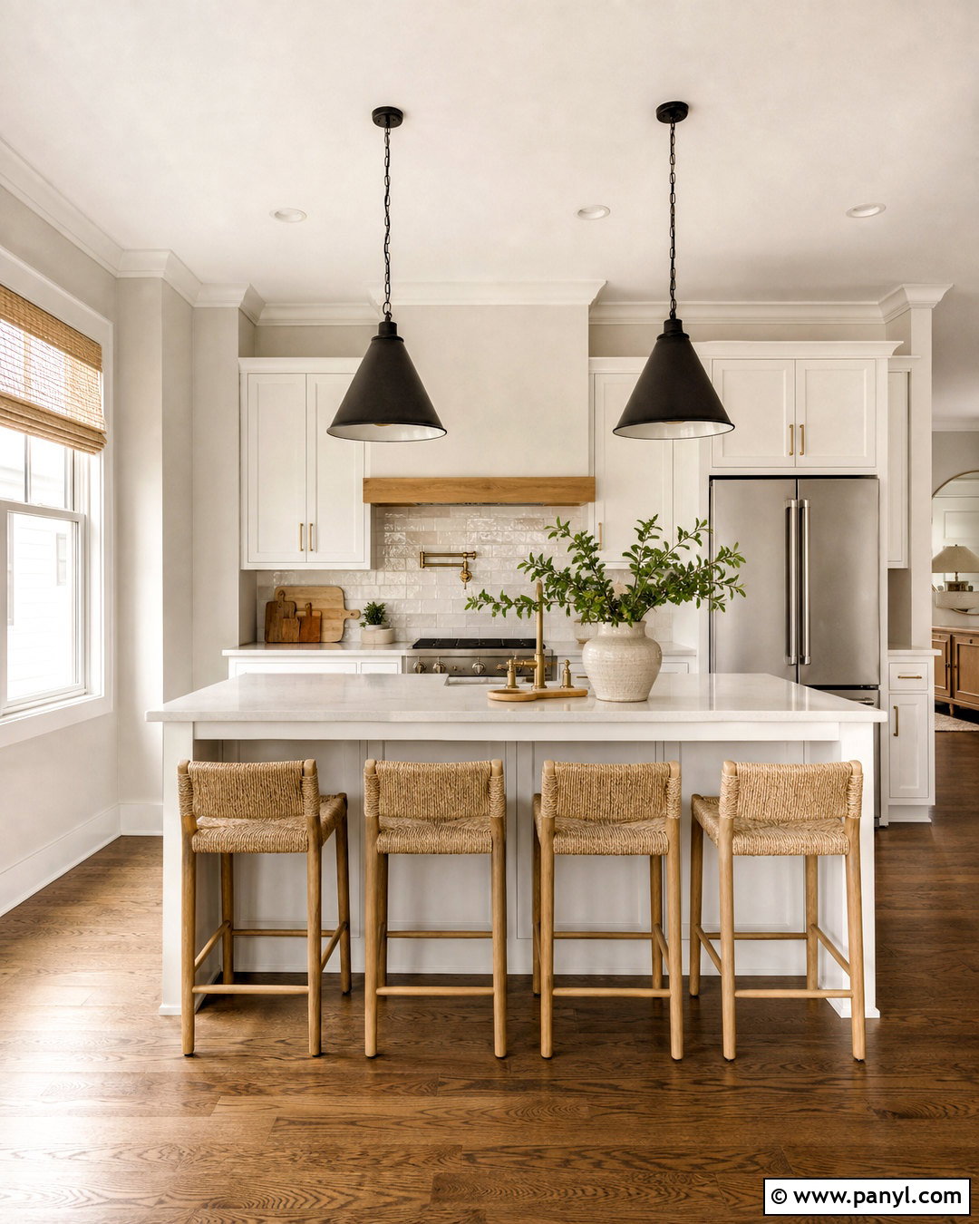
Shoji White SW 7042 is a pale greige off-white suited to kitchens that need warmth without distinctly beige walls. Use it across the walls and pair it with brighter white cabinetry for quiet contrast. Add lightly veined quartz, handmade cream backsplash tile, and natural white oak flooring. Brushed brass hardware and woven counter stools reinforce the inviting palette, while black pendants add definition over the island. Keep window treatments simple with flax linen shades. Shoji White can also connect creamy stone and white appliances more successfully than a cool, blue-based white. Because it sits close to off-white, compare it directly with cabinet paint and trim; otherwise, one surface may unexpectedly make another appear yellow, gray, or overly bright. ()
20. Aesthetic White Sherwin Williams
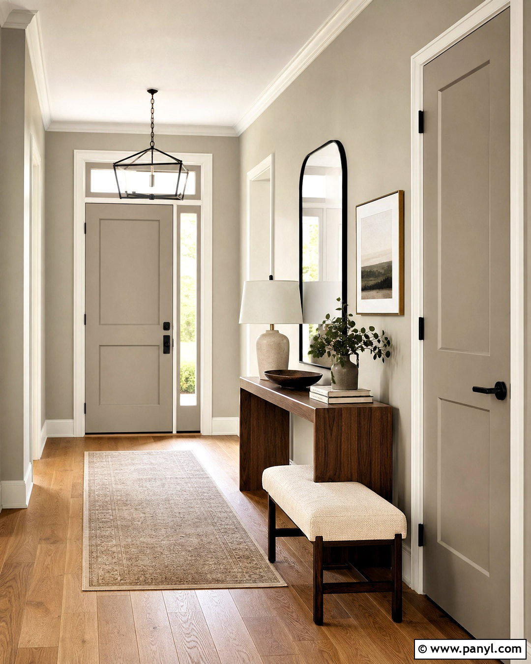
Aesthetic White SW 7035 creates a soft greige background for a hallway, entry, or minimalist living area. Paint both the walls and interior doors in the same color, using different sheens to add subtle dimension. Keep the ceiling and narrow trim in a clean warm white. Natural oak flooring, a slim walnut console, and an ivory upholstered bench establish an understated foundation. Add a black framed mirror, sculptural ceramic lamp, and muted landscape artwork for controlled contrast. This shade works particularly well when stark white feels too clinical but standard beige looks too golden. Sherwin-Williams classifies it among its neutral offerings. Test it next to existing white finishes because the relationship between two near-whites determines whether the final design feels intentional. ()
Conclusion:
These **20 greige paint colors sherwin williams ideas** show how flexible a gray-beige palette can be throughout a home. Pale choices such as Drift of Mist and Shoji White can brighten smaller rooms, while Perfect Greige, Mega Greige, and Pavestone create stronger contrast. Balanced shades like Agreeable Gray, Worldly Gray, and Colonnade Gray work well across connected spaces. The most successful choice depends on window direction, flooring, countertops, trim, and artificial lighting. Order samples and paint large test areas instead of relying on screens or small chips, since Sherwin-Williams notes that digital color displays may not precisely represent finished paint. () With careful testing, greige can create a warm, coordinated home that still feels fresh and personal.

Related Ideas and Inspiration:
Leave a Reply