
Choosing between gray and beige becomes much easier when you explore 20 greige paint colors that balance both sides of the neutral spectrum. Greige can brighten a small room, soften strong natural light, or connect warm flooring with cooler stone and metal finishes. However, every shade responds differently to daylight, bulbs, surrounding colors, and fixed materials. Always test large samples on several walls before ordering paint. Check them in morning, afternoon, and evening light. The most successful palette also considers trim, flooring, furniture, textiles, and finishes as one complete design. From airy bedrooms to grounded kitchens and welcoming exteriors, each selection below includes a coordinated look you can recreate. The complete room schemes below show how to decorate confidently with 20 greige paint colors. ()

1. Agreeable Gray SW 7029
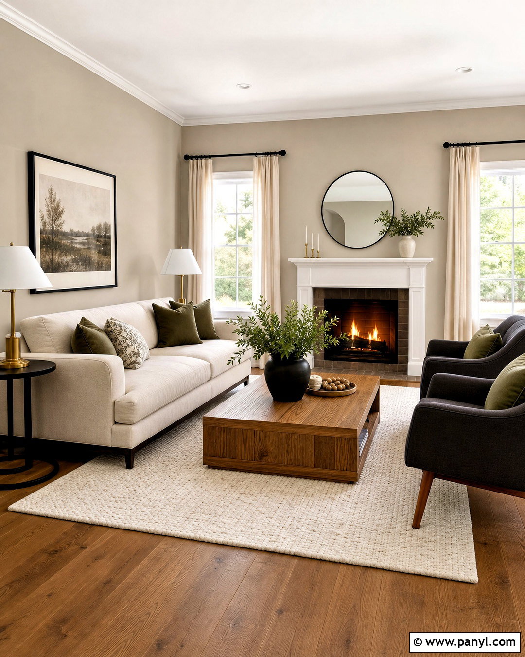
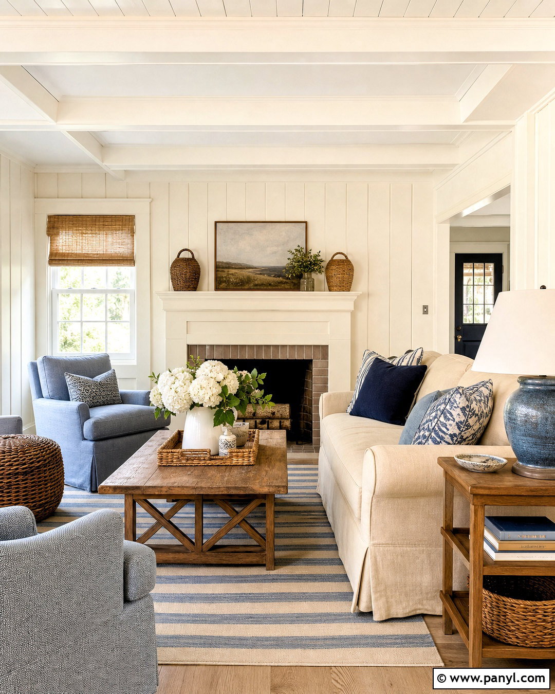
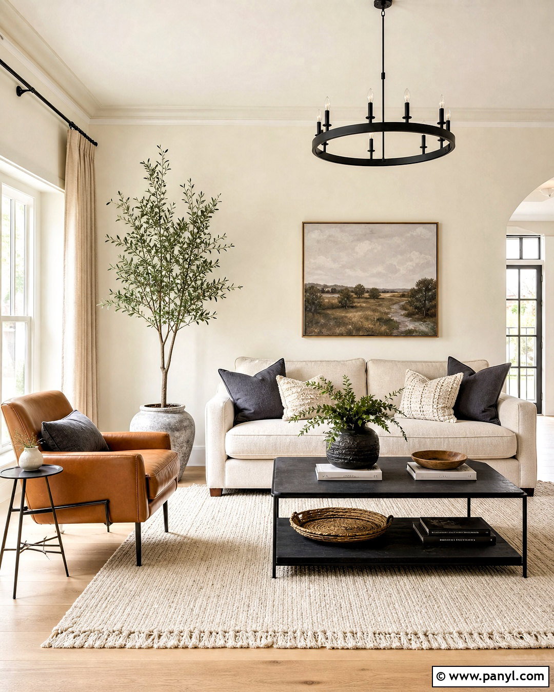
Agreeable Gray creates a comfortable living room that feels warm without becoming overly beige. Paint the walls in this soft greige, then use clean white on the ceiling, trim, and fireplace surround. A light oatmeal sofa, medium oak coffee table, and cream textured rug reinforce the welcoming palette. Add contrast through charcoal armchairs, matte black curtain rods, and olive green pillows. Warm brass lamps prevent the room from feeling flat, while linen curtains allow plenty of daylight to reach the walls. Keep large furniture neutral, but introduce rust, muted blue, or green through smaller accessories. This balanced design works especially well in open living spaces containing both warm wood and cool metal finishes. ()
2. Revere Pewter HC-172
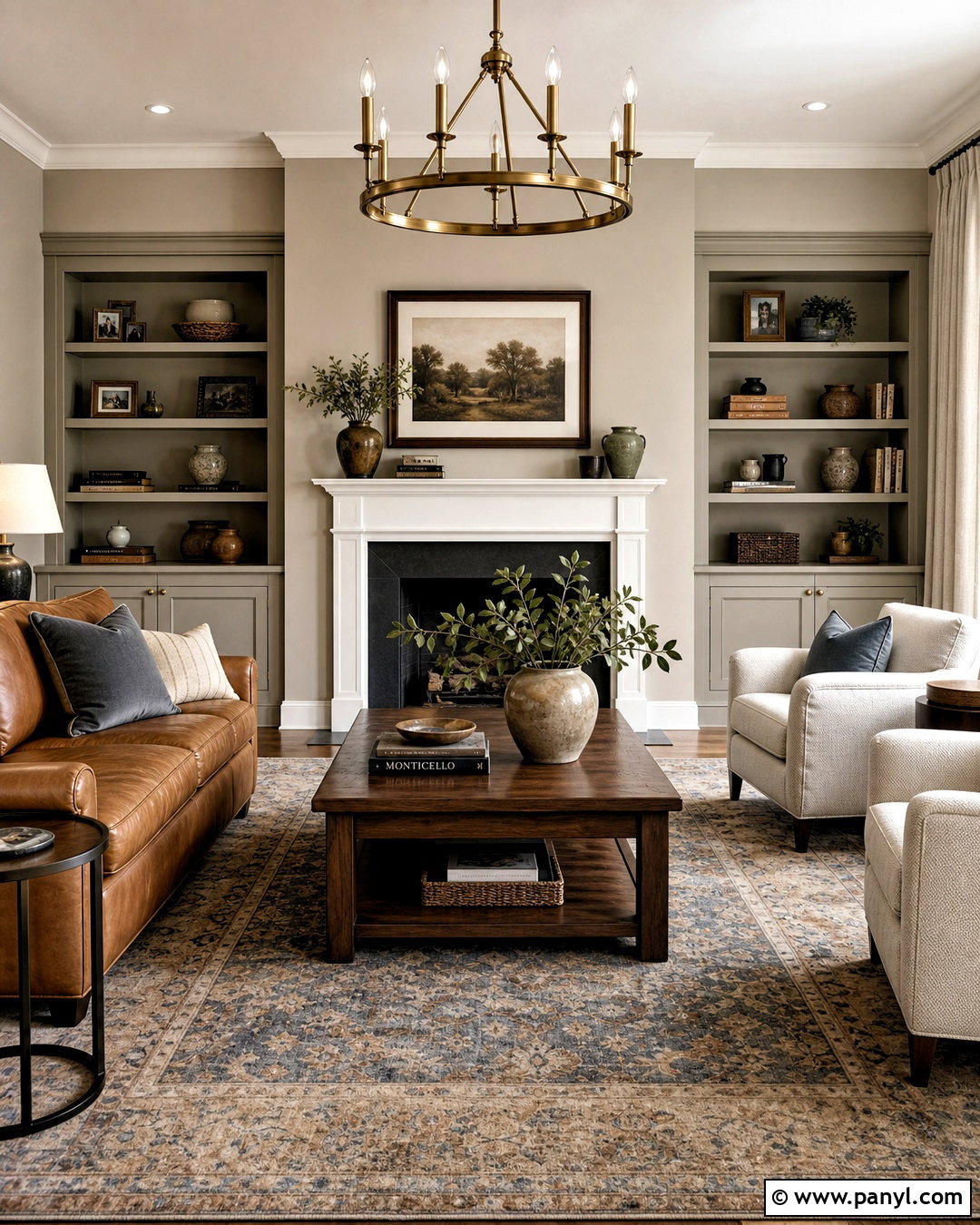
Revere Pewter brings depth to a traditional family room while remaining flexible enough for updated furniture. Cover the walls in this welcoming greige and pair them with soft white trim, a white mantel, and medium-toned hardwood flooring. Choose a camel leather sofa, two cream upholstered chairs, and a faded blue-and-taupe area rug. Walnut side tables and aged brass lighting add warmth without making the space look too brown. Built-in shelves painted the same greige create a seamless, custom effect. Display pottery, books, and dark wood frames with plenty of open space between them. Because Revere Pewter can shift with changing light, sample it beside the fireplace stone, flooring, and upholstery before completing the room. ()
3. Repose Gray SW 7015
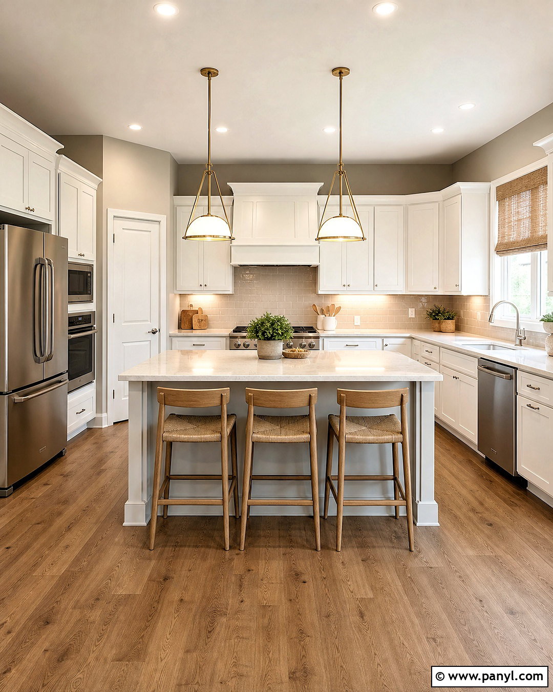
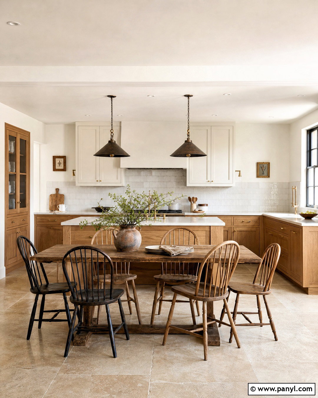
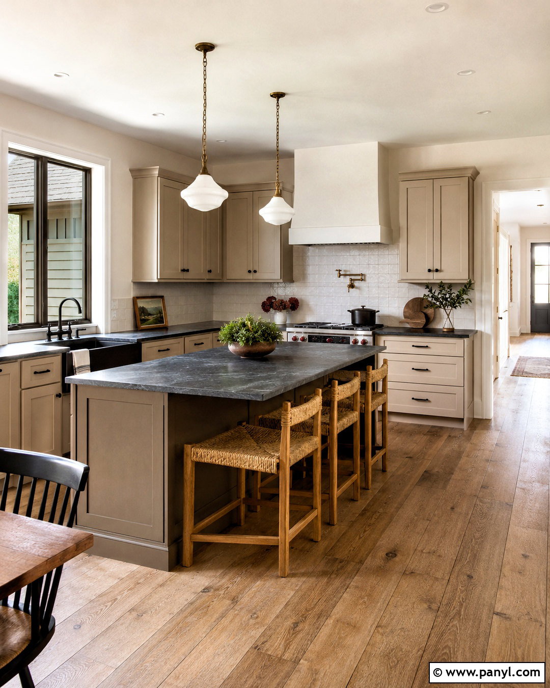
For a fresh kitchen, Repose Gray offers a cooler greige backdrop that complements white cabinets and stainless steel appliances. Use it on the walls around warm white Shaker cabinetry, then add pale quartz countertops with subtle gray veining. A soft taupe backsplash prevents the room from feeling too crisp, while natural oak stools and woven shades introduce warmth. Ground the scheme with medium brown flooring and a charcoal runner near the sink. Brushed nickel hardware supports the cooler side of the color, but a few aged brass pendants can provide attractive contrast. Add simple greenery and cream stoneware instead of excessive countertop decor. This complete palette feels bright, practical, and balanced in kitchens receiving moderate or strong natural light. ()
4. Edgecomb Gray HC-173
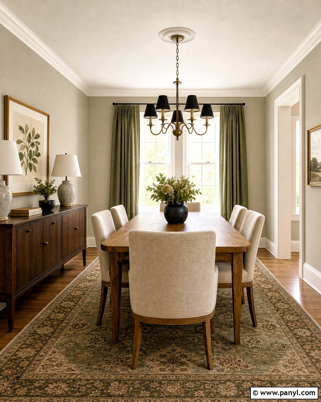
Edgecomb Gray can make a dining room feel relaxed, polished, and pleasantly warm. Paint the walls in this light greige, then use a creamy white on crown molding, baseboards, and window trim. Center the room around a natural oak dining table with upholstered oatmeal chairs. A flat-weave rug in muted sage, ivory, and tan defines the arrangement without competing with the wall color. Hang a simple black-and-brass chandelier above the table and repeat black through slim curtain rods or framed artwork. Soft green drapes bring out the organic character of the palette. Complete the space with a walnut sideboard, ceramic lamps, and minimal botanical artwork for a dining room that feels layered rather than plain. ()
5. Pale Oak OC-20
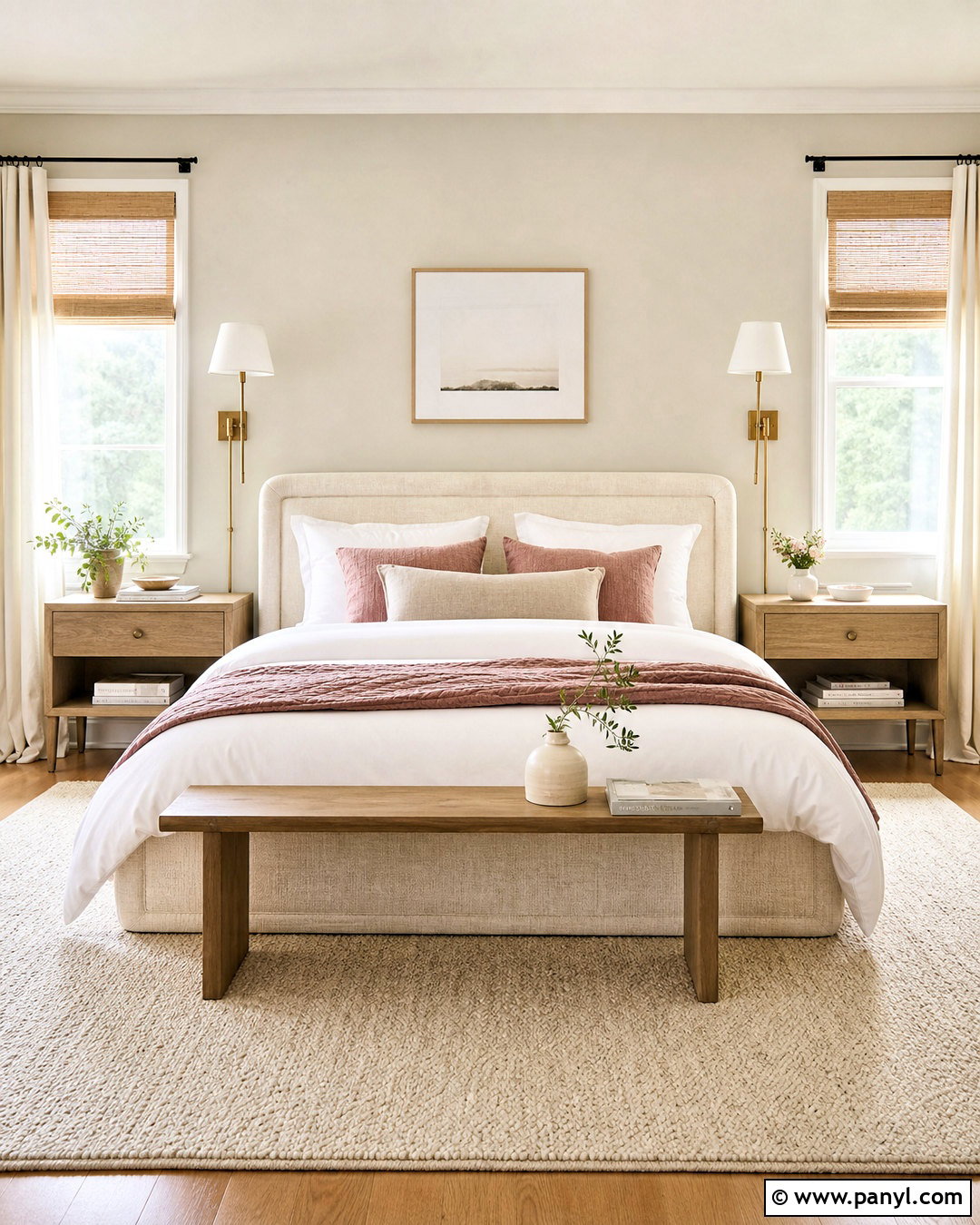
Pale Oak is well suited to a quiet bedroom where lighter neutrals and natural textures take priority. Apply it to every wall and pair it with warm white trim rather than a sharp blue-white. Choose an upholstered bed in oatmeal linen, washed oak nightstands, and a cream wool rug that extends beyond the bed. Layer white bedding with taupe, dusty rose, and muted brown accents for gentle contrast. Brushed brass sconces add a warmer finish, while woven window shades introduce subtle texture. Keep the ceiling bright and the furniture shapes simple so the room remains open. In changing daylight, Pale Oak may reveal slightly different gray, beige, or muted rosy notes, making careful sampling important before painting the full space. ()
6. Accessible Beige SW 7036
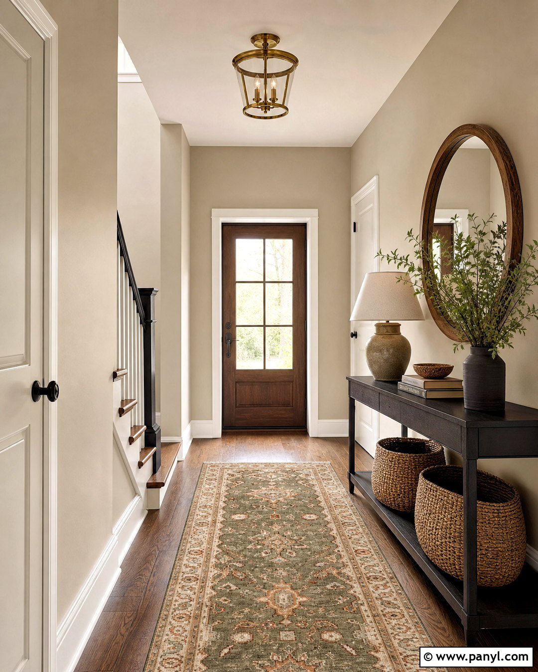
Accessible Beige supports an inviting entryway that connects traditional warmth with cleaner modern details. Paint the walls in this warm neutral and use creamy white on doors, trim, and stair risers. A narrow black console creates definition, while a large round wood-framed mirror reflects light through the space. Add a durable vintage-look runner containing olive, beige, charcoal, and faded rust. Woven baskets beneath the console provide practical storage for shoes and everyday items. A simple brass ceiling light brings warmth overhead without overwhelming a small foyer. Finish the arrangement with one ceramic lamp, a shallow tray, and leafy branches. This coordinated palette is especially useful when the entry opens toward rooms with wood flooring, tan upholstery, and soft white finishes. ()
7. Balboa Mist OC-27
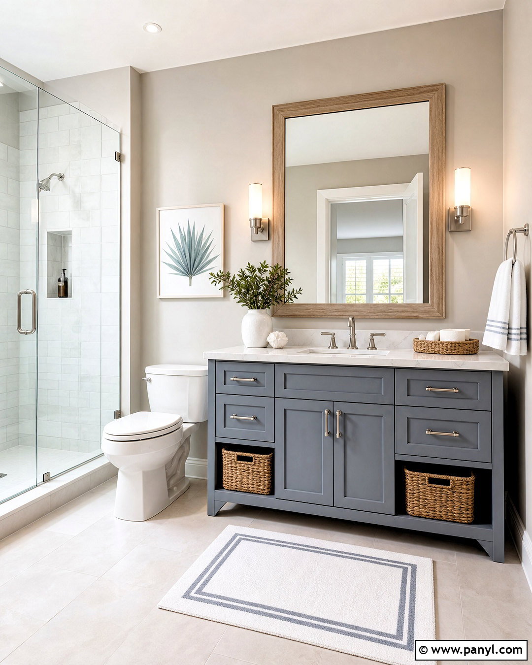
Balboa Mist gives a compact bathroom an airy appearance while adding more softness than plain white. Use it on the upper walls and paint the vanity a muted charcoal or dusty blue-gray. White marble-look counters, warm white trim, and pale porcelain floor tile keep the room bright. Choose polished nickel faucets for a clean finish, then introduce natural texture through a light oak mirror and woven storage baskets. White towels with narrow taupe borders connect the fixtures to the wall color. A clear glass shower enclosure maintains an open view, while two simple sconces provide even illumination. Since Balboa Mist can look warmer or cooler as lighting changes, test it beside the tile, countertop, and vanity finish before painting. ()
8. Perfect Greige SW 6073
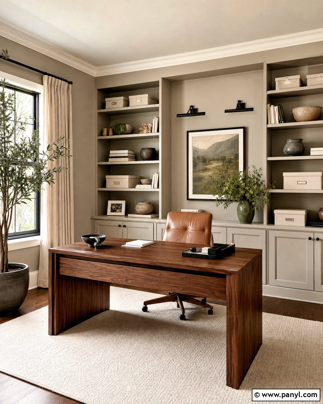
Perfect Greige creates a grounded home office with enough depth to make pale furniture and artwork stand out. Paint all four walls in this medium greige, then add creamy white trim and a warm white ceiling. Position a substantial walnut desk near the window and use a camel leather chair for comfortable contrast. Built-in shelving painted to match the walls gives the office a cohesive, enveloping look. Balance the darker surfaces with a cream rug, linen curtains, and light neutral storage boxes. Matte black picture lights and desk accessories add structure. A few muted green accents, such as pottery or a desk lamp, keep the palette natural. The finished office feels focused and warm without becoming dark or visually heavy. ()
9. Classic Gray OC-23
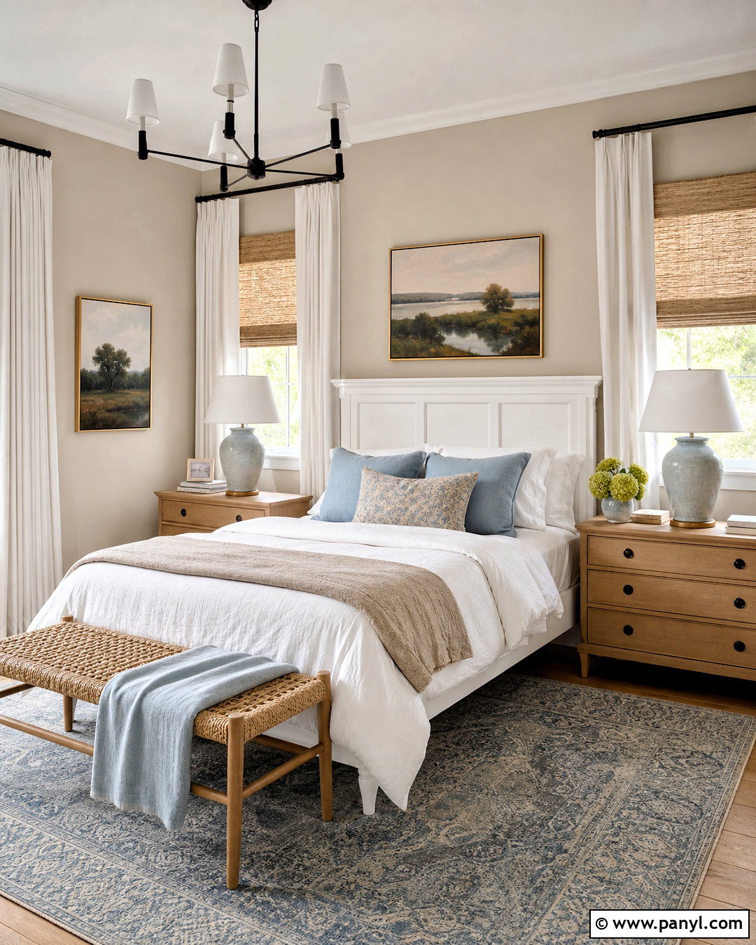
Classic Gray provides a barely-there greige background for a bright guest bedroom. Paint the walls in a matte finish, then use a soft white semi-gloss on the trim, doors, and simple paneled headboard. Dress the bed in white cotton bedding with light gray, pale blue, and sand-colored layers. Natural maple nightstands and a woven bench add warmth without creating strong contrast. Install linen Roman shades beneath full-length ivory curtains to control daylight while keeping the room soft. A faded blue rug grounds the pale palette and prevents it from looking washed out. Finish with ceramic lamps and understated landscape prints. This light, complete scheme works particularly well when you want a neutral room that still feels more dimensional than straightforward white. ()
10. Anew Gray SW 7030
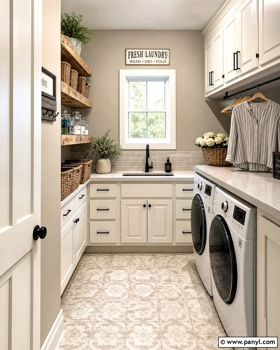
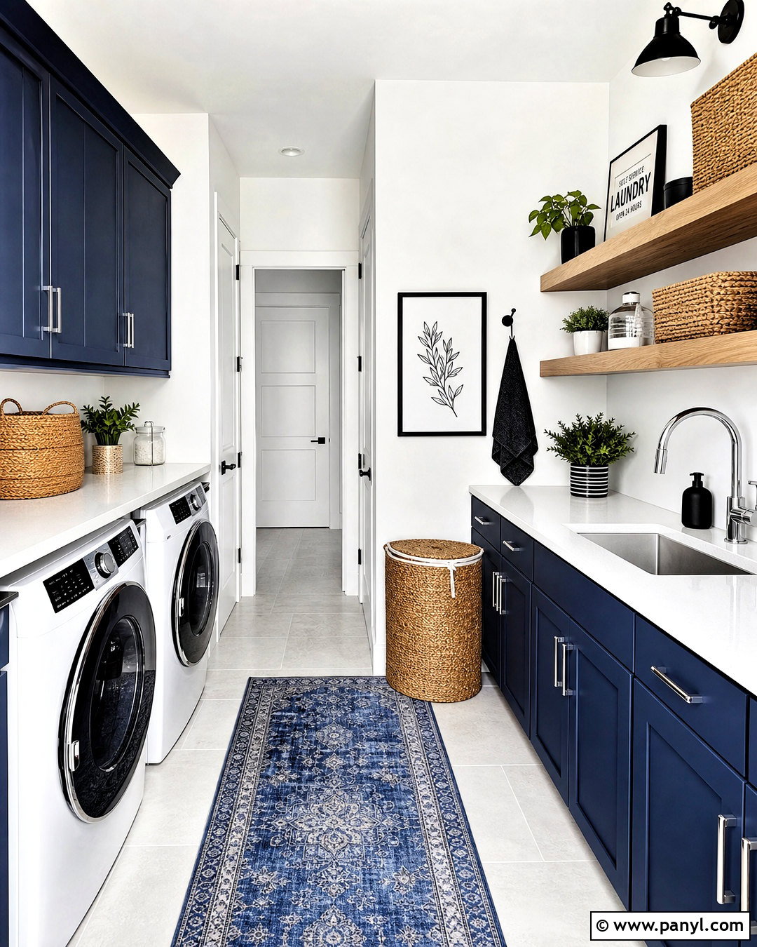
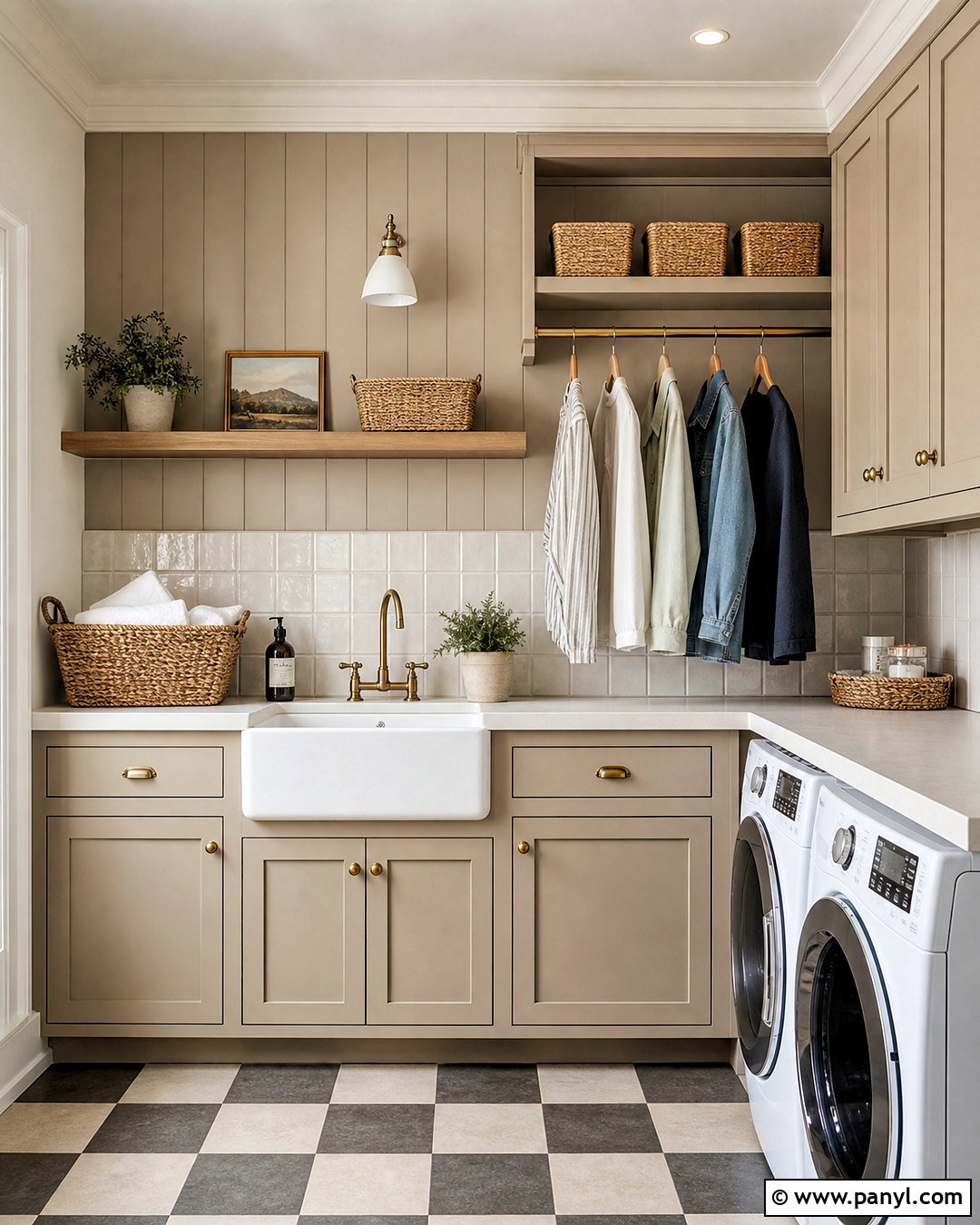
Anew Gray can turn a plain laundry room into a warm, organized space that coordinates with common household finishes. Use it on the walls behind creamy white cabinets and a light quartz folding counter. Install a beige-and-gray stone backsplash to connect the cabinetry with the deeper greige walls. Medium oak floating shelves provide open storage for matching baskets, glass containers, and neatly folded linens. Choose matte black cabinet pulls and a black hanging rod for useful contrast. Patterned porcelain floor tile in ivory, taupe, and charcoal hides everyday marks while adding visual interest. Bright ceiling lighting keeps the color from feeling heavy. The overall design looks practical and polished, with every storage feature integrated into a consistent neutral palette. ()
11. Natural Cream OC-14
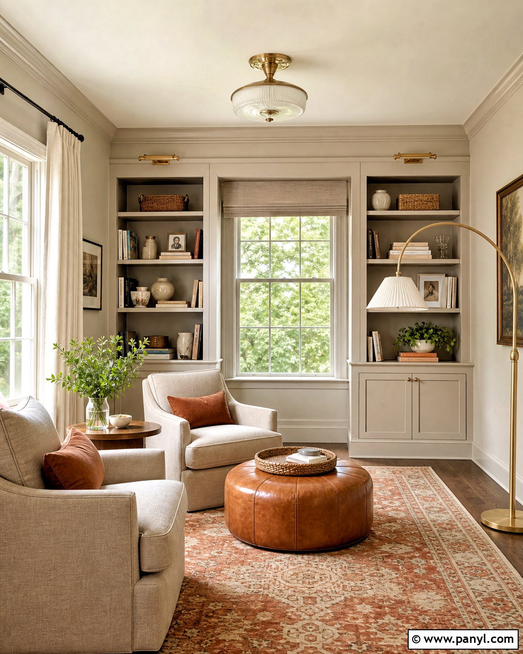
Natural Cream works beautifully in a cozy reading room built around soft materials and warm wood. Cover the walls in this light beige-leaning greige and continue the color across simple built-in bookcases for a unified effect. Use warm white on the ceiling and window trim to provide gentle separation. Arrange two oatmeal armchairs beside a walnut table and place a curved brass floor lamp between them. A faded terracotta-and-cream rug adds quiet color underfoot. Style the shelves with books, cream pottery, woven boxes, and a few dark accents rather than filling every opening. Linen curtains soften the windows, while a cognac leather ottoman adds richness. The finished space feels warm, collected, and comfortable without relying on dark wall paint. ()
12. Worldly Gray SW 7043
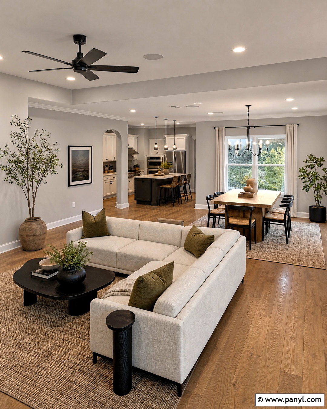
Worldly Gray creates an adaptable open-plan interior when the living room, kitchen, and dining area must share one wall color. Paint the connected walls in this soft greige and keep the trim a clean warm white. Use medium oak flooring throughout to establish continuity. In the living area, combine a cream sectional with olive pillows, a black coffee table, and a textured taupe rug. Repeat black on the kitchen hardware and dining chandelier. Natural wood dining chairs and woven counter stools keep the larger space relaxed. Limit accent colors to olive, muted clay, and charcoal so each area feels related. Worldly Gray acts as the linking neutral, helping warm wood, pale upholstery, and darker architectural accents coexist in one balanced design. ()
13. Pashmina AF-100
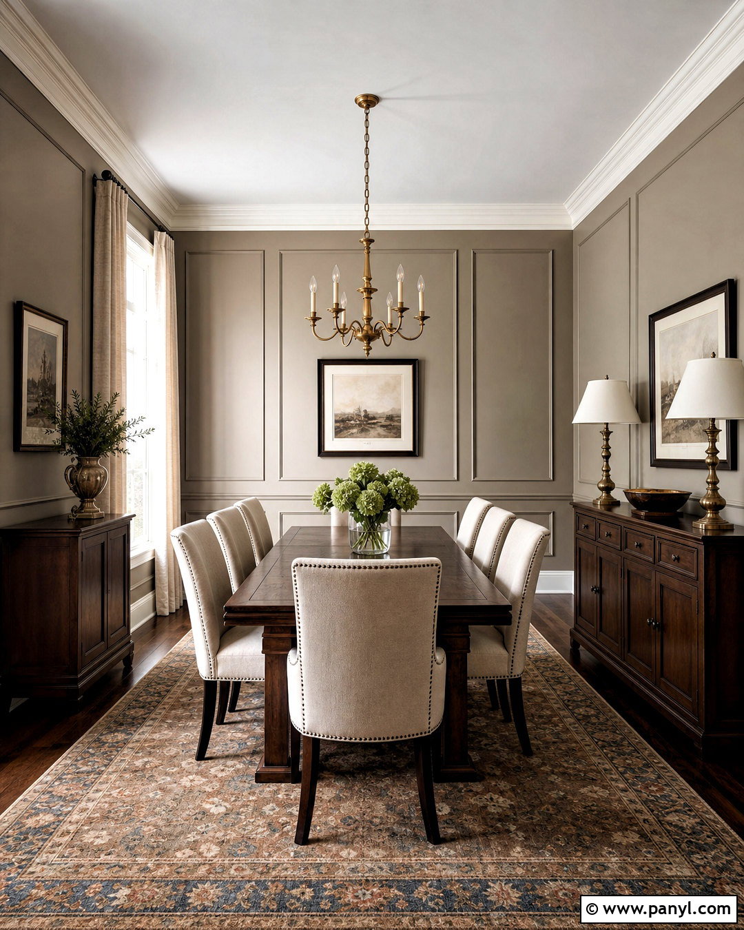
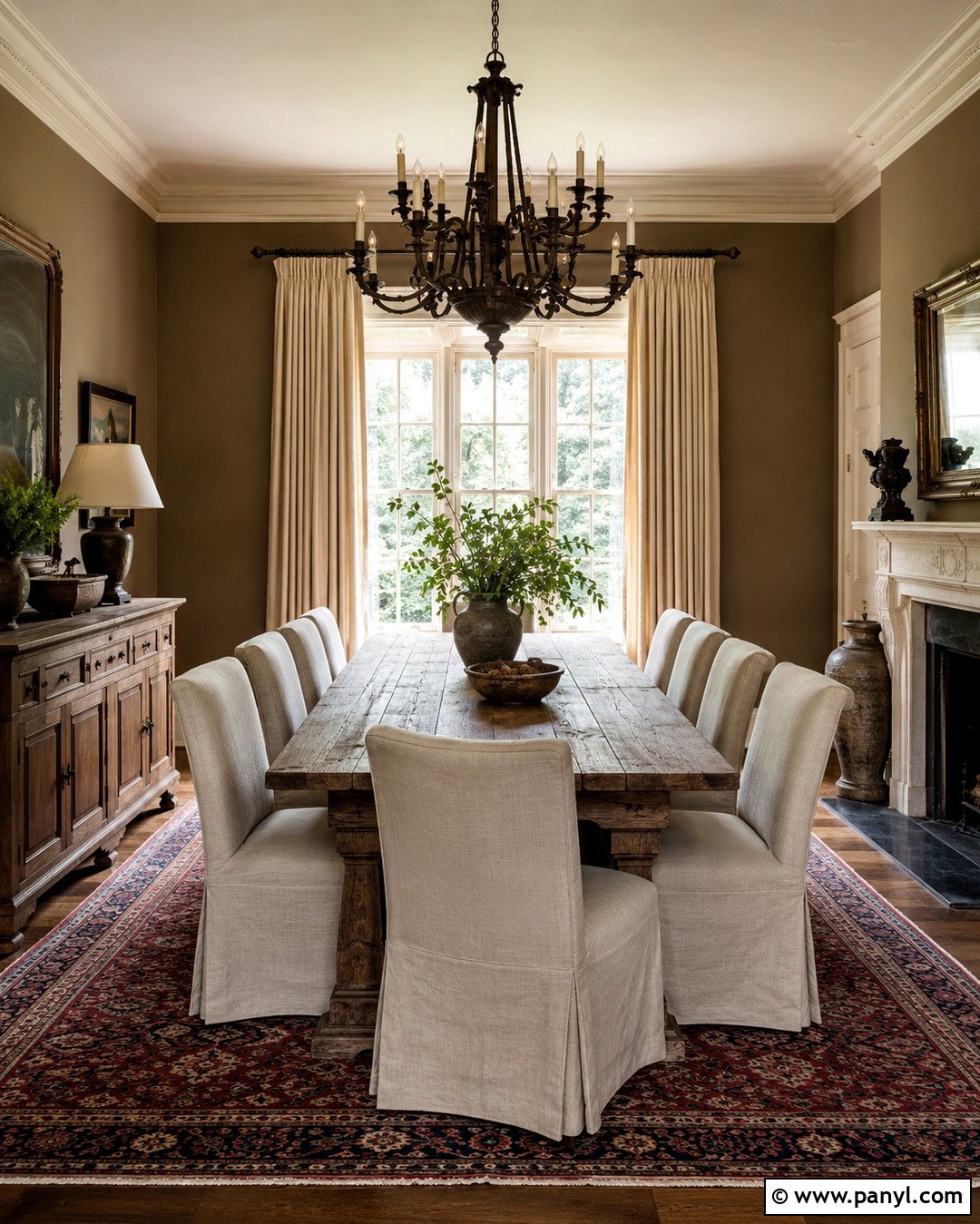
Pashmina gives a formal dining room a richer greige envelope that feels substantial without requiring dramatic color. Use it on the walls and lower panel molding, then paint the upper trim and ceiling a soft ivory. A dark walnut dining table provides a strong centerpiece, surrounded by cream linen chairs with slim black legs. Place a large vintage-style rug underneath in faded brown, muted blue, and warm gray. An aged brass chandelier and matching buffet lamps create a warm metallic layer. Add full-length natural linen curtains to soften the depth of the walls. Keep artwork light and generously scaled, using ivory mats and dark wood frames. The completed room feels tailored, welcoming, and suitable for both everyday meals and more polished gatherings. ()
14. Alpaca SW 7022
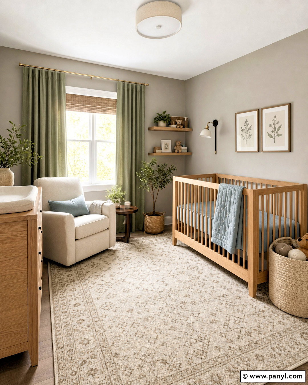
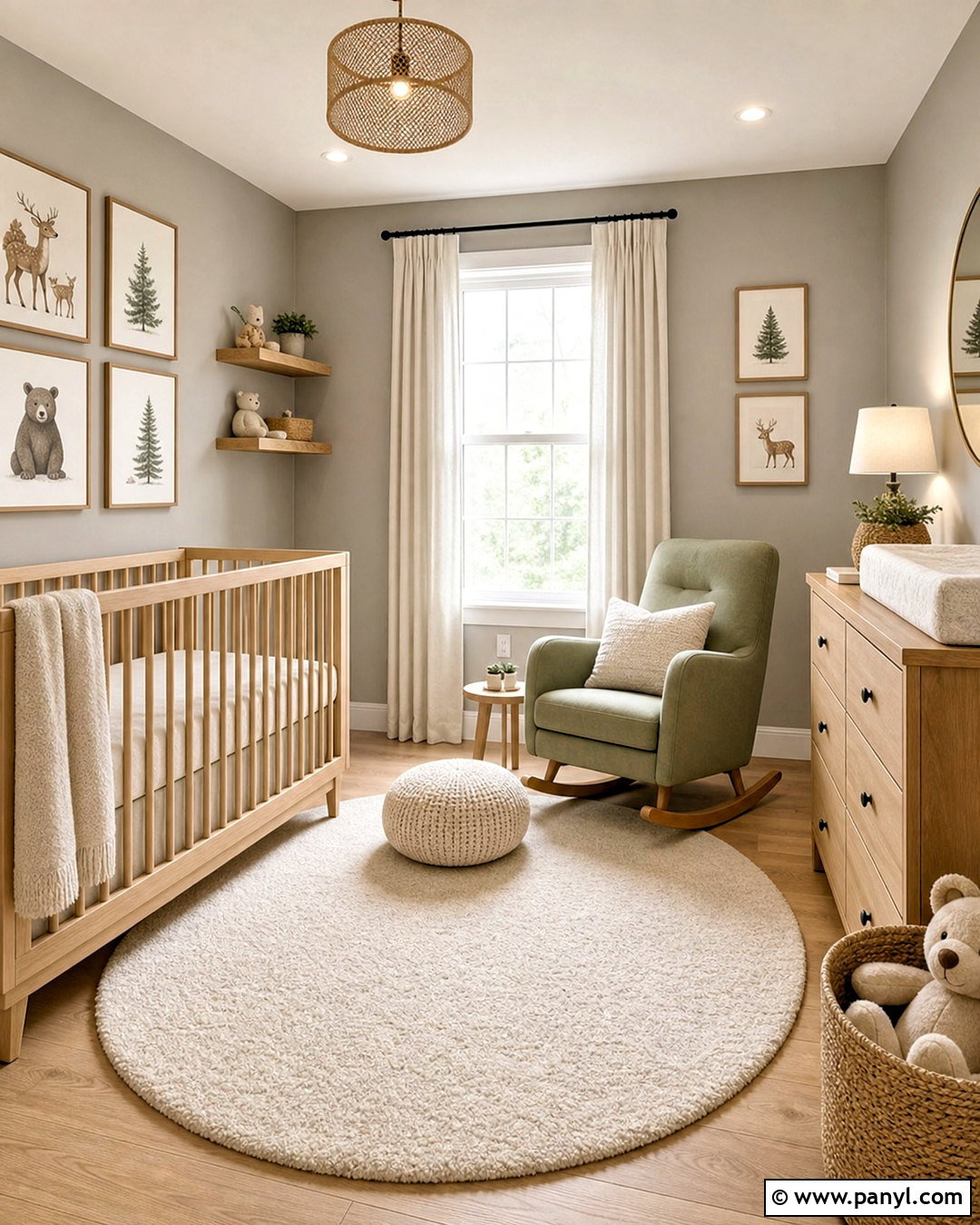
Alpaca brings subtle warmth to a nursery while allowing soft accent colors to change as the room grows. Paint the walls in this gentle greige and pair them with warm white trim, a natural wood crib, and a light oak dresser. Use an ivory rug with a small taupe pattern for softness and easy coordination. Muted sage curtains, dusty blue bedding, and warm beige storage baskets create a calm palette without looking overly themed. Add a comfortable cream glider beside a compact walnut table and wall-mounted reading light. Simple framed animal illustrations or botanical prints can provide personality. The completed nursery remains practical, bright, and adaptable because the major surfaces stay neutral while smaller textiles and artwork supply color that can be updated later. ()
15. Thunder AF-685
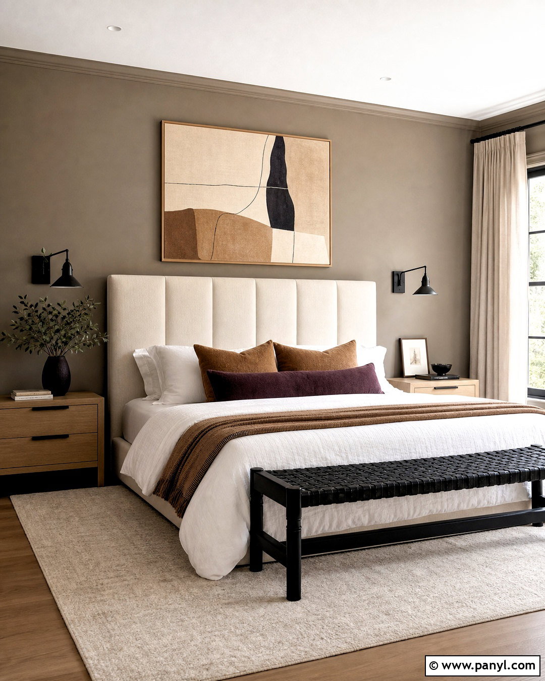
Thunder adds satisfying depth to a modern bedroom, especially when lighter furniture and textiles need a stronger background. Apply it to all walls for a cocooning effect, but keep the ceiling and trim warm white. Choose a tall ivory upholstered bed, pale oak nightstands, and crisp white bedding layered with camel and muted plum accents. A large cream rug brightens the floor, while black sconces and a black bench frame provide clean definition. Use natural linen curtains rather than dark drapes so daylight can balance the deeper greige. One oversized abstract print containing beige, charcoal, and dusty pink completes the wall above the bed. This coordinated approach makes the darker neutral feel deliberate, comfortable, and sophisticated rather than gloomy or overly gray. ()
16. Mega Greige SW 7031
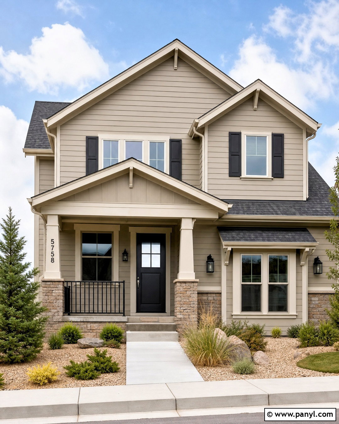
Mega Greige can give a standard home exterior a grounded, nature-connected appearance. Use it for the main siding, then choose crisp warm white for the trim, porch columns, and garage surround. A deep charcoal front door and matching shutters create contrast without introducing an unrelated color. Keep the roof in a medium charcoal blend and use natural stone containing beige and gray near the foundation. Black lanterns, house numbers, and simple metal railings sharpen the finished scheme. Complete the curb view with evergreen shrubs, ornamental grasses, pale gravel, and a warm concrete walkway. Because Mega Greige holds noticeable warmth, it works naturally with landscaping and wood details. Always test an exterior sample in direct sunlight and shade before committing. ()
17. Collingwood OC-28
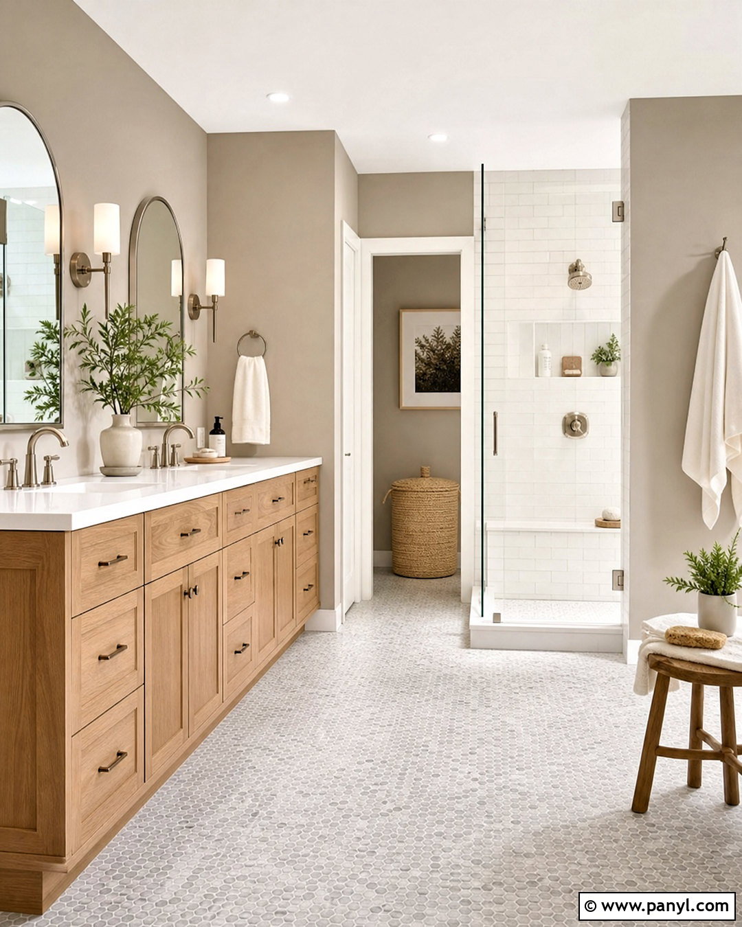
Collingwood creates a calm primary bathroom that sits comfortably between crisp white and deeper taupe. Paint the walls in this light greige and combine them with a white oak vanity, white quartz countertop, and brushed nickel faucets. Use large warm white tiles in the shower and a small greige mosaic on the floor for gentle variation. A frameless glass enclosure keeps the room visually open. Add two softly shaped mirrors and streamlined sconces with white glass shades. Folded ivory towels, a light wood stool, and simple ceramic accessories maintain the understated palette. To keep the design from feeling sterile, introduce one muted green plant and a woven laundry basket. The finished bathroom feels clean and restorative while still showing warmth and texture. ()
18. Functional Gray SW 7024
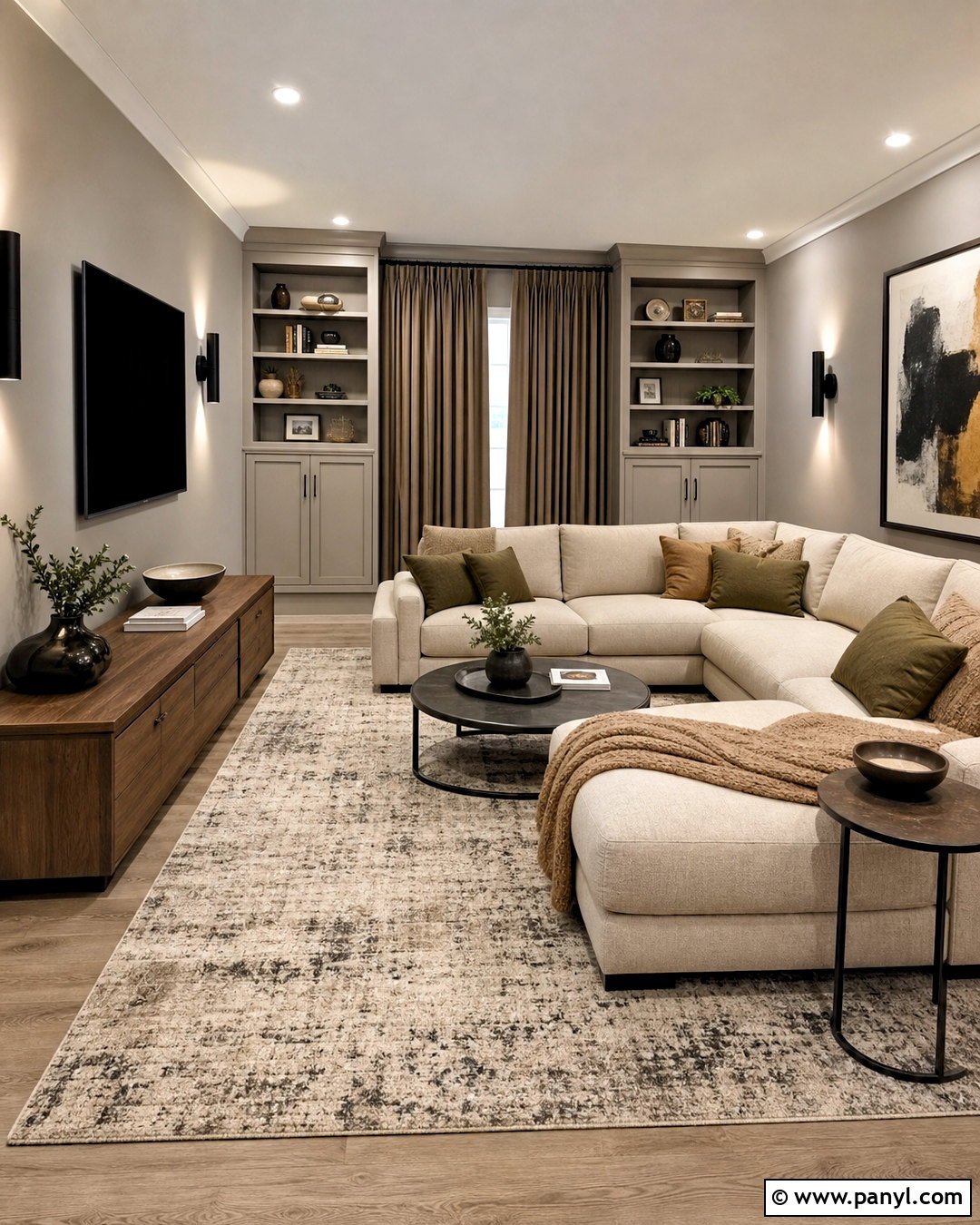
Functional Gray makes a strong backdrop for a media room where glare control and comfortable contrast matter. Cover the walls in this medium greige and paint the built-in media cabinetry the same color for a streamlined look. Choose a deep oatmeal sectional, a low walnut console, and a large textured rug in cream and charcoal. Blackout curtains in warm taupe help control daylight without adding another bold shade. Matte black wall sconces and dark metal side tables connect visually with the television screen. Bring in softer color through olive pillows, camel throws, and natural wood accessories. Instead of crowding the walls, use one large abstract artwork opposite the television. This full-room palette feels cozy and grounded while remaining lighter and warmer than a charcoal media space. ()
19. Gray Mist OC-30
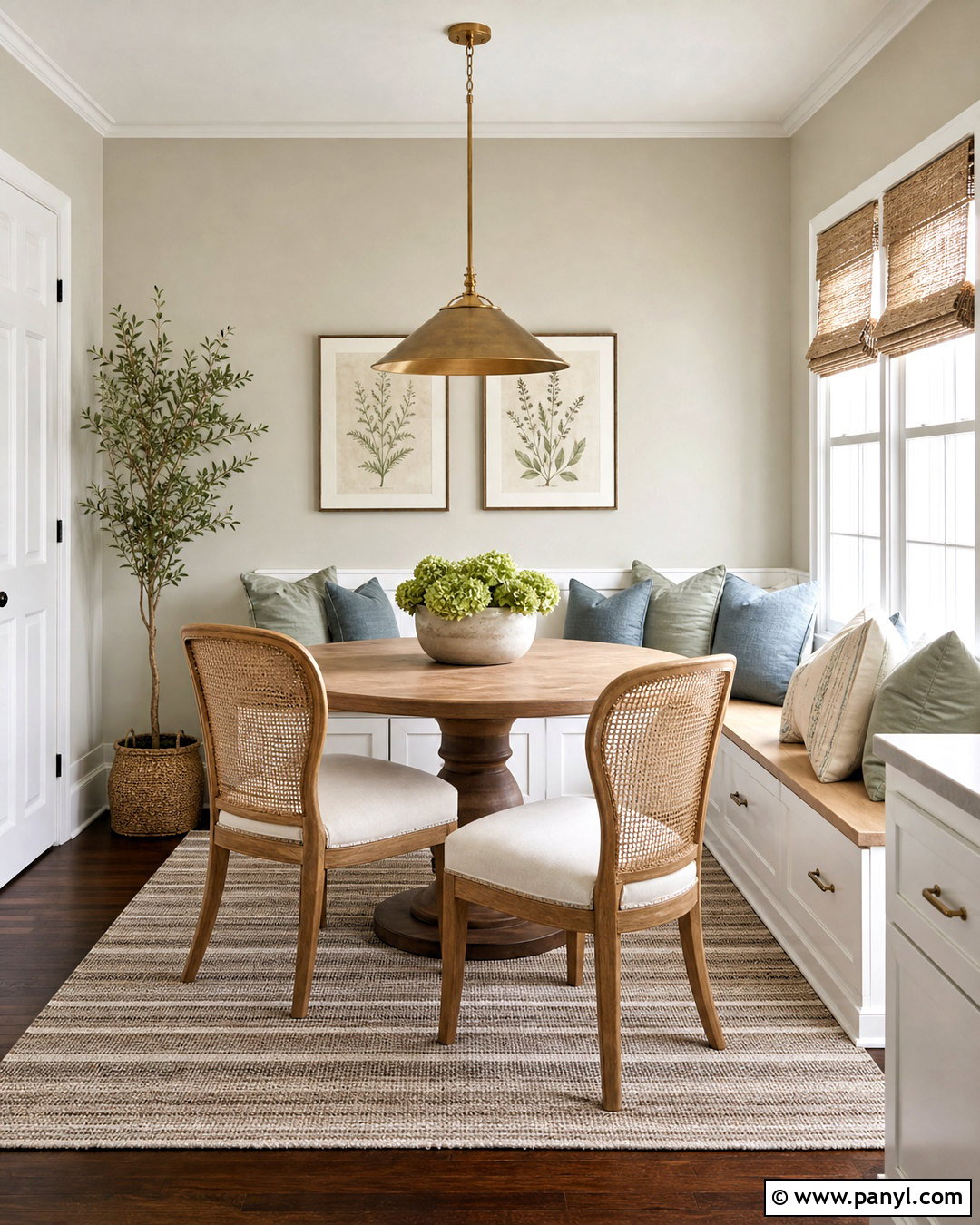
Gray Mist gives a small breakfast nook a light, softened background that works with both painted and natural wood furniture. Use it on the walls around a built-in bench with warm white cabinetry and a pale oak seat. Add a round pedestal table in medium wood and simple chairs with woven backs. Upholster the bench in a washable cream fabric, then layer muted blue, soft brown, and sage pillows for comfortable color. A small aged brass pendant defines the dining area without blocking the windows. Natural woven shades provide texture, while a striped ivory-and-taupe rug anchors the arrangement. Keep accessories minimal with one ceramic bowl and a few botanical prints. The complete nook feels brighter, more welcoming, and intentionally connected to the nearby kitchen. ()
20. Drift Of Mist SW 9166
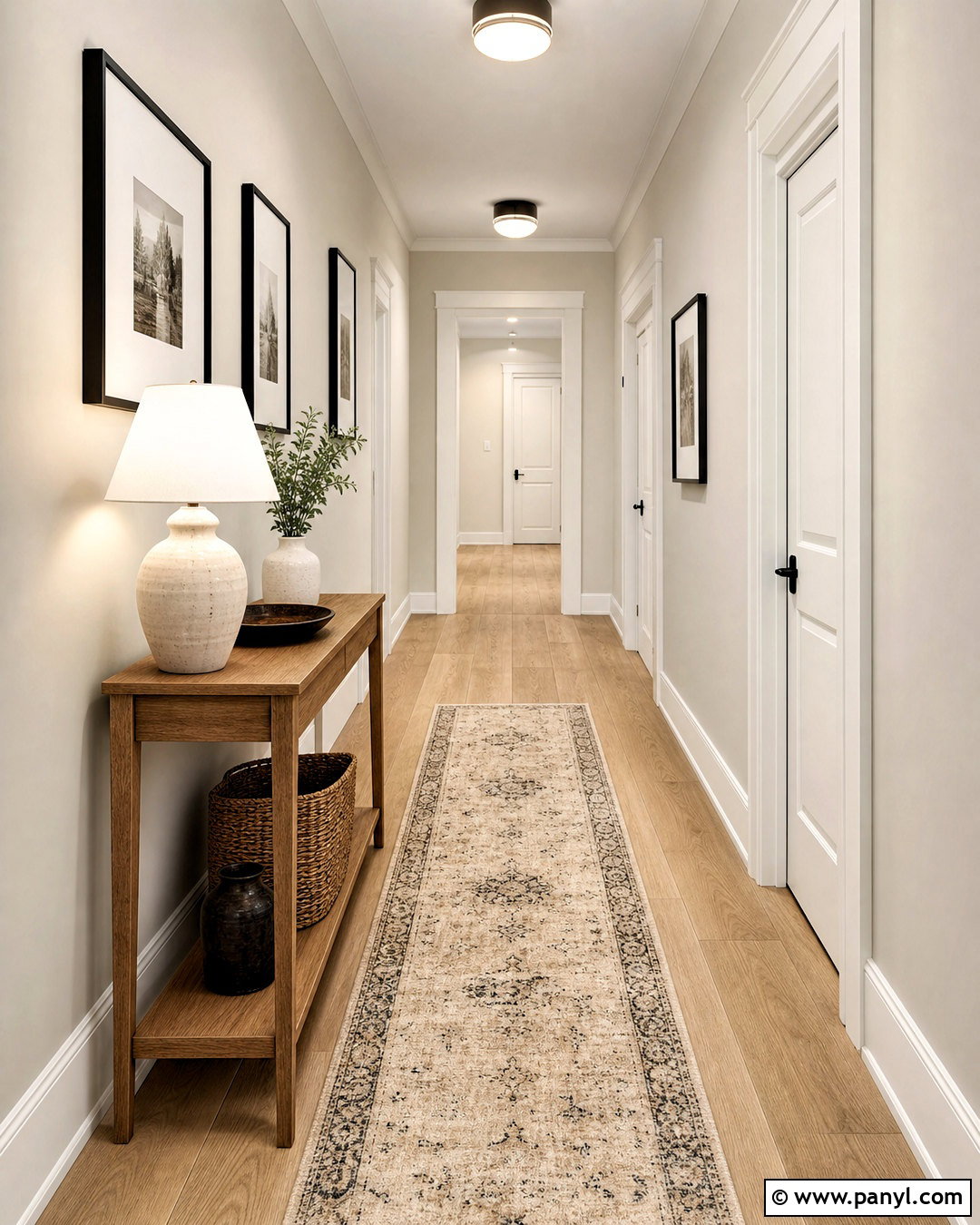
Drift of Mist is a useful choice for a narrow hallway where you want subtle warmth without visually closing in the space. Paint the walls in this pale greige and use warm white on the ceiling, baseboards, doors, and frames. Continue light oak flooring through the hall to reflect daylight and create a clean visual path. Add a slim natural wood console where space allows, topped with one ceramic lamp and a shallow catchall tray. Hang a balanced row of black-framed artwork with generous white mats. A washable runner in ivory, tan, and faded charcoal introduces pattern without making the corridor busy. Bright, consistent ceiling fixtures complete the design. The finished hallway feels connected, polished, and spacious rather than overlooked or purely functional. ()
Conclusion:
The best greige is not simply the most popular shade. It is the color that connects your lighting, flooring, furniture, trim, and permanent finishes. These 20 greige paint colors range from pale, airy neutrals to deeper tones suited to offices, bedrooms, media rooms, and exteriors. Before deciding, place large painted samples beside cabinets, counters, flooring, and fabrics. Move them around the space and observe each option throughout the day. Use warm whites when you want a softer result, or cleaner whites for clearer contrast. Once the undertones work with the room, build a complete palette using wood, textiles, metals, and a limited selection of accent colors for a polished, lasting design. ()

Related Ideas and Inspiration:
Leave a Reply