
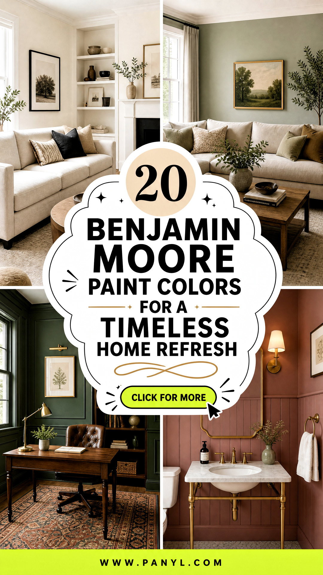
Choosing paint becomes easier when you see each color as part of a complete room rather than an isolated swatch. These 20 Benjamin Moore paint colors include flexible whites, warm neutrals, nature-inspired greens, calming blues, and dramatic dark tones. Many are established homeowner favorites, while Silhouette AF-655 brings a current direction as Benjamin Moore’s 2026 Color of the Year. () Each selection below includes practical suggestions for furniture, flooring, trim, lighting, and accent colors. Remember that natural light, existing finishes, and paint sheen can noticeably affect how a color appears. Sample your favorites on several walls before deciding. Use these complete room looks to find the most useful 20 Benjamin Moore paint colors for your home.
1. White Dove Living Room
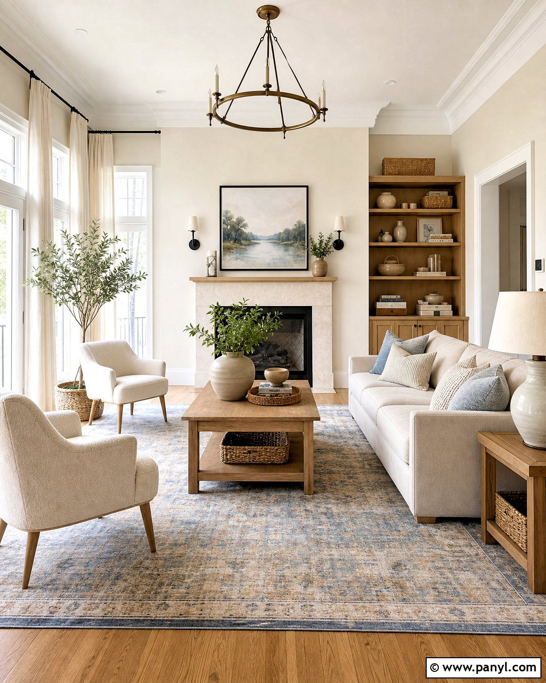
White Dove OC-17 creates a warm, welcoming living room that feels bright without looking cold or overly stark. Paint the walls in an eggshell finish, then repeat White Dove on the trim in semi-gloss for quiet dimension. Build the room around a light oatmeal sofa, warm oak coffee table, and two textured cream chairs. A faded blue and beige rug adds gentle contrast without disrupting the calm palette. Include linen curtains, woven baskets, and ceramic lamps with off-white shades. Small black accents, such as curtain rods and picture frames, keep the space defined. This complete scheme works especially well in traditional, transitional, coastal, and relaxed farmhouse homes where comfortable warmth matters more than crisp contrast. ()
2. Simply White Kitchen
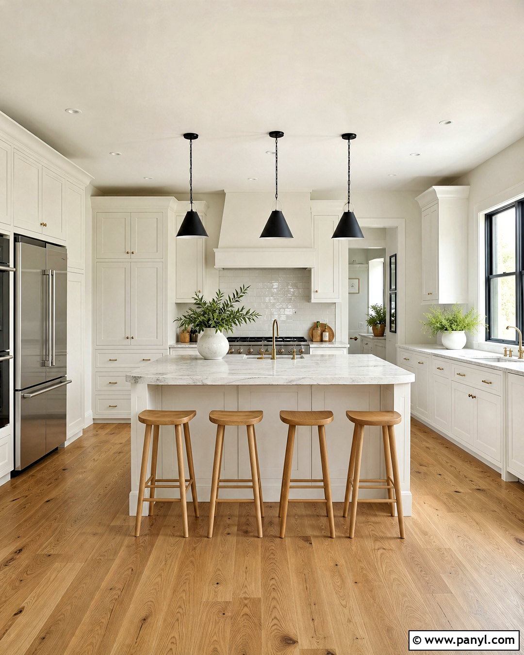
Simply White OC-117 gives a kitchen a clean appearance while retaining a soft hint of warmth. Use it across shaker cabinets, walls, and ceiling, changing the sheen to create separation. Satin cabinets, eggshell walls, and a flat ceiling produce a layered finish without introducing competing whites. Add honed gray-veined quartz counters, a handmade white tile backsplash, and medium-tone oak flooring. Brushed brass hardware brings warmth, while matte black pendant lights provide structure over the island. Complete the space with natural wood stools and a few green plants. This kitchen palette suits smaller spaces because it reflects light, yet it also feels polished in open layouts. Test it beside existing stone because warm countertops may influence its appearance. ()
3. Chantilly Lace Bathroom
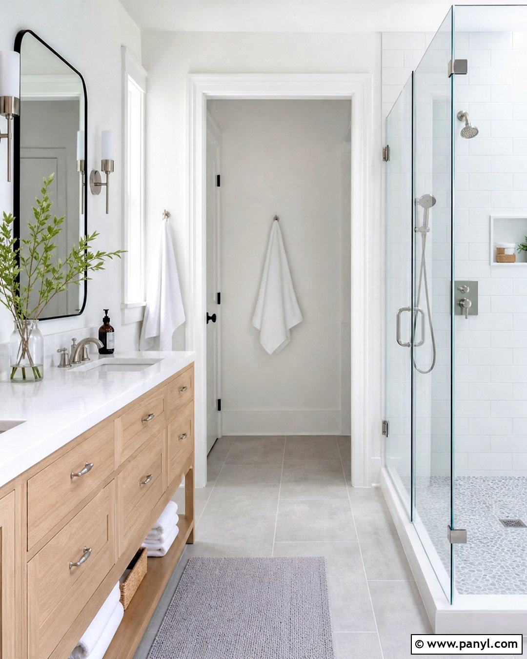
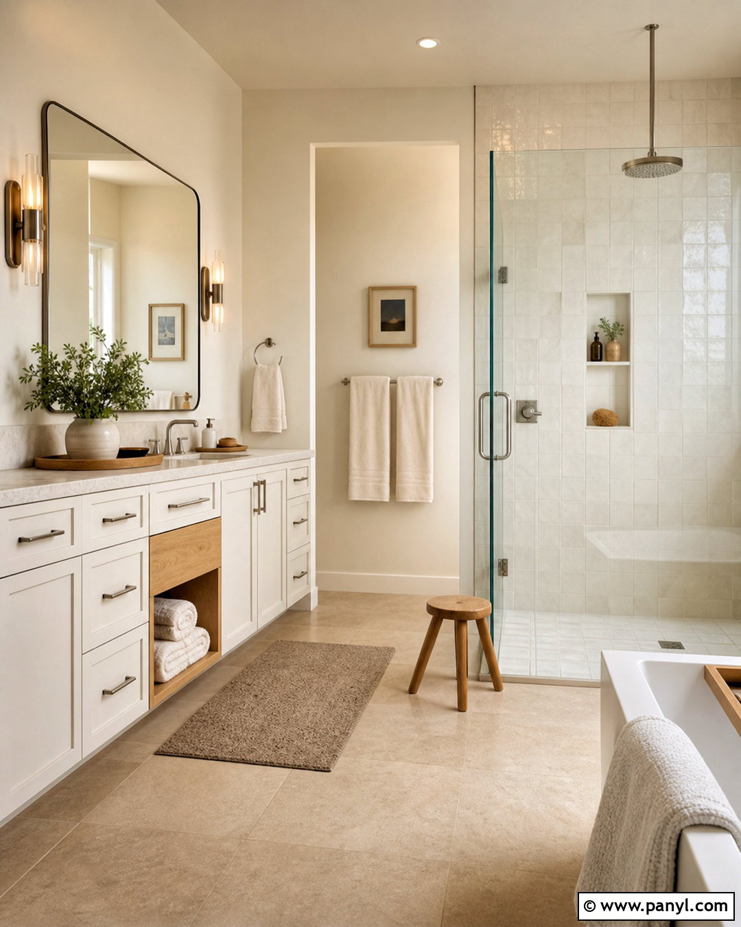
For a bathroom that feels fresh and uncluttered, Chantilly Lace OC-65 delivers a crisp white foundation. Use it on the walls, ceiling, door, and trim, then vary the finishes for subtle depth. Pair the color with a white oak vanity, pale gray porcelain floor tile, and a frameless glass shower. Brushed nickel faucets reinforce the cool, clean effect, while a slim black mirror adds a controlled graphic accent. Introduce softness through white towels, a light gray bath mat, and one small leafy plant. Good task lighting is important because very clear whites can shift under warm bulbs. This full bathroom look feels particularly effective in compact rooms, modern homes, and spaces with limited decorative detail. ()
4. Swiss Coffee Bedroom
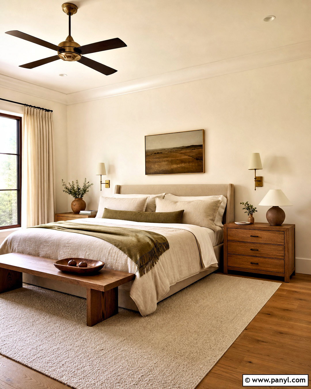
Swiss Coffee OC-45 can turn a bedroom into a restful, softly layered retreat. Cover the walls in this creamy off-white and use a slightly cleaner white on the trim if you want visible contrast. Choose an upholstered beige bed, medium oak nightstands, and natural linen bedding in cream, taupe, and muted brown. A wool rug beneath the bed adds warmth underfoot, while aged brass sconces create a gentle traditional note. Keep window treatments light and full-length to emphasize height. Terracotta pottery and one olive green throw prevent the neutral room from feeling flat. This complete bedroom palette complements warm wood floors and filtered daylight, making it suitable for organic modern, Mediterranean, transitional, and classic interiors. ()
5. Pale Oak Open Floor Plan
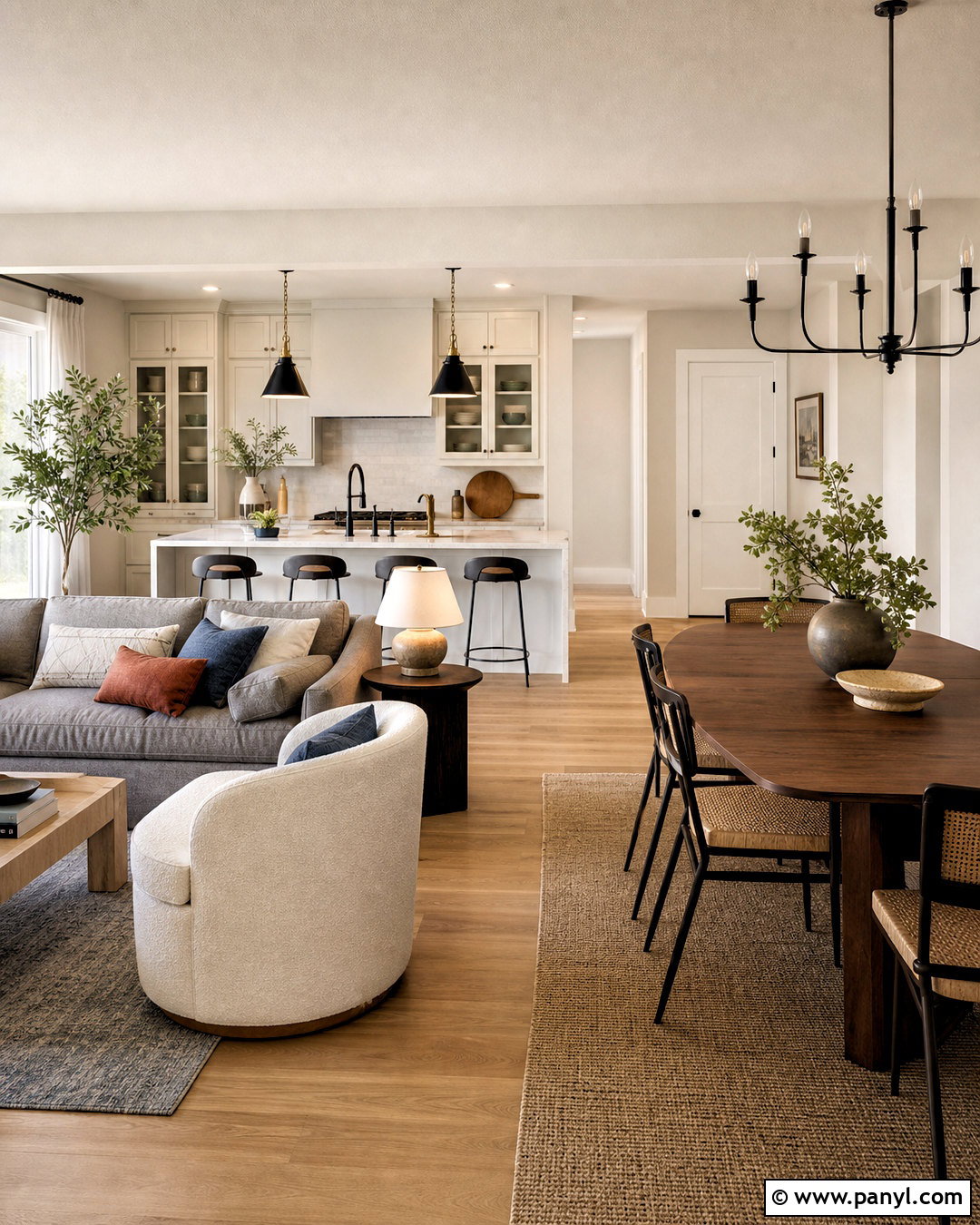
Pale Oak OC-20 offers a light neutral backdrop for an open floor plan where several functional areas must connect naturally. Apply it to the living, dining, and hallway walls, then use White Dove on trim and interior doors. Ground the arrangement with natural oak flooring and repeat black metal accents throughout the connected spaces. In the living area, select a warm gray sofa and ivory chairs. Use a walnut dining table with woven seats nearby. Soft blue, rust, and olive accessories provide controlled color without breaking visual flow. Pale Oak can appear warmer or grayer as daylight changes, so large samples are essential. The finished scheme feels cohesive, relaxed, and more forgiving than a bright white envelope. ()
6. Edgecomb Gray Family Room
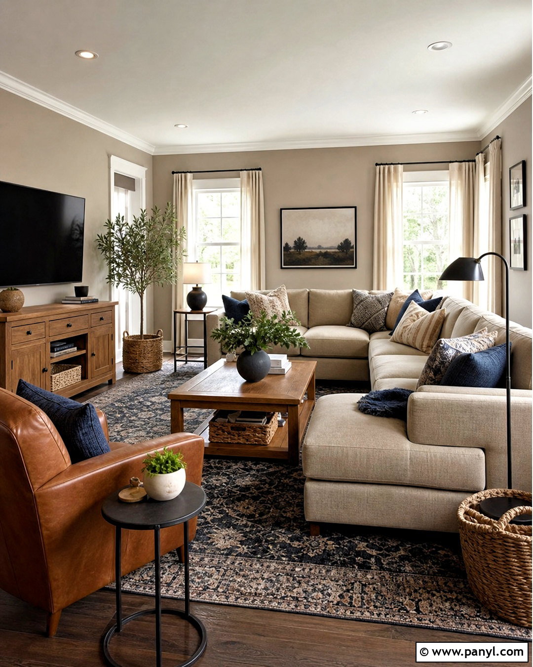
Edgecomb Gray HC-173 forms a comfortable family room palette that works with everyday furnishings and changing seasonal accents. Paint the walls this light greige, then add warm white trim and a simple white ceiling. A deep beige sectional, cognac leather chair, and substantial oak media console create a durable foundation. Layer in a patterned rug containing cream, charcoal, and faded blue to disguise wear while connecting the room’s colors. Black reading lamps and dark curtain rods sharpen the softer neutrals. Finish with washable linen-look curtains, textured pillows, and closed basket storage. The overall design feels warm but not yellow, making it a practical bridge between gray upholstery, brown wood, and mixed metal finishes. ()
7. Revere Pewter Dining Room
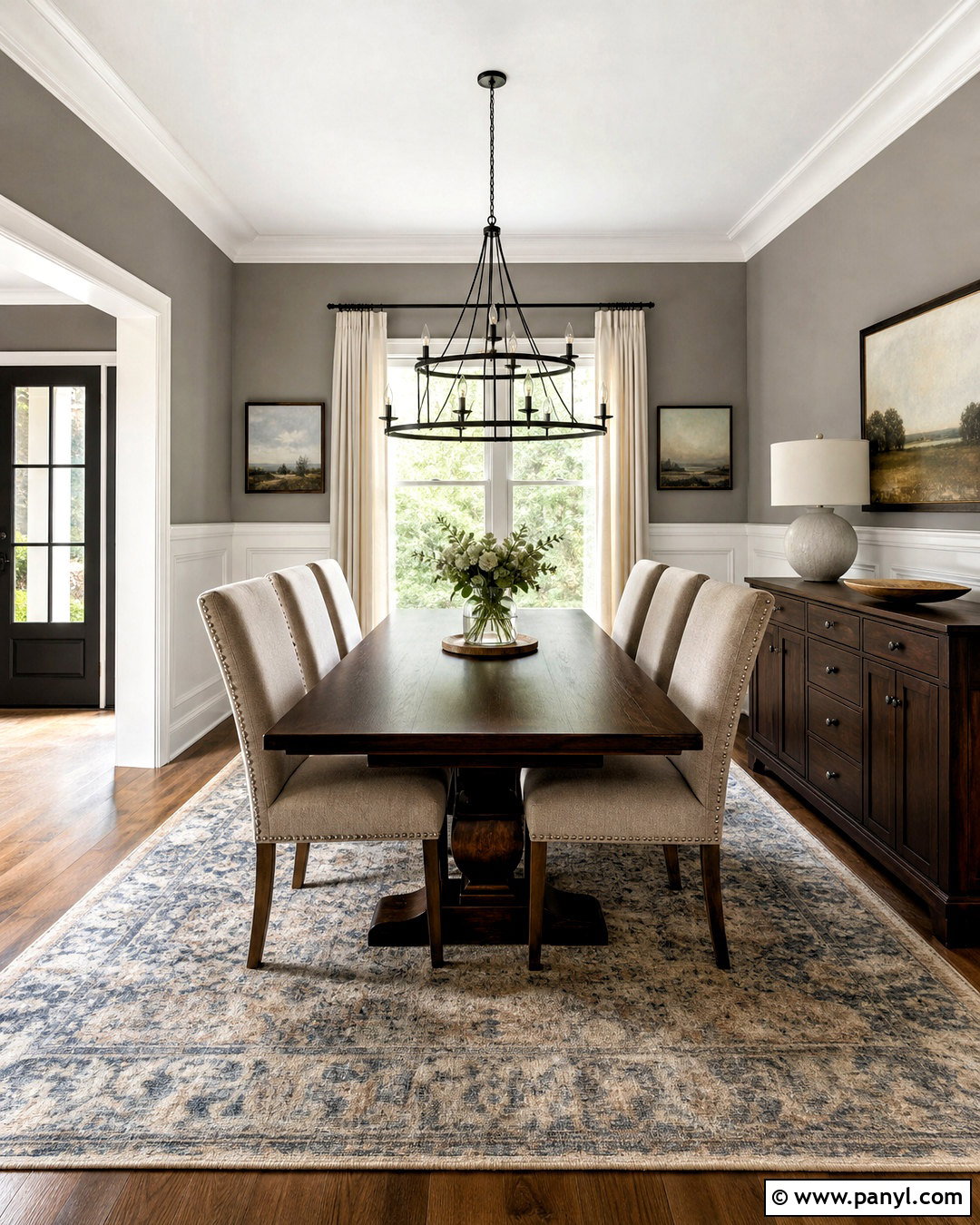
Revere Pewter HC-172 brings depth to a dining room without requiring a dark or highly saturated wall color. Use it above white wainscoting, or cover every wall for a simpler contemporary treatment. Pair the warm gray backdrop with a rectangular walnut table, upholstered oatmeal chairs, and a black metal chandelier. A muted vintage-style rug in blue, beige, and charcoal anchors the furniture while adding pattern. Hang full-length ivory curtains to soften the windows and display one oversized landscape print in a dark wood frame. For evening balance, include warm but clear dimmable lighting. This complete dining scheme feels established and inviting, with enough contrast for formal dinners but enough comfort for ordinary family meals. ()
8. Manchester Tan Entryway
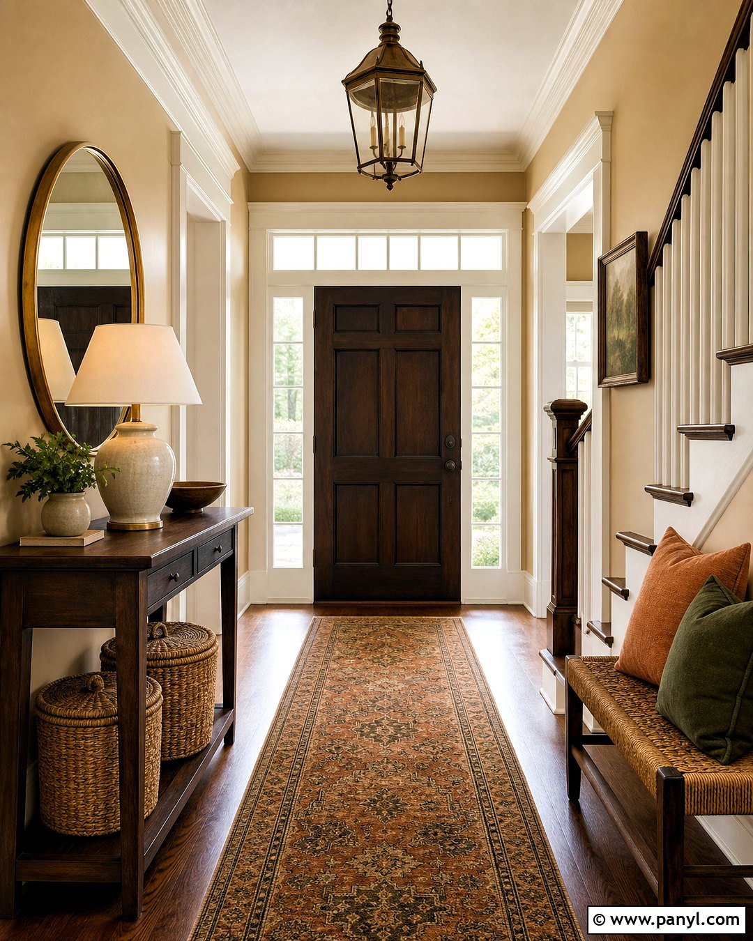
Manchester Tan HC-81 creates an entryway that feels sunny, traditional, and easy to coordinate with nearby rooms. Paint the walls this warm beige and use creamy white on the baseboards, door casing, and stair railing details. Place a dark walnut console against the main wall, topped with a large round brass mirror and a ceramic lamp. A narrow patterned runner containing rust, olive, tan, and navy introduces color while handling foot traffic. Add a woven bench or lidded baskets for practical storage. If the entry opens into several spaces, repeat one or two accent colors beyond the doorway. The finished look provides a gentle transition between wood floors, warm lighting, and classic furnishings without making the entrance feel heavy. ()
9. Pashmina Home Office
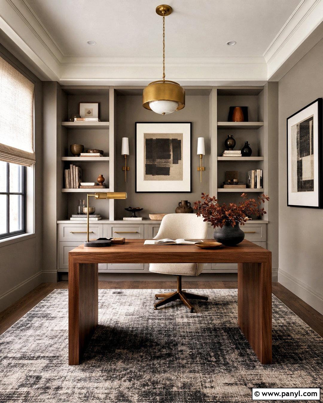
Pashmina AF-100 gives a home office a grounded neutral background that supports concentration without feeling corporate. Paint all four walls in this deeper taupe-gray and keep the ceiling a soft warm white. Use a streamlined walnut desk, a comfortable cream upholstered chair, and built-in storage painted to match the walls for a cohesive effect. A charcoal and ivory rug adds pattern beneath the work zone. Bring in aged brass lighting, black-framed artwork, and rust-colored accessories to emphasize the room’s warm side. Window treatments in natural linen control glare while preserving softness. This complete office works well in rooms with good daylight and offers enough depth to make video-call backgrounds look intentional, calm, and professionally arranged. ()
10. Silhouette Bedroom
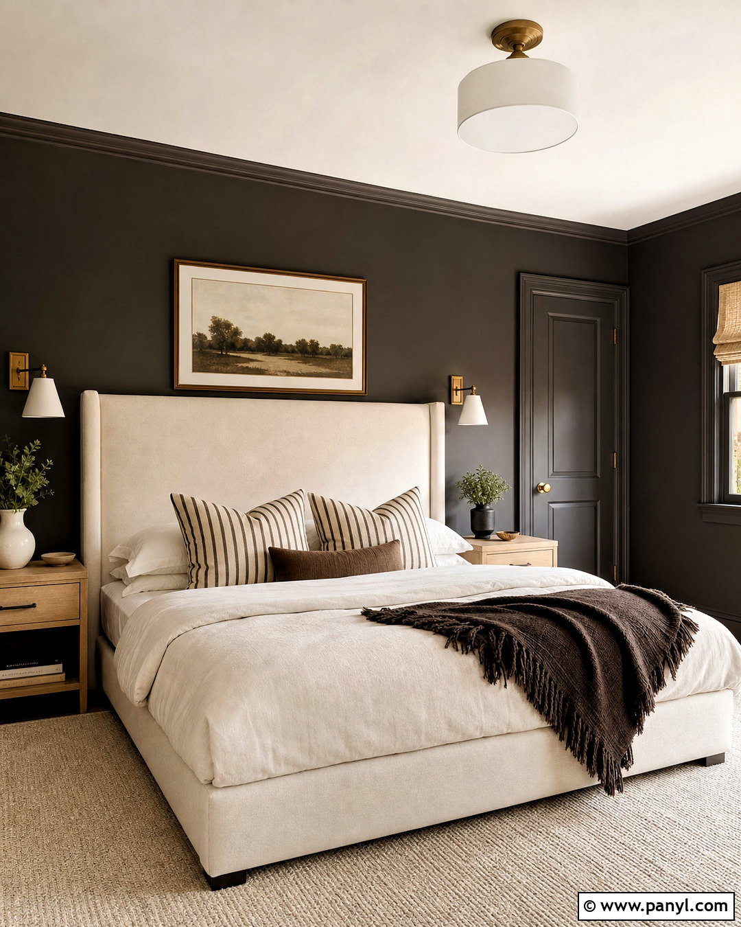
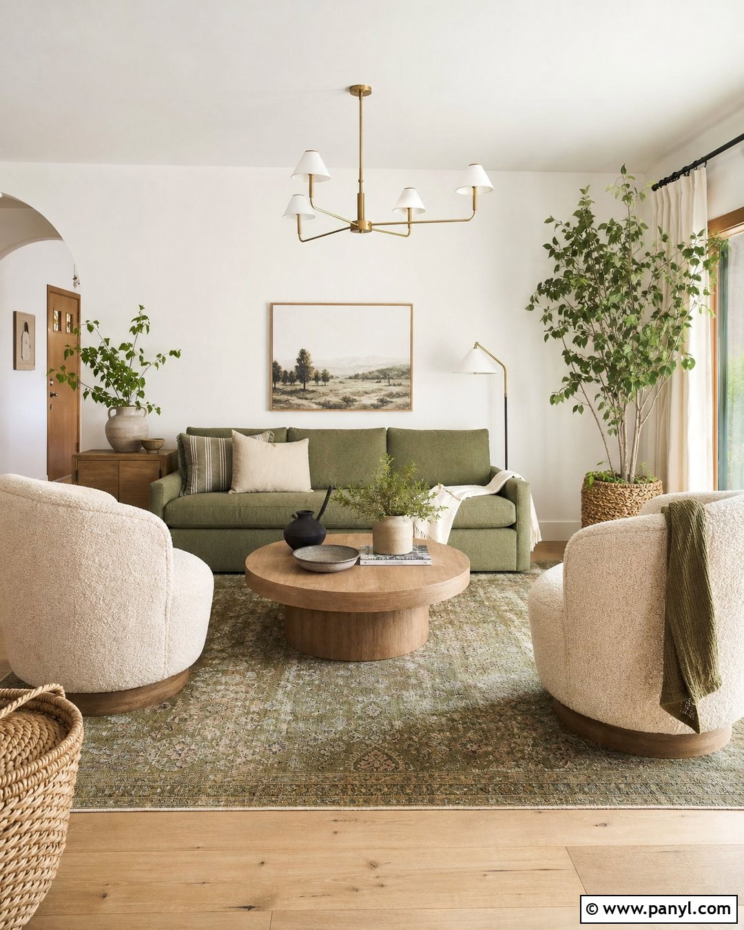
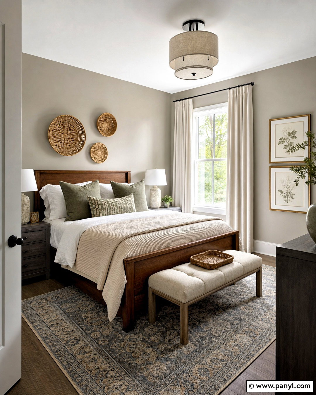
Silhouette AF-655, Benjamin Moore’s 2026 Color of the Year, creates a rich bedroom built around espresso brown with a charcoal influence. () Use it on every wall, including the baseboards and doors, for an immersive color-drenched effect. Balance the depth with a tall cream upholstered bed, ivory bedding, and pale oak nightstands. Add tailored details through striped accent pillows, a brown wool throw, and slim antique brass sconces. A light neutral rug prevents the room from becoming visually heavy, while warm white ceiling paint preserves brightness overhead. Keep artwork minimal and substantial rather than filling the walls with small pieces. This complete scheme feels intimate and sophisticated, especially in bedrooms with generous windows and uncomplicated architecture.
11. October Mist Living Room
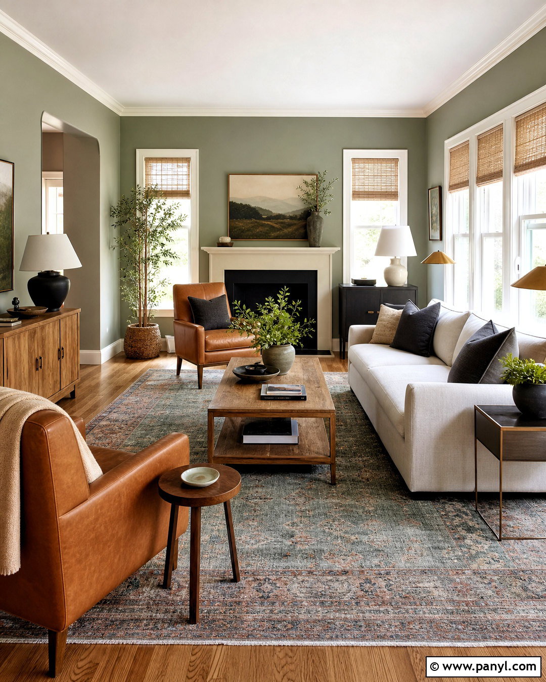
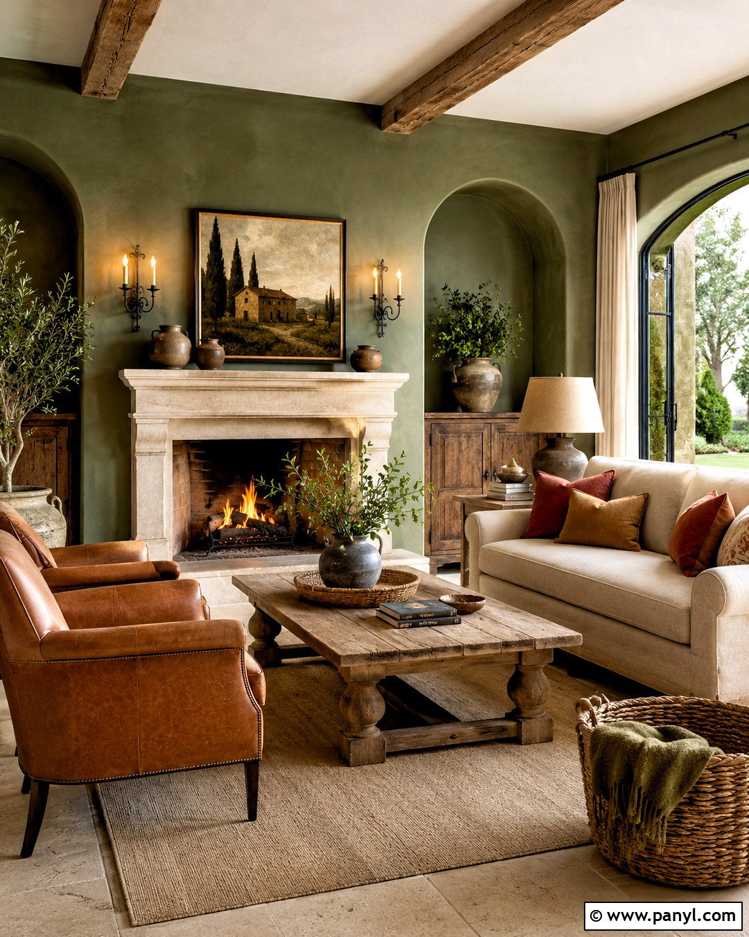
October Mist 1495 introduces muted botanical color to a living room while remaining gentle enough for large wall areas. Pair the soft sage walls with creamy white trim, a natural linen sofa, and medium oak furniture. Choose two accent chairs in camel leather or warm beige fabric to strengthen the earthy palette. A vintage-inspired rug with faded green, blue, and rust tones adds character without overpowering the paint. Complete the room with woven shades, brass floor lamps, and simple landscape art. Dark green or charcoal pillows can provide a stronger accent in small doses. This balanced design works well for homeowners who want noticeable color but still need flexibility for changing furniture, textiles, and seasonal decor. ()
12. Saybrook Sage Kitchen
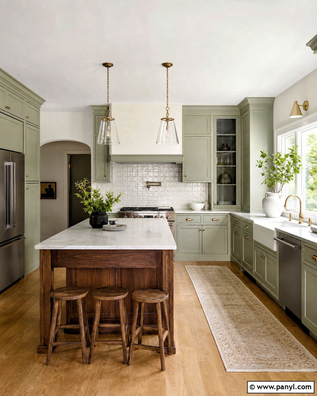
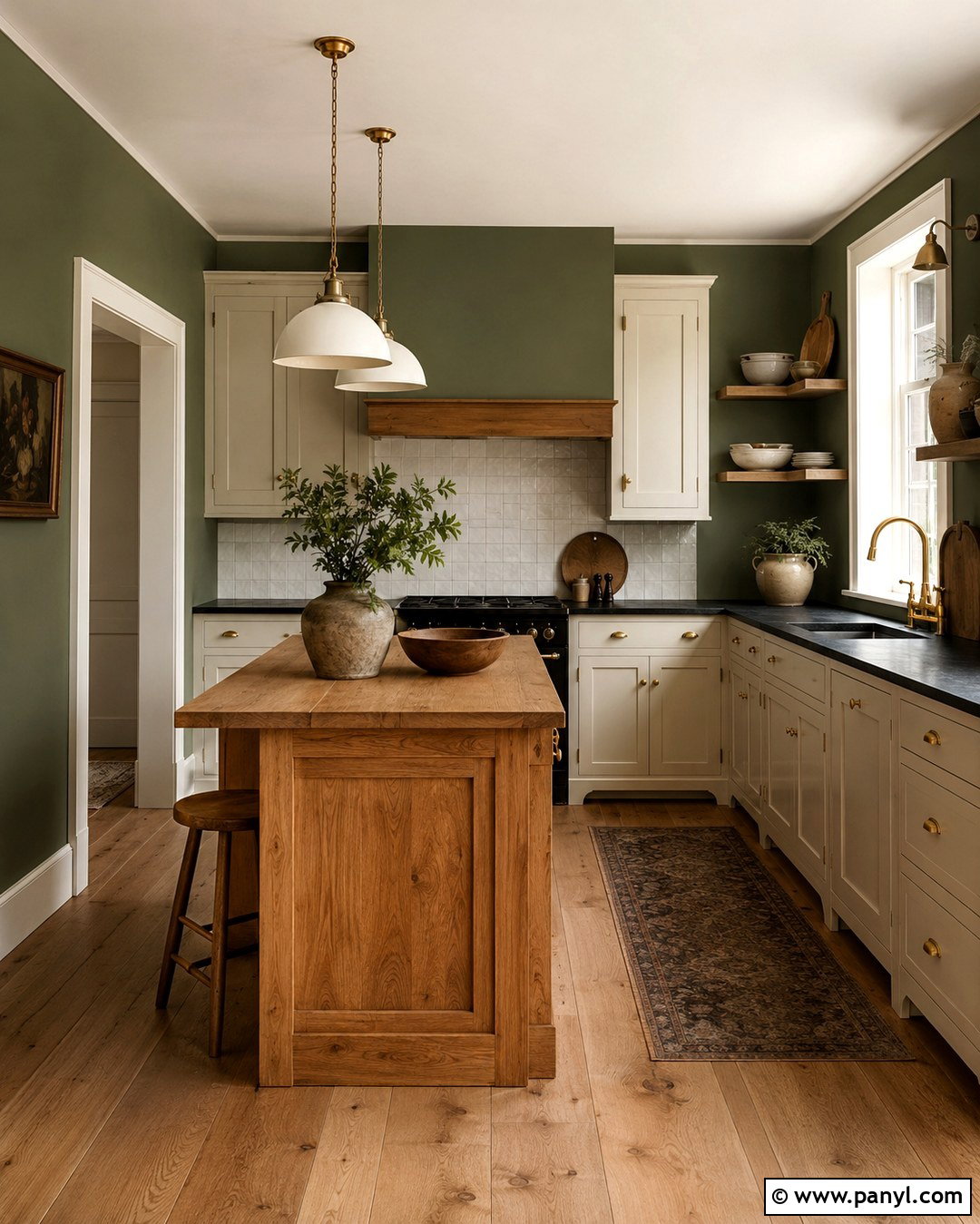
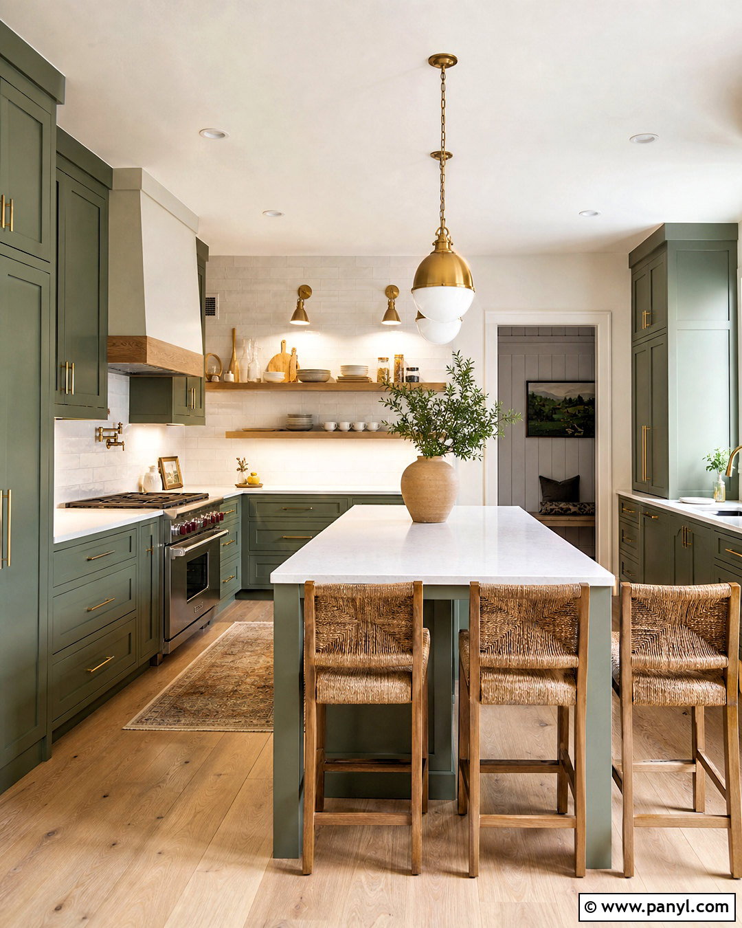
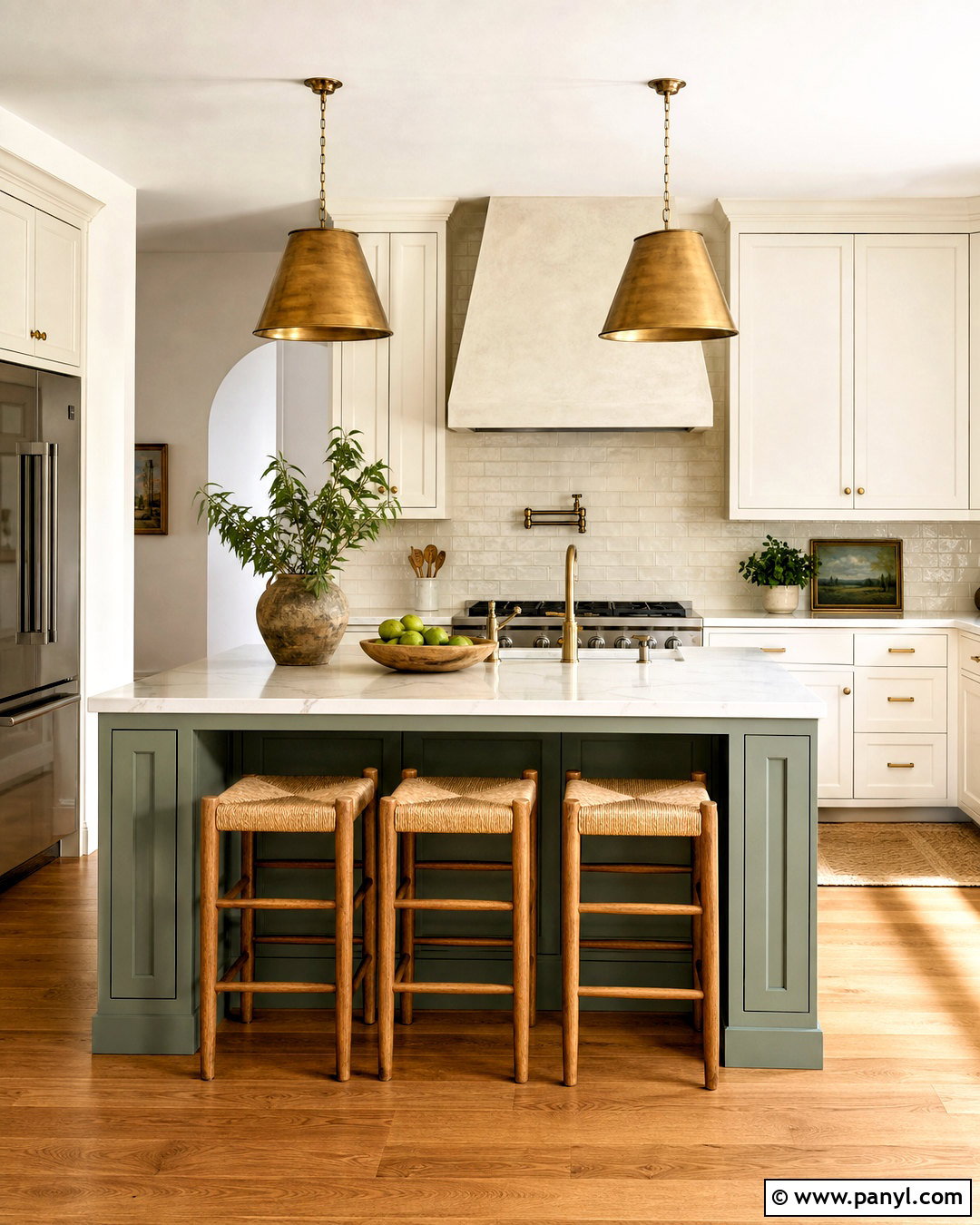
Saybrook Sage HC-114 gives kitchen cabinetry a calm, established appearance that pairs naturally with stone and wood. Apply it to shaker-style lower and upper cabinets in a durable satin finish. Keep the walls warm white and choose lightly veined cream quartz for the counters. A backsplash of handmade ivory tile adds texture, while aged brass knobs and bridge faucets reinforce the color’s traditional side. Ground the kitchen with warm oak floors and a walnut island topped with pale stone. Simple glass pendants keep the space open rather than visually crowded. This full scheme suits English-inspired, cottage, farmhouse, and transitional kitchens. For a smaller kitchen, use Saybrook Sage only on lower cabinets and keep the upper cabinets light. ()
13. Vintage Vogue Home Office
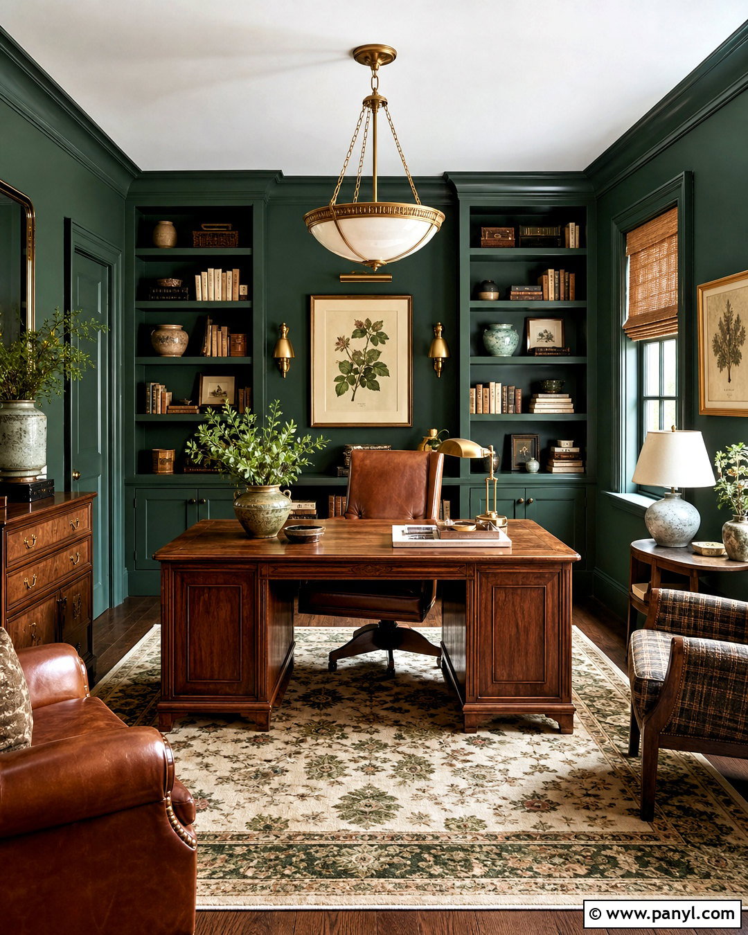
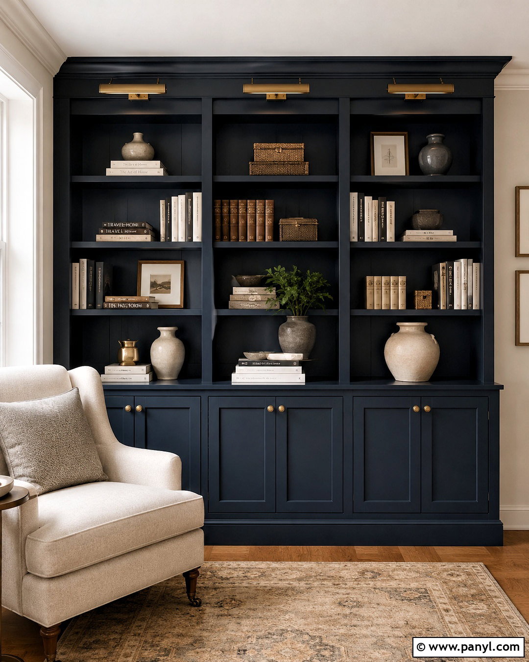
Vintage Vogue 462 transforms a home office into a focused, library-inspired space with a strong connection to nature. Paint the walls, built-in bookcases, and trim in the same deep green, using different sheens to reveal the architectural details. Add a substantial walnut desk, a cognac leather chair, and an antique-style brass picture light. A cream and olive patterned rug lightens the floor while maintaining the room’s tailored character. Display books, pottery, and framed botanical prints in a restrained arrangement. Natural woven shades filter daylight and prevent glare on screens. The completed office feels immersive rather than gloomy because the warm wood, pale textiles, and metallic details break up the saturated walls and create several reflective surfaces. ()
14. Palladian Blue Bathroom
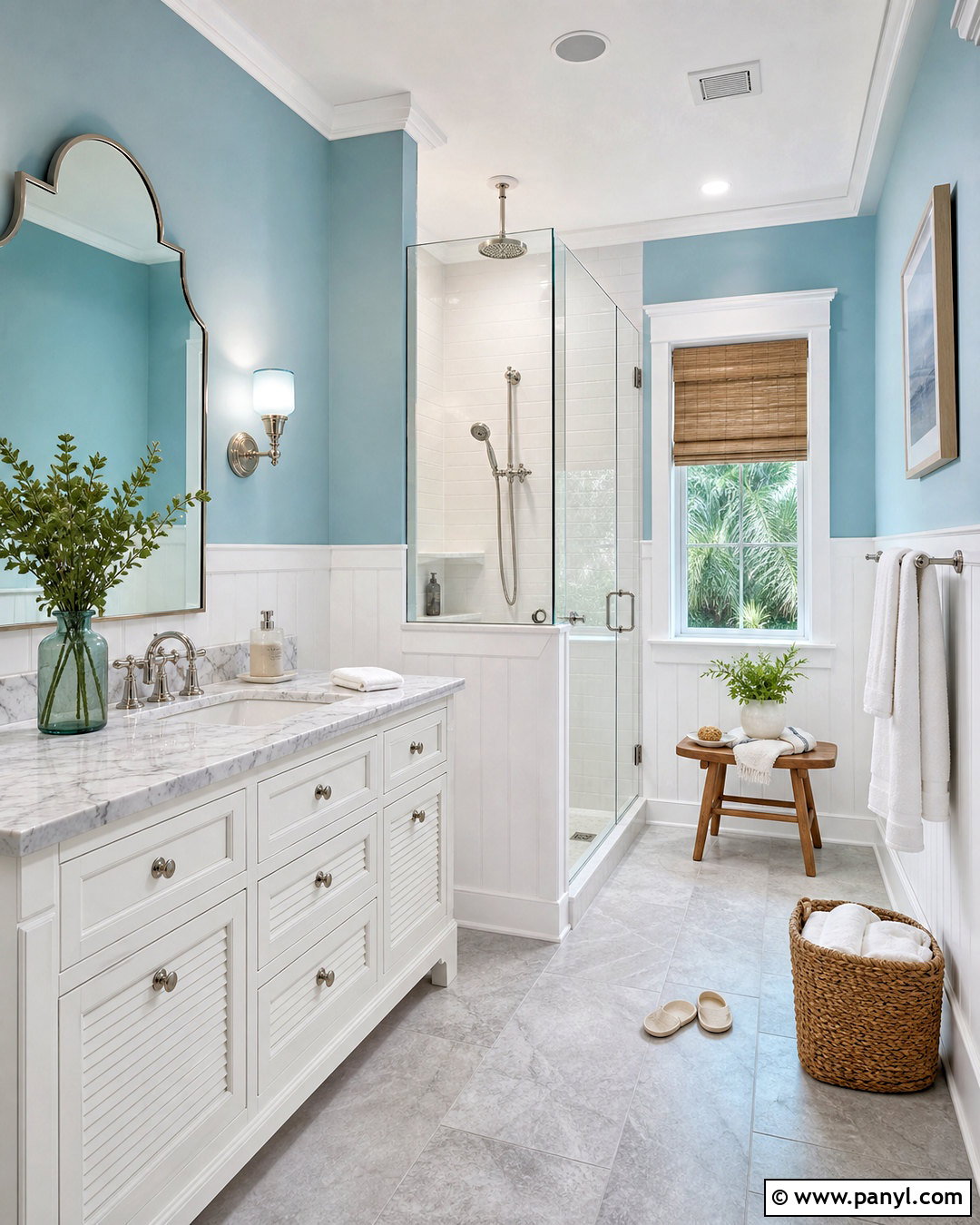
Palladian Blue HC-144 brings a watery blue-green quality to a bathroom, making the room feel clean and relaxed. Use it on the upper walls with white vertical paneling below, or paint the entire room for a simpler finish. Choose a white vanity with a pale marble counter, polished nickel hardware, and a curved framed mirror. Soft gray floor tile keeps the palette from becoming overly coastal. Add white towels, a natural teak stool, and one woven basket for practical warmth. Clear glass shower panels allow the wall color to remain visible throughout the room. This complete design works especially well with natural daylight, but sampling is important because surrounding tile and artificial light can shift the color toward blue or green. ()
15. Hale Navy Dining Room
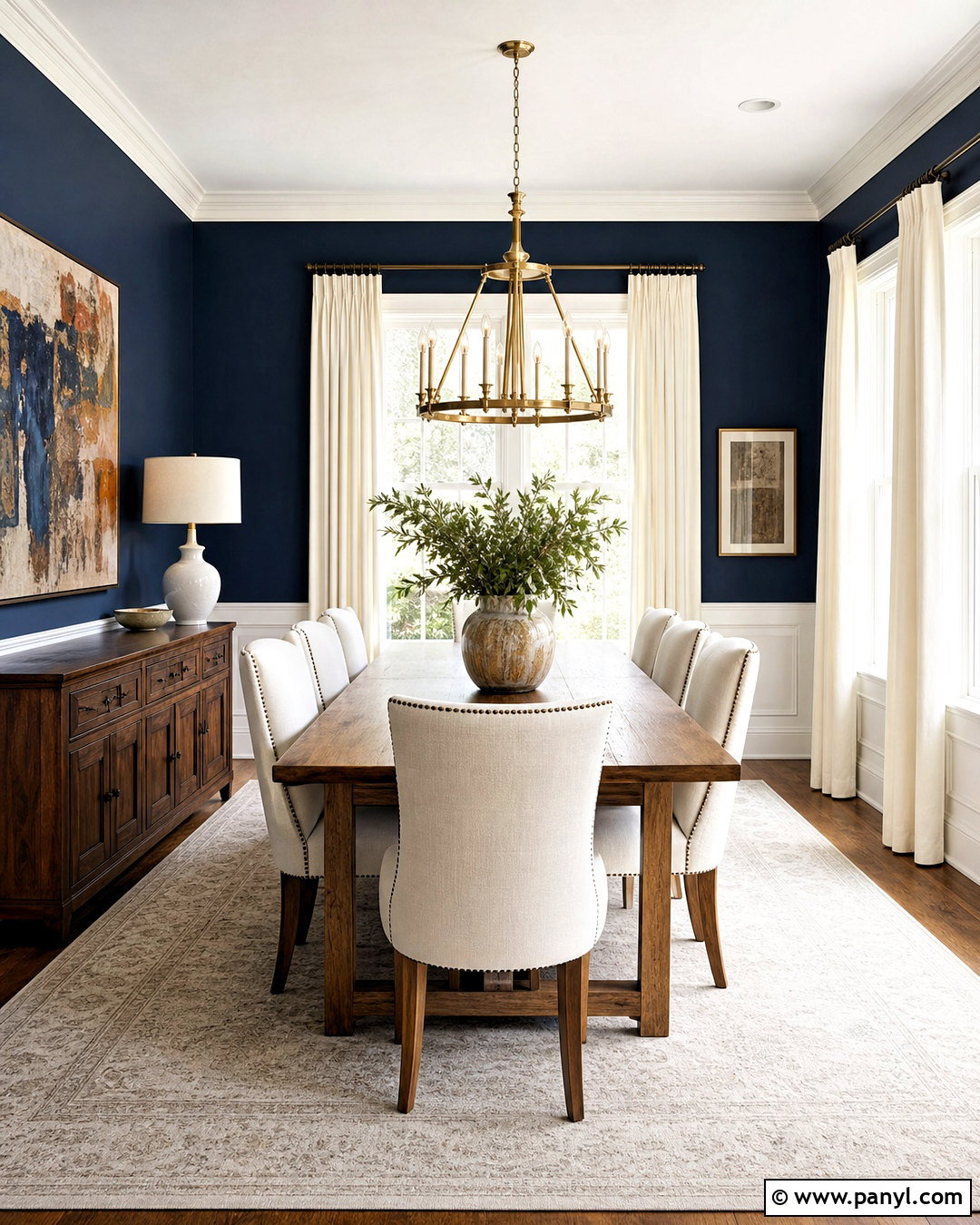
Hale Navy HC-154 creates a dramatic dining room that still feels classic and easy to furnish. Paint the walls deep navy and contrast them with crisp white trim, a white ceiling, and light linen curtains. Center a warm oak dining table beneath a sculptural aged brass chandelier. Upholstered chairs in cream or light gray prevent the arrangement from appearing too dark. Add a large neutral rug and one oversized piece of artwork with blue, rust, and ivory details. A walnut sideboard provides useful storage while adding another warm material. This full design is particularly successful in rooms used mainly during the evening because layered sconces and chandelier light reveal the navy’s depth while maintaining a comfortable, welcoming atmosphere. ()
16. Van Deusen Blue Kitchen
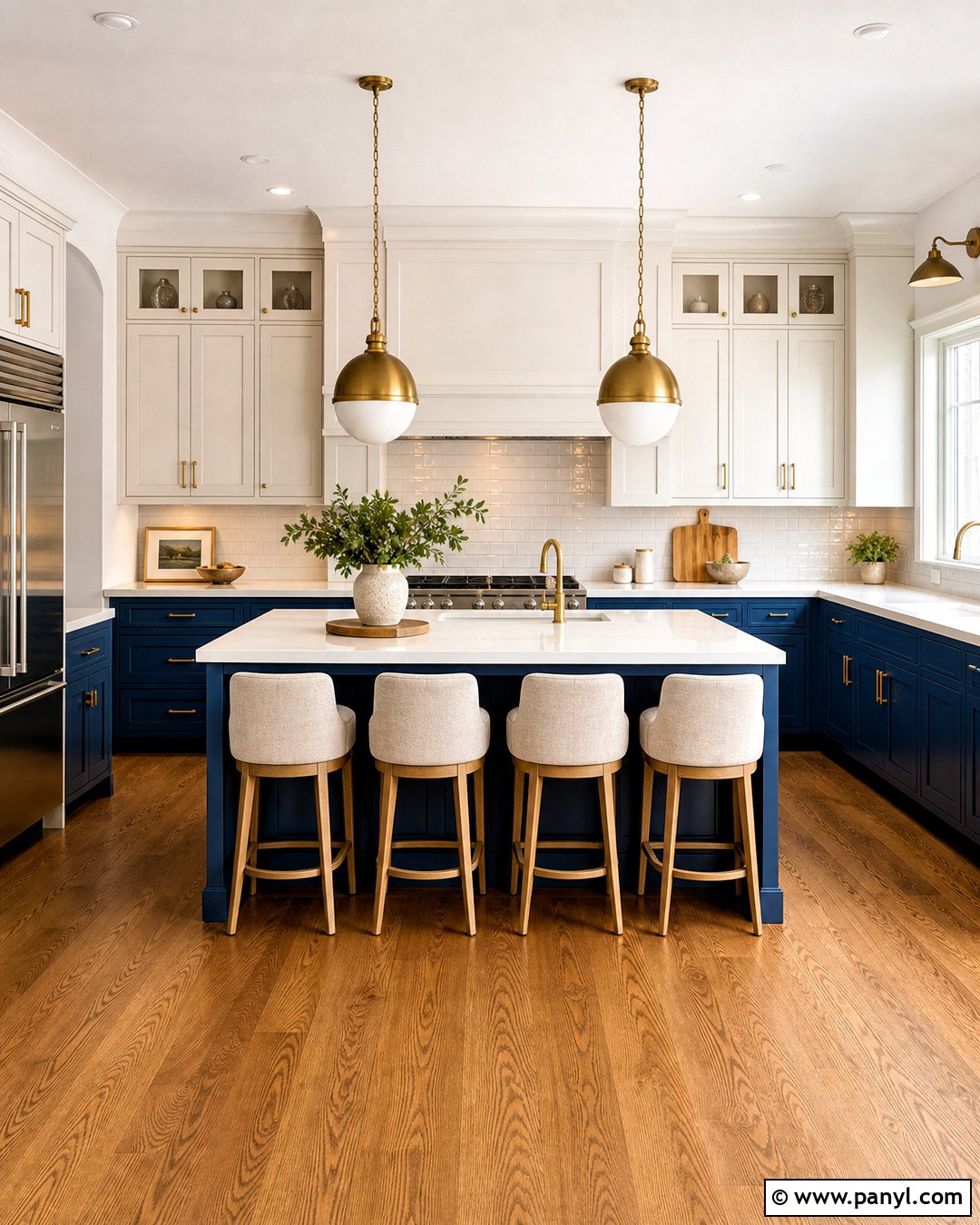
Van Deusen Blue HC-156 makes kitchen cabinets feel substantial, polished, and visually organized. Use the rich blue on lower cabinetry and the island, then balance it with warm white upper cabinets and walls. Select white quartz counters with gentle gray veining and a glossy white subway tile backsplash. Brushed brass pulls and pendant lights add warmth against the blue, while medium oak flooring keeps the kitchen approachable. Repeat the cabinet color in small details, such as upholstered counter stools or patterned window fabric. Keep appliances and other large finishes simple so the cabinetry remains the focal point. This complete two-tone design brings lasting contrast to traditional, coastal, and transitional kitchens without relying on short-lived decorative themes. ()
17. Aegean Teal Guest Bedroom
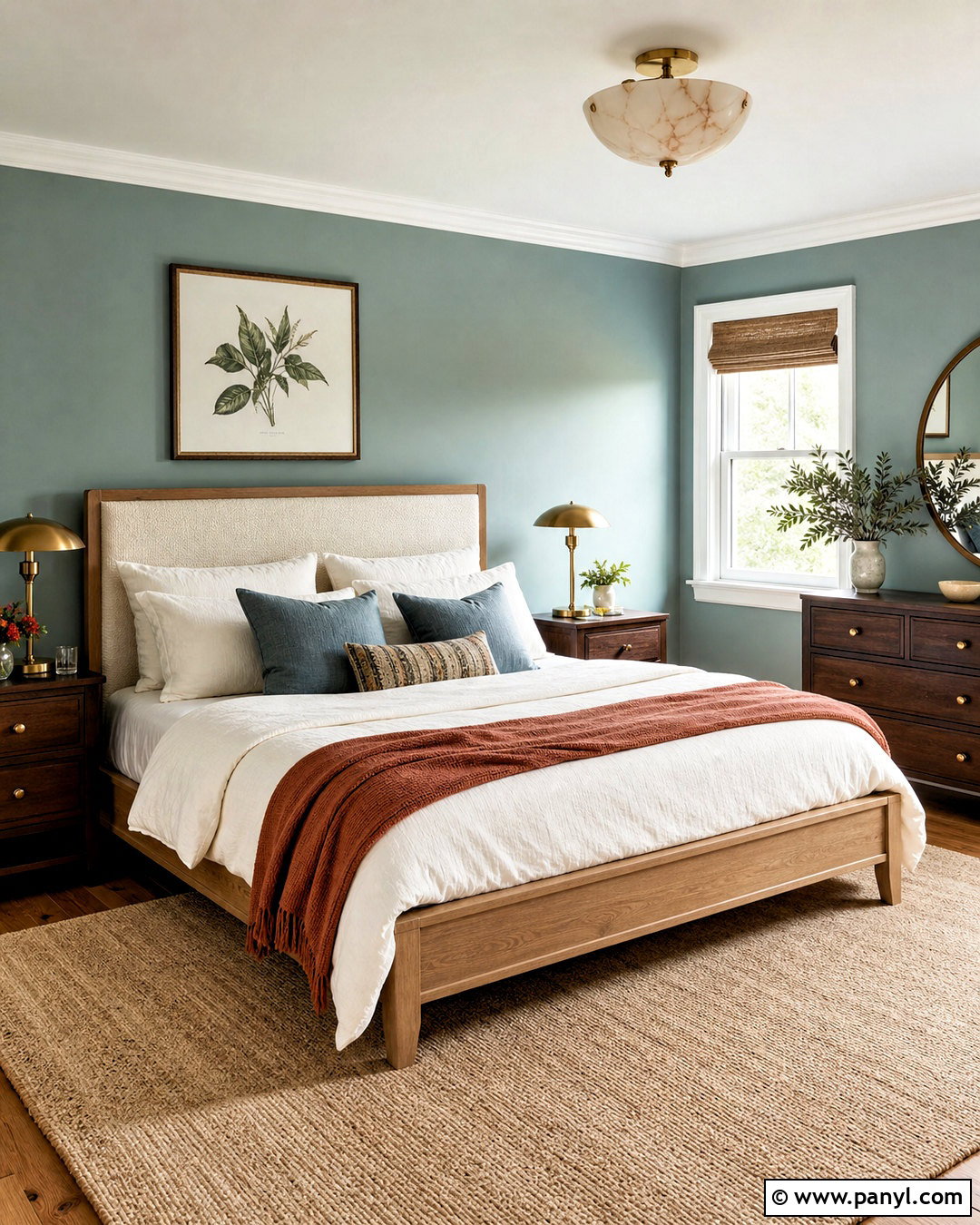
Aegean Teal 2136-40 creates a guest bedroom that feels colorful, calm, and thoughtfully finished. Paint the walls this muted blue-green and pair them with warm white trim and a simple white ceiling. Choose a light oak bed with an upholstered cream headboard, then layer the bedding in ivory, dusty blue, and warm terracotta. Walnut nightstands and aged brass lamps introduce deeper warmth. Place a soft beige rug under the bed to brighten the lower half of the room. Botanical prints and a few ceramic accessories can repeat the paint’s natural character without creating a theme. The finished design offers guests a memorable color experience while maintaining the practical comfort and softness expected from a restful bedroom. ()
18. Boothbay Gray House Exterior
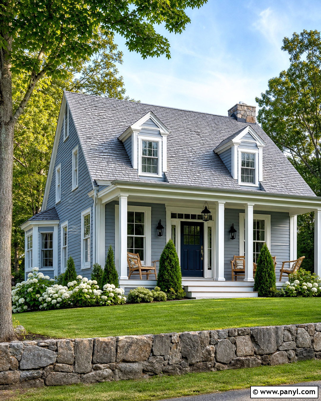
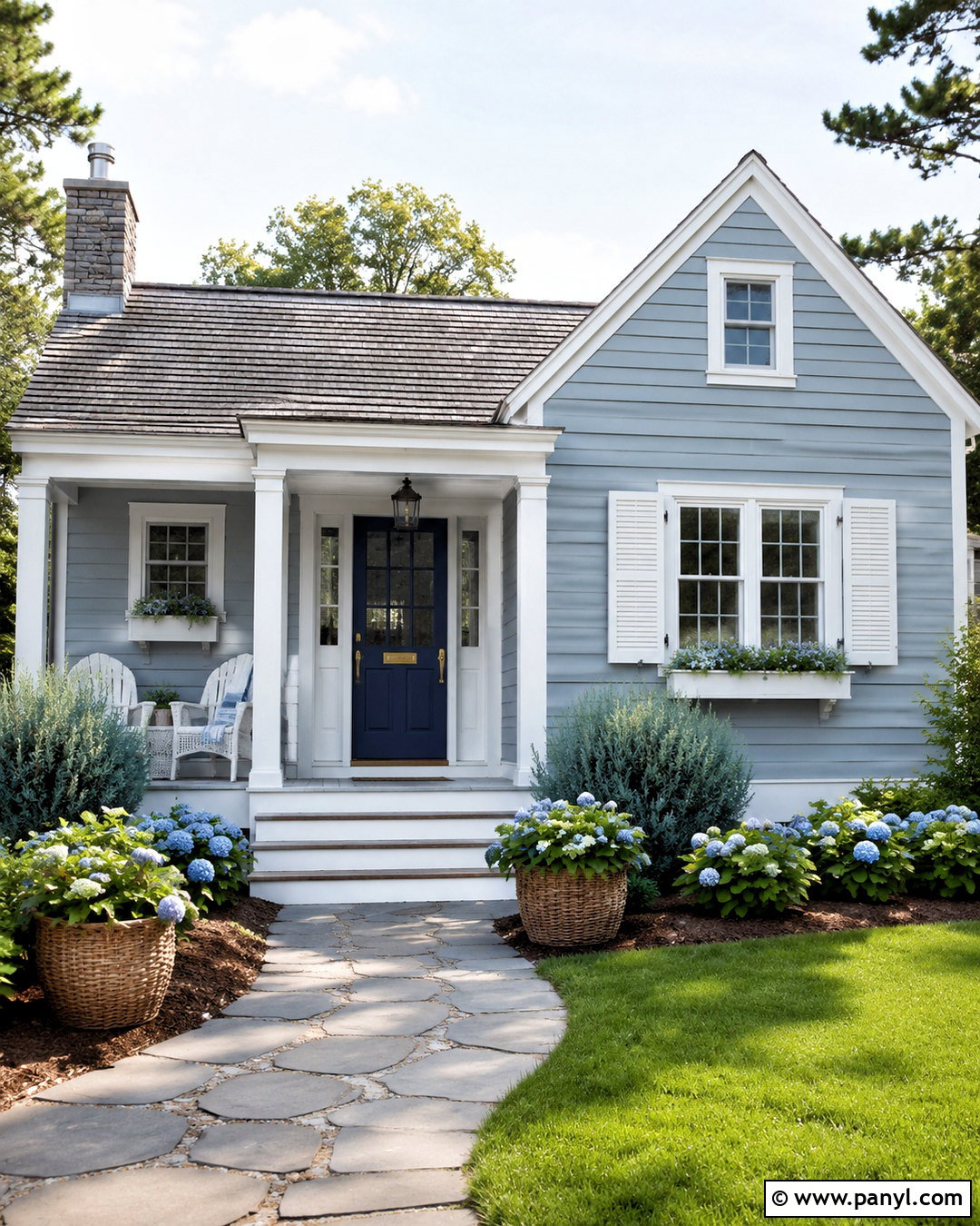
Boothbay Gray HC-165 gives a house exterior a refined blue-gray body color that works with traditional architecture and natural surroundings. Use it on horizontal siding, then add soft white trim around the windows, porch columns, and roofline. Paint the front door deep navy or charcoal for a stronger focal point. A medium gray shingle roof and stone foundation help connect the cool wall color to the landscape. Complete the curb view with black lanterns, warm wood porch furniture, and layered evergreen planting. White hydrangeas can brighten the foundation beds in season. This complete exterior scheme feels more distinctive than basic gray while remaining versatile enough for cottages, Colonials, Cape Cod homes, and modest suburban houses. ()
19. Wrought Iron Exterior
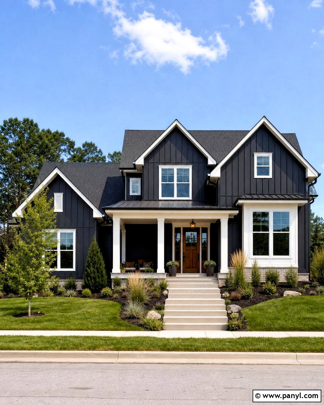
Wrought Iron 2124-10 creates a bold exterior that reads as softened black rather than a flat, severe color. Apply it to siding on a simple farmhouse, cottage, or modern home, then use warm white for the window trim, fascia, and porch columns. Add a natural cedar front door to introduce warmth and connect the house to the landscape. A charcoal roof maintains continuity without matching the siding exactly. Choose matte black lighting, pale concrete steps, and restrained foundation planting with ornamental grasses and evergreen shrubs. The completed palette feels dramatic in bright daylight but still residential and approachable. Test a large exterior sample because direct sun, shade, roof color, and surrounding greenery can noticeably affect dark paint. ()
20. Terra Mauve Powder Room
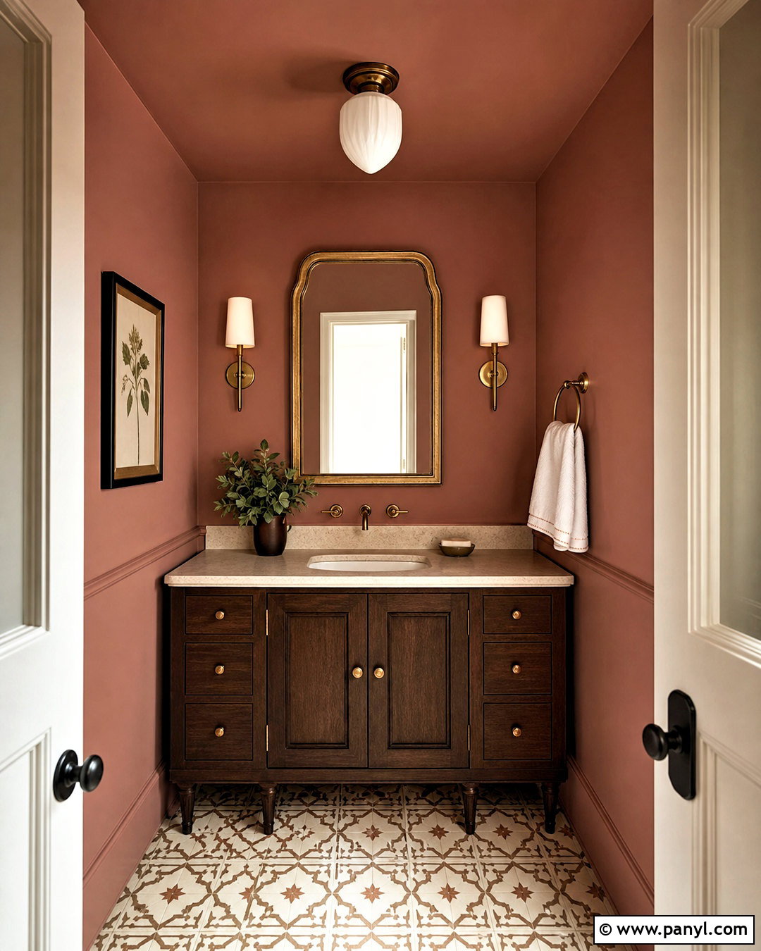
Terra Mauve 105 gives a powder room a warm, earthy identity through its muted terracotta and dusty rose character. Cover the walls and ceiling for a cozy, enveloping effect, then add a dark walnut vanity with a cream stone top. Use unlacquered brass for the faucet, mirror frame, and wall sconces. A patterned floor tile in ivory and soft brown reinforces the room’s vintage influence. Keep the sink, towels, and decorative objects light to prevent the compact space from feeling crowded. One small framed landscape or botanical print is enough artwork. This complete design turns a functional room into a memorable color moment and works especially well when nearby hallways use warm whites, beige, taupe, or natural wood. ()
Conclusion:
The best paint plan considers the entire space, including flooring, furniture, trim, lighting, and fixed finishes. These 20 Benjamin Moore paint colors offer useful options for bright kitchens, restful bedrooms, dramatic dining rooms, welcoming living spaces, and distinctive exteriors. Start by identifying whether your room needs warmth, freshness, softness, or stronger contrast. Then collect samples of two or three suitable colors and view them throughout the day. Paint large test areas rather than relying on small chips or digital images. Once the wall color is settled, repeat its undertones through textiles, wood, stone, and metal. This simple process creates a home palette that feels connected, comfortable, and intentionally designed.

Related Ideas and Inspiration:
Leave a Reply