
Choosing a kitchen paint color is easier when you consider the entire room rather than the walls alone. The best 20 Sherwin Williams Kitchen Wall Colors work with cabinet finishes, countertops, flooring, lighting, and hardware to create a balanced design. Warm neutrals remain especially relevant, while soft greens, dusty blues, and earthy accent colors bring personality without overwhelming the space. Sherwin-Williams’ current kitchen inspiration also reflects a mix of bright whites, nature-based hues, and practical neutrals that support different home styles. () Always test samples beside fixed finishes during the morning, afternoon, and evening because surrounding materials can shift how paint appears. Use the complete room combinations below to find the right match among these 20 Sherwin Williams Kitchen Wall Colors.

1. Universal Khaki Kitchen Walls
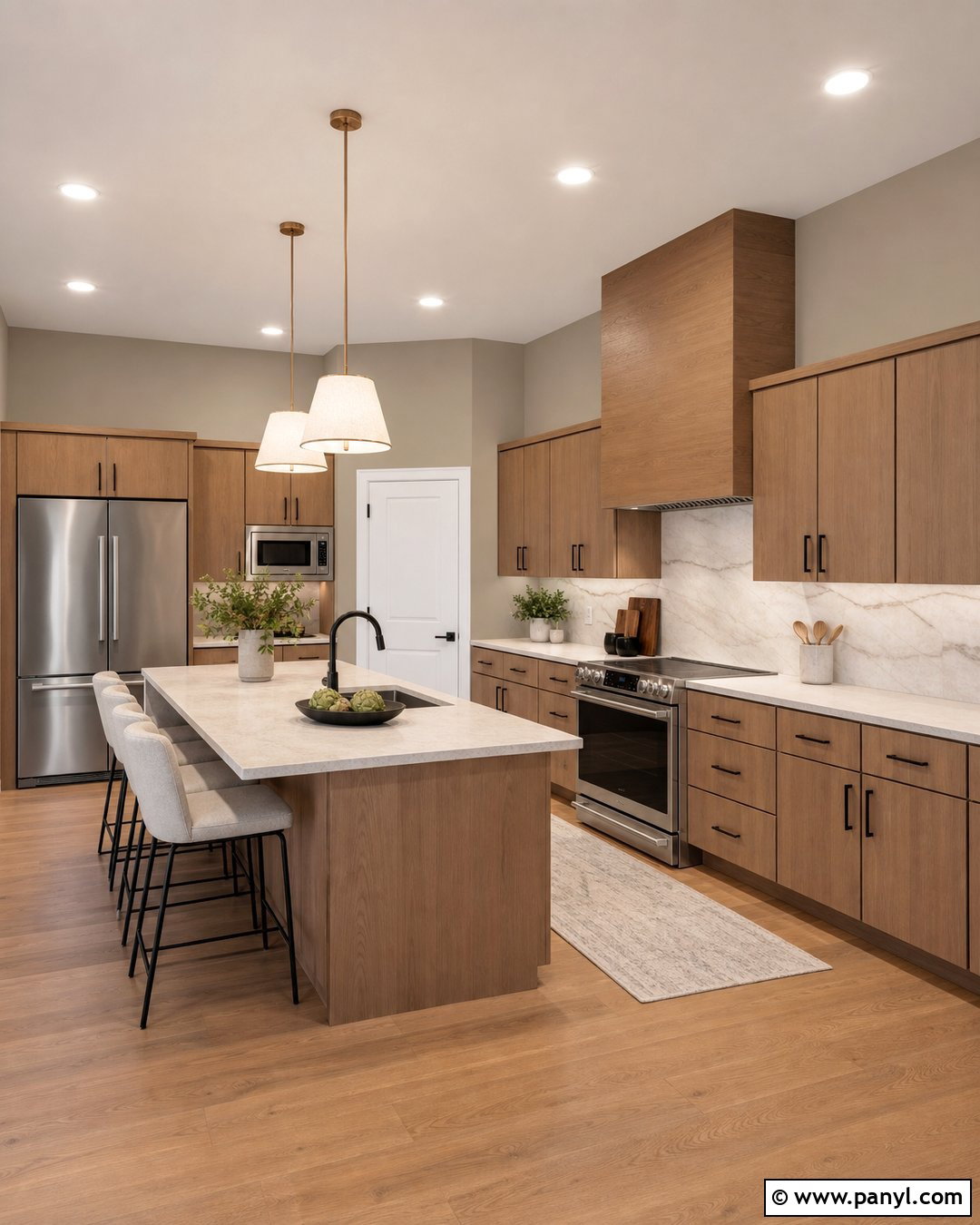
Universal Khaki SW 6150 creates an earthy, grounded kitchen that feels current without looking overly trendy. As Sherwin-Williams’ 2026 Color of the Year, this midtone neutral works especially well with natural finishes and warm white accents. () Use it on the walls around flat-panel white oak cabinets, then add creamy quartz countertops and a softly veined stone backsplash. Dark bronze hardware gives the palette definition, while ivory pendant lights keep the room bright. Choose medium oak flooring or warm limestone tile to continue the organic look. A few muted green accessories can introduce contrast without interrupting the calm palette. This combination is ideal for transitional, organic modern, and updated traditional kitchens with generous natural light.
2. Alabaster Kitchen Walls
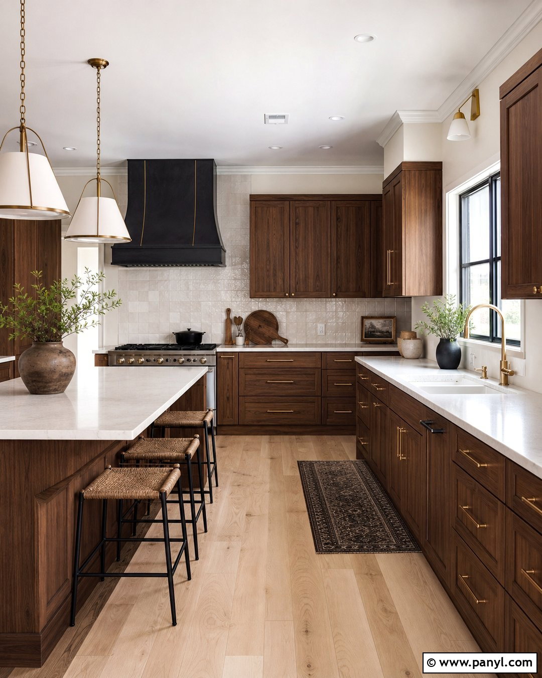
Alabaster SW 7008 is a warm, soft white that makes a kitchen feel comfortable rather than stark. Pair Alabaster walls with medium walnut cabinets to highlight the wood grain while keeping the room open and fresh. Cream quartz countertops, handmade ivory backsplash tile, and brushed brass hardware continue the gentle warmth. For flooring, use pale oak planks or light beige porcelain tile with minimal pattern. A black range hood or dark bronze faucet can provide just enough contrast to define the design. If the cabinets are also white, select a slightly cleaner trim color so the walls retain their subtle depth. This complete palette works beautifully in farmhouse, transitional, Mediterranean, and casually traditional kitchens.
3. Pure White Kitchen Walls
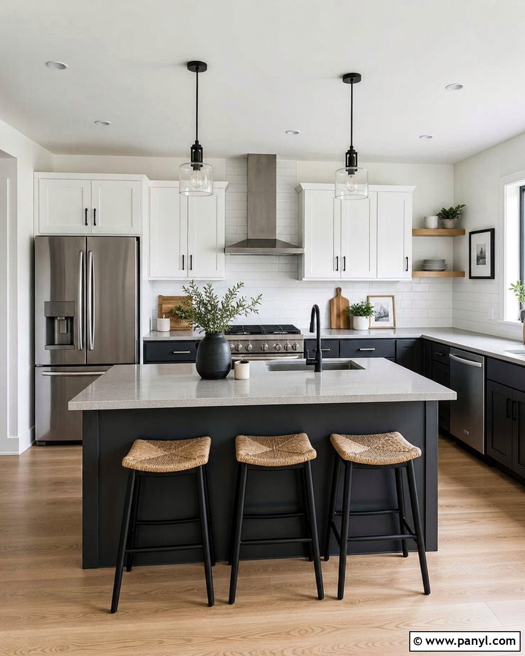
Pure White SW 7005 gives a kitchen a clean background without the harsh appearance of an extremely bright white. It works particularly well in contemporary rooms with charcoal lower cabinets, white upper cabinets, and streamlined stainless steel appliances. Continue the crisp look with pale gray quartz counters and a simple white subway tile backsplash. Matte black hardware and narrow black-framed pendant lights will connect the darker cabinets to the rest of the room. Light maple flooring keeps the contrast from feeling severe, while woven counter stools add natural texture. Pure White also suits kitchens with limited wall space because it helps cabinetry and architectural details stand out. The final design feels bright, practical, and polished.
4. Snowbound Kitchen Walls
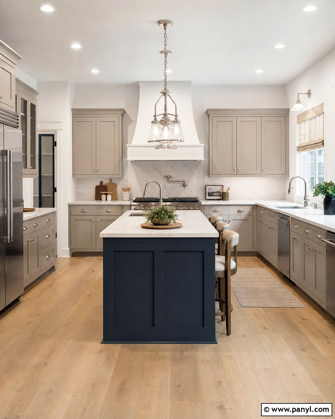
Snowbound SW 7004 offers a gently shaded white that can soften an all-white kitchen. Cover the walls and ceiling in Snowbound, then use light greige shaker cabinets to create quiet contrast. A marble-look quartz backsplash and countertop will add movement without introducing competing colors. Select polished nickel hardware for a classic finish, or choose brushed brass for a warmer interpretation. White oak flooring, oatmeal Roman shades, and woven seats prevent the room from looking flat. For the island, dusty navy paint can create a strong but familiar focal point. Sherwin-Williams has shown Snowbound across kitchen walls, cabinets, and ceilings with a blue island, demonstrating how easily it supports a layered palette. ()
5. Shoji White Kitchen Walls
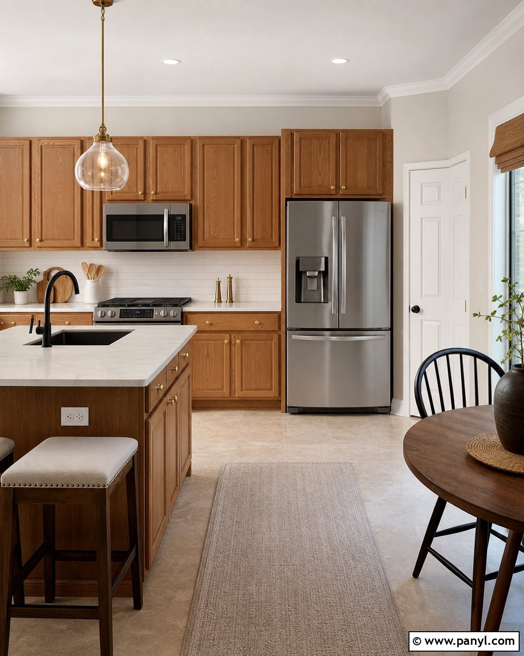
Shoji White SW 7042 is a light greige-white that can calm the orange or golden tones found in honey oak cabinetry. Paint the walls Shoji White and retain the natural cabinets for a cost-conscious kitchen update. Add an off-white quartz counter, warm white subway tile, and aged brass knobs to make the wood feel intentional. A medium taupe runner and simple cream window shade will connect the wall color to the floor. If possible, replace cool blue bulbs with neutral white lighting so the palette stays balanced after sunset. Darker accents, such as a bronze faucet and black counter stools, provide structure. The completed kitchen feels lighter and more cohesive without hiding the character of the original wood.
6. Accessible Beige Kitchen Walls
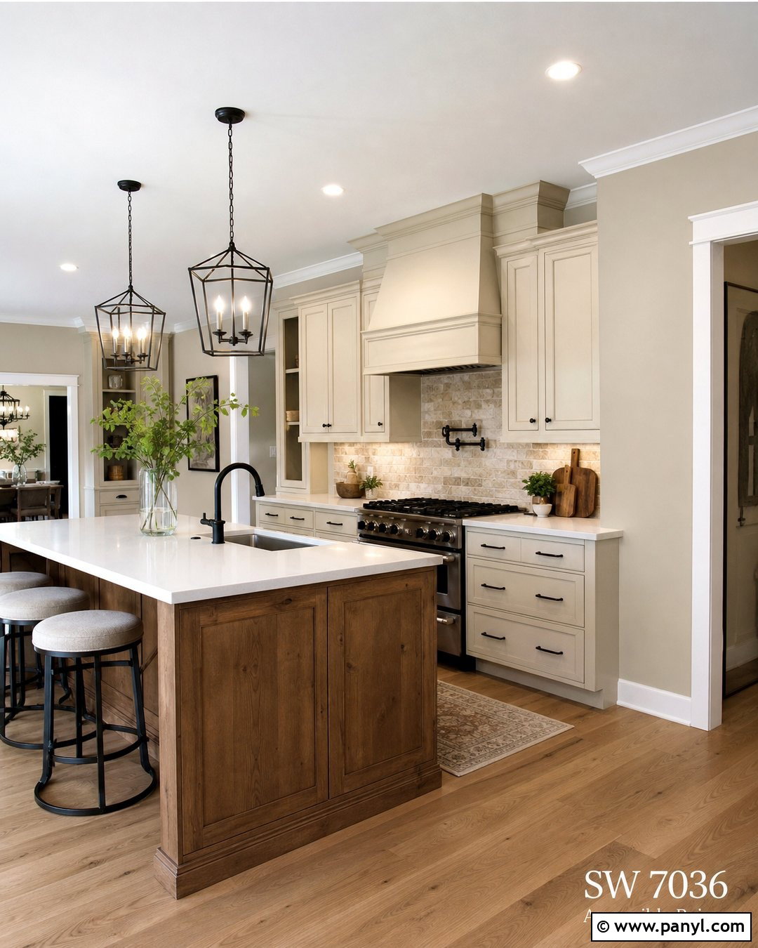
Accessible Beige SW 7036 creates a versatile bridge between beige cabinetry, white finishes, and warm wood. It is especially useful when a kitchen contains several fixed materials that need to look more connected. Pair the walls with cream-painted cabinets, white quartz counters, and a natural stone backsplash containing tan and gray variation. Medium oak flooring will reinforce the warmth, while black hardware and iron pendant lights sharpen the softer palette. Use a stained wood island if the room needs another layer of texture. Accessible Beige can also help visually soften orange-toned wood cabinets without pushing the design toward a cold gray scheme. () The result is relaxed, balanced, and suitable for open-concept homes.
7. Natural Linen Kitchen Walls
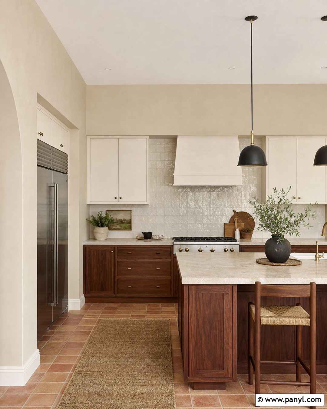
Natural Linen SW 9109 gives kitchen walls a warm woven appearance that complements wood-heavy interiors. Build the room around walnut lower cabinets and creamy white upper cabinets for a collected two-tone design. Add beige quartzite counters, an ivory zellige backsplash, and antique brass hardware to reinforce the warm, tactile character. Terracotta floor tile works beautifully in a Mediterranean kitchen, while medium oak is better for a modern transitional layout. Keep window treatments light and simple so the walls do not become overly yellow in reduced daylight. Natural Linen is also a helpful partner for honey-colored cabinetry because it blends with warmth instead of creating sharp contrast. Finish with matte black lighting for a clean visual anchor.
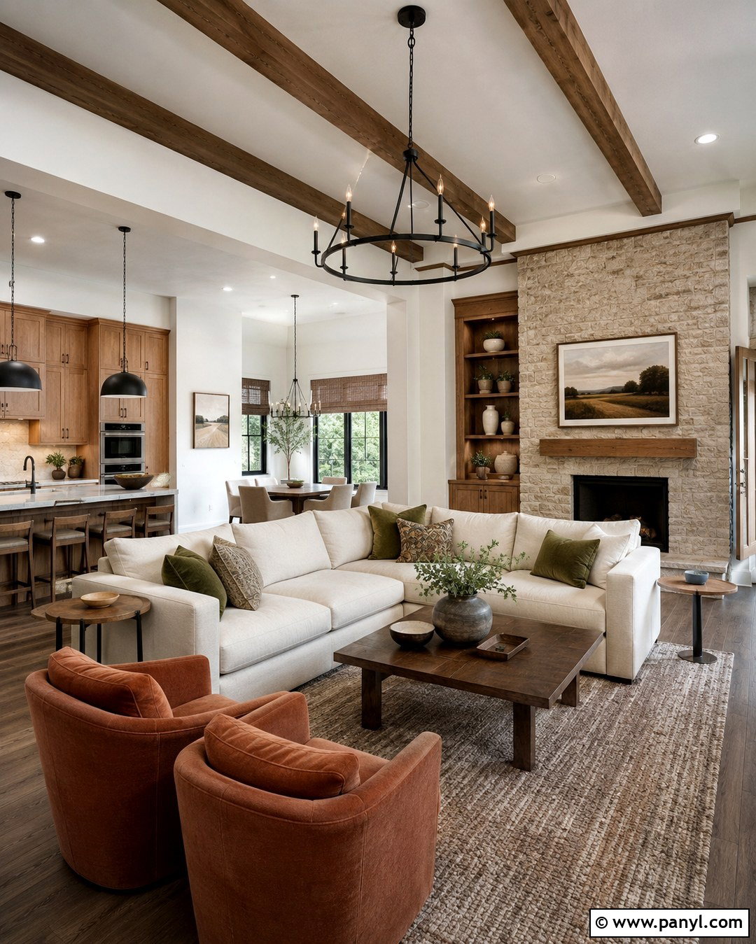
8. Agreeable Gray Kitchen Walls
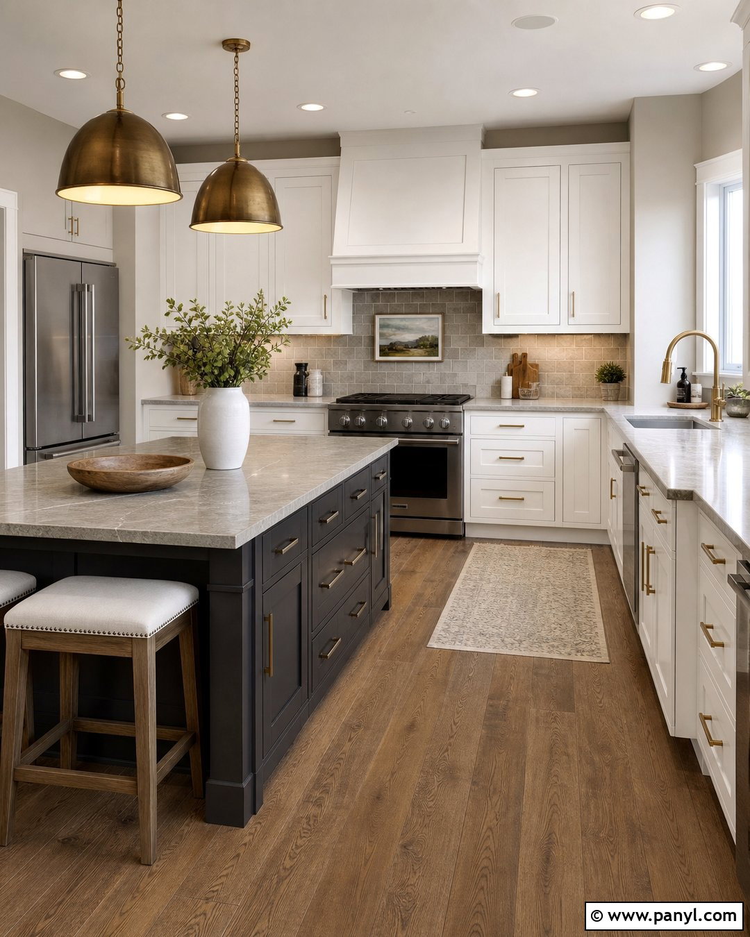
Agreeable Gray SW 7029 provides a balanced greige background for kitchens that mix cool and warm materials. Use it with bright white shaker cabinets, medium brown oak flooring, and quartz countertops that contain soft gray and taupe veining. A pale mushroom-colored backsplash can connect the walls to the counter without making the room monochromatic. Choose satin nickel hardware for a quiet finish or aged brass for added warmth. A charcoal island introduces depth and helps stainless steel appliances feel integrated. Because Agreeable Gray may shift with surrounding colors, test it beside the actual counter and cabinet samples before painting. The finished scheme is understated and flexible, making it practical for transitional kitchens and connected living areas.
9. Repose Gray Kitchen Walls
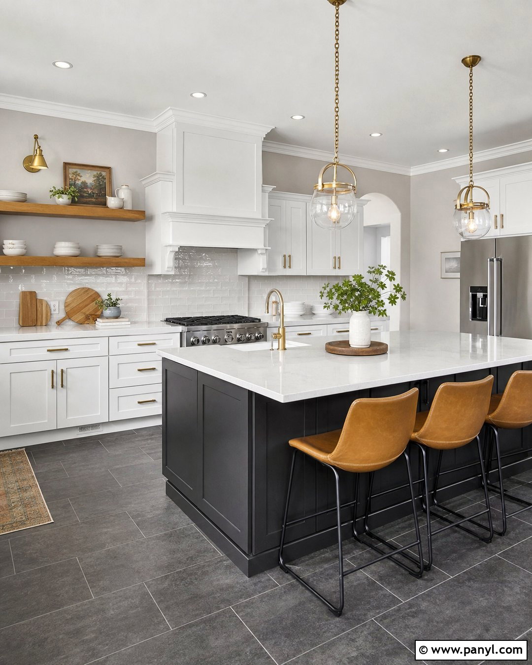
Repose Gray SW 7015 creates a cooler, more tailored kitchen than a traditional beige or cream. It pairs best with clean white cabinets, dark slate flooring, and white quartz counters with restrained gray veining. Bring warmth back through white oak open shelves, camel-colored counter stools, and brushed brass lighting. A glossy white backsplash reflects light and prevents the gray walls from making the room feel heavy. For a stronger focal point, paint the island deep charcoal and repeat the shade on the window frames or pantry door. This scheme is particularly effective in south-facing kitchens where warm daylight can balance the cooler paint. The complete room feels modern, organized, and crisp without becoming sterile.
10. Drift Of Mist Kitchen Walls
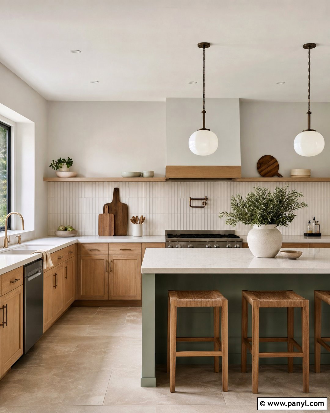
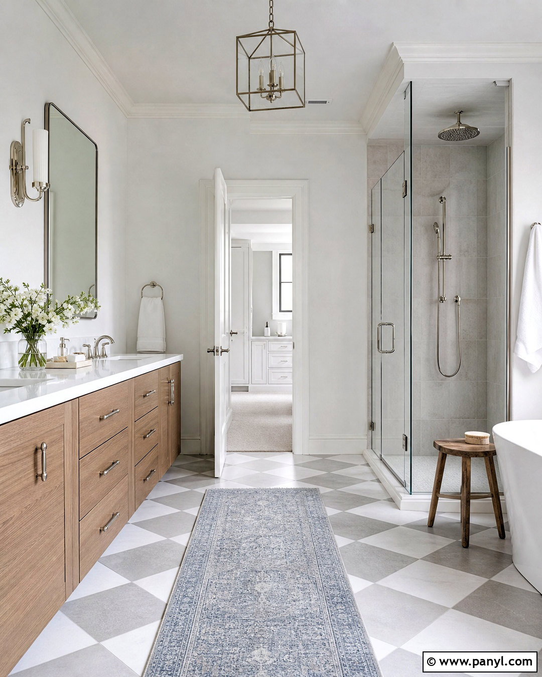
Drift of Mist SW 9166 is a pale neutral that sits quietly between warm white and light gray. It suits small kitchens where a pure white might look too sharp but a deeper greige could reduce brightness. Combine the walls with rift-sawn white oak cabinets, creamy quartz counters, and vertical off-white backsplash tile. Soft bronze hardware adds warmth, while pale limestone flooring gives the design an organic foundation. Keep the window coverings minimal and choose rounded milk-glass pendants for gentle contrast. A muted sage island can add color while preserving the room’s airy quality. Drift of Mist is included in Sherwin-Williams’ kitchen color inspiration, making it a practical starting point for a light, flexible palette. ()
11. Sea Salt Kitchen Walls
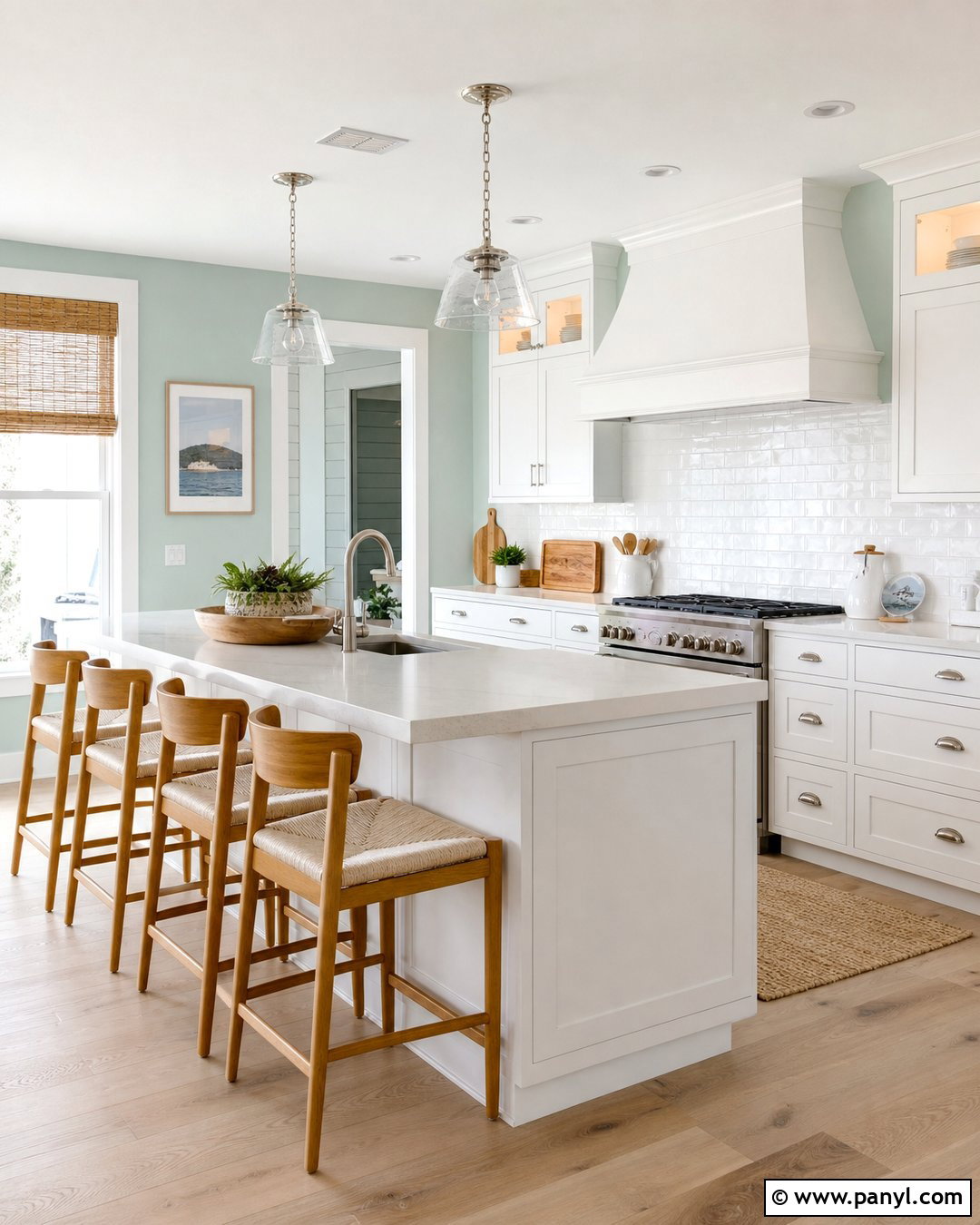
Sea Salt SW 6204 brings a soft blue-green quality to the kitchen, creating a fresh atmosphere without demanding attention. Pair it with creamy white cabinets rather than stark white ones, then introduce pale oak flooring and lightly veined quartz counters. A glossy white handmade backsplash reflects the changing color of the walls throughout the day. Brushed nickel hardware supports the cooler side of Sea Salt, while unlacquered brass creates a warmer coastal interpretation. Use natural woven shades, light wood counter stools, and simple ceramic accessories to complete the relaxed look. This color is especially effective in kitchens with abundant sunlight and views of outdoor greenery. The full palette feels breezy, comfortable, and appropriate for coastal or cottage homes.
12. Rainwashed Kitchen Walls
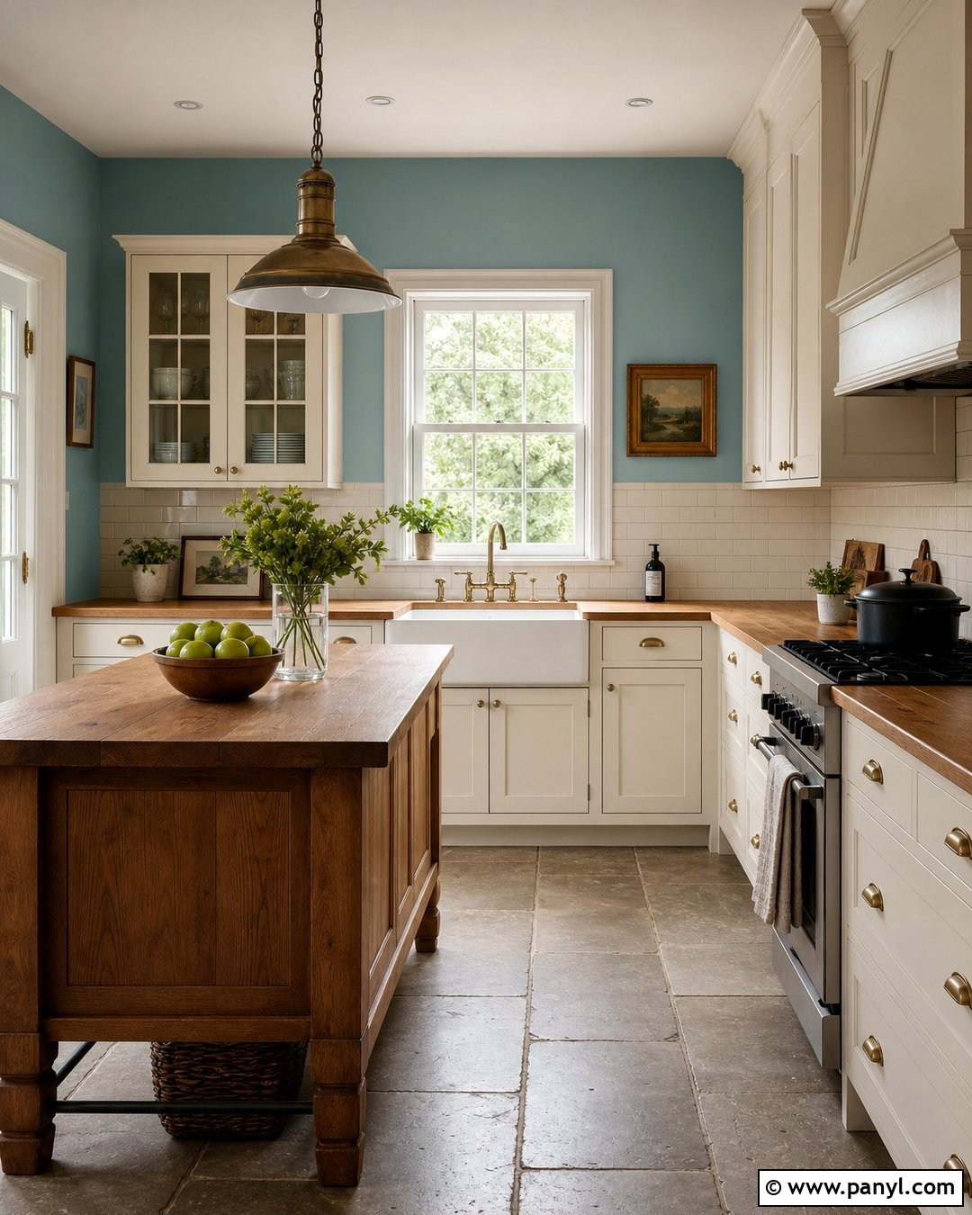
Rainwashed SW 6211 gives kitchen walls a more noticeable blue-green presence than a barely tinted neutral. Use it in a cottage kitchen with warm white inset cabinets, butcher-block counters, and a classic white apron-front sink. Pale gray stone tile underfoot will balance the wood, while aged brass latches and bridge-style faucets add traditional detail. Paint the interior of open shelving the same Rainwashed color so the design feels deliberate rather than randomly colorful. A creamy subway tile backsplash keeps the work areas easy to clean and visually quiet. For contrast, include a stained oak island with simple spindle-back stools. The completed space feels cheerful and refreshing but still grounded in familiar materials and practical finishes.
13. Evergreen Fog Kitchen Walls
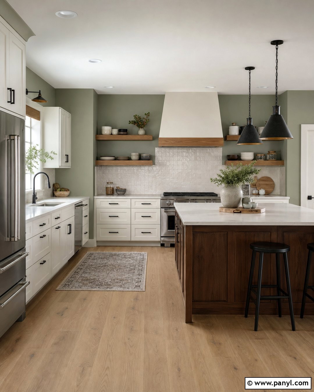
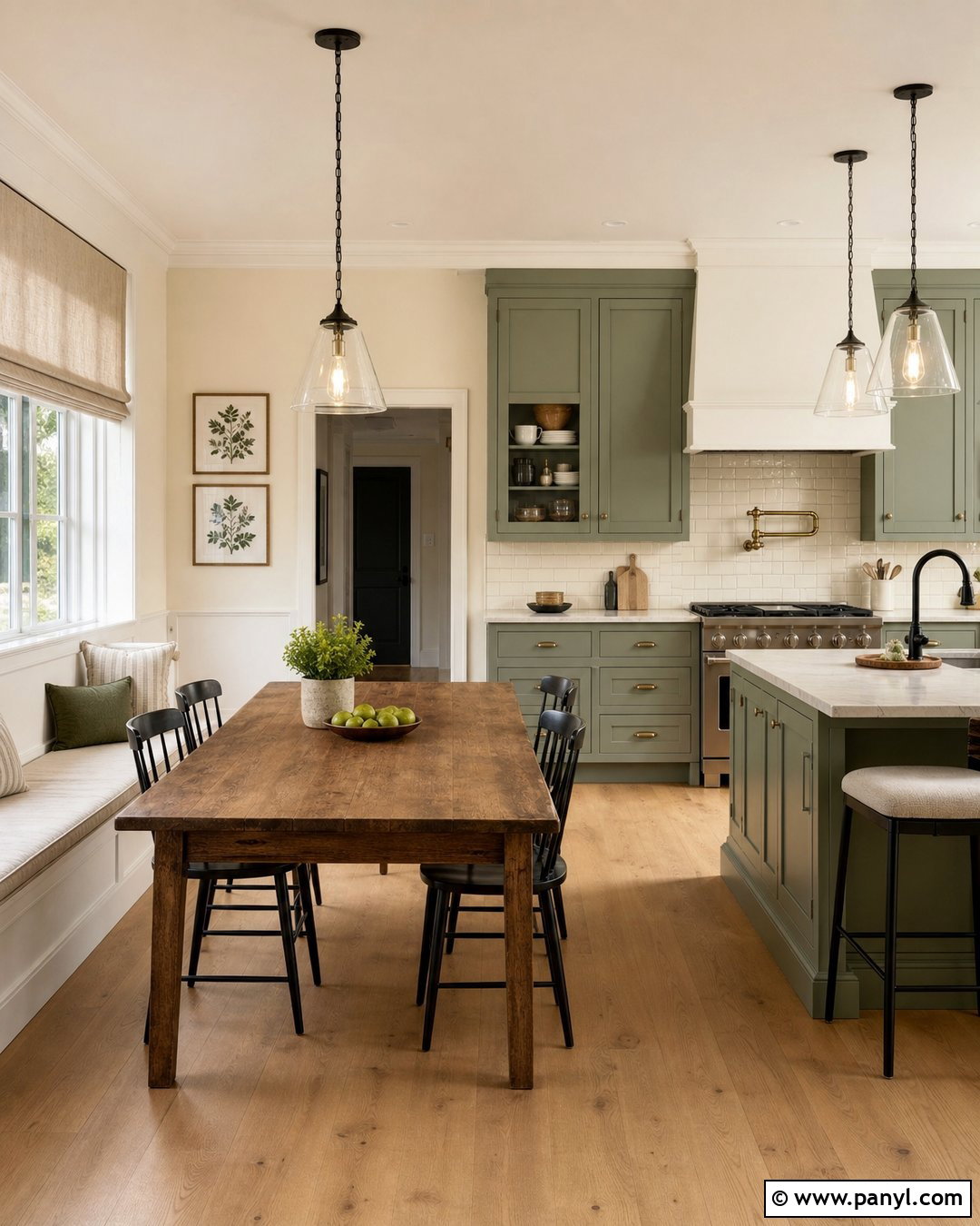
Evergreen Fog SW 9130 is a muted green-gray that can make a kitchen feel connected to nature. Paint the walls this soothing color and use warm white cabinets with simple shaker fronts. White oak shelves, a honed cream countertop, and lightly textured ivory backsplash tile will keep the palette organic. Choose aged bronze hardware and black-framed pendant lights to give the room enough definition. Medium oak flooring works well, as does warm gray stone with subtle movement. If the kitchen includes an island, stain it walnut to deepen the natural character without adding another paint color. Evergreen Fog has enough presence for a memorable room, yet its gray influence helps it remain comfortable in open layouts and everyday family kitchens.
14. Clary Sage Kitchen Walls
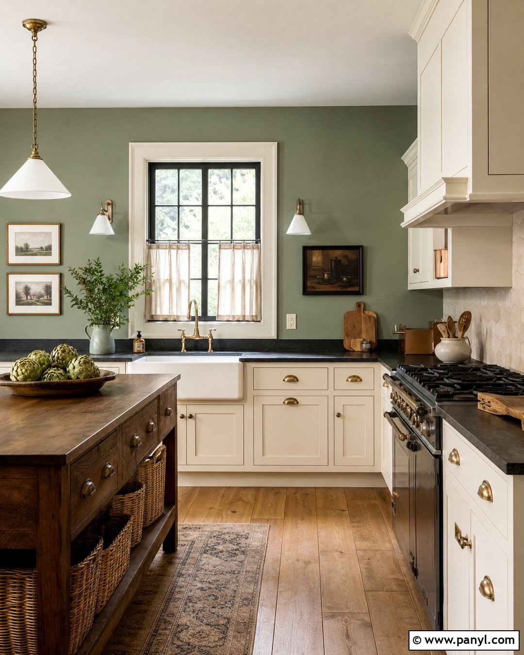
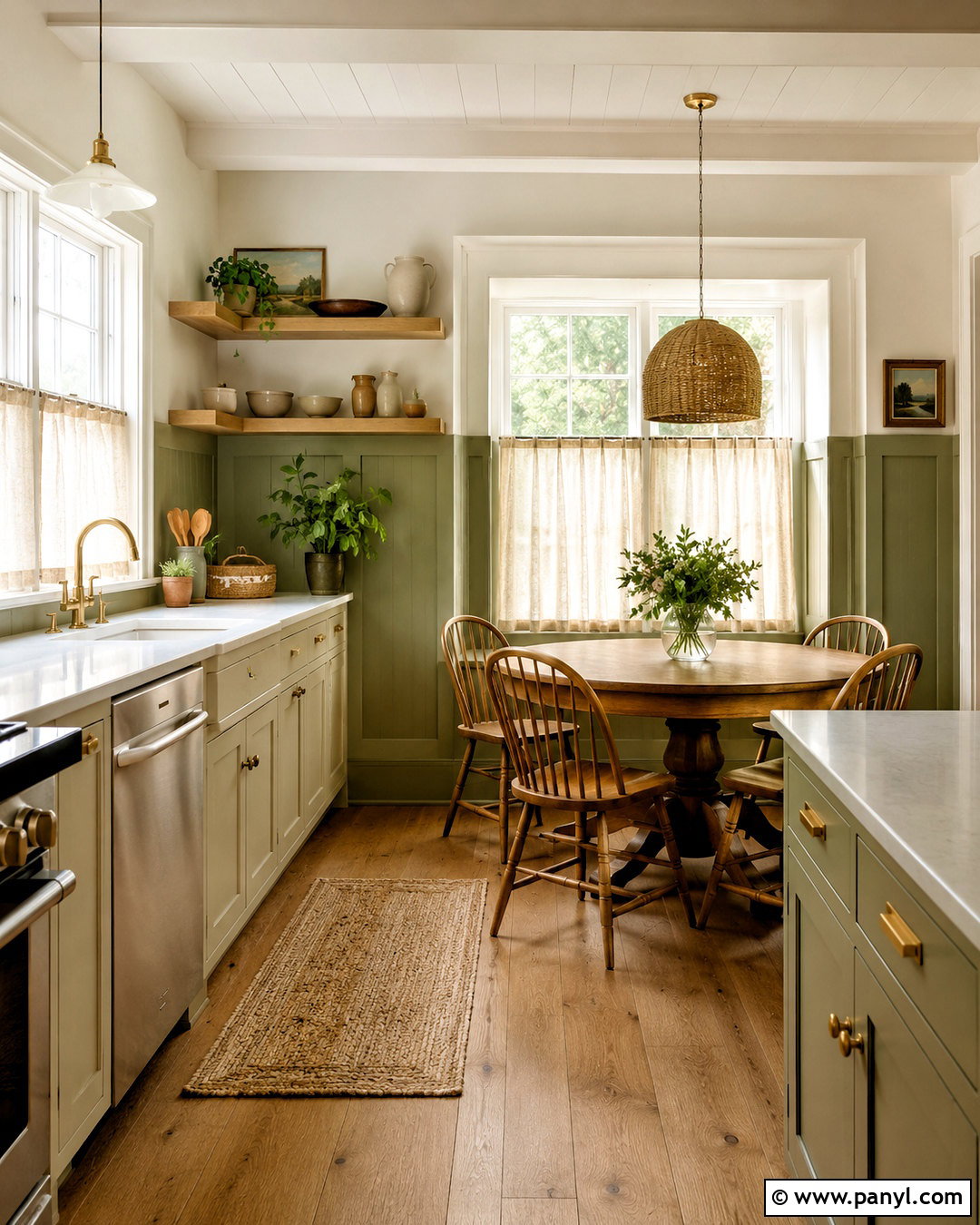
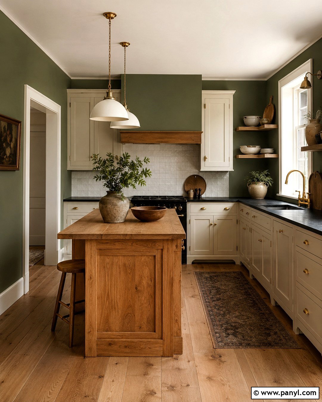
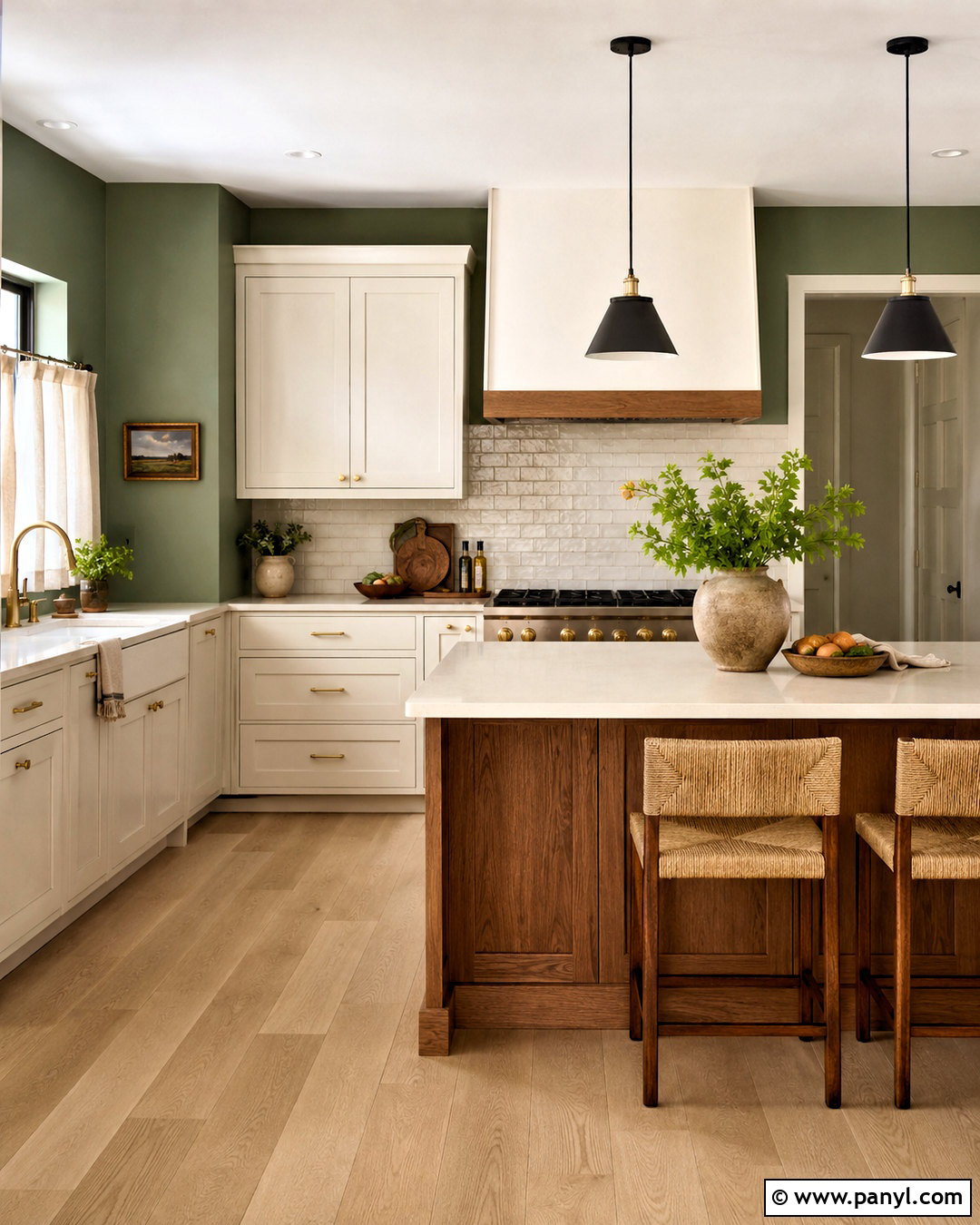
Clary Sage SW 6178 produces a warm, traditional green kitchen with an inviting garden-inspired character. Surround creamy off-white cabinets with Clary Sage walls, then add soapstone-look counters and a backsplash made from softly irregular ivory tile. Antique brass cup pulls, a dark bronze faucet, and warm oak flooring will strengthen the established, collected appearance. Use a walnut table or island instead of another painted feature so the room includes rich natural texture. Linen cafe curtains and simple cream ceramics keep the styling useful and unfussy. This wall color works particularly well in kitchens that receive steady natural light. The complete scheme can suit an English country interior, an updated farmhouse, or a traditional home with original wood details.
15. Pewter Green Kitchen Walls
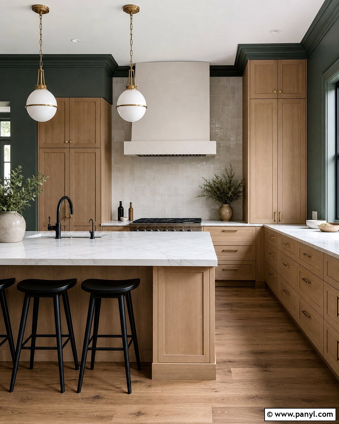
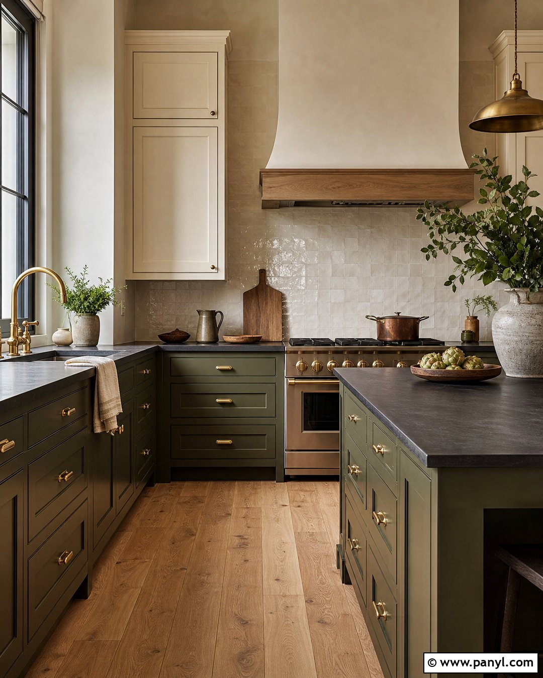
Pewter Green SW 6208 creates dramatic kitchen walls that feel sophisticated when balanced with lighter surfaces. Use it in a room with natural white oak cabinets, creamy marble-look quartz, and a full-height ivory backsplash. The pale cabinetry prevents the deep green from closing in the room, while brass hardware and warm wood flooring highlight its earthy character. Choose large white globe pendants to brighten the island and repeat matte black through the faucet and window frames. In a smaller kitchen, reserve Pewter Green for the dining wall and use a warm white on the remaining surfaces. The final palette is rich and contemporary, offering an alternative to dark charcoal or navy while retaining a similarly strong architectural effect.
16. Upward Kitchen Walls
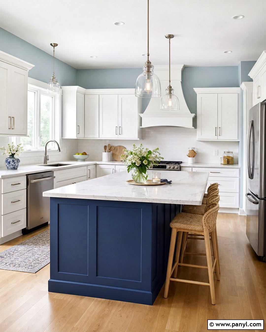
Upward SW 6239 is a gentle blue that can make a busy kitchen feel lighter and more relaxed. Pair it with crisp white cabinets, polished nickel hardware, and pale marble-look quartz for a clean transitional design. Add a backsplash of elongated white tile with light gray grout to introduce subtle rhythm. Natural maple flooring and woven counter stools keep the cool blue walls from feeling chilly. A medium navy island can provide depth, but leave the upper cabinetry white so the room remains visually open. Use simple glass pendants that do not block views across the kitchen. This completed palette works particularly well in compact spaces, breakfast areas, and homes where the kitchen connects directly to a light-filled living room.
17. Stardew Kitchen Walls
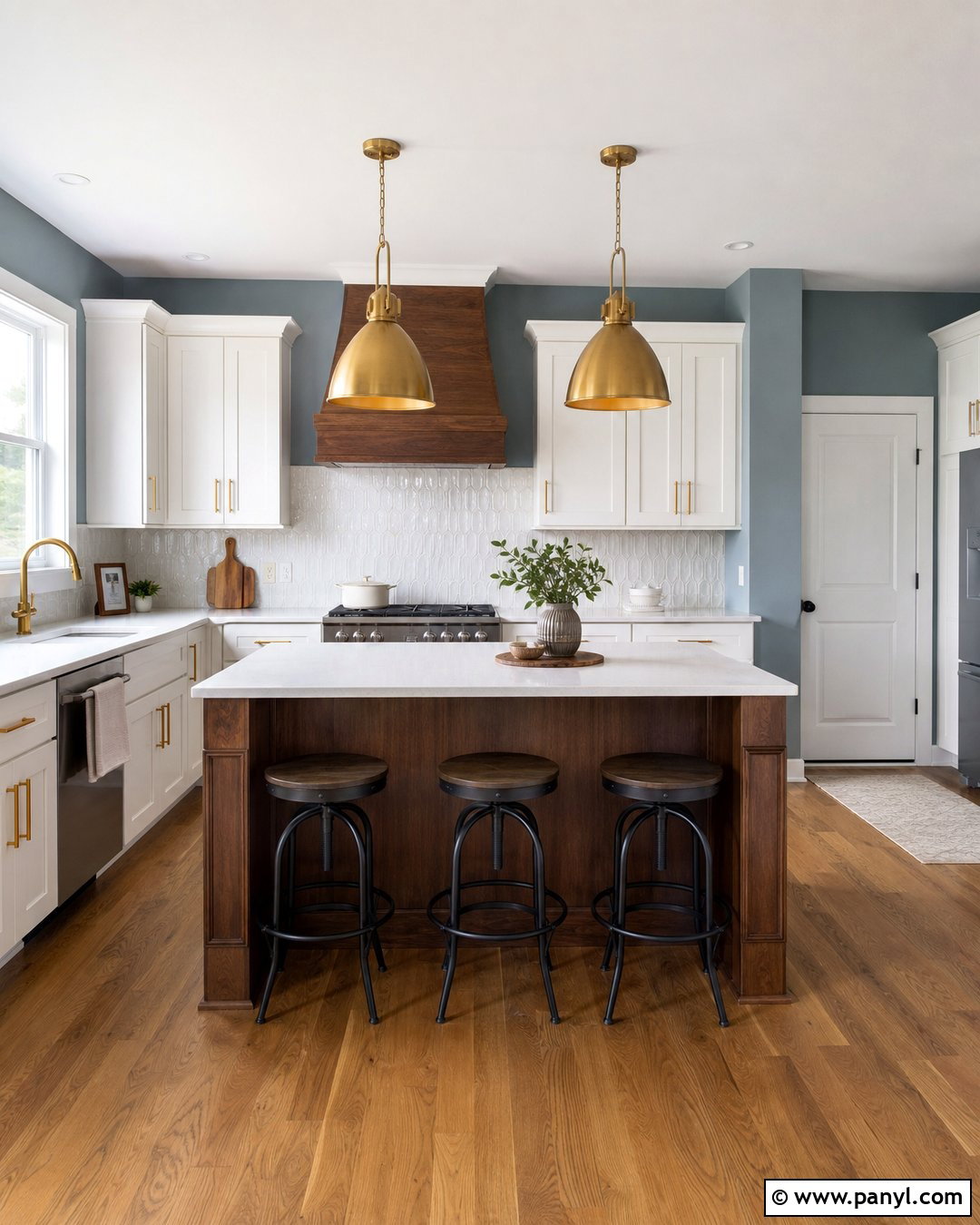
Stardew SW 9138 offers a dusty blue-gray tone that gives kitchen walls more depth than a pale sky blue. Build a calm modern farmhouse palette with Stardew walls, warm white cabinets, and medium-toned oak flooring. Use creamy quartz counters and a white backsplash with handcrafted variation to soften the cooler paint. A stained walnut island can become the visual center, especially when paired with brushed brass pendants and matching cabinet pulls. Keep textiles in oatmeal, ivory, and faded blue so the room feels connected but not overly coordinated. Stardew works best when repeated in small details, such as pantry doors or patterned seat cushions. The resulting kitchen feels composed, comfortable, and subtly colorful throughout the changing daylight.
18. Naval Kitchen Walls
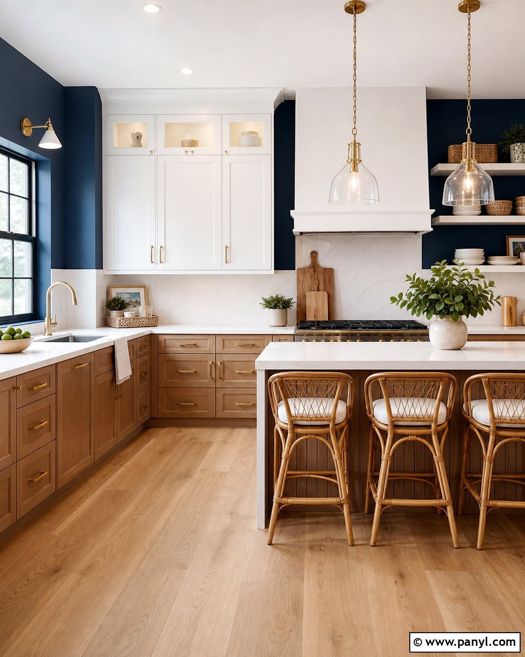
Naval SW 6244 creates a bold, enveloping kitchen when it is supported by reflective finishes and warm natural materials. Paint the main walls Naval and use bright white upper cabinets to preserve openness. White oak lower cabinets, pale quartz countertops, and a full-height white backsplash will break up the deep blue. Bring in unlacquered brass hardware, oversized glass pendants, and a warm oak floor for contrast. In a narrow kitchen, apply Naval to the dining end or the wall around open shelving rather than every surface. Repeating the color on a pantry door will make the placement feel intentional. This finished scheme suits coastal, traditional, and tailored contemporary interiors that receive reliable natural or layered artificial light.
19. Redend Point Kitchen Walls
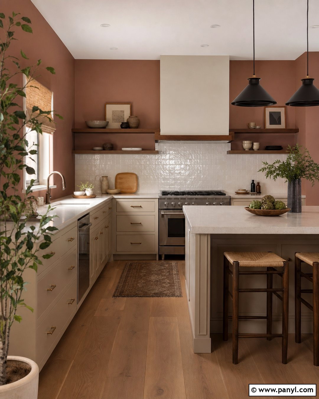
Redend Point SW 9081 brings a muted clay and blush tone to kitchens that need warmth beyond standard beige. Pair the walls with creamy mushroom cabinets, ivory quartz counters, and a backsplash of handmade off-white tile. Use walnut shelving and medium oak flooring to create depth within the earth-toned palette. Aged brass hardware will emphasize the warmth, while dark bronze pendants and a black faucet prevent the design from becoming too soft. Add woven shades and restrained terracotta accessories instead of introducing bright accent colors. Redend Point works well in southwest-inspired, Mediterranean, and organic modern kitchens. With the right supporting materials, the room feels warm and distinctive while remaining practical enough for an everyday family setting.
20. Lemon Chiffon Kitchen Walls
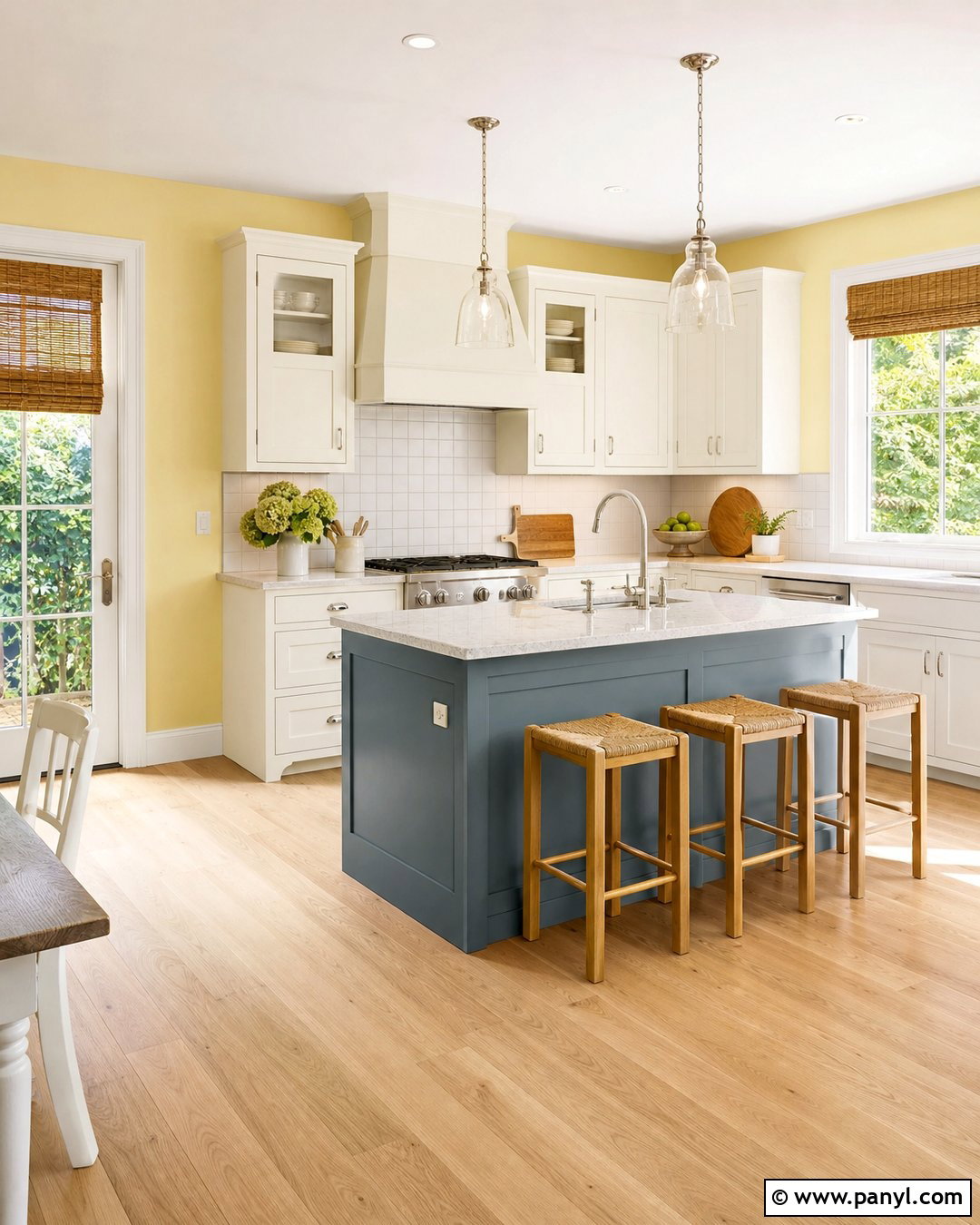
Lemon Chiffon SW 6686 creates a sunny kitchen without relying on an intense primary yellow. Use it with warm white cabinets, pale maple floors, and creamy quartz counters for a bright, welcoming foundation. A simple white square-tile backsplash will keep the room clean and familiar, while brushed nickel hardware offers a fresh counterpoint to the warm walls. Add a muted blue island or blue-gray breakfast bench for balanced contrast. Natural woven shades and light oak stools reinforce the casual atmosphere. Sherwin-Williams includes Lemon Chiffon in its 2026 coordinating palette and specifically identifies kitchens as spaces that can benefit from its cheerful character. () This complete look works especially well in breakfast kitchens, cottages, and north-facing rooms.
Conclusion:
The most successful 20 Sherwin Williams Kitchen Wall Colors do more than provide a decorative background. They connect cabinets, counters, flooring, lighting, and hardware into one complete kitchen design. Warm whites such as Alabaster and Shoji White create softness, while Accessible Beige and Universal Khaki support natural materials. Sea Salt, Evergreen Fog, and Upward introduce calm color. Naval, Pewter Green, and Redend Point offer greater depth and personality. Before making a final choice, paint large sample areas beside every permanent finish and observe them at different times of day. With careful testing and a coordinated palette, any of these 20 Sherwin Williams Kitchen Wall Colors can produce a polished, comfortable room.

Related Ideas and Inspiration:
Leave a Reply