
Sherwin-Williams Accessible Beige SW 7036 is a warm, flexible greige that can support far more than an all-neutral room. Its balanced beige-gray character works with creamy whites, earthy greens, muted blues, rich browns, and grounded charcoal accents. The color has an LRV of about 58 and is approved for interior and exterior use, making it practical across connected rooms and façades. () The key is creating enough contrast through paint, furniture, natural materials, and texture. Always sample the palette beside your permanent flooring, countertops, cabinets, and trim because changing daylight can shift how every color appears. From calming bedrooms to bold kitchens and welcoming exteriors, the 20 sw accessible beige color scheme ideas below offer complete looks you can recreate.

1. Accessible Beige And Pure White Living Room
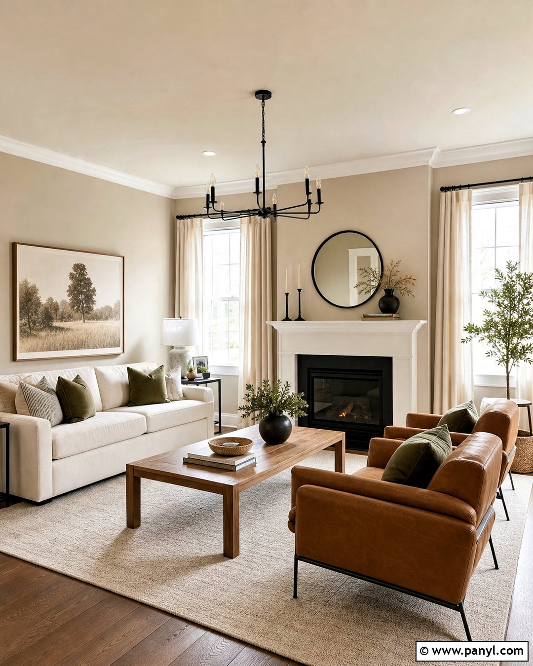
Create a bright, balanced living room with Accessible Beige walls and Pure White trim, doors, and ceiling. Pure White provides noticeable definition without making the warm wall color appear muddy. Place a soft ivory sofa against the beige backdrop, then introduce medium oak through a coffee table, side tables, and picture frames. A large cream-and-taupe rug connects the furniture while keeping the floor light. Add matte black curtain rods, lamps, and a slim fireplace screen for crisp contrast. Finish the room with oatmeal linen curtains, camel leather chairs, and muted olive pillows. This complete palette feels welcoming and contemporary because light neutrals dominate, while wood, black metal, and earthy textiles create depth.
2. Accessible Beige And Alabaster Bedroom
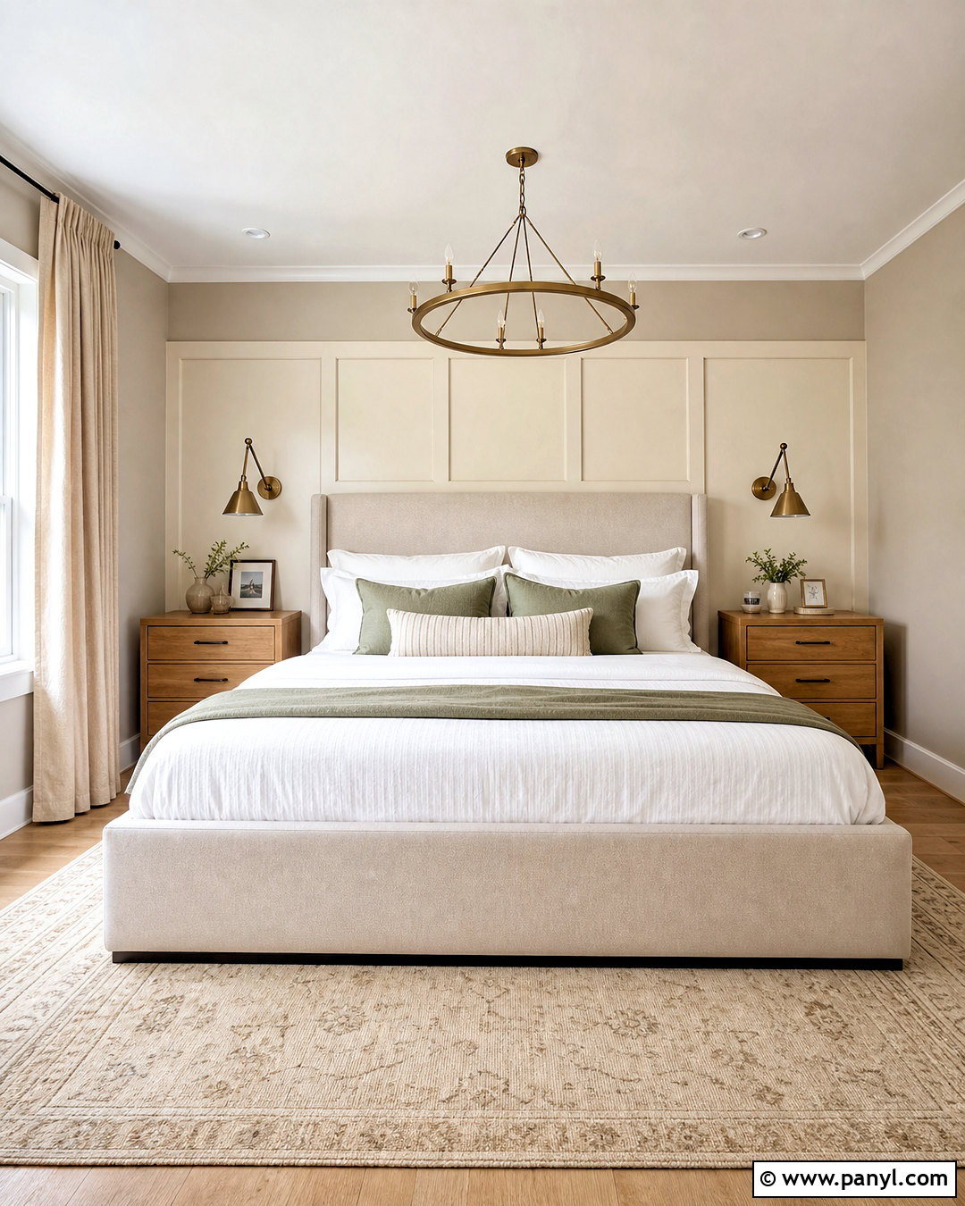
Imagine waking up in a bedroom that feels warm, quiet, and naturally bright. Paint the walls Accessible Beige and use Alabaster on the ceiling, baseboards, window trim, and paneled headboard wall. The creamy white softens transitions rather than creating severe contrast. Choose an upholstered oatmeal bed, light oak nightstands, and layered white, sand, and mushroom bedding. A warm ivory rug should extend beyond the bed to make the entire arrangement feel grounded. Add antique brass sconces and simple ceramic lamps for gentle warmth. Sage green pillows and one leafy plant provide a controlled touch of color. Natural linen curtains complete this relaxed bedroom scheme and complement the cozy gray undertones associated with Accessible Beige. ()
3. Accessible Beige And Shoji White Dining Room
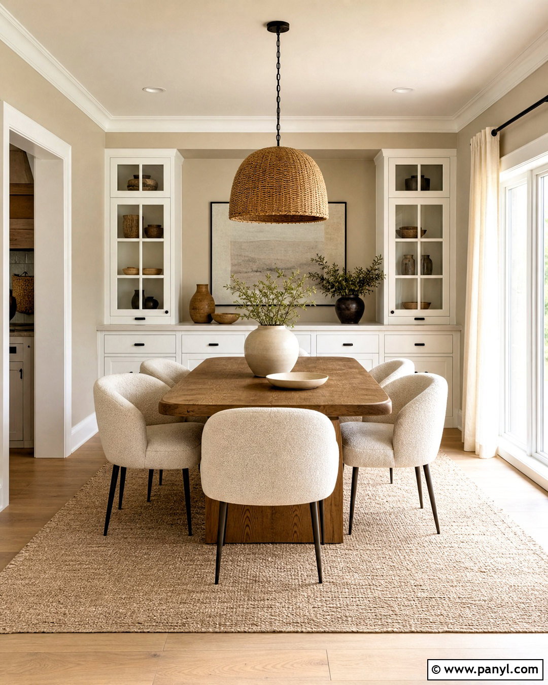
For a soft tonal dining room, combine Accessible Beige walls with Shoji White trim, ceiling paint, and built-in cabinetry. These related neutrals create a subtle layered effect that suits rooms where sharp white feels too stark. Shoji White is often used as a lighter companion for Accessible Beige, making it useful for gentle monochromatic palettes. () Center the room with a medium-tone oak dining table and curved cream chairs. Hang a wide woven pendant above the table to reinforce the natural color story. Use a pale taupe rug, off-white linen curtains, and handmade beige ceramics. Small matte black accents, such as curtain rods and cabinet knobs, prevent the scheme from becoming flat. Green branches in a stone vase add a fresh final layer.
4. Accessible Beige And Naval Home Office
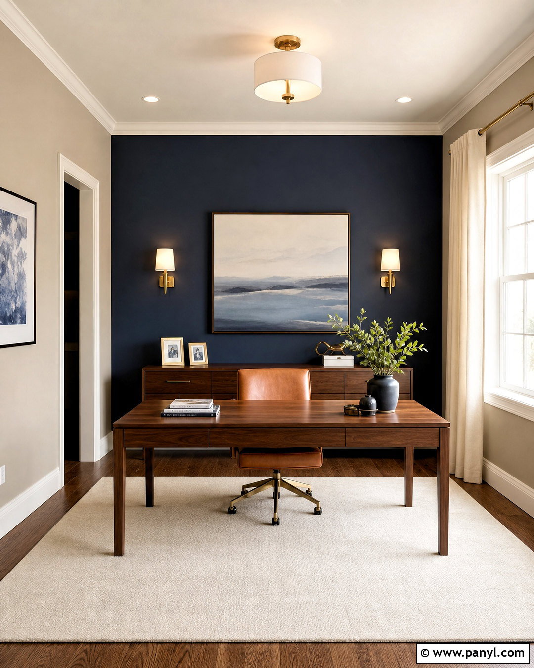
Would a deeper background help your home office feel more focused? Keep three walls in Accessible Beige and paint the desk wall Naval, a rich navy blue that creates a confident focal point. Add warm white trim to frame both colors and maintain a clean transition. Place a walnut desk against the navy wall with a cognac leather chair and a cream wool rug beneath it. Brass sconces and cabinet hardware will glow against the dark paint without looking overly formal. Use Accessible Beige again on freestanding storage or a nearby reading nook to maintain continuity. Finish with ivory curtains, blue-gray artwork, and a few natural wood accessories. Navy and beige form a classic high-contrast pairing that still feels comfortable and suitable for daily work. ()
5. Accessible Beige And Sea Salt Bathroom
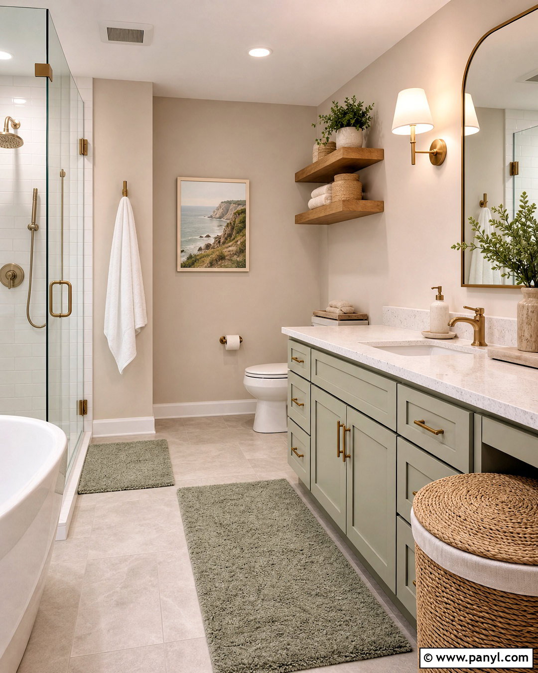
Bring a fresh, spa-like mood into the bathroom by pairing Accessible Beige with Sea Salt, a soft gray-green. Use Accessible Beige on the upper walls and Sea Salt on a painted vanity or the wall surrounding the bathtub. White quartz counters, creamy subway tile, and warm white trim keep the combination airy. Choose brushed nickel fixtures for a quiet finish, or use brushed brass when you want more warmth. Light oak floating shelves and a woven hamper introduce natural texture without overwhelming a smaller space. Add white towels, pale sage bath mats, and simple glass accessories. Sea Salt helps the beige background feel fresher, while Accessible Beige prevents the green from becoming cold. This combination can suit coastal, transitional, or relaxed farmhouse interiors. ()
6. Accessible Beige And Urbane Bronze Entryway
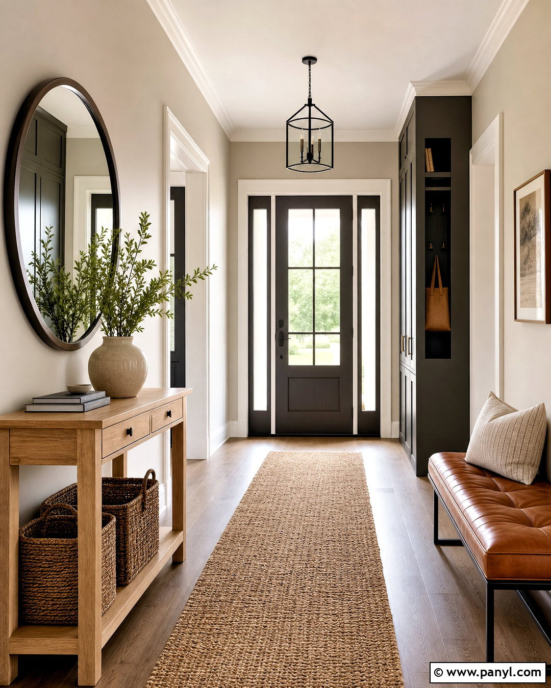
Give an ordinary entryway a stronger architectural presence with Accessible Beige walls and Urbane Bronze doors, railings, or built-in storage. The deep brown-gray accent grounds the lighter greige and disguises everyday scuffs in hardworking areas. Paint the ceiling and trim a warm white so the entrance stays open and inviting. Place a narrow oak console against one wall with a rounded mirror in a dark bronze frame. A natural jute runner, woven baskets, and a cognac leather bench reinforce the earthy palette. Add a small ceramic lamp and a bowl for keys rather than filling the console with decorations. Urbane Bronze is especially effective beside Accessible Beige when the room also includes organic wood, stone, and fiber textures. The finished entry feels practical, polished, and cohesive.
7. Accessible Beige And Terracotta Family Room
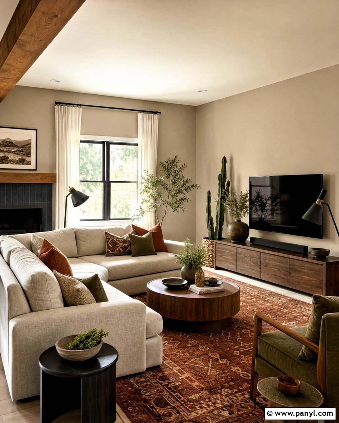
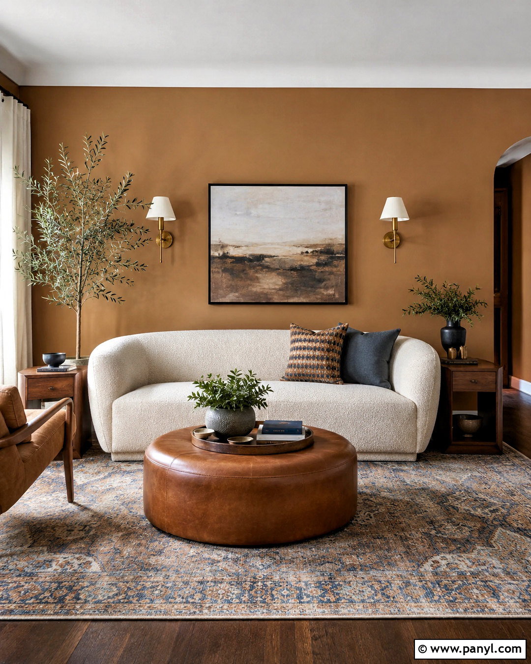
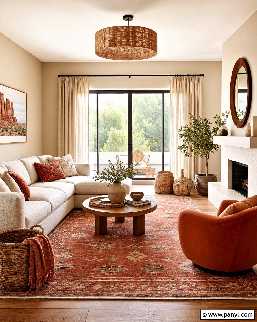
A family room should feel comfortable enough for everyday use but still look intentionally designed. Start with Accessible Beige walls, warm white trim, and a large oatmeal sectional. Introduce terracotta through pillows, a patterned rug, pottery, and one upholstered accent chair rather than covering an entire wall. Choose a medium walnut media console and a round wood coffee table to deepen the palette. Cream curtains and a textured ivory throw soften the stronger rust tones. Add muted olive accessories and leafy plants to balance the warmth with natural green. Black metal lighting supplies a small amount of definition. Accessible Beige works as the quiet foundation, allowing terracotta, wood, and olive to create a layered Southwestern-inspired look without making the family room feel overly themed.
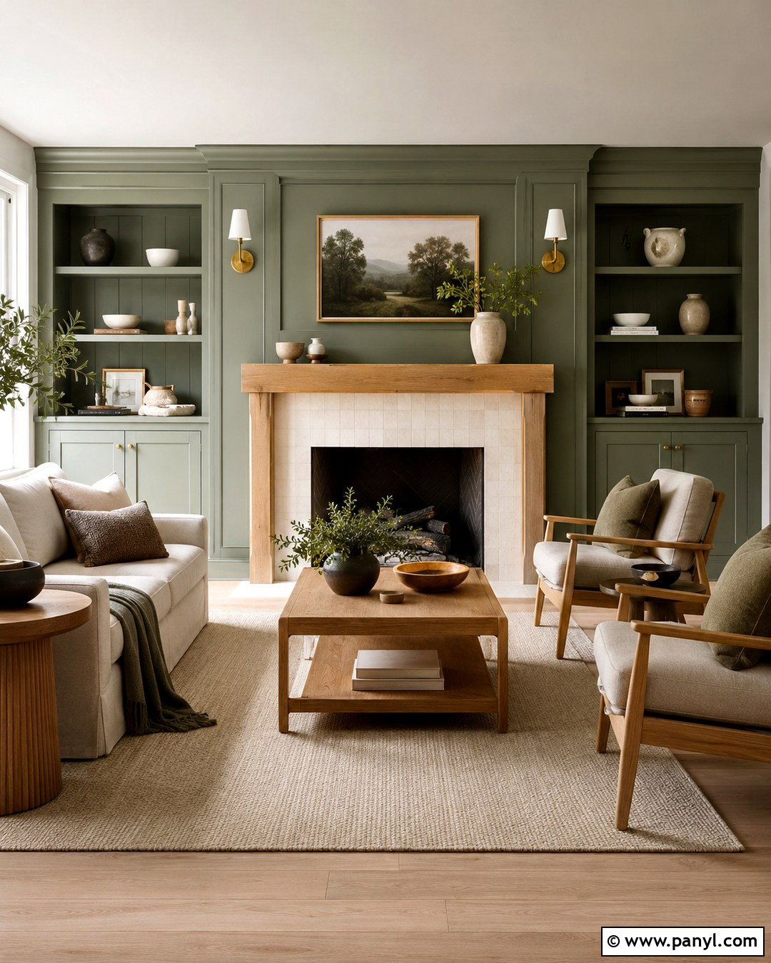
8. Accessible Beige And Cadet Kitchen
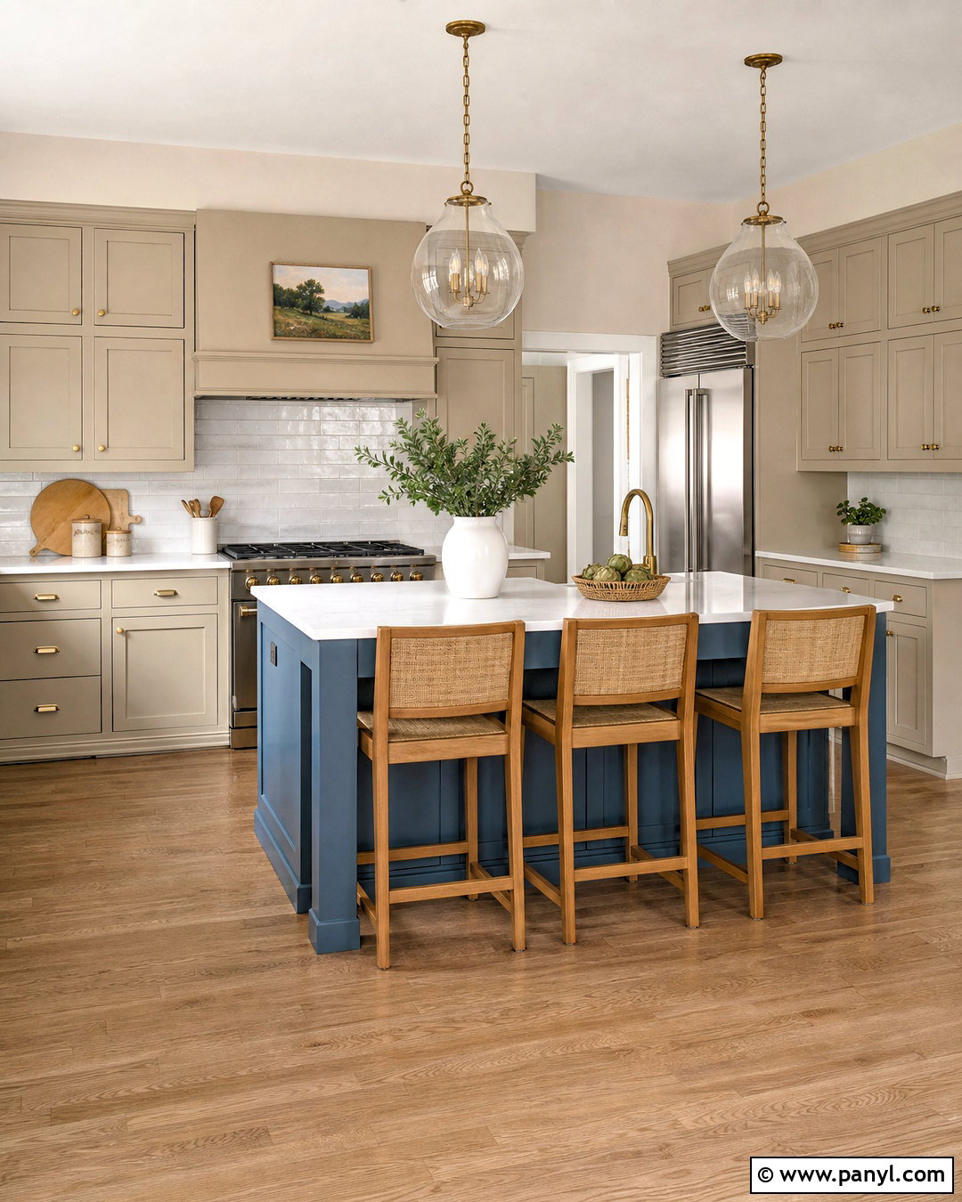
For a kitchen with controlled color, use Accessible Beige on the perimeter cabinets and Cadet, a subdued blue, on the island. Keep the walls and ceiling warm white so the two cabinet colors remain easy to distinguish. White quartz countertops with gentle beige veining will connect the island to the surrounding cabinetry. Add a handmade white tile backsplash, brushed brass hardware, and three simple glass pendants. Medium oak stools bring warmth to the blue island and coordinate with natural wood flooring. Repeat Cadet through small textiles or pottery rather than adding several competing blues. Sherwin-Williams presents Cadet among the coordinating colors for Accessible Beige, supporting a calm contrast between a grounded neutral and muted blue. () The result feels colorful, balanced, and highly livable.
9. Accessible Beige And Dusty Blush Nursery
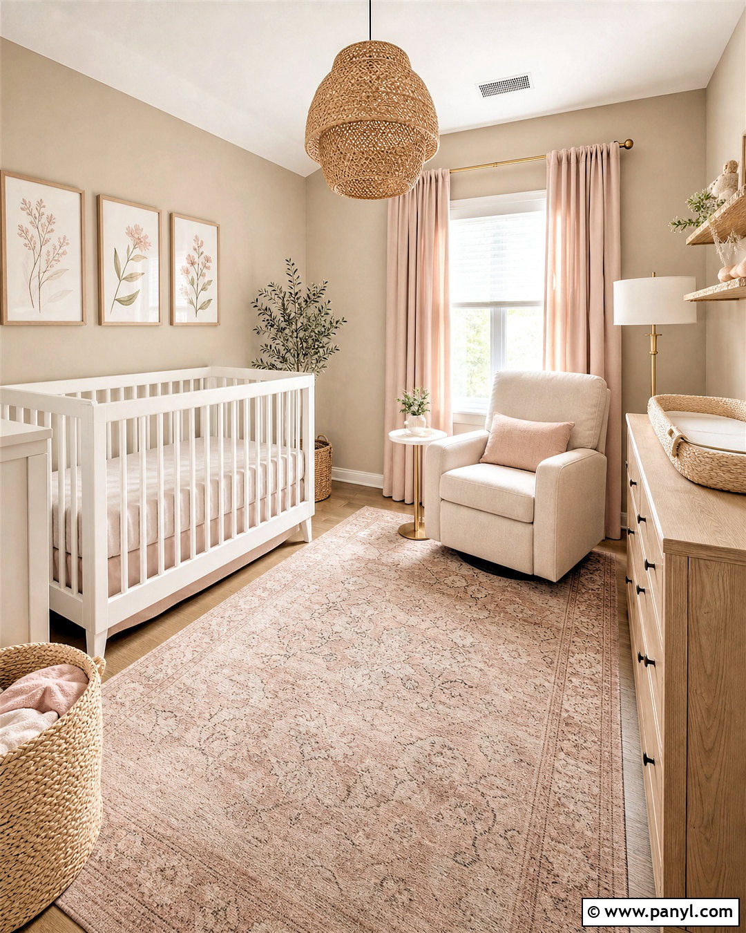
Accessible Beige provides a soothing gender-neutral base for a nursery that can evolve as the child grows. Paint the walls in the warm greige and use creamy white on the ceiling, trim, crib, and bookcase. Bring in dusty blush through blackout curtains, a washable area rug, and a comfortable glider pillow. Choose light oak for the dresser and floating shelves to add natural warmth. A woven ceiling light and lidded baskets make storage part of the design. Keep artwork simple, using soft botanical shapes in blush, beige, clay, and muted green. Avoid placing every colorful element on one wall; distribute blush accents around the room for balance. The finished nursery feels calm and coordinated while remaining flexible enough for future bedding, toys, and age-appropriate decorations.
10. Accessible Beige And Olive Green Kitchen
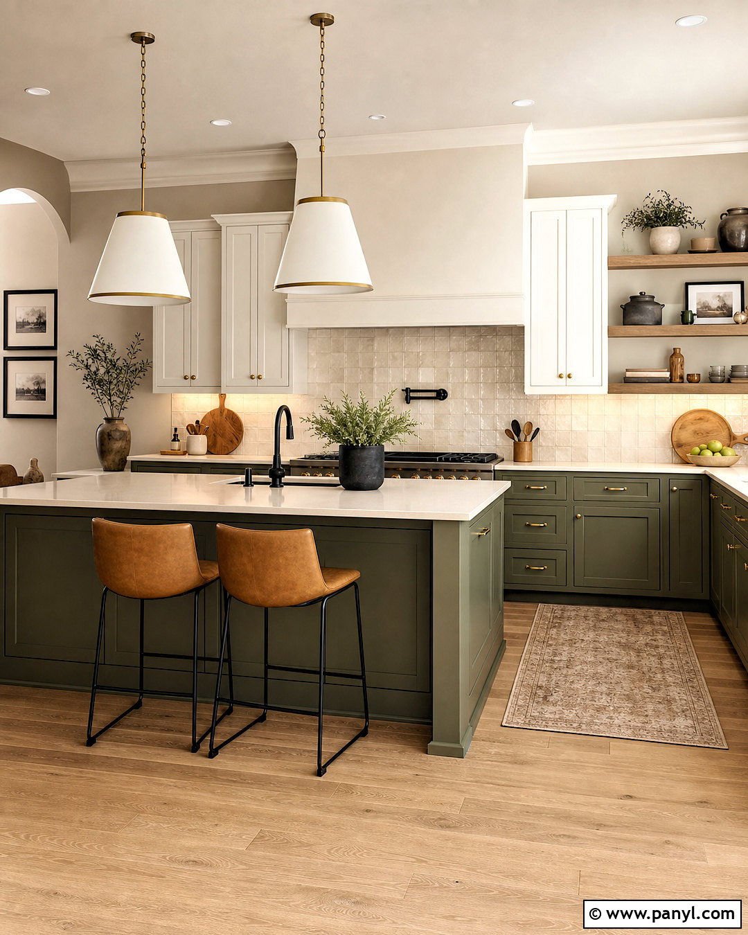
Earthy olive green gives Accessible Beige a richer, organic character. Paint the kitchen walls Accessible Beige and use a muted olive on the lower cabinets or a generous island. Choose warm white upper cabinets if the room needs extra brightness. Cream quartz countertops and an off-white zellige-style backsplash will bridge the colors without adding visual noise. Use aged brass knobs, medium oak shelves, and tan leather stools to reinforce the warm undertones. A dark bronze faucet adds definition at the sink. Finish the space with woven shades and understated cream pendants. Keep the flooring natural, such as white oak or beige limestone-look tile. This complete scheme feels collected rather than trendy because every finish comes from an earthy palette of warm greige, green, cream, wood, and metal.
11. Accessible Beige And Peppercorn Living Room
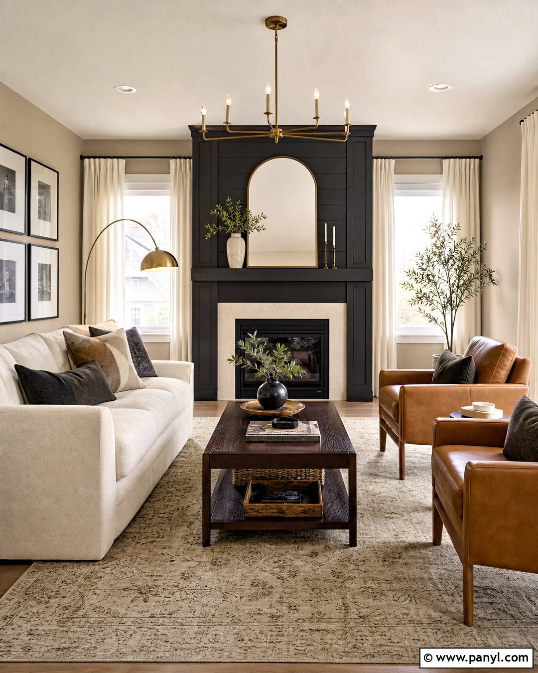
If your living room lacks a focal point, paint the main fireplace wall Peppercorn and use Accessible Beige throughout the remaining space. The charcoal-gray feature will frame a light stone or plaster fireplace while giving the room substantial contrast. Place a cream sofa facing the fireplace with two camel leather chairs positioned at an angle. A beige patterned rug, walnut coffee table, and ivory curtains will connect the light and dark surfaces. Repeat Peppercorn through a media cabinet, picture frames, or a floor lamp, but keep these accents limited. Soft brass lighting prevents the charcoal from feeling industrial. Accessible Beige and Peppercorn have also been used together in living spaces, hall alcoves, and reading areas, showing how effectively the combination supports layered neutral interiors. ()
12. Accessible Beige And Upward Guest Bedroom
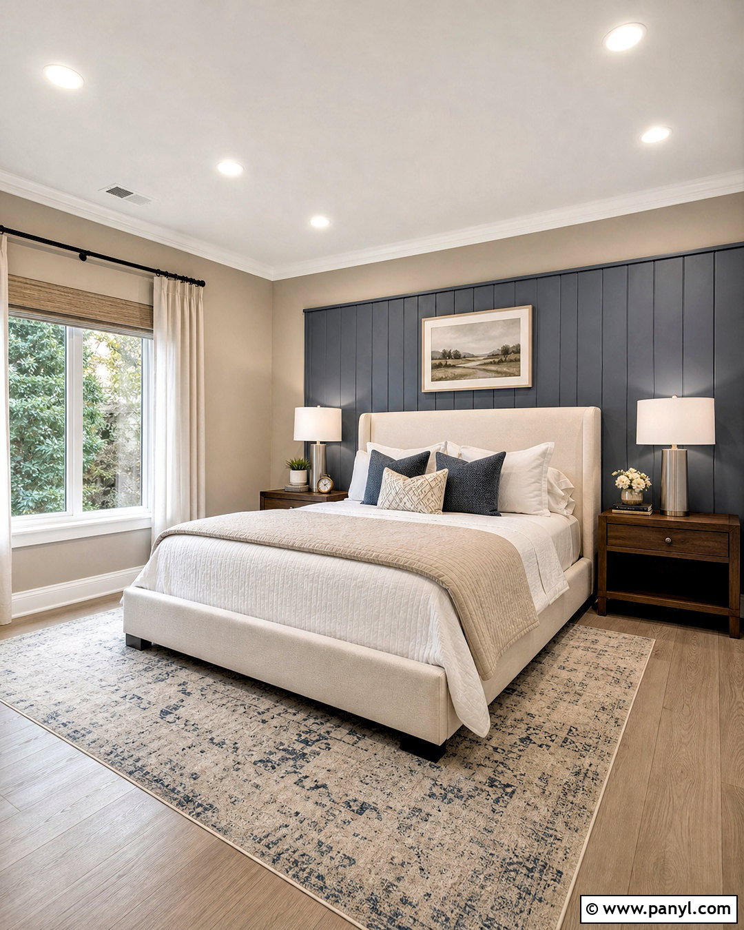
A muted blue guest bedroom can feel refreshing without becoming cool or overly coastal. Paint three walls Accessible Beige and use Upward, a soft smoky blue, behind the bed. Frame the room with crisp warm-white trim and choose an ivory upholstered headboard. Layer the bed with white sheets, a beige quilt, and blue-gray pillows. Medium walnut nightstands will add depth, while brushed nickel lamps create a clean contrast with the warm walls. Place a cream-and-blue rug beneath the bed and hang natural linen curtains at the windows. One landscape print can repeat the blue, beige, and brown palette. Upward sits close to the complementary side of Accessible Beige, so the pairing creates visible color contrast while remaining calm and easy to decorate. ()
13. Accessible Beige And Aesthetic White Hallway
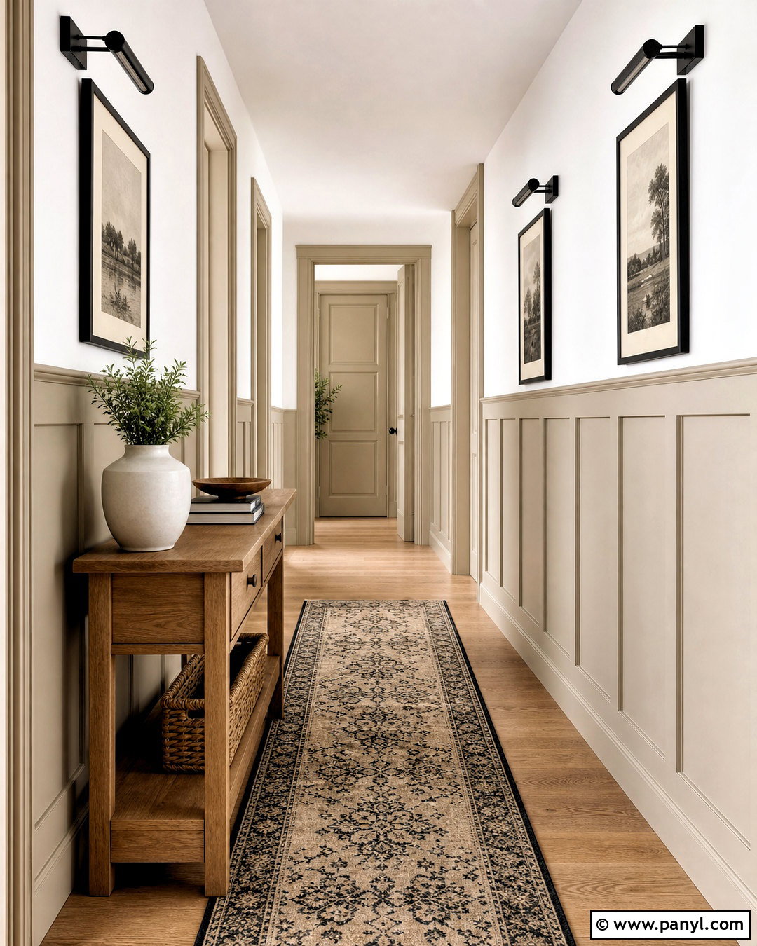
Long hallways often need subtle variation more than strong color. Use Aesthetic White on the upper walls and Accessible Beige on lower paneling, board and batten, trim, and interior doors. The two related neutrals create enough contrast to reveal the architectural details while keeping the narrow area bright. Install a natural oak console where space allows, or use a slim floating ledge for framed artwork. Choose a beige runner with a small black pattern to visually lengthen the hallway. Matte black picture lights and door hardware supply clear definition. Add matching warm-white frames containing simple charcoal sketches. Aesthetic White is an established coordinating option for Accessible Beige and produces a slightly cooler, understated transition. () The complete hallway feels finished without relying on excessive decorations.
14. Accessible Beige And Balanced Beige Bedroom
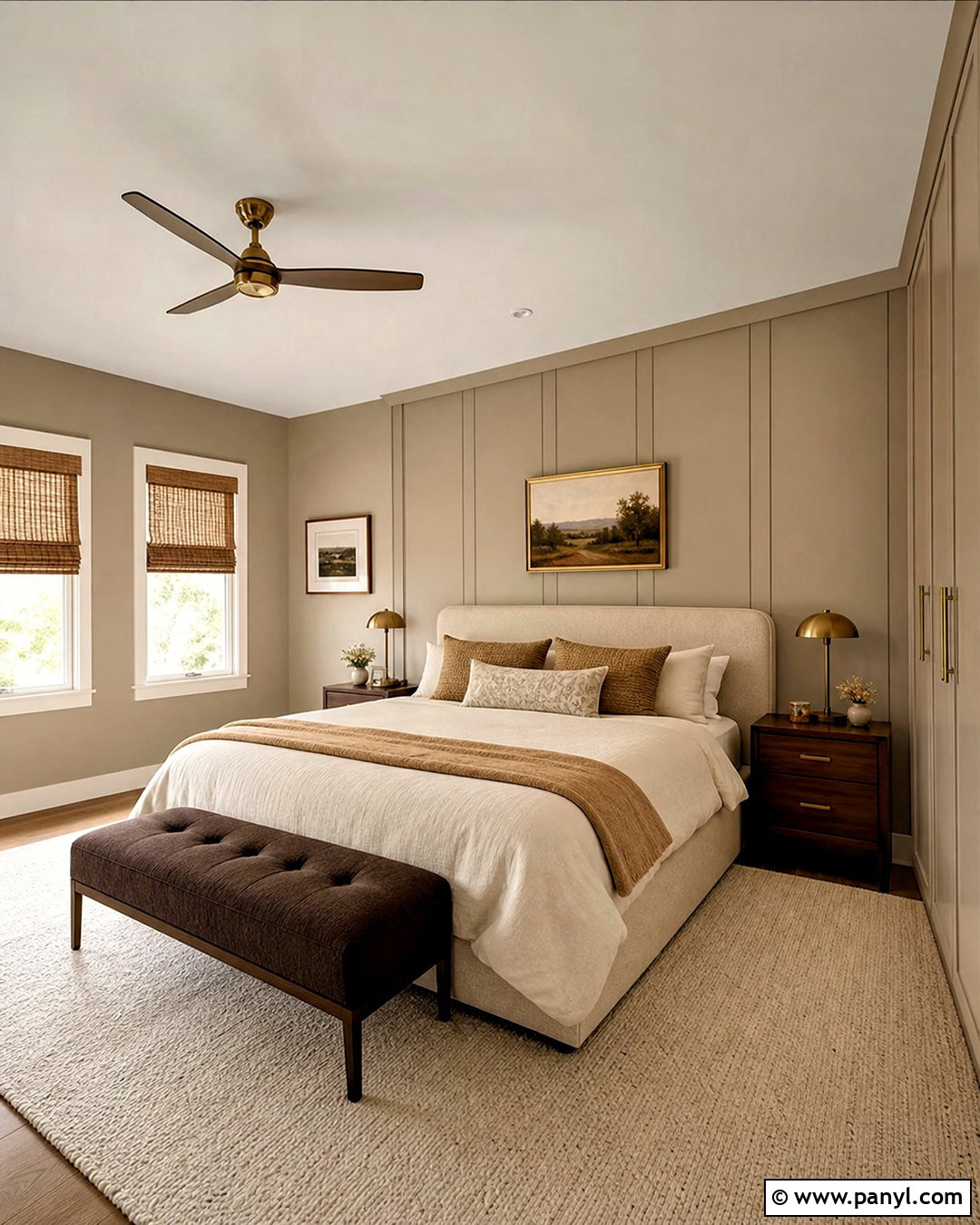
Build a cozy monochromatic bedroom by layering Accessible Beige with Balanced Beige, its deeper neighboring neutral. Use Accessible Beige on the main walls and Balanced Beige on the wall behind the bed or on full-height built-in wardrobes. Paint the ceiling and trim a soft creamy white to keep the darker taupe-beige from enclosing the room. Select a light oatmeal bed, dark walnut nightstands, and bedding in ivory, camel, and warm gray. Add chocolate brown through a bench and small decorative pillows. A thick cream rug will soften the overall composition. Use aged brass lamps and woven shades for gentle texture. Because Balanced Beige is one step deeper on the related color strip, it builds tonal contrast without disrupting the calm, cohesive nature of the palette. ()
15. Accessible Beige And Greek Villa Dining Room
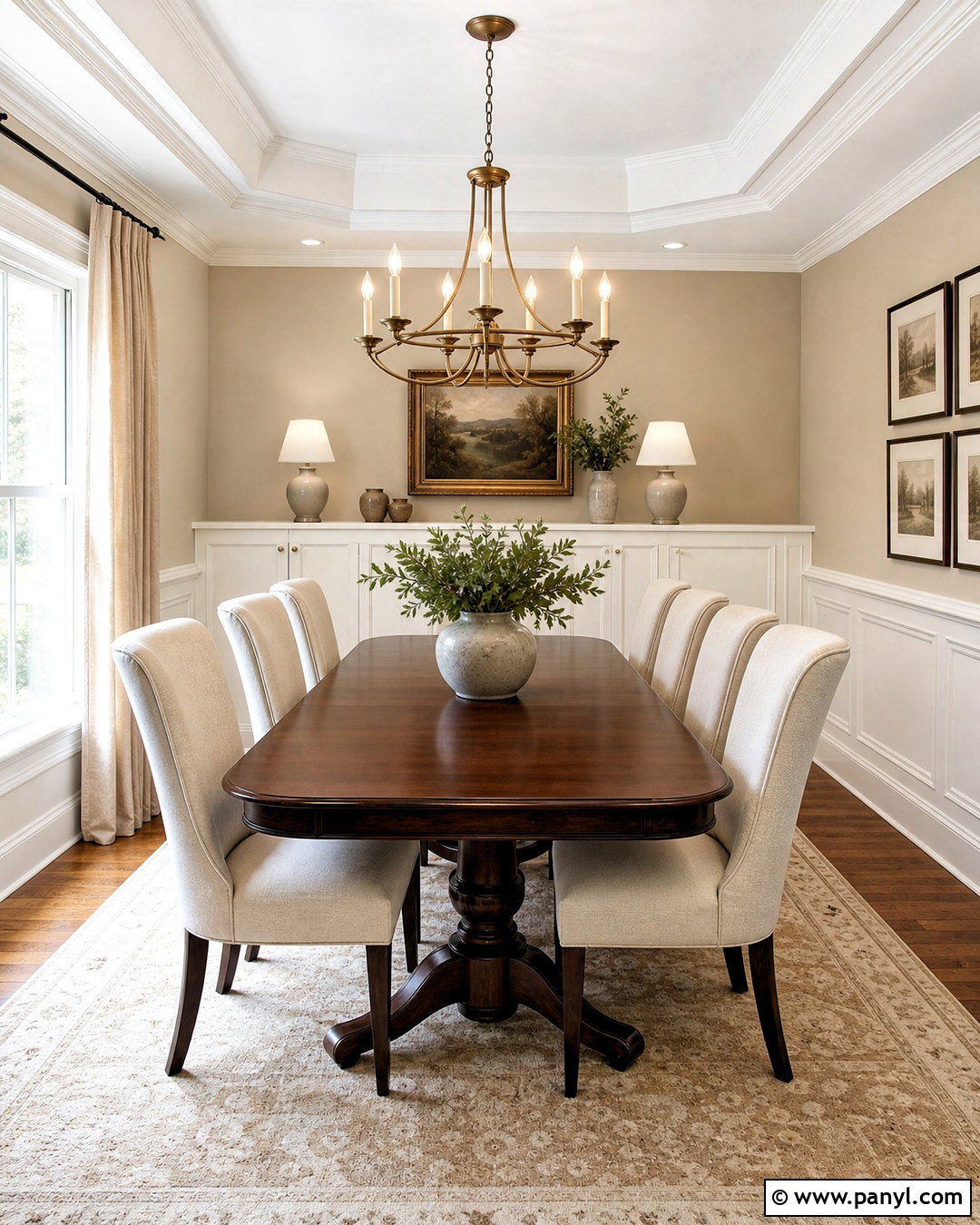
Combine Accessible Beige walls with Greek Villa trim and cabinetry for a warm dining room that avoids icy white surfaces. Greek Villa has a noticeable creamy character, so the transition feels soft and traditional. Place a dark walnut pedestal table in the center and surround it with upholstered cream chairs or simple black spindle chairs. A natural wool rug in ivory and tan should define the dining zone. Use a large linen drum pendant or aged brass chandelier above the table. Add chocolate brown curtain rods, warm beige drapes, and framed landscape artwork. A built-in buffet painted Greek Villa can display neutral stoneware and glass pieces. The completed scheme balances light walls, creamy millwork, dark wood, and restrained black accents, giving the room depth while preserving its welcoming atmosphere.
16. Accessible Beige Kitchen Cabinets
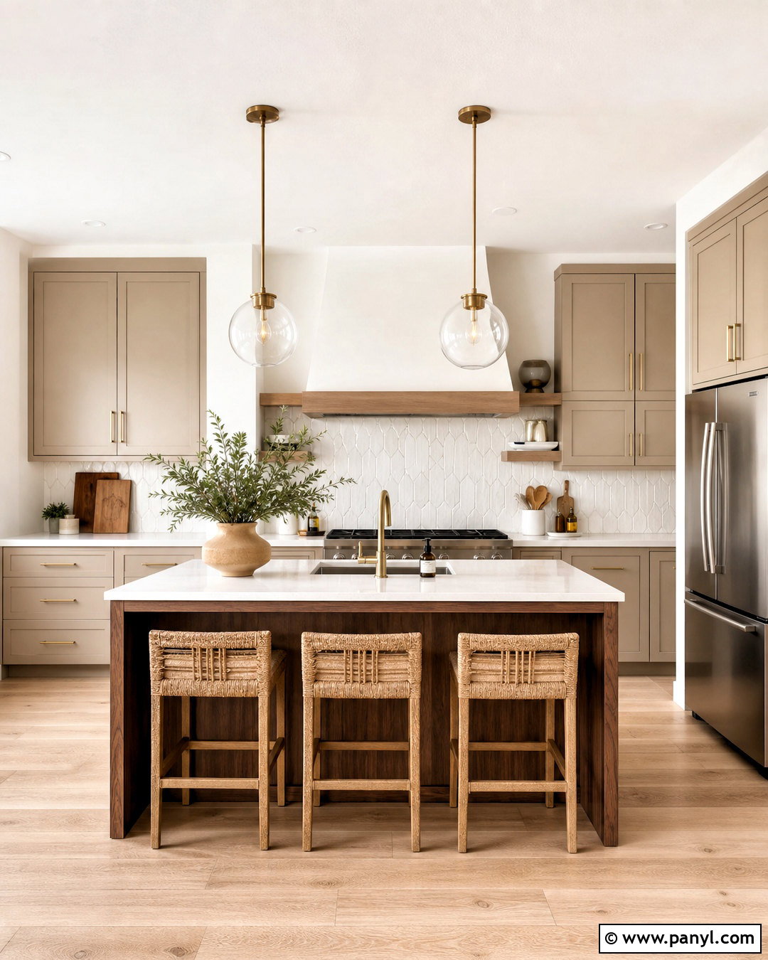
Accessible Beige can become the main cabinet color rather than remaining in the background. Paint both the upper and lower cabinetry in a durable satin finish, then keep the walls and ceiling Pure White. Add white quartz countertops with delicate warm-gray veining and a softly irregular white tile backsplash. A medium walnut island introduces deeper contrast without requiring another painted color. Use brushed brass knobs, a matte black faucet, and warm white globe pendants to mix finishes carefully. Light oak flooring and woven counter stools prevent the room from feeling formal. Accessible Beige cabinetry has been used successfully with white surfaces, black details, brass hardware, and dark charcoal accents. () This full kitchen palette feels warmer than white cabinetry while remaining neutral enough for changing accessories.
17. Accessible Beige Bathroom Wainscoting
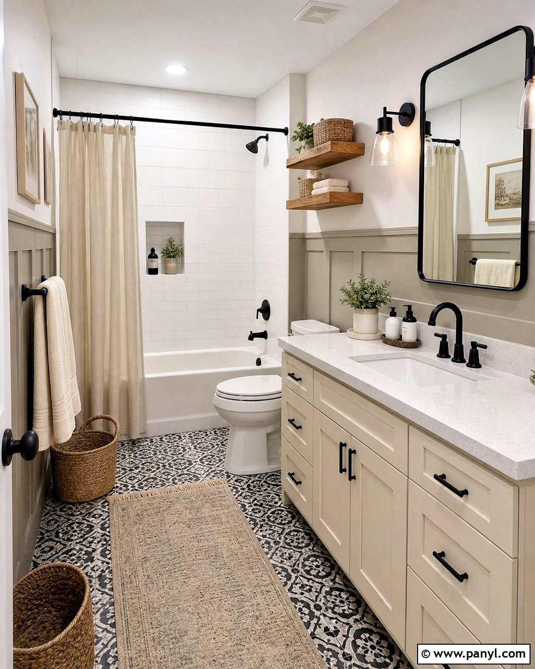
Turn a plain bathroom into a more architectural space with Accessible Beige wainscoting and warm white upper walls. Extend the painted paneling around the room at roughly two-thirds height so it visually anchors the vanity, bathtub, and toilet area. Choose a cream vanity with a white quartz top, matte black faucet, and black-framed mirror. Black-and-white patterned floor tile creates contrast, while white shower tile keeps the bathing area bright. Add oak shelves, woven baskets, and thick ivory towels to soften the harder finishes. Use a simple globe light with aged brass details to connect the warm paint and black hardware. Accessible Beige has been used on bathroom board and batten with white walls and dark flooring, creating a balanced mix of warmth, structure, and contrast. ()
18. Accessible Beige And Natural Wood Bedroom
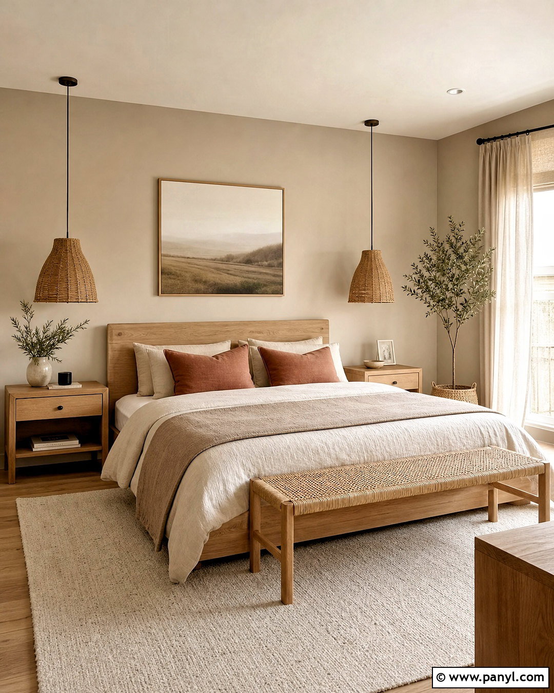
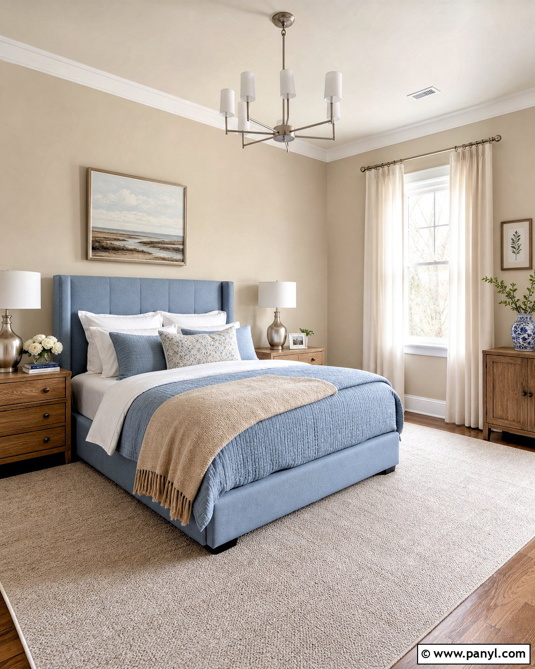
Sometimes the simplest palette becomes the most relaxing. Cover the bedroom walls in Accessible Beige, including the wall behind a low white oak bed. Use a warm white ceiling and minimal trim so the architecture feels clean. Layer the bed with ivory linen, a taupe coverlet, and muted clay pillows. Choose matching oak nightstands, a woven bench, and a large natural wool rug. Rattan pendant lights free the bedside surfaces and introduce another organic material. Add light-filtering flax curtains and one oversized neutral landscape above the headboard. Natural linens, sisal, rattan, marble, and porcelain are recommended materials for enhancing the soft character of Accessible Beige. () Keep decorative objects limited so variations in wood grain, woven fiber, and fabric provide the visual interest.
19. Accessible Beige And Urbane Bronze Exterior
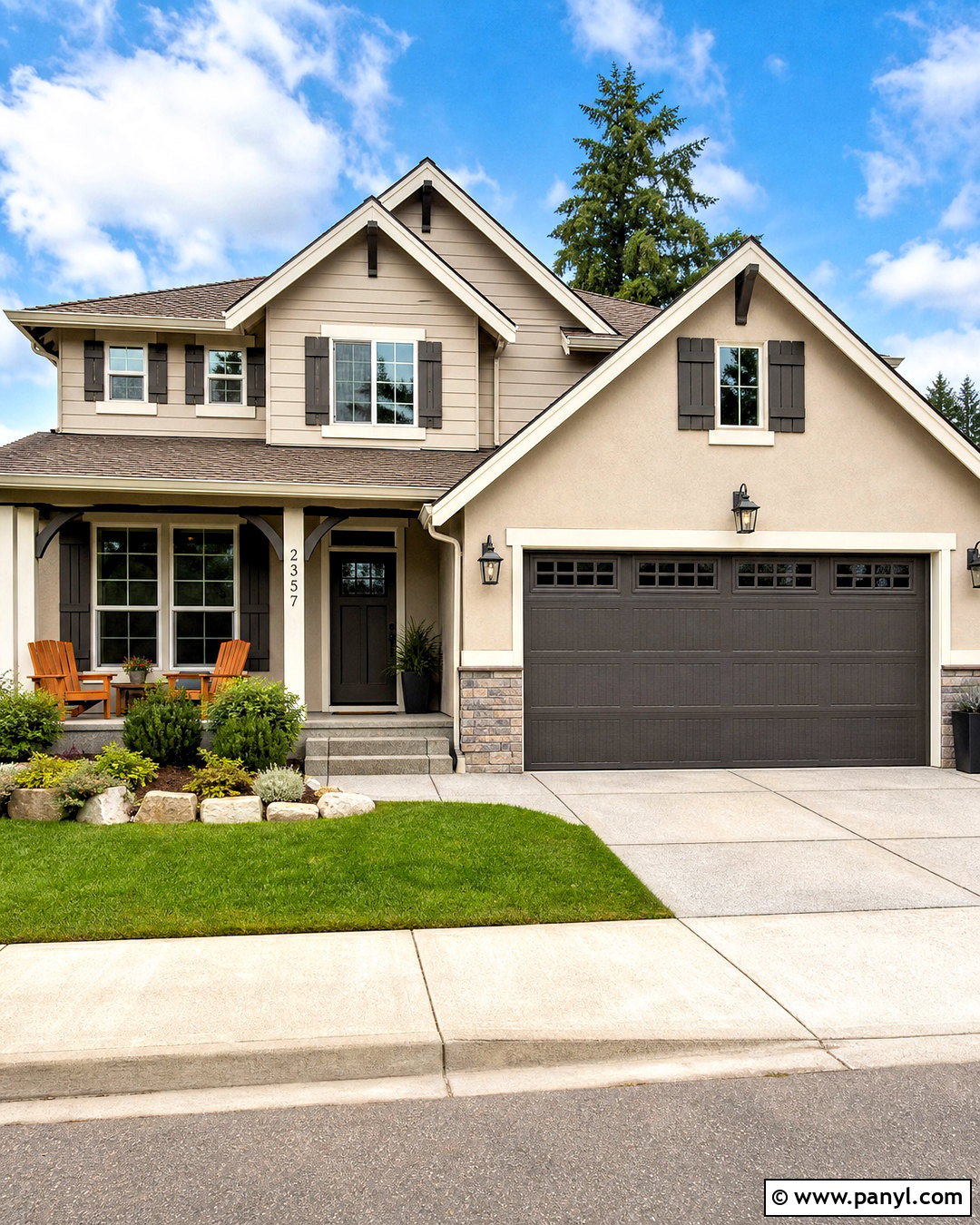
Accessible Beige creates a welcoming exterior when supported by enough contrast. Use it as the primary siding or stucco color, then apply Urbane Bronze to shutters, the front door, garage door, and selected architectural beams. Choose warm white for window trim, fascia, porch columns, and soffits. A medium brown architectural-shingle roof will connect naturally to both paint colors. Add black lanterns, stained cedar porch furniture, and large charcoal planters for extra definition. Keep the landscaping structured with evergreen shrubs, ornamental grasses, and pale gravel or natural stone edging. Accessible Beige is rated for exterior use, while dark brown-gray accents can help it appear more grounded in bright outdoor light. () Always sample large areas on different sides of the house before painting.
20. Accessible Beige Open Concept Palette

An open floor plan needs repeated colors and materials to prevent each zone from looking disconnected. Use Accessible Beige across the living room, dining area, and connecting hallways. Paint the kitchen cabinets warm white and introduce a muted green island as the main color accent. Repeat medium oak through flooring, the dining table, open shelves, and living room furniture. Use cream upholstery, taupe rugs, and oatmeal curtains to create soft transitions. Black lighting and hardware should appear in every zone in small, consistent amounts. Add terracotta pillows in the living room and matching pottery in the kitchen. Accessible Beige works especially well with neutral colors, wood, linen, sisal, rattan, and light stone, making these materials useful for connecting a spacious multipurpose interior. ()
Conclusion:
The best Accessible Beige palette is one that responds to your home’s permanent finishes, available light, and desired level of contrast. Soft whites and natural wood create an airy result, while navy, charcoal, olive, and bronze bring greater depth. Terracotta, blush, and smoky blue can introduce color without overwhelming the warm greige foundation. Repeat each accent at least two or three times across furniture, textiles, paint, and decorative details so the design feels intentional. Before committing, test large paint samples during morning, afternoon, and evening light. With thoughtful materials and balanced contrast, these 20 sw accessible beige color scheme ideas can support comfortable, cohesive rooms and welcoming exteriors throughout your home.

Related Ideas and Inspiration:
Leave a Reply