
Finding the right accent colors for a warm greige can transform an ordinary room into a layered, welcoming space. These **20 colors that go with Accessible Beige ideas** explore complete palettes for living rooms, kitchens, bedrooms, bathrooms, and other areas throughout the home. Sherwin-Williams Accessible Beige SW 7036 has gray undertones and is officially recommended with earthy colors, helping it bridge warm and cool finishes without feeling overly yellow. () Pair it with creamy white for quiet contrast, deep navy for drama, muted green for an organic mood, or terracotta for natural warmth. Always sample your combination beside flooring, countertops, and furniture because surrounding materials affect how paint appears. The complete room looks below offer practical inspiration through **20 colors that go with Accessible Beige ideas**.

1. Accessible Beige And Aesthetic White
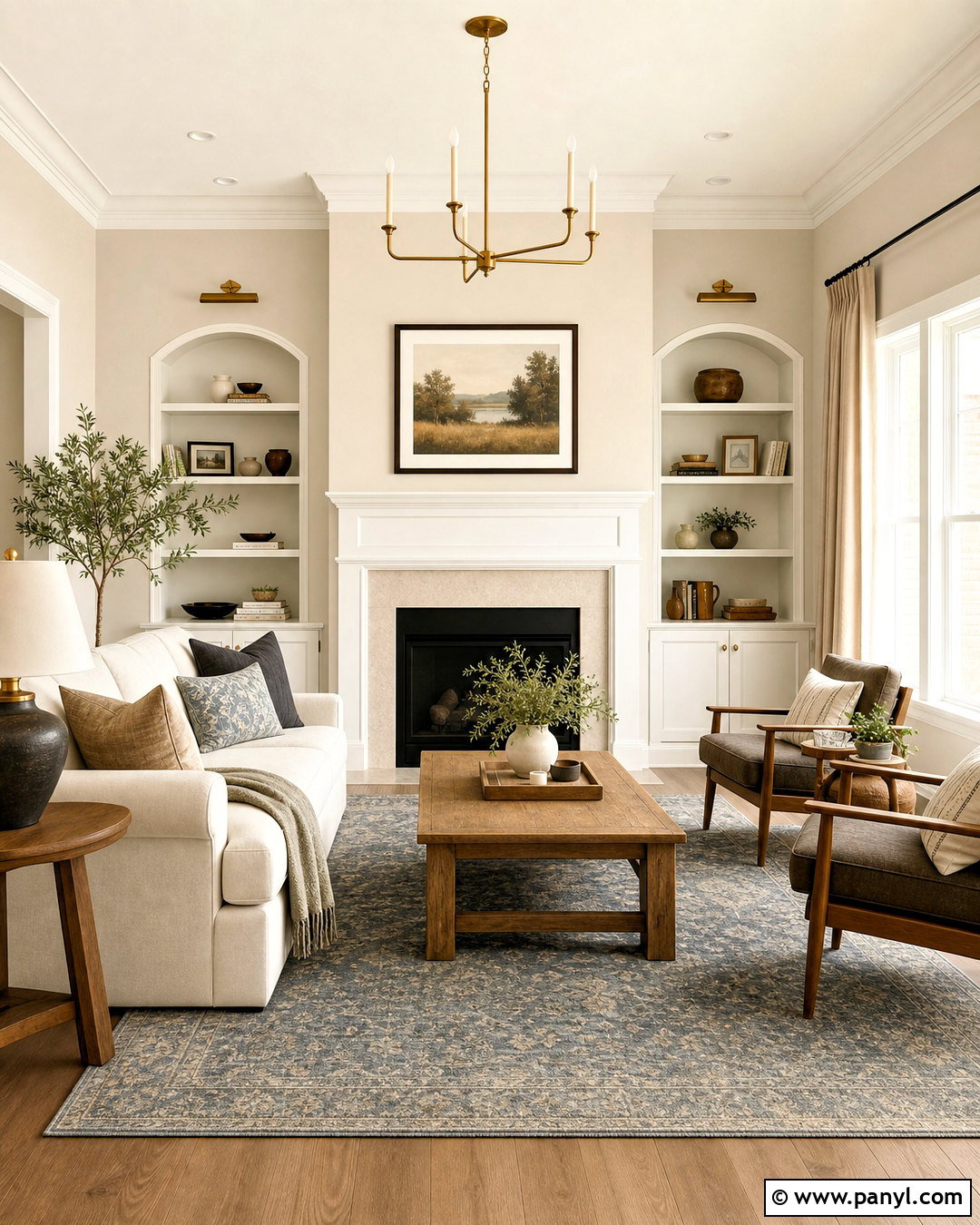
Aesthetic White creates a soft, low-contrast transition beside Accessible Beige. Use Accessible Beige across the living room walls and Aesthetic White on the trim, ceiling, fireplace surround, and built-in cabinets. This combination feels warmer and more relaxed than a bright white pairing. Add a cream linen sofa, natural oak coffee table, and oatmeal-colored curtains to continue the gentle palette. A muted blue-gray rug introduces quiet definition without making the room feel cold. Complete the look with antique brass lighting, dark bronze curtain rods, and a few walnut accents. Because the colors are closely related, texture becomes important. Mix woven baskets, boucle upholstery, slub linen, and matte ceramics to prevent the neutral room from looking flat or unfinished.
2. Accessible Beige And Alabaster
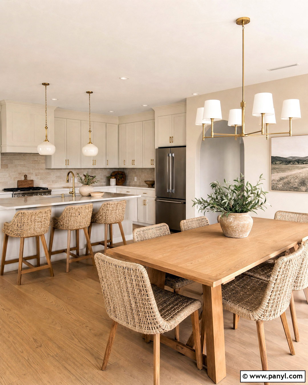
Want a warm room that still feels bright and fresh? Paint the walls Accessible Beige, then use Alabaster on the ceiling, window trim, doors, and kitchen cabinetry. Alabaster has enough softness to avoid the harsh contrast that can happen with a crisp blue-white. In an open kitchen and dining area, combine this palette with light oak flooring, creamy quartz countertops, and a handmade beige backsplash. A natural wood dining table and woven chairs add warmth without introducing another dominant color. Choose brushed brass cabinet pulls and simple milk-glass pendants for gentle shine. Bring in pale taupe upholstery and leafy green plants for depth. This complete scheme works especially well in spaces that receive balanced or slightly cool natural light.
3. Accessible Beige And Pure White
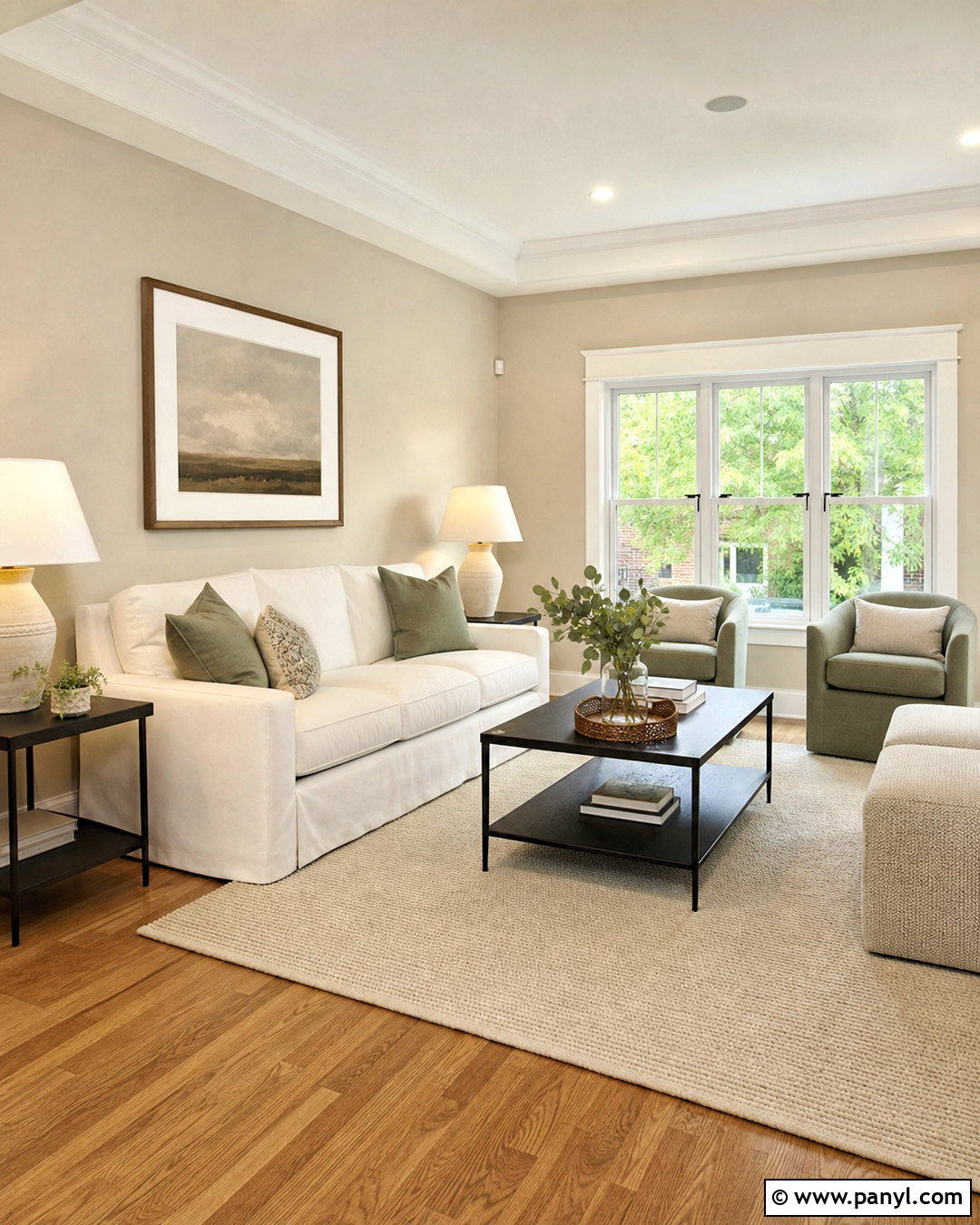
Pure White gives Accessible Beige a cleaner, more defined edge while keeping the room comfortable. Try Accessible Beige walls in a modern family room with Pure White crown molding, baseboards, window casings, and built-in shelving. Repeat the white through a streamlined sofa, ceramic lamps, and a simple fireplace mantel. Medium-tone oak flooring provides an organic bridge between the two paints. For stronger structure, add matte black window hardware, a black metal coffee table, and thin black picture frames. Soft sage pillows and a textured ivory rug keep the contrast approachable. This palette is useful when you want Accessible Beige to read as a definite warm wall color rather than blending into cream trim. Keep the furnishings simple so the precise architectural contrast remains visible.
4. Accessible Beige And Shoji White
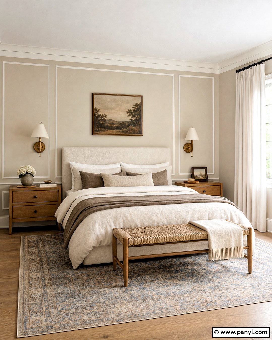
Shoji White and Accessible Beige build a quiet, enveloping bedroom palette. Cover the main walls in Accessible Beige and use Shoji White on the ceiling, trim, closet doors, and paneled wall behind the bed. Choose an upholstered oatmeal bed with layered ivory, mushroom, and pale camel bedding. Natural oak nightstands reinforce the warmth, while aged brass sconces add a polished finish. A faded blue and beige rug can introduce subtle pattern beneath the bed without disturbing the calm atmosphere. Use full-length off-white linen curtains instead of bright white panels. Finish the room with a woven bench, understated landscape artwork, and a single olive branch arrangement. The closely related colors create separation through tone rather than sharp contrast, making the bedroom restful yet visually complete.
5. Accessible Beige And Sanderling

Sanderling brings deeper earthy warmth to Accessible Beige without leaving the neutral family. In a dining room, place Accessible Beige on three walls and use Sanderling on a paneled feature wall or built-in buffet. Ground the space with a walnut dining table, upholstered cream chairs, and a large natural fiber rug. The darker beige accent will feel intentional when repeated through taupe drapery, pottery, and patterned seat cushions. Add an aged brass chandelier for soft reflection and use warm white lamps in the evening. Black accents should be limited to slender frames or small hardware so they do not overpower the tonal design. This palette produces a comfortable, collected room that suits traditional, transitional, and organic modern homes without looking overly monochromatic.
6. Accessible Beige And Balanced Beige
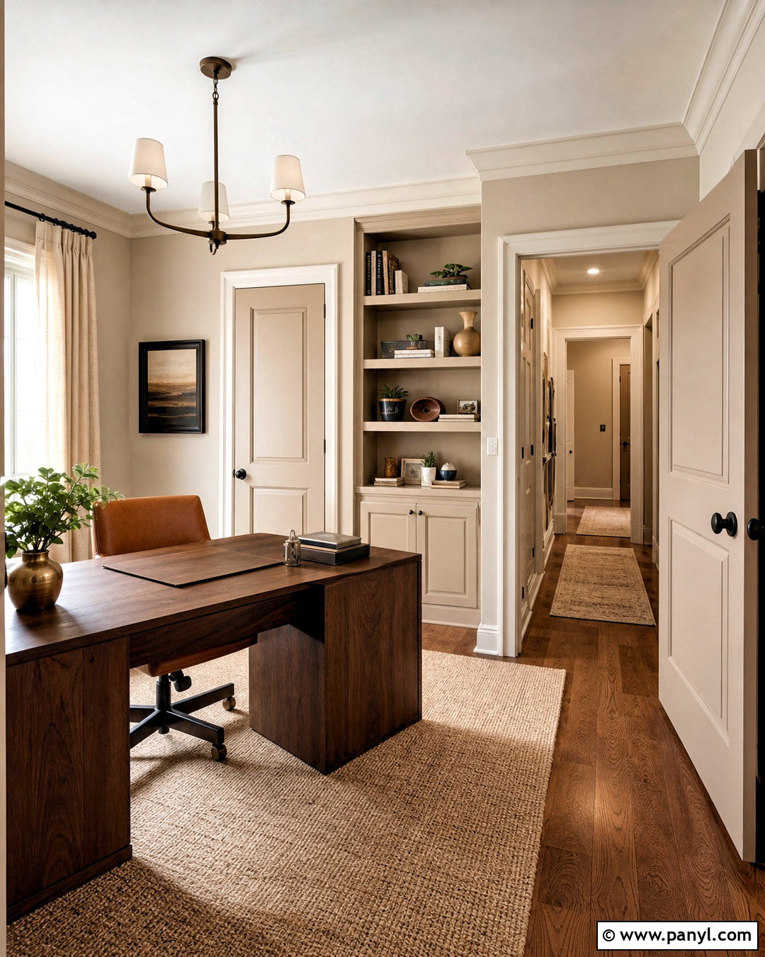
For a seamless whole-house palette, combine Accessible Beige with the richer depth of Balanced Beige. Paint the hallway and upper walls Accessible Beige, then use Balanced Beige on interior doors, lower wall paneling, or a nearby home office. Connect the spaces with medium oak flooring and warm white trim. In the office, add a substantial walnut desk, camel leather chair, woven rug, and cream curtains. A bronze desk lamp and dark brown picture frames create definition without introducing stark black. Since the two beiges sit close together visually, include pale textiles and reflective metal finishes to maintain contrast. This layered approach makes adjoining rooms feel coordinated while giving each area its own identity. It is especially effective in open layouts with long sightlines.
7. Accessible Beige And Tony Taupe
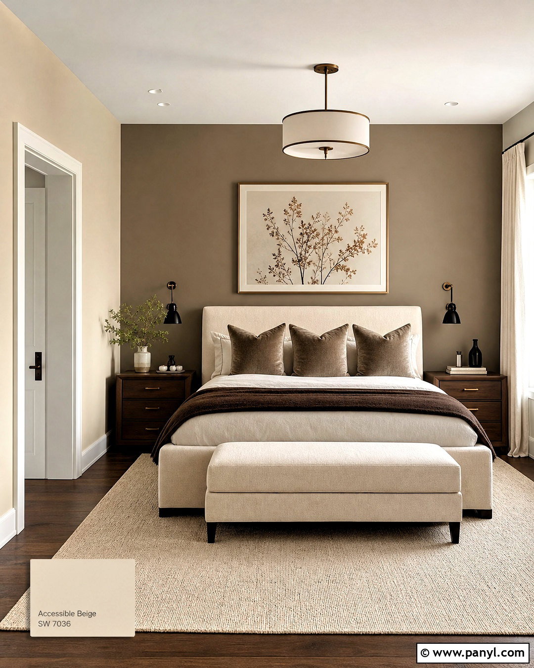
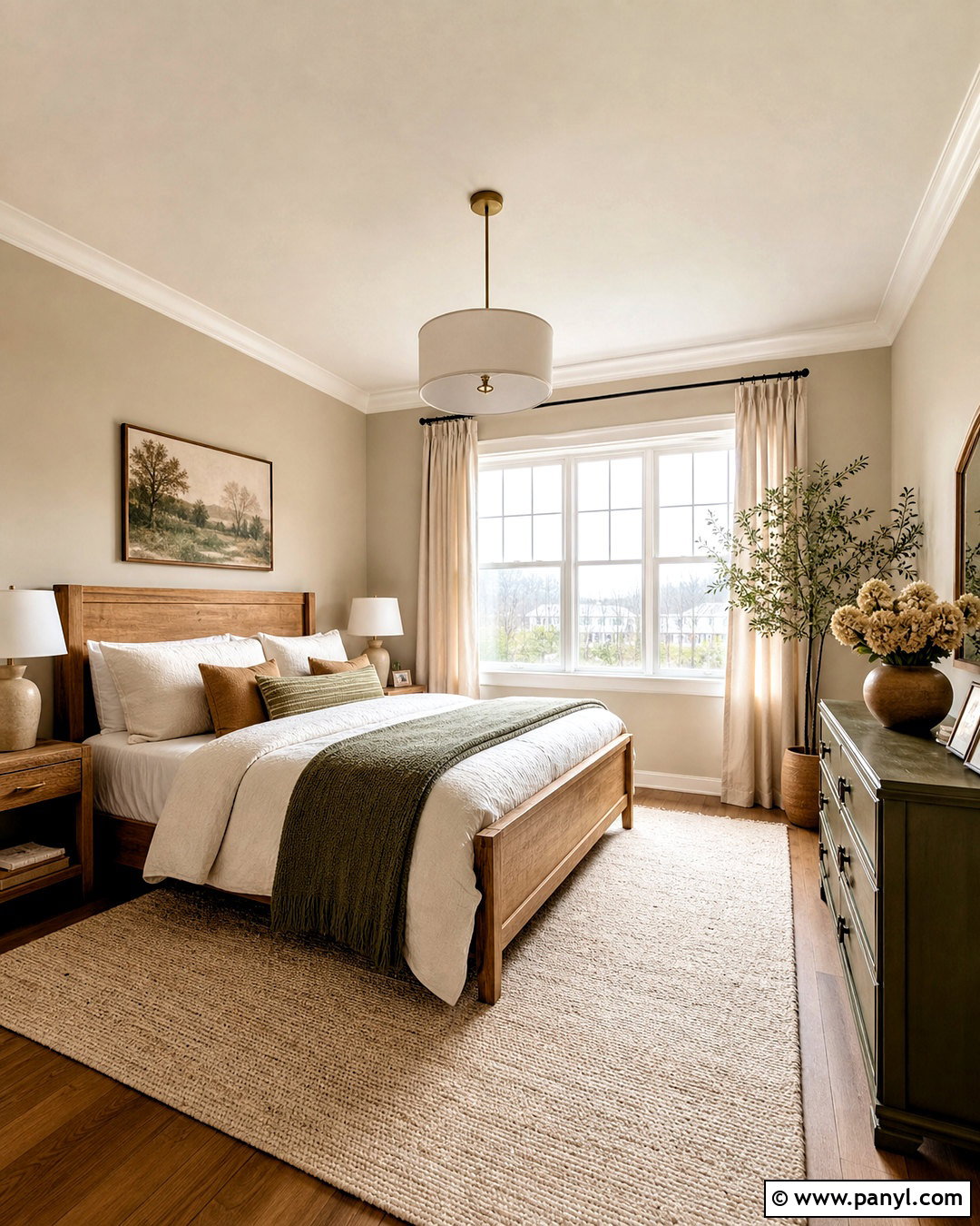
Tony Taupe gives Accessible Beige a grounded, sophisticated partner for a cozy primary bedroom. Use Accessible Beige on the main walls and Tony Taupe behind the bed, on built-in wardrobes, or across the interior doors. Select a warm ivory upholstered bed and dress it with cream linen, taupe velvet pillows, and a chocolate brown throw. Dark walnut nightstands add richness, while bronze wall sconces echo the deeper accent paint. Keep the flooring lighter with natural oak or a large oatmeal wool rug. Botanical prints in muted olive and brown bring controlled pattern into the scheme. The finished room should balance light and dark surfaces rather than concentrating every deep color in one place. This creates a restful, dimensional space with an understated boutique-hotel character.
8. Accessible Beige And Urbane Bronze
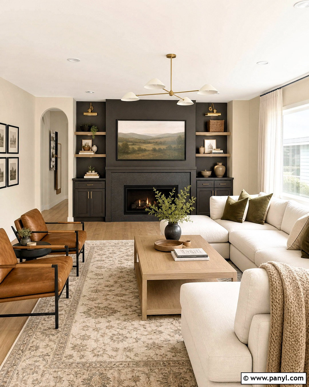
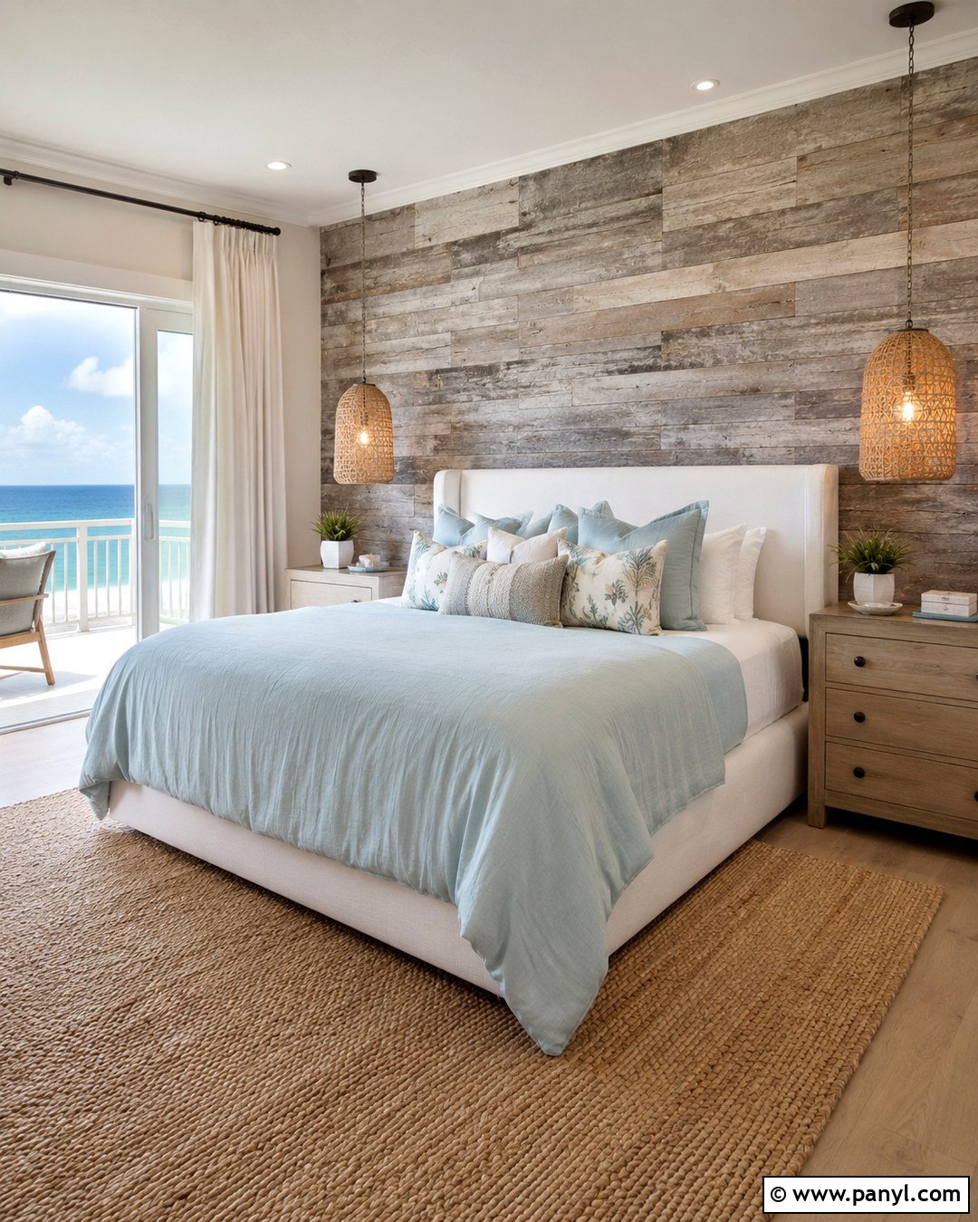
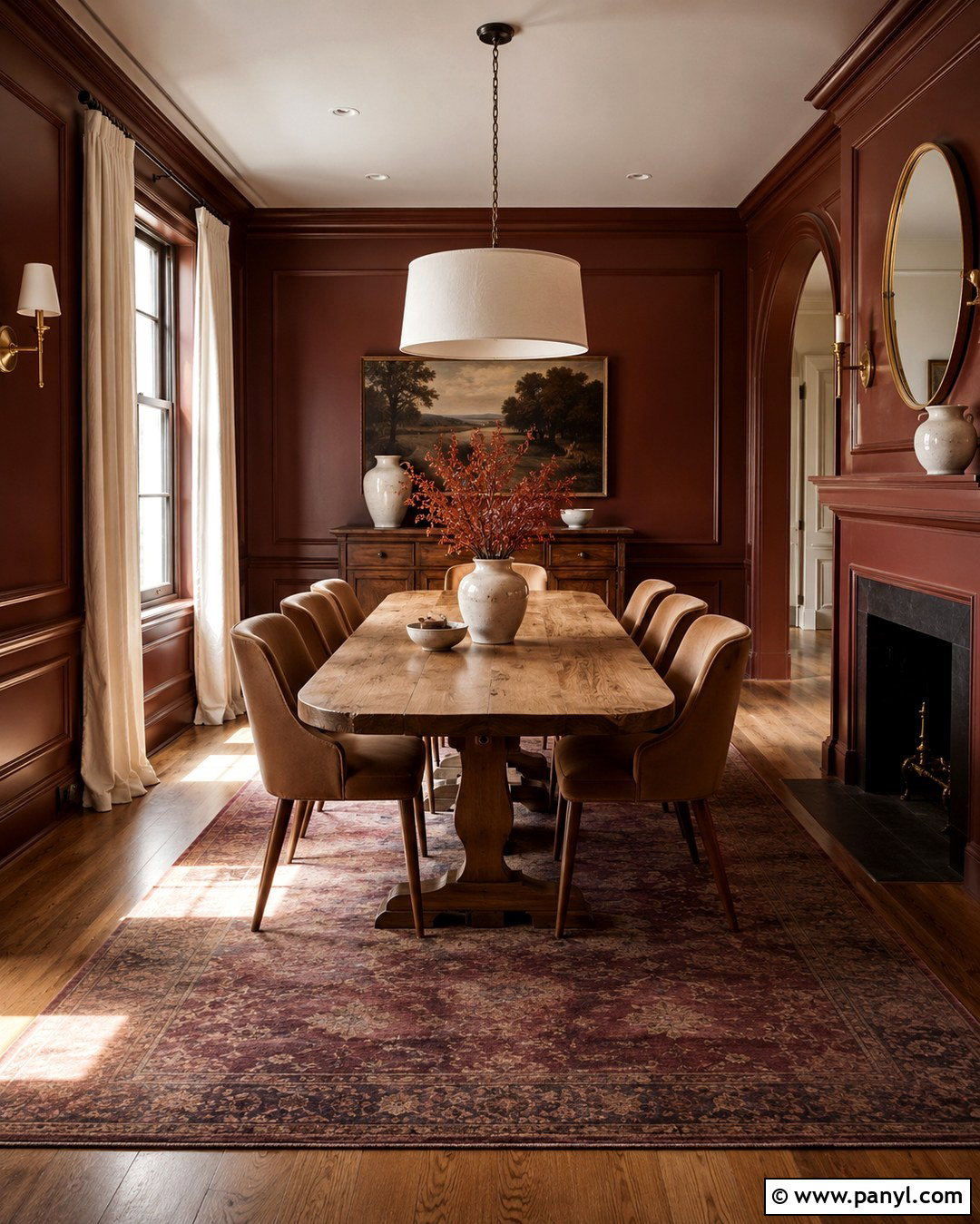
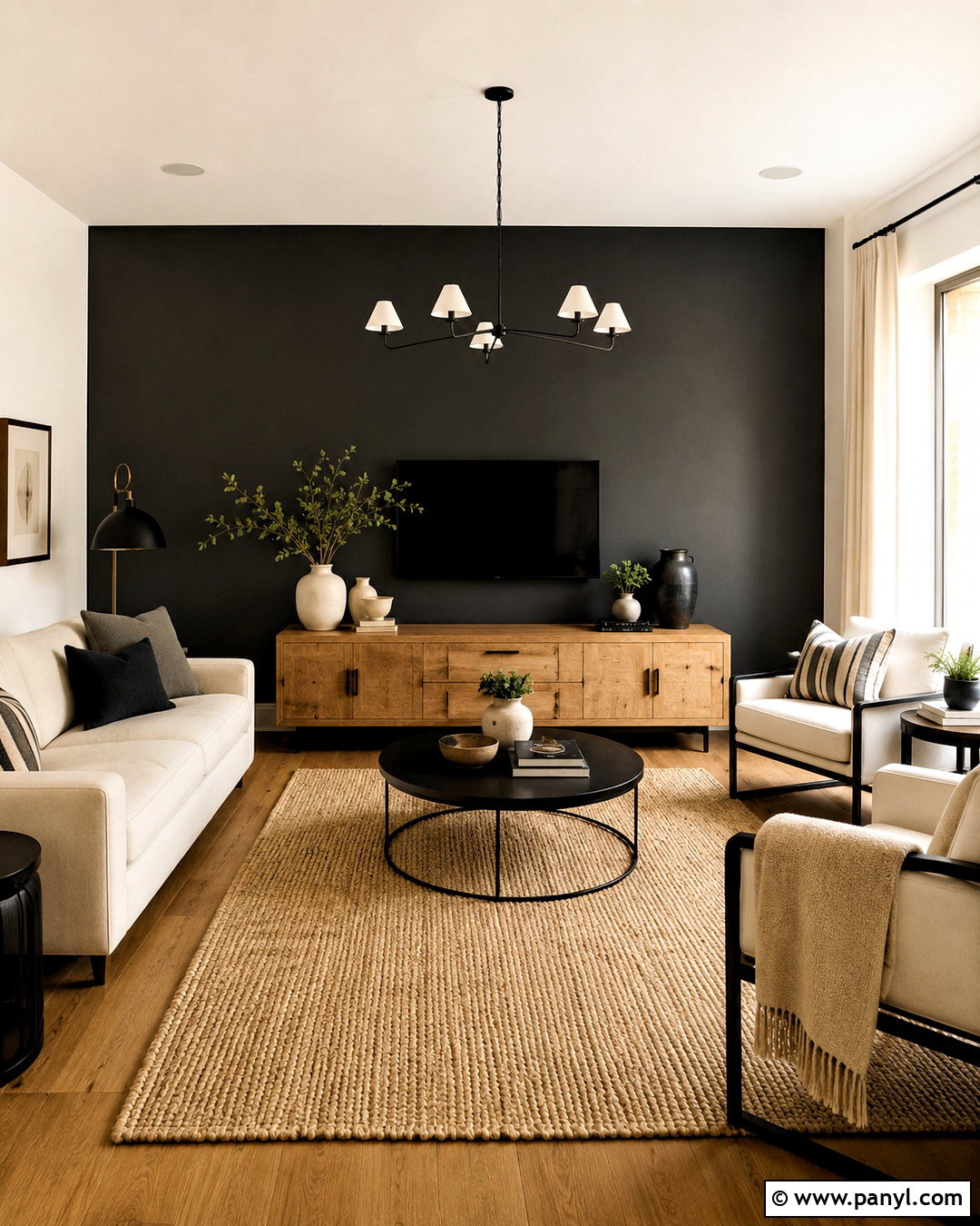
Urbane Bronze creates bold contrast while preserving the earthy character of Accessible Beige. In a living room, use Accessible Beige on most walls and Urbane Bronze on the fireplace, media cabinetry, or a full wall of built-ins. Balance the dark focal point with an ivory sectional, light oak coffee table, and a large cream-and-taupe rug. Cognac leather chairs introduce warm color and connect naturally with both paints. Add aged brass sconces, olive green pillows, and textured linen curtains for a layered organic look. Keep the ceiling and trim warm white so the room remains open and bright. This pairing works best when the darker color appears on a substantial architectural feature. Scattered, undersized bronze accents can make the design feel busy instead of confidently composed.
9. Accessible Beige And Black Fox
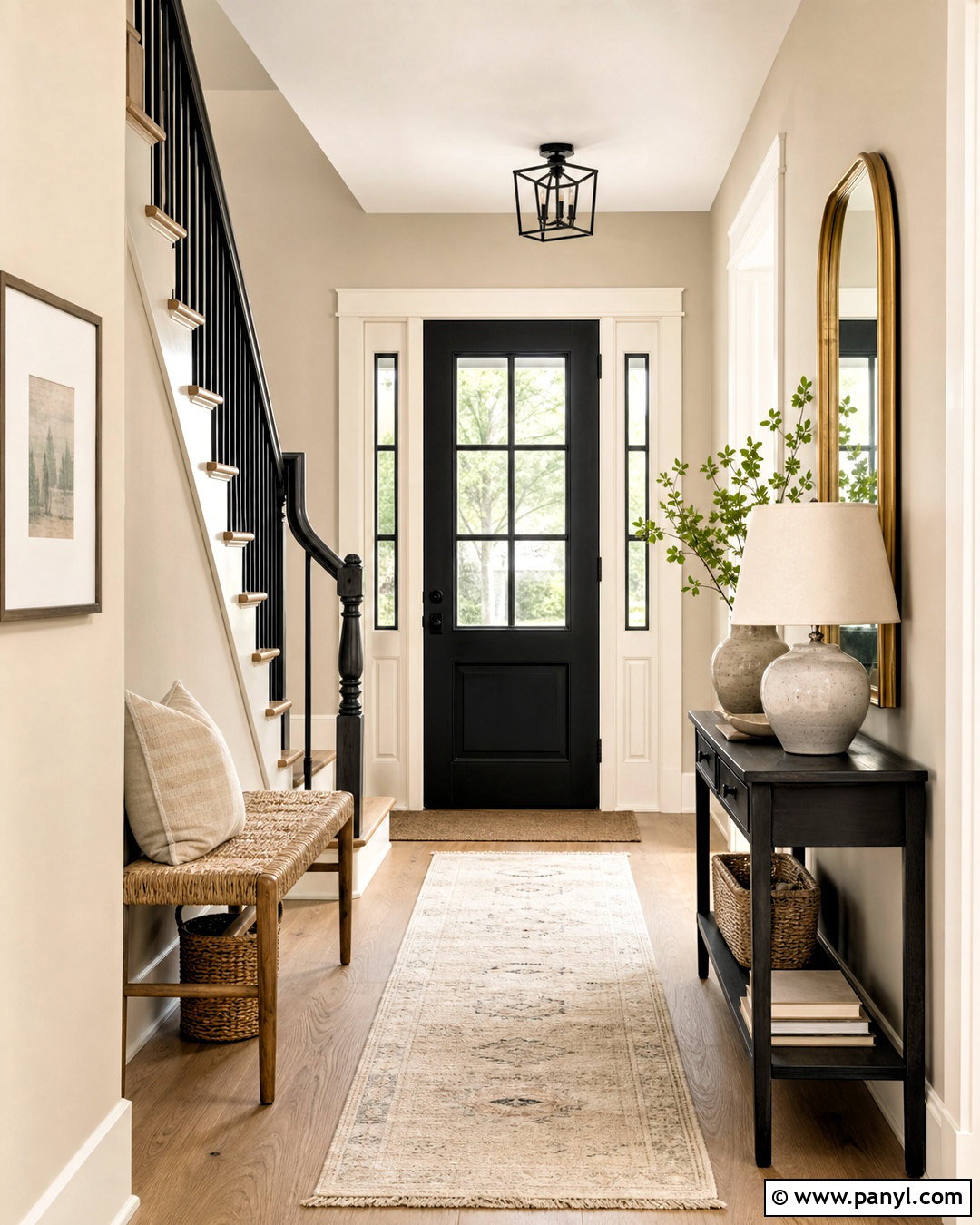
Black Fox adds a deep brown-black note that makes Accessible Beige feel more modern and structured. Use Accessible Beige on the walls of an entryway and Black Fox on the front door, stair railing, console, or lower cabinetry. Warm white trim will outline the architecture, while natural white oak flooring keeps the darker elements from becoming heavy. Add a woven bench, a large neutral runner, and a round brass-framed mirror. A ceramic lamp with a linen shade provides soft contrast on the console. Repeat Black Fox only in a few controlled details, such as hooks, frames, or a narrow pendant fixture. Green branches and handmade pottery soften the graphic edges. The result is a practical, welcoming entrance with visible contrast and plenty of natural texture.
10. Accessible Beige And Cadet
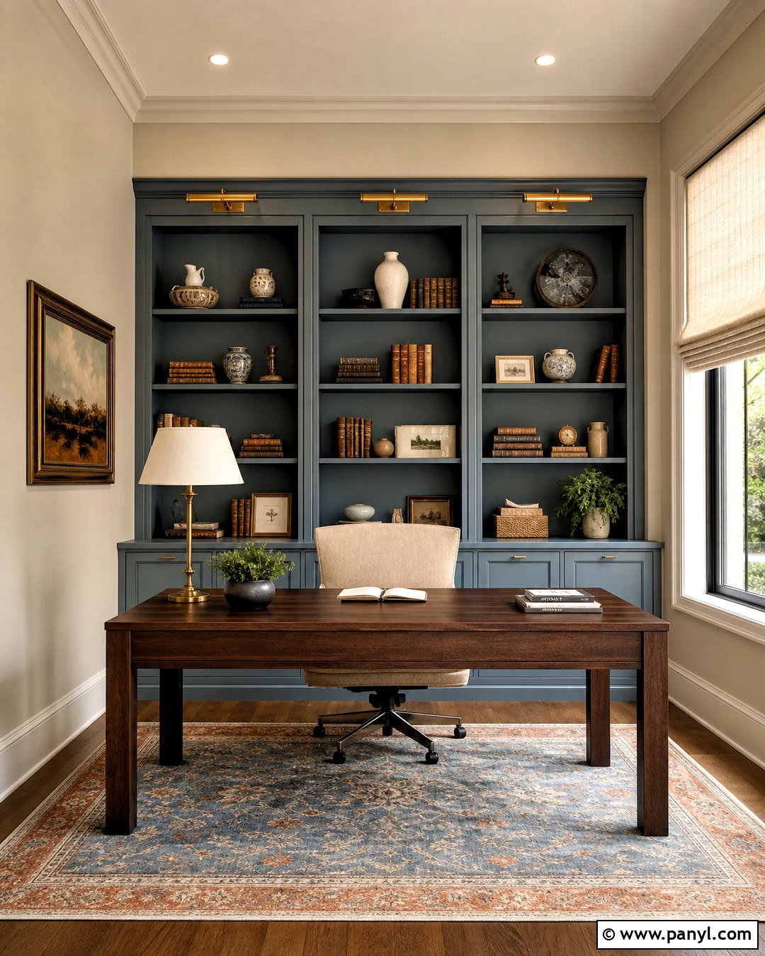
Cadet introduces a muted blue-gray that cools Accessible Beige without creating an uncomfortable clash. Build a polished home office with Accessible Beige walls, Cadet built-in bookcases, and warm white trim. Add a medium walnut desk and a light beige upholstered chair so the room retains its inviting quality. A faded blue, cream, and rust rug can connect the cabinetry to the warm wall color. Use aged brass library lights and cabinet hardware for subtle warmth. Linen Roman shades in natural ivory will filter daylight without adding another dominant hue. Display books, ceramics, and framed artwork sparingly so the built-ins remain organized. This complete look combines calm color with practical storage, making it suitable for a focused workspace that still feels connected to a warm neutral home.
11. Accessible Beige And Navy Blue

Navy blue delivers classic contrast against Accessible Beige and makes a neutral space feel more substantial. In a dining room, use Accessible Beige walls with a navy blue buffet, upholstered host chairs, or lower wall paneling. Center the room around a medium oak table and warm white dining chairs. A patterned rug containing navy, beige, and muted rust will tie the major colors together. Choose aged brass lighting and cream linen drapes to soften the darker accents. White trim can keep the architecture crisp, while natural woven shades add another warm layer. Avoid filling every wall with navy because the room may lose the lightness that makes Accessible Beige appealing. One strong navy feature, repeated through small textiles and artwork, produces a balanced and timeless finished space.
12. Accessible Beige And Sea Salt
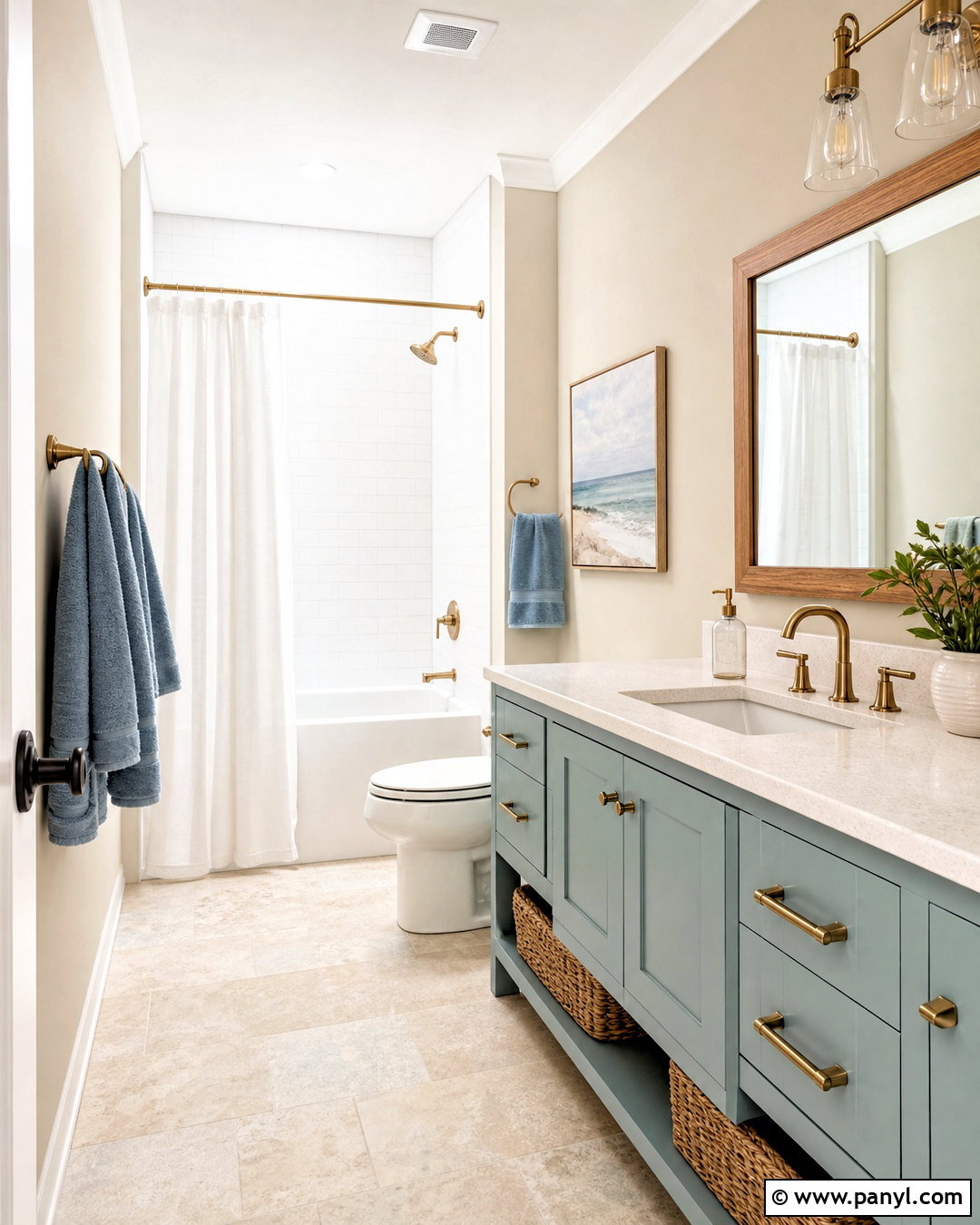
Sea Salt gives Accessible Beige a light blue-green partner that feels airy and restorative. Use Accessible Beige on the walls of a bathroom and bring Sea Salt onto the vanity, linen cabinet, or paneled bathtub surround. Warm white trim, pale stone flooring, and creamy quartz countertops will keep the palette light. Add brushed nickel or soft brass fixtures depending on the surrounding hardware in your home. Towels in ivory and dusty blue can reinforce the cool accent without becoming overly coastal. Include a natural oak mirror frame, woven baskets, and a simple white shower curtain for warmth and texture. This pairing works best with clear, uncluttered surfaces. The finished bathroom should feel fresh and peaceful while maintaining Accessible Beige as the warm visual foundation.
13. Accessible Beige And Evergreen Fog
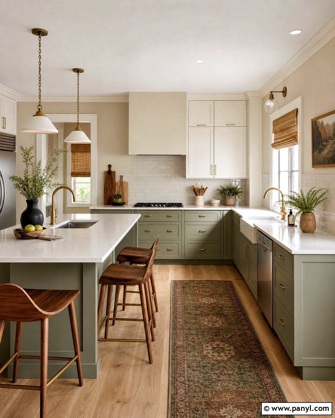
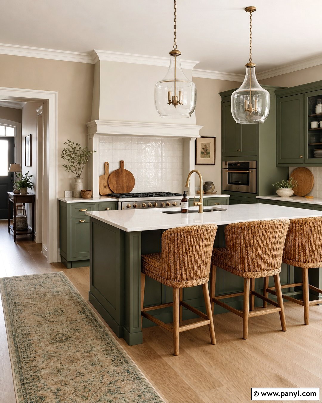
Evergreen Fog adds muted green depth to Accessible Beige and supports a relaxed, nature-inspired kitchen. Paint the walls Accessible Beige and use Evergreen Fog on the island or lower cabinets. Keep the upper cabinets warm white to prevent the green from dominating the room. Cream quartz counters, an off-white tile backsplash, and natural oak flooring create a smooth transition among the colors. Choose brushed brass pulls and simple pendant lights to add warmth. Walnut counter stools and woven shades introduce darker natural tones without competing with the cabinetry. A small vintage-style runner containing olive, beige, and rust can bring pattern to the floor. This balanced scheme feels current but not overly trendy because every color relates to natural wood, stone, and foliage.
14. Accessible Beige And Olive Green
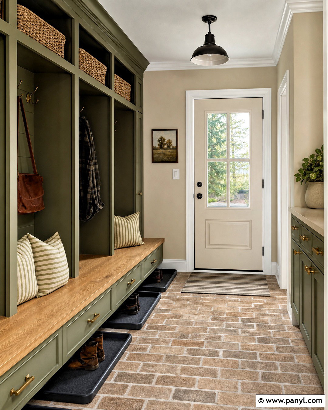
Olive green gives Accessible Beige a rich, earthy character that suits cozy and hardworking spaces. In a mudroom, cover the walls with Accessible Beige and paint the lockers, bench, or lower cabinets a warm olive green. Use a durable tan stone or brick-look floor to support the organic palette. A natural oak bench seat, antique brass hooks, and woven storage baskets will add useful texture. Keep the ceiling and trim creamy white for brightness. Incorporate charcoal boot trays and simple black-framed artwork in small amounts for definition. Seat cushions in striped beige and olive fabric can soften the built-ins while reinforcing the colors. The complete room feels organized and welcoming because the cabinetry, storage, flooring, and decorative details function as one practical design.
15. Accessible Beige And Forest Green
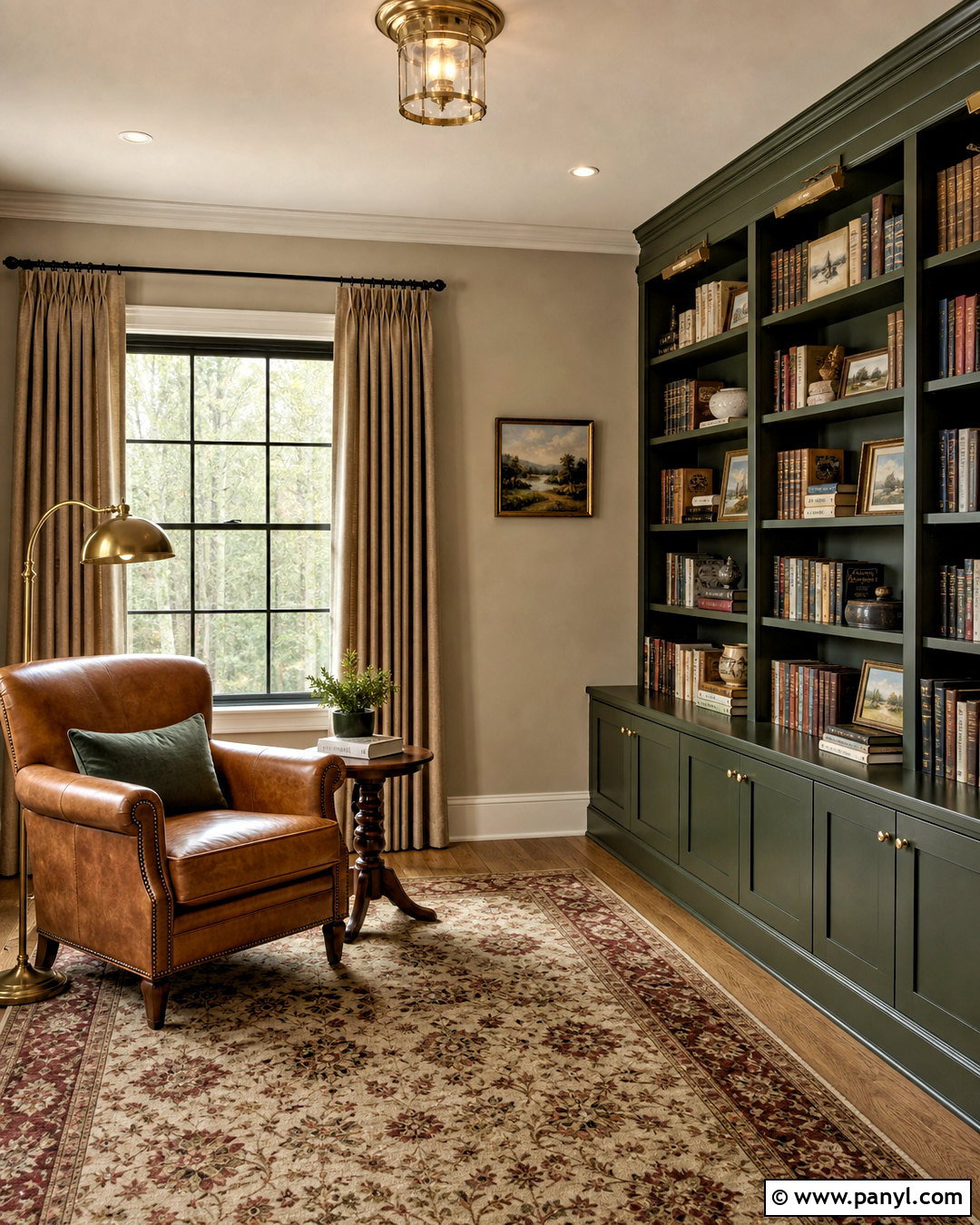
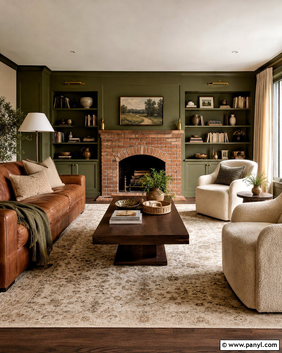
Forest green produces a dramatic, traditional pairing with Accessible Beige. Create a reading room with Accessible Beige walls, floor-to-ceiling forest green bookcases, and warm ivory trim. Place a camel leather chair beside the shelving and add a small walnut side table with an aged brass reading lamp. A Persian-inspired rug in forest green, cream, and muted brick red will ground the room and introduce controlled pattern. Use oatmeal curtains to soften the windows without competing with the bookcases. The green should cover one major architectural feature rather than many unrelated furnishings. This helps the space feel intentional and balanced. Complete the room with books, framed landscapes, and a few cream ceramics, leaving enough open shelving to prevent the dark cabinetry from appearing visually crowded.
16. Accessible Beige And Terracotta
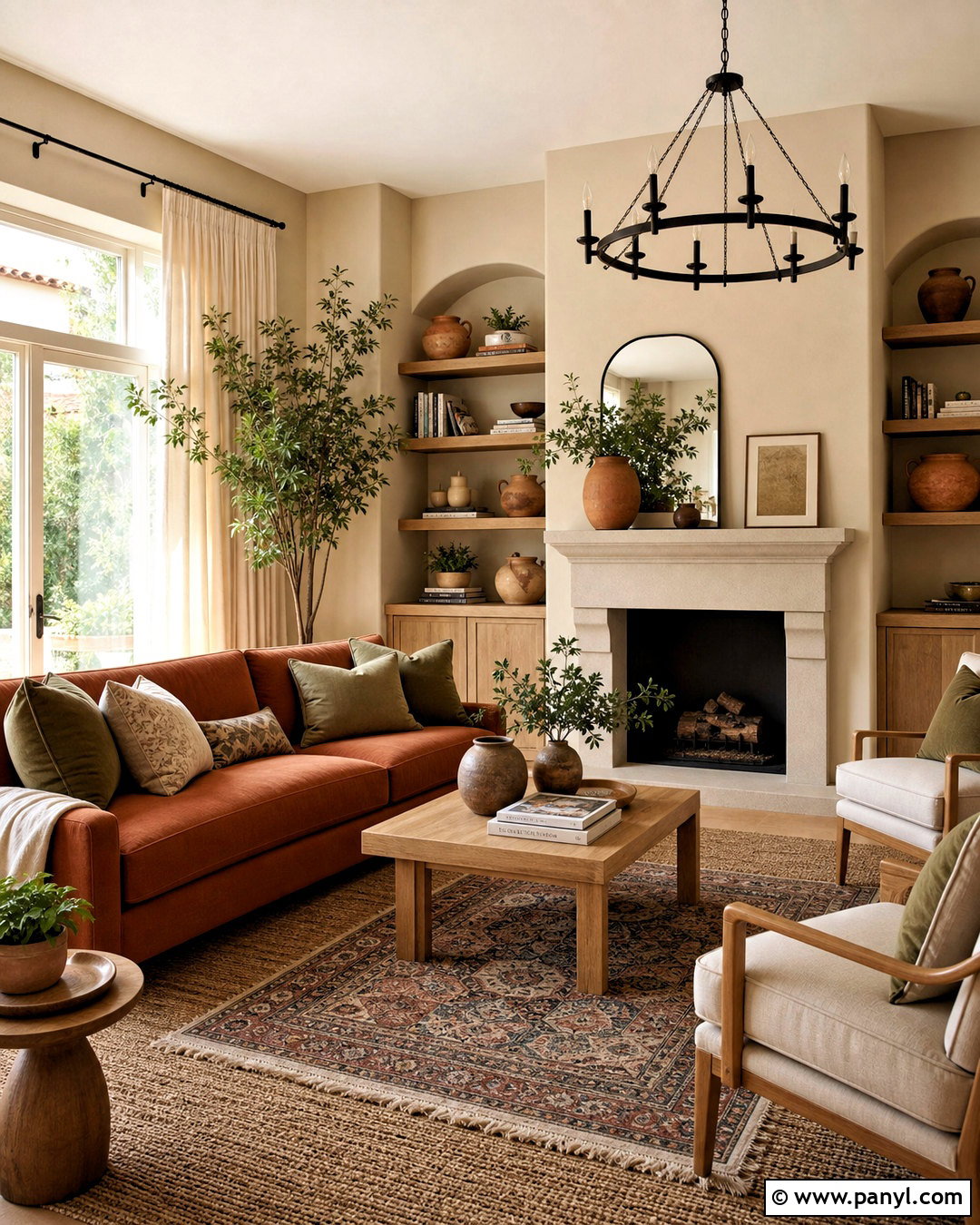
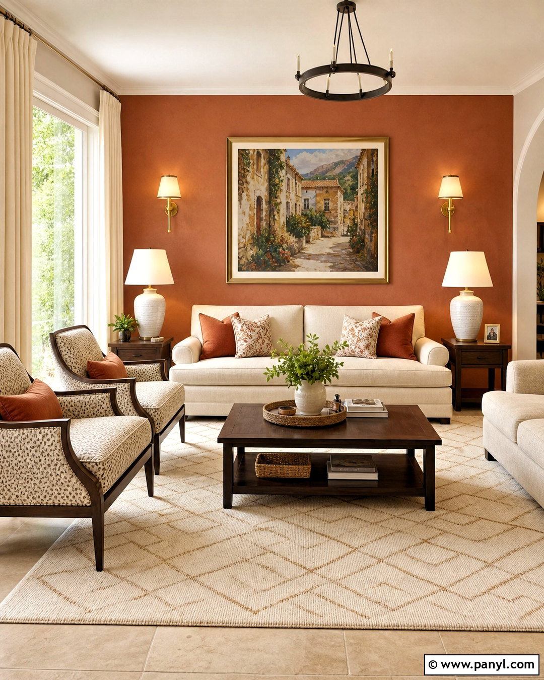
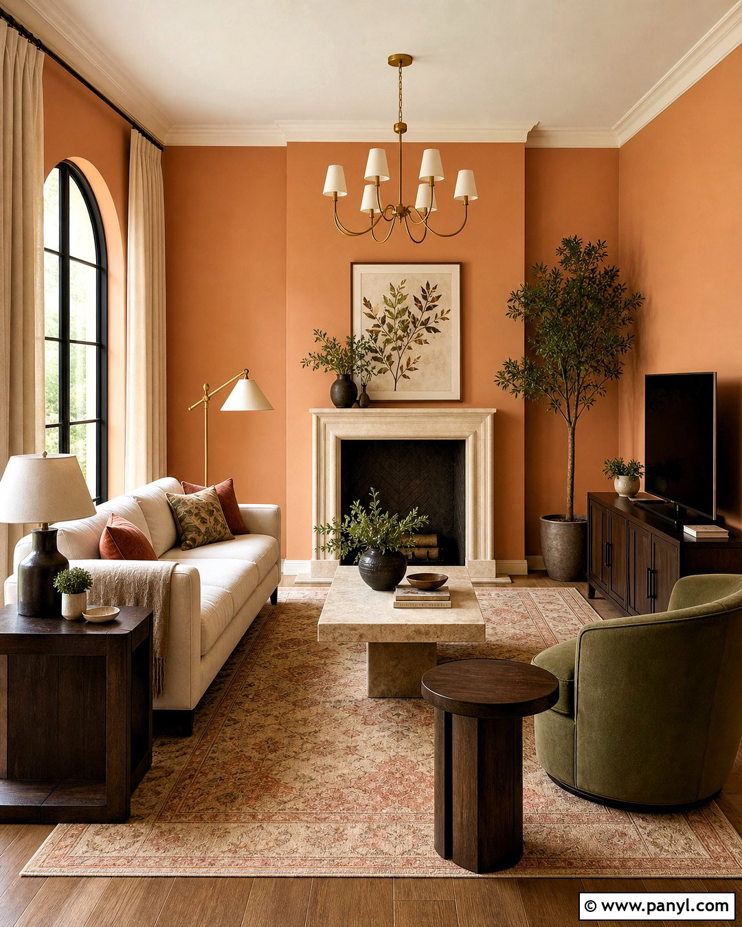
Terracotta draws out the warm, earthy side of Accessible Beige and creates a welcoming Southwestern or Mediterranean-influenced living space. Keep Accessible Beige on the walls and introduce terracotta through a sofa, accent chairs, large rug, or painted fireplace surround. Pair these colors with creamy linen curtains, natural oak furniture, and handmade clay pottery. A woven jute rug can sit beneath a patterned flatweave for extra texture. Use dark bronze lighting and hardware instead of shiny chrome, which may feel disconnected from the palette. Add muted olive pillows and leafy plants to provide a natural counterpoint to the orange-red accents. Distribute terracotta around the room in several sizes, but let one larger piece lead. The finished look should feel warm and collected, not themed.
17. Accessible Beige And Blush Pink
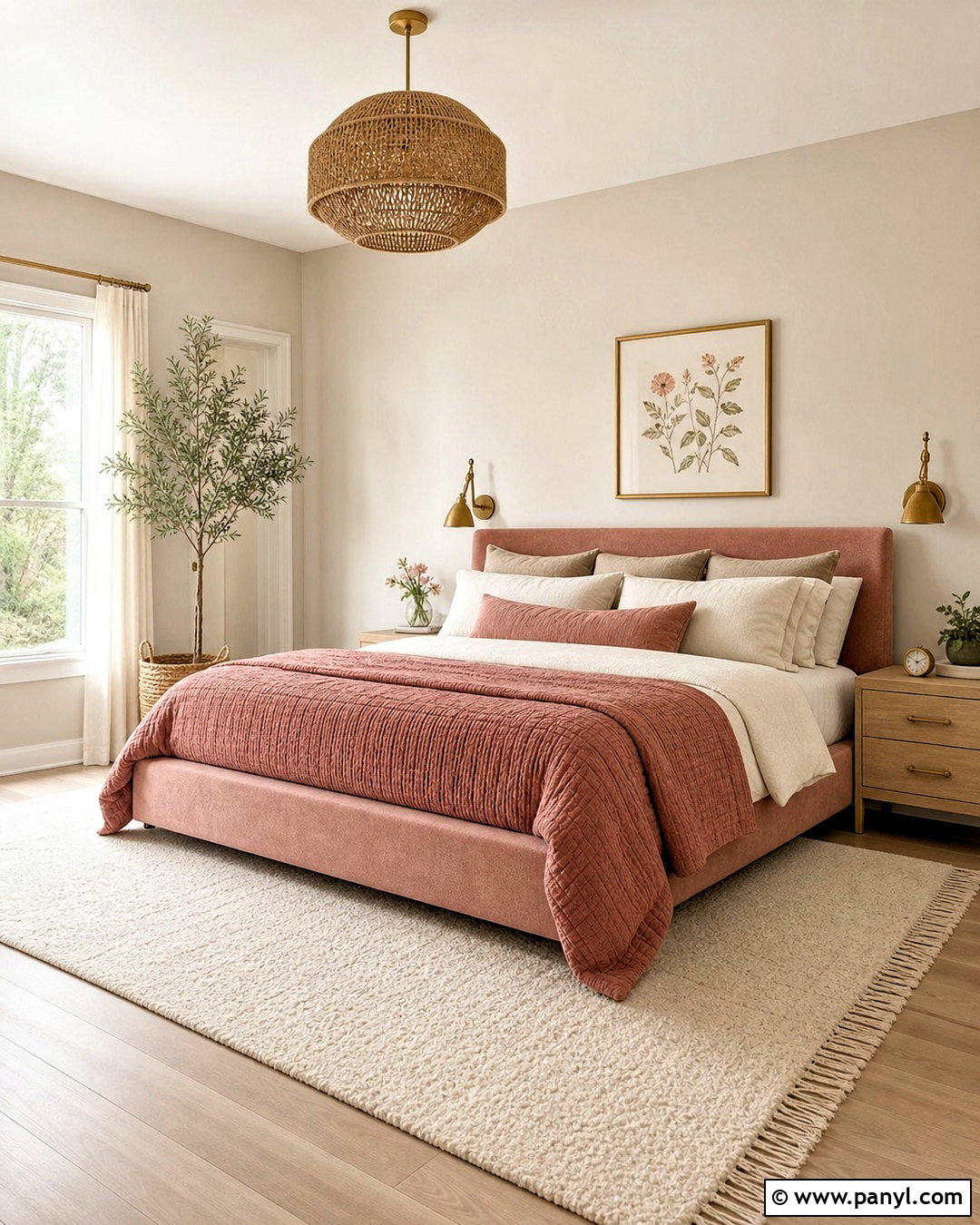
Blush pink softens Accessible Beige and brings gentle color into a bedroom, nursery, or dressing space. Paint the walls Accessible Beige, then use dusty blush on an upholstered bed, curtains, or a compact accent chair. Choose warm white trim and pale oak furniture to keep the room bright. Layer the bed with ivory linen, a muted rose quilt, and taupe pillows so the pink feels mature rather than sugary. A cream wool rug and woven pendant light add soft texture. Bring in aged brass hardware and a few walnut details for needed depth. Artwork can combine blush, beige, brown, and subdued green in an abstract or botanical composition. This full palette works because every color has a softened quality, allowing the furnishings and walls to flow together calmly.
18. Accessible Beige And Dusty Rose
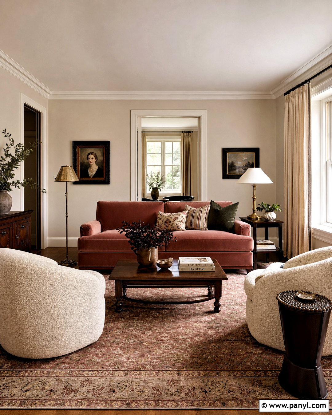
Dusty rose offers more depth than pale blush while remaining gentle beside Accessible Beige. In a formal sitting room, use Accessible Beige walls with a dusty rose velvet sofa as the central feature. Add two cream boucle chairs, a dark walnut coffee table, and a faded traditional rug containing rose, beige, olive, and brown. Full-length oatmeal curtains will frame the windows without competing with the sofa. Choose antique brass lamps and warm white trim for a softly polished finish. A few deep brown accents, including picture frames and side tables, keep the romantic color from feeling overly delicate. Limit additional pink accessories and instead repeat dusty rose through one artwork or patterned pillow. This approach creates a balanced room with warmth, character, and grown-up color.
19. Accessible Beige And Mustard Yellow
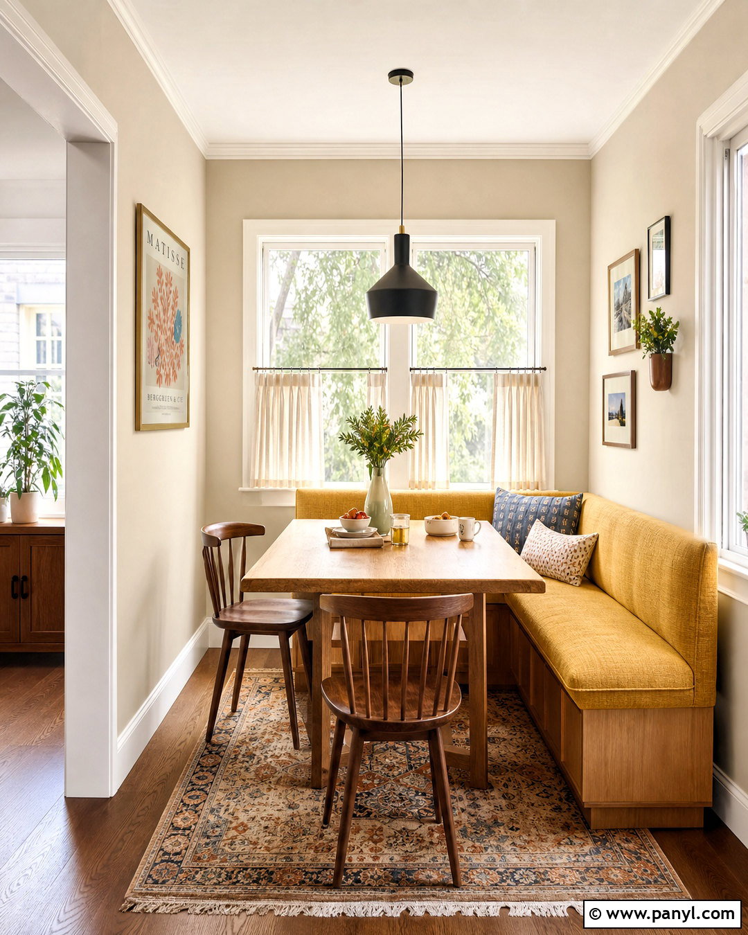
Mustard yellow brings cheerful warmth to Accessible Beige without the sharpness of a bright lemon tone. Design a casual breakfast nook with Accessible Beige walls, a mustard upholstered banquette, and a natural oak table. Use warm white trim and simple cream café curtains to maintain an open feeling. Dining chairs in walnut or black-stained wood will give the light palette stronger outlines. Add a vintage-inspired rug with beige, mustard, faded blue, and rust details. Ceramic tableware and a matte black pendant can provide practical finishing touches. Because mustard is visually powerful, concentrate it on the banquette and repeat it sparingly in artwork or a small cushion. The completed nook feels sunny and welcoming while keeping Accessible Beige as the calm background connecting every material.
20. Accessible Beige And Charcoal Gray
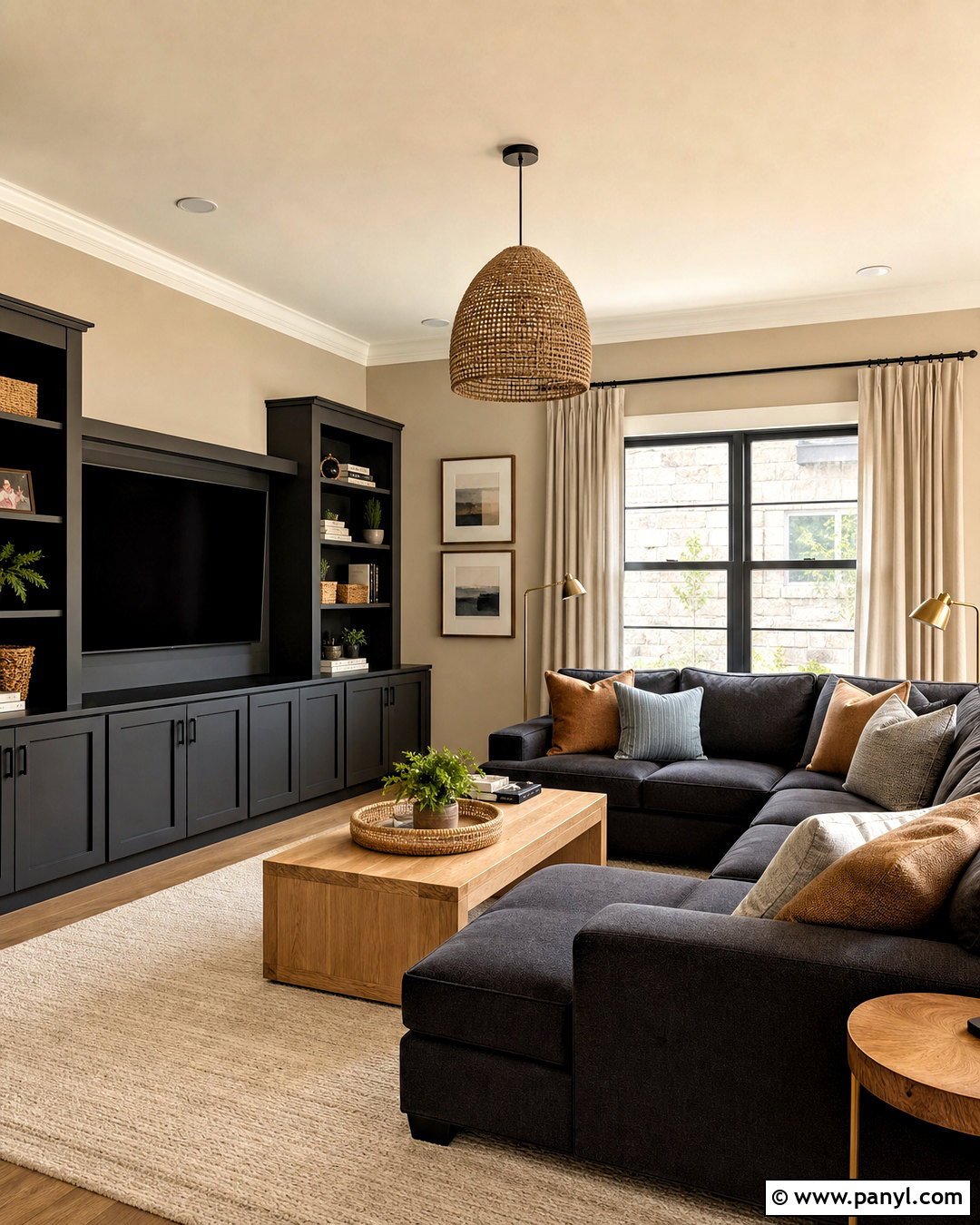
Charcoal gray gives Accessible Beige a tailored, contemporary contrast that works especially well in a media room. Paint the main walls Accessible Beige and use charcoal on the media cabinet, interior doors, or a large sectional. Add a pale oak console and a warm ivory rug to balance the darker surfaces. Cushions in camel, cream, and muted blue can create a comfortable transition between warm and cool tones. Use matte black hardware carefully because too much black may compete with the softer charcoal. Linen curtains, woven baskets, and warm brass floor lamps will prevent the space from feeling severe. Keep the ceiling warm white and incorporate layered lighting for flexibility. The complete design feels grounded and modern while remaining comfortable enough for everyday family use.
Conclusion:
These **20 colors that go with Accessible Beige ideas** show how easily this warm greige can support light neutrals, earthy shades, muted pastels, and dramatic dark accents. Aesthetic White and Alabaster create gentle brightness, while navy, forest green, charcoal, and Urbane Bronze deliver stronger contrast. Terracotta, mustard, olive, and dusty rose bring warmth and personality without fighting the beige foundation. Before committing, test large painted samples beside your flooring, countertops, wood finishes, and fabrics. View them during the morning, afternoon, and evening. Most importantly, design the entire room as one connected palette. When paint, furniture, textiles, lighting, and materials share related undertones, Accessible Beige looks intentional rather than simply neutral.

Related Ideas and Inspiration:
Leave a Reply