
Color is moving in two exciting directions for 2027: grounded nature tones and expressive, joy-filled brights. **20 Trendy Wall Colors 2027** explores both sides, including earthy clay, deep green, warm brown, energetic orange, and highly saturated blue. WGSN and Coloro named Luminous Blue their 2027 Color of the Year, supported by Energy Orange, Pop Pink, Meadowland Green, and Clay for spring and summer. Their fall and winter forecast adds Russet, Peaceful Lilac, Maize, and Deep Green. () These colors feel especially fresh when coordinated with flooring, furniture, trim, metals, and natural materials instead of appearing as isolated accent walls. Always test large samples throughout the day because undertones shift with exposure and artificial lighting. Here are complete, practical rooms built around **20 Trendy Wall Colors 2027**.

1. Luminous Blue Wall Color
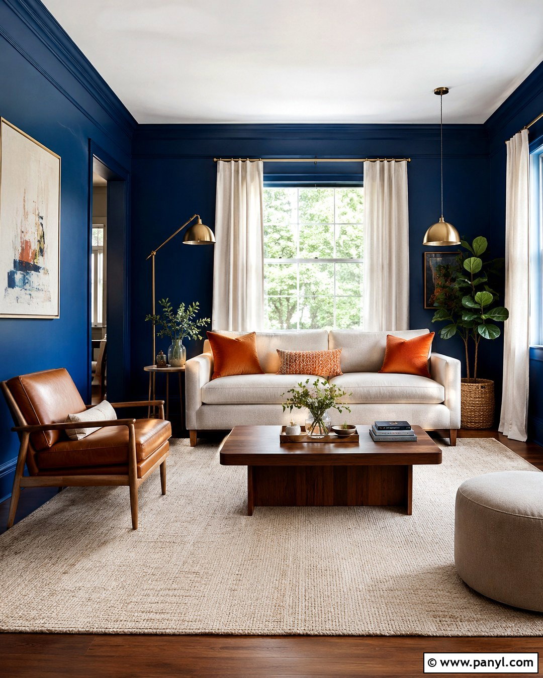
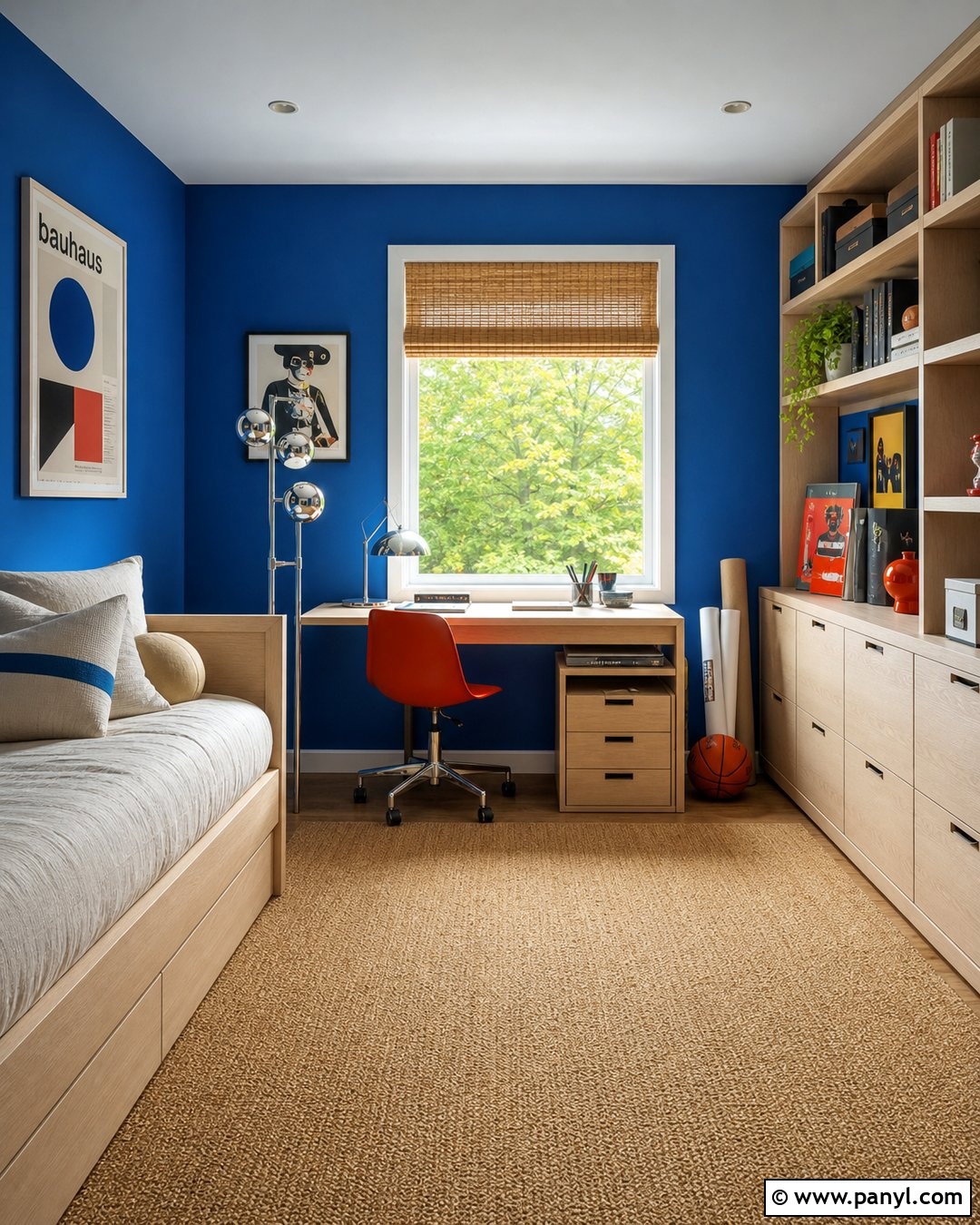
Luminous blue creates an immersive living room that feels confident, polished, and surprisingly comfortable. Paint every wall in this saturated blue, then use warm white on the ceiling to keep the space open. A low oatmeal sofa, cognac leather chair, and medium-tone walnut coffee table soften the color’s intensity. Add a cream wool rug with a simple geometric pattern to brighten the floor. Brushed brass lighting contributes warmth, while cobalt glass accessories develop a layered blue palette. Curtains should remain light, preferably natural linen or warm ivory cotton. Rather than introducing several competing colors, add restrained touches of burnt orange through pillows or artwork. This combination makes luminous blue dramatic enough to feel current without turning an average living room into an overwhelming space.
2. Energy Orange Wall Color
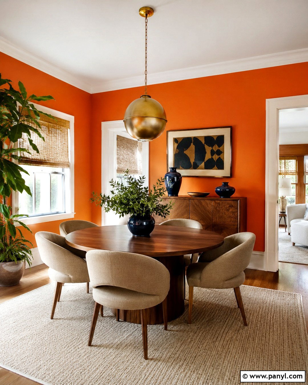
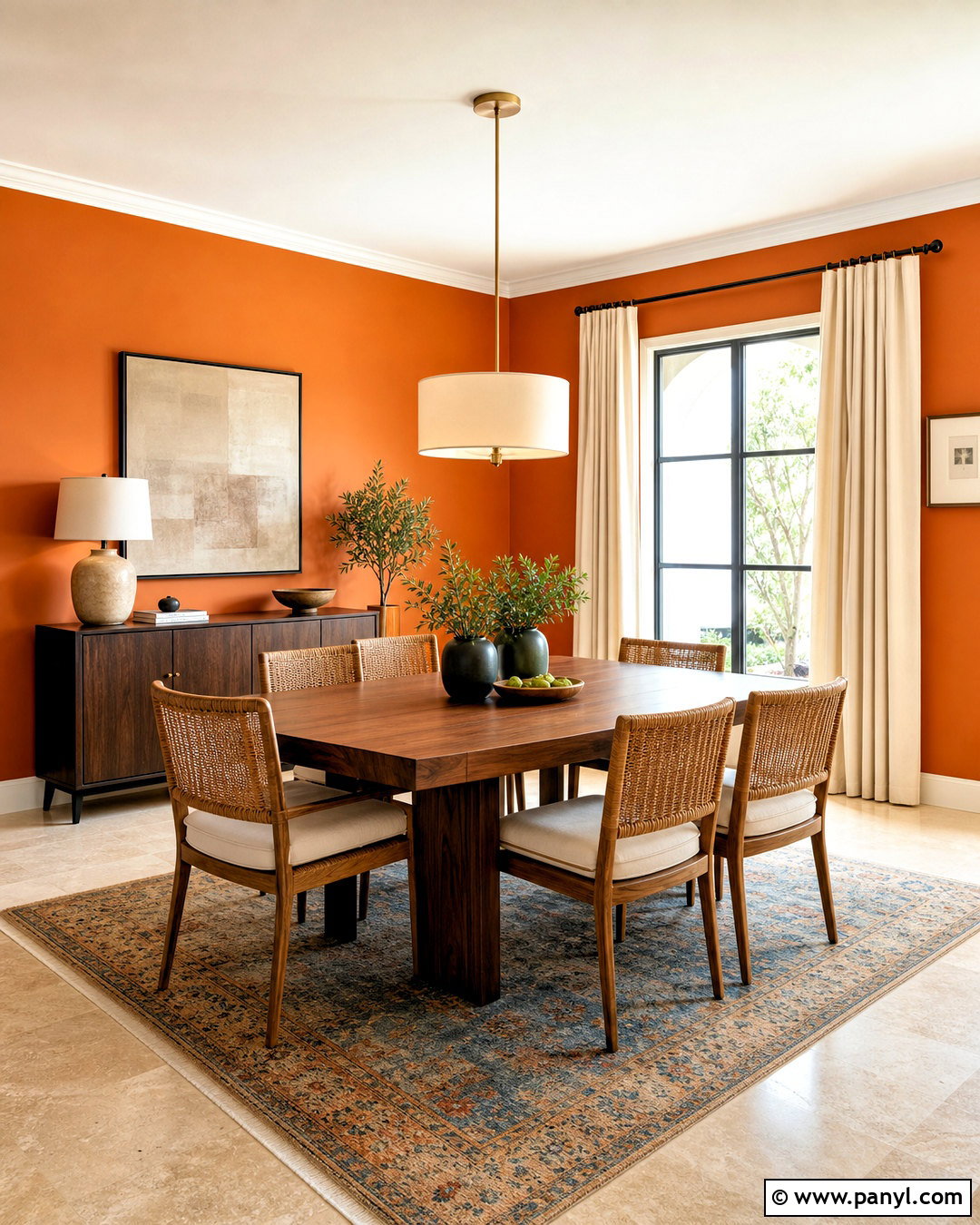
Could a dining room feel both playful and sophisticated? Energy orange makes that possible when its brightness is balanced with sturdy, natural finishes. Use the color across the walls, but keep the ceiling, crown molding, and baseboards soft white. Center the room with a round walnut dining table and curved chairs upholstered in warm beige fabric. A cream flat-weave rug provides visual breathing room underfoot. Choose a large pendant with an aged brass frame and white globe shades to distribute clean light. Small amounts of deep blue in pottery or framed artwork create crisp contrast. Natural woven blinds introduce texture without adding another strong color. The finished room feels cheerful during breakfast, glowing at dinner, and distinctive enough to make everyday meals more memorable.
3. Pop Pink Wall Color
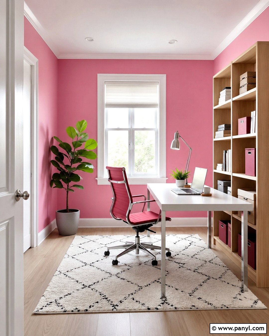
Pop pink can give a home office creative energy without making the room look childish. Choose a slightly softened version of the color for all four walls, then pair it with crisp white trim and pale oak flooring. A streamlined white desk keeps the center of the room visually calm. Add a berry-red task chair, a light oak bookcase, and matte burgundy storage boxes to build a tonal palette. A graphic cream-and-pink rug helps connect the furniture with the walls. Keep window treatments simple with white Roman shades that allow plenty of daylight inside. Brushed chrome hardware gives the room a modern edge, while one leafy plant adds a fresh natural note. This complete workspace feels uplifting, organized, and suitable for serious daily use.
4. Meadowland Green Wall Color
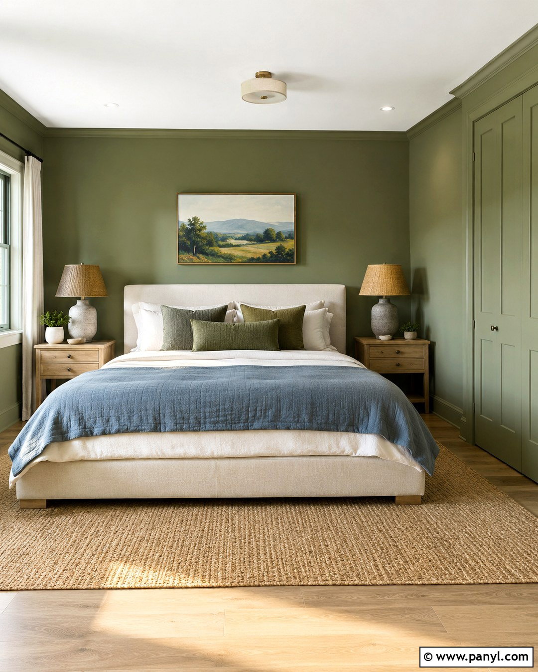
Meadowland green brings the restorative quality of an open landscape into a relaxed bedroom. Cover the walls in this balanced mid-green and continue the color onto simple closet doors for a seamless result. Choose an upholstered bed in oatmeal linen, layered with ivory sheets, moss-green pillows, and a muted blue quilt. Light oak nightstands prevent the palette from becoming too heavy, while ceramic lamps in warm white add gentle contrast. A natural jute-and-wool rug grounds the arrangement and complements woven window shades. Keep the ceiling creamy white to reflect daylight, especially in a smaller room. Black accents should be limited to thin picture frames or compact hardware. The final bedroom feels peaceful and nature connected, yet the clean furniture lines keep it fresh rather than rustic.
5. Clay Wall Color
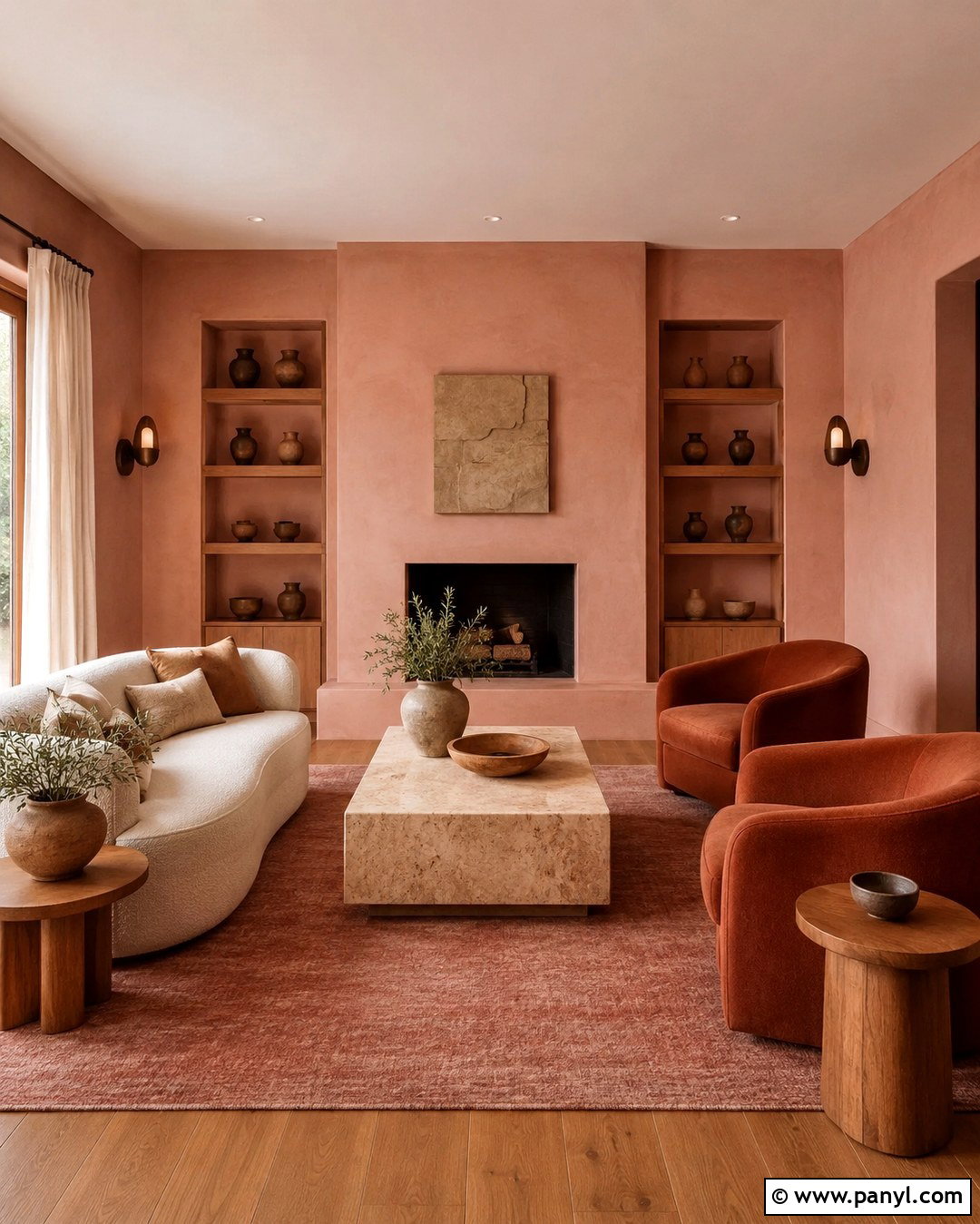
Clay walls offer an easy way to warm a living room while maintaining the flexibility of a neutral. Select a pink-toned clay shade with an earthy, muted finish and use it across the walls, fireplace surround, and built-in shelves. A cream boucle sofa and two rust-colored lounge chairs create a soft tonal arrangement. Introduce travertine through the coffee table, then add medium oak side tables for natural variation. The rug can combine sand, faded rose, and soft brown in a subtle pattern. Off-white linen curtains should hang high and wide to make the room feel taller. Finish with aged bronze sconces, handmade pottery, and a few deep green branches. Together, these materials give the clay color depth and make the complete space feel welcoming throughout the year.
6. Russet Wall Color
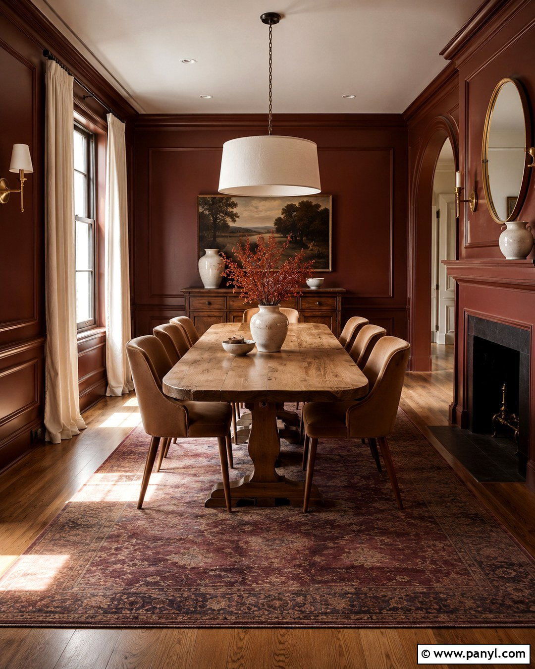
Rich russet transforms a formal dining room into a warm, intimate space without relying on dark gray or conventional navy. Paint the walls and lower paneling in the same reddish-brown shade, using an eggshell finish above and satin on the woodwork. A substantial oak dining table anchors the room, surrounded by chairs covered in camel-colored fabric. Hang an oversized linen pendant or sculptural cream chandelier above the table to brighten the composition. A faded rug containing rust, plum, and beige introduces quiet pattern. Keep the ceiling pale ivory and repeat that color through simple curtains. Antique brass candlesticks, dark wood frames, and off-white ceramics complete the setting. Russet works especially well here because evening light emphasizes its warmth while the neutral furnishings control its intensity.
7. Peaceful Lilac Wall Color
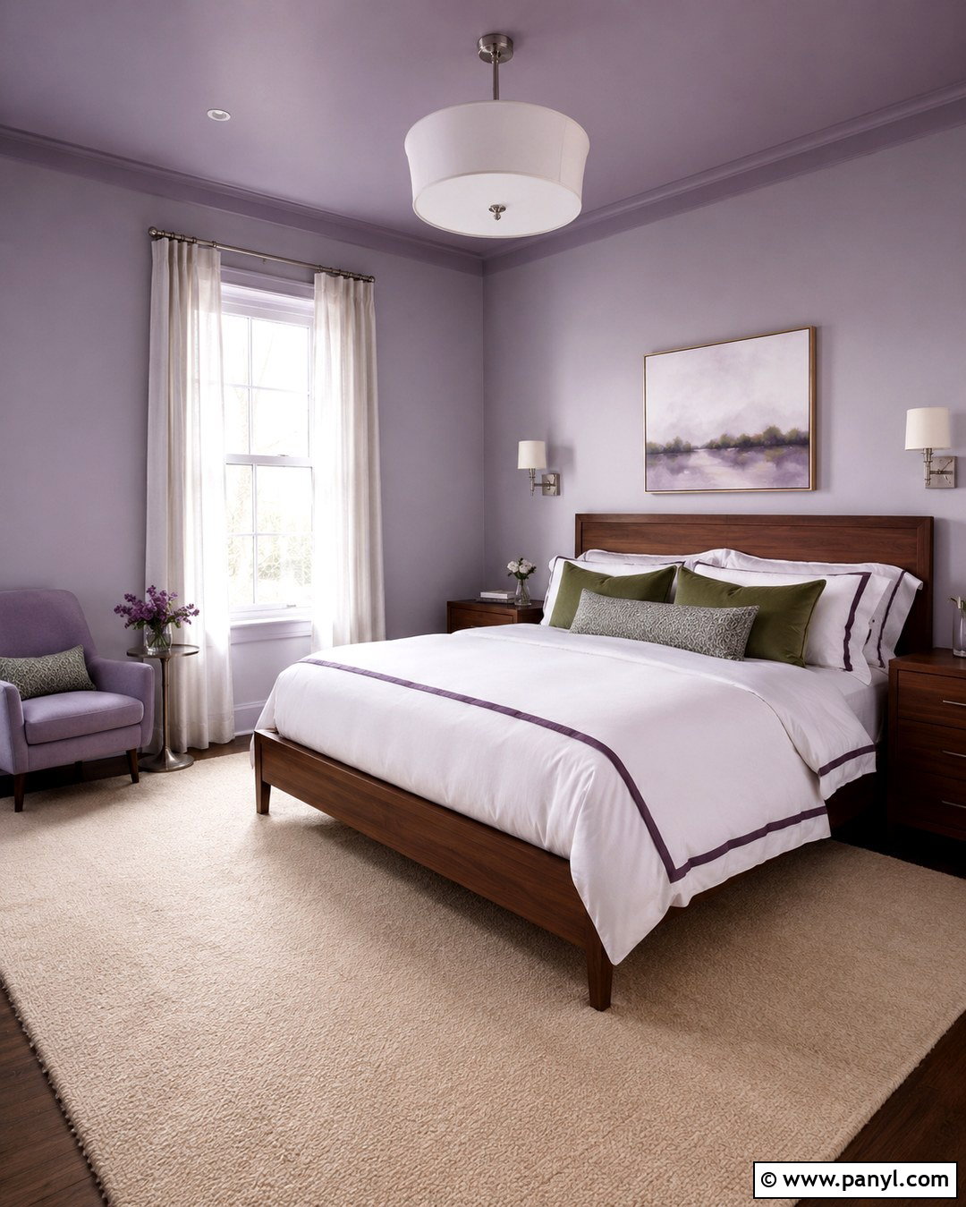
Peaceful lilac creates a bedroom that feels airy and distinctive without becoming overly sweet. Look for a pale lilac with gray undertones, then paint the walls and ceiling in closely related shades for a soft, enveloping effect. Ground the room with a walnut bed, matching nightstands, and warm beige carpeting or a large wool rug. White bedding keeps the palette clean, while plum piping and muted green pillows provide restrained contrast. Select brushed nickel lamps or chrome sconces to echo the color’s cool undertone. Natural linen curtains add warmth and soften direct sunlight. Artwork can introduce dusty blue, charcoal, and cream without disrupting the restful atmosphere. The finished bedroom feels gentle in bright daylight and slightly more complex under evening lighting, giving the pastel unexpected staying power.
8. Maize Wall Color
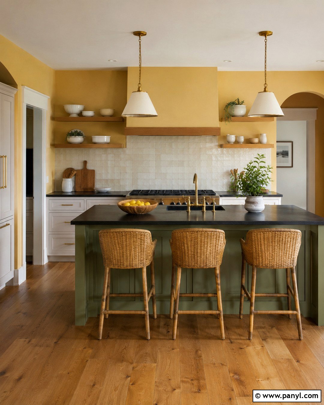
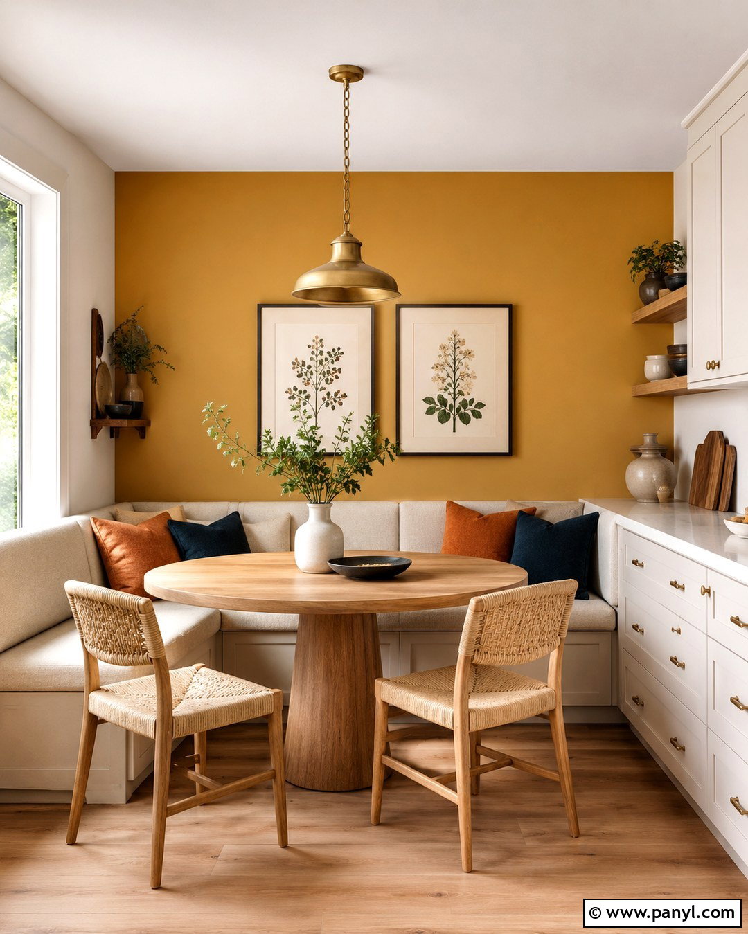
Maize is a mellow golden yellow that can make a kitchen feel sunny even on an overcast morning. Use it on the walls around warm white cabinets rather than combining it with stark, blue-based white. A backsplash of handmade cream tile adds subtle surface variation, while honed soapstone countertops provide grounding contrast. Choose medium oak flooring and repeat the wood on open shelves or counter stools. A small island painted muted olive green creates a natural connection between the yellow walls and darker surfaces. Unlacquered brass pulls will gradually develop character and deepen the room’s warmth. Keep decorative pieces useful and simple, such as white stoneware, wooden cutting boards, and linen towels. This complete palette feels nostalgic but clean, making maize suitable for traditional, farmhouse, and transitional kitchens.
9. Deep Green Wall Color
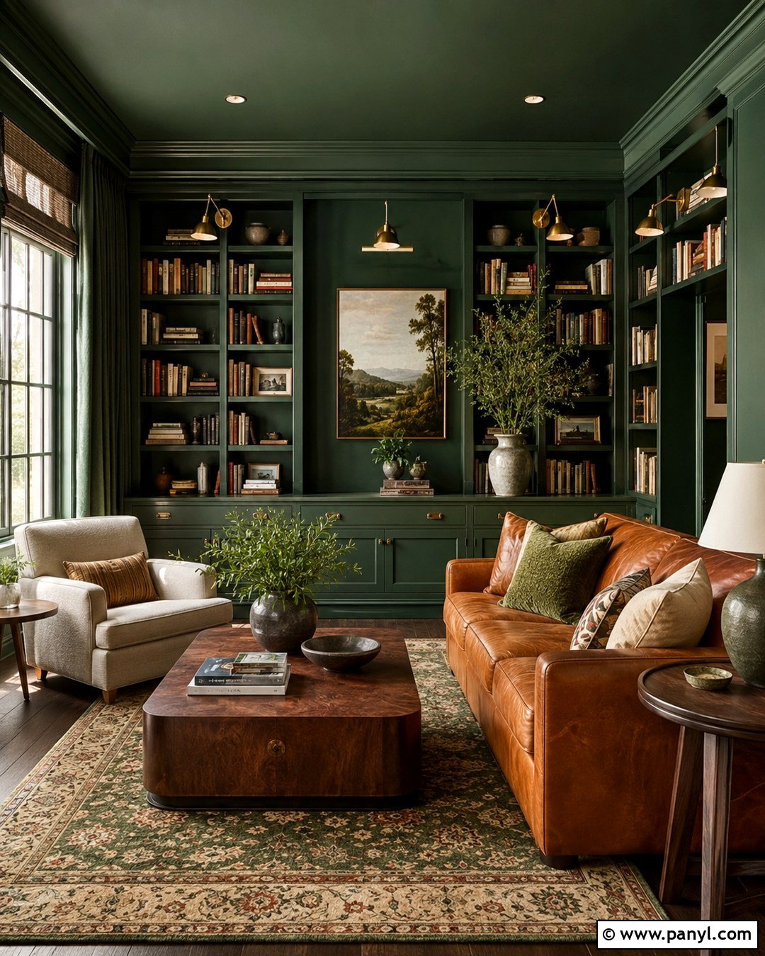
Deep green works beautifully in a reading room where an enclosed, quiet atmosphere is part of the appeal. Color-drench the walls, built-in bookcases, trim, and ceiling in a forest green with a slightly muted undertone. Add a deep caramel leather sofa and an oversized lounge chair upholstered in warm oatmeal fabric. A patterned wool rug containing dark green, tan, and faded red keeps the room from feeling flat. Use aged brass library lights to illuminate the shelves and place a simple bronze floor lamp beside the chair. Walnut side tables strengthen the traditional character, while cream pottery and book jackets provide lighter breaks. This layered room feels established rather than trendy, yet the immersive wall treatment gives the classic green palette a clearly updated 2027 direction.
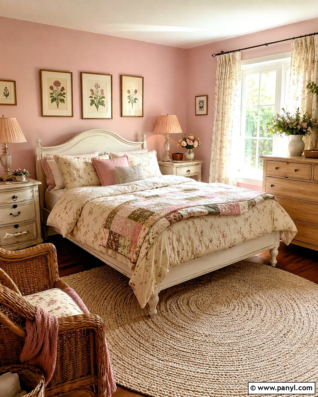
10. Warm Terracotta Wall Color
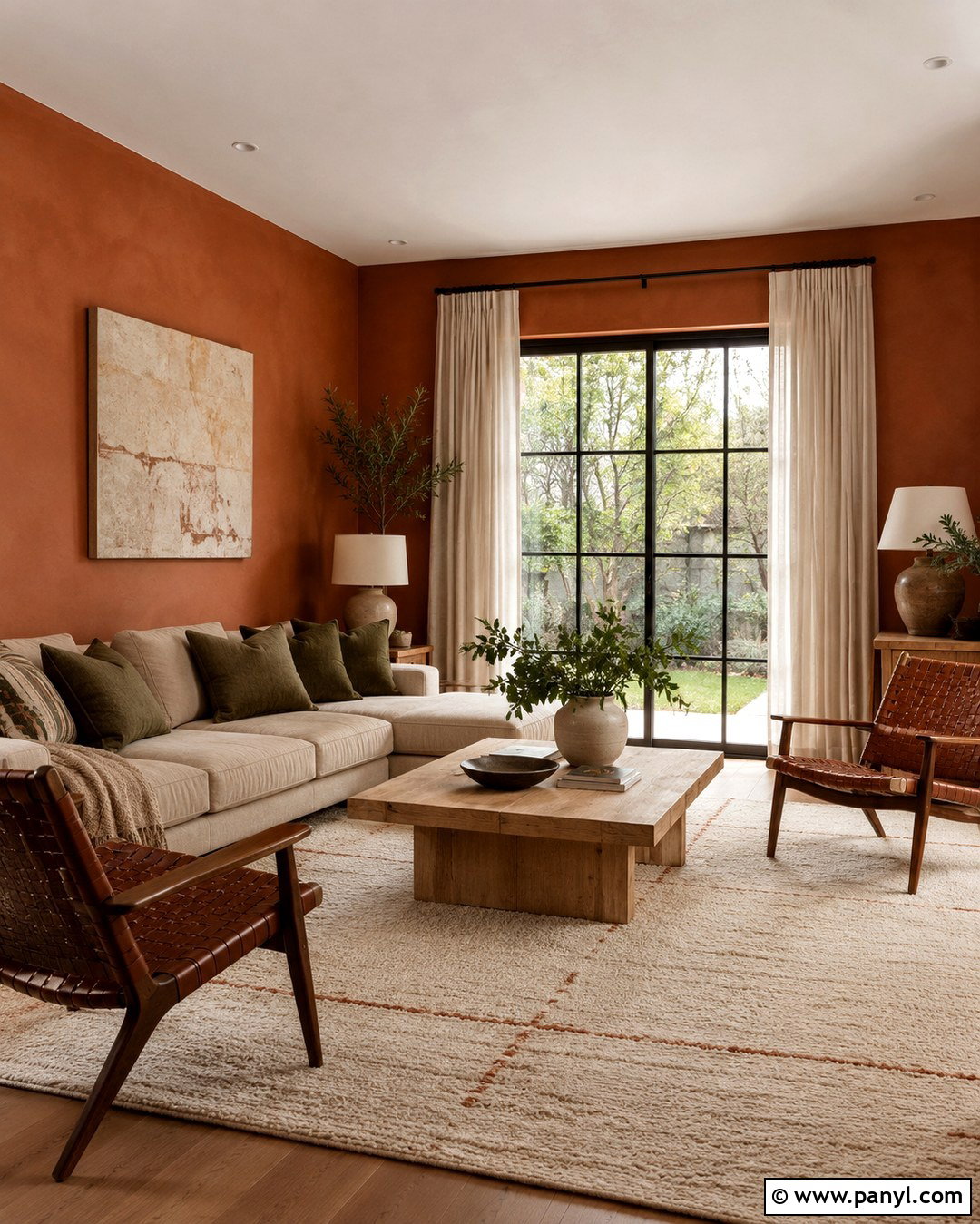
Warm terracotta brings sunbaked character to a family room when it is surrounded by light, tactile materials. Paint the walls in a muted orange-brown terracotta and leave the ceiling warm white. Arrange a flax linen sectional around a chunky light oak coffee table, then add woven lounge chairs to create flexible seating. A large cream rug with thin rust lines will brighten the floor while repeating the wall color quietly. Use olive-green pillows, sandy throws, and handmade ceramic lamps to reinforce the natural palette. Off-white curtains keep the windows soft and uncluttered. Instead of shiny finishes, favor matte black iron, unfinished wood, linen, and clay pottery. The complete space should feel casual and durable, with enough tonal variation to prevent the terracotta walls from looking heavy or overly themed.
11. Smoky Teal Wall Color
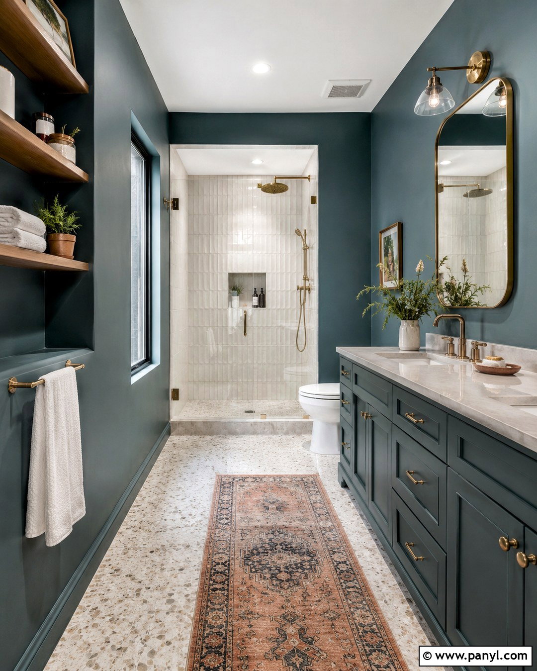
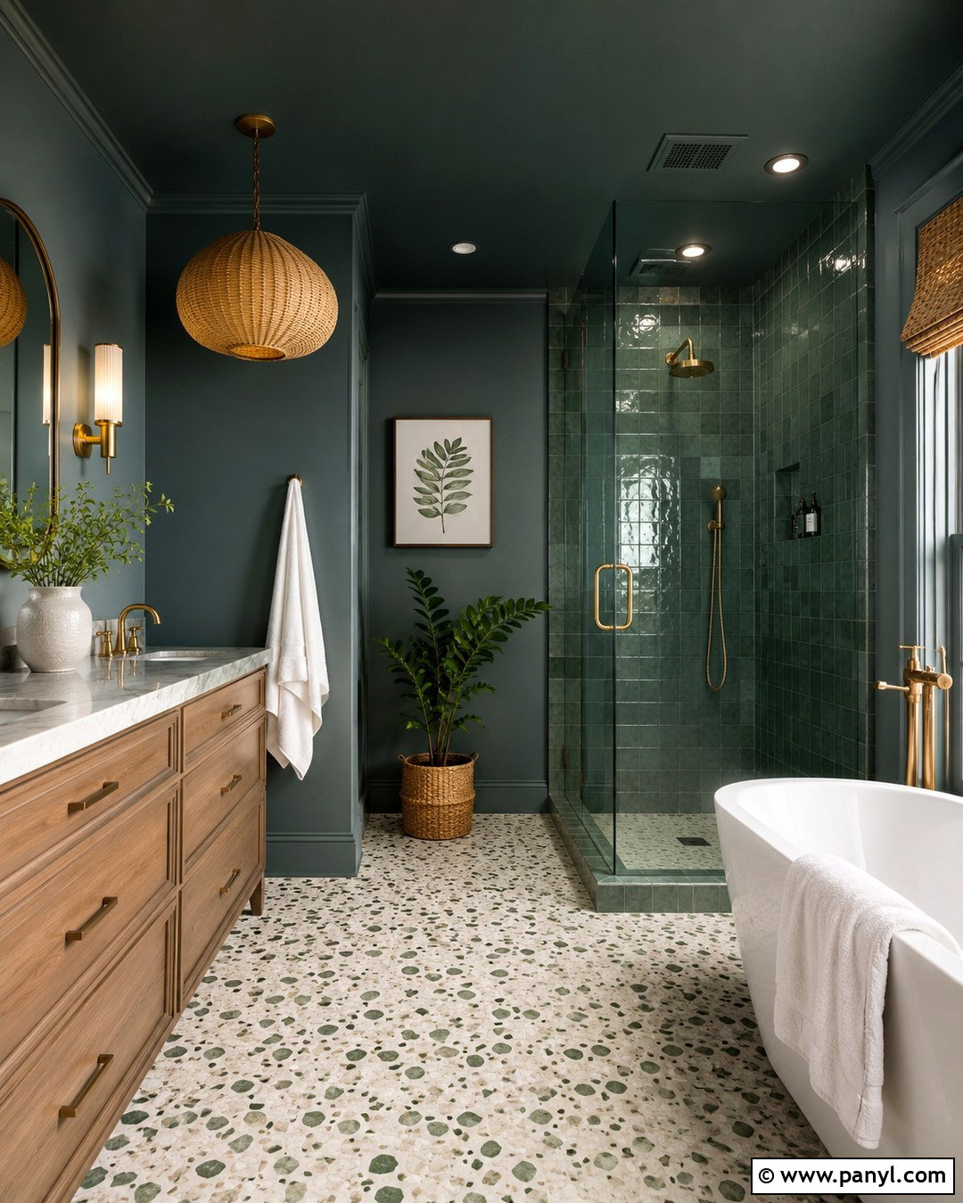
Smoky teal gives a bathroom depth while providing a softer alternative to dark navy. Apply the color to moisture-resistant walls and the vanity, creating a coordinated envelope around a white freestanding tub or simple tiled shower. Use warm white zellige tile in wet areas so the irregular surface catches and reflects light. A pale quartz countertop and light terrazzo floor keep the room feeling clean. Choose aged brass faucets, cabinet pulls, and mirror frames to warm the blue-green walls. Natural oak shelving adds another organic note and offers storage for neatly folded ivory towels. A muted coral runner can introduce a small but effective contrast. With bright lighting and a large mirror, the final bathroom feels saturated and relaxing rather than dark, making smoky teal practical even in a modest space.
12. Chocolate Brown Wall Color
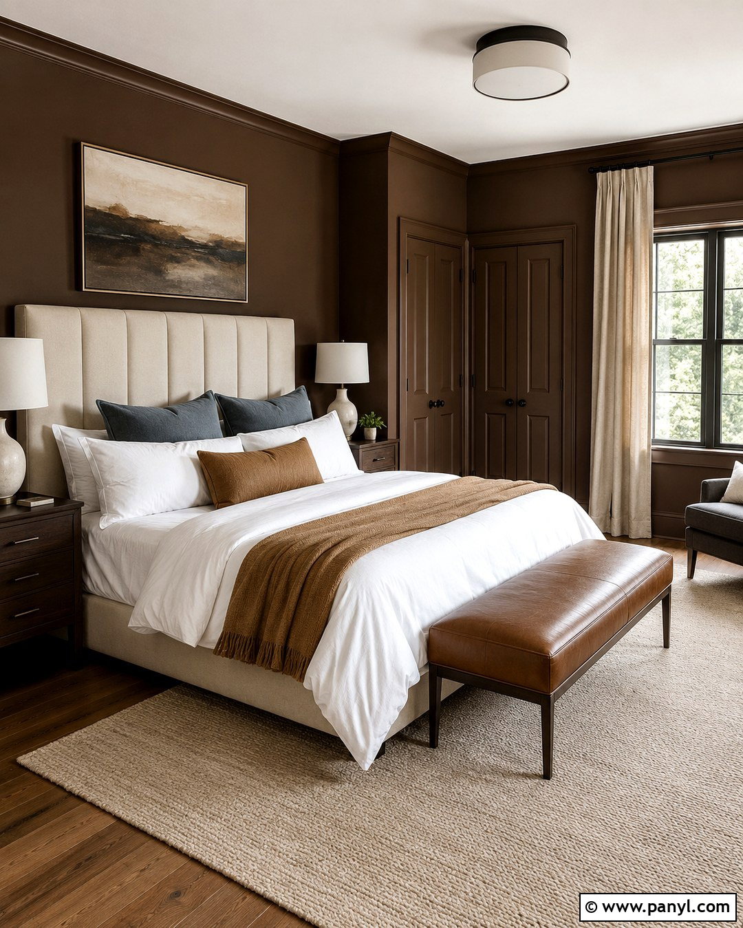
Chocolate brown can turn a bedroom into a comfortable cocoon when the furniture and textiles provide plenty of contrast. Select a deep cocoa shade with warm undertones and paint the walls, trim, and closet doors for a continuous look. Keep the ceiling creamy white unless the room is large and naturally bright. A tall ivory upholstered headboard becomes the focal point, accompanied by walnut nightstands and alabaster lamps. Layer the bed with white sheets, camel blankets, and muted blue pillows. A pale taupe rug prevents the floor area from disappearing into the dark palette. Add linen curtains and a bench in warm tan leather. Instead of black accessories, use aged brass and dark bronze sparingly. The result feels luxurious and grounded without requiring oversized furniture or expensive architectural detailing.
13. Burgundy Wall Color
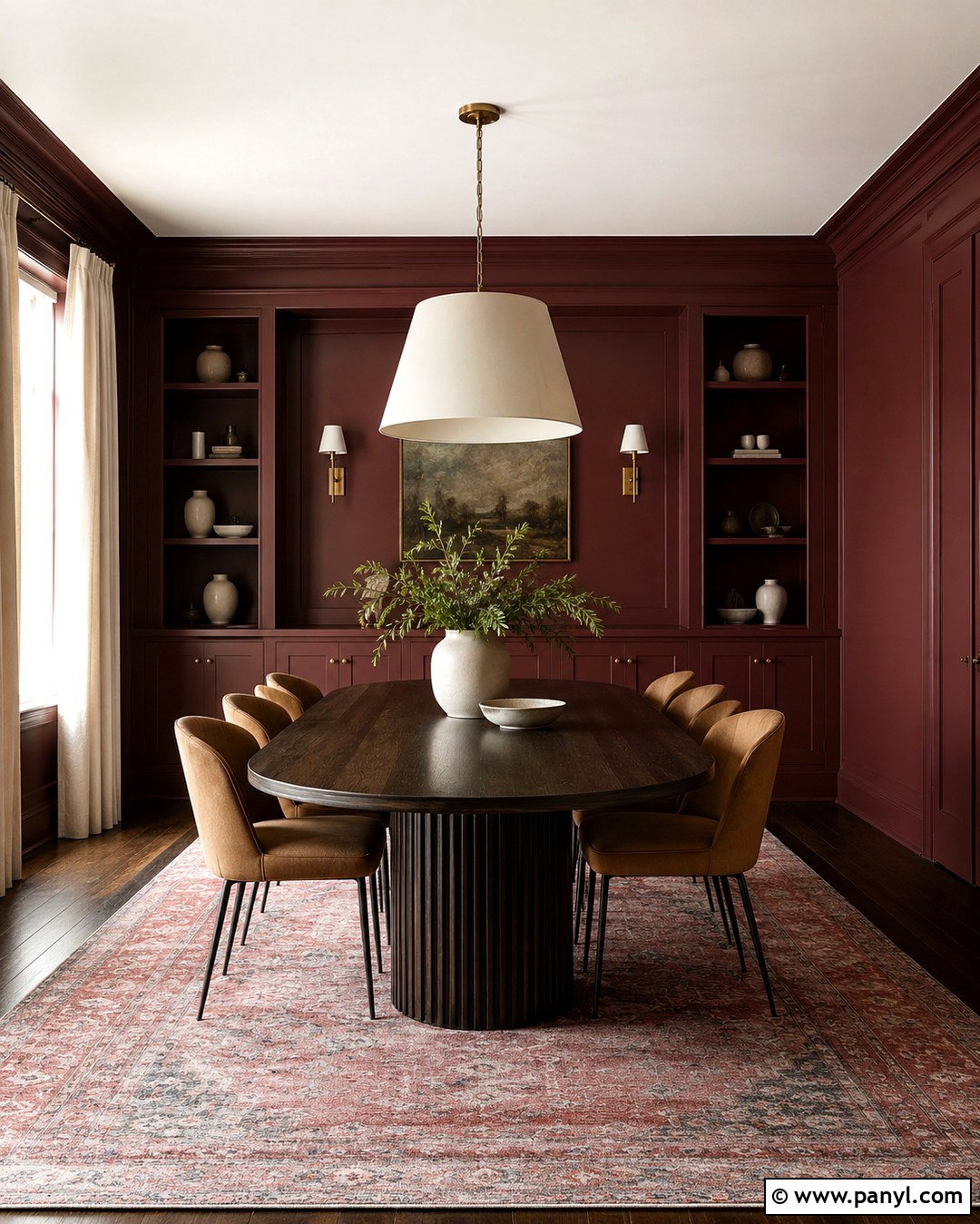
Burgundy makes a dining room feel rich and welcoming, especially when balanced with chalky neutrals and natural wood. Use a wine-free red-brown burgundy across the walls and built-in storage, then paint the ceiling a soft blush-white rather than bright white. Pair the walls with a dark oak table and dining chairs upholstered in textured camel fabric. A large cream pendant keeps the visual center light and prevents the palette from feeling formal or severe. Underfoot, choose a faded Persian-style rug containing burgundy, dusty rose, and muted blue. Antique brass hardware and slender wall sconces contribute warmth. Simple cream curtains and pale ceramics offer essential relief. This complete scheme makes burgundy feel current, livable, and appropriate for both intimate dinners and casual family gatherings.
14. Dusty Coral Wall Color
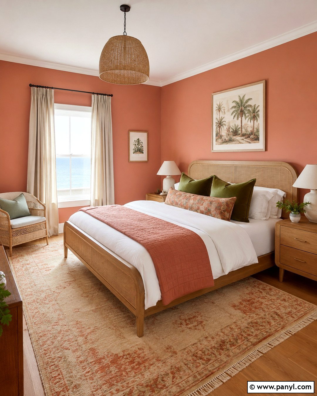
Dusty coral gives a guest bedroom warmth and personality while remaining softer than saturated pink or orange. Paint the walls in a muted coral with a touch of beige, then use creamy white on the trim and ceiling. Choose a cane or light oak bed to reinforce the casual feeling. White bedding, a terracotta quilt, and olive-green accent pillows create a balanced, nature-inspired palette. Place a woven wool rug in sand and faded coral beneath the bed, allowing it to extend generously on each side. Small plaster lamps and rounded oak nightstands keep the furniture visually light. Add linen curtains and one large botanical print rather than several small decorations. The finished space feels sunny, relaxed, and welcoming, giving guests a memorable room without sacrificing comfort or versatility.
15. Powder Blue Wall Color
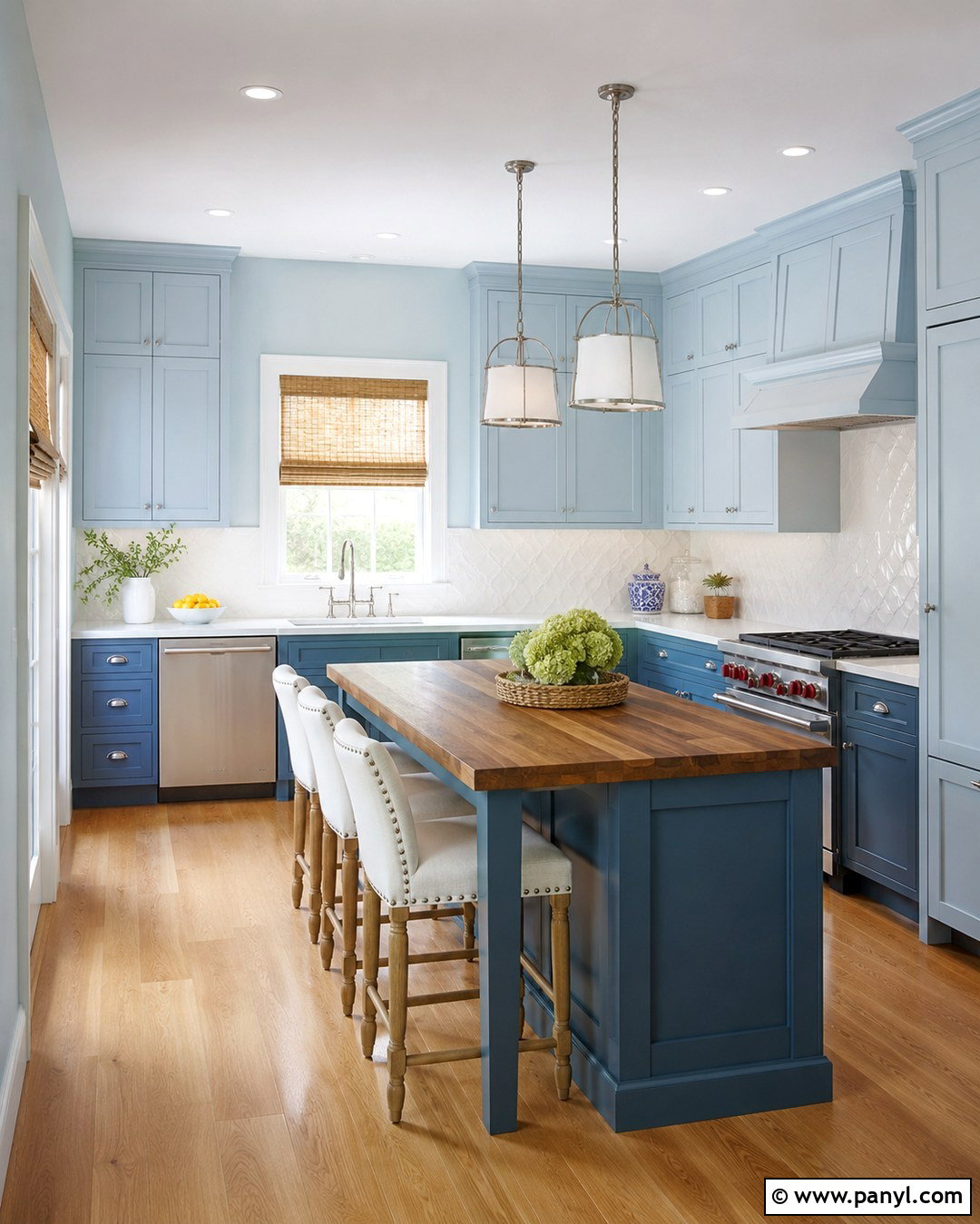
A powder blue kitchen feels clean and peaceful but gains character from warm wood and aged metal. Paint the walls and upper cabinets in the same soft blue, then use a slightly deeper version on the lower cabinetry for gentle contrast. Warm white quartz countertops and handmade ivory backsplash tile keep the room bright. Choose honey-toned oak flooring rather than cool gray planks, which can make pale blue feel cold. A small wood island with a butcher-block top provides extra preparation space and reinforces the warmth. Use brushed nickel or pewter hardware for a soft, understated finish. Natural woven shades and cream counter stools complete the room. This coordinated approach creates a subtle tonal kitchen that feels more developed than a basic blue-and-white scheme while remaining easy to live with.
16. Olive Green Wall Color
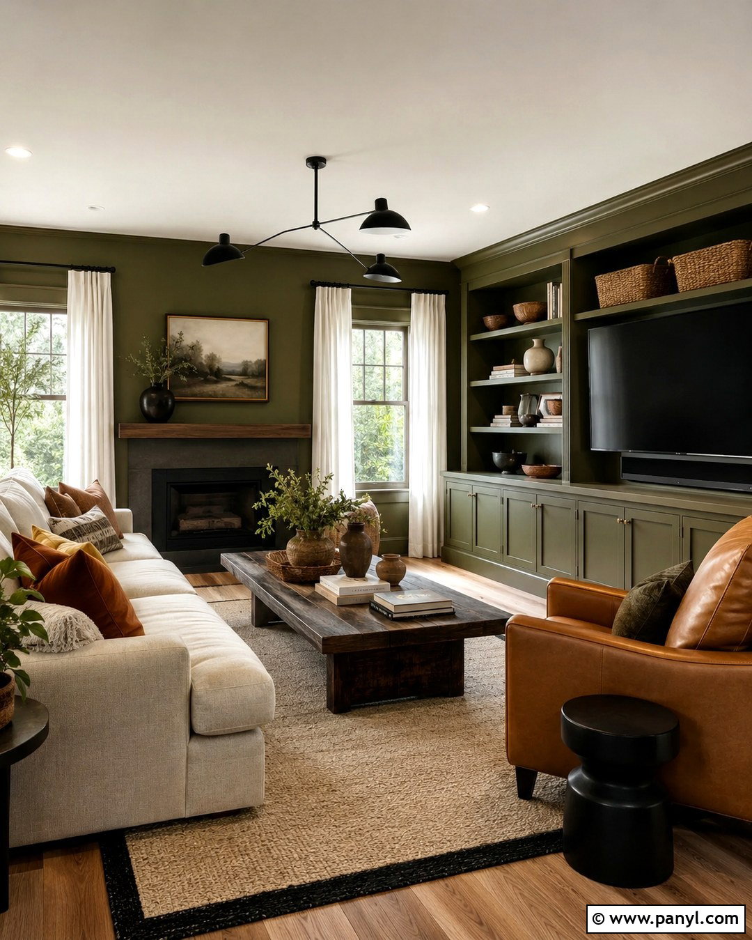
Olive green brings understated color to a living room and pairs easily with familiar neutral furniture. Choose a warm, earthy olive rather than a bright yellow-green, then carry it across the walls and built-in media cabinetry. A beige linen sofa, caramel leather armchair, and dark wood coffee table establish a comfortable foundation. Add a cream rug with a simple black border to define the seating area. Rust, ochre, and brown pillows deepen the organic palette without introducing unrelated colors. Warm white curtains and a pale ceiling keep the room from becoming visually dense. Matte black lighting offers clean contrast, while woven baskets and textured ceramics support the casual mood. The completed room feels collected and timeless, making olive a practical choice for households that want color without excessive brightness.
17. Mushroom Taupe Wall Color
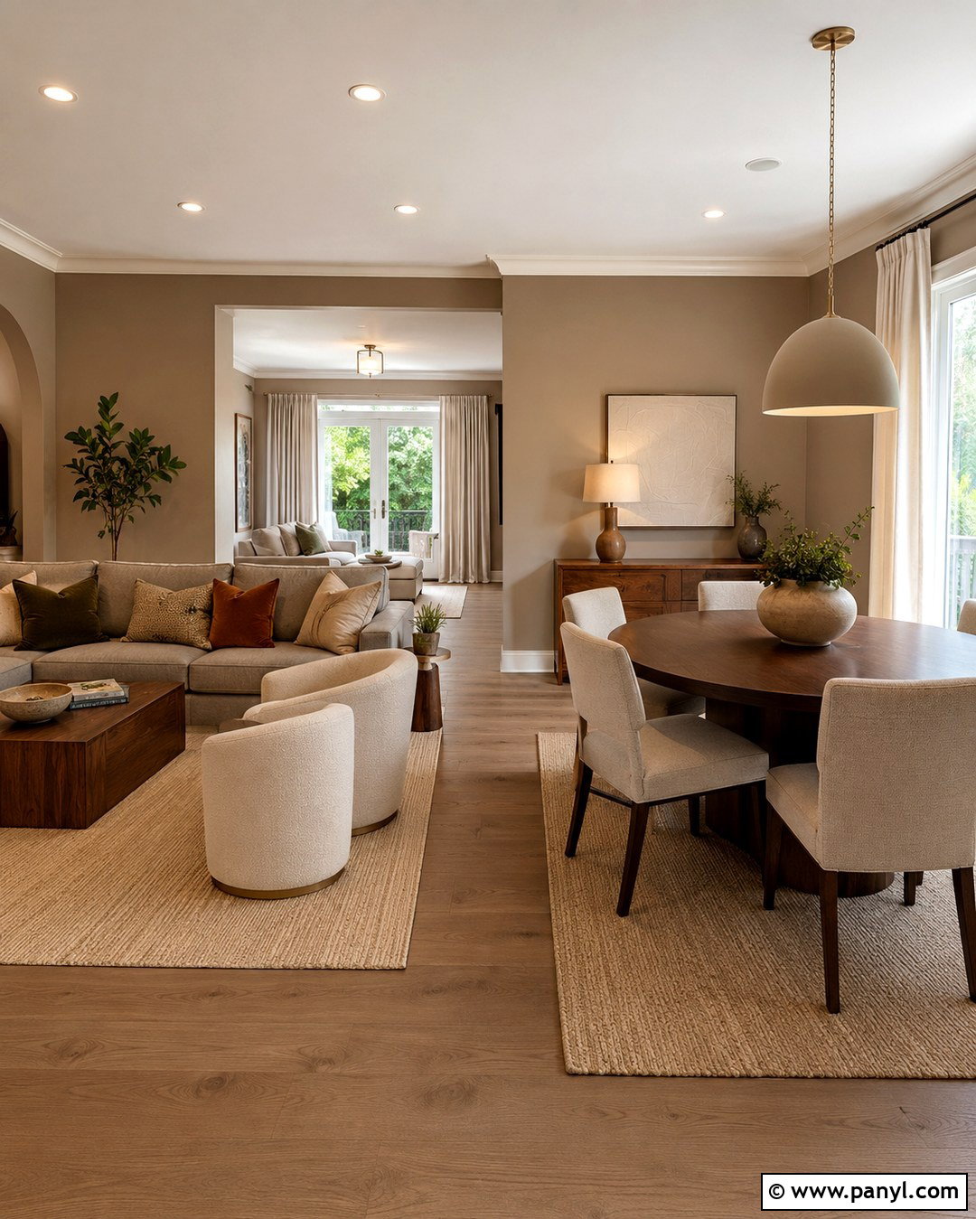
Mushroom taupe is an adaptable wall color for an open living and dining area because it changes gently with the light. Select a balanced shade with both brown and gray undertones, avoiding anything that reads distinctly cool. Use the same color across connecting walls, then paint trim and doors a creamy off-white. Furnish the living zone with a warm gray sofa, boucle chairs, and a walnut coffee table. In the dining area, repeat the walnut through a round table paired with oatmeal chairs. A sand-colored rug ties both zones together, while olive, rust, and black accents create definition. Linen curtains, ceramic lamps, and textured artwork prevent the neutral backdrop from appearing plain. This complete palette offers longevity while still reflecting the warmer, earthier direction of 2027 interiors.
18. Plaster White Wall Color
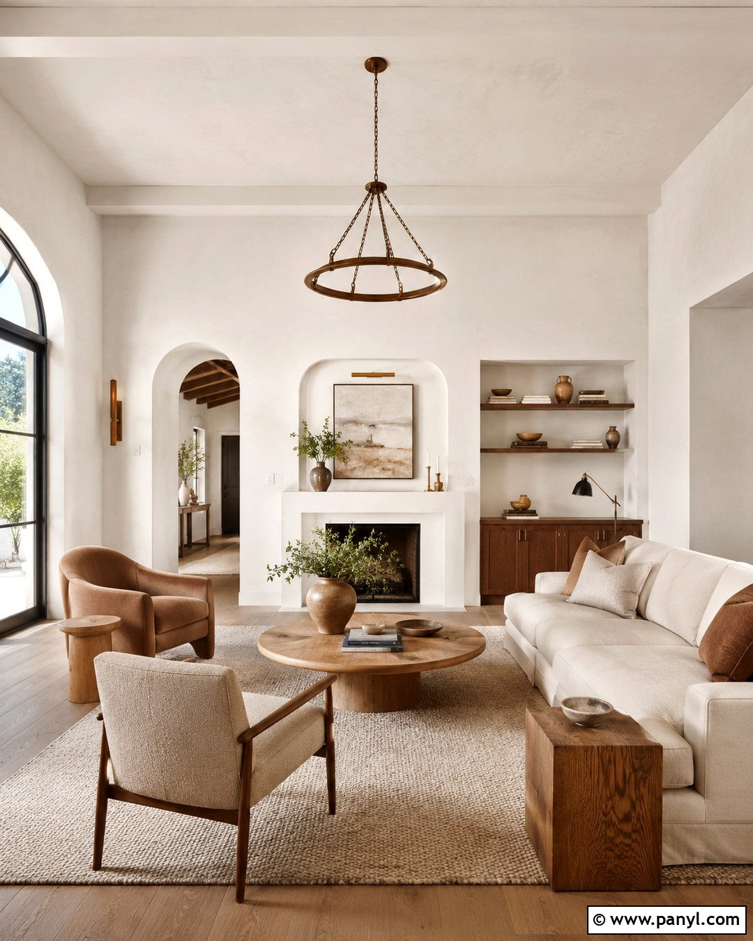
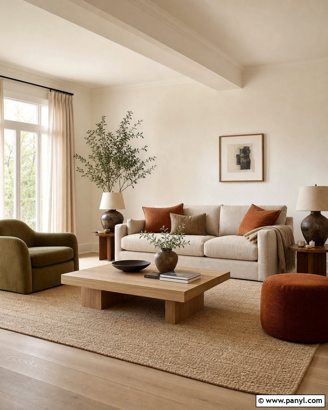
Plaster white replaces sharp builder white with a softer, mineral-inspired backdrop that supports a layered neutral room. Choose an off-white carrying subtle beige or clay undertones and apply it to the walls and ceiling. Use a slightly deeper version on doors and trim to introduce quiet architectural definition. Pair the walls with a cream sofa, pale oak tables, and warm beige lounge chairs. A large oatmeal rug creates softness, while nubby linen, boucle, and wool provide essential texture. Add contrast through one dark bronze floor lamp, slim black frames, and a walnut cabinet. Handmade ceramics in chalk, sand, and terracotta prevent the room from feeling colorless. The finished living space remains bright and flexible, but its tonal materials make it warmer and more intentional than a conventional all-white interior.
19. Aubergine Wall Color
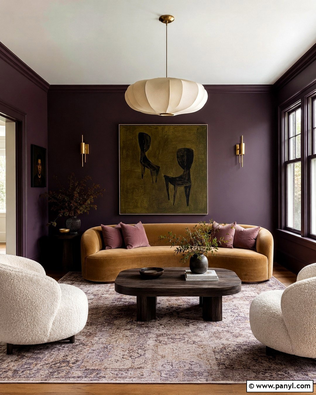
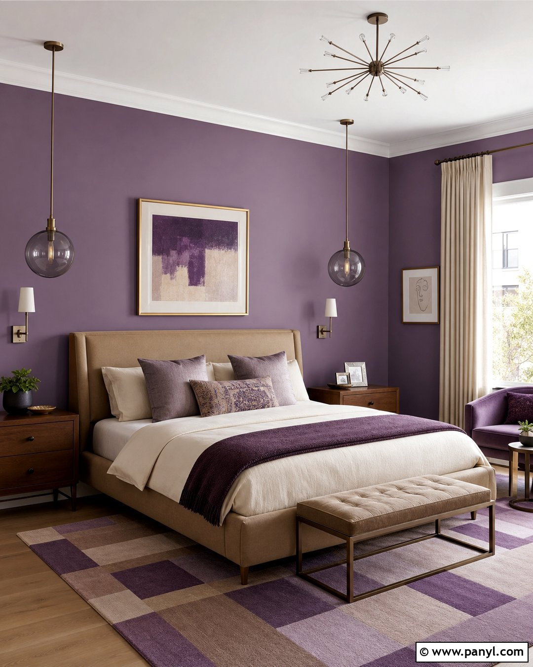
Aubergine creates a striking sitting room that feels warmer than charcoal and more unusual than navy. Paint the walls and trim in a deep eggplant purple, using a satin finish on doors and woodwork to reveal subtle differences in texture. Bring in a curved sofa upholstered in soft camel velvet, along with two cream boucle chairs. A walnut or smoked-oak coffee table reinforces the color’s depth. Choose a pale rug containing faint lilac and brown patterning to brighten the floor. Brushed brass sconces and a cream ceiling pendant add warm reflection. Muted rose pillows can develop the purple palette, while olive-green artwork provides an earthy counterpoint. This carefully balanced combination makes aubergine dramatic but approachable, especially in rooms used for conversation, reading, or quiet evening relaxation.
20. Soft Putty Wall Color
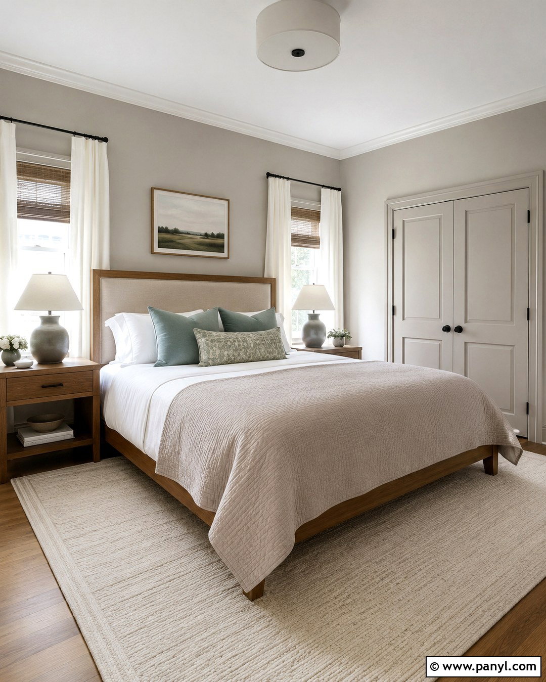
Soft putty is a warmer replacement for pale gray and provides an easy foundation for a calm, transitional bedroom. Look for a light beige-gray with subtle stone undertones, then paint the walls, closet doors, and trim in the same color for continuity. Center the room with a medium oak bed and upholstered linen headboard. Use crisp white sheets, a mushroom-colored coverlet, and soft blue-green pillows to create gentle contrast. Matching oak nightstands and matte ceramic lamps maintain the natural theme. A thick cream wool rug keeps the room comfortable and reflects light upward. Add woven shades beneath full-length ivory curtains for privacy and texture. The resulting bedroom feels simple but complete, giving neutral-color lovers a modern look that is warmer, softer, and more layered than standard greige.
Conclusion:
The strongest **20 Trendy Wall Colors 2027** balance emotional impact with practical decorating choices. Luminous blue, orange, pink, and aubergine bring personality, while meadow green, clay, russet, and terracotta connect interiors with the natural world. Softer options such as plaster white, mushroom taupe, powder blue, and putty offer flexibility without looking cold or unfinished. Whichever color you choose, plan the entire room before opening the paint can. Consider flooring, trim, furniture, metals, textiles, and natural light as one coordinated composition. Test large painted boards beside permanent surfaces for several days. A fashionable wall color becomes far more livable when its undertones, materials, and supporting accents work together from morning through evening.

Related Ideas and Inspiration:
Leave a Reply