
The 2027 wall color trends are moving homes away from flat, cautious palettes and toward colors with warmth, personality, and a stronger connection to nature. Forecasts highlight energetic blue, orange, pink, meadow green, and clay alongside earthy neutrals and deeper botanical shades. They also suggest that contrast, emotional comfort, and expressive color combinations will matter more than following one universal paint shade. () The most livable approach is to combine a trend-forward wall color with familiar wood, stone, metal, and fabric finishes. Always test large samples in morning and evening light before painting the entire room. From vivid living spaces to restful bedrooms, these complete looks offer practical ways to decorate with the leading 2027 wall color trends.

1. Luminous Blue Wall Color
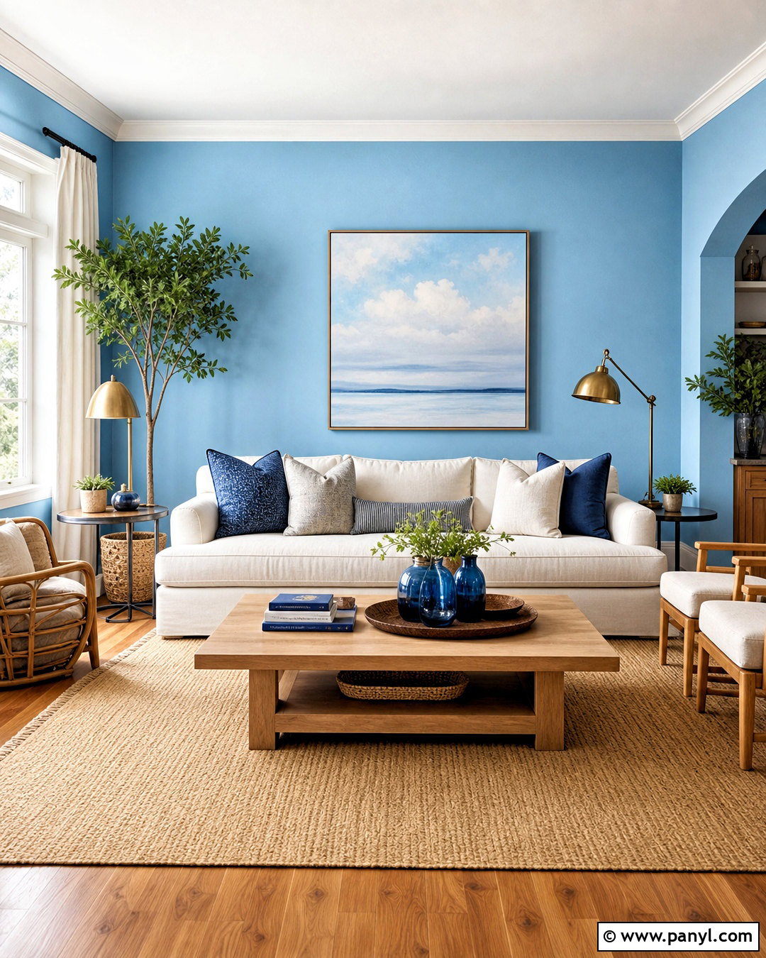
Luminous blue brings clear, electric energy to a living room without losing sophistication. Use it across the main walls, then soften its intensity with an ivory linen sofa, natural oak coffee table, and warm beige area rug. Aged brass lamps and picture frames add warmth, while cobalt glass and sky-blue artwork create gentle tonal variation. Keep the ceiling and trim soft white so the room feels crisp rather than enclosed. Medium-toned wood flooring prevents the blue from appearing overly cold. For an especially balanced layout, position the light upholstery near the windows and place darker furniture against the blue walls. The finished room feels expressive, modern, and cheerful, yet the neutral foundation makes it comfortable enough for daily living.
2. Energy Orange Wall Color
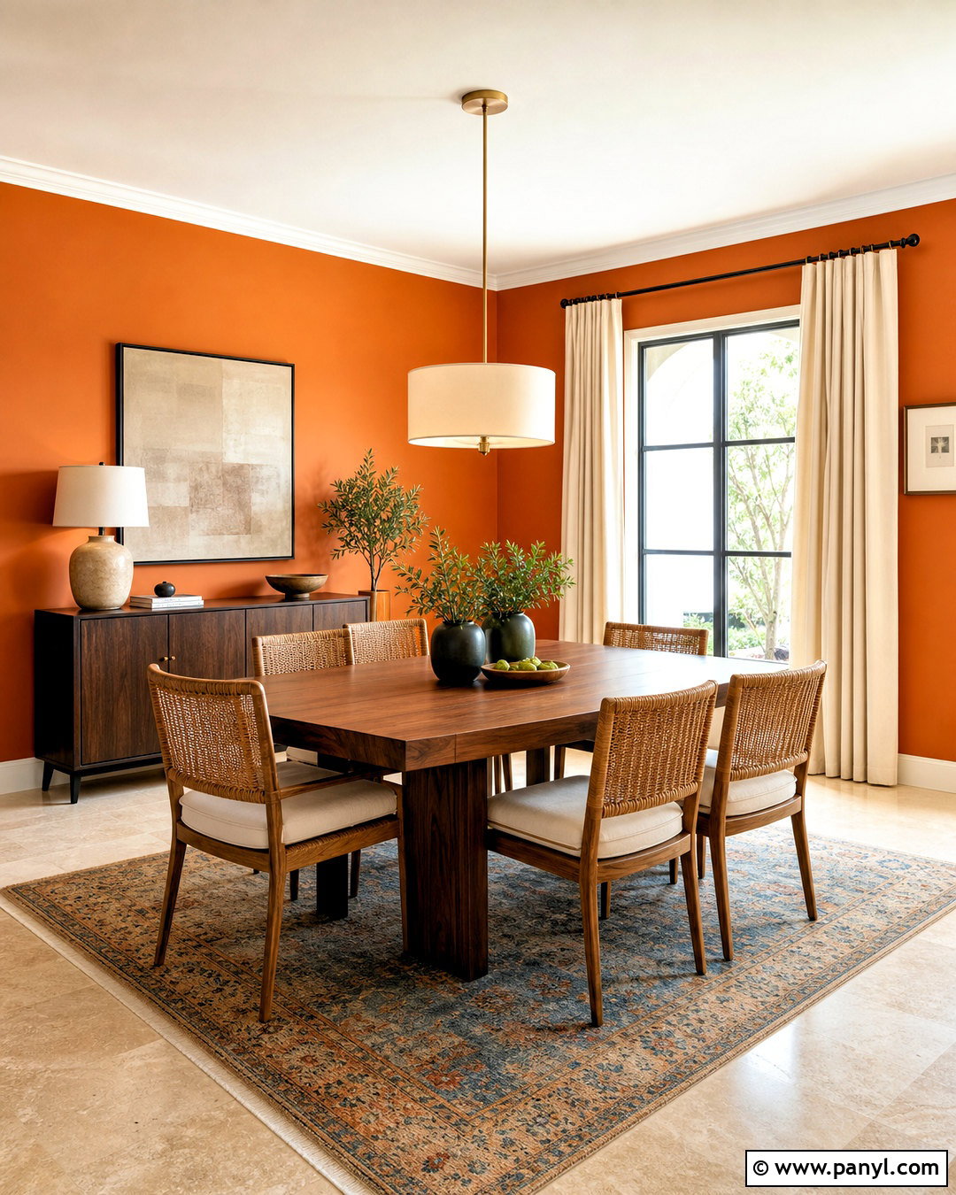
Could an orange room feel polished instead of overpowering? The answer lies in choosing a slightly softened, red-based orange and surrounding it with grounded finishes. Cover the walls of a dining room in this lively shade, then add a walnut table, woven dining chairs, and a large cream pendant light. Off-white curtains provide visual breathing room, while rust, burgundy, and muted blue table accents develop a layered palette. Use simple artwork with generous neutral space rather than covering every wall. A pale limestone or light oak floor helps reflect natural light throughout the room. This complete scheme turns everyday meals into a warmer experience and works particularly well in north-facing dining spaces that need added color and energy.
3. Pop Pink Wall Color
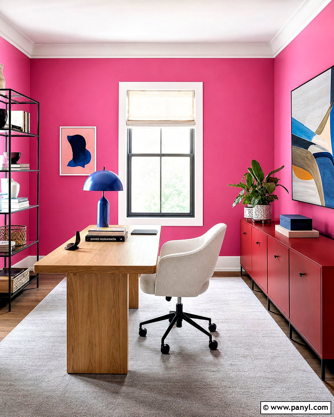
Pop pink can transform a home office into a confident, creative space when the surrounding furniture has clean lines. Choose a vivid pink with a slightly warm undertone for the walls, pairing it with a white oak desk and a comfortable cream upholstered chair. Matte red storage boxes and a cobalt blue lamp introduce intentional contrast without making the room look juvenile. Add a pale gray rug, white ceiling, and simple linen window shade to control the stronger colors. A few black metal details give the scheme definition. Instead of filling the room with small accessories, display one oversized abstract print and two sculptural objects. The result is bright, organized, and motivating, with enough neutral space to support concentration.
4. Meadow Green Wall Color
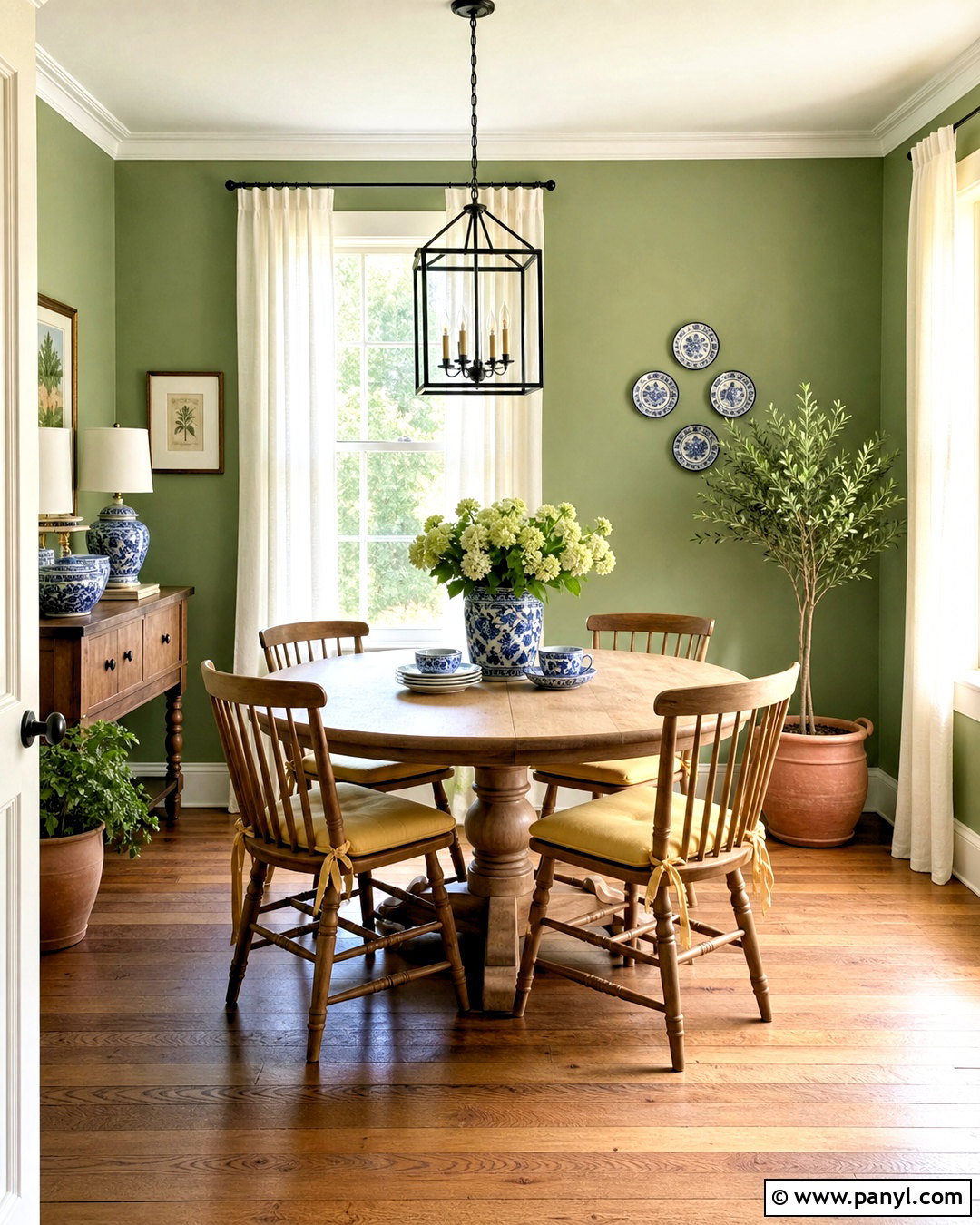
Fresh meadow green makes a breakfast room feel connected to the garden throughout the year. Apply this grassy, mid-tone green to every wall and keep the trim a warm creamy white. A round light oak table, spindle-back chairs, and woven pendant light reinforce the natural character. Introduce butter yellow seat cushions and simple blue-and-white ceramics for a relaxed contrast. Sheer linen curtains allow sunshine to brighten the green rather than dull it. Terracotta planters and leafy houseplants create a smooth transition between the interior and outdoor view. For flooring, warm oak or handmade beige tile keeps the palette grounded. This cheerful room feels energetic in the morning but remains soft enough for casual meals, homework, and weekend gatherings.
5. Clay Wall Color
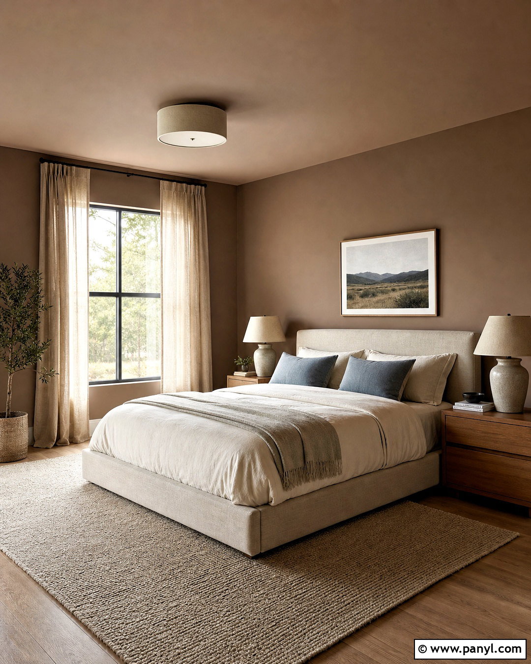
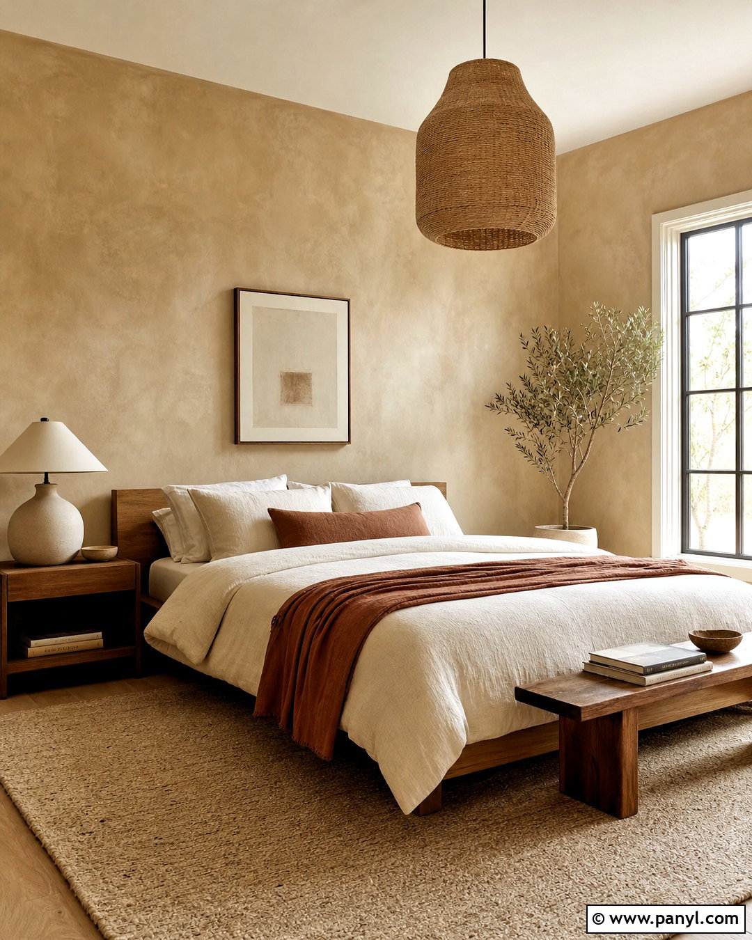
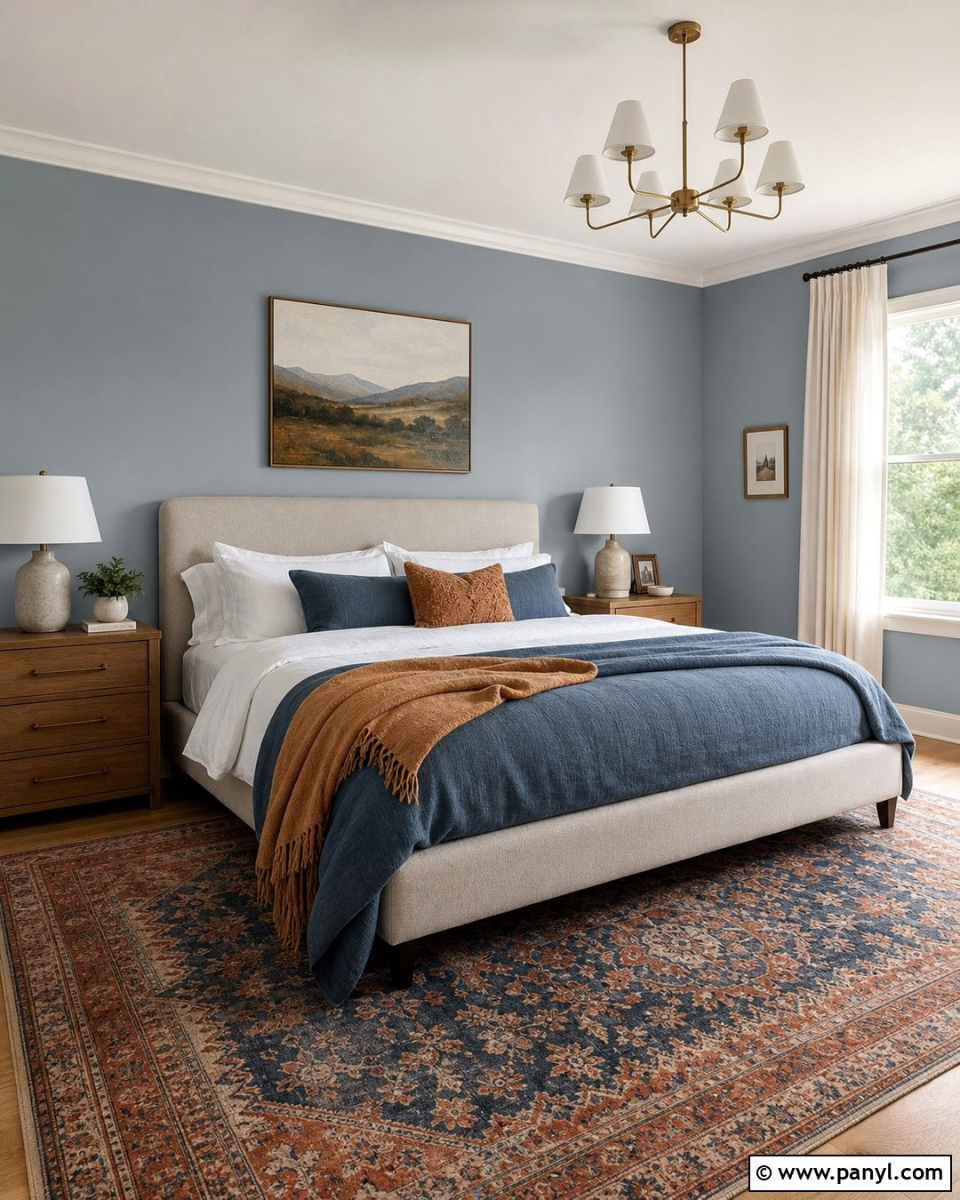
Soft clay walls give a bedroom an earthy warmth that feels calmer than brighter terracotta. Paint the walls and ceiling in the same muted reddish-brown shade to create a gentle, enveloping effect. Balance the color with an oatmeal upholstered bed, ivory bedding, and a chunky natural wool rug. Medium oak nightstands and ceramic lamps continue the organic palette, while dark bronze hardware brings subtle definition. Add dusty blue pillows or a folded blanket to cool the warm surfaces. Keep window treatments simple with full-length flax linen curtains. One large landscape print is enough decoration above the bed. This complete bedroom look feels grounded and restful, combining the comfort of sunbaked color with understated furnishings that will remain appealing beyond a single season.
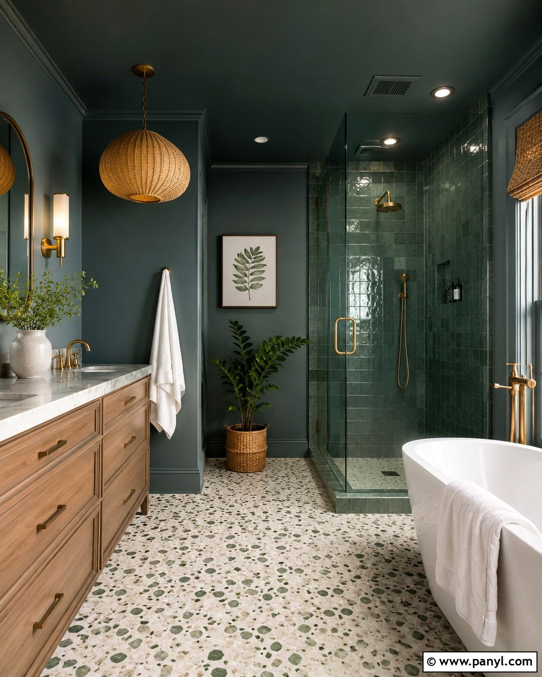
6. Forest Green Wall Color
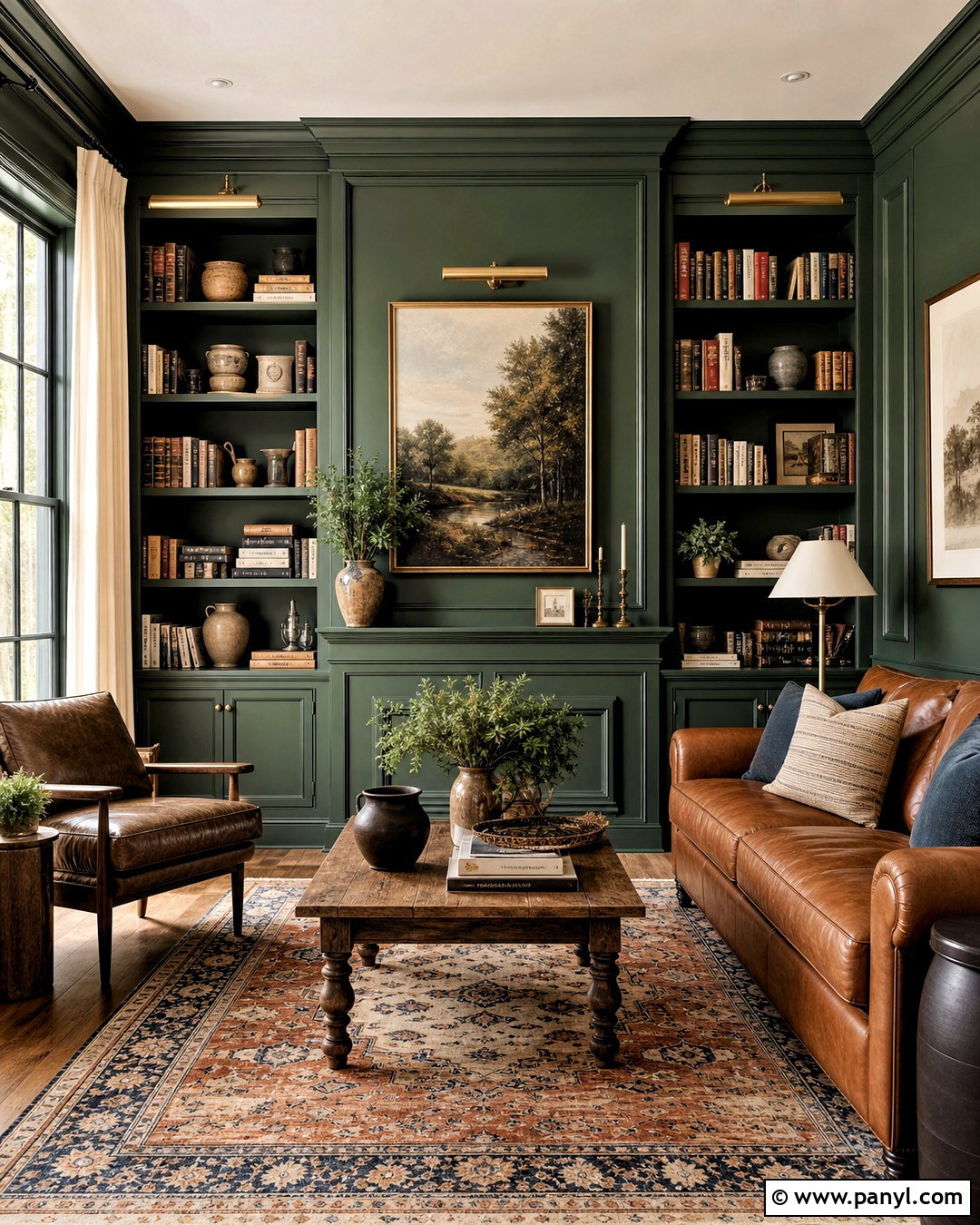
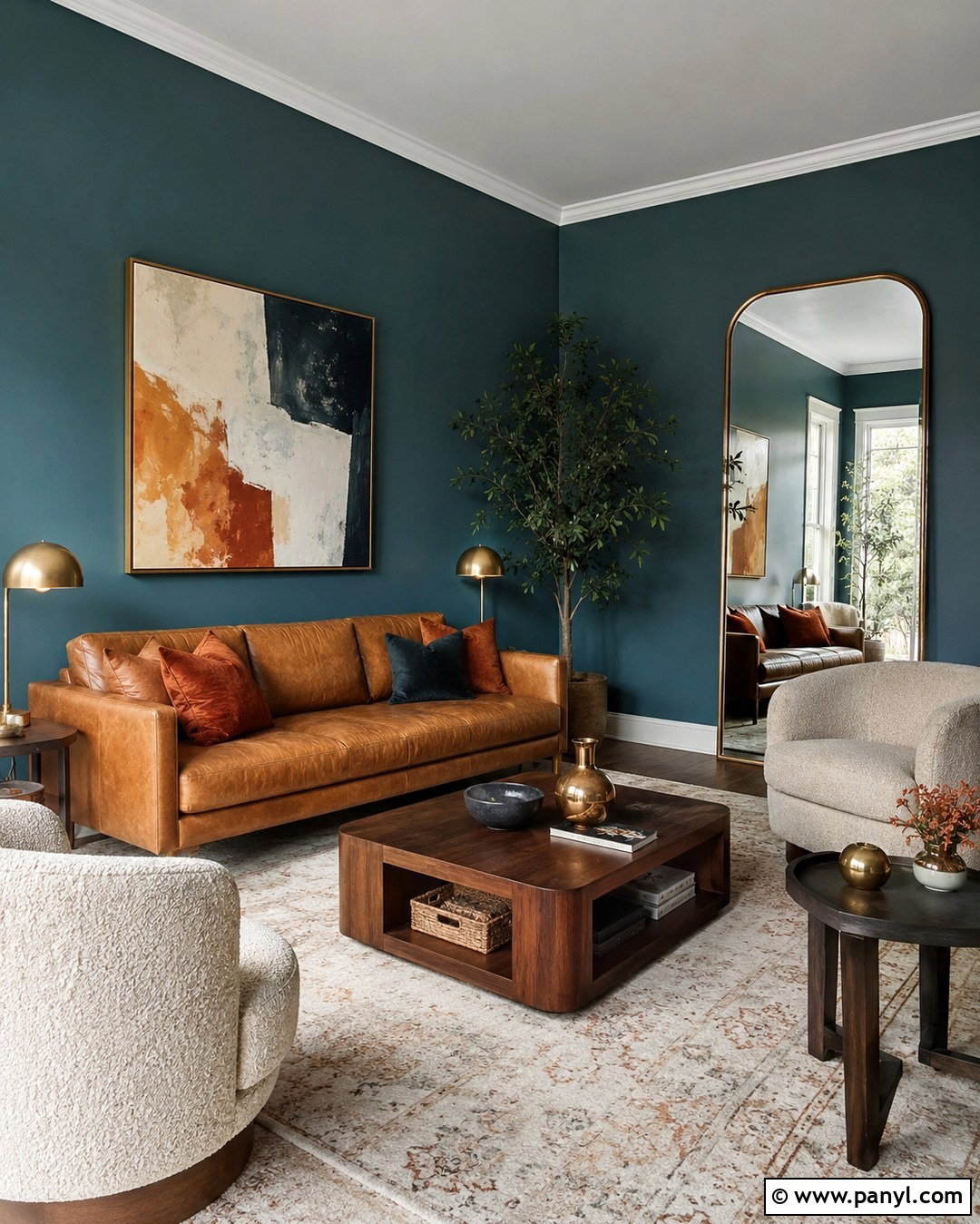
Deep forest green is especially effective in a library or reading room where a cozy atmosphere is desirable. Carry the green across the walls, built-in shelves, and trim for a seamless color-drenched finish. Add a cognac leather sofa, an aged oak coffee table, and a large traditional rug containing cream, rust, and faded blue. Brass picture lights and a warm white ceiling fixture keep the dark color from feeling heavy. Arrange books with pottery, framed art, and a few open spaces so the shelves appear collected rather than crowded. Cream curtains provide a lighter vertical element beside the windows. The resulting room has depth and character, yet natural materials and balanced lighting make it welcoming for reading, conversation, or quiet evening relaxation.
7. Blue Gray Wall Color
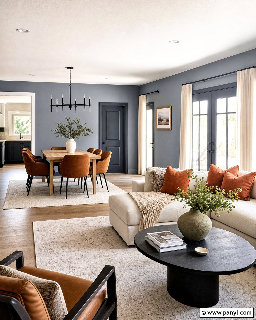
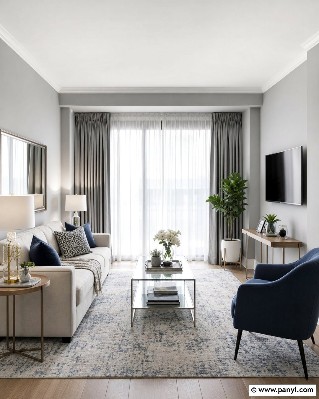
Blue-gray walls offer a quieter way to use color in an open living and dining area. Select a medium shade with noticeable blue depth rather than a cool, silvery gray. Pair it with a warm white sectional, pale oak dining table, and camel-colored leather dining chairs. Soft rust cushions and artwork with faded ocher details warm the overall palette. Use matching blue-gray paint on the doors and baseboards to create continuity between connected zones. A textured ivory rug and natural linen curtains keep the room light and comfortable. Matte black fixtures can provide small moments of contrast without dominating the scheme. This balanced look is practical for busy homes because it feels colorful and distinctive while remaining easy to coordinate with existing neutral furniture.
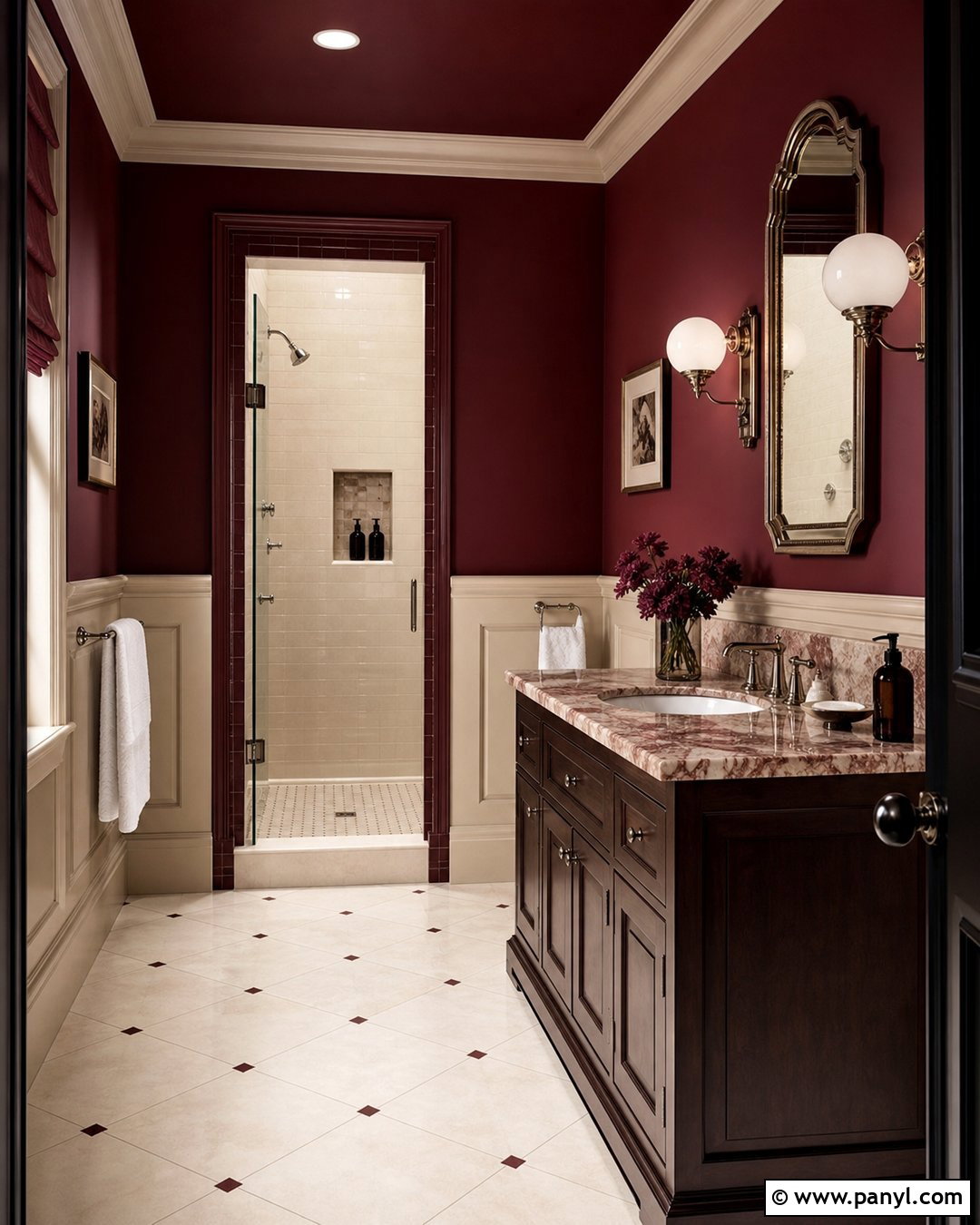
8. Burgundy Wall Color
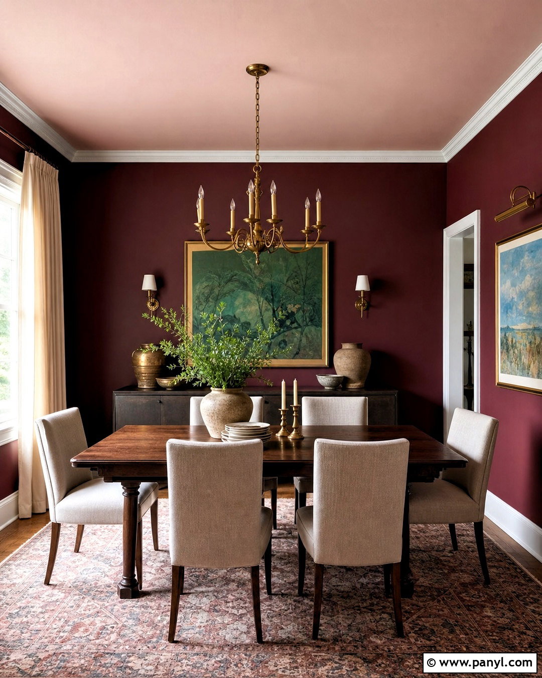
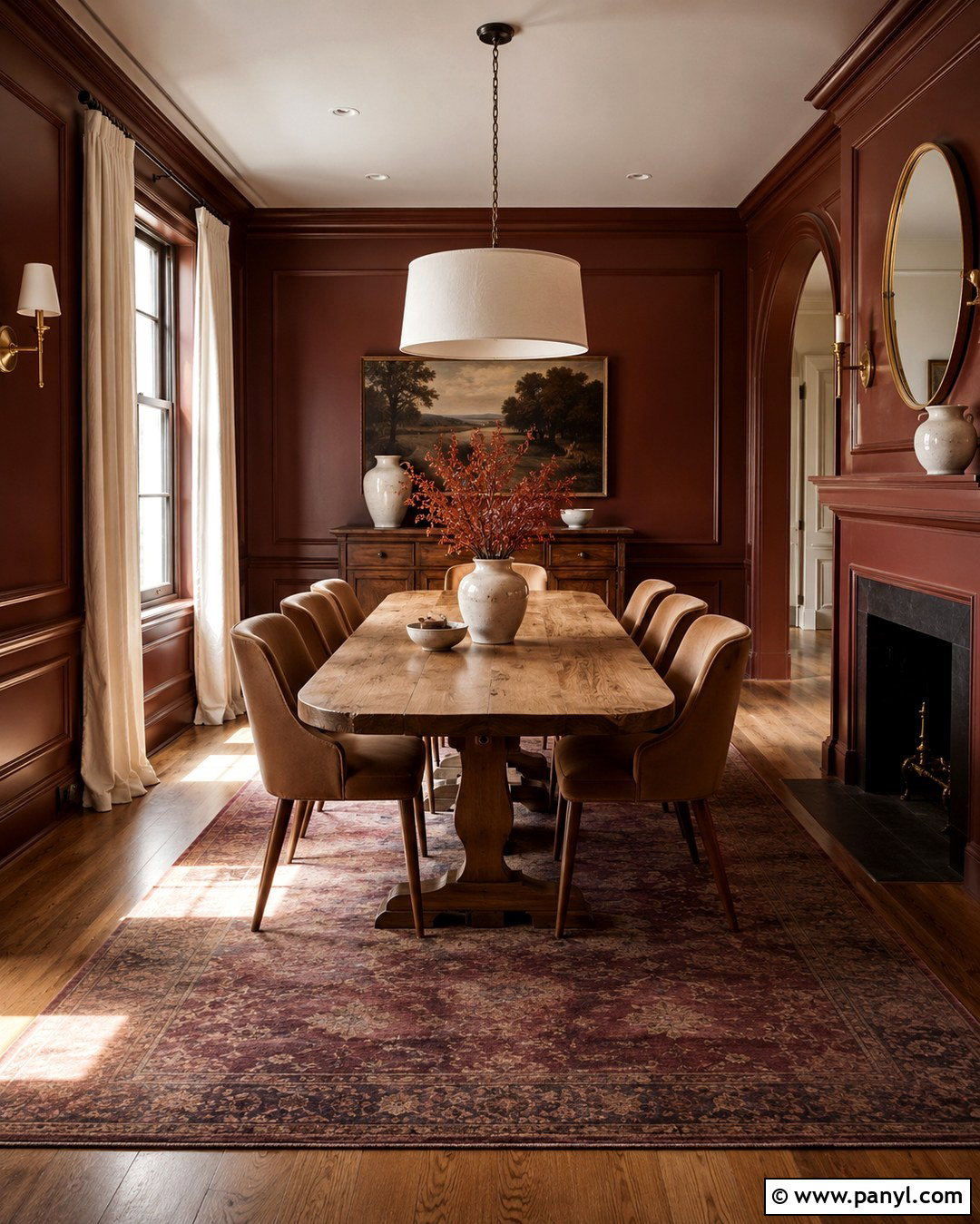
Burgundy walls can make a formal dining room feel rich, intimate, and current. Choose a muted wine-red shade with brown undertones, then paint the ceiling a pale blush instead of standard white. Center the room with a dark walnut table and upholstered chairs in warm beige performance fabric. An antique brass chandelier, cream curtains, and a faded Persian-style rug soften the strong walls. Add artwork featuring soft green and blue to prevent the palette from becoming overly red. Dark-stained flooring strengthens the traditional character, while a simple stoneware centerpiece keeps the table relaxed. This design works best with layered lighting, including wall sconces and table lamps. The final room feels memorable and sophisticated without requiring elaborate architectural details or expensive decorative finishes.
9. Terracotta Wall Color
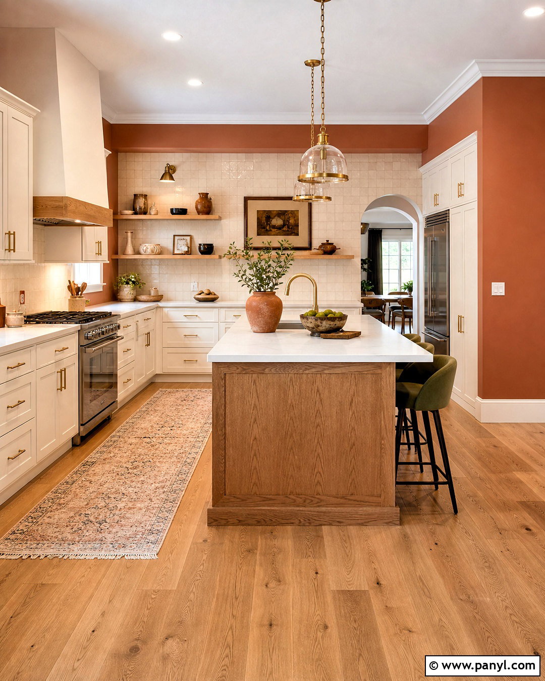
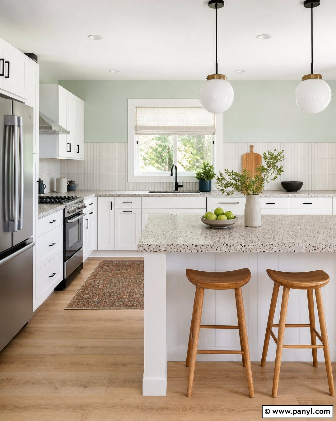
Sun-warmed terracotta gives a kitchen personality while working naturally with practical finishes. Use it on the walls around warm white cabinets, leaving the cabinetry simple so the color remains the focal point. Pair the scheme with honed cream quartz countertops, a handmade ivory tile backsplash, and brushed brass hardware. Medium oak flooring and a matching island introduce another natural layer. Bring in olive green through counter stools, pottery, or a washable runner for earthy contrast. White ceilings and generous under-cabinet lighting maintain brightness. If the kitchen is small, keep upper cabinets limited or add glass-front doors to reduce visual weight. This complete palette feels welcoming and artisanal, yet its durable surfaces and uncluttered layout make it suitable for everyday family cooking.
10. Chocolate Brown Wall Color
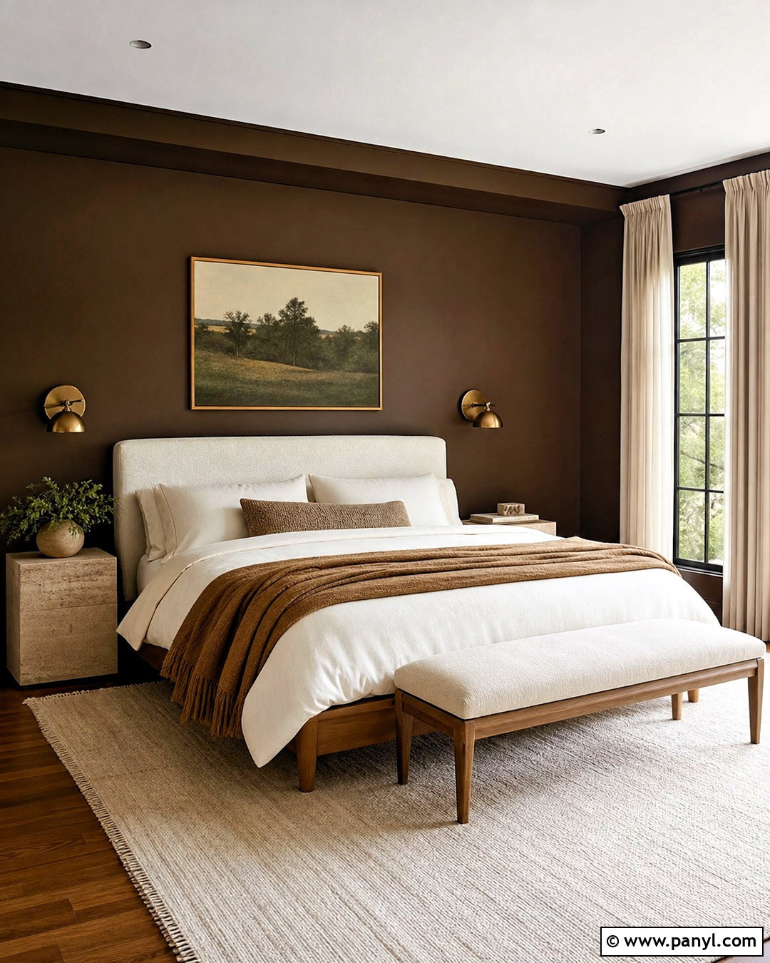
Chocolate brown creates a surprisingly soothing bedroom when it is balanced with lighter textiles and reflective accents. Paint the walls a rich cocoa shade, then use warm white on the ceiling to preserve an open feeling. Select a light oak bed with an oversized cream headboard, crisp ivory sheets, and caramel-colored blankets. A pale wool rug prevents dark flooring and dark walls from visually merging. Add bronze sconces, travertine-topped nightstands, and simple artwork containing beige and muted green. Full-length linen curtains should closely match the bedding rather than the walls. This thoughtful contrast allows the brown to act as a comfortable backdrop instead of making the room gloomy. The finished bedroom feels cocooning, natural, and quietly luxurious without relying on ornate furnishings.
11. Oatmeal Beige Wall Color
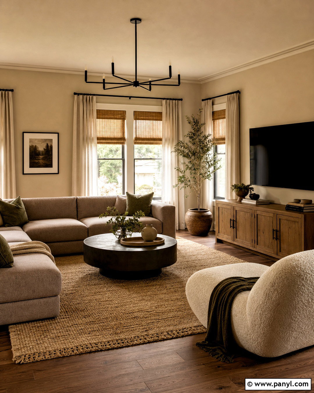
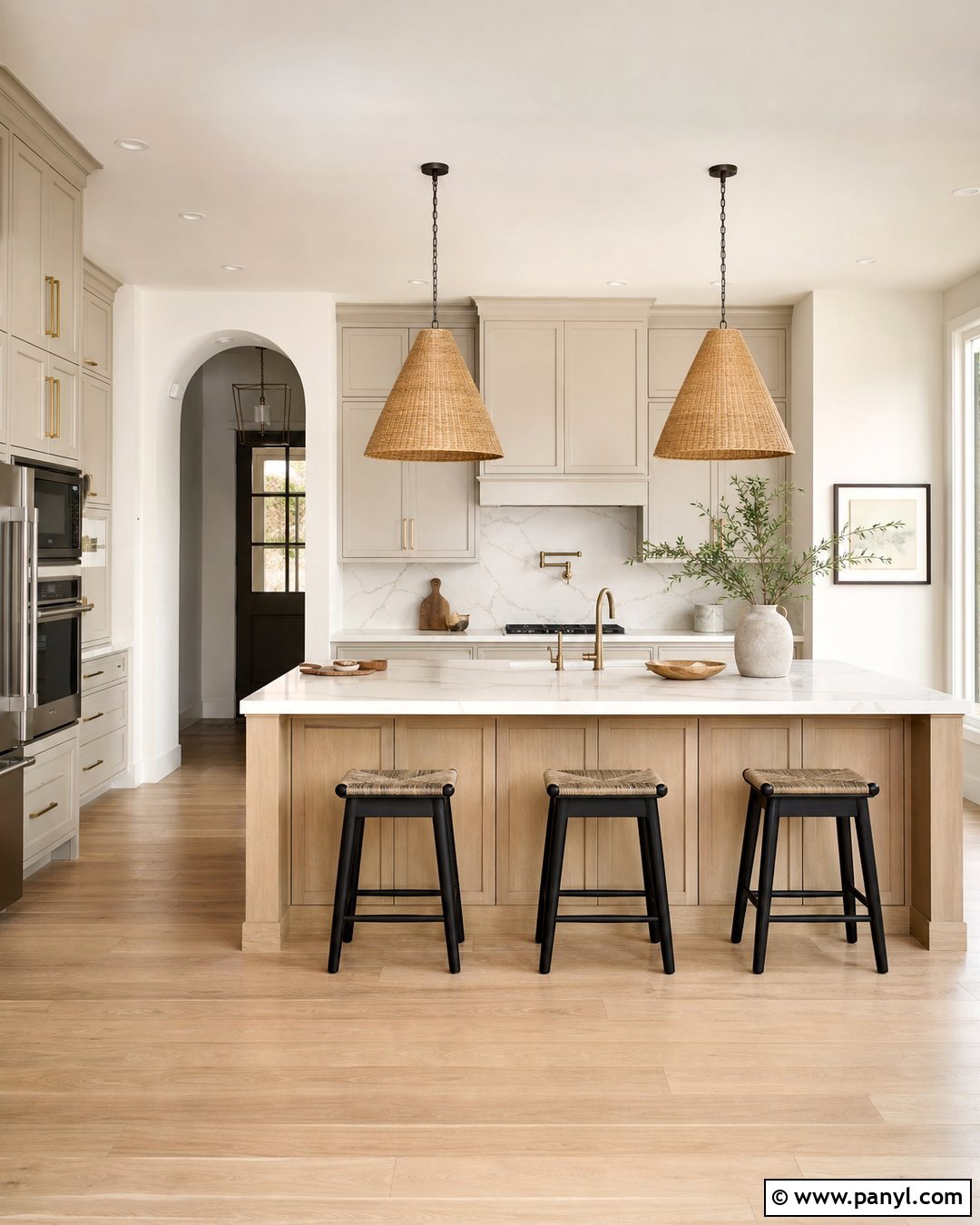
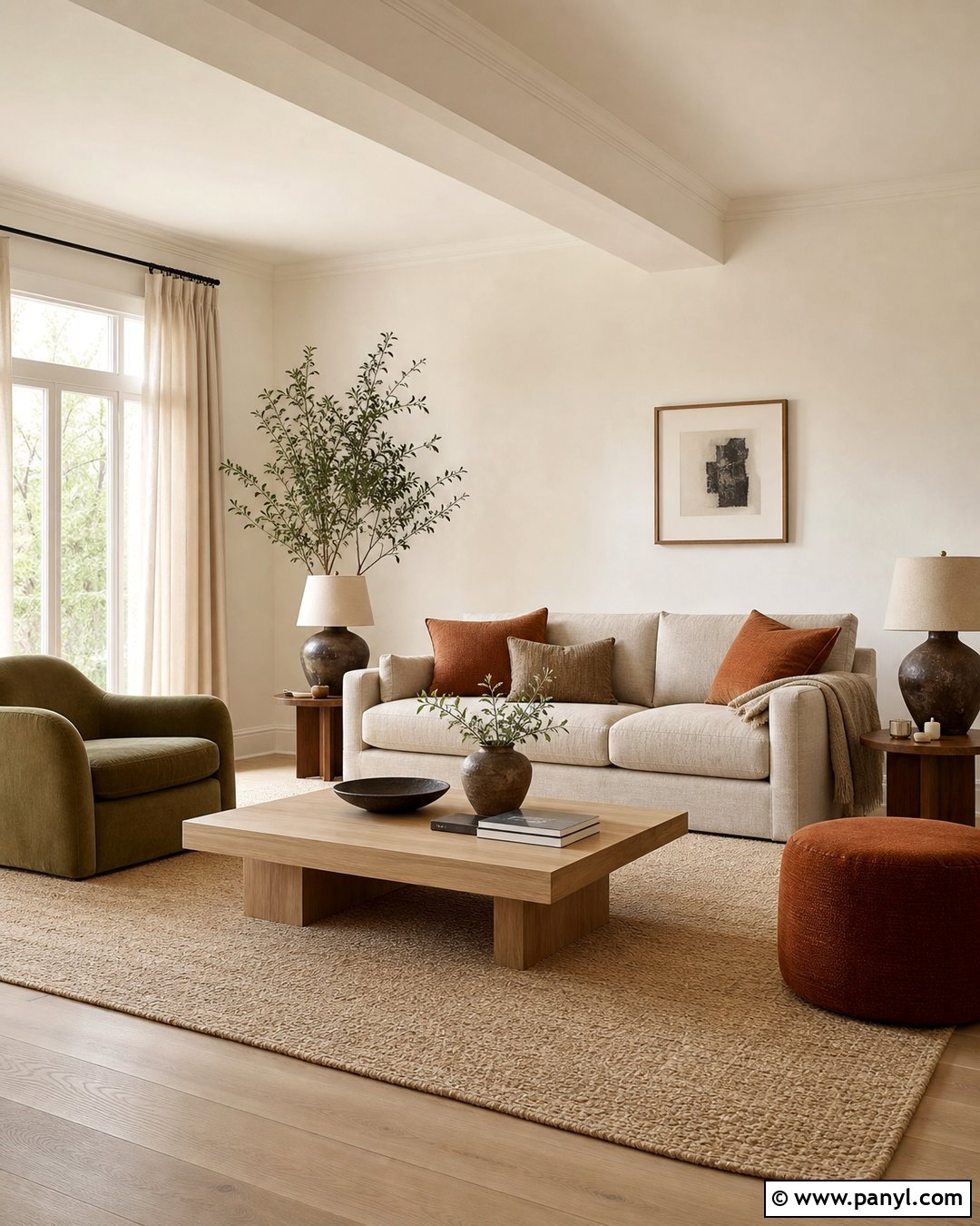
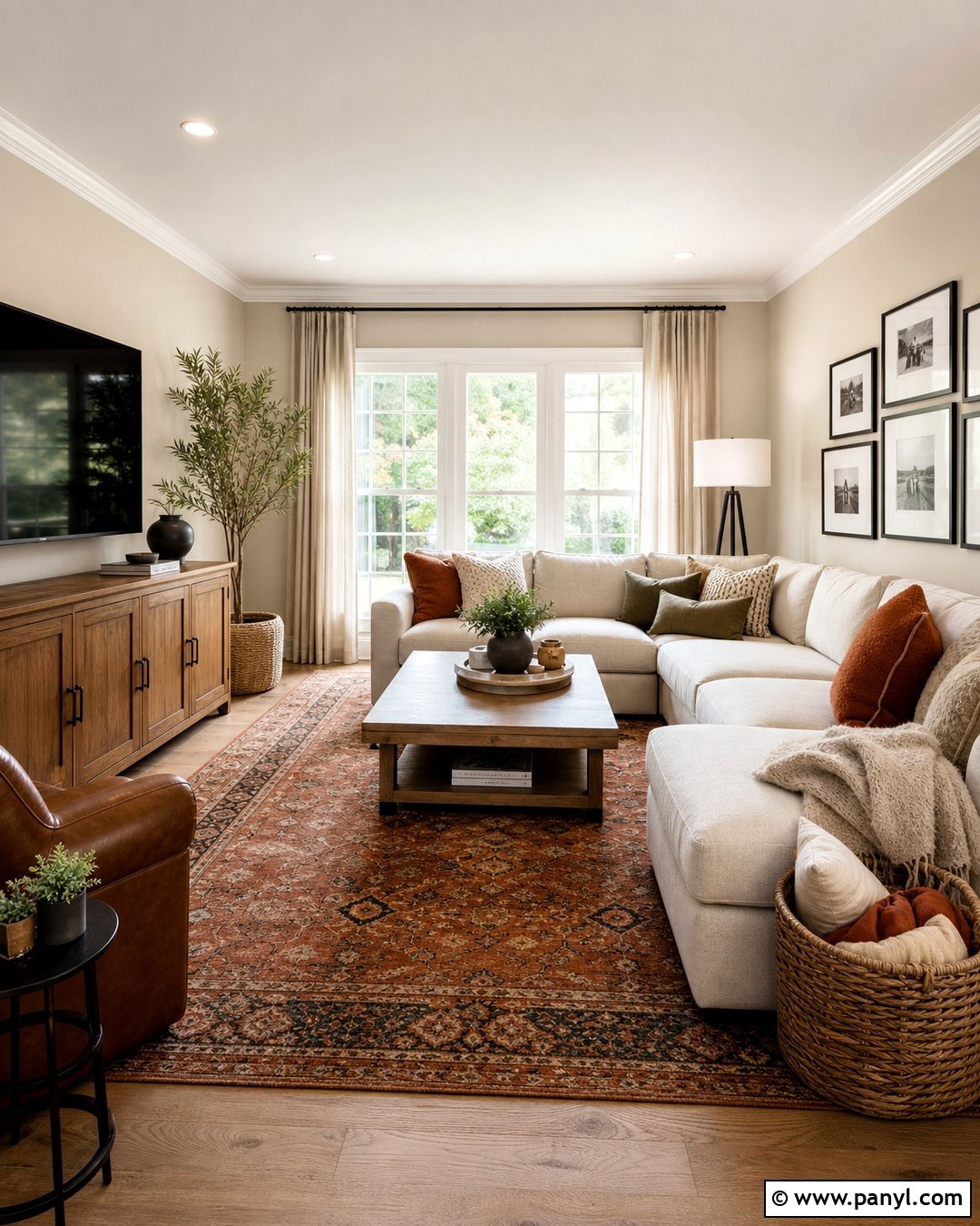
Oatmeal beige is replacing colder neutrals with a softer, more organic appearance. Use this warm, creamy shade throughout a family room, including the walls, trim, and ceiling in slightly different finishes. A mushroom-colored sectional, boucle lounge chair, and large jute-wool rug create subtle variation without interrupting the calm palette. Add a medium oak media cabinet and a round dark bronze coffee table for necessary contrast. Olive green pillows and handmade clay pottery prevent the room from feeling washed out. Layer linen curtains over woven shades to bring texture around the windows. Rather than relying on many decorative objects, choose oversized branches, substantial table lamps, and one large piece of artwork. The result is easygoing, comfortable, and flexible enough to accommodate changing seasonal accessories.
12. Limewash Beige Wall Color
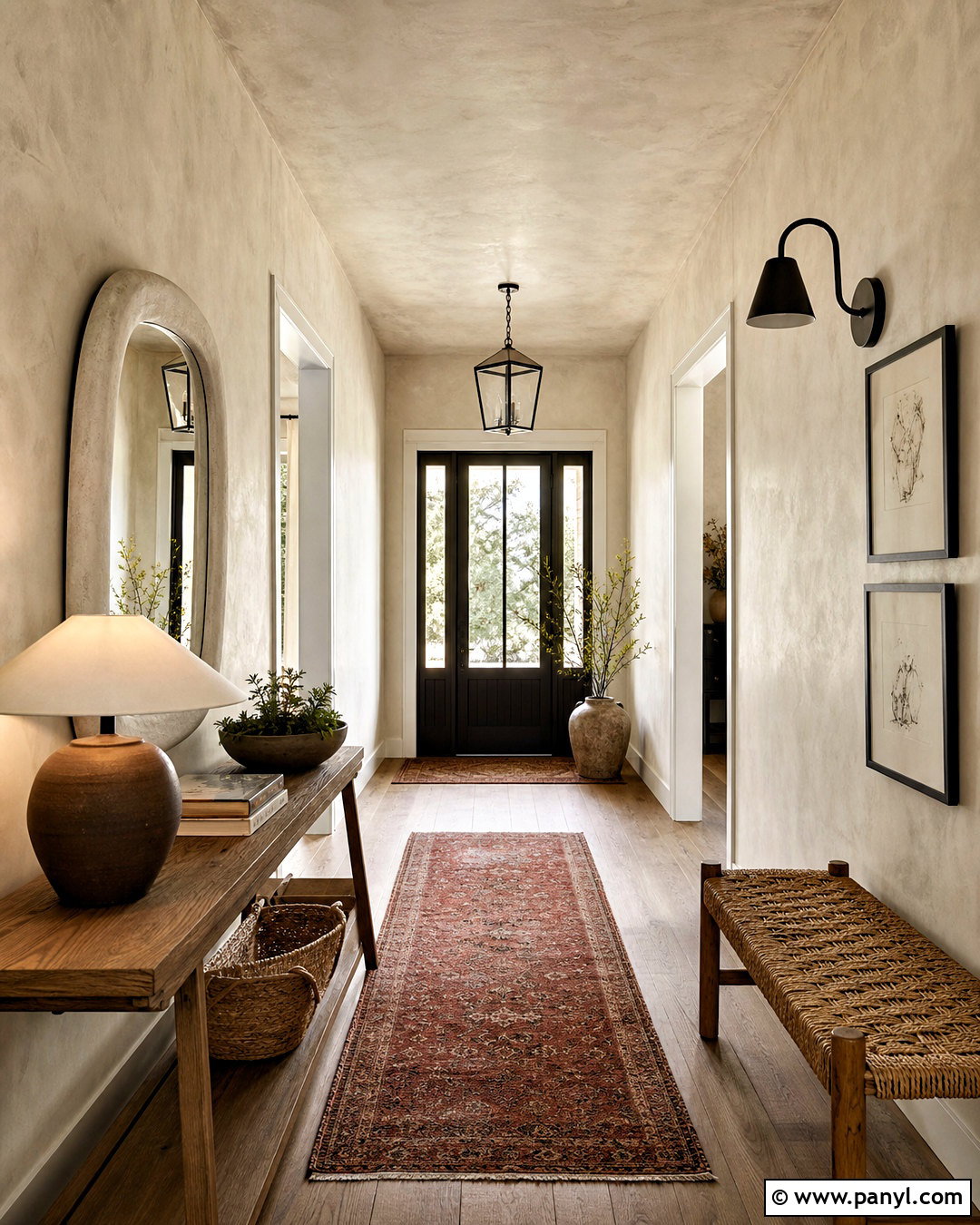
Cloudy limewash beige introduces visible depth to a hallway or entry without requiring bold color. Apply a mineral-style finish across the walls so gentle tonal movement appears as daylight changes. Pair it with a slim oak console, woven bench, and rounded plaster mirror. A muted brick-red runner adds warmth underfoot, while dark bronze hooks and lighting create sharp but controlled contrast. Continue the beige onto the ceiling for a unified envelope, especially in a narrow space with multiple doorways. Display one ceramic lamp, a shallow bowl, and a few framed sketches instead of filling the console. Natural stone or aged wood flooring complements the imperfect wall texture. This complete entry feels welcoming and handcrafted while remaining bright, practical, and easy to maintain visually.
13. Warm Mushroom Wall Color
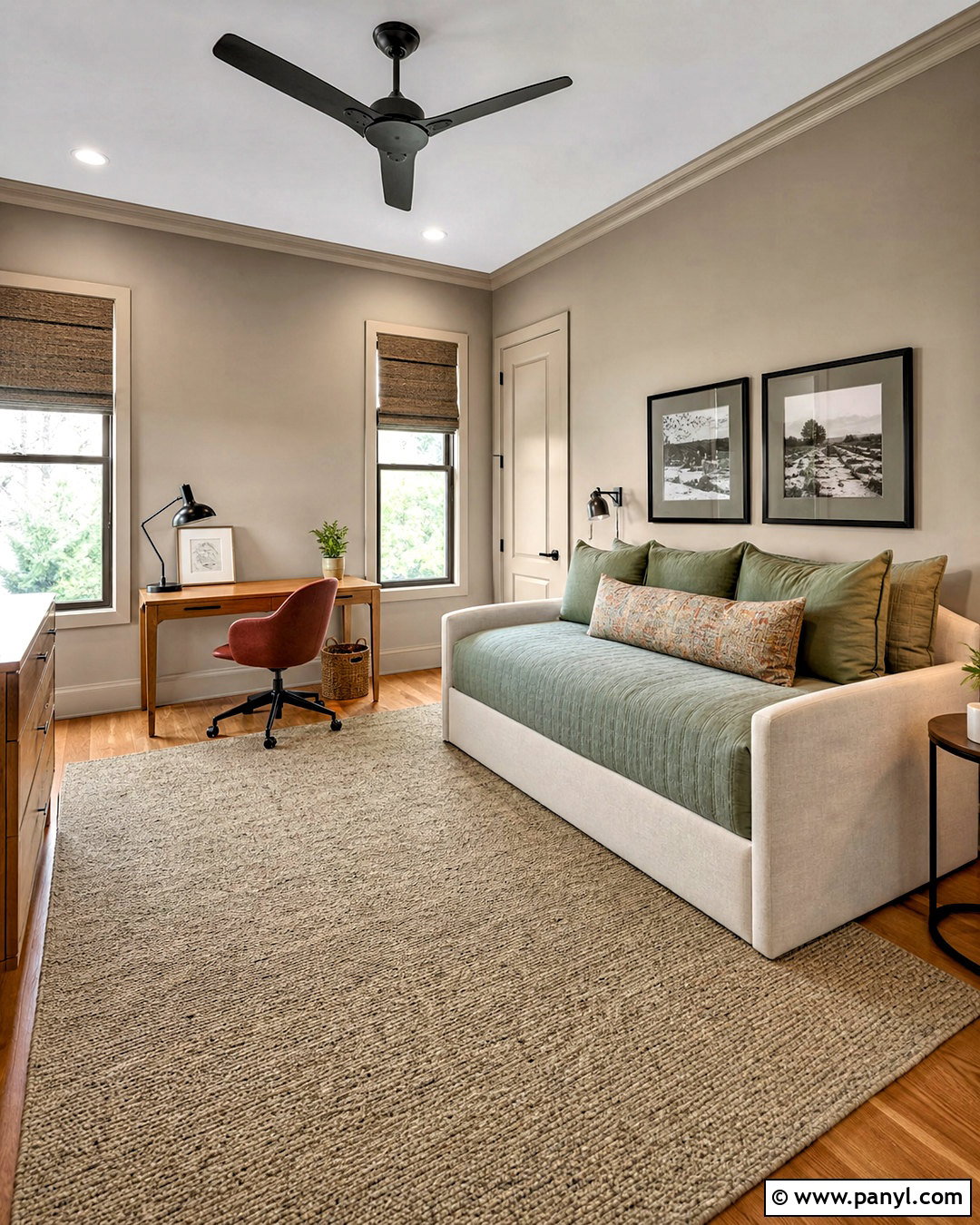
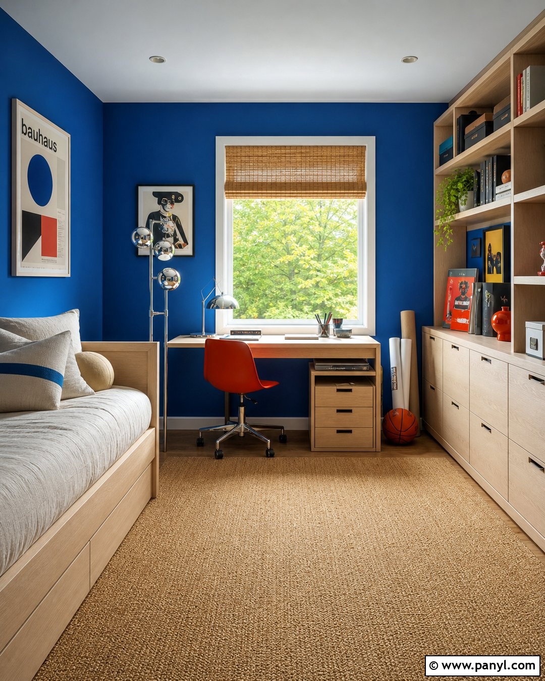
Warm mushroom paint offers more depth than beige while remaining adaptable in a multipurpose guest room. Cover the walls in a brown-based taupe and use a lighter mushroom tone on the ceiling and trim. Furnish the room with an ivory daybed, oak writing desk, and rust-colored desk chair. Sage green bedding adds gentle color, while black-framed artwork and a charcoal task lamp sharpen the soft palette. Choose a woven wool rug that combines cream, tan, and subtle brown. Simple Roman shades keep the windows tailored and leave space for the desk below. Closed storage prevents the smaller room from becoming cluttered. This cohesive design supports sleeping, reading, and occasional remote work, proving that a neutral room can still feel layered, warm, and purposefully decorated.
14. Dusty Rose Wall Color
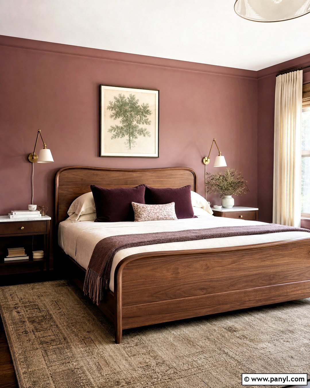
Dusty rose provides a mature alternative to sugary pink in a restful bedroom. Select a muted shade with clay or beige undertones and carry it across the walls and baseboards. Build the room around a curved walnut bed, warm white bedding, and a textured taupe rug. Deep plum pillows add tonal richness, while sage green artwork creates a cool counterpoint. Use aged brass wall lights and small marble-topped nightstands for understated polish. Natural linen curtains should be lighter than the walls to frame the windows softly. Avoid excessive floral decoration, which can make the palette feel overly themed. Instead, include geometric artwork, one sculptural vase, and clean-lined furniture. The final scheme feels warm, sophisticated, and versatile enough for contemporary or traditional homes.
15. Butter Yellow Wall Color
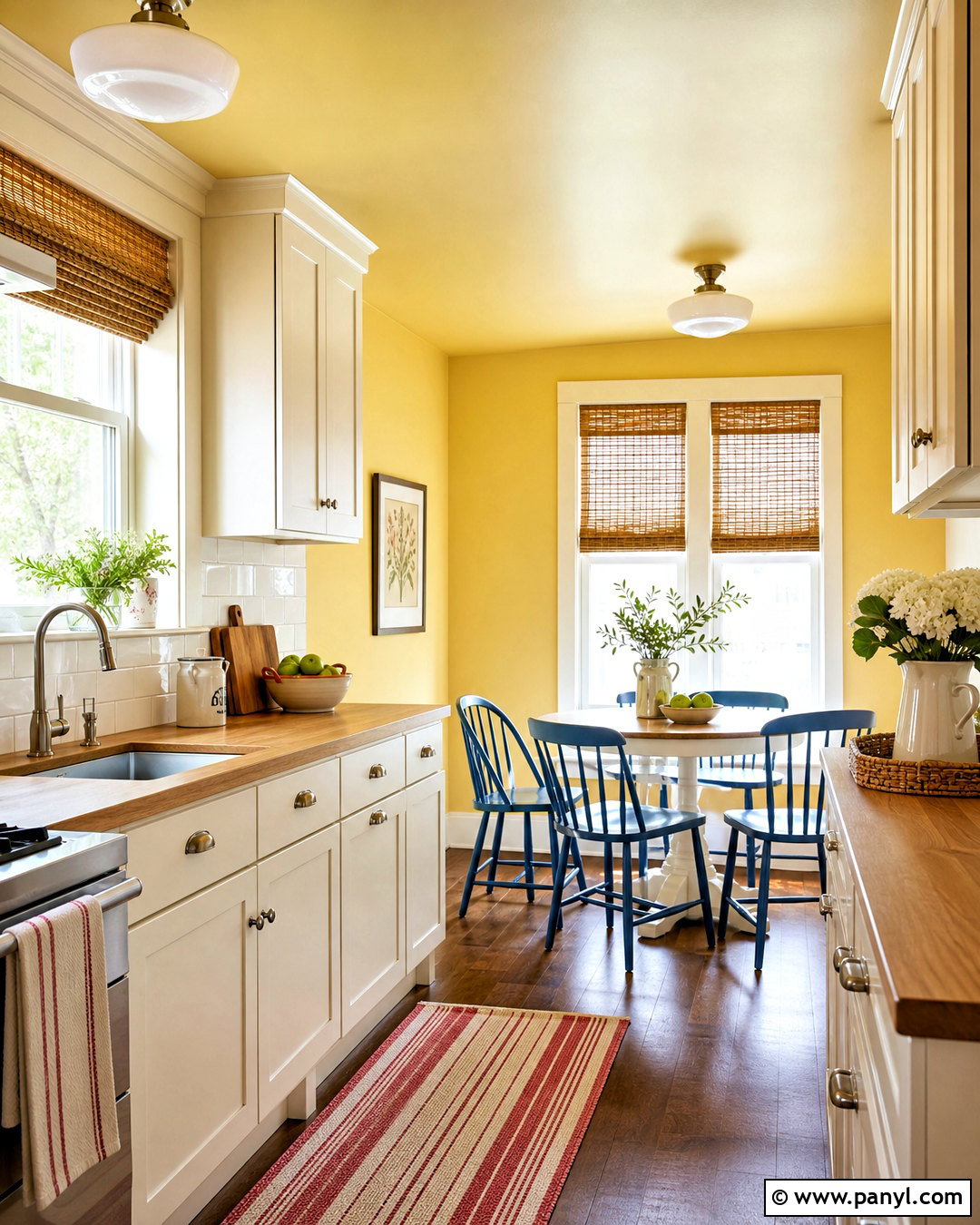
A soft butter yellow can make a small kitchen or breakfast nook feel sunny even on cloudy days. Paint the walls and ceiling in the same pale golden shade, using a washable finish where cooking splashes are likely. Add creamy white cabinets, light oak countertops, and brushed nickel hardware for a fresh foundation. A small round table with blue-painted chairs creates cheerful contrast, while a red-striped runner adds a controlled accent. Keep the backsplash simple with glossy white square tile that reflects available light. Woven shades and natural wood cutting boards bring warmth without competing with the walls. This complete look feels familiar and uplifting rather than trendy or overly bright, making it a practical choice for a hardworking room used from morning through evening.
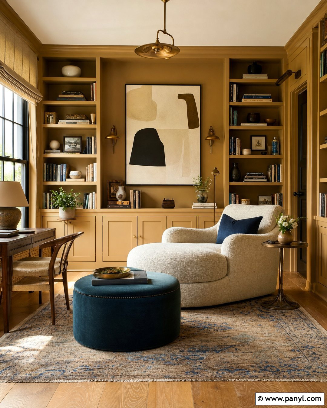
16. Topaz Yellow Wall Color
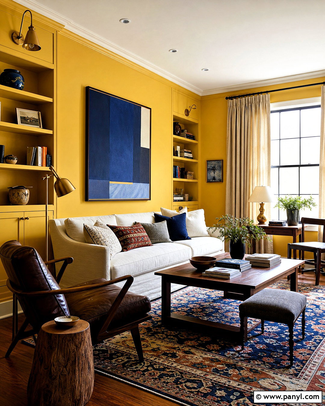
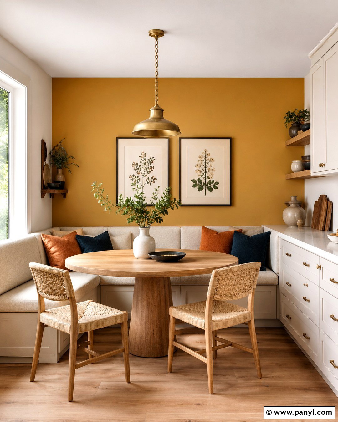
Topaz yellow has greater depth than buttercream and gives a living room a confident, collected identity. Use the saturated golden shade on walls and built-in cabinetry, then balance it with an off-white sofa and a dark brown lounge chair. A patterned rug containing navy, rust, and cream grounds the seating area and ties the stronger colors together. Choose walnut tables, antique brass lamps, and linen curtains in a light oatmeal tone. Deep blue artwork adds another bold element without competing with the walls. Keep decorative accessories substantial and limited, such as a large ceramic vessel and stacked books. With several warm light sources and an uncluttered layout, this golden room feels energetic during the day and comfortably enveloping in the evening.
17. Kiwi Green Wall Color
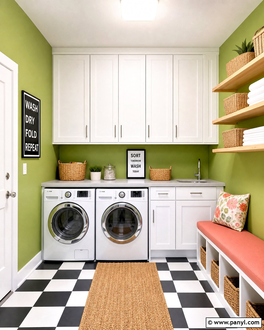
Kiwi green brings playful freshness to a laundry room, mudroom, or compact utility space. Use the crisp yellow-green shade on the walls, then pair it with simple white cabinets and pale gray quartz counters. Natural birch shelving, brushed stainless steel hardware, and a black-and-white checkerboard floor give the room structure. Include woven baskets and closed storage so colorful walls do not compete with household supplies. A coral-colored bench cushion or small piece of artwork adds a lively complementary accent. Bright ceiling lighting is essential because this green may shift dramatically in shadow. By balancing energetic paint with clean cabinetry and organized storage, the finished utility room feels cheerful and practical rather than chaotic, making repetitive household tasks a little more pleasant.
18. Spicy Red Wall Color
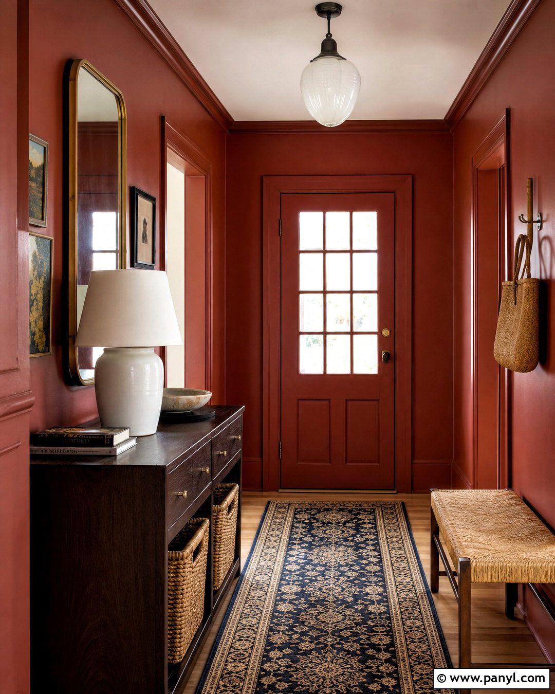
Spicy red can create a welcoming entryway when it is treated as an architectural color rather than a decorative afterthought. Paint the walls, trim, and interior doors in a warm red with earthy undertones. Ground the space with a dark oak console, a woven rush-seat bench, and a vintage-style runner in navy and cream. An oversized brass-framed mirror reflects light and visually expands the area. Add a white ceramic lamp and pale stone bowl to break up the deeper surfaces. Keep the adjoining rooms warm neutral so the entry feels like a deliberate moment of color. This complete design gives an ordinary hallway stronger identity while using durable, functional furniture for shoes, bags, mail, and other everyday necessities.
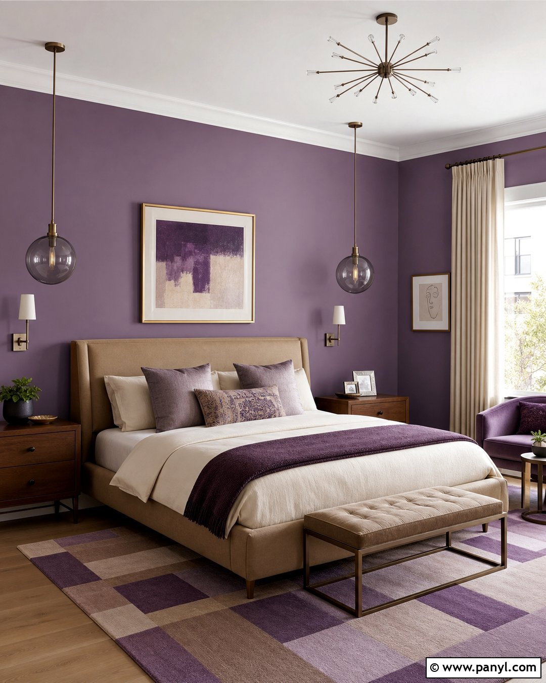
19. Aubergine Purple Wall Color
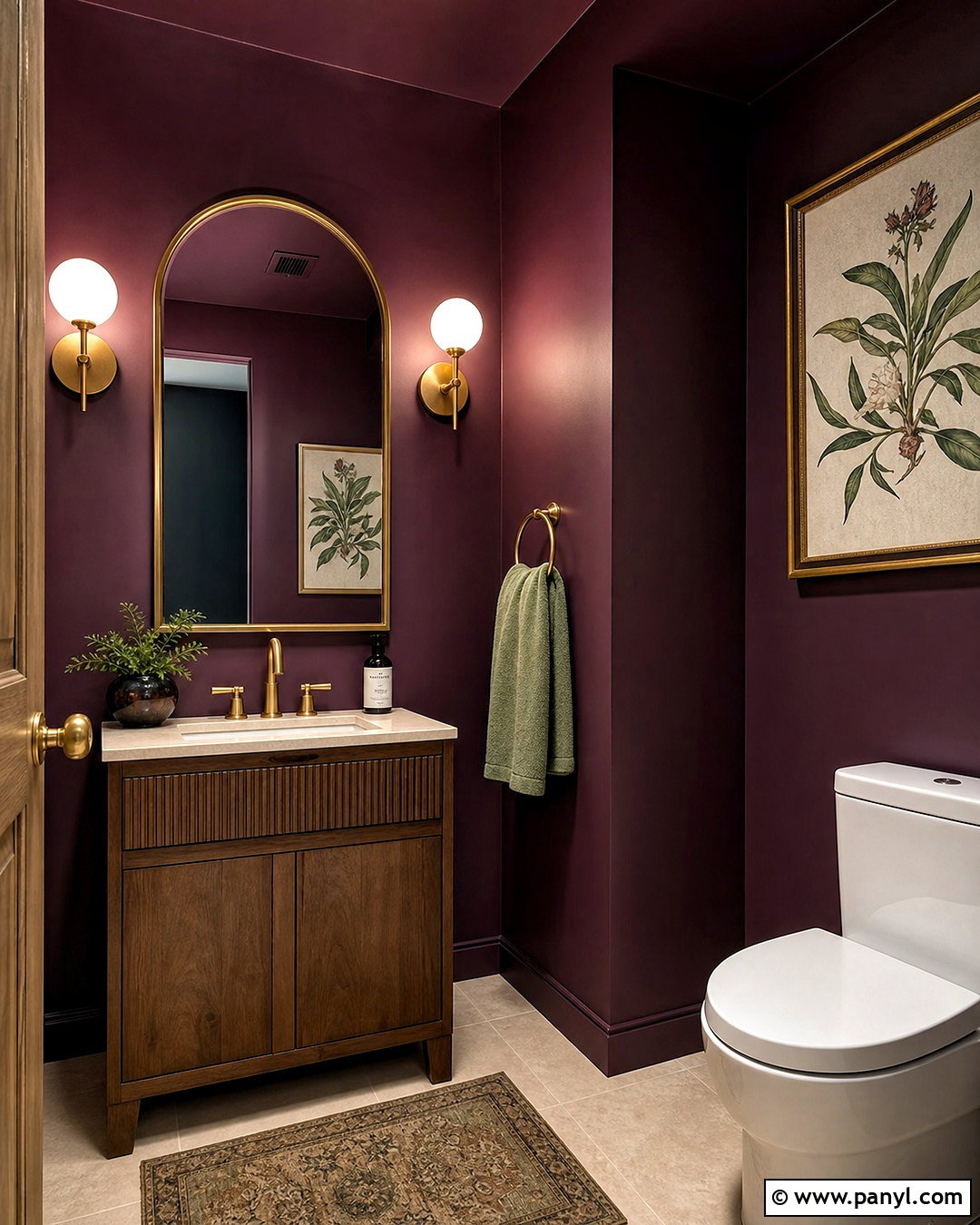
Aubergine purple makes a powder room feel dramatic and intentional without overwhelming a larger living area. Paint the walls and ceiling in the same deep eggplant shade, using a moisture-resistant satin finish. Pair it with a compact walnut vanity, cream stone countertop, and aged brass faucet. A warm white globe sconce on each side of an arched mirror provides even illumination. Use small-format beige floor tile to lighten the lower half of the room. One framed botanical print and a folded sage hand towel introduce natural contrast. Because every surface is carefully coordinated, the strong wall color appears sophisticated instead of theatrical. This jewel-toned room becomes a memorable feature while remaining functional, uncluttered, and realistic for an average-size home.
20. Mineral Aqua Wall Color
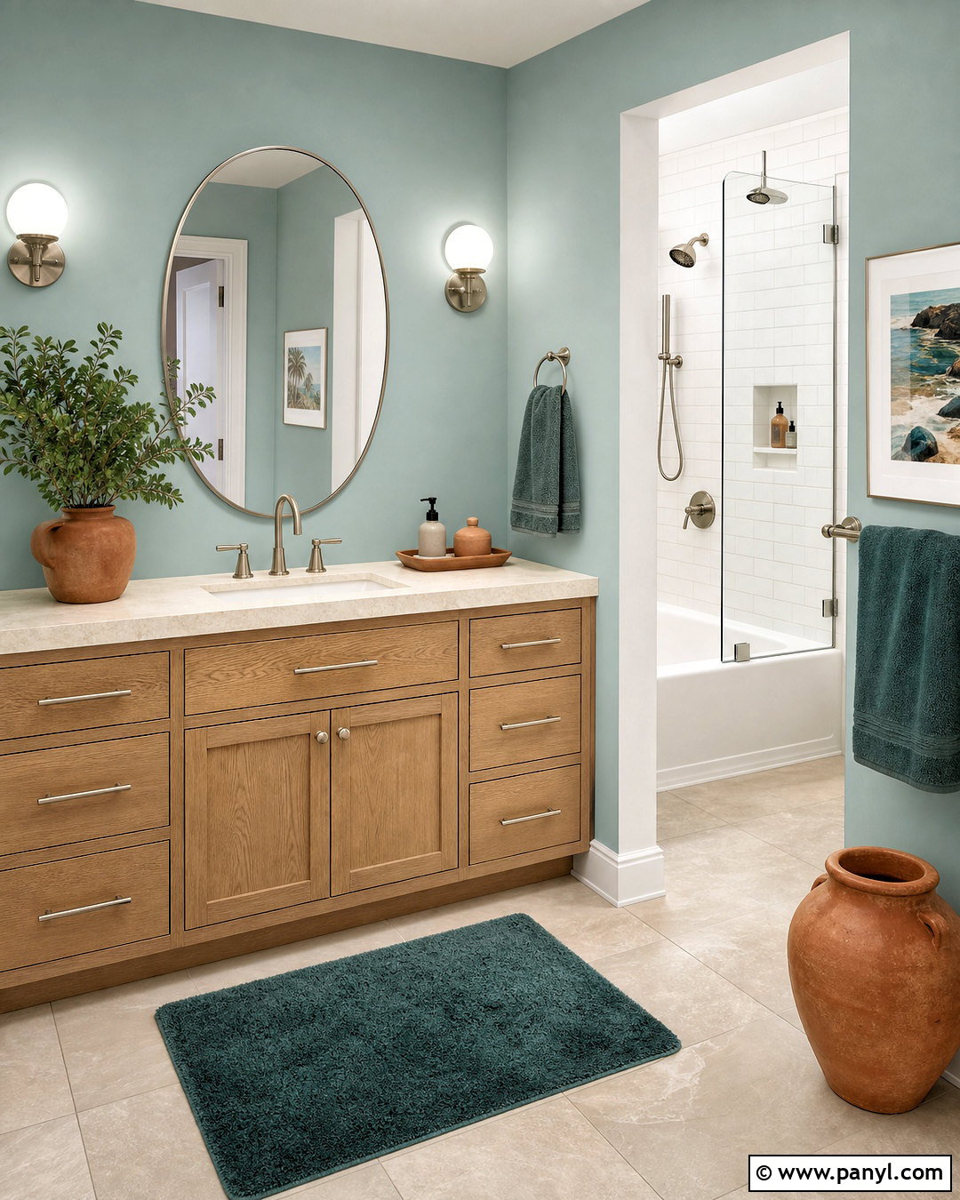
Mineral aqua combines the freshness of blue with the restorative quality of green, making it ideal for a bathroom. Choose a muted mid-tone aqua for the walls and pair it with a white oak vanity, pale limestone counter, and brushed nickel fixtures. Large cream floor tiles keep the palette bright, while a white shower curtain or frameless glass enclosure prevents visual heaviness. Add deeper teal towels and small terracotta accessories for layered contrast. Paint the ceiling a soft warm white instead of a blue-based white, which may make the room appear colder. A rounded mirror and simple globe lights soften the straight lines of the cabinetry. The finished bathroom feels clean and refreshing, but natural materials keep it from resembling a clinical or overly themed space.
Conclusion:
The most useful 2027 wall color trends offer more than fashionable paint shades. They help create rooms that feel warmer, more personal, and better connected to natural materials. Luminous blue, pop pink, and energy orange provide confident focal palettes, while clay, forest green, chocolate brown, and aubergine bring depth. Softer options such as oatmeal beige, mushroom, mineral aqua, and dusty rose make everyday spaces feel calm without becoming bland. Whichever direction you choose, coordinate the wall color with the flooring, furniture, lighting, and adjoining rooms before painting. Large samples are essential because undertones change throughout the day. A well-planned palette will feel current in 2027 while remaining comfortable and livable for years.

Related Ideas and Inspiration:
Leave a Reply