
The latest **20 current paint trends** move away from flat gray interiors and sterile white rooms. Today’s colors feel warmer, more natural, and more personal. Earthy reds, botanical greens, softened blues, and rich browns bring depth without making a home feel overly decorated. Warm neutrals remain practical, but they now have stronger undertones and more character. Painting techniques are changing too. Color drenching, tonal trim, limewash finishes, and contrasting cabinetry create a complete atmosphere instead of treating paint as a background detail. The best approach is to consider lighting, flooring, furniture, and adjoining rooms before choosing a shade. Each look below combines paint with complementary materials and decor, making it easier to recreate these **20 current paint trends**.

1. Warm White Paint
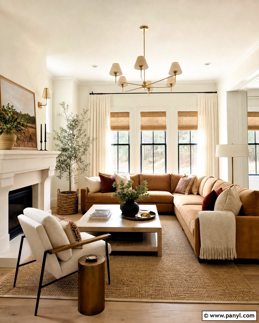
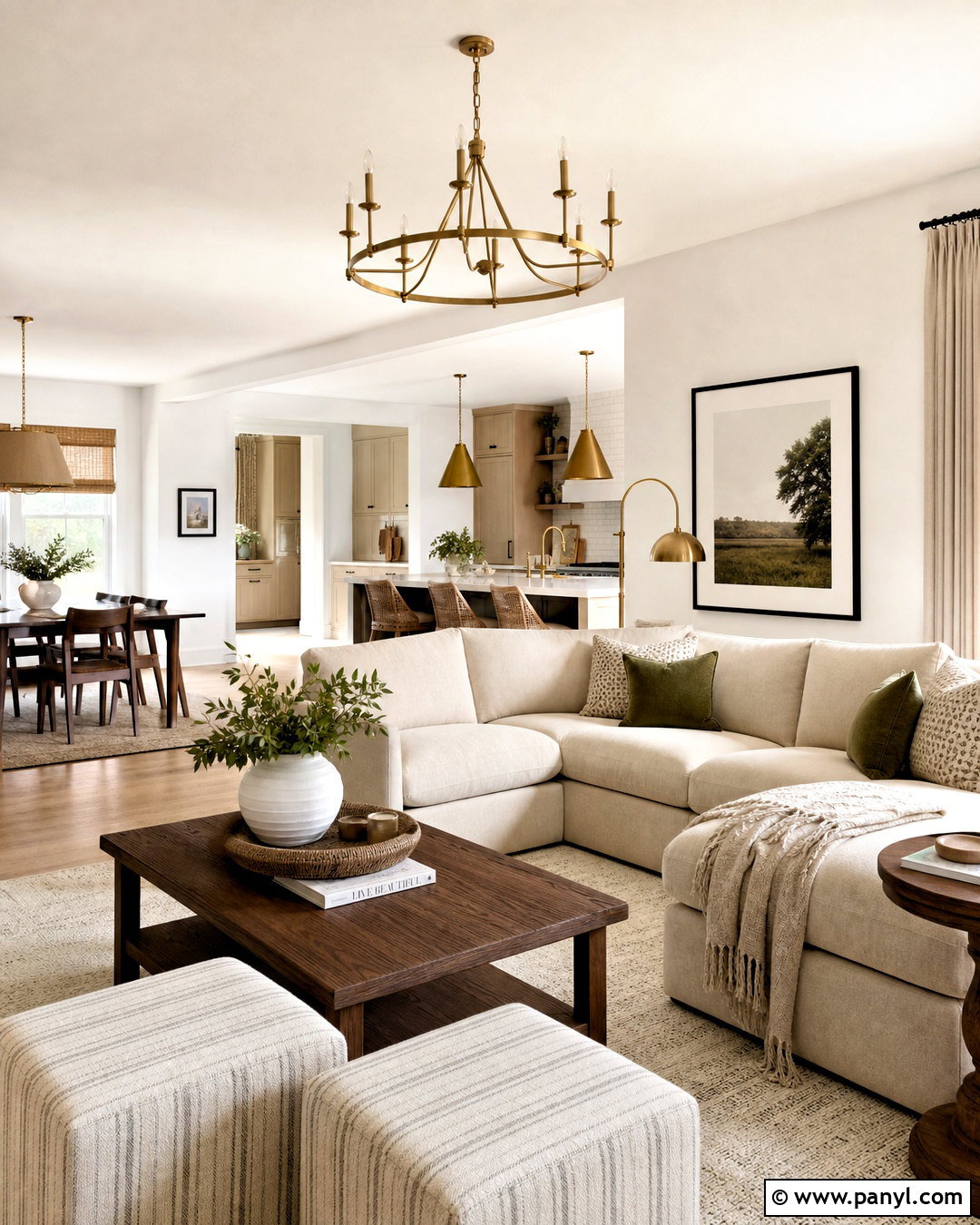
Warm white paint creates a bright room without the sharp, clinical effect of pure white. Use a creamy white with subtle beige or yellow undertones across the walls, ceiling, and simple trim. Then introduce light oak furniture, woven shades, ivory linen curtains, and a natural jute rug. In a living room, a camel sofa and rust-colored pillows add gentle contrast while keeping the palette relaxed. Brushed brass lighting reinforces the warmth, while a few matte black accents provide definition. This complete scheme works especially well in rooms with cool northern light because the undertones help balance blue shadows. Test the color beside fixed finishes, since warm whites can appear noticeably different near gray stone, yellow wood, or bright white cabinetry.
2. Soft Khaki Paint
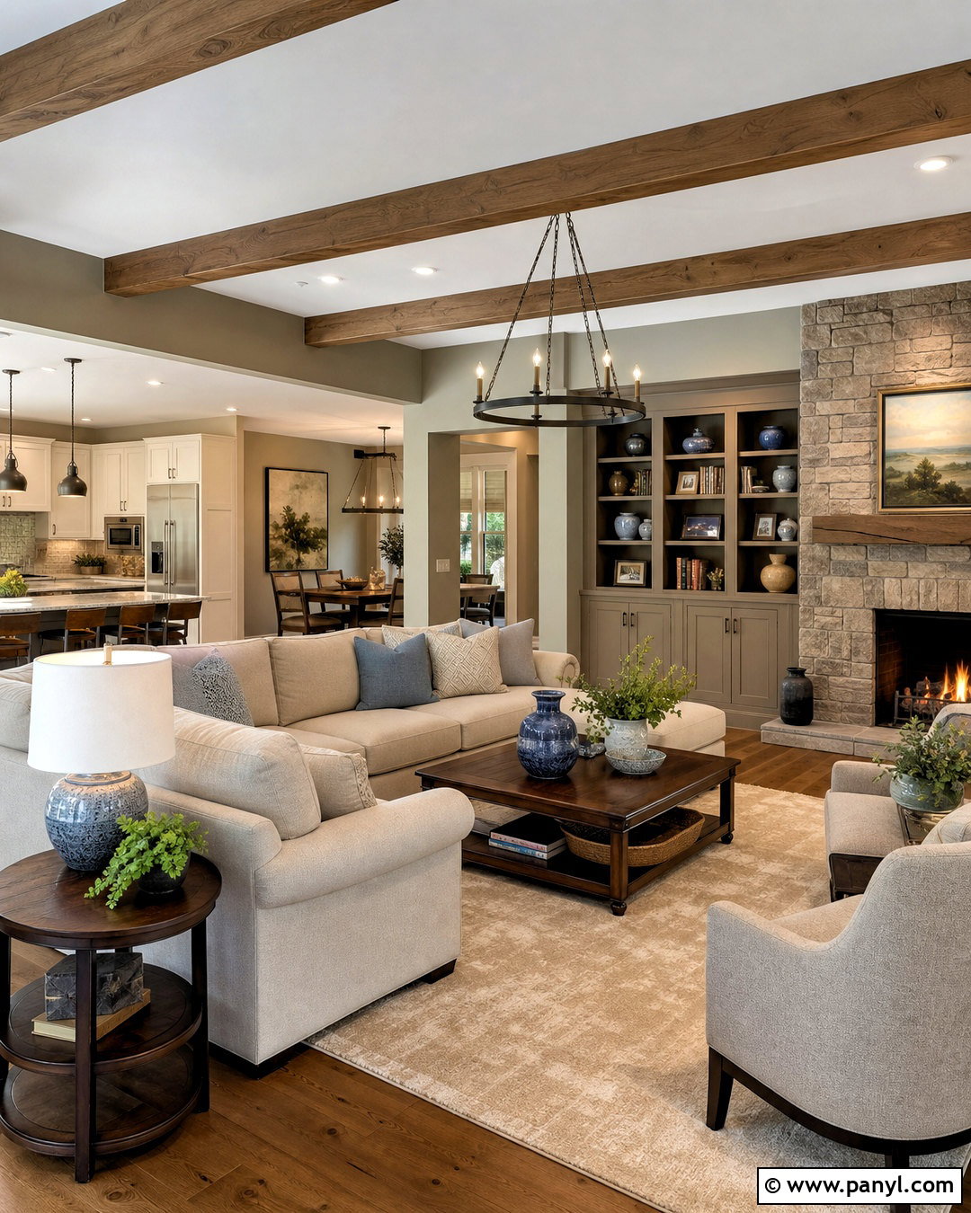
Soft khaki offers more depth than beige while remaining easy to use throughout an open-plan home. Choose a muted khaki with green-gray undertones for the main walls, then pair it with creamy trim and a slightly deeper taupe on built-in shelves. Walnut furniture, oatmeal upholstery, and aged bronze lighting create a grounded, comfortable foundation. Add muted blue textiles or ceramic pieces to prevent the palette from feeling too brown. In a connected dining area, repeat the khaki through painted cabinetry or a sideboard for visual continuity. This scheme suits traditional, transitional, and organic modern interiors because it bridges warm and cool finishes. It also works beautifully with stone fireplaces, medium wood floors, and natural fabrics that make the understated color feel layered rather than plain.
3. Sage Green Paint
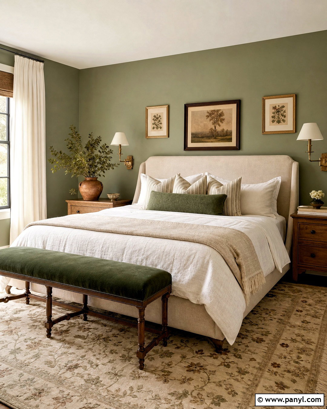
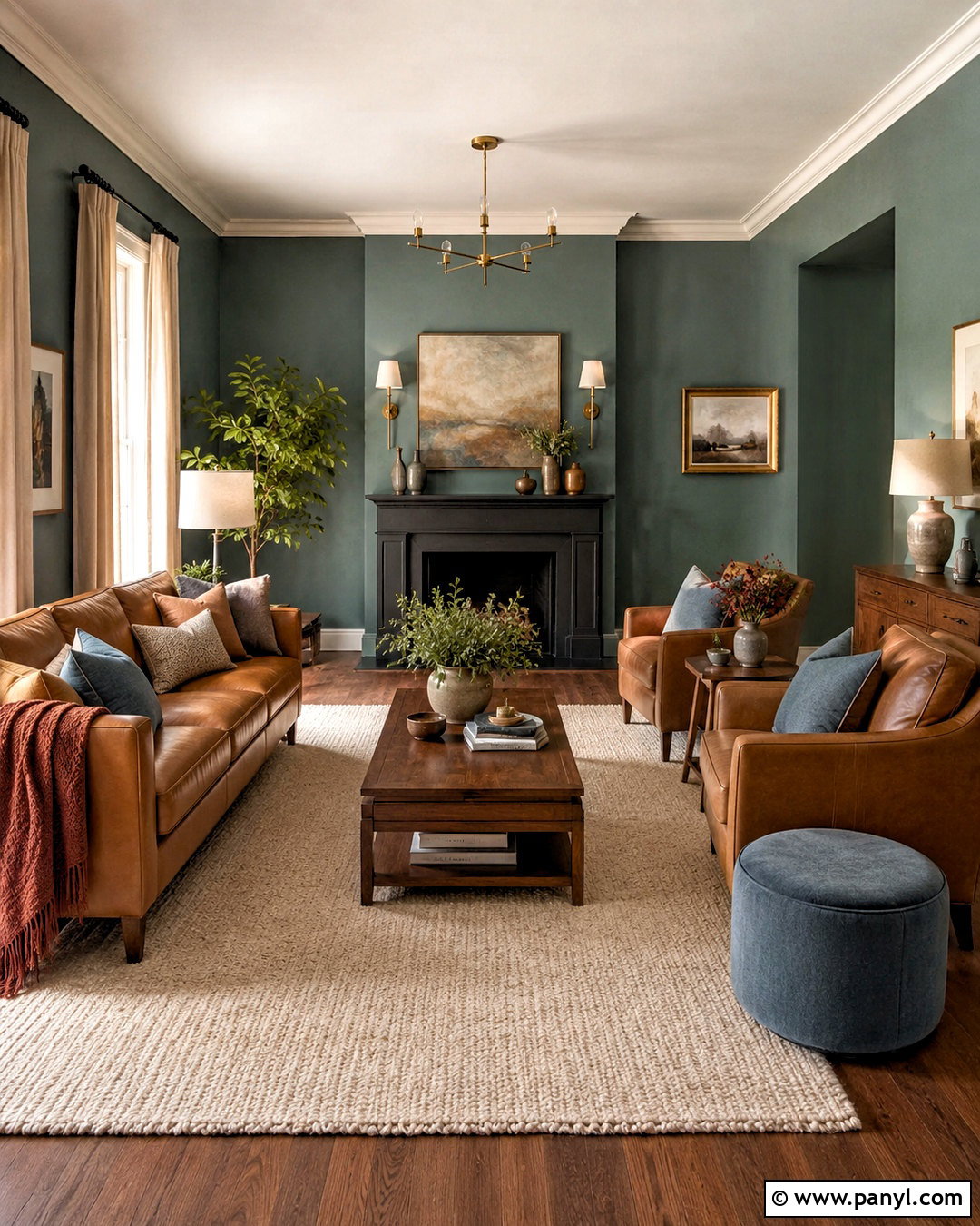
Sage green continues to work because it functions almost like a neutral while bringing a natural softness to the room. For a balanced bedroom, paint the walls muted sage and keep the ceiling warm white. Add an upholstered oatmeal bed, medium oak nightstands, linen bedding, and antique brass sconces. A deeper forest green bench or throw introduces contrast without breaking the restful mood. Use off-white curtains and a faded botanical rug to connect the entire palette. Sage can shift gray in cool light, so choose a slightly warmer version for north-facing rooms. The completed space should include a mix of smooth and tactile finishes rather than too many green accessories. Terracotta pottery, woven baskets, and warm wood are enough to make the wall color feel intentional and inviting.
4. Warm Eucalyptus Paint
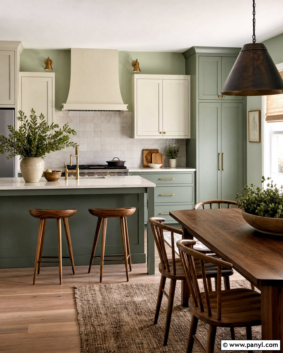
Warm eucalyptus paint gives kitchens and breakfast rooms a gentle botanical character without becoming overly rustic. Apply the muted green to lower cabinets and a coordinating lighter version to the walls. Keep upper cabinetry creamy white to preserve brightness, especially in a smaller kitchen. Honed limestone counters, an off-white tile backsplash, and unlacquered brass hardware complement the warm undertones. Bring in walnut stools, natural linen shades, and a simple wood dining table for an earthy finish. A dark bronze pendant adds useful contrast above the island. This layered palette feels fresher than an all-white kitchen but remains highly livable. Instead of matching every green surface exactly, use two related strengths so the cabinetry stands out while the room still looks calm, connected, and thoughtfully designed.
5. Smoky Jade Paint
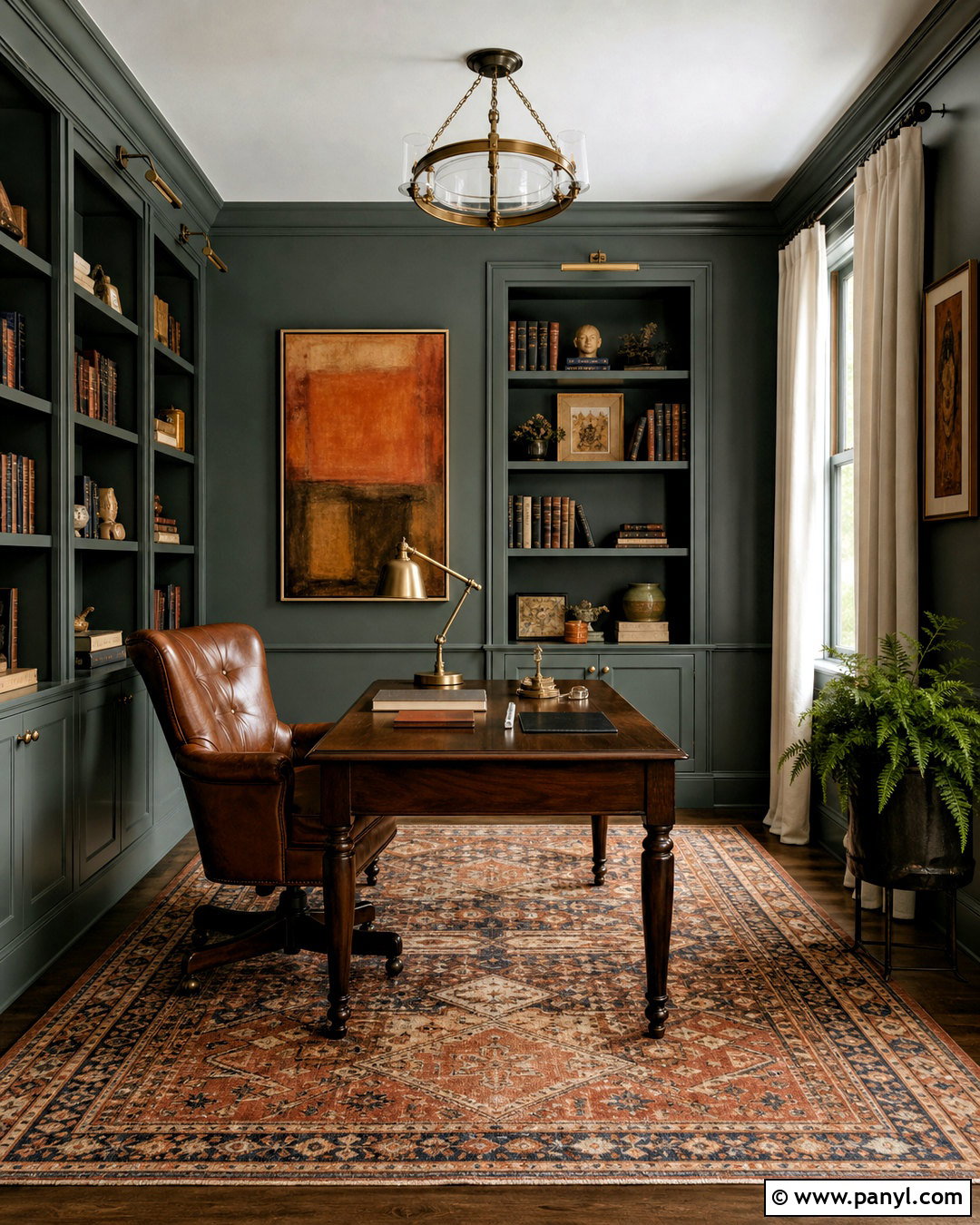
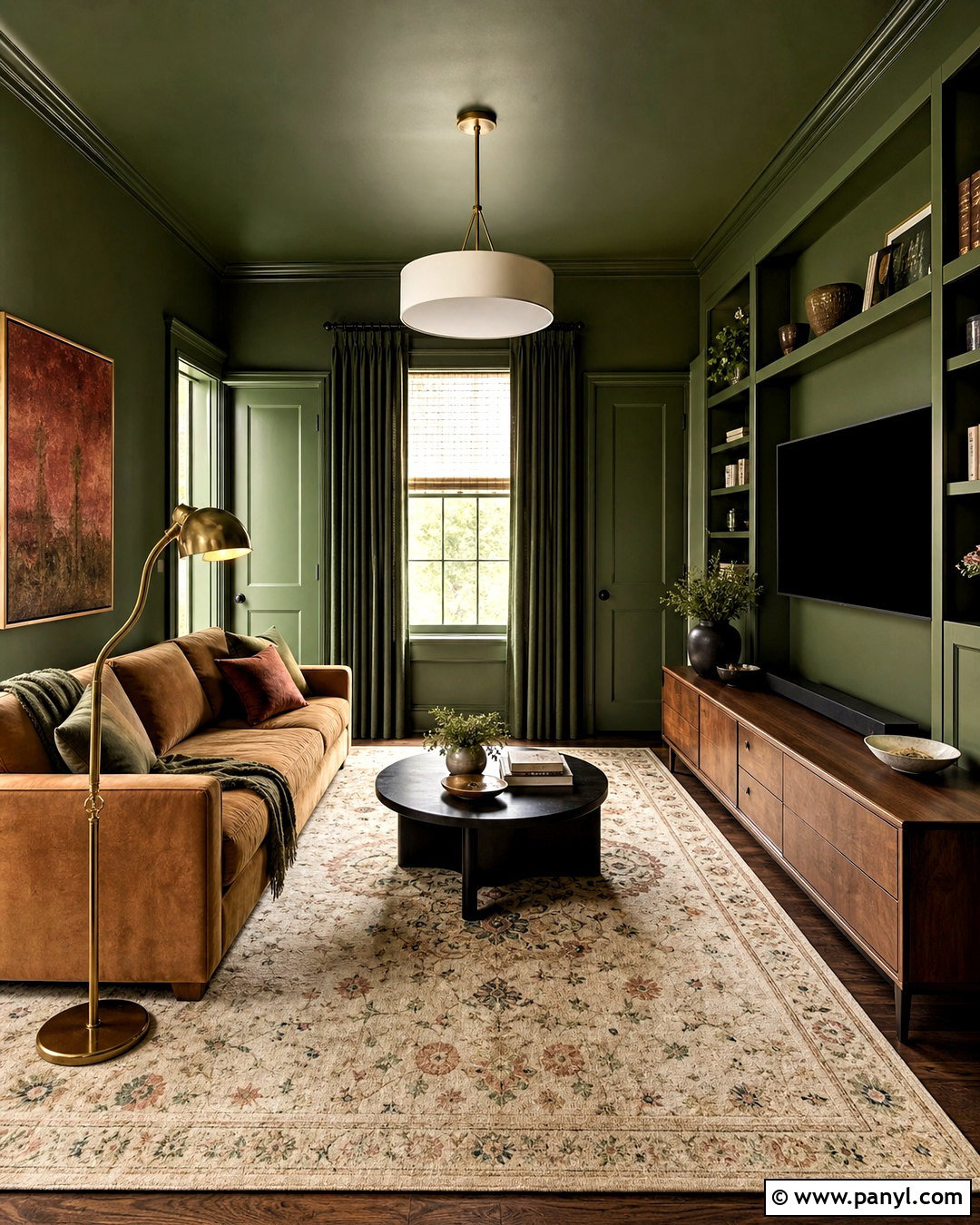
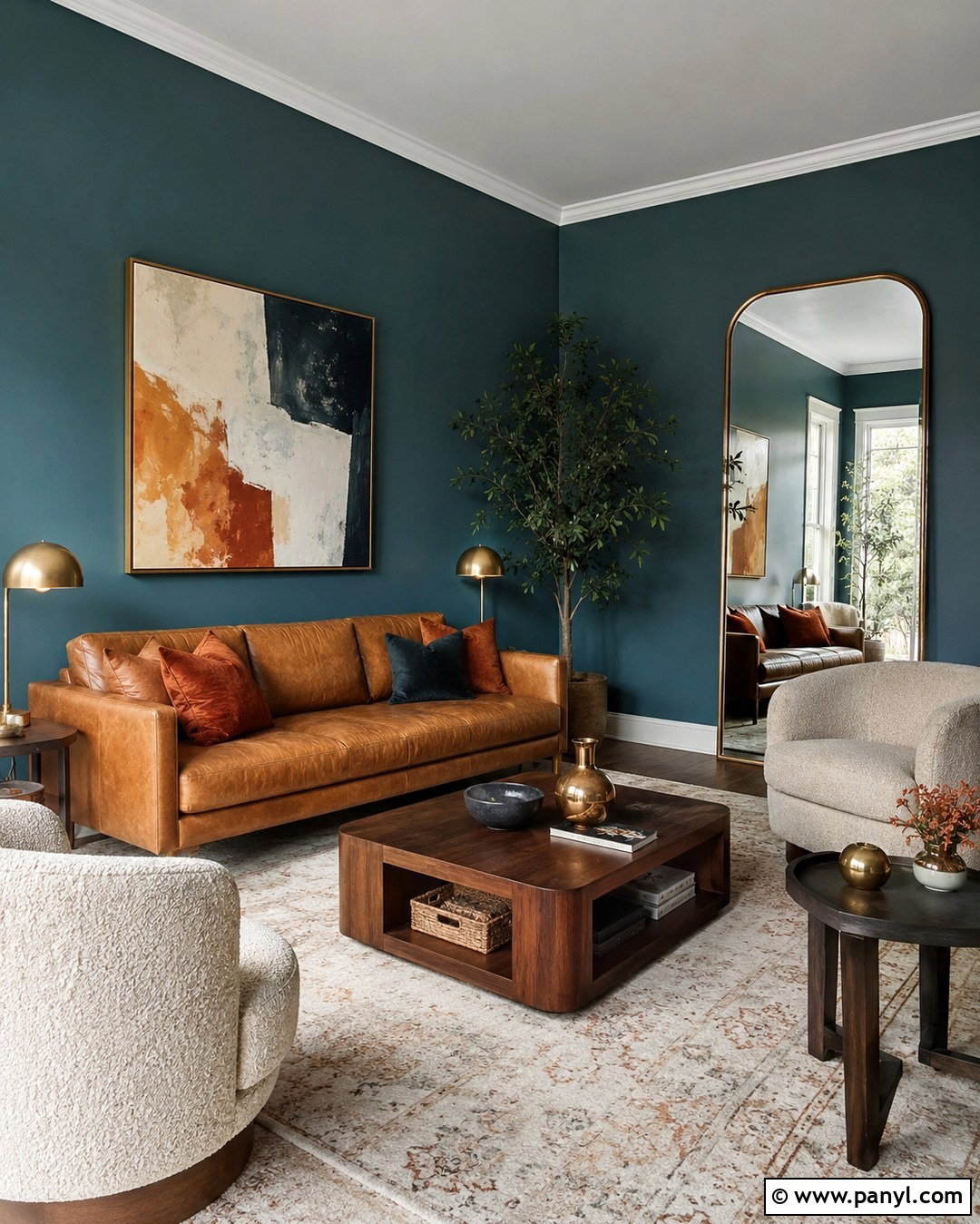
Smoky jade brings saturated color into a room while its gray undertones keep the overall effect sophisticated. It works particularly well in a library, home office, or formal sitting room with plenty of architectural detail. Paint the walls, bookcases, and trim in the same jade shade, using a satin finish on the millwork for subtle dimension. Add a tobacco leather chair, dark walnut desk, patterned wool rug, and aged brass picture lights. Cream curtains and a pale ceiling can keep the space from feeling enclosed if natural light is limited. For a stronger enveloping effect, continue the color overhead. Finish the room with artwork containing rust, ochre, or muted blue. These warmer accents balance the green and create a collected space rather than a heavily themed interior.
6. Deep Olive Paint
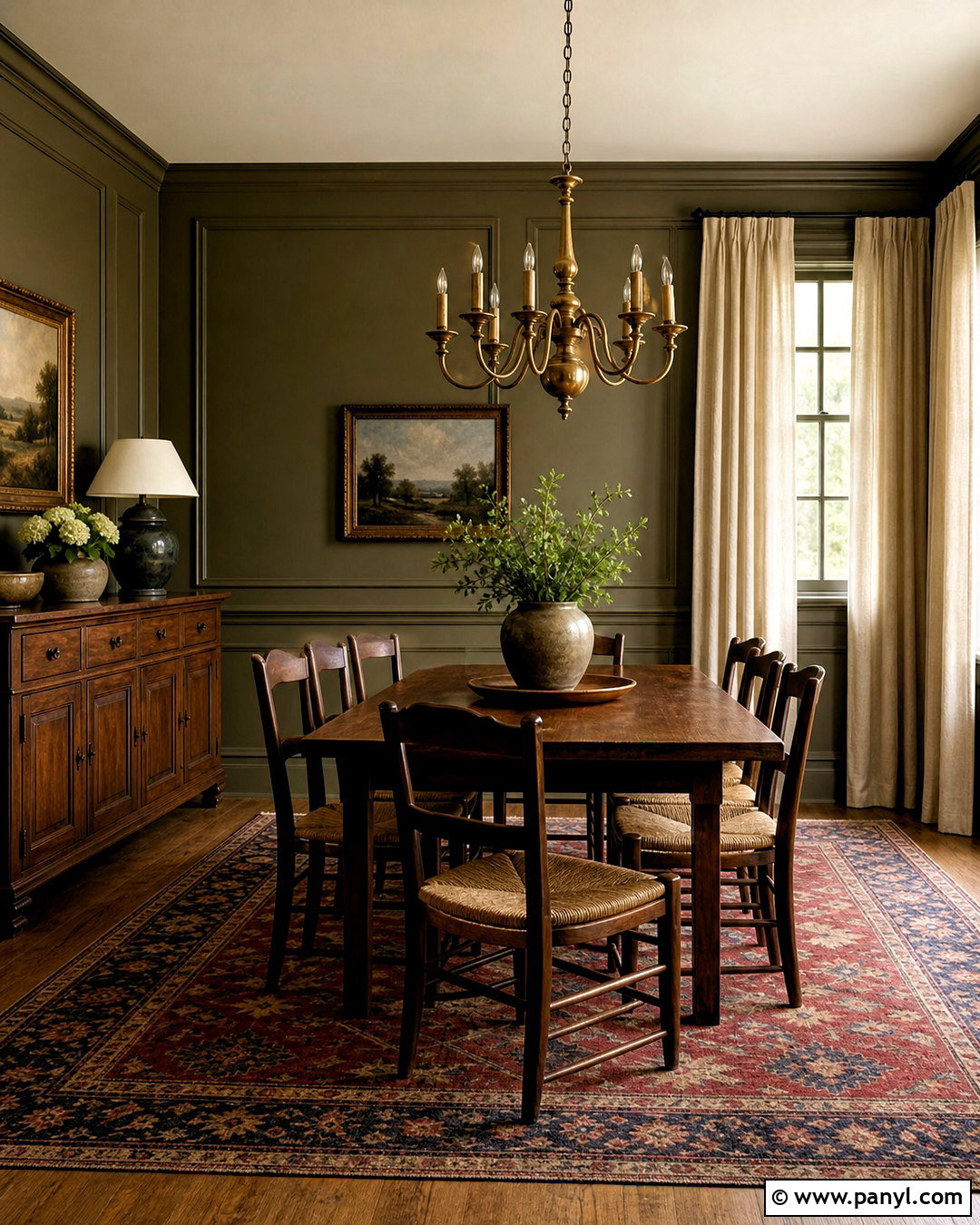
Deep olive paint can make a dining room feel intimate, established, and connected to nature. Cover the walls and traditional panel molding in a rich brown-based olive, then use a soft cream on the ceiling for contrast. A long walnut dining table, rush-seat chairs, and an antique brass chandelier support the earthy palette. Choose linen curtains in natural flax and a vintage-style rug containing faded red, tan, and green. Instead of adding more obvious botanical decor, bring in sculptural pottery, framed landscapes, and simple greenery. The dark walls will look richer beside warm wood and aged metal than beside cool chrome or blue-gray flooring. If the room receives limited daylight, include layered lighting from sconces, a central fixture, and lamps to reveal the color’s complex undertones throughout the evening.
7. Terracotta Paint
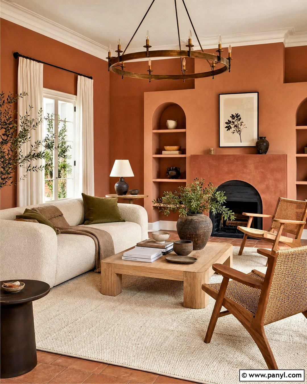
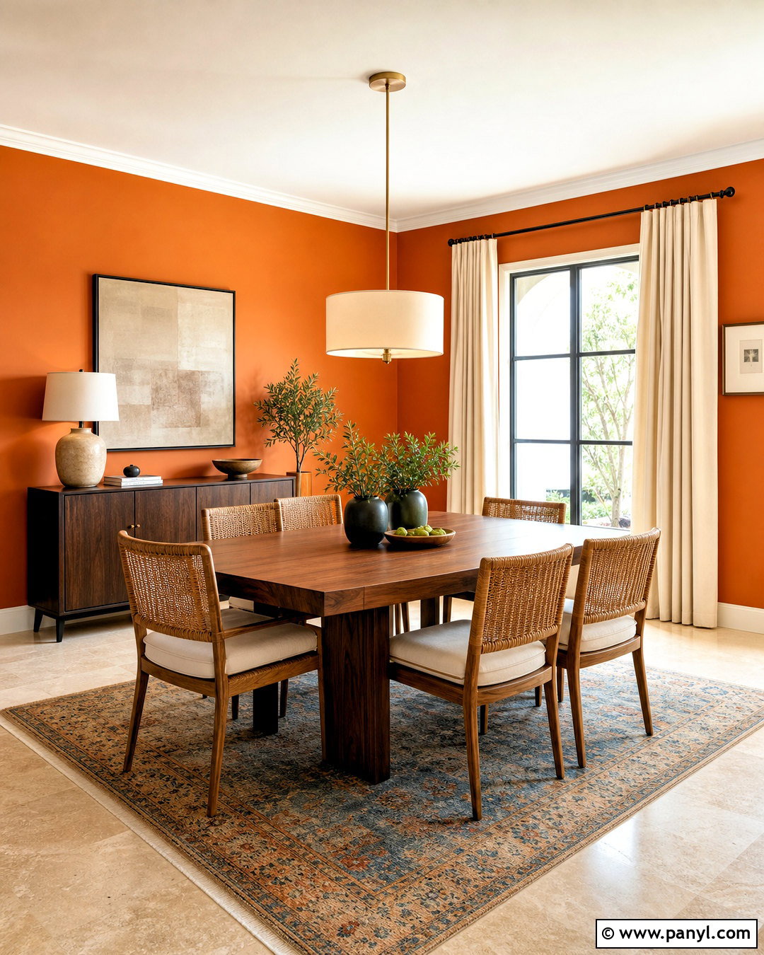
Terracotta paint creates a sun-warmed, welcoming living space when it is balanced with pale natural materials. Choose a dusty clay shade rather than a bright orange and apply it across the main walls. Pair it with a cream boucle sofa, light oak coffee table, woven chairs, and a large ivory rug. Linen curtains in warm white soften the windows without competing with the walls. Add aged brass lighting and small accents in olive green, chocolate brown, or faded blue. Keeping the ceiling and trim creamy white gives the saturated color breathing room. For a more immersive finish, paint a fireplace surround in a darker clay tone. The result should feel earthy and modern, combining substantial wall color with simple furniture, tactile textiles, and restrained decor rather than Southwestern-themed accessories.
8. Plaster Pink Paint
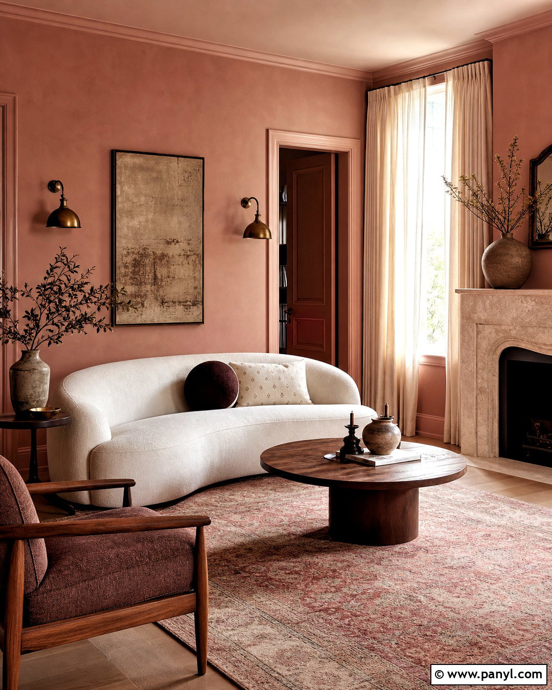
Plaster pink has become a practical alternative to beige because its dusty brown undertones prevent it from feeling sugary. Use it in a bedroom or relaxed sitting room, covering the walls and trim in closely related shades for a softly layered effect. Pair the paint with a curved cream sofa or upholstered bed, walnut furniture, and linen textiles in oatmeal and rust. Antique brass lighting warms the palette, while a burgundy cushion or dark wood frame supplies necessary contrast. Avoid combining the color with stark white trim, which can exaggerate its pinkness. A muted ivory or pale mushroom creates a smoother transition. Natural stone, handmade ceramics, and a faded patterned rug complete the room, giving the softened pink an aged, architectural quality that feels comfortable rather than overly delicate.
9. Butter Yellow Paint
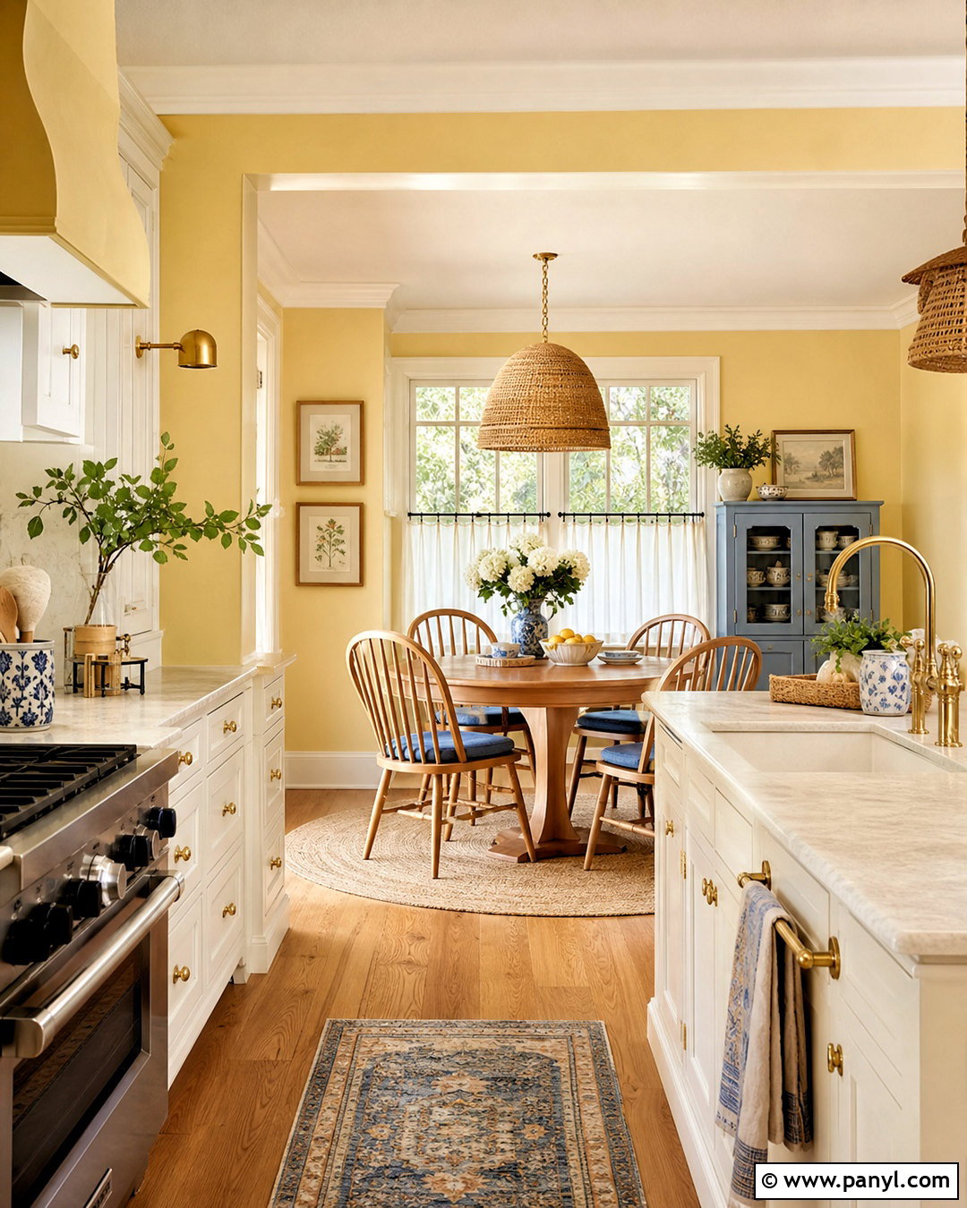
Butter yellow paint brings gentle brightness to kitchens, breakfast rooms, and family spaces without the intensity of a primary yellow. Select a creamy, muted shade and use it on walls alongside warm white cabinets and honey-toned wood floors. A farmhouse table or simple oak dining set grounds the cheerful color. Add woven pendant lights, linen café curtains, and small accents in dusty blue or muted green. In a kitchen, warm brass hardware and off-white stone counters keep the palette cohesive. Avoid pairing butter yellow with cold blue-white trim, which can make the walls look harsher. Cream trim produces a softer transition. This complete scheme feels sunny even on overcast days, while natural materials and subdued accent colors prevent the space from becoming too bright, themed, or visually restless.
10. Burgundy Paint
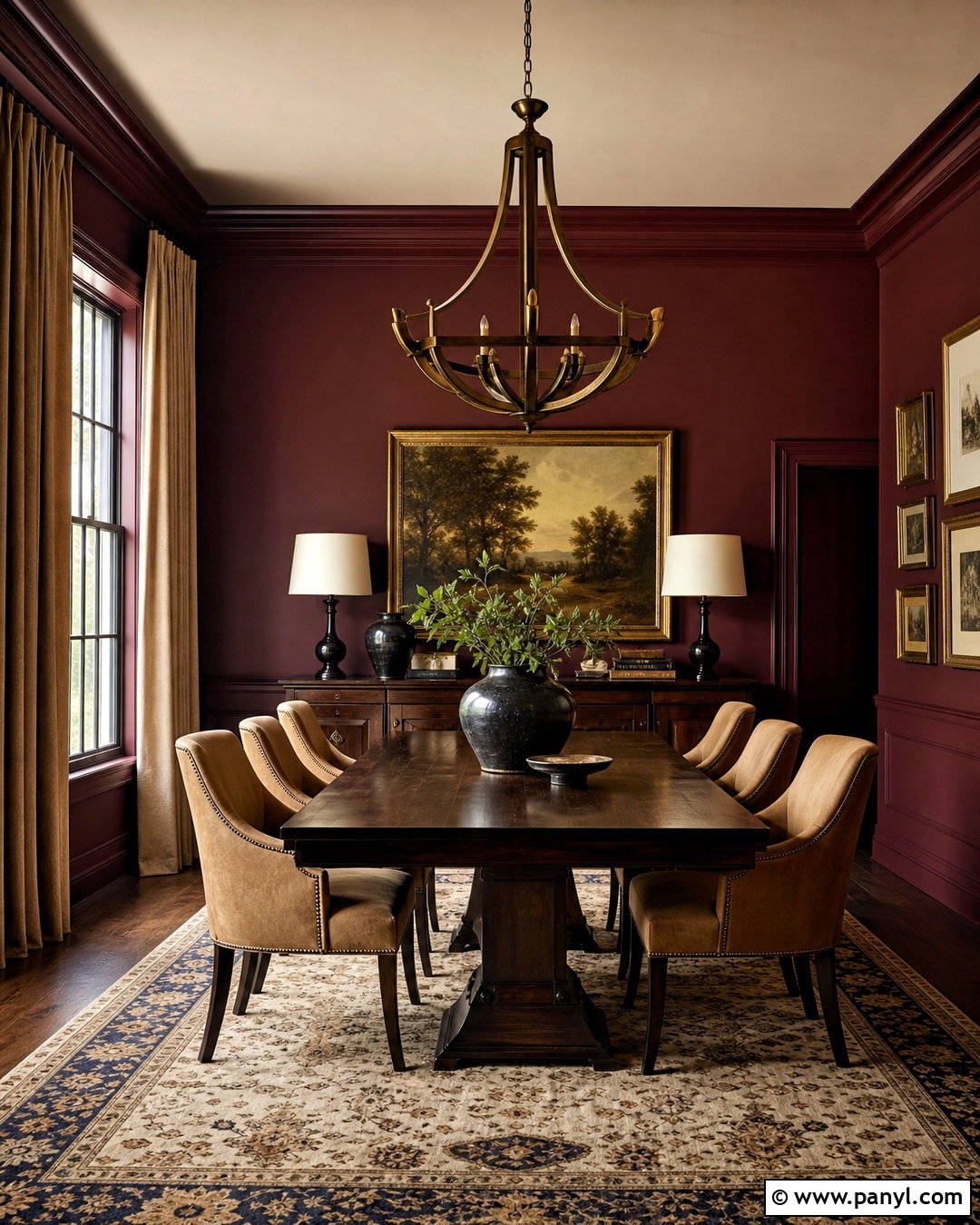
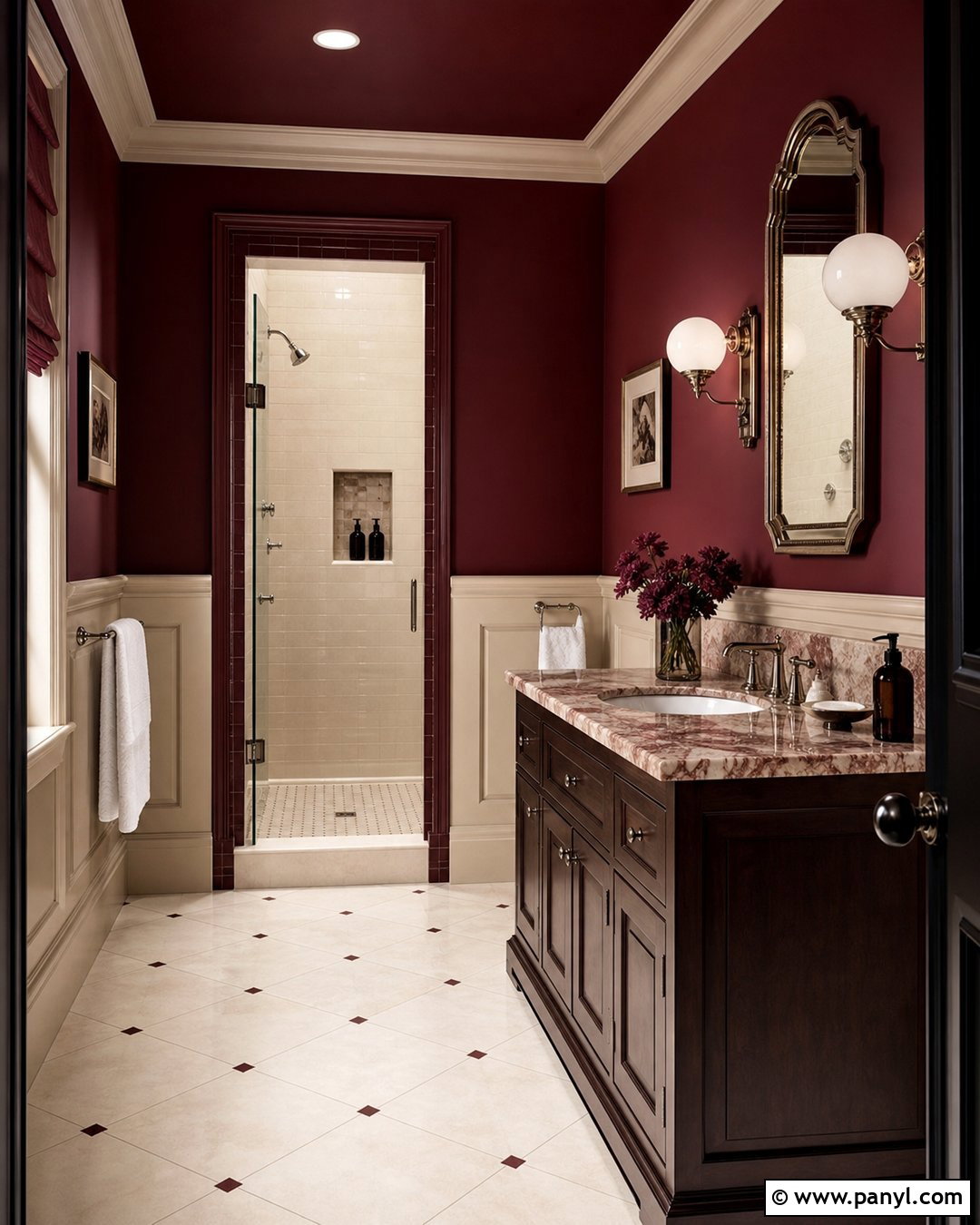
Burgundy paint transforms a formal room into a rich, enveloping space when used with restraint and balanced materials. In a dining room, paint the walls and molding a deep wine red, leaving the ceiling a soft putty color. Introduce a dark oak table, camel upholstered chairs, and a sculptural bronze chandelier. A patterned rug with faded cream, navy, and rust helps connect the strong wall color to the furniture. Use linen curtains in warm beige rather than matching burgundy drapes, which could make the design feel heavy. Framed artwork and a few glossy ceramic pieces reflect light against the matte walls. This palette is especially effective in rooms used at night, where layered sconces and lamps make the red appear warm, dimensional, and inviting instead of overly dramatic.
11. Chocolate Brown Paint
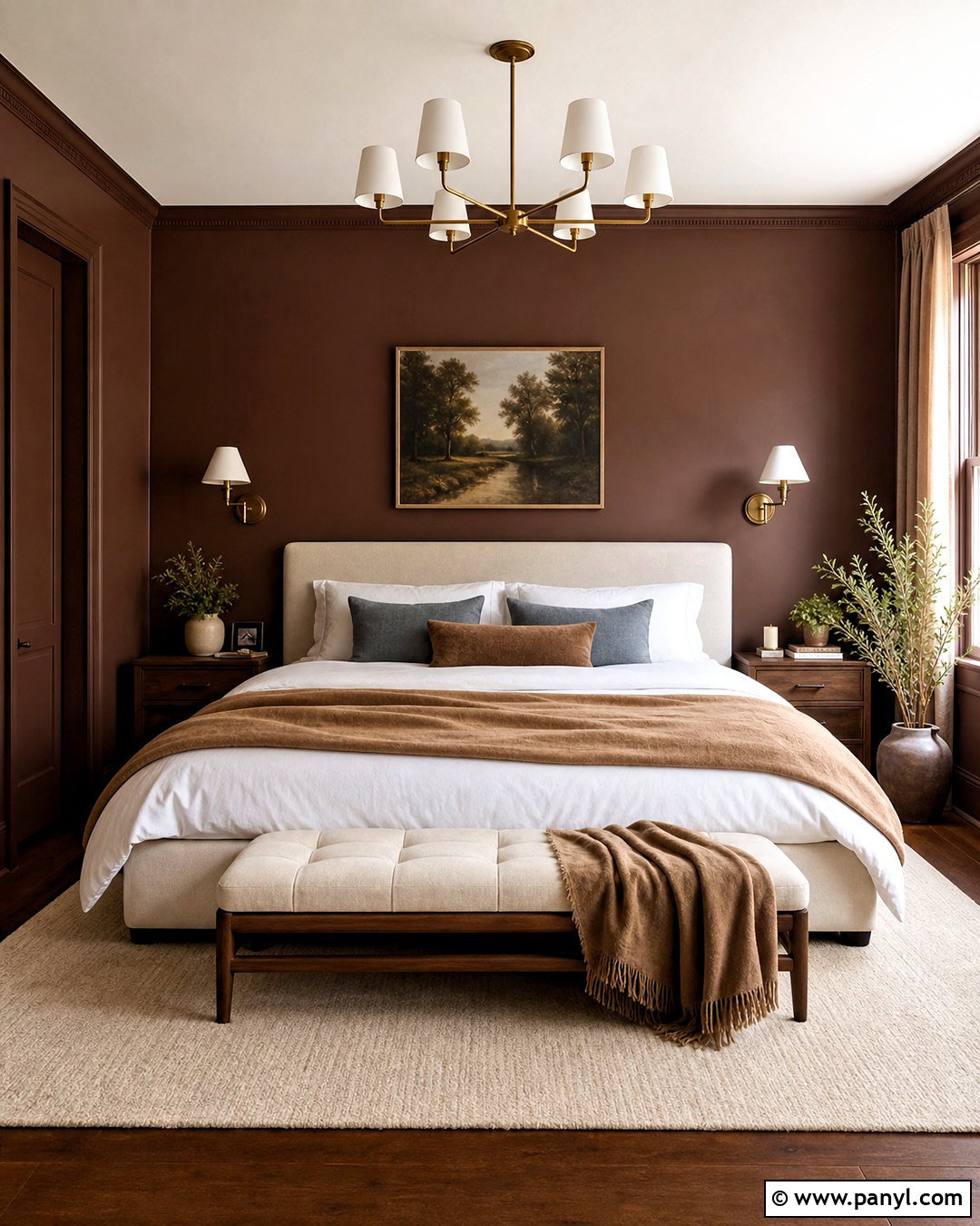
Chocolate brown is returning as a comforting bedroom color that feels both nostalgic and current. Choose a warm cocoa shade for the walls, then repeat it on the trim to create a seamless background. Keep the ceiling creamy white if the room is small, or use a lighter mocha for a cocooning tonal effect. An ivory upholstered bed, crisp white sheets, caramel linen blanket, and walnut nightstands lighten the deeper paint. Add antique brass sconces and a pale wool rug for subtle contrast. Dusty blue or muted rose accents can stop the brown scheme from looking overly neutral. The key is balancing dark walls with generous light-colored textiles and reflective details. This creates a restful, polished bedroom rather than a room that feels dim, dated, or dominated by heavy furniture.
12. Caramel Paint
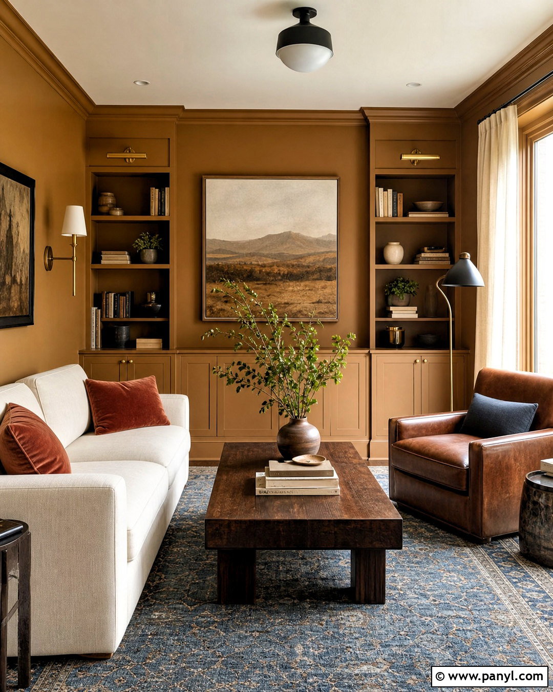
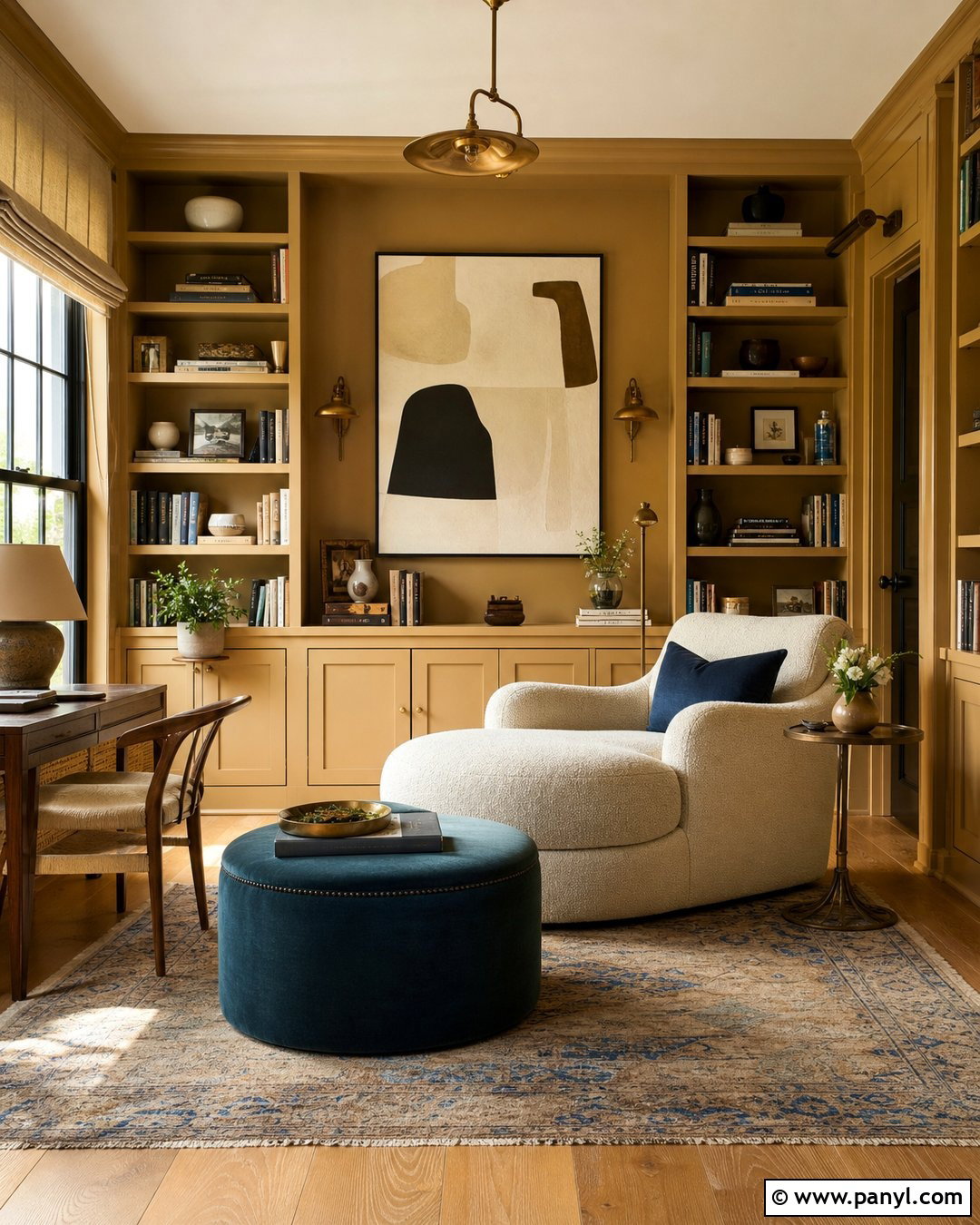
Caramel paint offers a warmer, more atmospheric alternative to pale tan and standard greige. Use it in a den or living room with architectural molding, painting the walls and built-ins in the same golden-brown hue. A cream sofa, dark walnut coffee table, and cognac leather chair create a rich range of related neutrals. Add rust velvet pillows, a charcoal floor lamp, and a faded blue rug to give the palette depth. Natural linen curtains will soften the color in daylight, while brass sconces make it glow after sunset. Keep decorative objects limited and substantial, such as stoneware, books, and framed abstract art. When every surface and furnishing has a slightly different texture, the monochromatic palette feels layered and expressive rather than flat, overly coordinated, or dependent on bold patterns.
13. Pale Blue Paint
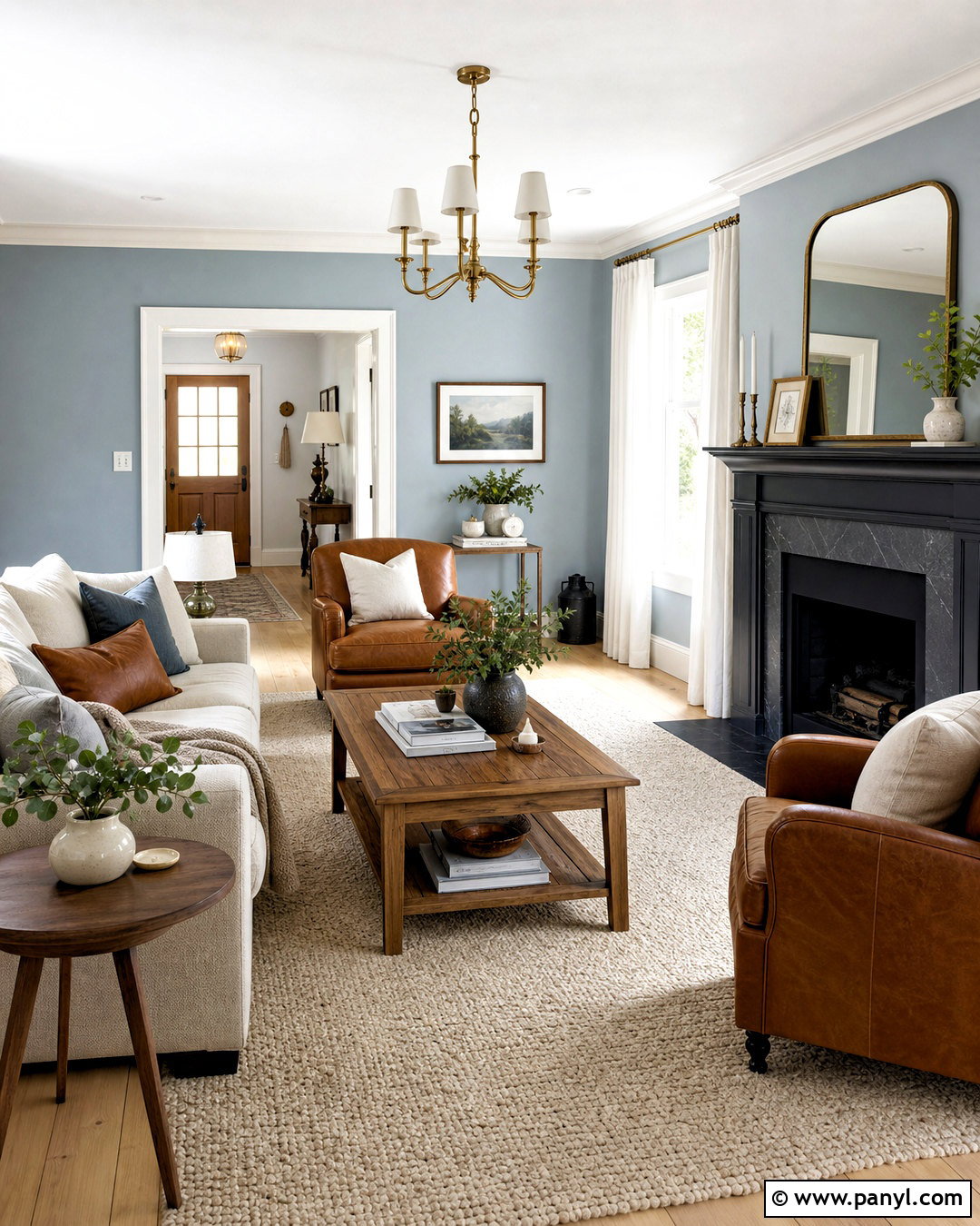
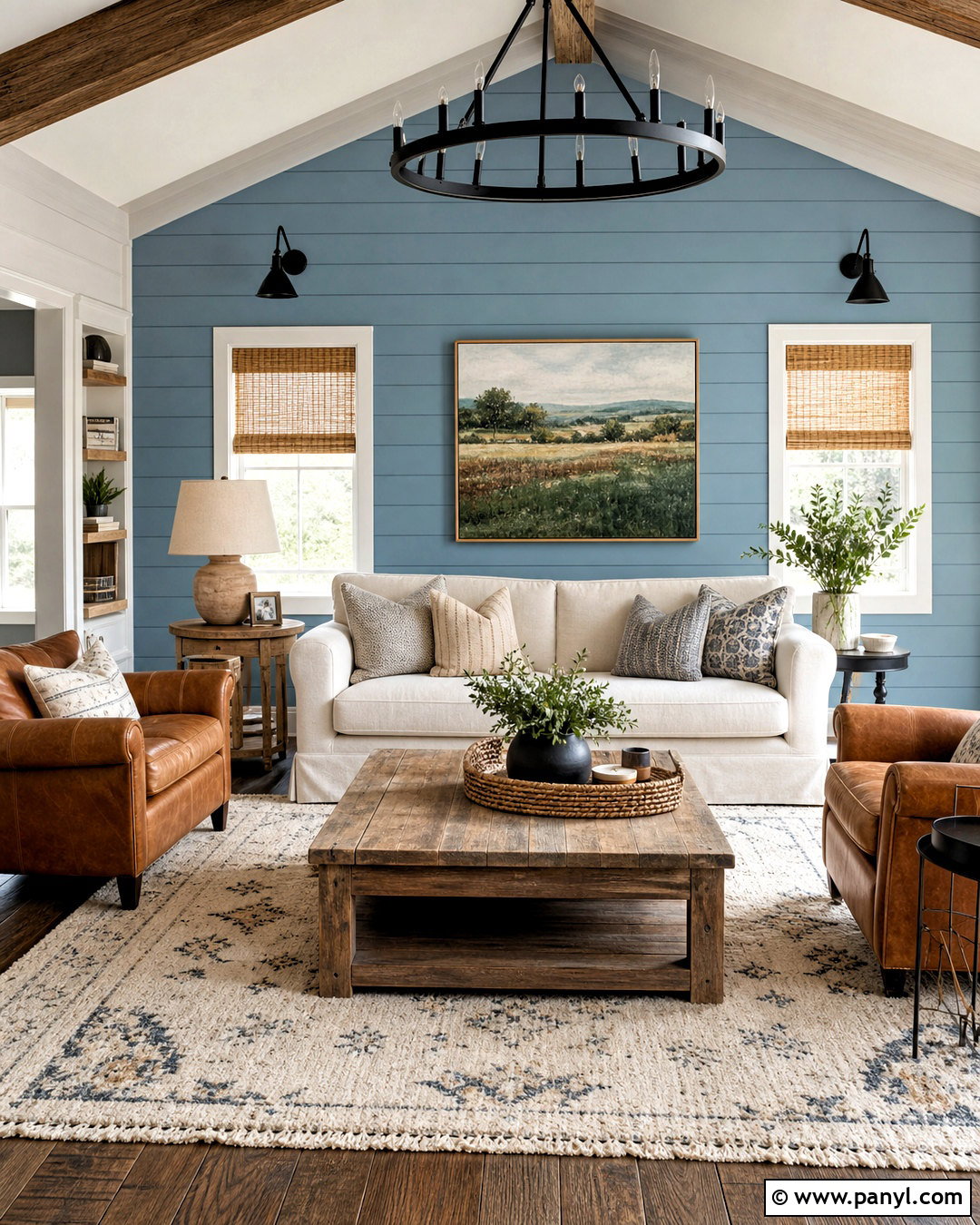
Pale blue paint is shifting toward softened, slightly gray versions that feel calm without becoming cold. In a living room, use the color on the walls with warm white trim and a light natural wood floor. Add an oatmeal sofa, medium oak tables, and a wool rug that blends cream, tan, and muted blue. Cognac leather and aged brass accents provide warmth, while white linen curtains preserve the airy quality. A charcoal fireplace surround can anchor the room and prevent the pale palette from floating visually. Choose a blue with enough pigment to remain visible in bright daylight, but avoid icy undertones near cool gray flooring. The completed design should combine the peaceful wall color with warm woods and textured neutrals, producing a balanced room that feels fresh, comfortable, and timeless.
14. Weathered Blue Paint
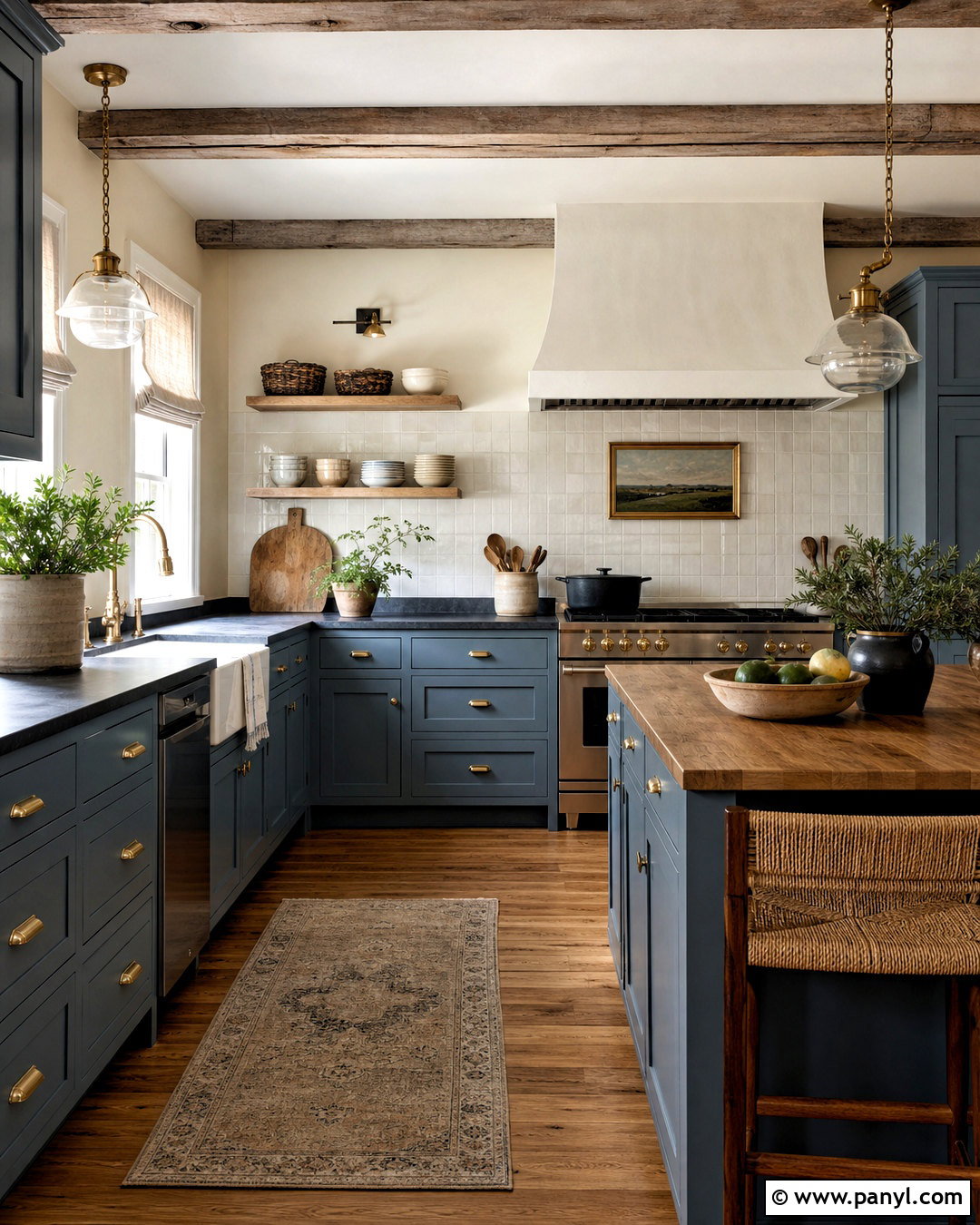
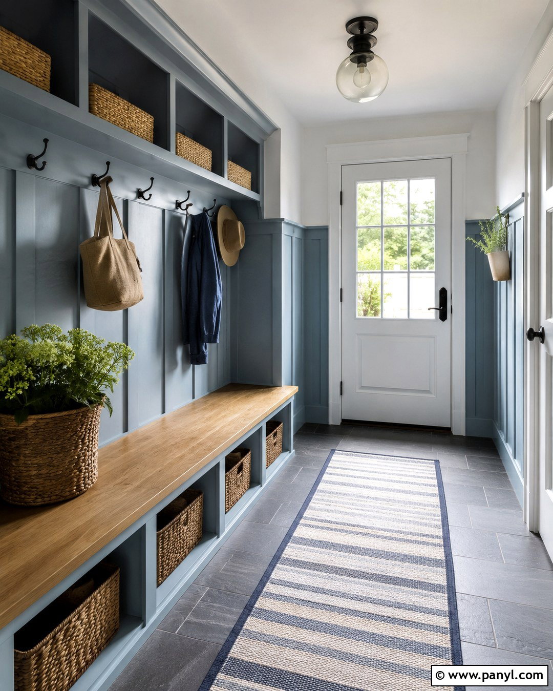
Weathered blue brings depth to a kitchen or mudroom while still feeling softer than navy. Paint cabinetry in a muted blue with gray-green undertones and use warm cream on the surrounding walls. Soapstone or honed charcoal counters create contrast, while an off-white handmade tile backsplash keeps the room bright. Choose aged brass or dark bronze hardware instead of polished chrome to support the color’s worn, natural appearance. Medium oak flooring, woven baskets, and linen window treatments complete the relaxed scheme. In a mudroom, carry the blue across lockers, benches, and trim for a built-in look. The slight variation of handcrafted materials is important here. It stops the design from feeling overly new and allows the softened blue to look collected, functional, and suited to everyday family life.
15. Periwinkle Paint
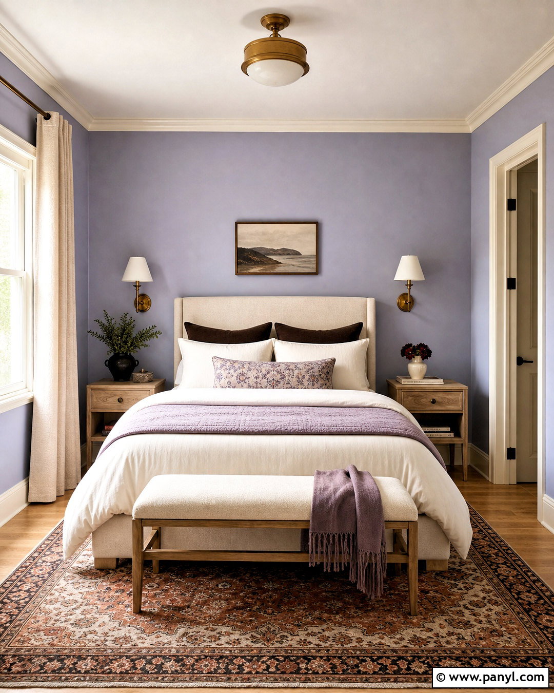
Periwinkle paint adds playful color while remaining surprisingly restful when its blue and violet tones are muted. Use it in a guest bedroom with warm white trim, an upholstered ivory bed, and pale oak nightstands. Layer bedding in cream, dusty lavender, and chocolate brown to give the pastel shade more maturity. A patterned rug containing rust or muted red introduces an unexpected warm note that prevents the room from feeling overly coordinated. Choose aged brass sconces and simple linen curtains for a soft finish. Periwinkle responds strongly to changing light, appearing bluer during the day and more violet at night. Sample it on several walls before committing. The finished bedroom should mix clean furniture lines with tactile fabrics, creating a fresh, welcoming space that feels colorful without looking childish.
16. Dusty Lavender Paint
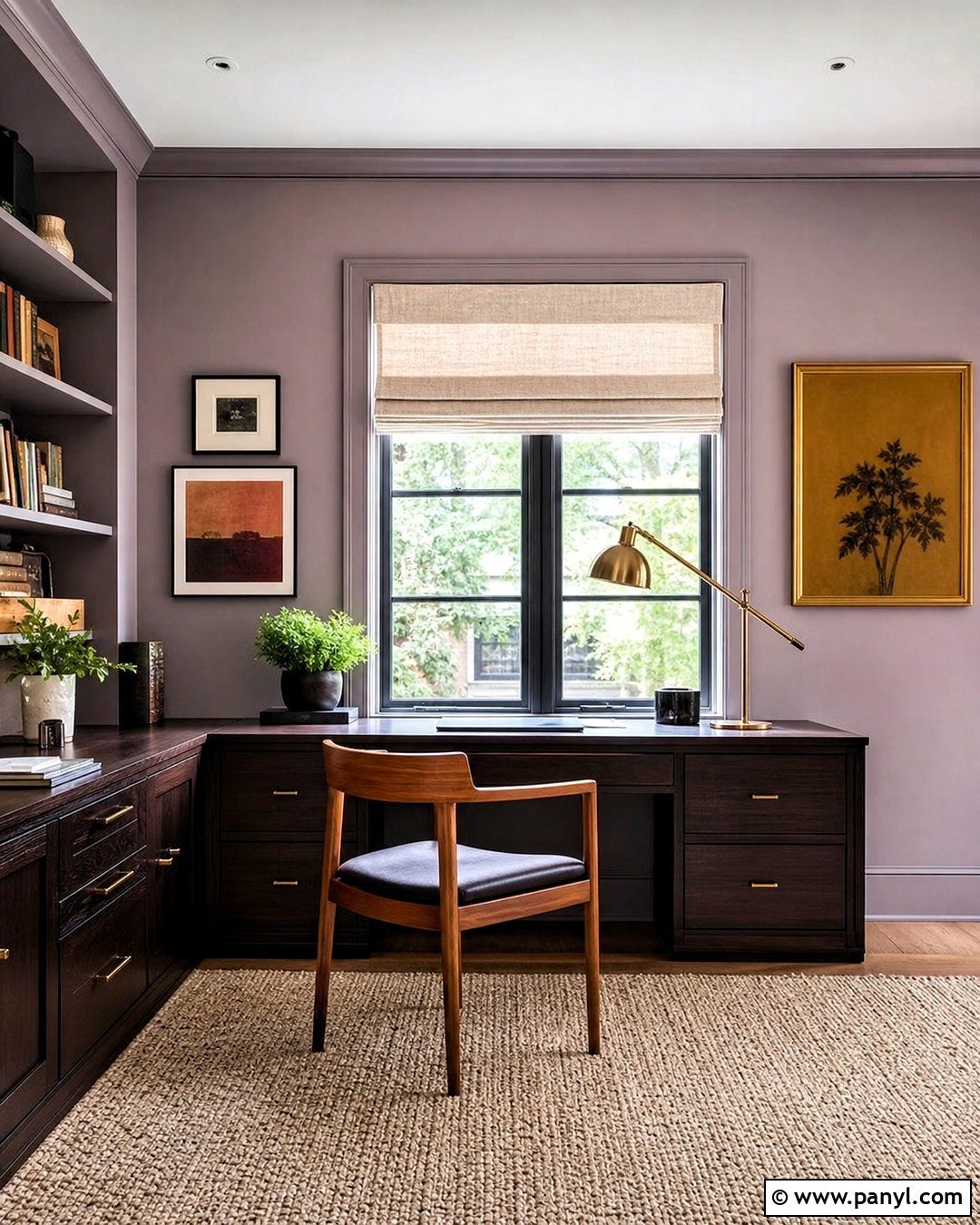
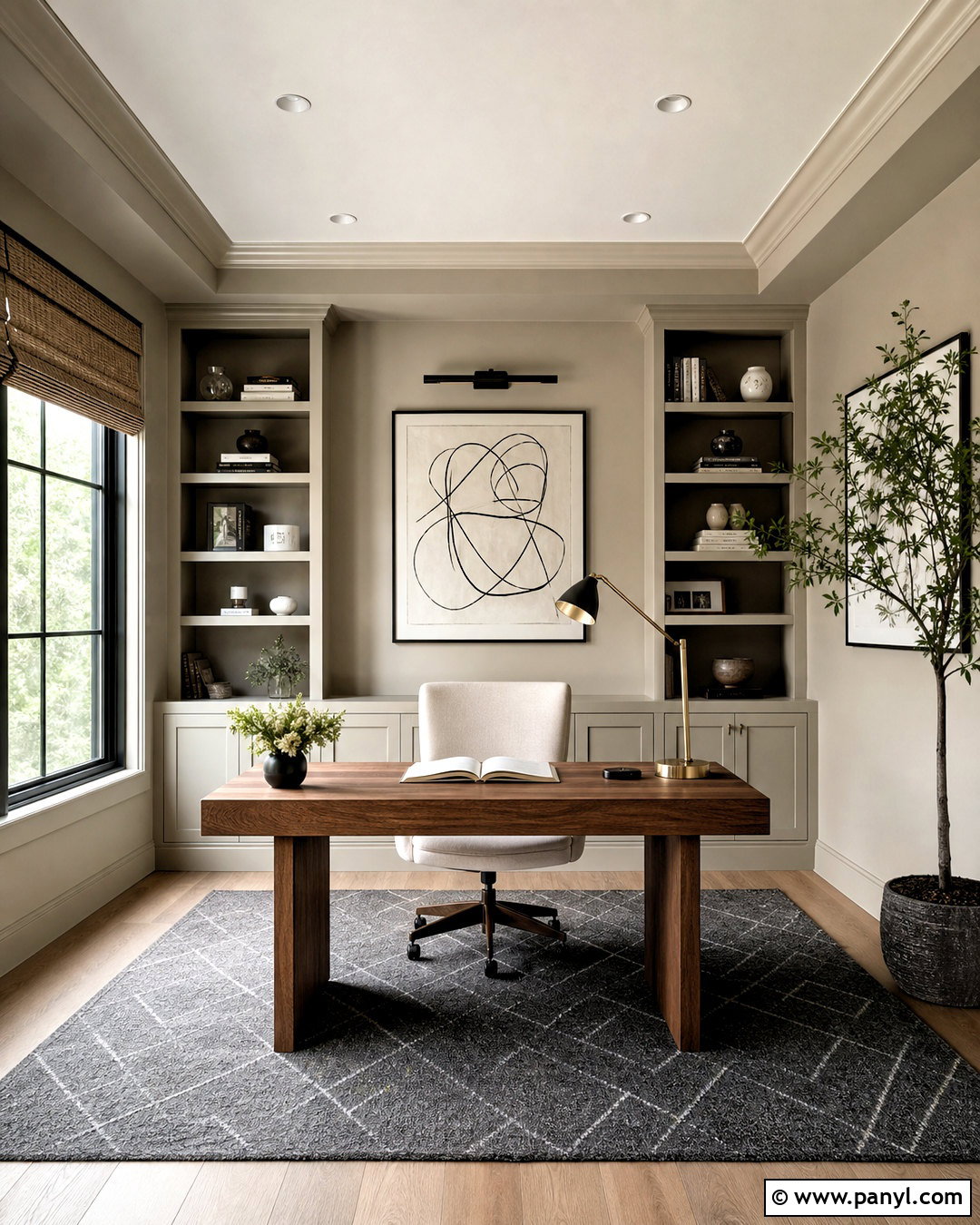
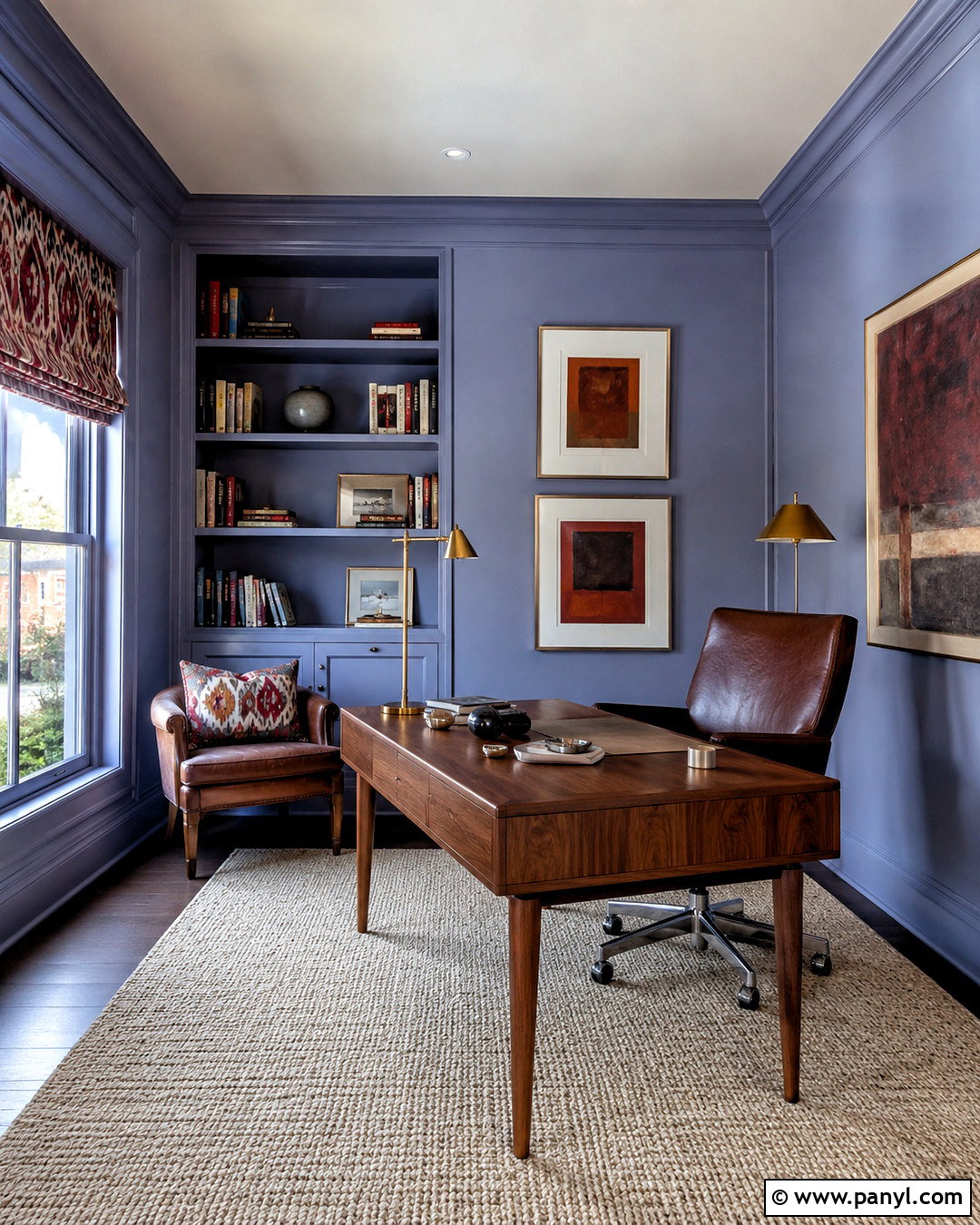
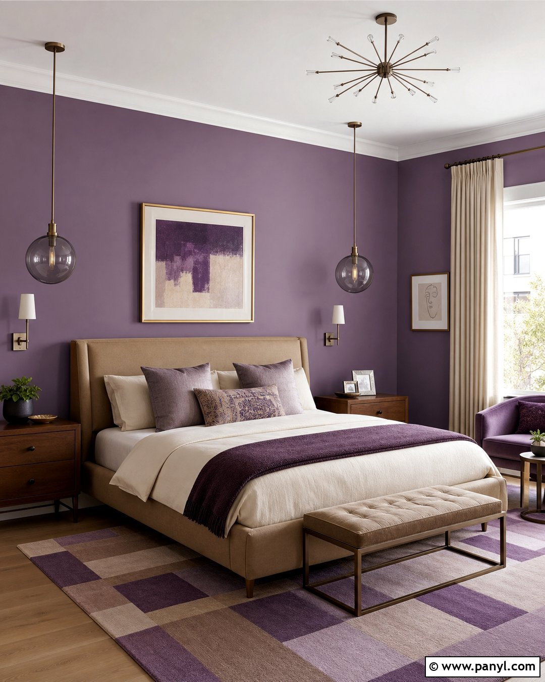
Dusty lavender creates a gentle, sophisticated backdrop when paired with earthy neutrals rather than bright white or silver. In a home office, cover the walls in a gray-based lavender and paint the built-in desk a deep espresso brown. Add a walnut chair, oatmeal Roman shade, and natural wool rug to warm the purple undertones. Aged brass task lighting adds a soft glow, while framed art in ochre, burgundy, and muted green introduces visual variety. Keep the ceiling a warm off-white to preserve openness. This palette works because the lavender acts as an atmospheric neutral instead of a decorative pastel. With dark wood and tactile finishes around it, the color feels calm and grounded. The complete room becomes distinctive enough for creative work while remaining organized, practical, and comfortable for daily use.
17. Deep Navy Paint
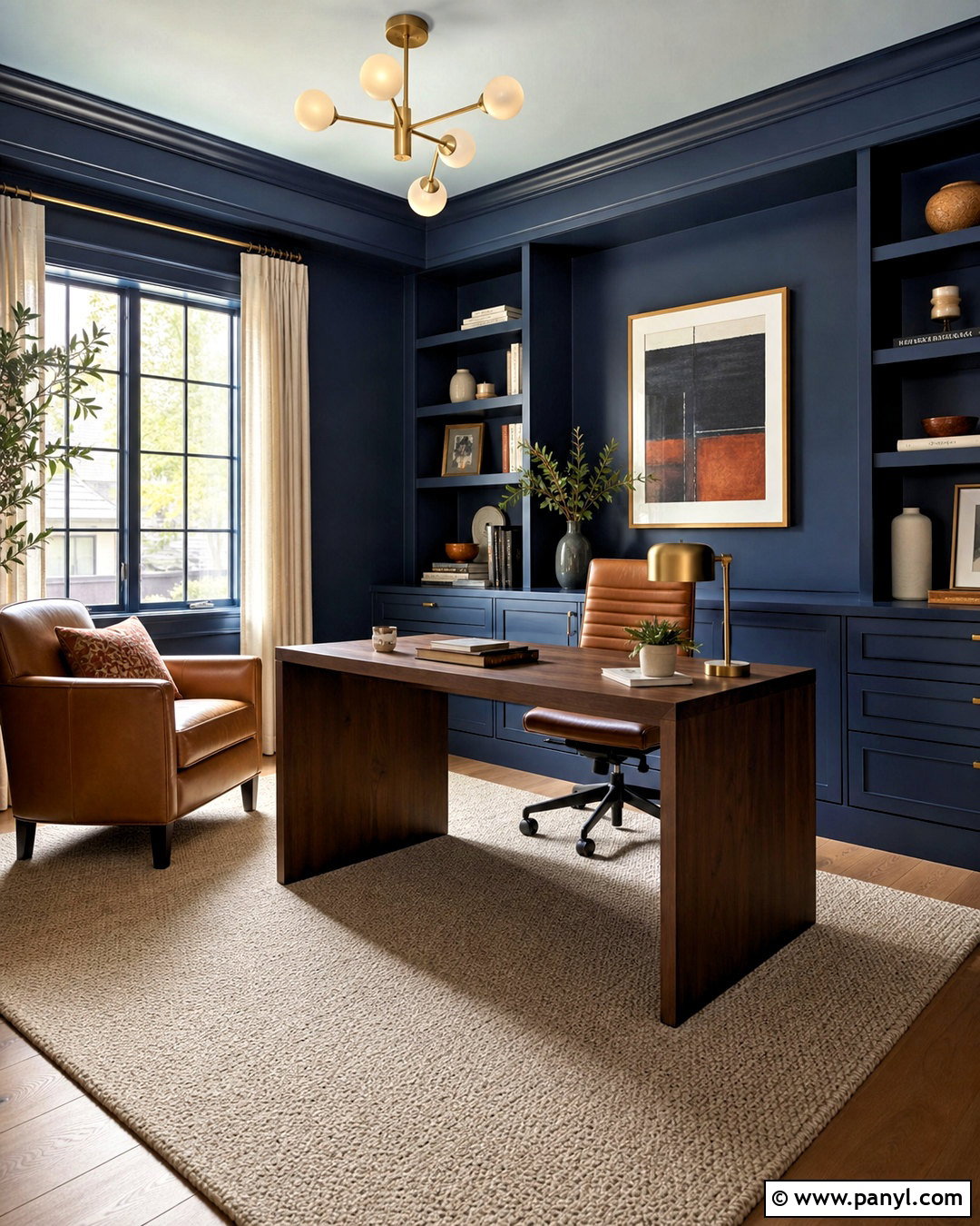
Deep navy paint gives a home office, media room, or bedroom a tailored appearance without relying on black. Use a navy with slightly warm or green undertones across the walls, trim, and built-in storage. Pair it with a camel leather chair, walnut desk, and cream wool rug to balance the darkness. Brushed brass lighting and natural linen curtains add warmth and reflect light around the room. If painting the ceiling navy feels too intense, choose a pale blue-gray instead of plain white for a smoother transition. Add limited accents in rust, burgundy, or olive to make the palette feel layered. Thoughtful lighting is essential, so combine overhead illumination with sconces and task lamps. The result is an immersive, functional room that looks dramatic but not severe.
18. Charcoal Gray Paint
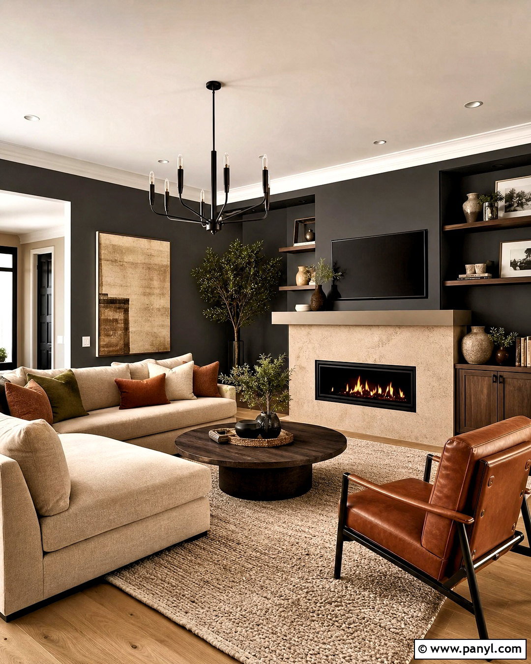
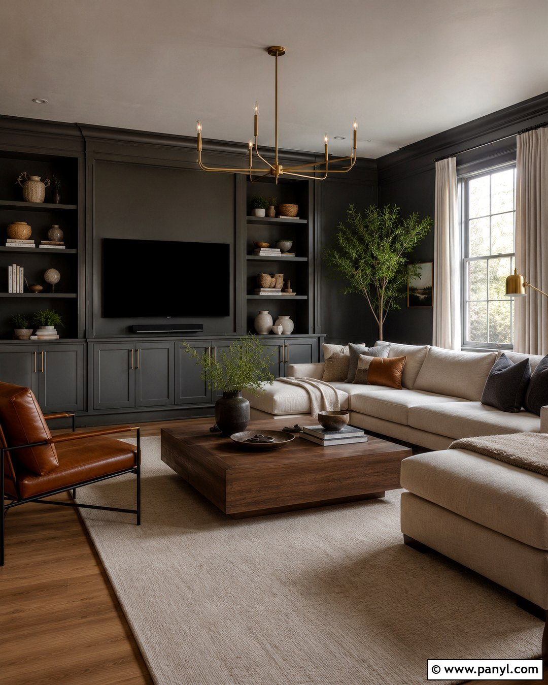
Charcoal gray remains relevant when it is warm, dimensional, and paired with organic materials rather than cool monochrome decor. Create a modern living room with charcoal walls, warm white trim, and a pale oak floor. Use a large cream sectional, cognac leather chair, and textured beige rug to brighten the space. A stone fireplace in soft taupe adds architectural depth, while matte black lighting quietly repeats the wall color. Include rust, ochre, or muted green pillows to introduce warmth. Avoid layering charcoal with icy gray furniture, chrome, and blue-white lighting, which can make the room feel stark. Instead, rely on wood, wool, linen, and aged metal. This complete scheme uses charcoal as a grounding neutral while maintaining enough brightness, softness, and natural variation for everyday comfort.
19. Color Drenching Paint
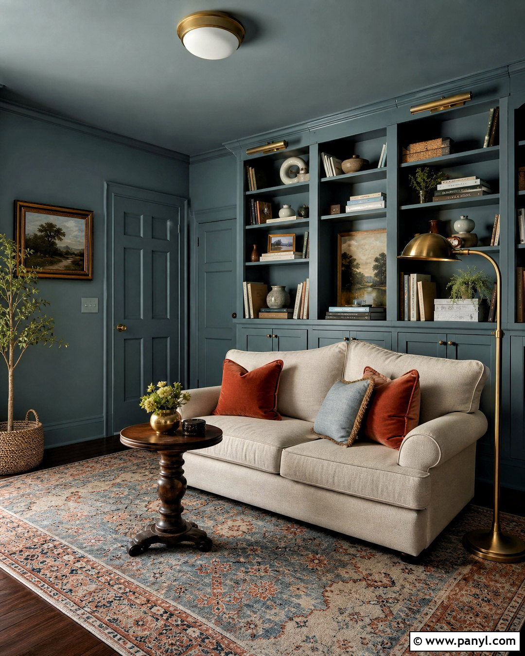
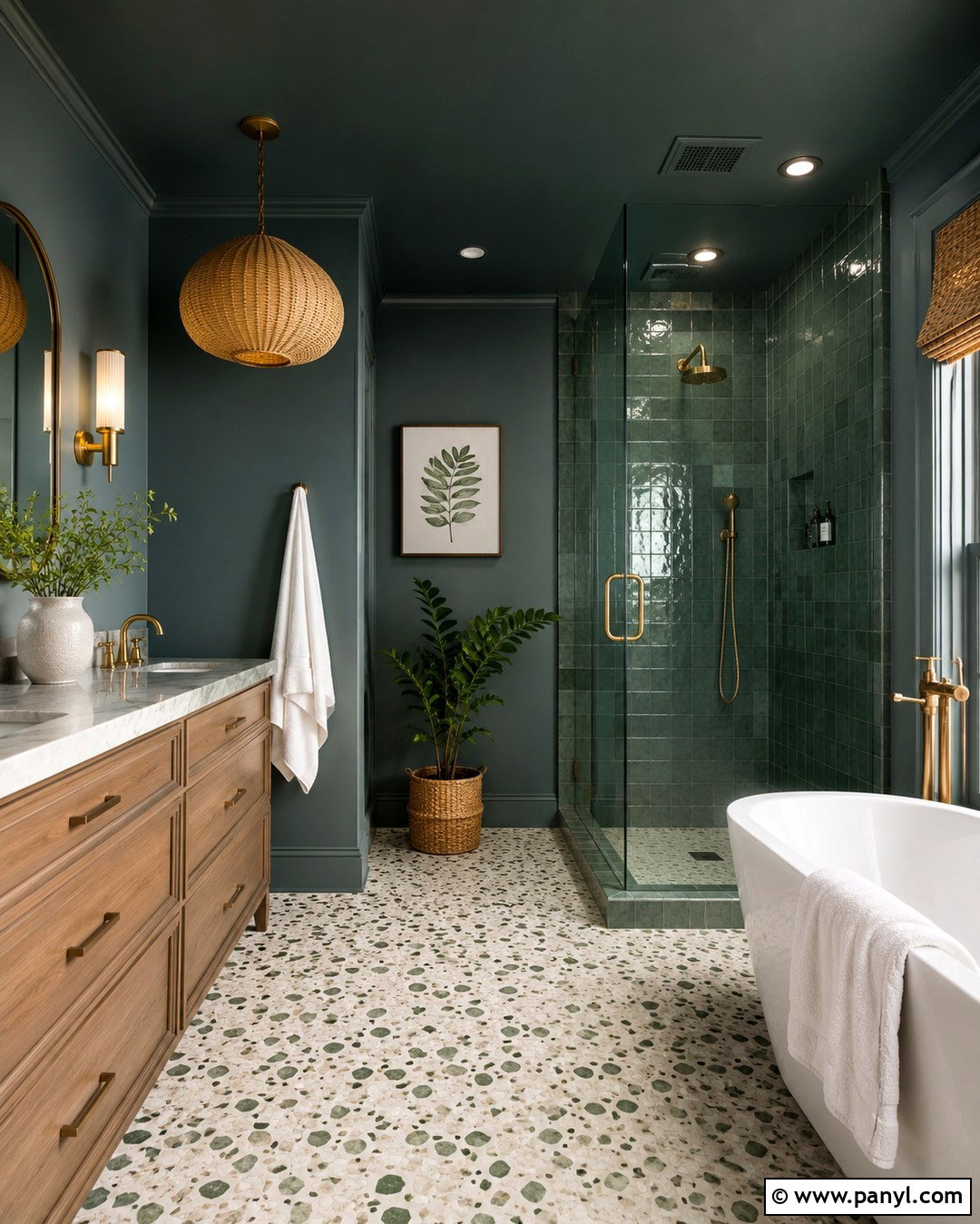
Color drenching creates an enveloping room by carrying one paint color across the walls, trim, doors, built-ins, and sometimes the ceiling. For a practical version, choose a muted mid-tone such as dusty blue-green for a reading room or small den. Apply matte paint to the walls and ceiling, then use satin on the woodwork so light reveals the architectural details. Add a cream loveseat, walnut side table, patterned rug, and aged brass floor lamp. Accent pillows in rust and pale blue introduce variation without disrupting the unified background. This treatment can actually simplify an awkward room because contrasting trim no longer divides the surfaces. Success depends on choosing a livable shade, varying material textures, and including enough pale upholstery and layered lighting to prevent the space from appearing visually flat.
20. Limewash Paint
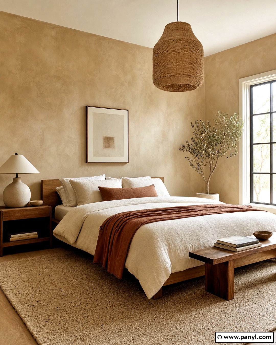
Limewash-style paint gives walls subtle movement and an aged, mineral appearance that suits relaxed, natural interiors. In a bedroom, choose a warm clay-beige finish with visible but softly blended brush variation. Pair it with a low oak bed, ivory linen bedding, woven pendant light, and a large neutral wool rug. Add a plaster bedside lamp, walnut bench, and muted terracotta textiles to echo the wall’s earthy undertones. Keep the trim a creamy solid color so the textured walls remain the main feature. Simple furniture works best because elaborate patterns can compete with the finish. The completed room should feel tactile and quiet, with natural materials repeating the soft irregularity of the paint. Proper wall preparation and large sample areas are essential for achieving a balanced, intentional effect.
Conclusion:
These **20 current paint trends** show how color can make a home feel warmer, more layered, and more personal. Earthy greens, clay reds, softened blues, and rich browns offer character, while warm whites and khakis provide flexible foundations. Techniques such as color drenching and limewash add depth even when the palette is restrained. Before painting, test large samples near the flooring, trim, countertops, and furniture. Check each shade in morning, afternoon, and evening light. Most importantly, design the entire room around the paint instead of choosing color in isolation. When materials, lighting, textiles, and finishes support the wall color, even a trend-forward palette can feel comfortable, cohesive, and lasting.

Related Ideas and Inspiration:
Leave a Reply