
The **20 new paint trends** shaping today’s homes move beyond safe gray walls and stark white rooms. Warm earth tones, botanical greens, rich browns, softened pastels, and immersive painting techniques are creating interiors that feel more personal and comfortable. Current forecasts point toward natural colors, nuanced neutrals, and expressive combinations rather than cold, one-note palettes. () The best part is that these colors can work in everyday homes, whether you are refreshing one bedroom or repainting an open floor plan. Each look below combines wall color with trim, flooring, furniture, lighting, and decor, giving you a complete plan instead of an isolated swatch. Explore these practical **20 new paint trends** to find a palette that fits your space.

1. Smoky Jade Green Paint
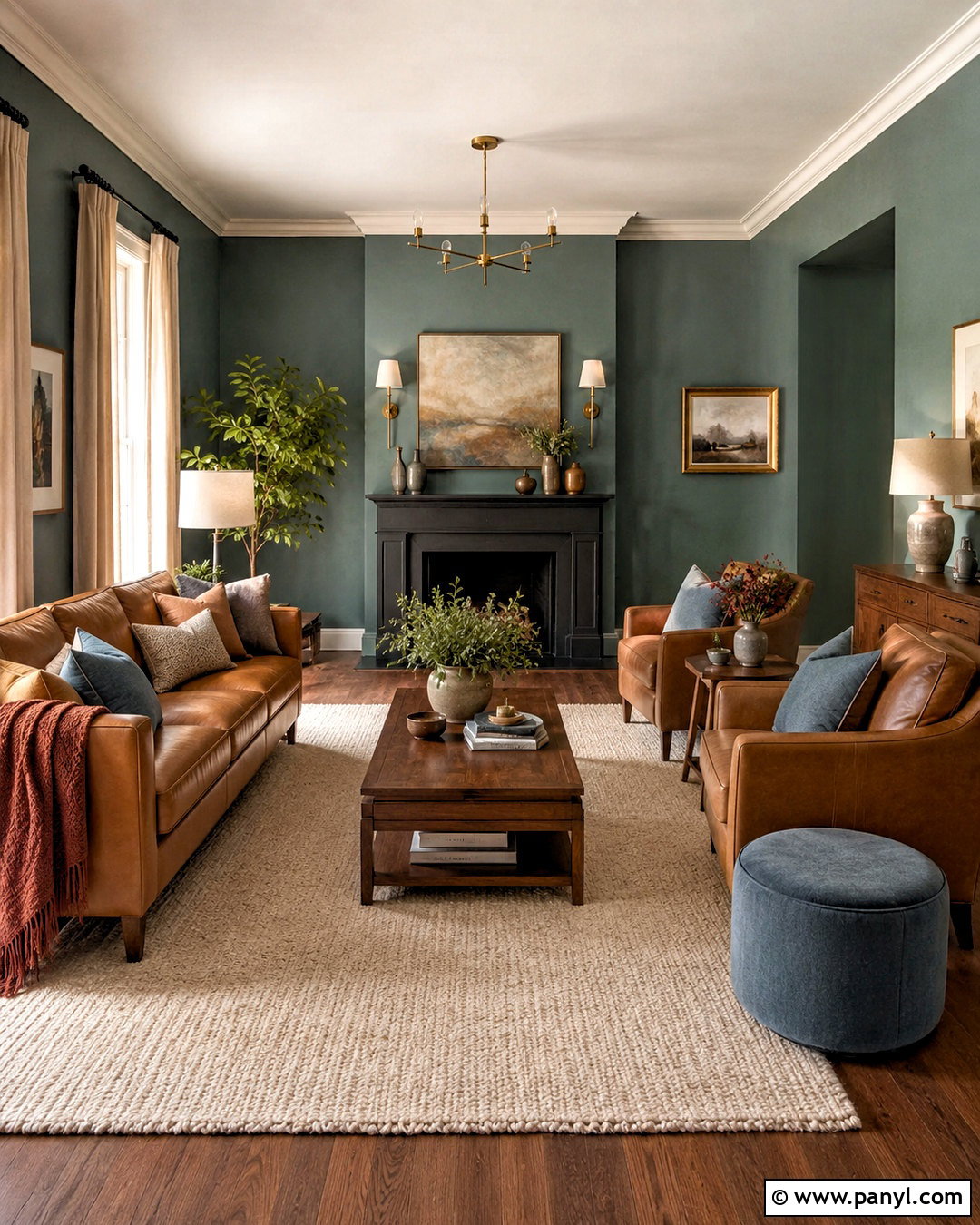
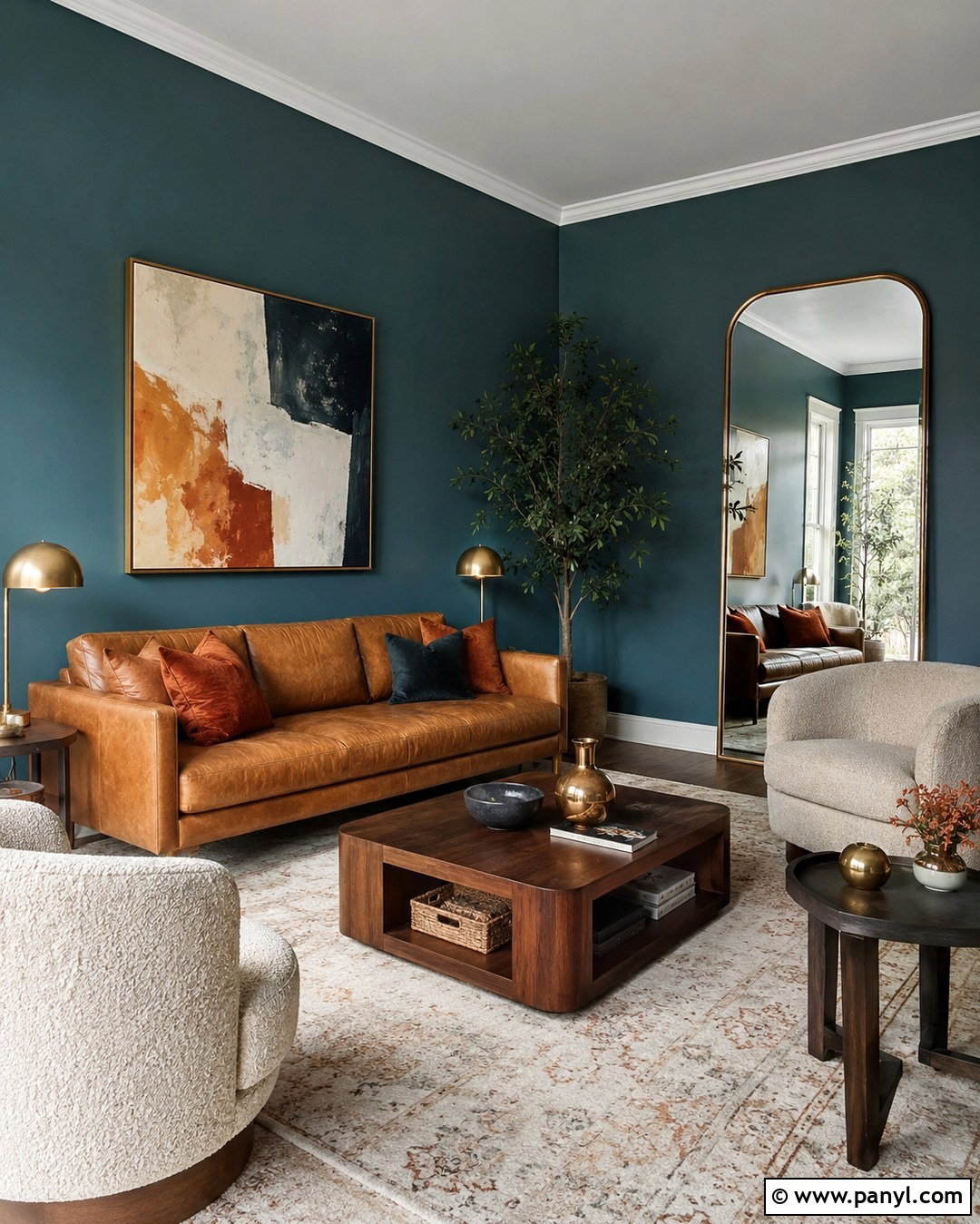
Smoky jade green creates a living room that feels colorful, grounded, and surprisingly versatile. Paint the walls in a muted blue-green with soft gray undertones, then use creamy white on the ceiling to preserve brightness. Walnut furniture, caramel leather, and an ivory textured rug warm the cooler green without making the room feel heavy. Add antique brass lighting and dark bronze curtain rods for understated contrast. Natural linen curtains help soften the windows, while rust, dusty blue, and chocolate brown accents build a layered palette. This paint color works especially well in rooms with moderate or strong natural light. Before committing, test it beside your flooring because surrounding wood tones can make smoky jade appear greener, grayer, or slightly bluer.
2. Warm Eucalyptus Green Paint
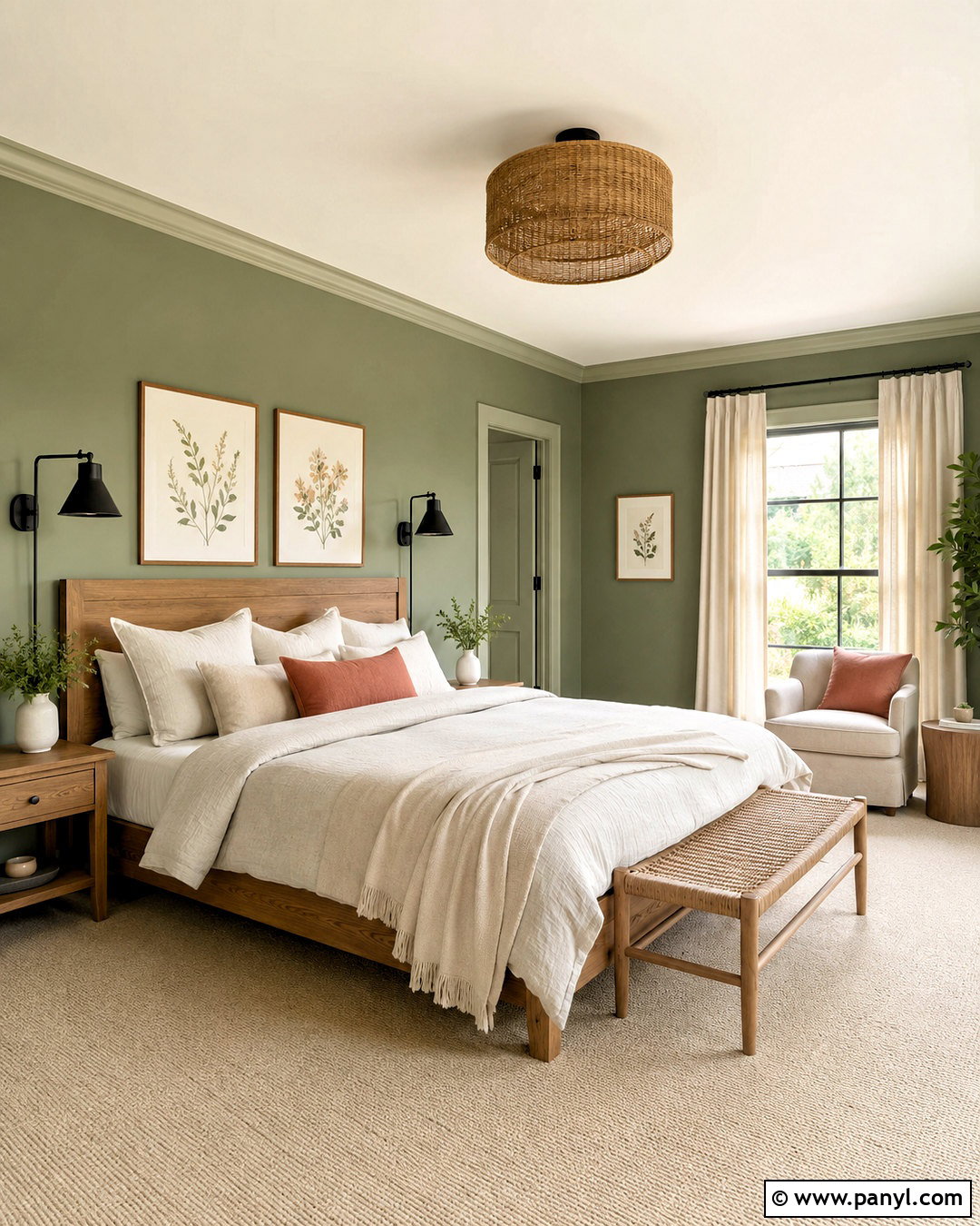
For a calm bedroom that does not look bland, warm eucalyptus green offers a soft connection to nature. Cover the walls in a muted midtone green and paint the trim one shade lighter for gentle definition. An oak bed, woven bench, and warm beige carpet keep the room natural and relaxed. Dress the bed with oatmeal linen, cream cotton, and a restrained touch of muted coral. Black reading sconces provide a crisp modern detail without disrupting the peaceful palette. This green is particularly effective in bedrooms facing east or west because its warmth remains noticeable as daylight changes. Complete the look with simple botanical artwork, ceramic lamps, and one substantial plant. Avoid filling the room with many additional greens, which can make the overall scheme feel too themed.
3. Deep Olive Green Paint
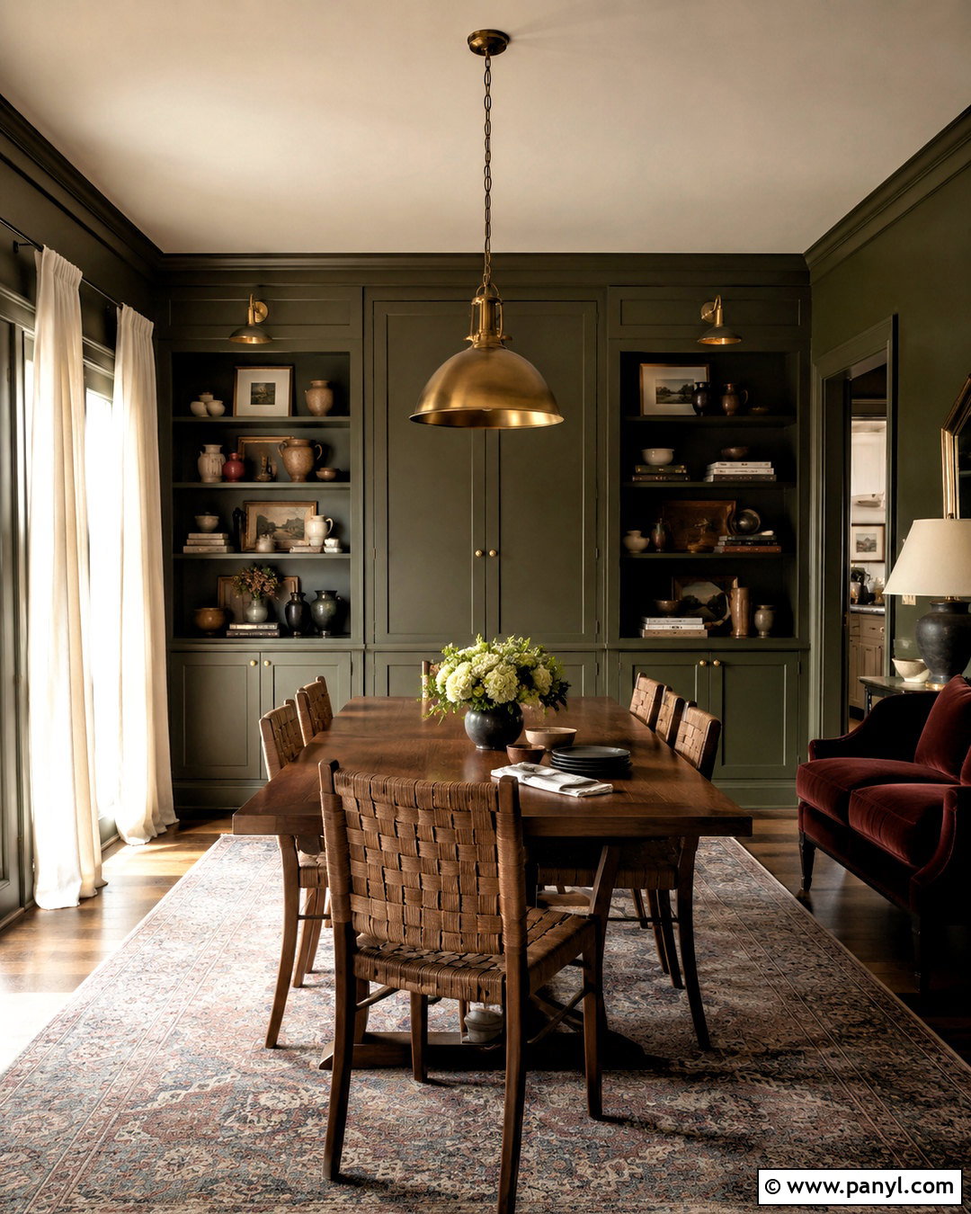
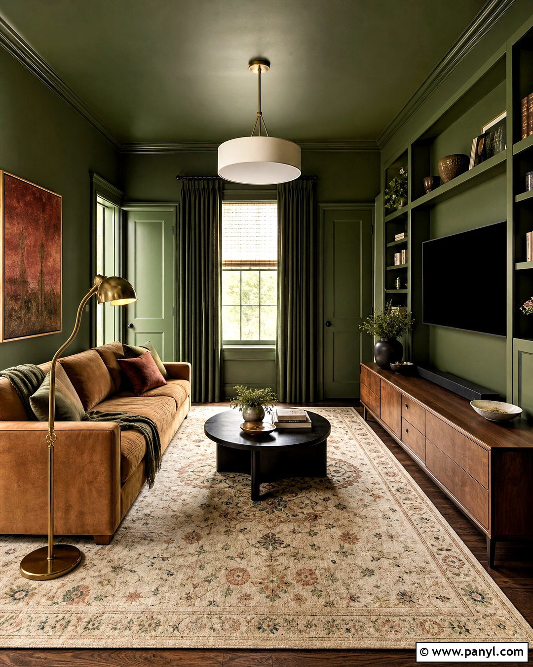
Deep olive paint can turn an ordinary dining room into a warm, intimate gathering space. Use the color across the walls and built-in cabinetry, choosing a washable eggshell finish for durability. Keep the ceiling a soft parchment white so the room remains open overhead. A medium walnut table, woven dining chairs, and aged brass lighting complement olive’s golden undertones. Introduce burgundy through a patterned rug or upholstered end chairs, then add off-white drapes to balance the darker walls. The completed room should feel collected rather than rustic. Deep olive works best when repeated in subtle places, such as pottery, artwork, or patterned textiles. If the room receives limited daylight, include layered lighting so the green remains rich and dimensional instead of appearing flat or muddy.
4. Sunbaked Terracotta Paint
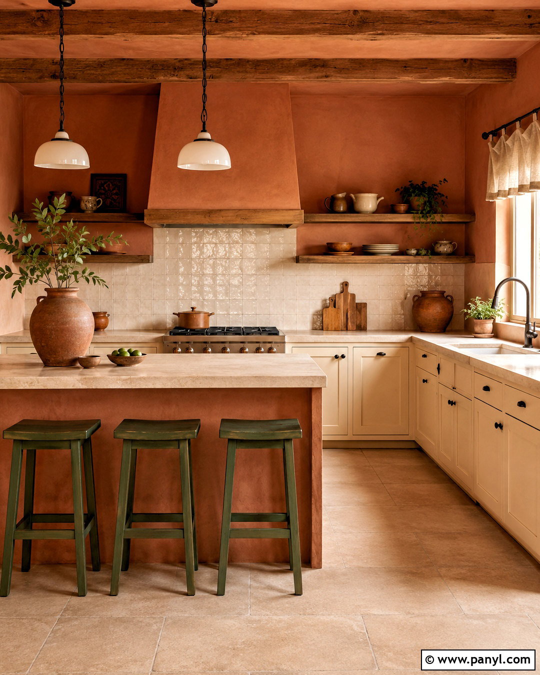
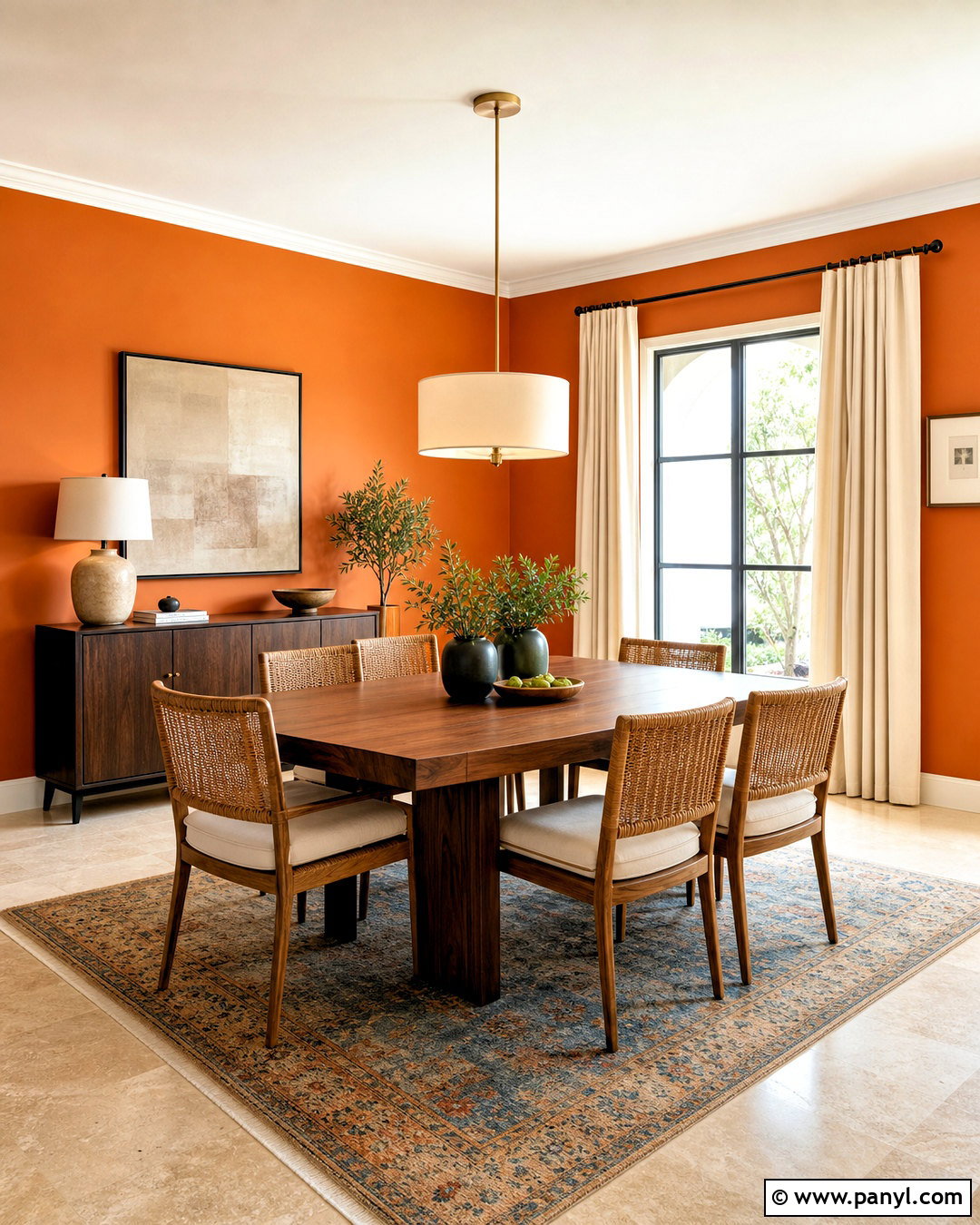
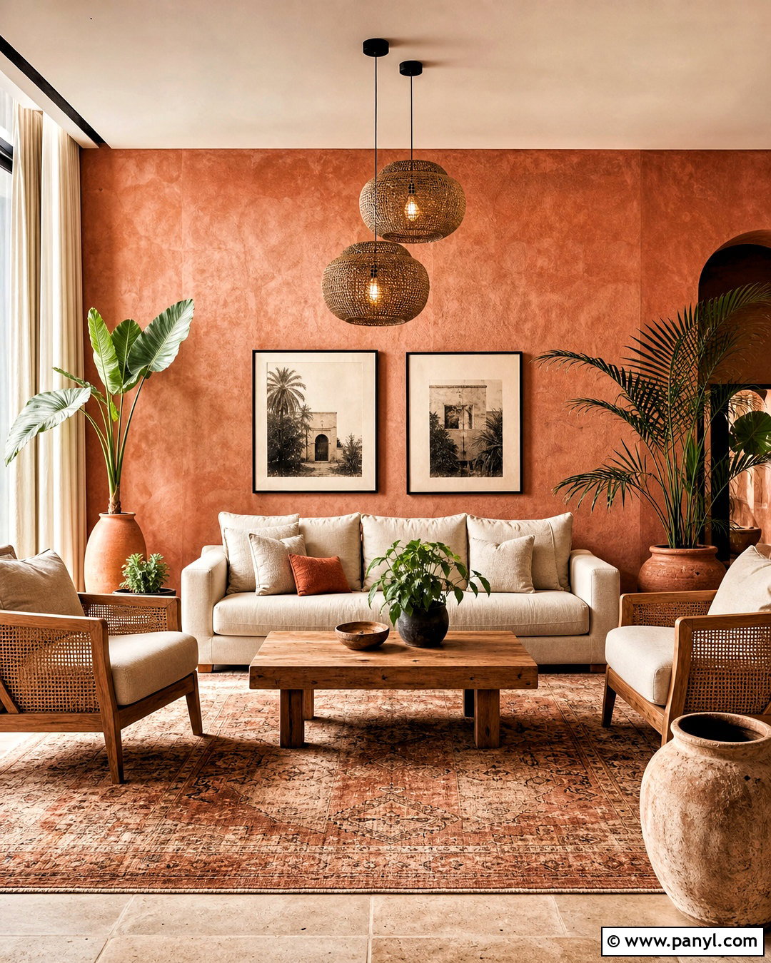
Sunbaked terracotta brings warmth to kitchens without relying on predictable beige or gray. Apply a softened clay-orange paint to the walls, then pair it with cream cabinets and a warm white ceiling. Natural oak shelving, honed limestone counters, and handmade-look ivory tile create a tactile background that supports the earthy color. Ground the room with dark bronze hardware and simple black accents rather than bright metallic finishes. Muted green bar stools or café curtains introduce a complementary note. Terracotta changes noticeably throughout the day, so compare samples under morning, afternoon, and artificial light. For a cohesive kitchen, repeat the wall color in small accessories while keeping major surfaces quiet. The result feels sunny, inviting, and contemporary without resembling a heavily themed Southwestern interior.
5. Espresso Brown Paint
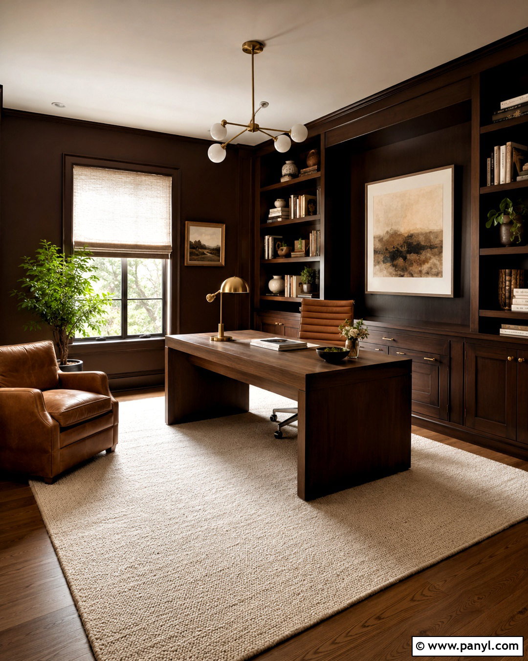
Espresso brown walls create a sophisticated home office that feels focused, comfortable, and substantial. Paint the walls and bookcases in the same deep brown, using eggshell on walls and satin on millwork to produce subtle depth. A cream ceiling can keep the room from becoming overly enclosed, while medium walnut flooring connects naturally with the palette. Choose a camel leather desk chair, an ivory wool rug, and linen window treatments to lighten the darker shell. A brushed brass desk lamp and framed artwork with warm white mats add controlled brightness. Espresso paint is especially effective in rooms used during the evening because it responds beautifully to layered lamps. Select bulbs with a balanced warm-white temperature so the brown looks rich, not black, red, or dull.
6. Burgundy Red Paint
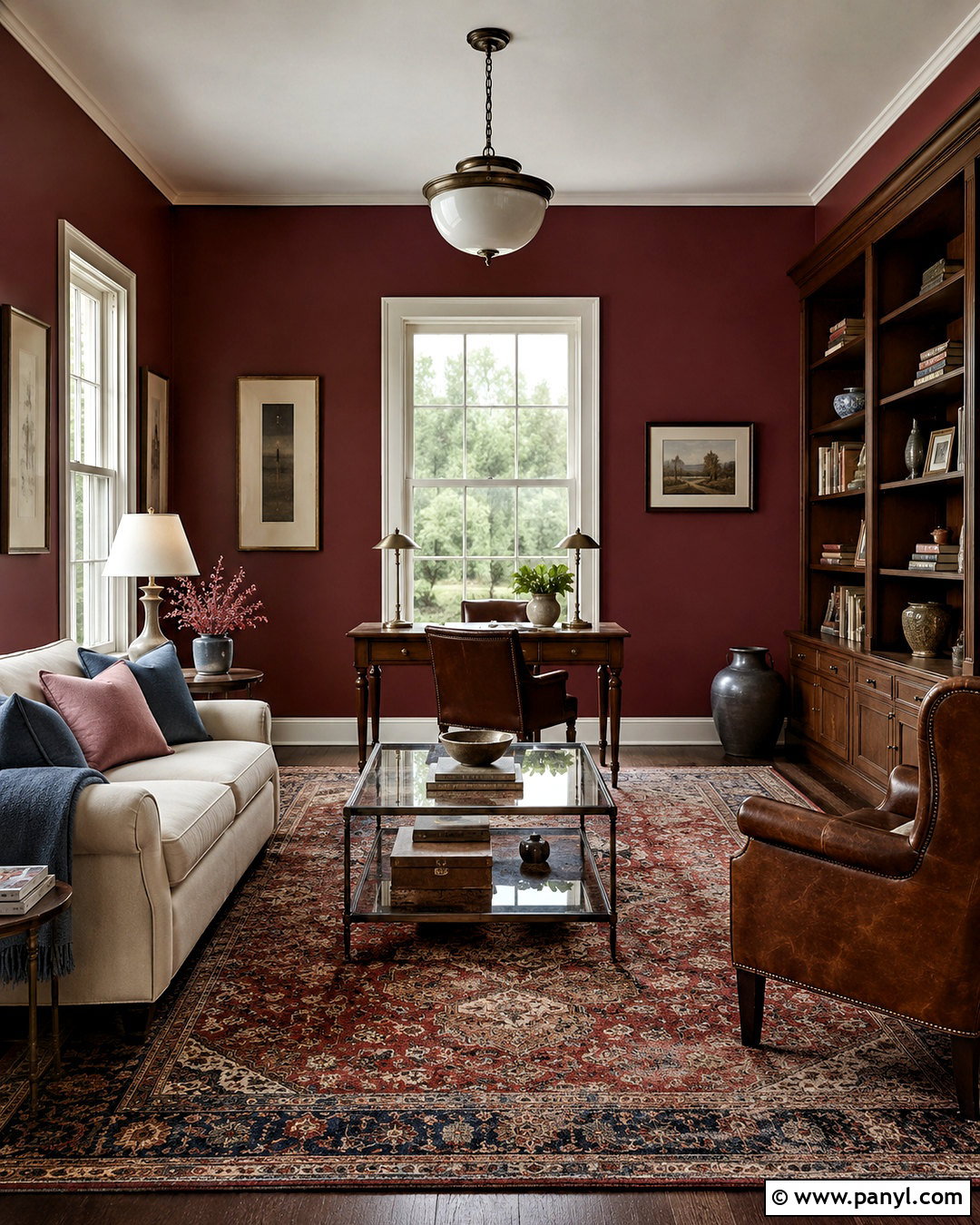
A burgundy library or reading room can feel dramatic while remaining livable when the surrounding finishes are carefully balanced. Paint the walls in a deep wine red with brown undertones, then use warm cream on the ceiling and window trim. Dark oak shelves, a tobacco leather chair, and an aged Persian-style rug reinforce the room’s traditional character. For a fresher edge, add a sculptural floor lamp and a simple ivory sofa with clean lines. Dusty pink and muted blue accents soften burgundy without reducing its depth. Use this color in a room with clear boundaries rather than spreading it through an entire open floor plan. Test large samples first, since burgundy can shift toward purple or brick red depending on daylight, flooring, and nearby wood finishes.
7. Universal Khaki Paint
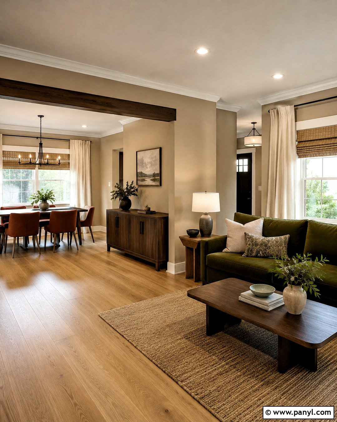
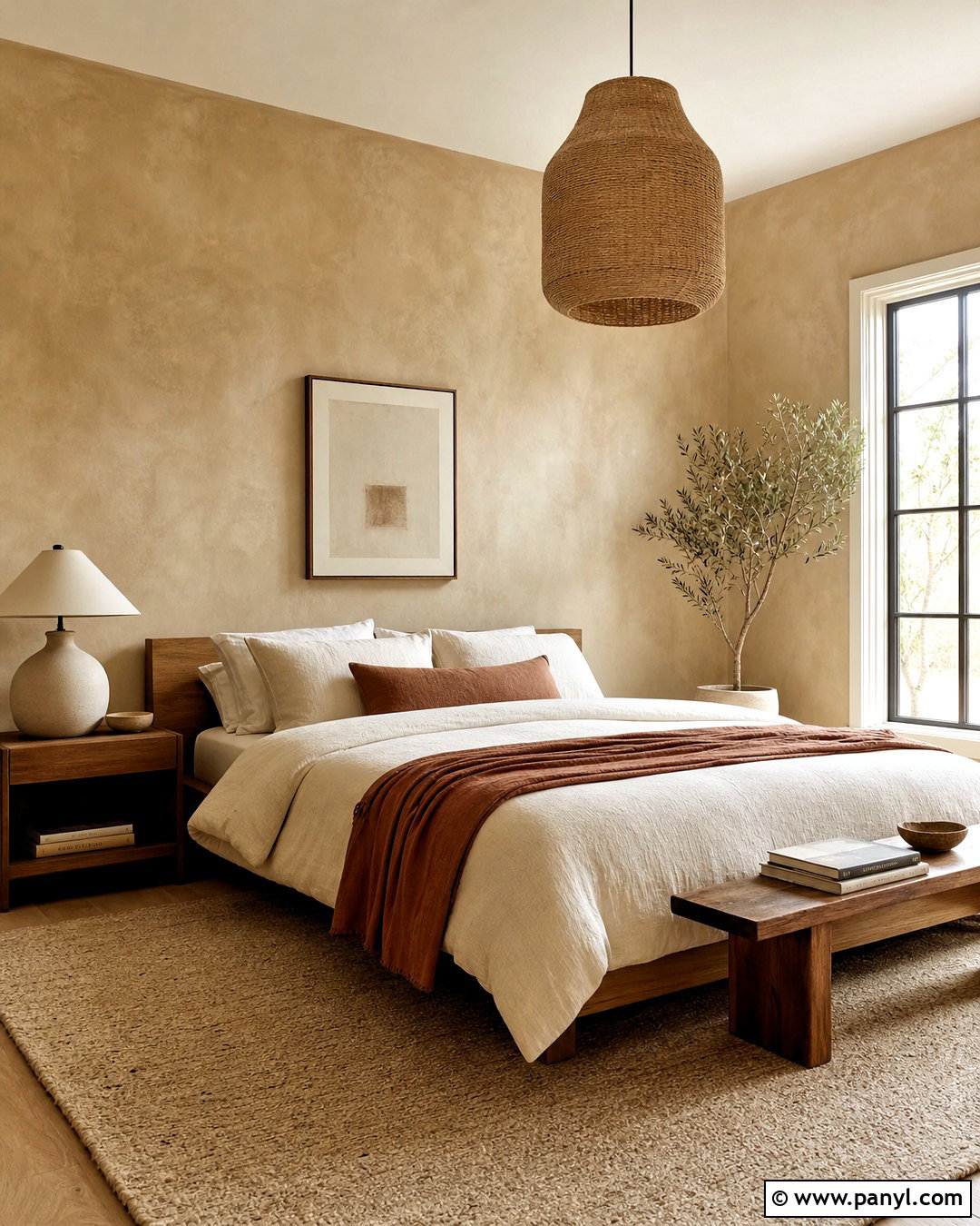
Universal khaki offers a warmer, more characterful alternative to standard greige. Use it throughout an open living and dining area to create continuity without making the space feel colorless. Pair the walls with creamy trim, white oak flooring, and medium-toned walnut furniture. A moss green sofa, rust-colored dining chairs, and blackened bronze fixtures give the neutral background stronger definition. Choose woven shades and natural linen drapes to emphasize the color’s organic warmth. Khaki can look different beside yellow, pink, or green undertones, so compare it directly with permanent finishes such as counters and flooring. For the most balanced result, repeat black accents in several areas and include a few pale textiles. This creates rhythm while allowing the warm wall color to connect both zones.
8. Butter Yellow Paint
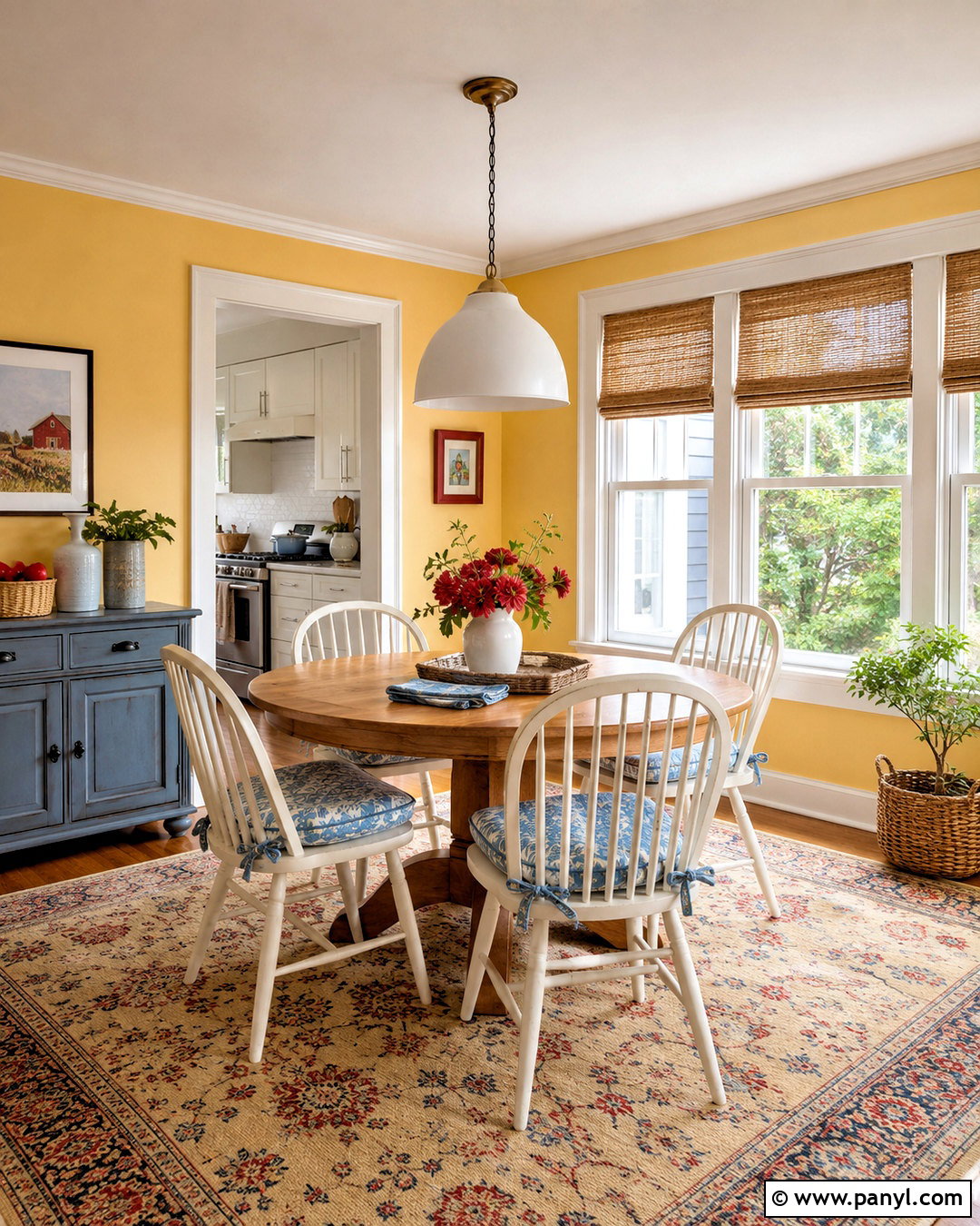
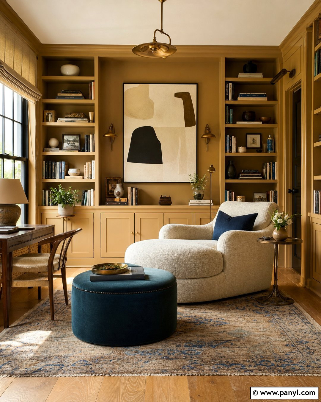
Butter yellow paint can brighten a breakfast room without becoming sharp or juvenile. Choose a creamy, low-saturation yellow for the walls and pair it with warm white trim. A round oak table, spindle-back chairs, and natural woven shades create a casual foundation. Add pale blue seat cushions, small red accents, and a washable patterned rug to give the room cheerful contrast. The palette works particularly well in north-facing spaces because the yellow counteracts cool daylight. Keep cabinets or nearby built-ins cream rather than brilliant white, which can make the yellow appear dingy. Simple ceramic lighting and botanical artwork complete the comfortable look. Butter yellow should read as warm sunlight rather than lemon, so evaluate samples across several walls before deciding how much color the room can handle.
9. Clear Sky Blue Paint
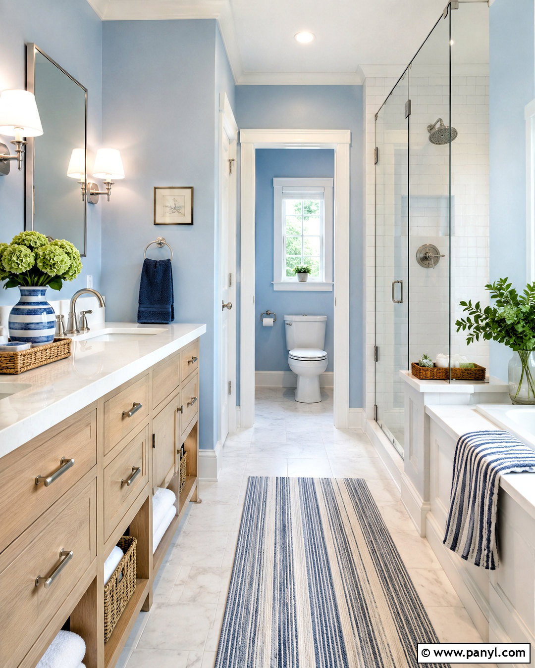
Clear sky blue creates an airy bathroom that feels refreshing without relying on predictable coastal decorations. Paint the walls in a softened medium-light blue and keep the ceiling and trim a clean, slightly warm white. Pair the color with a white oak vanity, pale stone flooring, brushed nickel fixtures, and simple white tile. A striped shower curtain or Roman shade can introduce navy, cream, and muted green in small amounts. Natural baskets and crisp cotton towels add warmth and texture. In a windowless bathroom, choose a blue with enough gray to prevent it from looking overly bright under artificial light. Finish the design with a large mirror and balanced wall sconces. The complete room should feel open, functional, and polished rather than themed around seashells or beach accessories.
10. Soft Periwinkle Paint
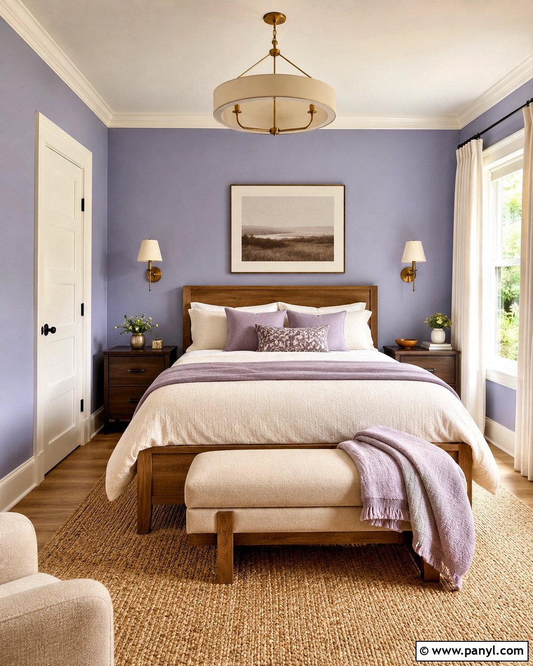
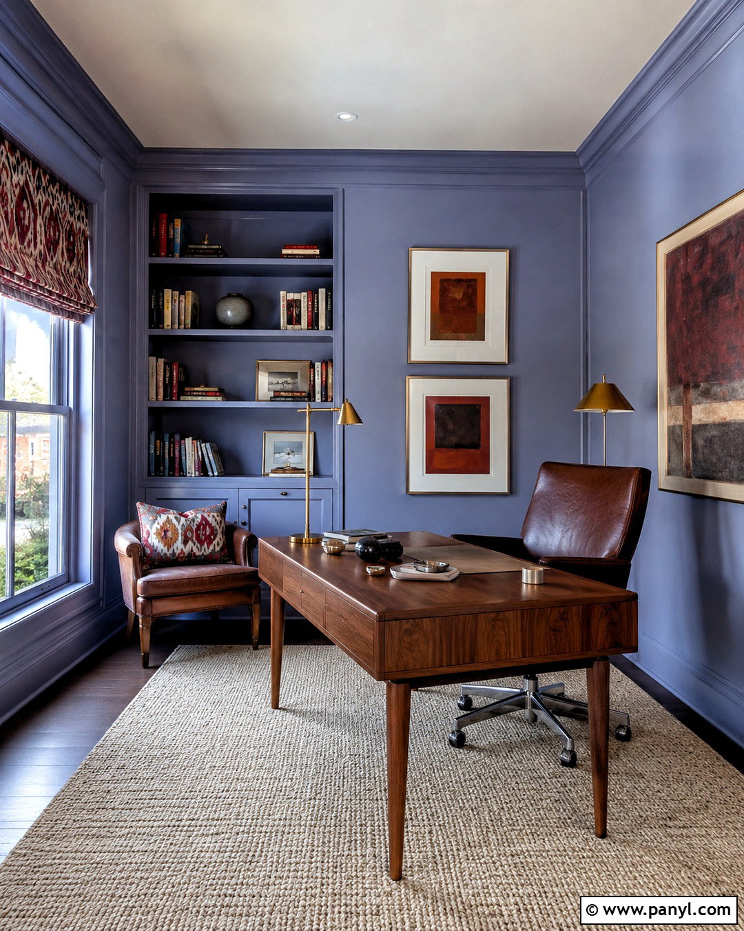
Soft periwinkle gives a guest bedroom personality while maintaining a restful atmosphere. Paint the walls in a gentle blue-violet and use chalky white on the trim and ceiling. Anchor the room with a medium oak bed, an oatmeal upholstered bench, and a natural fiber rug. Chocolate brown nightstands provide an unexpected grounding element that keeps the pastel from feeling overly sweet. Layer the bed with cream, muted lavender, and dusty blue textiles, then add aged brass sconces for warmth. Periwinkle works best when the rest of the room contains simple shapes and restrained patterns. Check samples during the evening because some versions can become noticeably purple under warm bulbs. Balanced lighting and earthy furnishings create a finished bedroom that feels modern, soft, and suitable for guests of different ages.
11. Chalky Pink Paint
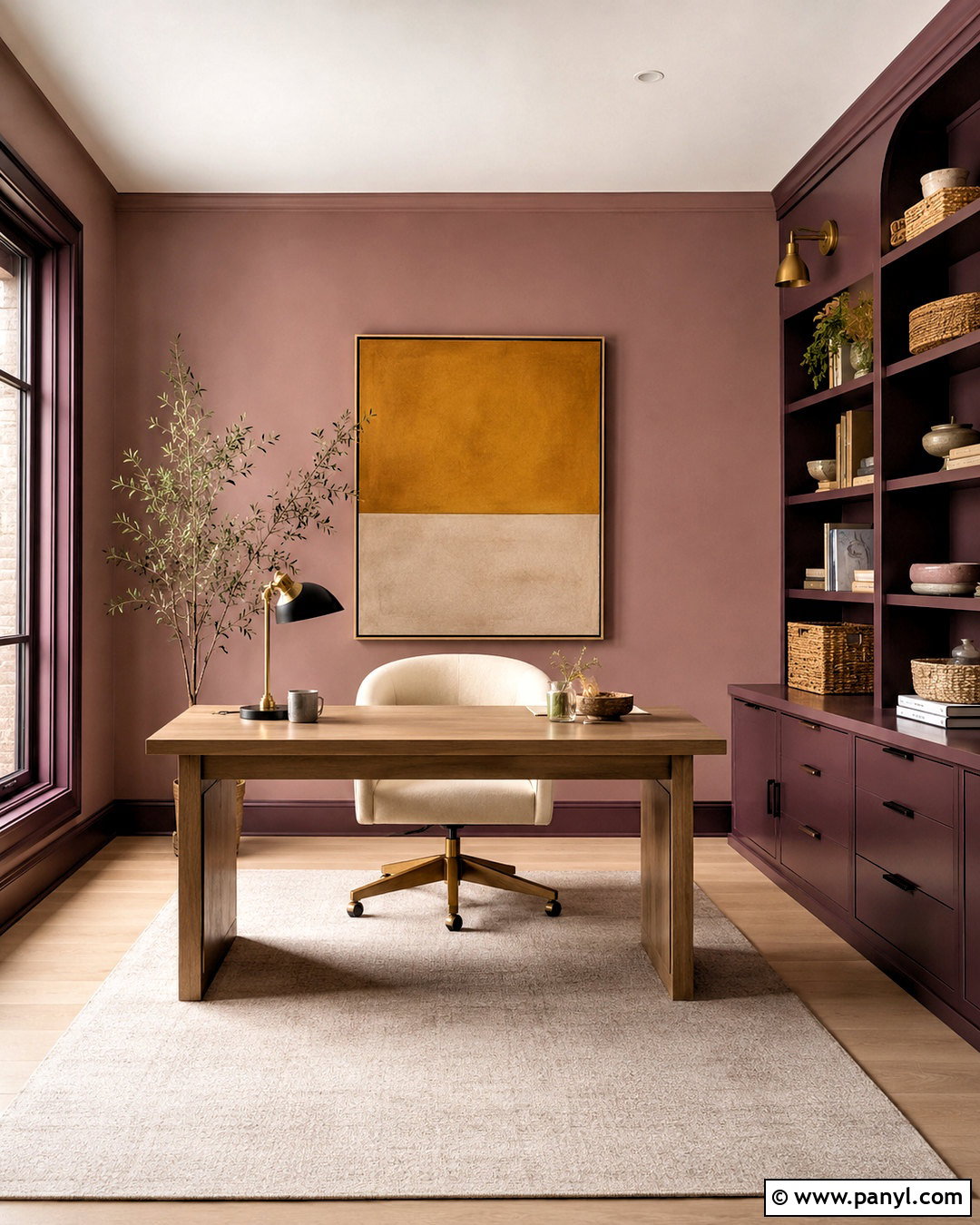
Chalky pink can make a home office or craft room feel warm and creative without becoming overly feminine. Select a dusty mineral pink with beige undertones and apply it to the walls. Use deep plum on a built-in desk or storage cabinet to add structure, while keeping the ceiling soft white. Pale oak flooring, a cream desk chair, and woven baskets maintain a light, practical foundation. Include matte black hardware and a small amount of brushed brass for definition. Artwork can introduce ochre, burgundy, and muted green, building a mature palette around the pink. Choose closed storage to keep the finished room visually calm. Chalky pink is especially attractive in late-afternoon light, but large samples are essential because it may look peach, mauve, or beige as conditions change.
12. Muted Aubergine Paint
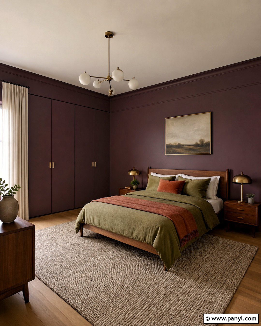
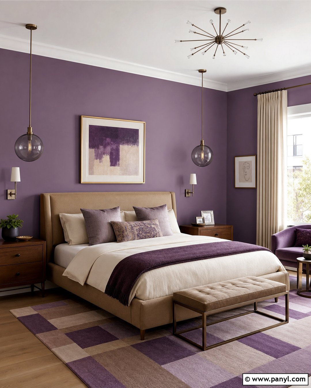
Muted aubergine creates an enveloping bedroom that feels richer than gray and softer than black. Paint the walls in a subdued eggplant purple with noticeable brown undertones, then continue the shade across simple closet doors for a seamless effect. Keep the ceiling a warm off-white unless the room is large enough for full color coverage. A walnut bed, flax linen curtains, and a mushroom-colored wool rug balance the depth of the walls. Add olive bedding, antique brass lamps, and one rust accent pillow for a natural, layered palette. Avoid cool silver finishes because they can make aubergine feel harsher. The color works beautifully with warm artificial lighting, making it a strong choice for rooms mainly used at night. Minimal artwork allows the painted envelope to remain the main feature.
13. Soft Charcoal Paint
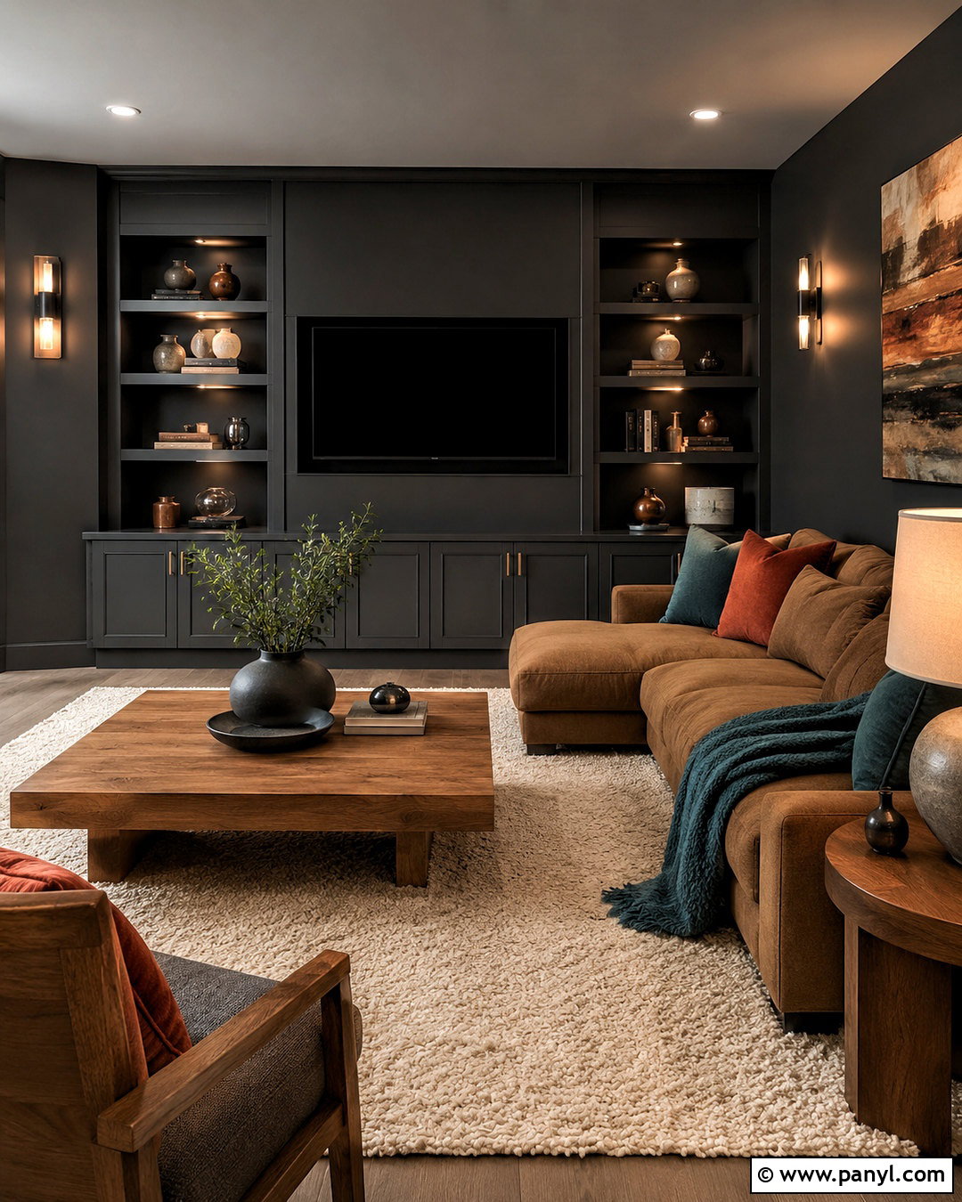
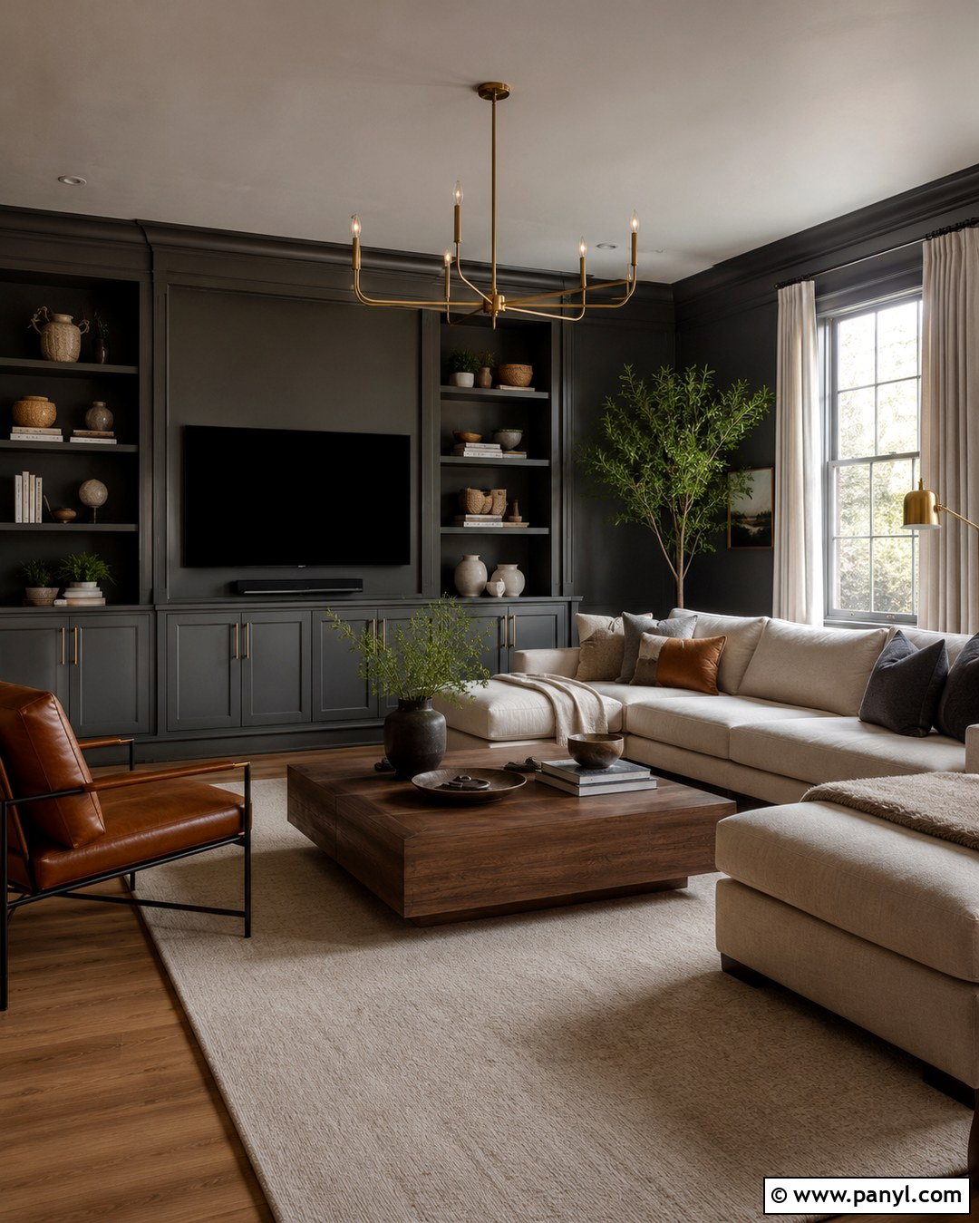
Soft charcoal delivers contrast without the severity of true black. In a media room, apply it to every wall and use a matching shade on built-in storage to reduce visual clutter. Keep the ceiling slightly lighter or continue the charcoal overhead for a more immersive setting. A low-profile camel sofa, an ivory rug, and medium oak tables add necessary warmth. Include rust, muted teal, and cream textiles so the room feels layered when the screen is off. Wall sconces and shaded table lamps prevent dark corners while maintaining a relaxed atmosphere. Choose a charcoal with warm brown or green undertones if the flooring is wood. Cooler blue-charcoal can work beside concrete or slate. Use matte wall paint to minimize glare, then choose satin for cabinetry and frequently touched surfaces.
14. Warm White Paint
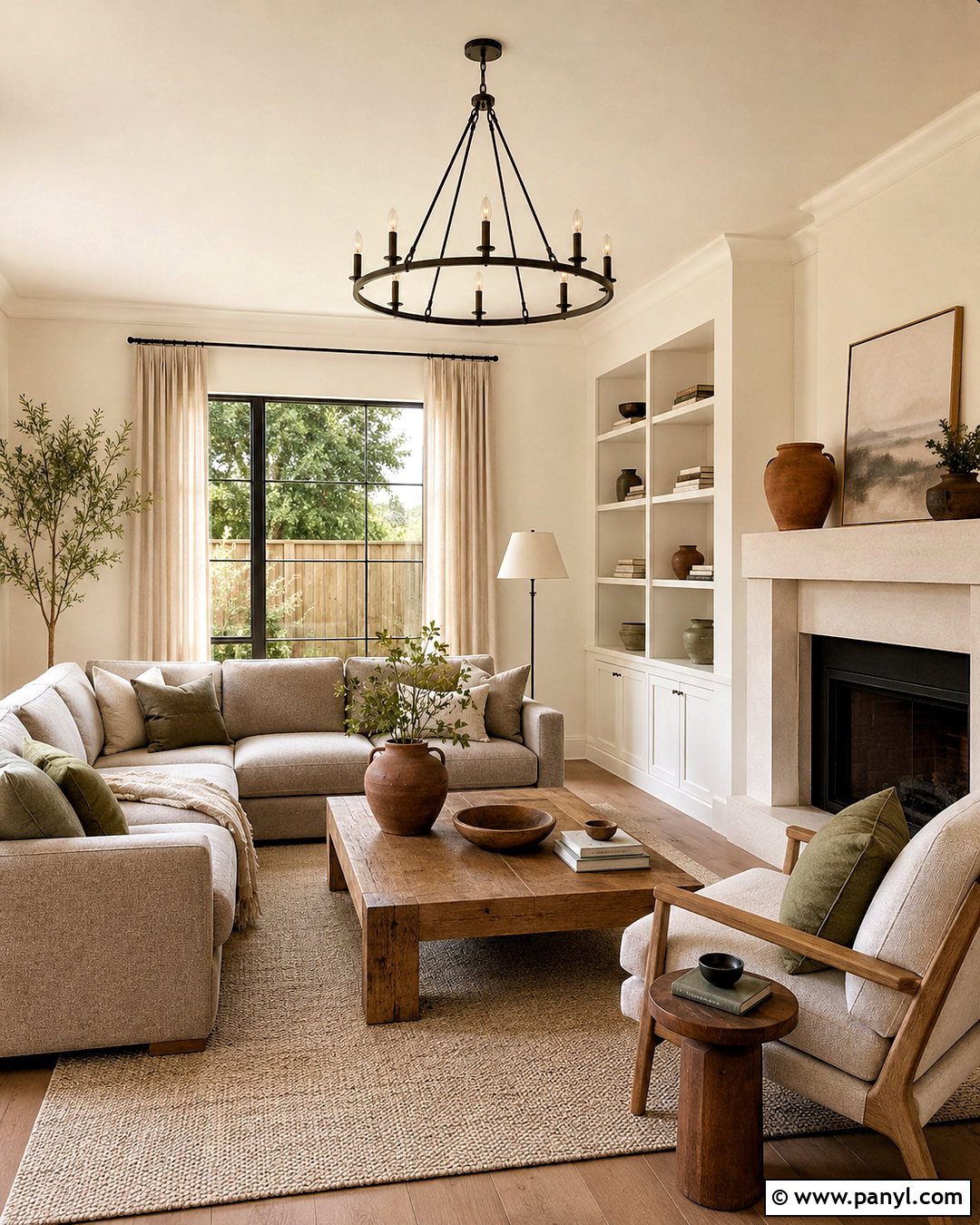
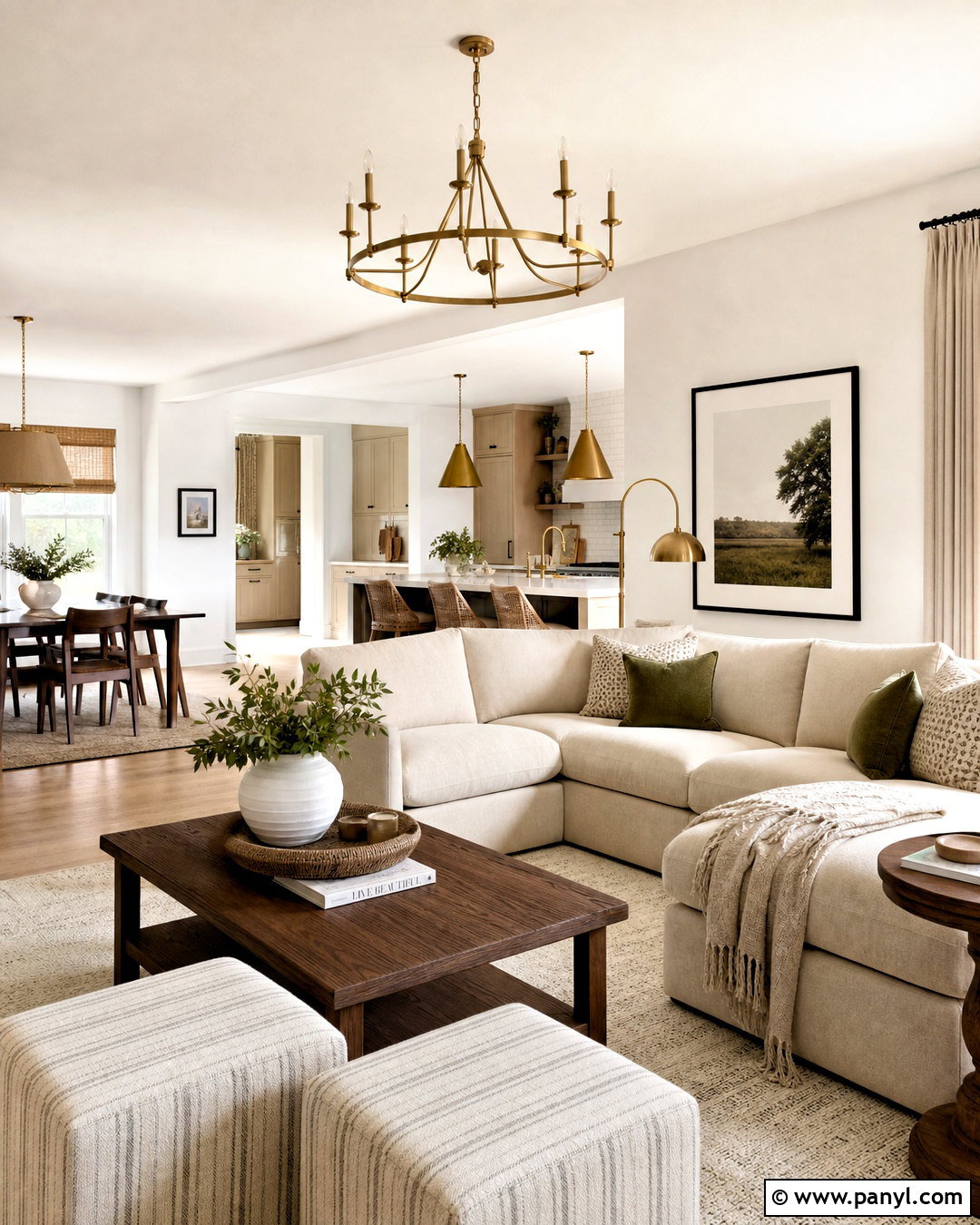
Warm white remains useful, but the updated approach replaces sterile brightness with soft, layered undertones. Paint living room walls in an ivory white that has a subtle creamy or sandy base. Use the same color on the ceiling and trim, changing only the sheen to create quiet definition. Bring in white oak furniture, a warm gray sofa, and a textured oatmeal rug so the room does not feel empty. Terracotta pottery, olive textiles, and dark bronze lighting add earthy contrast. Because white reflects surrounding colors, test it beside the flooring, stone, and upholstery rather than judging a sample alone. Avoid combining several unrelated whites throughout one room. A controlled tonal palette, natural materials, and a few darker accents produce a complete neutral interior that feels welcoming, bright, and intentional.
15. Clay Beige Paint
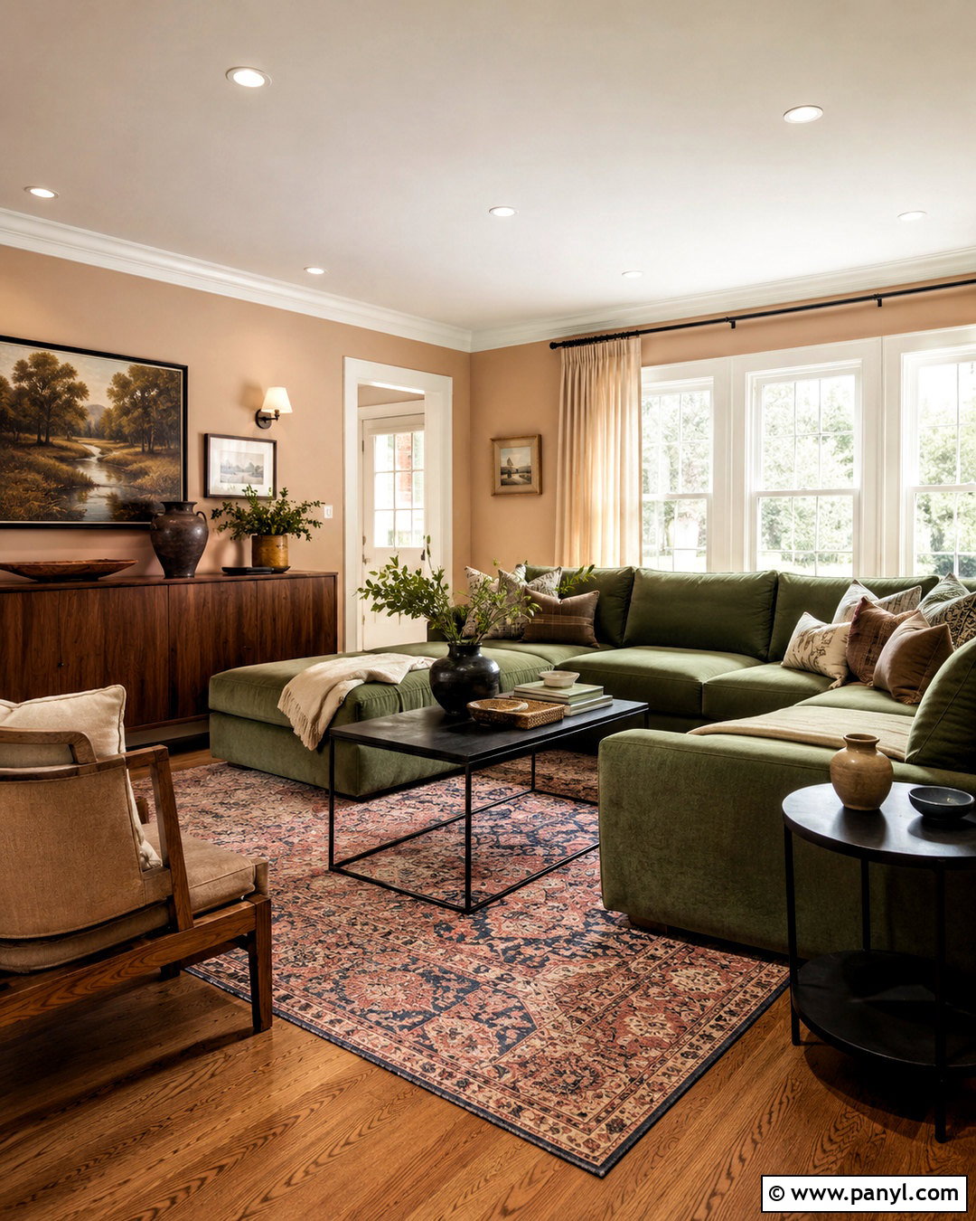
Clay beige introduces a subtle rosy warmth that ordinary beige often lacks. Use it in a family room where comfort and flexibility matter, covering the walls in a matte mineral-looking finish. Pair the paint with warm white trim, medium oak flooring, and a deep moss sectional. A faded red and blue rug connects the earthy colors, while cream curtains keep the windows light. Add black metal tables, handmade ceramics, and walnut picture frames for stronger visual edges. Clay beige works well in open homes because it coordinates with kitchens, hallways, and dining spaces without demanding that every room match. Test it against stone fireplaces and counters, since pink undertones can become stronger nearby. With grounded furniture and natural textures, the finished space feels relaxed, current, and easy to update.
16. Blue Green Color Drenching
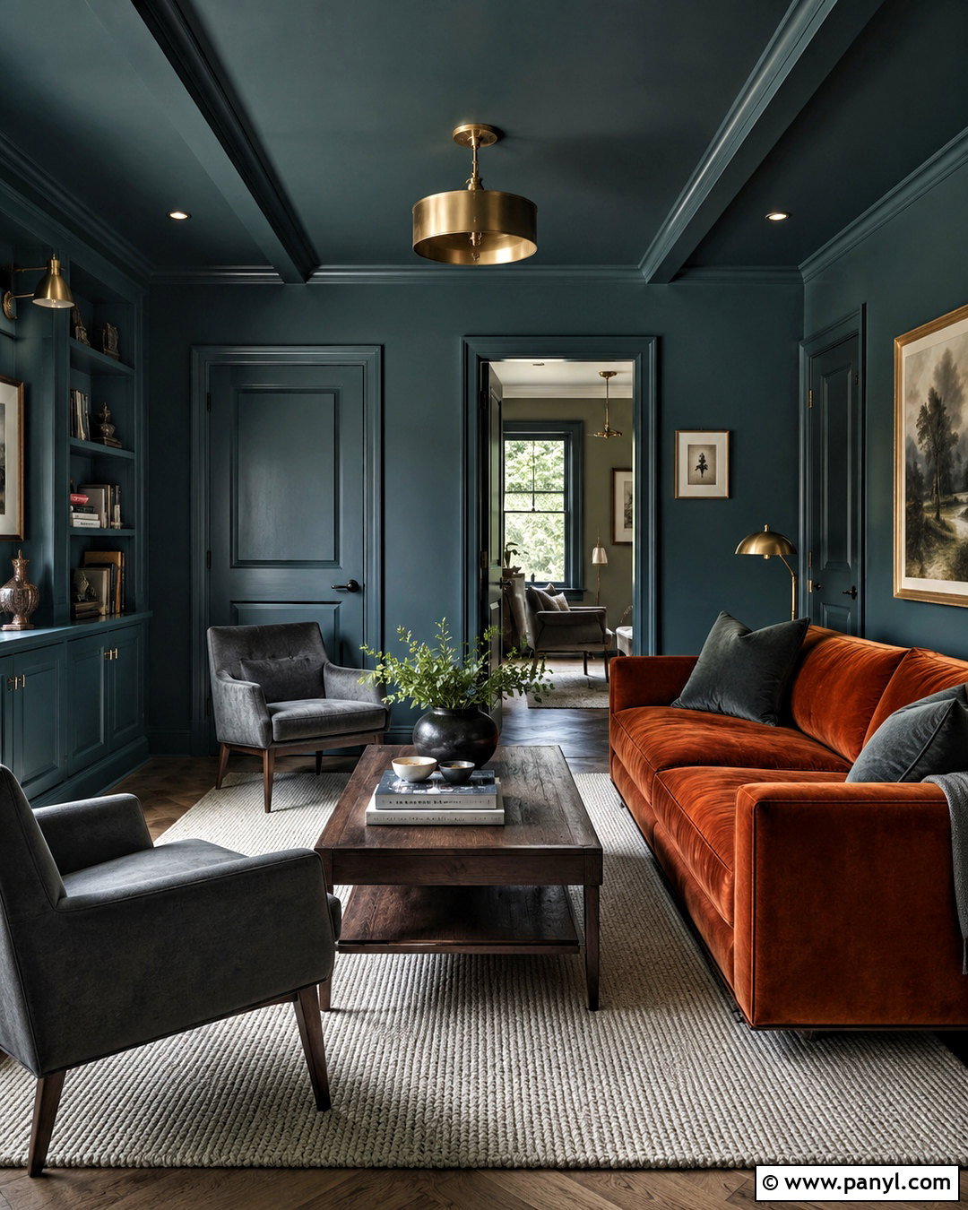
Blue-green color drenching creates a unified room by extending one paint color across the walls, trim, doors, and ceiling. Use a muted teal rather than a highly saturated turquoise so the result remains comfortable. Vary the finishes instead of the hue: matte on the ceiling, eggshell on walls, and satin on woodwork. In a small den, combine the painted envelope with a rust velvet sofa, a pale wool rug, and dark walnut tables. Cream artwork mats and aged brass lighting introduce small areas of relief. Color drenching can make awkward corners and mismatched doors visually disappear, which is helpful in compact rooms. Keep window treatments close to the wall color and choose only a few contrasting furnishings. This prevents the immersive scheme from becoming crowded or visually restless.
17. Tonal Green Hue Drenching
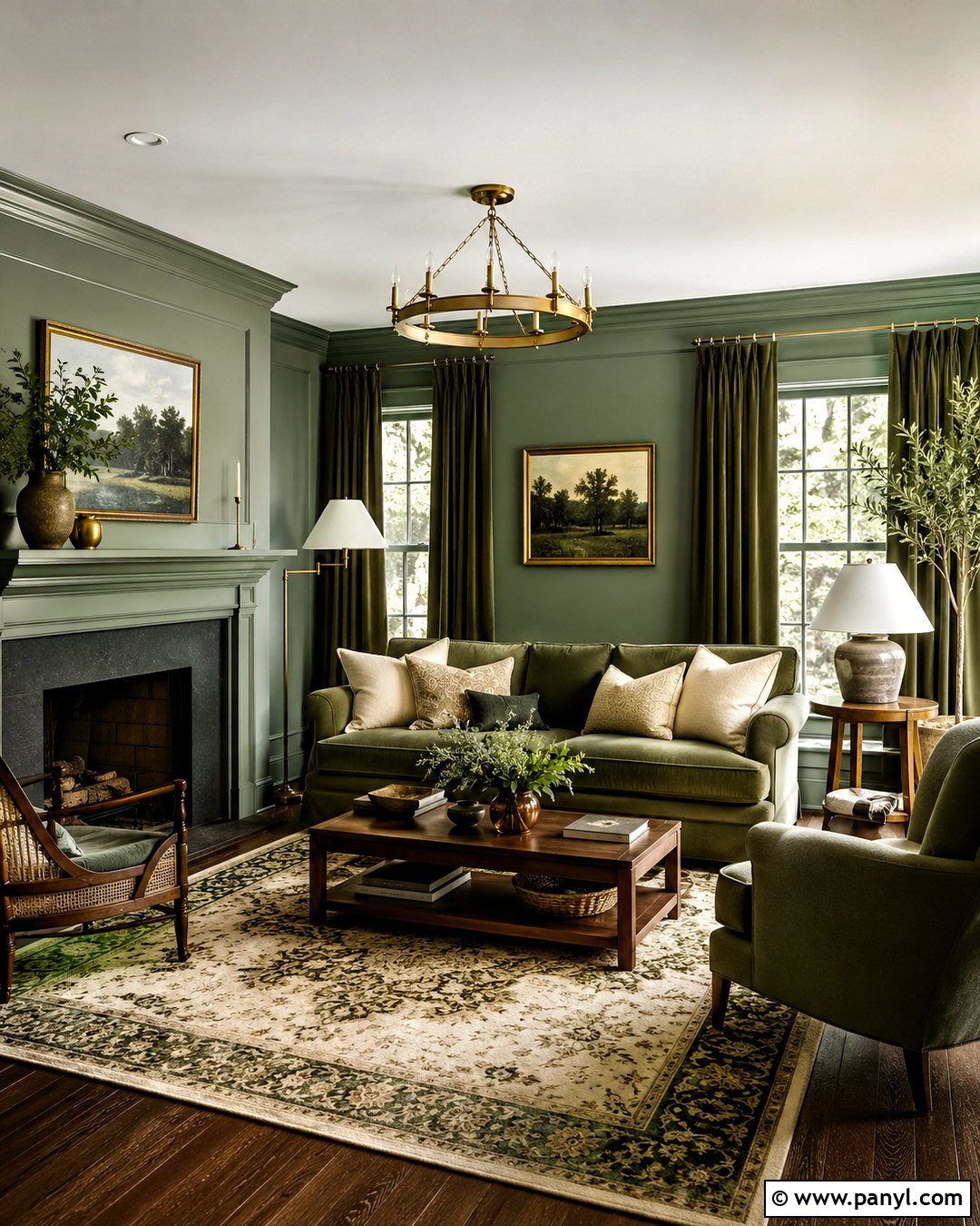
Hue drenching takes a single color family beyond paint by repeating related tones through furniture, textiles, and decor. Start with sage green walls, then paint the trim in a slightly deeper eucalyptus shade. Add an olive sofa, moss curtains, and a patterned rug containing cream, forest green, and warm brown. Walnut tables and antique brass fixtures stop the living room from feeling flat. The key is to vary texture and value rather than matching every surface exactly. Velvet, linen, wool, ceramic, and painted wood will each reflect green differently. Include a few warm neutral areas, such as an ivory ceiling and oatmeal pillows, to give the eye a place to rest. This complete tonal approach feels layered, calm, and far more dimensional than using one isolated green accent wall.
18. Two Tone Wall Paint
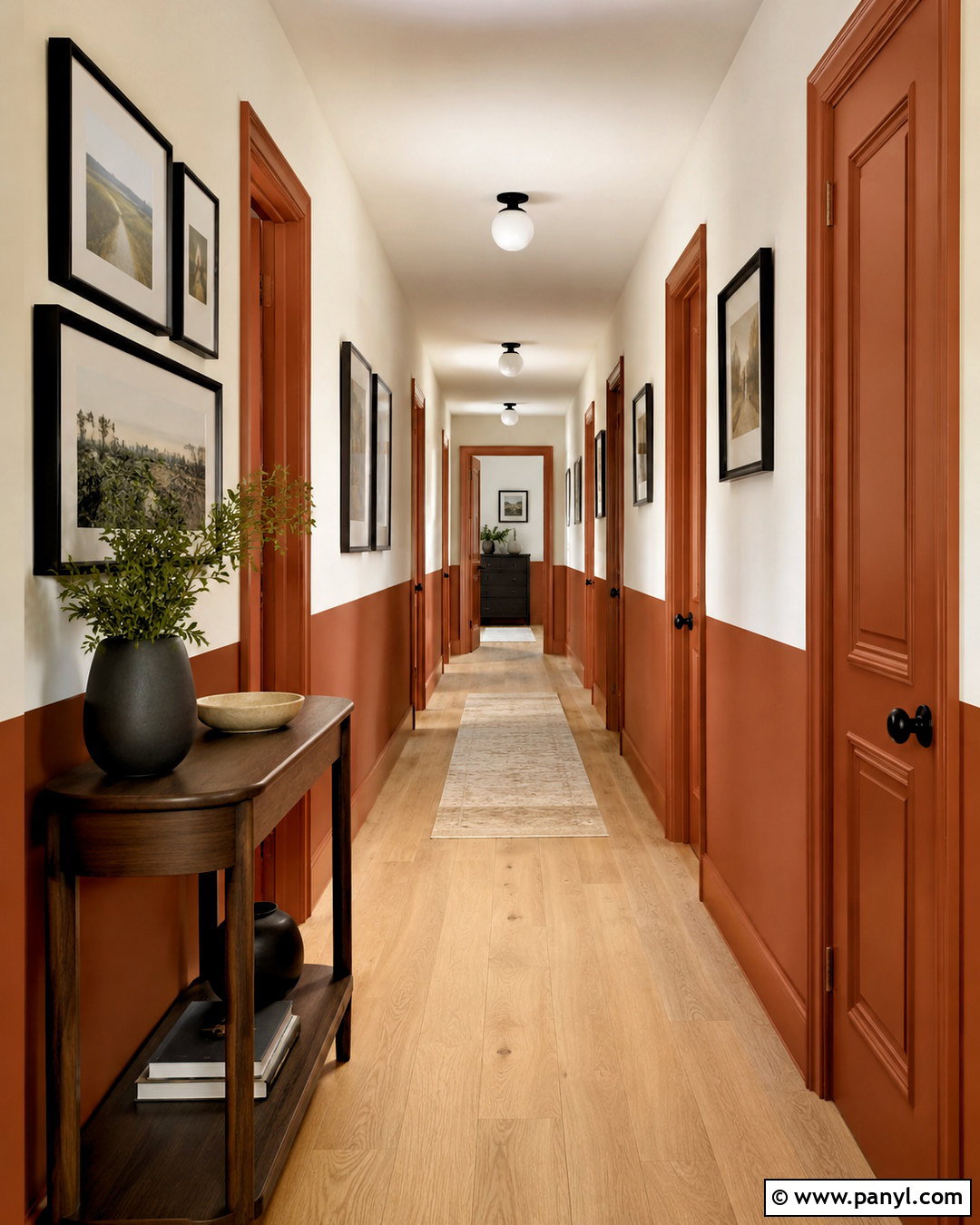
Two-tone walls provide architectural interest in rooms that lack molding or decorative detail. Paint the lower two-thirds of a hallway in muted rust and use warm beige above it, creating a crisp horizontal line that visually grounds the space. Continue the rust across doors and baseboards so the bottom section reads as one connected band. Light oak flooring, black picture frames, and a narrow walnut console complete the palette. Hang artwork so some pieces cross the painted division, which keeps the layout from appearing rigid. The darker shade should generally sit below the lighter one, especially in narrow areas. Use painter’s tape and a level for a clean transition. This treatment makes a plain passageway feel designed while remaining practical enough to withstand everyday marks and frequent traffic.
19. Painted Ceiling Color
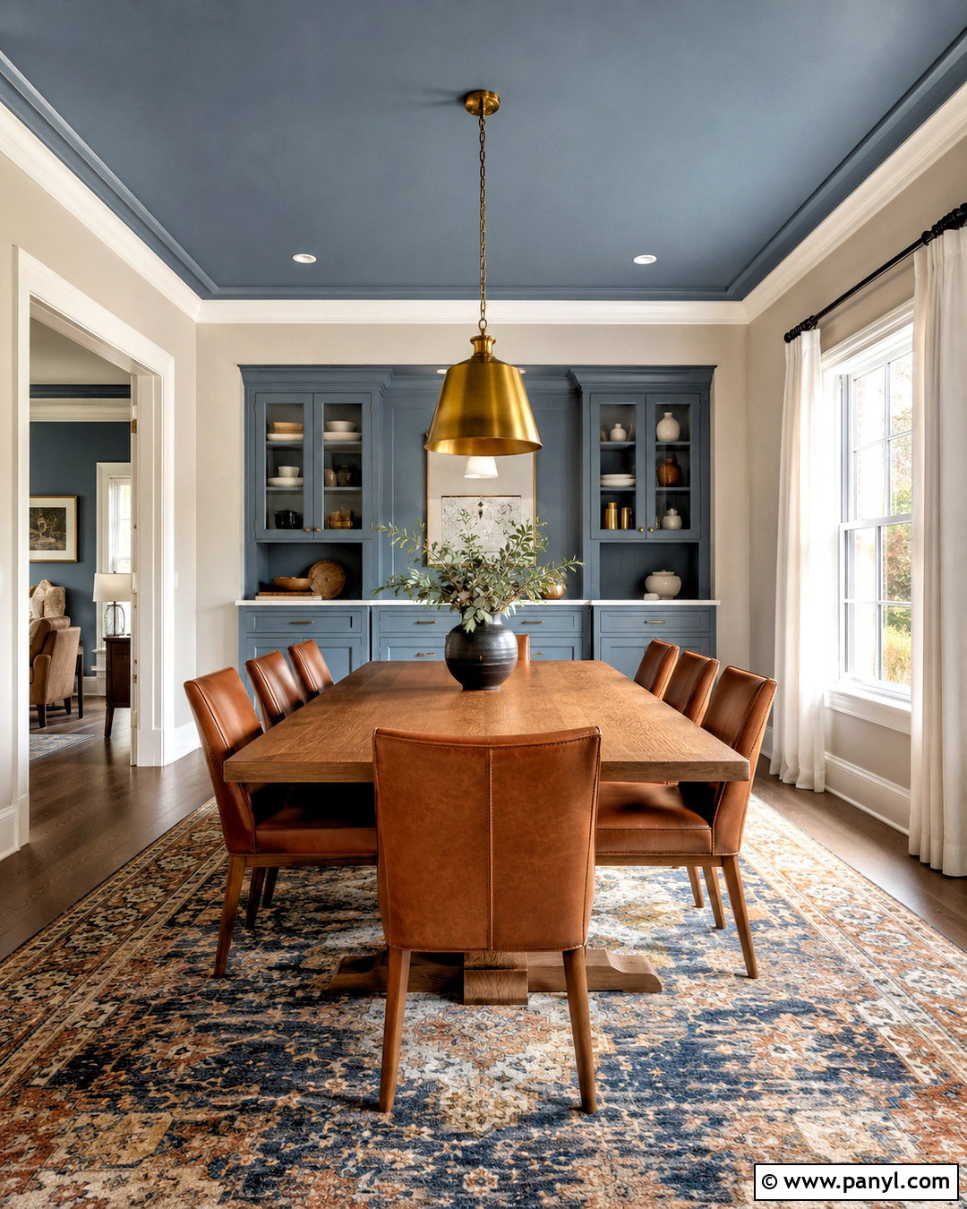
A painted ceiling turns the overlooked fifth wall into an intentional part of the room. In a cream dining room, use dusty blue overhead and repeat that blue on a built-in cabinet or window seat. Keep the trim warm white to frame both colors cleanly. An oak dining table, cognac leather chairs, and a brass pendant bring warmth beneath the cooler ceiling. A patterned rug containing blue, rust, and ivory helps connect the upper and lower halves of the room. Ceiling color often appears darker than expected, so test a large sample horizontally rather than holding it against a wall. Pale and midtone colors are easiest to use in average-height rooms. The finished scheme adds depth and personality without requiring dark walls or a complete commitment to color drenching.
20. Glossy Painted Trim

Glossy painted trim introduces color and reflectivity while allowing the walls to remain quiet. Cover living room walls in soft parchment, then paint the doors, baseboards, crown molding, and window casings in deep oxblood red with a high-gloss or durable gloss finish. Choose a warm white ceiling to keep the room balanced. A cream sofa, dark wood furniture, and an olive patterned rug support the rich trim without competing with it. Antique brass lighting adds another reflective surface, while natural linen curtains soften the sharp architectural lines. Preparation matters because glossy paint highlights dents, brush marks, and uneven woodwork. Sand and prime carefully before applying thin coats. This complete scheme works best when trim is substantial enough to become a deliberate feature rather than a narrow decorative outline.
Conclusion:
These **20 new paint trends** show that current color is less about following one fashionable shade and more about building a complete, comfortable room. Botanical greens, earthy reds, sophisticated browns, softened pastels, and warmer neutrals offer many alternatives to cold gray and plain white. Painting techniques are becoming more expressive too, with drenched rooms, colorful ceilings, two-tone walls, and glossy trim creating architectural character. Before choosing, test large samples beside your permanent flooring, cabinets, counters, and furniture. View them during daylight and after dark. Most importantly, select a trend that supports how you want the space to feel. A thoughtful palette will remain enjoyable long after the first coat dries.

Related Ideas and Inspiration:
Leave a Reply