
The 20 latest paint trends for 2026 move away from cold gray and stark white in favor of warmth, nature, and personality. Earthy greens, rich browns, softened yellows, and sunbaked reds are bringing depth back into everyday homes. At the same time, warm neutrals remain practical for anyone who wants a flexible backdrop. Application is changing too. Color-drenched rooms, coordinated trim, and low-contrast palettes can make ordinary architecture feel more intentional. The most successful schemes pair a trending color with flooring, furniture, lighting, and finishes that support its undertones. Always test large samples throughout the day before making a final choice. Here are complete, approachable rooms and exterior schemes inspired by the 20 latest paint trends. ()
1. Smoky Jade Living Room Paint
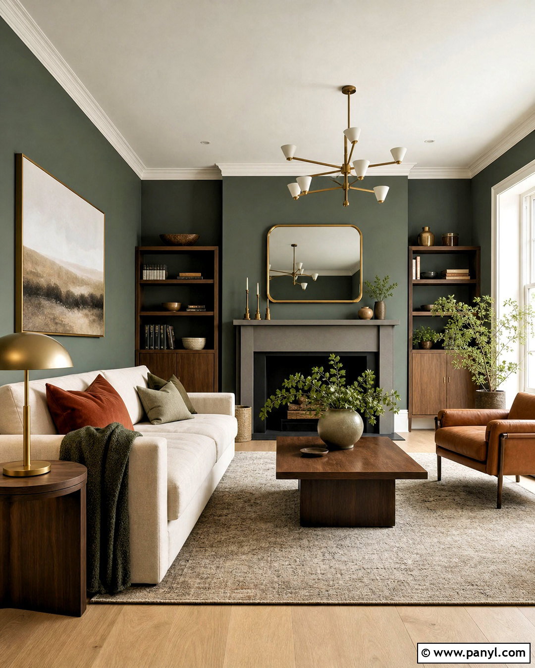
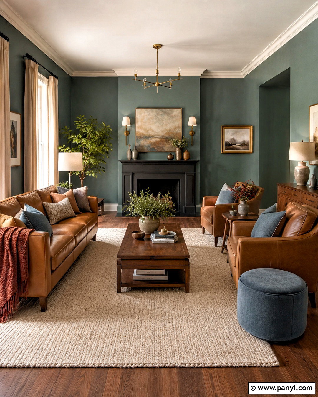
Smoky jade creates a living room that feels colorful without becoming loud. Cover the walls in a deep, muted jade green, then balance the richness with a warm white ceiling and lightly stained oak flooring. A cream linen sofa keeps the room bright, while walnut side tables and a camel leather chair reinforce the earthy character. Add oatmeal curtains, muted rust pillows, and aged brass lighting for gentle contrast. The green should appear slightly gray rather than bright or blue, which makes it easier to live with across changing seasons. Use matte paint on the walls and satin on the trim for subtle definition. This grounded green direction is especially relevant in 2026, with smoky jade among the year’s leading paint colors. ()
2. Warm Eucalyptus Bedroom Paint
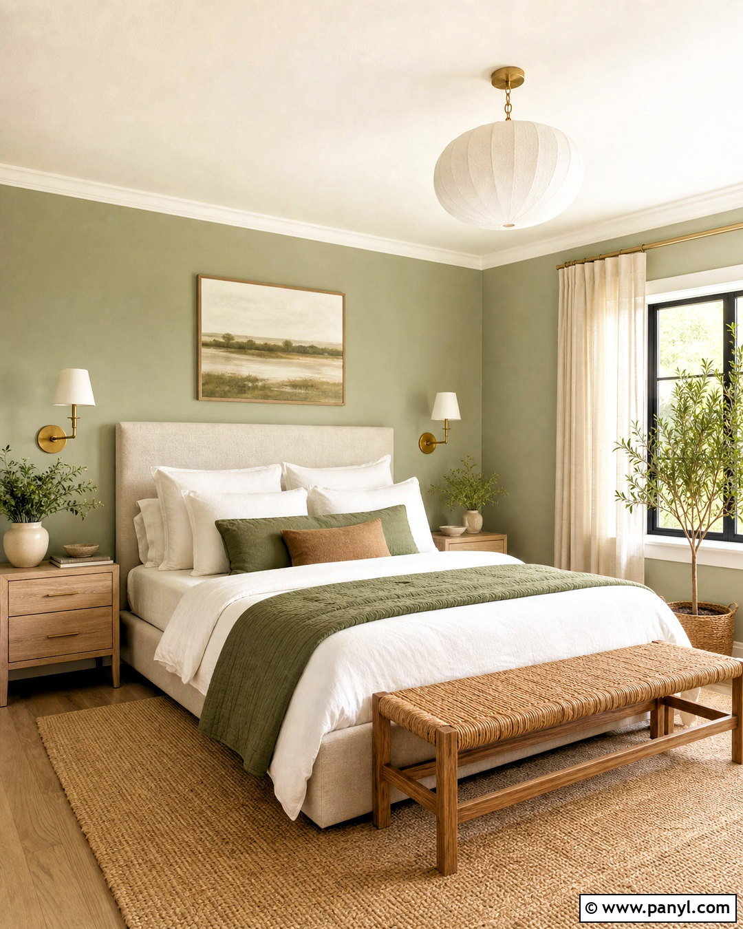
Imagine waking up in a bedroom surrounded by soft, restorative green. Warm eucalyptus paint has muted yellow-gray undertones that work beautifully with natural materials. Apply it to every wall, then use a creamy off-white on the ceiling and simple trim. Choose an upholstered oatmeal bed, pale oak nightstands, and a woven bench to create a relaxed foundation. Layer white sheets with moss green, clay, and beige bedding so the room feels collected rather than overly matched. Brushed brass sconces introduce a little warmth, while natural linen curtains gently filter daylight. Keep artwork minimal and botanical without making the theme too literal. Warm eucalyptus is one of 2026’s defining nature-inspired colors and offers a softer alternative to traditional sage. ()
3. Espresso Brown Home Office Paint
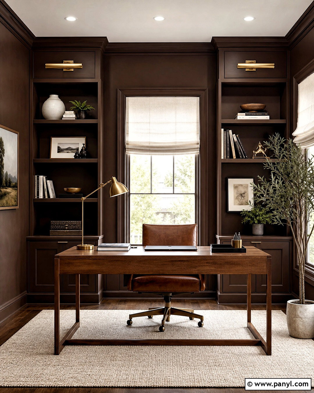
Rich espresso brown can turn a basic home office into a focused, polished workspace. Paint the walls, trim, and built-in bookcases in the same deep brown with subtle charcoal undertones. This color-drenched treatment minimizes visual breaks and makes modest architecture look more substantial. Bring in a medium-walnut desk, a cognac leather chair, and a cream wool rug to prevent the room from feeling heavy. A white ceiling can remain if the office is small, although continuing the brown overhead creates a cocooning library effect. Use antique brass picture lights and off-white Roman shades to reflect light. Espresso brown is replacing cooler dark grays in many dramatic rooms, offering depth while complementing wood, stone, leather, and warm metals. ()
4. Universal Khaki Entryway Paint
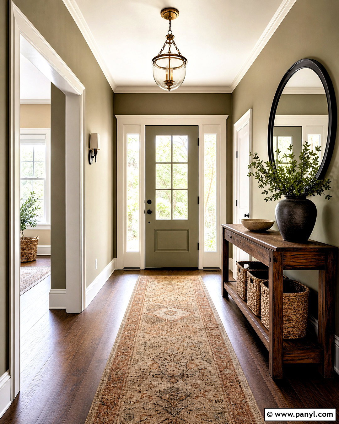
Universal khaki gives an entryway an understated, welcoming look that bridges beige, olive, and taupe. Use it across the walls and interior side of the front door, then paint the trim a creamy white with similar warm undertones. A slim walnut console, woven baskets, and a vintage-inspired runner strengthen the grounded palette. Add a round black-framed mirror and a simple aged brass ceiling light for contrast. Because khaki changes with its surroundings, test it beside the actual flooring before painting. It may look greener near red oak and more beige beside pale stone. The finished entry should feel warm and practical, not military or muddy. This adaptable earth neutral reflects the broader 2026 shift toward natural, lived-in paint palettes. ()
5. Terracotta Family Room Paint
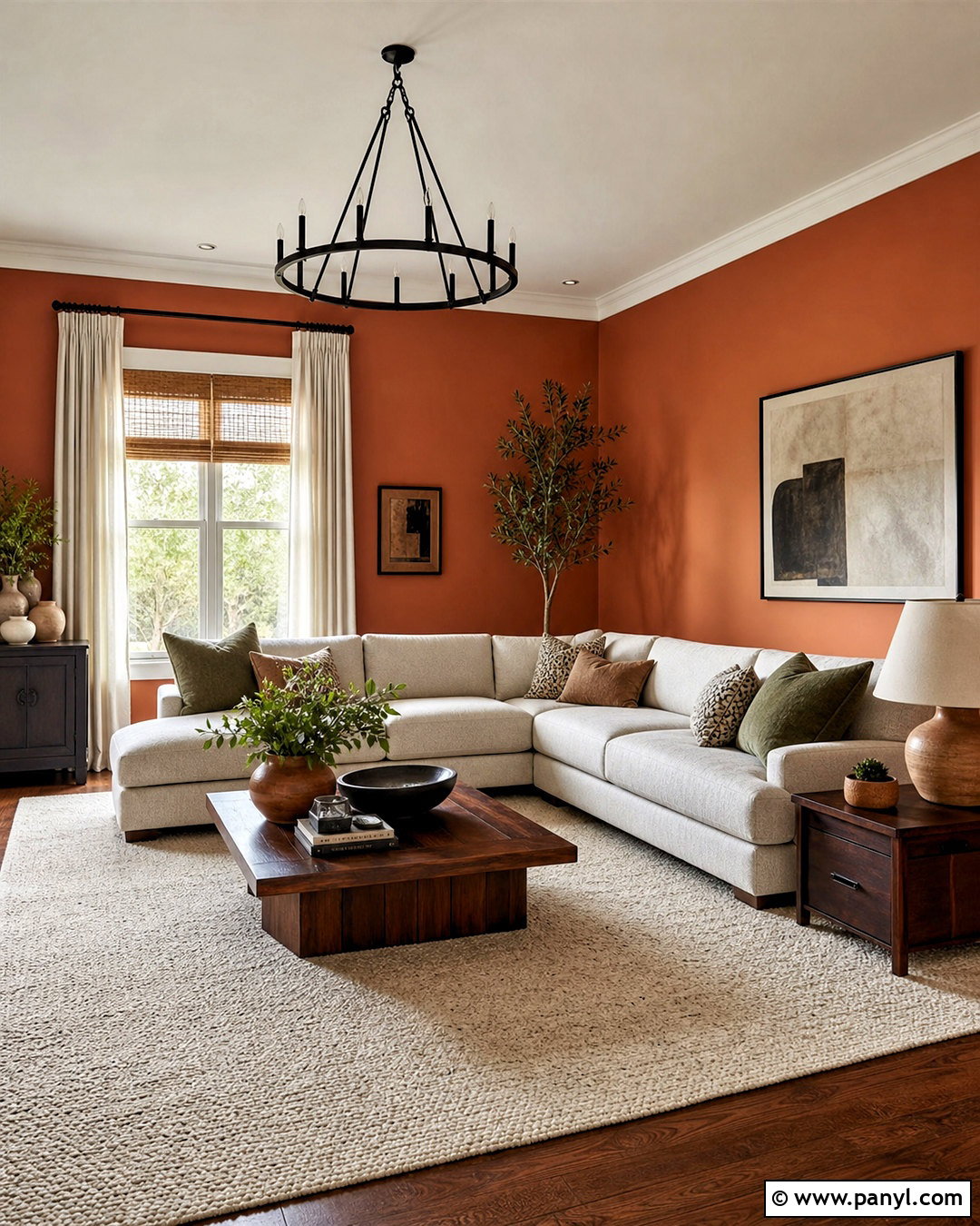
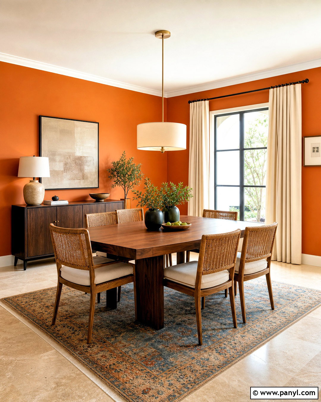
Terracotta walls bring warmth and movement to a family room, especially when the space receives strong natural light. Choose a softened clay shade with brown and peach undertones instead of a sharp orange. Pair it with a low-profile oatmeal sectional, a textured ivory rug, and dark walnut tables. Olive green pillows and handmade ceramic decor provide balance, while woven shades support the relaxed earth-tone palette. Keep the ceiling and trim warm white so the room remains open and suitable for everyday use. Black metal lighting adds a clean edge without interrupting the comfortable feeling. Terracotta is most convincing when repeated through several natural materials rather than treated as a single accent. Sunbaked clay shades continue to shape the warmer, earthier direction of 2026 interiors. ()
6. Butter Yellow Kitchen Paint
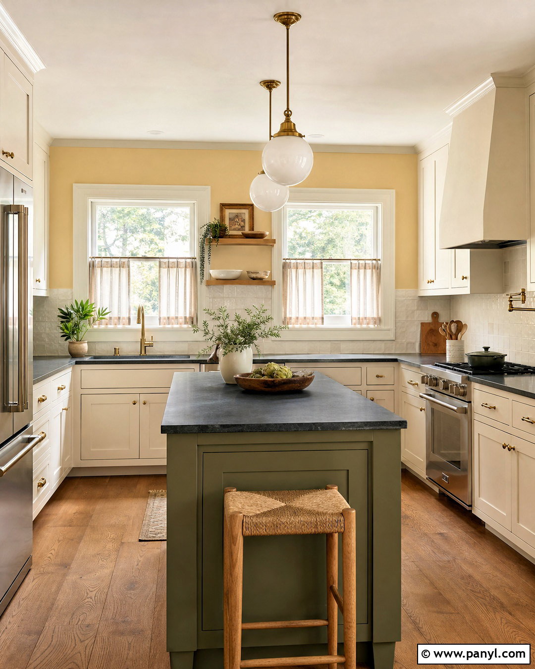
Butter yellow can make a kitchen feel cheerful and sunlit without introducing an overpowering primary color. Paint the walls a pale, creamy yellow and use warm white on the cabinets for a soft, low-contrast backdrop. Add honed soapstone countertops, medium-oak flooring, and brushed brass hardware to ground the sweetness. A small wood island painted muted olive creates a useful visual anchor. Complete the room with linen café curtains, simple white ceramics, and warm globe pendants. Avoid cool white tile, which can make yellow walls appear harsher. Instead, choose an ivory handmade backsplash with gentle variation. Soft yellows are returning alongside warmer neutrals and nostalgic palettes, making this scheme both current and approachable for a hardworking family kitchen. ()
7. Dusty Emerald Dining Room Paint
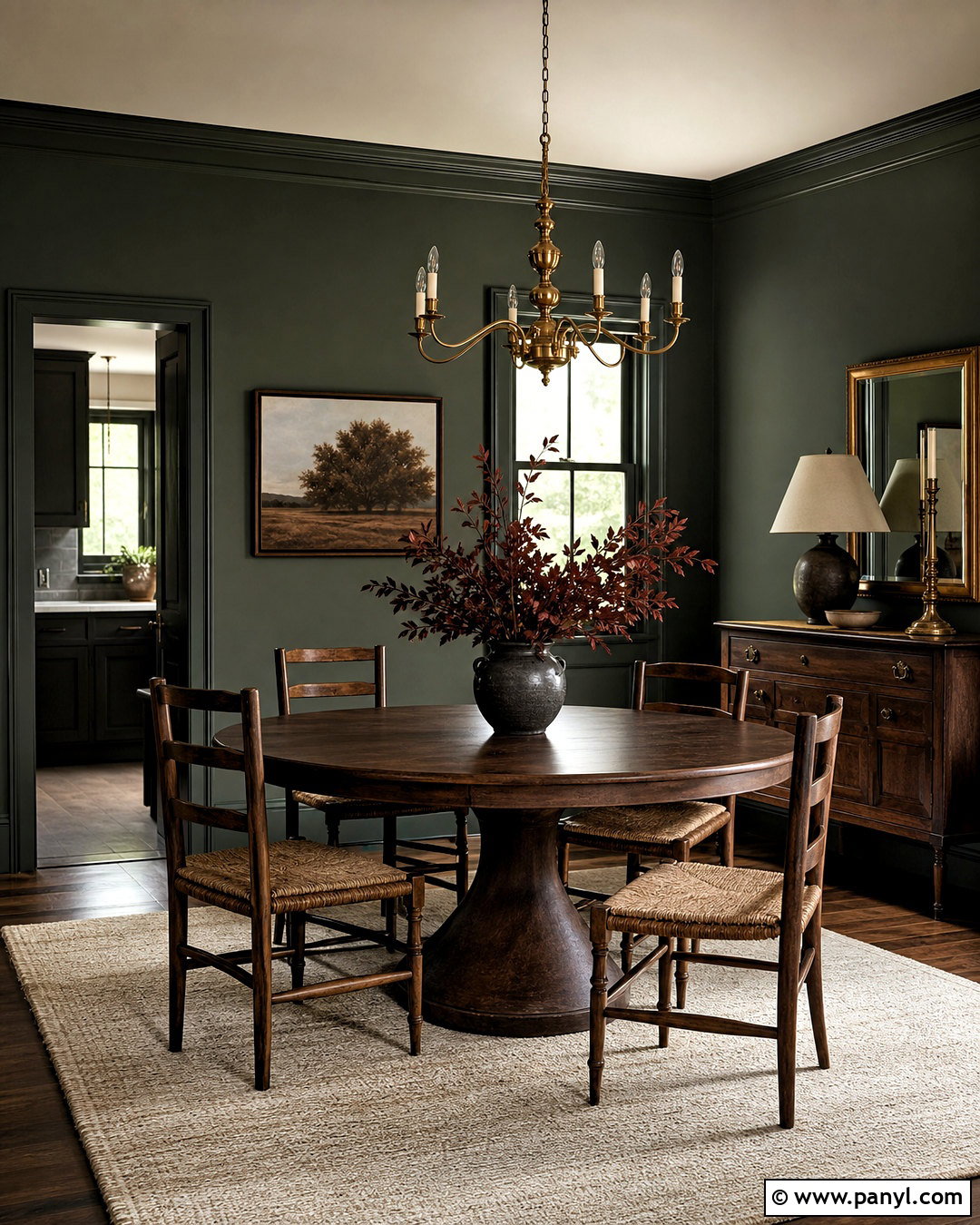
A dusty emerald dining room feels formal enough for gatherings but comfortable enough for everyday meals. Select a deep green with softened gray undertones, then carry it across the walls and baseboards. Keep the ceiling warm white to preserve height. A round walnut dining table, rush-seat chairs, and an ivory flat-weave rug lighten the center of the room. Hang a simple brass chandelier rather than an oversized fixture, and frame vintage landscape prints in dark wood. Burgundy napkins or a muted plum centerpiece can add an unexpected color relationship without overwhelming the green. Dusty emerald works best in satin or washable matte paint because dining spaces need durability. Rich, softened greens remain central to the deeper and more expressive color stories appearing in 2026. ()
8. Olive Green Kitchen Cabinet Paint
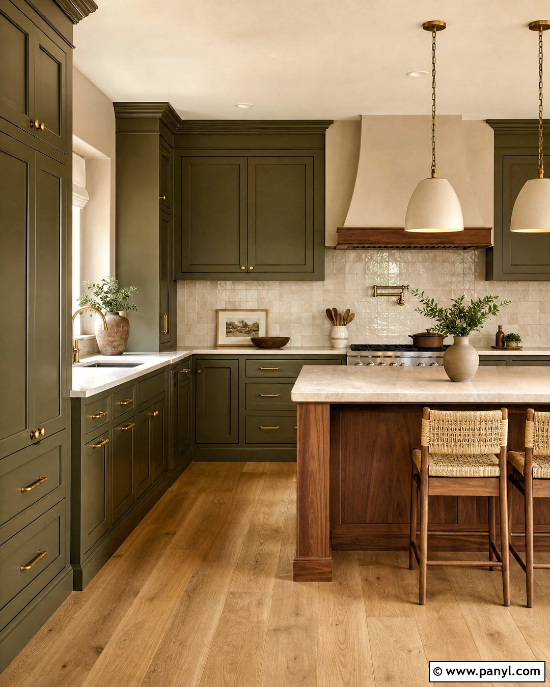
Olive green cabinets create a kitchen that feels established, natural, and warmer than familiar pale sage. Apply the color to both upper and lower cabinetry for a cohesive effect, or pair olive lowers with warm cream uppers in a smaller room. Choose unlacquered brass pulls, creamy quartz countertops, and an ivory zellige-style backsplash. Medium-toned oak flooring and a walnut island add enough brown to support the green undertones. Paint the walls a gentle putty color rather than bright white. This prevents a harsh divide between cabinets and surrounding surfaces. Add woven counter stools and simple ceramic pendants to finish the complete scheme. Deeper olive is gaining attention as a sophisticated alternative to lighter sage kitchens in 2026. ()
9. Merlot Dining Room Paint
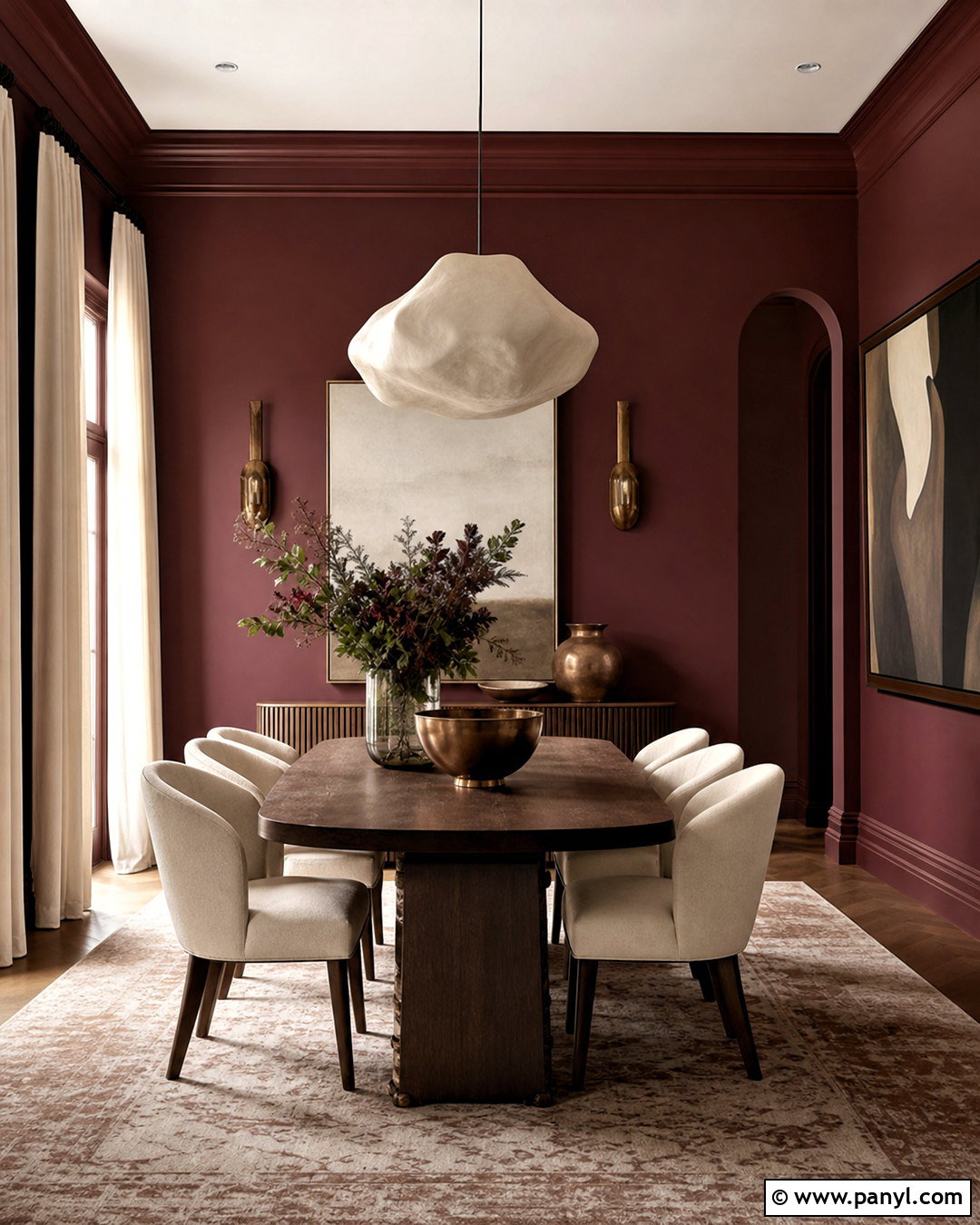
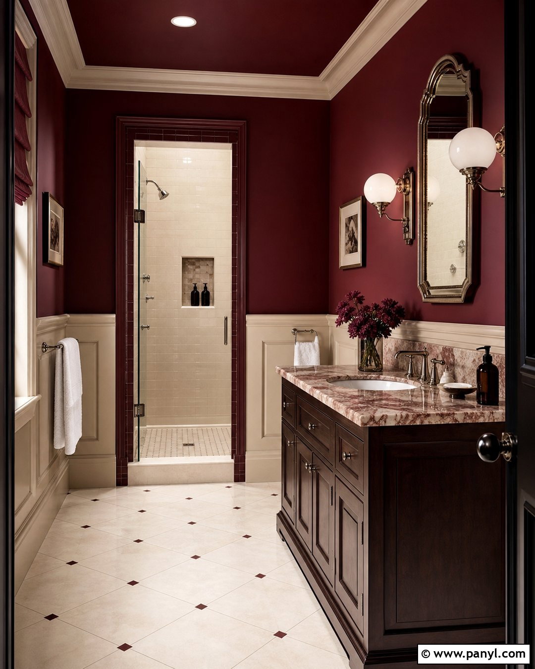
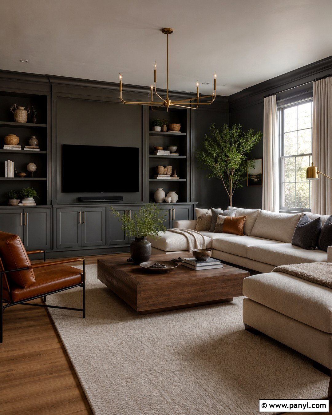
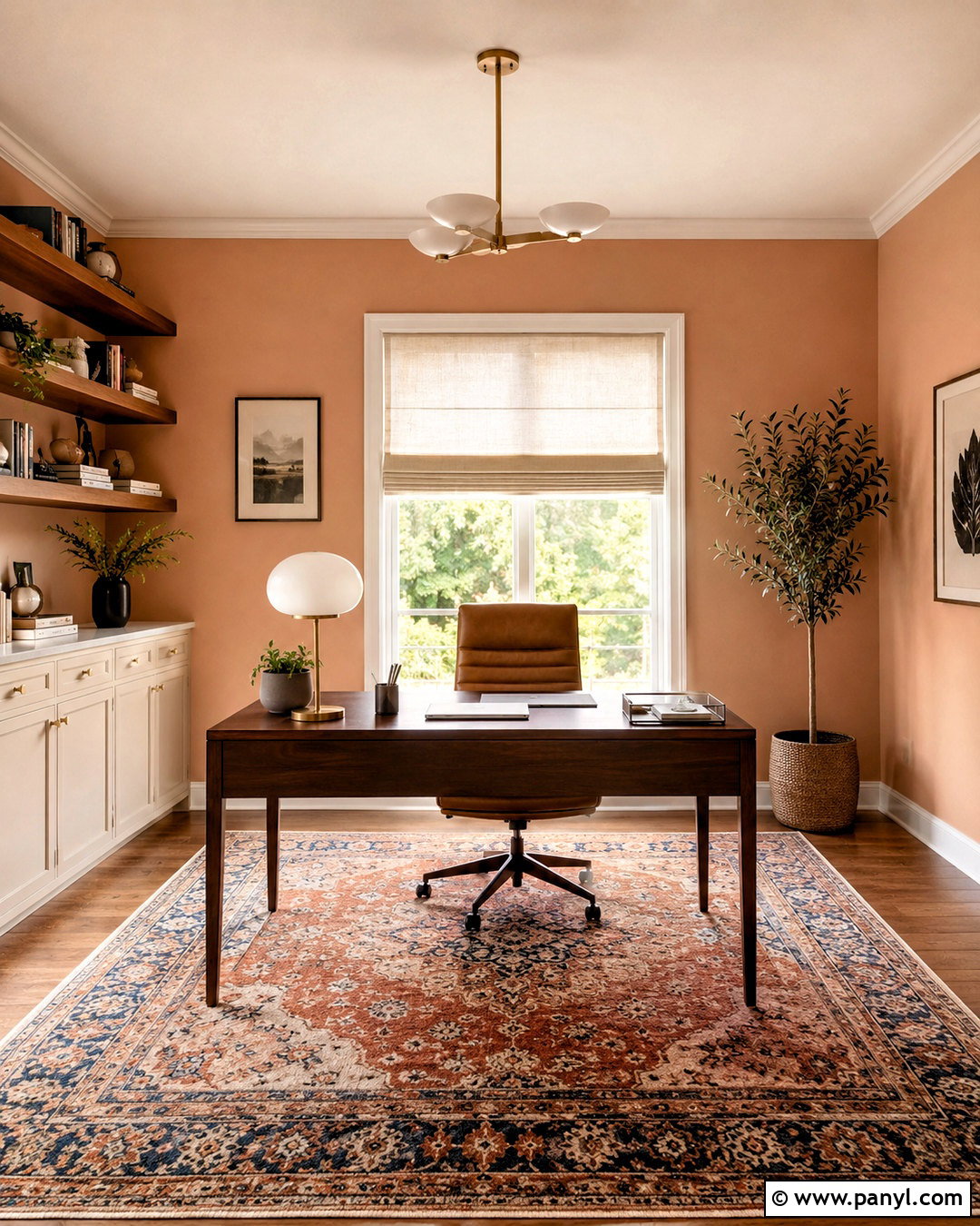
Merlot paint wraps a dining room in warm, confident color while remaining more versatile than bright red. Look for a brown-based burgundy that reads like dark berries rather than purple. Paint the walls and trim together, using a slightly glossier finish on the woodwork. Pair the color with a dark oak table, cream upholstered chairs, and a softly patterned beige rug. A sculptural plaster pendant introduces a modern note, while bronze candlesticks and muted artwork reinforce the intimate atmosphere. Keep window treatments light and full-length so daylight can soften the saturated walls. If the room opens into a neutral space, repeat merlot through one small textile nearby. Rich wine tones are part of the broader move from passive greige toward expressive, enveloping color. ()
10. Periwinkle Bedroom Paint
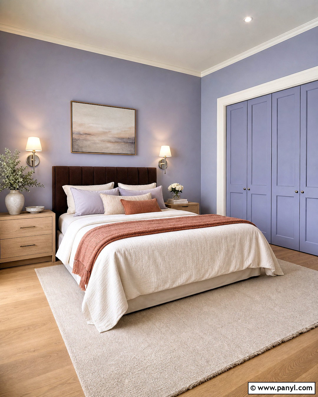
Periwinkle offers a fresh bedroom palette that sits between lavender and softened blue. Choose a slightly gray version for the walls, then pair it with warm white trim to keep the color calm. A chocolate brown upholstered headboard provides an unexpected but grounding contrast. Add pale oak nightstands, ivory bedding, and a muted rust throw to prevent the scheme from feeling overly cool. Brushed nickel or aged silver lighting complements the blue undertones without looking flashy. For a more complete effect, paint the closet doors periwinkle as well, using a satin finish for durability. The combination of periwinkle and deep brown reflects 2026’s interest in less predictable color pairings. It feels playful, balanced, and appropriate for both modern and traditional bedrooms. ()
11. Warm White Living Room Paint
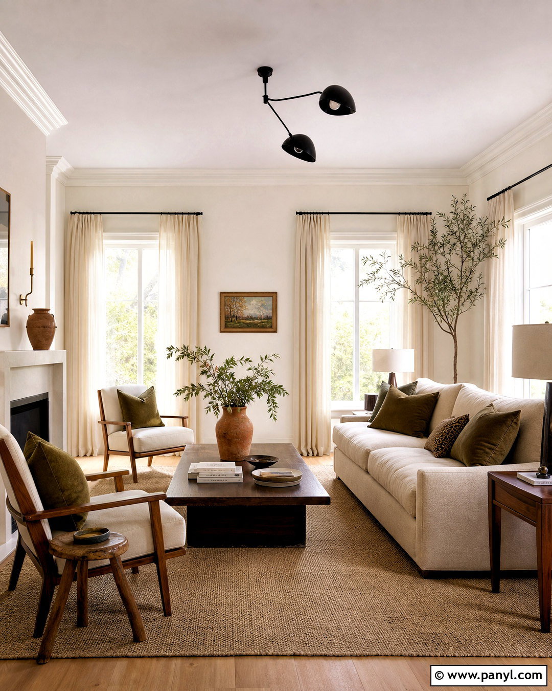
Warm white remains essential, but the latest versions feel creamy, dimensional, and intentionally paired with natural texture. Paint the living room walls and ceiling in the same soft white, then use satin paint on the trim to create a quiet shift in sheen. Furnish the space with an oatmeal sofa, walnut coffee table, woven wool rug, and light linen curtains. Add black metal lighting sparingly so the room has definition without returning to a severe black-and-white formula. Terracotta pottery, olive textiles, and aged brass accents bring controlled color into the neutral setting. Check samples beside fixed stone and flooring because some warm whites can appear unexpectedly yellow. The updated look replaces sterile brightness with a more relaxed, comfortable foundation. ()
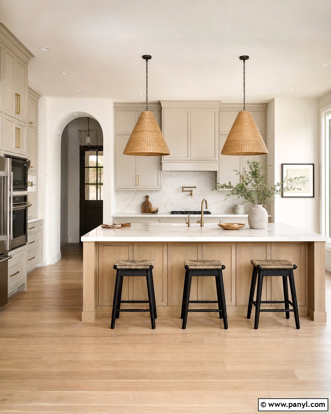
12. Creamy Greige Open Plan Paint
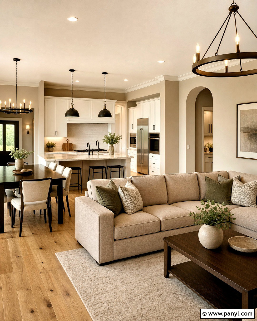
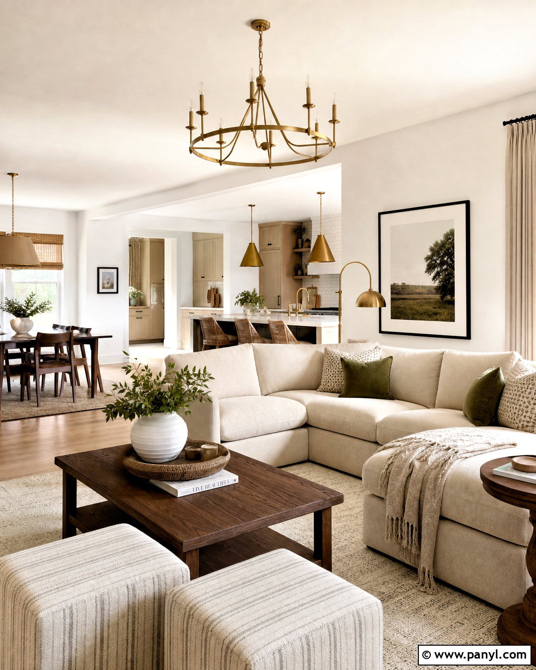
Could one neutral connect a kitchen, dining area, and living room without making everything look identical? Creamy greige offers enough warmth to unify an open plan while allowing furniture and cabinetry to define separate zones. Use it on the main walls, then choose a soft cream for ceilings and trim. Pair the color with natural oak floors, warm white kitchen cabinets, and a mushroom-colored sectional. Introduce contrast through a dark walnut dining table, bronze lighting, and muted green textiles. Avoid cool gray upholstery, which can expose unwanted pink or yellow undertones in the paint. Instead, coordinate materials using warm samples viewed together. Greige remains relevant when it looks earthy and nuanced rather than flat, cool, or associated with earlier all-gray interiors. ()
13. Charcoal Blue Bathroom Paint
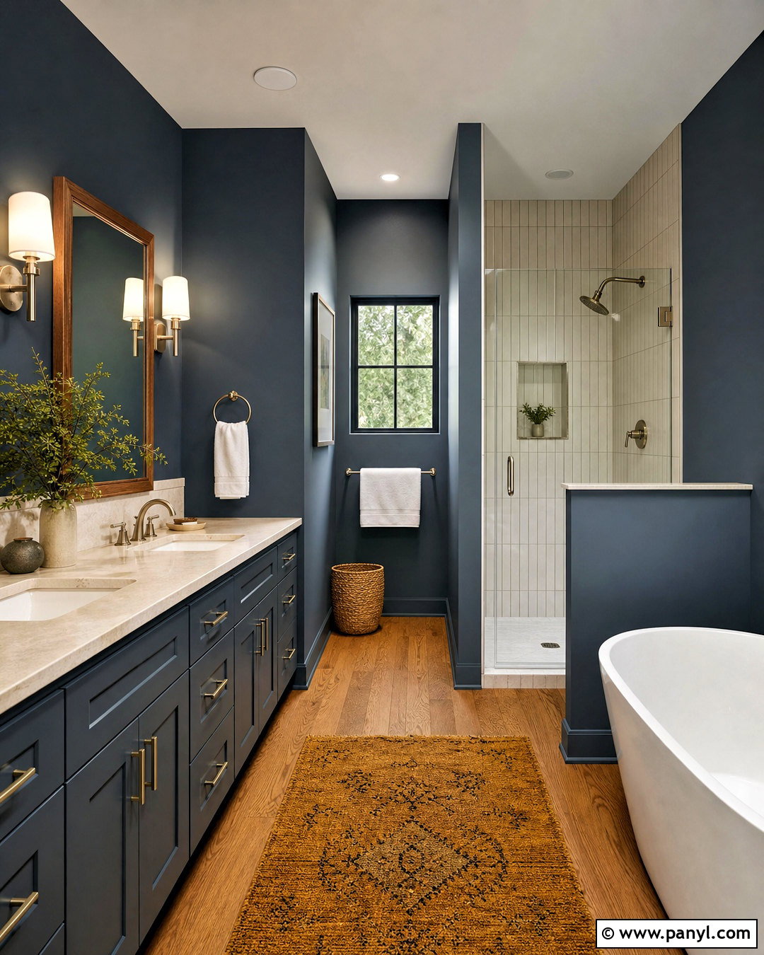
Charcoal blue gives a bathroom depth while feeling softer than pure black. Paint the upper walls and vanity in a dark blue-gray, using moisture-resistant satin paint for easy cleaning. Add creamy white vertical tile in the shower, a pale stone countertop, and medium-oak flooring to brighten the room. Brushed nickel fixtures support the cool side of the blue, while a walnut-framed mirror contributes necessary warmth. Choose white towels with one muted ochre bath mat for a restrained pop of color. In a windowless bathroom, use high-quality white lighting so the paint does not appear dull. Deep blue and charcoal shades are being used as grounding colors in compact rooms, offices, and dramatic interiors where homeowners want more character than ordinary gray. ()
14. Plaster Pink Powder Room Paint
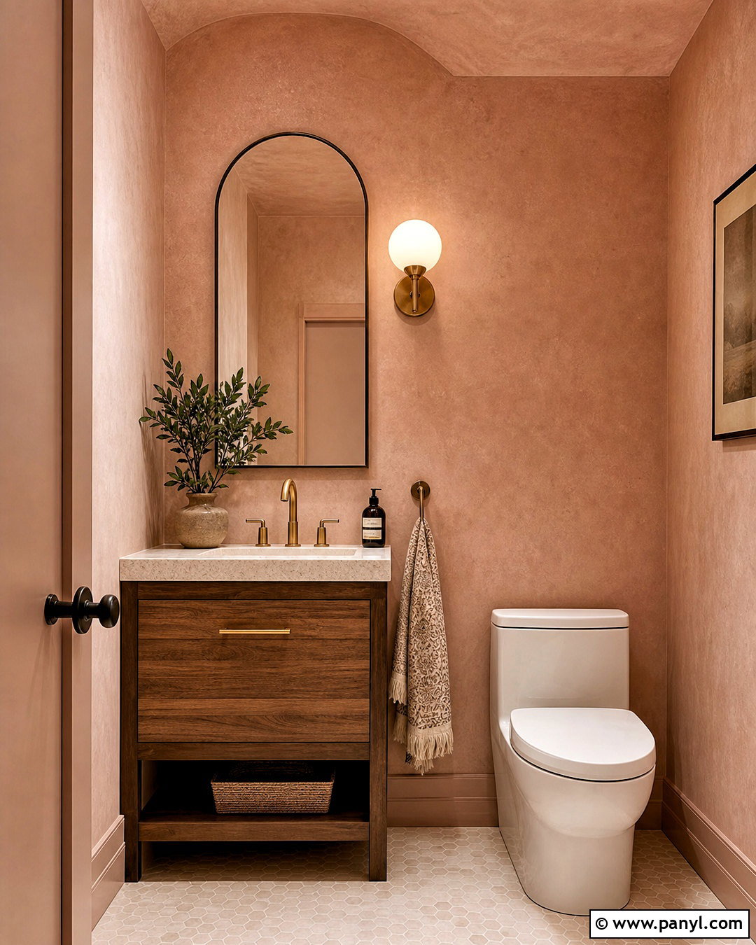
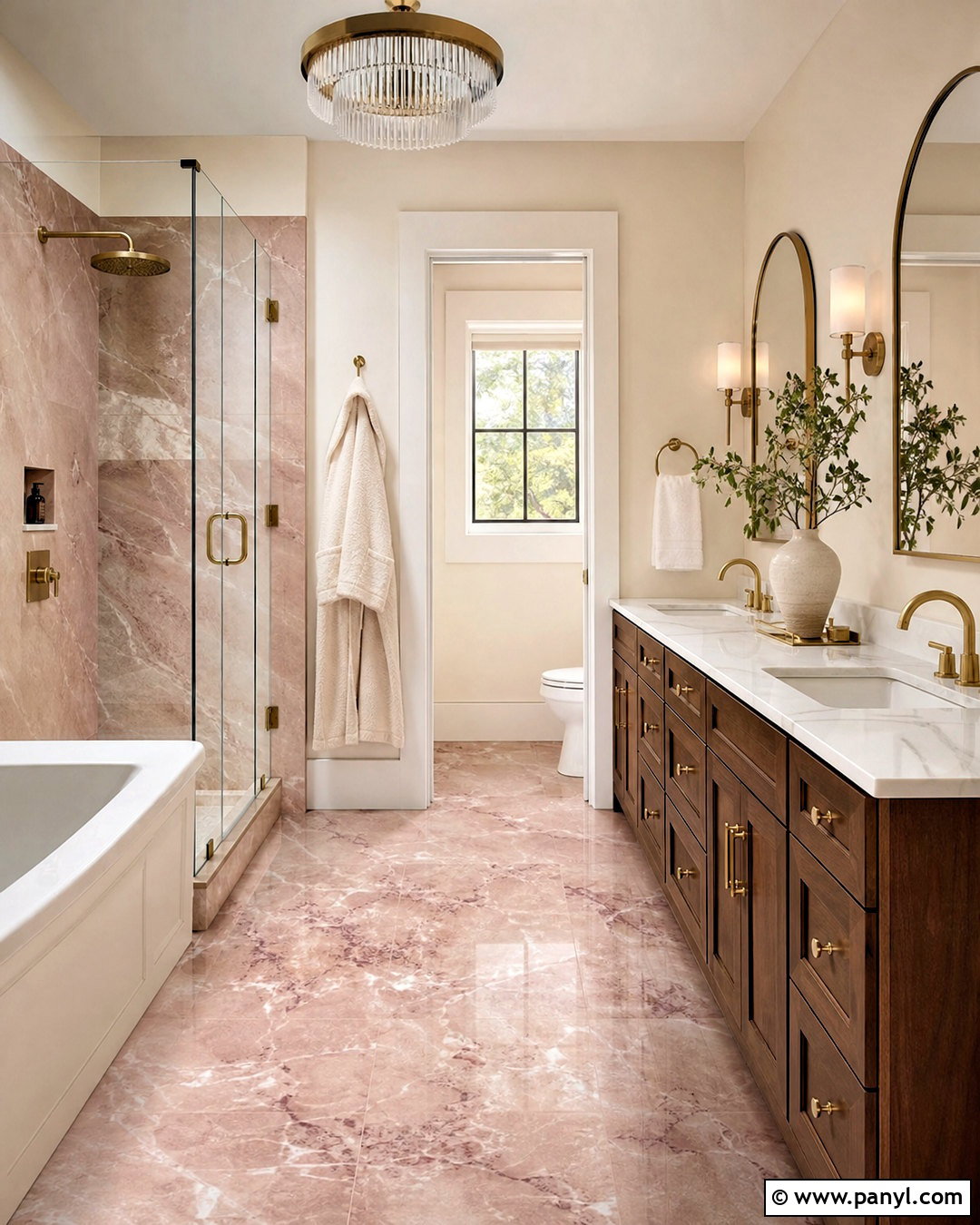
Plaster pink transforms a powder room with warmth that feels earthy rather than sugary. Choose a muted pink containing beige, clay, or brown undertones, and paint the walls, trim, and ceiling for a seamless envelope of color. Install a compact walnut vanity with a creamy stone sink and aged brass faucet. An arched mirror, small opal sconce, and patterned hand towel can provide character without crowding the room. If wallpaper feels too busy, use limewash-style paint or a subtle plaster finish to create movement on the walls. Keep flooring simple with warm white or terracotta tile. Pink continues to move beyond children’s spaces, appearing in sophisticated interiors and outdoor palettes because its warmer variations coordinate naturally with wood, greenery, stone, and brass. ()
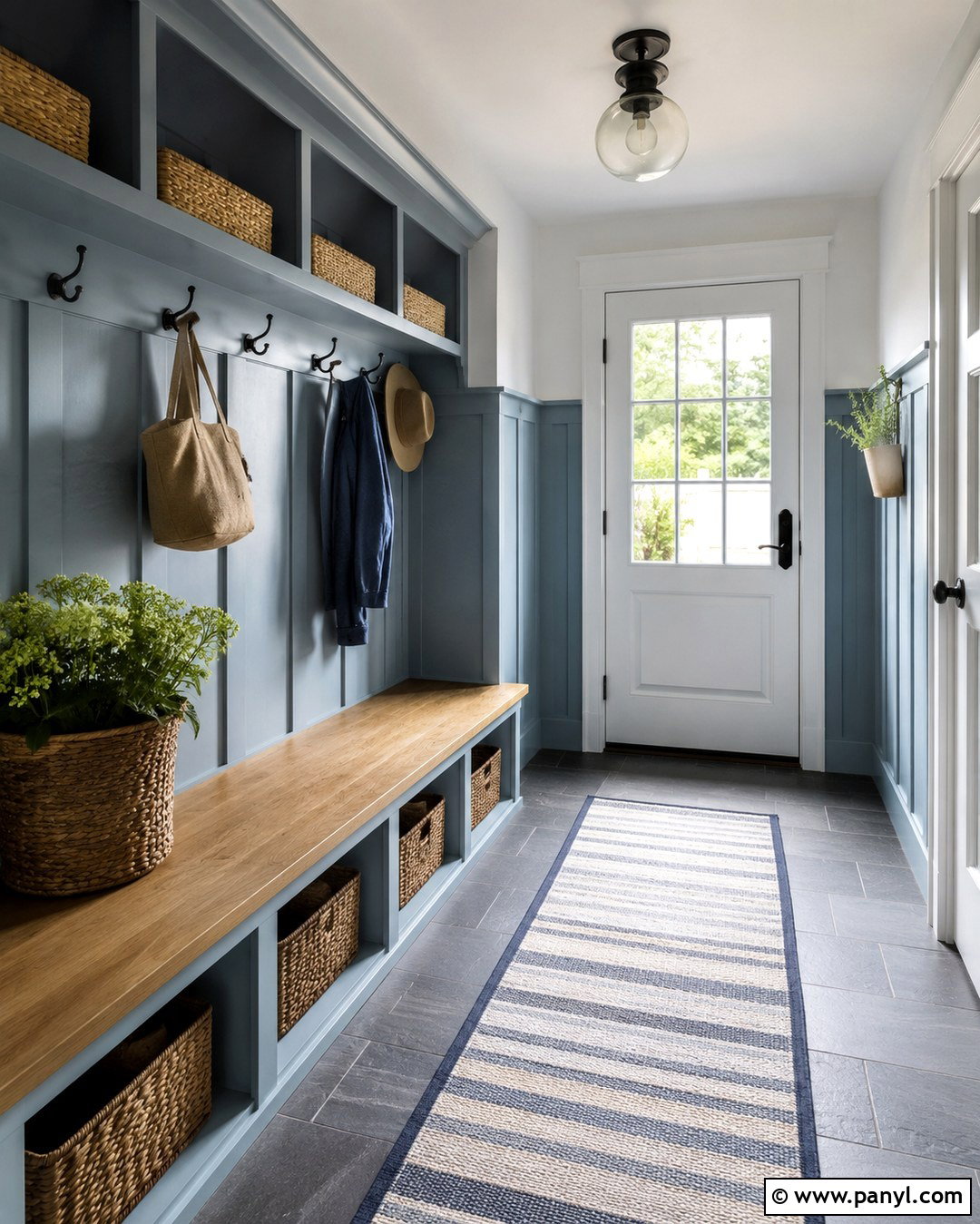
15. Clay Red Mudroom Paint
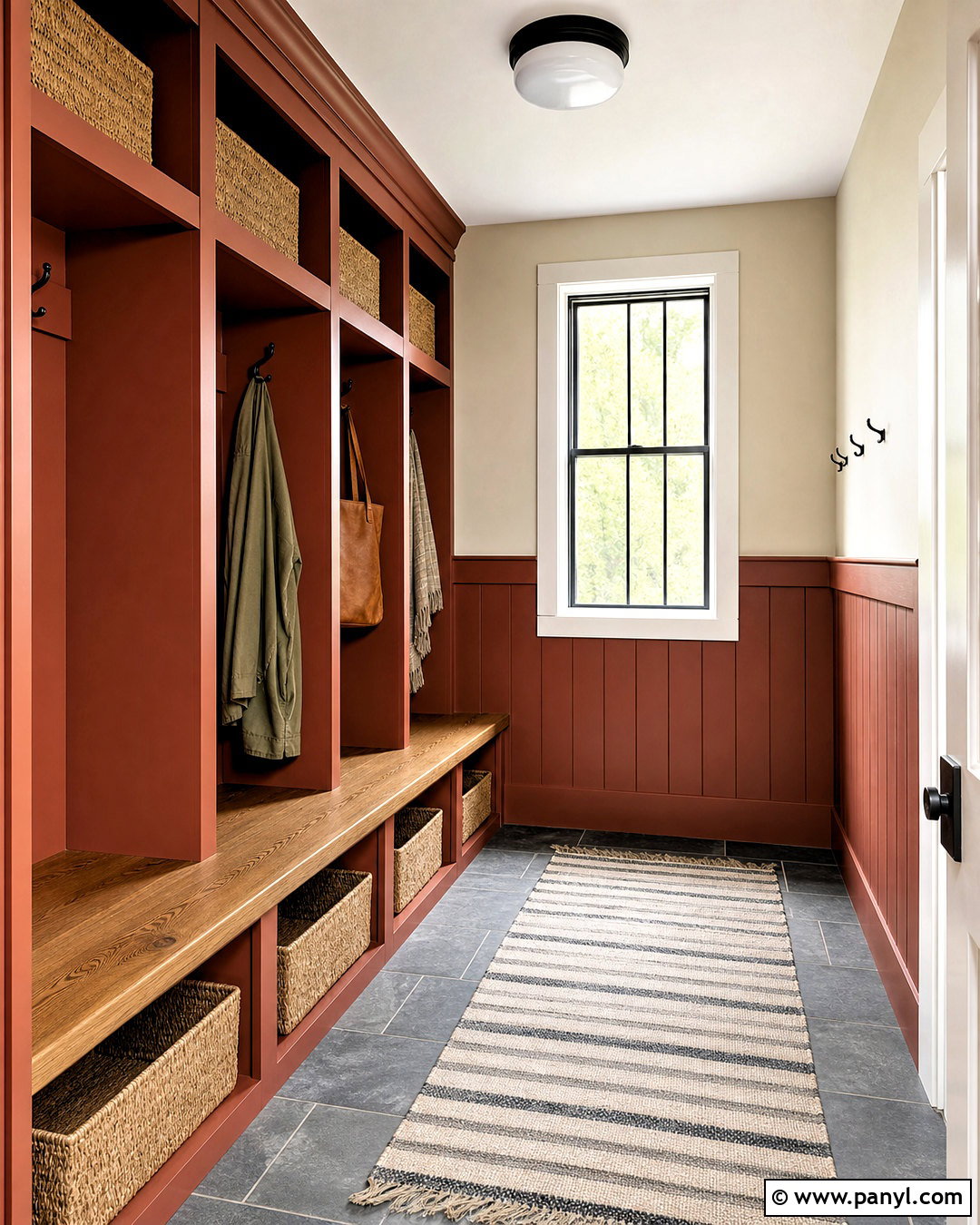
Clay red makes a hardworking mudroom feel warm, durable, and connected to the outdoors. Paint built-in lockers and lower wall paneling in a muted brick-red shade, then use creamy beige above to keep the space balanced. Choose slate-look floor tile, a solid oak bench, and woven baskets that can handle everyday storage. Matte black hooks and a simple flush-mount light add crisp definition. Repeat the red in a narrow striped runner, but keep the remaining accessories neutral. The color should contain enough brown to hide scuffs and avoid looking overly bright. Sunbaked red and clay tones fit the 2026 preference for grounded colors with visible personality. Used on practical millwork, they create impact without requiring every wall to carry the saturated shade. ()
16. Frosted Lavender Reading Room Paint
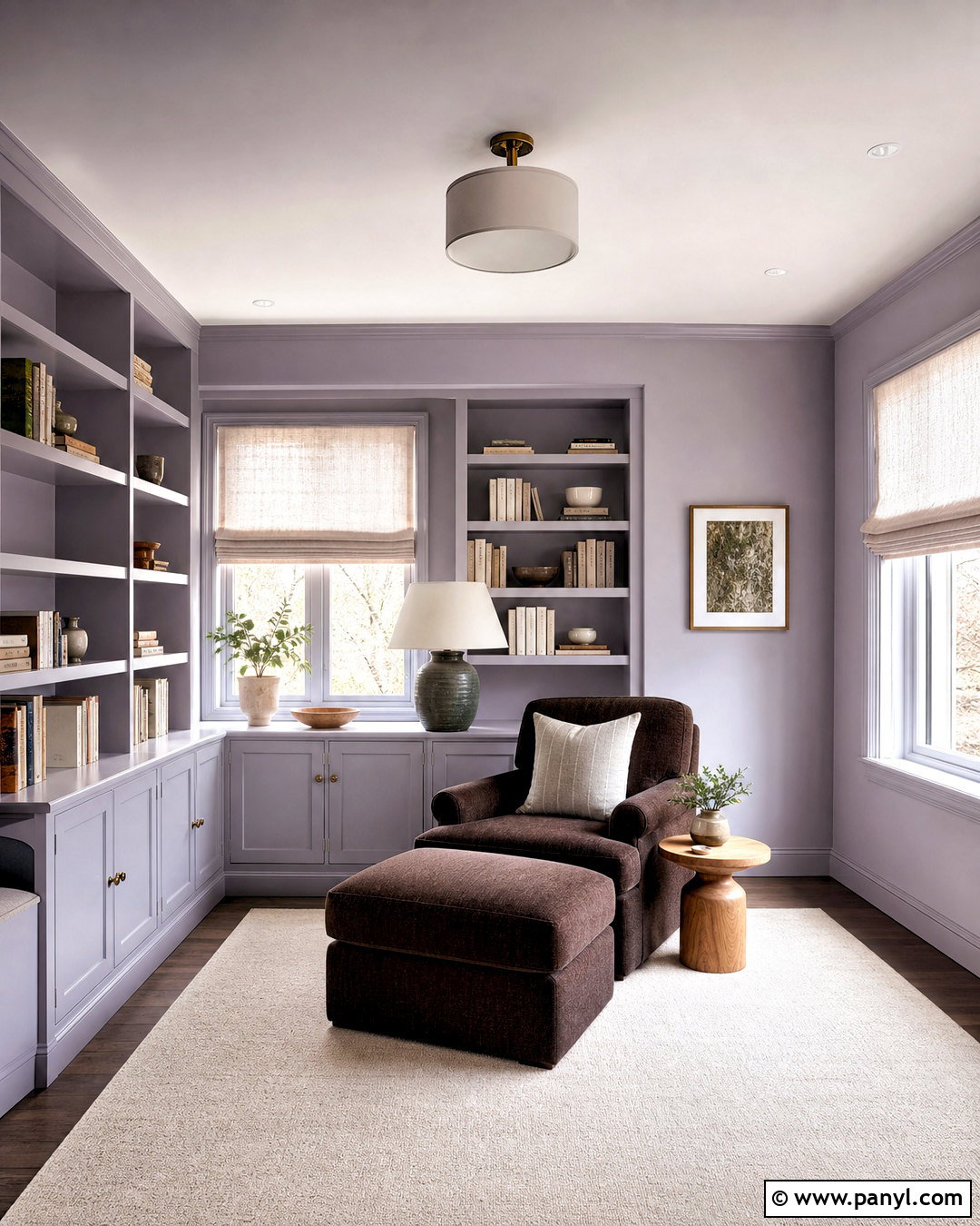
Frosted lavender brings soft color to a reading room without sacrificing calm. Select a pale lavender with noticeable gray undertones, and apply it to the walls and built-in shelving. Use warm white on the ceiling, then add a deep chocolate reading chair to anchor the pastel backdrop. Pale oak shelves, an ivory rug, and linen Roman shades maintain an airy appearance. Introduce muted green through a ceramic lamp or a few botanical branches, creating a natural complementary relationship. Books will supply additional color, so avoid filling every shelf with decorative objects. This scheme works especially well in rooms with cool northern light, provided the paint is tested first. Frosted lavender reflects the renewed interest in gentle pastels paired with stronger, earthy neutrals. ()
17. Color Drenched Den Paint
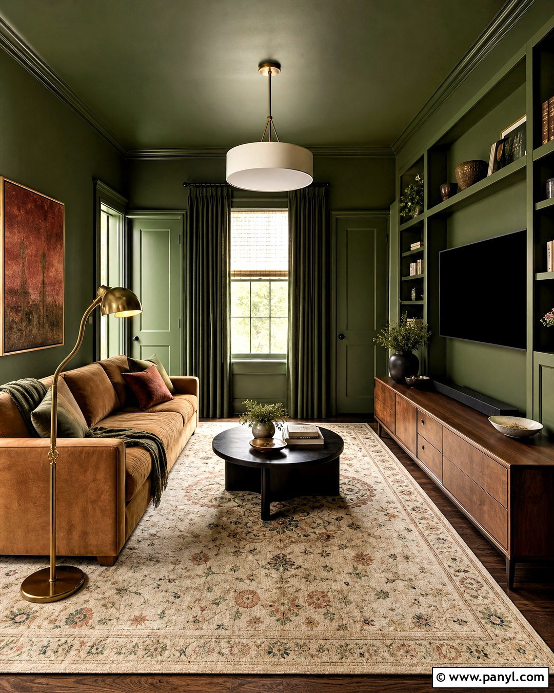
Color drenching uses one hue across walls, trim, doors, built-ins, and sometimes the ceiling to create a complete architectural statement. In a small den, choose a medium-toned moss green that feels rich without absorbing every trace of light. Apply matte paint to broad surfaces and satin to woodwork so the room gains depth through finish rather than contrasting colors. Add a camel sofa, walnut media cabinet, patterned cream rug, and brass floor lamp. Keep curtains close to the wall color to maintain continuity. Artwork with rust, tan, and pale blue can break up the green gently. This treatment makes mismatched doors and basic trim feel more intentional, and full-room color remains a prominent approach in personality-driven 2026 interiors. ()
18. Tonal Trim Living Room Paint
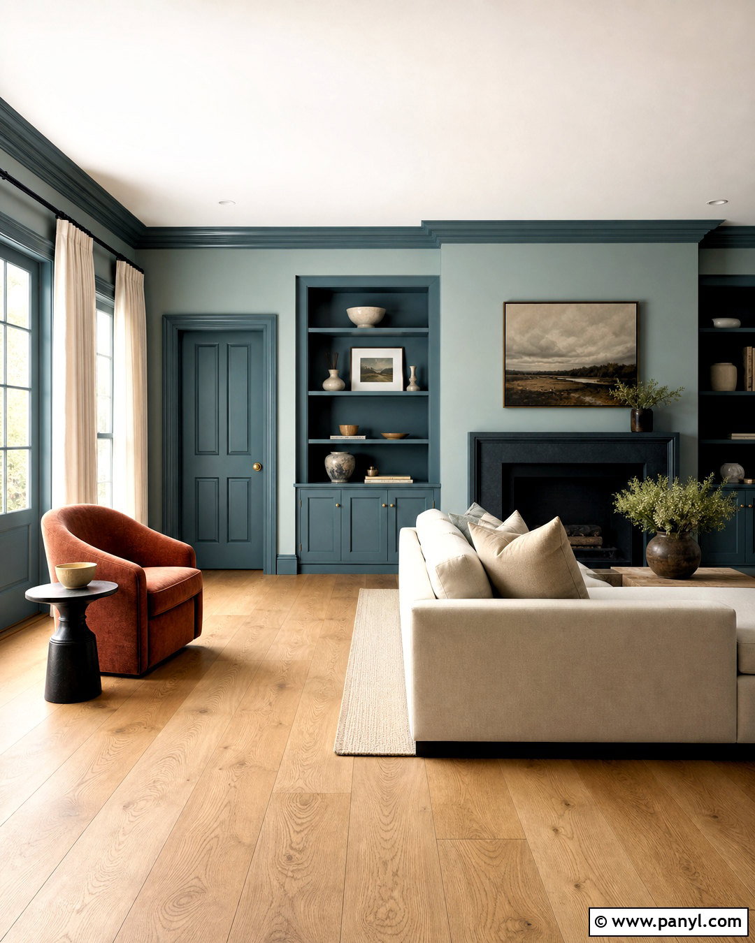
Tonal trim creates a softer transition than traditional white woodwork. Paint the living room walls a muted blue-green, then choose trim that is one or two shades deeper within the same color family. Continue the darker tone on doors and built-in cabinetry for a tailored finish. Use a cream sofa, natural oak flooring, and a rust-colored lounge chair to warm the palette. Linen curtains can match the walls closely, while matte black curtain rods provide a narrow line of contrast. This approach highlights architectural details without outlining every surface in bright white. It also makes lower ceilings and fragmented walls feel more connected. Coordinated, low-contrast color schemes support the current preference for immersive rooms that look thoughtful, comfortable, and less formulaic. ()
19. Sunny Yellow Exterior Paint
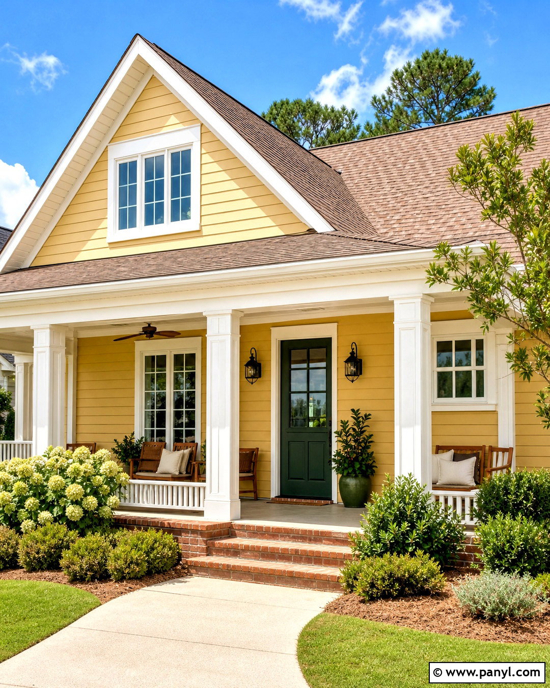
Sunny yellow exterior paint gives a modest home a joyful update when the entire scheme is carefully balanced. Choose a softened golden yellow for the siding, warm white for the fascia and window trim, and a muted forest green for the front door. A medium-brown roof, natural brick steps, and simple black lanterns ground the brighter body color. Repeat the green through foundation shrubs and porch planters, then use natural cedar furniture if space allows. Avoid combining yellow siding with brilliant white trim, which may create excessive contrast in direct sunlight. Test samples on several sides of the house before committing. Tint data reported in 2026 points to growing interest in sunny yellow exterior paint as homeowners embrace cheerful, nature-connected curb appeal. ()
20. Modern Black Exterior Stain
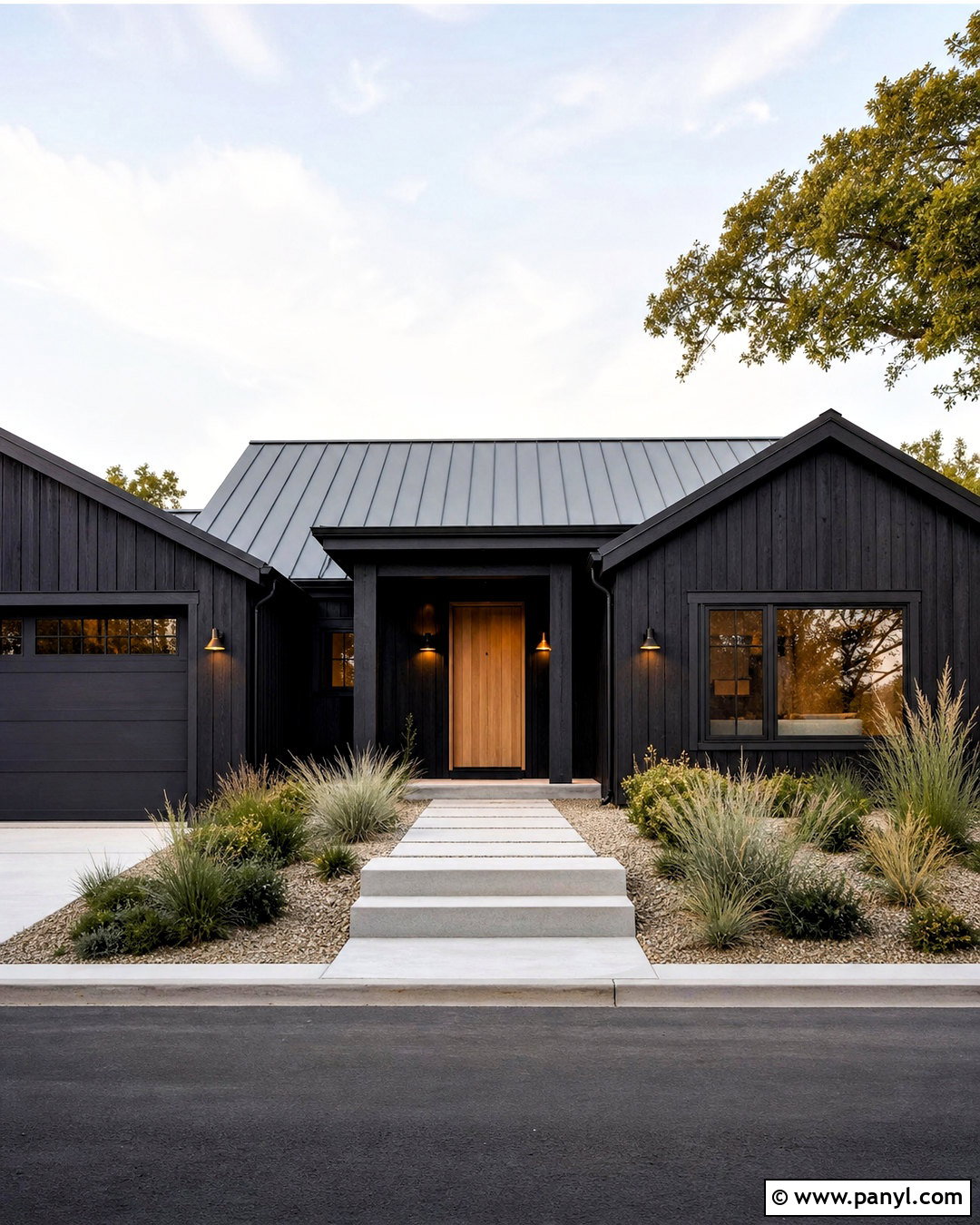
Modern black stain can update a cedar home while allowing the wood grain to remain visible. Use a translucent or semi-transparent charcoal-black stain on the siding, paired with warm black trim for a unified exterior. Add a natural oak front door, a medium-gray metal roof, and understated bronze house lights to soften the dark facade. Pale gravel paths, native ornamental grasses, and light concrete steps provide essential contrast around the structure. Keep window coverings simple so the exterior does not appear visually cluttered. On a traditional suburban house, limit the stain to cedar sections and balance it with warm white masonry. Modern black stains are among the notable exterior directions reported for 2026, offering a more textural alternative to flat black paint. ()
Conclusion:
The 20 latest paint trends show that homes are becoming warmer, richer, and more personal. Smoky green, espresso brown, clay red, and merlot create depth, while butter yellow, lavender, and plaster pink introduce softer character. Warm whites, khaki, and creamy greige still provide practical choices for flexible rooms. The key is building a complete palette rather than choosing a fashionable wall color in isolation. Consider flooring, cabinets, furniture, metals, textiles, exterior materials, and natural light together. Test large painted samples for several days and view them in morning, afternoon, and evening light. A thoughtful color choice should support how the space looks, functions, and feels long after the initial painting project is finished.

Related Ideas and Inspiration:
Leave a Reply