
The 20 latest paint colors for home ideas bring warmth, personality, and a stronger connection to nature into every room. For 2026, paint palettes are moving beyond cold gray and stark white. Warm khaki, creamy ivory, smoky jade, espresso brown, mineral yellow, eucalyptus green, and layered indigo now create inviting spaces that feel both current and comfortable. These colors work best as part of a complete design, paired with thoughtful flooring, furniture, trim, lighting, and natural materials. Before committing, test large samples on several walls and observe them throughout the day. Whether you prefer quiet neutrals or richer statement shades, the following complete looks offer practical ways to decorate with 20 latest paint colors for home ideas. ()

1. Universal Khaki Paint Color
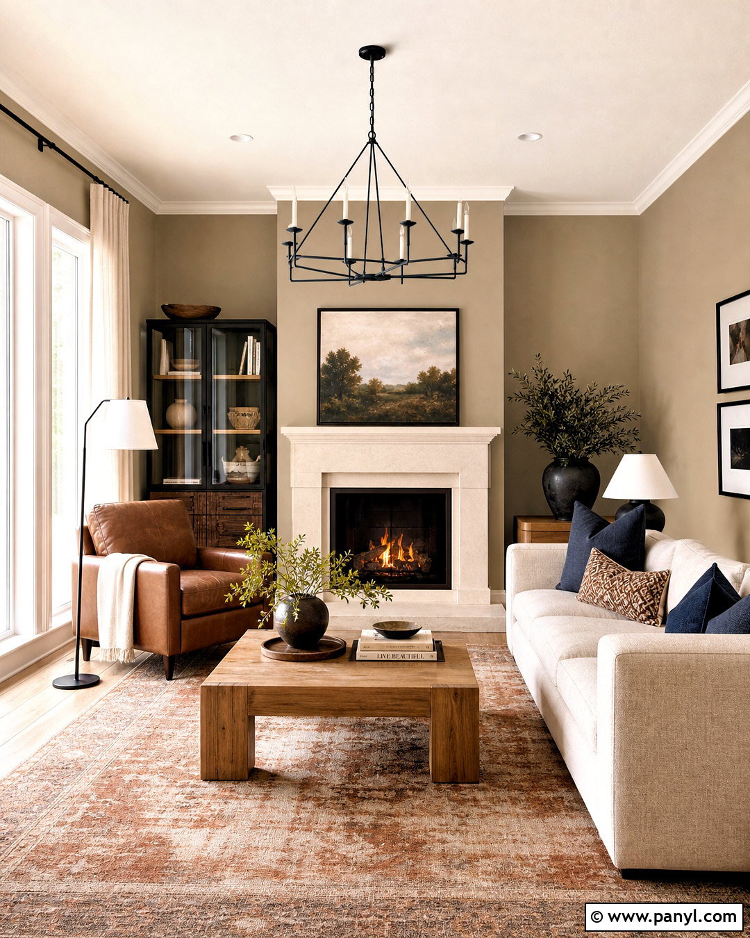
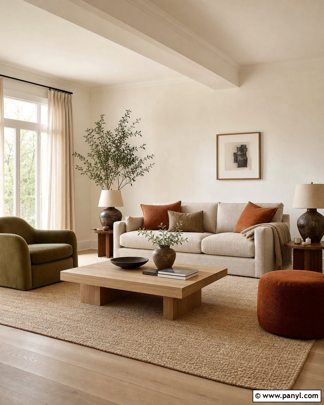
Universal Khaki brings an earthy, mid-tone neutral into the living room without making the space look plain. Paint the walls in this warm khaki shade, then use creamy white on the ceiling, trim, and fireplace. A light oatmeal sofa, cognac leather chair, and medium-tone oak coffee table create a comfortable mix of textures. Add muted navy pillows and a faded rust-and-cream rug for controlled contrast. Black metal lighting gives the softer colors a clean outline. Universal Khaki works especially well with woven baskets, linen curtains, pottery, and natural wood because these materials emphasize its grounded character. Sherwin-Williams selected Universal Khaki SW 6150 as its 2026 Color of the Year, describing it as a warm neutral with broad decorating flexibility. ()
2. Silhouette Paint Color
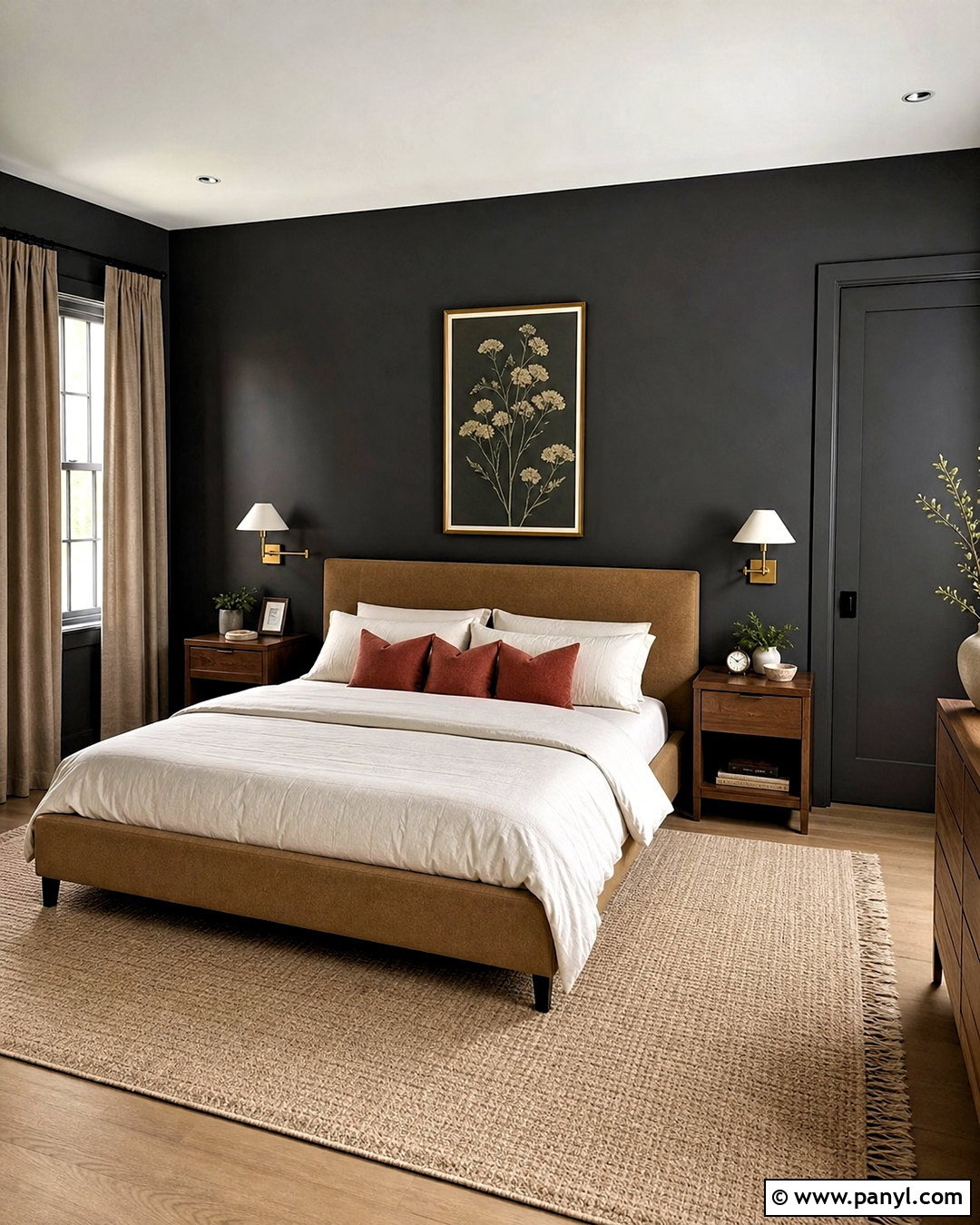
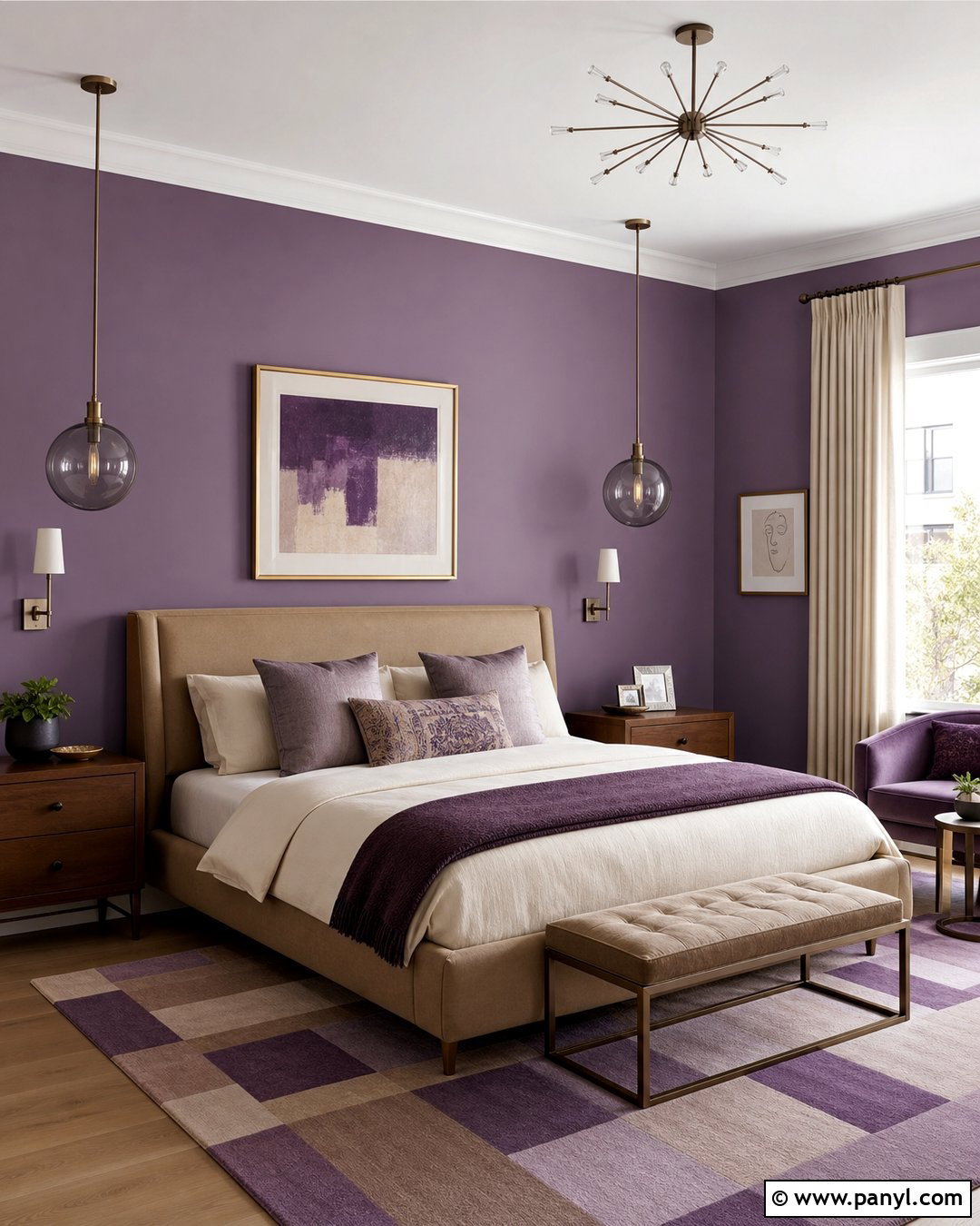
Could a dark brown make a bedroom feel polished rather than heavy? Silhouette combines espresso richness with a subtle charcoal quality, making it ideal for a restful primary bedroom. Paint every wall in the deep shade, but keep the ceiling warm white to preserve visual height. Choose an upholstered camel bed, ivory bedding, walnut nightstands, and aged brass sconces. A large beige wool rug will soften dark flooring while connecting the furniture to the walls. Use full-length linen curtains in mushroom or flax instead of bright white, which could create excessive contrast. A few framed botanical prints and rust-colored pillows complete the room. Benjamin Moore named Silhouette AF-655 its 2026 Color of the Year, identifying it as an espresso and charcoal blend. ()
3. Hidden Gem Paint Color
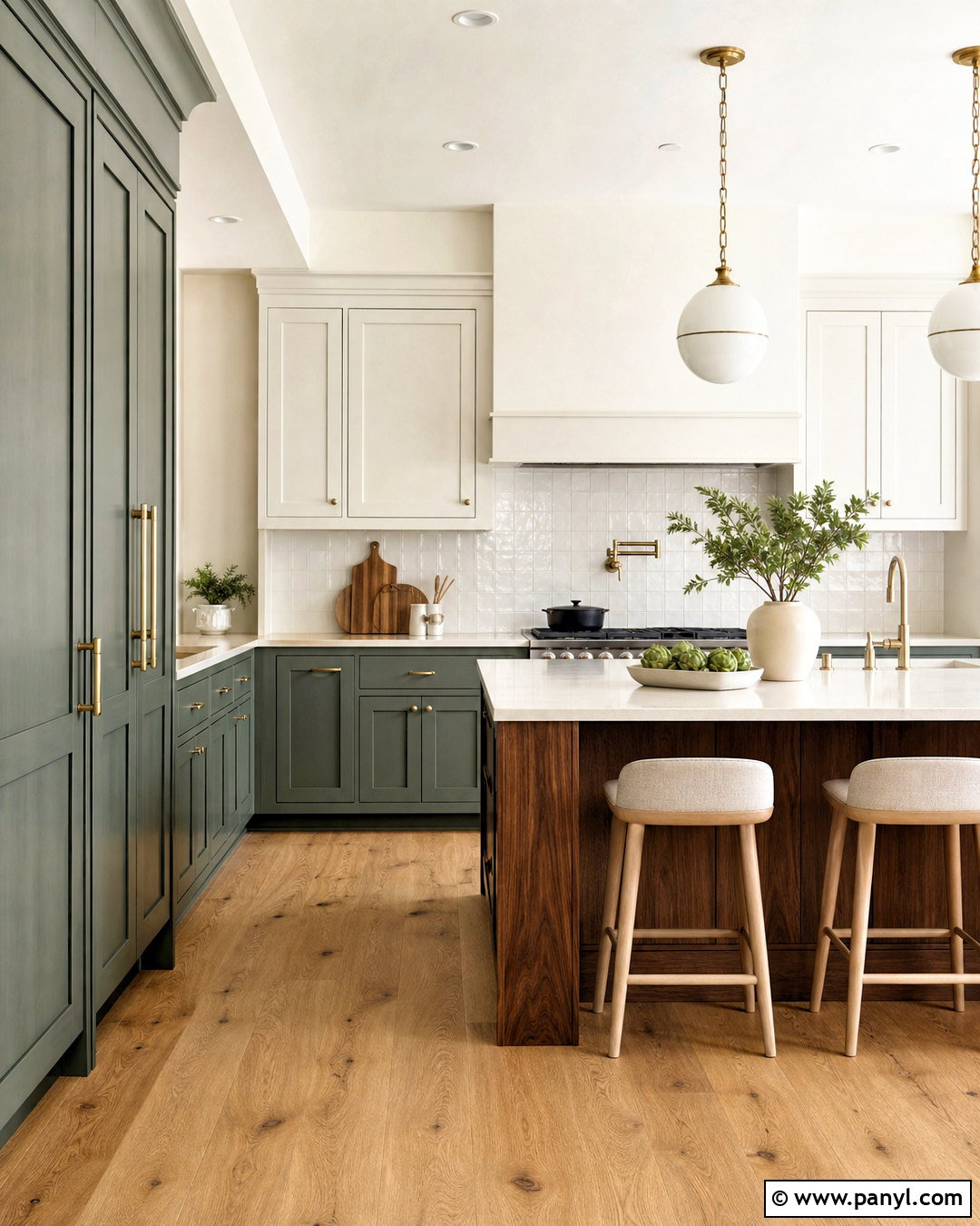
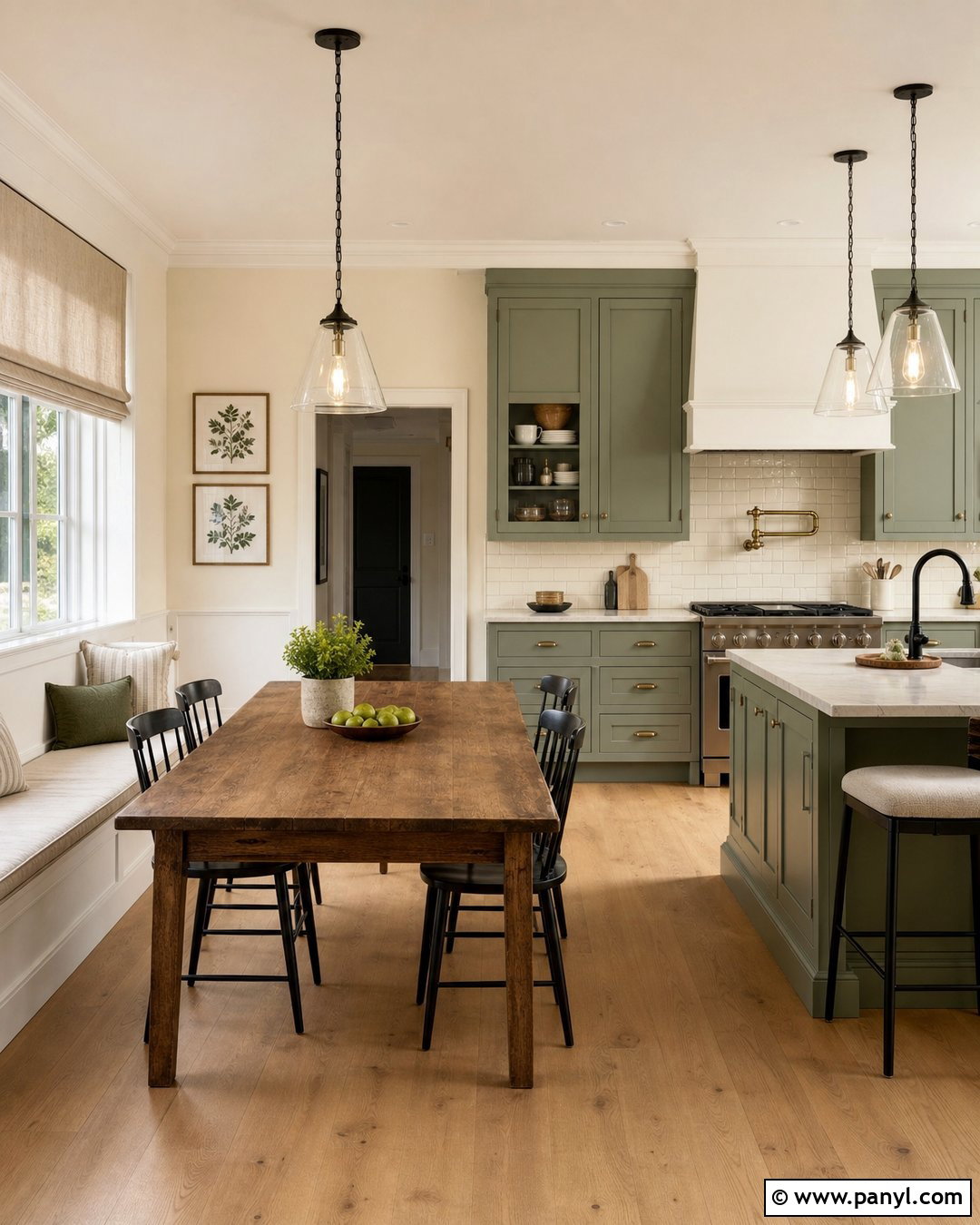
Smoky jade cabinets can turn an ordinary kitchen into a calm, memorable gathering space. Use Hidden Gem on lower cabinets and a tall pantry wall, then balance it with warm white upper cabinets. Cream quartz counters with subtle veining keep the palette light, while an off-white handmade tile backsplash adds texture. Choose natural white oak flooring, brushed brass hardware, and simple globe pendants for warmth. A walnut island can introduce another natural finish without competing with the green. Carry Hidden Gem into a nearby breakfast nook through a painted bench or narrow display cabinet. The result feels colorful but still practical for everyday living. Behr selected Hidden Gem, a smoky jade shade, as its 2026 Color of the Year. ()
4. Warm Eucalyptus Paint Color
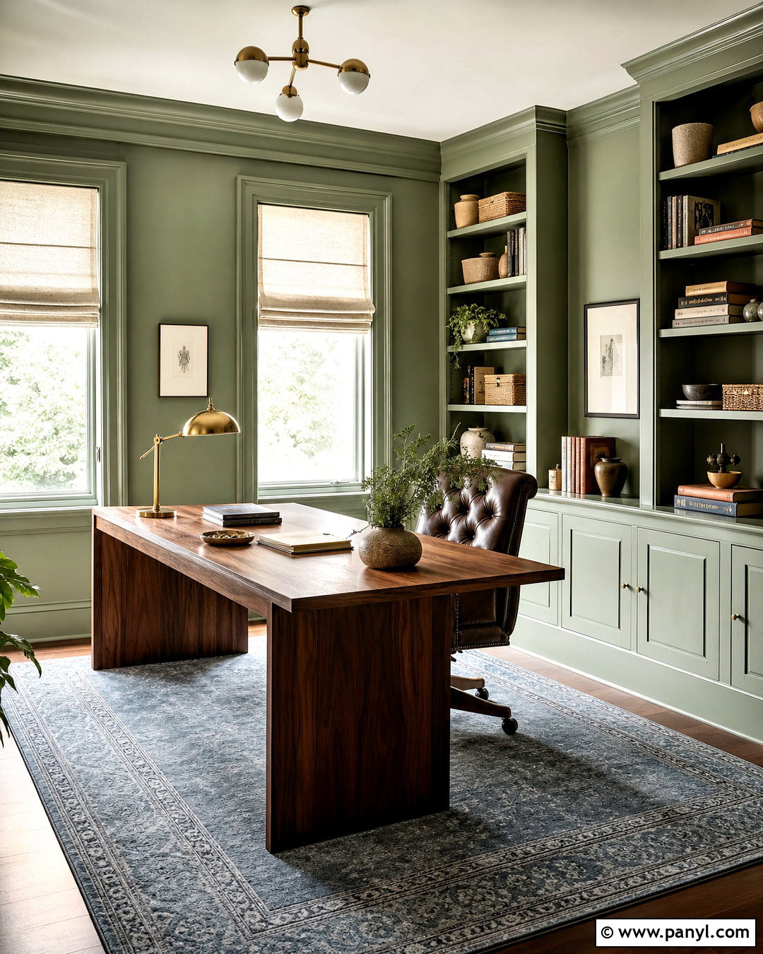
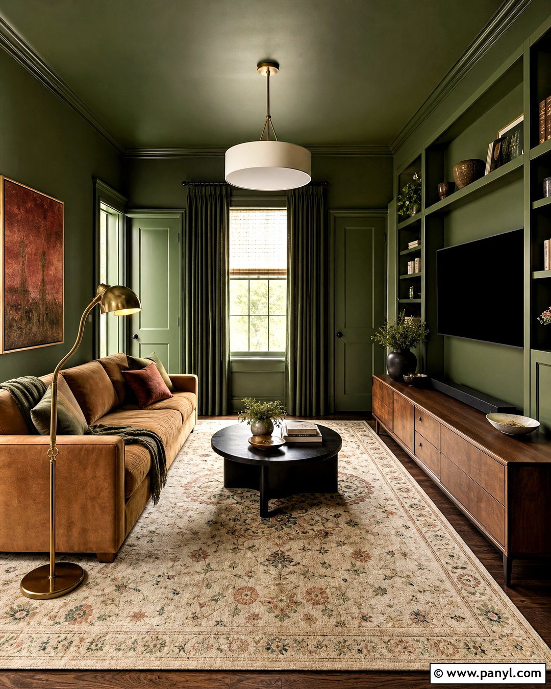
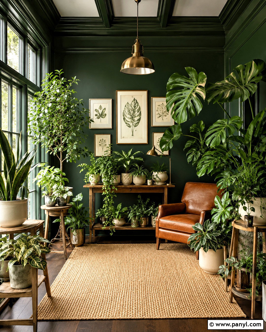
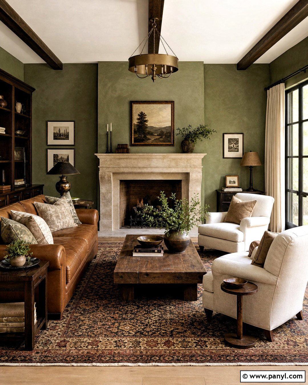
Warm Eucalyptus creates a peaceful home office that still has enough depth to feel focused and finished. Paint the walls, trim, and built-in shelving in the same muted green, using satin paint on the woodwork and eggshell on the walls. Place a walnut desk near the window and add a deep brown leather chair for a strong, natural foundation. A pale blue-gray rug, cream Roman shade, and small brass desk lamp prevent the room from becoming too dark. Style the shelves with pottery, books, woven boxes, and a few framed prints. Valspar named Warm Eucalyptus 8004-28F its 2026 Color of the Year, pairing this grounded green with blue-gray and deep brown supporting colors. ()
5. Warm Mahogany Paint Color
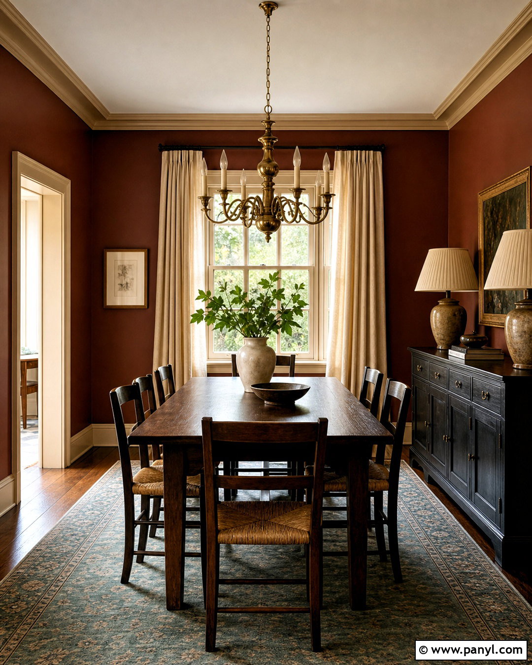
Warm Mahogany gives a dining room the depth of red without the brightness of a traditional scarlet wall. Paint the walls in this grounded red-brown and use creamy beige across the ceiling and architectural trim. A dark oak dining table, rush-seat chairs, and an antique-style brass chandelier make the color feel established rather than overly dramatic. Hang flax linen curtains and place a muted blue-green rug beneath the table to cool the warmth slightly. A black sideboard can provide practical storage and a place for ceramic lamps. Keep accessories limited so the wall color remains the main feature. PPG chose Warm Mahogany as its 2026 Color of the Year and included it throughout several expressive, heritage-influenced palettes. ()
6. Melodious Ivory Paint Color
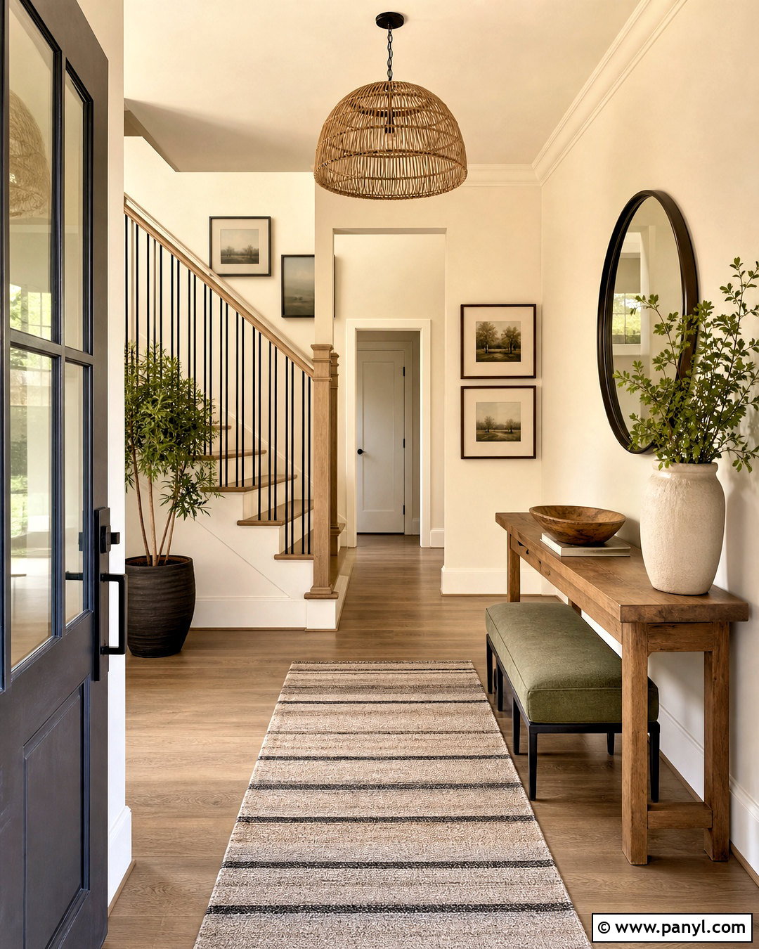
Soft ivory can make an entryway feel brighter and more welcoming than sharp builder white. Cover the walls in Melodious Ivory and continue the color into the connecting hallway for an easy sense of flow. Paint the trim a slightly cleaner cream so the architectural details remain visible without producing a harsh outline. Add a medium oak console, a round dark bronze mirror, and a striped neutral runner. A muted olive bench and a woven pendant bring subtle color and texture into the scheme. Use ceramic bowls, framed landscapes, and a tall leafy plant as restrained finishing touches. Dutch Boy selected Melodious Ivory 313-2DB as its 2026 Color of the Year, describing it as a soft, creamy beige suited to varied interiors. ()
7. Epernay Paint Color
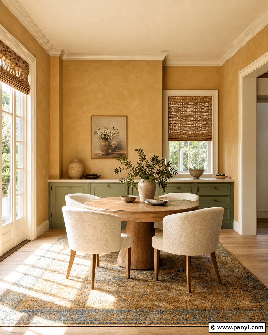
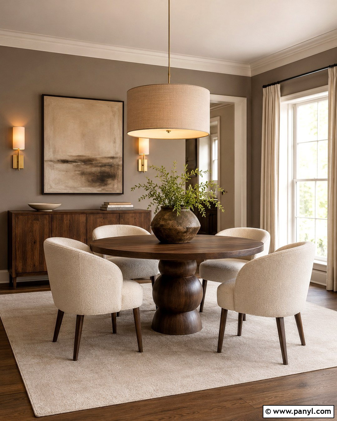
Sunlight gives a mineral ochre wall a gentle glow that feels warmer than beige but quieter than yellow. Use Epernay throughout a breakfast room with white oak floors, a round pedestal table, and curved dining chairs covered in natural linen. Paint the trim and ceiling soft cream, then introduce sage green through a built-in cabinet or window seat. Handcrafted ceramics, woven shades, and a simple plaster pendant support the shade’s earthy character. A faded rug containing ochre, olive, and dusty blue will connect the full palette. Keep the room uncluttered so its materials can stand out. C2 selected Epernay #639, an earthy soft ochre with mineral undertones, as its 2026 Color of the Year. ()
8. Mellow Flow Paint Color
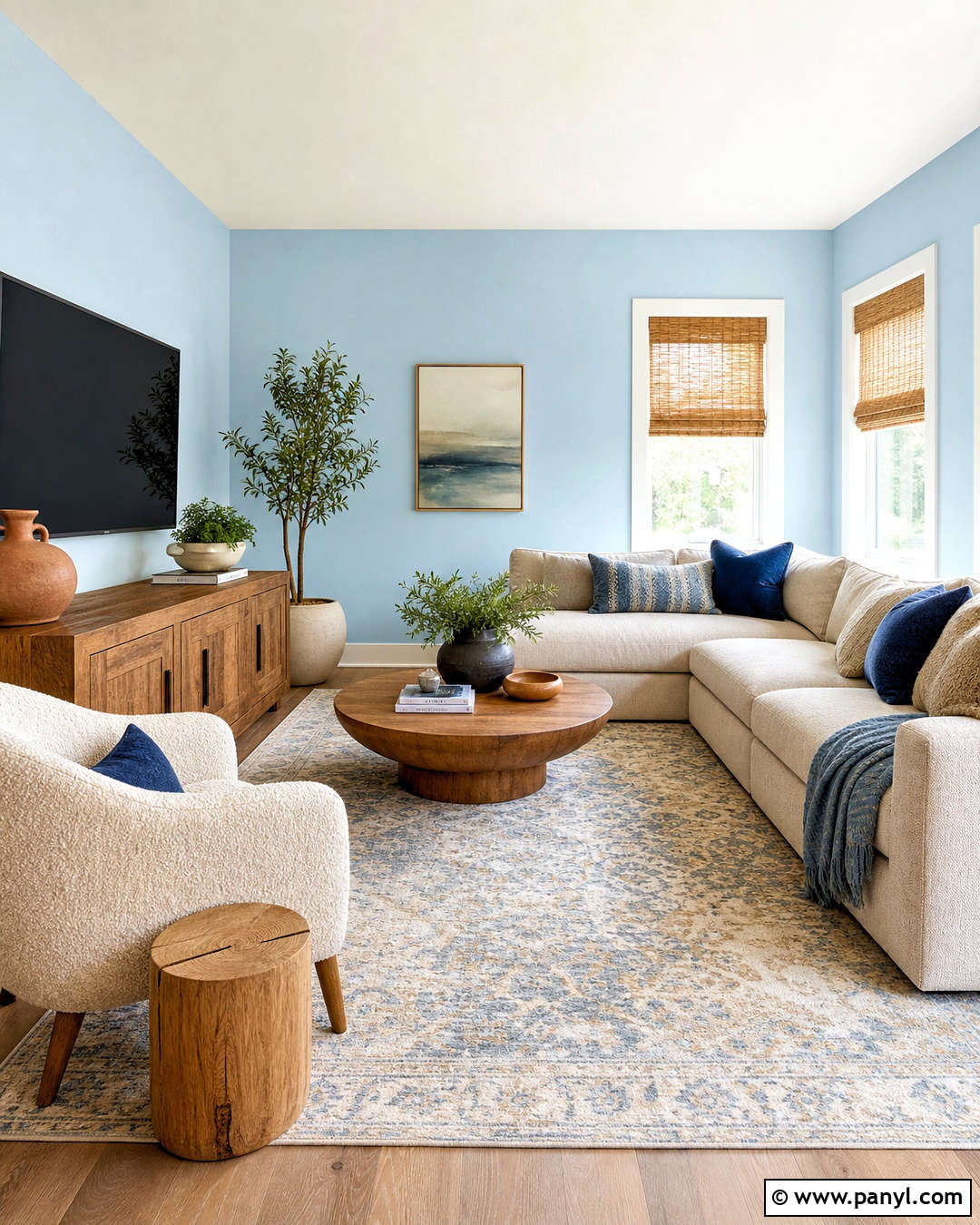
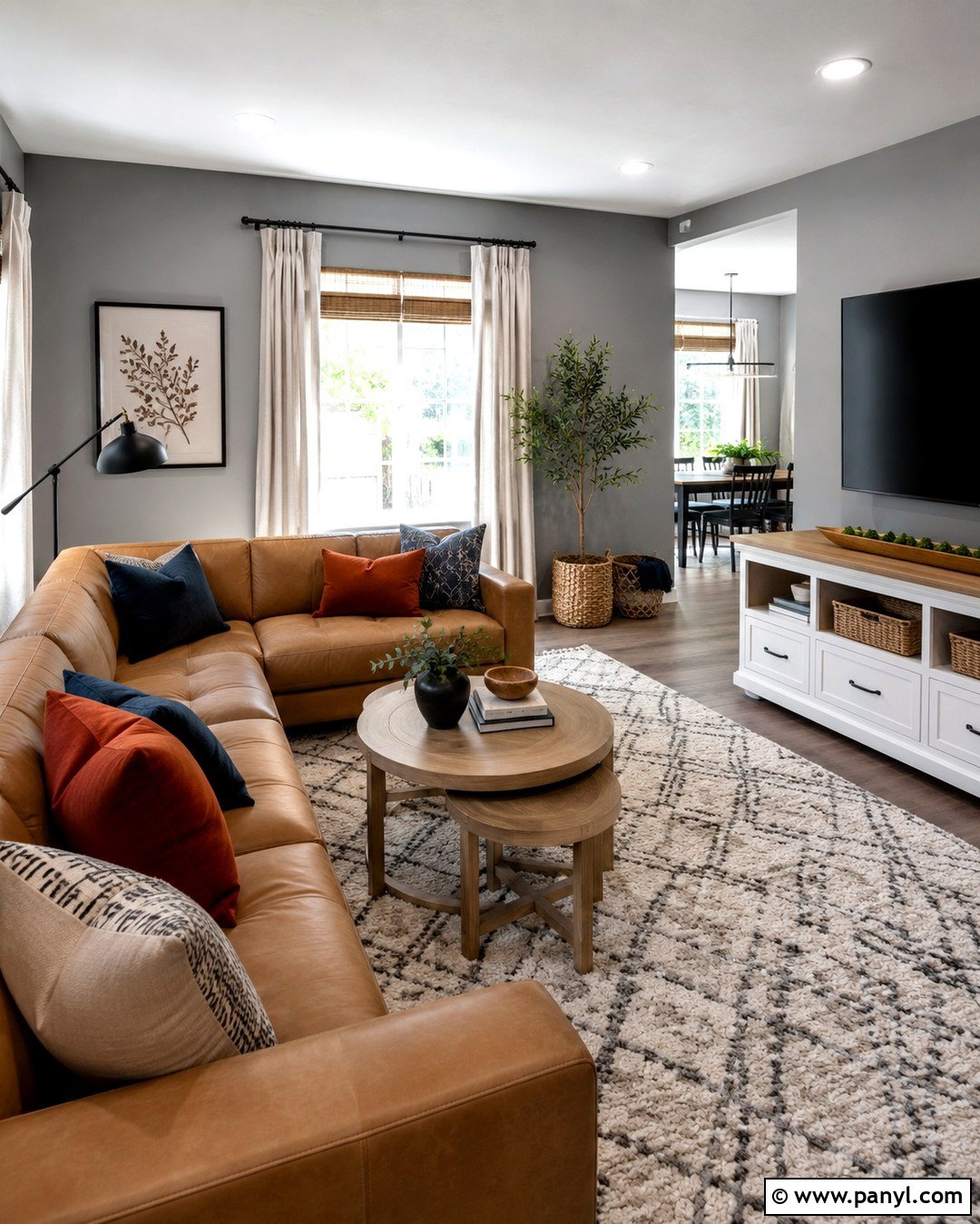
Mellow Flow offers a light, airy blue that can freshen a family room without making it feel cold. Paint the main walls in this soft blue and use warm white on the fireplace, ceiling, and trim. Select a beige sectional, an oak media console, and two textured cream armchairs to establish a comfortable neutral base. Deeper indigo pillows add definition, while terracotta pottery introduces a small amount of complementary warmth. Choose a patterned rug combining pale blue, sand, and ivory so the furniture and walls feel connected. Natural woven shades can filter bright daylight without hiding the color. Mellow Flow is one of the three indigo blues in Dulux’s official 2026 color family, alongside brighter and darker variations. ()
9. Free Groove Paint Color
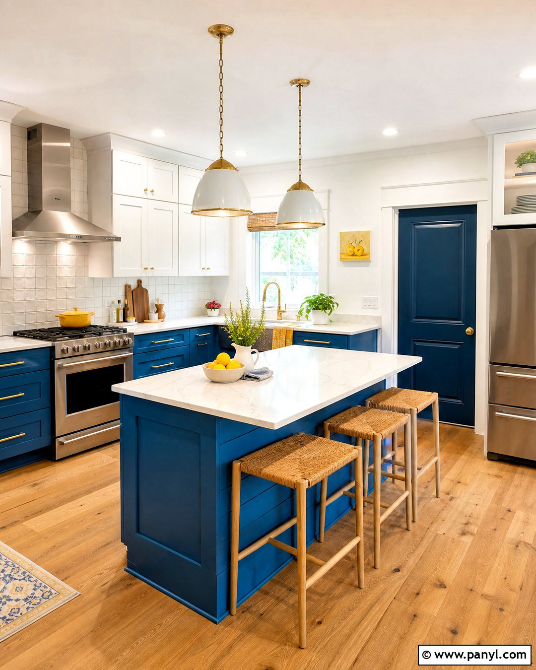
For a cheerful kitchen, Free Groove delivers stronger blue color while remaining easy to balance with familiar materials. Use it on the island and lower cabinets, then paint the upper cabinetry a clean, gentle white. White quartz counters and a pale tile backsplash keep the work surfaces bright. Introduce warmth through oak flooring, woven counter stools, brass handles, and copper-toned accessories. A dark navy pantry door can anchor the more energetic blue and create purposeful contrast. Keep walls creamy white so the cabinetry remains the clear focal point. Small accents of sunny yellow or coral can appear in pottery and textiles. Dulux includes vibrant Free Groove within its trio of soulful indigo colors selected for 2026 interiors. ()
10. Slow Swing Paint Color
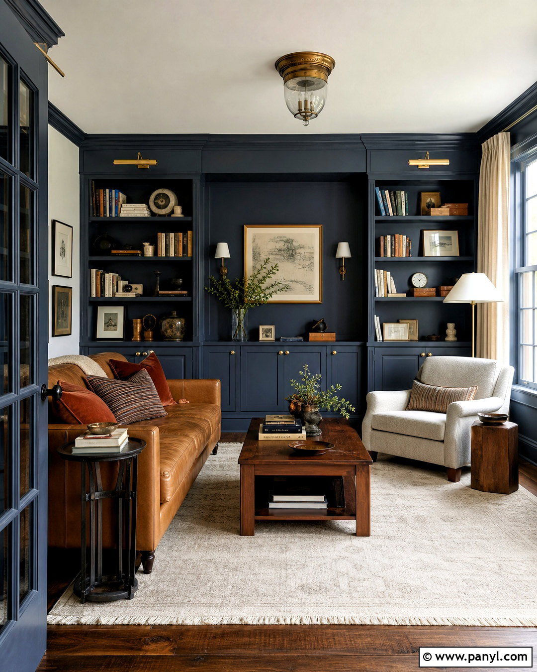
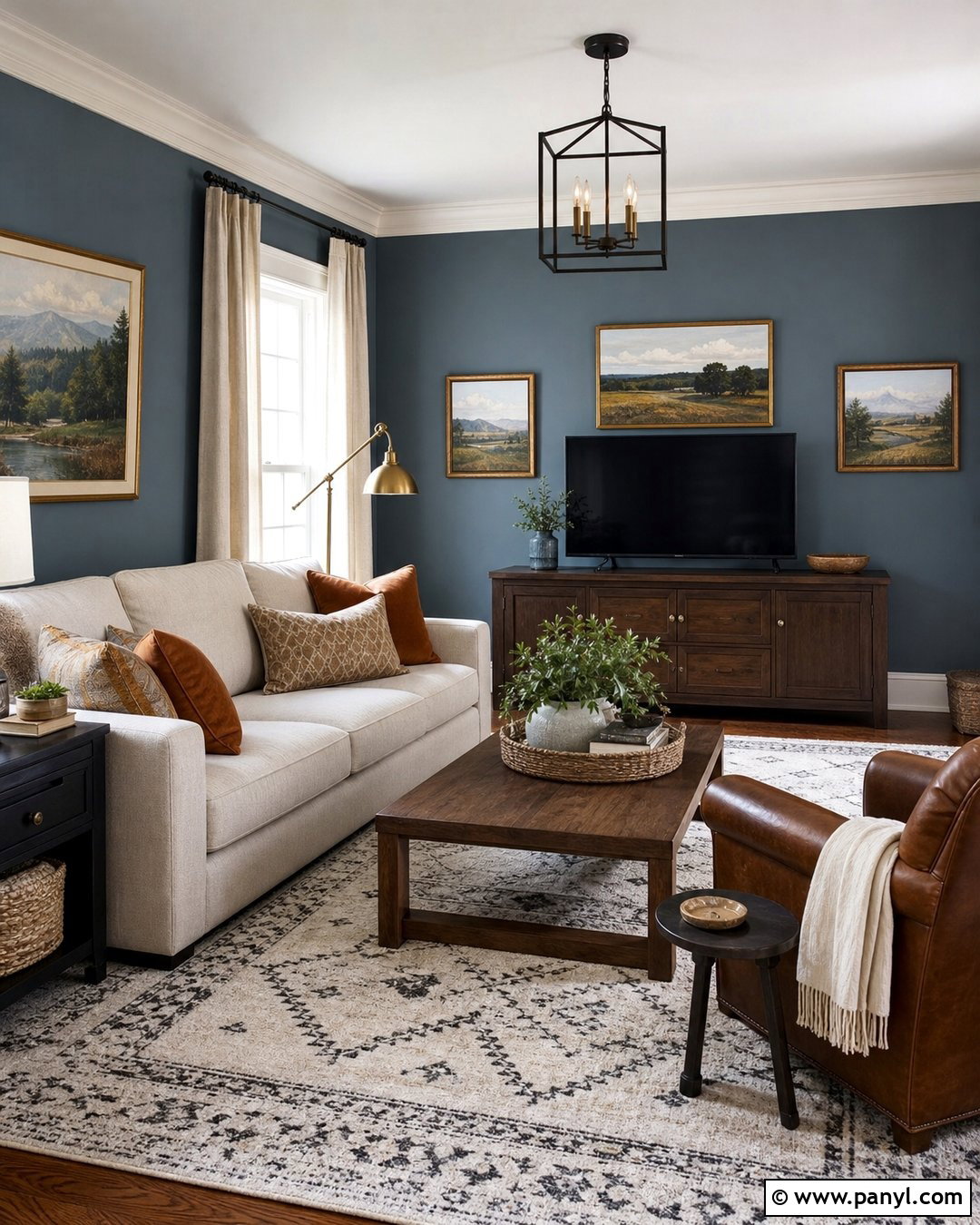
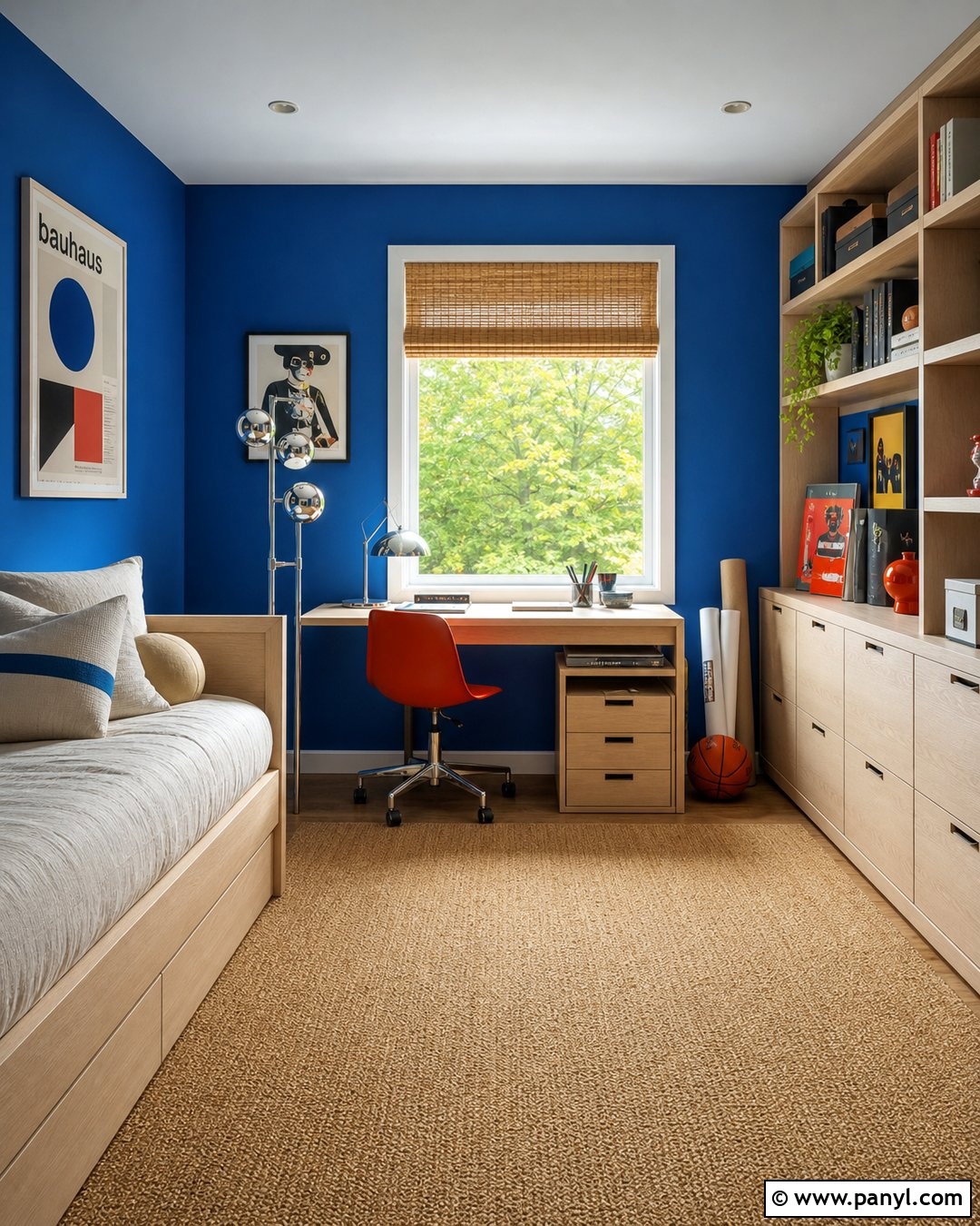
Deep blue walls can transform a den into a comfortable retreat when the room includes enough warm materials and lighter surfaces. Paint the walls and built-in bookcases in Slow Swing, using a satin finish on shelves for subtle reflection. Add a caramel leather sofa, walnut coffee table, and oatmeal lounge chair. A large cream rug will brighten the floor plane and stop the dark blue from overwhelming the room. Choose antique brass picture lights, warm white lampshades, and linen curtains for layered illumination. Rust-colored pillows and framed landscapes provide restrained contrast. Keep the ceiling a warm off-white unless the room has abundant daylight. Slow Swing is the darkest member of Dulux’s three-part indigo color family for 2026. ()
11. Mushroom Taupe Paint Color
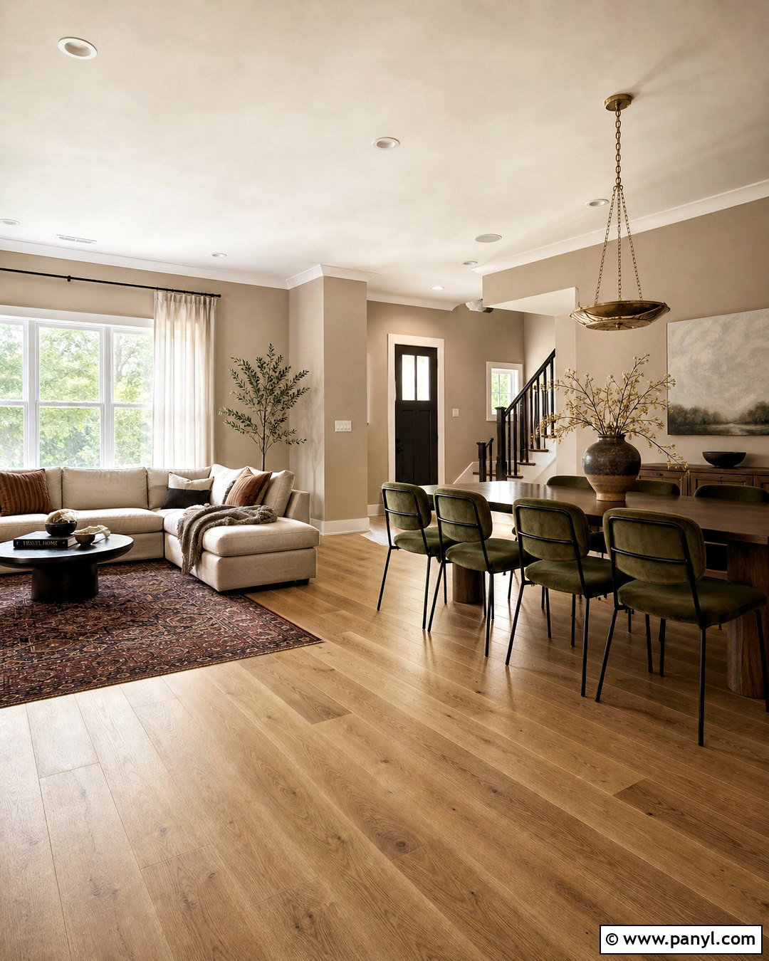
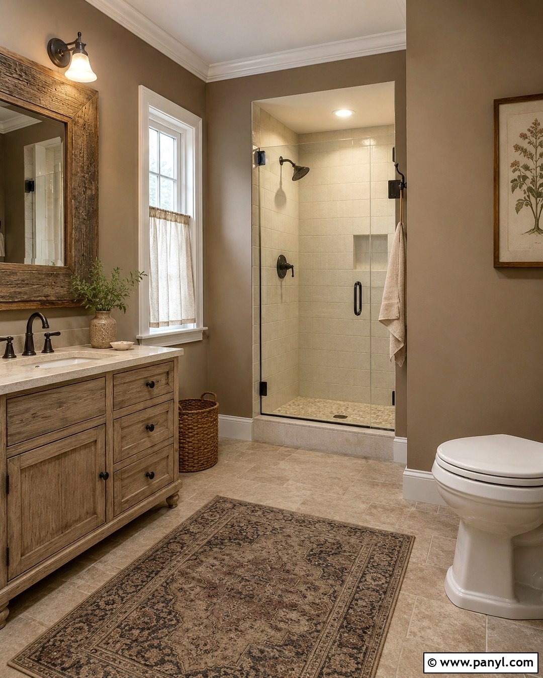
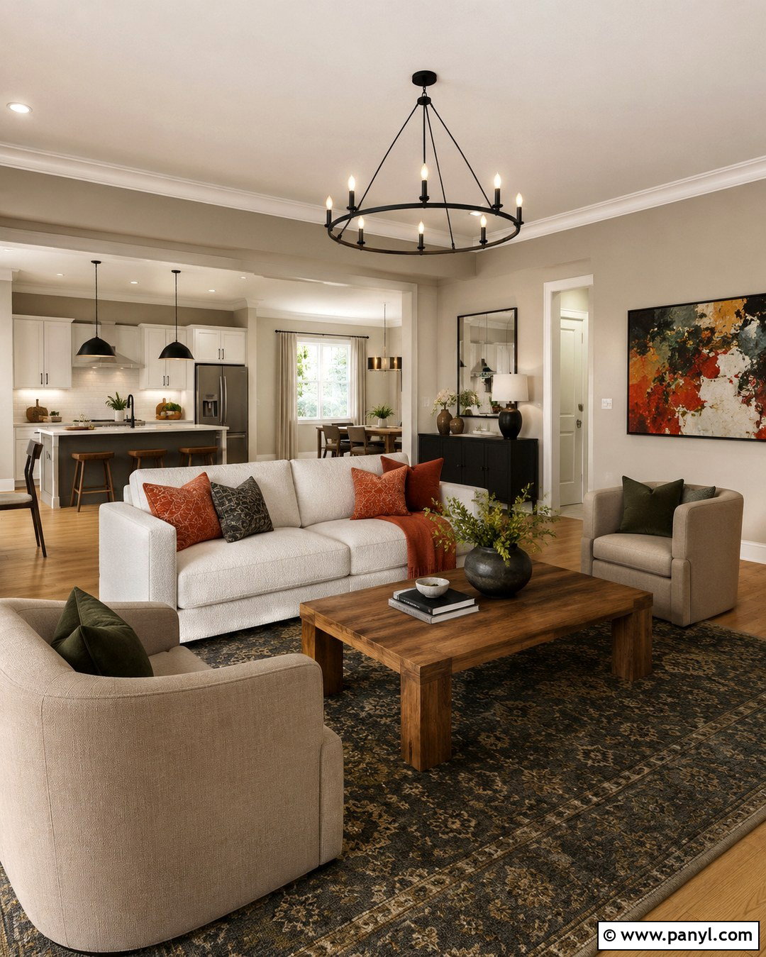
Mushroom taupe gives an open living and dining area a softer foundation than cool gray. Paint all connecting walls in the same warm gray-brown to reduce visual interruptions. Use creamy white trim, natural oak flooring, and an oatmeal sofa to build a light, relaxed base. A walnut dining table creates greater depth at the other end of the room. Add olive chairs, aged brass lighting, and a muted burgundy rug for controlled color. Linen curtains in a shade close to the walls will make the windows appear wider and keep the space cohesive. Include black only in small details, such as frames and curtain rods. This complete palette feels current but remains neutral enough to accommodate changing artwork, textiles, and seasonal accessories.
12. Olive Green Paint Color
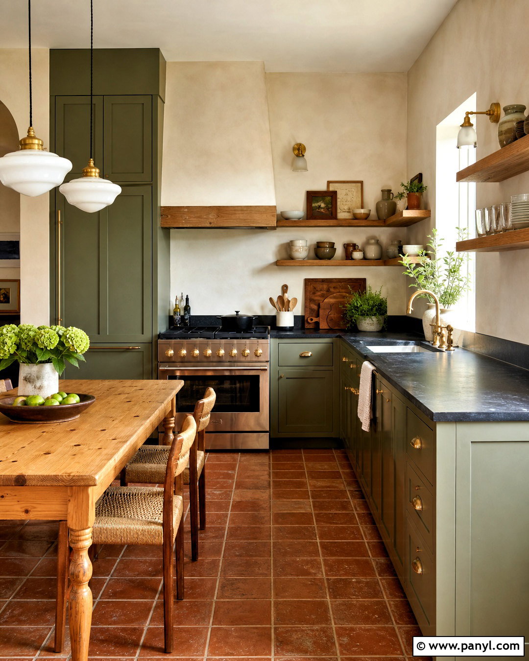
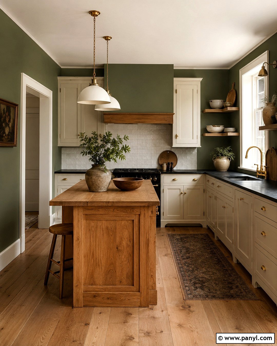
A muted olive kitchen feels natural, warm, and more established than a bright green scheme. Paint all cabinetry olive and pair it with creamy plaster walls rather than crisp white. Choose soapstone or dark charcoal counters for contrast, then soften the darker surfaces with oak open shelving and unlacquered brass hardware. Terracotta floor tile gives the room an earthy base and disguises everyday wear. Over the island, use simple milk-glass pendants that distribute clean light. A small breakfast area with a pine table and woven chairs extends the relaxed look. Decorate with cutting boards, neutral pottery, and linen towels instead of numerous colorful accessories. The finished kitchen feels rich and layered while allowing food, plants, and natural materials to provide liveliness.
13. Butter Yellow Paint Color
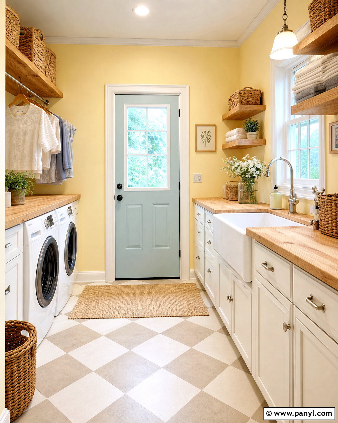
Butter yellow can brighten a laundry room while staying softer and more livable than lemon yellow. Apply the color to the walls and upper cabinets, then ground the room with warm white lower cabinets and a checkerboard floor in cream and muted taupe. Butcher-block counters introduce practical warmth above the appliances. Add brushed nickel hardware, a white farmhouse sink, and open oak shelves for everyday supplies. Woven baskets and glass storage containers keep necessary items organized without creating visual clutter. A pale blue door or Roman shade provides a fresh counterpoint to the yellow. Finish the room with a simple schoolhouse light and one framed print. This upbeat design makes a hardworking utility space feel cheerful, clean, and intentionally connected to the rest of the home.
14. Terracotta Paint Color
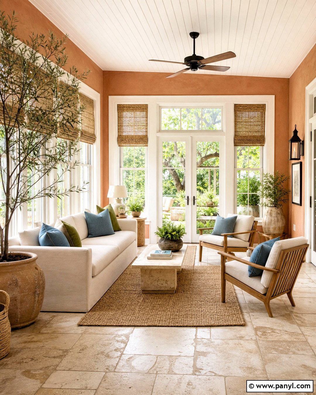
Terracotta walls wrap a sunroom in warmth and help connect indoor furnishings with outdoor greenery. Choose a softened clay shade rather than intense orange, then paint the window trim and ceiling creamy white. Furnish the room with a light linen sofa, teak lounge chairs, and a low travertine coffee table. A jute rug supports the earthy palette, while olive and dusty blue pillows introduce gentle contrast. Use large ceramic planters containing leafy plants to repeat the natural colors beyond the windows. Woven shades can reduce glare without making the space look formal. Keep decorative objects simple and tactile, including handmade pottery and linen throws. The complete room should feel sun-washed and casual, with the terracotta serving as a warm architectural background rather than a loud accent.
15. Dusty Rose Paint Color
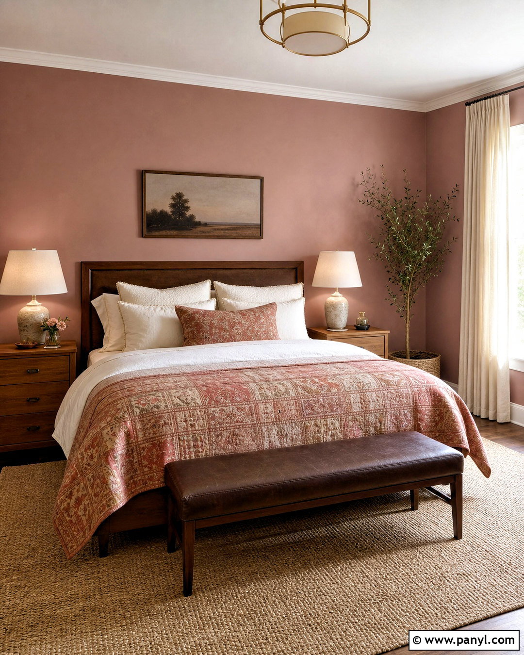
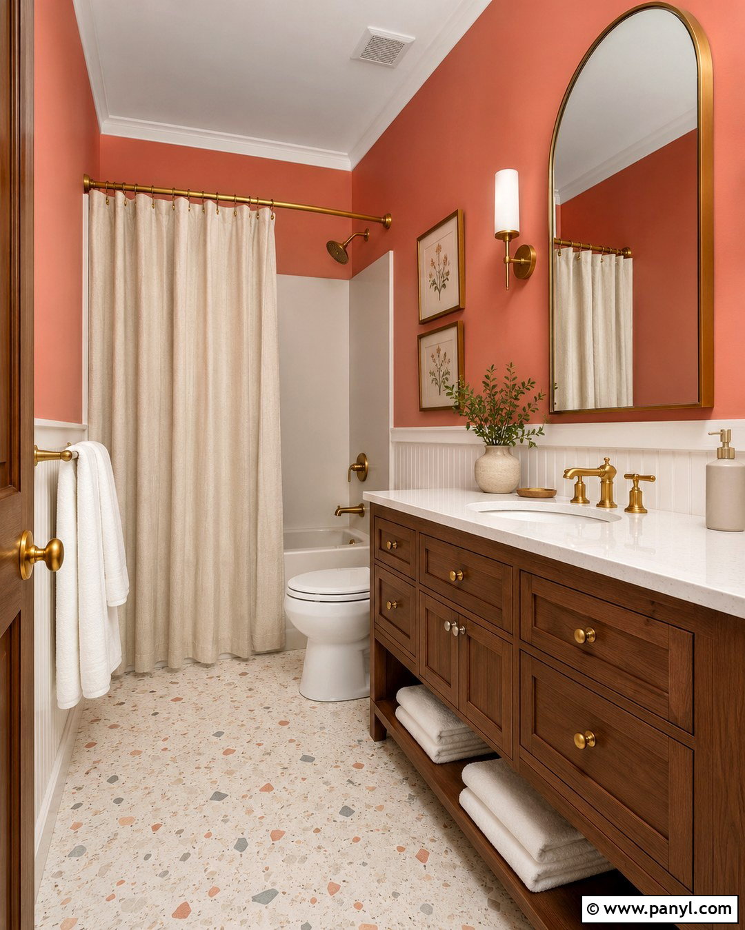
Dusty rose creates a welcoming guest bedroom when paired with brown, cream, and weathered wood instead of overly sweet pastels. Paint the walls in a muted rose with a beige undertone and leave the ceiling warm white. Choose a medium walnut bed, crisp ivory sheets, and a quilt combining rose, rust, and soft tan. Flank the bed with small oak nightstands and ceramic lamps with linen shades. A natural wool rug and full-length oatmeal curtains will keep the palette grounded. Add one vintage-style floral print above the bed and a dark brown bench at its foot. Avoid filling the room with pink accessories. Repeating the wall color only once or twice in the textiles creates a balanced retreat that feels comfortable for a wide range of guests.
16. Burgundy Paint Color
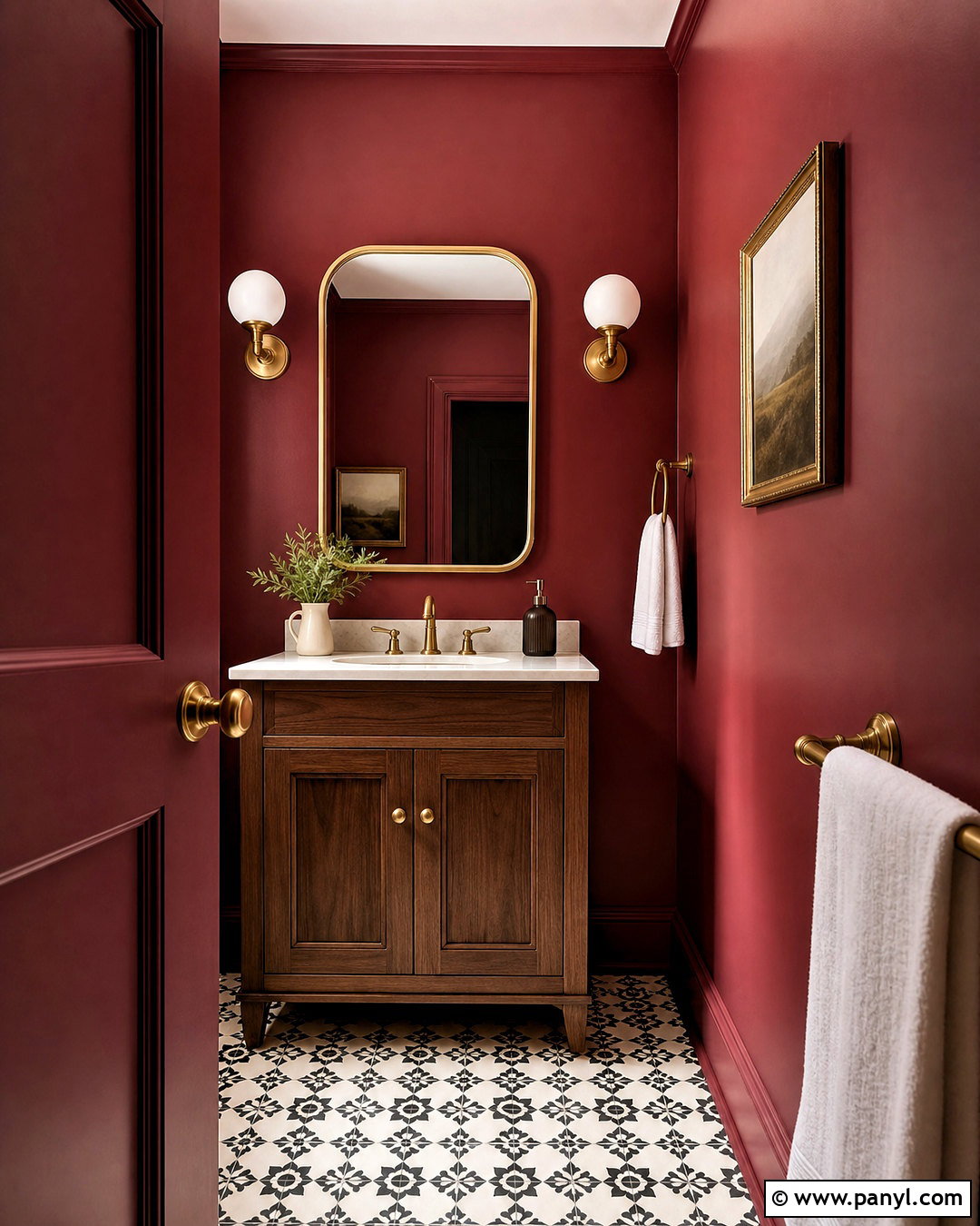
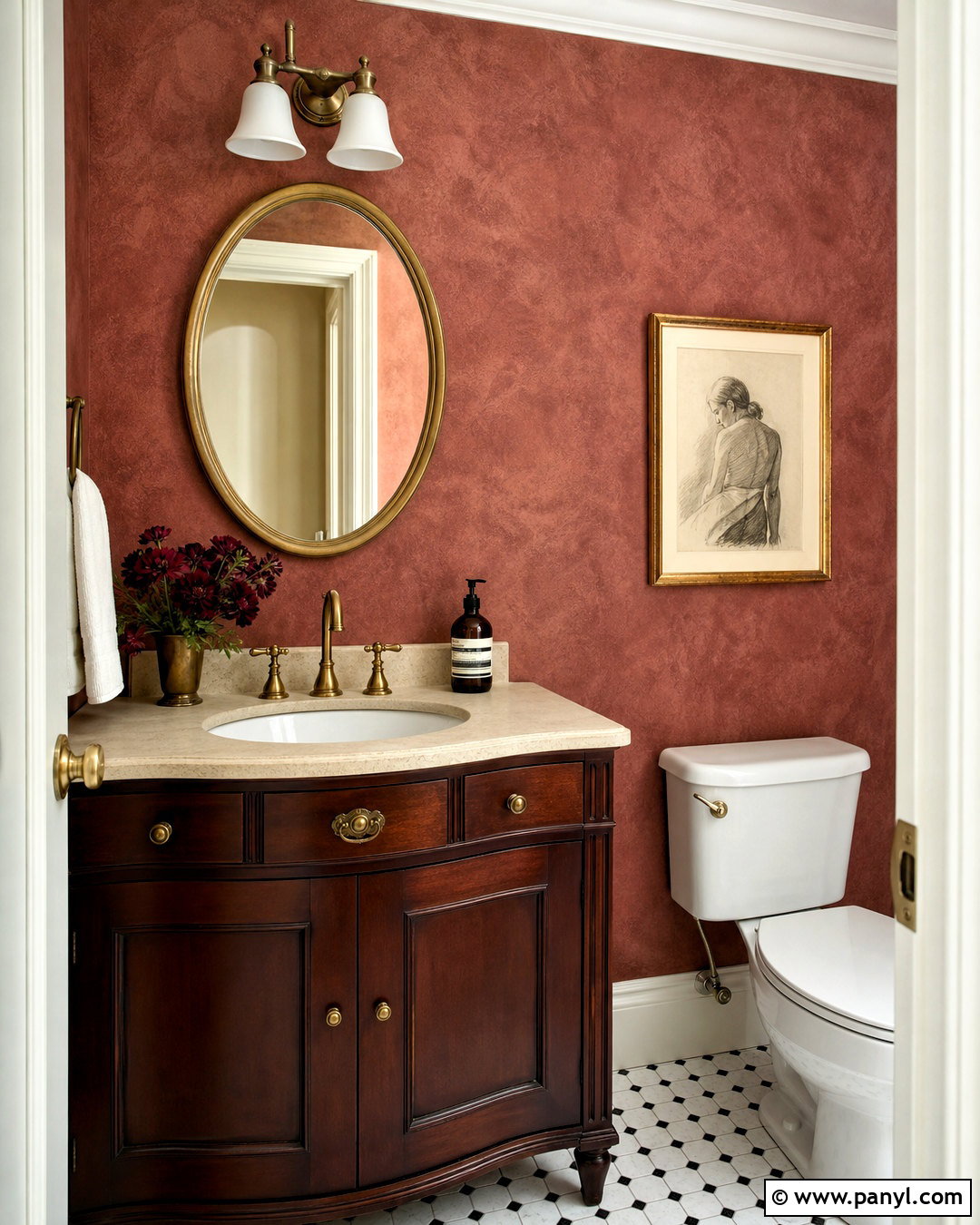
Burgundy can make a powder room feel sophisticated without requiring a large decorating budget. Paint the walls, trim, and interior side of the door in the same deep red for a seamless, enveloping result. Pair the color with a compact walnut vanity, creamy marble counter, and unlacquered brass faucet. A rounded brass mirror and two opal glass sconces provide soft visual contrast. Use small-scale black-and-ivory patterned floor tile to add energy without introducing another strong color. White towels and one framed landscape are enough to finish the room. Because a powder room is used for short periods, it can handle stronger color than many shared spaces. The completed design feels bold and carefully coordinated rather than like a single burgundy feature wall added without supporting elements.
17. Deep Teal Paint Color
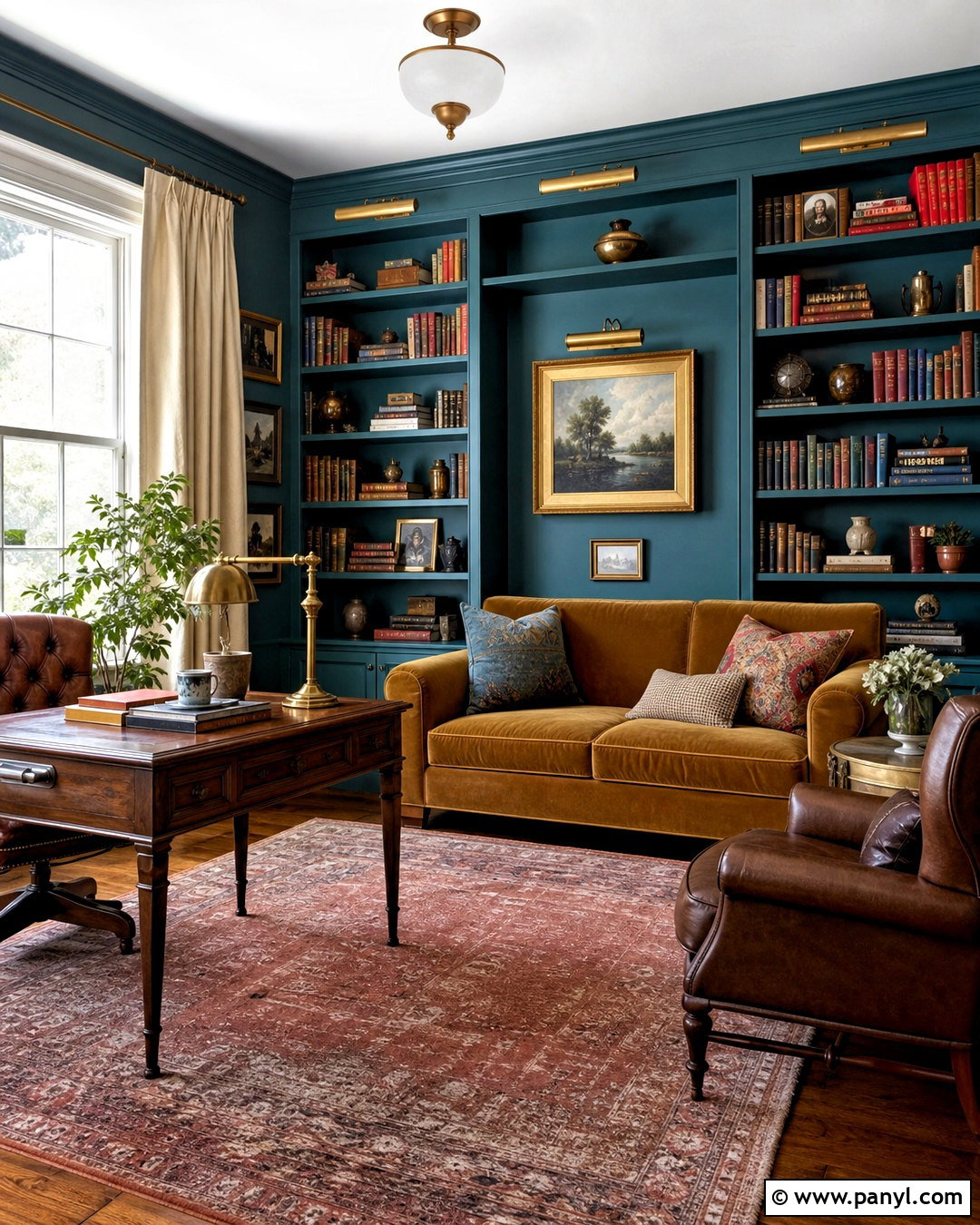
Deep teal turns a standard home library into a dramatic but practical multipurpose room. Color-drench the walls, built-in shelving, and trim so the compact space feels unified rather than visually chopped up. Leave the ceiling warm white if natural light is limited. Place a camel velvet sofa against one wall and use a walnut desk near the window. A faded rust rug, antique brass library lights, and cream linen curtains add essential warmth. Style the shelves with books, pottery, framed art, and a few empty areas so they do not appear overcrowded. A small round table can function as both a reading surface and an occasional work area. This scheme gives teal enough supporting texture and contrast to feel intentional throughout the entire room.
18. Soft Greige Paint Color
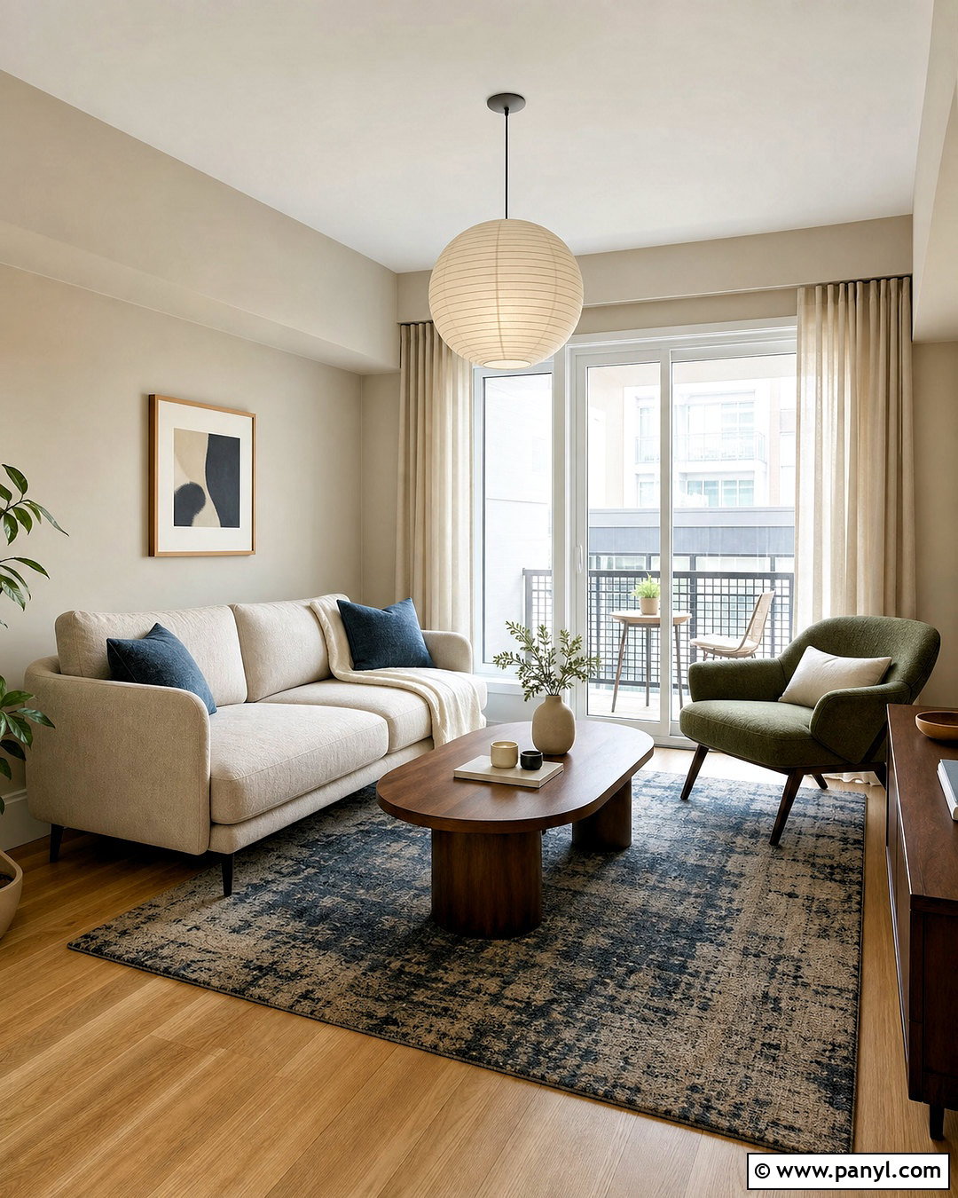
Soft greige remains useful when it leans warm and is paired with enough natural texture. Paint a small apartment living room in a pale beige-gray, carrying the color through the entry to make both spaces feel larger. Use warm white trim and a light oak floor for subtle separation. Choose a compact cream sofa, a rounded walnut coffee table, and one olive green lounge chair. A patterned rug containing taupe, charcoal, and muted blue prevents the neutral palette from looking unfinished. Add full-height linen curtains, a paper pendant light, and two large pieces of artwork instead of many small decorations. Black frames and table legs create definition in limited amounts. The completed space feels calm, flexible, and personal without returning to the cold gray interiors of earlier trends.
19. Creamy White Paint Color
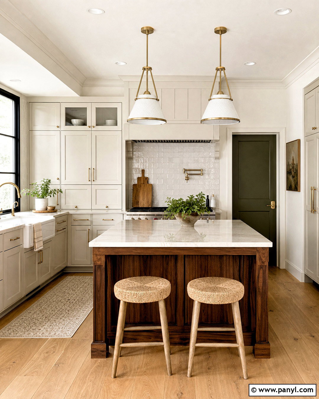
Creamy white works beautifully in a kitchen when varied finishes keep the space from becoming flat. Paint the walls and ceiling in a warm white, then choose cabinets in a slightly deeper cream so their shape remains visible. Use veined quartz counters, handmade off-white backsplash tile, and light oak flooring for gentle variation. A stained walnut island adds a darker focal point and makes the room feel grounded. Select aged brass hardware, woven counter stools, and clear glass pendants to maintain an open atmosphere. Introduce color through a muted green pantry door, natural pottery, and a washable vintage-style runner. Avoid blue-white trim, which may make creamy surfaces look yellow. The final kitchen appears bright and timeless while still offering warmth, texture, and meaningful contrast.
20. Charcoal Brown Paint Color
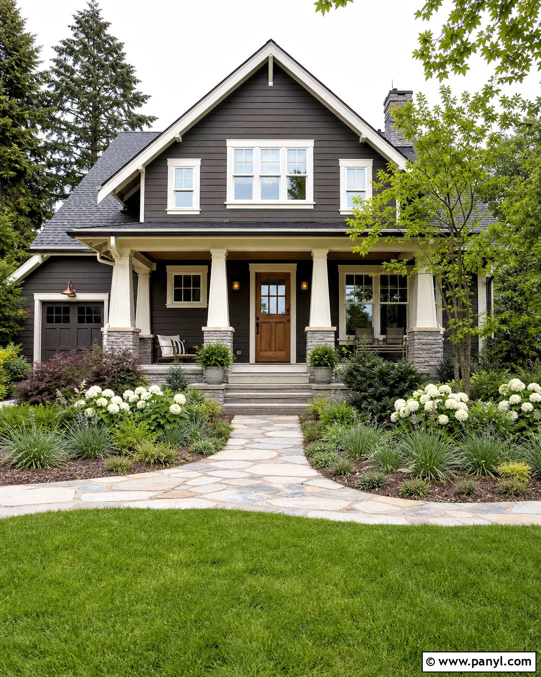
Charcoal brown gives a home exterior a modern identity while appearing warmer than pure black. Use it on horizontal or vertical siding, then outline windows, fascia, and porch columns in soft ivory. A natural cedar front door adds warmth and creates a clear entrance. Pair the scheme with a medium gray roof, black gutters, and simple bronze exterior lights. A pale stone foundation or walkway prevents the dark siding from feeling too severe. Complete the curb view with layered grasses, evergreen shrubs, white flowering plants, and dark brown mulch. Keep garage doors charcoal brown so they blend into the facade instead of becoming oversized focal points. This full exterior palette works especially well on modest ranch, Craftsman, and contemporary homes with clean, uncomplicated architecture.
Conclusion:
Choosing from the 20 latest paint colors for home ideas is easier when you plan the entire room instead of selecting a wall color in isolation. Consider how paint will relate to flooring, fixed finishes, furniture, trim, lighting, and nearby spaces. Warm neutrals offer flexible foundations, while smoky greens, indigo blues, ochres, burgundy, and deep brown create stronger character. Always test large painted samples beside permanent materials and view them during morning, afternoon, and evening light. If a bold shade feels overwhelming, use it on cabinetry, built-ins, or a smaller room. With thoughtful color placement and coordinated materials, these current shades can make a home feel comfortable, cohesive, and personal rather than temporarily trendy.

Related Ideas and Inspiration:
Leave a Reply