
The **20 Top Wall Colors** bring together warm neutrals, nature-inspired greens, restful blues, and richer shades that add personality without making a home difficult to decorate. Current color direction favors earthy, welcoming hues over cold gray and stark white, while smoky greens, khaki neutrals, deep browns, and powder blues are receiving renewed attention. () The best choice still depends on natural light, flooring, furniture, and the atmosphere you want to create. Before committing, paint a large sample on several walls and observe it throughout the day. Whether you are refreshing one room or building a coordinated whole-house palette, these complete, practical looks will help you use the **20 Top Wall Colors**.

1. Warm White Wall Color
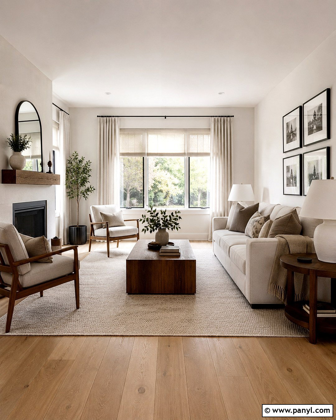
Warm white walls create a bright interior without the sharp, clinical feeling of pure white. Use this color in an open living room with medium oak flooring, an oatmeal sofa, and light linen curtains. Add a natural fiber rug, walnut side tables, and ceramic lamps to give the space visual warmth. Soft black accents on picture frames or curtain rods provide definition without overwhelming the airy palette. Choose a warm white with subtle cream or beige undertones, especially if the room receives cool northern light. Paint the trim in the same color with a satin finish for a smooth, modern transition. This complete scheme suits transitional, farmhouse, coastal, and Scandinavian homes while leaving plenty of flexibility for seasonal decor.
2. Soft Cream Wall Color
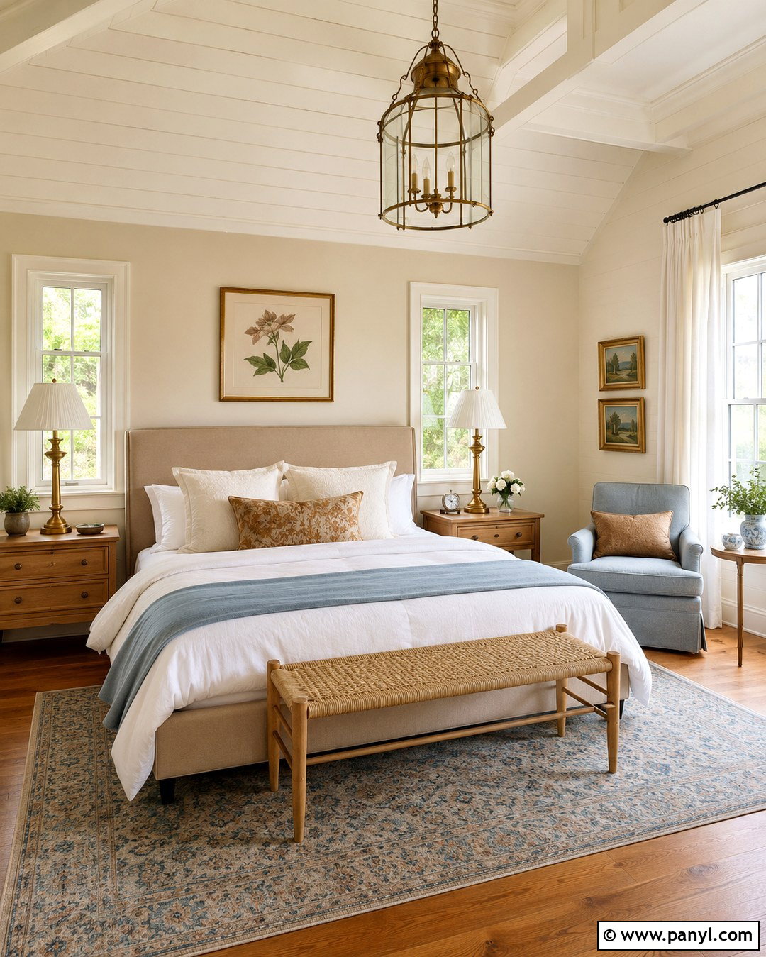
Soft cream makes a bedroom feel sunny, comfortable, and gently layered. Pair creamy walls with an upholstered bed in natural linen, warm maple nightstands, and a woven bench at the foot of the bed. White bedding keeps the room fresh, while muted gold, caramel, and dusty blue accents add interest. Choose aged brass lamps and simple botanical artwork to support the traditional warmth of the color. Cream is particularly useful in rooms with limited daylight because it reflects available light without turning icy. Keep the ceiling a lighter warm white, and use matching cream trim for a softly enveloping effect. Avoid overly yellow furnishings, which can make the palette look dated. Natural wood and crisp textiles create better balance.
3. Light Greige Wall Color
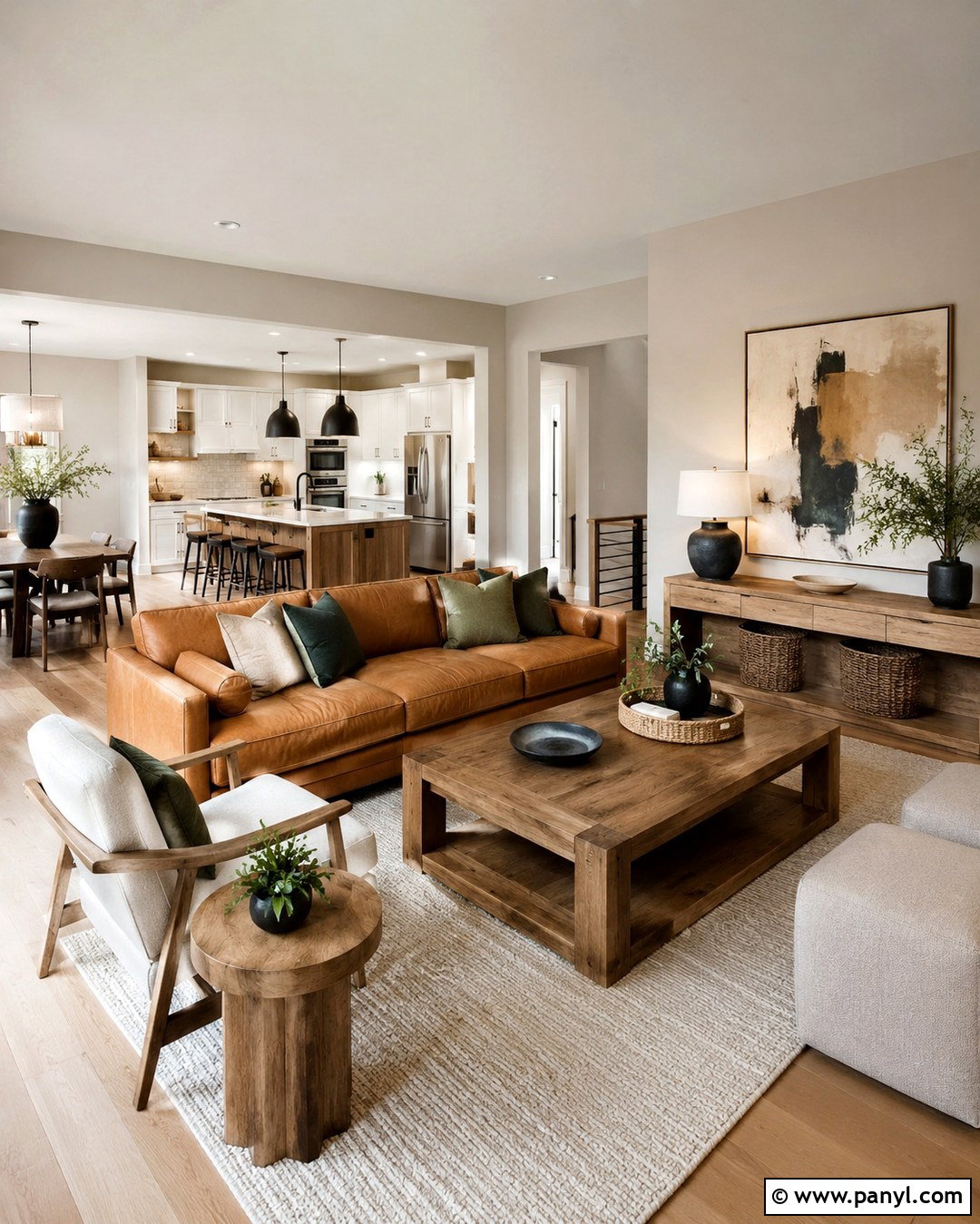
Can’t decide between gray and beige? Light greige offers a balanced background that works especially well in an open-concept family room. Cover the walls in a pale greige with warm undertones, then add a camel leather sofa, cream lounge chairs, and a textured ivory rug. Medium-toned oak furniture keeps the room grounded, while matte black lighting introduces clean contrast. Repeat the wall color in connected hallways to create an easy visual flow. Greige can shift noticeably under different lighting, so test it beside the flooring and large furniture pieces first. Finish the design with muted green pillows, woven baskets, and oversized abstract artwork. The result feels neutral and updated without becoming flat, cold, or overly beige.
4. Warm Taupe Wall Color
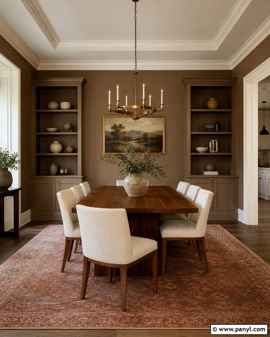
Warm taupe gives a dining room greater depth while remaining easy to coordinate. Build the look around taupe walls, a substantial walnut dining table, and upholstered chairs in creamy performance fabric. A large wool rug with faded rust and brown details helps connect the wall color to the furniture. Install a simple aged brass chandelier and hang one large landscape painting rather than several small pieces. Off-white trim provides subtle contrast and prevents the room from feeling too dark. Taupe looks particularly sophisticated beside stone, leather, linen, and dark wood. For a polished finish, repeat the color on built-in cabinetry while changing the sheen to satin. This creates a cohesive, architectural room that feels welcoming during everyday meals and special gatherings.
5. Mushroom Beige Wall Color
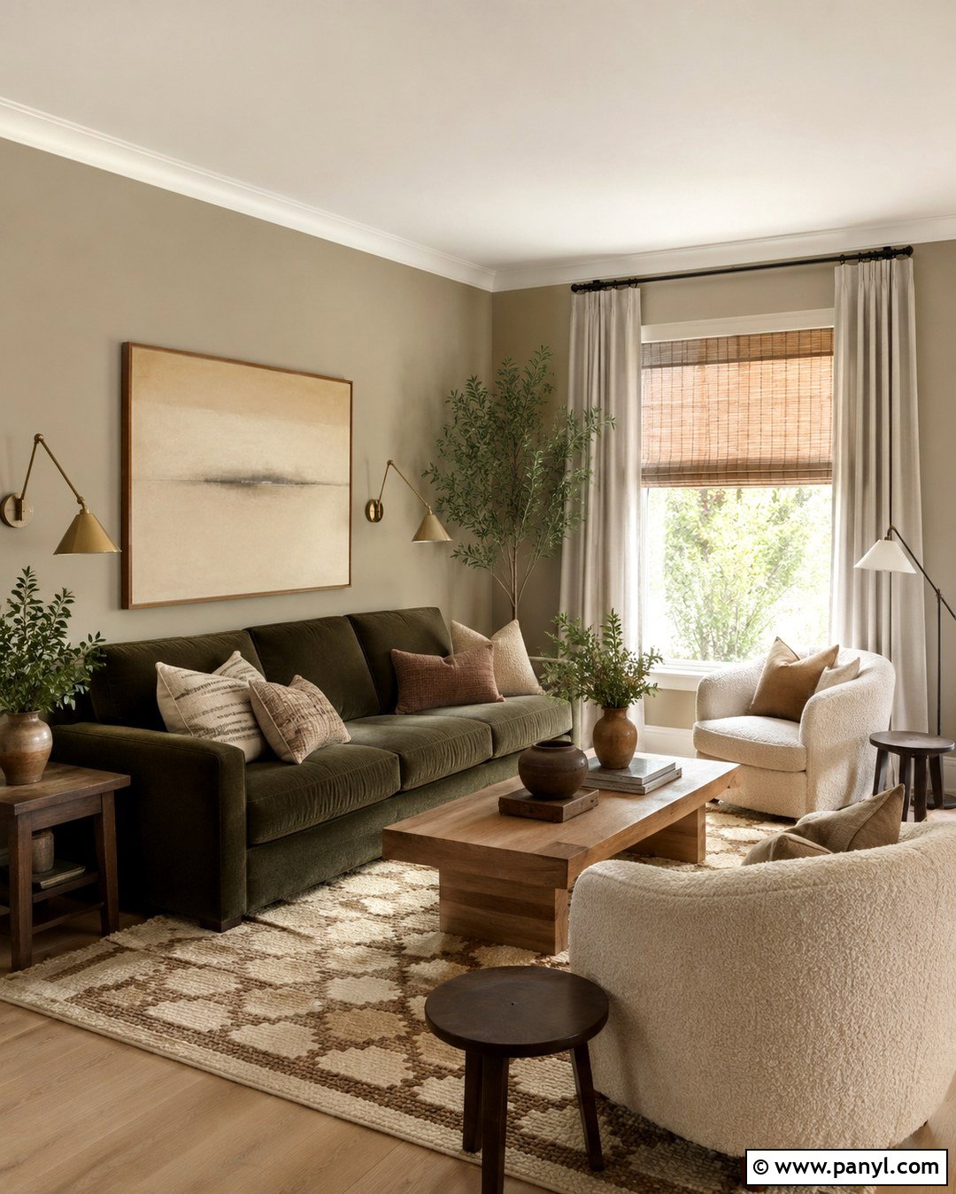
Mushroom beige brings earthy softness to a comfortable living room. Unlike basic beige, it has muted gray and brown undertones that create a more dimensional background. Pair it with a moss green sofa, natural oak coffee table, and boucle accent chairs. A cream-and-brown patterned rug can define the seating area without competing with the walls. Add woven shades beneath simple linen curtain panels to control light and introduce texture. Antique brass lighting, handmade pottery, and dark wood picture frames complete the grounded palette. Keep the ceiling and trim in a soft creamy white rather than brilliant white. This full-room combination works well in homes with stone fireplaces, exposed beams, or traditional millwork, but it can also soften a newer, builder-grade interior.
6. Universal Khaki Wall Color
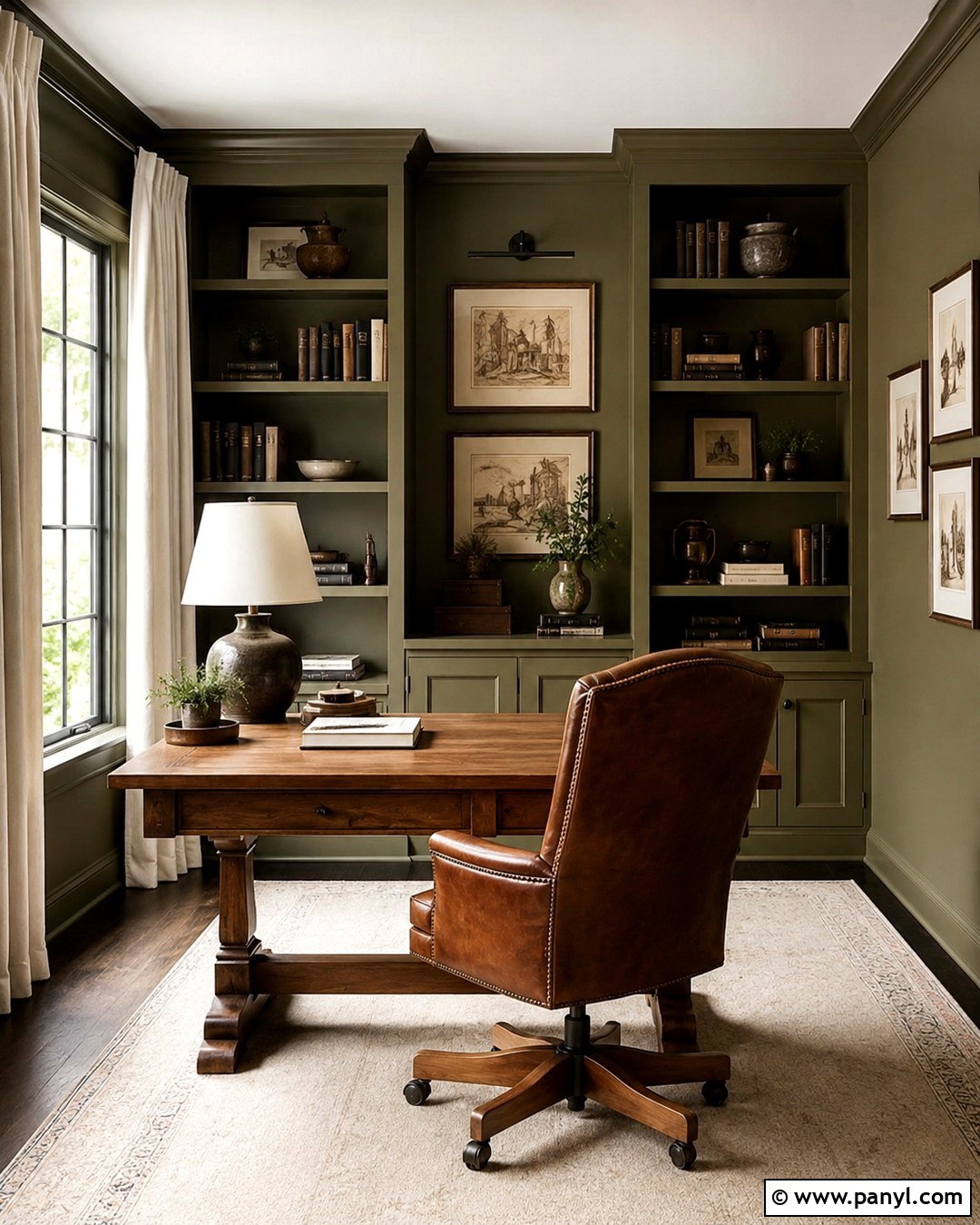
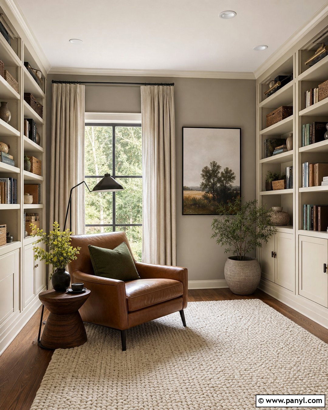
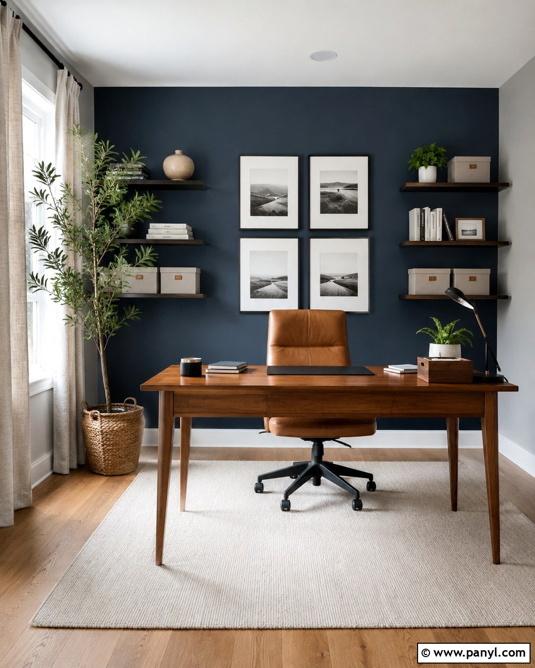
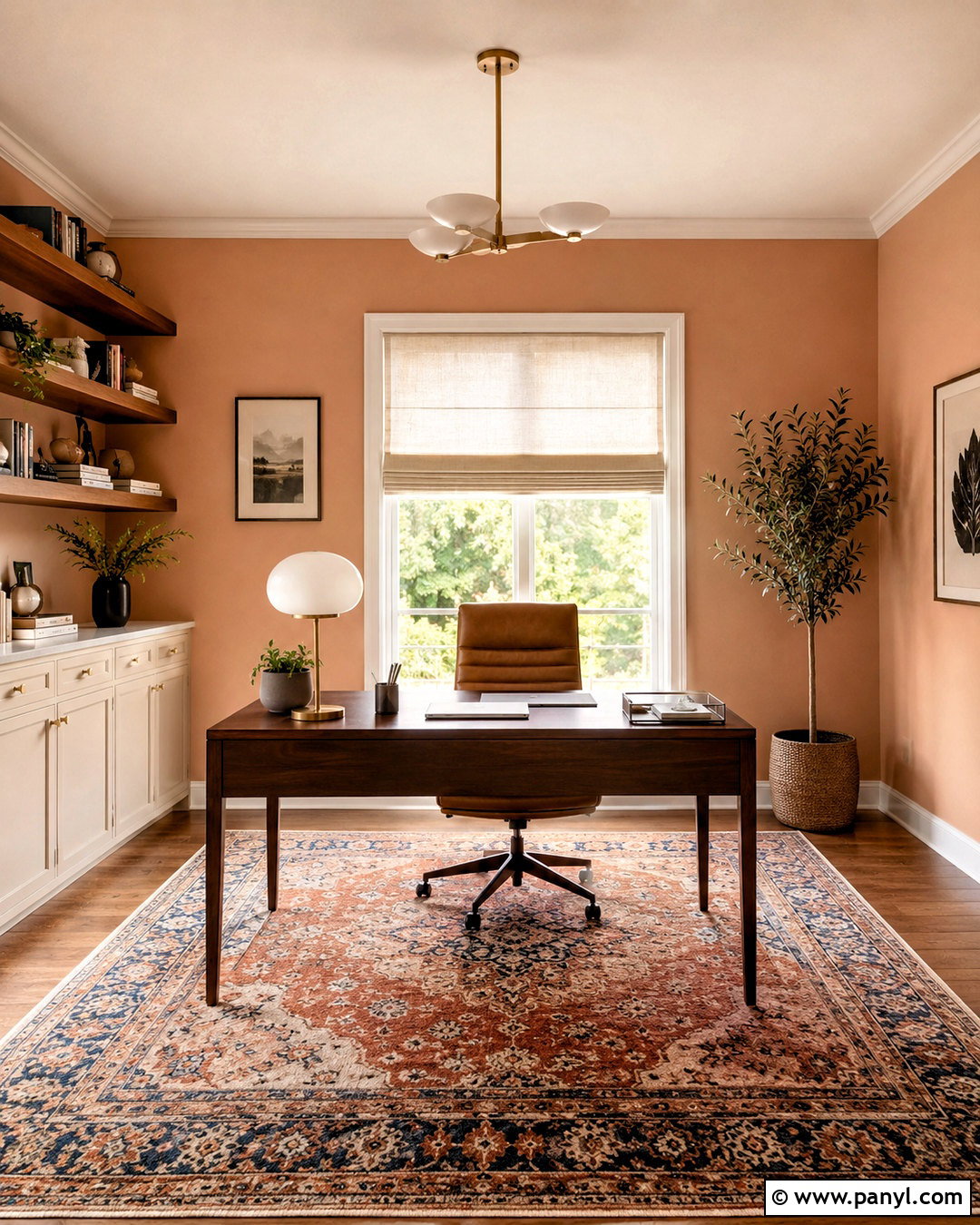
Khaki walls offer a relaxed neutral look with noticeable earthy character. Use this shade across a home office, including the walls, bookcases, and trim, for a subtle color-drenched effect. Bring in a solid oak desk, a brown leather chair, and flat-weave curtains in warm ivory. Black metal hardware gives the room definition, while deep olive accessories strengthen its natural quality. Since khaki can look greener or browner as the light changes, test samples beside the room’s fixed finishes. A lighter ceiling can keep a compact office open, while a matching ceiling creates a quieter, more immersive workspace. Finish with neatly arranged books, framed sketches, and a textured wool rug for a practical room that feels collected rather than corporate.
7. Pale Sage Green Wall Color
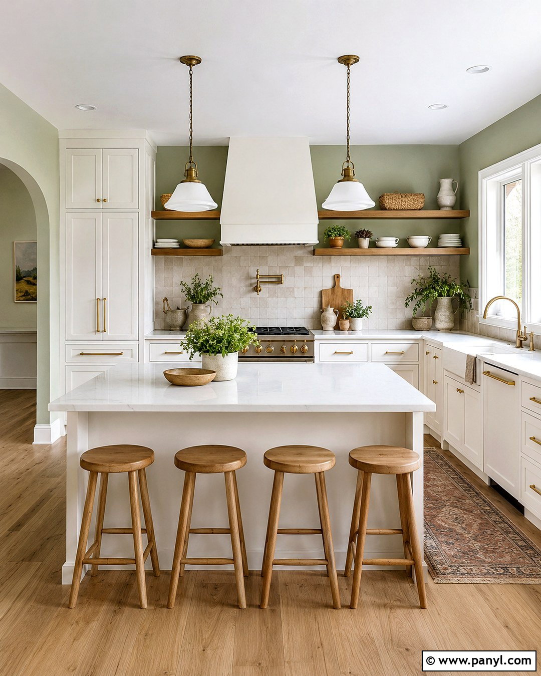
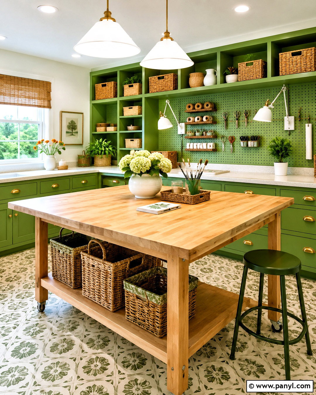
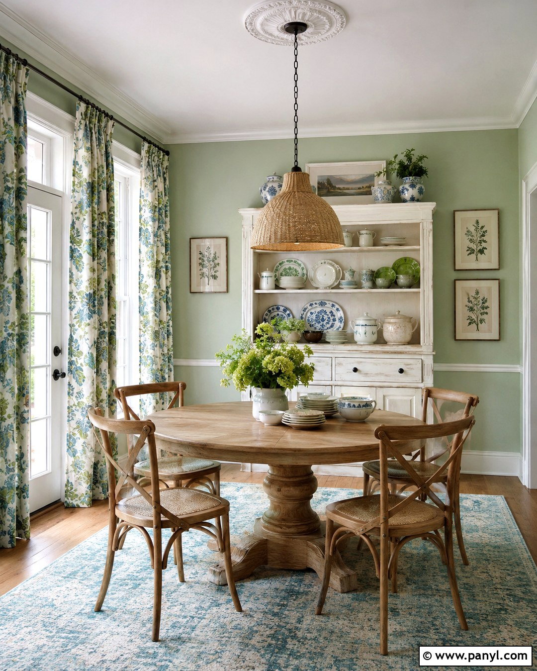
Pale sage green turns a kitchen into a calm, nature-inspired gathering space. Use sage on the walls with creamy white cabinets, honed light quartz counters, and a backsplash of handmade off-white tile. Warm oak stools and open shelves prevent the room from feeling overly cool. Choose unlacquered brass or brushed brass hardware to add gentle warmth, then introduce a few black details through lighting or window frames. The muted green background works beautifully with herbs, ceramic dishes, and natural woven materials. For continuity, carry the wall color into an adjacent breakfast nook and repeat the cabinet color on the trim. This complete palette feels fresh but not overly trendy, making it suitable for traditional kitchens, cottage spaces, and updated ranch homes.
8. Smoky Jade Wall Color
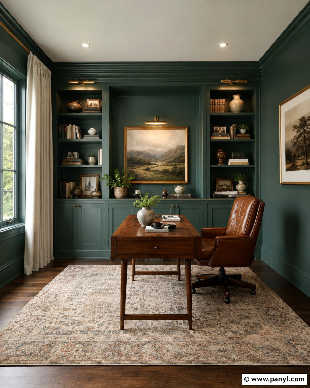
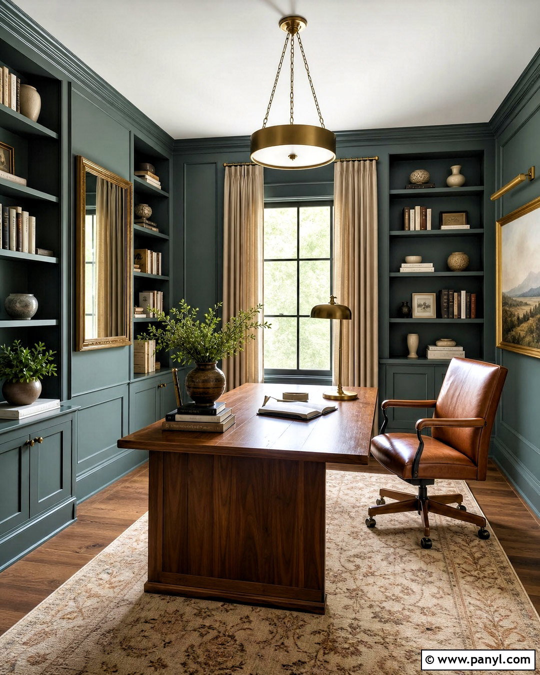
Smoky jade creates a confident home office or library that feels colorful and composed. Cover the walls and built-in shelving in the same blue-green shade, using matte paint on walls and satin on woodwork. Place a walnut writing desk in the center, then add a cognac leather chair and a muted vintage-style rug. Warm brass picture lights bring out the green undertones, while cream curtains keep the scheme from becoming too heavy. Arrange books, pottery, and framed art with enough open shelf space to avoid clutter. Smoky jade works best when supported by warm wood and restrained neutral fabrics. The finished room feels immersive and polished, offering more personality than a standard neutral office without creating a distracting or overly bright workspace.
9. Olive Green Wall Color
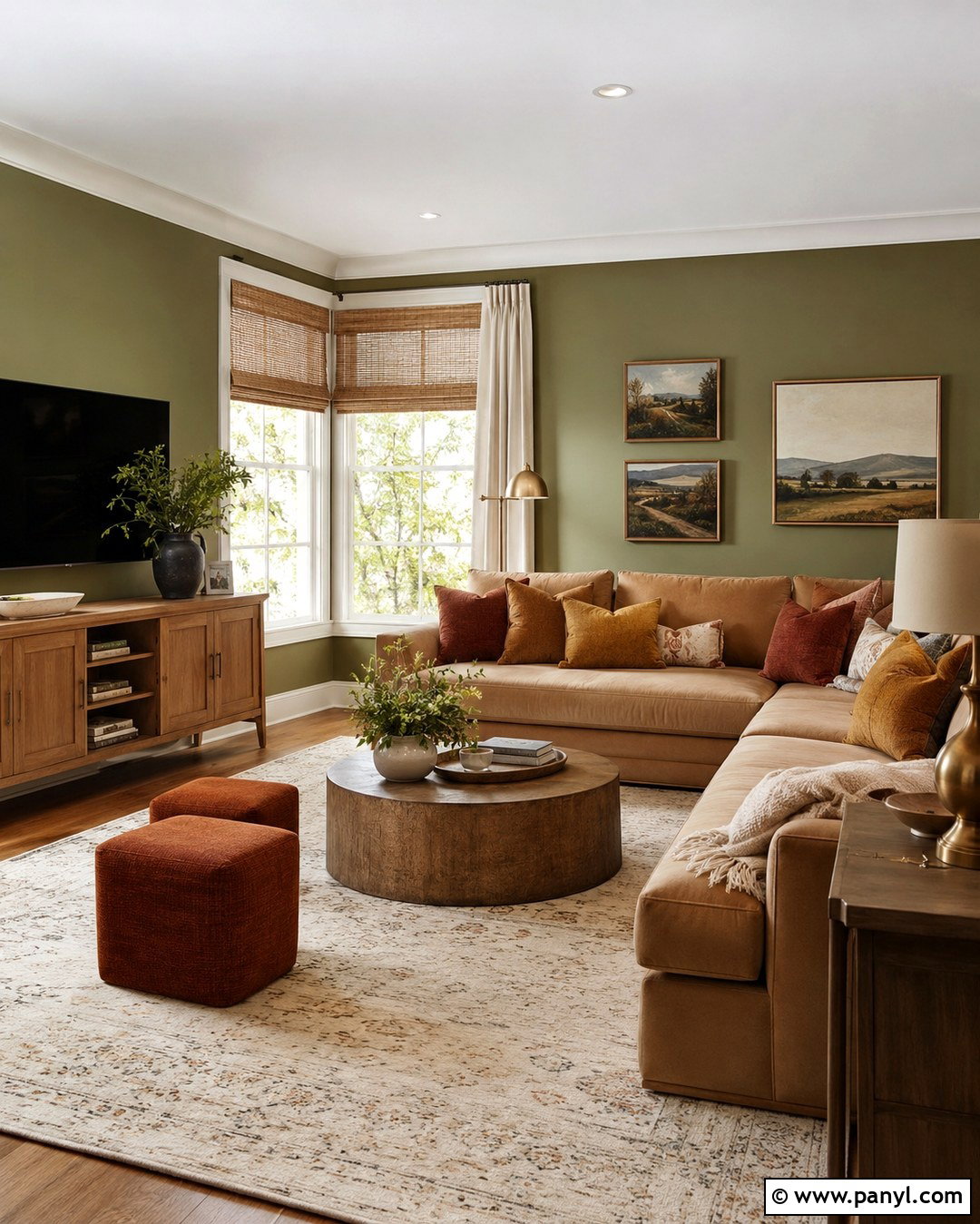
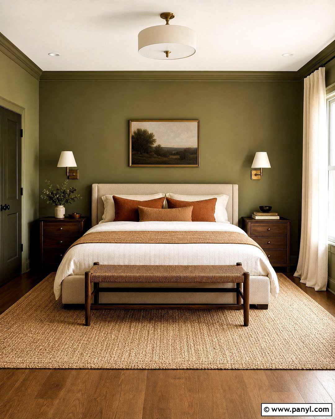
Olive green walls make a family room feel grounded, organic, and inviting. Select a medium olive that has warm brown undertones, then pair it with a tan sectional, an oak media console, and a large cream rug. Rust, camel, and muted mustard pillows add gentle variation while staying connected to the earthy palette. Use warm white on the ceiling and trim to frame the green clearly. Woven window shades, antique brass lamps, and landscape artwork complete the natural look. If the room includes a fireplace, use limestone or warm beige tile rather than cool gray stone. Olive can absorb light, so include layered illumination from floor lamps, table lamps, and ceiling fixtures. This balanced arrangement feels cozy without looking dark or heavily themed.
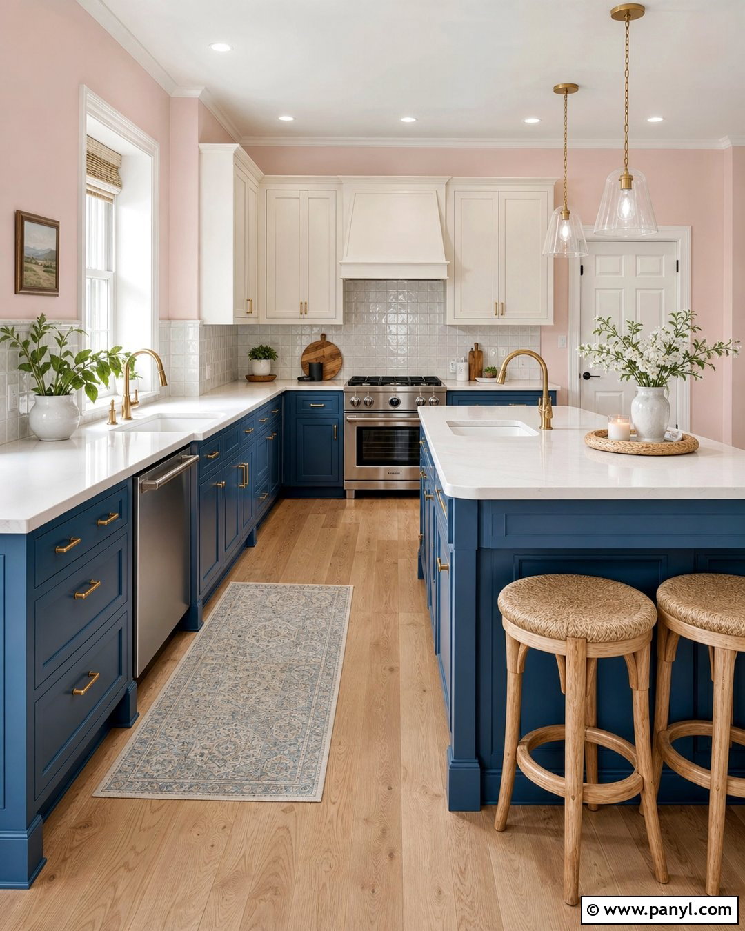
10. Forest Green Wall Color
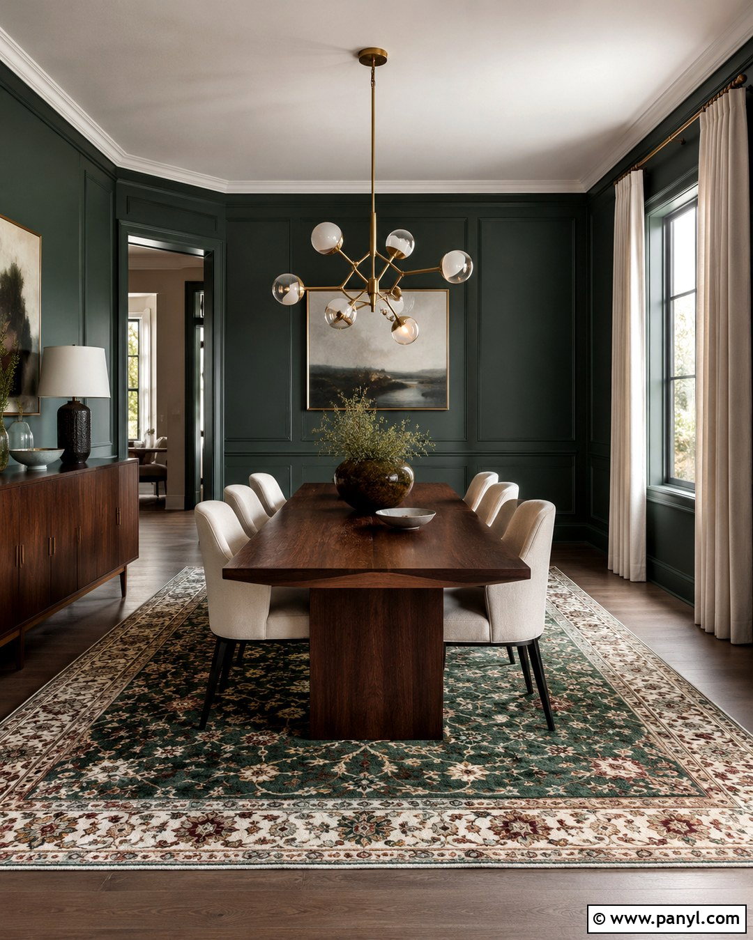
Deep forest green can transform a formal dining room into a dramatic but comfortable space. Apply the color to walls and traditional panel molding, then contrast it with a medium walnut table and ivory upholstered chairs. A vintage-inspired rug containing green, burgundy, and muted gold ties the surfaces together. Add a sculptural brass chandelier and simple cream drapery to brighten the darker background. Artwork with generous white matting will stand out clearly against the saturated walls. Keep the ceiling warm white unless the room is large enough for full color drenching. Forest green is especially successful in spaces used mainly during the evening because lamp light enhances its richness. The final design feels established, intimate, and appropriate for both casual dinners and special occasions.
11. Powder Blue Wall Color
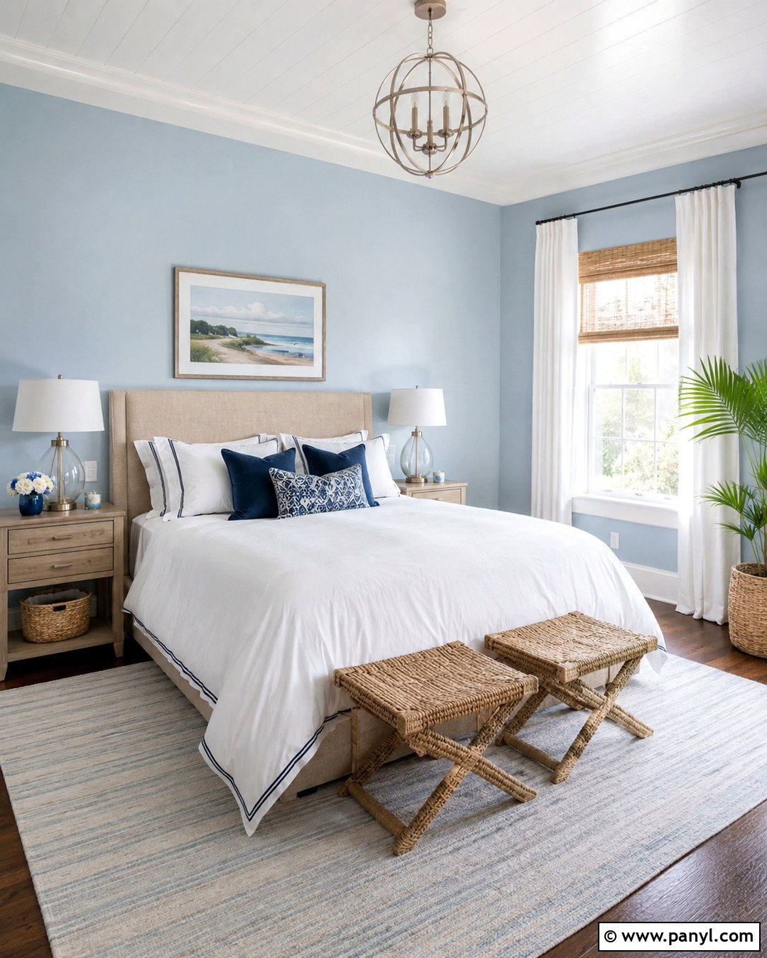
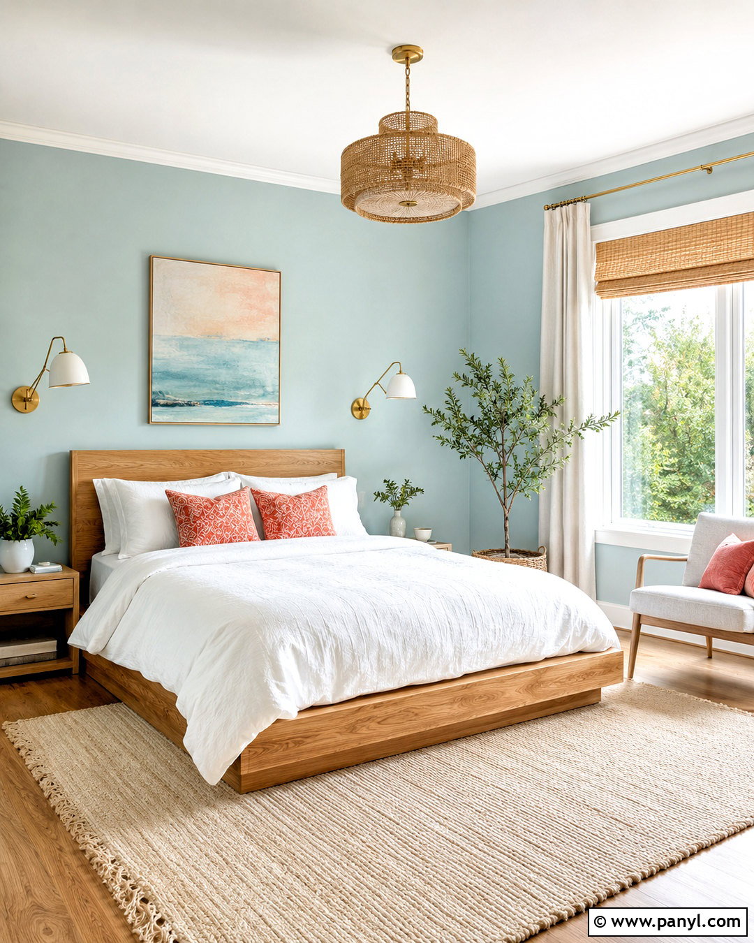
Powder blue creates a restful bedroom that still feels crisp and grown-up. Choose a muted blue with a slight gray undertone, then layer the room with a natural linen headboard, white cotton bedding, and pale oak furniture. Navy piping or a folded navy throw adds definition without disrupting the light atmosphere. Install woven shades and full-length white curtains to soften the windows. Brushed nickel, pewter, or antique brass lighting can work, but use one consistent metal finish throughout the room. A subtle striped rug and small botanical prints support the easy, classic look. Paint the ceiling warm white and repeat that shade on the trim. This complete palette is particularly effective for guest rooms, coastal homes, and bedrooms that need a brighter visual appearance.
12. Dusty Blue Wall Color
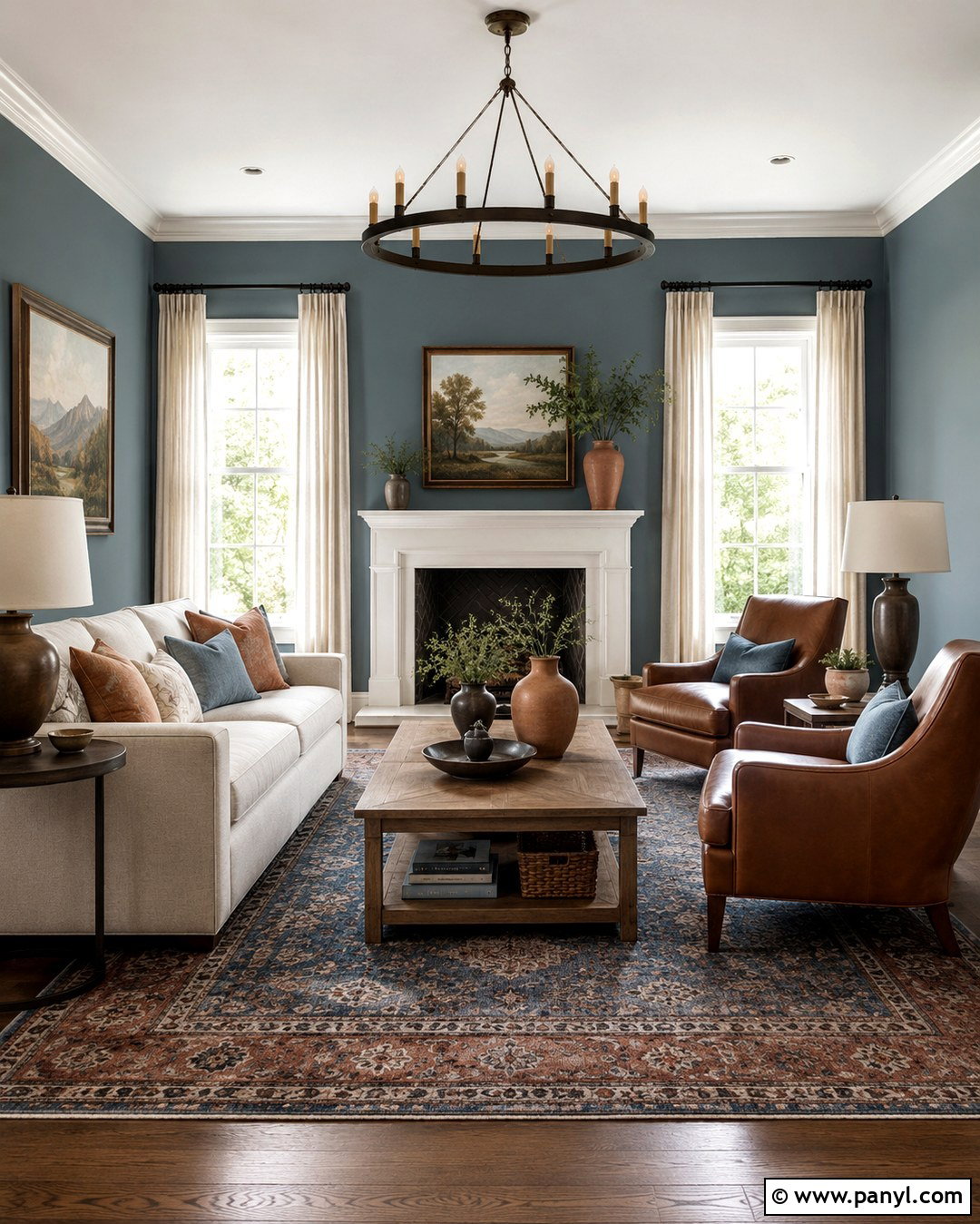
Dusty blue gives a living room color while preserving the versatility of a neutral. Pair the walls with a light gray-beige sofa, cognac leather chairs, and a medium oak coffee table. Use a patterned rug that combines faded blue, rust, and cream to establish a warm foundation. Long linen curtains in soft ivory prevent the room from appearing too cool. Add bronze floor lamps, dark wood frames, and a few terracotta accessories for contrast. Dusty blue works well with both contemporary furniture and inherited pieces because its muted quality is not overly bold. In an open layout, connect it to nearby rooms through repeated blue textiles rather than painting every wall the same shade. The completed space feels peaceful, layered, and suitable for everyday family life.
13. Slate Blue Wall Color
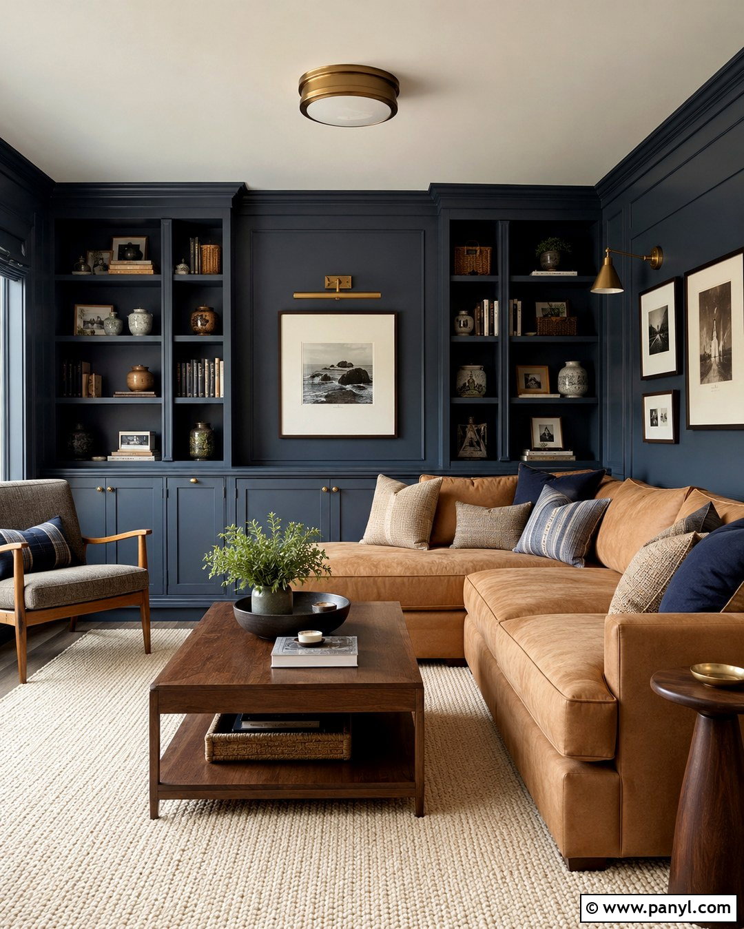
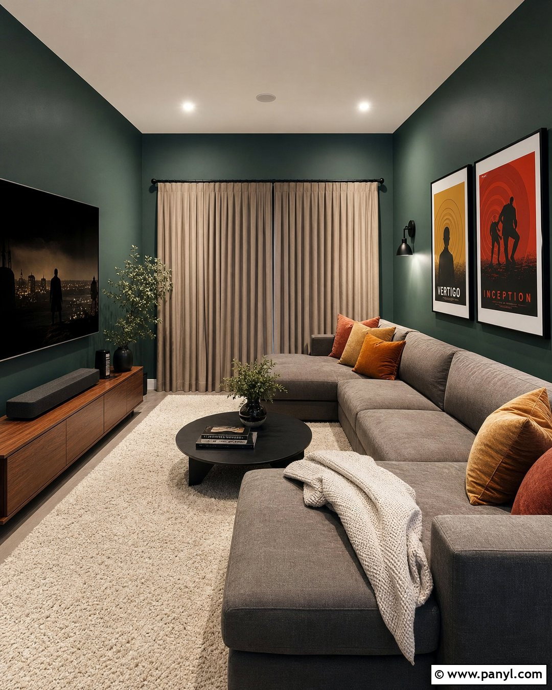
Slate blue adds structure and sophistication to a den, media room, or compact living area. Use the color across the walls and built-in storage to create a cohesive backdrop. A deep camel sofa provides strong contrast, while a cream wool rug prevents the darker palette from feeling enclosed. Include walnut tables, aged brass sconces, and striped blue-and-tan pillows for a tailored finish. If the room has limited daylight, leave the ceiling warm white and add several warm-neutral lamps at different heights. Simple framed prints with white mats will keep the walls from looking visually heavy. Slate blue pairs especially well with leather, wood, and natural stone. This complete look feels intimate and polished without relying on black or charcoal as the primary dramatic color.
14. Blue Gray Wall Color
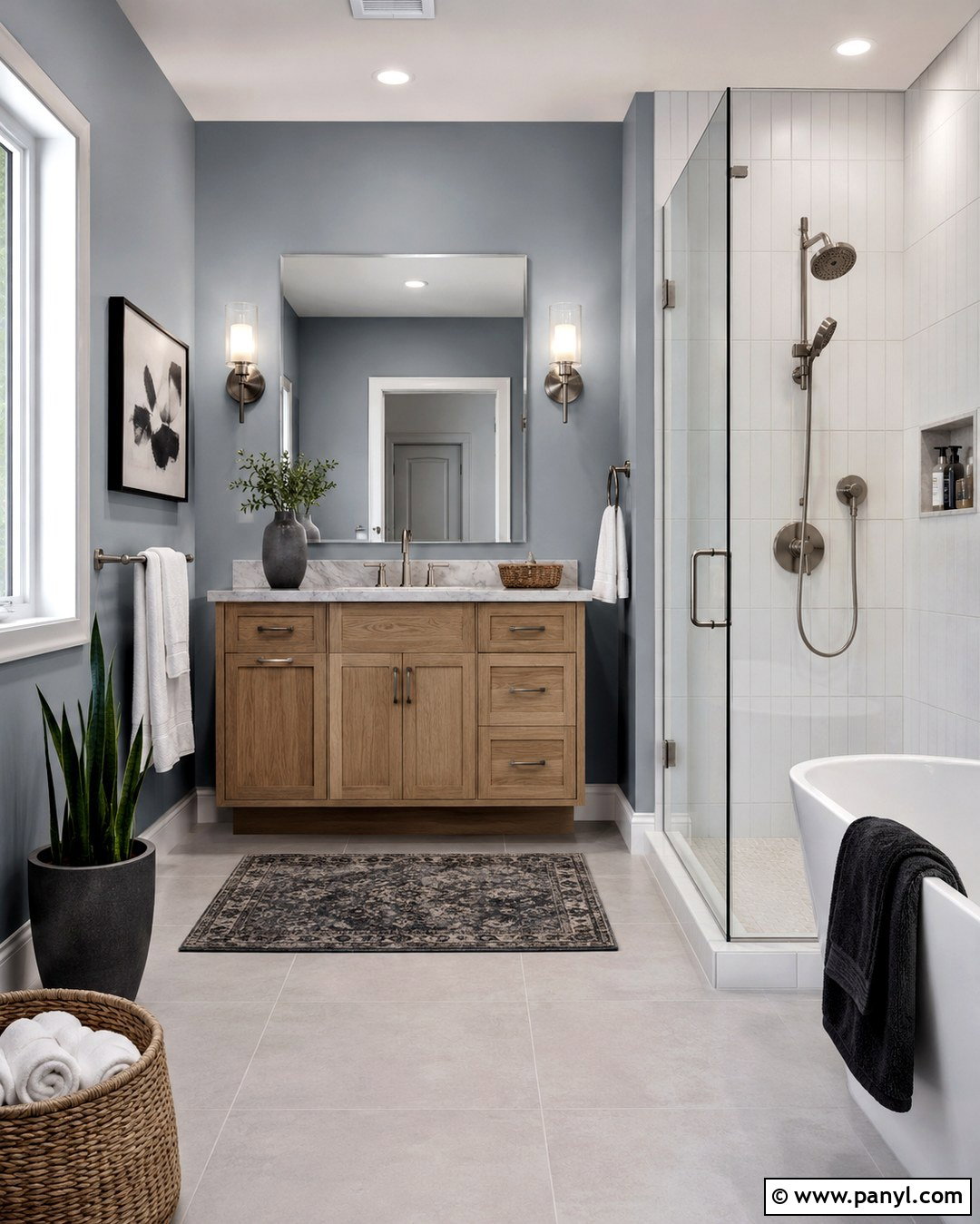
Blue-gray walls can make a bathroom feel clean, peaceful, and more spacious. Choose a soft mid-light shade and combine it with a white oak vanity, pale marble-look counters, and brushed nickel fixtures. Use vertical white tile inside the shower to add brightness and subtle movement. A frameless mirror and simple glass sconces keep the design visually light, while woven baskets bring warmth to the harder surfaces. Paint the trim a soft white that shares the wall color’s cool undertone. Avoid mixing too many blue-gray materials, or the room may appear flat. Instead, add contrast through white towels, warm wood, and one small charcoal accent. The completed bathroom feels fresh and calming while remaining practical enough for a busy household.
15. Muted Teal Wall Color
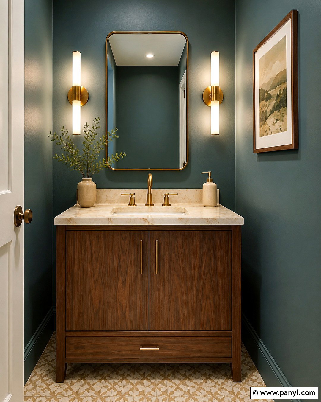
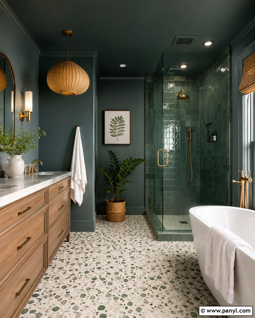
Muted teal brings energy to a small powder room without making it feel overly bright. Paint all four walls in a softened blue-green and pair them with a walnut vanity, creamy stone counter, and warm brass faucet. A rounded mirror softens the compact room, while two slender sconces create even lighting. Choose floor tile in warm beige or lightly patterned ivory to balance the stronger wall color. One framed print and a simple ceramic vase provide enough decoration without crowding the space. For a more enveloping result, carry teal onto the ceiling; for a lighter look, use soft white overhead. This full design turns a practical room into a memorable interior while keeping the materials refined, durable, and easy to coordinate.
16. Buttery Yellow Wall Color
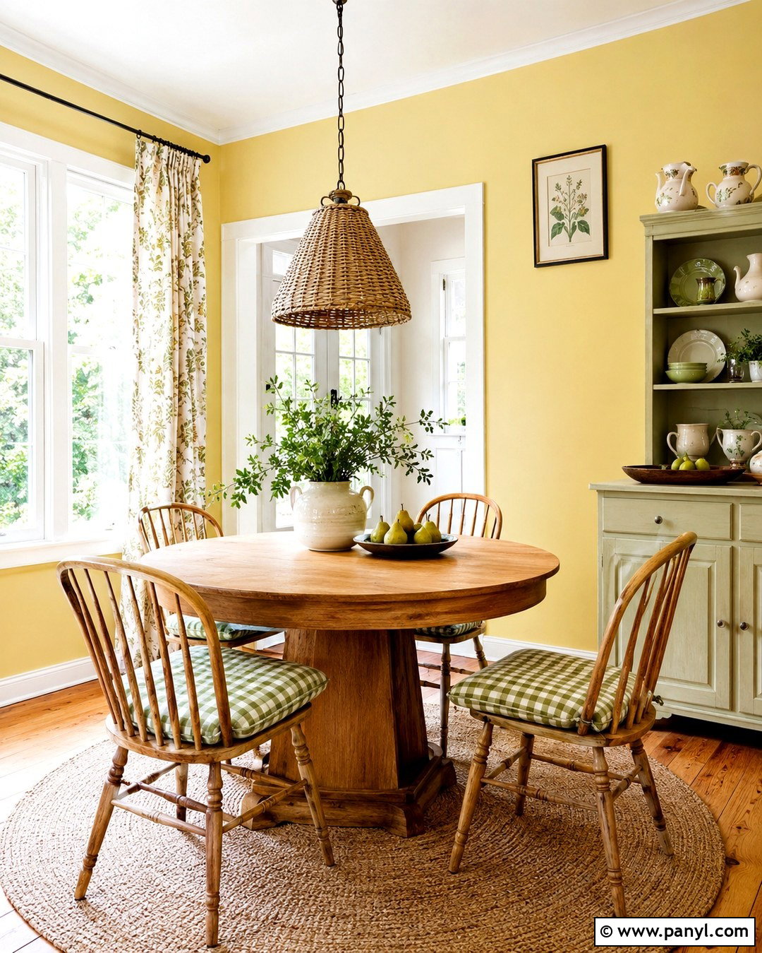
Buttery yellow makes a breakfast room feel cheerful even on cloudy mornings. Select a pale, softened yellow rather than a highly saturated lemon shade. Pair it with a round oak table, spindle-back chairs, and a natural jute rug. White trim and a white ceiling keep the room crisp, while green checked cushions or botanical curtains add a garden-inspired accent. A simple pendant in aged brass or woven rattan strengthens the welcoming character. Display everyday ceramics on a shallow painted cabinet, but keep the arrangement uncluttered. This wall color looks especially appealing beside warm wood flooring and windows overlooking greenery. The finished room feels sunny and nostalgic without becoming childish, making it a comfortable setting for breakfast, homework, and relaxed weekend meals.
17. Dusty Rose Wall Color
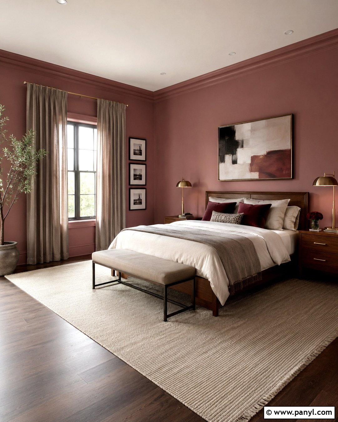
Dusty rose walls create a warm bedroom that feels sophisticated rather than overly sweet. Choose a muted pink with beige or brown undertones, then combine it with a walnut bed, ivory bedding, and taupe curtains. Deep burgundy pillows add tonal depth, while a cream rug keeps the lower half of the room light. Use aged brass lamps and minimal black frames to sharpen the soft palette. Natural linen, wool, and dark wood prevent the color from feeling delicate or juvenile. Painting the trim in the same dusty rose with a satin finish can make the walls appear taller and more intentional. Complete the room with one large abstract artwork and simple bedside styling. The result is calm, personal, and comfortably layered.
18. Terracotta Wall Color
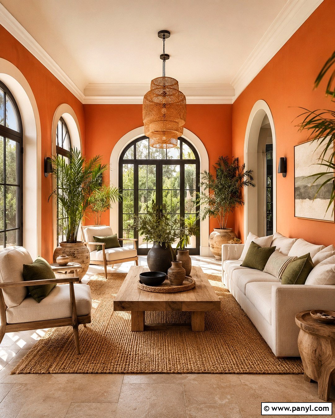
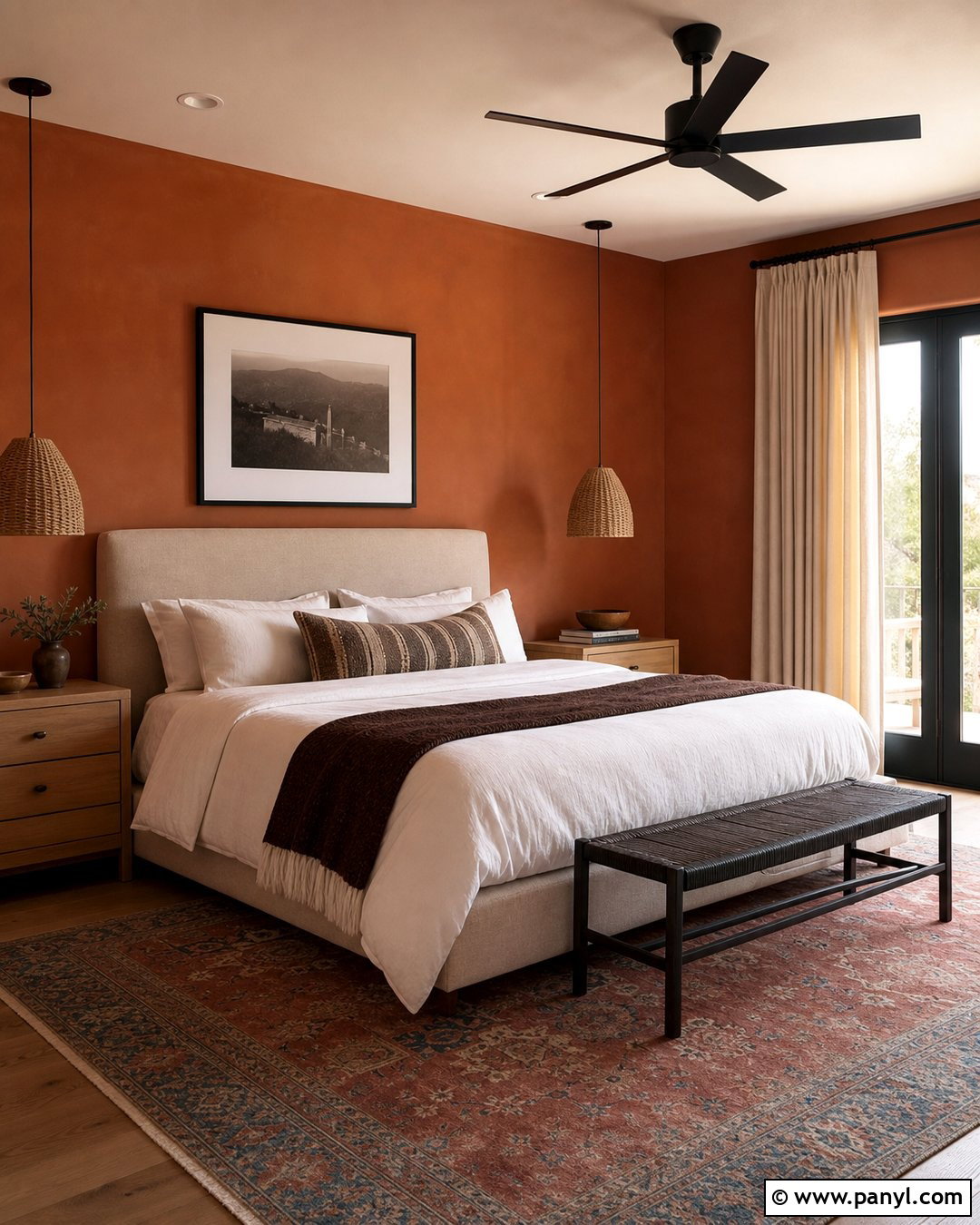
Terracotta brings warmth and architectural character to a dining nook, sunroom, or casual living space. Choose a softened clay shade and pair it with cream upholstery, warm oak furniture, and a textured natural rug. Olive green cushions and leafy plants create balanced contrast, while matte black accents provide a clean outline. If the room receives strong afternoon sun, use a slightly muted terracotta so the color does not become overly orange. Keep the trim and ceiling creamy white to preserve brightness. Linen curtains, handmade pottery, and woven pendant lighting reinforce the earthy quality without turning the room into a theme. This complete look feels relaxed and welcoming, particularly in Southwestern, Mediterranean, bohemian, and warm contemporary interiors.
19. Chocolate Brown Wall Color
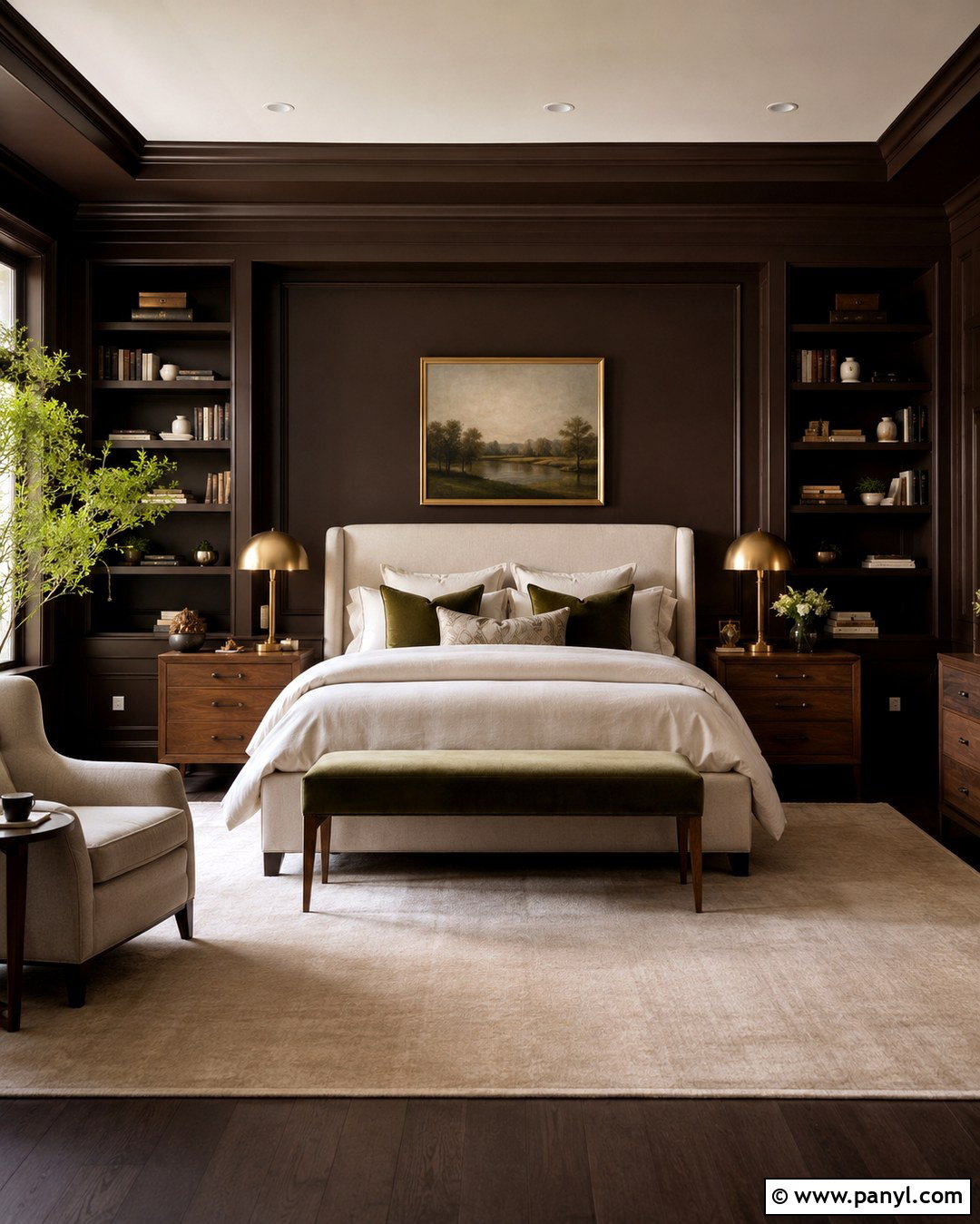
Chocolate brown walls create an enveloping bedroom or reading room with impressive depth. Select a rich brown with subtle charcoal undertones, then use it across the walls, trim, and built-in shelving. Balance the darkness with an ivory upholstered bed or cream lounge chair, pale bedding, and a light wool rug. Walnut furniture adds tonal variation, while polished brass lamps reflect light around the room. Include one muted blue or moss green accent to keep the brown palette from feeling one-dimensional. Several lighting sources are essential, especially in a room with small windows. When paired with soft textiles and restrained decor, chocolate brown feels luxurious and restful rather than heavy. The completed space offers a warmer alternative to a black or dark gray interior.
20. Deep Burgundy Wall Color
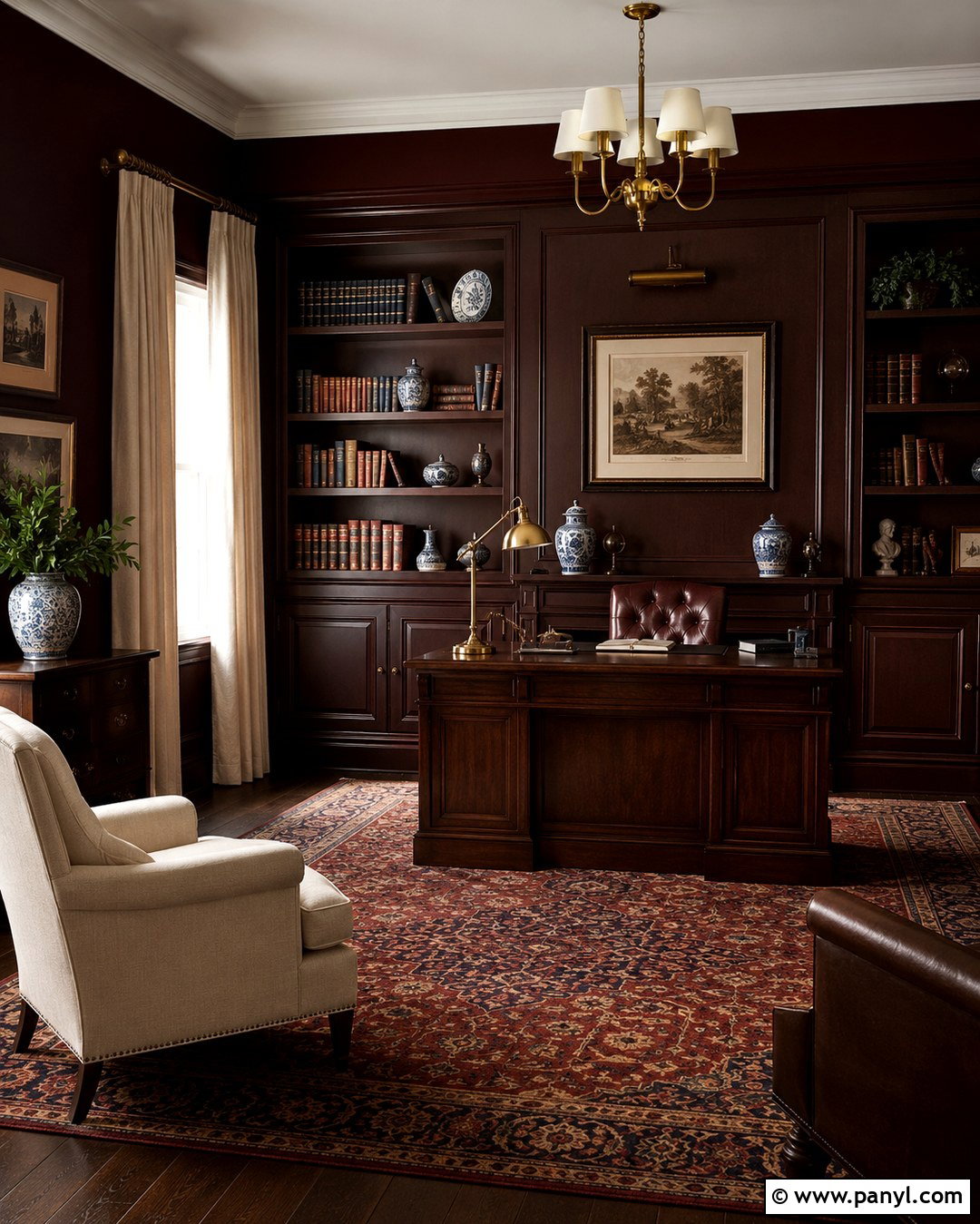
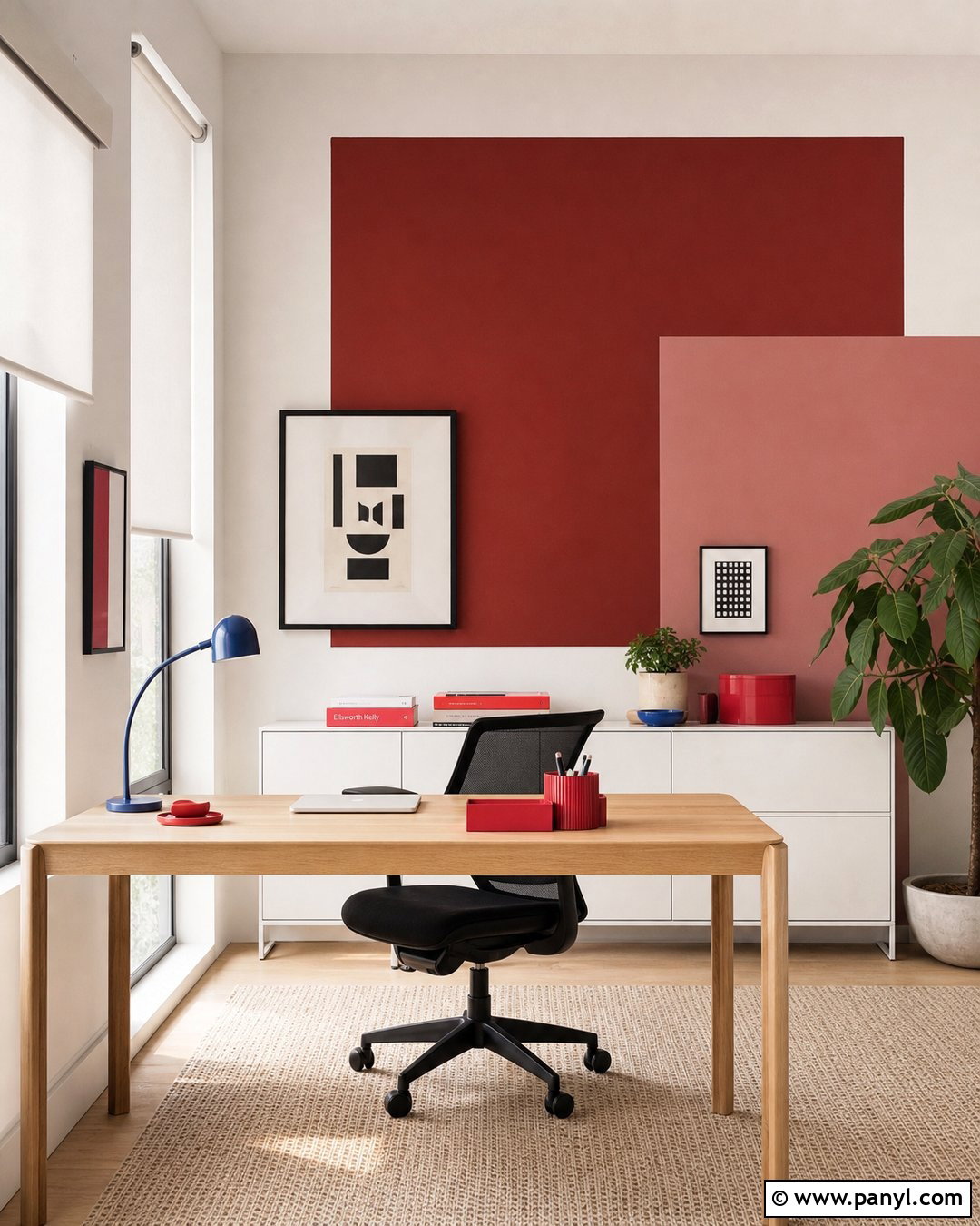
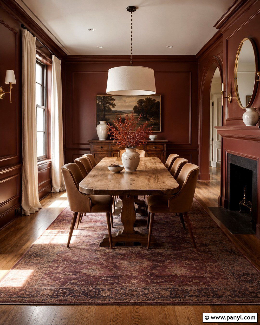
Deep burgundy gives a library, dining room, or formal living room a rich and distinctive identity. Cover the walls in a brown-based burgundy, then add dark walnut furniture, cream upholstery, and an antique-style rug with muted red and navy details. Aged brass lighting emphasizes the warmth, while off-white curtains soften the windows and provide needed contrast. Use the wall color on paneling or bookshelves for a built-in appearance, but keep the ceiling light in smaller rooms. Artwork in dark wood frames and a few ceramic accessories complete the scheme without competing with the saturated background. This coordinated design feels elegant and comfortable because every supporting material has a warm undertone. It offers memorable color while remaining more livable than a vivid primary red.
Conclusion:
Choosing from the **20 Top Wall Colors** becomes easier when you consider the entire room instead of viewing paint as an isolated surface. Compare each option with your flooring, furniture, trim, lighting, and fixed materials. Warm white, greige, taupe, and khaki provide flexible foundations, while sage, blue, terracotta, burgundy, and chocolate brown create stronger atmosphere. Always test large painted samples and check them in morning, afternoon, and evening light. Once you select a wall color, repeat its undertones through fabrics, wood finishes, hardware, and artwork. That simple approach creates a room that feels balanced and intentional. The right color should support daily life while giving your home a clear, personal character.

Related Ideas and Inspiration:
Leave a Reply