
Choosing from **20 light teal paint colors** can feel surprisingly complex because every shade balances blue, green, gray, and white differently. The right option can make a small room feel open, give a busy kitchen a calmer backdrop, or add gentle color without overwhelming neutral furnishings. Pale aqua teals appear fresh and coastal, while muted gray-teals create a quieter, more sophisticated look. Before committing, paint a large sample and view it beside your flooring, cabinets, trim, and fabrics throughout the day. Natural and artificial light can noticeably shift the undertones. The complete room schemes below pair each color with practical furniture, finishes, textiles, and accents, making it easier to confidently compare these **20 light teal paint colors**.

1. Barely Teal 2048-70 Bedroom
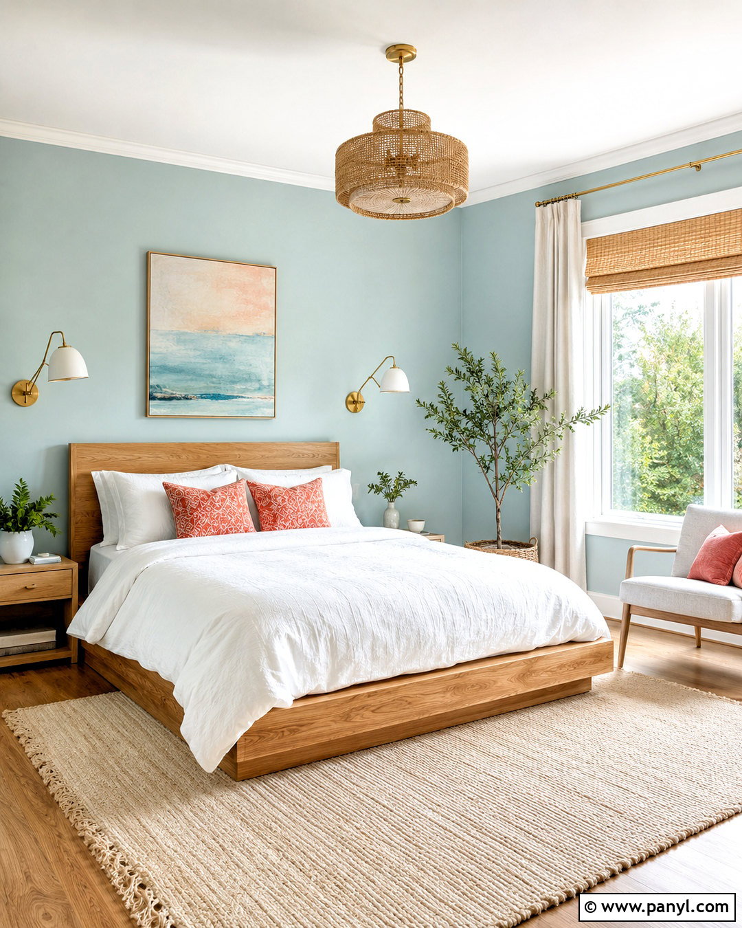
Benjamin Moore Barely Teal 2048-70 creates a whisper-soft bedroom backdrop that feels colorful without losing its airy quality. () Paint every wall in this pale blue-green, then use warm white on the ceiling, baseboards, and simple window trim. A natural oak platform bed keeps the palette grounded, while white linen bedding and a quilted sand-colored coverlet introduce relaxed layers. Place woven shades beneath lightweight white curtains to soften bright daylight. Brushed brass sconces and pale wood nightstands add warmth without making the room look formal. Finish the design with a flat-weave cream rug, two muted coral pillows, and one large botanical print. The result is a light teal bedroom that feels peaceful, balanced, and easy to update.
2. Blue Seafoam 2056-60 Bathroom
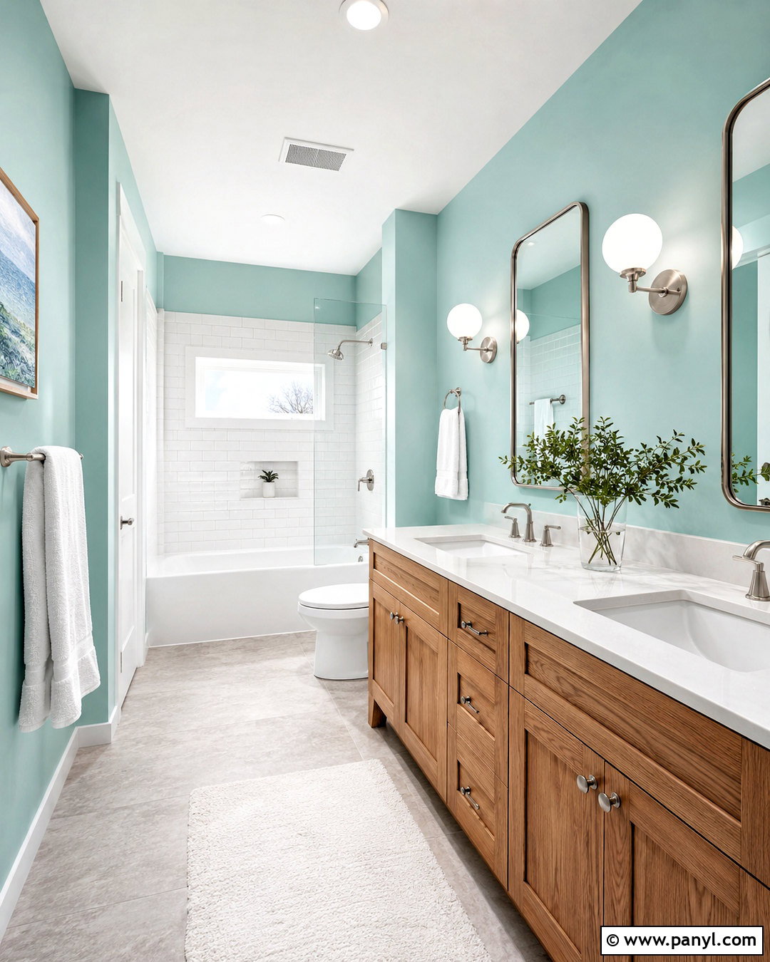
Benjamin Moore Blue Seafoam 2056-60 brings a clean, aquatic character to a bright bathroom while remaining soft enough for all four walls. () Pair the light teal paint with white vertical subway tile around the tub and a warm white quartz vanity top. A medium-tone oak vanity prevents the blue-green walls from feeling cold. Choose brushed nickel faucets, a rounded mirror, and simple globe sconces for a polished but approachable finish. Pale gray porcelain floor tile adds subtle contrast without introducing a competing pattern. Use crisp white towels, a textured ivory bath mat, and one small eucalyptus arrangement for restrained decoration. This complete palette works especially well in a bathroom with clear natural light, where the teal can appear fresh rather than overly saturated.
3. Sea Foam 2123-60 Kitchen
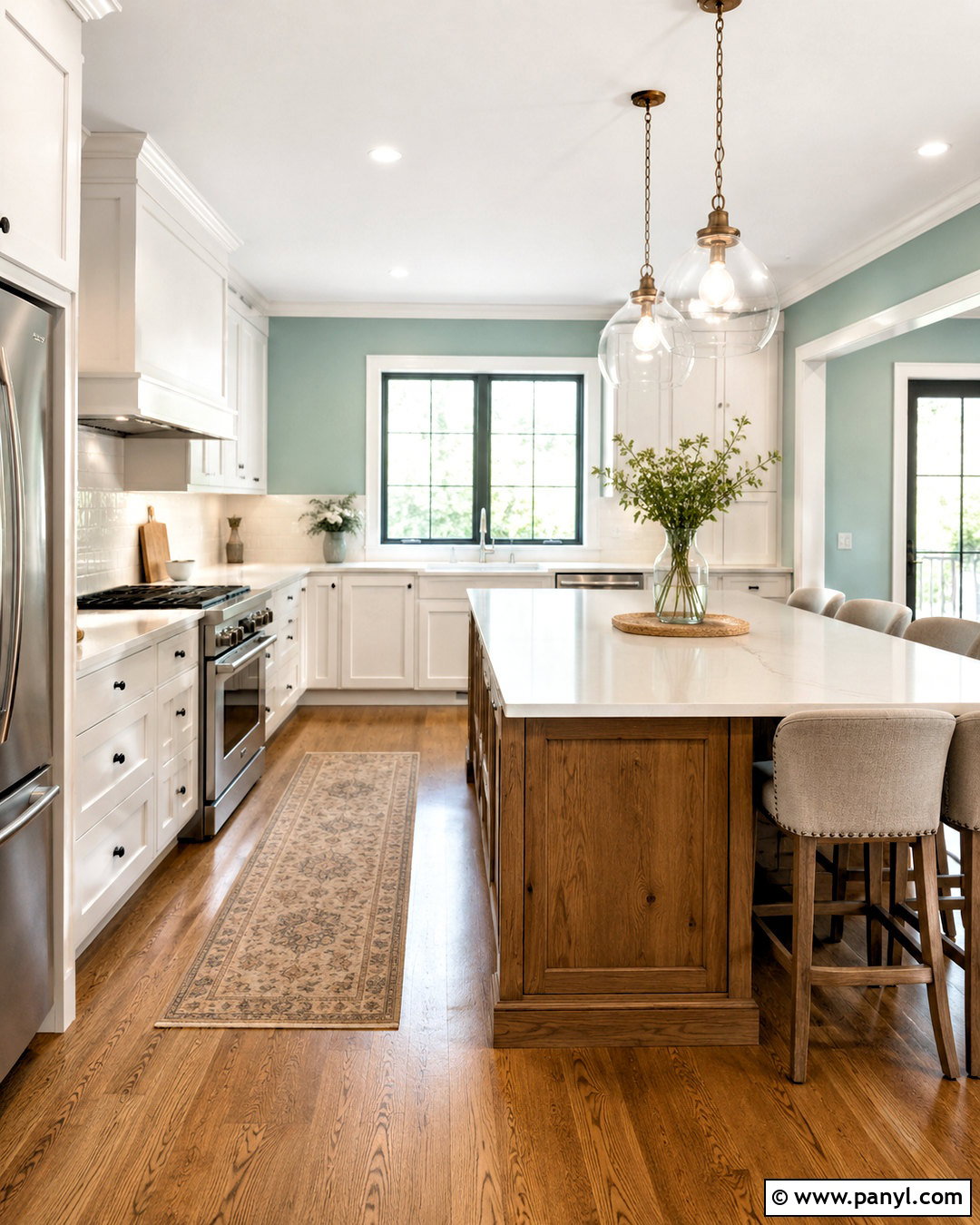
Would you like a colorful kitchen that still feels light and neutral? Benjamin Moore Sea Foam 2123-60 can cover the walls while warm white shaker cabinets keep the room bright. () Add lightly veined white quartz counters, a simple glazed tile backsplash, and natural white oak flooring. Matte black cabinet hardware creates definition, but use it sparingly so the room remains soft. A small island in stained oak introduces warmth and connects visually with the floor. Overhead, two clear glass pendants provide structure without blocking sightlines. Complete the kitchen with oatmeal-colored counter stools, white ceramic accessories, and a washable runner featuring faded blue-green details. This scheme gives light teal a practical role as a gentle background instead of making it the only noticeable feature.
4. Palladian Blue HC-144 Living Room
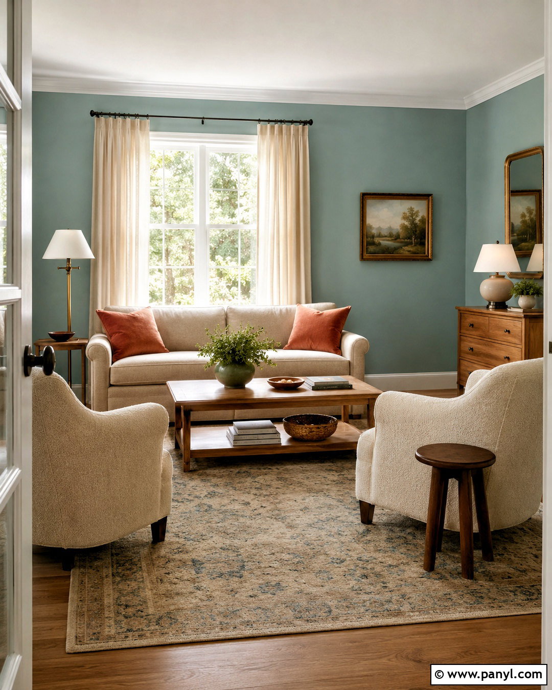
Benjamin Moore Palladian Blue HC-144 suits a living room that needs subtle color, comfortable furnishings, and a connection to natural materials. () Use the paint on the walls with soft white trim and a matching white ceiling. Center a warm greige sofa opposite a low oak media cabinet, then add two cream boucle chairs to create a conversational layout. A faded blue and beige rug connects the teal walls to the neutral upholstery. Linen curtains in warm ivory will filter daylight and prevent the palette from appearing chilly. Include aged brass lamps, woven baskets, and walnut side tables for depth. Rust-colored pillows and a small amount of black metal provide contrast. Together, these details create a welcoming room that feels fresh, layered, and quietly traditional.
5. Quiet Moments 1563 Home Office
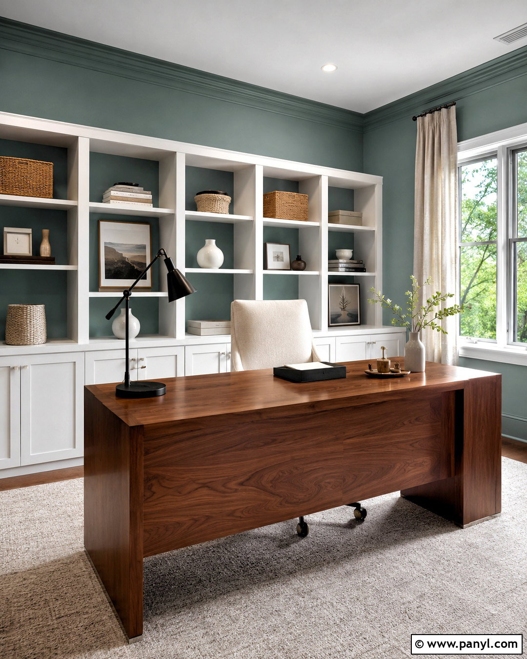
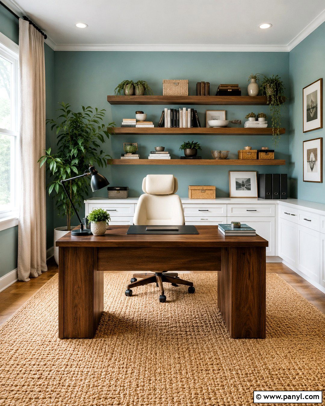
Soft color can make a hardworking office feel more comfortable without becoming distracting. Benjamin Moore Quiet Moments 1563 provides a muted blue-green background that works naturally with warm wood and clean white accents. () Paint the walls and built-in bookcase backs in the same shade, but keep the shelving frames and ceiling warm white. Position a walnut desk near the window and add an upholstered cream desk chair with supportive lines. A low-pile gray-beige rug makes rolling and cleaning easier. Use a black adjustable task lamp, woven storage boxes, and simple framed landscape art to complete the workspace. Full-length linen curtains soften sound and glare. The finished office feels calm and professional, with enough contrast to look intentional during both everyday work and video calls.
6. Covington Blue HC-138 Dining Room
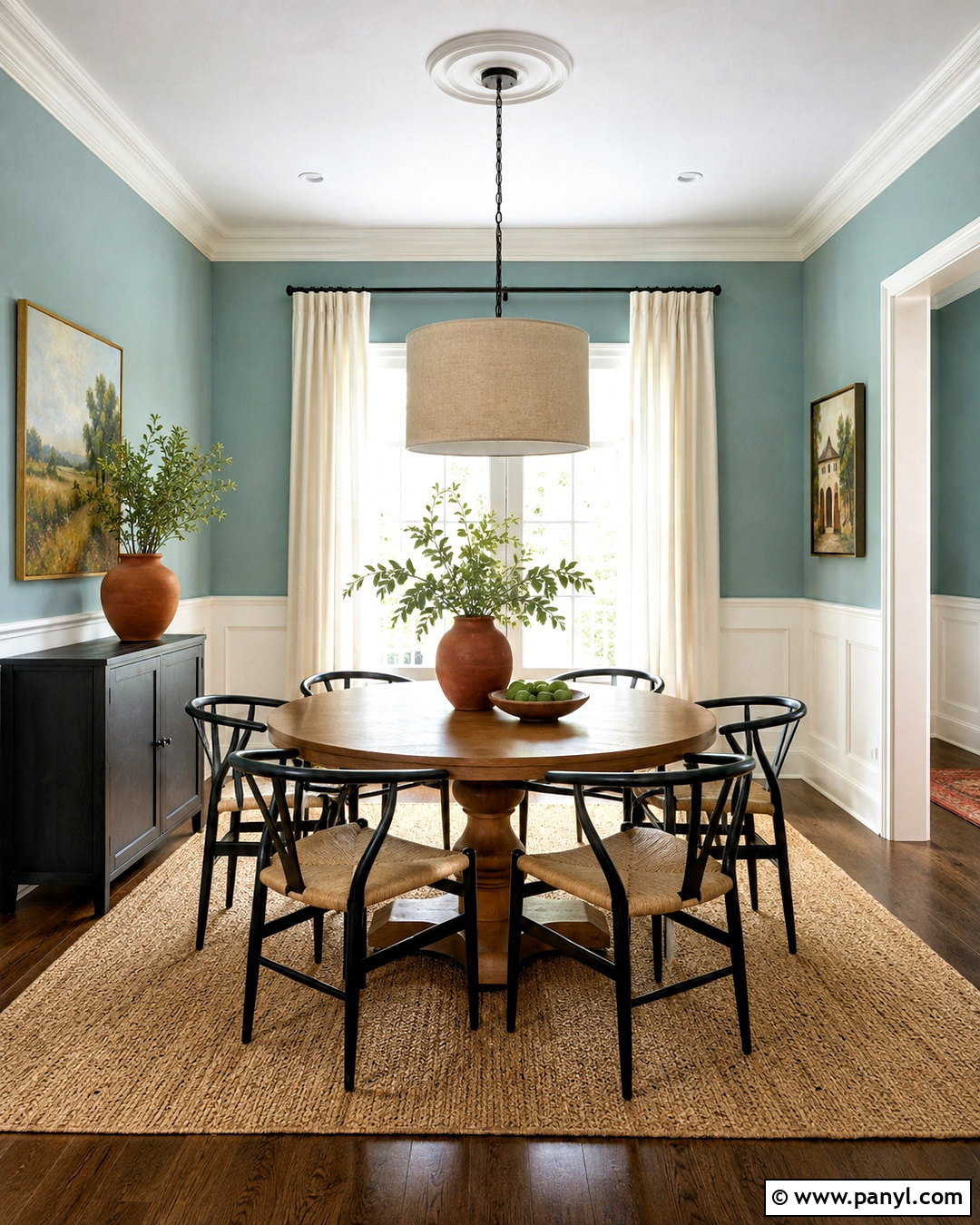
Benjamin Moore Covington Blue HC-138 can turn an ordinary dining room into a bright, welcoming gathering space with a relaxed historical character. Benjamin Moore includes the shade among its teal selections. () Use it above simple white wall paneling, allowing the architectural detail to balance the color. A round medium-oak table improves circulation and looks less formal than a long rectangular option. Surround it with woven-seat chairs painted soft black for contrast. Hang a linen drum pendant over the center and add an aged brass sideboard lamp nearby. Ivory curtains, a natural jute rug, and understated ceramic tableware maintain the light mood. A few terracotta accessories bring out the warmer side of the teal, producing a complete dining room that feels comfortable for daily meals and casual entertaining.
7. Aegean Teal 2136-40 Kitchen Cabinets
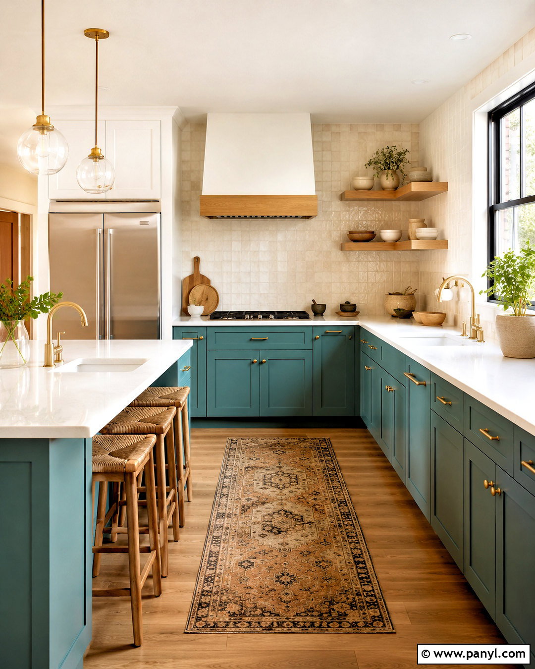
For a stronger version of light teal, use Benjamin Moore Aegean Teal 2136-40 on lower kitchen cabinets and keep everything above counter height noticeably brighter. The shade remains one of Benjamin Moore’s recognized teal colors. () Combine the cabinetry with warm white walls, white oak open shelves, and handmade cream backsplash tile. Choose pale quartz counters with limited veining so the cabinet color remains the focal point. Brushed brass pulls and a matching bridge faucet add warmth, while light oak flooring prevents the room from feeling heavy. Finish the look with woven counter stools, off-white pendant lights, and a narrow vintage-style runner. This balanced layout gives the medium light teal enough breathing room and creates a kitchen that feels distinctive without becoming overly colorful.

8. Bermuda Teal 2044-50 Laundry Room
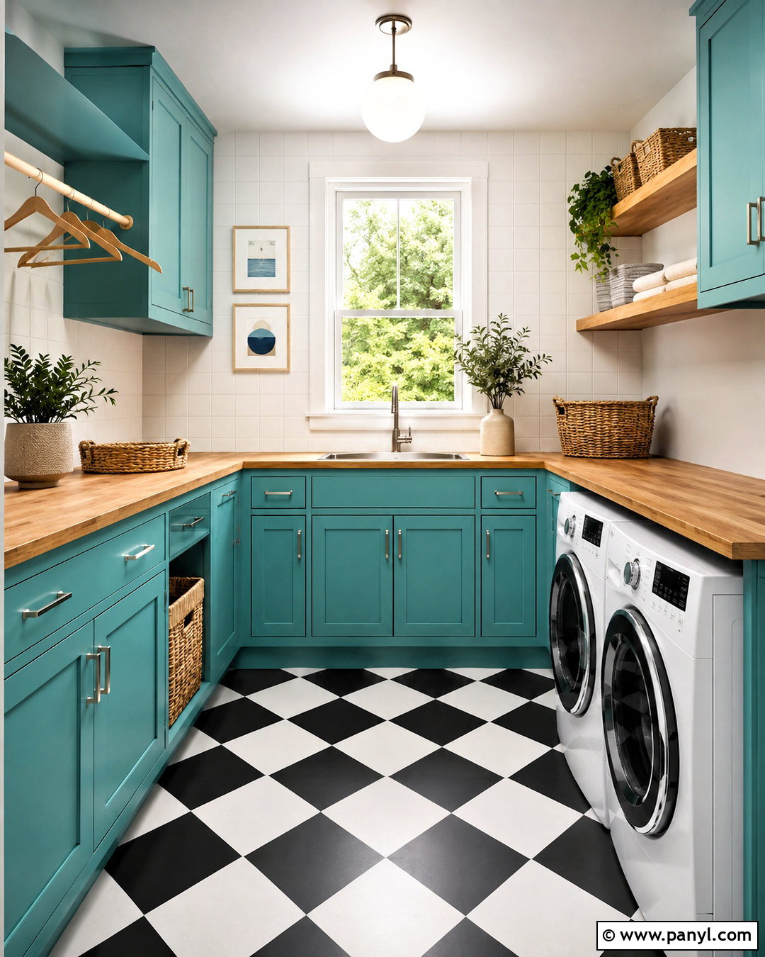
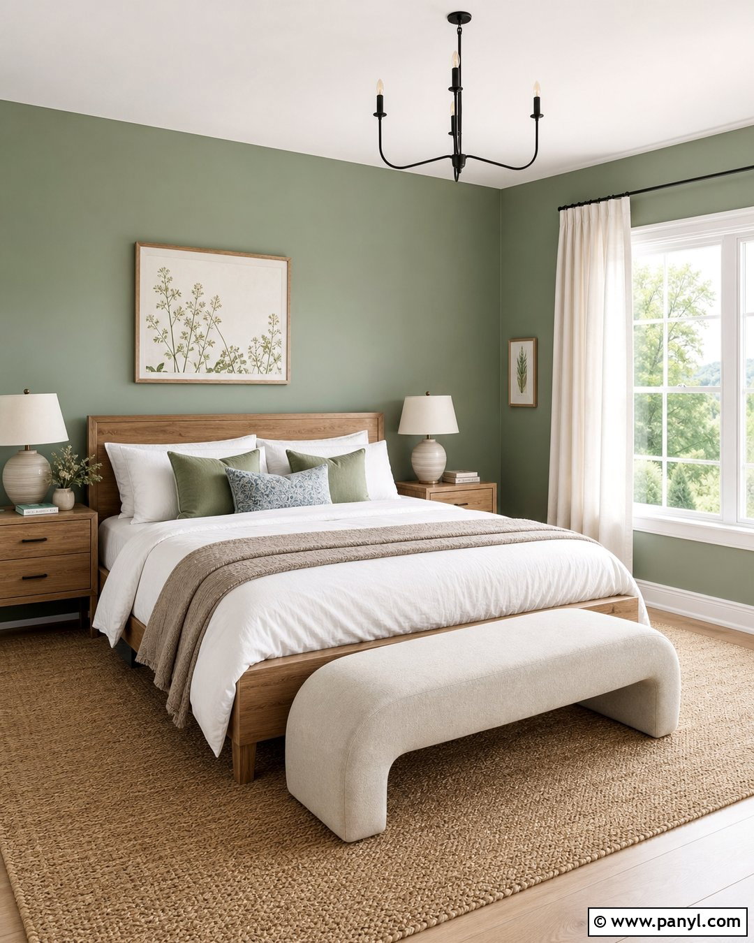
Laundry rooms are ideal places to use a cheerful shade such as Benjamin Moore Bermuda Teal 2044-50 because the color can energize a compact, functional space. () Apply it to the cabinetry and keep the walls, ceiling, and trim crisp white. Install a pale butcher-block counter above front-loading machines to add workspace and natural warmth. White square backsplash tile makes splashes easy to clean and prevents the teal cabinets from dominating. Use brushed nickel pulls, a simple ceiling fixture, and open oak shelves for baskets and everyday supplies. A black-and-white checkerboard floor introduces character while remaining practical. Finish with labeled glass containers, folded white towels, and a striped washable mat. The complete room feels organized, upbeat, and polished rather than purely utilitarian.
9. Crystal Clear 2044-60 Sunroom
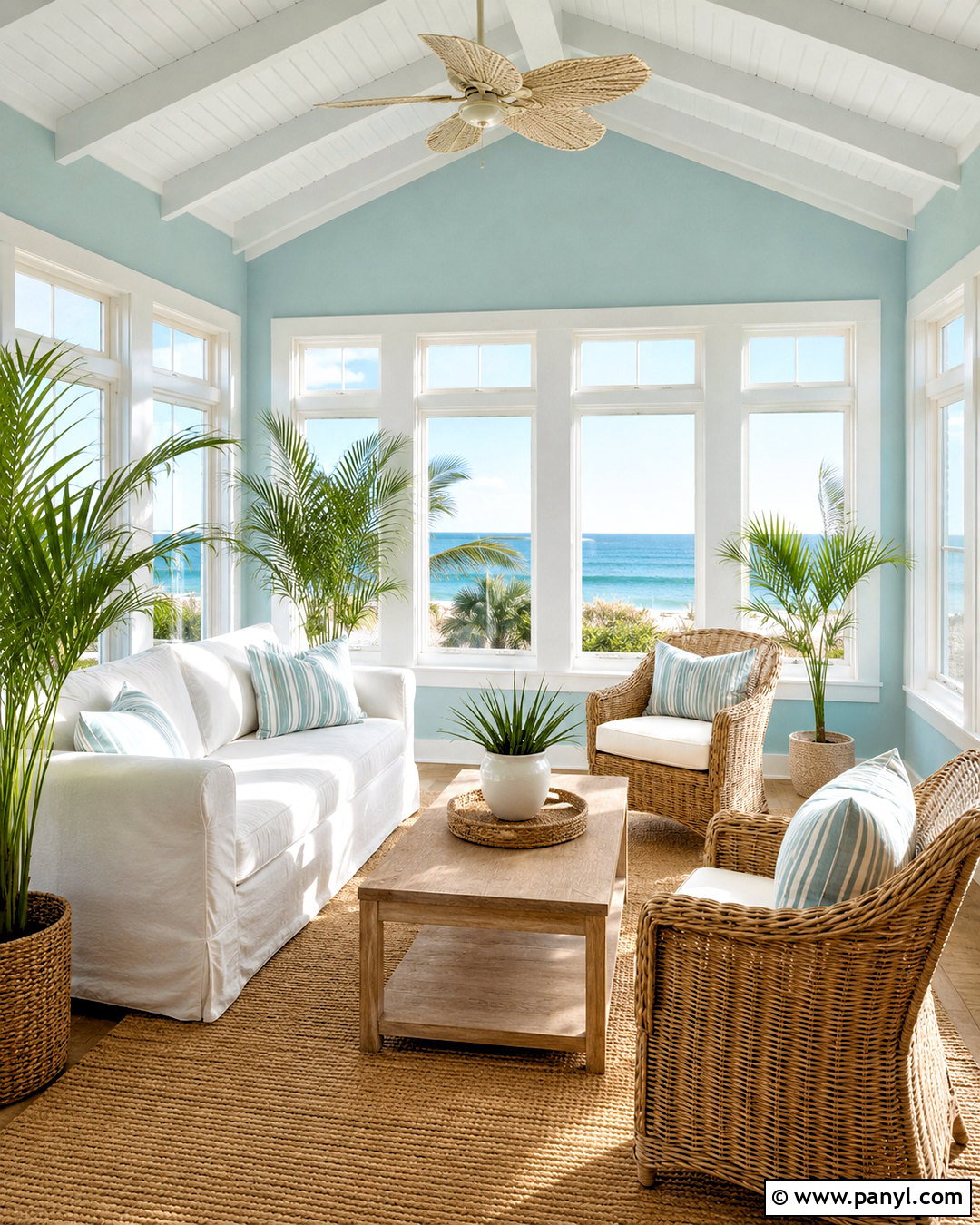
Sunlight can make Benjamin Moore Crystal Clear 2044-60 feel especially fresh in a casual sunroom surrounded by windows. () Paint the limited wall areas light teal and use warm white on the window frames, ceiling, and French doors. Arrange a slipcovered ivory sofa with two light rattan lounge chairs around a bleached oak coffee table. A large natural-fiber rug defines the seating zone while standing up to regular foot traffic. Add washable cushions in soft navy, muted apricot, and narrow teal stripes. Woven roller shades control glare without covering the outdoor view. Potted palms and simple ceramic planters strengthen the garden connection. The finished sunroom feels bright and relaxed, with the wall color linking blue skies, greenery, and the room’s warm organic materials.
10. Antique Glass CSP-695 Entryway
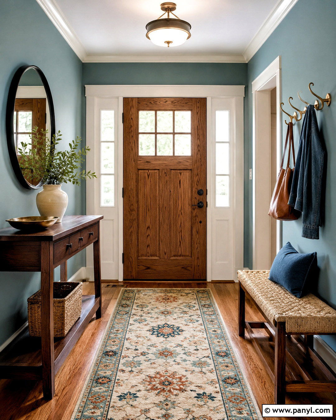
Benjamin Moore Antique Glass CSP-695 works beautifully in an entryway where muted color needs to coordinate with several adjoining rooms. It appears within Benjamin Moore’s broader teal collection. () Use the soft blue-green on the walls, paired with warm white trim and a natural oak front door. Place a slim walnut console against one wall and hang a large round black-framed mirror above it. A vintage-inspired runner in cream, faded teal, and rust gives the narrow space pattern without creating clutter. Add a woven bench with hidden shoe storage, two brass wall hooks, and a simple ceramic lamp. Keep accessories limited to a small tray, a leafy branch, and one lidded basket. This practical scheme creates a welcoming transition with color, storage, and clear walking space.
11. Waterfall SW 6750 Bedroom
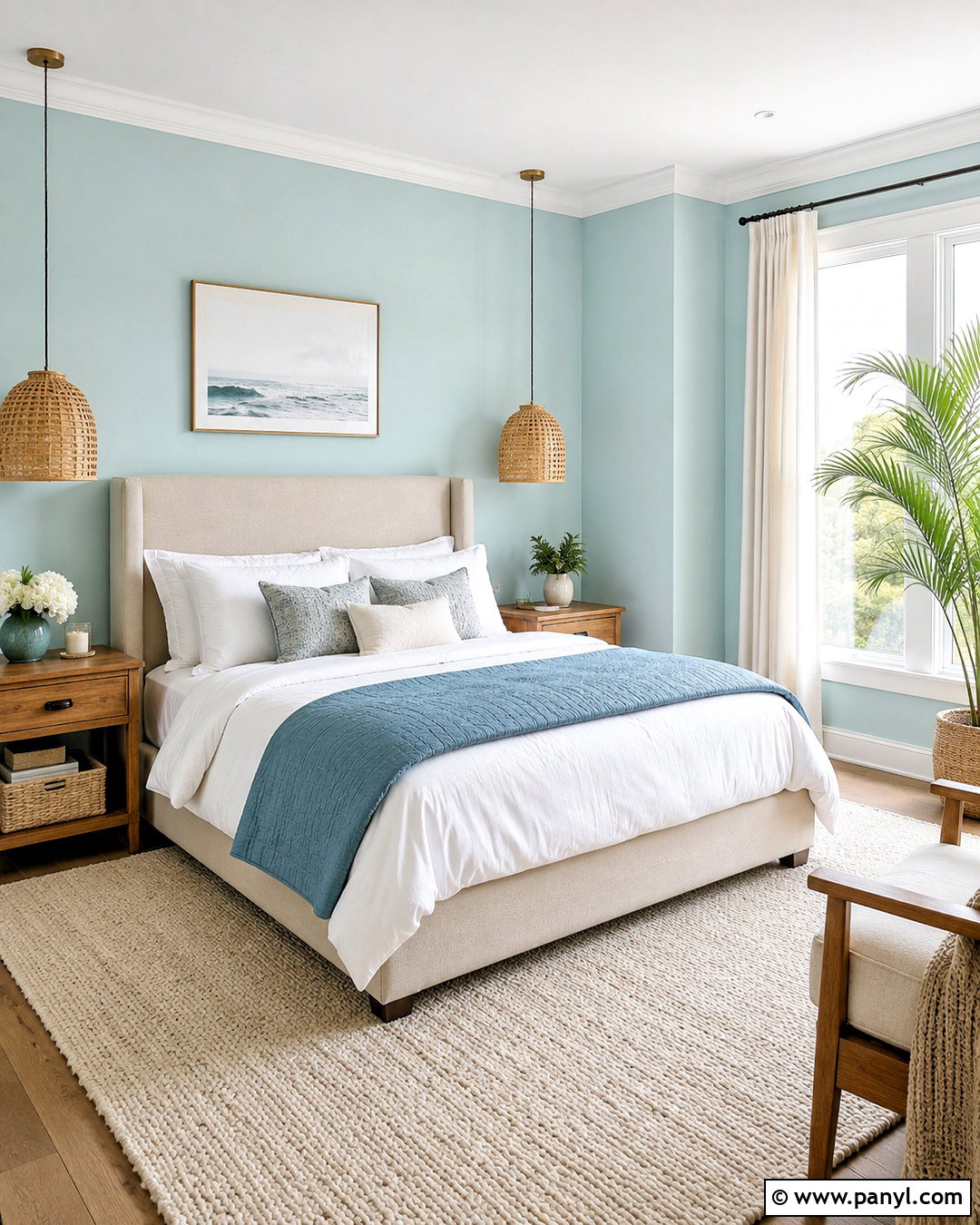
Sherwin-Williams Waterfall SW 6750 is a pale blue-green that can give a bedroom a clean coastal feeling without relying on themed accessories. () Cover the walls in Waterfall, then add bright white trim and a simple tongue-and-groove ceiling. Choose an upholstered oatmeal bed, white bedding, and a lightweight sea-blue quilt folded across the foot. Light oak nightstands and woven pendant lights introduce soft natural texture. Underfoot, use a cream wool rug with a subtle geometric pattern over medium oak flooring. Keep the windows relaxed with white linen curtain panels. A pair of abstract coastal prints and small ceramic lamps provide enough decoration. The overall bedroom feels breezy and comfortable while allowing the light teal walls to supply most of the personality.
12. Refresh SW 6751 Bathroom
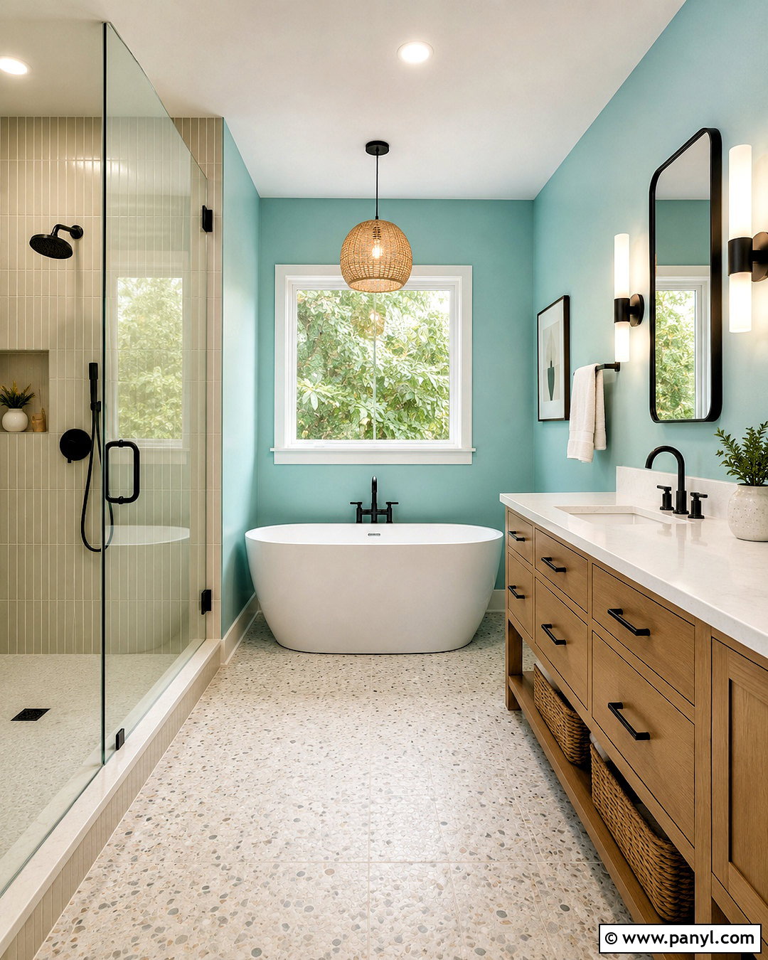
Sherwin-Williams Refresh SW 6751 has enough presence to enliven a bathroom while still working as a light, uplifting wall color. () Pair it with a white oak vanity, a bright white counter, and tall rectangular backsplash tile in a slightly creamy finish. Matte black faucets, cabinet pulls, and mirror frames provide crisp visual boundaries around the softer colors. Use pale terrazzo flooring with small gray and tan flecks to connect the cool walls and warm wood. Two vertical sconces beside the mirror give the vanity even illumination. Finish the room with white towels, a natural wood stool, and woven storage baskets. This full design feels modern but not stark, giving the brighter light teal a calm architectural setting rather than surrounding it with additional saturated colors.
13. Tame Teal SW 6757 Kitchen
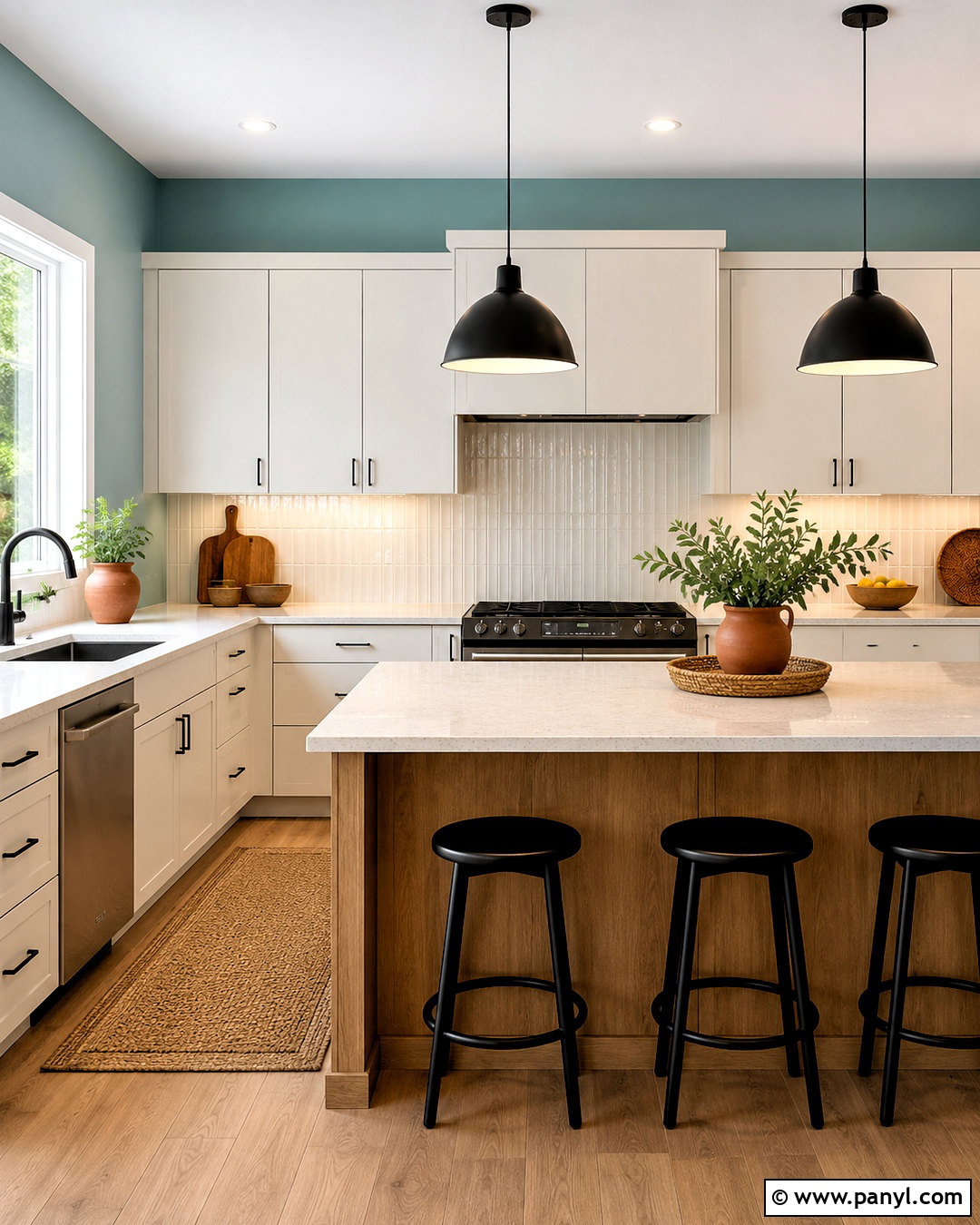
Sherwin-Williams Tame Teal SW 6757 can create a lively kitchen when it is balanced with simple cabinetry and warm, grounded finishes. () Paint the walls this clear light teal, then use creamy white flat-panel cabinets and pale quartz counters. A backsplash of narrow vertical tiles in warm white adds texture while maintaining an uncluttered appearance. Bring in natural oak through the island base, flooring, and a pair of backless stools. Small touches of matte black on the pendant lights and hardware keep the palette contemporary. Decorate with wooden cutting boards, white pottery, and one terracotta planter rather than many colorful objects. The complete kitchen feels bright and energetic, yet the restrained materials ensure the teal remains tasteful and suitable for an everyday family space.
14. Aqueduct SW 6758 Living Room
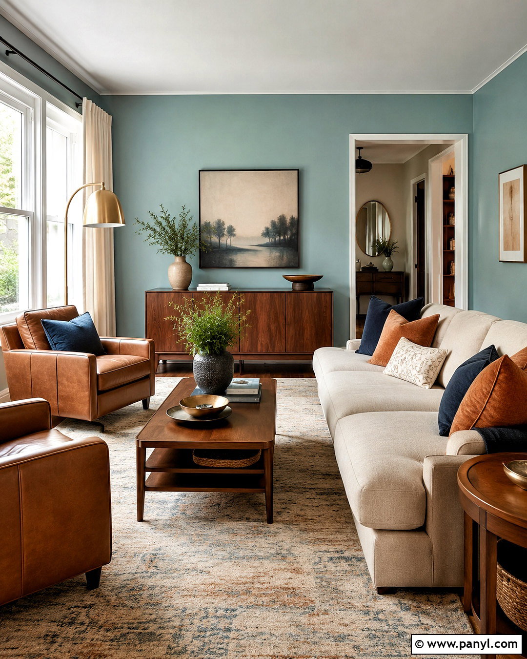
Sherwin-Williams Aqueduct SW 6758 sits on the more colorful edge of a light teal palette, making it effective in a living room with abundant windows and light upholstery. () Use it on the walls with crisp white trim, then anchor the room with a substantial cream sofa and two camel leather chairs. A large beige rug with a faded teal pattern connects the seating pieces and wall color. Select a walnut coffee table, brass floor lamp, and white oak shelving to create varied warmth. Ivory curtain panels soften the windows without reducing brightness. Add navy pillows for depth and a few patterned cushions containing cream, rust, and teal. This complete arrangement makes the stronger aqua-teal feel sophisticated instead of playful, especially when the accessories stay warm and edited.
15. Aquaverde SW 9051 Dining Room
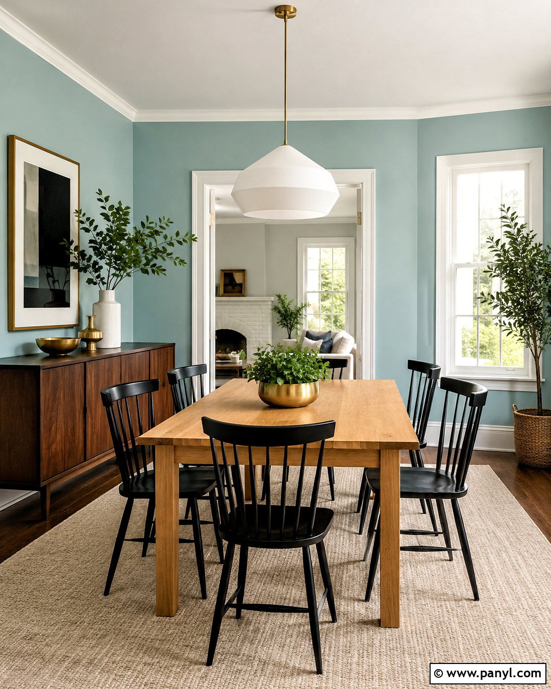
A dining room painted in Sherwin-Williams Aquaverde SW 9051 can feel fresh and contemporary while retaining enough softness for long, relaxed meals. Sherwin-Williams classifies the blue-family shade as light and recommends Creamy and Buff among its coordinating colors. () Use creamy white on the ceiling and trim, then introduce buff tones through a large wool rug and upholstered end chairs. A rectangular white oak table and six simple spindle chairs add natural structure. Hang a sculptural matte white pendant above the table, and place a narrow walnut sideboard against the longest wall. Cream curtains, handmade pottery, and restrained brass accents complete the room. This scheme balances the cool blue-green walls with warm neutrals, creating a dining area that feels colorful but not overly casual.
16. Spa SW 6765 Powder Room
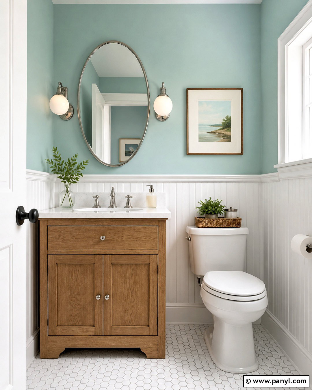
A small powder room offers a controlled setting for Sherwin-Williams Spa SW 6765, a watery blue-green that creates a crisp, uplifting impression. () Apply it to the upper walls and install white beadboard below for contrast and durability. Choose a compact oak vanity with a white stone top, then add a polished nickel faucet and an oval mirror with a thin metal frame. A small globe sconce on each side provides even light and a pleasing sense of symmetry. Use white hexagonal floor tile with light gray grout to keep the room bright. A framed botanical print, folded white hand towels, and a woven wastebasket complete the design. The result feels fresh and detailed, proving a light teal powder room can be both practical and memorable.
17. Swimming SW 6764 Breakfast Nook
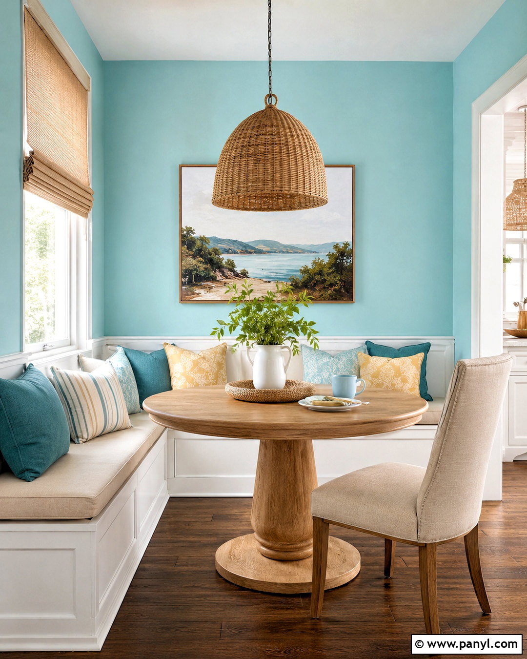
Sherwin-Williams Swimming SW 6764 gives a sunny breakfast nook a playful blue-green backdrop while keeping the overall space light and usable. () Paint the walls in this soft aqua teal and use clean white on the window trim, ceiling, and built-in banquette. Add a round pedestal table in natural oak to improve movement through the compact area. Cover the bench cushion in a durable oatmeal fabric, then layer striped teal, cream, and muted yellow pillows. A woven pendant light echoes the wood tones and adds texture above the table. Install pale linen Roman shades for glare control. A small gallery of simple landscape prints completes the nook. Together, the color, built-in seating, and natural finishes create an inviting place for casual meals and morning coffee.
18. Retiring Blue SW 6763 Guest Room
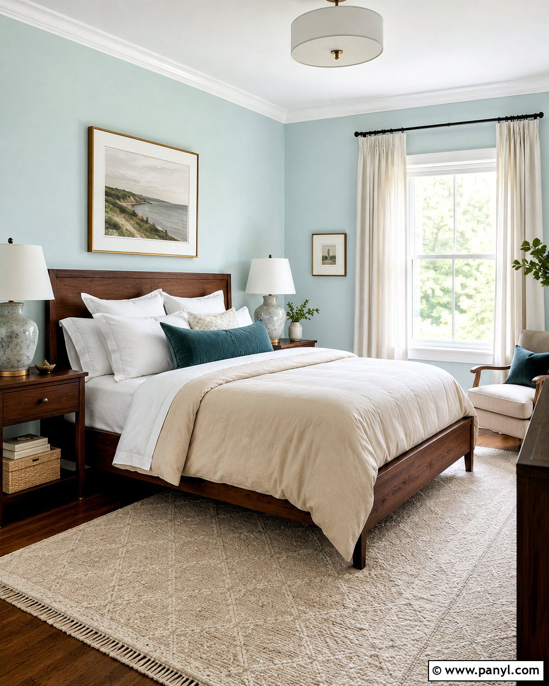
Sherwin-Williams Retiring Blue SW 6763 creates a very pale blue-green guest room that feels restful, uncluttered, and broadly appealing. () Paint the walls and keep the ceiling, doors, and trim a soft warm white. Center a simple walnut bed on the longest wall and dress it with crisp white sheets, a sand-colored duvet, and one textured teal lumbar pillow. Matching wood nightstands make the room feel settled, while small ceramic lamps provide warm bedside light. Add a cream and gray flat-weave rug, an upholstered bench, and white linen curtains. One large abstract artwork in faded green, blue, and beige adds interest without crowding the walls. This complete scheme gives visitors a comfortable room that feels considered, calm, and easy to personalize over time.
19. Embellished Blue SW 6749 Laundry Room
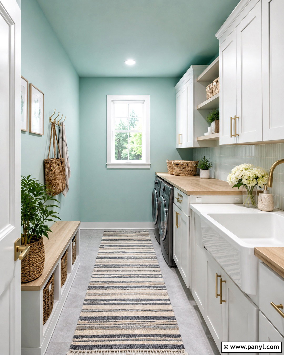
Imagine opening the laundry room door to a space that feels brighter and more orderly. Sherwin-Williams Embellished Blue SW 6749 offers a very light minty teal foundation for that transformation. () Use it on the walls with white cabinetry extending to the ceiling for maximum storage. Install a light oak counter over the appliances and repeat the wood on two open shelves. Brushed brass pulls add warmth, while a white porcelain utility sink keeps the room practical. Choose pale gray floor tile in a simple grid and add a washable striped runner. Woven baskets, clear containers, and a wall-mounted drying rail complete the organization. The finished laundry room feels cheerful and efficient, with the subtle teal preventing the all-white storage from looking flat or clinical.
20. Cooled Blue SW 6759 Screened Porch
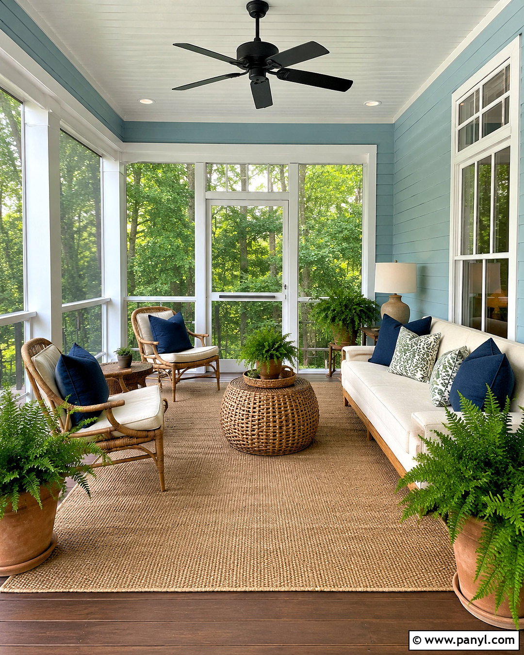
Sherwin-Williams Cooled Blue SW 6759 can give a screened porch a stronger light teal identity while still blending naturally with garden views. () Paint the paneled walls in Cooled Blue and use bright white on the ceiling, screens, and trim. Arrange a weather-resistant cream sofa with two teak lounge chairs around a low woven coffee table. Add an indoor-outdoor rug in beige and white to define the seating area. Cushions in navy, leafy green, and subtle teal patterns connect the painted walls with the surrounding landscape. A matte black ceiling fan and black lantern-style sconces provide practical contrast. Large clay planters filled with ferns complete the porch, resulting in a fresh outdoor room that feels comfortable, colorful, and connected to the home.
Conclusion:
These **20 light teal paint colors** show how versatile a blue-green palette can be throughout the home. The palest shades create airy bedrooms and clean bathrooms, while slightly stronger teals add personality to kitchens, dining rooms, and porches. Warm white trim is a dependable companion, but natural oak, walnut, woven fibers, brass, and terracotta are equally important because they keep teal from feeling cold. Remember that flooring, window direction, and surrounding finishes will influence how each color appears. Test two or three large samples on different walls and observe them from morning through evening. Once you identify the right undertone, build the rest of the room around it using a balanced mix of warm neutrals and simple contrast.

Related Ideas and Inspiration:

Leave a Reply