
Accessible Beige is a warm greige that creates a comfortable backdrop without making a home feel dated or overly tan. The best Accessible Beige coordinating colors can shift it toward airy, earthy, coastal, traditional, or dramatic, depending on the room and lighting. Its muted gray undertones work especially well with warm whites, stone-inspired neutrals, dusty greens, softened blues, rich browns, and carefully chosen dark accents. Sherwin-Williams officially recommends Aesthetic White, Sanderling, and Cadet, but the color can support many broader whole-room palettes. Always sample paint beside flooring, cabinets, countertops, and fabrics because natural and artificial light can change the final effect. () The complete room schemes below offer 20 practical ways to decorate with Accessible Beige coordinating colors.
1. Aesthetic White With Accessible Beige
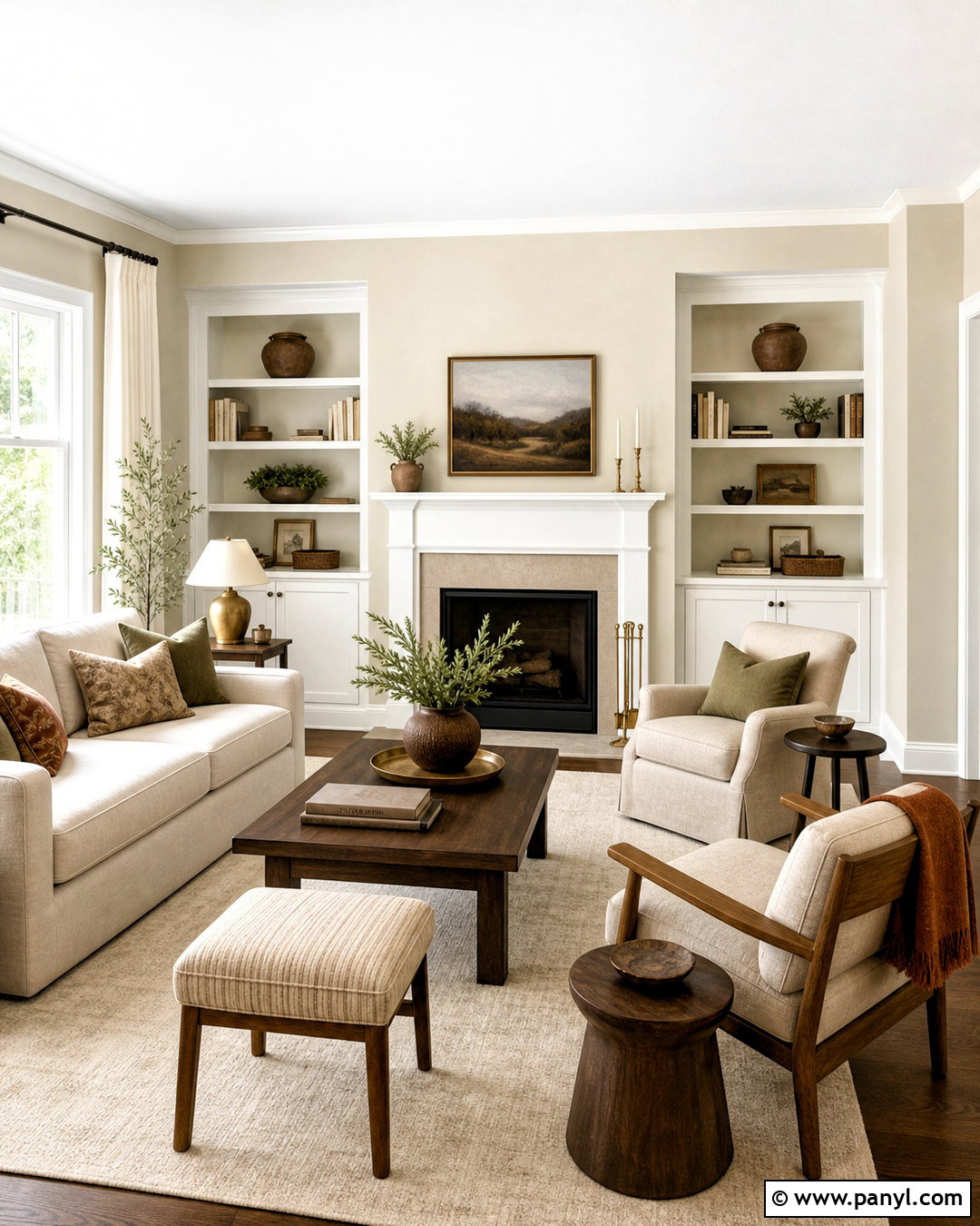
Aesthetic White SW 7035 creates a soft, connected transition beside Accessible Beige instead of a sharply contrasting outline. Use Accessible Beige across the main living room walls, then bring Aesthetic White onto the ceiling, trim, doors, and built-in shelving. A cream linen sofa, light oak coffee table, and warm ivory rug maintain the quiet palette. Add medium walnut side tables and brushed brass lighting so the room has enough depth. Small accents in muted olive, faded rust, and charcoal keep the neutral scheme from appearing flat. This combination works especially well in open floor plans because both colors share a gentle, subdued quality. Choose matte walls, flat ceiling paint, and satin trim to make the subtle color difference easier to see.
2. Sanderling With Accessible Beige
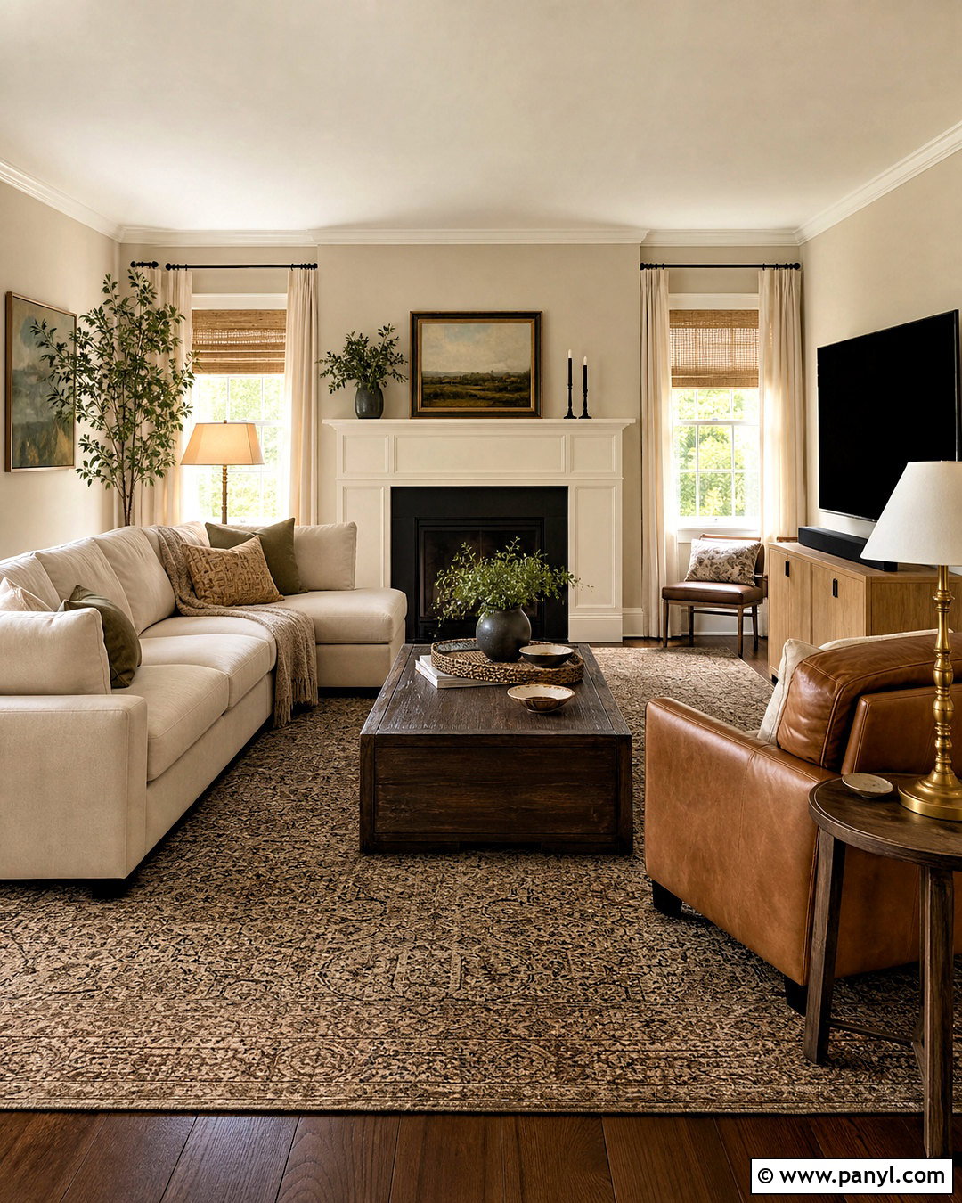
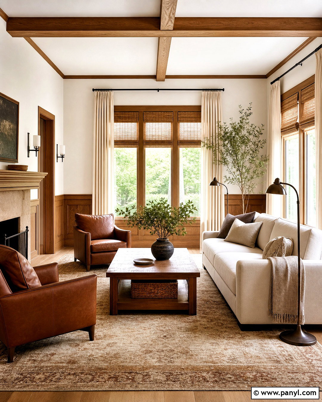
For a layered earth-tone interior, pair Accessible Beige walls with Sanderling SW 7513 on cabinetry, an accent wall, or a paneled fireplace. Sanderling is deeper and browner, so it grounds the lighter wall color without producing harsh contrast. Build a comfortable family room around a warm oatmeal sectional, cognac leather chair, and natural oak media console. A wool rug mixing beige, cocoa, and faded black will connect every surface. Finish the room with woven window shades, linen curtains, aged brass lamps, and simple pottery. Keep the ceiling and baseboards warm white to prevent the deeper beige from becoming heavy. This palette feels particularly natural beside stone fireplaces, medium wood flooring, and other finishes that contain brown, taupe, or sandy undertones.
3. Cadet With Accessible Beige
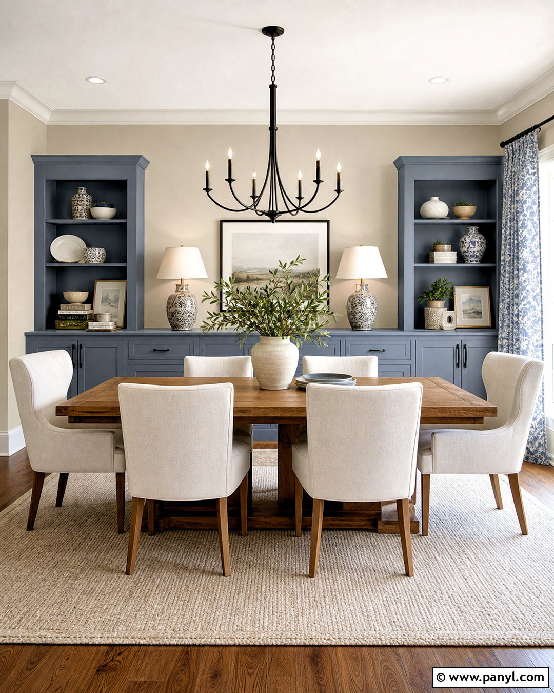
Cadet SW 9143 brings a cool, smoky blue contrast to the warmth of Accessible Beige. Try Accessible Beige on dining room walls and Cadet on a built-in buffet, lower cabinets, or the inside of a wide doorway. A medium oak dining table, cream upholstered chairs, and a textured ivory rug keep the space relaxed. Repeat the blue through patterned curtains or ceramic table lamps, but avoid covering every surface with it. Matte black hardware and a simple black chandelier give the scheme a clean outline. Warm white trim creates a useful bridge between the beige and blue. This complete palette works beautifully in transitional and updated traditional homes because Cadet adds noticeable color while its gray character remains calm beside the muted walls.
4. Alabaster With Accessible Beige
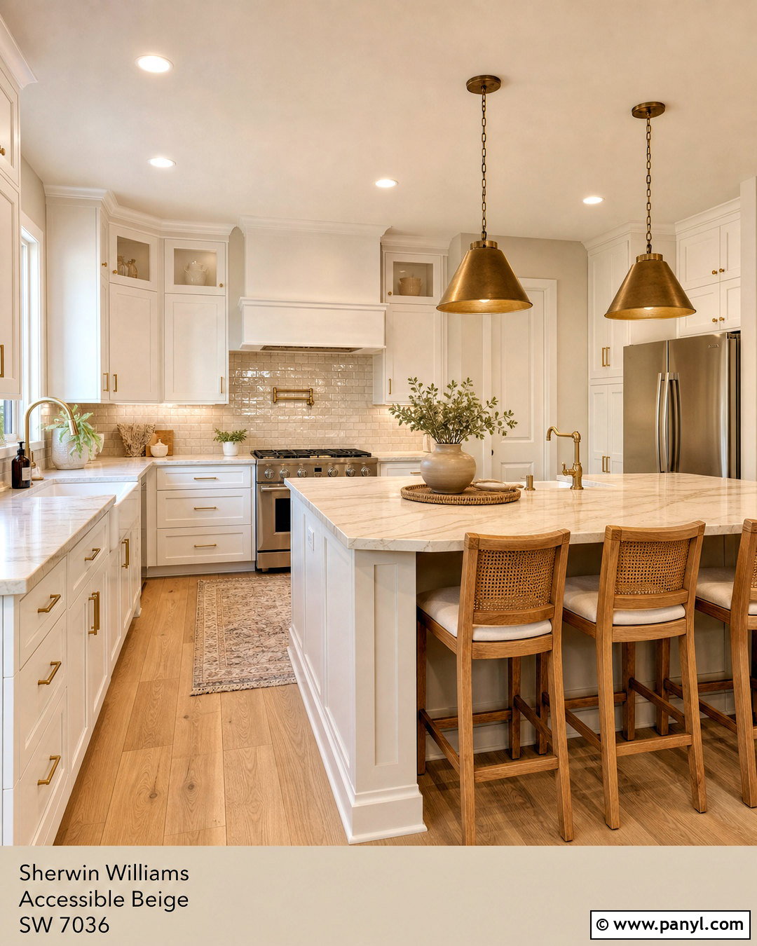
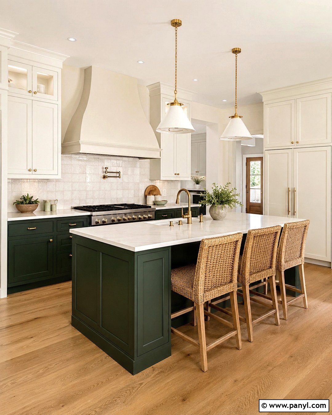
Alabaster SW 7008 gives Accessible Beige a warm, creamy partner that feels fresh without looking stark. In a kitchen, use Accessible Beige on the walls and Alabaster on Shaker cabinets, ceiling, trim, and doors. Natural white oak flooring and a soft beige-veined quartz countertop will connect the two paints. Add an ivory zellige backsplash for subtle texture, then introduce brushed brass hardware and warm metal pendants. Counter stools in woven cane or light wood reinforce the inviting look. A few accents in sage green, dusty blue, or warm black will provide balance. This combination is especially useful when existing surfaces include cream, tan, or warm stone. Test Alabaster beside white appliances, however, because brighter manufactured whites may make it appear creamier.
5. Pure White With Accessible Beige
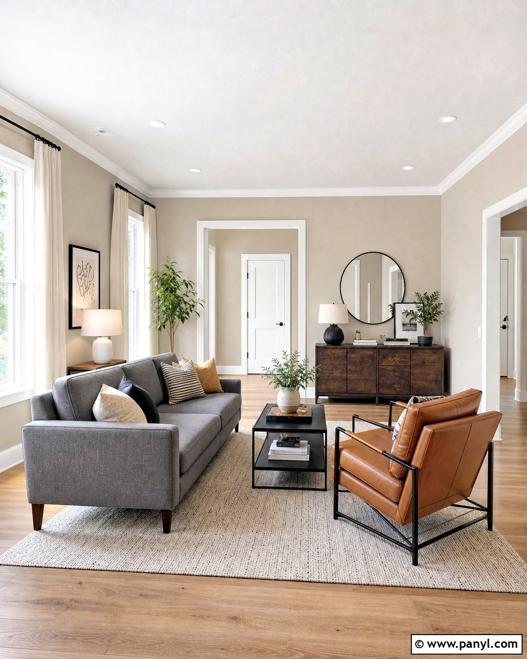
Pure White SW 7005 produces a cleaner, brighter frame around Accessible Beige while remaining softer than an icy blue-white. Use Accessible Beige throughout a hallway or living room, with Pure White on crown molding, baseboards, interior doors, window casings, and the ceiling. Choose pale oak flooring, a warm gray sofa, and an ivory rug to preserve the light effect. Black-framed artwork, matte black curtain rods, and one dark wood console add definition. Layer in camel leather, natural linen, and soft green accessories for warmth. This palette suits homes that need noticeable trim contrast but still have warm flooring and furnishings. Keep the white consistent across connected spaces. Several competing whites can make an otherwise polished Accessible Beige color scheme feel accidental and disconnected.
6. Shoji White With Accessible Beige
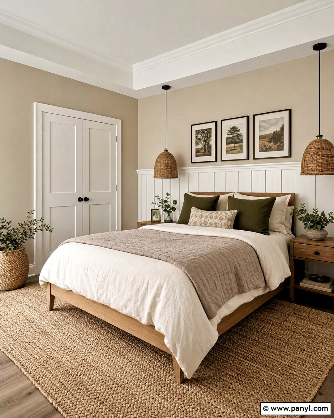
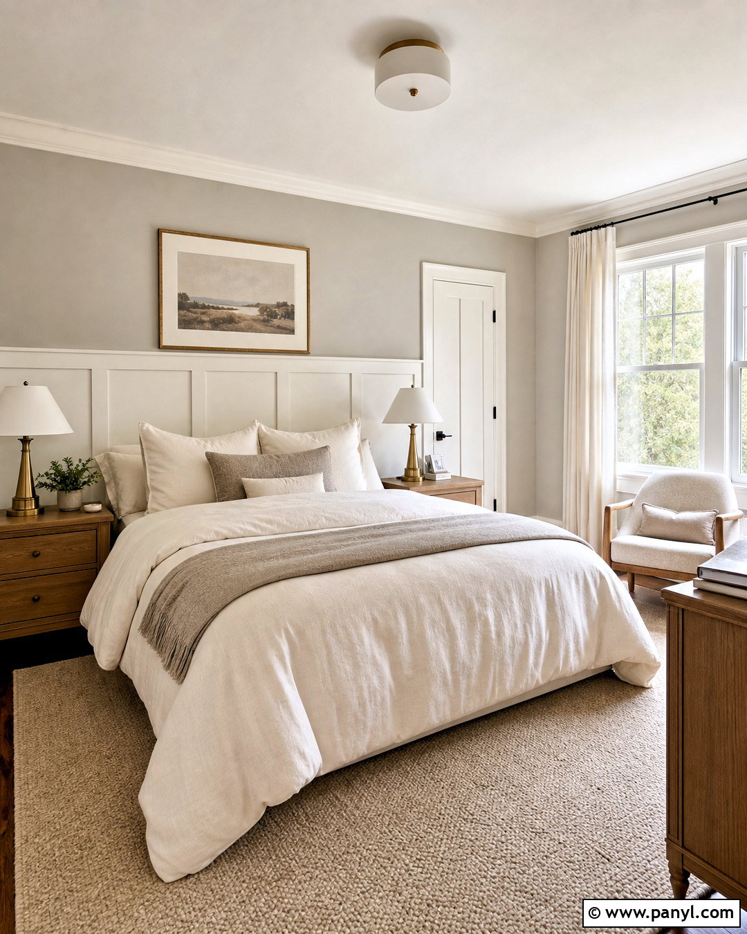
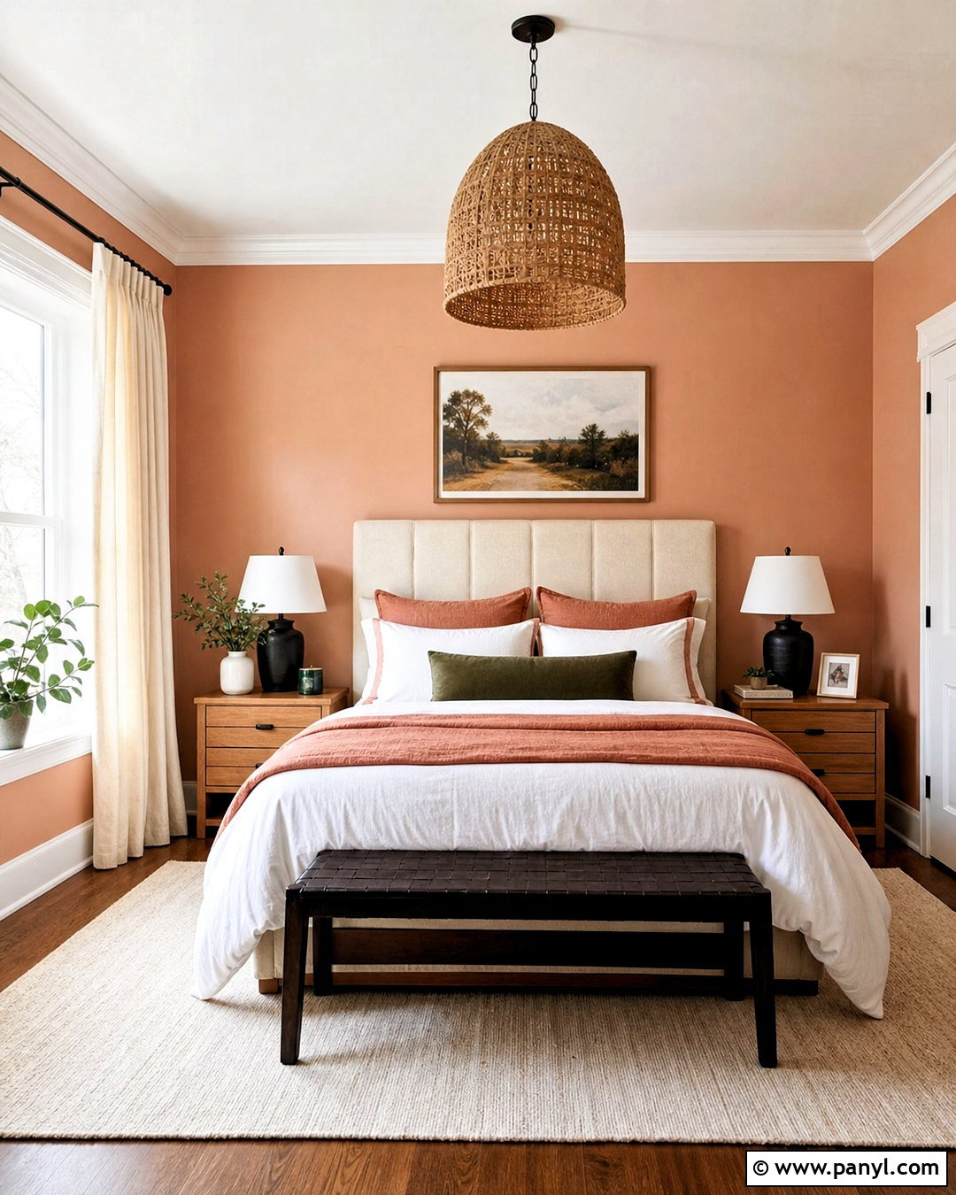
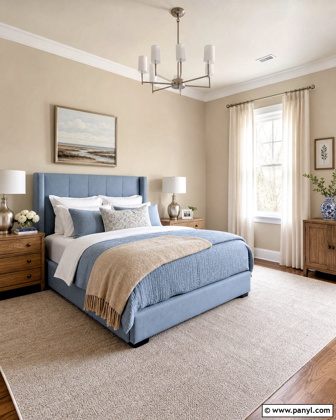
Shoji White SW 7042 creates a gently tonal palette with Accessible Beige, making it ideal for calm bedrooms and organic interiors. Paint the walls Accessible Beige and apply Shoji White to the ceiling, trim, closet doors, and a simple paneled headboard wall. Dress the bed in ivory linen, mushroom-colored quilting, and muted olive pillows. Light oak nightstands, woven pendant lights, and a large natural fiber rug bring texture without interrupting the soft color flow. Use aged bronze or matte black sparingly through lamps and picture frames. The overall effect should feel layered rather than monochromatic, so include a few darker wood pieces. This pairing works best when the room receives enough light to reveal the quiet difference between the two warm, subdued paint colors.
7. Sea Salt With Accessible Beige
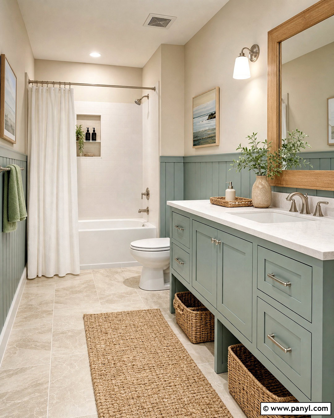
Sea Salt SW 6204 adds a pale green-blue note that makes Accessible Beige feel lighter and more relaxed. In a bathroom, use Accessible Beige on the upper walls and Sea Salt on the vanity or vertical wall paneling. Warm white quartz, pale limestone-look floor tile, and an ivory shower curtain maintain an airy foundation. Add a light oak mirror, brushed nickel fixtures, and woven storage baskets for a balanced mix of warm and cool finishes. Towels can repeat soft sage, dusty aqua, and cream. Avoid intensely turquoise accessories, which may overpower Sea Salt’s muted quality. This palette creates a soothing coastal influence without relying on obvious beach decorations. It also complements bathrooms where beige tile must remain but needs a fresher, more intentional surrounding color scheme.
8. Evergreen Fog With Accessible Beige
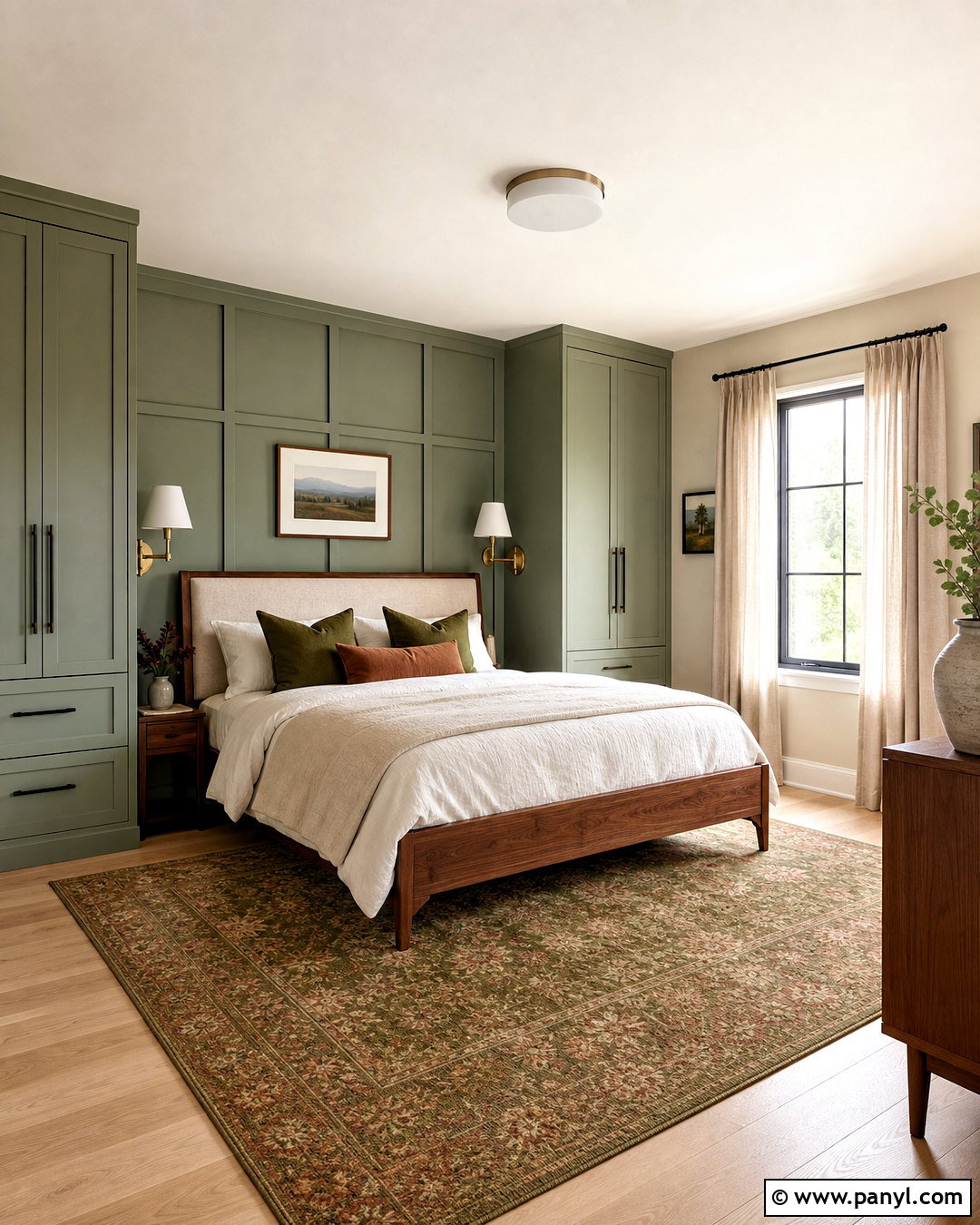
Evergreen Fog SW 9130 gives Accessible Beige a grounded green partner suited to natural, modern spaces. Use Accessible Beige on bedroom walls and Evergreen Fog on the wall behind the bed, a built-in wardrobe, or both nightstands. Choose a walnut or medium oak bed, oatmeal upholstery, and layered cream bedding. A vintage-inspired rug containing olive, beige, faded rust, and charcoal can unite the full room. Add antique brass sconces, linen curtains, and dark bronze hardware for quiet contrast. Because both paints are muted, introduce texture through wool, woven grasscloth, wood grain, and handmade ceramics. Keep the ceiling and remaining trim a warm white. The resulting bedroom feels restorative and substantial, with enough contrast to highlight architectural details without creating a dark or overly colorful environment.
9. Retreat With Accessible Beige
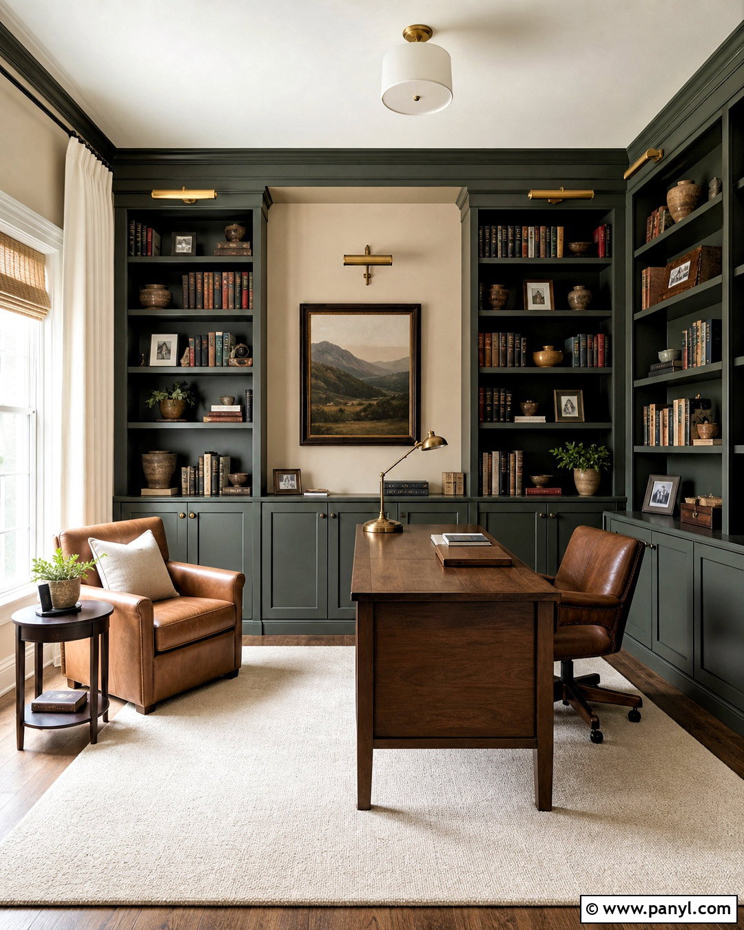
Retreat SW 6207 is a deeper green that can turn Accessible Beige into the foundation of a cozy library, office, or reading room. Paint the main walls Accessible Beige, then use Retreat across floor-to-ceiling bookcases or a wide paneled focal wall. Include a camel leather chair, medium walnut desk, cream wool rug, and warm white curtains. Aged brass picture lights and bronze cabinet hardware emphasize the traditional character of the palette. Repeat the green in one patterned pillow or upholstered desk chair instead of adding many competing shades. Dark brown frames and pottery provide extra depth. This combination works because the stronger green gives the room focus while Accessible Beige keeps the remaining surfaces warm and approachable. Good task lighting is important when using Retreat across large built-in features.
10. Urbane Bronze With Accessible Beige
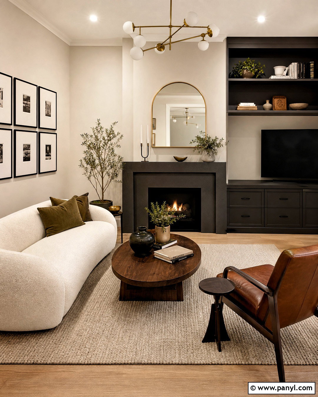
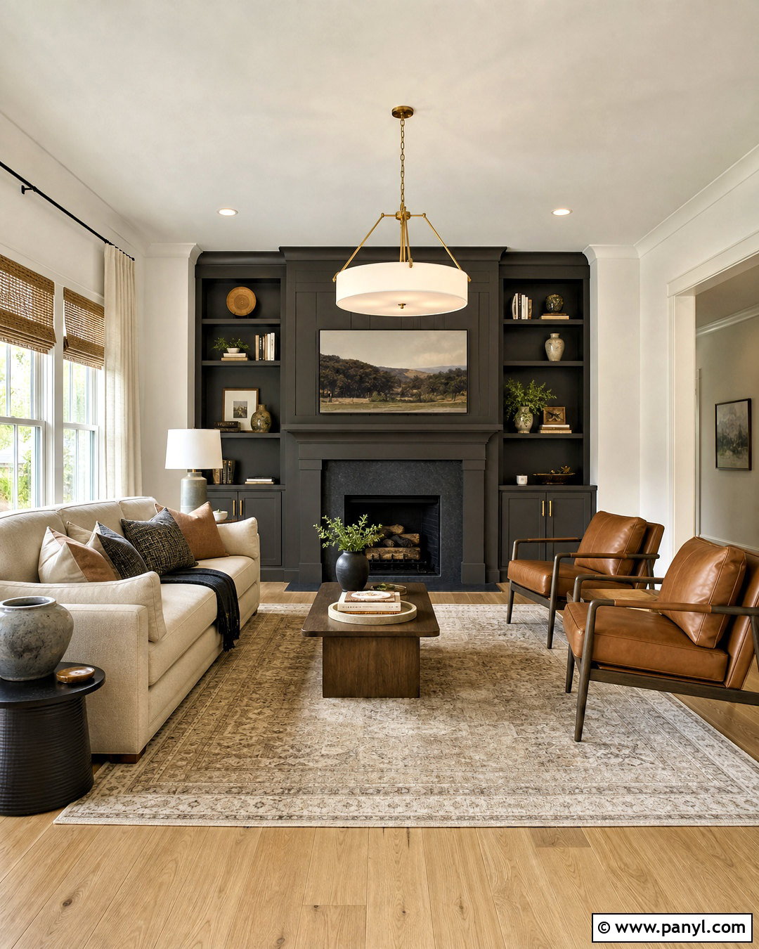
Urbane Bronze SW 7048 creates bold contrast while maintaining the earthy character of Accessible Beige. In a living room, paint the walls Accessible Beige and use Urbane Bronze on a substantial fireplace surround, media cabinet, or window wall. Select a cream boucle sofa, walnut coffee table, and beige wool rug to keep the room balanced. Add cognac leather seating and antique brass lighting for warmth. A few olive branches, stoneware pieces, and black-framed artwork complete the natural palette. Do not scatter the dark color across many small objects; one large, deliberate application looks more sophisticated. Warm white trim and a pale ceiling will keep the room open. This pairing is especially effective in spaces with strong daylight, natural stone, and medium-to-dark wood flooring.
11. Iron Ore With Accessible Beige
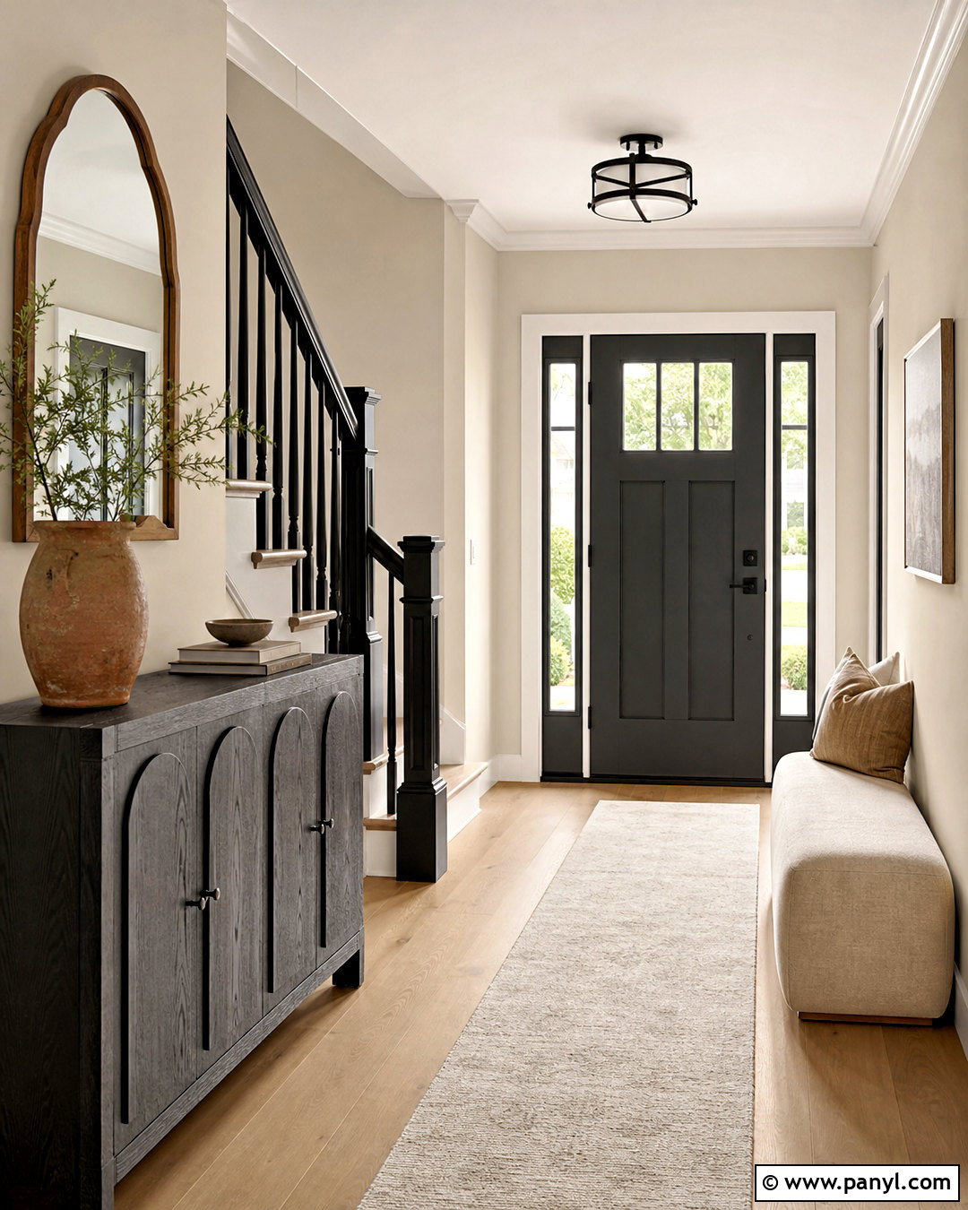
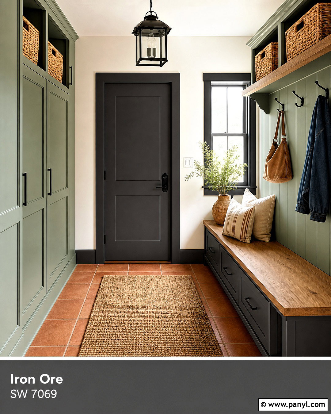
Iron Ore SW 7069 gives Accessible Beige a sophisticated charcoal accent that works in modern and transitional interiors. Use Accessible Beige throughout an entryway, then paint the inside of the front door, stair railing, and one slim console cabinet in Iron Ore. Pale oak floors, an ivory runner, and warm white trim prevent the darker details from dominating. Add a rounded wood mirror, blackened bronze light fixture, and a simple bench with oatmeal upholstery. Repeat the charcoal through a few picture frames and door handles for consistency. Natural greenery and terracotta pottery can soften the contrast. This palette feels polished because Iron Ore defines edges and focal points while Accessible Beige provides visual warmth. For the cleanest result, choose one dark metal finish and repeat it throughout the connected space.
12. Naval With Accessible Beige
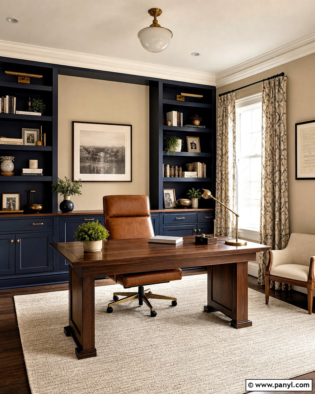
Naval SW 6244 offers a deep navy contrast that makes Accessible Beige appear warmer and more dimensional. In a home office, place Accessible Beige on the surrounding walls and use Naval on built-in shelves, lower cabinets, or the wall behind the desk. A warm walnut desktop, cognac leather chair, and cream flat-weave rug prevent the blue from feeling cold. Add aged brass library lights and cabinet pulls for a classic finish. Use warm white on the ceiling and trim, then repeat navy in a small patterned curtain or upholstered bench. Keep decorative objects restrained so the shelving color remains the main statement. This balanced scheme works well for an office that needs energy and definition while still coordinating with neutral hallways or adjoining rooms painted Accessible Beige.
13. Waterloo With Accessible Beige
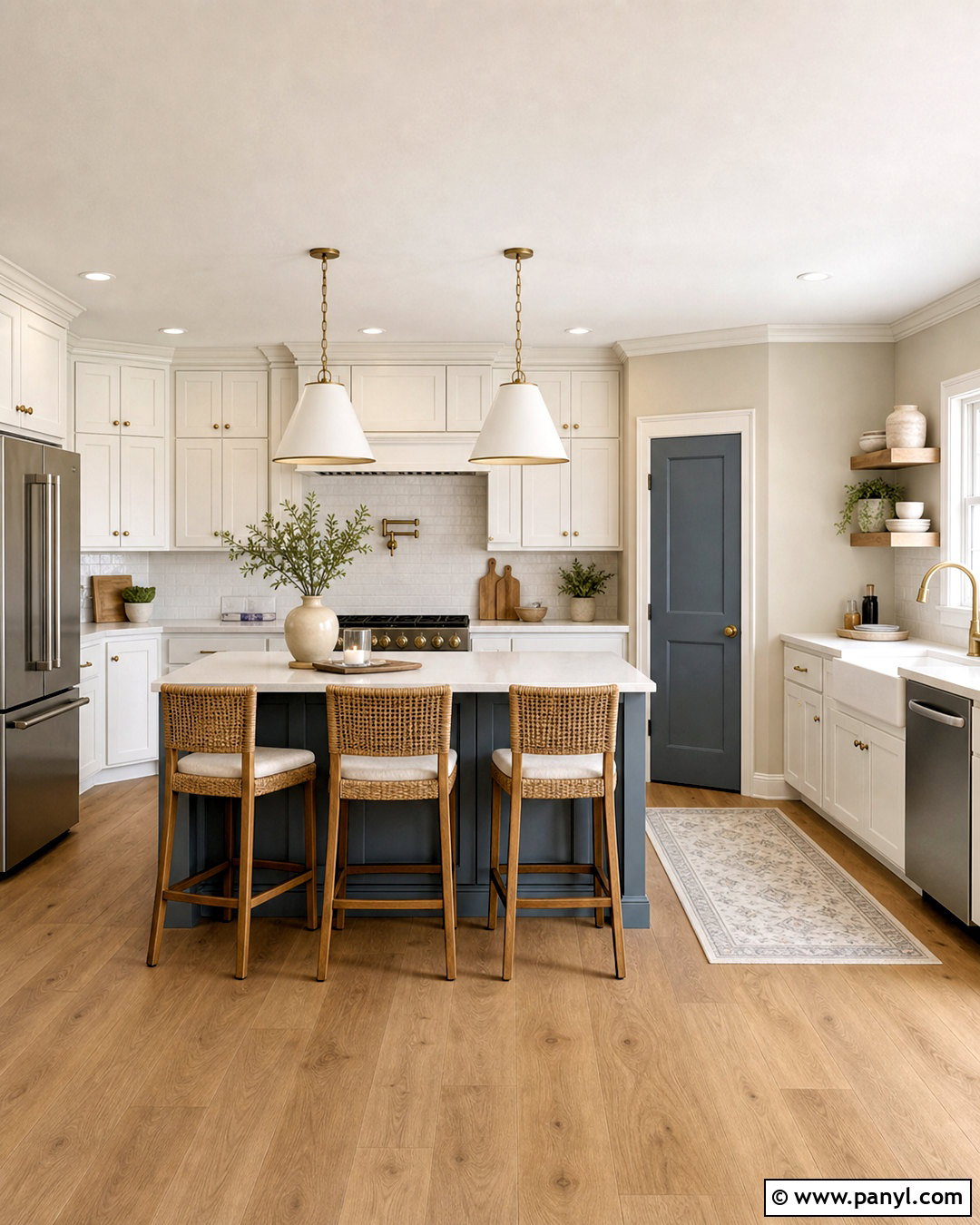
Waterloo SW 9141 creates a strong blue-gray accent with enough softness to sit comfortably beside Accessible Beige. Use the beige on kitchen walls and Waterloo on a large island, pantry door, or bank of lower cabinets. Warm white perimeter cabinets keep the layout open, while pale quartz countertops connect all three paint colors. Choose medium oak flooring, brushed brass hardware, and simple off-white pendants to warm the blue. Counter stools with woven seats add natural texture. Repeat Waterloo only once or twice through pottery or a narrow Roman shade. The color has enough visual weight to anchor a busy kitchen, so additional dark accents should remain limited. This combination feels tailored and welcoming rather than nautical, especially when paired with warm wood and softly veined stone.
14. Moth Wing With Accessible Beige
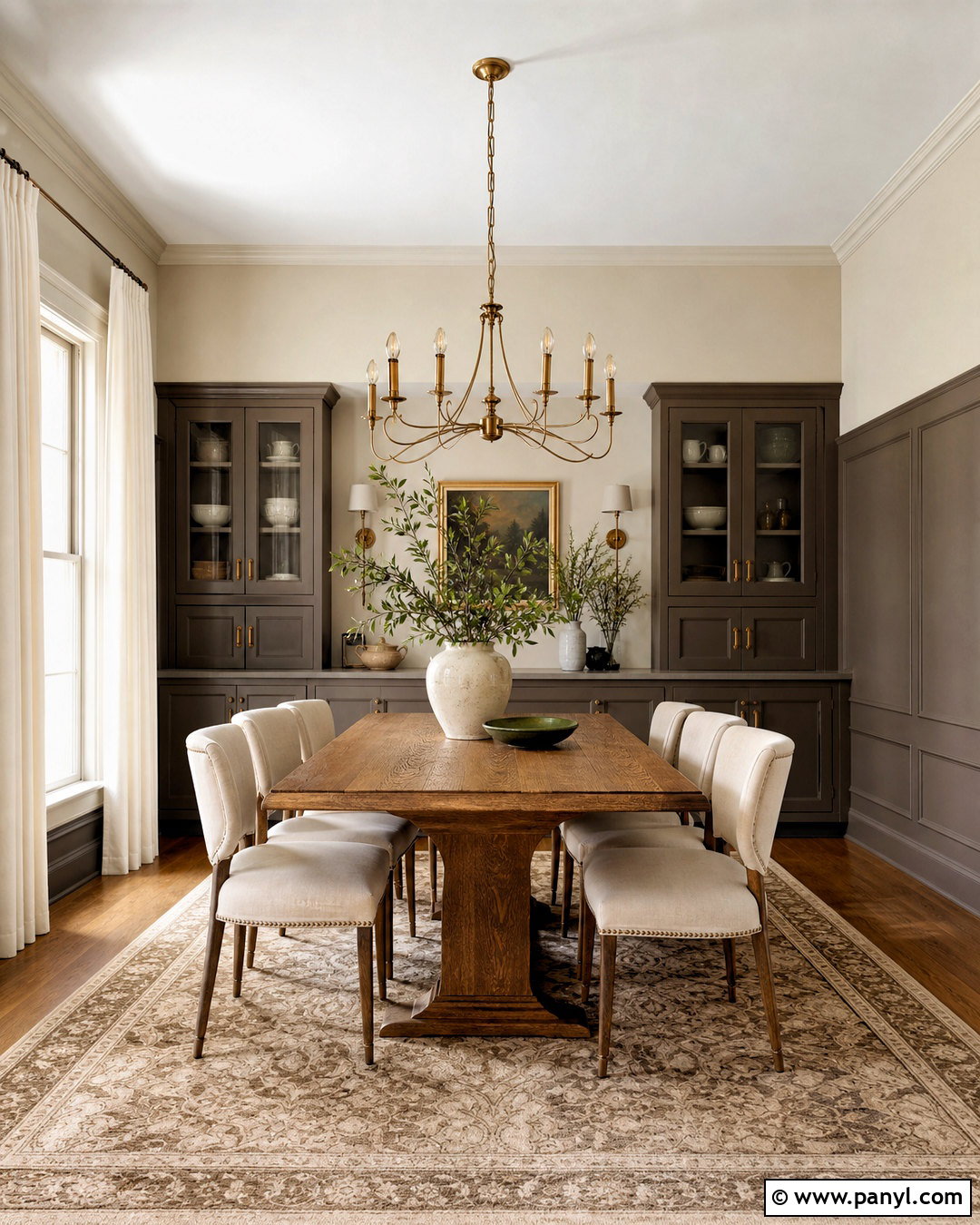
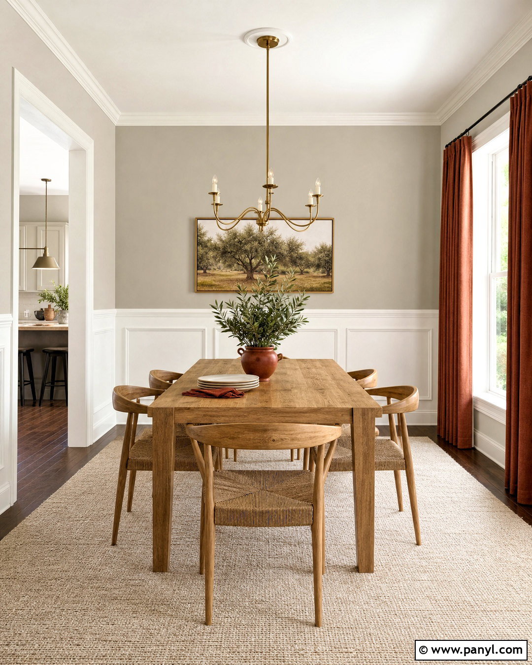
Moth Wing SW 9174 provides a deep brown-gray layer that enhances the warmth of Accessible Beige without introducing a completely different color family. In a dining room, use Accessible Beige on the walls and Moth Wing on a paneled lower wall, built-in china cabinet, or interior doors. A medium oak table and cream upholstered chairs will soften the darker paint. Add a beige-and-brown patterned rug, warm white curtains, and an aged brass chandelier. Black accents can be included, but dark brown frames and bronze hardware will look more connected. Finish with ceramic pieces in ivory, moss green, and muted clay. The room will feel intimate yet balanced, especially when the ceiling stays light. This palette is a useful choice for homes with traditional millwork and warm wood furniture.
15. Balanced Beige With Accessible Beige
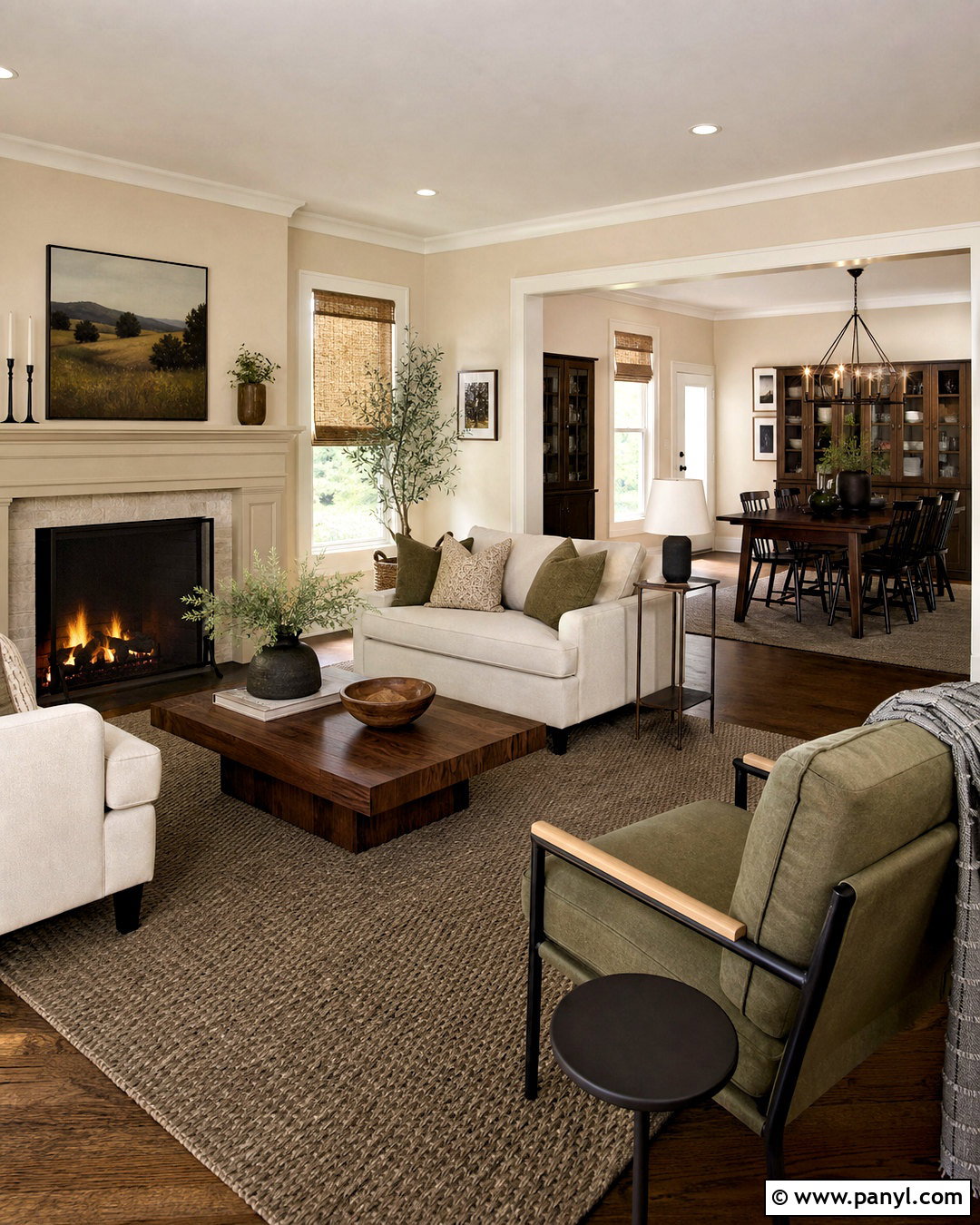
Balanced Beige SW 7037 sits deeper than Accessible Beige, making it a natural choice for a tonal, whole-home palette. Paint the main open living space Accessible Beige and use Balanced Beige in the adjoining dining room, on built-ins, or across a fireplace wall. Warm white trim should continue through both areas to create a consistent boundary. Furnish the rooms with cream upholstery, walnut tables, woven shades, and a textured taupe rug. Add contrast through olive textiles, dark bronze lighting, and a few charcoal accessories. Because the paints are closely related, vary materials and sheen so each surface remains visible. This layered approach feels calm and cohesive rather than repetitive. It is especially effective when homeowners want room-to-room definition without introducing a strong blue, green, or dramatic dark accent.
16. Tony Taupe With Accessible Beige
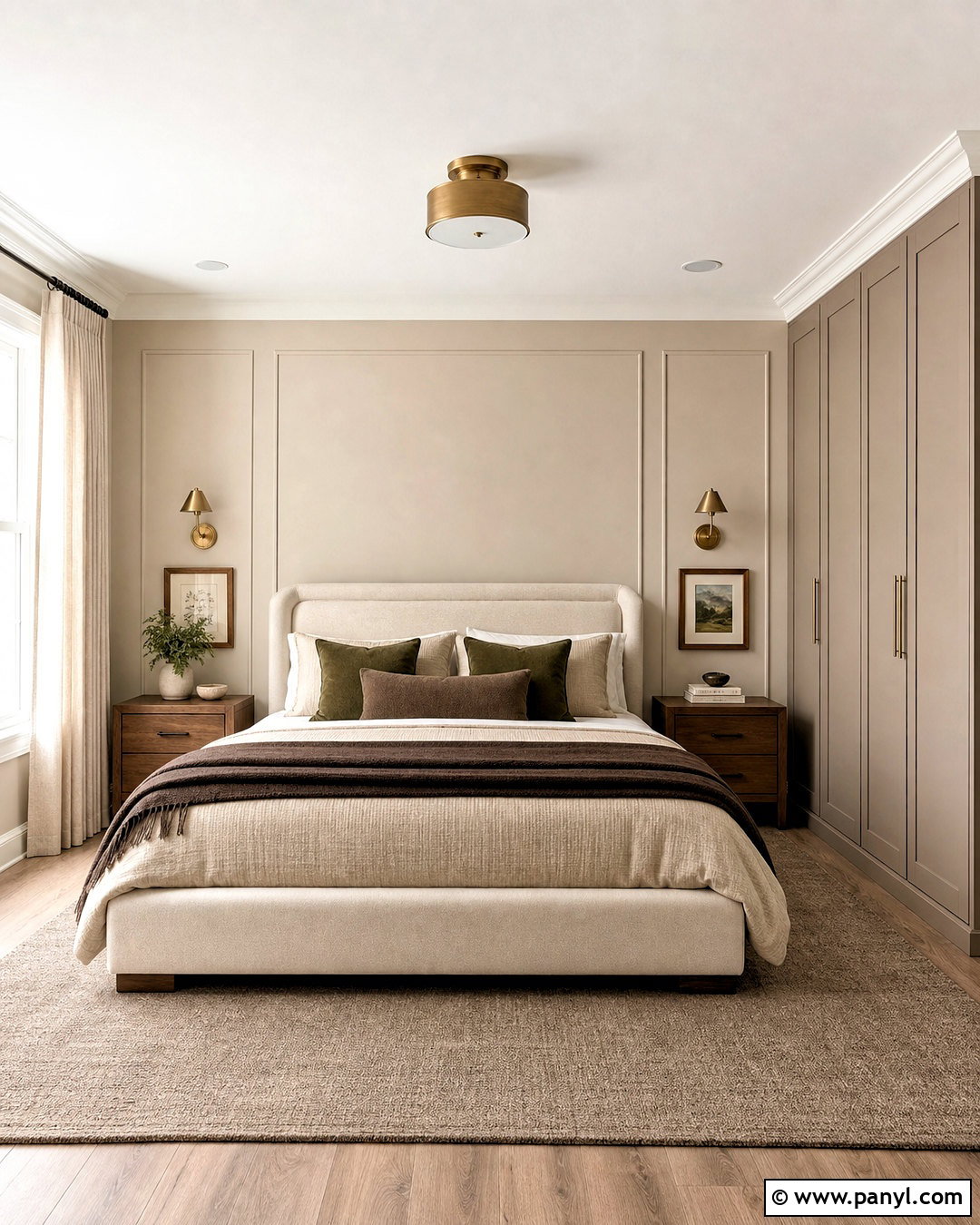
Tony Taupe SW 7038 adds richer taupe depth to an Accessible Beige palette and works particularly well in a comfortable primary bedroom. Keep Accessible Beige on most walls, then use Tony Taupe on a wide upholstered-look accent wall, window seat, or built-in wardrobes. Choose an ivory bed, medium walnut nightstands, and cream curtains hung close to the ceiling. Layer the bedding with oatmeal, cocoa, and soft olive textiles. Antique brass sconces and dark bronze curtain rods provide subtle structure. A large rug mixing beige and taupe should extend beyond the bed to connect the entire layout. Since Tony Taupe is noticeably deeper, adequate daylight and warm white ceiling paint will maintain balance. The result feels cozy, tailored, and easy to coordinate with natural wood furniture.
17. Virtual Taupe With Accessible Beige
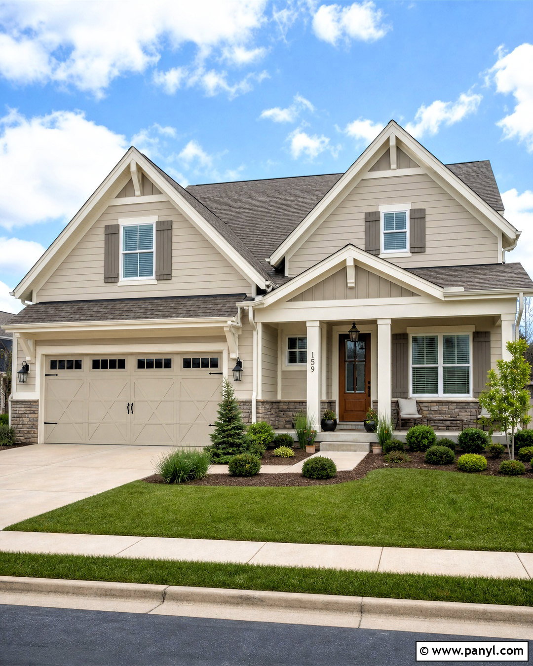
Virtual Taupe SW 7039 is a substantial brown-taupe that can give Accessible Beige a more architectural appearance. On a home exterior, use Accessible Beige for the siding or stucco body and Virtual Taupe for shutters, garage doors, or a wide porch gable. Choose warm white for fascia, window trim, and porch columns to keep the facade crisp. A medium brown roof, natural stone foundation, and stained wood front door will connect the full palette. Matte black lanterns and house hardware provide restrained contrast. Landscape with layered evergreen shrubs, ornamental grasses, and pale gravel or warm concrete paths. This complete exterior scheme feels grounded without becoming overly dark. Always sample both paints outdoors because direct sun can make neutral colors appear significantly lighter than they do inside.
18. Cavern Clay With Accessible Beige
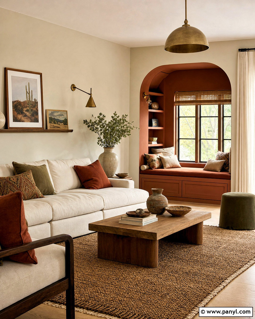
Cavern Clay SW 7701 adds a warm terracotta accent that highlights the earthy side of Accessible Beige. Use Accessible Beige on the living room walls and introduce Cavern Clay across a built-in window seat, painted cabinet, or defined reading nook. Choose a cream sofa, oak coffee table, and woven jute-wool rug for a natural foundation. Add pillows in muted rust, olive, tan, and ivory, plus off-white linen curtains. Aged brass lighting and handmade pottery suit the warm palette better than highly polished chrome. Keep the terracotta concentrated in one main feature so the room remains restful. Dark walnut or bronze details will add structure. This combination works especially well with southwestern, organic modern, and casual Mediterranean influences without requiring themed accessories or elaborate architectural changes.
19. Redend Point With Accessible Beige
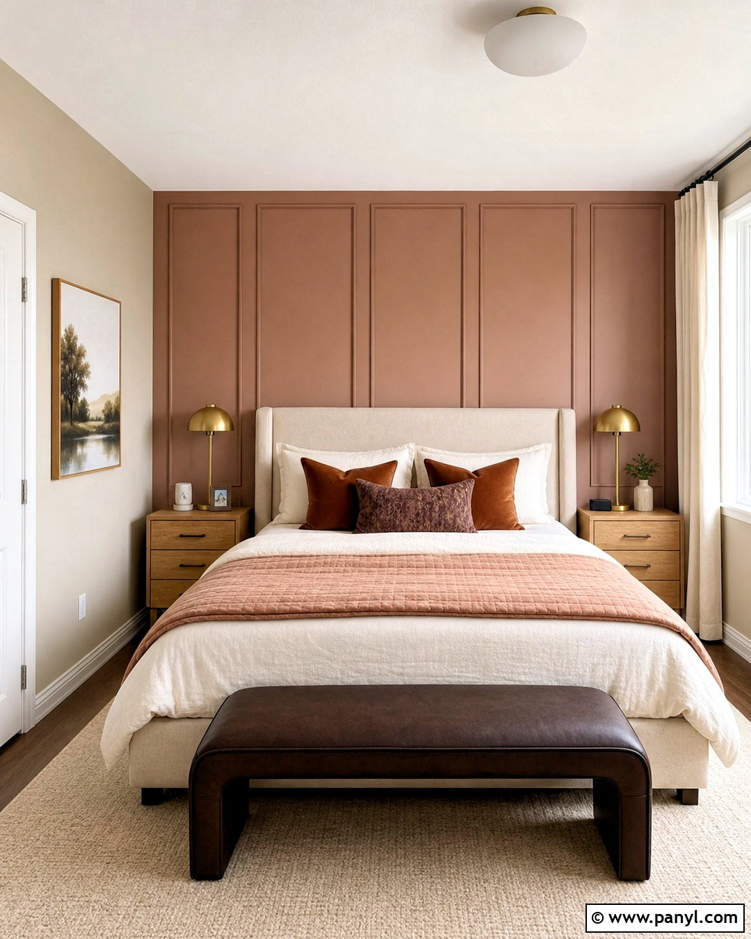
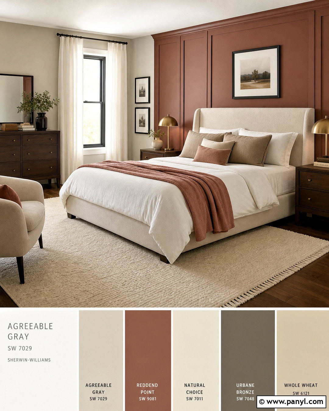
Redend Point SW 9081 introduces a muted blush-brown tone that gives Accessible Beige a gentle, modern warmth. In a guest bedroom, paint the main walls Accessible Beige and use Redend Point behind the bed or on a small dresser and matching nightstands. Select a cream upholstered headboard, light oak furniture, and warm white bedding. Add dusty rose, clay, and cocoa through a quilt, lumbar pillow, and patterned rug. Brushed brass lamps and ivory curtains keep the palette light, while one dark brown bench creates grounding contrast. Avoid bright pink accessories because they can make the softened accent look muddy. This complete scheme feels welcoming and distinctive without becoming overly feminine. It also coordinates naturally with woven materials, warm ceramics, and subtle botanical artwork in muted earth tones.
20. Tricorn Black With Accessible Beige
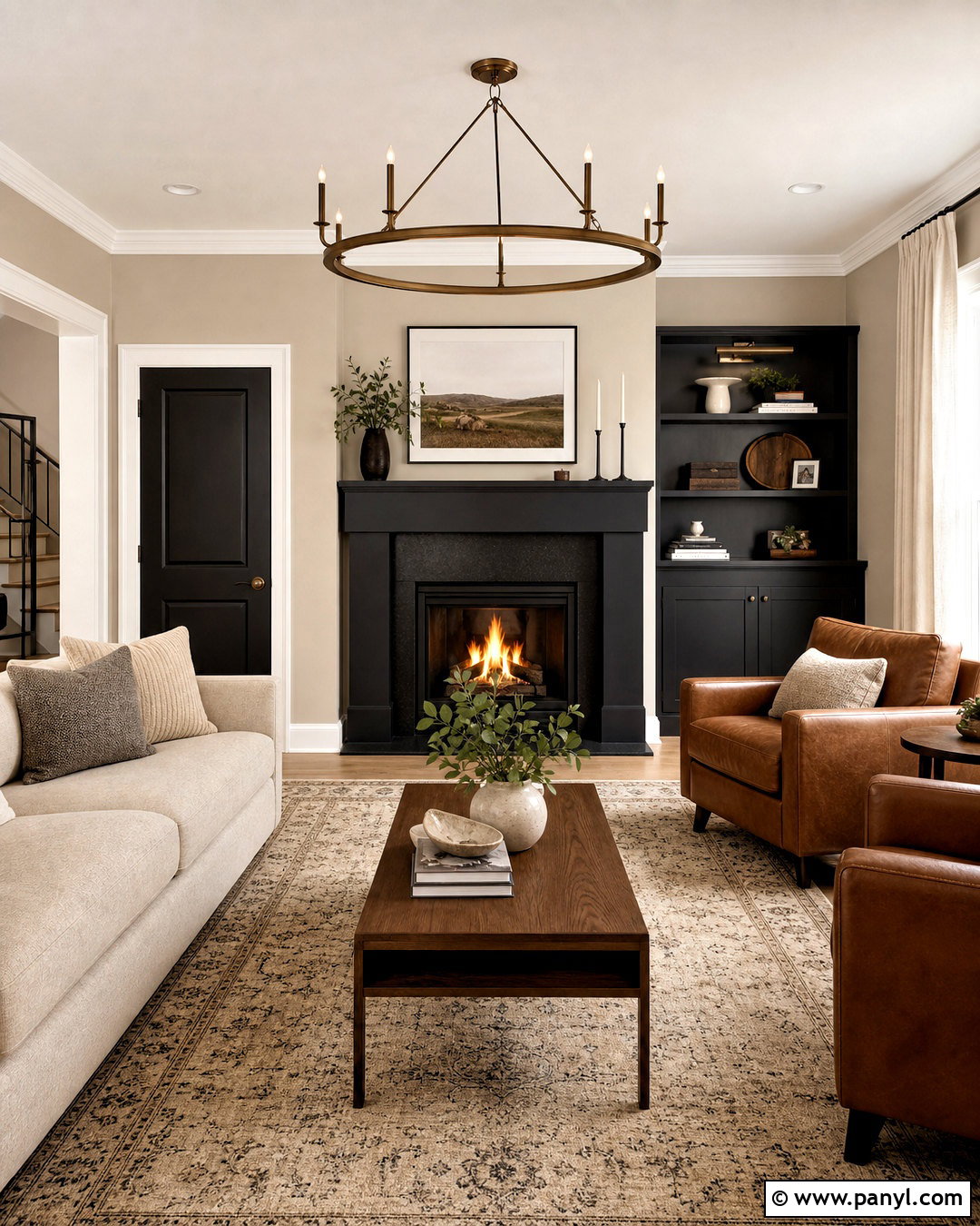
Tricorn Black SW 6258 gives Accessible Beige its sharpest, most graphic pairing. Use Accessible Beige across a bright living room or entry, then apply Tricorn Black to a fireplace, interior doors, window frames, or one substantial built-in cabinet. Balance the contrast with warm white trim, pale oak flooring, and cream upholstered furniture. A beige rug with a restrained black pattern will connect the dark feature to the rest of the room. Add cognac leather, natural linen, and walnut so the palette feels warm rather than stark. Brass or bronze lighting can soften the black further. Keep decorative clutter low and let the architecture carry the contrast. This scheme suits modern farmhouse, contemporary, and transitional homes when the black is used deliberately instead of scattered across every small accessory.
Conclusion:
Accessible Beige can support far more than a basic cream-and-tan palette. Its muted warmth works with soft whites, smoky blues, natural greens, layered taupes, clay tones, and dramatic dark accents. The strongest schemes give each color a clear purpose. Use Accessible Beige as the unifying backdrop, then place its partner on trim, cabinetry, built-ins, doors, furniture, or one architectural feature. Flooring, countertops, textiles, wood tones, and metal finishes should reinforce the relationship between both paints. Before committing, test large samples on several walls and review them throughout the day. With thoughtful placement and balanced materials, these Accessible Beige coordinating colors can create rooms and exteriors that feel comfortable, cohesive, and personal.

Related Ideas and Inspiration:
Leave a Reply