
Sherwin-Williams Iron Ore SW 7069 is a deep charcoal neutral that creates softer contrast than a stark, true black. It can anchor kitchen cabinets, accent walls, trim, fireplaces, doors, and full exteriors. Sherwin-Williams officially pairs it with light neutrals and layered grays, but its versatility extends to warm whites, earthy browns, muted greens, restrained blues, and clay-inspired accents. () The right pairing depends on natural light, fixed finishes, and how much visual contrast you want. Warm companions make Iron Ore feel inviting, while cool shades produce a cleaner, more contemporary result. The complete palettes below include practical finishes, furnishings, and accent materials to help you confidently use these 20 iron ore coordinating colors.
1. Iron Ore And Alabaster
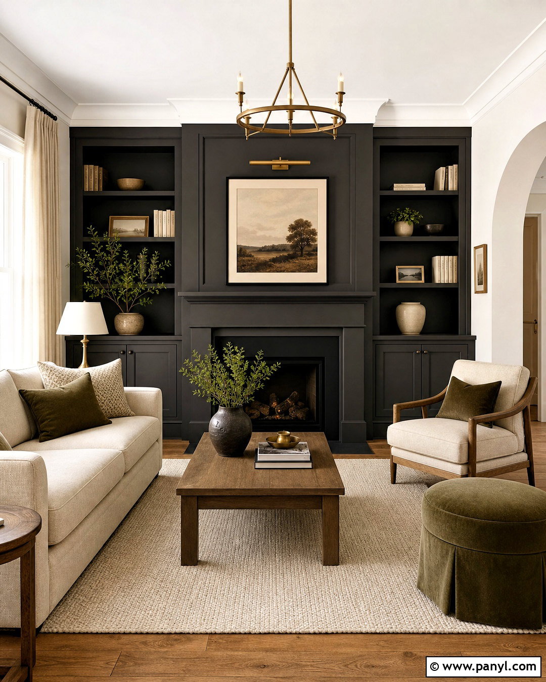
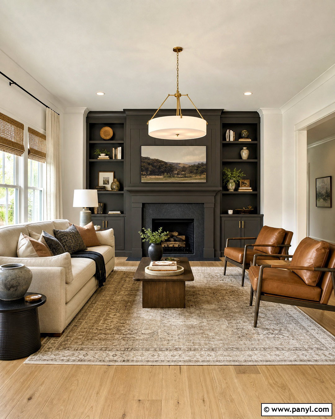
Iron Ore and Sherwin-Williams Alabaster SW 7008 create a balanced black-and-white palette without looking cold. Use Alabaster across the main walls and apply Iron Ore to built-in shelving, interior doors, or a fireplace surround. Medium oak floors bring natural warmth between the two colors. Choose an oatmeal sofa, cream curtains, and a textured ivory rug to keep the living room soft and comfortable. Black metal lighting can echo Iron Ore without making the room feel overly coordinated. Add aged brass, warm pottery, and muted olive pillows for gentle color. This pairing works especially well in transitional and modern farmhouse homes because Alabaster’s creamy character softens the depth of Iron Ore while maintaining noticeable contrast.
2. Iron Ore And Extra White
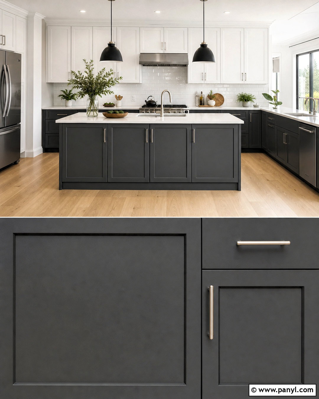
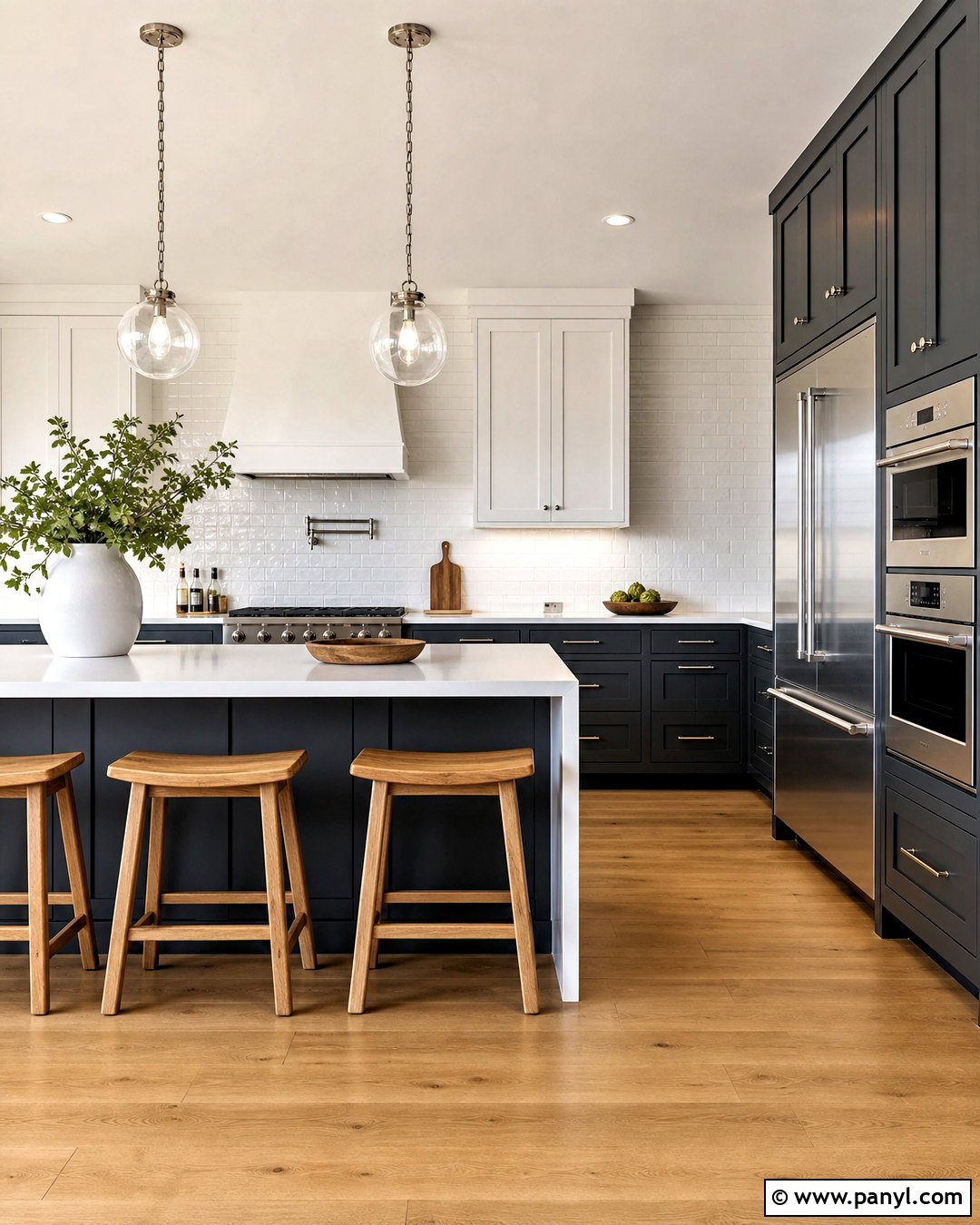
For sharp, architectural contrast, combine Iron Ore with Sherwin-Williams Extra White SW 7006. This scheme suits a contemporary kitchen with Iron Ore lower cabinets, a matching island, and bright Extra White upper cabinetry. Keep the backsplash simple with glossy white subway tile or a clean quartz slab. Pale oak flooring prevents the black-and-white combination from feeling too severe. Brushed nickel hardware supports the cooler direction, while matte black pendant lights connect visually with the dark cabinetry. Use minimal window treatments so natural light can reflect across the white surfaces. Extra White also works well on ceilings and trim, creating crisp edges around Iron Ore walls. Add greenery and light wood accessories to give this polished palette a relaxed, livable finish.
3. Iron Ore And Pure White
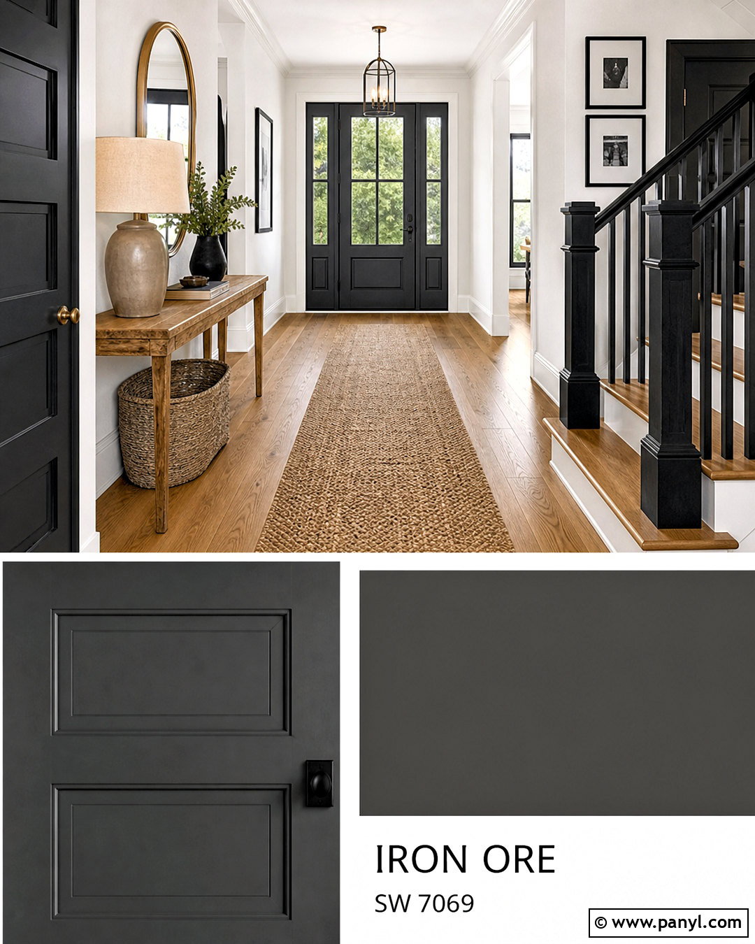
Sherwin-Williams Pure White SW 7005 brings a slightly gentler contrast to Iron Ore than a highly brilliant white. Create a welcoming entryway with Pure White walls, Iron Ore doors, and coordinating dark stair railings. Warm white oak flooring and a woven runner introduce texture without competing with the strong paint combination. A narrow oak console, rounded brass mirror, and simple ceramic lamp complete the space. Paint the baseboards Pure White for a seamless wall transition, then repeat Iron Ore through picture frames and small metal accents. This palette feels clean but not clinical, making it suitable for transitional, Scandinavian, and updated traditional homes. The mix also provides enough contrast to emphasize millwork, door panels, and other architectural details throughout the entry.
4. Iron Ore And Nebulous White
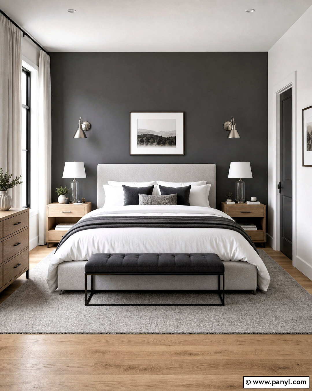
Iron Ore looks calm and sophisticated beside Sherwin-Williams Nebulous White SW 7063, a light neutral with a cooler, misty character. Use Nebulous White on bedroom walls and reserve Iron Ore for the wall behind the bed. An upholstered light-gray bed, layered white bedding, and charcoal-edged pillows will connect the two paint colors naturally. Choose pale flooring or a soft gray rug to maintain the airy direction. Brushed silver sconces and clear glass lamps add brightness without introducing excessive warmth. A light oak nightstand keeps the scheme from becoming flat. This combination is especially useful in bedrooms with strong daylight because the gentle gray-white walls balance the dark accent surface while creating a quiet, cohesive retreat.
5. Iron Ore And Cityscape
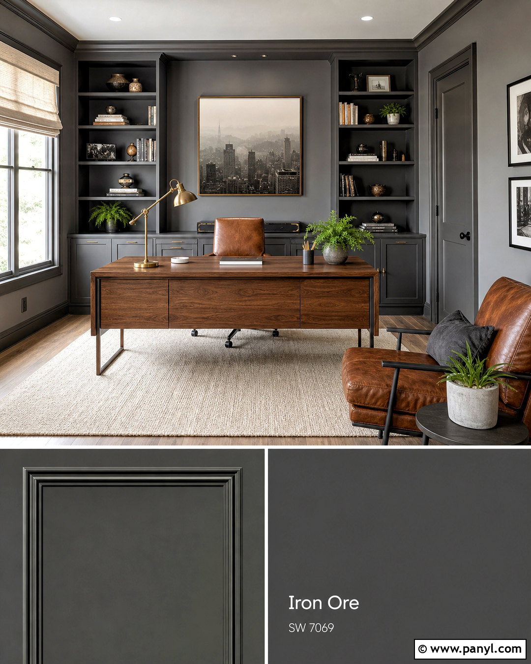
A layered charcoal palette feels intentional when Iron Ore is paired with Sherwin-Williams Cityscape SW 7067. Use Cityscape on home office walls and Iron Ore on built-in bookcases, doors, and desk cabinetry. The difference in depth creates definition without the dramatic contrast of white. Choose a substantial walnut desk and cognac leather chair to warm the cool gray foundation. An ivory wool rug, linen Roman shade, and light ceiling keep the office from becoming too dark. Add antique brass task lighting and a few green plants for controlled color. This complete look works best in a room with generous natural or overhead lighting. Sampling both shades together is important because surrounding light can influence how clearly their charcoal tones separate.
6. Iron Ore And Agreeable Gray
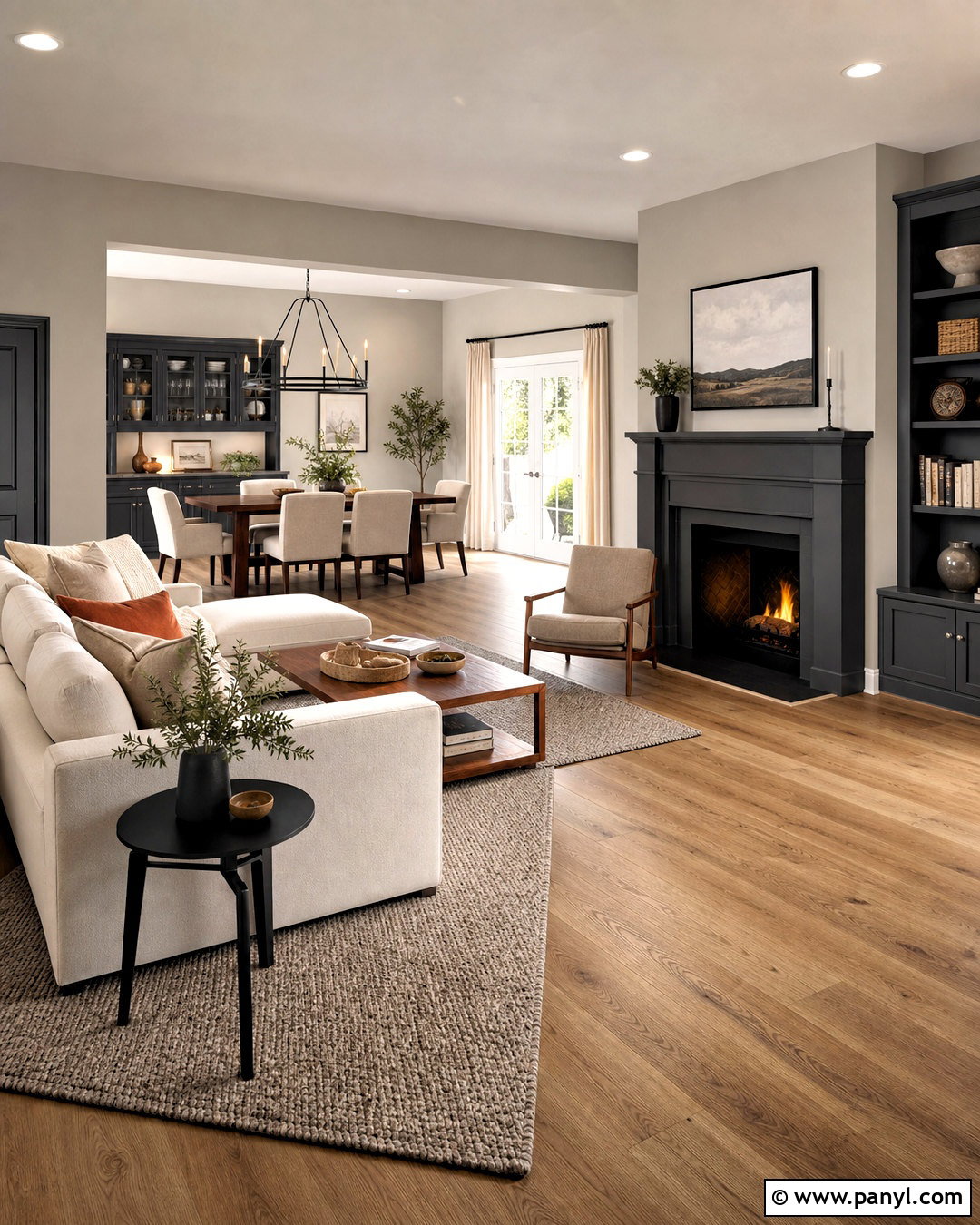
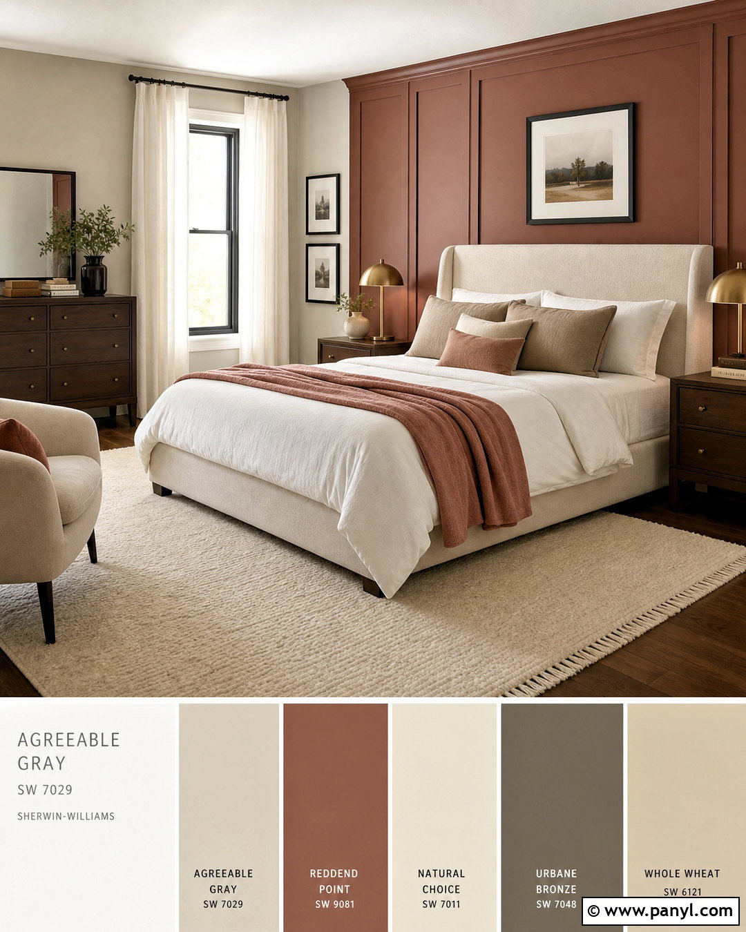
Iron Ore and Sherwin-Williams Agreeable Gray SW 7029 form an adaptable neutral scheme for an open living and dining area. Cover the main walls in Agreeable Gray and feature Iron Ore on a fireplace, media cabinet, or nearby dining hutch. Wide-plank oak flooring enhances the subtle warmth of the lighter neutral. Furnish the space with a cream sectional, walnut dining table, oatmeal chairs, and a greige area rug. Repeat Iron Ore through slim window frames, lighting, and occasional furniture legs. Soft rust, camel, and olive accents add depth without overwhelming the palette. This combination works particularly well when homeowners want a dramatic near-black feature while keeping the larger room bright, comfortable, and easy to decorate across changing seasons.
7. Iron Ore And Accessible Beige
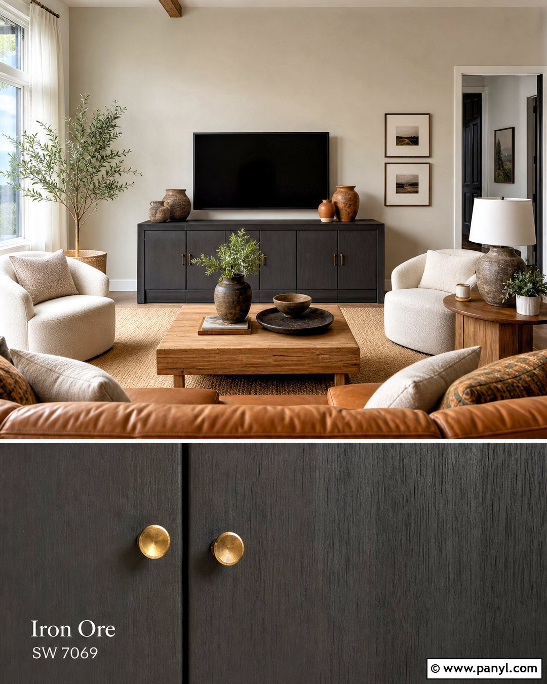
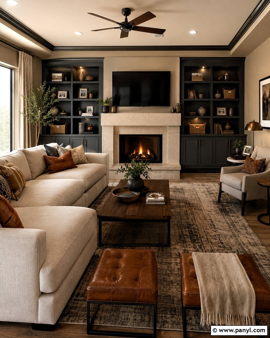
Could a dark charcoal still feel warm and relaxed? Pair Iron Ore with Sherwin-Williams Accessible Beige SW 7036 for a comfortable family room that answers that question. Paint the main walls Accessible Beige and use Iron Ore on a wide media unit with closed storage. A camel leather sofa, creamy boucle chairs, and a natural jute rug reinforce the welcoming palette. Choose medium-toned oak tables instead of very pale wood to create a smooth transition between the beige walls and dark cabinetry. Aged brass lighting and terracotta pottery provide additional warmth. Keep the ceiling and curtains soft white so the room remains fresh. This combination suits traditional, organic modern, and casual contemporary interiors without relying on harsh black-and-white contrast.
8. Iron Ore And Greek Villa
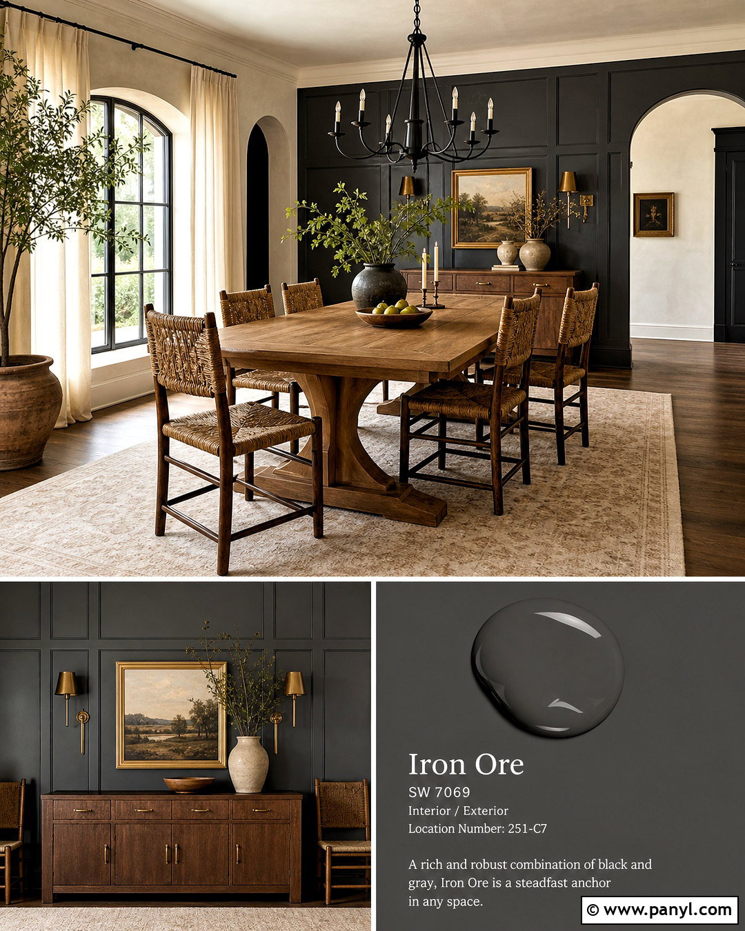
Iron Ore gains a warm, collected appearance when paired with Sherwin-Williams Greek Villa SW 7551. In a dining room, use Greek Villa on the walls and ceiling, then paint a paneled buffet wall or built-in cabinet Iron Ore. A natural oak dining table and woven rush chairs give the space an approachable character. Hang a simple black chandelier above the table to repeat the charcoal tone at eye level. Cream linen curtains, an ivory patterned rug, and handmade ceramic dishes create gentle layers. For contrast, add muted green branches and warm brass candlesticks. Greek Villa keeps the room lighter and softer than a crisp white would, making this pairing especially effective in homes with traditional millwork, warm floors, and moderate natural light.
9. Iron Ore And Shoji White
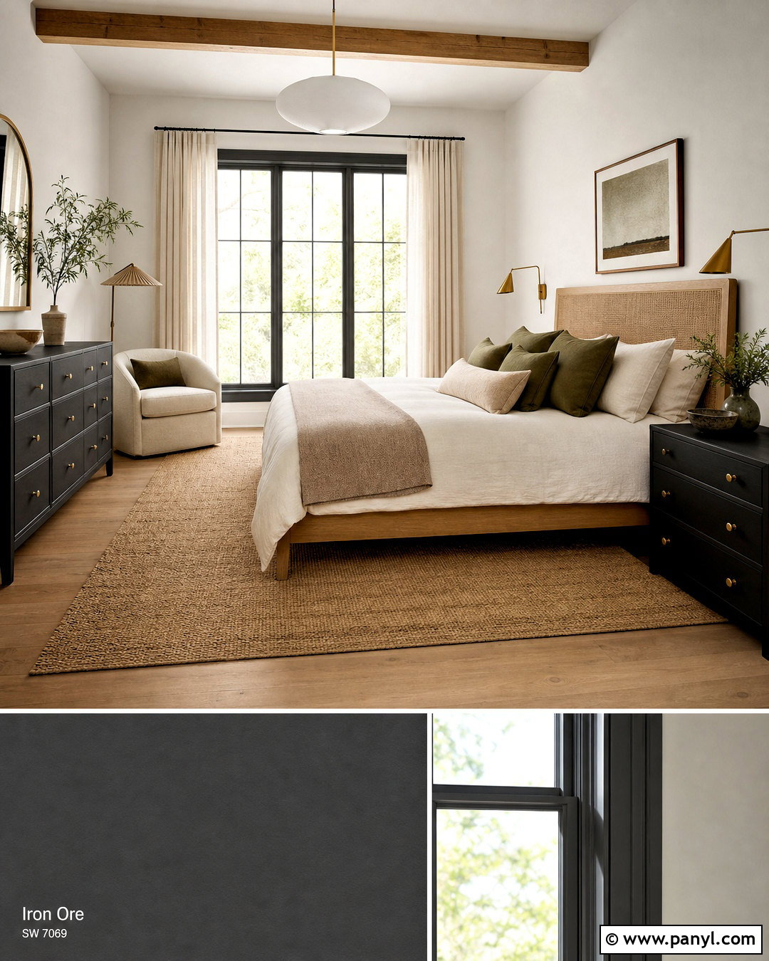
Sherwin-Williams Shoji White SW 7042 gives Iron Ore an earthy, understated companion. Build a serene primary bedroom with Shoji White walls, Iron Ore window trim, and a matching charcoal dresser. Choose a warm oak bed with a woven headboard, then layer it with off-white linen, taupe blankets, and olive accent pillows. A large natural-fiber rug grounds the arrangement while maintaining a quiet, neutral mood. Use parchment-colored curtains to soften sunlight and brass reading lights for subtle warmth. Avoid bright white accessories, which can interrupt the gentle tonal progression. This palette is ideal for organic modern interiors because it combines deep structure, creamy neutral surfaces, and natural materials in a way that feels polished without becoming formal or overly dramatic.
10. Iron Ore And Felted Wool
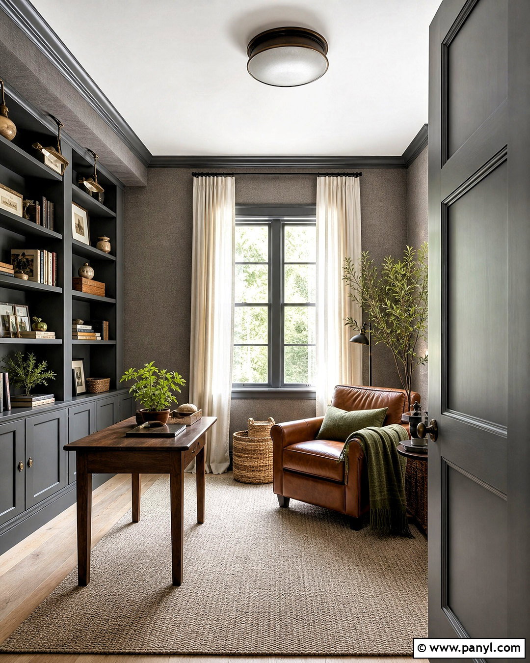
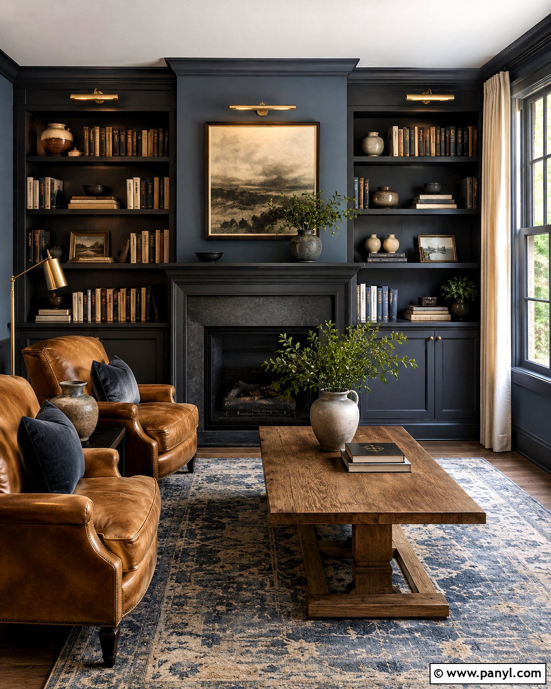
Iron Ore and Sherwin-Williams Felted Wool SW 9171 produce a grounded, tonal palette with warm gray-brown depth. Use Felted Wool on the walls of a cozy reading room and Iron Ore across built-in shelves, window trim, and the interior door. Furnish the space with a caramel leather chair, walnut side table, and a large oatmeal rug. Cream curtains and an off-white ceiling provide necessary brightness. Add aged bronze sconces, woven baskets, and moss-green textiles to support the earthy mood. Because both paint colors carry visual weight, use layered lighting and leave some shelving open rather than filling every surface. The resulting room feels enveloping and comfortable, making it well suited to libraries, dens, offices, or quiet sitting rooms.
11. Iron Ore And El Caramelo
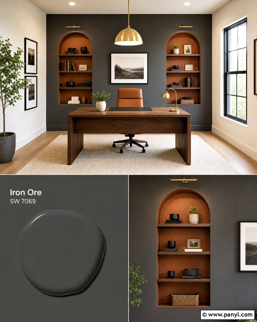
A golden brown accent can bring out Iron Ore’s warmer, more relaxed side. Pair it with Sherwin-Williams El Caramelo SW 9106 in a stylish home office or creative studio. Use Iron Ore on the main desk wall and El Caramelo inside shelving niches or on a secondary cabinet. Balance these saturated surfaces with creamy side walls, pale oak flooring, and an ivory area rug. A streamlined walnut desk, tan leather chair, and brushed brass lighting complete the palette. Add simple black frames and restrained greenery rather than several competing colors. El Caramelo delivers a sunbaked, earthy note that prevents Iron Ore from feeling industrial. The final space is bold and productive, yet still warm enough for comfortable everyday use.
12. Iron Ore And Habanero Chile
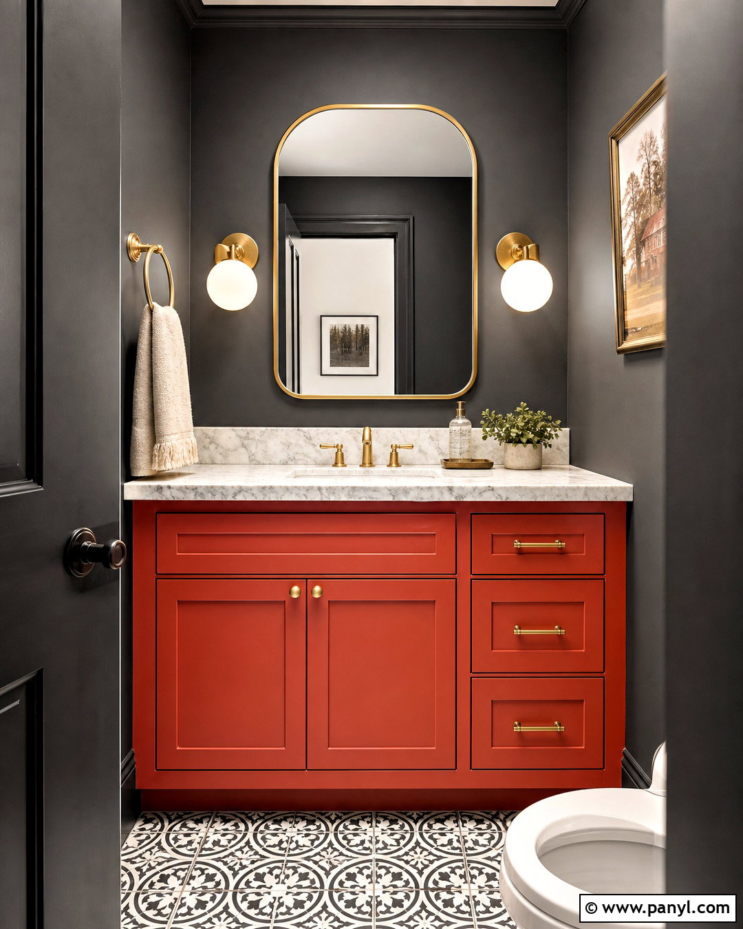
For a dramatic palette with controlled color, coordinate Iron Ore with Sherwin-Williams Habanero Chile SW 7589. Create a memorable powder room using Iron Ore on the upper walls and a muted red vanity painted in Habanero Chile. Add white marble or pale quartz counters to give the saturated colors breathing room. Warm brass faucets, a rounded mirror, and small globe sconces bring a refined finish. Black-and-white patterned floor tile can connect the charcoal walls with the lighter countertop. Keep towels and decorative accessories cream rather than bright white. Since both paint colors make a strong statement, avoid unnecessary ornament. This compact, complete design works because the warm red vanity becomes the focal point while Iron Ore provides a sophisticated, grounding background.
13. Iron Ore And Rosemary
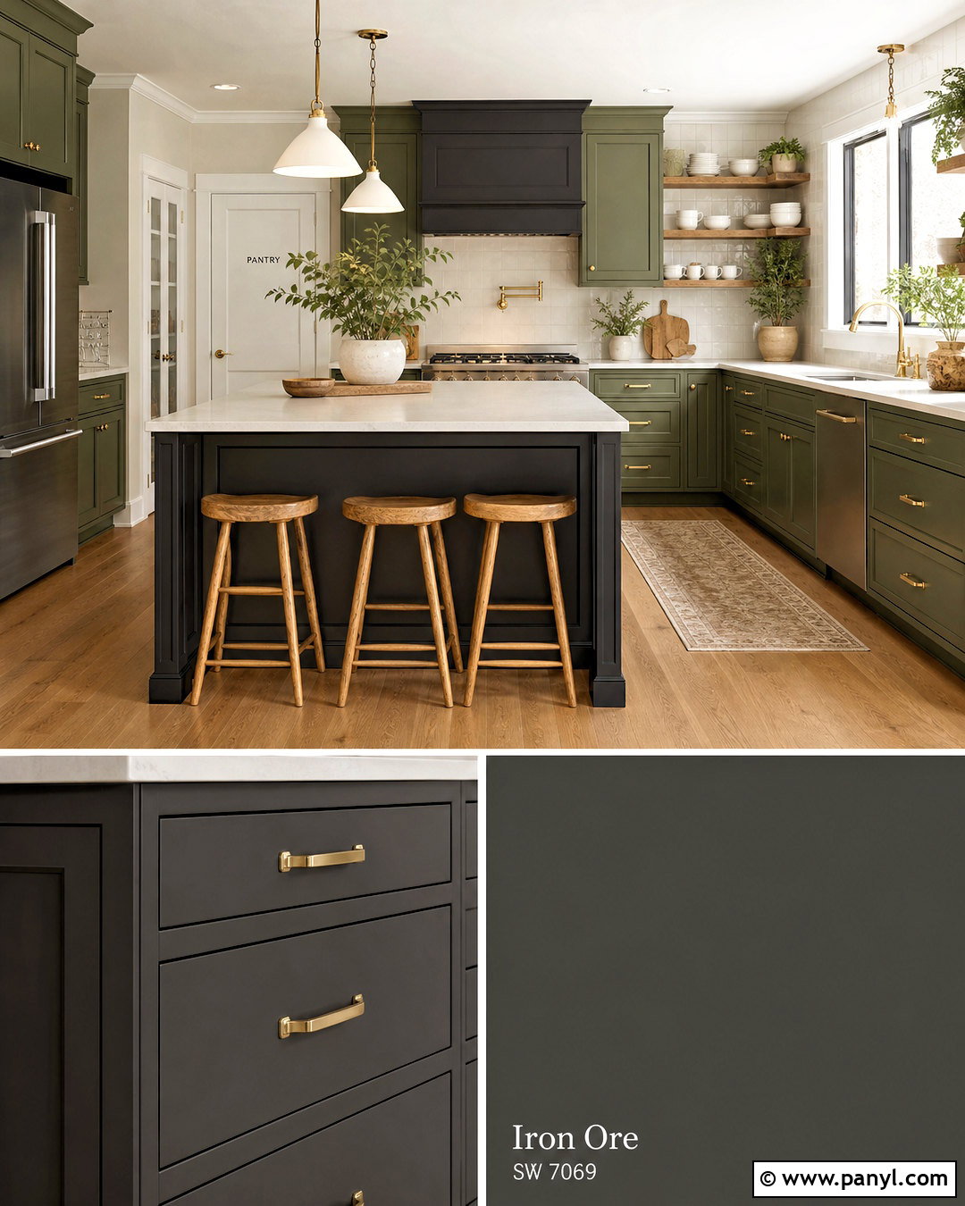
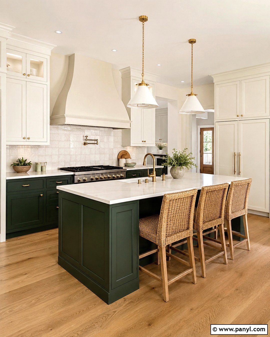
Iron Ore pairs naturally with Sherwin-Williams Rosemary SW 6187 for an earthy kitchen filled with depth. Use Rosemary on the main cabinets and Iron Ore on the island, range hood, and adjoining pantry door. Cream quartz counters and a warm white backsplash balance the two dark finishes. Select aged brass hardware, oak barstools, and medium-toned wood flooring to reinforce the organic character. Open shelves can display ivory dishes and handmade pottery without creating visual clutter. Keep walls a soft off-white and bring in herbs or leafy plants near the windows. Rosemary contributes a muted botanical color, while Iron Ore gives the layout structure. This palette works beautifully in modern farmhouse, English-inspired, and organic transitional kitchens with adequate natural light.
14. Iron Ore And Naval
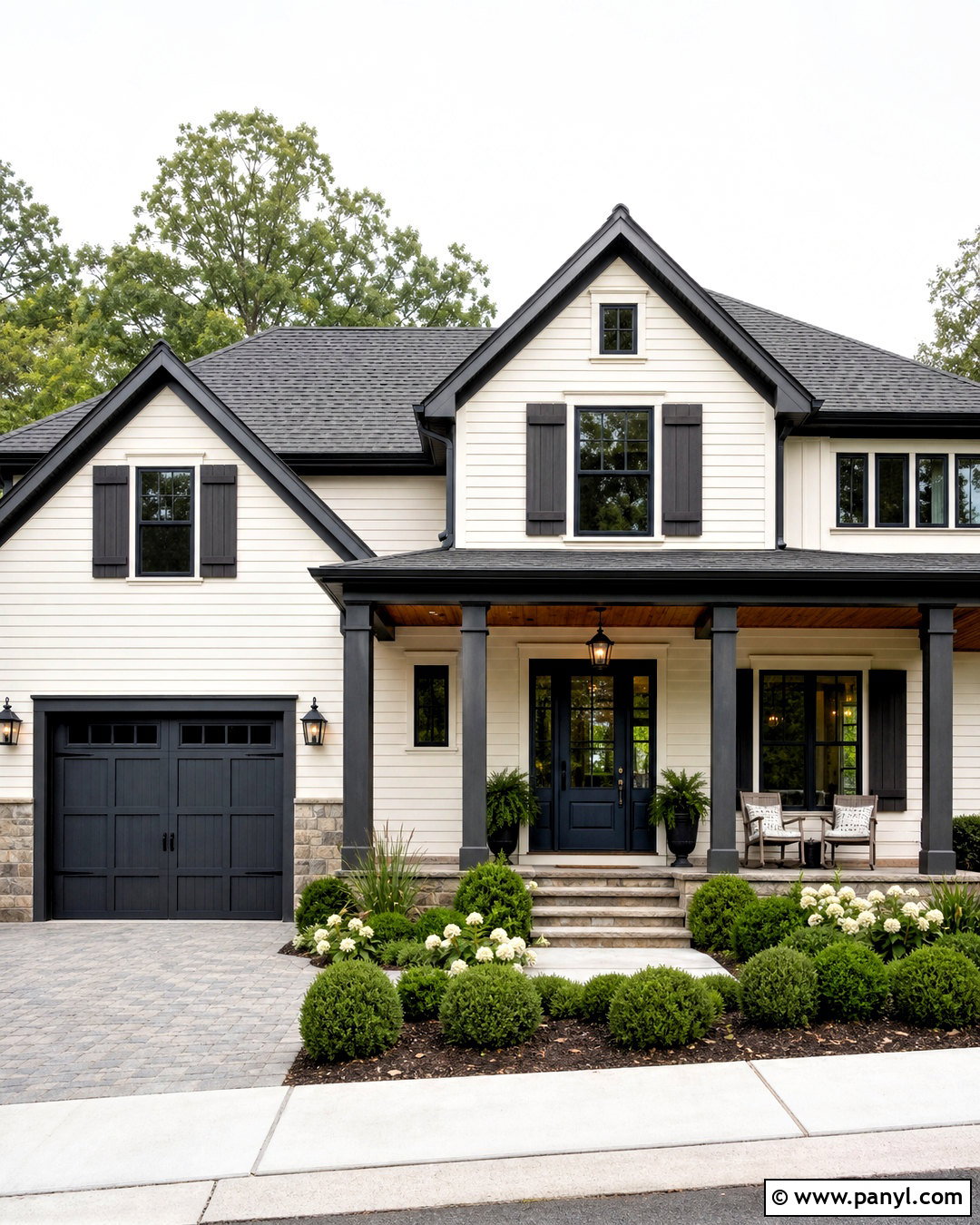
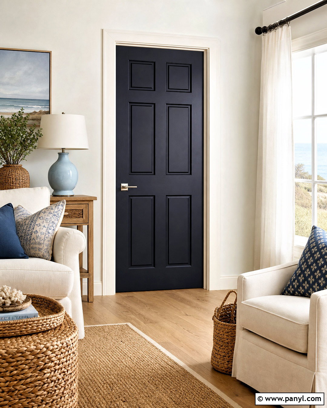
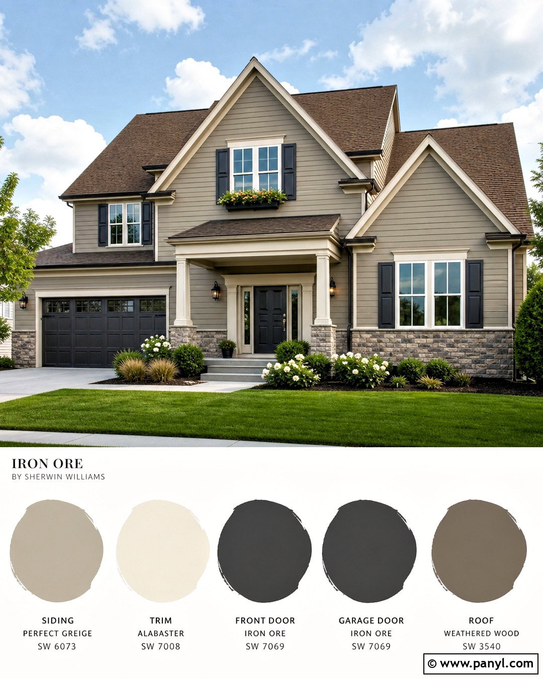
Combine Iron Ore with Sherwin-Williams Naval SW 6244 for a sophisticated blue-charcoal exterior. Use a warm off-white on the main siding, Naval on the front door, and Iron Ore on shutters, window trim, and garage doors. A medium gray roof supports both dark tones without introducing a conflicting undertone. Add natural stone along the foundation and warm cedar beneath the porch ceiling to soften the cool palette. Simple brass or bronze exterior lights will stand out against Iron Ore. Keep landscaping fresh with boxwood, ornamental grasses, and white flowering plants. Naval should appear as the intentional color accent rather than cover every surface. The finished facade feels traditional and polished while maintaining a strong, contemporary sense of contrast.
15. Iron Ore And Urbane Bronze
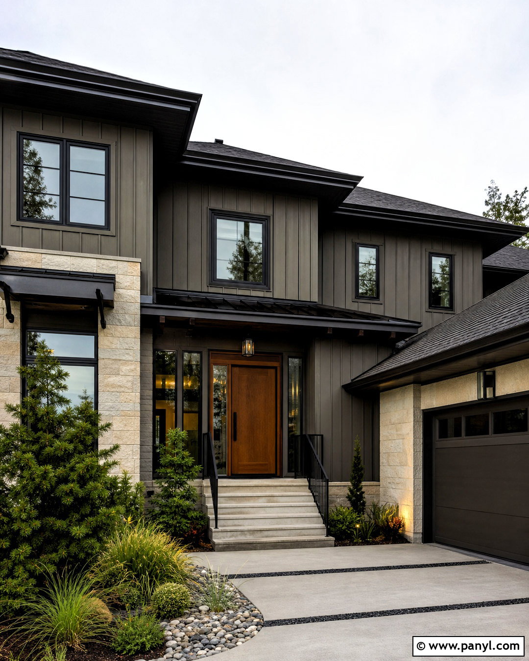
Iron Ore and Sherwin-Williams Urbane Bronze SW 7048 create a rich exterior scheme built around deep, earthy neutrals. Apply Urbane Bronze to vertical siding and use Iron Ore on window frames, fascia, garage doors, and metal railings. Introduce cream limestone or light tan brick to keep the facade from looking too heavy. A natural oak or cedar front door adds warmth and clearly marks the entrance. Choose a medium brown or charcoal roof that relates to both paint colors. Low ornamental grasses, evergreen shrubs, and gravel planting beds support the modern organic character. Because the colors are close in value, place them beside different materials and architectural planes. This allows their subtle contrast to remain visible from the curb.
16. Iron Ore And Light French Gray
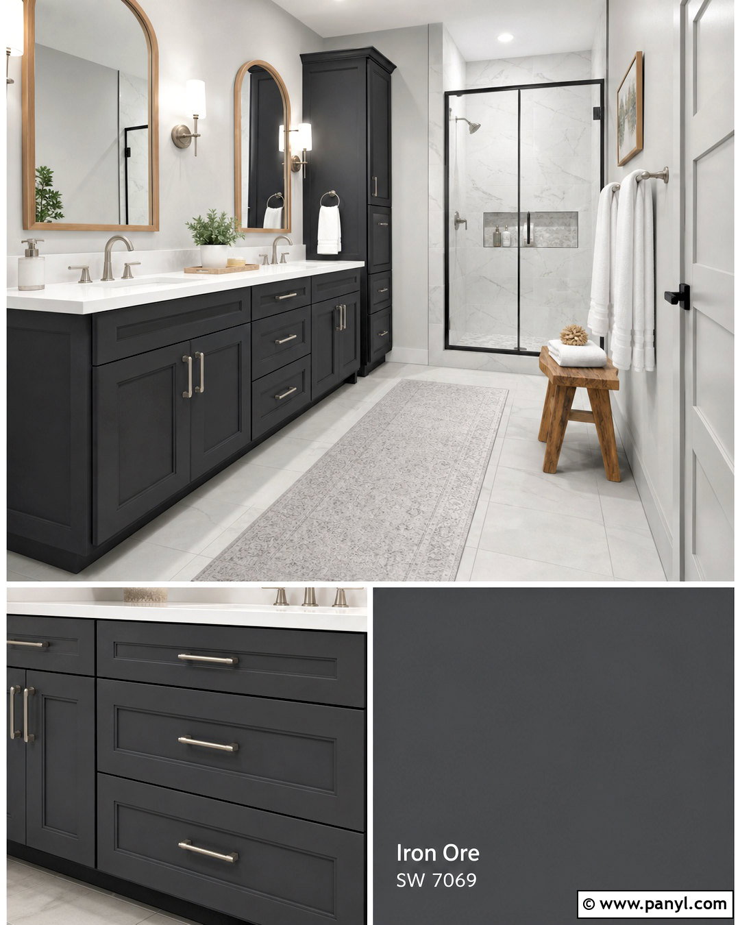
Sherwin-Williams Light French Gray SW 0055 gives Iron Ore a clean, cool companion for a polished bathroom. Paint the walls Light French Gray and use Iron Ore on a double vanity, linen cabinet, and framed shower enclosure. White quartz counters and large marble-look shower tile brighten the design. Select brushed nickel faucets for a cool, streamlined finish, then introduce warmth through a pale oak mirror frame and small wooden stool. Soft white towels, a light gray runner, and clear glass accessories maintain the uncluttered atmosphere. Use bright vanity lighting so the deep cabinetry remains detailed rather than appearing solid black. This palette suits contemporary and transitional bathrooms where homeowners want noticeable contrast without choosing an overly stark white wall color.
17. Iron Ore And Sage
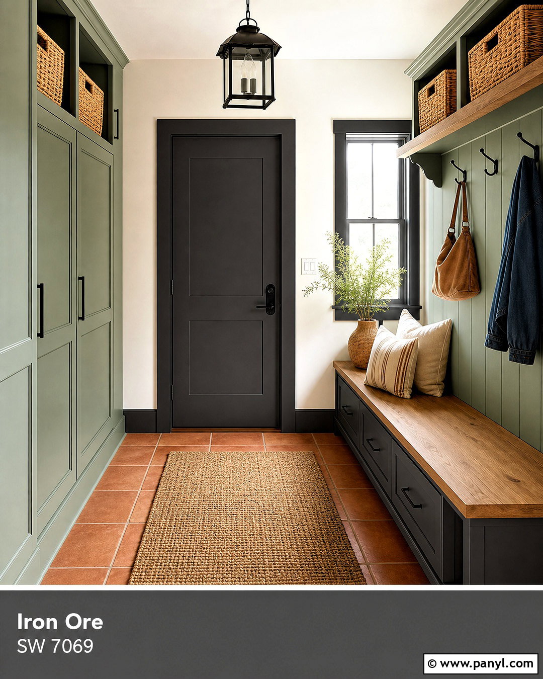
Iron Ore and Sherwin-Williams Sage SW 2860 establish a soft heritage palette for a welcoming mudroom. Paint the cabinets Sage and use Iron Ore on the bench base, interior door, coat hooks, and window trim. Warm brick or terracotta floor tile gives the hardworking space character while disguising everyday dirt. Add a natural oak bench seat, woven baskets, and cream canvas cushions to create practical storage. Keep the upper walls warm white so the room does not become too enclosed. A simple black lantern fixture repeats Iron Ore overhead. Sage contributes a muted, established color that feels calm beside the deep charcoal. Together, these shades create an organized entry that works for farmhouse, cottage, and updated traditional homes.
18. Iron Ore And Evergreen Fog
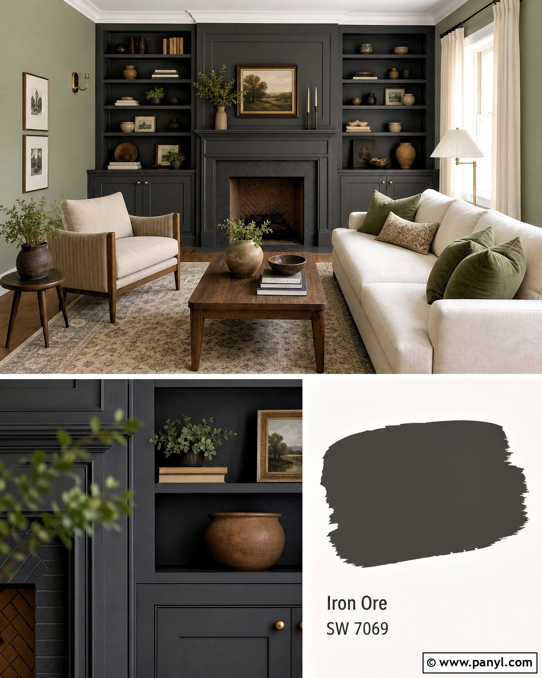
A muted green-gray such as Sherwin-Williams Evergreen Fog SW 9130 makes Iron Ore feel connected to nature. Design a restful living room with Evergreen Fog walls, Iron Ore built-ins, and a charcoal-painted fireplace surround. Choose a light beige sofa, walnut coffee table, and large cream rug to balance the colored surfaces. Linen curtains in warm white will filter natural light while preserving the room’s gentle contrast. Add olive pillows, clay pottery, and antique brass lamps for layered warmth. Keep the ceiling light and leave open space around the darker features. Evergreen Fog changes subtly throughout the day, so test the two paints beside existing flooring. The finished palette suits organic modern, transitional, and relaxed contemporary spaces.
19. Iron Ore And Sea Salt
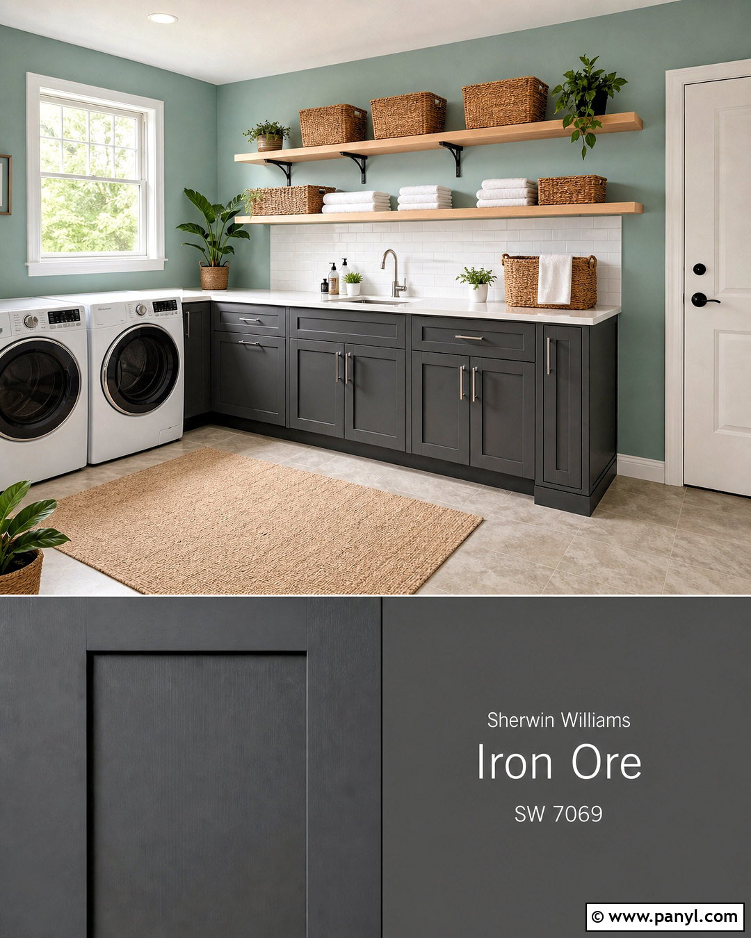
Iron Ore provides helpful structure beside the airy green-blue character of Sherwin-Williams Sea Salt SW 6204. Use Sea Salt on laundry room walls and Iron Ore on the lower cabinets, utility door, and open shelf brackets. White quartz counters and a glossy white tile backsplash keep the compact workspace bright. Introduce pale oak floating shelves, woven storage baskets, and light stone-look flooring for warmth and texture. Brushed nickel hardware supports the fresh color direction without adding another dark finish. Keep accessories simple, using white containers and a few green plants. Sea Salt prevents the charcoal cabinetry from dominating the room, while Iron Ore gives the practical layout a defined, tailored foundation that feels more finished than standard white utility cabinetry.
20. Iron Ore And Cavern Clay
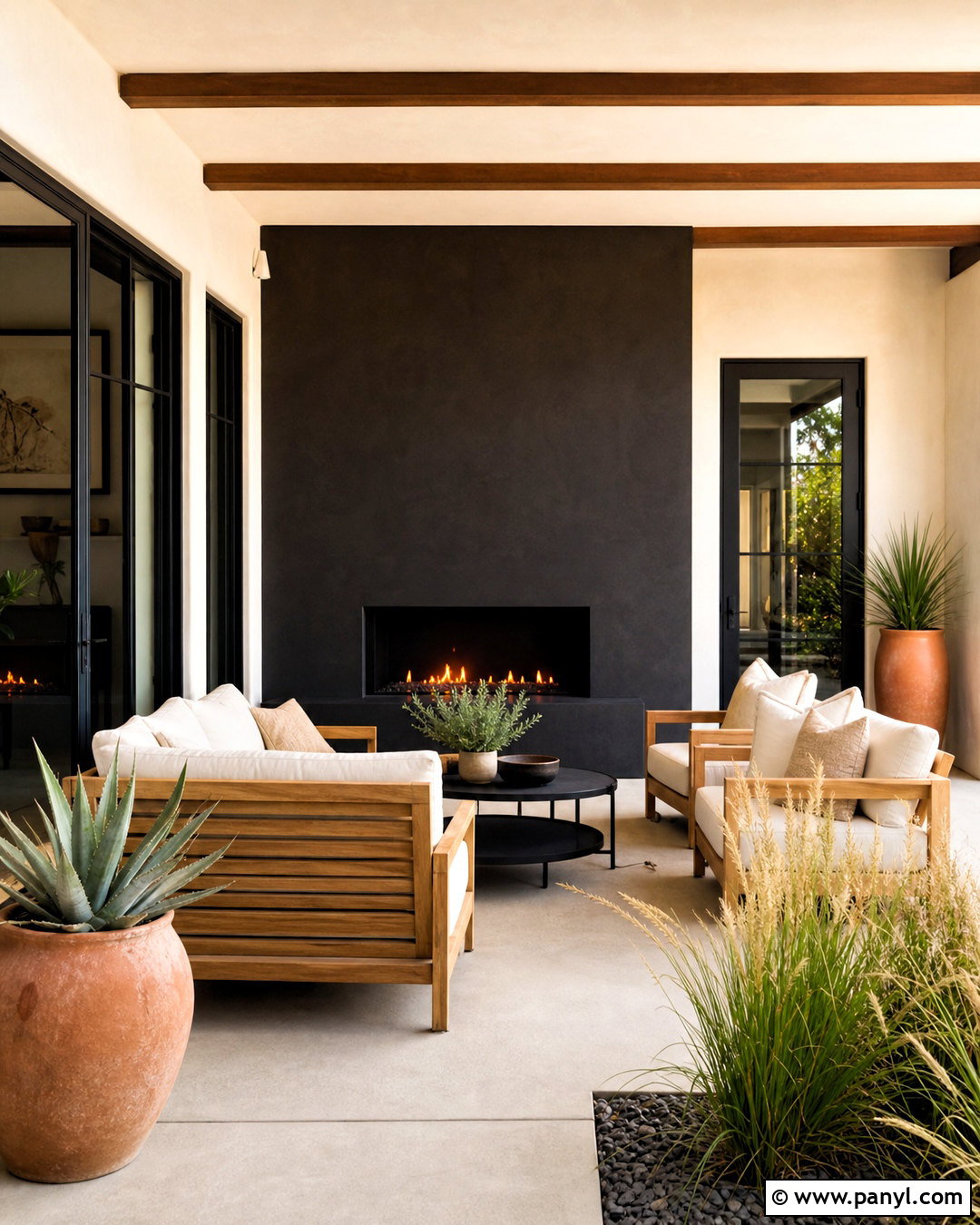
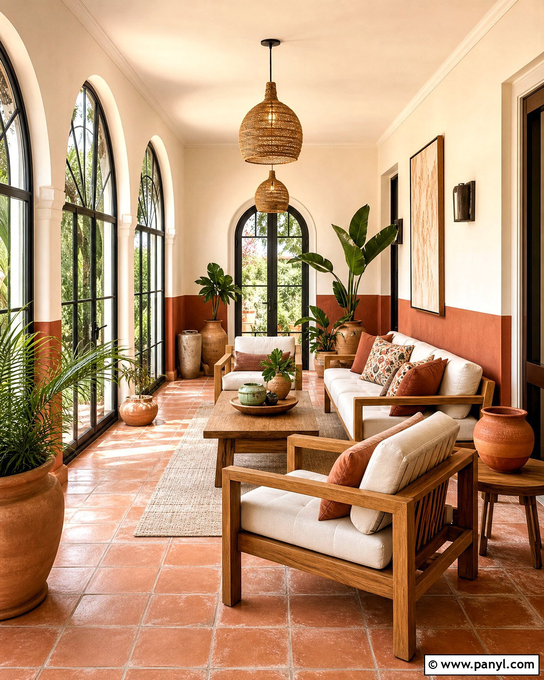
Iron Ore and Sherwin-Williams Cavern Clay SW 7701 form a warm, southwestern-inspired palette for a covered patio. Use Iron Ore on exterior doors, window frames, and a painted outdoor fireplace. Apply Cavern Clay to a stucco feature wall, then balance it with pale concrete flooring and warm white surrounding walls. Furnish the patio with natural teak seating, cream cushions, and black metal side tables. Add terracotta planters filled with agave, ornamental grasses, and drought-tolerant greenery. Woven outdoor textiles can repeat rust, tan, and charcoal in restrained patterns. The clay tone brings sunlight and warmth to the composition, while Iron Ore sharpens the architecture. This complete outdoor look feels earthy, modern, and connected to the surrounding landscape.
Conclusion:
The best 20 iron ore coordinating colors range from soft whites and versatile greiges to botanical greens, deep blue, and warm clay. Light shades such as Alabaster, Pure White, and Shoji White create comfortable contrast, while Cityscape and Felted Wool produce a layered, tonal effect. Rosemary, Sage, and Evergreen Fog connect Iron Ore with natural materials. Stronger accents such as Naval, Habanero Chile, and Cavern Clay offer more personality. Before committing, sample every color beside Iron Ore on the actual surface. Review it during the morning, afternoon, and evening because exposure, sheen, flooring, and nearby finishes can change the relationship. Thoughtful testing will help the final palette feel balanced and intentional.

Related Ideas and Inspiration:
Leave a Reply