
Sherwin-Williams Alabaster SW 7008 is a soft, balanced white that brings gentle warmth without making a room feel heavily cream. With an LRV around 82, it reflects plenty of light while still creating a comfortable, welcoming background. () Its versatility makes it suitable for walls, cabinets, trim, and exterior siding. The secret is pairing it with colors that complement its subtle beige-yellow undertone. Warm greiges create an easy flow, muted greens add an organic quality, and dark blues or charcoals deliver crisp contrast. Natural wood, stone, woven textiles, and warm metals complete these palettes beautifully. The 20 sw alabaster coordinating colors below provide complete, practical looks for rooms and exteriors.

1. SW Alabaster With Pure White
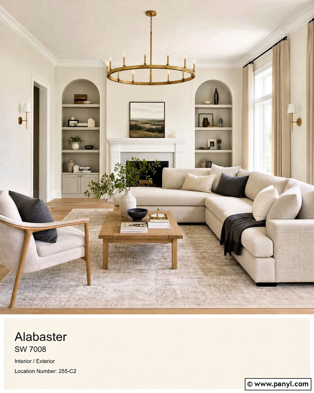
Pure White SW 7005 creates a clean but gentle contrast when used beside Alabaster. Paint the main walls Alabaster and reserve Pure White for baseboards, crown molding, interior doors, and window trim. This combination works especially well in a transitional living room with natural oak flooring, a light greige sofa, and cream linen curtains. Add a medium-tone wood coffee table and brushed brass lighting to reinforce Alabaster’s warmth. Pure White looks slightly crisper without introducing the icy cast associated with brighter whites. For a more layered result, include oatmeal pillows, charcoal accents, and simple landscape artwork. The finished room feels fresh and defined, yet it remains soft enough for relaxed everyday living. ()
2. SW Alabaster With Accessible Beige
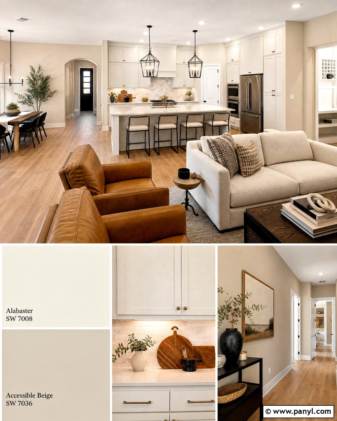
Accessible Beige SW 7036 gives Alabaster a warm, understated partner that works throughout open-concept homes. Use Alabaster on the kitchen cabinets and trim, then apply Accessible Beige to the surrounding living and dining room walls. Light oak flooring creates continuity between the spaces, while a limestone backsplash and warm white quartz countertops keep the kitchen bright. Choose camel leather chairs, an oatmeal sofa, and black metal lighting for a balanced mix of softness and structure. This palette is especially useful when pure gray feels too cool but traditional beige seems dated. Accessible Beige adds enough depth to separate the surfaces without creating a strong color change. The entire home feels coordinated, comfortable, and naturally inviting.
3. SW Alabaster With Agreeable Gray
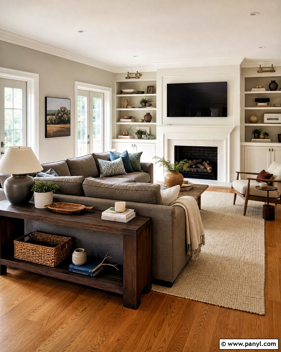
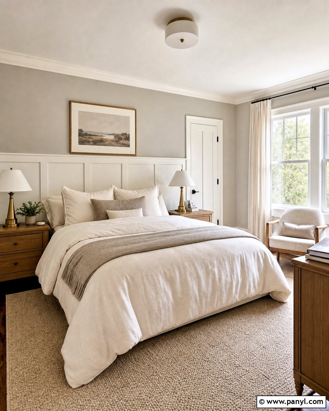
A room with mixed warm and cool finishes can benefit from Agreeable Gray SW 7029. Cover the walls in this adaptable greige, then use Alabaster on the ceiling, fireplace, built-ins, and trim. In a family room, combine the palette with medium oak floors, a warm gray sectional, and an ivory wool rug. Matte black curtain rods and a dark wood console add contrast, while muted blue and clay-colored pillows keep the space from looking overly neutral. Alabaster softens the gray and helps the architectural details appear brighter. Agreeable Gray grounds the larger wall areas without making the room feel closed in. Together, the colors create a flexible background for changing furniture, artwork, and seasonal accessories.
4. SW Alabaster With Repose Gray
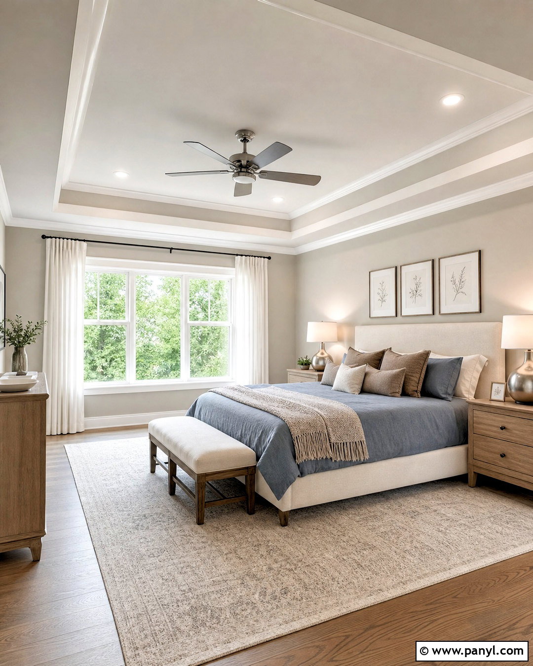
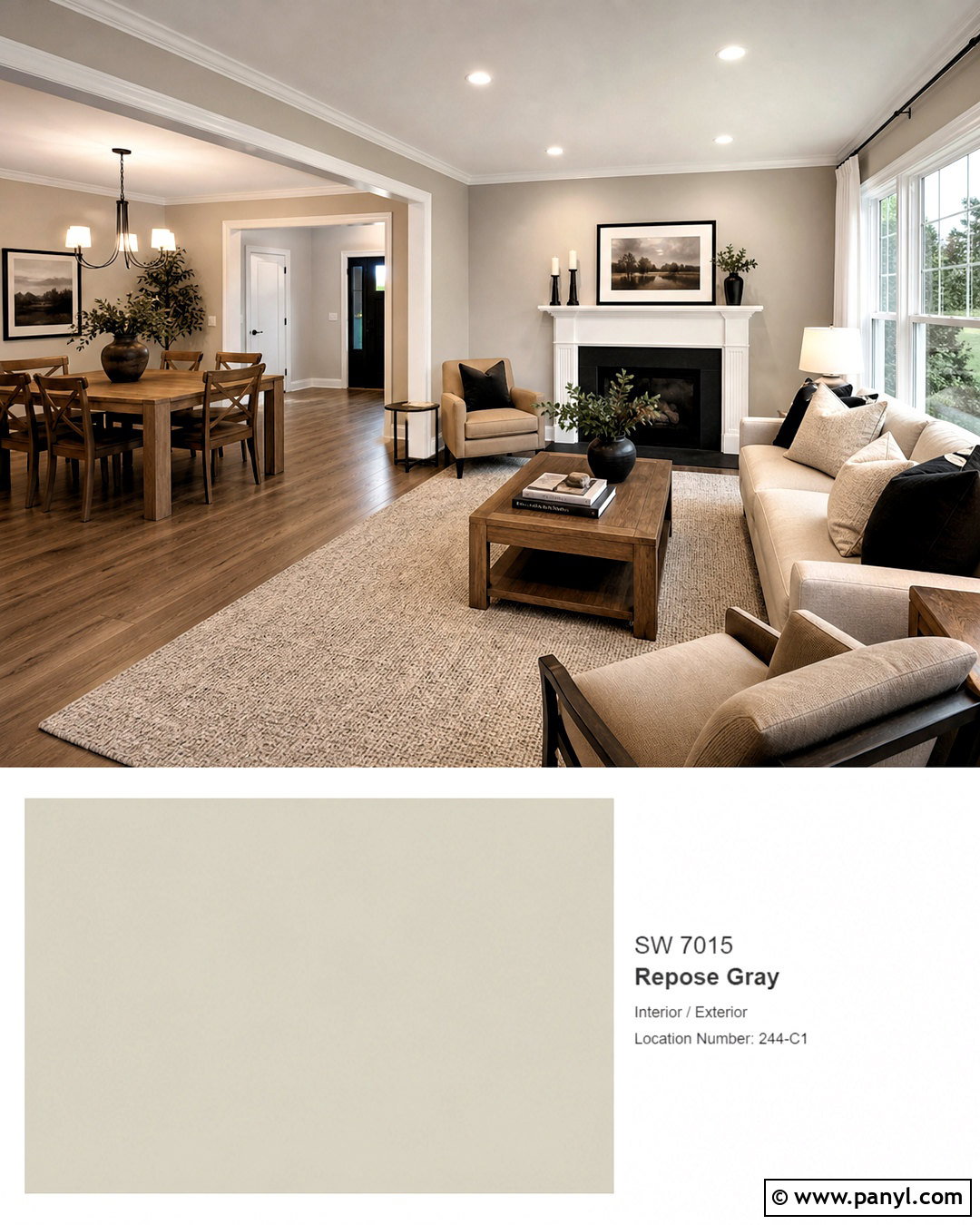
Repose Gray SW 7015 brings a calm, slightly cooler balance to the creamy character of Alabaster. This pairing suits a restful primary bedroom with Repose Gray walls, Alabaster trim, and an Alabaster-painted tray ceiling. Add a natural linen upholstered bed, white oak nightstands, and a textured ivory rug. Dusty blue bedding and muted taupe pillows connect the warm and cool tones, while brushed nickel lamps offer a quiet metallic finish. Use full-length off-white curtains to soften daylight and prevent the gray walls from feeling flat. The contrast remains low enough for relaxation but noticeable enough to highlight molding and windows. Sample both colors beside the flooring because strong northern light can make Repose Gray appear cooler.
5. SW Alabaster With Mindful Gray
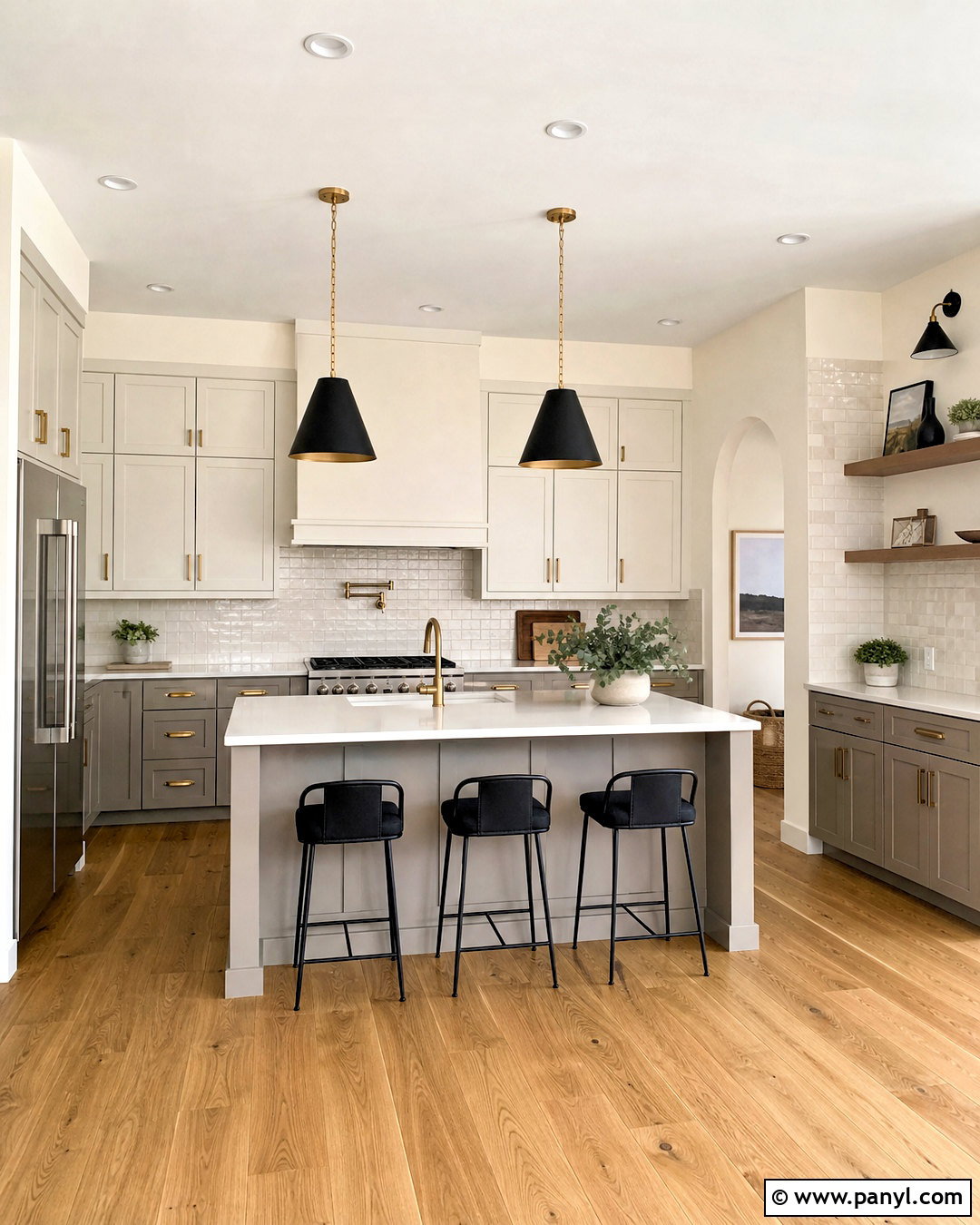
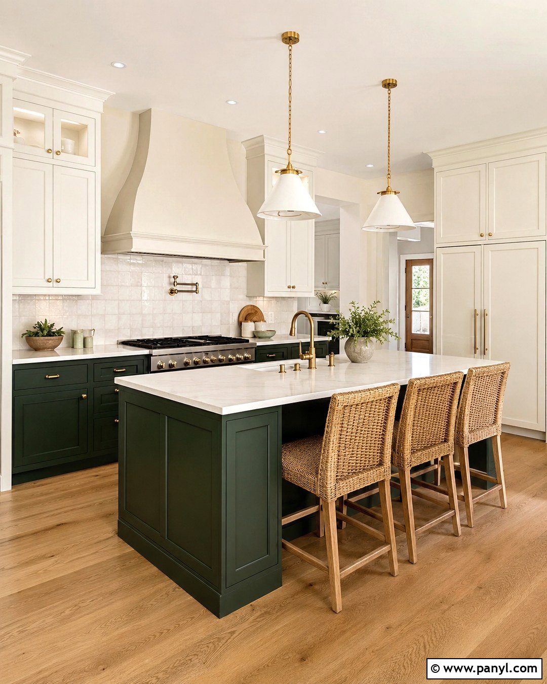
For stronger definition without a dramatic color shift, pair Alabaster with Mindful Gray SW 7016. Use Mindful Gray on lower kitchen cabinets or a large island, with Alabaster on the upper cabinets and surrounding walls. Warm white quartz counters, a handmade cream tile backsplash, and medium oak flooring connect the two paint colors. Finish the cabinetry with aged brass pulls and add black pendants above the island for sharper contrast. Mindful Gray has enough depth to anchor the kitchen, especially in a bright room where lighter greiges may disappear. Alabaster keeps the upper half open and airy. This complete scheme feels tailored and practical, and it hides everyday marks better on the hardworking lower cabinets.
6. SW Alabaster With Dorian Gray
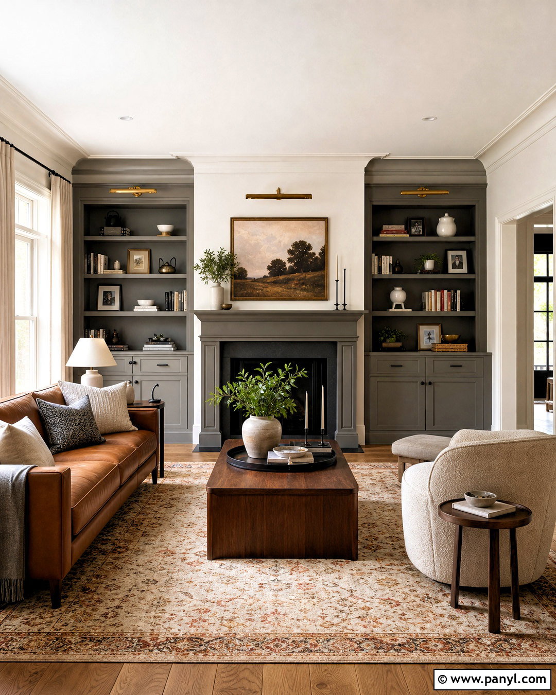
Dorian Gray SW 7017 creates a substantial medium-gray contrast that can make Alabaster look clearer and brighter. Try Alabaster on living room walls and Dorian Gray across a fireplace surround, built-in bookcases, or a connected media wall. Balance the painted features with walnut furniture, a cream boucle chair, and a patterned rug containing gray, beige, and rust. A cognac leather sofa introduces warmth and prevents the darker gray from becoming too formal. Use brass picture lights above the shelving and repeat matte black in small hardware details. This palette works best in a room with good natural or layered artificial light. The result is grounded, polished, and comfortable rather than stark or monochromatic.
7. SW Alabaster With Townhall Tan
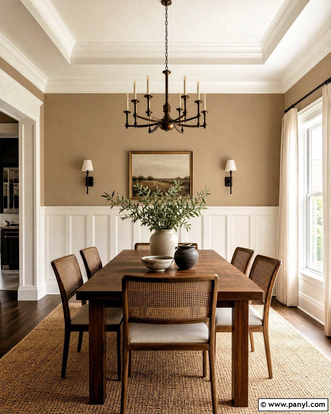
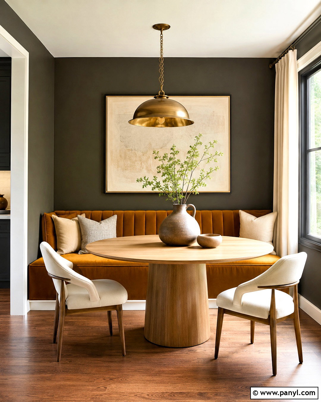
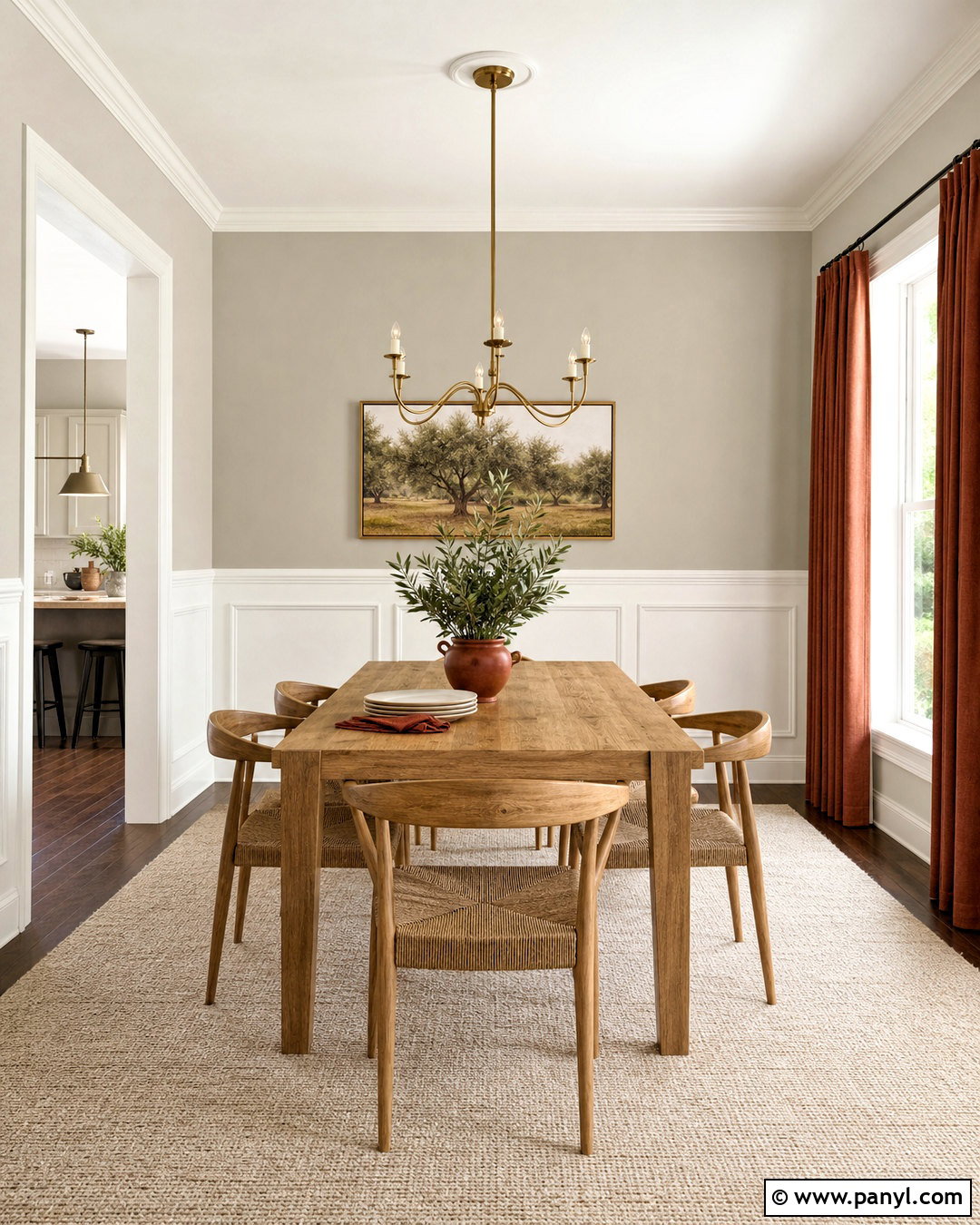
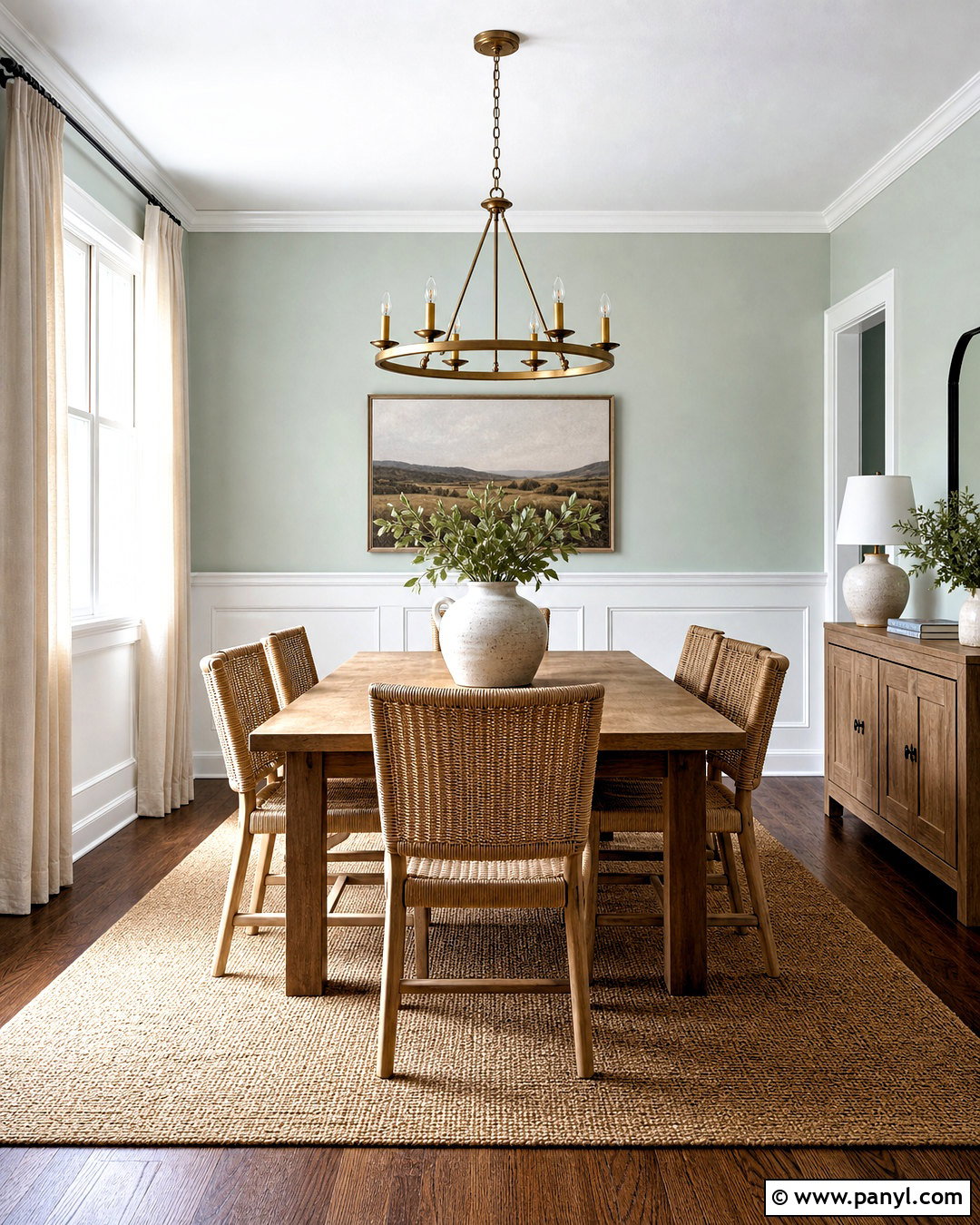
Townhall Tan SW 7690 is one of the coordinating colors presented by Sherwin-Williams for Alabaster. () Its rich tan character creates a warm, earthy palette suited to dining rooms and traditional open spaces. Paint the dining room walls Townhall Tan, then use Alabaster on the ceiling, paneled wainscoting, and trim. A medium walnut table, woven cane chairs, and a natural jute rug reinforce the inviting color story. Add cream linen drapery and aged bronze lighting for depth without excessive contrast. Greenery and simple ceramic pieces can provide a fresh counterpoint. This combination feels especially harmonious with warm hardwood flooring, natural stone, and rooms receiving clear southern or western daylight.
8. SW Alabaster With Dakota Wheat
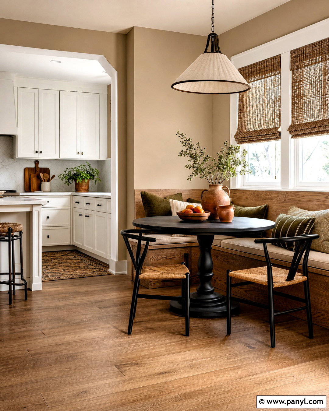
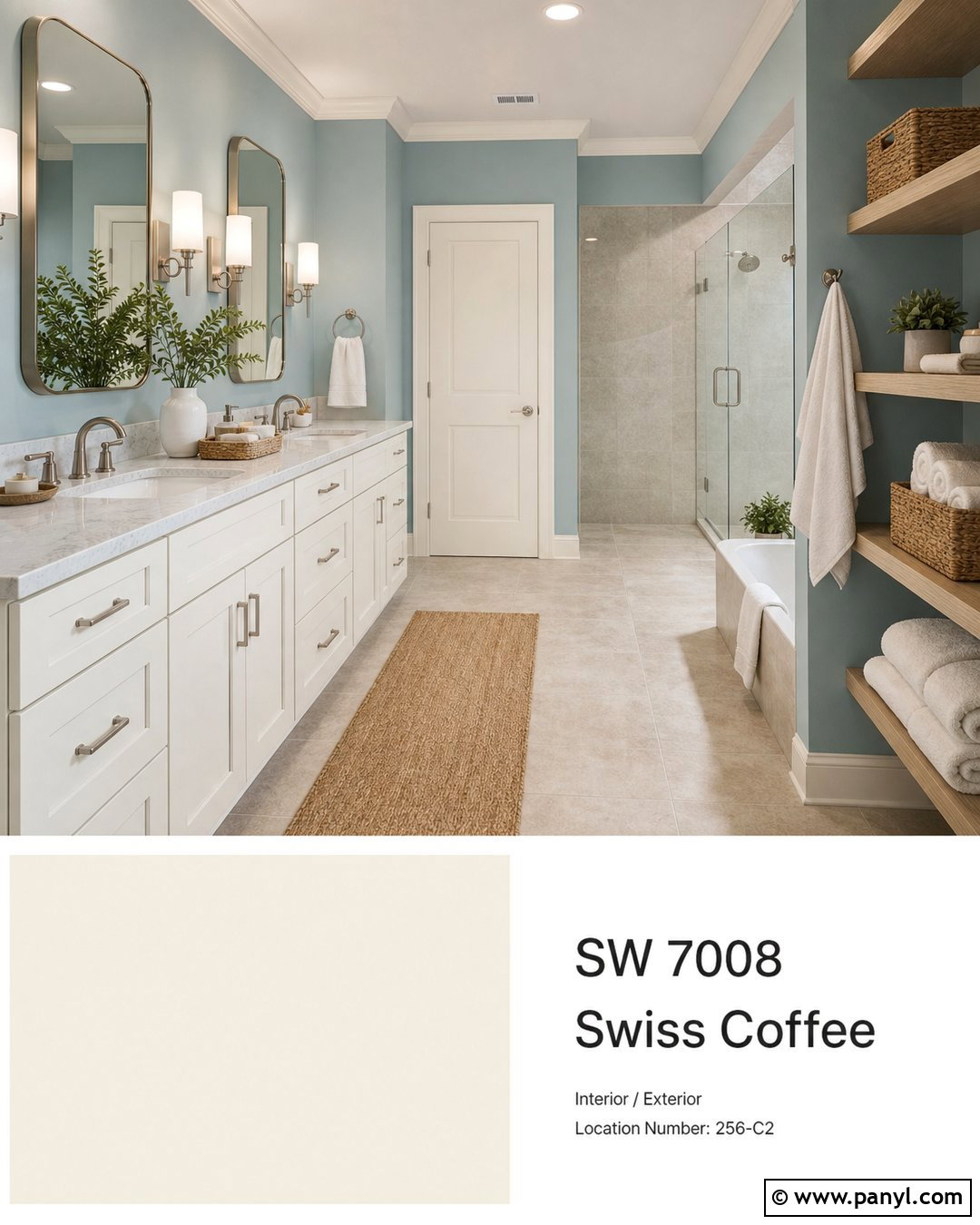
Dakota Wheat SW 9023 brings muted golden warmth to Alabaster without creating an overly yellow room. Sherwin-Williams lists it as another coordinating color for Alabaster, making the combination a reliable starting point for a warm palette. () Use Dakota Wheat on breakfast nook walls and Alabaster on the adjacent kitchen cabinetry, ceiling, and trim. Add a built-in oak bench, oatmeal cushions, woven shades, and a round black pedestal table. Terracotta pottery and soft olive textiles contribute earthy color in small amounts. The darker golden tone defines the dining area, while Alabaster maintains brightness in the kitchen. This scheme feels sunny, natural, and welcoming, particularly in spaces inspired by relaxed farmhouse or Mediterranean interiors.
9. SW Alabaster With Sea Salt
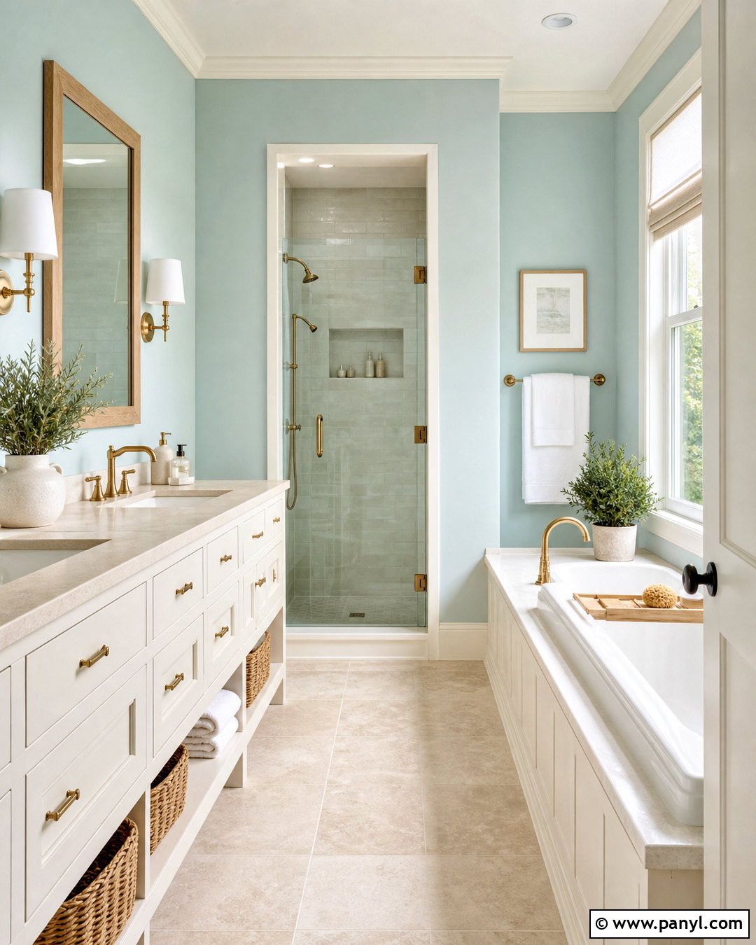
Sea Salt SW 6204 offers a light blue-green contrast that makes Alabaster feel fresh and peaceful. In a bathroom, paint the walls Sea Salt and use Alabaster for the vanity, trim, ceiling, and paneled tub surround. Choose pale limestone flooring, warm white countertops, and brushed brass or polished nickel fixtures. A light oak mirror and woven baskets provide natural warmth that connects with Alabaster’s creamy undertone. Keep towels and shower curtains in soft white rather than bright optical white. The resulting palette has a coastal influence without relying on themed decorations. Sea Salt may look greener or bluer as daylight changes, so test it near the tile, countertop, and window before committing to the entire room.
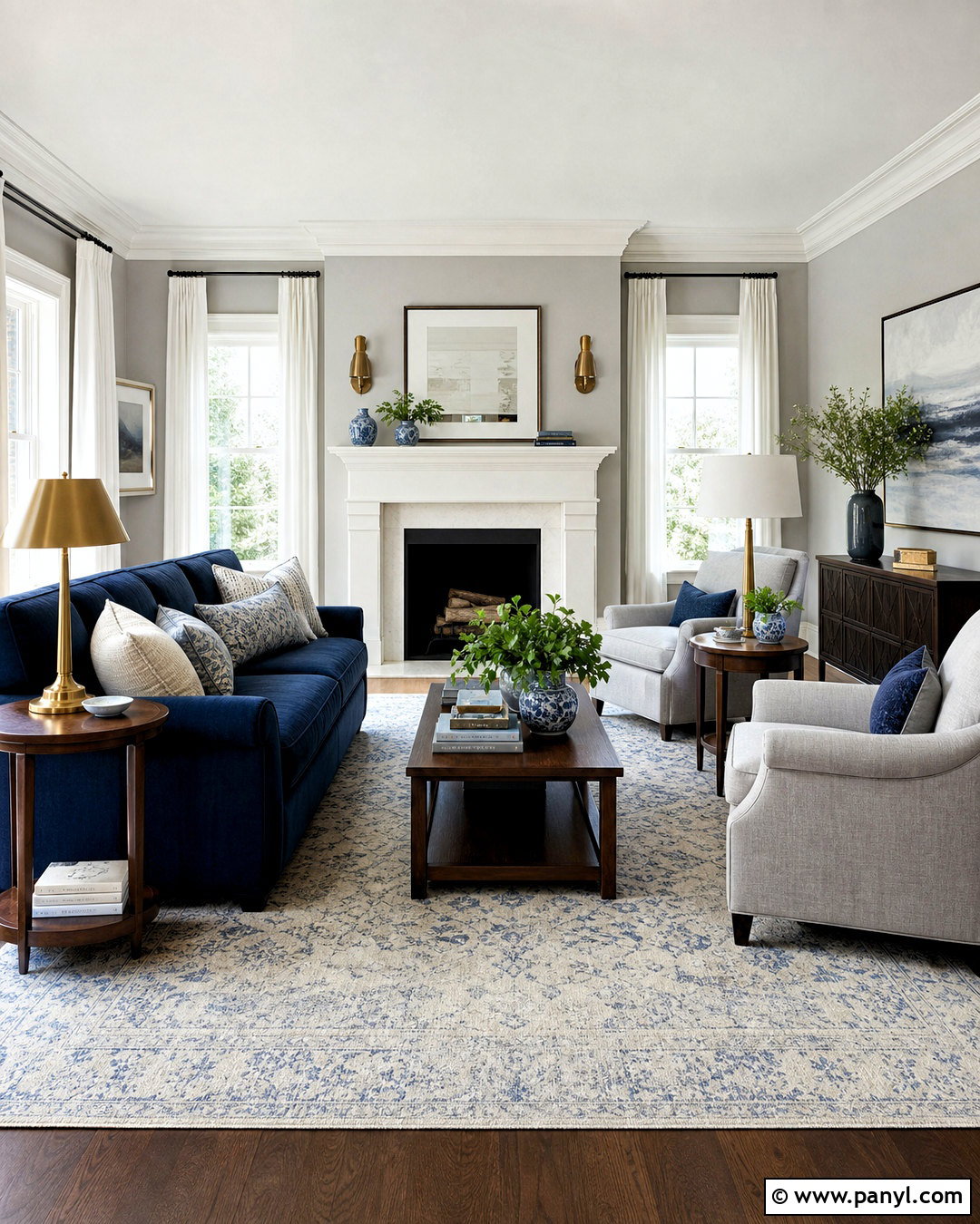
10. SW Alabaster With Evergreen Fog
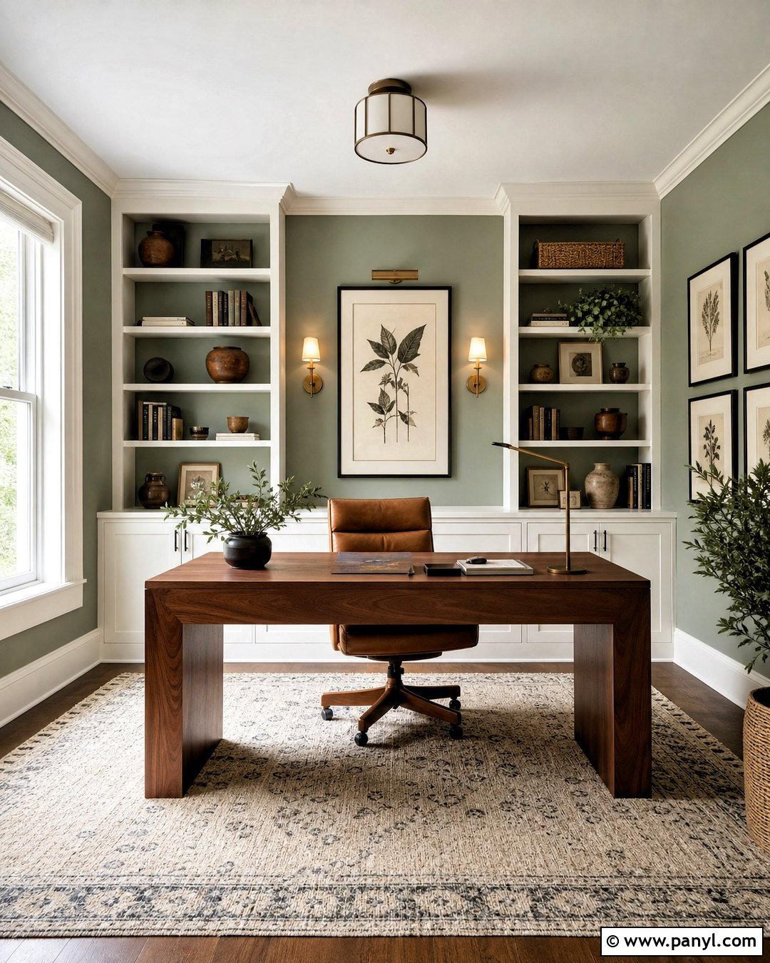
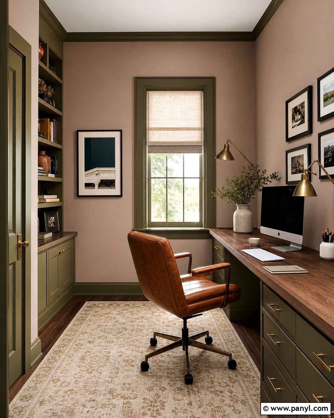
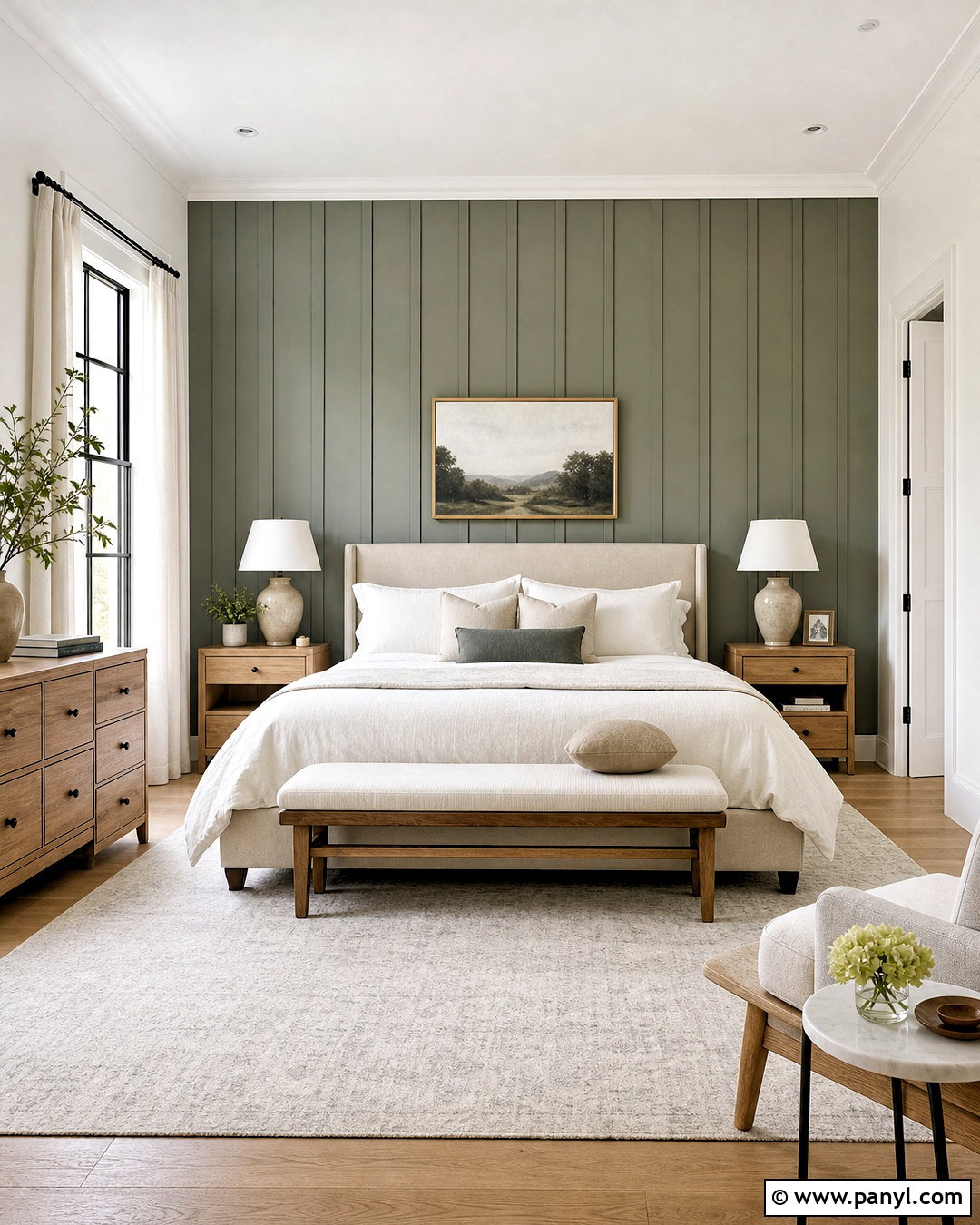
Evergreen Fog SW 9130 brings a muted, earthy green presence to an Alabaster palette. Create a complete home office with Evergreen Fog walls, Alabaster trim, and Alabaster built-in shelving. Add a walnut desk, a tan leather chair, and a natural wool rug with subtle cream and charcoal patterning. Antique brass sconces and black cabinet hardware give the room a polished finish. The green provides enough color for focus and personality, while Alabaster keeps the shelving and architectural details from feeling heavy. Include a few clay vessels, framed botanical prints, and restrained greenery rather than filling every shelf. This grounded combination works particularly well in rooms overlooking trees, gardens, or other natural outdoor features.
11. SW Alabaster With Retreat
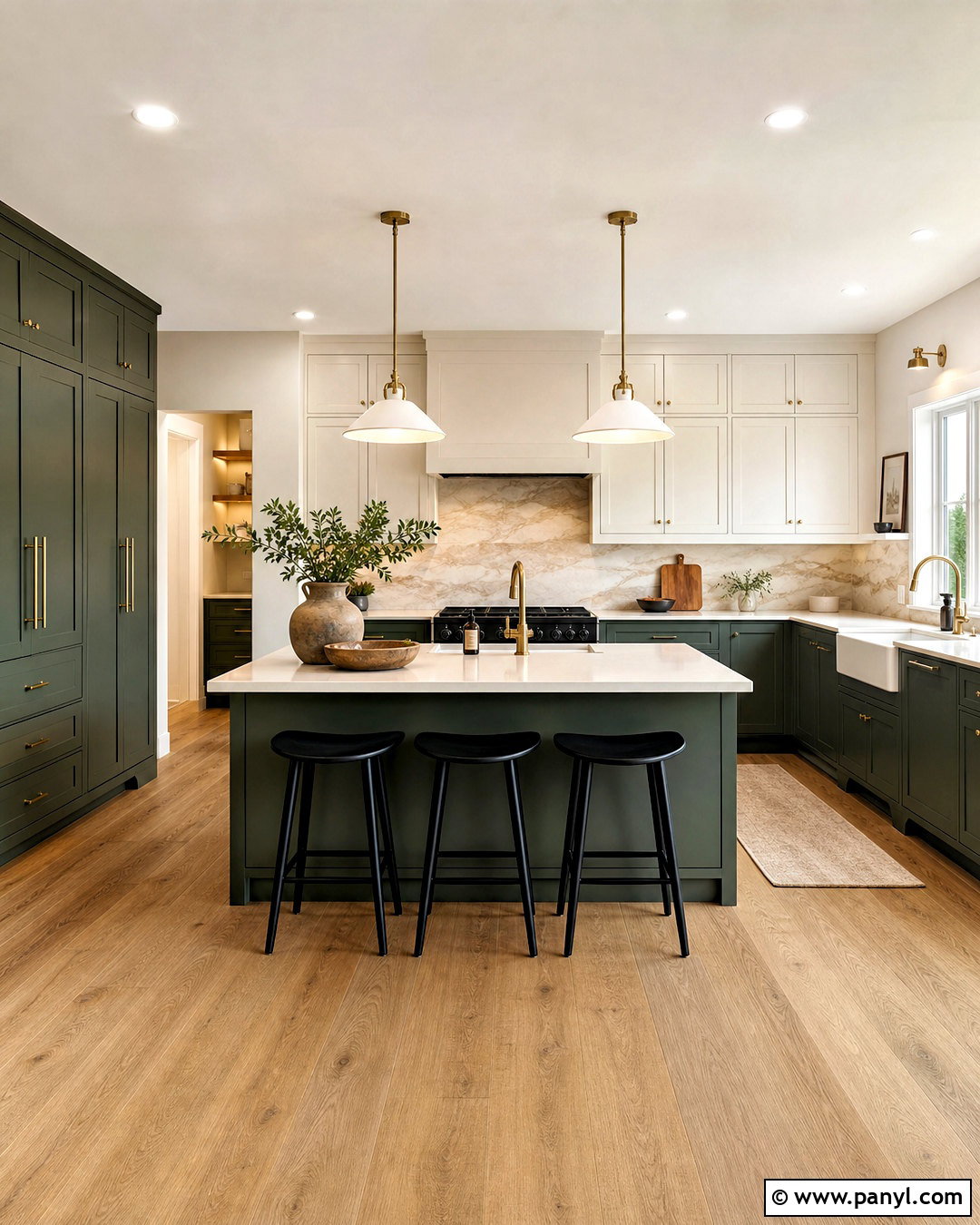
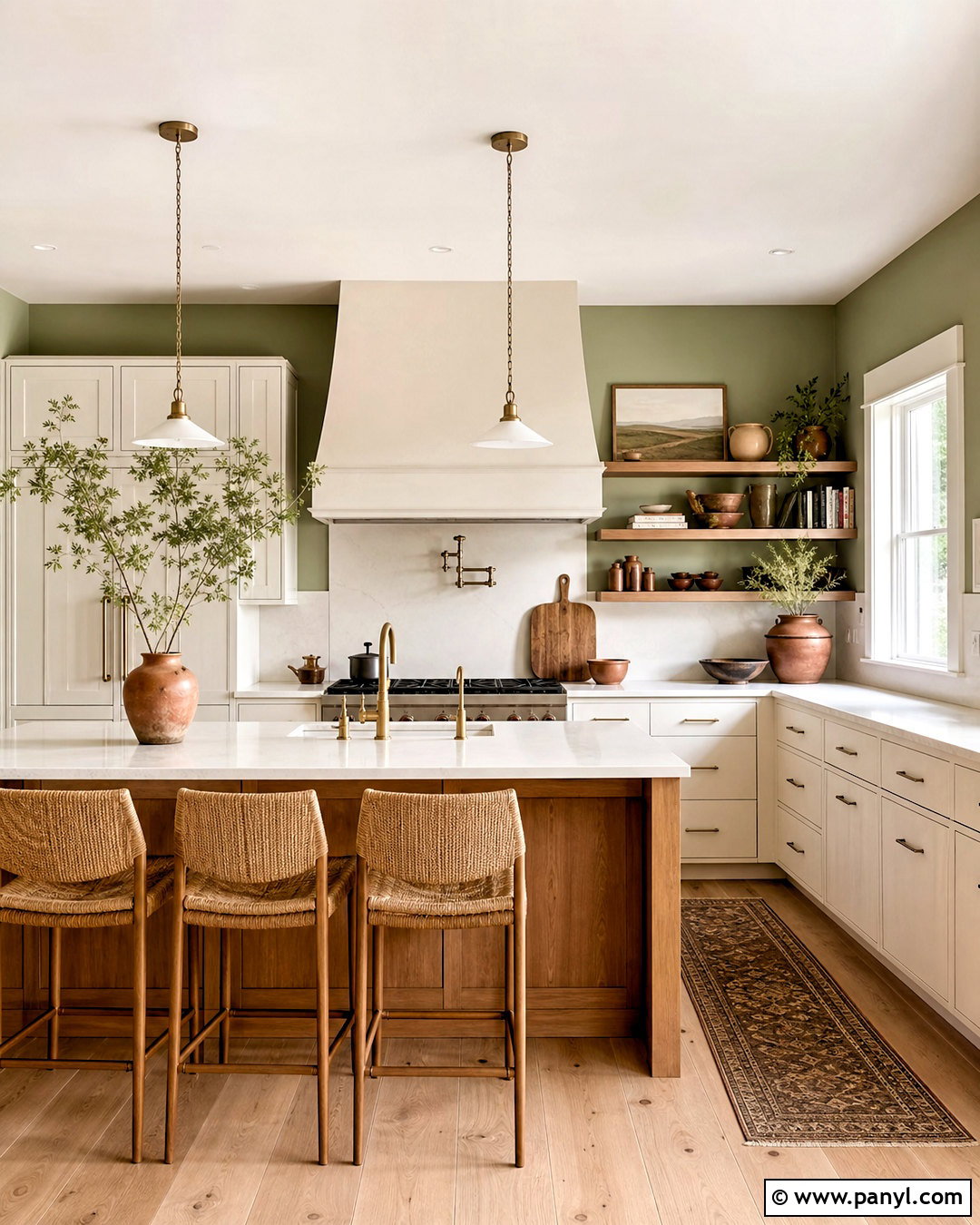
Retreat SW 6207 is a deeper gray-green that creates noticeable contrast against Alabaster. Use Retreat on kitchen base cabinets, a tall pantry wall, and the island, then place Alabaster on the upper cabinets and walls. White oak flooring, creamy quartz countertops, and a warm marble backsplash help the two colors transition naturally. Choose aged brass hardware and simple black counter stools for a modern organic finish. Retreat gives the cabinetry a strong presence without appearing as severe as charcoal or black. Alabaster prevents the deeper green from overwhelming the room and reflects light around the work surfaces. A few wooden cutting boards and handmade ceramic pieces finish this kitchen without introducing unnecessary colors or clutter.
12. SW Alabaster With Pewter Green
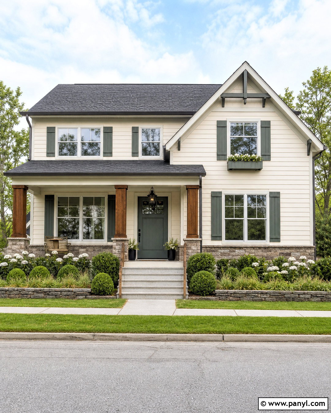
Pewter Green SW 6208 gives Alabaster a dark, sophisticated partner with noticeable natural character. On a home exterior, use Alabaster for the siding and broad trim, then paint the front door, shutters, and porch ceiling details in Pewter Green. A charcoal architectural-shingle roof and warm gray stone foundation will ground the high-contrast scheme. Add stained cedar porch posts, black lanterns, and a medium wood garage door to bring warmth back into the facade. Landscape with clipped boxwoods, ornamental grasses, and white flowering shrubs. The deep green accents create definition while still feeling softer than pure black. This exterior palette works especially well on Craftsman, cottage, farmhouse, and traditional suburban architecture.
13. SW Alabaster With Meditative
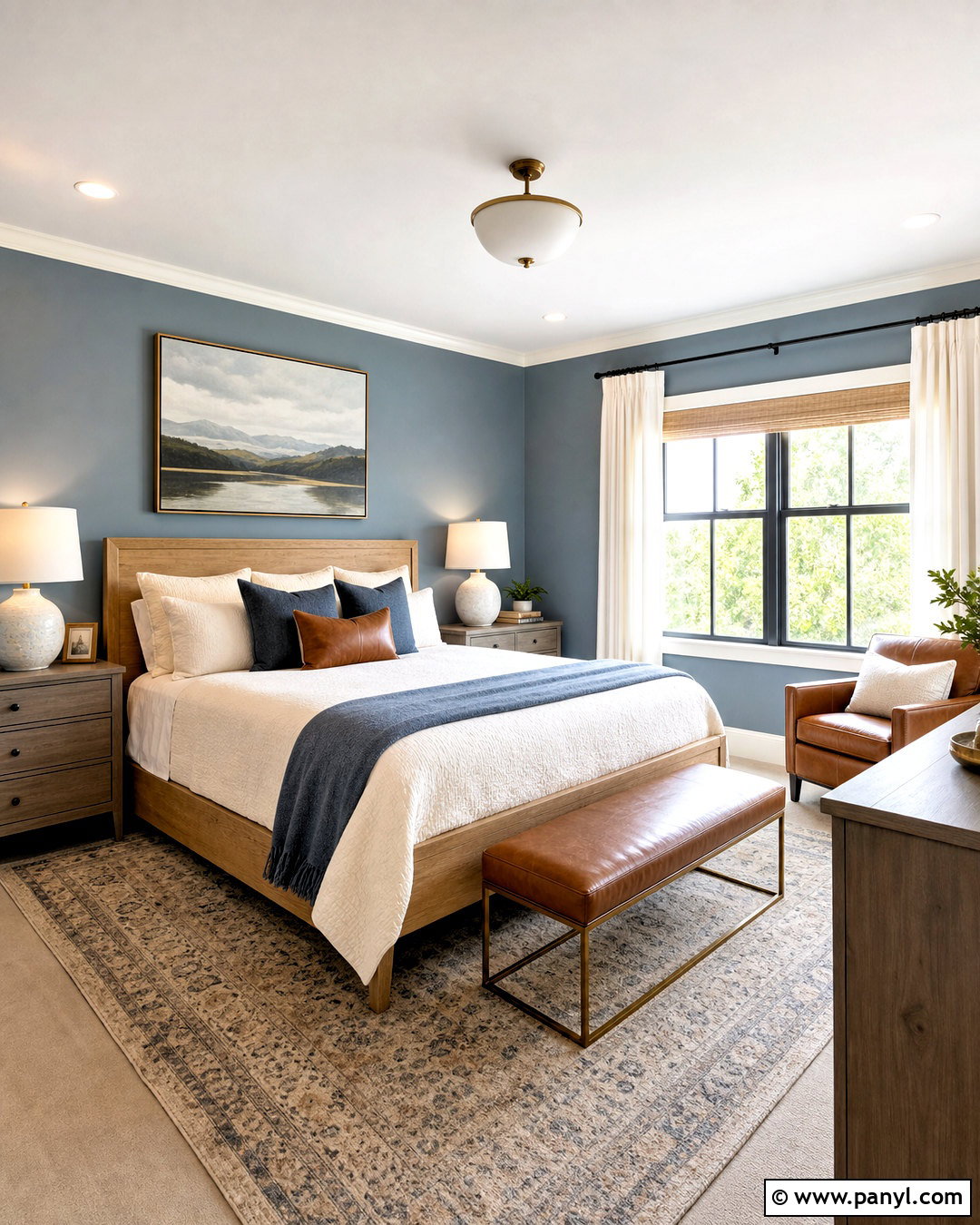
Meditative SW 6227 introduces a muted blue-gray that feels calm beside warm Alabaster. Design a welcoming guest bedroom with Meditative walls, Alabaster trim, and a simple Alabaster-painted ceiling. A natural oak bed, ivory quilt, and slate blue throw create a layered color connection. Add warm gray nightstands, ceramic lamps, and linen curtains that fall close to the wall color. Small touches of cognac leather or aged brass keep the blue from reading cold. This palette works because the soft white provides warmth while the blue-gray establishes a quiet sense of separation. Avoid crisp blue-white bedding, which may make Alabaster appear more yellow. Instead, choose textiles with cream, flax, and subdued blue undertones.
14. SW Alabaster With Smoky Blue
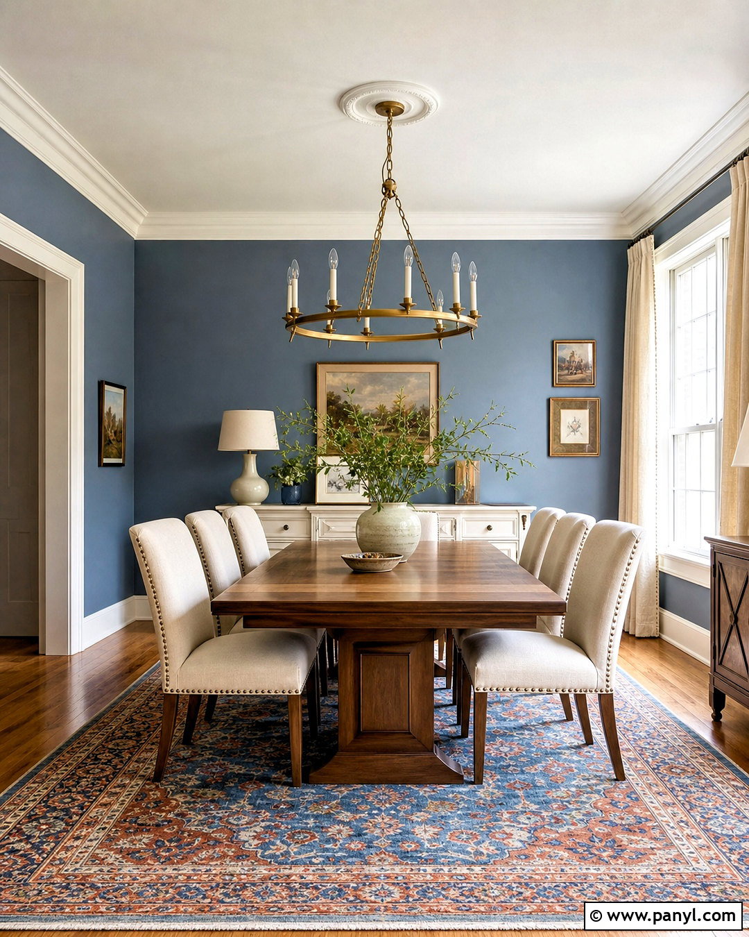
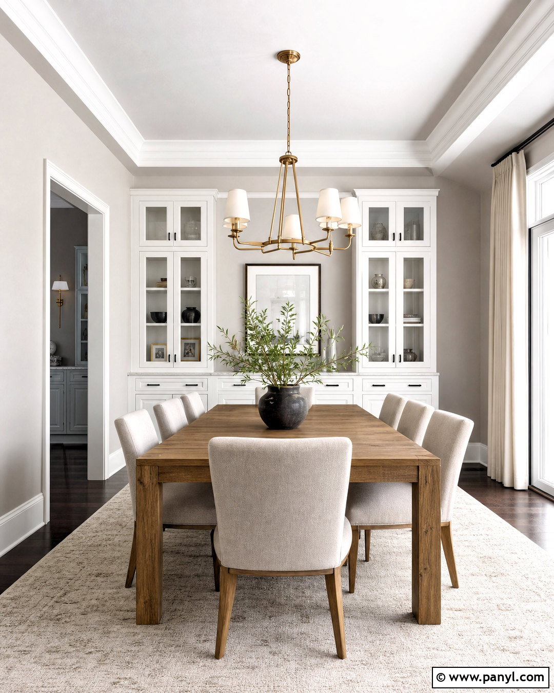
Smoky Blue SW 7604 delivers richer color while preserving the relaxed feeling associated with Alabaster. Use Smoky Blue on dining room walls and Alabaster on the ceiling, substantial crown molding, window trim, and a painted sideboard. Furnish the room with a medium walnut table, upholstered cream chairs, and a vintage-style rug containing blue, rust, and beige. An aged brass chandelier adds warmth at eye level, while natural linen curtains soften the windows. The blue has enough depth to make Alabaster architectural details stand out clearly. This complete look suits transitional and updated traditional homes. Keep accessories restrained so the wall color, wood grain, and millwork remain the strongest visual features.
15. SW Alabaster With Naval
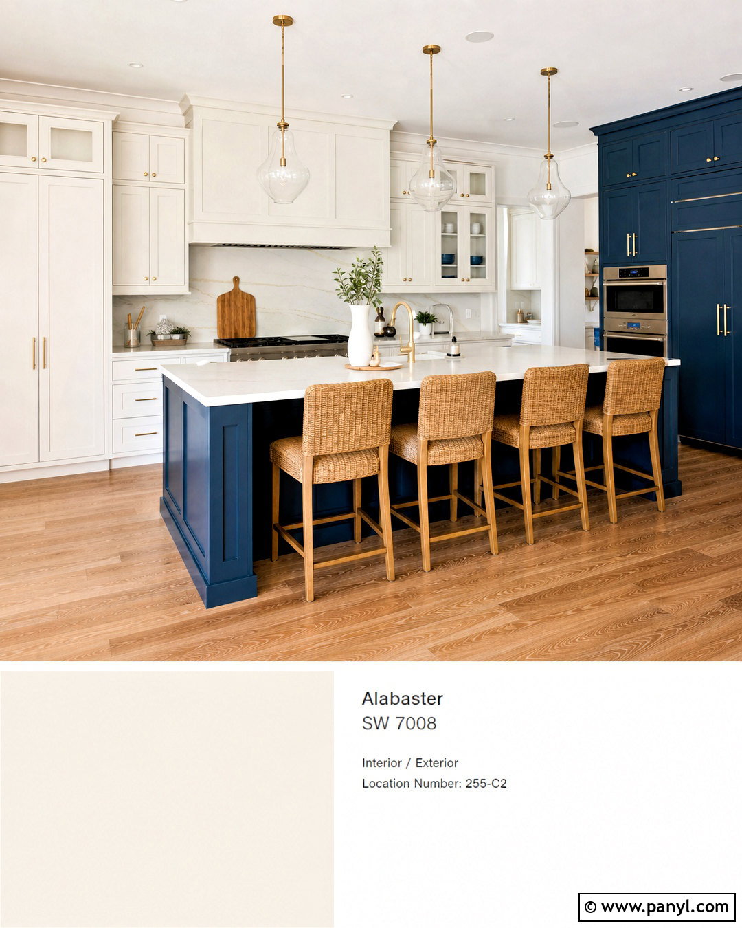
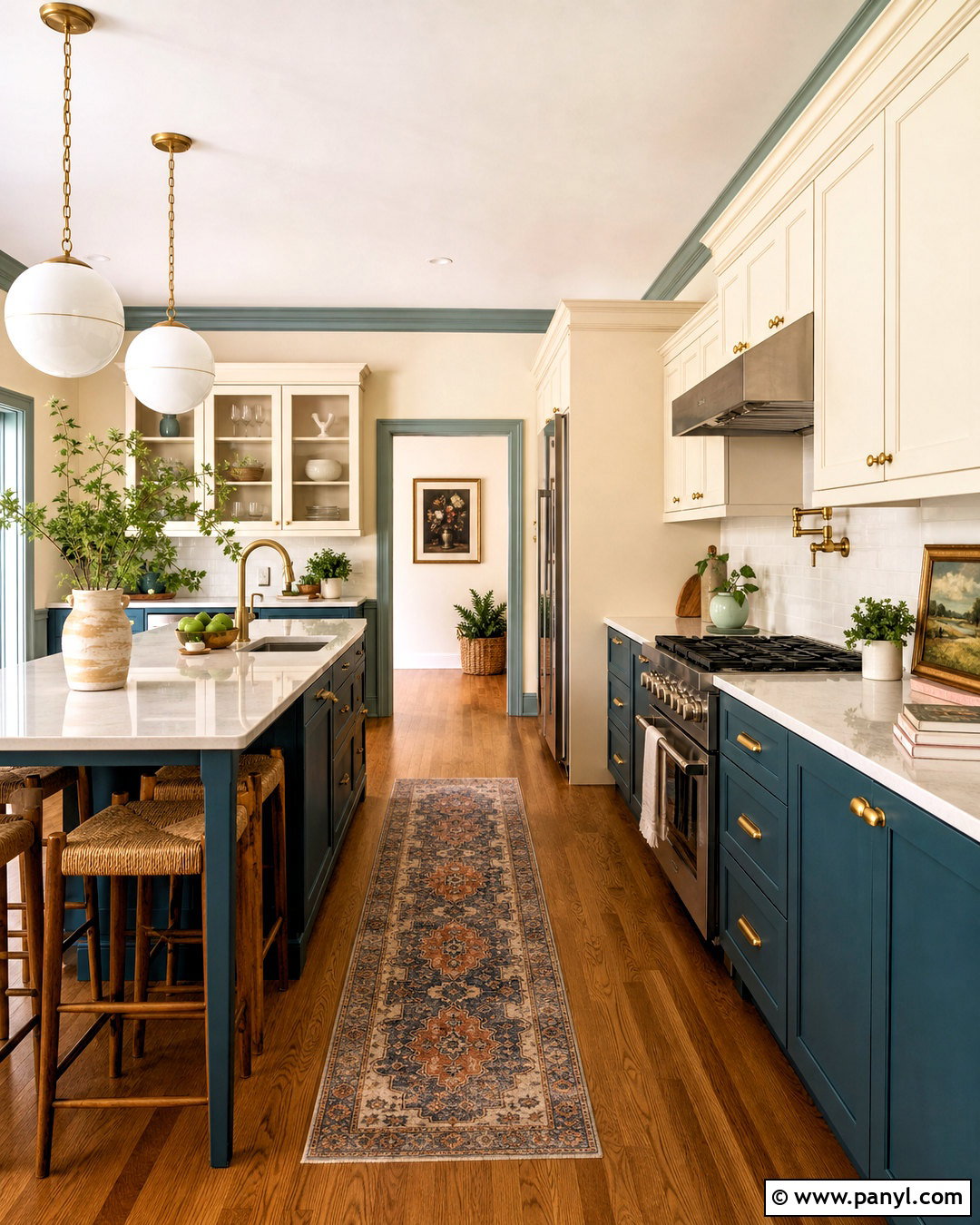
Naval SW 6244 creates a classic deep-blue contrast against the warm softness of Alabaster. In a kitchen, paint the island and tall pantry cabinets Naval while using Alabaster on perimeter cabinetry and walls. Add white quartz counters with gentle warm veining, medium oak flooring, and unlacquered brass hardware. Navy counter stools can make the island feel too heavy, so choose woven seats or warm wood instead. Clear glass pendants preserve open sightlines and allow the cabinetry to remain the focal point. Alabaster prevents the high-contrast design from feeling sharp or nautical. The finished kitchen feels confident, timeless, and balanced, with enough color to create personality while remaining easy to coordinate with natural materials.
16. SW Alabaster With Urbane Bronze
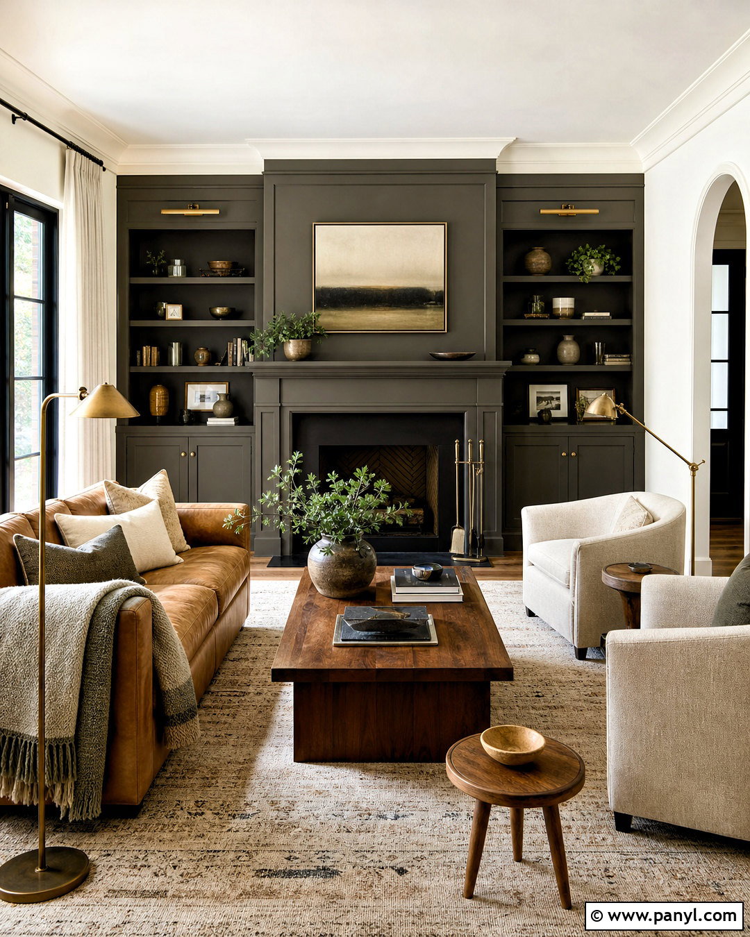
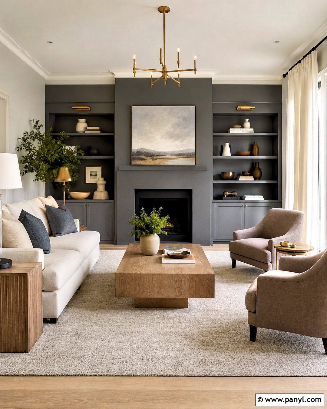
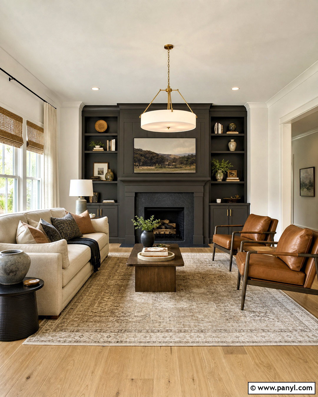
Urbane Bronze SW 7048 adds a warm brown-charcoal depth that complements Alabaster’s creamy undertone. Create a dramatic living room by painting the fireplace wall and built-in cabinetry Urbane Bronze, then use Alabaster on the remaining walls, trim, and ceiling. Choose a camel leather sofa, two oatmeal lounge chairs, and a warm neutral rug. Walnut tables and aged brass lighting enhance the earthy palette, while black accents add controlled definition. Because Urbane Bronze absorbs considerably more light than Alabaster, keep the darker color concentrated on one architectural feature. Large windows, layered lamps, and a pale floor will maintain balance. The completed room feels modern, grounded, and warm rather than harsh or overly masculine.
17. SW Alabaster With Iron Ore
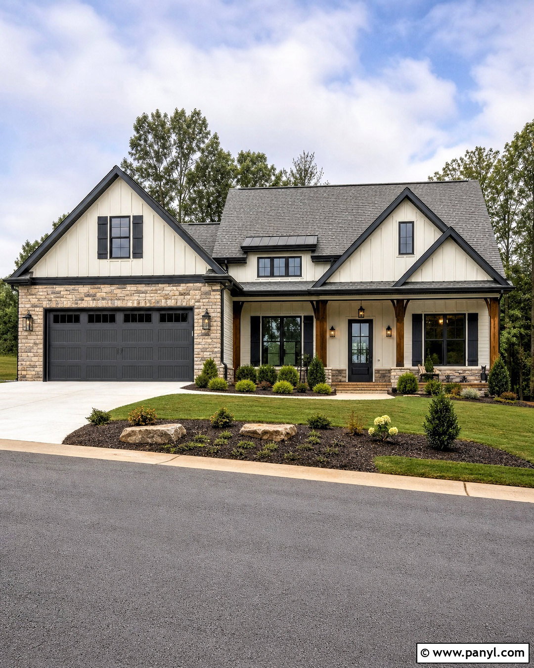
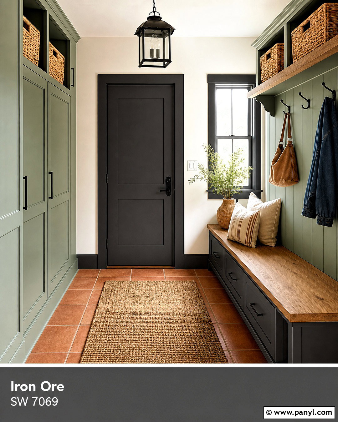
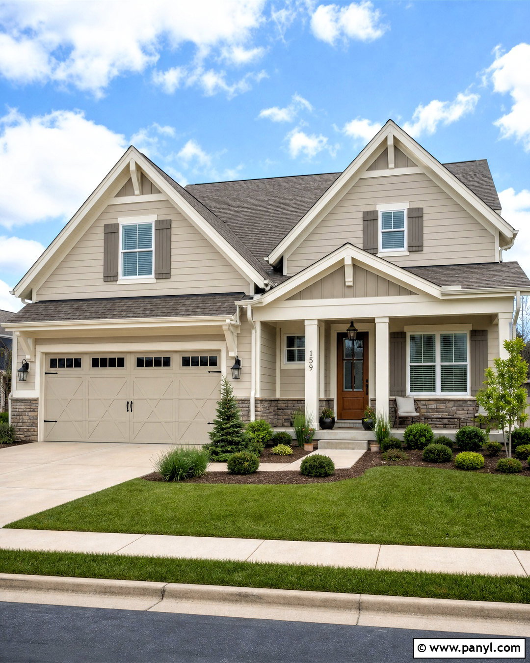
Iron Ore SW 7069 is an excellent choice when you want near-black contrast with a softer appearance. Paint a home’s main siding Alabaster, then use Iron Ore on the shutters, garage door, gutters, and front door. A medium gray roof and natural stone accents will bridge the light and dark surfaces. Warm stained wood porch columns keep the exterior from becoming strictly black and white. Complete the curb appeal with black lanterns, curved planting beds, evergreen shrubs, and pale gravel or concrete walkways. Alabaster appears warm and welcoming across the large facade, while Iron Ore outlines important architectural features. The scheme works on ranch, modern farmhouse, Craftsman, and updated colonial homes.
18. SW Alabaster With Tricorn Black
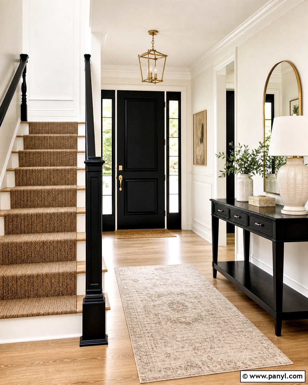
Tricorn Black SW 6258 provides the clearest, boldest contrast among these SW Alabaster coordinating colors. Use Alabaster on entryway walls, trim, and stair risers, then paint the interior front door, stair railing, and console table in Tricorn Black. Warm oak flooring and a natural woven runner soften the graphic combination. Add an arched brass mirror, a cream ceramic lamp, and one large piece of neutral artwork. Keep the black elements deliberate and evenly distributed rather than adding small dark objects everywhere. This creates a strong visual rhythm without making the entry feel busy. Alabaster supplies warmth and brightness, while Tricorn Black defines the architecture and gives an ordinary entrance a crisp, finished appearance.
19. SW Alabaster With Redend Point
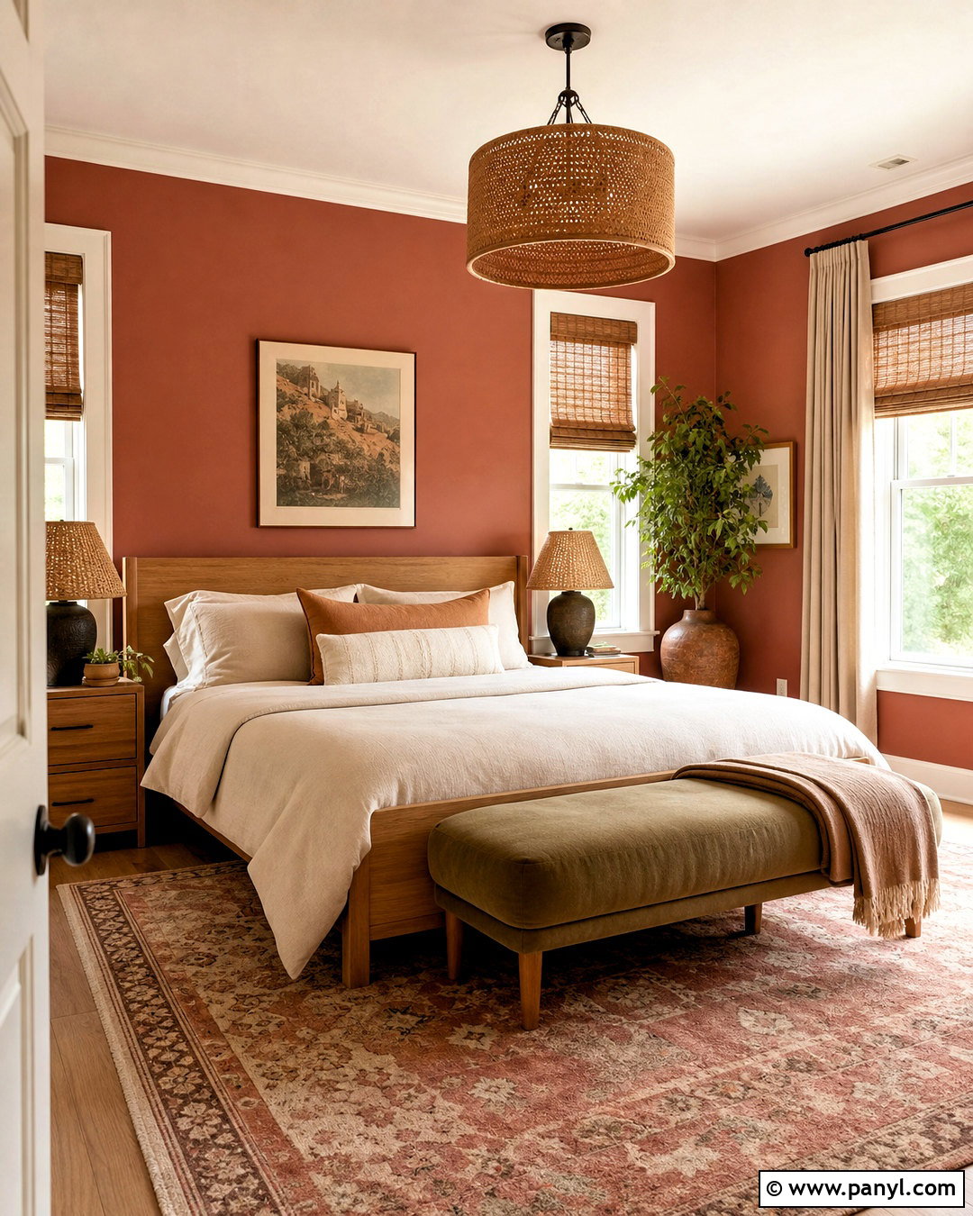
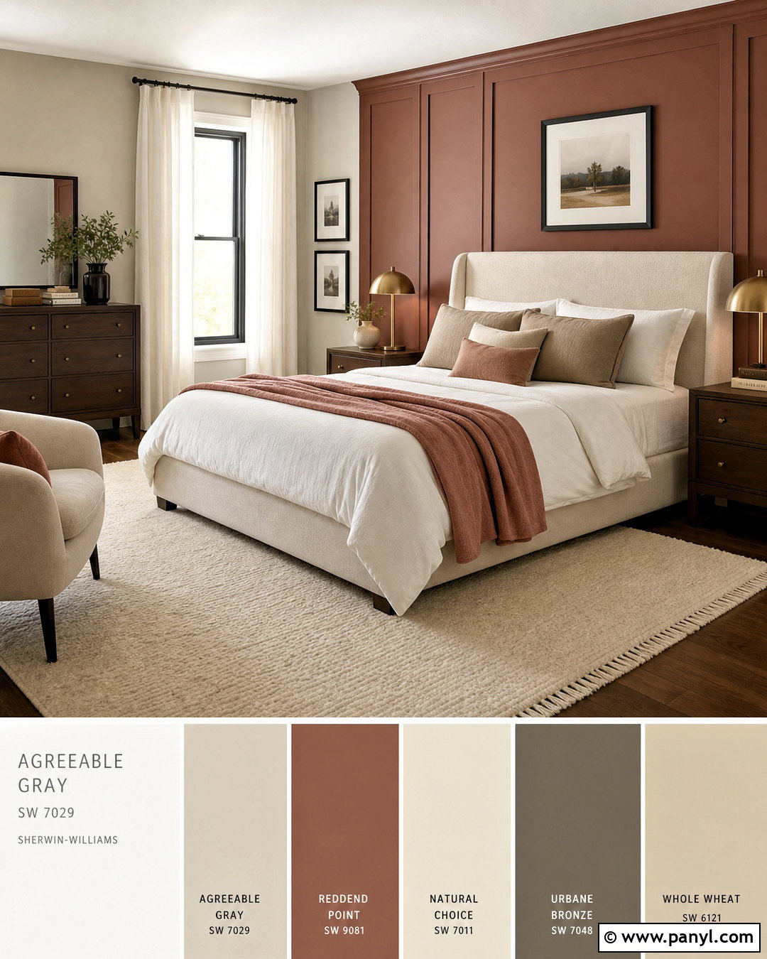
Redend Point SW 9081 introduces a dusty clay tone that makes Alabaster feel especially warm and organic. Build a comfortable bedroom around Redend Point walls, Alabaster trim, and a soft Alabaster ceiling. Choose a light oak bed, creamy linen bedding, and a wool rug mixing blush, rust, and beige. Dark bronze lamps and woven window shades provide structure without fighting the gentle wall color. Add one muted olive throw or upholstered bench to balance the clay undertones. This palette creates color without relying on bright saturation, making it suitable for restful spaces. Alabaster keeps the room luminous, while Redend Point supplies the depth and warmth needed for a layered, finished design.
20. SW Alabaster With Cavern Clay
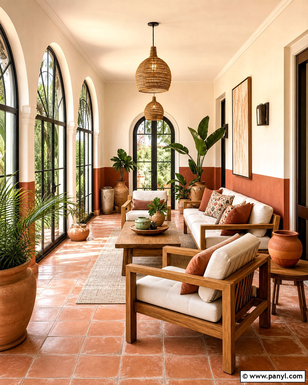
Cavern Clay SW 7701 creates a bold, sunbaked contrast that works beautifully with Alabaster in warm, casual spaces. Use Cavern Clay on the lower half of a sunroom or covered patio wall, with Alabaster above it, across the ceiling, and on the trim. Add terracotta floor tile, teak or natural wood furniture, and cream outdoor cushions. Woven pendants, black metal frames, and large green plants complete the earthy palette. Repeating Alabaster in textiles and pottery prevents the clay color from becoming visually heavy. This combination feels energetic in bright daylight but remains grounded by natural materials. It is a practical choice for Southwestern, Mediterranean, bohemian, and modern organic homes.
Conclusion:
The best SW Alabaster coordinating colors either support its warm undertone or create deliberate, balanced contrast. Pure White and soft greiges produce quiet transitions, while greens and blue-grays add calm color. Naval, Iron Ore, Urbane Bronze, and Tricorn Black make architectural details more prominent. Earthy shades such as Dakota Wheat, Redend Point, and Cavern Clay create warmer, more expressive palettes. Always compare large paint samples beside permanent flooring, tile, countertops, roofing, and stone. Check them during the morning, afternoon, and evening because changing light affects every pairing. With thoughtful testing, these 20 sw alabaster coordinating colors can create a connected home that feels bright, comfortable, and carefully finished.

Related Ideas and Inspiration:
Leave a Reply