
Choosing paint is easier when you picture the entire room rather than judge a small color chip. The best interior paint colors should support your flooring, furniture, natural light, and the atmosphere you want to create. Current palettes are moving toward warmer neutrals, nature-inspired greens, quiet blues, earthy reds, and deep grounding shades, while stark whites and icy grays are becoming less dominant. () This collection balances those fresh directions with dependable colors that remain easy to decorate around. Each selection includes a complete room concept, practical pairings, and guidance for creating a cohesive finish. Whether you prefer bright and relaxed rooms or rich, enveloping spaces, these approachable looks reveal the decorating potential of the **20 best interior paint colors**.

1. Warm White Interior Paint Color
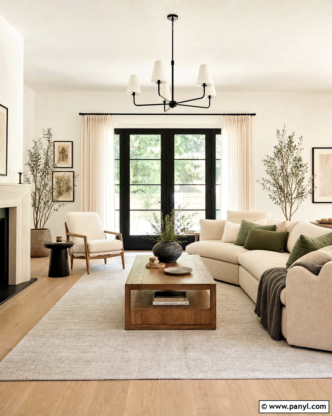
Warm white creates a bright, welcoming foundation without the cold appearance that pure white can produce. Use it throughout a living room with light oak flooring, an oatmeal linen sofa, and softly textured ivory curtains. Add contrast through a walnut coffee table, black metal floor lamp, and framed earth-toned artwork. Cream, camel, and muted sage pillows keep the palette gentle but visually layered. Paint the walls in eggshell and use the same warm white in a satin finish on trim for subtle dimension. This color works especially well in rooms receiving cooler northern light. Before committing, confirm that the undertone looks creamy rather than yellow beside your flooring, upholstery, and fixed stone surfaces.
2. Cream Interior Paint Color
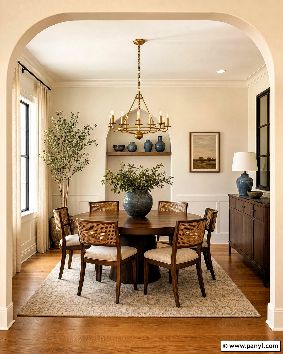
Cream paint gives a room more warmth and character than crisp white while remaining flexible enough for many decorating schemes. Create a comfortable dining room with creamy walls, medium-toned oak flooring, a round walnut table, and woven dining chairs. A vintage-inspired brass chandelier brings warmth overhead, while ivory curtains soften the windows. Introduce muted blue through pottery or patterned seat cushions to prevent the room from looking overly beige. Keep the ceiling a lighter cream and paint the trim in a slightly cleaner off-white. The finished space should feel sunny, layered, and relaxed. Cream is particularly effective in rooms with limited daylight because it reflects available light without creating a sterile or bluish cast.
3. Soft Greige Interior Paint Color
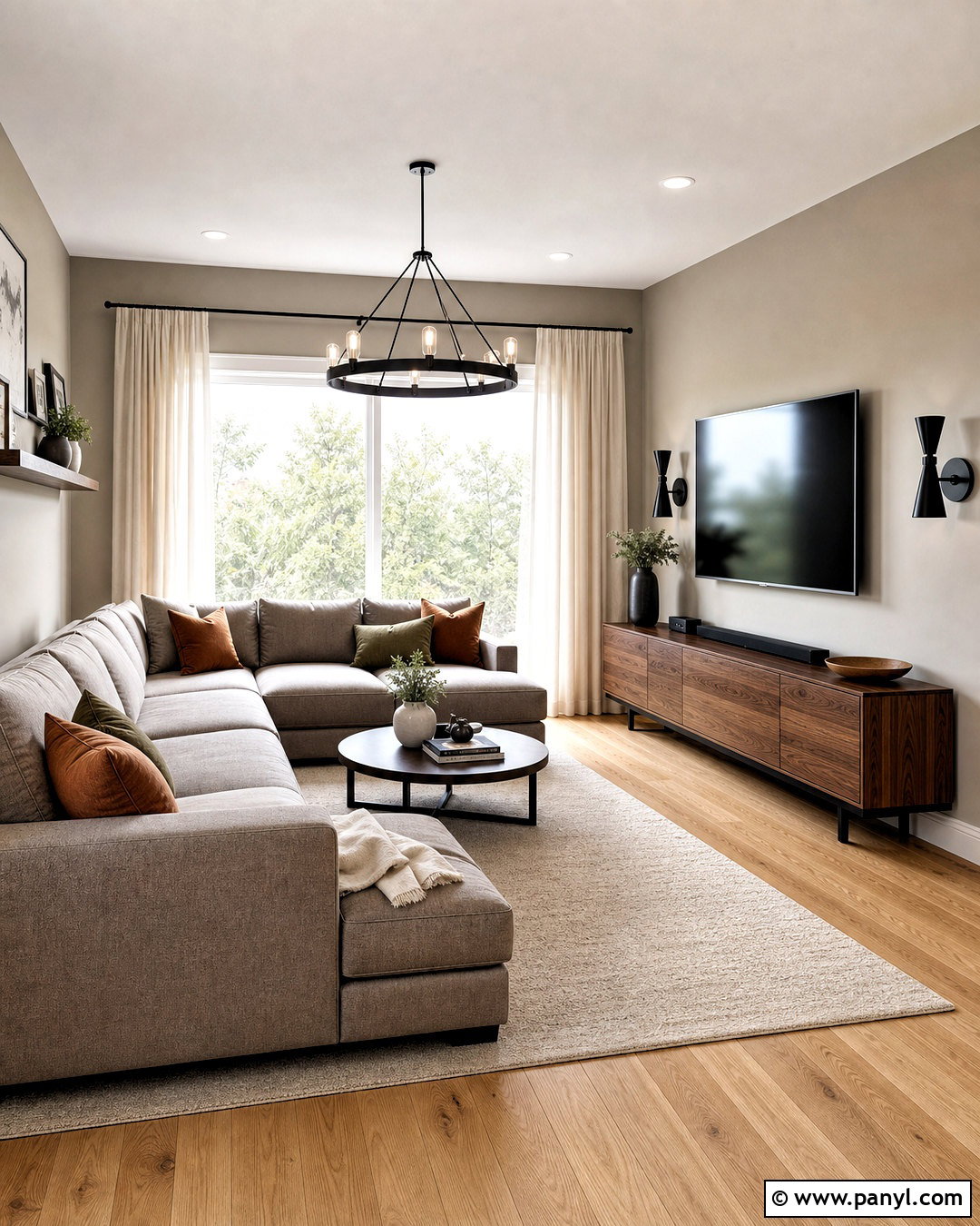
Soft greige combines the versatility of gray with the welcoming warmth of beige. It is a practical whole-home color when adjoining rooms need to flow smoothly. Pair greige walls with natural white oak floors, a warm gray sectional, and a low walnut media console. Add ivory curtains, black metal accents, and pillows in rust, olive, and cream. Choose warm white for the ceiling and trim so the walls remain visibly deeper. Greige can shift considerably throughout the day, so test it beside stone countertops and existing fabrics before painting. Avoid versions with strong purple undertones unless those tones already appear in the room. The final scheme feels calm and contemporary while leaving plenty of space for personal artwork and changing seasonal accents.
4. Mushroom Interior Paint Color
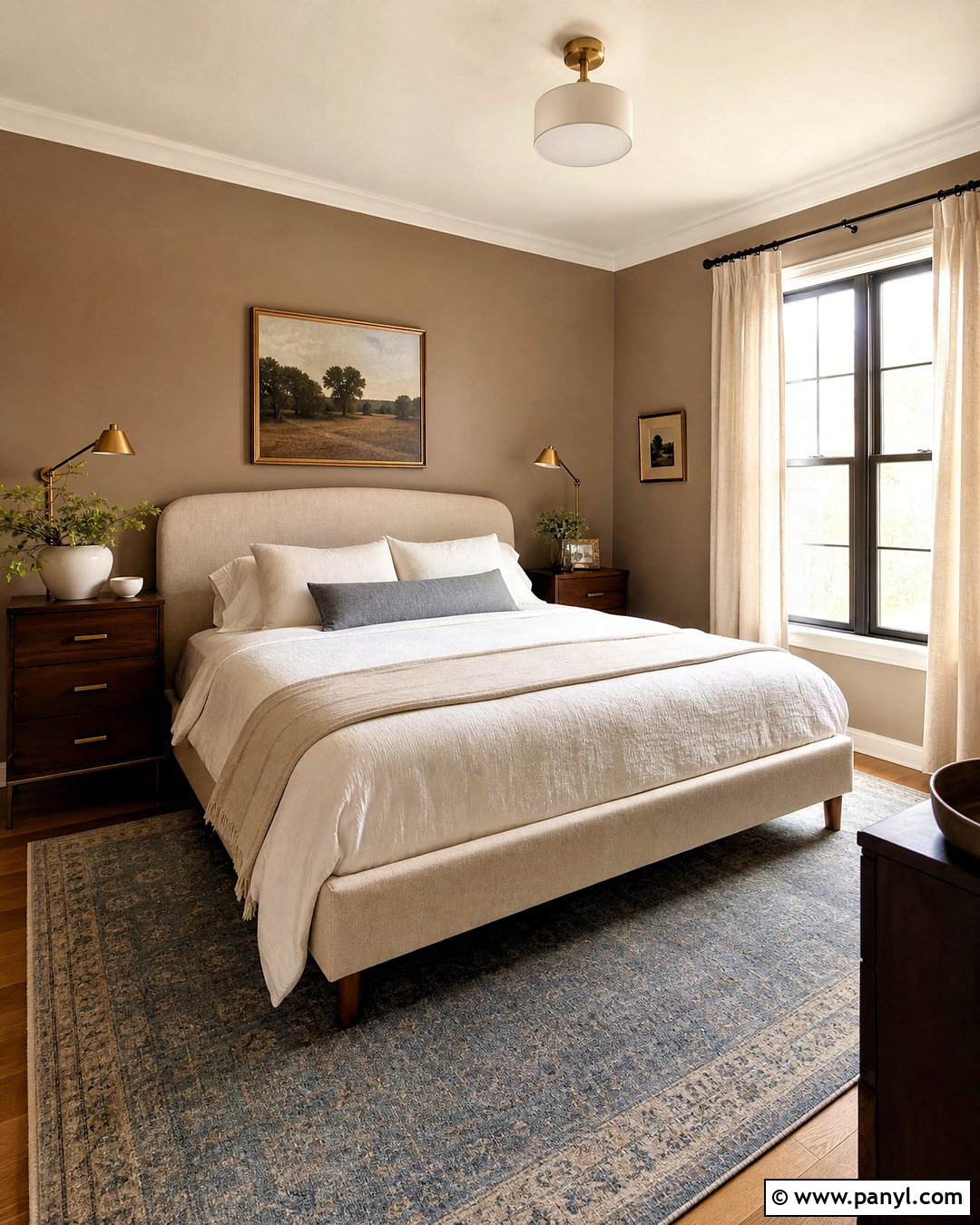
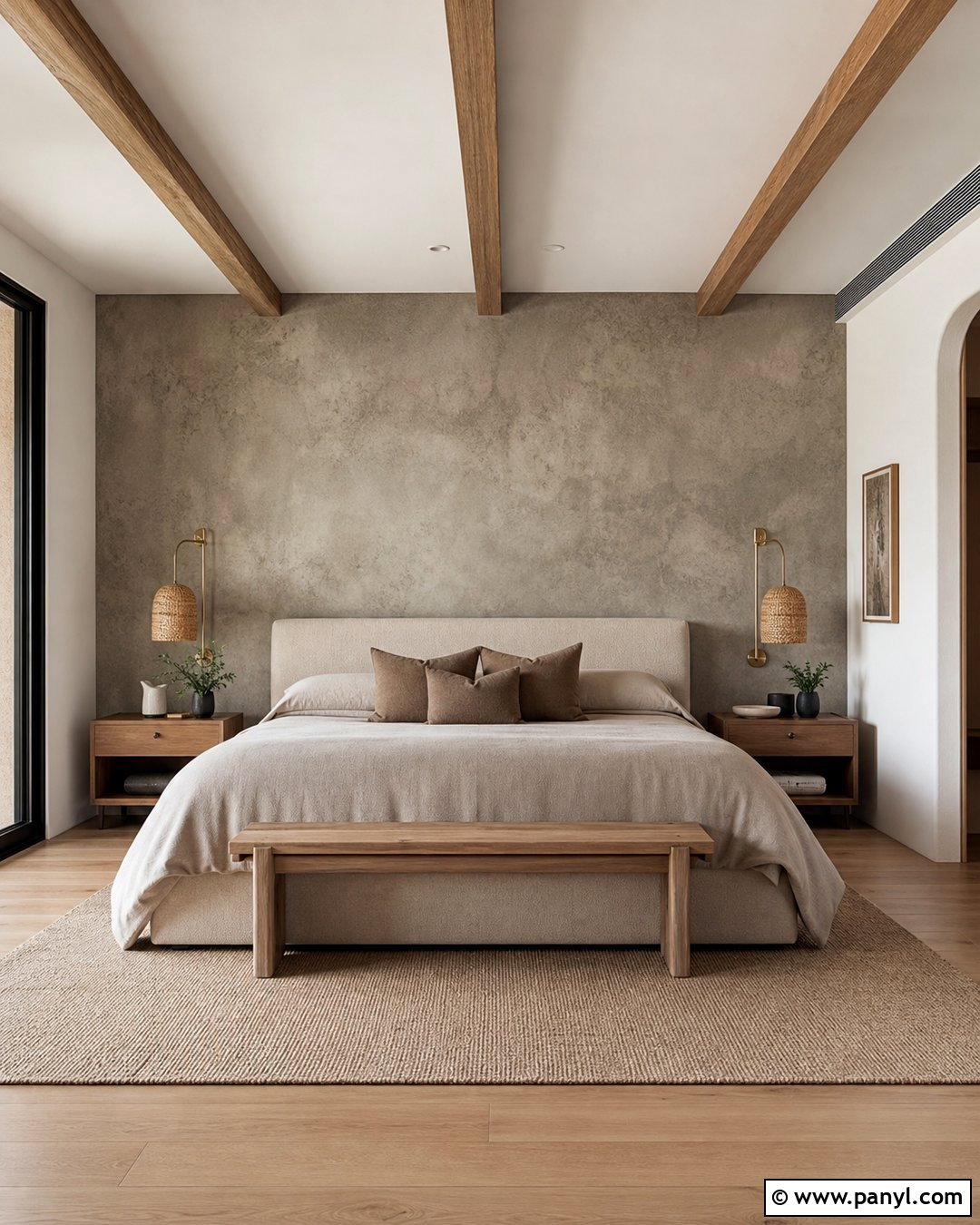
Mushroom is a complex neutral that sits between taupe, beige, and soft brown. It creates more depth than standard off-white without making a room feel dark. Use mushroom walls in a bedroom with an upholstered oatmeal bed, walnut nightstands, and warm white bedding. Layer a faded blue area rug beneath the bed and add antique brass lamps for a quiet, collected finish. Linen curtains in a similar wall tone will make the room appear taller and more cohesive. Paint the trim a creamy off-white instead of bright white, which may exaggerate the brown undertone. Mushroom works beautifully with natural stone, aged wood, and tactile fabrics. Its understated depth makes an ordinary bedroom feel comfortably finished rather than plainly neutral.
5. Warm Beige Interior Paint Color
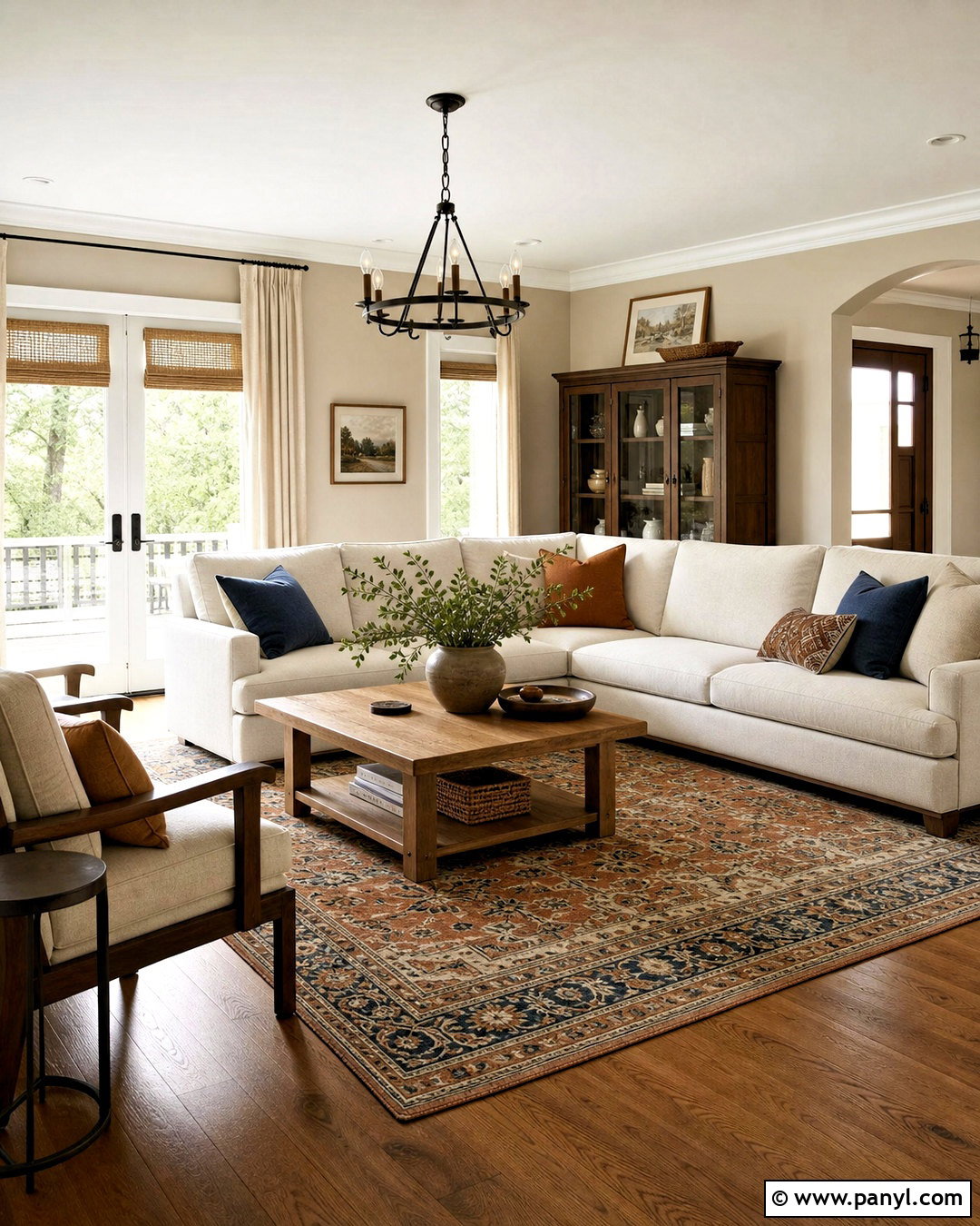
Warm beige brings softness to open living spaces and pairs naturally with wood, woven fibers, and creamy textiles. Build a relaxed family room around beige walls, a large ivory sectional, and a substantial medium-oak coffee table. Ground the seating area with a patterned rug containing tan, faded rust, and dusty blue. Woven shades and full-length linen curtains make the windows feel complete, while dark bronze lighting adds definition. Use soft white on the ceiling and trim to maintain a clean transition between surfaces. Beige looks most intentional when the room includes several darker values, so add walnut frames, brown leather, or charcoal pottery. This balanced design feels warm and familiar without slipping into an outdated, overly matching brown palette.
6. Taupe Interior Paint Color
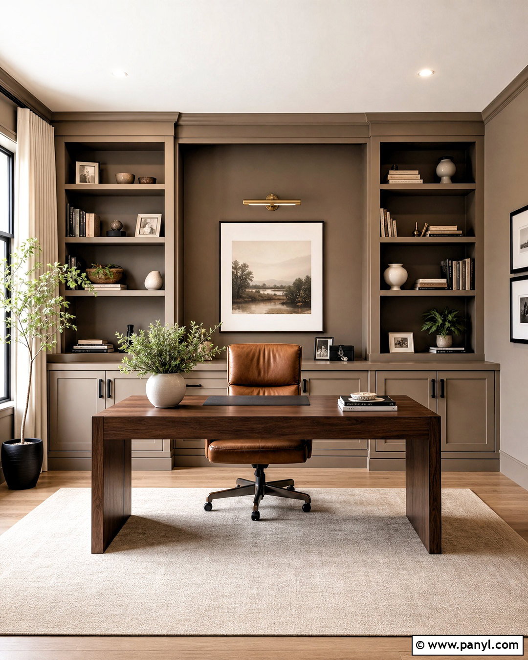
Taupe creates a tailored backdrop with enough depth to define architectural details. For a polished home office, cover the walls in medium taupe and repeat the color on built-in shelving. Add a walnut desk, cognac leather chair, and a low-pile cream rug. Aged brass picture lights and black cabinet hardware provide small points of contrast. Keep the ceiling warm white unless the room is compact and cozy, in which case taupe can continue overhead for an enveloping effect. Decorate shelves with books, ceramic vessels, and restrained greenery rather than many tiny accessories. Because taupe may carry pink, gray, or green undertones, compare samples against the desk and flooring. The complete office should feel focused, comfortable, and professionally composed.
7. Khaki Interior Paint Color
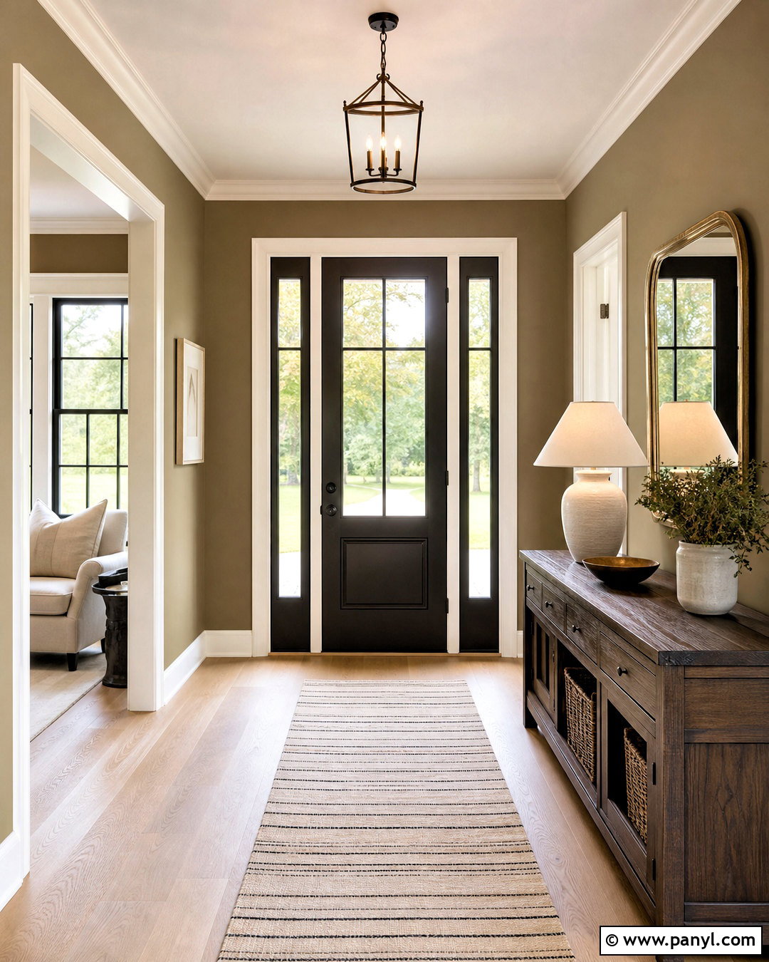
Khaki offers more personality than beige while still functioning as a versatile neutral. Its earthy green-brown undertone works especially well in an entryway designed with natural materials. Pair khaki walls with white oak flooring, a dark wood console, and a large round mirror framed in aged brass. Add a striped wool runner in cream and charcoal, a ceramic table lamp, and one generous branch arrangement. Paint doors and trim in a warm off-white for soft contrast, or use matching khaki on the doors for a more continuous look. Matte black hooks or hardware will sharpen the palette. The finished entry feels grounded and orderly, making it an inviting transition into rooms decorated with olive, rust, navy, cream, or warm wood tones.
8. Sage Green Interior Paint Color
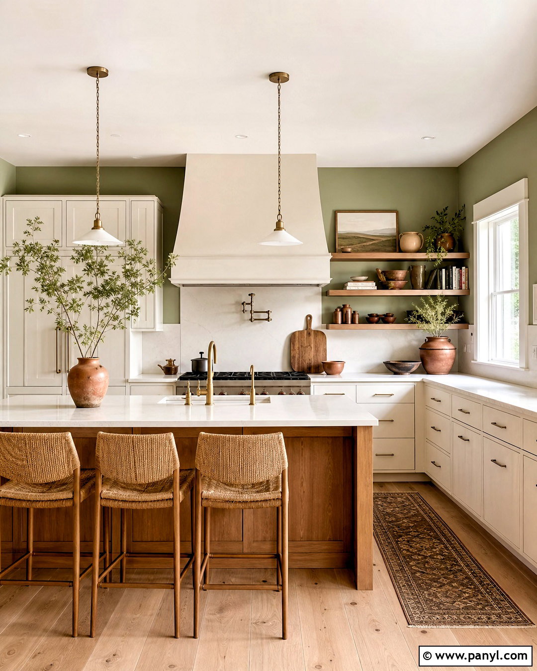
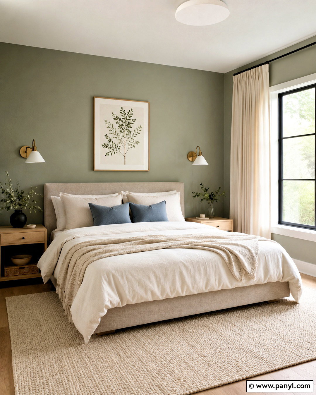
Sage green is easy to live with because its gray undertone keeps it quiet and adaptable. Create a calm kitchen with sage walls, creamy white cabinets, pale quartz counters, and a warm oak island. Brushed brass hardware brings subtle polish, while woven counter stools and terracotta pottery introduce organic texture. Use simple off-white tile for the backsplash so the wall color remains the defining feature. Medium oak flooring adds warmth without competing with the green. Repeat sage in a small patterned runner or botanical artwork to connect the palette. In darker kitchens, choose a lighter sage and test it under both daylight and artificial lighting. This complete combination feels fresh, natural, and welcoming without relying on a bright or overly decorative green.
9. Eucalyptus Green Interior Paint Color
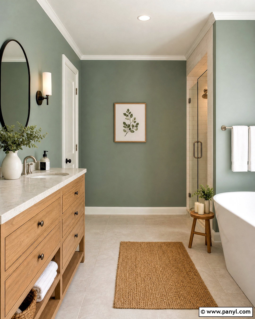
Eucalyptus green has a soft blue-gray quality that creates a refreshing but settled atmosphere. It is particularly effective in a bathroom with warm white tile, pale oak cabinetry, and brushed nickel fixtures. Paint the walls eucalyptus and keep the ceiling a clean but gentle white. Add a frameless glass shower, a light stone countertop, and a large rounded mirror to maintain an open feeling. Towels in white and muted sand will keep the palette calm, while small charcoal accessories add necessary definition. A woven bath mat introduces natural warmth without disrupting the clean design. Select an eggshell or bathroom-rated finish that tolerates moisture. The finished room feels restorative and current, with enough color to appear thoughtfully designed rather than simply functional.
10. Olive Green Interior Paint Color
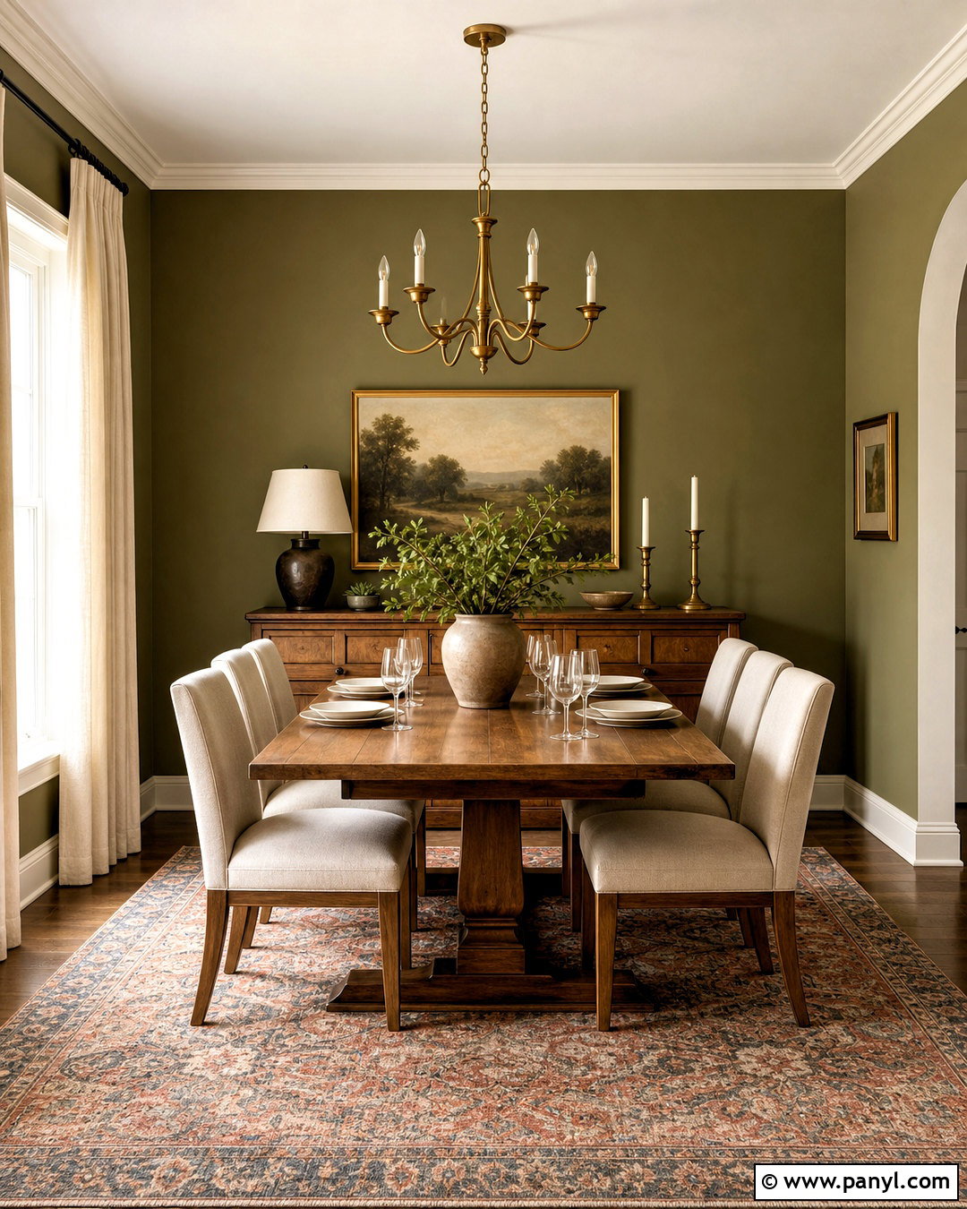
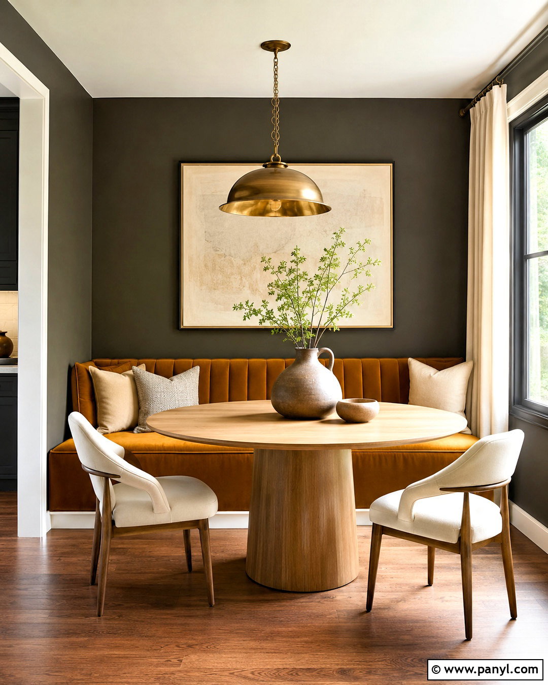
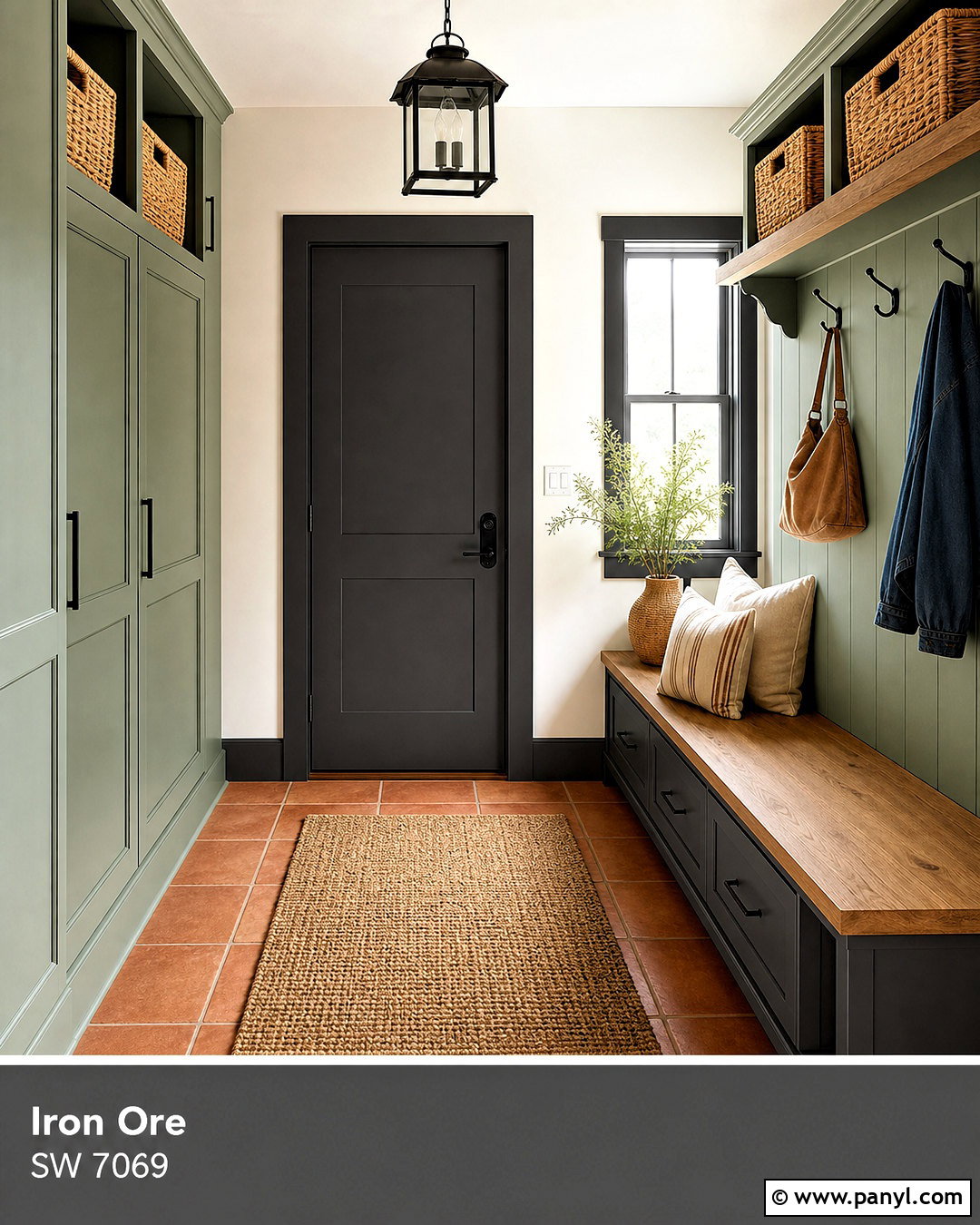
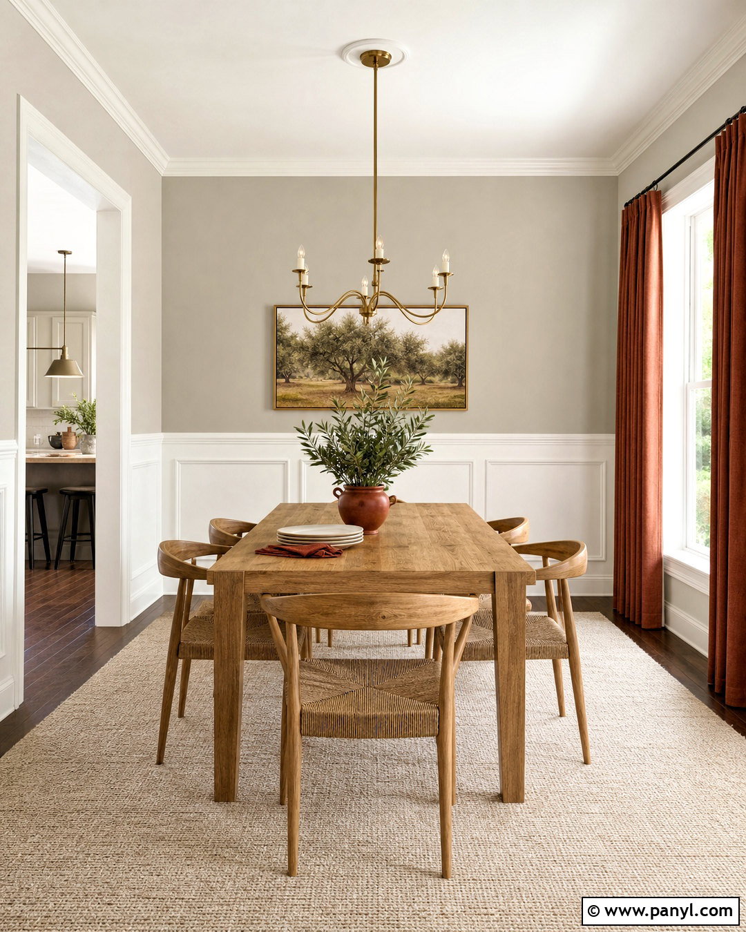
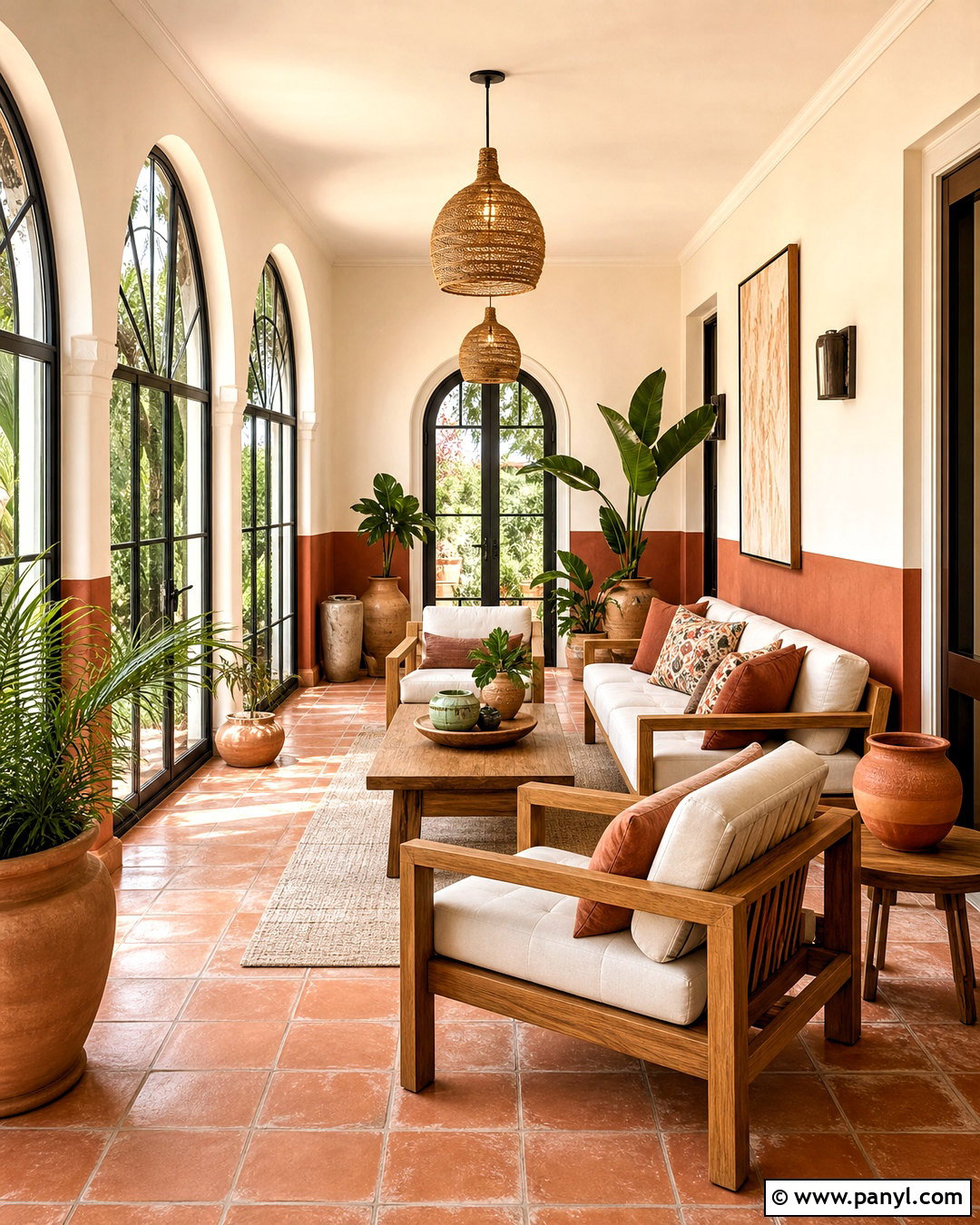
Olive green creates a warm, established look that pairs beautifully with brown wood and aged metals. Use it in a dining room with olive walls, a substantial walnut table, and chairs upholstered in natural linen. Hang a simple brass chandelier above the table and place a vintage-inspired rug beneath it in cream, rust, and muted blue. Warm white trim will frame the color, while matching olive on a built-in cabinet creates continuity. Add pottery, landscape art, and linen curtains instead of overly formal accessories. Because olive can become muddy in weak light, test several shades and choose one with enough warmth to remain lively. The resulting dining room feels intimate, grounded, and appropriate for both everyday meals and more polished gatherings.
11. Forest Green Interior Paint Color
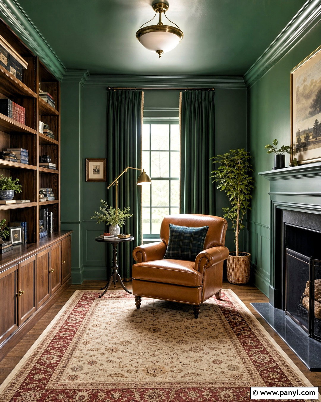
Forest green turns a small room into a confident, cozy destination. Apply it to the walls, trim, and ceiling of a reading room for a seamless color-drenched effect. Furnish the space with a camel leather armchair, a compact walnut bookcase, and a small brass floor lamp. A traditional rug containing cream, faded red, and dark blue will brighten the floor while complementing the deep walls. Add one large framed print rather than a crowded gallery display. Full-length velvet curtains in a slightly lighter green can make the window appear generous and finished. Forest green looks especially rich beside warm wood and brass. Adequate lamps are essential, since layered lighting keeps the room atmospheric without allowing corners or reading surfaces to become gloomy.
12. Powder Blue Interior Paint Color
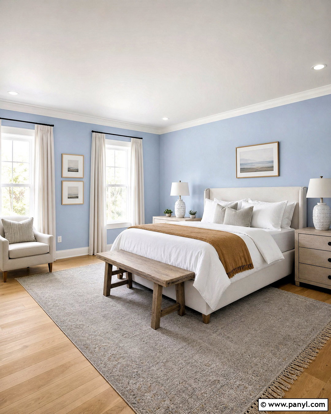
Powder blue gives a bedroom gentle color while preserving the airy versatility of a neutral. Pair powder blue walls with warm white trim, light oak flooring, and an upholstered cream headboard. Dress the bed in white cotton, a small blue pattern, and a camel throw for warmth. Natural linen curtains soften the windows, while light wood nightstands and ceramic lamps keep the arrangement relaxed. Introduce one deeper blue through artwork or a bench so the pale walls do not appear washed out. Powder blue works particularly well in sunny rooms, where natural light reveals its softness. Avoid surrounding it with icy gray furnishings. Cream, tan, light brown, and muted coral create a warmer, more balanced bedroom that remains peaceful and easy to update.
13. Dusty Blue Interior Paint Color
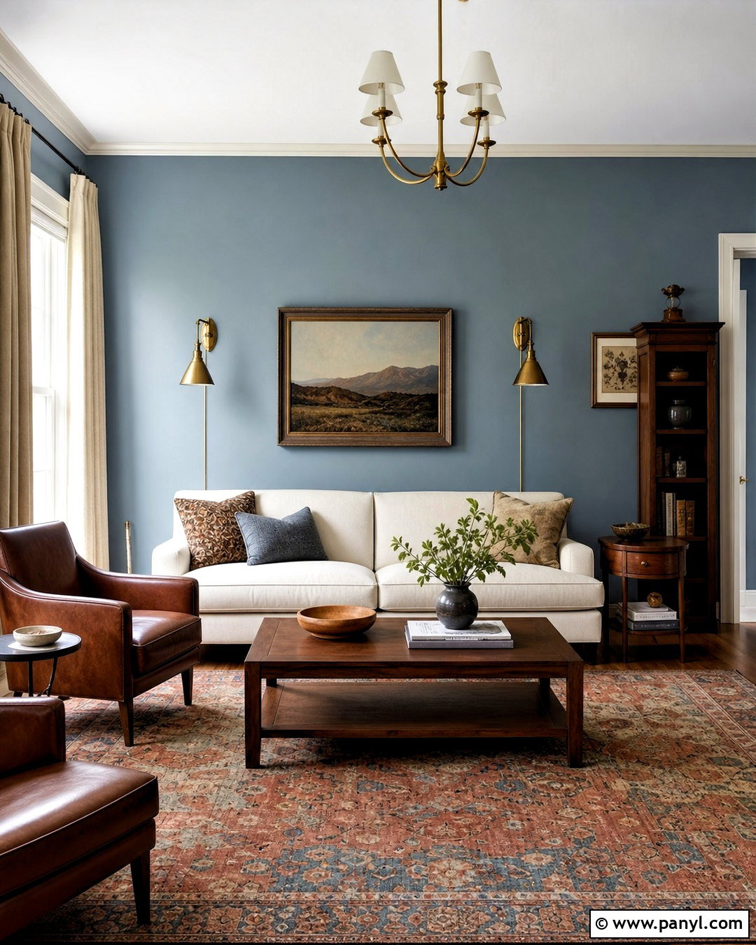
Dusty blue delivers more depth than powder blue but still feels quiet enough for everyday spaces. Create a sophisticated living room with dusty blue walls, a warm ivory sofa, and two compact brown leather chairs. Use a faded rust-and-blue rug to connect the cool walls with the warm seating. Walnut tables, antique brass lighting, and cream linen curtains complete the room without making it formal. Paint the trim a soft warm white to keep the blue looking clear rather than gray. Add artwork containing small touches of ochre, green, or terracotta for controlled variety. Dusty blue is an excellent backdrop for natural wood because the contrasting temperatures create balance. The completed room feels collected, comfortable, and colorful without becoming visually demanding.
14. Slate Blue Interior Paint Color
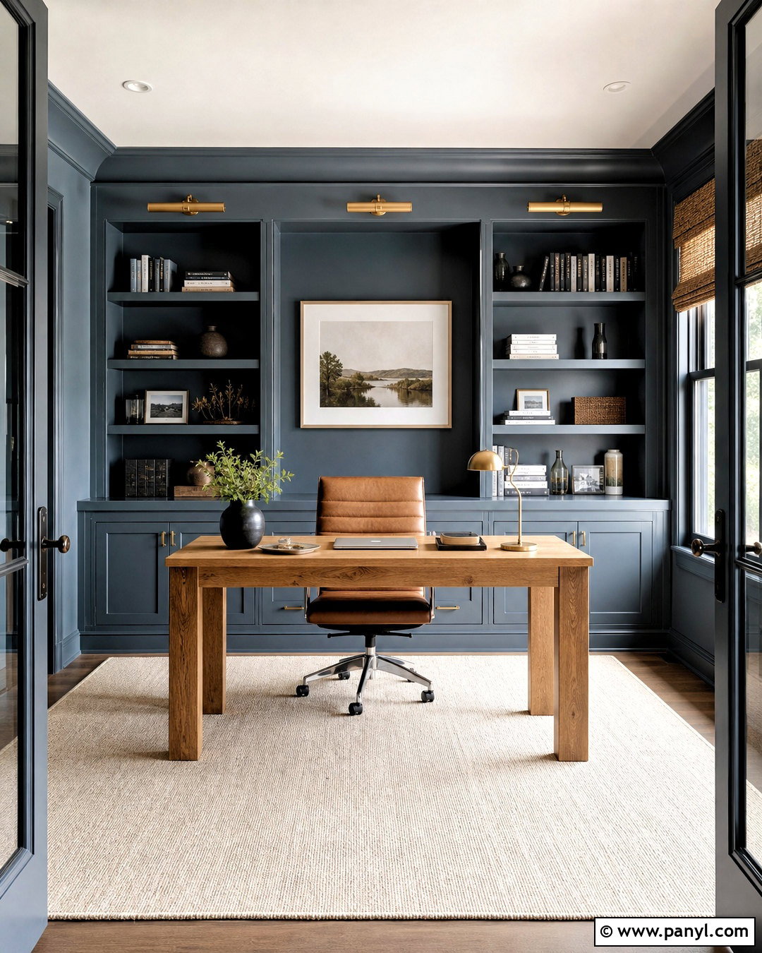
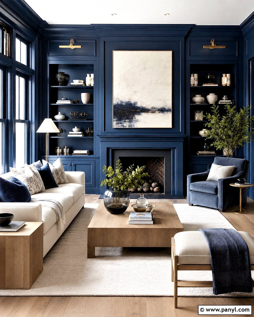
Slate blue brings structure and calm to rooms that benefit from a stronger architectural presence. Use it in a home office with slate blue walls, matching built-in cabinets, and warm white ceilings. A natural oak desk and cognac leather chair keep the blue from feeling cold. Ground the space with a cream wool rug and install aged brass library lights above the shelving. Simple woven shades filter daylight while maintaining a tailored look. Keep accessories limited to books, a few ceramics, framed artwork, and practical storage boxes. Slate blue can appear darker than expected, so sample it on several walls before deciding. When balanced with warm wood and focused lighting, the completed office feels serious and productive without becoming stiff, gloomy, or overly corporate.
15. Deep Navy Interior Paint Color
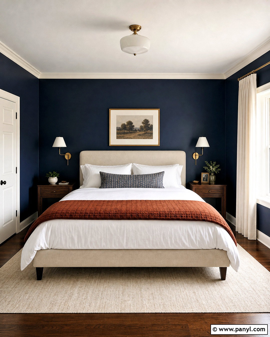
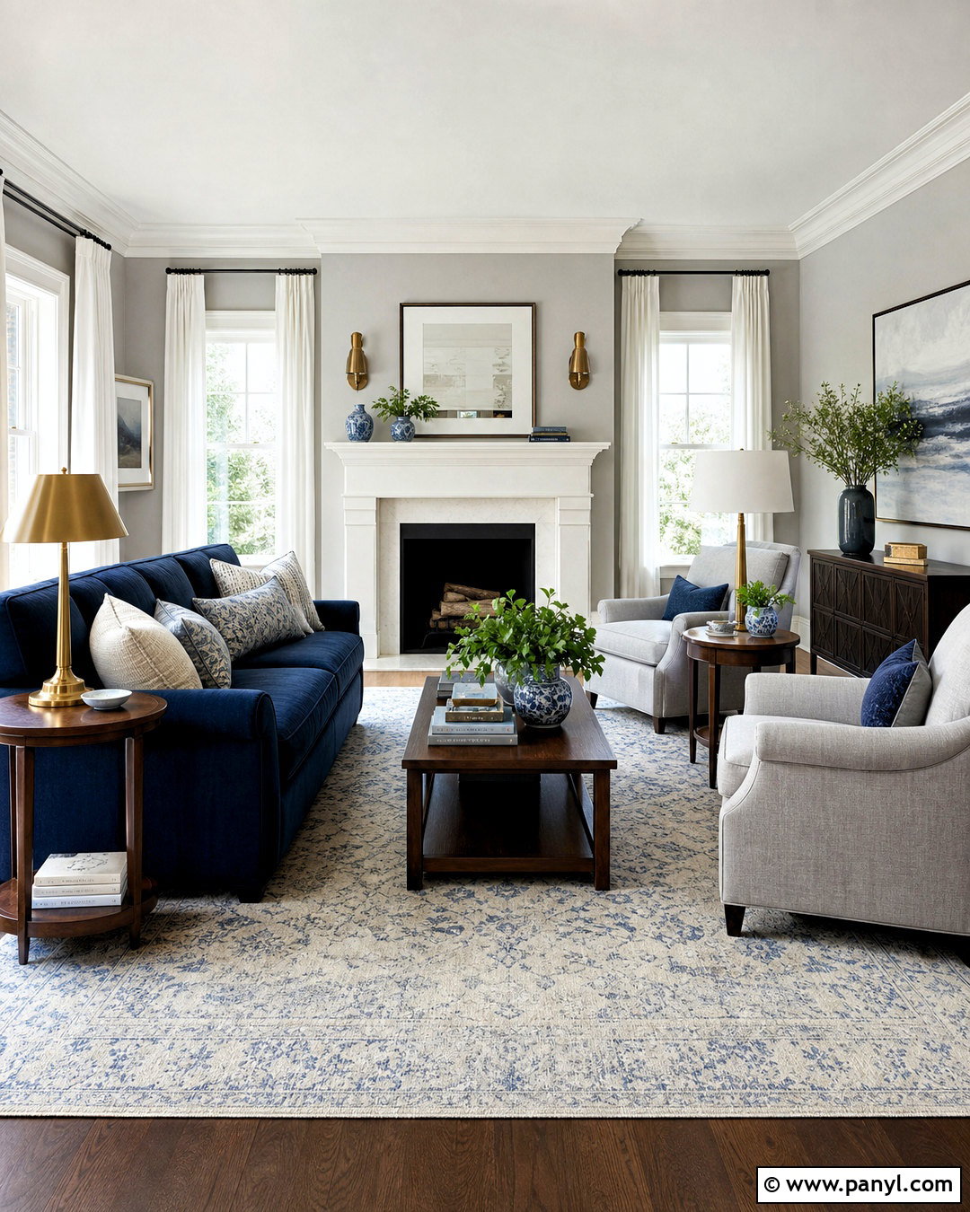
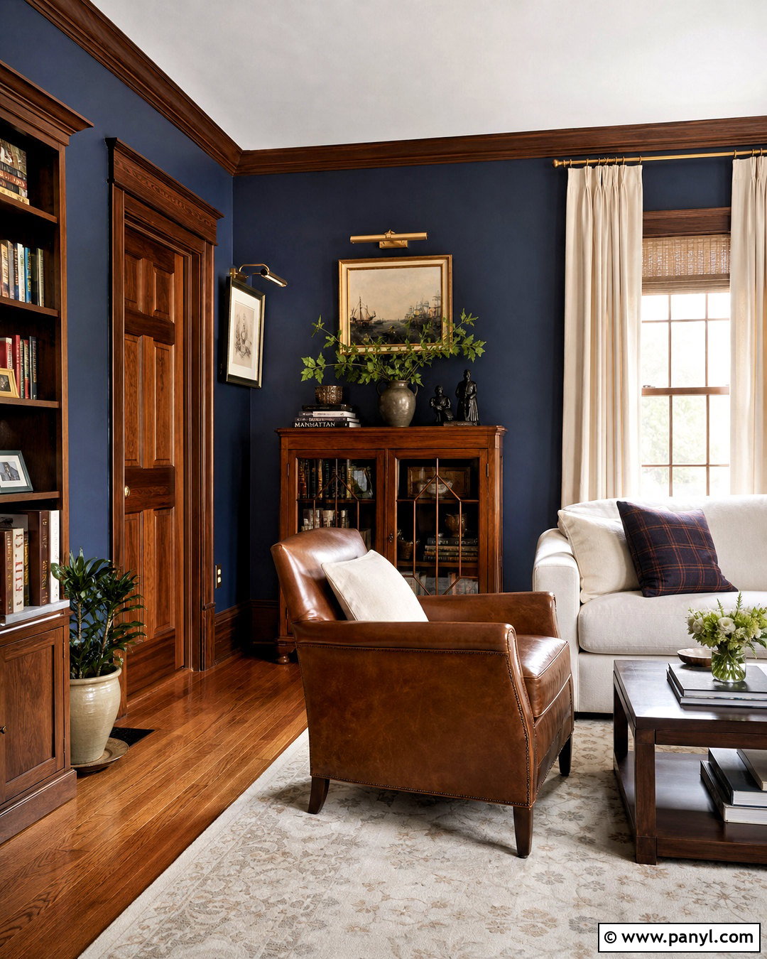
Deep navy creates dramatic contrast while remaining familiar and highly adaptable. Design a formal yet comfortable bedroom with navy walls, warm white crown molding, and a tall oatmeal upholstered bed. Layer the bedding with crisp white sheets, muted blue pillows, and a rust-colored quilt. Medium walnut nightstands and brass sconces bring needed warmth against the dark background. Choose a large cream rug to brighten the floor and hang natural linen curtains for softness. Navy can also continue onto the closet doors for a more integrated look. Keep the ceiling warm white unless the room has abundant light and can support full color drenching. The finished bedroom feels restful and refined, with a strong backdrop that makes light textiles and wood furniture stand out.
16. Muted Teal Interior Paint Color
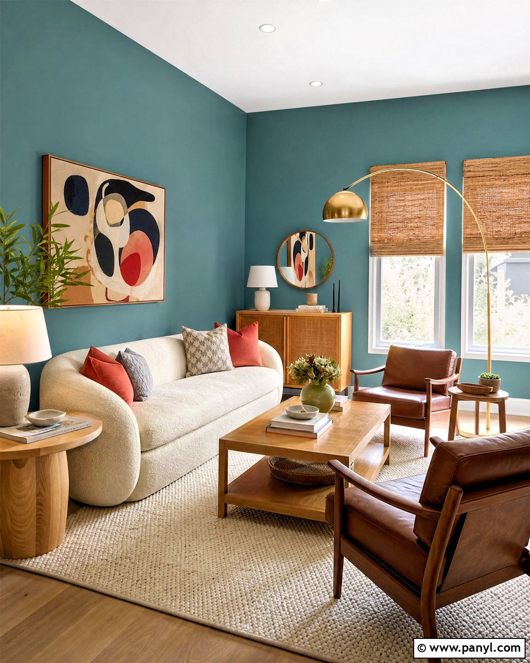
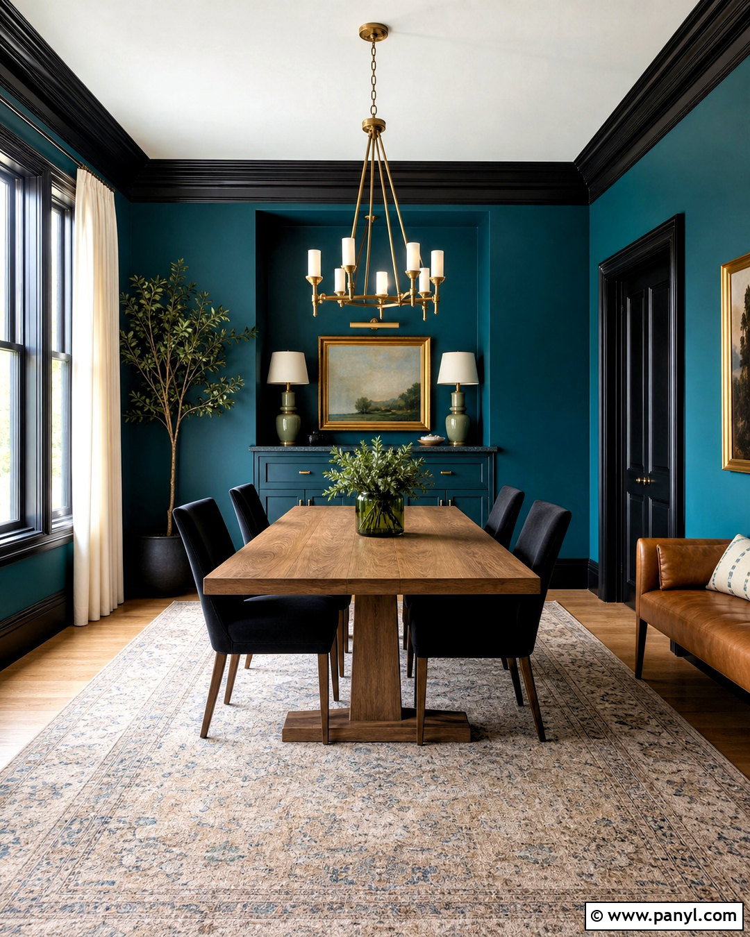
Muted teal blends blue and green into a rich color that feels expressive without becoming overly bright. Use it in a living room with teal walls, a cream boucle sofa, and a pair of saddle-brown leather chairs. A light oak coffee table and warm woven shades offset the cooler paint. Introduce muted coral through pillows and artwork, but limit the accent so the room remains balanced. Cream curtains and a pale patterned rug reflect light around the space. Choose warm white for the ceiling and trim, or paint the trim teal for a more immersive finish. Brushed brass lighting adds a polished final layer. The complete room feels distinctive, lively, and grounded, offering more personality than a conventional blue or green scheme.
17. Terracotta Interior Paint Color
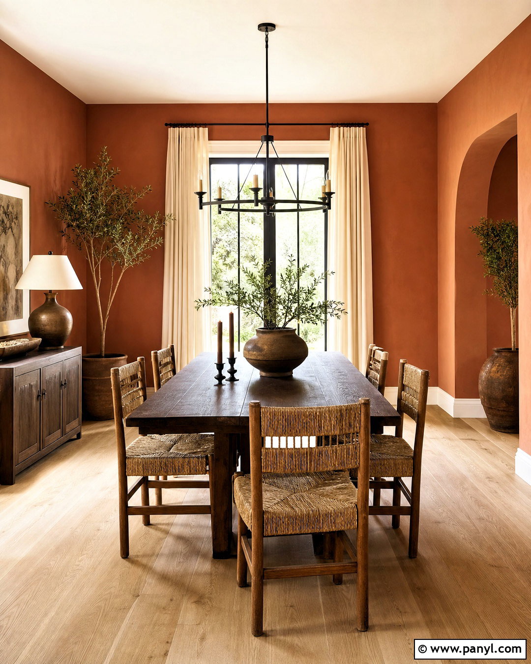
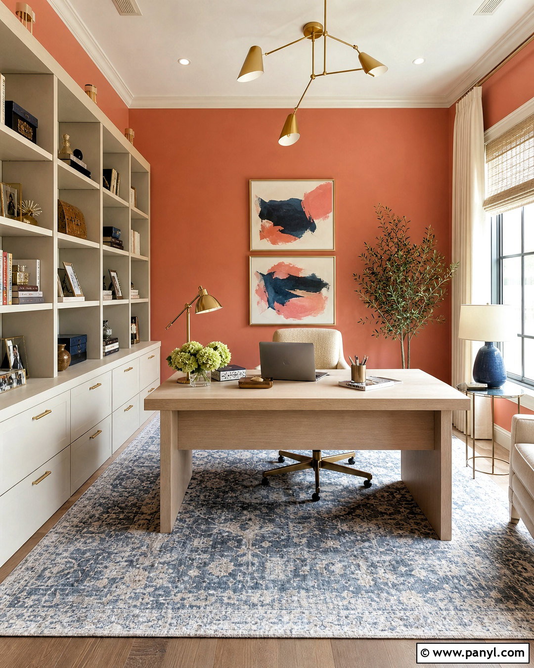
Terracotta brings sunbaked warmth and an inviting sense of character to an interior. Use a softened terracotta on dining room walls with light oak flooring, a dark walnut table, and woven rush-seat chairs. Balance the warm paint with creamy linen curtains and an ivory textured rug. A black metal chandelier adds graphic definition, while olive pottery and botanical artwork connect the color to natural greens. Paint the ceiling and trim in a warm white so the space stays fresh. Avoid using too many orange accessories, which can make the palette feel overly coordinated. Instead, introduce cream, charcoal, olive, and dark brown. The resulting dining area feels warm and sociable, with enough earthiness to suit casual meals and more elevated entertaining.
18. Clay Pink Interior Paint Color
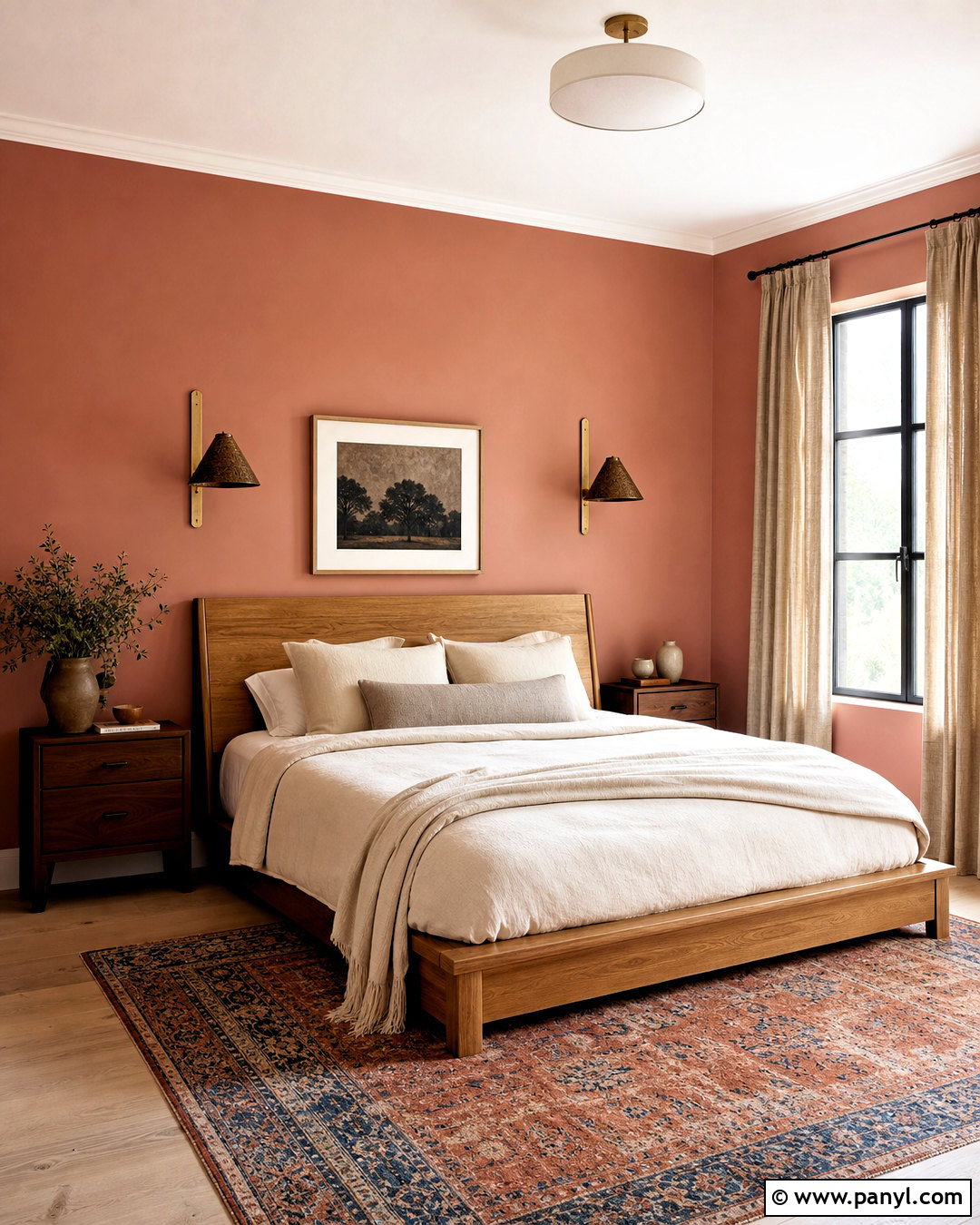
Clay pink offers a grown-up alternative to sweet pastel pink. Its muted brown undertone works well in a bedroom, guest room, or creative workspace. Pair clay pink walls with an oak bed, creamy bedding, and a rust-and-blue patterned rug. Use dark bronze sconces and walnut nightstands to ground the softer wall color. Linen curtains in natural flax will filter light without adding another competing hue. Bring in dusty blue or olive through one blanket, chair, or framed print. Warm white trim keeps the room crisp while preserving the earthy quality of the pink. The overall scheme should feel balanced rather than delicate. With natural wood and restrained contrasts, clay pink creates a comforting room that looks sophisticated in both traditional and modern homes.
19. Burgundy Interior Paint Color
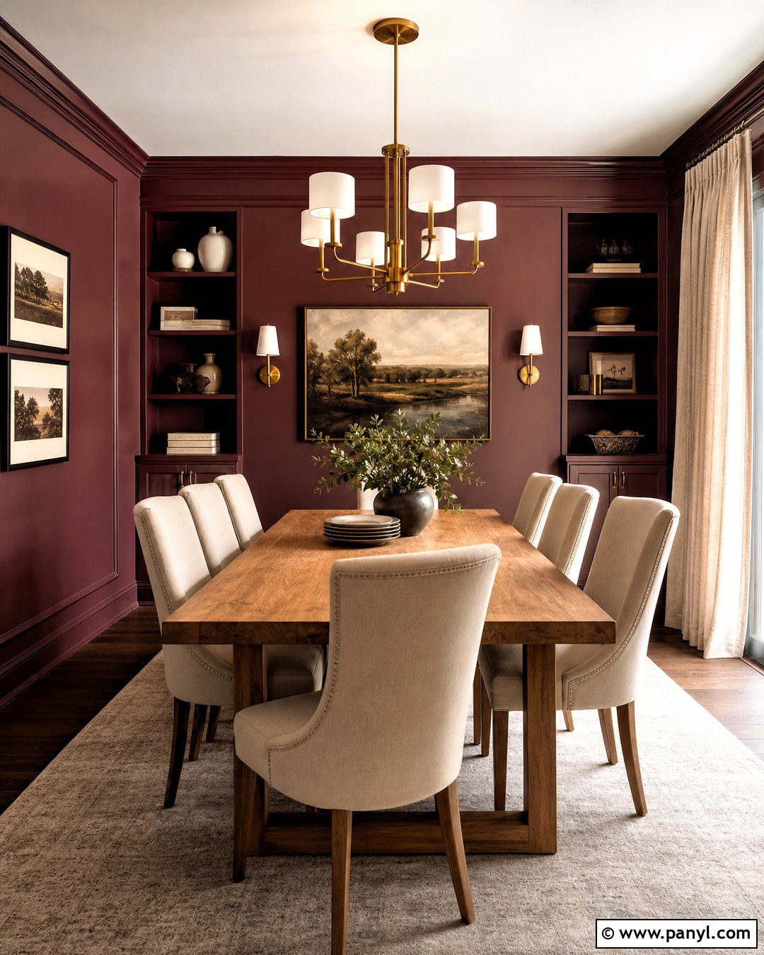
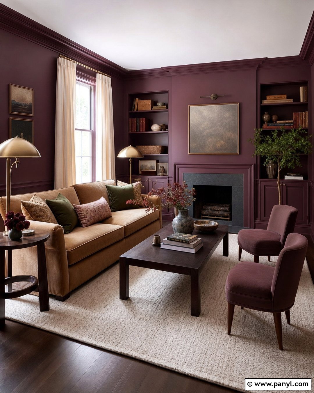
Burgundy creates a luxurious, enveloping interior when it is balanced with lighter materials and clean lines. Use it in a dining room with burgundy walls, a medium oak table, and cream upholstered chairs. Install a contemporary brass chandelier to illuminate the center of the room, then add full-length flax curtains and a pale neutral rug. Warm white trim will outline the room, while matching burgundy on built-in cabinets adds depth. Decorate with simple ceramic pieces, dark-framed artwork, and muted green foliage. Avoid combining the walls with too many heavy red fabrics or dark wood pieces. The lighter furniture and textiles prevent the palette from becoming oppressive. This finished look feels intimate and memorable while remaining comfortable enough for regular family dining.
20. Soft Charcoal Interior Paint Color
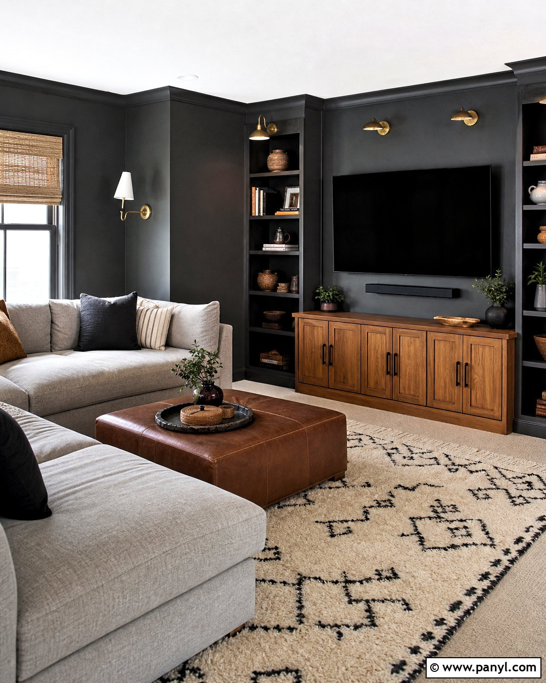
Soft charcoal provides drama without the absolute heaviness of black. It works beautifully in a media room where deeper color can reduce visual distractions and create a cozy atmosphere. Paint the walls and built-in storage charcoal, then pair them with a large light gray sectional and a warm oak media cabinet. Add a cream-and-black patterned rug, cognac leather ottoman, and adjustable brass wall lights. Natural woven shades introduce texture while maintaining privacy. Use off-white on the ceiling to preserve some brightness, or continue charcoal overhead in a small room for a cocooning finish. Accessories should remain simple and substantial. The completed space feels modern, practical, and layered, with warm materials preventing the dark paint from looking flat or industrial.
Conclusion:
The **20 best interior paint colors** include far more than safe white, beige, and gray. Warm neutrals create flexible foundations, while botanical greens and softened blues bring natural character into everyday rooms. Terracotta, clay pink, burgundy, navy, and charcoal offer greater depth when balanced with lighter textiles, thoughtful lighting, and warm wood. The most successful choice will always respond to the room’s daylight, fixed finishes, and furnishings. Paint large sample areas on more than one wall, then observe them from morning through evening. Once the undertone feels right, build a complete palette around it using coordinated trim, flooring, furniture, metals, textiles, and artwork. That approach produces a room that feels intentional, comfortable, and personal.

Related Ideas and Inspiration:
Leave a Reply