
Choosing from these 20 Revere Pewter coordinating colors makes it easier to build a balanced palette around Benjamin Moore’s classic HC-172. This versatile greige sits comfortably between warm beige and soft gray, so it can support creamy whites, earthy greens, muted blues, rich charcoals, and warmer accent shades. Benjamin Moore’s own combinations include White Dove, Chelsea Gray, Sparrow, and Fog Mist, showing how easily the color moves from light and airy to deep and grounded. () The key is using each pairing as part of a complete room, with flooring, furniture, metals, and textiles reinforcing the palette. Below, you will find practical, finished looks built around 20 Revere Pewter coordinating colors.

1. Revere Pewter And White Dove
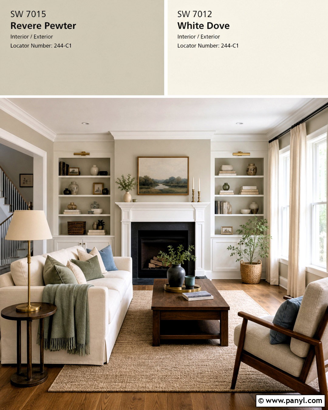
White Dove OC-17 creates a soft, polished contrast with Revere Pewter walls without making the room feel stark. Use this combination in a transitional living room with White Dove trim, doors, ceiling, and built-in shelves. Add a warm ivory sofa, medium-tone oak flooring, and a textured oatmeal rug to connect the two paint colors. Walnut side tables and aged brass lighting provide richer warmth, while muted blue and sage pillows add restrained color. Keep window treatments light with natural linen panels. This complete palette works especially well in open spaces because the creamy white defines architectural details while Revere Pewter supplies enough depth to make pale furniture and trim stand out.
2. Revere Pewter And Simply White
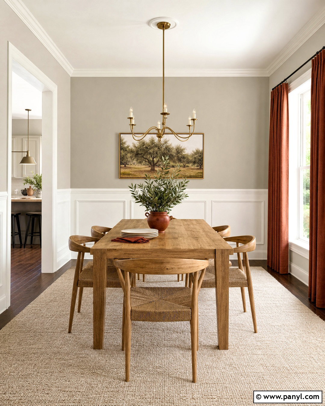
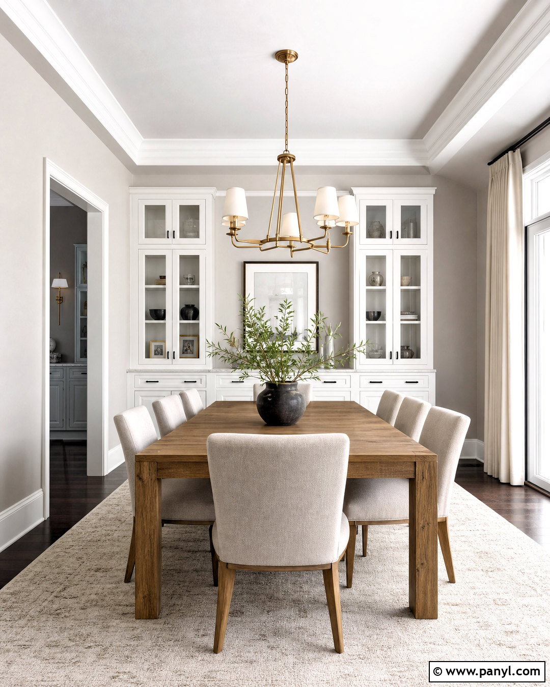
Would you like a brighter look without introducing a cold, blue-white finish? Simply White OC-117 adds clean contrast while retaining enough warmth to sit comfortably beside Revere Pewter. Try Revere Pewter on dining room walls and Simply White across the ceiling, trim, wainscoting, and interior doors. A natural oak dining table, woven-seat chairs, and a cream wool rug create a relaxed foundation. Use brushed brass in the chandelier and curtain hardware for subtle shine. Olive green artwork and rust-colored linen napkins can provide earthy accent notes. This combination feels fresh in rooms with moderate natural light, especially when warm woods and off-white fabrics keep the brighter white from appearing disconnected.
3. Revere Pewter And Chantilly Lace
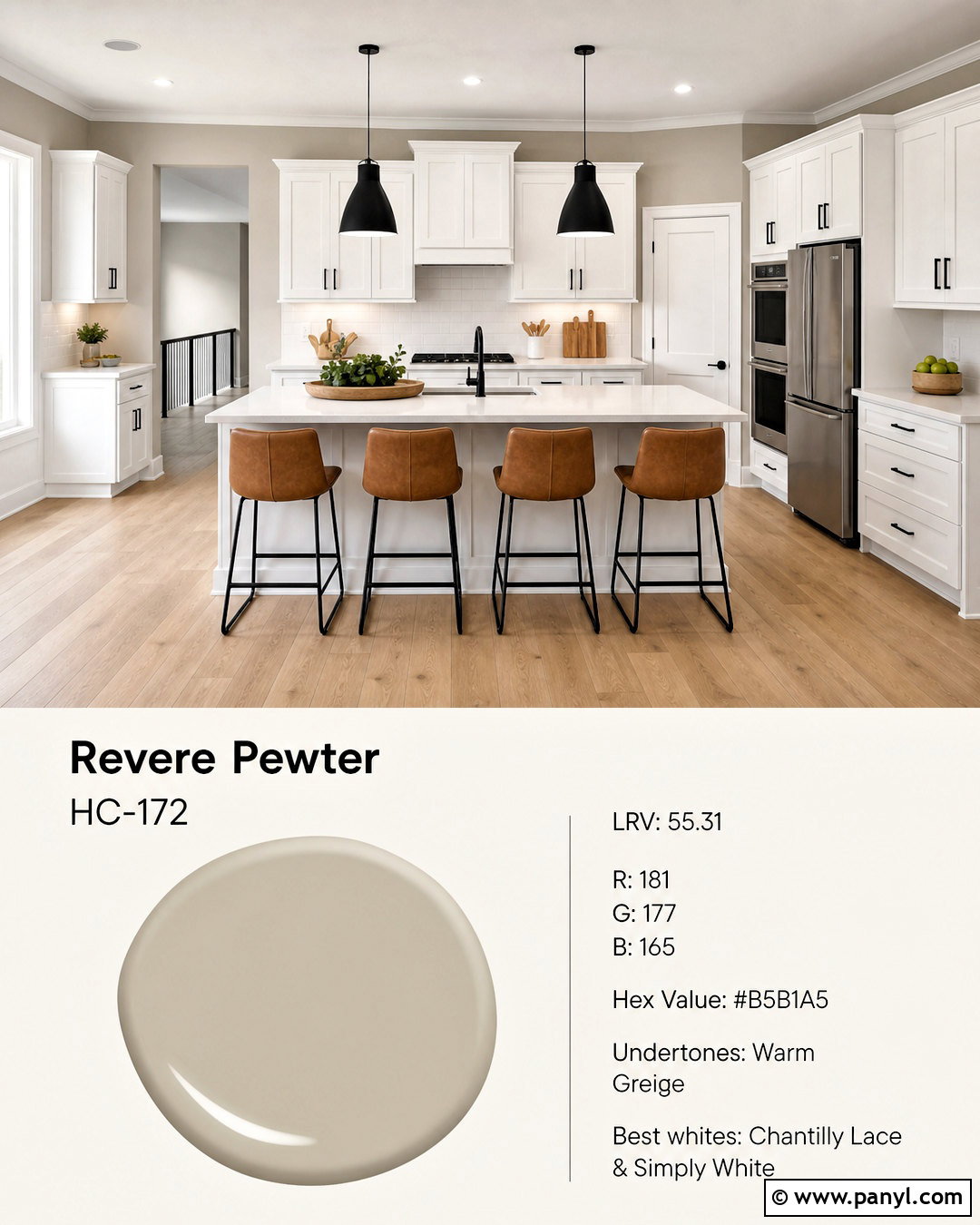
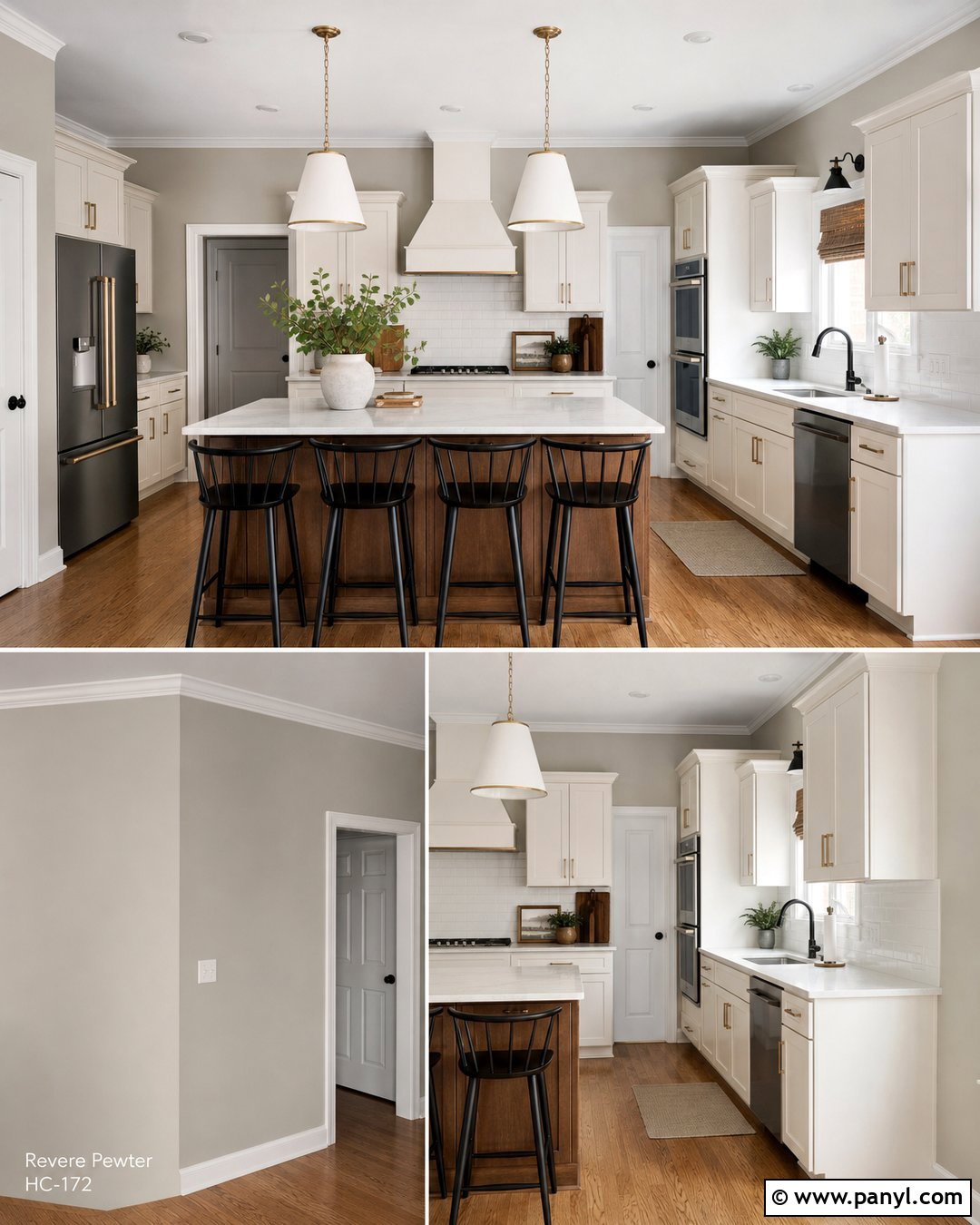
For sharper definition, pair Revere Pewter with Chantilly Lace OC-65 in a clean, modern kitchen. Paint the surrounding walls Revere Pewter and use Chantilly Lace on flat-panel or simple Shaker cabinets. Continue the brighter effect with pale quartz countertops and a white ceramic backsplash. Light white oak flooring warms the scheme, preventing the crisp cabinetry from feeling clinical. Matte black pendant lights, cabinet pulls, and window frames add a graphic outline. Finish the space with counter stools in camel leather and a few natural wood accessories. Because this white creates stronger contrast, repeat warm materials throughout the kitchen and test both colors near the counters, flooring, and backsplash before making a final commitment.
4. Revere Pewter And Fog Mist
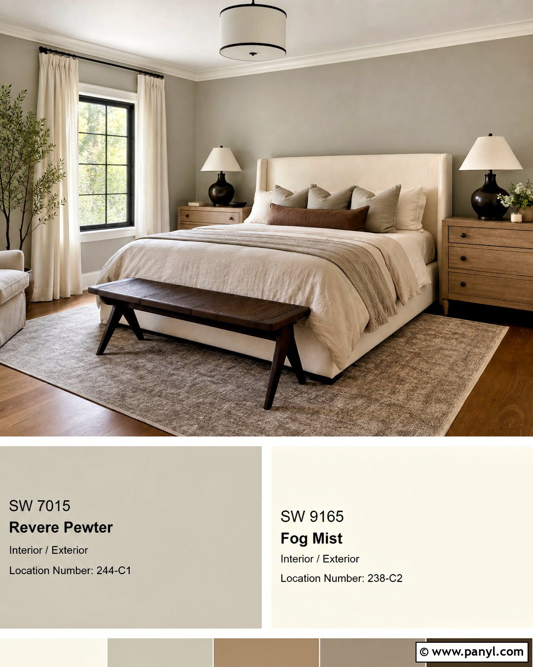
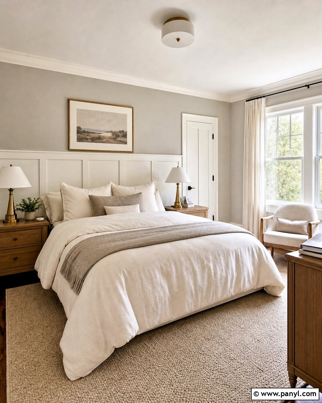
Fog Mist OC-31 brings a quiet, layered effect to Revere Pewter without creating an obvious color break. Build a serene primary bedroom with Revere Pewter walls, Fog Mist trim, and a Fog Mist-painted ceiling. Choose an upholstered bed in warm ivory, pale oak nightstands, and soft flax linen bedding. A subtle greige rug can blend the two paint colors while adding comfort underfoot. Introduce depth through bronze bedside lamps, charcoal piping, and a walnut bench at the foot of the bed. Keep the window coverings simple and light filtering. This low-contrast combination is useful when you want the entire room to feel calm and connected rather than divided by bright white architectural details.
5. Revere Pewter And Edgecomb Gray
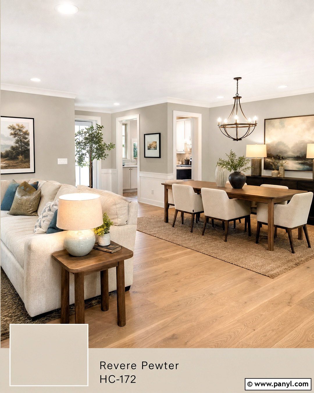
Edgecomb Gray HC-173 and Revere Pewter can create a gentle transition through an open floor plan. Use the lighter Edgecomb Gray in the main living area and place Revere Pewter in the adjoining dining room or reading nook. Connect both spaces with continuous white oak flooring, warm white trim, and repeated natural textures. A sand-colored sectional, cognac leather chair, and woven jute rug keep the living room casual. In the darker zone, add a walnut dining table, cream chairs, and an antique bronze chandelier. Limit accent colors to dusty blue, olive, and muted clay. This tonal approach creates separation without making neighboring rooms look unrelated, which is especially helpful when walls share long sightlines.
6. Revere Pewter And Chelsea Gray
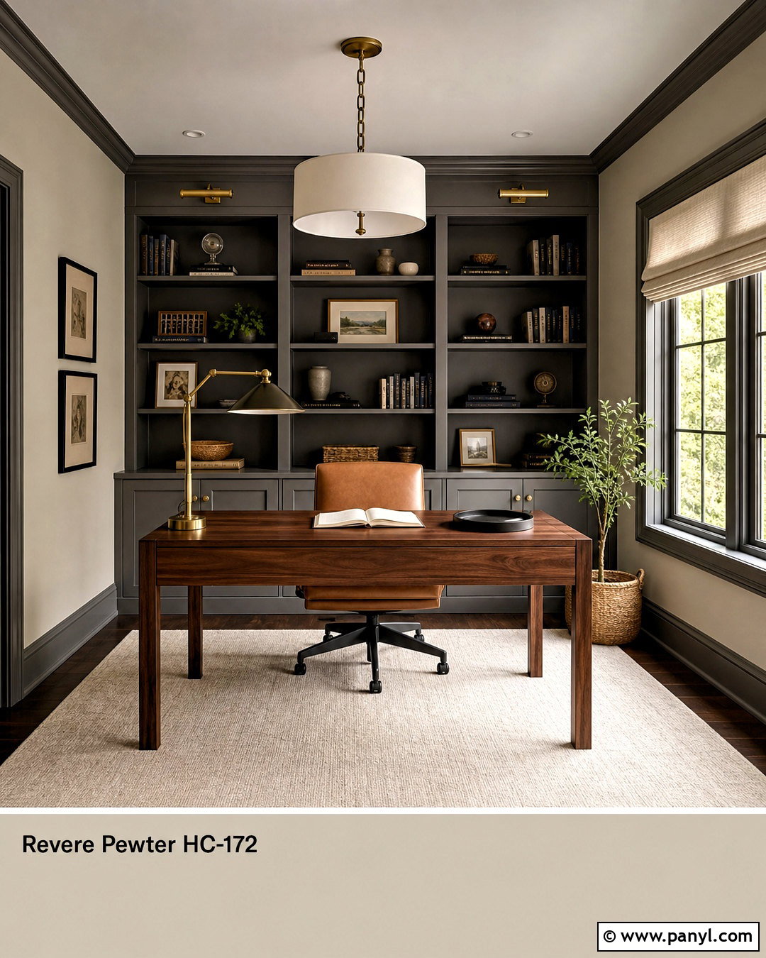
Chelsea Gray HC-168 gives Revere Pewter a deeper, tailored partner. For a complete home office, place Revere Pewter on the walls and Chelsea Gray on built-in bookcases, lower cabinets, and the back of the door. Add a substantial walnut desk, camel leather chair, and warm white wool rug. Aged brass picture lights will highlight books and artwork while softening the darker cabinetry. Use cream Roman shades to maintain natural brightness, then repeat Chelsea Gray through storage boxes or a small upholstered bench. The contrast feels sophisticated but still comfortable because both colors share a grounded neutral character. This combination also helps a practical workspace look finished without depending on several bright accent colors.
7. Revere Pewter And Amherst Gray
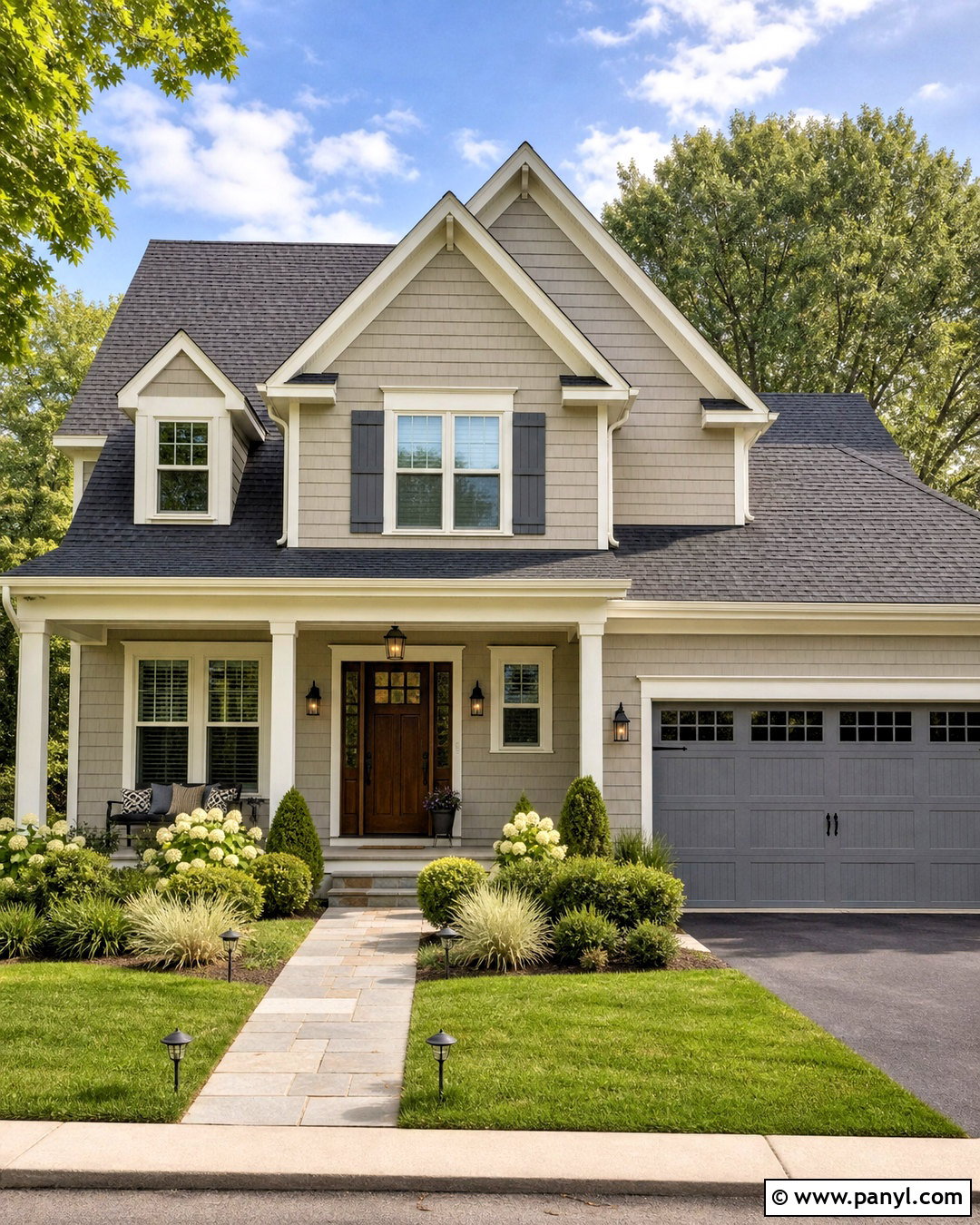
A Revere Pewter exterior becomes more defined when Amherst Gray HC-167 is used for shutters, garage doors, or architectural accents. Paint the main siding Revere Pewter, keep the trim a warm off-white, and apply Amherst Gray to the shutters and garage door. A stained walnut front door introduces natural warmth, while dark bronze lanterns coordinate with the deeper gray. Complete the curb appeal with a medium charcoal roof, limestone walkway, clipped boxwoods, and loose ornamental grasses. Cream flowering plants can brighten the foundation without competing with the restrained palette. This full scheme suits traditional, ranch, and Craftsman homes because it creates visible contrast while allowing stone, brick, and wood features to remain part of the design.
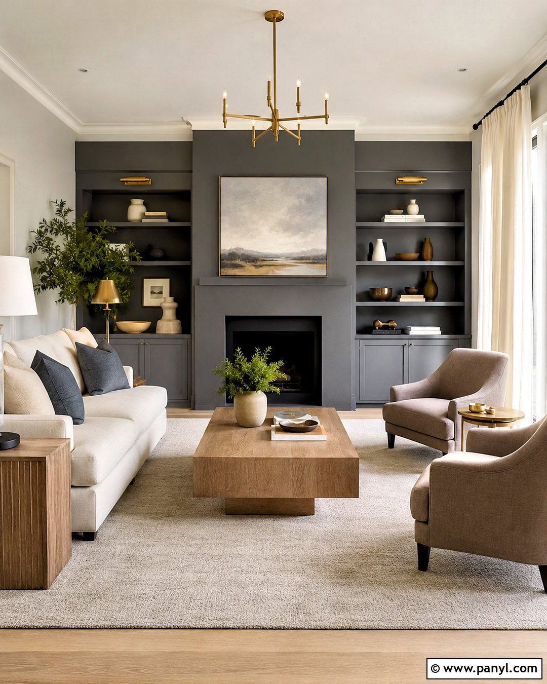
8. Revere Pewter And Kendall Charcoal
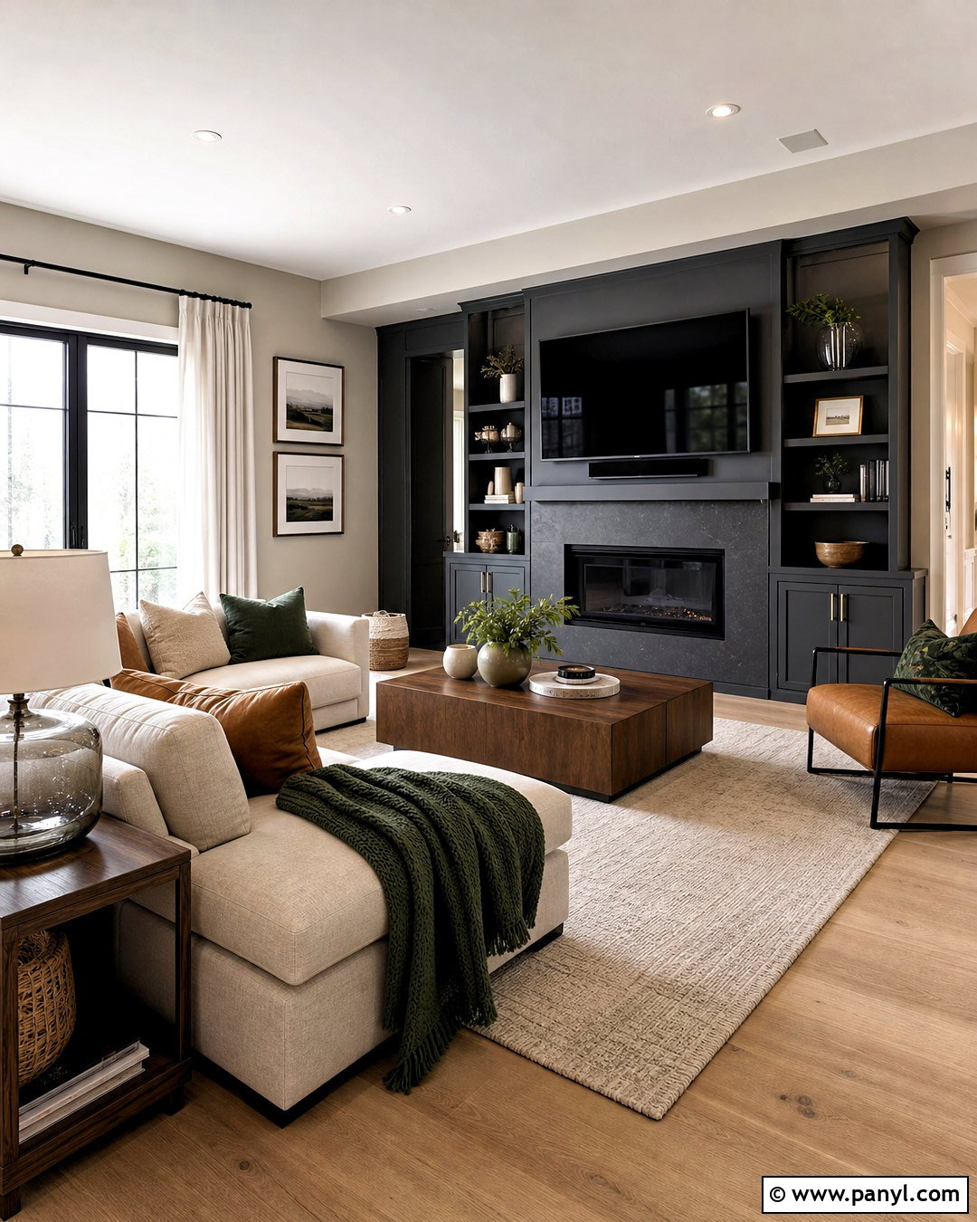
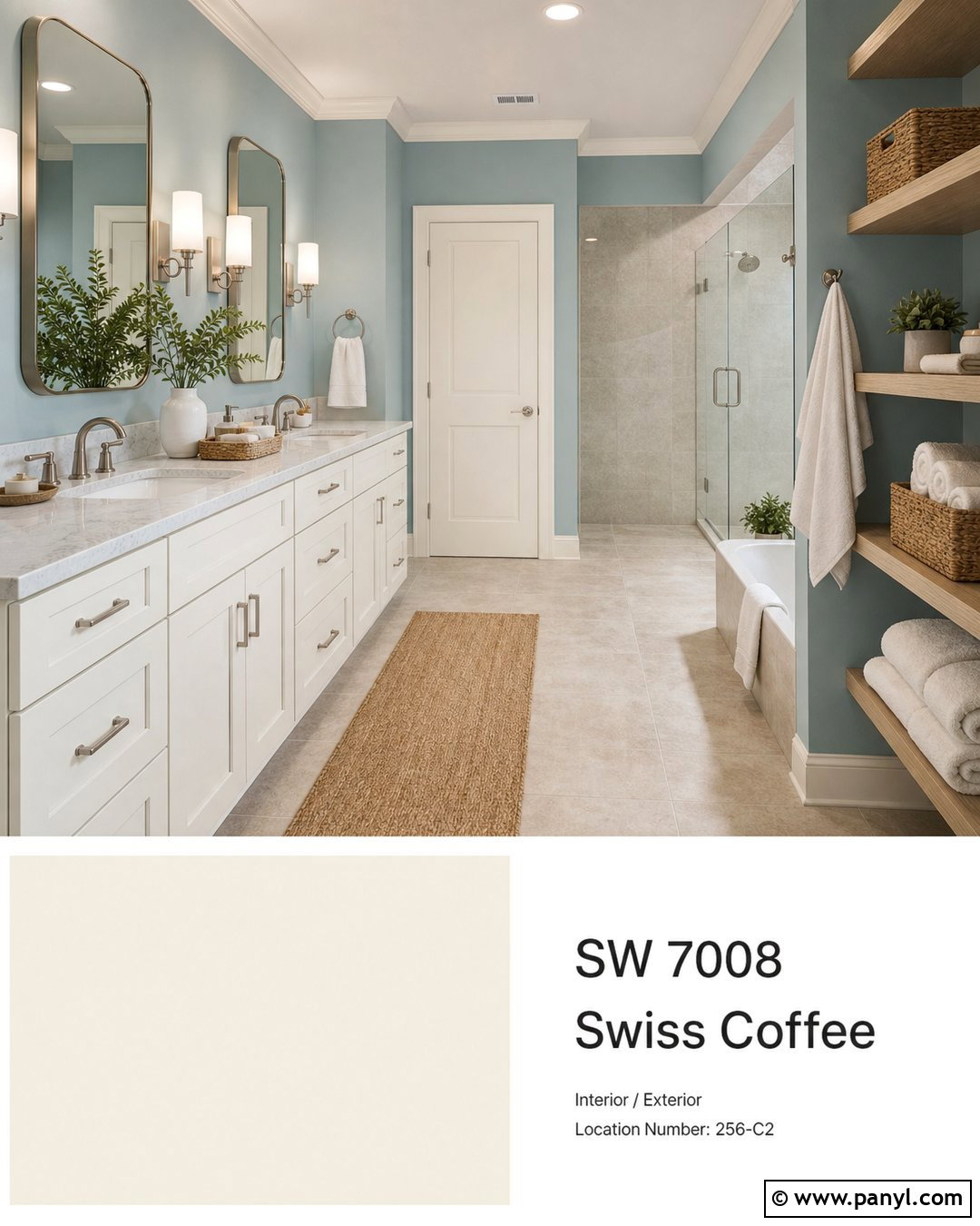
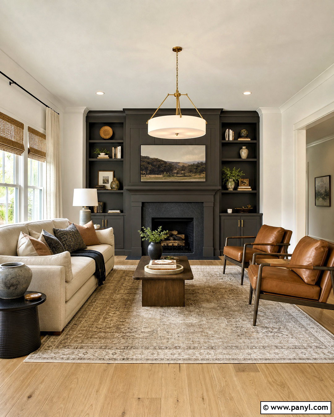
Kendall Charcoal HC-166 can turn Revere Pewter into a stronger contemporary palette. Use Revere Pewter on the walls of a family room and Kendall Charcoal across a fireplace surround, media cabinets, and one set of interior doors. Balance these dark surfaces with a cream modular sofa, light oak flooring, and a large ivory-and-gray rug. Add blackened bronze hardware, smoked glass lamps, and walnut occasional tables for dimension. Cushions in muted camel and forest green will bring understated color into the room. Keep the ceiling and window trim warm white to preserve brightness. The result feels grounded rather than heavy because the dark focal features are surrounded by lighter upholstery, flooring, and reflective surfaces.
9. Revere Pewter And Sparrow
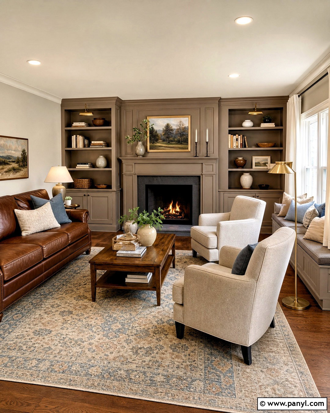
Sparrow AF-720 adds warm taupe-brown depth to a Revere Pewter palette. Create a comfortable den with Revere Pewter walls and Sparrow on the built-in shelving, fireplace mantel, and window seat cabinetry. Layer in a tobacco leather sofa, oatmeal club chairs, and a patterned rug containing beige, brown, and faded blue. Medium walnut flooring supports the earthy color direction, while antique brass lamps create a warm but controlled glow. Use off-white curtains and a pale ceiling to keep the room from becoming too enclosed. A few ceramic pieces in cream and moss green can finish the shelves. This pairing works best when the goal is a cozy, established room that still feels uncluttered and practical.
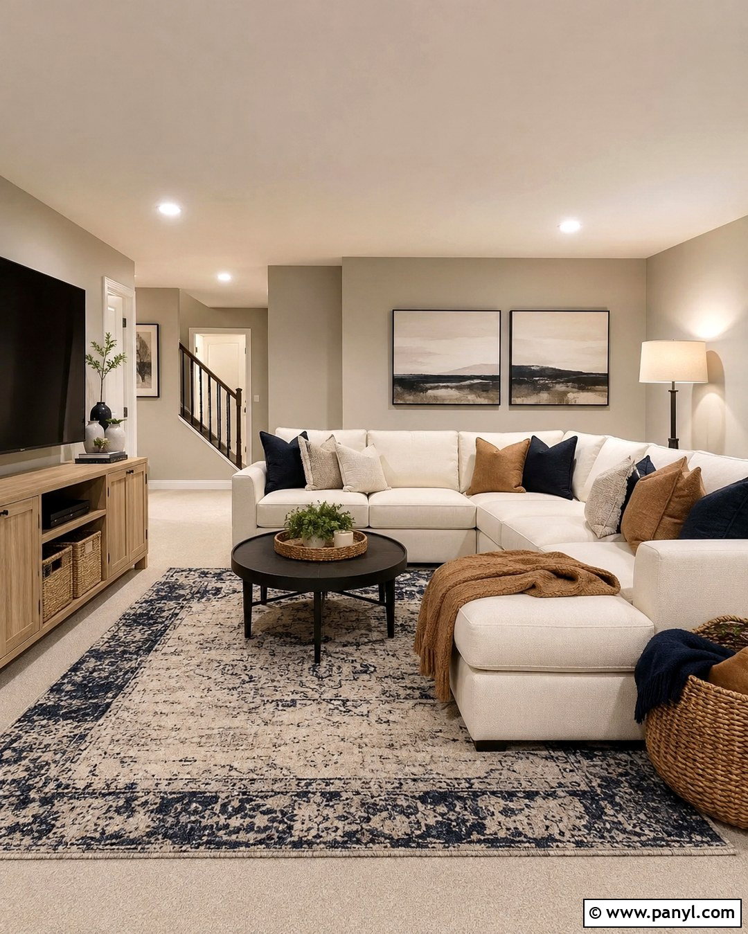
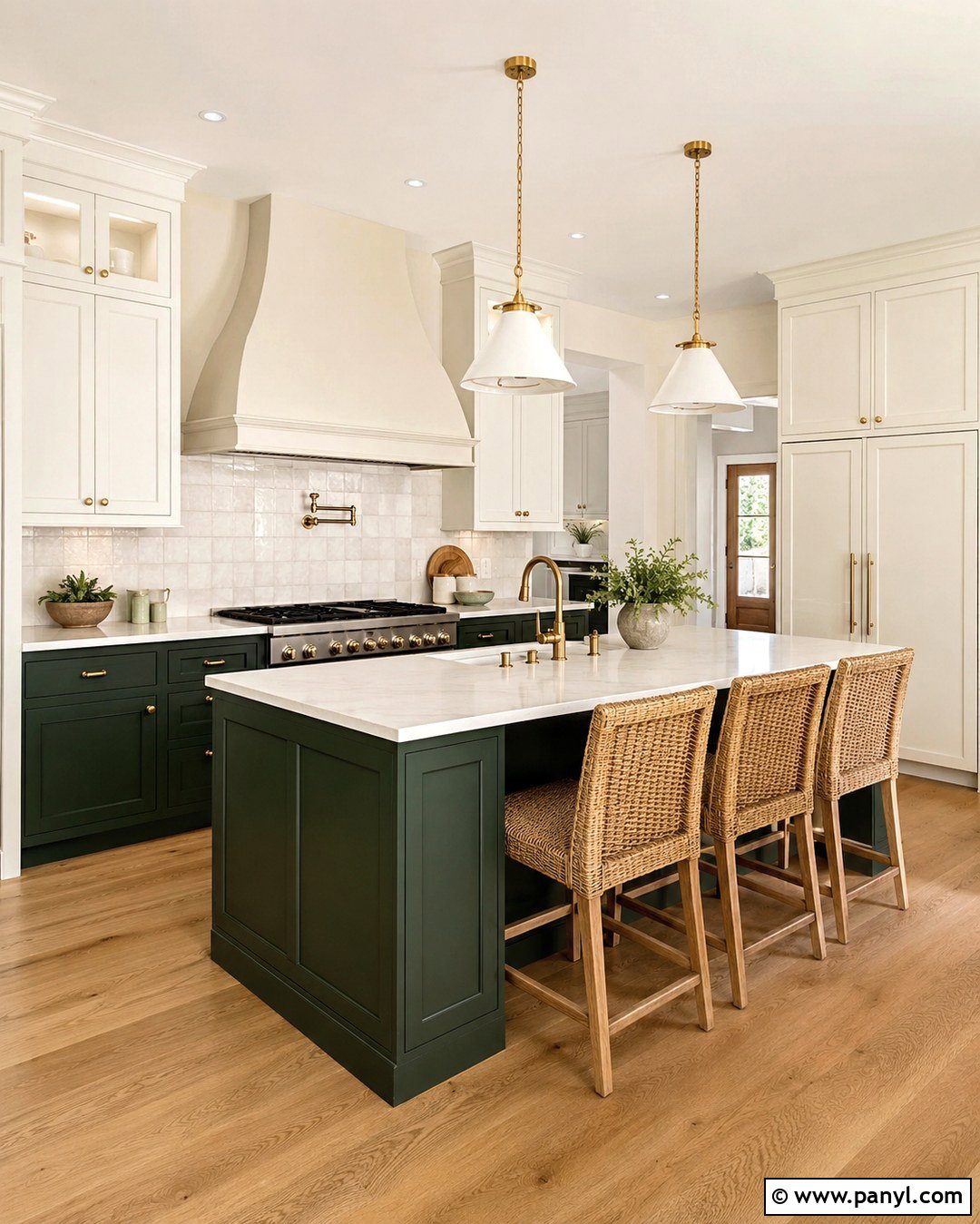
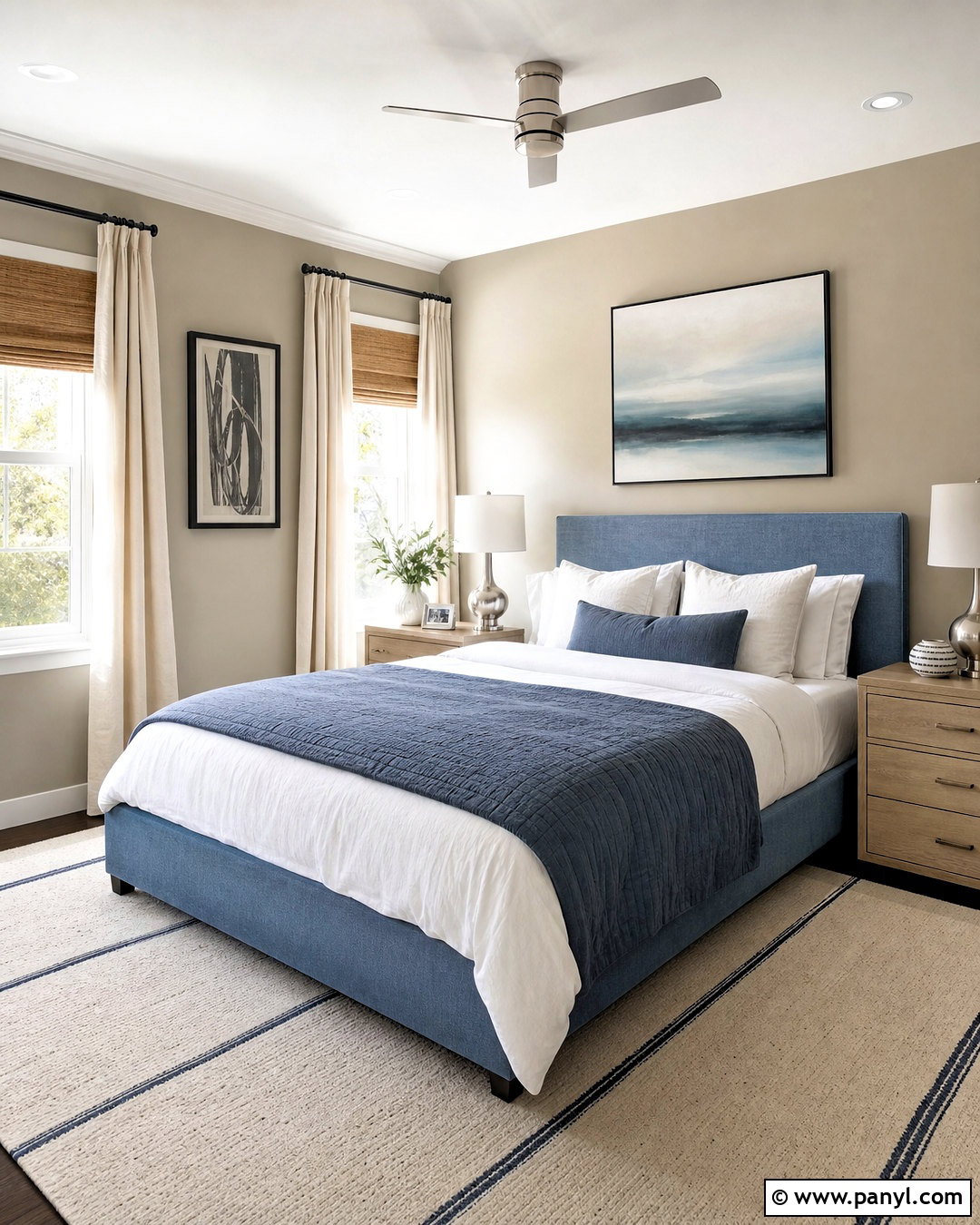
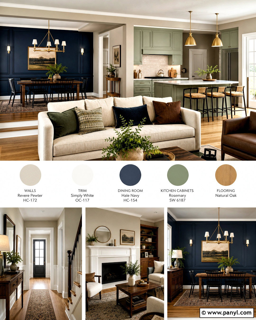
10. Revere Pewter And Hale Navy
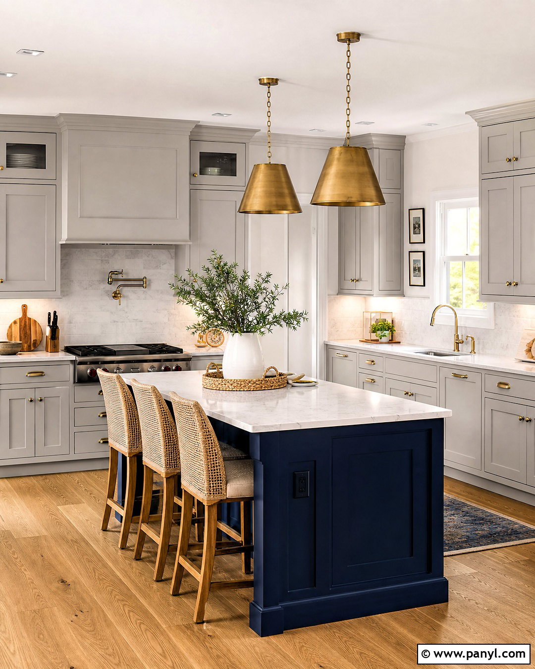
Few pairings create clearer contrast than Revere Pewter and Hale Navy HC-154. In a kitchen, use Revere Pewter on the perimeter cabinetry and Hale Navy on a large island. Warm white walls, veined quartz counters, and a pale marble backsplash will keep the two cabinet colors visually balanced. Choose medium oak flooring and counter stools with woven seats to soften the painted finishes. Polished nickel can create a cleaner look, while aged brass adds warmth; select one metal and repeat it consistently. Keep countertop accessories simple and functional. The navy island becomes the focal point, but Revere Pewter still defines most of the room, producing a classic kitchen that feels current without depending on overly trendy materials.
11. Revere Pewter And Boothbay Gray
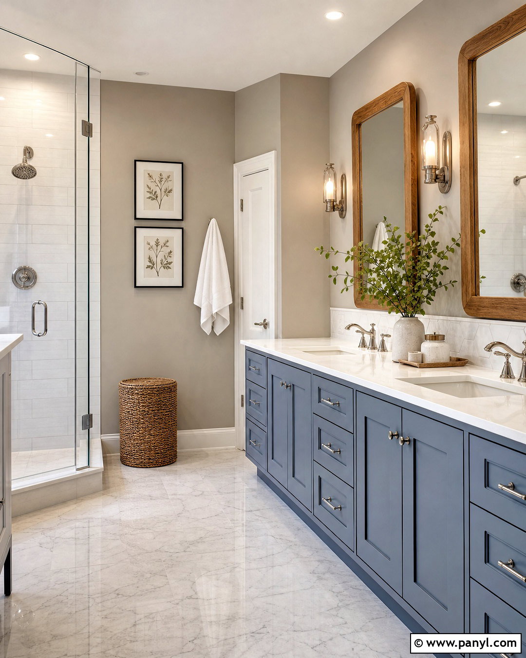
Boothbay Gray HC-165 brings a muted coastal blue-gray quality to Revere Pewter. Design a relaxed bathroom with Revere Pewter walls, Boothbay Gray vanity cabinets, and warm white trim. A white quartz counter, pale gray marble floor tile, and handmade off-white shower tile create a light foundation. Use polished nickel faucets and clear glass sconces for a crisp finish. Natural oak mirrors and a woven hamper prevent the blue-gray cabinetry from feeling too cool. Add soft white towels with understated blue borders and one or two small green plants. This finished look suggests a coastal influence without obvious themed decor, making it suitable for both traditional and updated bathrooms with moderate or strong natural light.
12. Revere Pewter And Wedgewood Gray
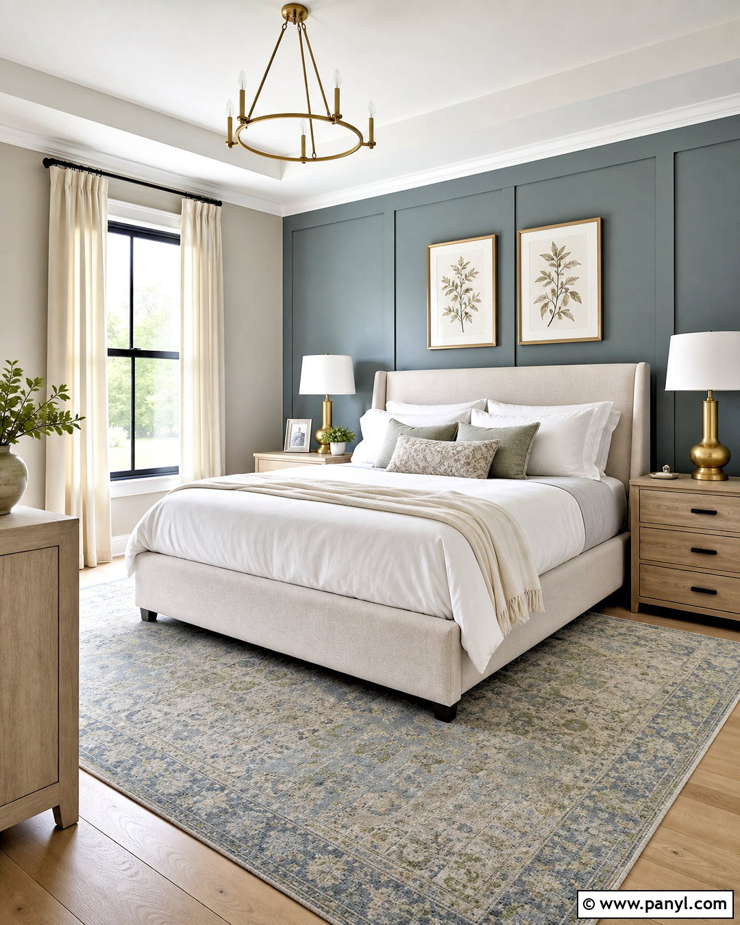
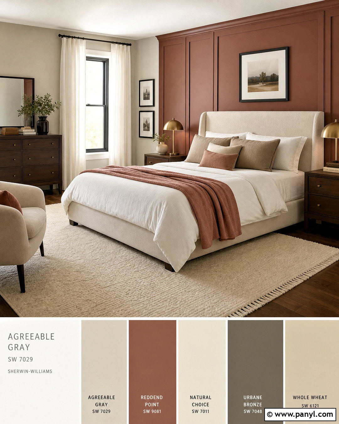
Wedgewood Gray HC-146 introduces a soft blue-green note that can refresh Revere Pewter’s earthy character. Use Revere Pewter on bedroom walls and Wedgewood Gray on a paneled headboard wall or a pair of painted nightstands. Choose warm white bedding, a flax-colored upholstered bed, and light oak flooring. A vintage-inspired rug containing faded blue, sage, and beige will connect both paint colors naturally. Add brushed brass lamps and simple cream curtains for a warmer finish. Keep artwork quiet, perhaps with botanical prints or subtle landscapes. This combination creates enough color to make the bedroom distinctive, yet it remains gentle and restful. Repeating the blue-green shade in small textiles will make the accent surface feel intentional.
13. Revere Pewter And Palladian Blue
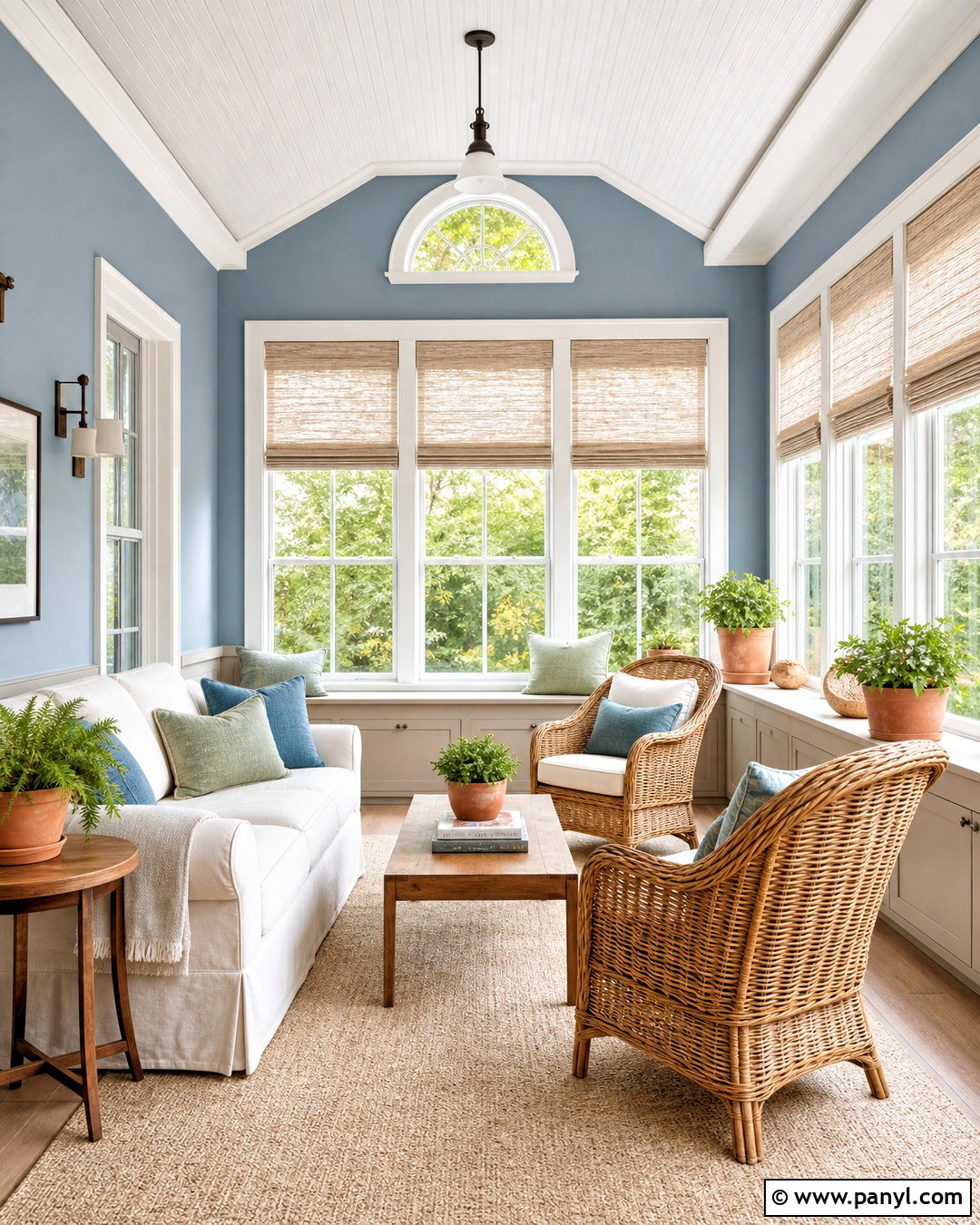
Imagine a bright sunroom where Revere Pewter grounds the lower surfaces and Palladian Blue HC-144 lifts the walls. Paint built-in benches, storage cabinets, or lower paneling Revere Pewter, then use Palladian Blue above. Warm white trim will clearly separate the two colors. Furnish the room with natural rattan chairs, an ivory slipcovered loveseat, and a pale woven rug. Add light oak tables, white linen shades, and cushions patterned with muted green and blue. Terracotta planters can provide a small amount of warm contrast. The completed space feels airy and connected to the outdoors, while Revere Pewter gives the lighter blue enough weight to work alongside practical furniture and everyday family storage.
14. Revere Pewter And Saybrook Sage
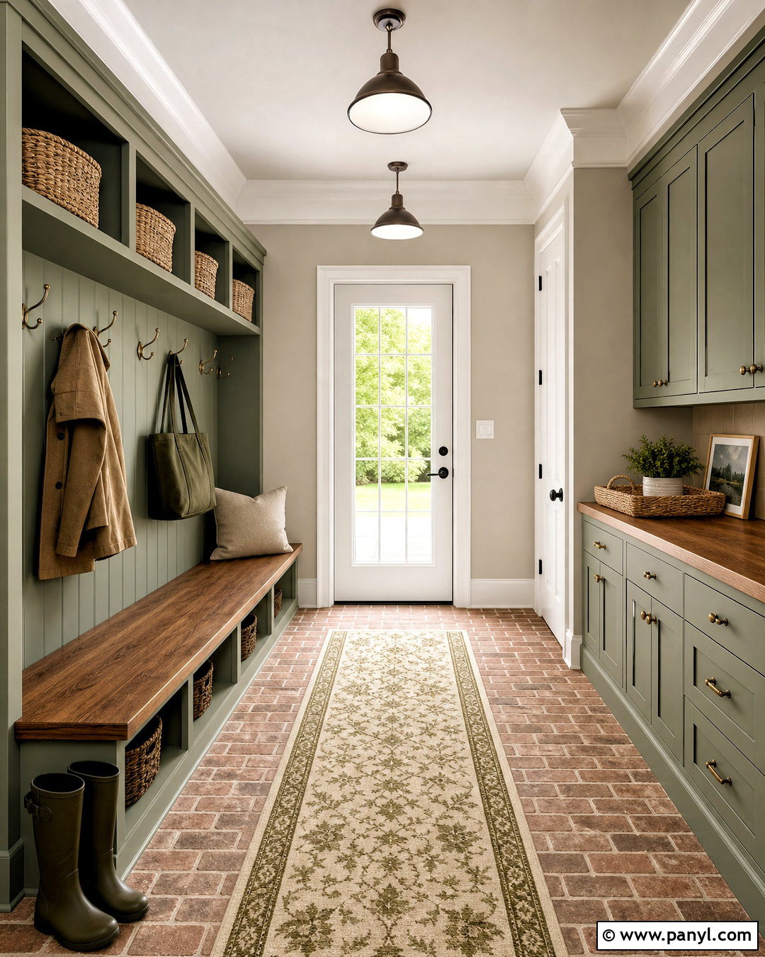
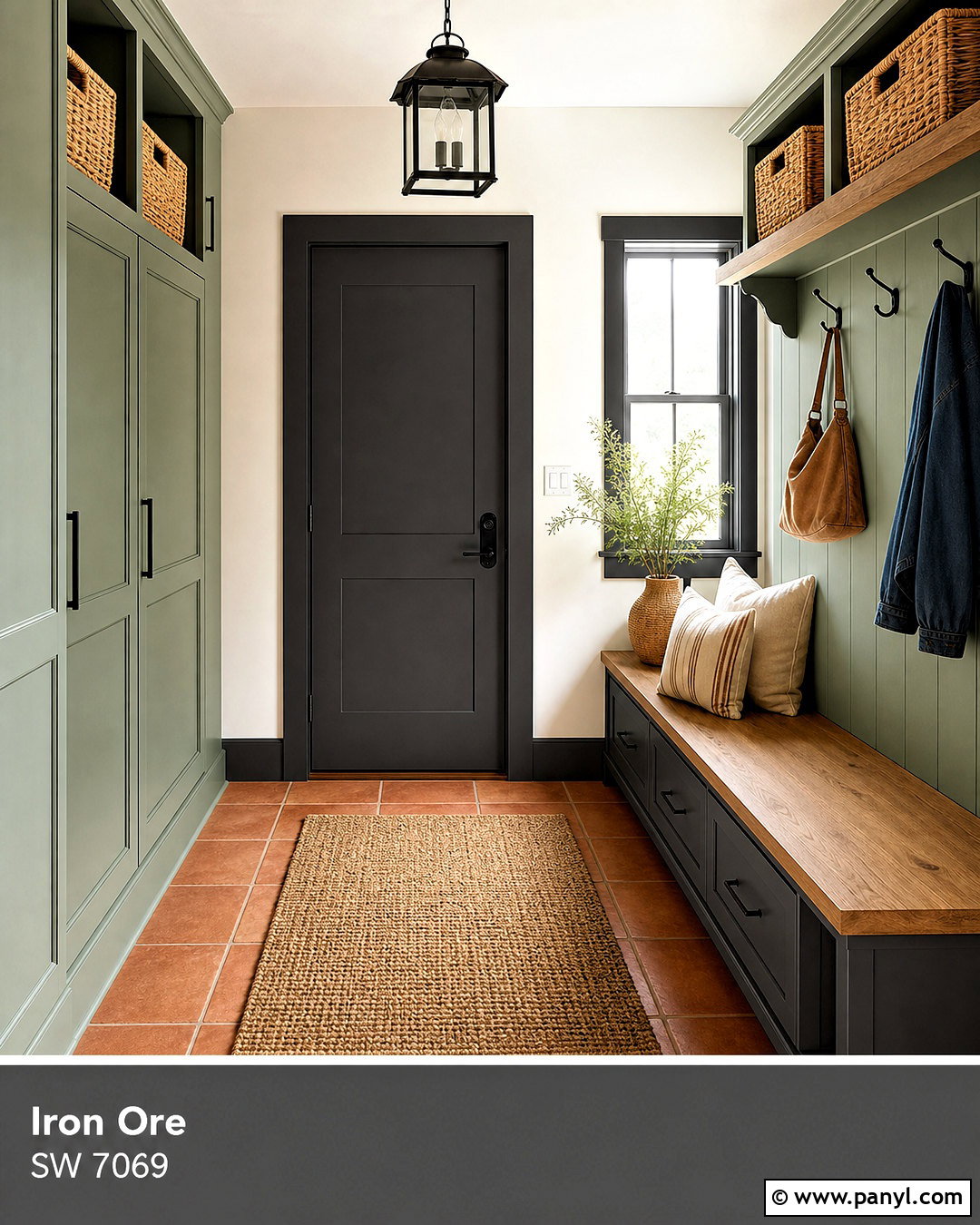
Saybrook Sage HC-114 complements Revere Pewter with a natural, muted green. Build a welcoming mudroom using Revere Pewter on the walls and Saybrook Sage on floor-to-ceiling lockers, a storage bench, and utility cabinets. Add warm white trim, brick-look porcelain flooring, and a butcher-block bench seat. Antique brass hooks and dark bronze lighting reinforce the practical, earthy character. Woven baskets can organize shoes and outdoor accessories while introducing useful texture. Include a washable striped runner in cream, taupe, and olive to connect the entire palette. This combination makes a hardworking entrance feel designed and cohesive. It also transitions smoothly into nearby rooms with wood furniture, neutral upholstery, or other nature-inspired colors.
15. Revere Pewter And October Mist
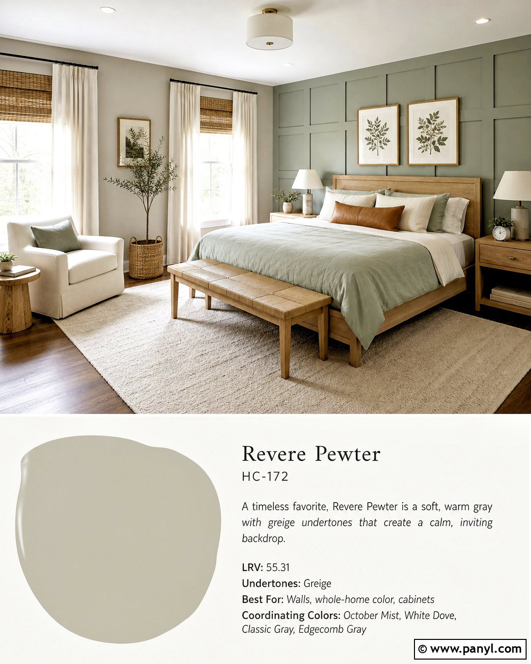
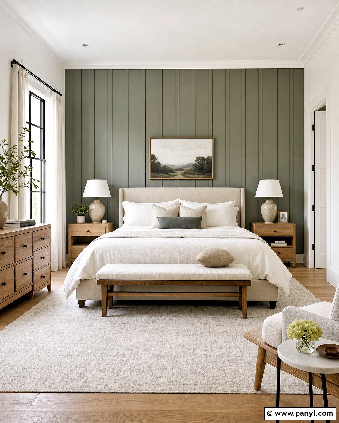
October Mist 1495 creates a softer green pairing with Revere Pewter for spaces intended to feel restful. In a nursery or guest bedroom, use Revere Pewter on three walls and October Mist on a simple board-and-batten feature wall. Choose natural maple furniture, an ivory upholstered chair, and a cream washable rug. Linen curtains in warm white will soften the daylight, while woven shades add texture and privacy. Accent the room with muted botanical prints, pale sage bedding, and a few warm tan details. Avoid filling the space with several competing pastels. By repeating the green in small amounts and allowing Revere Pewter to remain dominant, the completed room feels peaceful, adaptable, and suitable beyond a single decorating stage.
16. Revere Pewter And Knoxville Gray
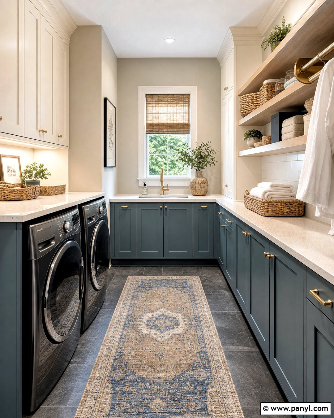
Knoxville Gray HC-160 offers a deep blue-green contrast that feels rich without becoming overly bright. Use it on lower cabinets in a laundry room, with Revere Pewter on the walls and warm white on upper cabinets. Add light quartz counters, a practical white tile backsplash, and slate-look porcelain flooring. Brushed brass hardware highlights the green undertones, while natural wood shelves introduce warmth. Store supplies in matching woven baskets and clear containers to keep the room orderly. A vintage-style runner in blue, taupe, and cream can soften the hard surfaces. This complete design turns a utility room into a polished extension of the home while preserving durable materials, efficient storage, and an easy-to-maintain layout.
17. Revere Pewter And French Press
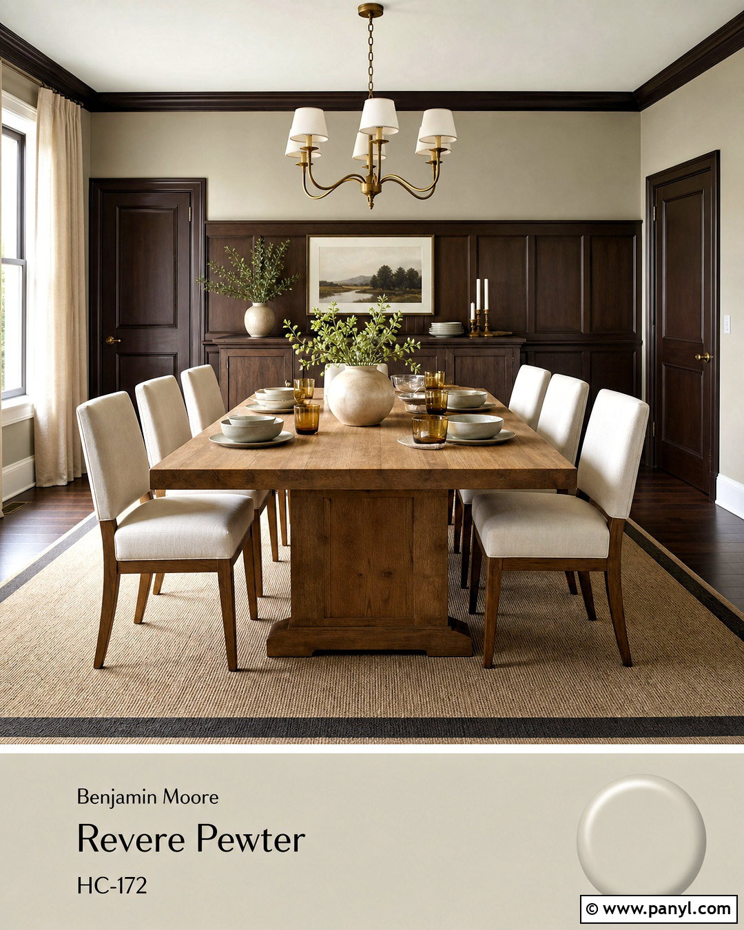
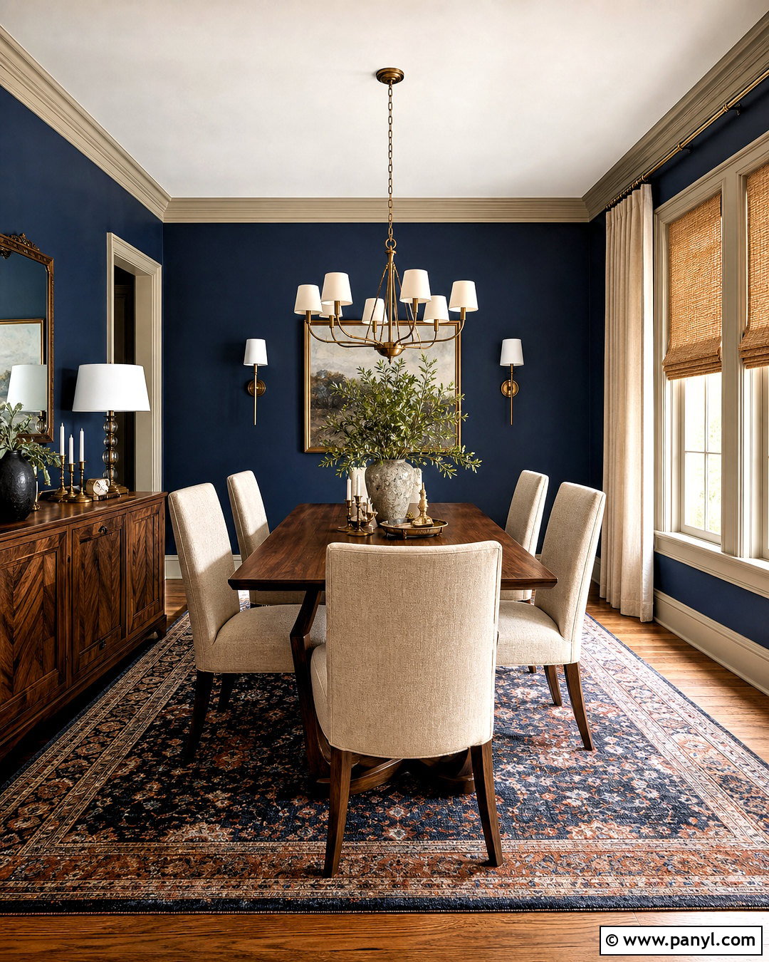
French Press AF-170 provides an espresso-brown anchor for Revere Pewter’s softer neutral appearance. Create an inviting dining room with Revere Pewter walls and French Press on a china cabinet, interior doors, or a paneled buffet wall. Use a medium oak dining table, cream upholstered chairs, and a large neutral rug with a subtle brown border. An aged brass chandelier and linen curtains will warm the room without making it feel dark. Add simple stoneware, amber glass, and greenery rather than many small decorative objects. A warm white ceiling maintains openness above the deeper accents. This combination works particularly well with traditional wood furniture because the brown paint connects older pieces to a lighter, updated wall color.
18. Revere Pewter And Black Beauty
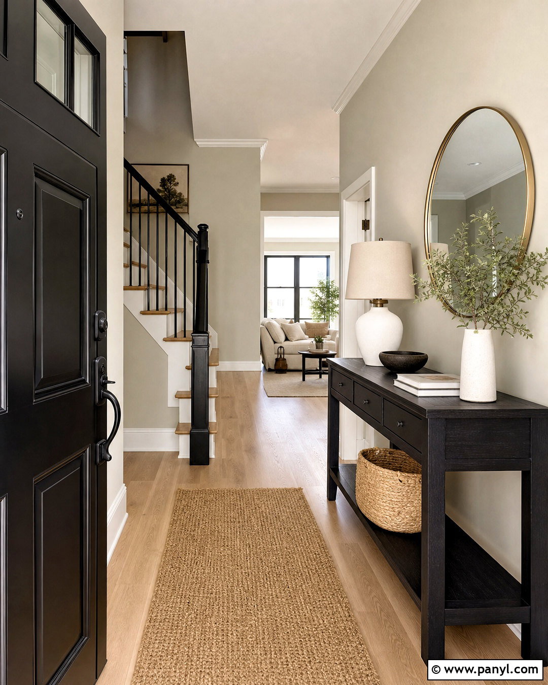
Black Beauty 2128-10 creates a bold architectural outline against Revere Pewter. For a modern entryway, use Revere Pewter on the walls and Black Beauty on the front door, stair railing, and a slim console table. Keep the trim warm white, then add pale oak flooring and a natural jute runner to balance the darker details. A round brass-framed mirror introduces brightness, while a simple white ceramic lamp keeps the console functional. Include one large piece of neutral artwork and a woven storage basket rather than crowded accessories. The black elements should appear in several controlled locations so the front door feels connected to the interior. This restrained palette makes an average-size entry look crisp, organized, and purposeful.
19. Revere Pewter And Terra Cotta Tile
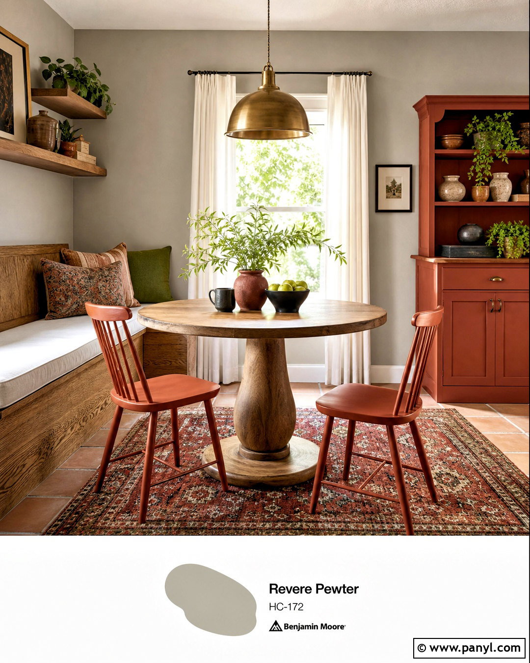
Terra Cotta Tile 2090-30 brings an earthy red-orange accent to the quieter Revere Pewter background. Use this pairing in a cozy breakfast nook with Revere Pewter walls, a built-in oak bench, and Terra Cotta Tile on the chair frames or a compact freestanding cabinet. Add an ivory seat cushion, a round wood pedestal table, and a washable patterned rug containing rust, beige, and olive. Warm white curtains will filter sunlight, while an aged brass pendant centers the dining area. Include handmade pottery and one leafy plant for a casual, collected finish. Keeping the terracotta color concentrated on a few substantial features prevents the palette from becoming busy while still giving the neutral room warmth and personality.
20. Revere Pewter And Straw
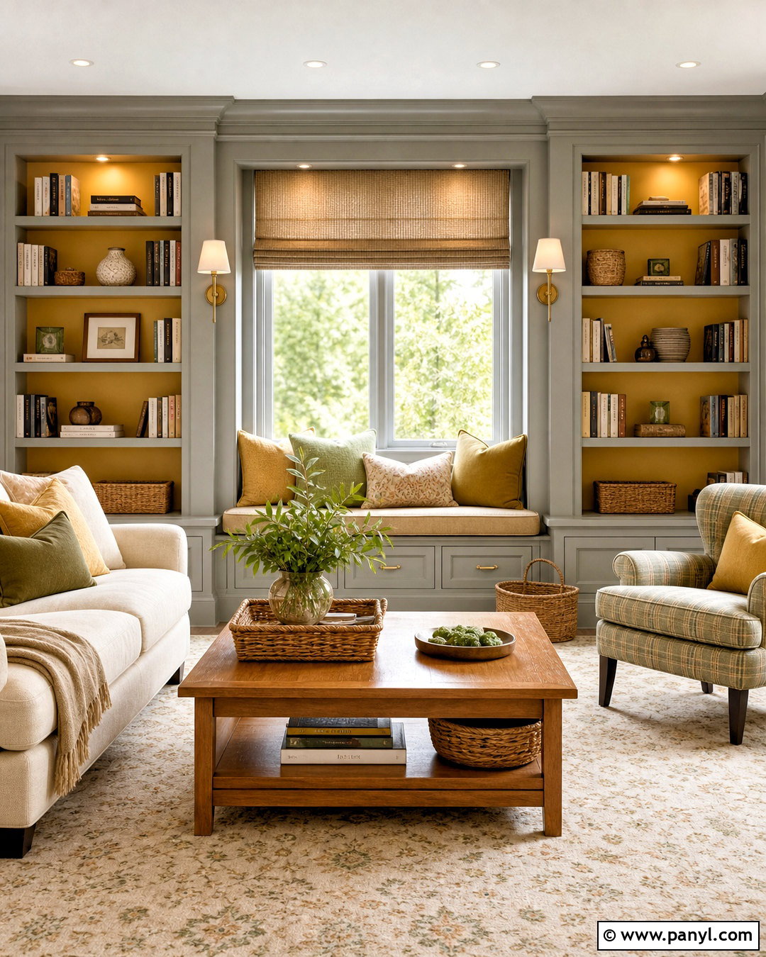
Straw 2154-50 adds a soft golden note to Revere Pewter without creating an overly bright yellow palette. Design a cheerful reading room with Revere Pewter walls, Straw on a window seat or built-in bookcase backing, and warm white trim. Choose a cream loveseat, honey oak side table, and an ivory rug with a small golden pattern. Add linen Roman shades, antique brass sconces, and cushions in muted ochre, olive, and beige. Natural baskets can hold books and blankets while supporting the relaxed color scheme. The golden accent should appear in measured areas rather than covering every wall. This gives the room a sunny quality while Revere Pewter keeps the finished design calm, mature, and easy to coordinate.
Conclusion:
The best Revere Pewter palette considers more than two paint swatches. Flooring, countertops, furniture, lighting, textiles, and metal finishes all influence how the colors appear together. Warm whites provide gentle definition, while navy, charcoal, brown, and black create stronger structure. Muted greens and blues bring in natural color, and terracotta or golden accents add comfortable warmth. Before painting an entire room, sample each combination beside permanent finishes and view it throughout the day. Repeating the coordinating shade in two or three meaningful places will also make the design feel intentional. With thoughtful placement and balanced materials, these 20 Revere Pewter coordinating colors can support rooms ranging from airy and peaceful to bold and tailored.

Related Ideas and Inspiration:
Leave a Reply