
Choosing the right partners for Sherwin-Williams Drift of Mist can turn this airy greige into a polished whole-home palette. With an LRV near 69, Drift of Mist reflects plenty of light while retaining more depth than a standard off-white. Its subtle gray, beige, and slightly green undertones work with crisp whites, earthy neutrals, muted greens, restful blues, and dramatic charcoal accents. Sherwin-Williams officially recommends Eider White, Polished Concrete, and Perle Noir, but many additional pairings can create equally balanced rooms and exteriors. () The key is matching each color combination with compatible wood tones, metals, textiles, and lighting. Below, you will find complete, practical looks built around 20 drift of mist coordinating colors.

1. Drift Of Mist And Eider White
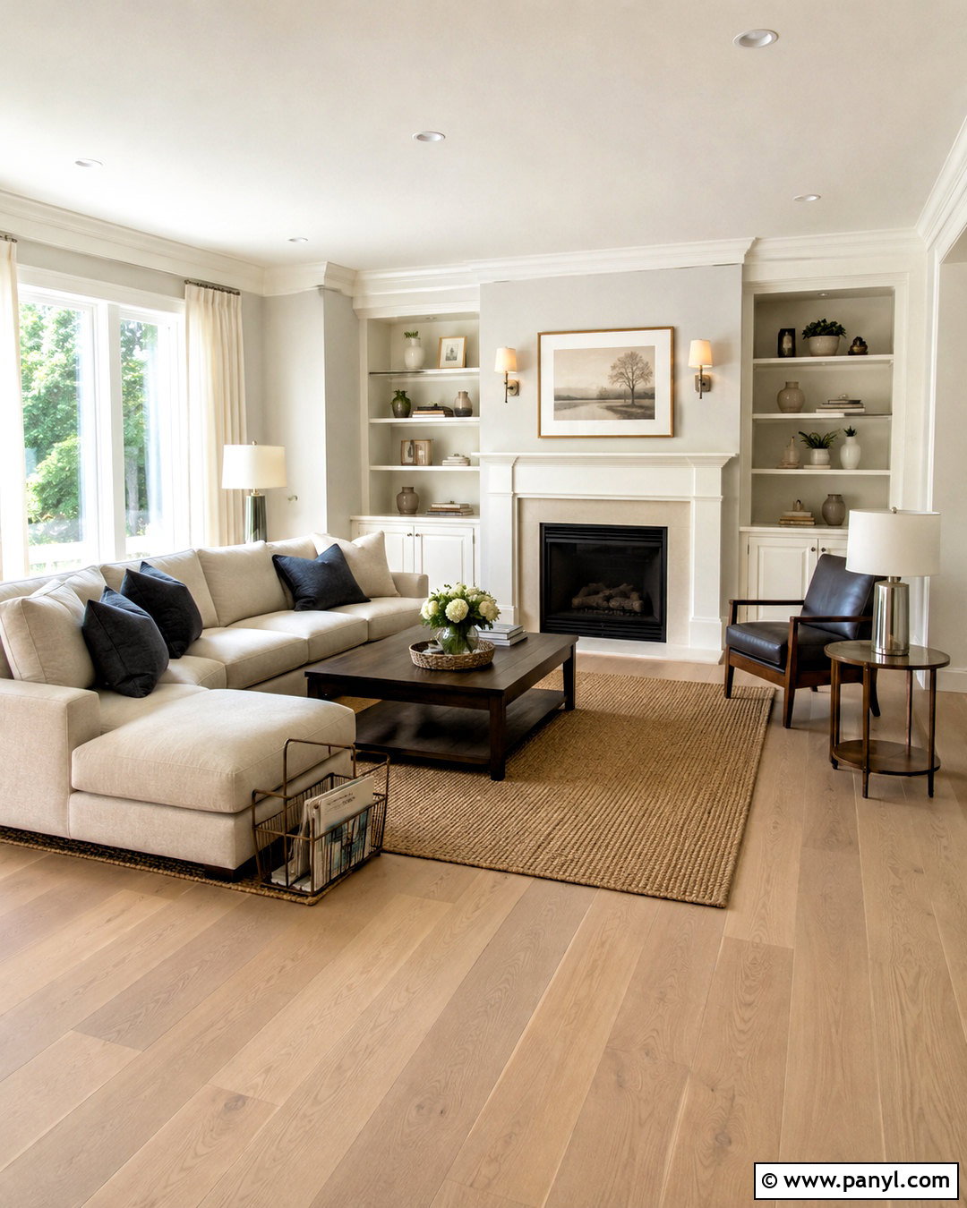
For a light, softly layered interior, paint the main walls Drift of Mist and use Eider White on the trim, doors, ceiling, and built-in cabinetry. Eider White has enough gray character to avoid looking stark, so the transition feels calm rather than sharply contrasted. This combination works beautifully in an open living room with pale oak flooring, an oatmeal sofa, and ivory curtains. Add brushed nickel lighting and charcoal-colored pillows for definition. A natural jute rug brings warmth without introducing a strong yellow tone. Keep larger furnishings simple and streamlined so the subtle wall-and-trim relationship remains visible. The completed room will feel bright, comfortable, and more nuanced than an all-white space.
2. Drift Of Mist And Polished Concrete
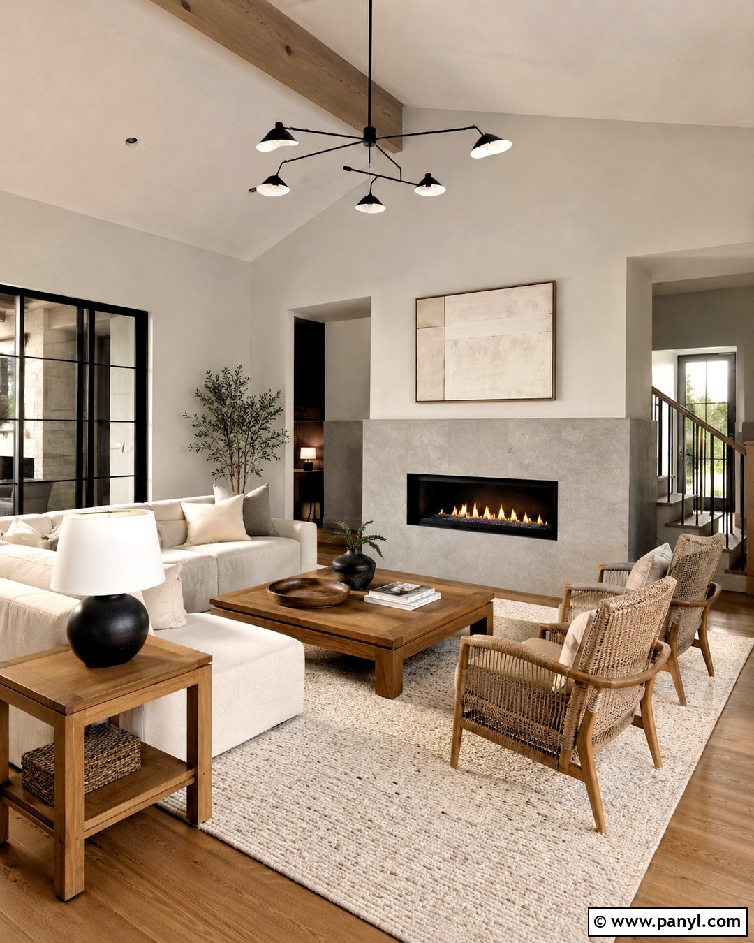
Would you like a neutral palette with noticeable depth but no harsh contrast? Use Drift of Mist across the upper walls and Polished Concrete on lower paneling, built-in shelving, or a fireplace surround. The deeper gray creates structure while maintaining a relaxed connection to the main wall color. Complete the living room with medium-toned oak furniture, a warm white sectional, and woven taupe upholstery. Matte black curtain rods and table lamps add thin, controlled lines. Choose a textured ivory rug to prevent the gray surfaces from making the space feel flat. This tonal combination suits contemporary, transitional, and minimalist homes, especially when several adjoining areas must share a consistent neutral palette.
3. Drift Of Mist And Perle Noir
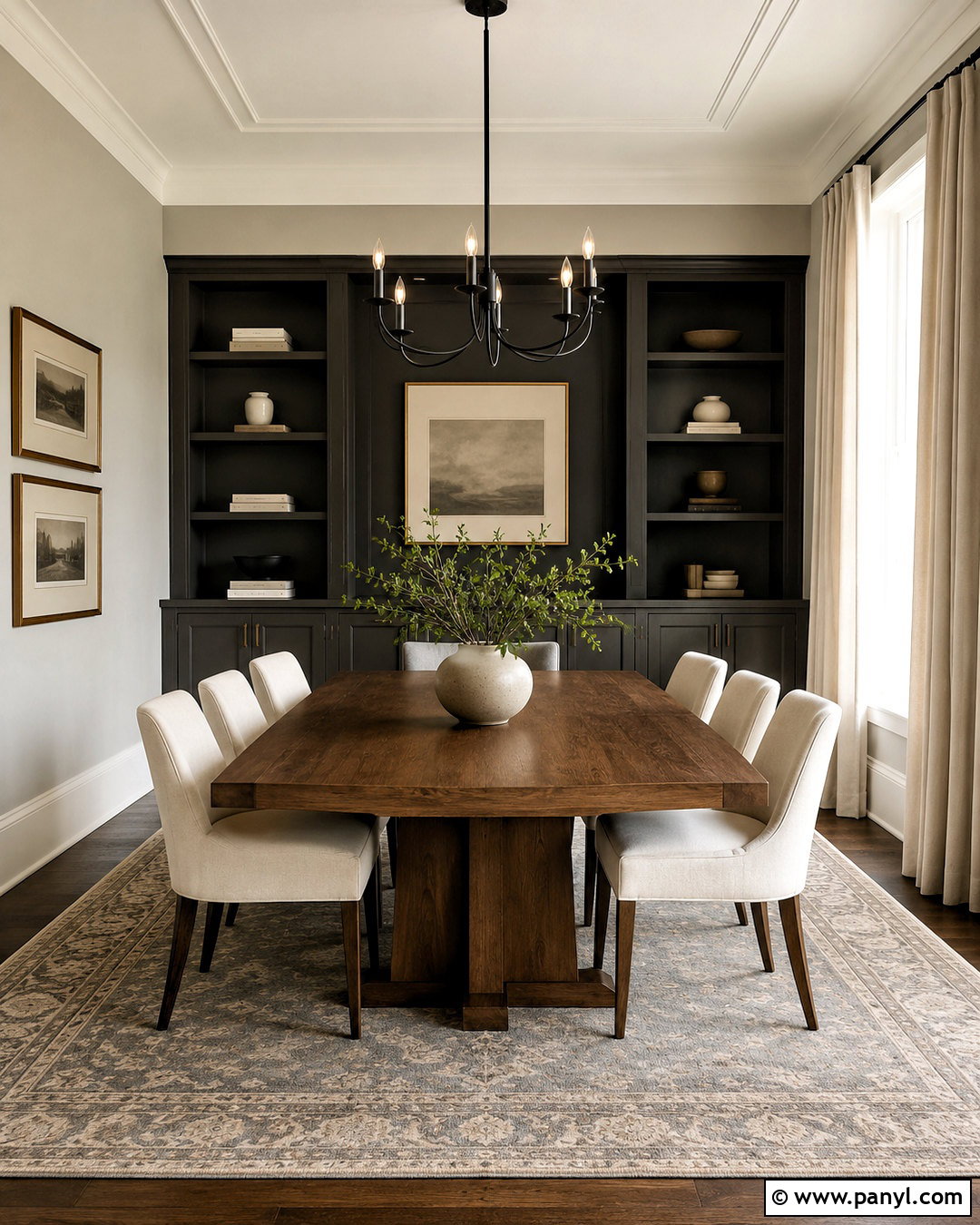
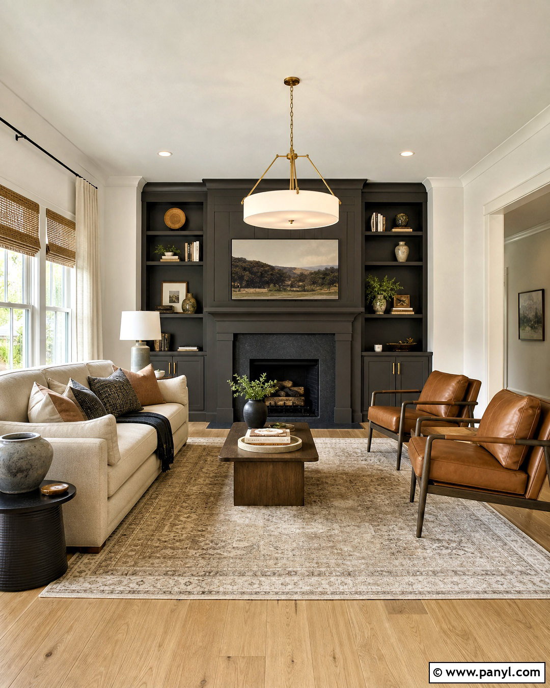
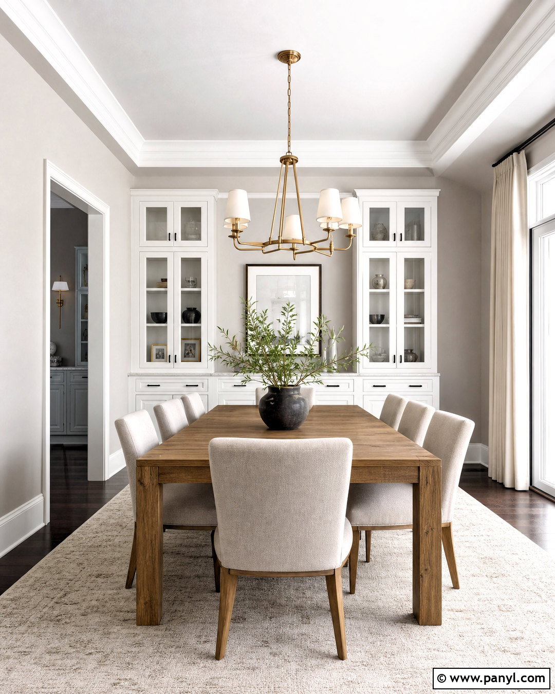
Deep Perle Noir gives Drift of Mist a refined, dramatic edge without overwhelming its quiet character. Paint the walls Drift of Mist, then introduce Perle Noir on a fireplace, bookcase wall, interior doors, or lower cabinetry. In a dining room, the combination feels especially balanced with a natural walnut table, cream upholstered chairs, and a sculptural black chandelier. Add aged brass picture frames or candleholders to soften the dark accents with gentle warmth. Pale linen curtains and a subtle gray-and-beige rug will connect the light and dark surfaces. Keep decorative accessories limited and intentional. The finished room should have strong contrast, clean sightlines, and enough natural texture to remain welcoming rather than severe.
4. Drift Of Mist And Pure White
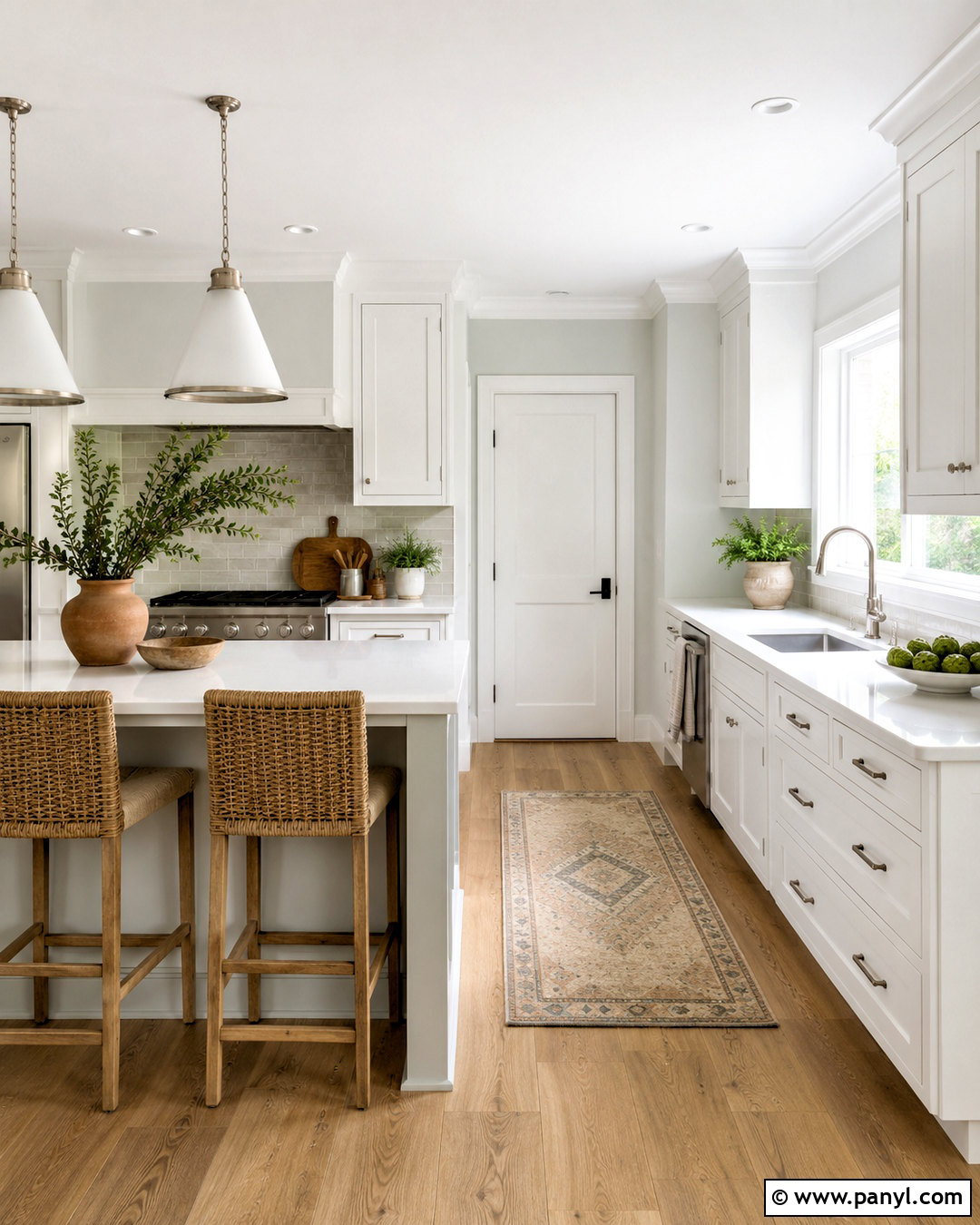
Sunlight makes this clean pairing feel open, fresh, and effortless. Use Drift of Mist on the walls and Pure White for trim, ceilings, cabinets, and doors. Because Pure White is brighter, it outlines the room’s architecture without creating the cold appearance associated with blue-based whites. In a kitchen, combine these paint colors with light oak floors, white quartz countertops, and brushed nickel hardware. A pale greige backsplash can bridge the cabinet and wall colors. Add woven counter stools, simple ceramic accessories, and one or two leafy plants for natural softness. This coordinated look works particularly well in smaller or connected spaces where a crisp finish and generous sense of light are important.
5. Drift Of Mist And Alabaster
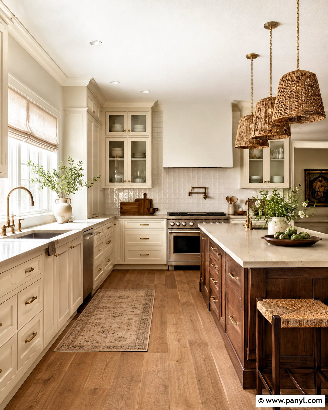
A warm, comfortable home comes together naturally when Drift of Mist meets Alabaster. Place Drift of Mist on the main walls and use Alabaster on kitchen cabinets, trim, and ceilings. Alabaster’s creamy warmth makes the gray-beige wall color feel softer, especially under warm LED lighting. Build the complete kitchen around honed beige quartz, medium oak flooring, and a handmade off-white tile backsplash. Choose antique brass hardware rather than shiny yellow gold. Linen Roman shades and woven pendants can reinforce the casual warmth. For contrast, introduce a walnut island or dark bronze stools. The result is bright but not sterile, making this combination suitable for traditional, organic modern, and relaxed transitional interiors.
6. Drift Of Mist And Snowbound
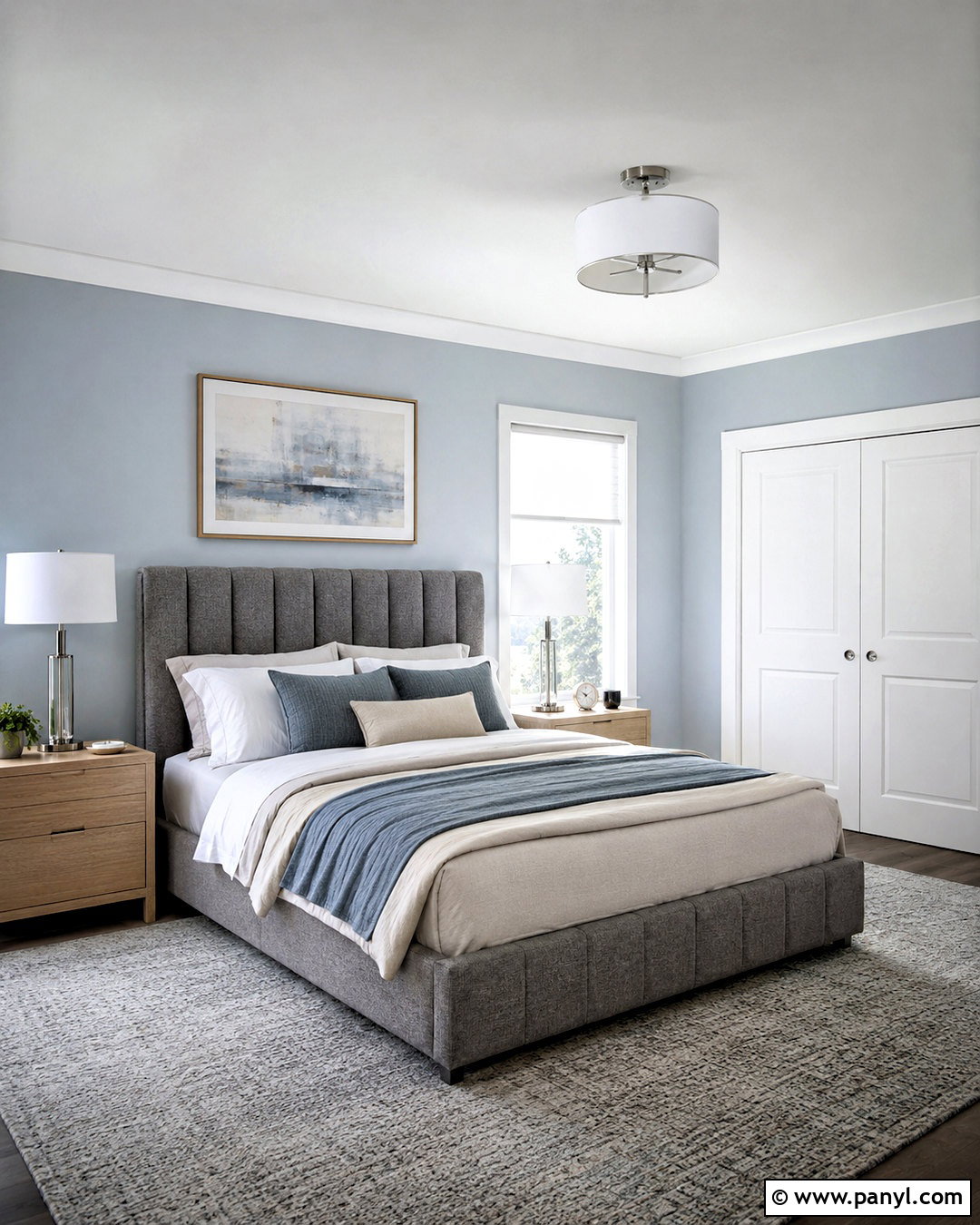
For a cooler, tailored look, pair Drift of Mist walls with Snowbound trim and cabinetry. Snowbound has a lightly shaded quality that feels softer than a brilliant white while still producing a visible architectural outline. This combination is ideal for a bedroom with a channel-tufted gray bed, pale oak nightstands, and white bedding layered with mushroom and muted blue textiles. Use polished nickel lamps or clear glass pendants to maintain the clean feeling. A light gray wool rug will ground the furniture without darkening the floor area. Avoid overly creamy fabrics, which may compete with Snowbound’s cleaner appearance. The finished bedroom will feel peaceful, polished, and pleasantly airy throughout the day.
7. Drift Of Mist And Iron Ore
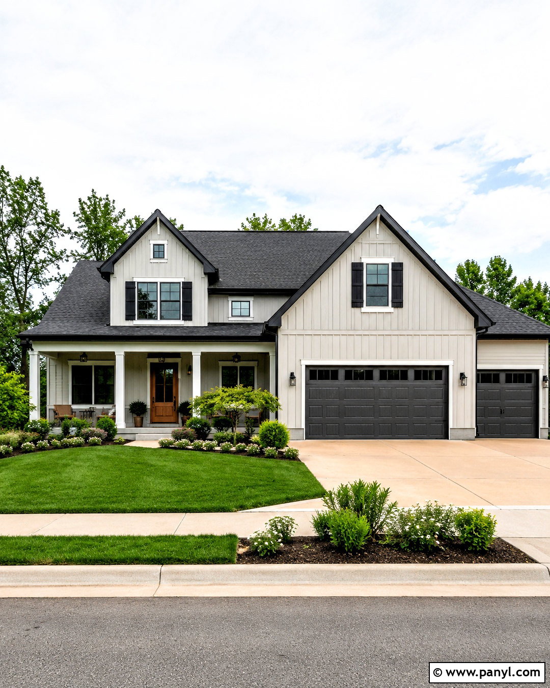
Iron Ore creates a bold anchor for the pale, understated nature of Drift of Mist. On a home exterior, use Drift of Mist for the siding or stucco, Iron Ore for shutters, gutters, and garage doors, and a soft white for narrow trim details. A natural cedar front door prevents the palette from becoming too monochromatic. Complete the curb appeal with charcoal roof shingles, black metal lights, and foundation plantings in layered green tones. Pale gravel or warm concrete walkways will complement the greige body color. This exterior scheme is especially effective on modern farmhouses and updated ranch homes because the contrast highlights the building’s shape while preserving a practical, approachable residential appearance.
8. Drift Of Mist And Tricorn Black
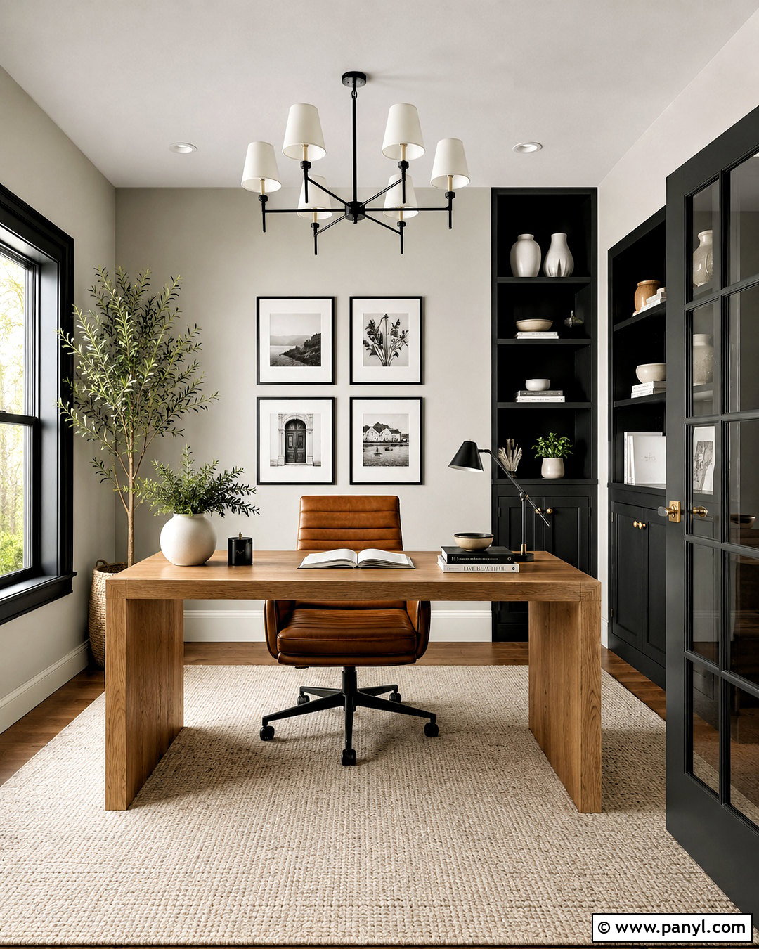
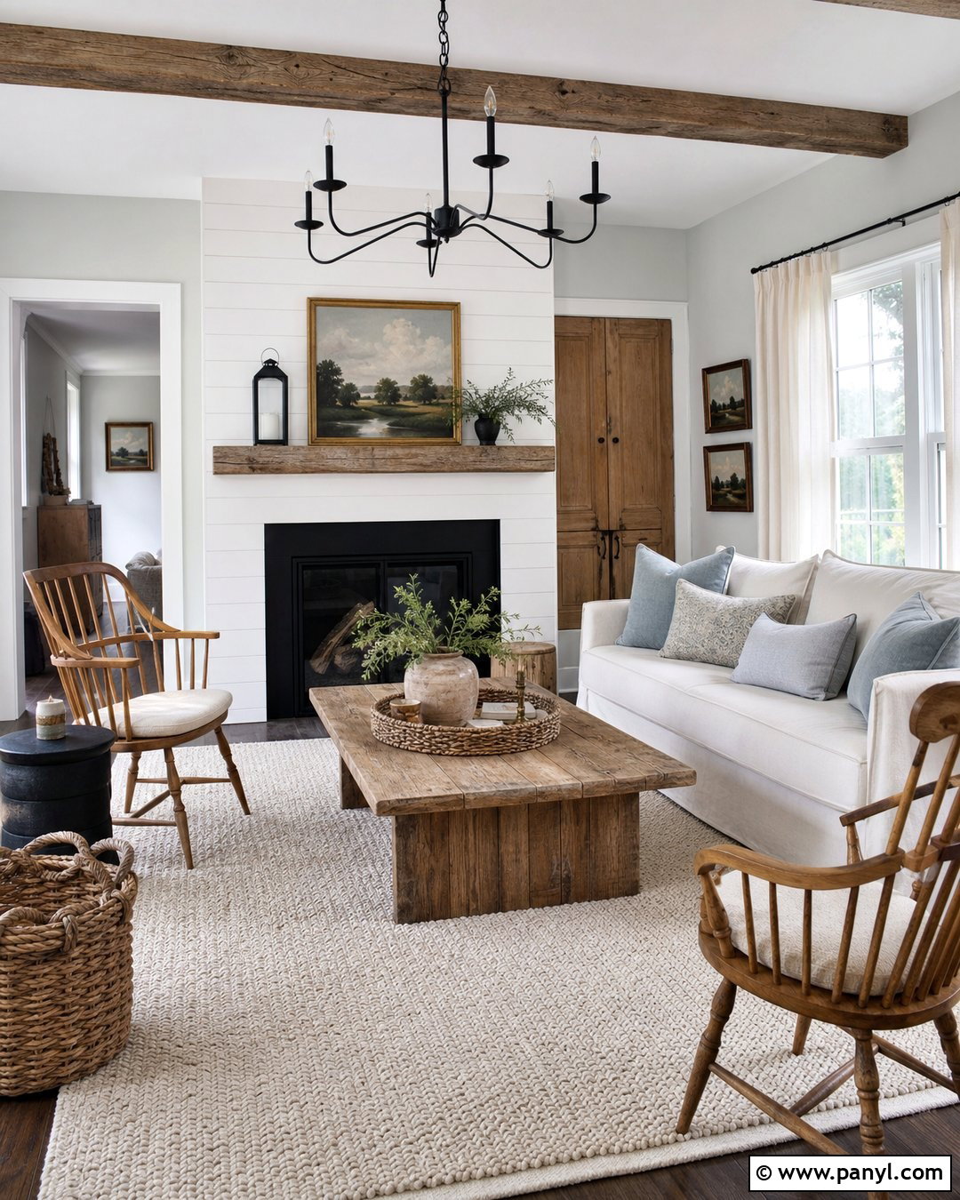
Crisp black details can make Drift of Mist look cleaner and more contemporary. Cover the walls with Drift of Mist, then use Tricorn Black on French doors, metal-framed windows, or one slim built-in workstation. In a home office, select a warm oak desk, cognac leather chair, and ivory flat-weave rug to balance the graphic contrast. Simple black shelves can repeat the accent without dominating the wall. Introduce greenery and a few off-white ceramic pieces for softness. Keep the ceiling and baseboards in a clean white so the room retains an open quality. This finished scheme offers enough visual energy for a productive workspace while remaining neutral enough to coordinate with adjacent rooms.
9. Drift Of Mist And Urbane Bronze
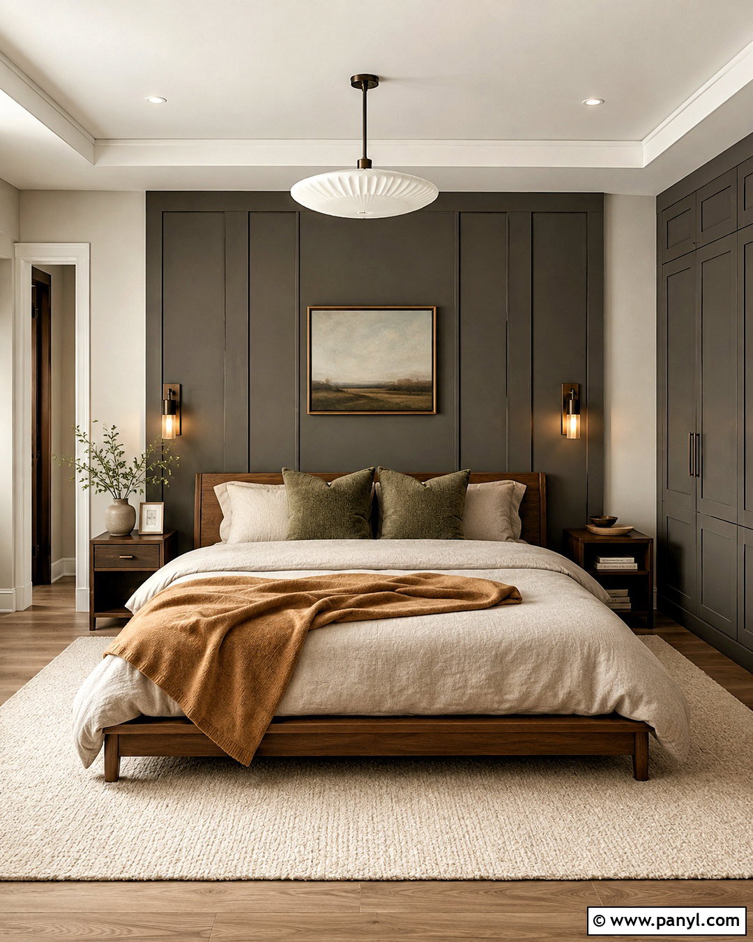
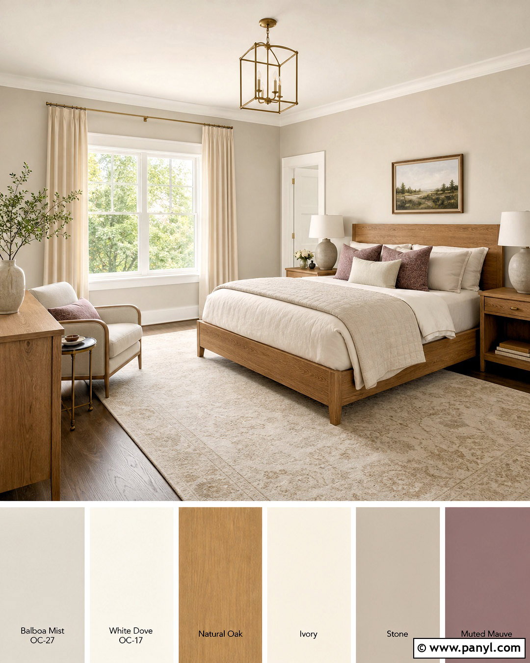
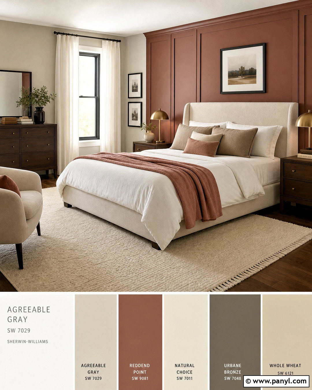
Earthy and substantial, Urbane Bronze draws out the warmer side of Drift of Mist. Use the lighter color throughout a bedroom and apply Urbane Bronze to the wall behind the bed or to a bank of wardrobes. Build the look with a low walnut bed, flax linen bedding, and a textured cream rug. Bronze sconces and dark wood nightstands will blend naturally into the accent color. Add muted olive pillows and a camel-colored throw for restrained variation. Avoid bright whites, which can interrupt the earthy mood; choose warm ivory instead. This complete palette feels grounded and restful, with enough contrast to define the sleeping area while maintaining the soft, quiet atmosphere Drift of Mist provides.
10. Drift Of Mist And Gossamer Veil
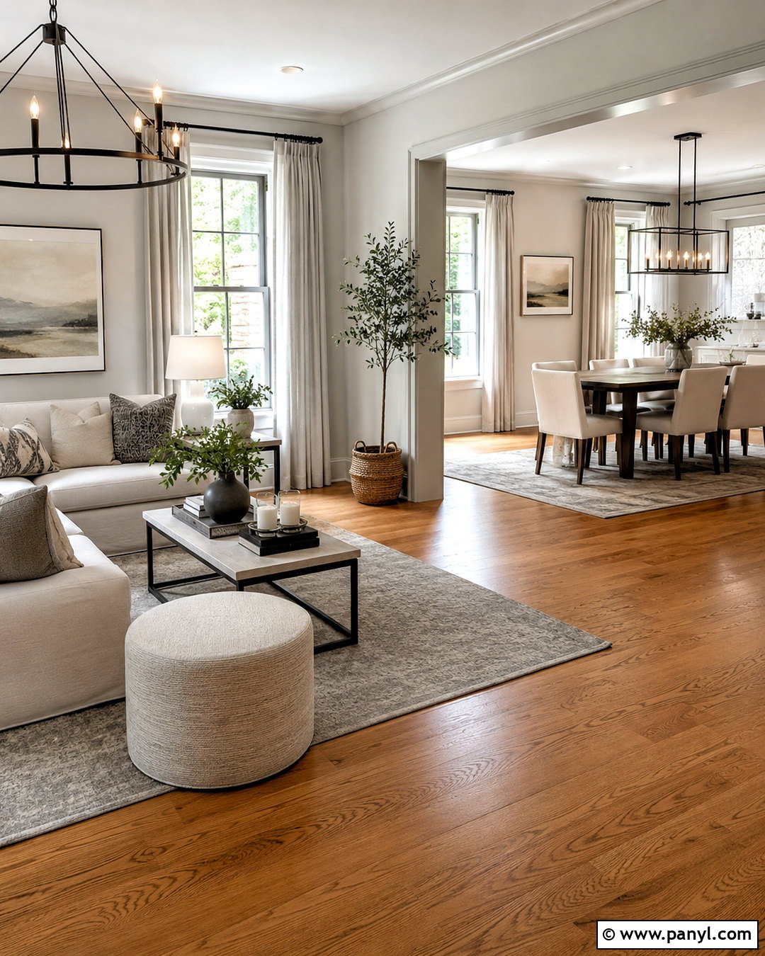
Layering Drift of Mist with Gossamer Veil creates an easy whole-home neutral scheme. Use Drift of Mist in the entry and main living area, then continue Gossamer Veil into an adjoining dining room or hallway. The slightly deeper neighboring neutral provides a gentle transition instead of an obvious color change. Repeat both shades through upholstery, rugs, and window treatments to connect the rooms. Natural oak flooring, linen seating, and matte bronze lighting support the warm gray palette. Include black only in small amounts, such as thin frames or furniture legs. This approach is useful for open floor plans because each zone gains its own identity while the overall interior remains cohesive, spacious, and calm.
11. Drift Of Mist And Skyline Steel
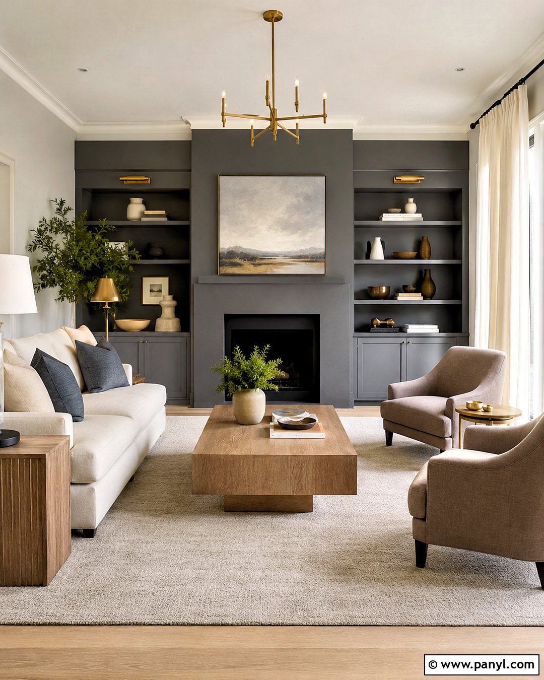
Soft tonal contrast gives this living room combination a quietly sophisticated finish. Paint most walls Drift of Mist and reserve Skyline Steel for built-in shelving, a media cabinet, or the fireplace wall. Furnish the room with a cream sofa, taupe lounge chairs, and a pale gray wool rug. Mixed wood tones can work here, but repeat each one at least twice to make the arrangement feel intentional. Brushed brass lighting brings warmth, while slate-colored pillows echo the deeper paint. Use sheer ivory curtains to diffuse strong daylight. The finished design feels inviting and structured, making it a strong option for homeowners who want a neutral room with visible dimension but no highly saturated accent color.
12. Drift Of Mist And Quarry Stone
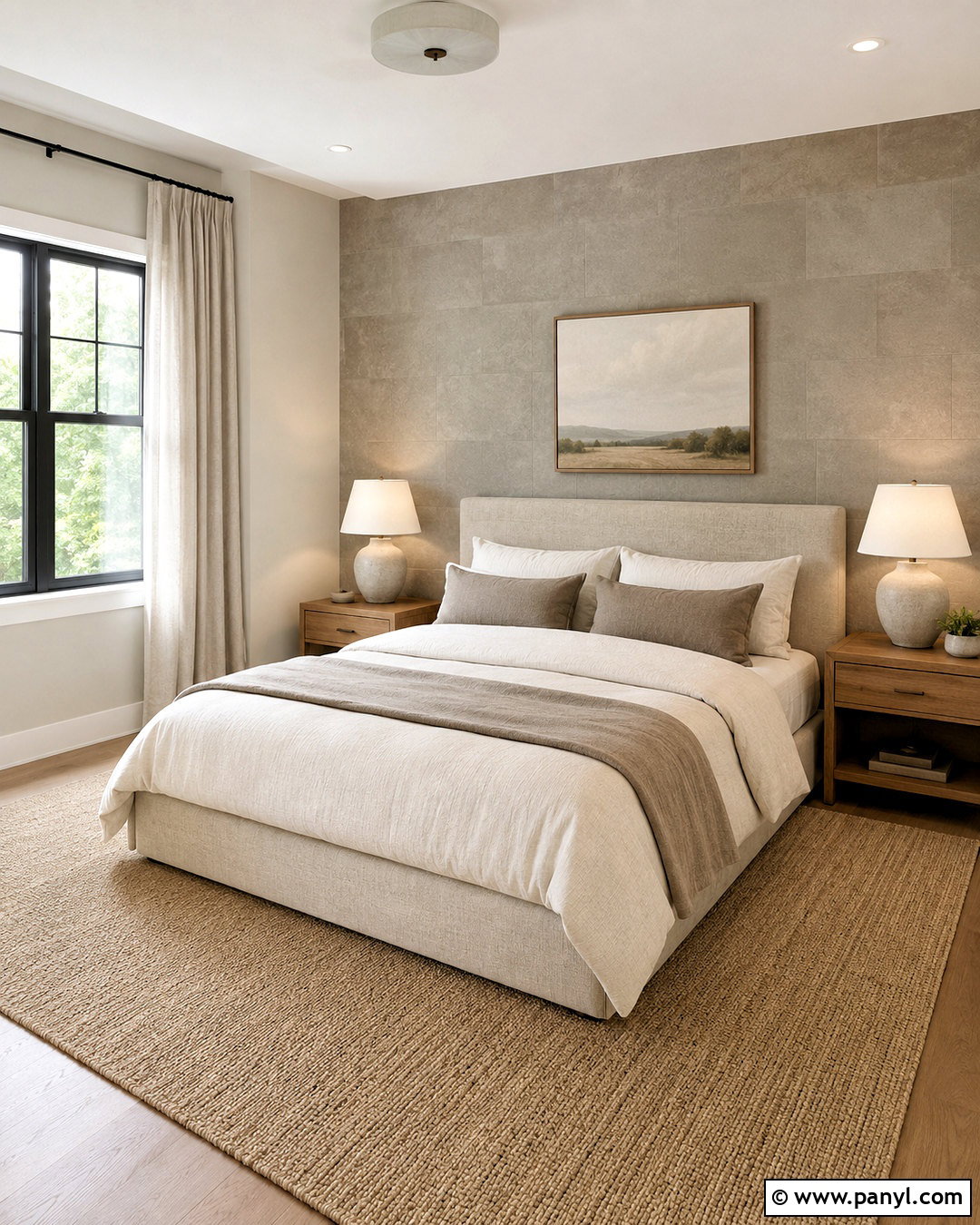
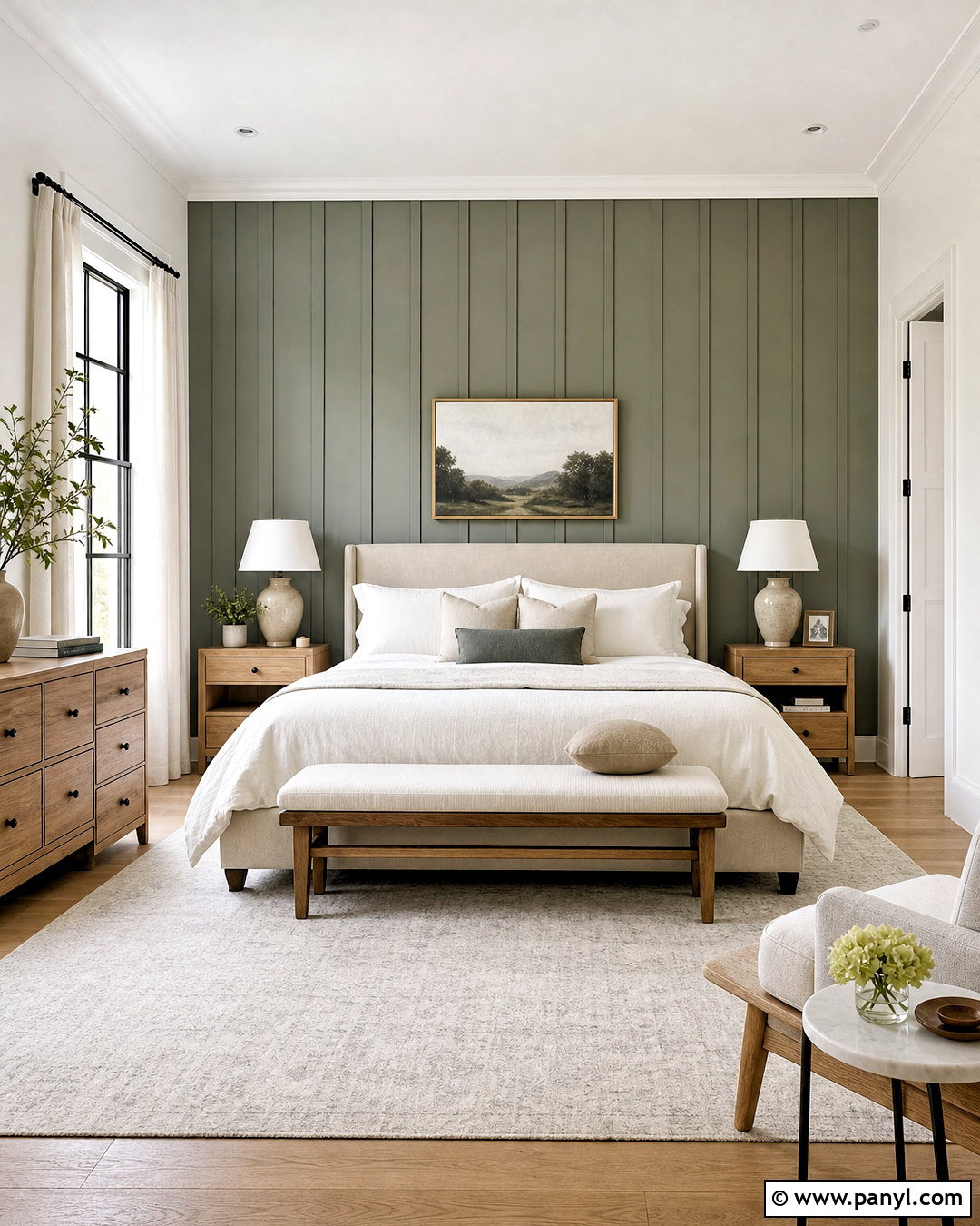
Imagine a restful bedroom built from stone-inspired neutrals and touchable natural fabrics. Drift of Mist can cover three walls, while Quarry Stone creates a deeper accent behind the bed. Choose an upholstered bed in oatmeal linen and dress it with ivory sheets, mushroom-colored quilts, and warm gray pillows. Oak nightstands and ceramic lamps will reinforce the organic character. Install a light natural-fiber rug beneath the bed to brighten the lower half of the room. Blackout curtains in a soft putty tone add function without appearing heavy. This combination works best with warm white bulbs and restrained decor, creating a finished bedroom that feels secure, calm, and connected to natural materials.
13. Drift Of Mist And Upward
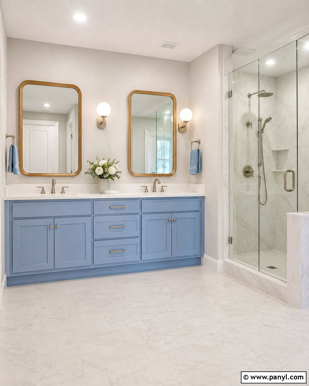
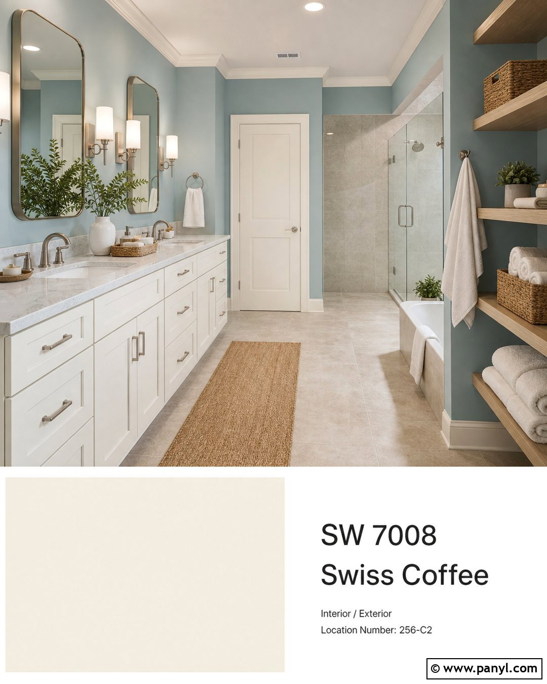
Muted blue brings an airy, refreshing quality to Drift of Mist. Use Drift of Mist on the main bathroom walls and Upward on a double vanity or compact linen cabinet. White quartz countertops, pale marble-look tile, and brushed nickel fixtures will keep the room bright. Introduce natural oak through mirror frames or a slim storage stool so the blue-and-gray palette does not feel chilly. Towels in white, foggy blue, and light greige can repeat the wall colors in practical layers. Choose simple globe sconces with clear white light. This completed bathroom feels serene and clean, with Upward supplying recognizable color while Drift of Mist provides a versatile background that connects easily to nearby neutral rooms.
14. Drift Of Mist And Gale Force
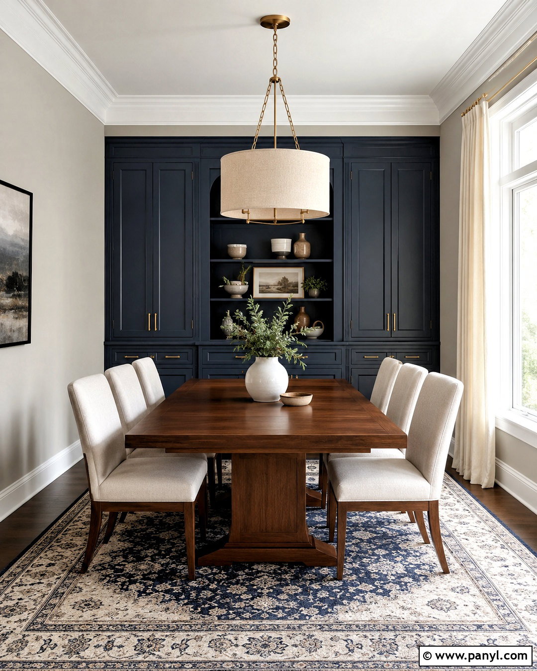
When a room needs stronger color, Gale Force delivers deep blue contrast without the severity of black. Paint the dining room walls Drift of Mist and use Gale Force on a large built-in cabinet, window seat, or paneled feature wall. A medium walnut dining table and light upholstered chairs will warm the palette. Add brushed brass hardware and a broad linen pendant to create a comfortable focal point. A patterned rug containing navy, beige, and ivory can unite every major surface. Keep curtains pale and relatively simple to preserve natural light. The finished dining space will feel distinctive yet livable, combining Drift of Mist’s softness with the confident visual weight of a deep, sophisticated blue.
15. Drift Of Mist And Sea Salt
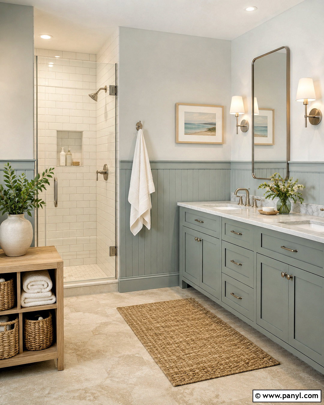
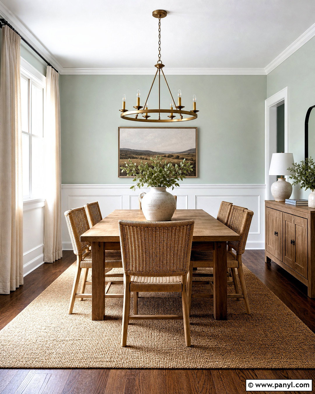
Sea Salt and Drift of Mist create a soft, nature-inspired palette that suits bathrooms, bedrooms, and relaxed living areas. In a bathroom, place Drift of Mist on the upper walls and Sea Salt on the vanity or lower wall paneling. Finish the room with warm white tile, pale oak storage, and brushed nickel plumbing fixtures. Woven baskets and ivory towels add texture while keeping the surfaces uncluttered. If the room receives cool northern light, include beige stone flooring to maintain warmth. A clear glass shower enclosure will help both paint colors remain visible. This complete look has a light coastal influence, but its simple finishes prevent it from feeling overly themed or decorative.
16. Drift Of Mist And Evergreen Fog
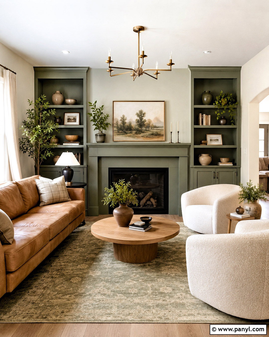
Evergreen Fog gives Drift of Mist an earthy green partner with enough depth to define furniture and architectural features. Use Drift of Mist across a living room and paint a built-in bookcase or fireplace wall Evergreen Fog. Add a camel leather sofa, cream boucle chairs, and an oak coffee table with rounded edges. A faded olive-and-beige rug will connect the green feature to the neutral walls. For lighting and hardware, choose aged brass or dark bronze rather than polished chrome. Off-white curtains keep the windows bright, while pottery and leafy plants repeat the organic palette. The completed space feels current and comfortable, blending subtle color, natural materials, and practical everyday furnishings.
17. Drift Of Mist And Palm Leaf
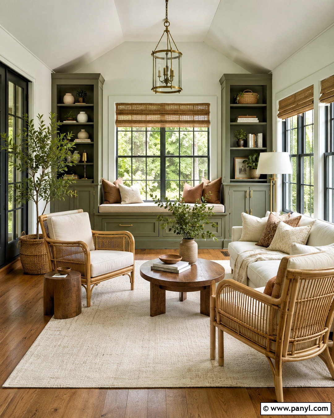
For a richer botanical look, combine Drift of Mist with the deeper olive character of Palm Leaf. Paint the bedroom or sunroom walls Drift of Mist, then apply Palm Leaf to a paneled window wall, built-in bench, or substantial storage cabinet. Natural cane furniture, medium oak flooring, and cream cushions keep the dark green feature from feeling heavy. Add clay-colored pillows and woven bamboo shades for extra warmth. A large ivory rug will reflect light across the room and create visual breathing space. Keep metal accents in aged brass or matte bronze. This complete palette feels lush and grounded without requiring numerous decorative colors, making it easy to maintain and update over time.
18. Drift Of Mist And Accessible Beige
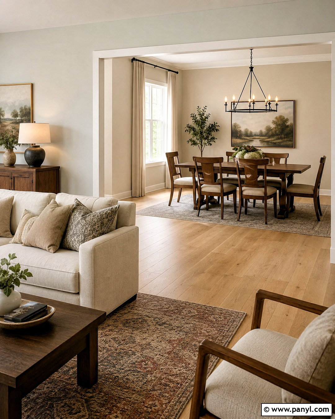
Do you prefer warm neutrals that flow easily from room to room? Pair Drift of Mist in the main living area with Accessible Beige in an adjacent dining space, hallway, or reading nook. Accessible Beige adds noticeable warmth and depth while remaining quiet enough for an open layout. Connect the rooms with continuous white oak flooring and warm white trim. Use cream upholstery, beige linen curtains, and walnut accent furniture across both areas. Dark bronze lighting provides a consistent finishing detail. Introduce pattern through a muted vintage-style rug rather than brightly colored accessories. The completed scheme will feel soft, collected, and cohesive, particularly in homes with abundant warm daylight and traditional architectural features.
19. Drift Of Mist And Natural Linen
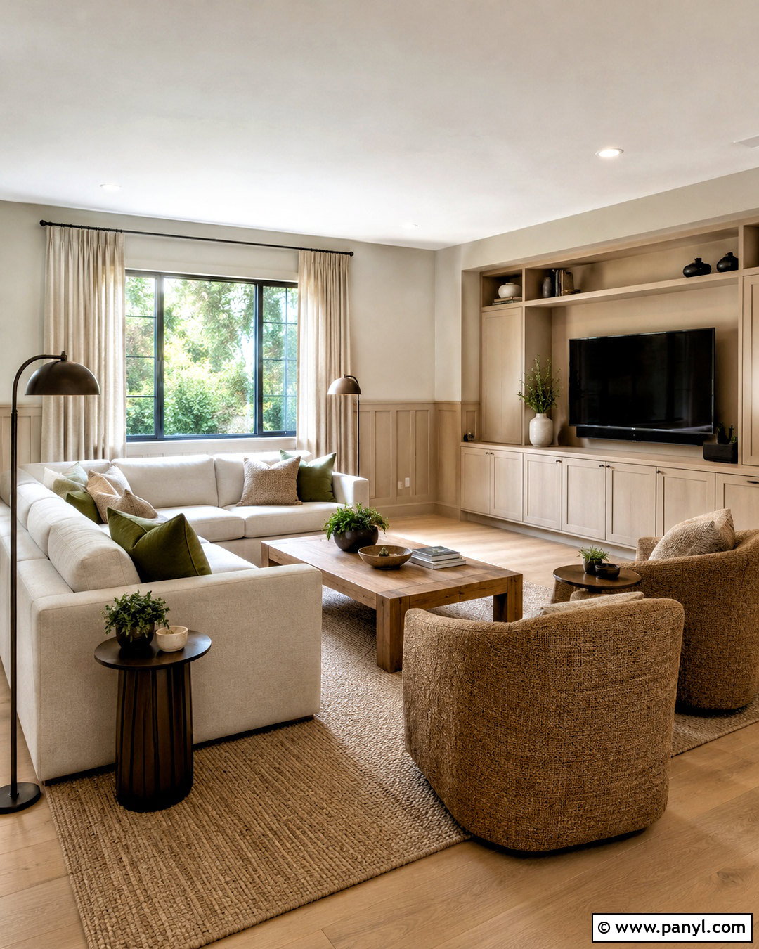
Drift of Mist and Natural Linen form a relaxed palette with an inviting, lived-in warmth. In a family room, use Drift of Mist on the walls and Natural Linen on a large media cabinet, lower wall paneling, or connecting hallway. Choose a deep cream sectional, textured tan chairs, and a medium oak coffee table. Layer a woven rug over warm wood flooring to emphasize the casual character. Bronze floor lamps and flax-colored curtains will strengthen the connection between the two paints. Add muted green pillows for a small amount of contrast. This finished space feels comfortable enough for daily use while remaining visually coordinated, making it especially useful for busy homes that need forgiving neutral surfaces.
20. Drift Of Mist And Cavern Clay
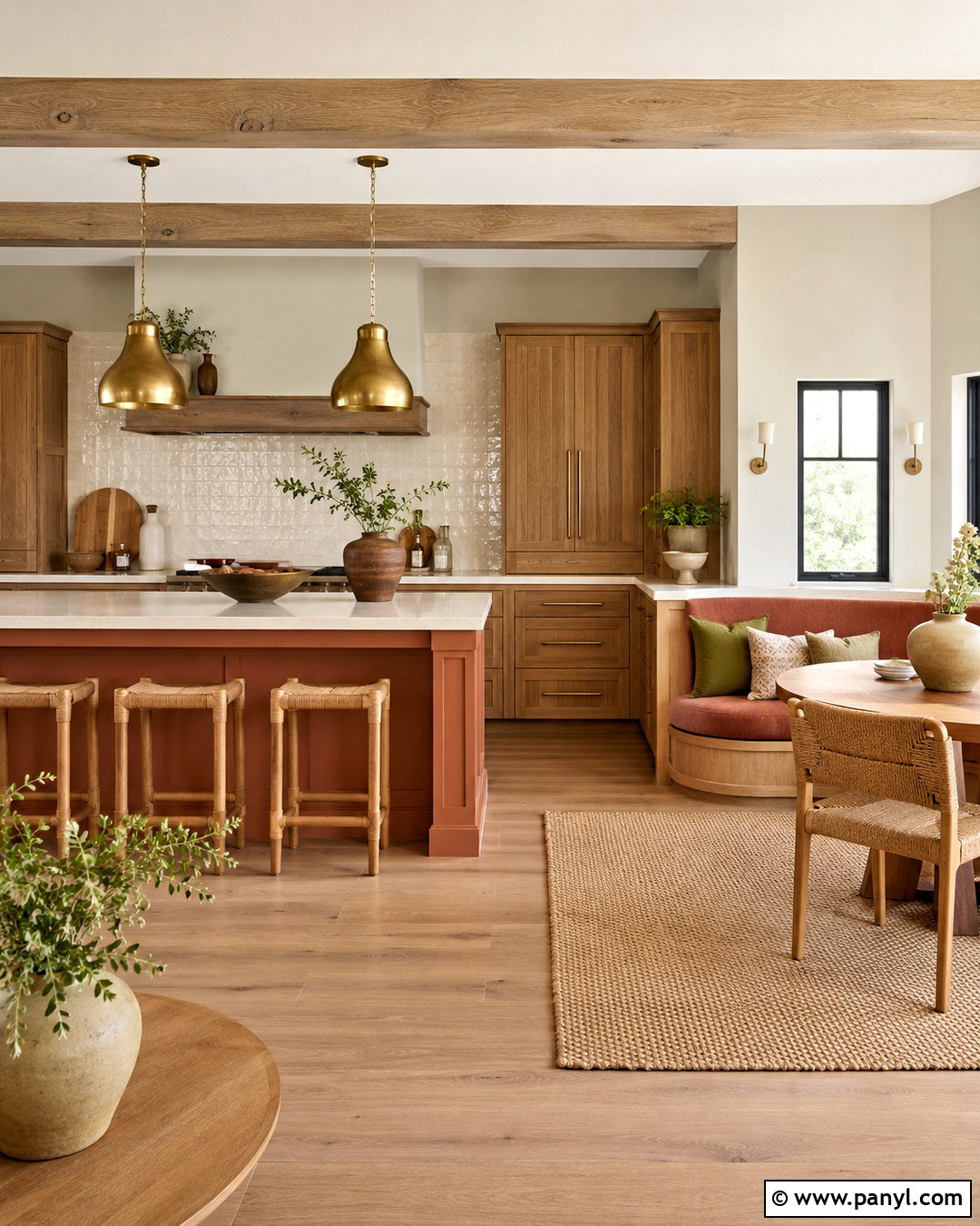
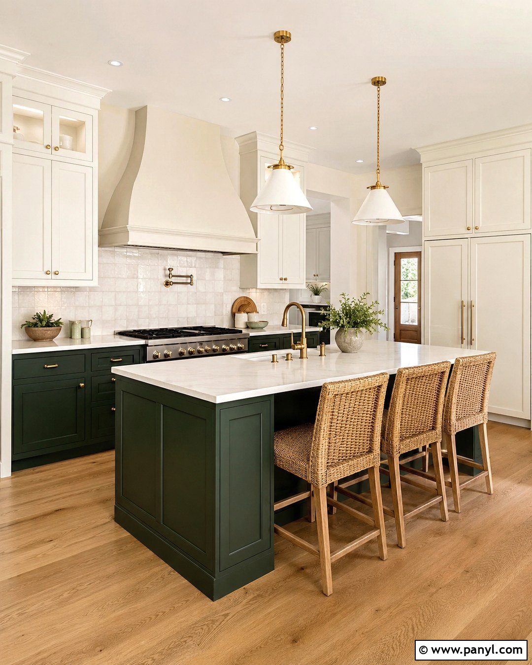
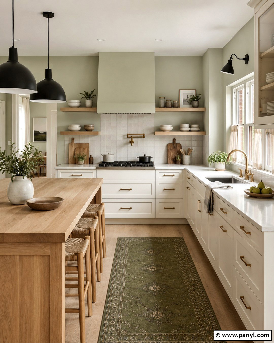
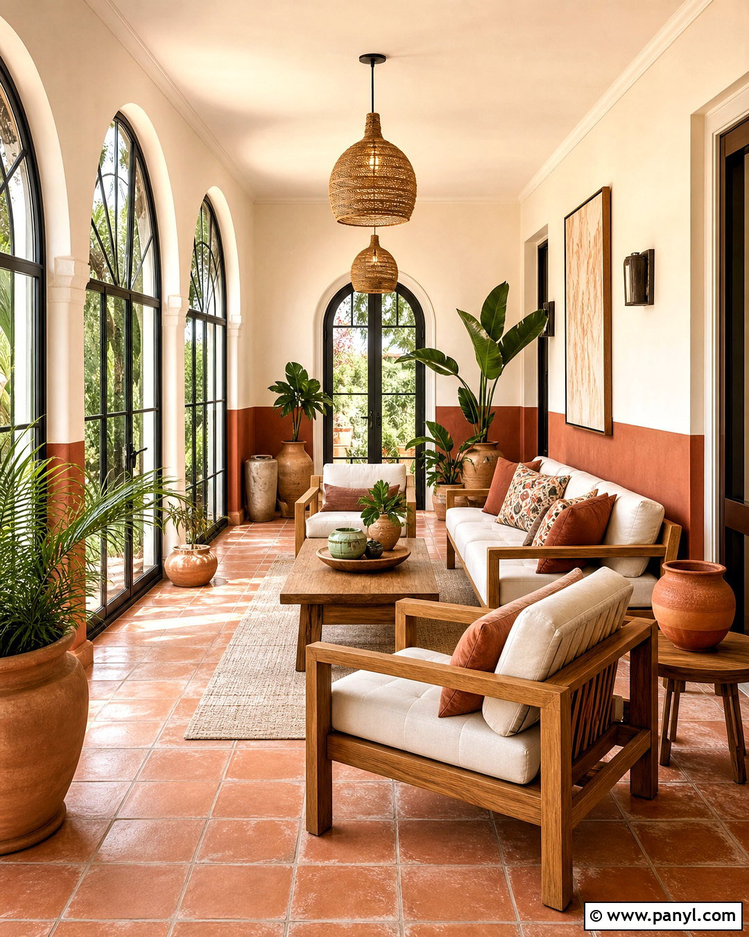
Warm terracotta creates an energetic but grounded counterpoint to Drift of Mist. Use the neutral shade across a kitchen or breakfast room and introduce Cavern Clay on an island, banquette, or compact accent wall. Pair the colors with creamy quartz countertops, natural oak cabinetry, and handmade ivory tile. Woven counter stools, clay pottery, and aged brass pendants will reinforce the warm material story. Keep the floor medium-toned rather than dark so the room stays bright. Small touches of olive green can provide balance through cushions or plants. The completed palette feels sunny and welcoming, allowing the earthy orange accent to stand out while Drift of Mist keeps the larger space calm and versatile.
Conclusion:
These 20 drift of mist coordinating colors demonstrate how easily this light greige can support crisp whites, tonal neutrals, earthy greens, muted blues, and dramatic dark accents. For a gentle scheme, start with Eider White, Gossamer Veil, or Natural Linen. Choose Iron Ore, Tricorn Black, or Gale Force when the room needs sharper definition. Evergreen Fog, Palm Leaf, and Cavern Clay offer warmer, nature-inspired character. Before making a final decision, test large samples beside flooring, cabinets, countertops, and fixed exterior materials. Review them during the morning, afternoon, and evening because changing light can reveal different undertones. A thoughtful test will help the complete palette feel balanced in your actual home.

Related Ideas and Inspiration:
Leave a Reply