
Sherwin-Williams Sea Salt SW 6204 is a soft, muted green with cool blue-gray undertones. Its shifting character helps it feel fresh in bright rooms, soothing in softer light, and surprisingly neutral beside natural materials. Sherwin-Williams officially recommends light neutrals such as Spare White, Fleur de Sel, and Summit Gray, but Sea Salt also works beautifully with warm whites, earthy browns, deep blues, charcoal tones, and layered greens. () The key is creating enough contrast while repeating warm or cool undertones through flooring, textiles, hardware, and furniture. Always test samples because surrounding light and finishes can change how the color appears. The complete room schemes below explore 20 sea salt coordinating colors for relaxed, balanced interiors.

1. Sea Salt And Spare White

Spare White SW 6203 is one of the easiest colors to place beside Sea Salt because its understated warmth softens the green without creating harsh contrast. Use Sea Salt across the walls of a casual living room, then apply Spare White to the ceiling, trim, fireplace, and built-in shelves. A light oak coffee table, oatmeal-colored sofa, woven shades, and cream area rug keep the space inviting. Add pale blue pillows and small matte-black accents for definition. This combination works especially well in rooms receiving clear natural light because the white remains gentle while Sea Salt looks airy. Keep upholstery mostly neutral so the wall color remains noticeable without overwhelming the comfortable, layered design.
2. Sea Salt And Fleur De Sel
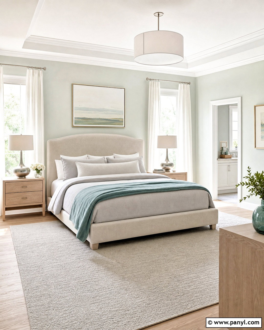
For a quiet, tone-on-tone palette, combine Sea Salt with Fleur de Sel SW 7666. This delicate off-white has a subtle gray quality that supports Sea Salt’s cooler side. Paint bedroom walls Sea Salt and use Fleur de Sel on the ceiling, doors, trim, and a simple paneled headboard wall. Choose white oak nightstands, an upholstered oatmeal bed, pale gray bedding, and a soft blue-green throw. Brushed nickel lamps and sheer white curtains reinforce the light appearance. Introduce texture through boucle, linen, and a flat-weave rug instead of adding strong colors. The finished bedroom feels clean and restful, yet the slight differences between the wall, trim, and textiles prevent the scheme from appearing flat or unfinished.
3. Sea Salt And Summit Gray

Summit Gray SW 7669 gives Sea Salt a grounded partner without making the overall design feel overly dark. In a home office, use Sea Salt on the main walls and Summit Gray on lower cabinets, a built-in desk, or one full bookcase wall. Balance the cool colors with a walnut desktop, cognac leather chair, warm white curtains, and a natural jute rug. Aged brass lighting introduces gentle warmth, while charcoal frames repeat the cabinetry color around the room. This palette works best when the gray is used in concentrated areas rather than covering every surface. The contrast creates a professional, organized workspace while allowing Sea Salt to provide the calm, open background needed for comfortable everyday use.
4. Sea Salt And Pure White
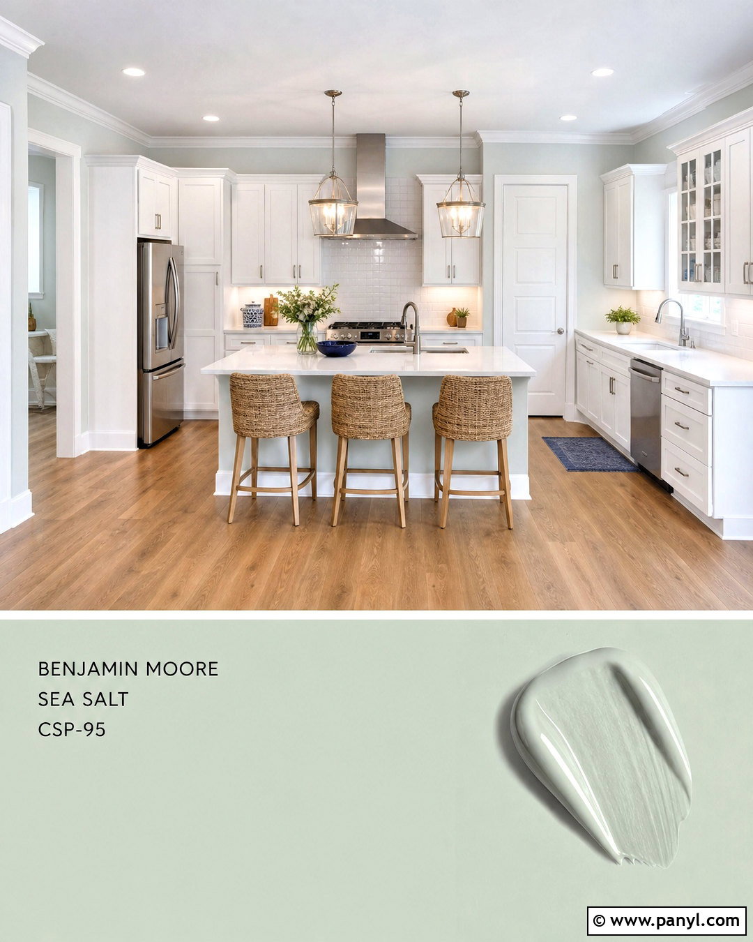
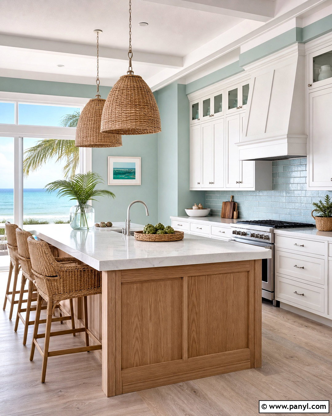
Pure White SW 7005 creates a cleaner, brighter transition than creamier whites, making it especially useful in kitchens and bathrooms. Cover kitchen cabinetry and trim in Pure White, then bring Sea Salt onto the walls or a spacious island. Choose pale quartz countertops with subtle gray veining, a glossy white subway tile backsplash, and warm oak flooring. Brushed nickel hardware keeps the palette cool and cohesive, while woven counter stools add natural texture. A few navy accessories can provide controlled contrast without disturbing the fresh appearance. Because Pure White is crisp but not extremely stark, it defines Sea Salt’s green-blue character while maintaining an approachable atmosphere. The completed kitchen feels open, practical, and timeless rather than heavily themed.
5. Sea Salt And Alabaster
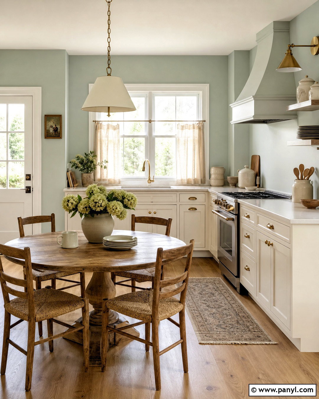
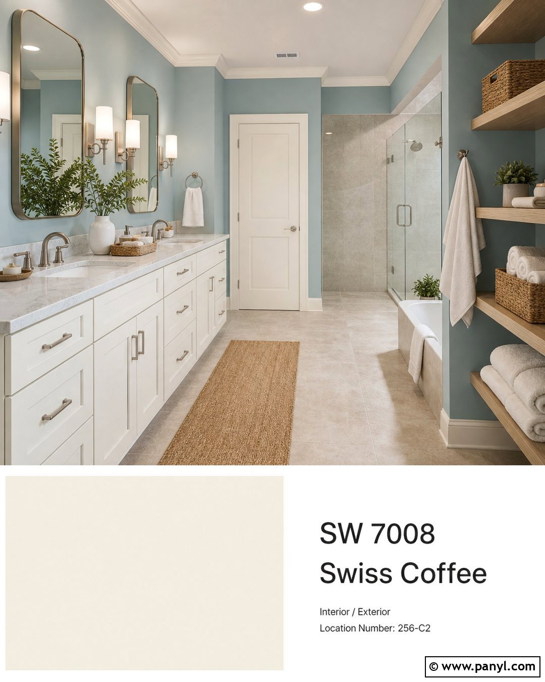
Alabaster SW 7008 brings creamy warmth to Sea Salt, making the combination ideal for rooms that need a softer, more traditional look. Use Alabaster on kitchen cabinets, trim, and ceilings, with Sea Salt covering the walls around a breakfast nook. Warm white quartz, unlacquered brass hardware, medium oak floors, and linen café curtains connect the two paint colors. Add a round wood table, rush-seat chairs, and simple ceramic accessories in cream and muted green. The warmer white prevents Sea Salt from appearing too chilly in north-facing light. Avoid introducing icy grays, which could weaken the welcoming effect. Instead, repeat tan, ivory, and honey-colored finishes so the complete room feels balanced, comfortable, and gently collected.
6. Sea Salt And Shoji White
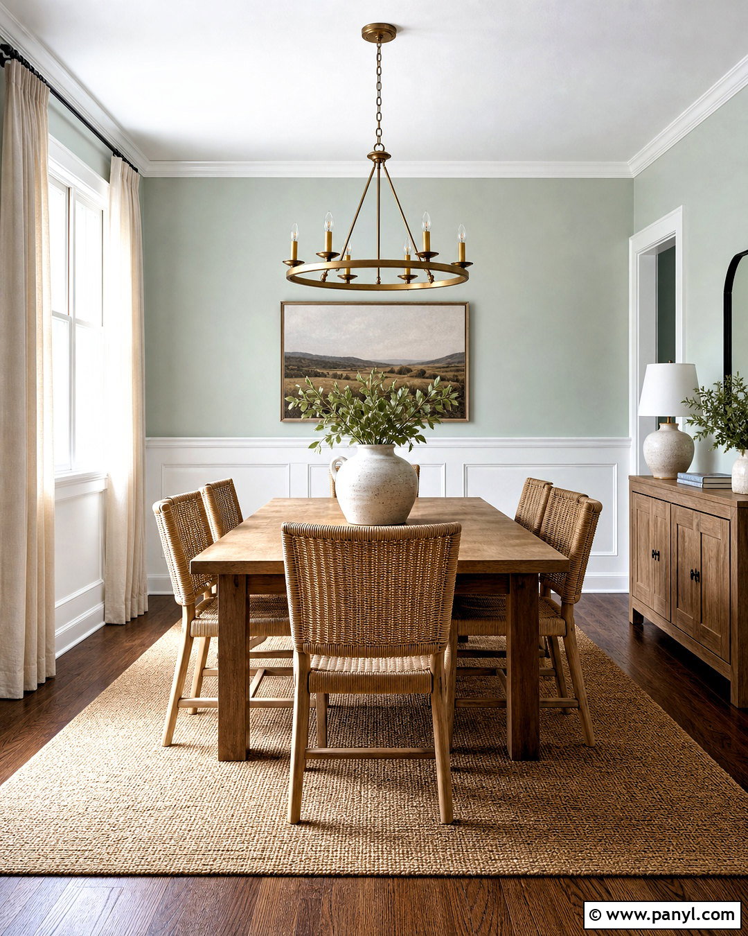
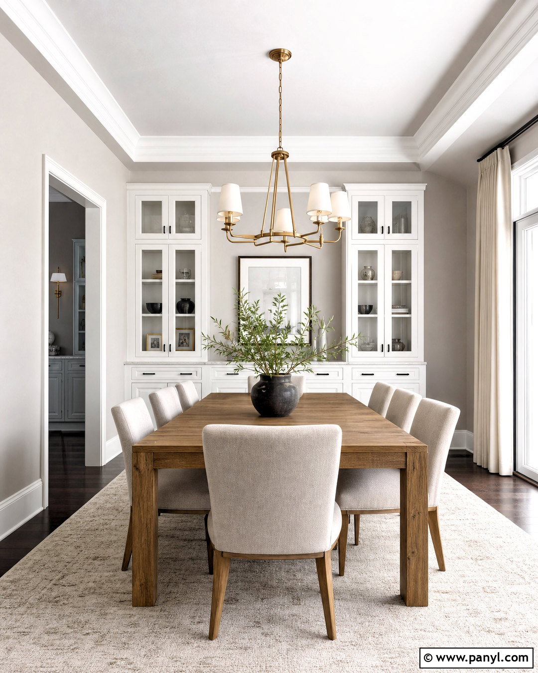
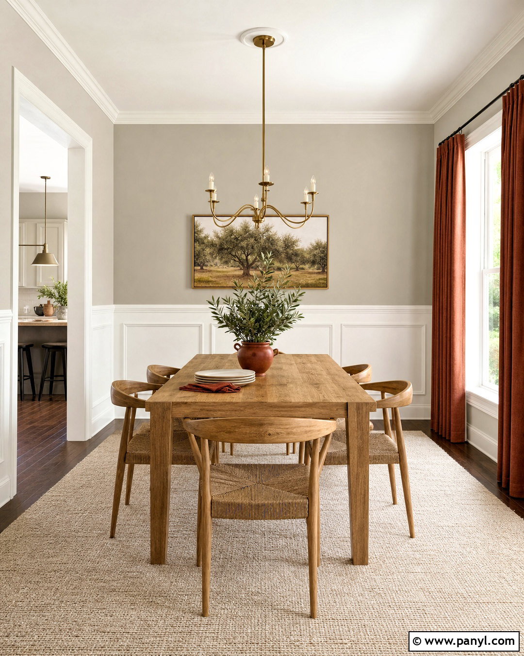
Could a neutral dining room still feel colorful and memorable? Pair Sea Salt with Shoji White SW 7042 for a warm, organic scheme that answers that question beautifully. Paint the upper walls Sea Salt and use Shoji White on substantial wainscoting, window trim, and the ceiling. Center the room with a medium-toned oak table, woven dining chairs, and a large natural-fiber rug. Linen drapes, off-white pottery, and an aged brass chandelier add softness. Shoji White’s beige undertone bridges the difference between cool Sea Salt and warm wood, preventing either side from feeling disconnected. Finish the setting with leafy branches and muted landscape artwork. The result is an inviting dining space with gentle contrast and plenty of natural texture.
7. Sea Salt And Accessible Beige
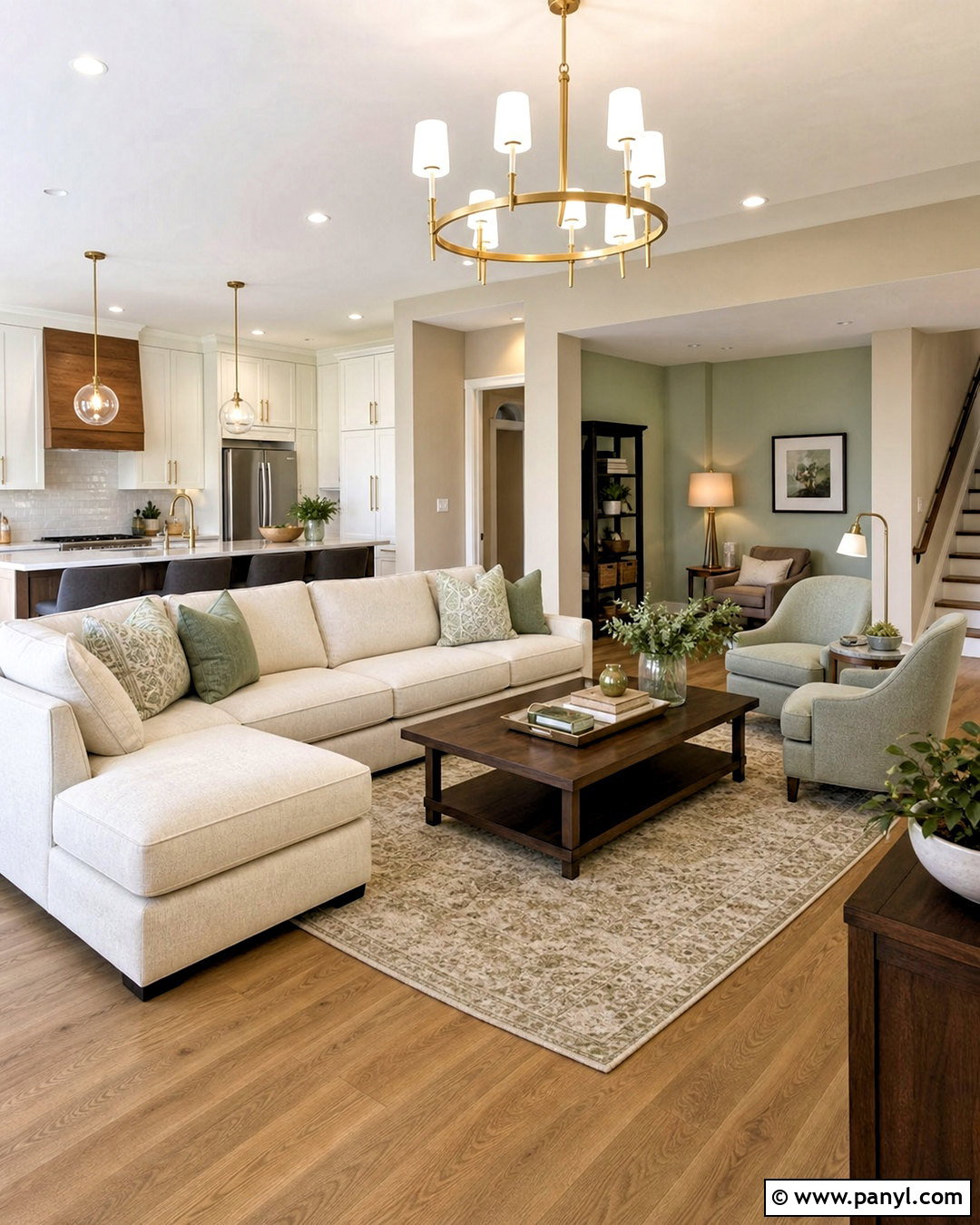
Accessible Beige SW 7036 makes Sea Salt feel warmer, earthier, and easier to use throughout an open floor plan. Place Accessible Beige in the main living area and reserve Sea Salt for an adjoining kitchen, reading nook, or dining zone. Connect both spaces with continuous medium oak flooring, ivory upholstery, and warm white trim. Use a beige sectional, Sea Salt-colored accent chairs, walnut tables, and brushed brass lighting to distribute the palette evenly. Patterned pillows can combine sage green, cream, taupe, and dusty blue. This arrangement creates visual separation without an abrupt color change. Accessible Beige provides a flexible neutral foundation, while Sea Salt introduces a refreshing layer that identifies the secondary space and keeps the overall home from looking too beige.

8. Sea Salt And Agreeable Gray

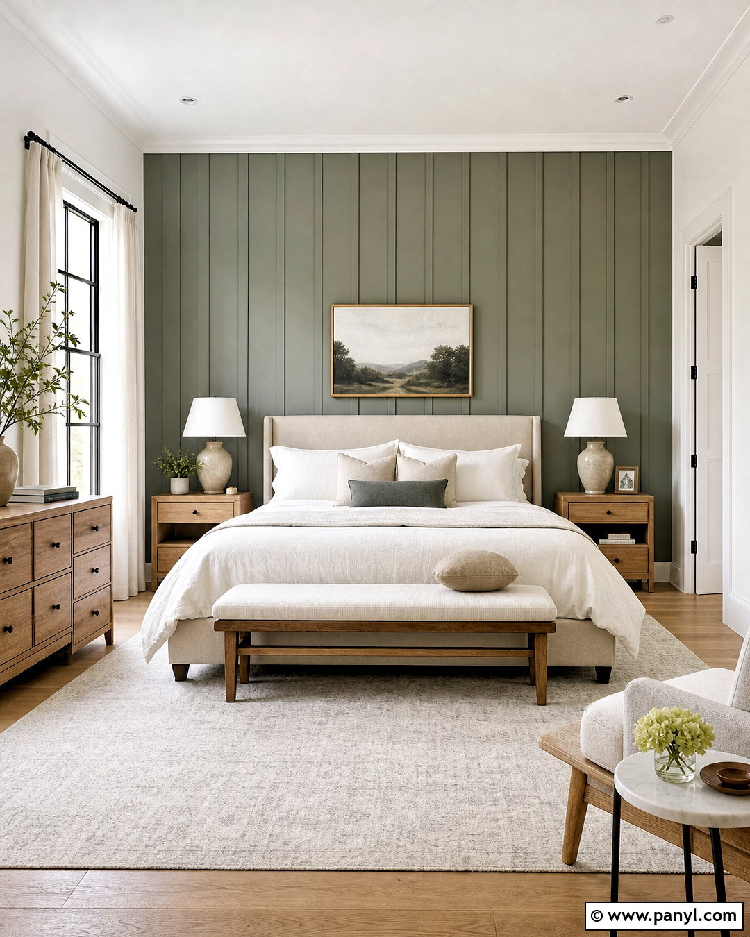
Sea Salt and Agreeable Gray SW 7029 create an adaptable whole-home palette because one supplies gentle color while the other establishes a warm neutral base. Use Agreeable Gray through hallways and connected living spaces, then introduce Sea Salt in the primary bedroom. Continue the same white trim and light oak flooring between areas for an intentional transition. In the bedroom, combine Sea Salt walls with a greige upholstered bed, cream bedding, oak nightstands, and warm gray curtains. Black reading lights offer crisp definition, while sage and faded blue textiles connect the paint colors. Since Agreeable Gray can shift with lighting, place large samples beside Sea Salt before committing. A successful pairing should look softly layered rather than noticeably divided.
9. Sea Salt And Repose Gray

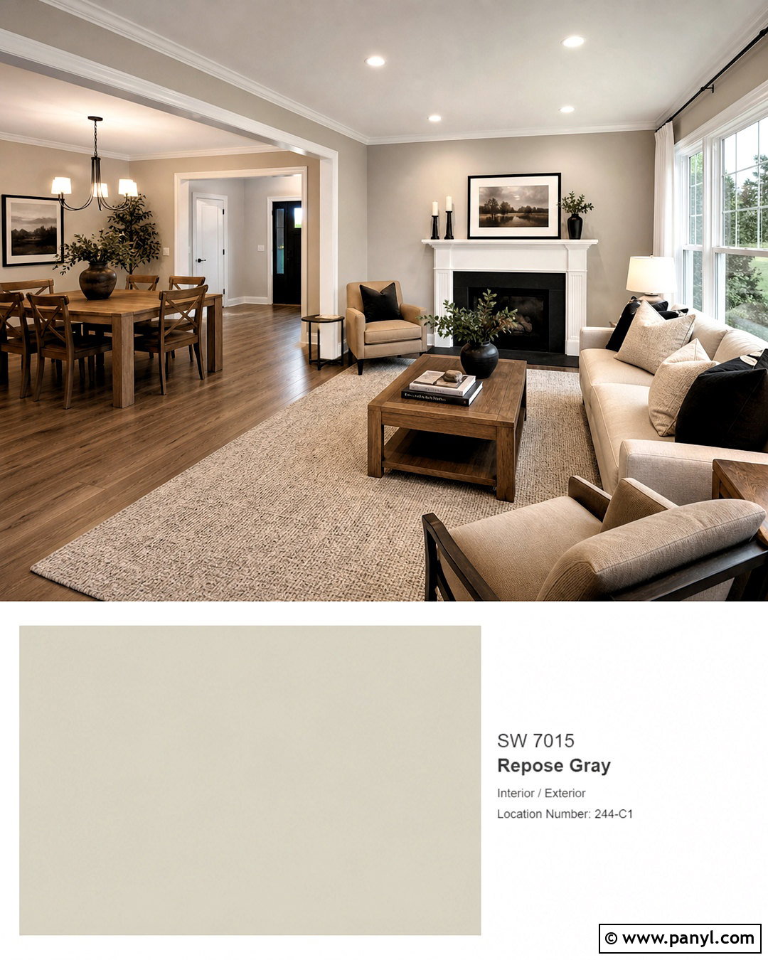
Repose Gray SW 7015 offers a slightly cooler neutral direction that suits streamlined contemporary interiors. Create a complete living room with Sea Salt walls, Repose Gray built-in cabinetry, and crisp white trim. Select a light gray sectional, black metal coffee table, pale oak media console, and textured ivory rug. Repeat Sea Salt through subtle patterned pillows instead of matching every accessory exactly. Matte-black lighting and hardware sharpen the pale palette, while warm wood prevents it from feeling sterile. This combination performs especially well in rooms with generous natural light, where both colors can display their nuanced undertones. Keep the decor simple and use a few larger pieces rather than many small objects to preserve the calm, modern character.

10. Sea Salt And Natural Linen
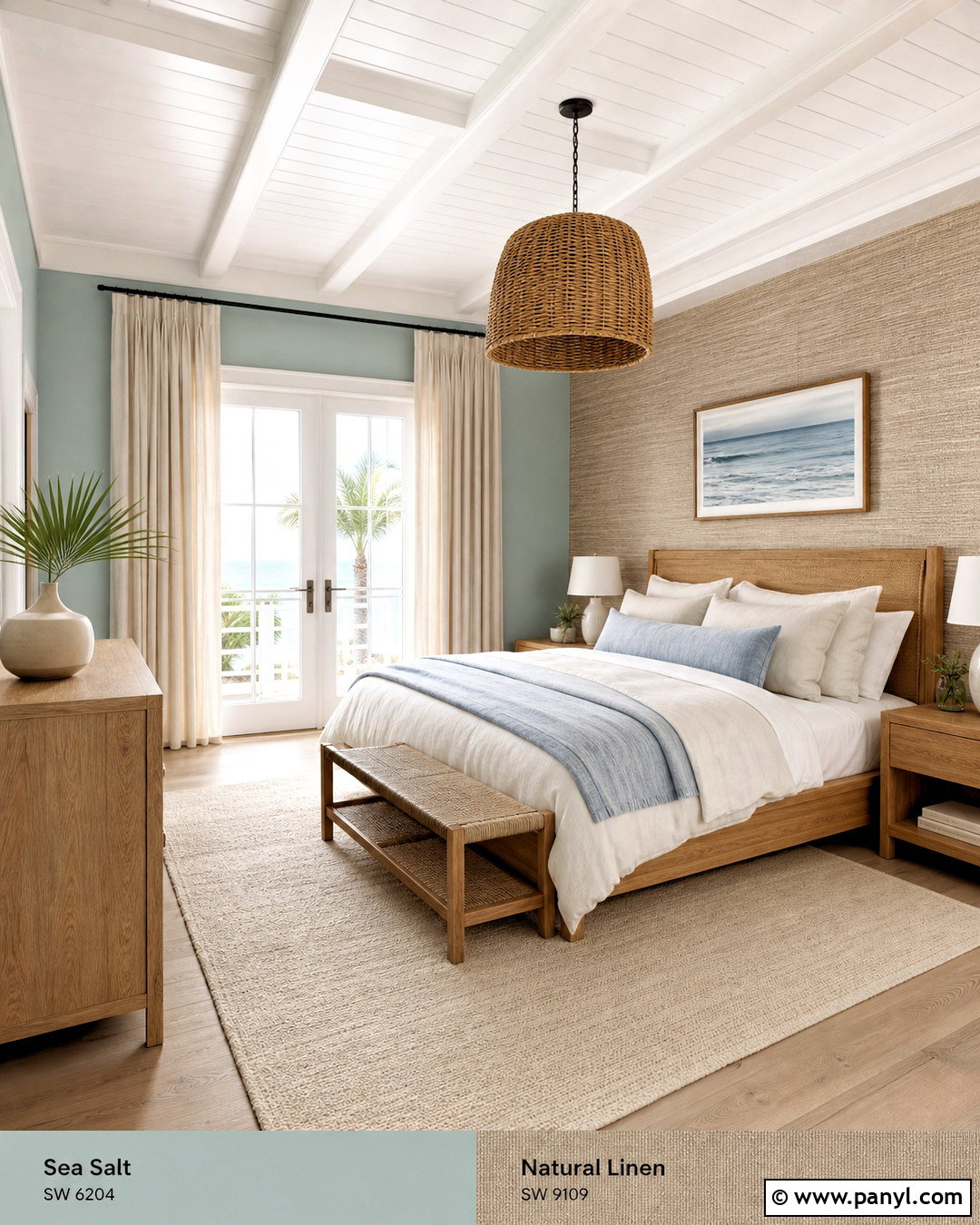
Natural Linen SW 9109 gives Sea Salt an easy coastal connection without relying on obvious beach-themed decor. Paint bedroom walls Sea Salt and use Natural Linen on a built-in window seat, an adjacent dressing area, or a wide accent wall behind the bed. Bring in a natural oak bed, woven pendant light, flax linen curtains, and an ivory wool rug. Bedding in cream, sand, soft green, and faded denim blue completes the relaxed palette. Avoid bright nautical accessories and instead emphasize genuine materials such as rattan, cotton, linen, and unfinished wood. The warm beige balances Sea Salt’s cool undertones, while the shared muted quality keeps the contrast gentle. The room feels breezy, grown-up, and comfortable in every season.
11. Sea Salt And Naval
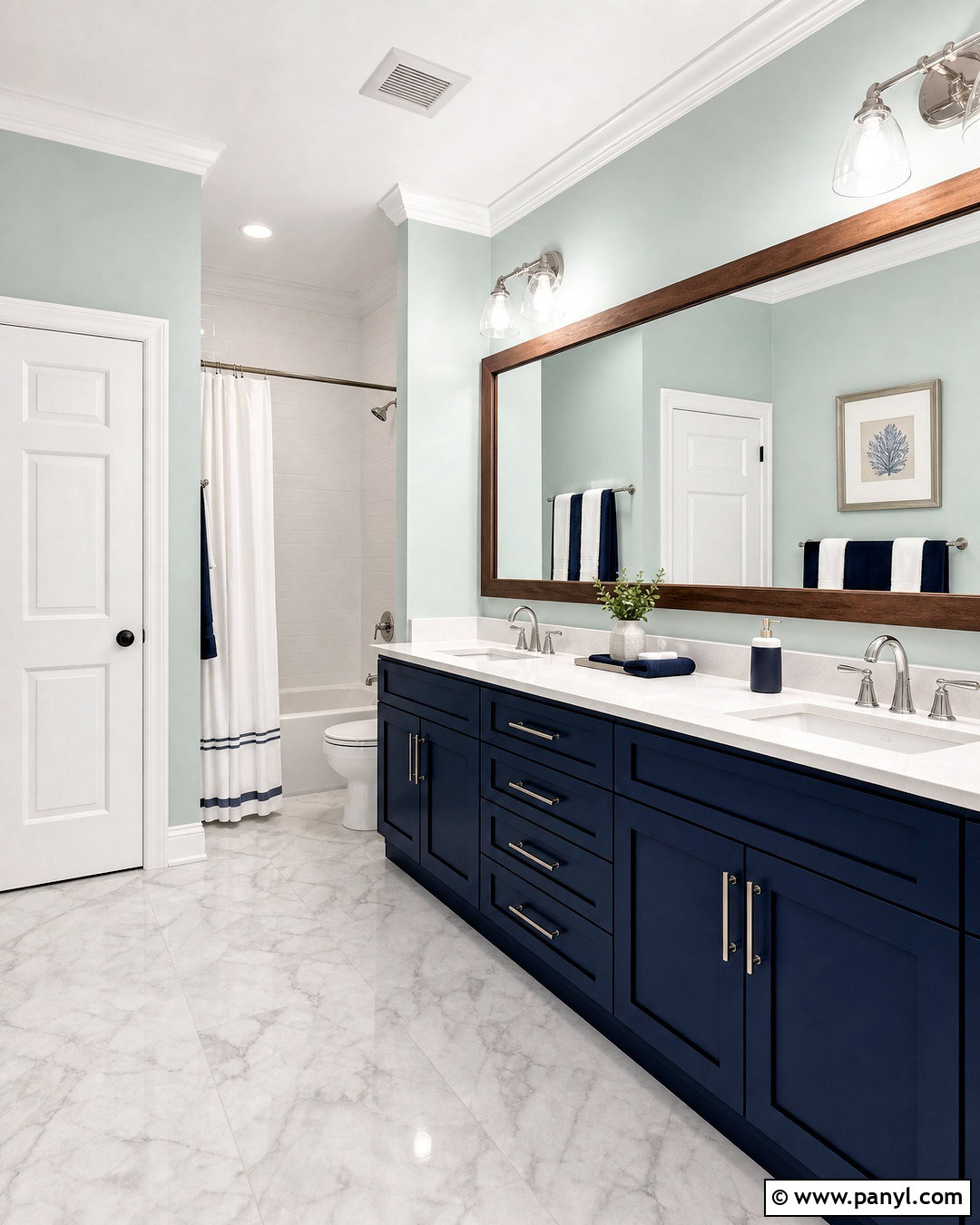
Naval SW 6244 transforms Sea Salt into a higher-contrast palette with classic depth. In a bathroom, cover the main walls with Sea Salt and use Naval on a double vanity or tall linen cabinet. Add white quartz counters, polished nickel faucets, marble-look floor tile, and bright white trim. A large wood-framed mirror introduces warmth, while navy-and-cream towels repeat the cabinetry color. Keep the darkest shade below eye level when possible so the room remains open rather than enclosed. Naval provides enough weight to anchor Sea Salt’s light appearance, particularly in a room with strong daylight. The completed bathroom feels tailored and substantial, yet Sea Salt prevents the deep blue cabinetry and stone finishes from becoming too formal or visually heavy.
12. Sea Salt And Charcoal Blue

Charcoal Blue SW 2739 is a sophisticated dark partner that highlights Sea Salt’s blue undertone while providing strong architectural contrast. Sherwin-Williams color experts have suggested deep shades such as Charcoal Blue for adding dimension without overpowering Sea Salt. () Use Sea Salt on bedroom walls and Charcoal Blue on a paneled headboard wall, built-in wardrobes, or a window seat. Choose a camel leather bench, warm oak nightstands, white bedding, and muted blue-gray curtains. Antique brass sconces bring warmth to the cool palette. Limit additional patterns to one striped rug or a few block-print pillows. The dark blue becomes the room’s visual anchor, while Sea Salt keeps the surrounding surfaces relaxed, light, and suitable for everyday living.
13. Sea Salt And Cityscape
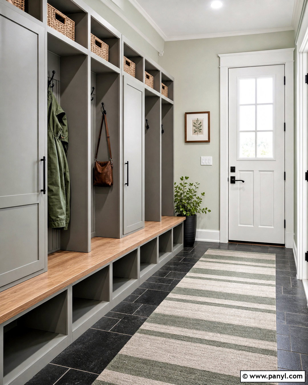
Cityscape SW 7067 gives Sea Salt a graphite-gray companion that feels modern without appearing completely black. It is another deeper color recommended for bringing balance and definition to Sea Salt’s subtle character. () Design a mudroom with Sea Salt walls, Cityscape lockers and lower cabinets, and durable slate-look flooring. Add a natural oak bench, woven baskets, matte-black hooks, and warm white ceiling paint. The darker built-ins conceal everyday wear, while the pale green walls prevent the hardworking area from feeling cramped. Use closed storage below and open cubbies above to keep the layout practical. A striped indoor-outdoor runner combining gray, cream, and green completes the space. The entire scheme feels organized, durable, and visually connected to nearby neutral rooms.
14. Sea Salt And Iron Ore
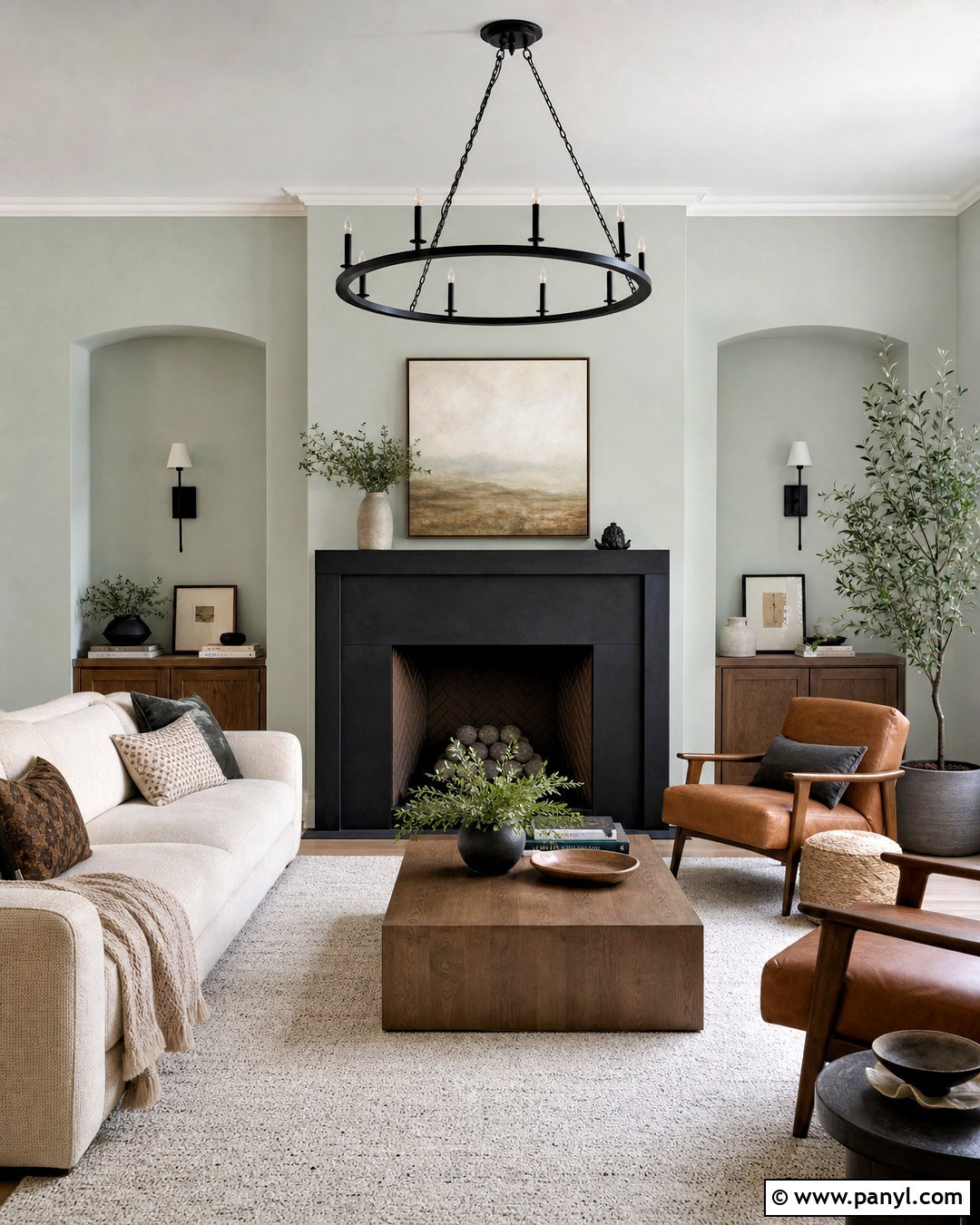
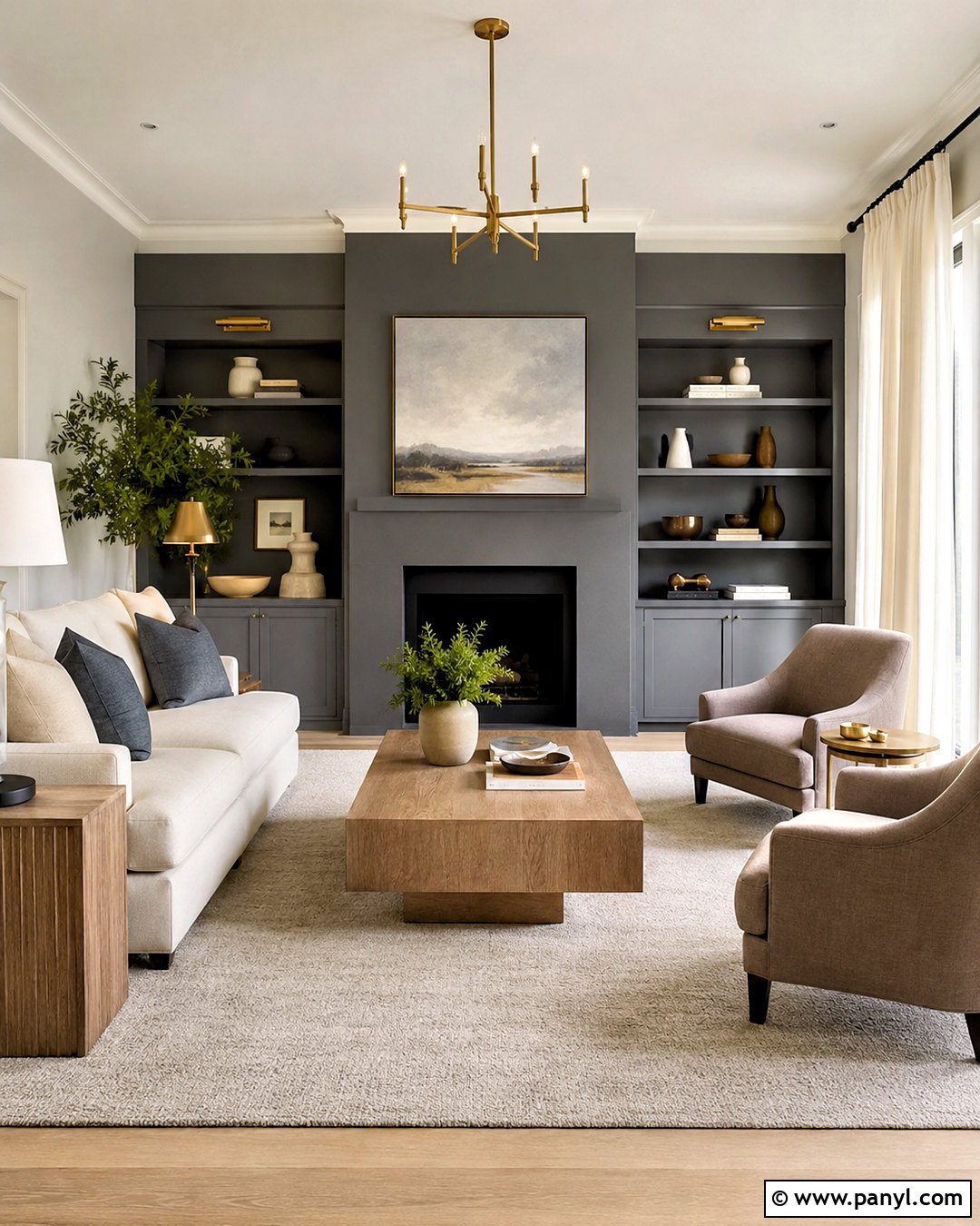
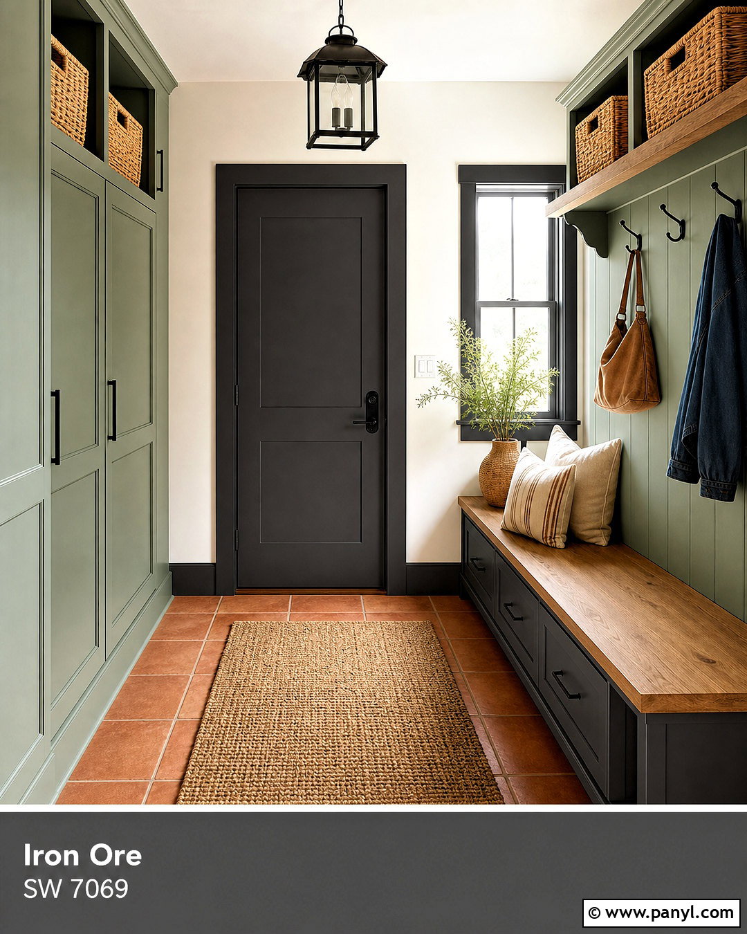
Iron Ore SW 7069 creates dramatic contrast that works particularly well when used on a defined architectural feature. In a Sea Salt living room, paint the fireplace surround, interior doors, or a wall of lower built-ins in Iron Ore. Keep the ceiling and remaining trim soft white. Furnish the space with a cream sofa, caramel leather chairs, walnut tables, and a warm ivory rug. Blackened metal lighting can repeat the dark paint, but use it sparingly so the room does not become too severe. Large windows and light textiles help Sea Salt retain its soft green quality. The finished design feels contemporary and grounded, with Iron Ore providing a clear focal point and the natural wood tones easing the transition between pale and dark surfaces.
15. Sea Salt And Urbane Bronze

Urbane Bronze SW 7048 brings rich, earthy depth to Sea Salt and works especially well with wood, stone, and woven finishes. Use Sea Salt on sunroom walls and Urbane Bronze on French doors, window frames, or a substantial built-in cabinet. Add a warm taupe sofa, teak coffee table, cane lounge chairs, and a cream performance-fabric rug. Terracotta planters and abundant green foliage connect the indoor palette to the outdoor view. Keep window treatments light so the deeper brown-gray paint does not absorb too much daylight. This room should feel natural rather than overly polished. By balancing the cool wall color with brown-black accents and sun-warmed materials, the palette creates a grounded retreat that remains bright, relaxed, and comfortable.
16. Sea Salt And Evergreen Fog
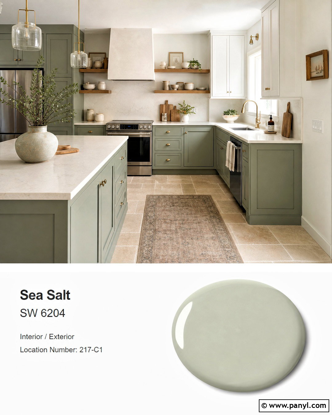
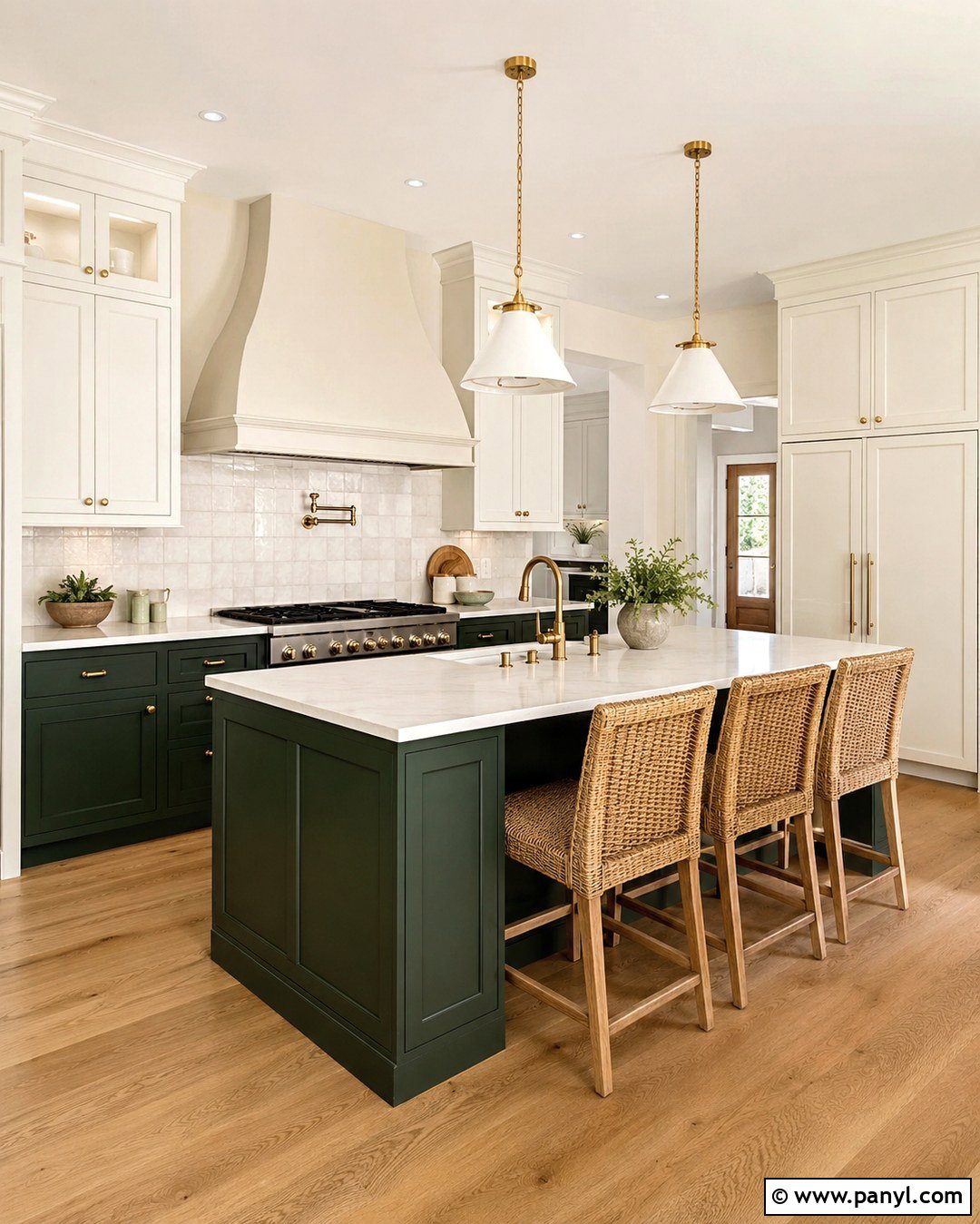
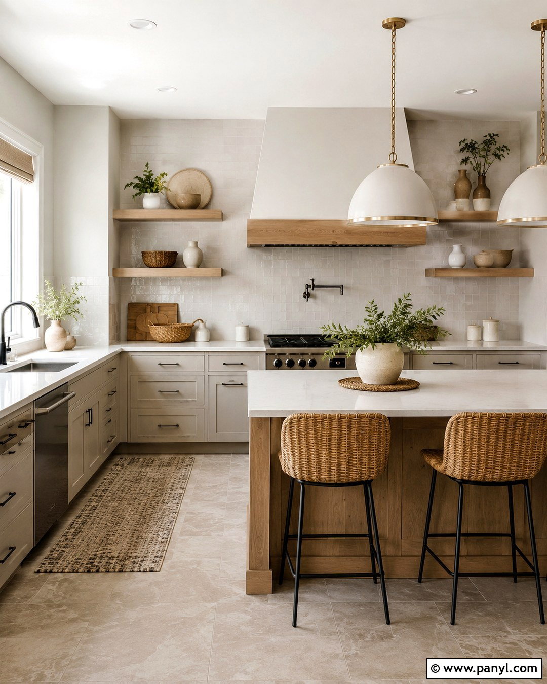
Evergreen Fog SW 9130 produces a layered green palette with enough difference in depth to keep the room visually interesting. Paint kitchen walls Sea Salt and use Evergreen Fog on lower cabinetry or a generous island. Choose warm white upper cabinets to prevent the green from becoming excessive. Cream quartz counters, aged brass hardware, oak shelves, and limestone-look flooring add warmth and texture. Display neutral pottery, wood boards, and clear glass rather than introducing several unrelated accent colors. Because both paints are muted, the combination feels coordinated rather than sharply contrasting. Sea Salt opens the surrounding walls, while Evergreen Fog adds weight to the working surfaces. This complete kitchen feels organic, current, and welcoming without depending on short-lived decorative trends.
17. Sea Salt And Pewter Green
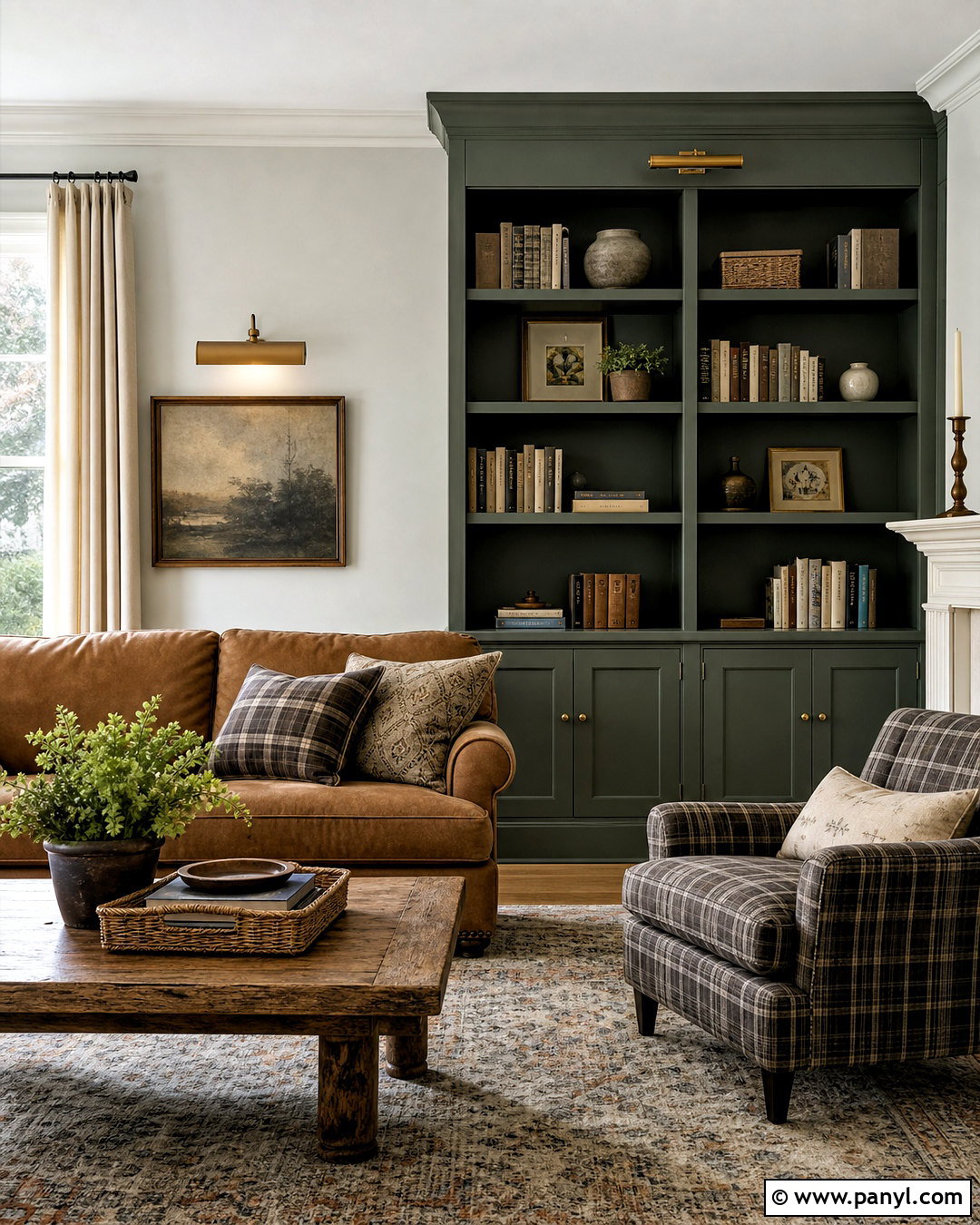
Pewter Green SW 6208 offers a deeper, more traditional green that gives Sea Salt a strong but related companion. Create a library-inspired family room with Sea Salt walls and floor-to-ceiling Pewter Green bookcases. Add a camel leather sofa, plaid wool chair, antique brass picture lights, and a distressed oak coffee table. Cream curtains and a faded Persian-style rug lighten the dark built-ins while introducing subtle pattern. Arrange books, pottery, and framed art in balanced groups instead of filling every shelf. The repeated green family makes the room cohesive, yet the large difference in value provides necessary dimension. Sea Salt keeps the space airy, while Pewter Green establishes a cozy focal point suitable for reading, conversation, and relaxed evenings at home.
18. Sea Salt And Rainwashed
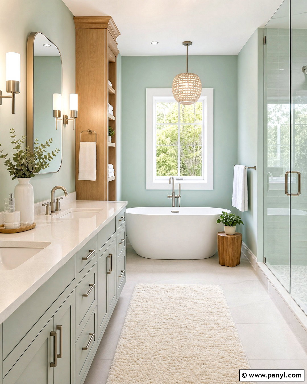
For a breezy monochromatic scheme, pair Sea Salt with Rainwashed SW 6211. Rainwashed is more noticeably blue-green, so it should be used where its stronger color can create purposeful separation. Paint the main bathroom walls Sea Salt and apply Rainwashed to the vanity, a freestanding storage cabinet, or the wall surrounding a soaking tub. Use white quartz, pale porcelain tile, brushed nickel hardware, and natural maple accents to maintain brightness. White towels and a cream bath mat provide visual rest. Avoid mixing in additional saturated blues or greens, which could make the palette feel busy. The closely related colors form a smooth, spa-like progression, while clean white surfaces and light wood keep the completed bathroom fresh and practical.
19. Sea Salt And Cavern Clay
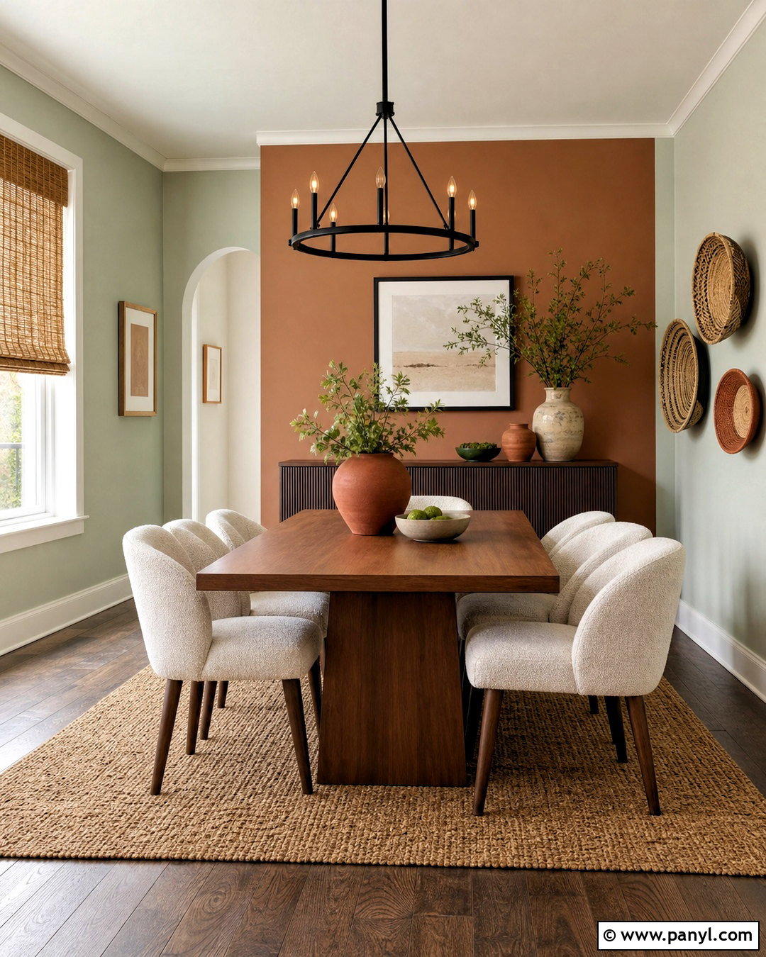
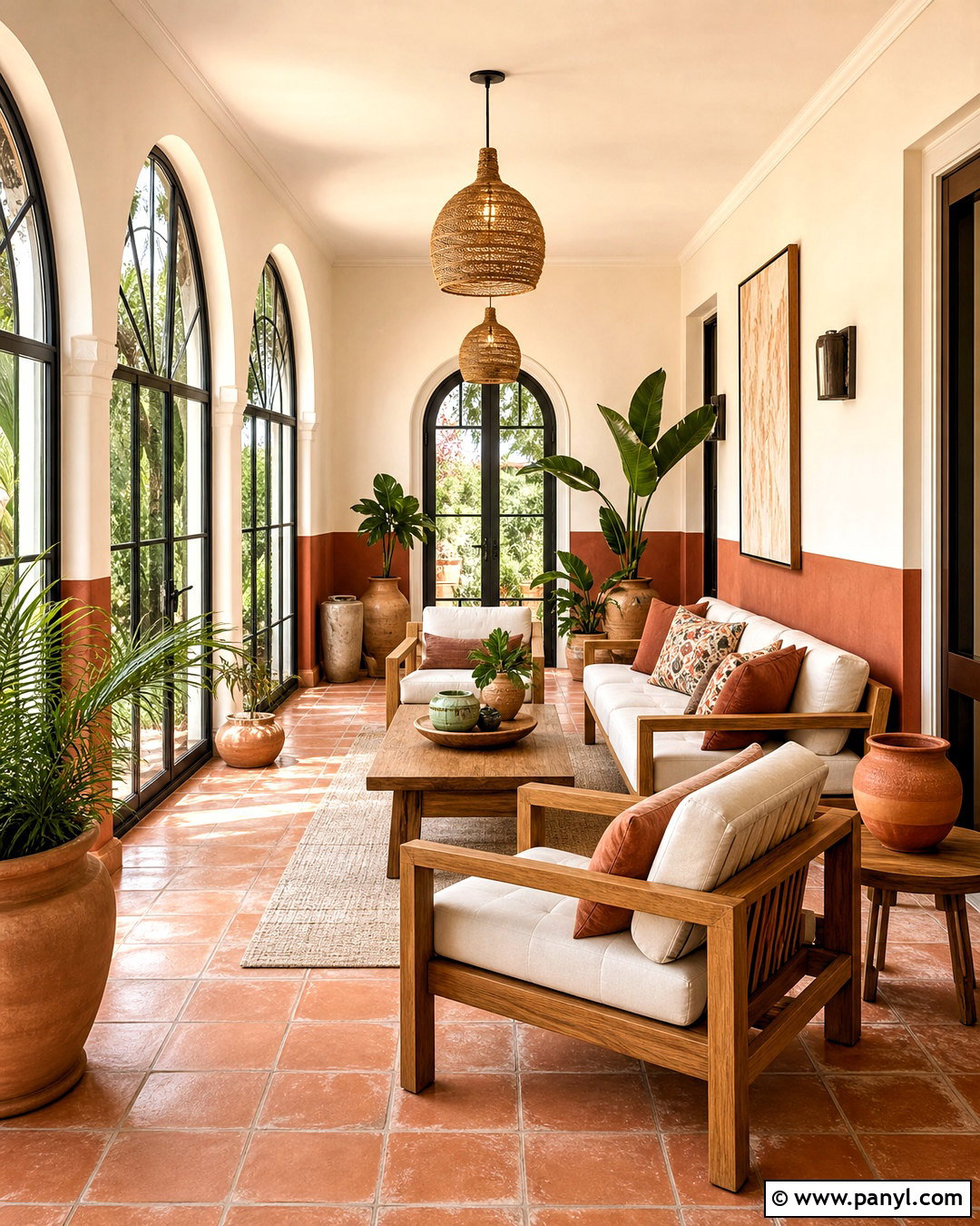
Cavern Clay SW 7701 is a warm terracotta shade that creates an energetic yet earthy contrast with Sea Salt. Use Sea Salt on dining room walls and introduce Cavern Clay through a painted buffet, an arched niche, or the wall behind open shelving. Ground the room with a walnut dining table, cream upholstered chairs, woven shades, and a natural jute rug. Black metal lighting adds structure, while ceramic pieces in rust, ivory, and muted green connect the palette. Because the colors sit on warm and cool sides of the scheme, repeat each one in small amounts around the room. The final look feels lively and balanced, with Sea Salt supplying softness and Cavern Clay bringing sunbaked warmth and personality.
20. Sea Salt And Redend Point
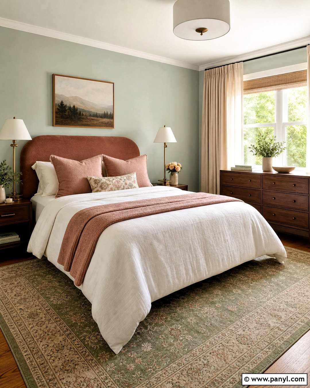
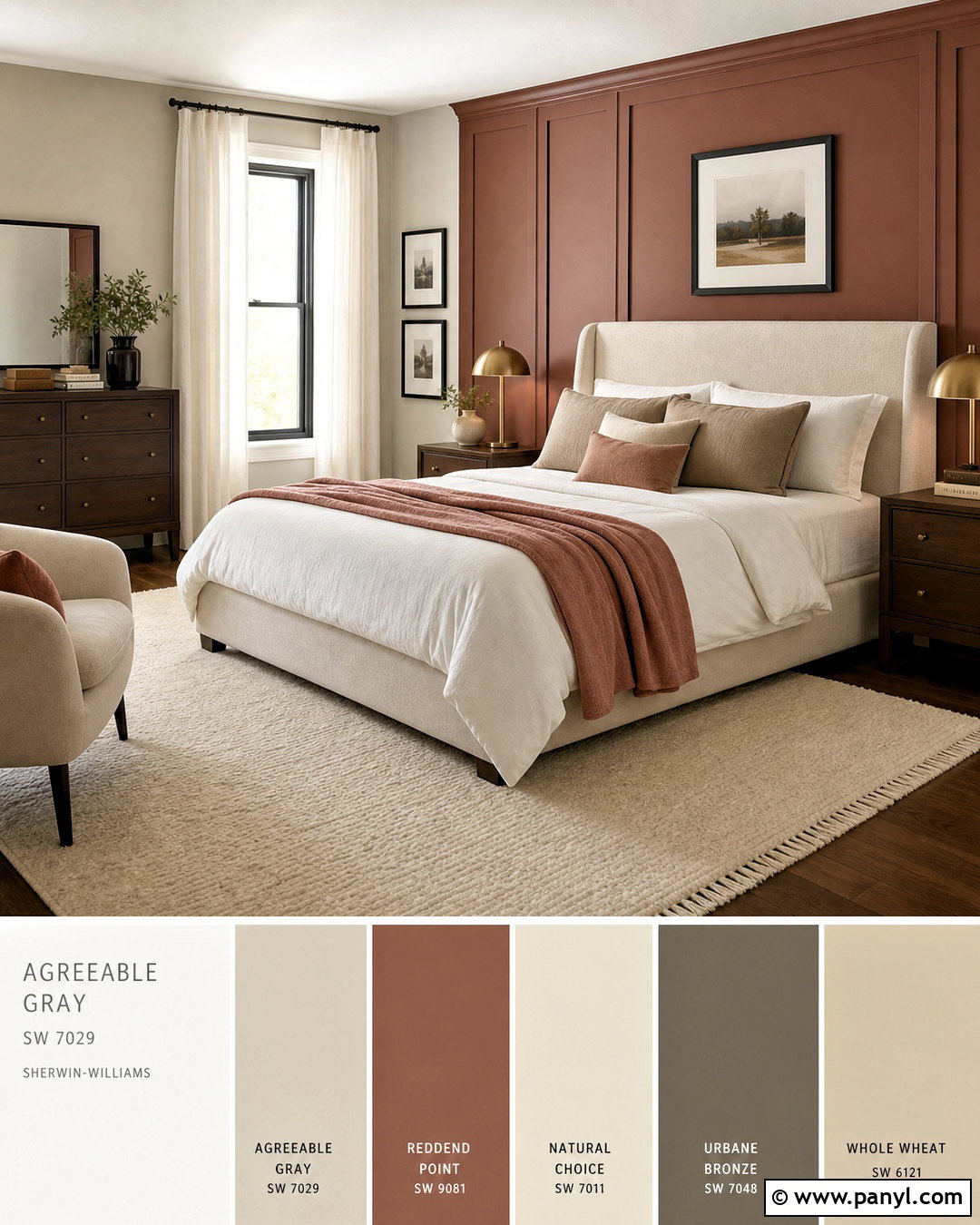
Redend Point SW 9081 brings a muted rosy-brown warmth that makes Sea Salt feel sophisticated and less predictably coastal. In a guest bedroom, paint the walls Sea Salt and use Redend Point on a wide upholstered headboard, painted dresser, or compact reading nook. Add walnut furniture, creamy white bedding, dusty rose pillows, and a patterned rug combining sage, blush, and beige. Aged brass lamps and linen curtains reinforce the gentle warmth. Keep the ceiling and trim light so the room remains open. This pairing works because both colors are softened rather than intensely saturated. Sea Salt contributes freshness, while Redend Point adds a comfortable earthy note. Together, they create a distinctive guest space that feels restful, coordinated, and thoughtfully finished.
Conclusion:
Choosing among these 20 sea salt coordinating colors becomes easier when you consider light, fixed finishes, and the mood you want to create. Soft whites produce a bright, airy result, while beige and greige add warmth and flexibility. Navy, charcoal, and deep green provide contrast for cabinets, doors, or feature walls. Earthy terracotta and rosy brown create a warmer, more distinctive direction. Build each palette as a complete design by repeating colors through textiles, furniture, flooring, hardware, and decor. Most importantly, test every paint beside your permanent materials at different times of day. Sea Salt can shift between green, blue, and gray, so thoughtful sampling is essential for a balanced finished room.

Related Ideas and Inspiration:


Leave a Reply