
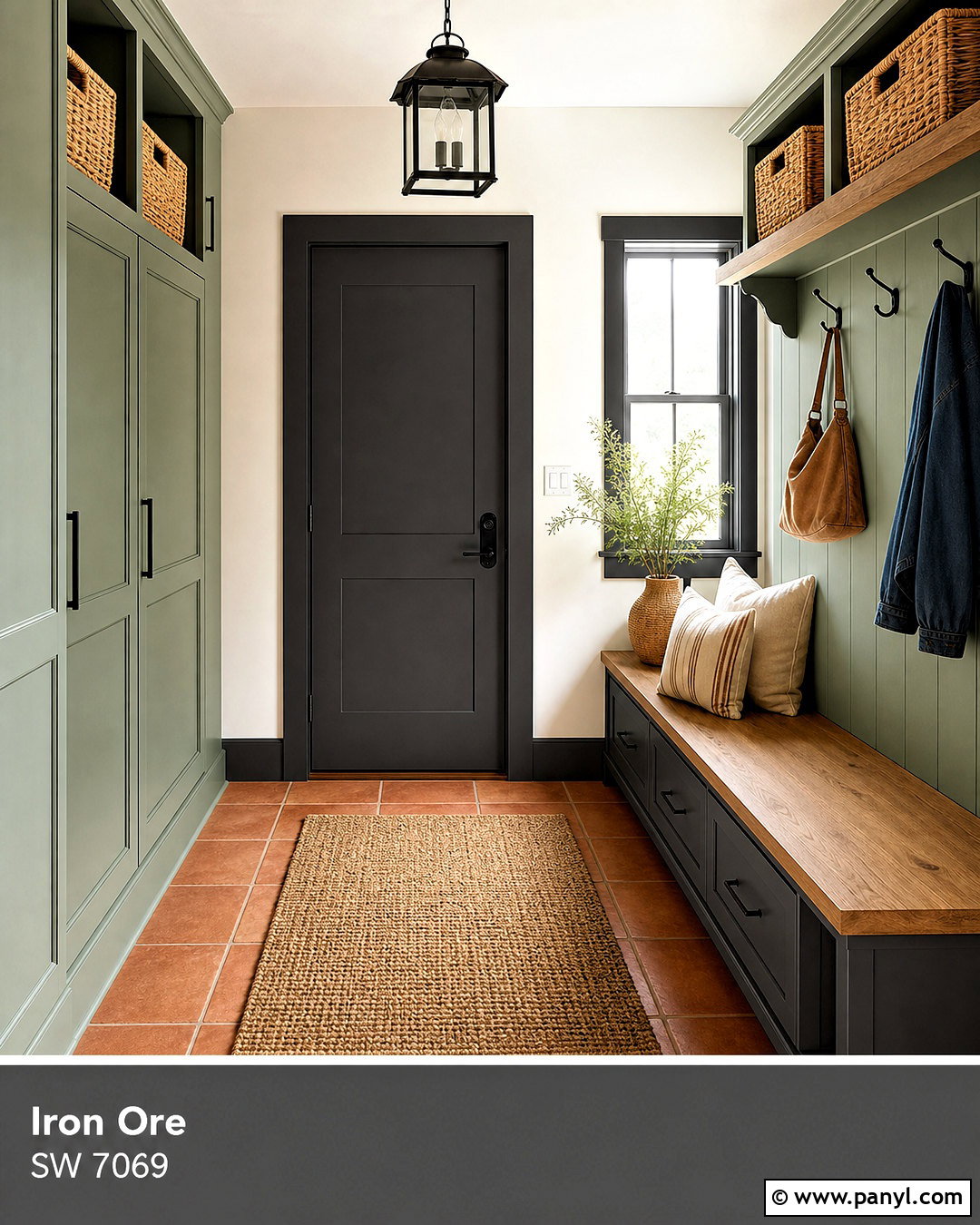
Sherwin-Williams Iron Ore is a deep charcoal neutral that brings definition, sophistication, and contrast to interiors and exteriors. If you are searching for **20 iron ore complimentary colors**, the strongest choices include soft whites, warm neutrals, earthy greens, muted blues, and sunbaked accent shades. Sherwin-Williams officially pairs Iron Ore with Nebulous White, Extra White, and Cityscape, but its versatility allows many broader palettes. () The key is balancing its visual weight with lighter surfaces, natural texture, and intentional lighting. You should also test samples because surrounding materials and daylight can change how dark colors appear. The complete room and exterior schemes below offer practical ways to decorate with **20 iron ore complimentary colors**.
1. Iron Ore And Alabaster
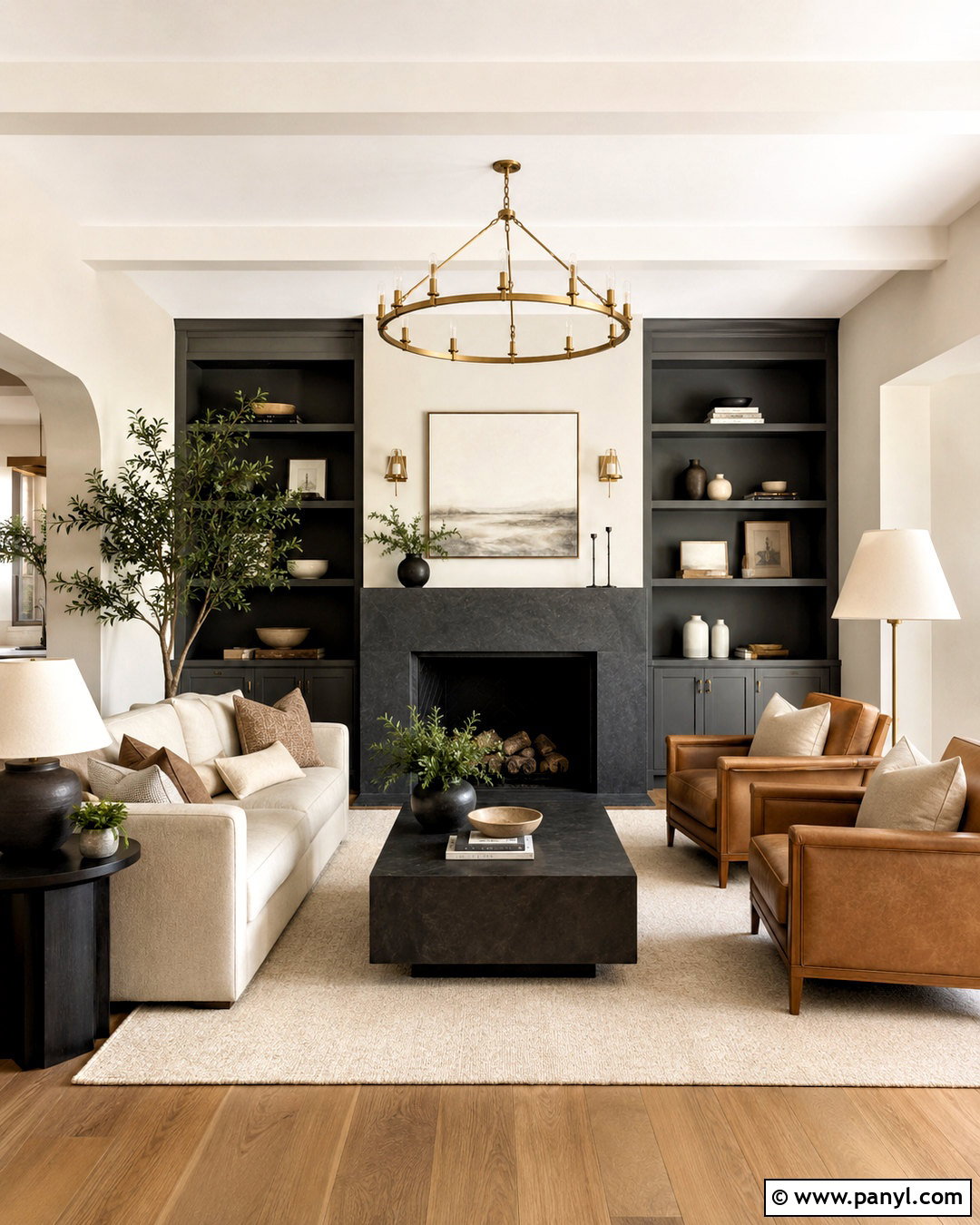
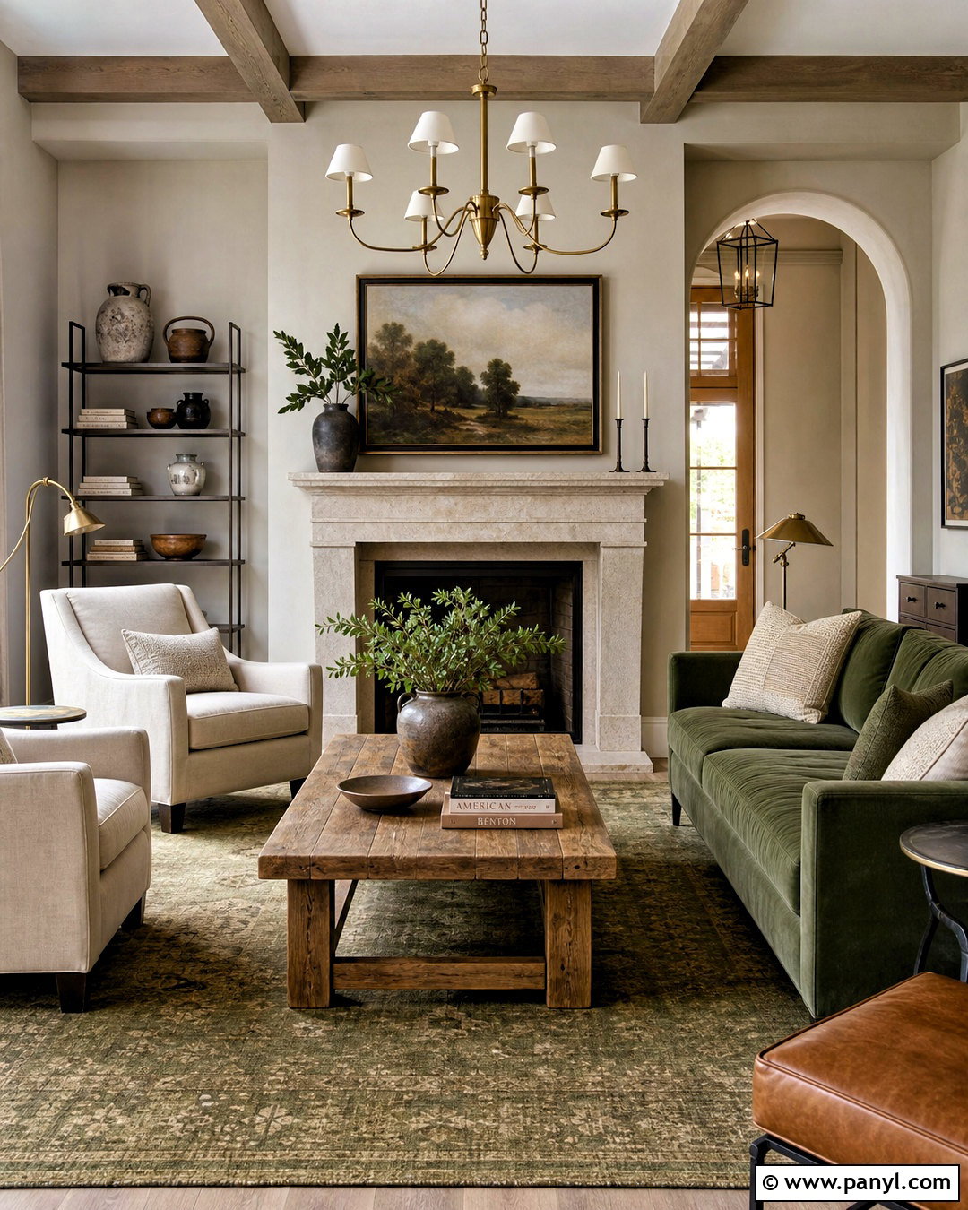
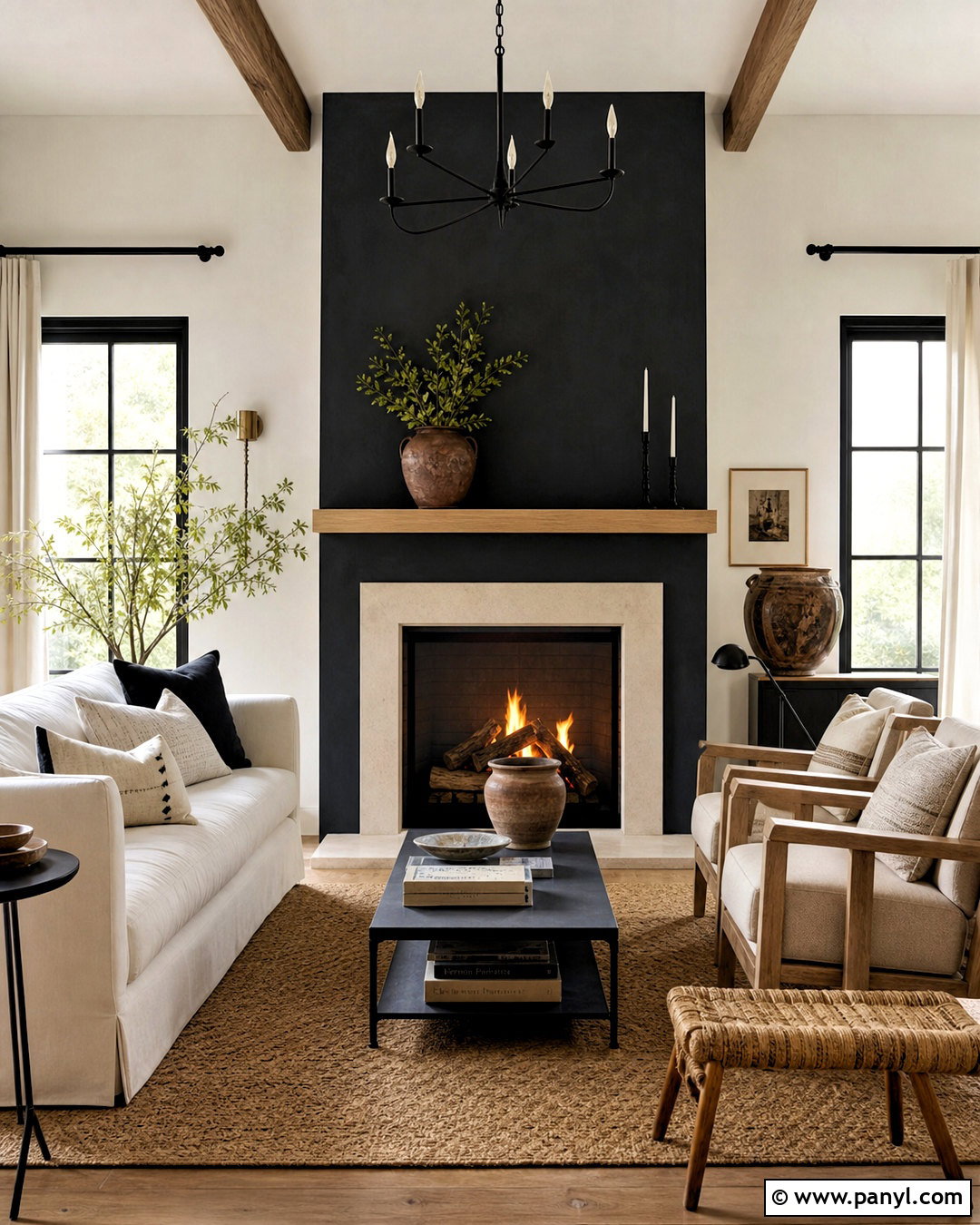
Alabaster gives Iron Ore a warmer, softer contrast than a stark white. Use Alabaster on the main walls of a living room, then feature Iron Ore on built-in bookcases, the fireplace surround, or one architectural wall. A warm oak floor keeps the palette natural, while an oatmeal sofa prevents the room from looking overly black and white. Add camel leather chairs, cream curtains, and a textured ivory rug for gentle layers. Brushed brass lighting introduces warmth without competing with the dark paint. For a balanced layout, place the darkest elements around the room rather than concentrating them in one corner. This combination suits transitional, farmhouse, organic modern, and updated traditional homes.
2. Iron Ore And Extra White
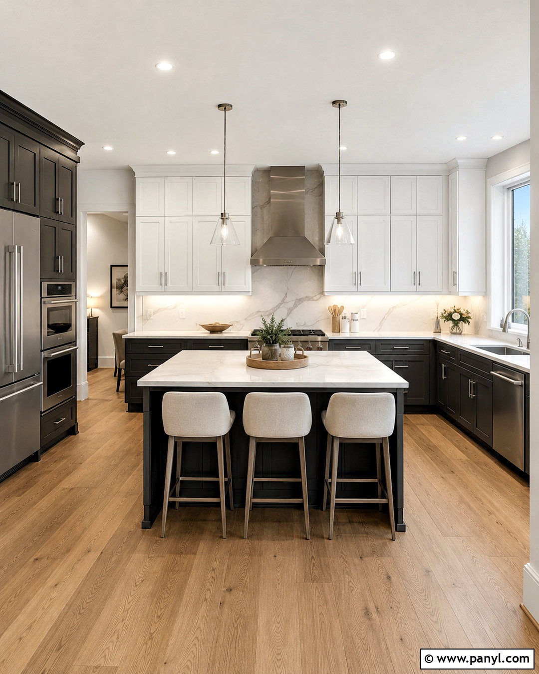
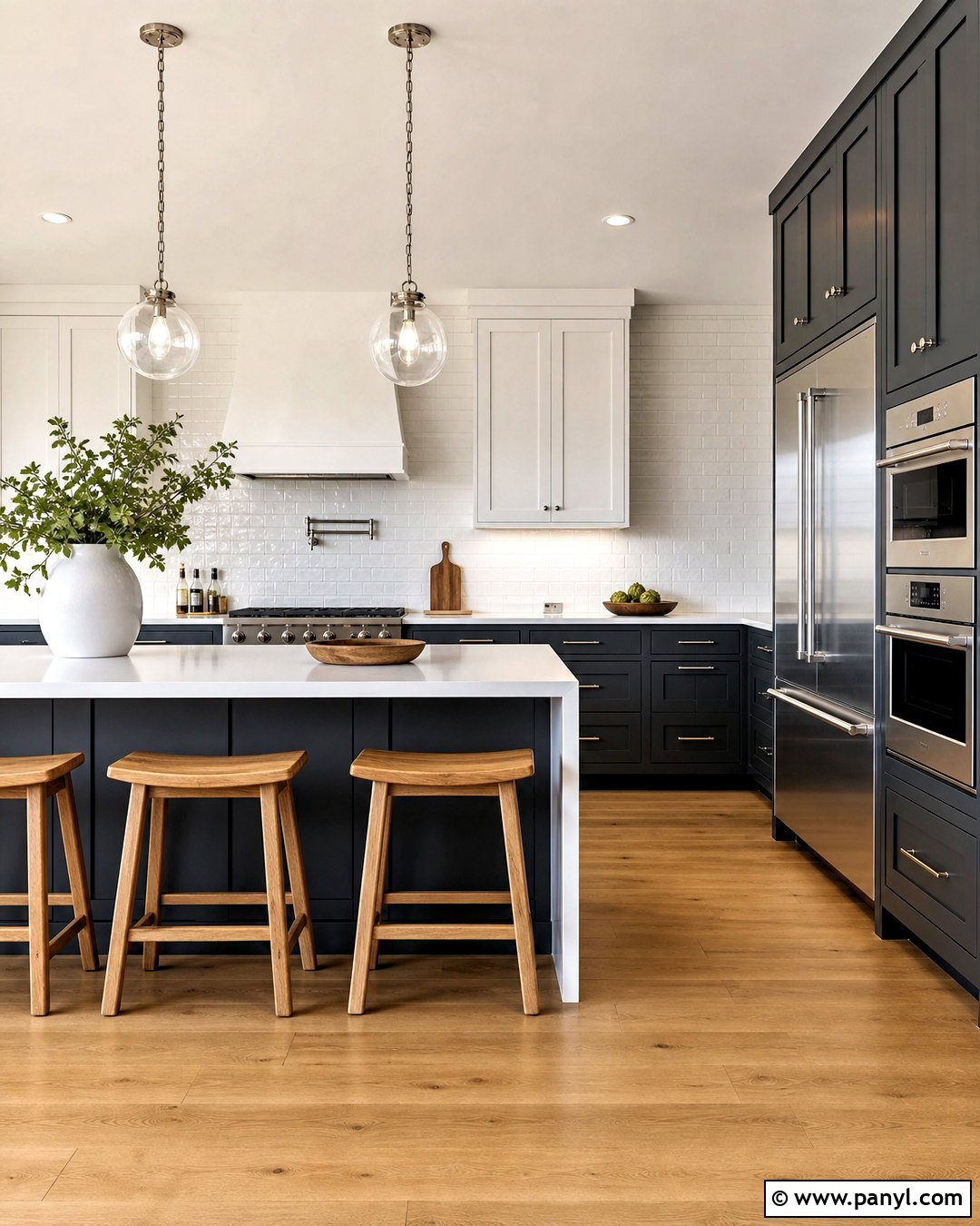
Extra White creates a clean, graphic palette that works especially well in modern kitchens. Paint the upper cabinets and walls Extra White, then use Iron Ore on the lower cabinets and island. White quartz counters with subtle gray veining connect both colors without adding visual clutter. Choose light oak flooring to warm the scheme, along with brushed nickel hardware and simple glass pendants. Black stools can blend into the island, while pale gray upholstery adds a softer layer. Keep the backsplash white and streamlined so the Iron Ore cabinetry remains the main feature. This high-contrast combination is best in kitchens with generous windows or strong overhead lighting, since the dark lower cabinetry absorbs considerable light.
3. Iron Ore And Nebulous White
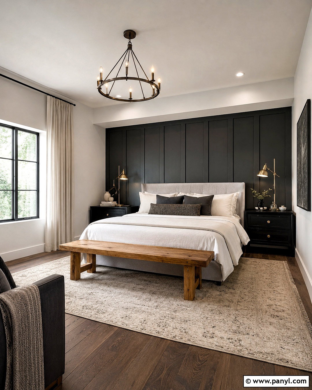
Nebulous White and Iron Ore form a calm gray-white palette with less contrast than a bright white pairing. Try Nebulous White across bedroom walls and ceilings, then use Iron Ore on a paneled headboard wall. An upholstered bed in pale gray, white linen bedding, and a medium oak bench keep the room relaxed. Bring in soft blue-gray pillows and a woven cream rug to highlight the cooler side of the palette. Matte black bedside tables can connect visually with the accent wall, while brushed brass lamps prevent the room from feeling cold. Finish with full-height white curtains and restrained landscape artwork. The result feels peaceful, polished, and suitable for a contemporary or transitional bedroom.
4. Iron Ore And Cityscape
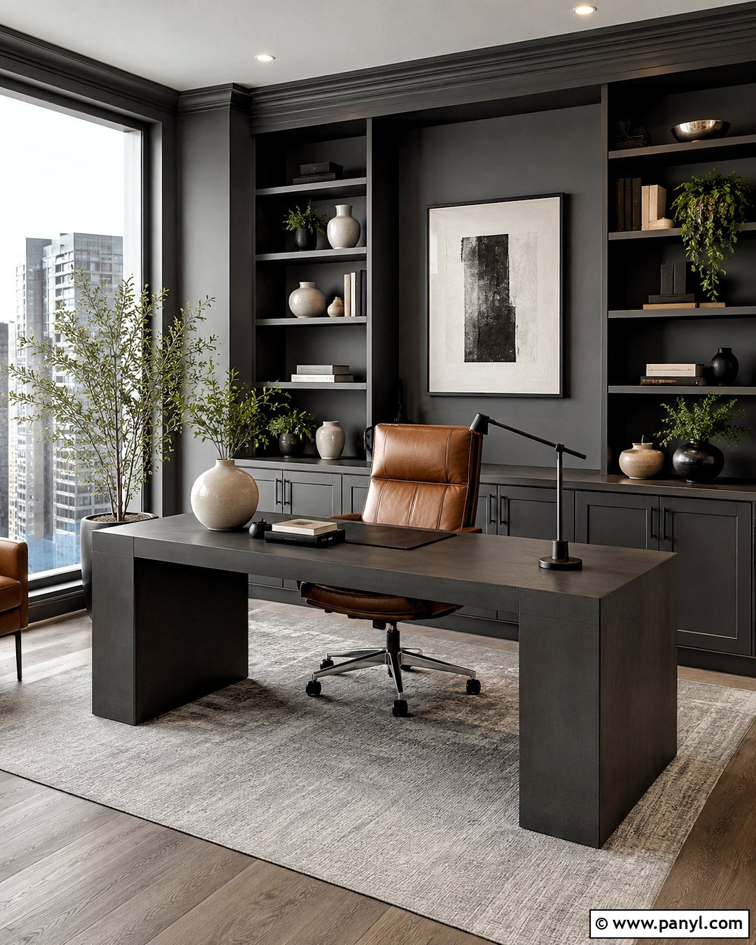
For a layered monochromatic room, combine Iron Ore with Cityscape and several lighter gray surfaces. Paint a home office in Cityscape, then use Iron Ore on built-in shelving, the desk, and the interior door. A pale gray rug and light ash flooring stop the darker colors from overpowering the space. Choose a cognac leather desk chair to introduce warmth, then add cream ceramics, black frames, and small green plants. Keep shelves partly open rather than filling every inch. This allows the dark cabinetry to remain visible and defined. A large window, white ceiling, and directional task lighting are essential. This tailored palette creates a focused workspace without relying on bright or distracting accent colors.
5. Iron Ore And Pure White
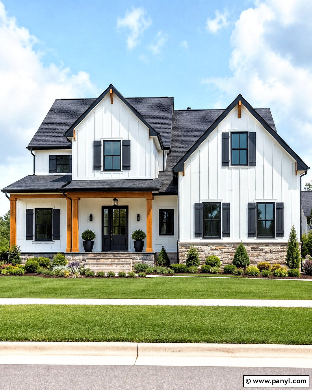
Pure White offers a balanced backdrop that is neither overly creamy nor sharply cool. On a home exterior, use Pure White for the siding and Iron Ore for window frames, shutters, gutters, and the front door. A medium charcoal roof anchors the palette, while natural stone around the foundation introduces beige and gray variation. Warm cedar porch columns prevent the facade from looking flat. Continue the contrast with black planters, simple exterior lights, and a pale concrete walkway. Landscaping should include rounded evergreen shrubs, ornamental grasses, and white flowering plants. This full exterior scheme works on farmhouse, craftsman, colonial, and contemporary homes because the restrained colors allow architectural lines and natural materials to stand out.
6. Iron Ore And Agreeable Gray
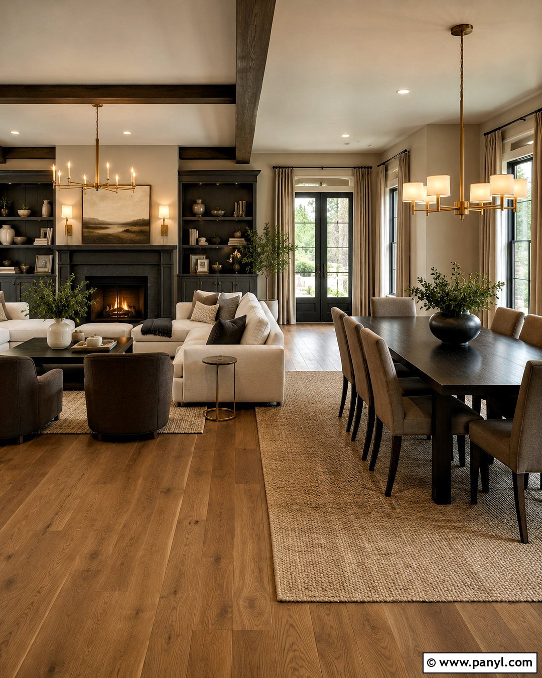
Agreeable Gray softens Iron Ore with a warm greige foundation, making the pairing comfortable in an open-plan living and dining area. Cover the main walls in Agreeable Gray and reserve Iron Ore for the fireplace, interior doors, and dining-room built-ins. Use medium oak flooring throughout to visually connect the spaces. A cream sectional, taupe dining chairs, and a natural jute rug create a gentle transition between light and dark. Add aged brass fixtures and linen window treatments for warmth. Small black accessories can repeat Iron Ore without overwhelming the rooms. This palette feels coordinated but not overly matched, which makes it useful when several connected areas need to share one practical, cohesive color story.
7. Iron Ore And Accessible Beige
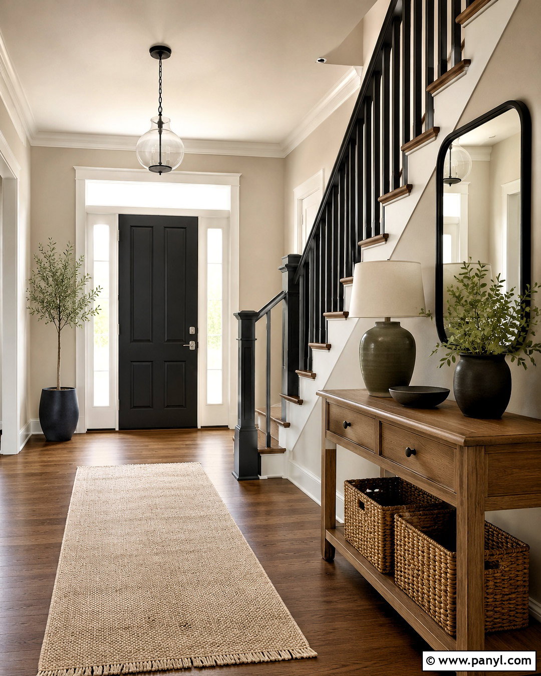
Accessible Beige brings warmth and everyday comfort to the depth of Iron Ore. Build a welcoming entryway with Accessible Beige walls, an Iron Ore front door, and matching dark stair railings. A natural oak console and woven storage baskets introduce texture, while a cream runner brightens the floor. Hang a large black-framed mirror above the console to repeat the door color and reflect daylight through the space. Add an olive ceramic lamp, warm white shade, and simple botanical branches. If the entry connects to a staircase, keep the risers creamy white and use medium-stained wood treads. This combination feels grounded and inviting, with enough contrast to define architectural details without making a compact entrance appear closed in.
8. Iron Ore And Natural Linen
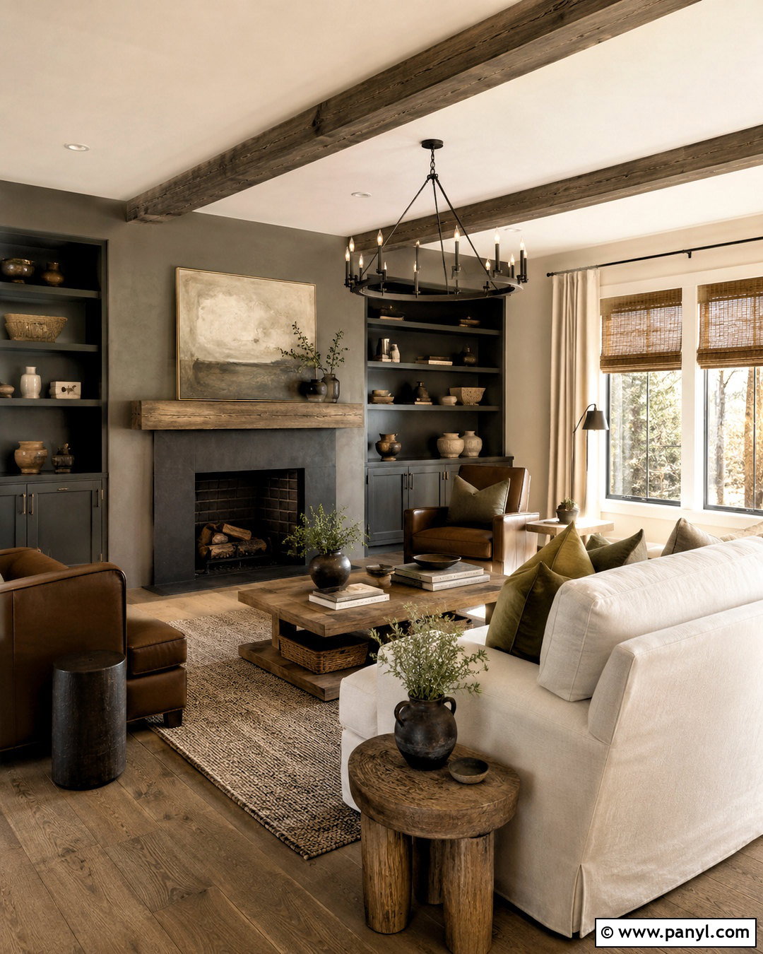
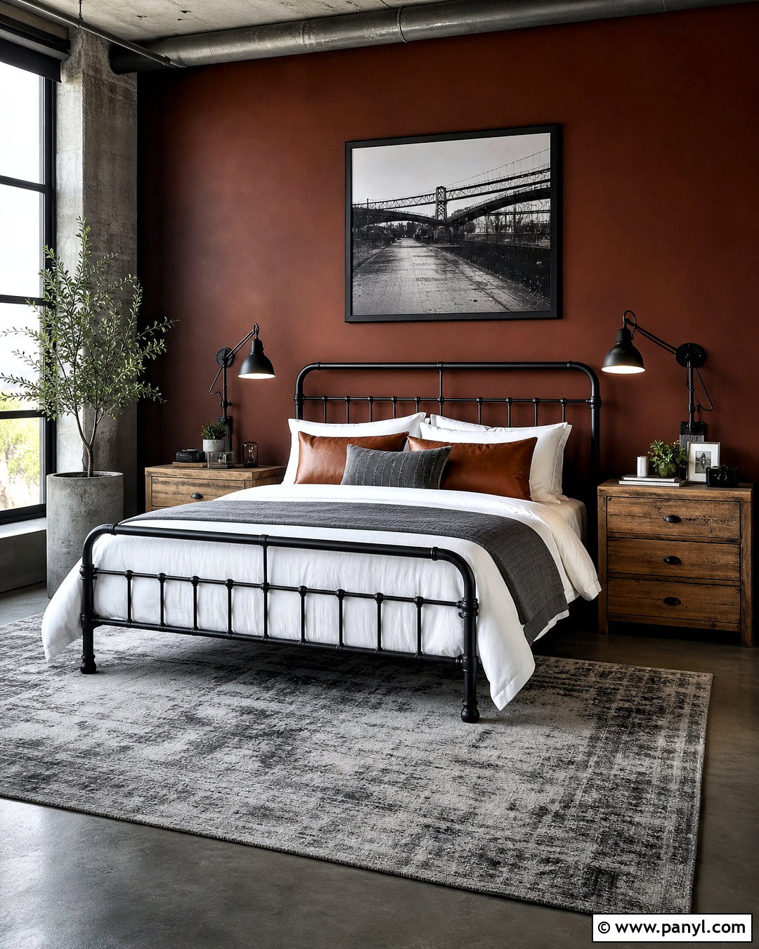
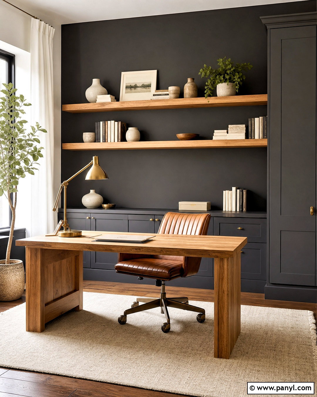
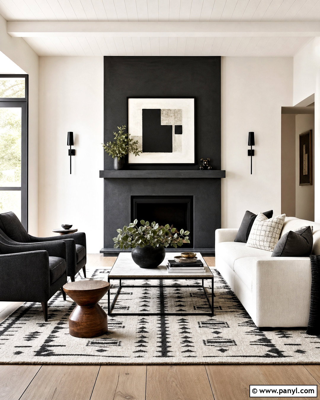
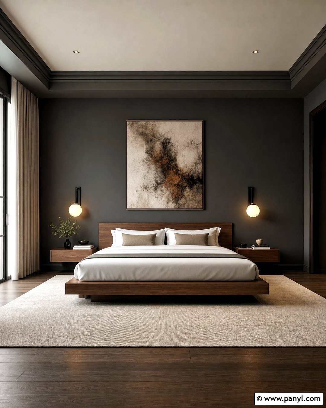
Natural Linen creates a relaxed, earthy background for Iron Ore in a cozy family room. Paint the walls Natural Linen and use Iron Ore on a wide media cabinet, window trim, or a low fireplace surround. Select a slipcovered cream sofa and place it opposite two warm brown leather chairs. A large wool rug in beige and charcoal will connect the seating area to the painted features. Introduce rustic oak side tables, woven shades, and linen curtains for a comfortable layered effect. Clay pottery and muted olive pillows provide quiet color. Keep the ceiling and crown molding warm white. The finished room feels casual and collected, making this pairing ideal for modern farmhouse, rustic, and organic interiors.
9. Iron Ore And Greek Villa
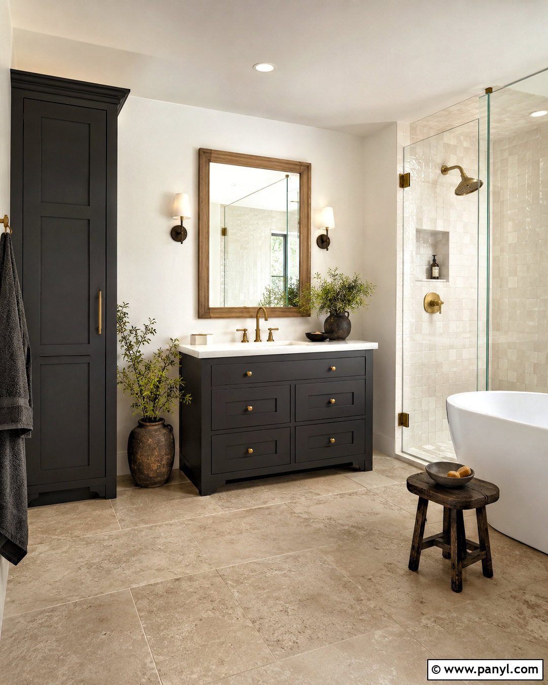
Greek Villa gives Iron Ore a creamy, sunlit contrast that works beautifully in a transitional bathroom. Use Greek Villa on the walls and ceiling, then paint the vanity and tall storage cabinet Iron Ore. Choose warm white quartz counters, handmade ivory backsplash tile, and brushed brass faucets. A light oak-framed mirror adds another warm surface and keeps the vanity from appearing too heavy. Continue the palette with beige floor tile, white towels, and a woven laundry basket. Clear glass shower panels preserve an open view through the room. Because Greek Villa has a soft appearance, it makes the dark cabinetry feel less severe than a crisp white would. The overall bathroom remains bright, warm, and refined.
10. Iron Ore And Sea Salt
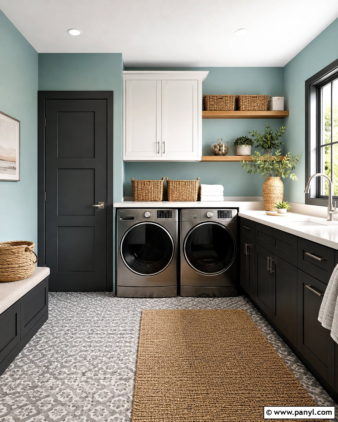
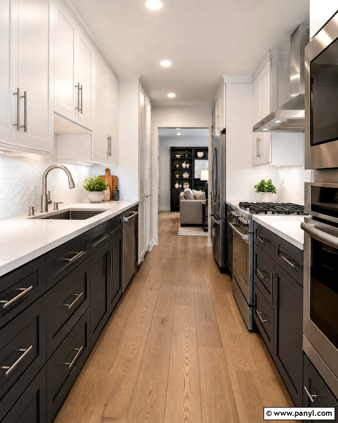
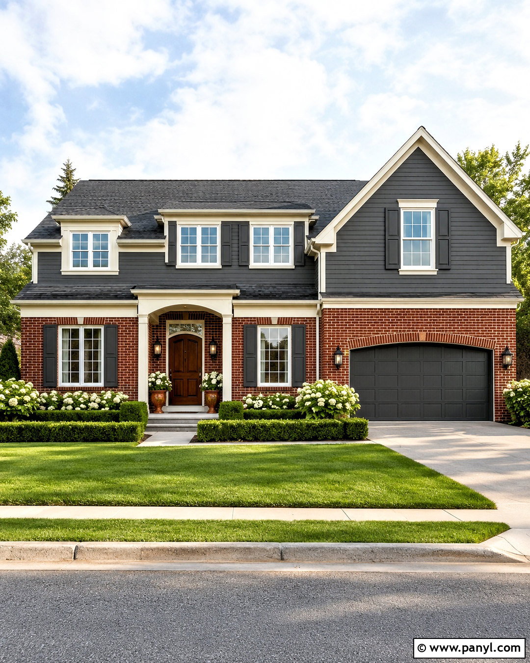
Sea Salt adds a quiet green-blue freshness that lightens the serious character of Iron Ore. In a laundry room, paint the walls Sea Salt and use Iron Ore on the lower cabinets, utility door, and open shelf brackets. White upper cabinets and pale quartz counters maintain brightness. Add a warm oak floating shelf above the washer and dryer for baskets, jars, and folded linens. A light gray patterned floor provides movement without introducing another dominant color. Choose brushed nickel hardware, simple white ceiling lights, and woven shades. This complete palette makes a practical room feel calm and organized. It is especially effective where natural light brings out the soft green quality of the walls.
11. Iron Ore And Evergreen Fog
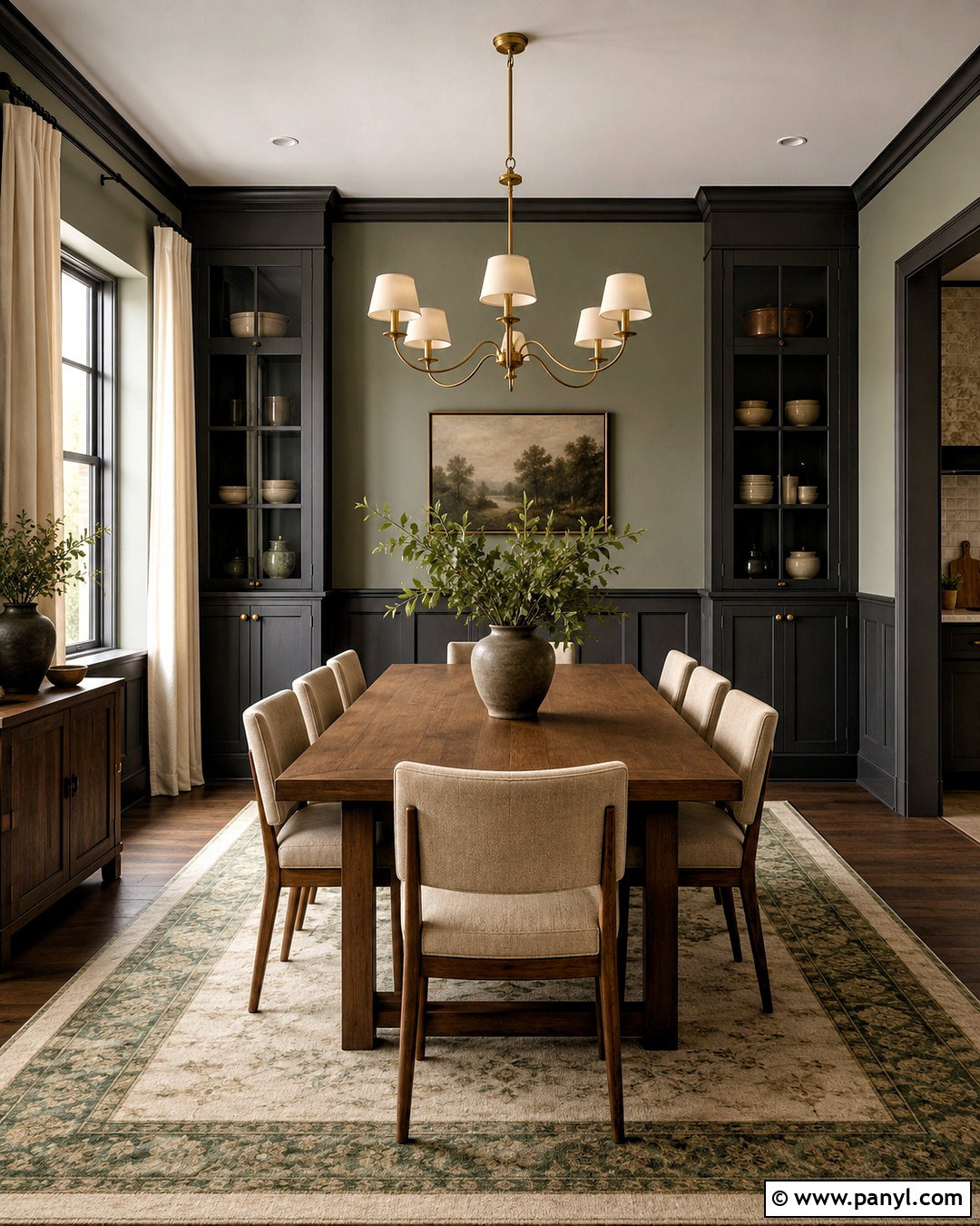
Evergreen Fog and Iron Ore create an earthy palette with enough depth for a sophisticated dining room. Paint the walls Evergreen Fog, then use Iron Ore on the lower wall paneling, built-in cabinet, or interior doors. Center a rectangular oak table beneath a simple aged brass chandelier. Upholster the dining chairs in warm beige fabric and place a muted green-and-cream rug underneath. Off-white curtains will frame the windows without adding sharp contrast. For decor, use stoneware, clear glass, and one large landscape print rather than several small accessories. The green walls soften the charcoal details, while natural wood prevents the scheme from becoming cool. This combination suits craftsman, organic modern, and transitional dining spaces.
12. Iron Ore And Sage Green
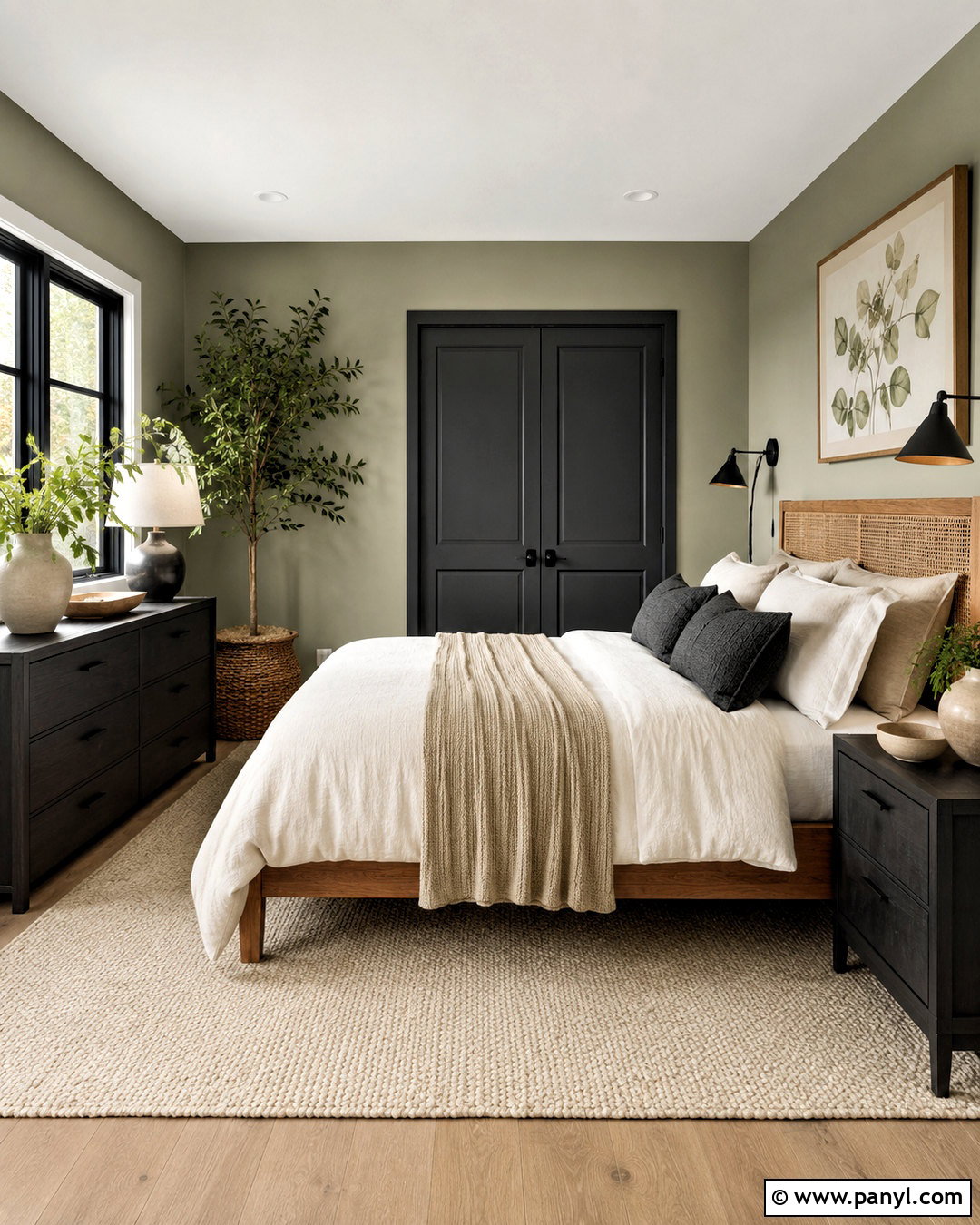
Soft sage green brings a garden-inspired quality to Iron Ore and works well in a restful guest bedroom. Use sage on all four walls and paint the closet doors, window trim, and narrow dresser Iron Ore. Choose an oak bed with a woven headboard to warm the room. Layer ivory bedding with sage quilts, charcoal pillows, and a lightweight beige throw. A cream wool rug will brighten the floor, while black reading sconces repeat the darker painted features. Add botanical artwork in light wood frames and simple ceramic lamps. Keep accessories minimal so the natural palette remains relaxing. The complete look feels fresh and welcoming, with Iron Ore supplying structure and sage providing softness.
13. Iron Ore And Dusty Blue
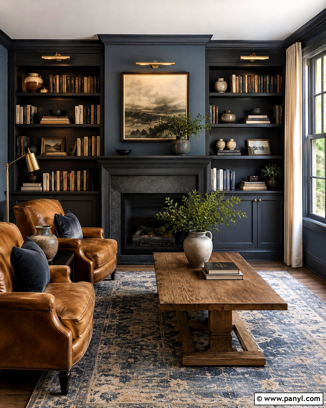
Dusty blue gives Iron Ore a classic, tailored character without creating harsh contrast. In a home library, cover the main walls in muted dusty blue and paint the bookcases, fireplace, and window frames Iron Ore. Arrange two camel leather chairs around a small round oak table. A faded blue-and-cream rug will reinforce the wall color while softening dark wood flooring. Use antique brass picture lights above the shelves and cream linen curtains around the windows. Books, framed photographs, and pottery can add character, but leave open space between collections. The combination feels comfortable rather than formal because the blue is subdued. It works particularly well in traditional, transitional, and English-inspired rooms.
14. Iron Ore And Deep Navy
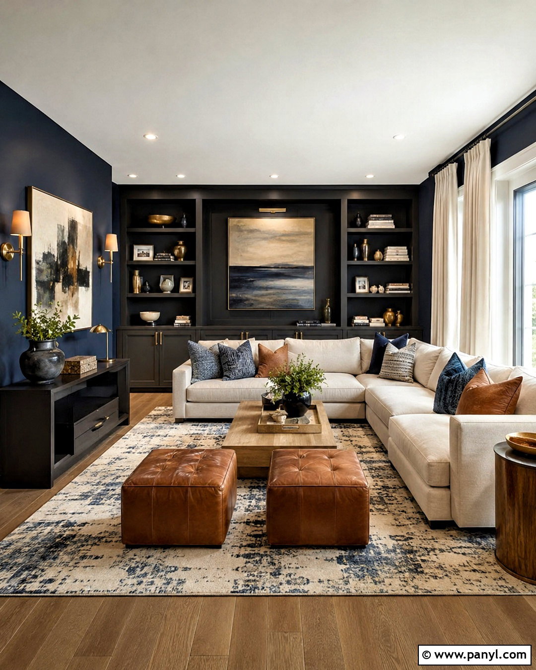
Deep navy and Iron Ore can share a room when lighter finishes clearly separate them. Create a dramatic den with navy walls, Iron Ore built-ins, and a bright white ceiling. Use a large oatmeal sectional as the main light element, then add medium oak tables and a cream-and-blue patterned rug. Cognac leather ottomans bring warmth and help distinguish the charcoal cabinetry from the blue walls. Choose aged brass sconces and picture lights so the darker paint colors remain visible after sunset. White curtains should extend from ceiling to floor to visually lift the room. This layered palette feels rich and immersive, but the generous pale upholstery, reflective metal, and natural wood keep it from becoming gloomy.
15. Iron Ore And Terracotta
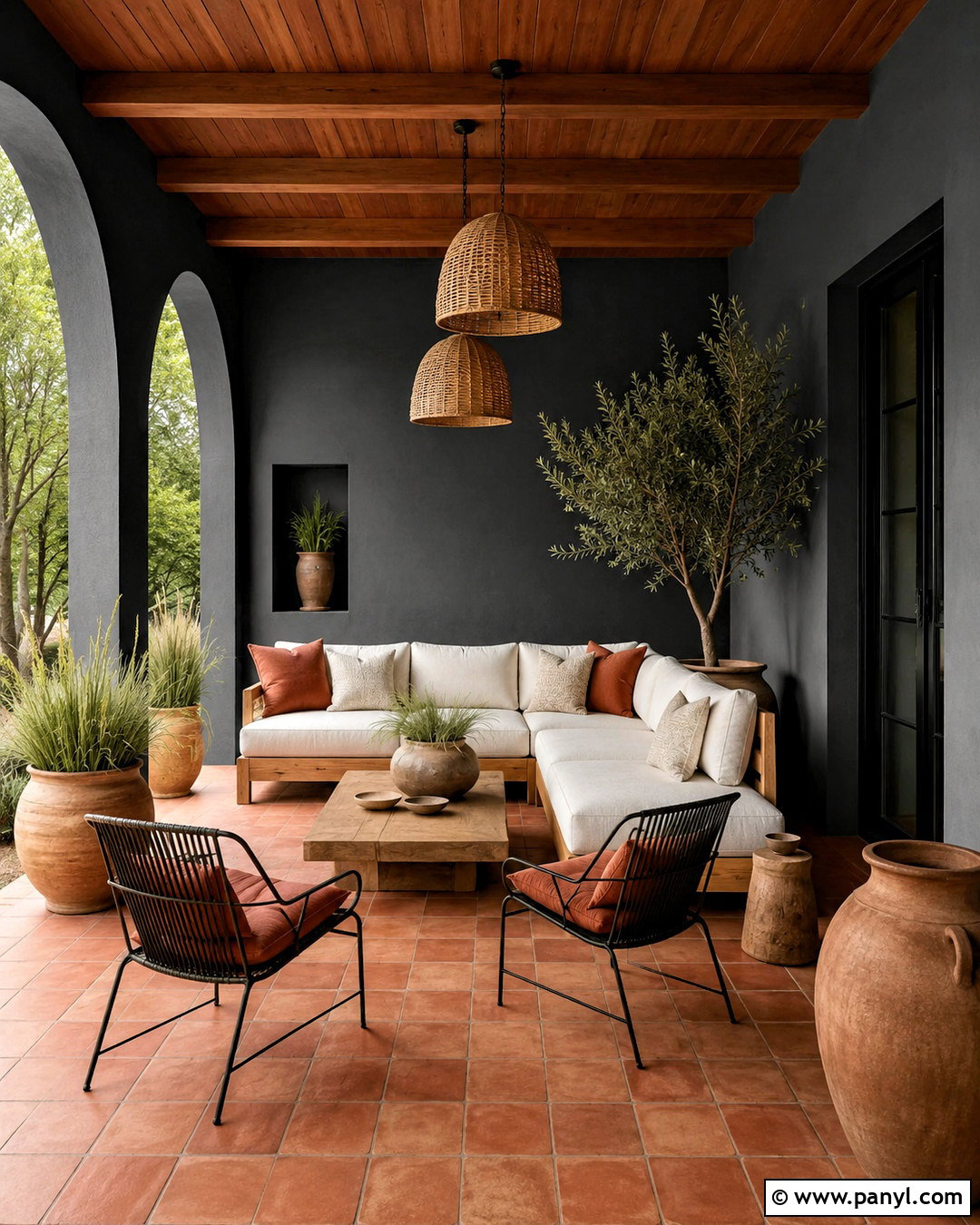
Terracotta adds sunbaked warmth and lively contrast to Iron Ore. Use this combination on a covered patio with an Iron Ore-painted exterior wall, terracotta floor tile, and cedar ceiling boards. Arrange a light beige outdoor sofa with rust, cream, and charcoal cushions. Black metal lounge chairs can repeat the wall color, while a natural teak coffee table keeps the seating area relaxed. Add large clay planters filled with olive trees, grasses, or drought-tolerant greenery. Cream outdoor curtains will soften the dark wall and provide shade. Finish with woven pendant lighting and a simple neutral rug. The complete design feels warm, grounded, and suitable for Mediterranean, Southwestern, or modern outdoor settings.
16. Iron Ore And Muted Blush
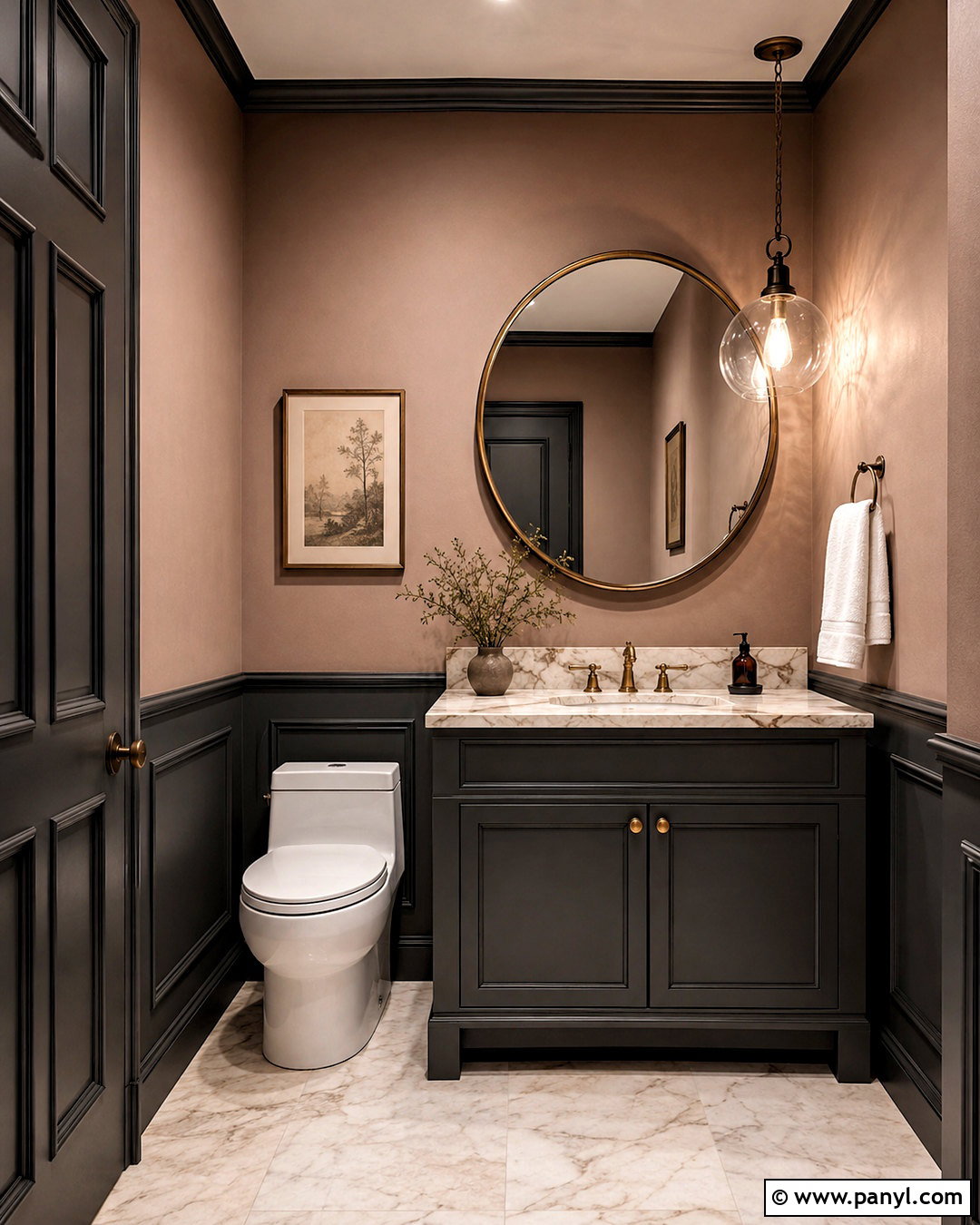
Muted blush brings an unexpected softness to Iron Ore without making the room feel overly sweet. In a powder room, paint the walls a dusty pink-beige and use Iron Ore on the vanity, door, and narrow wall molding. Select a white marble counter with subtle warm veining and an aged brass faucet. A rounded brass mirror will echo the hardware and soften the straight architectural lines. Install ivory floor tile and a small glass pendant for brightness. Keep towels, soap containers, and accessories creamy white. One simple floral or abstract print is enough decoration. The blush walls warm the charcoal paint, while the dark vanity gives the compact room a strong focal point and polished finish.
17. Iron Ore And Ochre Yellow
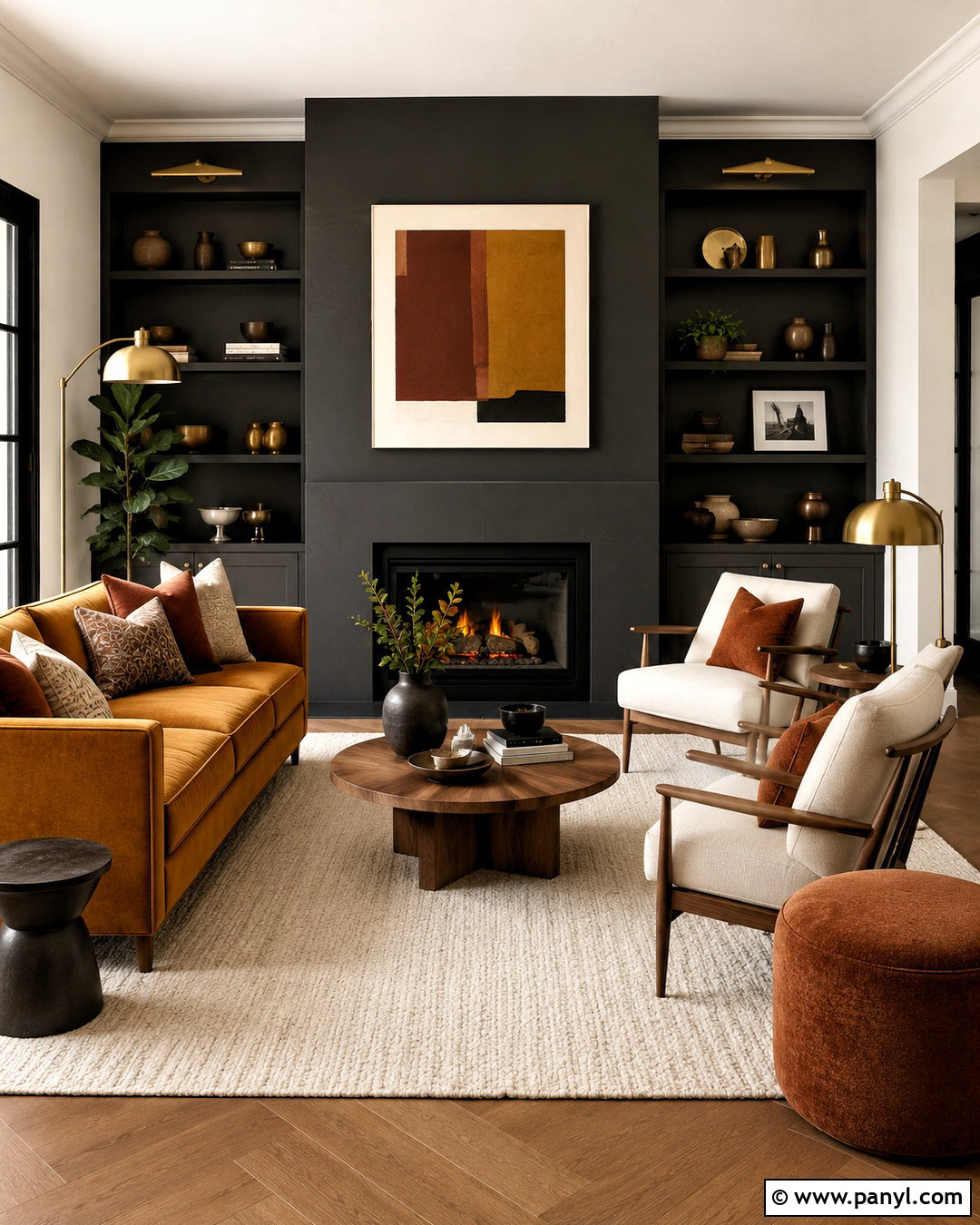
Ochre yellow creates a confident accent against Iron Ore when used in controlled amounts. Design a modern living room with Iron Ore built-ins and fireplace walls surrounded by warm off-white paint. Place an ochre velvet sofa at the center, then balance it with two cream armchairs and a pale wool rug. Medium walnut tables provide a smooth transition between the yellow upholstery and charcoal cabinetry. Add black-framed artwork, brass floor lamps, and a few clay-colored pillows. Keep curtains light and unpatterned so the sofa remains the main color statement. This palette feels energetic yet grounded because ochre carries earthy brown undertones. It is especially effective in midcentury and contemporary interiors.
18. Iron Ore And Warm Taupe
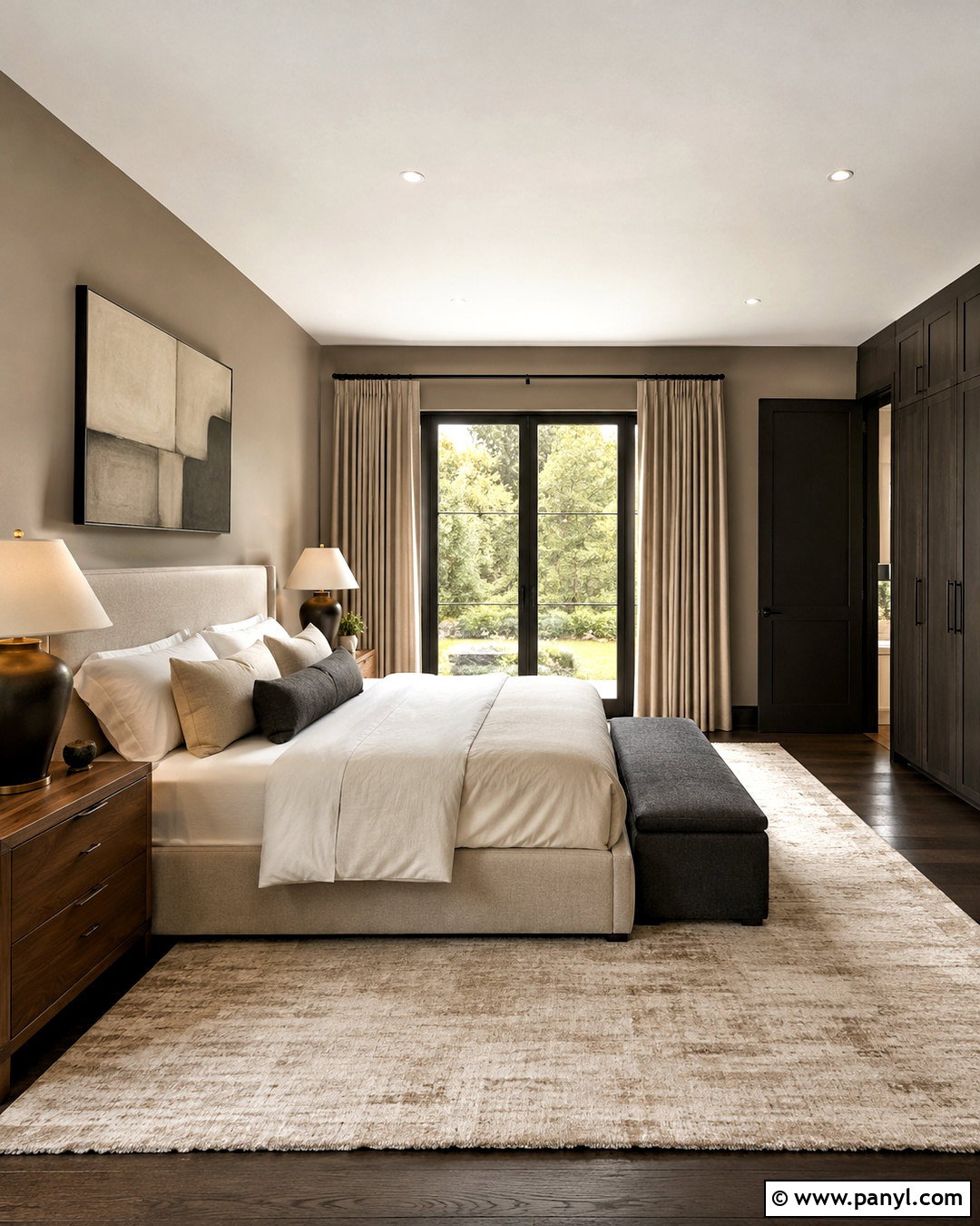
Warm taupe provides a subtle backdrop that allows Iron Ore millwork to feel architectural rather than heavy. Paint a primary bedroom in taupe and use Iron Ore on a full wall of wardrobes, the bedroom door, and slim window frames. Choose a tall oatmeal upholstered bed, walnut nightstands, and layered ivory bedding. A large beige rug should extend beyond the bed to brighten the lower half of the room. Add bronze lamps, linen curtains, and one charcoal bench for repetition. Avoid cool silver finishes, which can weaken the warmth of the scheme. The finished bedroom feels calm and tailored, with a low-contrast neutral foundation that makes the deep painted features look intentional and integrated.
19. Iron Ore And Light Oak
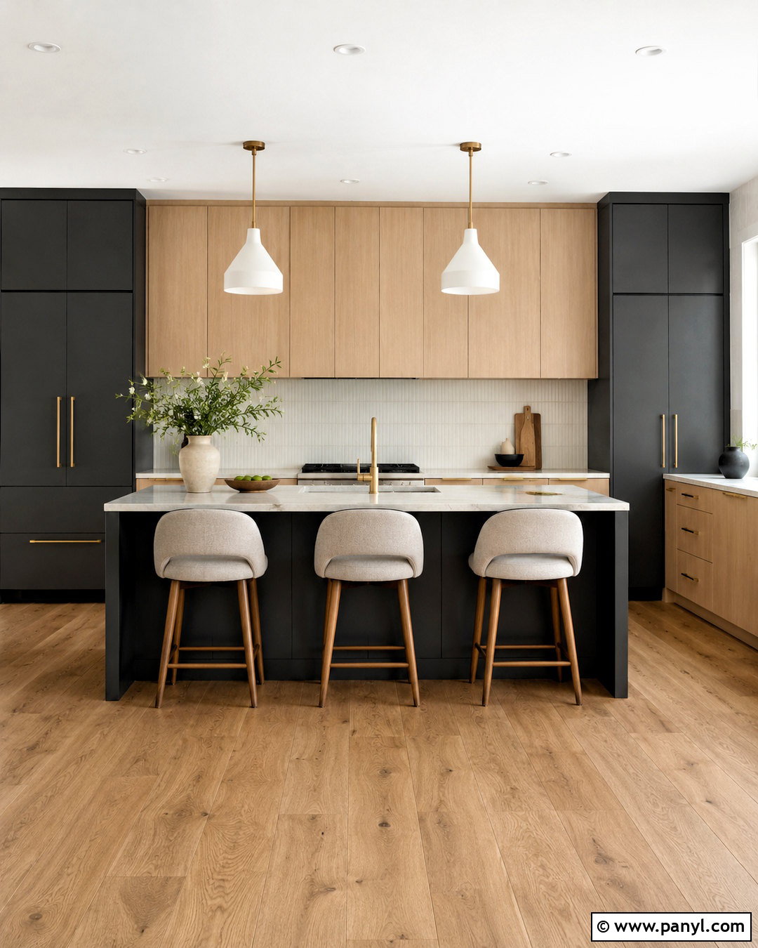
The golden color of light oak is a natural complement to Iron Ore, especially in streamlined kitchens. Paint the tall pantry cabinets and island Iron Ore, then use flat-front light oak cabinetry along the main working wall. Install creamy quartz counters and a warm white backsplash to separate the two cabinet finishes. Pale oak flooring can continue the wood tone without requiring an exact match. Select brushed brass hardware, simple white pendants, and stools upholstered in oatmeal fabric. Keep appliances and accessories visually quiet so the dark paint and wood grain remain prominent. This complete material palette balances modern lines with organic warmth, making the kitchen feel current without depending on short-lived decorative trends.
20. Iron Ore And Cognac Brown
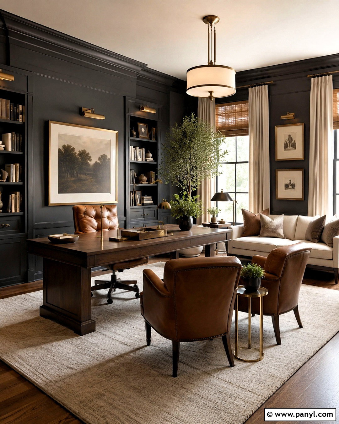
Cognac brown leather adds warmth, age, and depth to an Iron Ore color scheme. Build a comfortable office or reading room with Iron Ore walls, a large walnut desk, and cognac leather chairs. Use a cream wool rug to brighten the floor and place a warm white sofa against the darkest wall. Brass desk lamps and library lights will create reflective highlights across the charcoal paint. Add woven shades, ivory curtains, and framed artwork with beige matting. A few olive plants can introduce muted natural color. Keep the ceiling white and include strong task lighting to maintain visibility. The finished room feels established and welcoming, combining dark architectural color with durable, warm-toned furnishings.
Conclusion:
These **20 iron ore complimentary colors** show how easily deep charcoal can adapt to different homes, rooms, and design preferences. Soft whites produce clean contrast, while greige, linen, and taupe create a gentler transition. Green and blue make Iron Ore feel earthy or tailored. Terracotta, blush, ochre, oak, and cognac add valuable warmth. Whatever palette you choose, distribute dark elements throughout the space and support them with pale surfaces, layered lighting, and natural texture. Most importantly, sample every paint color beside your flooring, countertops, fabrics, and exterior materials. Observe the samples during the morning, afternoon, and evening before committing. Careful testing will help your complete Iron Ore palette feel balanced and intentional.

Related Ideas and Inspiration:
Leave a Reply