
Sherwin-Williams Iron Ore SW 7069 is a deep charcoal neutral that can look softer than true black while still creating strong contrast. The brand recommends it for well-lit interiors and exterior applications, with coordinating shades that include Nebulous White, Extra White, and Cityscape. () Its depth also works beautifully with natural wood, warm metals, earthy greens, creamy whites, muted reds, and quiet blues. The key is building a balanced scheme around the room’s light, fixed finishes, and desired mood. Use Iron Ore as the anchor, then add lighter surfaces and tactile materials that keep the design comfortable. The complete rooms and exterior schemes below offer practical, coordinated ways to recreate these 20 iron ore color palette ideas.
1. Iron Ore And Alabaster Living Room
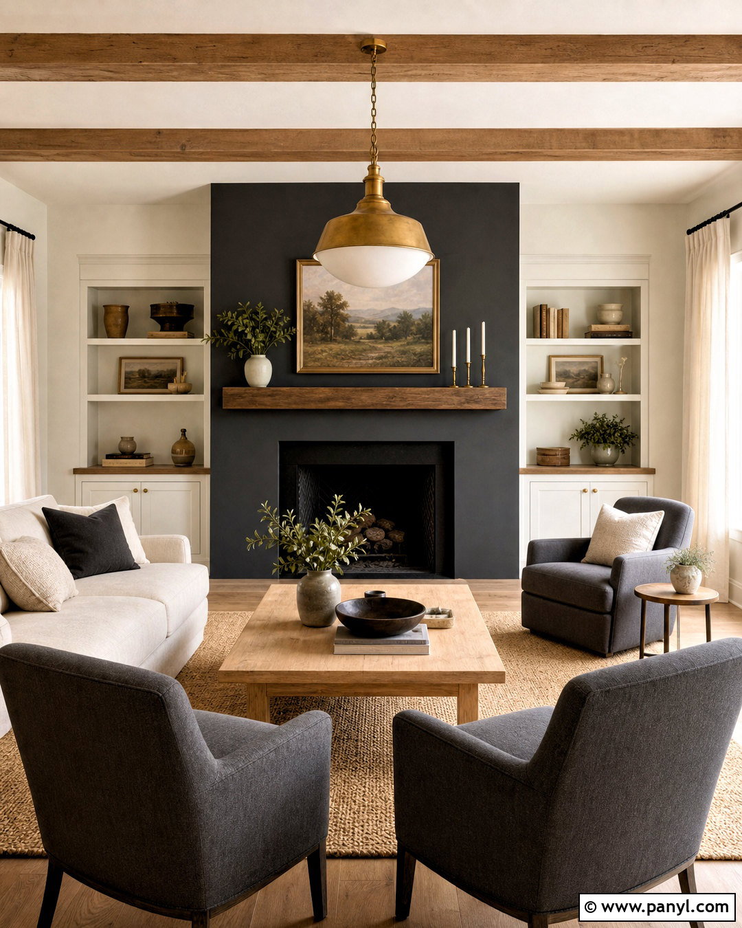
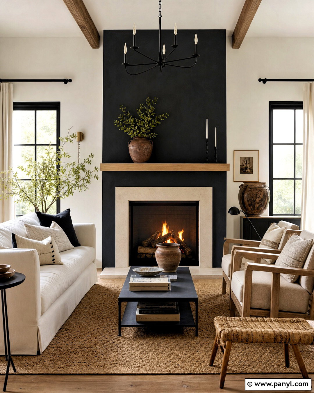
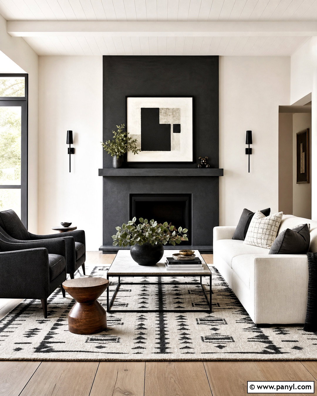
Create a sophisticated living room with Iron Ore on the fireplace wall and warm Alabaster across the remaining walls and trim. An oatmeal linen sofa keeps the center of the room light, while two charcoal lounge chairs connect visually to the fireplace. Add a pale oak coffee table, woven jute rug, and ivory curtains for softness. Small touches of aged brass on the floor lamp and picture frames warm the cool charcoal. For artwork, choose abstract pieces combining cream, taupe, gray, and restrained rust accents. This palette works especially well when the room receives plenty of daylight. Keep the ceiling warm white and use layered lighting at night so the dark feature wall feels dimensional rather than flat.
2. Iron Ore And Natural Oak Kitchen
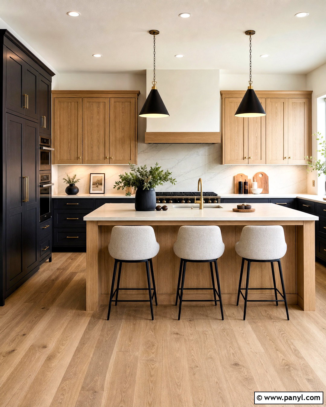
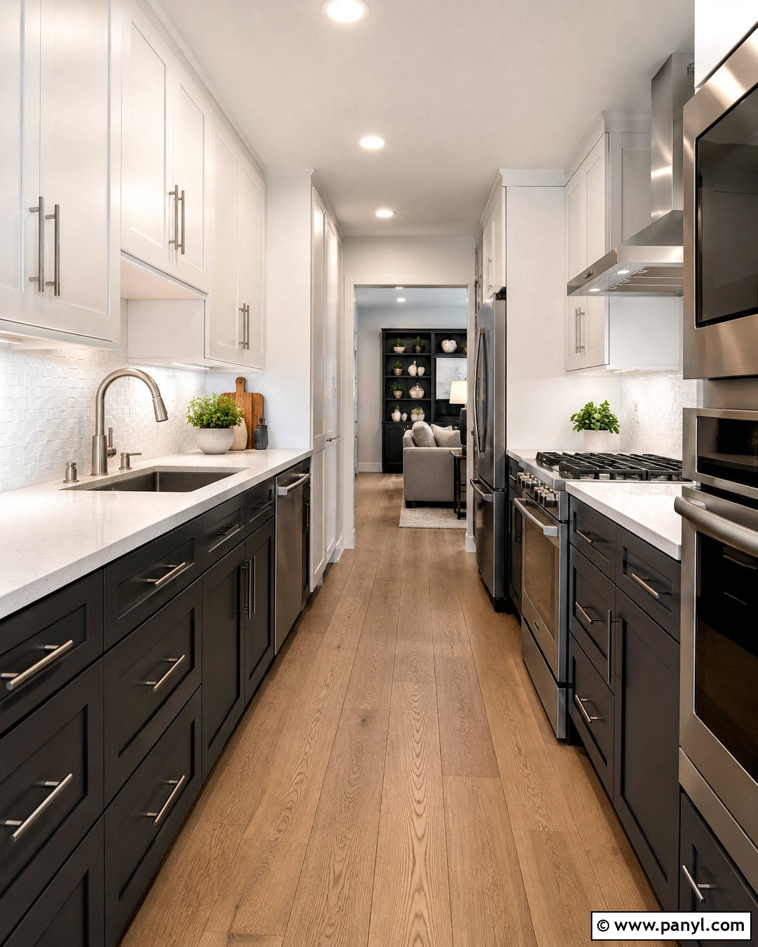
A kitchen pairing Iron Ore with natural oak feels modern, warm, and highly livable. Paint the lower cabinets and tall pantry units Iron Ore, then use flat-panel white oak for the upper cabinets or island. Soft white walls and a creamy quartz countertop prevent the dark cabinetry from overwhelming the room. Carry subtle charcoal veining into the backsplash for continuity. Brushed brass hardware adds warmth, while matte black pendants provide a quiet connection to the cabinet color. Choose light oak or limestone-look flooring to brighten the foundation. Counter stools covered in textured oatmeal fabric complete the palette. This arrangement balances charcoal, warm wood, cream, and metallic details, giving the kitchen contrast without making it feel overly dramatic or stark.
3. Iron Ore And Sage Green Bedroom

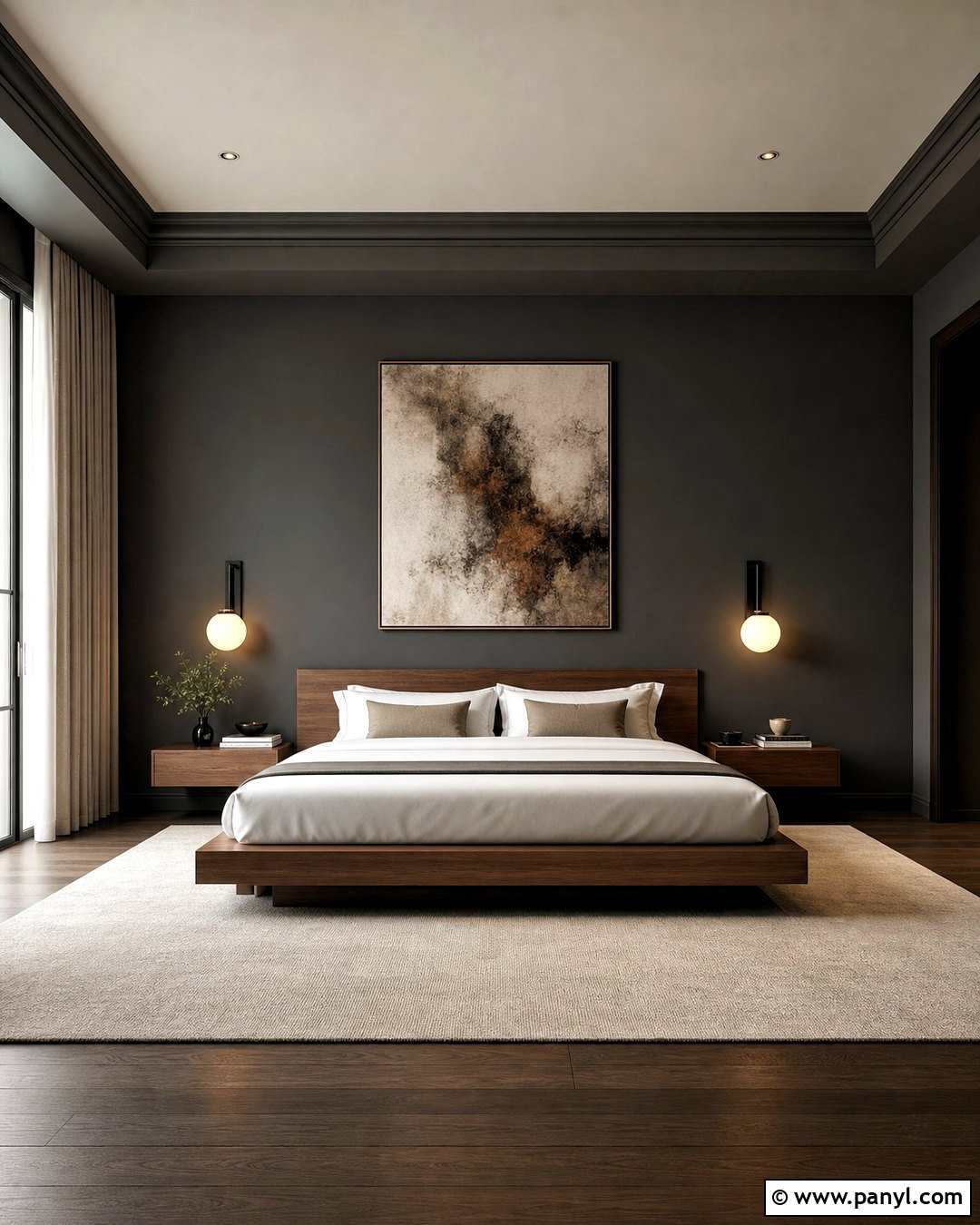
Would you like a dark bedroom that still feels calm and connected to nature? Use Iron Ore behind the bed, soft sage green on the other walls, and warm ivory for the ceiling and trim. Center the room with an oak platform bed dressed in cream linen, moss green pillows, and a muted charcoal coverlet. Natural woven shades filter daylight without introducing another strong color. Add blackened bronze sconces, light wood nightstands, and a wool rug combining beige, sage, and gray. A few ceramic pieces in earthy brown will make the palette feel grounded. Keep patterns simple and organic. Together, the charcoal, sage, ivory, and oak create a restful bedroom with enough contrast to appear polished and intentional.
4. Iron Ore And Warm Beige Dining Room
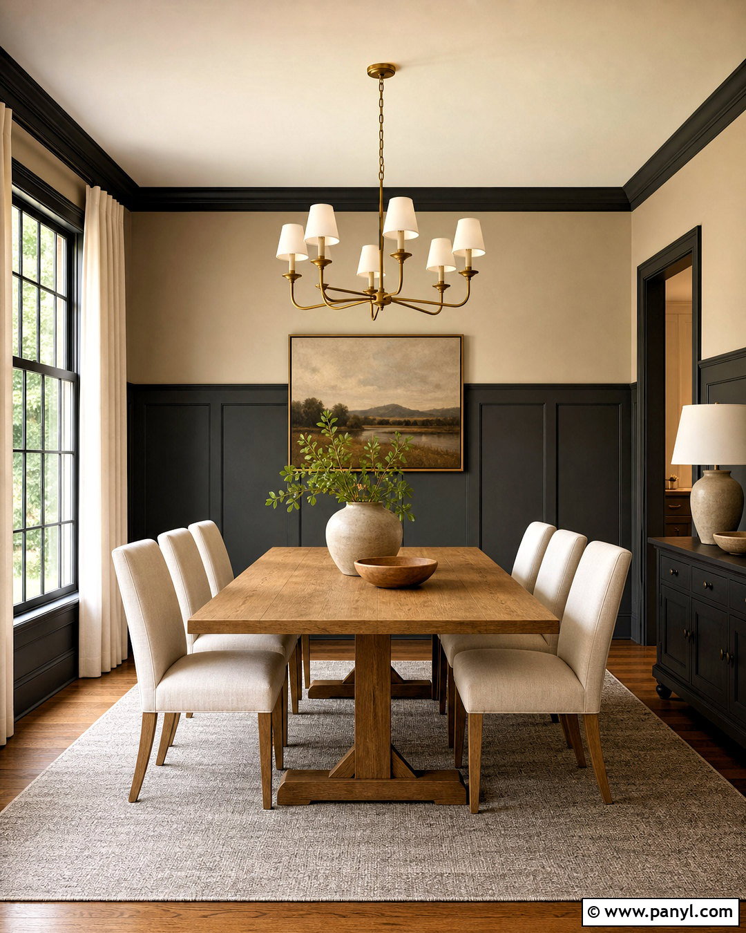
Iron Ore can give a dining room structure without covering every wall. Apply it to full-height wainscoting, including the baseboards and door trim, then paint the upper walls a soft warm beige. A substantial medium-oak dining table bridges the dark and light portions of the room. Surround it with upholstered chairs in textured cream, and place a warm gray rug underneath to define the arrangement. An aged brass chandelier introduces a gentle glow, while ivory curtains soften the windows. Decorate with matte ceramic vessels, simple greenery, and artwork containing charcoal linework. The finished room feels formal enough for gatherings but comfortable for daily meals. Warm beige keeps the palette welcoming, while Iron Ore emphasizes the architecture and creates a memorable foundation.
5. Iron Ore And Terracotta Home Office
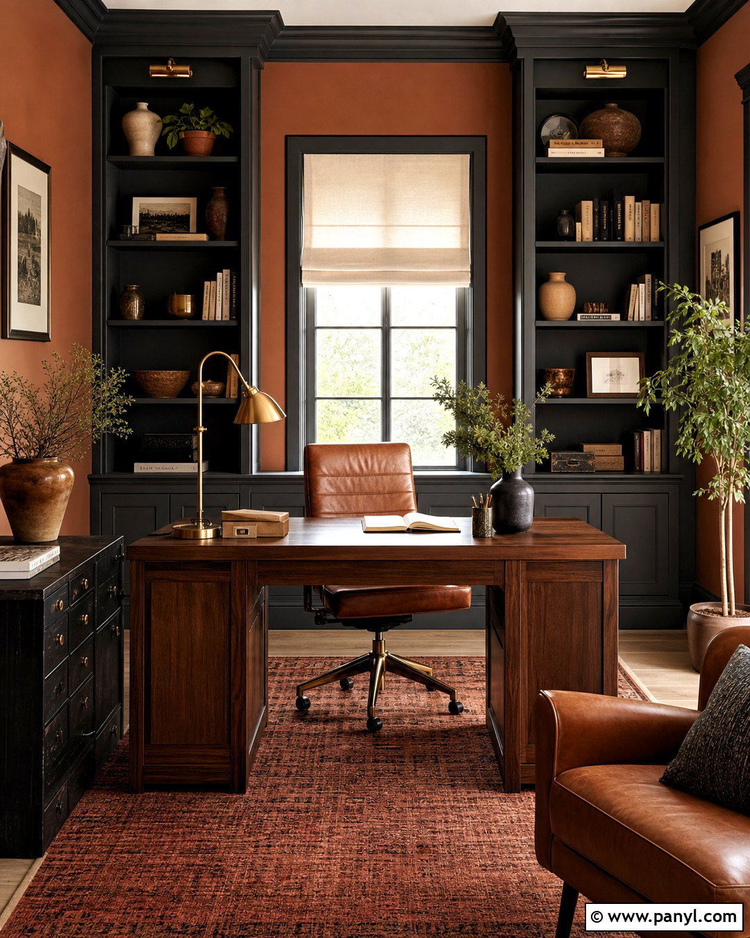
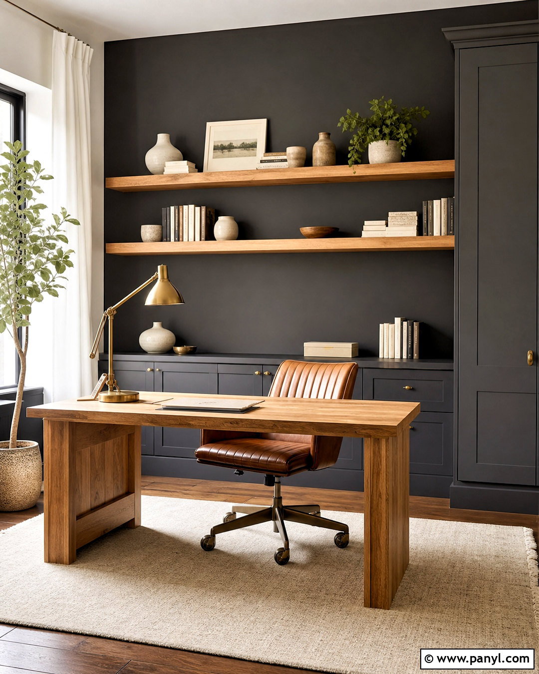
Warm terracotta brings an energetic, earthy character to an Iron Ore home office. Paint the built-in bookcases, lower storage, and window trim Iron Ore, then use a subdued clay color on the surrounding walls. Position a walnut desk in the center with a cognac leather chair and a woven rust-colored rug beneath it. Cream Roman shades help control glare while maintaining brightness. Add desk accessories in antique brass, natural wood, and matte black rather than introducing unrelated colors. Open shelves can hold tan books, pottery, framed art, and small green plants. The combination of charcoal, clay, walnut, and leather feels creative but still professional. Use a pale ceiling and focused task lighting to keep the workspace clear, practical, and comfortable throughout the day.
6. Iron Ore And Dusty Blue Bathroom
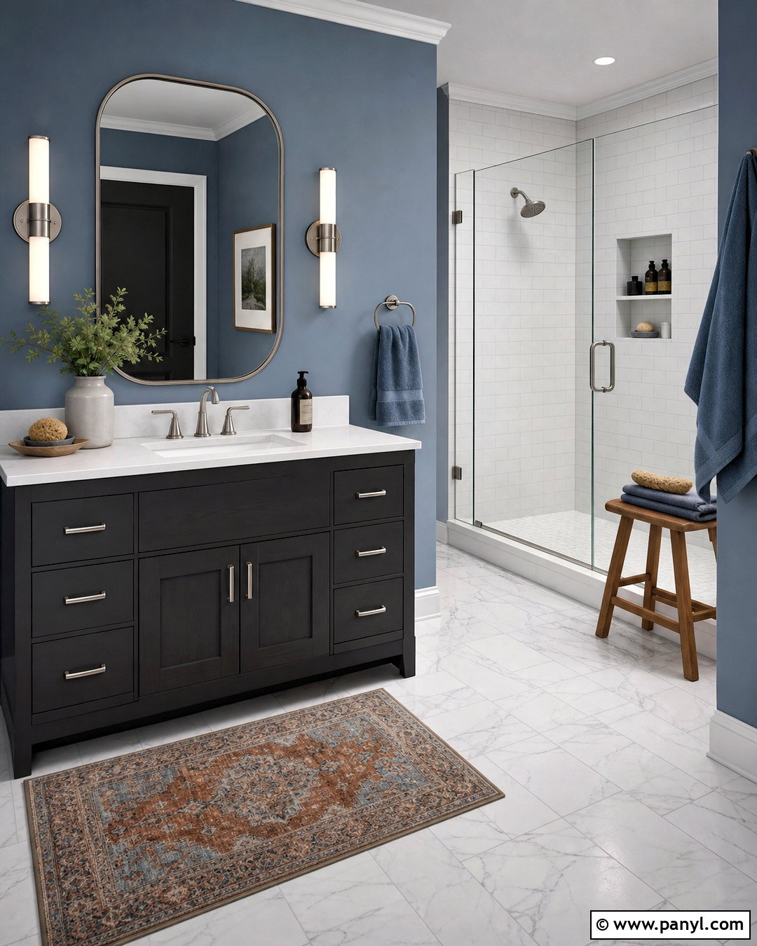
For a bathroom that feels tailored and peaceful, combine an Iron Ore vanity with dusty blue walls and crisp white fixtures. Choose a white quartz countertop, an undermount sink, and brushed nickel faucets for a clean transition between the dark base and lighter upper surfaces. A marble-look porcelain floor with quiet gray veining adds movement without making the palette busy. Install a frameless glass shower with large white tiles and soft gray grout. Dusty blue towels reinforce the wall color, while a pale wood stool adds warmth. Finish the vanity with streamlined nickel pulls and place simple globe sconces beside a rounded mirror. This balanced palette gives the room contrast and personality while retaining the fresh, bright quality expected in a functional everyday bathroom.
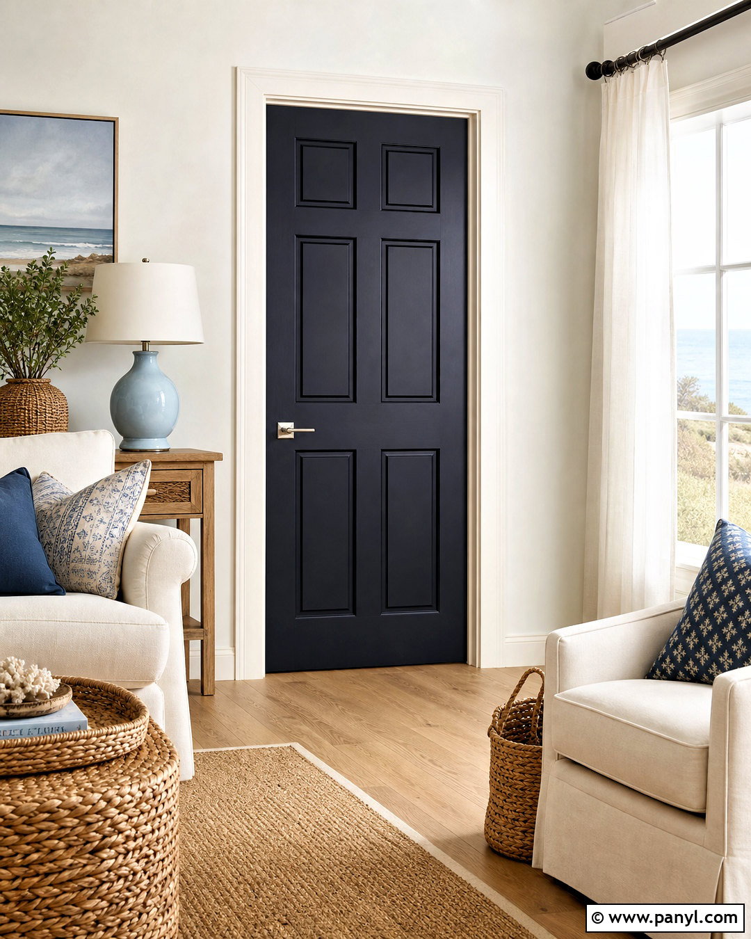
7. Iron Ore And Cream Entryway
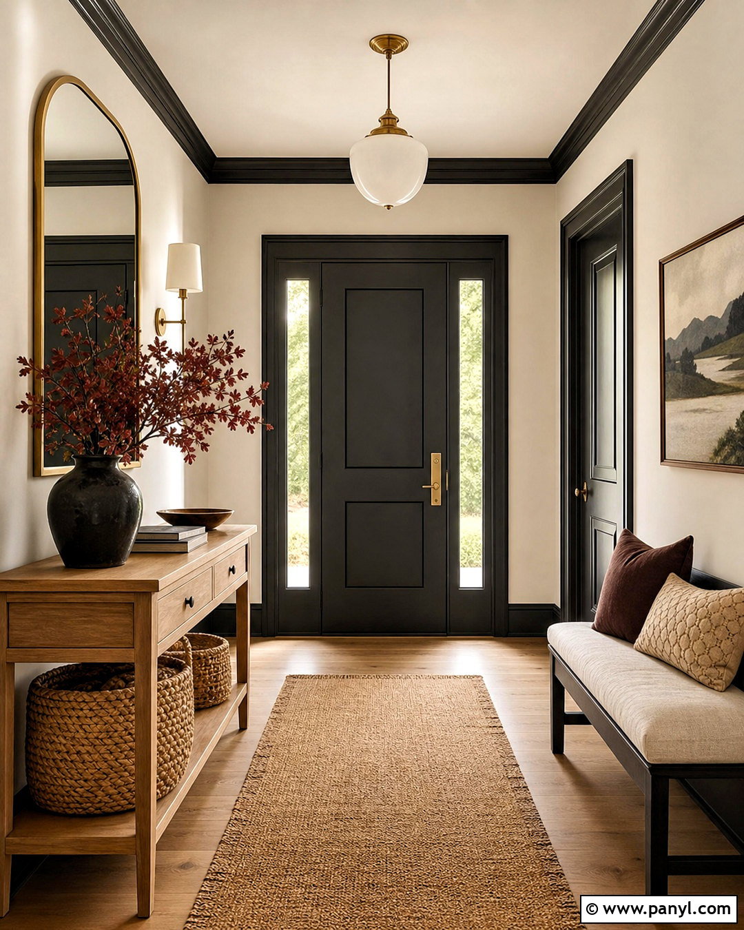
Make a strong first impression with Iron Ore doors and trim surrounded by creamy walls. This low-contrast alternative to pure black and bright white feels softer and more inviting. Add a slim console in light oak, a large rounded mirror with an aged brass frame, and a natural fiber runner that includes cream, tan, and charcoal threads. A small upholstered bench can provide seating without crowding the walkway. Keep storage practical with woven baskets beneath the console and wall hooks painted to match the doors. A warm white ceiling and a milk-glass pendant spread light evenly through the space. Finish the look with one leafy plant and restrained landscape artwork. Every element supports a welcoming entryway built around charcoal, cream, natural wood, and warm metallic accents.
8. Iron Ore And Blush Pink Bedroom
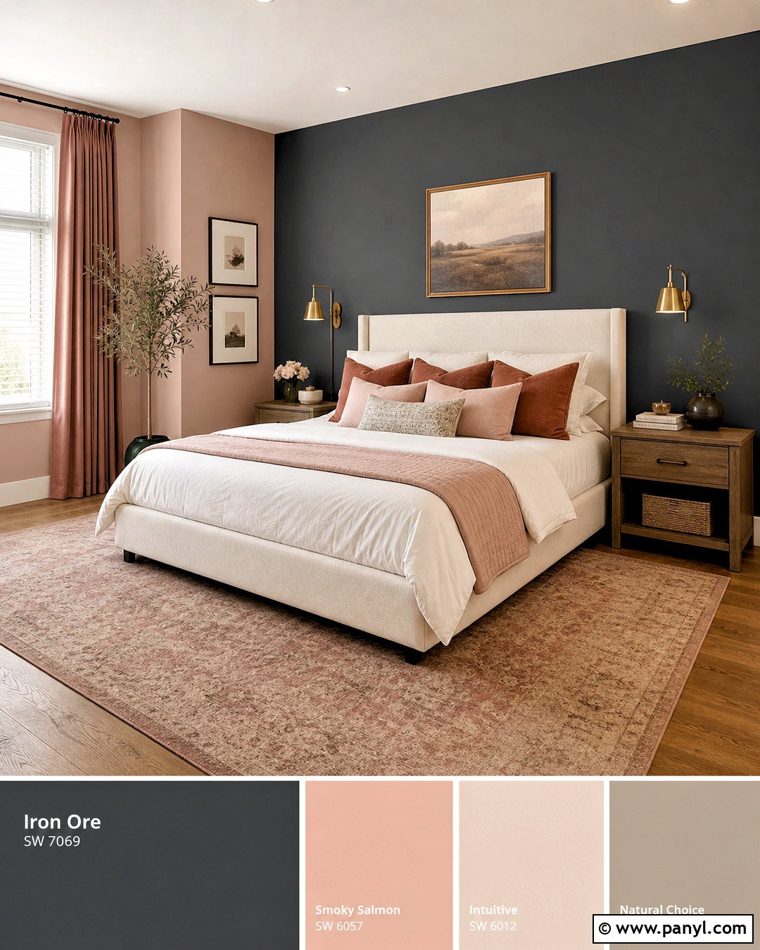
Soft blush pink can make Iron Ore feel unexpectedly gentle in a bedroom. Paint the wall behind the bed Iron Ore and cover the remaining walls in a dusty, muted blush rather than a sugary pastel. Choose an upholstered bed in warm ivory, then layer white bedding with rose, taupe, and charcoal pillows. Pale walnut nightstands add organic warmth, while brushed brass sconces provide a refined accent. Ground the room with a large beige rug featuring a faded pink pattern. Keep window treatments light and simple so daylight can balance the feature wall. Artwork should repeat the palette through abstract shapes or quiet botanical forms. The finished bedroom feels mature, comfortable, and cohesive, with Iron Ore preventing the softer colors from appearing overly delicate or juvenile.
9. Iron Ore And Camel Leather Family Room
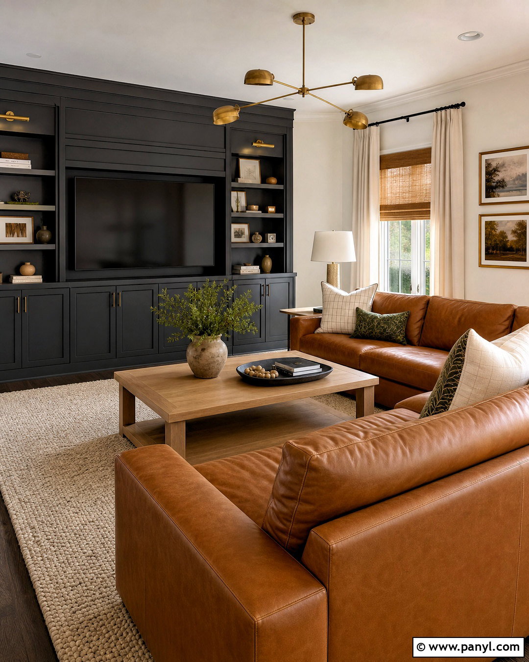
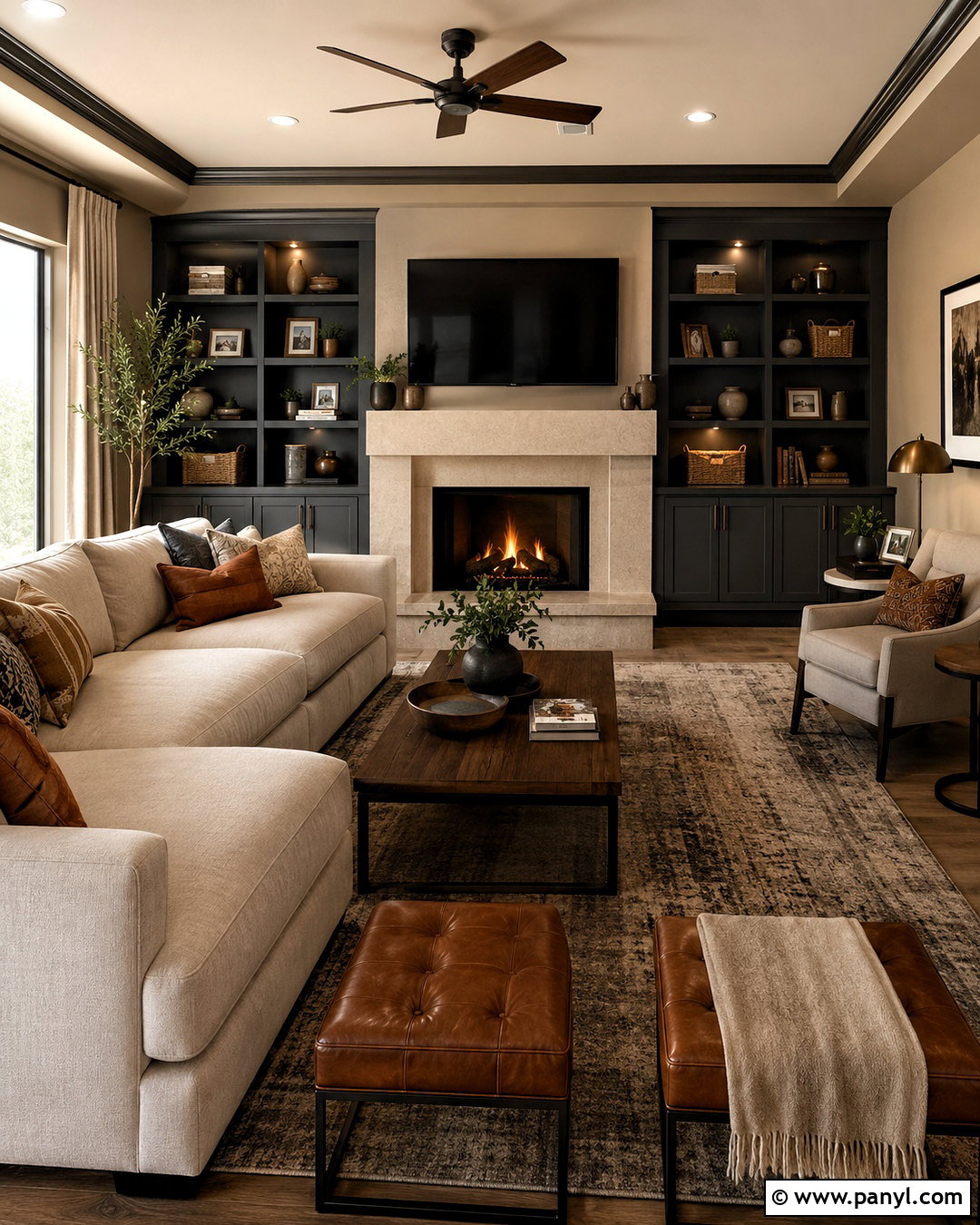
The rich color of camel leather brings immediate warmth to a family room anchored by Iron Ore. Cover the media wall and built-in storage in the charcoal paint, then keep the other walls a soft putty white. Place a camel leather sectional opposite the media center and layer it with cream, olive, and charcoal pillows. A substantial oak coffee table and textured wool rug make the room more relaxed. Use woven shades and off-white curtains together for practical light control. Black metal lamps can echo the cabinetry, while aged brass details keep the scheme from feeling industrial. Add closed storage for games and electronics so the design remains uncluttered. This complete palette is durable, family-friendly, and visually balanced across dark paint, warm leather, pale textiles, and natural wood.
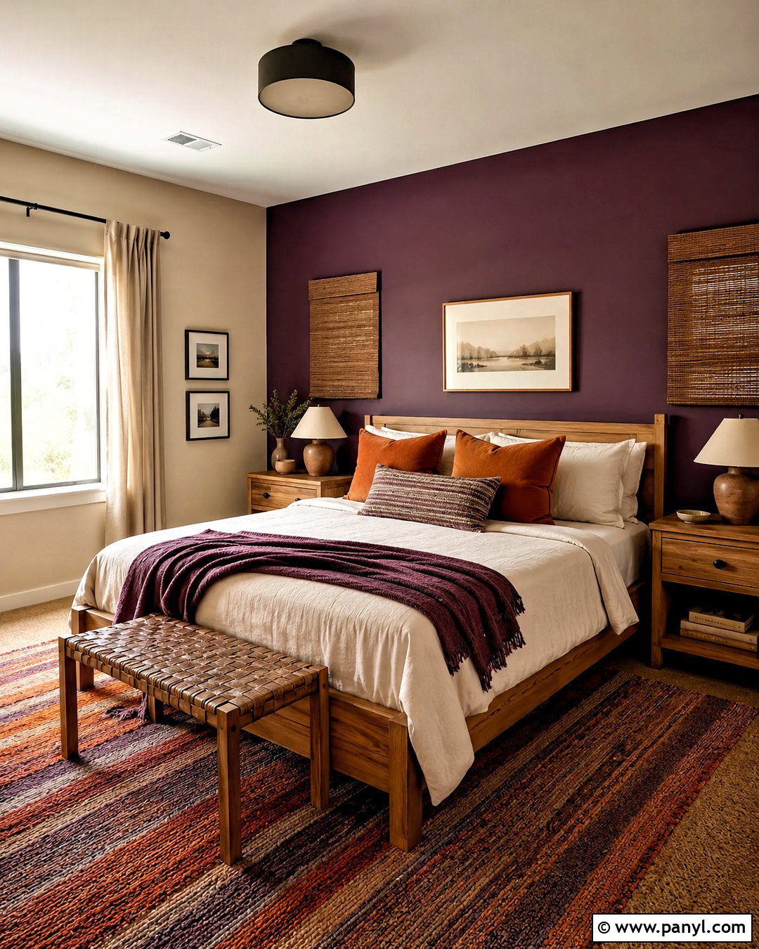
10. Iron Ore And Walnut Library
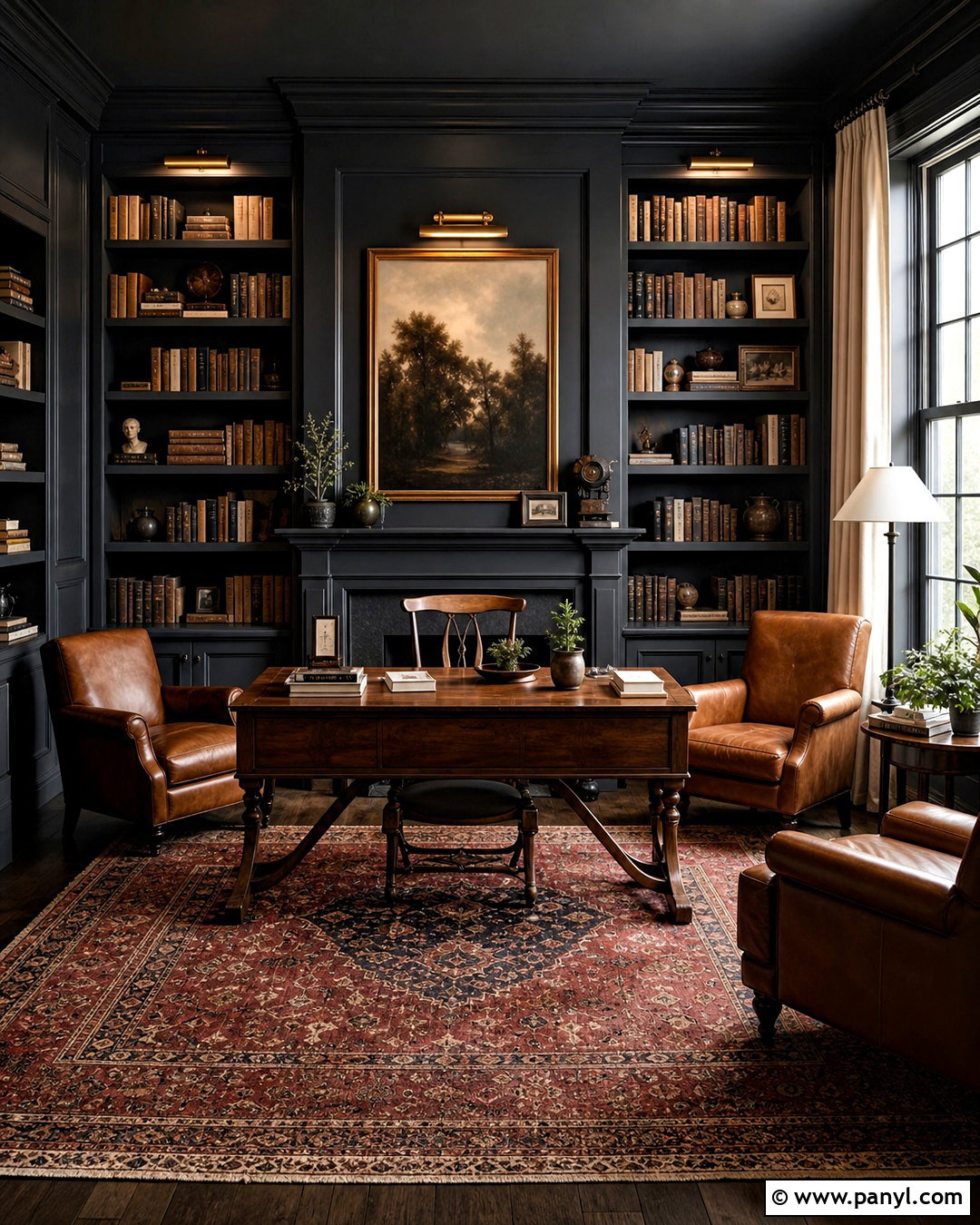
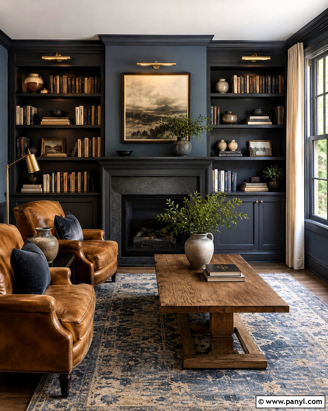
A home library can handle deeper color when warm walnut and thoughtful lighting are included. Paint the walls, bookcases, trim, and ceiling Iron Ore for a seamless, enveloping background. Fill the shelves with books in muted brown, cream, rust, and olive tones instead of arranging overly bright accessories throughout. A walnut writing table or low cabinet introduces rich grain, while a pair of cognac leather chairs creates a comfortable reading area. Lay down a vintage-style rug with faded red, tan, and charcoal details. Antique brass picture lights and a cream-shaded floor lamp provide several pools of useful illumination. Linen curtains in warm flax soften the windows. The resulting library feels intimate and collected, with each material contributing warmth, contrast, and practical comfort.
11. Iron Ore And Brass Powder Room
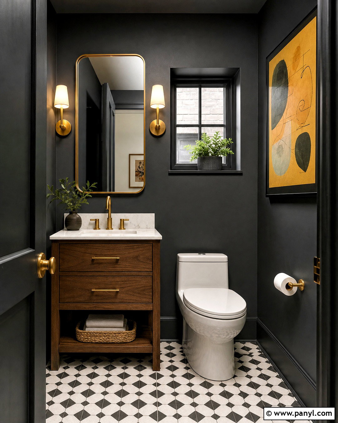
Small powder rooms are excellent places to use bold contrast. Paint every wall and the ceiling Iron Ore, then install a compact walnut vanity with a white marble top. A sculptural brass faucet, matching cabinet pulls, and warm brass sconces stand out clearly against the charcoal background. Choose a large mirror with a thin brass frame to reflect light and make the room feel more open. White porcelain fixtures provide a crisp visual break, while small black-and-white floor tiles add pattern at a manageable scale. Include a cream hand towel, amber glass soap dispenser, and one piece of colorful artwork featuring ochre or rust. This complete palette turns a practical room into a memorable design moment without requiring many furnishings, accessories, or costly architectural changes.
12. Iron Ore And White Marble Kitchen
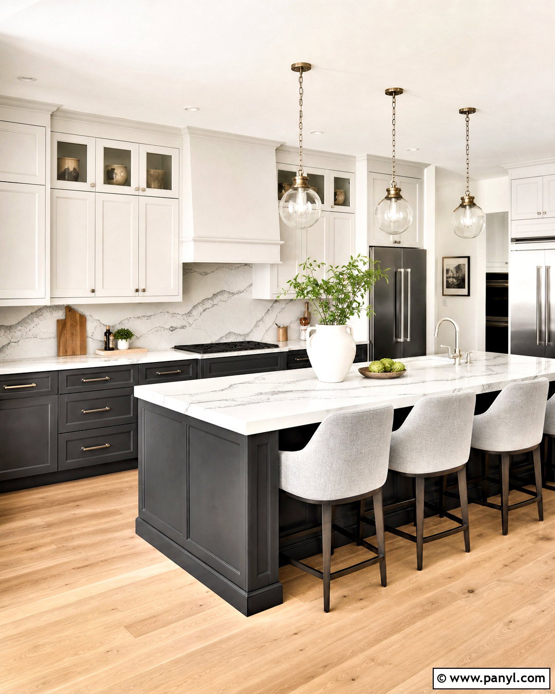
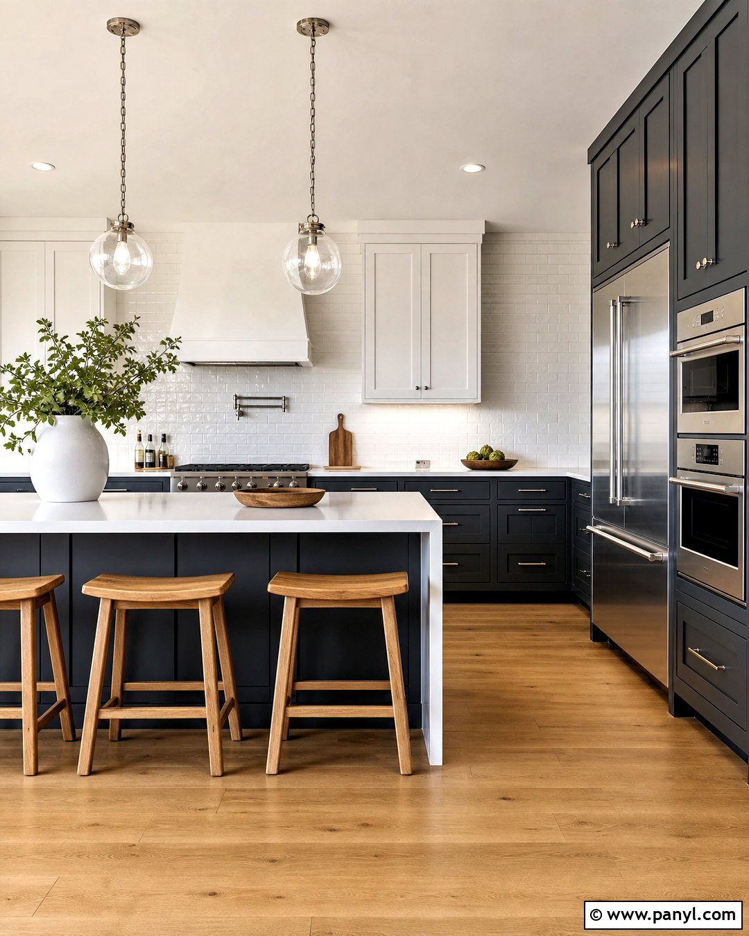
Crisp white marble gives Iron Ore cabinetry a polished, high-contrast appearance. Use the charcoal on all base cabinets and the island, then balance it with warm white upper cabinets and walls. Select marble or marble-look quartz with broad gray veining for the counters and backsplash. The veining should connect visually with the cabinet color without making every surface dark. White oak flooring adds warmth below, while polished nickel hardware creates a cleaner effect than matte black. Install clear glass pendants above the island and add counter stools upholstered in light gray fabric. Keep small appliances and countertop decor minimal. The final kitchen combines dark cabinetry, bright stone, pale wood, and reflective metal, producing a fresh design that feels elegant while remaining suitable for everyday cooking and entertaining.
13. Iron Ore And Olive Green Mudroom
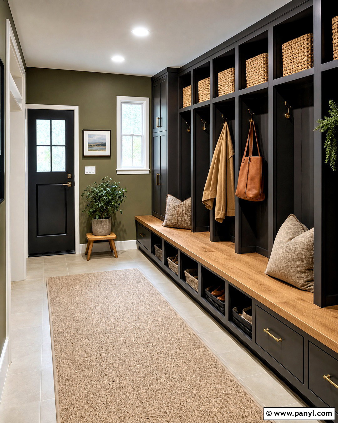
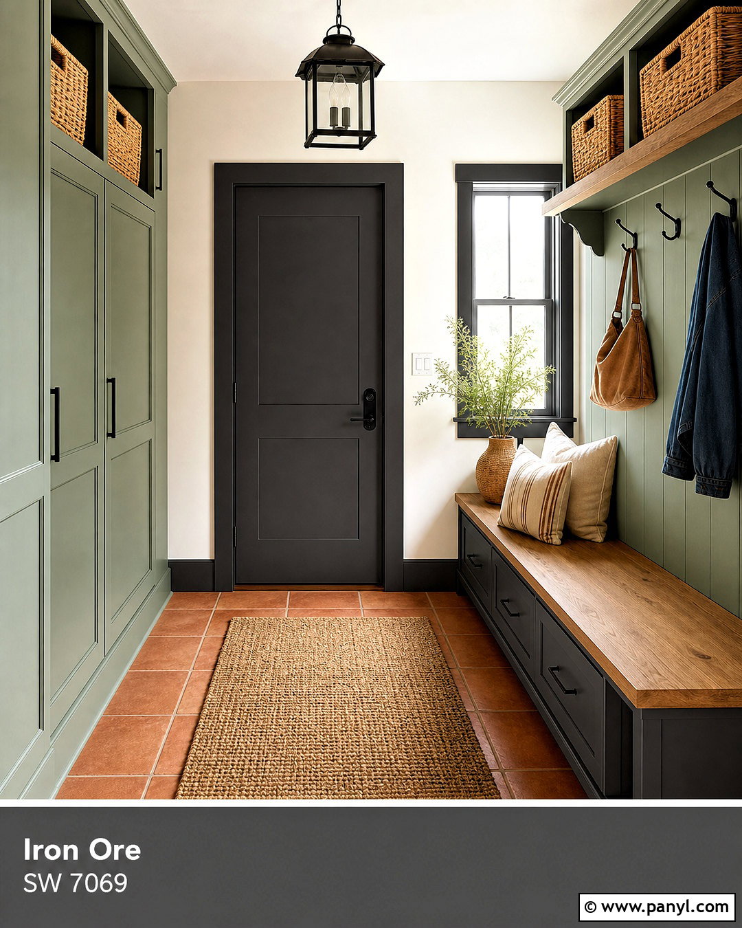
A hardworking mudroom benefits from colors that hide wear while still feeling welcoming. Paint built-in lockers, drawers, and bench supports Iron Ore, then use muted olive green on the walls. Top the bench with natural oak and add durable seat cushions in tan performance fabric. Large-format beige floor tiles will brighten the room and make cleaning easier. Use aged brass hooks, woven storage baskets, and labeled bins in cream or kraft tones to maintain order. An ivory washable runner can soften the walkway without introducing a delicate surface. Add a simple flush-mount light and an unframed mirror near the exit. Charcoal cabinetry grounds the room, olive provides earthy color, and oak adds warmth, resulting in an organized transition space that can comfortably handle bags, coats, shoes, and outdoor equipment.
14. Iron Ore And Greige Exterior
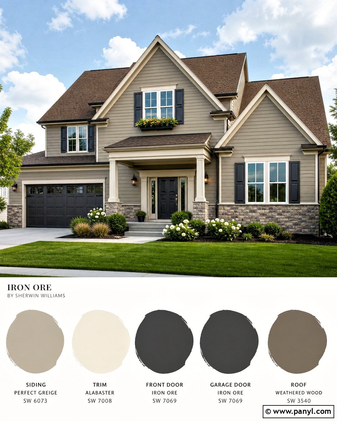
Give a traditional house a sharper appearance by pairing warm greige siding with Iron Ore architectural accents. Use greige across the main body, then apply Iron Ore to the shutters, front door, garage door, and selected trim details. Keep the remaining window trim a creamy off-white so the exterior retains depth and definition. A medium-brown roof and warm stone foundation will connect naturally with the greige. Add lantern-style fixtures in aged bronze and simple house numbers in dark metal. Landscaping should combine evergreen shrubs, ornamental grasses, white flowers, and natural mulch. The result is balanced rather than aggressively modern. Iron Ore supplies contrast, while the warmer body color, roof, masonry, and planting soften the complete curb view and complement a familiar residential scale.
15. Iron Ore And Cedar Exterior
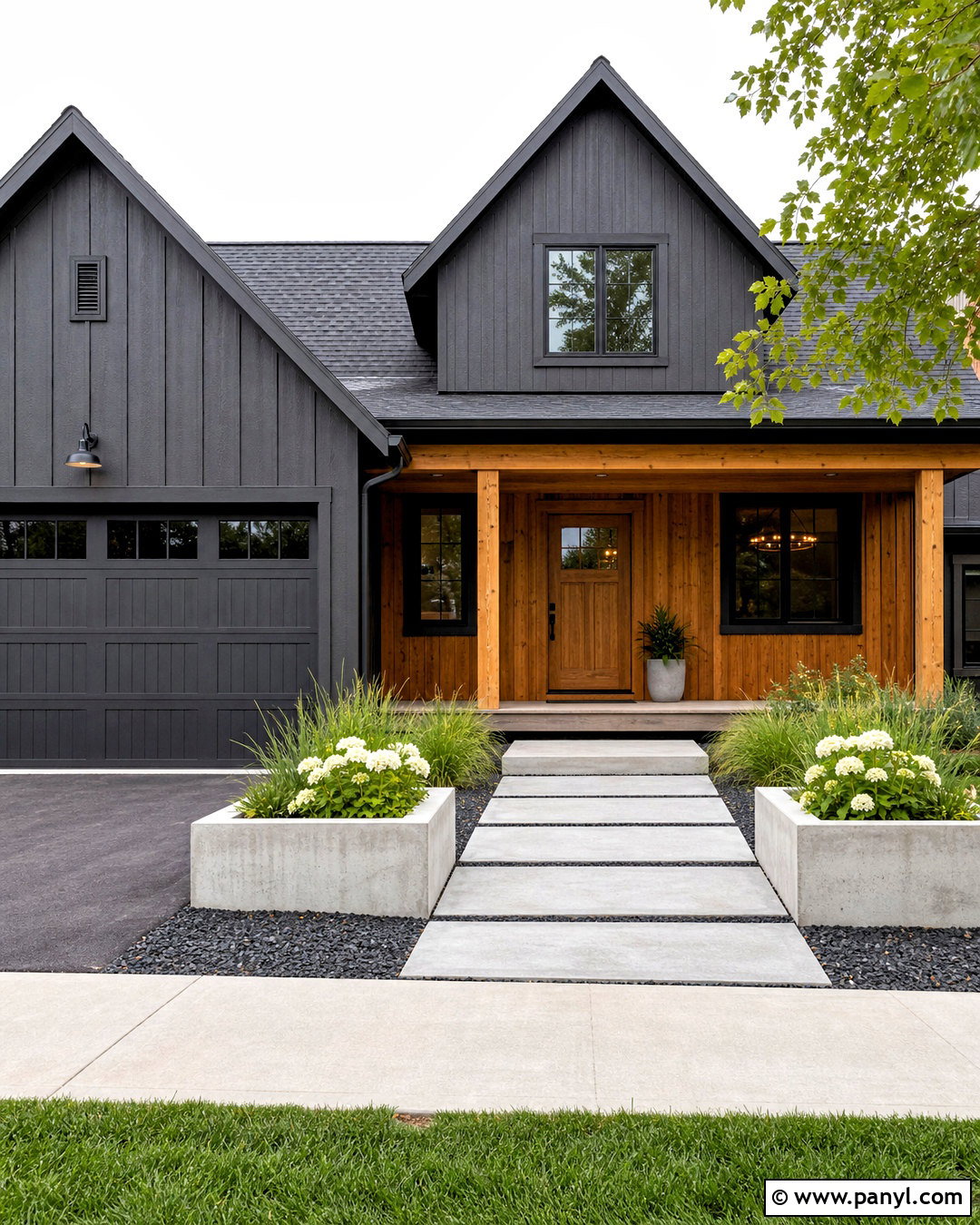
Natural cedar can prevent an Iron Ore exterior from looking too cool or severe. Use Iron Ore on the primary siding, garage door, gutters, and window frames. Introduce warm cedar on the porch ceiling, front door, support columns, and one section of vertical accent siding. A charcoal or medium-gray roof keeps the upper portion cohesive, while a light stone walkway brightens the approach. Choose concrete planters filled with green grasses and white flowering plants for a clean landscape. Black exterior sconces should have simple forms that do not compete with the wood grain. This palette works particularly well on modern and transitional homes. The dark charcoal creates a strong outline, but the cedar, pale hardscaping, and fresh planting give the full exterior warmth and everyday curb appeal.
16. Iron Ore And Red Brick Exterior
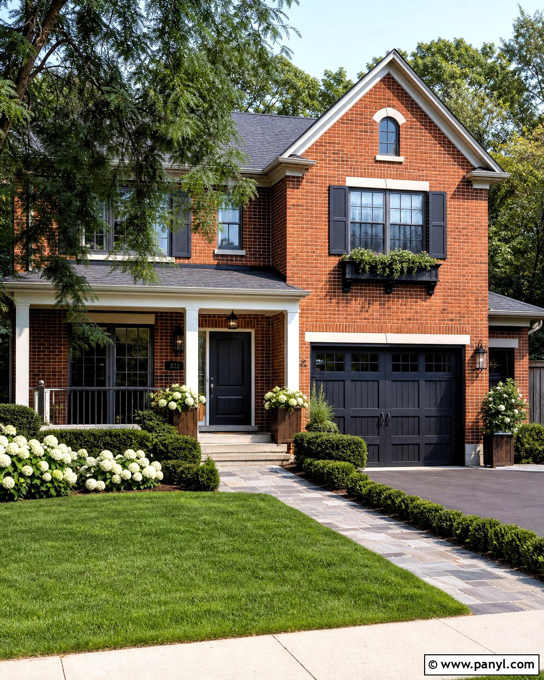
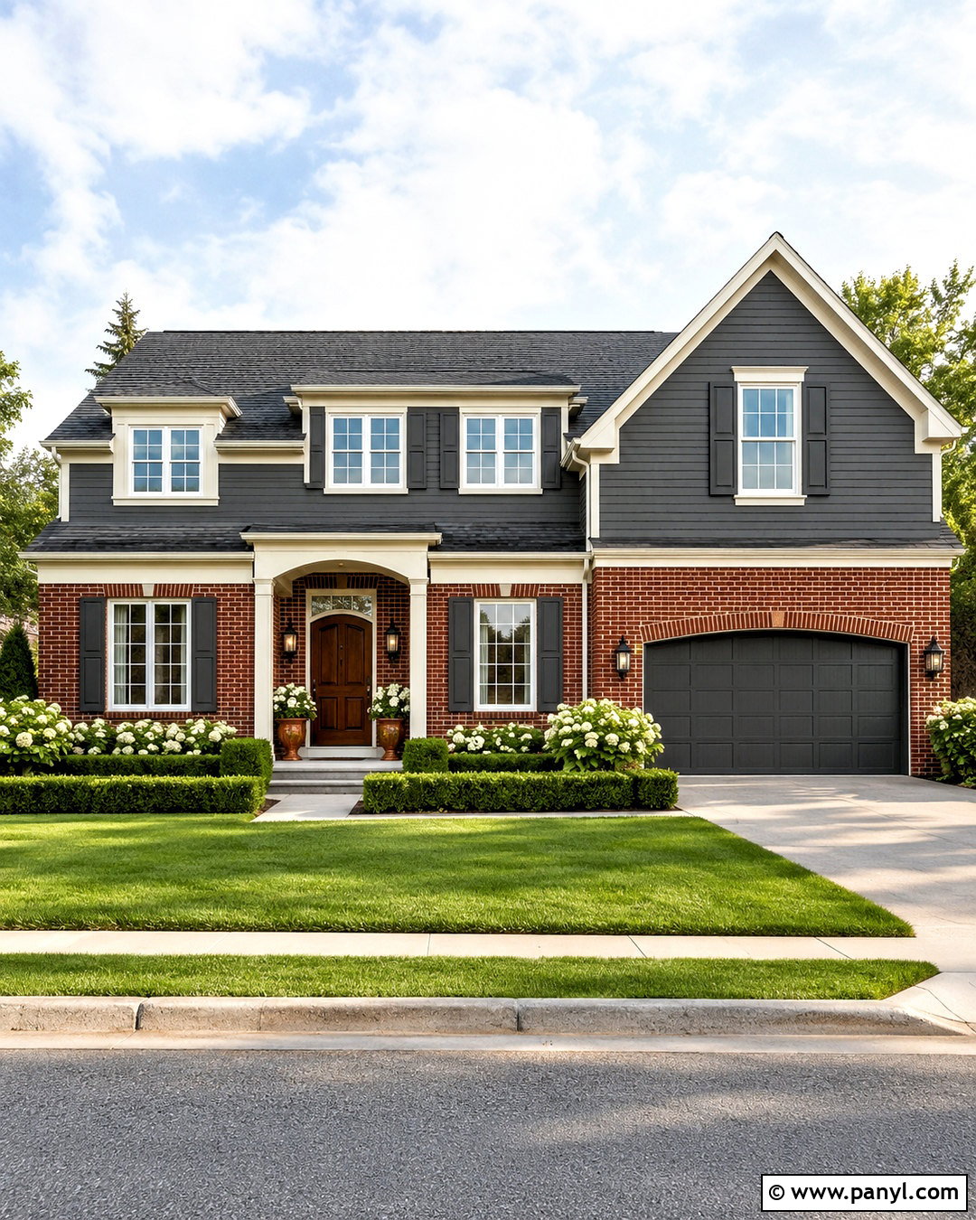
Existing red brick gains a more current look when balanced with Iron Ore and warm cream. Leave the main brick surfaces unpainted, then use Iron Ore on the shutters, front door, porch railing, and garage doors. Paint soffits, window trim, and porch ceilings a creamy white that relates to the mortar rather than a harsh blue-white. Natural cedar planters or a wooden bench can help bridge the warm brick and dark accents. Choose exterior lights in aged bronze or matte black with clear glass. Complete the yard with clipped evergreen shrubs, white hydrangeas, and a simple stone path. Iron Ore adds definition without competing with the brick’s variation. The final scheme respects the home’s original material while creating cleaner lines and a more coordinated street-facing appearance.
17. Iron Ore And Soft White Farmhouse Exterior
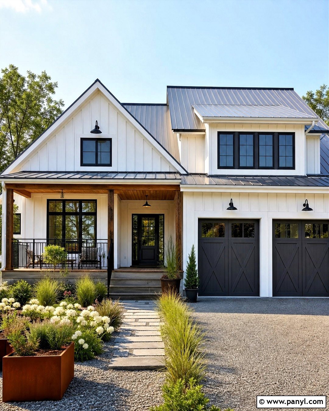
For a farmhouse exterior with strong but approachable contrast, use soft white siding and Iron Ore trim. Apply the charcoal to the window frames, front door, metal awnings, porch railing, and garage doors. Keep corner boards and broad fascia in the soft white body color to avoid outlining every architectural seam. A medium-gray metal roof or dimensional shingle roof works well with this palette. Warm the entry with a natural oak or stained fir porch ceiling and matching wood planters. Gravel paths, native grasses, low boxwood, and white flowers create an unfussy landscape. The design feels cleaner than a standard black-and-white farmhouse because Iron Ore has a gentler charcoal quality. Every exterior element supports a bright, balanced, and practical country-inspired look.
18. Iron Ore And Navy Covered Patio
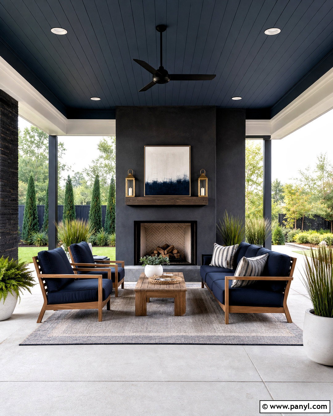
A covered patio can feel like an outdoor room when Iron Ore and navy are used with lighter natural materials. Paint the exterior wall or fireplace Iron Ore, then select navy cushions for a teak or pale wood seating group. Add a large outdoor rug in cream and gray to define the conversation area. White planters filled with grasses, herbs, and leafy green plants brighten the edges. Use warm brass-tone lanterns or black ceiling fans for function without introducing unnecessary color. A light concrete floor keeps the foundation open and easy to maintain. Add cream throw pillows and one or two muted blue patterns for depth. This palette creates a polished outdoor retreat where charcoal anchors the architecture, navy adds color, and wood and cream maintain a relaxed atmosphere.
19. Iron Ore And Concrete Basement
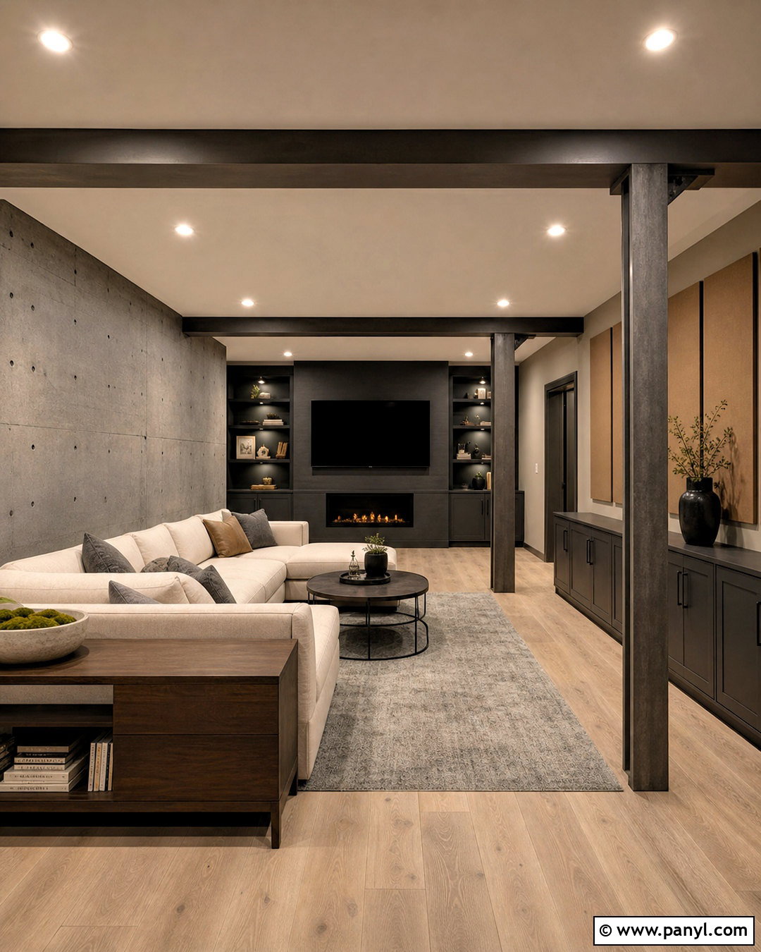
Exposed concrete and Iron Ore can create a finished basement that feels modern rather than unfinished. Paint the media wall, support columns, and storage cabinetry Iron Ore while leaving one sealed concrete wall visible. Use warm greige on the remaining drywall and install light oak luxury vinyl plank flooring to offset the cooler materials. A low-profile sectional in oatmeal performance fabric creates a comfortable gathering area. Add a large gray rug, walnut media console, and nesting tables with black metal frames. Acoustic panels covered in tan felt can improve function while supporting the palette. Bright recessed lighting and several floor lamps are essential. The complete room combines charcoal, concrete gray, pale wood, and warm upholstery, turning a potentially cold lower level into a welcoming multipurpose space.
20. Iron Ore Monochromatic Color Drench
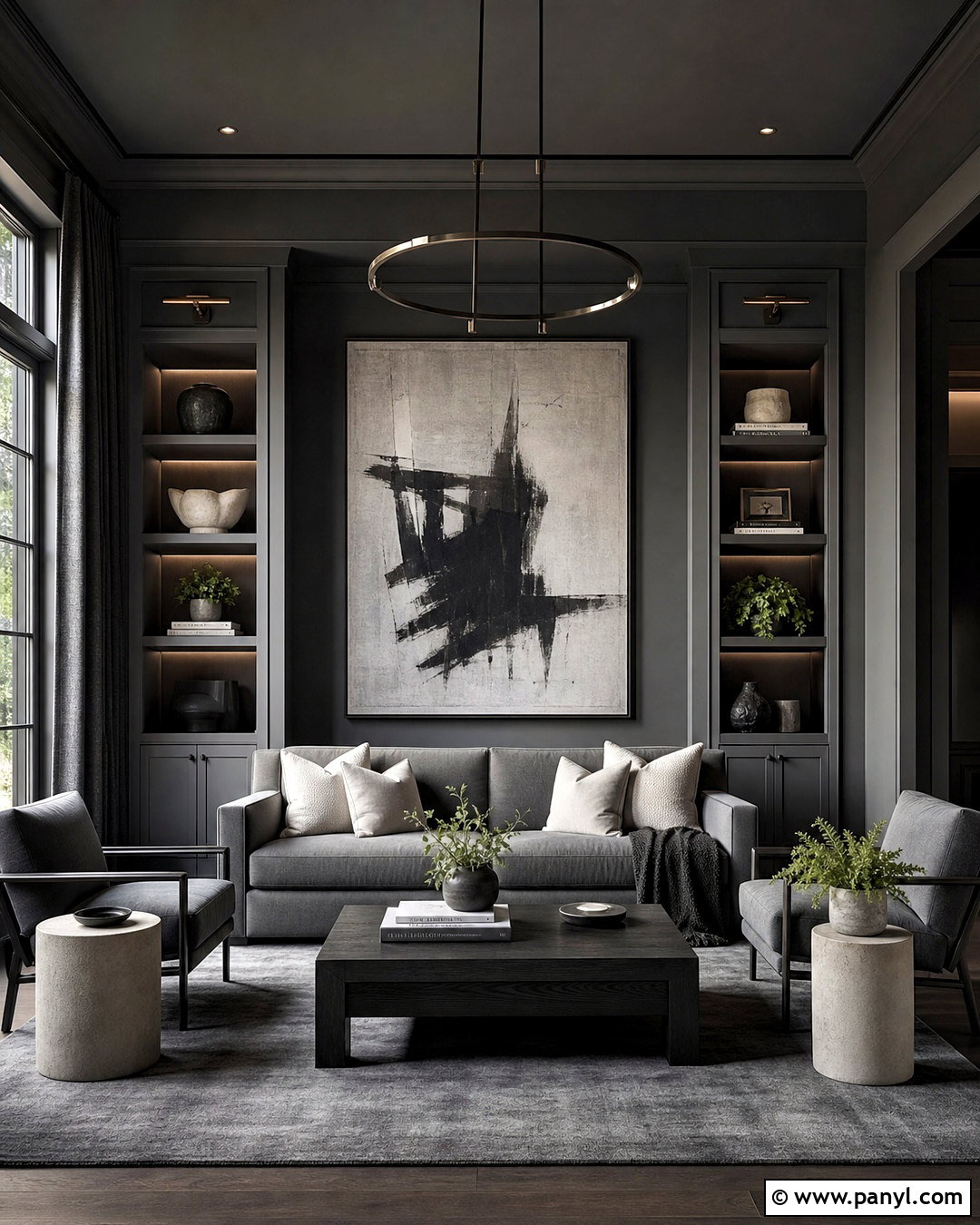
A monochromatic Iron Ore room can look dramatic and surprisingly unified when finishes and textures create variation. Paint the walls, trim, doors, built-ins, and ceiling the same charcoal, using a lower sheen on broad surfaces and a slightly more durable finish on woodwork. Choose a sofa in a lighter graphite fabric so it remains visible against the walls. Add a black oak coffee table, smoky gray rug, and curtains in textured charcoal linen. Pale stone side tables and cream cushions provide controlled relief without interrupting the monochromatic effect. Brushed nickel lighting introduces a subtle reflective element. Include green plants and oversized artwork with white, gray, and earthy brown details. Strong daylight and layered artificial lighting are important for revealing the room’s depth and material contrast.
Conclusion:
These 20 iron ore color palette ideas show how one deep charcoal can support many different moods, from bright transitional kitchens to enveloping libraries and high-contrast exteriors. The most successful combinations balance Iron Ore with lighter surfaces, warm textures, and intentional accent colors. Cream, oak, walnut, leather, sage, terracotta, dusty blue, and natural brick can all soften its visual weight. Before painting, test a physical sample on multiple walls or exterior surfaces and observe it throughout the day, since changing light and surrounding finishes affect the result. () Whether used for cabinetry, trim, siding, or full color drenching, Iron Ore works best as part of a complete, carefully layered design.

Related Ideas and Inspiration:
Leave a Reply