
Choosing among 20 repose gray coordinating colors makes it easier to build a connected home palette without settling for an all-gray interior. Sherwin-Williams Repose Gray SW 7015 is a balanced, medium-light neutral that can appear warmer, cooler, or slightly violet as daylight changes. The best companion colors either soften those undertones, create deliberate contrast, or introduce natural warmth. Crisp whites suit trim and cabinetry, while navy, green, bronze, terracotta, and charcoal add personality. Flooring, lighting, textiles, and metal finishes also influence whether the finished room feels inviting or cold. Always test large samples beside permanent surfaces before painting. The complete room schemes below show practical ways to decorate with 20 repose gray coordinating colors.

1. Pure White Trim With Repose Gray
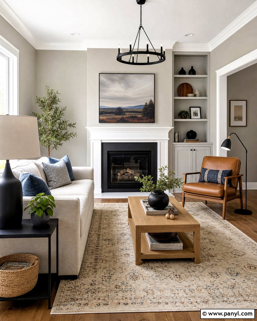
Pure White SW 7005 creates a clean, flexible framework around Repose Gray walls. Use Pure White on baseboards, window casings, interior doors, crown molding, and the ceiling for consistent contrast. In a transitional living room, bring in a warm oatmeal sofa, natural oak coffee table, and an ivory rug with a subtle gray pattern. Matte black lamps sharpen the palette, while camel leather and muted blue pillows prevent the room from looking flat. Medium-toned wood flooring is especially helpful because it balances the cooler side of Repose Gray. This combination works well in open floor plans where one trim color needs to connect several rooms without appearing stark or overly creamy. ()
2. Alabaster Cabinets With Repose Gray
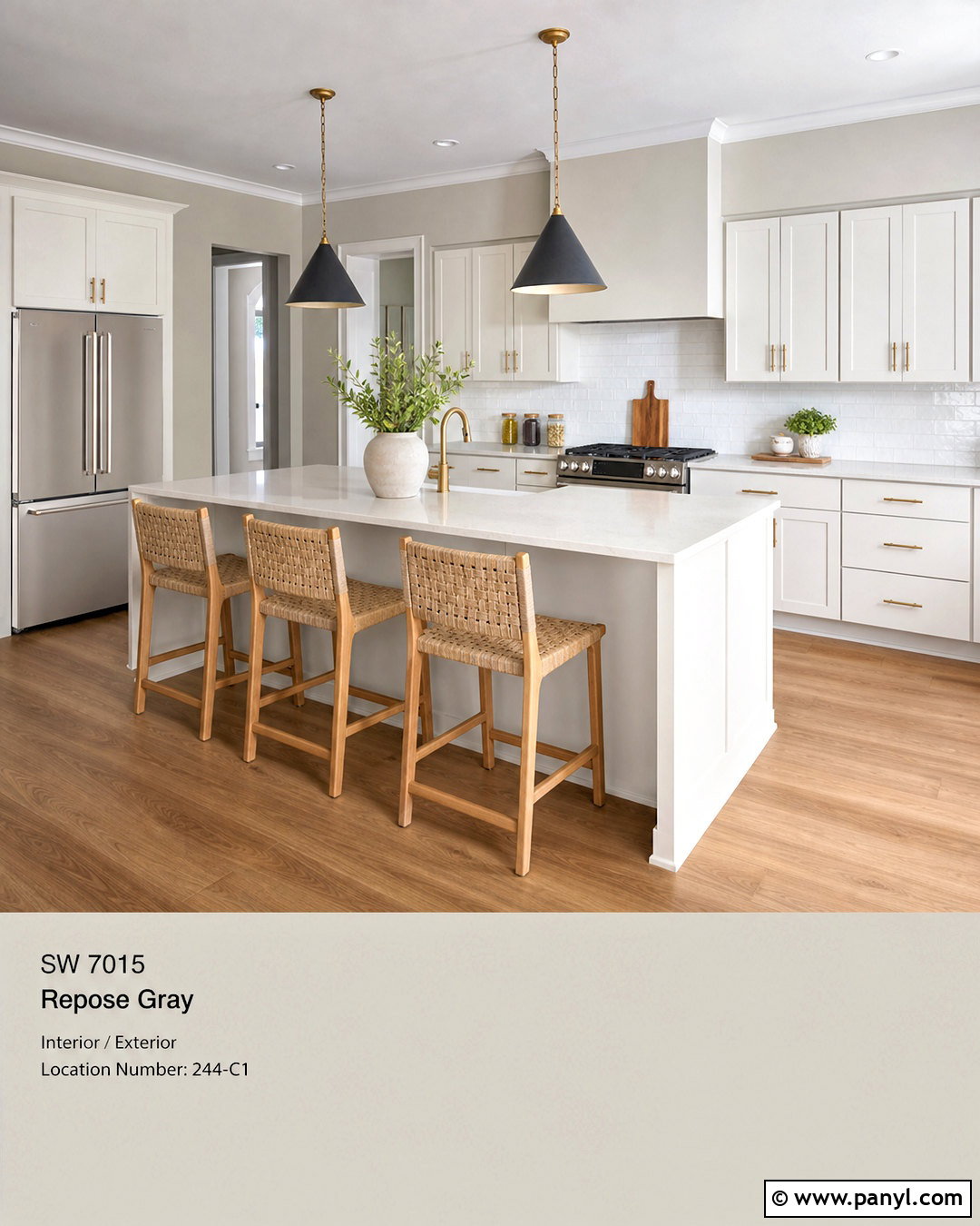
For a softer kitchen, pair Repose Gray walls with Alabaster SW 7008 cabinets. Alabaster has enough warmth to keep the room welcoming, especially when the windows receive limited or cool natural light. Complete the look with cream quartz countertops, a handmade white backsplash, and brushed brass cabinet hardware. Natural white oak stools and medium oak flooring add another warm layer without introducing strong yellow tones. Paint the ceiling Alabaster as well, creating a smooth visual connection with the cabinetry. A charcoal range hood or black pendant lights can provide restrained contrast. This complete scheme feels brighter than an all-gray kitchen while remaining gentler and more traditional than a sharp white-and-gray palette. ()
3. Extra White Kitchen With Repose Gray
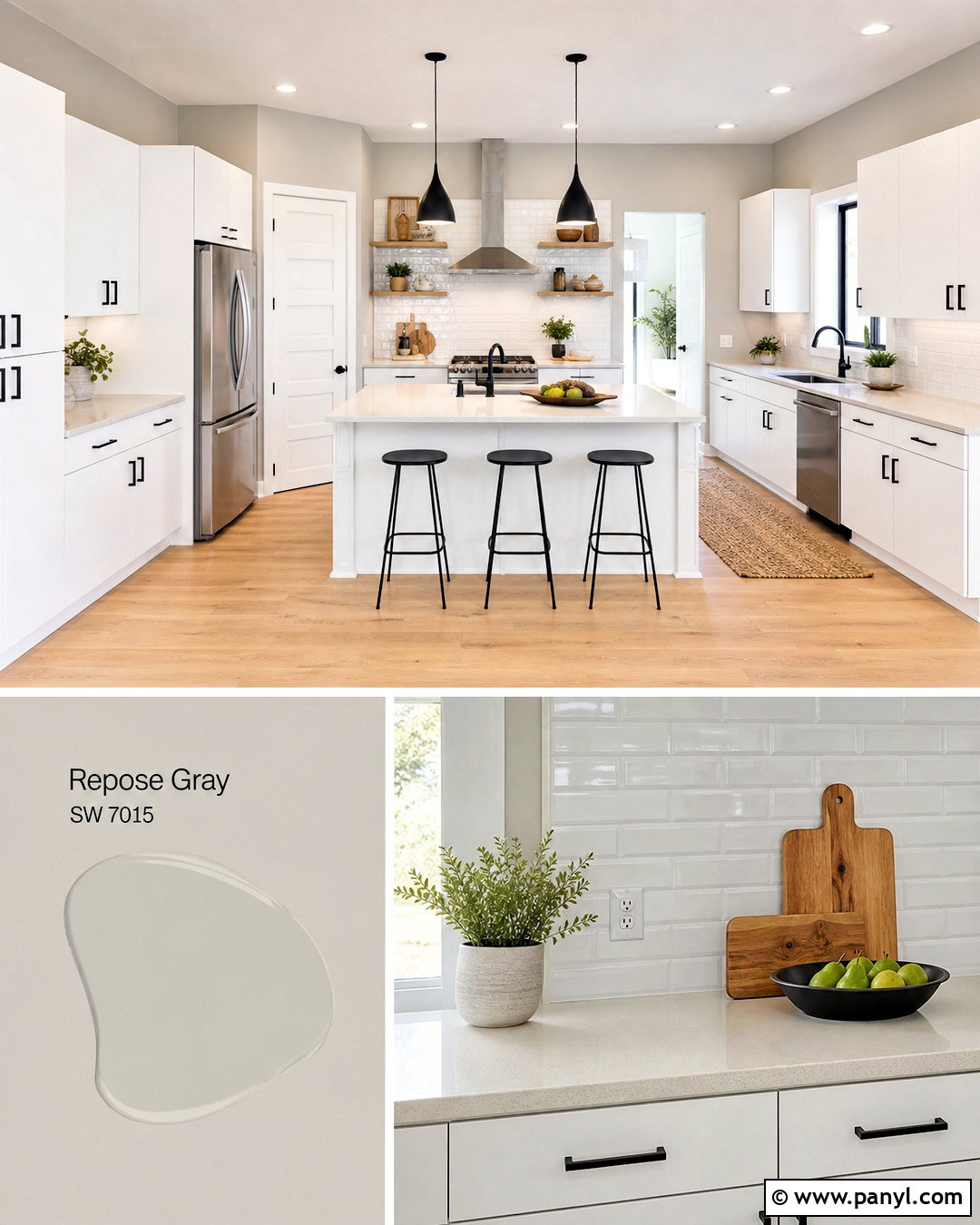
Extra White SW 7006 gives Repose Gray a brighter, cooler edge that suits streamlined kitchens with strong natural light. Cover the walls in Repose Gray and use Extra White on flat-panel cabinets, trim, doors, and the ceiling. Choose pale quartz counters with quiet gray veining and a glossy white subway tile backsplash to bounce light around the room. Light maple flooring adds warmth, while matte black pulls and simple black pendants define the cabinetry. Keep window treatments sheer and furnishings minimal. A woven runner and small touches of pale wood stop the palette from feeling clinical. Because this white can look crisp beside Repose Gray, sample the combination near the backsplash, flooring, and windows before committing.
4. Eider White Bedroom With Repose Gray
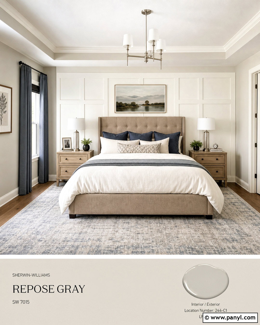
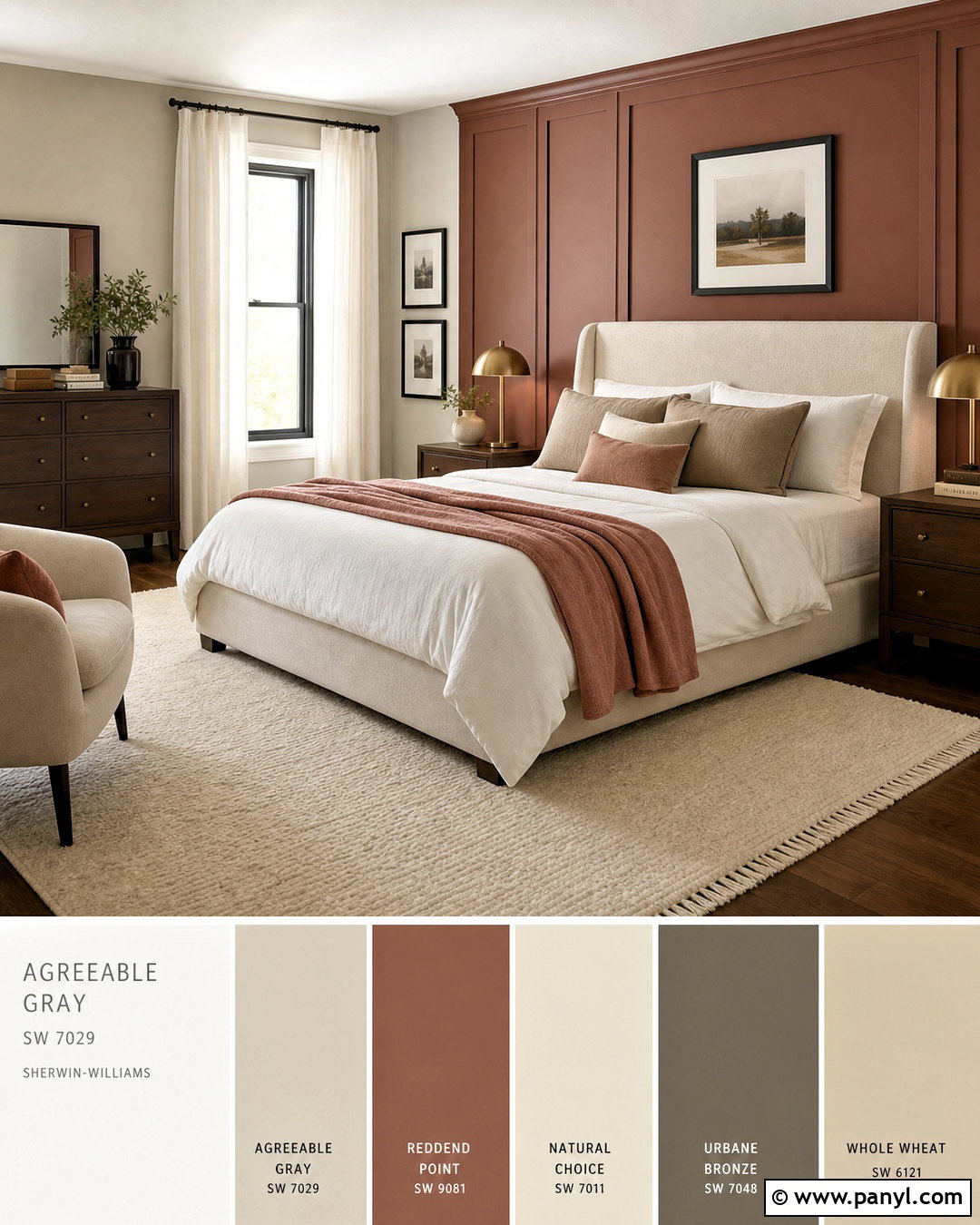
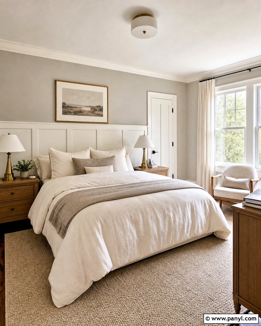
Eider White SW 7014 brings gentle warmth to a Repose Gray bedroom without creating an obvious cream-and-gray contrast. Use Repose Gray on the main walls, then paint the ceiling, trim, and paneled headboard wall in Eider White. Build the room around an upholstered taupe bed, warm white bedding, and a textured beige rug. Pale oak nightstands keep the scheme relaxed, while brushed nickel lamps echo the cooler notes in the wall color. Add dusty blue pillows and soft charcoal curtains for definition. This palette is particularly effective when you want a neutral bedroom that still has visible layers. The slightly softened white makes the architecture noticeable while allowing the walls to remain calm. ()
5. White Duck Dining Room With Repose Gray
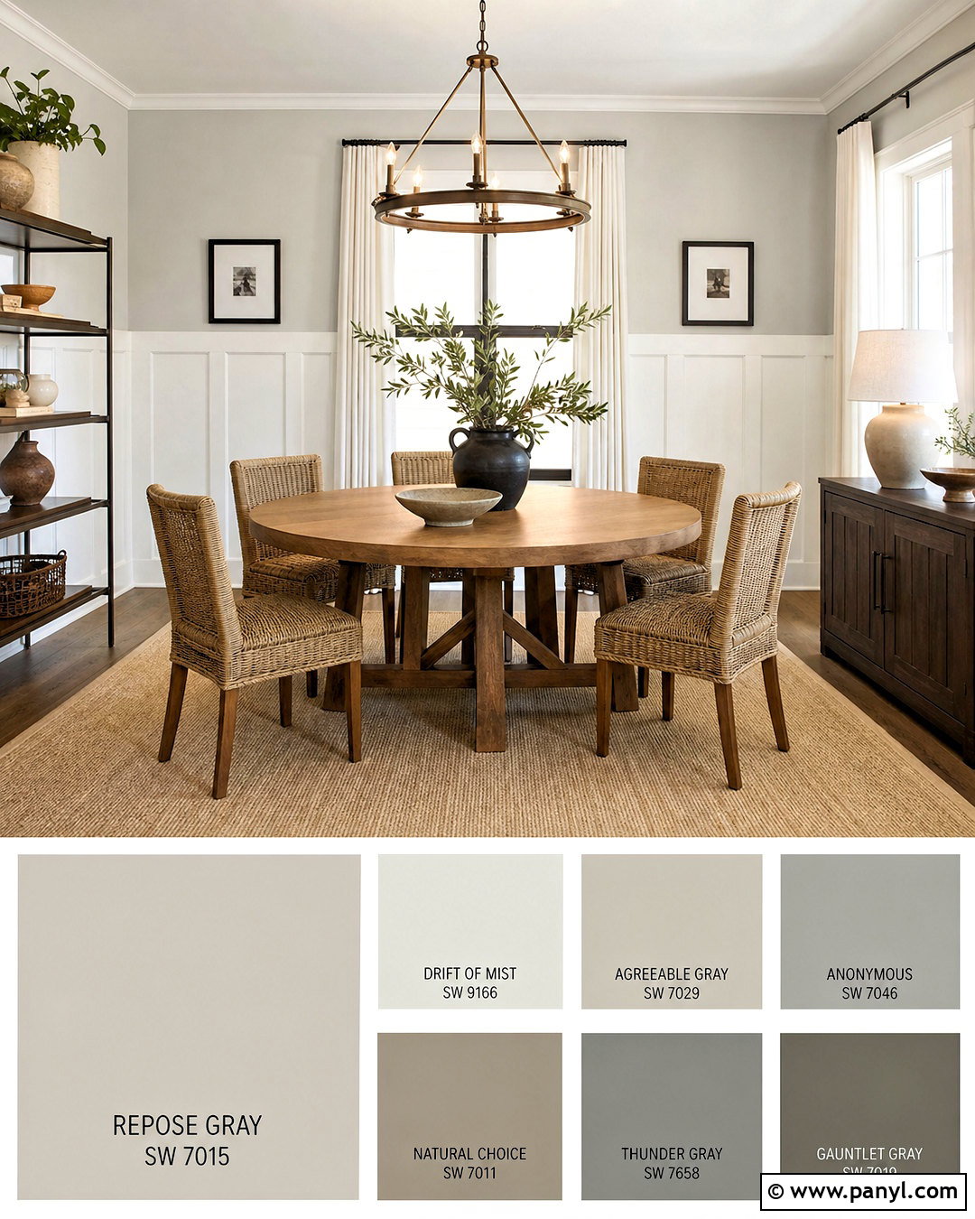
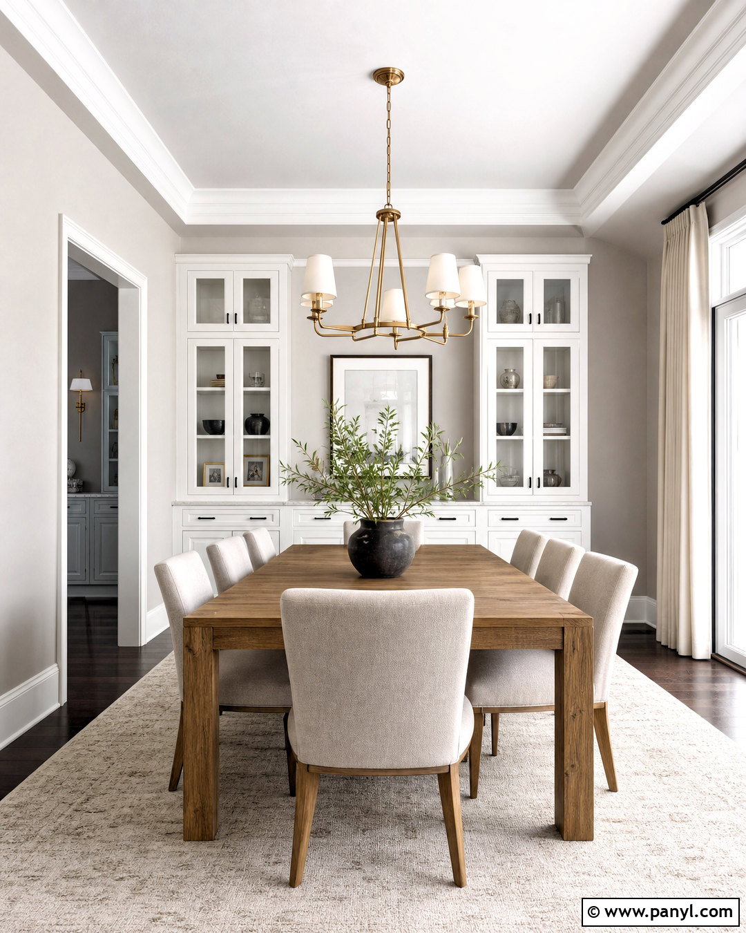
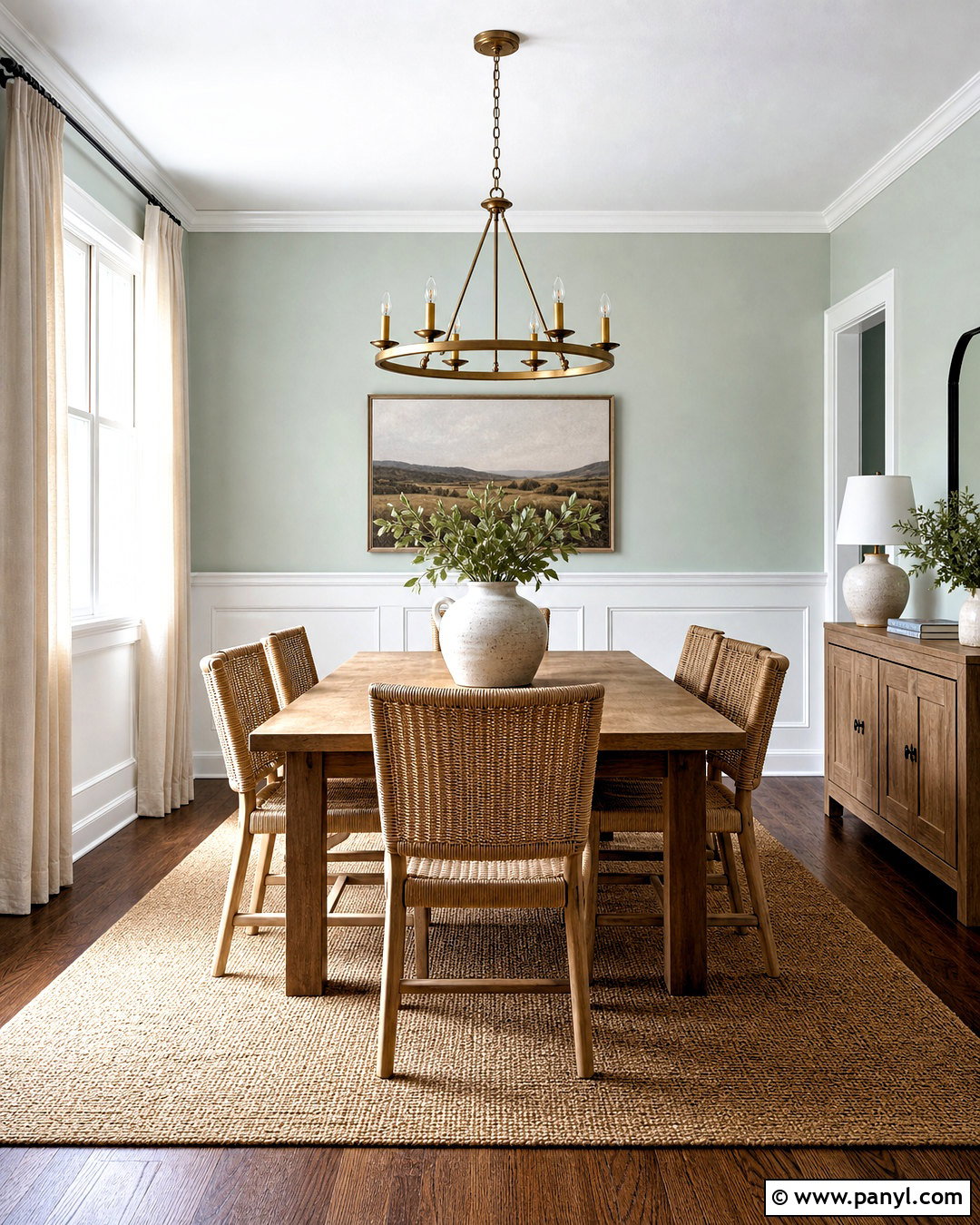
White Duck SW 7010 offers a warm, understated partner for Repose Gray in a casual dining room. Paint the walls Repose Gray and use White Duck on board-and-batten paneling, trim, and the ceiling. A round natural oak table, woven dining chairs, and a warm beige flat-weave rug create an organic foundation. Add a simple bronze chandelier and linen curtains in soft ivory. Dark brown frames and a ceramic centerpiece provide enough depth to keep the light neutrals from blending together. This scheme works best when repeated materials connect the colors. Warm wood reinforces White Duck, while bronze and brown accents ground Repose Gray. The result feels comfortable, collected, and easy to carry into nearby spaces. ()
6. Mindful Gray Office With Repose Gray
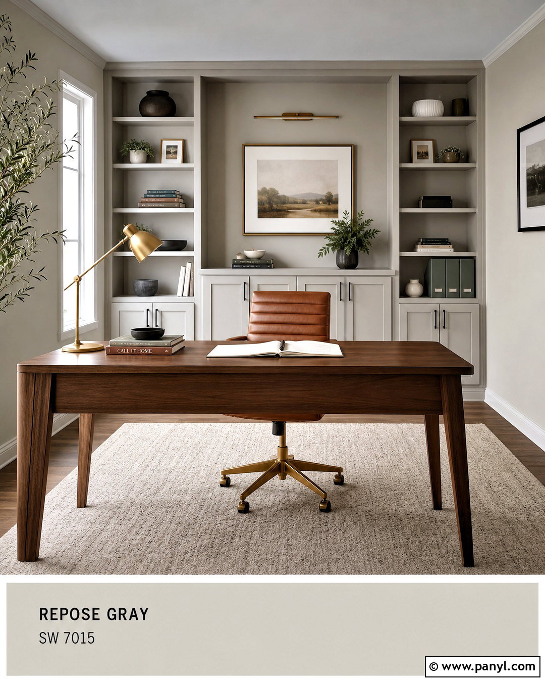
Mindful Gray SW 7016 creates a natural tonal transition because it is deeper than Repose Gray without introducing a completely different color family. Use Repose Gray on three walls and Mindful Gray behind built-in shelves or a substantial desk. Pure White trim keeps the edges fresh. Furnish the office with a walnut desk, cognac leather chair, and oatmeal wool rug. Black shelving hardware and an aged brass desk lamp add definition, while a few muted green accessories bring in an organic note. The darker feature wall should anchor the working zone rather than cover every surface. This layered gray palette feels deliberate when warm wood, leather, and woven textures are included throughout the complete room. ()
7. Dovetail Fireplace With Repose Gray
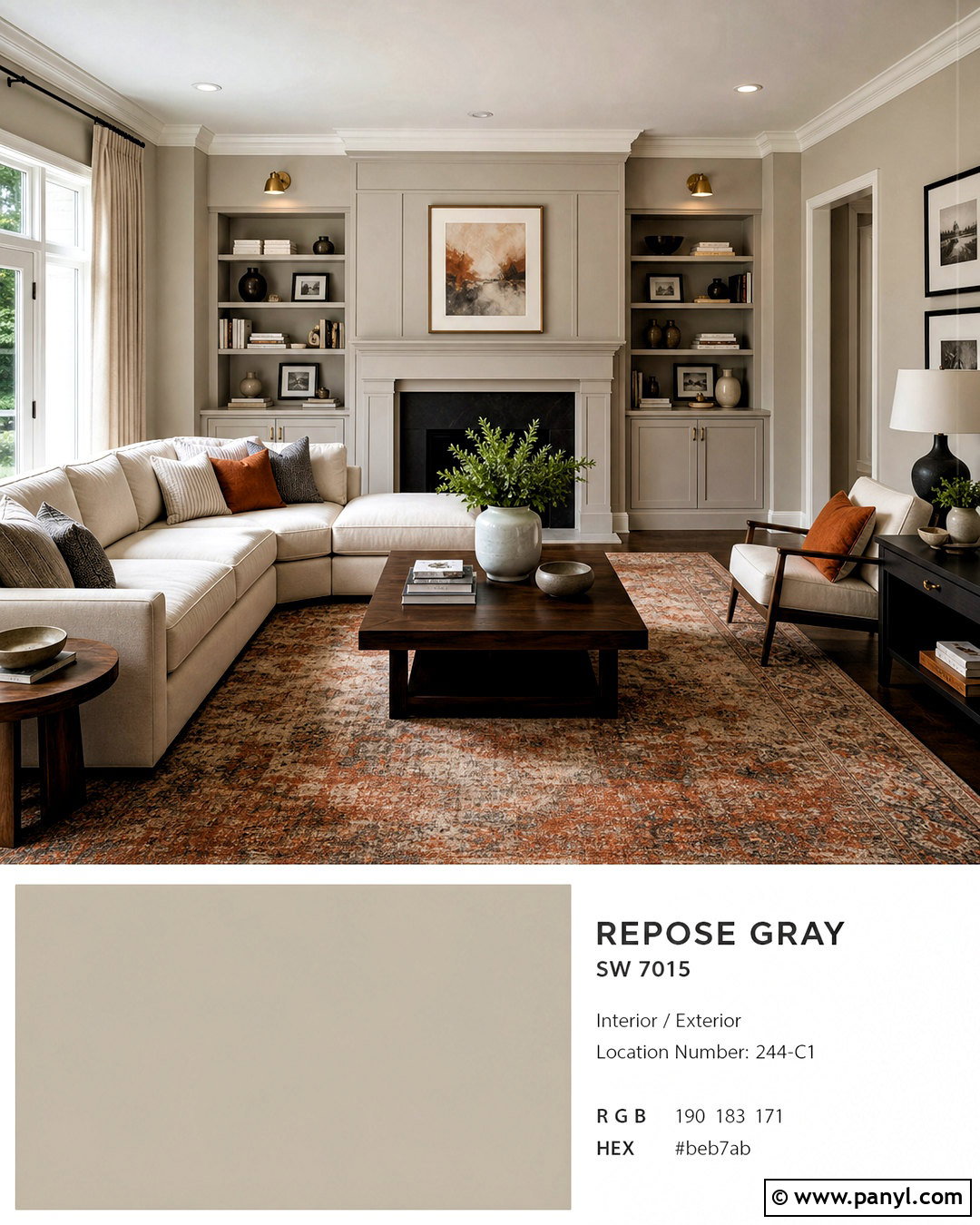
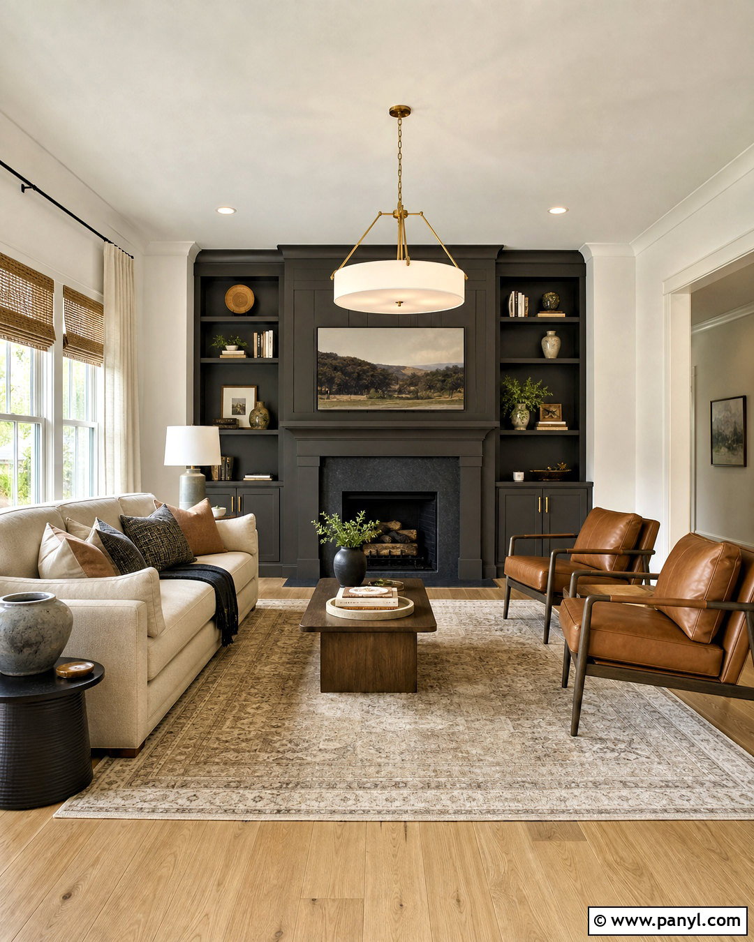
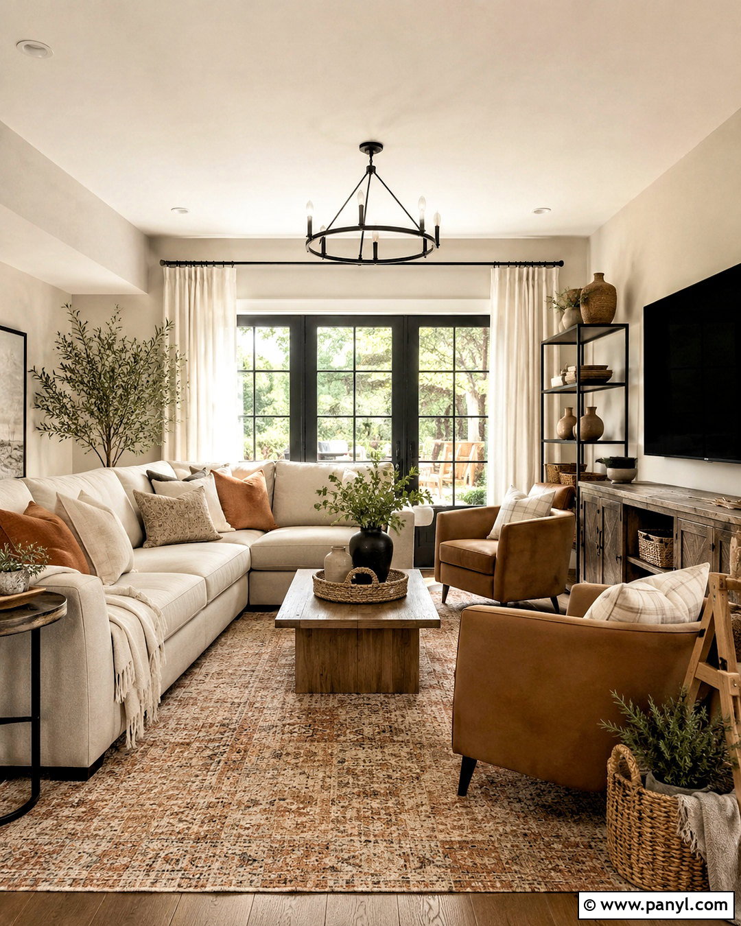
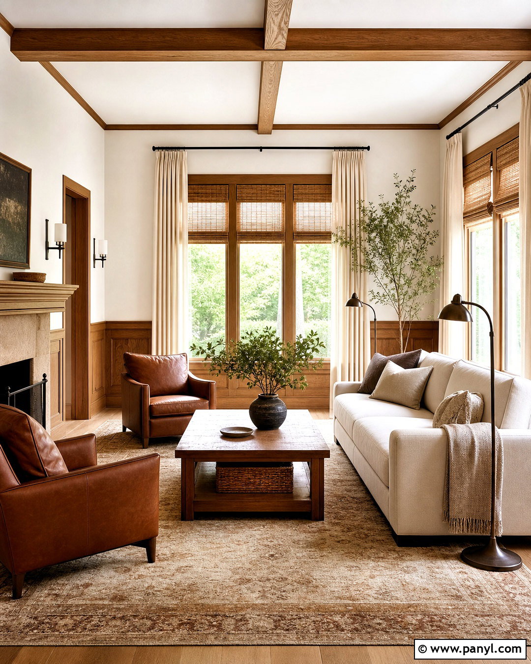
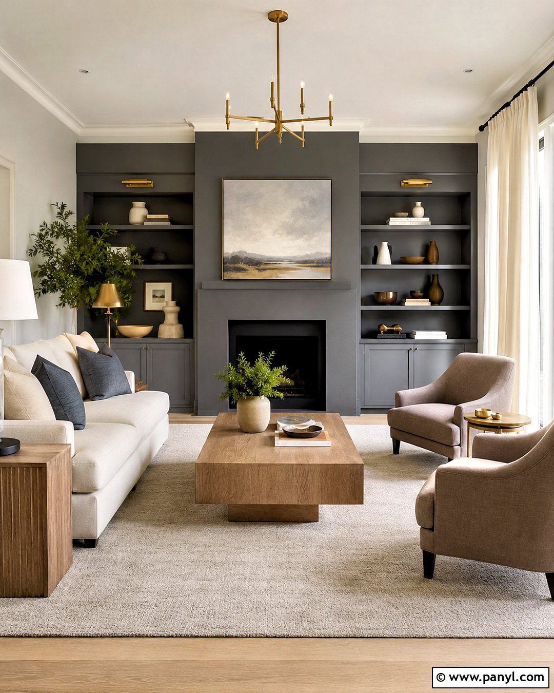
A Dovetail SW 7018 fireplace wall gives a Repose Gray living room depth without the intensity of black. Paint the surrounding walls Repose Gray and apply Dovetail to the fireplace, mantel, and adjacent built-in cabinetry. Use warm white trim to separate the gray tones clearly. A cream sectional, walnut side tables, and a rust-and-gray patterned rug soften the darker focal point. Brushed brass sconces bring warmth to the fireplace, while linen curtains keep the windows light. Repeat Dovetail in small details such as pillow piping or picture frames. The room will feel balanced because the deepest color remains concentrated around one architectural feature while lighter furnishings preserve an open, comfortable atmosphere. ()
8. Gauntlet Gray Exterior With Repose Gray
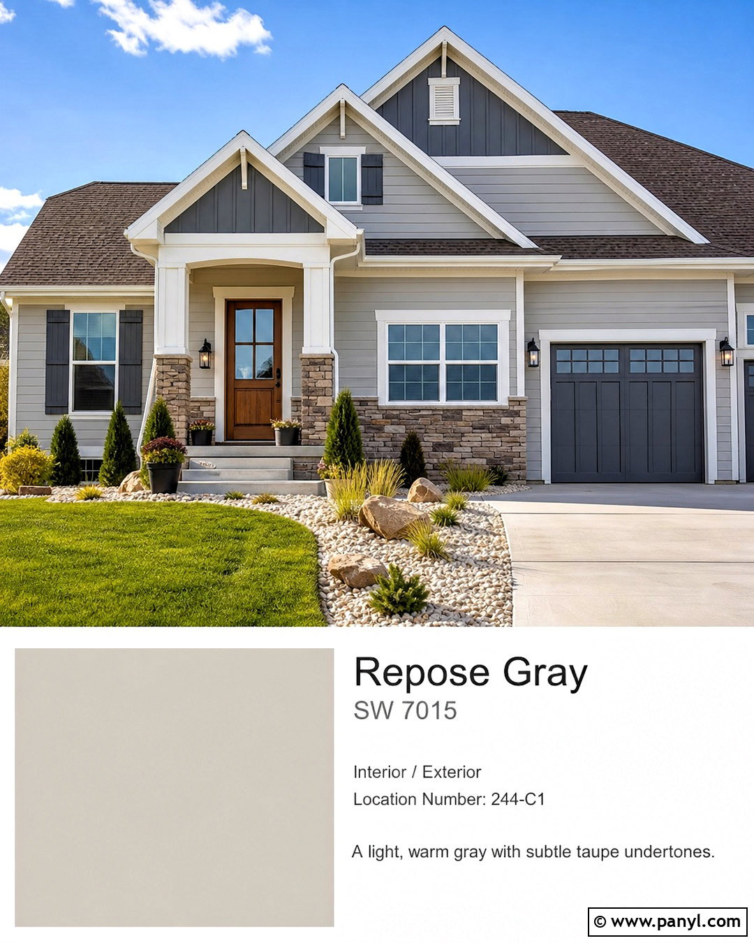
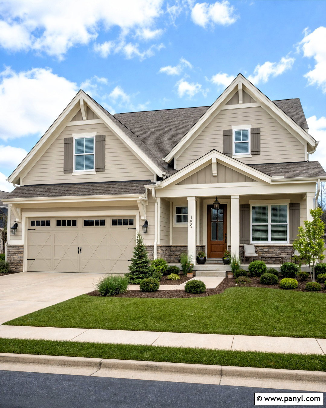
Gauntlet Gray SW 7019 can turn Repose Gray into a sophisticated exterior palette for a traditional or transitional home. Use Repose Gray on the main siding and Gauntlet Gray on shutters, garage doors, and selected gable details. Finish the trim, columns, and soffits in a soft white rather than a blue-white. A medium brown roof, natural stone foundation, and stained wood front door strengthen the warm side of the scheme. Matte black lanterns provide crisp outlines without overwhelming the facade. Complete the curb view with clipped evergreen shrubs, ornamental grasses, and pale gravel beds. This arrangement gives every color a clear role, helping an average-size house look layered and polished instead of monochromatic.
9. Urbane Bronze Kitchen Island With Repose Gray
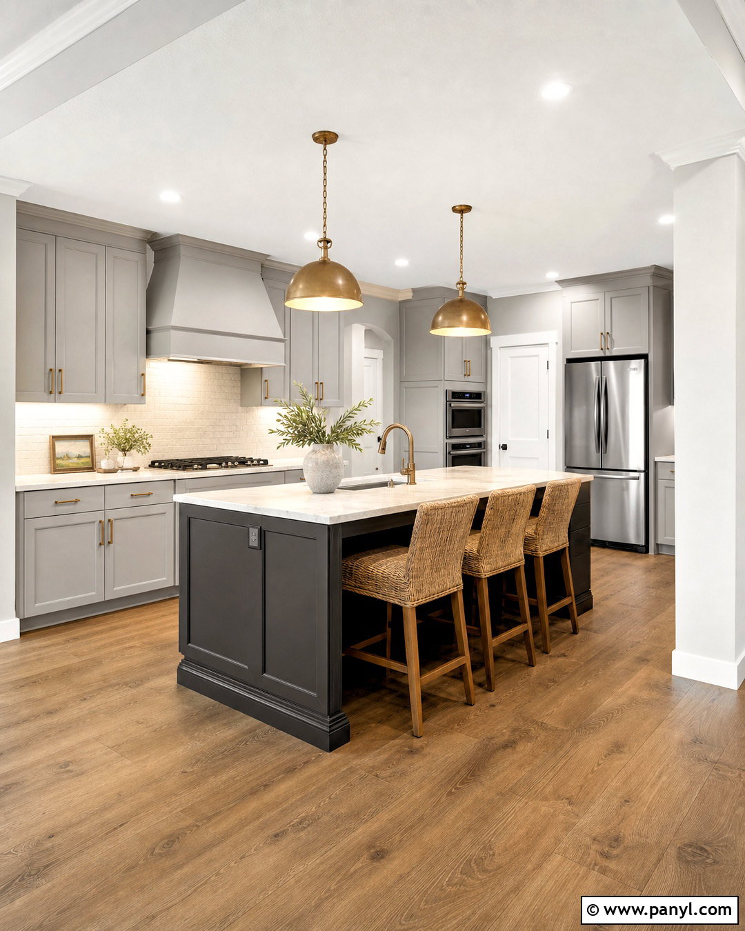
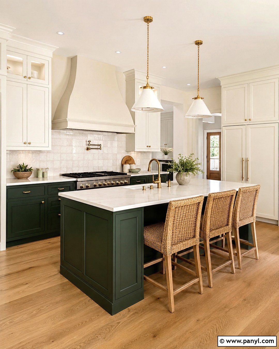
Urbane Bronze SW 7048 adds rich, earthy contrast to a Repose Gray kitchen. Paint the perimeter cabinets and walls Repose Gray, then use Urbane Bronze on a large island with simple shaker panels. Cream-toned quartzite countertops, an off-white backsplash, and brushed brass hardware warm both paint colors. Choose medium oak flooring and woven counter stools to reinforce the natural brown notes. Pure White trim keeps the room from becoming too heavy. Two aged brass pendants can center the island, while a small amount of black in the range and windows adds structure. This complete palette feels grounded and substantial because the deepest color appears on one central feature instead of surrounding the entire room. ()
10. Tricorn Black Doors With Repose Gray
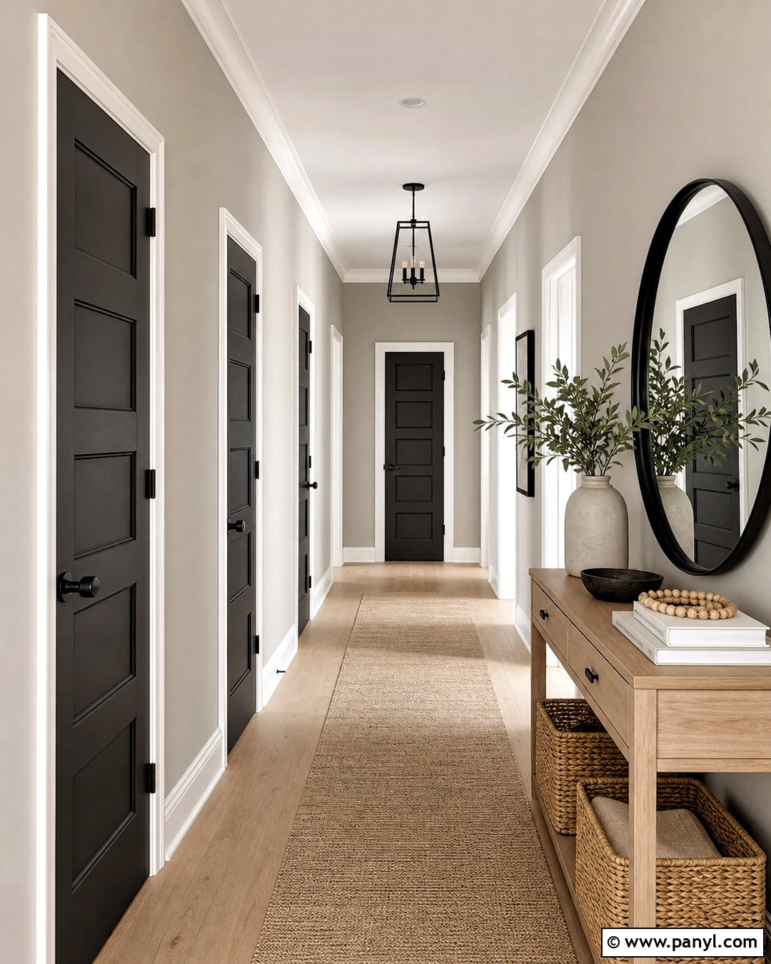
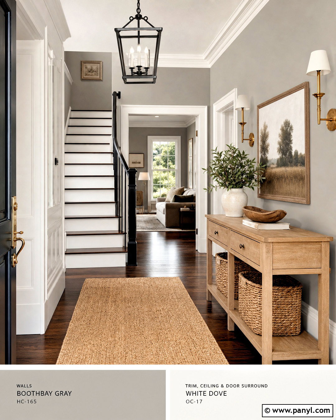
Tricorn Black SW 6258 creates bold definition when used sparingly with Repose Gray. In a modern hallway, paint the walls Repose Gray, the trim Pure White, and the interior doors Tricorn Black. Continue the look with a pale oak console, a large rounded mirror, and a black metal ceiling fixture. A light beige runner softens the high contrast, while woven baskets and ceramic accessories add natural texture. Keep the ceiling white so the hallway still feels bright. Black door hardware can blend into the painted doors for a smooth, unified finish. This approach works because the repeated dark surfaces create rhythm down the hall, while Repose Gray provides a calm bridge between black, white, and warm wood. ()
11. Iron Ore Exterior With Repose Gray
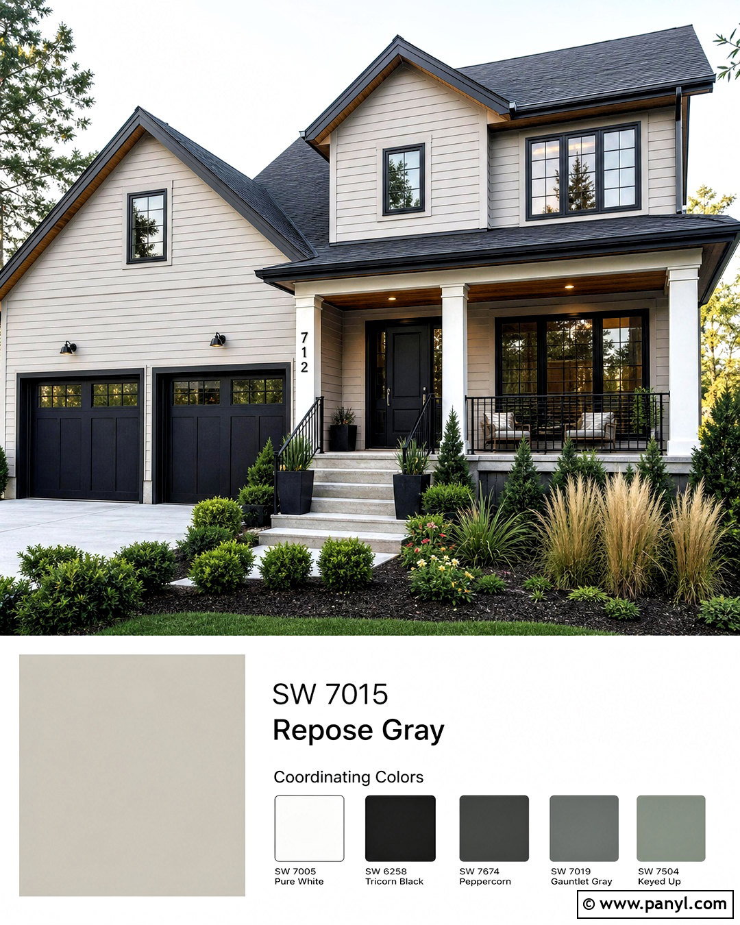
Iron Ore SW 7069 gives a Repose Gray exterior a strong contemporary outline without reading as a harsh jet black. Apply Repose Gray to horizontal siding or stucco, then use Iron Ore on window frames, porch railings, garage doors, and the front door. Bright warm-white trim can highlight the roofline and porch columns. Add cedar soffits or a natural wood porch ceiling to introduce warmth near the entry. Charcoal roof shingles, concrete steps, and black planters complete the architecture. For landscaping, choose structured evergreen shrubs mixed with feathery grasses. This coordinated exterior works especially well on homes with simple lines because the dark accents clarify the shape while the lighter body color keeps the facade approachable. ()
12. Naval Built-Ins With Repose Gray
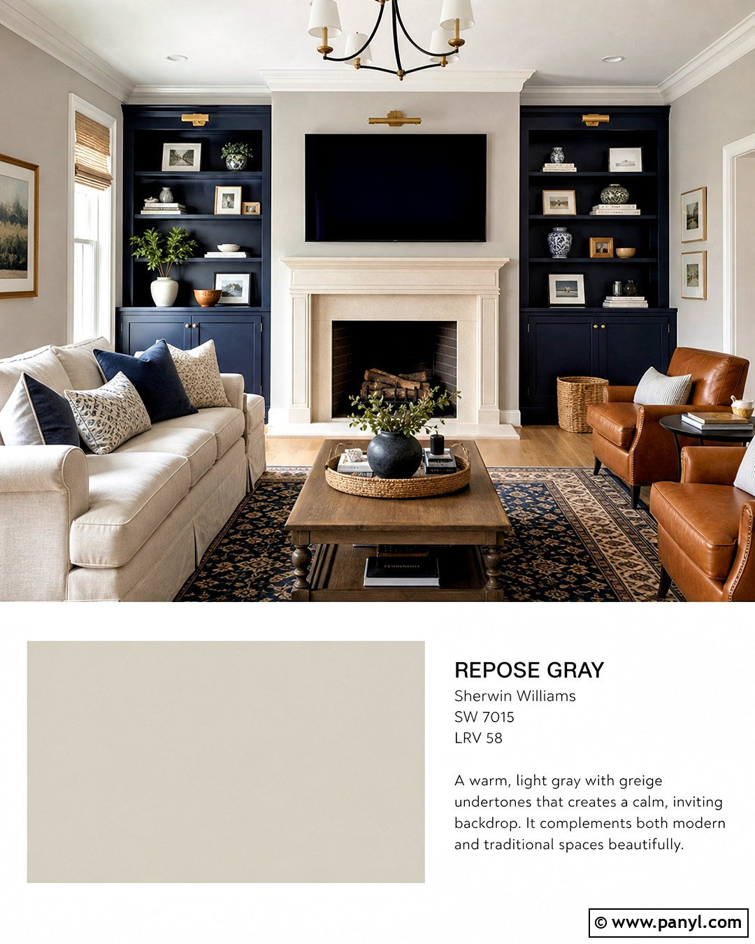
Naval SW 6244 brings classic blue contrast to Repose Gray without making the room feel overly colorful. Use Repose Gray on the living room walls and Naval on floor-to-ceiling built-ins surrounding a white or light stone fireplace. Add a warm ivory sofa, caramel leather chairs, and a traditional rug combining navy, gray, and muted tan. Brass picture lights and cabinet pulls brighten the deep blue. Natural oak flooring prevents the cool colors from dominating, while Pure White trim provides a clean boundary. Repeat Naval only a few times through pillows or artwork. Keeping the largest furniture pieces warm and light creates a balanced room where the blue cabinetry feels substantial but not visually heavy. ()
13. Indigo Batik Front Door With Repose Gray
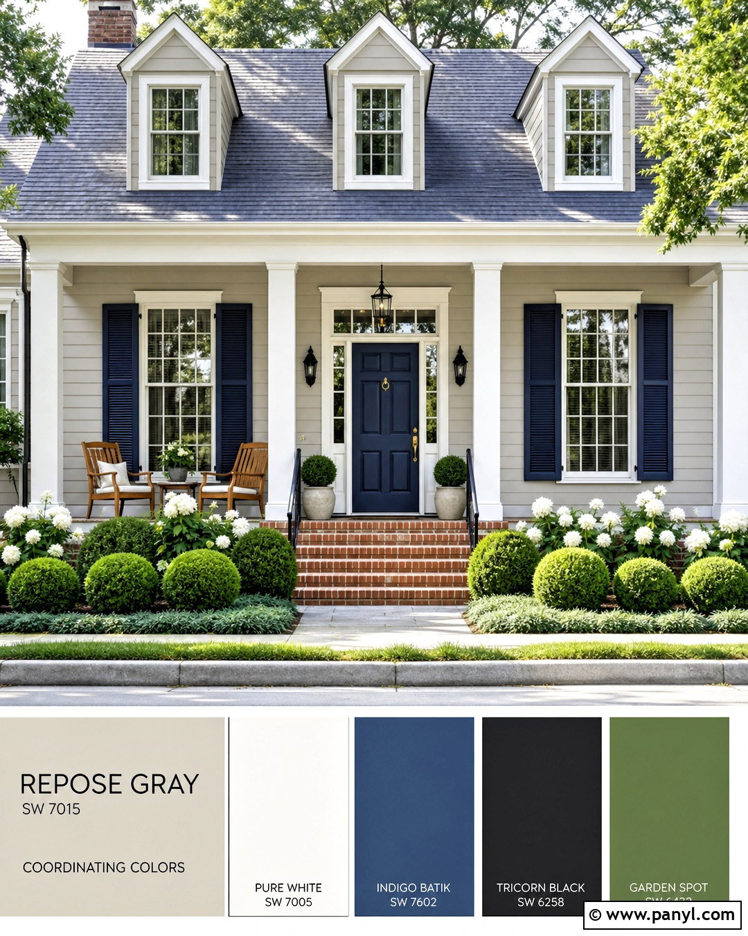
Indigo Batik SW 7602 offers a slightly softer blue statement for a Repose Gray house exterior. Paint the siding Repose Gray and use Pure White on the trim, porch columns, and garage surround. Make the front door Indigo Batik, then repeat the blue on simple shutters or two porch planters. A weathered gray roof, warm brick steps, and natural cedar porch furniture keep the palette residential and relaxed. Black lanterns and house hardware add fine contrast without competing with the door. Surround the entry with boxwood, white flowering shrubs, and deep green ground cover. The result is an inviting curb appeal scheme with a noticeable focal point and a clear connection between the neutral facade and colorful entrance. ()
14. Sea Salt Bathroom With Repose Gray
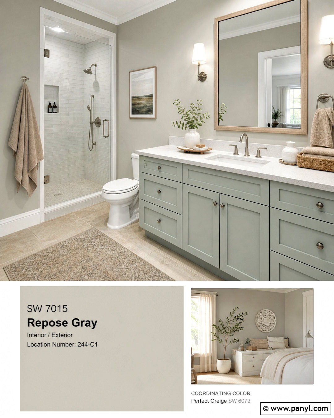
Sea Salt SW 6204 pairs beautifully with Repose Gray in a bathroom that needs soft color rather than dramatic contrast. Use Sea Salt on the vanity or upper wall and Repose Gray on the remaining walls. Pure White trim, a white quartz counter, and glossy off-white shower tile keep the room bright. Choose a pale oak vanity top detail or wood-framed mirror to add warmth. Brushed nickel fixtures support the quiet blue-green palette, while sandy beige towels stop it from feeling too cool. A light stone-look floor can connect all three neutrals. This spa-like scheme remains practical because Repose Gray carries the main space while Sea Salt identifies the vanity zone and adds a refreshing focal point. ()
15. Rainwashed Laundry Room With Repose Gray
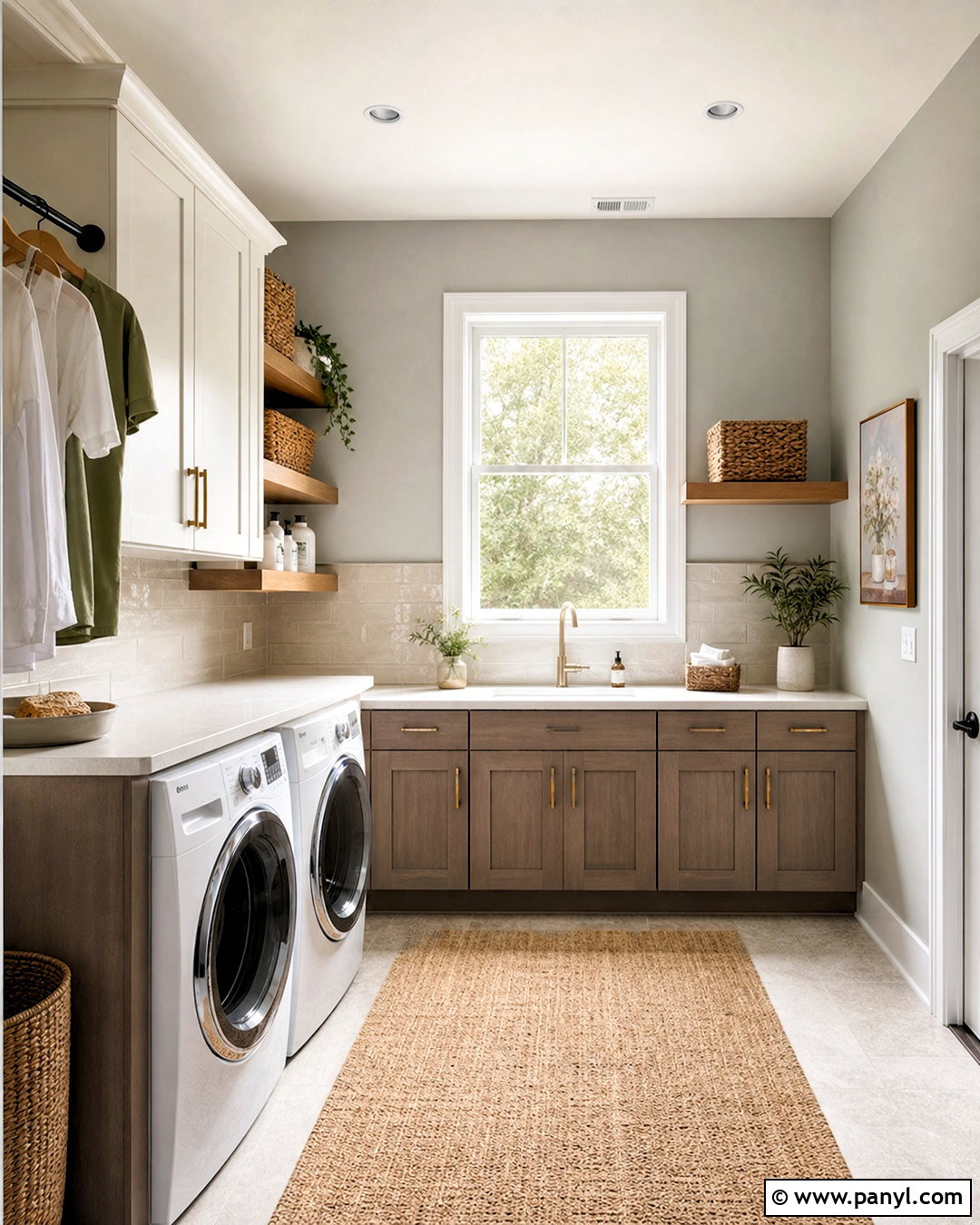
Rainwashed SW 6211 gives a Repose Gray laundry room a fresh blue-green accent while maintaining a calm whole-home palette. Paint the walls Repose Gray and the lower cabinets Rainwashed. Use warm white upper cabinets to prevent the compact room from feeling crowded. A pale quartz counter above the washer and dryer creates a useful folding surface, while a creamy handmade tile backsplash adds gentle texture. Finish the room with brushed brass pulls, a natural woven runner, and light oak floating shelves. Place matching storage baskets on the shelves for a tidy appearance. The mix of soft color, warm metal, and natural fiber turns a practical utility room into a finished space that still connects easily with surrounding gray hallways. ()
16. Evergreen Fog Mudroom With Repose Gray
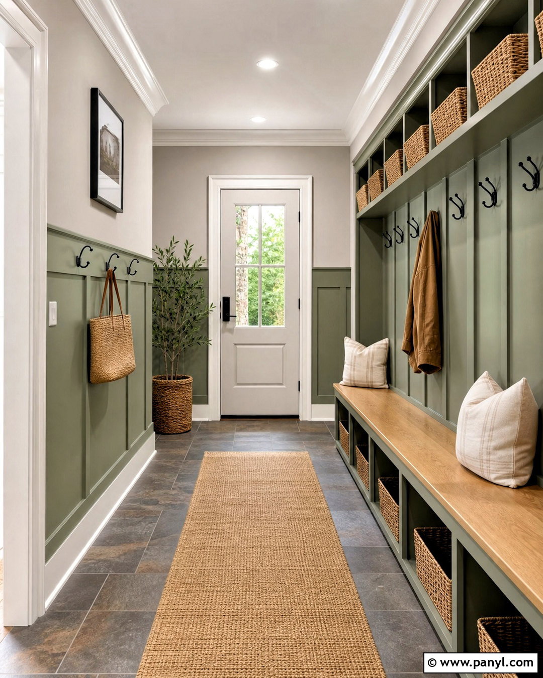
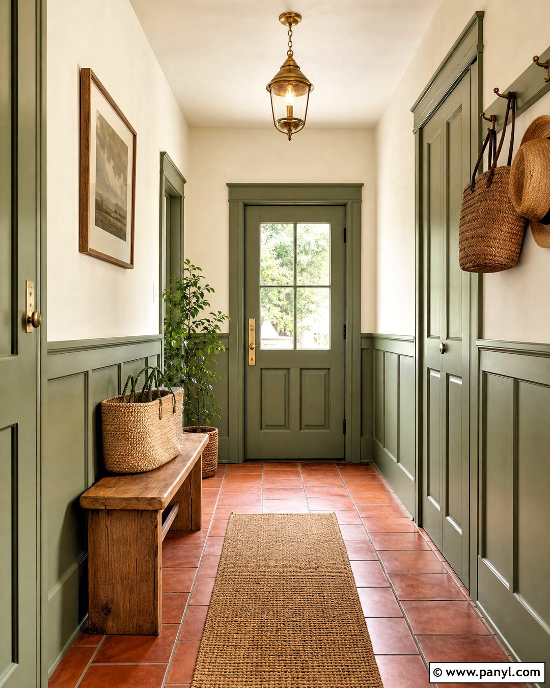
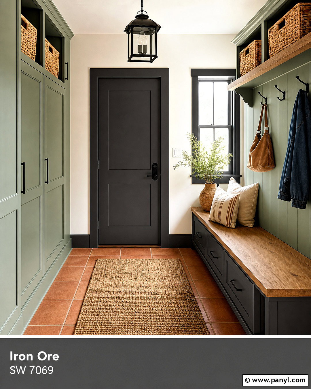
Evergreen Fog SW 9130 makes Repose Gray feel more organic in a hardworking mudroom. Use Repose Gray on the upper walls and Evergreen Fog on built-in lockers, the storage bench, and lower wall paneling. Finish the trim in Pure White for a defined transition. A warm oak bench seat, matte black hooks, and woven baskets introduce useful texture. Choose durable slate-look porcelain flooring with warm gray variation rather than a cold blue-gray tile. A washable beige runner and cream seat cushions lighten the lower half of the room. This complete design gives the green a functional purpose while Repose Gray keeps the background neutral. It feels earthy, organized, and connected to both indoor living areas and outdoor entrances. ()
17. Sage Bedroom With Repose Gray
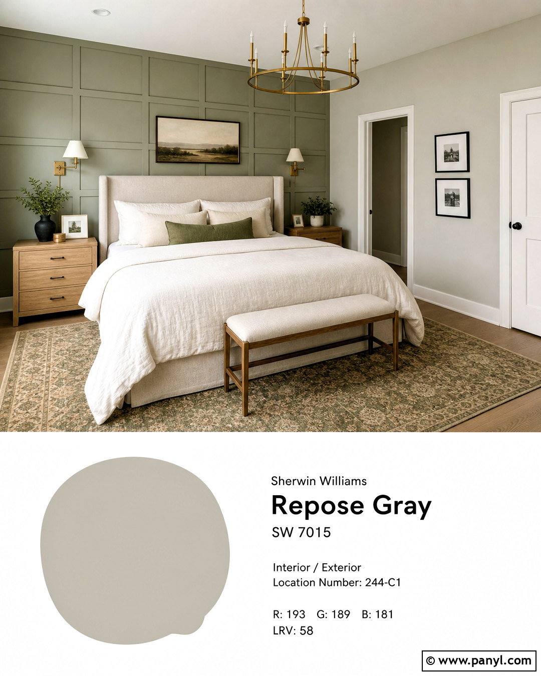
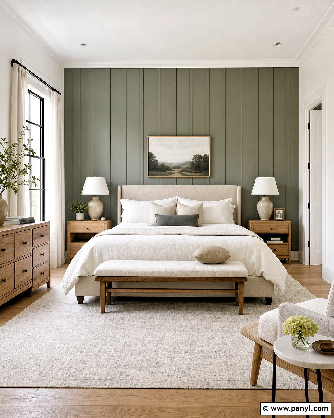
Sage SW 2860 can create a restful bedroom when combined with Repose Gray and warm natural materials. Paint the walls Repose Gray and use Sage on a paneled wall behind the bed or on a pair of freestanding wardrobes. Select an oatmeal upholstered bed, ivory linen bedding, and a softly patterned rug containing green, beige, and gray. Medium oak nightstands warm the room, while aged brass sconces add a subtle glow. Keep the trim and ceiling a soft white. Small black frames can provide contrast, but avoid filling the room with cool silver accents. The complete palette feels calm because the green is muted, the gray is balanced, and every large textile introduces softness rather than another hard color. ()
18. Accessible Beige Open Floor Plan With Repose Gray
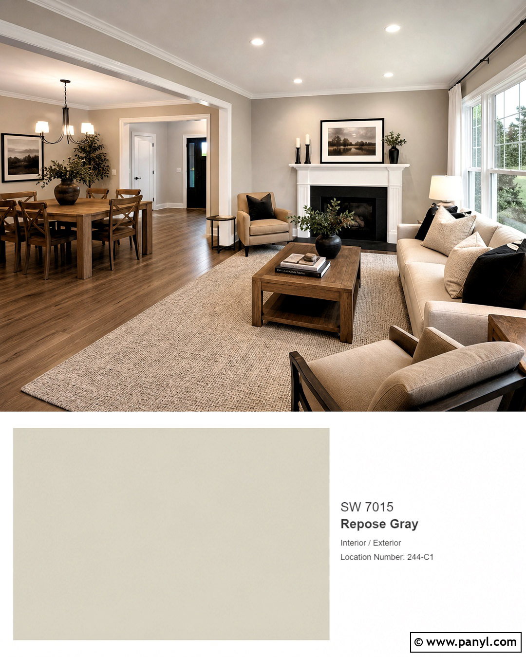
Accessible Beige SW 7036 helps Repose Gray move gracefully through an open floor plan with changing light. Use Repose Gray in the living area and Accessible Beige in the adjoining dining room or kitchen. Keep Pure White on all connecting trim, doors, and ceilings so the two wall colors feel intentional. Furnish both zones with medium oak, warm beige upholstery, and dark bronze lighting. A large rug containing greige, ivory, and charcoal can visually link the spaces. Repeat black accents in each area through frames, chair legs, or cabinet hardware. This warm-to-cool progression adds subtle variety without interrupting flow, making it useful for homes where one neutral looks different from the sunny side to the shaded side. ()
19. Cavern Clay Dining Room With Repose Gray
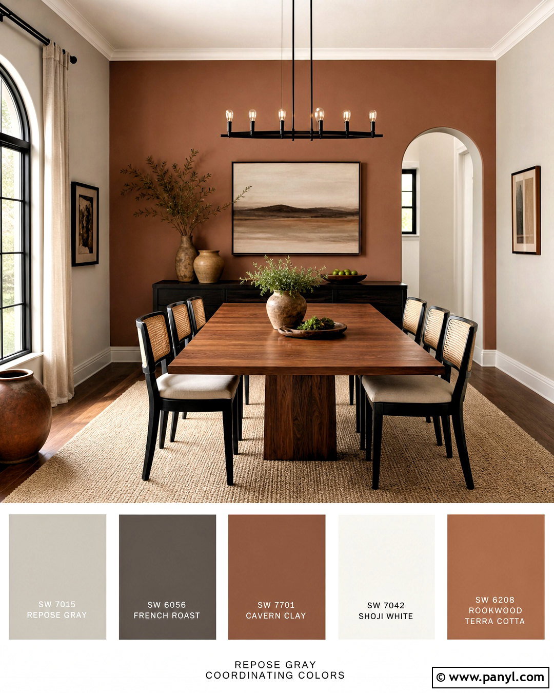
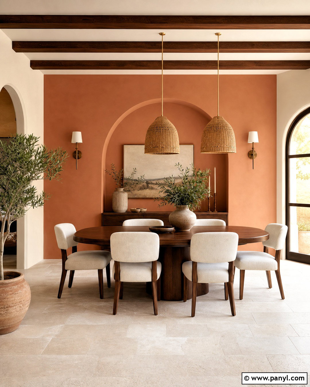
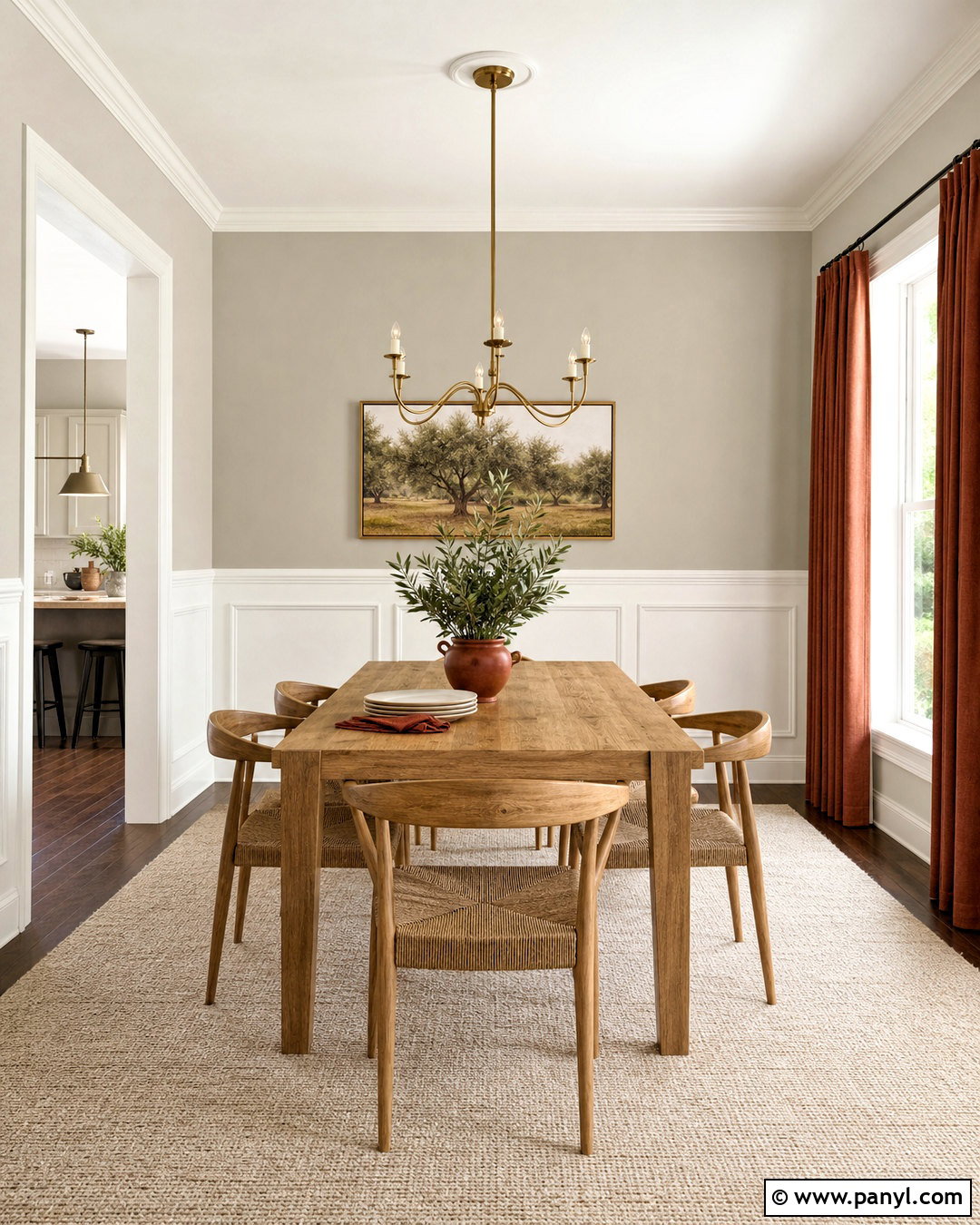
Cavern Clay SW 7701 introduces earthy terracotta warmth to a Repose Gray dining room. Keep Repose Gray on most walls and paint the wall behind a buffet or dining table in Cavern Clay. Add a walnut dining table, woven cane chairs, and a cream textured rug to create a comfortable foundation. Alabaster trim softens the contrast between the warm accent and gray background. A black linear chandelier supplies structure, while pottery, linen curtains, and rust-patterned cushions repeat the clay color in smaller doses. Green branches or muted olive accessories provide a natural counterpoint. This palette feels welcoming because the terracotta warms the neutral walls, yet its limited placement prevents the dining room from becoming too saturated or theme-driven. ()
20. Coral Clay Living Room With Repose Gray
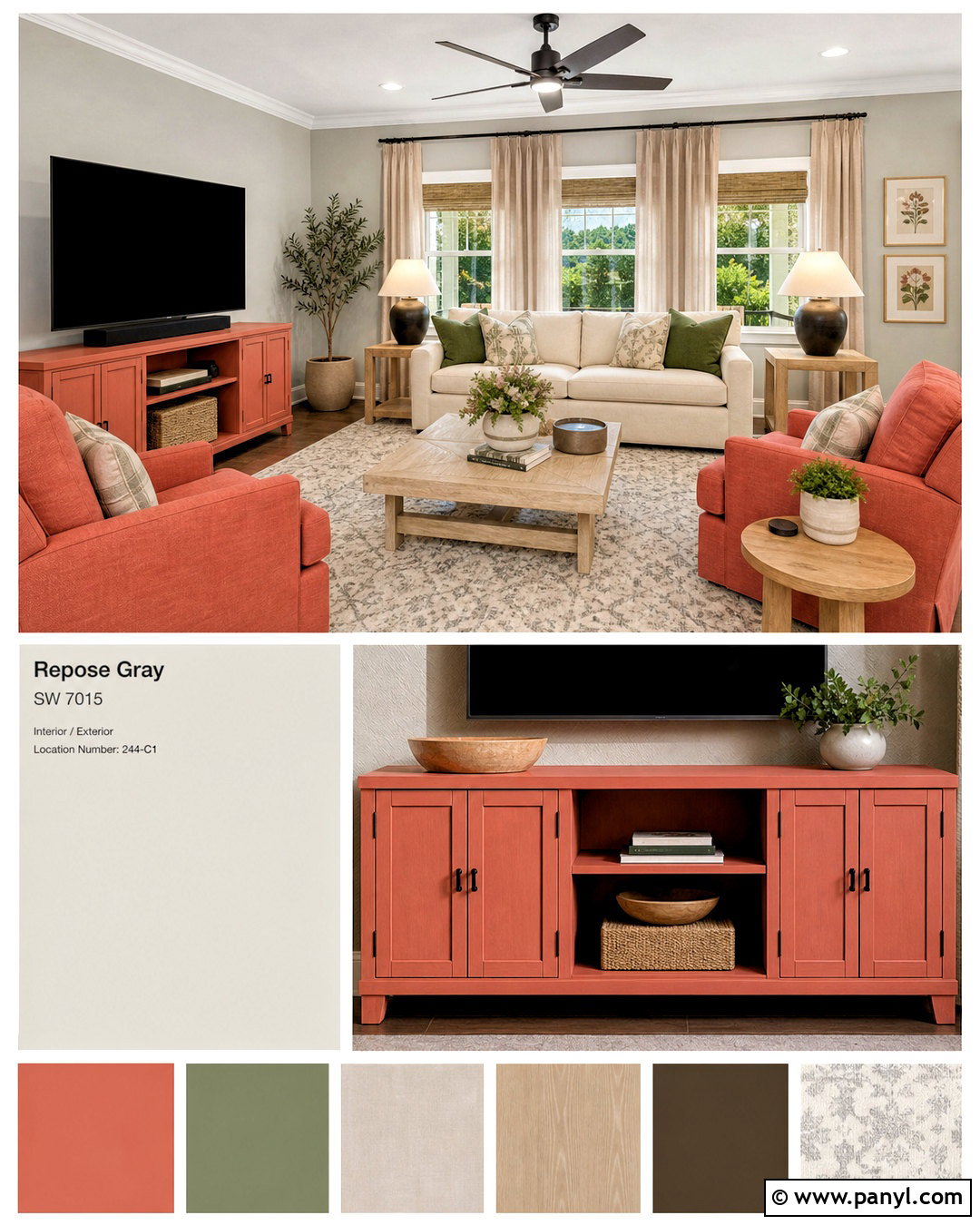
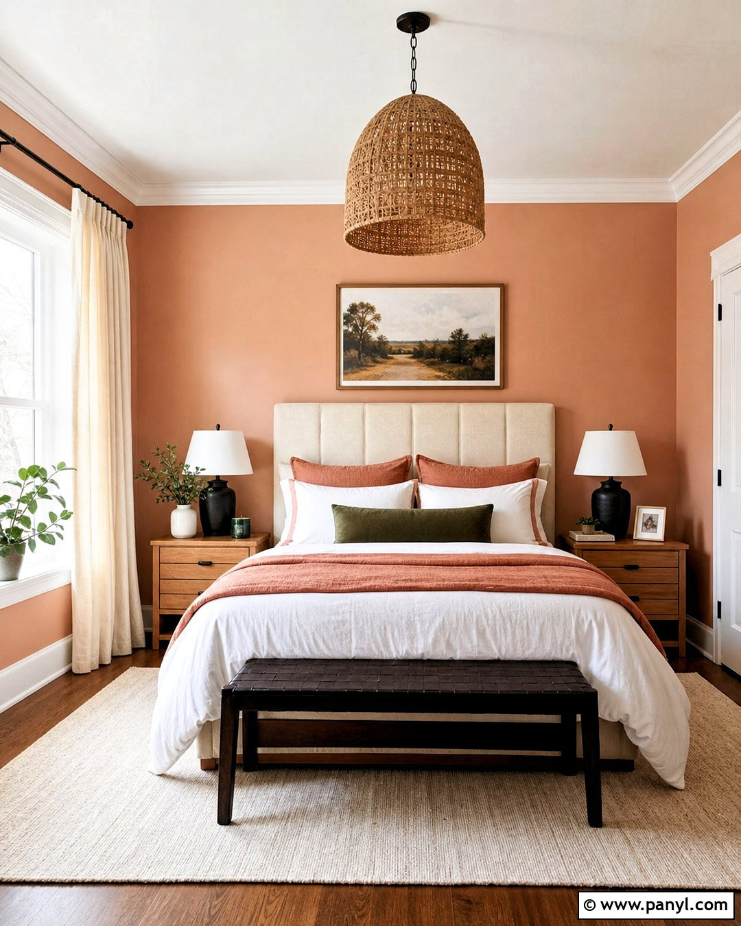
Coral Clay SW 9005 brings a lively but grounded accent to a Repose Gray living room. Use Repose Gray on every wall, then introduce Coral Clay through a painted media console, two upholstered chairs, or a defined window-seat nook. Balance the warmer color with a cream sofa, pale oak tables, and an ivory-and-gray rug. Pure White trim keeps the architectural lines fresh. Add muted green pillows and dark bronze lamps so the coral does not stand alone. Natural linen curtains filter bright daylight and reduce harsh contrast. By distributing Coral Clay across two or three substantial features, the color feels integrated into the complete design rather than added as a small, unrelated pop. ()
Conclusion:
The best 20 repose gray coordinating colors include soft whites, layered grays, deep charcoals, classic blues, muted greens, warm greiges, and earthy clay tones. The right option depends on the room’s light, permanent finishes, and the amount of contrast you prefer. Pure White and Alabaster offer reliable trim solutions. Naval, Urbane Bronze, and Iron Ore create stronger focal points. Sea Salt, Rainwashed, and Evergreen Fog deliver quieter color, while Cavern Clay and Coral Clay add warmth. Build a complete palette around flooring, furniture, hardware, and textiles rather than choosing paint in isolation. Most importantly, test every color beside Repose Gray throughout the day before purchasing paint for the entire space.

Related Ideas and Inspiration:
Leave a Reply