
Sherwin-Williams Agreeable Gray SW 7029 is a warm greige with subtle beige undertones, making it flexible enough for calm neutrals, earthy shades, muted colors, and dramatic accents. Sherwin-Williams officially recommends Incredible White, Extra White, and Coral Rose as coordinating options, but its versatility reaches much further. () The key is creating balanced contrast while considering natural light, flooring, cabinetry, and fixed finishes. Cooler colors make Agreeable Gray appear warmer, while creamy whites and rich browns emphasize its softer beige side. Always test samples beside existing materials during the day and evening. The complete room schemes below explain practical, attractive ways to decorate with **20 agreeable gray coordinating colors**.

1. Agreeable Gray And Incredible White
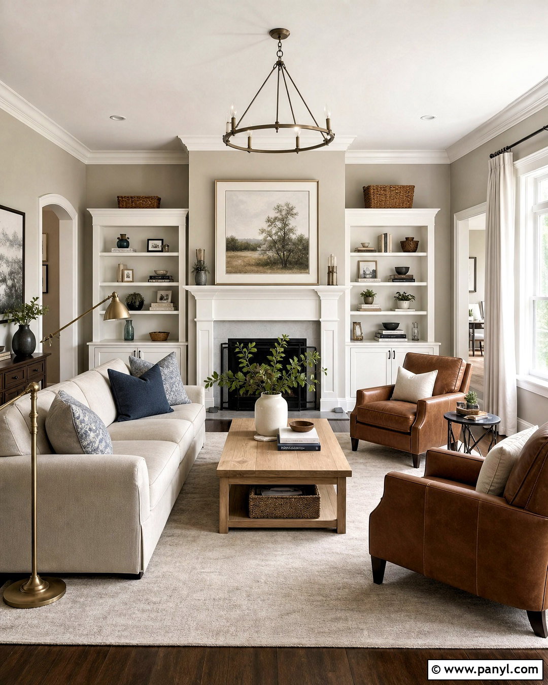
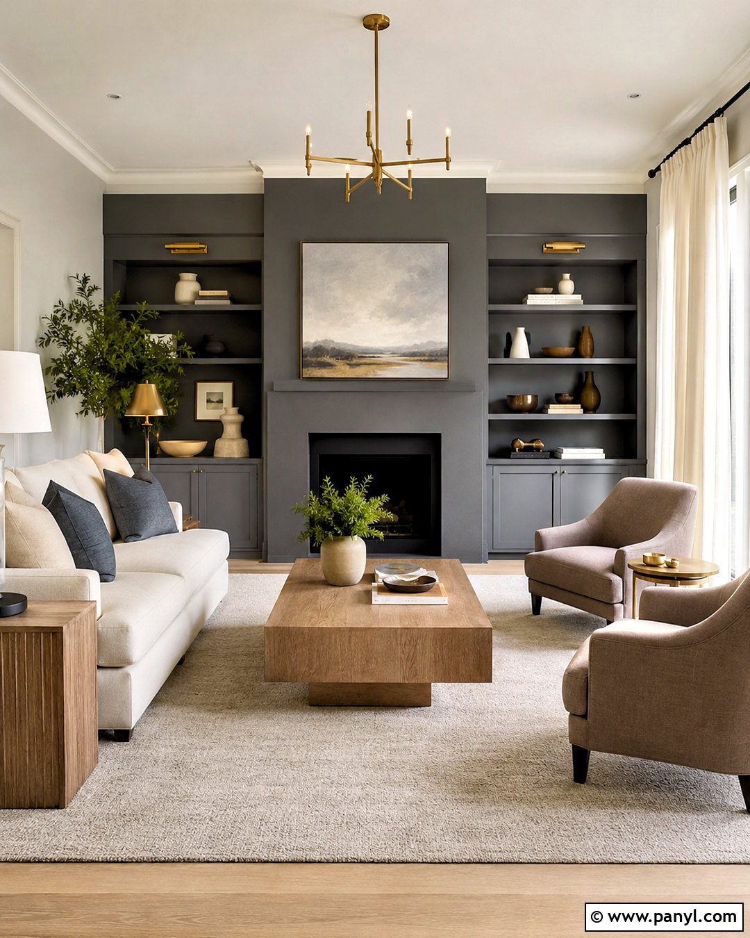
Incredible White SW 7028 creates a gentle transition rather than sharp contrast, making it ideal for a quiet, layered living room. Paint the main walls Agreeable Gray and use Incredible White on the ceiling, trim, fireplace surround, and built-in bookcases. Bring in a warm ivory sofa, pale oak coffee table, and oatmeal linen curtains to continue the soft neutral palette. A textured beige rug prevents the similar wall colors from looking flat. Add aged brass lighting, medium brown leather chairs, and muted blue-gray pillows for definition. This combination works especially well in open rooms where an intense white might feel disconnected. The result is warm, comfortable, and polished without looking overly formal or stark.
2. Agreeable Gray And Extra White
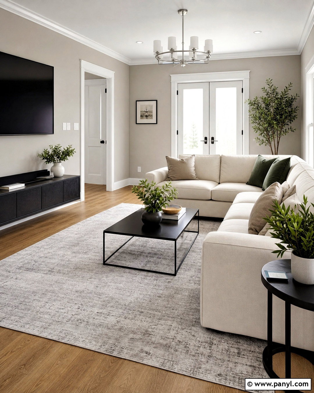
Extra White SW 7006 gives Agreeable Gray a cleaner, brighter edge. Use Agreeable Gray across the living room walls, then apply Extra White to baseboards, crown molding, window trim, interior doors, and the ceiling. The stronger contrast highlights architectural details and makes the greige walls easier to recognize. Choose a streamlined cream sectional, a black metal coffee table, and a light gray wool rug for a modern foundation. Natural oak flooring keeps the room from feeling cold. Finish the space with matte black curtain rods, brushed nickel lighting, white ceramic accessories, and a few deep green plants. This complete scheme suits rooms with good daylight and homeowners who want Agreeable Gray to feel fresh, crisp, and contemporary.
3. Agreeable Gray And Coral Rose
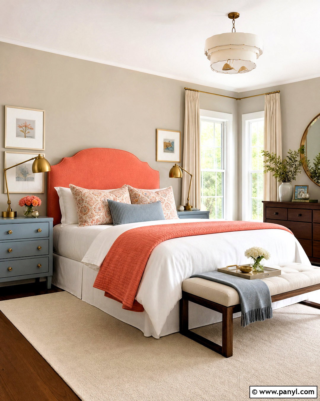
Coral Rose SW 9004 adds welcoming color without overpowering the warmth of Agreeable Gray. In a bedroom, use Agreeable Gray on every wall and introduce Coral Rose through an upholstered headboard, bench, patterned pillows, and a painted bedside cabinet. Keep the bedding soft white with a folded coral coverlet for a controlled layer of color. Light walnut nightstands and brushed brass lamps support the palette’s warm undertones. Ground the arrangement with a cream rug containing faded coral, taupe, and dusty blue details. White curtains keep daylight bright and balanced. Rather than spreading coral evenly throughout the room, concentrate it around the bed to establish a clear focal point. The completed space feels warm, cheerful, and restful.
4. Agreeable Gray And Pure White
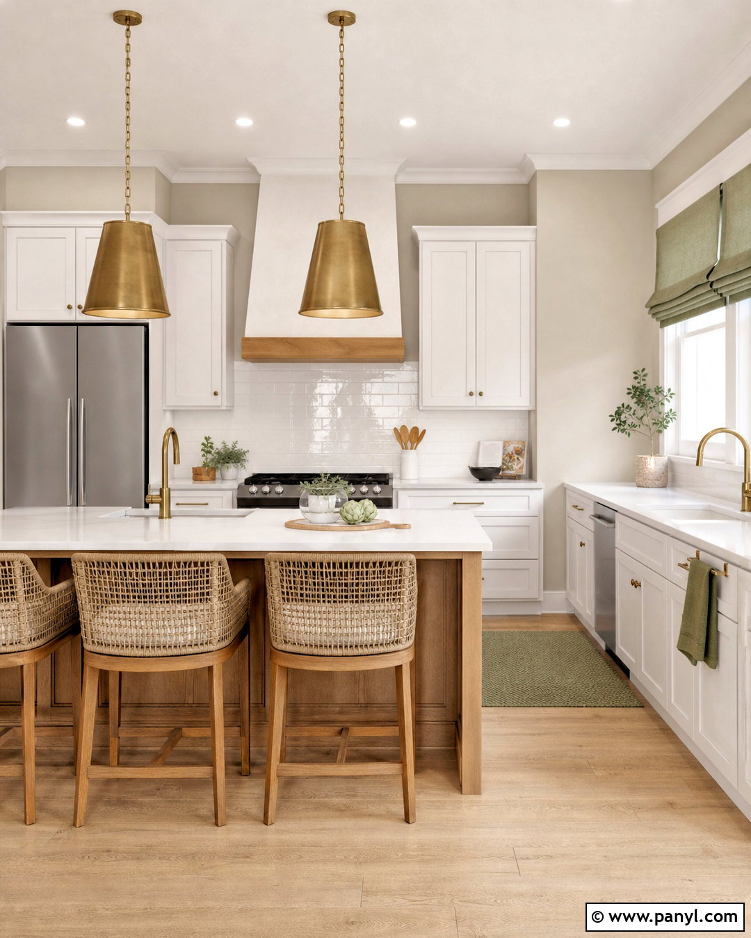
Pure White SW 7005 is a balanced choice for a bright kitchen with Agreeable Gray walls. Paint shaker cabinets Pure White and use the same shade on trim, doors, and the ceiling for a consistent background. Agreeable Gray adds warmth around the cabinetry without creating a yellow or overly creamy effect. Install lightly veined white quartz counters, a glossy white subway tile backsplash, and pale white oak flooring. A medium oak island introduces natural contrast while brushed brass pendants and cabinet pulls add warmth. Complete the kitchen with woven counter stools, simple ceramic accessories, and muted green textiles. This pairing looks clean but still comfortable, making it useful in transitional kitchens that combine classic cabinet shapes with modern finishes and uncluttered styling.
5. Agreeable Gray And Alabaster
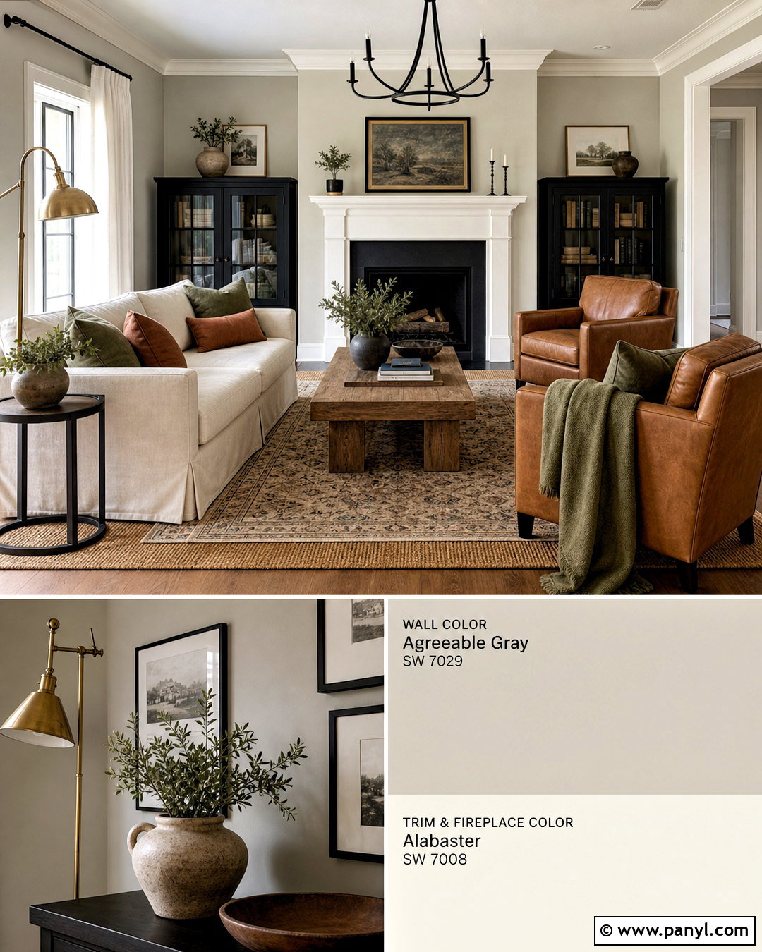
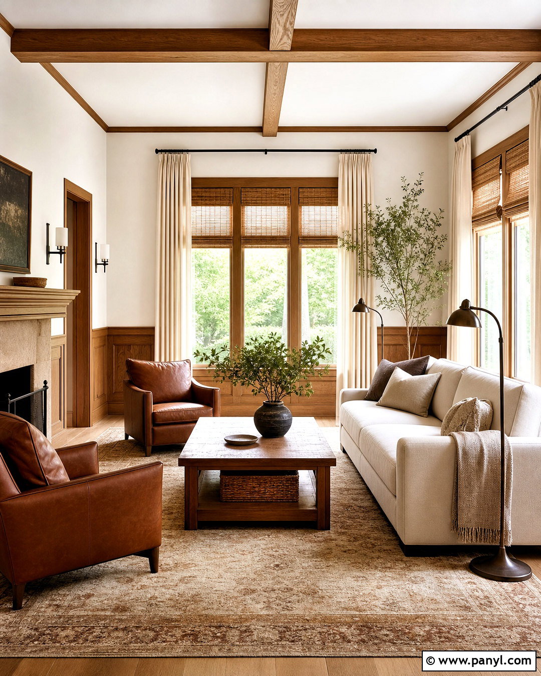
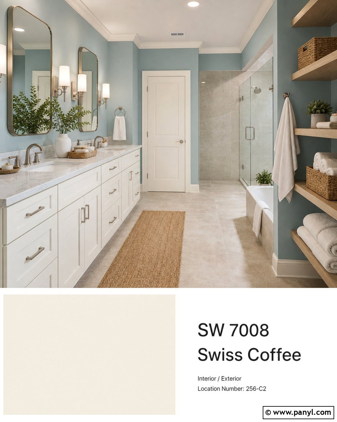
Alabaster SW 7008 brings out the warm, relaxed side of Agreeable Gray. Create a comfortable family room with Agreeable Gray walls, Alabaster trim, and an Alabaster-painted fireplace. Choose a slipcovered cream sofa, caramel leather armchairs, and a substantial reclaimed oak coffee table. A natural jute rug layered beneath a smaller patterned wool rug gives the seating area more depth. Add linen curtains, antique brass lamps, and pillows in muted olive, rust, and warm charcoal. Because both paint colors have softness, include a few dark accents, such as black frames or an iron fireplace screen, to create definition. This full palette works beautifully with warm wood floors and traditional architecture, producing a casual, collected room that never feels too gray.
6. Agreeable Gray And Greek Villa
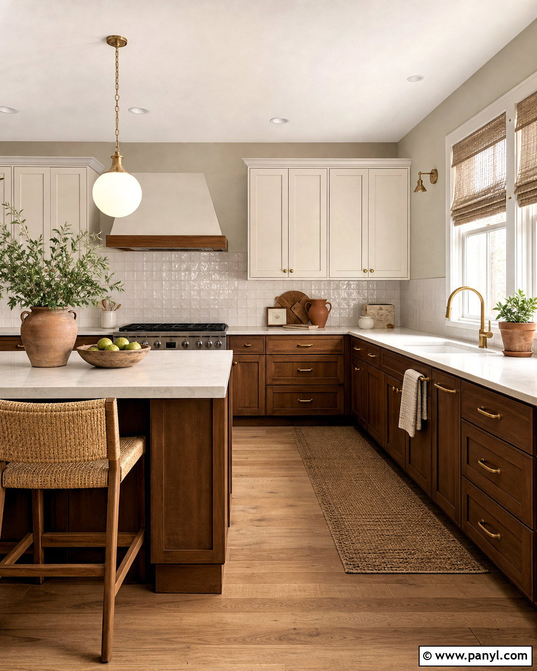
Greek Villa SW 7551 coordinates with Agreeable Gray through its warm, creamy character. Use Greek Villa on upper kitchen cabinets and Agreeable Gray on the surrounding walls, then deepen the room with natural walnut lower cabinets or an island. Cream quartz countertops and handmade off-white backsplash tile connect the two paint colors without making everything match. Choose aged brass hardware, warm white globe pendants, and medium-toned oak flooring. A small breakfast nook can include a walnut table, woven chairs, and a washable rug with muted terracotta details. Keep appliances in stainless steel for a clean interruption between warm finishes. This layered scheme is especially effective in kitchens with moderate natural light where a cooler white might appear harsh beside Agreeable Gray.
7. Agreeable Gray And Shoji White
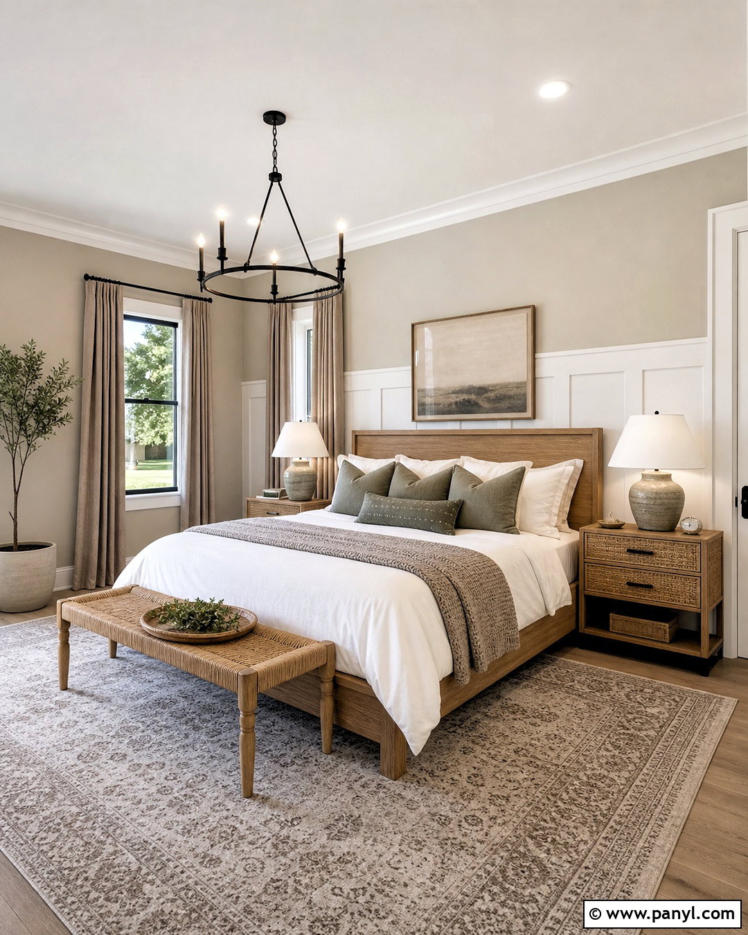
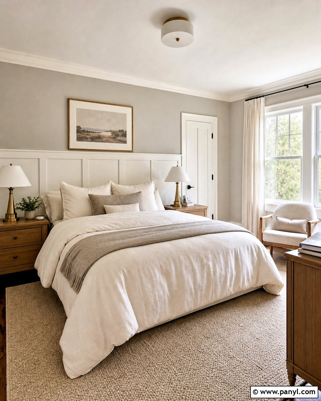
Shoji White SW 7042 creates a soft, organic pairing for a peaceful primary bedroom. Cover the walls in Agreeable Gray and use Shoji White on the ceiling, trim, and paneled wall behind the bed. Select a light oak platform bed, warm white linen bedding, and taupe wool curtains. A large cream-and-gray rug should extend beyond the bed to make the layout feel generous and grounded. Add woven nightstands, ceramic lamps, and a curved oatmeal bench for natural texture. Small accents in muted sage and matte black provide contrast without disrupting the restful palette. Since Shoji White can appear creamy, repeat its warmth in bedding and upholstery. The finished bedroom feels cohesive, airy, and comfortable rather than plain or overly beige.
8. Agreeable Gray And Accessible Beige
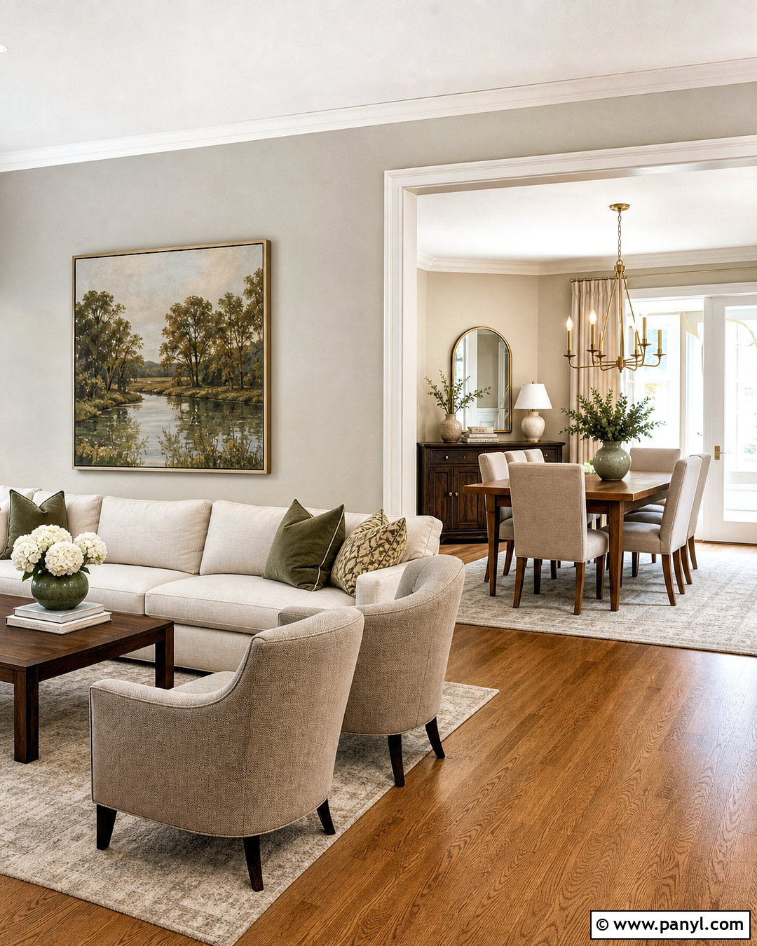
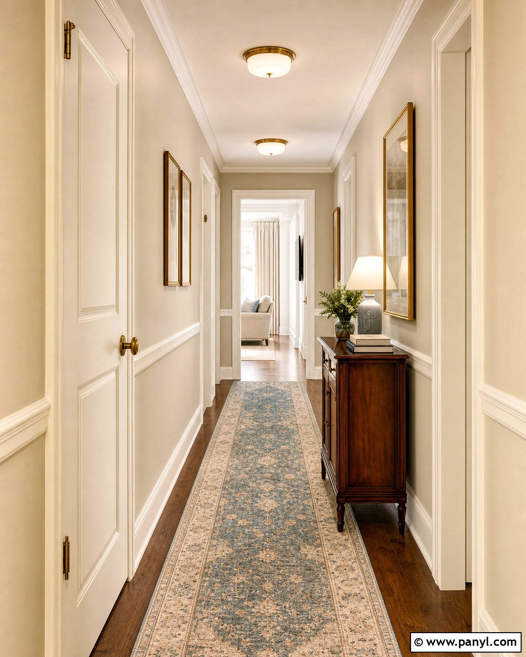
Accessible Beige SW 7036 can create subtle depth in an open-concept home without introducing an unrelated color. Use Agreeable Gray in the living area and Accessible Beige in the connected dining space, allowing white trim and continuous oak flooring to unite both zones. Furnish the living room with a cream sofa, taupe chairs, and a walnut media console. In the dining area, choose a substantial oak table, oatmeal upholstered chairs, and an aged brass chandelier. Repeat black accents through frames, curtain rods, and tableware for consistency. Textiles featuring greige, tan, and muted green help bridge the neighboring wall colors. This understated combination is useful when you want gentle room-to-room variation while maintaining a calm and cohesive whole-house neutral palette.
9. Agreeable Gray And Sea Salt
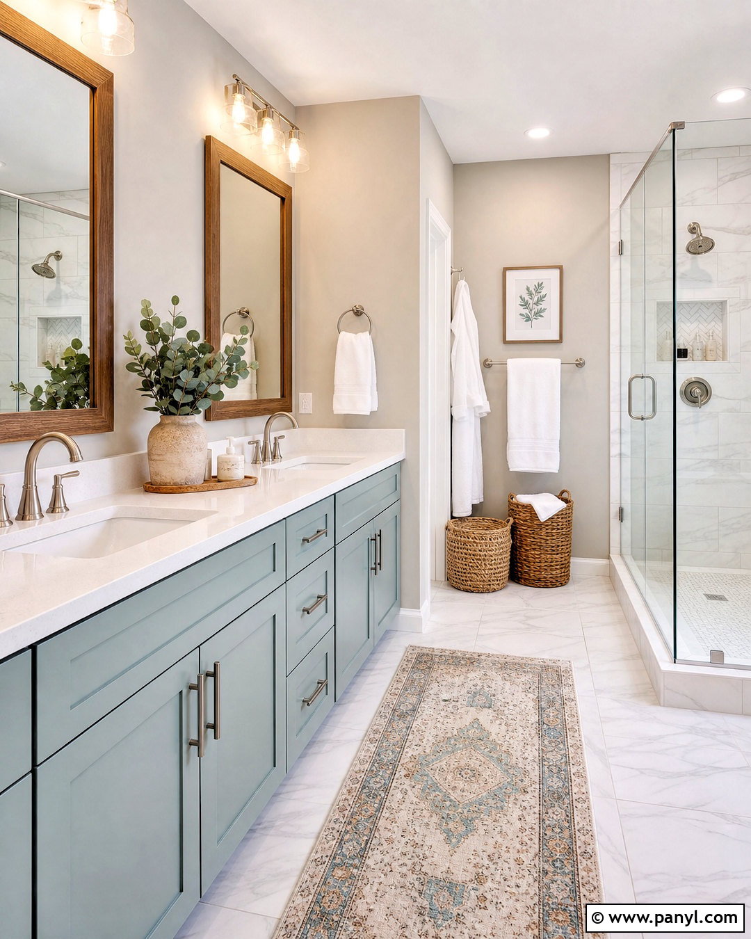
Sea Salt SW 6204 brings a muted blue-green freshness to Agreeable Gray. For a bathroom, paint the upper walls Agreeable Gray and use Sea Salt on a double vanity with simple shaker doors. White quartz counters, brushed nickel faucets, and pale marble-look floor tile keep the room bright. Frame the mirrors in natural oak to add warmth and connect with Agreeable Gray’s beige undertone. Use white towels, a softly patterned blue-green runner, and clear glass shower panels to avoid visual clutter. A few woven baskets introduce practical storage and natural texture. Repeat Sea Salt in small ceramic accessories rather than covering another large surface. This complete palette produces a clean, spa-like bathroom that feels soothing, approachable, and suitable for everyday use.

10. Agreeable Gray And Rainwashed
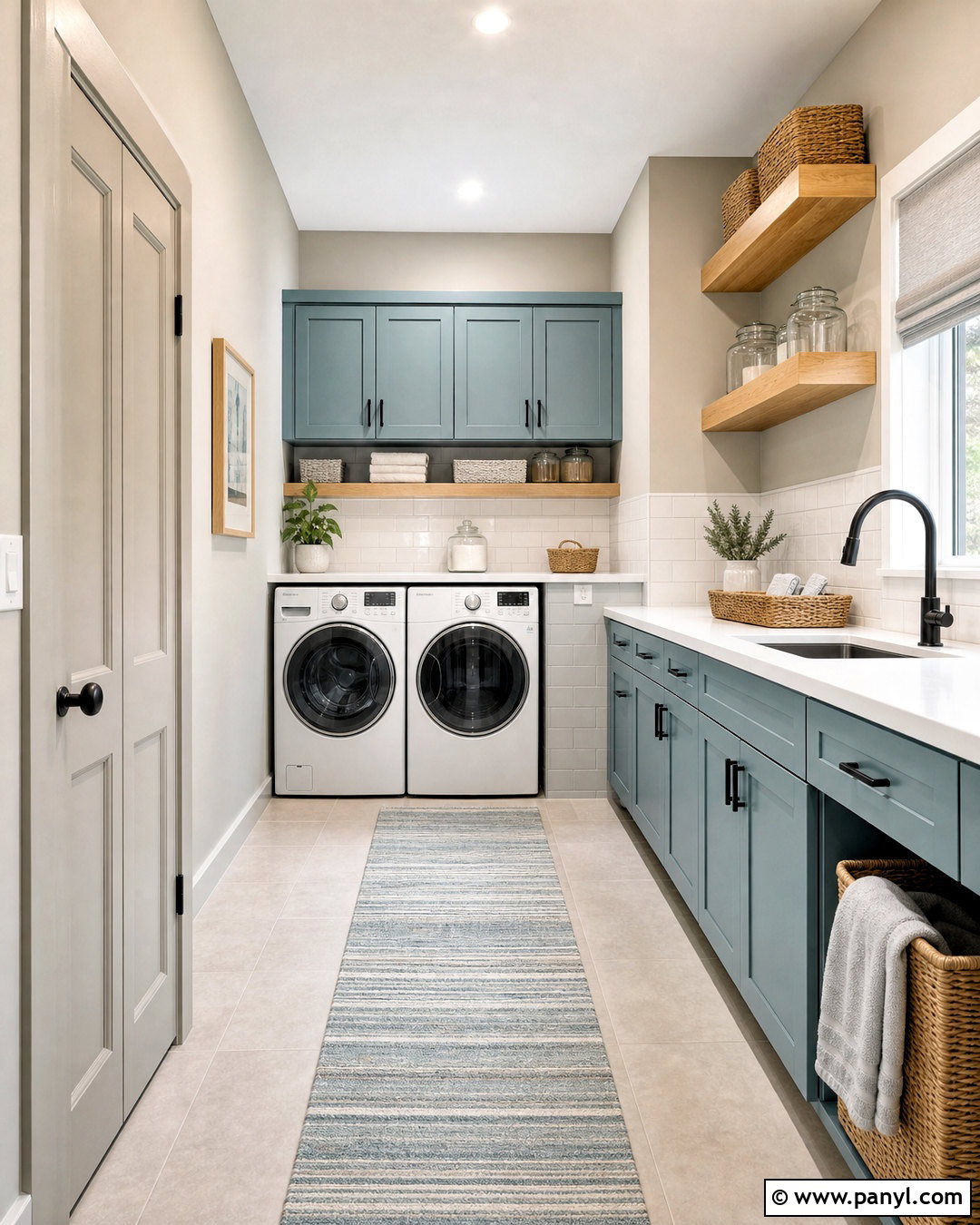
Rainwashed SW 6211 gives an Agreeable Gray laundry room a light, refreshing character. Paint the main walls Agreeable Gray and apply Rainwashed to full-height storage cabinets, a utility door, or the lower portion of built-ins. Install white quartz counters above the washer and dryer, along with a simple white backsplash for easy cleaning. Warm oak floating shelves prevent the blue-green cabinetry from feeling chilly. Add matte black hardware, woven storage baskets, clear containers, and a striped washable runner that repeats gray and muted aqua. Bright white trim keeps the compact room crisp. The combination makes a practical work area feel thoughtfully decorated while preserving visual calm. It is especially effective when the laundry room receives soft natural light.
11. Agreeable Gray And Evergreen Fog
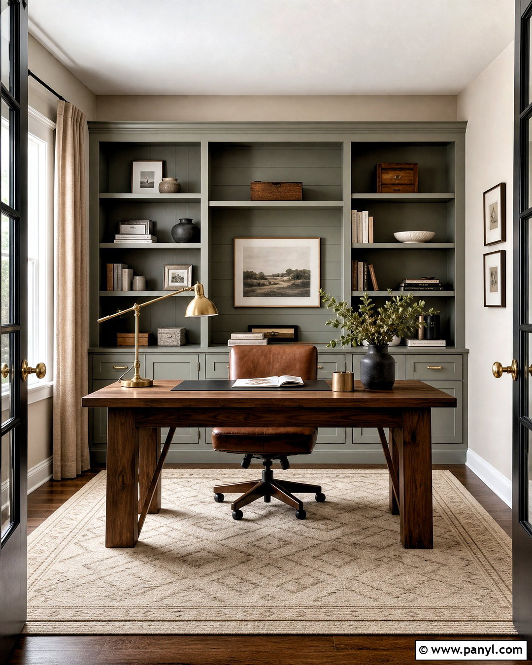
Evergreen Fog SW 9130 provides earthy contrast for an office surrounded by Agreeable Gray. Use Agreeable Gray on three walls and Evergreen Fog on built-in bookcases and the wall behind the desk. A walnut desk, cognac leather chair, and antique brass task lamp bring warmth to the green-gray accent. Choose a low-pile cream rug with a subtle geometric pattern, then add flax linen curtains and black metal shelving details. Keep books and decorative objects limited to cream, brown, black, and muted green for a well-organized appearance. An off-white ceiling prevents the deeper cabinetry from closing in the room. This complete office scheme feels focused and grounded, balancing the dependable neutrality of Agreeable Gray with a nature-inspired color that has real presence.
12. Agreeable Gray And Retreat
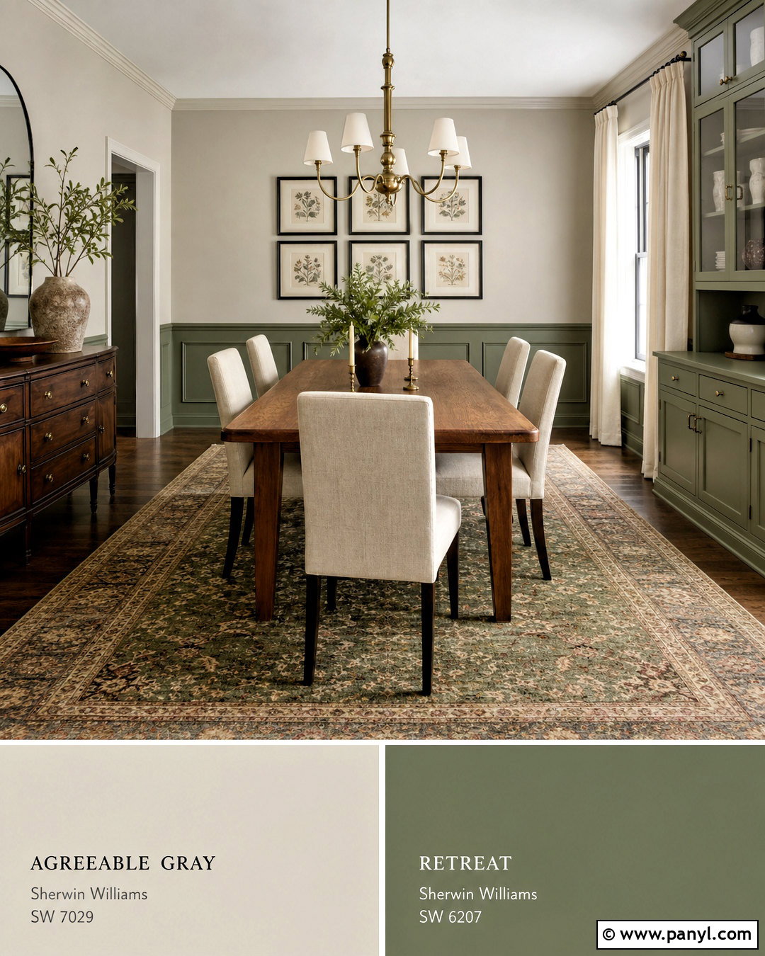
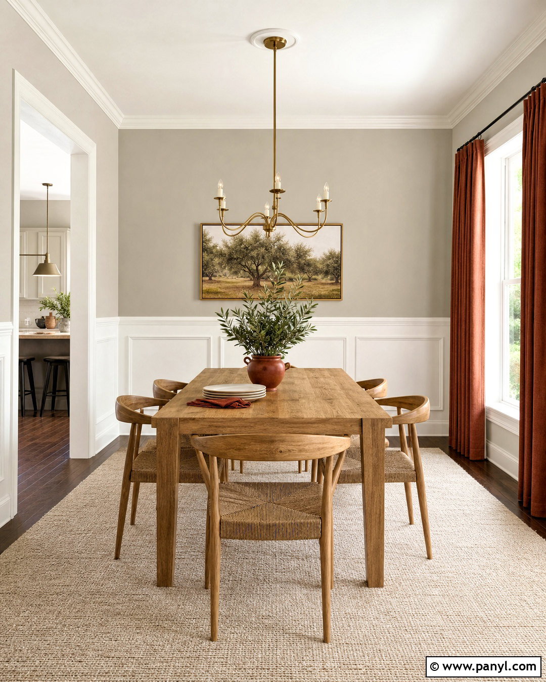
Retreat SW 6207 creates a richer, more traditional green pairing with Agreeable Gray. In a dining room, cover the walls with Agreeable Gray and paint a built-in buffet, interior door, or lower wall paneling in Retreat. Center the room around a medium walnut dining table with cream upholstered chairs. Add an aged brass chandelier, warm white curtains, and a vintage-style rug combining olive, tan, charcoal, and faded rust. Black picture frames and dark ceramic lamps strengthen the deeper accents. Keep the ceiling and upper trim a soft white so the room remains open and bright. The green should appear in a few additional details, such as napkins or artwork, creating rhythm without becoming repetitive. The finished room feels comfortable, established, and inviting.
13. Agreeable Gray And Dried Thyme
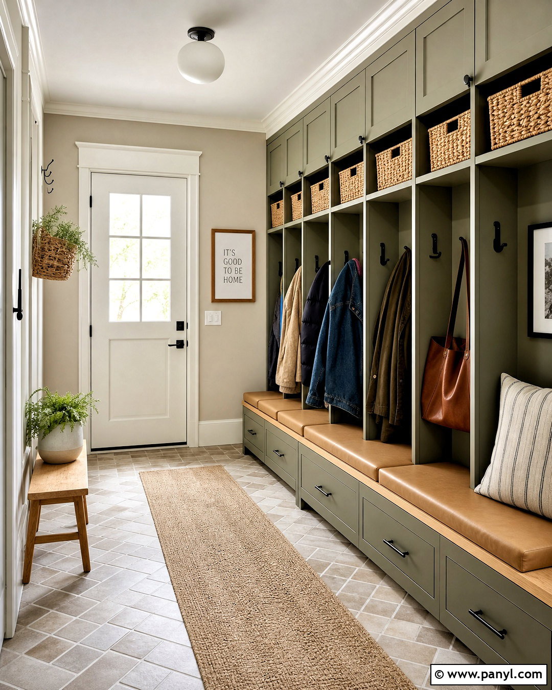
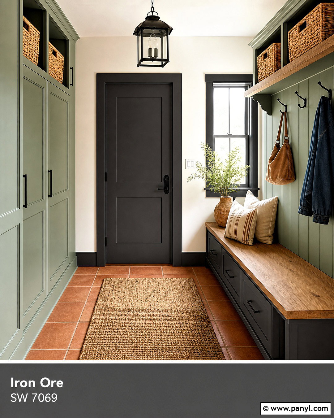
Dried Thyme SW 6186 complements Agreeable Gray with an understated olive tone. Use this combination in a mudroom, where Agreeable Gray walls provide a light background and Dried Thyme covers lockers, storage cabinets, and the built-in bench base. Top the bench with natural oak and add tan leather cushions for durability and warmth. A brick-pattern porcelain floor in soft taupe hides everyday dirt while supporting the neutral palette. Use matte black hooks, woven baskets, and warm white overhead lighting to complete the practical design. Paint trim and doors creamy white to define the green cabinetry. This whole-space approach turns a busy entrance into an organized transition area, giving shoes, coats, and bags designated storage while maintaining a polished, cohesive appearance.
14. Agreeable Gray And Naval
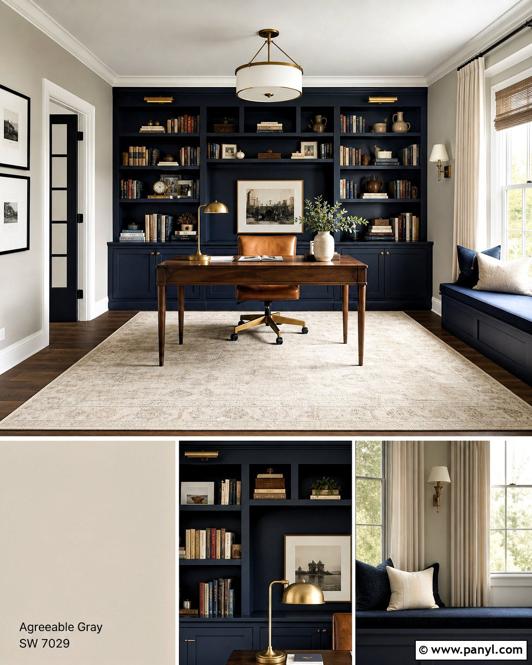
Naval SW 6244 creates a bold, tailored contrast against Agreeable Gray. Design a home office or library with Agreeable Gray walls and Naval built-in shelving covering one complete wall. Include a coordinating navy desk or window seat to make the accent feel intentional. Add a warm walnut desktop, cognac leather chair, and brass library lights to balance the deep blue. A large ivory rug, natural linen curtains, and white ceiling keep the room from appearing heavy. Repeat navy through one patterned pillow and a few book spines rather than adding numerous unrelated blue accessories. Matte black frames can introduce another strong neutral. The completed room feels structured and sophisticated, while Agreeable Gray maintains enough softness for comfortable daily work or reading.
15. Agreeable Gray And Smoky Blue
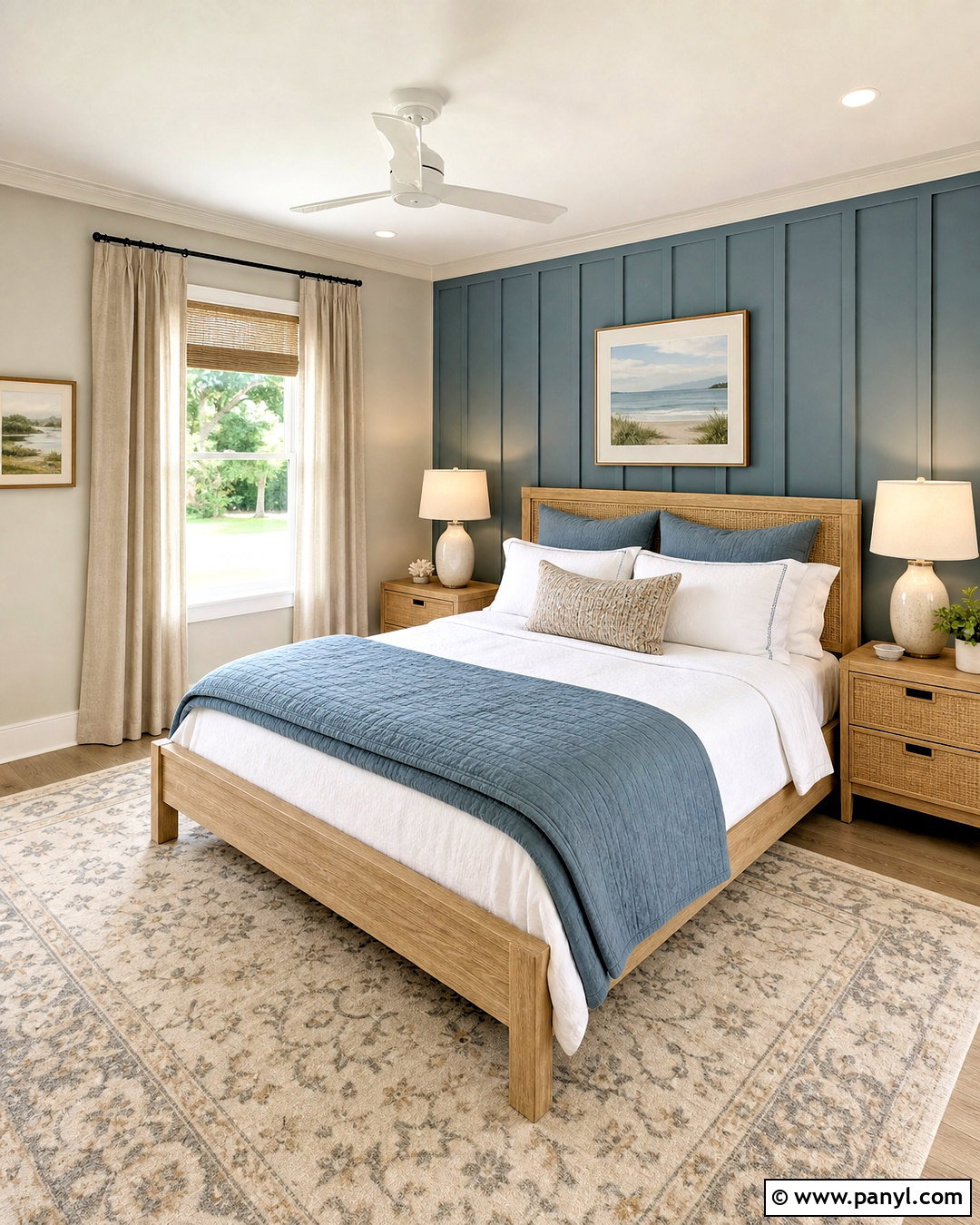
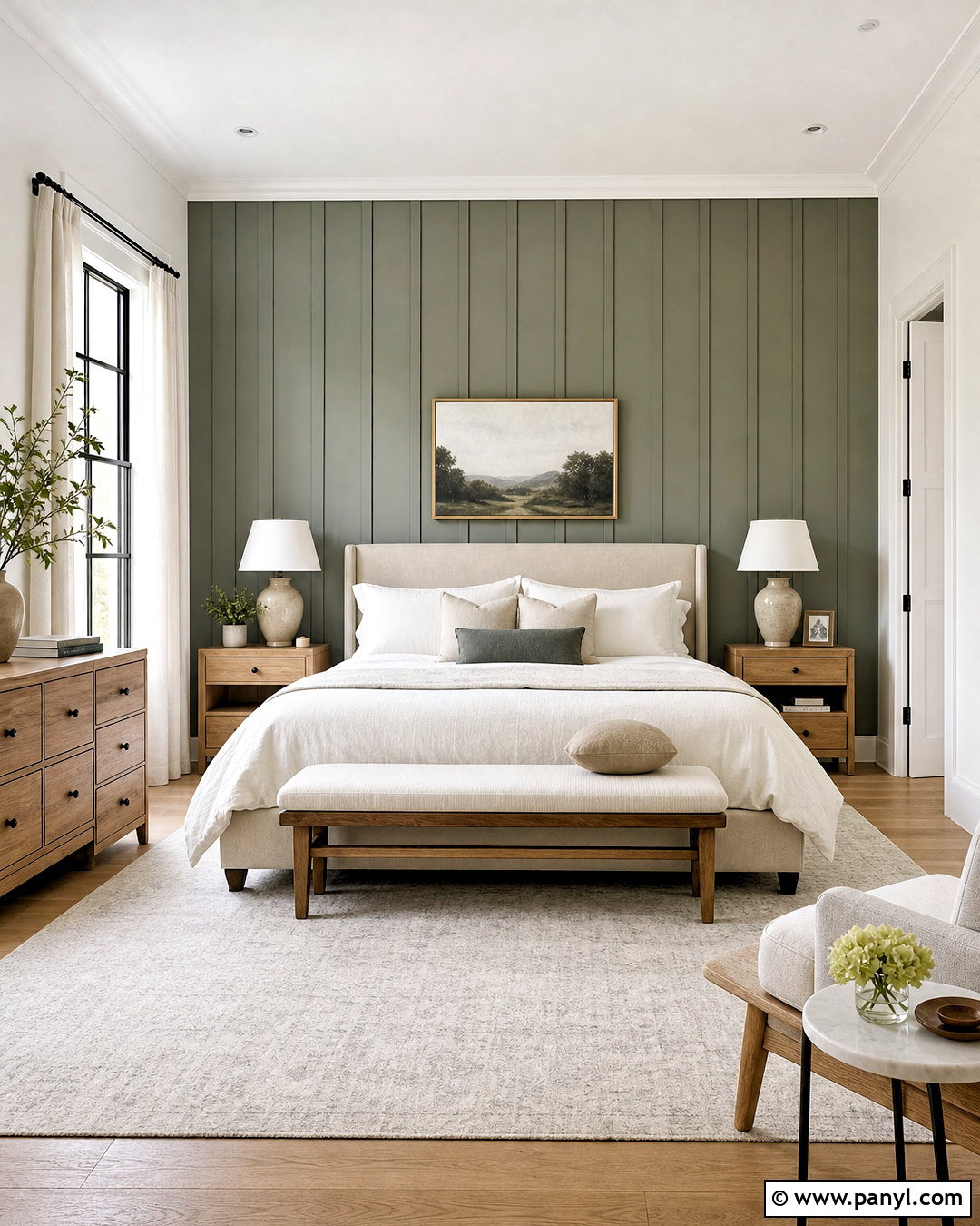
Smoky Blue SW 7604 gives Agreeable Gray a relaxed coastal influence without relying on bright nautical colors. Paint a guest bedroom in Agreeable Gray and use Smoky Blue on the headboard wall or a wide board-and-batten treatment. Choose a natural oak bed, white cotton bedding, and a blue-gray quilt with subtle texture. Woven nightstands, ceramic lamps, and sand-colored curtains bring warmth to the cooler accent. Place a cream rug with faded blue and taupe details beneath the bed. Brushed nickel hardware keeps the look clean, while one or two dark wood accessories add depth. Avoid excessive seaside decorations. The full scheme should feel simple and residential, using color, texture, and natural materials to create a fresh but restful retreat.
16. Agreeable Gray And Iron Ore

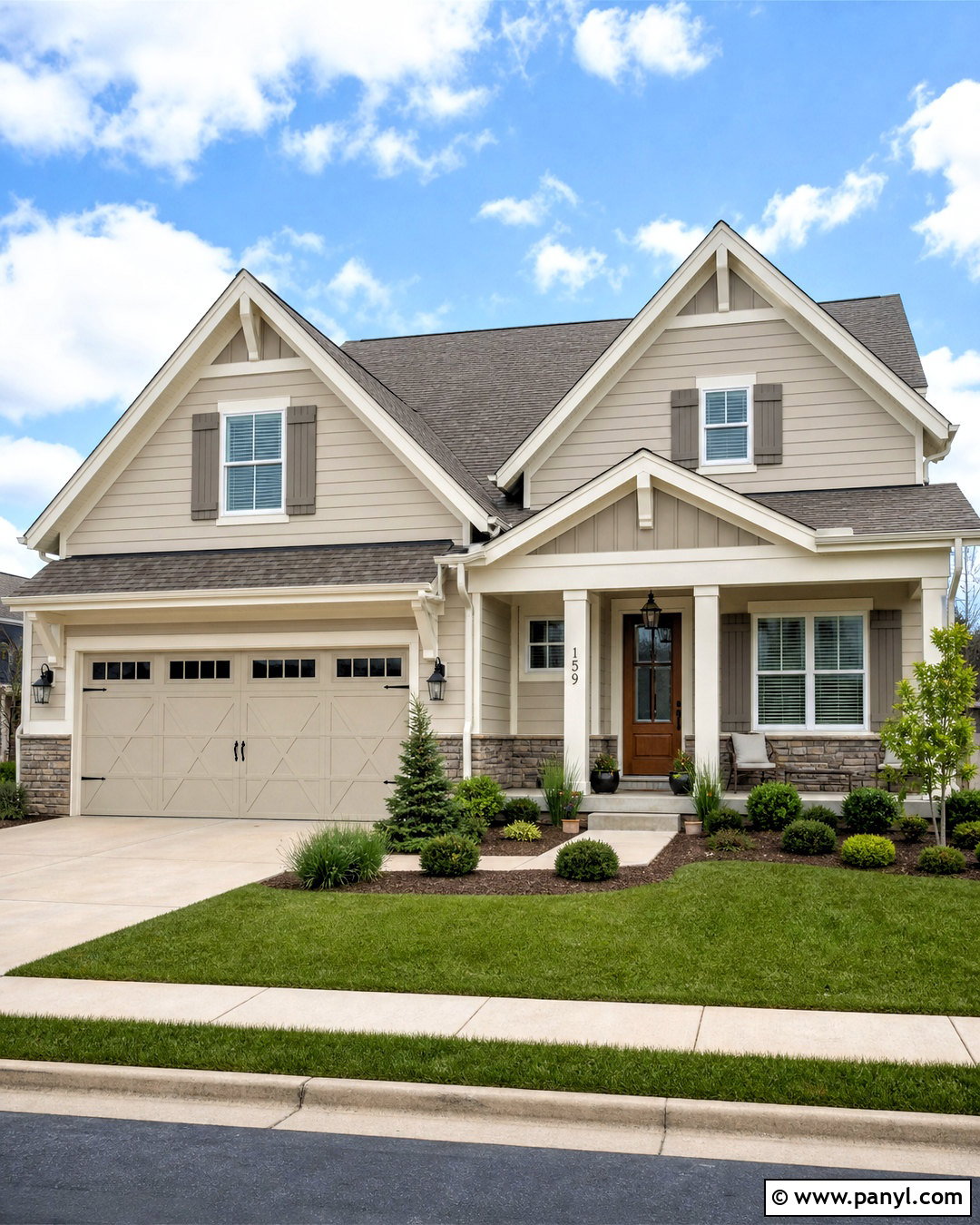
Iron Ore SW 7069 adds dramatic charcoal contrast to an Agreeable Gray exterior. Use Agreeable Gray on the main siding or stucco body, Iron Ore on shutters and the garage door, and a clean warm white on trim, columns, and soffits. A medium brown wood front door prevents the scheme from feeling overly monochromatic. Pair the colors with a charcoal architectural-shingle roof, matte black lighting, and simple metal house numbers. Landscaping should include structured evergreen shrubs, ornamental grasses, and pale stone edging. A concrete walkway and natural wood porch furniture complete the approachable curb view. This balanced exterior scheme suits traditional, craftsman, and modern suburban homes because it highlights architectural features while keeping the main body light and welcoming.
17. Agreeable Gray And Urbane Bronze
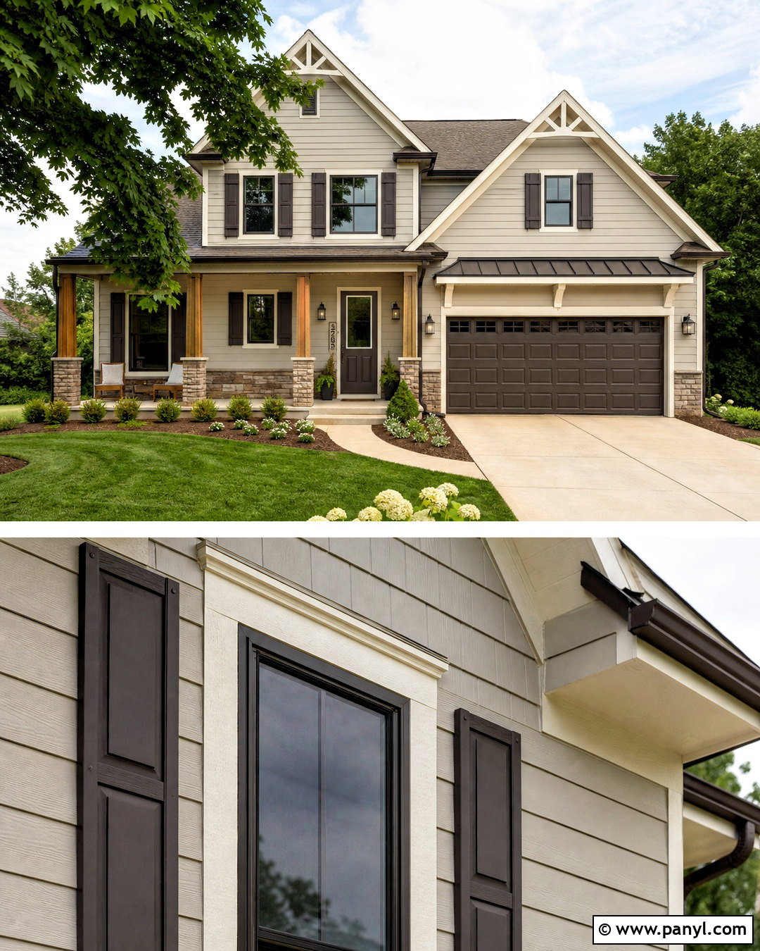
Urbane Bronze SW 7048 creates an earthy exterior with more warmth than a standard black accent. Apply Agreeable Gray to the siding, creamy white to the trim, and Urbane Bronze to the front door, shutters, and garage door. Add cedar porch posts or natural wood brackets to connect the brown-gray accent with the landscaping. A dark bronze metal roof detail or coordinating gutters can reinforce the palette without dominating it. Use warm stone around the foundation and repeat its beige tones in the walkway. Low green shrubs, cream flowering plants, and natural mulch soften the facade. The resulting exterior feels grounded and current. Each color has a clear purpose, allowing Agreeable Gray to remain the calm foundation of the complete curb appeal design.
18. Agreeable Gray And Tricorn Black
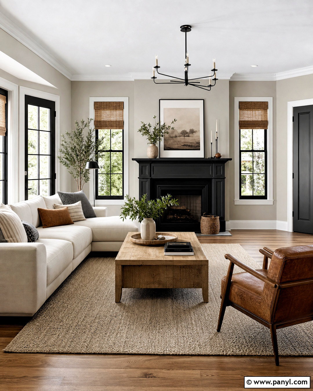
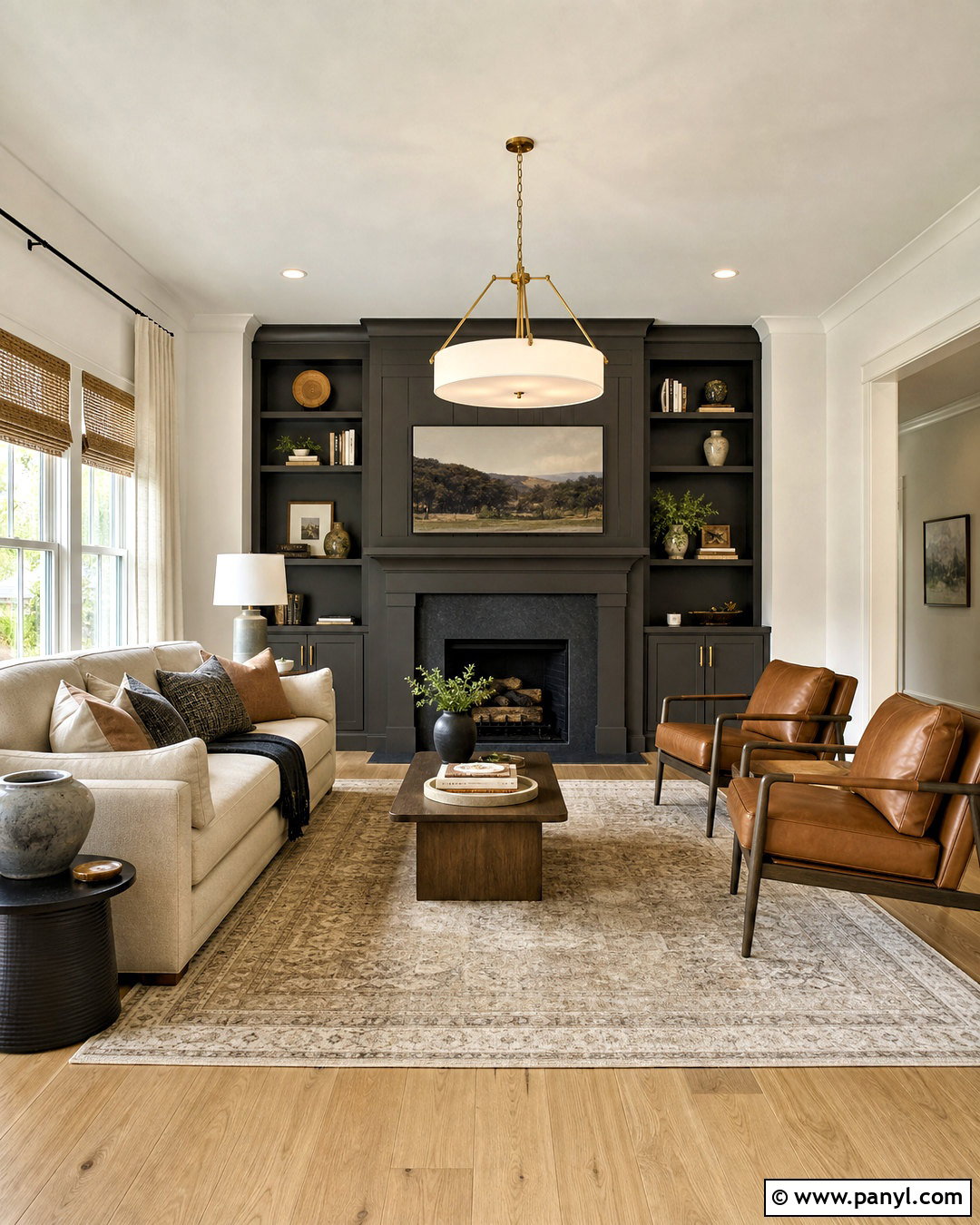
Tricorn Black SW 6258 makes Agreeable Gray look sharper and more architectural. In a modern living room, use Agreeable Gray on the walls and Tricorn Black on a streamlined fireplace surround, interior doors, and slim window frames. Keep the ceiling and baseboards bright white for separation. Furnish the room with a warm cream sectional, an oak coffee table, and a textured taupe rug. Black metal lighting and small charcoal accessories should repeat the dark focal point, while cognac leather and woven shades bring in warmth. Limit the black to defined features rather than a full wall, particularly in smaller rooms. This complete palette creates strong contrast and clean lines, yet natural wood, soft upholstery, and layered textiles keep the space comfortable.
19. Agreeable Gray And Cavern Clay
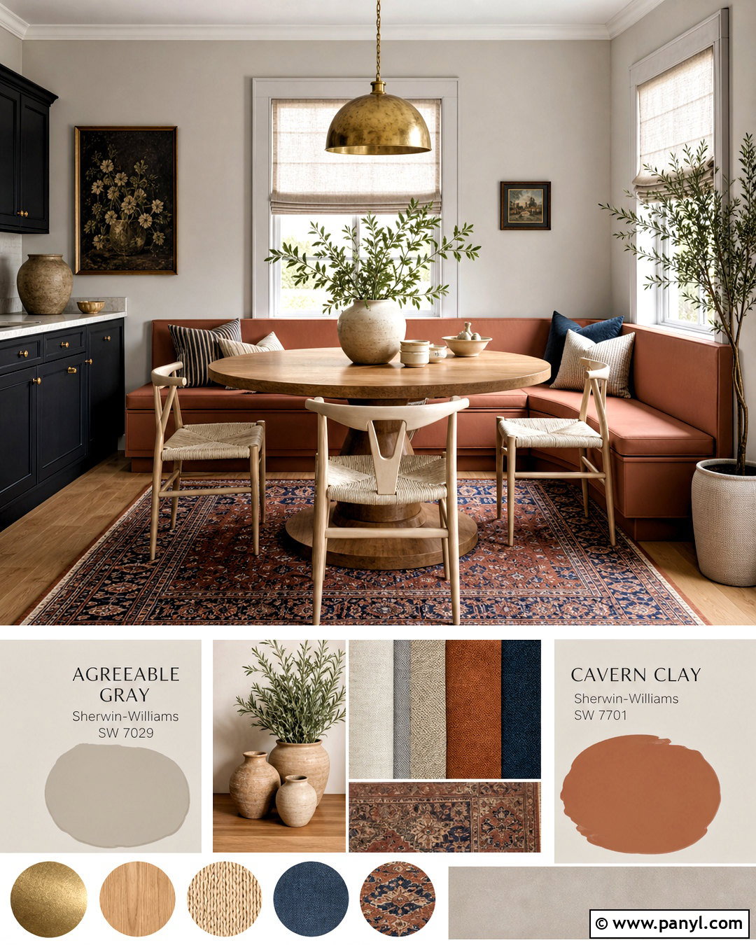
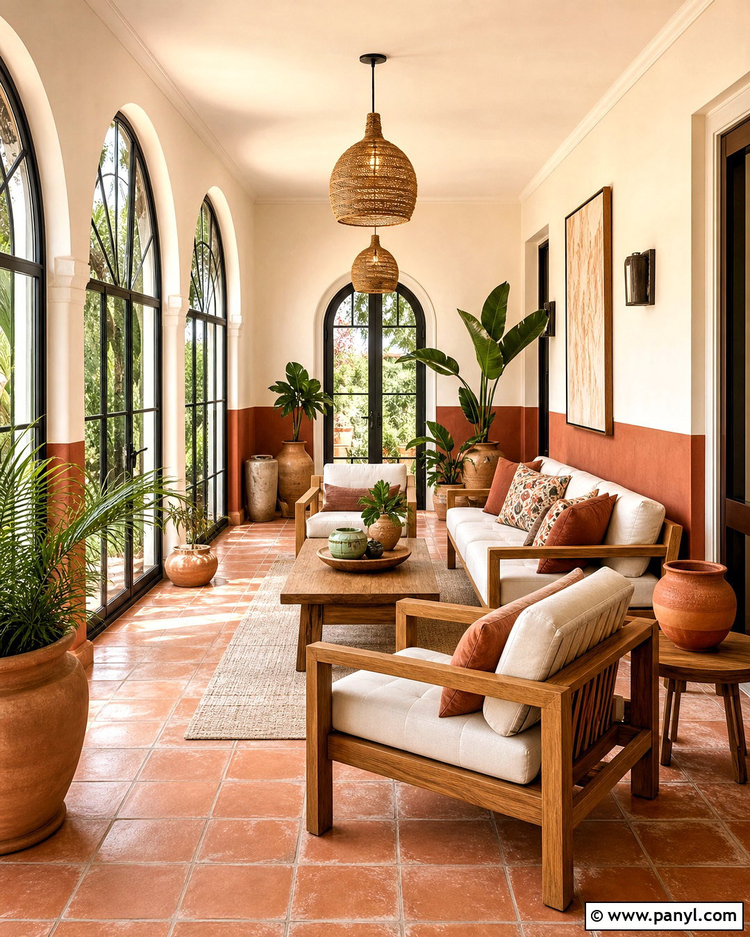
Cavern Clay SW 7701 introduces warm terracotta energy to Agreeable Gray. Create an inviting breakfast room with Agreeable Gray walls and a Cavern Clay banquette, lower cabinet section, or painted niche. Add a round oak pedestal table and cream upholstered or woven dining chairs. A flat-weave rug featuring rust, beige, charcoal, and faded blue connects the accent color to the surrounding neutral walls. Use aged brass lighting, linen Roman shades, and handmade cream pottery for a relaxed finish. A few olive green plants provide natural contrast to the clay tone. Keep nearby trim warm white and avoid adding several other strong colors. This balanced room feels sunny and collected, with Agreeable Gray calming the richer accent and preventing the palette from becoming too rustic.
20. Agreeable Gray And Redend Point
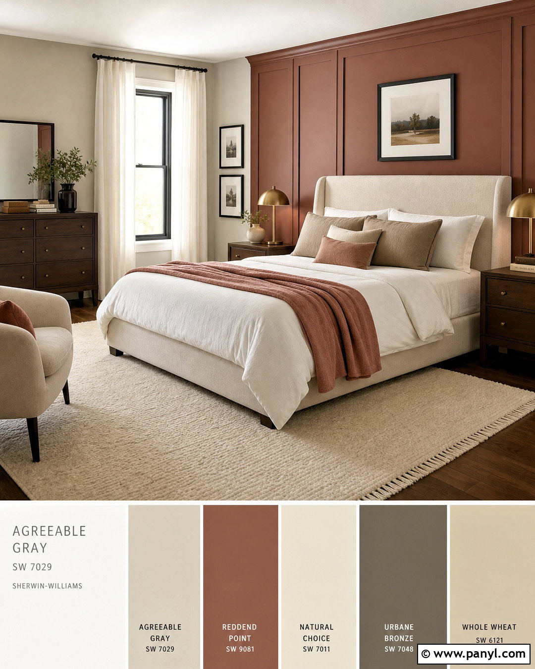
Redend Point SW 9081 gives Agreeable Gray a muted rosy-brown companion that feels softer than strong pink. Use Agreeable Gray on bedroom walls and Redend Point on a paneled headboard wall, dresser, or upholstered bed. Layer the bed with ivory linen, taupe pillows, and a dusty rose throw to blend the two paint colors naturally. Medium walnut nightstands and antique brass lamps emphasize the palette’s warmth. Choose a cream wool rug and warm white curtains to brighten the room. Small charcoal accents, such as frames or curtain rods, add needed definition. Keep decorative objects simple and repeat Redend Point only a few times. The finished bedroom feels calm, warm, and grown-up, with subtle color that remains easy to live with.
Conclusion:
The best Agreeable Gray palette considers more than two paint chips. Flooring, daylight, trim, furniture, metals, and textiles all influence whether this popular greige appears warm, balanced, or slightly cool. Whites create clean or creamy foundations, blue-greens add calm contrast, earthy shades reinforce warmth, and deep charcoal or navy accents provide definition. Use one coordinating color for a major feature, then repeat it sparingly in fabrics or accessories to make the room feel intentional. Most importantly, test large painted samples beside permanent finishes before committing. These **20 agreeable gray coordinating colors** offer complete, practical schemes for creating cohesive interiors and exteriors without making every space look the same.

Related Ideas and Inspiration:
Leave a Reply