
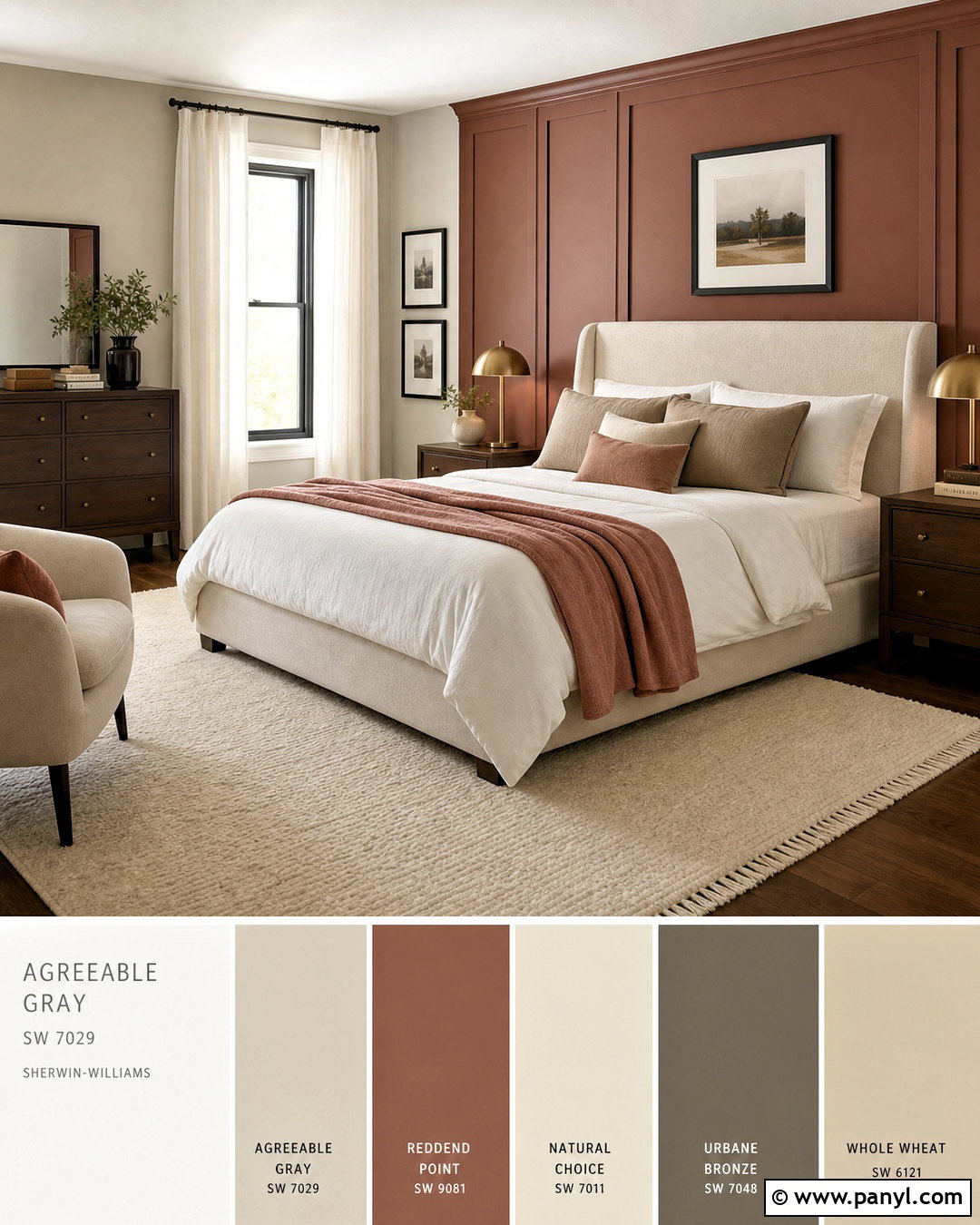
Agreeable Gray SW 7029 is a warm, flexible greige that can shift from soft gray to subtle beige as natural and artificial light change. With an LRV of 60, it has enough depth to define walls while still keeping most rooms open and bright. Its balanced character works with clean whites, stormy blue-grays, earthy greens, charcoal accents, and several muted neutrals. However, undertones matter. Flooring, countertops, window exposure, and nearby finishes can all influence how a pairing appears. Always test large samples together and check them throughout the day before painting. The complete room schemes below combine wall color, furniture, finishes, and accents, making it easier to confidently choose from these 20 agreeable grey coordinating colors. ()

1. Agreeable Gray And Pure White
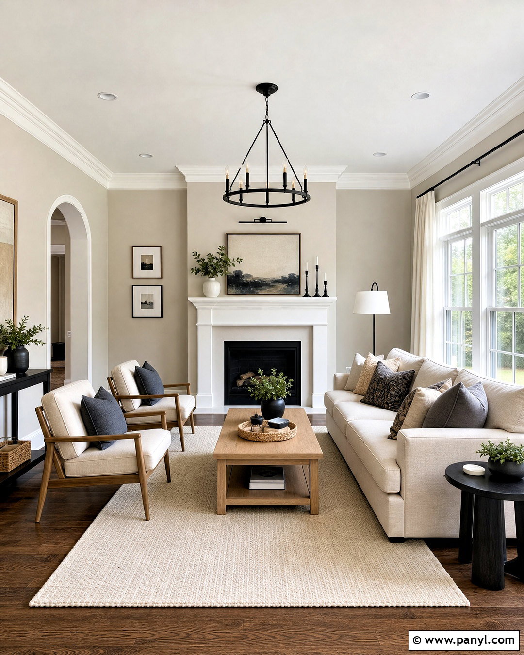
Pure White SW 7005 creates a fresh but gentle contrast with Agreeable Gray walls. Use Pure White across baseboards, doors, crown molding, and a simple fireplace surround for a connected living room. Add a light oatmeal sofa, natural oak coffee table, and cream wool rug to reinforce the warm undertones. Matte black curtain rods and a few charcoal accessories provide definition without making the space harsh. Choose curtains in soft ivory rather than bright blue-white. Medium-toned oak flooring helps the gray and beige notes blend naturally. This combination is especially useful in open layouts because the trim remains clean while Agreeable Gray adds comfortable depth. Repeat Pure White on built-in shelves to complete the balanced, airy look. ()
2. Agreeable Gray And White Dove
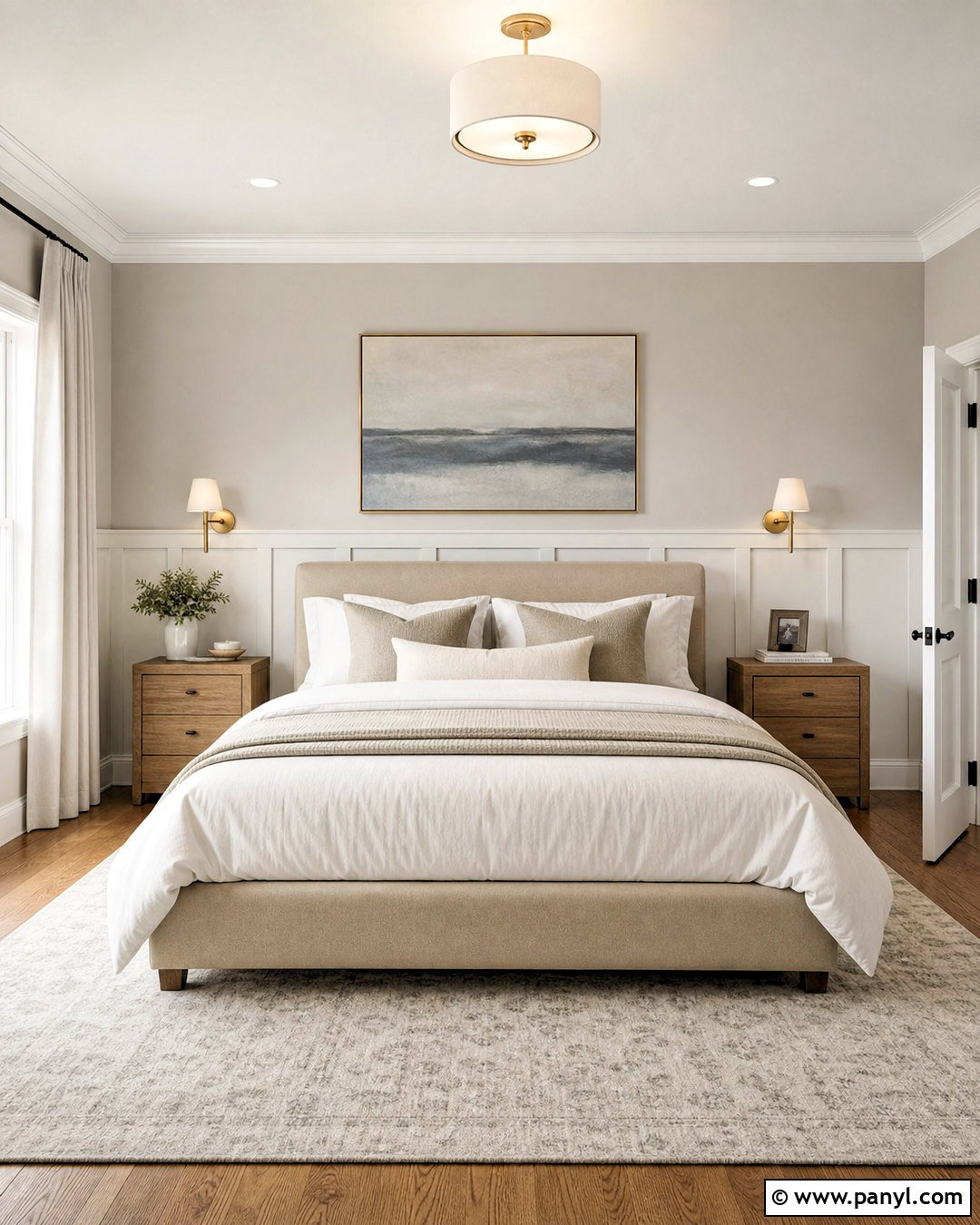
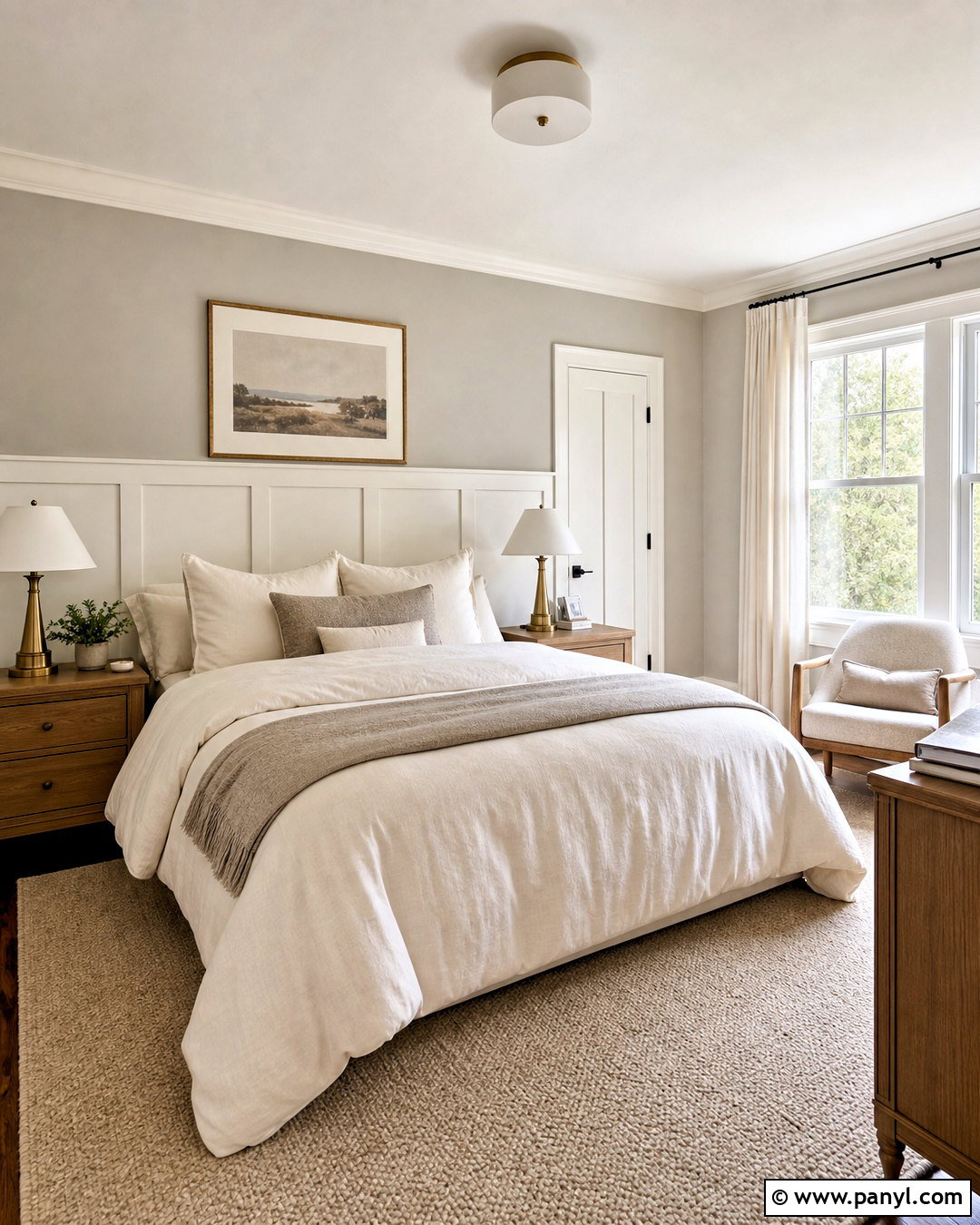
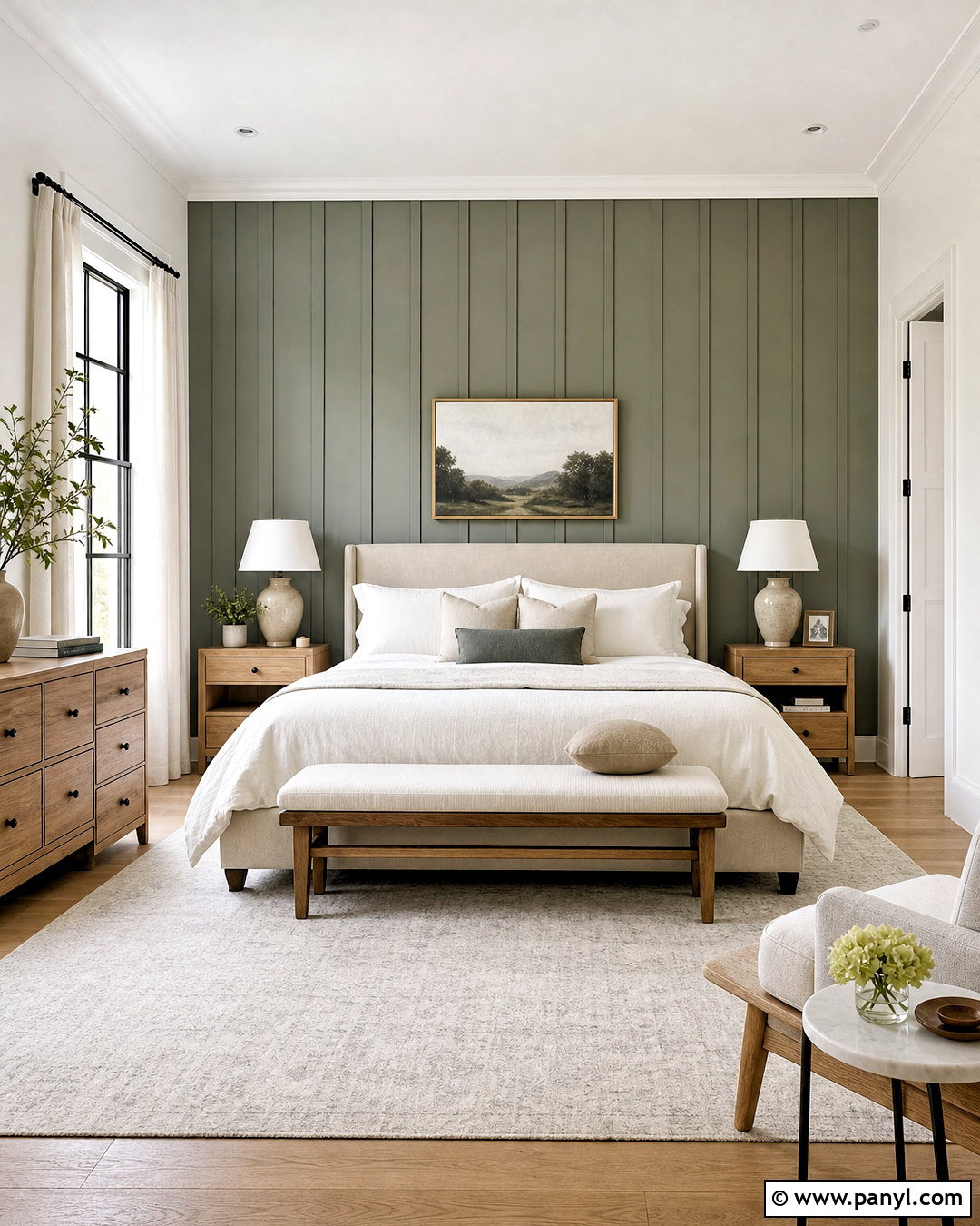
Benjamin Moore White Dove OC-17 brings a softly creamy finish to an Agreeable Gray bedroom. Paint the walls Agreeable Gray and use White Dove on the ceiling, trim, doors, and a paneled headboard wall. Layer the room with an upholstered beige bed, ivory bedding, taupe pillows, and medium oak nightstands. Brushed brass sconces introduce warmth, while muted blue-gray artwork prevents the palette from becoming overly beige. A textured cream rug over natural wood flooring keeps the space light and restful. This pairing suits rooms with balanced or slightly cool daylight because White Dove helps soften Agreeable Gray without creating a stark border. Check samples beside the flooring, since orange-toned wood can make both colors appear warmer. ()
3. Agreeable Gray And Chantilly Lace
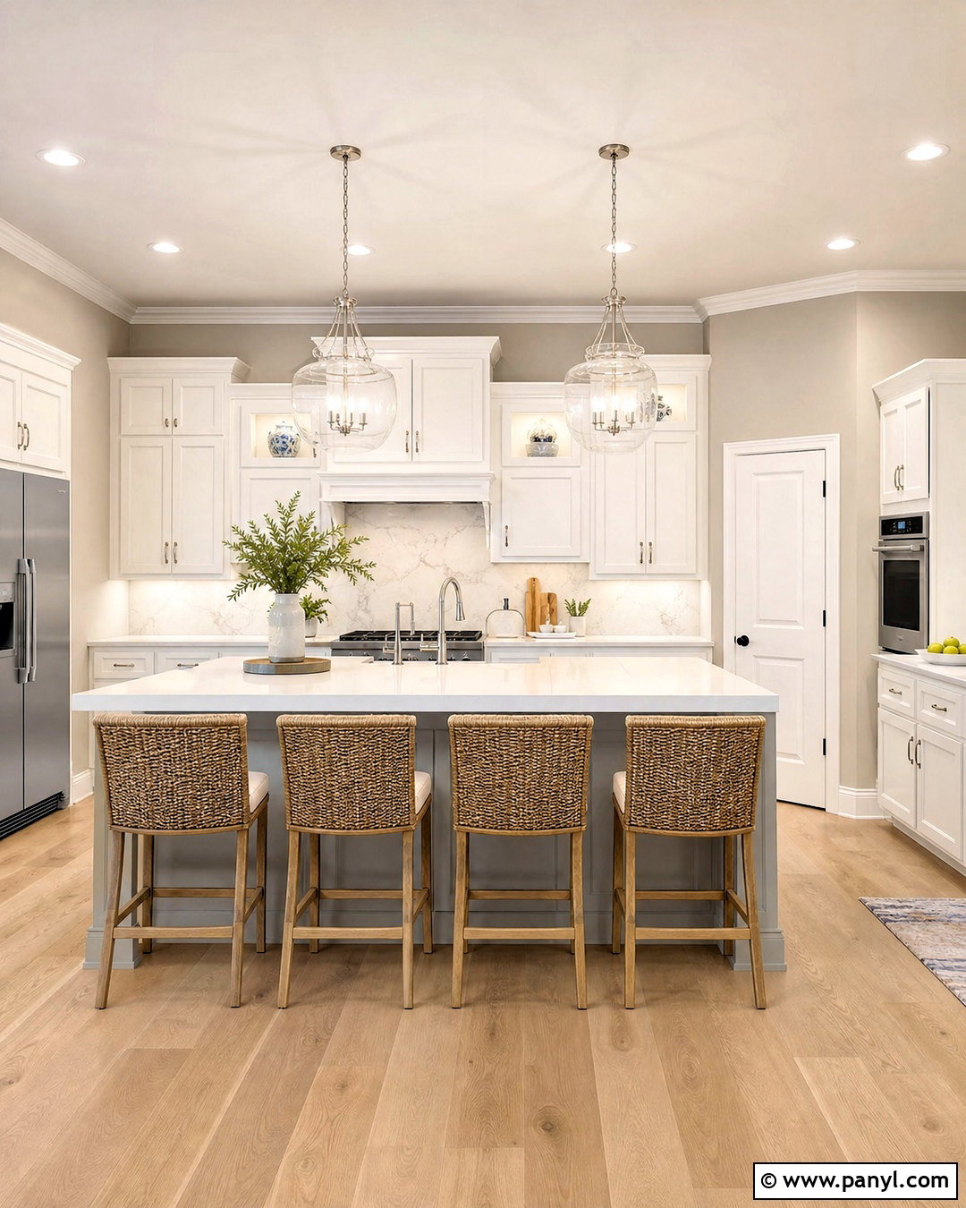
For a brighter kitchen, combine Agreeable Gray with Benjamin Moore Chantilly Lace OC-65. Use Chantilly Lace on Shaker cabinets, ceiling, trim, and window casings, then place Agreeable Gray on the surrounding walls and kitchen island. White quartz counters with quiet gray veining connect both paint colors without introducing busy movement. Add a pale marble backsplash, light oak flooring, and polished nickel hardware for a clean transitional finish. A pair of clear glass pendants keeps the island visually open. Warm the crisp palette with woven counter stools, wooden cutting boards, and small ceramic accessories. Chantilly Lace produces stronger contrast than softer whites, so this scheme works particularly well in kitchens with generous daylight and warm natural materials. ()
4. Agreeable Gray And White Snow
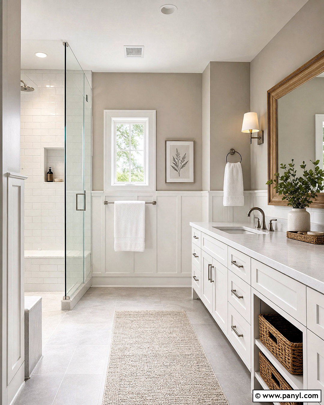
White Snow SW 9541 gives an Agreeable Gray bathroom a clear, updated appearance without feeling clinical. Apply Agreeable Gray to the upper walls and White Snow to the vanity, trim, ceiling, and lower wall paneling. Complete the room with pale gray porcelain flooring, white quartz counters, and a frameless glass shower. Brushed nickel fixtures echo the cooler details, while a light oak mirror and woven storage baskets restore warmth. Keep towels white and add one muted sage bath mat for a restrained touch of color. This combination is effective when you want Agreeable Gray to look more defined and slightly warmer. Since White Snow is noticeably bright, compare both samples under bathroom lighting before selecting bulbs, countertops, or grout. ()
5. Agreeable Gray And Extra White
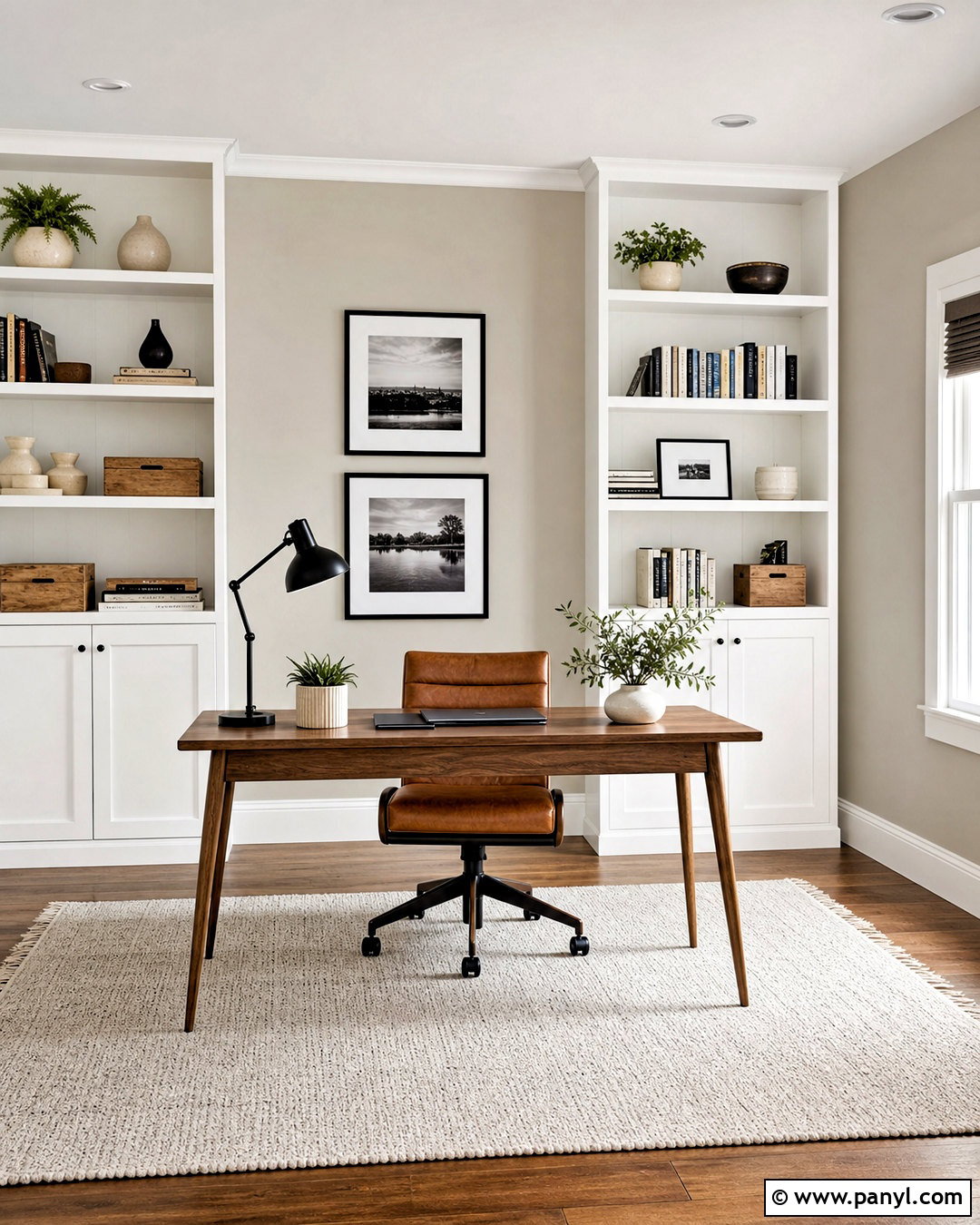
Extra White SW 7006 gives a compact home office crisp edges while allowing Agreeable Gray to remain the calming background. Paint the walls Agreeable Gray, then use Extra White on the ceiling, window trim, interior door, and floor-to-ceiling bookcases. Choose a slim walnut desk, warm leather chair, and low-pile ivory rug to balance the cleaner white. Black picture frames and a matte black task lamp add structure. Style the shelves sparingly with cream ceramics, natural wood boxes, and muted green books. This complete palette feels professional without becoming cold or overly corporate. Extra White can shift with surrounding light, so test it beside Agreeable Gray and the room’s permanent flooring before committing to all the millwork. ()
6. Agreeable Gray And Aesthetic White
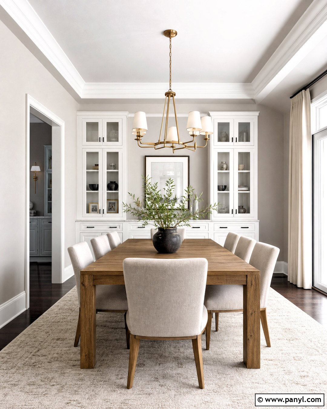
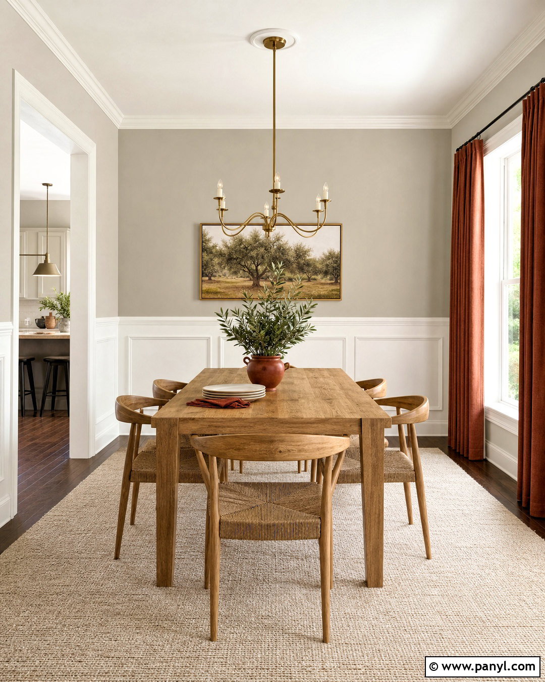
Aesthetic White SW 7035 creates a quiet, layered neutral palette beside Agreeable Gray. In an open dining room, use Agreeable Gray on the main walls and Aesthetic White on a large built-in buffet, adjacent hallway, and ceiling-height cabinetry. Add a medium oak dining table, oatmeal upholstered chairs, and a warm ivory rug. Aged brass lighting and dark bronze hardware prevent the pale scheme from looking washed out. Bring in depth with charcoal pottery, olive branches, and linen drapery. Because both colors have warmth, place them in separate planes rather than dividing one wall into competing blocks. This allows the subtle contrast to remain visible and gives the overall room a soft, connected, whole-house feeling. ()
7. Agreeable Gray And Comfort Gray
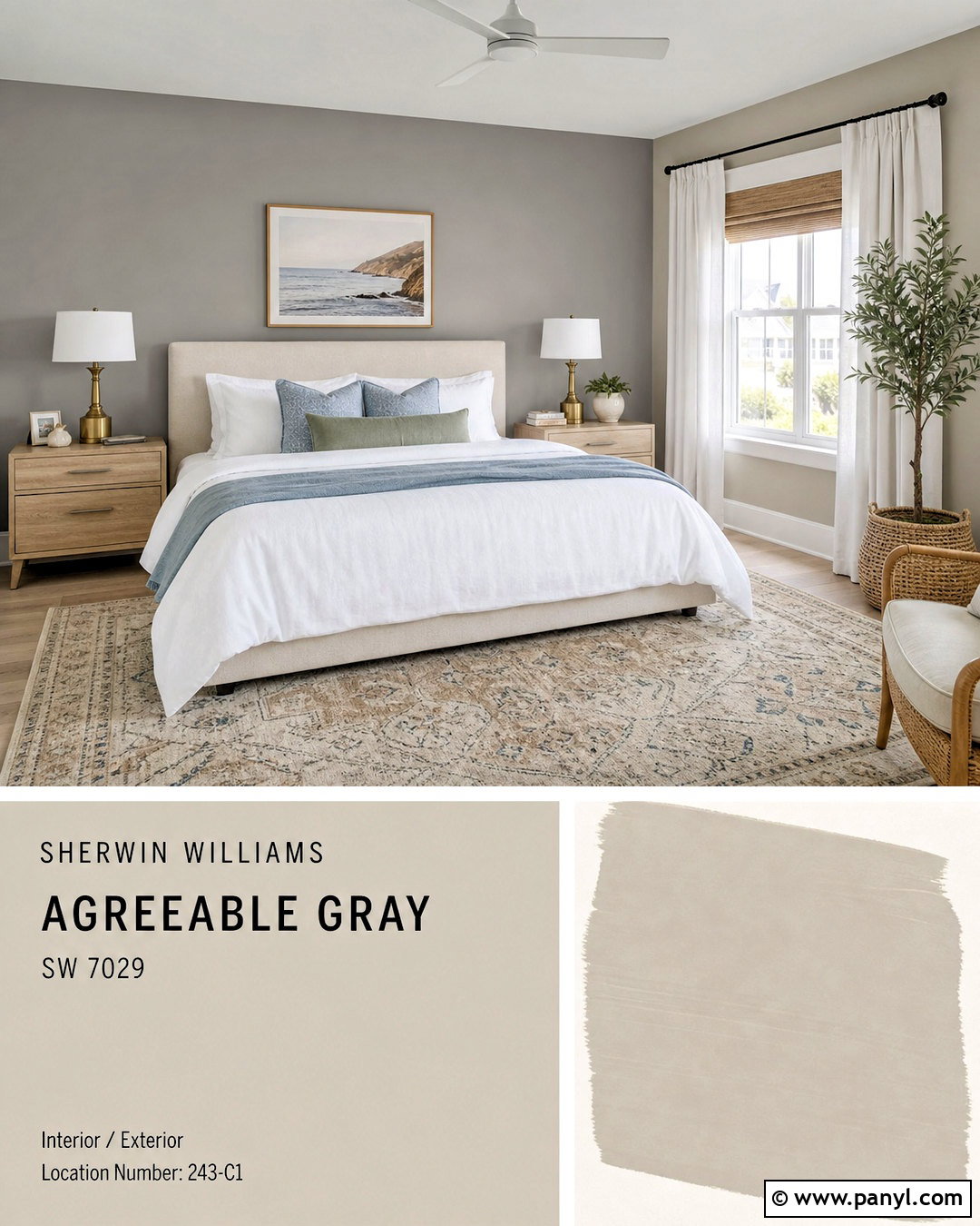
Comfort Gray SW 6205 adds a gentle blue-green-gray note to an Agreeable Gray guest bedroom. Keep Agreeable Gray on three walls and apply Comfort Gray to the wall behind the bed. Choose an ivory linen headboard, pale oak nightstands, and white bedding layered with dusty blue and muted sage textiles. Soft white trim keeps the transition clean, while brushed brass lamps add controlled warmth. Ground the room with a beige-and-blue patterned rug and medium wood flooring. The finished space feels relaxed and colorful without losing its neutral foundation. Comfort Gray can show more blue or green depending on exposure, so use a large sample beside Agreeable Gray and view it during morning, afternoon, and evening light. ()
8. Agreeable Gray And Sunbleached
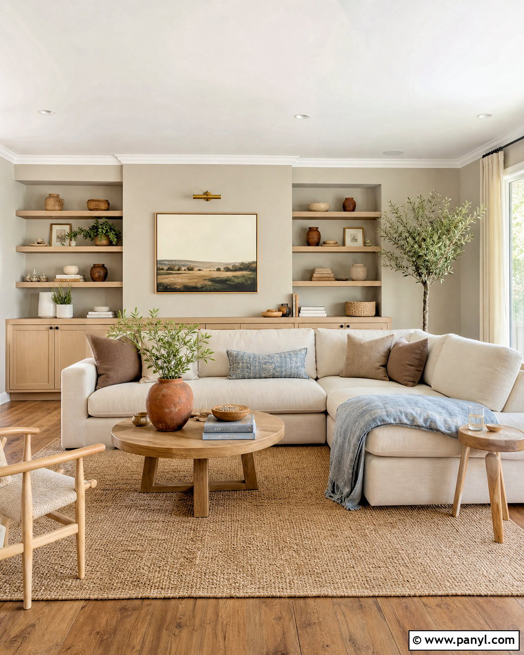
Sunbleached SW 9585 supports a light, organic family room when paired with Agreeable Gray. Use Agreeable Gray on the primary walls and Sunbleached on a wide media cabinet, reading nook, or adjoining passage. Furnish the room with a cream sectional, pale oak tables, and a textured jute-blend rug. Add mushroom-colored pillows, soft terracotta pottery, and faded blue textiles for subtle variation. Linen curtains should remain close to the wall colors instead of introducing a bright white stripe. Warm wood flooring helps both muted neutrals feel intentional. This low-contrast scheme is ideal for homeowners who prefer quiet transitions and natural materials. Add black sparingly through a floor lamp or narrow frames so the room still has visual structure. ()
9. Agreeable Gray And Silver Strand
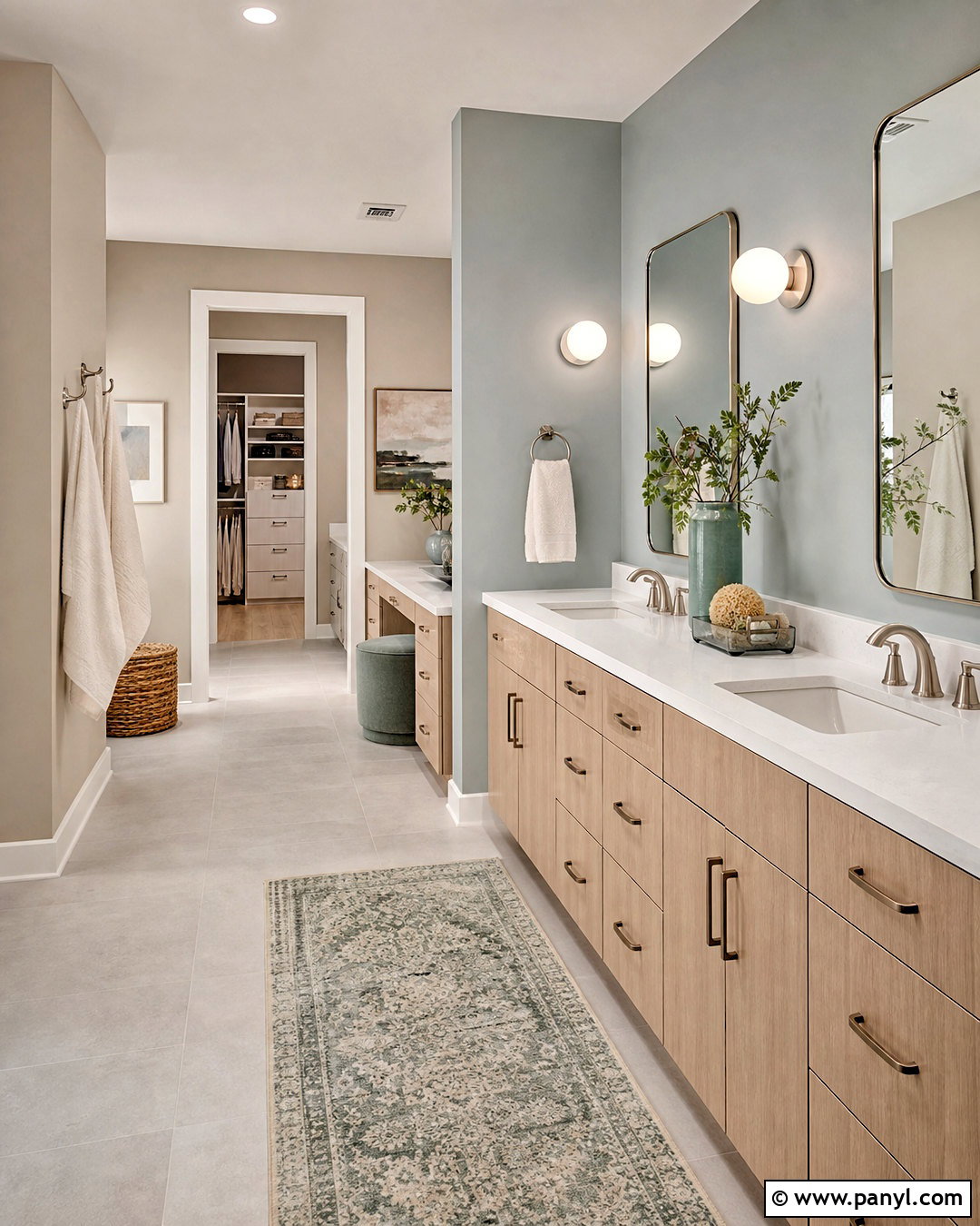
Silver Strand SW 7057 brings a watery blue-green quality to an Agreeable Gray bathroom suite. Paint the main dressing area Agreeable Gray and use Silver Strand inside the bathroom or on the vanity wall. Connect both zones with soft white trim, light gray tile, and a white quartz countertop. Choose a pale oak vanity, brushed nickel fixtures, and simple globe sconces. Towels in ivory and muted sea-glass green strengthen the calm palette without overwhelming it. Silver Strand can appear more colorful in strong daylight, while Agreeable Gray remains warmer and quieter. The separation between spaces makes that contrast feel deliberate. Use warm white bulbs and repeat natural wood in both areas to keep the complete design cohesive. ()
10. Agreeable Gray And Mortar
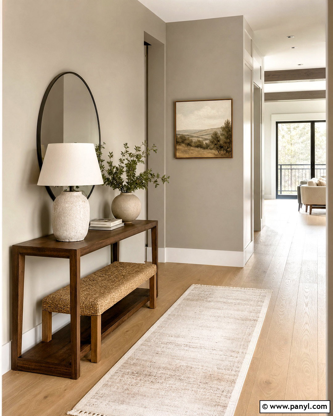
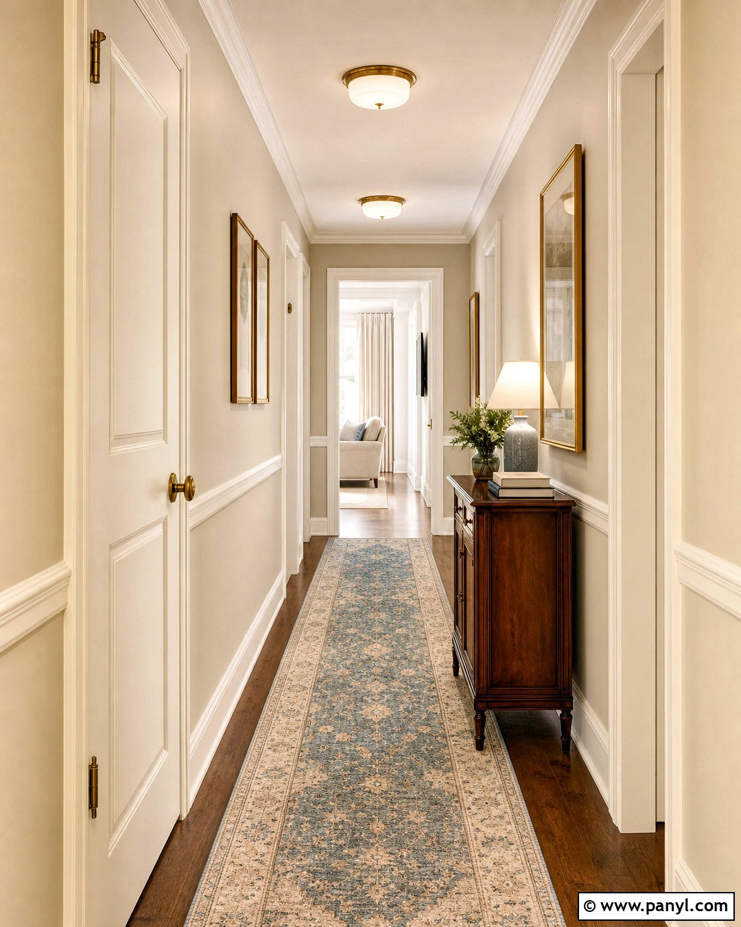
Mortar SW 9584 works with Agreeable Gray in a soft, sophisticated entry and hallway. Cover the larger entry walls in Agreeable Gray, then use Mortar on an arched opening, console wall, or connected stairwell. Add a narrow walnut console, woven bench, cream runner, and oversized mirror with a dark bronze frame. Warm white trim defines the architecture without competing with the layered neutrals. A ceramic lamp, beige stoneware, and muted landscape artwork create understated interest. Since Mortar is lighter and softly taupe, it can prevent Agreeable Gray from looking too heavy in a narrow passage. Keep the flooring consistent across both areas, preferably natural oak or warm limestone, so the subtle paint transition reads as intentional rather than mismatched. ()
11. Agreeable Gray And Dorian Gray
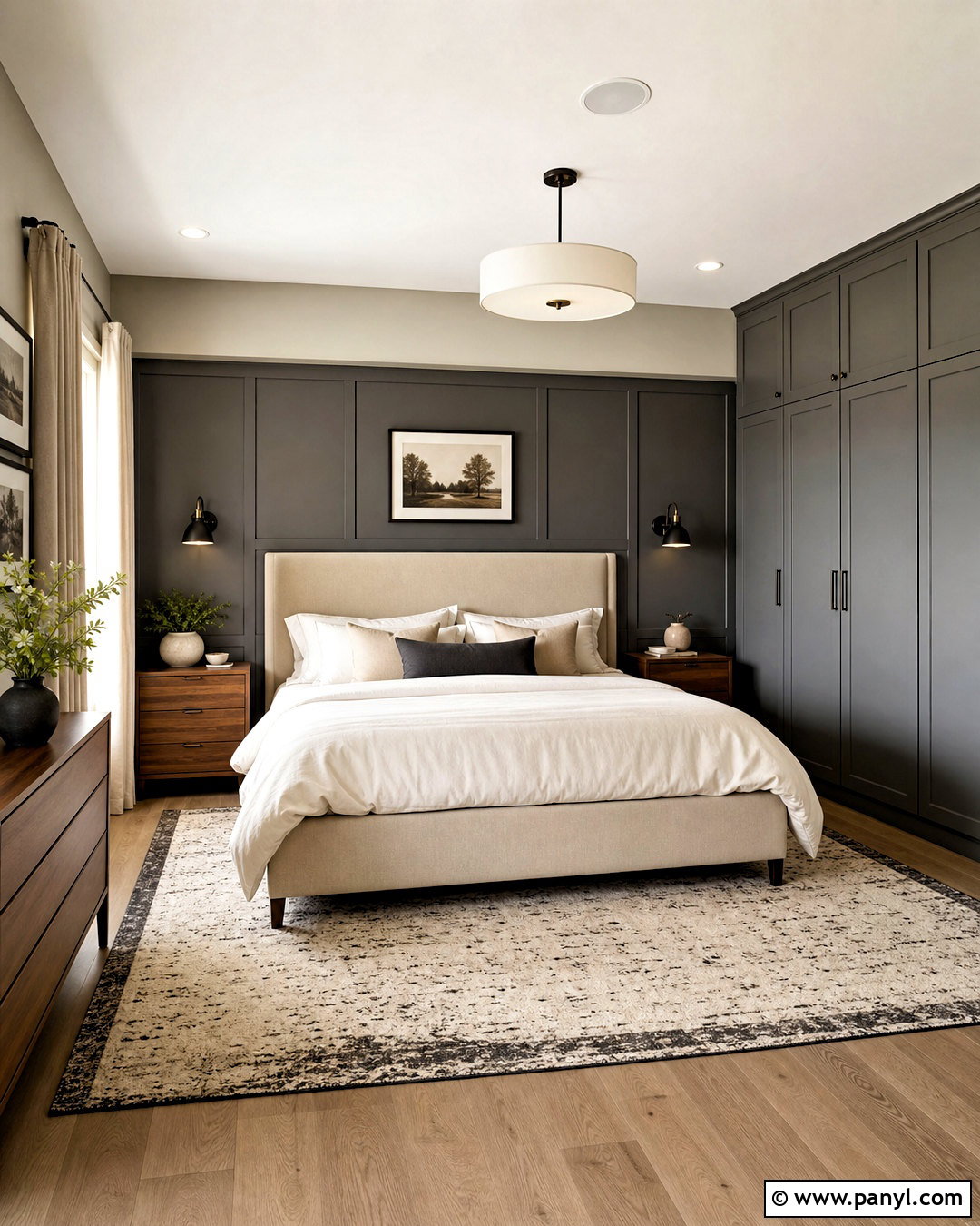
Dorian Gray SW 7017 gives an Agreeable Gray primary bedroom more depth while maintaining a smooth tonal relationship. Use Agreeable Gray on the surrounding walls and Dorian Gray behind the bed or across custom wardrobes. Add a warm beige upholstered bed, crisp ivory bedding, and walnut nightstands. Blackened bronze sconces provide contrast, while a cream-and-charcoal rug connects the darker feature to the lighter walls. Choose soft white trim and natural linen curtains to brighten the edges. This scheme feels restful because both paints share a muted, warm gray character. Avoid filling the room with additional competing grays. Instead, rely on wood, woven fabrics, and a few olive or clay accents to give the finished bedroom warmth and personality. ()
12. Agreeable Gray And Cornwall Slate
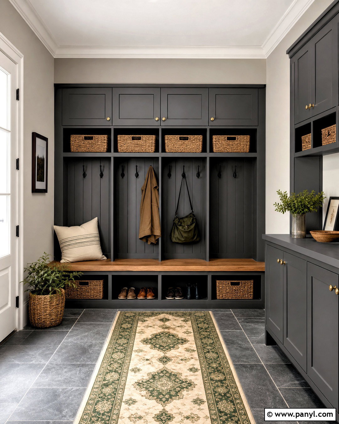
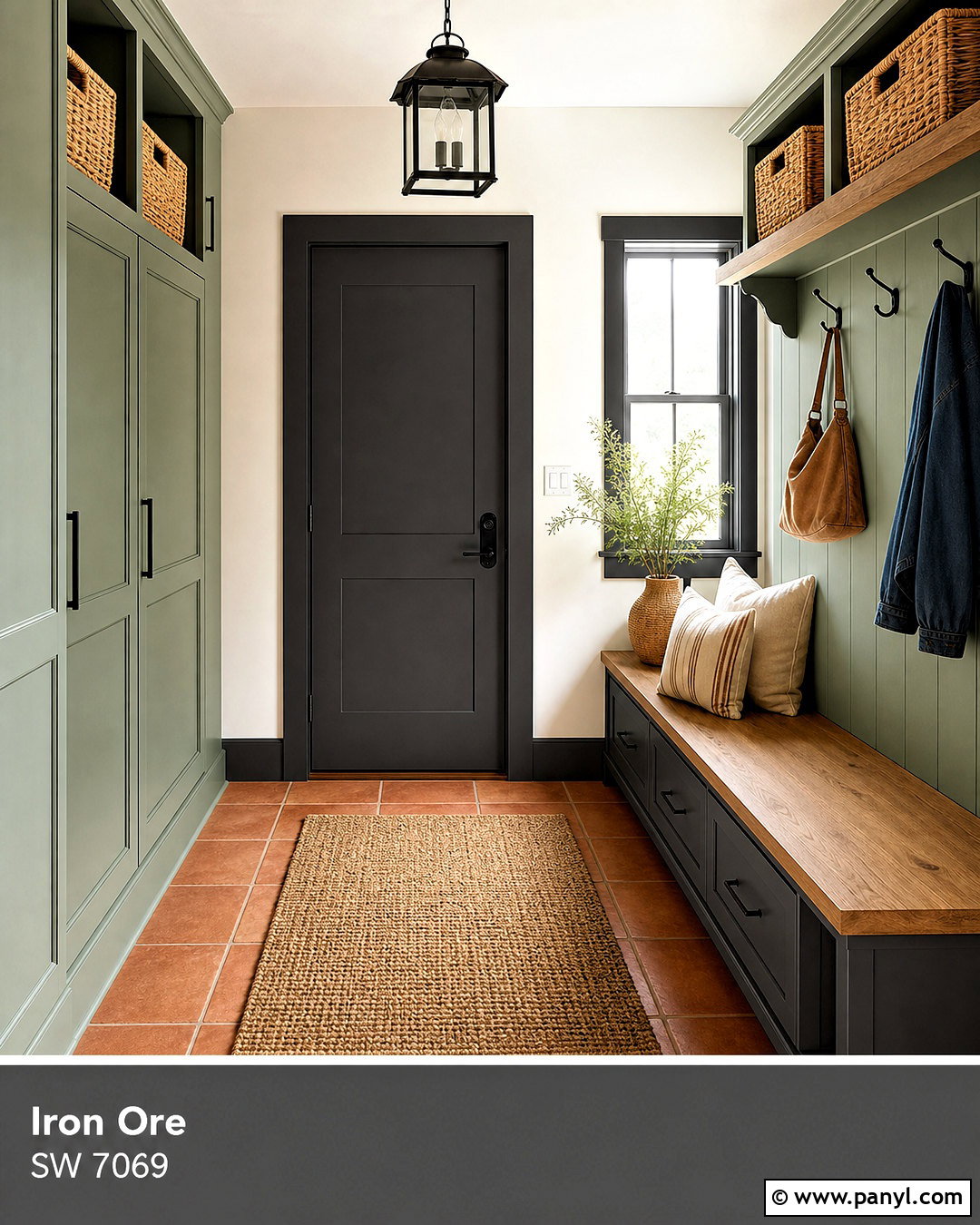
Cornwall Slate SW 9131 turns an Agreeable Gray mudroom into a grounded, practical space. Paint the upper walls Agreeable Gray and use Cornwall Slate on full-height lockers, lower cabinets, and a built-in bench. Finish the cabinetry with matte black hooks and simple aged brass knobs. Add a natural oak bench seat, slate-look porcelain flooring, and woven baskets for shoes and outdoor supplies. Soft white trim keeps the room from becoming too dark. A patterned runner in cream, gray, and muted green ties the two paint colors together. Cornwall Slate delivers a clearly earthy green accent, but its gray base keeps it comfortable beside Agreeable Gray. This combination works especially well with durable materials and streamlined storage rather than delicate decorative details. ()
13. Agreeable Gray And Dovetail
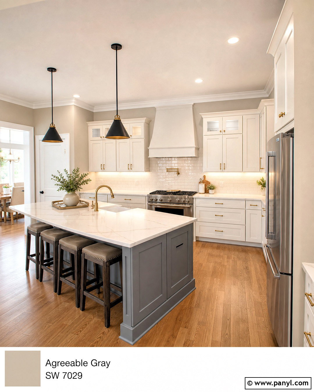
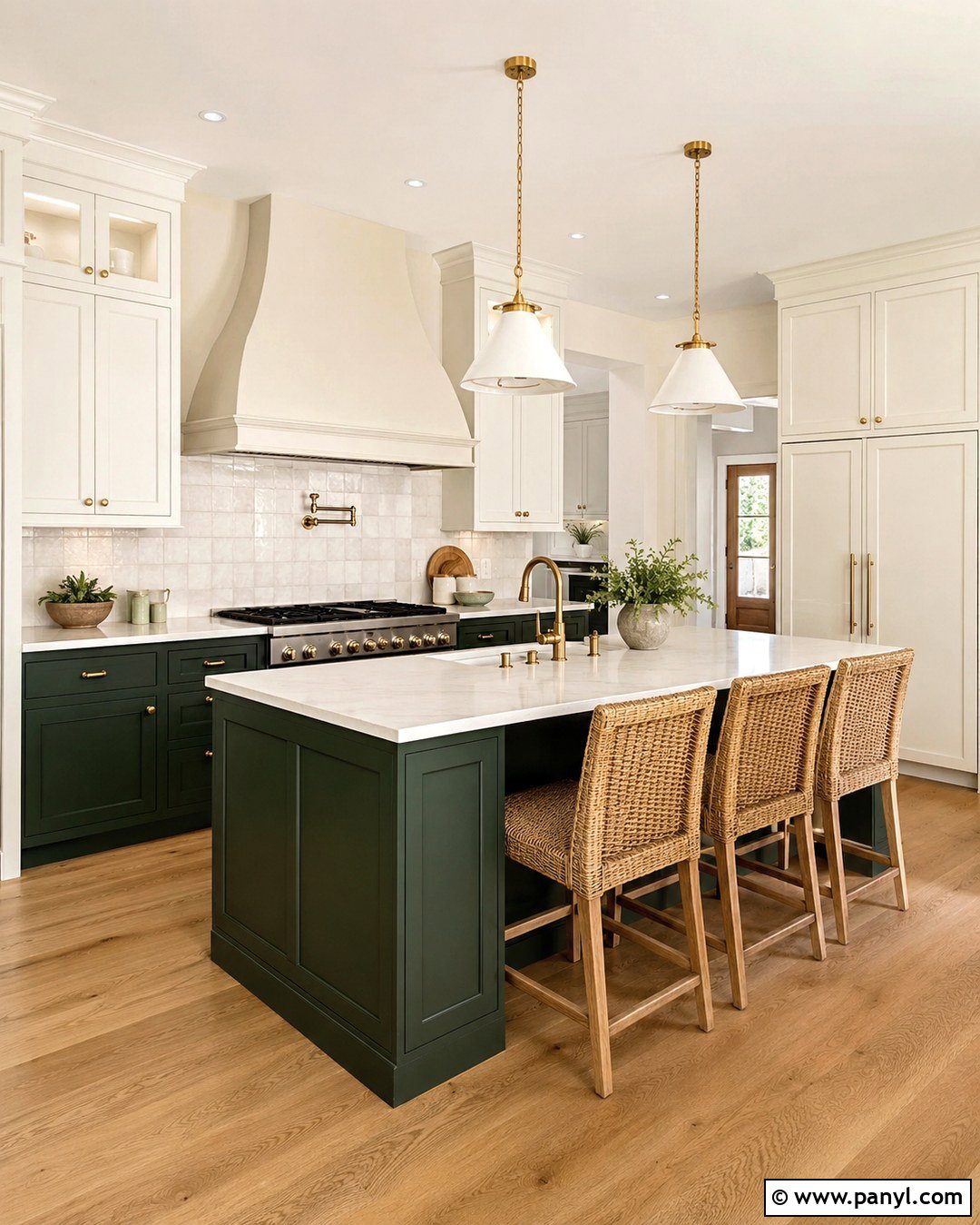
Dovetail SW 7018 creates a strong kitchen focal point against Agreeable Gray walls. Use Agreeable Gray throughout the perimeter, paint the island Dovetail, and finish the remaining cabinets in a soft white. White quartz countertops with warm gray veining bridge all three colors. Add medium oak flooring, matte black pendants, and brushed brass cabinet pulls for a layered transitional look. Keep the backsplash simple with warm white rectangular tile and light greige grout. Dovetail has enough depth to anchor a large island without producing the sharp effect of black. Repeat it on a nearby pantry door or breakfast-room console to distribute the color. The finished kitchen feels balanced, warm, and more dimensional than an all-neutral white-and-gray scheme. ()
14. Agreeable Gray And Mineral Deposit
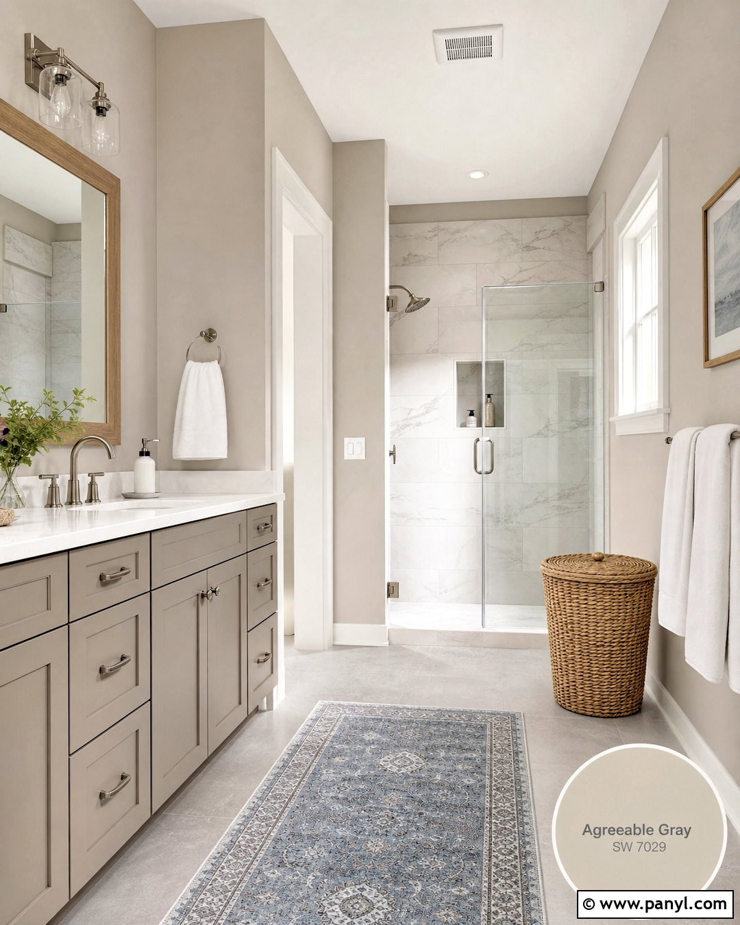
Mineral Deposit SW 7652 gives an Agreeable Gray bathroom a cool, stormy accent. Keep Agreeable Gray on the main walls, then paint the vanity and a recessed linen cabinet in Mineral Deposit. Use soft white quartz, brushed nickel fixtures, and pale marble-look shower tile to brighten the deeper blue-green-gray cabinetry. A white oak mirror and woven hamper add enough warmth to connect with Agreeable Gray’s beige side. Choose simple white towels and a muted gray-blue runner rather than adding several bright colors. The result feels fresh but still grounded. Mineral Deposit can work particularly well in a bathroom with warm artificial lighting, where its cool character balances the bulbs and prevents Agreeable Gray from appearing overly beige. ()
15. Agreeable Gray And Cadet
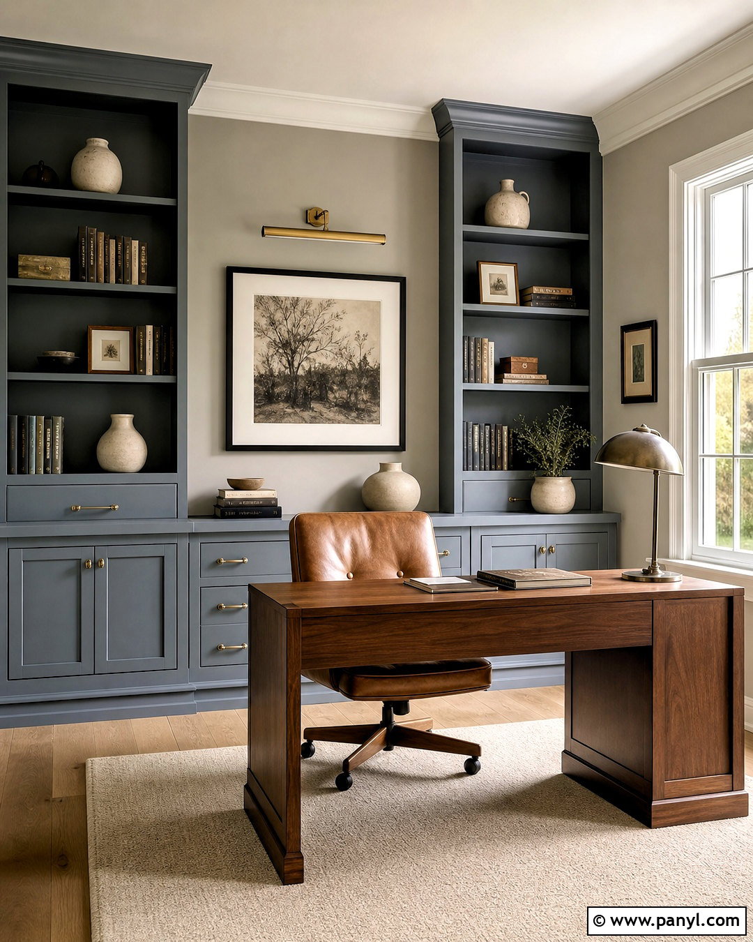
Cadet SW 9143 creates a tailored office when surrounded by Agreeable Gray. Paint the hall and remaining walls Agreeable Gray, then use Cadet on floor-to-ceiling bookcases and the wall behind a walnut desk. Install warm white trim and light oak flooring to stop the deeper blue-gray from dominating the room. A cognac leather chair, cream rug, and aged brass picture light bring warmth and polish. Add charcoal frames, off-white pottery, and restrained greenery to finish the shelves. Cadet supplies enough color to distinguish the workspace while its stormy gray quality relates naturally to Agreeable Gray. Repeat the blue-gray in one patterned cushion or window treatment, but keep larger upholstery neutral for a balanced, usable home office. ()
16. Agreeable Gray And Cyberspace
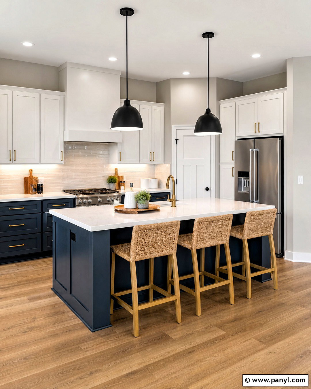
Cyberspace SW 7076 produces a dramatic kitchen without requiring true black cabinetry. Use Agreeable Gray on the walls, soft white on the upper cabinets, and Cyberspace on the lower cabinets and island. Complete the room with pale quartz counters, a warm white tile backsplash, and medium oak flooring. Brushed brass pulls brighten the deep blue-charcoal finish, while black pendants add a clean architectural line. Woven stools and wood accessories keep the kitchen comfortable rather than severe. Cyberspace works best as a controlled focal color, so avoid repeating it on every surface. Carry Agreeable Gray into the breakfast area with cream upholstery and navy-gray textiles to create a smooth visual connection between both sides of the room. ()
17. Agreeable Gray And Gauntlet Gray
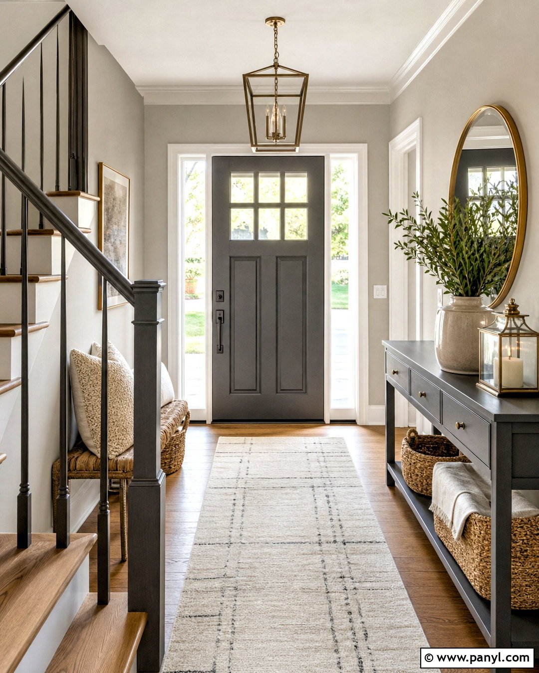
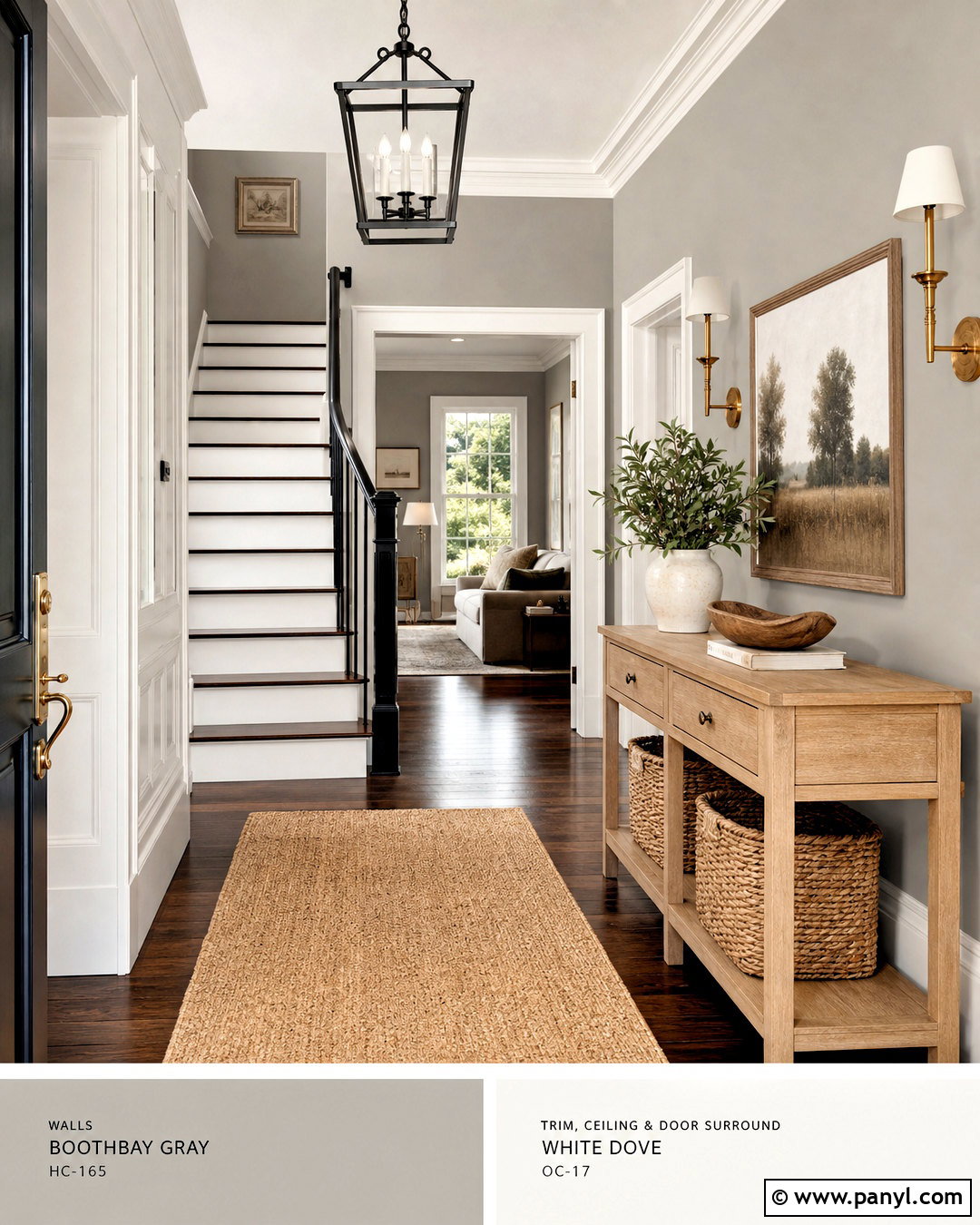
Gauntlet Gray SW 7019 gives an Agreeable Gray entryway a polished sense of depth. Paint the walls Agreeable Gray, then apply Gauntlet Gray to the inside of the front door, stair railing, and a slim storage console. Add soft white trim, warm oak flooring, and a cream runner with subtle charcoal lines. A round brass mirror and clear glass lantern soften the darker accents. Keep baskets, cushions, and ceramics in natural tan and ivory so the entry remains welcoming. Gauntlet Gray has enough warmth to connect with the greige walls more gently than a cool charcoal might. For a cohesive view from adjoining rooms, repeat the color once on a distant cabinet or interior door rather than using unrelated dark finishes. ()
18. Agreeable Gray And Grays Harbor
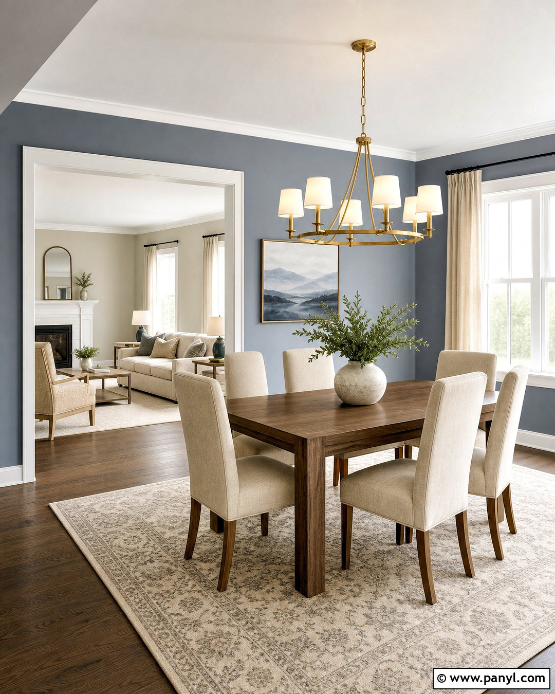
Grays Harbor SW 6236 creates an intimate dining room next to Agreeable Gray living spaces. Paint the dining room walls Grays Harbor and carry Agreeable Gray through the open doorway, hallway, and nearby sitting area. Use soft white trim to frame the transition. A medium walnut dining table, oatmeal chairs, and a cream patterned rug balance the deep blue-green-gray walls. Add a brushed brass chandelier, natural linen curtains, and simple landscape artwork with muted blue tones. This complete scheme makes the dining area feel distinct without disconnecting it from the rest of the home. Keep the ceiling light and avoid overly dark furniture on every side. The contrast should feel purposeful, with Agreeable Gray acting as the brighter neutral between rooms. ()
19. Agreeable Gray And Urbane Bronze
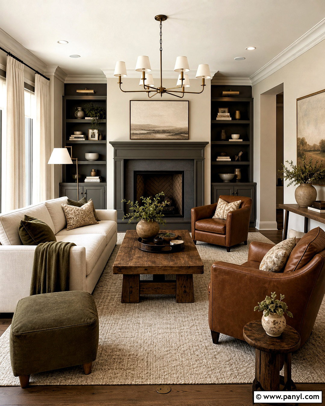
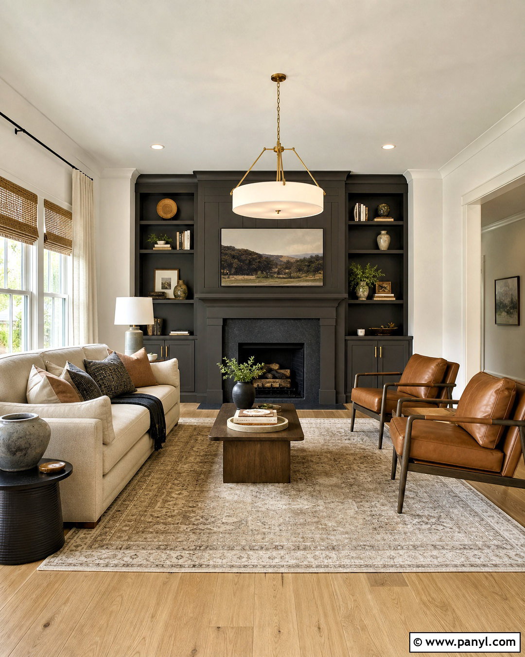
Urbane Bronze SW 7048 adds earthy drama to an Agreeable Gray living room. Keep Agreeable Gray on the main walls and use Urbane Bronze on a fireplace surround, built-in cabinets, and lower shelving. Choose a cream sofa, cognac leather chairs, and a chunky oak coffee table to complement the brown-green depth of the accent color. A warm ivory rug prevents the arrangement from feeling heavy. Add antique brass lighting, natural linen curtains, and a few muted olive textiles. The darker paint should remain concentrated around one architectural feature so it becomes the room’s anchor. Repeat it lightly through frames or metal accessories. This palette is particularly effective with stone, warm wood, and tactile fabrics that emphasize its natural character. ()
20. Agreeable Gray And Iron Ore
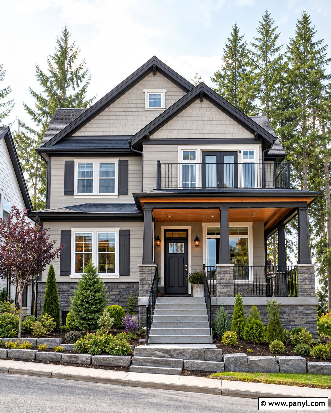
Iron Ore SW 7069 gives an Agreeable Gray exterior a strong, modern outline. Use Agreeable Gray on the siding or stucco body, soft white around the windows, and Iron Ore on the front door, shutters, gutters, and selected metal railings. A charcoal roof, medium gray stone base, and warm cedar porch ceiling complete the balanced facade. Add black-framed lanterns, simple concrete steps, and layered evergreen landscaping for year-round structure. Iron Ore is softer than a pure black, so it provides definition without creating an overly sharp contrast against the warm greige body. Keep the garage door Agreeable Gray or soft white rather than dark charcoal. This prevents it from becoming the largest visual feature and preserves a welcoming curb view. ()
Conclusion:
The best palette does more than place two attractive paint colors beside each other. It connects walls, trim, cabinets, flooring, furniture, and lighting into one complete design. Soft whites make Agreeable Gray feel brighter, while layered greiges create subtle transitions. Blue-grays and earthy greens add restrained color. Charcoal, bronze, and near-black accents provide stronger definition for cabinetry, doors, fireplaces, and exteriors. Before choosing among these 20 agreeable grey coordinating colors, paint large sample boards and move them around the room. Review each pairing in morning light, afternoon sun, and evening illumination. Comparing samples with fixed finishes will help you create a coordinated home that feels comfortable, balanced, and intentional.

Related Ideas and Inspiration:
Leave a Reply