
Urbane Bronze is a deep brownish gray that can feel earthy, modern, or quietly dramatic depending on its partner. Sherwin-Williams officially recommends warm whites such as Shoji White, Extra White, and Ivoire, while also highlighting natural materials, parchment neutrals, mushroom tones, and ochre accents. () Because this rich shade reflects little light, successful palettes usually include contrast, texture, and thoughtful lighting. Pale oak, warm stone, linen, leather, and aged metals help soften its visual weight. Cooler greens and blues can provide freshness, while clay and gold bring out its brown undertones. The combinations below turn 20 Urbane Bronze coordinating colors into complete room and exterior schemes you can confidently recreate.

1. Urbane Bronze And Shoji White
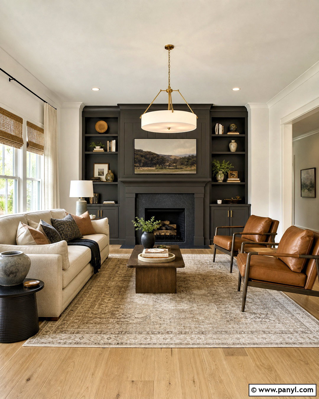
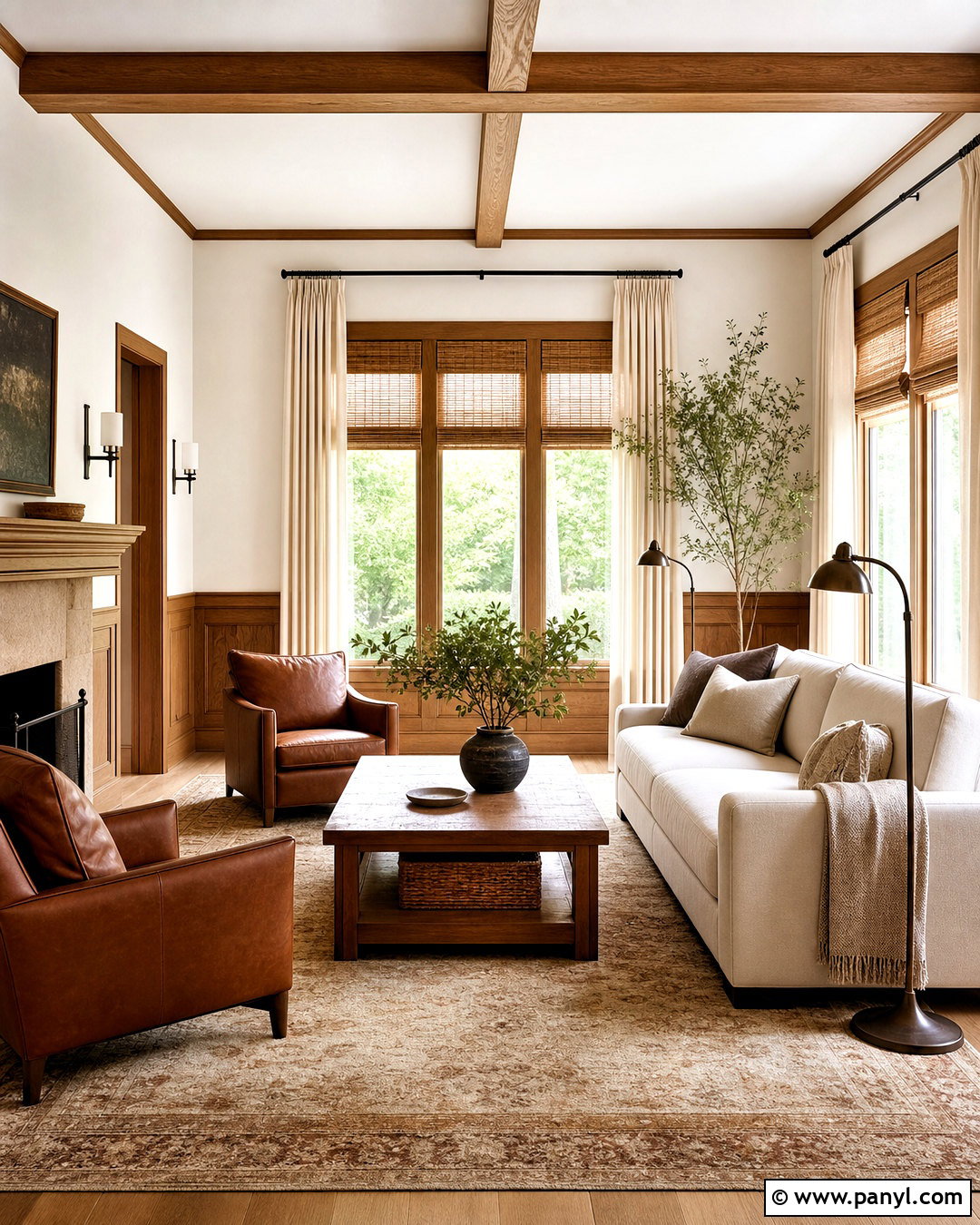
Shoji White gives Urbane Bronze a warm, softened contrast without making the palette look stark. Use Shoji White across living room walls, then place Urbane Bronze on built-in shelving, a fireplace surround, or interior doors. A pale oak floor and oatmeal-colored sofa keep the room bright, while camel leather chairs strengthen the earthy character. Add a cream-and-taupe rug, woven shades, and brushed brass lighting for gentle warmth. The combination works especially well in transitional, organic modern, and updated farmhouse homes. Since Shoji White has warm undertones, it connects naturally with beige textiles and wood. Finish the room with black accents in small amounts so they define the design without competing with the dark bronze feature.
2. Urbane Bronze And Extra White
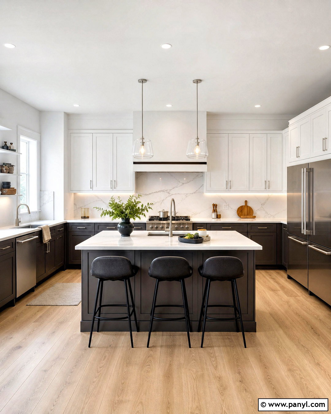
Do you want Urbane Bronze to appear cleaner and more architectural? Extra White creates crisp separation around dark cabinetry, doors, and exterior accents. In a kitchen, try Urbane Bronze on the island and lower cabinets, with Extra White walls and upper cabinets. White quartz counters, a marble-look backsplash, and light oak flooring prevent the dark finish from overwhelming the room. Matte black stools add structure, while polished nickel or brushed brass hardware introduces subtle shine. This pairing also works beautifully outside, especially when Urbane Bronze highlights shutters or a front door against Extra White siding. Keep decorative colors controlled. Soft gray upholstery, natural greenery, and warm wood accessories maintain balance while letting the strong light-and-dark contrast remain the main feature.
3. Urbane Bronze And Ivoire
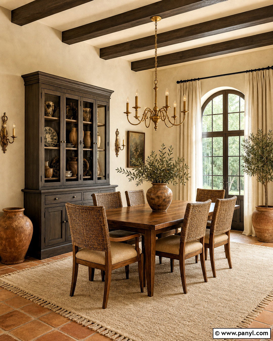
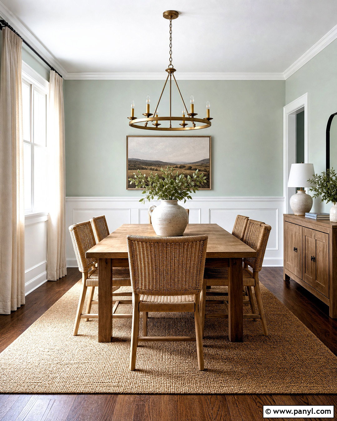
Ivoire brings creamy golden warmth to Urbane Bronze, creating an inviting palette that suits traditional and Mediterranean-inspired rooms. Paint dining room walls Ivoire and use Urbane Bronze on the ceiling beams, window trim, or a substantial china cabinet. A medium walnut table, woven dining chairs, and an ivory wool rug make the space feel layered rather than overly matched. Terracotta pottery and antique brass lighting echo Ivoire’s warmth, while linen curtains soften the heavier finishes. This combination performs best in rooms receiving warm afternoon light, where both colors appear rich and comfortable. Avoid icy gray decor, which may feel disconnected. Instead, repeat warm cream, rust, olive, and natural brown throughout the textiles and accessories for a unified, welcoming design.
4. Urbane Bronze And Alabaster
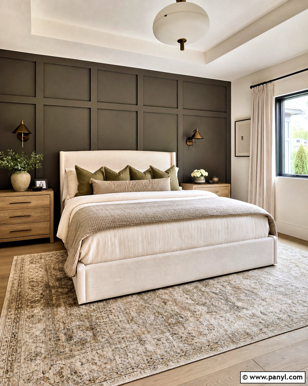
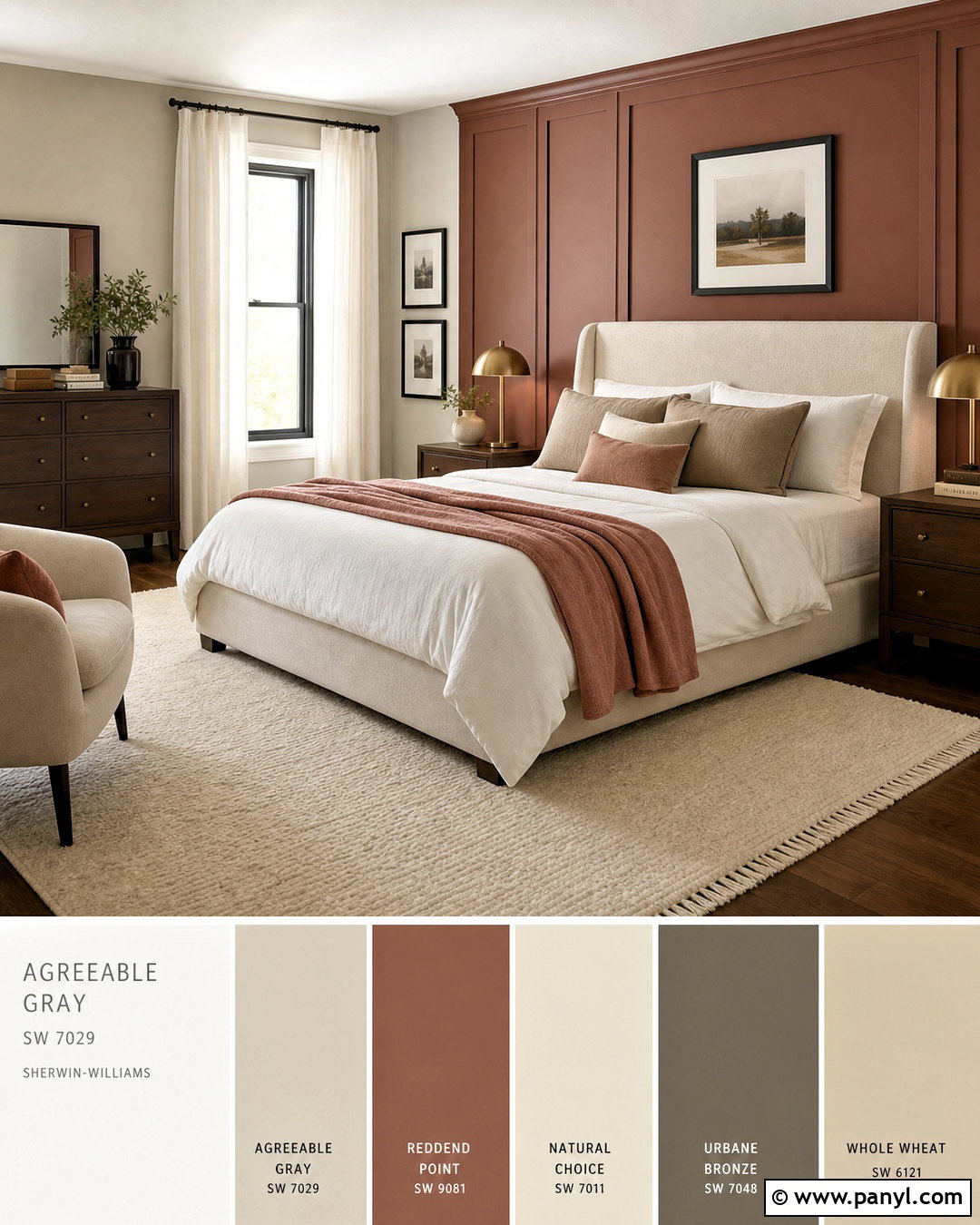
Alabaster creates an easy, flexible background for Urbane Bronze because it is bright without looking cold. For a relaxed bedroom, cover the walls in Alabaster and paint the bed wall, paneled headboard, or closet doors Urbane Bronze. Layer the bed with ivory linen, mushroom-colored quilts, and muted olive pillows. Light oak nightstands provide natural contrast, while bronze sconces connect with the accent color. A softly patterned beige rug keeps the dark wall from feeling visually disconnected from the pale floor and bedding. This palette works particularly well when you want a calm neutral room with one grounding feature. Use warm white bulbs and multiple light sources so Urbane Bronze retains its complex brown-gray character after sunset instead of appearing nearly black.
5. Urbane Bronze And Agreeable Gray
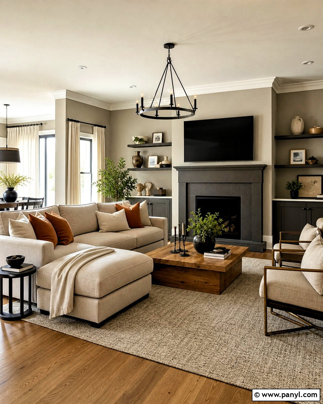
Agreeable Gray makes Urbane Bronze feel approachable in open-plan homes where rooms need to flow together. Use Agreeable Gray on the main walls and Urbane Bronze on a fireplace, media cabinet, or nearby home office built-ins. A greige sectional, warm oak coffee table, and cream curtains build a smooth transition between the two paint colors. Add charcoal sparingly through frames or table lamps, then introduce clay-colored pillows and greenery for depth. The scheme has enough contrast to define architectural features without producing a sharp black-and-white effect. It also connects easily with stone fireplaces and mixed beige flooring. Before committing, test both paints beside permanent surfaces, since natural light and existing finishes can noticeably influence how their warm and cool undertones are perceived.
6. Urbane Bronze And Modern Gray
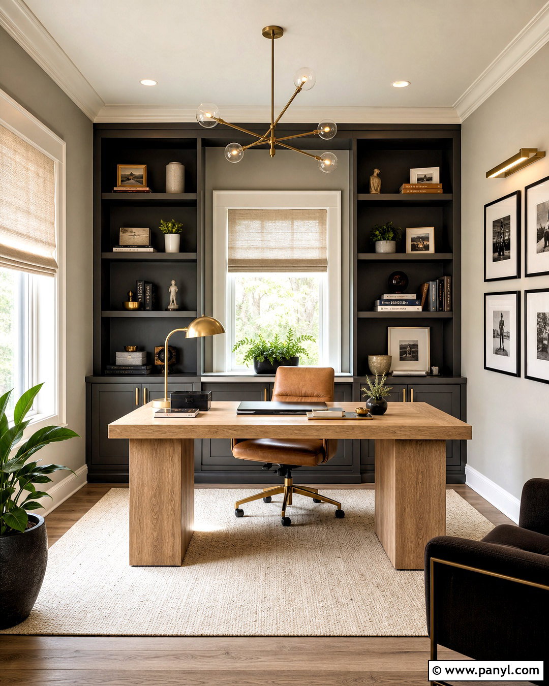
Modern Gray provides a light mushroom background that complements the earthy depth of Urbane Bronze. Create a polished home office with Modern Gray walls, an Urbane Bronze bookcase wall, and a broad light oak desk. Upholster the desk chair in warm cognac leather and place a cream flat-weave rug underfoot. Black picture frames can add definition, but aged brass hardware and lighting will keep the room from becoming too severe. Linen Roman shades filter daylight and allow the darker cabinetry to remain detailed. This combination feels professional without being corporate, making it ideal for a visible workspace near a living area. Carry Modern Gray into the adjoining room, then repeat Urbane Bronze through a door or console to create a deliberate whole-home connection.
7. Urbane Bronze And Messenger Bag
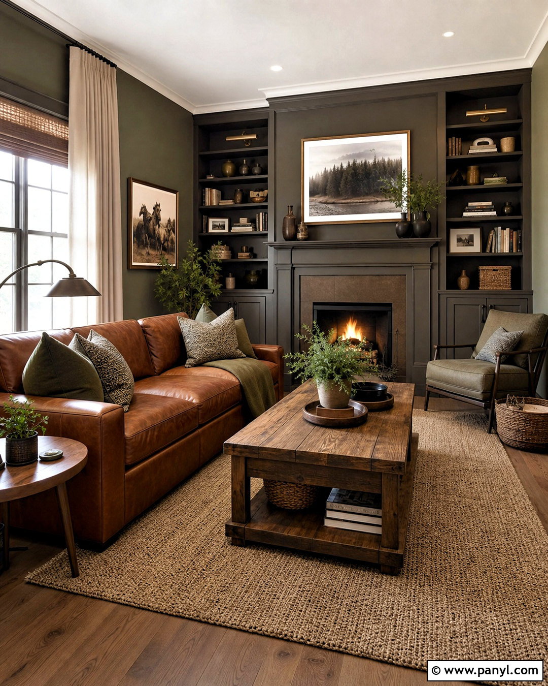
Messenger Bag is an earthy khaki green that strengthens the natural side of Urbane Bronze. For a cozy den, paint the walls Messenger Bag and use Urbane Bronze on low cabinets, doors, and the fireplace surround. Choose a caramel leather sofa, warm wood tables, and a nubby cream rug to prevent the deeper colors from becoming heavy. Olive and tan textiles can continue the tonal palette, while aged bronze lamps provide soft metallic highlights. Include off-white curtains and a pale ceiling to preserve brightness. The finished room should feel grounded and comfortable rather than overly rustic. Clean-lined furniture and simple ceramics keep the arrangement current. This pairing is especially effective where windows overlook trees because the muted green visually connects the interior with the surrounding landscape.
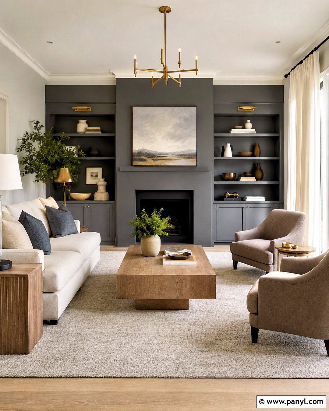
8. Urbane Bronze And Felted Wool
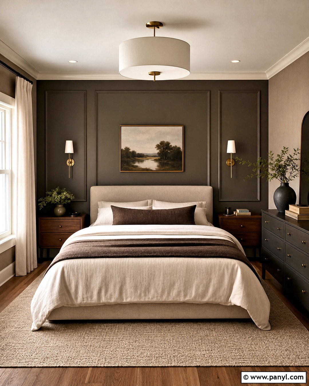
A soft taupe like Felted Wool creates a layered neutral scheme with more depth than a basic beige palette. Use Felted Wool on bedroom walls and Urbane Bronze on a paneled accent wall, dresser, and slim window frames. Add an upholstered oatmeal bed, walnut nightstands, and bedding in ivory, taupe, and muted brown. A textured wool rug and full linen curtains help the room feel comfortable despite the dark painted feature. Keep the ceiling and trim a warm white so the architecture remains clear. For subtle contrast, introduce sage greenery and antique brass sconces rather than bright accent colors. The finished bedroom feels enveloping but not gloomy, particularly when bedside lamps and ceiling lighting provide several warm, evenly distributed sources of illumination.
9. Urbane Bronze And Porpoise
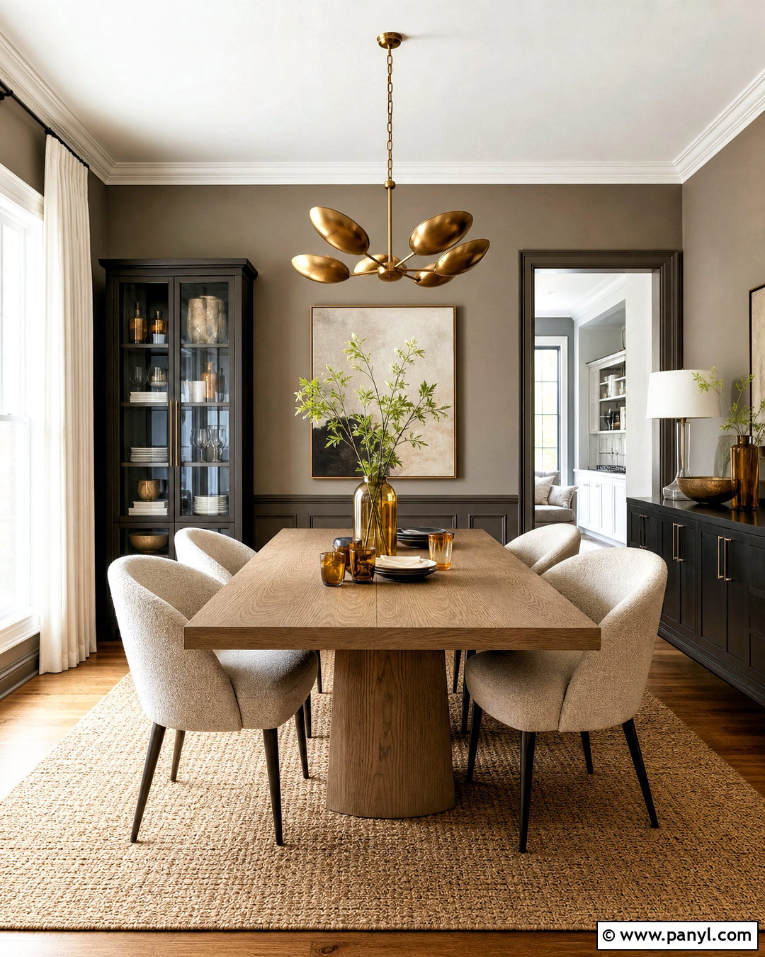
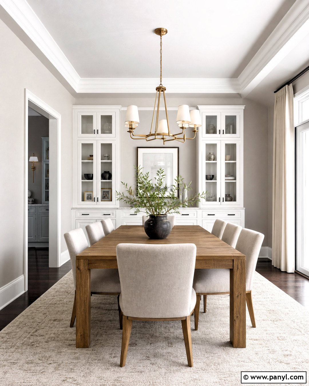
Porpoise and Urbane Bronze form a sophisticated tonal pairing built around warm brown-gray shades. Use Porpoise on a dining room’s upper walls and Urbane Bronze below a chair rail or across full-height paneling. A pale oak dining table and cream boucle chairs offer necessary visual relief. Hang a sculptural brass chandelier overhead and place a light natural-fiber rug beneath the table to brighten the center of the room. Simple ivory drapery frames the windows without disrupting the earthy color story. Since both paints are substantial, generous daylight is helpful. In smaller spaces, limit Urbane Bronze to the buffet, doors, or trim. Stoneware, amber glass, and a few matte black details complete the room while maintaining its restrained, tailored character.
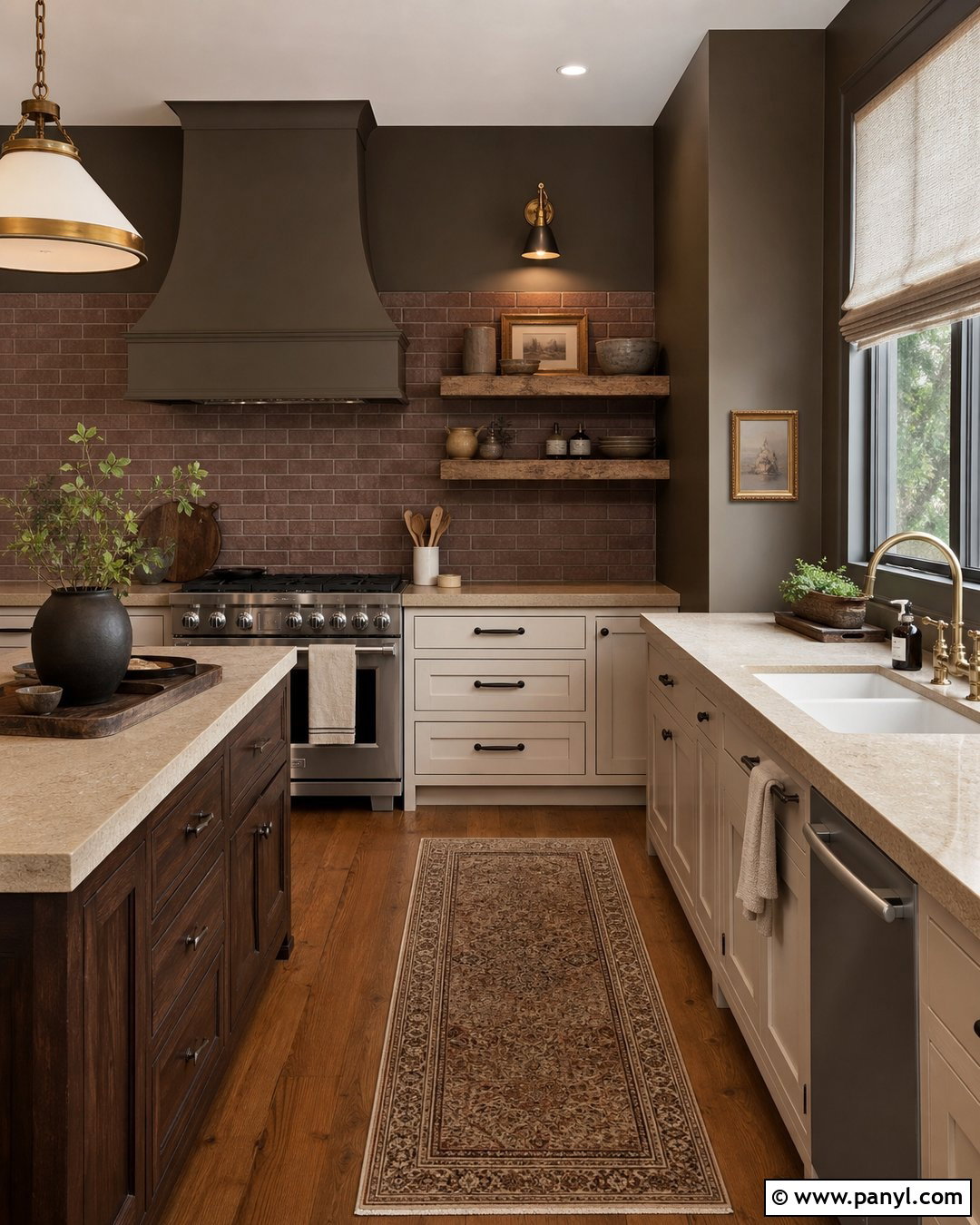
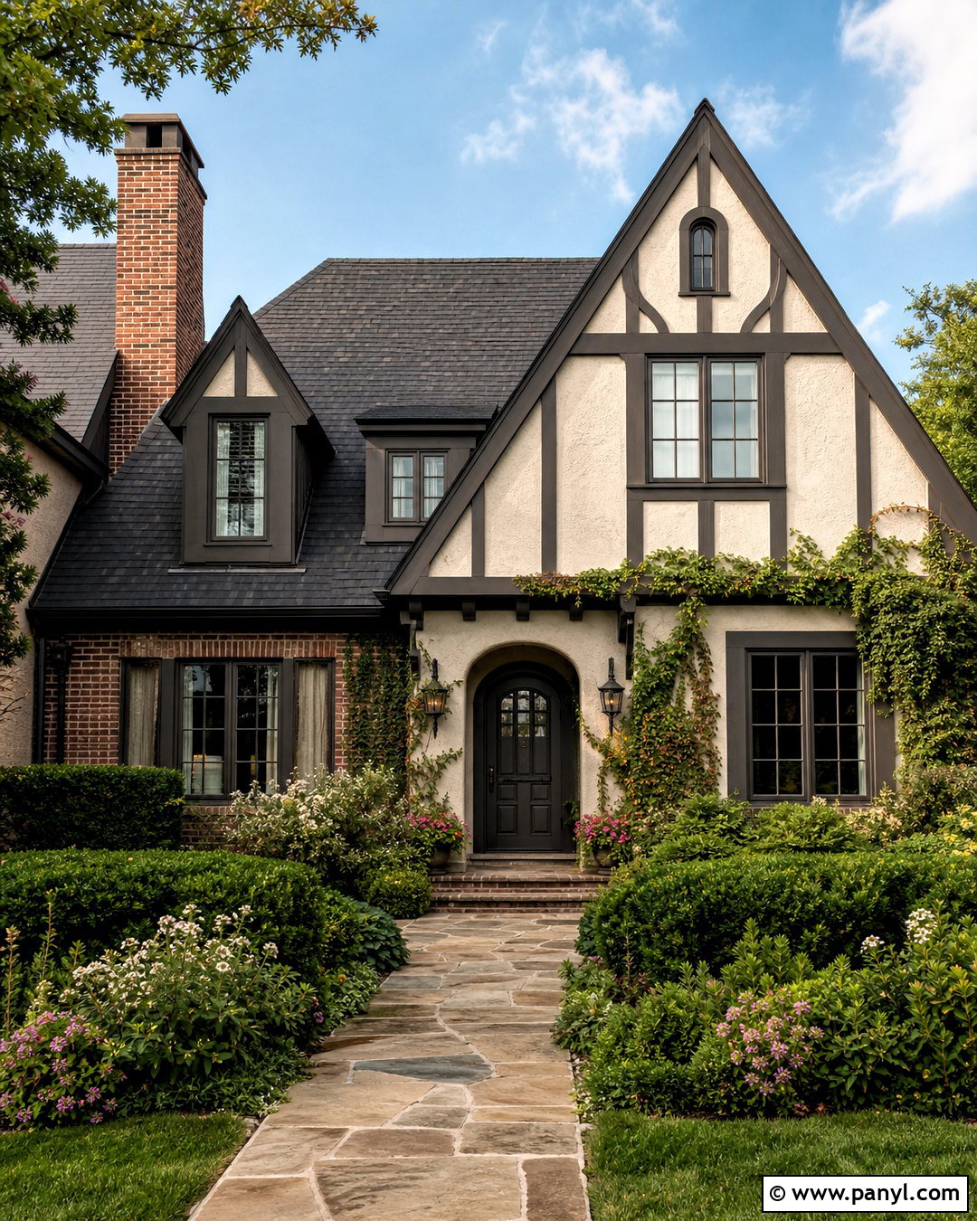
10. Urbane Bronze And Tricorn Black
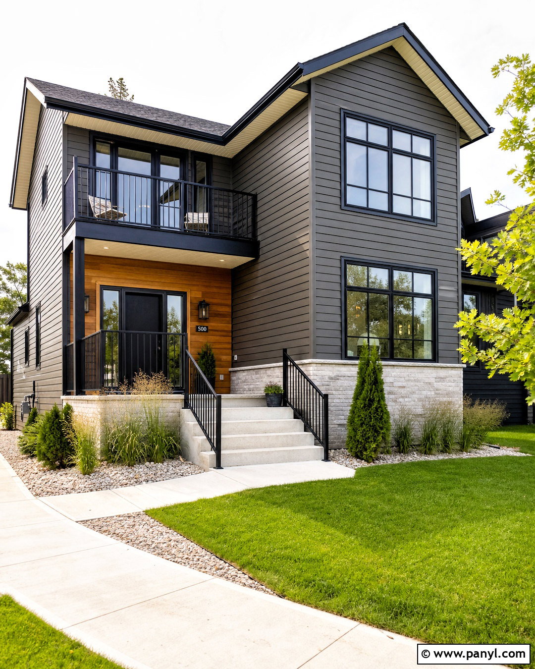
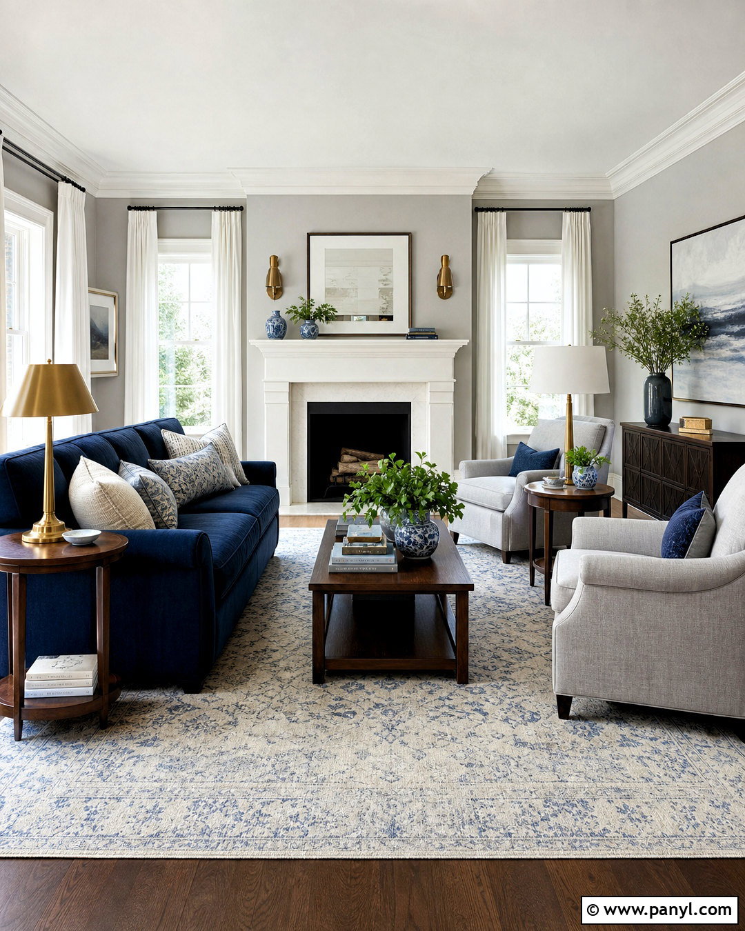
Pairing Urbane Bronze with Tricorn Black creates a bold, modern look, but a lighter third color is essential. On a contemporary exterior, use Urbane Bronze for the main siding, Tricorn Black on window frames and metal railings, and a warm white for soffits and porch ceilings. Natural cedar at the entry adds warmth and prevents the facade from looking flat. Choose light gray stone around the foundation and simple concrete steps for additional material contrast. Landscaping should include layered ornamental grasses, evergreen shrubs, and pale gravel that can be seen clearly against the dark exterior. This scheme suits modern ranch, contemporary farmhouse, and minimalist homes. Test large samples outdoors because direct sunlight can reveal more of Urbane Bronze’s brown character than indoor lighting does.
11. Urbane Bronze And Accessible Beige
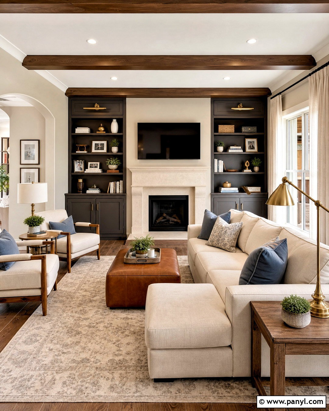
Accessible Beige softens Urbane Bronze with a familiar, welcoming warmth that works well in family spaces. Paint living room walls Accessible Beige, then use Urbane Bronze on built-ins surrounding a cream stone fireplace. Select a light beige sectional, cognac leather ottoman, and medium-tone oak tables. Curtains in natural linen and a large ivory-and-taupe rug keep the design airy. Add muted blue or olive pillows for gentle color without disturbing the neutral foundation. Brass cabinet hardware and table lamps introduce warmth, while a few black accents give the arrangement definition. This complete palette transitions easily into nearby kitchens and hallways. Repeat Accessible Beige across connected walls and use Urbane Bronze on selected doors or cabinetry to make the dark shade feel intentional throughout the home.
12. Urbane Bronze And Natural Choice
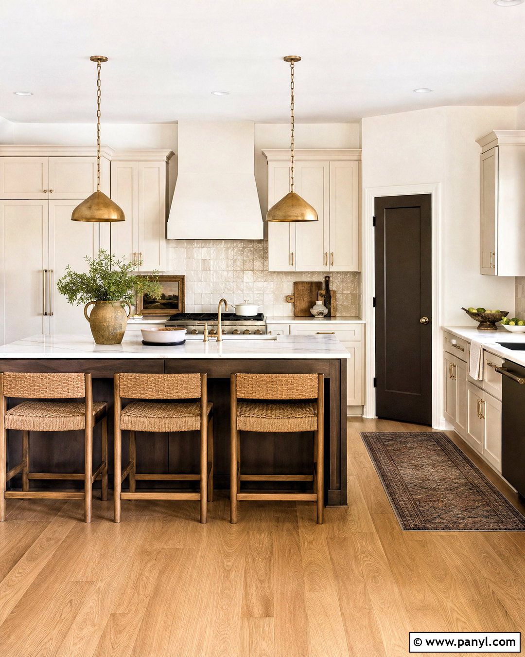
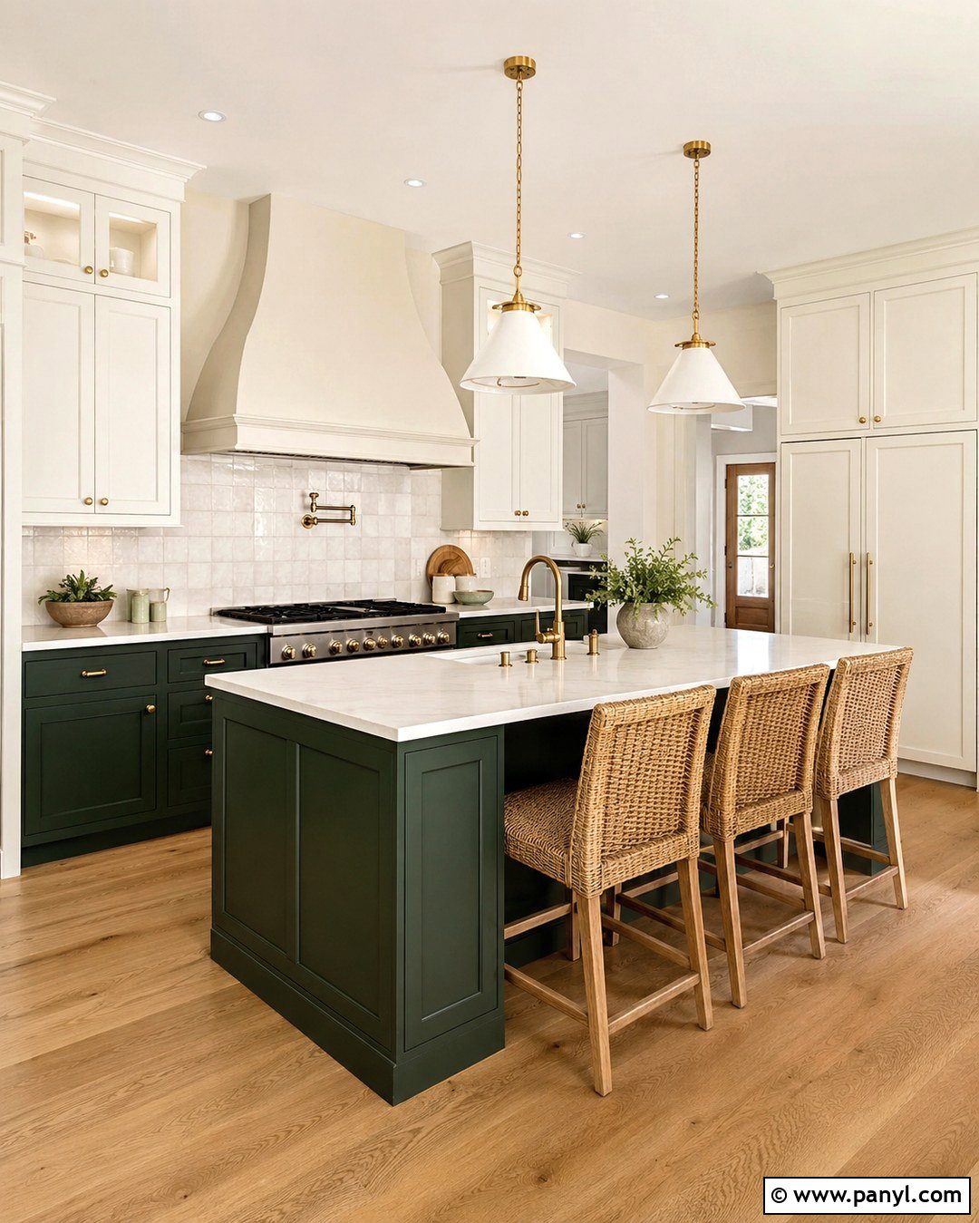
Natural Choice brings a fresh, creamy quality to Urbane Bronze and works especially well with organic materials. In a kitchen, cover the perimeter cabinets in Natural Choice and reserve Urbane Bronze for a generous island and pantry door. Choose pale quartz counters with subtle beige veining, handmade cream backsplash tile, and white oak flooring. Woven counter stools add texture, while aged brass pendants provide a warm focal point above the island. Keep appliances and plumbing fixtures in stainless steel or muted brass rather than using too many black elements. The resulting kitchen feels bright, natural, and grounded. Carry the two colors into an adjoining breakfast area with Natural Choice walls, an Urbane Bronze sideboard, linen upholstery, and a simple oak dining set.
13. Urbane Bronze And Sea Salt
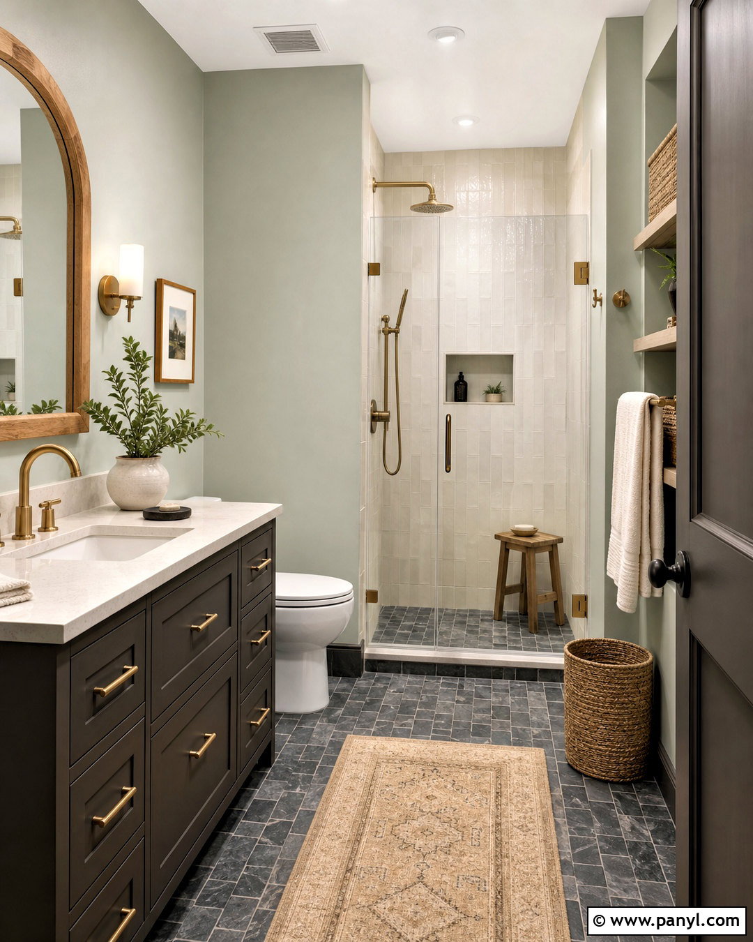
Sea Salt gives Urbane Bronze a light, restorative contrast through its muted green-gray character. Build a calm bathroom with Sea Salt walls, an Urbane Bronze vanity, and creamy white shower tile. A pale quartz countertop keeps the vanity crisp, while brushed brass fixtures bring warmth to both colors. Use a light oak mirror frame, woven baskets, and ivory towels to reinforce the natural atmosphere. Small slate floor tiles can add depth, although the grout should remain medium or light to avoid making the floor appear too busy. This palette performs well in bathrooms with natural light, where Sea Salt can shift gently between green and gray. Keep accessories simple and repeat Urbane Bronze once more through a door or recessed cabinet for a cohesive finish.
14. Urbane Bronze And Sage Green
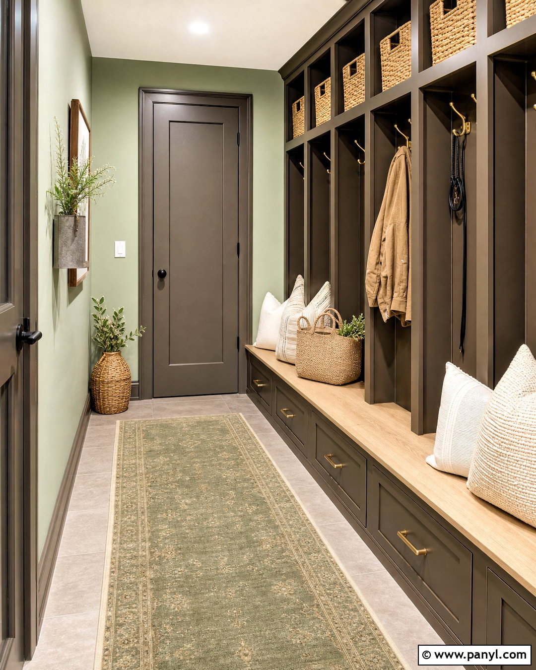
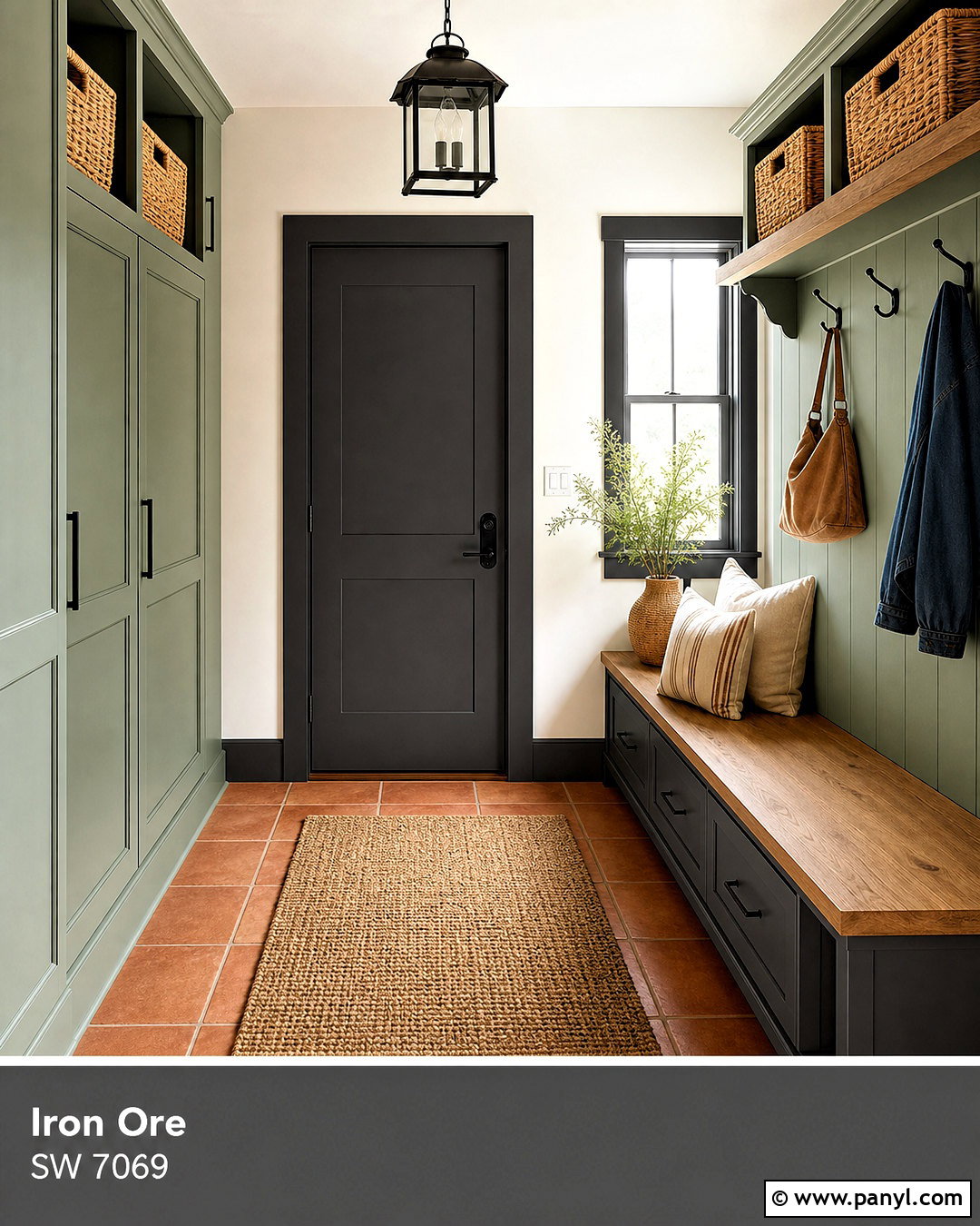
Warm sage green creates a relaxed, garden-inspired partner for Urbane Bronze. In a mudroom, use sage on the walls and Urbane Bronze on lockers, bench drawers, and the interior door. Add a white oak bench seat, durable warm gray floor tile, and woven baskets for practical storage. Cream seat cushions and simple brass hooks soften the dark cabinetry while keeping everyday items organized. A warm white ceiling and trim preserve brightness in a room that may have limited windows. The palette also connects naturally with outdoor views and landscaped entries. Choose a subdued sage rather than a highly saturated green so it does not clash with Urbane Bronze’s brown undertones. Repeating the sage in a washable runner completes the functional, coordinated space.
15. Urbane Bronze And Evergreen Fog
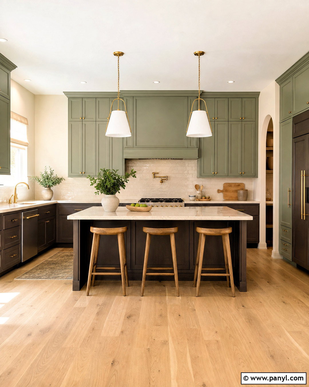
Evergreen Fog and Urbane Bronze create a rich nature-based scheme suitable for kitchens, libraries, and covered porches. For a kitchen, paint the upper cabinets Evergreen Fog and use Urbane Bronze on the lower cabinets and island. Light quartz countertops and warm white walls provide breathing room between the two grounded colors. A white oak floor, cream backsplash, and unlacquered brass hardware add natural warmth. Keep pendant lights visually simple so the two cabinet colors remain the focus. This combination works best when each shade appears in a substantial area rather than through scattered accessories. Include wood stools, linen shades, and a few handmade ceramic pieces to complete the organic look. Bright task lighting is important for maintaining clear color separation at night.
16. Urbane Bronze And Naval
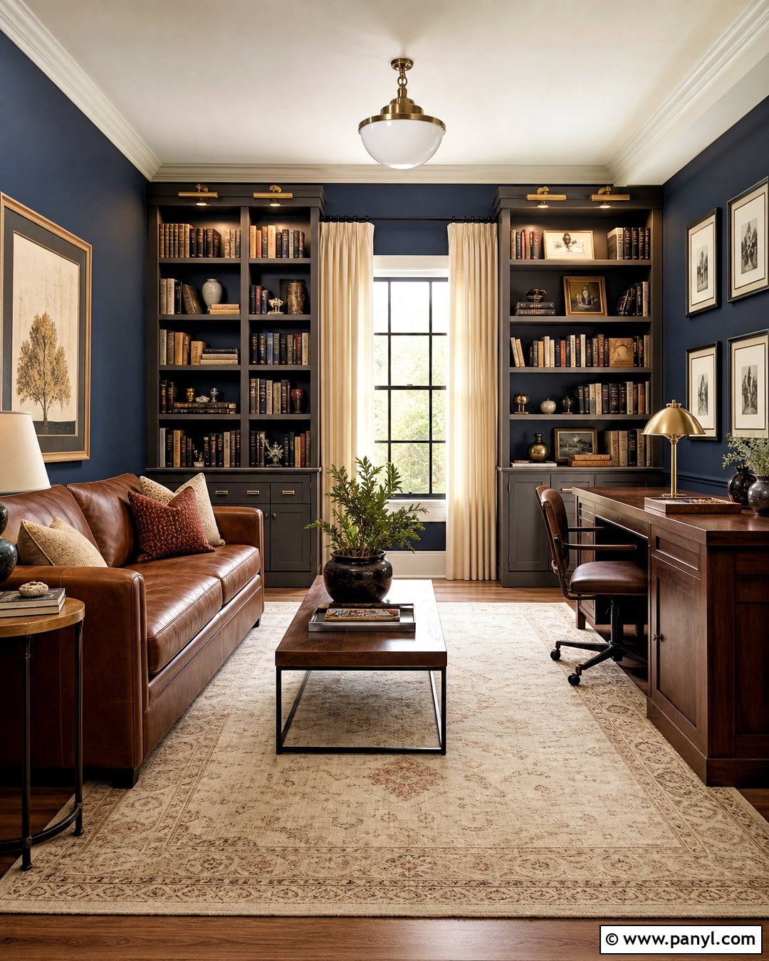
Naval introduces deep blue contrast while sharing Urbane Bronze’s dramatic visual weight. Use this combination in a spacious study with Naval walls, Urbane Bronze built-ins, and a warm white ceiling. A cognac leather sofa and large cream rug prevent the darker painted surfaces from enclosing the room. Add walnut tables, antique brass picture lights, and ivory curtains for warmth and balance. Books and artwork can contribute muted rust, tan, and green accents without creating visual clutter. If the room is small, place Naval on one wall and reserve Urbane Bronze for the desk or cabinetry. Multiple lamps are essential because both colors absorb light. The completed scheme feels tailored and comfortable, blending traditional library character with clean, contemporary furniture lines.
17. Urbane Bronze And Cavern Clay
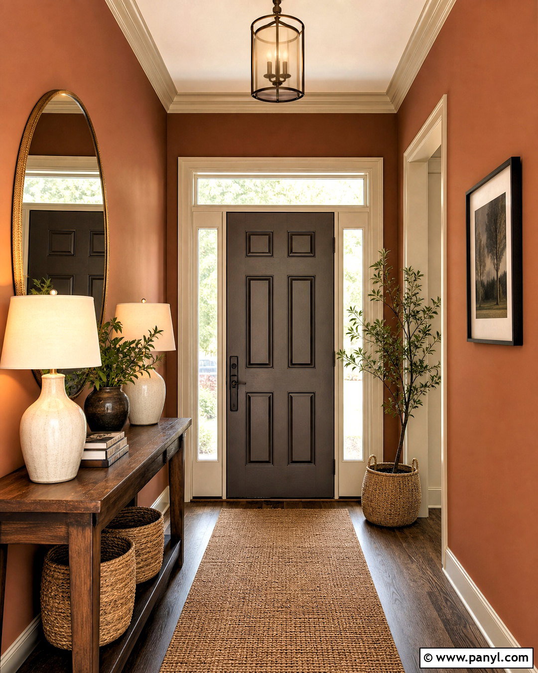
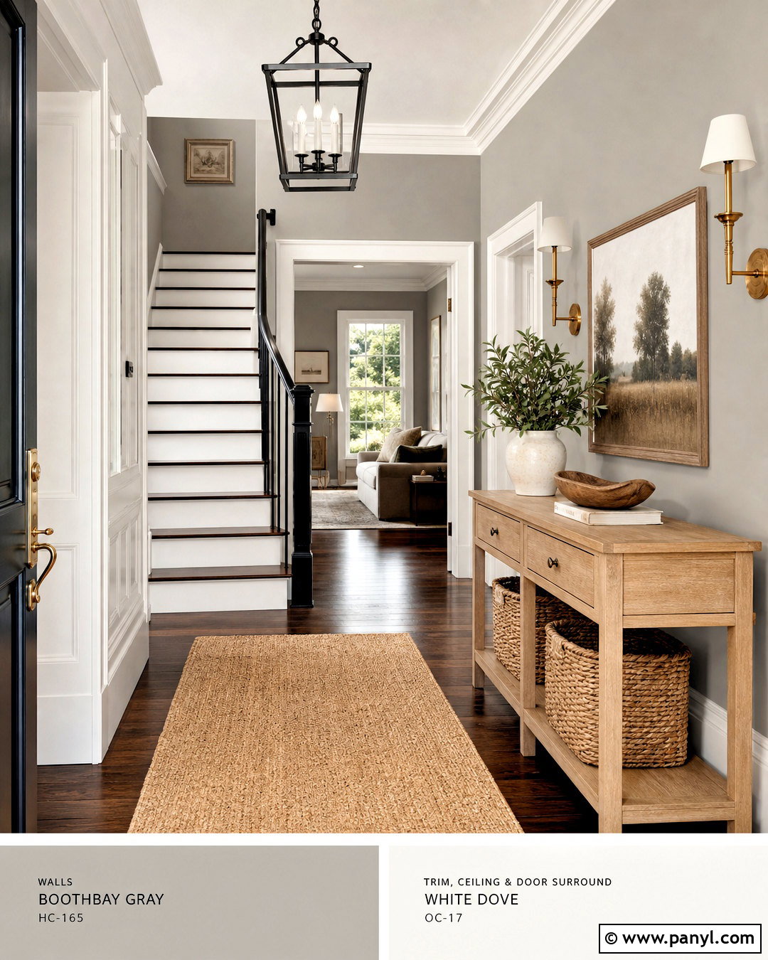
Cavern Clay brings out the subtle earthy warmth hidden inside Urbane Bronze. Create a welcoming entry with Cavern Clay walls, an Urbane Bronze front door, and warm white trim. Add a narrow walnut console, a natural jute runner, and a large rounded mirror with an aged brass frame. Cream ceramic lamps and woven storage baskets lighten the richer paint colors. Continue the terracotta influence through one or two patterned textiles rather than filling the space with orange accents. The result should feel sun-warmed and grounded, not overly Southwestern. This palette is especially attractive near brick, terracotta tile, or medium wood flooring. Keep the ceiling pale and the lighting bright so the entry feels open while still making a memorable first impression.
18. Urbane Bronze And Blackberry
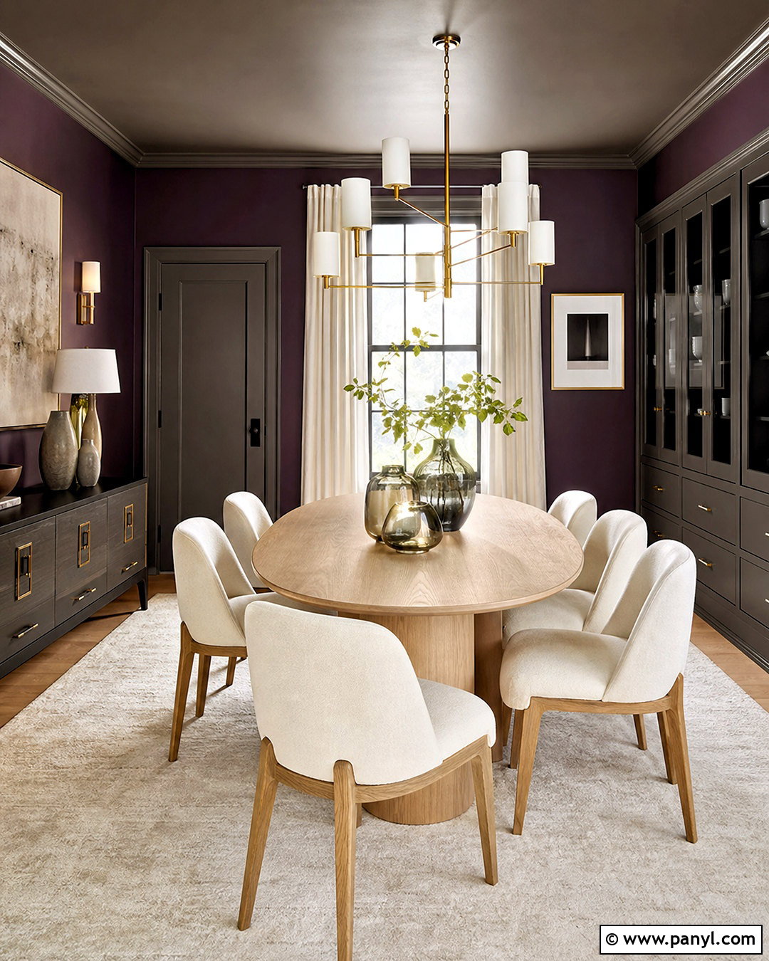
Blackberry gives Urbane Bronze a subtle plum contrast that feels luxurious without relying on bright color. Use Blackberry on dining room walls and Urbane Bronze on the ceiling, doors, or a wide built-in buffet. Balance these enveloping shades with an oval light oak table, ivory upholstered chairs, and a large cream rug. A brass chandelier and pale linen curtains introduce brightness and reflect light around the room. Keep tableware and accessories in warm white, smoky glass, and muted bronze. Because both colors are deep, this scheme works best in a room with broad windows or strong layered lighting. The completed space feels distinctive yet grounded. Avoid adding vivid purple, which can make the nuanced Blackberry walls look more saturated than intended.
19. Urbane Bronze And Ochre Gold
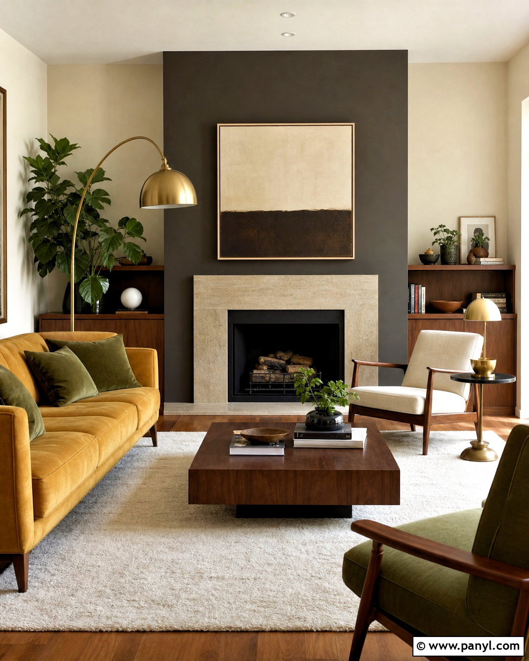
An ochre gold partner adds warmth and energy to Urbane Bronze while maintaining an earthy palette. In a living room, use Urbane Bronze on the fireplace wall and warm cream across the remaining walls. Introduce ochre through a substantial sofa, two lounge chairs, or full-length curtains rather than several tiny accessories. A walnut coffee table, ivory rug, and beige stone fireplace complete the foundation. Add aged brass lighting and small olive accents for a balanced natural scheme. The gold should look muted and mineral-based, not neon yellow. This arrangement works particularly well in rooms with midcentury or modern furnishings. Allow plenty of pale negative space around the darker fireplace so the feature feels dramatic, structured, and visually connected to the warmer upholstery.
20. Urbane Bronze And Crushed Ice
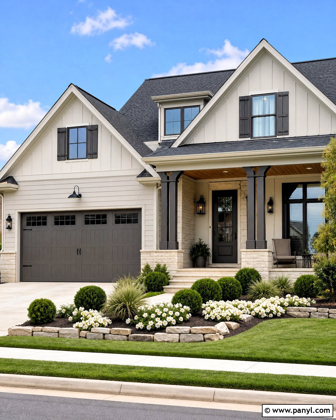
Crushed Ice offers a light neutral contrast that can make Urbane Bronze feel more modern and streamlined. For a home exterior, use Crushed Ice on the primary siding and Urbane Bronze on the garage door, shutters, porch columns, and front door. Add charcoal roof shingles, light limestone accents, and warm cedar beneath the porch ceiling. Matte black lighting and house numbers provide crisp definition without introducing another major color. Keep the landscaping simple with rounded evergreen shrubs, white flowers, ornamental grasses, and natural stone edging. This scheme suits suburban homes that need stronger curb appeal without an extreme color change. Review samples against the roof and masonry during morning and afternoon light before finalizing the placement of each shade.
Conclusion:
The best Urbane Bronze coordinating colors either lighten its deep brown-gray character, reinforce its natural warmth, or create controlled contrast. Creamy whites and light greiges make it easier to use in everyday rooms. Sage, blue, clay, plum, and ochre introduce color while keeping the overall palette grounded. For a complete design, consider flooring, countertops, roofing, wood tones, fabrics, lighting, and permanent stone before choosing paint. Large sample boards are more useful than tiny chips because Urbane Bronze can shift noticeably throughout the day. Whether it appears on walls, cabinetry, trim, doors, or siding, thoughtful repetition will make the shade feel connected rather than isolated within your finished home.

Related Ideas and Inspiration:
Leave a Reply