
Accessible Beige by Sherwin-Williams is a balanced greige with soft gray undertones that feels warmer than standard gray without becoming overly yellow. That versatility makes it a practical backdrop for natural wood, crisp white, earthy green, deep blue, terracotta, and many other colors. The best Accessible Beige color palette ideas consider more than wall paint. Flooring, cabinetry, upholstery, metal finishes, and lighting must work together to create a complete look. Always test a physical paint sample because daylight, artificial light, and surrounding finishes can change how the color appears. () Whether you want a calm bedroom, welcoming kitchen, or polished living room, the following complete spaces offer 20 accessible beige color palette ideas.

1. Accessible Beige And Warm White
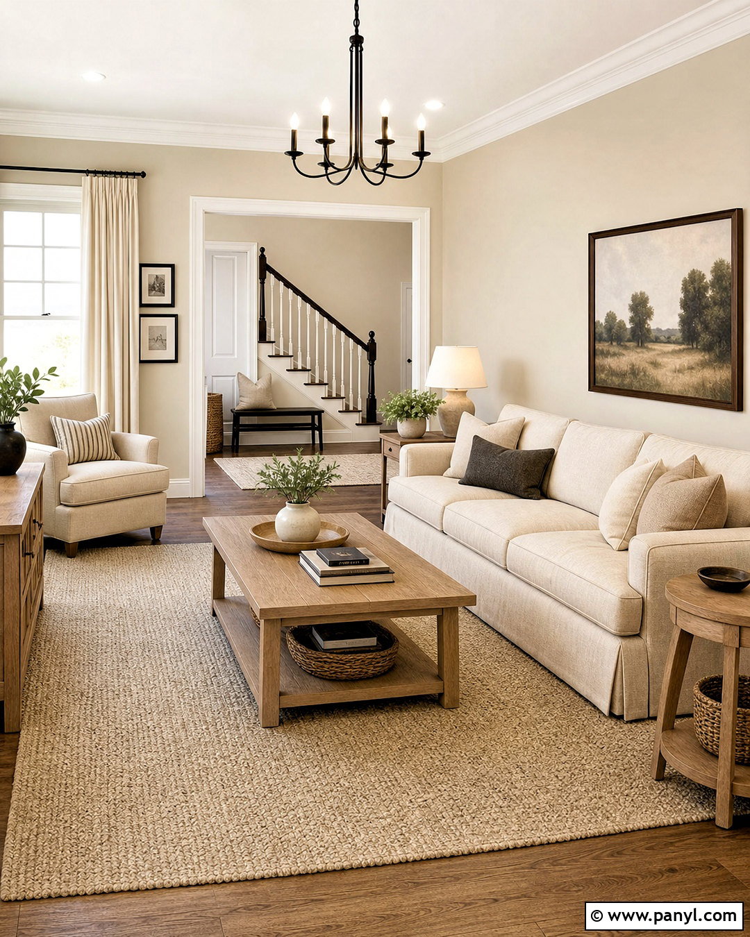
Accessible Beige walls and warm white trim create a bright, comfortable foundation that suits almost any room. Use a creamy white rather than a sharp blue-white so the contrast feels gentle and connected. In a living room, add an oatmeal sofa, ivory curtains, and a large wool rug with subtle beige patterning. Light oak tables introduce natural warmth without making the palette too brown. Complete the room with soft black lighting, woven baskets, ceramic lamps, and a few leafy plants. This combination works especially well in spaces that need to feel open yet cozy. Keep upholstery slightly lighter than the walls, then add definition through black frames and small metal accents rather than introducing another dominant color.
2. Accessible Beige And Sage Green
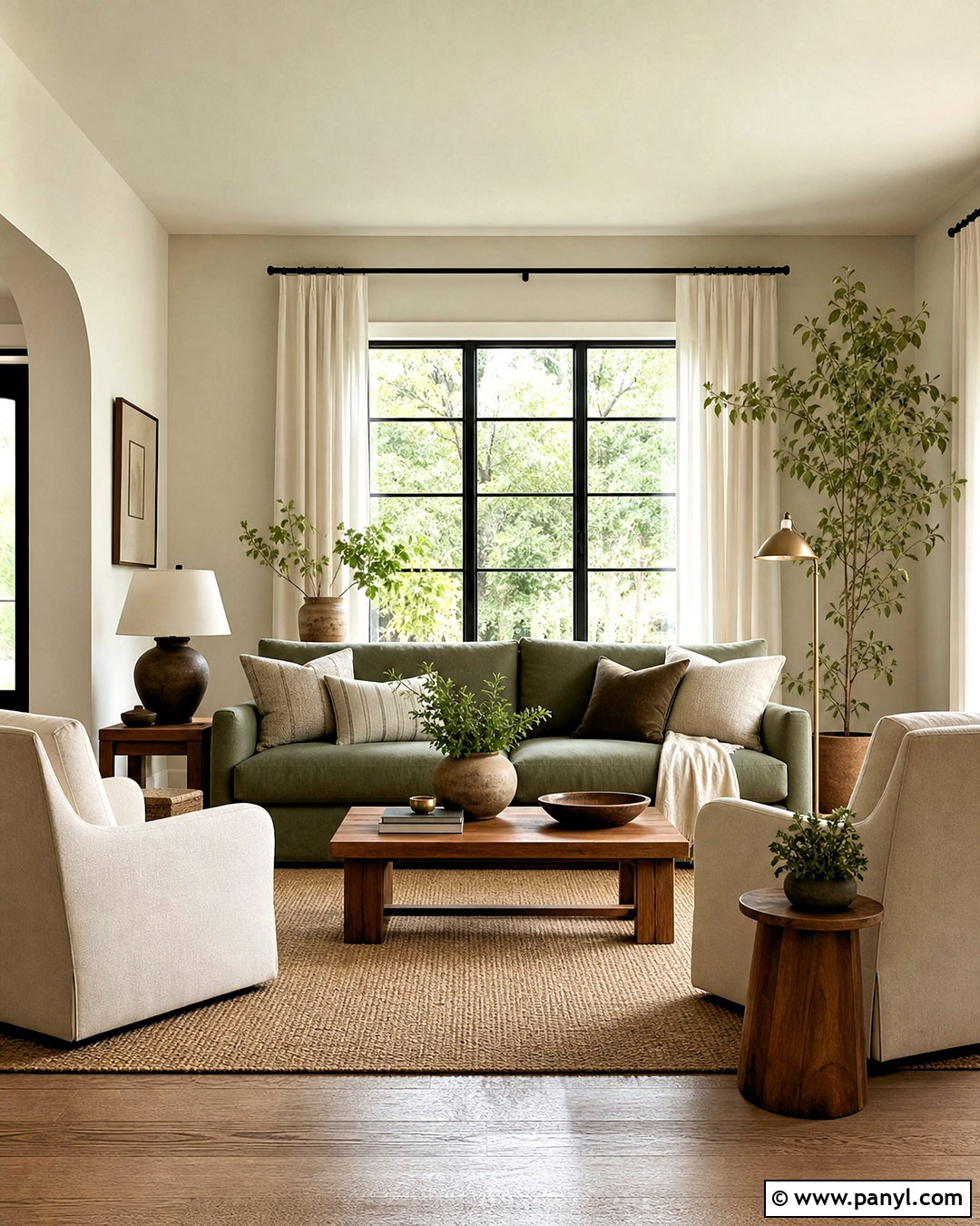
Fresh sage green gives Accessible Beige an earthy quality that feels relaxing instead of plain. Paint the walls beige, use warm white on the trim, and bring sage into a sofa, accent chairs, or built-in cabinetry. A medium oak coffee table and woven jute rug support the nature-inspired palette. Choose linen curtains in soft ivory to filter daylight without cooling the room. Aged brass lamps, botanical artwork, and handmade cream pottery provide quiet detail. For better balance, repeat sage in three areas, such as seating, pillows, and plants. This complete living room look is especially effective in transitional, cottage, and organic modern homes because every color feels connected to materials commonly found in nature.
3. Accessible Beige And Navy Blue
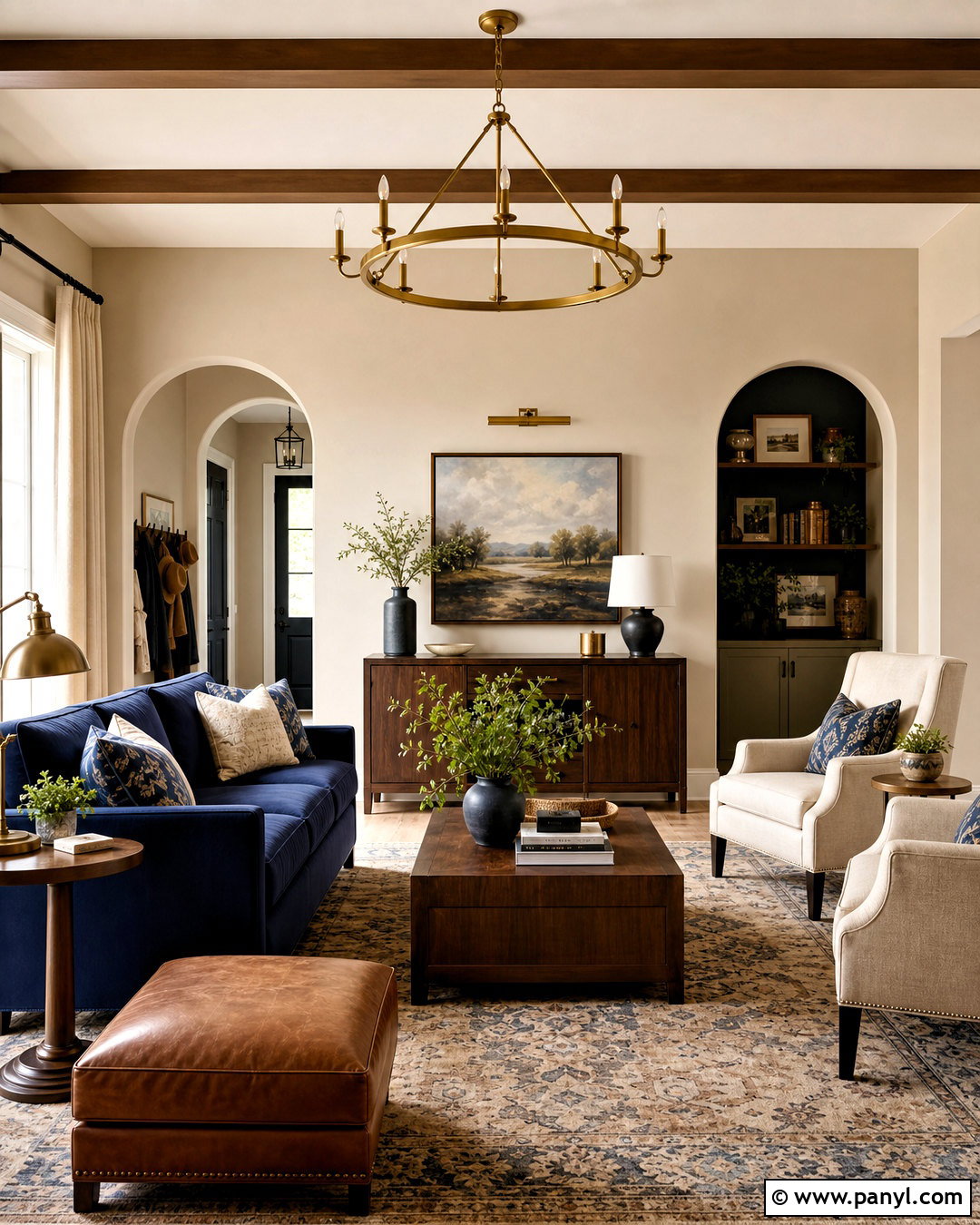
How can a neutral room feel sophisticated without becoming formal? Pair Accessible Beige walls with deep navy blue upholstery and warm walnut furniture. The navy adds strong contrast, while the beige prevents it from feeling cold or nautical. Choose a tailored navy sofa, cream accent chairs, and a patterned rug containing beige, ivory, and muted blue. Walnut tables and cognac leather accessories add another layer of warmth. Use brushed brass for lamps and hardware, then finish the windows with natural linen curtains. Warm white trim keeps the architectural details clean. This palette works best when navy appears in a few substantial pieces rather than scattered decorations, creating a clear and grounded focal point.
4. Accessible Beige And Terracotta
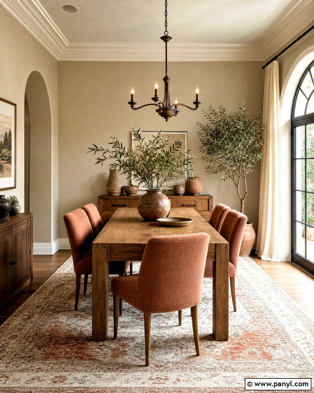
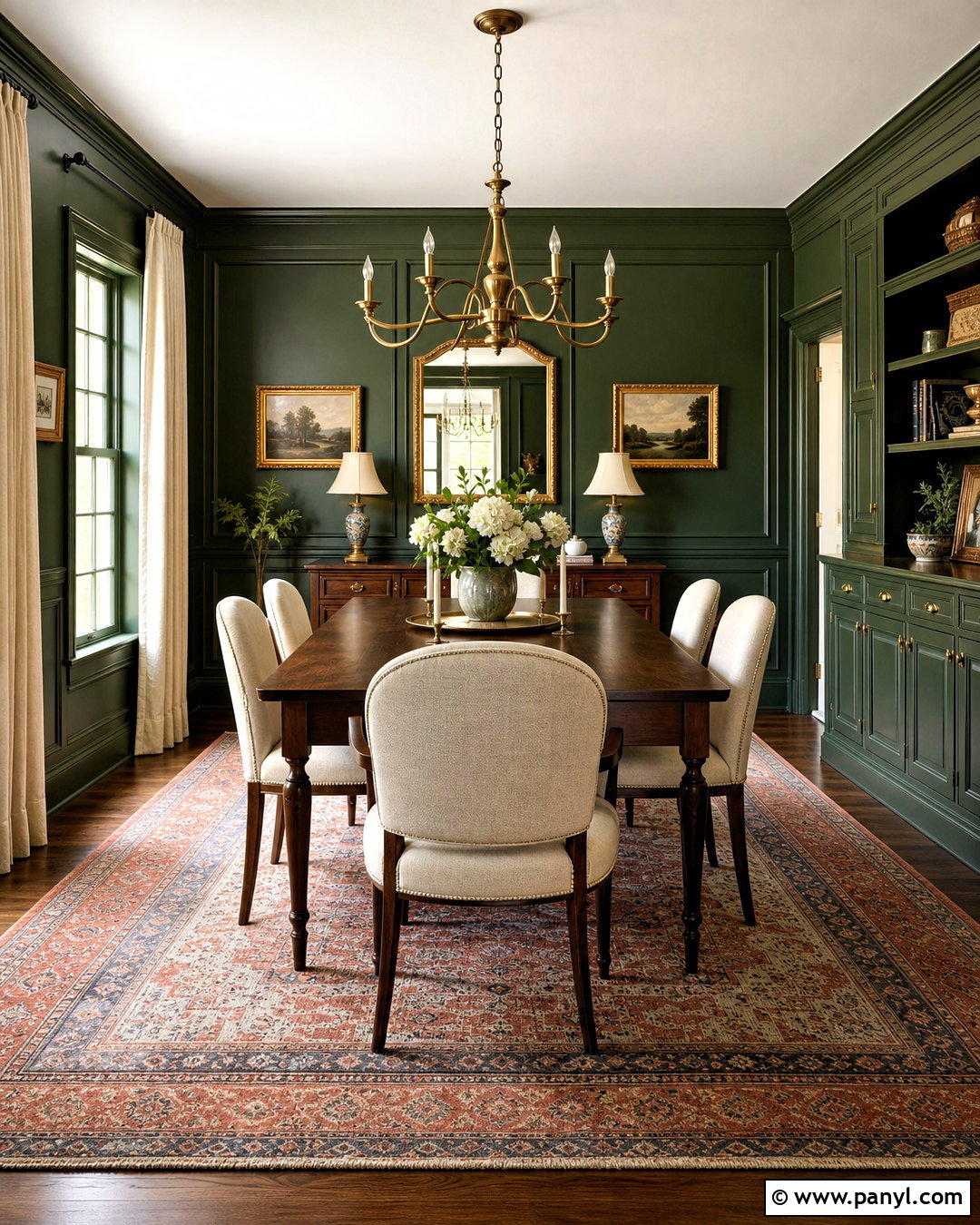
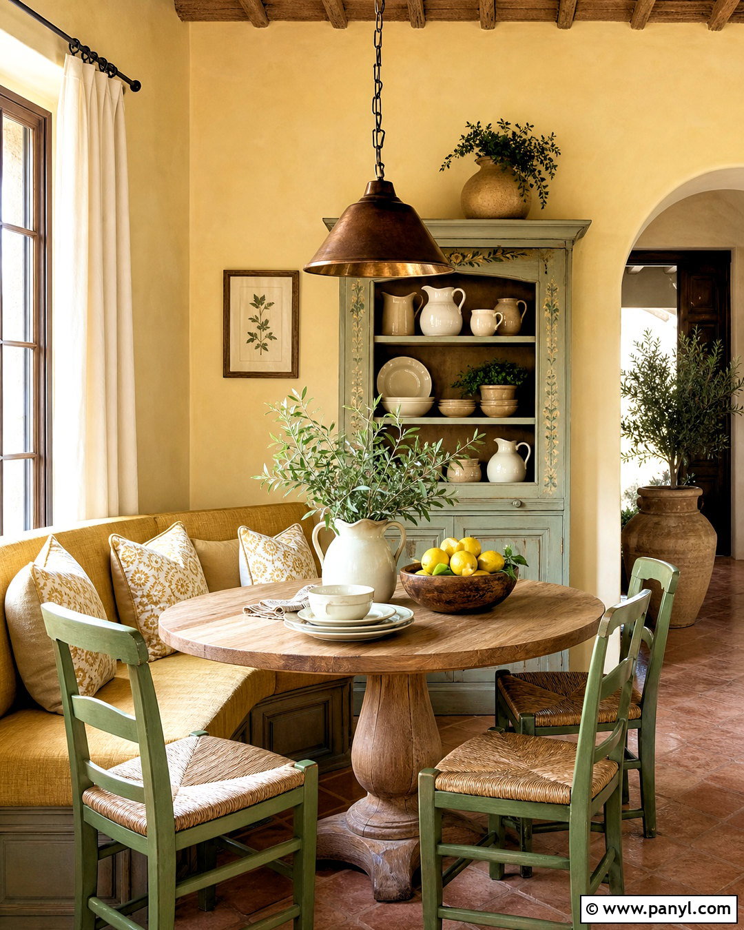
Sunbaked terracotta brings inviting color to an Accessible Beige dining room. Keep the walls beige and introduce terracotta through upholstered chairs, an earthy patterned rug, and simple ceramic pieces. A substantial oak dining table grounds the room, while warm white curtains soften the natural light. Consider a vintage-inspired bronze chandelier to reinforce the rich, organic mood. Olive branches or deep green plants provide a cool counterpoint to the warm palette. Avoid filling every surface with orange tones. Instead, combine pale clay, muted rust, and natural leather for more depth. The result feels collected and comfortable, with enough color for personality and enough neutral space to remain calm throughout the year.
5. Accessible Beige And Charcoal Gray
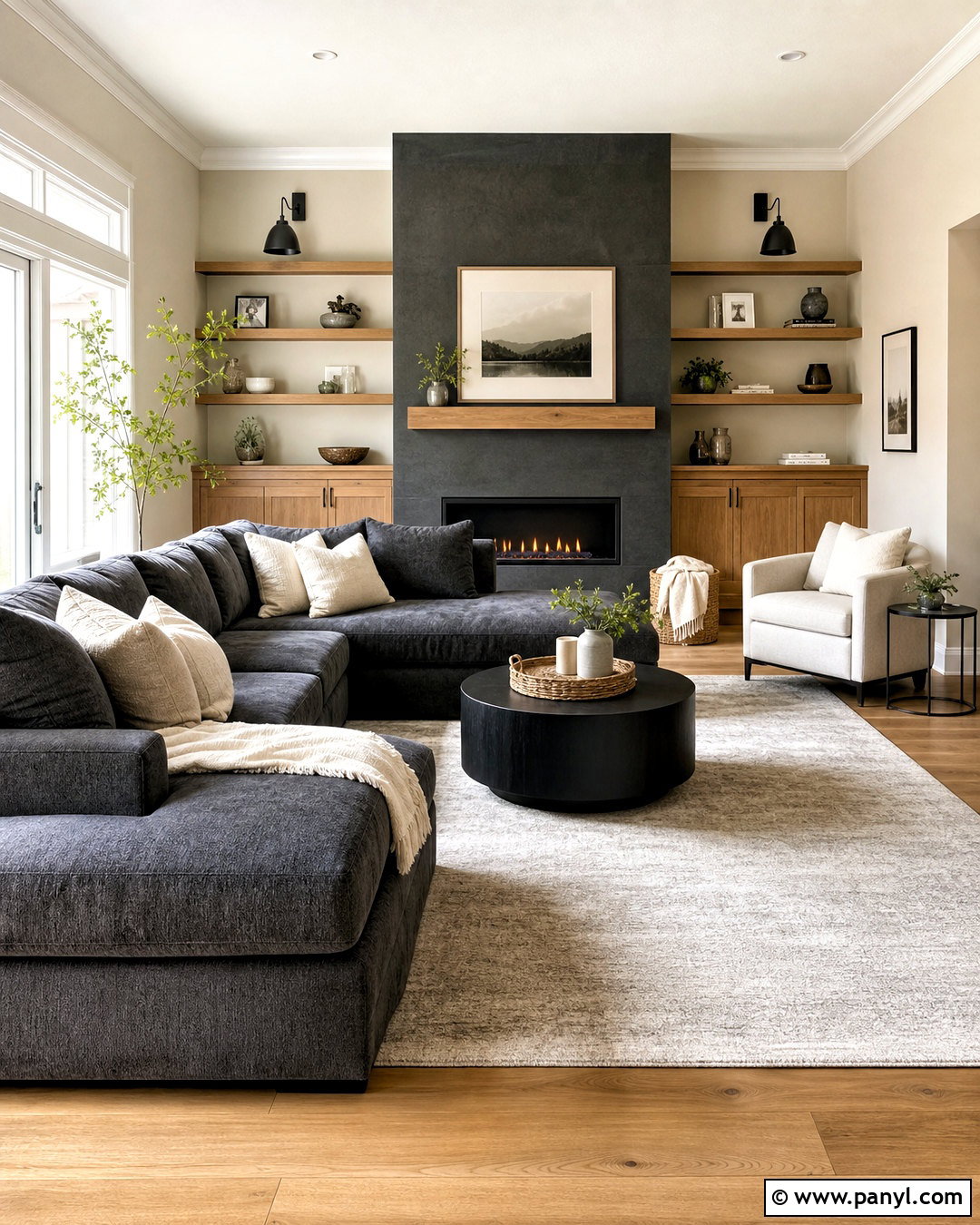
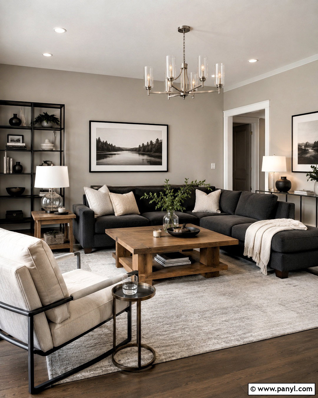
Accessible Beige and charcoal gray form a modern palette with noticeable contrast but no harsh edges. In a family room, use beige on every wall and charcoal for a large sectional or fireplace surround. Layer in a light gray-beige rug, ivory pillows, and warm oak storage cabinets to bridge the two main colors. Matte black sconces can reinforce the darker accents, while brushed nickel or pewter details add a subtle cooler note. Keep the ceiling and trim warm white to maintain brightness. Because charcoal has strong visual weight, place it low or around one clear focal point. This arrangement creates a balanced room that feels contemporary, practical, and warmer than a standard gray-and-white interior.
6. Accessible Beige And Dusty Blue
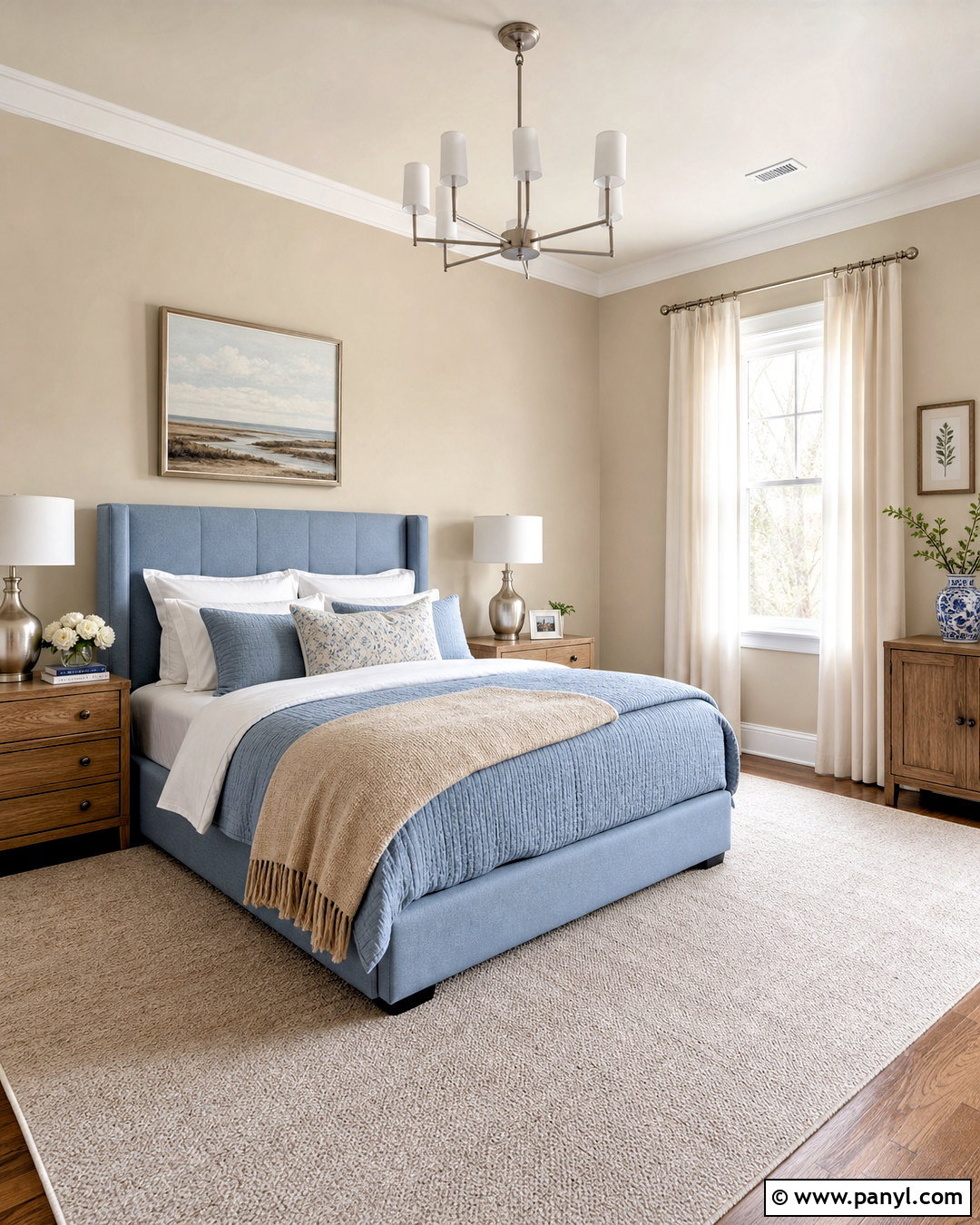
A dusty blue and Accessible Beige bedroom feels quiet, airy, and easy to live with. Cover the walls in beige, then make muted blue the primary textile color through the upholstered headboard, quilt, and patterned pillows. Add white cotton sheets and a pale taupe throw to prevent the bedding from appearing overly coordinated. Natural oak nightstands bring warmth, while brushed nickel lamps add a clean finish. Choose a soft beige carpet or wool rug underfoot and hang ivory linen curtains near the ceiling. A landscape print containing blue, green, and tan can tie everything together. This restful combination has enough color to remain interesting while supporting the peaceful atmosphere expected in a bedroom.
7. Accessible Beige And Matte Black
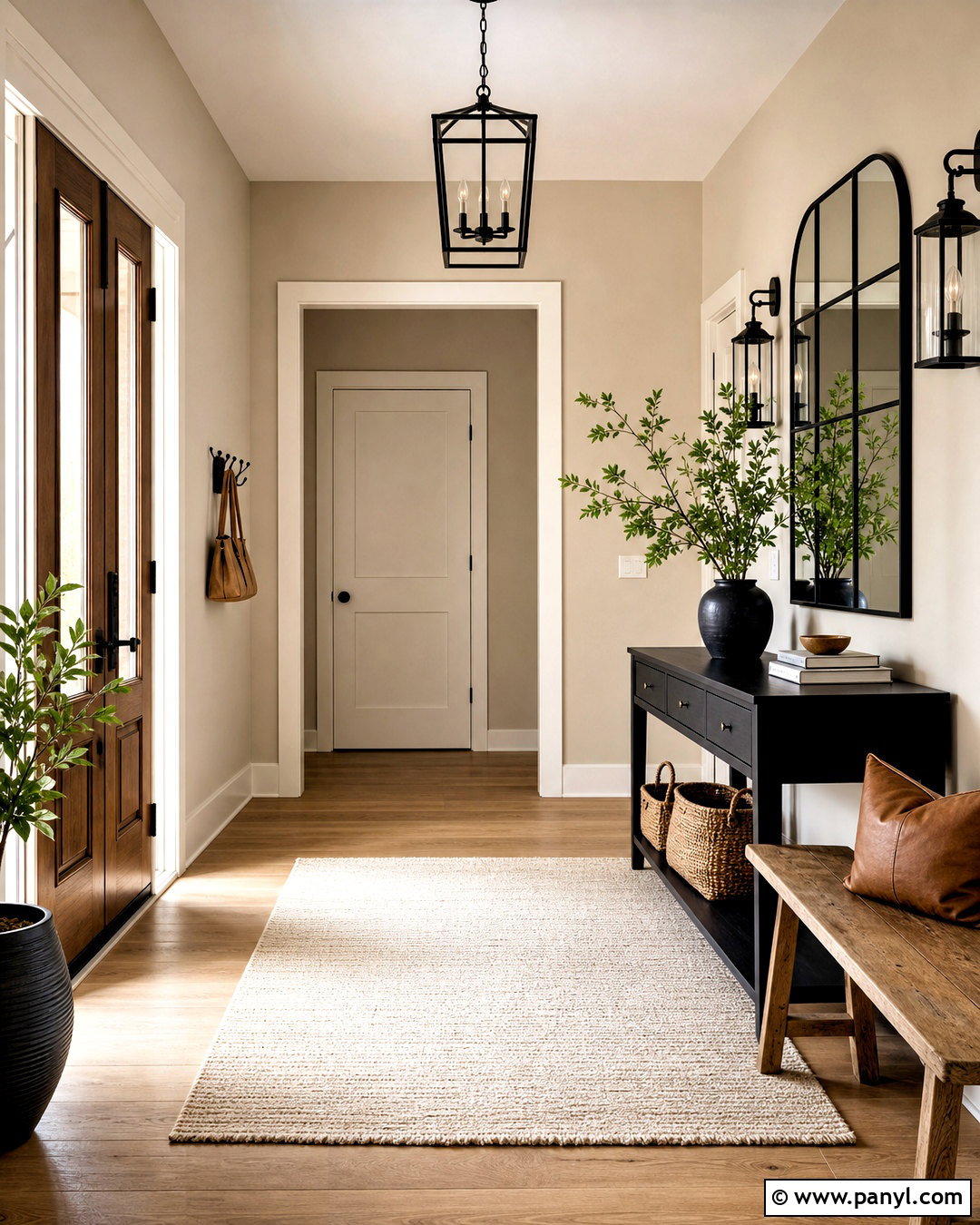
Crisp matte black accents give Accessible Beige a bold architectural edge. This palette works beautifully in an entryway where a black console, metal-framed mirror, and slim lantern fixture can create an immediate focal point. Keep the walls beige and use warm white on doors and trim. Add a natural oak bench, a flat-woven cream rug, and a few tan leather accessories to soften the contrast. Black should outline the space rather than overwhelm it, so leave plenty of light surfaces visible. A large ceramic vase and simple green branches can add organic movement. The completed entry feels tailored and modern while remaining approachable enough for a normal family home.

8. Accessible Beige And Dusty Rose
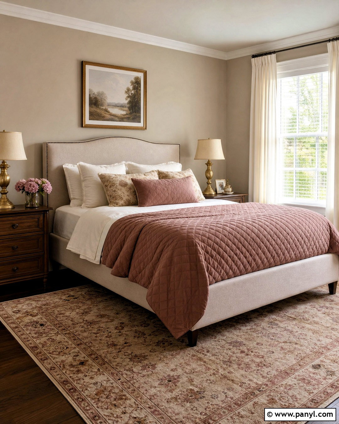
Dusty rose brings understated warmth to Accessible Beige without making a room feel overly sweet. In a guest bedroom, pair beige walls with a muted rose quilt, oatmeal upholstered bed, and ivory sheets. Choose medium walnut nightstands to create contrast and add antique brass lamps for a soft metallic detail. A faded area rug containing rose, taupe, and cream can connect the furnishings to the wall color. Keep window treatments light and simple, preferably natural linen or warm white cotton. Add charcoal or dark brown picture frames to ground the softer shades. This complete palette feels welcoming, mature, and gently colorful, making it suitable for both traditional and contemporary bedrooms.
9. Accessible Beige And Olive Green
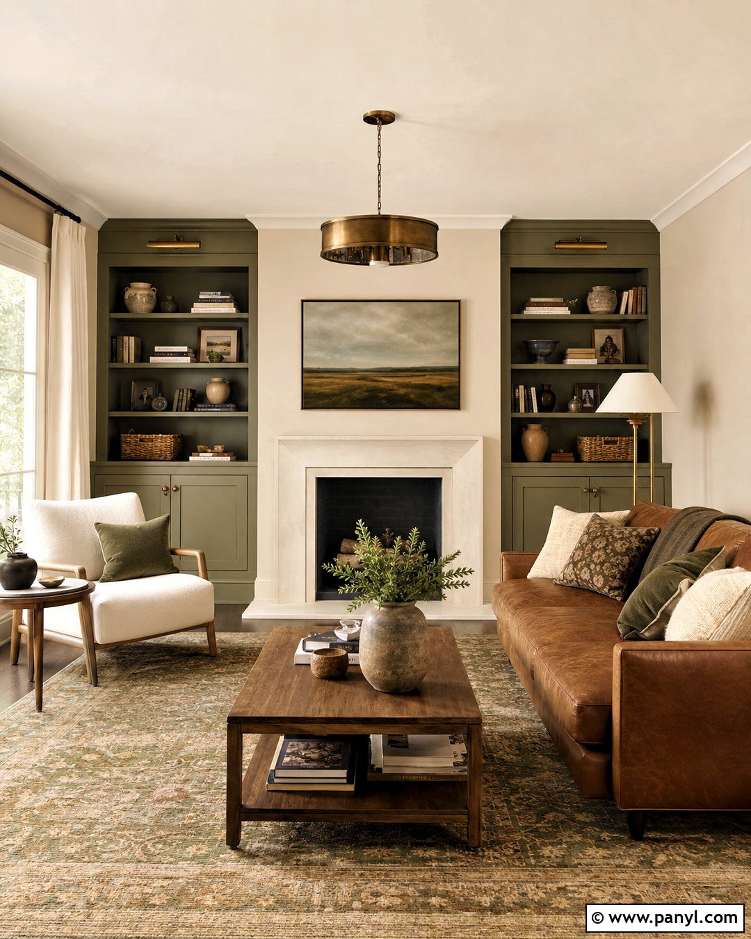
Olive green creates a deeper, moodier contrast than sage while still complementing Accessible Beige’s earthy character. Use beige walls around olive built-in bookcases or a painted media cabinet in a comfortable den. Add a camel leather sofa, cream lounge chair, and vintage-style rug with olive, tan, and faded red details. Walnut tables strengthen the rich palette, while bronze lighting keeps the finishes warm. Books, stoneware, and woven baskets can fill the shelves without making them look crowded. Leave the ceiling and major upholstery light enough to balance the dark cabinetry. The finished space feels established and layered, yet the neutral walls keep it from appearing heavy or enclosed.
10. Accessible Beige And Burnt Orange
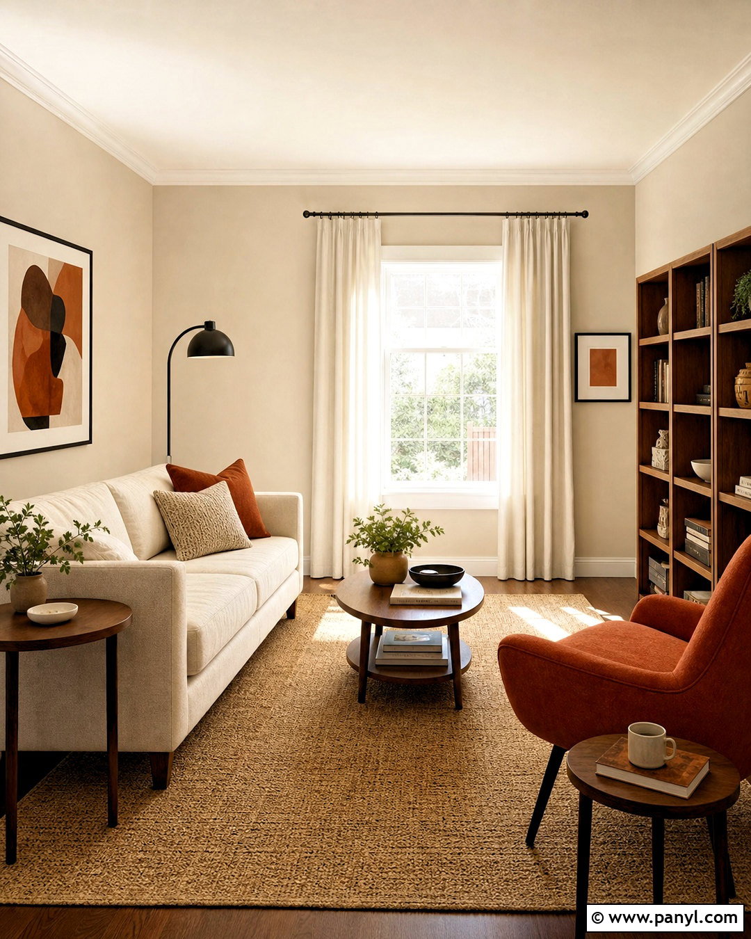
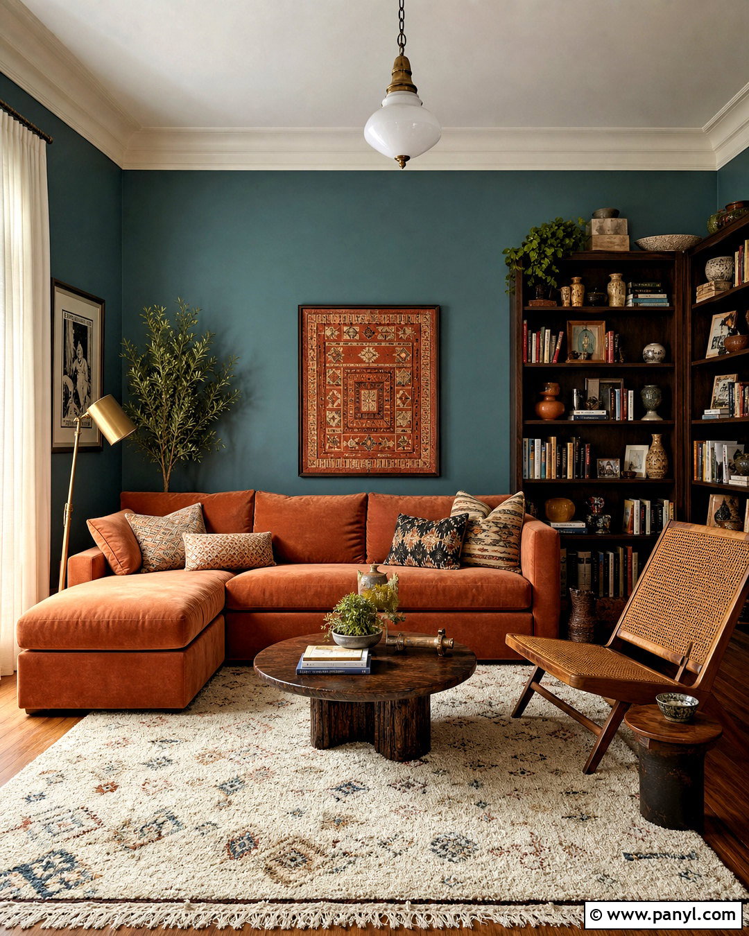
Imagine a sunny reading room where warm color appears in confident but controlled doses. Accessible Beige walls provide the neutral background, while burnt orange covers one lounge chair and reappears in a few patterned pillows. Build the rest of the space with an ivory sofa, medium oak bookcase, and natural fiber rug. Dark bronze floor lamps and small walnut tables introduce definition. Add cream curtains and artwork featuring rust, tan, and muted blue to broaden the palette. Burnt orange can dominate quickly, so avoid using it on every large surface. With thoughtful placement, this combination creates an energetic room that still feels grounded, comfortable, and suitable for everyday relaxation.
11. Accessible Beige And Cream
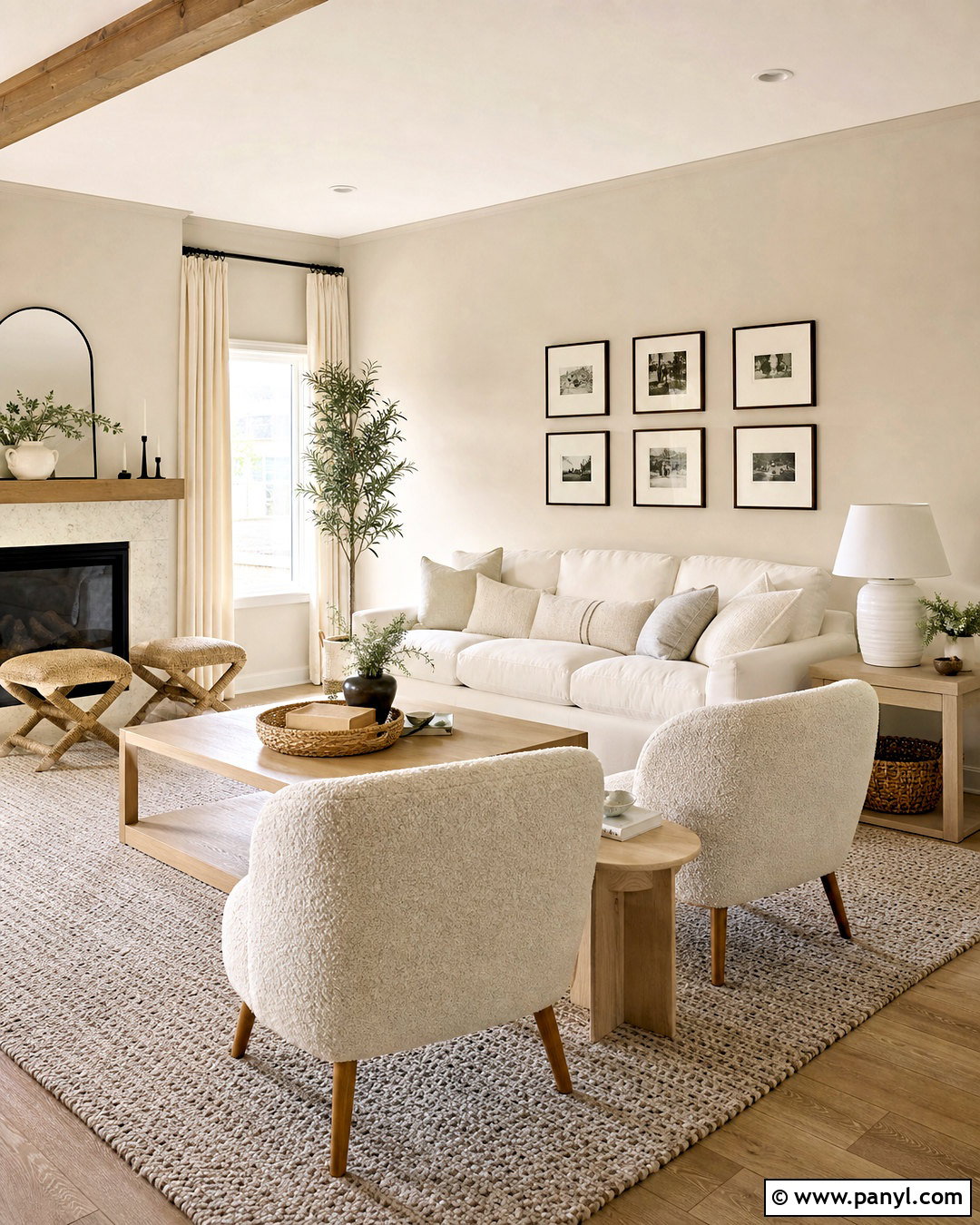
For a soft tonal interior, layer Accessible Beige with cream, ivory, oatmeal, and pale taupe. Use beige on the walls, creamy white on the trim, and an ivory slipcovered sofa as the lightest major element. An oatmeal wool rug and pale oak furniture maintain the low-contrast appearance. Texture becomes essential in this palette, so combine boucle chairs, linen curtains, woven baskets, and ribbed ceramic lamps. Add one or two dark brown details, such as a side table or picture frame, to give the eye a resting point. This complete living room feels calm and spacious without looking unfinished. It also offers a flexible foundation for seasonal accent colors or changing artwork.
12. Accessible Beige And Deep Teal
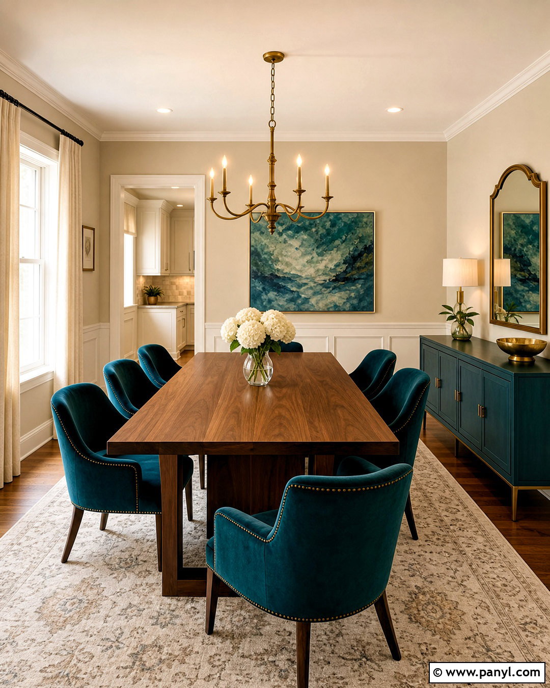
Deep teal can turn Accessible Beige into a rich, memorable backdrop. In a dining room, use beige walls with a teal sideboard or upholstered dining chairs. A walnut table adds warmth between the cool accent color and the neutral walls. Choose an ivory rug with a restrained teal pattern, then install aged brass lighting for a polished glow. Warm white trim and linen curtains keep the overall room bright. Artwork can include muted green, blue, cream, and brown to connect every surface. Keep teal concentrated in two or three prominent areas rather than covering the room. The completed scheme feels colorful and sophisticated while preserving the comfortable neutrality that makes Accessible Beige so versatile.
13. Accessible Beige And Muted Plum
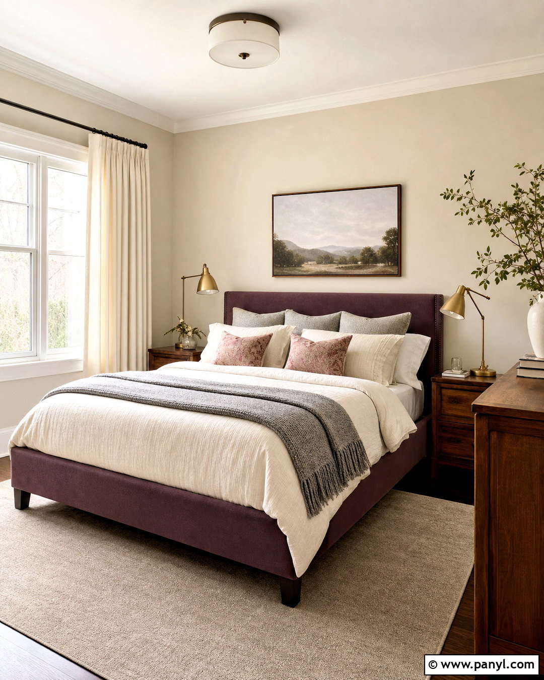
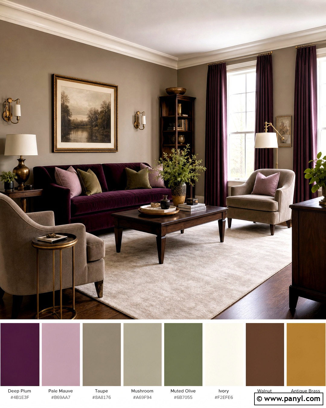
Muted plum offers an unexpected partner for Accessible Beige, especially in a cozy bedroom or sitting room. Start with beige walls and layer in plum through an upholstered bed, velvet accent chair, or substantial curtains. Balance those deeper pieces with ivory bedding, a pale taupe rug, and warm walnut furniture. Antique brass hardware and lighting complement the red undertones in plum without appearing flashy. Add a few dusty pink and soft gray textiles to create gradual transitions between dark and light. Avoid bright purple, which can look disconnected from the earthy neutral. A restrained plum palette feels mature, personal, and comforting, giving the beige background greater depth without sacrificing its calm character.
14. Accessible Beige And Greige
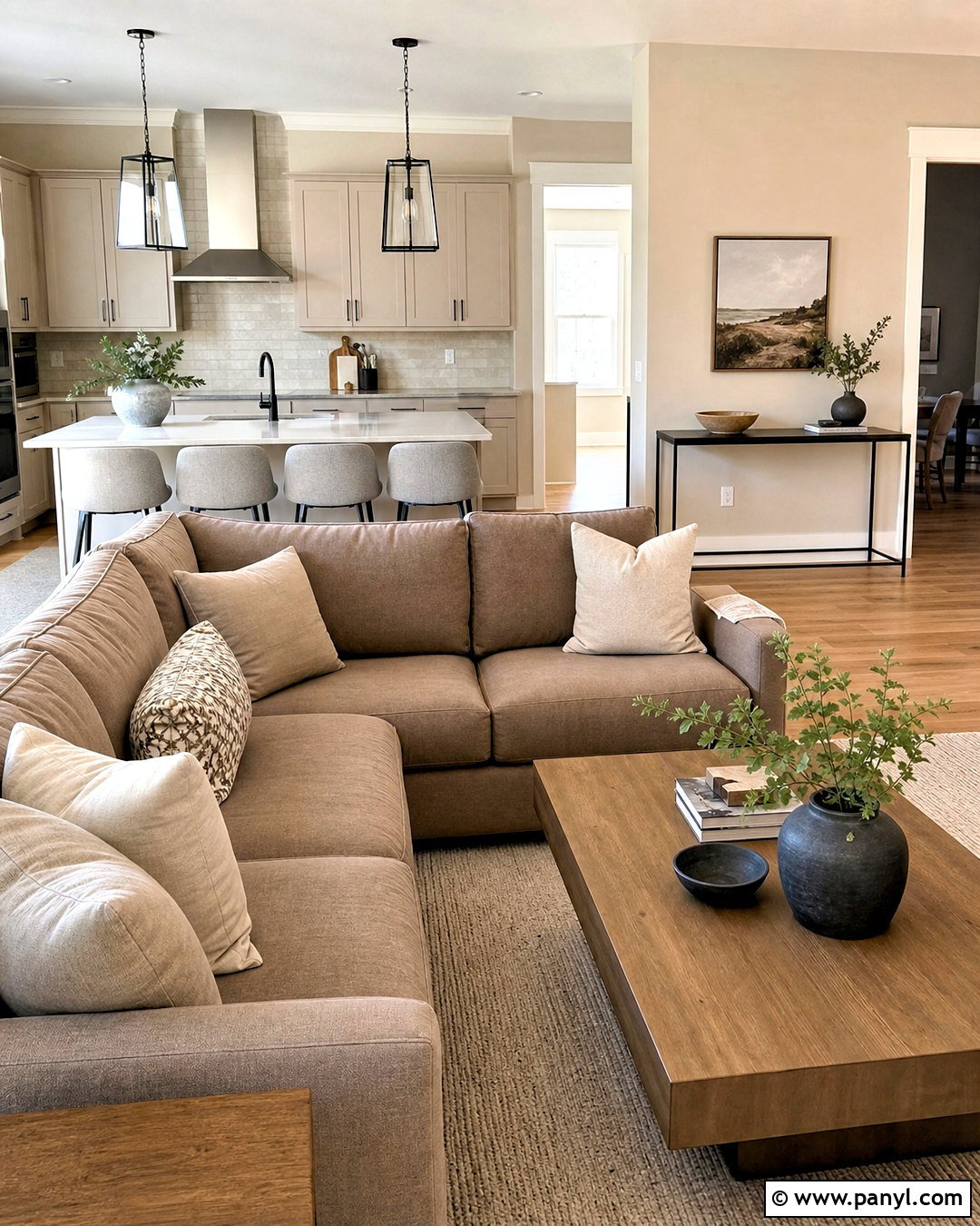
A layered greige palette is ideal when you want an open-plan home to flow without every surface matching. Use Accessible Beige for the main walls, a lighter warm greige on kitchen cabinetry, and creamy white on trim and ceilings. Ground the space with medium oak flooring and a mushroom-colored sofa. Choose quartz countertops with soft beige-gray movement rather than dramatic veining. Black metal lighting and hardware provide a clean outline, while natural linen and wool add softness. Vary the lightness of each neutral so furniture does not disappear against the walls. The finished interior feels cohesive and current, with subtle transitions that help define the kitchen, dining area, and living space.
15. Accessible Beige And Coastal Blue
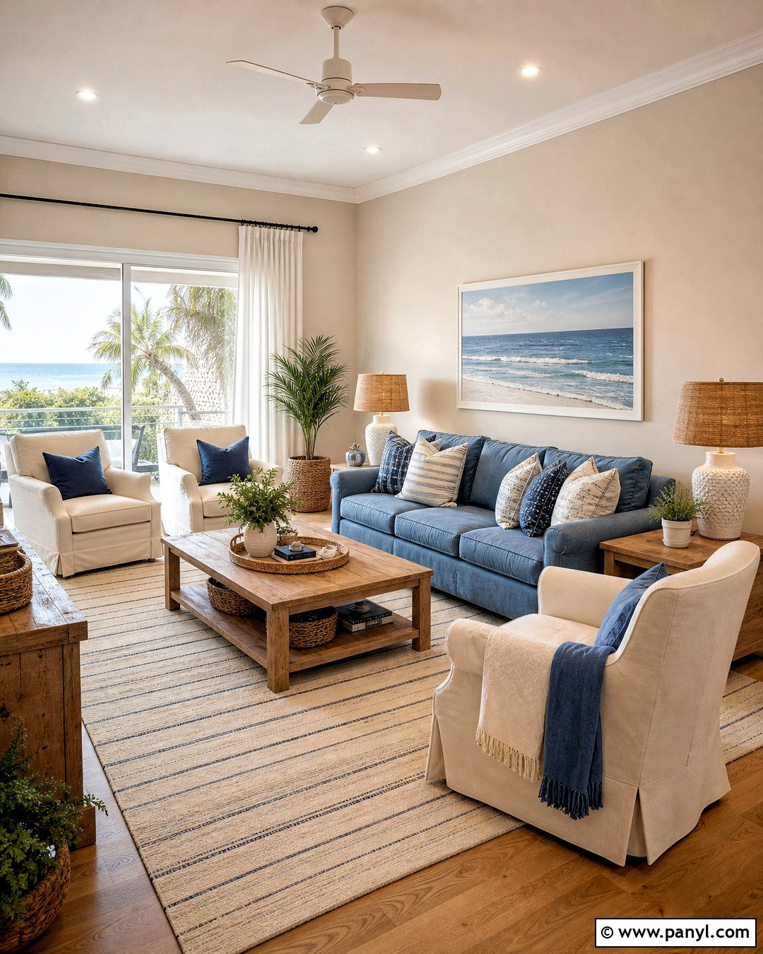
Accessible Beige can support a coastal room without relying on bright white walls or obvious seaside decorations. Pair it with weathered blue upholstery, ivory linen, and lightly washed oak furniture. In a living room, use a soft blue sofa, two cream armchairs, and a beige woven rug with a faded stripe. Add pale oak tables, white ceramic lamps, and natural woven shades. A small amount of navy in artwork or pillows provides useful depth. Keep shells, signs, and themed accessories out of the room. Instead, create the coastal feeling through breezy fabrics, gentle colors, and relaxed materials. The result feels fresh, comfortable, and appropriate far beyond waterfront homes.
16. Accessible Beige And Espresso Brown
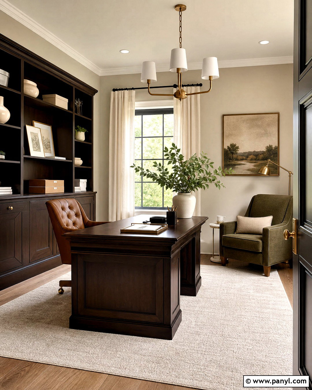
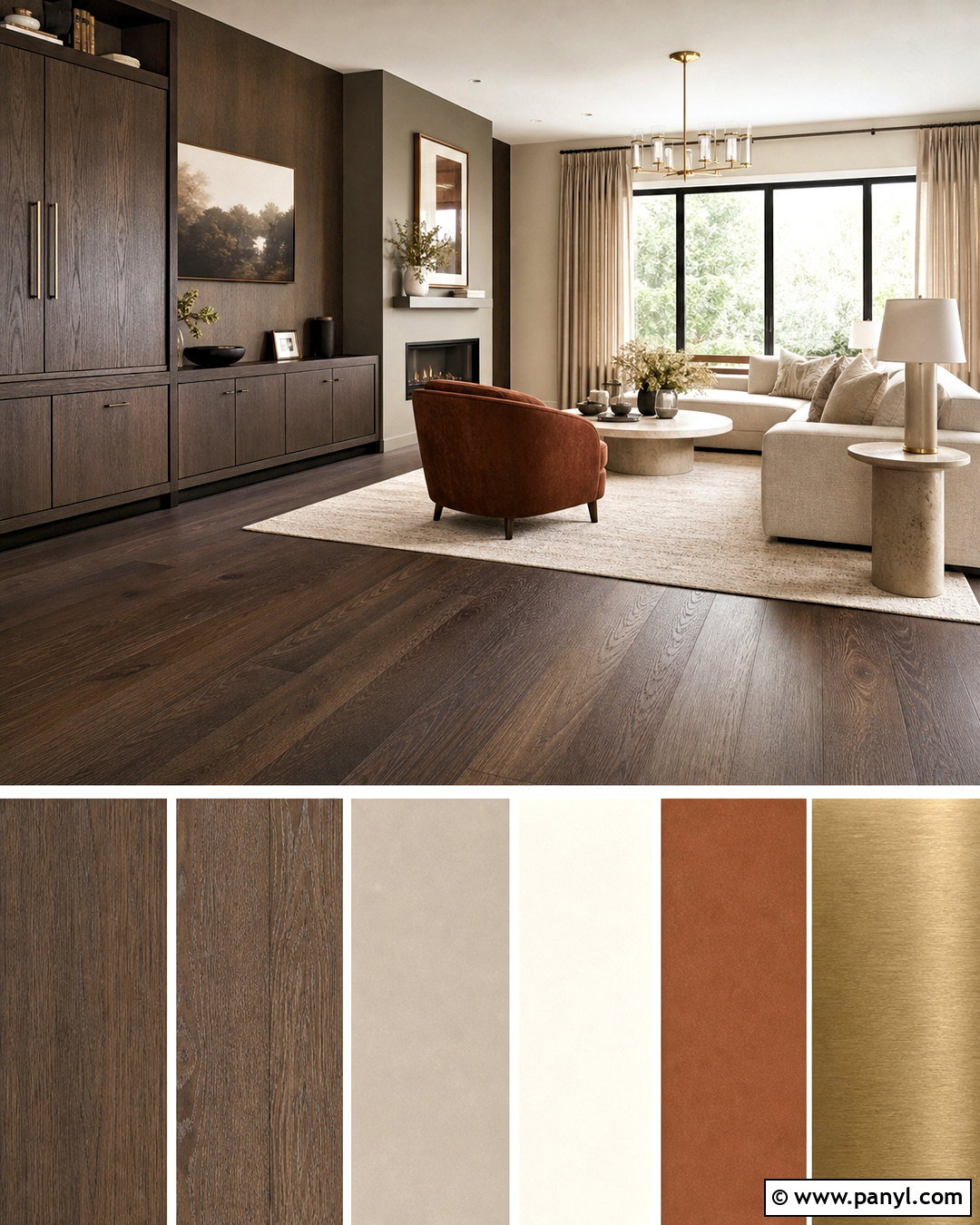
Rich espresso brown gives Accessible Beige a traditional, grounded appearance that works well in a home office. Paint the walls beige and use espresso-stained wood for the desk, shelves, and picture frames. A camel leather desk chair adds warmth, while an ivory wool rug prevents the dark furniture from weighing down the room. Choose warm white curtains and antique brass lighting to soften the strong wood contrast. Organize shelves with cream pottery, tan storage boxes, and a limited number of books. A muted green accent chair can introduce natural color without disrupting the palette. This office feels professional and established while remaining brighter and more welcoming than a room dominated by dark wood.
17. Accessible Beige And Muted Gold
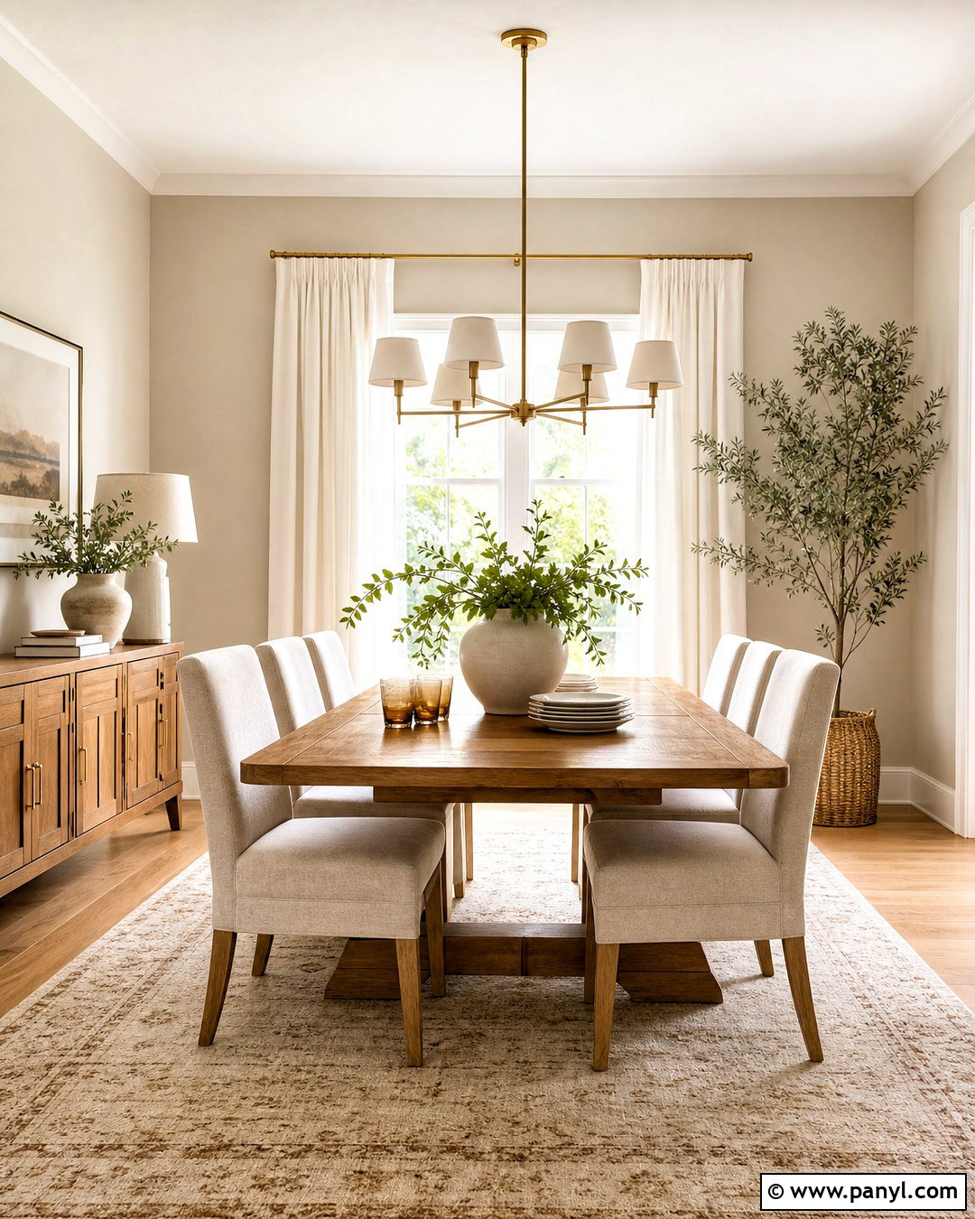
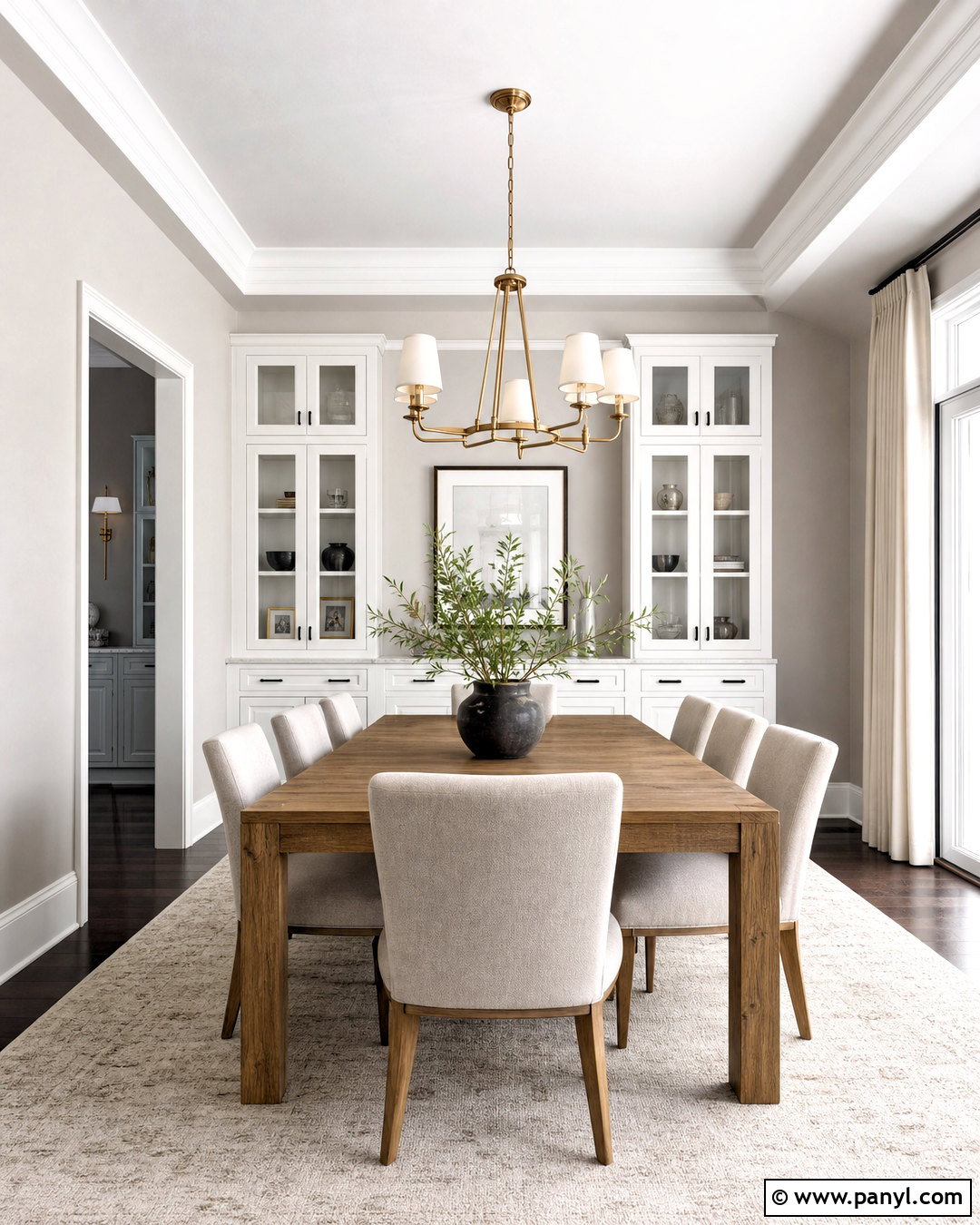
Soft golden accents can highlight the warmth of Accessible Beige without creating a yellow room. In a dining space, keep the walls beige and select natural oak furniture with honey-colored undertones. Add muted gold through a brushed brass chandelier, slim curtain rod, and simple cabinet hardware. Upholster the chairs in oatmeal fabric and place a cream-and-tan rug underneath the table. Warm white curtains and trim maintain a light perimeter. For decoration, use amber-toned glass sparingly alongside white stoneware and green branches. The gold should come primarily from finishes and natural wood rather than bright yellow textiles. This approach produces a warm, refined room that catches the light beautifully.
18. Accessible Beige And Brick Red
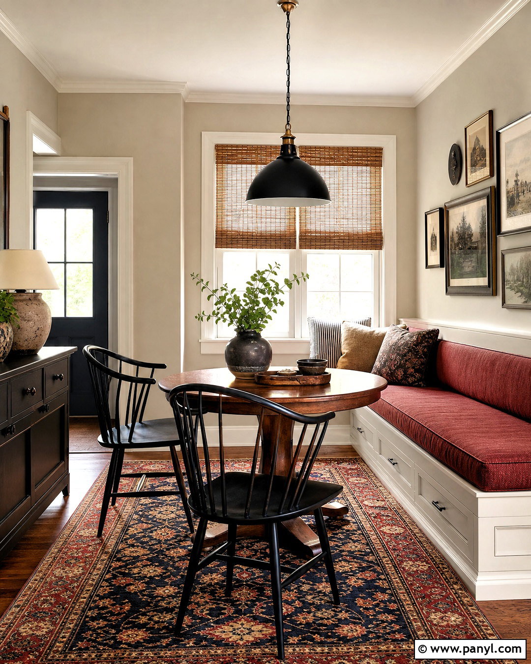
Brick red adds historic warmth and character to an Accessible Beige palette. It is particularly effective in a breakfast room with beige walls, warm white trim, and a built-in bench covered in muted red fabric. Pair the seating with a round walnut table, black spindle chairs, and a vintage-inspired rug combining brick, tan, navy, and cream. A simple black pendant can echo the chairs without making the room too formal. Add woven shades and a few stoneware pieces for texture. Choose earthy red with brown undertones rather than a bright primary red. The completed room feels welcoming and collected, offering a colorful look that remains grounded in practical, familiar materials.
19. Accessible Beige And Forest Green
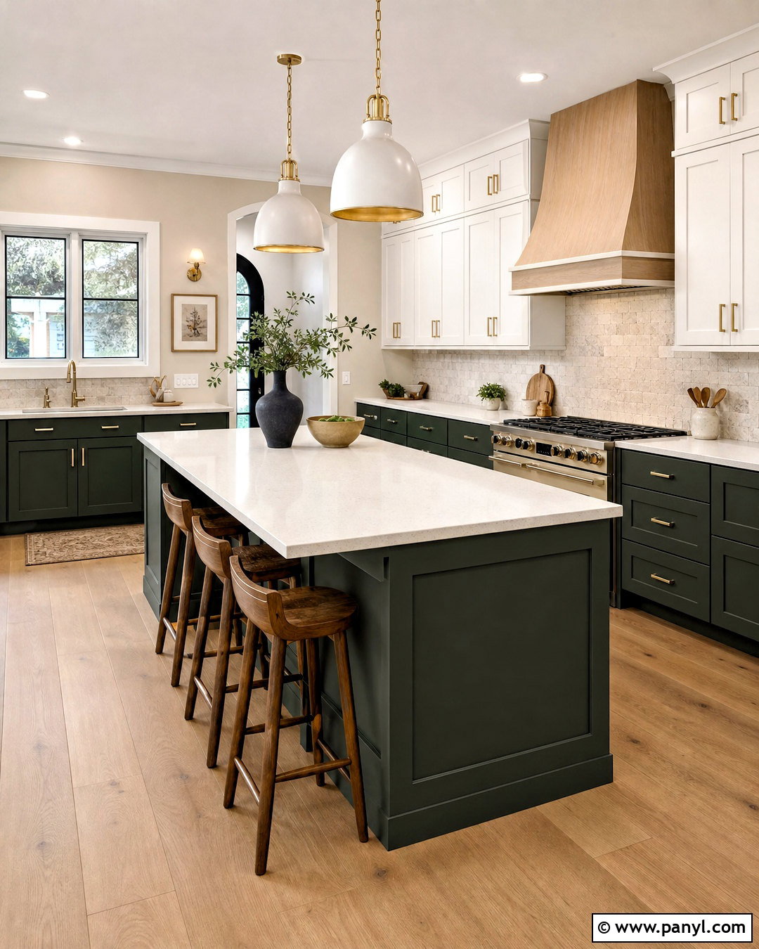
Forest green creates a dramatic but natural contrast with Accessible Beige. Use this pairing in a kitchen by painting the walls beige and the lower cabinets deep green. Keep upper cabinets warm white so the space remains open, then connect the colors with creamy quartz counters and a lightly patterned stone backsplash. White oak flooring and bar stools add warmth, while aged brass hardware provides a polished finish. Repeat green through a small runner or plants, but avoid introducing several competing accent colors. Dark green absorbs light, so this scheme works best with good daylight or layered ceiling and task lighting. The final kitchen feels distinctive, balanced, and rooted in natural color.
20. Accessible Beige Whole House Palette
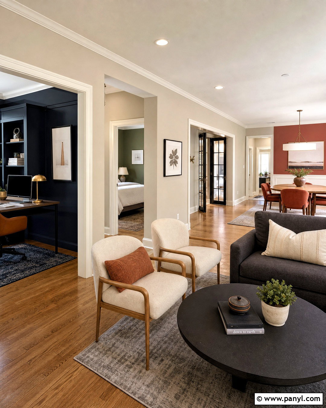
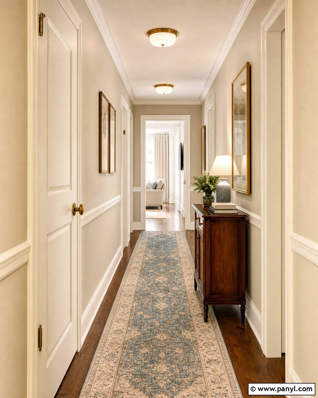
A whole-house palette should create flow while still giving each room an individual identity. Use Accessible Beige throughout halls, living areas, and connecting spaces. Pair it with warm white trim and ceilings, then introduce sage in bedrooms, navy in the office, terracotta in the dining room, and charcoal in the family room. Repeat medium oak flooring and brushed brass or matte black finishes to keep the transitions cohesive. Choose upholstery in cream, oatmeal, camel, and muted gray so furniture can move between spaces if needed. Test every color beside permanent surfaces, including countertops and flooring. This flexible plan creates variety without making adjacent rooms appear unrelated, overly busy, or dependent on passing trends.
Conclusion:
The strongest accessible beige color palette ideas combine wall color with flooring, furniture, textiles, lighting, and finishes rather than treating paint as an isolated choice. Warm white creates a fresh foundation, while sage, navy, terracotta, plum, or forest green can shape the room’s personality. Natural oak, walnut, linen, wool, stone, and woven fibers are especially effective because they reinforce the paint’s earthy warmth. Darker accents should be repeated thoughtfully, and lighter materials can prevent the space from feeling heavy. Most importantly, sample Accessible Beige in the actual room and check it throughout the day. With a balanced supporting palette, this adaptable neutral can feel bright, cozy, modern, or traditional.

Related Ideas and Inspiration:

Leave a Reply