
A clean color scheme can make any room feel calmer, brighter, and more thoughtfully designed. These 20 clean color palette ideas combine versatile neutrals, nature-inspired shades, and controlled accent colors for a polished look without visual clutter. The secret is choosing a dominant background color, a supportive secondary tone, and one or two accents that create depth. Natural materials also matter. Oak, linen, stone, ceramic, and matte metal help simple palettes feel layered rather than flat. Whether you prefer warm minimalism, coastal freshness, modern contrast, or muted color, every palette below includes a complete room concept you can recreate. Use the combinations across walls, furniture, flooring, textiles, lighting, and decor to build a balanced home with these 20 clean color palette ideas.

1. Warm White and Light Oak Color Palette
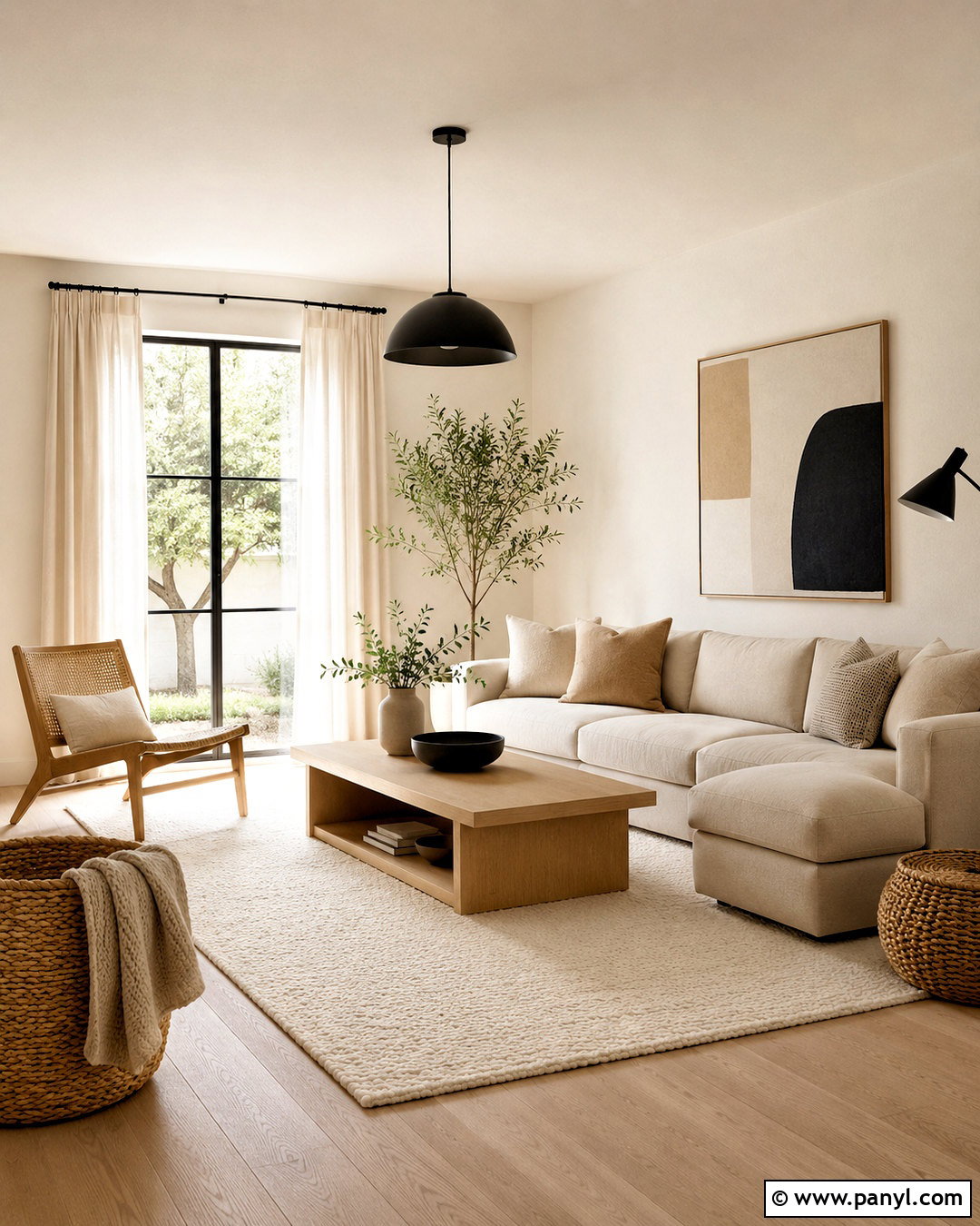
Warm white walls and pale oak finishes create a bright foundation that still feels welcoming. Build this palette in a living room with a low-profile oatmeal sofa, light oak coffee table, cream wool rug, and ivory linen curtains. Choose warm white rather than sharp white so the room does not appear cold or overly sterile. Add small touches of sand, beige, and soft brown through pillows, ceramics, and woven baskets. Matte black can appear sparingly on a floor lamp or slim window frames to sharpen the scheme. Keep the layout open and surfaces mostly clear. A large leafy plant and one simple abstract artwork will bring life to the room while preserving the palette’s relaxed, uncluttered character.
2. Soft Greige and Charcoal Color Palette
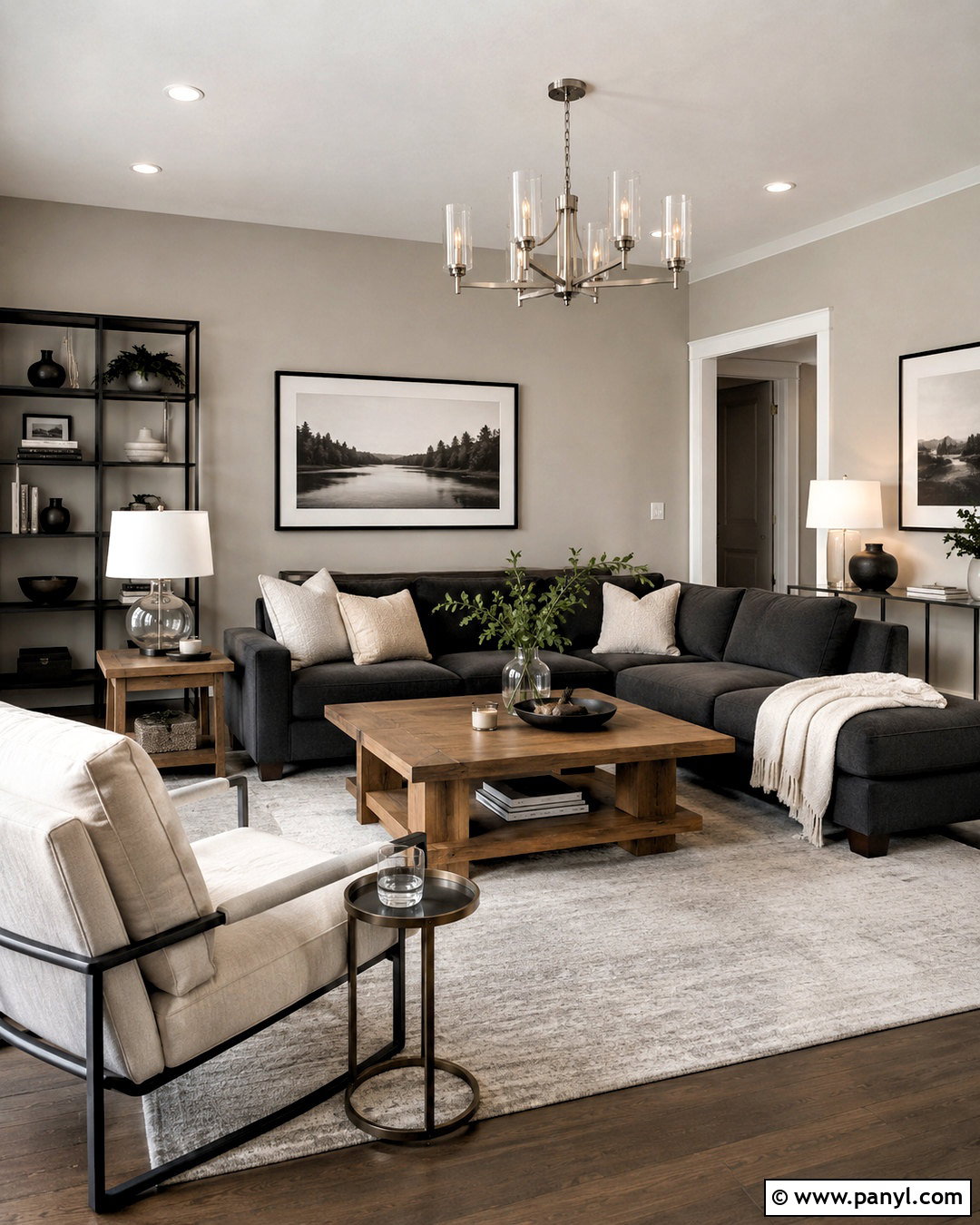
If plain beige feels too warm and gray feels too cool, soft greige offers a balanced alternative. Use greige across the walls, then furnish the room with a charcoal sofa, pale gray rug, and medium-toned oak tables. Cream pillows and a textured ivory throw will soften the darker seating. Repeat charcoal in a slim metal bookcase, picture frames, or a modern pendant light so the contrast feels intentional. Brushed nickel and clear glass work well for smaller accents because they maintain a crisp appearance. Finish the space with black-and-white photography and one muted green plant. This complete living room palette feels contemporary and practical, especially in open-plan homes where colors need to flow smoothly between connected areas.
3. Cream and Sage Green Color Palette
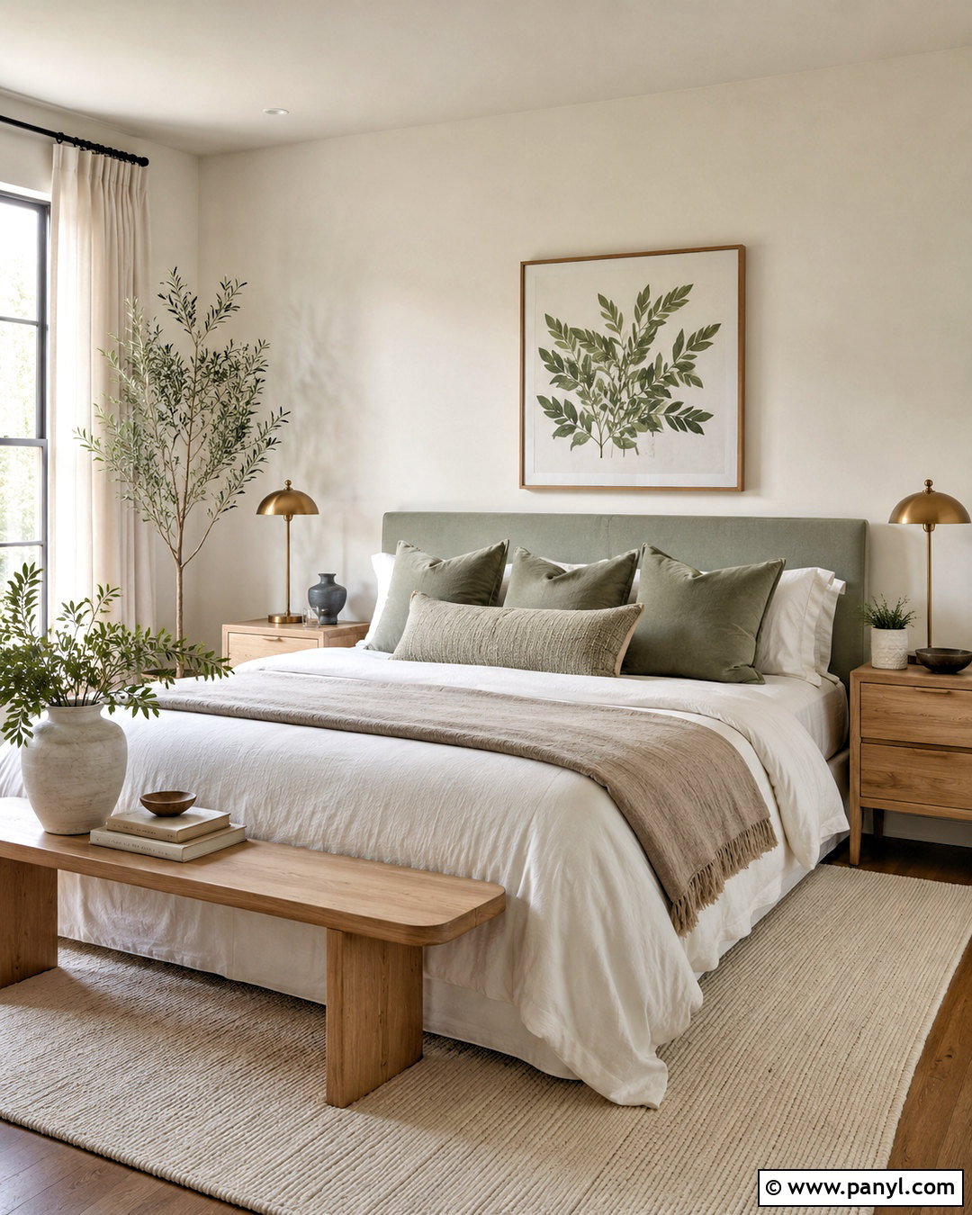
Imagine a restful bedroom where every color feels gentle and connected to nature. Paint the walls creamy off-white and introduce sage green through an upholstered headboard, cotton bedding, or a quiet painted accent wall. Light oak nightstands and a natural woven bench keep the scheme warm, while an ivory rug creates a soft visual base. Add white bedding with sage and flax-colored layers instead of using one solid block of green. Aged brass lamps provide subtle warmth without becoming overly decorative. Keep artwork minimal, choosing botanical shapes or soft landscapes in cream, green, and tan. This palette works especially well with linen, cotton, wood, and ceramic, producing a fresh bedroom that looks clean but remains comfortable and lived in.
4. Crisp White and Navy Blue Color Palette
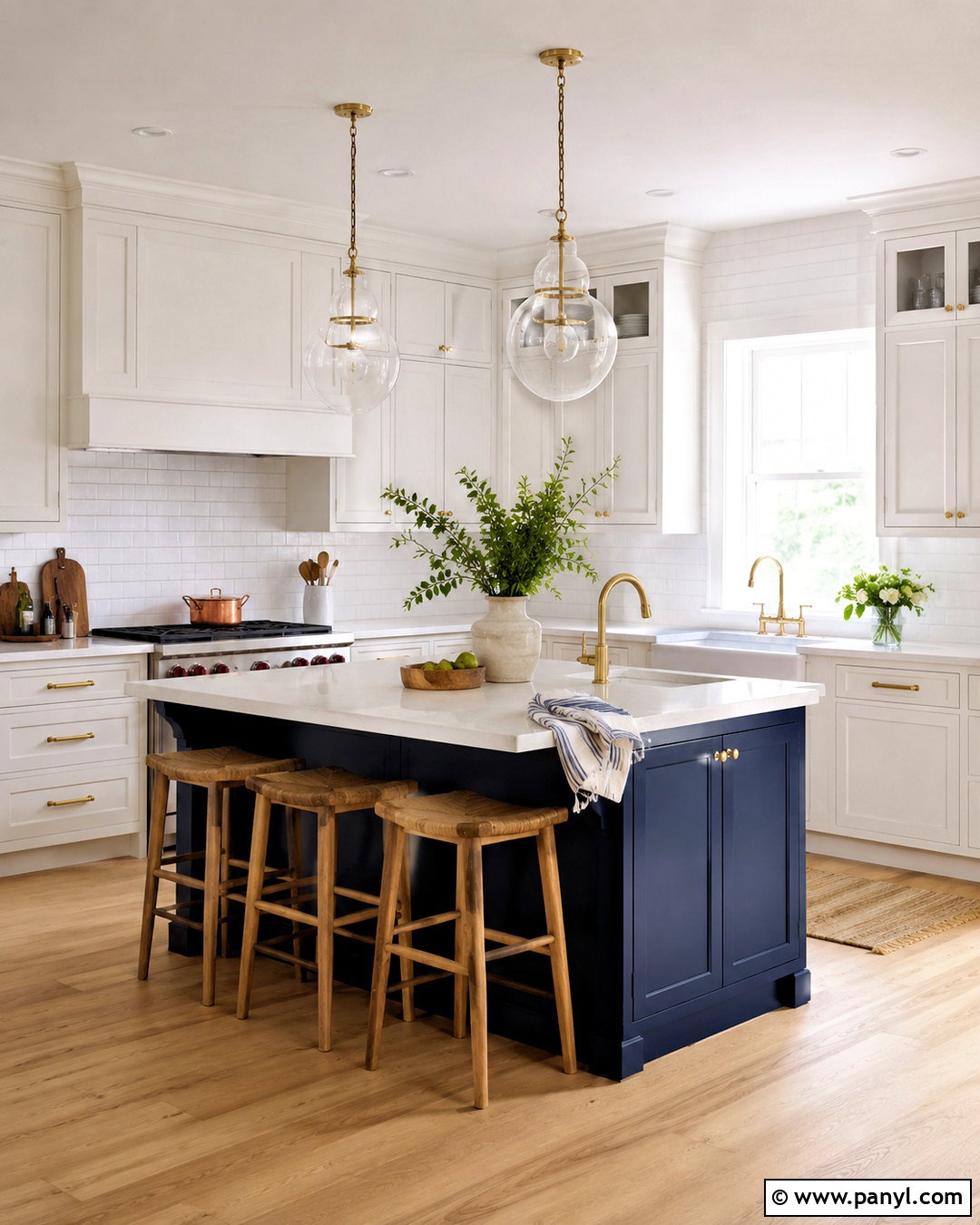
Crisp white and navy blue create a clear, timeless contrast that is perfect for a clean kitchen. Use white shaker or flat-panel cabinets around the room, then bring in navy on the island for a strong central feature. Pale quartz countertops, a simple white backsplash, and light oak flooring will keep the darker color from feeling heavy. Add brushed brass or polished nickel hardware for a controlled hint of shine. Natural wood stools can connect the island to the flooring, while small navy details in striped towels or ceramic bowls reinforce the palette. Keep counters open and organized. Clear glass pendants and a few fresh green branches complete a kitchen that feels bright, structured, and inviting rather than overly formal.
5. Sand and Terracotta Color Palette
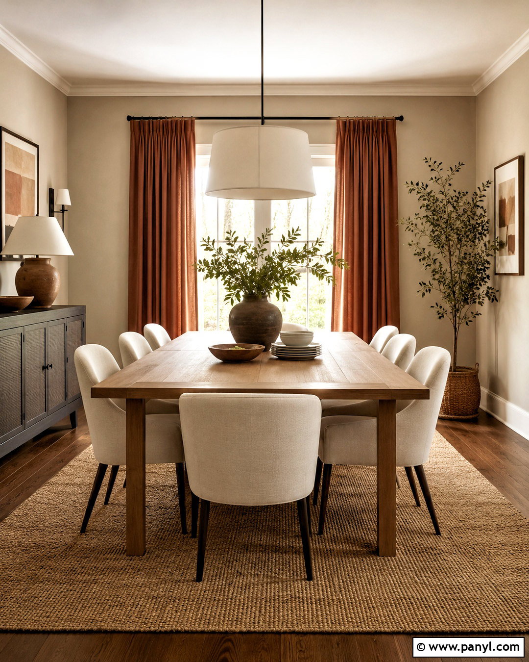
Warm sand and muted terracotta can make a dining room feel grounded without sacrificing simplicity. Begin with pale sandy beige walls and a large natural jute or wool rug. Center the room around a streamlined oak dining table with cream upholstered chairs. Introduce terracotta through linen curtains, ceramic serving pieces, and one softly colored artwork rather than covering every surface in orange. Use warm white on the ceiling and trim to maintain freshness. A simple plaster or linen pendant will support the natural look, while dark bronze hardware adds definition. This palette becomes especially effective when finishes remain matte and tactile. The finished dining space feels sun-warmed and welcoming, with enough empty space to keep the earth tones looking clean.
6. Pale Blue and Soft Gray Color Palette
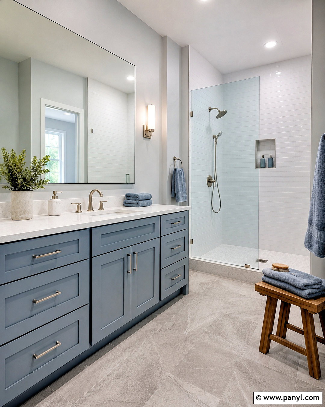
A pale blue and soft gray bathroom can feel fresh without becoming cold. Choose a misty blue-gray vanity as the main color feature, surrounded by soft gray stone-look floor tiles and clean white walls. White quartz countertops and glossy white shower tile will reflect light throughout the room. Add polished chrome fixtures for a crisp finish, or use brushed nickel for a softer effect. Towels in white, pale blue, and silver-gray will keep the scheme cohesive. Include a light wood stool or narrow shelf to introduce natural warmth. Simple frameless mirrors and clear glass shower panels prevent visual interruptions. The result is an airy bathroom with calm color, practical finishes, and enough contrast to define each surface clearly.
7. Ivory and Olive Green Color Palette
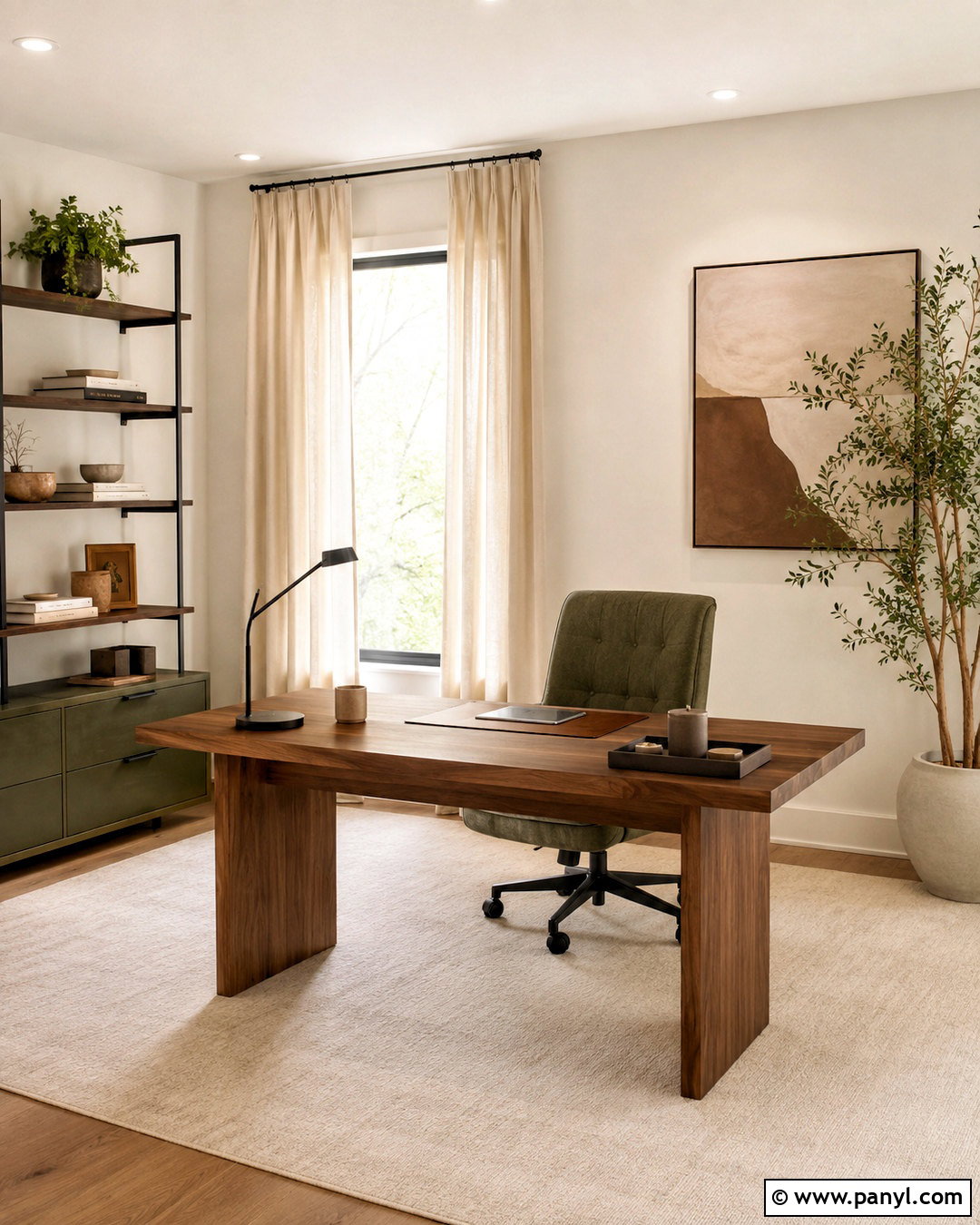
Ivory and olive green bring quiet richness to a home office while remaining easy on the eyes. Cover the walls in soft ivory and position an olive green desk chair beside a clean walnut or oak desk. A low olive storage cabinet can provide additional color without overwhelming the room. Ground the workspace with a cream flatweave rug and use warm white curtains to filter daylight. Black metal shelving, a slim task lamp, and dark picture frames will create neat lines around the softer colors. Add tan leather accessories, stoneware containers, and one large plant for natural texture. This balanced office feels focused and professional, but the warm wood and subdued green prevent it from looking corporate or impersonal.
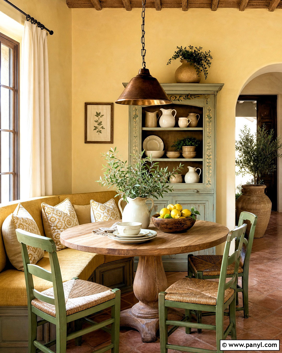
8. White and Matte Black Color Palette
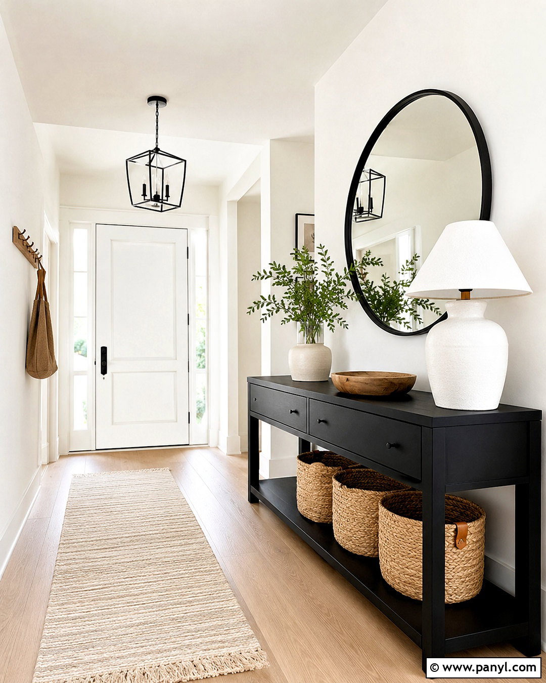
Black and white can look surprisingly comfortable when texture softens the strong contrast. Design a modern entryway with warm white walls, a matte black console, and a black-framed round mirror. Choose pale oak or light stone flooring to brighten the area and keep black from dominating the small space. A cream runner with a subtle linear pattern will visually connect the two colors. Add a white ceramic lamp, natural wood bowl, and one leafy branch for a simple decorative arrangement. Black hooks or a slim coat rail can provide useful storage while supporting the palette. By leaving space around each item and hiding everyday clutter in baskets or drawers, the entry will feel organized, graphic, and welcoming from the moment someone walks inside.
9. Oatmeal and Dusty Blue Color Palette
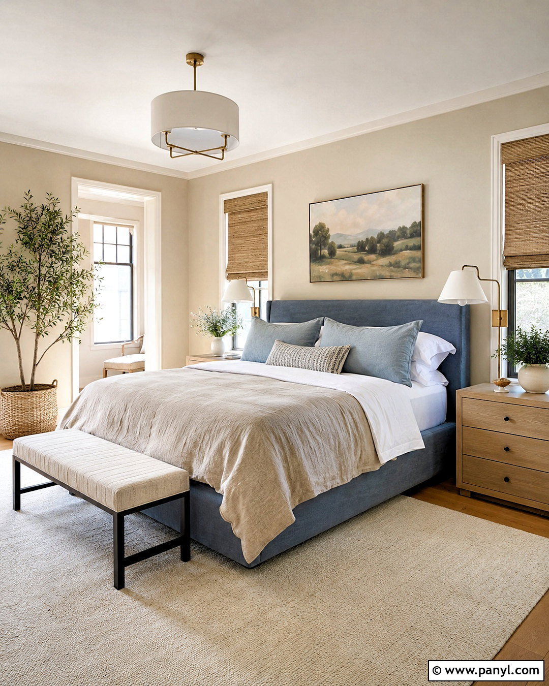
Soft oatmeal and dusty blue create a bedroom that feels peaceful but not colorless. Start with oatmeal-colored walls or a warm beige grasscloth texture, then add a dusty blue upholstered bed as the focal point. Layer the bed with white cotton sheets, flax linen covers, and a few blue-gray pillows. Pale oak nightstands, a cream rug, and natural woven shades will keep the overall look light. Use antique brass or muted bronze lamps for gentle warmth. Instead of bright patterns, select one large landscape print containing faded blue, taupe, and ivory. The restrained color contrast supports rest, while the mixture of linen, wool, wood, and upholstery gives the finished room enough depth to feel complete and thoughtfully furnished.

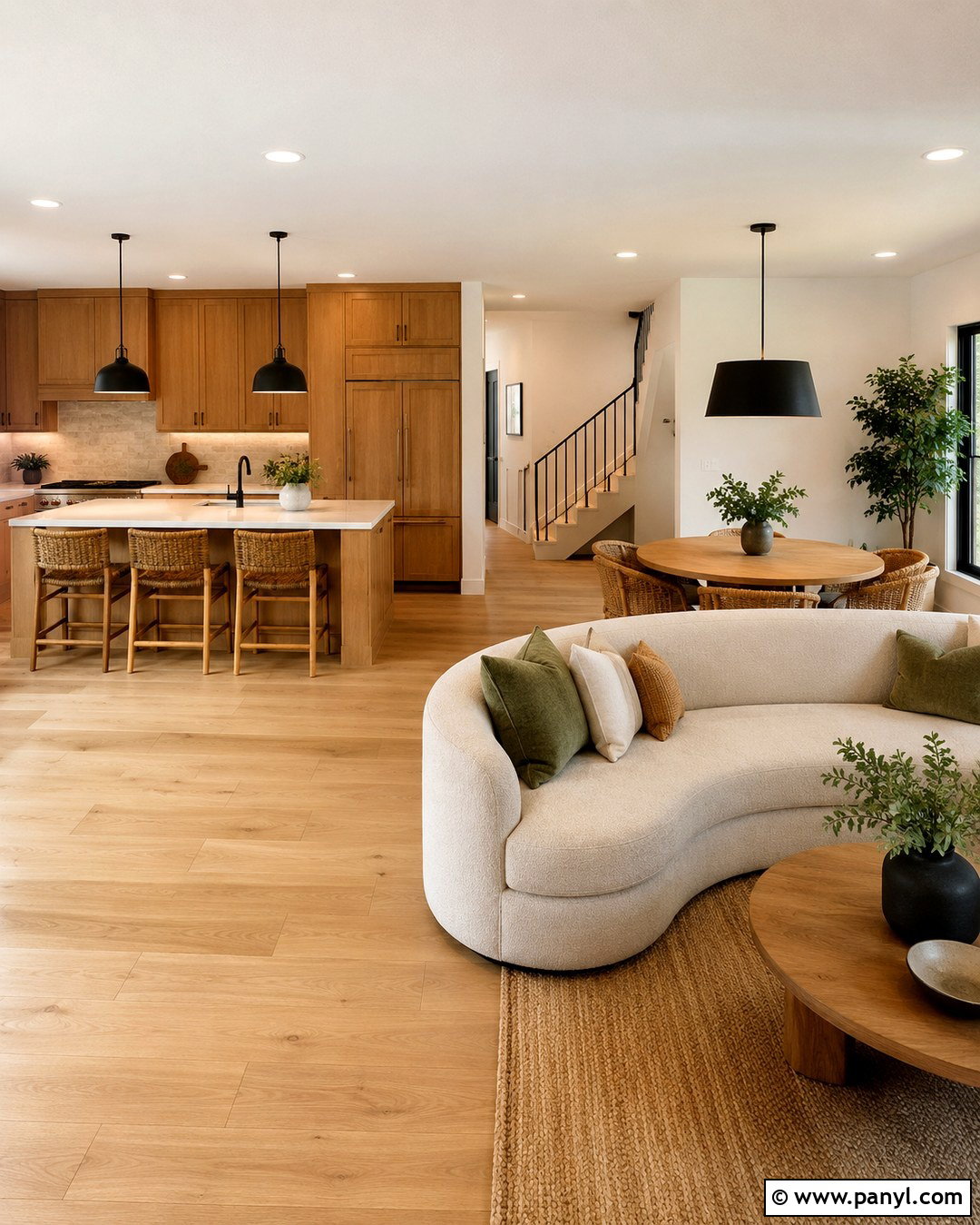
10. Mushroom and Walnut Color Palette
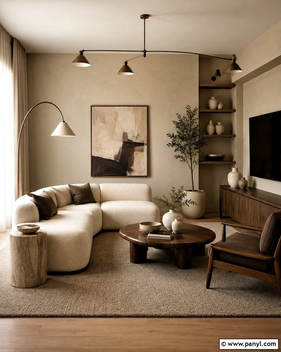
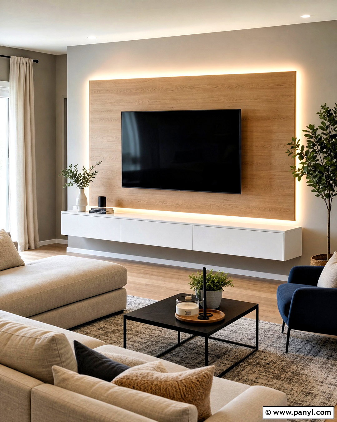
For a clean interior with deeper warmth, combine mushroom beige with dark walnut. Paint living room walls a muted mushroom tone and choose a cream boucle or linen sofa to keep the center of the space light. Add a walnut media console, sculptural coffee table, and slim side tables for rich contrast. A taupe wool rug can bridge the pale upholstery and dark wood. Use bronze lighting, chocolate brown pillows, and off-white ceramics as controlled accents. Curtains should closely match the walls, allowing windows to blend into the background. Complete the room with understated artwork in beige, brown, and charcoal. This layered neutral palette feels sophisticated, yet its simple shapes and natural materials make it comfortable enough for everyday living.
11. Soft White and Eucalyptus Color Palette
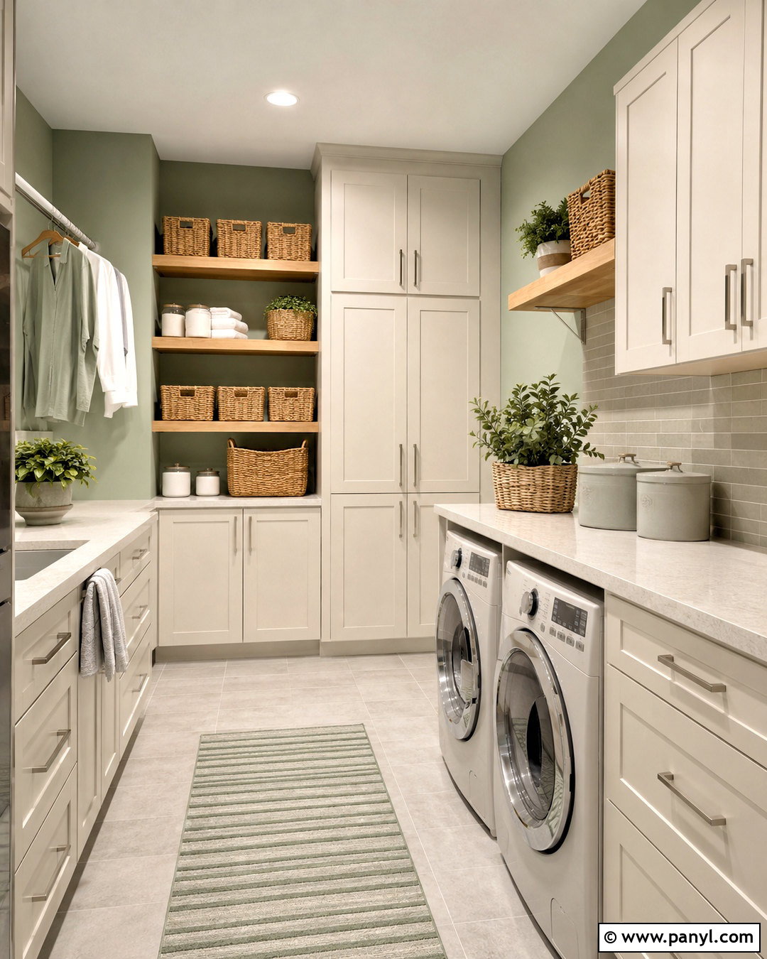
A soft white and eucalyptus palette gives a laundry room a clean appearance without relying on sterile finishes. Use warm white cabinetry from floor to ceiling and paint the walls a light eucalyptus green. Install a pale quartz counter above front-loading appliances to create a practical folding area. Light gray porcelain flooring will conceal everyday marks while maintaining the airy scheme. Add natural wood shelves, woven storage baskets, and brushed nickel hardware for subtle texture. Keep soaps and supplies inside matching containers or closed cabinets. A small striped runner in white and muted green can soften the floor. With functional storage, calm color, and clear work surfaces, the finished room will feel organized and pleasant rather than purely utilitarian.
12. Pearl Gray and Blush Color Palette
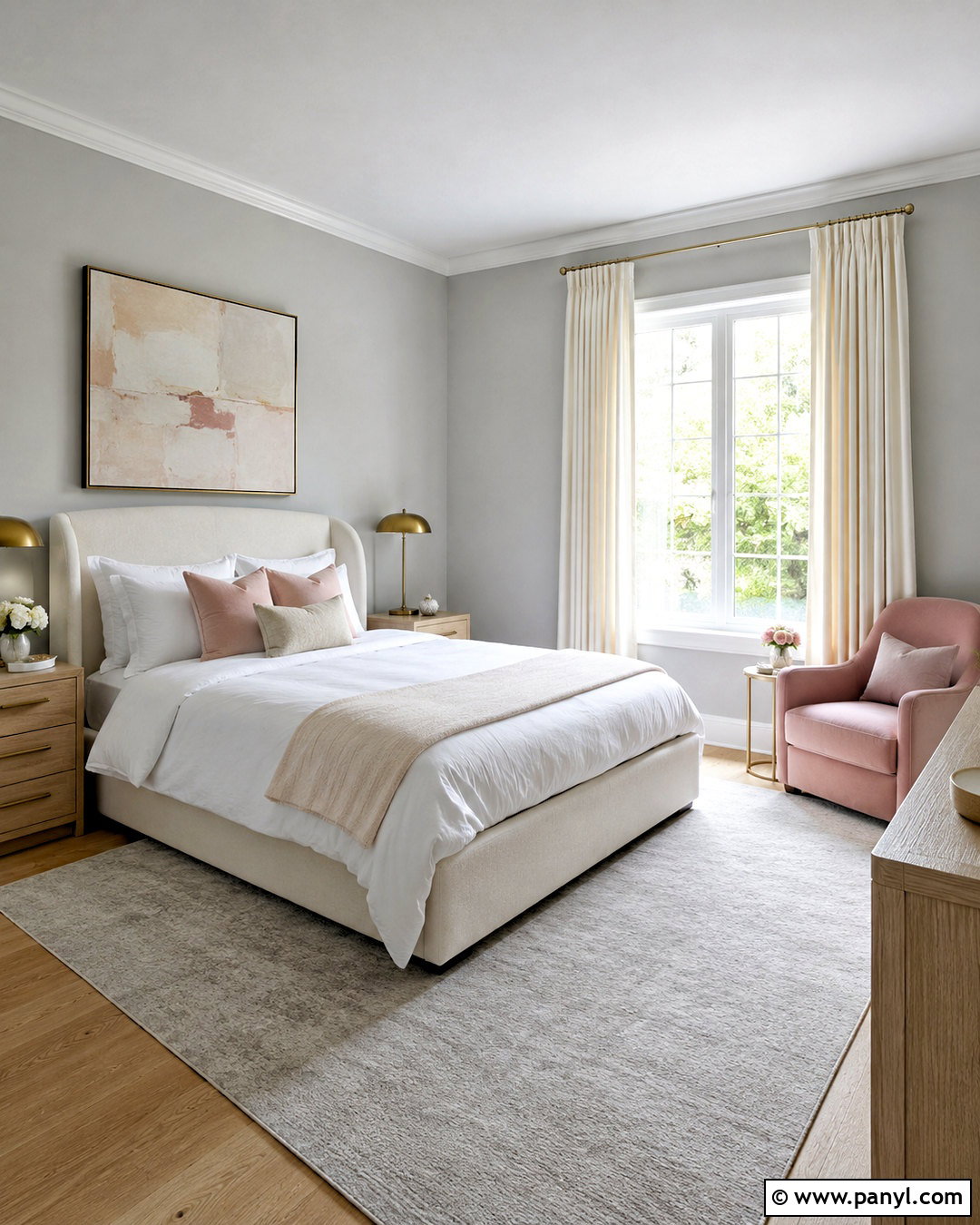
Pearl gray and muted blush can create a polished guest bedroom that feels welcoming for different tastes. Use pearl gray on the walls and select an ivory upholstered bed with simple lines. Introduce blush through linen pillows, a lightweight coverlet, and one small armchair rather than painting the entire room pink. A pale gray rug and white bedding will preserve the clean foundation. Add light oak nightstands and brushed brass lamps for warmth. Artwork can combine abstract shapes in blush, beige, gray, and warm white. Choose sheer ivory curtains under simple blackout panels for comfort and softness. This controlled use of blush keeps the room mature, while layered neutrals make the complete space feel calm, bright, and carefully prepared.
13. Stone Beige and Deep Green Color Palette
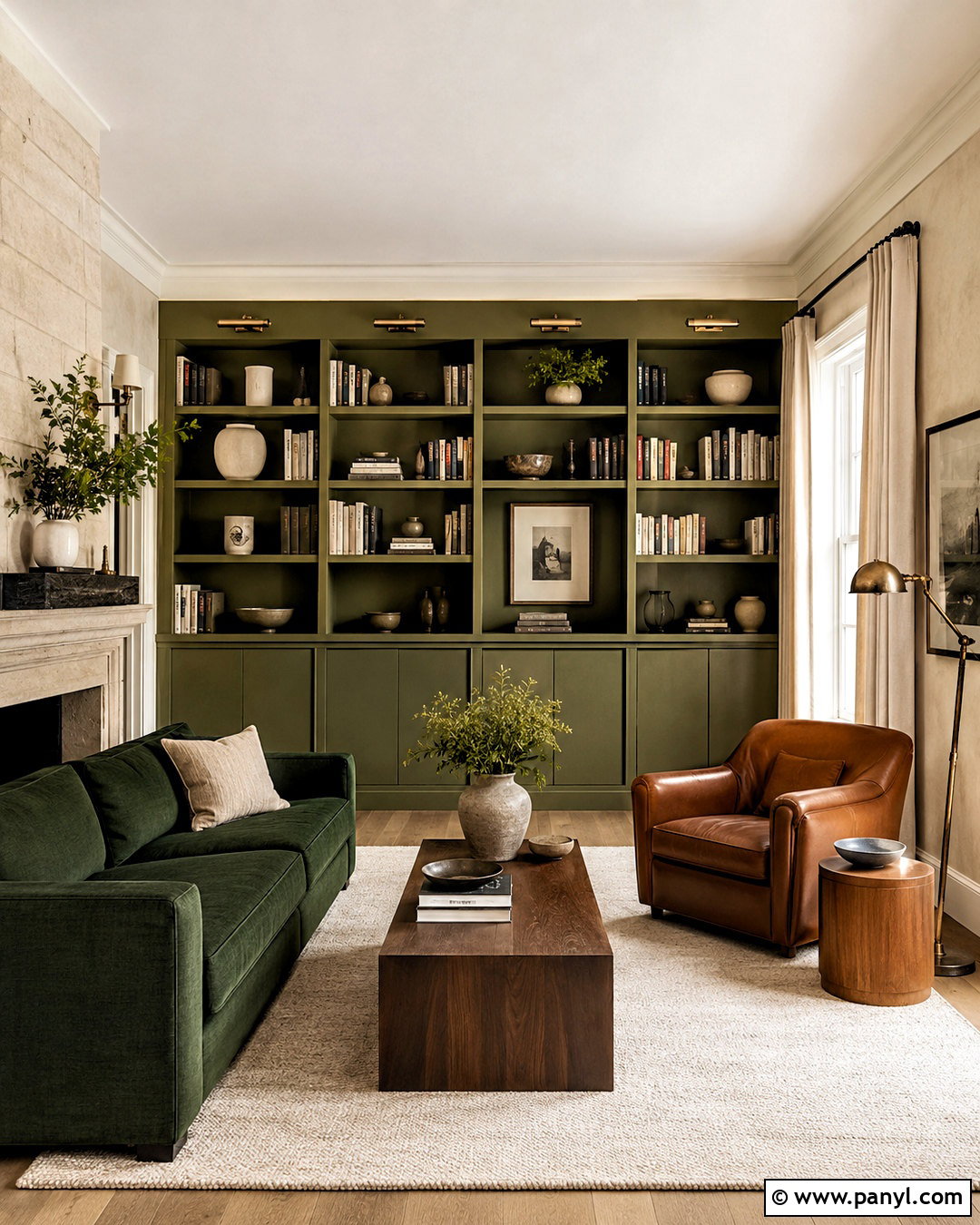
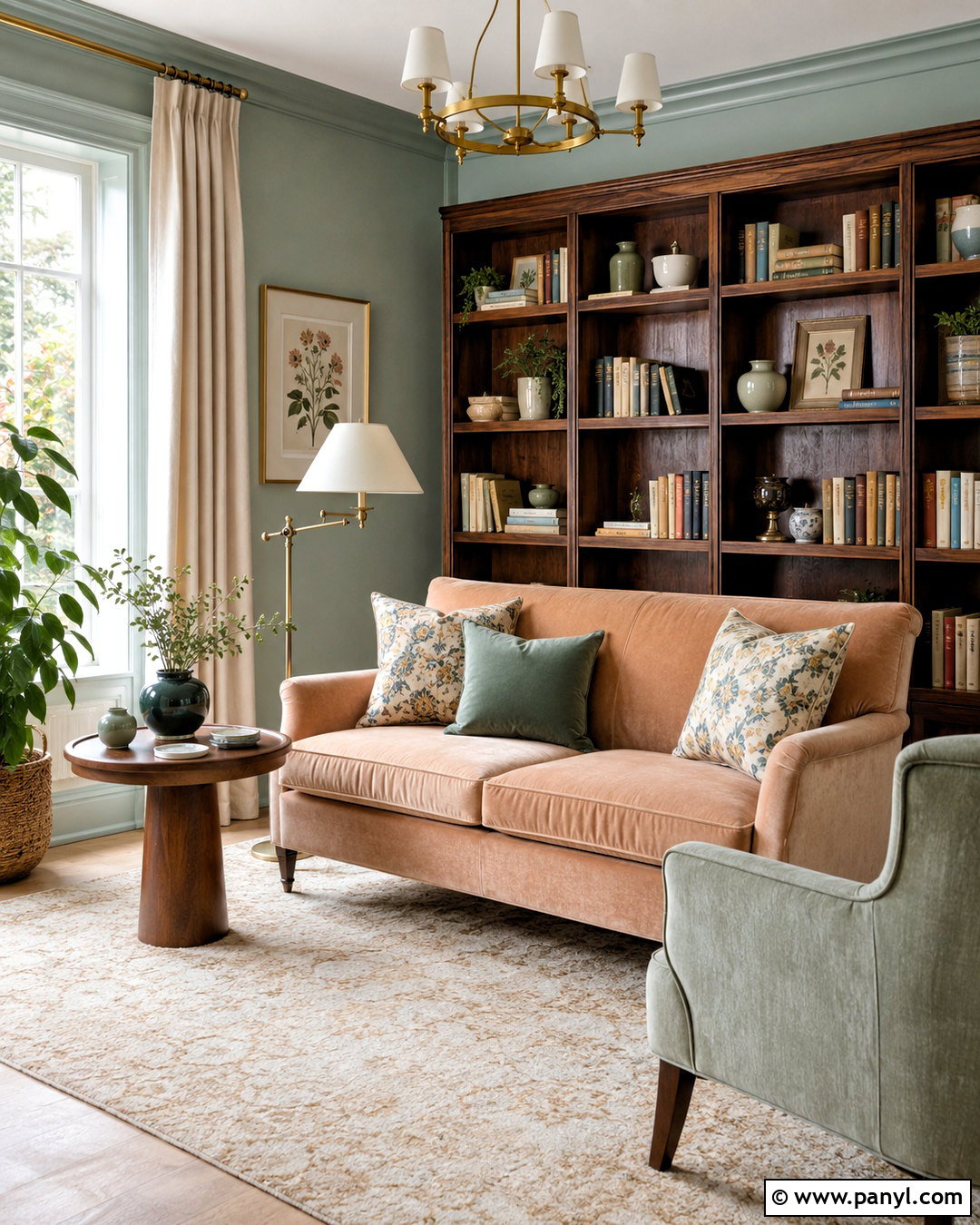
Stone beige and deep green bring definition to a reading room or quiet living area. Wrap the walls in a light stone beige and furnish the space with a deep green velvet or textured linen sofa. Add a cream rug, walnut side table, and cognac leather reading chair to build a complete, comfortable seating arrangement. Use warm white curtains and an aged brass floor lamp to brighten the darker upholstery. Shelves can be painted to match the walls so books and objects remain the main visual detail. Keep accessories limited to cream ceramics, brown wood, and a few green accents. The result feels rich without being busy, using one saturated color against a soft, neutral architectural background.
14. Cloud White and Pale Yellow Color Palette
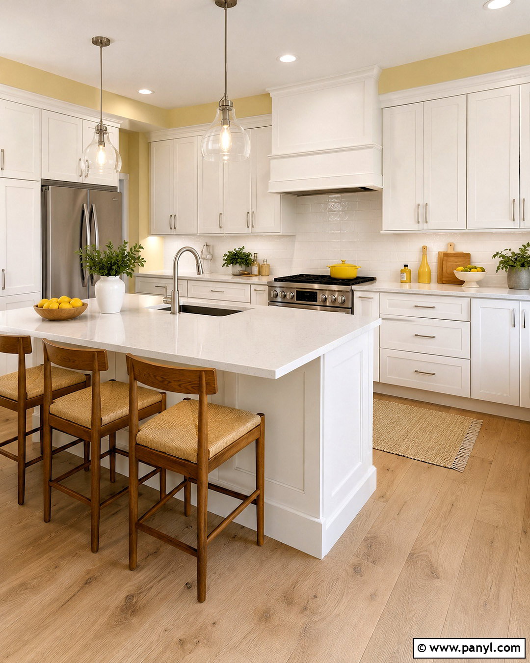
Could a cheerful kitchen still feel clean and restrained? Cloud white cabinetry paired with pale buttery yellow walls offers a bright answer. Keep the yellow soft and slightly creamy so it behaves like a warm neutral. Use white quartz counters, a simple off-white tile backsplash, and pale oak flooring throughout the room. Introduce light yellow again through counter stools, linen shades, or small ceramic pieces. Brushed nickel hardware and clear glass lighting will prevent the scheme from becoming overly rustic. A compact breakfast table in natural wood can make the kitchen more functional and welcoming. With uncluttered counters, concealed storage, and a few fresh plants, this palette feels sunny, organized, and suitable for everyday family life.
15. Warm Gray and Muted Teal Color Palette
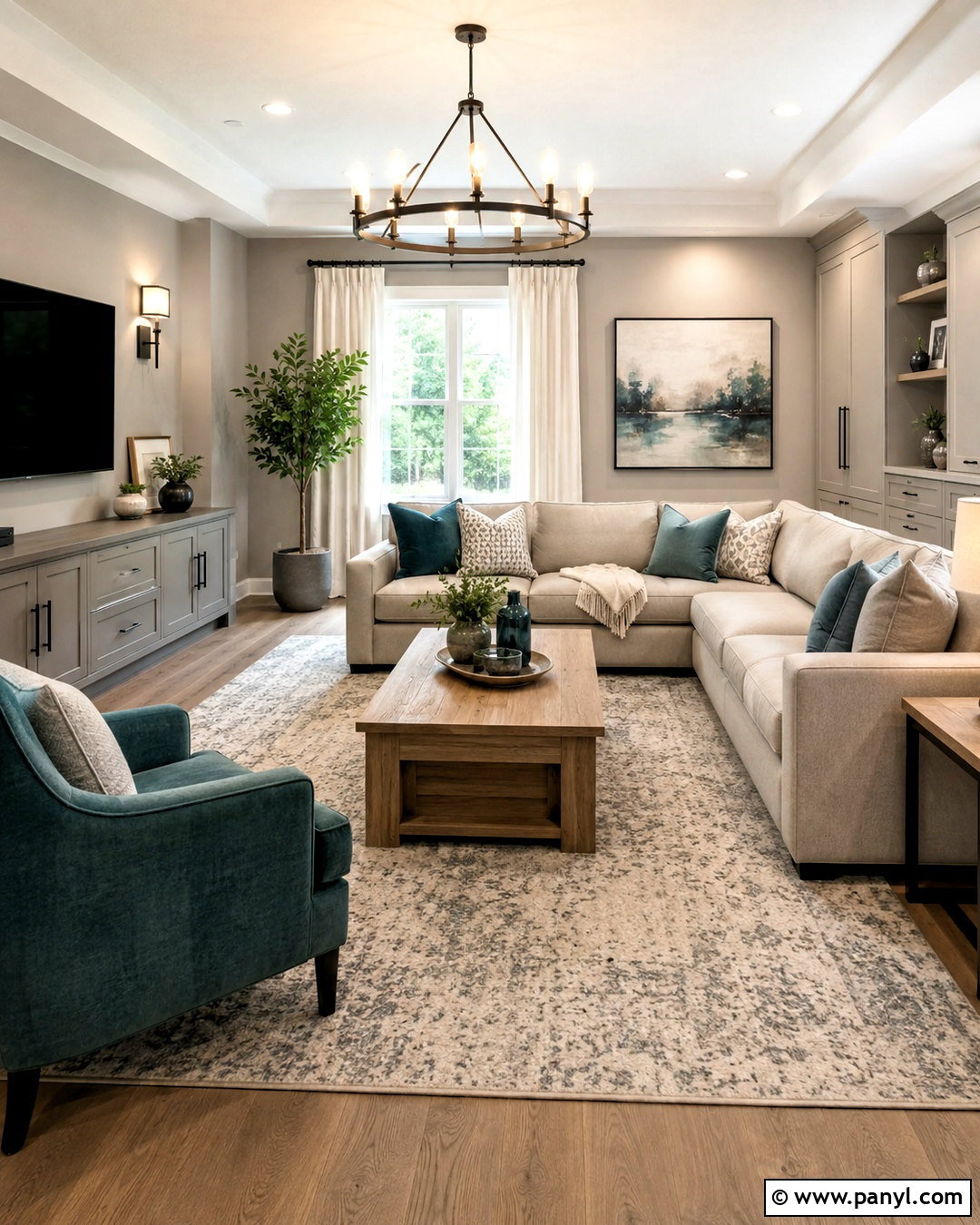
Warm gray and muted teal make a comfortable family room feel current without using overly bright color. Choose warm gray walls, a light taupe sectional, and a muted teal accent chair or built-in media cabinet. A cream and gray patterned rug can unify the seating area while disguising daily wear. Add medium oak tables, charcoal metal lighting, and off-white curtains to balance the cooler teal. Repeat the accent color in only a few pillows and pieces of artwork. Closed storage will help toys, electronics, and supplies stay out of sight. The completed room has enough contrast to feel interesting, yet every color remains softened. This makes the palette practical for a relaxed, frequently used gathering space.
16. Linen and Clay Pink Color Palette
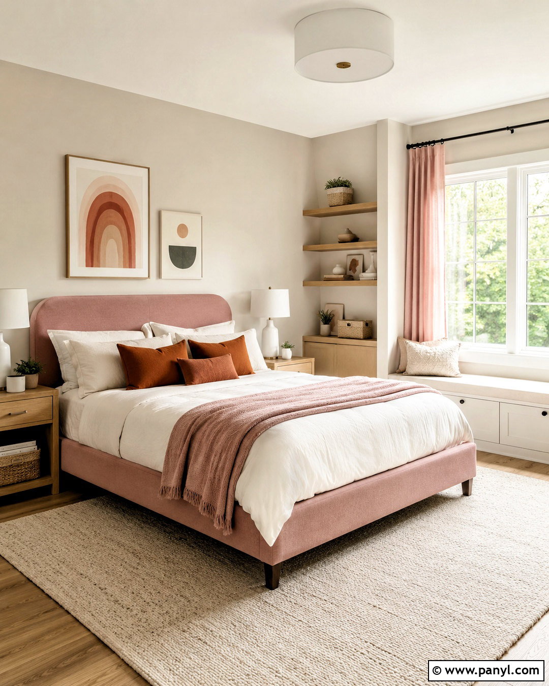
Linen beige and clay pink offer a warmer alternative to conventional pastel rooms. In a nursery or child’s bedroom, use pale linen-colored walls with a clay pink painted dresser or softly upholstered bed. Keep larger pieces, including the crib, shelves, and storage bench, in natural oak or warm white. Add a cream washable rug and simple curtains in muted pink or beige. Woven baskets can provide accessible storage while reinforcing the natural texture. Select bedding and artwork that combine clay, tan, ivory, and a small amount of rust. Avoid overly themed decorations so the room can adapt over time. This complete palette feels gentle and youthful, but its earthy undertones keep it polished and easy to update.
17. Soft Taupe and Lavender Color Palette
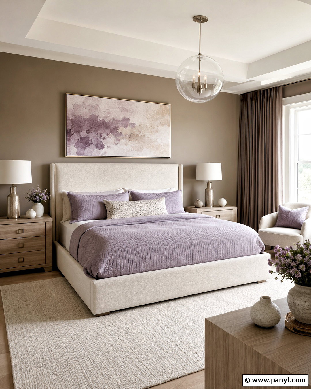
Soft taupe and dusty lavender can turn a primary bedroom into a calm, refined retreat. Paint the walls a warm taupe and use lavender on a quilted bedspread, upholstered bench, or pair of accent pillows. Choose an ivory bed, cream wool rug, and pale wood nightstands to maintain a light foundation. Add darker taupe curtains for subtle framing around the windows. Brushed nickel lamps and a simple glass pendant will bring clarity without introducing another strong color. Artwork featuring muted lavender, gray, and beige can connect the scheme above the bed. Keep surfaces open except for a few ceramic pieces and books. The lavender provides personality, while the surrounding neutrals ensure the entire bedroom remains clean and restful.
18. Cool White and Slate Blue Color Palette
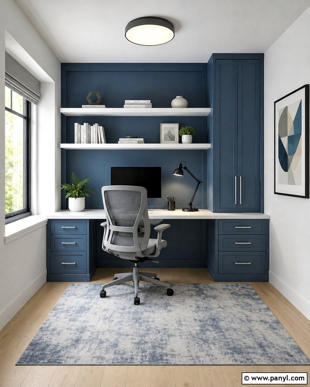
Cool white and slate blue create a focused color scheme for a compact home office. Use cool white walls to maximize brightness and install a slate blue built-in desk or storage wall as the room’s main feature. Pair it with a pale gray ergonomic chair, light oak flooring, and a simple charcoal desk lamp. White shelves against the blue cabinetry will prevent the storage area from appearing too heavy. Add a gray-blue rug and restrained artwork with geometric forms. Keep office supplies in matching white or navy containers to reduce visual clutter. Silver hardware and frosted glass lighting suit the cooler undertones. The finished workspace feels crisp and structured, encouraging concentration while still offering enough color to appear personal and inviting.
19. Bone White and Cocoa Brown Color Palette
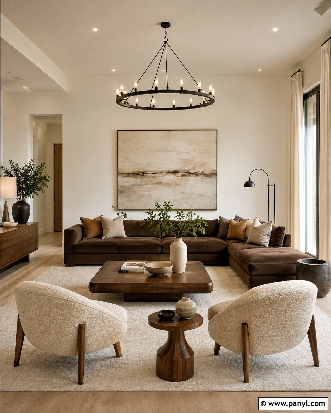
Bone white and cocoa brown form a soft high-contrast palette that works beautifully in a modern living room. Cover the walls in bone white and choose a cocoa brown sofa with clean, low arms. Balance the dark seating with an ivory rug, cream curtains, and pale boucle accent chairs. Walnut tables can extend the brown tones across the room, while blackened bronze lighting adds slim, defined lines. Include cushions in caramel, taupe, and warm white to create gradual color transitions. One oversized abstract artwork can combine all the neutral shades without making the room busy. This complete arrangement feels grounded and substantial, but the generous use of warm white keeps it bright enough for smaller or naturally shaded spaces.
20. Ivory and Blackened Blue Color Palette
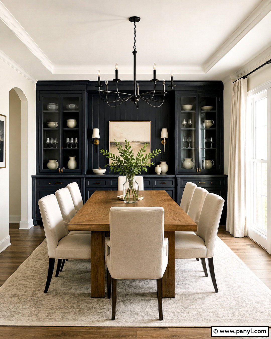
Ivory and blackened blue deliver dramatic contrast while preserving a calm, uncluttered atmosphere. Use ivory walls and cabinetry in a dining room, then paint a built-in cabinet or one architectural wall a deep blue that nearly reads as black. Place a medium oak dining table in the center with ivory upholstered chairs and a light neutral rug underneath. Add a simple black metal chandelier and brushed brass cabinet hardware to create layered contrast. White ceramic dishes, clear glassware, and a restrained centerpiece will keep the table polished. Pale curtains can soften daylight without competing with the dark feature. The finished dining room feels bold and modern, yet the balanced materials and open surfaces prevent the deep blue from overpowering the space.
Conclusion:
The best clean rooms are not empty or limited to plain white. They combine controlled color, practical furniture, natural texture, and enough contrast to make each feature easy to see. These 20 clean color palette ideas range from light neutral combinations to deeper schemes with navy, green, teal, brown, and black. Begin with the dominant wall or cabinet color, then select furniture and flooring that support its undertone. Add accent shades through pieces that are easier to change, including pillows, curtains, art, and ceramics. Before committing, view paint and material samples together in the room’s natural and artificial light. A thoughtful palette will help the entire space feel connected, comfortable, and visually calm.

Related Ideas and Inspiration:
Leave a Reply