
Periwinkle sits between soft blue and gentle violet, giving rooms a calm presence without feeling predictable. A well-planned periwinkle color palette can appear airy, sophisticated, playful, or dramatic depending on the supporting shades and materials. Warm neutrals make it inviting, greens create a garden-inspired mood, and richer colors such as navy or plum add depth. Periwinkle also works across many decorating directions, from relaxed coastal rooms to polished modern interiors. The key is using it as part of a complete scheme that balances color, texture, furniture, lighting, and finishes. Whether you are refreshing one room or planning a whole-home palette, these practical combinations make this distinctive hue easier to use. Explore the following 20 periwinkle color palette ideas for complete, achievable design inspiration. ()

1. Periwinkle And Ivory Color Palette
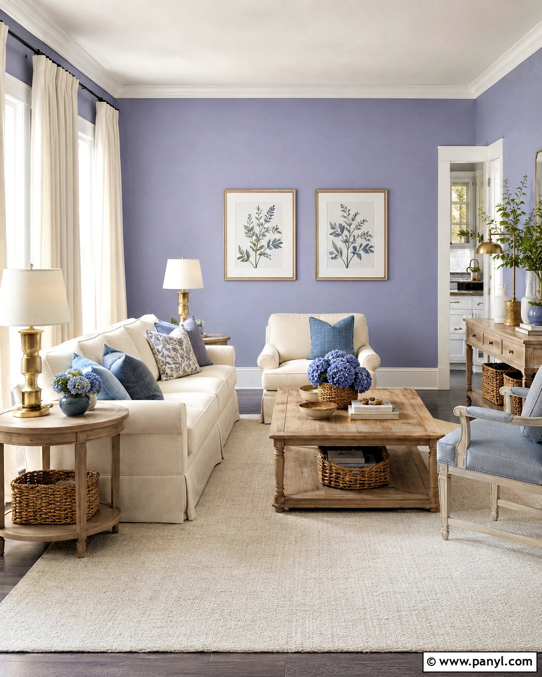
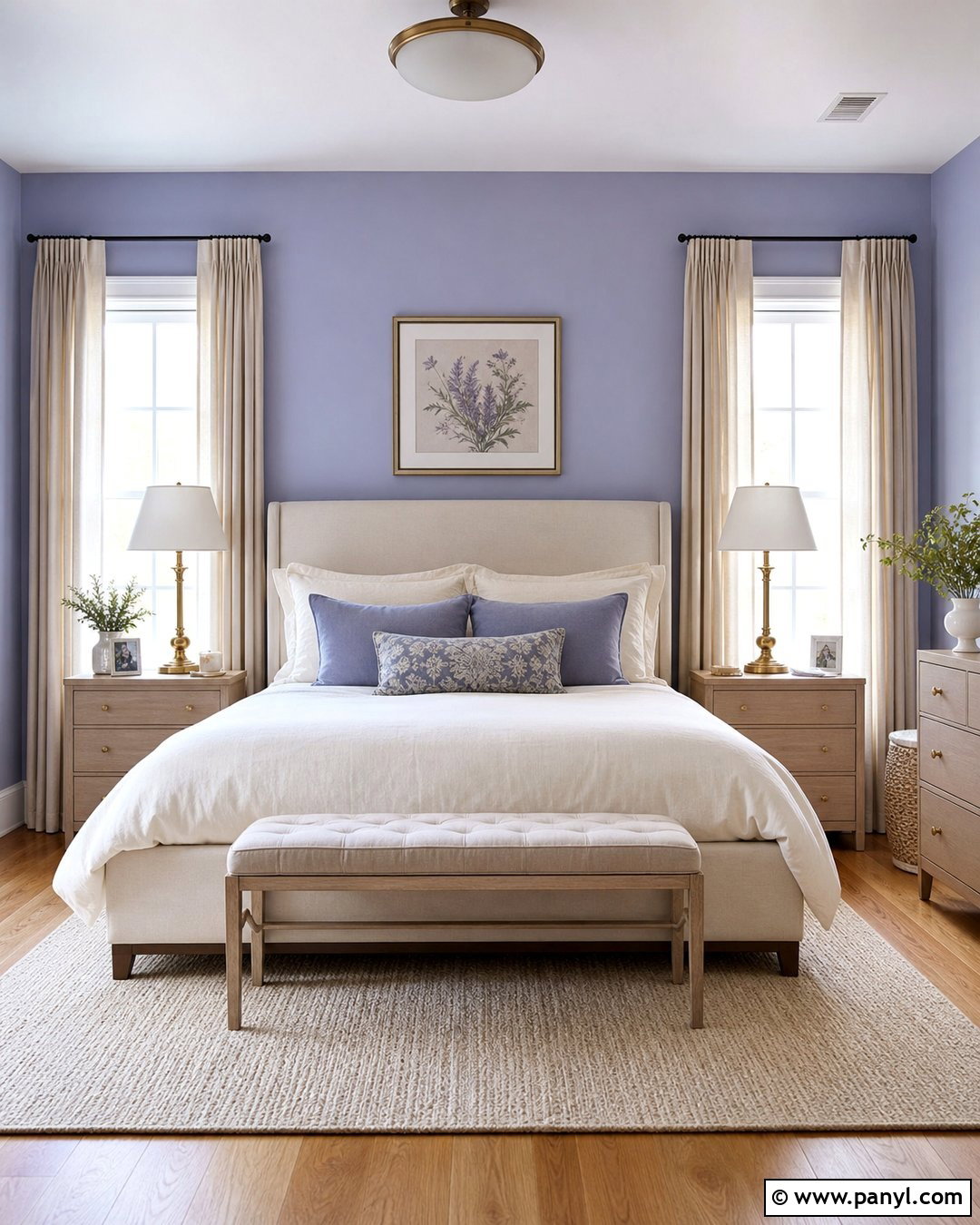
Soft periwinkle walls and warm ivory upholstery create an elegant living room that feels light without looking cold. Use periwinkle across the main walls, then add an ivory sofa, cream curtains, and a pale wool rug to soften the blue-violet undertones. Natural white oak works beautifully for the coffee table, shelving, and picture frames. Include brushed brass lighting for gentle warmth, but keep the metal accents limited so the room remains relaxed. A few dusty blue pillows can connect the furnishings to the wall color. Finish the complete look with ceramic lamps, simple botanical artwork, and woven baskets. This palette suits traditional, transitional, and casual contemporary homes, especially when plenty of natural daylight keeps the colors fresh.
2. Periwinkle And Sage Green Color Palette
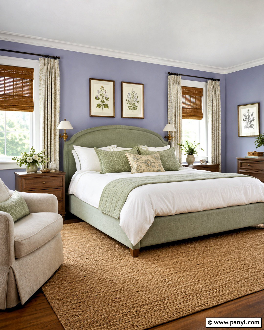
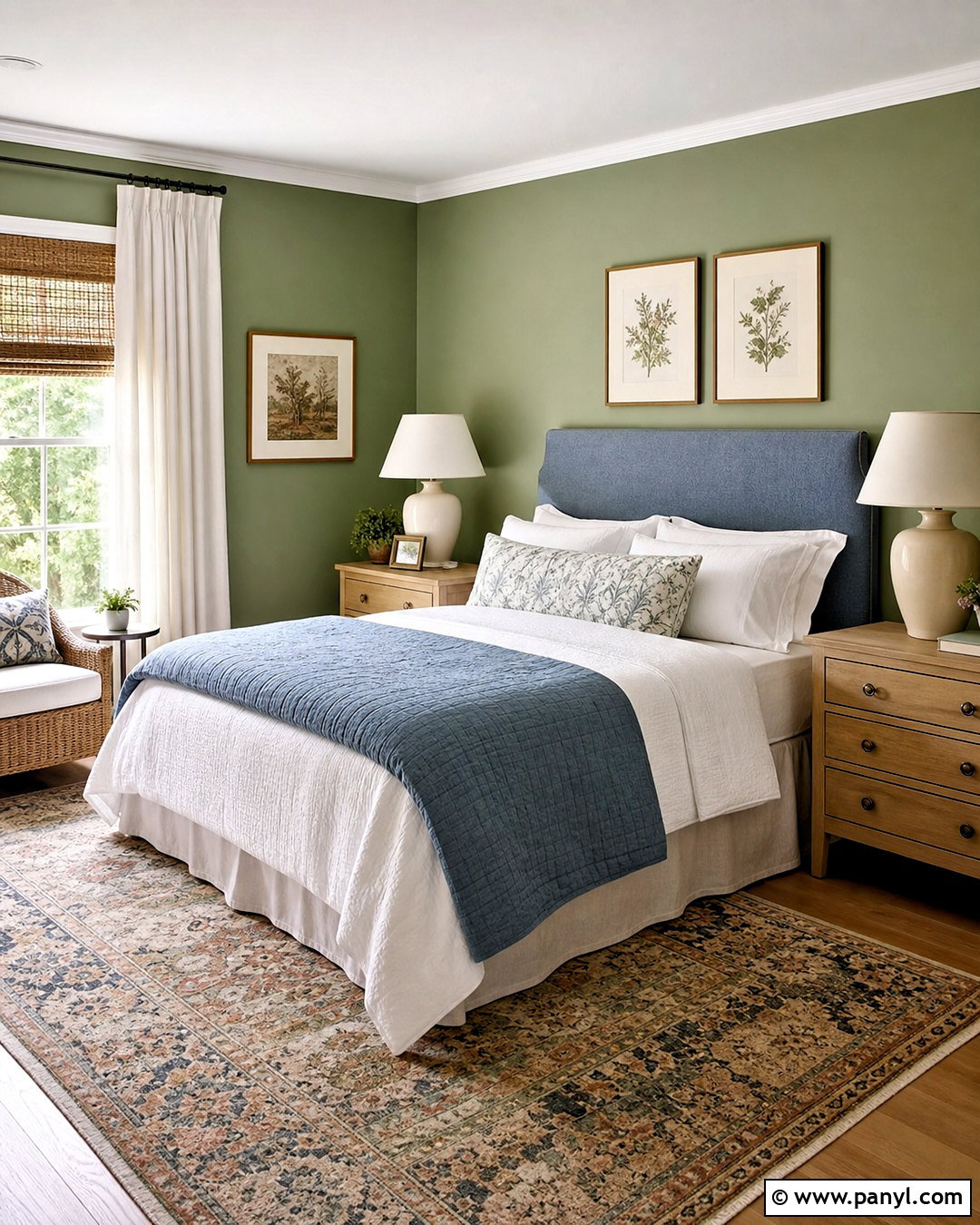
Periwinkle and sage green bring the soothing colors of a garden into a comfortable bedroom. Paint the walls a muted periwinkle, then choose a sage upholstered bed or quilt as the second major color. Cream bedding provides breathing room between these two cool shades. Add medium oak nightstands, woven window shades, and a natural jute rug to ground the softer colors. Small touches of aged brass can appear on reading lights and drawer pulls. Botanical prints featuring lavender-blue flowers and gray-green leaves reinforce the palette without making the room look overly themed. For a balanced finish, repeat periwinkle on one decorative pillow and sage in the curtains. The complete combination feels calm, organic, and suitable for year-round decorating.
3. Periwinkle And Butter Yellow Color Palette
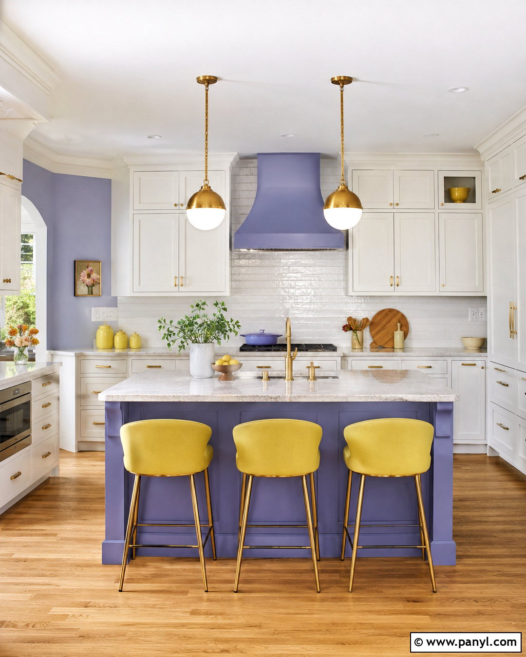
Could a cheerful kitchen still feel soft and livable? Pair a periwinkle island with butter yellow accents and warm white perimeter cabinets. The island becomes the room’s focal point, while pale yellow counter stools, café curtains, or pendant shades add sunshine in smaller amounts. Select creamy quartz counters and a simple white tile backsplash to prevent the colors from competing. Light oak flooring keeps the scheme warm and casual. Matte brass hardware complements the yellow notes without appearing too formal. Display white dishes, wooden cutting boards, and a few yellow ceramics on open shelves. This complete periwinkle color palette feels fresh rather than childish because each brighter hue is surrounded by clean neutrals, practical materials, and uncluttered surfaces.
4. Periwinkle And Blush Pink Color Palette
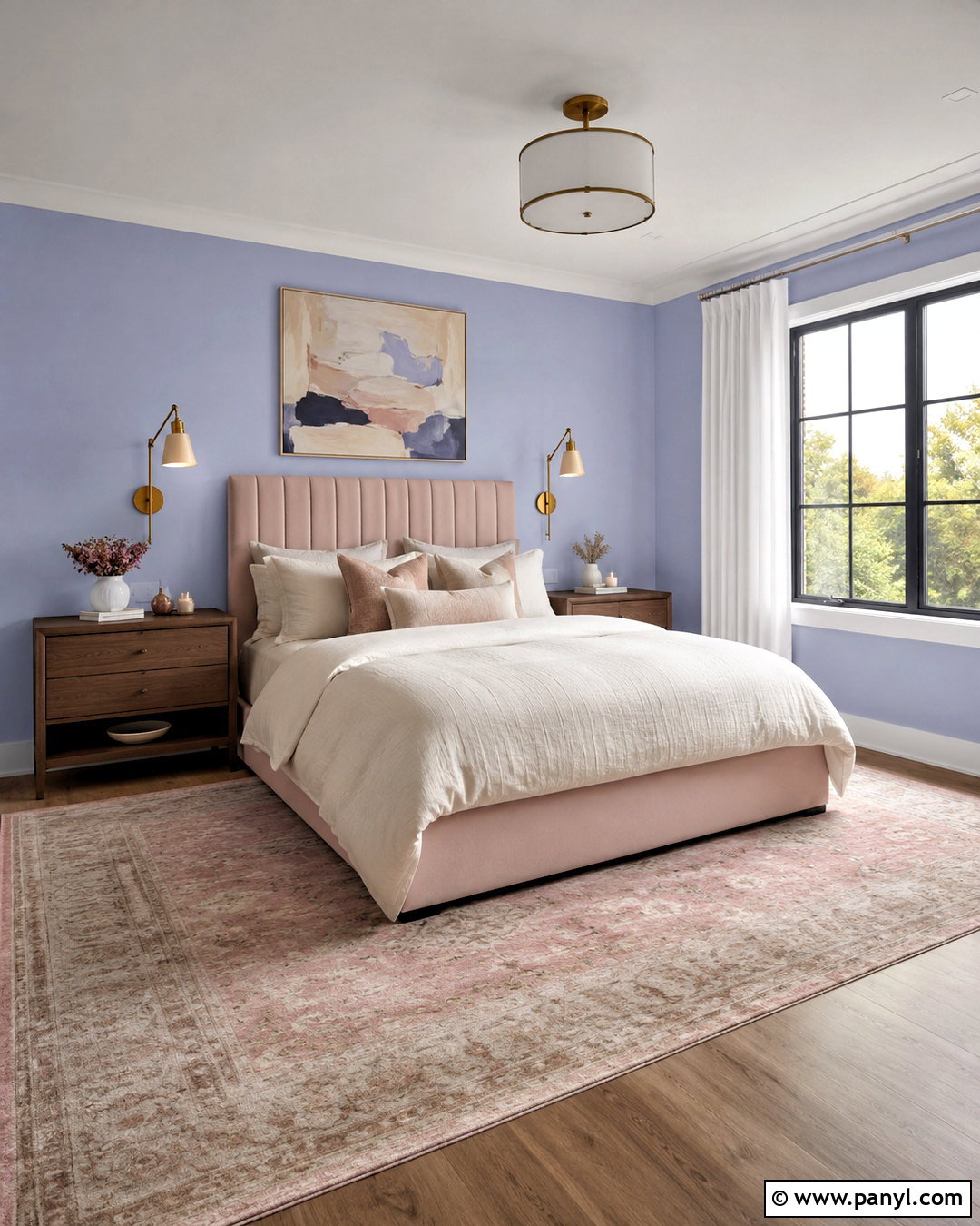
A periwinkle and blush pink bedroom can look polished when the colors are layered with warm neutrals and tailored furniture. Cover the walls in a pale periwinkle and introduce blush through a channel-tufted headboard, a folded coverlet, and one or two pillows. Use ivory bedding to keep the center of the room crisp. Walnut nightstands add needed contrast, while brushed brass sconces provide a refined finish. Choose a vintage-style rug containing faded pink, lavender-blue, and beige rather than a strongly patterned pastel design. Soft white curtains and simple abstract artwork complete the space. Repeating black in thin picture frames or lamp details gives the palette definition, ensuring the finished room feels sophisticated, comfortable, and appropriate beyond a nursery or child’s bedroom.
5. Periwinkle And Navy Blue Color Palette
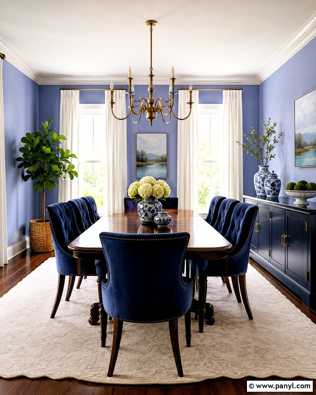
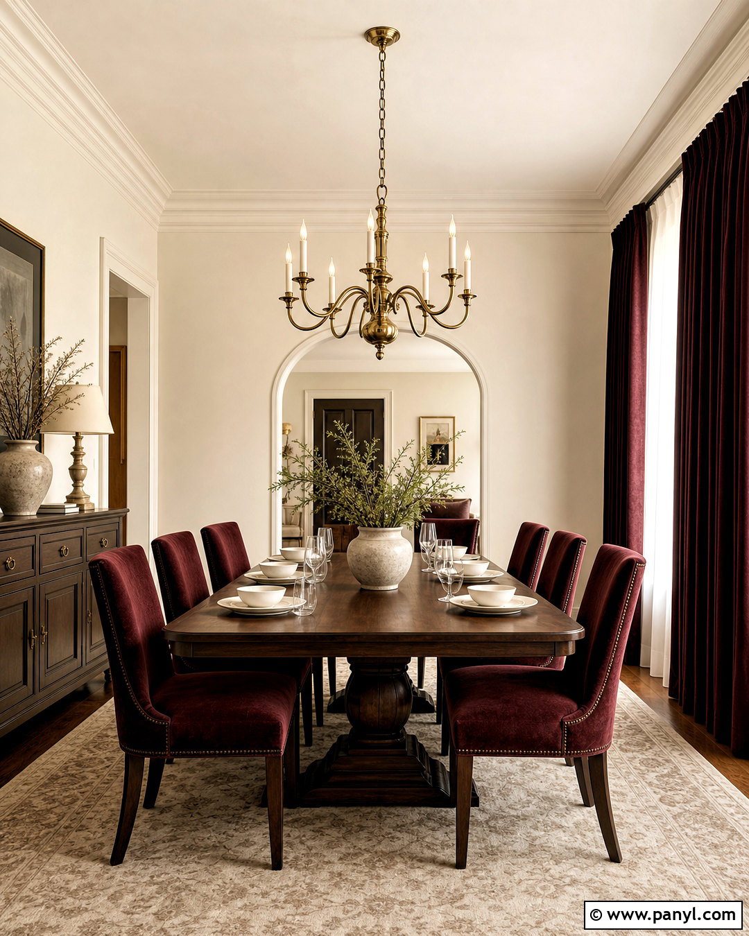
For a deeper and more tailored scheme, combine periwinkle walls with navy blue furniture in a dining room. A navy velvet dining chair or painted sideboard adds visual weight against the lighter walls. Choose a medium walnut table to warm both blue tones and establish a timeless foundation. An ivory rug, white ceiling, and linen curtains prevent the room from becoming too dark. Brass or antique bronze lighting introduces a subtle glow, while blue-and-white ceramics connect the two main colors. Add artwork containing periwinkle, navy, cream, and touches of muted green. The tonal relationship makes the room feel coordinated, but the difference in value creates clear contrast. This palette works especially well for traditional, coastal, and updated classic interiors.
6. Periwinkle And Coral Color Palette
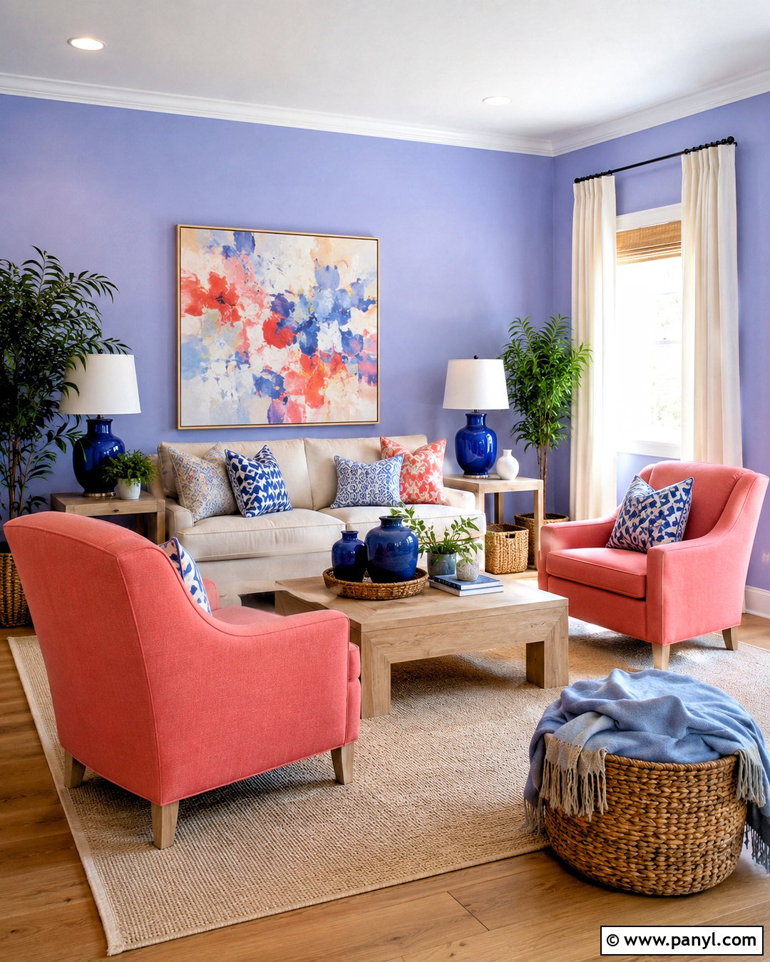
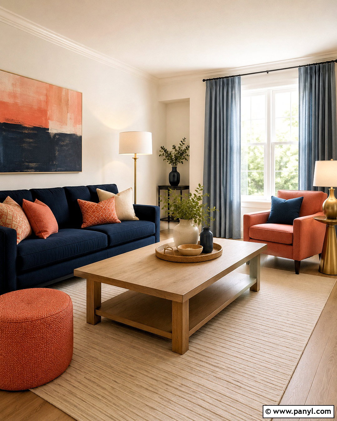
Periwinkle and coral create a lively living room with enough contrast to feel energetic but still welcoming. Use a pale periwinkle on the walls and choose a neutral oatmeal sofa as the room’s largest furniture piece. Introduce coral through two lounge chairs, patterned pillows, and a small amount of artwork. Cream curtains and a light beige rug give the stronger colors space to stand out. Use light oak tables and woven accessories to keep the overall mood casual. A few deep blue details, such as a lamp base or ceramic bowl, can provide additional structure. Avoid scattering coral everywhere. Concentrating it in a few connected areas makes the finished design intentional. The result is bright, balanced, and ideal for an upbeat family space.
7. Periwinkle And Terracotta Color Palette
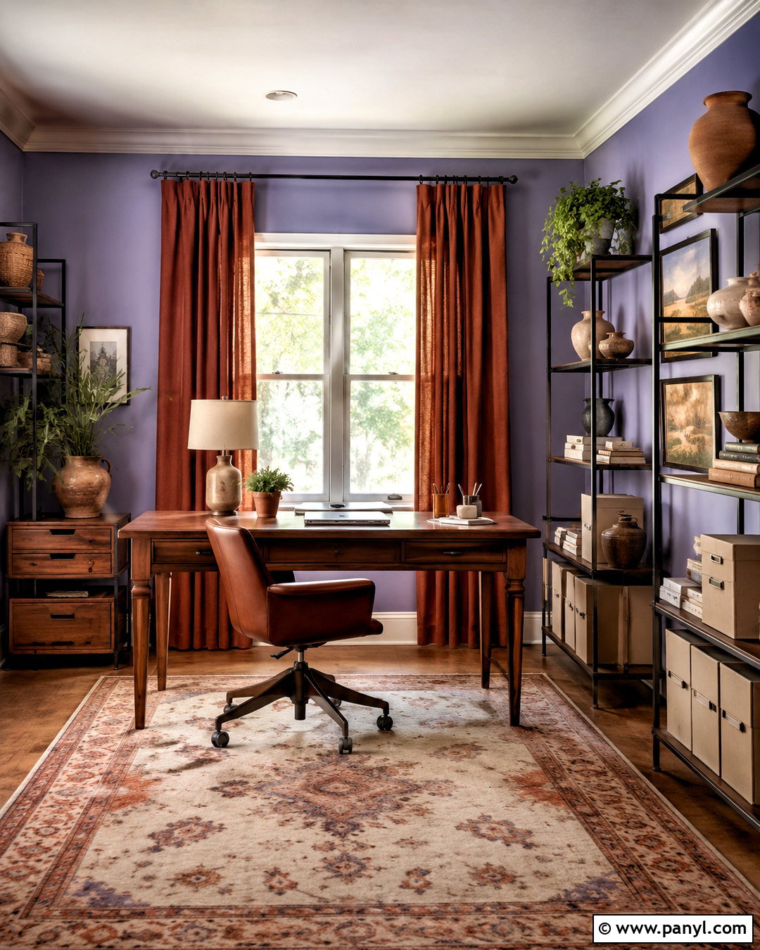
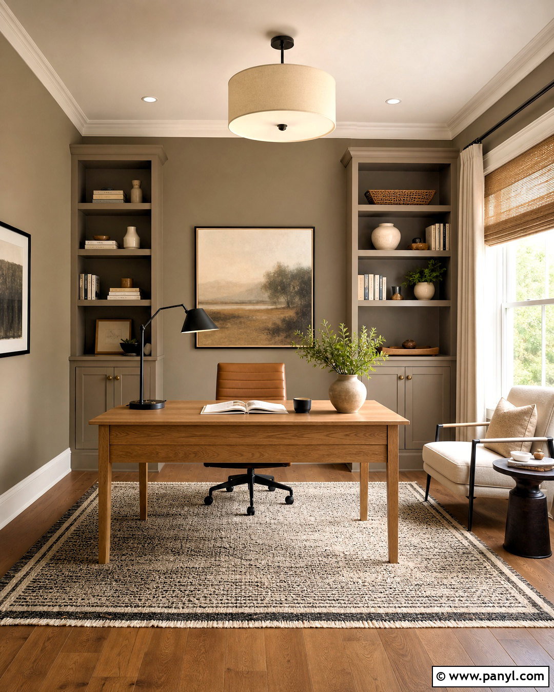
Earthy terracotta gives periwinkle a warmer, more grounded personality. Start with muted periwinkle walls in a home office, then add a cognac leather desk chair and terracotta-colored curtains. A substantial walnut desk creates a strong center for the design, while a cream-and-rust patterned rug connects the cool walls to the warm furnishings. Use black metal shelving or picture frames to sharpen the scheme. Handmade clay pots, linen storage boxes, and landscape artwork add texture without creating clutter. Keep the ceiling and trim warm white rather than bright blue-white. This complete palette feels creative and mature because the dusty quality of terracotta balances the gentle violet notes in periwinkle. It is particularly effective in rooms with warm wood floors and afternoon sunlight.
8. Periwinkle And Charcoal Gray Color Palette
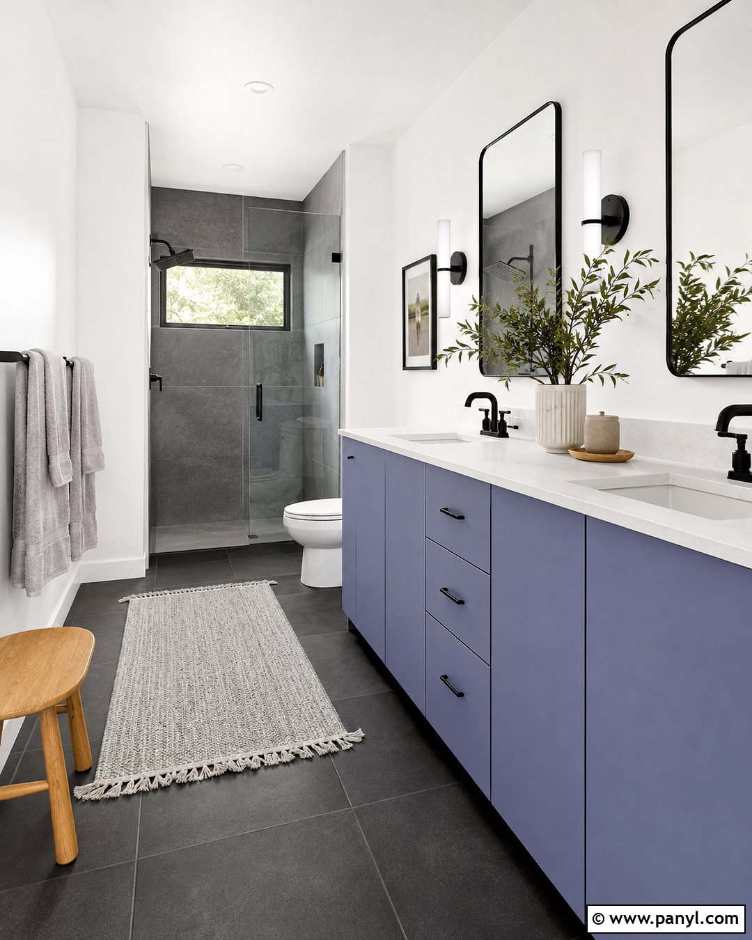
A charcoal and periwinkle bathroom feels modern, clean, and more interesting than a standard gray scheme. Use periwinkle on a flat-panel vanity, then surround it with charcoal floor tile and soft white walls. A white quartz counter keeps the vanity area bright, while matte black faucets and framed mirrors echo the darker floor. Include pale gray towels and a light shower curtain to soften the transition between black, white, and color. Brushed nickel hardware can add a cooler metallic note without competing with the palette. Finish with a small oak stool, simple glass containers, and one leafy plant. The charcoal gives periwinkle visual strength, allowing the pastel shade to feel crisp and architectural rather than delicate or overly decorative.
9. Periwinkle And Mint Green Color Palette
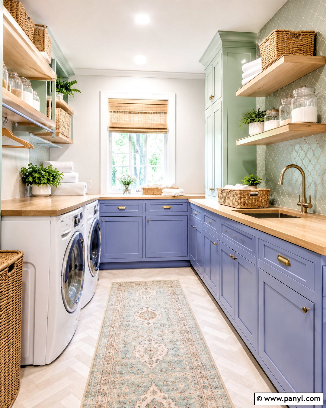
Fresh and breezy, periwinkle and mint green make a charming laundry room feel brighter and more organized. Paint the lower cabinets periwinkle, use warm white walls, and introduce mint through a patterned backsplash or a slim storage cabinet. Pale butcher-block counters contribute natural warmth and provide a practical folding surface. Choose white appliances so they blend quietly into the overall plan. Woven baskets, clear storage jars, and brushed brass cabinet pulls complete the room without adding unnecessary colors. A small washable runner can combine periwinkle, mint, cream, and pale blue. Keep open shelving neat with matching containers and folded linens. This complete palette gives a hardworking utility space personality while maintaining the clean, orderly appearance needed for everyday use.

10. Periwinkle And Lavender Color Palette
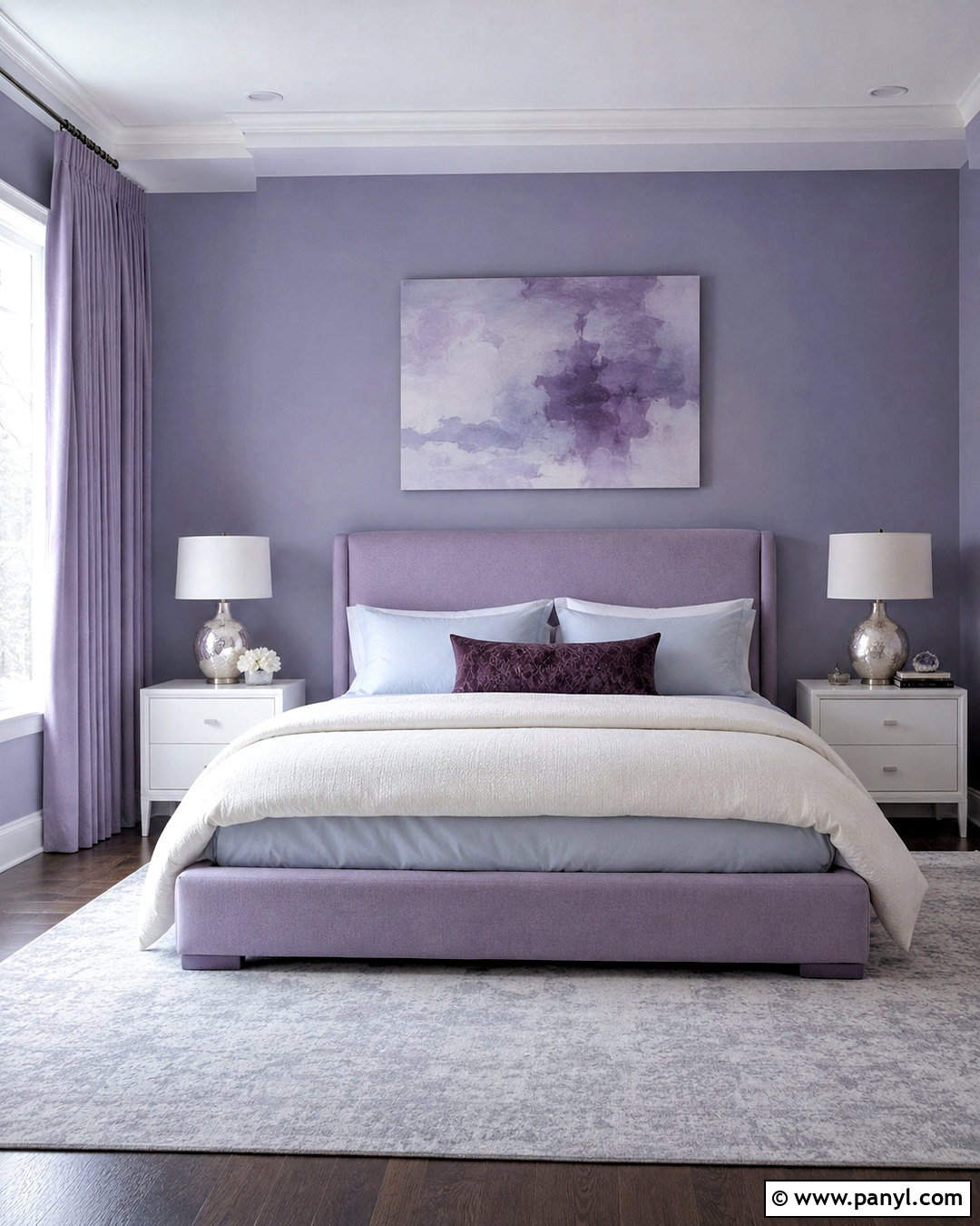
Layering periwinkle with lavender creates a tonal bedroom that feels restful rather than overly sweet. Select a grayed periwinkle for the walls and a slightly warmer lavender for the upholstered headboard or duvet. Add pale blue sheets, an ivory blanket, and a plum lumbar pillow to create gradual shifts from blue to violet. Light gray carpeting or a large wool rug keeps the floor neutral. Choose silver-toned lamps, mirrored details, and white nightstands for a clean finish. Texture is important in a close color scheme, so mix velvet, linen, cotton, and soft wool. Simple artwork with broad lavender-blue shapes can complete the walls. The finished space feels cohesive because every shade shares similar cool undertones while varying in depth and material.
11. Periwinkle And Teal Color Palette
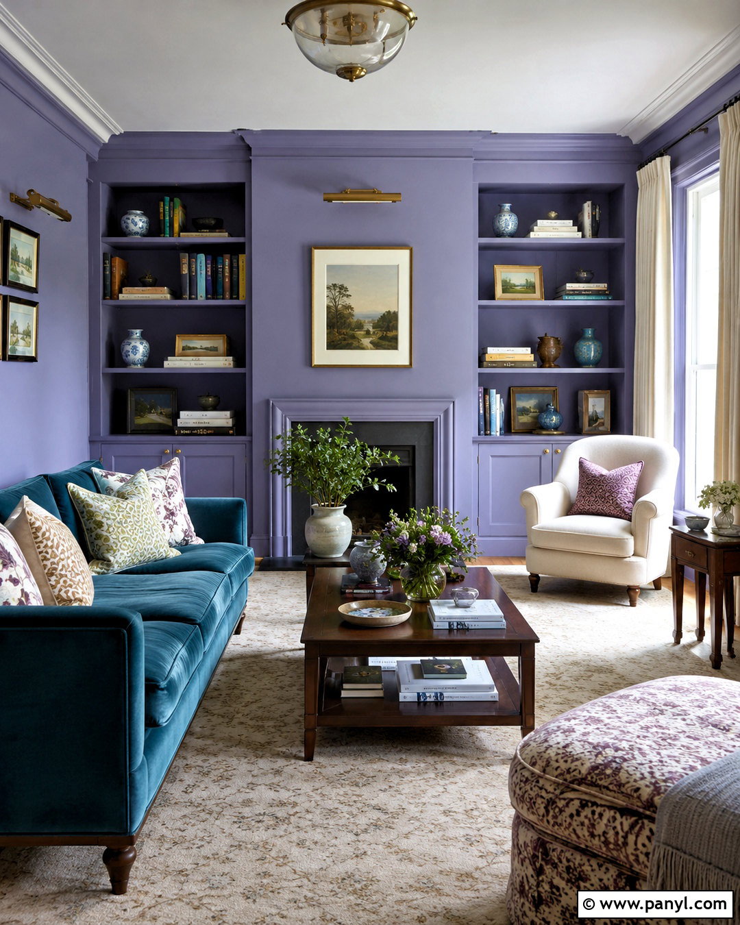
Periwinkle and teal can turn a reading room into a rich, collected retreat. Cover the walls and built-in shelves in a medium periwinkle, then place a deep teal sofa or reading chair at the center of the space. Add an ivory rug and cream curtains to brighten the saturated colors. Walnut shelving, a dark wood side table, and aged brass picture lights make the palette feel established rather than trendy. Use patterned pillows containing teal, periwinkle, green, and small touches of rust. Books, ceramic vessels, and framed prints can add personality, but leave open areas on the shelves for visual balance. The completed room feels cozy and colorful while maintaining enough neutral space to support comfortable reading and everyday relaxation.
12. Periwinkle And Mustard Yellow Color Palette
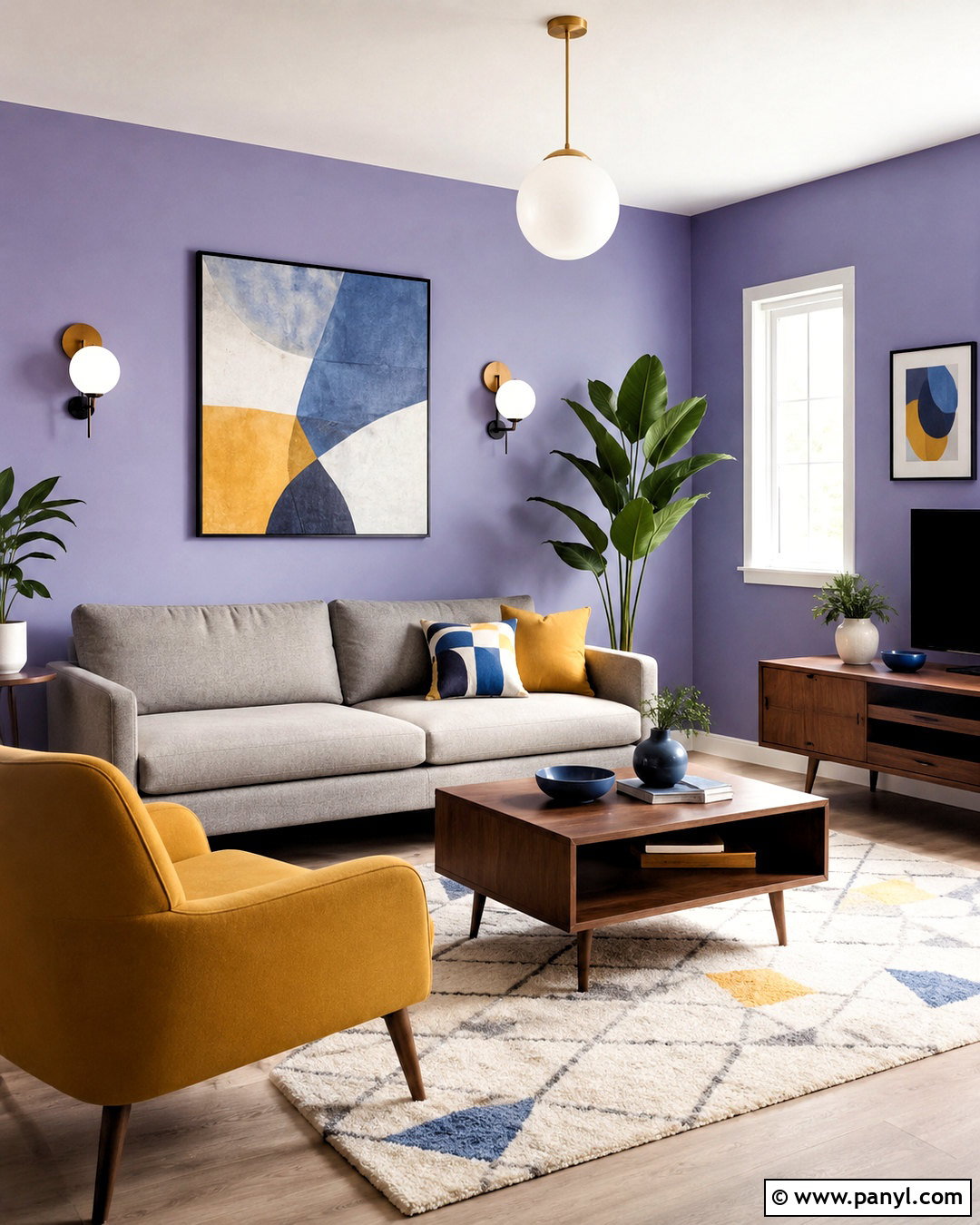
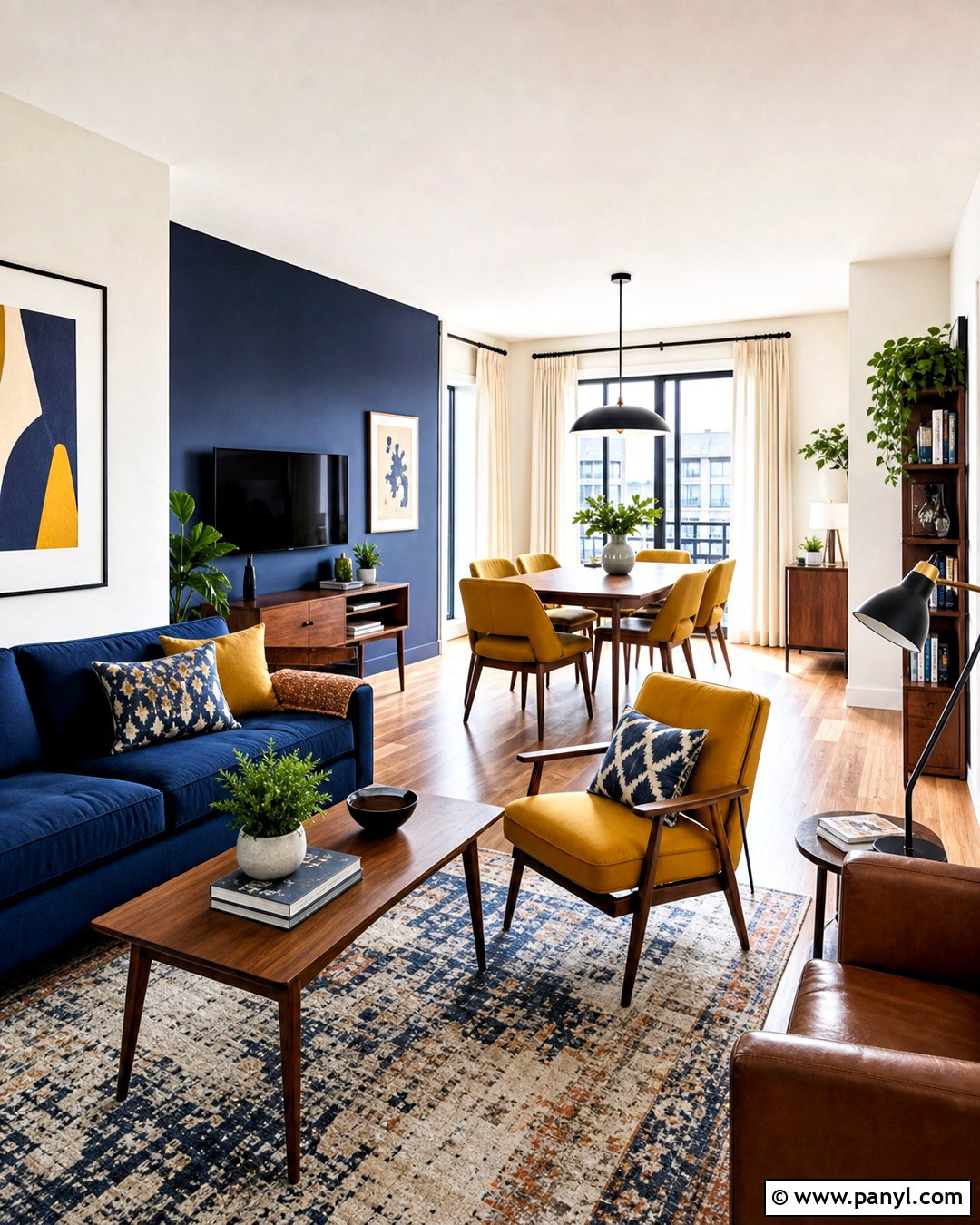
A mustard yellow accent can give periwinkle a confident midcentury character. Paint the living room walls a soft periwinkle and select a streamlined warm gray sofa for balance. Place one mustard lounge chair near a walnut media console, then repeat yellow in a small pillow or abstract print. A cream geometric rug brightens the floor and separates the furniture from darker wood. Choose globe lighting, tapered furniture legs, and simple black frames to reinforce the midcentury direction. Periwinkle should remain the main field of color, while mustard is used selectively for stronger contrast. Add olive or rust only in tiny decorative details. This measured approach produces a colorful complete room that looks intentional, warm, and easy to live with.
13. Periwinkle And Red Color Palette
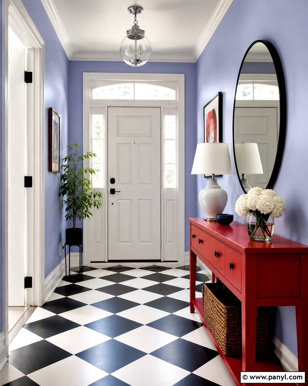
Red gives periwinkle an unexpected, graphic quality that works especially well in an energetic entryway. Paint the walls a clear, light periwinkle and use a cherry-red console or bench as the main focal point. Crisp white trim and a black-and-white checkered floor provide structure around the two colors. Add a round black mirror, polished chrome light fixture, and simple white lamp to maintain a clean appearance. Artwork can repeat small amounts of red, blue, and violet, but avoid filling every surface. A natural woven basket introduces texture and keeps daily items organized. The complete design feels playful yet controlled because red appears on one substantial piece, while periwinkle provides a softer background. This palette suits modern, eclectic, and updated traditional homes.
14. Periwinkle And Black Color Palette

Black accents can make a periwinkle home office look crisp, focused, and contemporary. Use a pale periwinkle wall color throughout the room, then anchor it with a matte black desk and a matching open bookcase. A cream bouclé chair and pale gray rug prevent the darker furniture from feeling severe. Choose a white ceiling, white trim, and light curtains to maximize brightness. Black-framed artwork, a slim task lamp, and organized document boxes repeat the contrast in practical ways. Bring in natural oak through a desktop accessory or narrow cabinet to add warmth. The finished workspace feels calm enough for concentration but still visually distinctive. Keeping decorative objects minimal allows the periwinkle walls and strong furniture outlines to define the complete look.
15. Periwinkle And Powder Blue Color Palette
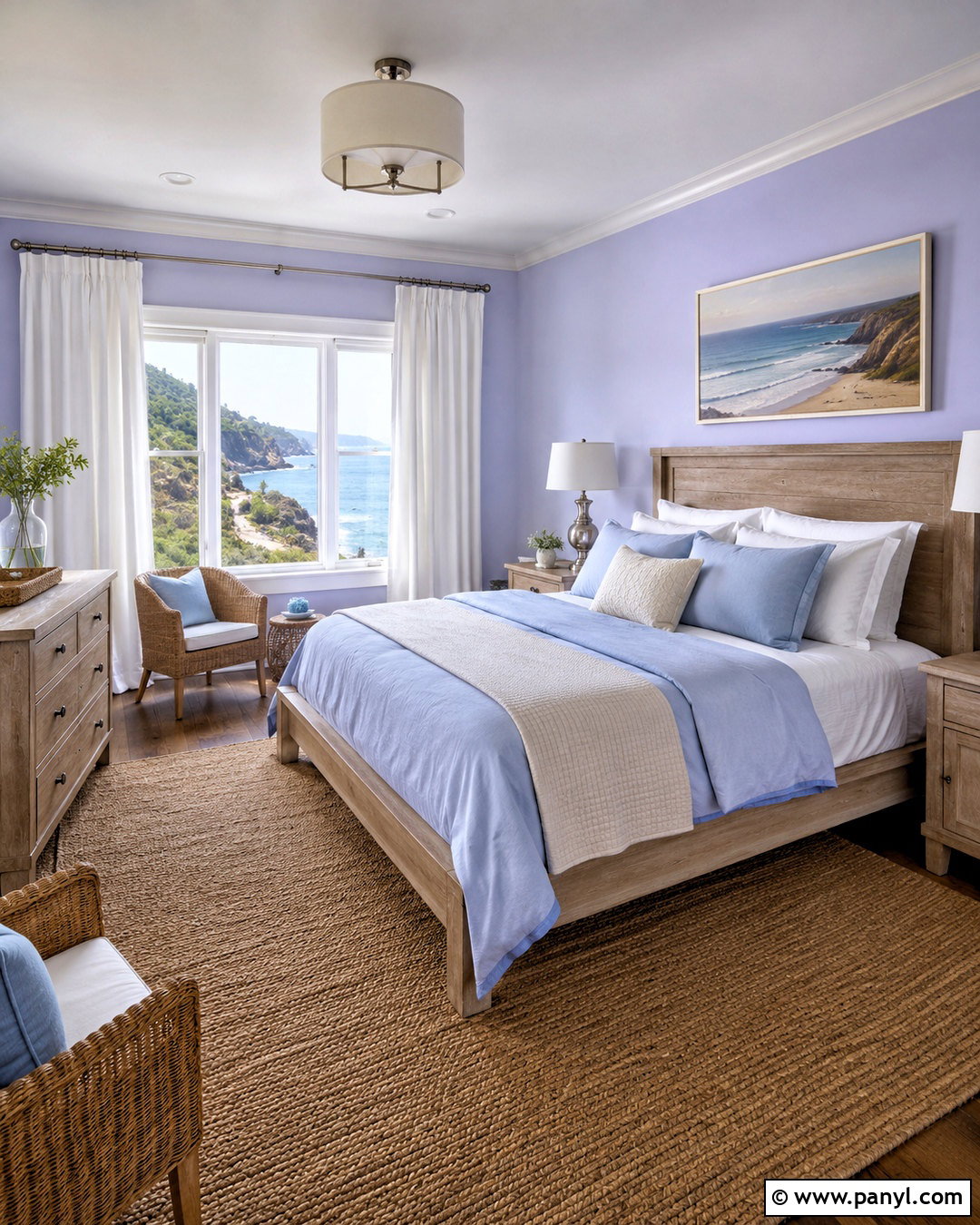
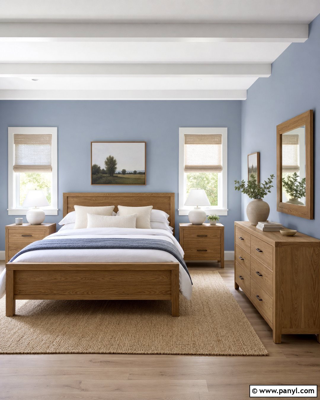
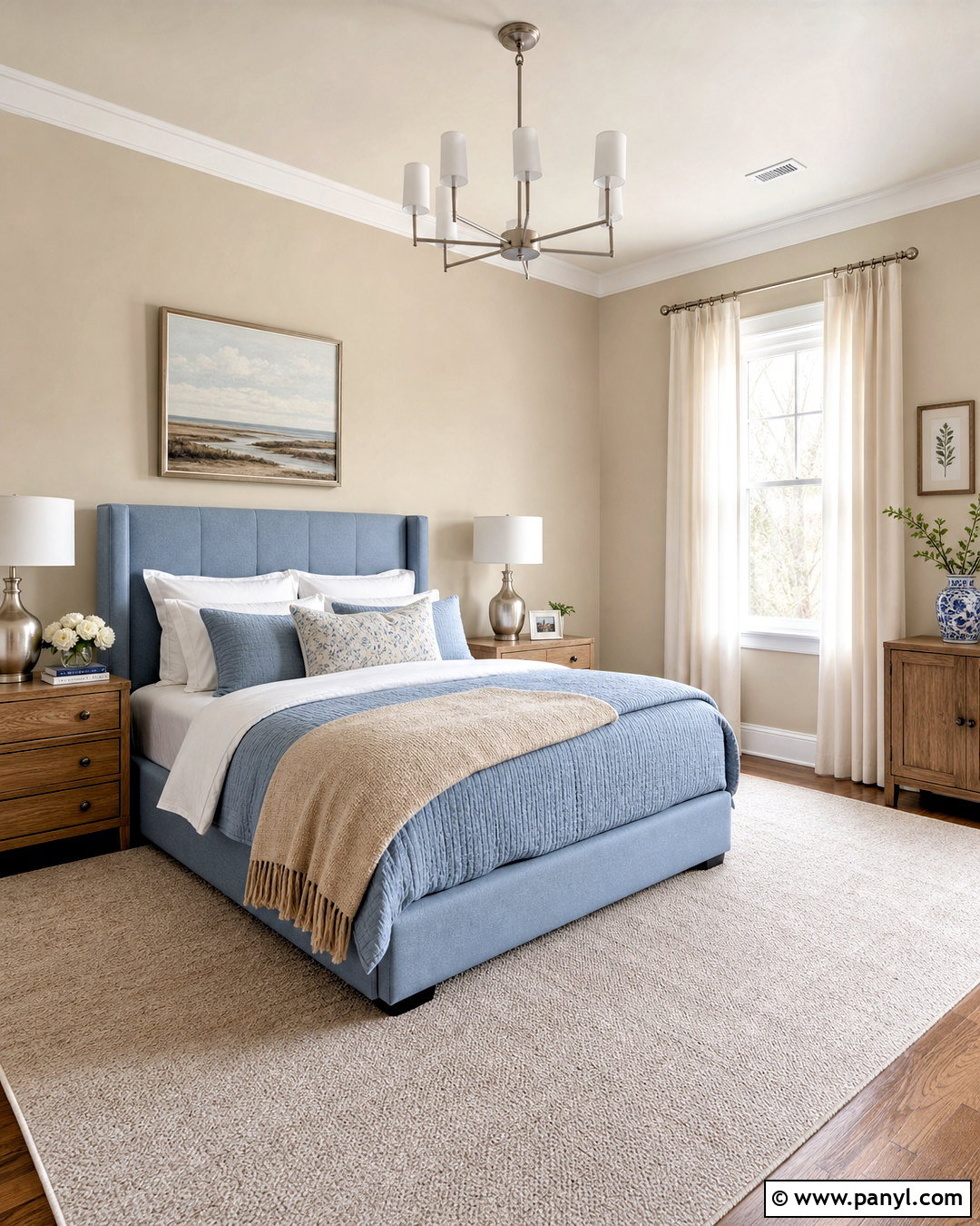
Periwinkle and powder blue create an airy coastal bedroom without relying on obvious nautical decorations. Paint the walls a very light periwinkle and choose powder blue linen bedding layered with white sheets and a cream quilt. A weathered oak bed, woven bench, and natural fiber rug add relaxed texture. Use white curtains that filter daylight and maintain the room’s open feeling. Introduce deeper blue through one striped pillow or a small landscape painting rather than multiple themed accessories. Brushed nickel lamps and clear glass bases keep the finishes light. A pale blue-gray dresser can provide quiet storage while staying within the palette. The completed room feels peaceful, fresh, and connected to the coast through color and natural materials instead of literal motifs.
16. Periwinkle And Chocolate Brown Color Palette
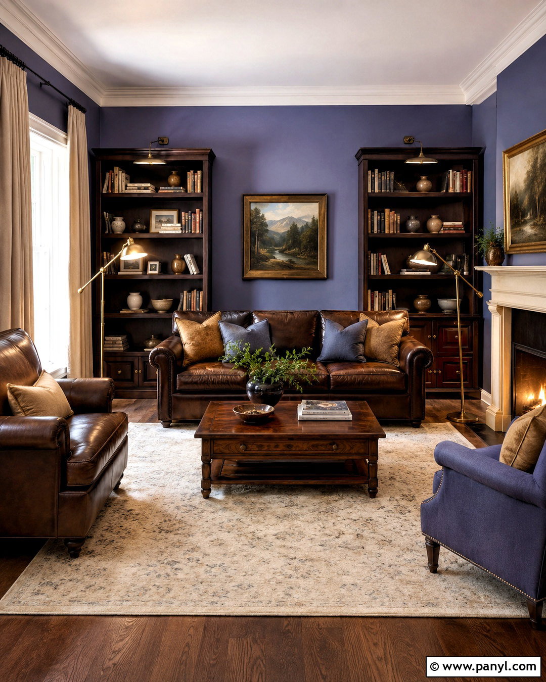
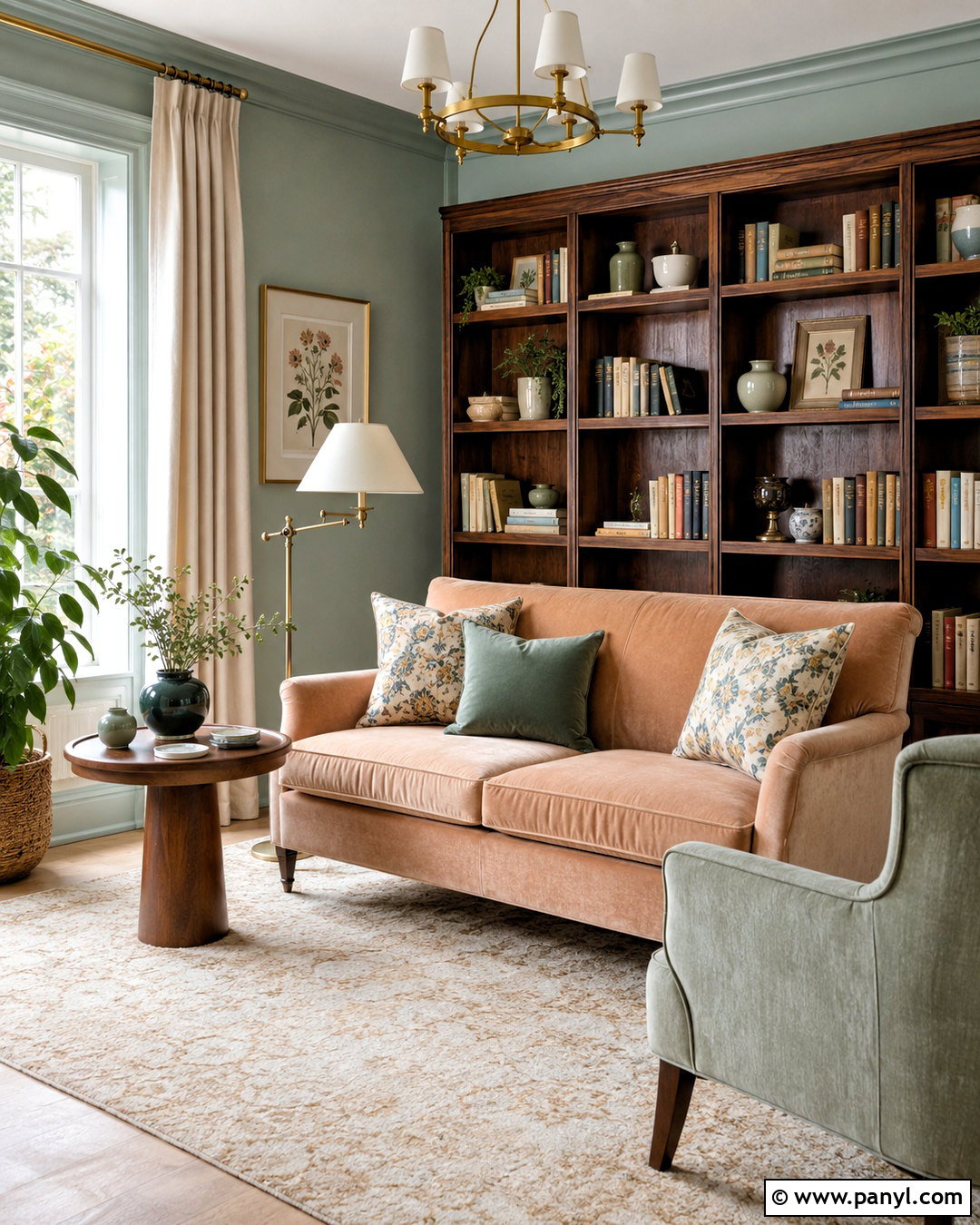
Chocolate brown adds richness to periwinkle and creates a comfortable library-inspired living room. Begin with muted periwinkle walls, then add a deep brown leather sofa and dark wood bookcases. Use a large cream rug to lighten the floor and define the seating arrangement. Linen curtains in warm beige soften the windows, while brass floor lamps bring gentle warmth near the darker furniture. Include pillows in periwinkle, camel, and ivory to connect the sofa with the walls. Traditional artwork and a walnut coffee table reinforce the cozy character. Avoid using dark brown on every surface; leaving the ceiling, trim, and textiles lighter preserves balance. This complete palette feels substantial and inviting, making it well suited to dens, libraries, and formal family rooms.
17. Periwinkle And Apricot Color Palette
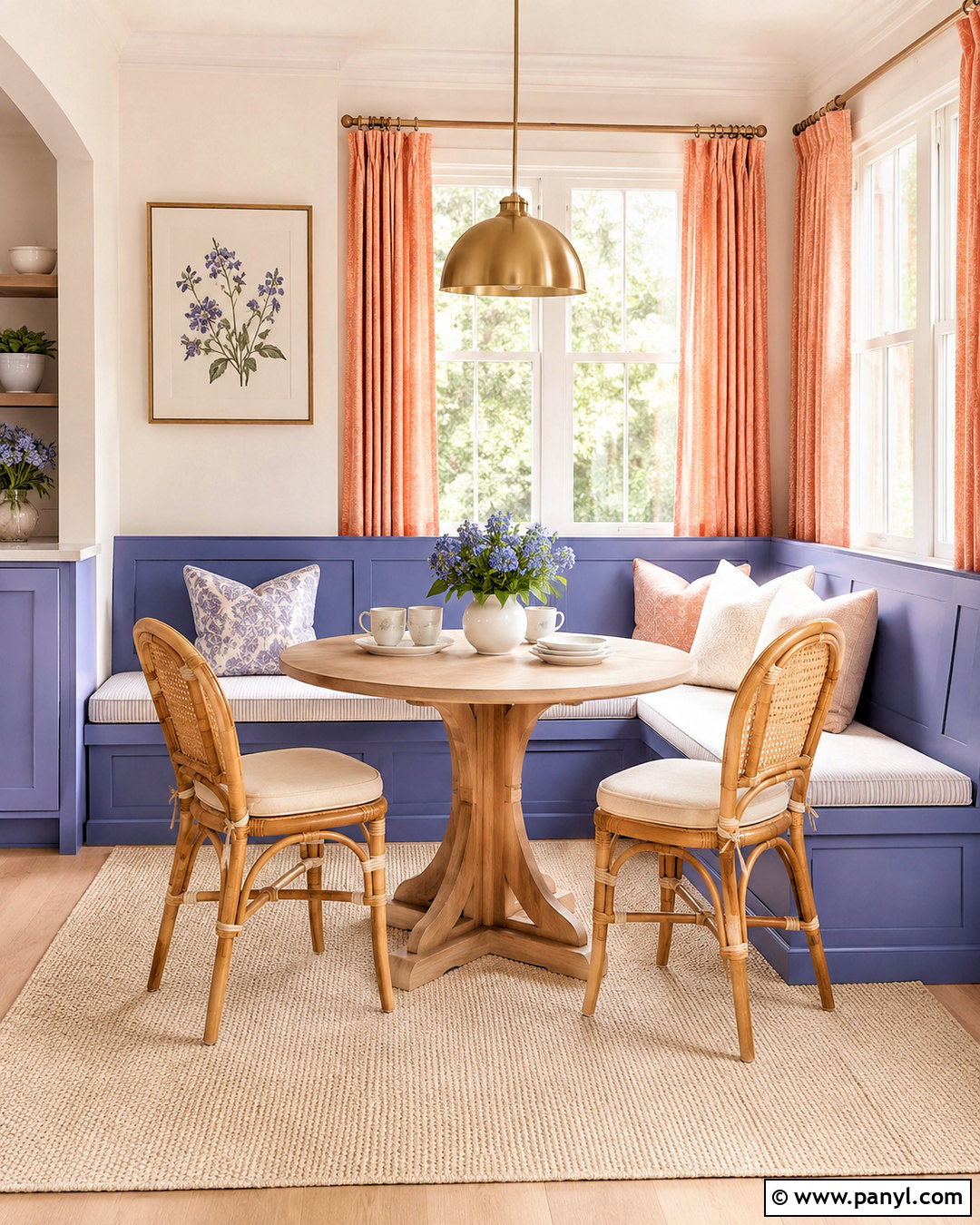
A soft apricot and periwinkle scheme creates a welcoming breakfast nook with a gentle sunrise quality. Paint a built-in banquette periwinkle or use the color on its upholstered cushions. Pair it with apricot curtains, warm white walls, and a pale oak pedestal table. Cream seat cushions and a washable beige rug keep the stronger colors from overwhelming the small area. Add brushed brass lighting and white ceramic dishes for a simple, polished finish. A botanical print containing peach, lavender-blue, and green can tie the palette together above the seating. Keep window treatments lightweight so natural light reaches every corner. The completed nook feels cheerful and intimate, combining cool and warm pastels with practical materials that can handle daily meals.
18. Periwinkle And Olive Green Color Palette
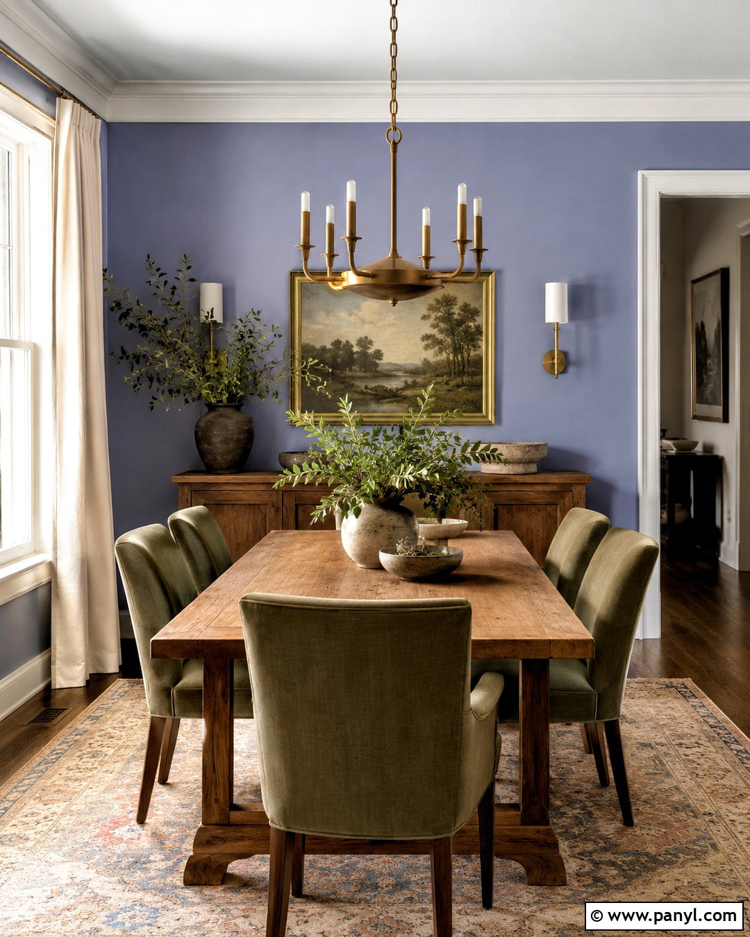
Periwinkle and olive green form a grounded, nature-inspired dining room with a slightly traditional mood. Use periwinkle on the walls, olive upholstery on the dining chairs, and a medium oak table as the central neutral. Cream curtains and an off-white ceiling maintain brightness around the earthier green. Introduce natural stone through a sideboard lamp or decorative bowl, then add aged brass lighting above the table. A vintage-inspired rug containing faded olive, blue-violet, tan, and rust can unify the entire room. Keep accessories simple with ceramic vases, greenery, and framed landscape prints. Olive gives the lighter periwinkle more weight, while wood and stone prevent both colors from appearing overly polished. The finished scheme feels relaxed, established, and connected to nature.
19. Periwinkle And Silver Color Palette
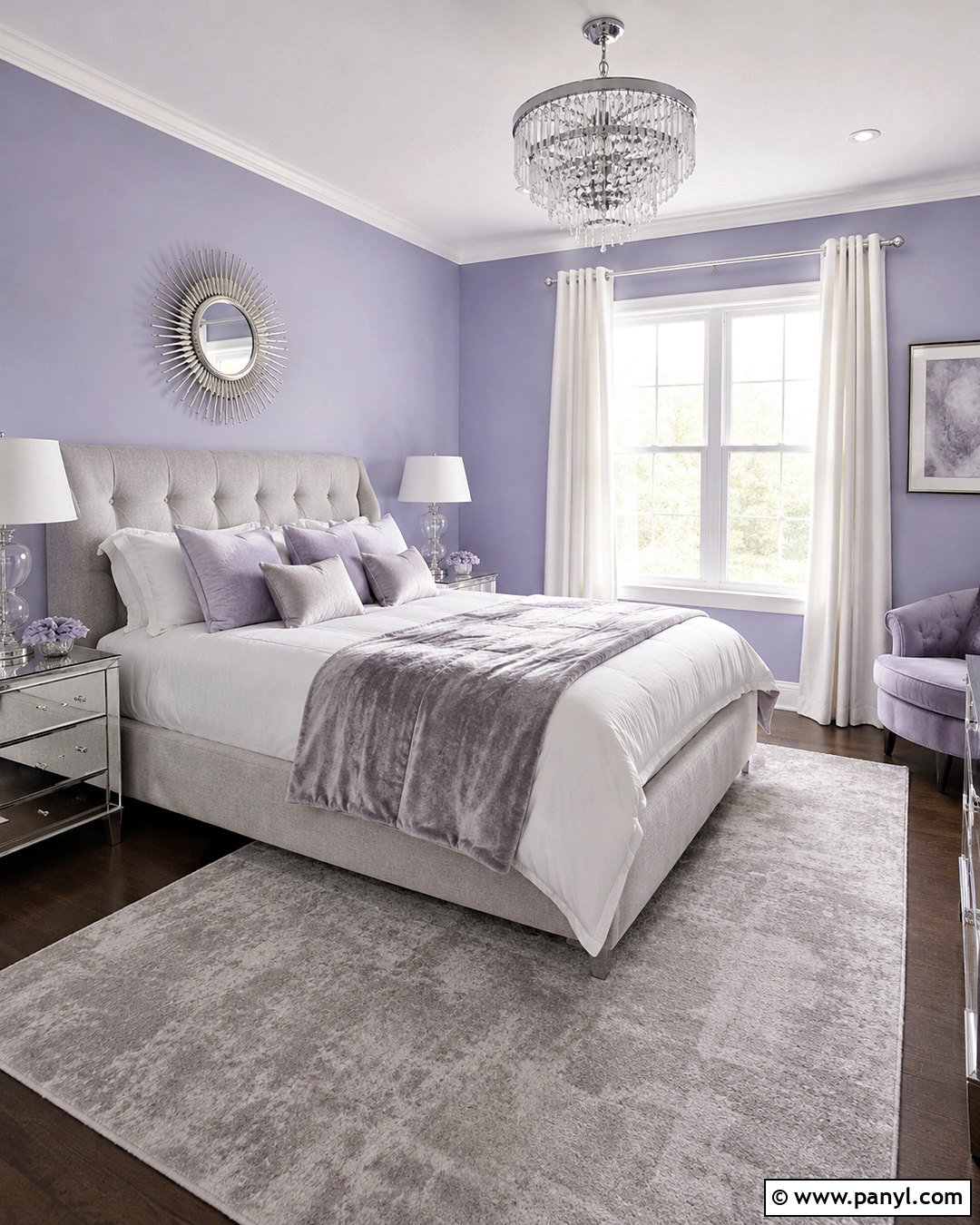
Periwinkle and silver create a polished guest bedroom with a subtle glamorous finish. Paint the walls a medium-light periwinkle and choose a tall light gray upholstered bed with clean lines. Add white bedding, a silver-gray velvet blanket, and pillows in periwinkle and pale lavender. Mirrored nightstands or brushed nickel tables reflect light, while crystal or glass lamps add sparkle without introducing another strong color. Ground the room with a soft gray rug and white curtains. One dark charcoal pillow can provide necessary definition near the center of the bed. Keep decorative accessories restrained so the reflective surfaces remain elegant rather than flashy. The completed bedroom feels luminous, comfortable, and refined, offering guests a memorable space that still encourages rest.
20. Periwinkle And Plum Color Palette
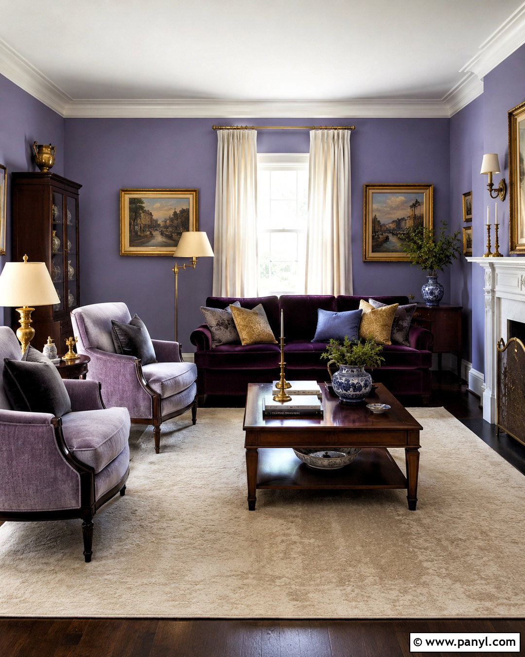
For a dramatic finish, pair periwinkle with deep plum in a sophisticated sitting room. Use medium periwinkle on the walls and select a plum velvet sofa as the room’s strongest feature. Balance these purple-blue shades with an ivory rug, warm white curtains, and a walnut coffee table. Antique brass lamps and picture frames introduce warmth, while a few muted gold pillows add gentle contrast. Choose artwork containing cream, plum, periwinkle, and charcoal to connect the room’s colors. A dark wood cabinet can provide additional weight along one wall. Keep the ceiling and trim light to prevent the design from feeling enclosed. This complete palette demonstrates how periwinkle can support rich, adult interiors when combined with deeper tones and classic materials.
Conclusion:
The most successful periwinkle color palette balances its cool blue-violet character with thoughtful supporting shades, varied textures, and practical neutrals. Ivory, cream, and warm wood create an easy foundation, while sage, powder blue, or lavender produce a softer tonal look. For greater contrast, consider mustard, coral, terracotta, red, navy, or plum. Apply the colors across the entire room rather than treating periwinkle as an isolated accent. Walls, furniture, flooring, textiles, lighting, and decorative pieces should feel connected. Before committing, test paint samples beside permanent finishes throughout the day. With the right balance, these 20 periwinkle color palette ideas can inspire rooms that feel distinctive, comfortable, and beautifully coordinated.

Related Ideas and Inspiration:

Leave a Reply