
A well-planned color scheme can make a home feel connected, comfortable, and thoughtfully finished. These 20 colour palette ideas offer complete decorating looks rather than random combinations of attractive shades. Each palette brings walls, furniture, flooring, textiles, lighting, and decorative accents together in a practical way. You will find warm neutrals, earthy greens, coastal blues, dramatic jewel tones, and playful pastels that suit many rooms and decorating preferences. Before choosing, observe how natural and artificial light affect color throughout the day. Test samples beside existing flooring, cabinets, and upholstery so every shade works together. Whether you are refreshing one room or planning a coordinated home, explore these 20 colour palette ideas for a look you can confidently recreate.

1. Warm Beige Color Palette
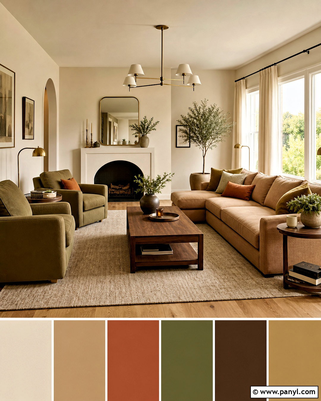
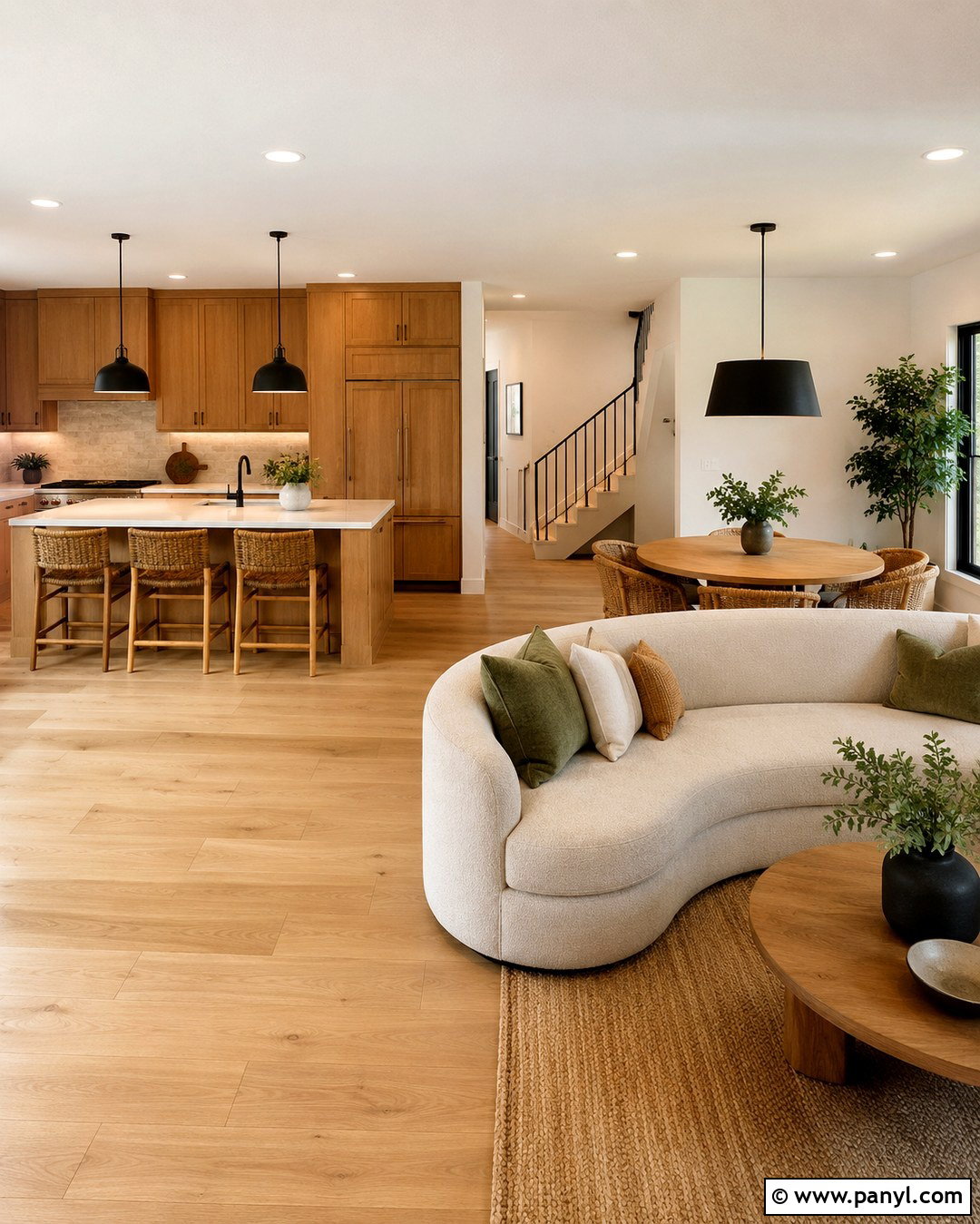
Warm beige creates a relaxed foundation without making a room feel plain or washed out. Paint the walls a creamy beige, then introduce a slightly deeper camel shade through a linen sofa or upholstered bed. Natural oak flooring and woven jute add gentle variation while preserving the calm look. Use ivory curtains, oatmeal pillows, and a soft taupe rug to build comfortable layers. Walnut side tables provide definition, while aged brass lighting brings a subtle glow. A few accents in muted rust or olive green keep the palette from becoming too predictable. This complete scheme works especially well in living rooms and bedrooms where softness matters. Choose textures with visible weaves and natural grain so the neutral colors remain interesting.
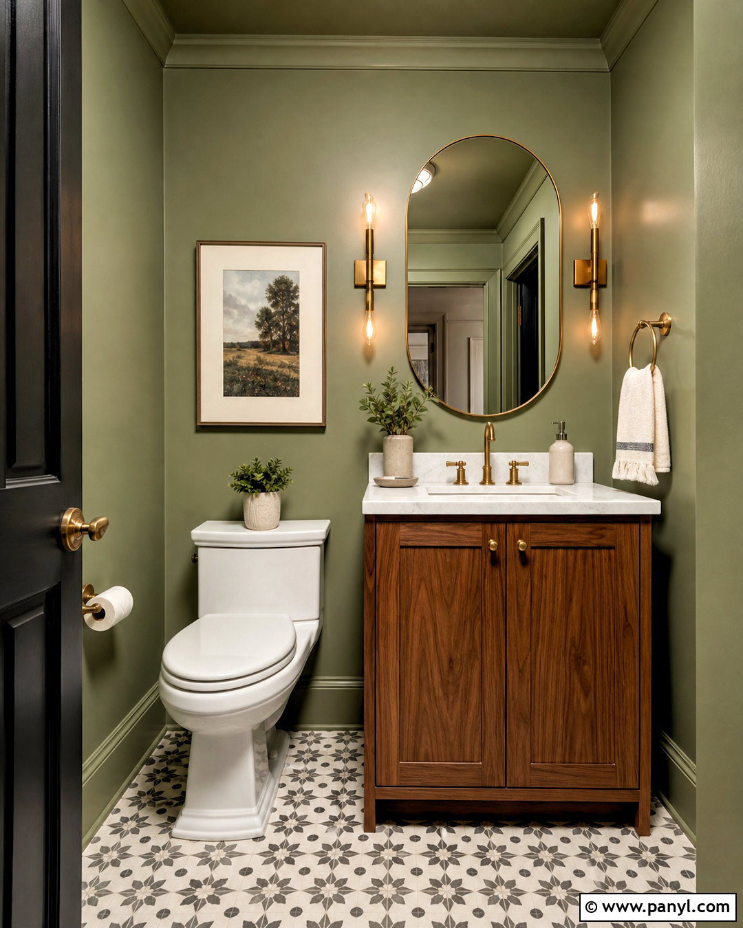
2. Sage Green Color Palette
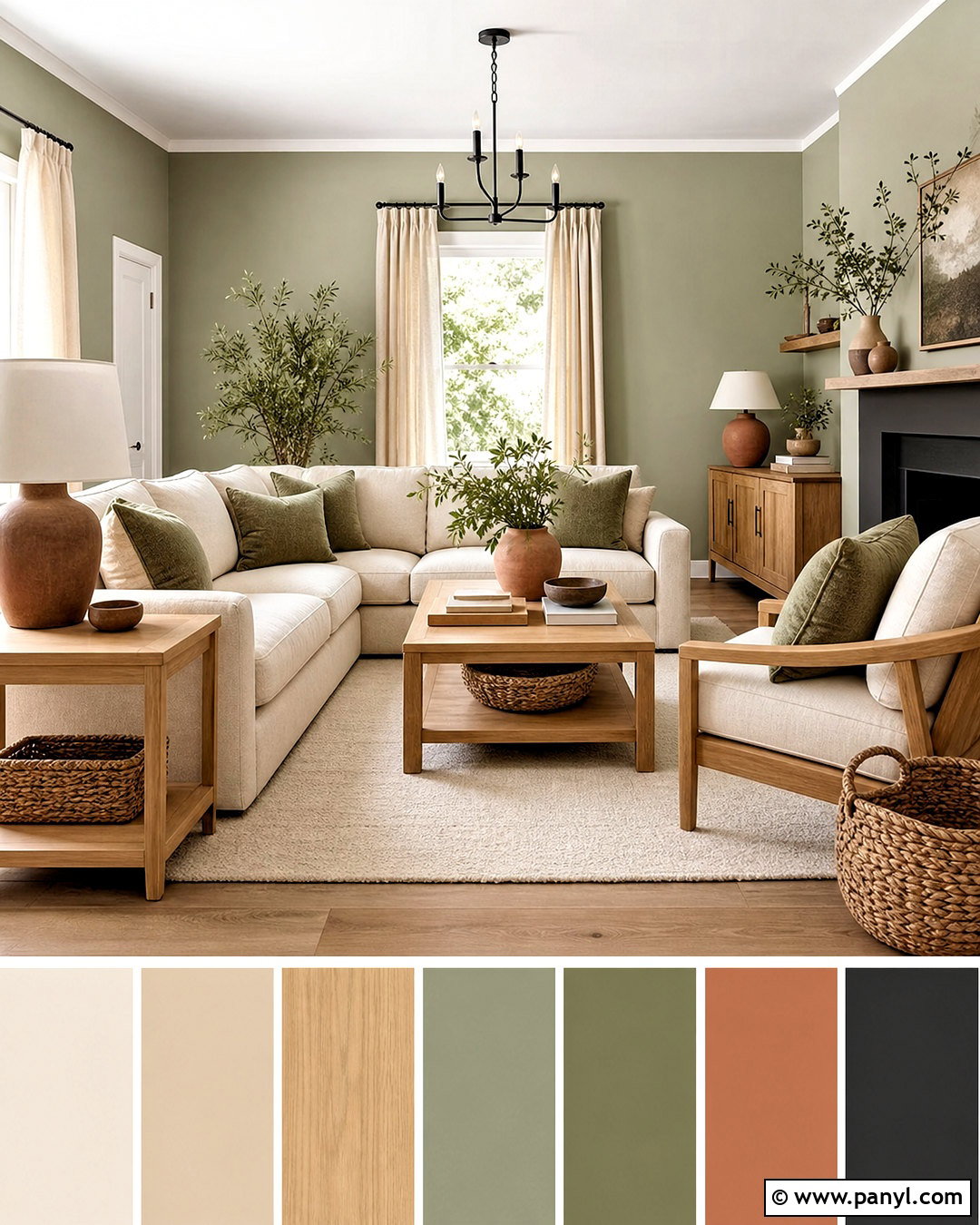
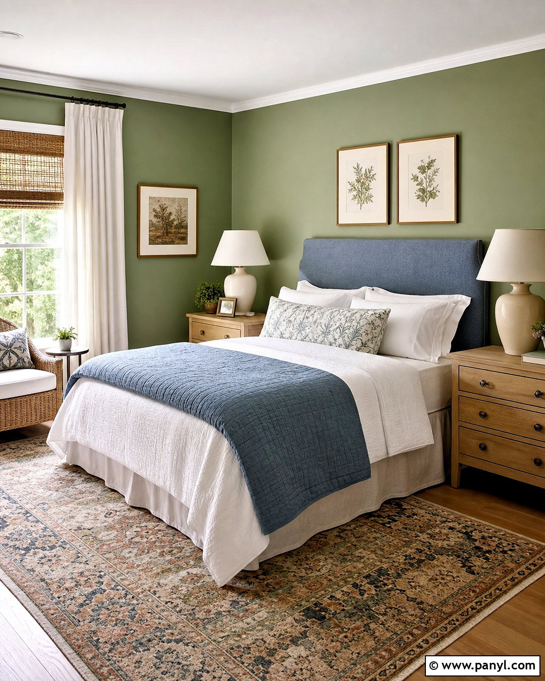
Soft sage green brings the peaceful feeling of a garden indoors while remaining easy to decorate around. Cover the walls in a warm, muted sage and pair them with cream upholstery, light oak furniture, and an ivory wool rug. Add darker olive green through pillows, botanical artwork, or a painted cabinet to create depth. Small touches of dusty terracotta provide a warm contrast without overpowering the room. Linen curtains, ceramic lamps, and woven baskets reinforce the natural character of the palette. Matte black hardware can outline the softer shades and give the arrangement a modern finish. Keep the ceiling and trim warm white rather than brilliant white. The result is a cohesive living space that feels fresh, grounded, and comfortable in every season.
3. Navy Blue Color Palette
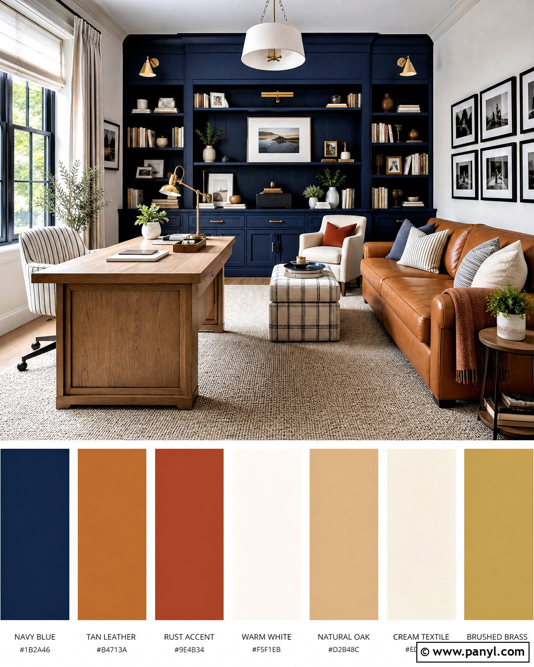
Deep navy blue gives a room structure and drama, but lighter finishes keep it from feeling heavy. Use navy on built-in shelving or one main wall, then balance it with warm white on the remaining surfaces. A camel leather sofa, natural oak coffee table, and cream textured rug bring warmth into the scheme. Repeat blue in smaller amounts through striped pillows, patterned curtains, and ceramic accessories. Brushed brass sconces and table lamps stand out beautifully against the darker background. For additional character, introduce muted rust or burgundy in artwork and textiles. Medium-toned wood flooring completes the look without creating harsh contrast. This palette suits a living room, home office, or den that needs to feel polished, comfortable, and visually anchored.
4. Terracotta Color Palette
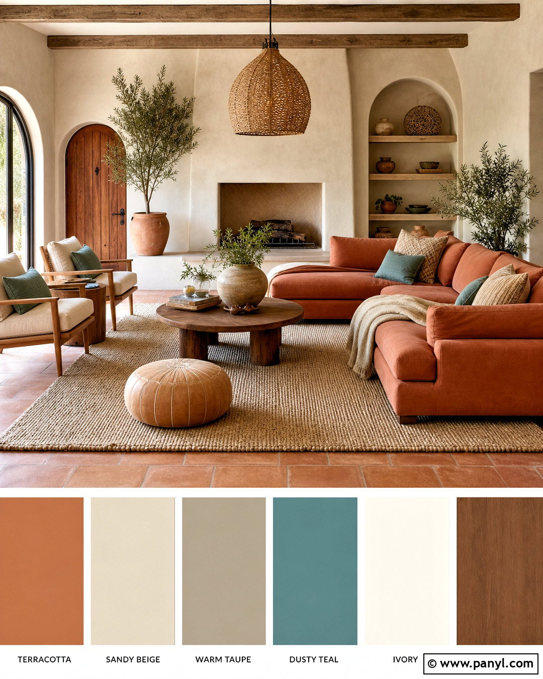
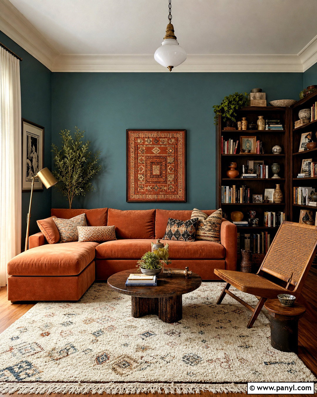
Imagine the warmth of sunbaked clay balanced by soft, chalky neutrals. Begin with light plaster-colored walls and make terracotta the main accent through a sofa, painted fireplace, or generously sized area rug. Pair it with warm cream, sandy beige, and medium walnut so the room feels layered rather than overly orange. A small amount of dusty blue or muted teal creates refreshing contrast. Choose linen curtains, handmade-looking ceramics, woven pendants, and nubby upholstery to support the earthy atmosphere. Black metal should appear only in thin details, such as curtain rods or furniture legs. Indoor greenery adds another natural note. This complete palette creates an inviting dining room or living room with warmth, texture, and a relaxed Mediterranean influence.
5. Olive Green Color Palette
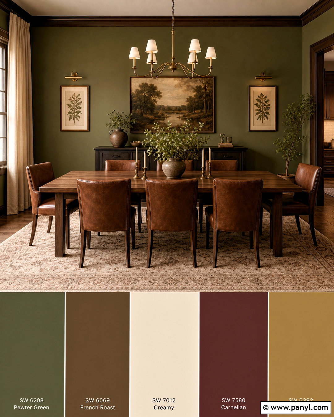
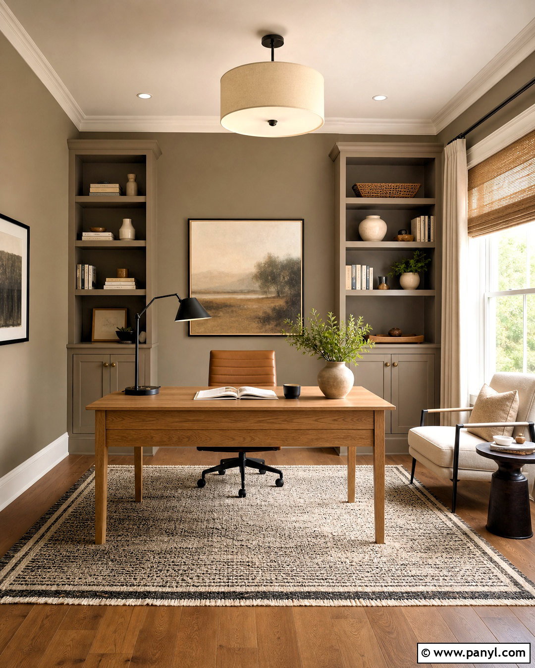
For a richer natural scheme, combine deep olive green with tobacco brown, warm ivory, and aged brass. Olive walls create an enveloping background, especially in a study, dining room, or cozy living room. Add a brown leather chair or walnut dining table to strengthen the earthy character. Cream curtains and a pale patterned rug prevent the darker colors from closing in the space. Use brass picture lights, candle-style fixtures, and framed art to introduce gentle highlights. Burgundy or muted ochre can appear in cushions and decorative objects for added dimension. Keep the ceiling a warm off-white unless the room receives abundant daylight. With substantial wood furniture and tactile fabrics, this palette feels established and collected rather than overly rustic or trend-focused.
6. Soft Blue Color Palette
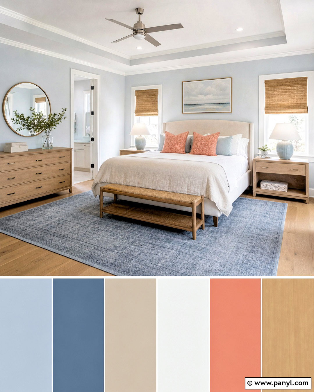
A soft blue palette can make a room feel open, clean, and quietly restful. Paint the walls a pale, slightly gray blue and combine them with warm white trim and natural white upholstery. Light oak furniture adds warmth, while a faded denim rug introduces a stronger version of the wall color. Use sandy beige in woven shades, storage baskets, and pillows to prevent the scheme from looking cold. Small accents in muted coral can bring life to artwork or patterned textiles. Select brushed nickel or soft brass lighting instead of stark black fixtures. Airy cotton curtains and simple ceramic accessories complete the room. This balanced arrangement works well in a bedroom, bathroom, or casual living space where a light but welcoming atmosphere is the priority.
7. Chocolate Brown Color Palette
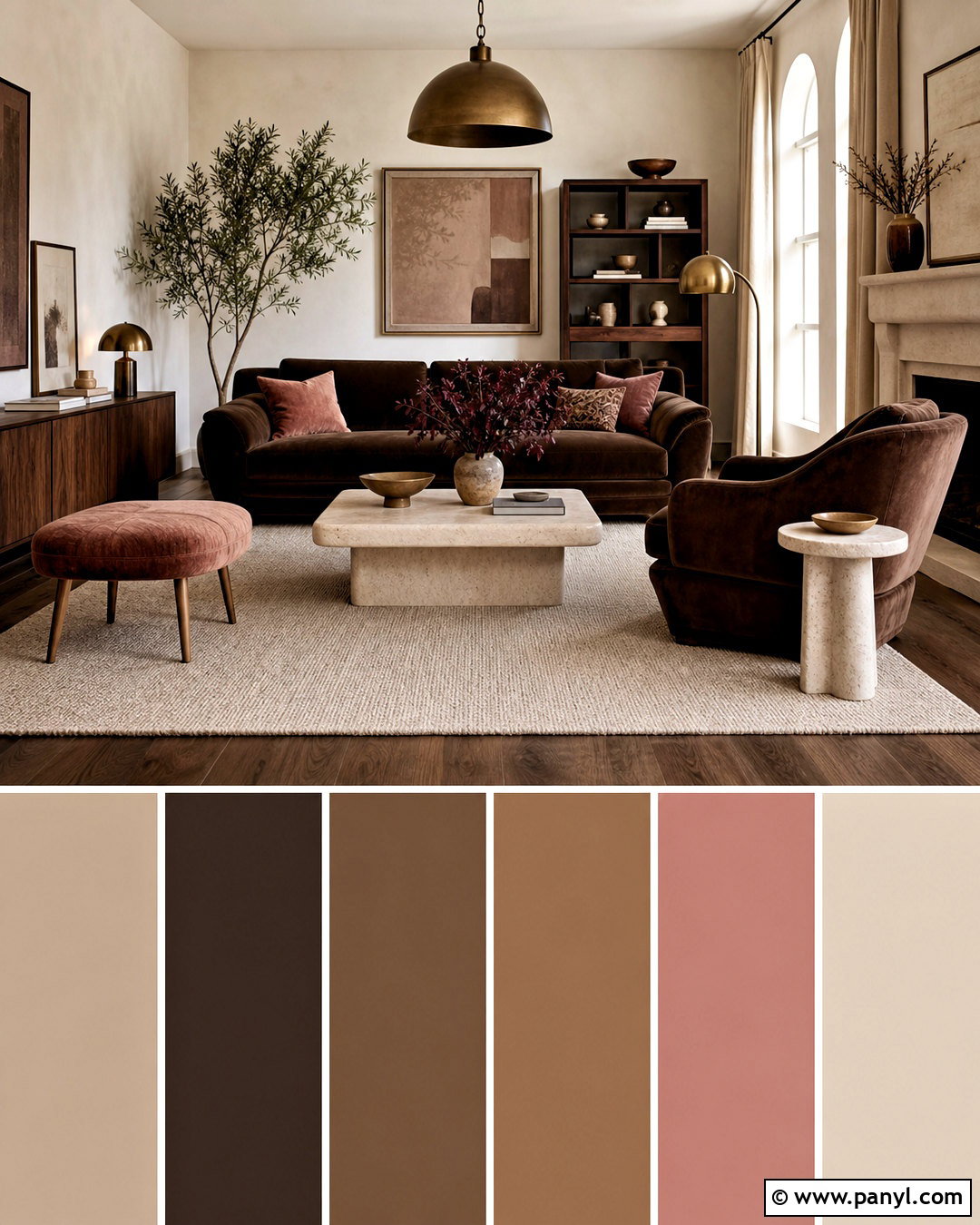
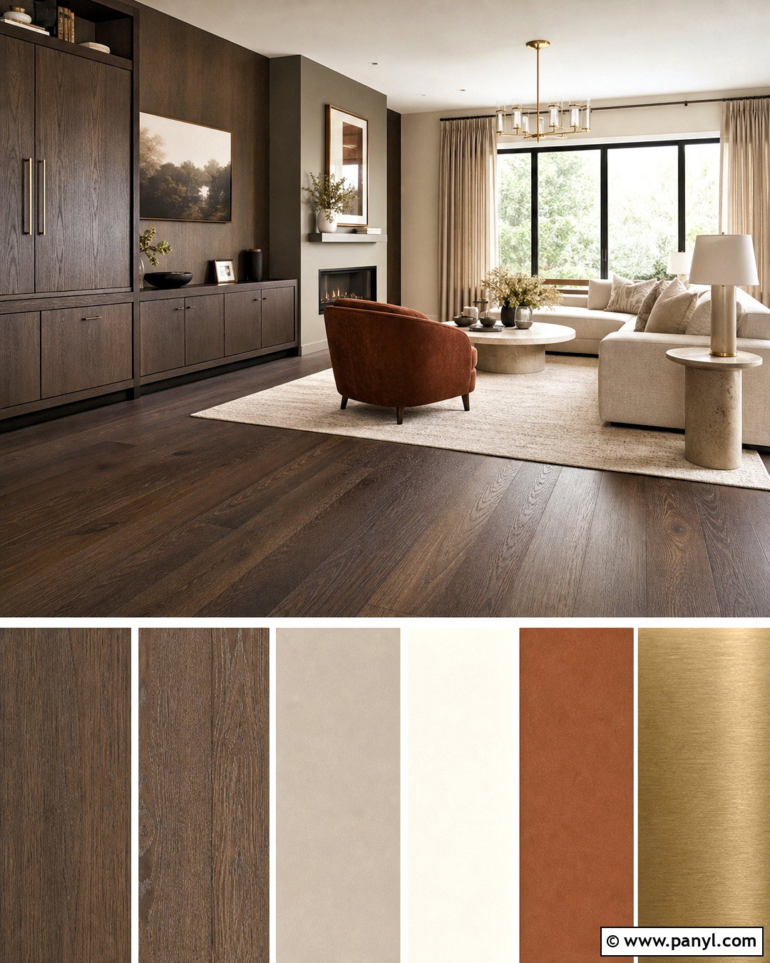
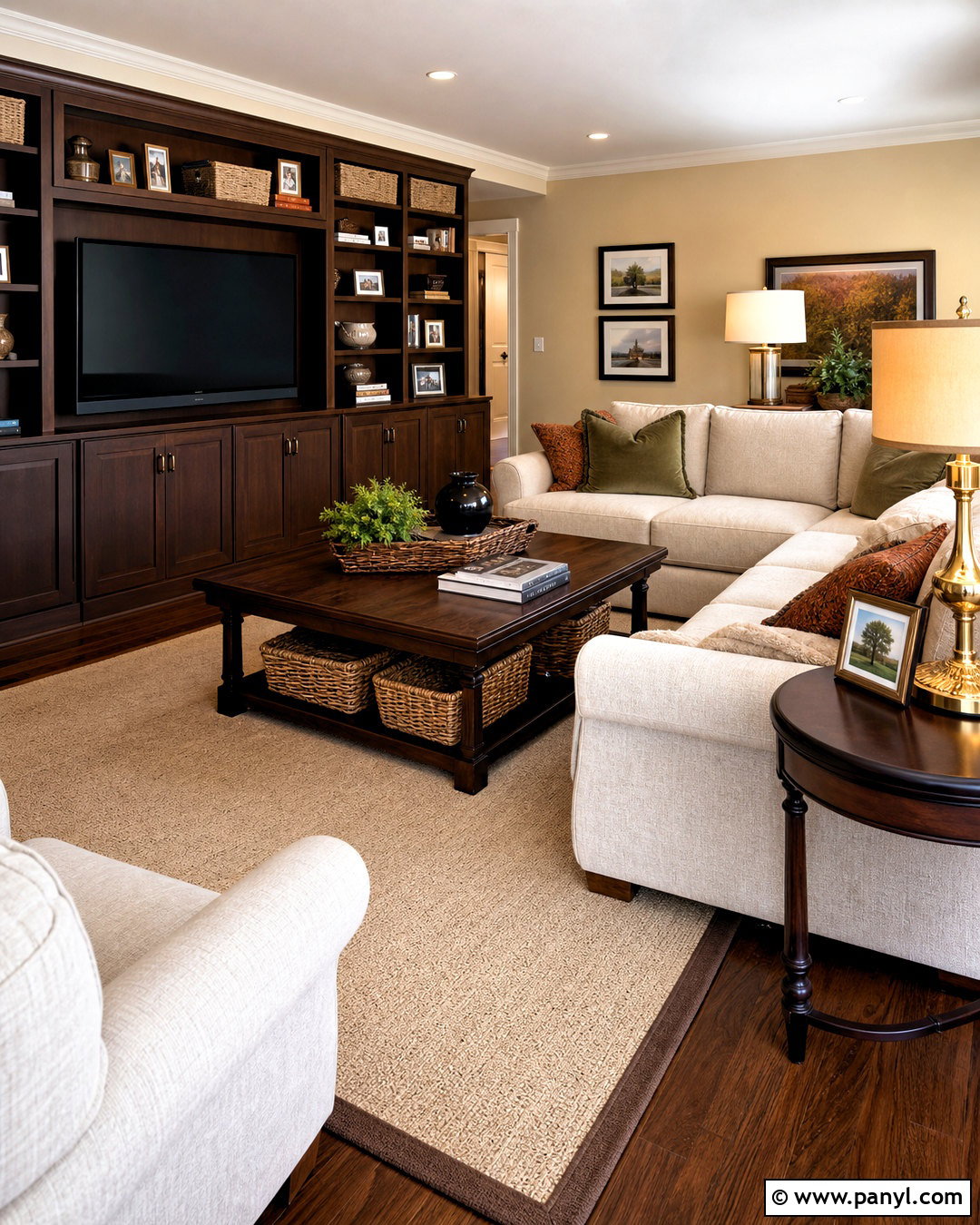
Chocolate brown becomes inviting and sophisticated when it is surrounded by creamy, light-reflective shades. Start with rich brown upholstery, built-in cabinets, or a painted feature wall. Add warm ivory walls elsewhere, along with a large oatmeal rug and flax-colored curtains. Walnut furniture can deepen the palette, while travertine or pale stone introduces a cooler, solid surface. Dusty pink, pale blue, or muted lilac accents soften the brown and give the room a more current personality. Use bronze lighting and sculptural ceramic pieces to maintain the warm finish. Avoid filling every surface with dark wood; leave enough pale space around the main pieces. The finished living room feels cocooning and polished, with a pleasing balance between deep color, natural texture, and gentle contrast.
8. Dusty Rose Color Palette
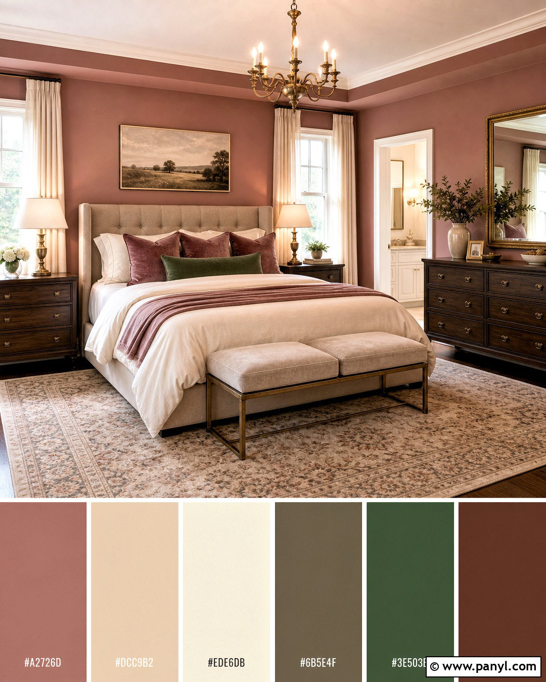
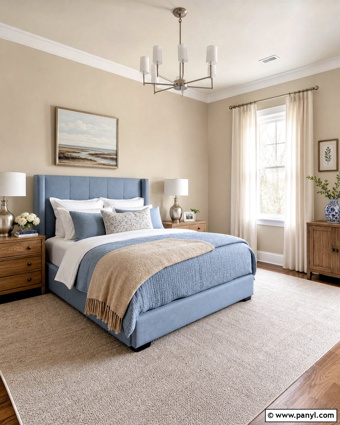
Dusty rose offers warmth without the sugary appearance associated with brighter pinks. Use a muted rose shade on the walls, then layer the room with mushroom taupe, warm cream, and medium brown. A taupe upholstered bed or sofa provides a practical anchor, while rose velvet pillows and patterned curtains repeat the wall color. Dark walnut tables add visual weight, and antique brass lighting gives the palette a softly aged finish. Introduce muted forest green through artwork, a bench, or a few botanical accents for contrast. Keep bedding and larger textiles mostly ivory to preserve a restful balance. This complete palette works beautifully in an adult bedroom, reading room, or elegant sitting area, creating a space that feels soft, grounded, and thoughtfully coordinated.
9. Teal Color Palette
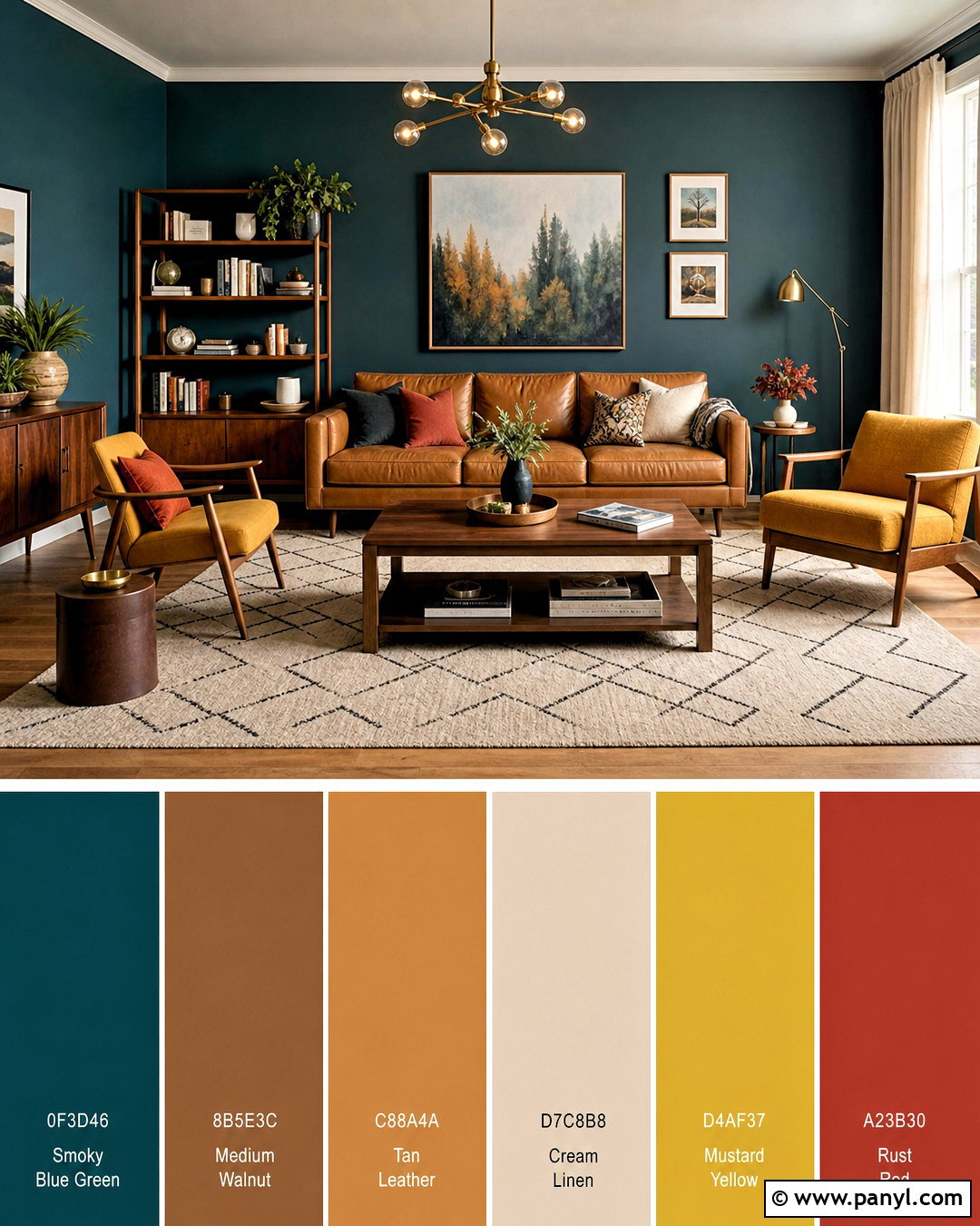
Rich teal can become the centerpiece of a colorful room without dominating every surface. Paint the walls a smoky blue-green, then add a warm tan sofa, medium walnut furniture, and a cream geometric rug. Mustard yellow works well as a controlled accent on an armchair, pillows, or framed art. Include small amounts of rust red to create another warm connection. White or pale linen curtains keep the windows bright, while brass lighting emphasizes the depth of the teal. Choose one or two patterned textiles that combine the main colors rather than scattering unrelated prints around the room. This full living room palette feels energetic yet balanced. It is especially effective in spaces with generous natural light, where teal can display its blue and green undertones clearly.
10. Greige Color Palette
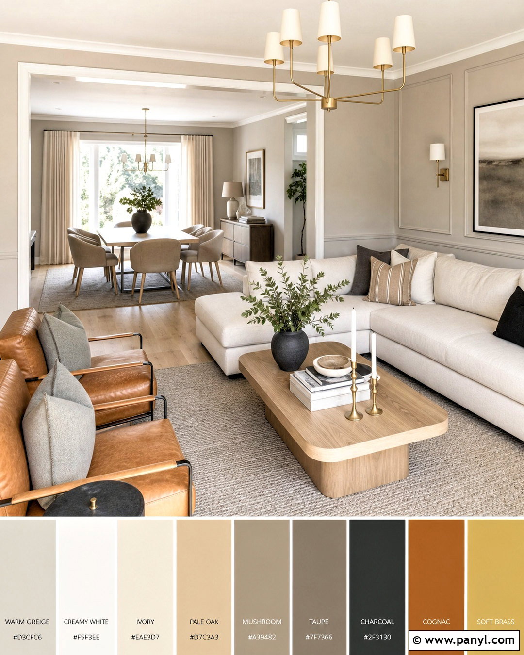
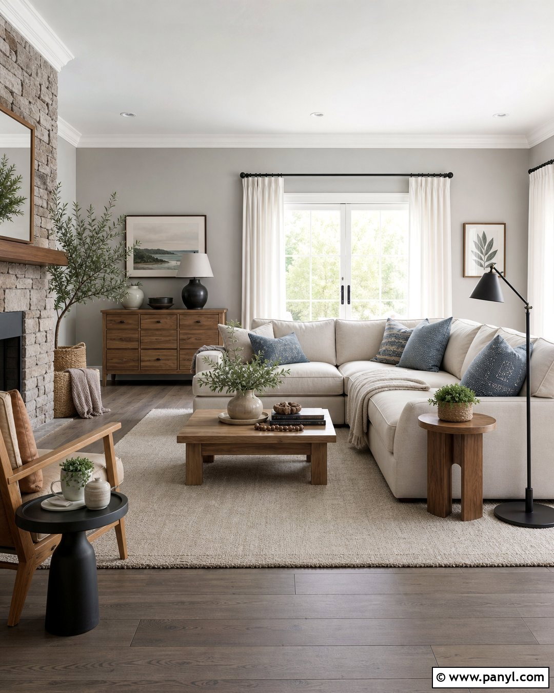
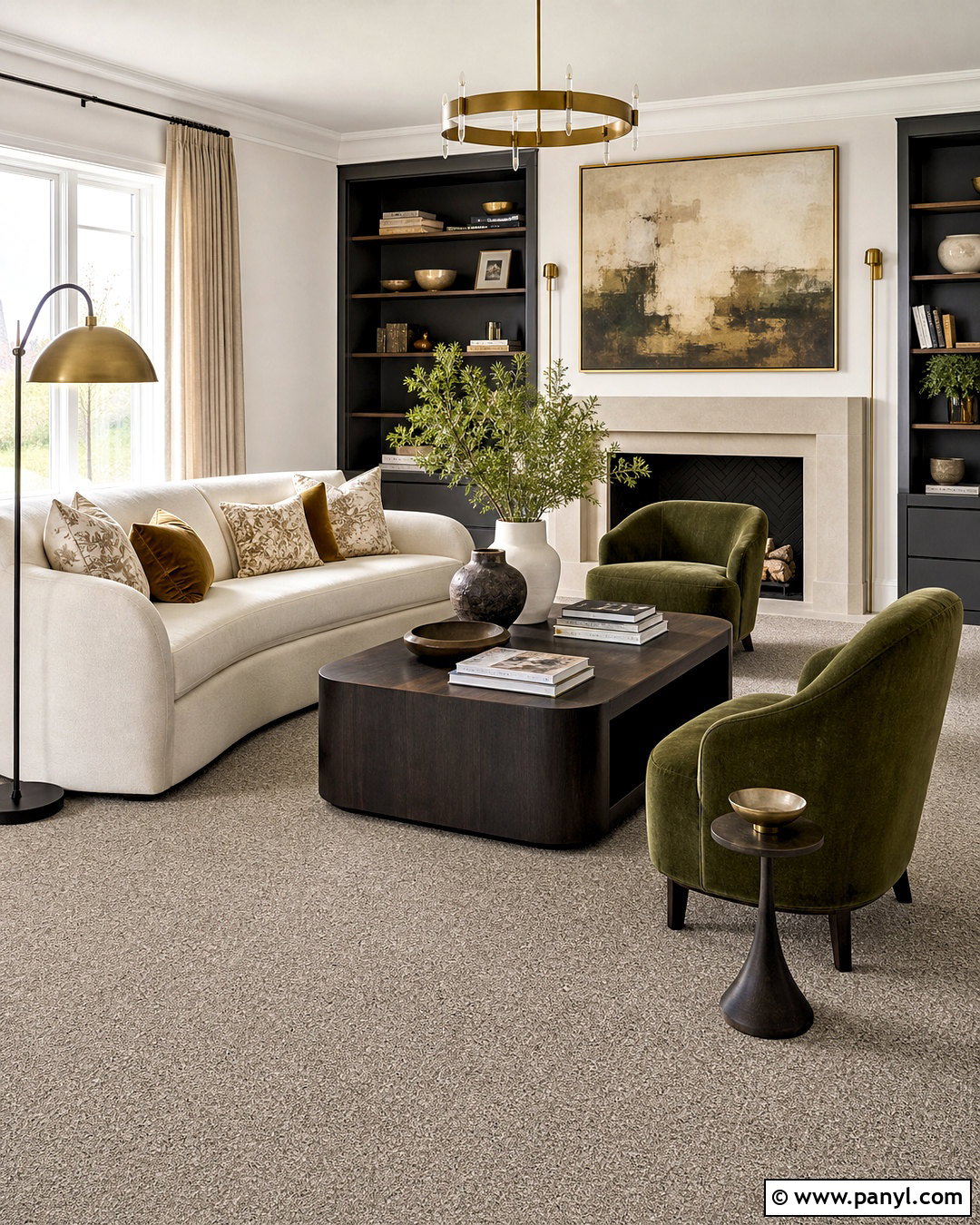
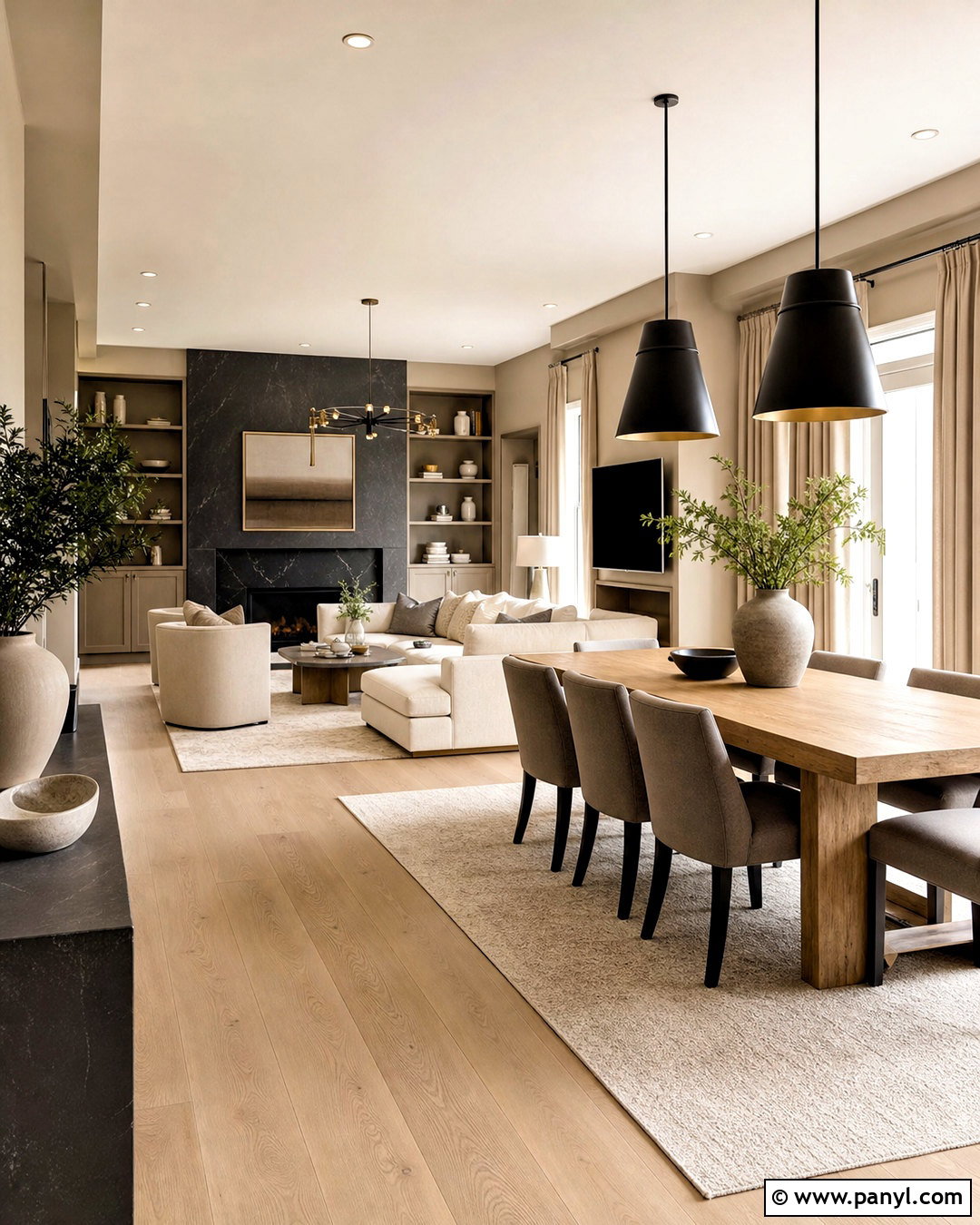
Greige provides a versatile background for a room that needs to feel calm but not completely colorless. Select a warm greige for the walls and pair it with creamy white trim, an ivory sofa, and pale oak furniture. Build depth with mushroom, charcoal, and taupe in rugs, pillows, and upholstered chairs. Black can appear in slender frames, lamp bases, and cabinet hardware, but it should not overwhelm the gentle scheme. Add warmth through cognac leather, woven baskets, and soft brass fixtures. A few muted green branches or ceramic pieces introduce quiet color. This complete palette is ideal for an open living and dining area because the related neutrals flow easily between zones. Varied materials prevent the restrained colors from looking flat or unfinished.
11. Mustard Yellow Color Palette
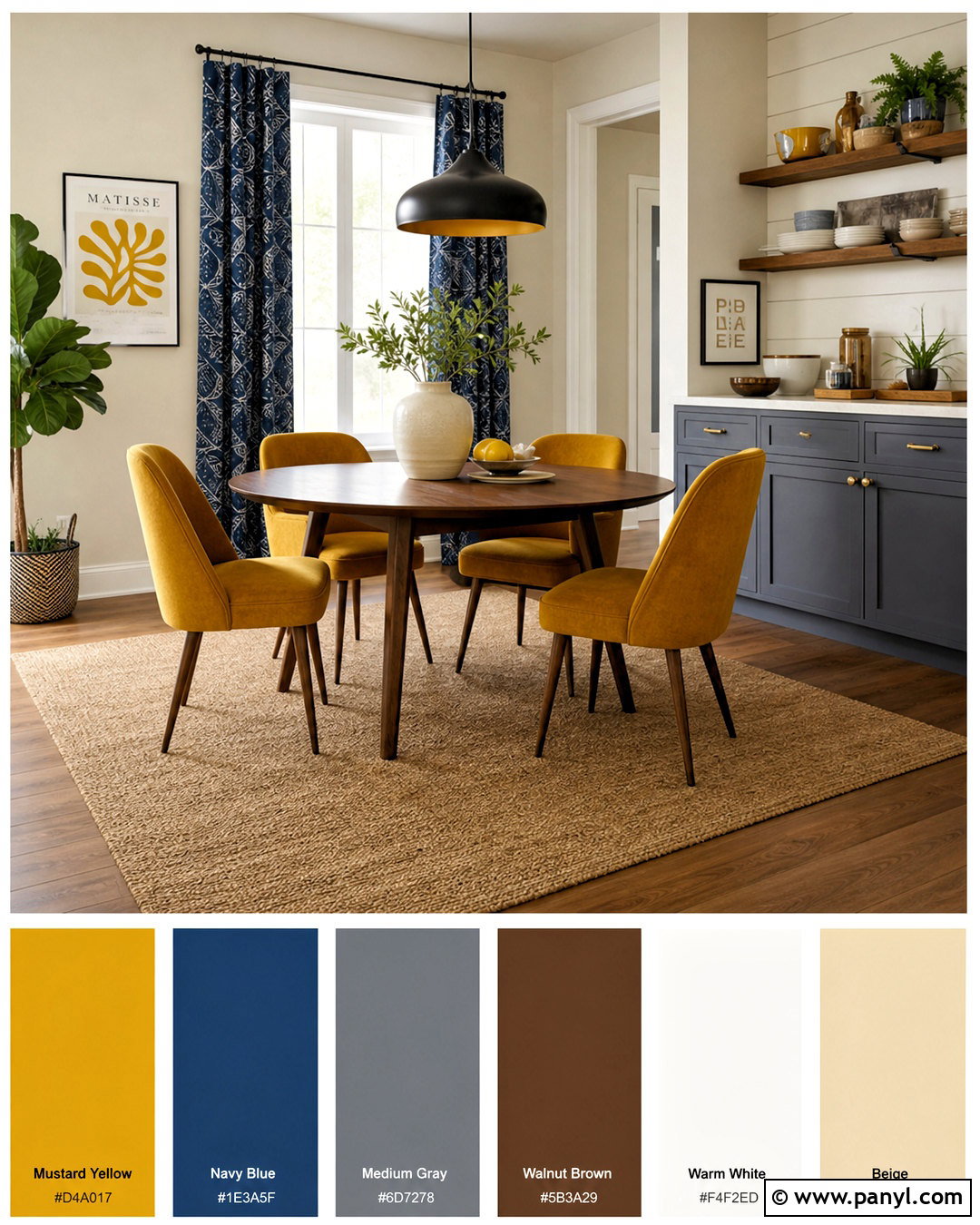
Mustard yellow adds cheerful energy while still feeling grounded and livable. Begin with warm white walls and use mustard on a sofa, upholstered dining chairs, or a painted cabinet. Balance this strong color with medium gray, walnut brown, and creamy beige across the larger surfaces. Deep navy makes an effective accent for pillows, artwork, and patterned curtains. Use a natural fiber rug to soften the arrangement and connect the warm tones. Matte black lighting gives the palette a clean outline, while pottery and wood accessories keep it approachable. Rather than repeating mustard everywhere, allow one large feature and a few smaller details to carry the color. The completed room feels expressive and sunny without becoming overly bright, making it suitable for living rooms, breakfast areas, and creative spaces.
12. Burgundy Color Palette
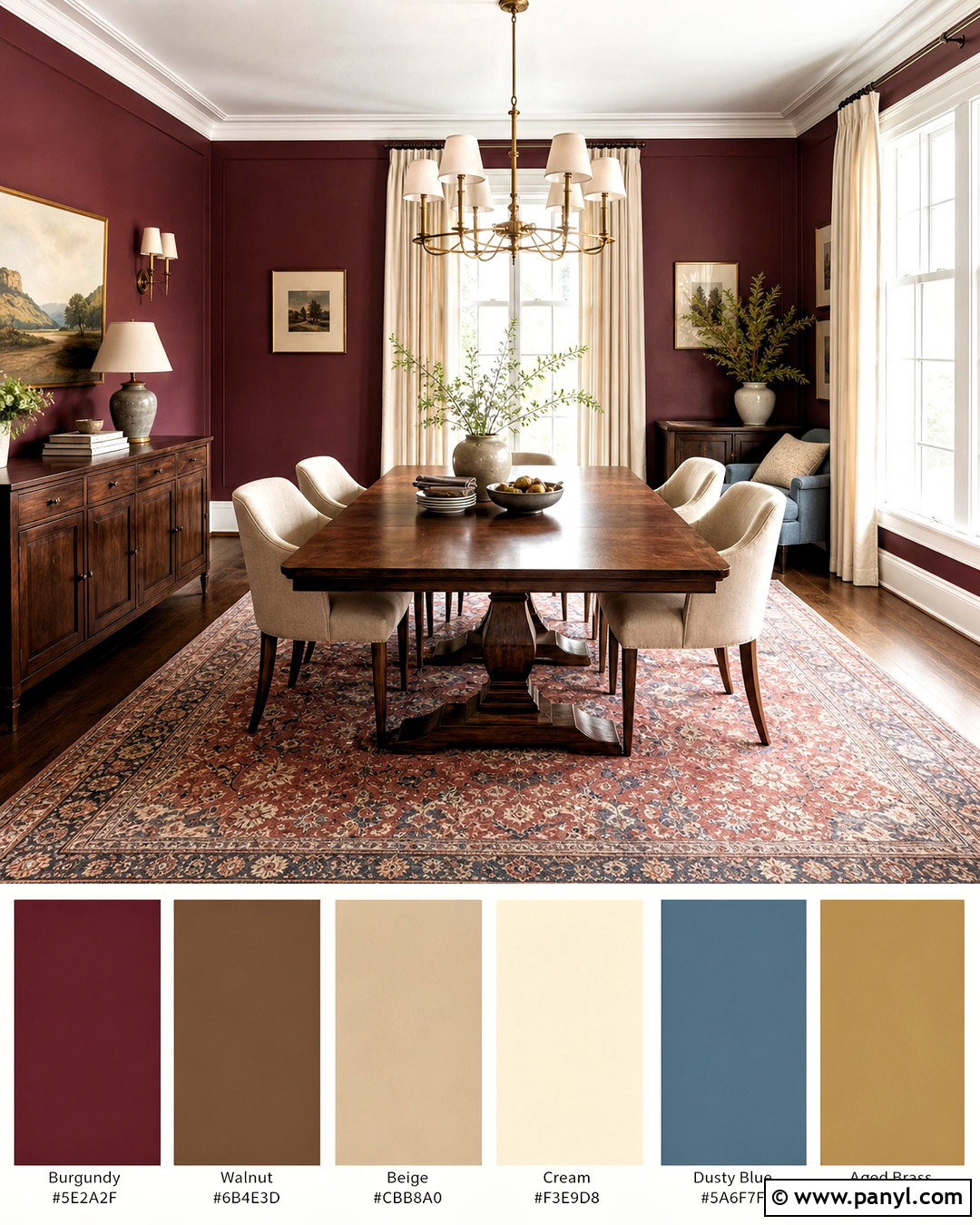
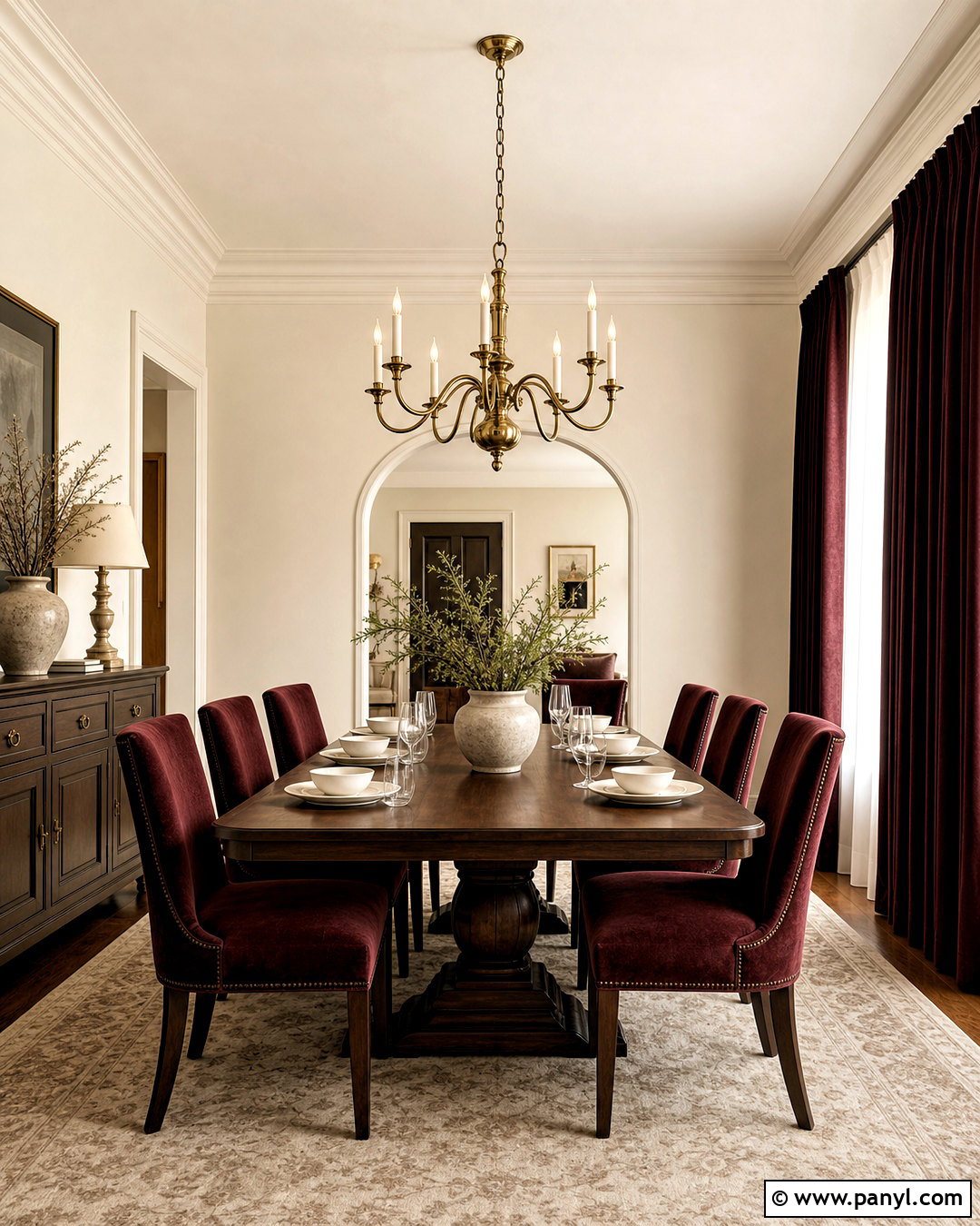
Burgundy brings depth and warmth to a room, especially when it is paired with relaxed neutrals. Use a deep wine-red shade on built-ins, dining room walls, or a substantial velvet sofa. Surround it with warm beige, soft cream, and natural walnut to keep the space welcoming. Muted blush or dusty blue can lighten the arrangement through curtains, seat cushions, and artwork. Choose aged brass fixtures for gentle contrast, then ground everything with a traditional rug that repeats burgundy in small amounts. Cream ceilings and pale upholstery help reflect light around the darker features. This complete scheme suits a dining room, library, or formal living area. The result feels refined and comfortable, with enough natural texture to prevent the strong color from becoming stiff or overly dramatic.
13. Peach And Green Color Palette
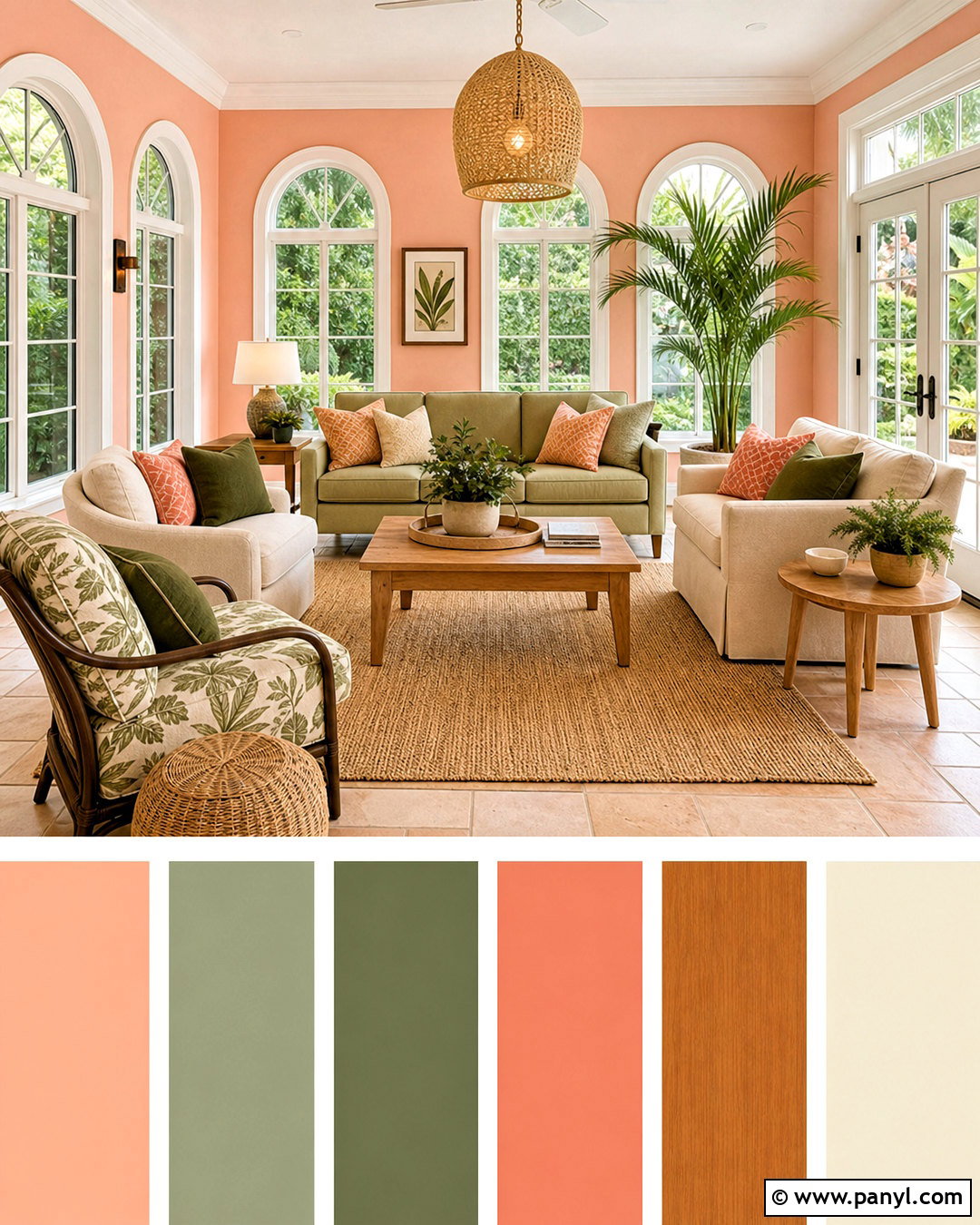
Soft peach and leafy green create a fresh combination that feels cheerful without becoming childish. Paint the walls a light peach with warm undertones, then introduce muted green through an upholstered sofa, painted cabinetry, or generous curtains. Cream furniture and a natural jute rug give the stronger colors room to breathe. Add medium oak tables, woven lighting, and ceramic accessories for a relaxed finish. A few accents in coral can deepen the peach, while dark olive provides definition around the softer greens. Keep patterns limited to one botanical fabric or a simple striped textile. This complete palette works well in a sunroom, breakfast nook, bedroom, or casual living room. Natural light enhances its garden-inspired quality and keeps both colors feeling clear and balanced.
14. Black And Cream Color Palette
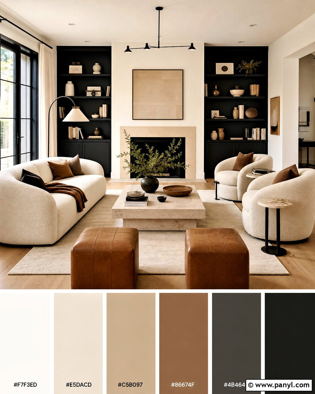
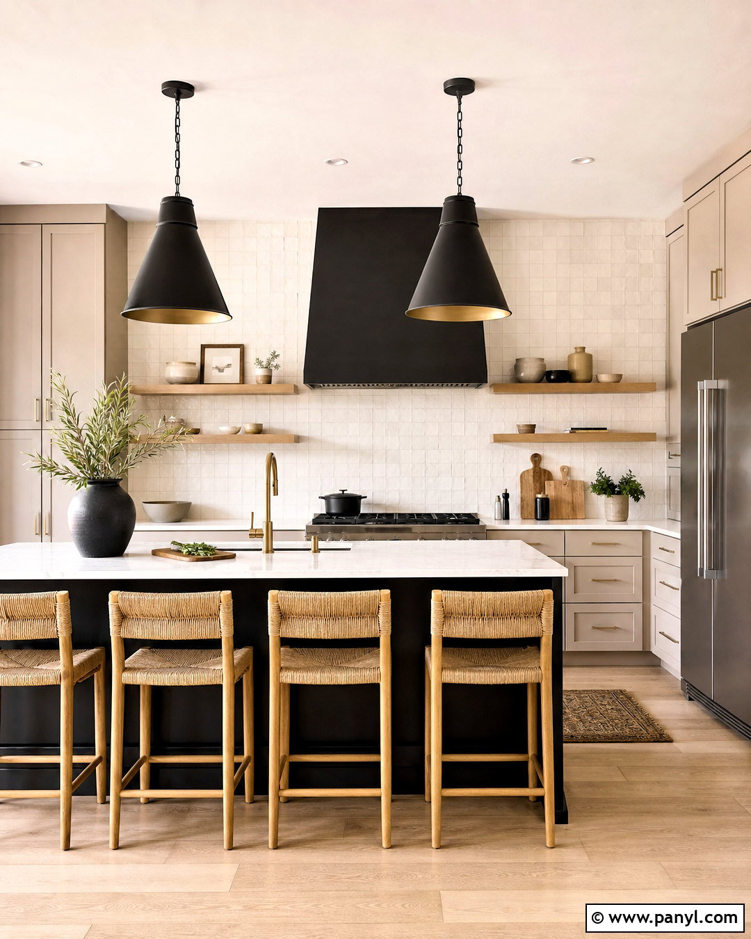
Could a mostly neutral room still feel bold? A black and cream palette creates strong contrast while remaining easy to personalize. Use creamy white on the walls and choose one large black feature, such as built-in shelves, kitchen cabinets, or a fireplace surround. Balance it with cream upholstery, pale stone surfaces, and a light wool rug. Medium oak flooring prevents the room from feeling stark, while cognac leather adds another warm bridge between the extremes. Repeat black through window frames, lighting, and slender furniture legs. Choose soft linen, boucle, and woven materials to offset the sharper lines. This complete scheme suits modern living rooms, dining rooms, and kitchens. Warm bulbs and natural materials are essential for keeping the high-contrast palette comfortable rather than clinical.
15. Lavender Color Palette
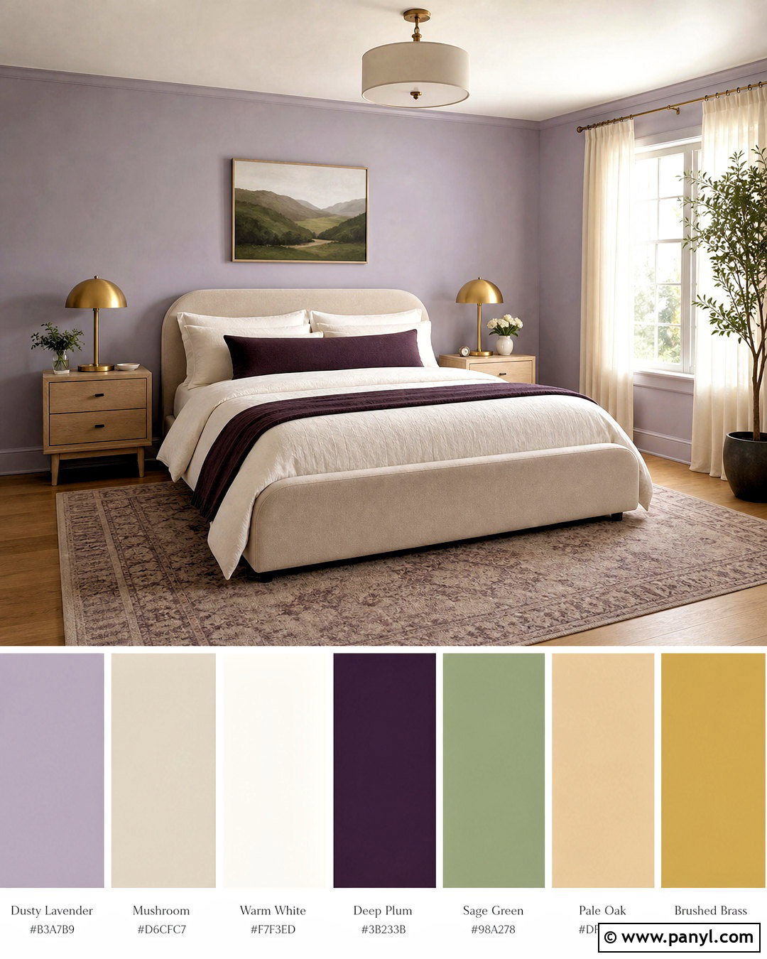
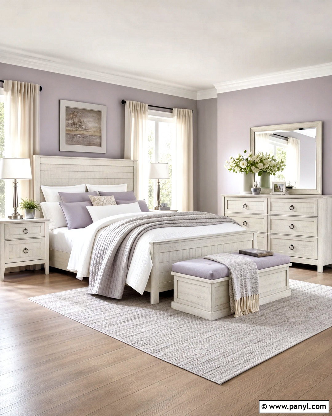
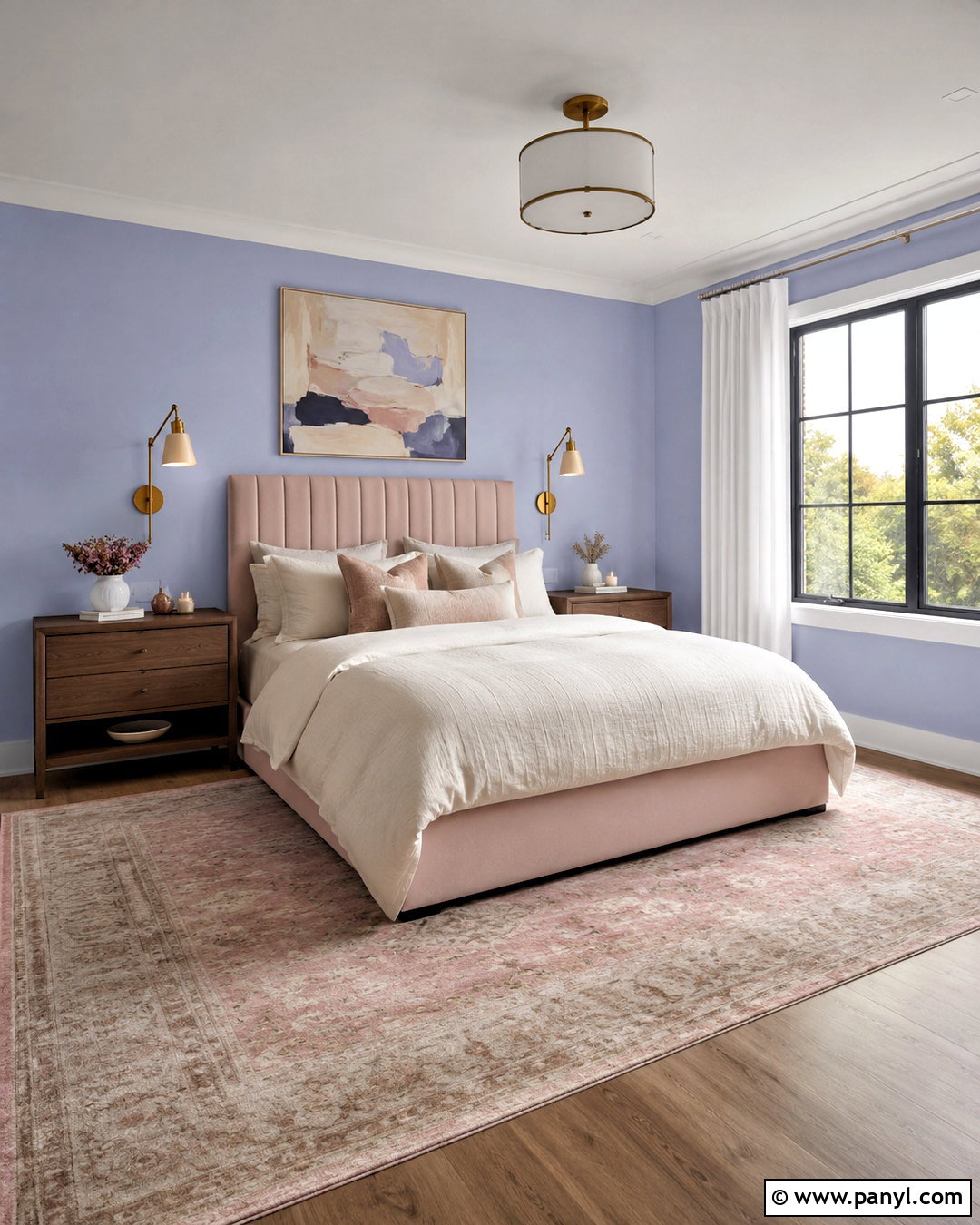
Lavender can feel calm and sophisticated when its undertones are muted and slightly gray. Apply a dusty lavender to bedroom walls, then layer it with warm white bedding, mushroom-colored upholstery, and pale oak furniture. Deep plum can appear in a bench, throw, or patterned pillow to create dimension. Introduce sage green through artwork or a small chair for an understated natural contrast. Brushed brass lighting adds warmth, while sheer ivory curtains keep the overall look airy. Avoid combining lavender with too many sweet pastel shades; grounded neutrals make it feel more mature. A softly patterned rug can bring lavender, taupe, and cream together beneath the furniture. The finished bedroom feels restorative and graceful, with enough depth to remain visually interesting in both daylight and evening lighting.
16. Coastal Blue Color Palette
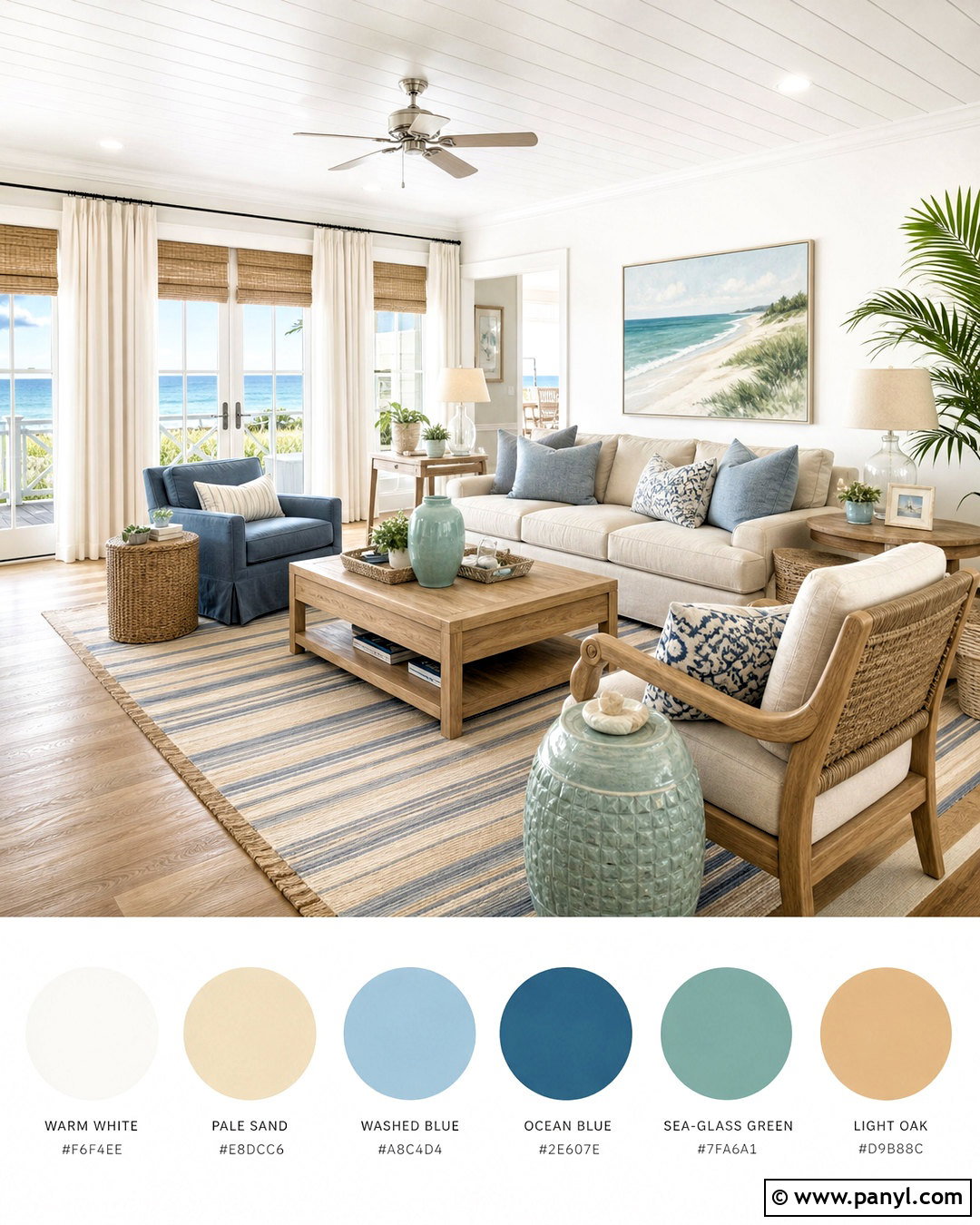
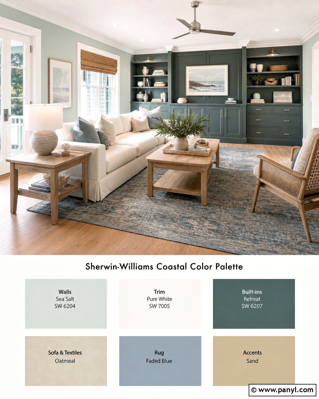
A successful coastal palette should feel breezy and natural rather than crowded with themed decorations. Use warm white walls, a pale sand-colored sofa, and washed blue textiles as the main foundation. Introduce deeper ocean blue through an armchair, striped rug, or painted cabinet. Light oak, woven rattan, and natural linen add the texture associated with relaxed waterfront homes. Small accents in sea-glass green provide variation without distracting from the blues. Keep metal finishes soft and simple, such as brushed nickel or aged brass. Instead of obvious nautical accessories, choose abstract art, ceramic lamps, and sculptural shells used sparingly. This complete living room or bedroom palette feels light and casual. It also works well away from the coast because the colors remain timeless and approachable.
17. Plum And Taupe Color Palette
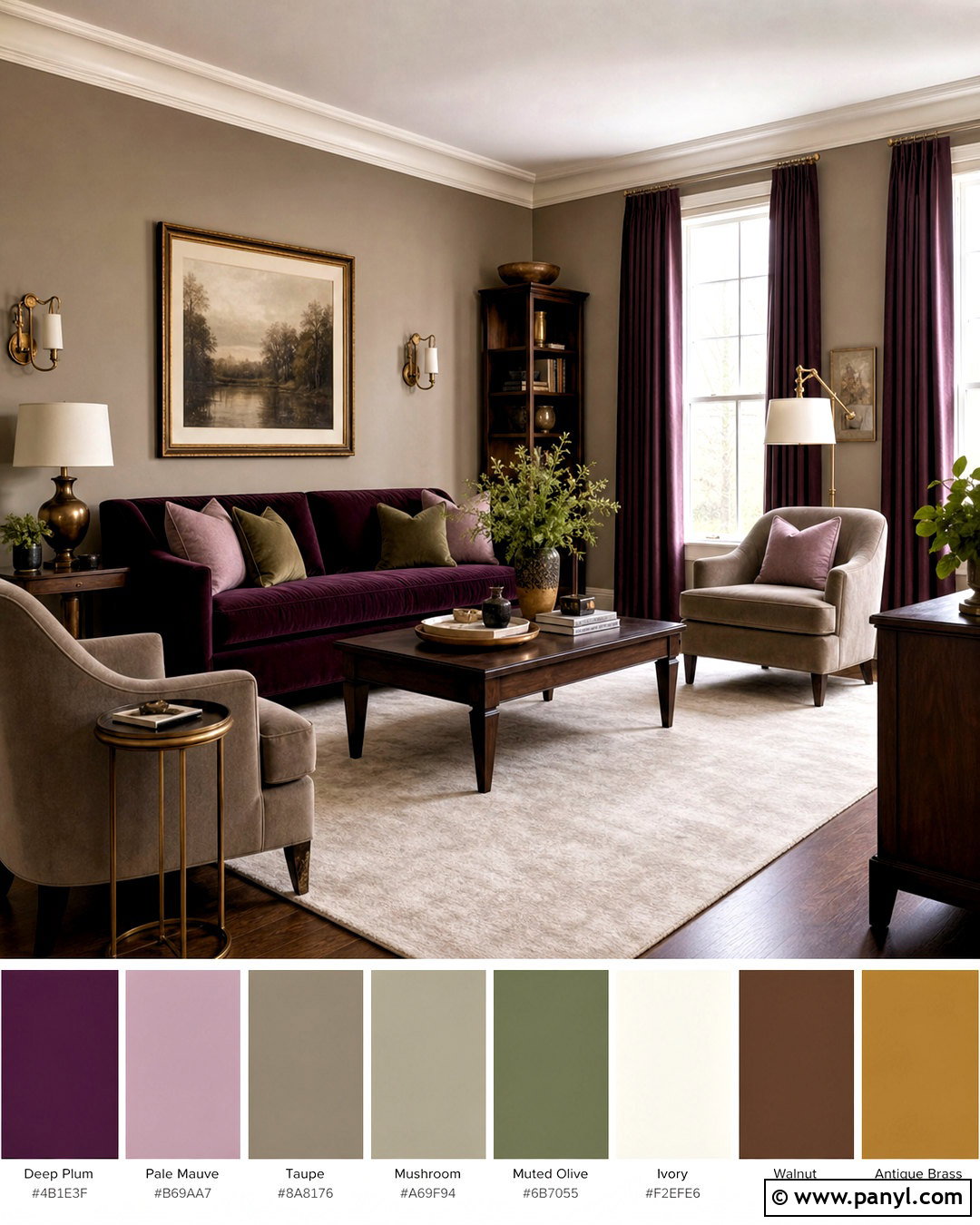
Deep plum and warm taupe produce a comfortable palette with an elegant, slightly dramatic character. Paint the walls a medium taupe and reserve plum for a velvet sofa, upholstered headboard, or floor-length curtains. Add mushroom, ivory, and soft brown through rugs, bedding, and occasional chairs. Walnut furniture reinforces the warmth, while antique brass fixtures provide small points of light. A muted green plant or olive patterned pillow can offer a natural contrast. Use plum in different strengths, from pale mauve accessories to one dark focal piece, so the color feels layered. This complete scheme works particularly well in bedrooms and formal sitting rooms. Its balance of rich and quiet tones creates intimacy without requiring very dark walls or excessive decorative detail.
18. Rust And Blue Color Palette
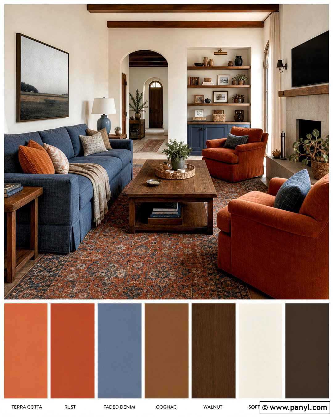
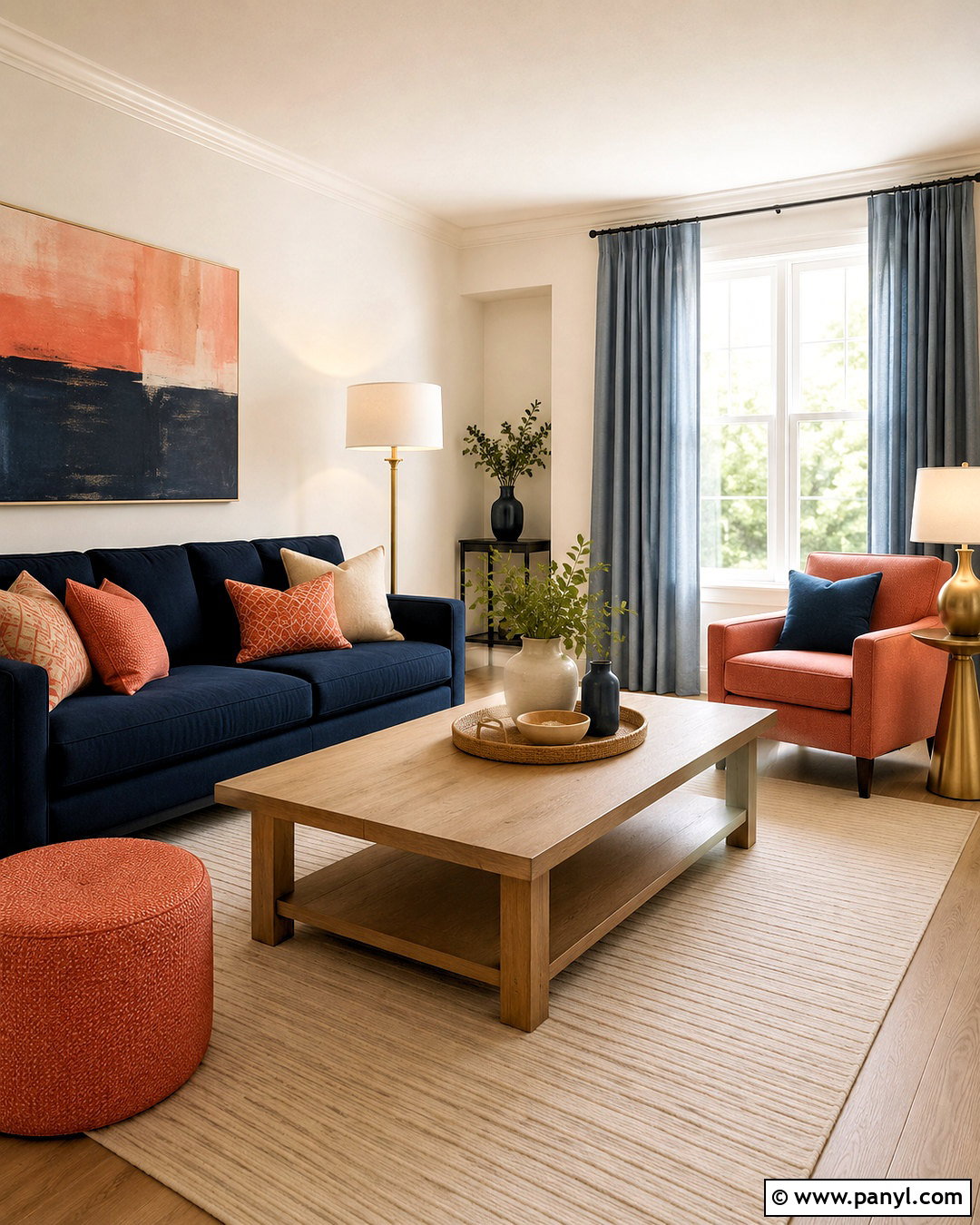
Rust orange and muted blue create an appealing balance between warm and cool color. Begin with soft warm-white walls and a faded blue sofa or upholstered bed. Add rust through a large rug, curtains, or a pair of accent chairs so it has enough presence to feel intentional. Walnut furniture and cognac leather support the warmth, while cream pillows and pale linen keep the arrangement from becoming visually heavy. Repeat blue in ceramic lamps and patterned textiles, using both denim and dusty sky shades. Dark bronze hardware provides definition without the sharpness of pure black. This complete palette works in casual living rooms, guest bedrooms, and family spaces. Its earthy contrast feels colorful, relaxed, and easy to update as accessories change over time.
19. Emerald Green Color Palette
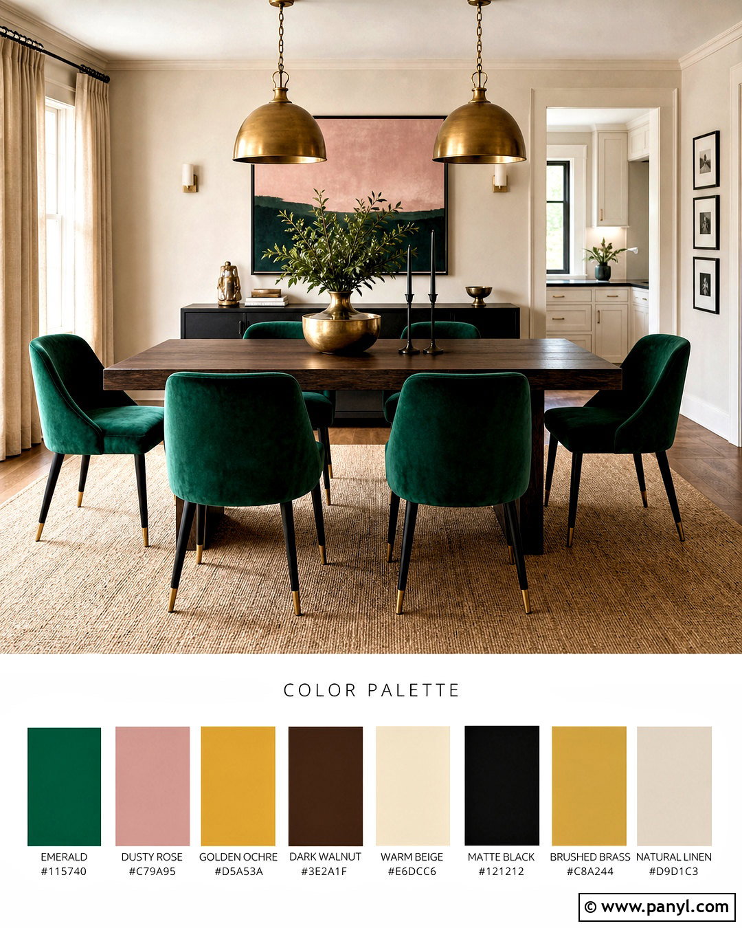
Emerald green makes a striking focal color when it is surrounded by warm, substantial materials. Use emerald on a velvet sofa, kitchen island, or set of dining chairs rather than spreading it evenly across every surface. Pair it with creamy walls, dark walnut furniture, and a warm beige rug. Brass lighting and hardware highlight the jewel-like green, while black accents provide a crisp outline. Introduce muted pink, rust, or golden ochre through artwork and pillows for added personality. Curtains in natural linen keep the room from becoming overly formal. If using green walls, balance them with pale upholstery and a light ceiling. This complete palette creates a polished living or dining space that feels vibrant, inviting, and connected through carefully repeated materials and colors.
20. Earthy Neutral Color Palette
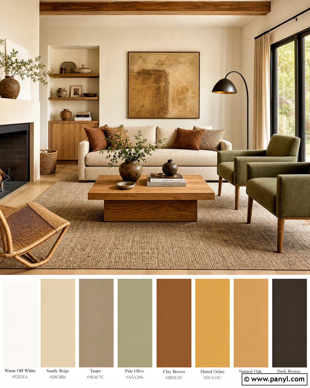
An earthy neutral palette combines clay, sand, stone, wood, and soft mineral shades into one calming look. Choose warm off-white walls, a sandy beige sofa, and a large taupe rug as the light foundation. Layer in clay brown, muted ochre, and pale olive through chairs, cushions, ceramics, and artwork. Use natural oak or walnut furniture, depending on how much contrast the room needs. Linen curtains, wool textiles, woven baskets, and stone accessories provide enough texture to separate the similar colors. A dark bronze floor lamp can add definition without disrupting the organic mood. This complete living room feels warm and collected because no single shade dominates. It is also flexible enough to complement modern, farmhouse, rustic, or minimalist architecture.
Conclusion:
The best palette is not simply a collection of colors you like. It should connect the room’s permanent finishes, main furniture, textiles, lighting, and smaller decorative details. These 20 colour palette ideas provide complete starting points that can be adjusted for your home’s architecture, daylight, and existing materials. Begin with one dominant neutral or grounding color, add a supporting shade, and finish with a smaller contrasting accent. Repeat each important color at least a few times so the room feels intentional. Most importantly, test paint and fabric samples inside the actual space before purchasing. A thoughtful palette will make decorating easier and help every part of the room feel naturally connected.

Related Ideas and Inspiration:
Leave a Reply